
A presentation at CSS Day in in Amsterdam, Netherlands by Manuel Matuzovic
That’s not how I wrote CSS 3 years ago Manuel Matuzović, CSS Day 2023
Hi, I’m Manuel! 👊 matuzo.at manuel@matuzo.at front-end.social/@matuzo htmhell.dev
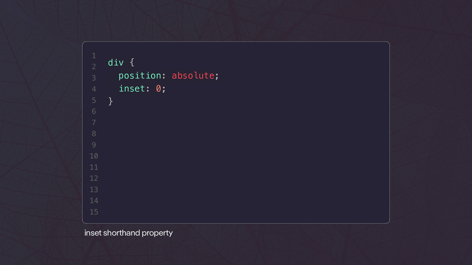
1 2 3 4 5 div { position: absolute; inset: 0; } 6 7 8 9 10 11 12 13 14 15 inset shorthand property
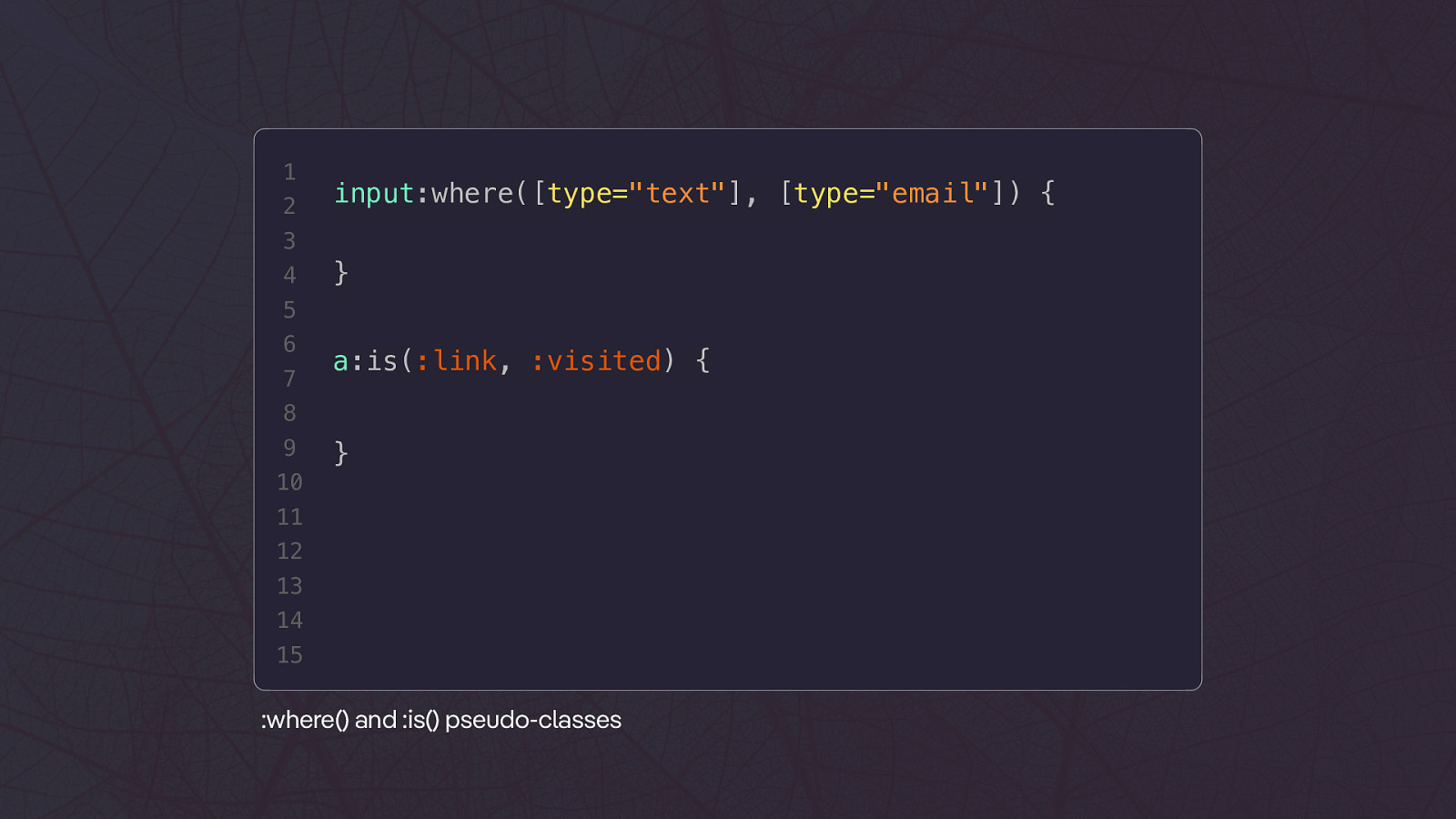
1 2 input:where([type=”text”], [type=”email”]) { 3 4 } 5 6 7 a:is(:link, :visited) { 8 9 10 } 11 12 13 14 15 :where() and :is() pseudo-classes
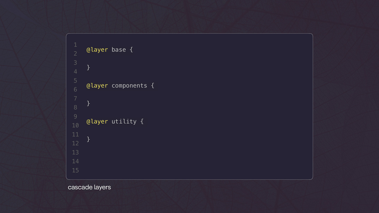
1 2 3 4 5 6 7 8 9 10 11 12 @layer base { } @layer components { } @layer utility { } 13 14 15 cascade layers
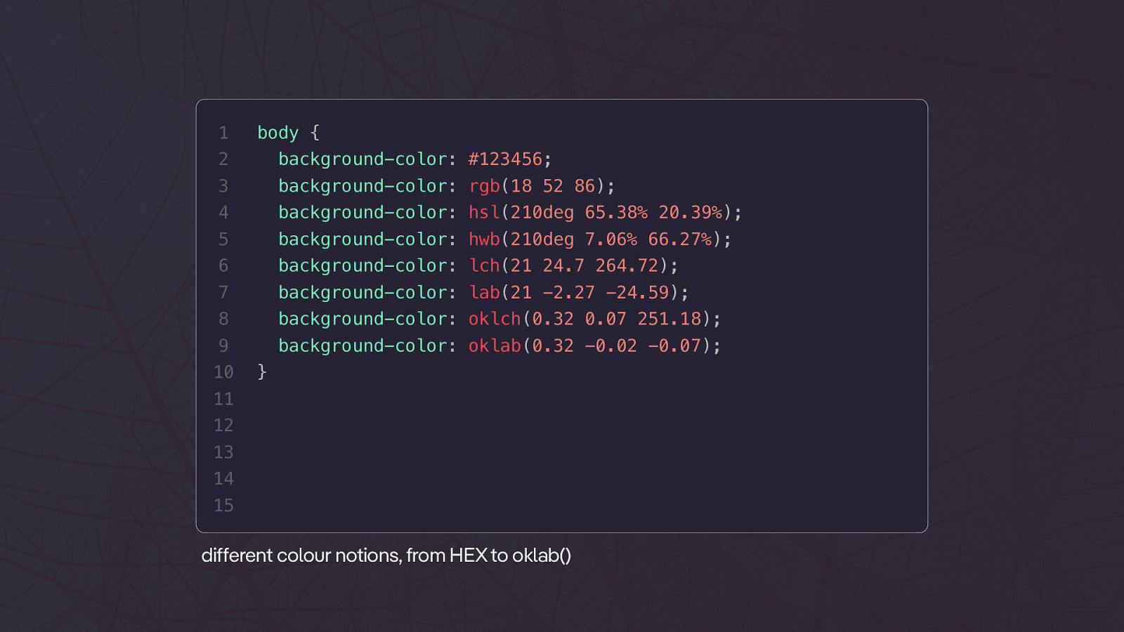
1 body { 2 background-color: #123456; 3 background-color: rgb(18 52 86); 4 background-color: hsl(210deg 65.38% 20.39%); 5 background-color: hwb(210deg 7.06% 66.27%); 6 background-color: lch(21 24.7 264.72); 7 background-color: lab(21 -2.27 -24.59); 8 background-color: oklch(0.32 0.07 251.18); 9 background-color: oklab(0.32 -0.02 -0.07); 10 } 11 12 13 14 15 ff di erent colour notions, from HEX to oklab()
???
#100DaysOfMoreOrLess ModernCSS
E M BOB
HUG O
DRE AM CAS T❤
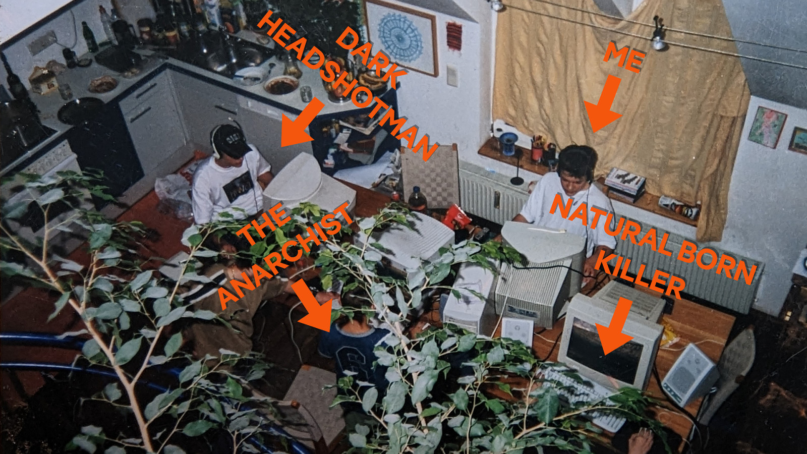
HE D AD A R SH K OT M AN T E S H I T H C R A N A ME NAT URA L BO KIL R N LER
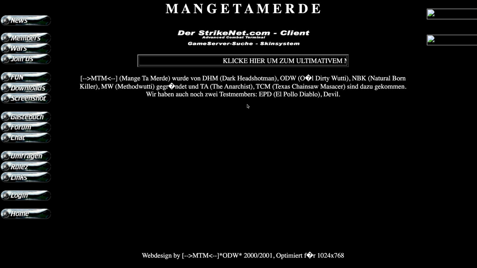
[—>MTM<—] Mange Ta Merde
1 2
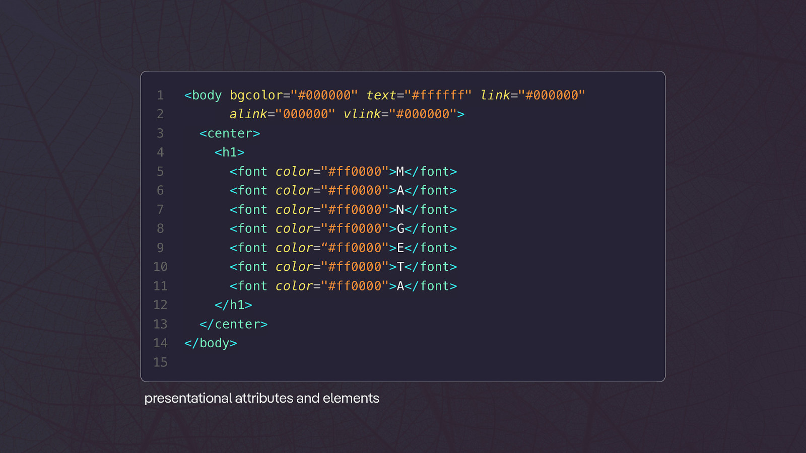
<body bgcolor=”#000000” text=”#ffffff” link=”#000000” alink=”000000” vlink=”#000000”> 3 <center> 4 <h1> 5 <font color=”#ff0000”>M</font> 6 <font color=”#ff0000”>A</font> 7 <font color=”#ff0000”>N</font> 8 <font color=”#ff0000”>G</font> 9 <font color=“#ff0000”>E</font> 10 <font color=”#ff0000”>T</font> 11 <font color=”#ff0000”>A</font> 12 </h1> 13 </center> 14 </body> 15 tt presentational a ributes and elements1
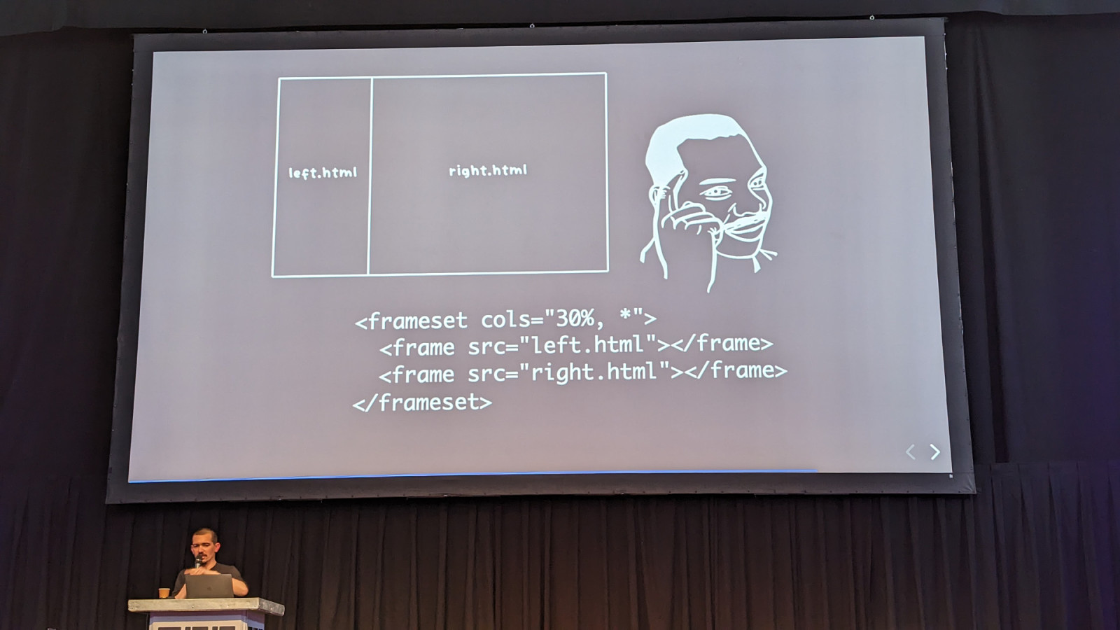
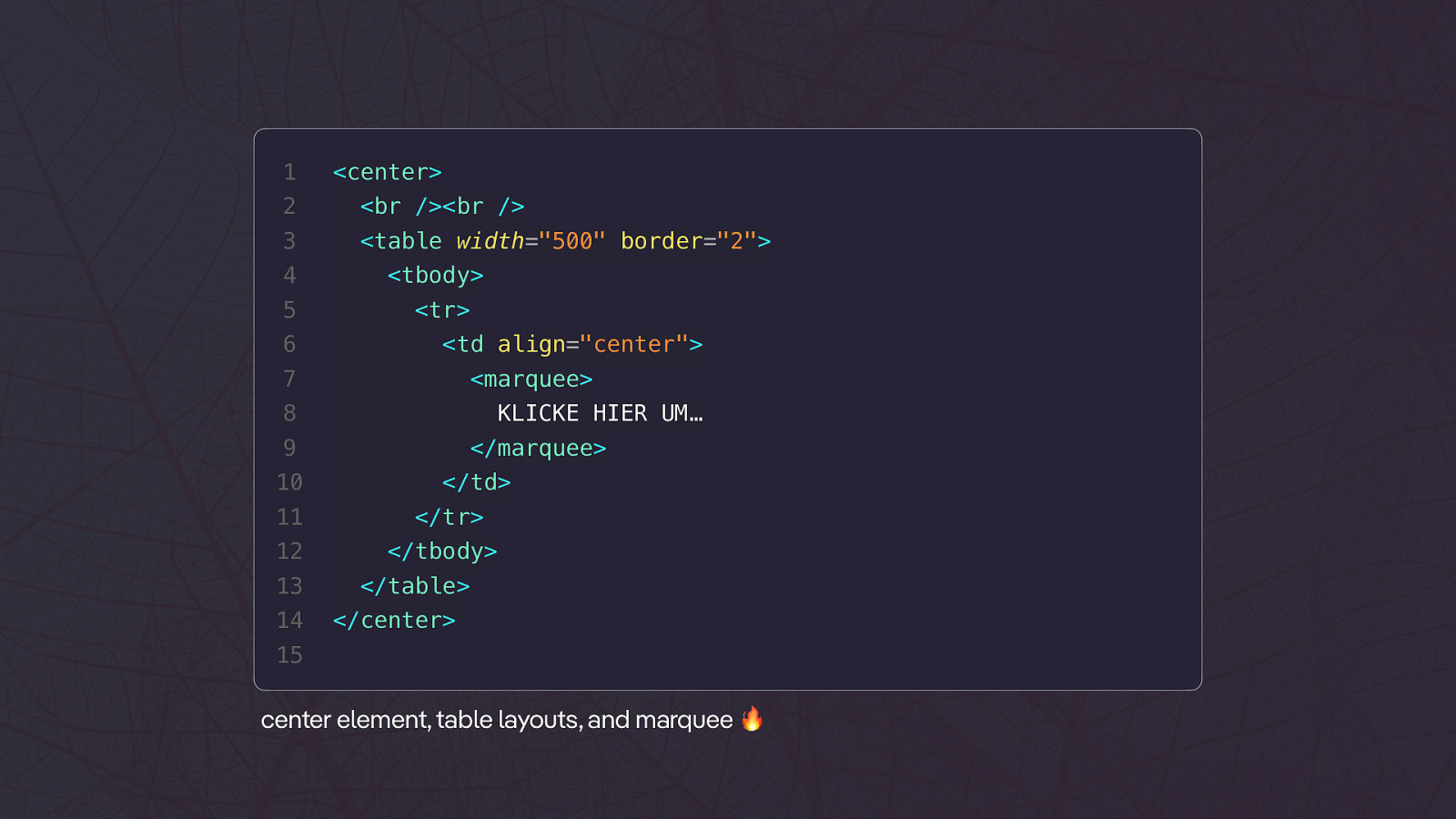
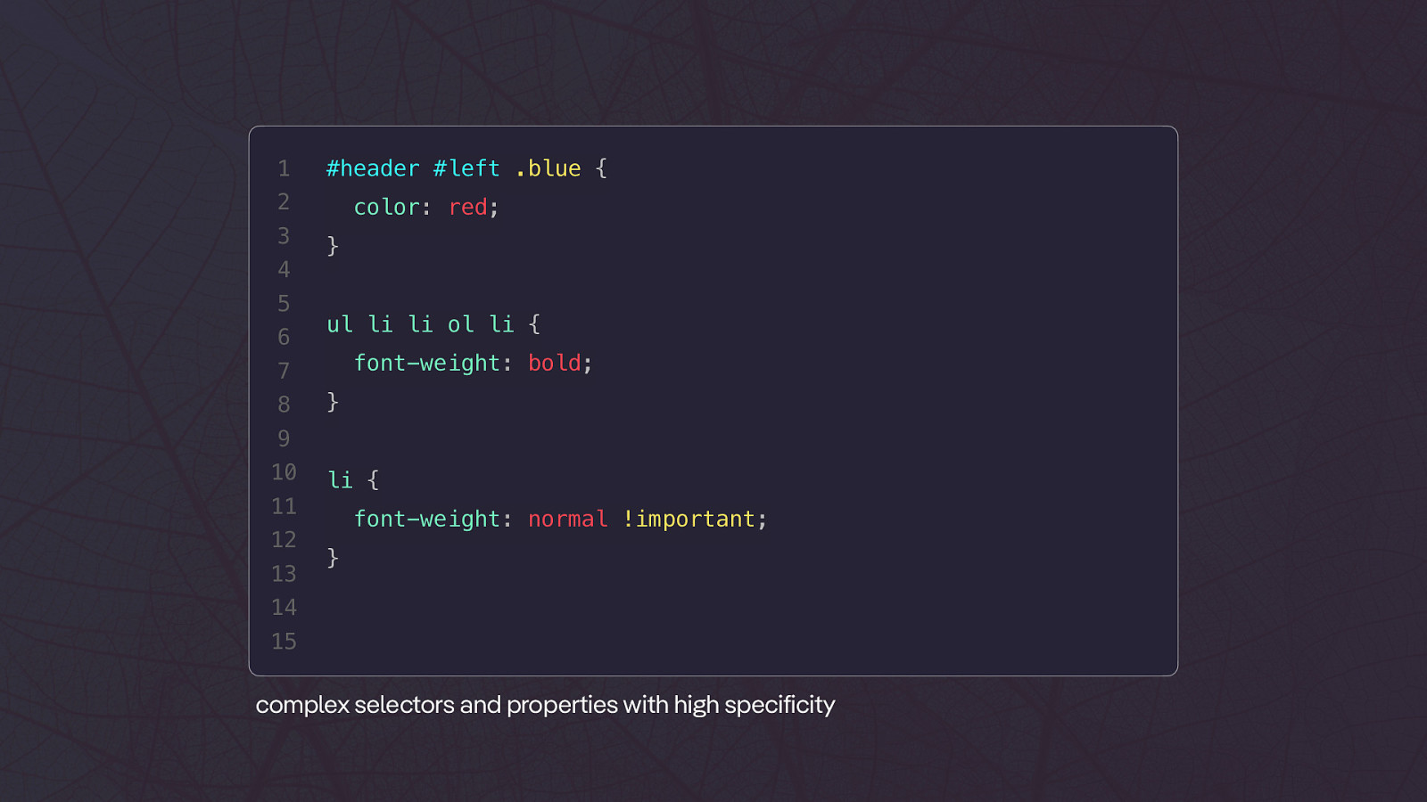
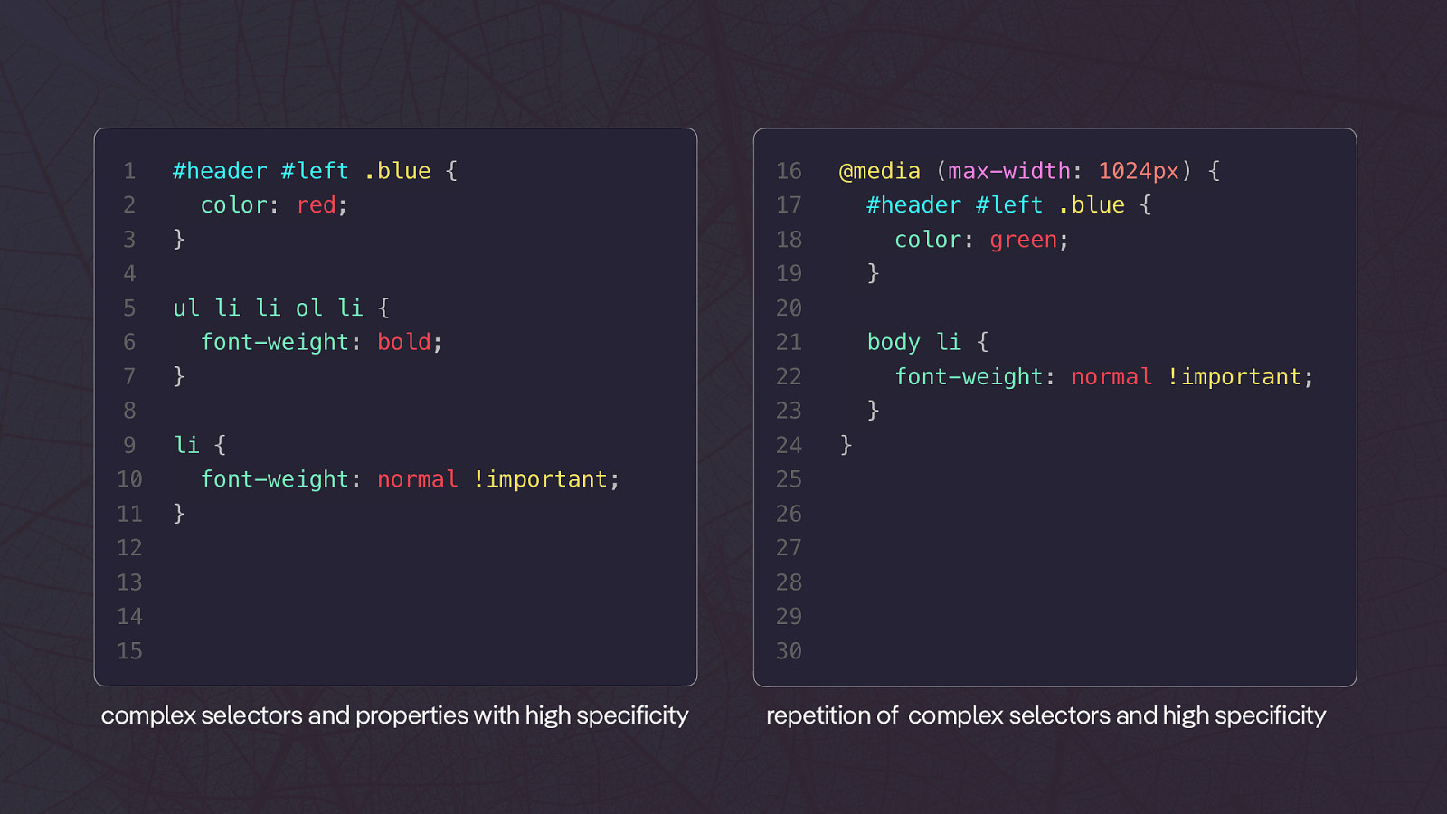
<center> 2 <br /><br /> 3 <table width=”500” border=”2”> 4 5 6 <tbody> <tr> <td align=”center”> 7 <marquee> 8 KLICKE HIER UM… 9 10 11 12 13 14 </marquee> </td> </tr> </tbody> </table> </center> 15 center element, table layouts, and marquee 🔥1 #header #left .blue { 2 3 4 5 6 color: red; } ul li li ol li { font-weight: bold; 7 8 } 9 10 li { 11 12 13 font-weight: normal !important; } 14 15 complex selectors and properties with high specificity
1 #header #left .blue { 2 3 color: red; ul li li ol li { font-weight: bold; color: green; } 20 21 body li { font-weight: normal !important; 23 li { 10 11 #header #left .blue { 22 } 8 9 17 19 6 7 @media (max-width: 1024px) { 18 } 4 5 16 font-weight: normal !important; } 24 } 25 26 12 27 13 28 14 29 15 30 complex selectors and properties with high specificity } repetition of complex selectors and high specificity
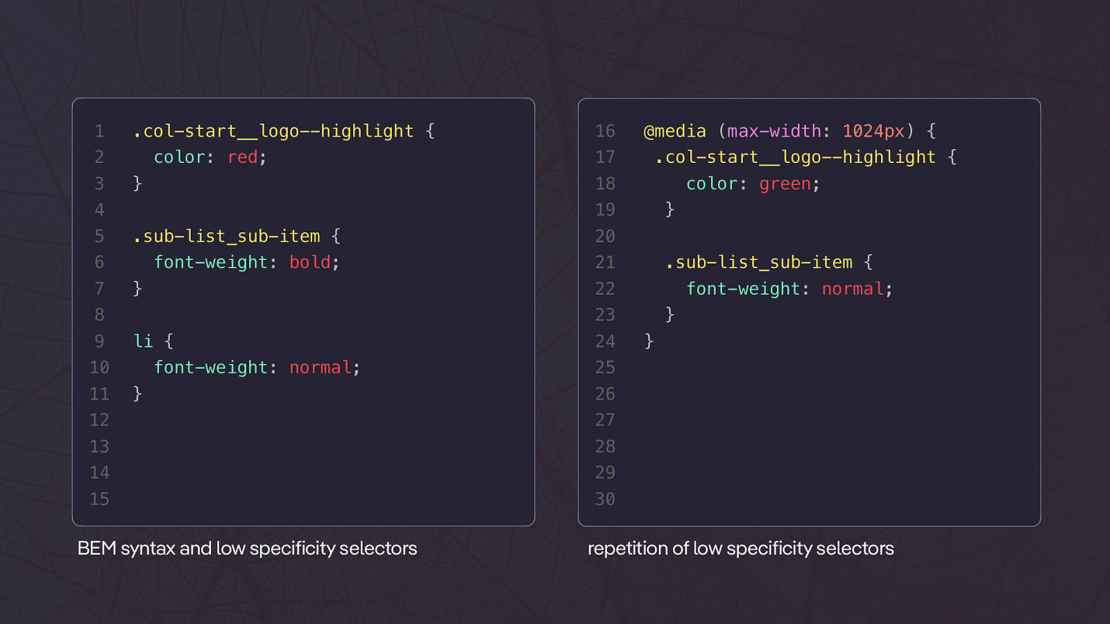
1 .col-start__logo—highlight { 2 3 color: red; 16 17 .sub-list_sub-item { 20 6 font-weight: bold; 21 } .sub-list_sub-item { 22 } font-weight: normal; 23 8 li { 10 11 color: green; 19 5 9 .col-start__logo—highlight { 18 } 4 7 @media (max-width: 1024px) { font-weight: normal; } 24 } 25 26 12 27 13 28 14 29 15 30 BEM syntax and low specificity selectors } repetition of low specificity selectors
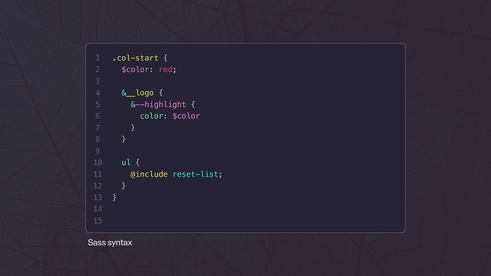
1 .col-start { 2 $color: red; 3 4 &__logo { 5 &—highlight { 6 color: $color 7 } 8 } 9 10 ul { 11 @include reset-list; 12 13 } } 14 15 Sass syntax
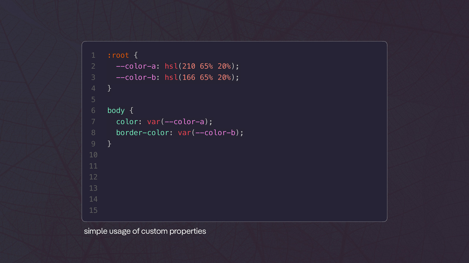
Custom Properties
1 :root { 2 —color-a: hsl(210 65% 20%); 3 —color-b: hsl(166 65% 20%); 4 } 5 6 body { 7 color: var(—color-a); 8 border-color: var(—color-b); 9 } 10 11 12 13 14 15 simple usage of custom properties
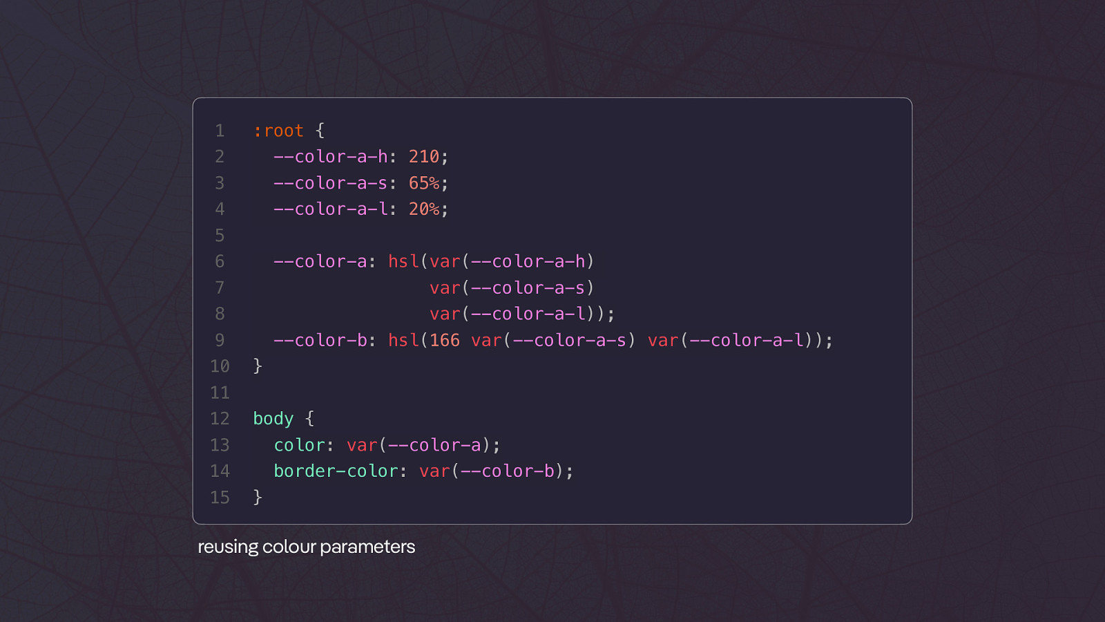
1 :root { 2 —color-a-h: 210; 3 —color-a-s: 65%; 4 —color-a-l: 20%; 5 6 —color-a: hsl(var(—color-a-h) 7 var(—color-a-s) 8 var(—color-a-l)); 9 10 —color-b: hsl(166 var(—color-a-s) var(—color-a-l)); } 11 12 body { 13 color: var(—color-a); 14 border-color: var(—color-b); 15 } reusing colour parameters
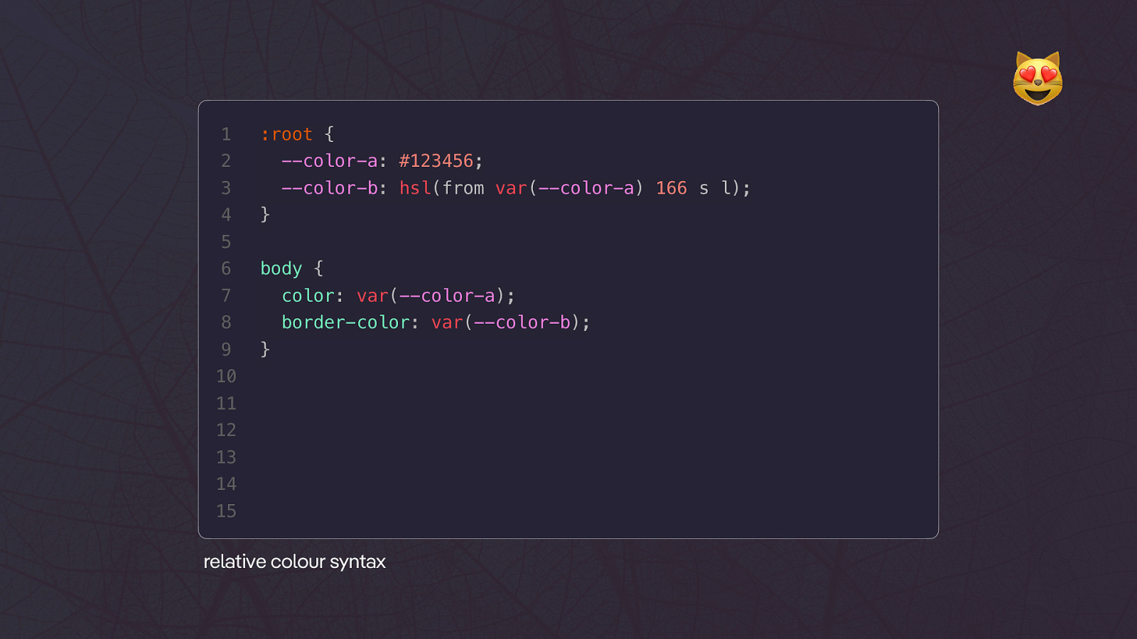
😻 1 :root { 2 —color-a: #123456; 3 —color-b: hsl(from var(—color-a) 166 s l); 4 } 5 6 body { 7 color: var(—color-a); 8 border-color: var(—color-b); 9 } 10 11 12 13 14 15 relative colour syntax
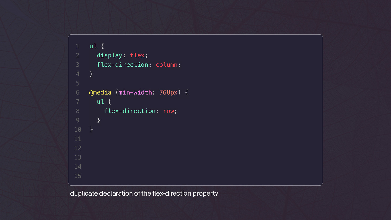
1 ul { 2 display: flex; 3 flex-direction: column; 4 } 5 6 @media (min-width: 768px) { 7 ul { 8 flex-direction: row; 9 10 } } 11 12 13 14 15 duplicate declaration of the flex-direction property
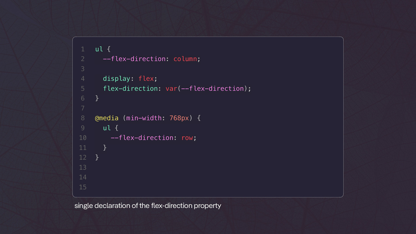
1 ul { 2 —flex-direction: column; 3 4 display: flex; 5 flex-direction: var(—flex-direction); 6 } 7 8 @media (min-width: 768px) { 9 ul { 10 —flex-direction: row; 11 12 } } 13 14 15 single declaration of the flex-direction property
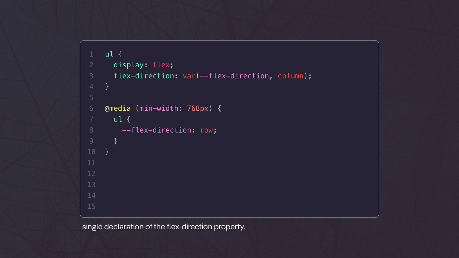
1 ul { 2 display: flex; 3 flex-direction: var(—flex-direction, column); 4 } 5 6 @media (min-width: 768px) { 7 ul { 8 —flex-direction: row; 9 10 } } 11 12 13 14 15 single declaration of the flex-direction property.
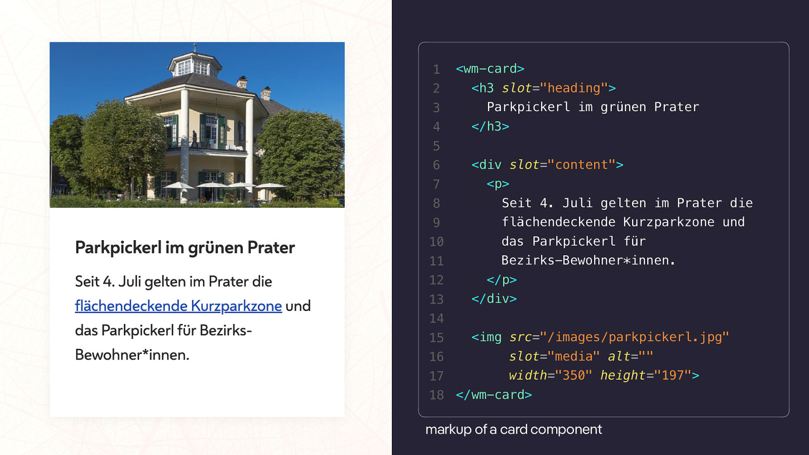
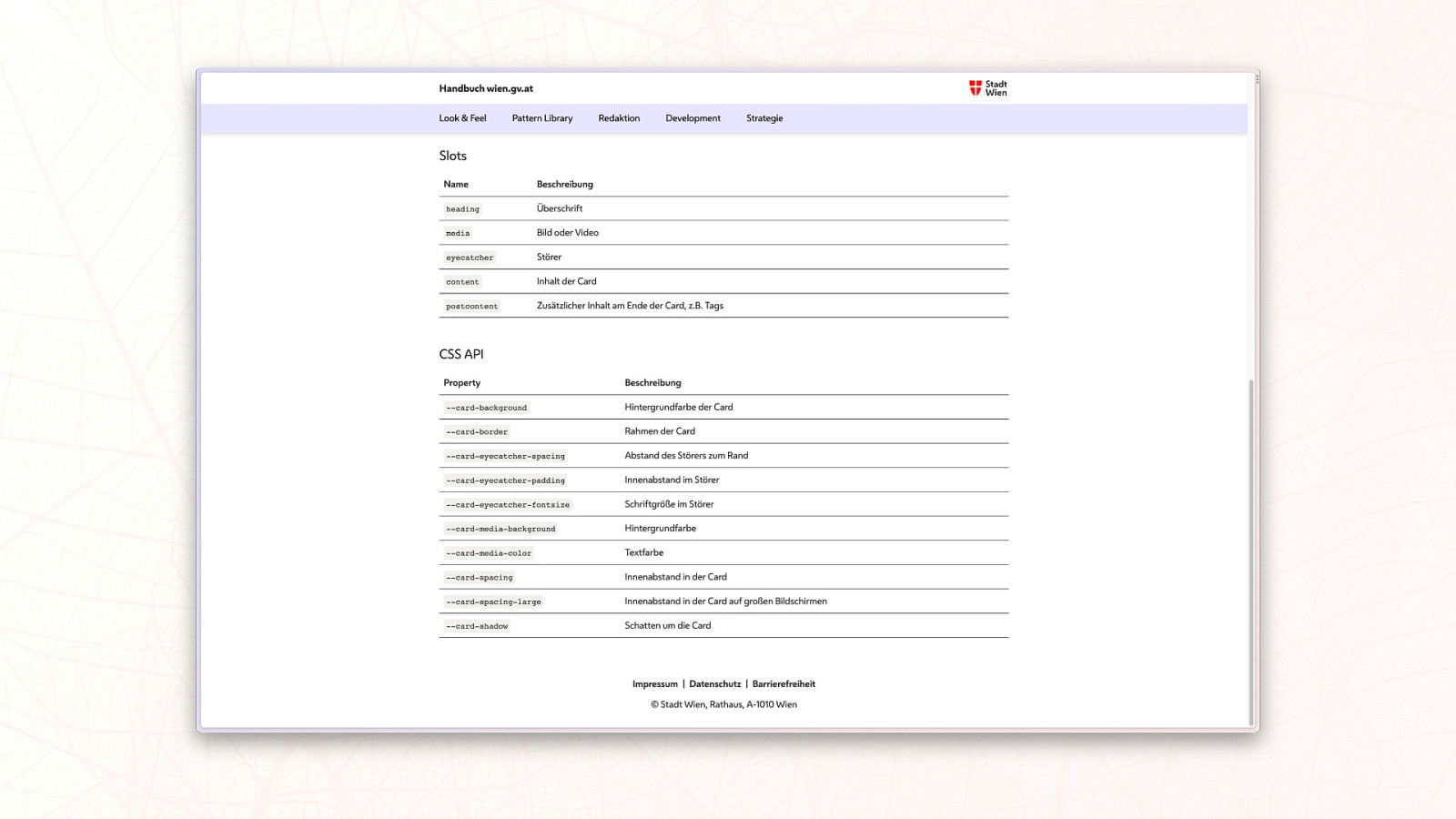
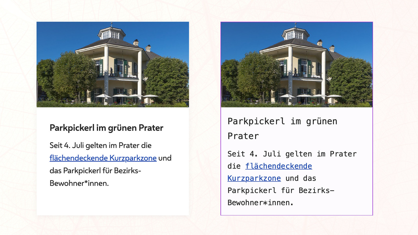
1 2 3 4 <wm-card> <h3 slot=”heading”> Parkpickerl im grünen Prater </h3> 5 6 7
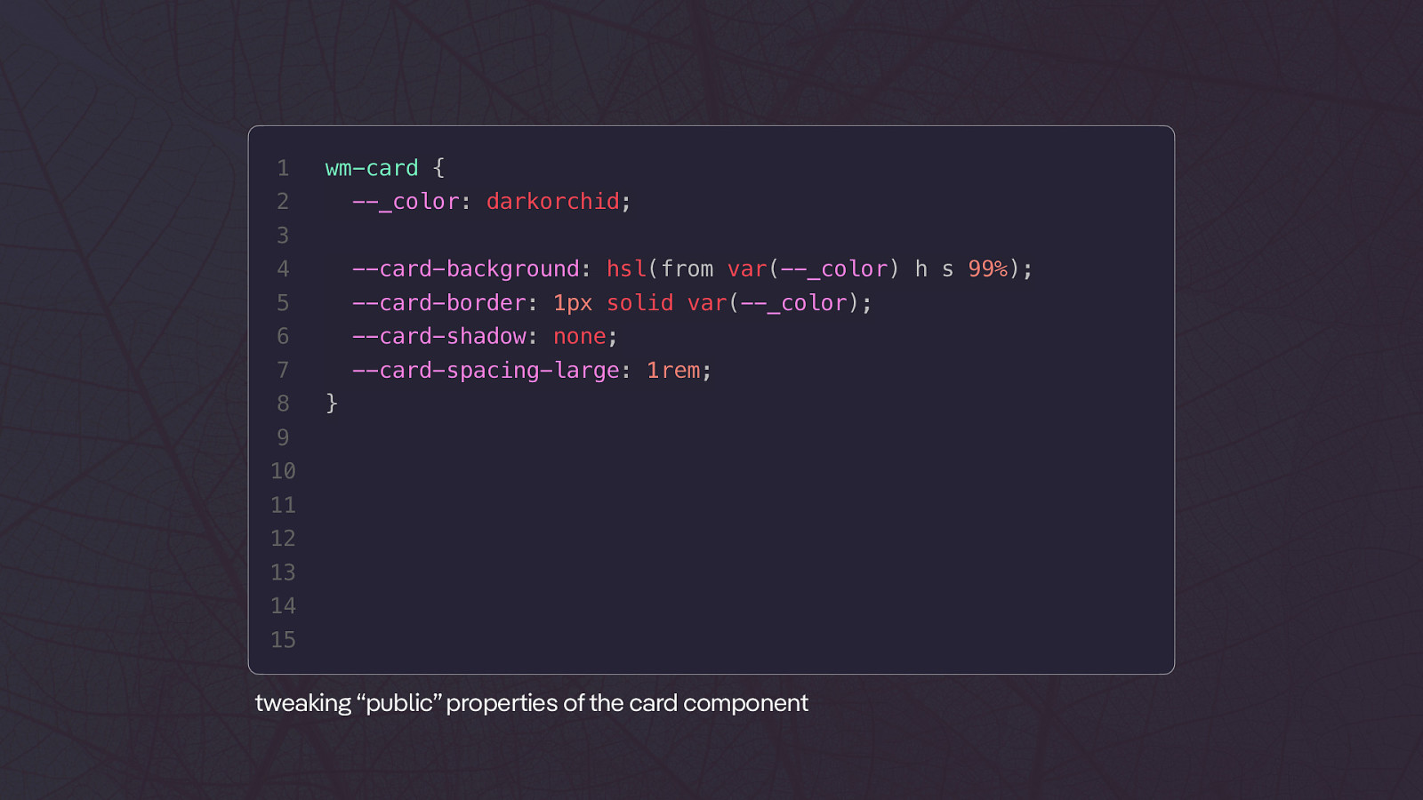
<div slot=”content”> <p> 8 Seit 4. Juli gelten im Prater die 9 flächendeckende Kurzparkzone und 10 das Parkpickerl für 11 Bezirks-Bewohner*innen. 12 </p> 13 </div> 14 15 <img src=”/images/parkpickerl.jpg” 16 slot=”media” alt=”” 17 width=”350” height=”197”> 18 </wm-card> markup of a card component1 wm-card { 2 —_color: darkorchid; 3 4 —card-background: hsl(from var(—_color) h s 99%); 5 —card-border: 1px solid var(—_color); 6 —card-shadow: none; 7 —card-spacing-large: 1rem; 8 } 9 10 11 12 13 14 15 tweaking “public” properties of the card component
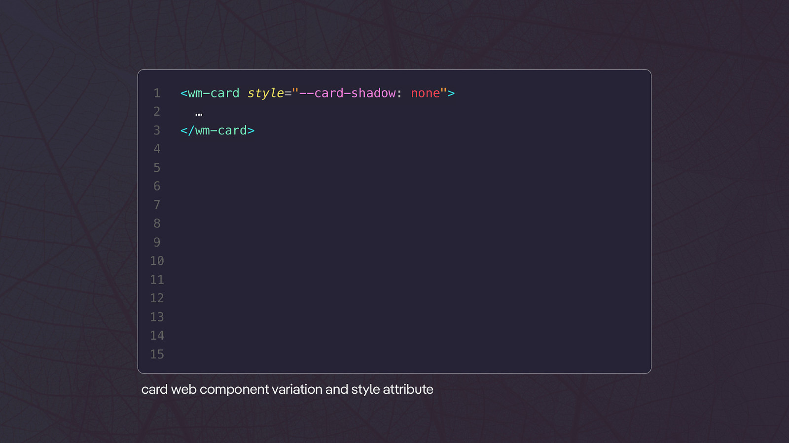
1 2 3 <wm-card style=”—card-shadow: none”> … </wm-card> 4 5 6 7 8 9 10 11 12 13 14 15 tt card web component variation and style a ribute
tt tt h ps://almanac.h parchive.org/en/2022/css
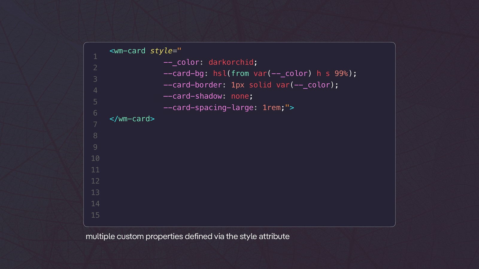
1 <wm-card style=” —_color: darkorchid; 2 —card-bg: hsl(from var(—_color) h s 99%); 3 —card-border: 1px solid var(—_color); 4 —-card-shadow: none; 5 6 7 —card-spacing-large: 1rem;”> </wm-card> 8 9 10 11 12 13 14 15 tt multiple custom properties defined via the style a ribute
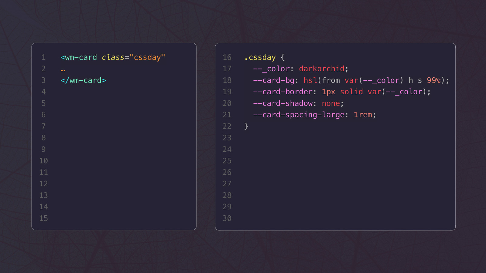
1 <wm-card class=”cssday” 16 2 … 17 —_color: darkorchid; 3 </wm-card> 18 —card-bg: hsl(from var(—_color) h s 99%); 4 19 —card-border: 1px solid var(—_color); 5 20 —card-shadow: none; 6 21 —card-spacing-large: 1rem; 7 22 8 23 9 24 10 25 11 26 12 27 13 28 14 29 15 30 .cssday { }
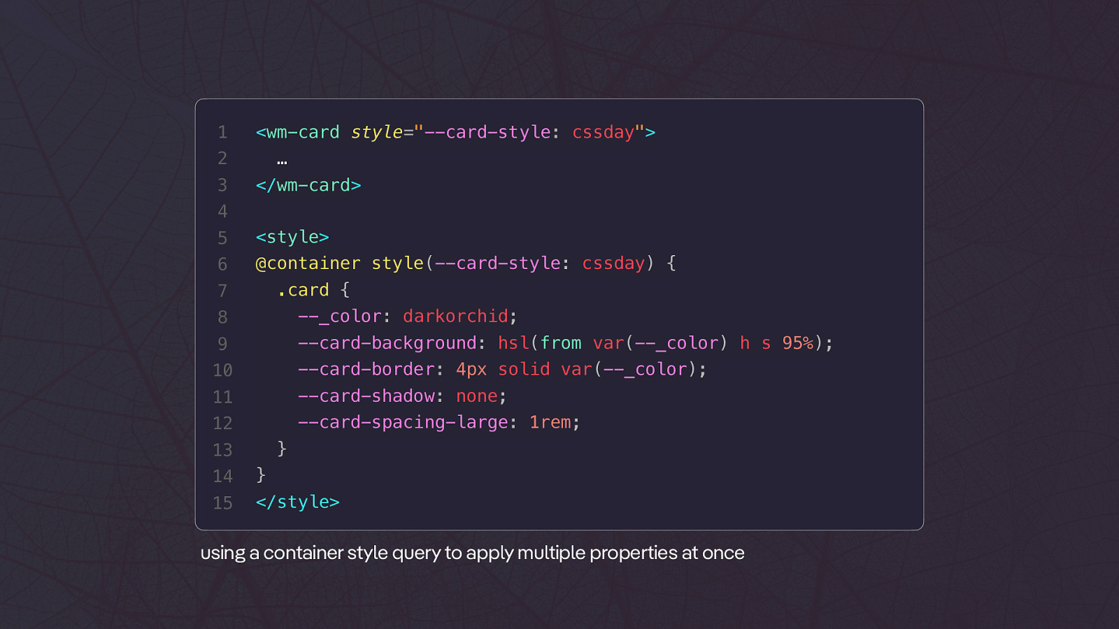
1 <wm-card style=”—card-style: cssday”> 2 3 … </wm-card> 4 5
<style> 6 @container style(—card-style: cssday) { .card { 7 8 —_color: darkorchid; 9 —card-background: hsl(from var(—_color) h s 95%); 10 —card-border: 4px solid var(—_color); 11 —card-shadow: none; 12 —card-spacing-large: 1rem; } 13 14 } 15 </style>using a container style query to apply multiple properties at once
🐢 1 2 3 4
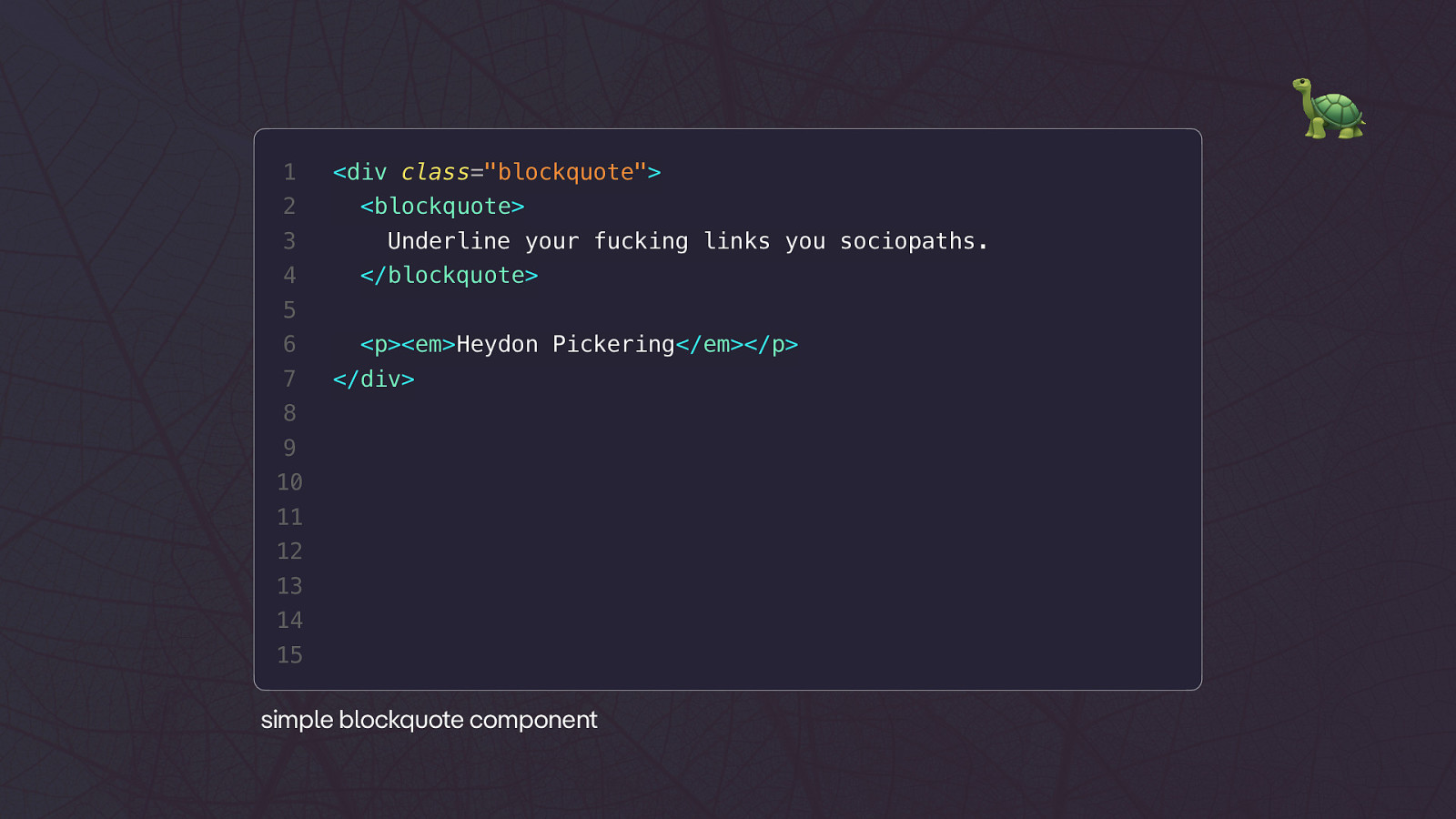
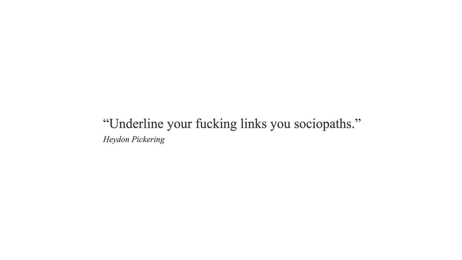
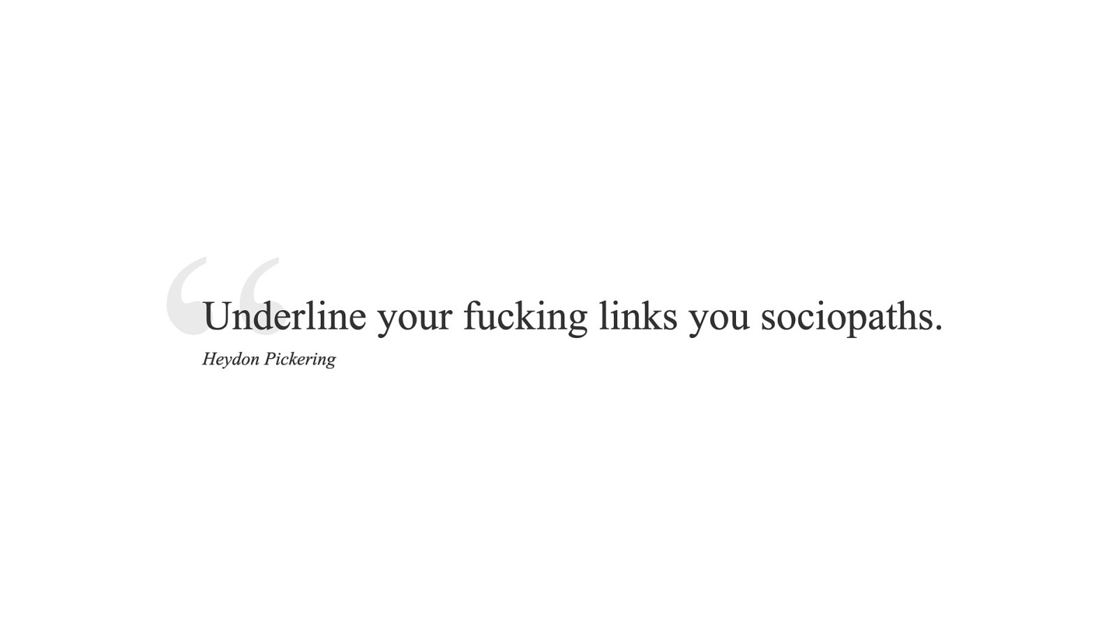
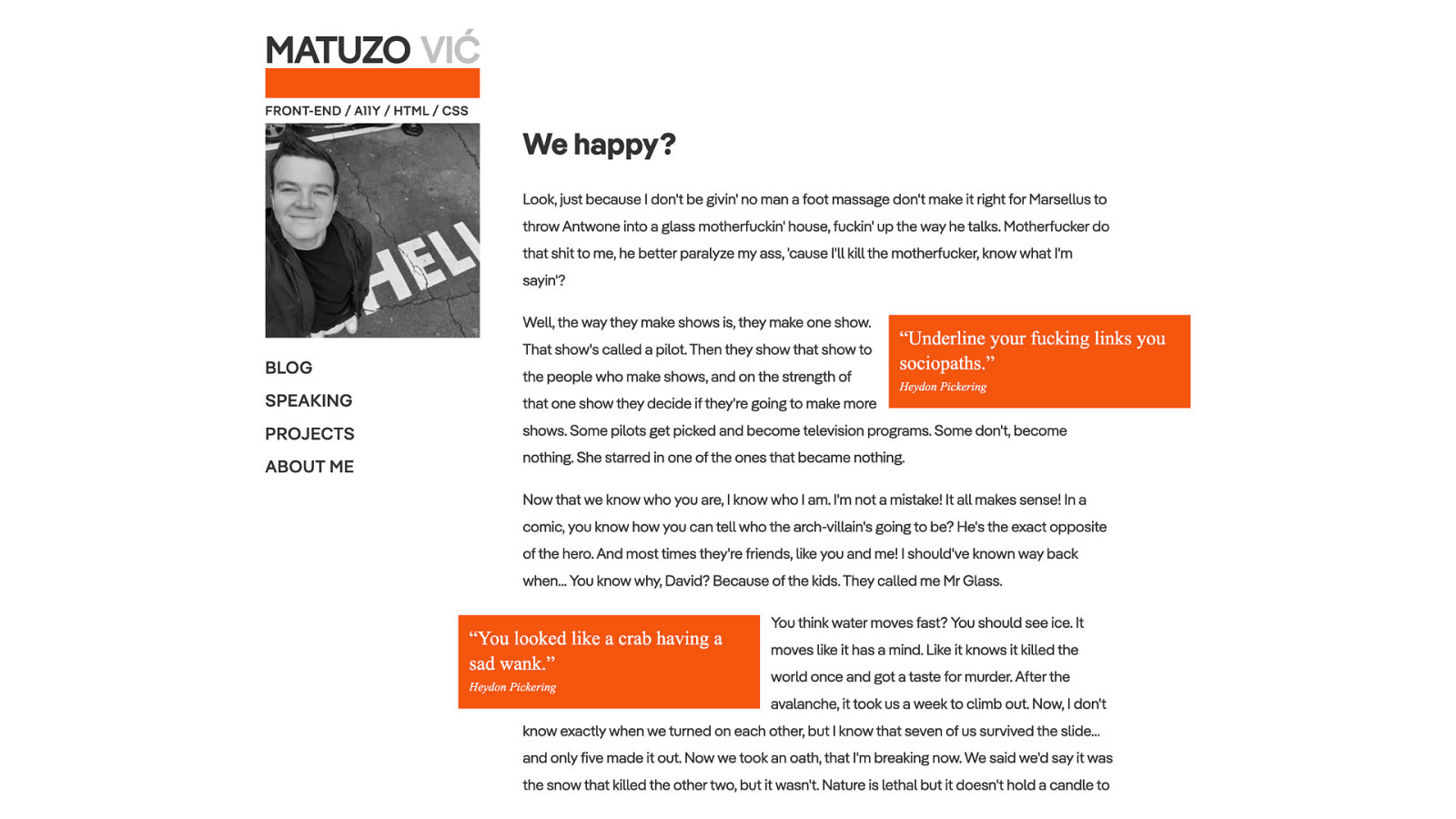
<div class=”blockquote”> <blockquote> Underline your fucking links you sociopaths. </blockquote> 5 6 7 <p><em>Heydon Pickering</em></p> </div> 8 9 10 11 12 13 14 15 simple blockquote component1 2 3 4
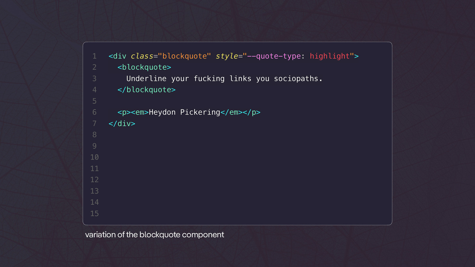
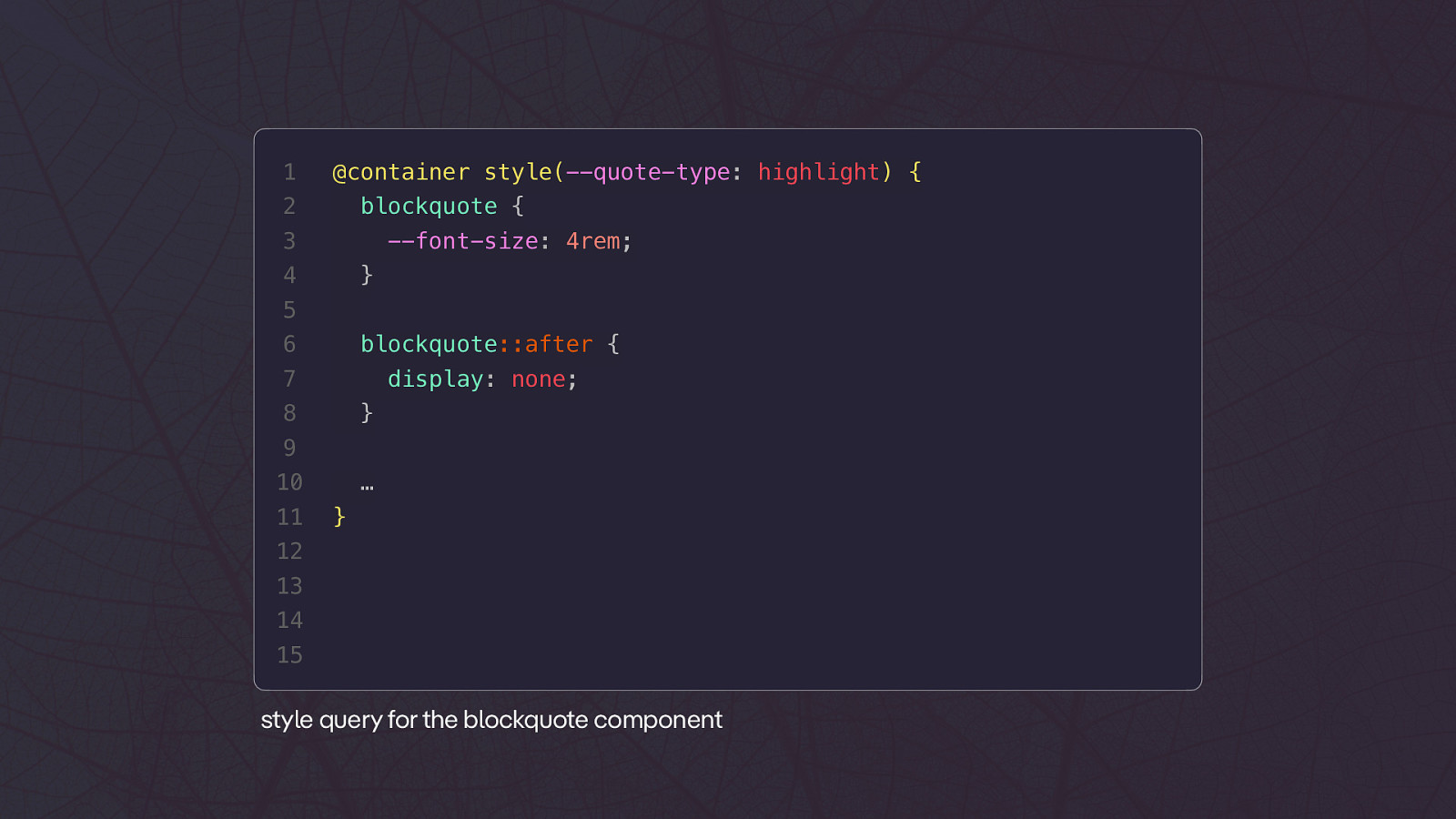
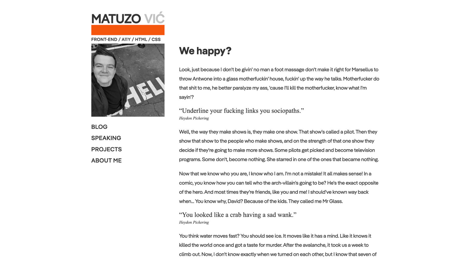
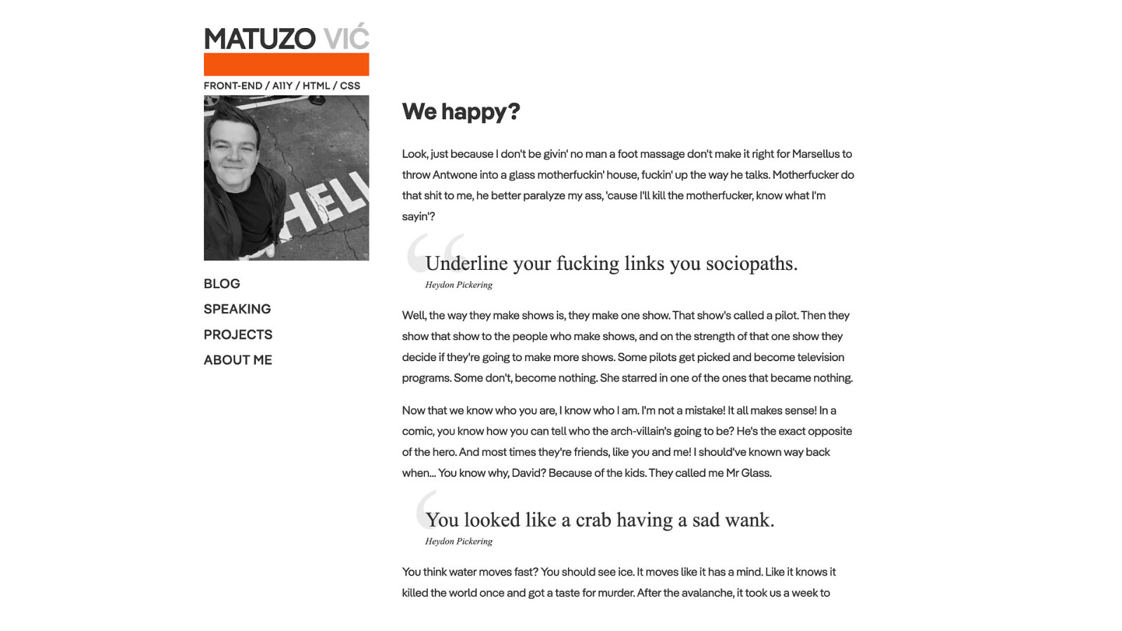
<div class=”blockquote” style=”—quote-type: highlight”> <blockquote> Underline your fucking links you sociopaths. </blockquote> 5 6 7 <p><em>Heydon Pickering</em></p> </div> 8 9 10 11 12 13 14 15 variation of the blockquote component1 @container style(—quote-type: highlight) { 2 blockquote { 3 —font-size: 4rem; 4 } 5 6 blockquote::after { 7 display: none; 8 } 9 10 11 … } 12 13 14 15 style query for the blockquote component
1
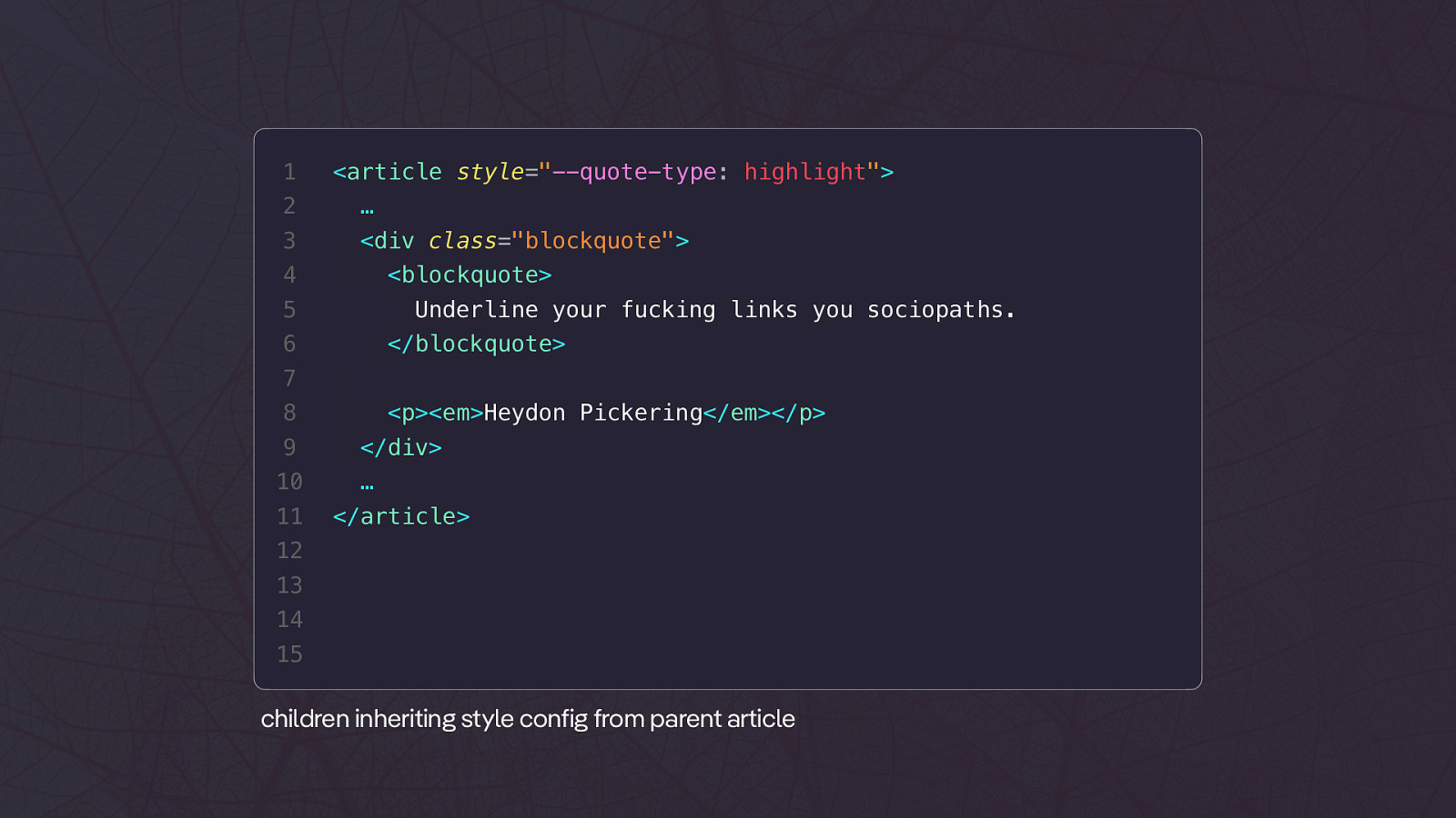
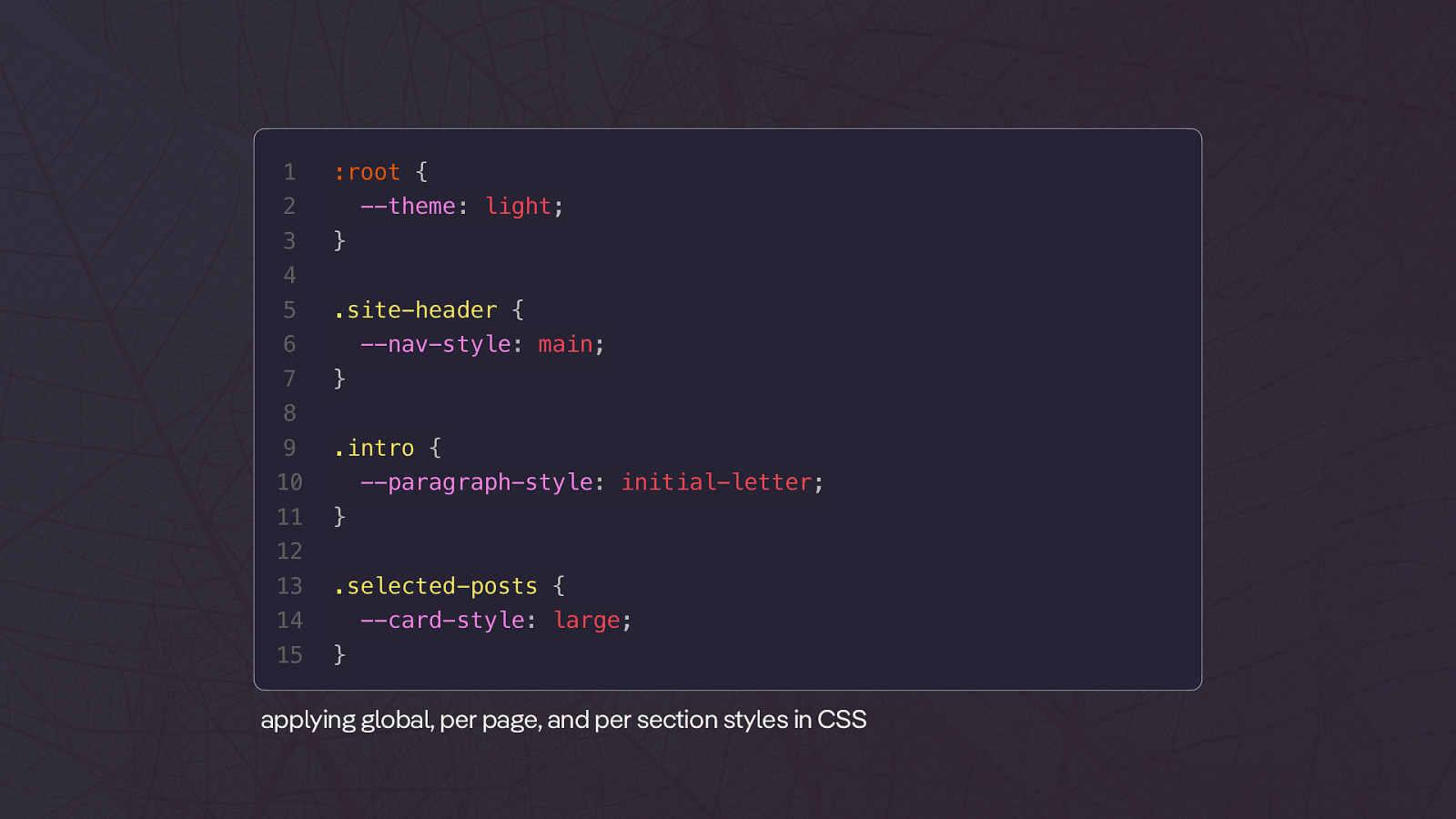
<article style=”—quote-type: highlight”> 2 … 3 <div class=”blockquote”> 4 <blockquote> 5 Underline your fucking links you sociopaths. 6 </blockquote> 7 8 9 10 11 <p><em>Heydon Pickering</em></p> </div> … </article> 12 13 14 15 children inheriting style config from parent article1 :root { 2 3 —theme: light; } 4 5 .site-header { 6 7 —nav-style: main; } 8 9 .intro { 10 11 —paragraph-style: initial-letter; } 12 13 .selected-posts { 14 15 —card-style: large; } applying global, per page, and per section styles in CSS
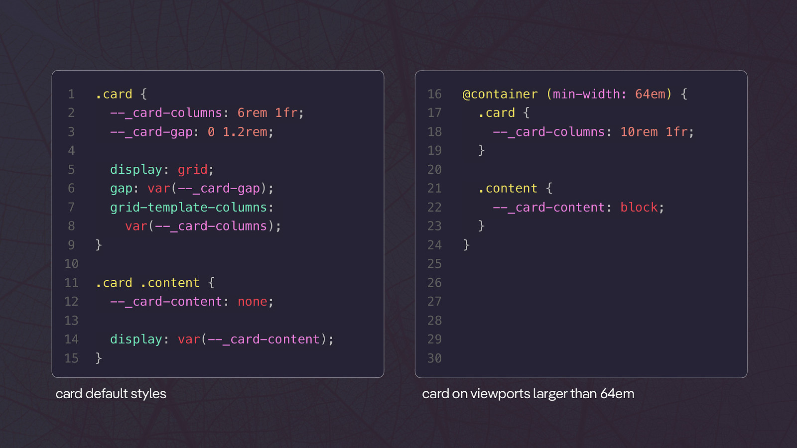
1 .card { 16 2 —_card-columns: 6rem 1fr; 17 3 —_card-gap: 0 1.2rem; 18 5 display: grid; 20 6 gap: var(—_card-gap); 21 7 grid-template-columns: 22 8 var(—_card-columns); } .content { —_card-content: block; } } 25 .card .content { 12 —_card-content: none; 26 27 28 13 14 15 —_card-columns: 10rem 1fr; 23 24 } 10 11 .card { 19 4 9 @container (min-width: 64em) { display: var(—_card-content); } card default styles 29 30 card on viewports larger than 64em
Default 64em and more
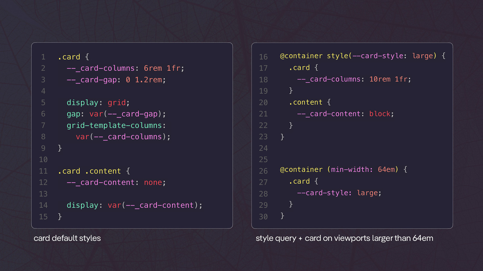
1 .card { 16 2 —_card-columns: 6rem 1fr; 17 3 —_card-gap: 0 1.2rem; 18 4 .content { 20 6 gap: var(—_card-gap); 21 7 grid-template-columns: 22 9 } } 25 .card .content { 12 —_card-content: none; 26 @container (min-width: 64em) { .card { 27 —card-style: large; 28 13 14 15 23 —_card-content: block; 24 } 10 11 —_card-columns: 10rem 1fr; } display: grid; var(—_card-columns); .card { 19 5 8 @container style(—card-style: large) { display: var(—_card-content); } card default styles } 29 30 } style query + card on viewports larger than 64em
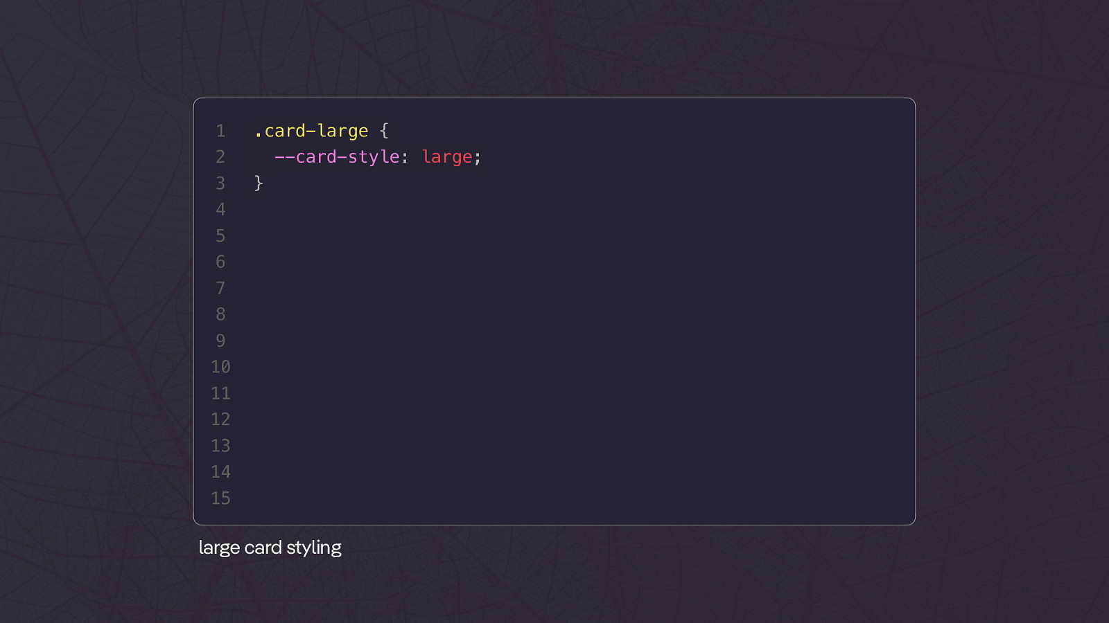
1 .card-large { 2 3 —card-style: large; } 4 5 6 7 8 9 10 11 12 13 14 15 large card styling
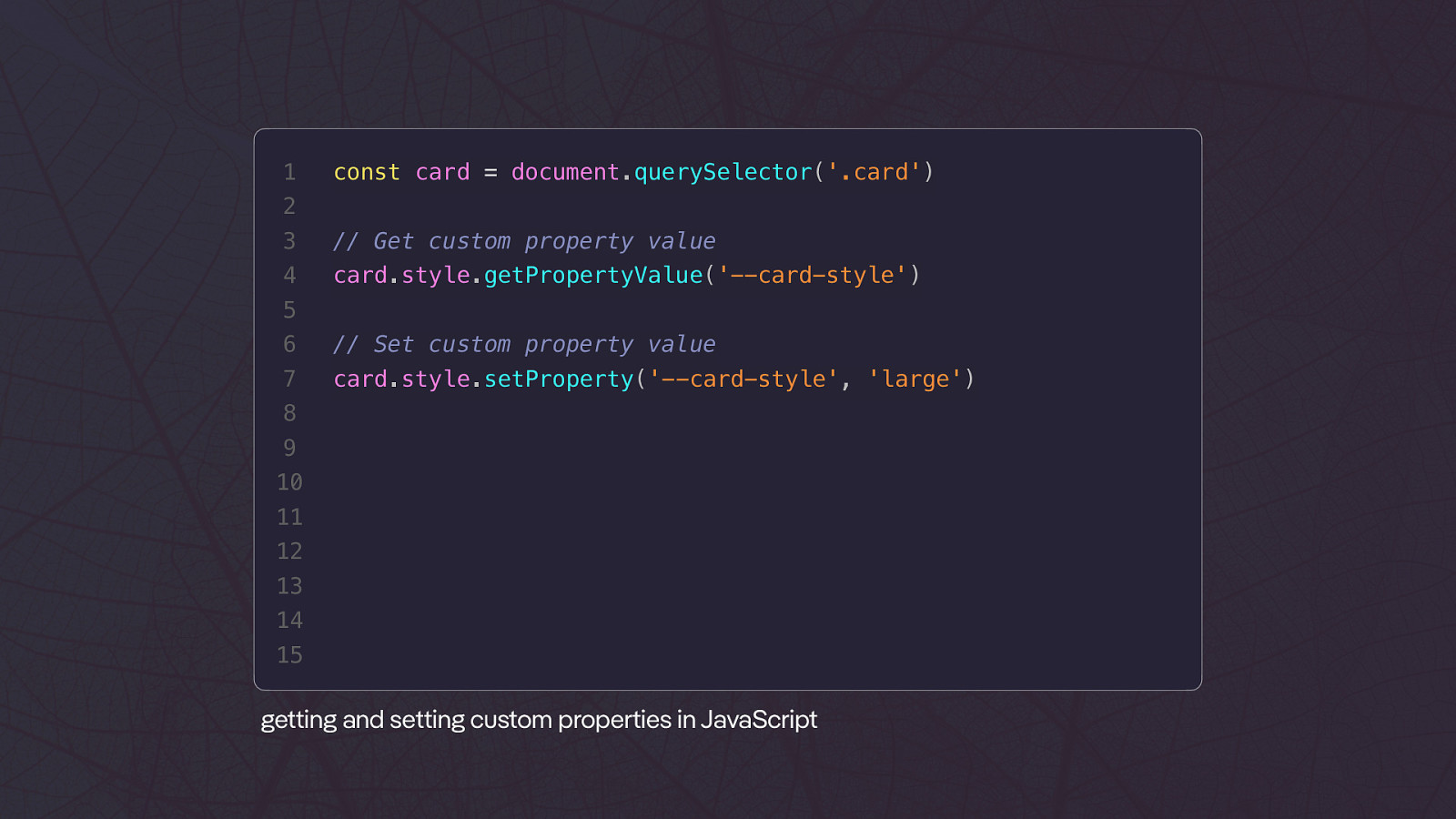
1 const card = document.querySelector(‘.card’) 2 3 // Get custom property value 4 card.style.getPropertyValue(‘—card-style’) 5 6 // Set custom property value 7 card.style.setProperty(‘—card-style’, ‘large’) 8 9 10 11 12 13 14 15 tt tt ge ing and se ing custom properties in JavaScript
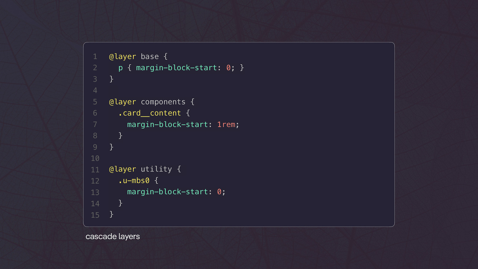
Cascade Layers
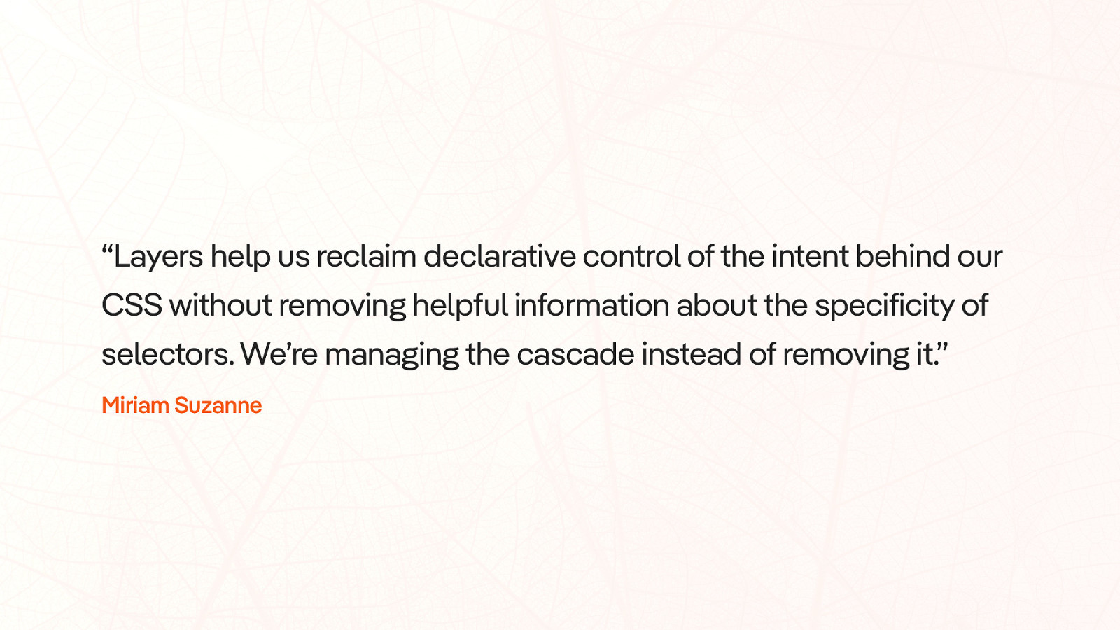
“Layers help us reclaim declarative control of the intent behind our CSS without removing helpful information about the specificity of selectors. We’re managing the cascade instead of removing it.” Miriam Suzanne
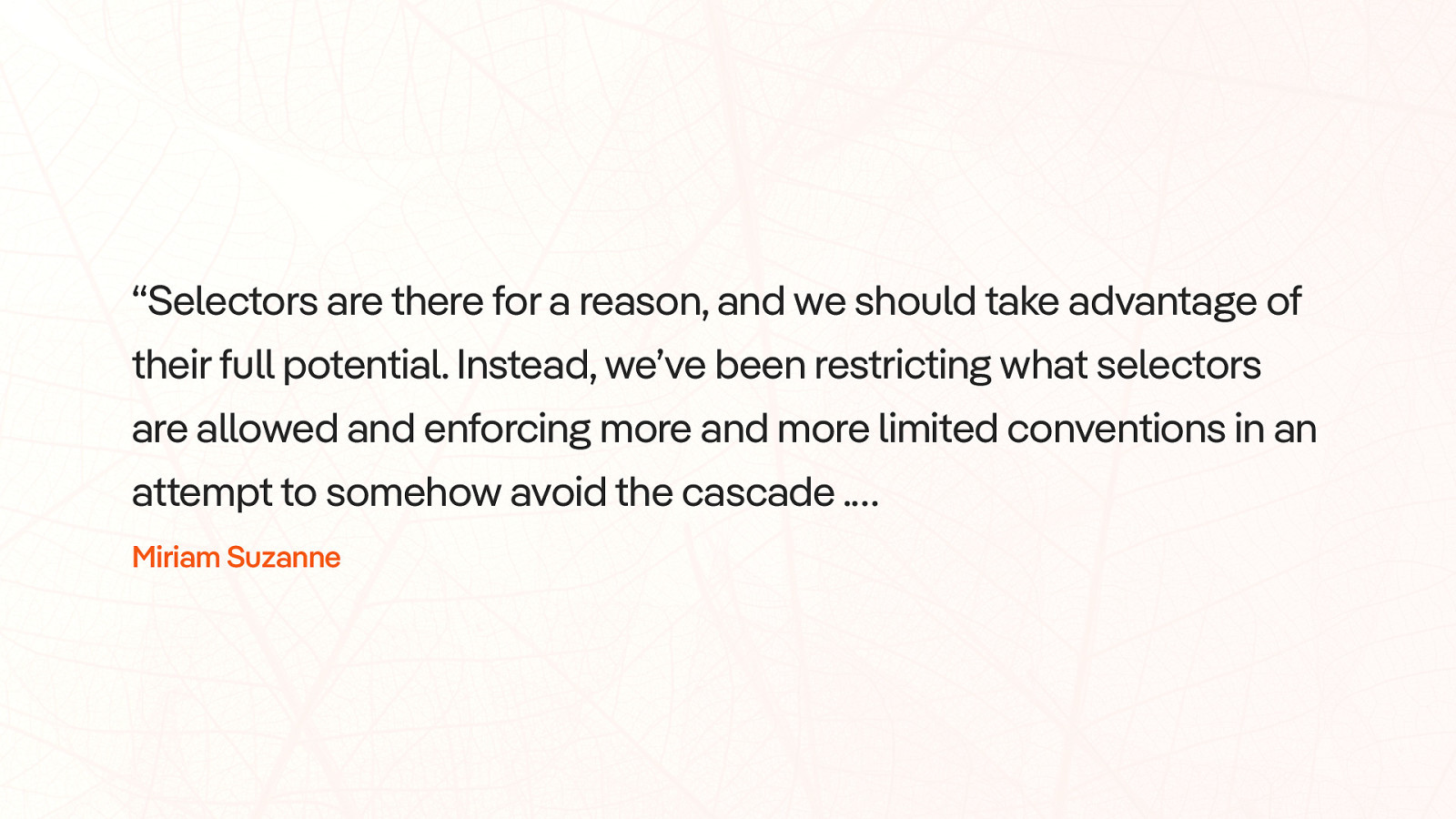
“Selectors are there for a reason, and we should take advantage of their full potential. Instead, we’ve been restricting what selectors are allowed and enforcing more and more limited conventions in an a empt to somehow avoid the cascade .… tt Miriam Suzanne
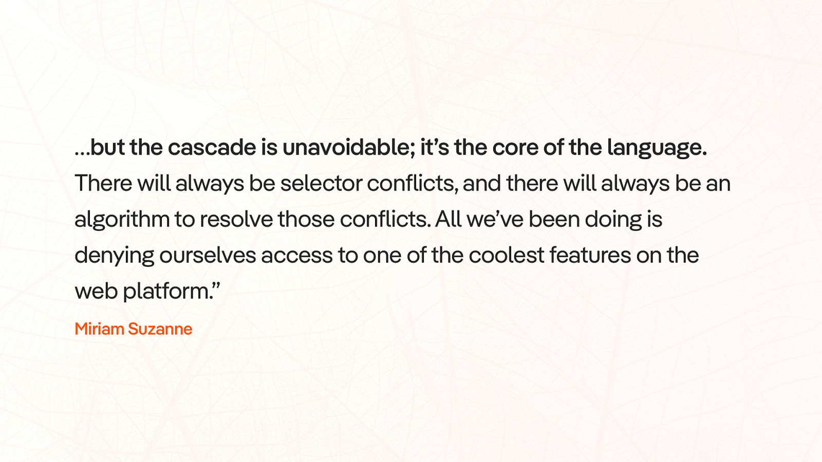
…but the cascade is unavoidable; it’s the core of the language. There will always be selector conflicts, and there will always be an algorithm to resolve those conflicts. All we’ve been doing is denying ourselves access to one of the coolest features on the web platform.” Miriam Suzanne
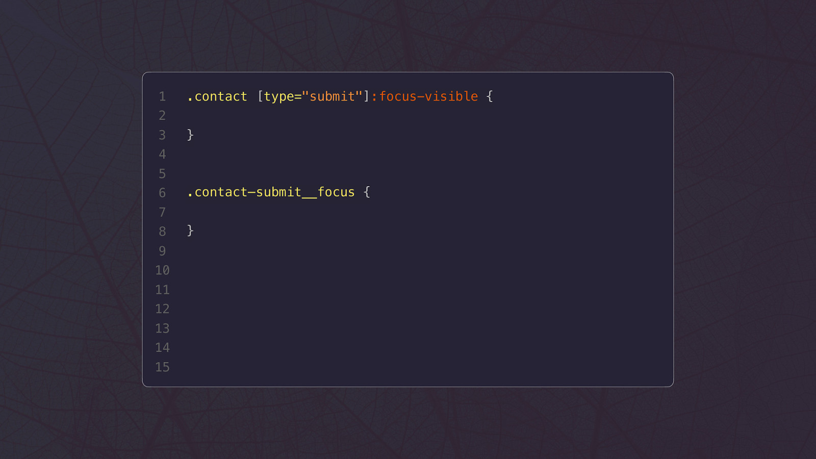
1 .contact [type=”submit”]:focus-visible { 2 3 } 4 5 6 .contact–submit__focus { 7 8 9 10 11 12 13 14 15 }
1 @layer base { 2 3 p { margin-block-start: 0; } } 4 5 @layer components { 6 .card__content { 7 margin-block-start: 1rem; 8 9 } } 10 11 @layer utility { .u-mbs0 { 12 margin-block-start: 0; 13 } 14 15 } cascade layers
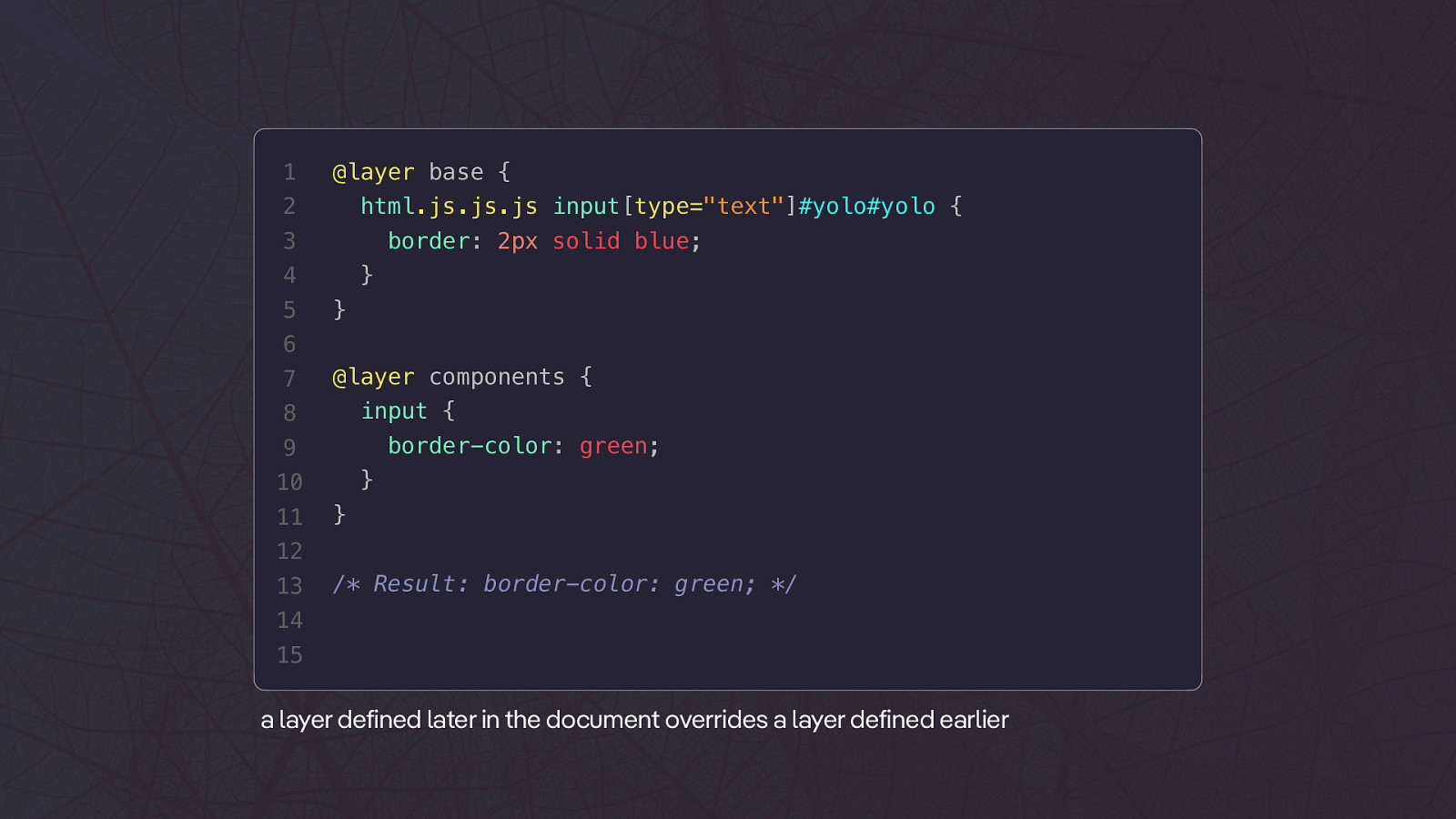
1 @layer base { 2 html.js.js.js input[type=”text”]#yolo#yolo { 3 border: 2px solid blue; 4 5 } } 6 7 @layer components { input { 8 border-color: green; 9 } 10 11 } 12 13 /* Result: border-color: green; */ 14 15 a layer defined later in the document overrides a layer defined earlier
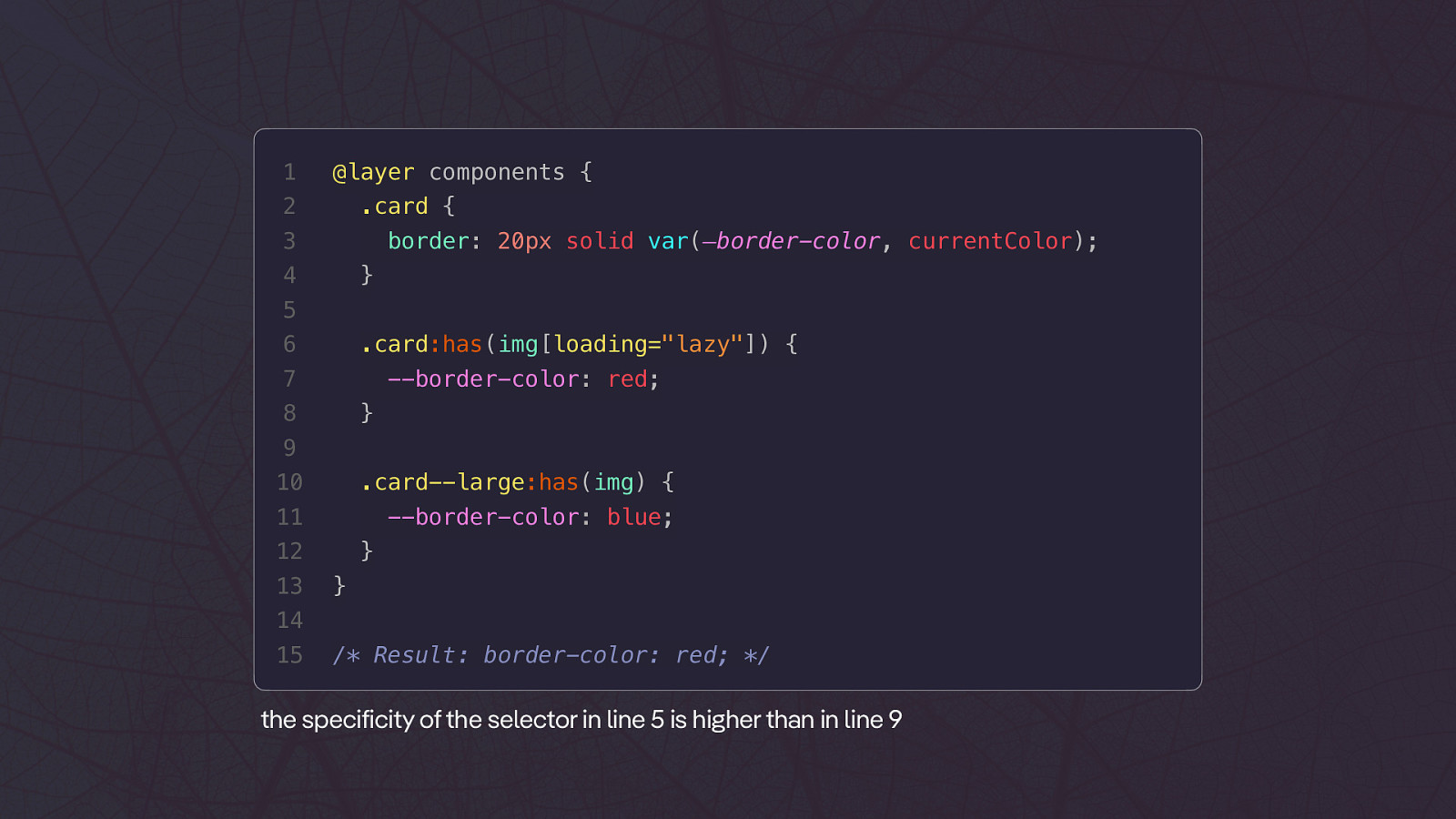
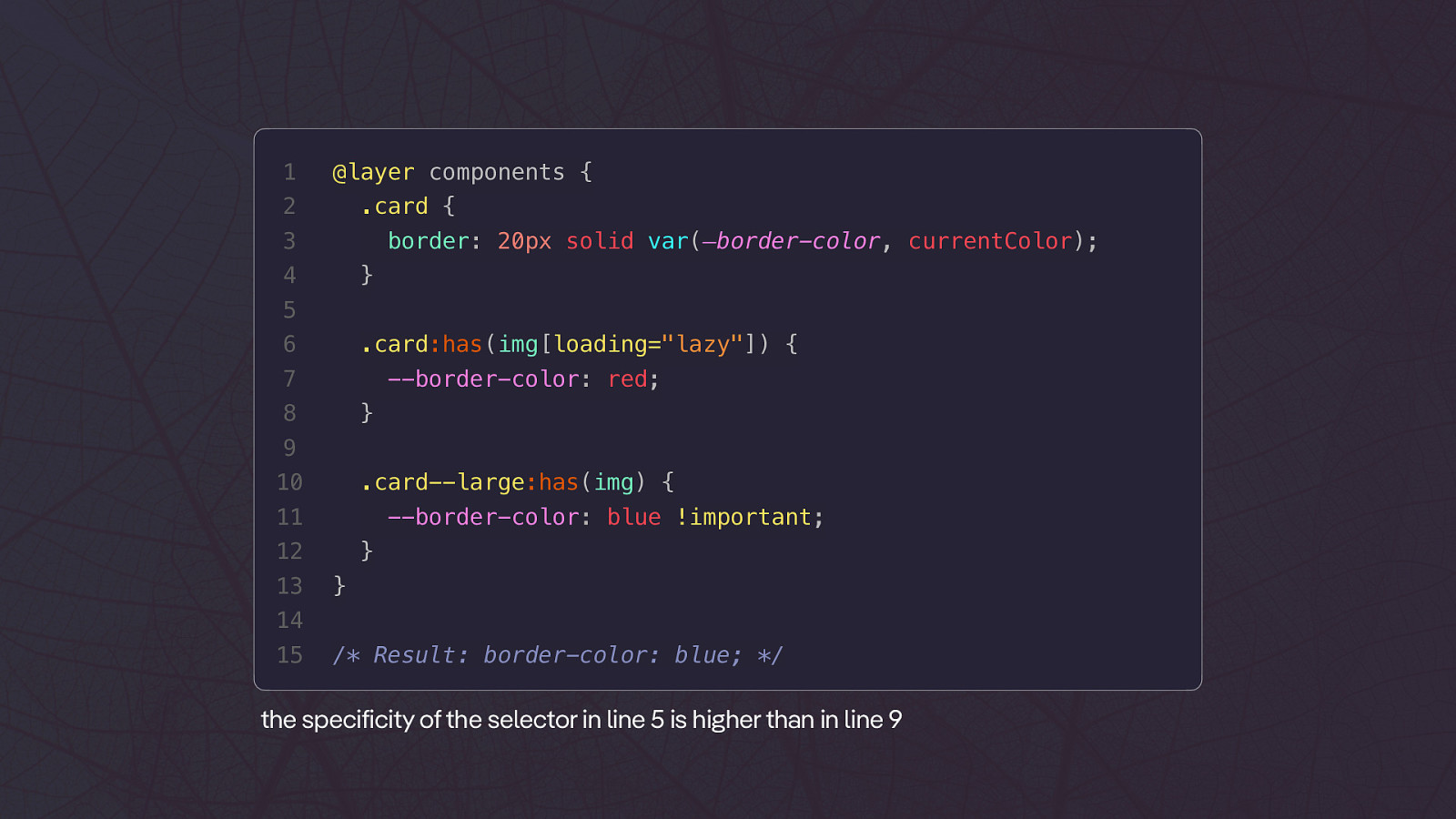
1 @layer components { 2 .card { 3 border: 20px solid var(—border-color, currentColor); 4 } 5 6 .card:has(img[loading=”lazy”]) { 7 —border-color: red; 8 } 9 10 .card—large:has(img) { 11 —border-color: blue; 12 13 } } 14 15 /* Result: border-color: red; */ the specificity of the selector in line 5 is higher than in line 9
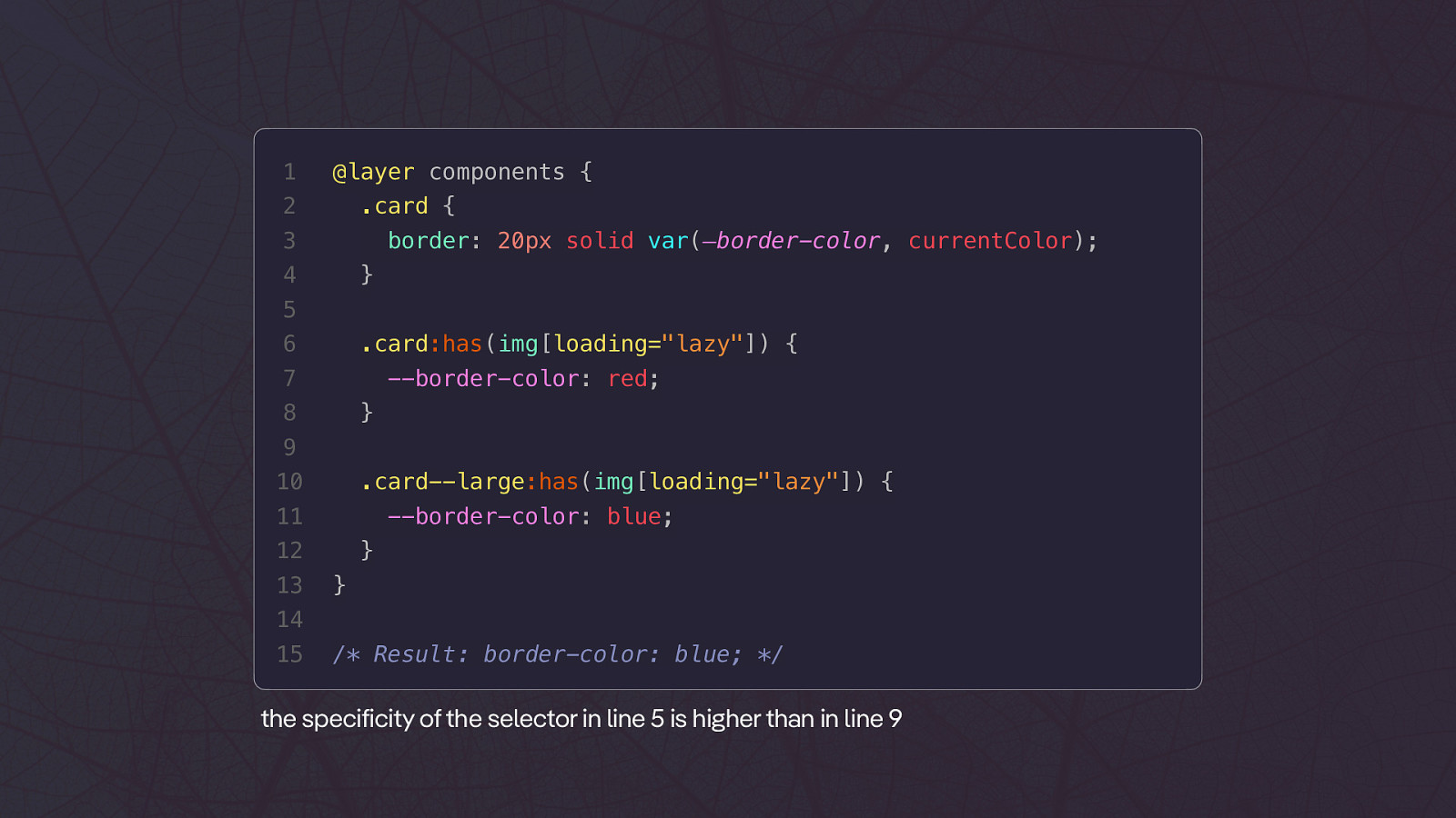
1 @layer components { 2 .card { 3 border: 20px solid var(—border-color, currentColor); 4 } 5 6 .card:has(img[loading=”lazy”]) { 7 —border-color: red; 8 } 9 10 .card—large:has(img[loading=”lazy”]) { 11 —border-color: blue; 12 13 } } 14 15 /* Result: border-color: blue; */ the specificity of the selector in line 5 is higher than in line 9
1 @layer components { 2 .card { 3 border: 20px solid var(—border-color, currentColor); 4 } 5 6 .card:has(img[loading=”lazy”]) { 7 —border-color: red; 8 } 9 10 .card—large:has(img) { 11 —border-color: blue !important; 12 13 } } 14 15 /* Result: border-color: blue; */ the specificity of the selector in line 5 is higher than in line 9
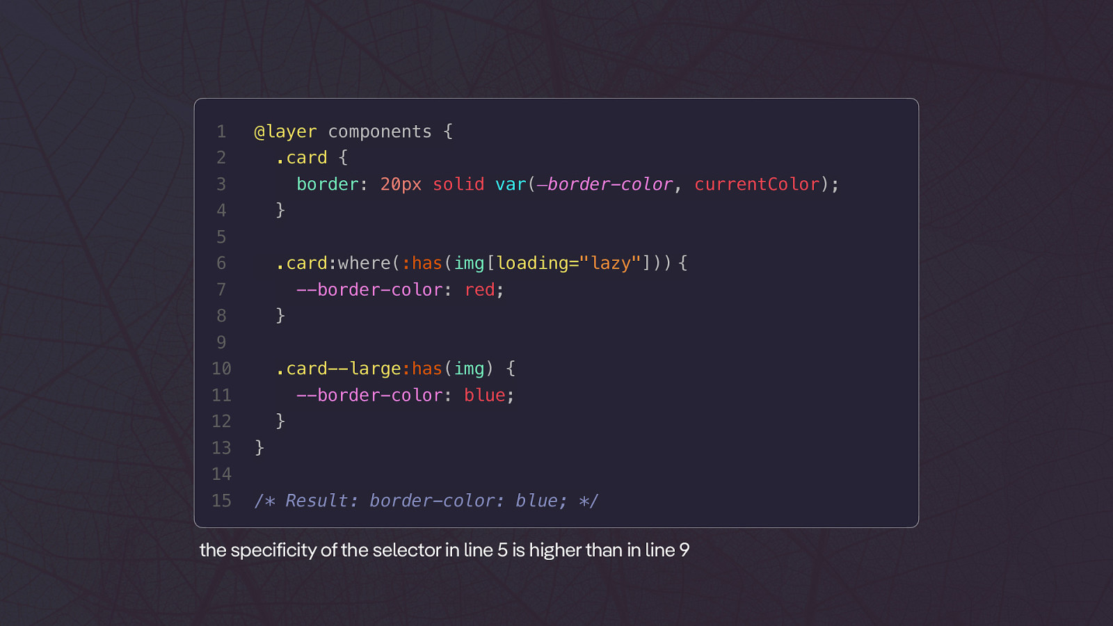
1 @layer components { 2 .card { 3 border: 20px solid var(—border-color, currentColor); 4 } 5 6 .card:where(:has(img[loading=”lazy”])) { 7 —border-color: red; 8 } 9 10 .card—large:has(img) { 11 —border-color: blue; 12 13 } } 14 15 /* Result: border-color: blue; */ the specificity of the selector in line 5 is higher than in line 9
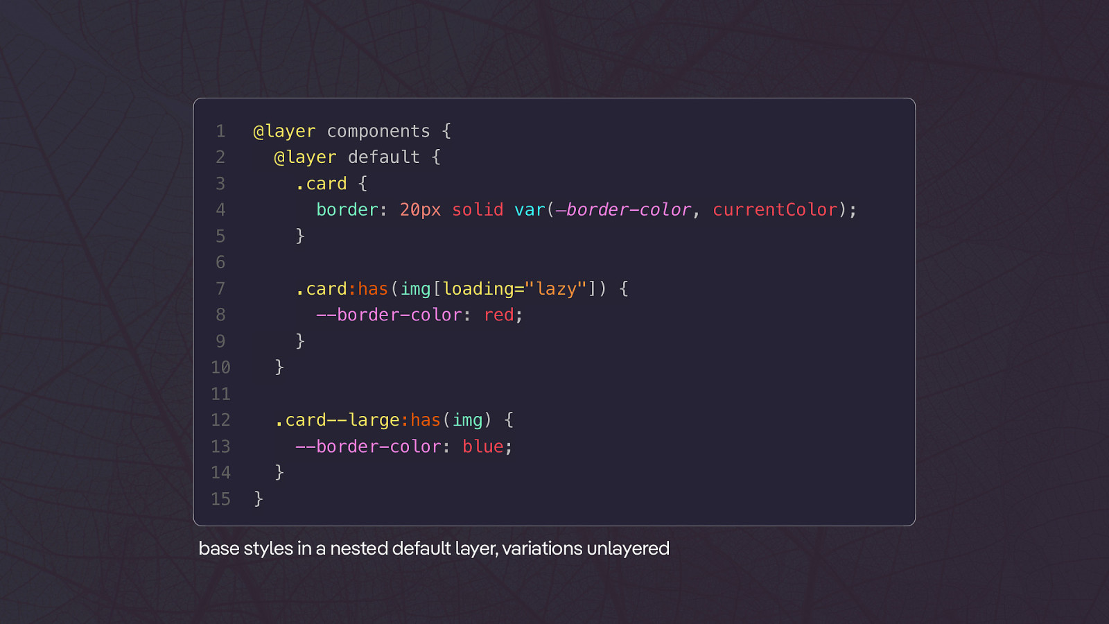
1 @layer components { 2 @layer default { 3 .card { 4 border: 20px solid var(—border-color, currentColor); 5 } 6 7 .card:has(img[loading=”lazy”]) { 8 —border-color: red; 9 } 10 } 11 12 .card—large:has(img) { 13 —border-color: blue; 14 15 } } base styles in a nested default layer, variations unlayered
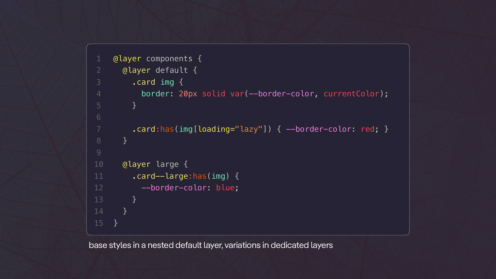
1 @layer components { 2 @layer default { 3 .card img { 4 border: 20px solid var(—border-color, currentColor); 5 } 6 7 .card:has(img[loading=”lazy”]) { —border-color: red; } 8 } 9 10 @layer large { 11 .card—large:has(img) { 12 —border-color: blue; 13 } 14 15 } } base styles in a nested default layer, variations in dedicated layers
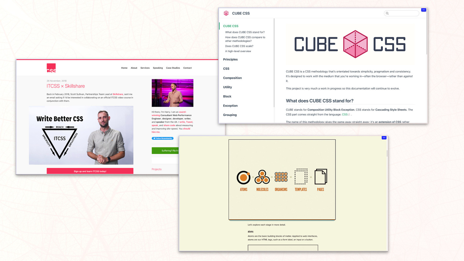
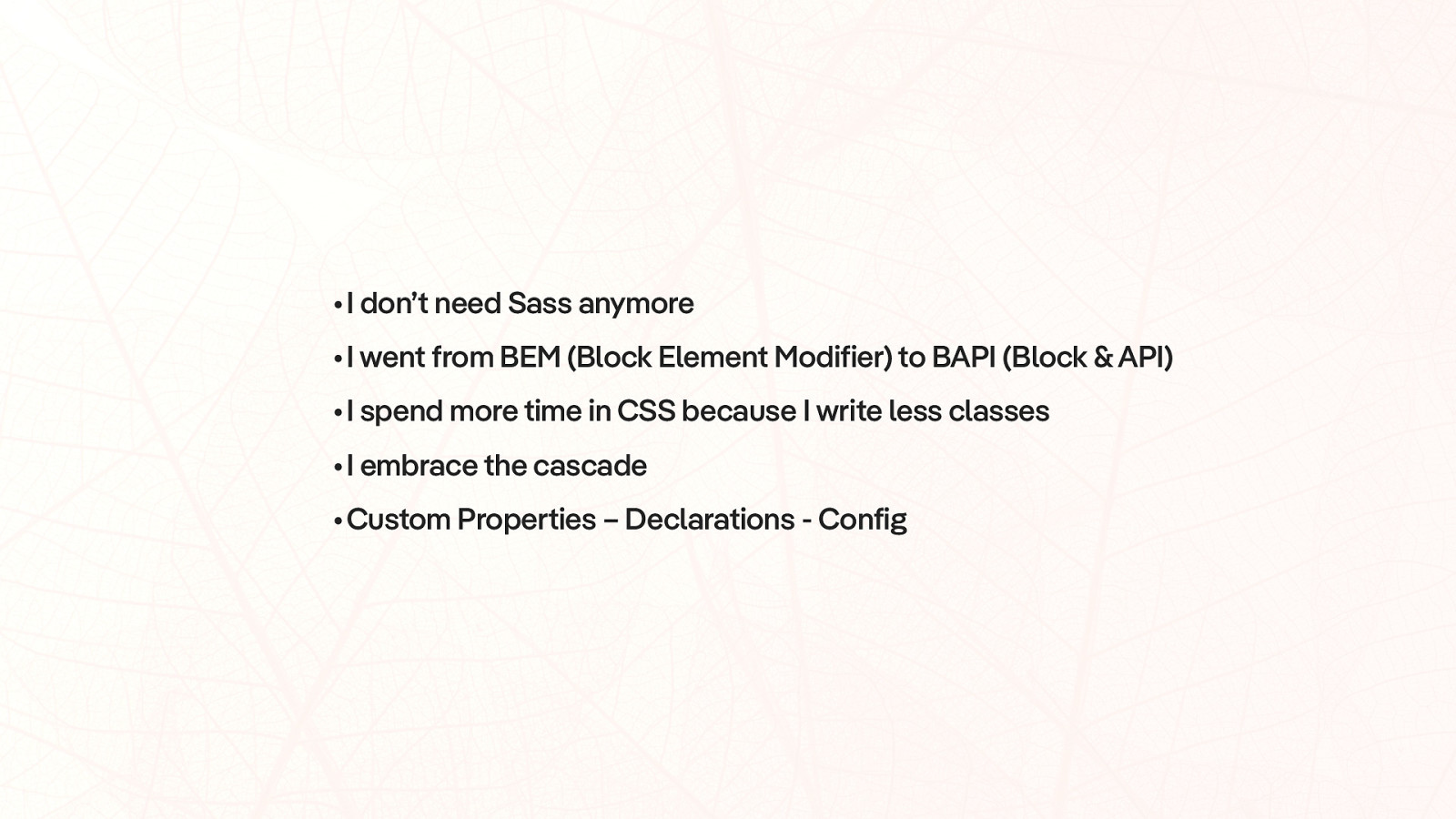
•I don’t need Sass anymore •I went from BEM (Block Element Modifier) to BAPI (Block & API) •I spend more time in CSS because I write less classes •I embrace the cascade •Custom Properties – Declarations - Config
JavaScript
1
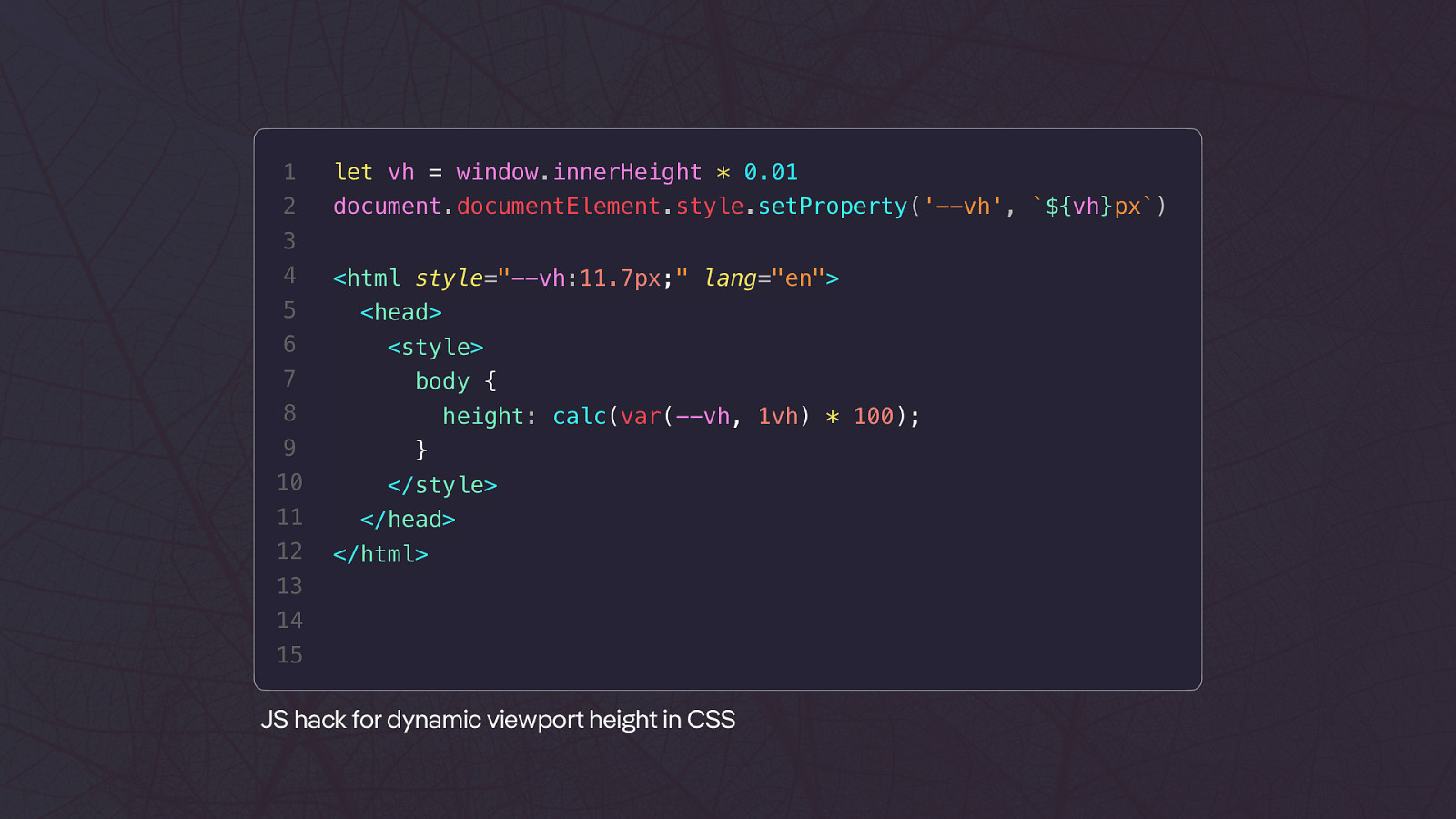
let vh = window.innerHeight * 0.01
2
document.documentElement.style.setProperty(‘—vh’, ${vh}px)
3 4 5 6 7
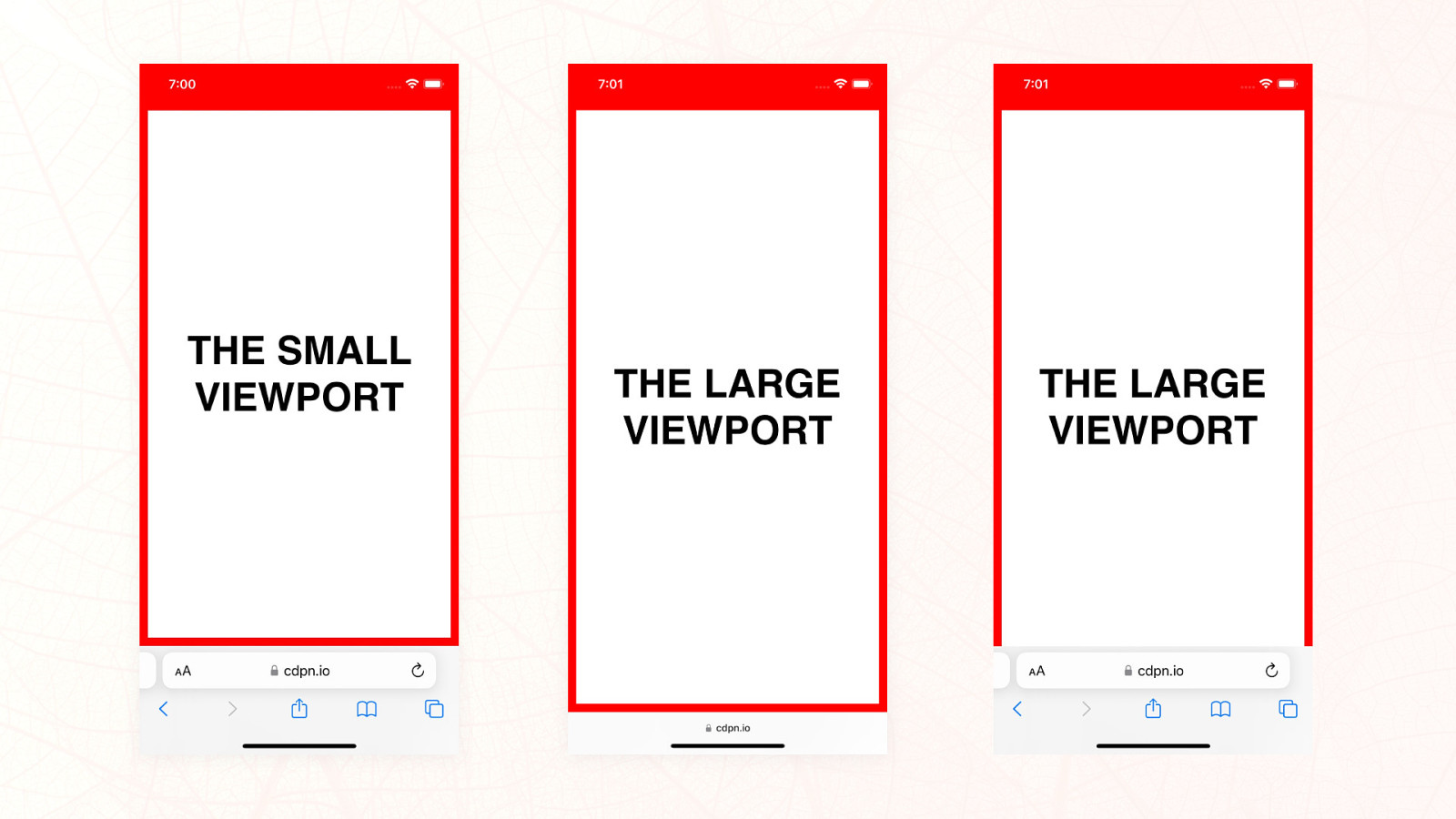
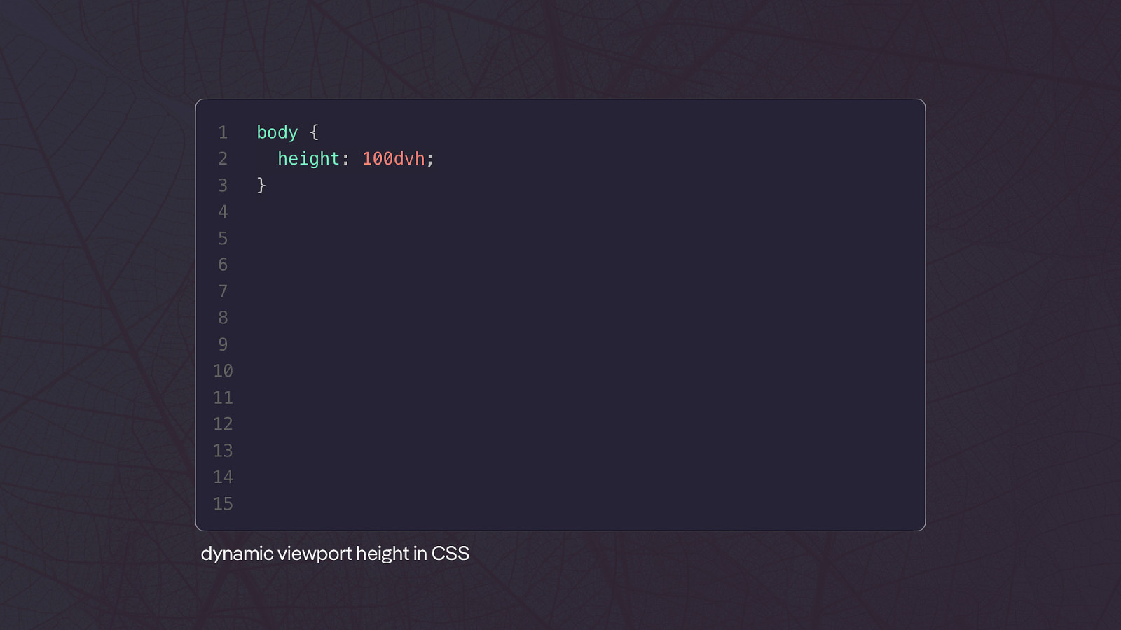
1 body { 2 3 height: 100dvh; } 4 5 6 7 8 9 10 11 12 13 14 15 dynamic viewport height in CSS
Video
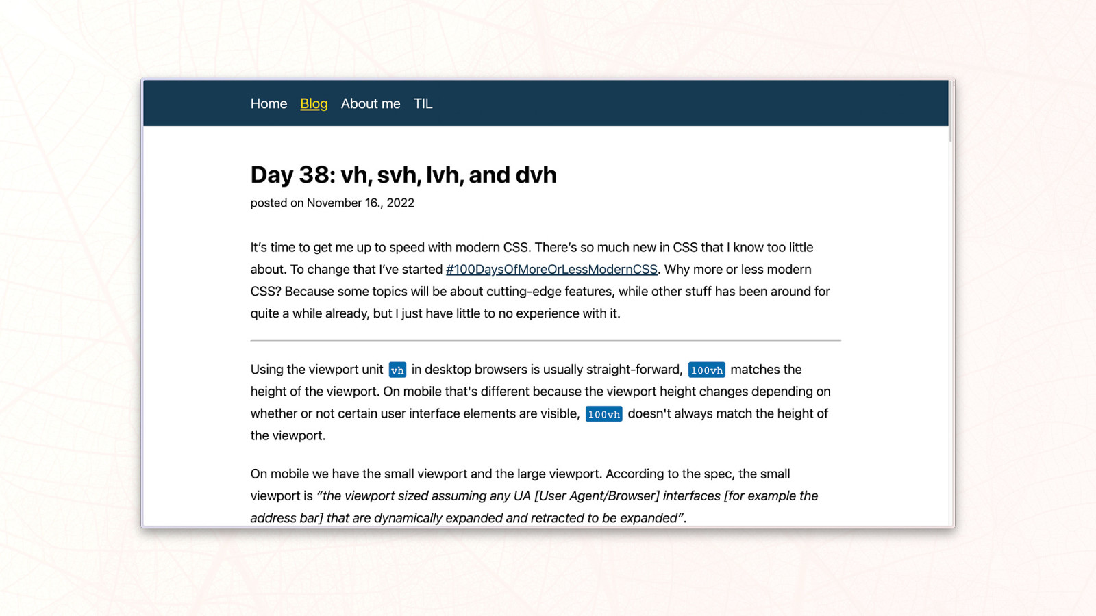
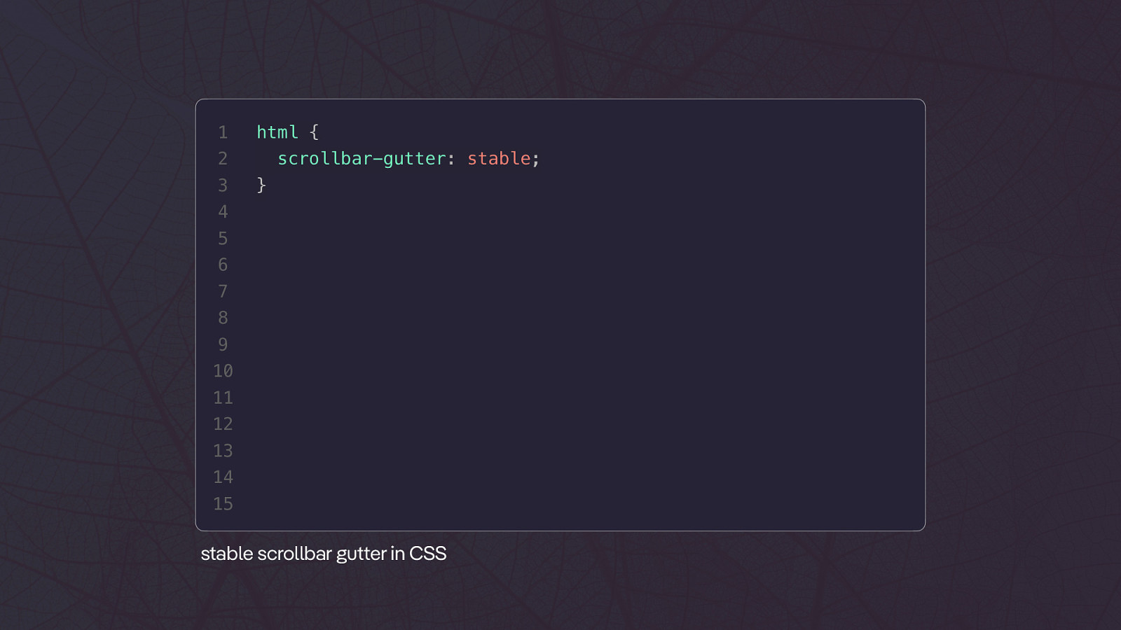
1 html { 2 3 scrollbar-gutter: stable; } 4 5 6 7 8 9 10 11 12 13 14 15 tt stable scrollbar gu er in CSS
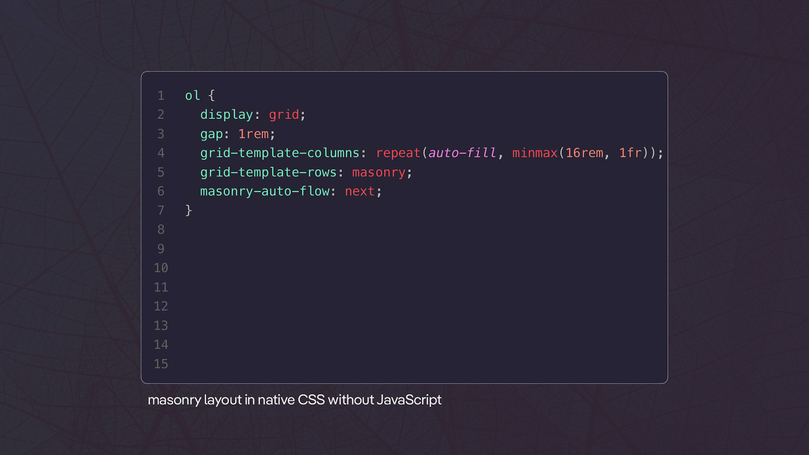
1 ol { 2 display: grid; 3 gap: 1rem; 4 grid-template-columns: repeat(auto-fill, minmax(16rem, 1fr)); 5 grid-template-rows: masonry; 6 masonry-auto-flow: next; 7 } 8 9 10 11 12 13 14 15 masonry layout in native CSS without JavaScript
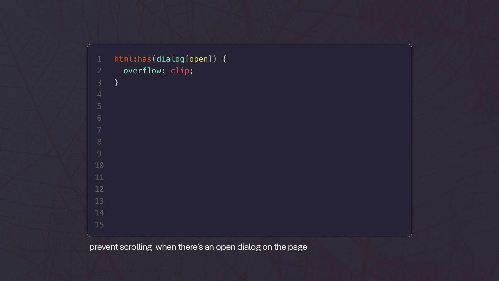
1 html:has(dialog[open]) { 2 3 overflow: clip; } 4 5 6 7 8 9 10 11 12 13 14 15 prevent scrolling when there’s an open dialog on the page
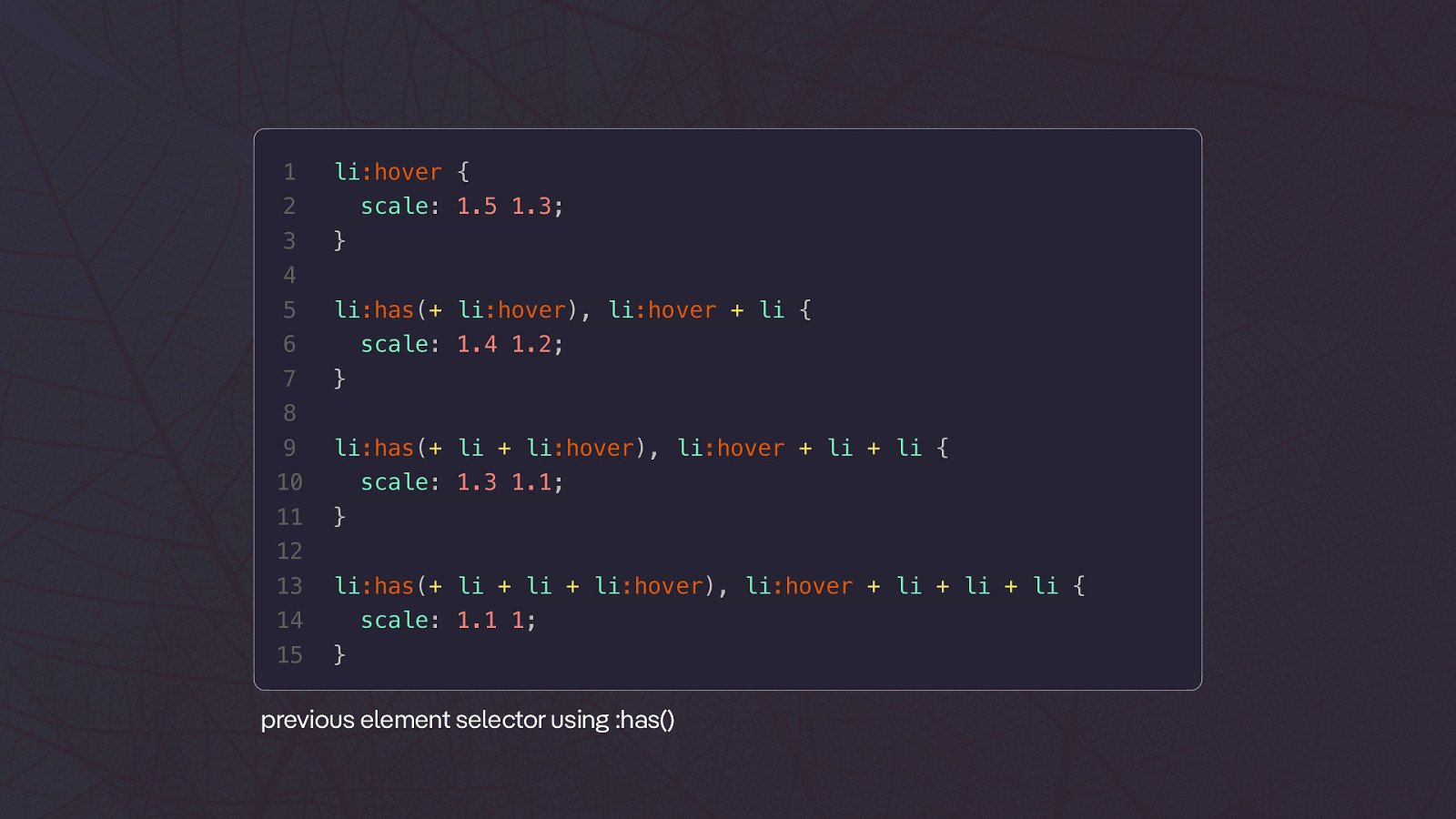
1 li:hover { 2 3 scale: 1.5 1.3; } 4 5 li:has(+ li:hover), li:hover + li { 6 7 scale: 1.4 1.2; } 8 9 li:has(+ li + li:hover), li:hover + li + li { 10 11 scale: 1.3 1.1; } 12 13 li:has(+ li + li + li:hover), li:hover + li + li + li { 14 15 scale: 1.1 1; } previous element selector using :has()
u k Th an yo ❤

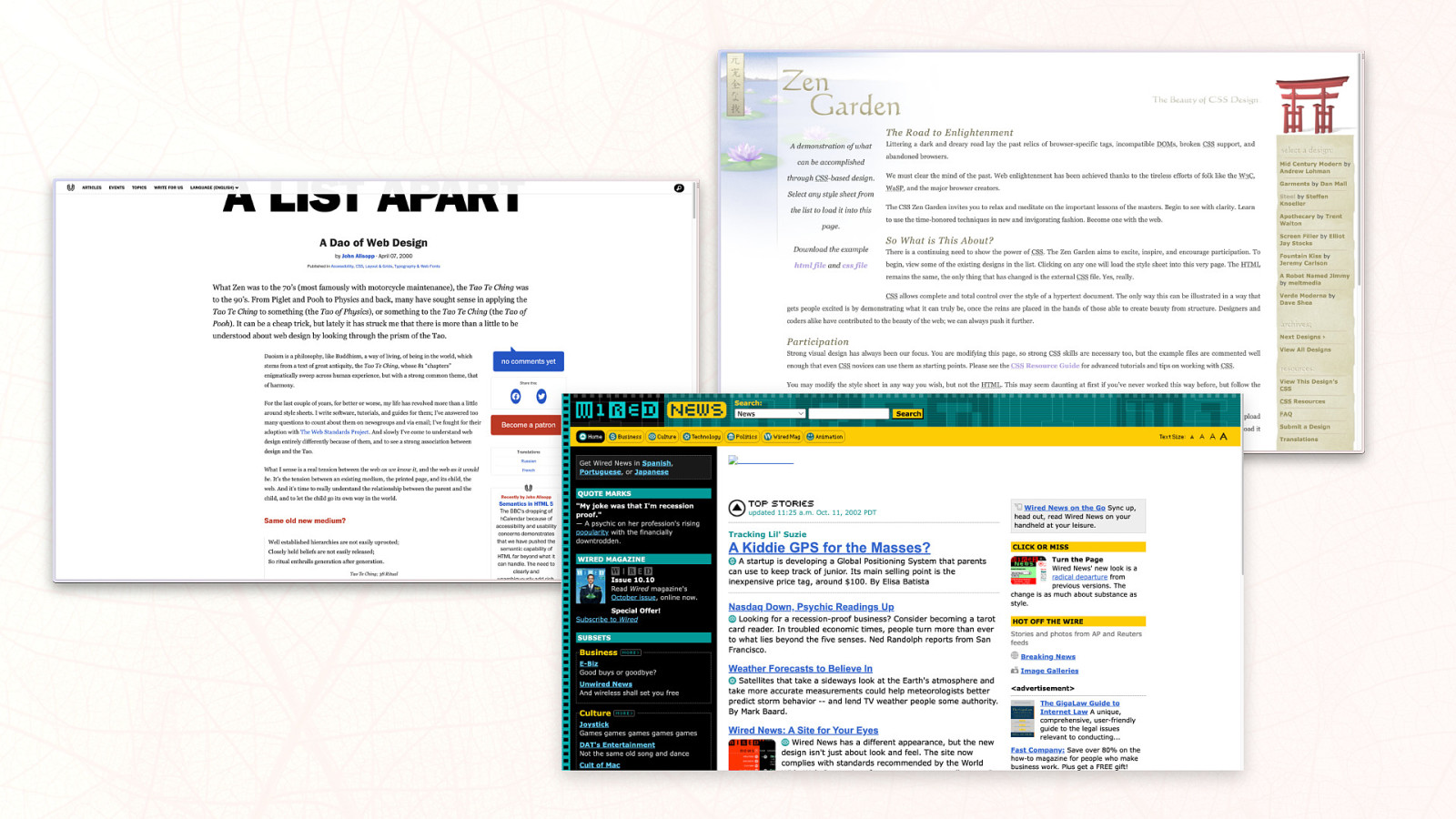
How I write CSS has changed several times in the last two decades. It made different transitions, especially in the first couple of years, until I found my final form for the longest time. Due to some addition to the language, it changed again recently and will change even more with modern CSS.
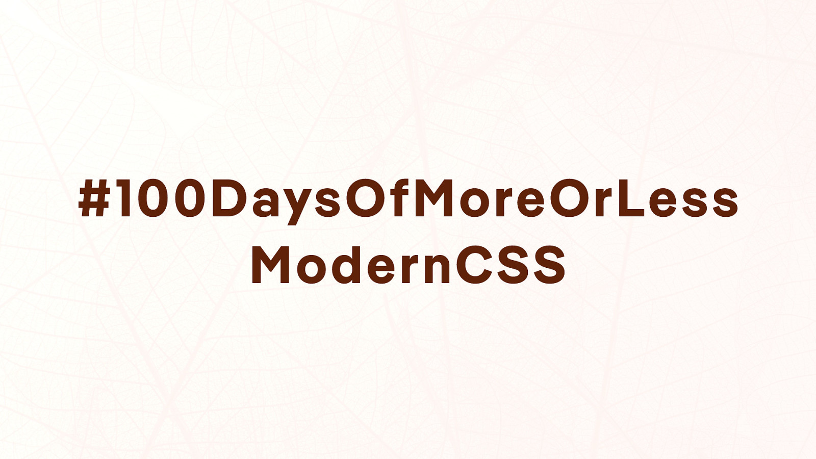
In his talk, Manuel goes down memory lane and presents some of the most significant impacts that changed how we write CSS in the past, and he tries to predict future influences. He also explains why his project #100DaysOfMoreOrLessModernCSS was one of his best and worst ideas at the same time.


 for free. You
can too.
for free. You
can too.