
A presentation at SmashingConf Freiburg in in Freiburg, Germany by Manuel Matuzovic
Manuel Matuzović, Smashing Conf Freiburg, September 10th, 2025
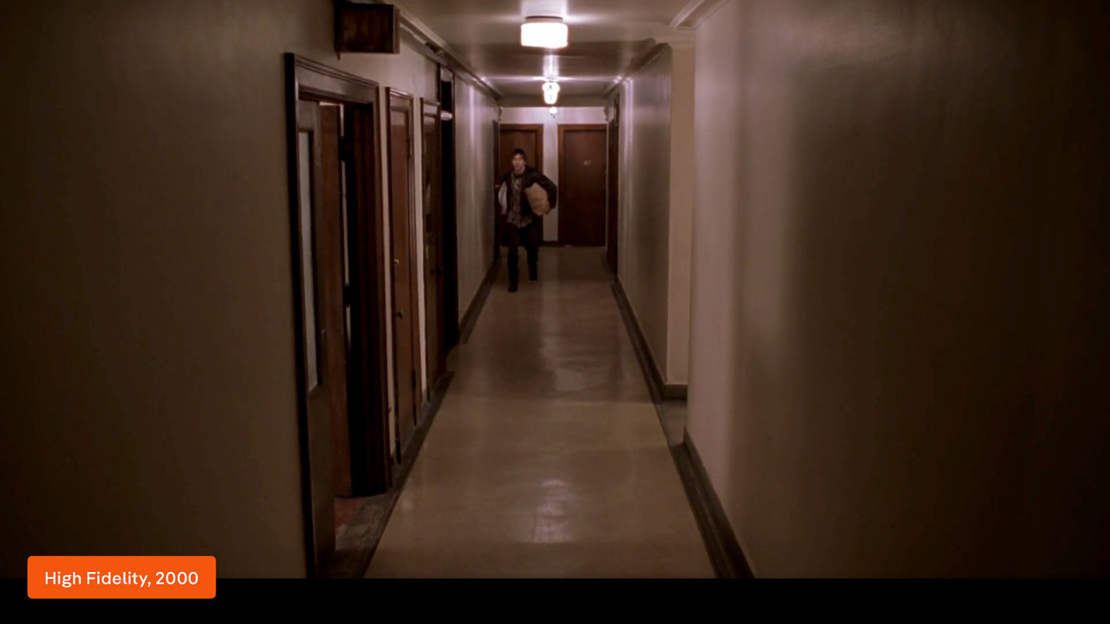
I love how disgusted Dick is when he says “not alphabetical!?”. In the movie High Fidelity, based on the book, Rob, played by John Cusack, reflects on his personal life by reorganising his record collection. I did a similar thing and reflected on my professional life. I didn’t reorganise my records but I put the steps in my career and development as a CSS developer on a timeline.
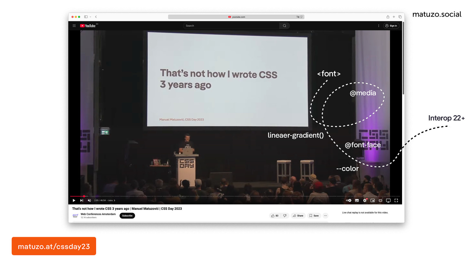
The result was a talk called „That’s not how I wrote CSS 3 years ago”, which I presented at CSS Day in 2023. I talk about how I began styling websites by using presentational attributes in HTML and how I learned CSS in the early 2000s and I mention some of my biggest milestones in the following 20 or so years. I also talk about the present and I give an outlook for the future. I claim that many of the new things that we have in CSS now will change the way we write and think about CSS significantly. The thing is, that was two years ago and nothing much has changed, at least for me because I haven’t had a project yet I could use to put my predictions into practice. That’s why I decided to create my own project and do all the things that I was talking about because the CSS future is now. In this talk I present my learnings and some of the things that had a big impact on me.
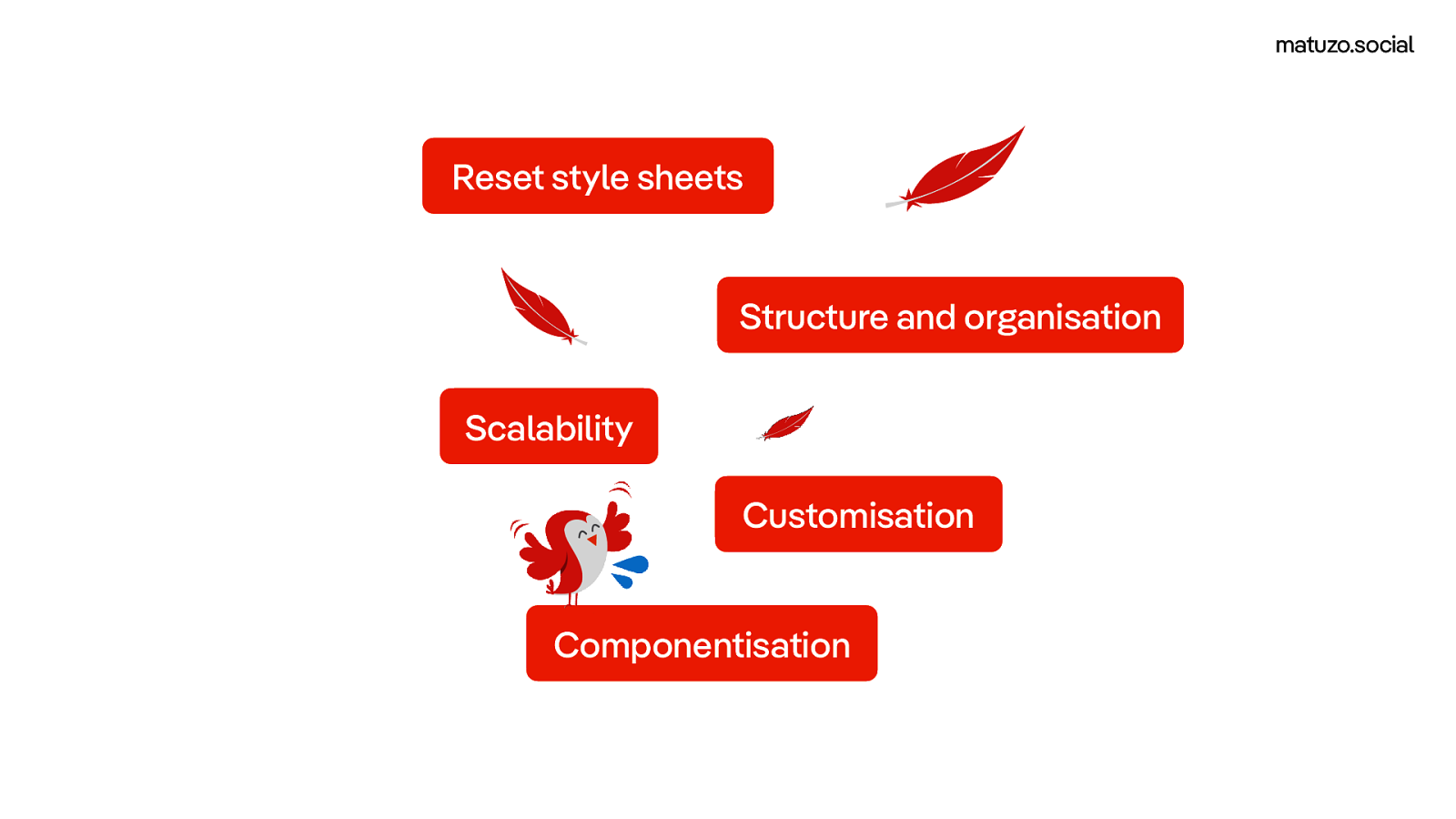
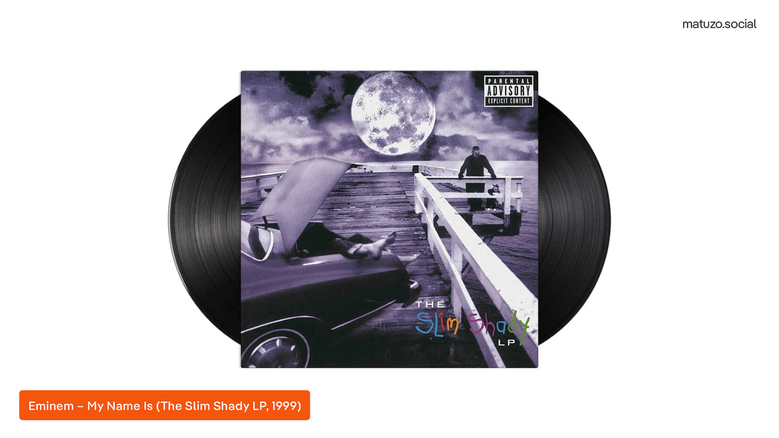
I want to focus on 5 main areas. Before I start, I should probably introduce myself like Eminem did on the song “Hi My Name is” on the The Slim Shady LP, released in 1999.
[ Played a sample of the song “My Name Is” by Eminem (The Slim Shady LP, 1999)] Listen to it on Youtube (https://youtu.be/0mNUa1m3RUI)
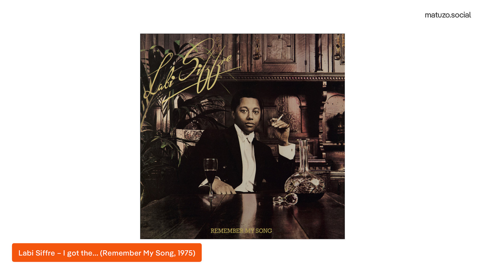
In this song they use a sample from the 1975 single “I got the…” by Labi Siffre from the album “Remember my song”.
[Played a sample of the song “I got the” by Labi Siffre (Remember My Song, 1975)] Listen to it on Youtube (https://youtu.be/xKISdd2mKzU)
So, Hi! My name is Manuel Matuzovic…
I’m a front and developer, consultant, accessibility auditor, teacher, and book author from Austria and I’m specialised in HTML, CSS and web accessibility. Now, let’s get back to the main topic, and we will start with reset style sheets.
accessibility-cookbook.com matuzo.social htmhell.dev matuzo.at manuel@matuzo.at
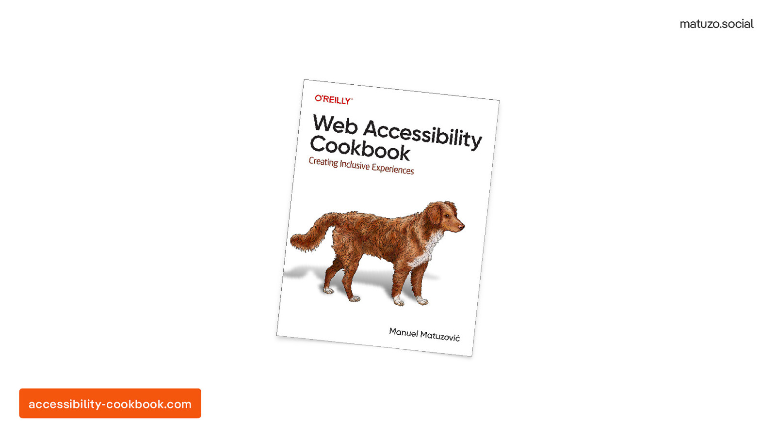
I also wrote a book, the Web Accessibility Cookbook.
accessibility-cookbook.com
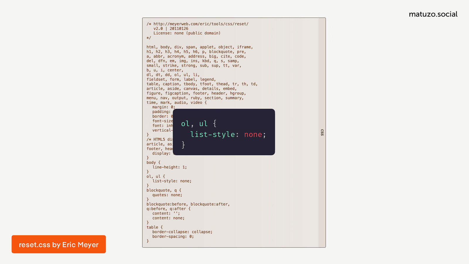
I haven’t been using reset style sheets at all in the last five plus years or so because I just didn’t see the point.
ol, ul {
  list-style: none;
}
There used to be a time, when reset style sheets were really useful because the browser landscape was more diverse than today and browsers rendered pages very differently by default. Eric Meyer famously created the first popular reset style sheet, reset.css, which did things like removing margins, paddings and border, and resetting other properties.
html {
  cursor: default;
  overflow-y: scroll;
  -webkit-tap-highlight-color: transparent;
  -webkit-text-size-adjust: none;
}
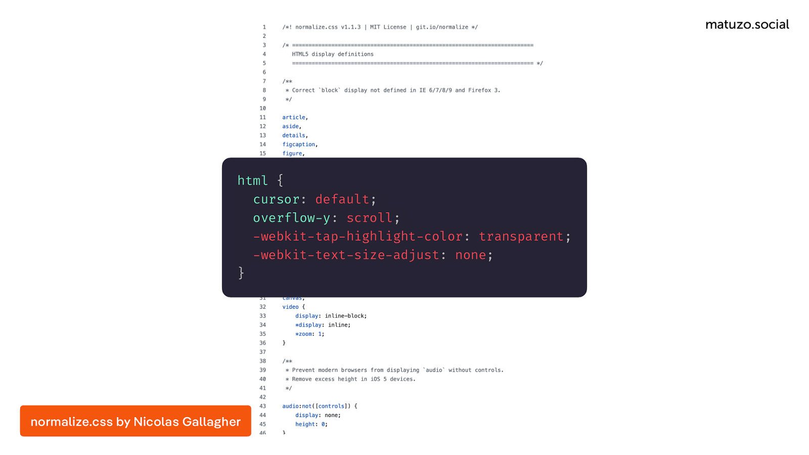
normalize.css by Nicolas Gallagher Nicolas Gallagher took a gentler approach and normalised more than reseted. That made sense and was super useful.
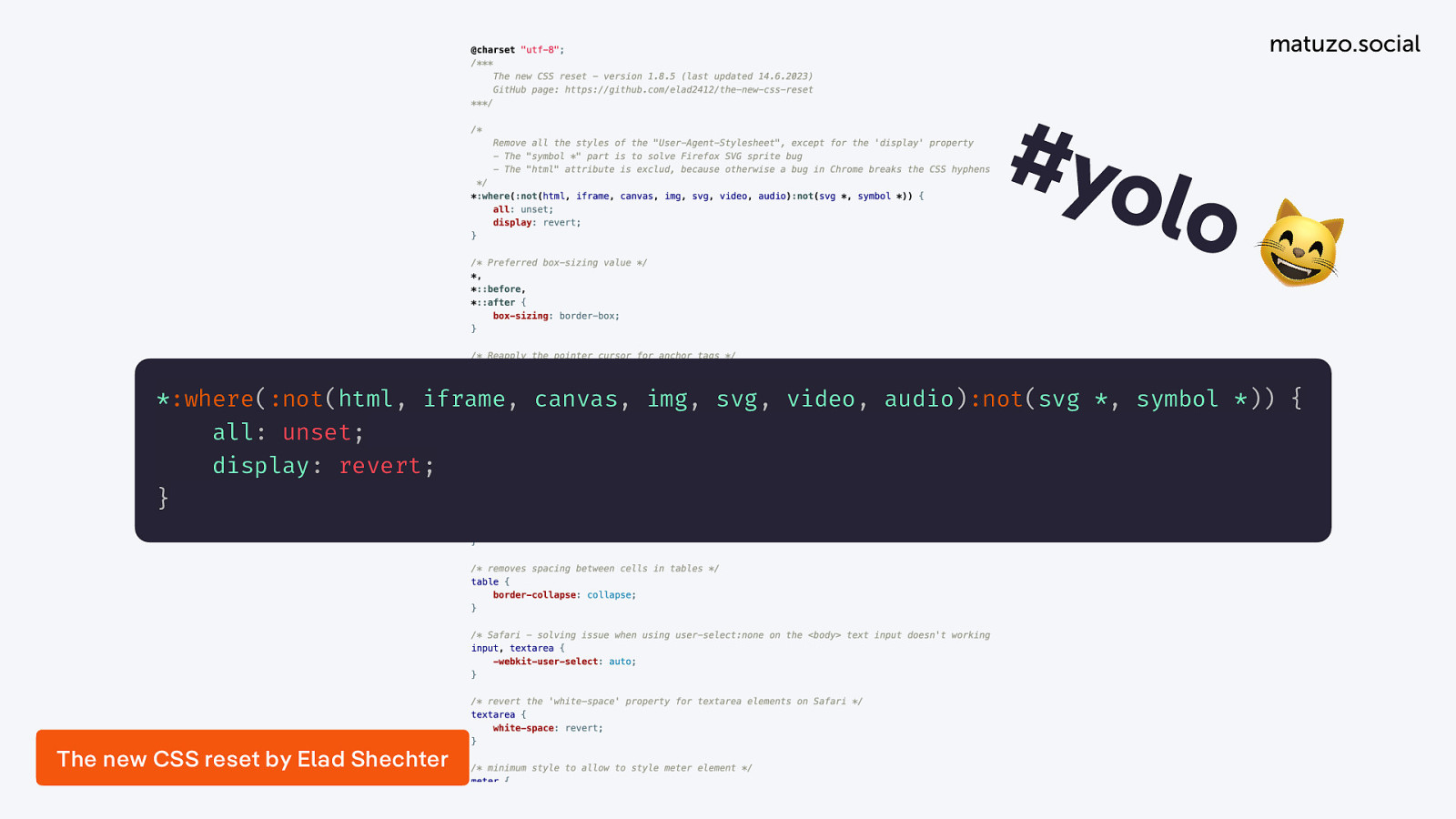
The thing is, that was a long time ago and both style sheets solved many problems that don’t exist anymore today, but reset style sheets are still a thing. There are modern style sheets, like for example “The New CSS Reset” by Elad Shechter.
*:where(:not(html, iframe, canvas, img, svg, video, audio):not(svg *, symbol *)) {
    all: unset;
    display: revert;
}
His approach is to reset almost everything. He selects most of the elements and sets all: unset and you can also see a lot of none and revert keywords. That’s pretty radical, but there are also other modern style sheets that take a different approach.
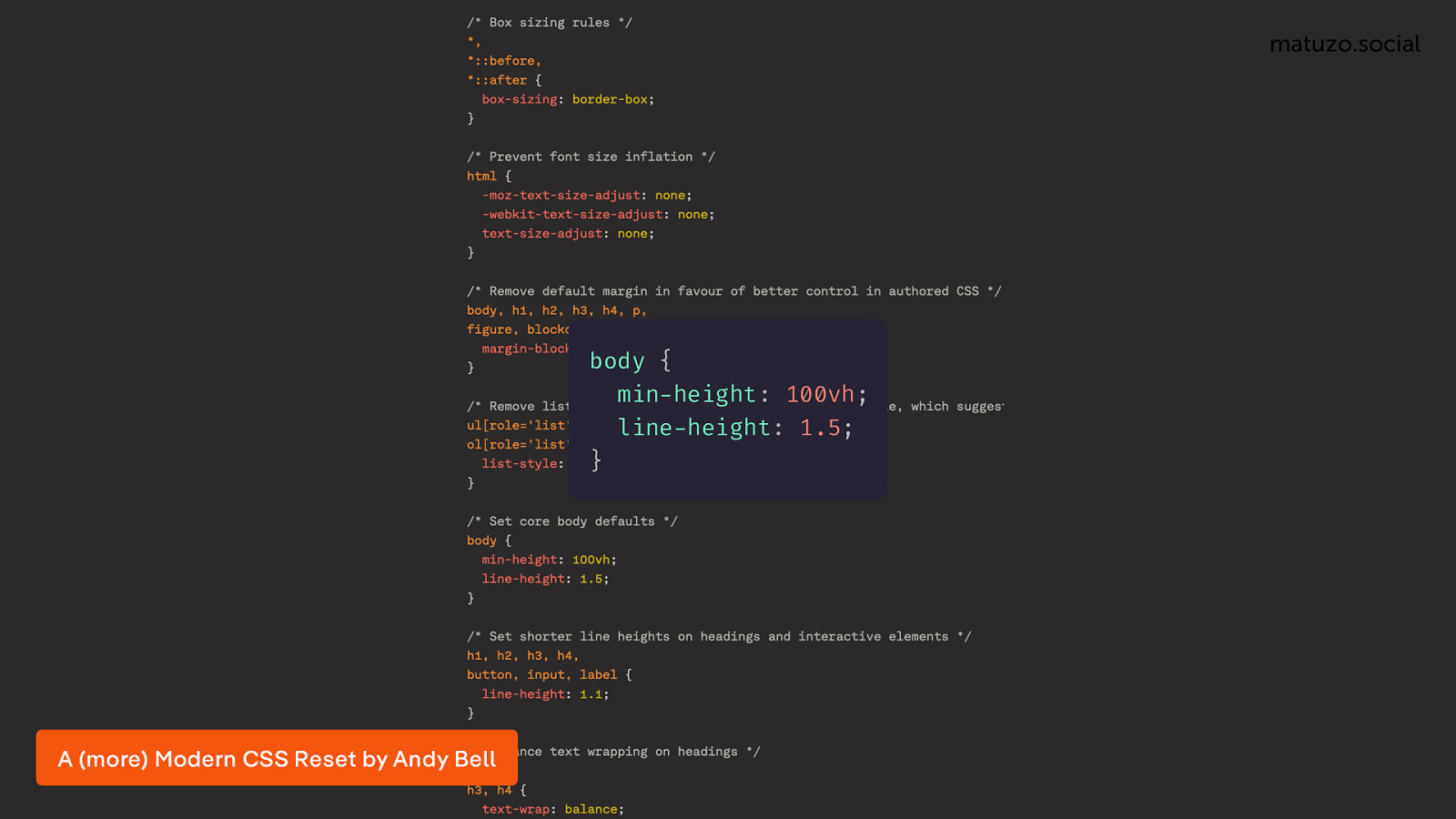
body {
  min-height: 100vh;
  line-height: 1.5;
}
For example, Andy Bell’s “A (more) Modern CSS Reset”. Looking at it and other similar style sheets, I realised that today it’s more about improving the defaults rather than resetting or normalising properties.
So, this is the first area where I’m challenging my usual approach. I’m trying to find out if maybe it makes sense to use a reset style sheet in 2025 and if modern CSS can solve problems that I may have.
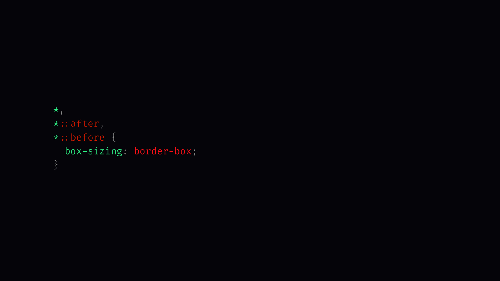
*, * after, * before {
  box-sizing: border-box;
}
Of course, in my reset style sheet I’m doing some of the basic and well established stuff, like using the traditional box model, but now we are mostly interested in the new CSS stuff.
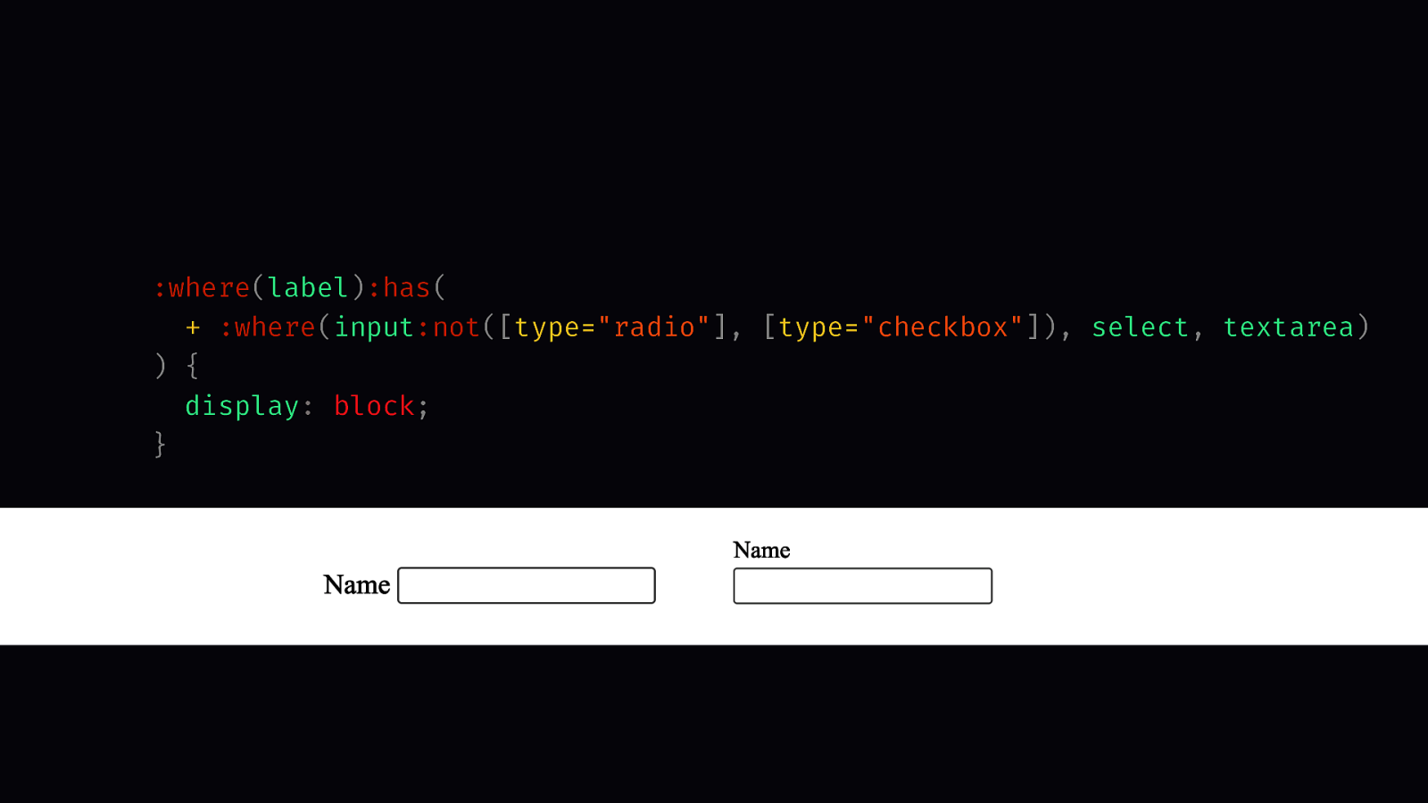
:where(label):has(
  + :where(input:not([type="radio"], [type="checkbox"]), select, textarea)
) {
  display: block;
}
If you create a label and an input field, by default, this is how it looks like in the browser. The input field is next to the label. I would say in 98% of cases that’s not what you want because we know that for the UX it’s best to put your input fields below the label. That’s what this rule does. I’m saying every label that is followed by an input, select or textarea, sets display block. Of course, that doesn’t apply for radio buttons and check boxes.
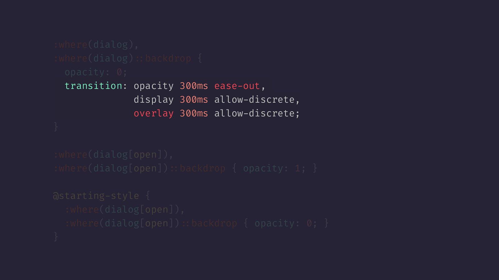
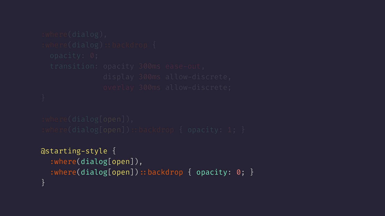
:where(dialog),
:where(dialog)::backdrop {
  opacity: 0;
  transition: opacity 300ms ease-out,
              display 300ms allow-discrete,
              overlay 300ms allow-discrete;
}
Here’s another example: By default, if you open a dialogue, it just appears and disappears and there is no transition. The problem is that the dialog is hidden and we can’t animate hidden elements, or at least we weren’t able to do that for the longest time. Today, it’s possible by not just transitioning the opacity property but also the display property with the allow-discrete keyword, which allows the animation or transition of discrete properties. The same goes for the overlay property which allows us to fade out the backdrop of the dialogue.
:where(dialog),
:where(dialog)::backdrop {
  opacity: 0;
  transition: opacity 300ms ease-out,
              display 300ms allow-discrete,
              overlay 300ms allow-discrete;
}

:where(dialog[open]),
:where(dialog[open])::backdrop { opacity: 1; }

@starting-style {
  :where(dialog[open]),
  :where(dialog[open])::backdrop { opacity: 0; }
}
To allow our dialogue to fade in as well, we have to define a starting style and set opacity: 0.
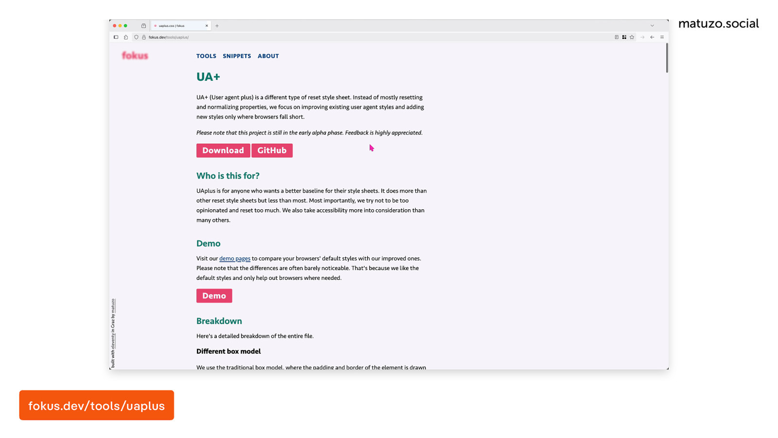
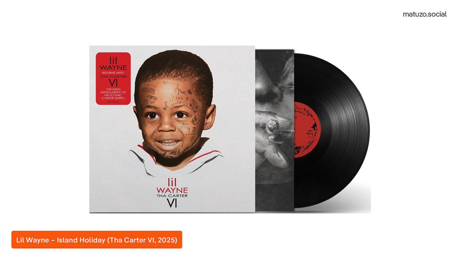
My reset style sheet is available on GitHub and I also created a website for it. It’s online at fokus.dev. Fokus with a k, because all the goods domain names are gone. The website is just a placeholder basically so it doesn’t look nice, but you will find a breakdown of all the rules that I’m using and I also have this demo which is really cool. It includes most of the elements in HTML and you can compare how it looks like with my reset style sheet and with the default rendering in the browser and you can also compare it against other style sheets. I know that some rules are very opinionated, but I just hope that I didn’t make a big mistake like Lil Wayne did on his latest album Tha Carter VI when he decided to cover Weezer.
fokus.dev/tools/uaplus
Lil Wayne – Island Holiday (Tha Carter VI, 2025) [ Played a sample of the song “Island Holiday” by Lil Wayne (Tha Carter VI, 2025)] Listen to it on Youtube (https://youtu.be/C-YiUjgkBCI)
This is so horrible, especially if you know the original.
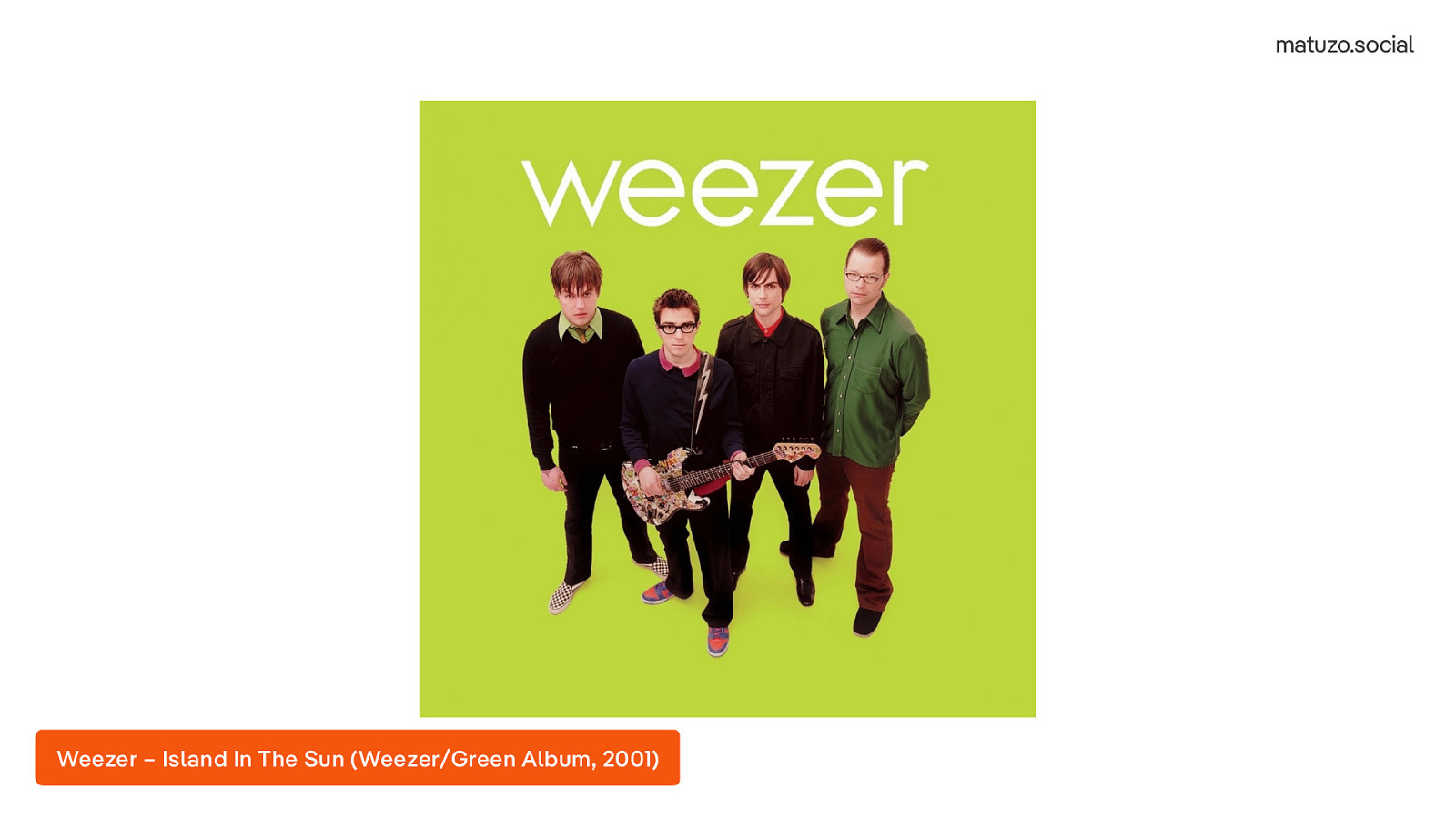
The original is called “Island In The Sun” by Weezer from the Green album, released in 2001.
[ Played a sample of the song “Island In The Sun” by Weezer ] Listen to it on Youtube (https://youtu.be/erG5rgNYSdk)
The next big topic for me was structure and organisation.
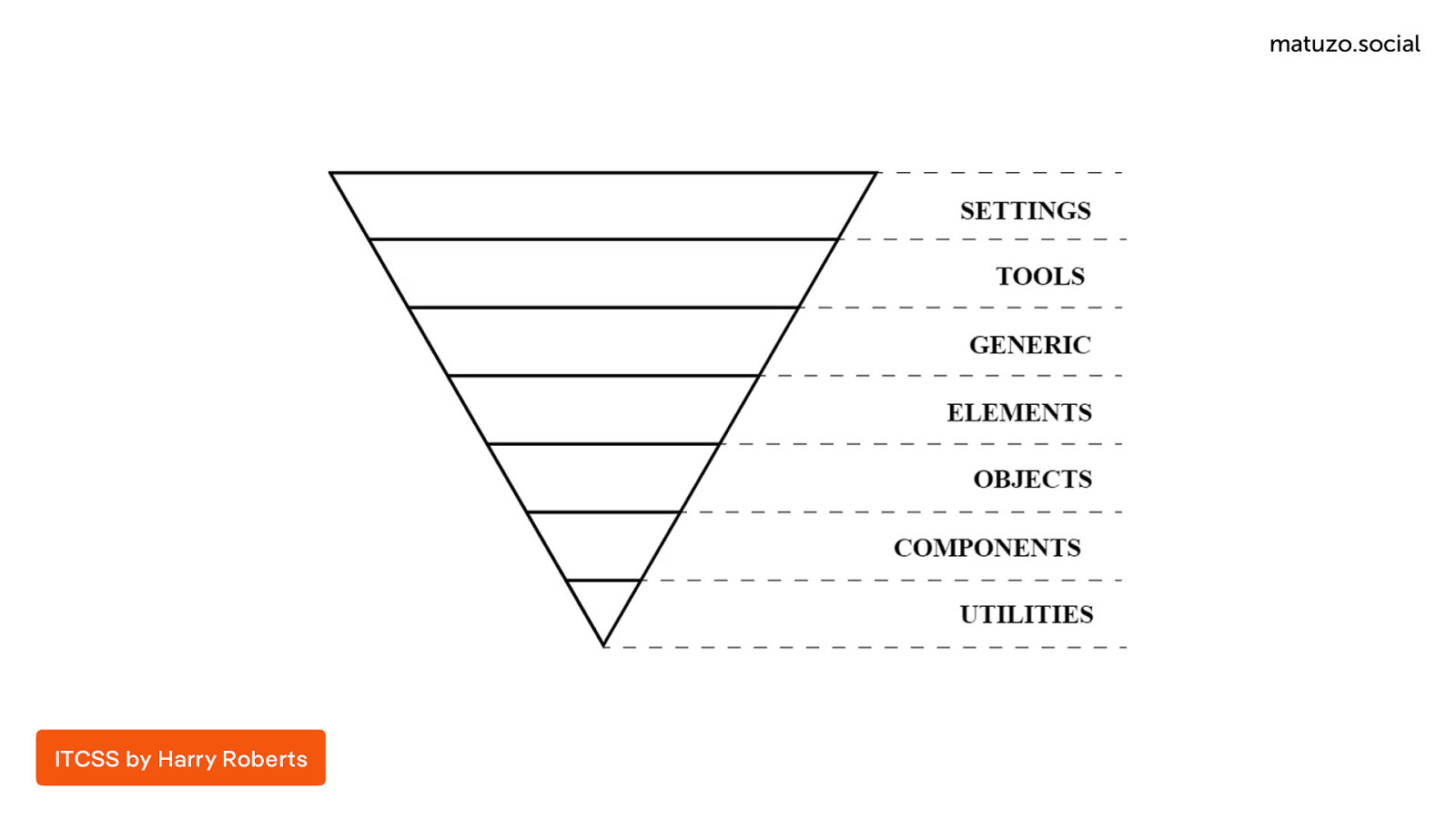
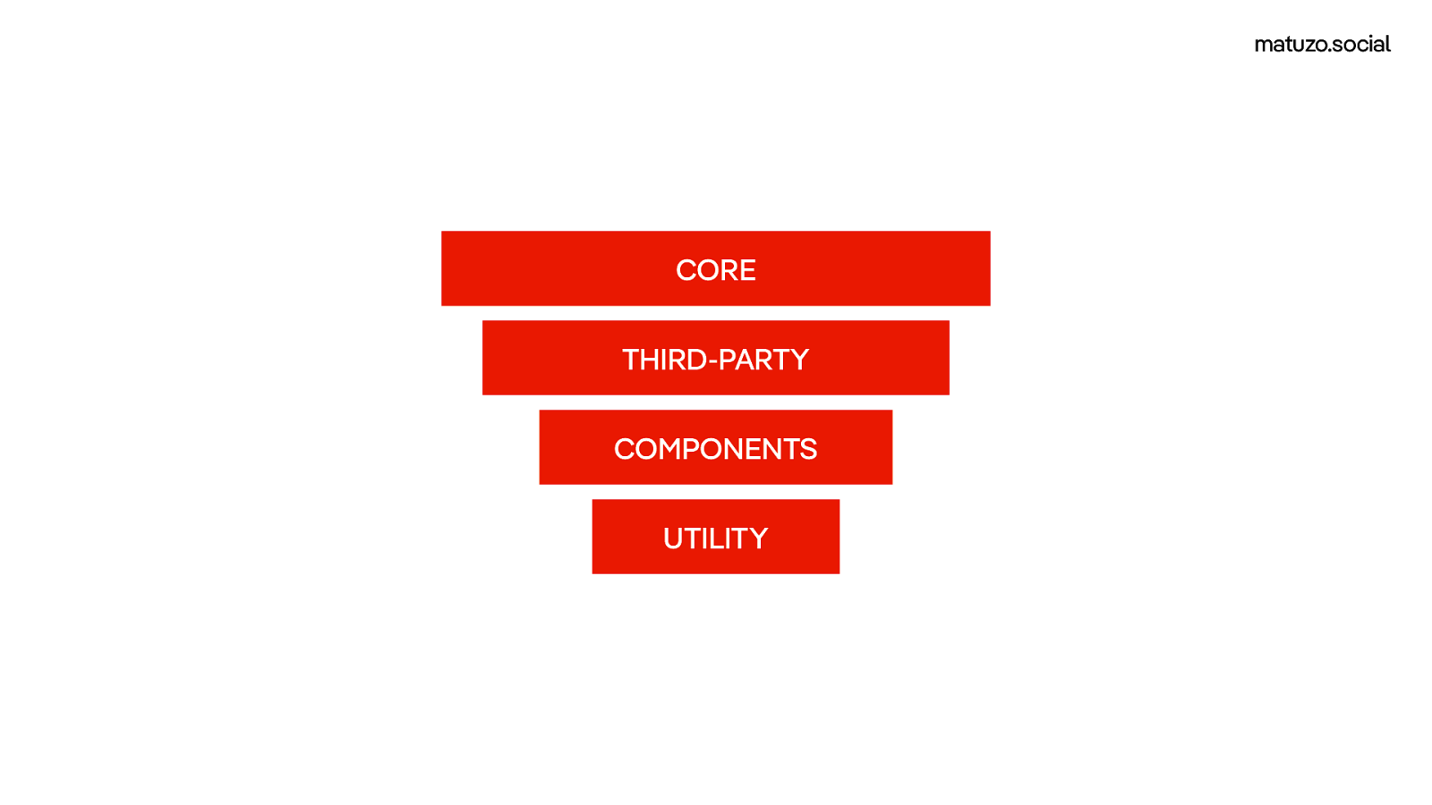
For most of my career I followed an approach very similar to Harry Robert’s ITCSS, which is represented with this inverted pyramid. The idea is that at the beginning of your CSS you have generic code that applies to the entire website. In a pre-processor like Sass that would be mixins, functions, etc. Then you get more specific by writing base rules using tag selectors. Then you get more specific by using selectors for your components and finally you have utility classes which are very specific. The idea is that you avoid specificity problems by starting with very broad low specificity selectors and getting more specific as your file progresses. The concept is great, but it’s just a concept. There isn’t anything that enforces these rules. If you put an id selector at the beginning of the file it will mess with the specificity.
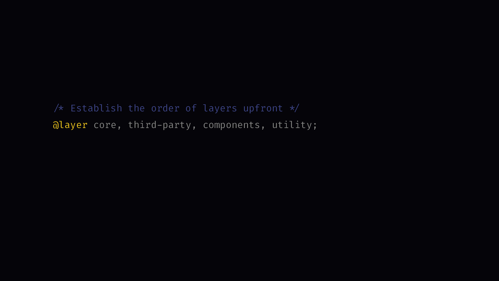
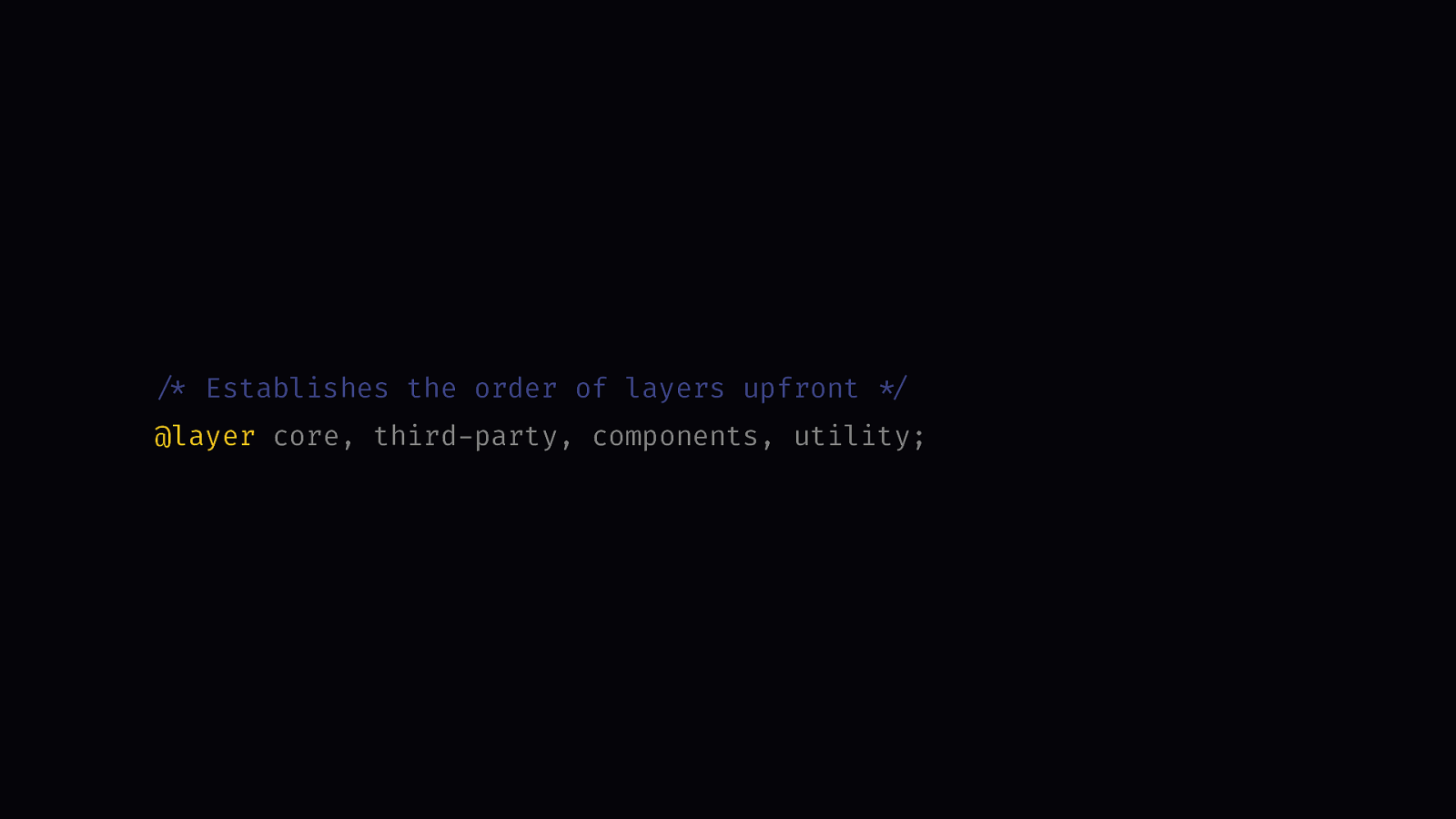
/* Establish the order of layers upfront */
@layer core, third-party, components, utility;
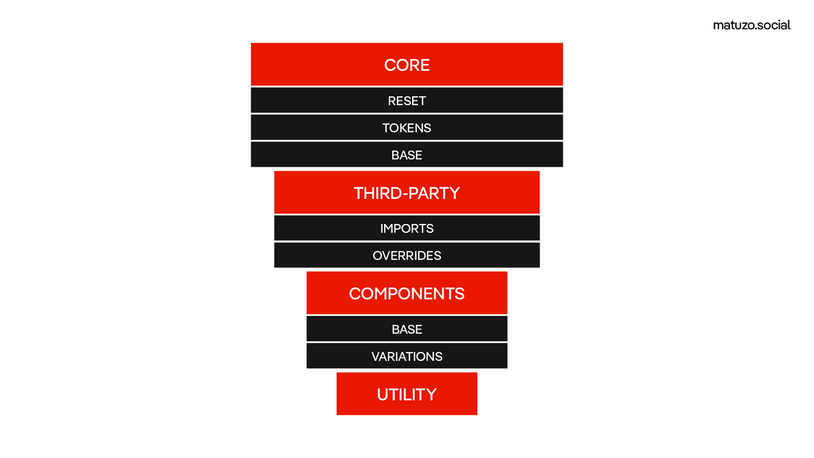
@layer core.reset, core.tokens, core.base;
@layer third-party.imports, third-party.overrides;
@layer components.base, components.variations;
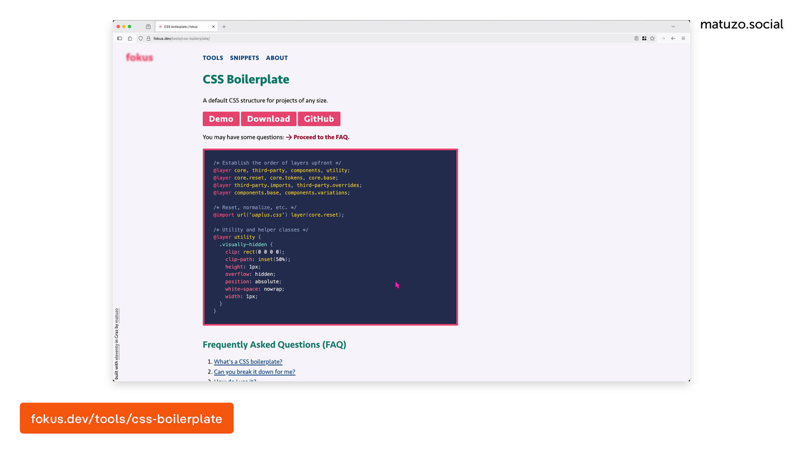
Luckily, now we have cascade layers that allow us to enforce these rules. Layers defined later in the document overwrite layers defined earlier. For my project, I didn’t just want to use cascade layers. I wanted to come up with a structure that I can use in any project of any size. Here is what it looks like. We have four main layers: core, third-party, components, and utility. base consists of three sub layers. One for reset style sheets, one for tokens, and one for base rules. The third-party layer consists of two sub layers. One for imports, so that’s where your bootstrap.css or prism.css belongs, and one for overrides. If there’s anything that you want to change in these third-party styles, you don’t do it just anywhere, you do it here so there is one dedicated place for it. The component layer consists of two layers, one for the base and one for variations.
*
/
Establish the order of layers upfront
/* Establish the order of layers upfront */
@layer core, third-party, components, utility;
@layer core.reset, core.tokens, core.base;
@layer third-party.imports, third-party.overrides;
@layer components.base, components.variations;
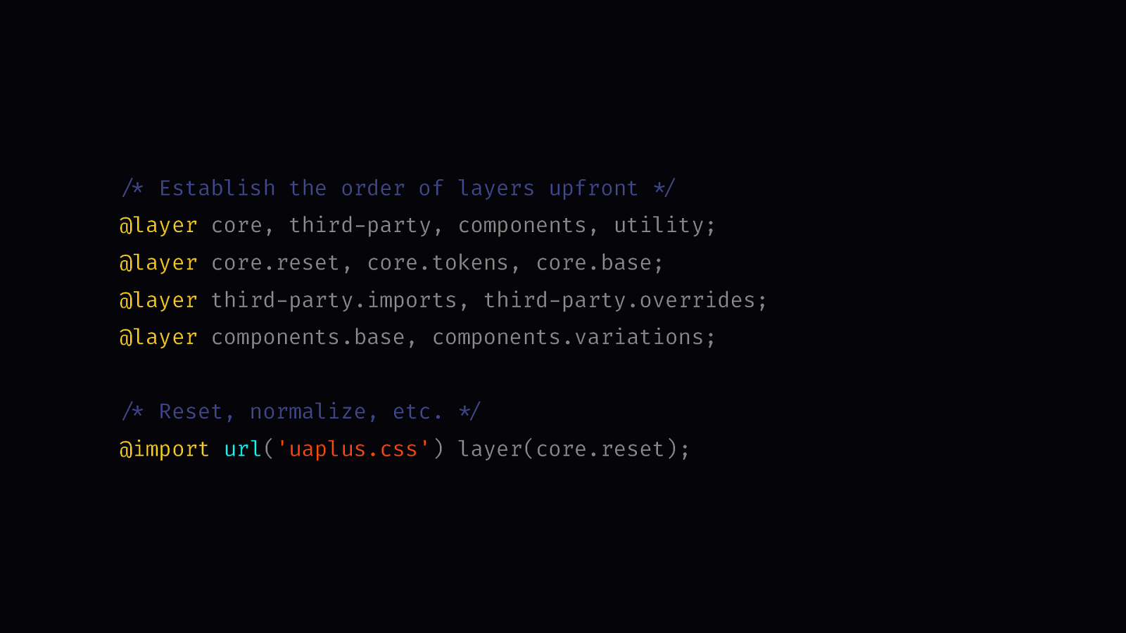
/* Reset, normalize, etc. */
@import url('uaplus.css') layer(core.reset);
Here is how I add my reset style sheet by using the @import at-rule and importing directly into the core reset layer.
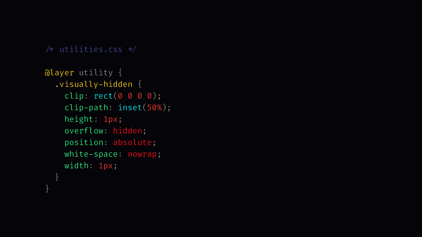
/* utilities.css */

@layer utility {
  .visually-hidden {
    clip: rect(0 0 0 0);
    clip-path: inset(50%);
    height: 1px;
    overflow: hidden;
    position: absolute;
    white-space: nowrap;
    width: 1px;
  }
}
Here’s how I add a utility class to the utility layer.
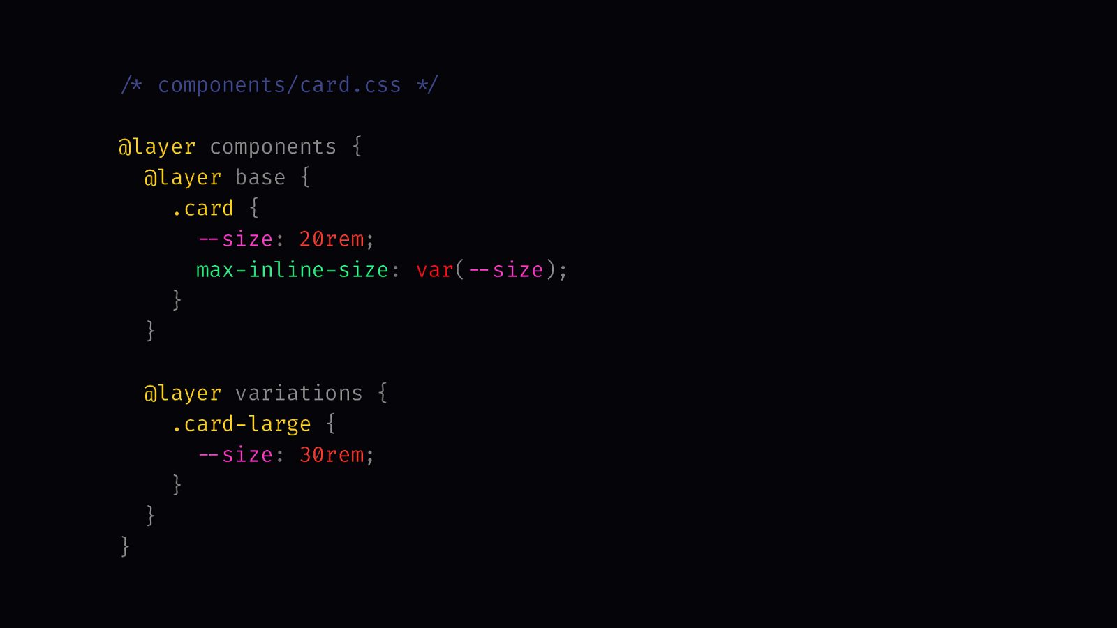
/* components/card.css */

@layer components {
  @layer base {
    .card {
      --size: 20rem;
      max-inline-size: var(--size);
    }
  }

  @layer variations {
    .card-large {
      --size: 30rem;
    }
  }
}
Here’s an example for component style.
@layer core, third party, components, utility;
What’s great about that is that it doesn’t just make working with the Cascade easier, it also allows me to split up my CSS into multiple files and not having to worry about specificity because in the very first line we have already established the order of the cascade layers. If we use them later on anywhere in the documents, we’re not redefining layers we’re just reusing them.
Here’s how my inverted pyramid looks like: Base styles overwritten by third-party styles overwritten by component styles and finally utility styles with the highest specificity.
Here’s the pyramid with sublayers.
CORE RESET TOKENS BASE THIRD-PARTY IMPORTS OVERRIDES COMPONENTS BASE VARIATIONS UTILITY
This CSS boilerplate is also online on fokus.dev. I have a dedicated page where I explain my decisions and I also answer some common questions. Now let’s move onto the next…episode.
fokus.dev/tools/css-boilerplate
[ Played a sample of the song “The Next Episode” by Dr. Dre (2001, 1999)] Listen to it on Youtube (https://youtu.be/A8V0-gLxeB0)
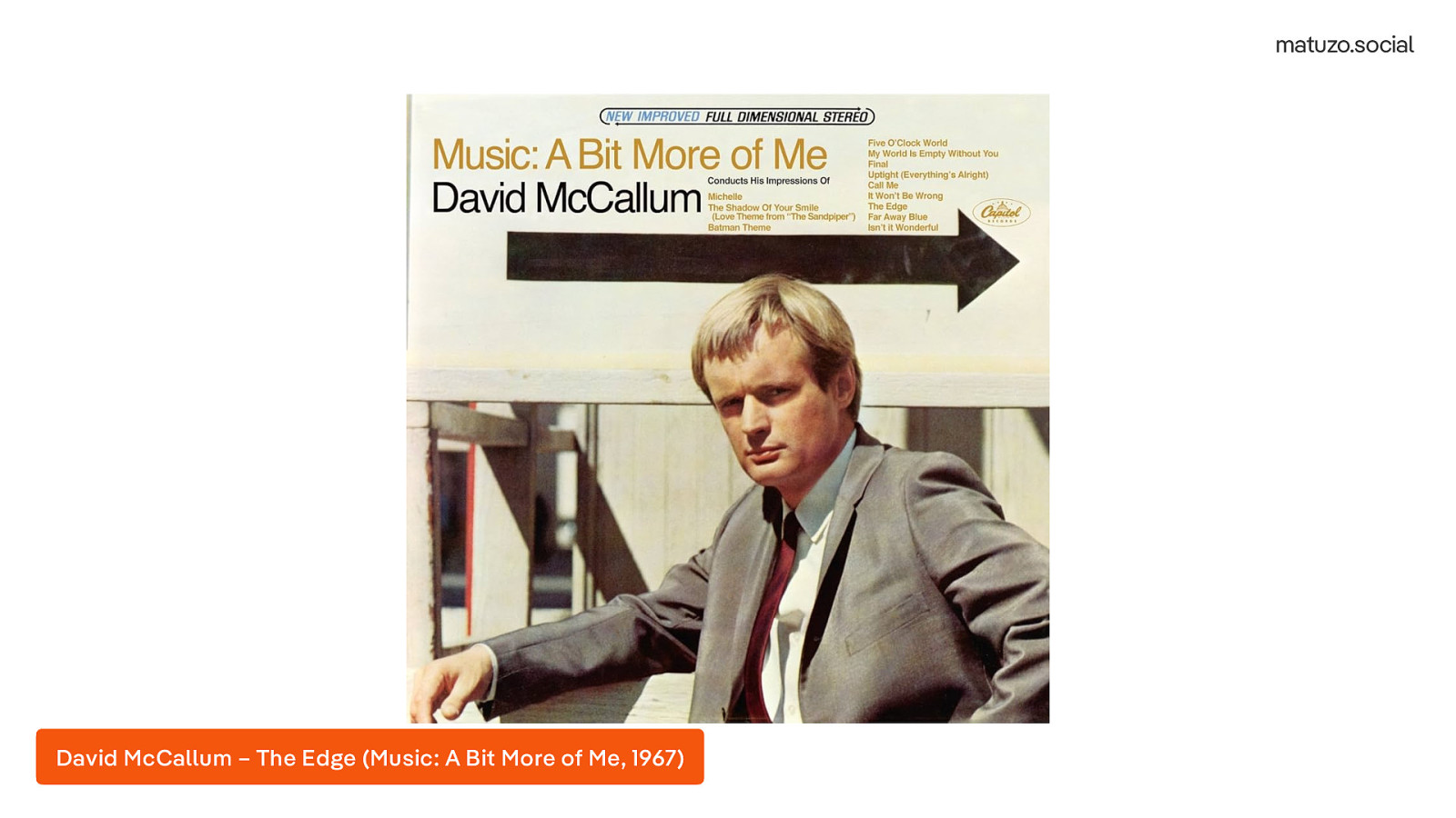
The next episode is a song by Dr. Dre released in 1999 on his second album 2001.
“The next episode” uses a sample from the song “The Edge” by David McCallum, released in 1967 on the album “Music: A Bit More of Me”.
The next thing I wanted to find out is if there is a way to improve the resilience and capability of my CSS.
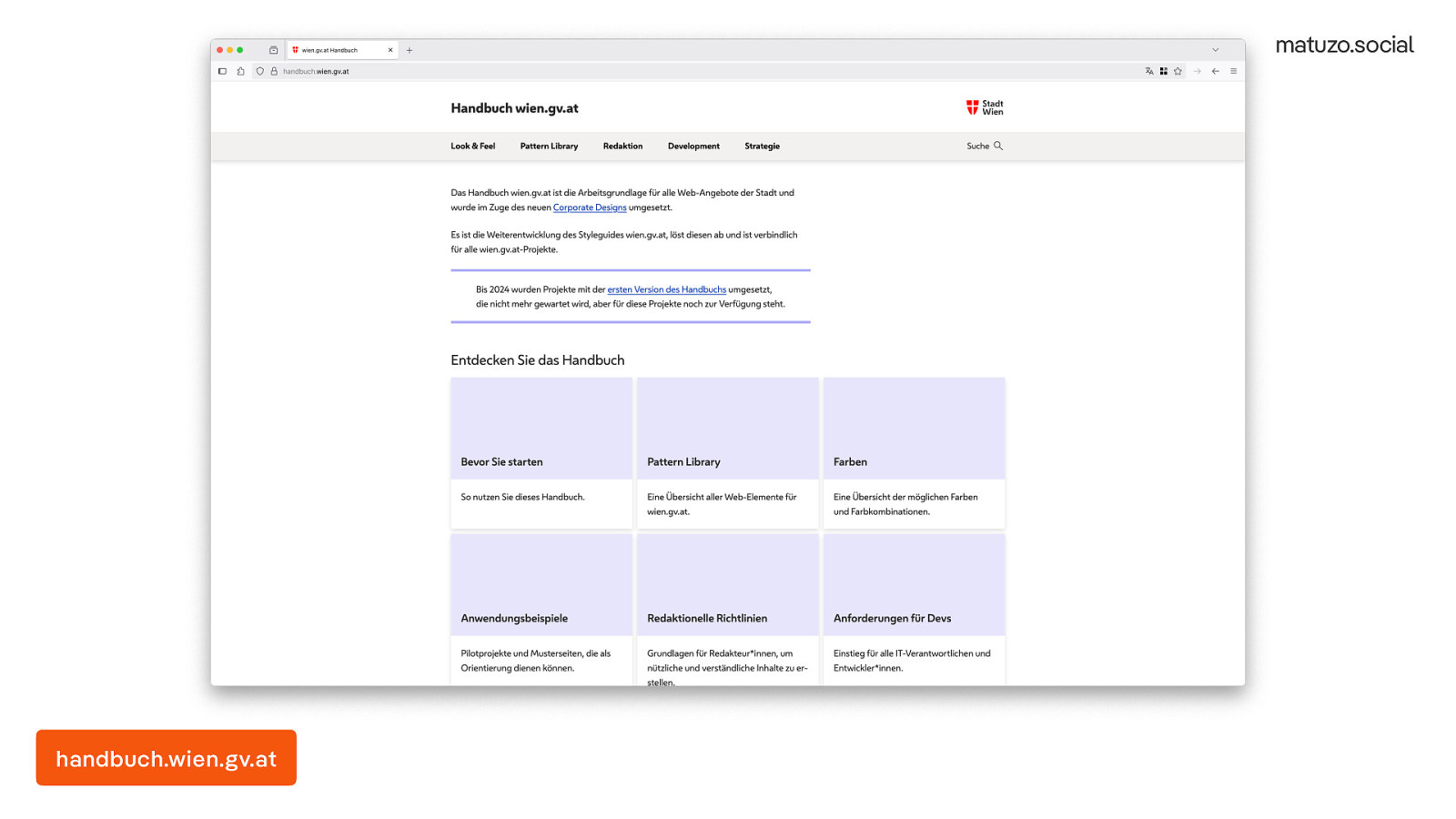
One of my clients is the City of Vienna. I created the concept for their new pattern library and I also wrote a lot of it. The way we designed it is that we use native HML, native CSS and for JavaScript we use Web Components. We are big fans of progressive enhancement. The website still looks and works fine without JavaScript. It even looks fine if you don’t add any classes in CSS. That’s because we designed it as a no class framework. When we switch from our old CMS to a new one, many of the thousands of pages will be important automatically. To ensure that they still look okay, we added detailed base styles. Because that worked so well, I decided to pay much more attention to base styles than I used to. Here are some of the highlights.
handbuch.wien.gv.at
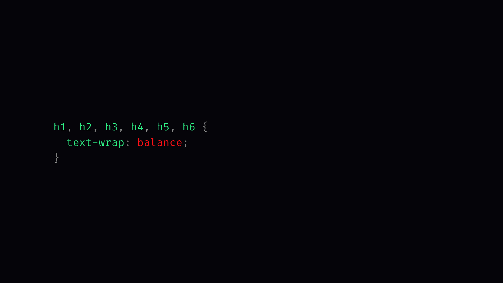
h1, h2, h3, h4, h5, h6 {
  text wrap: balance;
}
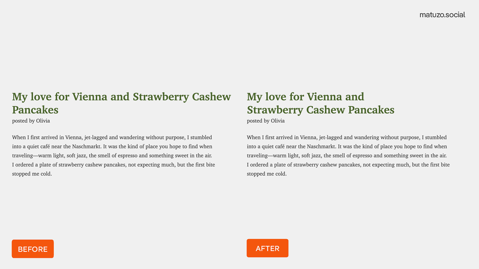
I’m selecting all headings and I’m using text-wrap: balance. This ensures more balanced line lengths in multiline headings.
In the before and after comparison, you can see how lines are more balanced with this rule.
h1 {
  font-size: 47px;
}

h2 {
  font-size: 41px;
}

h3 {
  font-size: 30px;
}
…
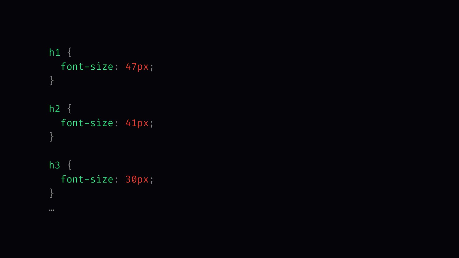
When I work with headings, I usually take the font sizes from the design and put them in my CSS. That’s fine, but these sizes are just by looking at the CSS random numbers.
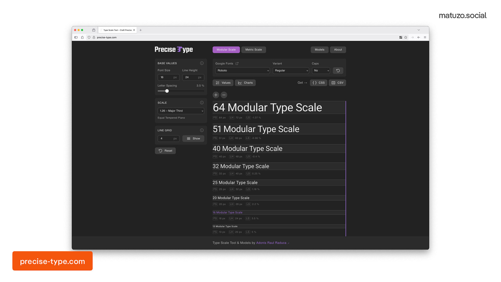
I know that some people use type scales for sizing their headings. So I tried that and used one of the many sites that provide scales. Usually they have a base font size and a scale, like 1.26, and then they give you different font sizes.
precise-type.com
h1 {
  font-size: 51px;
}

h2 {
  font-size: 40px;
}

h3 {
  font-size: 32px;
}
…
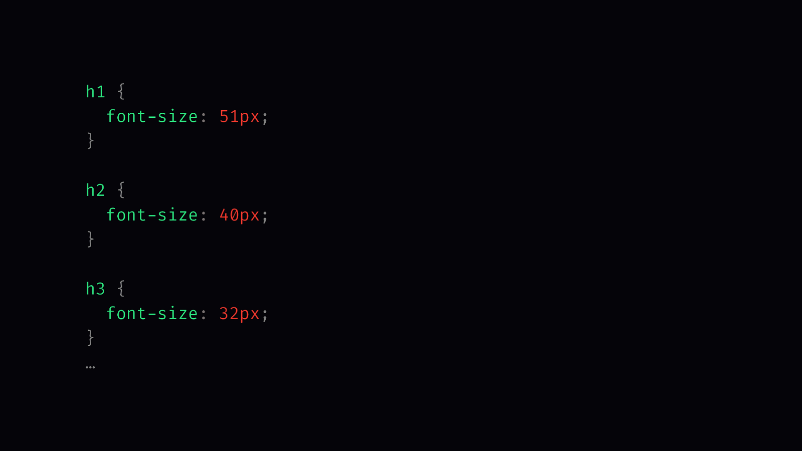
Instead of random numbers in my style sheet, I now use the numbers from the type scale, but looking at the CSS these numbers are still magic numbers. They don’t reflect the algorithm behind them.
That’s why I looked again at the website. When I was in school I was really bad at maths, or actually at any subject, but especially at maths, but I was still able to figure out what they’re doing here. They start with 16 pixels and multiply it by the scale 1.26. The result is 20, then they take 20 and multiply it by the scale again and the result is 25. Then they multiply 25 by the scale and they get 32, and so.
precise-type.com
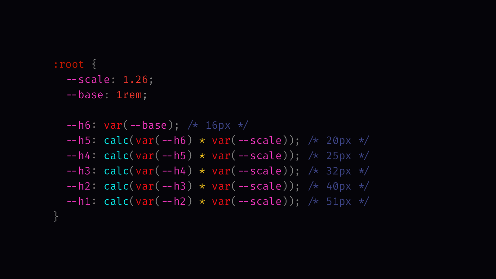
:root {
  --scale: 1.26;
  --base: 1rem;

  --h6: var(--base); /* 16px */
  --h5: calc(var(--h6) * var(--scale)); /* 20px */
  --h4: calc(var(--h5) * var(--scale)); /* 25px */
  --h3: calc(var(--h4) * var(--scale)); /* 32px */
  --h2: calc(var(--h3) * var(--scale)); /* 40px */
  --h1: calc(var(--h2) * var(--scale)); /* 51px */
}
It’s easy to re-create that in CSS. I have a custom property for the scale and one for the base font size. My H6 equals the base size. The H5 is the result of the size of the H6 times scale. The H4 takes the size of the H5 multiplied by the scale, etc. That’s fine, but I don’t like that for every font size you have to reference the previous font size, and I also don’t like the repetition.
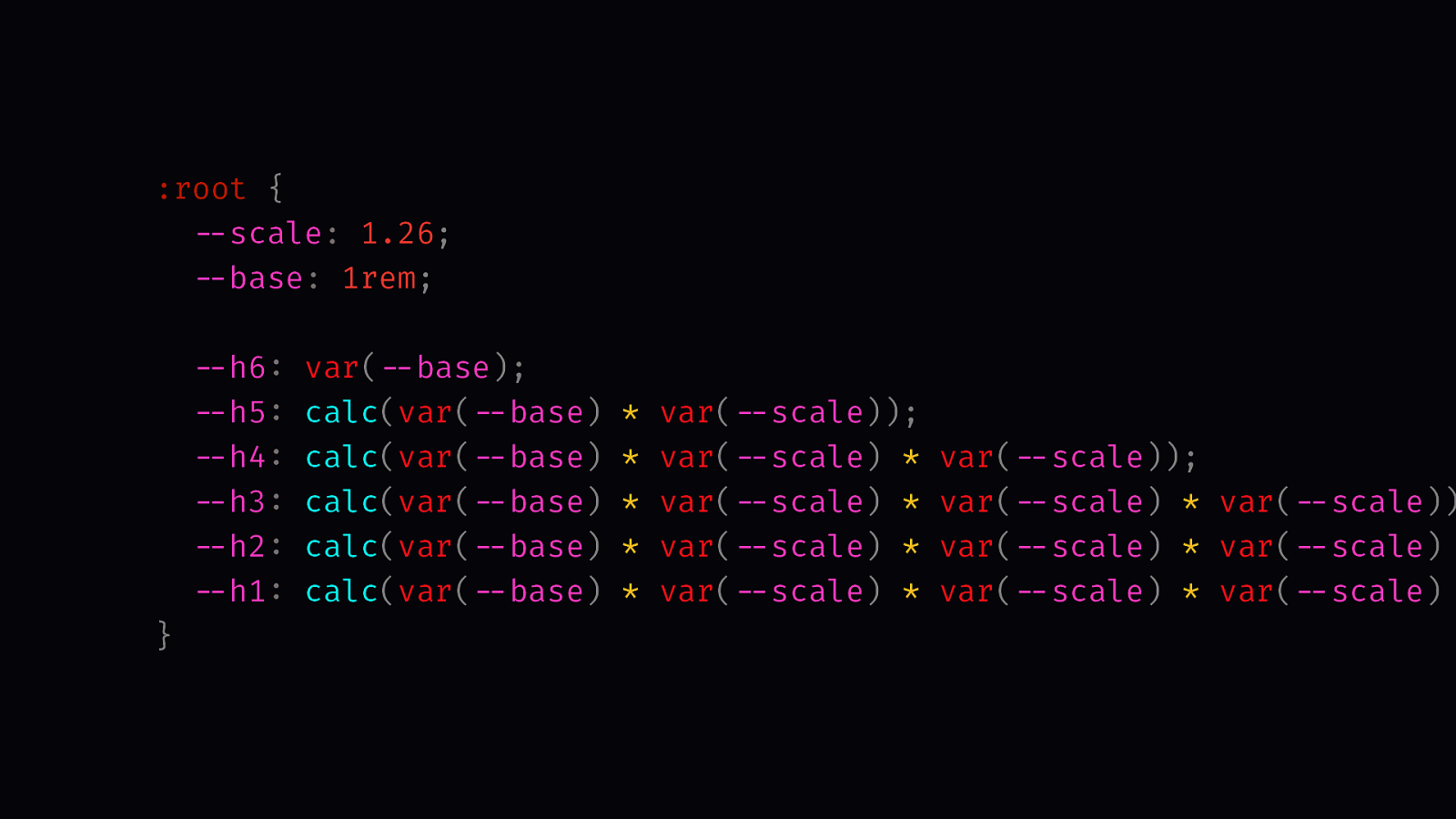
:root {
  --scale: 1.26;
  --base: 1rem;

  --h6: var(--base);
  --h5: calc(var(--base) * var(--scale));
  --h4: calc(var(--base) * var(--scale) * var(--scale));
  --h3: calc(var(--base) * var(--scale) * var(--scale) * var(--scale));
  --h2: calc(var(--base) * var(--scale) * var(--scale) * var(--scale) * var(--scale));
  --h1: calc(var(--base) * var(--scale) * var(--scale) * var(--scale) * var(--scale) * var(--scale));
}
Another way of writing that is to take the base font size multiplied by the scale for the H5, for the H4 you multiply the base font size by the scale and again by the scale, and so on.
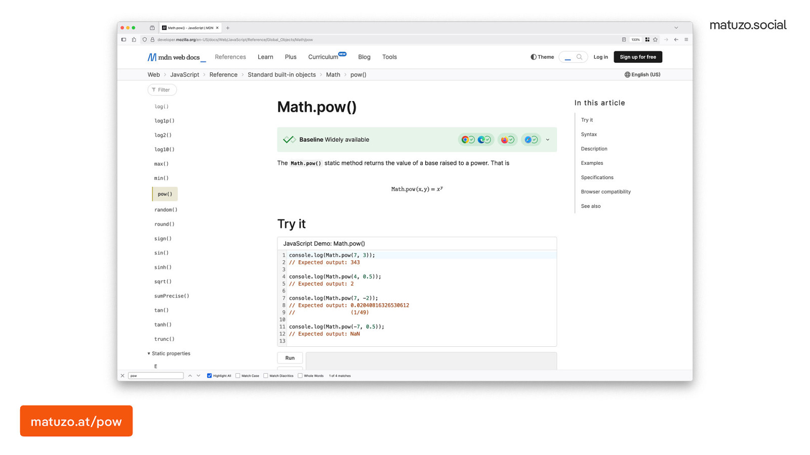
When I saw that, I was sure that some dead dude probably already came up with a formula for that.
I know that CSS now has math functions so I went on MDN and I tried to find the formula. I clicked on some random functions and then I found this: “the Math.pow() static method returns the value of a base raised to a power”: That looked exactly like what I needed, so I tried it.
matuzo.at/pow
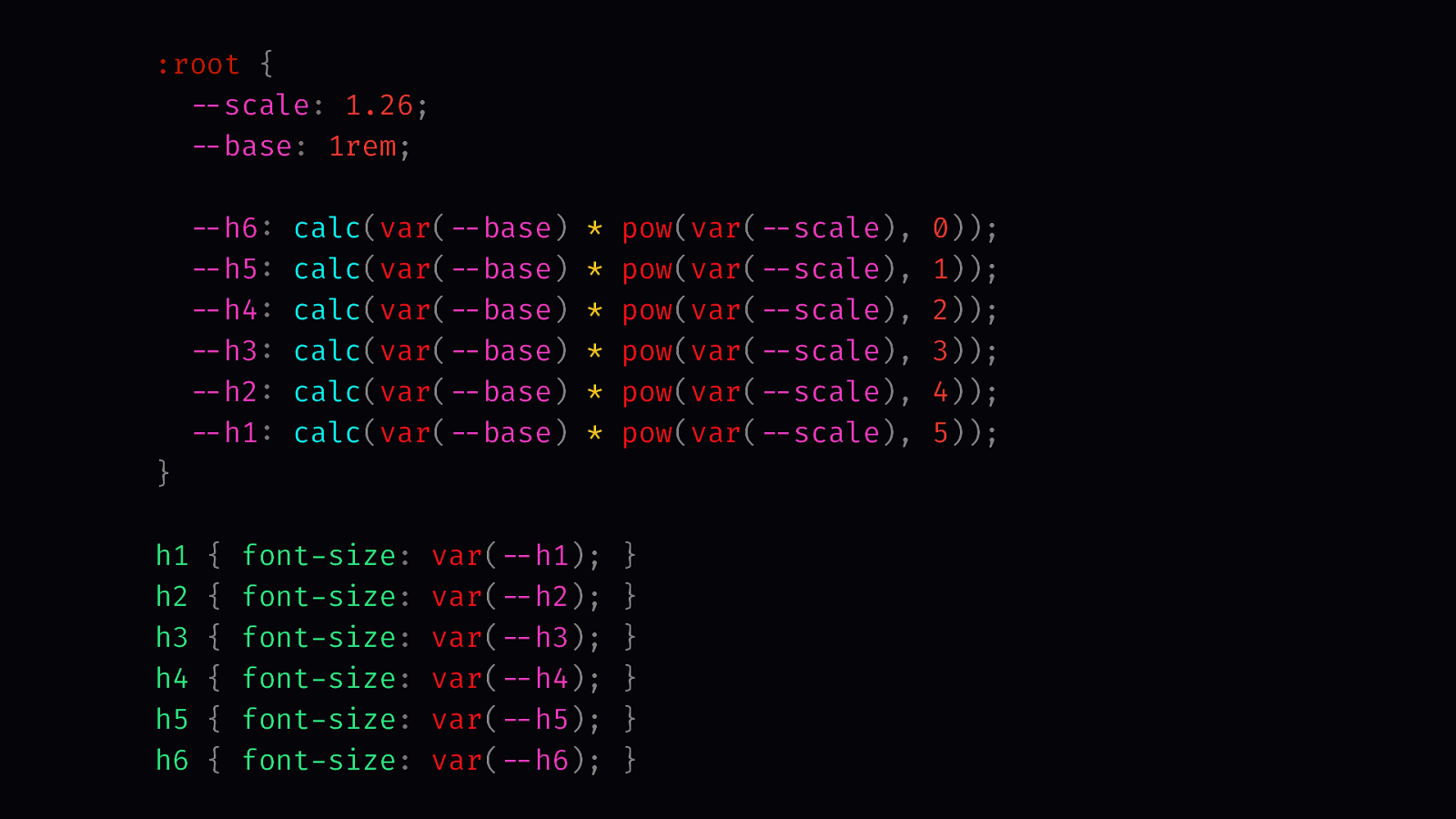
:root {
  --scale: 1.26;
  --base: 1rem;

  --h6: calc(var(--base) * pow(var(--scale), 0));
  --h5: calc(var(--base) * pow(var(--scale), 1));
  --h4: calc(var(--base) * pow(var(--scale), 2));
  --h3: calc(var(--base) * pow(var(--scale), 3));
  --h2: calc(var(--base) * pow(var(--scale), 4));
  --h1: calc(var(--base) * pow(var(--scale), 5));
}

h1 { font-size: var(--h1); }
h2 { font-size: var(--h2); }
h3 { font-size: var(--h3); }
h4 { font-size: var(--h4); }
h5 { font-size: var(--h5); }
h6 { font-size: var(--h6); }
Instead of multiplying the scale multiple times I now use the pow() function. The first value is the base number and the second value is the exponent. The larger exponent the larger the font size.
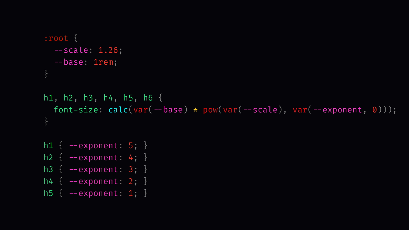
That’s much better now, but I still have a lot of repetition here.
:root {
  --scale: 1.26;
  --base: 1rem;
}

h1, h2, h3, h4, h5, h6 {
  font-size: calc(var(--base) * pow(var(--scale), var(--exponent, 0)));
}

h1 { --exponent: 5; }
h2 { --exponent: 4; }
h3 { --exponent: 3; }
h4 { --exponent: 2; }
h5 { --exponent: 1; }
To avoid repetition, I’m selecting all the headings and I’m setting to the font size to the base font size times the pow() function. The exponent defaults to 0 but you can override it using the —exponent custom property. I know that looks really strange because we are used to using the font-size property but this allows me to stay within my type scale. It enforces the sizing system in my CSS, very similar to what we did earlier with cascade layers.
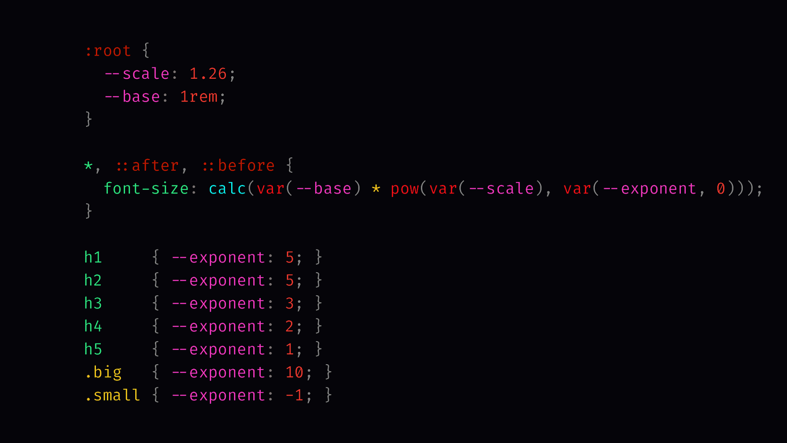
I was really happy with that, but then I realised that it only applies to headings, but I may want to use the system for different elements, too.
:root {
  --scale: 1.26;
  --base: 1rem;
}

*, ::after, ::before {
  font-size: calc(var(--base) * pow(var(--scale), var(--exponent, 0)));
}

h1     { --exponent: 5; }
h2     { --exponent: 5; }
h3     { --exponent: 3; }
h4     { --exponent: 2; }
h5     { --exponent: 1; }
.big   { --exponent: 10; }
.small { --exponent: -1; }
Don’t try this at home, or actually try at home but don’t try to work. Instead of selecting headings only, I’m selecting all the elements on the page and I’m using my formula here. It works fine for me, but it’s dangerous because it resets all font sizes and it messes with inheritance. If I want a really large font size on a random element, I can just use a large exponent or if you want a small font size I use a negative value.
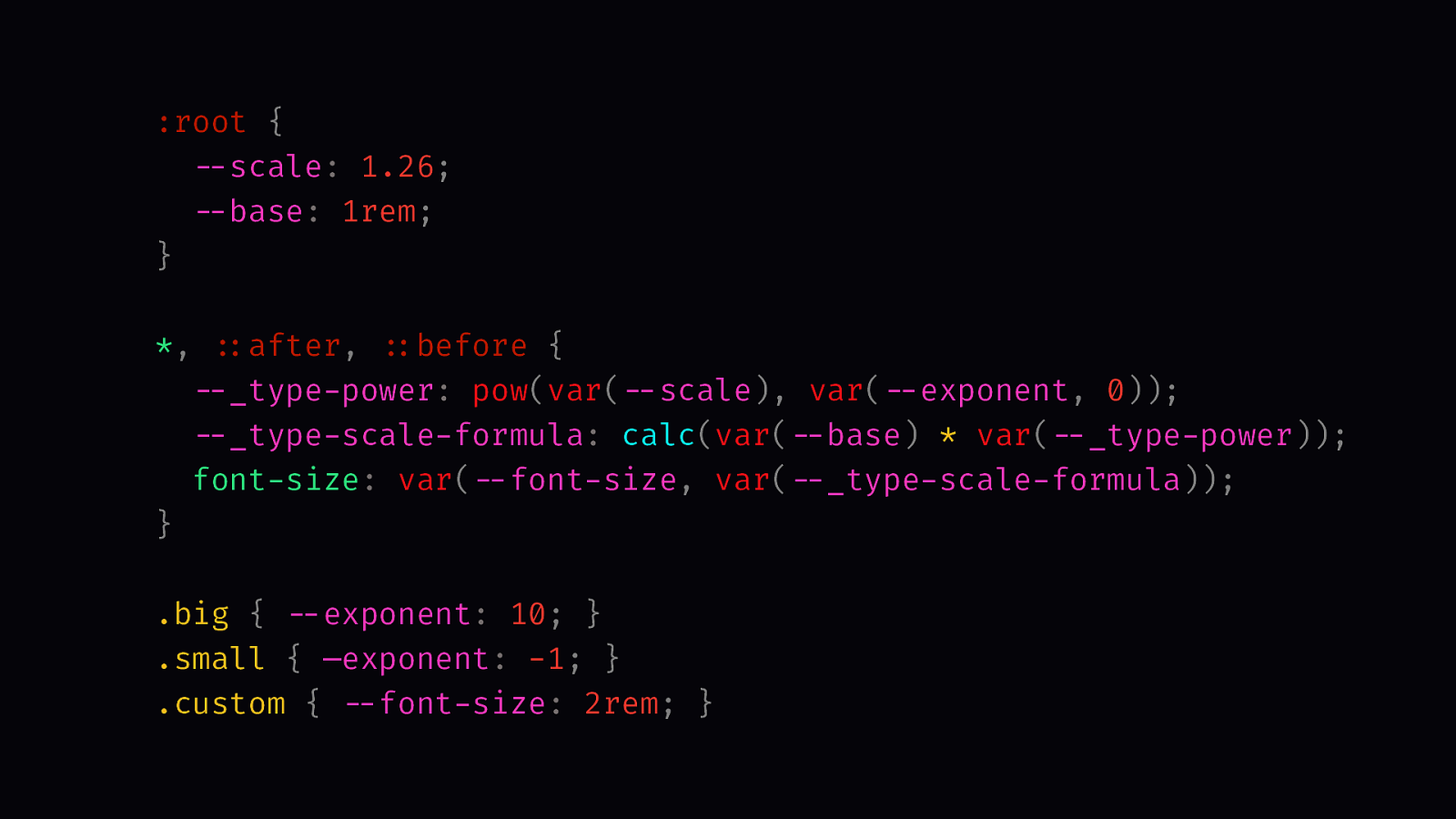
It’s cool that I’m now forced to use my type scale, but what if I don’t want to?
:root {
  --scale: 1.26;
  --base: 1rem;
}

*, ::after, ::before {
  --_type-power: pow(var(--scale), var(--exponent, 0));
  --_type-scale-formula: calc(var(--base) * var(--_type-power));
  font-size: var(--font-size, var(--_type-scale-formula));
}

.big { --exponent: 10; }
.small { —exponent: -1; }
.custom { --font-size: 2rem; }
I’m still using my formula, but now it’s the fallback for a custom property. If the —font-size custom properties is defined, that’s the font size. If not, it defaults to the formula.
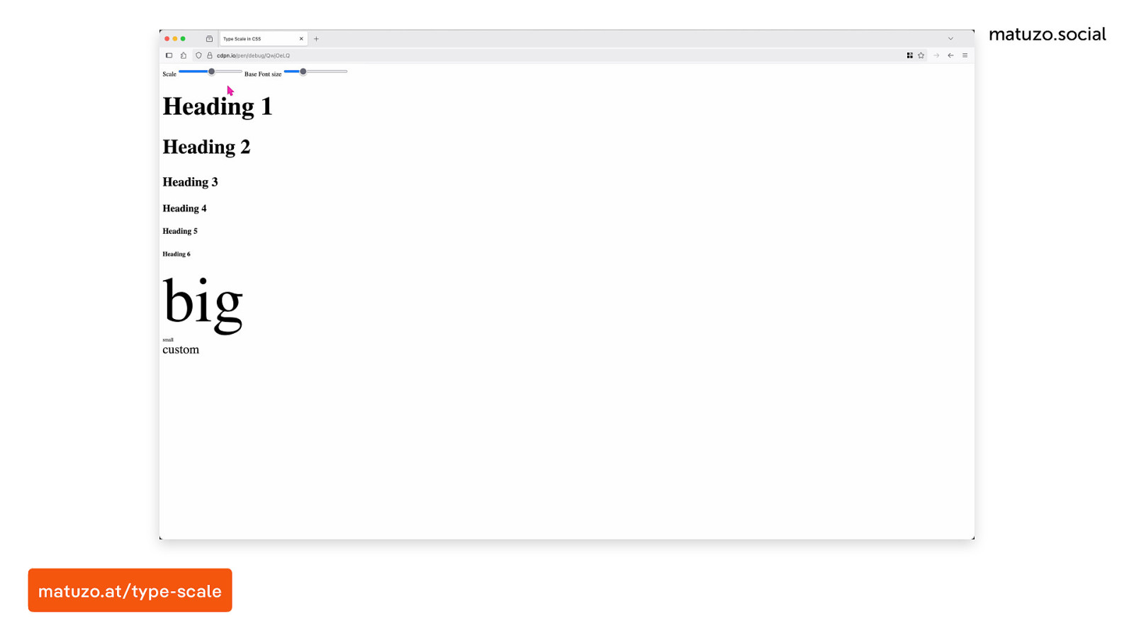
Here is how it looks like an action. I have range sliders for the scale with a value between 1 and 2 and one for the base font size with the value between 10 and 20 pixel. As I’m changing the value, you can see how the scale adapts and looks differently. It affects my .big and .small class but it doesn’t affect the .custom class. I don’t know about you, but I think that’s super cool.
matuzo.at/type-scale
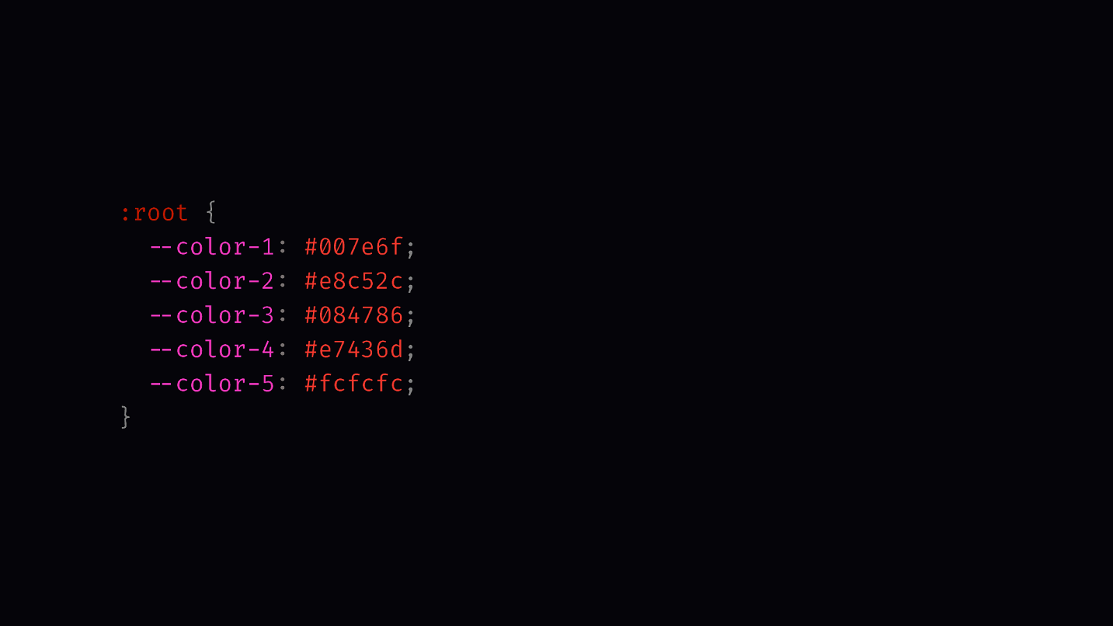
:root {
  --color-1: #007e6f;
  --color-2: #e8c52c;
  --color-3: #084786;
  --color-4: #e7436d;
  --color-5: #fcfcfc;
}
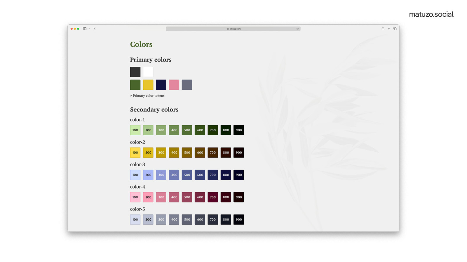
Another interesting topic is colour. For the most of my part of my career, I didn’t care much about colour and also didn’t know anything about colour theory, but Marc invited me to speak at Beyond Tellerrand in Berlin…
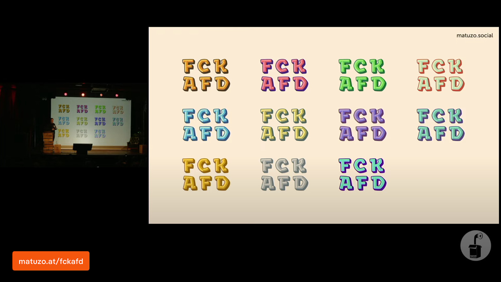
… and I presented a talk titled “Color in CSS Or How I Learned to Disrespect Tennis”. In preparation for this talk, I learned a lot about colour theory and also how to use it CSS. Now I know so much more about colour but I still fucking hate Tennis.
matuzo.at/fckafd
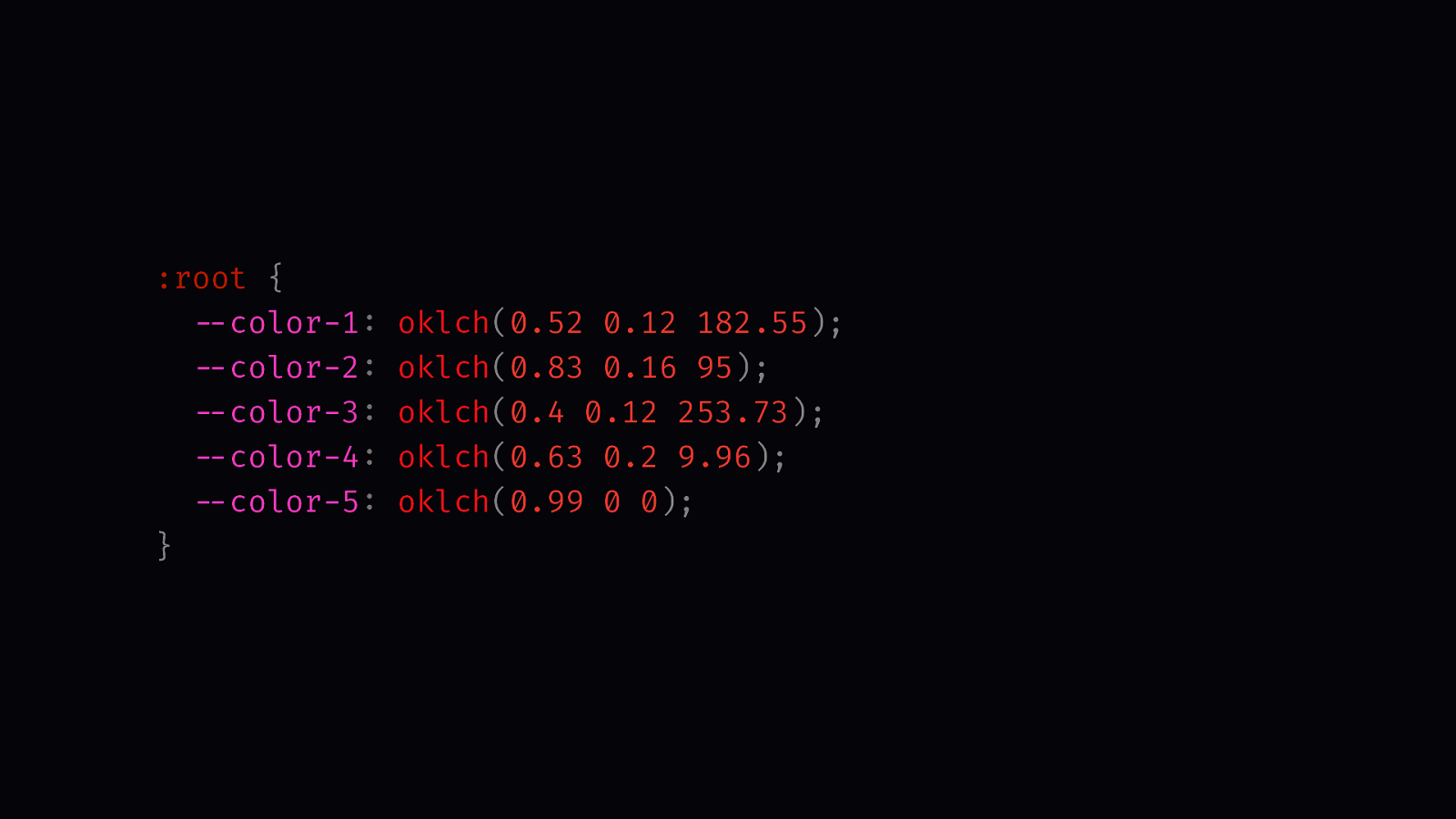
:root {
  --color-1: oklch(0.52 0.12 182.55);
  --color-2: oklch(0.83 0.16 95);
  --color-3: oklch(0.4 0.12 253.73);
  --color-4: oklch(0.63 0.2 9.96);
  --color-5: oklch(0.99 0 0);
}
You can see how I have five custom properties with five different colours but usually when we work with colour we need much more colours with different lighter and darker variations of our base colours.
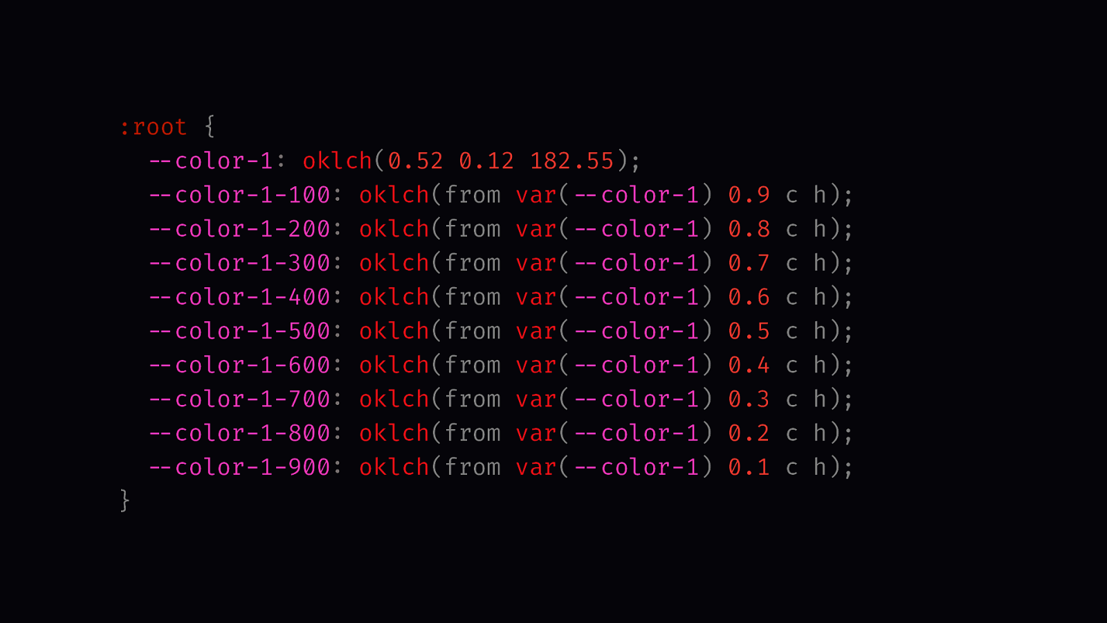
:root {
  --color-1: oklch(0.52 0.12 182.55);
  --color-1-100: oklch(from var(--color-1) 0.9 c h);
  --color-1-200: oklch(from var(--color-1) 0.8 c h);
  --color-1-300: oklch(from var(--color-1) 0.7 c h);
  --color-1-400: oklch(from var(--color-1) 0.6 c h);
  --color-1-500: oklch(from var(--color-1) 0.5 c h);
  --color-1-600: oklch(from var(--color-1) 0.4 c h);
  --color-1-700: oklch(from var(--color-1) 0.3 c h);
  --color-1-800: oklch(from var(--color-1) 0.2 c h);
  --color-1-900: oklch(from var(--color-1) 0.1 c h);
}
With relative colour syntax in CSS that’s easy to do. We use a colour function, extract the channels we need from our base colour, in this case the chroma and the hue, and then we change the lightness.
And this gives us this really nice colour scale for each base colour. They look nice, but they’re far from perfect. If you want to know why watch my talk at Beyond Tellerrand.
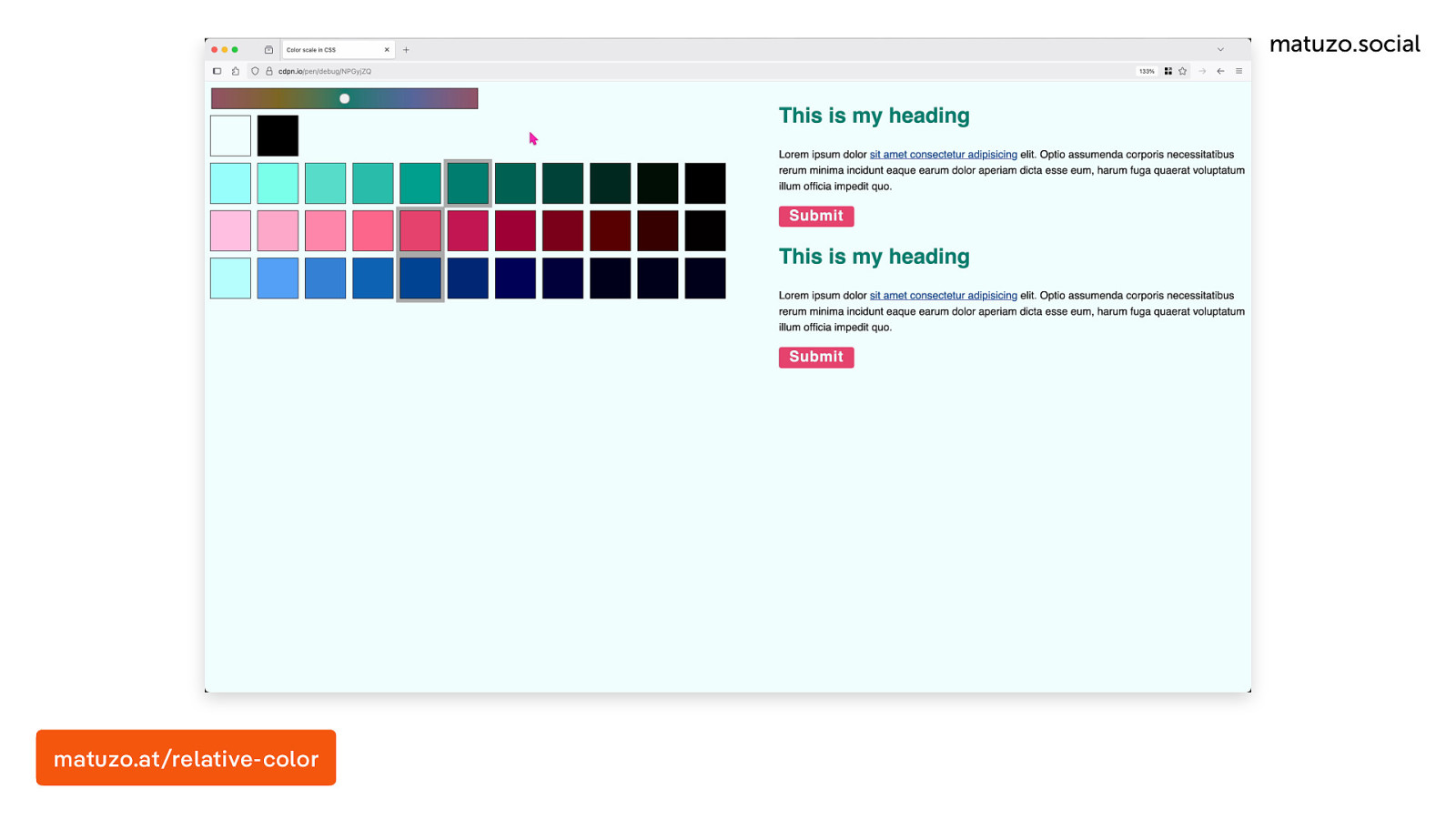
You can take it one step further. In this demo I’ve defined a base hue, not just the base colour, a base hue. Based on that hue I’ve defined all the other colours, the pink and the blue. You can see when I’m changing the base hue how all the colours are changing with it. I don’t know if that’s useful, if you need it, but it’s possible and it’s cool.
matuzo.at/relative-color
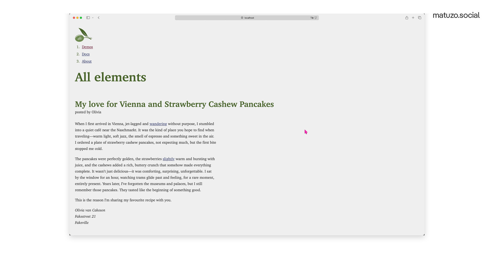
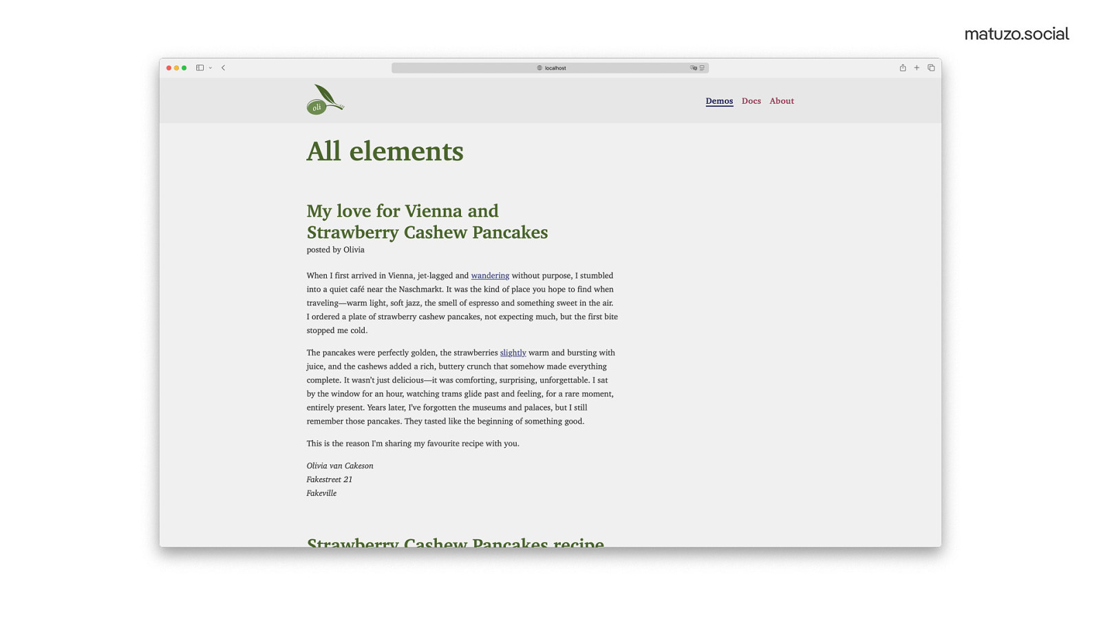
There are many more rules in my style sheet, but I would say that was the most interesting stuff. Here’s how my final demo HTML file looks like. [Scrolling through the page. URL: https://olicss.dev/demos/all]
That’s great, but this style sheet only includes styles for elements. This page doesn’t look like a proper website. There is a header and a nav element
I could add rules for the header and the nav element, but that’s pretty dangerous because there could also be a header in a section or a nav within the main content somewhere. On the other hand, if I know how the markup is structured, I may want the header to look like a proper header. What I need is a level of customisation where I can either choose to leave it as is or get an optimised version. What I need is some kind of magic that lets me choose.
:root {
  --magic: true;
}
That’s why I select the root element and I set —magic to true.
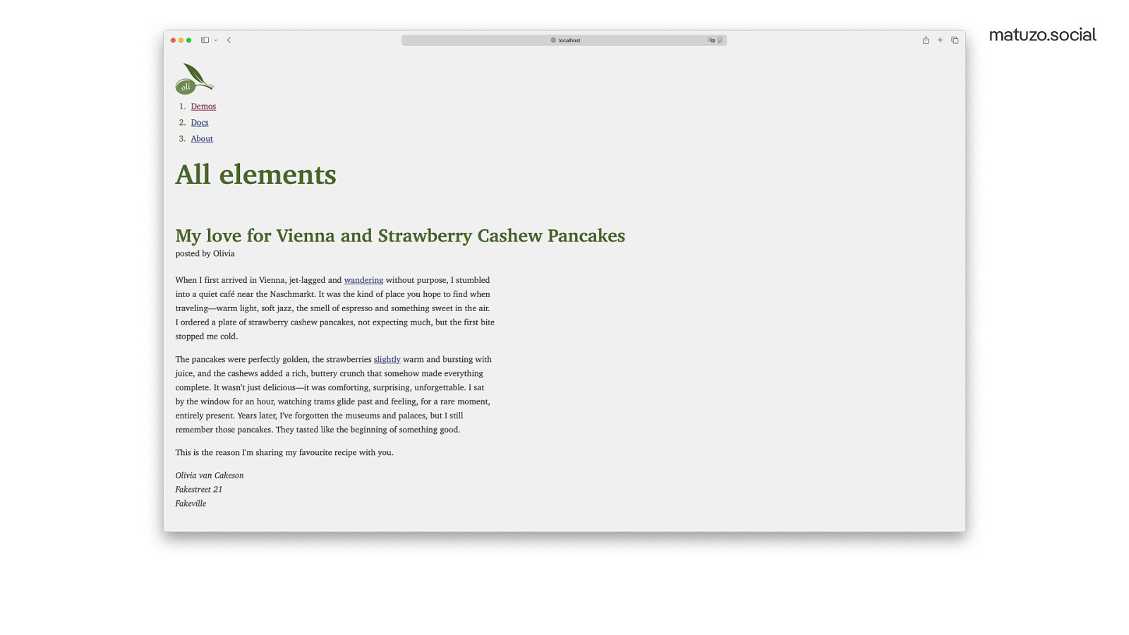
And now the header looks like a proper header and the list in the nav element looks like a navigation.
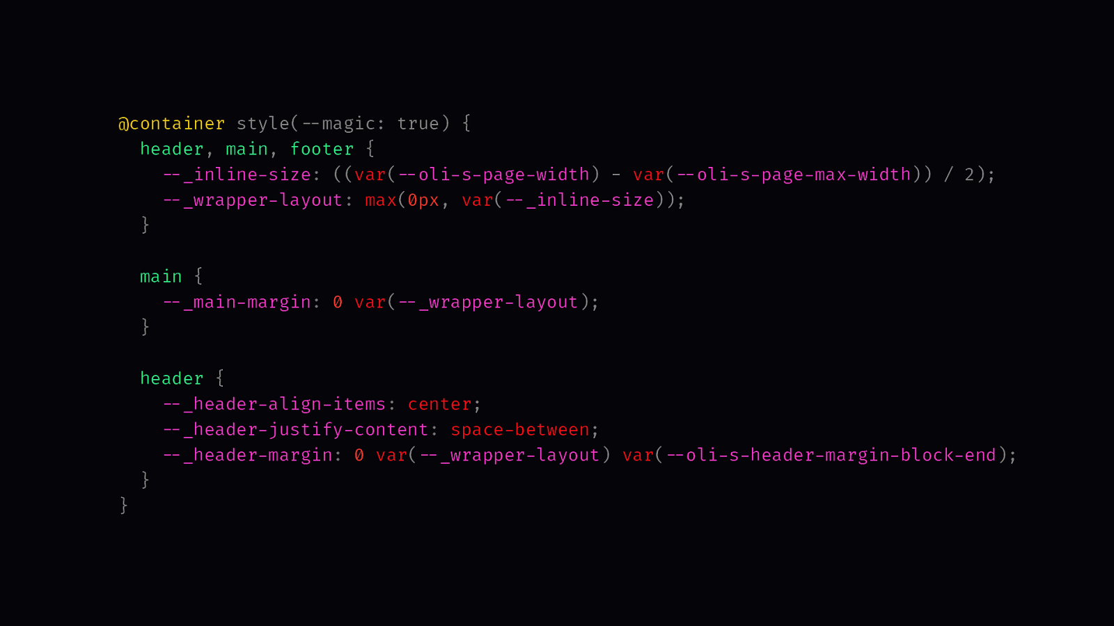
@container style(--magic: true) {
  header, main, footer {
    --_inline-size: ((var(--oli-s-page-width) - var(--oli-s-page-max-width)) / 2);
    --_wrapper-layout: max(0px, var(--_inline-size));
  }

  main {
    --_main-margin: 0 var(--_wrapper-layout);
  }

  header {
    --_header-align-items: center;
    --_header-justify-content: space-between;
    --_header-margin: 0 var(--_wrapper-layout) var(--oli-s-header-margin-block-end);
  }
}
That’s possible thanks to container style queries. In this query I check if —magic is set to true. If that’s the case, I change the layout and styling of the header, navigation and other elements.
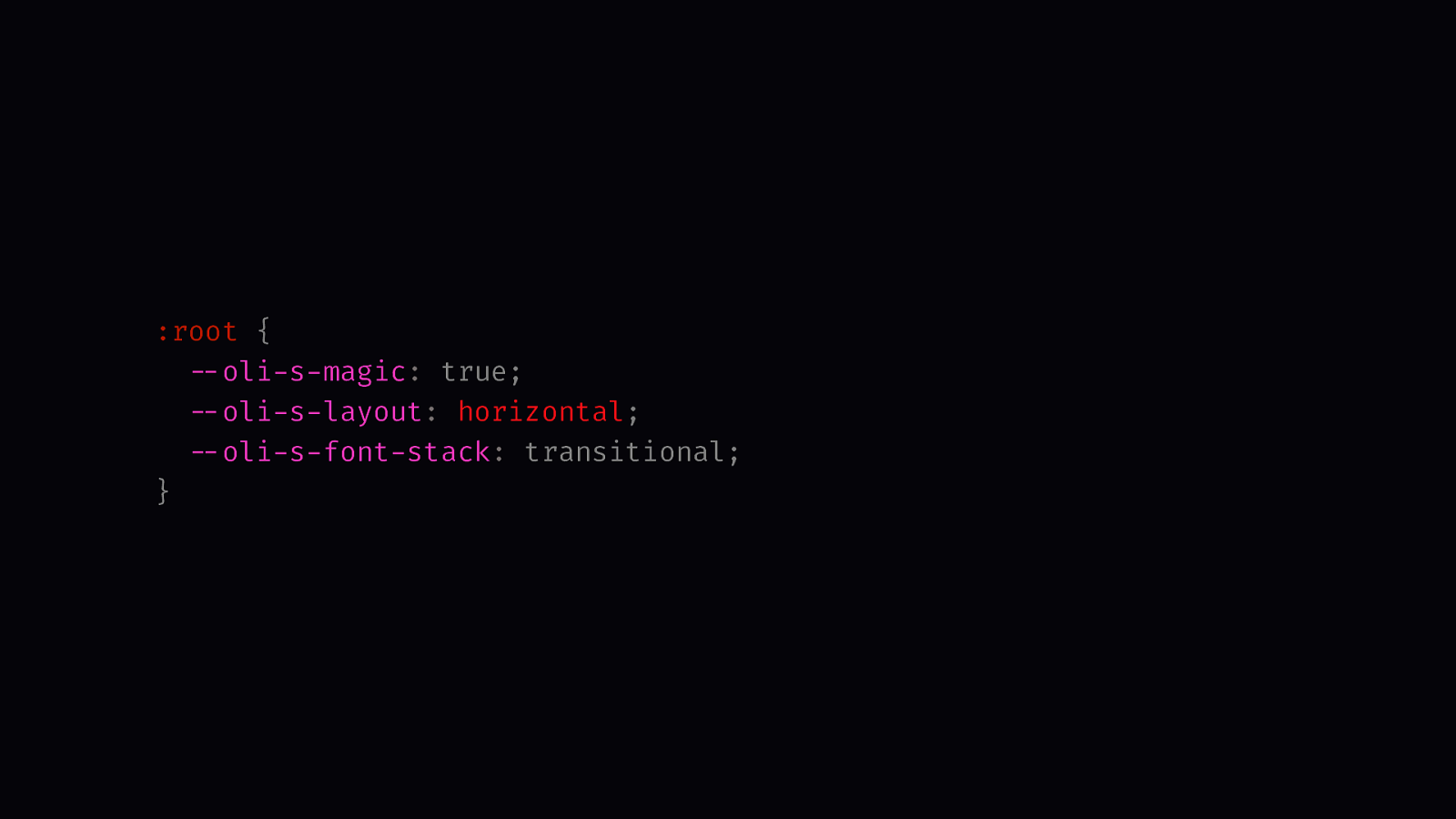
:root {
  --oli-s-magic: true;
  --oli-s-layout: horizontal;
  --oli-s-font-stack: transitional;
}
Right now, I have three settings: magic, one for layout that allows me to switch to a horizontal layout and one that allows me to switch the font stack.
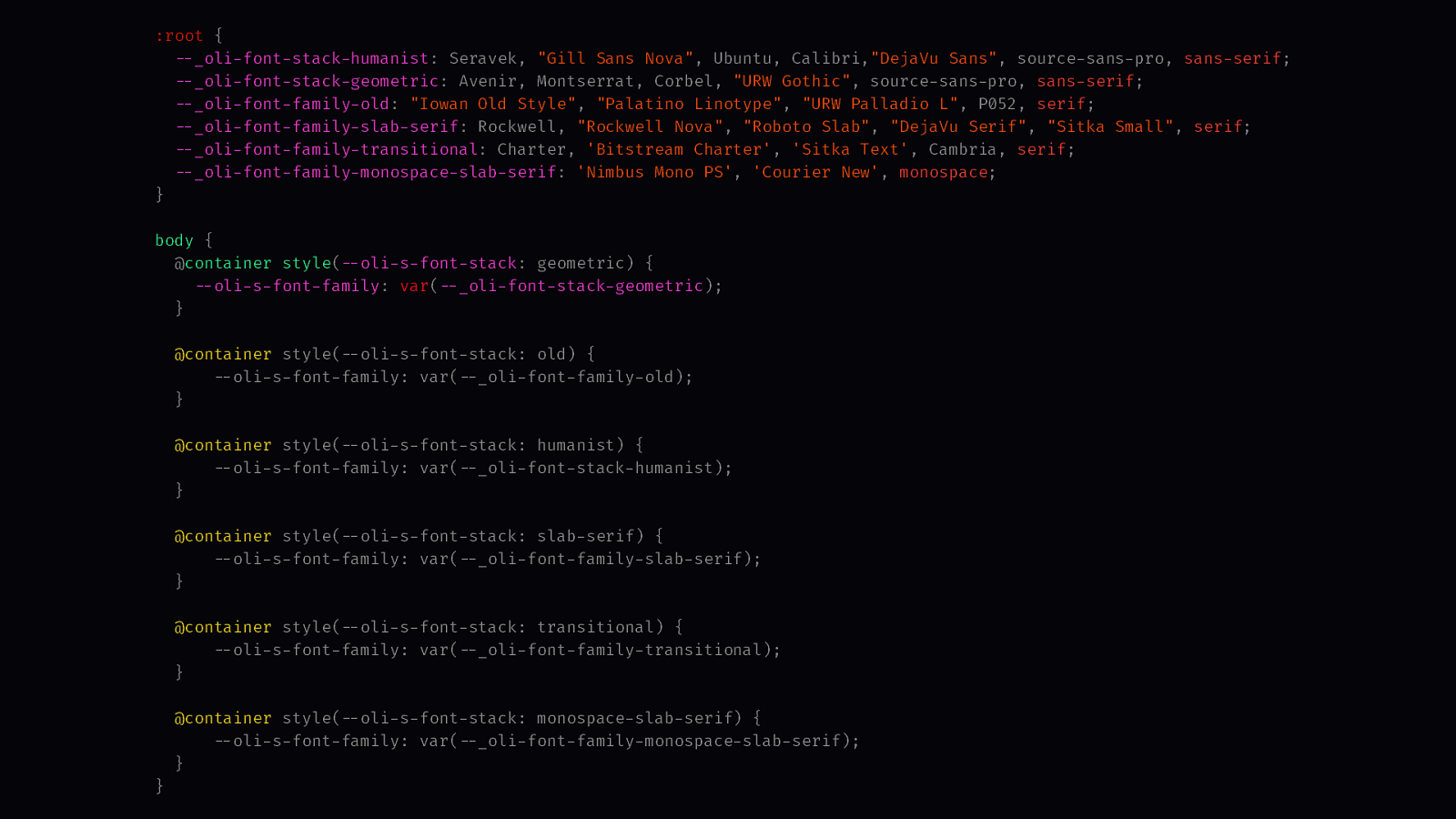
:root {
  --_oli-font-stack-humanist: Seravek, "Gill Sans Nova", Ubuntu, Calibri,"DejaVu Sans", source-sans-pro, sans-serif;
  --_oli-font-stack-geometric: Avenir, Montserrat, Corbel, "URW Gothic", source-sans-pro, sans-serif;
  --_oli-font-family-old: "Iowan Old Style", "Palatino Linotype", "URW Palladio L", P052, serif;
  --_oli-font-family-slab-serif: Rockwell, "Rockwell Nova", "Roboto Slab", "DejaVu Serif", "Sitka Small", serif;
  --_oli-font-family-transitional: Charter, 'Bitstream Charter', 'Sitka Text', Cambria, serif;
  --_oli-font-family-monospace-slab-serif: 'Nimbus Mono PS', 'Courier New', monospace;
}

body {
  @container style(--oli-s-font-stack: geometric) {
    --oli-s-font-family: var(--_oli-font-stack-geometric);
  }

  @container style(--oli-s-font-stack: old) {
      --oli-s-font-family: var(--_oli-font-family-old);
  }

  @container style(--oli-s-font-stack: humanist) {
      --oli-s-font-family: var(--_oli-font-stack-humanist);
  }

  @container style(--oli-s-font-stack: slab-serif) {
      --oli-s-font-family: var(--_oli-font-family-slab-serif);
  }

  @container style(--oli-s-font-stack: transitional) {
      --oli-s-font-family: var(--_oli-font-family-transitional);
  }

  @container style(--oli-s-font-stack: monospace-slab-serif) {
      --oli-s-font-family: var(--_oli-font-family-monospace-slab-serif);
  }
}
I’m using some of the font stacks from modernfontstacks.com. That’s basically a switch statement in CSS.
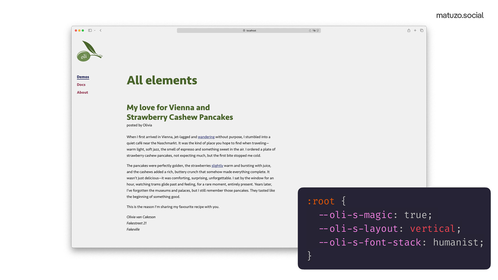
:root {
  --oli-s-magic: true;
  --oli-s-layout: vertical;
  --oli-s-font-stack: humanist;
}
The same site with two different settings. It still feels like the original but it has it’s own character.
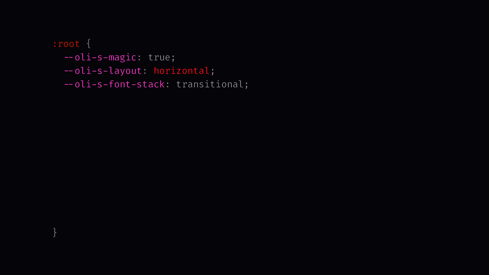
:root {
  --oli-s-magic: true;
  --oli-s-layout: horizontal;
  --oli-s-font-stack: transitional;
  --oli-s-scroll-behavior: smooth;
  --oli-s-page-max-width: 80rem;
  --oli-s-page-width: 100%;
  --oli-s-page-start-column-width: 16rem;
  --oli-s-page-text-scale: 1.4;
  --oli-s-page-line-height: 1.7;
  --oli-s-page-padding: 2rem;
  --oli-s-page-background-color: var(--oli-g-colors-color-5);
  --oli-s-page-color: var(--oli-g-colors-black);
  --oli-s…
}
On top of my three custom properties with made-up values I also have a bunch of properties that I use directly without querying them. That gives me a high level of customisation.
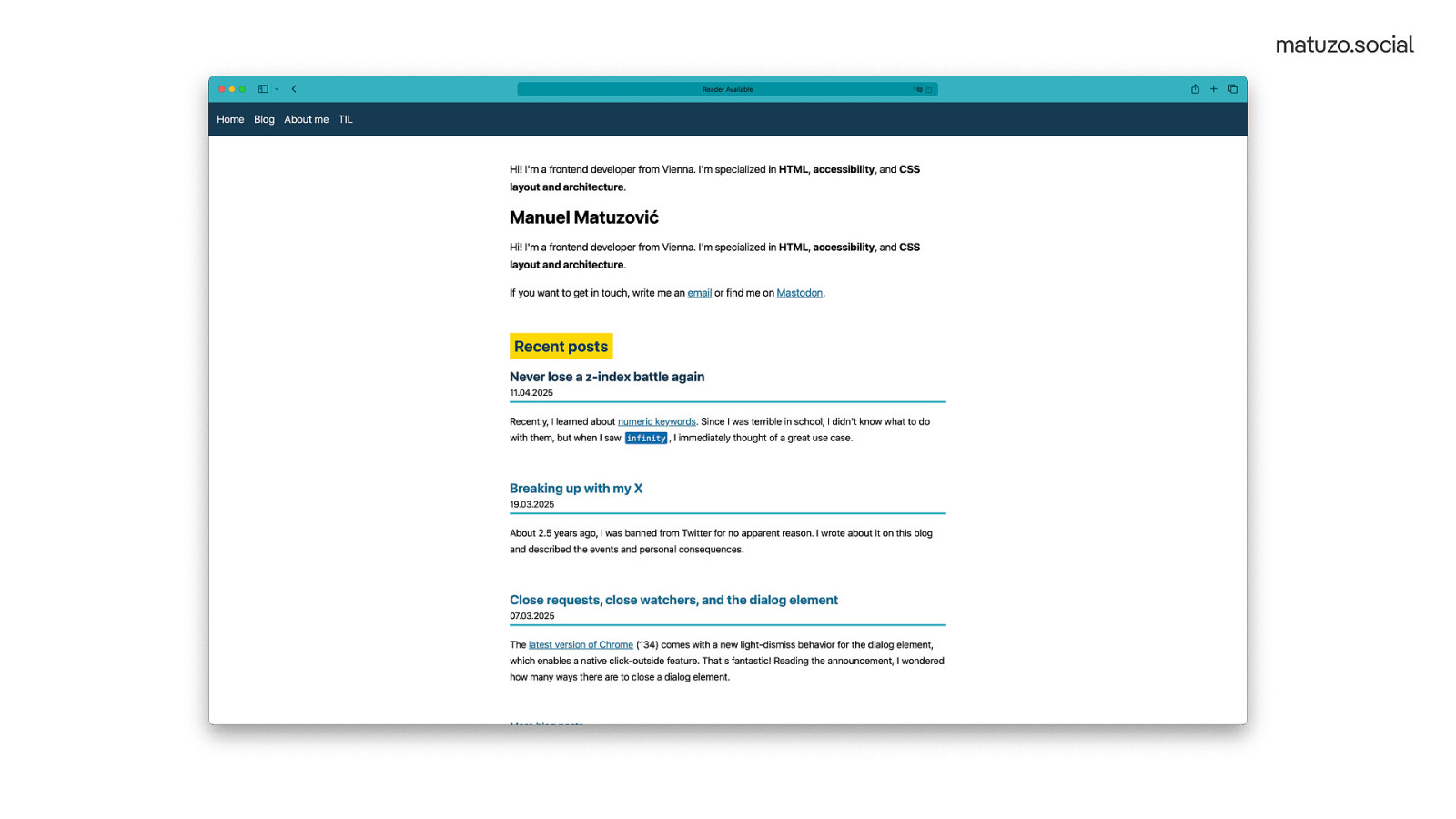
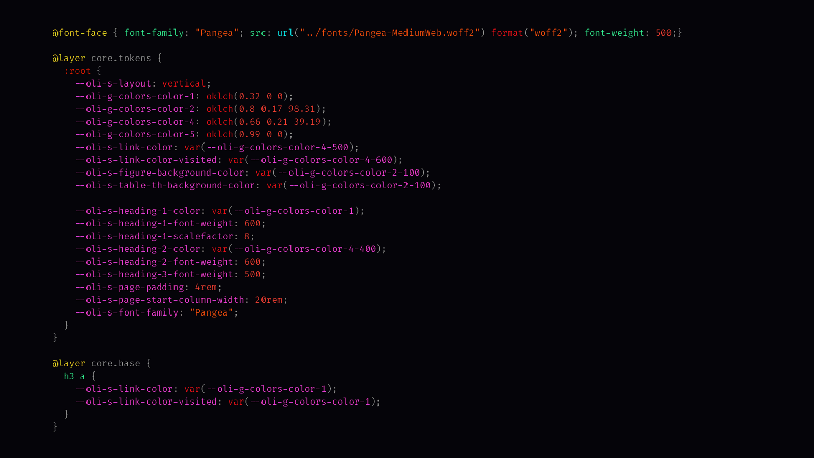
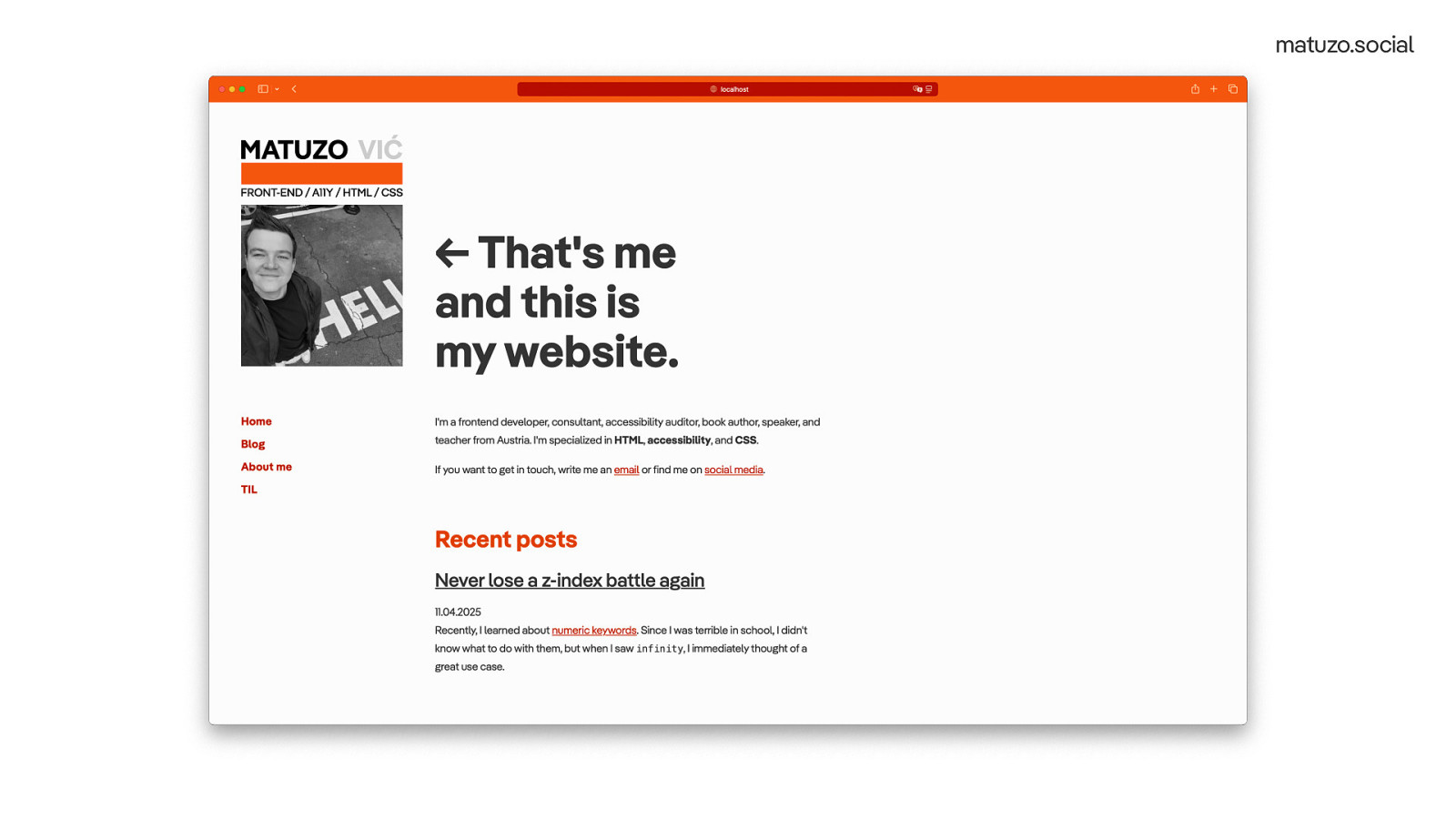
In order to test how well that works I took my existing website, removed the CSS and made some minor changes to the markup.
@font-face {
  font-family: "Pangea"; src: url("../fonts/Pangea-MediumWeb.woff2") format("woff2");
  font-weight: 500;
}

@layer core.tokens {
  :root {
    --oli-s-layout: vertical;
    --oli-g-colors-color-1: oklch(0.32 0 0);
    --oli-g-colors-color-2: oklch(0.8 0.17 98.31);
    --oli-g-colors-color-4: oklch(0.66 0.21 39.19);
    --oli-g-colors-color-5: oklch(0.99 0 0);
    --oli-s-link-color: var(--oli-g-colors-color-4-500);
    --oli-s-link-color-visited: var(--oli-g-colors-color-4-600);
    --oli-s-figure-background-color: var(--oli-g-colors-color-2-100);
    --oli-s-table-th-background-color: var(--oli-g-colors-color-2-100);

    --oli-s-heading-1-color: var(--oli-g-colors-color-1);
    --oli-s-heading-1-font-weight: 600;
    --oli-s-heading-1-scalefactor: 8;
    --oli-s-heading-2-color: var(--oli-g-colors-color-4-400);
    --oli-s-heading-2-font-weight: 600;
    --oli-s-heading-3-font-weight: 500;
    --oli-s-page-padding: 4rem;
    --oli-s-page-start-column-width: 20rem;
    --oli-s-font-family: "Pangea";
  }
}

@layer core.base {
  h3 a {
    --oli-s-link-color: var(--oli-g-colors-color-1);
    --oli-s-link-color-visited: var(--oli-g-colors-color-1);
  }
}
Than I changed some of the settings, like the layout, color, paddings, and font weights.
And that’s how my existing website looks like with custom settings and without touching the markup significantly. I really wanted to make it easy to customise the styling of the page. Just like Big K.R.I.T. did in his song…
[ Played a sample of the song “Make It Easy” by Big K.R.I.T] Listen to it on Youtube (https://youtu.be/VQAU6z856Ks) In this song he sampled…
[ Played a sample of the song “Make It Easy On Yourself” by The Walker Brothers] Listen to it on Youtube (https://youtu.be/bZTS9H-l5qQ)
For the music nerds. Yes, I know, this version is not the original. It’s a cover of Jerry Butlers song, released in 1962.
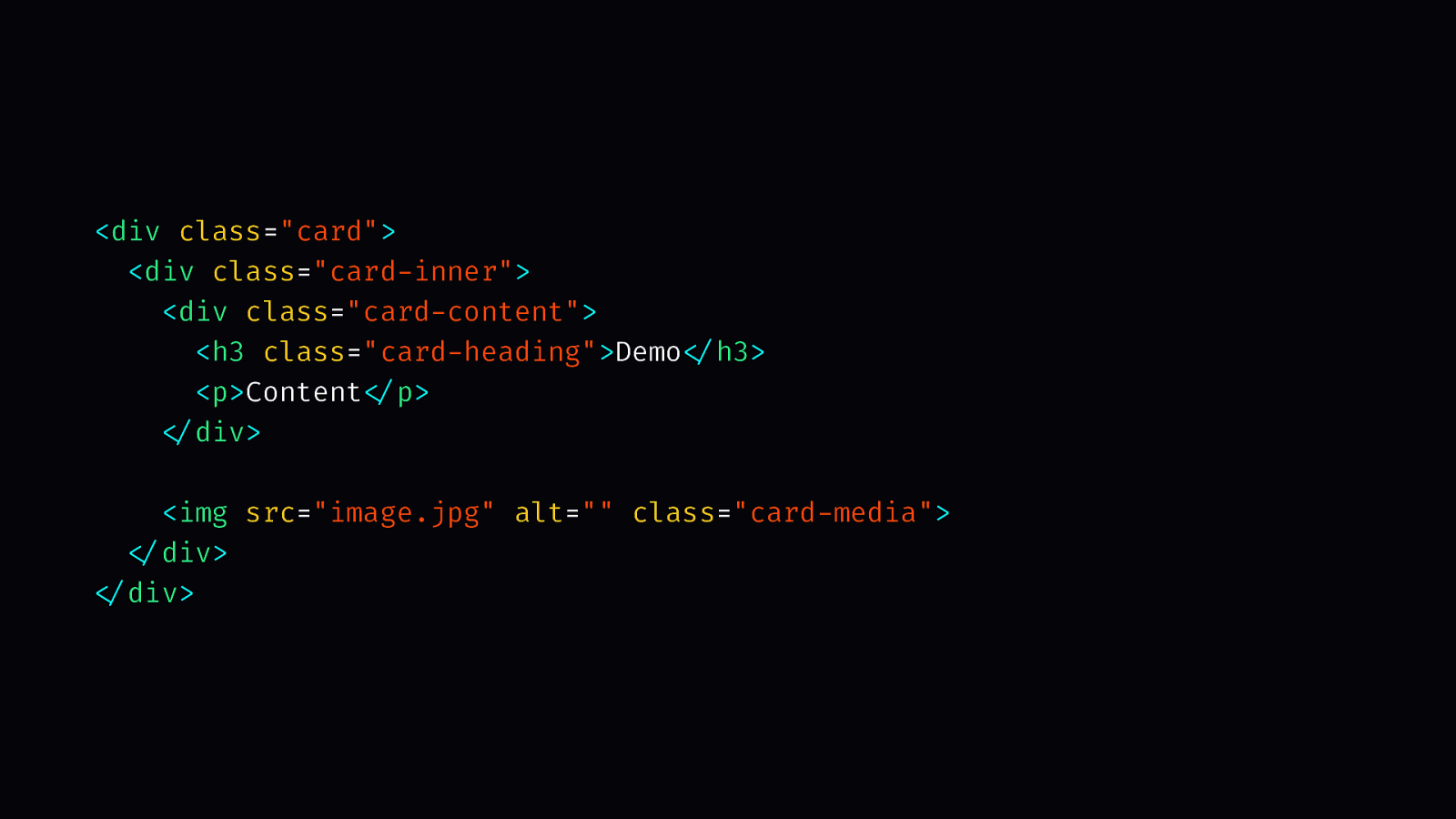
I didn’t come up with that on my own. Of course, I was inspired by the amazing Lea Verou. In a presentation of hers, she talked about how custom properties can replace presentational attributes and classes for components. Here’s an example.
<div class="card">
  <div class="card-inner">
    <div class="card-content">
      <h3 class="card-heading">Demo</h3>
      <p>Content</p>
    </div>

    <img src="image.jpg" alt="" class="card-media">
  </div>
</div>
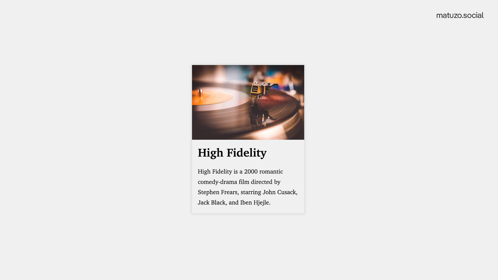
Let’s say we have a good old card component. Heading, some content, and an image.
That’s how it looks like: An image followed by a heading and text.
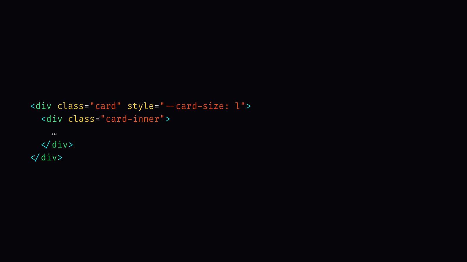
<div class="card" style="--card-size: l">
  <div class="card-inner">
    …
  </div>
</div>
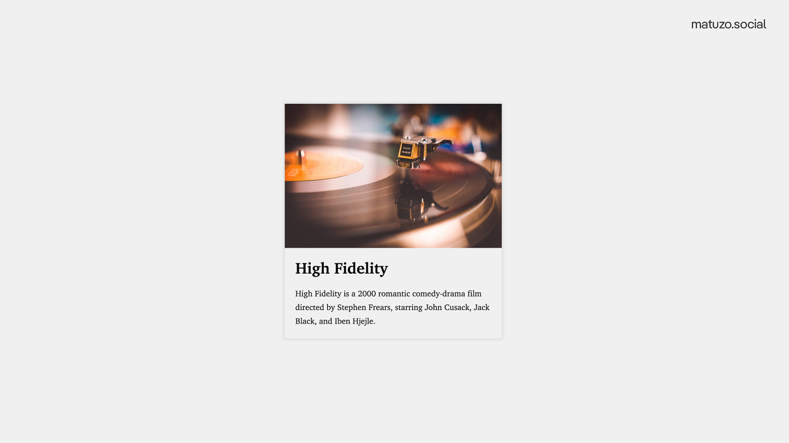
If we want a larger variation of the same component, we set —card-size: l;
And then we get a slightly larger card.
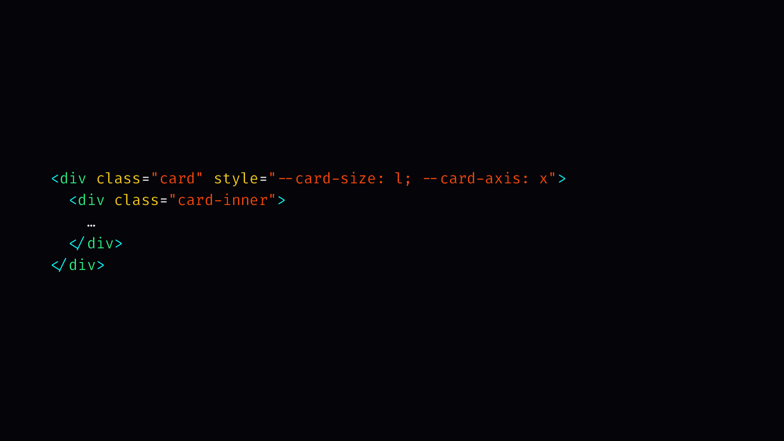
<div class="card" style="--card-size: l; --card-axis: x">
  <div class="card-inner">
    …
  </div>
</div>
We can also change the layout by defining another property, —card-axis: x;
That changes the layout and puts the image on the left and the content on the right.
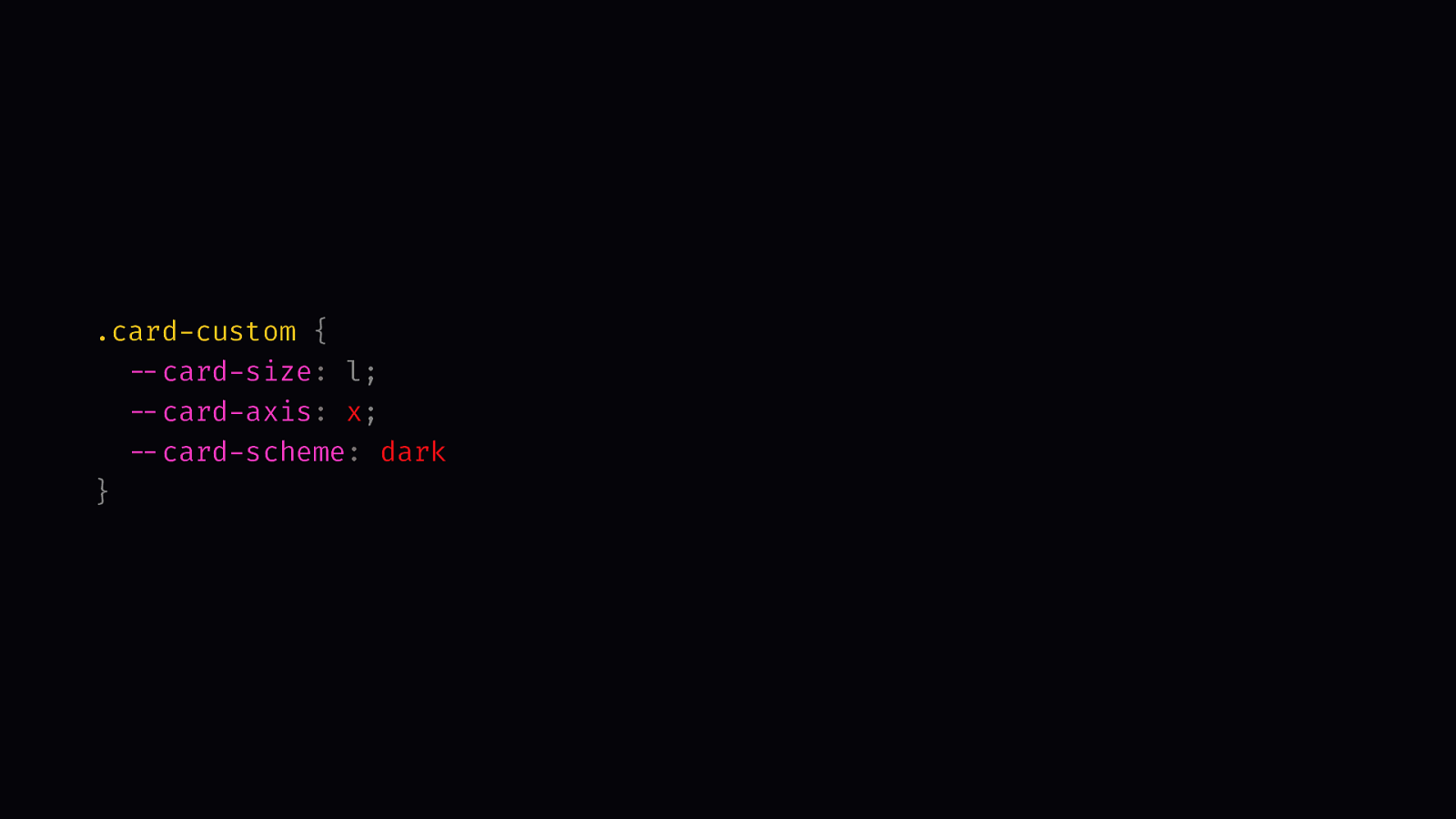
.card-custom {
  --card-size: l;
  --card-axis: x;
  --card-scheme: dark
}
The big difference is that we’re not redeclaring random properties, we’re configuring our predefined settings for the component. There are also other advantages.
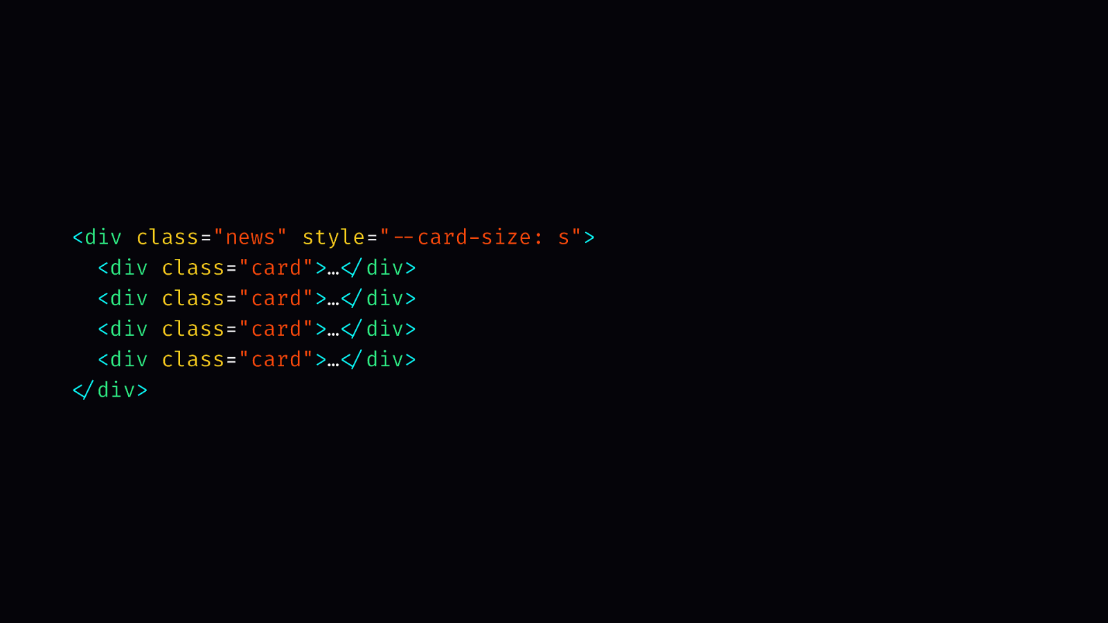
<div class="news" style="--card-size: s">
  <div class="card">…</div>
  <div class="card">…</div>
  <div class="card">…</div>
  <div class="card">…</div>
</div>
Of course, working with classes is still fine, that’s not the point, but one of the advantages of using custom properties is inheritance. If you want all items in a parent item so adapt a certain size, for example, you can define the size on the parent and the children will react to it.
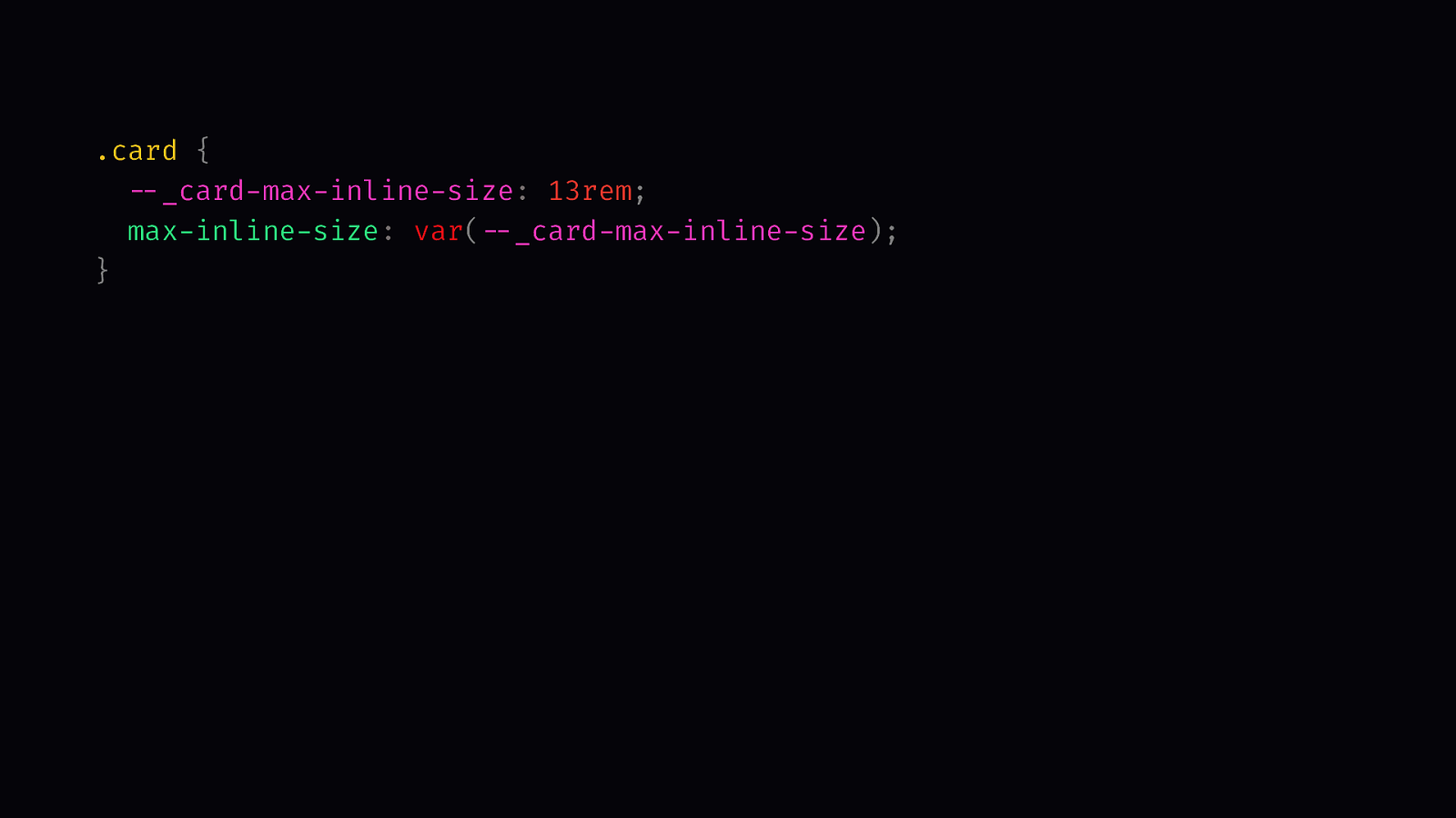
.card {
  --_card-max-inline-size: 13rem;
  max-inline-size: var(--_card-max-inline-size);
}

@media (min-width: 48rem) {
  .card {
    --_card-max-inline-size: 23rem;
  }
}

.card--large {
  --_card-max-inline-size: 23rem;
}
Another advantage is that you can write DRYer code. Let’s say you define a max-width for the card. On larger screen you increase the max-width. You do the same in a custom class. You have to define the value once for the media query and than repeat it for the custom class.
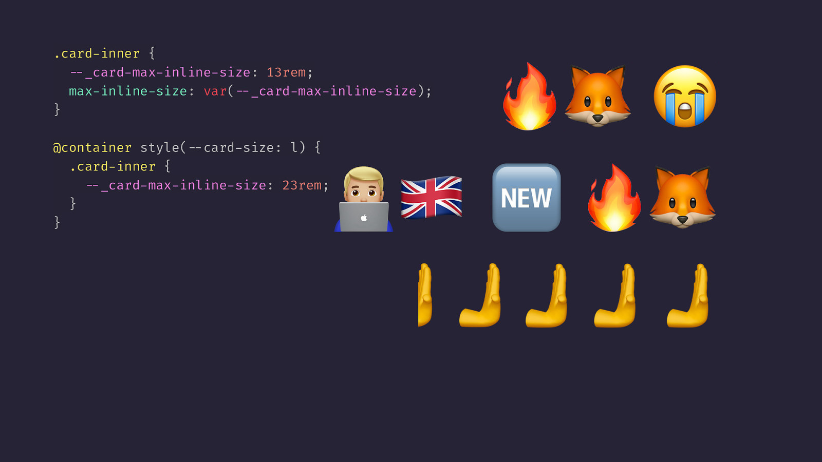
.card-inner {
  --_card-max-inline-size: 13rem;
  max-inline-size: var(--_card-max-inline-size);
}

@container style(--card-size: l) {
  .card-inner {
    --_card-max-inline-size: 23rem;
  }
}

@media (min-width: 48rem) {
  .card {
     --card-size: l;
  }
}

.card--large {
  --card-size: l;
}
With container style queries you define the value once and than you just repeat the setting. That’s very similar to using mixins.
The only downside is that it doesn’t work in Firefox at the moment, but maybe there’s someone in the audience today who recently started working at Firefox, who can push this topic for us. Pu-pu-push it, Pu-pu-push it real good
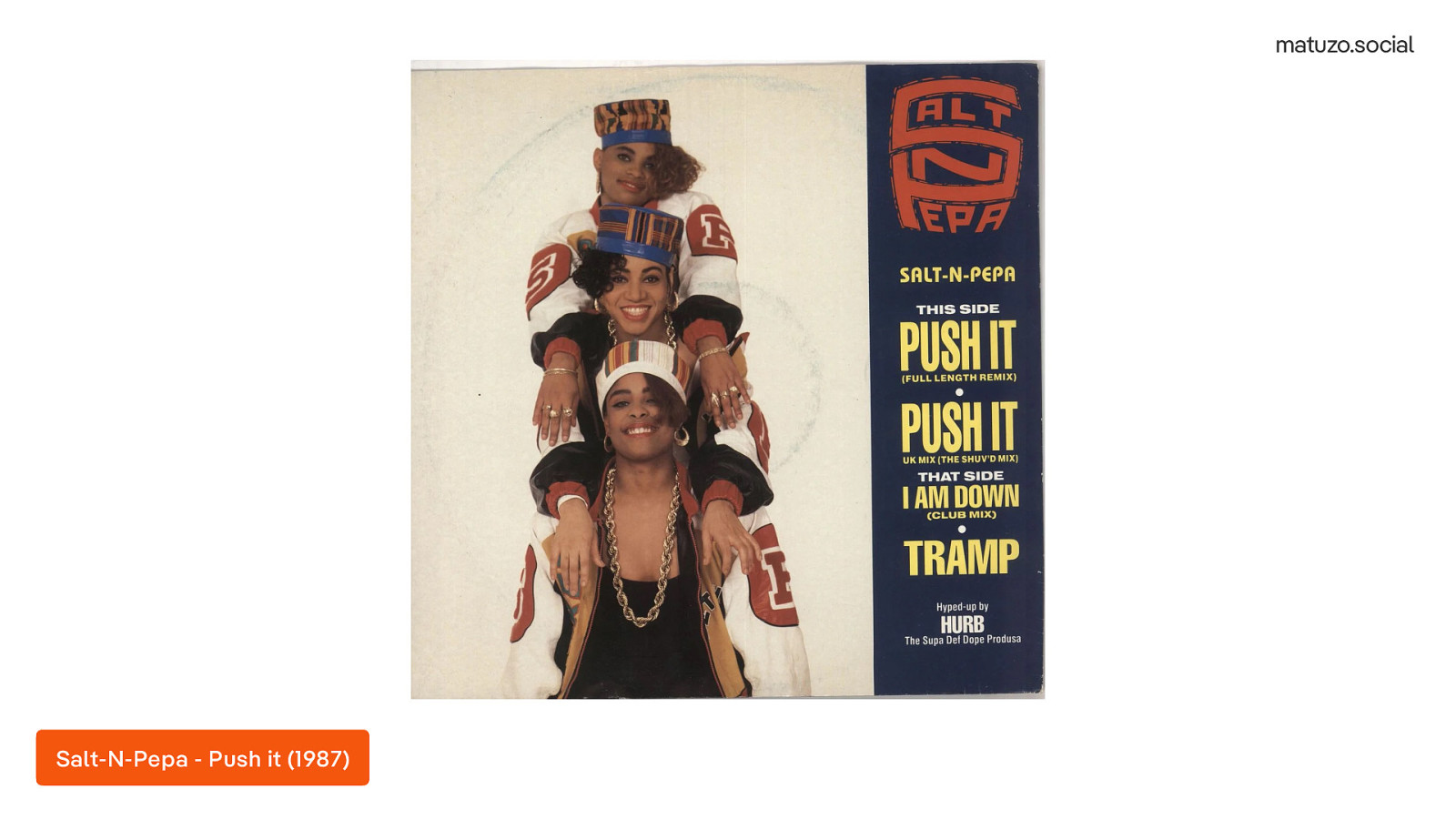
[ Played a sample of the song “Push it” by Salt-N-Pepa] Listen to it on Youtube (https://youtu.be/vCadcBR95oU) They sampled many song but one of them is…
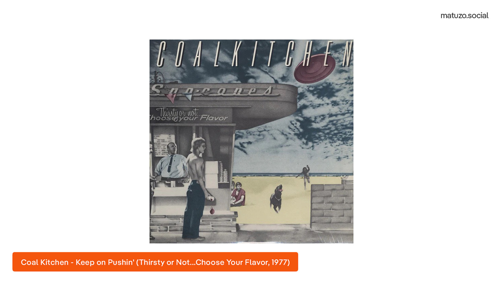
[ Played a sample of the song “Keep on Pushin’” by Coal Kitchen] Listen to it on Youtube (https://youtu.be/Zgo1L05t6uU?) Keep on Pushin’ by Coal Kitchen
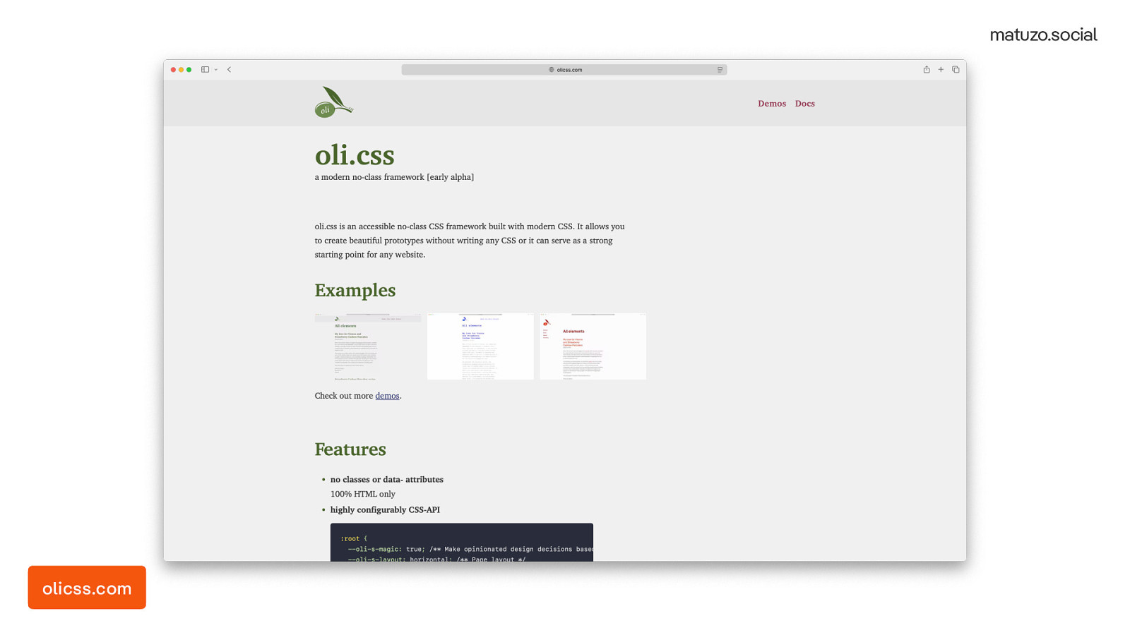
Initially I planned to release the project for this event but I didn’t manage to finish it in time. Still, I put it online so that I don’t disappoint you. You can check it out and download it. Please just keep in mind it’s not production ready. It’s named after one of my daughters but I have three so two more projects based on oli.css will follow, a HTML/CSS component library (phili.css) and a web component library (Hanni).
olicss.com
Thank you! ❤
Thank you!

Some new features in CSS only show their real potential when we radically break with old habits. Doing that on an existing website is almost impossible. That’s why Manuel built a new project from scratch with modern CSS and questioned every line of code he wrote.
In this talk, he presents what he has learned and encourages you to review your best practices.


 for free. You
can too.
for free. You
can too.