Custom Properties: The Secret Ingredients for CSS Magic

A presentation at SmashingConf Live in August 2020 in by Michelle Barker

Slide 1

Slide 1

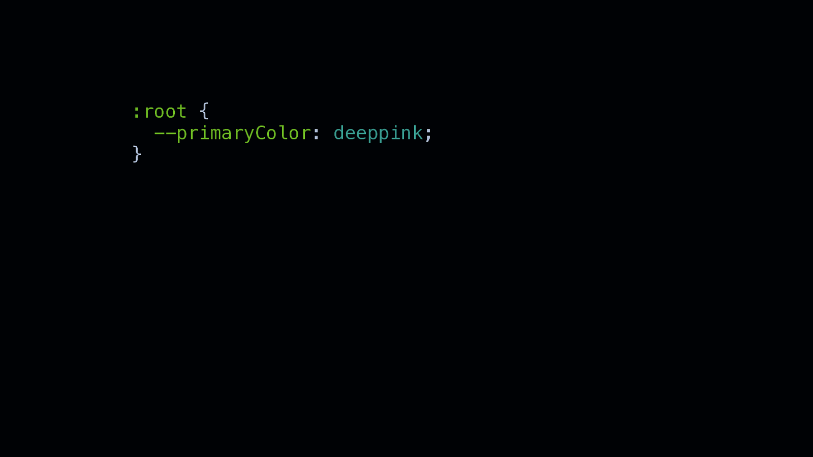
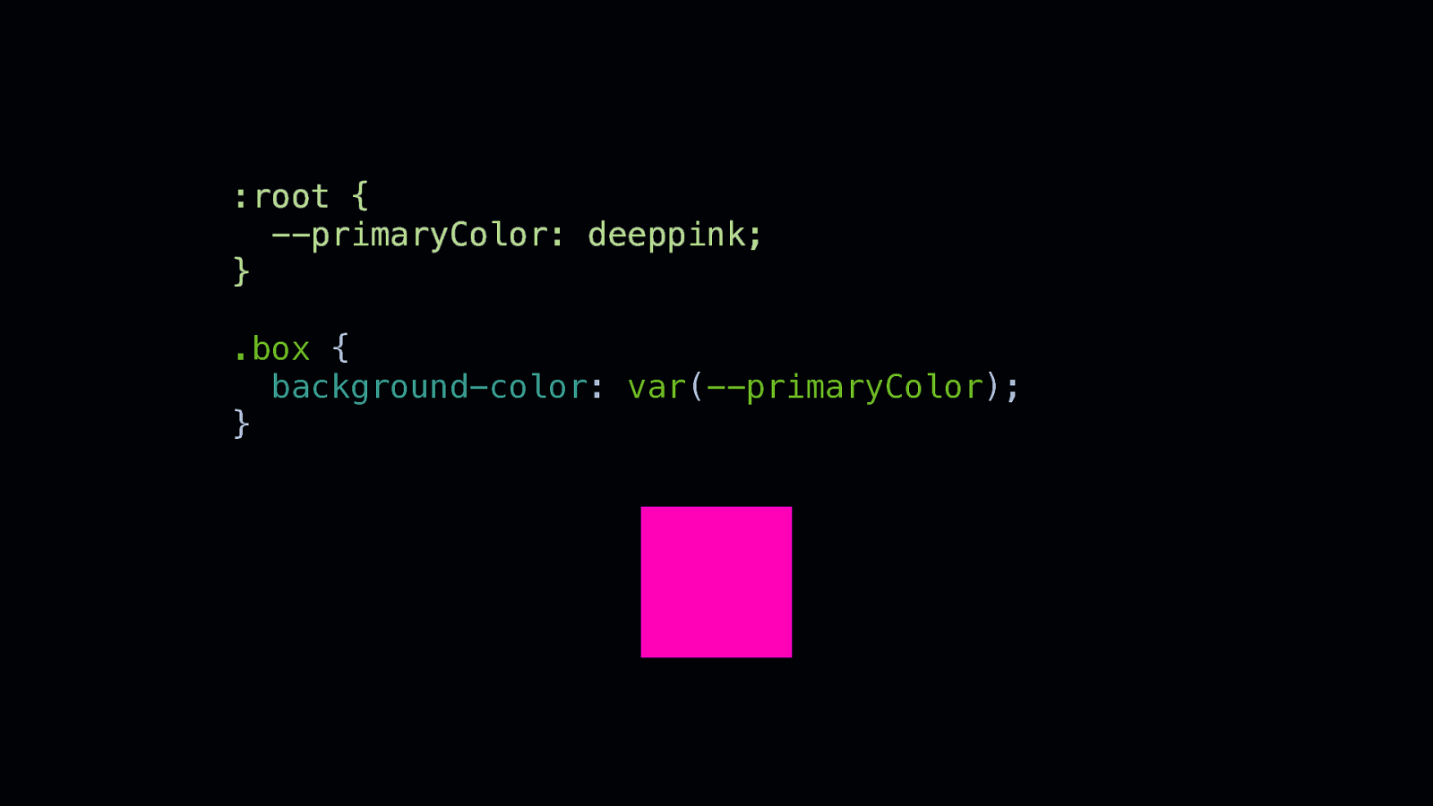
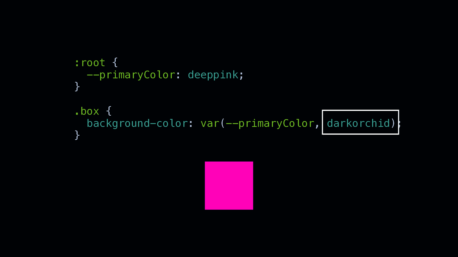
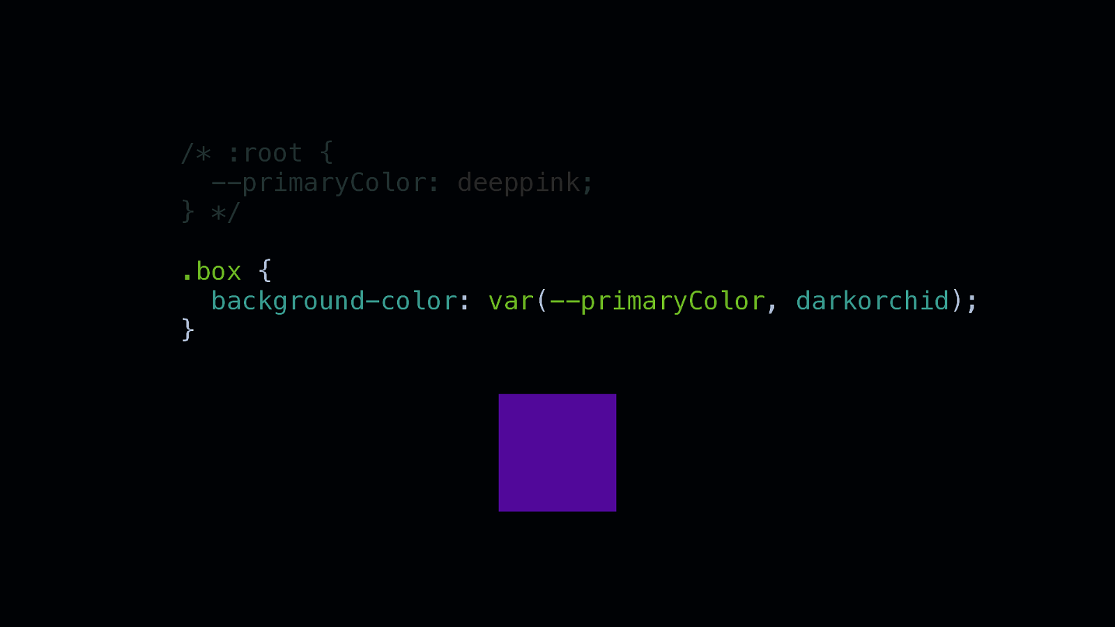
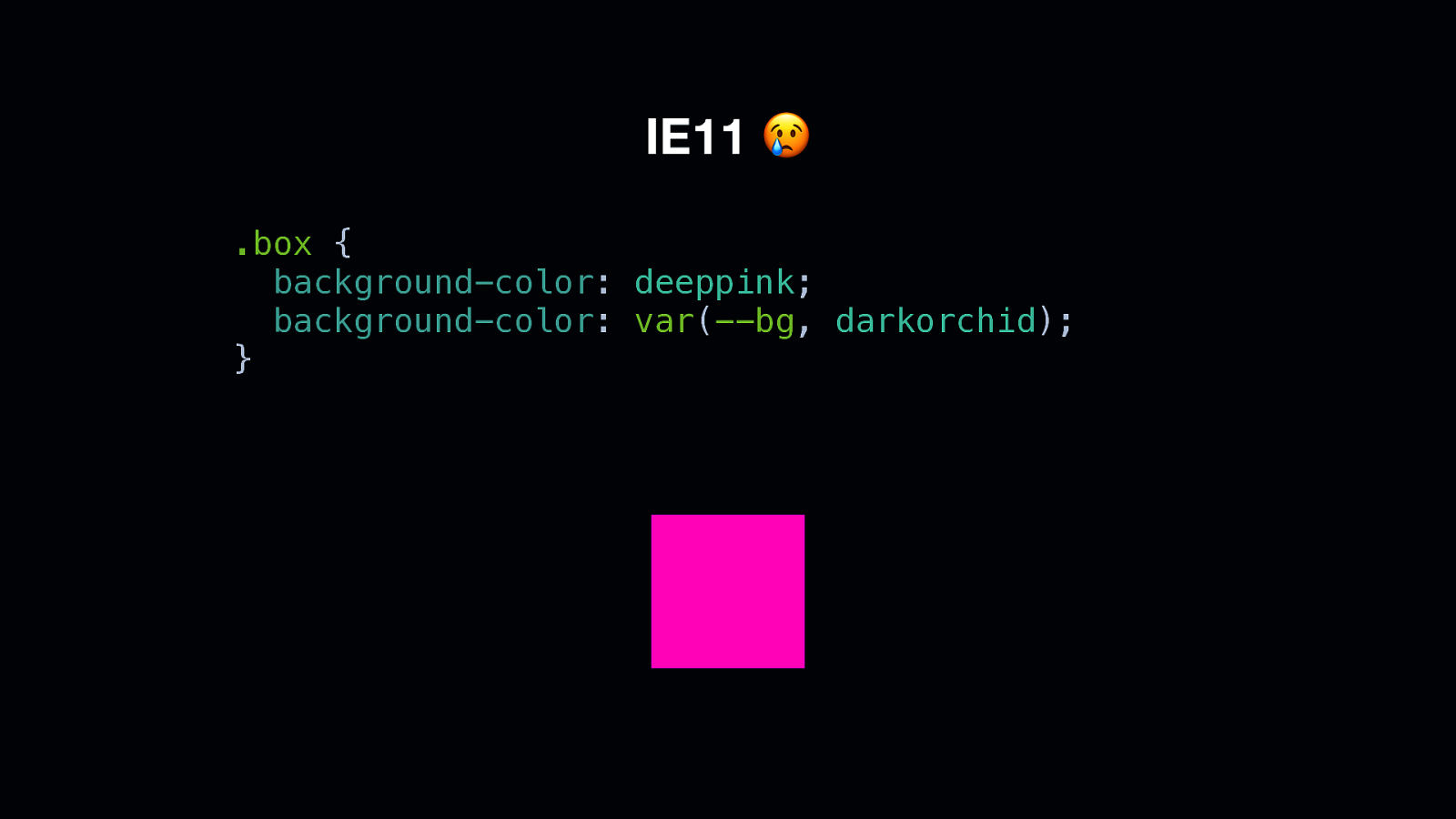
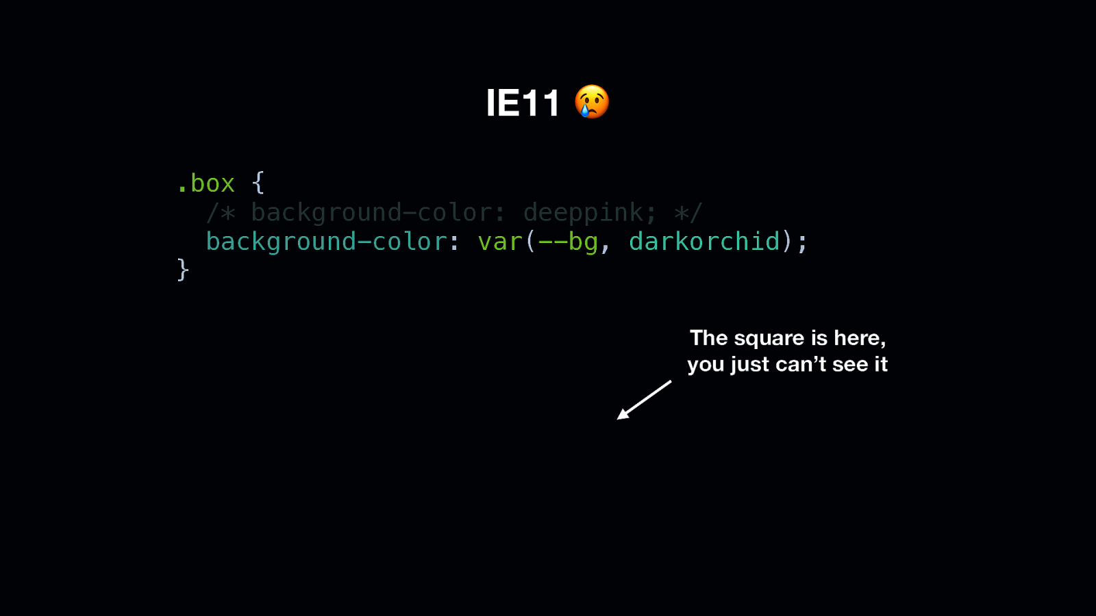
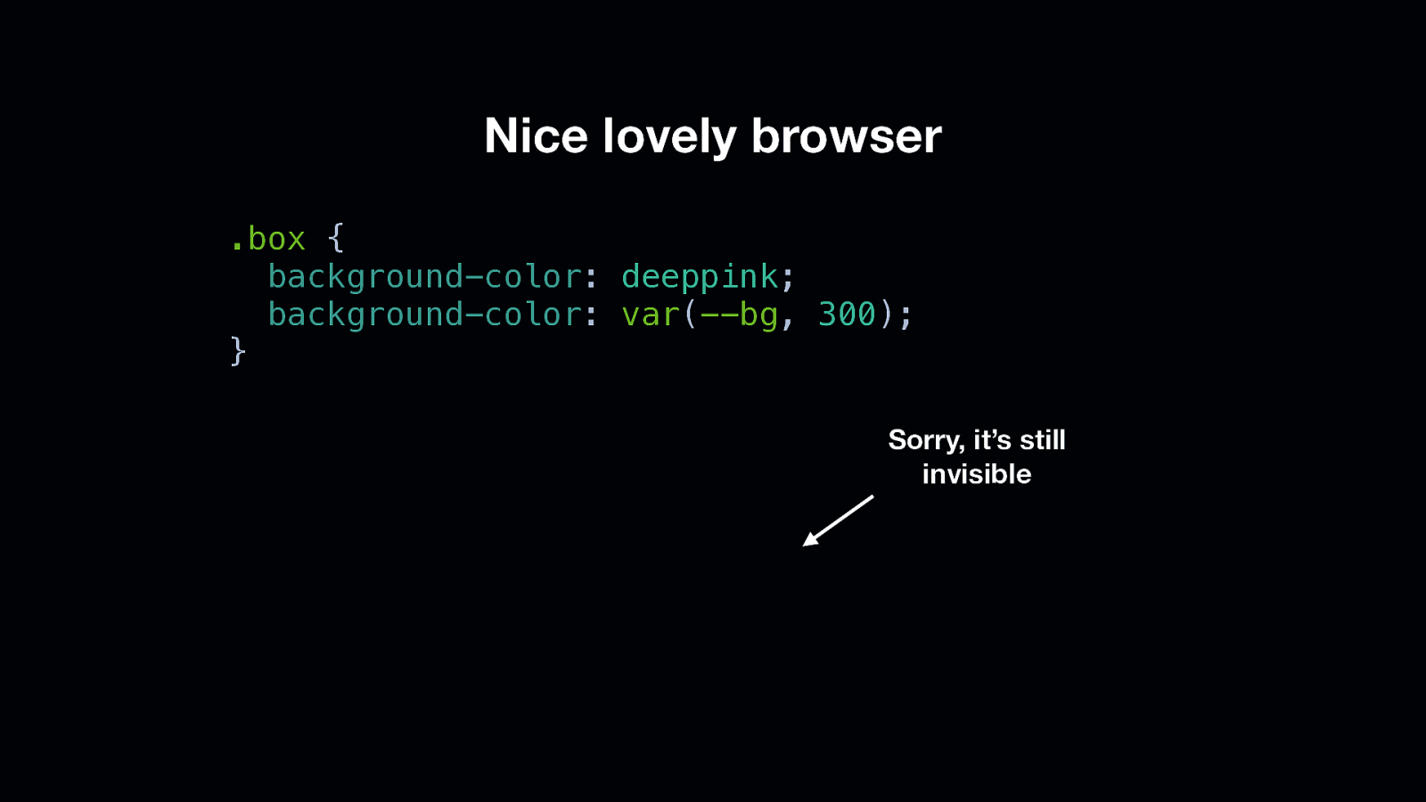
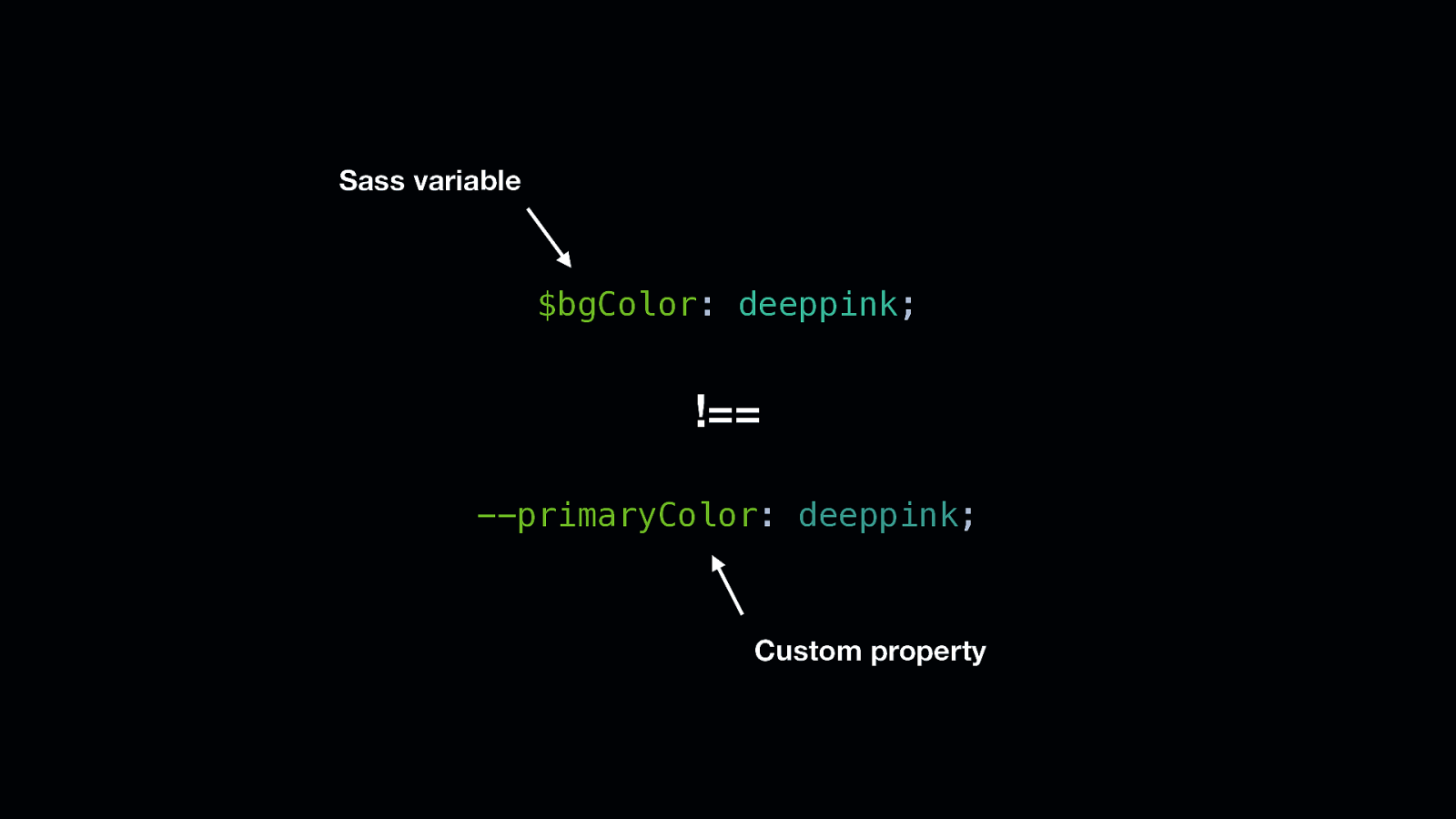
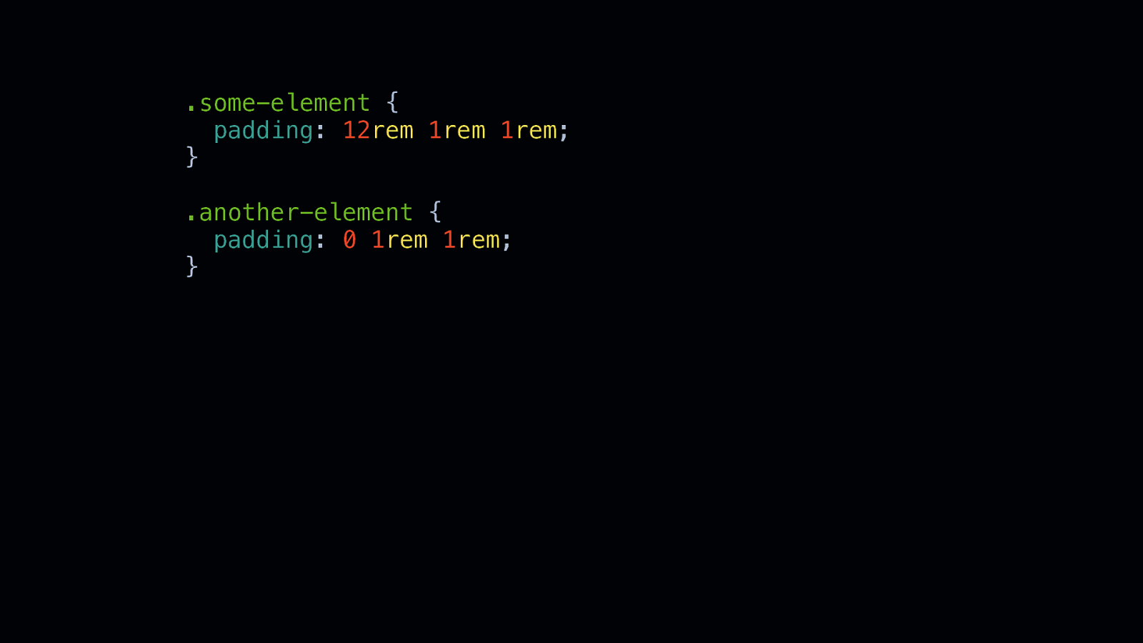
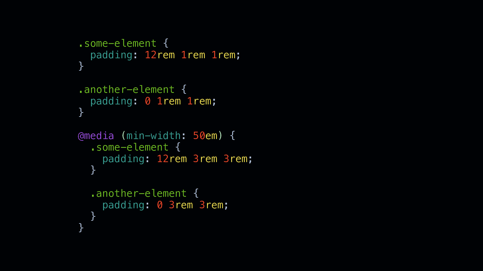
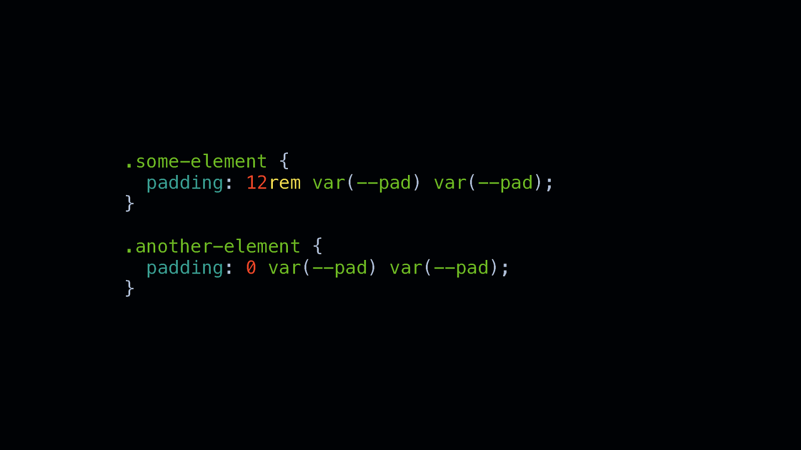
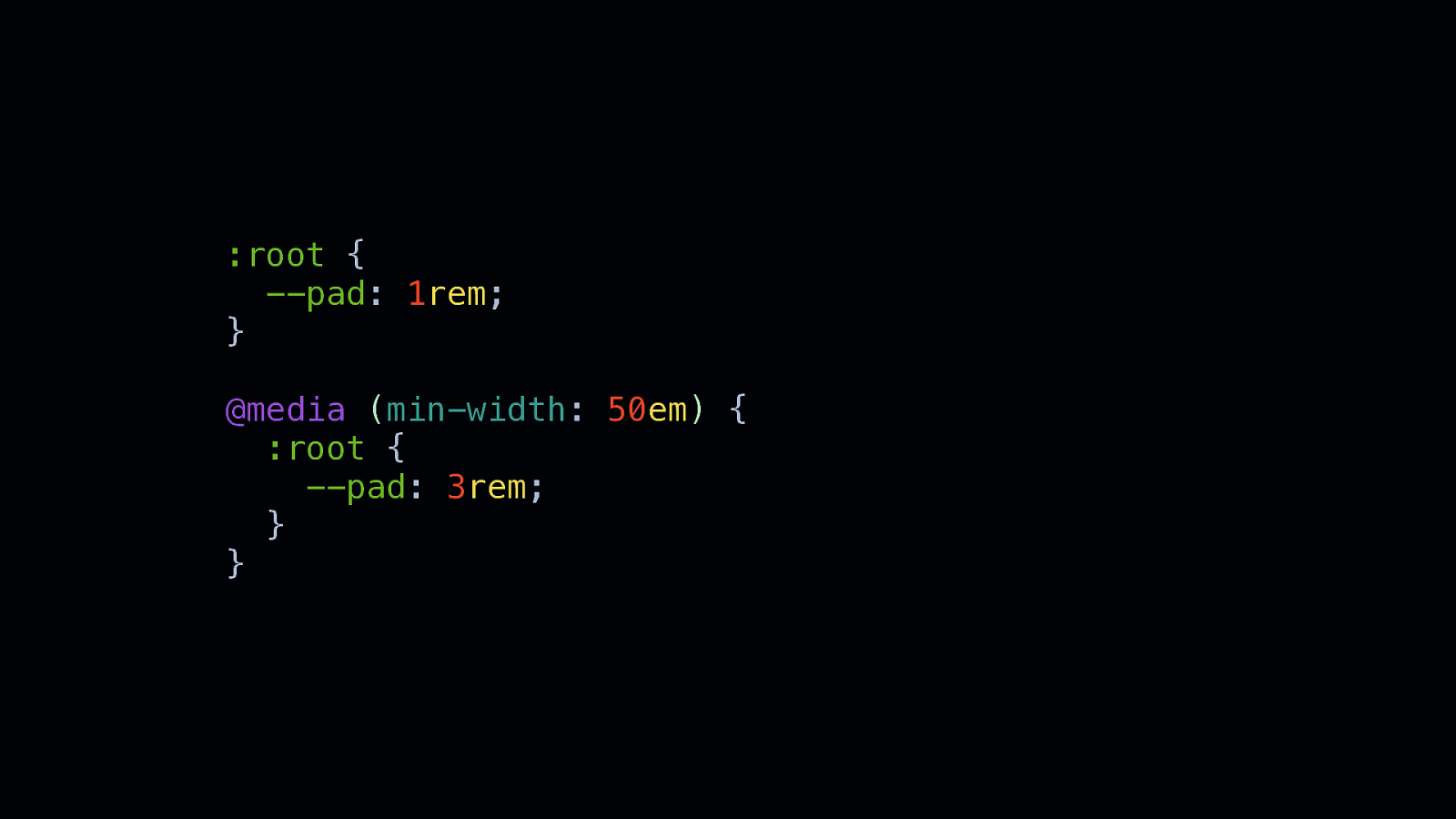
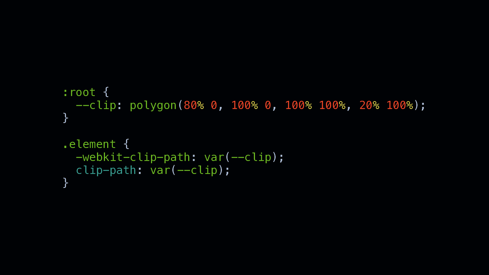
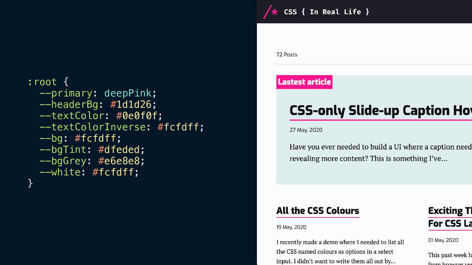
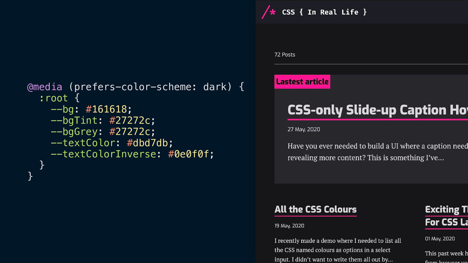
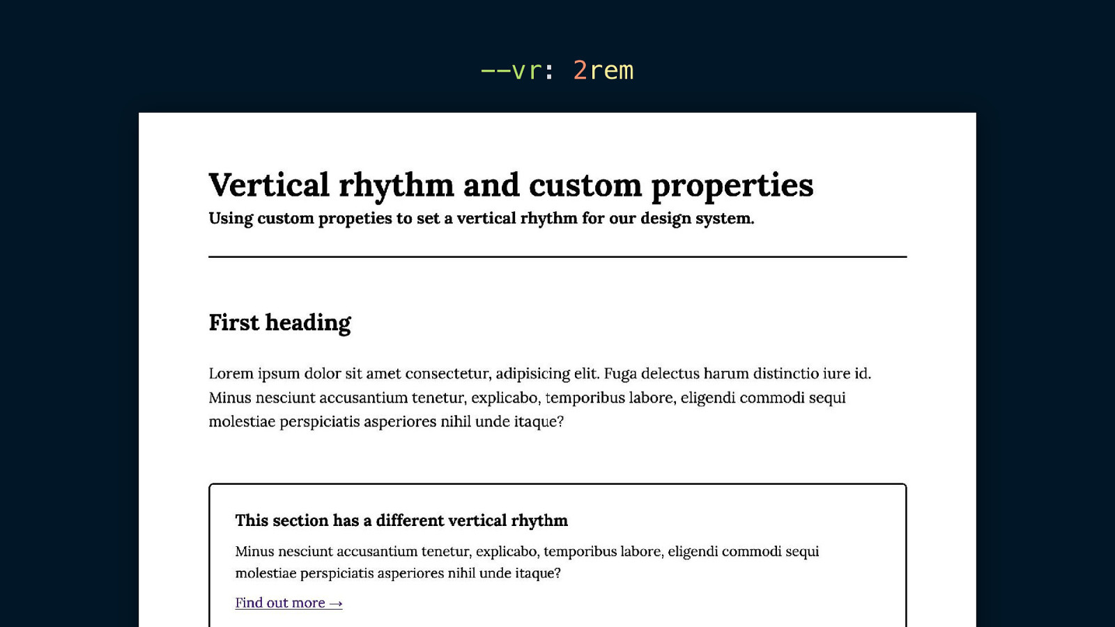
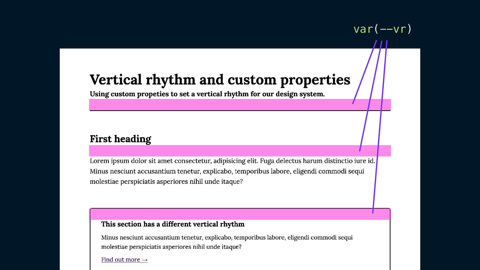
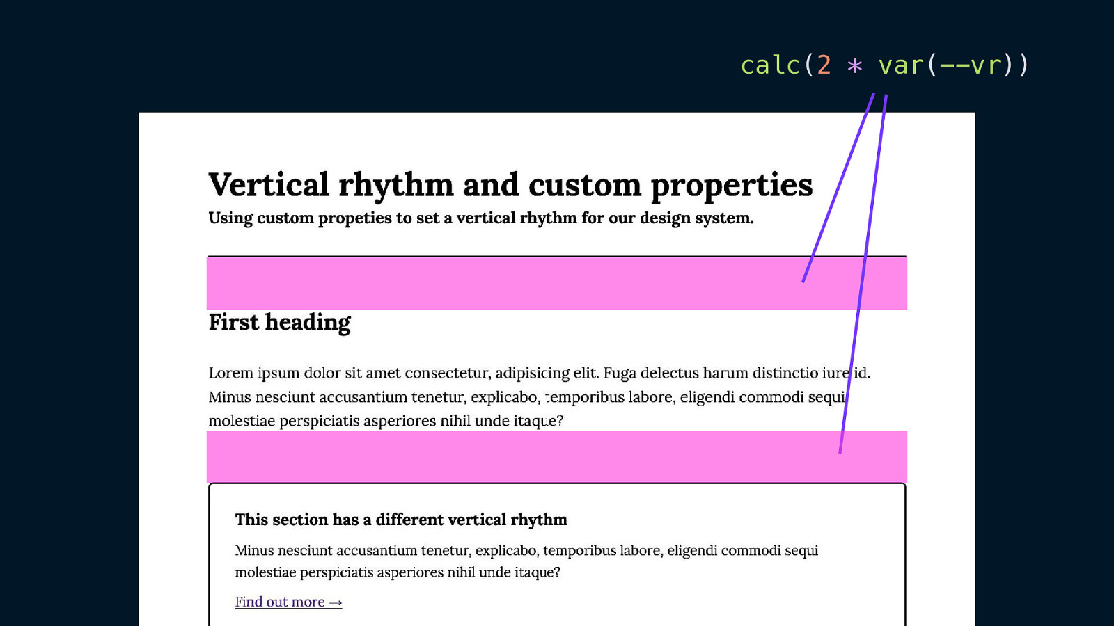
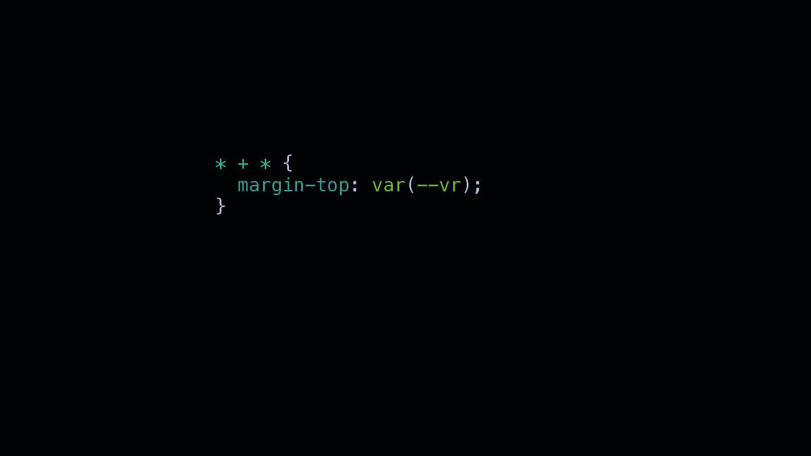
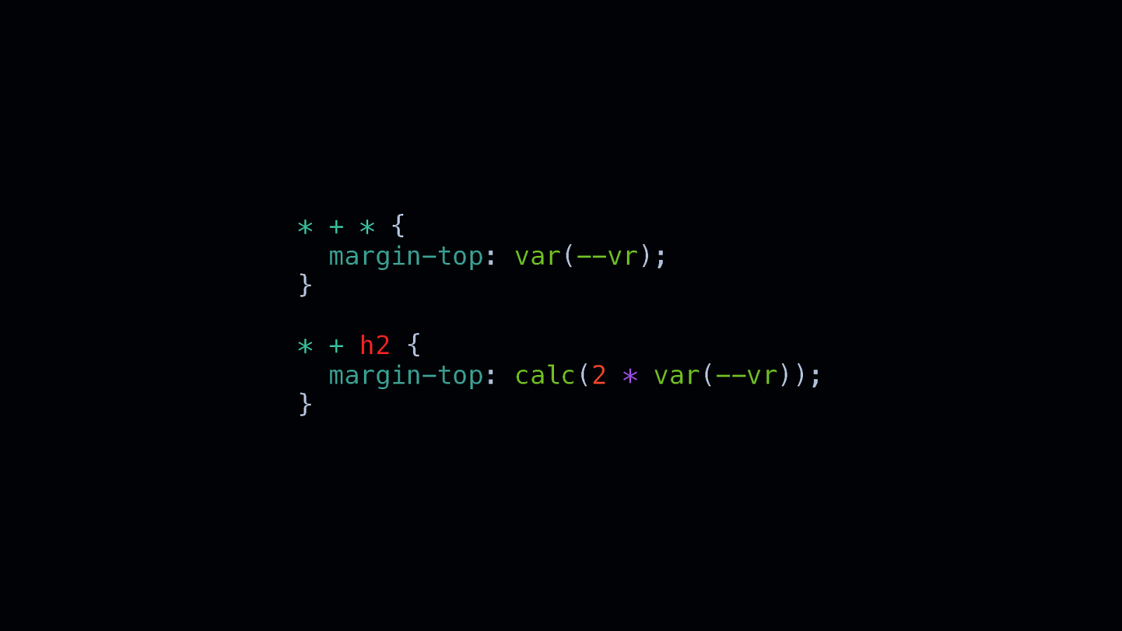
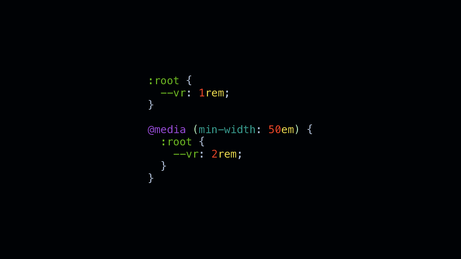
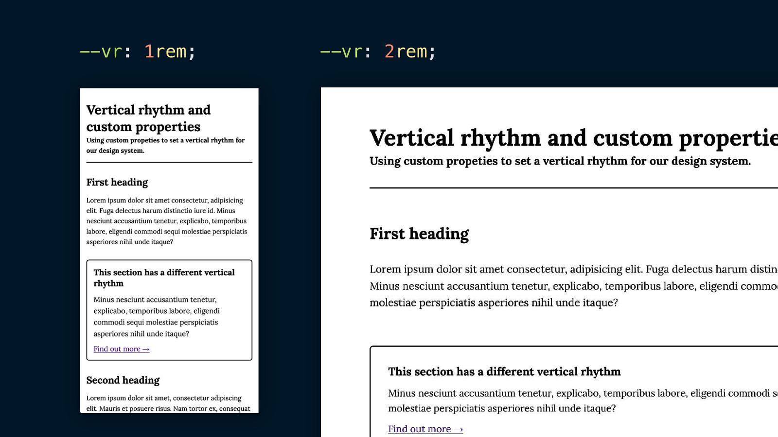
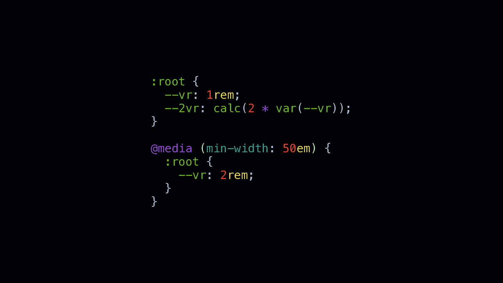
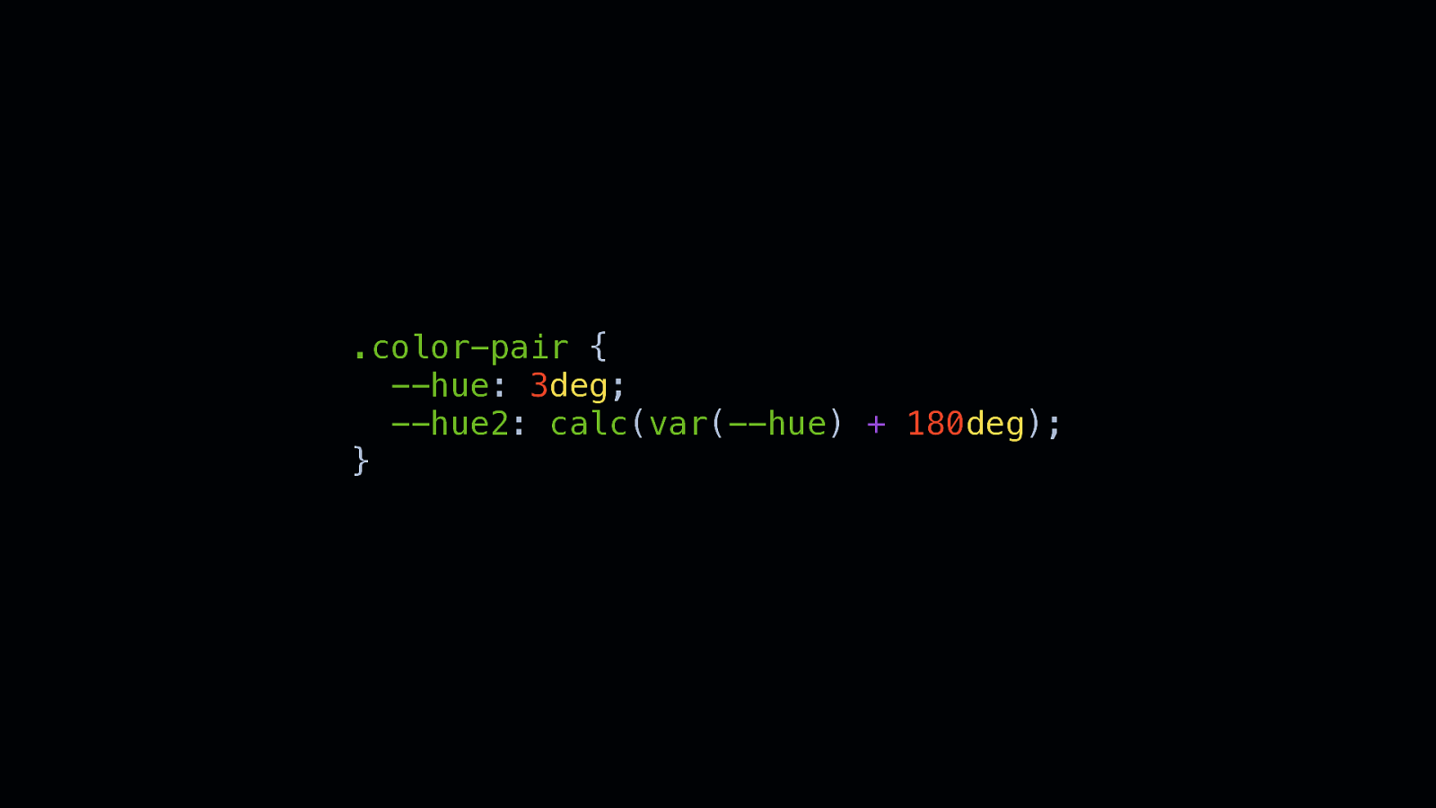
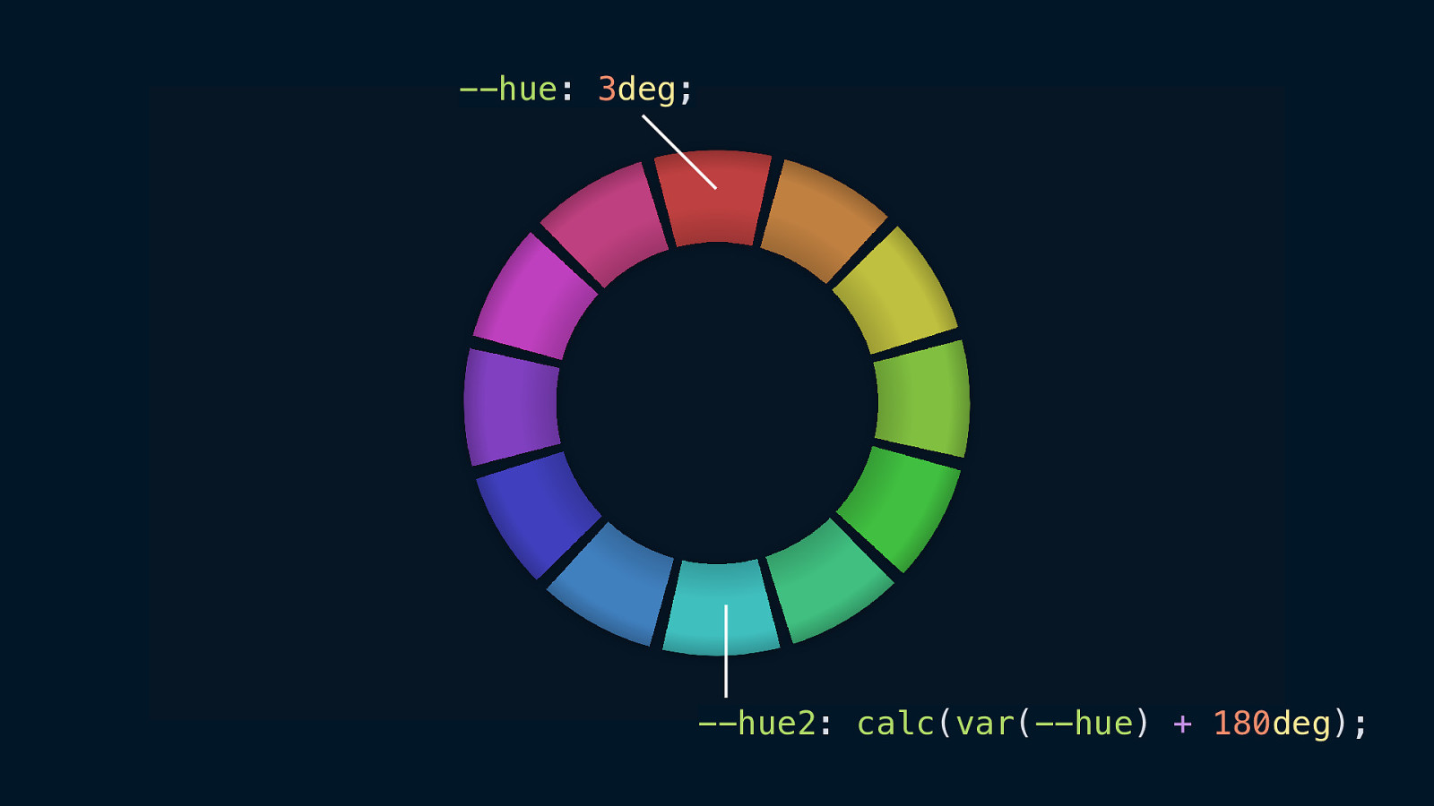
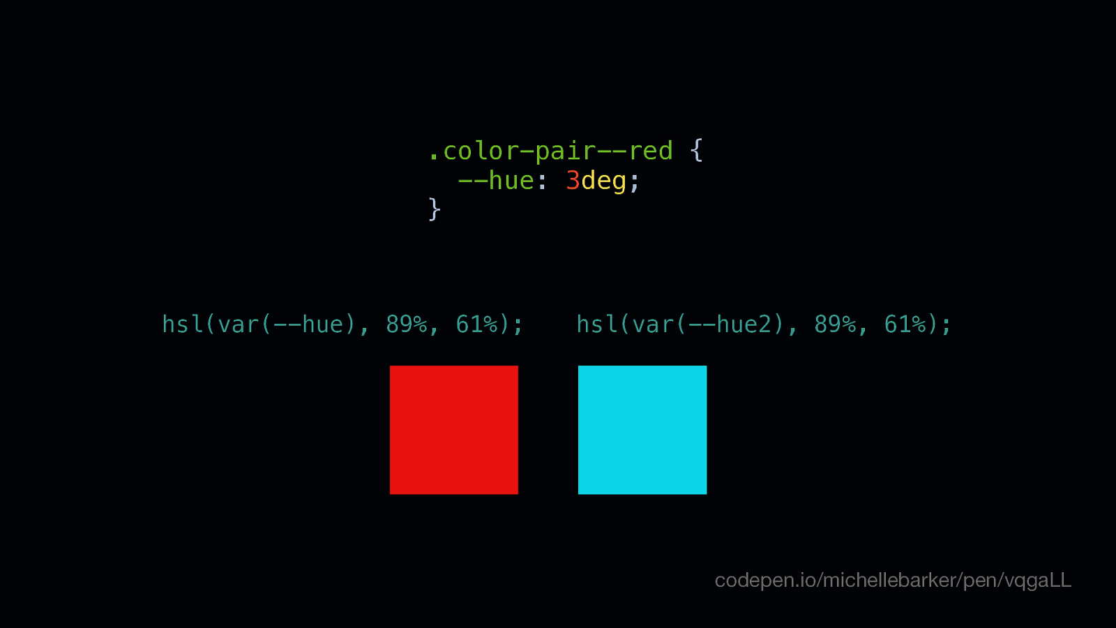
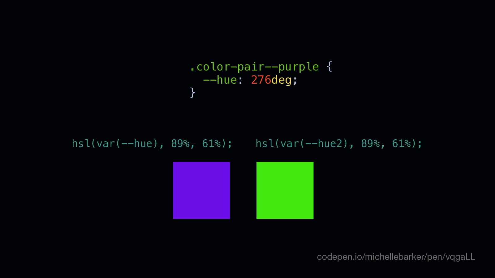
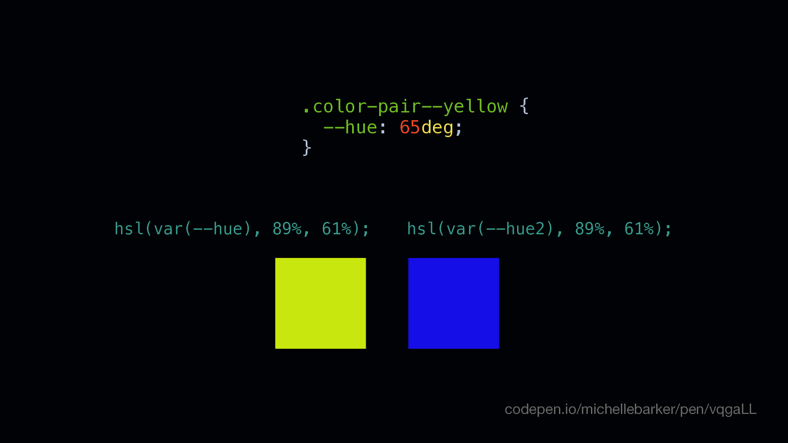
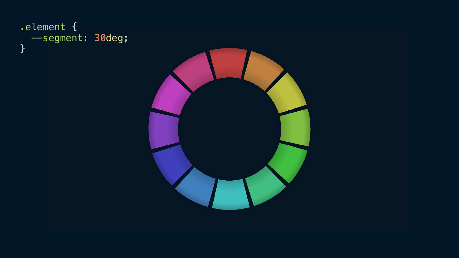
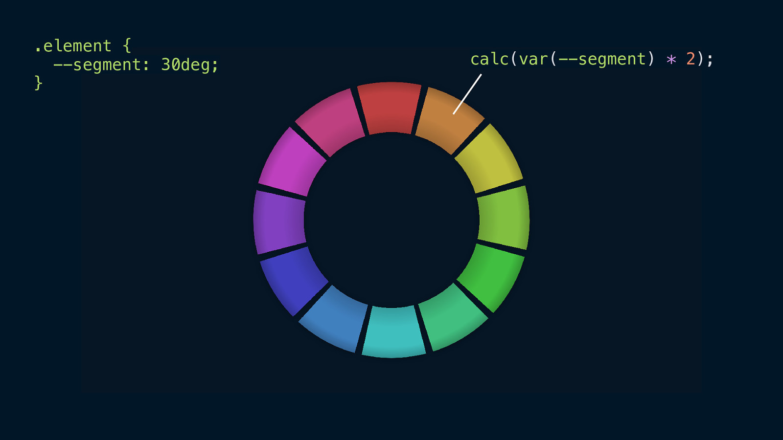
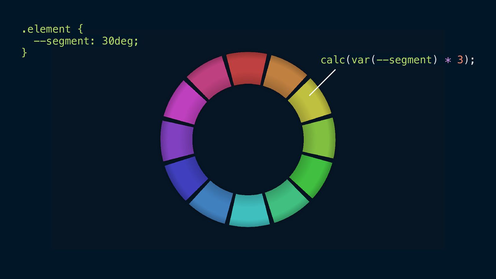
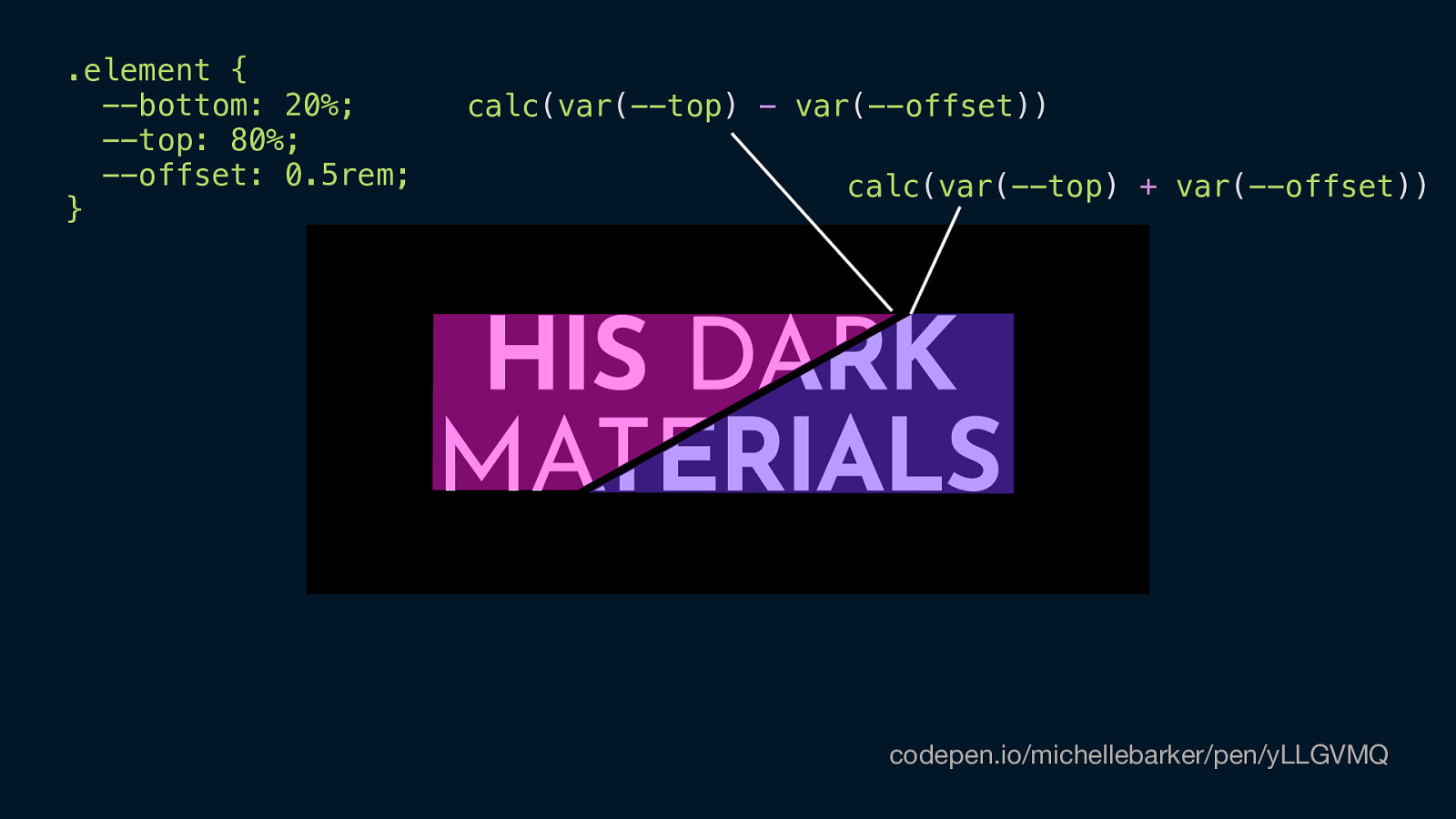
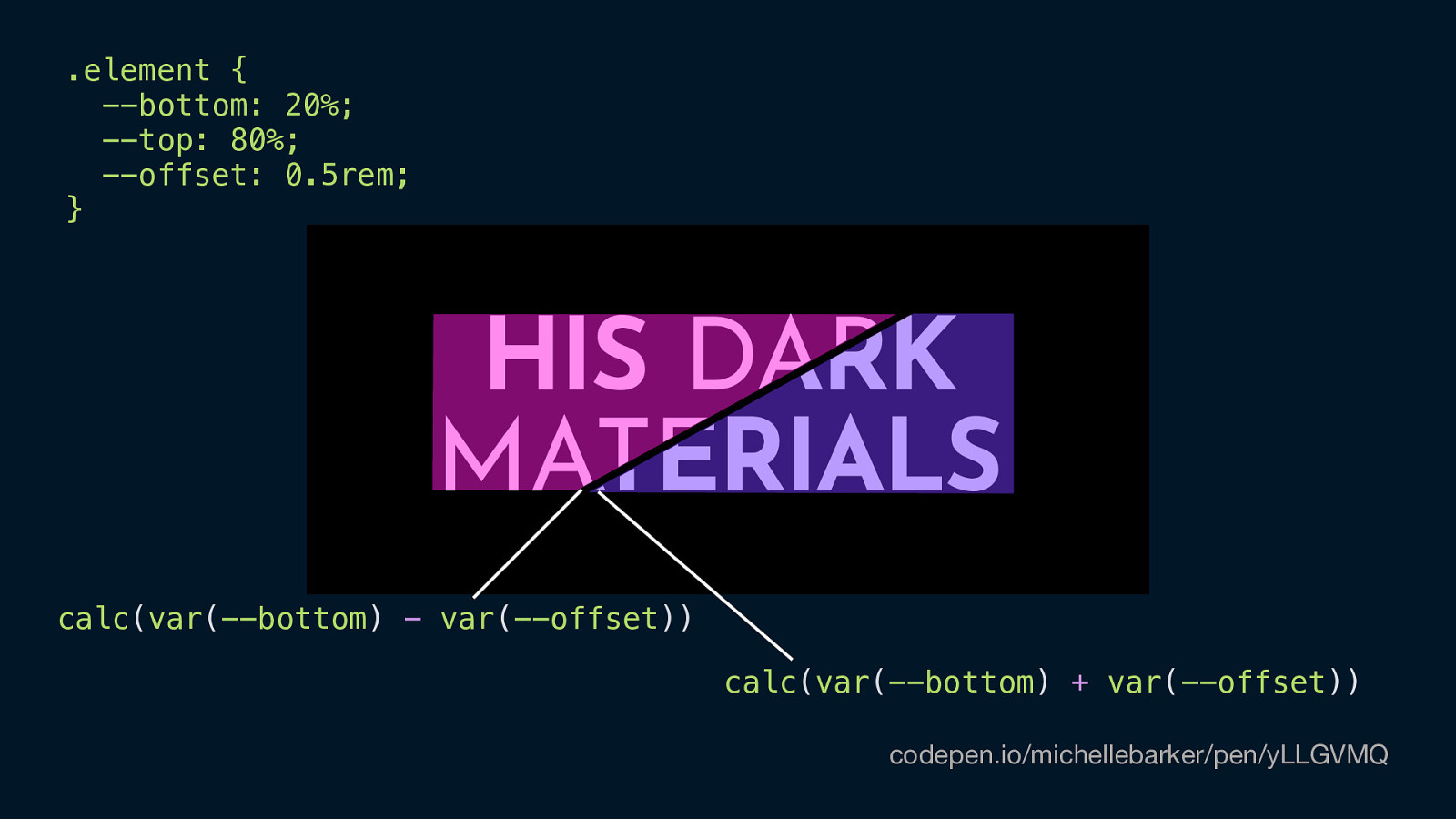
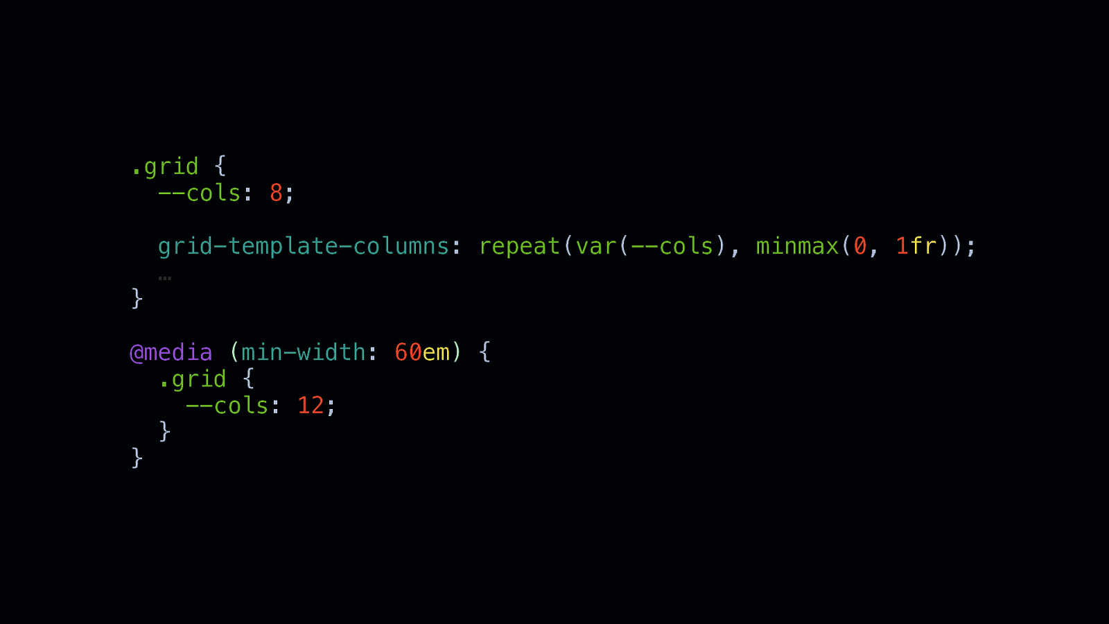
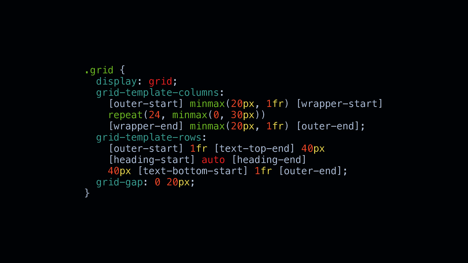
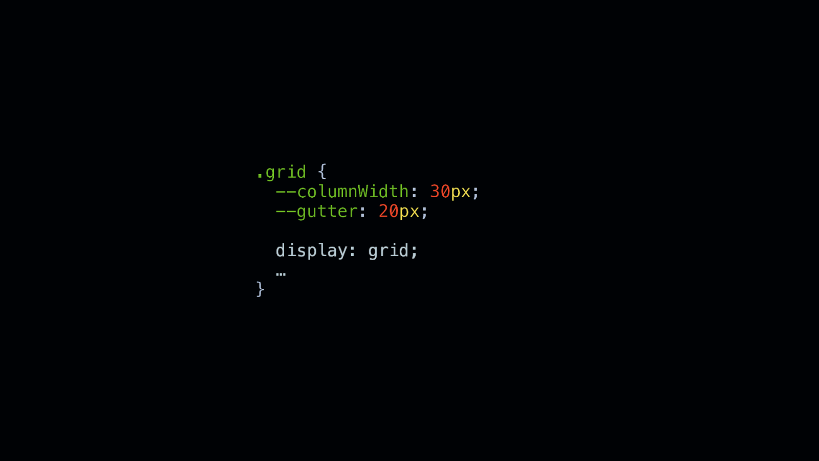
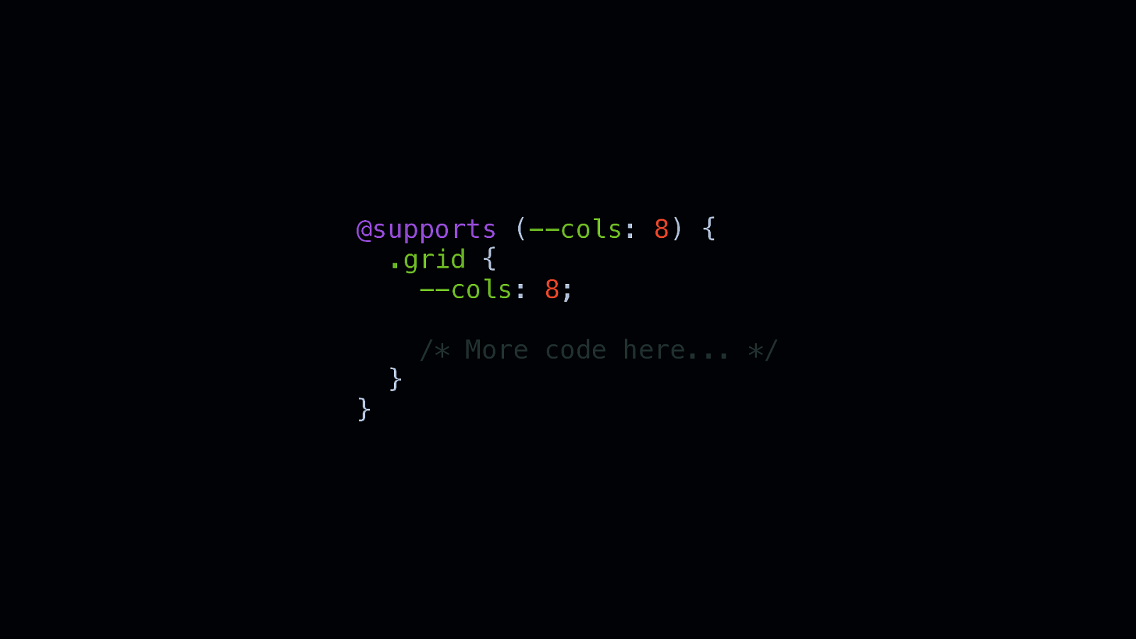
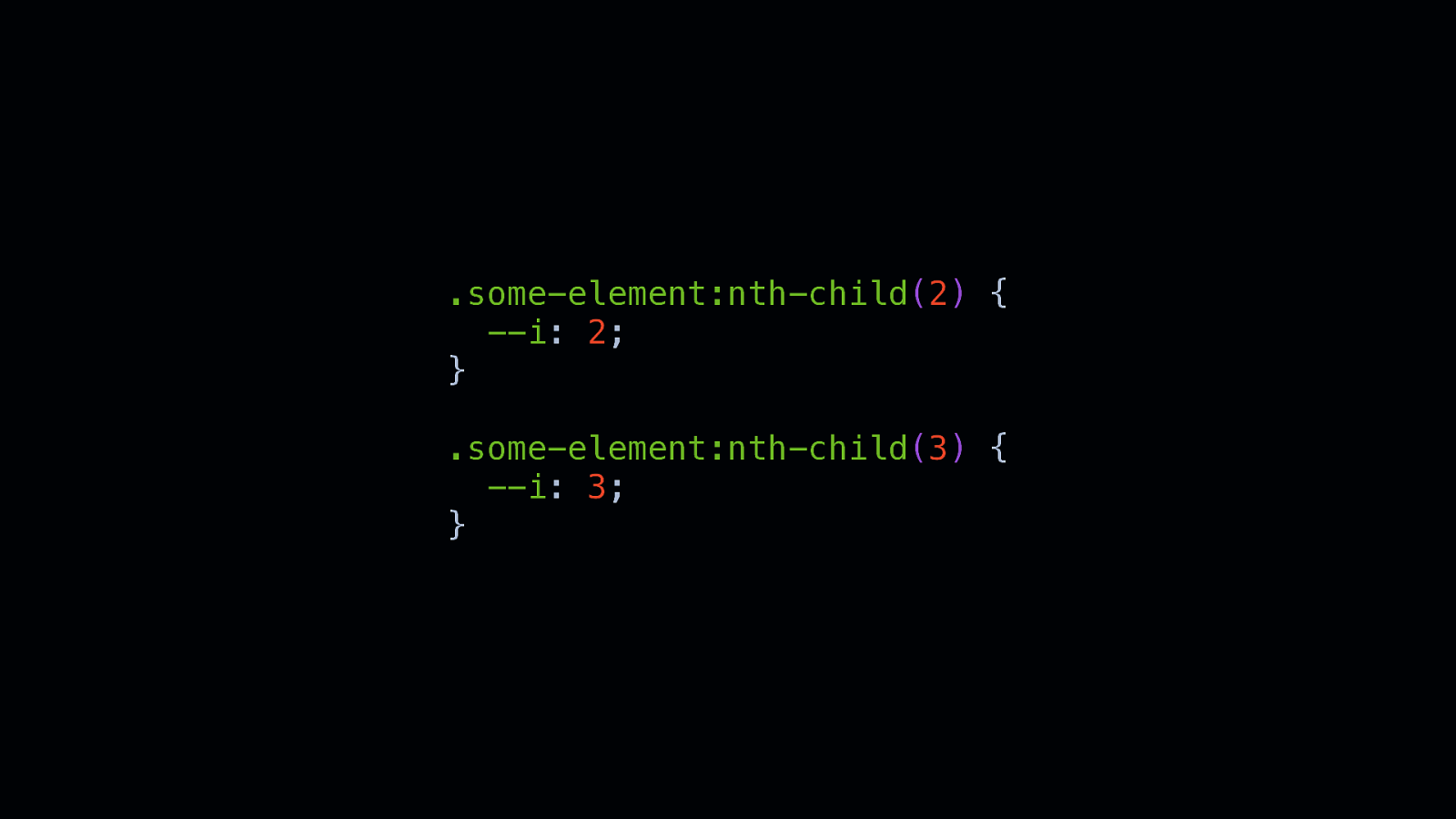
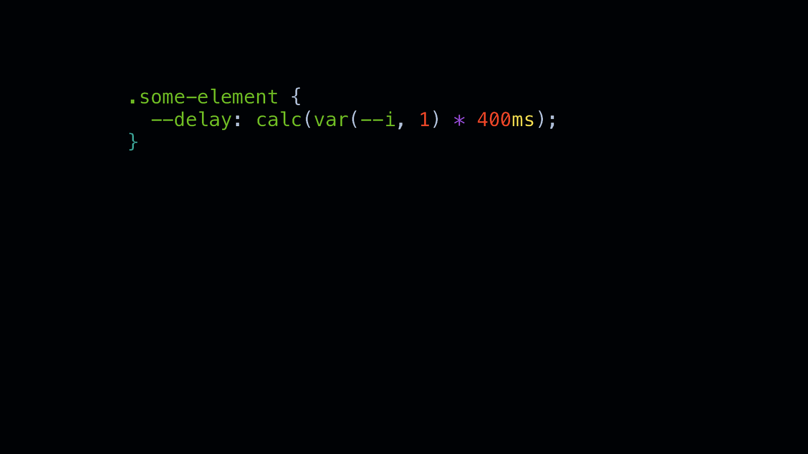
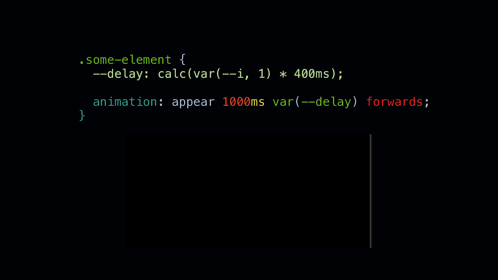
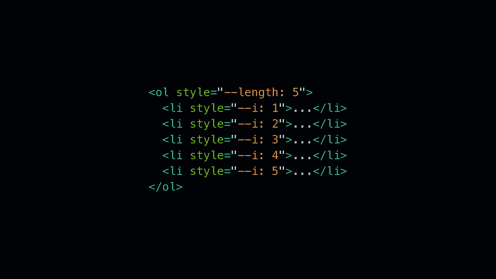
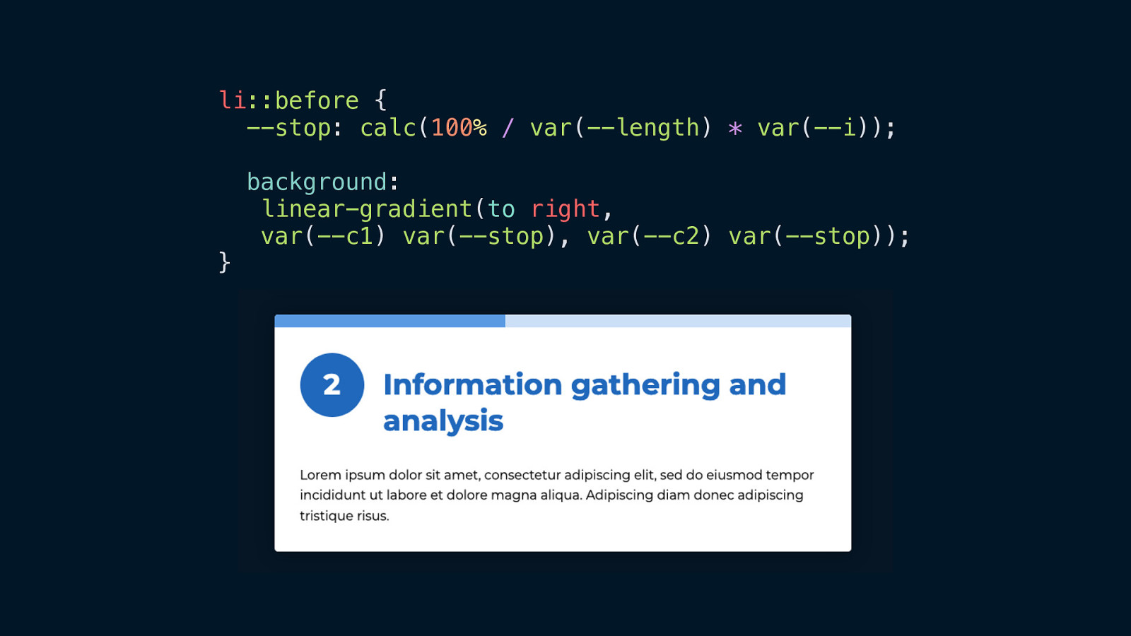
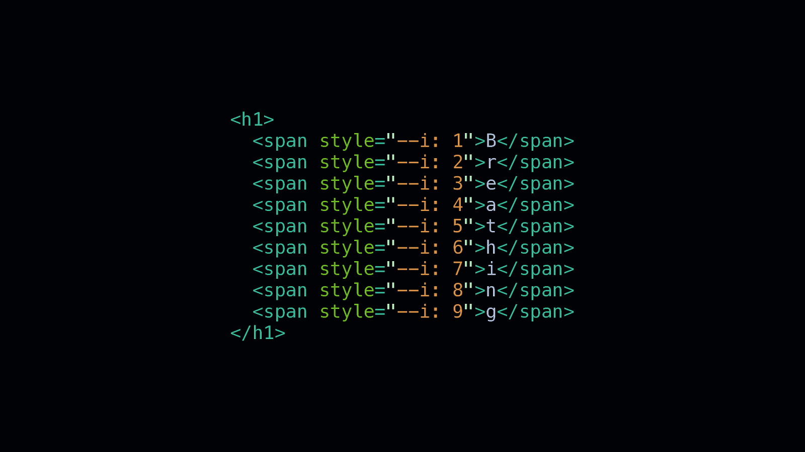
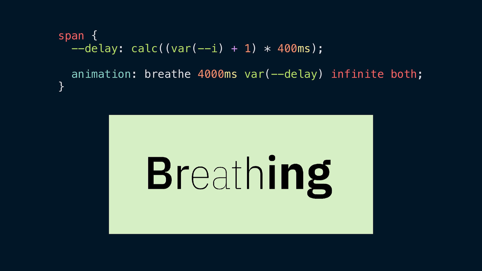
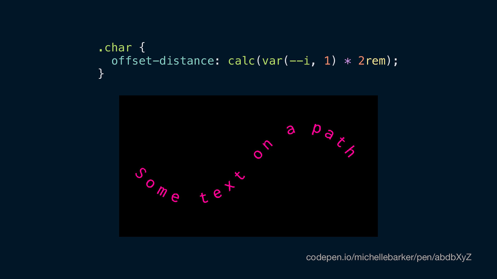
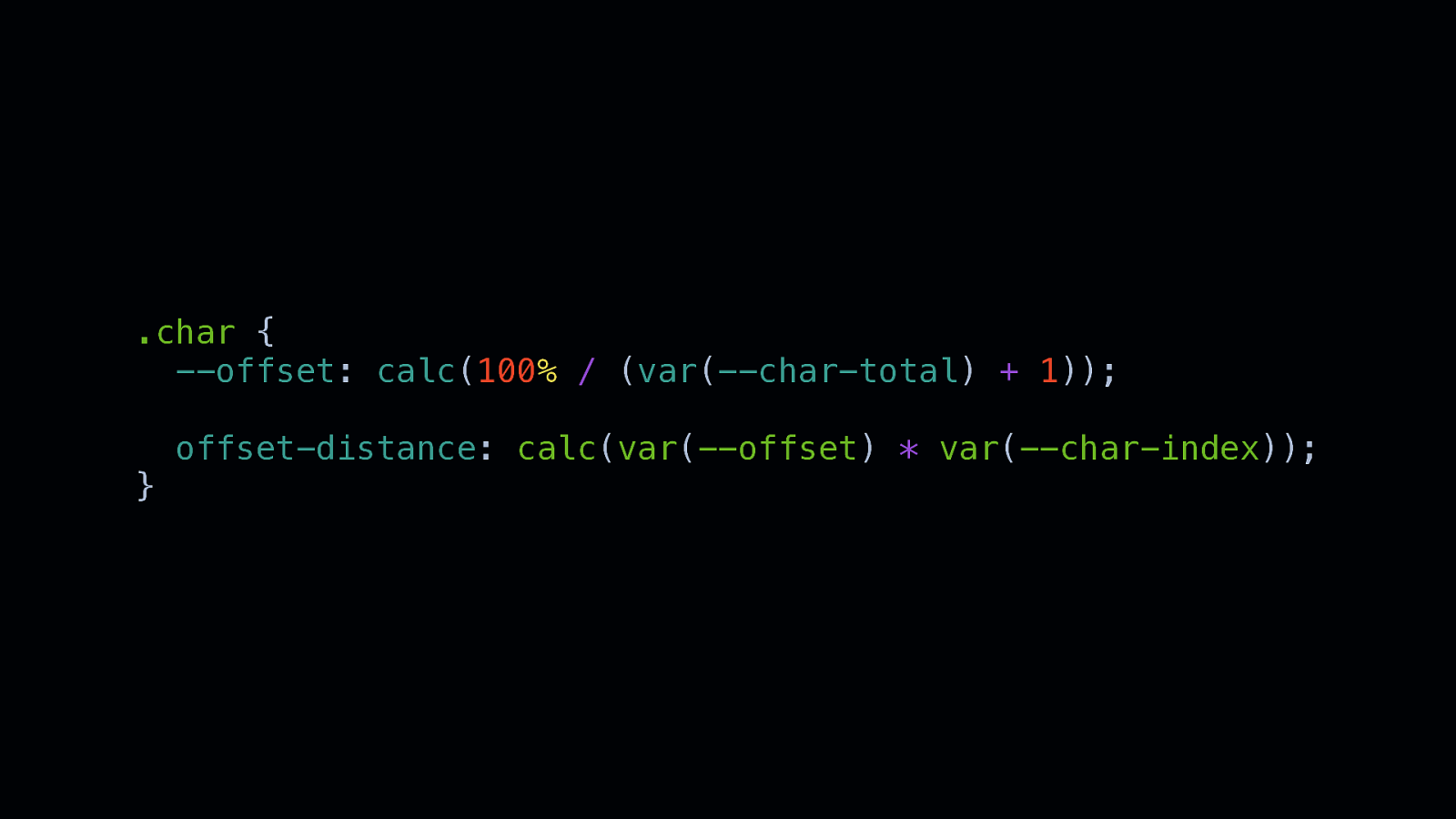
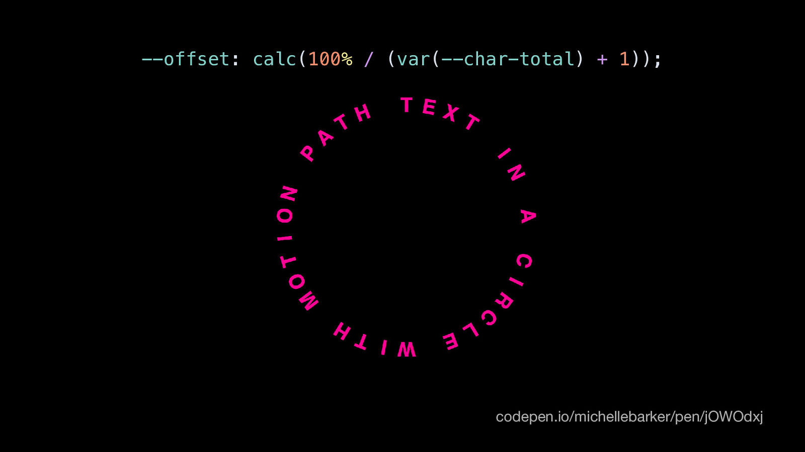
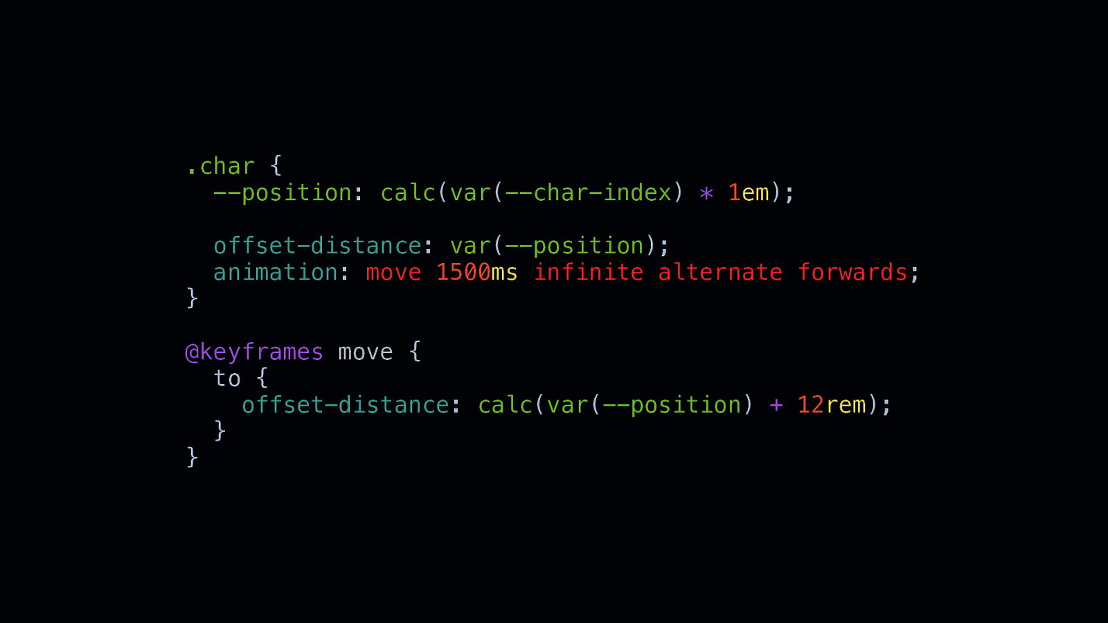
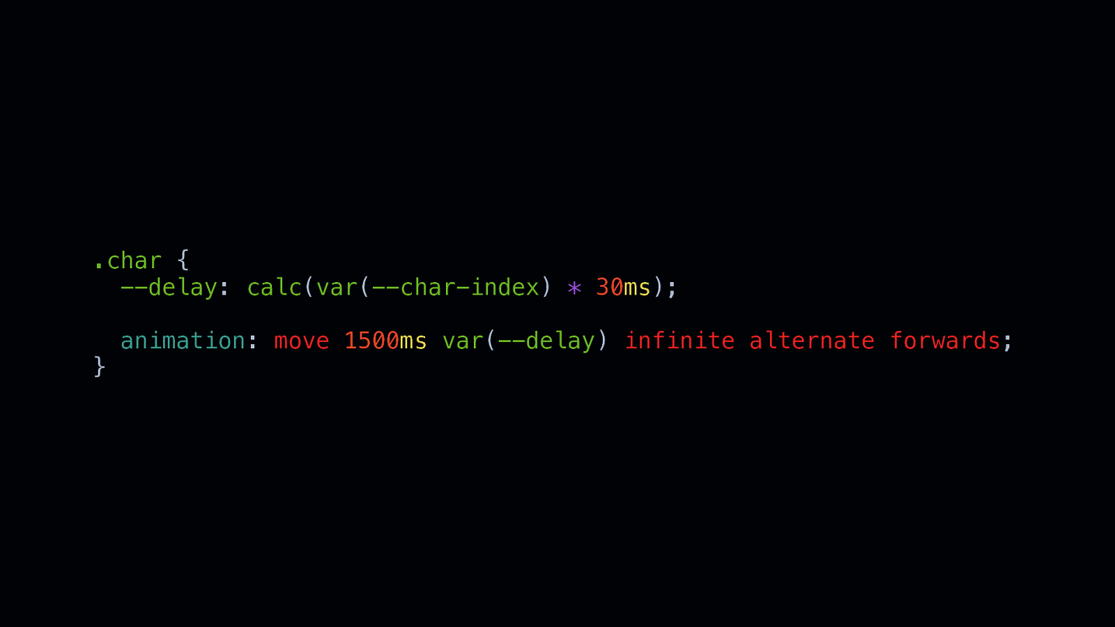
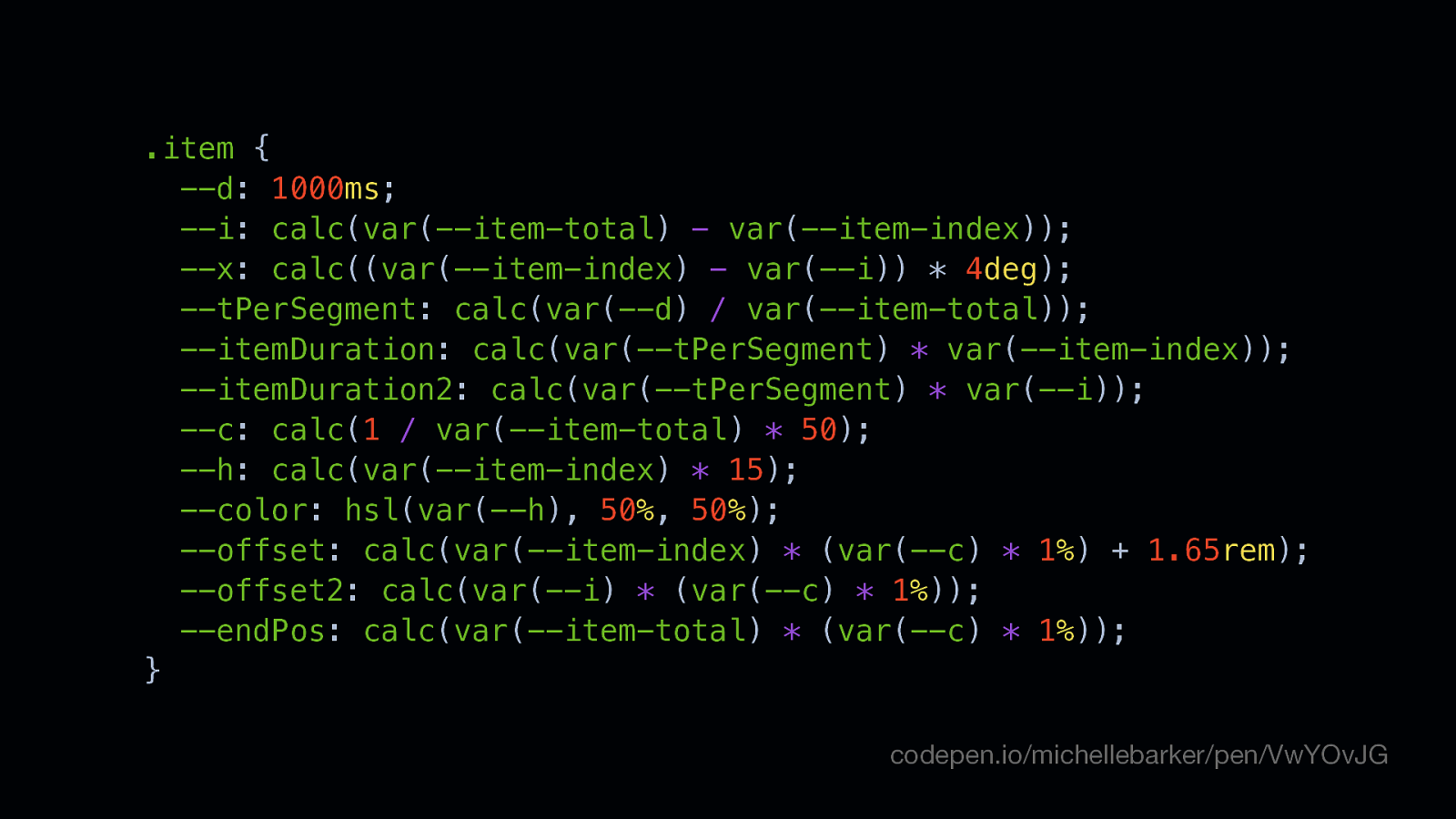
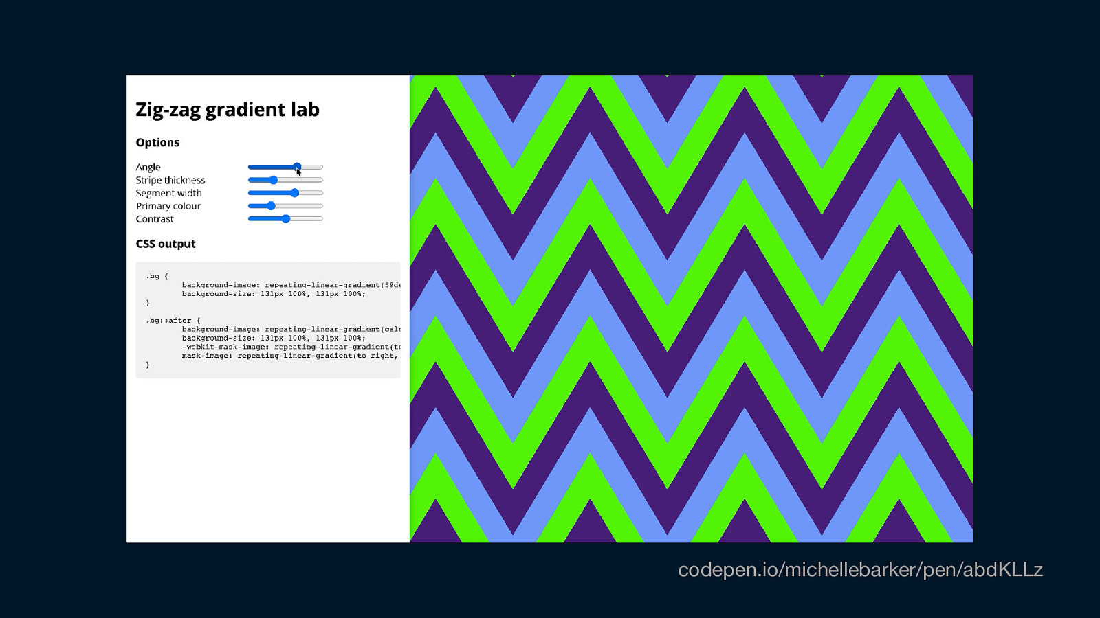
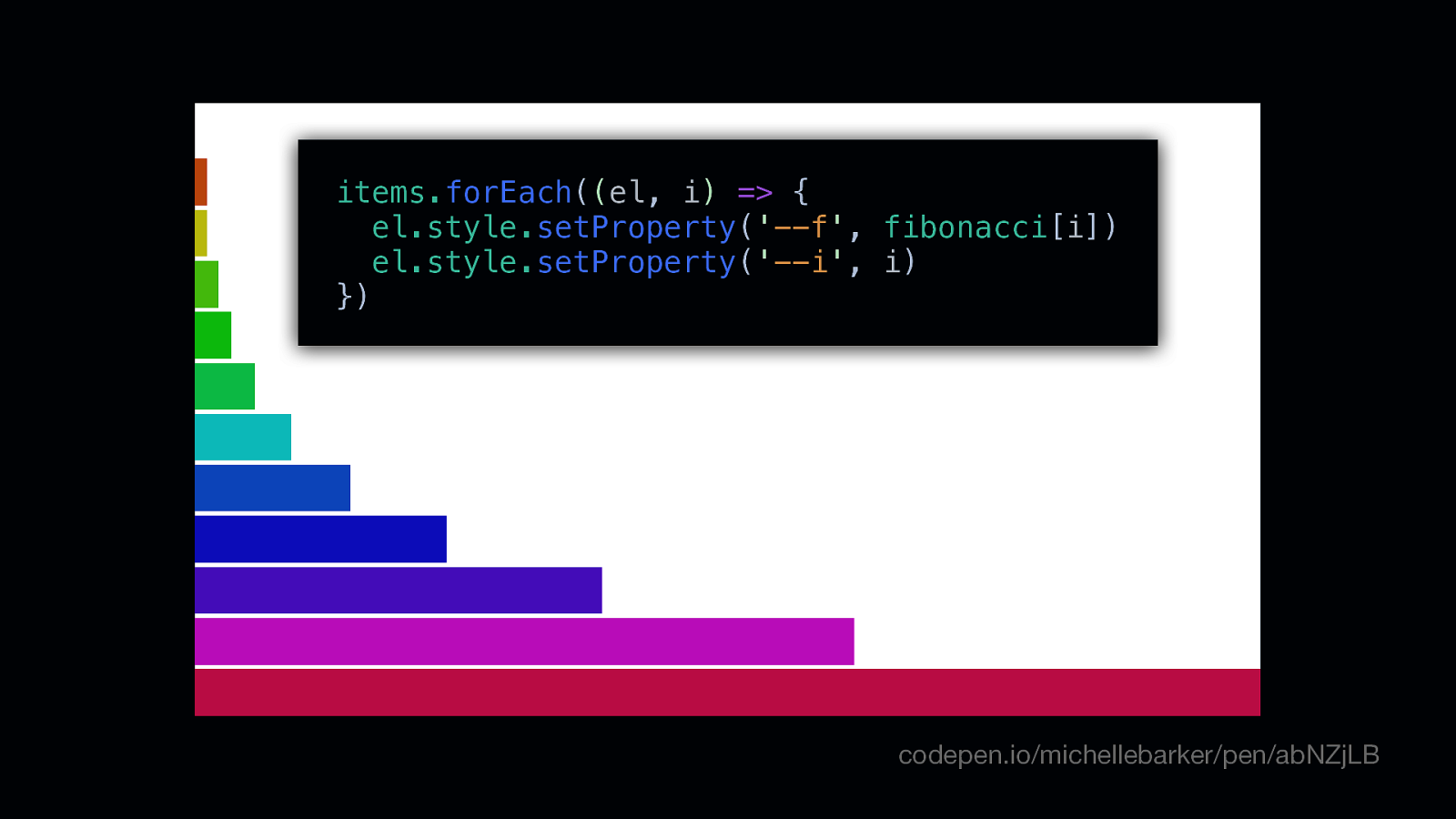
Custom Properties The Secret Ingredients for CSS Magic 🎩🐇 • Today I want to talk about one of my favourite things in CSS, and that’s custom properties. I spend a lot of my spare time making demos and tinkering with CSS, and in nearly all my demos I find myself using custom properties these days. I’m finding new use cases for them all the time, and have a lot of fun working with them. So I want to share some of those use cases with you today. • You may have heard custom properties referred to as CSS variables, because they allow you to store values for reuse in your stylesheets.

Slide 2

Slide 2

:root { —primaryColor: deeppink; } • If you’re not too familiar with custom properties, this is a quick recap of the syntax • Here we’re defining a custom property (or variable) called primaryColor on the root element, making it a global variable that we can use anywhere in our stylesheet, and the value of our custom property is deeppink, the CSS named colour.

Slide 3

Slide 3

:root { —primaryColor: deeppink; } .box { background-color: var(—primaryColor); } • Then we can use that custom property inside a selector to apply our predefined value as the background colour of this square, say, or anywhere else we might want to use it.

Slide 4

Slide 4

:root { —primaryColor: deeppink; } .box { background-color: var(—primaryColor, darkorchid); } • We can also provide a default value if we choose to, in case there’s a possibility that we’re using a custom property before it’s been defined. • So if we’ve previously defined the custom property then our box is going to be pink…

Slide 5

Slide 5

/* :root { —primaryColor: deeppink; } */ .box { background-color: var(—primaryColor, darkorchid); } • But if we haven’t defined it yet it’s going to fall back to darkorchid as the background colour.

Slide 6

Slide 6

IE11 😢 .box { background-color: deeppink; background-color: var(—bg, darkorchid); } • Browsers that don’t support custom properties won’t recognise that background colour as a valid property value, so one way we could handle that is to set a valid background-color value higher up, and allow the browser to ignore the second rule if it doesn’t support it. • So in IE11, which doesn’t support custom properties, this box is going to be deeppink.

Slide 7

Slide 7

IE11 😢 .box { /* background-color: deeppink; */ background-color: var(—bg, darkorchid); } The square is here, you just can’t see it • But if we don’t include a fallback value and the browser doesn’t support custom properties, the background-color will fall back to its initial value, which is transparent – the default value is meaningless if the browser doesn’t understand it, which maybe goes without saying.

Slide 8

Slide 8

Nice lovely browser .box { background-color: deeppink; background-color: var(—bg, 300); } Sorry, it’s still invisible • However, if the browser does support custom properties and you put some kind of nonsensical value in there, like 300 – which makes no sense as a backgroundcolor value – this will also fall back to the initial value, even though we’ve set the background-color value higher up in our selector. Again, the element will be transparent. • So that’s something to watch out for

Slide 9

Slide 9

Sass variable $bgColor: deeppink; !== —primaryColor: deeppink; Custom property • Of course, we’ve been able to use variables for quite a long time in Sass and other preprocessor languages. But what makes custom properties different is that they’re dynamic variables, and can be updated in your CSS, or with Javascript. Preprocessor variables are compiled into regular CSS property values before your code hits the browser – the browser will never know what is and isn’t a variable. Custom properties are computed in the browser, and that has implications for how we can use them. • Let’s first of all take a look at a simple use case.

Slide 10

Slide 10

Repeating values Repeating values Repeating values Repeating values Repeating values Repeating values Repeating values • That’s repeating values, which is perhaps the most obvious use case for custom properties – anywhere you need to update a value that’s repeated throughout your code. • That could be shorthand property values, for example.

Slide 11

Slide 11

.some-element { padding: 12rem 1rem 1rem; } .another-element { padding: 0 1rem 1rem; } Suppose you have two elements that have different top padding values, but the same padding for the remaining sides…

Slide 12

Slide 12

.some-element { padding: 12rem 1rem 1rem; } .another-element { padding: 0 1rem 1rem; } @media (min-width: 50em) { .some-element { padding: 12rem 3rem 3rem; } } .another-element { padding: 0 3rem 3rem; } • …and at different breakpoints we need to adjust the padding of the three remaining sides identically across both elements. • That ends up being quite a lot of code to write.

Slide 13

Slide 13

.some-element { padding: 12rem var(—pad) var(—pad); } .another-element { padding: 0 var(—pad) var(—pad); } We could replace those identical values with a custom property…

Slide 14

Slide 14

:root { —pad: 1rem; } @media (min-width: 50em) { :root { —pad: 3rem; } } …and that way we only need to change one value within our media query, both values will be updated. And we could do that for multiple breakpoints if we needed to.

Slide 15

Slide 15

:root { —clip: polygon(80% 0, 100% 0, 100% 100%, 20% 100%); } .element { -webkit-clip-path: var(—clip); clip-path: var(—clip); } It’s pretty useful too for vendor prefixes, especially for long values. For example clip-path still needs to be prefixed in some browsers.

Slide 16

Slide 16

Global vs local scoping • In the examples so far I’m defining the custom property on the root element, so it’s a global variable. You can also scope a custom property to a selector, and we’ll look at some reasons to do that a little later on. • But defining globals variables can be a good idea if they’re part of a design system – if they’re global values that we need to use repeatedly across different components.

Slide 17

Slide 17

Dark mode • It’s becoming really popular for websites to have a dark theme, and using custom properties makes it quite easy to implement this. This is how I do it on my own website:

Slide 18

Slide 18

:root { —primary: deepPink; —headerBg: #1d1d26; —textColor: #0e0f0f; —textColorInverse: #fcfdff; —bg: #fcfdff; —bgTint: #dfeded; —bgGrey: #e6e8e8; —white: #fcfdff; } I have all my colours set as custom properties…

Slide 19

Slide 19

@media (prefers-color-scheme: dark) { :root { —bg: #161618; —bgTint: #27272c; —bgGrey: #27272c; —textColor: #dbd7db; —textColorInverse: #0e0f0f; } } …and then I use the prefers-color-scheme media query to redefine those variables for dark mode • I don’t have to change all of them because some, like the primary brand colour and header colour will remain the same. I only have to change these five custom properties and that’s my dark mode implemented right across the site. • But I do have to be quite careful about naming them – my instinct is to name variable things like bgLight or bgDark for the background colour, but of course when we switch them to dark mode we don’t want a value for bgLight that’s actually a dark colour, that would just be too confusing.

Slide 20

Slide 20

Vertical rhythm Another reason for global variables might be in order to maintain vertical rhythm, and consistent spacing.

Slide 21

Slide 21

—vr: 2rem • We could set a custom property for one vertical spacing unit – so we’re going to call this vertical rhythm custom property “vr”, and set its value as 2rem.

Slide 22

Slide 22

var(—vr) • These highlighted margins are each one vr, which in this case is 2rem

Slide 23

Slide 23

calc(2 * var(—vr)) • And these spaces are 2 times our vertical spacing unit, so we can use calc for that

Slide 24

Slide 24

      • { margin-top: var(—vr); } We could do that quite easily with the lobotomised owl selector (coined by Heydon Pickering), which uses the adjacent sibling combinator. So here we’re saying that any element that follows another element should have a standard top margin with a value of one “vr” (2rems).

Slide 25

Slide 25

      • { margin-top: var(—vr); } * + h2 { margin-top: calc(2 * var(—vr)); } But for some element’s we’ll override that and give them a top margin of a multiple of a vr unit.

Slide 26

Slide 26

:root { —vr: 1rem; } @media (min-width: 50em) { :root { —vr: 2rem; } } • And perhaps we want that space to scale at different breakpoints, so we give elements a bit more breathing room on larger screens by increasing the whitespace. • Where we’re setting that custom property, we could specify that at a certain breakpoint we want to increase that vr unit across the whole site

Slide 27

Slide 27

—vr: 1rem; —vr: 2rem; So the large spaces will always be twice the width of the smaller ones whatever the size of our screen – and we only need that one media query.

Slide 28

Slide 28

:root { —vr: 1rem; —2vr: calc(2 * var(—vr)); } @media (min-width: 50em) { :root { —vr: 2rem; } } • For even more consistency we could even abstract that calc value out into another custom property. • We don’t need to recalculate that 2vr variable in a media query, that’s going to be automatically updated for us because it’s calculated using the vr custom property, which we’re already updating. • So we can calculate custom property values from other custom properties, which can be very useful.

Slide 29

Slide 29

Color One example that has already been written and talked about quite a bit is colour. I really like using HSL when I’m working with custom properties…

Slide 30

Slide 30

Hue Saturation Lightness hsl(3deg, 89%, 61%) • Which stands for Hue, Saturation, Lightness. • I’m not going to go into too much detail on this one, because it’s already fairly widely documented.

Slide 31

Slide 31

Hue Saturation Lightness hsl(var(—hue), 89%, 61%) • But setting variables for each of the values in HSL gives you a fine degree of control over colour. • In this example I’m using a custom property for the hue value.

Slide 32

Slide 32

.color-pair { —hue: 3deg; —hue2: calc(var(—hue) + 180deg); } I’m setting the ‘hue’ value as 3 degrees, which corresponds to a red hue. And then I’m setting this second custom property, ‘—hue2’, which I’m calculating as the original hue plus 180 degrees.

Slide 33

Slide 33

—hue: 3deg; —hue2: calc(var(—hue) + 180deg); • So that corresponds to a hue value from the opposite side of the colour wheel • And that’s going to give us a complementary colour pair.

Slide 34

Slide 34

.color-pair—red { —hue: 3deg; } hsl(var(—hue), 89%, 61%); hsl(var(—hue2), 89%, 61%); codepen.io/michellebarker/pen/vqgaLL So we could create a bunch of colour pairings and adjust them as much as we want just by tweaking one value…

Slide 35

Slide 35

.color-pair—purple { —hue: 276deg; } hsl(var(—hue), 89%, 61%); hsl(var(—hue2), 89%, 61%); codepen.io/michellebarker/pen/vqgaLL …the secondary colour will always respond and be the exact same number of degrees from the first. We don’t need to recalculate that second colour each time.

Slide 36

Slide 36

.color-pair—yellow { —hue: 65deg; } hsl(var(—hue), 89%, 61%); hsl(var(—hue2), 89%, 61%); codepen.io/michellebarker/pen/vqgaLL

Slide 37

Slide 37

• This is in fact a single-div CSS illustration of a colour wheel, made using only CSS gradients (conic-gradient) and the mask-image property. • It uses custom properties in a similar way, to determine the hue value of each segment.

Slide 38

Slide 38

.element { —segment: 30deg; } Each segment is 30 degrees, which we can set as a custom property.

Slide 39

Slide 39

.element { —segment: 30deg; } Each gradient stop is calculated as a multiple of that custom property. calc(var(—segment) * 2);

Slide 40

Slide 40

.element { —segment: 30deg; } calc(var(—segment) * 3);

Slide 41

Slide 41

Relative values What we’re doing here is setting custom properties that are relative to another. And that doesn’t have to apply just to colour.

Slide 42

Slide 42

codepen.io/michellebarker/pen/yLLGVMQ Here’s a demo I made a little while ago that uses two clip paths.

Slide 43

Slide 43

Path 1 Path 2 codepen.io/michellebarker/pen/yLLGVMQ With an overlay you can see those two clip paths a bit more easily.

Slide 44

Slide 44

codepen.io/michellebarker/pen/yLLGVMQ The second clip-path needs to be offset from the first by the same amount in two places.

Slide 45

Slide 45

calc(80% - 0.5rem) calc(80% + 0.5rem) codepen.io/michellebarker/pen/yLLGVMQ So we have two x values for our clip path points that are separated by the same amount at the top…

Slide 46

Slide 46

calc(20% - 0.5rem) calc(20% + 0.5rem) codepen.io/michellebarker/pen/yLLGVMQ …and at the bottom • Without custom properties, if I update one path I then have to work out the revised path from the other, which starts to be a bit of a headache.

Slide 47

Slide 47

.element { —bottom: 20%; —top: 80%; —offset: 0.5rem; } codepen.io/michellebarker/pen/yLLGVMQ • But we could set some custom properties for those variables • We’re setting variables for the x-axis value for where we want to clip the elements at the top and bottom, and the offset value, for the distance between the two paths.

Slide 48

Slide 48

.element { —bottom: 20%; —top: 80%; —offset: 0.5rem; } calc(var(—top) - var(—offset)) calc(var(—top) + var(—offset)) codepen.io/michellebarker/pen/yLLGVMQ • Then we can calculate the x-value of the second path relative to the first and have that update automatically whenever I adjust one of those x-axis values.

Slide 49

Slide 49

.element { —bottom: 20%; —top: 80%; —offset: 0.5rem; } calc(var(—bottom) - var(—offset)) calc(var(—bottom) + var(—offset)) codepen.io/michellebarker/pen/yLLGVMQ • If we want to change the position of the clip-path, or we want to have a bigger gap between them, all we need to do is change the custom property, we don’t need to update the clip-path property value at all.

Slide 50

Slide 50

Local scoping • So far we’ve talked about using globally scoped custom properties, but in the last couple of examples you might’ve noticed we’re scoping them to a selector, and there are plenty of cases when that’s more useful. • One reason you might want to do that is to avoid a naming clash, which might mean a selector inadvertently inherits a custom property value you’ve set on an ancestor. Personally I find it helpful to set custom properties as close as possible to the point I’m using them. • Setting a custom property on a selector means it is inherited by its descendants. • There are also possible performance issues with using a lot of custom properties on the root element. Updating a custom property will cause a style recalculation of its descendants. So setting only where you need to use it is preferable.

Slide 51

Slide 51

.grid { —cols: 8; } grid-template-columns: repeat(var(—cols), minmax(0, 1fr)); … @media (min-width: 60em) { .grid { —cols: 12; } } • An example is a layout class. • Here we’re setting a custom property called cols for the number of columns in a grid layout, then updating it within the media query to avoid having to write out the entire grid-template-columns declaration again • cols doesn’t need to be a global variable because it only applies to our grid, and it means that if we have another layout class somewhere else in my code then we’re free to use the same variable name. • I like to use custom properties quite a lot with grid layout. One reason is because I sometimes work with quite complex grids, and I find that using custom properties can make them more maintainable.

Slide 52

Slide 52

• This is a screenshot for website I worked on a couple of years ago for Warners Bros Studios, and it was one of the first sites I built with CSS Grid. • The design used several different grids across the site. These components in particular used a 24-column grid, and there were 9 or 10 different variants, with the image and text positioned differently for each one.

Slide 53

Slide 53

• With the Firefox grid inspector turned on, you can see that 24-column grid • And there were 9 or 10 variants of these grid components, with the image and text laid out slightly differently in each one.

Slide 54

Slide 54

.grid { display: grid; grid-template-columns: [outer-start] minmax(20px, 1fr) [wrapper-start] repeat(24, minmax(0, 30px)) [wrapper-end] minmax(20px, 1fr) [outer-end]; grid-template-rows: [outer-start] 1fr [text-top-end] 40px [heading-start] auto [heading-end] 40px [text-bottom-start] 1fr [outer-end]; grid-gap: 0 20px; } • You can see the code where I’m defining my grid is fairly complex…

Slide 55

Slide 55

.grid { —columnWidth: 30px; —gutter: 20px; } display: grid; … • But using custom properties, we can define the important values at the top of the selector, and replace some of those values • And I find that it makes that grid easier to understand to someone new to it, or if you’re coming back to it after a while. • The other reason I like to use custom properties with Grid is because they have a very similar level of browser support – so it basically means if you’re testing for one, you’re testing for both. I can’t think of any browsers that support one and not the other, but I could be wrong about that.

Slide 56

Slide 56

@supports (—cols: 8) { .grid { —cols: 8; } We can test for support using feature queries, like this } /* More code here… */

Slide 57

Slide 57

S t a g g e r e d Animations • As I touched upon with colours, using calc with custom properties opens up a whole new world of excitement. • One place you can have a lot of fun with custom properties is staggered animations.

Slide 58

Slide 58

• Suppose we have a group of elements and we want them to animate in, but we want a slight delay between the start of each element’s animation, to create a staggered effect. • We can use custom properties to achieve this

Slide 59

Slide 59

.some-element:nth-child(2) { —i: 2; } .some-element:nth-child(3) { —i: 3; } • First we assign each element a custom property that corresponds to the element’s index. • We don’t need to assign the first one, because we can use a default value, which, if you remember, it will fall back to if the variable isn’t yet defined.

Slide 60

Slide 60

.some-element { —delay: calc(var(—i, 1) * 400ms); } Then we can use calc to calculate the delay between each one, and assign it to its own custom property.

Slide 61

Slide 61

.some-element { —delay: calc(var(—i, 1) * 400ms); animation: appear 1000ms var(—delay) forwards; } • …And we can use that in place of our animation-delay value in the shorthand property • If you’re working with lists, or any kind of UI where you have groups of similar elements, using an element’s index as a custom property can be very handy.

Slide 62

Slide 62

Progress indicators • Just to digress from the animation angle for a moment… • We can use a similar technique to visualise progress, which is something I did on a recent project.

Slide 63

Slide 63

• I needed to build a UI with a series of steps showing the customer journey, and at the top of each step is a little bar to indicate the step’s position relative to the total number of steps – so if you were at step 5 out of 10, the little progress bar would be 50% filled.

Slide 64

Slide 64

<ol style=”—length: 5”> <li style=”—i: 1”>…</li> <li style=”—i: 2”>…</li> <li style=”—i: 3”>…</li> <li style=”—i: 4”>…</li> <li style=”—i: 5”>…</li> </ol> • I gave each list item a custom property that corresponds to its index in the list, the whole list has a custom property that corresponds to the length of the list (or the number of items). • In this case I’m doing that in the HTML rather than in the CSS • The advantage of that is if you’re using a templating language, you can set the custom property within the loop – if you’re looping over items, you can use the loop index. • I use Twig, but most templating languages will give you a way to do this.

Slide 65

Slide 65

li::before { —stop: calc(100% / var(—length) * var(—i)); } background: linear-gradient(to right, var(—c1) var(—stop), var(—c2) var(—stop)); • There are difference ways you could style up that progress bar, but the way I’m doing it is by using a linear-gradient background with hard colour stops. • In the CSS, I calculated the gradient stop as a percentage, using the length and item index custom properties. This is step 2 of 5, so that progress bar is two-fifths filled. • Armed with a custom property value that matches the element’s index we can get even more creative, especially with text.

Slide 66

Slide 66

<h1> <span <span <span <span <span <span <span <span <span </h1> style=”—i: style=”—i: style=”—i: style=”—i: style=”—i: style=”—i: style=”—i: style=”—i: style=”—i: 1”>B</span> 2”>r</span> 3”>e</span> 4”>a</span> 5”>t</span> 6”>h</span> 7”>i</span> 8”>n</span> 9”>g</span> In order to implement a staggered animation for a string of text, we need to wrap each individual letter in a `span` and assign it a custom property, which, if we prefer, we could do within the HTML itself

Slide 67

Slide 67

span { —delay: calc((var(—i) + 1) * 400ms); } animation: breathe 4000ms var(—delay) infinite both; • Then we can implement the animation in the same way as before, by calculating the delay variable • In this case the keyframe animation is animating the font weight of a variable font

Slide 68

Slide 68

⚠ • There are accessibility implications with wrapping each letter in a span, as some screenreaders won’t read that h1 as a whole world, instead they’ll announce every letter. So you need to make sure you account for that, which you can do by using aria-label or aria-labelledby, or a visually hidden element with the original text. • There are advantages and disadvantages to each approach

Slide 69

Slide 69

splitting.js.org • If you feel like setting custom property on every element could get a little laborious, there is a little JS library called Splitting.js that does that work for you, and that’s in fact what I used for the variable font demo. It’s pretty much my favourite JS library for using in demos. It also provides you with a custom property for the length of the text string too. • Let’s look at a few examples of how we can use these.

Slide 70

Slide 70

Motion Path I really love playing around with CSS Motion Path. The Motion Path specification enables us to place elements on a path, and to animate them along that path.

Slide 71

Slide 71

⚠ Motion Path • Warning: There is quite a lot of motion in the next section, so if you’re someone who suffers from sickness or vestibular disorders you might want to skip this part, or proceed with caution

Slide 72

Slide 72

.element { offset-path: path(‘M.4 84.1s127.4 188 267.7 0 247.3 0 247.3 0’); offset-distance: 0; } • We do that using the offset-path property to define a path, and use offset-distance to specify how far along the path to place an element. • For offset-path we give it a path value similar to SVG path syntax. That’s how I get my paths – draw them as SVGs and copy the value. • An offset-distance value of 0 would place an element at the start of the path.

Slide 73

Slide 73

.element { offset-path: path(‘M.4 84.1s127.4 188 267.7 0 247.3 0 247.3 0’); offset-distance: 0; animation: move 2000ms infinite alternate; } @keyframes move { to { offset-distance: 100%; } } • Then we can animate the offset-distance property value

Slide 74

Slide 74

codepen.io/michellebarker/pen/wvMvRLy • And that’s going to give us this little ball sliding up and down the curve. • So, a fairly simple animation, but kind of cool that we can do that just with CSS • Now, the name Motion Path is a little misleading, as it doesn’t necessarily have to relate to motion. We can position stationery elements along the path if we choose to.

Slide 75

Slide 75

.element { offset-distance: calc(var(—i, 1) * 4rem); } codepen.io/michellebarker/pen/PoZoVPE • If we want to position several elements equidistantly along the path then custom properties are great for that. • Again, we’re calculating the offset-distance value of each celement using the element’s index as a custom property • We can even do it with text.

Slide 76

Slide 76

.char { offset-distance: calc(var(—i, 1) * 2rem); } codepen.io/michellebarker/pen/abdbXyZ • This works best with uppercase text, a monospace font, or a font where each character has a very similar with, otherwise the spacing gets all weird

Slide 77

Slide 77

.char { —offset: calc(100% / (var(—char-total) + 1)); } offset-distance: calc(var(—offset) * var(—char-index)); • If we want to get even more clever about it, we could ensure that our text is always positioned along the full length of the path…

Slide 78

Slide 78

.char { —offset: calc(100% / (var(—char-total) + 1)); } offset-distance: calc(var(—offset) * var(—char-index)); • …by calculating the position of each character based on a custom property that corresponds to the length of the text string.

Slide 79

Slide 79

.char { —offset: calc(100% / (var(—char-total) + 1)); } offset-distance: calc(var(—offset) * var(—char-index)); • Again, Splitting.js provides us with that, with this custom property

Slide 80

Slide 80

codepen.io/michellebarker/pen/jOWOdxj • So we could position our text around a circle using offset-path, for instance. • We could, of course, position text in a circle using transforms, but the difference here is the text remains selectable, which is pretty cool.

Slide 81

Slide 81

—offset: calc(100% / (var(—char-total) + 1)); codepen.io/michellebarker/pen/jOWOdxj • We’re dividing the path length by the number of characters plus one – which is in case we want a space after our text ends – to get the offset value for each character

Slide 82

Slide 82

offset-distance: calc(var(—offset) * var(—char-index)); codepen.io/michellebarker/pen/jOWOdxj • And multiplying that by the character index in our offset-distance property. • So even if we change the length of our text, it will still fit the circle

Slide 83

Slide 83

.char { —position: calc(var(—char-index) * 1em); } offset-distance: var(—position); animation: move 1500ms infinite alternate forwards; @keyframes move { to { offset-distance: calc(var(—position) + 12rem); } } • That’s a static text example, but we can animate our text along a path too. • Here, our keyframe animation is moving each character along 12rem from its original position, which is calculated with the custom property

Slide 84

Slide 84

codepen.io/michellebarker/pen/abOKPyg Which gives us this result

Slide 85

Slide 85

.char { —delay: calc(var(—char-index) * 30ms); } animation: move 1500ms var(—delay) infinite alternate forwards; • That’s kind of cool, but we could also add a small delay to each character, using the same technique as the staggered animation before. • And that gives our animation a much more fluid, organic feel.

Slide 86

Slide 86

codepen.io/michellebarker/pen/abOKPyg …which I think feels a lot nicer

Slide 87

Slide 87

codepen.io/michellebarker/pen/XWJyydY And of course we can get even more creative with our paths and the properties we animate. But this demo is using exactly the same techniques, nothing more advanced than that.

Slide 88

Slide 88

codepen.io/michellebarker/pen/VwYOvJG And this one’s pretty similar, but with the addition of a 3d transform.

Slide 89

Slide 89

.item { —d: 1000ms; —i: calc(var(—item-total) - var(—item-index)); —x: calc((var(—item-index) - var(—i)) * 4deg); —tPerSegment: calc(var(—d) / var(—item-total)); —itemDuration: calc(var(—tPerSegment) * var(—item-index)); —itemDuration2: calc(var(—tPerSegment) * var(—i)); —c: calc(1 / var(—item-total) * 50); —h: calc(var(—item-index) * 15); —color: hsl(var(—h), 50%, 50%); —offset: calc(var(—item-index) * (var(—c) * 1%) + 1.65rem); —offset2: calc(var(—i) * (var(—c) * 1%)); —endPos: calc(var(—item-total) * (var(—c) * 1%)); } codepen.io/michellebarker/pen/VwYOvJG • But you can get pretty complex with custom properties if you want to, and calculate a bunch of things. • In the following demo I have these 12 custom properties, some of which are calculated from others.

Slide 90

Slide 90

codepen.io/michellebarker/pen/QWbGvWj • This is one of the more complex demos and those custom properties are computing the values for, delay, colour, 3d transform rotation value, the position along the path (offset distance – because it uses motion path), and animation duration, on each of those individual segments. • So there’s really no limit to how creative you can get if you use your imagination, and you like doing maths – which I apparently do!

Slide 91

Slide 91

codepen.io/michellebarker/pen/abdKLLz • We can also manipulate custom property values with Javascript. • This is a tool I built for generating zig-zag gradient backgrounds. • Whenever the user moves one of these sliders, it changes one of the custom properties, which I’m using to set the thickness of the stripes, the angle, and the width of the zig-zags. • Also, although we can’t use animations or transitions on CSS gradients, we can transition custom properties using Houdini …a set of APIs that allow developers to extend CSS.

Slide 92

Slide 92

✨ Houdini ✨ transition: —angle 200ms, —t 200ms, —w 200ms; • So I register the property in Javascript, and then transition it just like any other CSS property, which makes the whole thing feel a bit smoother. • So that’s another bonus you get with using custom properties, although it’s not supported in all browsers.

Slide 93

Slide 93

codepen.io/michellebarker/pen/abNZjLB To demonstrate how to set custom properties in JS, this is a simple demo that uses custom properties that correspond to the fibonacci sequence (or golden ratio).

Slide 94

Slide 94

items.forEach((el, i) => { el.style.setProperty(‘—f’, fibonacci[i]) el.style.setProperty(‘—i’, i) }) codepen.io/michellebarker/pen/abNZjLB • We can use element.style.setProperty to set them with JS • In a forEach loop, I’m setting a custom property on each item that uses the element’s index, which I’m using to calculate the colour • and another custom property for the corresponding value in the fibonacci sequence, which calculates the width of each item.

Slide 95

Slide 95

A user’s guide to CSS variables by Lea Verou bit.ly/3fSZCOS Calculating Color: Dynamic Color Theming with Pure CSS by Una Kravets bit.ly/3akbTKP CSS { In Real Life } css-irl.info I hope this has given you a bit of a glimpse into custom properties, and left you feeling a little bit inspired to play around with them and build some fun things. If you’d like more resources: • Lea Verou recently wrote a great introduction to custom properties. • Una Kravets has a great write up of using hsl and custom properties for colour theming. • And I’ve written about some of the techniques used here on my blog CSS {IRL}.

Slide 96

Slide 96

@MicheBarks @CSSInRealLife Thank you for listening, you can also find me on Twitter