A presentation at Company Event in May 2022 in by Melanie Sumner Temple
I’m Melanie Sumner, a Senior Software Engineer, on the Design Systems team at HashiCorp. I’m also on the Framework Core Team for Ember.js. I serve as an Invited Expert, W3C WAI-ARIA, and also as a Board Member, VetsWhoCode
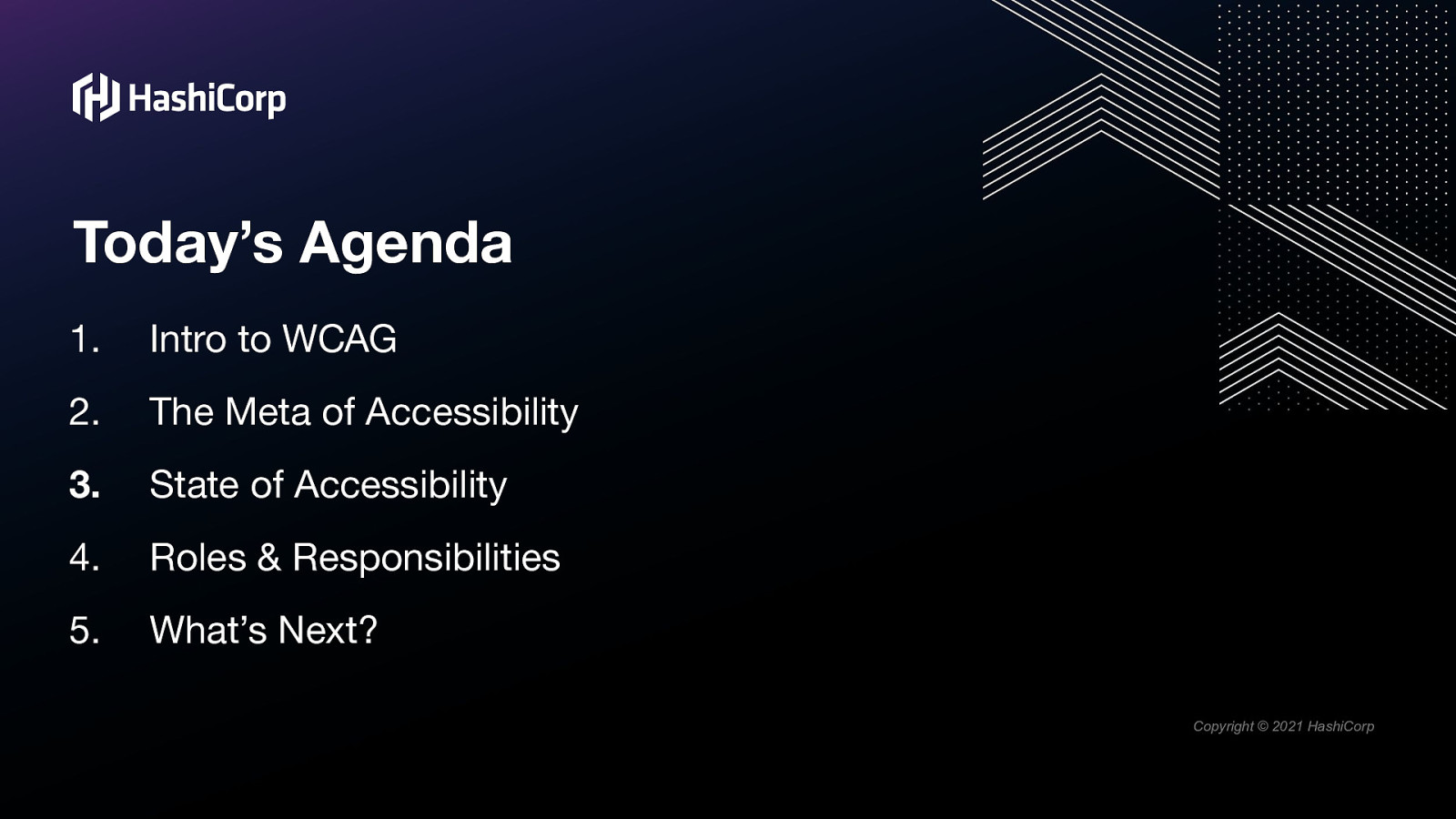
1.Intro to WCAG 2.The Meta of Accessibility 3.State of Accessibility 4.Roles & Responsibilities 5.What’s Next?
But in all of this, the most important takeaway I want you to have today is this: Accessibility is a Journey.
It takes time to learn. It takes time to process what accessibility means from an empathic perspective It takes time to adapt the way we’ve always thought about things and looked at things.

It requires passion, it requires patience and it requires persistence.
So be please kind to yourself and to others.
We’re all on this journey together.
Let’s dive in.
So. What is WCAG?
The Web Content Accessibility Guidelines, or WCAG for short, are…well, they’re the rules. They are a set of success criteria used to evaluate the accessibility of digital content, and represent the minimum requirements for conformance.
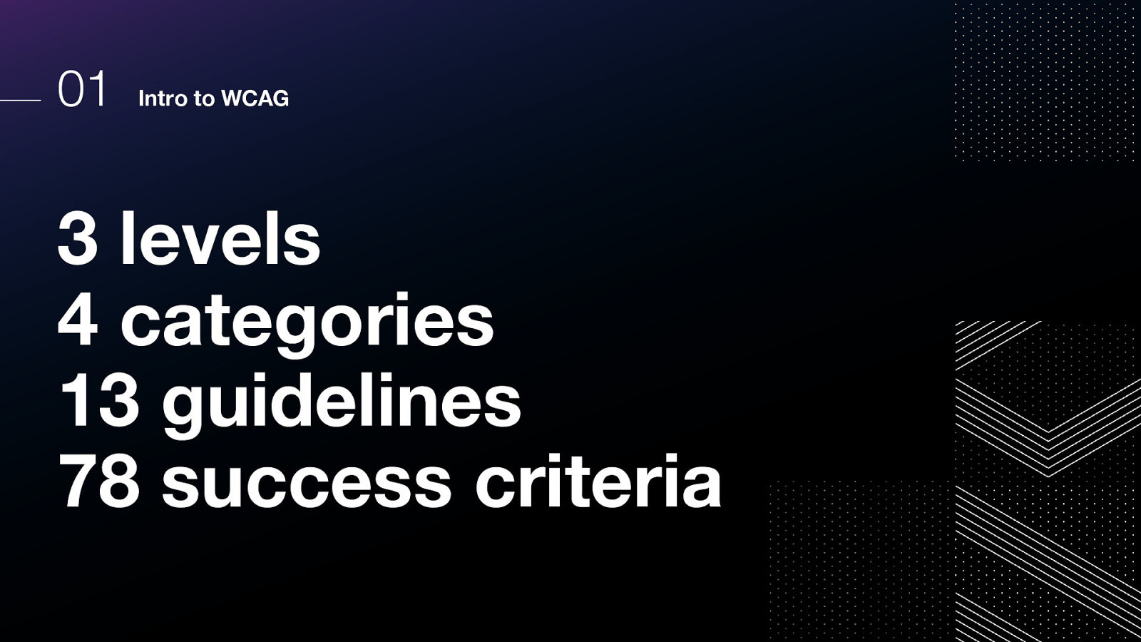
There are 3 levels 4 categories 13 guidelines 78 success criteria

Let’s look at the three levels.
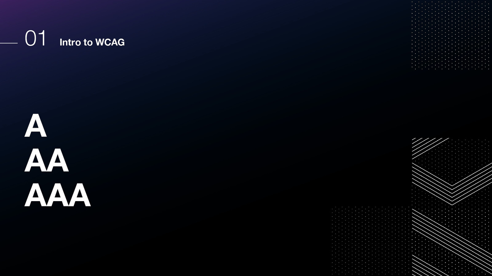
There are three levels: A, AA, AAA A is the lowest level of conformance, and AAA is the most stringent. Each level includes the one preceding it
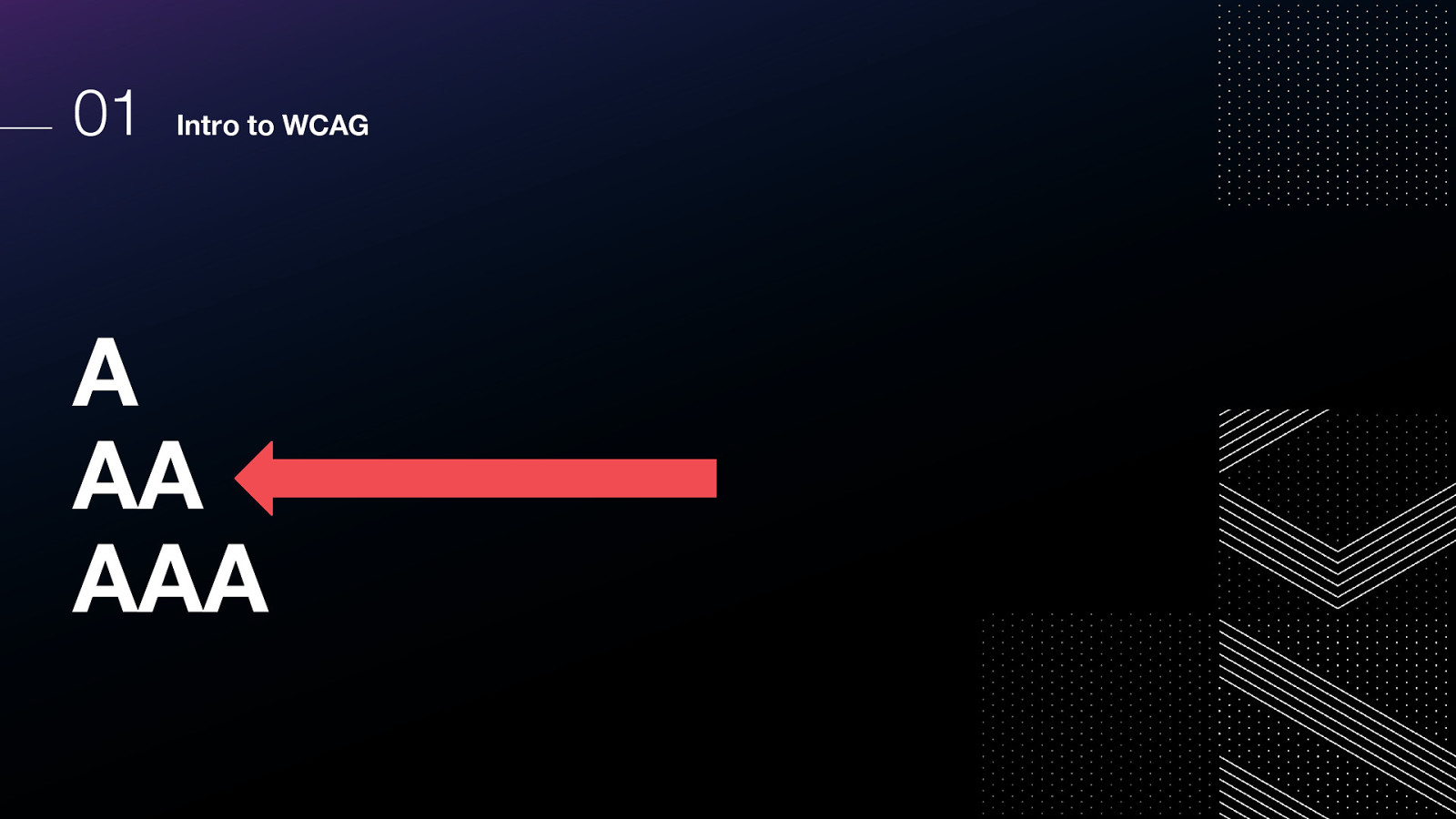
Most corporations and governments target AA as their minimum standard. Triple A is typically more geared toward educational institutions and some types of public resources.
In many developed countries, legal standards have been set to ensure that users with disabilities have access to the information they need, and have adopted the W3C’s conformance standards as a result.
Additionally, many state and federal governments are now requiring accessibility conformance standards to be met as a precondition for purchasing software.
Let’s set those levels aside for a moment, and review how the criteria themselves are categorized. We have four categories:
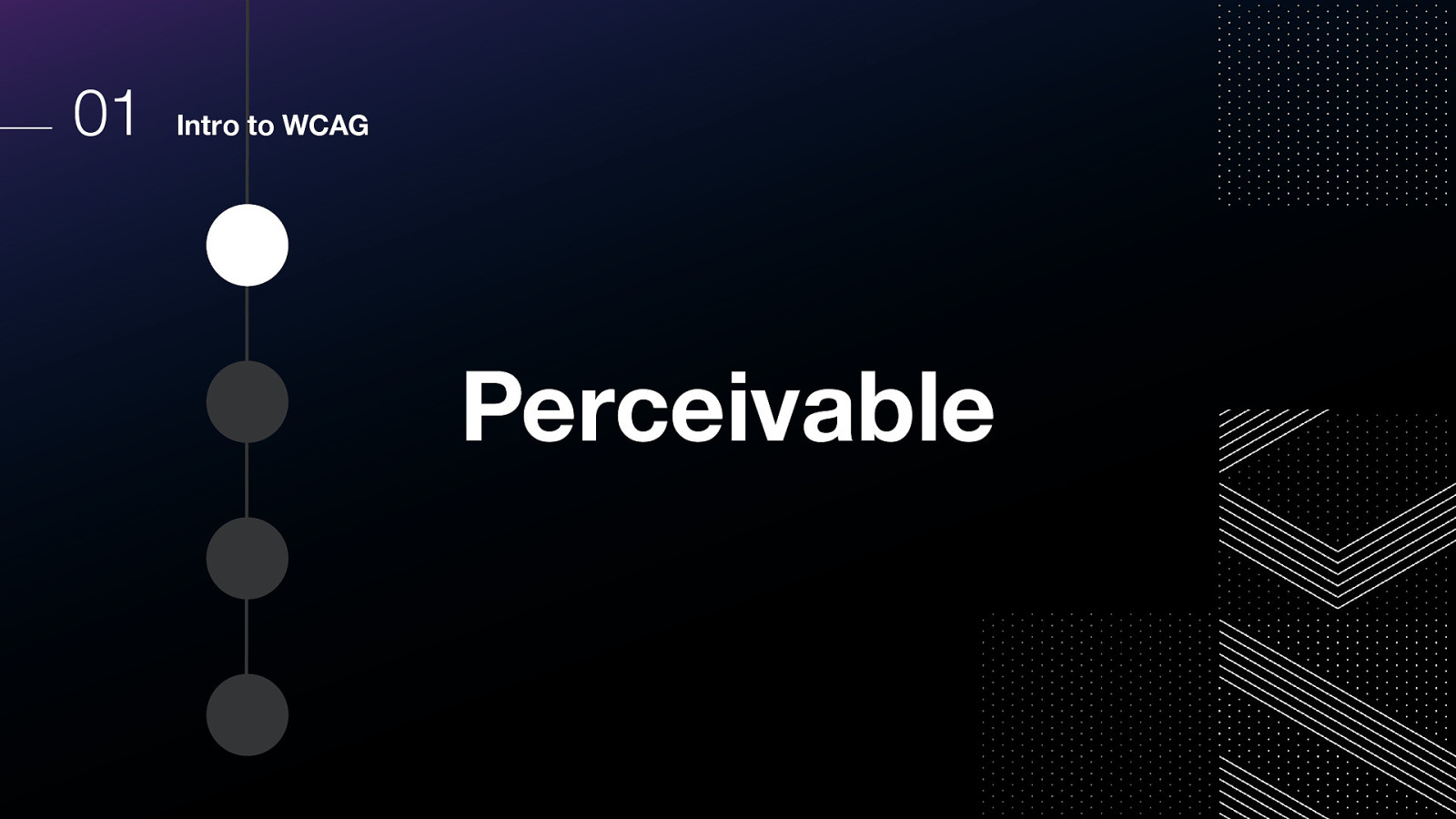
The first category is perceivable.
Content must be perceivable to the user. This may mean presenting it in different ways for different type users so that they can consume the content without losing meaning.
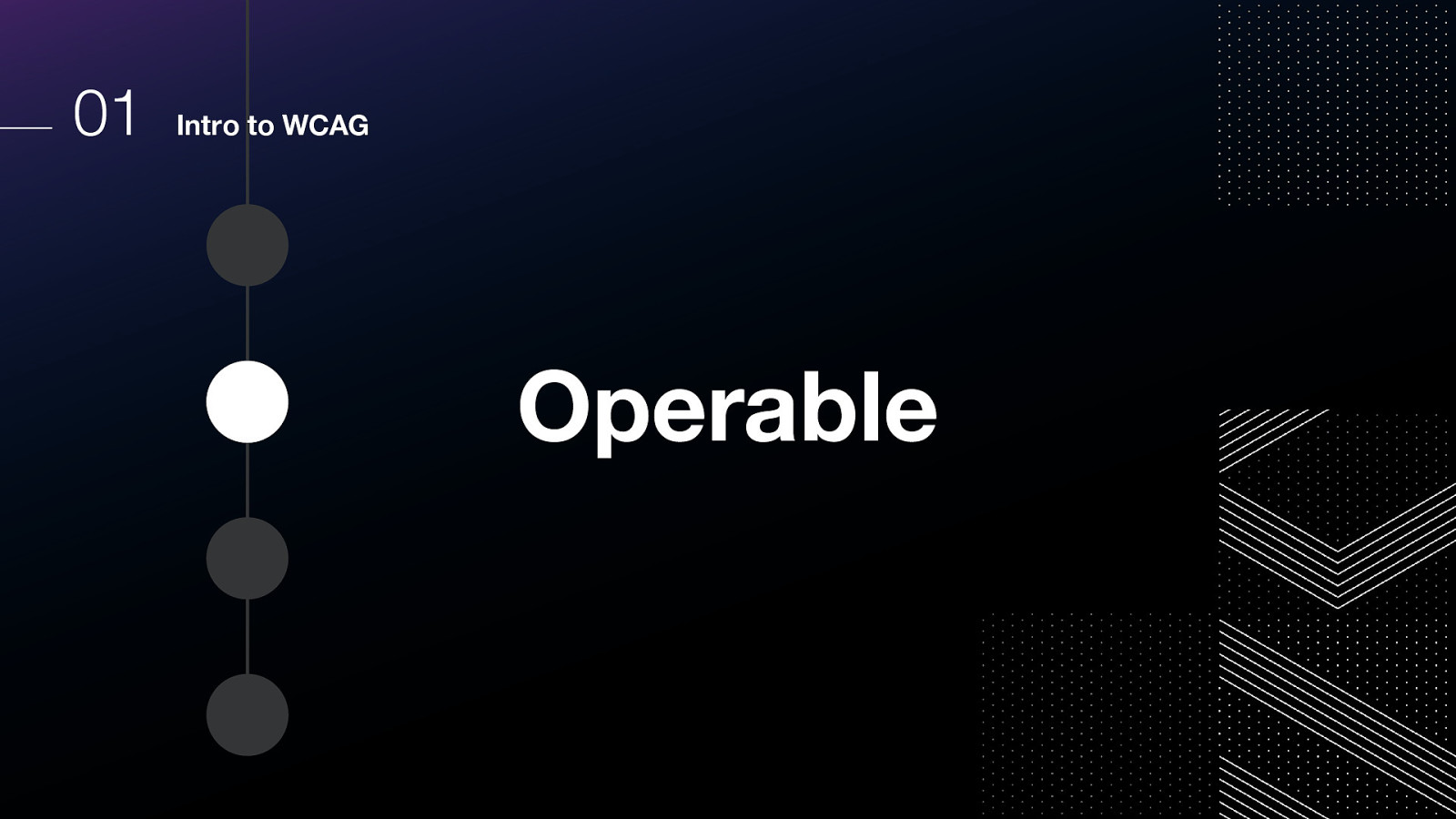
The second category is operable, and relates to how the user can interact with the interface.
Some examples include
Make all functionality available from a keyboard. Give users enough time to read and use content. Do not use content that causes seizures or physical reactions. Help users navigate and find content. Make it easier to use inputs other than keyboard.
The third category is understandable, and relates to content.
Some examples include Make text readable and understandable. Make content appear and operate in predictable ways. Help users avoid and correct mistakes.

And the fourth category is robust.
This means that the code rendered to the browser needs to be able to be successfully parsed and understood by assistive technology. Some techniques include using HTML according to the specification, ensuring all ID attributes on a page have unique values, and that the web pages themselves have been validated for technical accuracy.
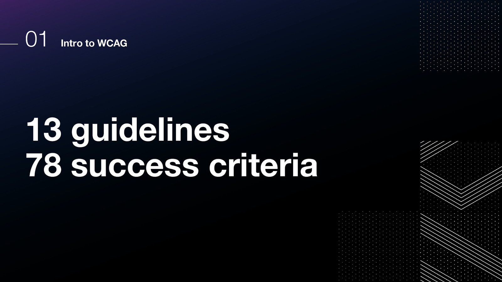
These four categories are divided into 13 guidelines.
Within those 13 guidelines, there are a total of 78 success criteria! Each success criteria is given a level of A, AA, or AAA.
Of course, we don’t have time to review each of these now, but they are available on the web and will be covered in future accessibility trainings.
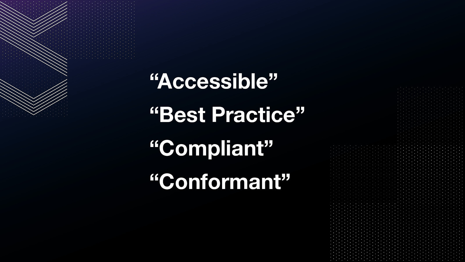
Now, there are also some terms that you may hear when an accessibility subject-matter expert, or SME, is evaluating a digital product. Accessible” “Best Practice” “Compliant” “Conformant”
It is very common to hear “this is accessible” or “this is not accessible.”
It is a bit of a shortcut, and includes some assumptions, so if you hear me or another accessibility SME using this term and it’s not obvious to you what they mean, please feel free to ask for more clarification.
However, it is my experience that many designers and developers do not generally wish to use specific technical terms and the broad term is sufficient.
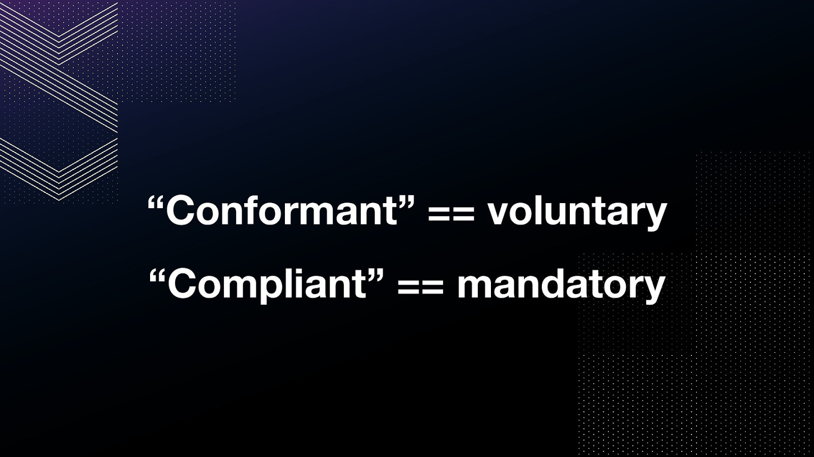
Conformance and compliance are the more official terms.
when the word conformant is used, it is indicating a voluntary implementation of WCAG success criteria.
Compliant is used to indicate mandatory implementation of WCAG success criteria for legal purposes.
Additionally, there is the phrase “best practice”.
When we say “best practice” it’s a combination of “this is what we have learned from the feedback of users with disabilities” When we wrote the specification for the web, this is how we wanted folks to do things, and there were reasons Spec doesn’t have to just support the web for now, it has to support the web in a backwards compatible way. This means there are examples in the specification that are very much intended to support legacy code, but they are considered outdated or not best practice in modern code.
This doesn’t mean “personal preference.”
It takes a long time for specifications to change, too! New implementations have to be proposed and reviewed and tested and then nominated for acceptance. Best practice is one way to indicate that it’s the direction specification committees intend authors to implement, but it might not yet be official specification.
Moving on to our next agenda item: the meta of accessibility. Let’s talk about ways we can update our mental model.
In the past, we thought things were very simple. You have a disability or you don’t.
But we have learned that this is an outdated way to think about it.
For example, did you know that most color blind users don’t consider themselves “disabled” or “having a disability”?
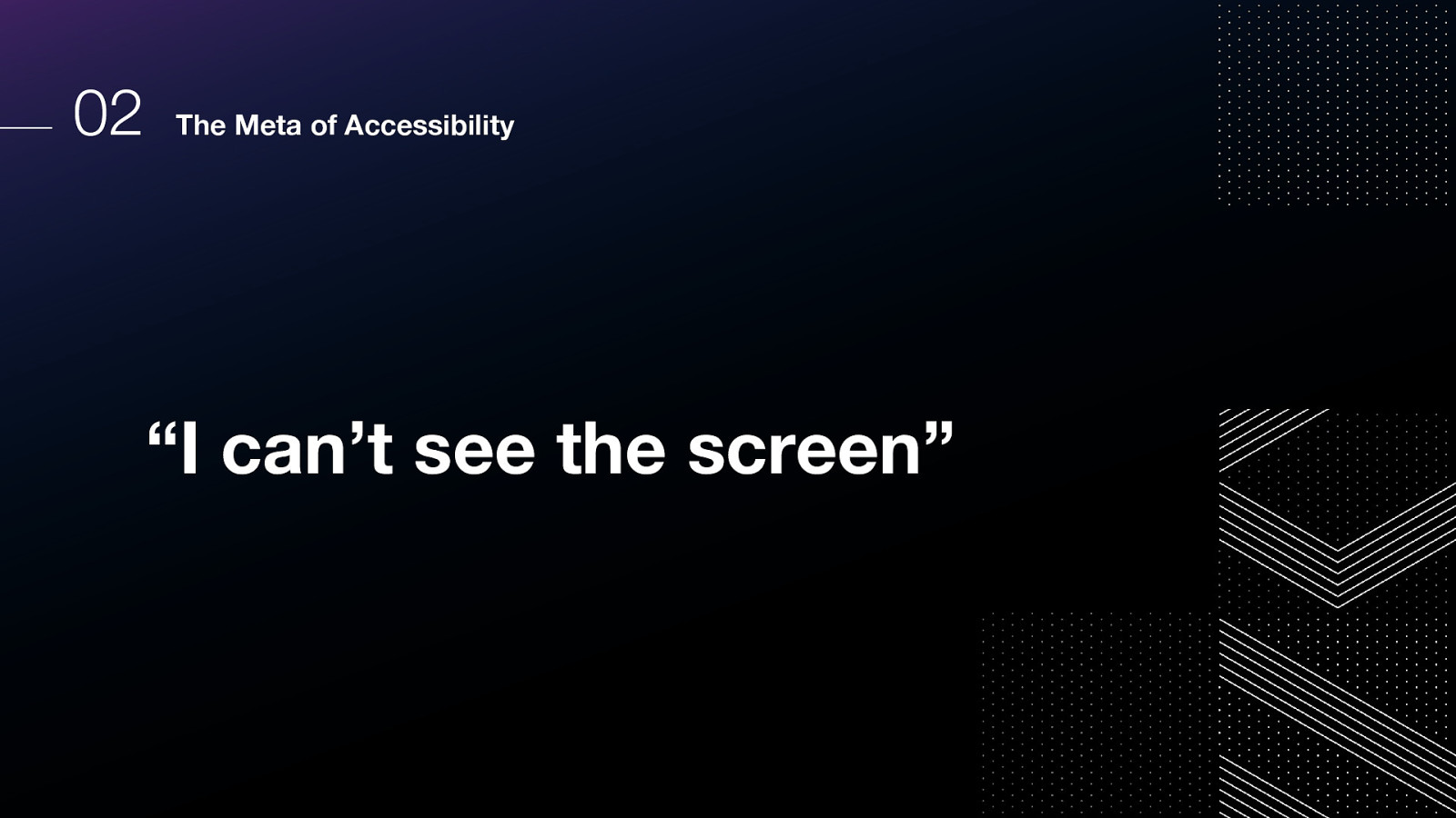
What do you think about when someone says “I can’t see the screen”?
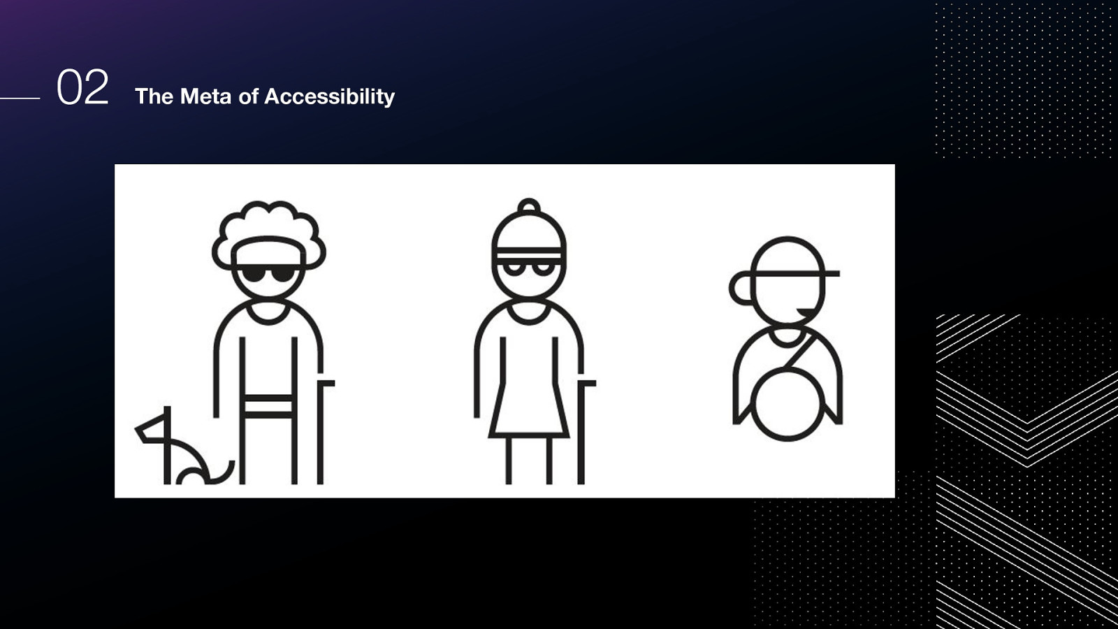
Could be blind Could be near or far sighted Could be color blind and there’s not enough contrast Could have just had eye surgery Could be outside in the bright sun
What about when someone asks for captions?
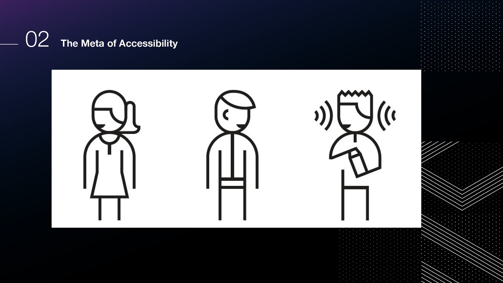
Could be deaf Could have an ear infection Could be in a quiet place and have no headphones Could be in a noisy place and even with headphones, can’t hear very well Could be attending a talk where the speaker has an accent they are not used to
what about when someone needs keyboard shortcuts or wants touch capabilities?
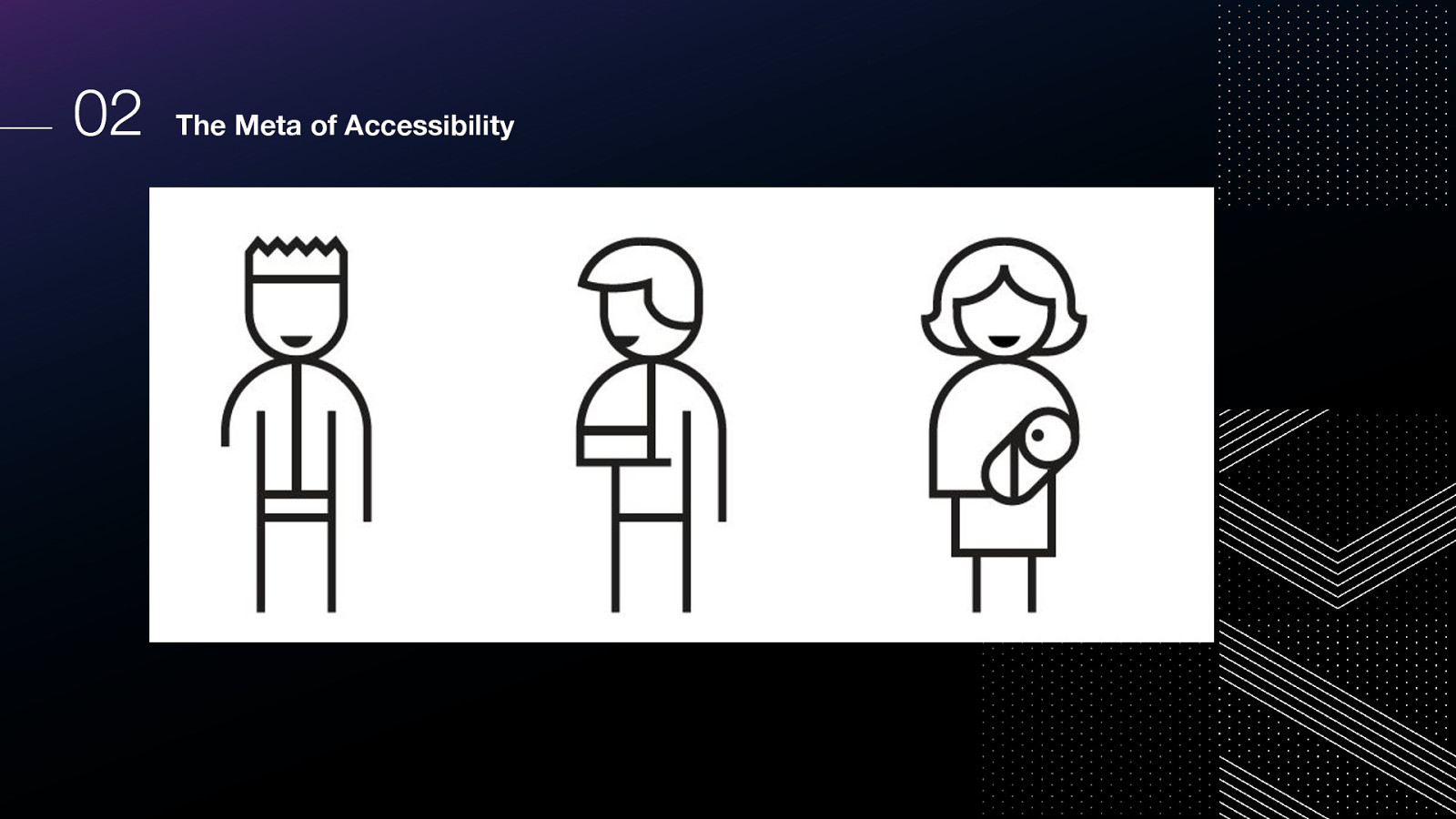
They could have RSI They could need to do things faster (parenting small children, have time constraints for work, attending lots of meetings, etc) They could be a power user Could have ADHD and muscle memory of keyboard shortcuts are super useful Maybe their mouse batteries died
So going back to this outdated thinking…what’s a new way to think about this?
I think Microsoft really helped us all think about this in an improved way.
How about this: it’s a mismatched interaction. It might be situation or permanent.
But this isn’t about a single user’s health or personal situation;
Instead, let’s focus on the interaction itself; a mismatch between a user and the interface they are trying to use.
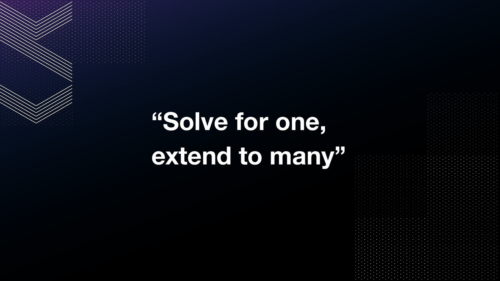
From Microsoft’s Inclusive Design: Recognize exclusion Learn from diversity Solve for one, extend to many
What is the state of accessibility on the web?
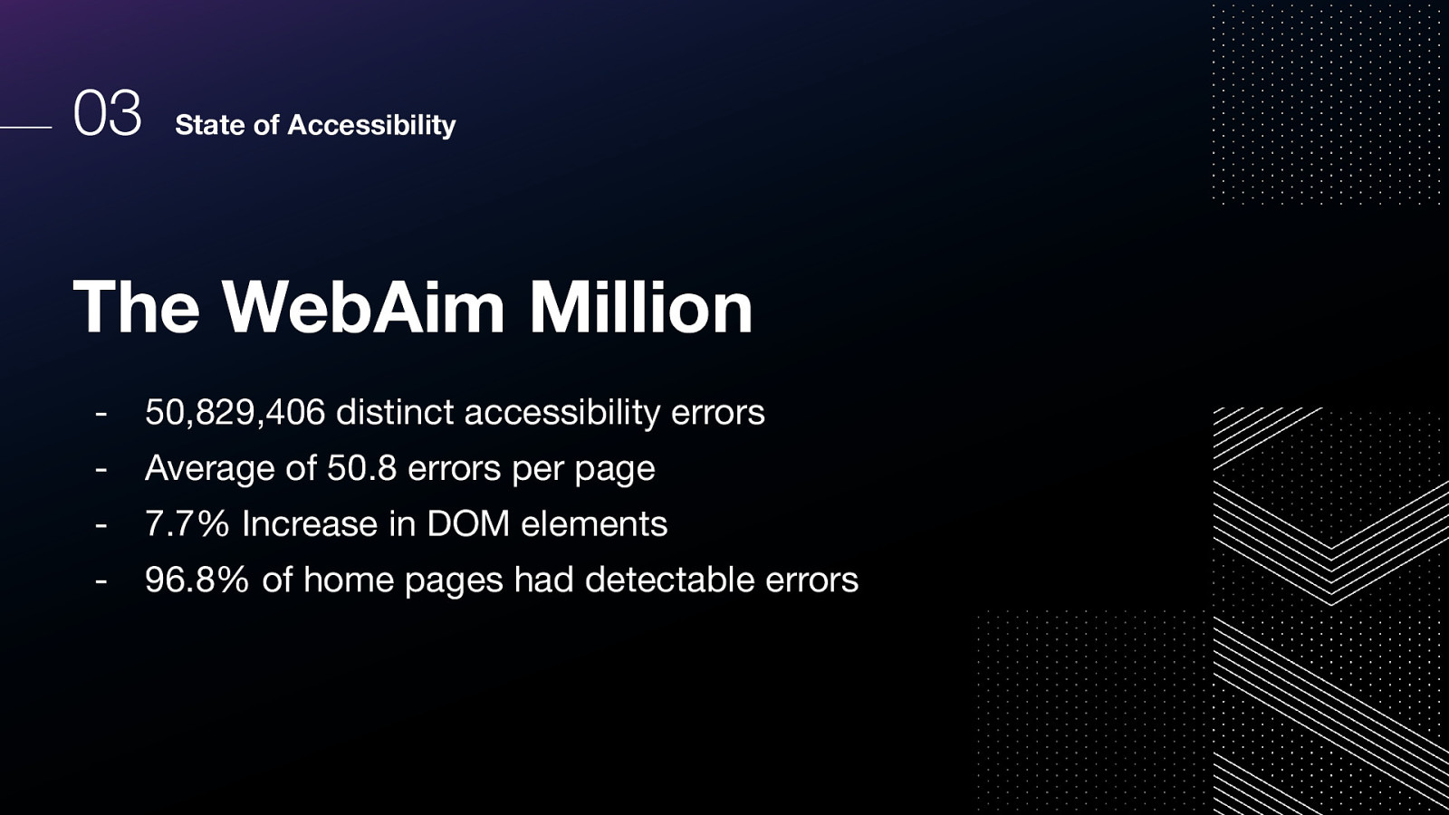
WebAim produces an annual report on the accessibility of the top one million most-visited home pages, and evaluates those pages for conformance with the WCAG success criteria.
Here’s what they found in 2022.
We all have a role to play, and it takes everyone at every part of the process to successfully make an accessible product.
We might hear people say “our clients didn’t ask for accessibility.”
I like to compare this to a baker saying, “You didn’t ask for sugar in your cookie.”
▪ Vocalize accessibility as a priority ▪ Ensure it is included in budgets
▪ Use clear language ▪ Use consistent phrasing
▪ Simplify the user experience ▪ Make context and purpose clear
▪ Think beyond minimum color contrast requirements ▪ Plan for zoom (browser zoom, text size zoom) ▪ Make sure interactive elements are large enough ▪ Try to think in proportions, not pixels
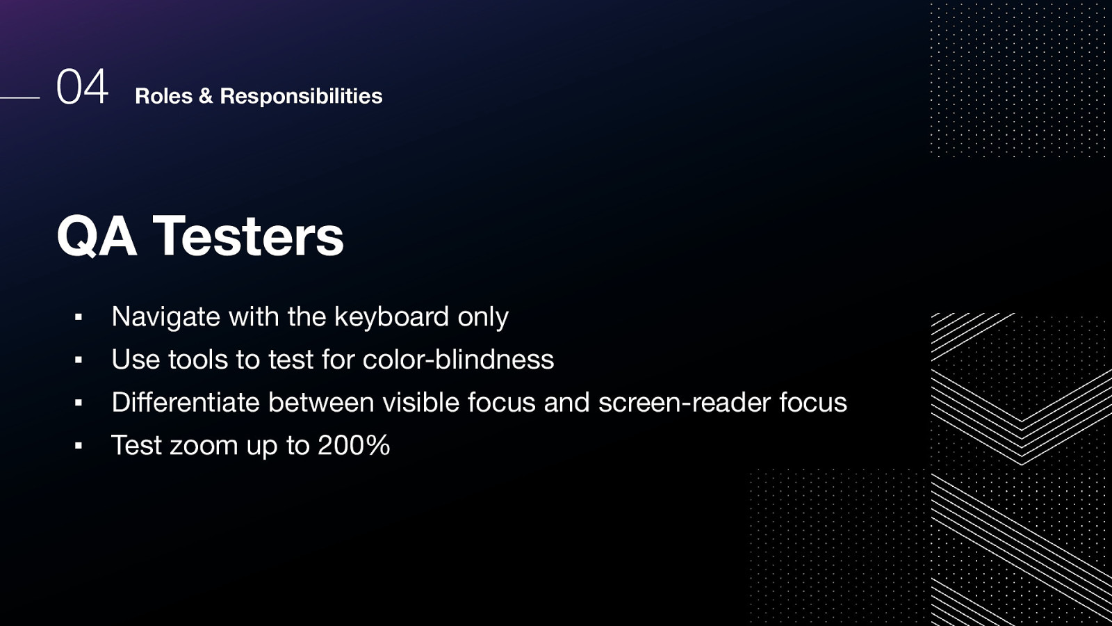
▪ Navigate with the keyboard only ▪ Use tools to test for color-blindness ▪ Differentiate between visible focus and screen-reader focus ▪ Test zoom up to 200%
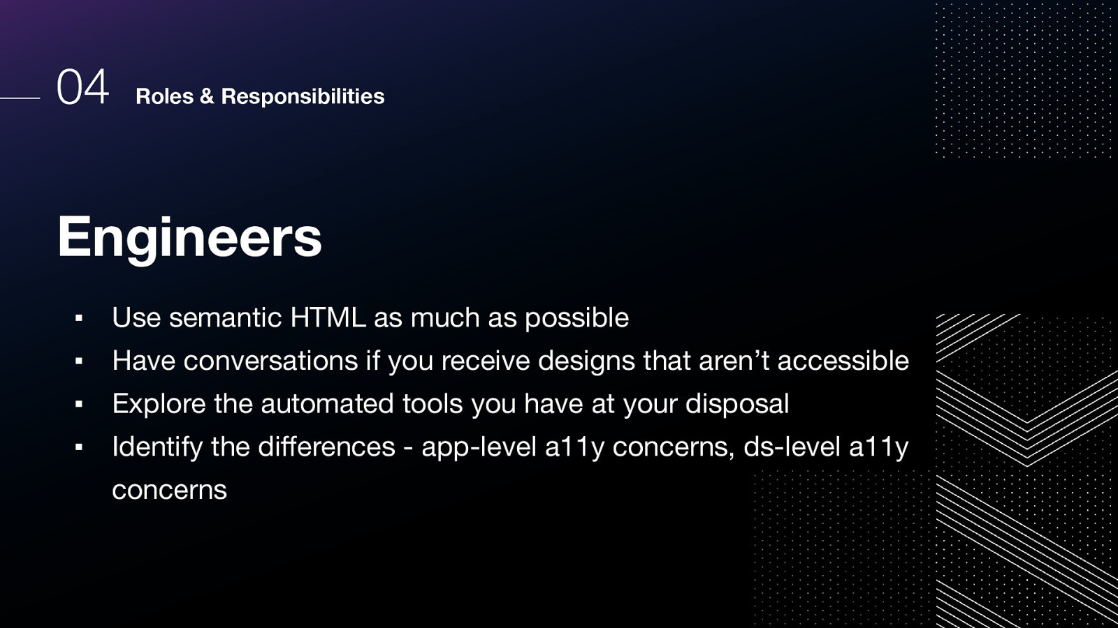
▪ Use semantic HTML as much as possible ▪ Have conversations if you receive designs that aren’t accessible ▪ Explore the automated tools you have at your disposal ▪ Identify the differences - app-level a11y concerns, ds-level a11y concerns
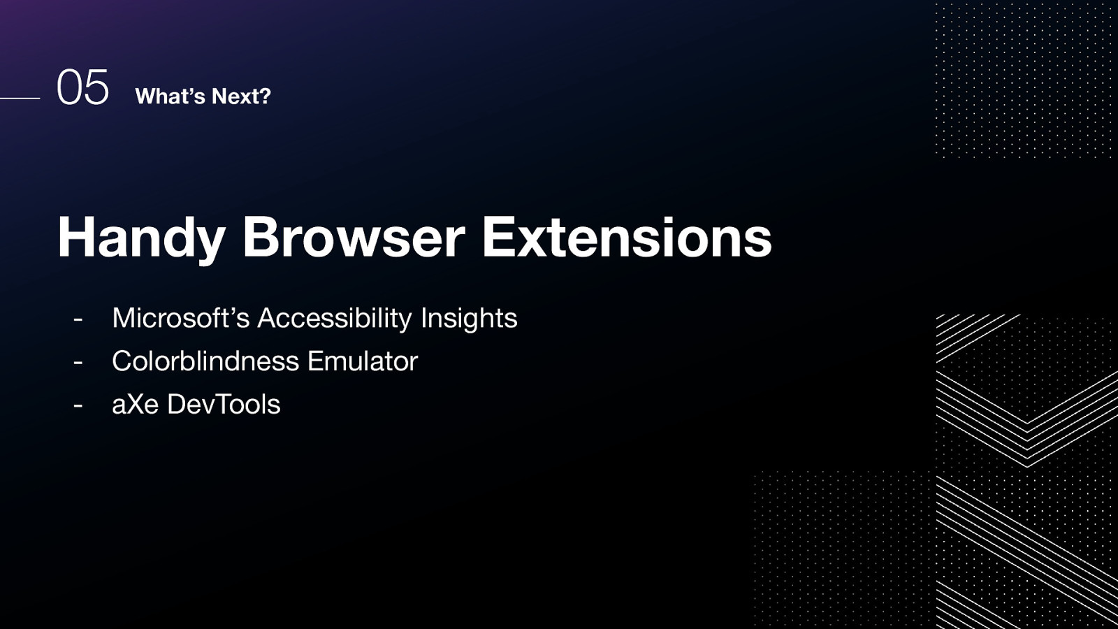
Handy Browser Extensions

HashiCorp Design System https://go.hashi.co/design-system through which we’ll be implementing our accessibility strategy.
So let’s recap, what did we talk about? 1.Intro to WCAG 2.The Meta of Accessibility 3.State of Accessibility 4.Roles & Responsibilities 5.What’s Next?
You do not require permission to create accessible products. This is my quote, but I put it in all of my slides because I want us to really have this ingrained in our psyche.

You can reach me at melanie@hashicorp.com. Thanks for watching this talk!