Hello Everyone. My name is Melanie Sumner, and I’m here today to talk about the phenomenon of the unlucky choice- the kind of choices that we make in the digital product development process that can hurt us in the long run.

A presentation at EmberFest in October 2019 in Copenhagen, Denmark by Melanie Sumner Temple

Hello Everyone. My name is Melanie Sumner, and I’m here today to talk about the phenomenon of the unlucky choice- the kind of choices that we make in the digital product development process that can hurt us in the long run.

I live in Chicago with my husband, son, and our two cats. Our cats like to try to sit in the same box, steal my desk chair, sleep on the books I’m trying to read, and get me to buy larger desks so they can sleep between my monitor and my keyboard.

I’m a disabled, decorated military veteran who served as an intelligence analyst in the US Navy.
Right now, I work as a senior software engineer and accessibility SME at LinkedIn, where our vision is to create economic opportunity for every member of the global workforce. I work directly on the accessibility of Ember.js, the front-end JavaScript framework that powers all LinkedIn apps. It’s also a framework committed to providing an accessible experience for everyone that uses an Ember app.
As a member of the Ember.js core team, I am helping to make that idea happen. In the last year, we’ve added an accessibility category to the framework documentation, and improving accessibility across the board is one of our primary goals for the next edition of Ember.
I also am a judge for CSS Design awards- and yes, I do check the accessibility of the sites as part of the design.
I’m also an organizer for EmberCamp Chicago.
I write articles, tweet a lot – my twitter handle is melaniersumner, and you’ll see it in the bottom-right corner of all of my slides – and talk about accessibility at conferences.
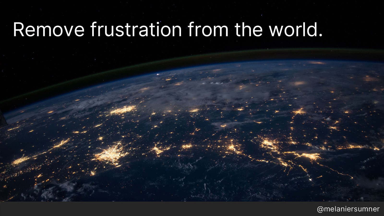
I became a web developer because I wanted to remove frustration from the world.
I remember the happiness I felt in 1997 when I wrote my first lines of HTML and saw it render on the page. I remember the absolute elation of learning CSS and making my site look different. I soaked up everything I could from CSS Zen Garden and tried all sorts of different things. I remember the sorrow of trying to learn JS and the joy from when it finally worked.
But around me, I saw people being frustrated with the web. Frustrated with poorly designed and implemented software. They just wanted to check their bank balance, or do their daily jobs, jobs that required software, but the software was designed poorly and their frustration mounted as a result.
If you think about it, web developers have such a great capacity to create delight. So I imagined that maybe if I created a great interface, the people who used it would be happy at work, and even happier leaving work, and they wouldn’t honk so much or have so much road rage, and maybe they’d be nicer and not kick the dog, and maybe even recycle and who knows even be inspired to reduce their carbon footprint and we’d fix global warming.
Ok so maybe that was a little bit of a rabbit hole but you get the idea.

But of course, reality is different. The state of web development is such that you can have two people who are both front end developers but in reality they have nothing in common. JavaScript engineers have taken over the space because businesses would rather make it efficient by having the same job and the same requirements and hey, the back-end is basically the same thing as the front end anyway right?
So we’re in this strange twilight zone where there’s always a new thing that is supposed to solve all our problems, only the new thing pretty much has the same problems as the old thing, but we never figure it out until it’s too late and everyone has re-written their apps…for the third time.
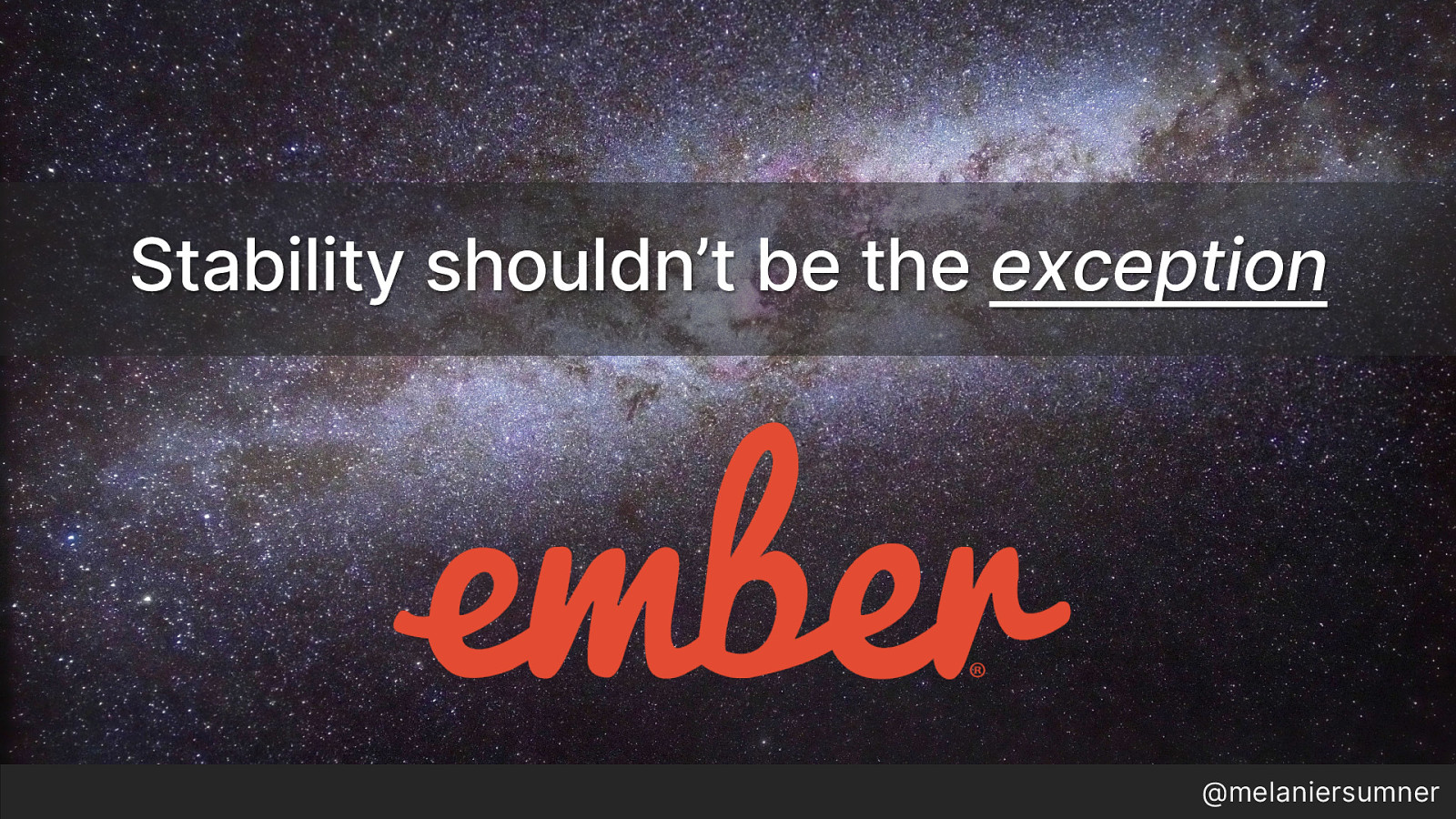
We are super lucky that Ember has a backwards compatibility guarantee- that means new features can be introduced, but they must be backwards compatible. While this does mean extra work, the stability we are able to offer as a result has made it worthwhile.
However, this kind guarantee shouldn’t be the exception. It should be the rule. But somehow it’s not. T
he thing is, 20 years ago we were all just figuring out how to do this. 10 years ago we were just getting JS frameworks to help efficiently ship web-based software for companies.
And Today? We should have a lot more stability. Our jobs should be a lot more BORING.
We have a lot of it figured out. But I don’t think we’ve realized it yet. So I spent a some time thinking about why.
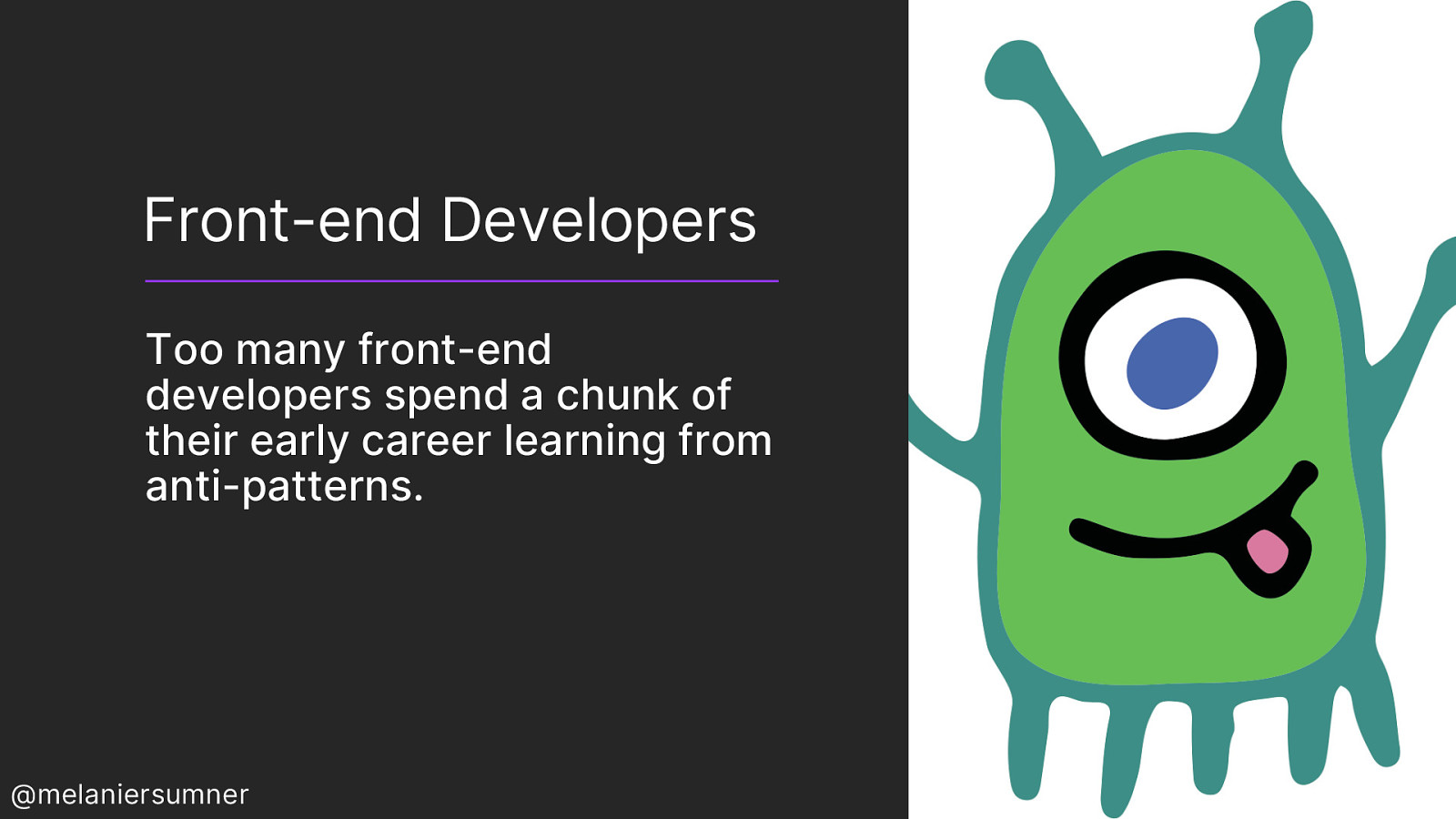
Today, too many front-end developers spend time learning how to “hack” things together, and end up learning from anti-patterns as a result.
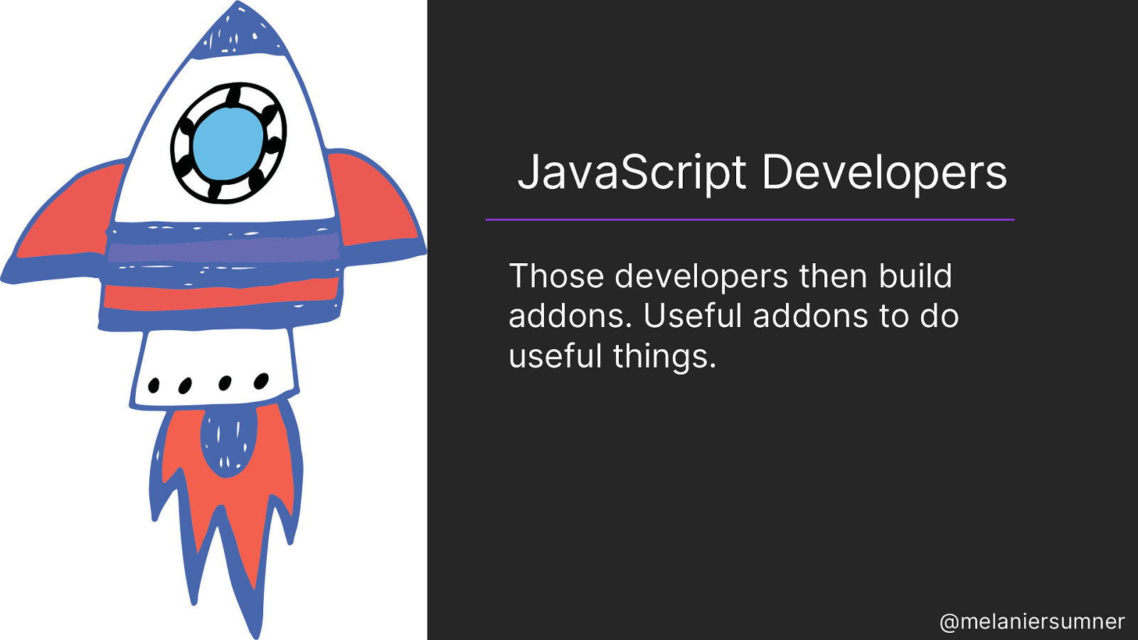
But, those developers never come to understand that the thing they learned how to hack together is really an anti-pattern- to them it is just a pattern- those developers then use that knowledge to build addons and libraries and they are useful because they do useful things. And they get praised for them! Promoted even!
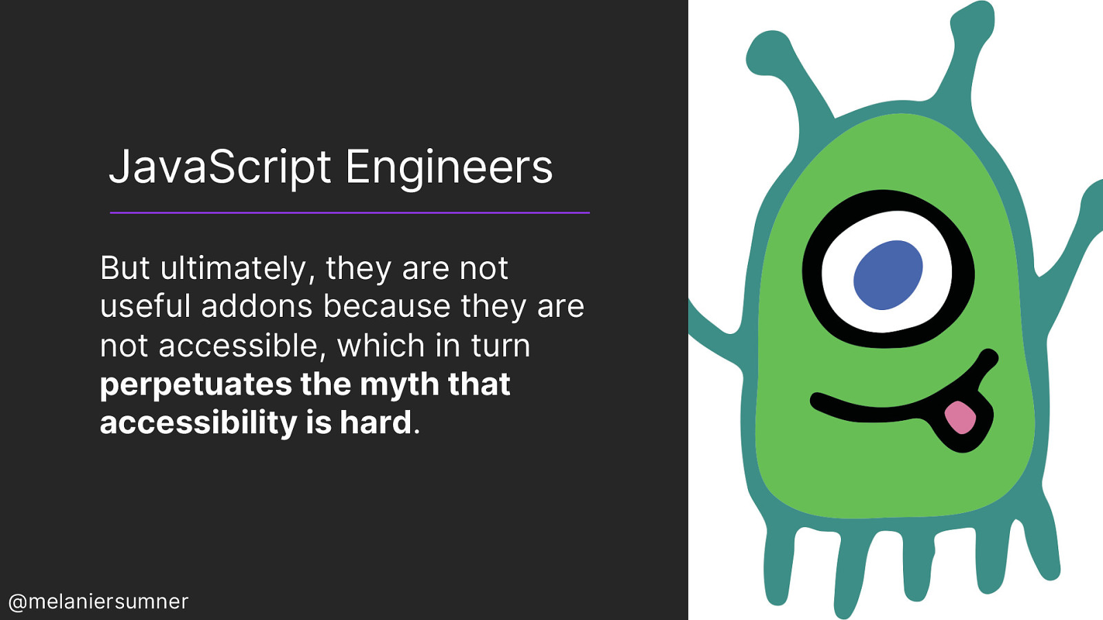
But ultimately they are not useful because they are not accessible and there’s this moment of intense disconnect for the front end developer. Why is an accessibility engineer telling them that their super useful thing is wrong? Why is the thing that they were praised for and promoted because of, bad? After all the things they have learned and how much work it took to get to that point, realizing that they know absolutely nothing about the things that are BASICS in accessibility can feel really disheartening and even demoralizing. It feels bad. Really Bad.
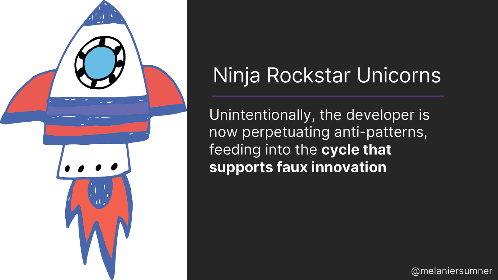
So then the ninja rock star unicorn starts to perpetuate the myth that accessibility is hard, as a means of self-defense. Surely they are right. They were praised! They were promoted! They landed that swanky job!
This is problematic because at a large scale, it feeds into the cycle that supports faux innovation.
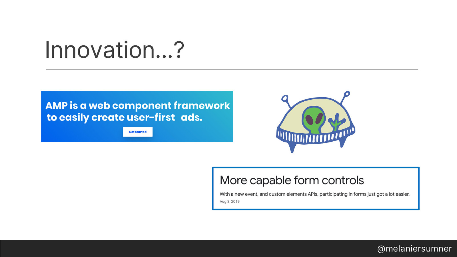
They become the engineers who are the driving force of what we think of as innovation, but are not helping us to innovate anything new, but rather reinventing things we already had. I have two examples of this. Consider AMP – add some extra markup and it will make your sites faster! It promises.
This might seem like innovation, but is it really?
Or consider the recent announcement by Google to make developing forms easier“more capable form controls,” we are promised.
The crux of this innovation? It seems to be “We can’t style native controls, so let’s hand over the API to be attached to whatever you decide to make instead.
And sure, sometimes it’s hard to style forms, and I think that can be made easier, and I know folks are working on it, but all of these poor decisions are building on top of one another, when we had the answers all along.
These were solved problems.
The thing is, semantic HTML resolves so many issues that these JS-based innovations attempt to solve- or re-solve, as the case may be.
Too many JavaScript engineers brush off HTML, “oh I just don’t know it that well.” It shouldn’t be this way. The idea that we’re willing to re-write what’s available in HTML simply to make it more like JS absolutely baffles me.
I mean geez, write a transpiler at least! (that’s a joke…I think)
But maybe the way to interrupt all of this, maybe the way to get us all to stop and think for a hot second, is to look at some of unlucky choices we make at an individual level- because one of the ways that change happens is with each and every of us.
So first, let’s talk about this choice in design, this choice to chase aesthetics. I think a lot of time, folks mix up art and design. Interpretation of art is up to the artist or the viewer; but design is different. Design can have an impact on the usability of a thing. Obviously I’m a fan of aesthetics, or at least this slide deck is indicative that I care to some extent, right? But there are some unlucky choices we can make in design that ultimately hurt our other hard work.
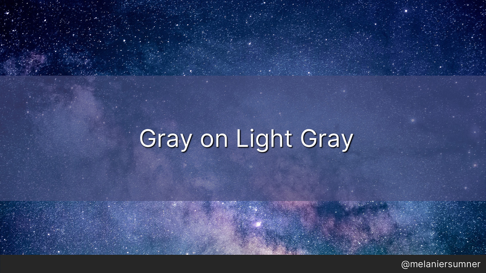
Let’s talk about gray on light gray, or as I like to call it
“When muted tones attack” – made popular by unsubscribe links everywhere. Muted design is the modern equivalent of demonstrating wealth in the west- muted décor lends itself to an airy feel. A popular home painting store here in the United States offers over 100 shades of white, gray, and beige, all barely indistinguishable from one another. And somehow, this invaded our digital product design thinking.
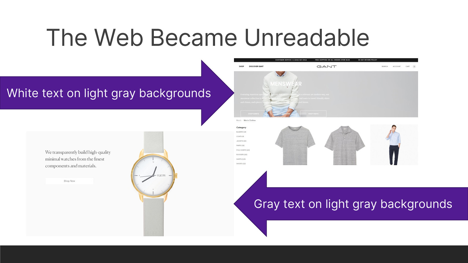
The web became unreadable. White on light gray text, gray on lighter gray text, all of these things became beautiful because big companies who were known for beautiful designs told us that these things were beautiful! They presented them with big splashy events and suddenly silver and space gray became THE colors du jour. So we copied them. It was an unlucky choice, but it felt like an easy choice to make. Surely the big company, who produced beautiful products and beautiful presentations, had done their research. Surely they wouldn’t steer the whole web in the wrong direction. But they did.
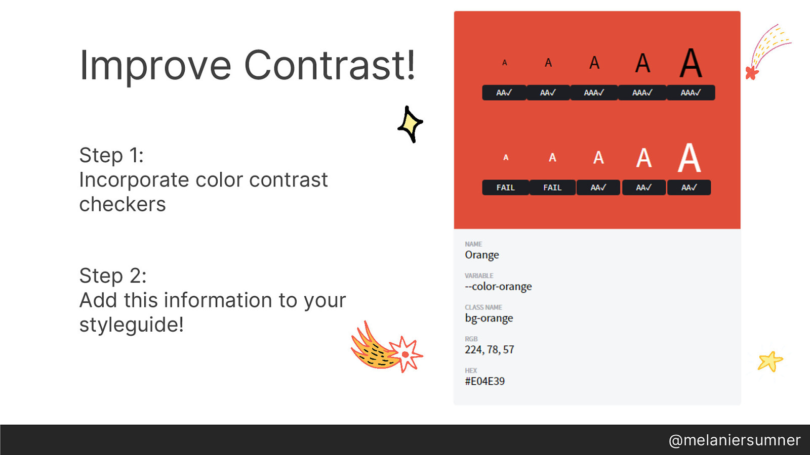
So what do we do about this in our own products? Two things. Step 1: incorporate color contrast checkers into EVERY STEP OF YOUR PROCESS. Designers should have color contrast checkers. Developers should have color contrast checkers. Add extra testing for color contrast checking. It’s 2019 and color contrast in digital products is a solved issue. With science. And math. We don’t have to have this issue anymore. Ever. Not sure which one to use? Search “color contrast checker” in your search engine of choice and you’ll see a ton of options. Step 2: Add this information to your styleguide. Make it so gosh-darn simple to understand that there’s zero question about it. It’s documentation that can be used in conversations with product managers, stakeholders, users, designers, developers, everyone! Make it easy to understand what passes and what fails.
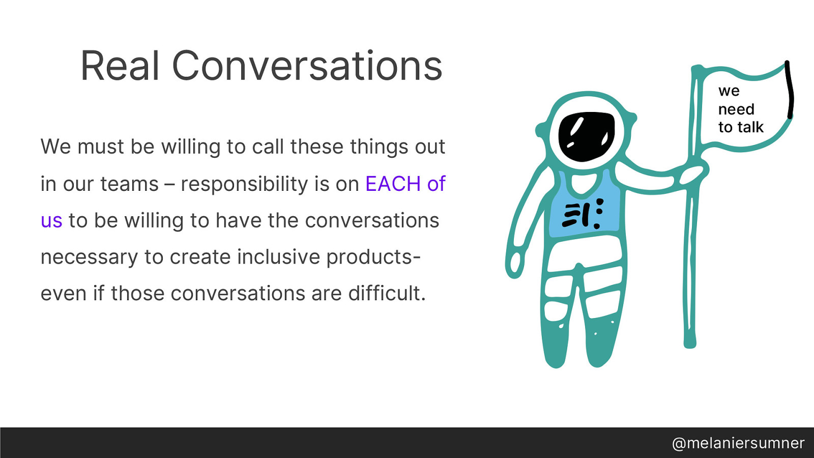
Real talk, thoughIt’s vital, it’s a solved problem, and I can assure you that every single accessibility professional in your life is really tired of talking about it. We absolutely must be willing to call these things out in our teams. The responsibility is on each of us to be willing to have the conversations necessary to create inclusive products- even if those conversations are difficult. It’s okay to spend some time thinking about the right way to phrase it. It’s okay to raise a concern. It’s okay to ask about the risk. It is no longer okay to stay silent, or think that the responsibility belongs to someone else. It does not.
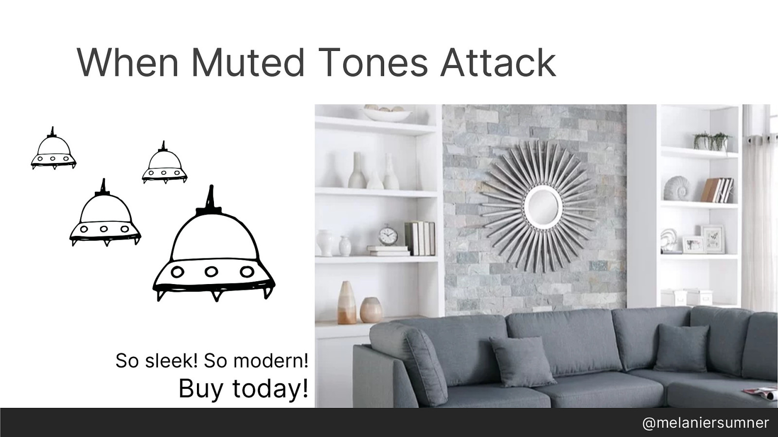
Another area where we allow chasing aesthetics is in form controls- specifically radio buttons.
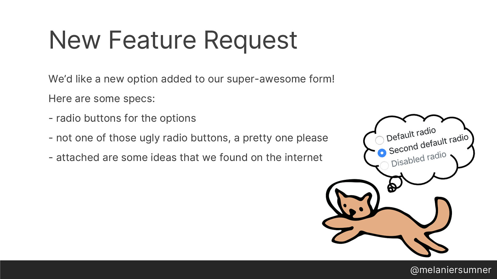
A new feature request comes in. They’d like a radio button with options for the new form. But they don’t want any old radio buttons, they want fancy buttons. Oh and it’s easy right? So can you ship it today? So you start to think about the radio button- default state, selected state, disabled state…but get interrupted with an updated request- can you ship it yesterday, actually? Oh, and…here’s some examples of nice-looking ones that we found on the internet.
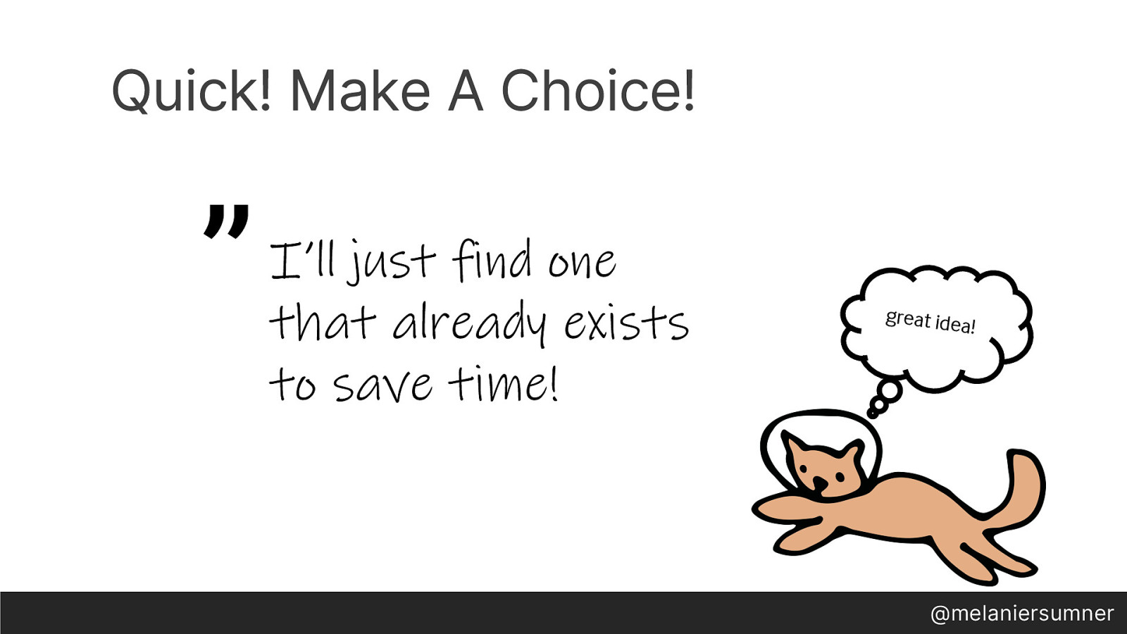
So we stop thinking about radio buttons and instead think about how we could ship it yesterday; after all, we’re ninja rock star unicorns so we can absolutely do that. Oh wait! We’ll just find one that already exists to save time! And in that moment, you’ve made a choice.

So you go hunting, and find something online that’s made by BigTech Co, and it looks nice, and they have tons of components, and it seems to work - so it must be good enough- maybe even great! And in that moment, that’s the moment when you’ve made an unlucky choice.
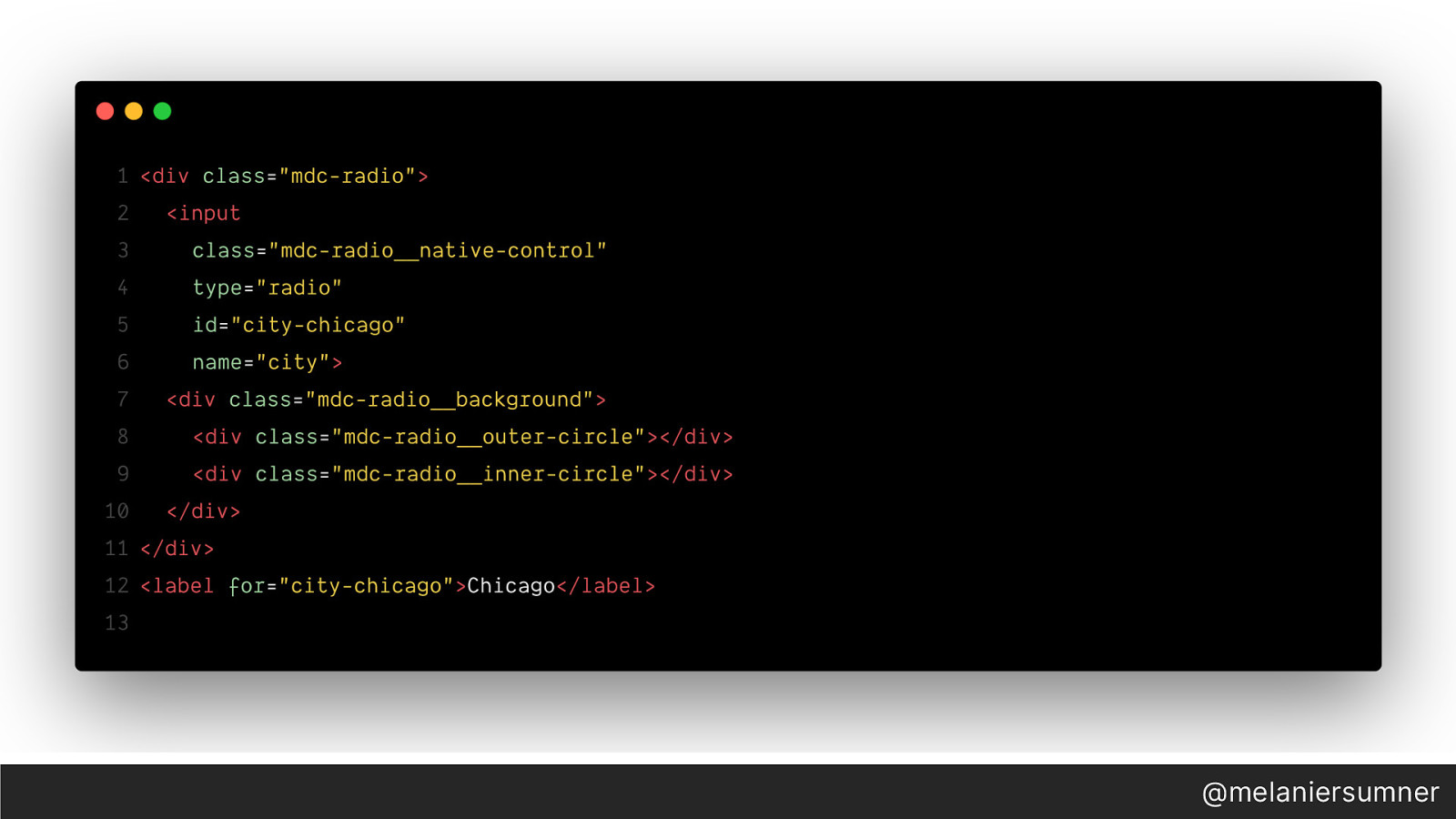
But we don’t realize it yet, and we are paid enough to do some due diligence, so we checkout the markup produced by BigTechCo. A div with an input and more divs, and a label. Seems like a lot. But, the rendered output looks as “pixel perfect” as the product owner wanted. So we decide to use it, and go further down the road of that unlucky choice. But what does this really cost us?
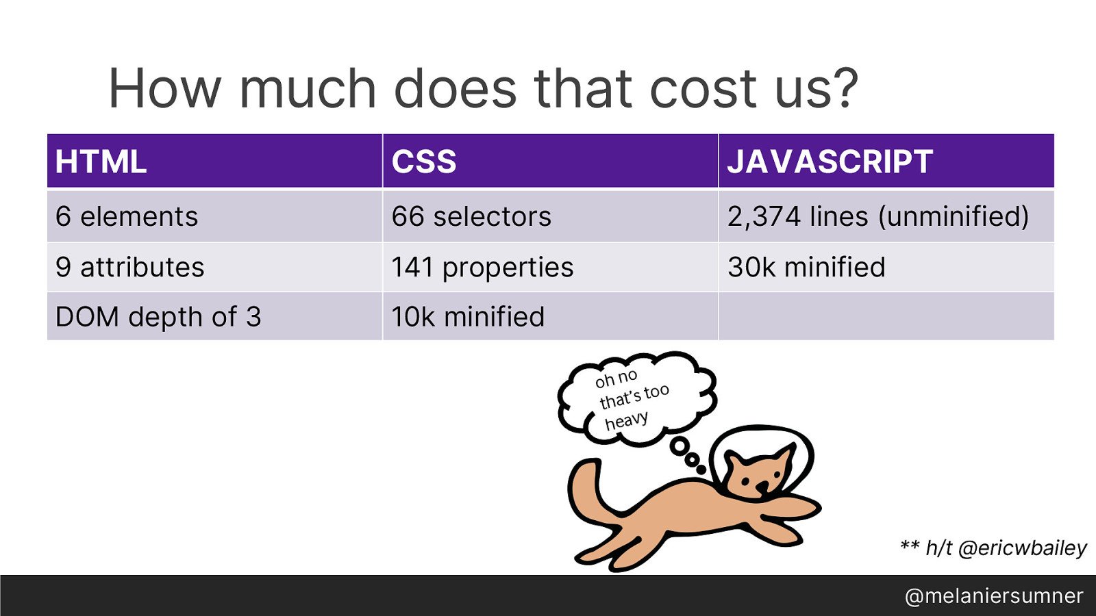
We end up with 6 html elements, 9 attributes, 66 CSS selectors and 30k of minified JS. For a radio button? Turns out, if our form has too many radio buttons, and you try to use that with a screen reader, this will crash everything, since there’s too many DOM nodes to handle. Period. Not even handle, efficiently, just handle at all. All along, we had a much simpler, much more correct answer available to us.
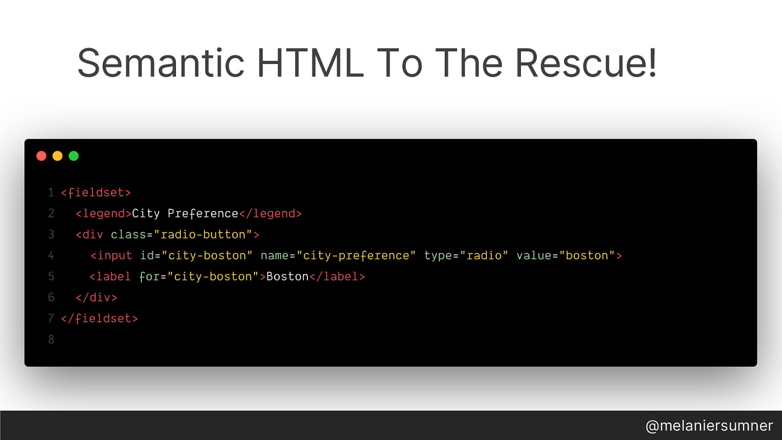
By using the fieldset and legend elements, we can group the radio buttons together in the way that was intended. This also means that we have improved the experience for users with assistive technology such as a screen reader.
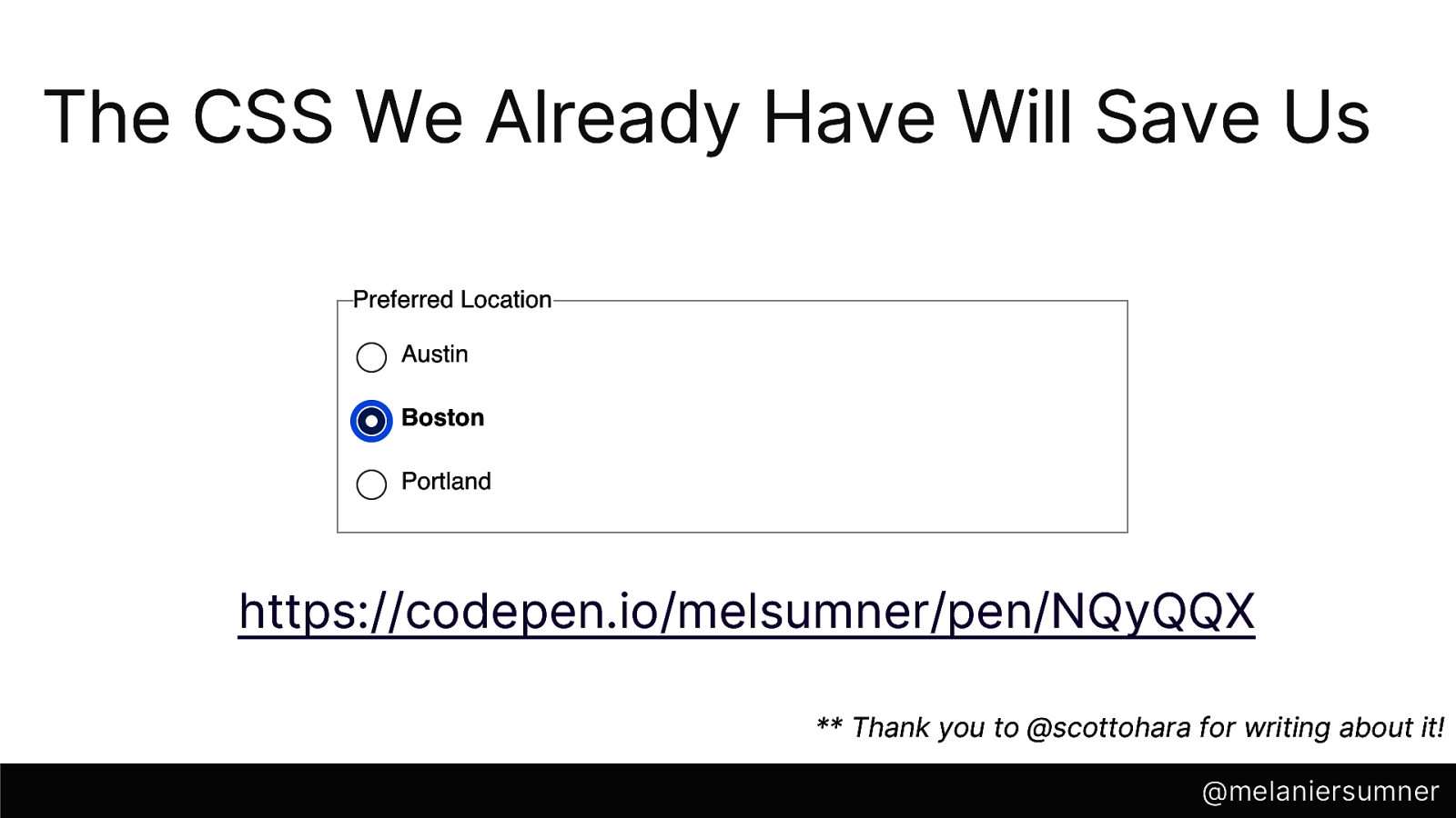
“But what about the fancy design?” you might be wondering. Well, Scott O’Hara has you covered- by showing us that by using CSS that we already have, we can provide non-default radio button styling right along with our default, semantic HTML markup. You can play around with it yourself in this CodePen I’ve compiled to demonstrate the point- codepen.io/melsumner/pen/NQyQQX.
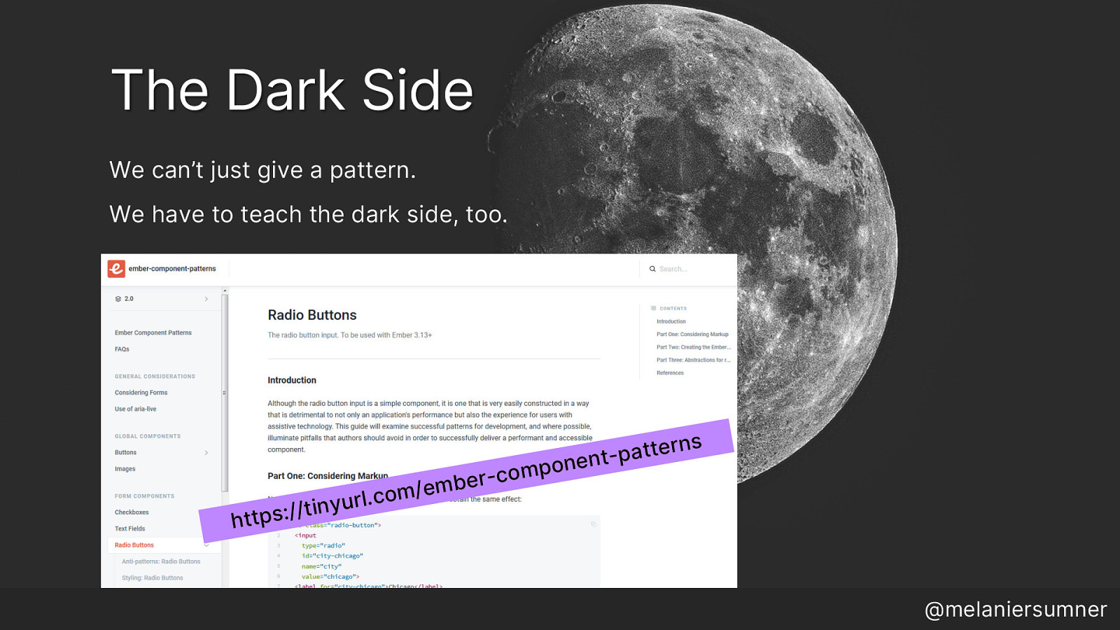
Some Real Talk: I think it’s really important that we focus more on bridging the gulf that exists between accessibility in design and development. So to work on that, I started a project for Ember developers called “Ember Component Patterns” and my goal is to talk through all of these parts- the proper markup, the correct design defaults, how to implement the right thing in Ember, and even how to scale that. I also have included anti-patterns that devs might be tempted to embrace. Because I believe we cannot just give direction on what to do, we need to also provide education about what not to do. We must talk about the dark side. We must talk about it, because that education empowers developers to have the necessary conversations to improve products. You can read more about radio buttons and watch the project as it progresses by visiting https://tinyurl.com/ember-component-patterns - (obvs not right now though!)
So we’ve talked about a couple of the unlucky choices we can make when we are chasing aesthetics, let’s talk about a few of the unlucky choices we can make when we develop with less care than perhaps is wise. I like to call this section lost in web space, because it’s how users with assistive technology often feel when trying to navigate sites.

The first one is missing landmarks.
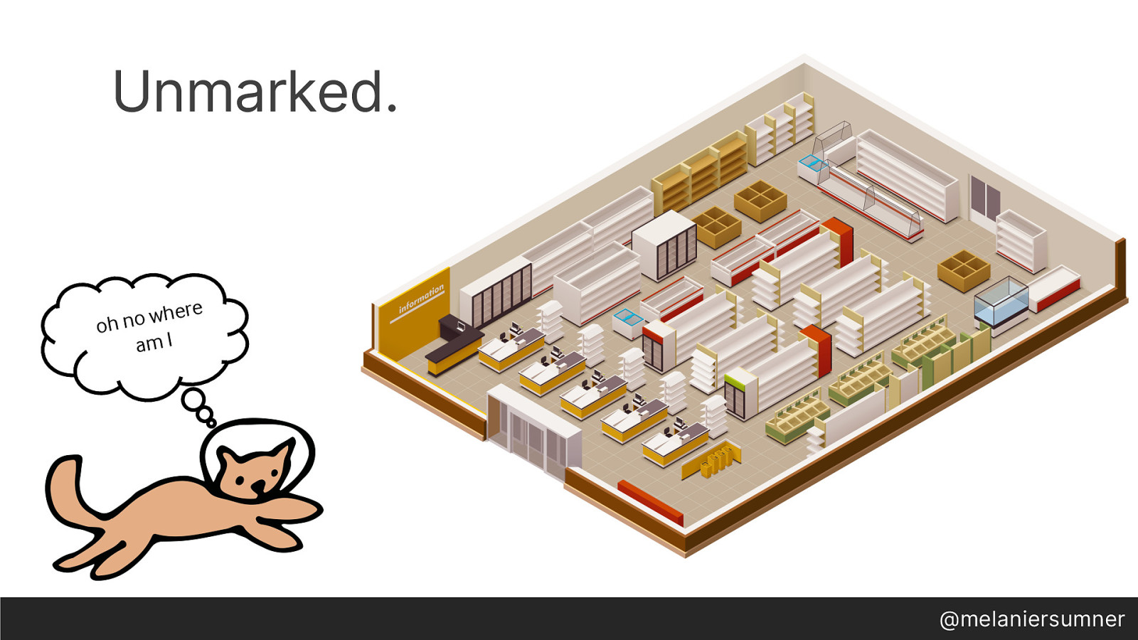
I’d like you to imagine for a moment that you’ve walked into a grocery store. In the grocery stores here in the United States (and I’m only saying that because I don’t know how grocery stores are all over the world, so I can only talk about the ones I know) there are rows of groceries. Above those rows of groceries, hang signs that tell you where things are. Aisle 5, cereal. Aisle 24, paper plates. That kind of thing. Now, imagine you’ve walked into a grocery store, and there’s no signs. So you can’t get to the aisle you need very quickly. You have to walk up and down each aisle and check to see if it’s got the thing you need, or you have to ask someone else for help and that means you can’t shop on your own. That sucks. Why am I talking about grocery stores with no aisle signs?
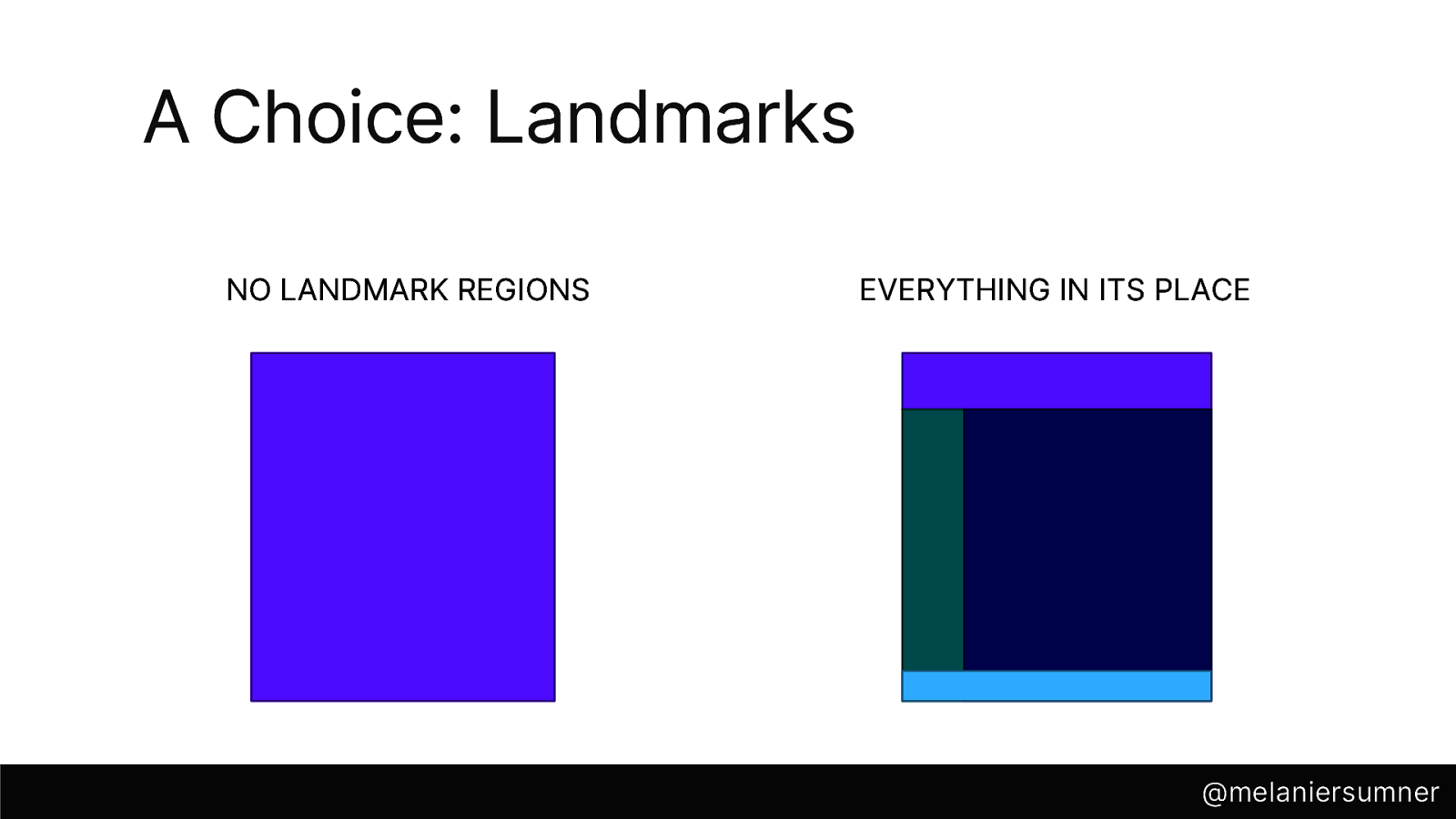
Because that’s similar to a website with no landmark regions. When we fail to wrap the header content in the header tag, or the main content in the main tag, or the footer in the footer tag, we’re leaving out the markers that allow users with assistive technology to quickly – and independently- navigate to the part of the website that they want to get to, the part that matters to them at that moment. Sighted users take this for granted, because we can immediately absorb the full scope of the site with one glance.
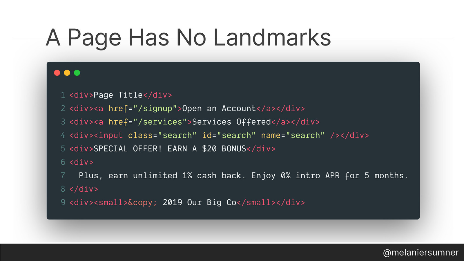
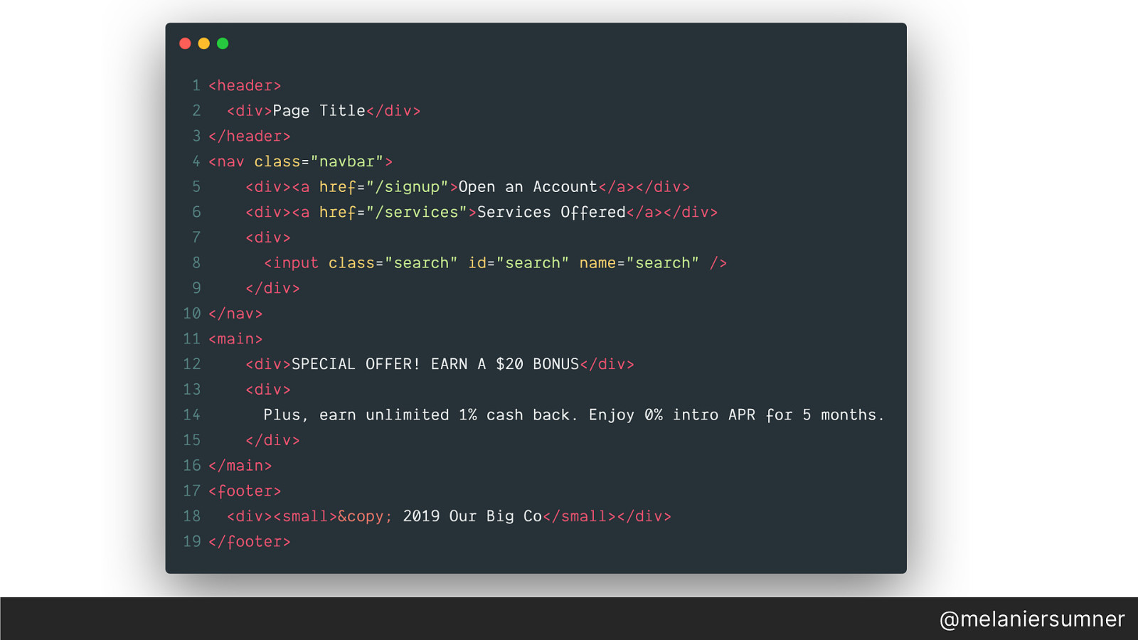
This is a bit of code with no landmarks. It doesn’t have any semantic html either, but we’ll get to that in a minute. This page will read out that there are links - to open an account and another to a page that lists more services offered, and it seems like there’s a search input, and there’s some text with a special offer of a $20 bonus, and some detail text. Everything has landed on the page in a div. It will render to the browser and as such, seem permissible- but none of it has any semantic meaning.
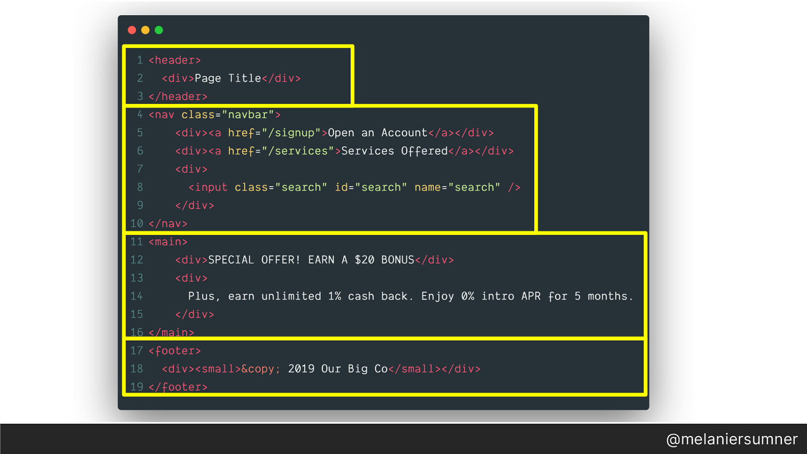
By comparison, this bit of code has landmarks. We have a header that contains the page title. We have a navigation element that contains the links to other pages and the site search. The primary content is now contained in the main element, and the copyright info is in the footer. We’ve just given our users a much easier way to navigate the site.
But what about the code contained in those landmarks? It’s missing semantic HTML which will give the content meaning. Back to our grocery store analogy.
The grocery store now has signs above each aisle- cereal, Aisle 5, paper plates, Aisle 24 – but now all of the items on the shelves have no labels. This means you’d have to open up each package to find out what’s inside- super messy, to say the least. And that’s what we have in this code here. We have the landmarks of header, nav, main and footer, but the content inside each of those landmarks is still missing semantic meaning.
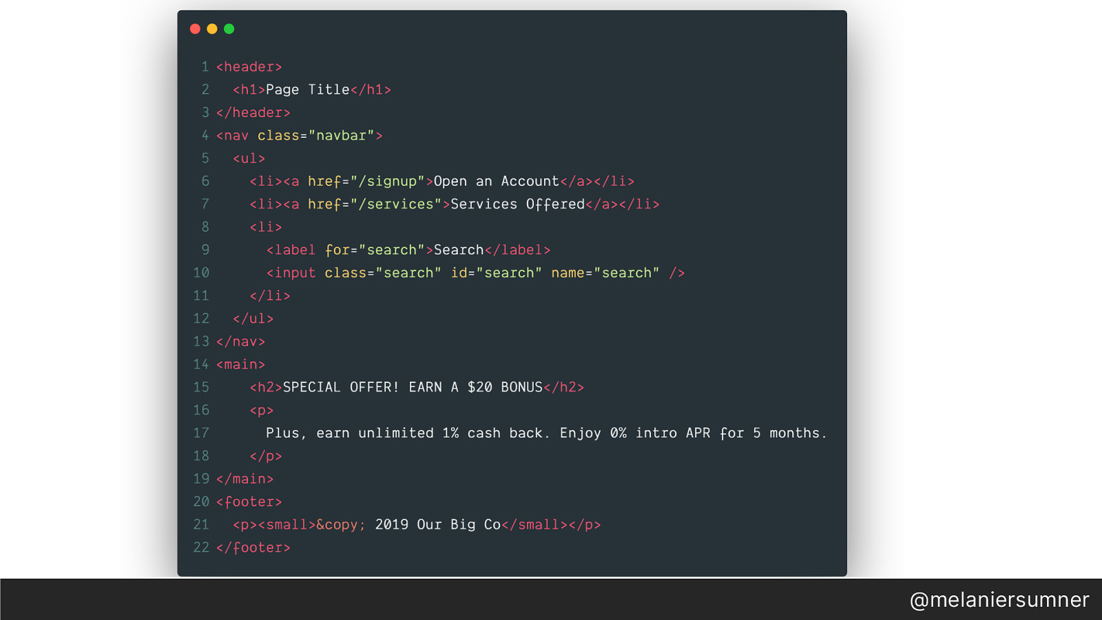
By adding semantic markup- we’ve now got an h1 inside the header element. The navigation elements are now contained in an unordered list. There’s a label associated with our search input field, and the content is now contained in paragraph tags. We’ve now written more technically accurate and better crafted code, because we’ve used the language (HTML) the way it was designed to be used.

I think it’s awesome that JavaScript is so prevalent on the web. I know it might not seem like it all the time, but I think it’s mostly because we have not learned how to properly wield this powerful tool that we have. It’s made accessibility possible. It’s made building powerful web apps something you could learn how to do on your own, or at a bootcamp or with a friend at a meetup. No CS degree necessary. But there’s a non-negligible effect of all these awesome new JS engineers who were straight up trained that using div elements is just fine, or who never bothered to learn semantic HTML. HTML isn’t old school. It’s necessary. Any content that ends up rendered to a browser page needs to have semantic HTML. As a developer, we must write it. As tech leads, we must provide that feedback when a pull request doesn’t have it. As leaders, we must insist on well-crafted code in our products.
The thing is, it still goes deeper than chasing aesthetics or marking up code, because we’re clever. Because there are 10 ways to do any single thing in JavaScript, and we’ve not yet come together and made the choice that even though we could do it ten different ways, there are a lot more interesting problems to be solved and we could move forward faster if we all focused in on one or two ways. Boring but effective.
We see the opposite of this with custom components. I think we have the best component story out there, bar none. Especially with Ember Octane.
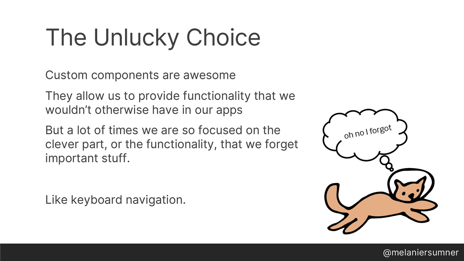
But we get tripped up with them, because we haven’t realized that parts of the component development process should be mind-numbingly boring because it should never change. We reinvent the wheel each time and in doing that, we forget important stuff. Like Keyboard Navigation.
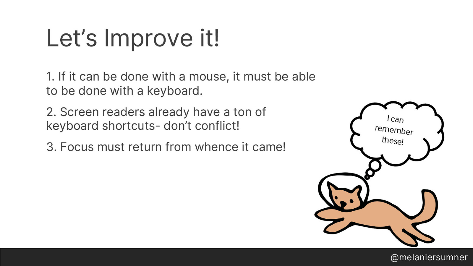
We must remember these criteria and put them into every custom component we create: if it can be done with a mouse, it must be able to be done with a keyboard. Screen readers already provide a lot of keyboard shortcuts- learn about them! ESC must close dropdowns, and focus should return from whence it came.
Another part where our cleverness gets in the way is with aria live.
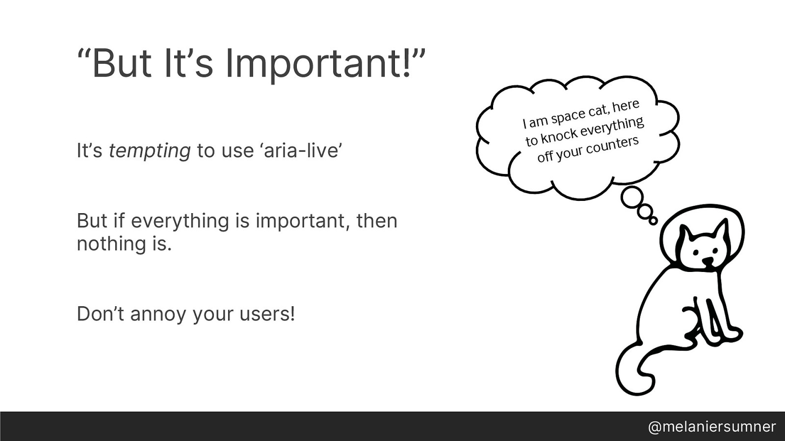
Sometimes when you have spent weeks working on a widget for a BigCo app, it can seem like the most important thing in the world. “What about the async data loading that needs to happen?”, someone asks. Then the ninja rock star speaks up “Let’s just use the aria-live attribute on the widget, so the user will know that new content is loaded.” Everyone is relieved that an answer has been presented. But the whole team just made a really unlucky choice.
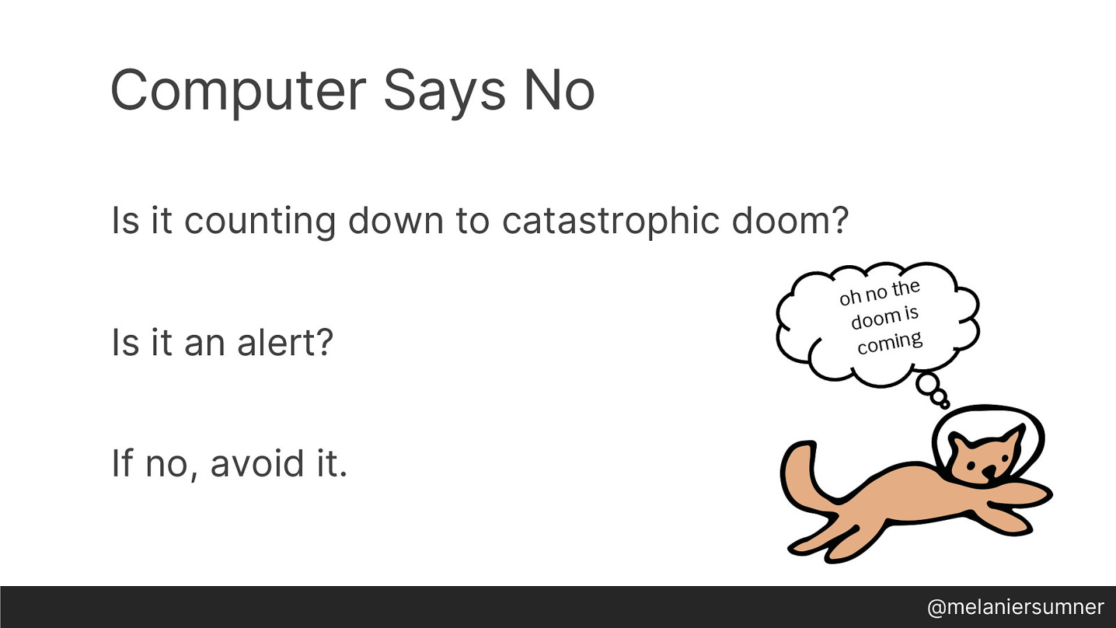
Unless it’s counting down to catastrophic doom, don’t use it. Really, just don’t. It’s really irritating, and the majority of folks don’t use it correctly. My advice is this- Make yourself and your team read absolutely every bit of specification that exists about aria-live before even considering it. That is usually a big enough hurdle to make folks lean to a different solution- but if they’re willing to jump over that hurdle, then there’s some chance it’ll be used correctly.

So, while you’re thinking about catastrophic doom, which will inevitably lead to contemplating the insignificance of our existence in comparison to the entire universe at large, think about this. Accessibility experts will not be able to innovate on ways to make digital accessibility easier to do while we are repeatedly forced to focus on the same issues that developers and designers commonly cause over and over and over again. There are other things I want to do- One of my side projects is a command-line based, choose your own adventure style “screen reader” for JS engineers, for example. But I’m still dealing with reviewing modals that don’t trap focus, or having “but why do I have to, it’s cramping my design creativity” conversations. STILL. JUST DO IT. It’s 2019. It’s the law. If you live in a place where it’s not the law yet, don’t worry, it’s coming soon. We have recognized that this is the way forward for the human race, and it will not change or be stopped. So JUST DO IT.
The thing is, I have only touched on the tip of the iceberg when it comes to unlucky choices we can make in our applications that will haunt us down the line. By remembering that we always have some level of choice, we can craft better experiences and be more inclusive in our development. I encourage everyone to create the space for deep thinking to occur, because this is where we create the environment for ourselves to genuinely excel and produce long-lasting value.
If you enjoyed this talk, or you have a “well actually” that just can’t wait, find me on twitter- @melaniersumner.