
A presentation at Talk.CSS in in Singapore by Eric A. Meyer

Talk.CSS #56 4 November 2020 DESIGN IN THE BACKGROUND
THE BODY’S MANY LAYERS
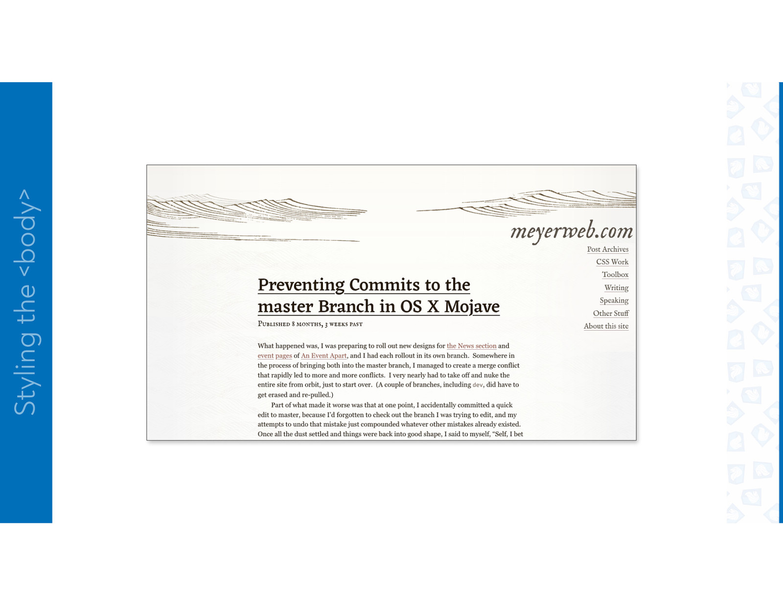
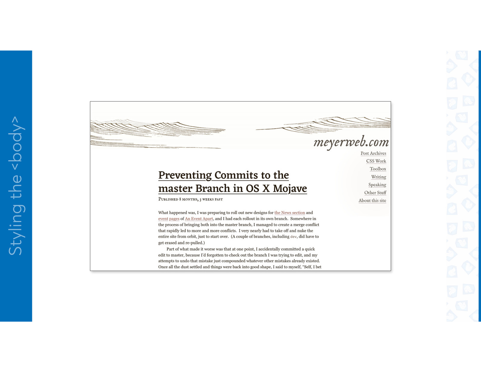
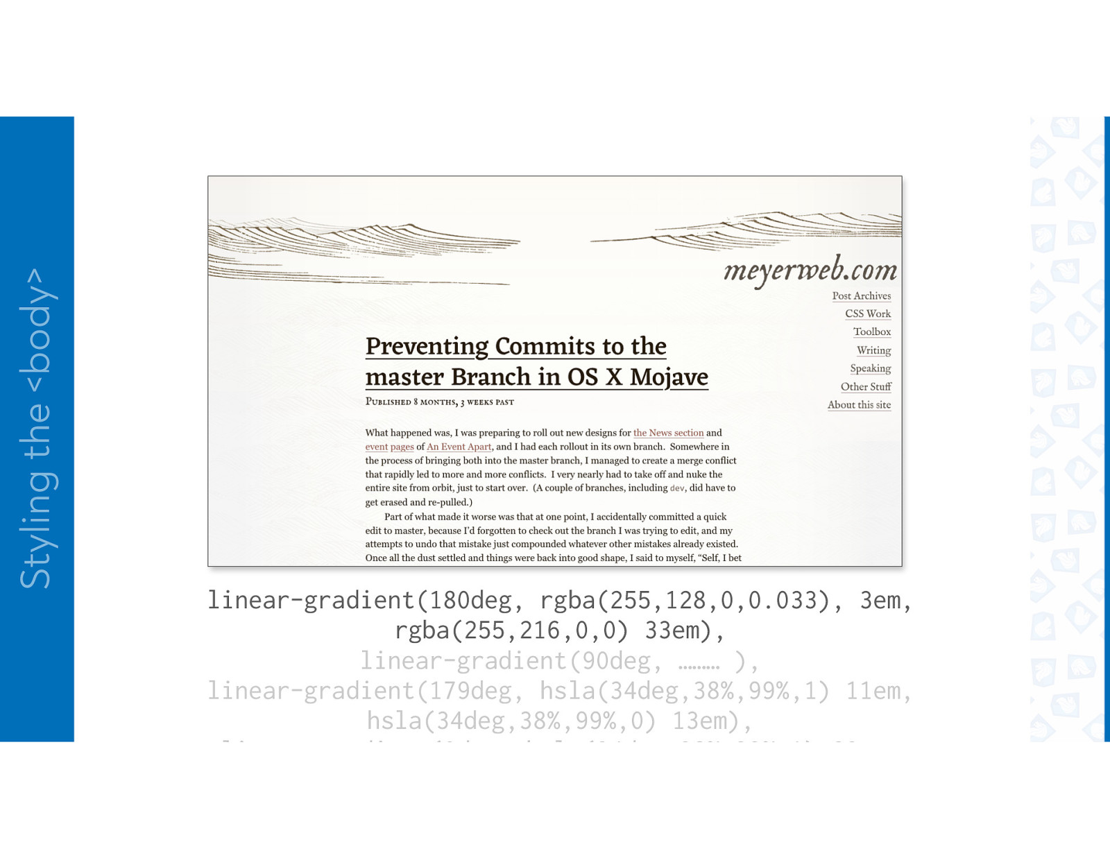
Styling the <body>
Styling the <body>
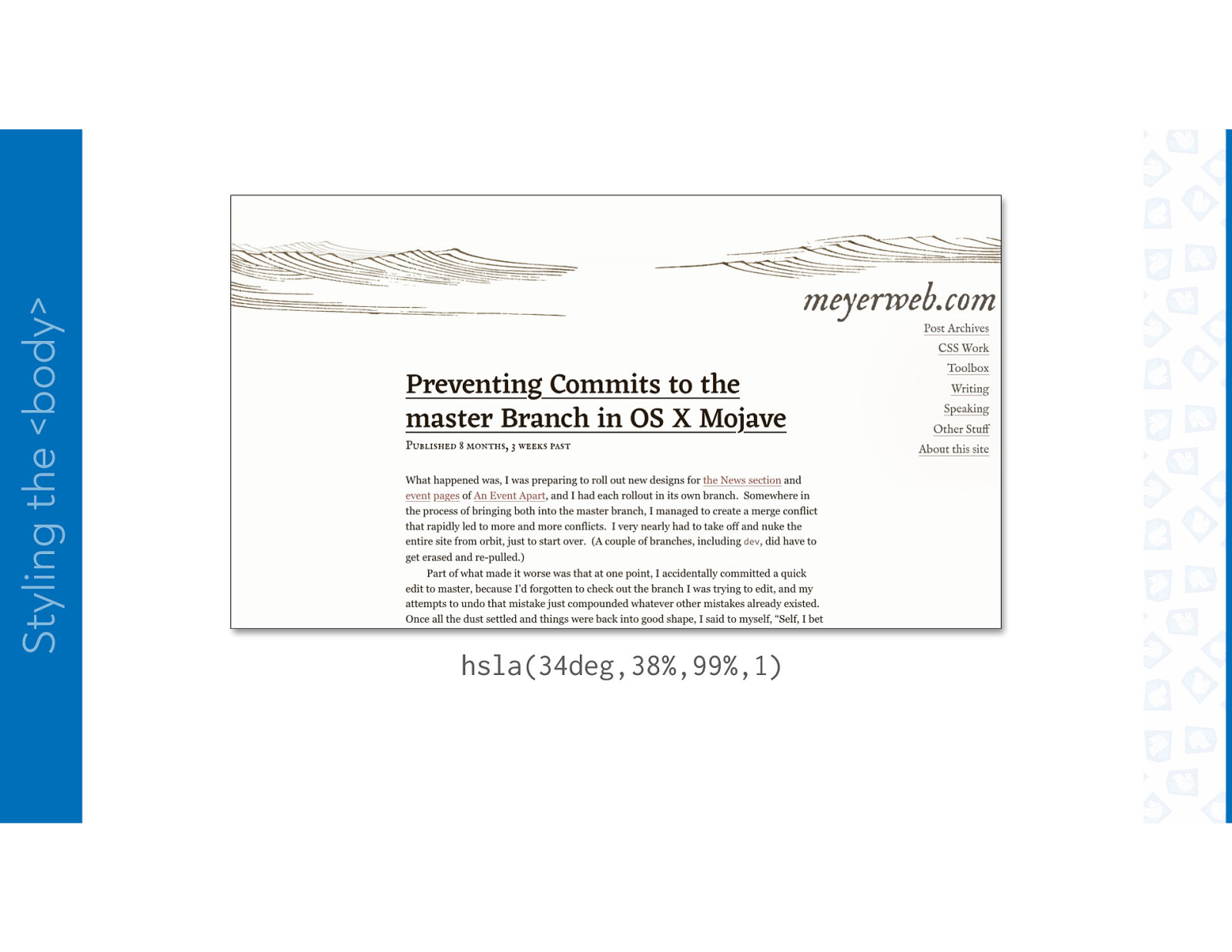
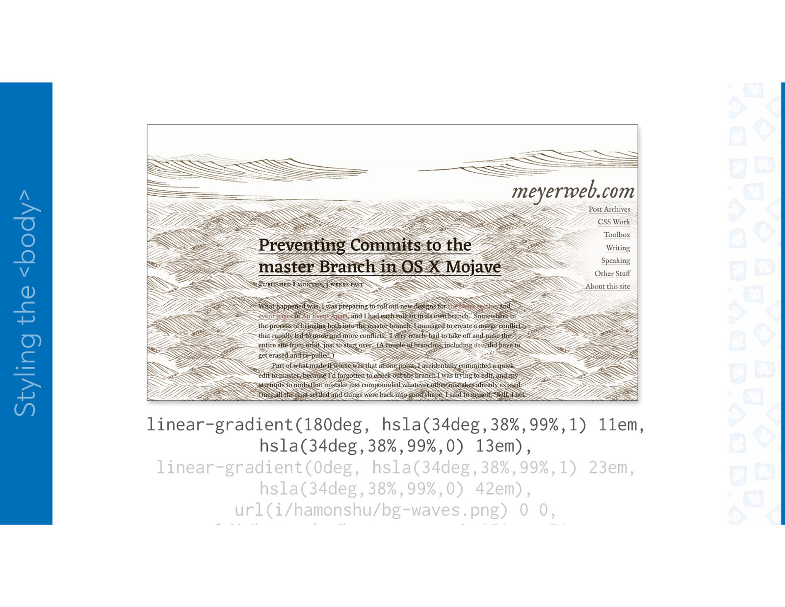
Styling the <body> hsla(34deg,38%,99%,1)
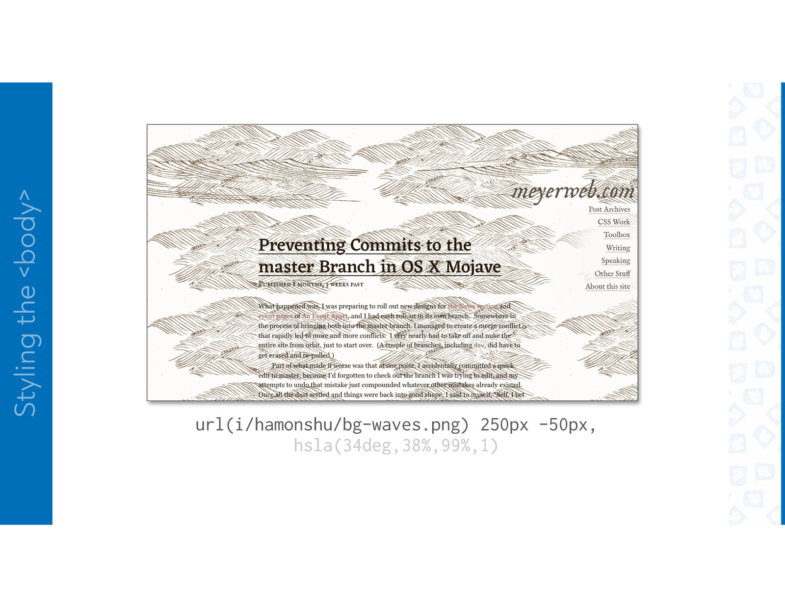
Styling the <body> url(i/hamonshu/bg-waves.png) 250px -50px, hsla(34deg,38%,99%,1)
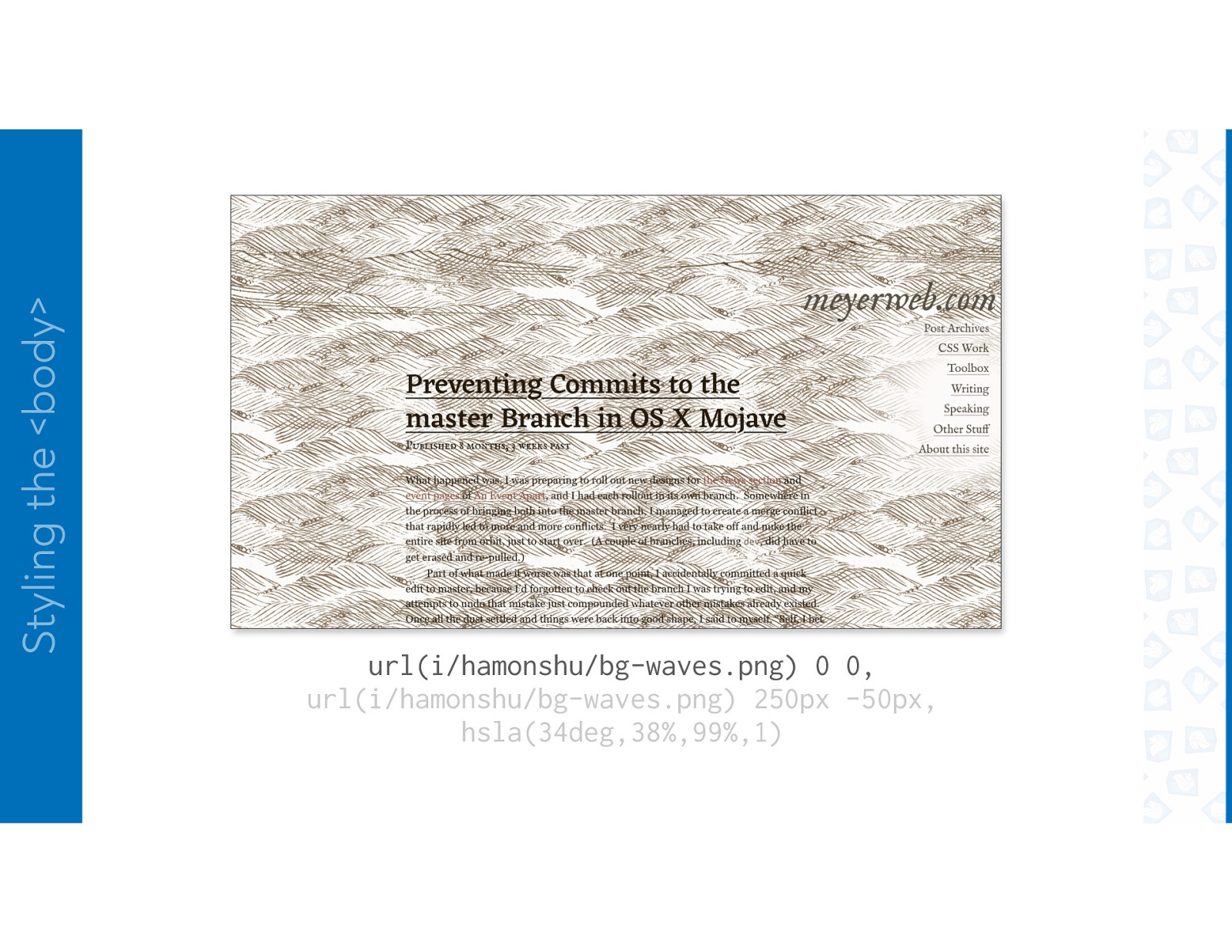
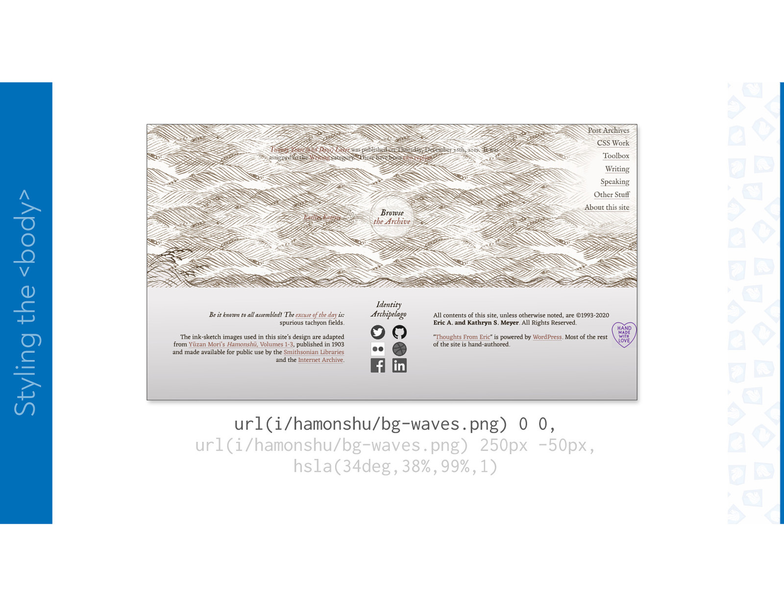
Styling the <body> url(i/hamonshu/bg-waves.png) 0 0, url(i/hamonshu/bg-waves.png) 250px -50px, hsla(34deg,38%,99%,1)
Styling the <body> url(i/hamonshu/bg-waves.png) 0 0, url(i/hamonshu/bg-waves.png) 250px -50px, hsla(34deg,38%,99%,1)
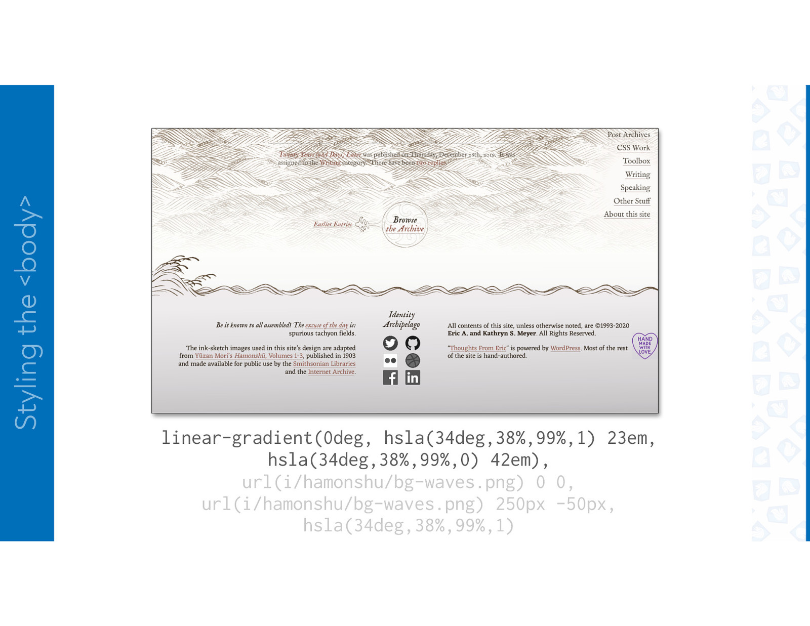
Styling the <body> linear-gradient(0deg, hsla(34deg,38%,99%,1) 23em, hsla(34deg,38%,99%,0) 42em), url(i/hamonshu/bg-waves.png) 0 0, url(i/hamonshu/bg-waves.png) 250px -50px, hsla(34deg,38%,99%,1)
Styling the <body> linear-gradient(179deg, hsla(34deg,38%,99%,1) 11em, hsla(34deg,38%,99%,0) 13em), linear-gradient(0deg, hsla(34deg,38%,99%,1) 23em, hsla(34deg,38%,99%,0) 42em), url(i/hamonshu/bg-waves.png) 0 0, url(i/hamonshu/bg-waves.png) 250px -50px,
Styling the <body> linear-gradient(180deg, hsla(34deg,38%,99%,1) 11em, hsla(34deg,38%,99%,0) 13em), linear-gradient(0deg, hsla(34deg,38%,99%,1) 23em, hsla(34deg,38%,99%,0) 42em), url(i/hamonshu/bg-waves.png) 0 0, url(i/hamonshu/bg-waves.png) 250px -50px,
Styling the <body> linear-gradient(179deg, hsla(34deg,38%,99%,1) 11em, hsla(34deg,38%,99%,0) 13em), linear-gradient(0deg, hsla(34deg,38%,99%,1) 23em, hsla(34deg,38%,99%,0) 42em), url(i/hamonshu/bg-waves.png) 0 0, url(i/hamonshu/bg-waves.png) 250px -50px,
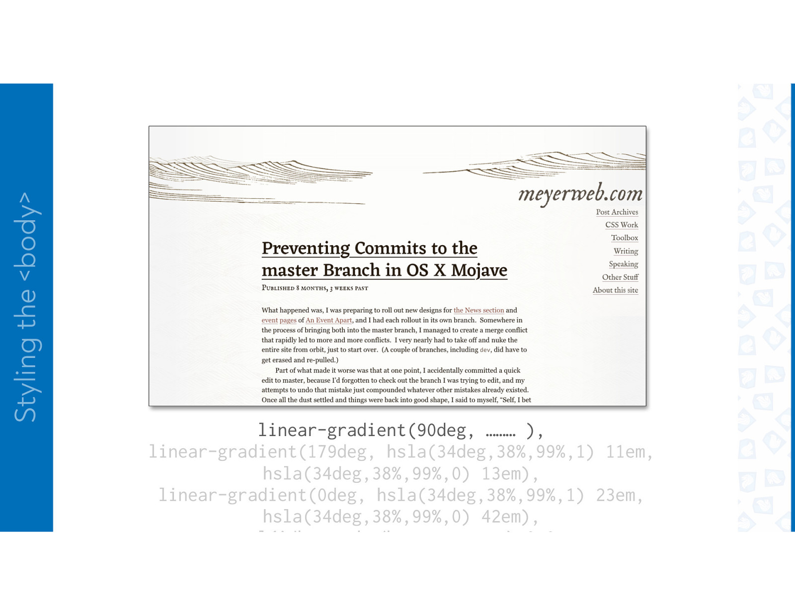
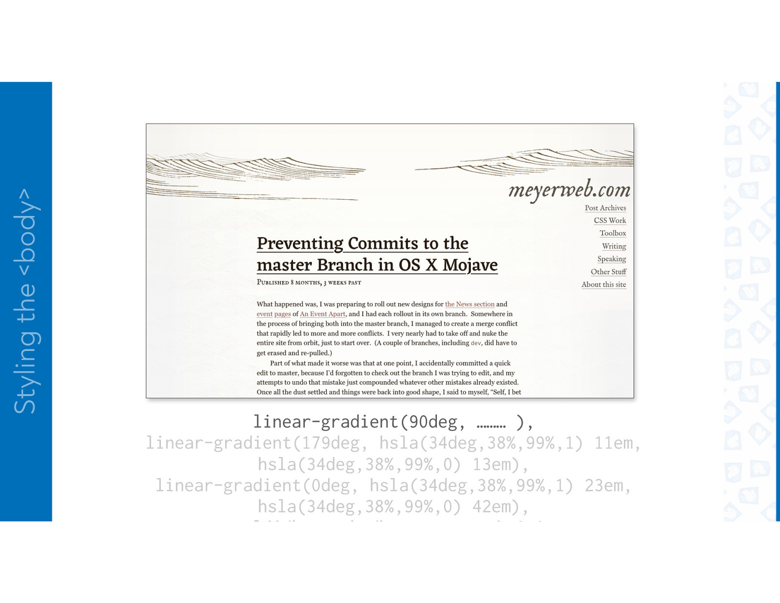
Styling the <body> linear-gradient(90deg, ……… ), linear-gradient(179deg, hsla(34deg,38%,99%,1) 11em, hsla(34deg,38%,99%,0) 13em), linear-gradient(0deg, hsla(34deg,38%,99%,1) 23em, hsla(34deg,38%,99%,0) 42em), url(i/hamonshu/bg-waves.png) 0 0,
Styling the <body>
Styling the <body> linear-gradient(90deg, ……… ), linear-gradient(179deg, hsla(34deg,38%,99%,1) 11em, hsla(34deg,38%,99%,0) 13em), linear-gradient(0deg, hsla(34deg,38%,99%,1) 23em, hsla(34deg,38%,99%,0) 42em), url(i/hamonshu/bg-waves.png) 0 0,
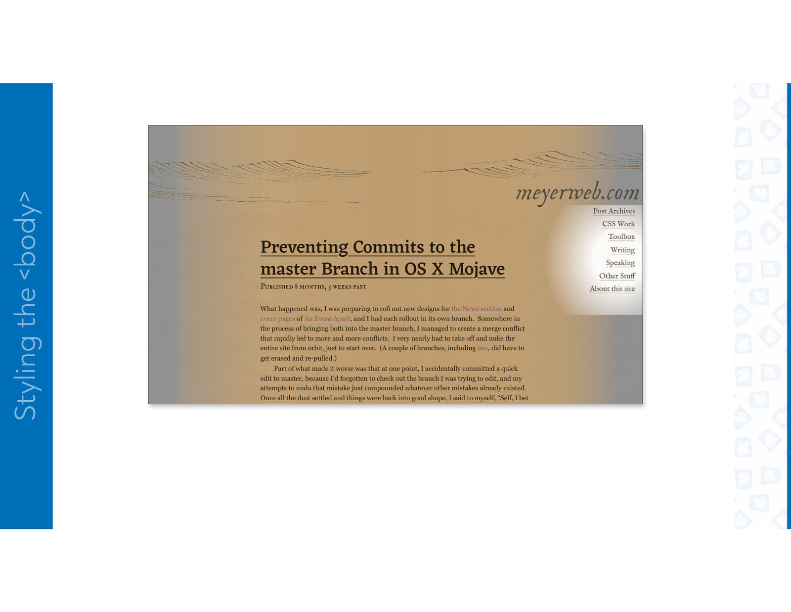
Styling the <body> linear-gradient(180deg, rgba(255,128,0,0.033), 3em, rgba(255,216,0,0) 33em), linear-gradient(90deg, ……… ), linear-gradient(179deg, hsla(34deg,38%,99%,1) 11em, hsla(34deg,38%,99%,0) 13em), linear-gradient(0deg, hsla(34deg,38%,99%,1) 23em,
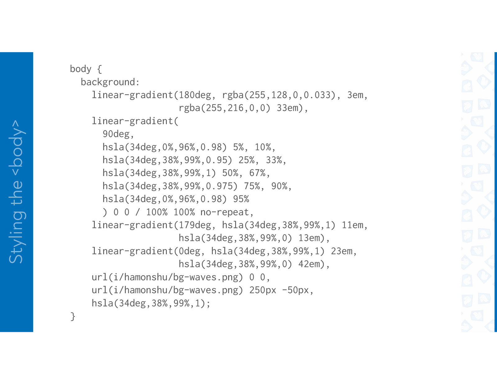
Styling the <body> body { background: linear-gradient(180deg, rgba(255,128,0,0.033), 3em, rgba(255,216,0,0) 33em), linear-gradient( 90deg, hsla(34deg,0%,96%,0.98) 5%, 10%, hsla(34deg,38%,99%,0.95) 25%, 33%, hsla(34deg,38%,99%,1) 50%, 67%, hsla(34deg,38%,99%,0.975) 75%, 90%, hsla(34deg,0%,96%,0.98) 95% ) 0 0 / 100% 100% no-repeat, linear-gradient(179deg, hsla(34deg,38%,99%,1) 11em, hsla(34deg,38%,99%,0) 13em), linear-gradient(0deg, hsla(34deg,38%,99%,1) 23em, hsla(34deg,38%,99%,0) 42em), url(i/hamonshu/bg-waves.png) 0 0, url(i/hamonshu/bg-waves.png) 250px -50px, hsla(34deg,38%,99%,1); }
WAVES ACROSS THE FOOTER
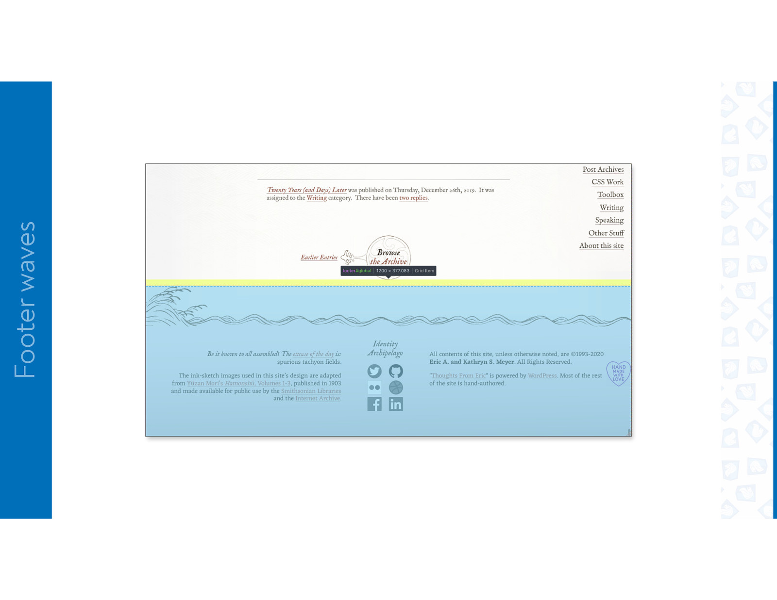
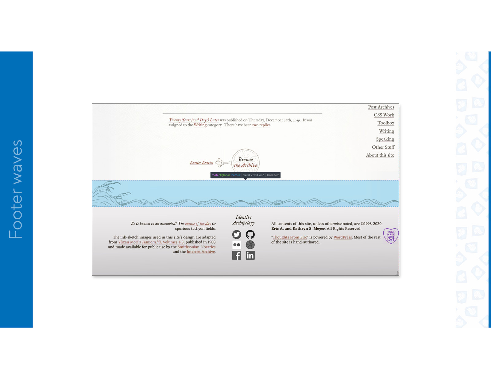
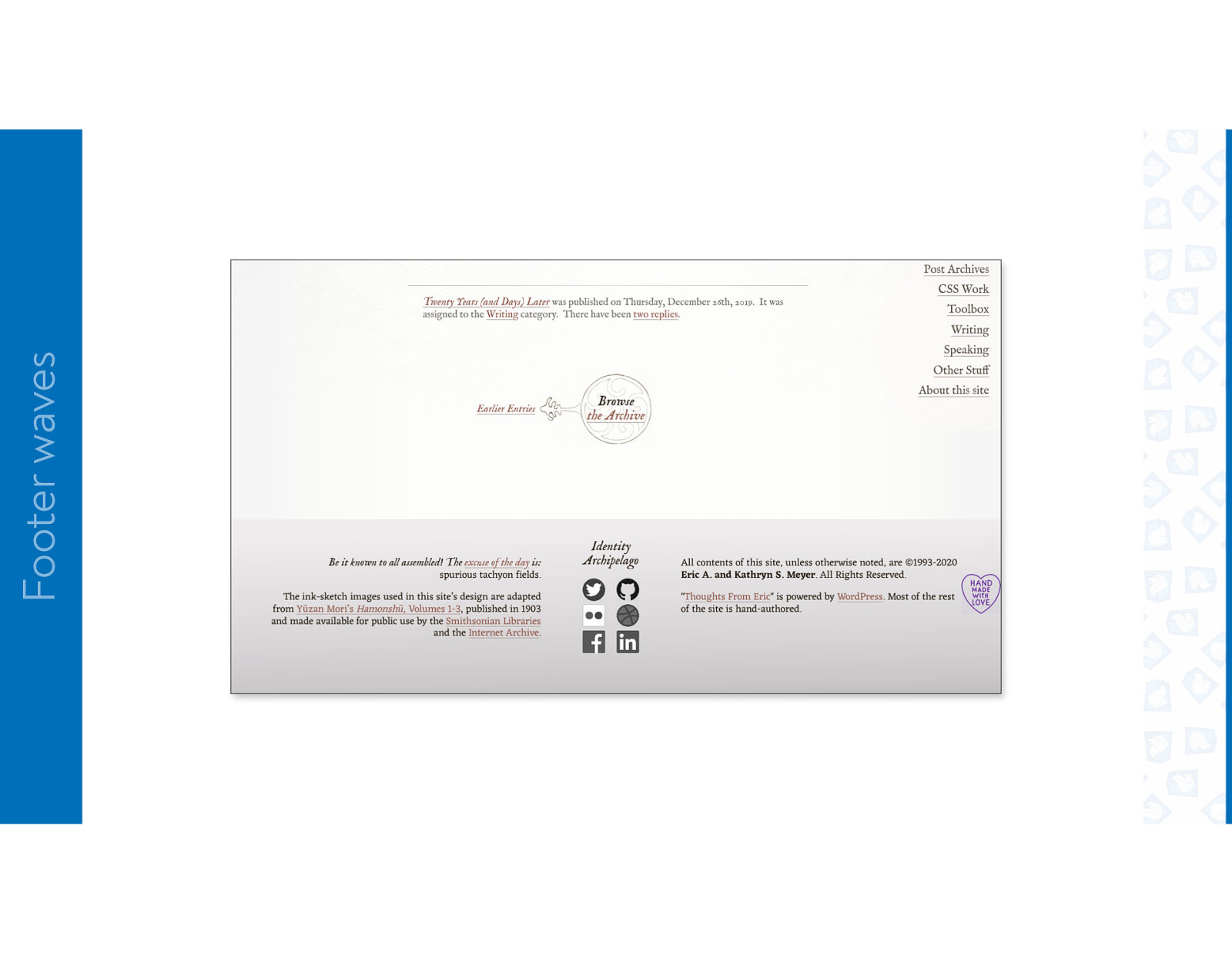
Footer waves
Footer waves
Footer waves
Footer waves
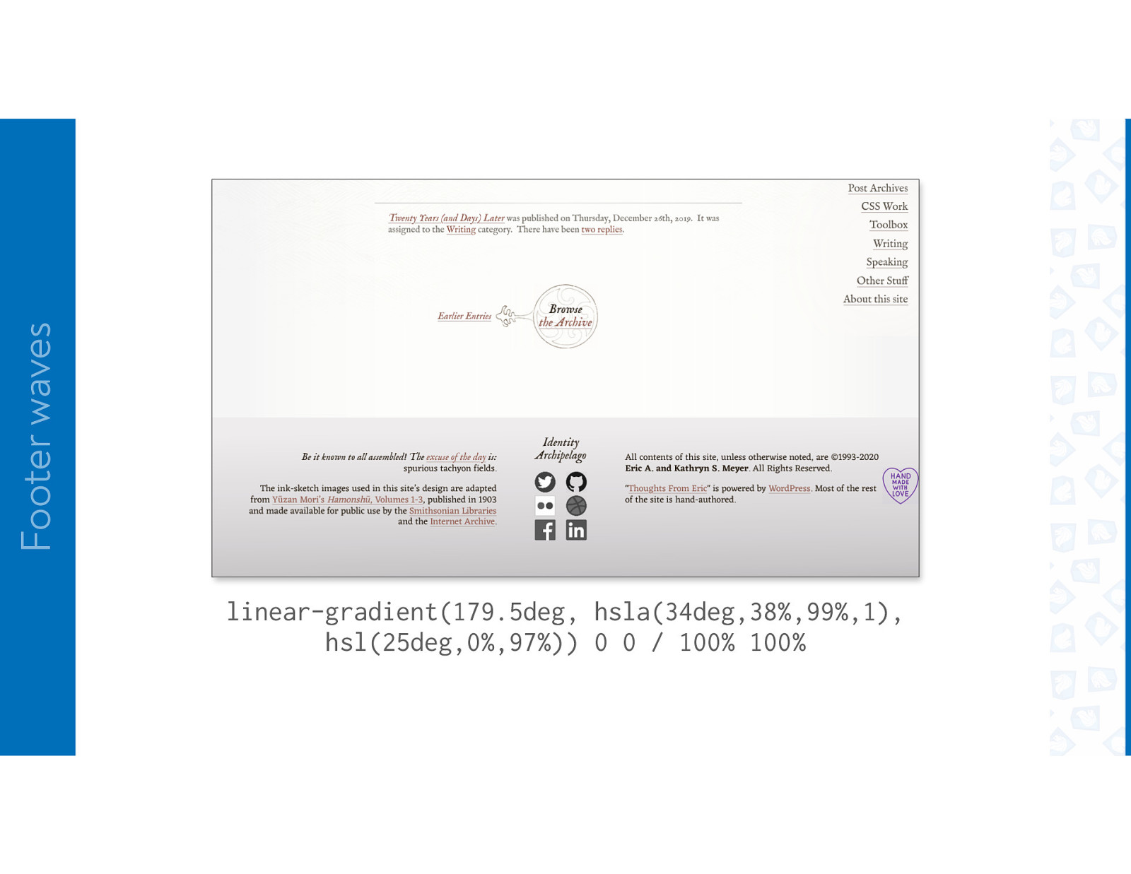
Footer waves linear-gradient(179.5deg, hsla(34deg,38%,99%,1), hsl(25deg,0%,97%)) 0 0 / 100% 100%
Footer waves linear-gradient(179.5deg, hsla(34deg,38%,99%,1), hsl(25deg,0%,97%)) 0 0 / 100% 100%
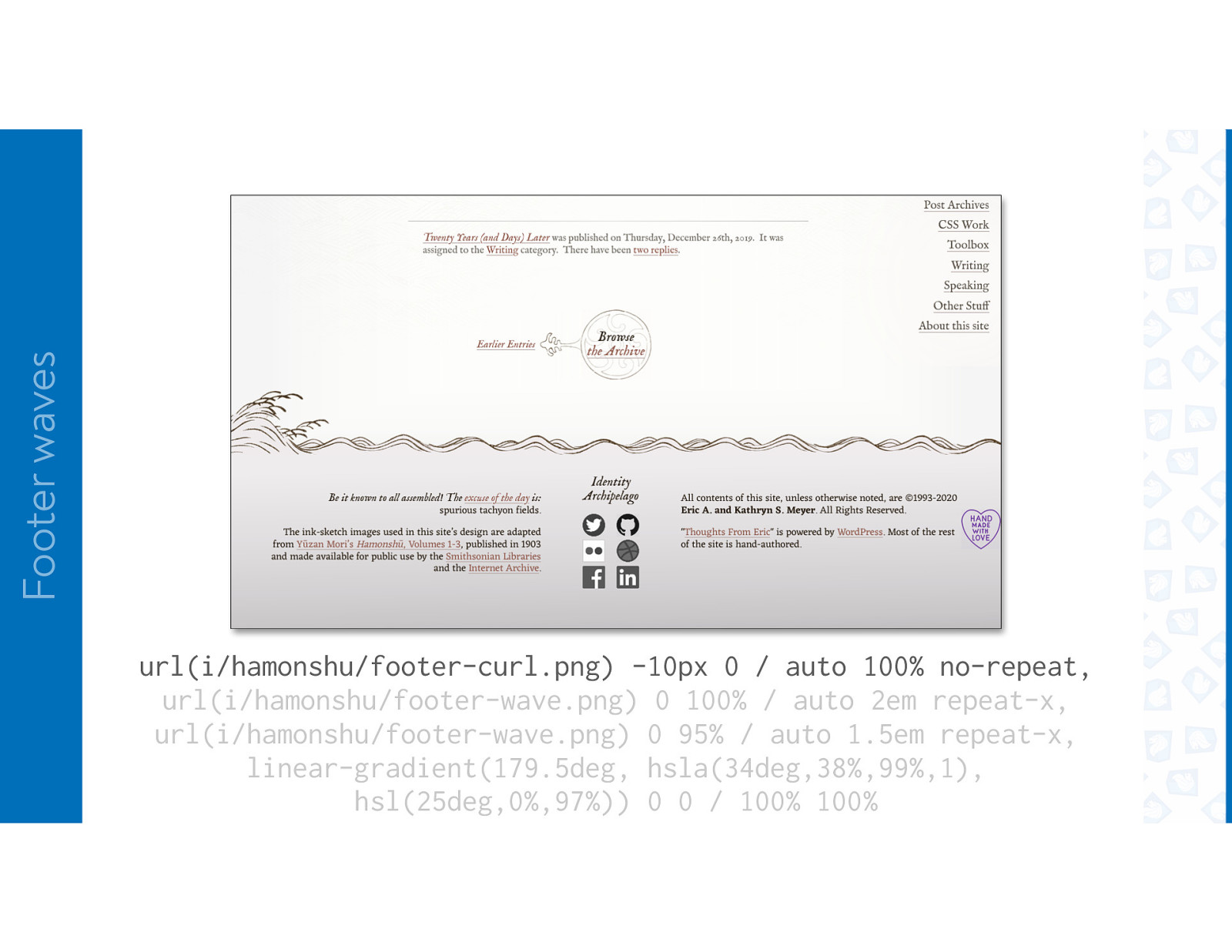
Footer waves url(i/hamonshu/footer-wave.png) 0 95% / auto 1.5em repeat-x, linear-gradient(179.5deg, hsla(34deg,38%,99%,1), hsl(25deg,0%,97%)) 0 0 / 100% 100%
Footer waves url(i/hamonshu/footer-wave.png) 0 100% / auto 2em repeat-x, url(i/hamonshu/footer-wave.png) 0 95% / auto 1.5em repeat-x, linear-gradient(179.5deg, hsla(34deg,38%,99%,1), hsl(25deg,0%,97%)) 0 0 / 100% 100%
Footer waves url(i/hamonshu/footer-curl.png) -10px 0 / auto 100% no-repeat, url(i/hamonshu/footer-wave.png) 0 100% / auto 2em repeat-x, url(i/hamonshu/footer-wave.png) 0 95% / auto 1.5em repeat-x, linear-gradient(179.5deg, hsla(34deg,38%,99%,1), hsl(25deg,0%,97%)) 0 0 / 100% 100%
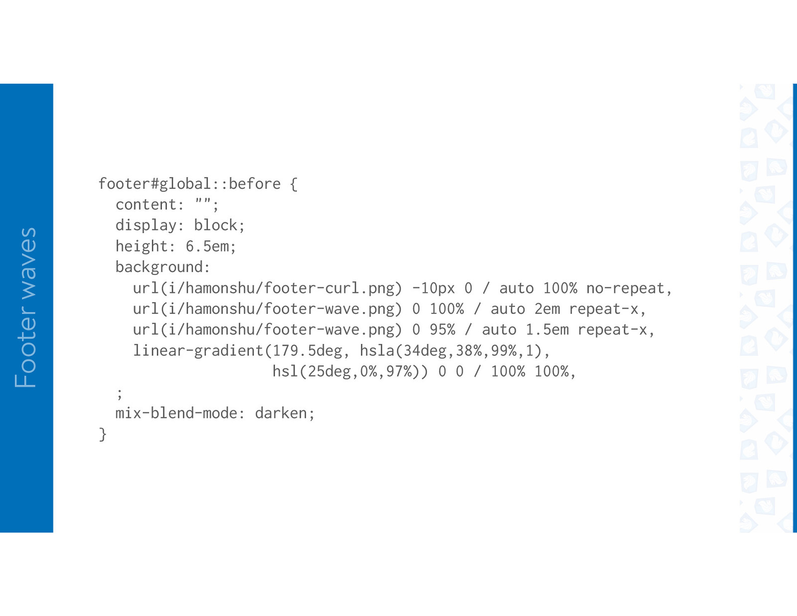
Footer waves footer#global::before { content: “”; display: block; height: 6.5em; background: url(i/hamonshu/footer-curl.png) -10px 0 / auto 100% no-repeat, url(i/hamonshu/footer-wave.png) 0 100% / auto 2em repeat-x, url(i/hamonshu/footer-wave.png) 0 95% / auto 1.5em repeat-x, linear-gradient(179.5deg, hsla(34deg,38%,99%,1), hsl(25deg,0%,97%)) 0 0 / 100% 100%, ; mix-blend-mode: darken; }
SPLITTING THE HEADER
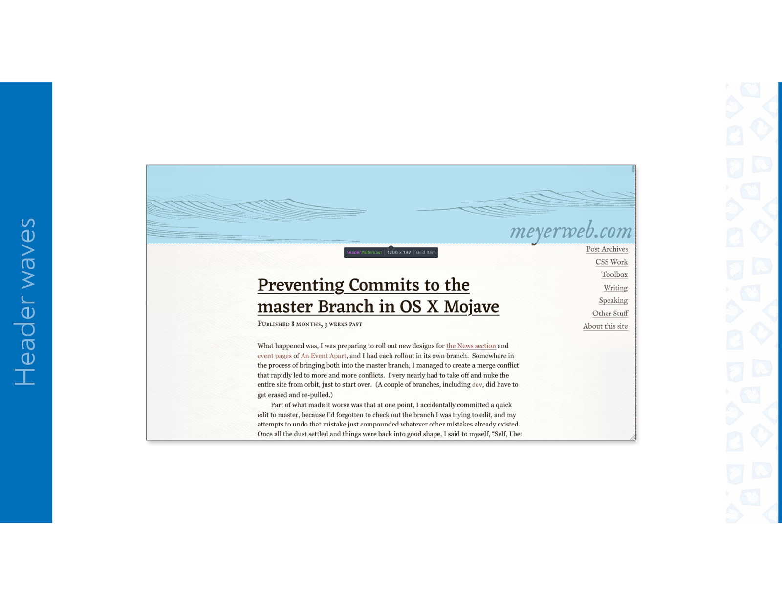
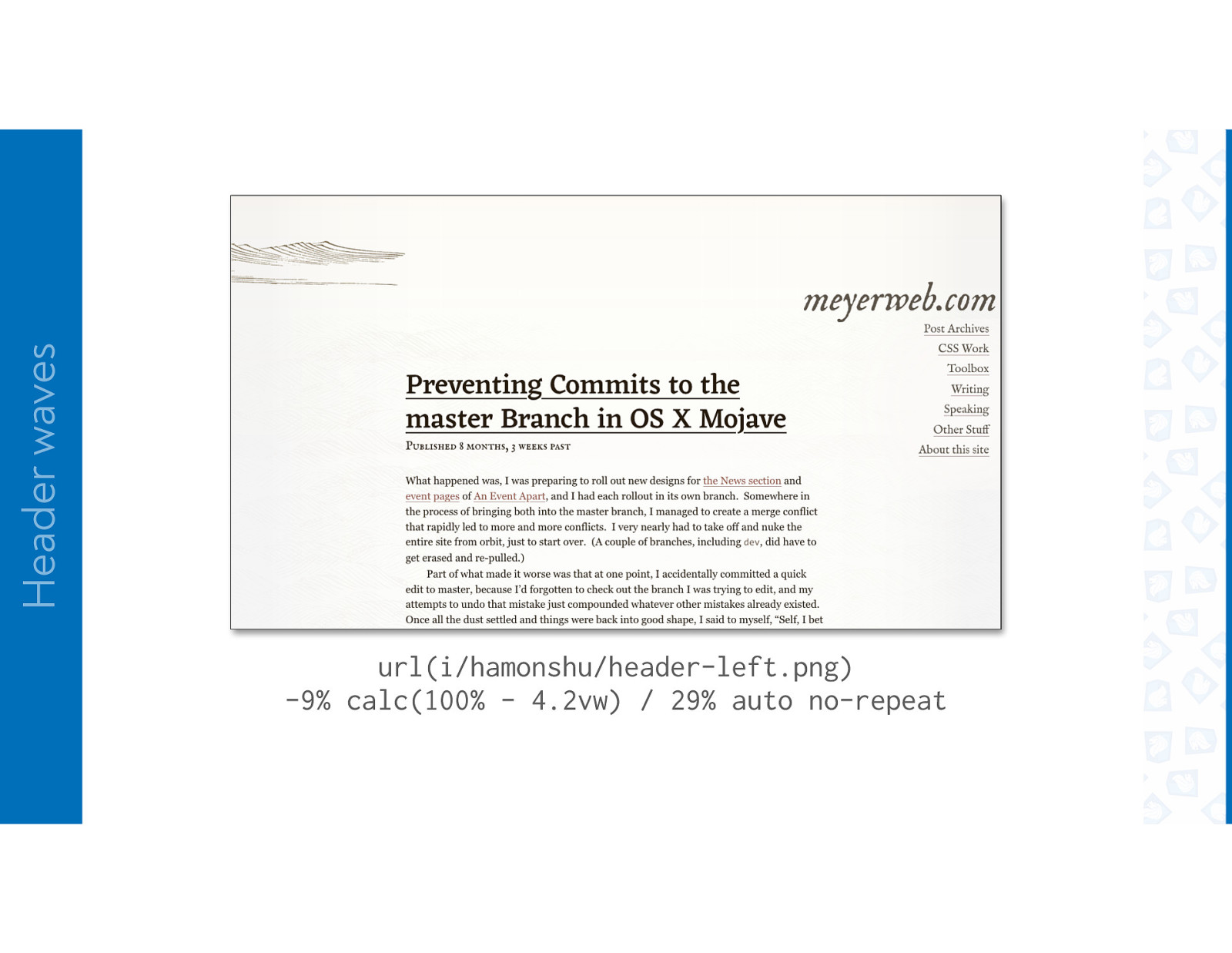
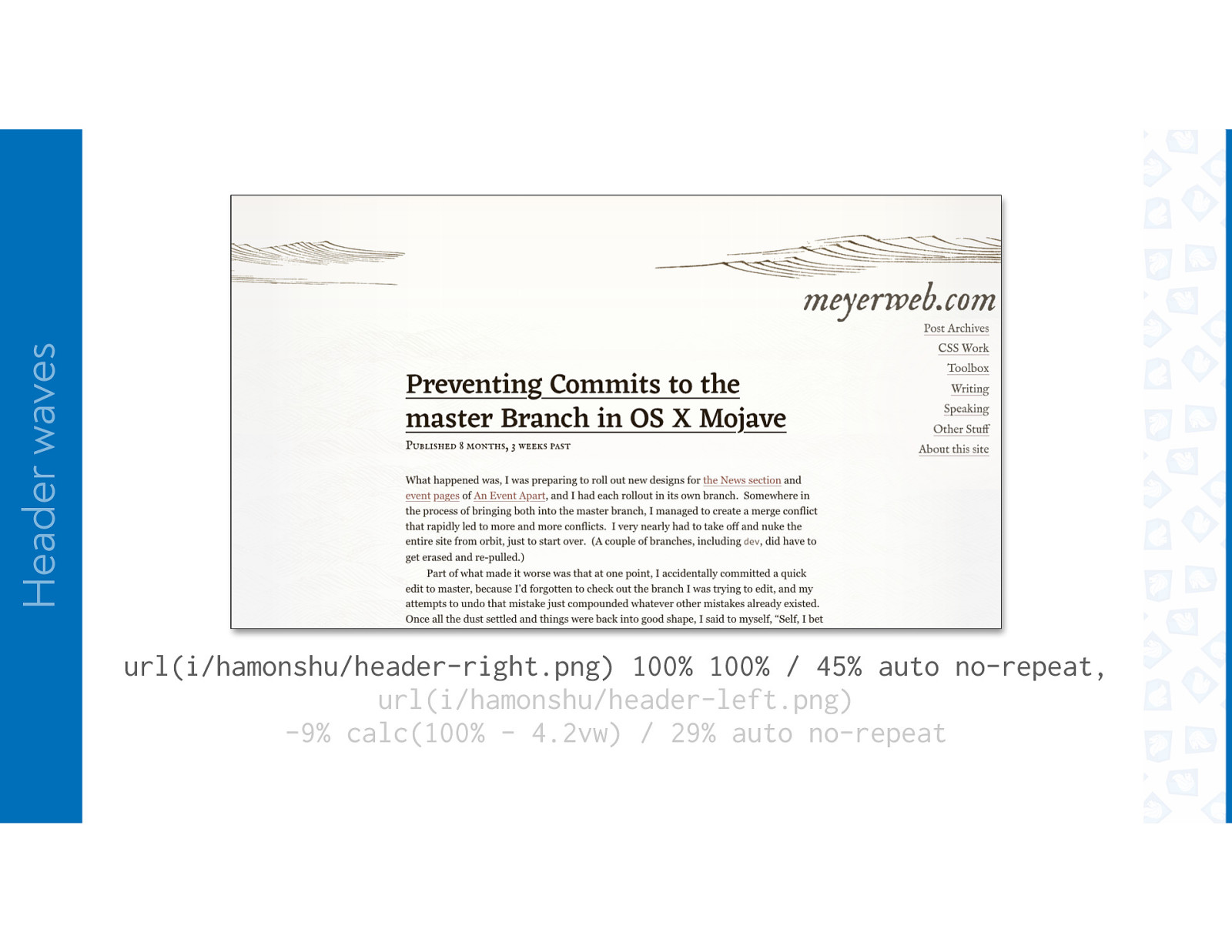
Header waves
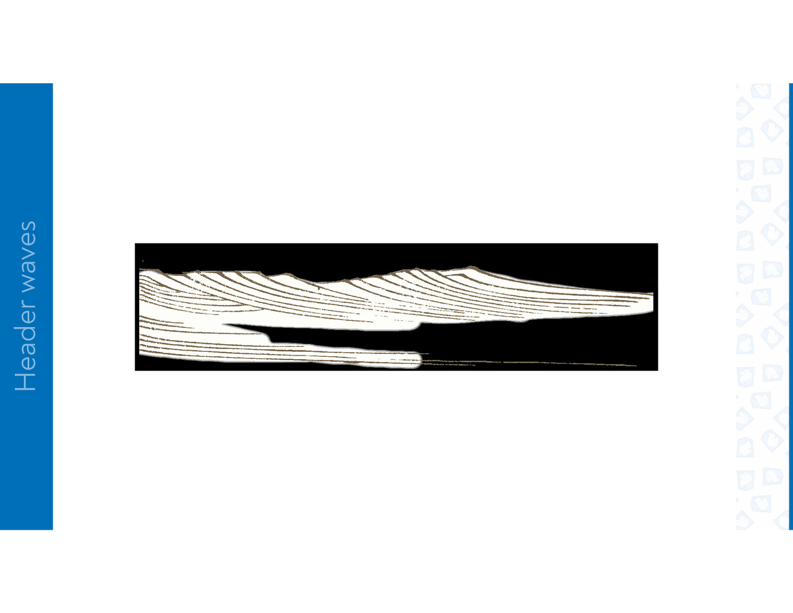
Header waves url(i/hamonshu/header-left.png) -9% calc(100% - 4.2vw) / 29% auto no-repeat
Header waves url(i/hamonshu/header-right.png) 100% 100% / 45% auto no-repeat, url(i/hamonshu/header-left.png) -9% calc(100% - 4.2vw) / 29% auto no-repeat
Header waves url(i/hamonshu/header-left.png) 0 100% / 45% auto no-repeat, url(i/hamonshu/header-right.png) 100% 100% / 45% auto no-repeat, url(i/hamonshu/header-left.png) -9% calc(100% - 4.2vw) / 29% auto no-repeat
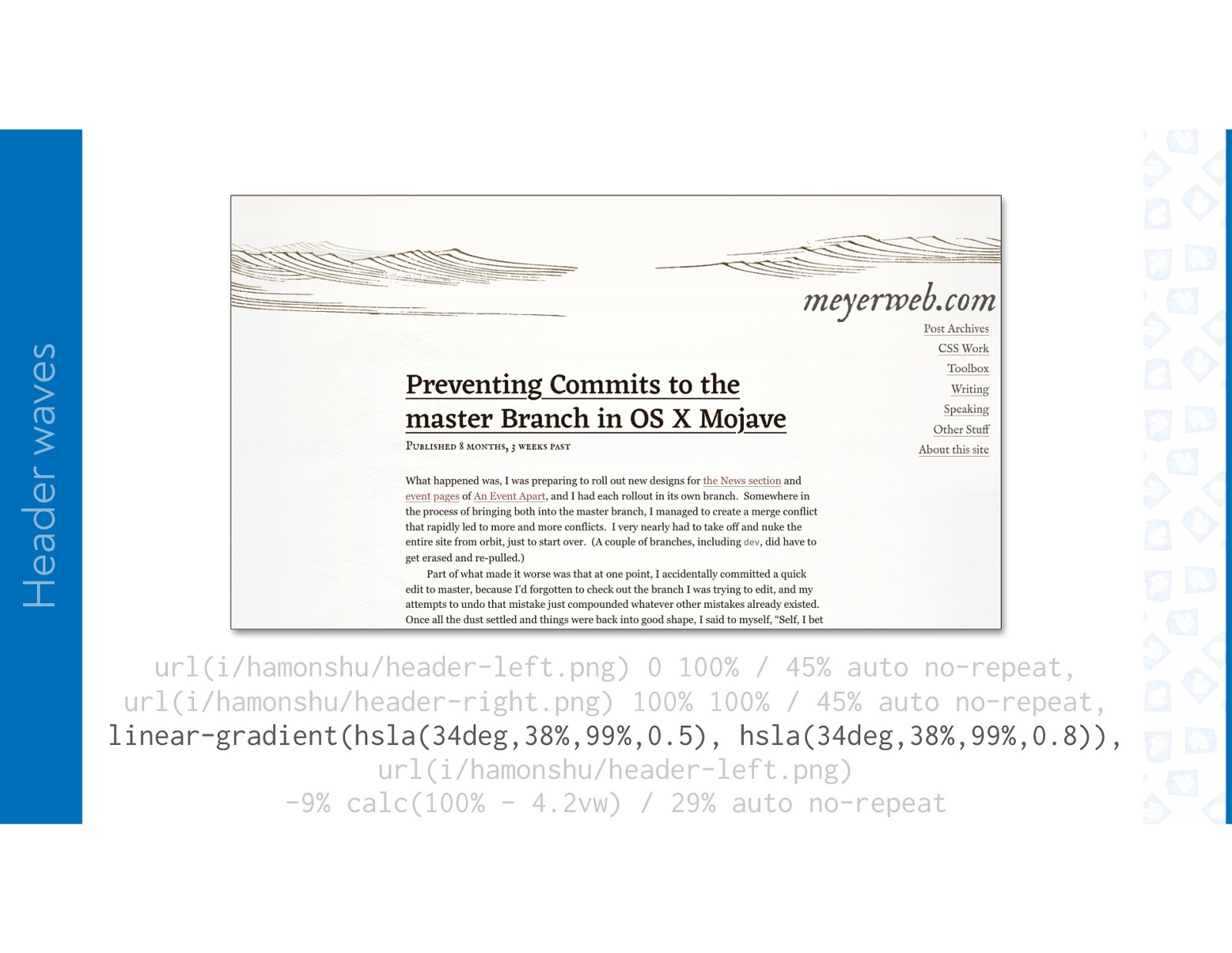
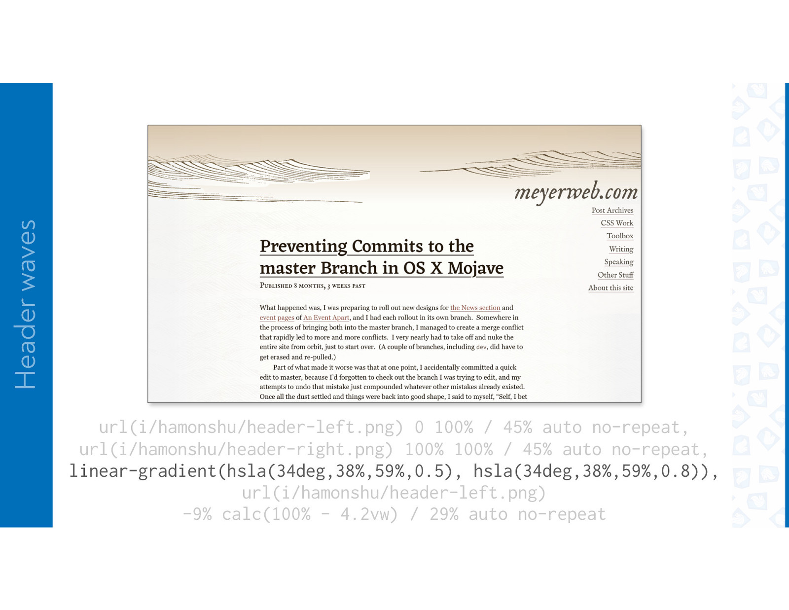
Header waves url(i/hamonshu/header-left.png) 0 100% / 45% auto no-repeat, url(i/hamonshu/header-right.png) 100% 100% / 45% auto no-repeat, linear-gradient(hsla(34deg,38%,99%,0.5), hsla(34deg,38%,99%,0.8)), url(i/hamonshu/header-left.png) -9% calc(100% - 4.2vw) / 29% auto no-repeat
Header waves url(i/hamonshu/header-left.png) 0 100% / 45% auto no-repeat, url(i/hamonshu/header-right.png) 100% 100% / 45% auto no-repeat, linear-gradient(hsla(34deg,38%,59%,0.5), hsla(34deg,38%,59%,0.8)), url(i/hamonshu/header-left.png) -9% calc(100% - 4.2vw) / 29% auto no-repeat
Header waves
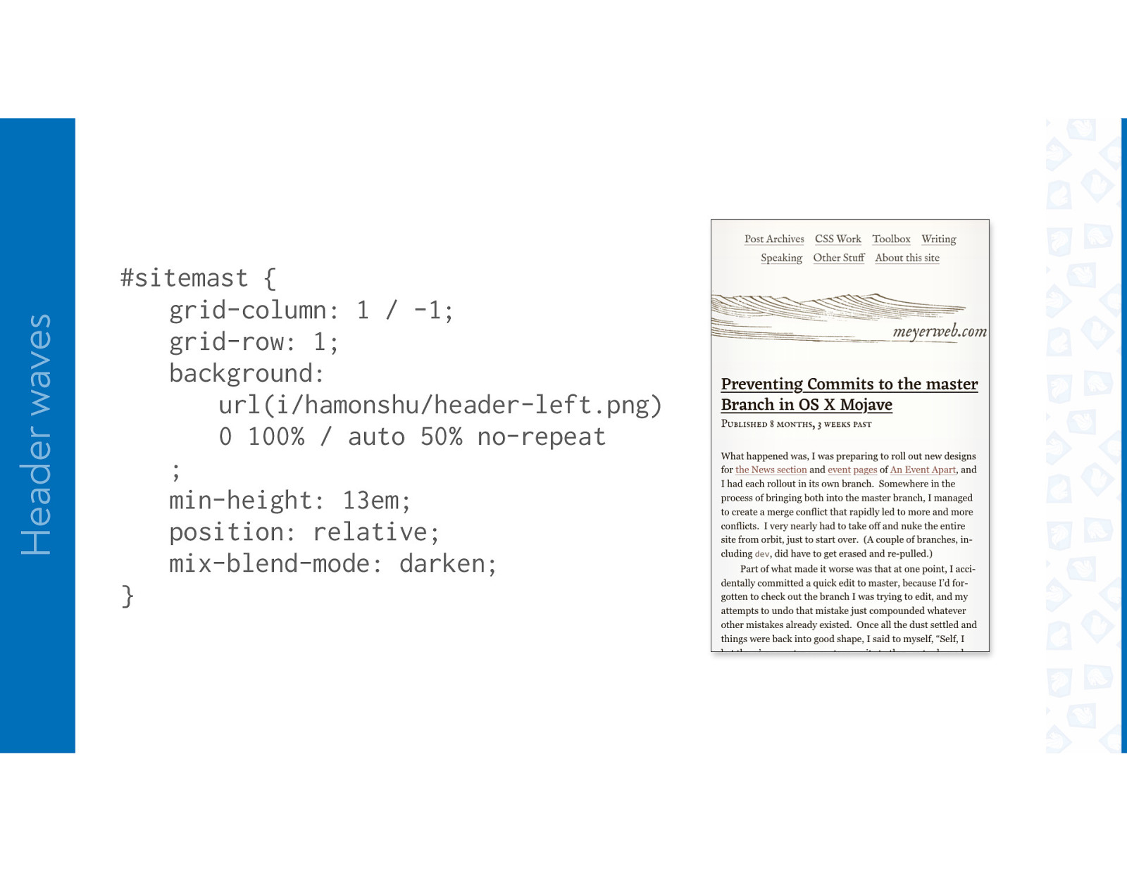
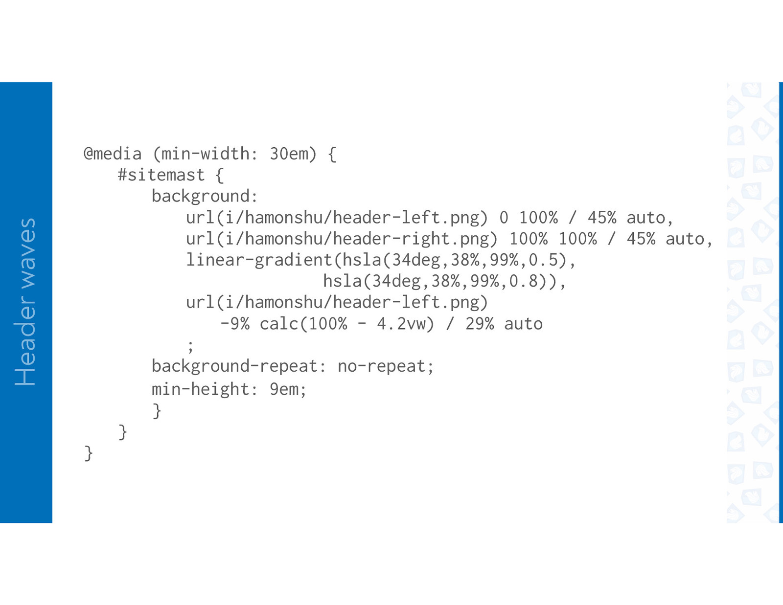
Header waves #sitemast { grid-column: 1 / -1; grid-row: 1; background: url(i/hamonshu/header-left.png) 0 100% / auto 50% no-repeat ; min-height: 13em; position: relative; mix-blend-mode: darken; } @media (min-width: 30em) { #sitemast { background: url(i/hamonshu/header-left.png) 0 100% / 45% auto,
position: relative; mix-blend-mode: darken; Header waves } @media (min-width: 30em) { #sitemast { background: url(i/hamonshu/header-left.png) 0 100% / 45% auto, url(i/hamonshu/header-right.png) 100% 100% / 45% auto, linear-gradient(hsla(34deg,38%,99%,0.5), hsla(34deg,38%,99%,0.8)), url(i/hamonshu/header-left.png) -9% calc(100% - 4.2vw) / 29% auto ; background-repeat: no-repeat; min-height: 9em; } } }
ONE-LINE SEPARATOR
A simple separator
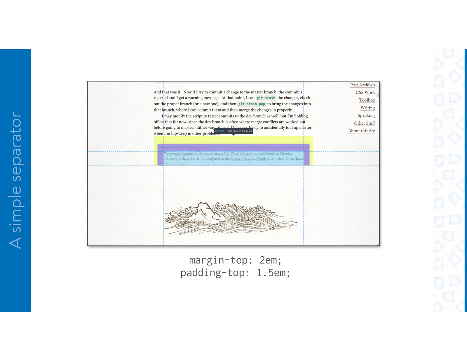
A simple separator margin-top: 2em; padding-top: 1.5em;
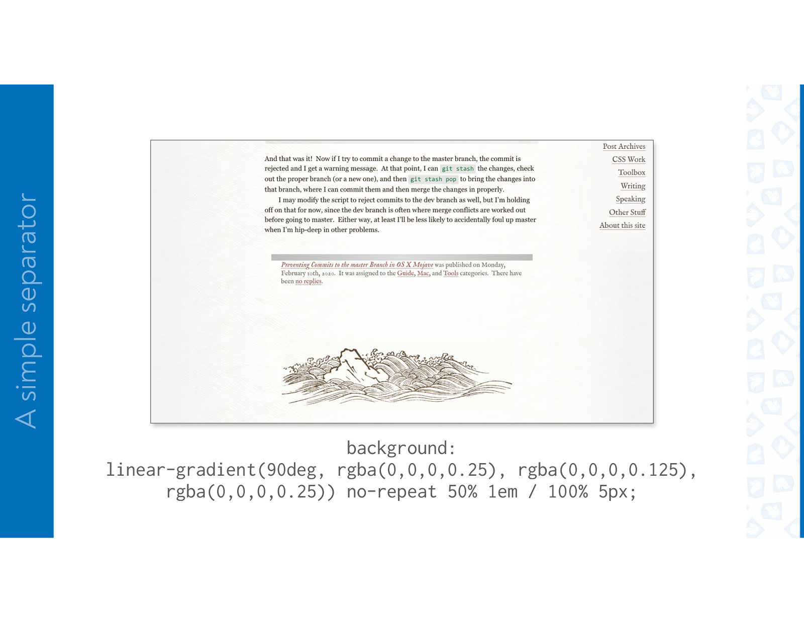
A simple separator background: linear-gradient(90deg, rgba(0,0,0,0.25), rgba(0,0,0,0.125), rgba(0,0,0,0.25)) no-repeat 50% 1em / 100% 5px;
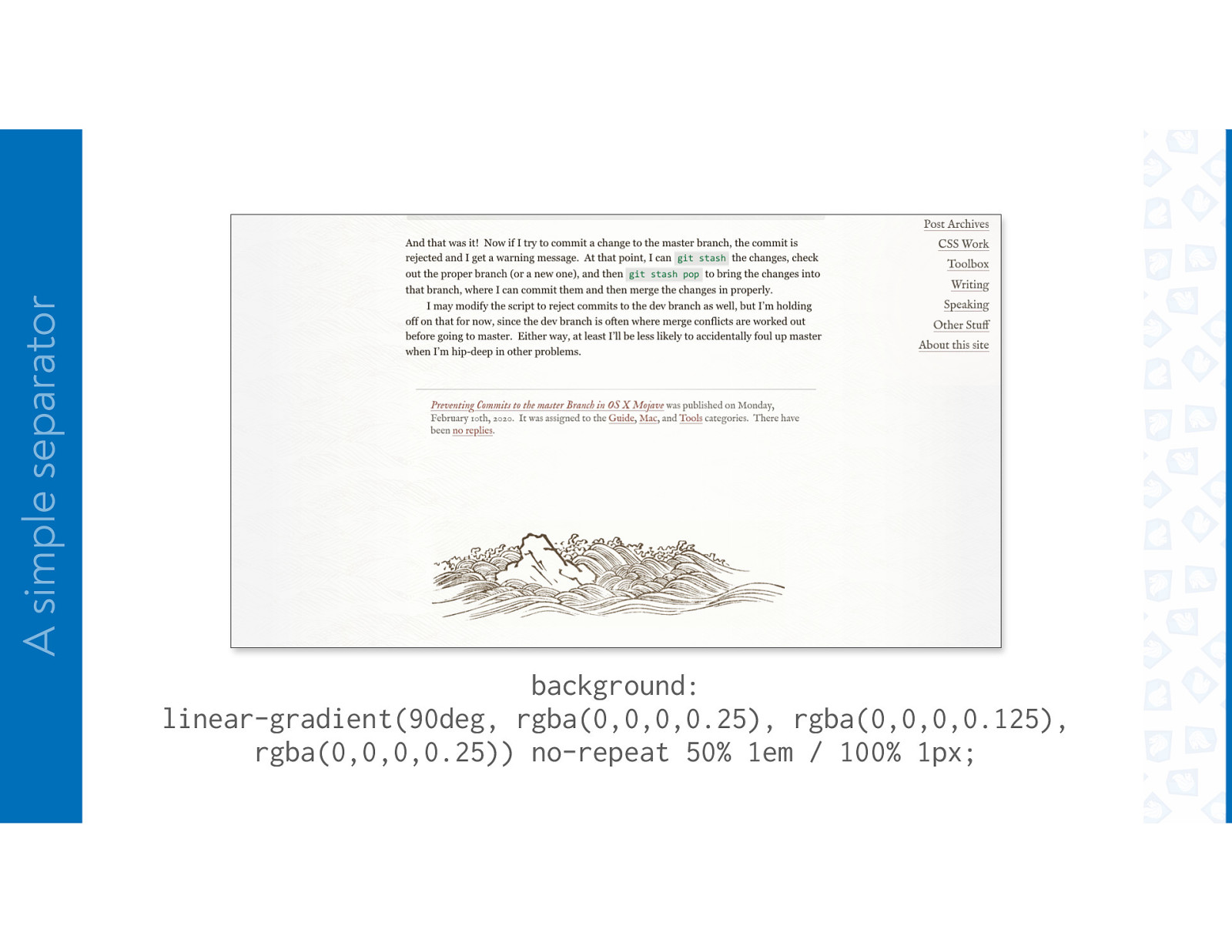
A simple separator background: linear-gradient(90deg, rgba(0,0,0,0.25), rgba(0,0,0,0.125), rgba(0,0,0,0.25)) no-repeat 50% 1em / 100% 1px;
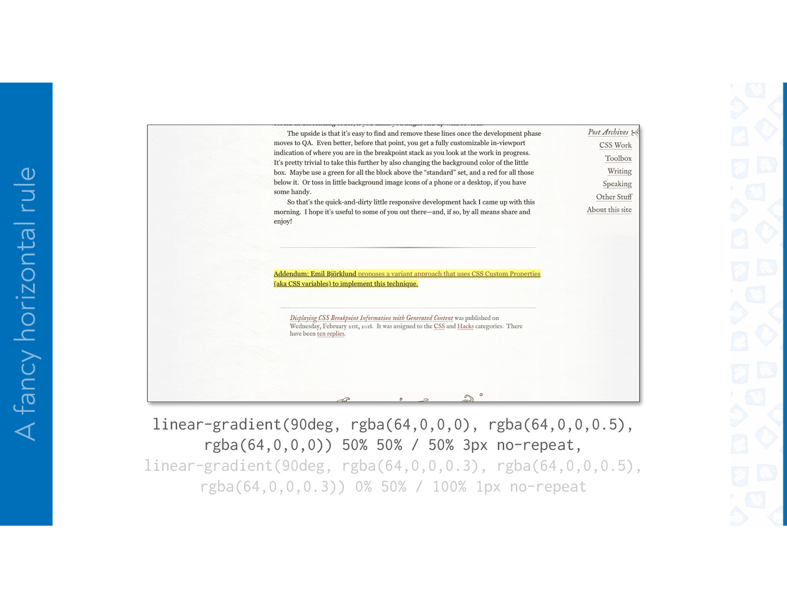
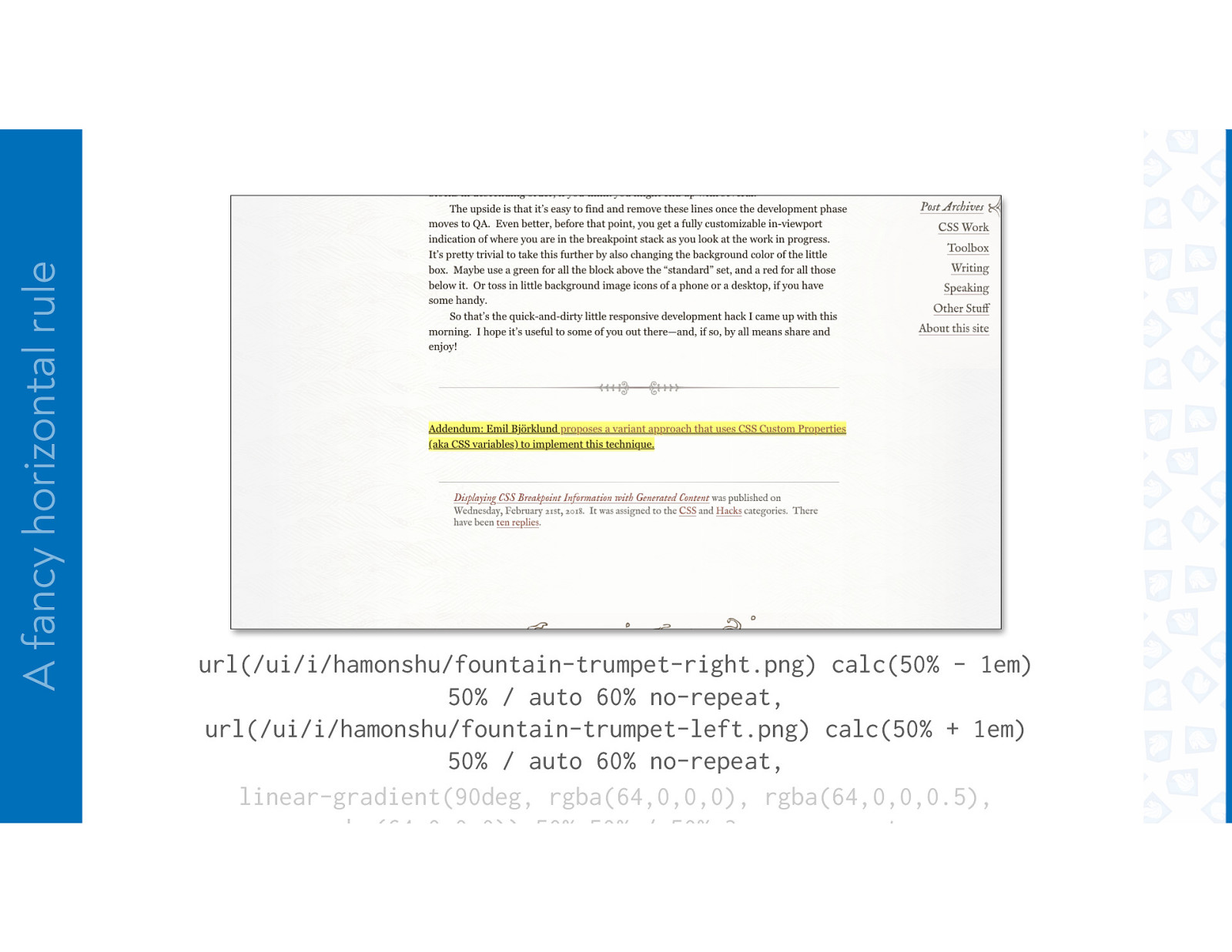
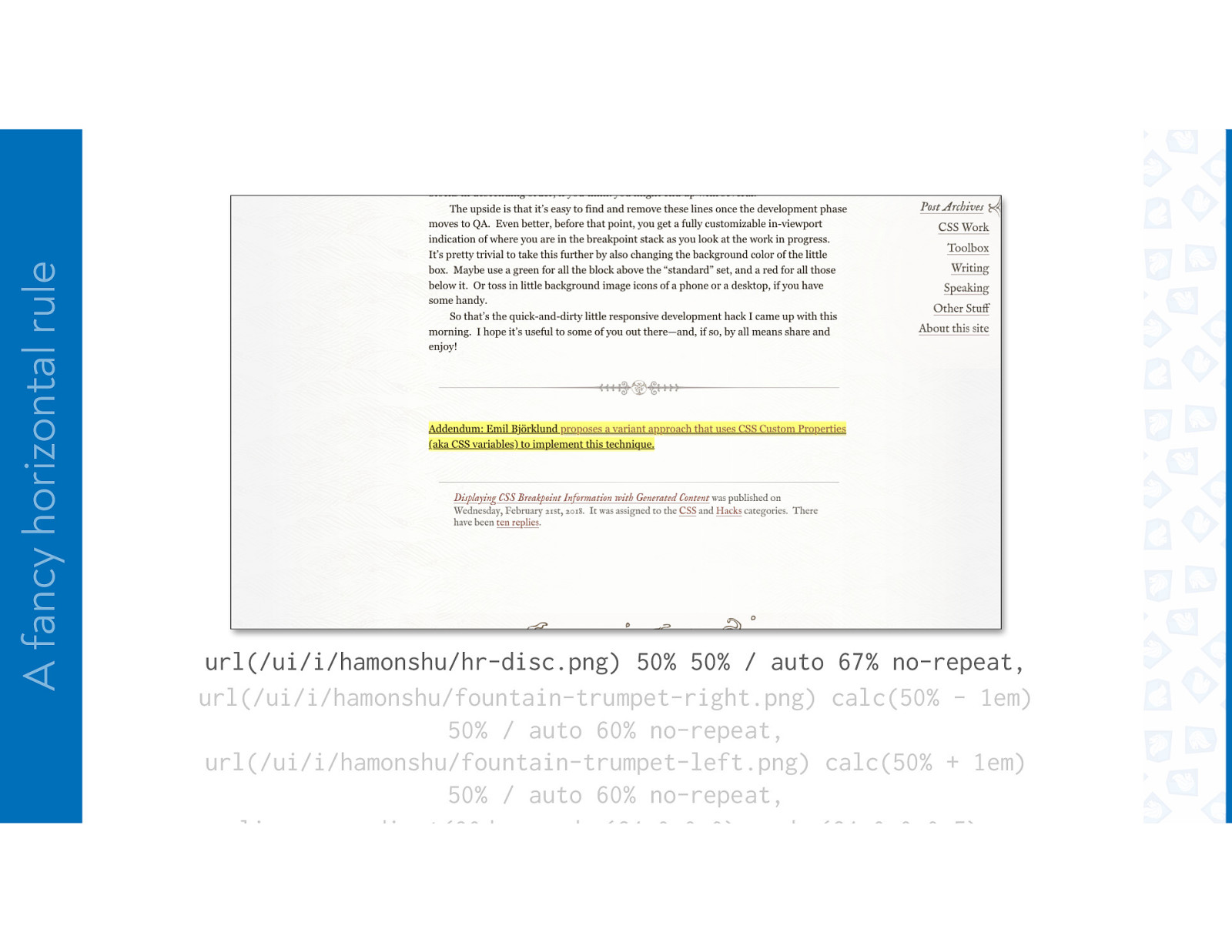
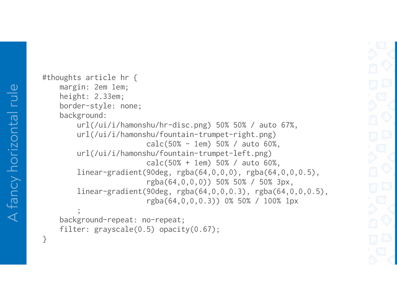
FANCY RULE
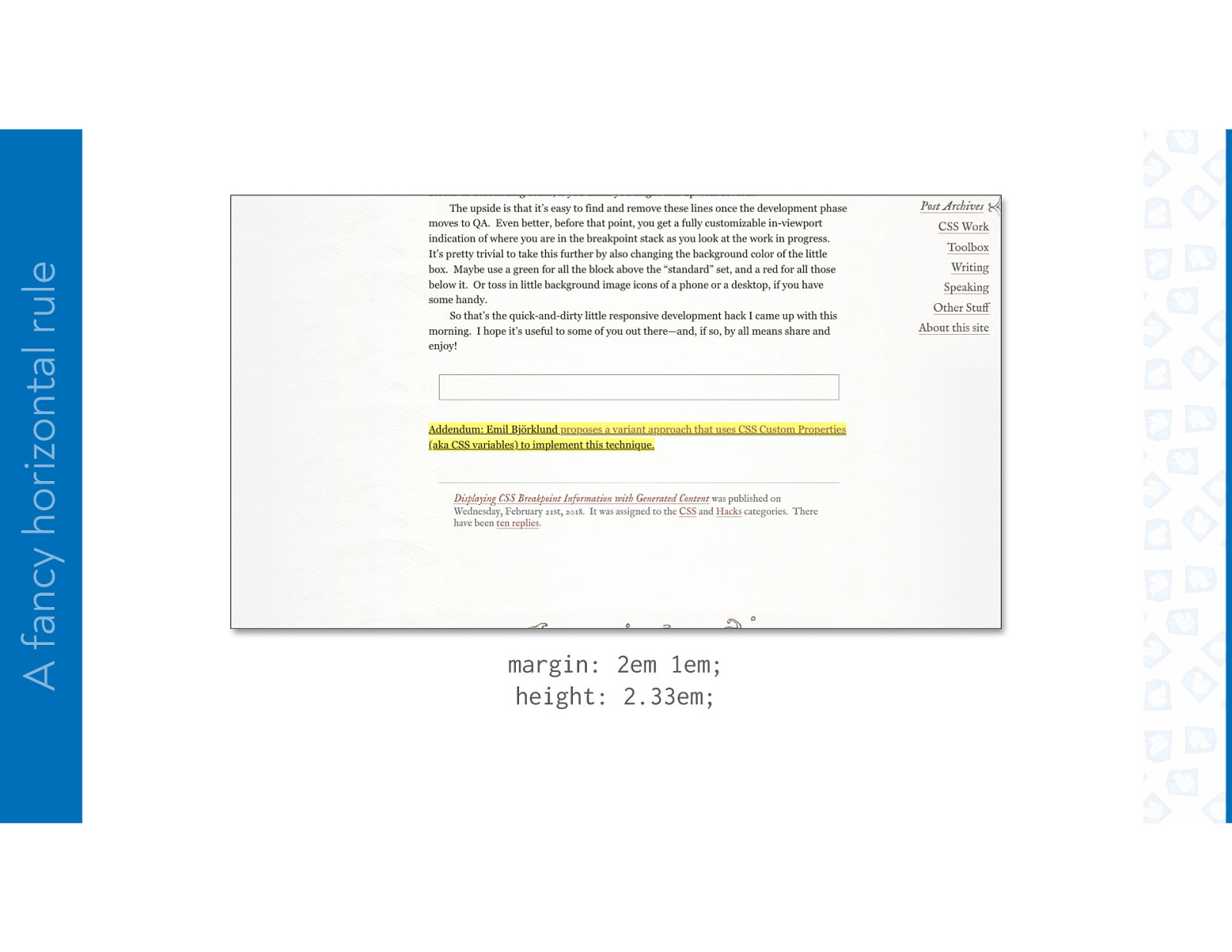
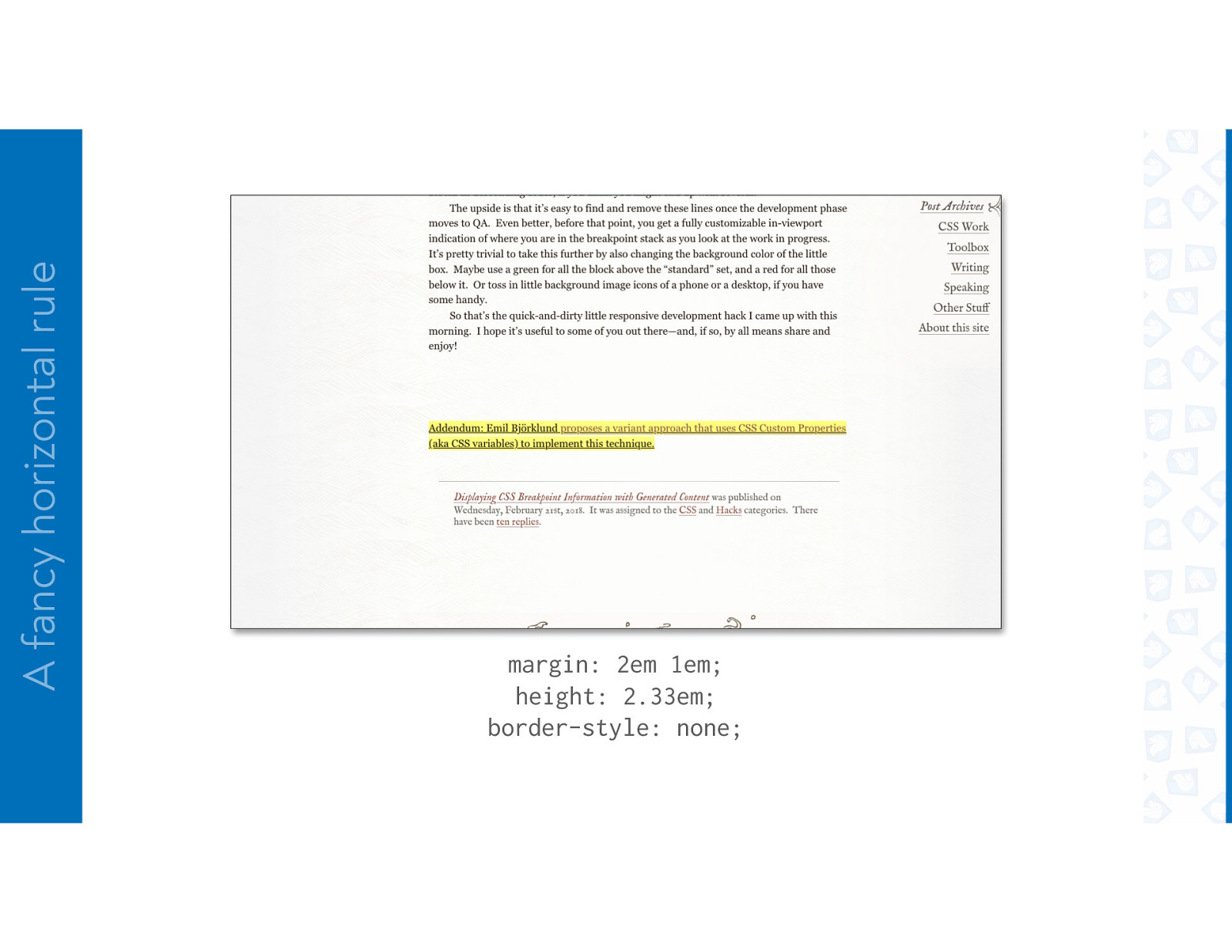
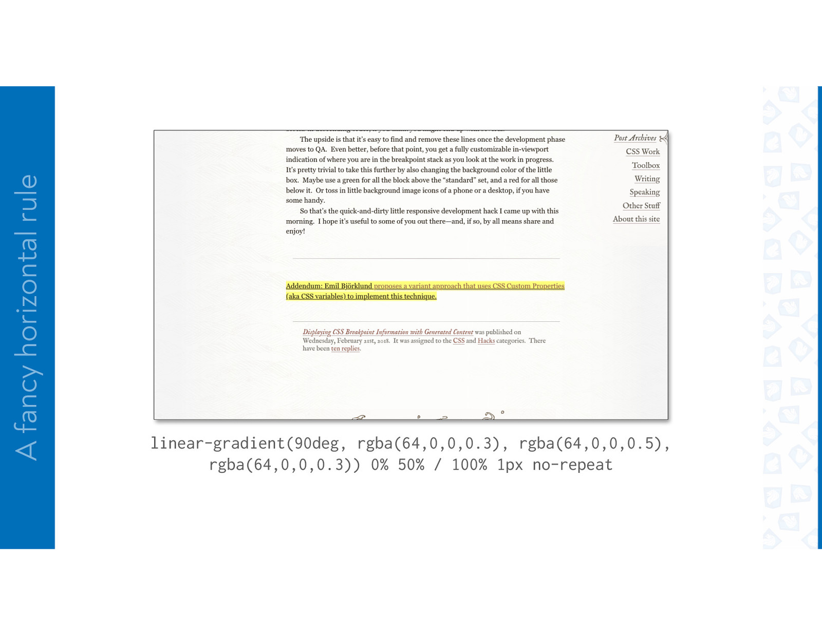
A fancy horizontal rule
A fancy horizontal rule
A fancy horizontal rule margin: 2em 1em; height: 2.33em;
A fancy horizontal rule margin: 2em 1em; height: 2.33em; border-style: none;
A fancy horizontal rule linear-gradient(90deg, rgba(64,0,0,0.3), rgba(64,0,0,0.5), rgba(64,0,0,0.3)) 0% 50% / 100% 1px no-repeat
A fancy horizontal rule linear-gradient(90deg, rgba(64,0,0,0), rgba(64,0,0,0.5), rgba(64,0,0,0)) 50% 50% / 50% 3px no-repeat, linear-gradient(90deg, rgba(64,0,0,0.3), rgba(64,0,0,0.5), rgba(64,0,0,0.3)) 0% 50% / 100% 1px no-repeat
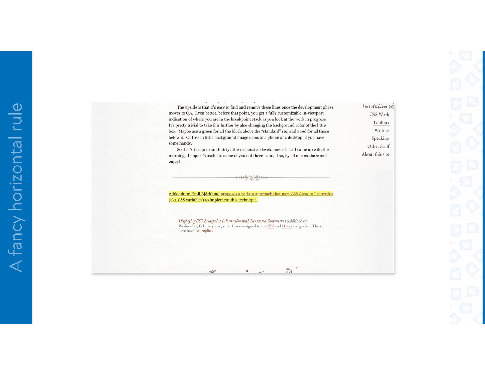
A fancy horizontal rule url(/ui/i/hamonshu/fountain-trumpet-right.png) calc(50% - 1em) 50% / auto 60% no-repeat, url(/ui/i/hamonshu/fountain-trumpet-left.png) calc(50% + 1em) 50% / auto 60% no-repeat, linear-gradient(90deg, rgba(64,0,0,0), rgba(64,0,0,0.5), rgba(64,0,0,0)) 50% 50% / 50% 3px no-repeat,
A fancy horizontal rule url(/ui/i/hamonshu/hr-disc.png) 50% 50% / auto 67% no-repeat, url(/ui/i/hamonshu/fountain-trumpet-right.png) calc(50% - 1em) 50% / auto 60% no-repeat, url(/ui/i/hamonshu/fountain-trumpet-left.png) calc(50% + 1em) 50% / auto 60% no-repeat, linear-gradient(90deg, rgba(64,0,0,0), rgba(64,0,0,0.5),
A fancy horizontal rule #thoughts article hr { margin: 2em 1em; height: 2.33em; border-style: none; background: url(/ui/i/hamonshu/hr-disc.png) 50% 50% / auto 67%, url(/ui/i/hamonshu/fountain-trumpet-right.png) calc(50% - 1em) 50% / auto 60%, url(/ui/i/hamonshu/fountain-trumpet-left.png) calc(50% + 1em) 50% / auto 60%, linear-gradient(90deg, rgba(64,0,0,0), rgba(64,0,0,0.5), rgba(64,0,0,0)) 50% 50% / 50% 3px, linear-gradient(90deg, rgba(64,0,0,0.3), rgba(64,0,0,0.5), rgba(64,0,0,0.3)) 0% 50% / 100% 1px ; background-repeat: no-repeat; filter: grayscale(0.5) opacity(0.67); }
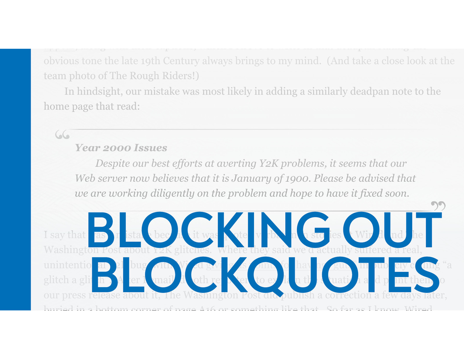
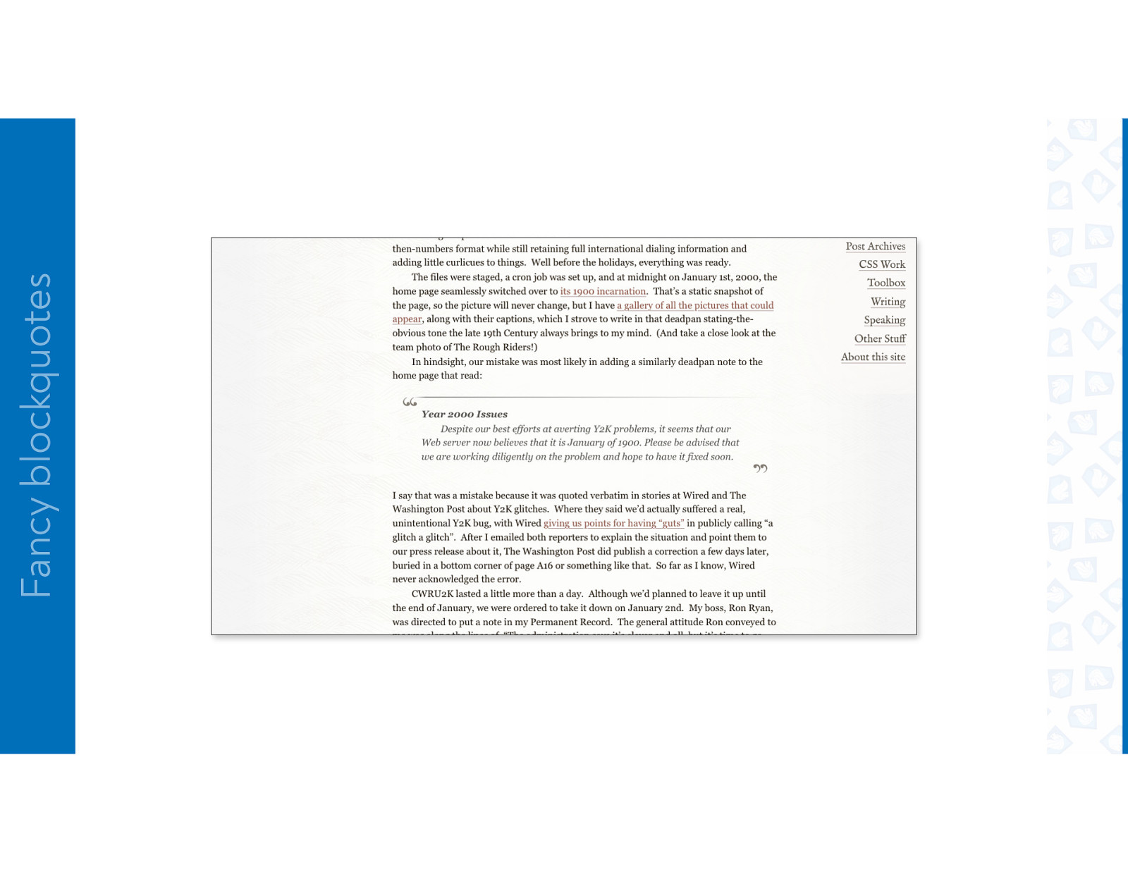
BLOCKING OUT BLOCKQUOTES
Fancy blockquotes
Fancy blockquotes
Fancy blockquotes
Fancy blockquotes
Fancy blockquotes
Fancy blockquotes
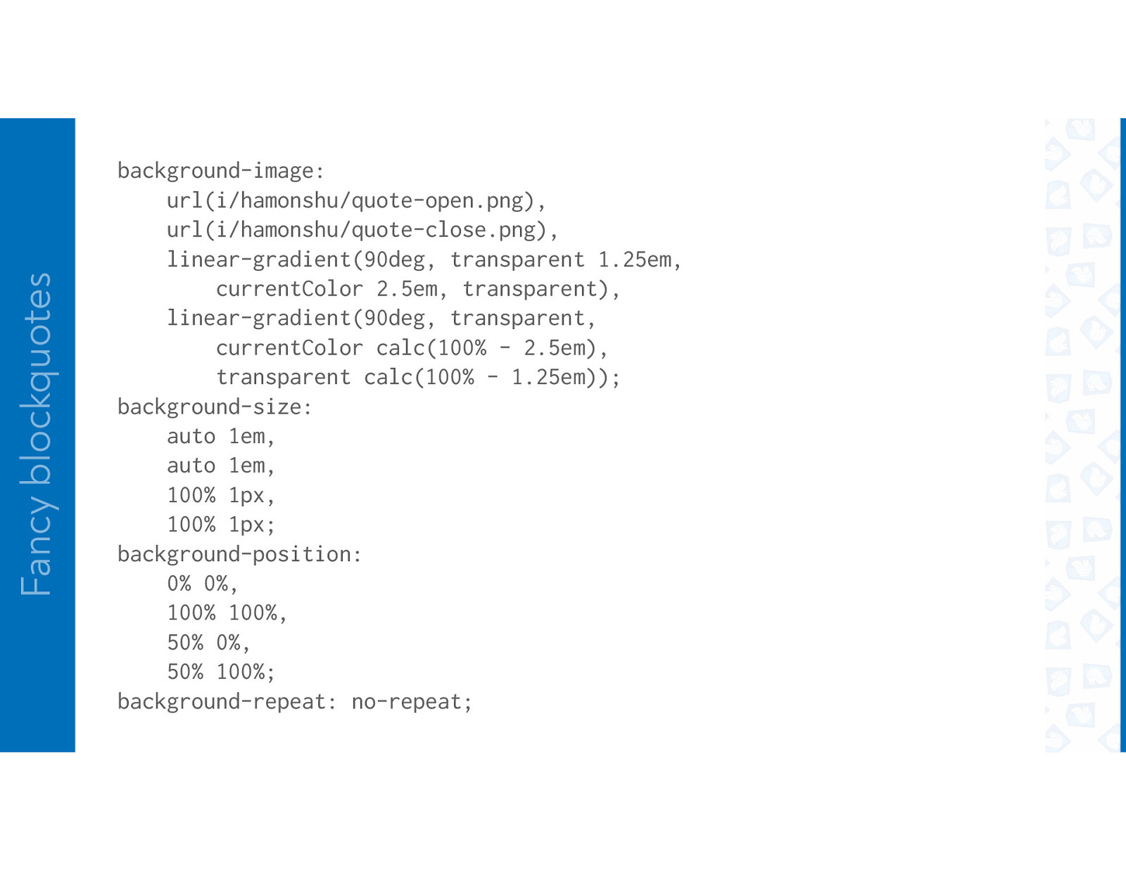
Fancy blockquotes background-image: url(i/hamonshu/quote-open.png), url(i/hamonshu/quote-close.png), linear-gradient(90deg, transparent 1.25em, currentColor 2.5em, transparent), linear-gradient(90deg, transparent, currentColor calc(100% - 2.5em), transparent calc(100% - 1.25em)); background-size: auto 1em, auto 1em, 100% 1px, 100% 1px; background-position: 0% 0%, 100% 100%, 50% 0%, 50% 100%; background-repeat: no-repeat;
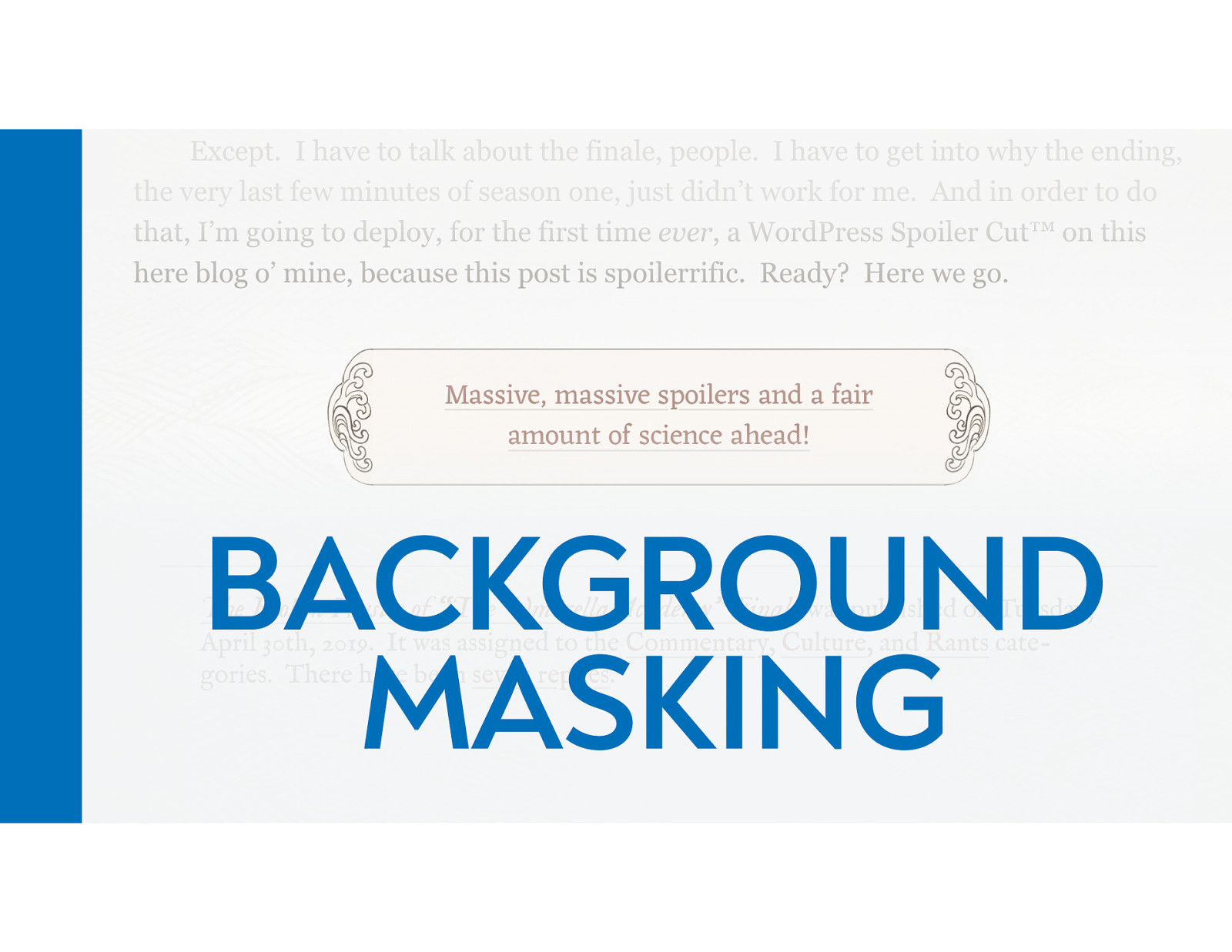
BACKGROUND MASKING
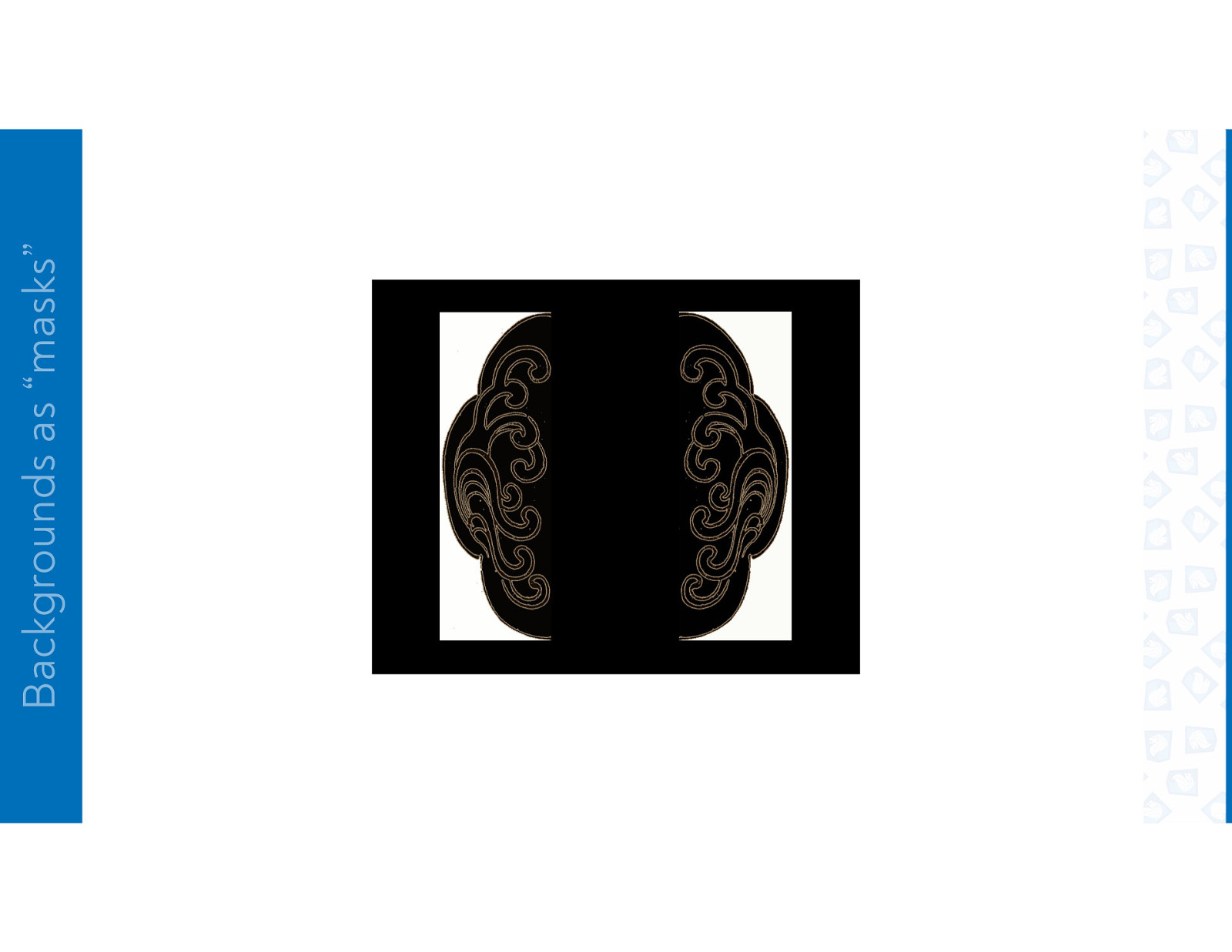
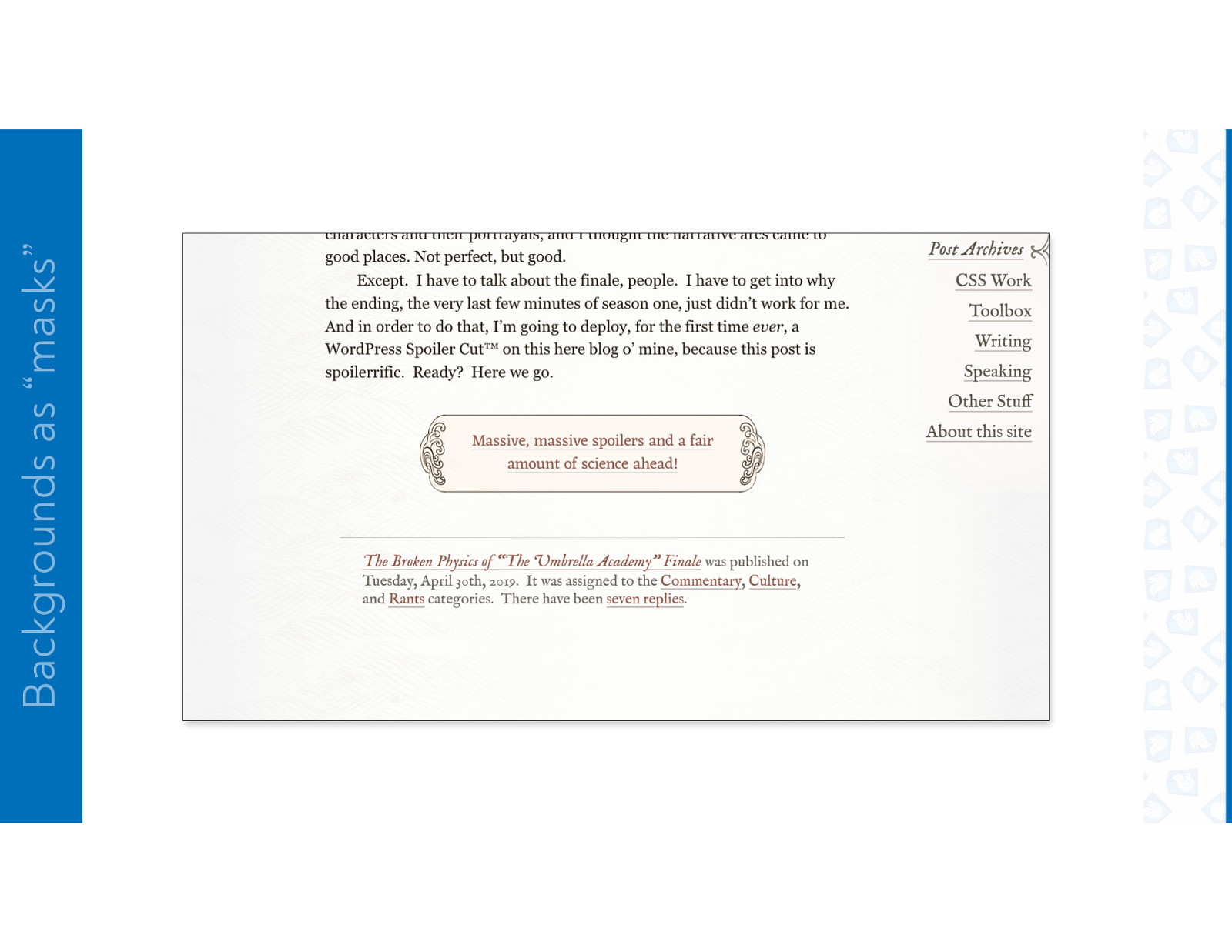
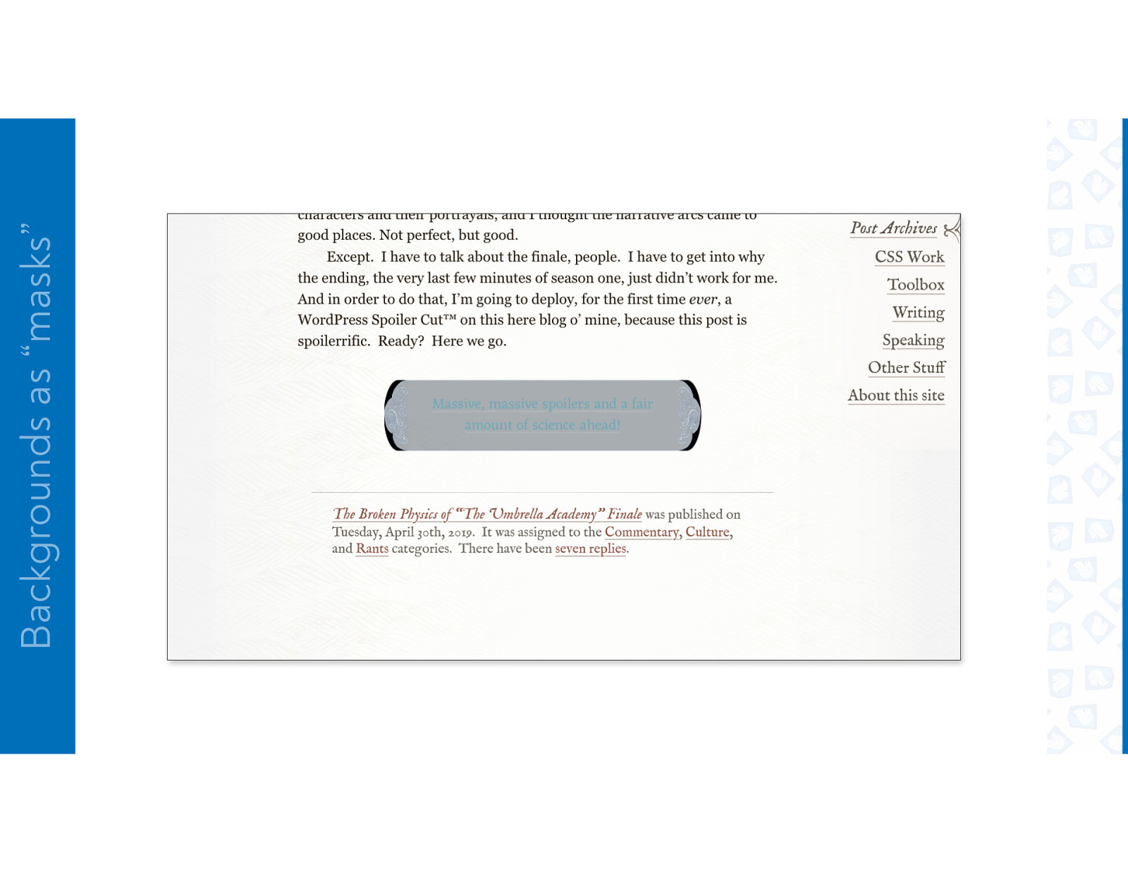
Backgrounds as “masks”
Backgrounds as “masks”
Backgrounds as “masks”
Backgrounds as “masks”
Backgrounds as “masks”
Backgrounds as “masks”
Backgrounds as “masks”
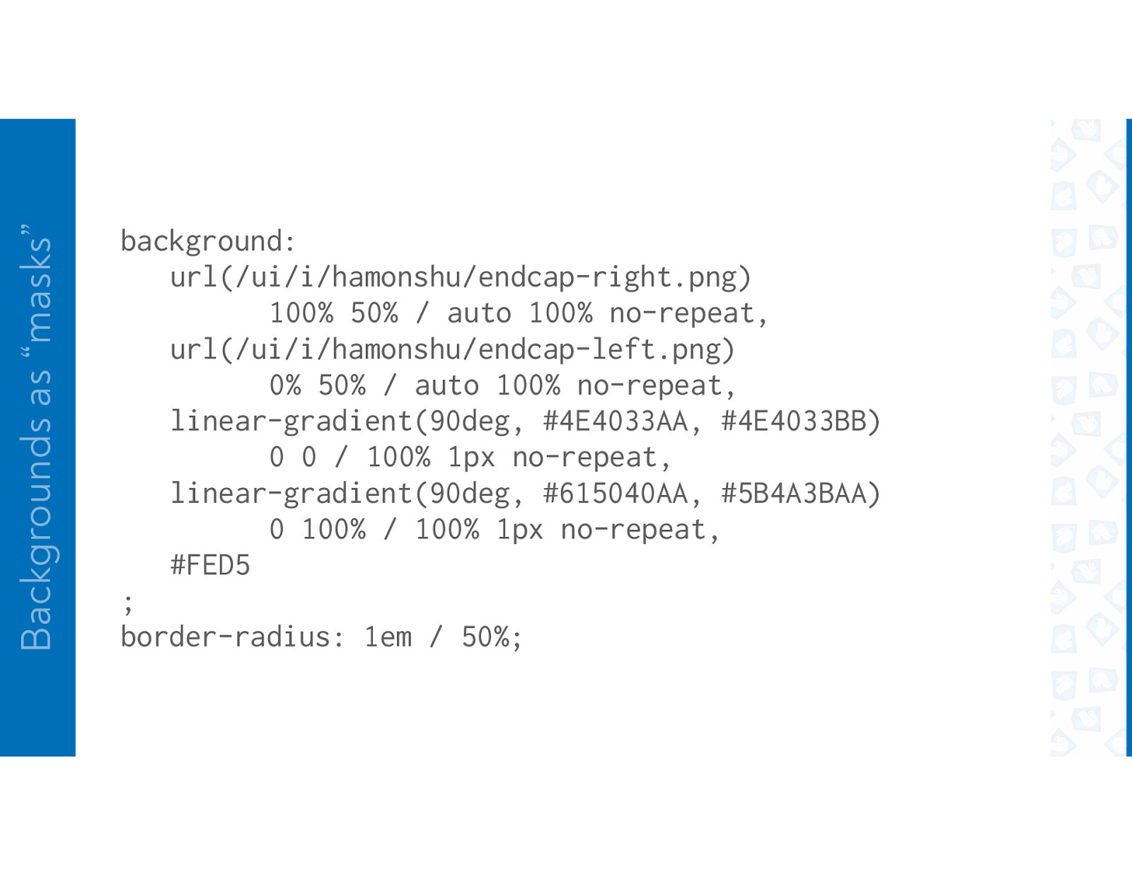
Backgrounds as “masks” background: url(/ui/i/hamonshu/endcap-right.png) 100% 50% / auto 100% no-repeat, url(/ui/i/hamonshu/endcap-left.png) 0% 50% / auto 100% no-repeat, linear-gradient(90deg, #4E4033AA, #4E4033BB) 0 0 / 100% 1px no-repeat, linear-gradient(90deg, #615040AA, #5B4A3BAA) 0 100% / 100% 1px no-repeat, #FED5 ; border-radius: 1em / 50%;
THANK YOU Design in the Background Talk.CSS #56 4 November 2020 @meyerweb


 for free. You
can too.
for free. You
can too.