Designing Content for Customers

A presentation at General Assembly in September 2015 in by Mike Atherton

Slide 1

Slide 1

Designing Content for Customers

Today I want to address an issue I’ve encountered while working on far too many corporate websites. While our fantastic clients have slowly warmed to the idea of User Experience Design, the perception remains that this process is best used when designing user interfaces.

I mean, it is good for that. But we can go further, and apply UX thinking to the content we put into the world.

Slide 2

Slide 2

Part 1: A Little History

Once upon a time there was advertising.

Slide 3

Slide 3

Advertisers knew how to craft a message which scratched the itch of a potential customer. The good ones knew how to express that with such distinction and style that the message stuck and was acted upon. And they knew how to do all that within a billboard or a 30-second commercial.

Slide 4

Slide 4

Then further down the highway came the information superhighway. And things changed. ‘Digital’ was happening, and as is always the case with disruptive technology we tried to apply the old paradigms to the new media. We drive into the future using our rear-view mirror.

This new world-wide web was presented as a means of publishing documents. A publishing medium. And to many of us, publishing meant pushing messages in one direction, just as we’d done with advertising, journalism, or print marketing.

Slide 5

Slide 5

First steps were tentative. From the New York Times to the BBC, the ‘website’ sat in the corner of the room, like a baby exotic pet who almost certainly wasn’t ever going to grow up and eat us in the night. It wasn’t seen as serious, or even especially useful. There was core business, and then way down the agenda sheet was ‘the website’. Around the boardroom tables the refrain was ‘what’s happening with the website’ (this ‘other’ thing).

As the buck was passed, it most often ended up in the lap of marketing.

Slide 6

Slide 6

Perhaps because of this, the prevailing model for the corporate website became the digital brochure. The shortest step from the world that marketing people knew, to this brave new digital world. Brochure websites became a digital calling card in a corporate arms race fought on golf courses the world over.

“We need to have a website!”

“But why?”

“Because our competitors do.”

A refrain to be repeated for mobile apps, Alexa skills, and no doubt whatever’s next.

Slide 7

Slide 7

But as is the way with arms races, things escalated. The web was taking the world by storm. More people round that boardroom table felt ‘their thing’ should be on the website. And hey - unlike the page count of a print brochure, or the airtime of a TV spot, the website had near infinite capacity.

Content grew like topsy. Content was king. Company filing cabinets were emptied onto the website, because why not? Maybe it’ll be useful to someone.

Slide 8

Slide 8

Websites started to look like the Winchester Mystery House in San Jose; a sprawling mansion where new rooms and corridors get bolted on ad-hoc to appease the imagined needs of supposed ghosts. This was addictive content hoarding and many didn’t know where to stop.

Eventually, once the site becomes so unwieldy, outdated, or structurally complicated, the cry would go out: we need to redesign! And the circle of life began again.

Slide 9

Slide 9

Part 2: The Problem

So why does this content sprawl happen so often? And how do we need to change our mindset to improve our return on content investment?

Slide 10

Slide 10

The hand of history is upon us still. Part of the problem is a lack of purpose. Well-meaning business owners still think its about publishing stuff they think will be interesting.

They don’t have any real clear objectives for the website, even though they feel they should have one. Somehow in 2015, digital is somehow ‘other’ than core business.

Slide 11

Slide 11

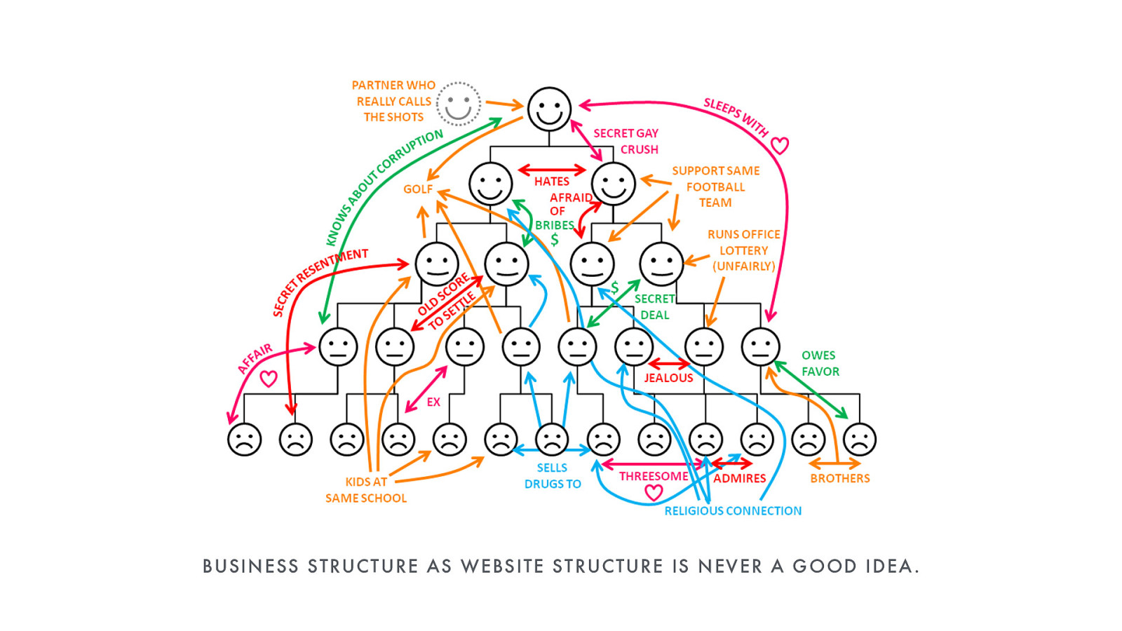
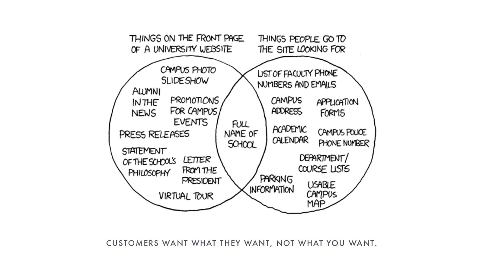
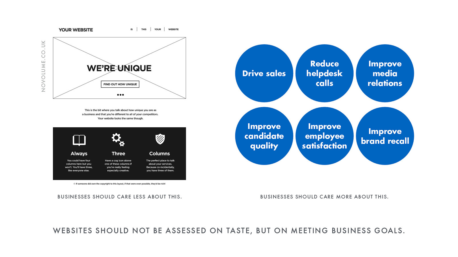
Feeling they’re somehow responsible for the design of the website, companies often fall back on the model most familiar to them; that of the company structure itself.

Websites start to emulate the org chart, creating a virtual voodoo doll of the business. That can mean that any departmental silos, tensions, inconsistencies, confusions of structure can surface in the website itself. When I worked at the BBC, putting local news on the website was hard work, mostly because their concept of local was a hangover from the physical location of radio transmitters.

Today I’ll ask clients, “Why are your product categories like that?” and hear “Because that’s how our business units are.” To say nothing of the inter-departmental tussles for ‘their’ part of the website getting supremacy.

It’s said that those automatic carousels you get on home pages were invented as an end to stakeholder arguments.

Slide 12

Slide 12

Agendas change. Campaigns come and go. Businesses sprawl. If your site is reflective of a fragmented, not-aligned, multi-siloed company culture it’s hard to know when to stop publishing stuff.

The old UK government websites had this problem. In one example, tax advice applying to beekeepers meandered in to general advice about beekeeping itself. As silly as that sounds, there was just no guidance as to where the publishing boundaries should be. No criteria written-down of what should be in and what should be out.

Slide 13

Slide 13

Aside from the mess, throwing more and more stuff into the digital void is expensive to create and difficult to maintain, but it can be a casualty of a structure where you’re trying to represent just how brilliant your department is compared to all the other departments.

But really, why? Who is this helping? Are we just saying, “Here’s everything about us. You figure out which stuff is useful to you!”

Slide 14

Slide 14

Part 3: The Rise of UX

Somewhere along the line came the new hotness: User Experience Design. We stopped talking and started listening.

Slide 15

Slide 15

A revelation that sparked a revolution. Our website might be about us, but it’s not for us. It’s for our customers! Your brand isn’t what you say it is, it’s what they say it is.

A website isn’t about what the client wants, it’s about what the client’s customer wants. The user experience, not the client experience. In UX design we talk to customers to find out what they care about and what they want from the business.

Slide 16

Slide 16

Yes, what they want from the business, not specifically the website. Because the website is no longer the thing in the corner of the room. It’s the channel for doing business. This isn’t just marketing any more. The website has a job to do. Be that driving sales, reducing support calls, qualifying leads, or improving the recruitment pipeline.

The site is now a core business channel for customers to carry out the most important tasks with effectiveness and satisfaction. Good content is focused, memorable, distinctive, brief, and never without a call to action. To paraphrase Seth Godin, don’t find customers for your content, find content for your customers.

Slide 17

Slide 17

This is all now codified within the discipline of content strategy, which frames content as specifically supporting business strategy. There’s the substance and the structure of the content itself, which is often where we stop. But consider also the human components. The workflow and governance which makes appropriate content happen within a business. And this puts clients just as much on the hook for delivery.

It’s a problem I see often. Companies will spend £300k every three years for a complete redesign, but they won’t put £50k/year into keeping the site living and breathing. We sometimes think of website projects as somewhere from designing a brochure to building a printing press. But really, it’s more like running a newspaper and we somehow have to get to tomorrow’s edition.

The output may be content, but getting it there, making it right, and keeping it coming is all strategy. Useful content which supports business goals by helping users complete their tasks.

Slide 18

Slide 18

Content Strategy in Action

Let’s take an example. If we were choosing an Airbnb to stay in, what would we want to know?

Slide 19

Slide 19

We’d want to know what it looks like. How much it costs. Is it available for our chosen dates? Are we getting the whole place or just a room?

The interface design is structured to provide us with easy answers to our most pressing questions.

Slide 20

Slide 20

What amenities does it offer?

Slide 21

Slide 21

Do other people think its any good?

Slide 22

Slide 22

Is the host someone I can trust?

Throughout the experience the design decisions support the content. Airbnb are creating reassurance to encourage you to book.

Slide 23

Slide 23

Less is More

Back to the UK government. When the GOV.UK website launched back in 2012 the team were on a mission to prune all the redundant, outdated and trivial content. They focused on providing quick and clear answers to people’s most pressing questions, from VAT rates to public holiday dates.

Slide 24

Slide 24

GOV.UK planned to replace the individual websites of hundreds of government departments and public bodies by 2014. By May 2013, all 24 ministerial departments and 28 other organisations had their URLs redirecting to gov.uk.

By the time they were done over 1700 central government websites were replaced by this single destination.

Slide 25

Slide 25

Top Tasks

But how do you determine what the most important tasks are? Go back to the customers. Look at the analytics. What are the top performing content pages? When people arrives at the site from organic search, which terms are they searching for.

If your site has its own search, which terms are people searching for? That’s incredibly revealing. People are telling you what they want using their own terminology.

Slide 26

Slide 26

Armed with insight we can compile a list of the likely tasks we’d expect users to want to complete. Gerry McGovern advocates a method called ‘Top Task Ranking’. If we can get enough representative users in a room, we can ask them to force rank these tasks based on priority. Trends in this process will give us a picture of which are the top tasks and which only the tiny tasks.

Slide 27

Slide 27

Done correctly, this exercise helps you rank the relative value of the content you have. Note that we’re not directly measuring the popularity of the content, but the priority of the tasks it supports.

Slide 28

Slide 28

Too many long weeds choke out the flowers. Time to kill your darlings.

Slide 29

Slide 29

So now we get a clearer picture of which are the most important customer tasks the site has to meet. Our picture of success. This changes everything.

Content is now expressly designed to support tasks. Those tasks in turn support higher business goals. There’s a clear set of priorities and boundaries for creating content.

Success is measured not on whether the ‘client’ ‘likes’ the ‘creative’, but simply on whether this product is successfully doing the job it’s been designed to do.

Slide 30

Slide 30

The website goes from being a cost centre (where budgets are small because the clients want to throw away as little money as possible) to earning its keep and offering return on investment. The business case is made: more investment yields better returns.

Slide 31

Slide 31

Who would ever have thought that the British Government would be leading the world in UX and Content Strategy? Yet the work GDS completed was revolutionary and has since inspired other governments around the world to take the same approach.

Slide 32

Slide 32

Before GOV.UK digital government services were failing. In one case, users on average had to call a helpline seven times. Improving digital services [and developing in-house] was estimated to save taxpayers £1.8 billion per year.

Slide 33

Slide 33

Start with Needs

The GDS team take a highly principled approach to transforming government services through the information they provide. Their first principle is to focus on the needs of users, not of government.

Slide 34

Slide 34

Do Less

Focus only on the stuff that you do well, and basically to provide only as much content as is needed. It’s like visual design where we need to rationalise every element in a layout. Like the man said, ‘perfection is achieved when there’s nothing left to take away’. Same is true of content. No longer that infinitely large filing cabinet but using tough decision making to offer the minimum amount of content needed to successfully support each task.

Slide 35

Slide 35

If content is redundant, outdated, or trivial it’s costing time, money, and reputation to keep it there. It’s in the way. Bad content smothers good content.

Publish only what’s useful.

Slide 36

Slide 36

With top tasks and business goals defined, we start to design that useful content. All design should begin by designing the content itself. The tasks and goals it must support. How we get there. What’s the substance? What are the onward paths or calls-to-action.

Netlife Research developed a ‘core model’ to help ensure content objectives are aligned across the whole team, including their client.

Slide 37

Slide 37

Going even more granular, we can issue a ‘content spec sheet’ which tells editors what to write, what it’s for, how long it each section should be. Stylistically they have voice and tone guidelines to work from.

Like those advertising Mad Men of old, we understand attention is in scarce supply. So content must short, transactional, and compelling. It needs purpose.

Slide 38

Slide 38

Tools such as GatherContent help us organize our material in advance of any visual design or engineering. With the content in place early, everyone in the team understands the shape of the content and can create interfaces to suit.

Slide 39

Slide 39

Because content is the whole damn point. Interface design should be informed by the content itself, to structure and present that content to help support its goals.

So death to lorem ipsum. Needs drive tasks, tasks drive content, content drives design.

Slide 40

Slide 40

As with other forms of design, content design needs principles and standards to help it maintain coherence. Mailchimp blazed a trail years ago by publishing their comprehensive content guidelines publicly. Much of their brand was built on taking a more human approach to the language found throughout their product and marketing.

Slide 41

Slide 41

Part 4: Reaching Further

Now we know that content should be designed to meet user needs, let’s see some examples that take this to the next level.

Slide 42

Slide 42

Airbnb

What businesses like Airbnb really understand is what their customers are trying to achieve, so provide content around the wider context. Their city guides are lifestyle-based, but support their core proposition and customer’s top task of deciding on a place to stay.

Slide 43

Slide 43

Mailchimp

MailChimp also create guides to email marketing - not how to use their platform, but how to write, how to run campaigns. Because that’s what their customers are trying to do. This kind of content funnels usage back into the core product and builds brand loyalty.

Slide 44

Slide 44

Google

Content is becoming freed from interface. Where once we’d go visiting to a company’s homepage and work our way down, now we’re starting that journey from Google. Google is our home page. We are watching embedded videos directly from within Facebook and Twitter, so sometimes not even having to visit a site’s interface at all to experience the content.

Slide 45

Slide 45

So content must have its own structure distinct from interface. Where responsive design has allowed us to experience sites across multiple devices, metadata structures allows us to experience content across multiple services. That’s going to raise important challenges around distinctiveness.

We’re not building brochures or ivory towers. No one is knocking on the front door. Content has to go to where the people are, and the content that will win is stitched into the fabric of the web.

Slide 46

Slide 46

It's Called a Web for a Reason

It’s always been called a web because it’s supposed to be an endlessly interlinked web of content. We don’t go to one provider for all our information. We cherry pick from all over the place.

Perhaps we’ve come full circle. Compelling distinctive messages both in voice but in substance. Giving people something they can’t get from a click away.

Slide 47

Slide 47

So to sum up: People come to websites to complete specific tasks. That might be completed on the website, or might be about pinpointing specific info to complete a task elsewhere.

Designing useful content means understanding what the top tasks are for those people. That means getting close to customers and understanding their needs and behaviours.

Task-centred content strategy transforms the website from being a general marketing channel to being a true business channel with measurable ROI.

Winning content considers what customers need and like advertising copy of old is focused, memorable, distinctive, brief, and never without a call to action. Make content for customer conversion.

Slide 48

Slide 48

My thanks to Gerry McGovern, Paul Annett, Lou Rosenfeld and other folks whose amazing work is featured in this presentation.