Future-Friendly Content
It’s 2015. The web is 26 years old, but this isn’t the past or the present anymore.
A presentation at Midwest UX 2015 in October 2015 in Pittsburgh, PA, USA by Mike Atherton
It’s 2015. The web is 26 years old, but this isn’t the past or the present anymore.
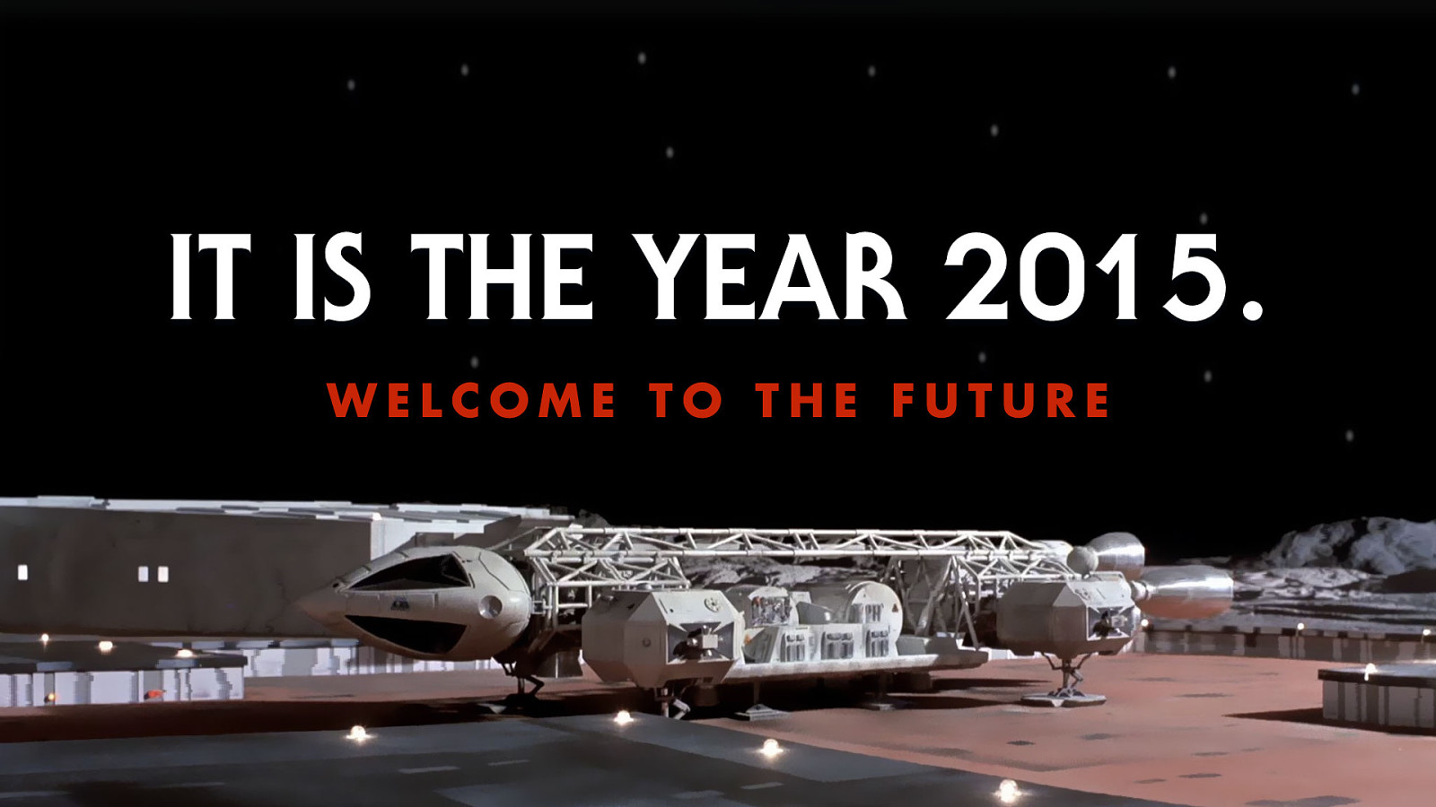
This is the future. It’s time to look at a way of creating, structuring, designing content that’s ready for anything the future can hold.
The furniture designer Charles Eames said that design is a plan for arranging elements to accomplish a particular purpose.
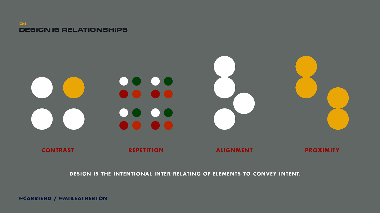
We can say that design is about managing relationships between elements. This is where we say that visual design is C.R.A.P.
Contrast. One of these kids is doing his own thing–contrast in colour, size, material, motion. When something is different to other things we want to show it as different.
Repetition. When things are the same, they should look the same. Creating patterns to convey consistency of meaning, so we can learn quickly through pattern repetition that things belong together.
Alignment. Things aligned suggest a consistent linear progression, but when something is out of alignment it calls attention as being different - we understand it has a different relationship to the aligned elements.
Proximity. Things close together are more thematically-related than things further apart.
From visual design theory we know how different design elements, information, or physical materials can be represented to show similarity, hierarchy, or difference. Design therefore is about how we manage those inter-relationships to convey our intent.
UX hero Jared Spool calls design the rendering of intent. That when we design something, we have a specific conceptual goal or model in mind, and the thing we design is our attempt to convey or render that intent.
And as fellow information architect Abby Covert say, the material of intent is language itself. That it is first through language–communication–that we develop the intent which we may later manifest into a physical or digital artefact.
Successful design starts from sharing a common language with those we design for. We often think of design as primarily visual, but really everything starts with words.
Briefs from clients. Interviews with users. We’re first trying to understand either a problem space, or a subject domain. The space and context we are designing for has terms, relationships, and rules. These conceptual spaces exist as mental models in peoples heads, and our role as researchers and designers is to extract them, write them down and make sense of them.
Design is building understanding through that shared language; the vocabulary and relationships of the ‘subject domain’. Eventually our intent is to represent this information space through some kind of interface, but to do that successfully we need to first understand and agree on how that world fits together.
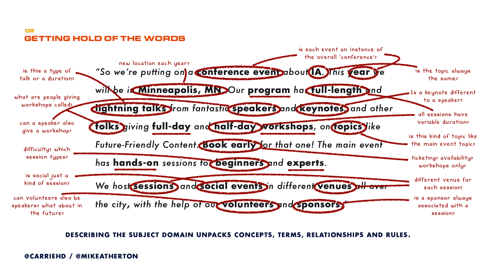
When we interview a stakeholder or a user, we can extract from them their view of their world. Listen out for the nouns and ask questions which define each thing, and how it’s different to another thing.
In user interviews we can listen out for all the nouns and verbs, so that we can understand what each term means, which things are different to other things, and how all the things are connected.
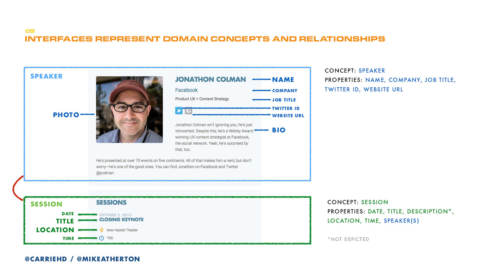
Every interface we then design is an expression of the things and relationships in that subject domain.
This is a screenshot from the Midwest UX website interface. This design conveys that there’s the concept of a ‘speaker’ (and that is broken down into smaller pieces of information) . And also the concept of a ‘session’ (again broken into smaller pieces of information). The designer here has made some decisions about how these pieces of information should be represented to show the speaker and the session, and the relationship between them. They’ve also made a decision about how much of that information will be shown on this page.
These concepts and relationships don’t just exist on this page. They exist in a database, far beyond the interface. We’re just using an interface to connect us to a conceptual content structure that when you think about it, is what ‘interface’ means.
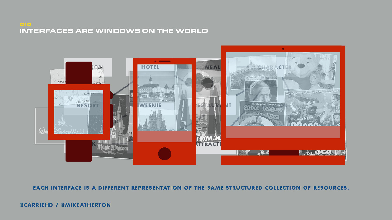
The key thing to takeaway is that design doesn’t start by planning the interface. In many ways it ends there. Instead we start with an understanding about how the subject we’re representing fits together.
We can actually structure content to conform to this model using a content management system, so that the content is broken down and connected to match the underlying model. And then each interface–desktop, mobile, watch, or whatever–is like looking at that structure through a lens.
Language is the material of intent, says Abby. Design is the rendering of intent, says Jared. Language is infrastructure, says Andrew. So design is the rendering of an abstract infrastructure, to convey a specific, contextual intent.
The model for that infrastructure exists right now mostly in your user’s heads. It is the ‘wireframe for the wireframe’, or as Jason Hobbs says ‘the design behind the design’.
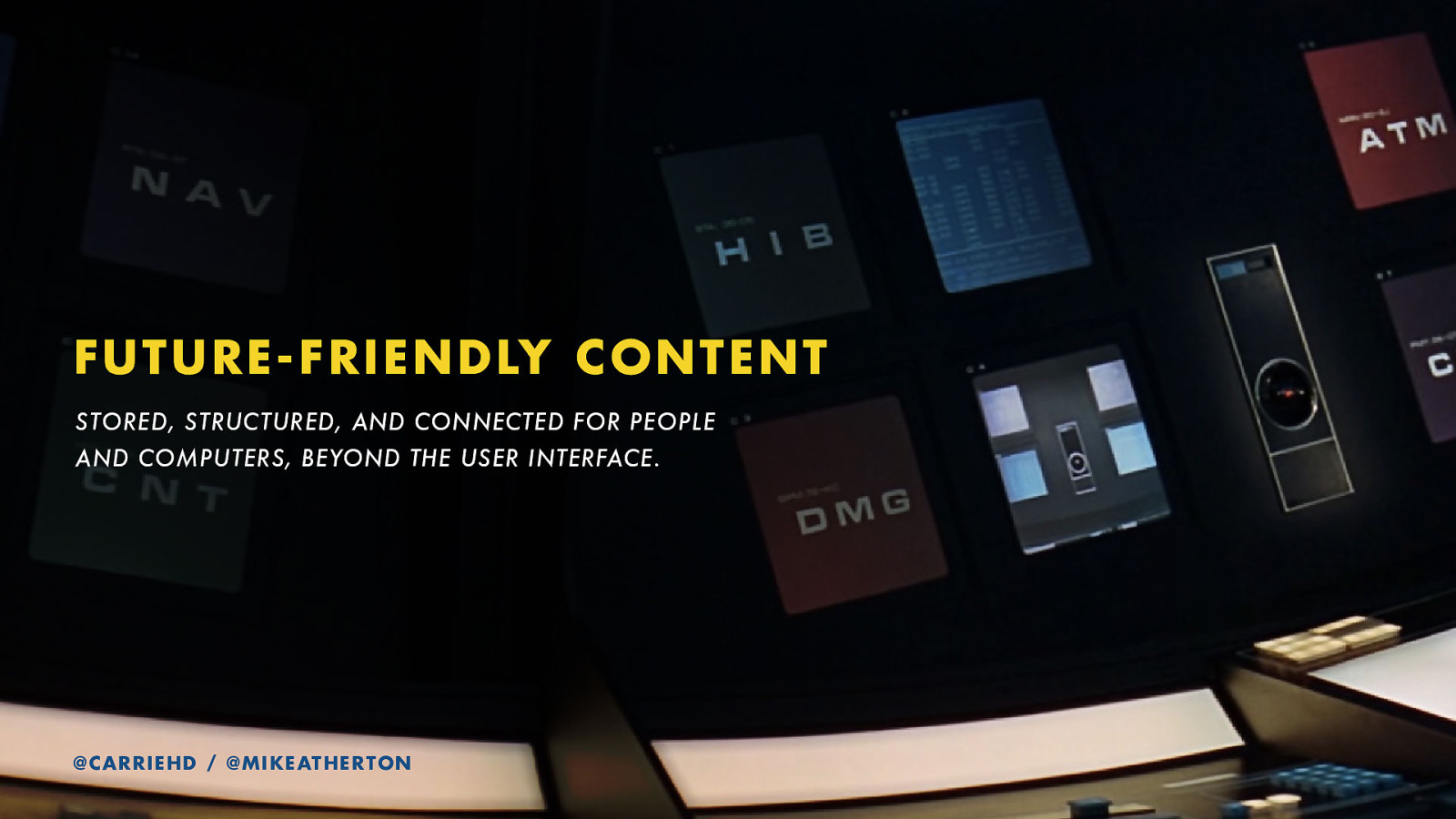
And this is what we mean when we say future-friendly content: content that has been stored, structured, and connected outside of any user interface. And in a way that’s readable by people and computers.
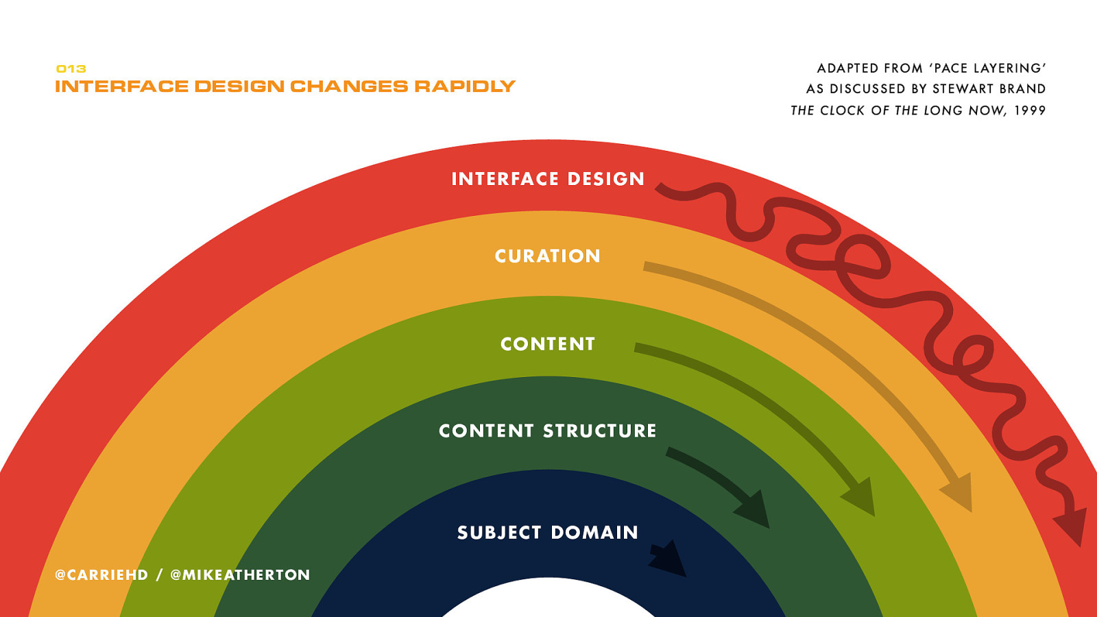
The concept of ‘pace layering’ from Stuart Brand illustrates how different parts of a system move at different speeds. We know that from shiny to skeuomorphic to flat to responsive, interface design trends move rapidly. Content itself, and the way that pieces of content are curated into packages, get updated slightly less often.
But the structure of that content, and especially the subject domain which that structure represent are the most change-resistant, or future-friendly, of all.
That’s where it’s most important to get design right. Which is what makes information architecture so important.
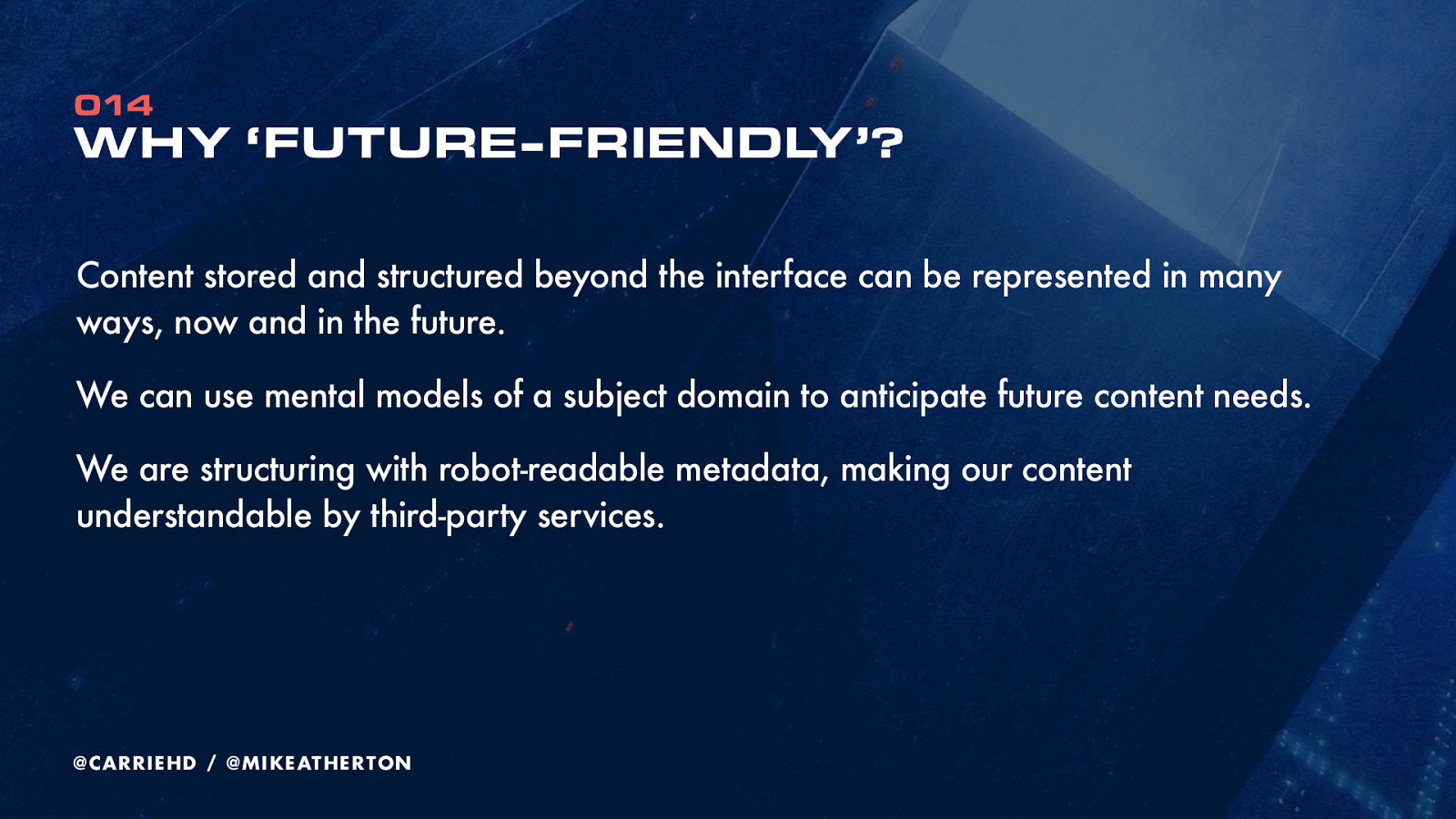
We can’t predict the devices to come, and they’re coming in too fast. Every device brings its own interface. The interface itself doesn’t dictate structure, so we can design (or redesign) many different interfaces based on the same underlying content structure.
Even before that, we’re designing the subject domain which content will support. As we’ll see, that subject might be bigger than we have content for right now, but it will give us a plan of where to go in the future.
Rather than interface-first, we’re designing content-first. Content resources before interface representations. Rendering our intent with language, long before sketches, wireframes, or prototypes.
Don’t worry about the content you’ve got, or your CMS platform. In fact let’s put aside websites right now. We’re going to start our design process by capturing the real-world subject domain.
Capturing a subject domain starts with understanding the concepts (or ‘things’) within that domain, and the relationships between those things.
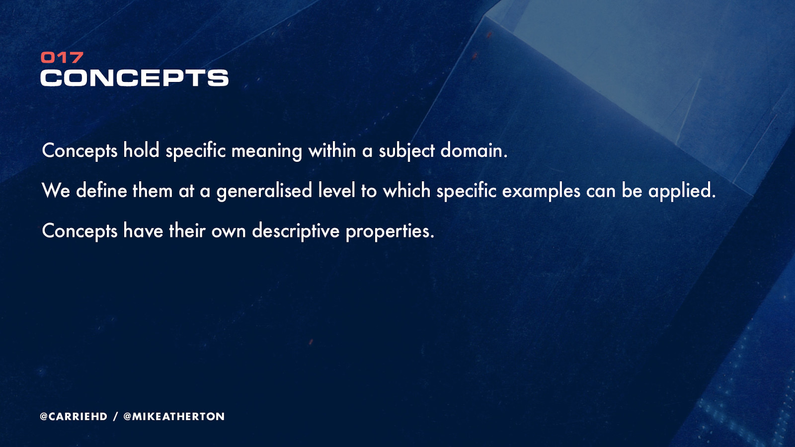
Concepts are the things that exist within a subject. They’re meant to be reusable. You might think of them as a category of thing, rather than the thing itself.
If our concept was ‘planets’ then ‘Jupiter’ and ‘Mars’ would be two different examples of that concept. And of course concepts break down further into properties which make up that concept.
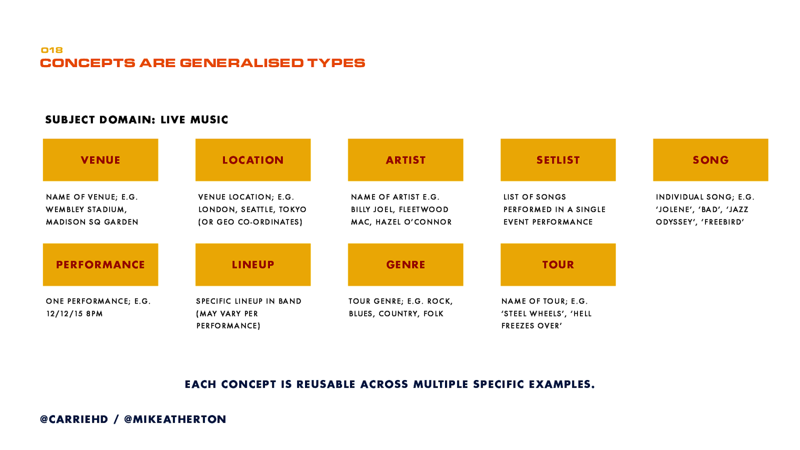
Here’s one I did earlier. Artists (covers both solo artists and bands), songs, which might be part of a setlist, and that setlist might change every night at each performance. Each song or even the whole performance could conform to a musical genre. You might even get a different band lineup at each performance. Each performance could be at a different venue, as part of a tour.
At this point we focus on concepts. You can see we’re already starting to think about how those concepts fit together.
So relationships now, which you probably realise are how concepts relate to one another. Once again, we’re thinking about the real-world relationship here. We’re not worrying about website navigation or anything. Connecting the boxes is great, but we can actually go one better and describe ‘how’ two things are related, which gives an extra dimension to understanding the subject domain, and if expressed through an interface gives an educational aspect of describing how the world joins up.
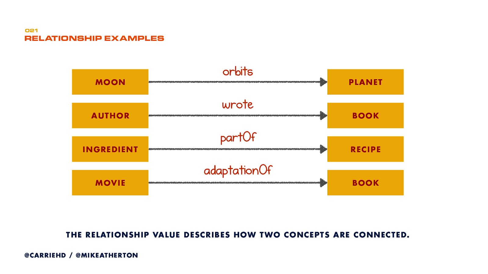
Examples of that here. If I had a concept of ‘moon’ and a concept of planet’ I could connect them, and describe that connection saying that the moon ‘orbits’ the planet.

Now we get to put all this together in a domain model. Domain modeling is an old technique from software development, but it’s something we used a lot while I was at the BBC to plan better, more scalable, information architecture.
As the name suggests, it’s a model of the subject domain; how all of the principal concepts are related.
This is where we start design from, so we’re not limiting it by the technical constraints of the website, or even by the content we have. Instead we are focused only on our best representation of the subject itself.
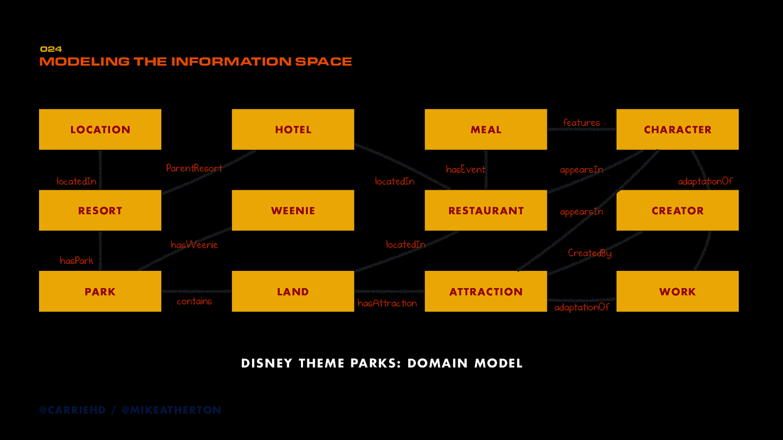
This is a domain model I put together for Disney theme parks (or arguably any theme park). You can see the concepts and relationships between them.
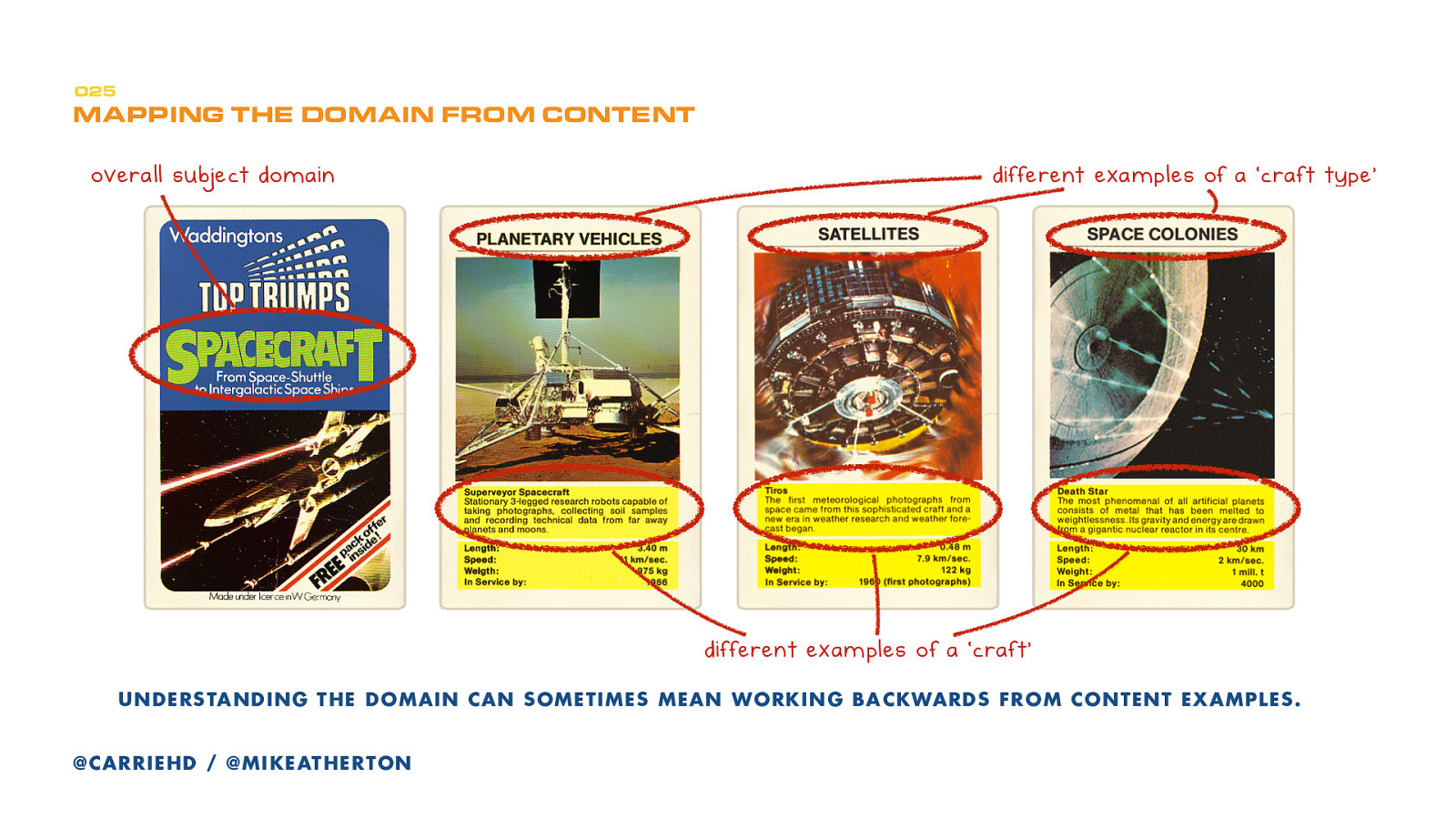
Let’s say we want to construct a domain model about spacecraft.
Quick aside: a great card came from my country (and my youth) is Top Trumps. There are lots of different decks–from sports cars to superheroes to spacecraft.
There are several categories of cards, with examples of each category. Each example has its own set of properties which you compare head-to-head to win an opponent’s card. Grab a set if you can. It’s a great way to think about structured content.
Anyway, we have a subject domain of spacecraft, and some types of craft.
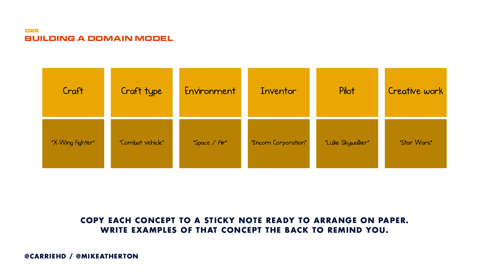
My first step uses our old UX friend, the sticky note. I write each concept on a single note. So from our domain I’ve taken the concept of a Craft, a Type of craft, and an Environment. Just to make things more interesting I’ve listed more things in the domain, like Inventor, Pilot, and the concept of a Creative Work that covers crafts appearing in a movie or a novel. On the back of the sticky note I jot down some examples of that thing, just so I remember what I’m talking about.
For Craft, I might write down X-Wing Fighter or Space Shuttle. For Type I might put down Combat Vehicle or Space Station.
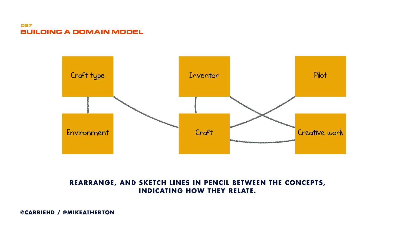
Next I lay these notes out on a bigger sheet of paper, so I can sketch lines between them, which indicate how these things relate.
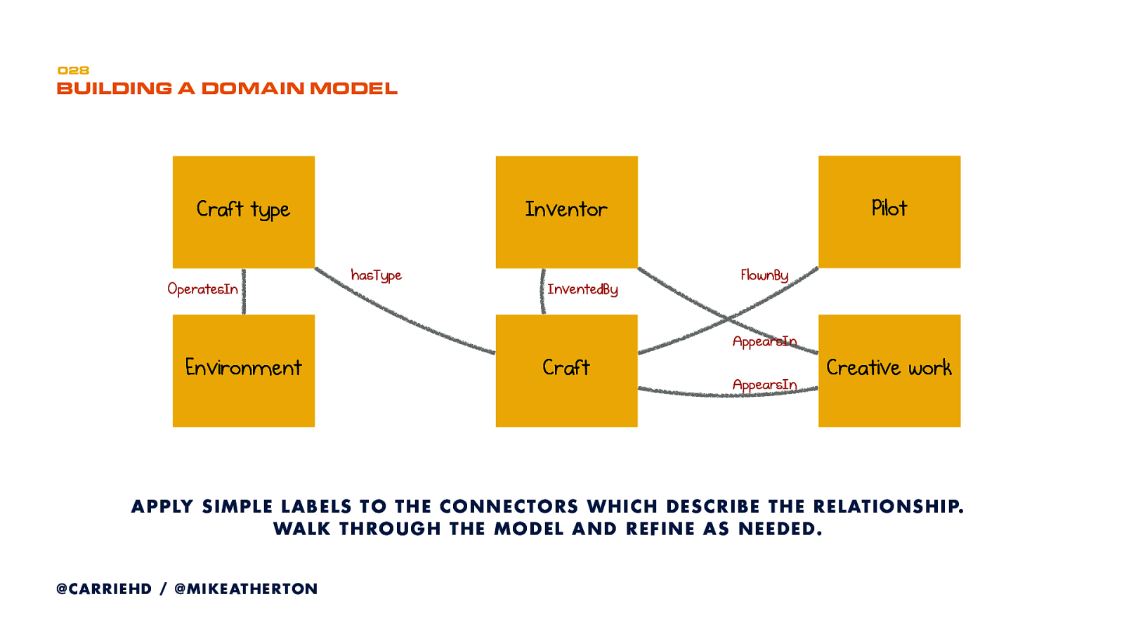
Then I write down the relationship implied by each line. Sometimes that’s very obvious, like saying a Craft–hasType–Craft type. Other times it’s more explanatory, like saying that an Inventor–appearsin–Creative work.
This simple example could already inform a powerful content structure if we filled it out with compelling content about every spacecraft!
Most of the time you’re not the subject matter expert. That’s where your UX research skills come in. Using interviews, contextual inquiry, search logs, even card sorting, we extract domain knowledge from experts and users to make a best fit understanding.
Start with a subject-matter expert. Get an overall picture of their world. Find out which things are important, what those things are called, and how they relate to one another.
Then talk to real users. They’ll have a different view of where the subject begins and ends. They’ll likely have lot less objectivity than experts, and you can use that to prioritise.
Learn the terms they use and favour their language where you can.
Domain experts can give you the overall coverage, and users will tell you what’s important. Your model should strike a balance between having enough authority to please experts but enough accessibility to appeal to users.
Ultimately your model is just the best take on a subject that you can manage. But don’t sweat it. Test and iterate often. While it’s boxes and arrows on paper, that’s very cheap to do.
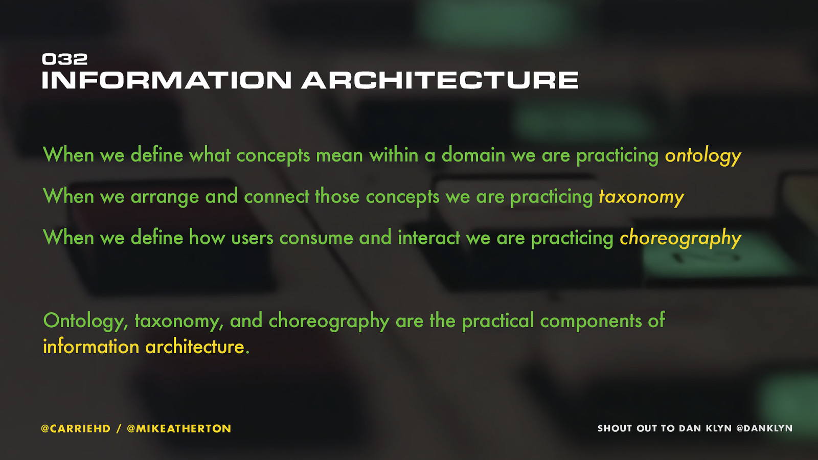
Guess what? By defining concepts and meaningfully connecting them we even did some pretty hardcore information architecture!
Information architect Dan Klyn talks about IA having three main components.
Ontology is where we define what our concepts mean within the context of a subject domain.
Taxonomy is putting those concepts into some kind of order. Traditionally you might have done that with hierarchy when you plan a site map. The relationship mapping we’ve done today is also taxonomy.
Choreography refers to the logic we can impose in structure or display. If we say that one conference event has multiple sessions, each with either one, or more than one, presenter, that’s choreography. If we decide our speaker biographies can be no more than 200 words and must include a photo, that’s choreography too.
That’s what Wikipedia says too. We are breaking down the content into smaller elements, and classifying them according to the actual things they represent.
classification isn’t just done for people. It’s done outside of the interface using metadata, so that humans and robots can make sense of the classification.
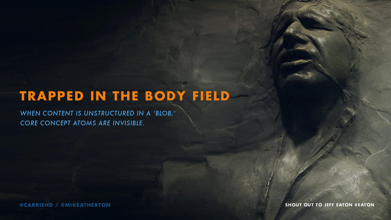
If you’ve ever worked with a content management system, you know that you’re often asked to create a new ‘page’. You create a title for that page before being faced with a big field and a lot of formatting controls that look a bit like a word processor.
That ‘body field’ is where you stuff all the other content. We say that this content is “trapped in the body field.” It’s one big blob of stuff. Really limiting if we want to have consistent styles and flexibility in formatting across different devices or interfaces.
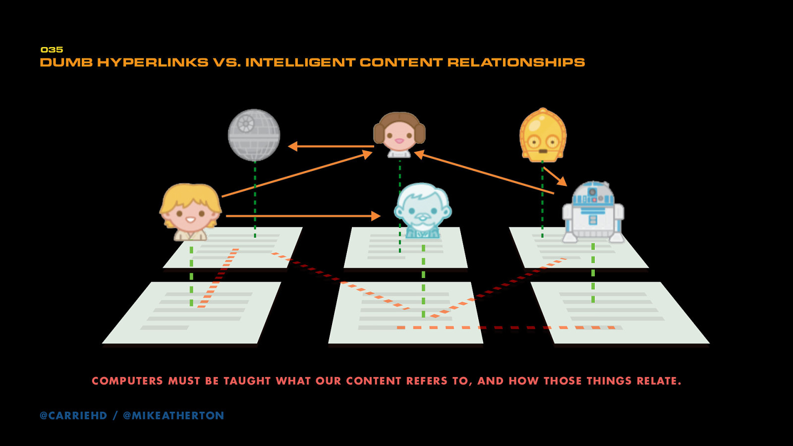
When we link web pages together, computers have no idea what the relationship is between them. To a computer it’s just a dumb link from one document to another.
Our reasons for linking are probably important. We’re connecting one concept to another. If we could teach the computer how to understand the things our content refers to and how those things connect, it can help us make the connections.
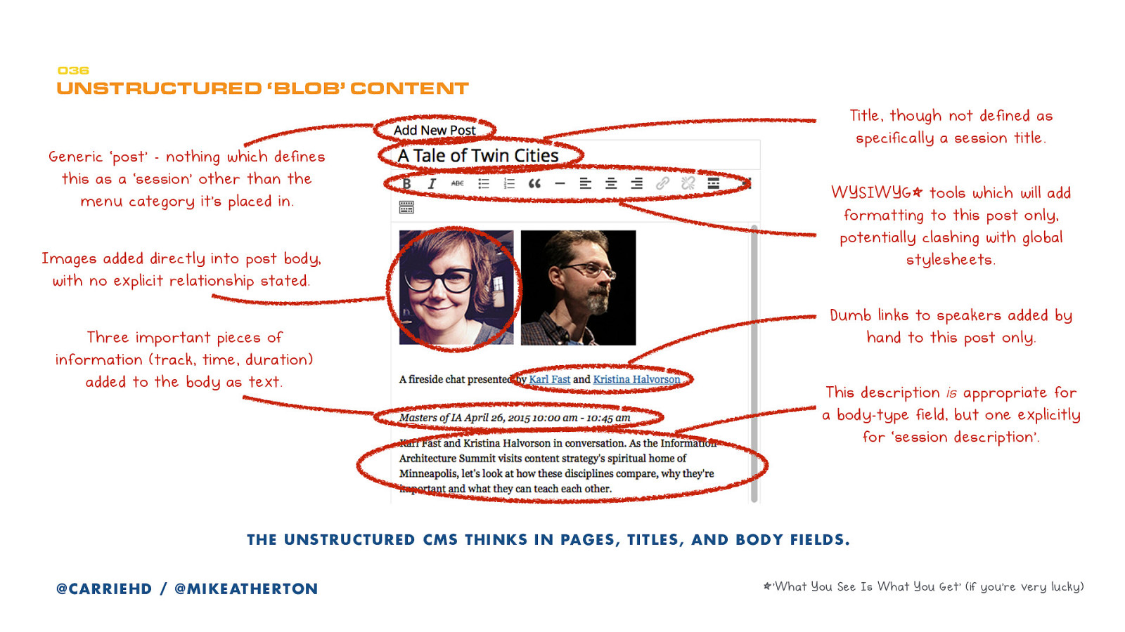
Big, dumb blobs of content is hard for computers to understand. Here’s an example.
You have a generic page, with a generic “title,” a body field with a WYSIWYG for everything, including manual links, images, and other important information. To get this to display properly on a screen, you have to do all kinds of HTML tricks and know the limits of the device it’s appearing on.
All of these relationships between speakers and their sessions are only implicit on this page. There’s nothing in the underlying structure which tells the computer that this talk is being given by Kristina Halvorson and Karl Fast.
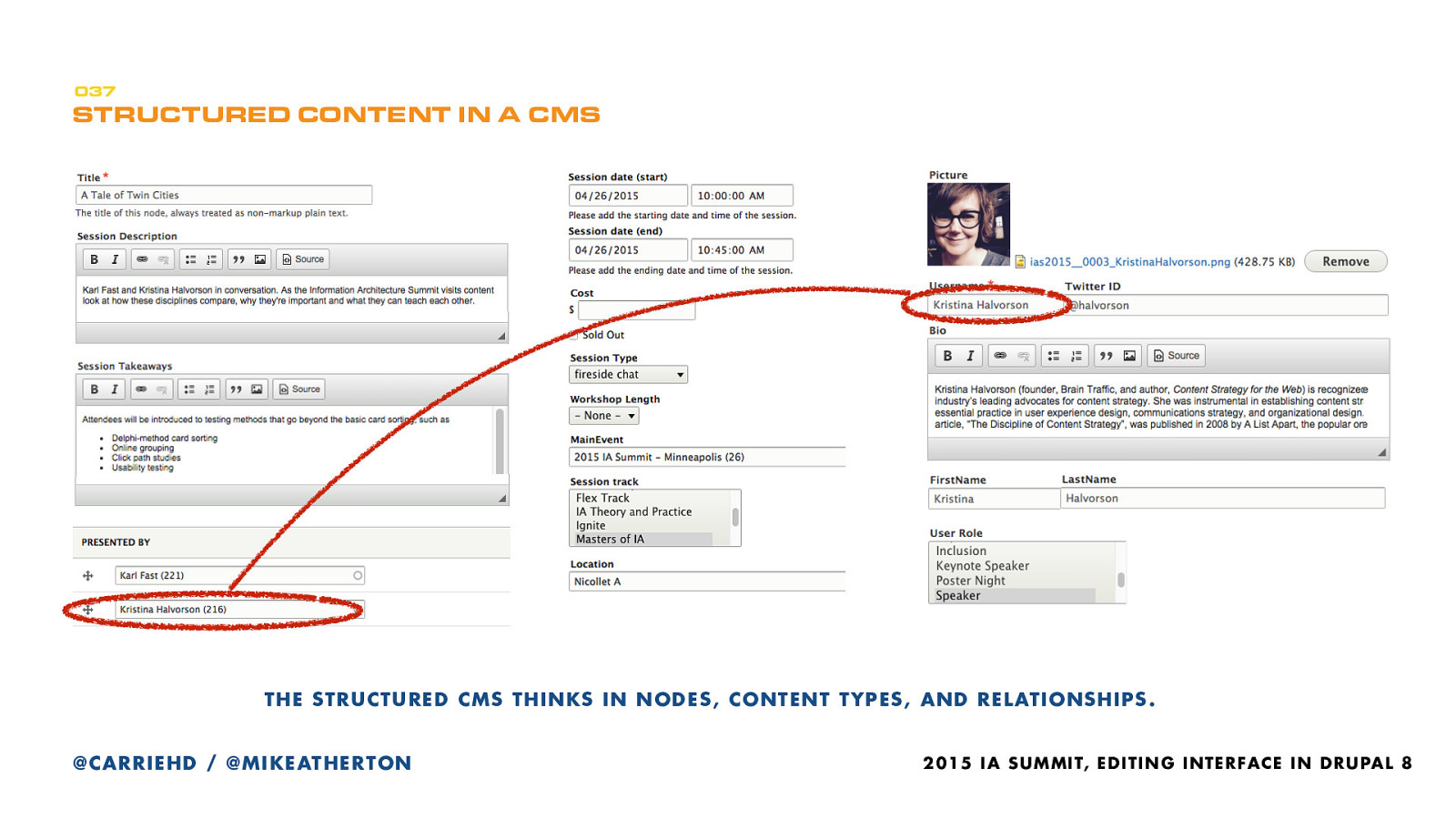
By contrast, here is how things look when the content is structured. Instead of putting the title, description, speaker’s name, speaker’s photo, a link to the bio in the body field of the session, you can enter the information about just the session and create a relationship to other things. We’ve got the title, of course, a description, takeaways, dates and times, session type, session track, location - all things we need to know about the session in multiple contexts. Since the speaker is a separate content type, we entered that information elsewhere. That means we can select the name and create a relationship between the speaker and the session.
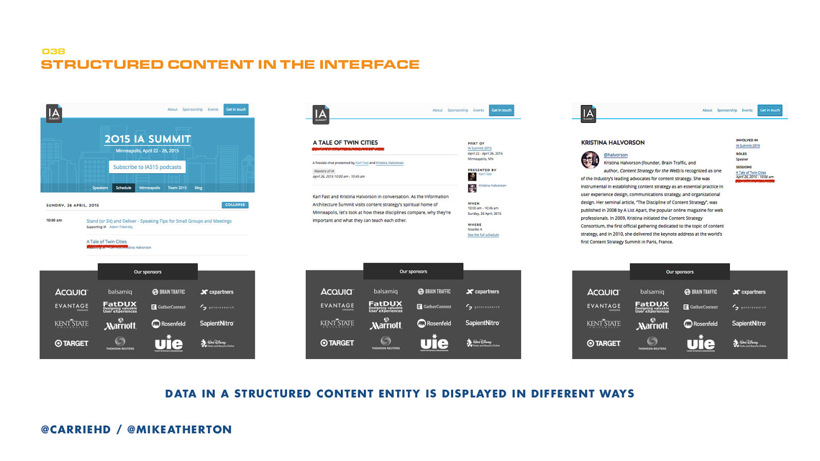
Here’s that information as part of the website. This is how the session appears in the schedule, on the session display page, and from Kristina’s bio page.
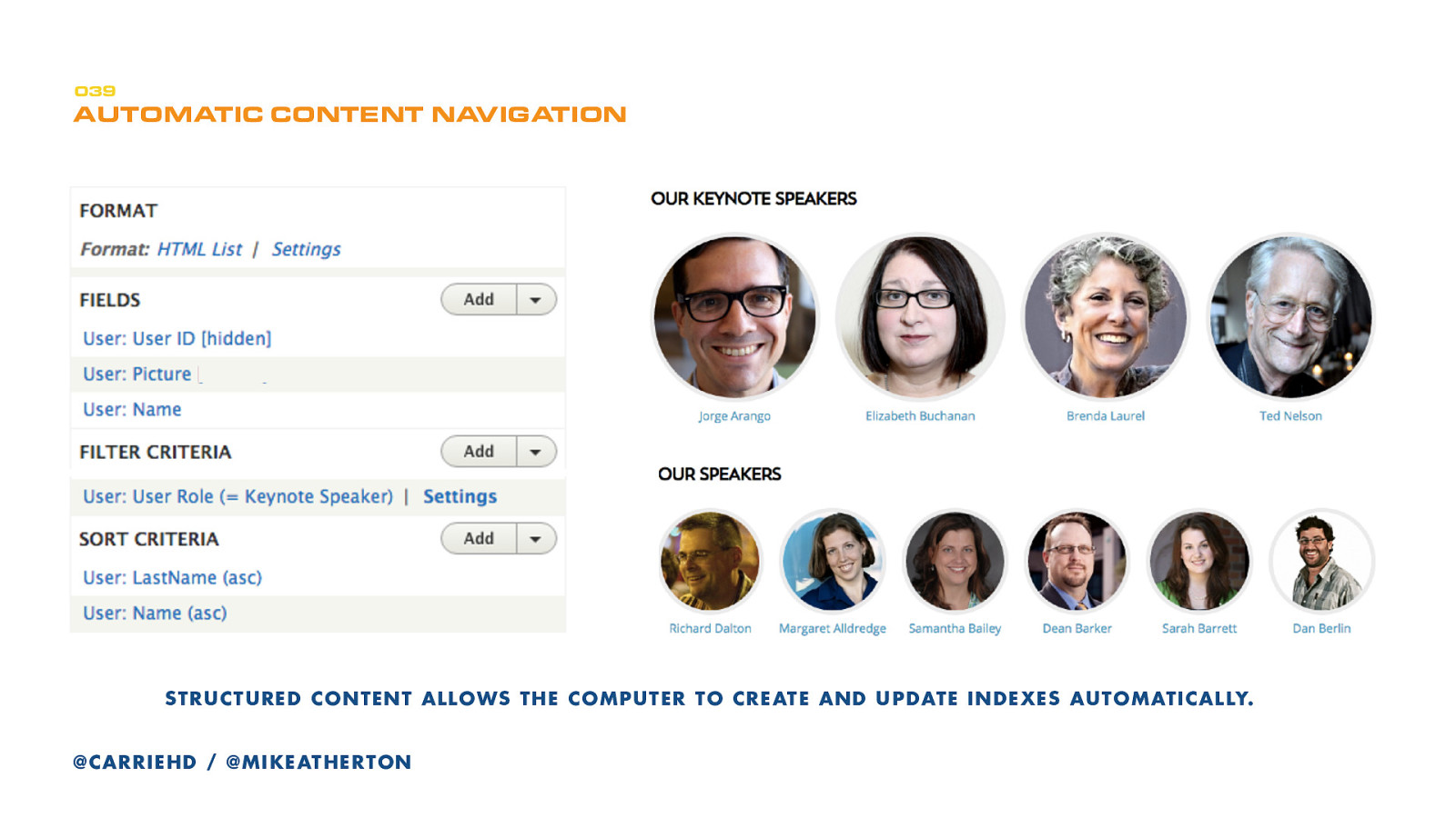
Chunks of information can be recombined in many ways. The Speakers page is a dynamic list of the speakers - not a formatted blob of text.
On the left is the Drupal view configuration that tells the page to display the Names and Pictures of the the Keynote Speakers and link each one to its bio page. There’s a similar role for session speakers. Updating speaker details becomes easy.
Our content is now future friendly. If Jorge is a session speaker in 2016 (rather than a keynote speaker), his biography info is already stored. All you have to do is add his 2016 data and he’ll appear in whatever displays are used for that event.
Following that quick and dirty run down of what structured content is, let’s look more at why it’s good.
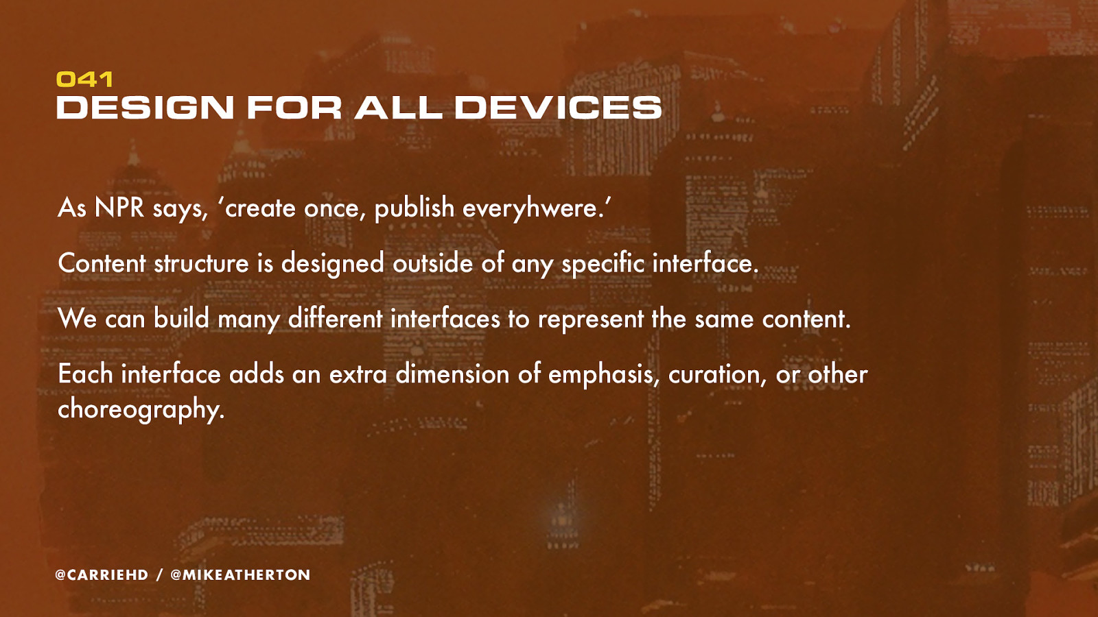
NPR coined the acronym COPE: create once, publish everywhere. The goal is to create information resources that are separated from any particular platform-based representation, and connecting those resources by meaning using metadata.
Whether on desktop, mobile, tablet, TV or things we haven’t thought of yet, it’s all driven by the same structured content. Semantic meaning and relationships stored in the database and expressed through the interface.
With those relationships held at data level, rather than just at page-level, we’re free to experiment with designing interfaces that allow us to explore the content many different ways.
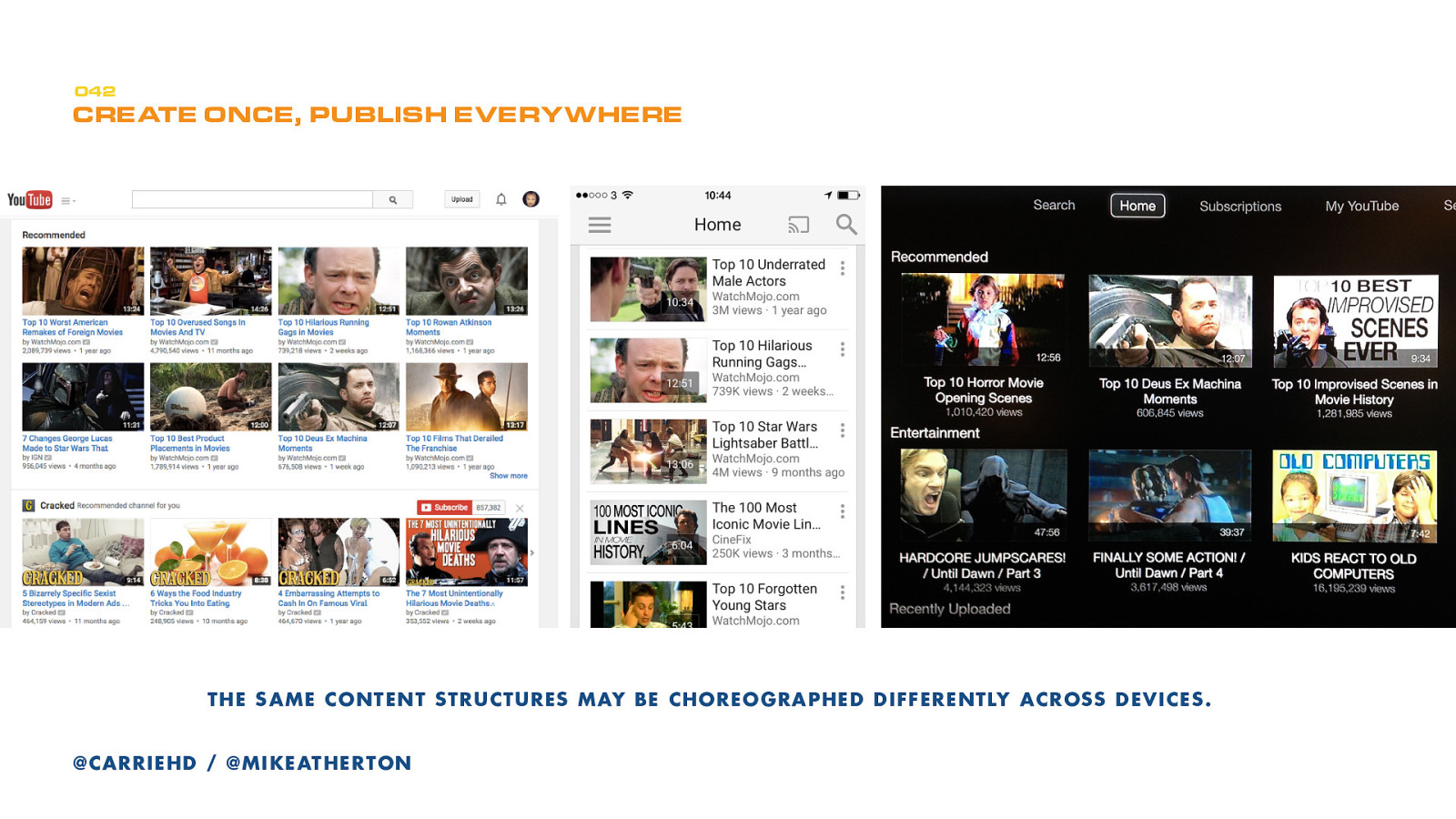
Here’s YouTube on a desktop, a phone, and Apple TV. Who knows how many other ways YouTube is displayed.
If no one can find your content, they won’t read it. If they can’t easily share your content, you won’t build an audience. When a person wants to find something, they use search engines. Search robots aren’t great at extracting meaning from documents like humans can.
Structured content makes it possible for computers to make sense of the data. Because you created content as entities not display pages, you can reuse the same content in different places instead of duplicating it, making it easier to find and share.
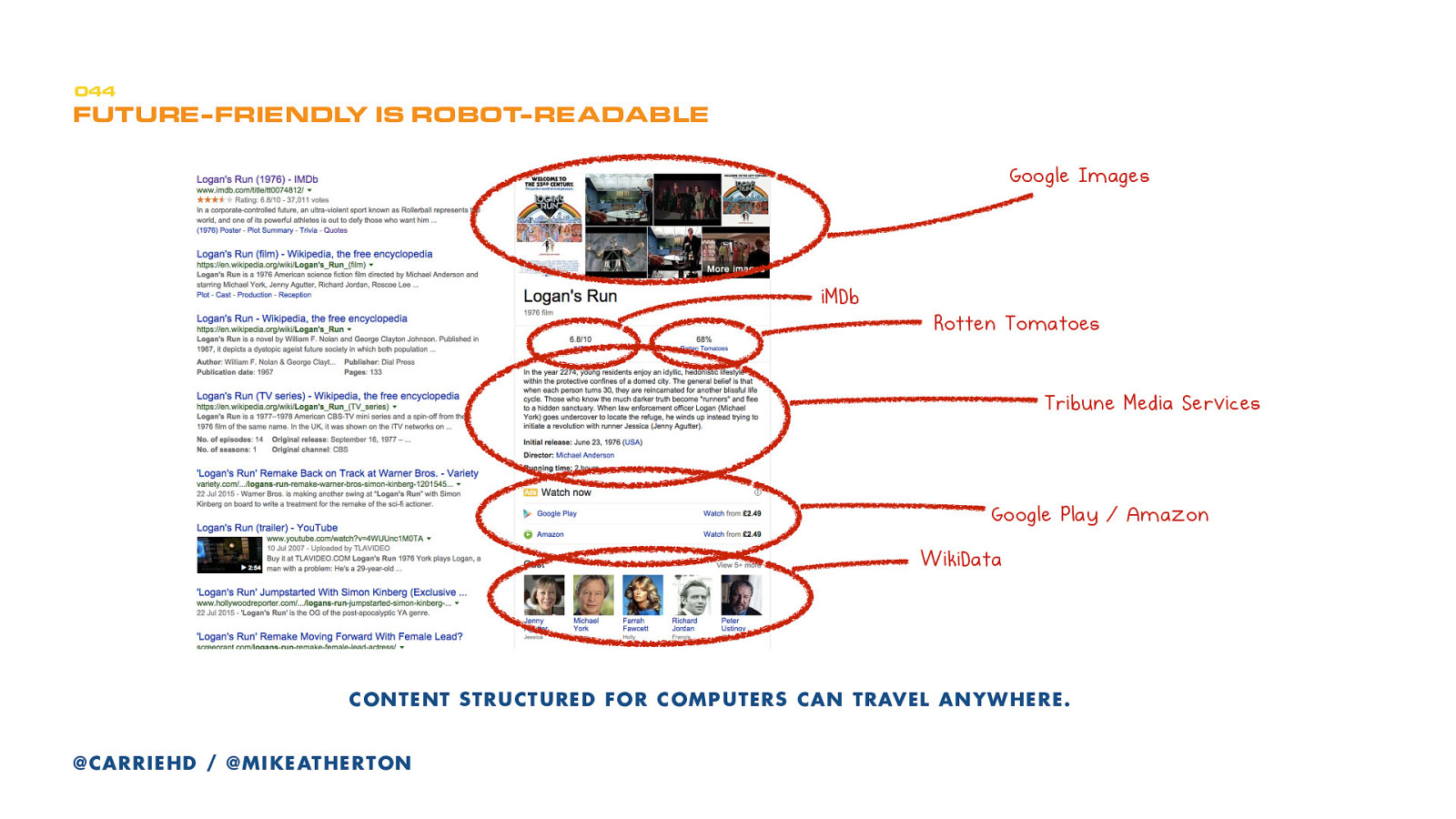
This isn’t the future, this is now. Actually, it’s in the past!
In 2012 Google moved toward a new way of searching not for pages that match query terms but for ‘entities’ or concepts that the words describe. They call this the Knowledge Graph and it can be queried to answer factual questions.
This is the second level of detail in our modeling process. It is where we take the major ‘content types’ defined in our domain model, and look at how these break down into smaller chunks. We’re going to make the concepts real.
If a domain model is everything about the subject matter then the content model zooms in to add specific detail about the content itself.
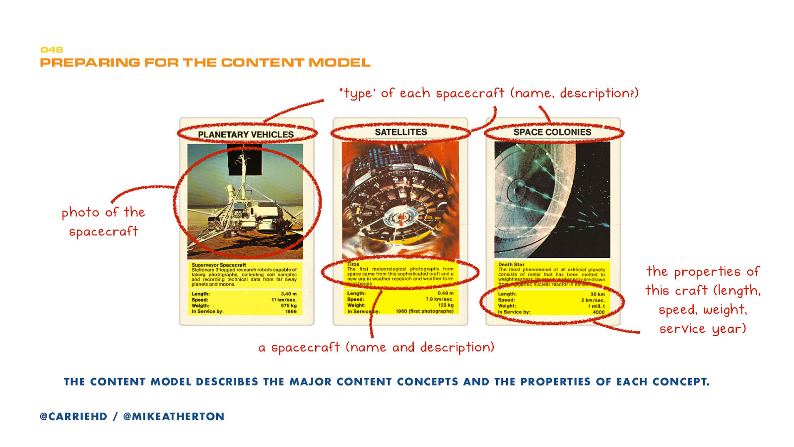
Remember the Top Trump cards from earlier? Each card here is a different example of the same type of content. Let’s call that content type spacecraft. It comprises several different properties: the name, the photo, the description, and numeric properties of length, speed, and year of service.
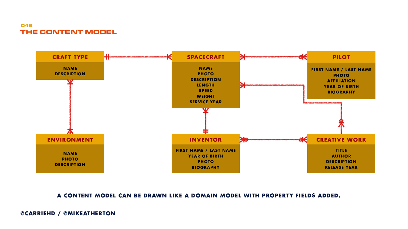
Here’s all that expanded out as a content model. We determine content types based on the model and its properties. Content types can have relationships to other content types.
Sometimes (like with the Top Trumps example) you approach modeling with your existing content in hand, figuring out where the inherent structure and properties are hiding.
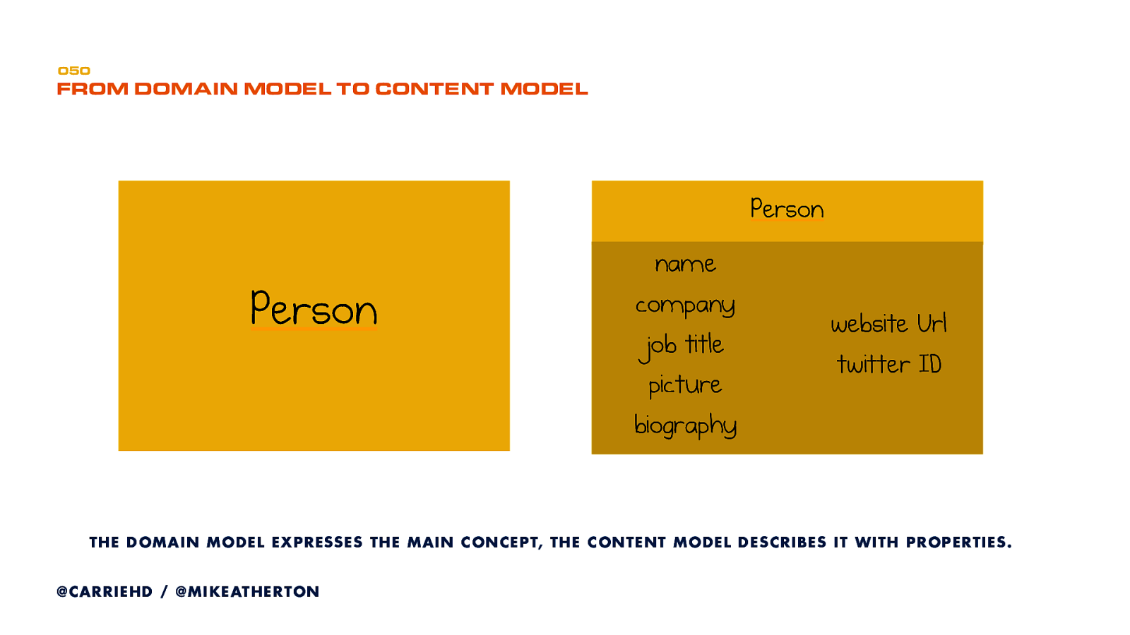
Start by taking each concept entity in the domain model and listing out the properties each concept should have. Here’s an example for a Person.
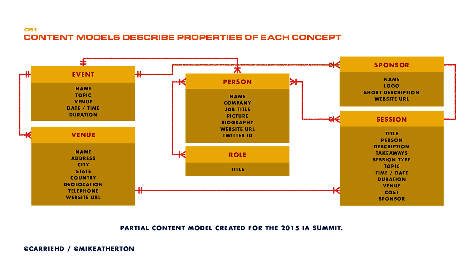
Here’s part of a content model that we prepared for the IA Summit conference. Next, assess the content you have against the domain and content models.
Using these models as a reference, start to organize and align content against the pieces of the model. You’ll quickly uncover what you have too much of or where your gaps are.
So you’ve done the high-level planning, defined each content type and its properties. Now we have to translate this for our content management system.
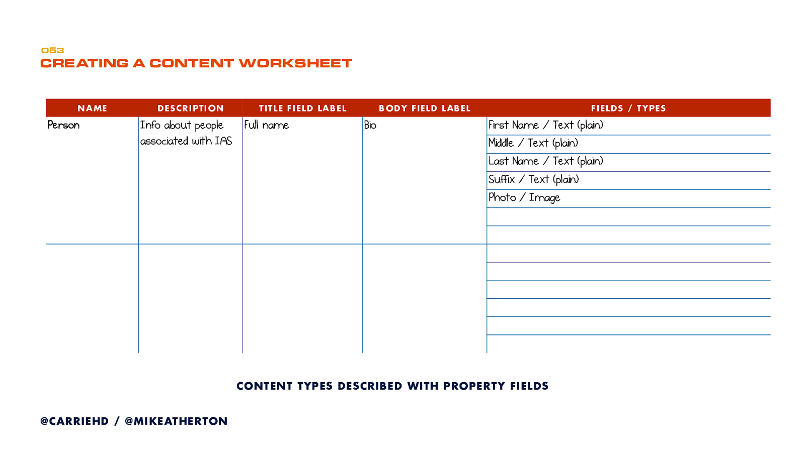
This is where content becomes data.
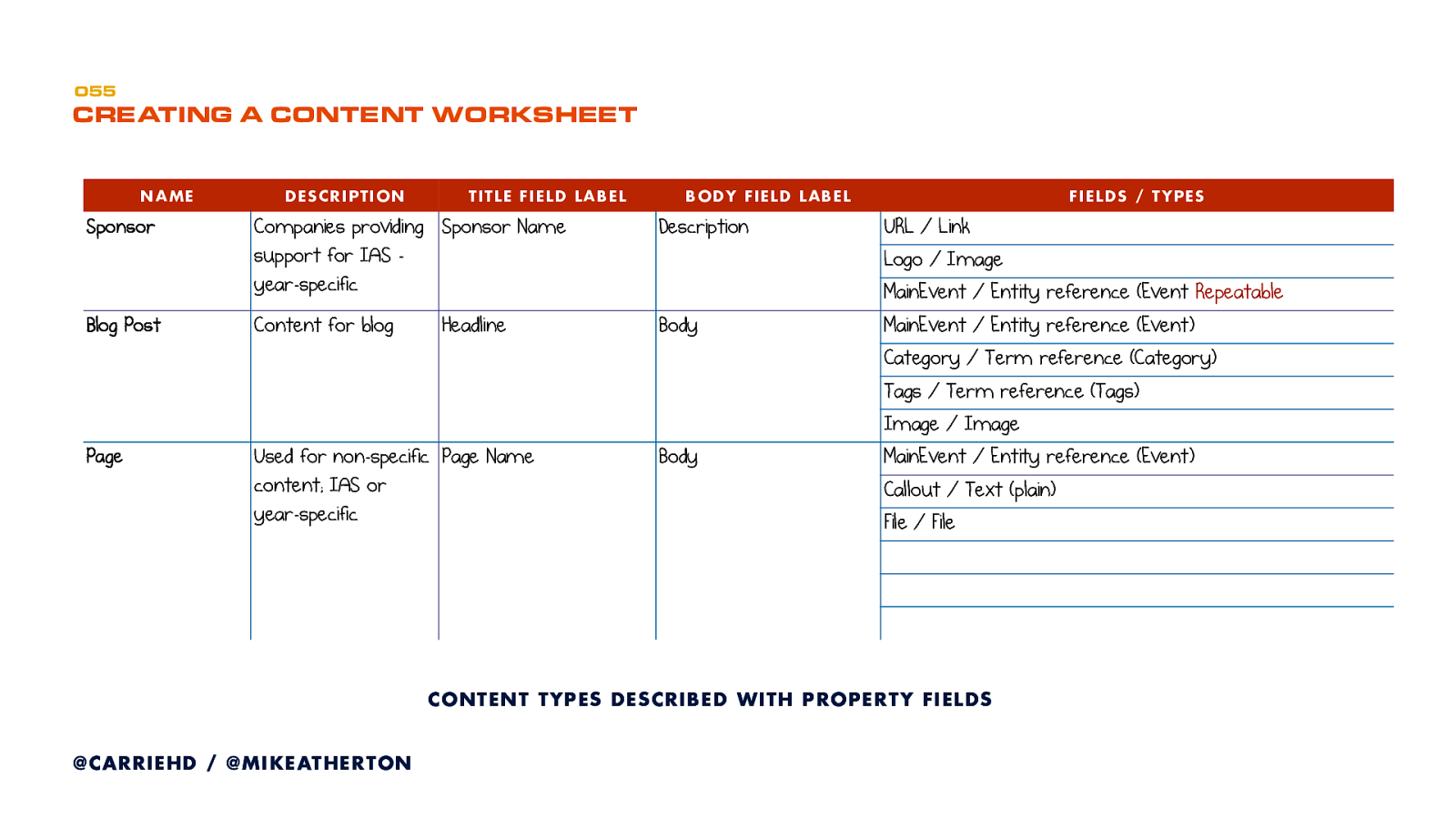
This spreadsheet guides CMS development. List all your fields and determine the type of input (such as text, image, datestamp etc.) required.
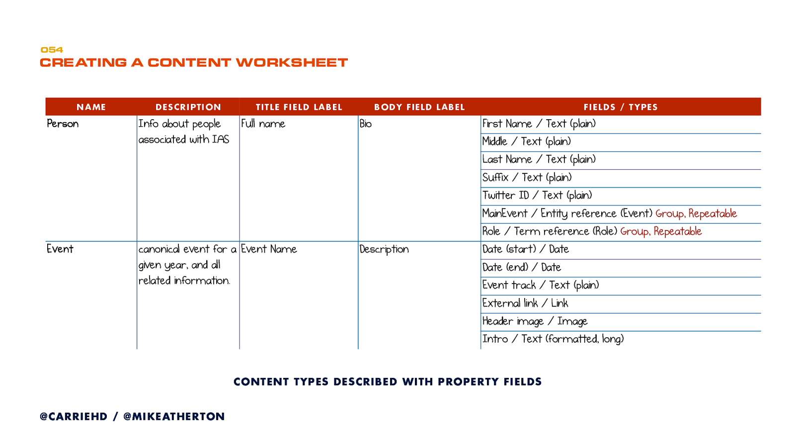
Continue until you have details of every content type and its properties.
We want to make our content chunks granular enough to give us flexibility in presentation, but not create so many types that our content becomes unmanageable. Not too hot, and not too cold.
Now you understand what it means to design from the content first. As UX designers, content informs all other aspects of design.
Before we go let’s summarize of why designing future-friendly content is important.
Getting to content is the whole point of our work. We talk about user experience design, but do people really want to immerse themselves in an experience for its own sake? Or do they just want to get stuff done?
Helping users complete tasks efficiently and satisfactorily is what we do. That means getting them to the right information.
UX is big on empathy and collaboration. That includes having a better understanding of how our colleagues think. Our future-friendly approach looks at structure like a developer would - separating out the model, the various interface views, and the controlling interactions.
I’ve found that having better empathy, not only for colleagues but for the medium itself, makes me a better designer.
Organizations often consider ‘the website’ to be a one-off project. They start to stuff it with more and more content without a real plan for growth. When it all gets too unwieldy and too difficult to find anything, they throw up their hands and say, “we need a redesign!”
Planning better for the future helps prevent this. When redesigns do happen they’re much easier because you’re building on solid foundations.
We have touched on about how this approach makes your content available, not just from your website or app, but from third-party services like Google or Facebook. To me that’s a catalyst for thinking of your offering as being part of a wider conversation.
We use the whole web as our resource, cherry-picking information from all over the place. So when you’re publishing ask not just ‘what is this doing for my customers?’ but ‘what is this adding to the web as a whole?’. Take that wider view in your modeling.
A domain model doesn’t care what content you have. It only cares about the subject. And that’s true of people too. Their interest in a subject doesn’t begin and end with your content inventory.
So model their whole world. It’s good for users and good for your brand.
