Beyond the Polar Bear
Developed by Mike Atherton and Michael Smethurst. First presented at the Information Architecture Summit in 2011.
A presentation at Information Architecture Summit 2011 in March 2011 in Denver, CO, USA by Mike Atherton
Developed by Mike Atherton and Michael Smethurst. First presented at the Information Architecture Summit in 2011.
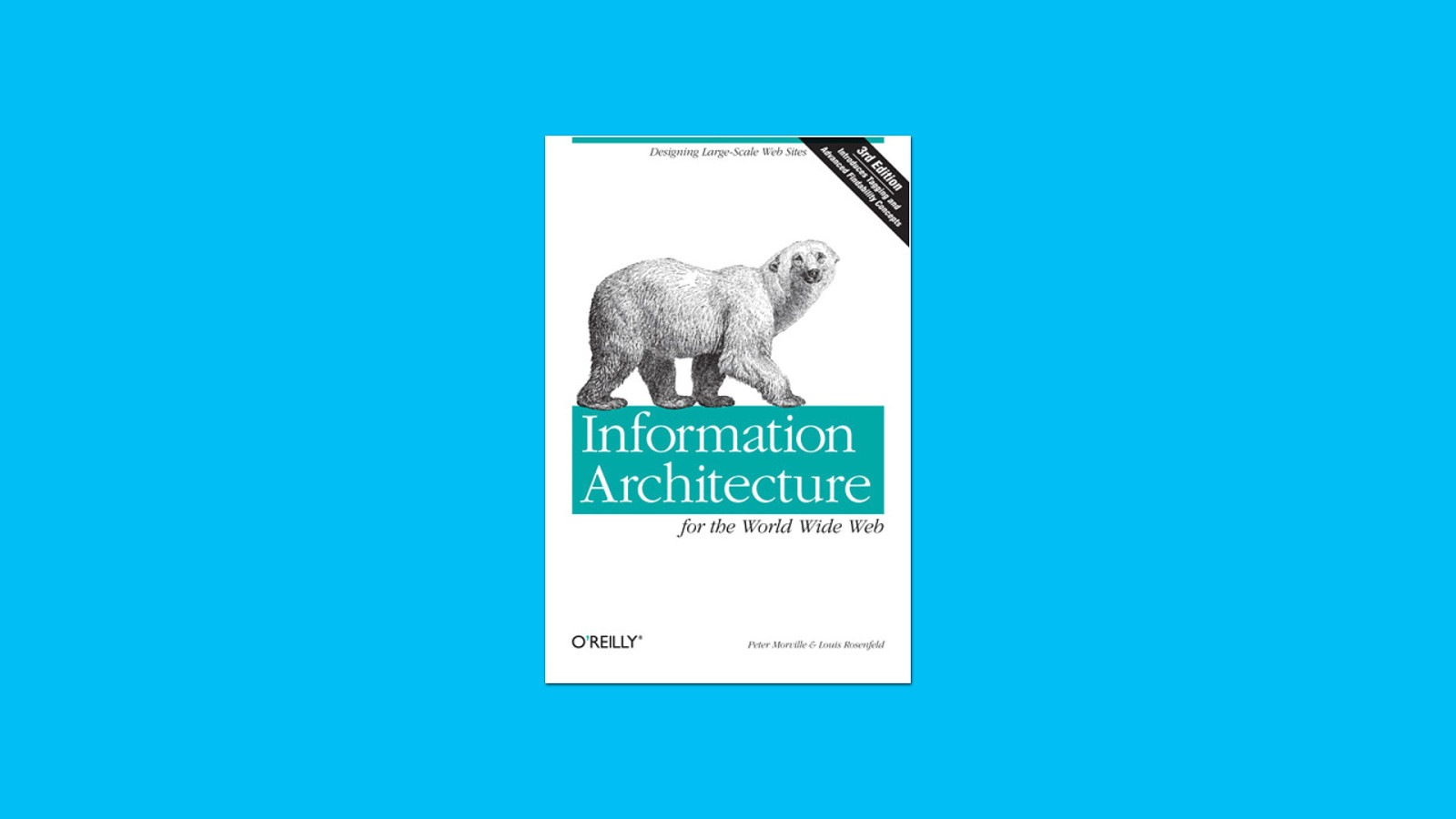
For the past thirteen years, ‘the polar bear’ book by Lou Rosenfeld and Peter Morville has been an invaluable constitution for our industry. Maybe today we’ll be drafting a few amendments to that constitution.
Much has happened in that time. Google happened. Facebook and Twitter happened. Smartphones happened. IPTV happened. The paths to content have splintered, and the way we access information has become more organic and ubiquitous.
Today we’ll look at how the BBC now makes websites that better represent their core business, better fit how the web is today, and deliver on the mission they’ve had since 1922 to inform, educate and entertain.
We’ll discuss how you too can apply these principles. If there’s time, I’ll include the customary IA Summit rant about how you’re all doing it wrong.
On that note, I should say that any implied frustrations with UX practices, whether intentional or incidental, are entirely my own.
(This was back in 2011. I’m more sanguine now. MA, 2020)
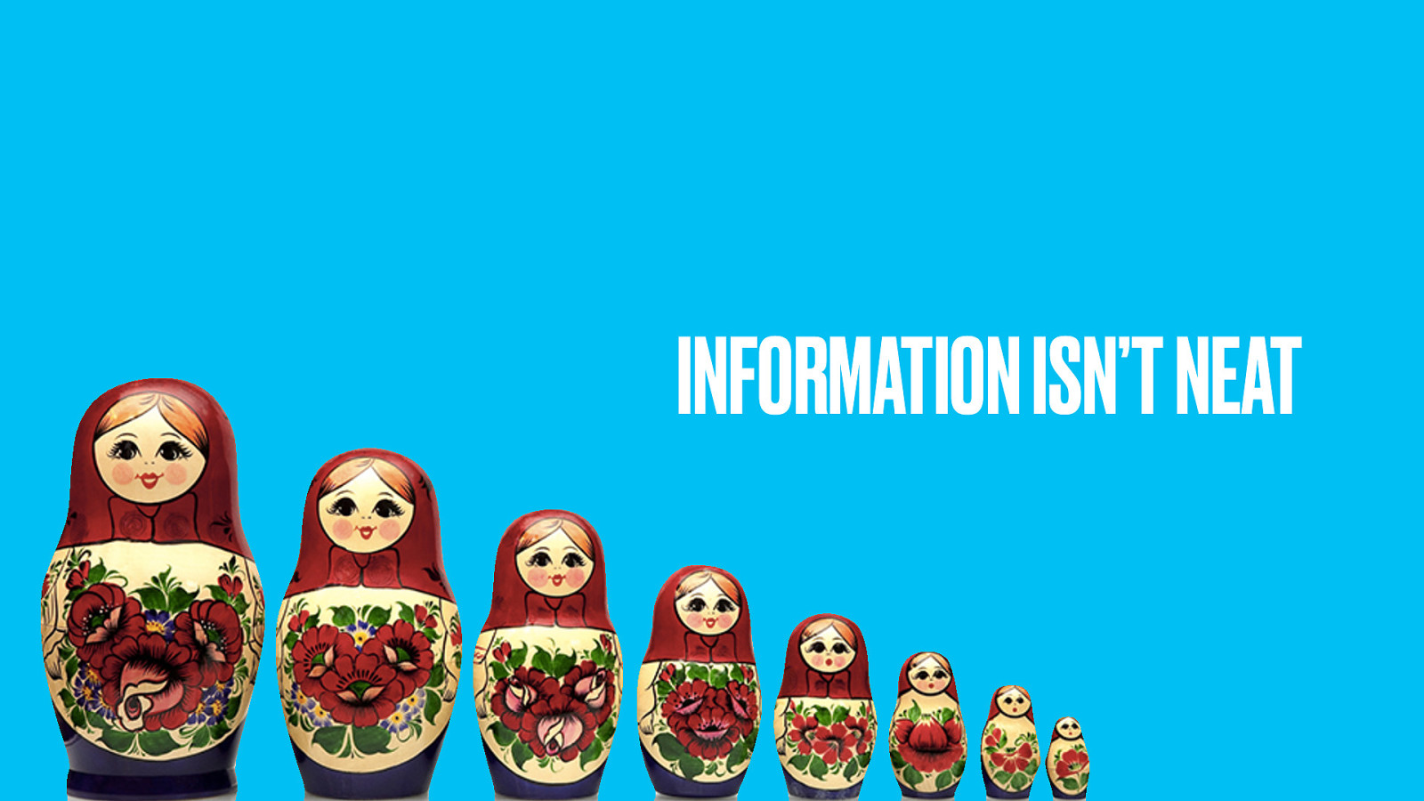
As the polar bear teaches us, information is hard to categorise. We have a raft of tools and techniques to help us, from card sorts to use cases to content inventories, but at the end of the day, when we draw our taxonomical site map we know we’re making a series of compromises and workarounds to ‘best fit’ the limitations of that structure.
In many ways, taxonomical site design hasn’t really moved on from the traditional library science approach where a physical book has to go on one physical shelf. In the last few years we’ve done things like tagging to expose more subtle facets of information and thus unlock more user journeys.
Still, information architects are largely limited to saying that one thing is more or less specific than another thing. We do our card sorts. We label our boxes. We cross our fingers that our homepage superordinate categories will give some clue as to the goodies within (then get frustrated in user testing sessions when people demonstrate that they don’t visit our homepage at all but deep link to our content from Google).
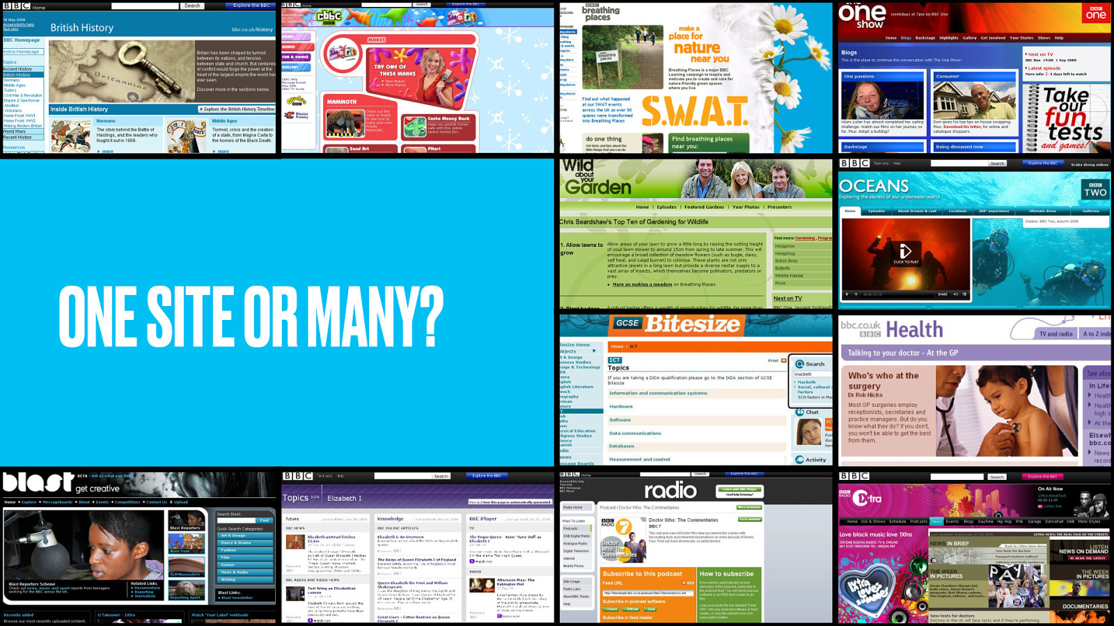
At the BBC no-one knows whether to refer to website singular or websites plural. In theory, our website is bbc.co.uk, but the reality is that small BBC web presences popped up over the years like tents on a hillside, and still in user research we hear people refer to…
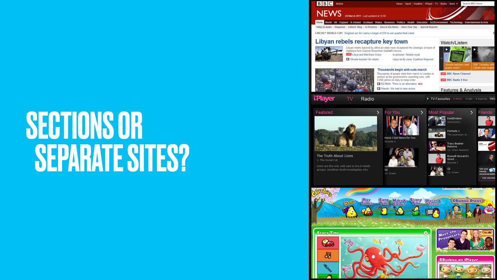
…the news site, or the iPlayer site, or the CBeebies site.
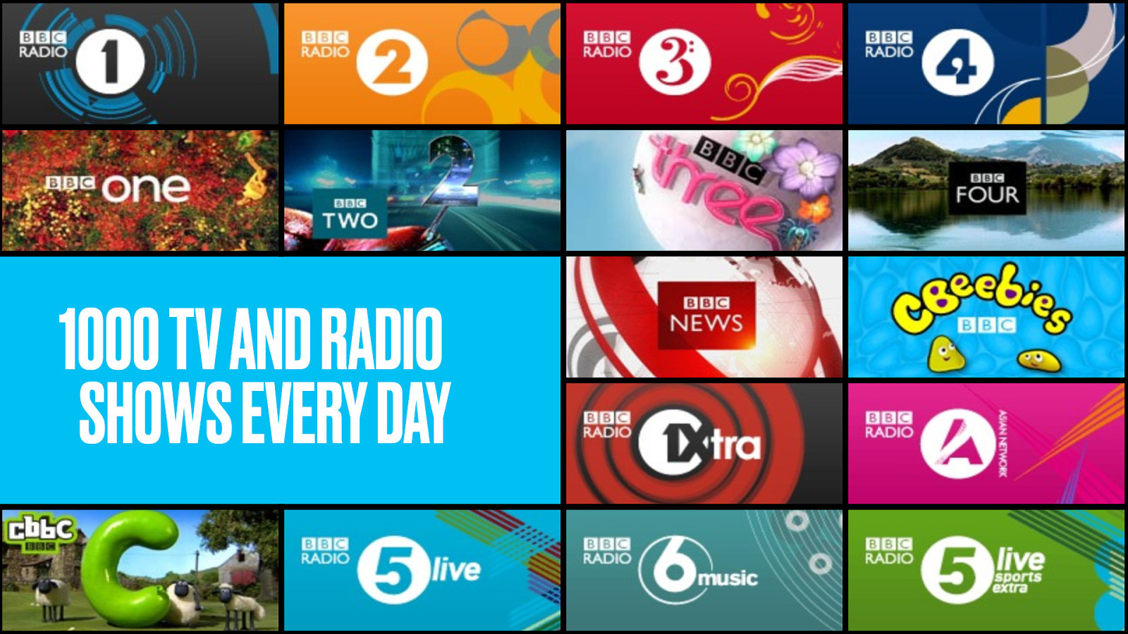
The BBC publish a massive amount of content, A thousand programmes every day across 8 national TV channels, 10 national radio stations and over 40 local radio stations.
Over the years it’s been difficult for a such large organisation to represent its offering online. There were political, cultural and technical hurdles to overcome, and consequently they ended up building a web presence in just about the most expensive and inefficient way possible. Teams working in silos, hand-cranking out pages all over the place.
For years the sites just weren’t very joined-up. They suffered from repetition of content (a curse of such a large and fragmented corporation). Pages that weren’t linked to (and so have terrible SEO)
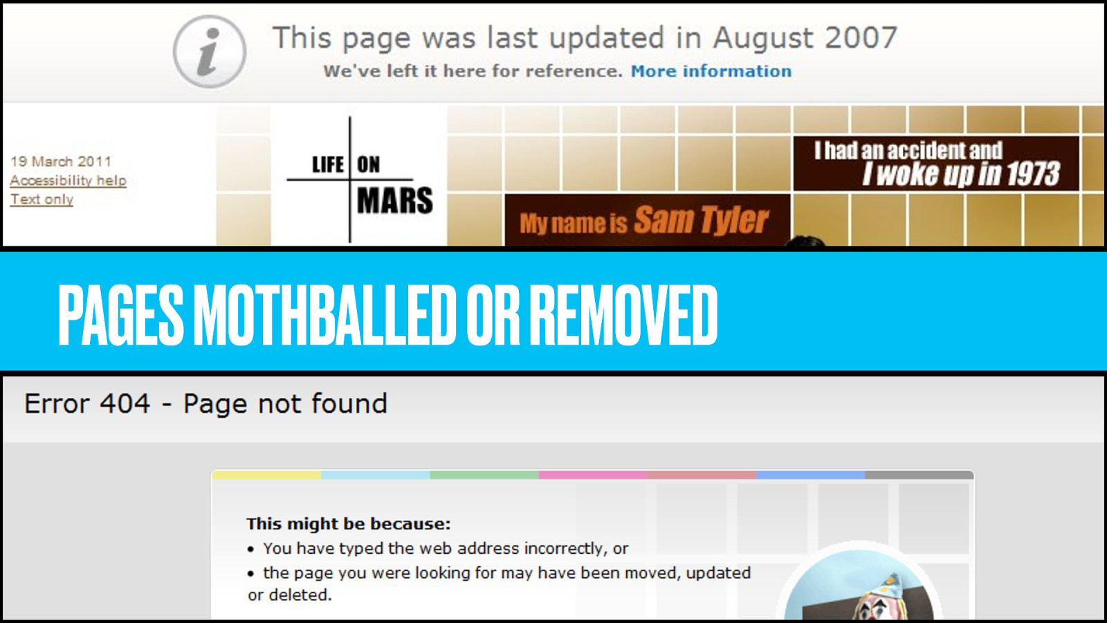
Pages that get mothballed (whatever that means) because the programme they supported isn’t on anymore. Pages removed completely, throwing 404 errors.
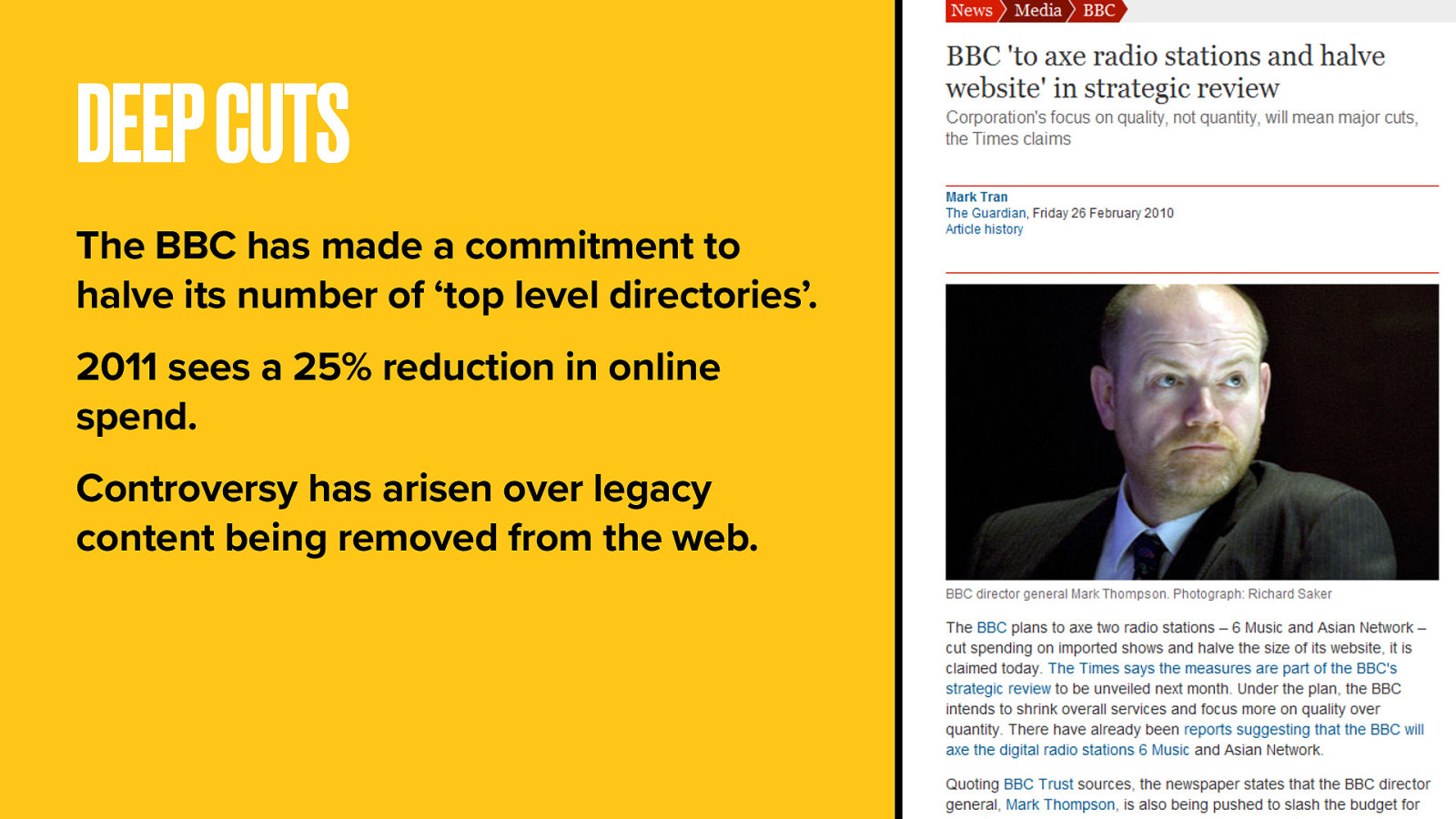
And most recently a government-appeasing diktat to reduce the number of “top-level directories” by half. Weird, for something that’s supposed to be one website, and all a bit embarrassing for a broadcaster regarded as the best in the world.
So the BBC has pledged to cut its spending online by 25%. This will lead to a major loss of resource and so force a new and more efficient way of publishing.
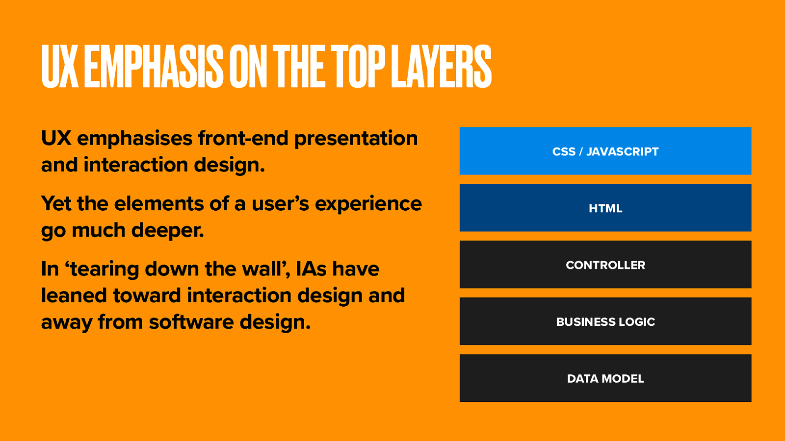
At the BBC, and arguably even beyond, the grey squirrel of user experience design is gnawing the legs off the red squirrel of information architecture. The focus is now squarely on the presentational and interaction elements of UX, and service design projects that start with beautiful, but largely imaginary page mockups.
In a great metropolitan company right now, a senior executive is being seduced by a Photoshop comp that may or may not be buildable.
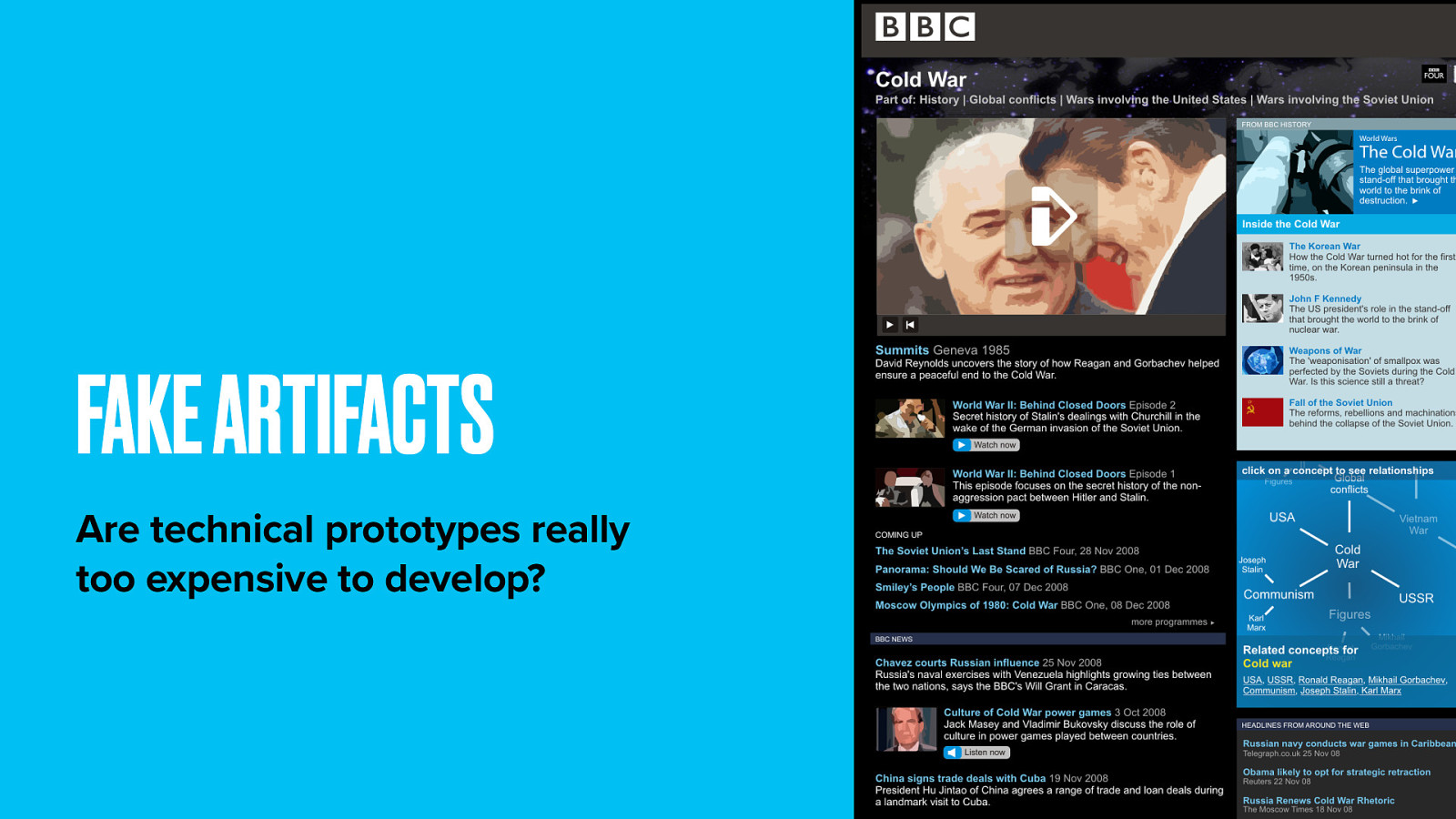
The perception is that rapid prototyping (i.e. faked-up prototypes) are cheaper and easier to develop than anyone getting their hands dirty with code.
UX design and prototyping commits a lot of product decisions before anything gets in front of a real user, or before software developers are consulted about the art of the possible.
So Auntie Beeb’s whole web thing needed a bit of a rethink. Some some rebel forces, striking from a hidden base, won their first victory against the evils of siloed thinking.
They recognised the power of the semantic web. How it could be used to build better bridges between content, extend user journeys and stitch all of the BBC’s offering into a single, extensible framework.
Our process allows great things to be done quickly with real content. It brings UX, software development, product management and users as equal partners to the process.
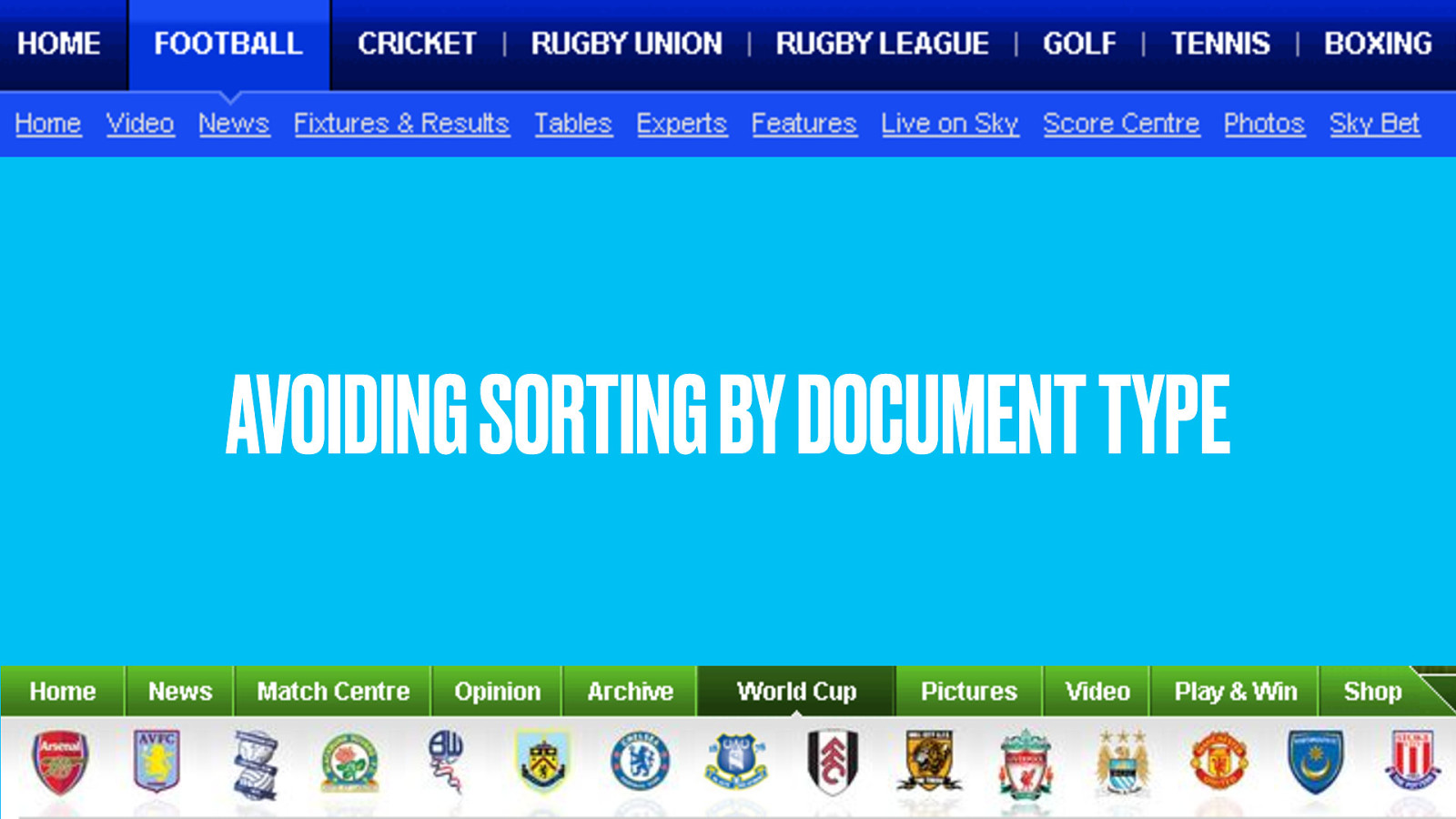
When we’re doing some heavy IA, we’re thinking about how our subject breaks down. And at the same time, how the website should be organised. Like librarians, we find the right boxes to place our stuff in.
Through card sorting, we might end up with a box for photos, another for videos and a third for news. This is not without problems. Web documents don’t fit neatly into prescribed categories. The relationships between bits of knowledge are much richer and graph-like than just ‘broader and narrower’.
There’s a bigger problem still. When we think about our favourite subject, we don’t think of documents at all. We think about things.
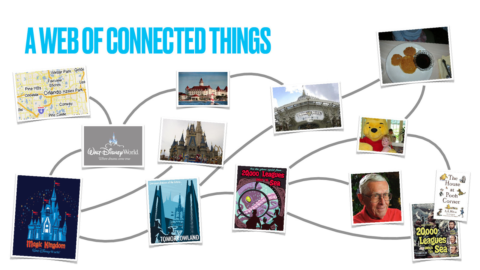
Real-world things. Last time at this conference I spoke about Disney theme parks. Disney World is a real place, in a real location. It has some theme parks in it. Each park is divided into lands, and as Disney fans know have an iconic weenie.
The lands have attractions, each created by a lead Imagineer. Hotels have restaurants. Lands have restaurants too. Restaurants have meals, which might be associated with a character. And that character could be also be based on some prior art.
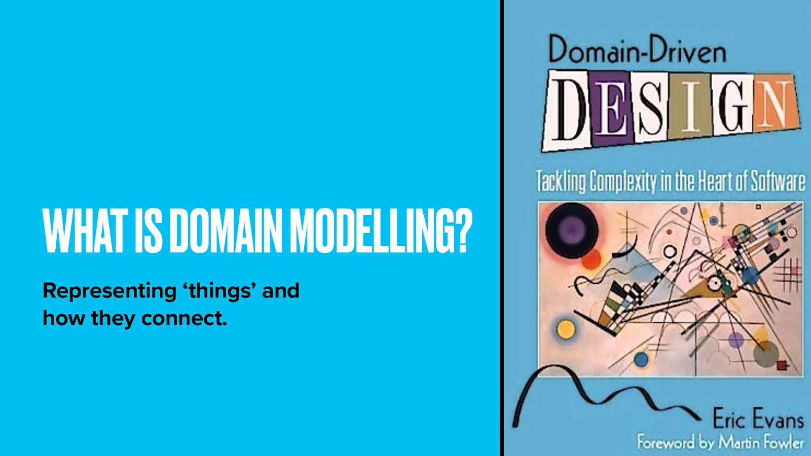
So when representing a subject online, we think first about the things in that subject–long, long before we ever think about web pages. The book Domain Driven Design has become our new bible. It proposes an ontological model for modelling subject domains, called (appropriately enough) a domain model.
This model captures how people think about a subject. a user’s mental model about a subject; It identifies the most important things in that subject and the complex relationships between them.
Domain modelling is central to our approach. We moved away from a process that begins with wireframes and Photoshop comps to one that starts with a logical model of the subject and works upward from there.
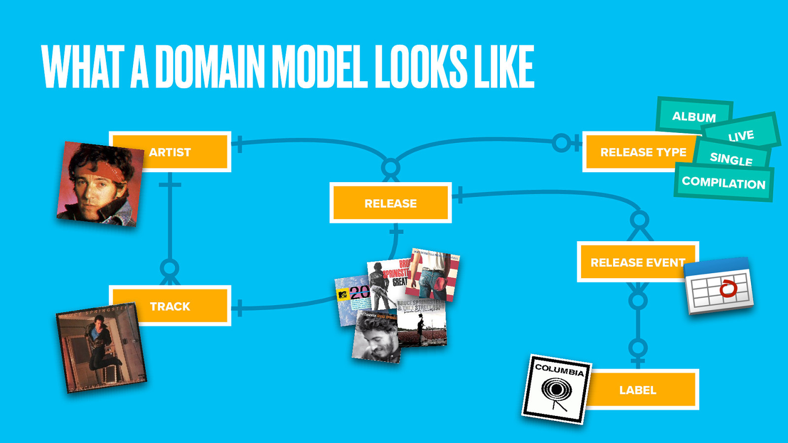
Here’s a simple domain model for music. It defines the most important things and connects the dots between them. A recording artist creates several tracks. A track might be released in more than one place (such as a single, an album, or greatest hits compilation). We define release types to cover these kinds of releases, each of which has a release date and a record label.
You can see already how capturing this through a simple hierarchy would be difficult.
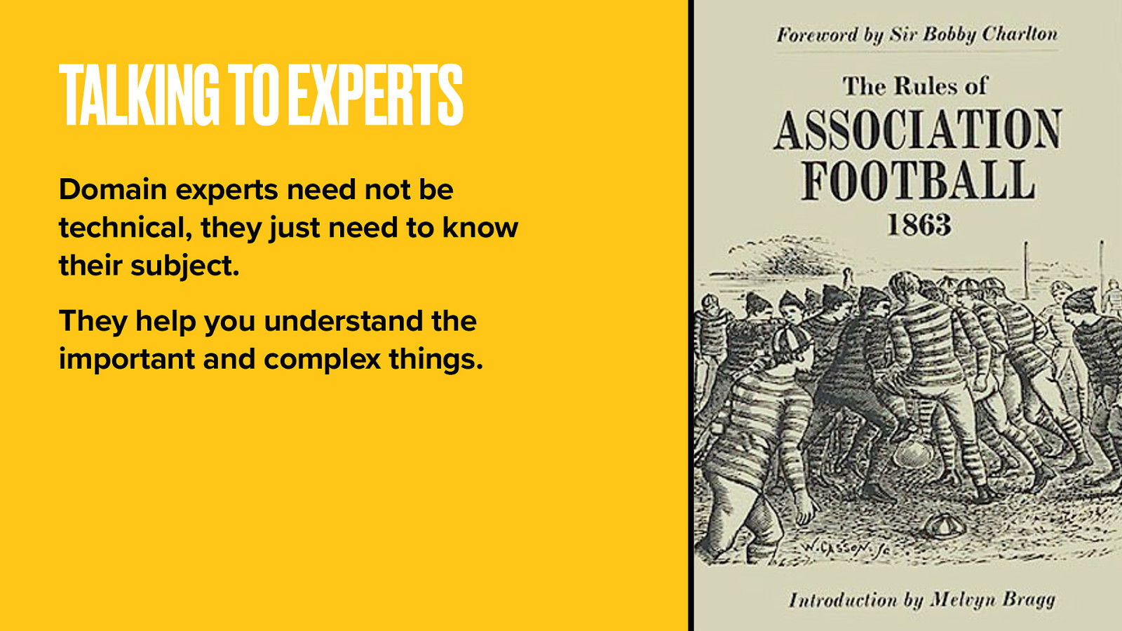
Start by speaking to people who really know their onions. These domain experts don’t need to know anything about web design, just their specialist subject. Maybe you have some in your company. It’s a great way to give stakeholders direct influence over product design from within their area of expertise.
Get them describe (or better yet, sketch) their world to you. Ask questions. Uncover hidden complexities. When we talk about a soccer match, how is that organised? Do matches exist in isolation or as part of a bigger competition?
Soon you’ll discover what the experts think are the most important things and the relationships between them.
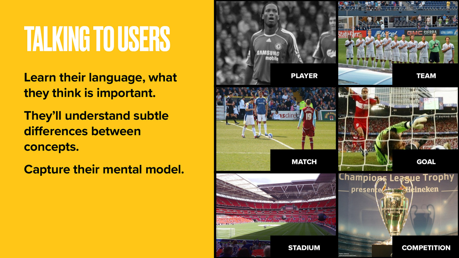
After talking to the experts you’ll have at least a prototype understanding of the subject, but you may find users have a simpler or just different view of the world.
It’s more important to get the model, and specifically the language, right for users. After all they are the ones who’ll be searching on Google and hoping to access your content according to their own mental model.
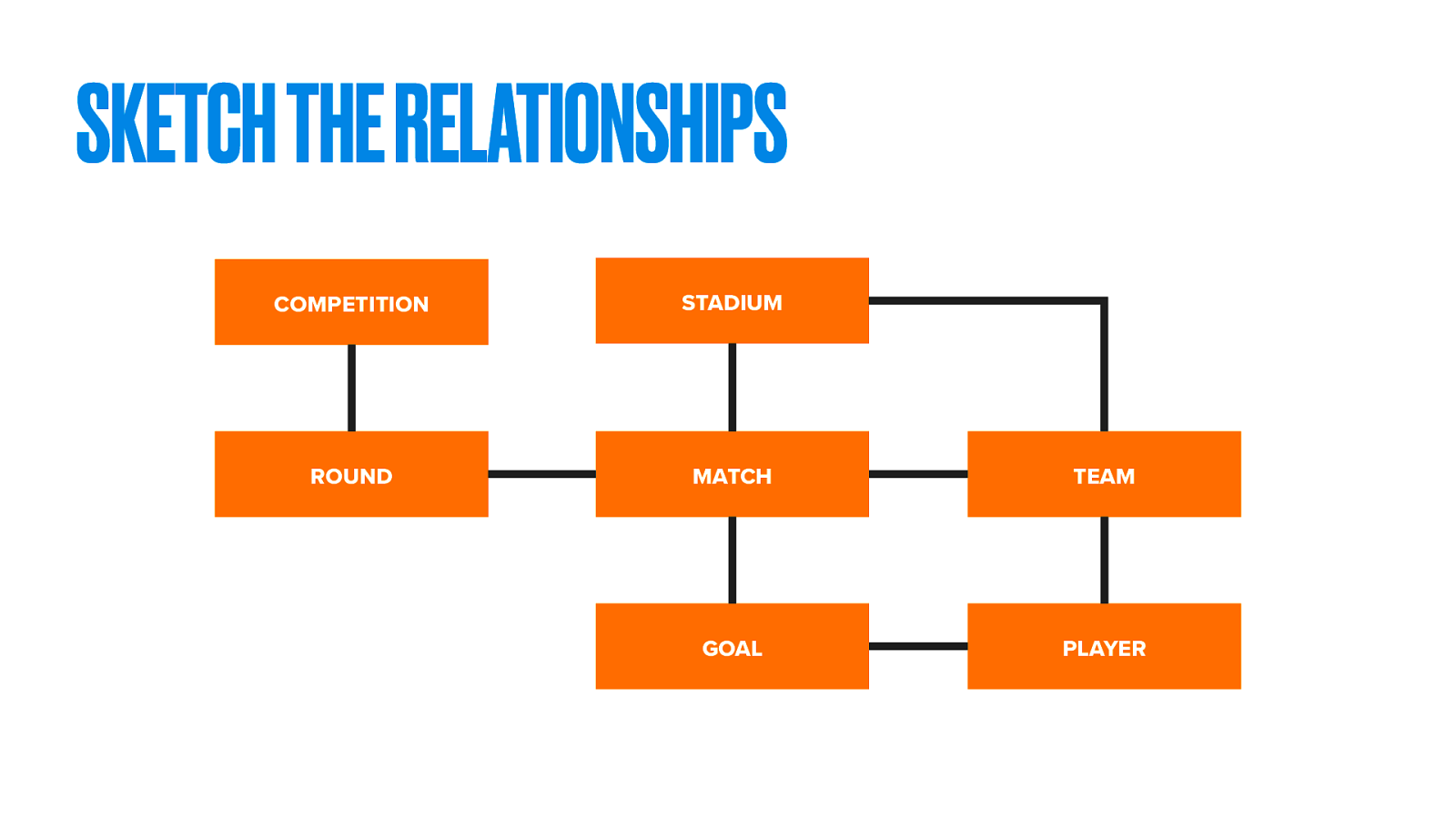
Again, sketch their world back to them. Identify the key things and figure out the relationships between them. This isn’t yet about web pages. We’re simply modelling the subject itself.
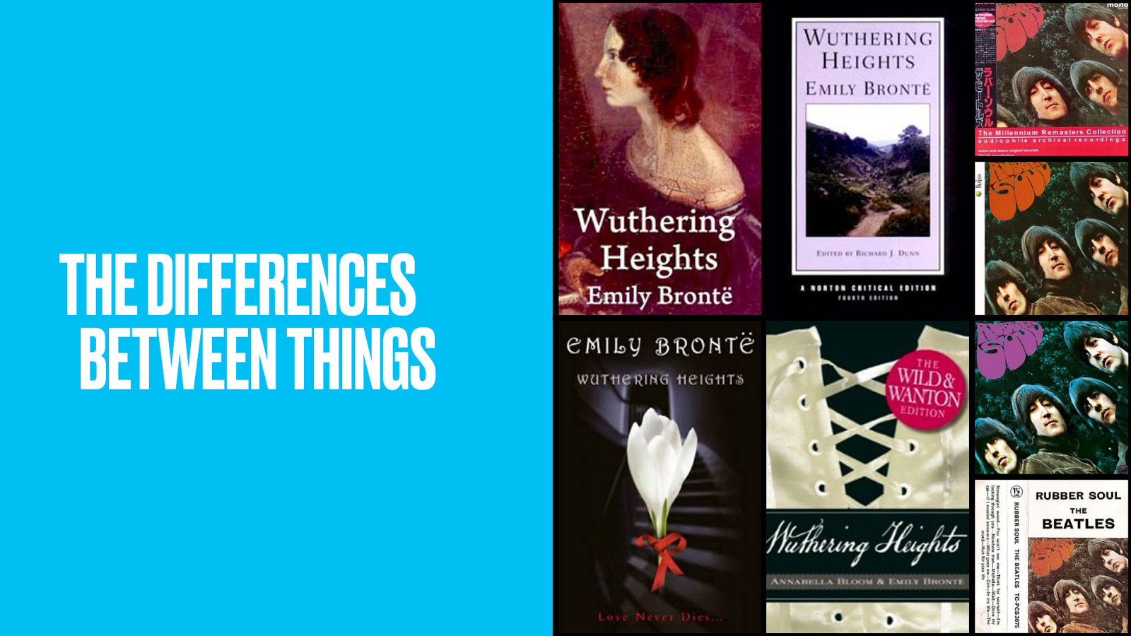
Labelling things is hard. Defining conceptual differences is even harder.
I like Wuthering Heights. But what do I mean by that? That I like the book? Or maybe I like the movie? Maybe even the Kate Bush song. Is it a specific edition of the book, or the overall concept of Wuthering Heights that I like, distinct from any specific manifestation The creative work, if you will.
Some things are hard to quantify. Outside of domain experts, people may struggle to name things appropriately, even if they can appreciate the inherent differences between them.
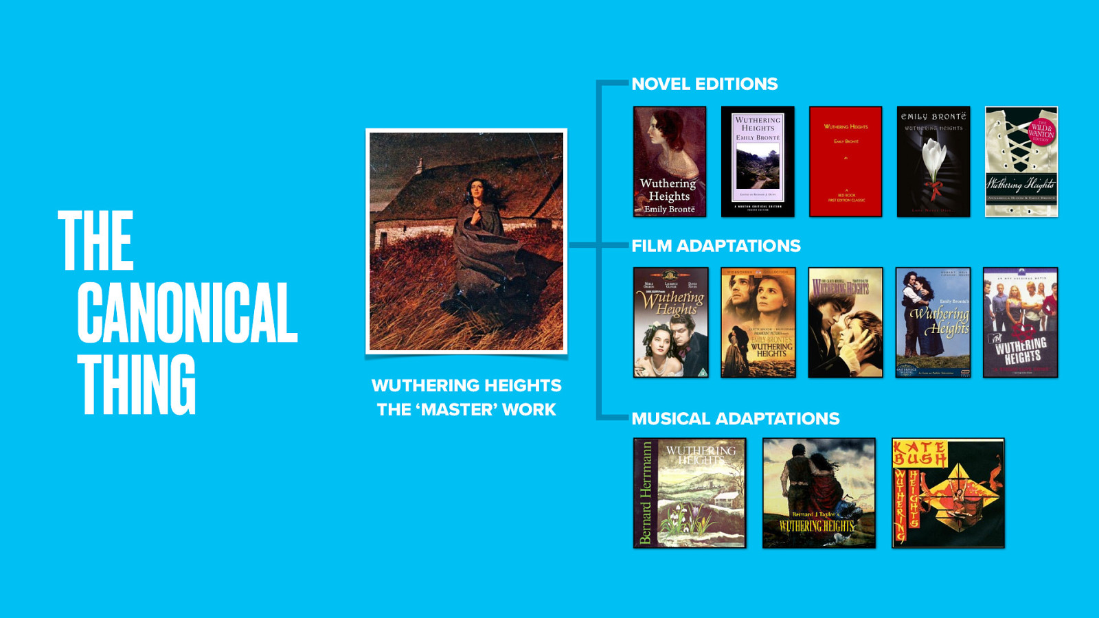
But defining the damn things is vital if you want to be able to point at them.
Back to Wuthering Heights. I expect most people wanting to buy a copy of the novel think in general terms and not of a specific edition. Yet Amazon have no concept of a ‘cultural work’. To them two different editions of Wuthering Heights are really as different as a copy of Wuthering Heights and a copy of Pride and Prejudice.
When you Google Wuthering Heights you get a bunch of different Amazon results. Not so, great for their Googlejuice as one ‘master’ Wuthering Heights aggregation page would be. Amazon hacks reviews together, so you’ll often find complaints about the quality of a DVD version of a movie on the product page for the Blu-Ray.
We think about the basic level at which people search for, we first want to represent a ‘canonical’ version of that concept.
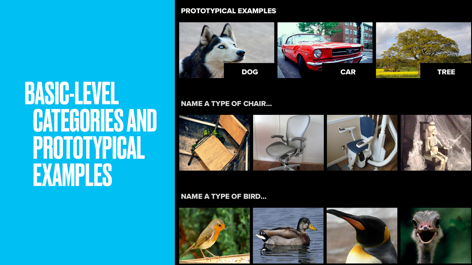
This touches on a little cognitive science. Basic-level categories are the level at which we most readily identify things. Simple names we give things as kids; Dog, not Husky or Mammal. Car, not vehicle or Mustang. Tree, not Oak or plant.
Somehow they’re more important. More cognitively real than higher or lower-order categories. Not only that, but that within categories we find ‘prototypical examples’. If I asked you to name a type of chair, you probably wouldn’t leap to an electric chair. With birds, I bet you’d say robin before you’d say ostrich.
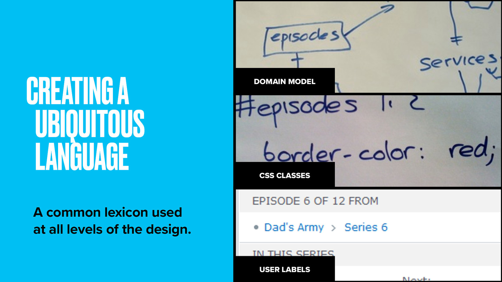
In domain-driven design your goals is to get a ubiquitous language. An terminology lexicon used by everyone on the project team all down the stack. This way everyone on the project has a shared understanding and things don’t get lost in translation.
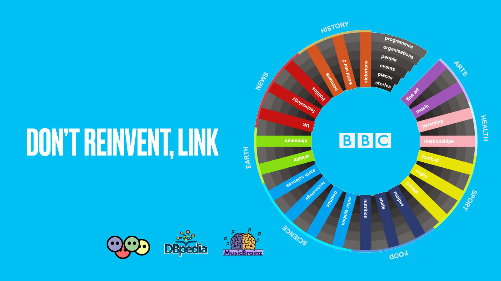
So, where should you stop? What are the limits of your domain? Some things (like people or places) branch into whole other subjects.
This could mean a link between your model and someone else’s. The BBC music site makes extensive use of MusicBrainz, which describes all the releases made by recording artists. It may even be that other parts of your website deal with some of your domain objects, in which case its okay to link out to these pages.
The point is not to replicate content unnecessarily. Don’t reinvent where someone else has already done the thinking.
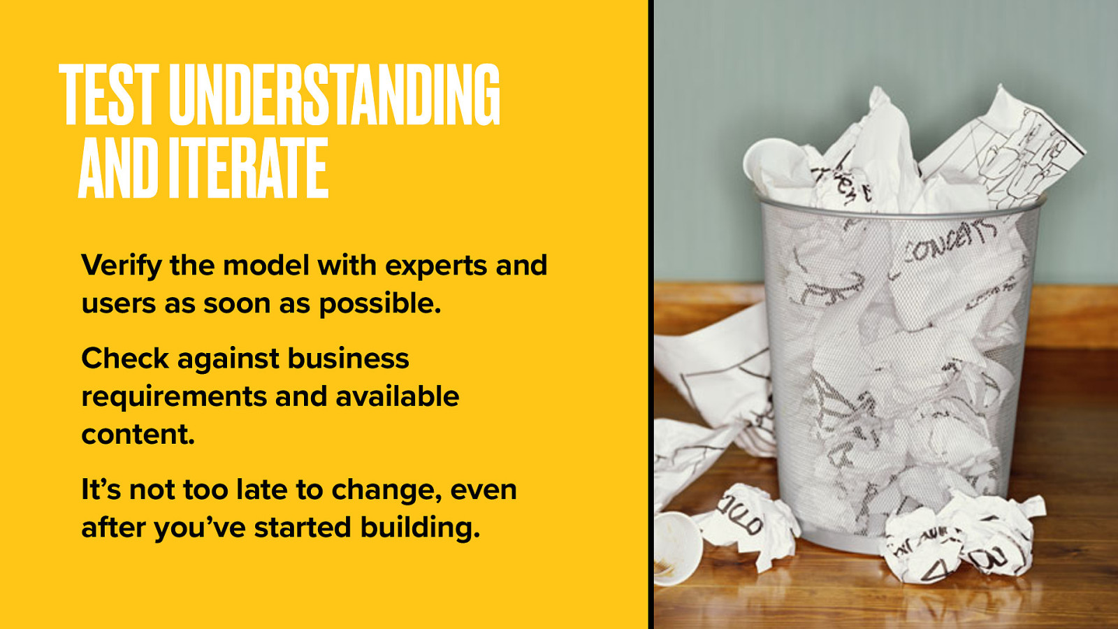
You don’t have to get it right first time. Domain models are heavy on the iteration. Things change all the time support new requirements or understanding.
Hopefully that quick run-through gives you some idea of the theory. But let’s put it into practice now with a story of how the BBC Programmes team met a long-held ambition: a way to make a permanent page for every one of the thousand programmes the BBC broadcasts every day.
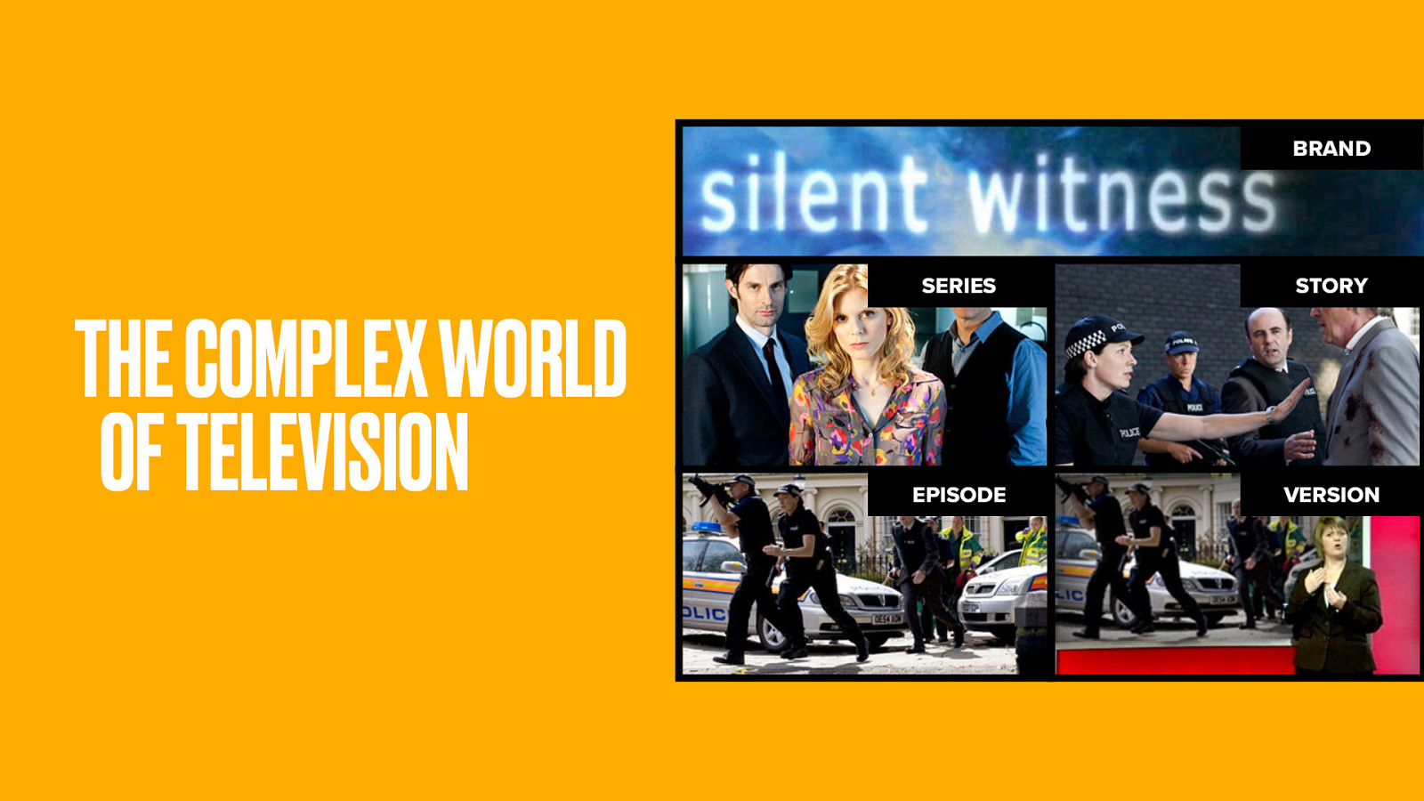
TV is a messy business. Sometimes one-off shows become the pilot for a series. Sometimes two-part stories become an arc within a series. Our general sense of a ‘show’ (like Glee or The Wire or Silent Witness) is what the BBC they call a brand. It’s different to a particular season of that show. And then there are different versions of episodes, most commonly the version that goes out with sign-language.
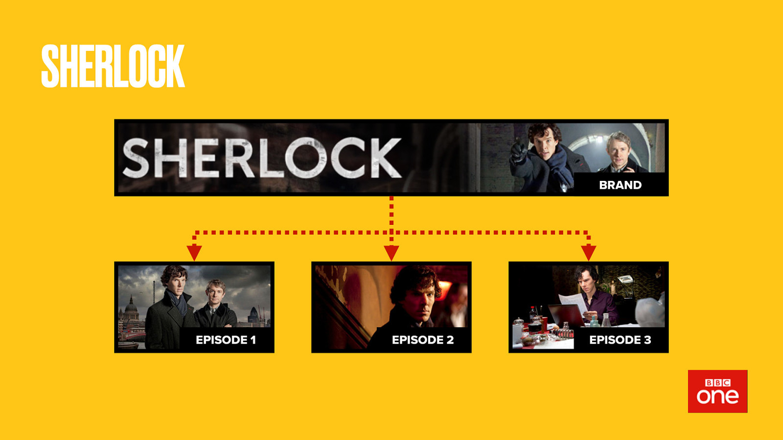
Sherlock was a popular show recently, yet only had three episodes. What does that make it? Can we even answer that until we know its future? For now, Sherlock is a brand with some episodes. It aired on BBC One.
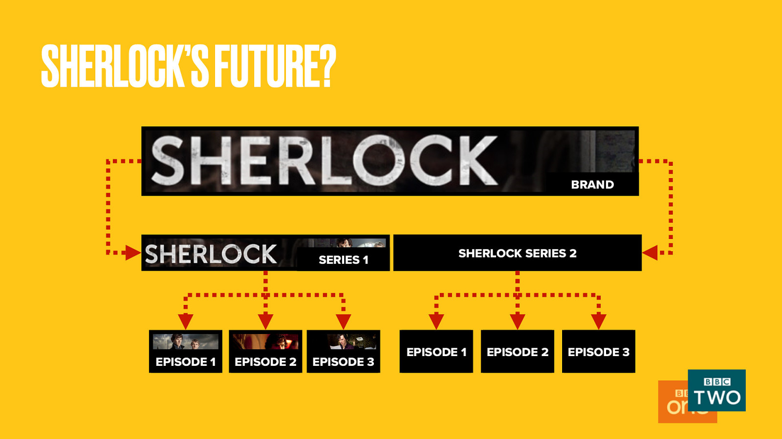
But if new episodes of Sherlock get made, how would this change? Maybe it becomes a full series? More likely the new episodes would become series 2. So we’d then need to define serie 1, messing up our hierarchy. Who knows, it may also switch to BBC Two.
It’s problems like this that the Programmes team have to make sense of.
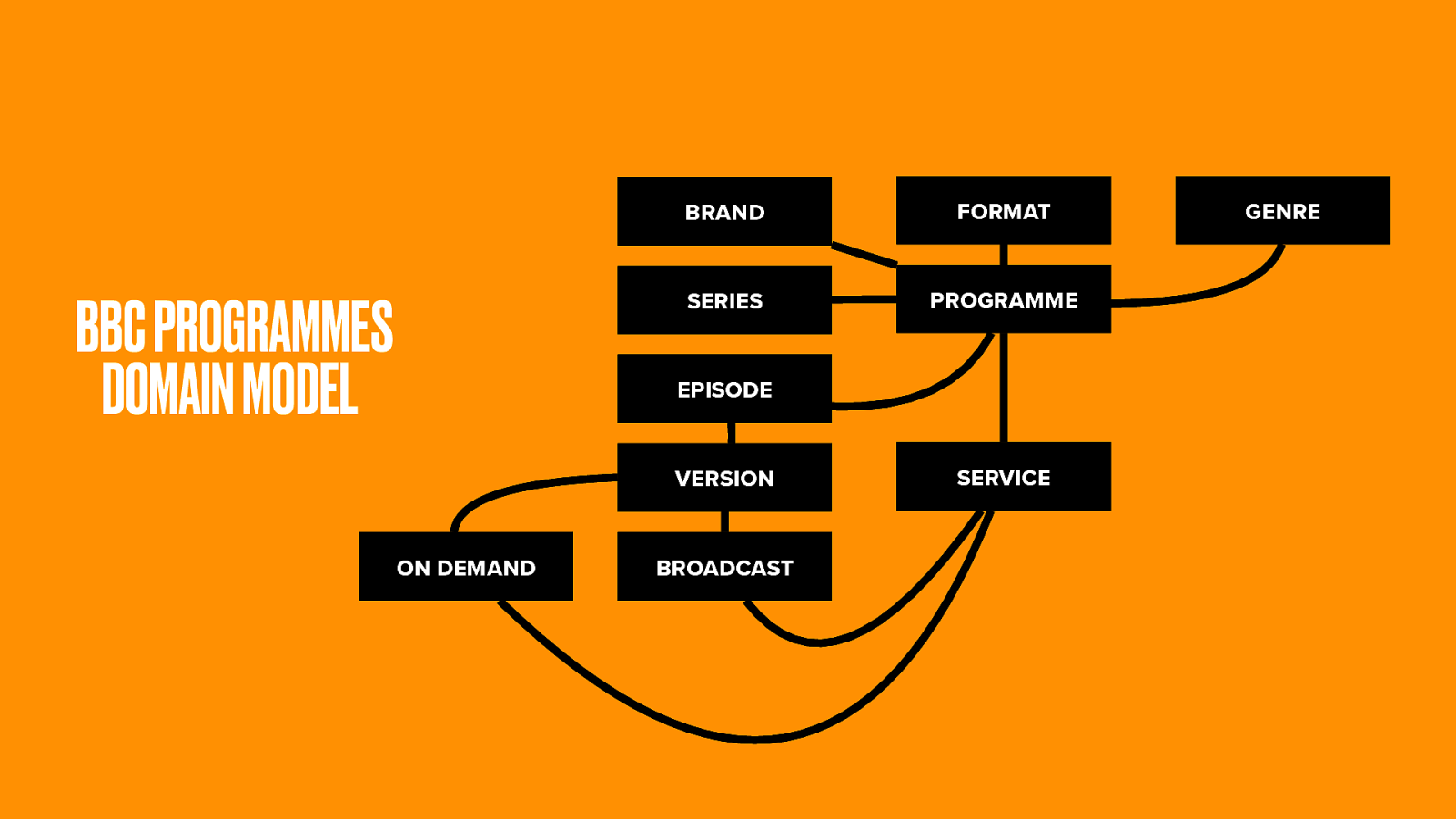
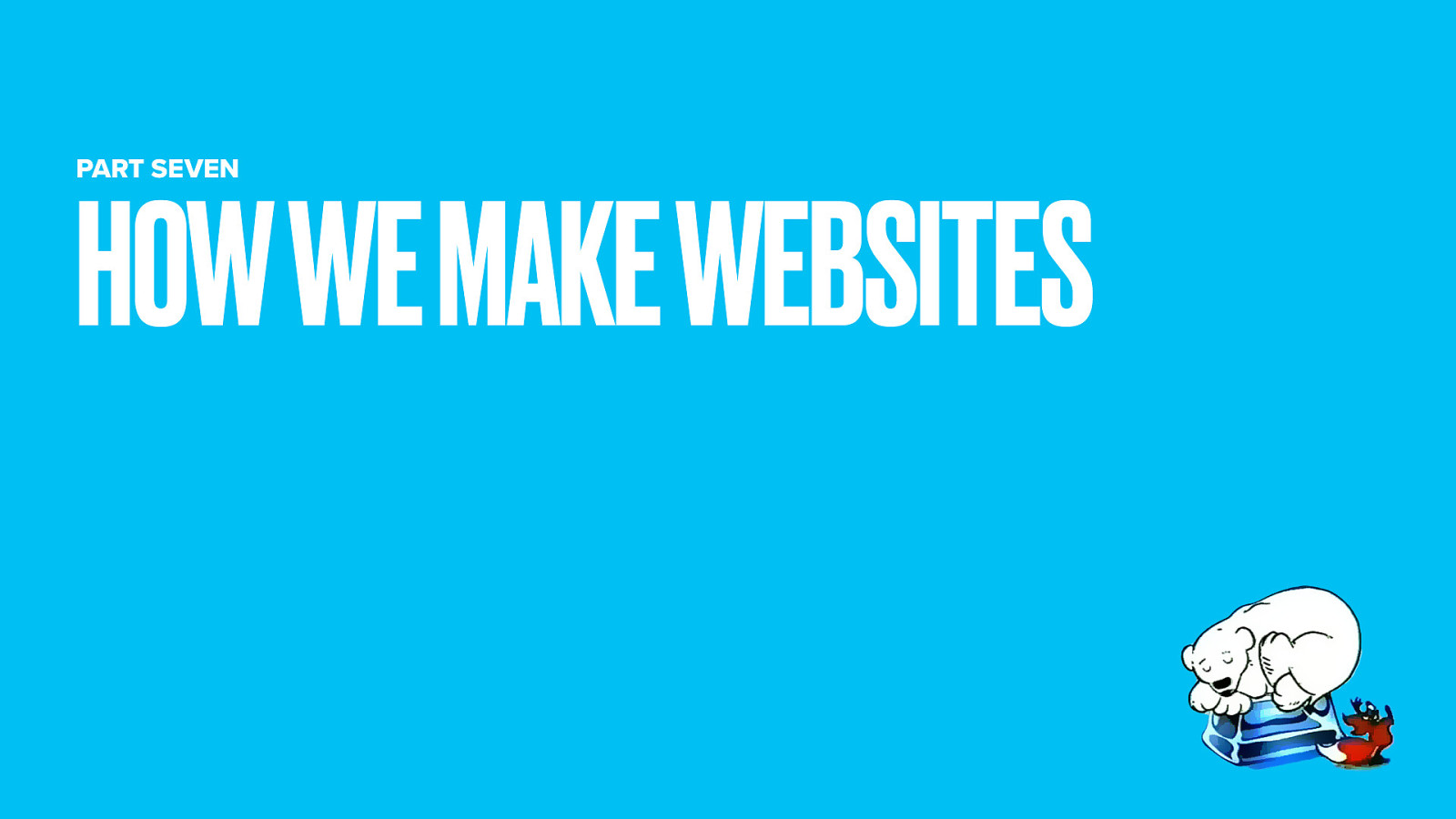
Through chats with schedulers, the Programmes team came up with a domain model.
The Brand is the highest level object. This is the overall ‘cultural work’, say Doctor Who.
Doctor Who has a number of Series (though any fans will know even that is complex). Each series has some Episodes. Each episode may have multiple Versions, and all of these have either been Broadcast, or available On-demand, at some specific time and date.
Collectively we call these things Programmes and they go out on Services (either that TV channels, radio stations or the IPlayer catch-up service).
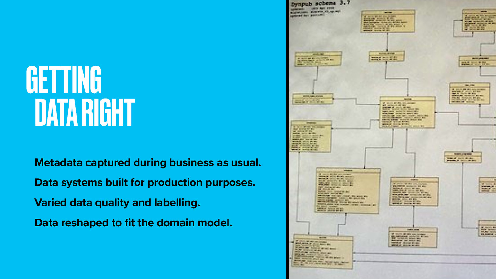
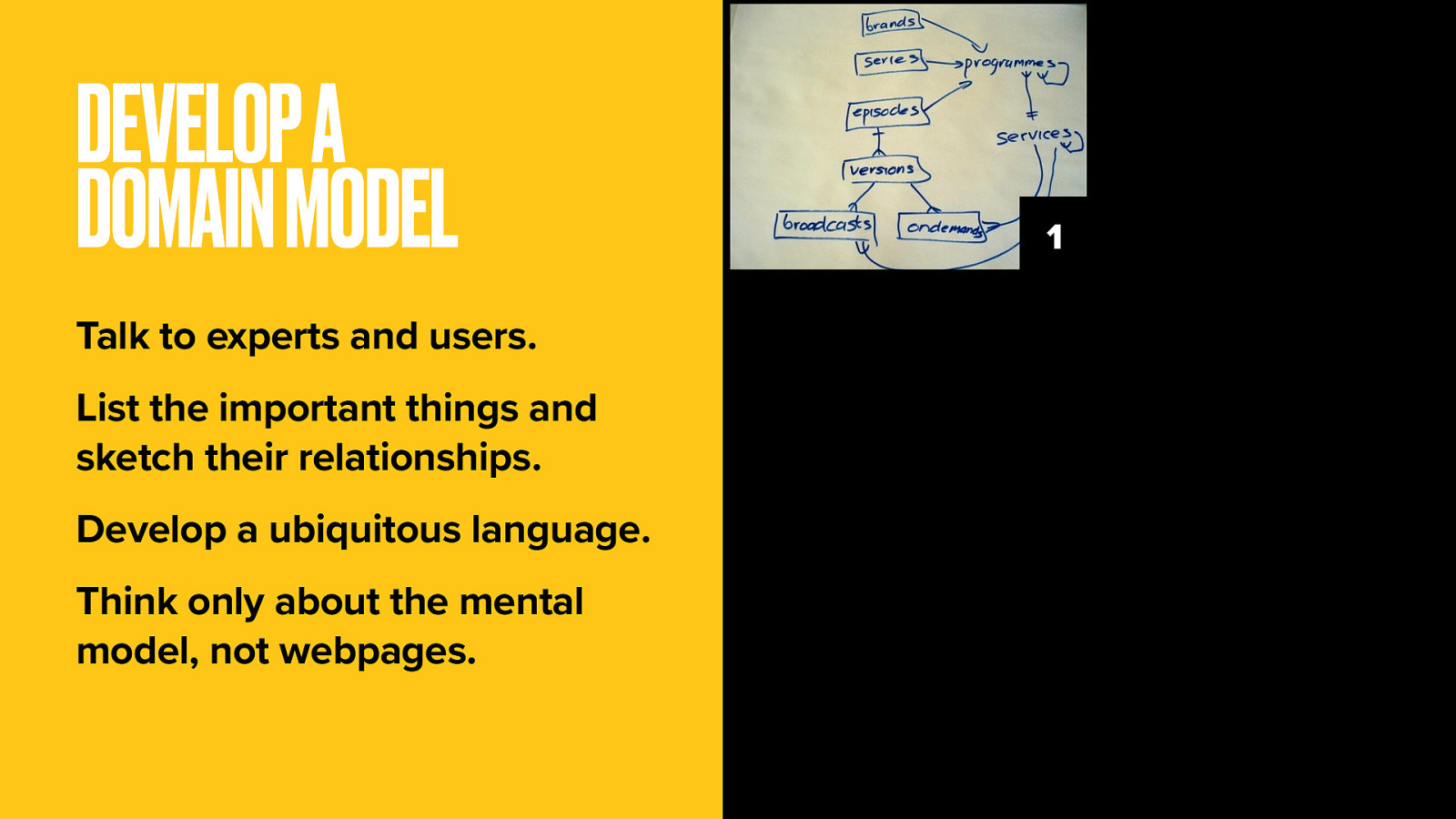
Models need to be populated with data. There’s a ton of business data available for programmes, including episode titles, synopses, and broadcast dates.
Alas this data was never meant to be used this way. It’s normally used for things like compliance and rights management and lacks consistency.
It took a lot of work and workarounds for the web team to whip this data into the right shape. That’s an important lesson in itself. You know better than to replicate your company’s org chart in your site structure. So don’t be a slave to the inherited data model. It just won’t be right, or at least complete.
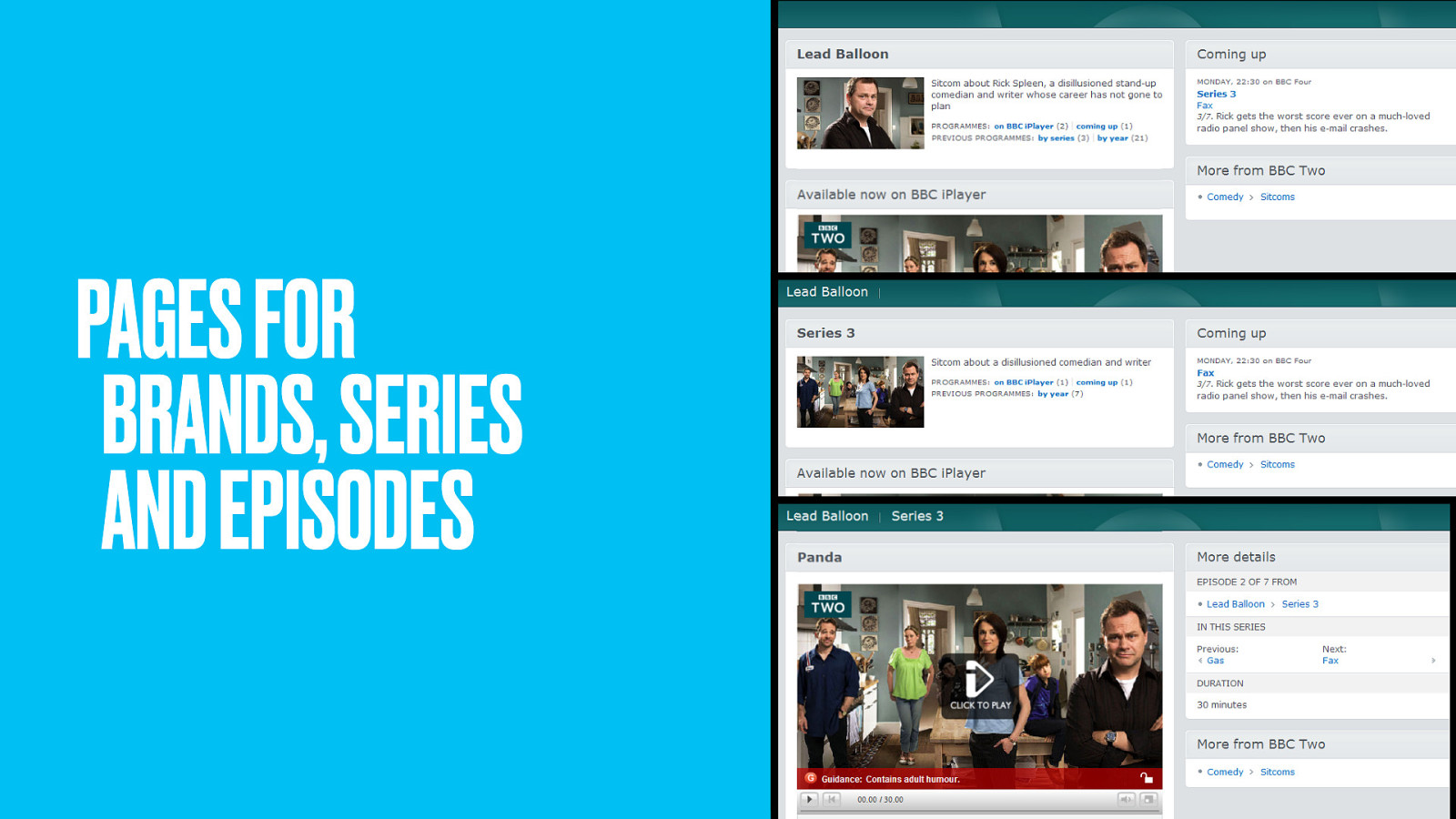
With the model populated, the team built simple web pages to represent each example of each thing. Because these things and relationships were already modeled, it became relatively easy to push out a ton of interlinked web pages.
For the first time in web history, a broadcaster had represented all its output accurately, persistently and scalably on the web.
We had one single web page for each ‘thing’. One page per programme, with one URL to locate that programme. Why is this important?
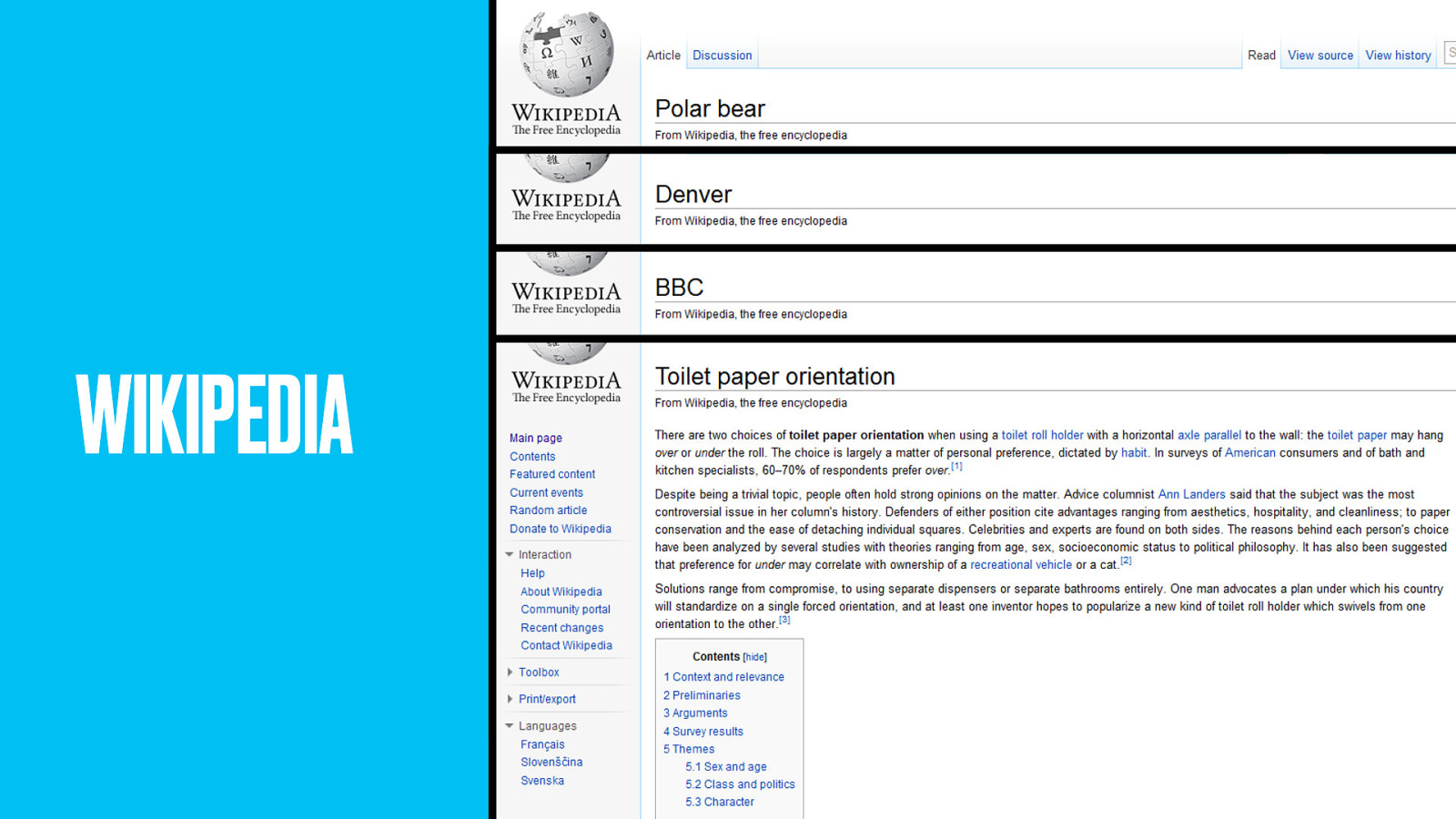
Just look at the success of Wikipedia, which has many thousands of single pages, each discussing a single topic.
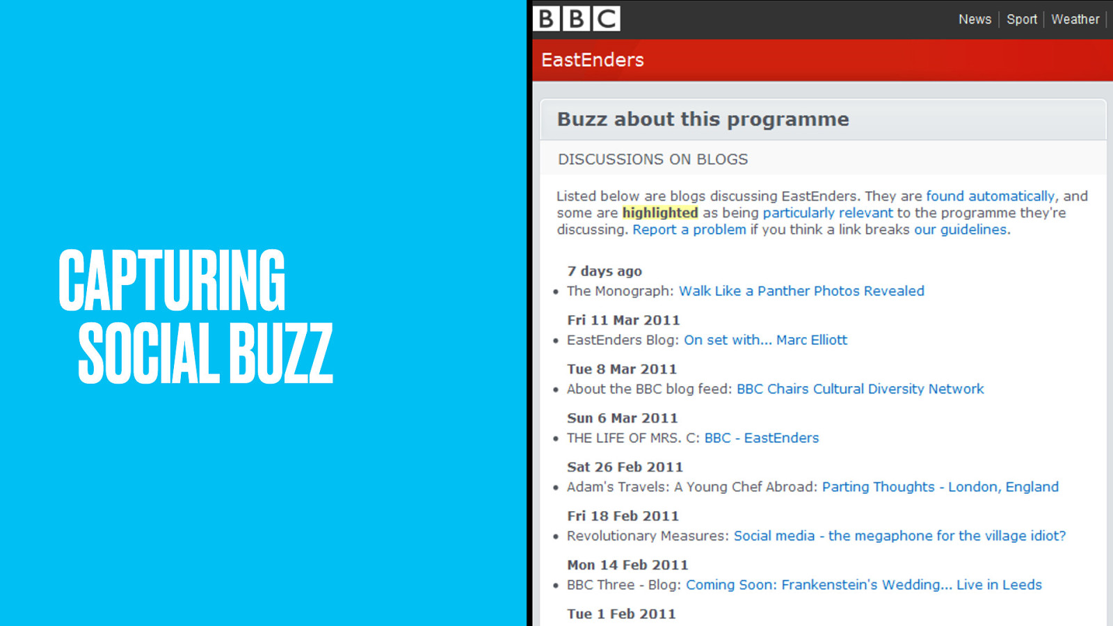
A single URL makes it easy to point at that thing. It’s easy to link to. Easy to blog and tweet about.
Content teams know exactly where to put their multimedia niceties to enhance that one page. It focuses SEO efforts squarely on a single location, making it easier for people to find.
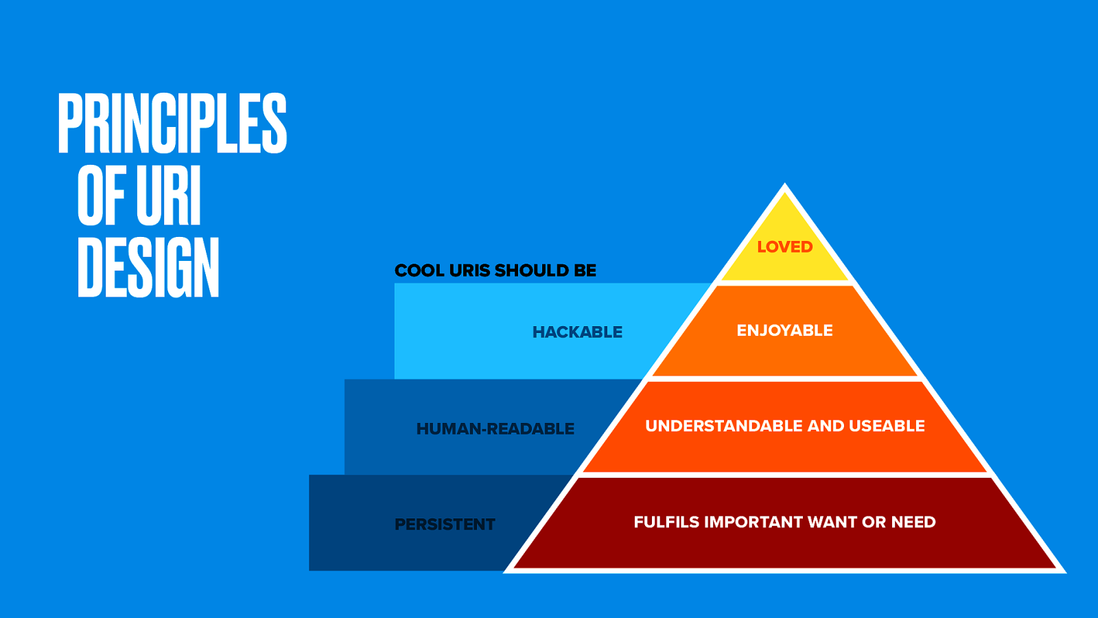
URI design is an important (though often overlooked) component of user experience.
We use some guiding principles in making nice web addresses. They should be persistent (in other words, always reliably there). Hackable (so people can chop them back at the slashes as a means of navigation). And preferably human-readable (since that’s just nice).
Balancing those things can be tough. As the hierarchy of needs shows, the most important one is persistence.
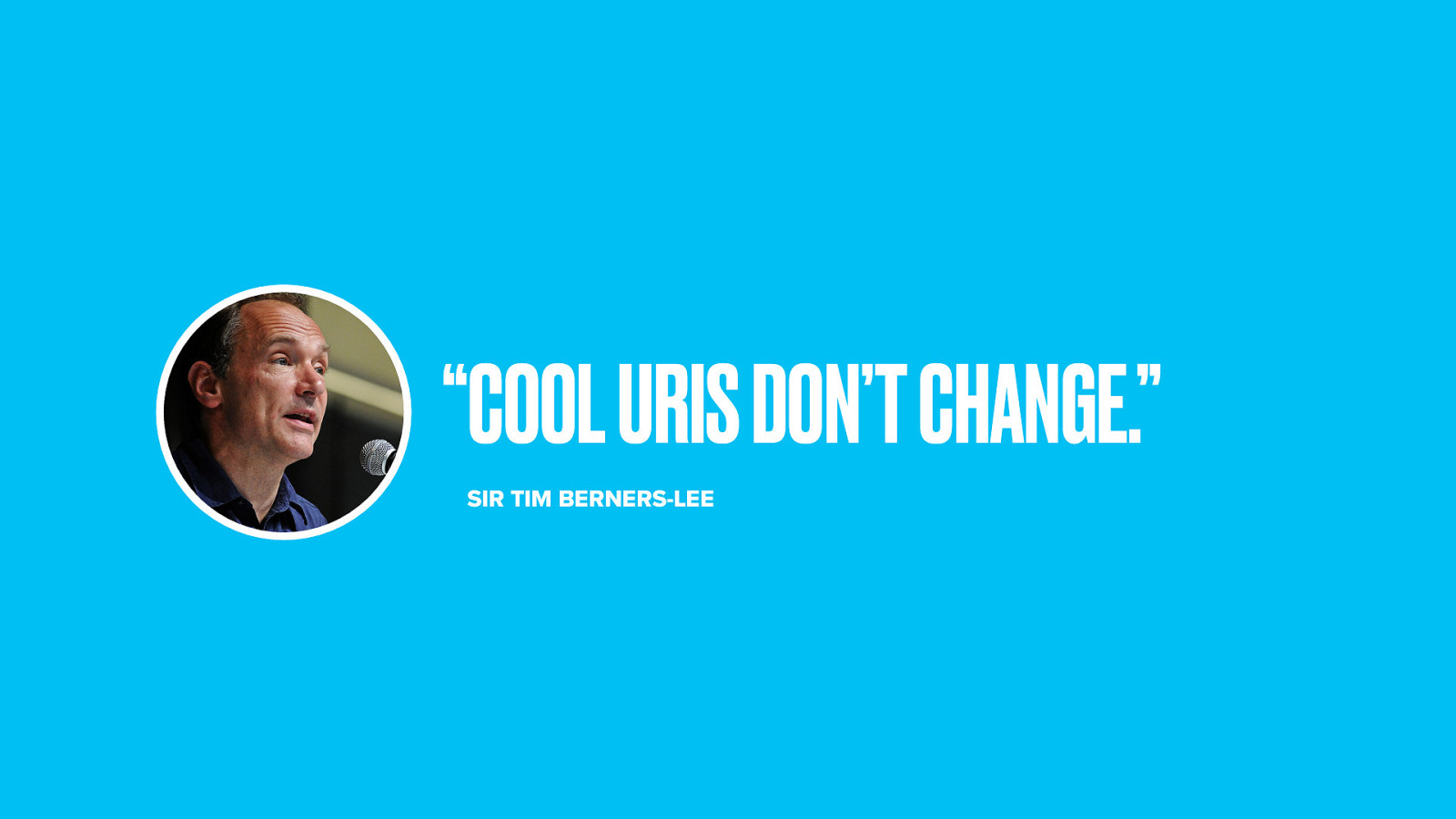
As Tim Berners-Lee says, “Cool URIs don’t change”. Your web address is an implicit contract with the people who link to or bookmark your site.
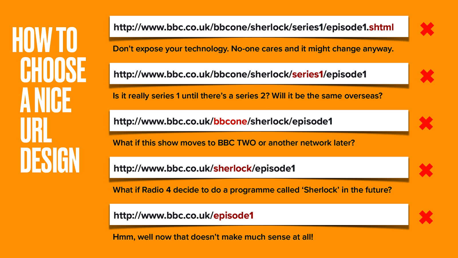
But how can we maintain persistence with content that is subject to change? Let’s examine our URI.
First let’s get rid of the extension. No-one cares about the technology, and one day we might change it anyway.
Is keeping the /series part okay? As with Sherlock this could change, so let’s take it out too. BBC One is the network, but one day this show might move to another network. The name Sherlock is unlikely to change, but across dozens of TV and Radio stations it might not be the only show with that name.
Taking all that variable change out leaves just /episode1, and that doesn’t make much sense at all.
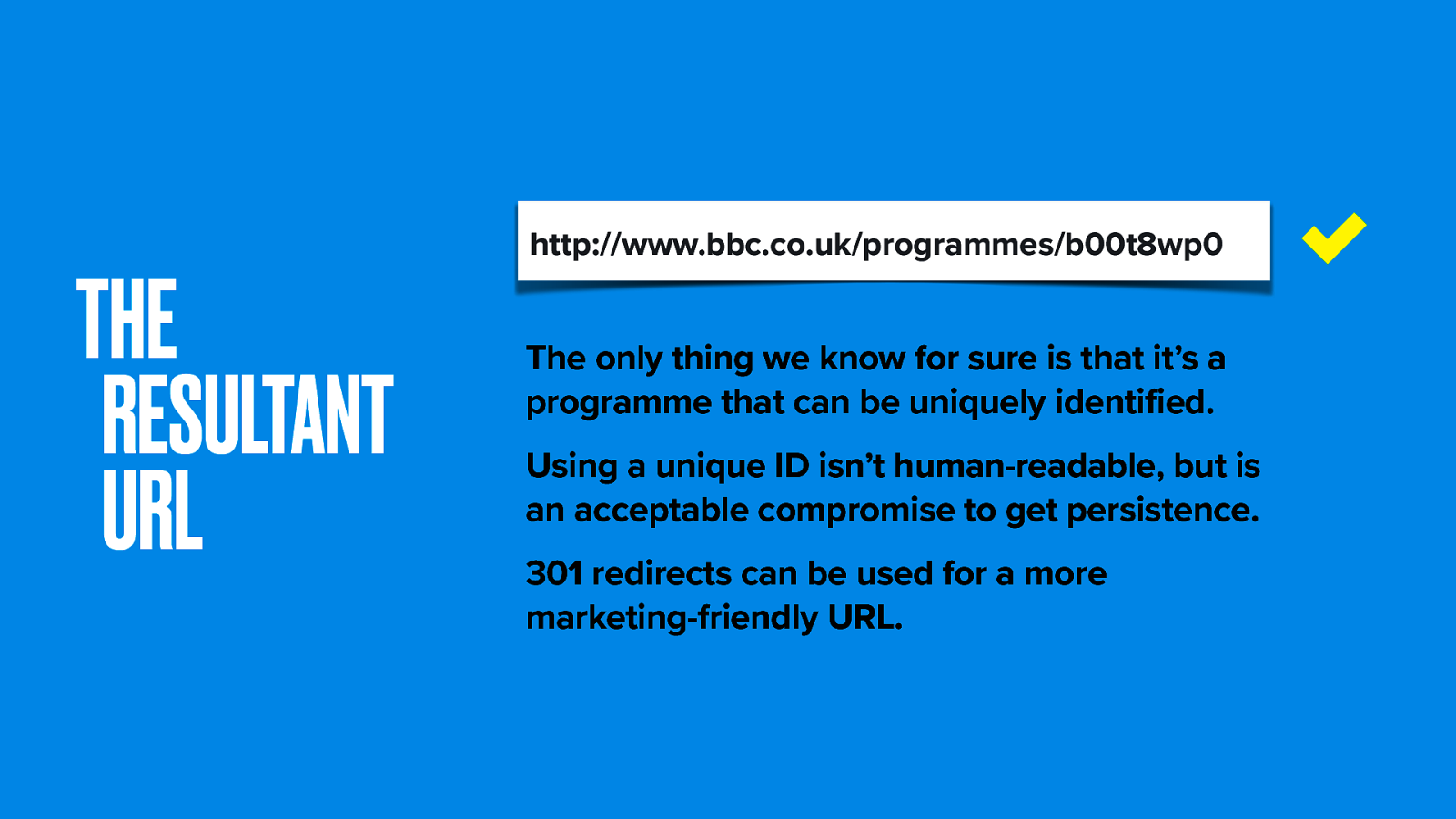
So here’s the format we chose.
The only thing we’re sure of is that our thing is a uniquely-identifiable version of a programme. Using a unique ID isn’t human-readable, but is an acceptable compromise to get persistence. 301 redirects can be used for a more marketing-friendly URL.
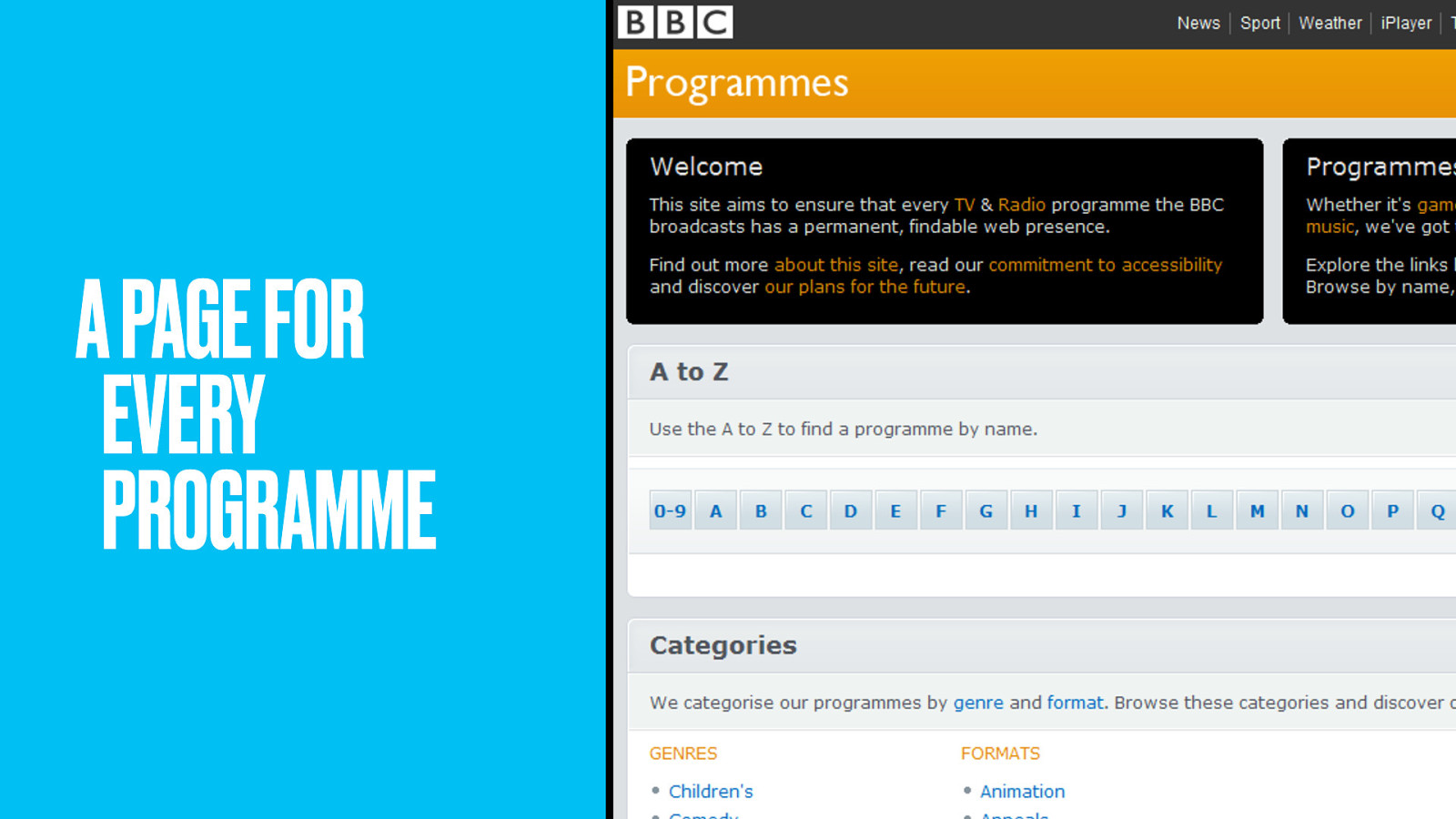
The BBC Programmes site launched with a whimper, quietly providing people with places to link to when referencing any BBC programme…
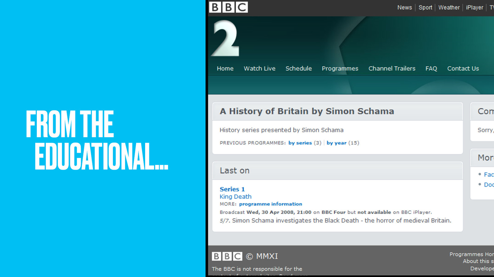
…from the worthy and educational ones that make good use of our public funding…
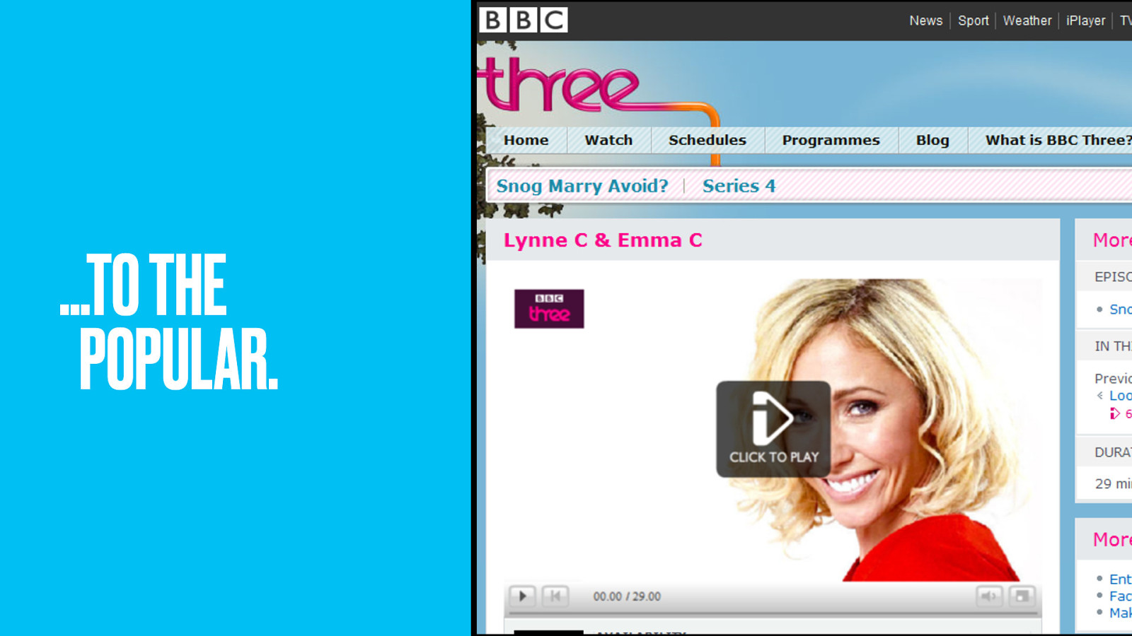
…to the ones people enjoy watching. No longer would only popular brands get a web presence. Did it set the web alight? Not at first, at least not to people outside the IA community.
Because while modelling was a major technical feat, content really is still king. Beyond the episode details and air dates, the Programme pages were light on delight. A skeleton lacking muscles and skin. Pretty soon though, programme content teams took a pride in having their own pages to embellish. Things got a lot richer.
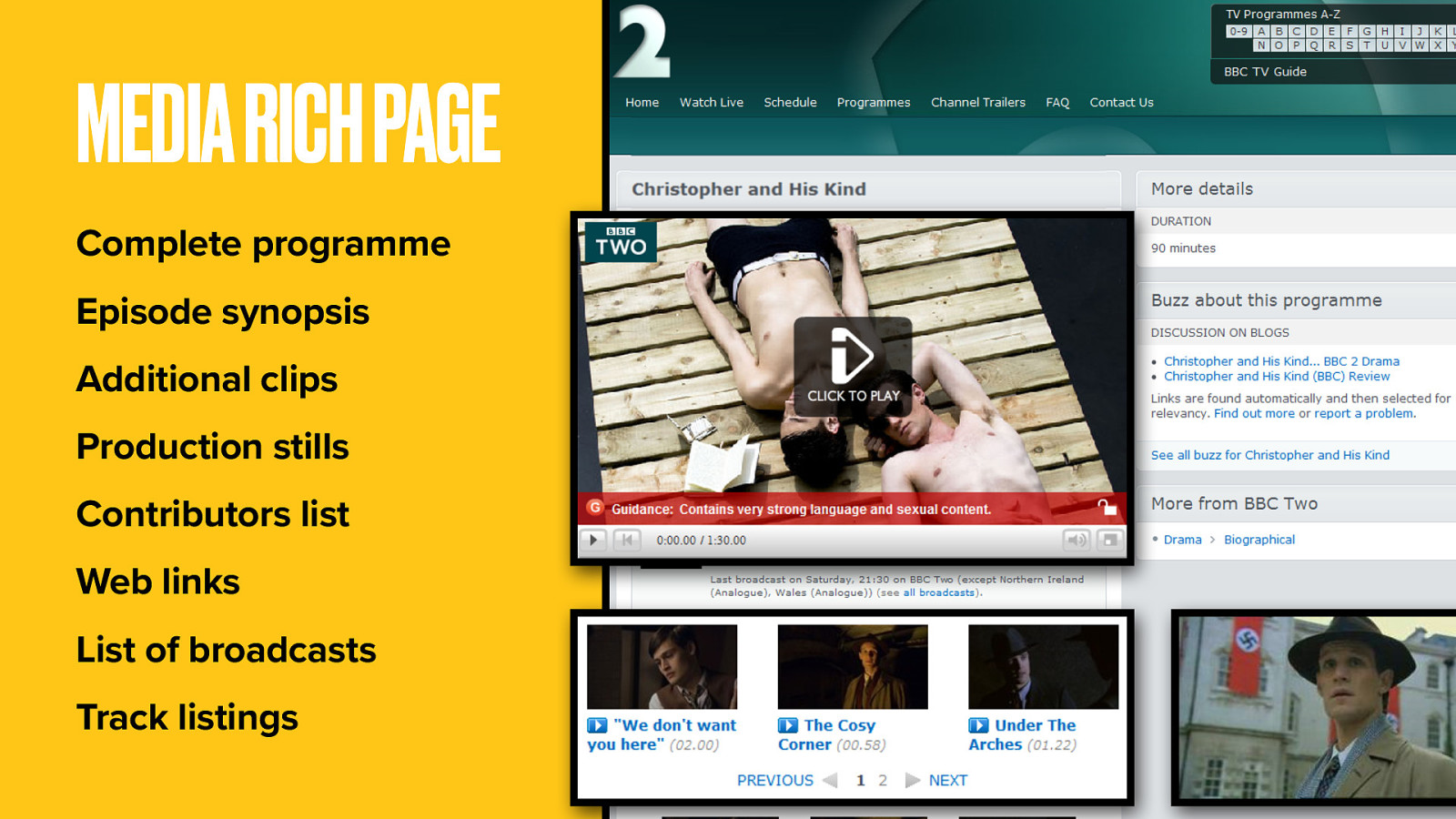
We embedded the complete programme itself onto the page. We added extras: production stills, behind-the-scenes clips…
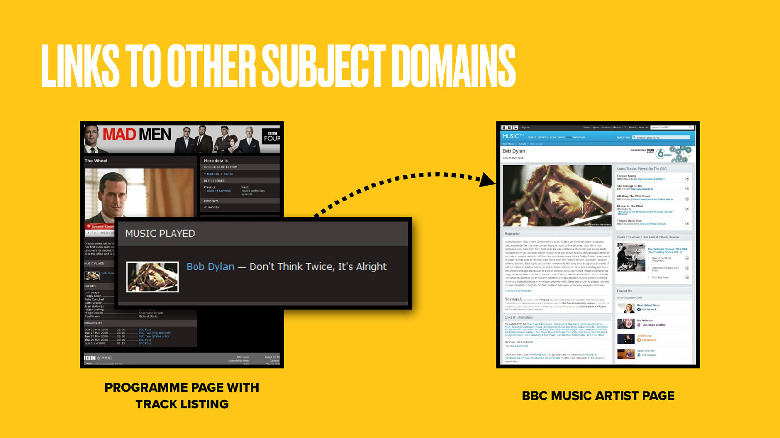
…even track listings for the music used. This got very cool when the team linked those to the /Music domain.
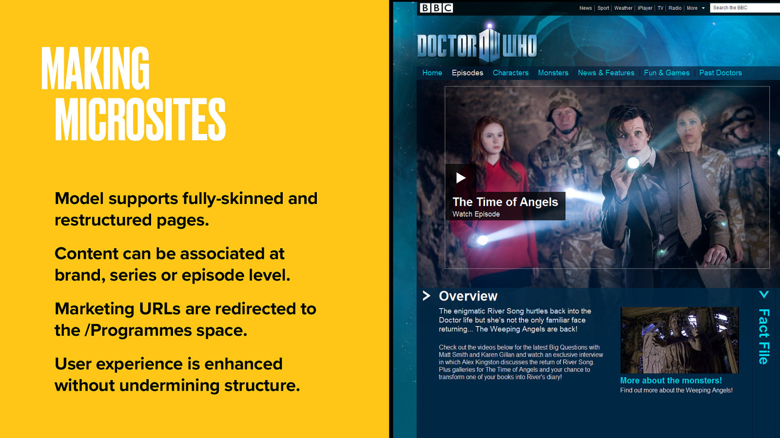
Programme pages have become the standard representation of programme content. No more siloed teams making siloed microsites. Instead we have a scalable ecosystem that comprehensively represents the BBC’s massive output.
Still, people do quite like those programme microsites so content teams now have the tools to make branded support sites using Programme pages. Of course you still need human-readable URLs you can put on the side of a bus, but thanks to some polite web redirects our on-air announcers don’t need to say “just go to www.bbc.co.uk/programmes/b006ml0g”.
The experience is at least equivalent to the old microsites but instead of being siloed, they’re stitched into the wider fabric.
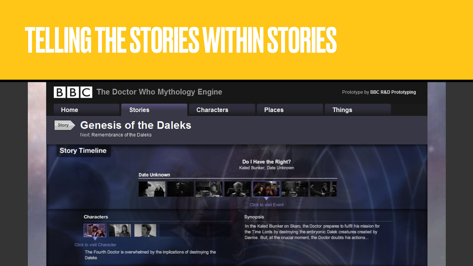
We even started to explore modelling things within the content of a programme like characters, locations and plot events, with a view to recontextualising stories beyond the confines of the episode.
Modelling programmes was only the start of the story. On a business and content stack largely built around AV content, once you can point to programmes, and even to individual bits of them, you’ve unlocked a ton of content you can then use to make more products.
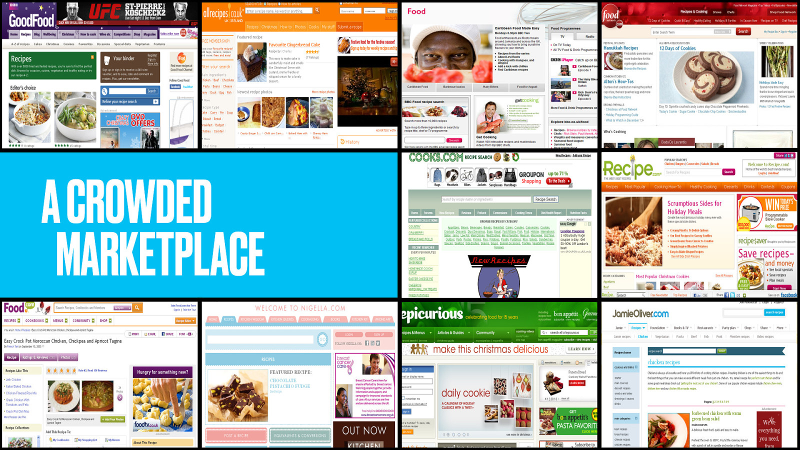
The BBC Food site is recipe database designed to support our variety of cooking shows. I don’t know about you but if I want the recipe for apple crumble, there’s only one place I go first: Google. I’ll get back a ton of recipes and I’ll probably pick one from the first couple of results. SEO therefore is hugely important in the totally saturated recipes market. But BBC Food’s SEO wasn’t great.
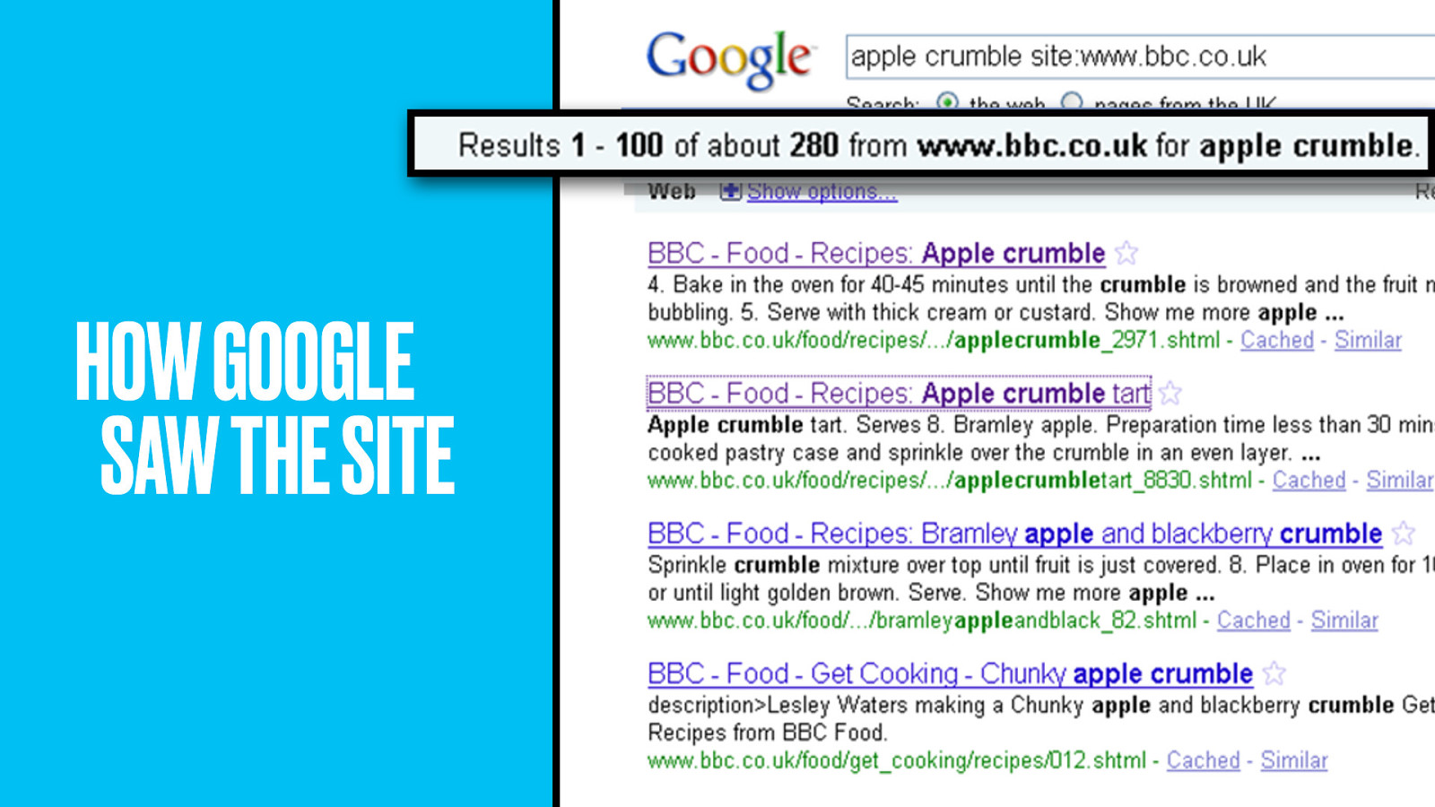
They had apple crumble alright–too many of them, fragmenting our SEO efforts. How then could SEO be improved and more value from the content be unlocked?
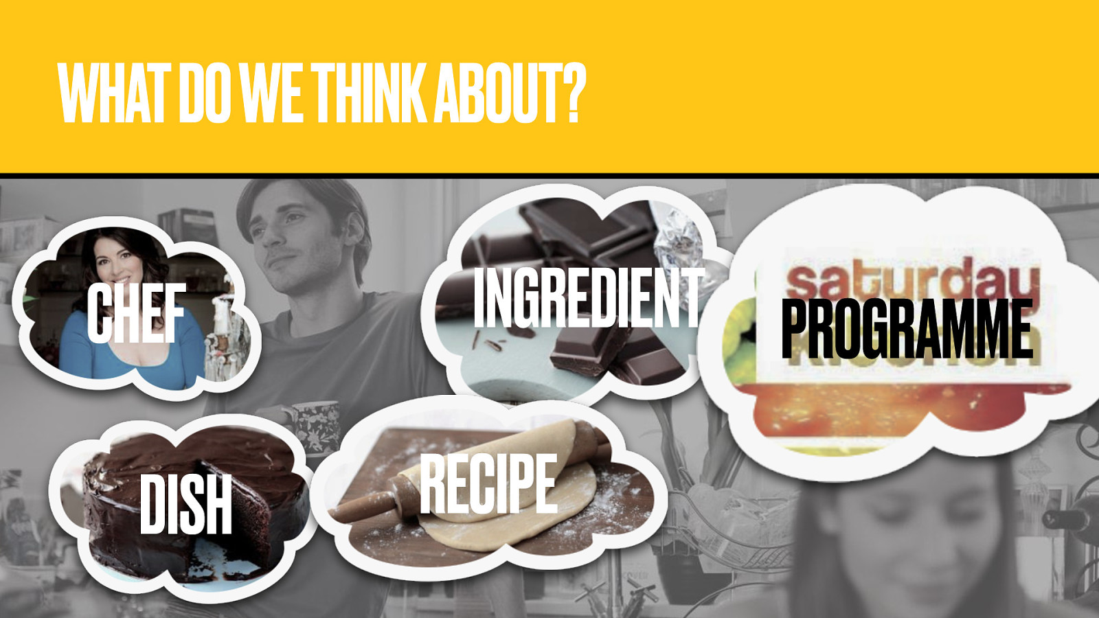
The Food team went back to consider the things people think about and search for.
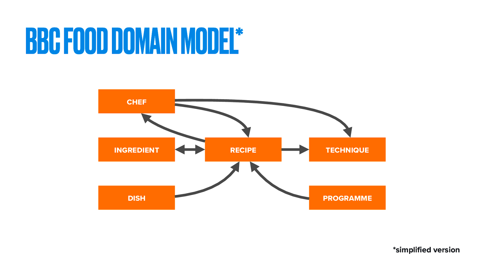
This is how that looks as a simplified domain model. The central Recipe is written by a Chef. It has Ingredients (and sometimes recipes like chicken stock or corned beef, can make something then used as an ingredient in another recipe). It may have associated Techniques, such as how to knead dough or scoop out lobster brains. Because we’re the BBC, this recipe has come from a Programme.
Then there’s the all-important Dish, which we’ll come back to.
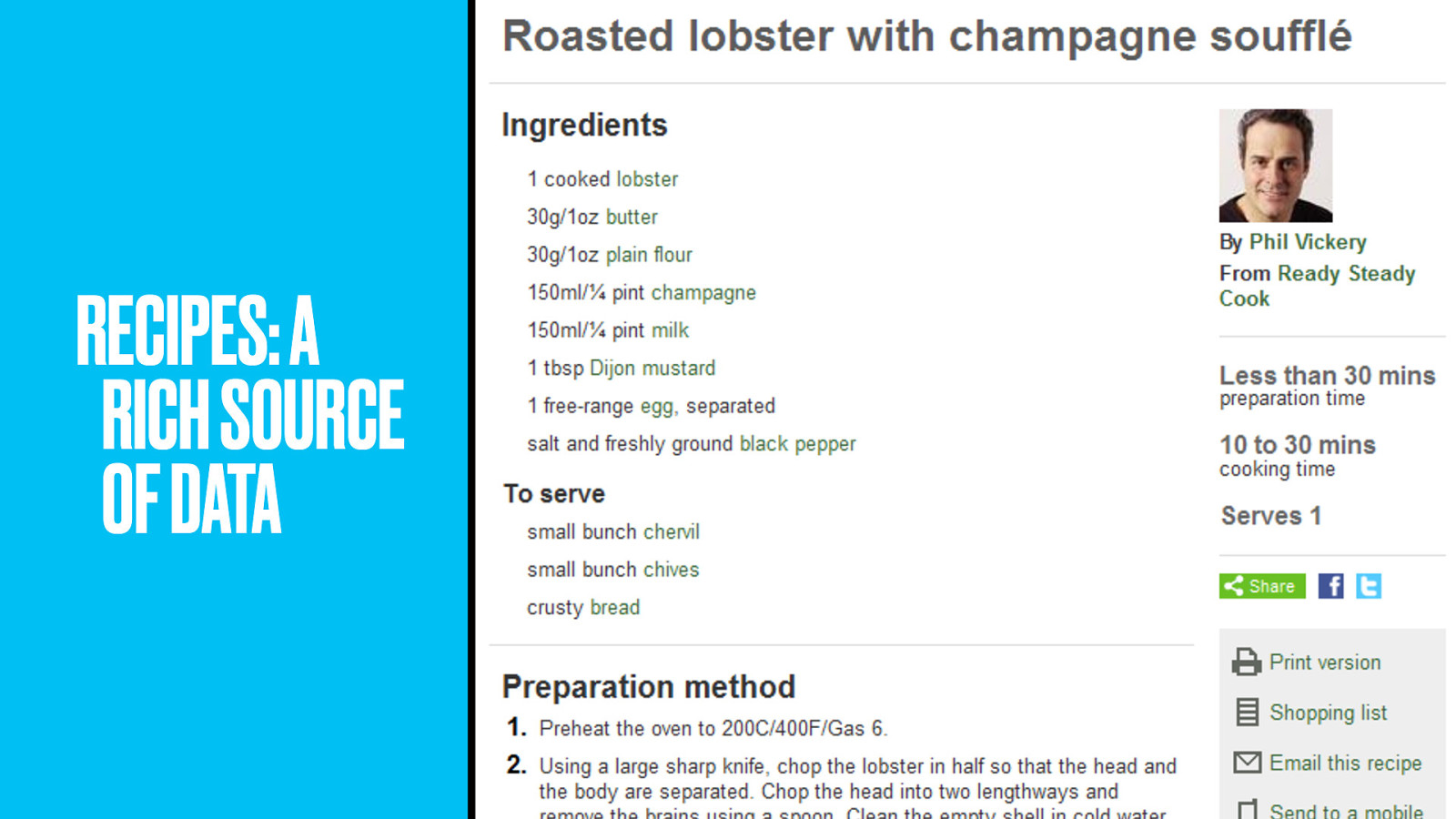
Think about the content of a recipe. It’s stuffed with data. Through domain modelling, we can make each ingredient and even some techniques into a pointable thing. From sauces to resources. Sorry.
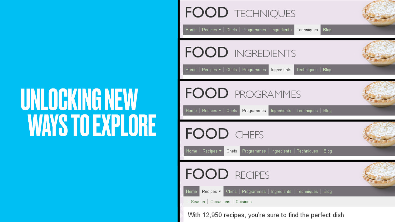
By modelling the structure of a recipe, the team unlocked new ways of exploring food and cookery.
“Show me all of Nigella’s cupcake recipes.”
“Show me what I can do with zucchini.”
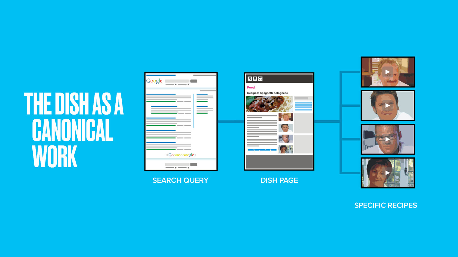
So back to the ‘dish’. It’s our master canonical ‘work’. A mental image of Spaghetti Bolognese from which individual recipes could hang. The dish gave something for people to point at and stabilised the structure. Recipes are more rights-protected than you might think. Sometimes a specific spaghetti recipe had to be removed, yet the canonical Dish stood firm. Al dente. Sorry again.
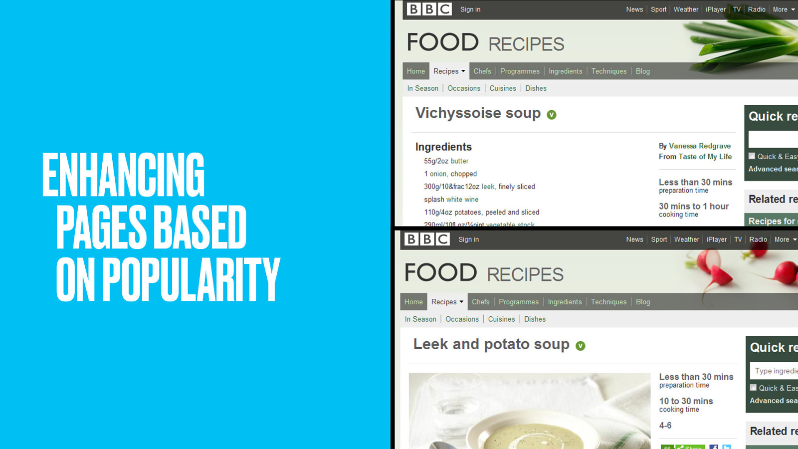
The recipes were carefully selected and named by studying the search analytics. We used to have the oh-so-fancy name Vichyssoise, until we found out people were searching for plain old leek and potato soup. All the photographic love and fanciness was quickly migrated to Leek and Potato soup.
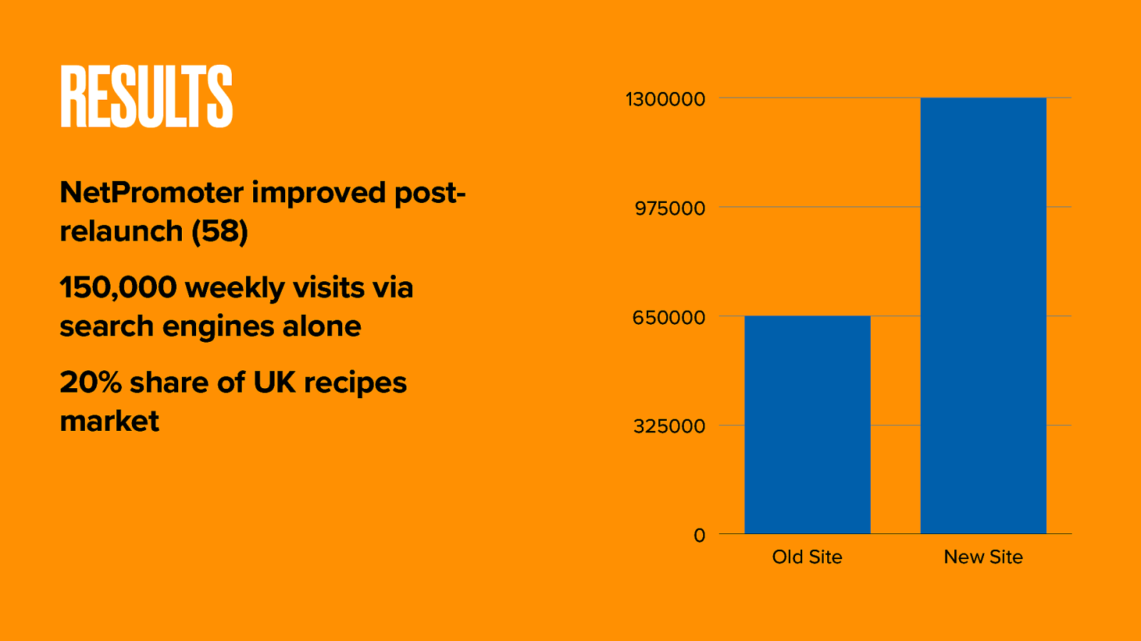
These new and interwoven routes to content massively boosted internal and external link density. Traffic doubled. BBC Food now has 20% of the UK recipes market. That’s 150,000 extra search users each week.
Let’s look at those users for a minute and ponder something else.
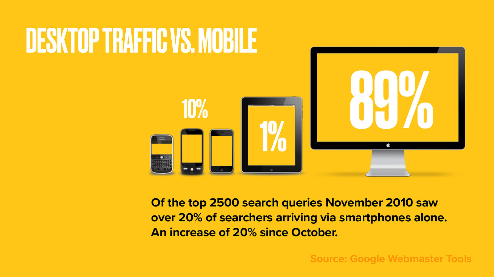
Last year the site saw a 20% rise in access from mobile devices.
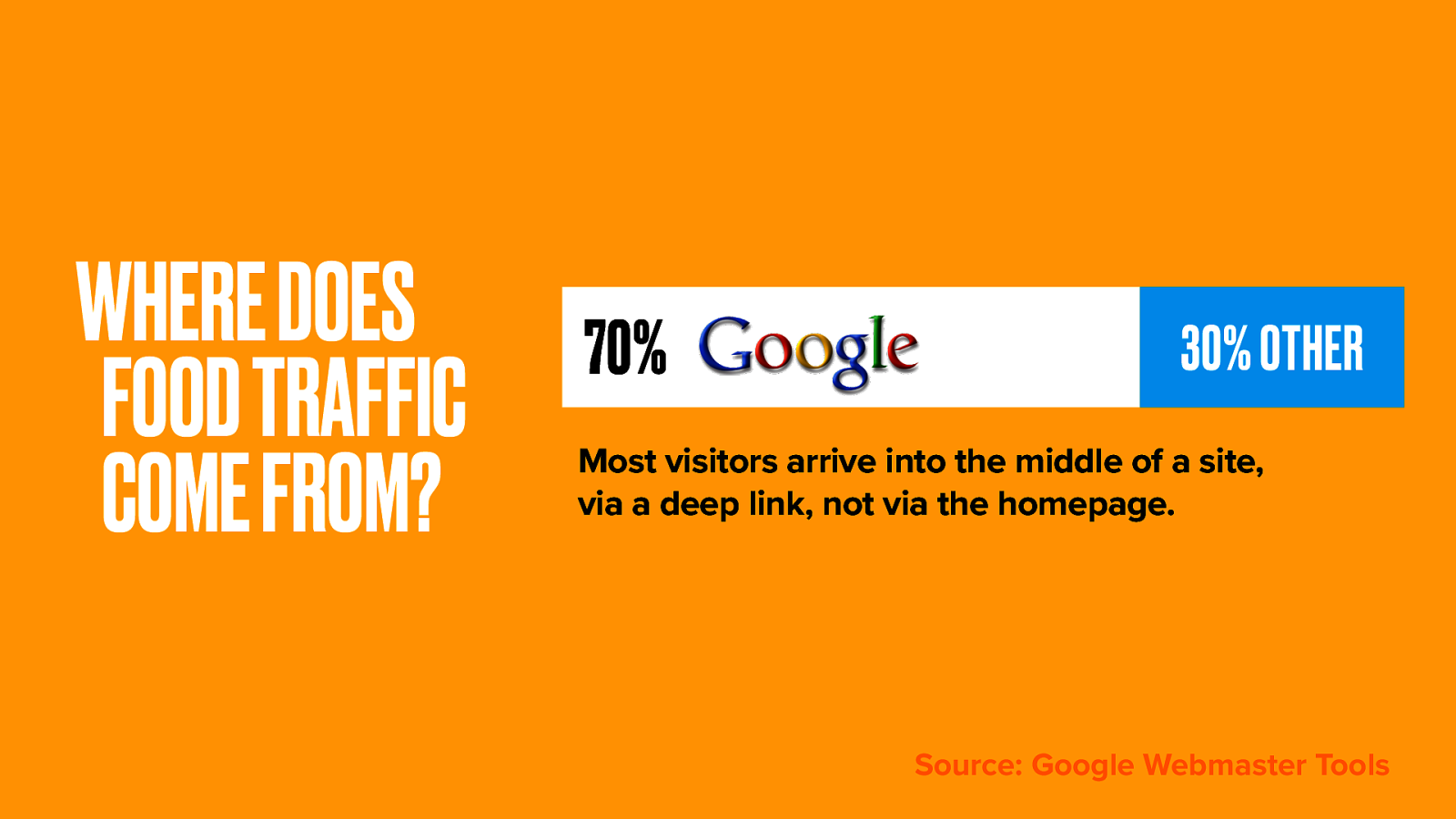
70% of traffic comes directly to recipe pages from Google; far more than from the BBC Food homepage. I’ll bet those referral figures are similar for a lot of other sites too.
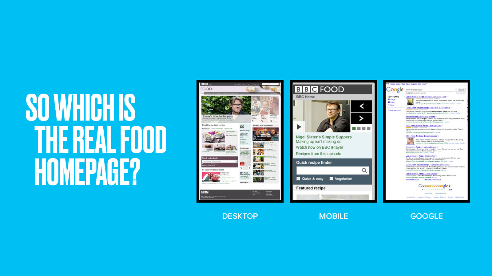
So which is the real BBC Food homepage? Web, Mobile or Google?
The old rhetoric that your homepage is your most important page is no longer true. According to the traffic, at best 30% of effort should be on the homepage, and 70% on your thing pages.
Finally, let’s look at the standard bearer for domain-driven design at the BBC. A site whose subject could be said to inherit a domain model. One that needs more data than even the BBC can provide.
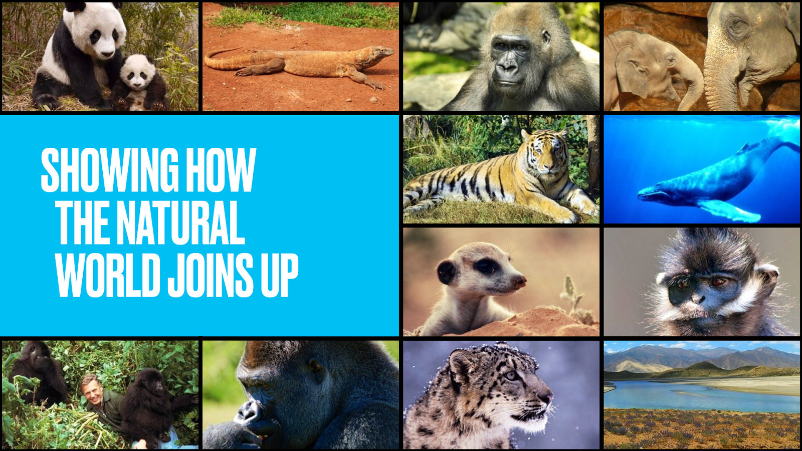
Wildlife Finder is a showcase for the BBC’s award-winning natural history footage.
Far more than being a simple video gallery, it presents these clips in a new and useful way. Wildlife Finder attempts to show how the natural world joins up.
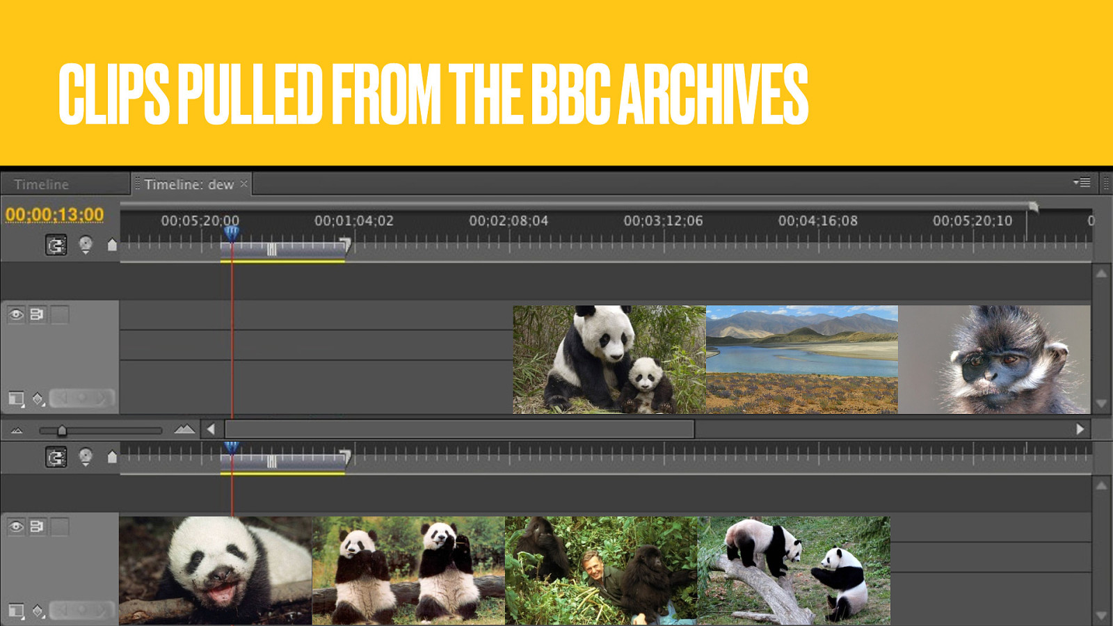
Educational, informative and entertaining clips have been pulled from thousands of hours of archive footage.
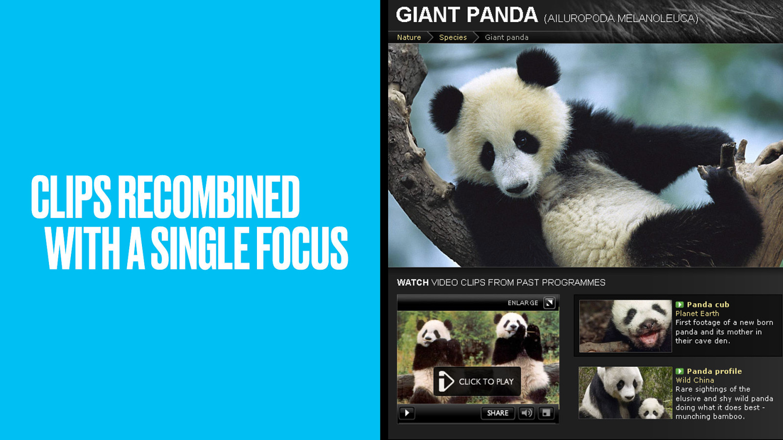
Specific clips from more general programmes have been extracted to focus on individual animals.
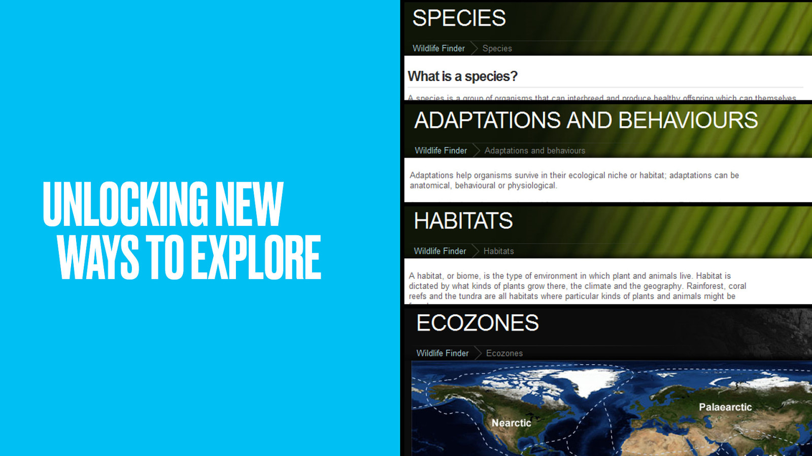
The learning is not just in the clips themselves, but in how the species, adaptations and behaviours, habitats and ecozones of the natural world are connected.
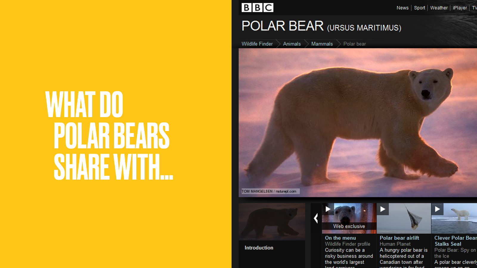
What does the Polar Bear have in common with…
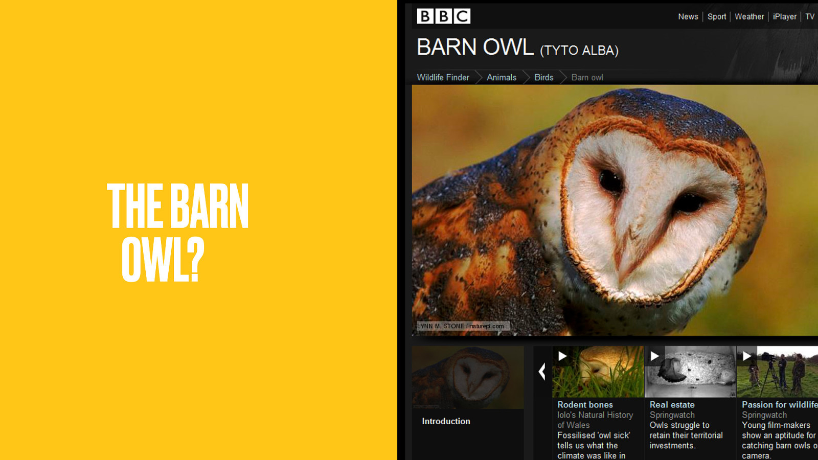
…the Barn Owl?
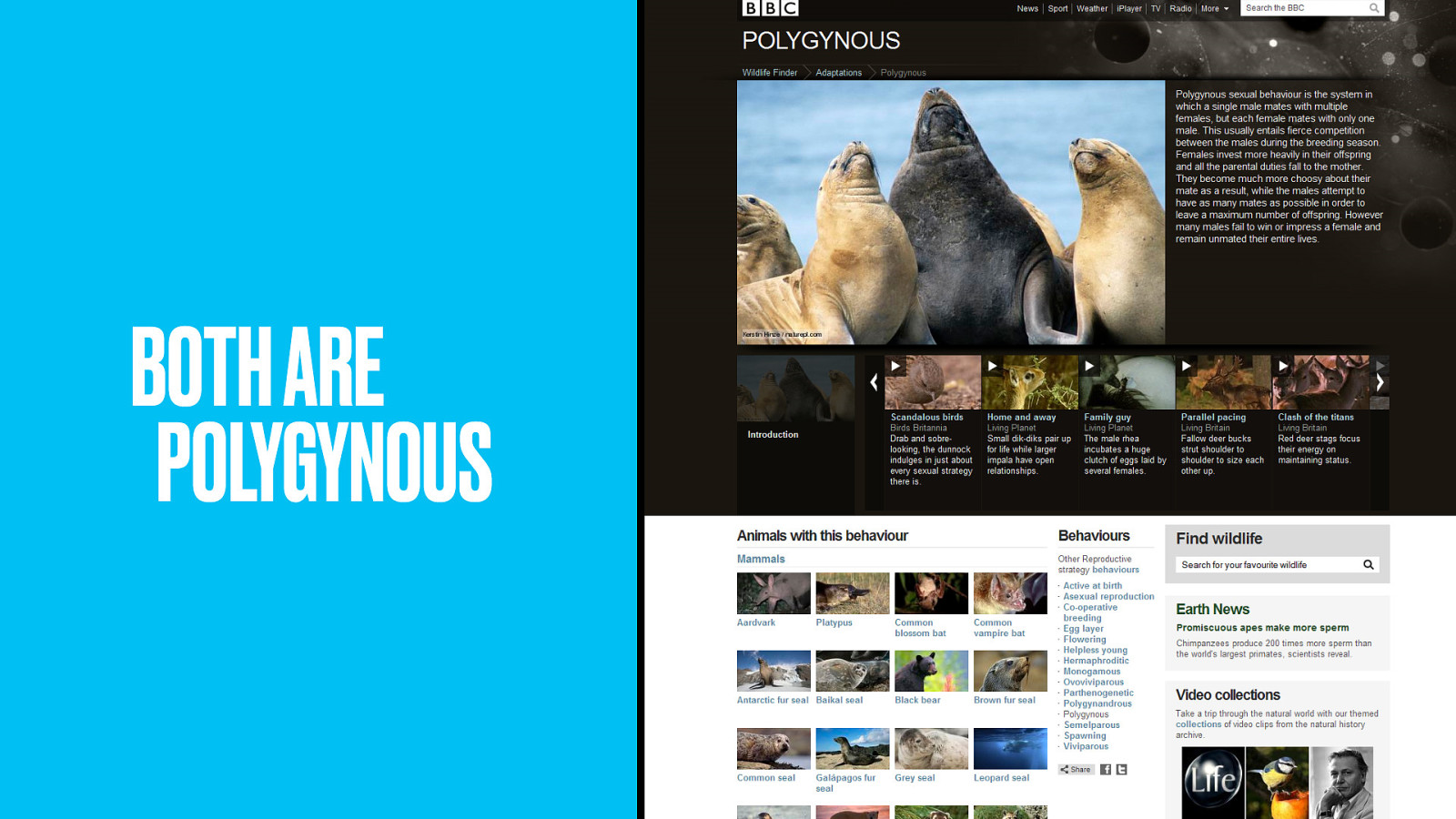
Both are polygynous; where one male mates with multiple females, but each female mates with only one male. What else is polygynous?
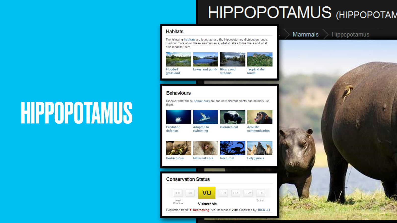
Maybe the Hippo? It’s herbivorous, lives in flooded grassland and is (uh-oh) on the vulnerable list.
You could lose yourself for hours in these user journeys. Unlike sites with seemingly random ‘related content’ each onward link is teaching you something new.
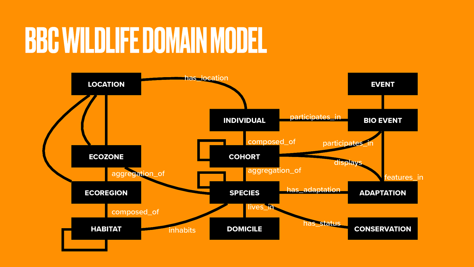
The rich domain model is partly based on the Linnaean taxonomy for biological classification. The natural world is a huge subject. And while we have an archive stretching back 50 years, that only provides the video clips.
There aren’t teams of elves working away to attach the written descriptions needed for every creature in the animal kingdom.
Oh wait, there are.
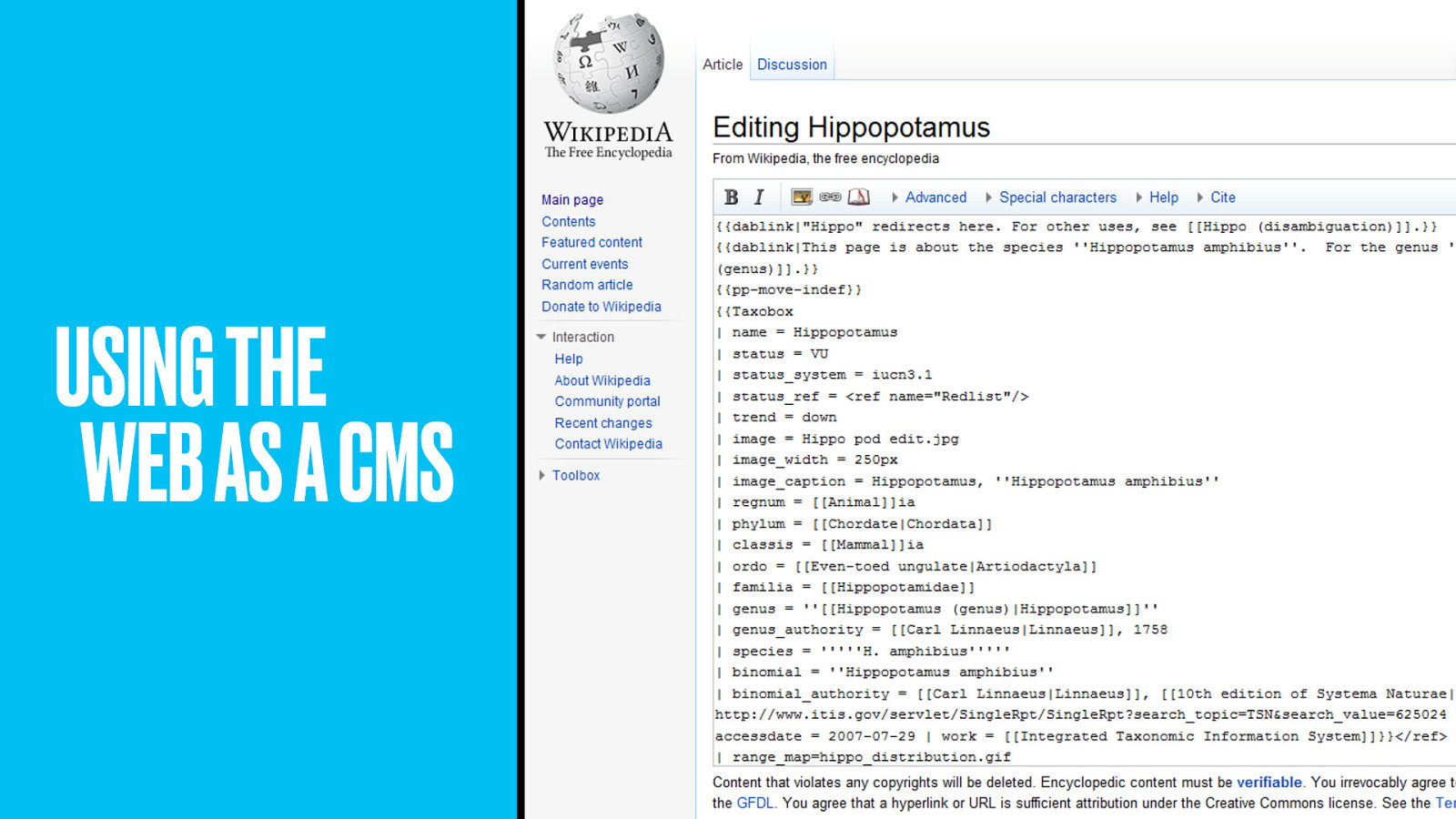
It’s just that they do it on Wikipedia. Yes, the Wildlife team are fans of using the whole web as their content management system.
Need a description? Pull it in automatically from Wikipedia. Do some Wikipedia entries suck? Yes, so edit them directly on Wikipedia so that everyone benefits.
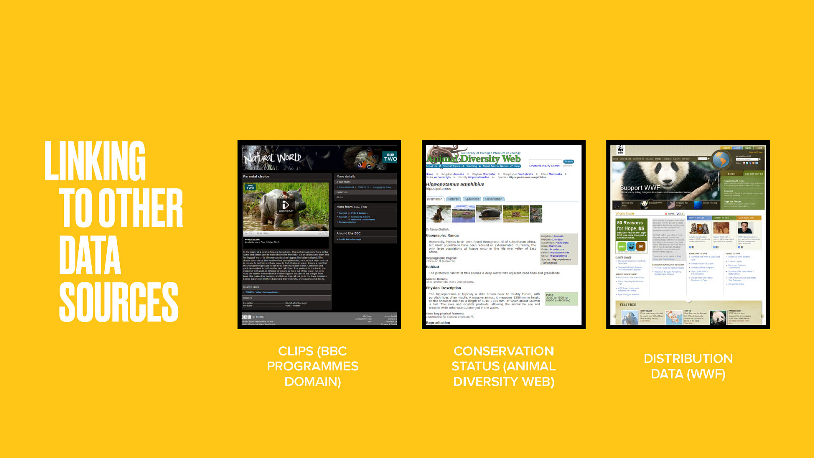
The clips in Wildlife Finder are defined as segments of programmes, so link to the BBC Programmes domain. Similarly, the conservation status of animals is maintained, not by the BBC, but by the University of Michigan. Distribution data comes from the Worldwide Fund for Nature.
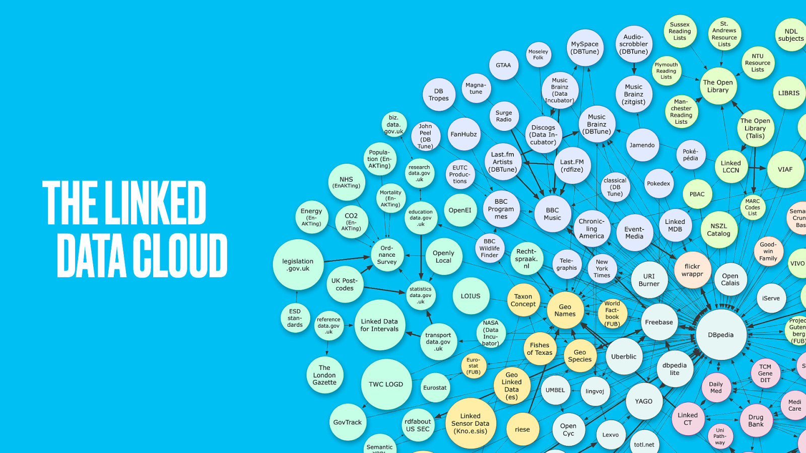
This hints at the power of using linked data. The whole web can be your database to draw upon. Bits and pieces of content to plug the gaps in your own offering.
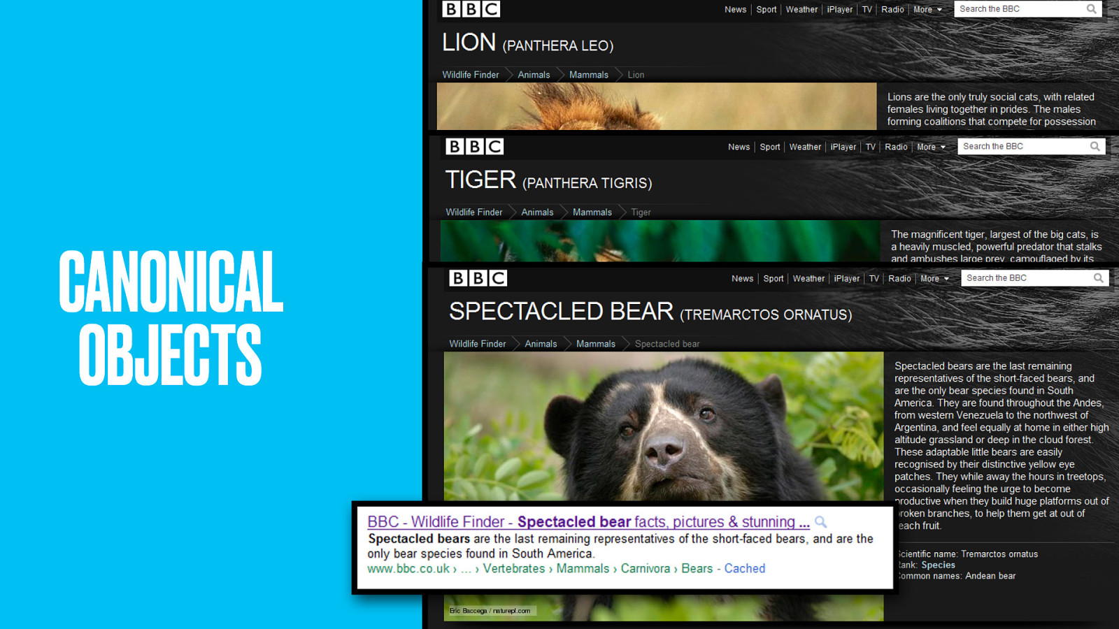
Once again, these thing pages are the canonical work that gathers SEO effort and gives people a place to point to and talk about when they want to reference lions, tigers and bears.
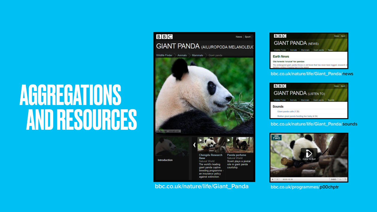
It doesn’t end there. Because really, these pages are a collection of a whole bunch of individual audio and video resources–each of which can be accessed individually.
The Wildlife team have made it easy for developers to access this content and add it to their own meshup applications.
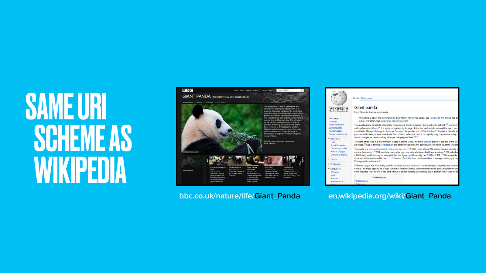
Right down to using the same URL format as Wikipedia. By using a known URL scheme and by being able to serve content in HTML, RDF and the species microformat, the Wildlife Finder site is also its own API.
If you’re a data hacker, go dream up the next big thing.
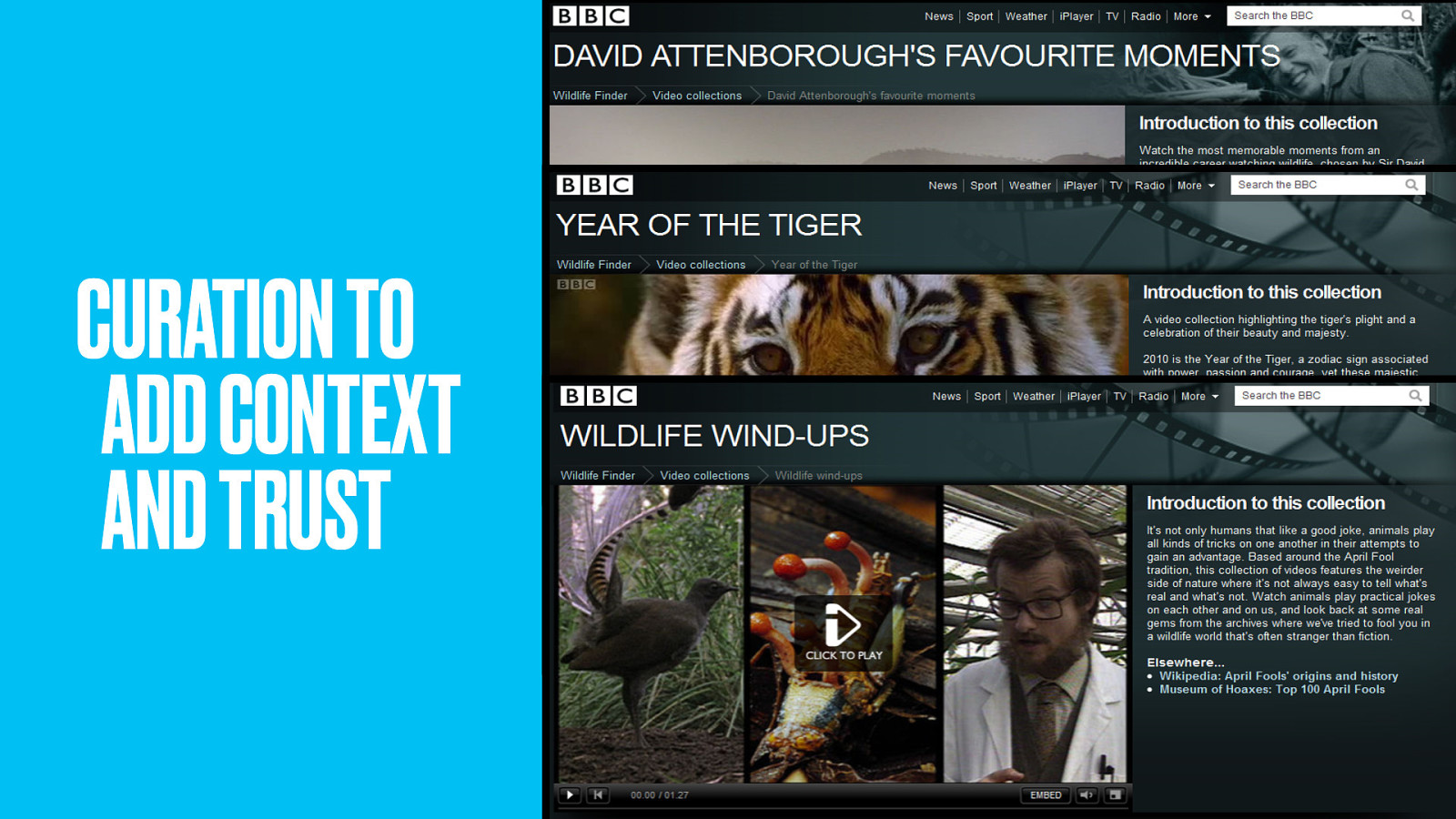
In fact the Wildlife team continue to build next big things, using the resources and thing pages as Lego bricks.
The latest addition is curation. Addressing one of the main criticisms of the domain-driven approach (namely how to add some editorial voice) curated collections add a human touch. Hand-picked examples tell a particular story.
Collections add new context, timeliness and promotion; an alternative view through the eyes of presenters and filmmakers. They enhance the experience without undermining the structure.
The success of these projects has changed the way we make websites at the BBC. From Music to the Solar System to the Olympics and World Cup and soon to History. The domain driven design means everything not just links to, but seamlessly integrates with everything else.
Let’s recap.
Explore the subject and talk to domain experts and end-users. List the things they talk about and sketch the relationships between things.
Define the most important things and develop a ubiquitous language used throughout the technology and user interface. The objective is to map a mental model that works for both casual users and subject experts. Think only at this stage about representing the subject, not about creating webpages.
Working in collaboration with a software engineer, translate your domain model into a database schema.
Check to see what data is available within your organisation and if any holes may be plugged by data available from external providers. Reshape data as needed to pipe into your domain-model-based schema.
Don’t just expose your internal data models as-is. Data availability decisions will iterate the domain and data models. Remember you have the option to expose only parts of the domain model based on available data.
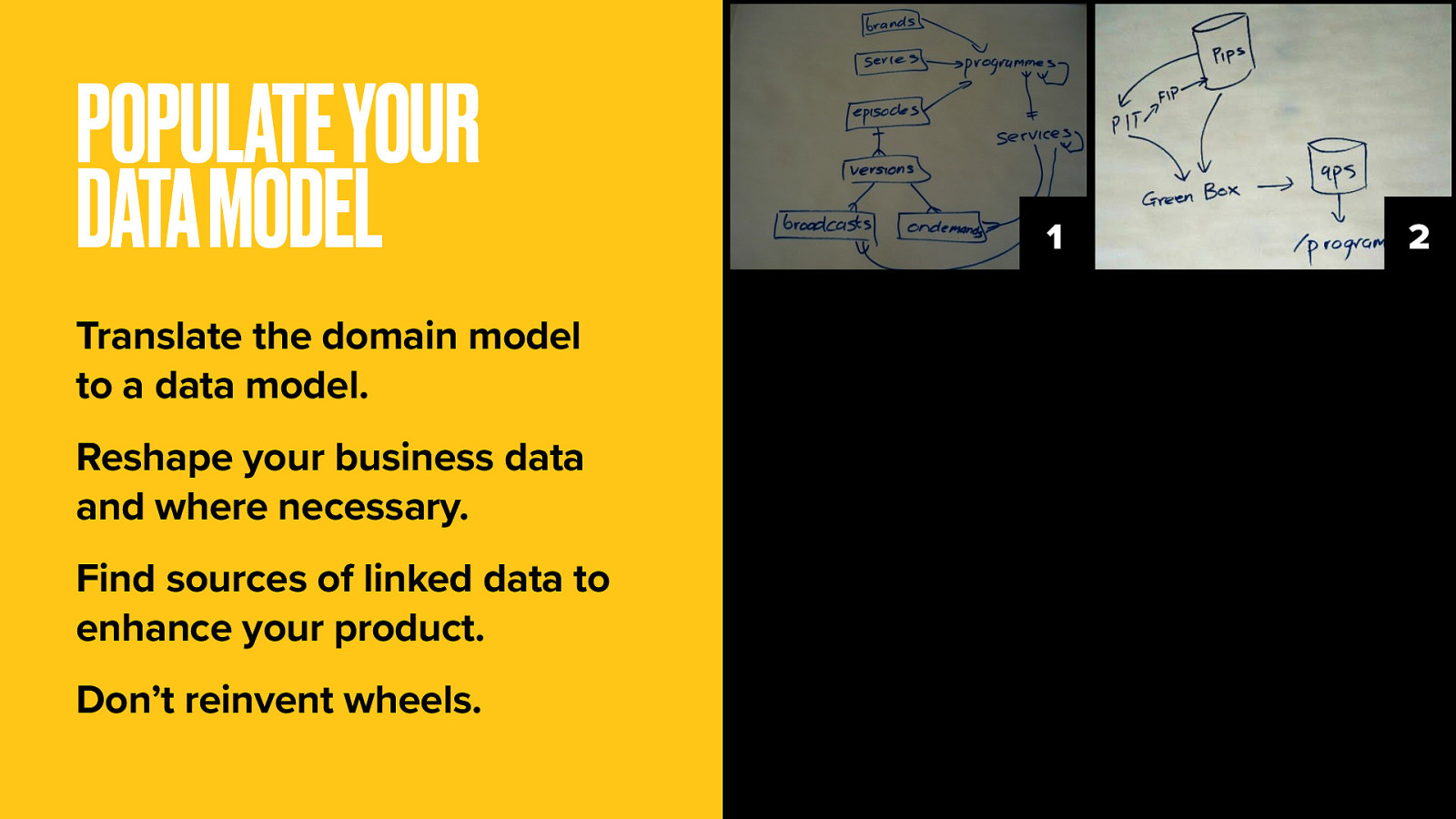
Design URIs for all the individual resources and aggregations you’re going to offer. The URI scheme should follow your domain model, and follow as far as possible principles of persistence, hackability and readability.
Please don’t expose your technology in the URL. It isn’t necessary, it isn’t pretty, and it’s a problem for URI persistence should you change your technology platform down the line.
Maintain a policy of one URI per thing, one thing per URI. Don’t worry about building taxonomic hierarchy into your URLs.
Get extra credit for using web-scale identifiers if possible to make it easier for outside developers to meshup your content. It’s in your interest to give your content as much reach as you can. Make your URIs human-readable if you can but avoid including anything that could change over time.
If content must move, do it nicely. Use 301 redirects for permanent redirection, 302 redirects for temporary redirection.
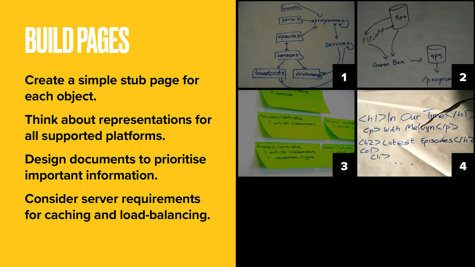
Define all the data you’ll need for all representations, not just HTML. Start with stub pages with H1 titles that represent your domain objects.
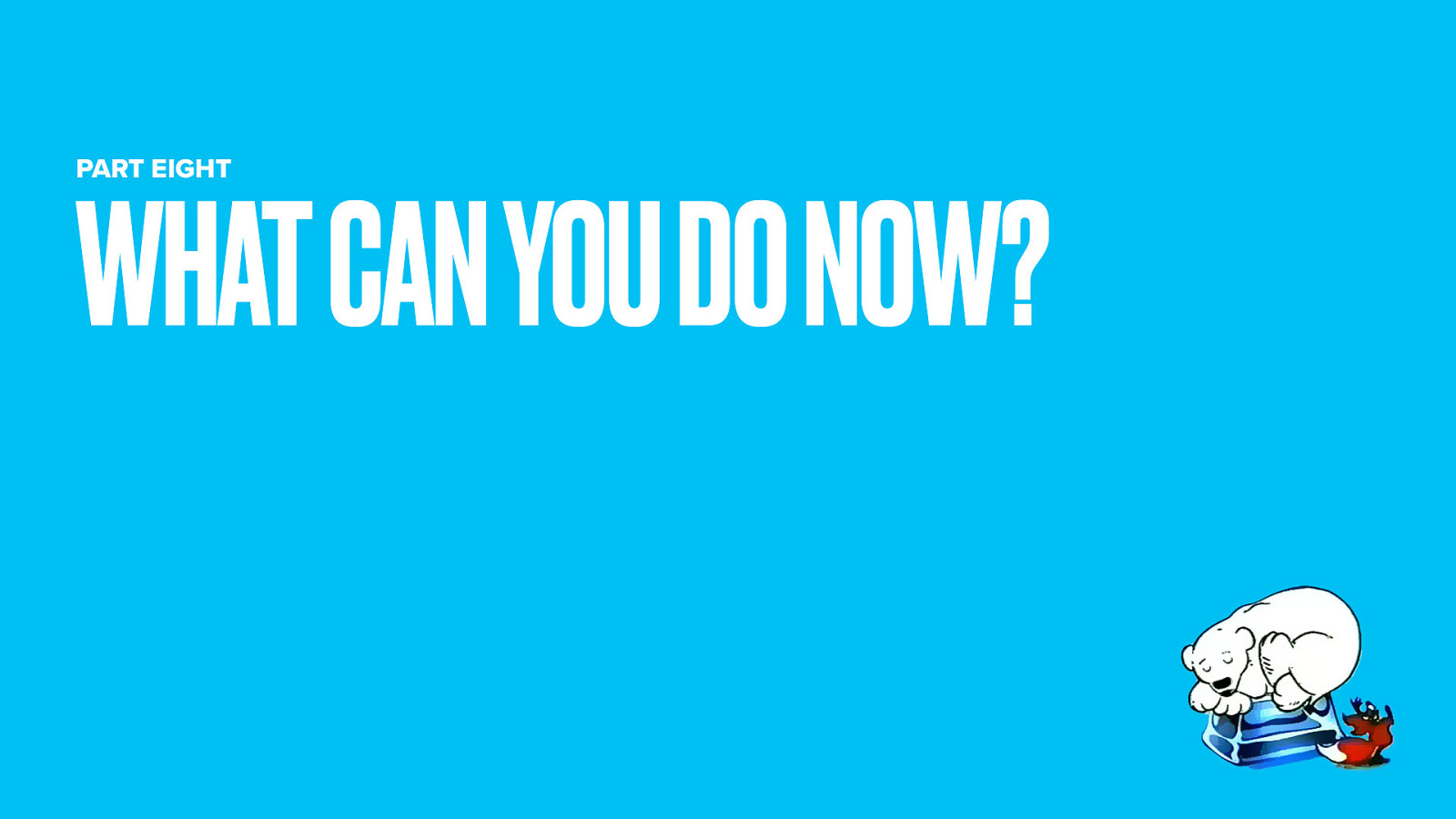
For your HTML pages, think about document design before applying any layout. HTML document design is another one of those often-forgotten parts of user experience. How does your page look with all the stylesheets and Javascript niceties turned off? Is the most pertinent information highest in the document, or are you including a whole bunch of links before getting to the good stuff? It’s not just screen readers that will see it that way, Google will too and mobile browsers may also get a limited rendering.
Speaking of rendering, think about speed. Slow sites equal bad UX, so considering the balance between too much and too little caching really is a UX issue.
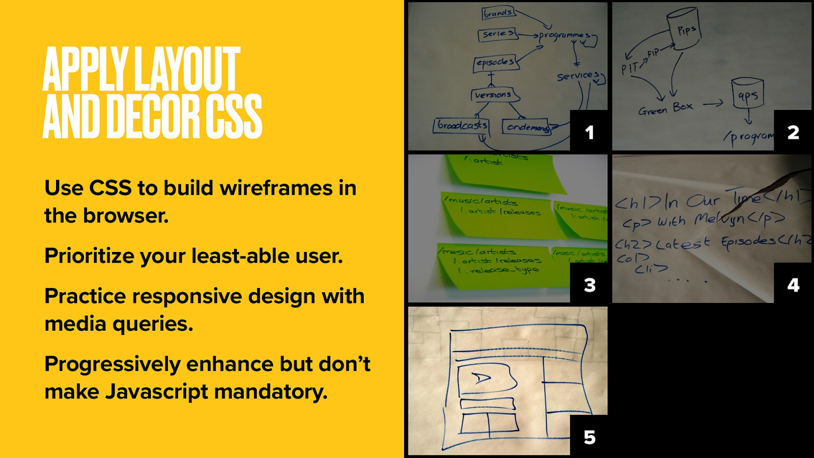
I appeal to you now: take the plunge. Consider leaving behind the Axure and the Omnigraffle and the pages and pages of wireframes.
Think of the power you could wield if you were wireframing directly in the web browser using CSS to draw boxes and a domain model to point the arrows. Layout CSS positions elements on the webpage. Like wireframing, only this time you’re working with live content for a far more realistic experience. It’s bold, I know.
Decor CSS is still probably the domain of your visual design colleagues. It’s where the visual niceties of styling are added. In all of this, design with your least able user or device in mind. Not just the desktop web.
Use a responsive design approach with media queries that govern which elements get displayed and how. Certainly you should progressively enhance with Javascript and AJAX for complex interactions and general wow factor. But never require those things for your site to work.
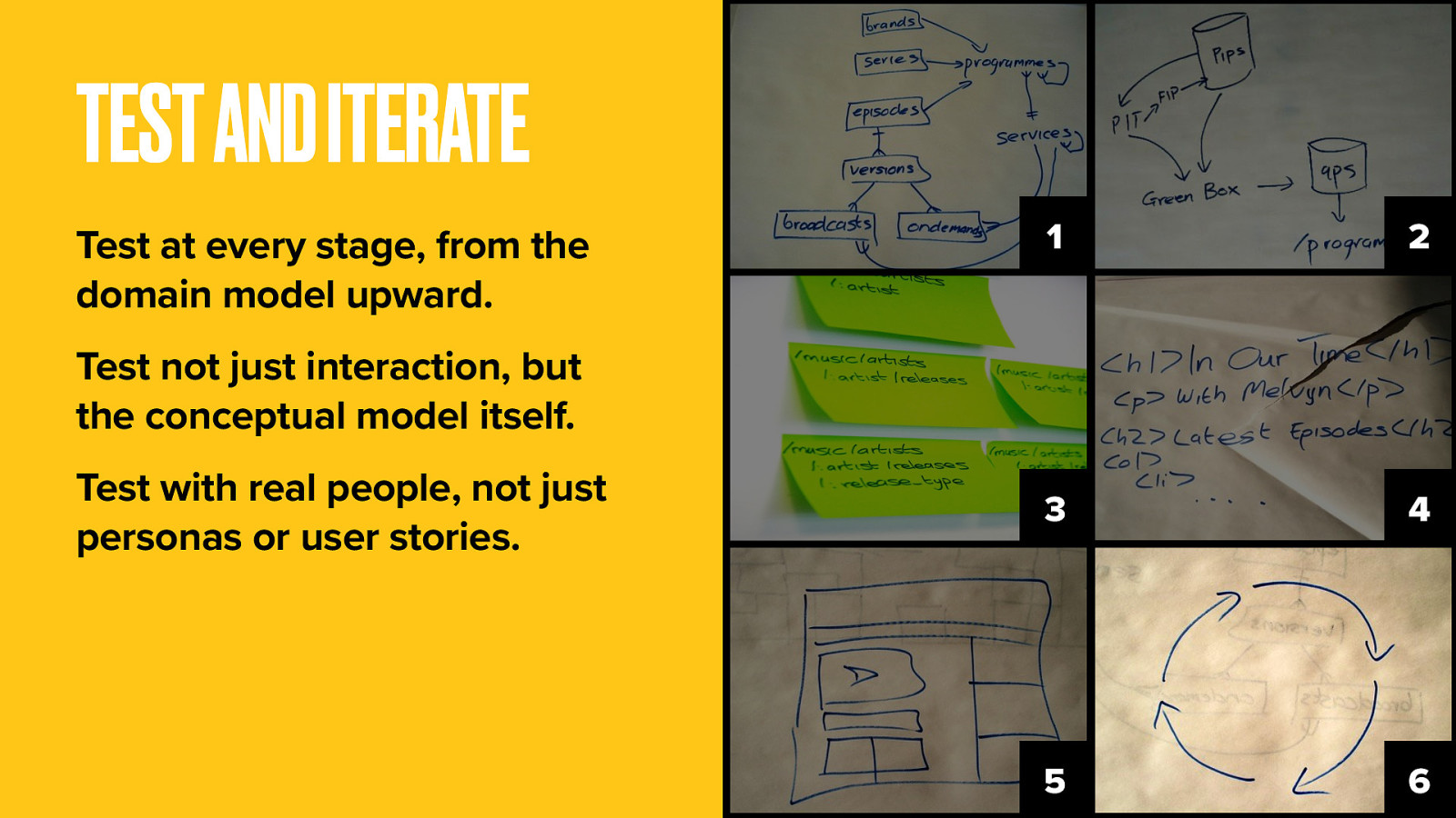
Actually you should be doing this at every step. This whole approach is about getting to real code, real data, real content and real users as soon as you can.
Test understanding of the conceptual model, not just of the interaction. The advantage over top-down design is that your product is far more malleable and able to adapt to new requirements. You haven’t painted yourself into any corners. For every development cycle, test and iterate again.
We’re almost done. But here’s few things we learned along the way.
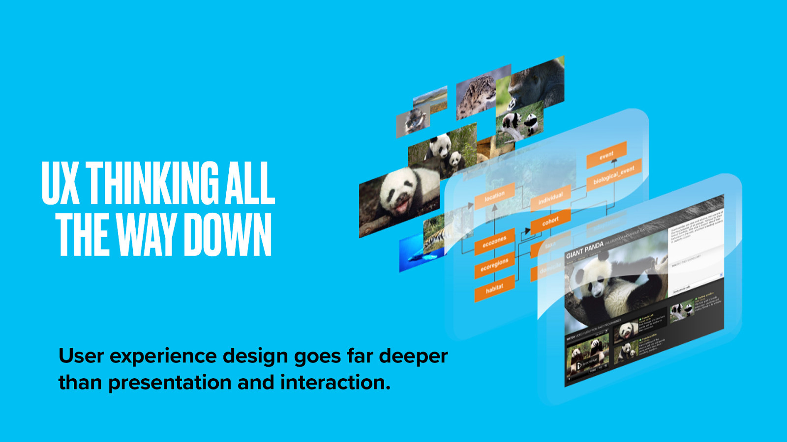
User experience goes far deeper than presentation. It reaches down through all the layers of this software trifle. You have responsibility to get your hands dirty throughout.
Business logic, SEO, pointability, document design, URI design, even server load and caching. All these things have a profound effect on the experience your users will have when interacting with your content. All of them are facets of information architecture.
The approach practiced at the BBC puts IA at the heart of an end-to-end service design, not just interaction or presentation. With great power comes great responsibility.
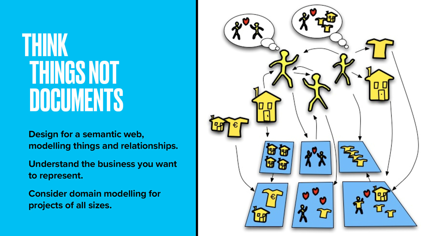
Think about your content in terms of things, not documents. Standards exist to allow you to add semantic meaning, allowing you to model complexities in knowledge and make links between things represent a specific (and machine-readable) relationship.
Adding semantics involves two things: allowing documents to contain machine-readable information, and allowing links to be created with relationship values.
When computers can read our stuff properly, we can use them to do the heavy-lifting we’d otherwise do by hand, Like saying, “Show me all the Blu-ray players under $70 from suppliers who offer overnight shipping” or “Where in Denver can I get a hair appointment for 3pm tomorrow?” All those things could be built fairly trivially today if only the suppliers would publish data in the right format.
Understand the business you represent. Know what’s most important to experts and casual users. This process can work for projects large and small. How about your local restaurant What would diners care about? Dishes? Cuisines? Local producers? Paired wines? How do these things connect?
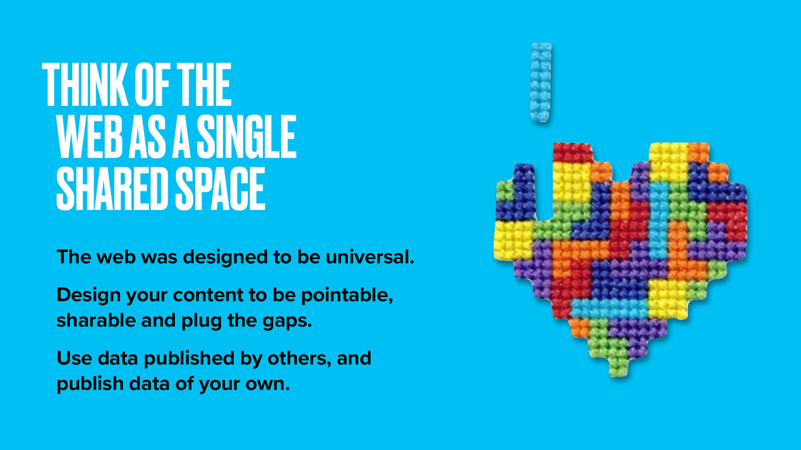
Think about the web as a whole and how your contribution can make it a better place. The World Wide Web didn’t evolve by chance. It was designed as a universal space.
We are supposed to use this space to share information. Not to build ourselves ivory towers. Make your stuff easy to point at and easy to share. Convince your bosses of the value of increased reach. Design using web-scale identifiers where you can. And reap the benefits of shared information–enhance your own content with linked open data. DBpedia is a great place to start. It’s an open database with all the information from Wikipedia and is free to use.
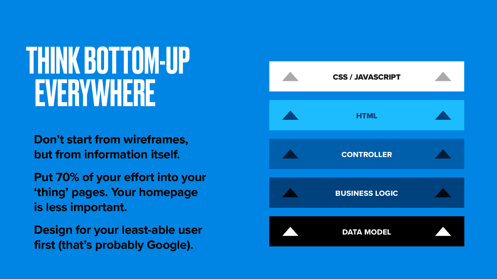
Don’t begin your design process by thinking about web page wireframes. Design from the data upwards. Put most effort into core content pages, rather than the home page. Most traffic will be from deep links into your content. Google is your front door.
Design for your least-able user first. Not just screen-readers, but API and search bots. Mobile users too. Mobile traffic to the BBC Food site is up 20% from last year. Be future-friendly and maximise reach.
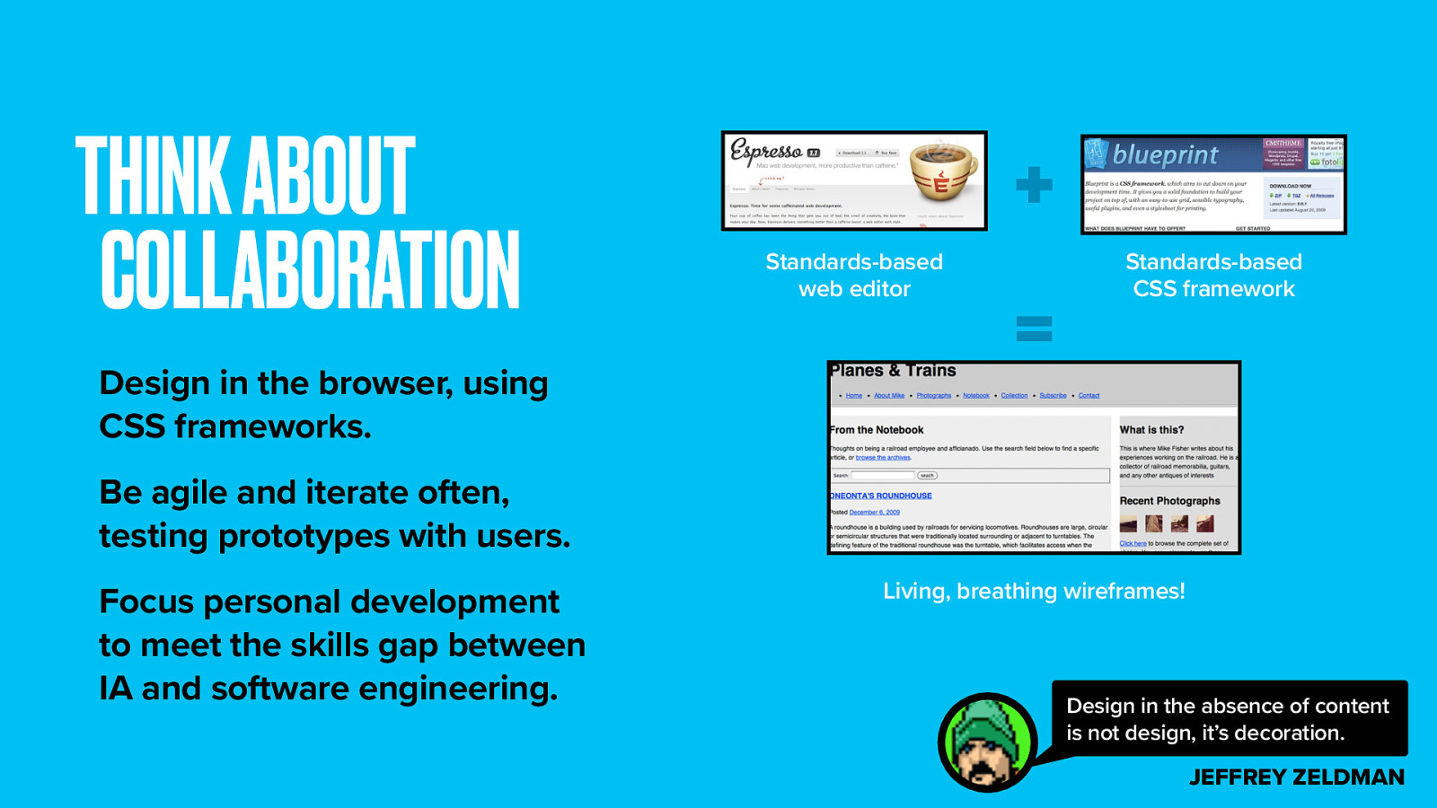
Make friends with a software engineer. In the advertising industry, great work is done by pairing and art director with a copywriter. Just think what a dynamic duo an IA and a coder could be. Be agile and iterate often.
Prototypes are more effective when they’re powered by real data, real code, so they can be put in front of real users, real fast. Doing it for real isn’t really more expensive than creating tons of UX documentation but it does takes some new skills. That investment is far outweighed by the benefits.
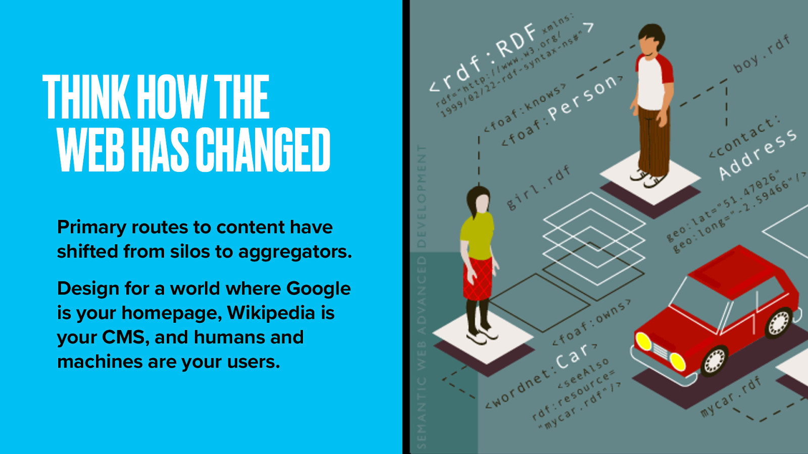
More than anything, accept that the web has changed. Our practice must change with it.
Today the public at large architect information through bookmarking, tagging and socially curating content. Half of all social media traffic to websites comes from Facebook. Can people easily point to your content from there? The polar bear asks ‘Does your site need search?’. The BBC has a site search, yet 70% of traffic to Food is coming from Google. So probably not, because Google is your search. Hell, Google is pretty much your information architecture.
We still need to create the shortest route to content and make it easier for people to find what they’re looking for. We still classify information.
But using taxonomic library science to build a series of private libraries limits us. Access to information is perhaps more ubiquitous and fractured than ever before. Consider the whole web as your canvas, and make your content mesh seamlessly into it.
We have the power to tame the roots and branches of knowledge itself. There are rich social graphs to mine, appetites for infographics and data journalism, growing repositories of free data to exploit.
Design for a world where Google is your homepage, Wikipedia is your CMS, and humans and machines are your users.
