A presentation at Frontend NE in in Newcastle upon Tyne, UK by Niels Leenheer
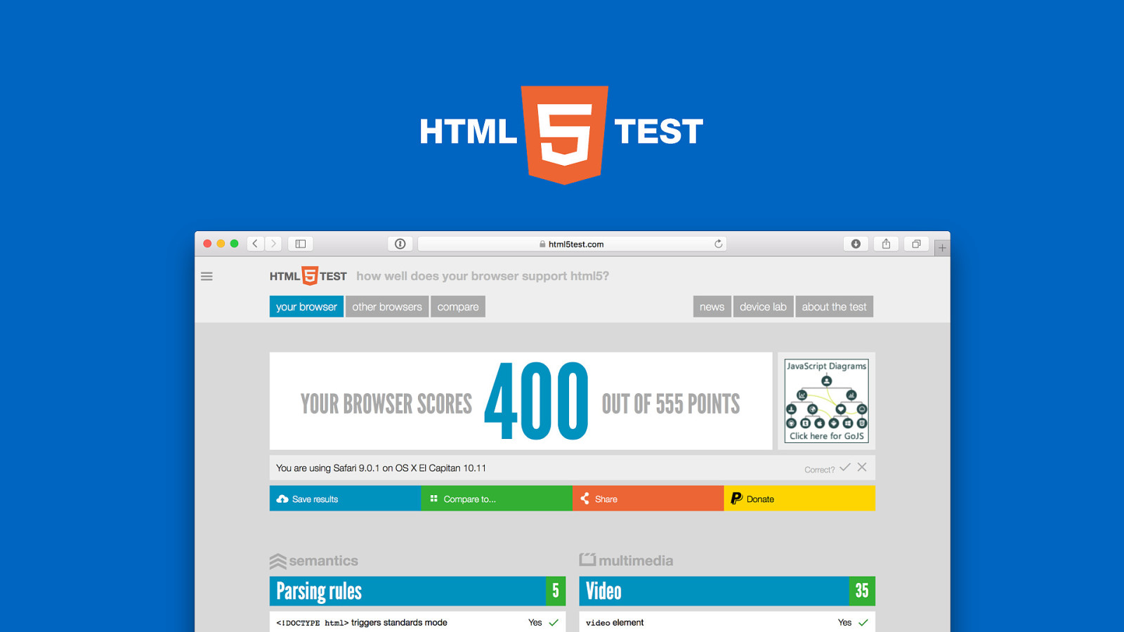
?weird browsers? frontend ne — march 3rd 2016 @html5test
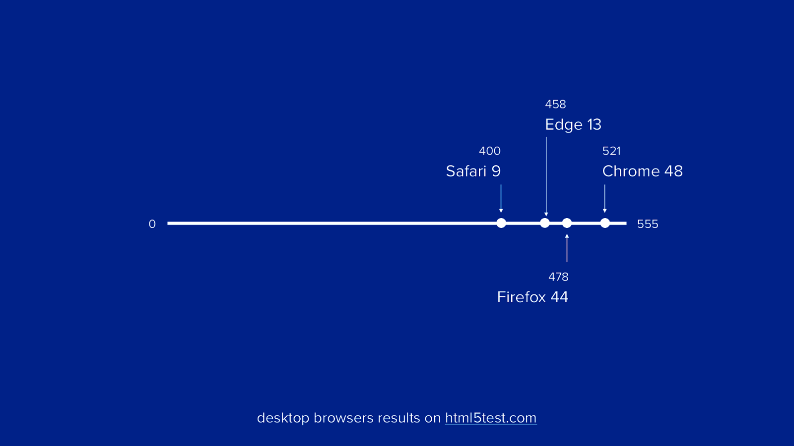
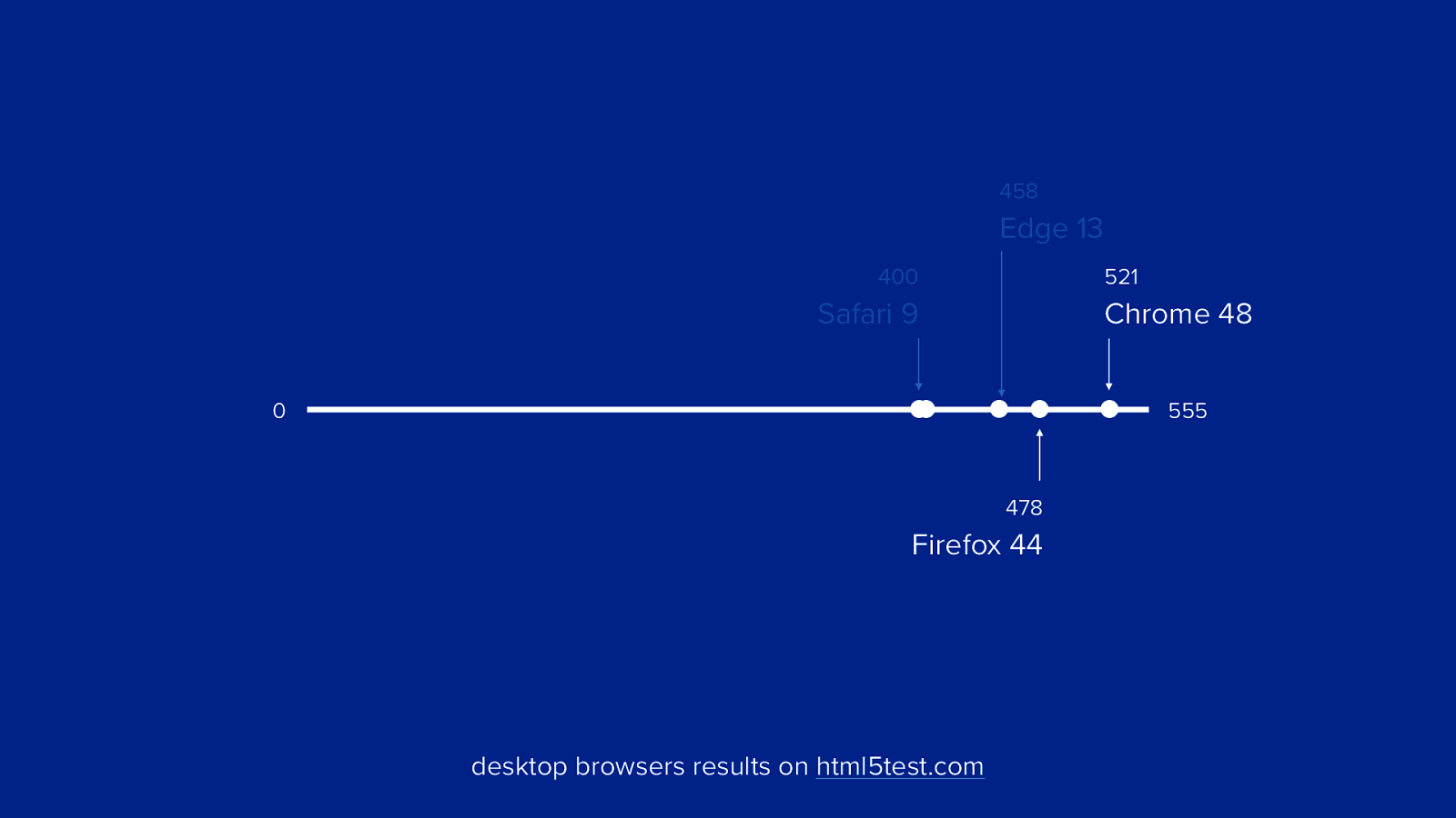
458 Edge 13 400 521 Safari 9 Chrome 48 0 555 478 Firefox 44 desktop browsers results on html5test.com
458 Edge 13 400 521 Safari 9 Chrome 48 0 555 478 Firefox 44 desktop browsers results on html5test.com
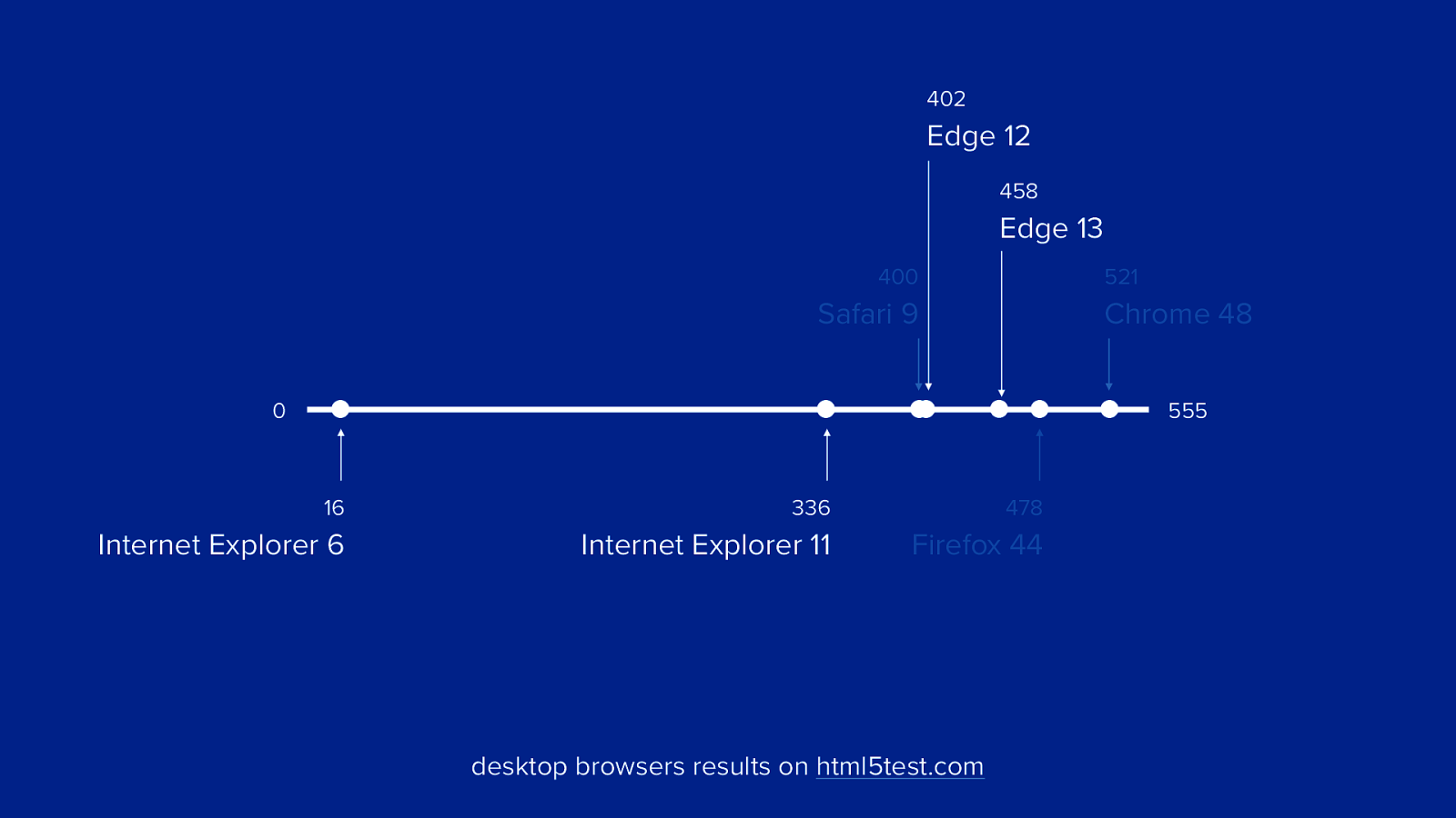
402 Edge 12 458 Edge 13 400 521 Safari 9 Chrome 48 0 555 16 336 478 Internet Explorer 6 Internet Explorer 11 Firefox 44 desktop browsers results on html5test.com
?weird browsers?
?weird browsers?
?weird browsers?
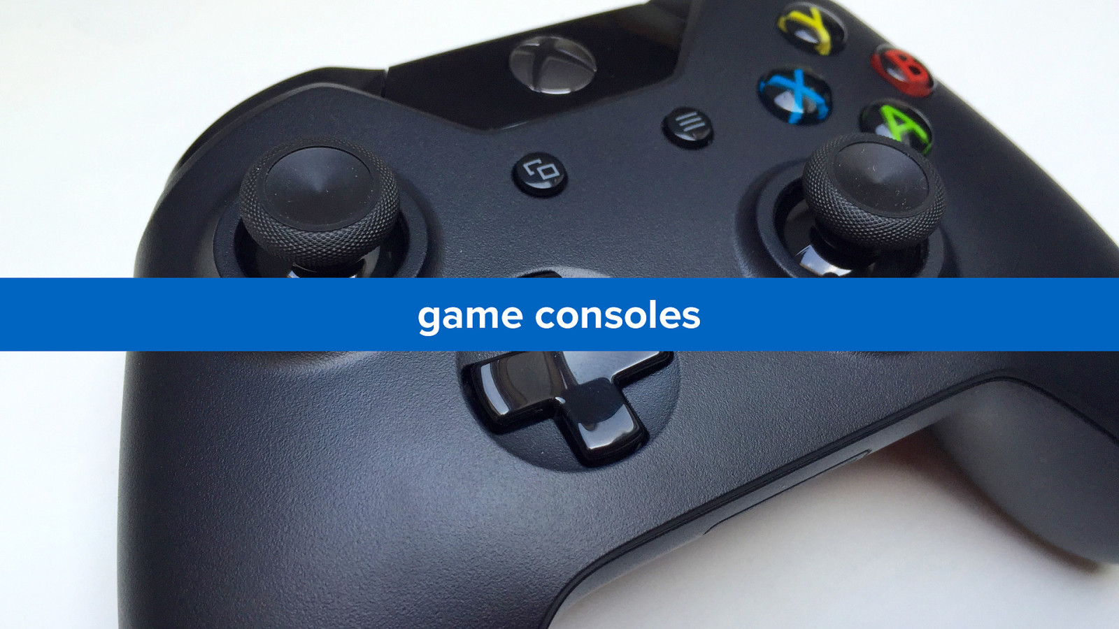
game consoles
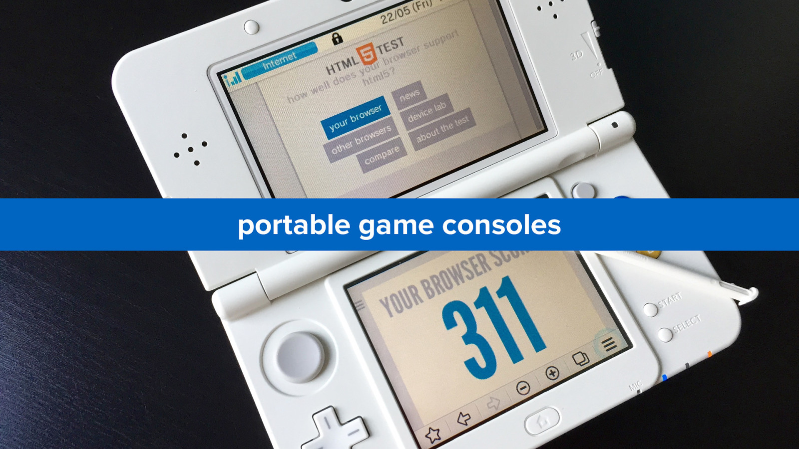
portable game consoles
smart tvs
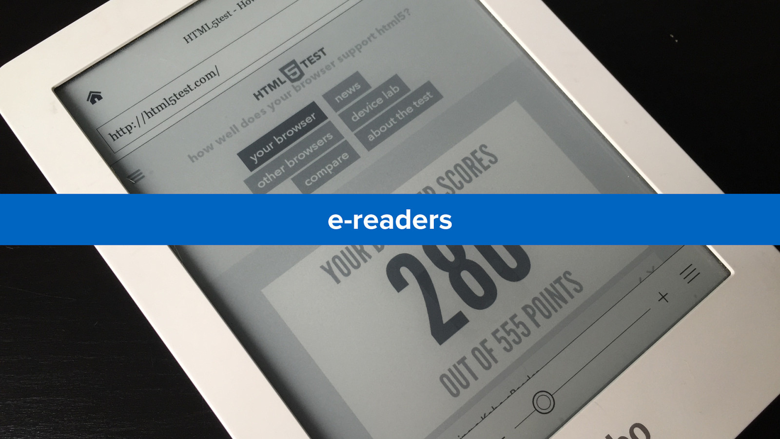
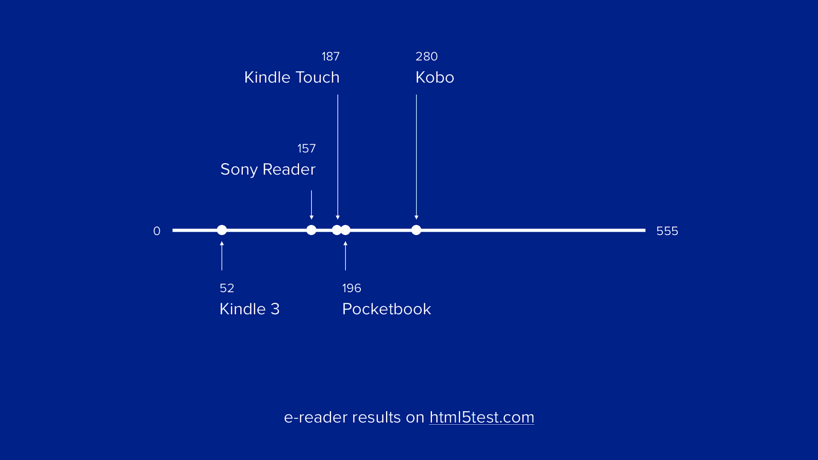
e-readers
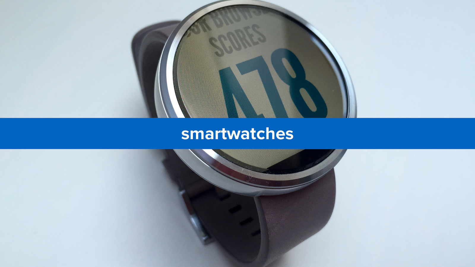
smartwatches
photo cameras
Andre Jay Meissner cars
smart tvs, set-top boxes and consoles
“big screen browsers”
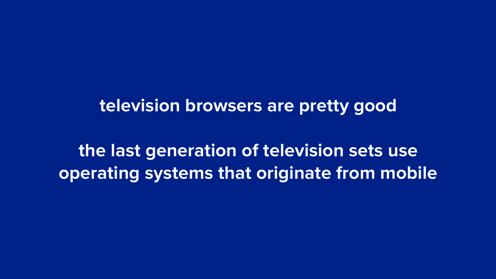
television browsers are pretty good the last generation of television sets use operating systems that originate from mobile
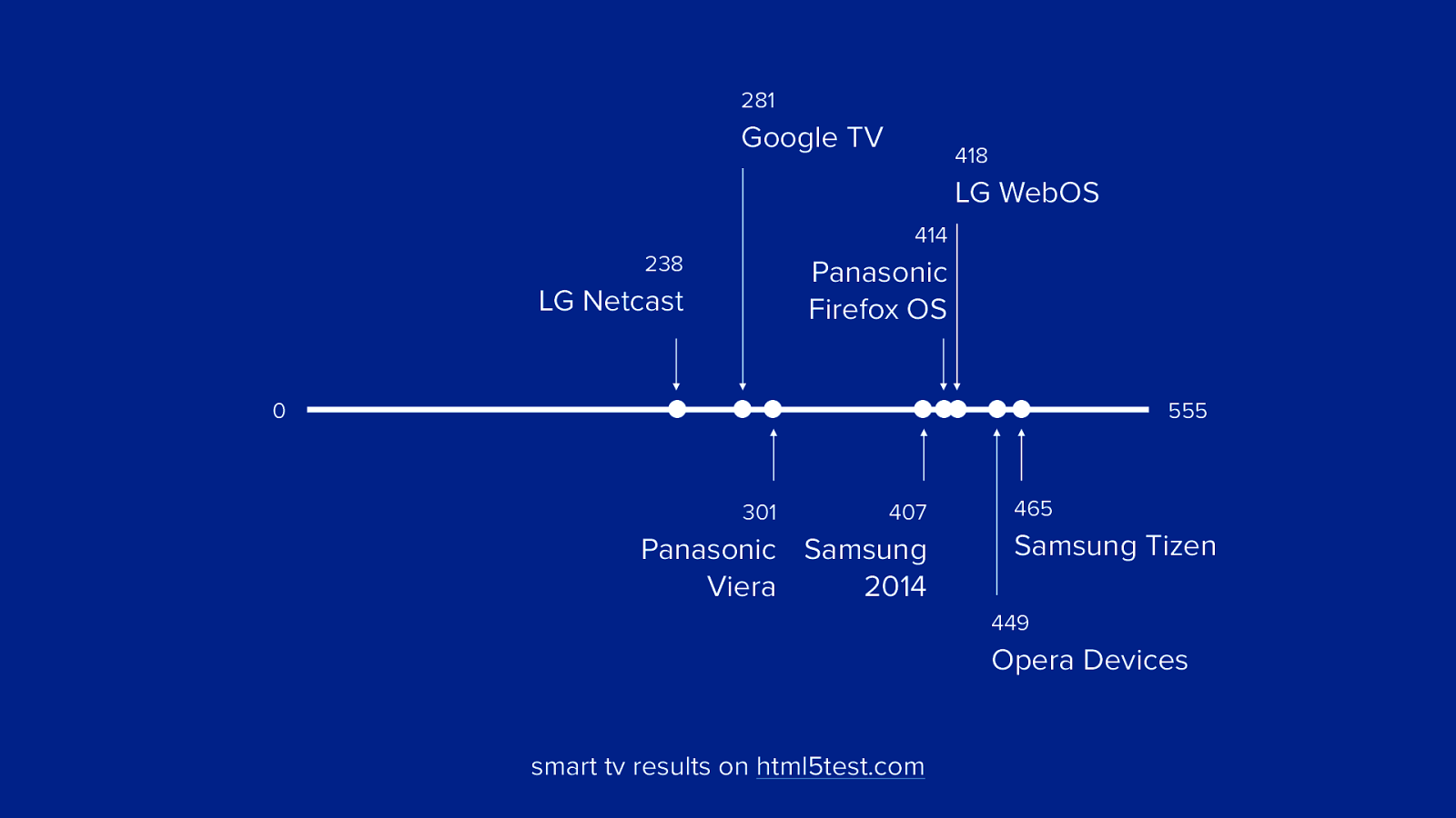
281 Google TV 418 LG WebOS 414 238 Panasonic Firefox OS LG Netcast 0 555 301 407 Panasonic Samsung Viera 2014 465 Samsung Tizen 449 Opera Devices smart tv results on html5test.com
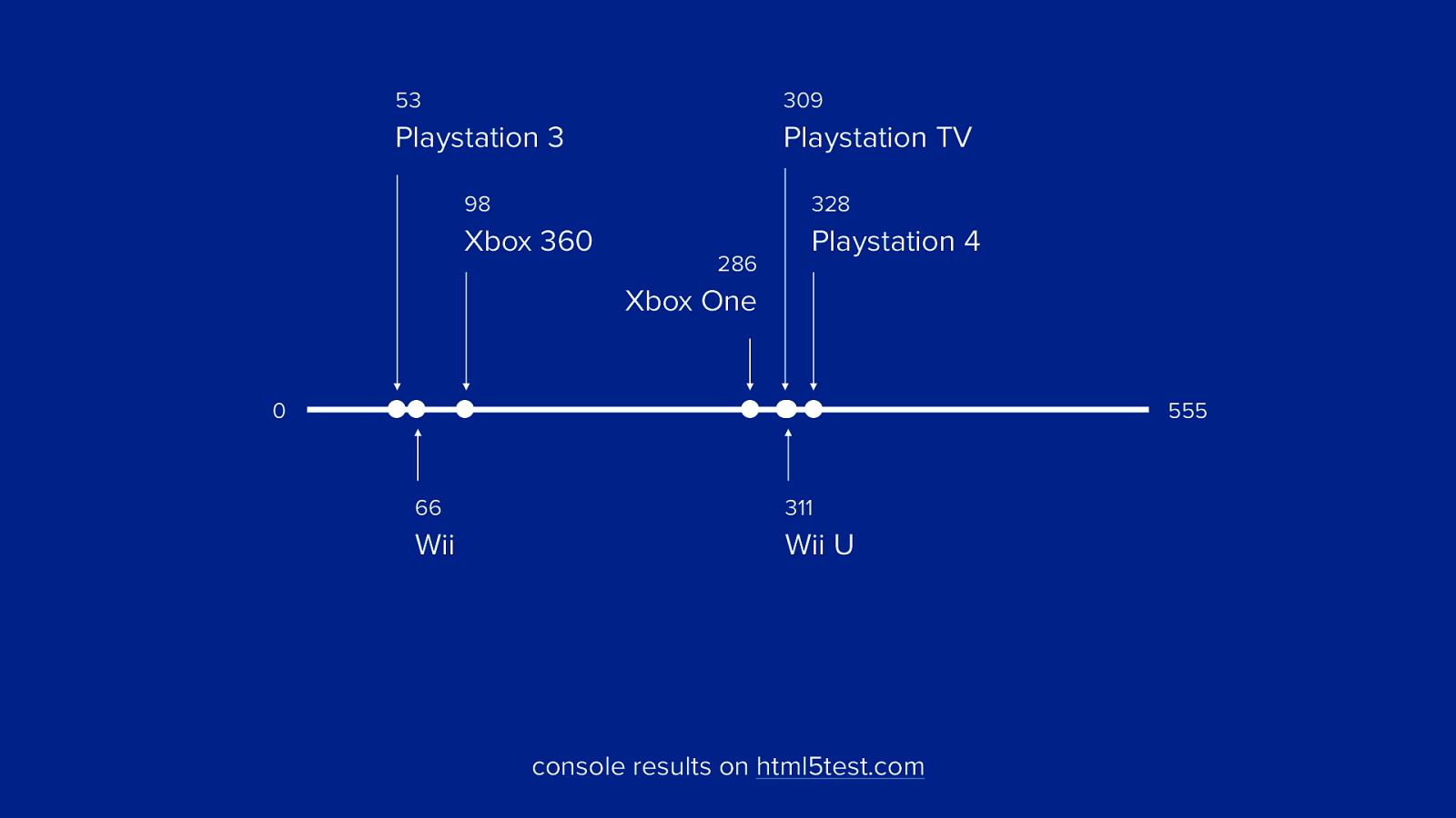
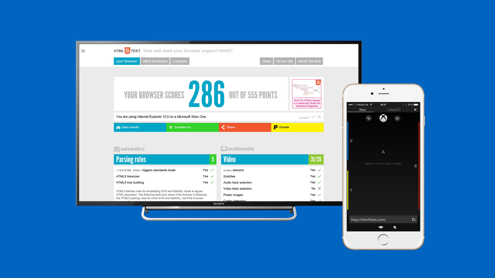
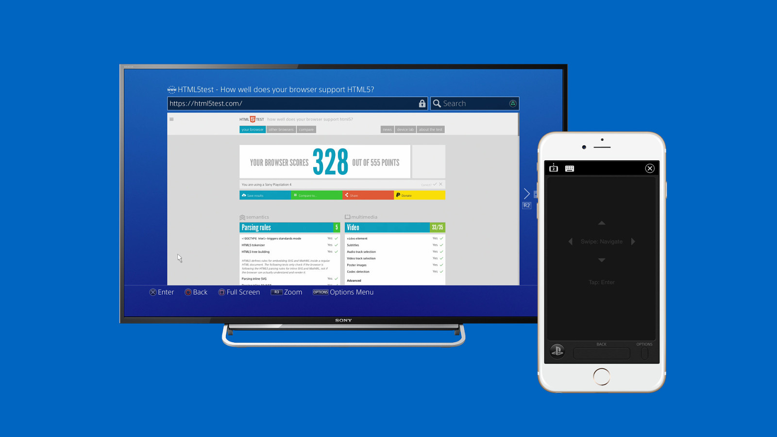
53 309 Playstation 3 Playstation TV 98 328 Xbox 360 Playstation 4 286 Xbox One 0 555 66 311 Wii Wii U console results on html5test.com
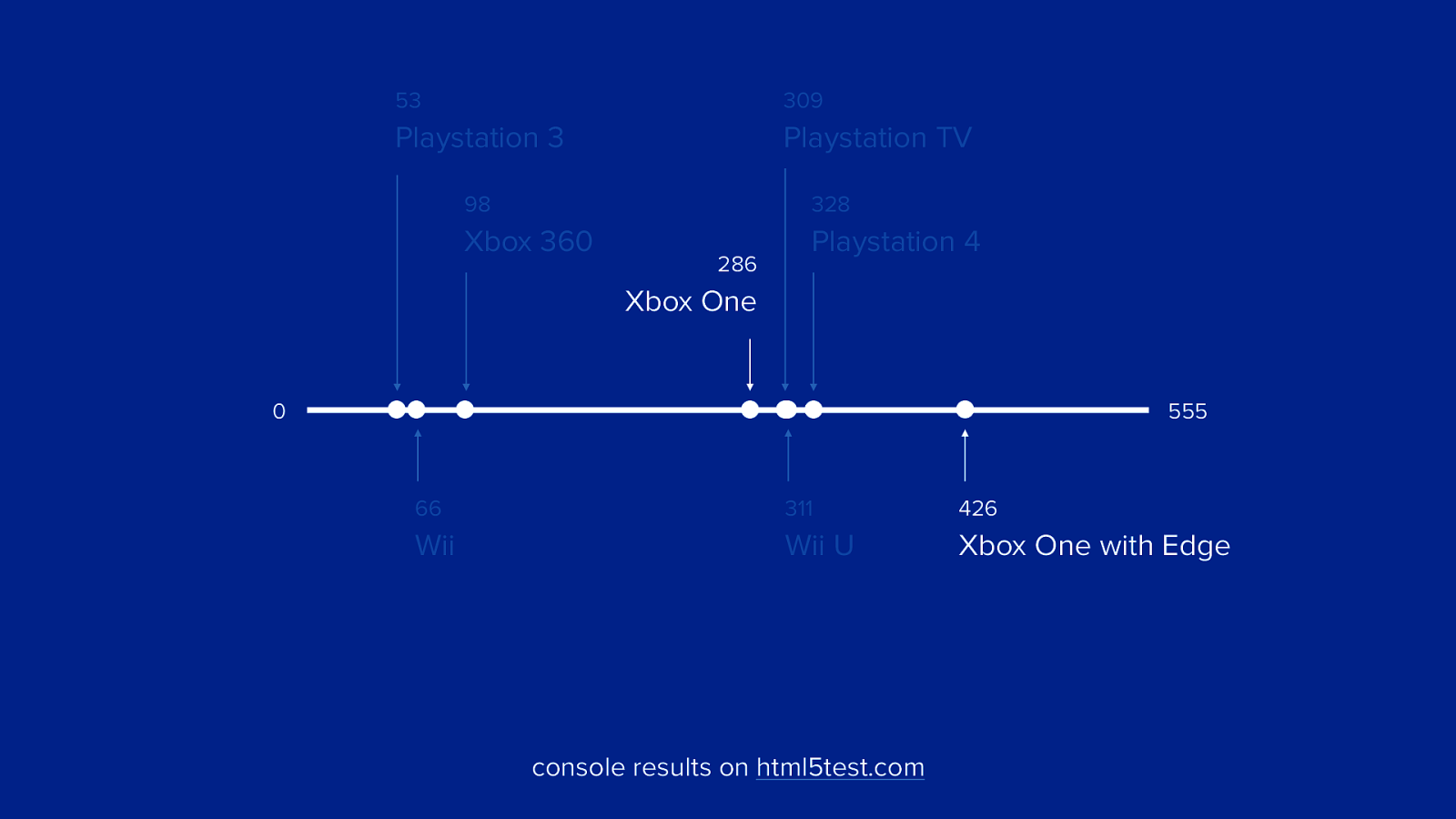
53 309 Playstation 3 Playstation TV 98 328 Xbox 360 Playstation 4 286 Xbox One 0 555 66 311 426 Wii Wii U Xbox One with Edge console results on html5test.com
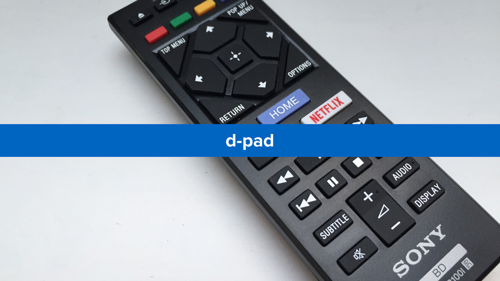
1 control
the biggest challenge of of television browsers
navigation (without mouse or touchscreen)
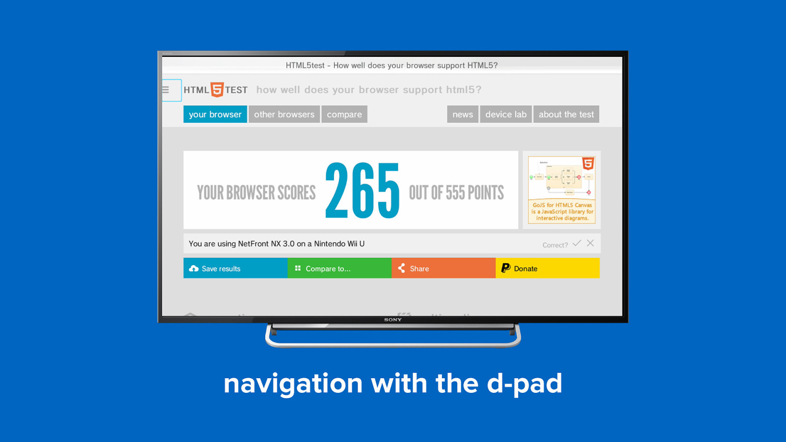
d-pad
navigation with the d-pad
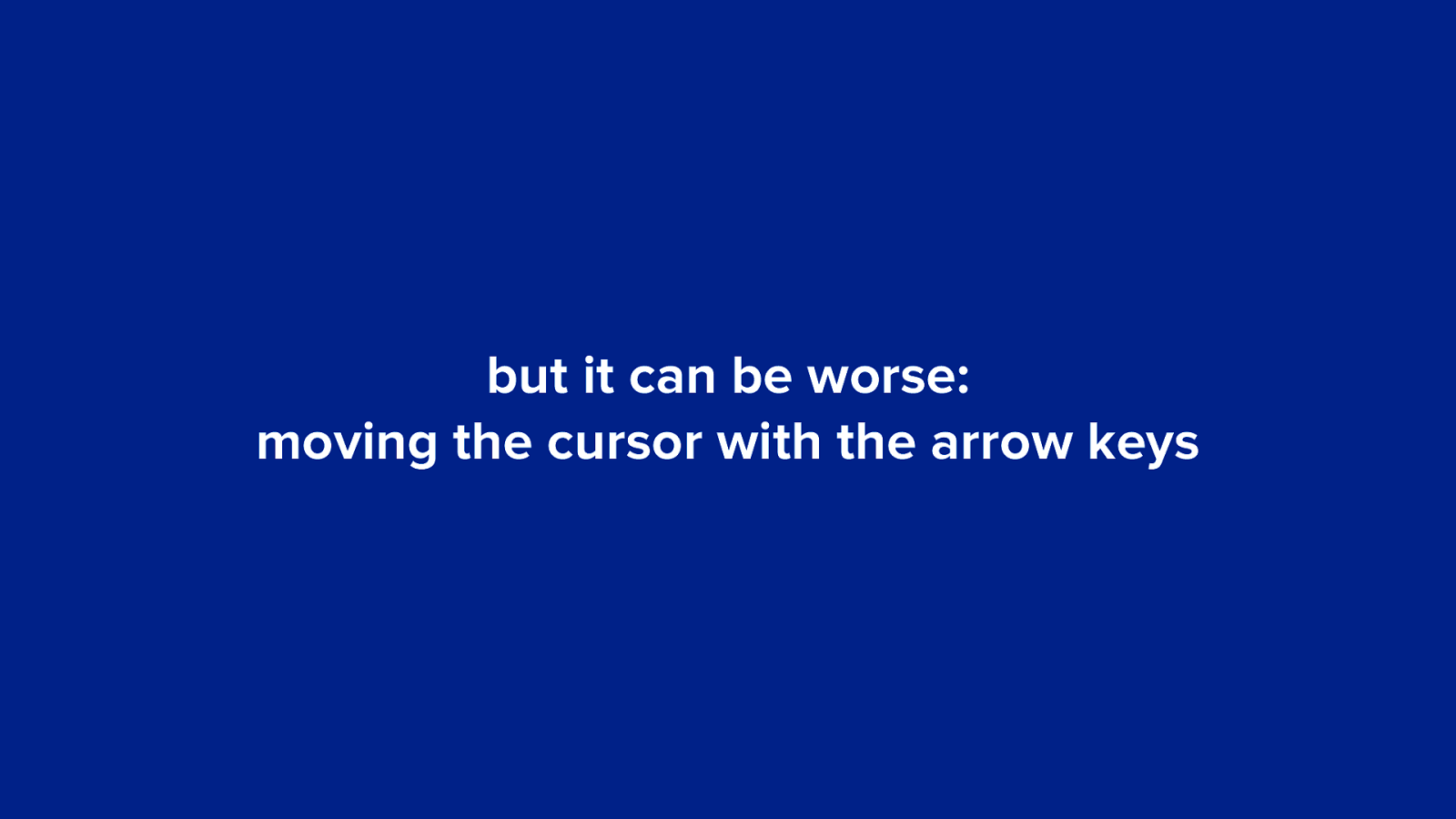
but it can be worse: moving the cursor with the arrow keys
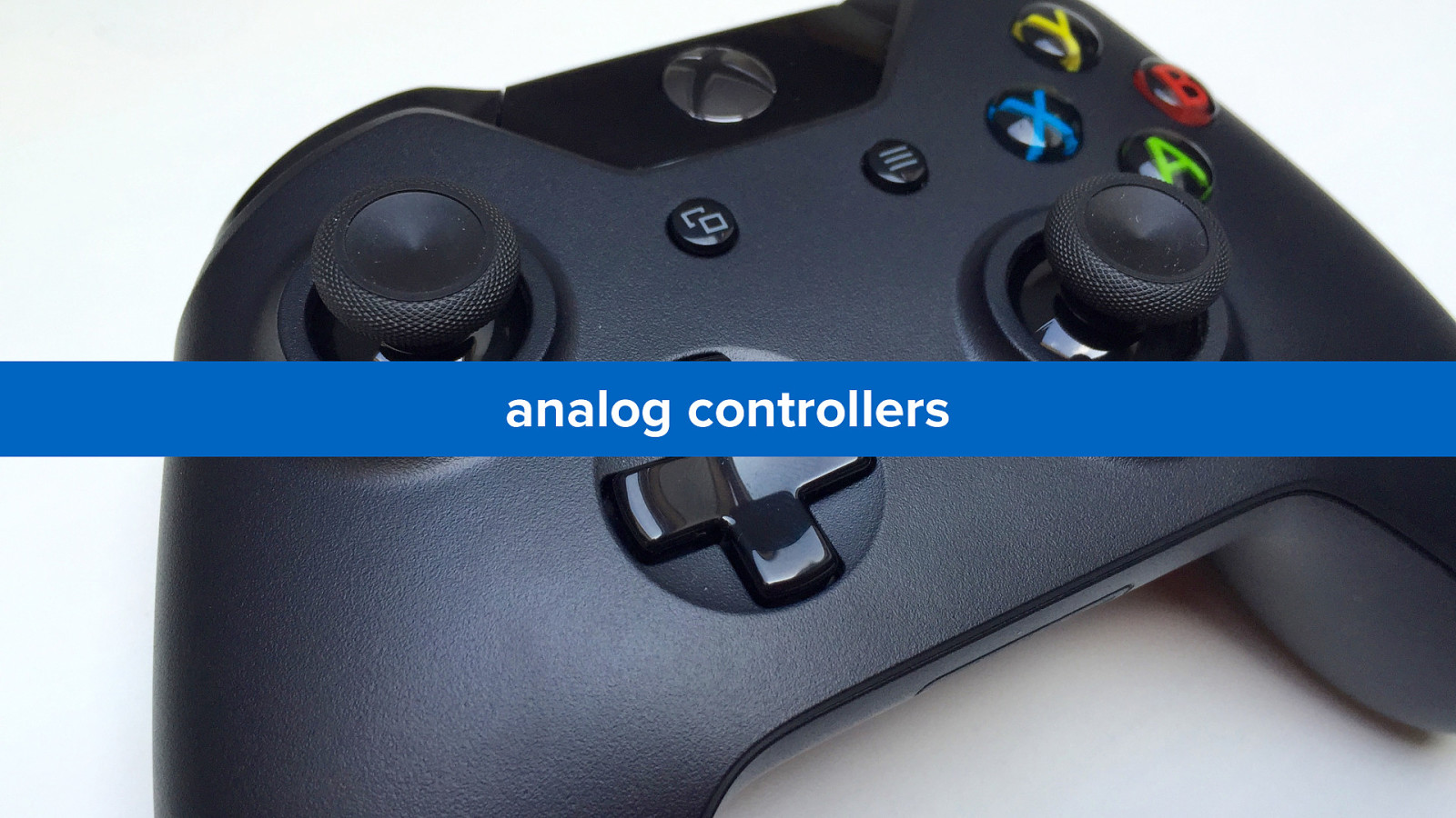
alternatives
analog controllers
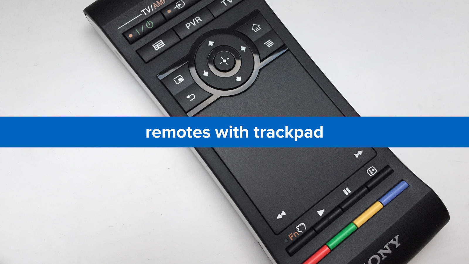
remotes with trackpad
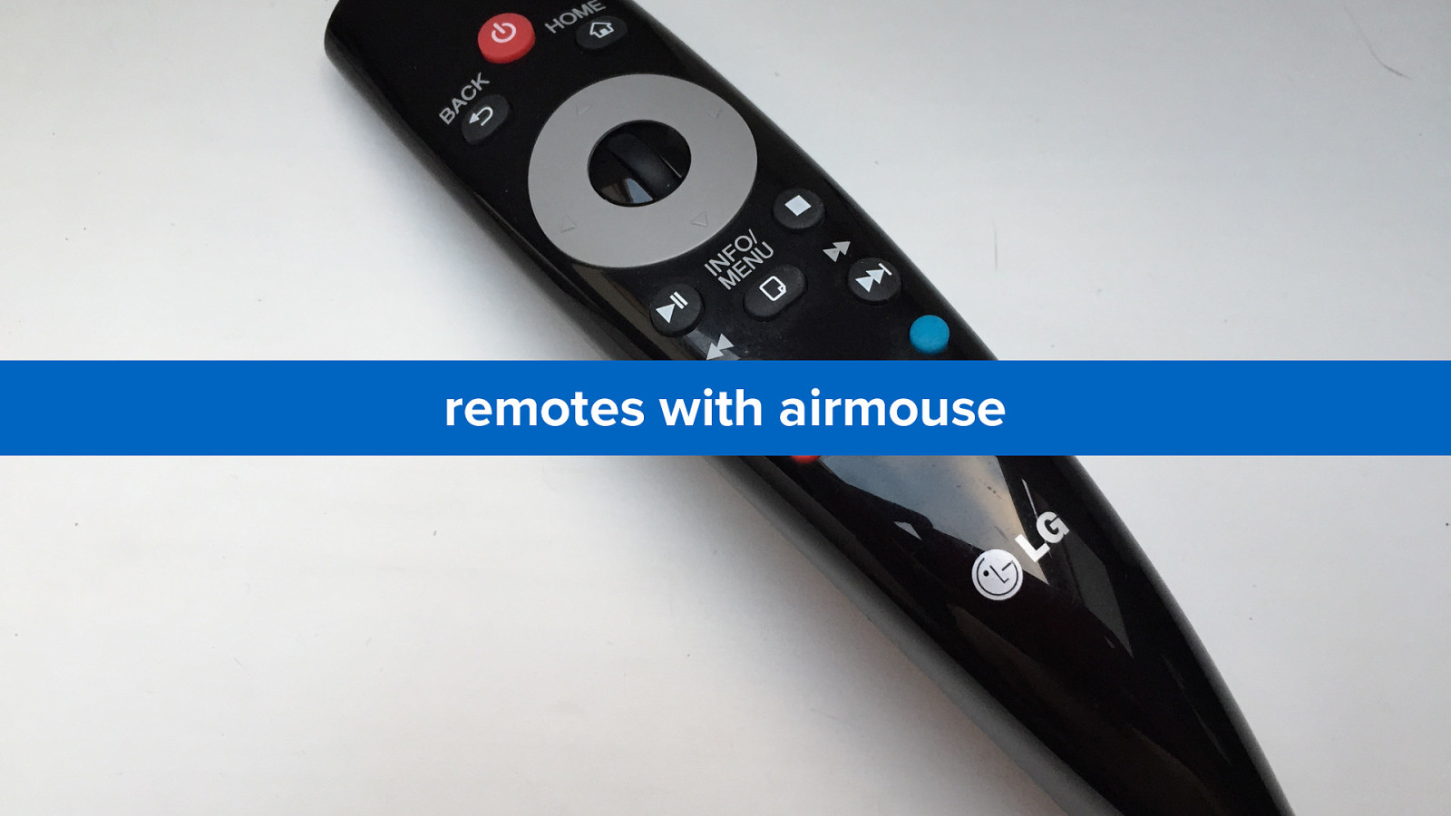
remotes with airmouse
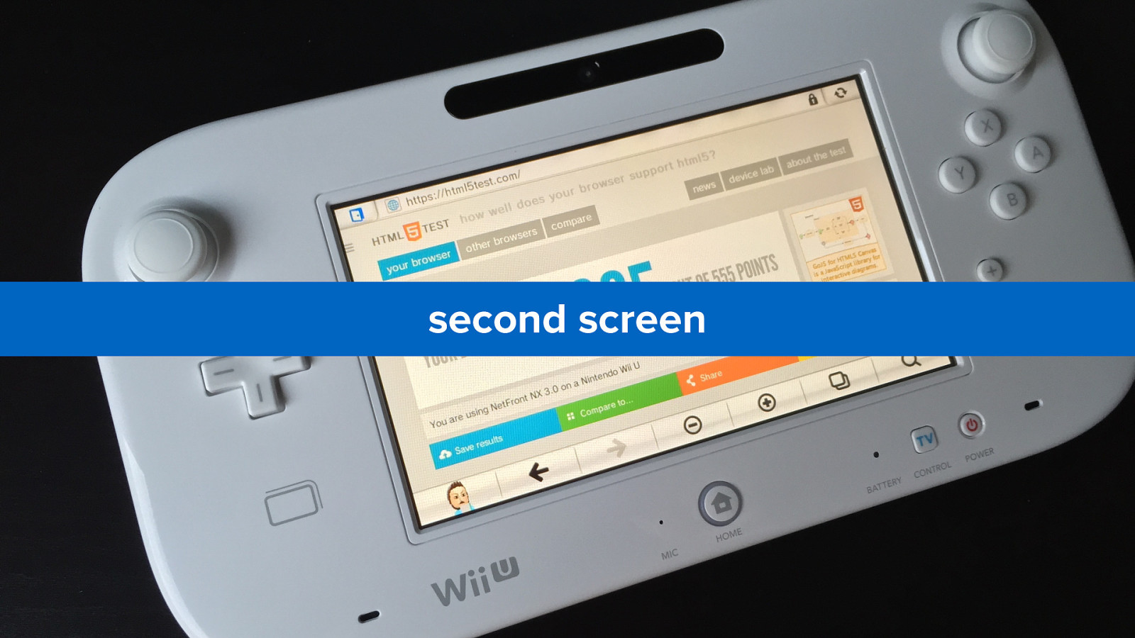
second screen
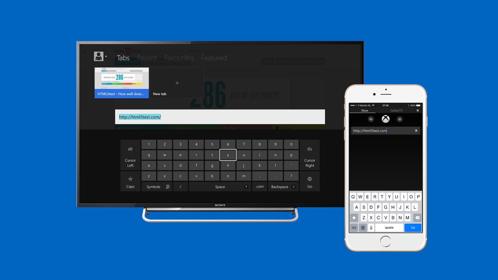
many manufacturers also create apps for controlling the smart tv, console or set-top box
text input (without keyboard)
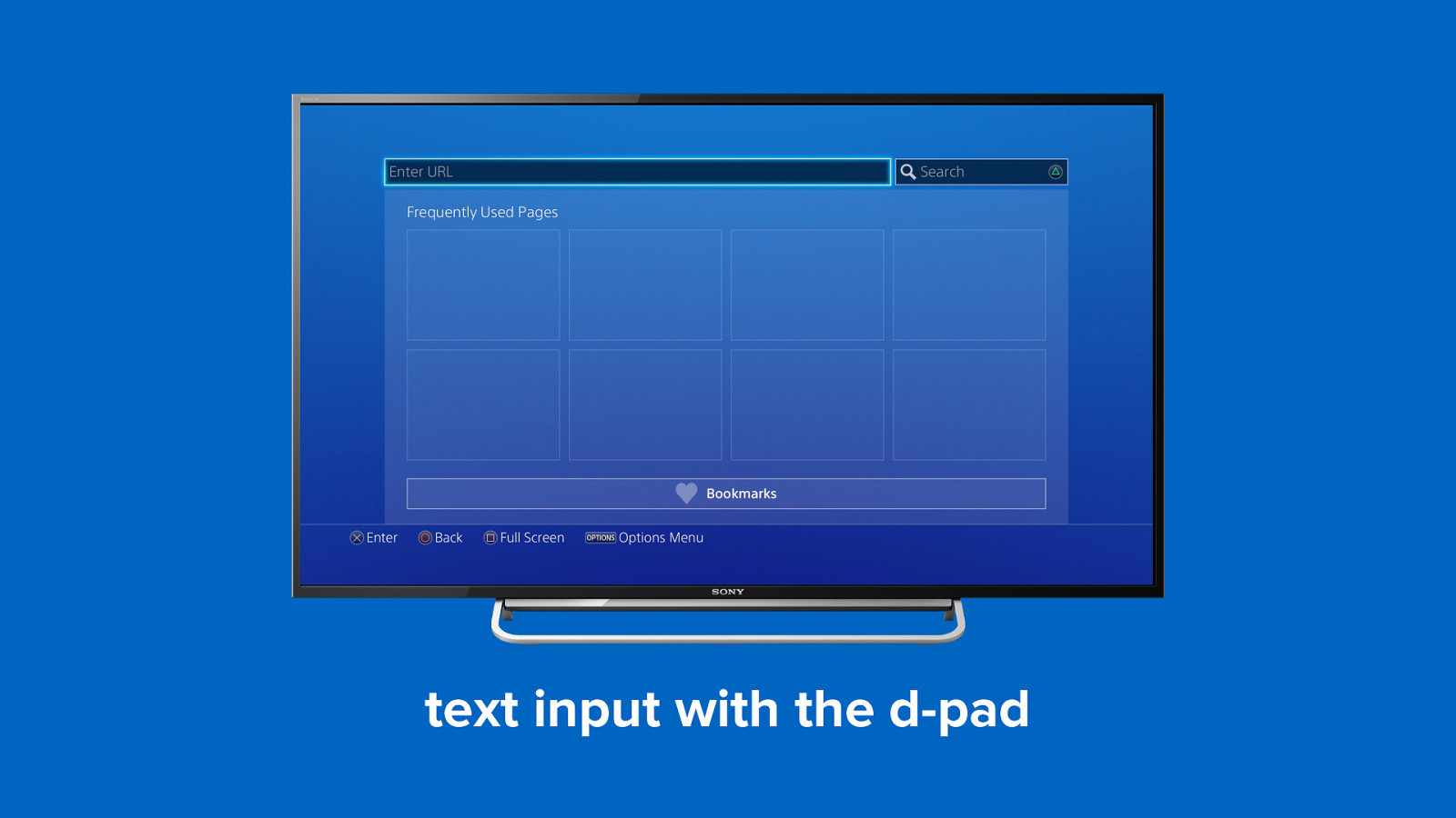
d-pads
text input with the d-pad
alternatives
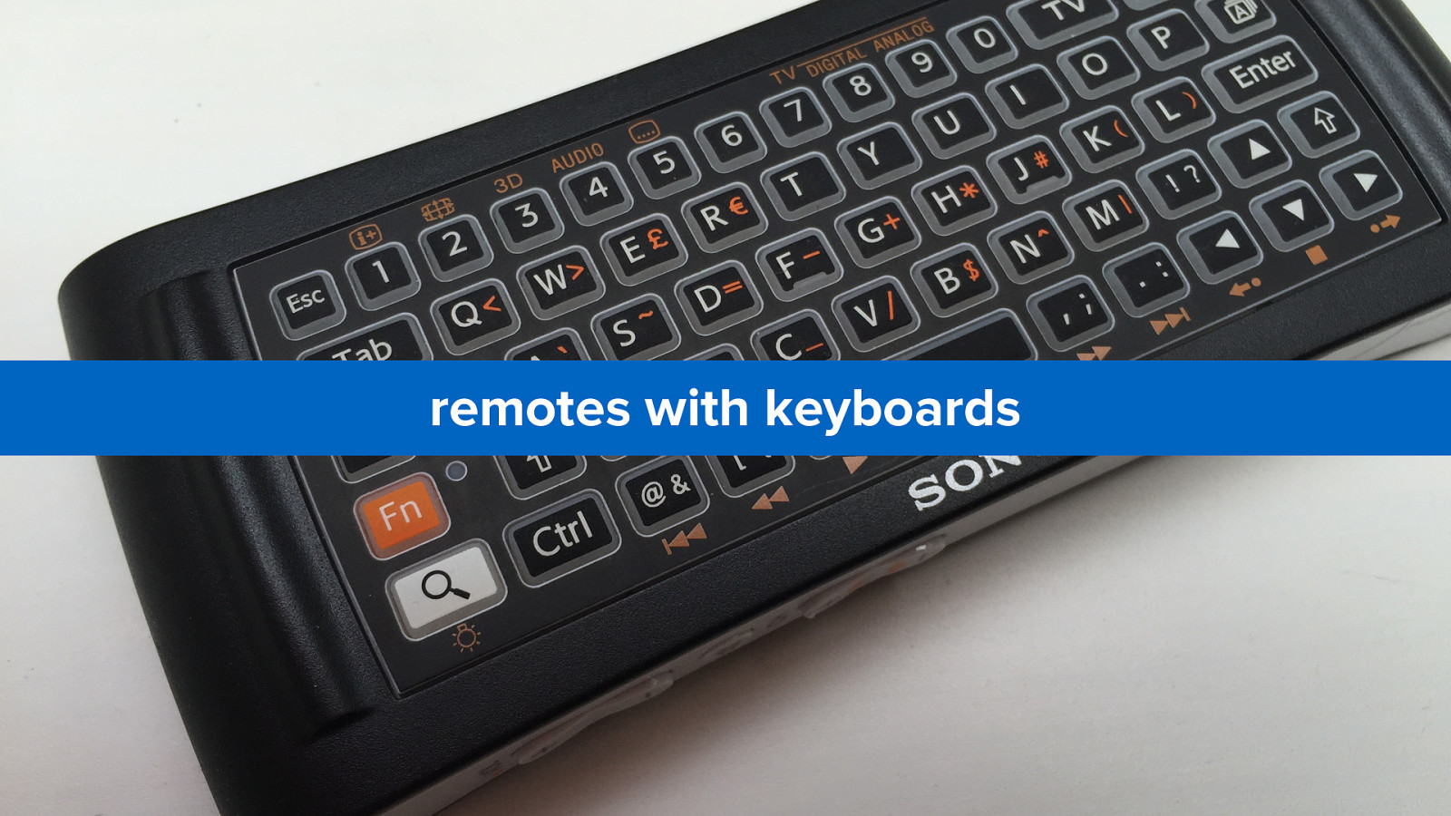
remotes with keyboards
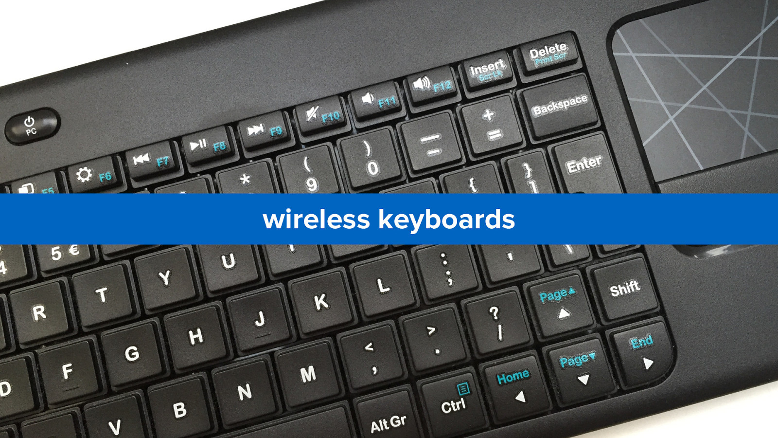
wireless keyboards
and apps
gesture control (throw your hands up in the air, and wave ’em like you just don’t care)
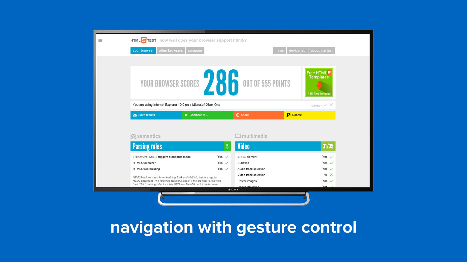
navigation with gesture control
can we control these input methods directly from javascript?
the d-pad maybe
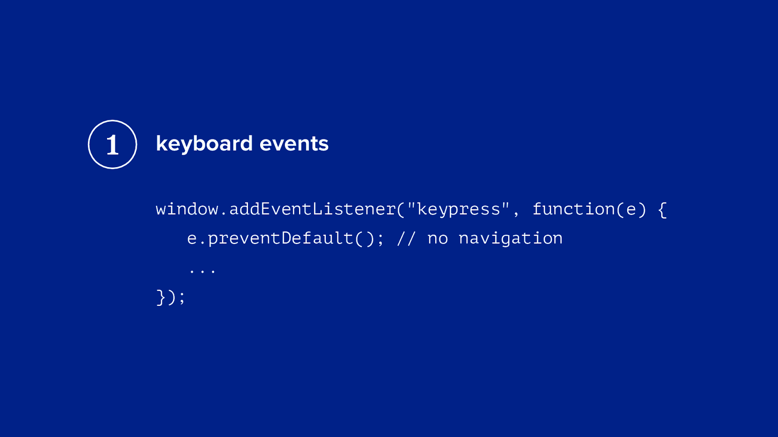
1 keyboard events window.addEventListener("keypress", function(e) { e.preventDefault(); // no navigation ... });
the gamepad maybe
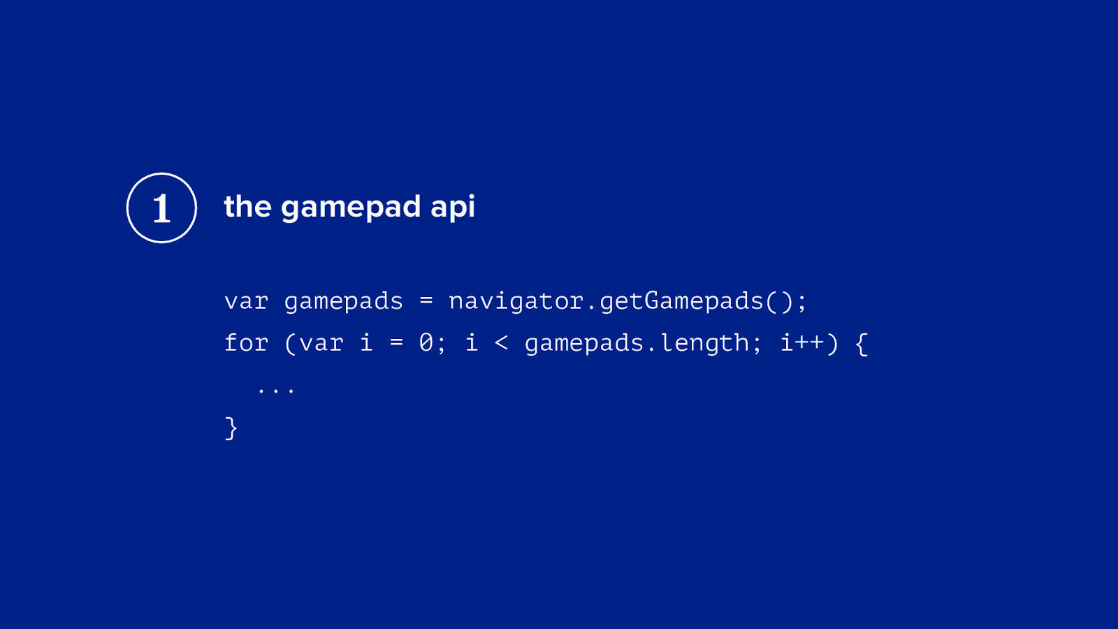
1 the gamepad api var gamepads = navigator.getGamepads(); for (var i = 0; i < gamepads.length; i++) { ... }
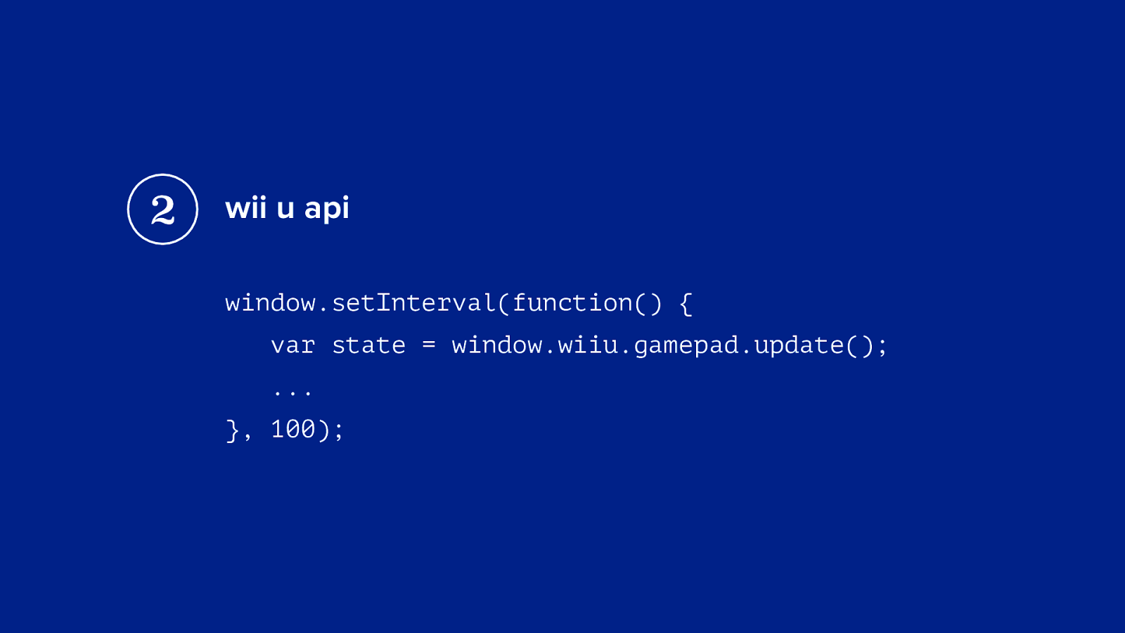
2 wii u api window.setInterval(function() { var state = window.wiiu.gamepad.update(); ... }, 100);
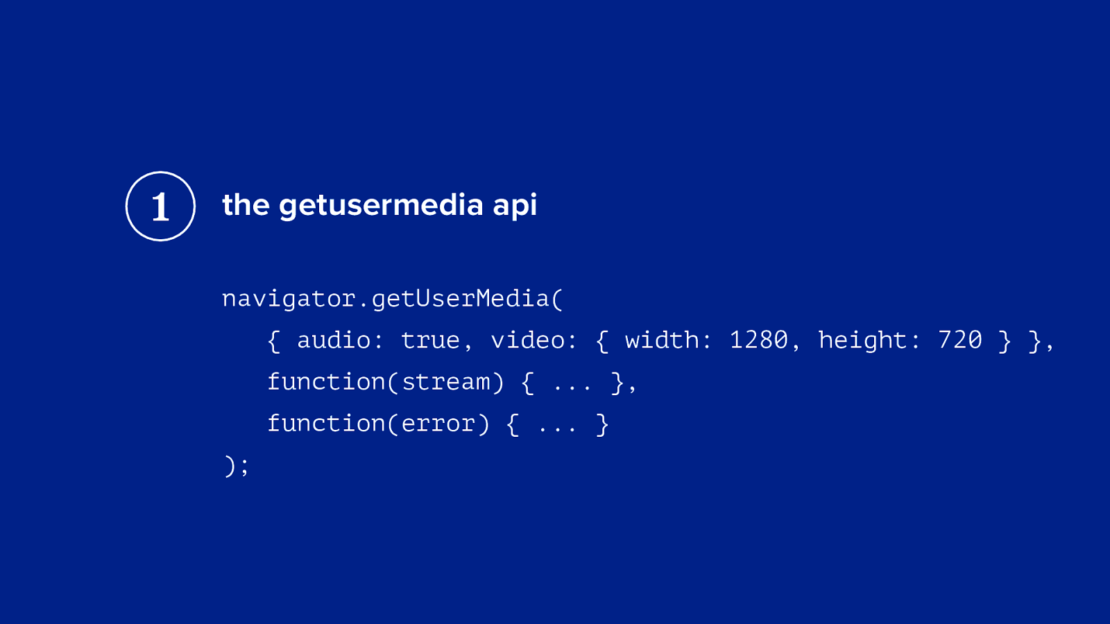
the webcam maybe
1 the getusermedia api navigator.getUserMedia( { audio: true, video: { width: 1280, height: 720 } }, function(stream) { ... }, function(error) { ... } );
2 the difference between a television and a monitor
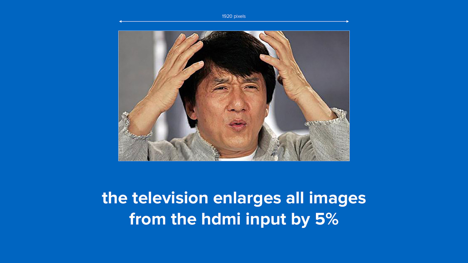
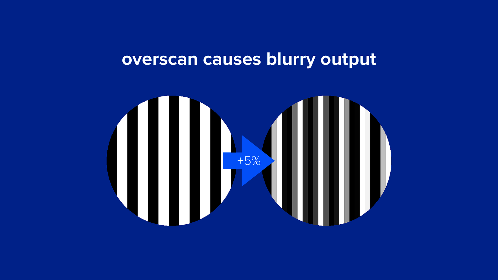
overscan (let’s make it a bit more complicated)
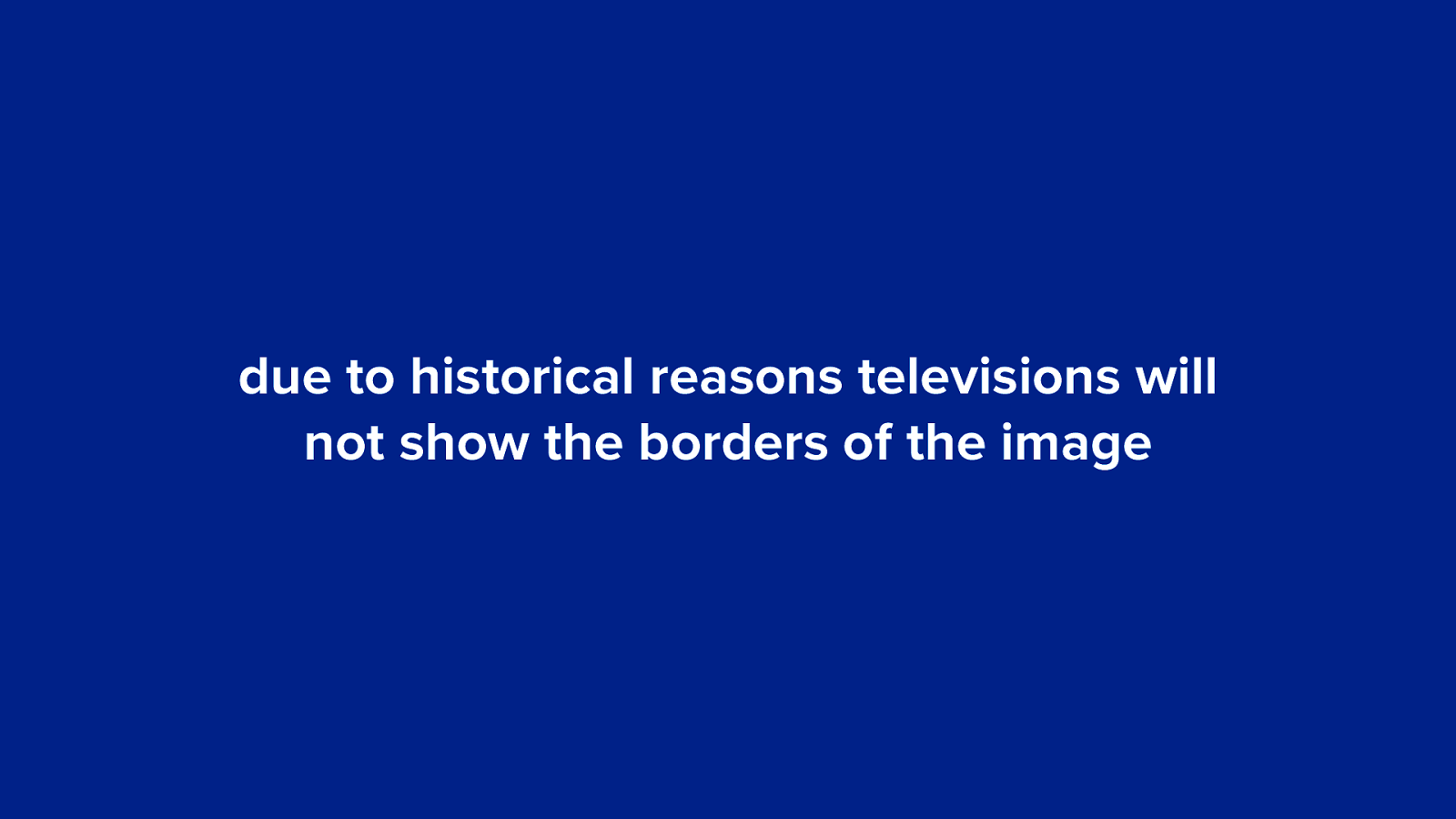
due to historical reasons televisions will not show the borders of the image
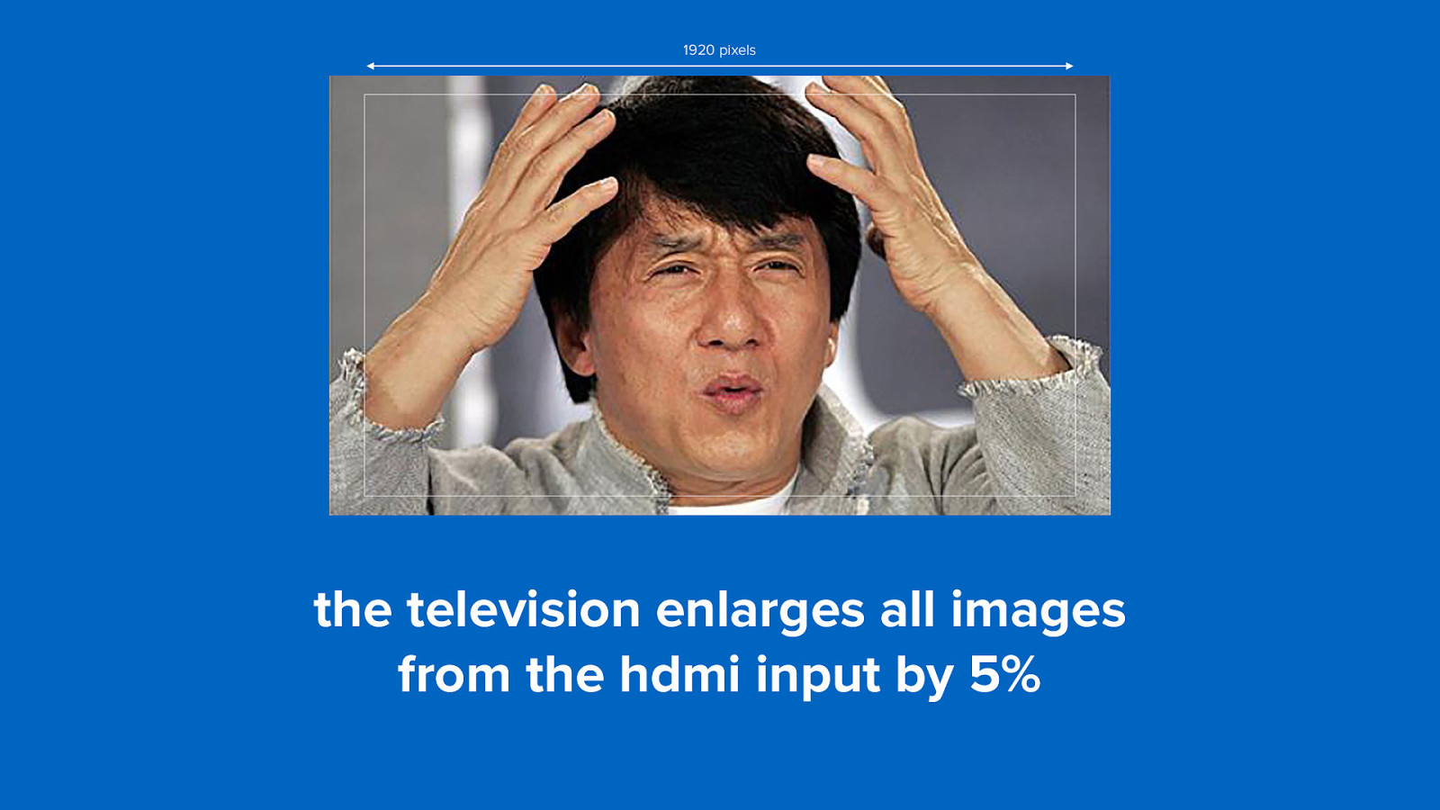
1920 pixels the television enlarges all images from the hdmi input by 5%
1920 pixels the television enlarges all images from the hdmi input by 5%
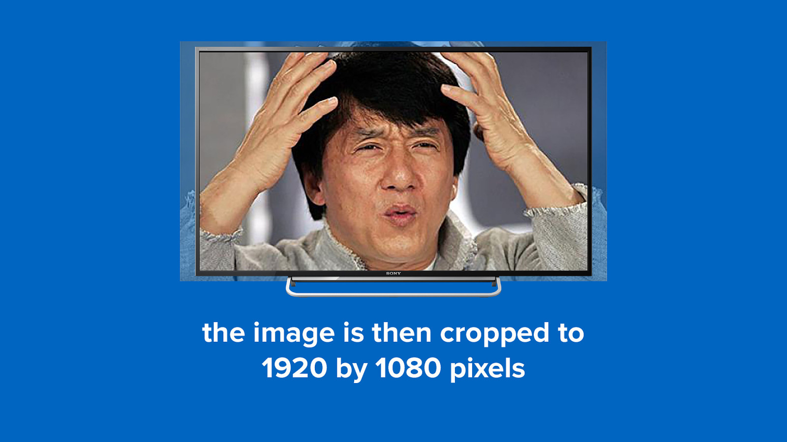
the image is then cropped to 1920 by 1080 pixels
the image is then cropped to 1920 by 1080 pixels
overscan causes blurry output +5%
solution 1 overscan correction
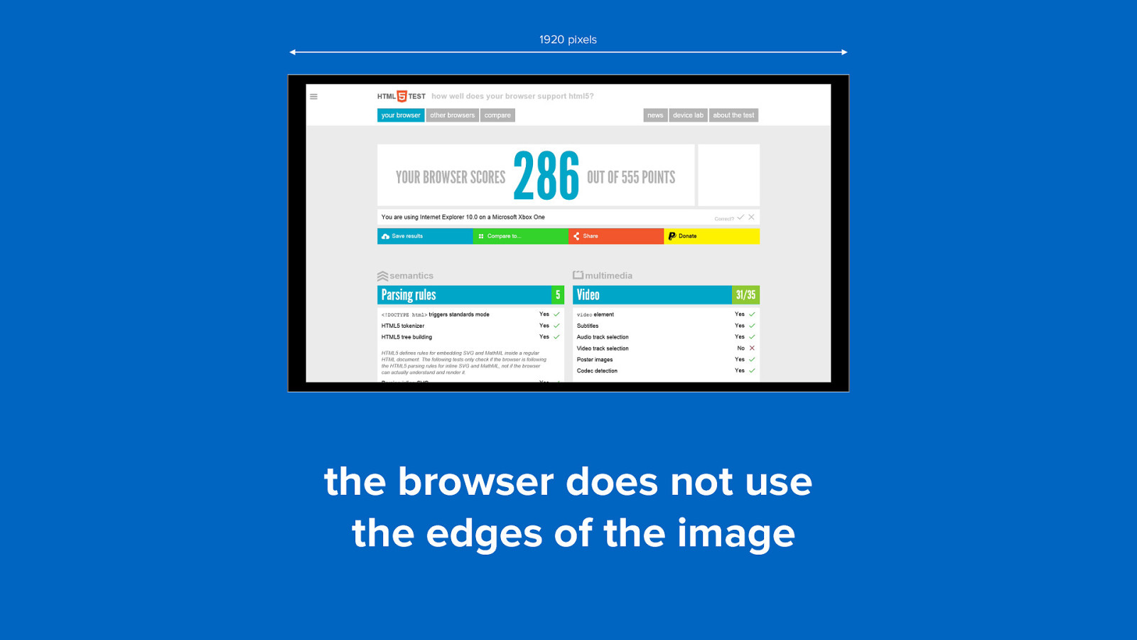
1920 pixels the browser does not use the edges of the image
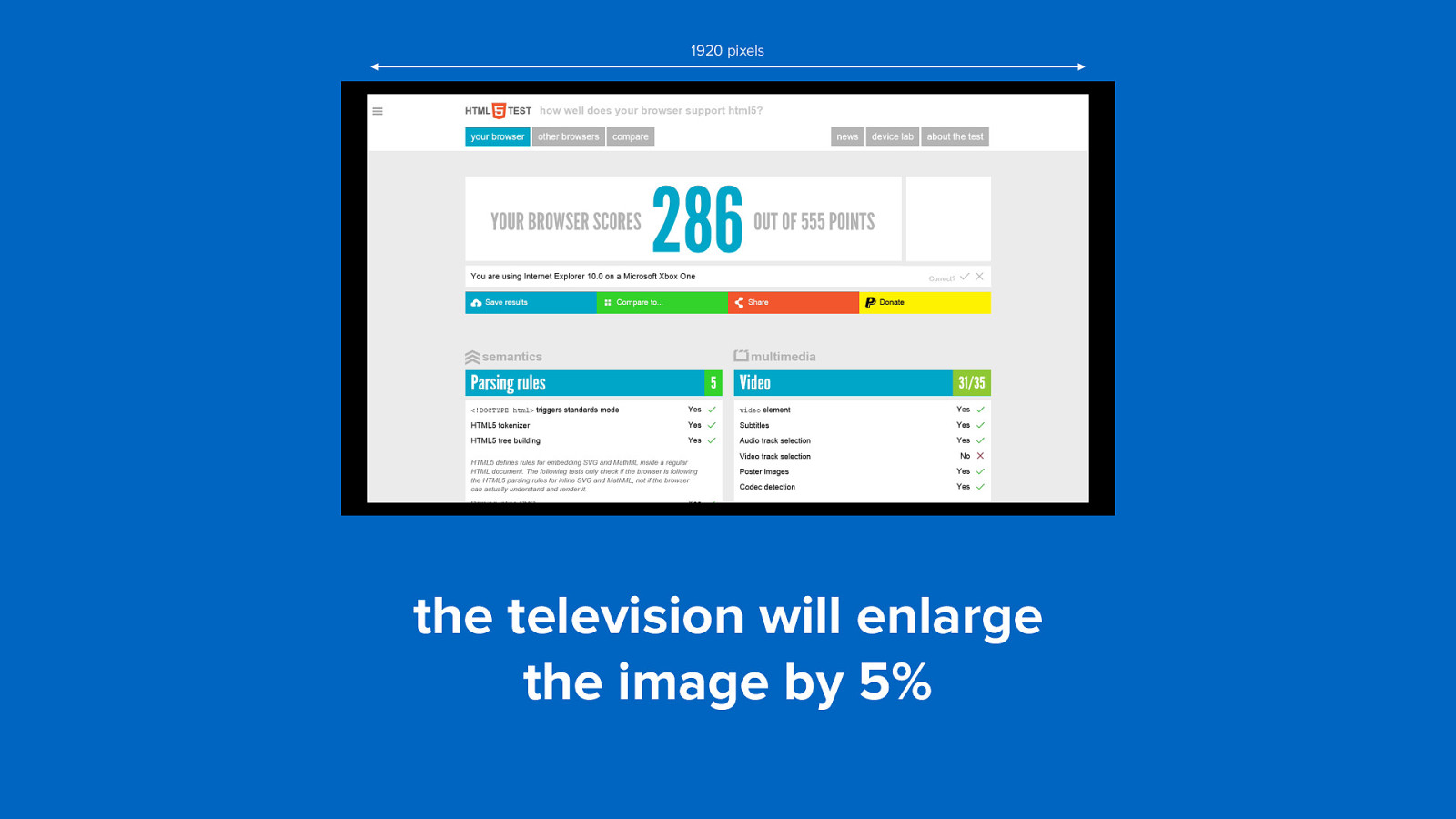
1920 pixels the television will enlarge the image by 5%
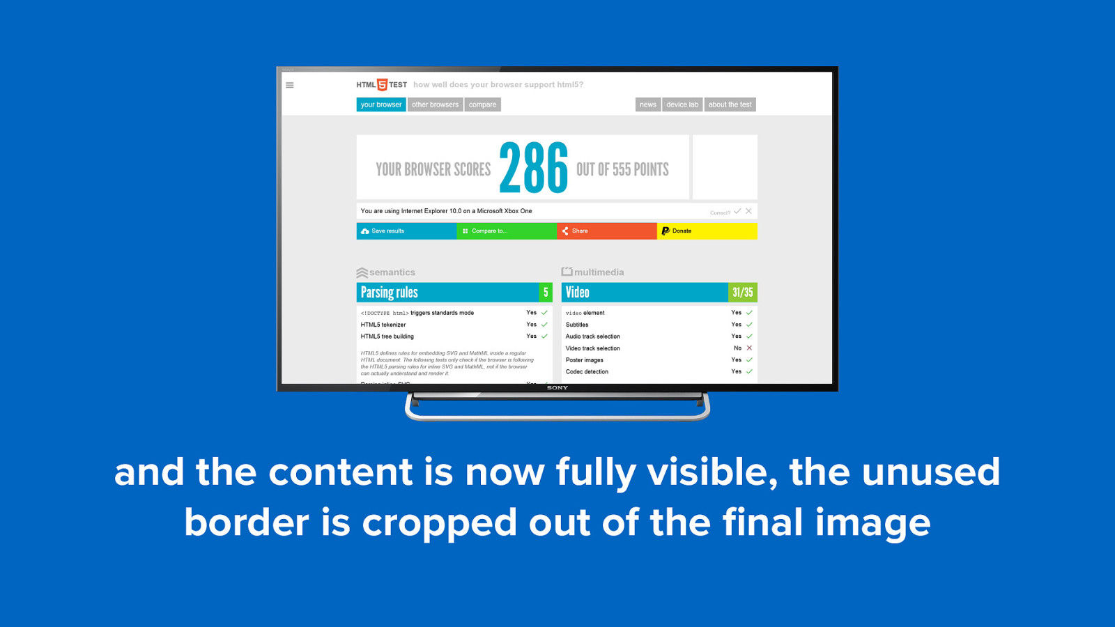
and the content is now fully visible, the unused border is cropped out of the final image
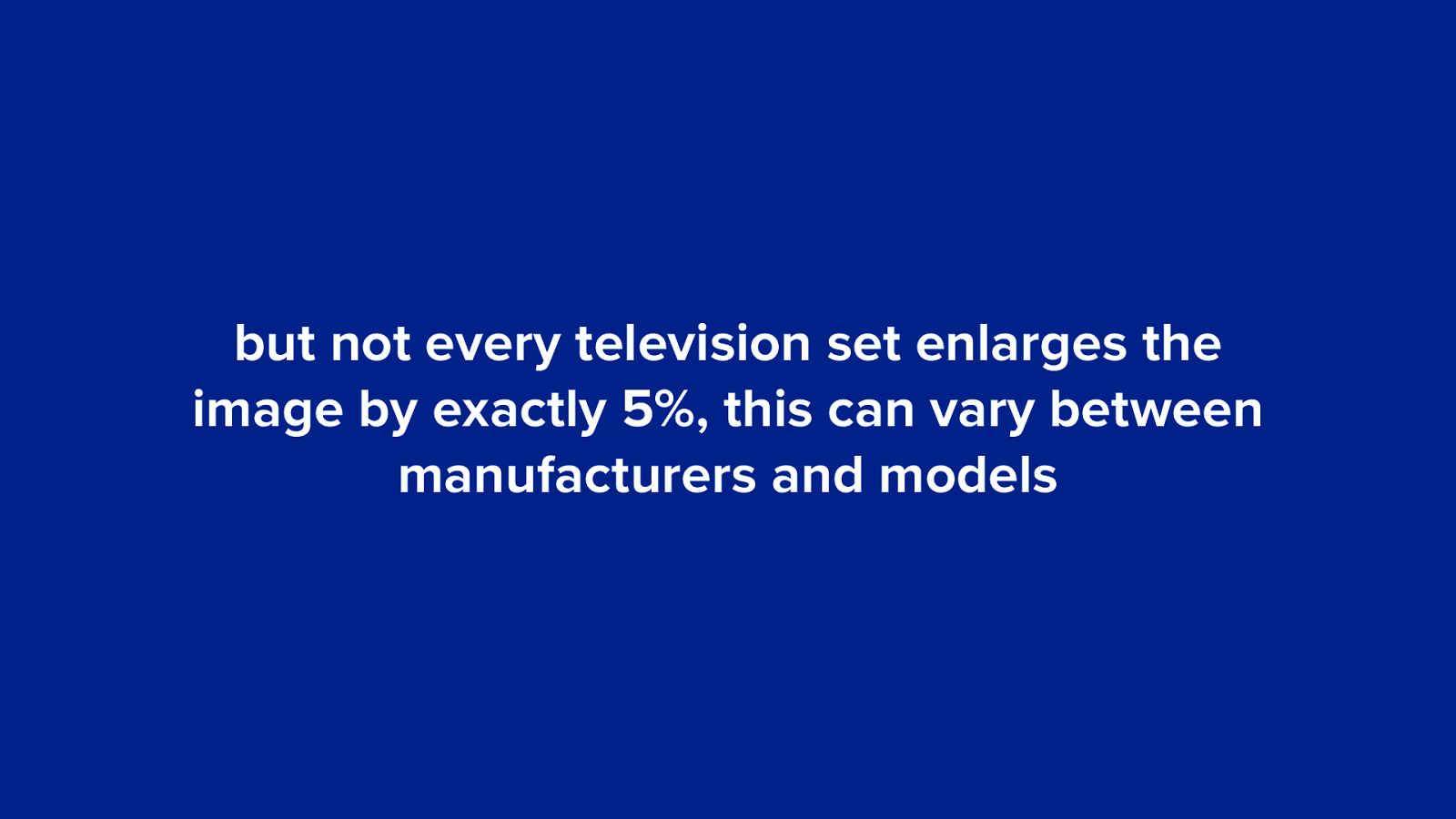
but not every television set enlarges the image by exactly 5%, this can vary between manufacturers and models
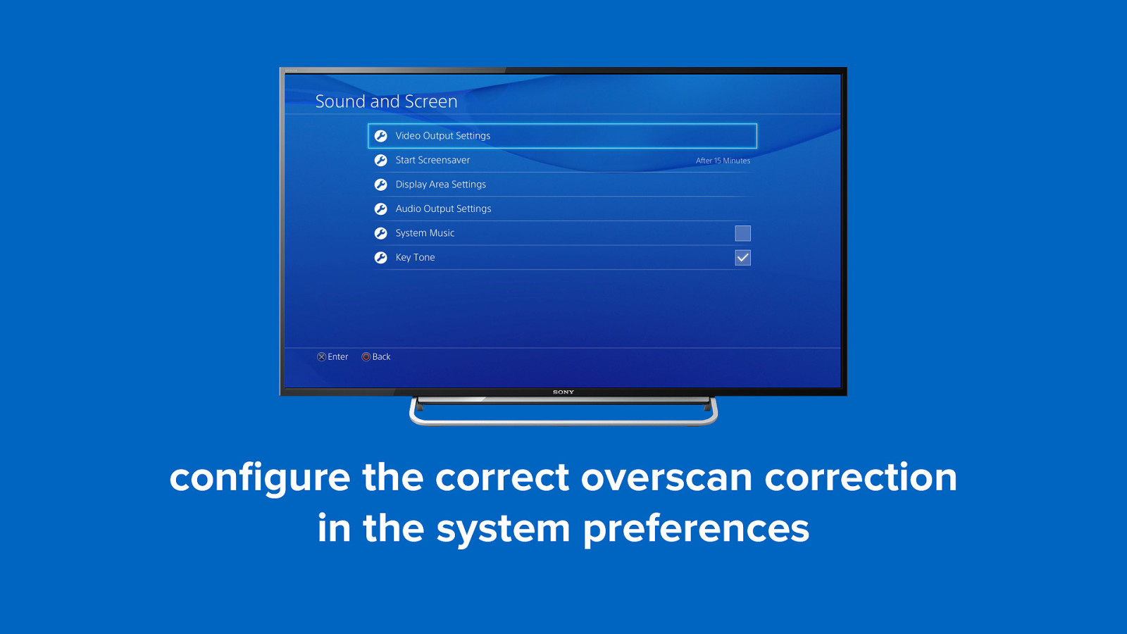
configure the correct overscan correction in the system preferences
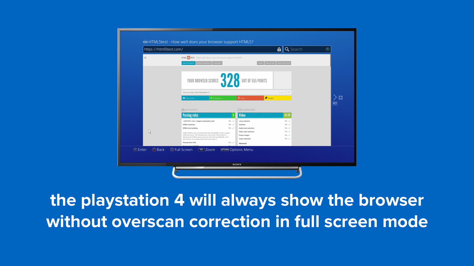
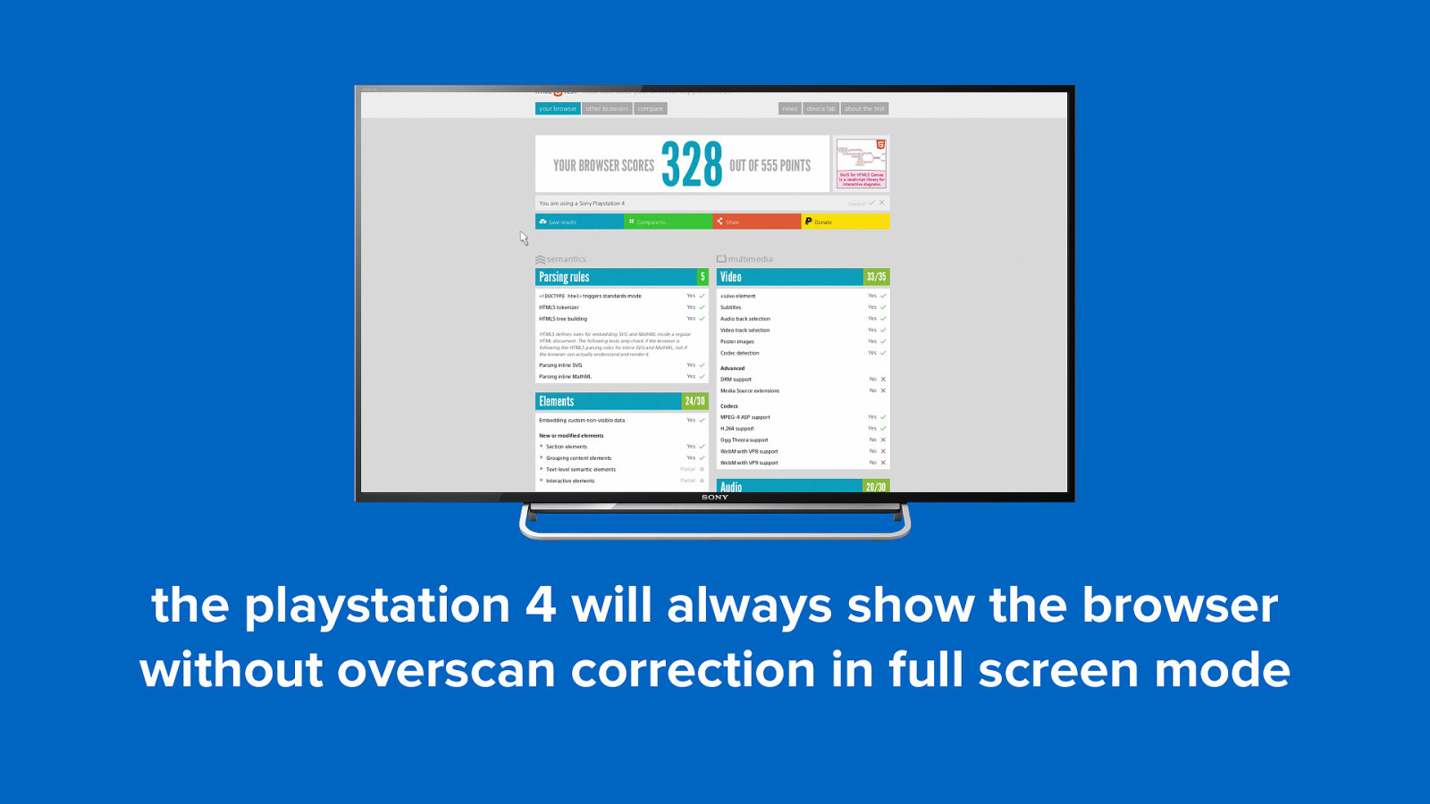
the playstation 4 will always show the browser without overscan correction in full screen mode
the playstation 4 will always show the browser without overscan correction in full screen mode
solution 2 no overscan
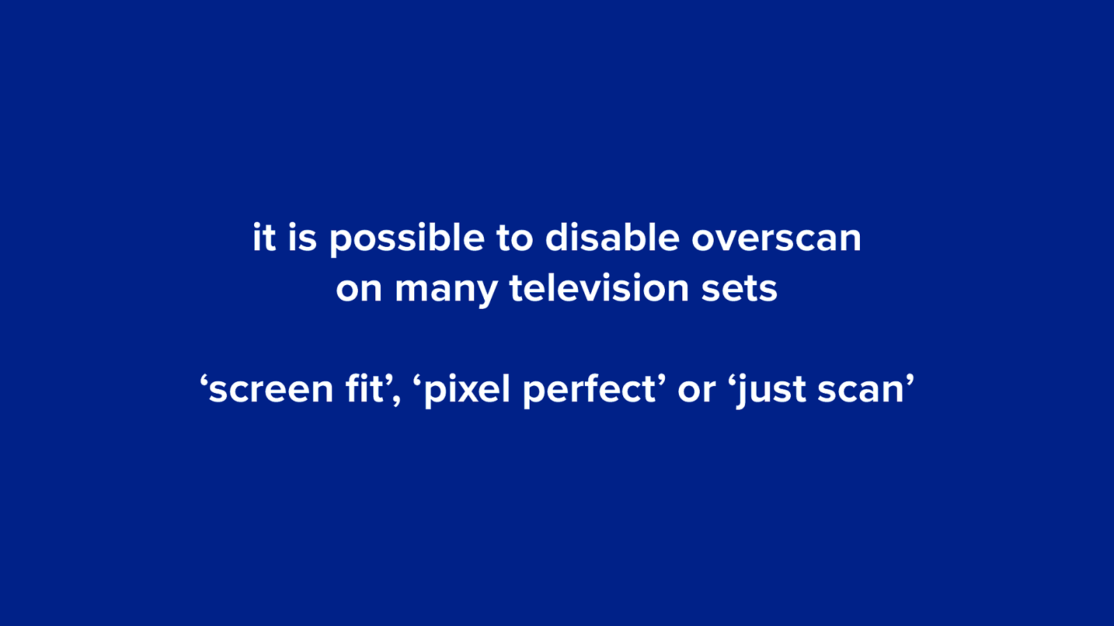
it is possible to disable overscan on many television sets ‘screen fit’, ‘pixel perfect’ or ‘just scan’
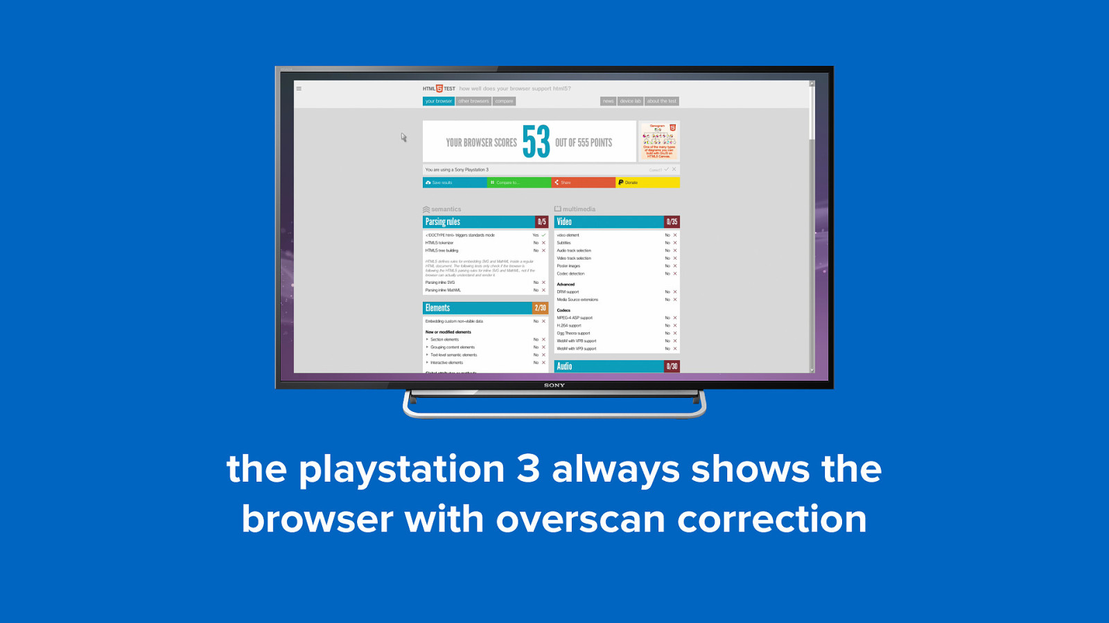
the playstation 3 always shows the browser with overscan correction
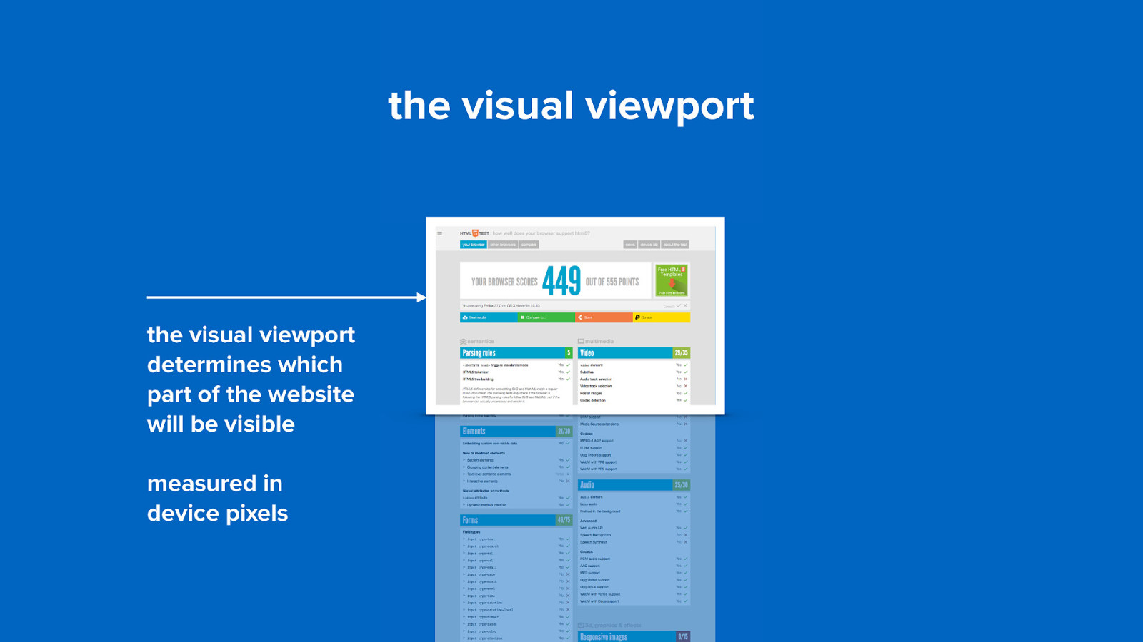
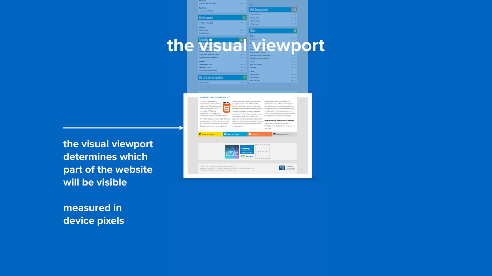
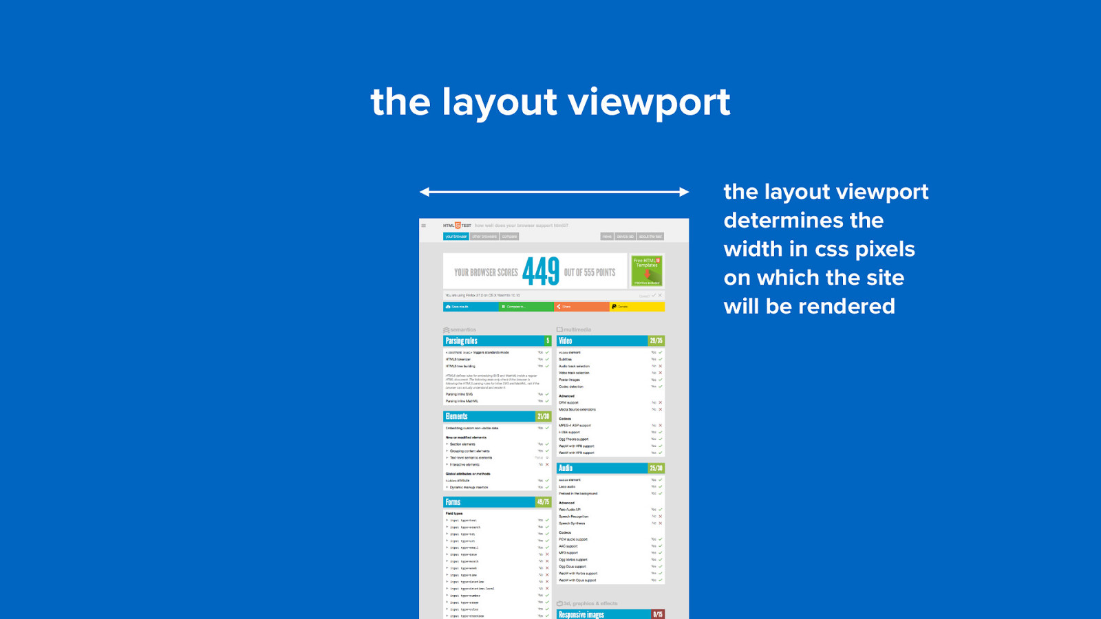
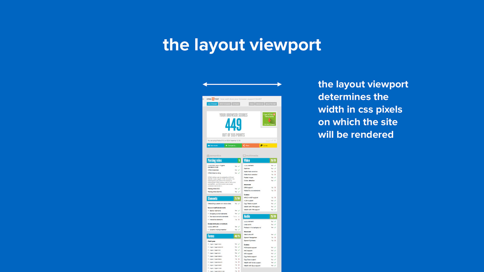
the viewport (i really need some aspirin!)
the visual viewport the visual viewport determines which part of the website will be visible measured in device pixels
the visual viewport the visual viewport determines which part of the website will be visible measured in device pixels
the visual viewport the visual viewport determines which part of the website will be visible measured in device pixels
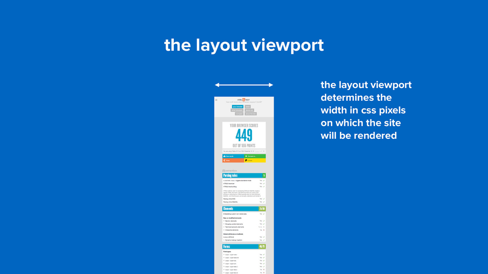
the layout viewport the layout viewport determines the width in css pixels on which the site will be rendered
the layout viewport the layout viewport determines the width in css pixels on which the site will be rendered
the layout viewport the layout viewport determines the width in css pixels on which the site will be rendered
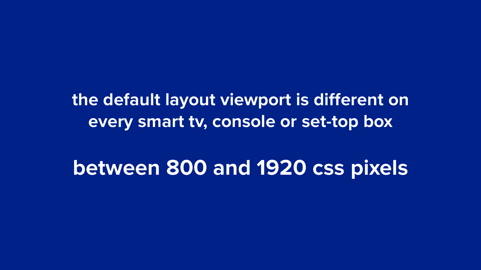
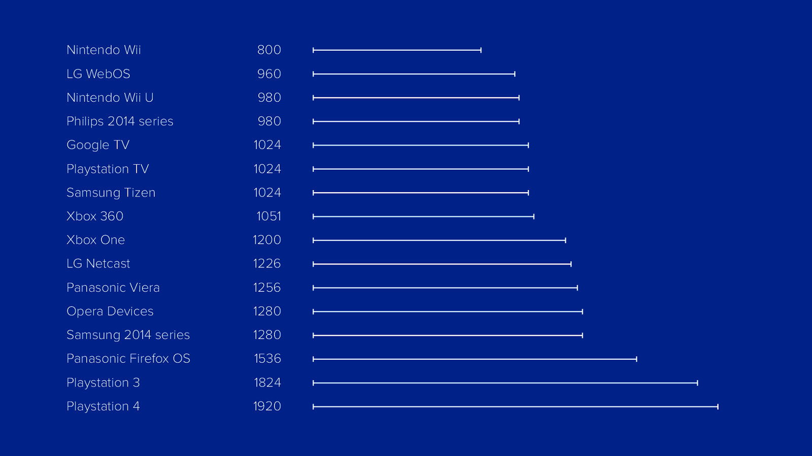
the default layout viewport is different on every smart tv, console or set-top box between 800 and 1920 css pixels
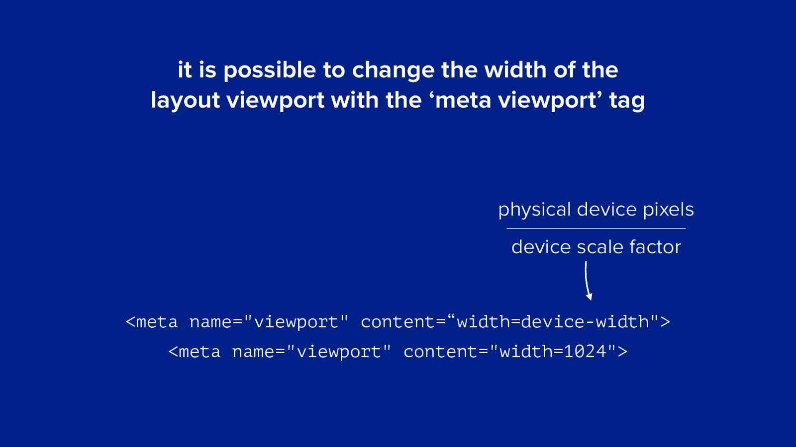
it is possible to change the width of the layout viewport with the ‘meta viewport’ tag physical device pixels device scale factor
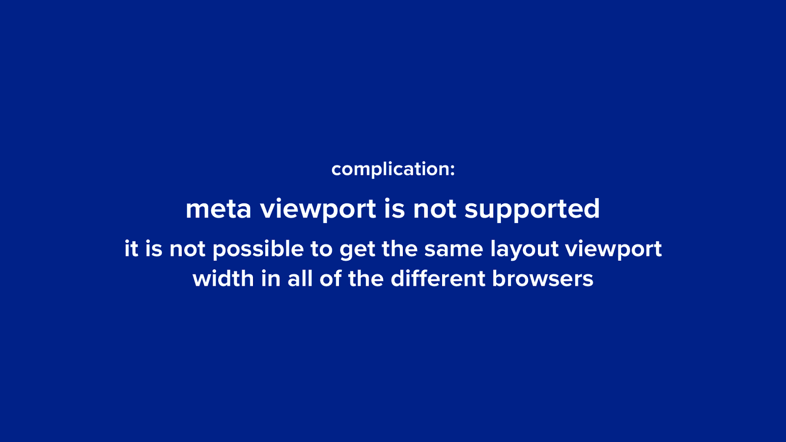
<meta name="viewport" content=“width=device-width"> <meta name="viewport" content="width=1024">complication: meta viewport is not supported it is not possible to get the same layout viewport width in all of the different browsers
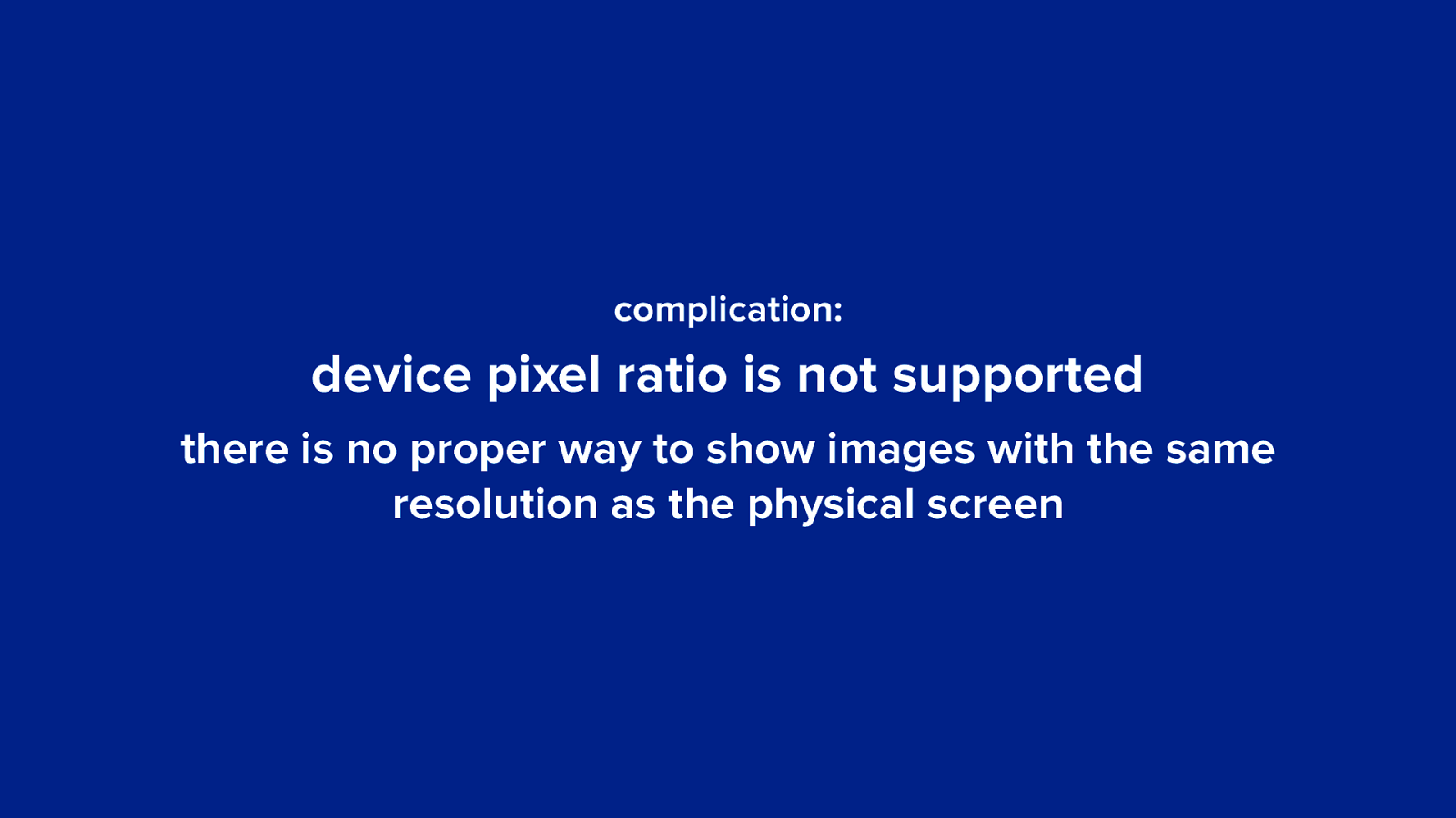
complication: device pixel ratio is not supported there is no proper way to show images with the same resolution as the physical screen
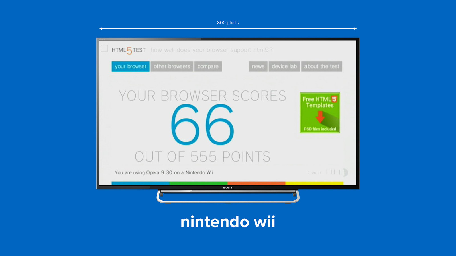
800 pixels nintendo wii
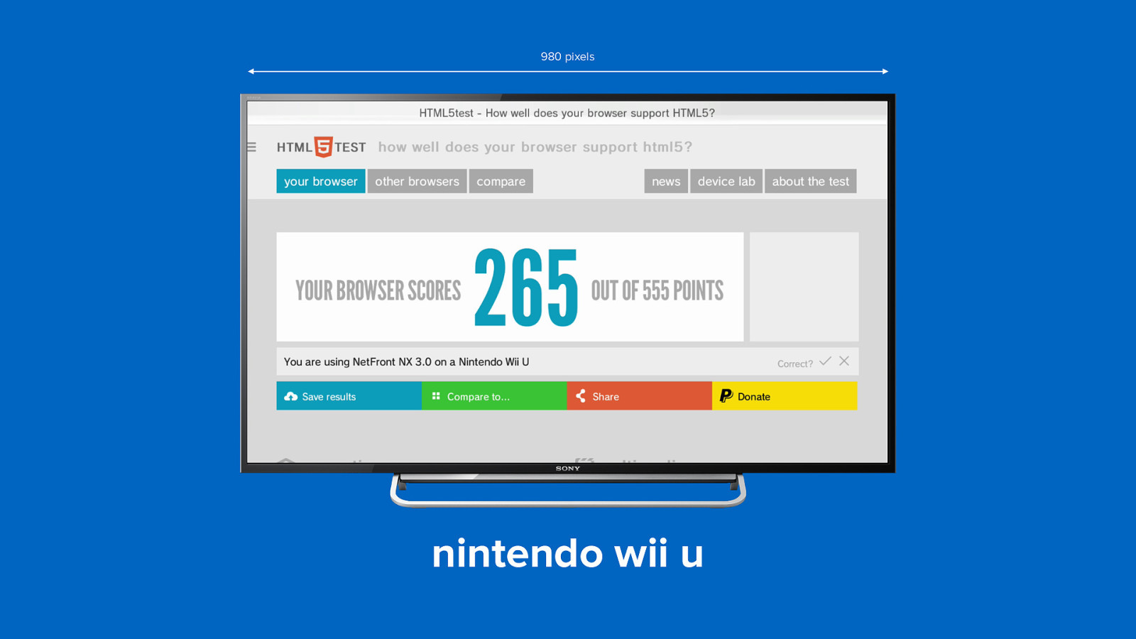
980 pixels nintendo wii u
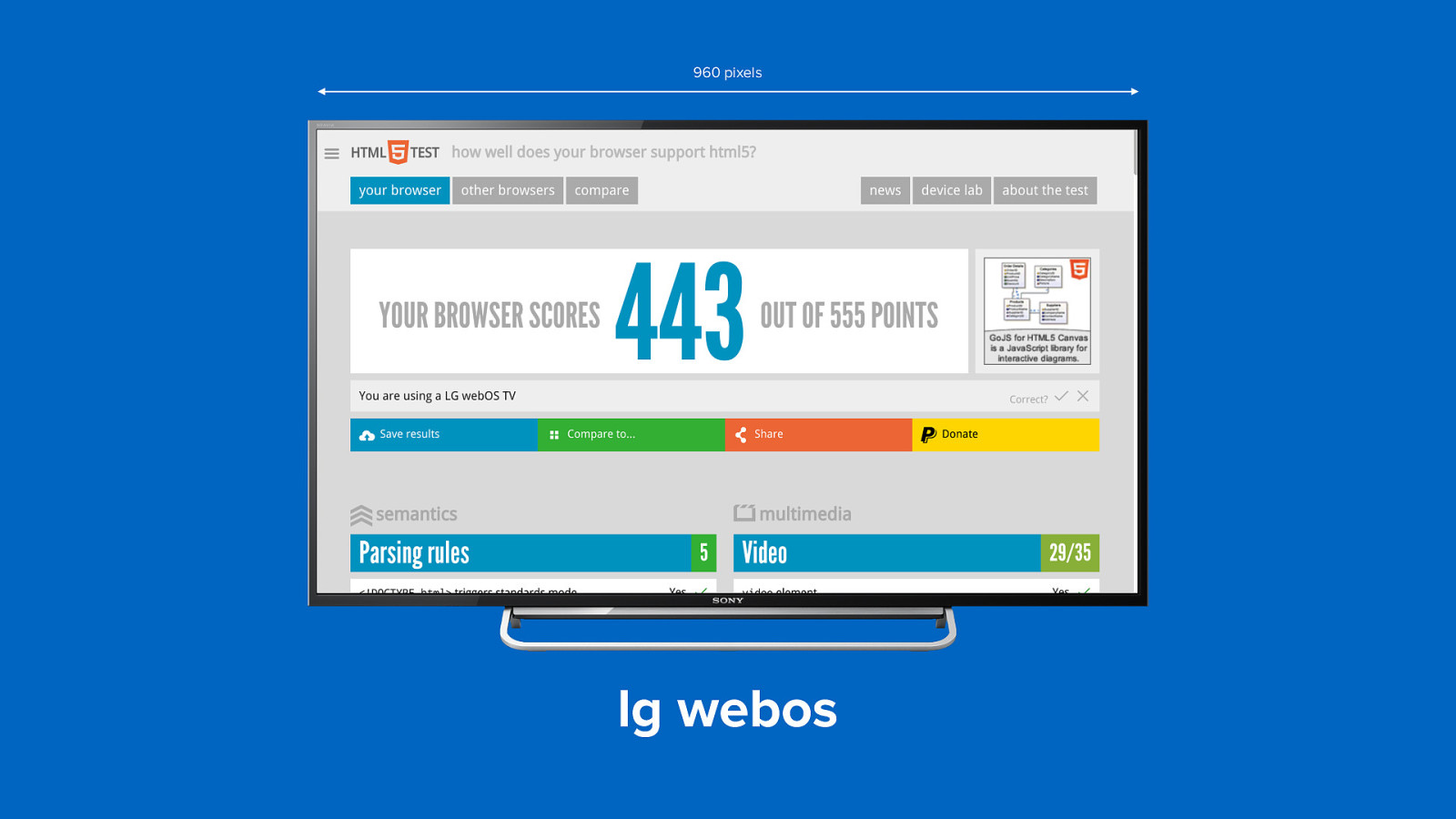
960 pixels lg webos
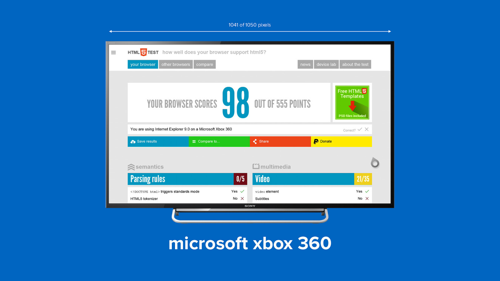
1041 of 1050 pixels microsoft xbox 360
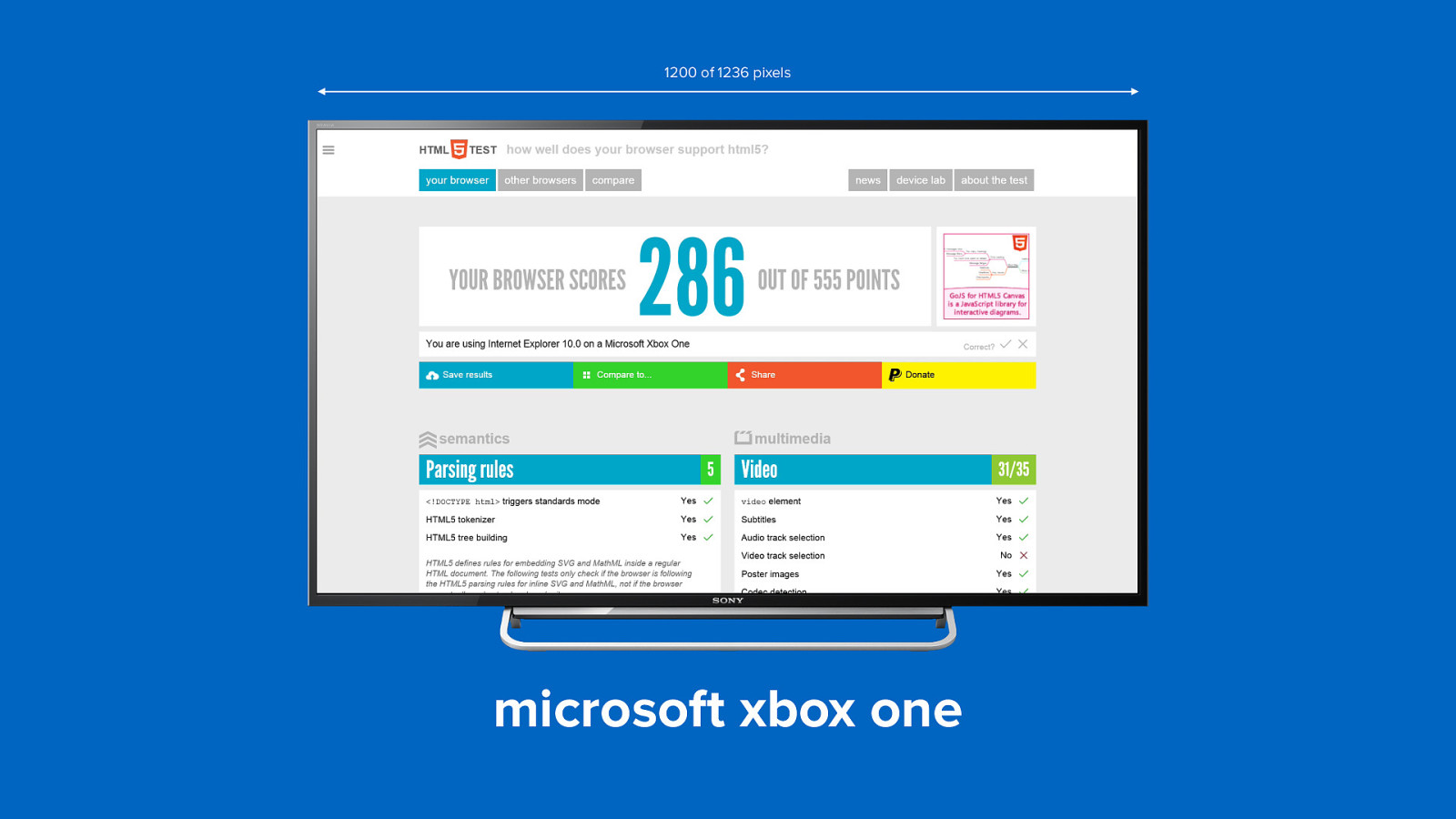
1200 of 1236 pixels microsoft xbox one
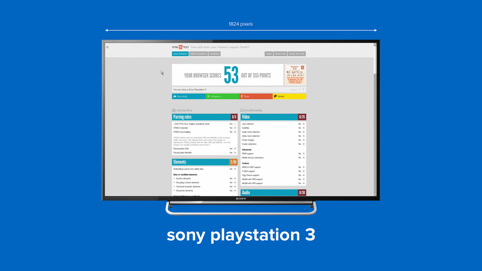
1824 pixels sony playstation 3
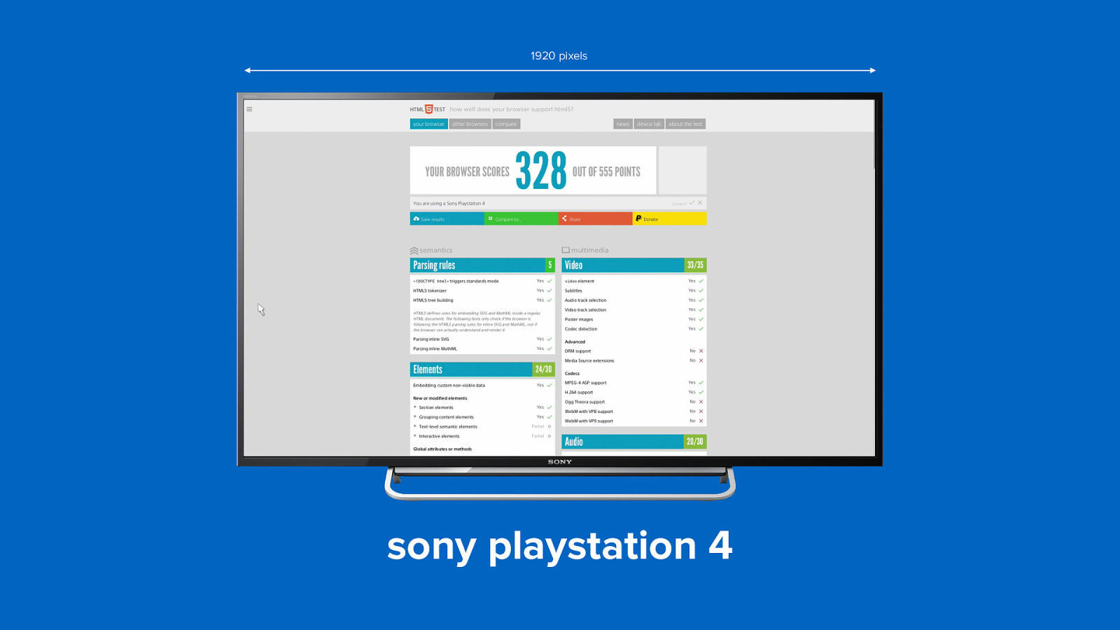
1920 pixels sony playstation 4
Nintendo Wii 800 LG WebOS 960 Nintendo Wii U 980 Philips 2014 series 980 Google TV 1024 Playstation TV 1024 Samsung Tizen 1024 Xbox 360 1051 Xbox One 1200 LG Netcast 1226 Panasonic Viera 1256 Opera Devices 1280 Samsung 2014 series 1280 Panasonic Firefox OS 1536 Playstation 3 1824 Playstation 4 1920
device pixels != device pixels (of course not)
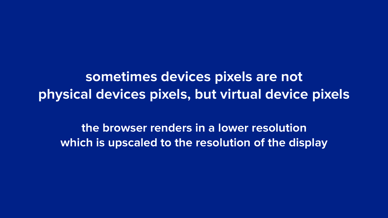
sometimes devices pixels are not physical devices pixels, but virtual device pixels the browser renders in a lower resolution which is upscaled to the resolution of the display
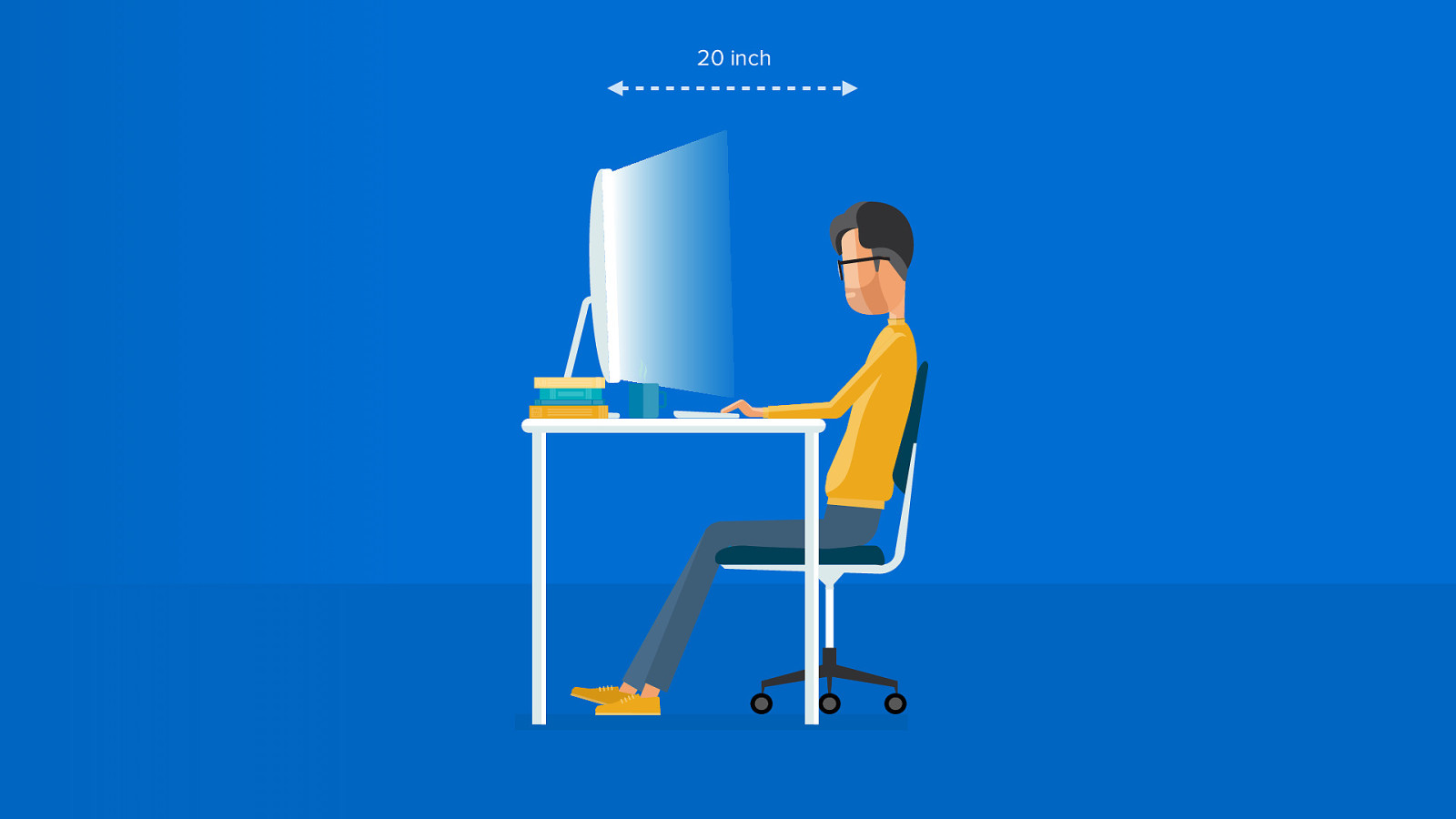
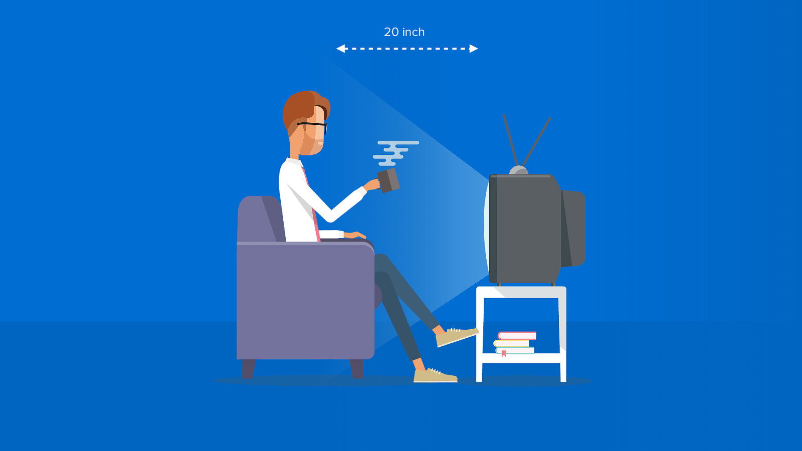
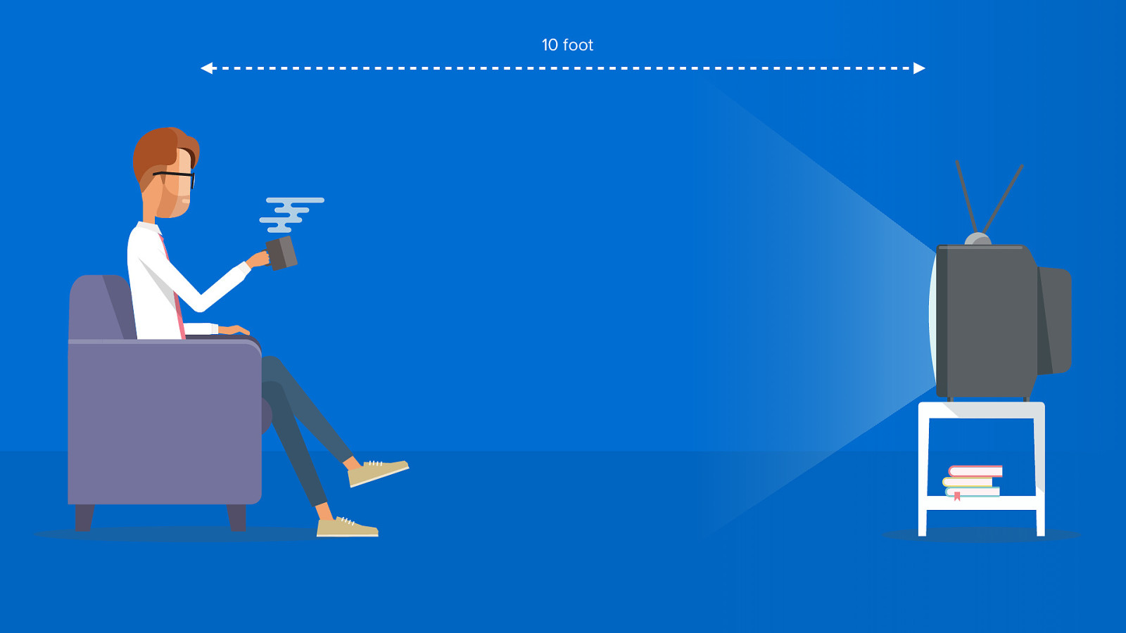
3 distance to the screen
20 inch
20 inch
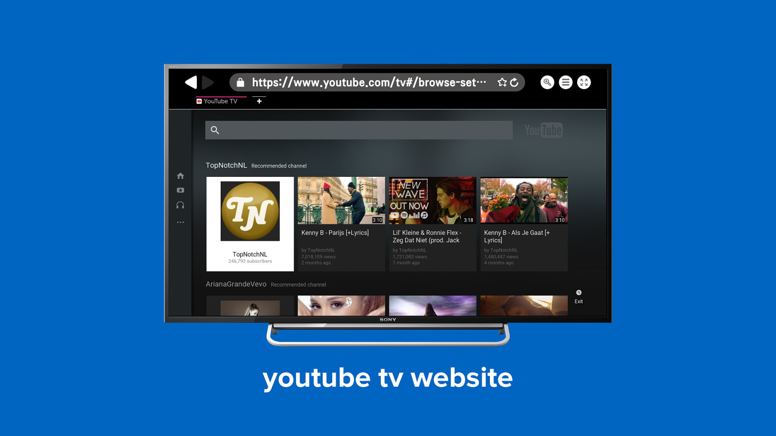
10 foot
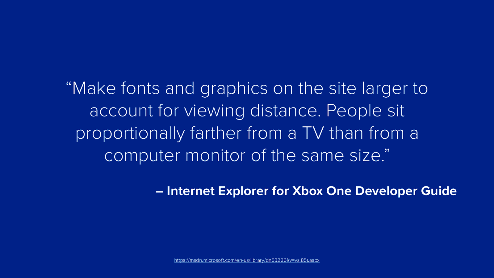
“Make fonts and graphics on the site larger to account for viewing distance. People sit proportionally farther from a TV than from a computer monitor of the same size.” – Internet Explorer for Xbox One Developer Guide https://msdn.microsoft.com/en-us/library/dn532261(v=vs.85).aspx
Make your text and images two to three times bigger
Make your text and images two to three times bigger
Make your text and images two to three times bigger
youtube tv website
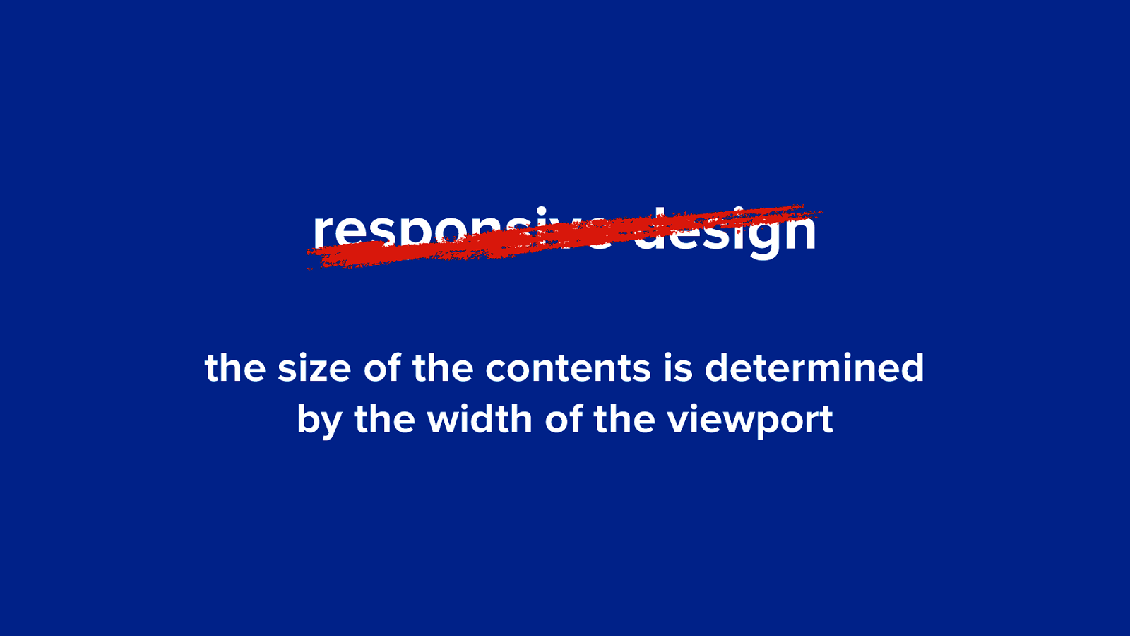
responsive design the size of the contents is determined by the width of the viewport
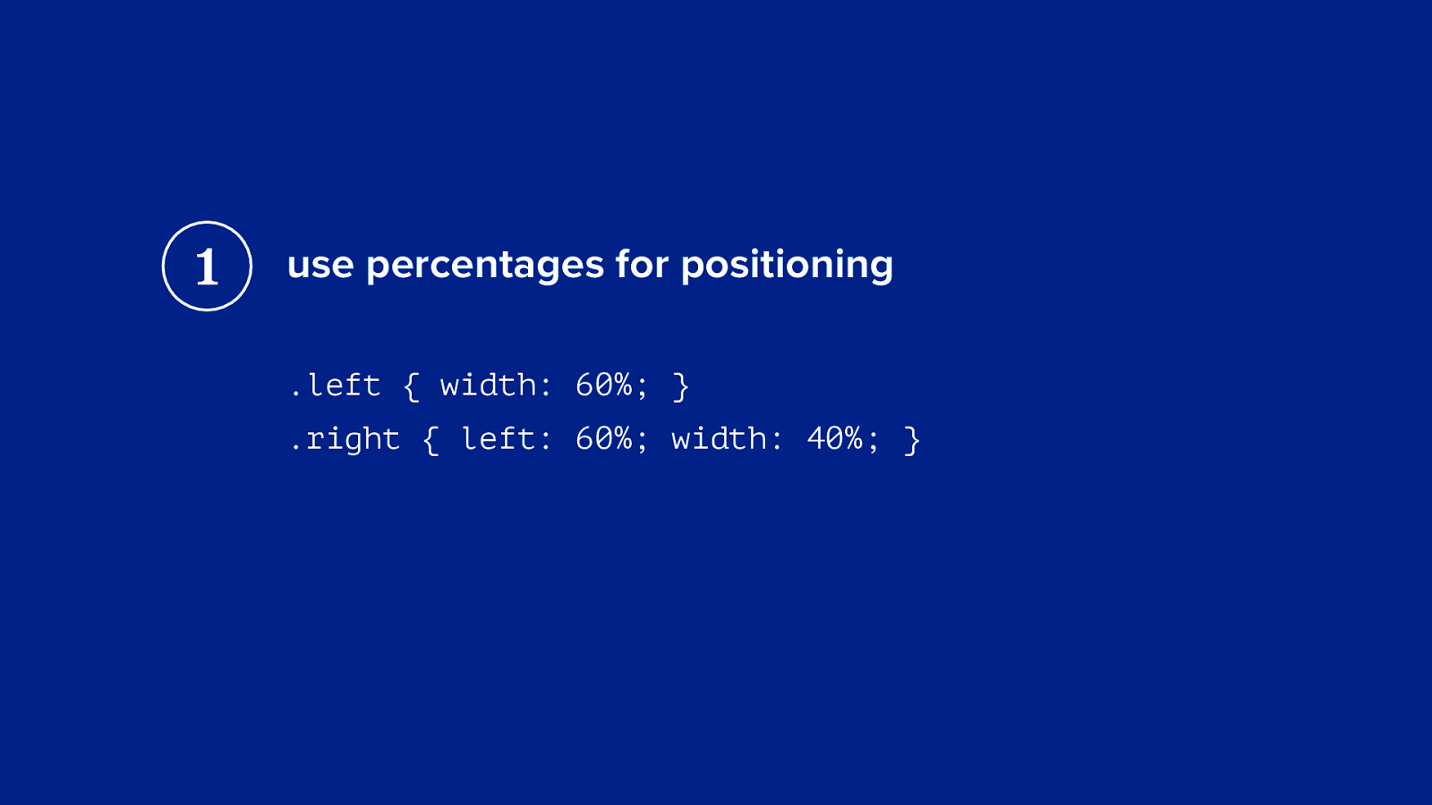
1 use percentages for positioning .left { width: 60%; } .right { left: 60%; width: 40%; }
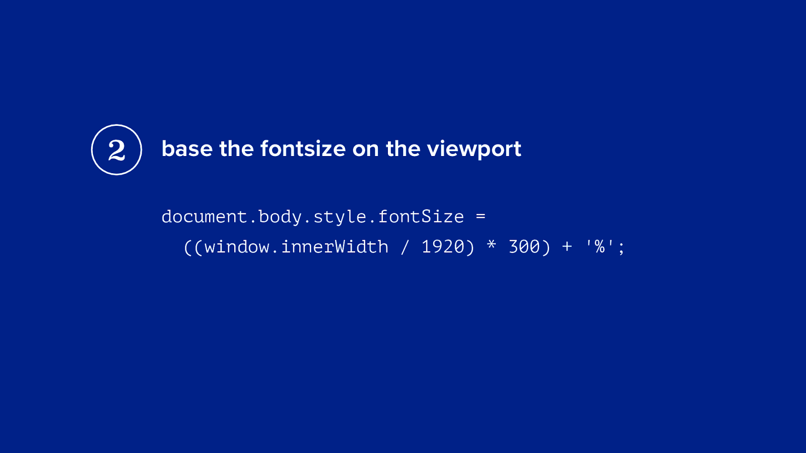
2 base the fontsize on the viewport document.body.style.fontSize = ((window.innerWidth / 1920) * 300) + '%';
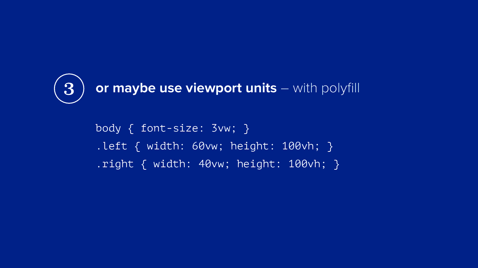
3 or maybe use viewport units – with polyfill body { font-size: 3vw; } .left { width: 60vw; height: 100vh; } .right { width: 40vw; height: 100vh; }
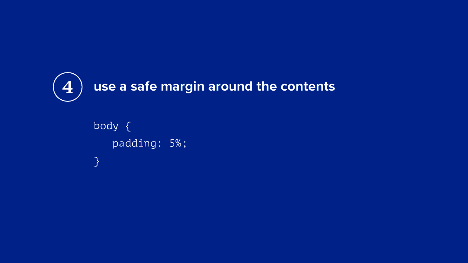
4 use a safe margin around the contents body { padding: 5%; }
identifying smart tv’s (css for televisions)
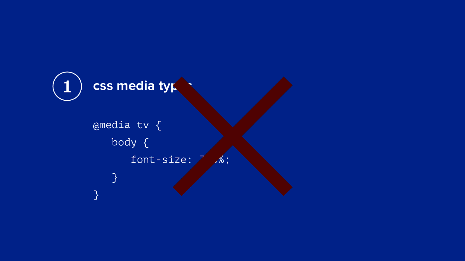
1 × css media types @media tv { body { font-size: 300%; } }
1 css media types all television browsers use the css media type ‘screen’
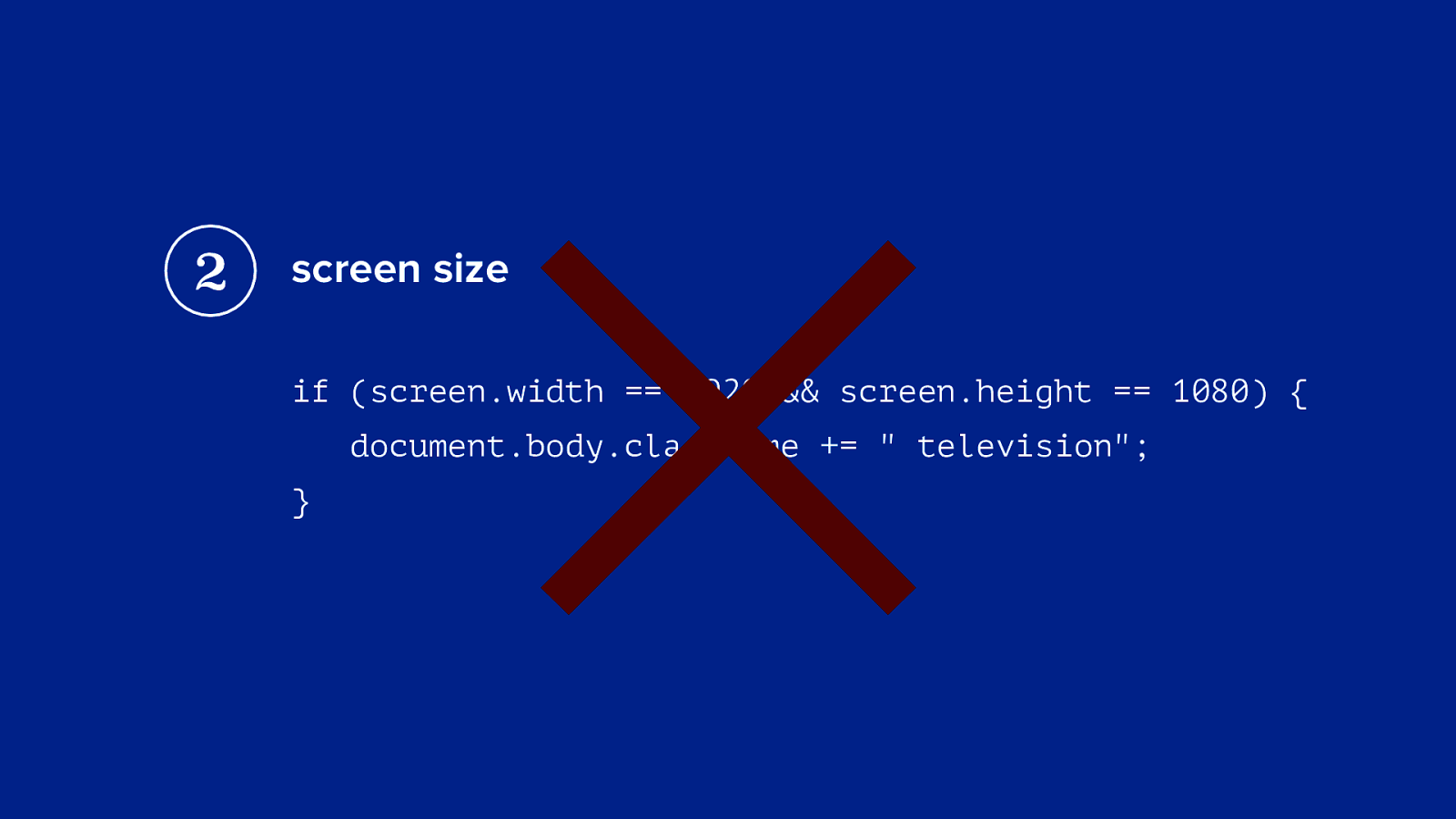
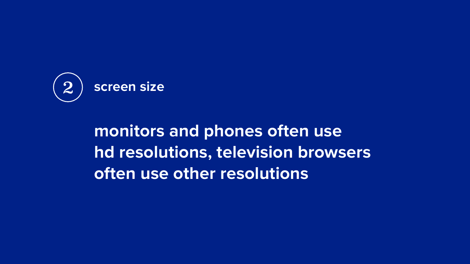
2 × screen size if (screen.width == 1920 && screen.height == 1080) { document.body.className += " television"; }
2 screen size monitors and phones often use hd resolutions, television browsers often use other resolutions
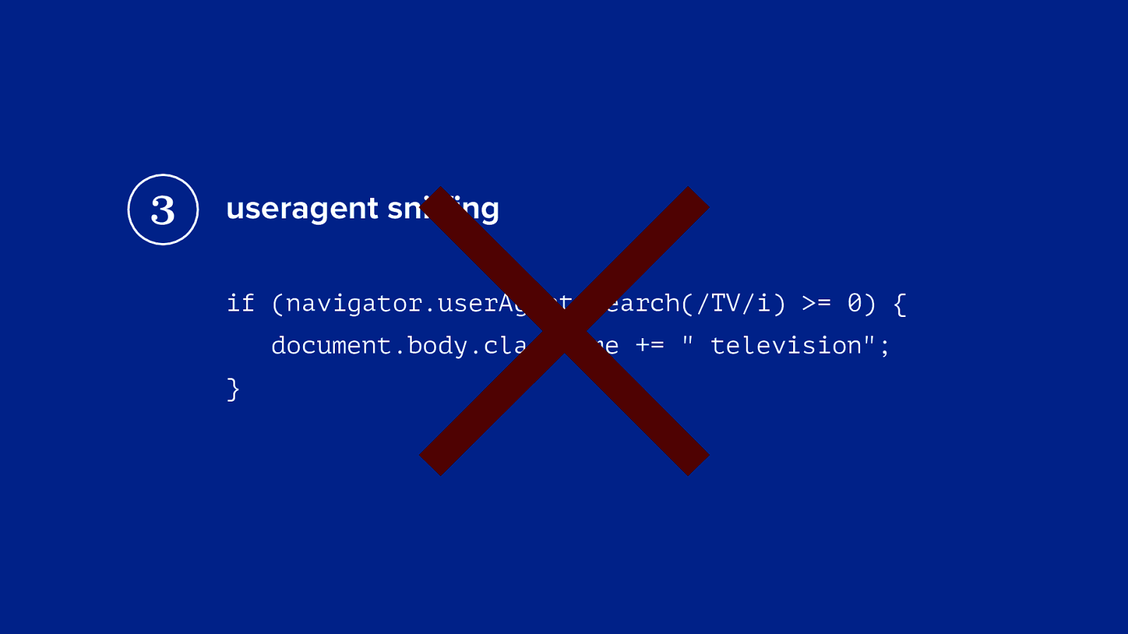
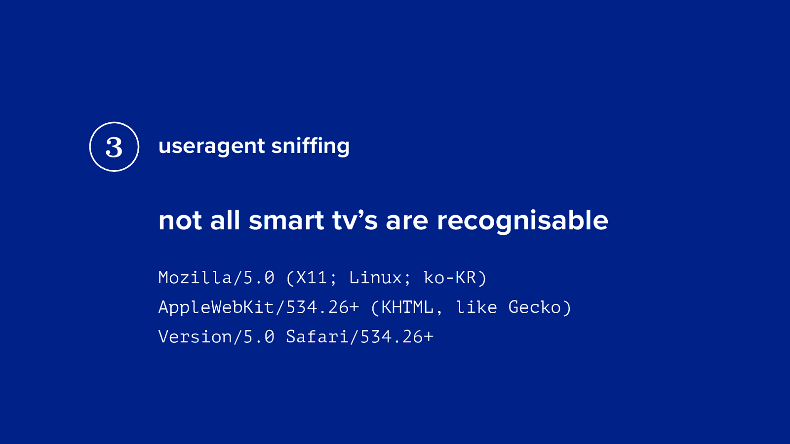
3 × useragent sniffing if (navigator.userAgent.search(/TV/i) >= 0) { document.body.className += " television"; }
3 useragent sniffing not all smart tv’s are recognisable Mozilla/5.0 (X11; Linux; ko-KR) AppleWebKit/534.26+ (KHTML, like Gecko) Version/5.0 Safari/534.26+
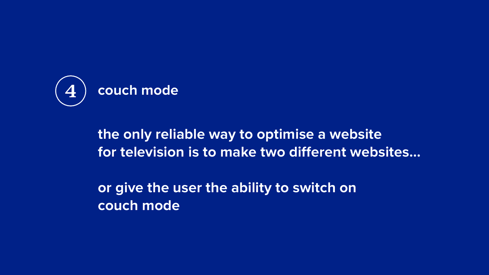
4 couch mode the only reliable way to optimise a website for television is to make two different websites… or give the user the ability to switch on couch mode
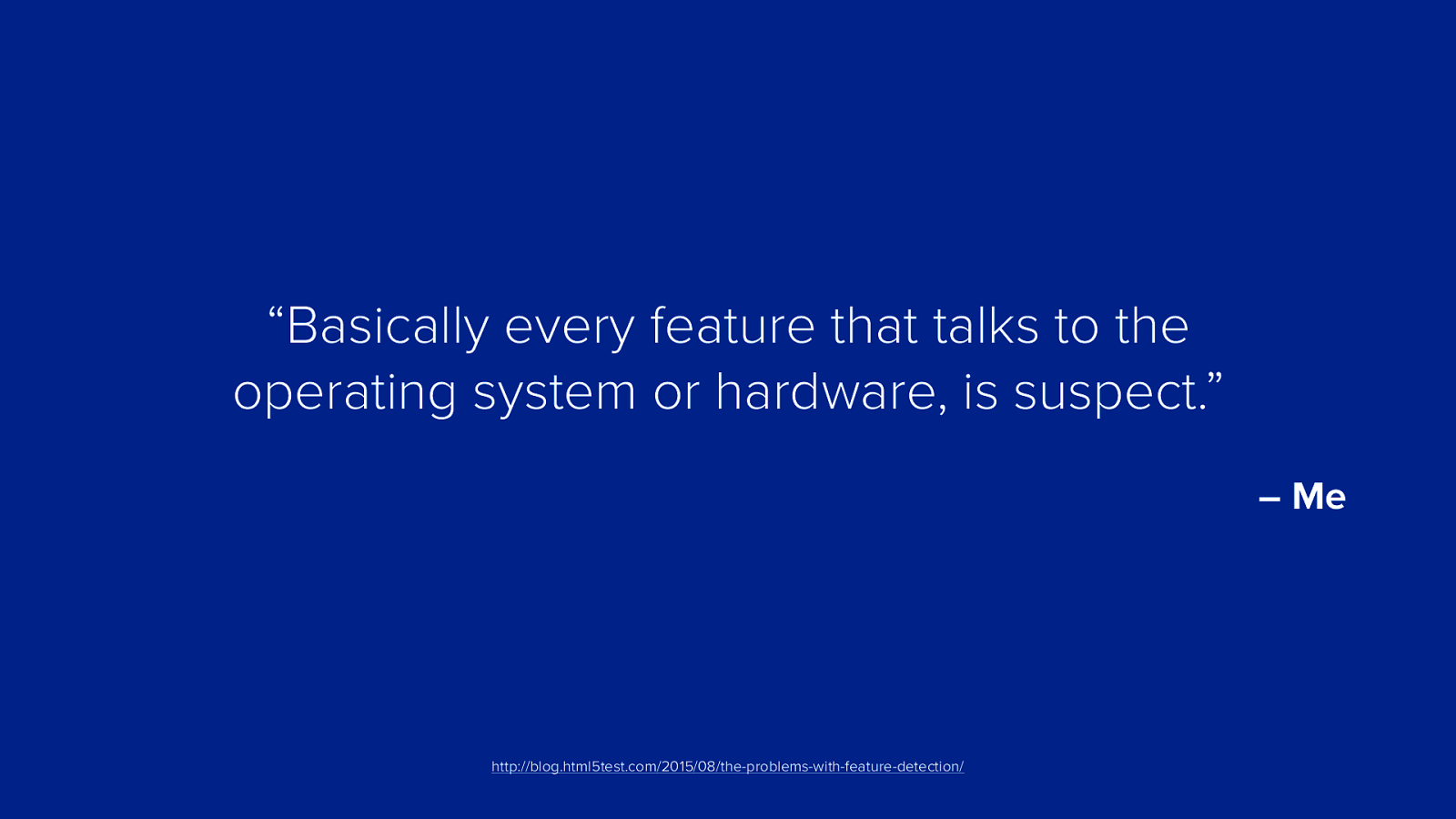
4 be careful with feature detection
“Basically every feature that talks to the operating system or hardware, is suspect.” – Me http://blog.html5test.com/2015/08/the-problems-with-feature-detection/
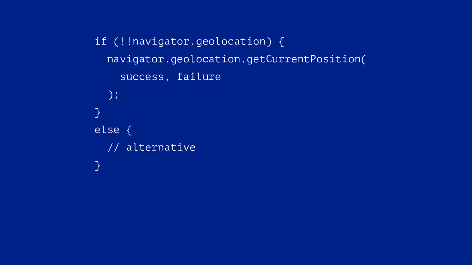
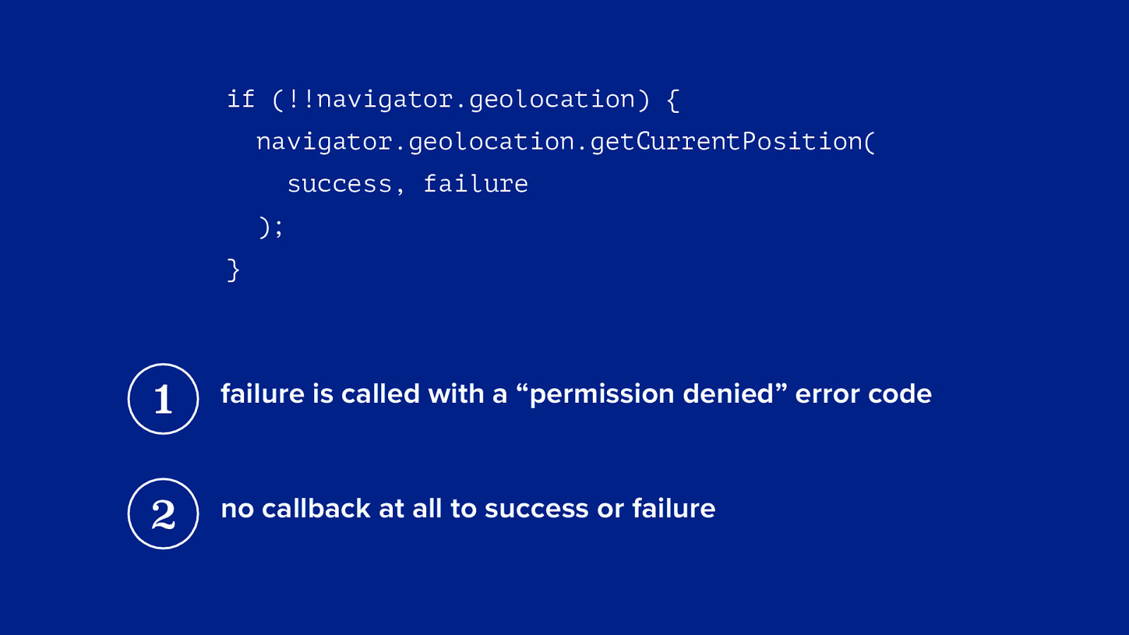
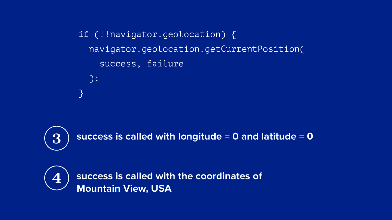
if (!!navigator.geolocation) { navigator.geolocation.getCurrentPosition( success, failure ); } else { // alternative }
if (!!navigator.geolocation) { navigator.geolocation.getCurrentPosition( success, failure ); } 1 failure is called with a “permission denied” error code 2 no callback at all to success or failure
if (!!navigator.geolocation) { navigator.geolocation.getCurrentPosition( success, failure ); } 3 success is called with longitude = 0 and latitude = 0 4 success is called with the coordinates of Mountain View, USA
is there a future for web apps on the big screen?
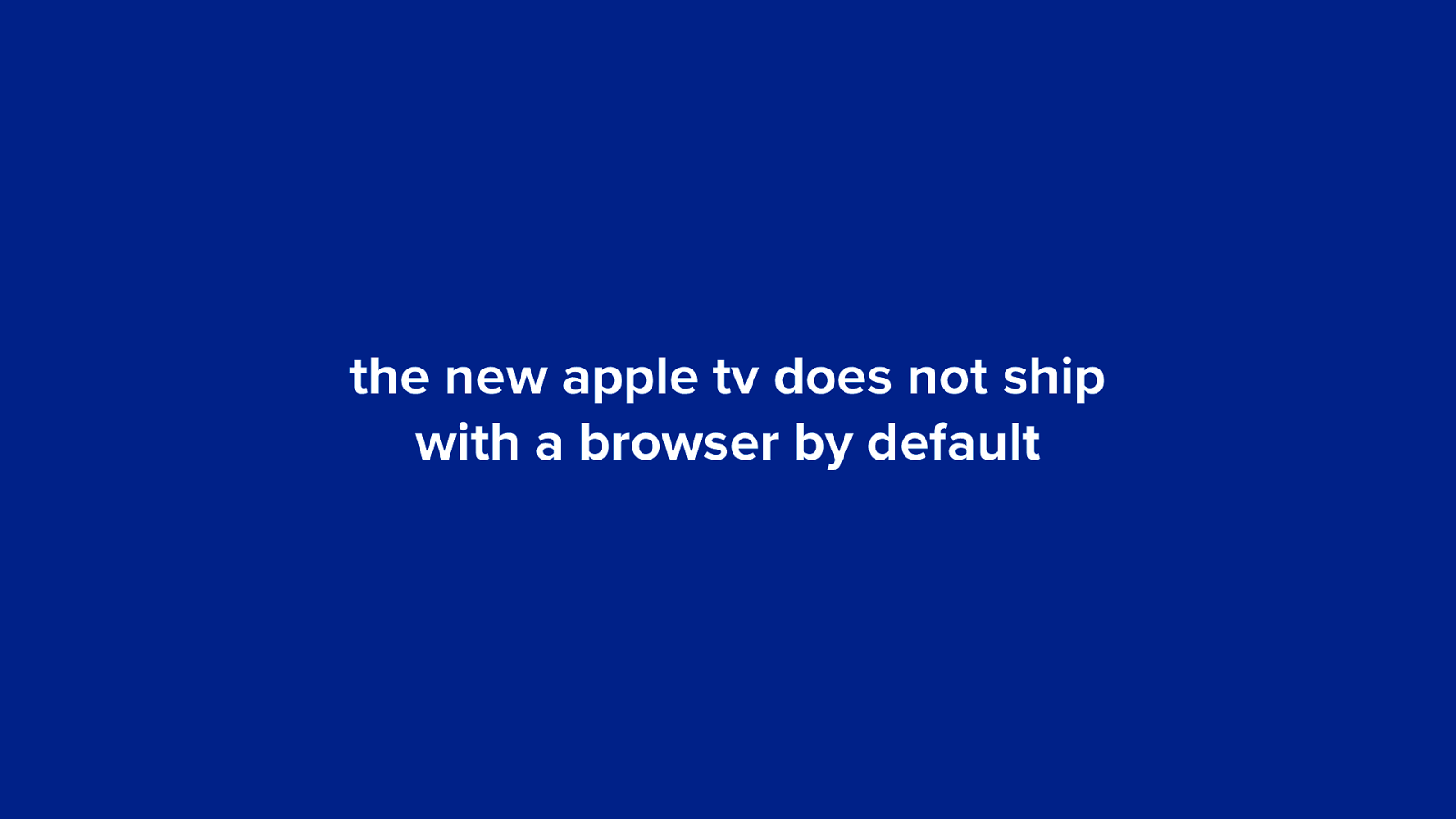
the new apple tv does not ship with a browser by default
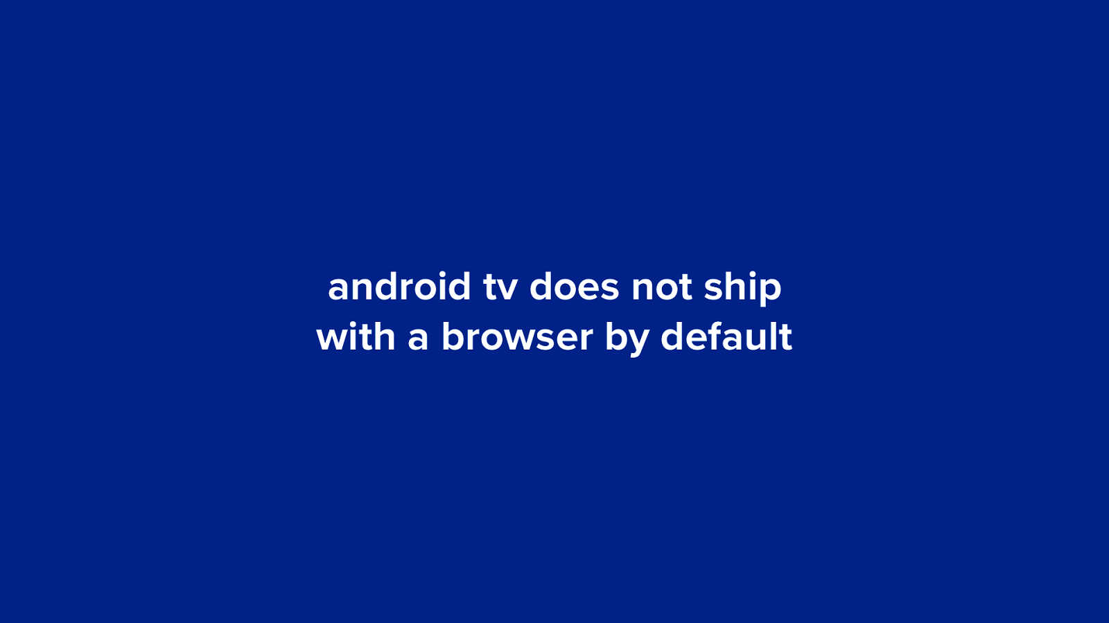
android tv does not ship with a browser by default
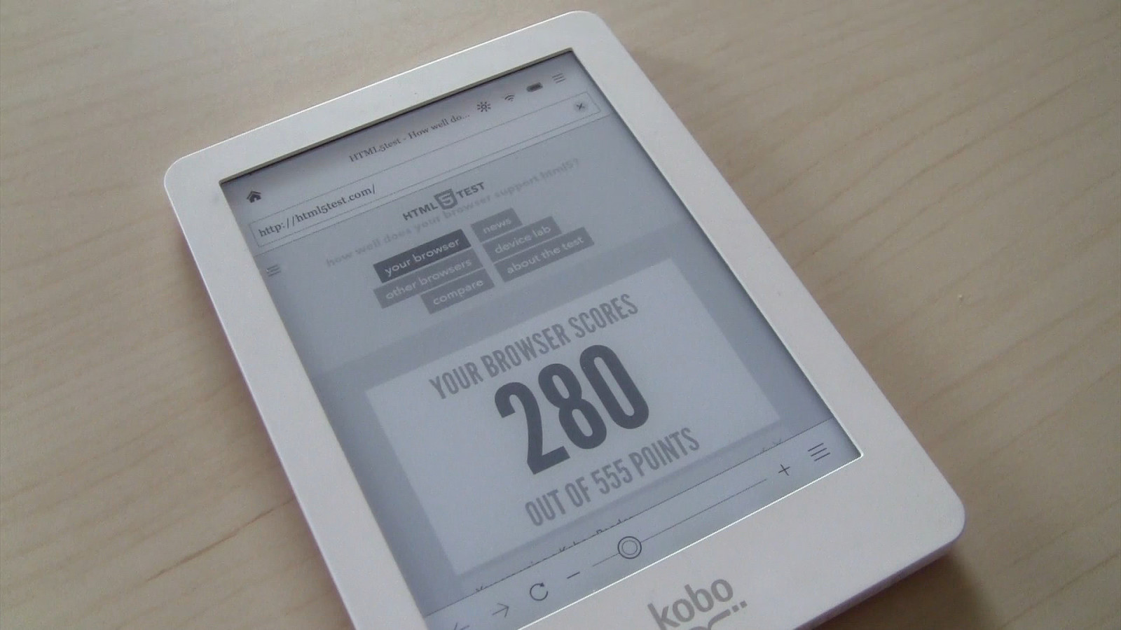
e-readers
187 280 Kindle Touch Kobo 157 Sony Reader 0 555 52 196 Kindle 3 Pocketbook e-reader results on html5test.com
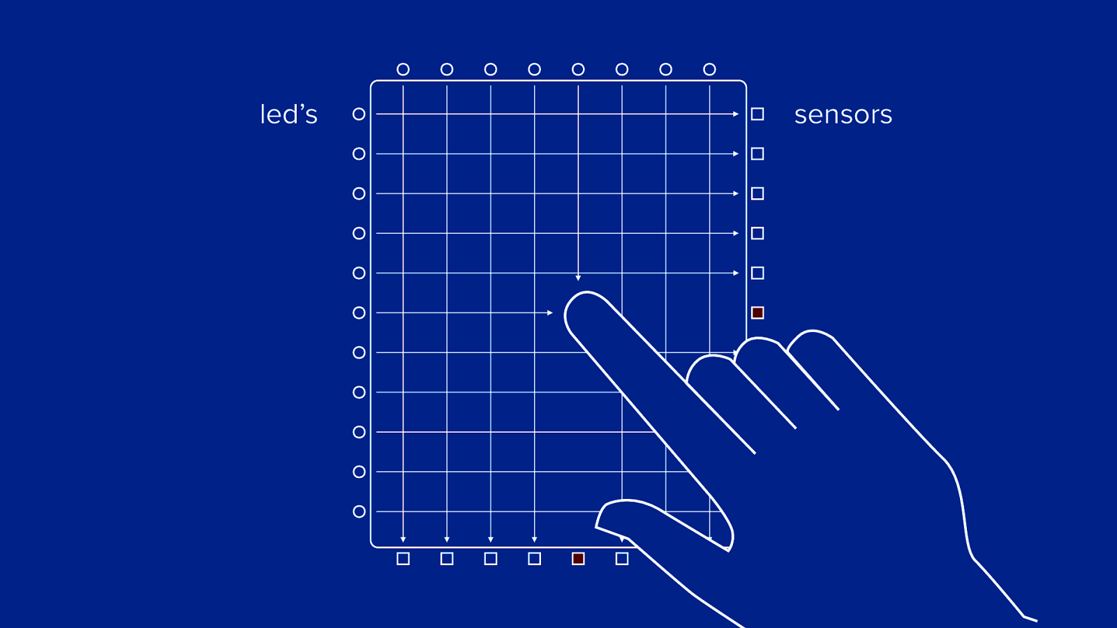
infrared touch screen
led’s sensors
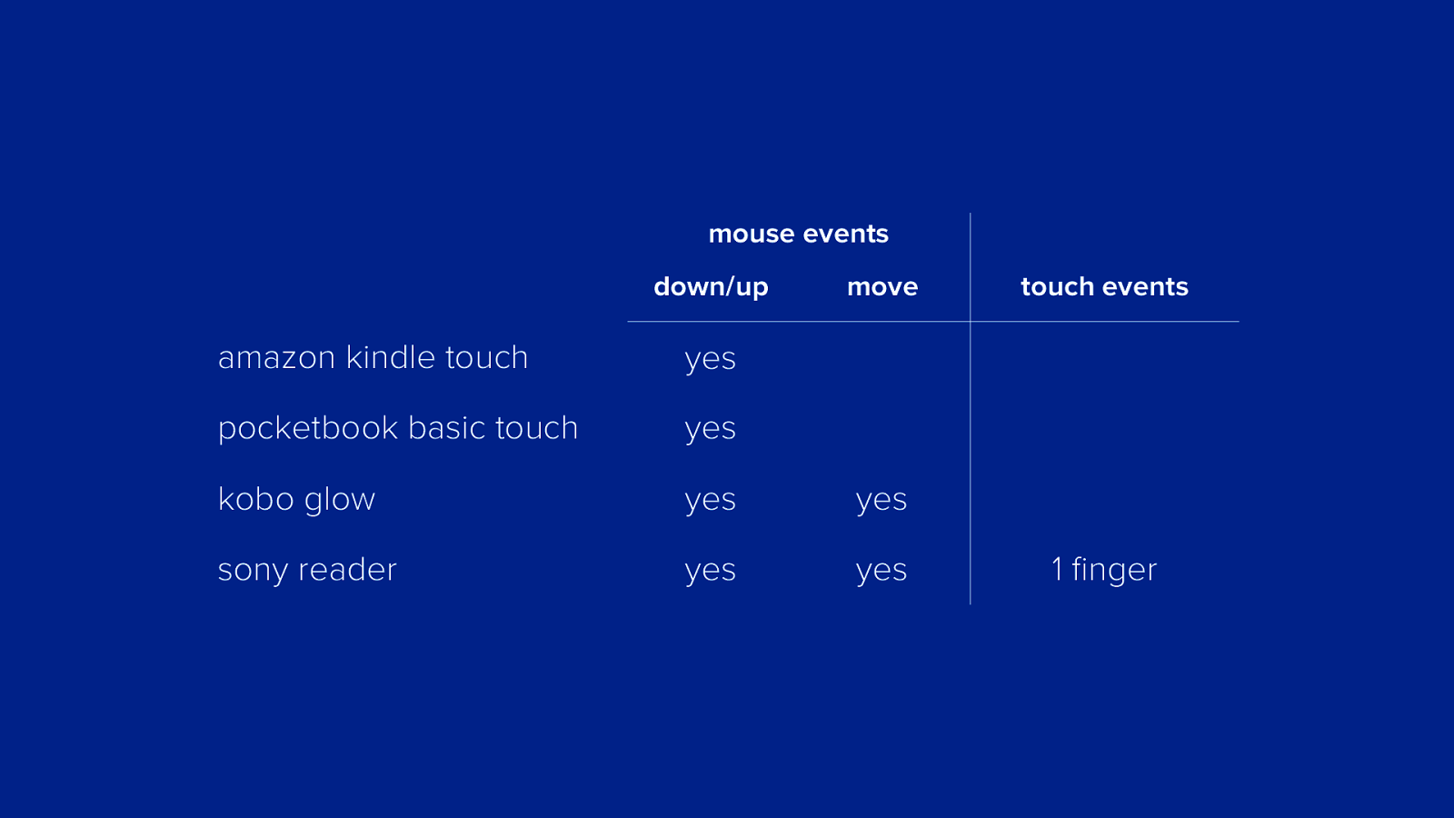
mouse events down/up move amazon kindle touch yes pocketbook basic touch yes kobo glow yes yes sony reader yes yes touch events 1 finger
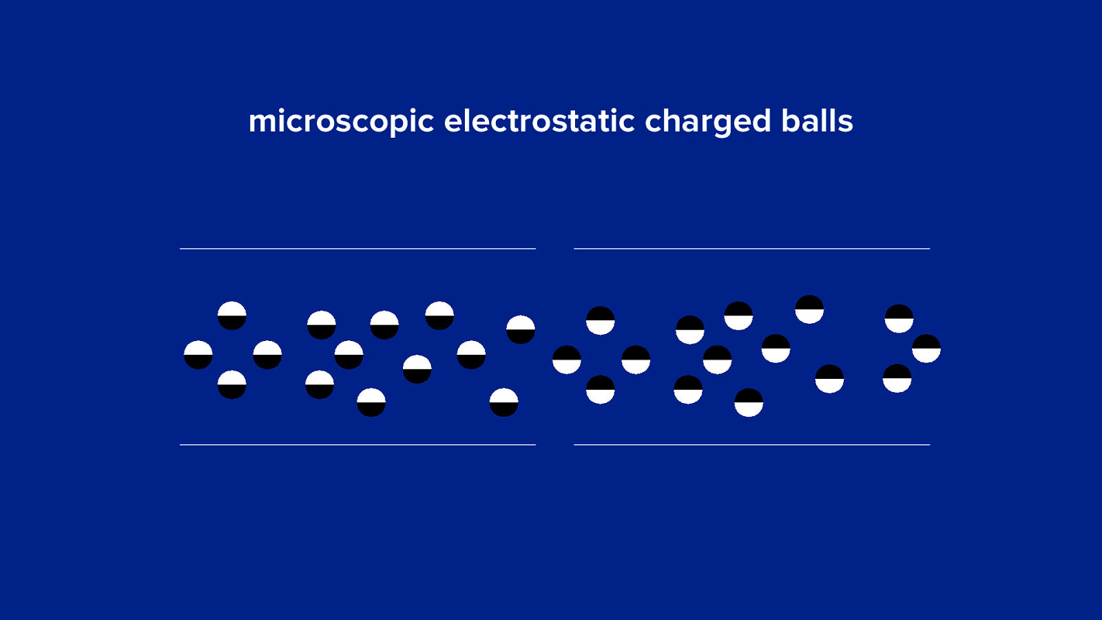
e-ink screens (slow, slower, slowest)
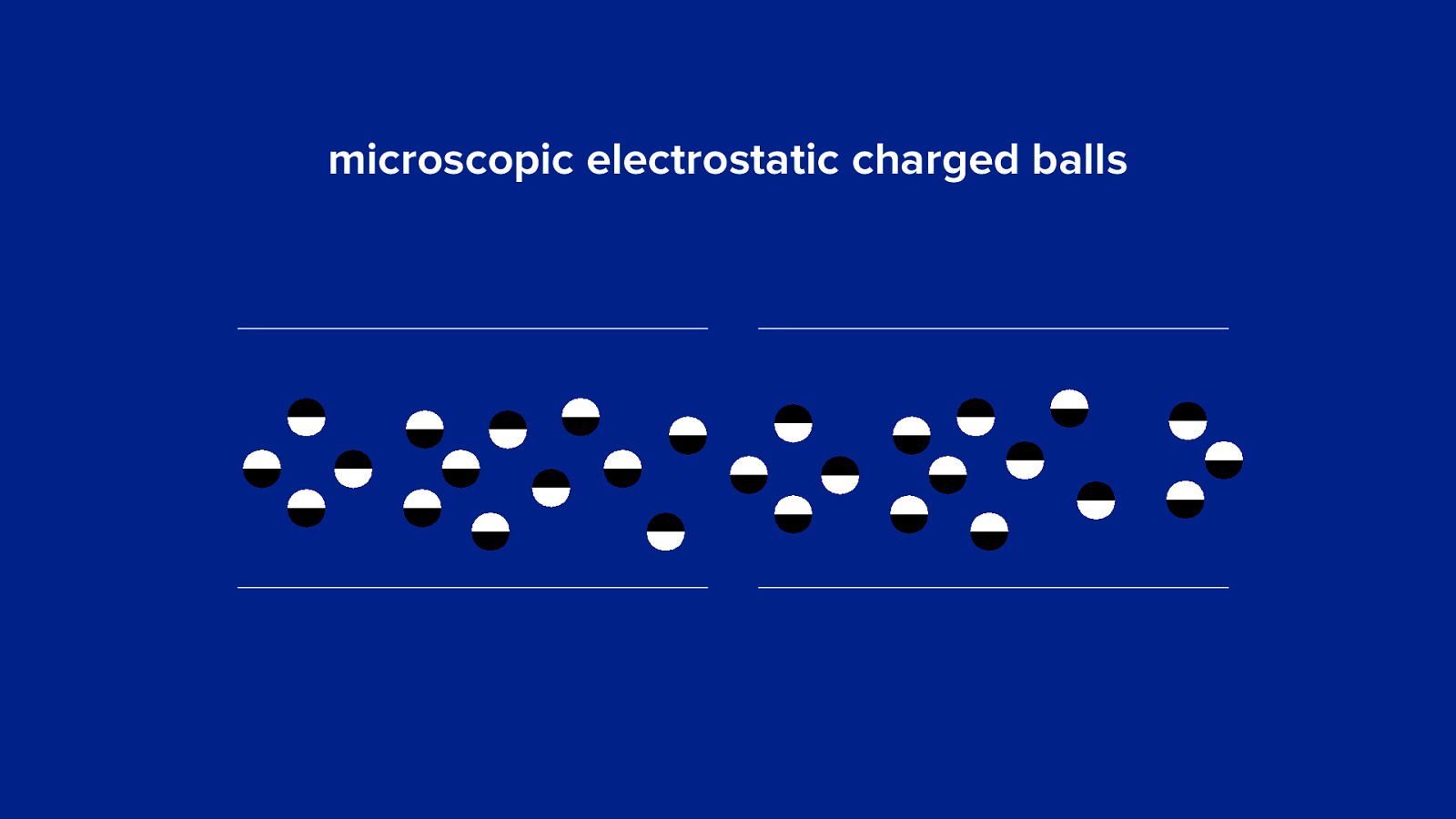
microscopic electrostatic charged balls
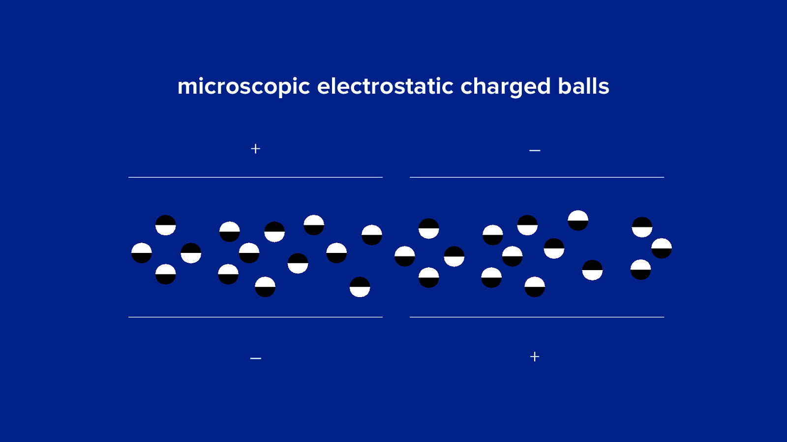
microscopic electrostatic charged balls + – – +
microscopic electrostatic charged balls + – – +
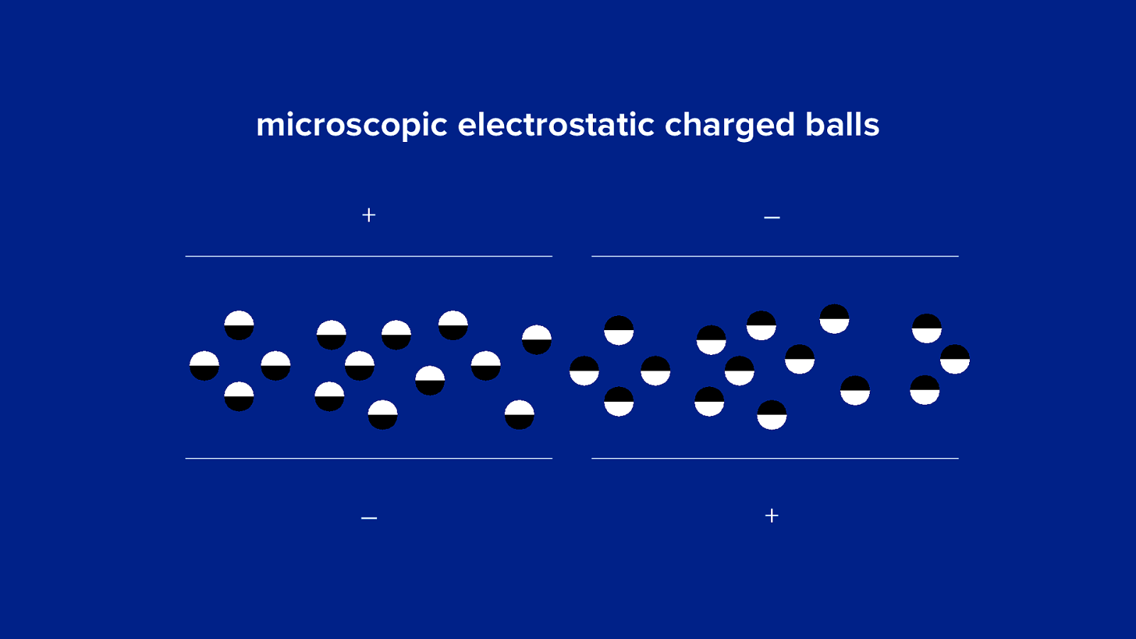
microscopic electrostatic charged balls
maybe css animations and transitions weren’t such a great idea after all
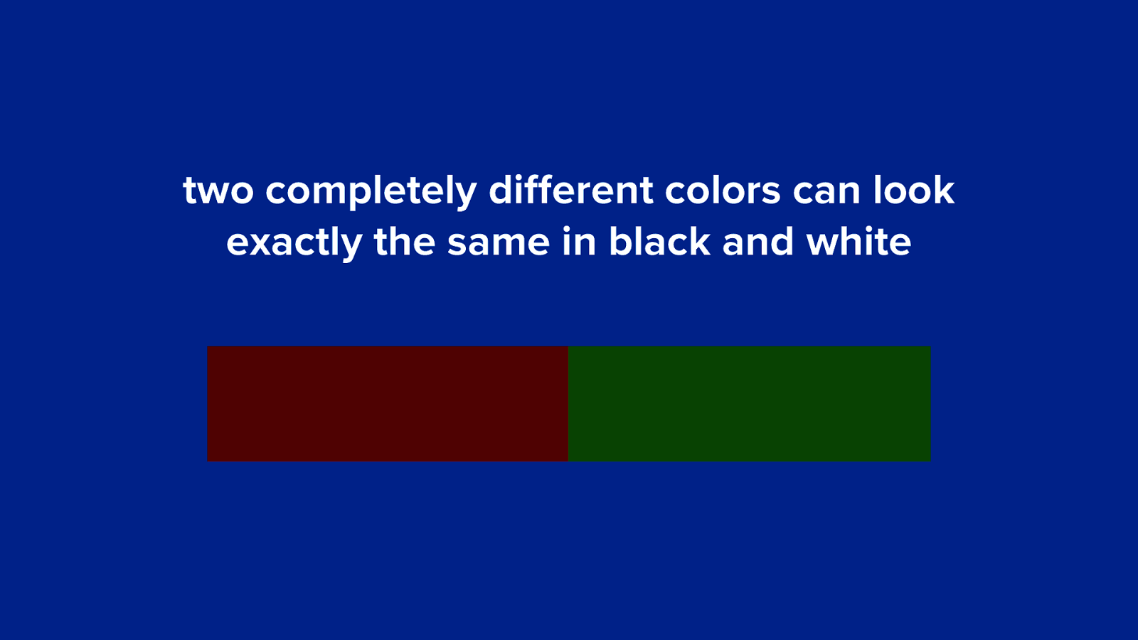
two completely different colors can look exactly the same in black and white
two completely different colors can look exactly the same in black and white
identifying e-readers (css for e-ink screens)
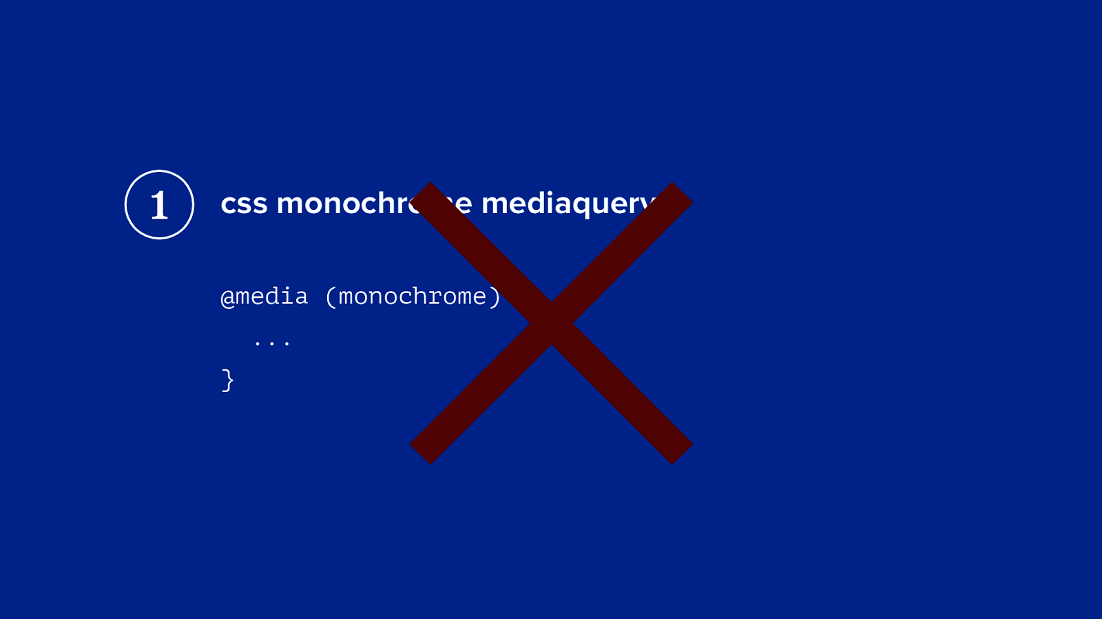
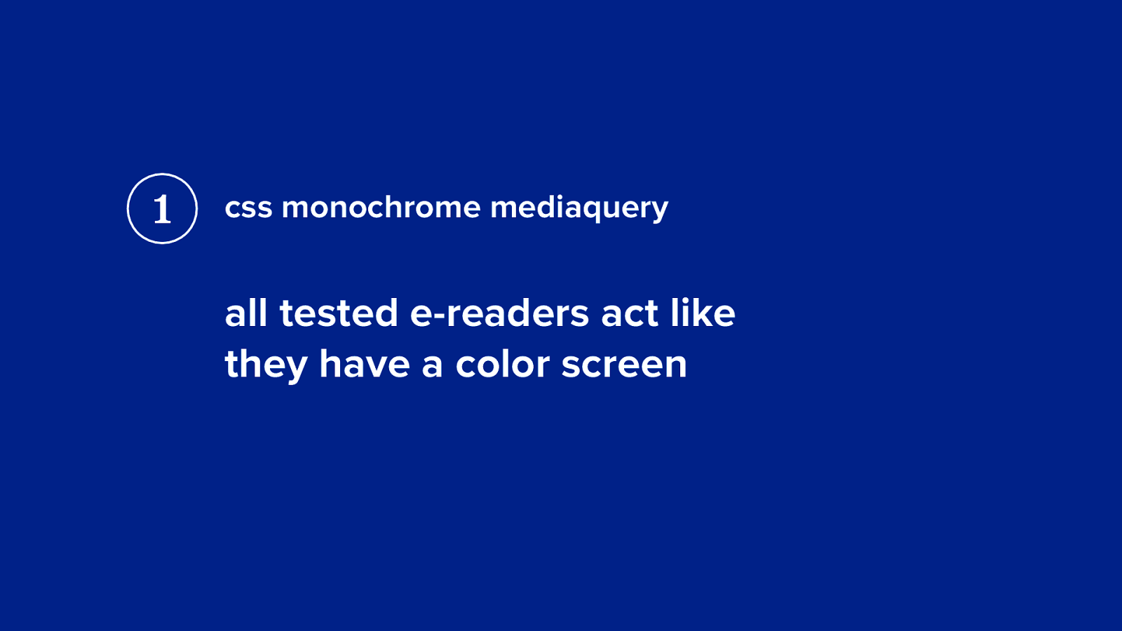
1 × css monochrome mediaquery @media (monochrome) { ... }
1 css monochrome mediaquery all tested e-readers act like they have a color screen
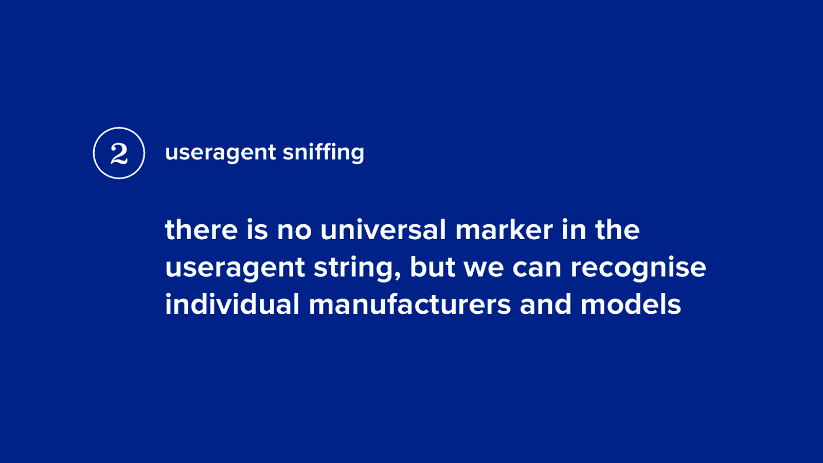
2 useragent sniffing there is no universal marker in the useragent string, but we can recognise individual manufacturers and models
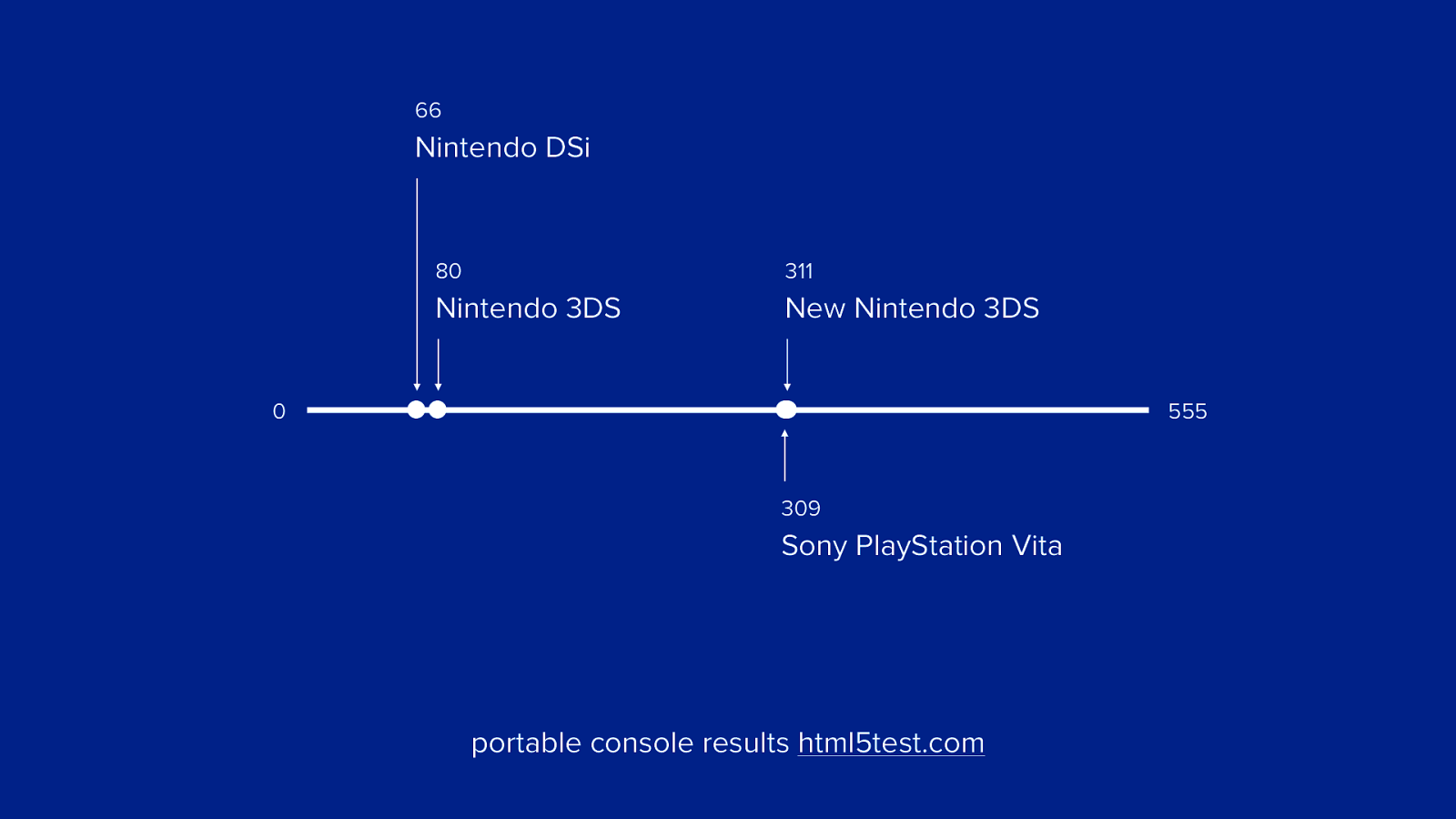
portable consoles
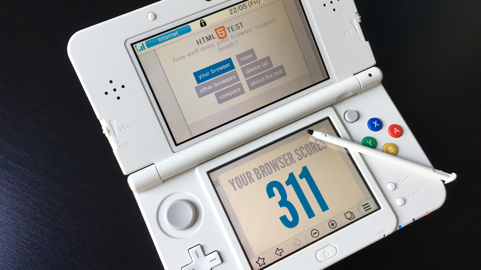
66 Nintendo DSi 80 311 Nintendo 3DS New Nintendo 3DS 0 555 309 Sony PlayStation Vita portable console results html5test.com
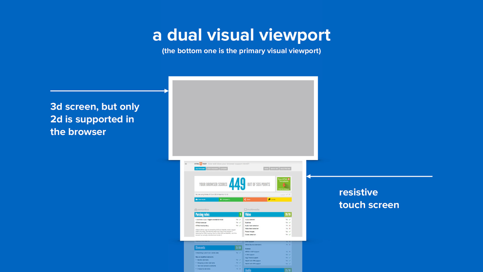
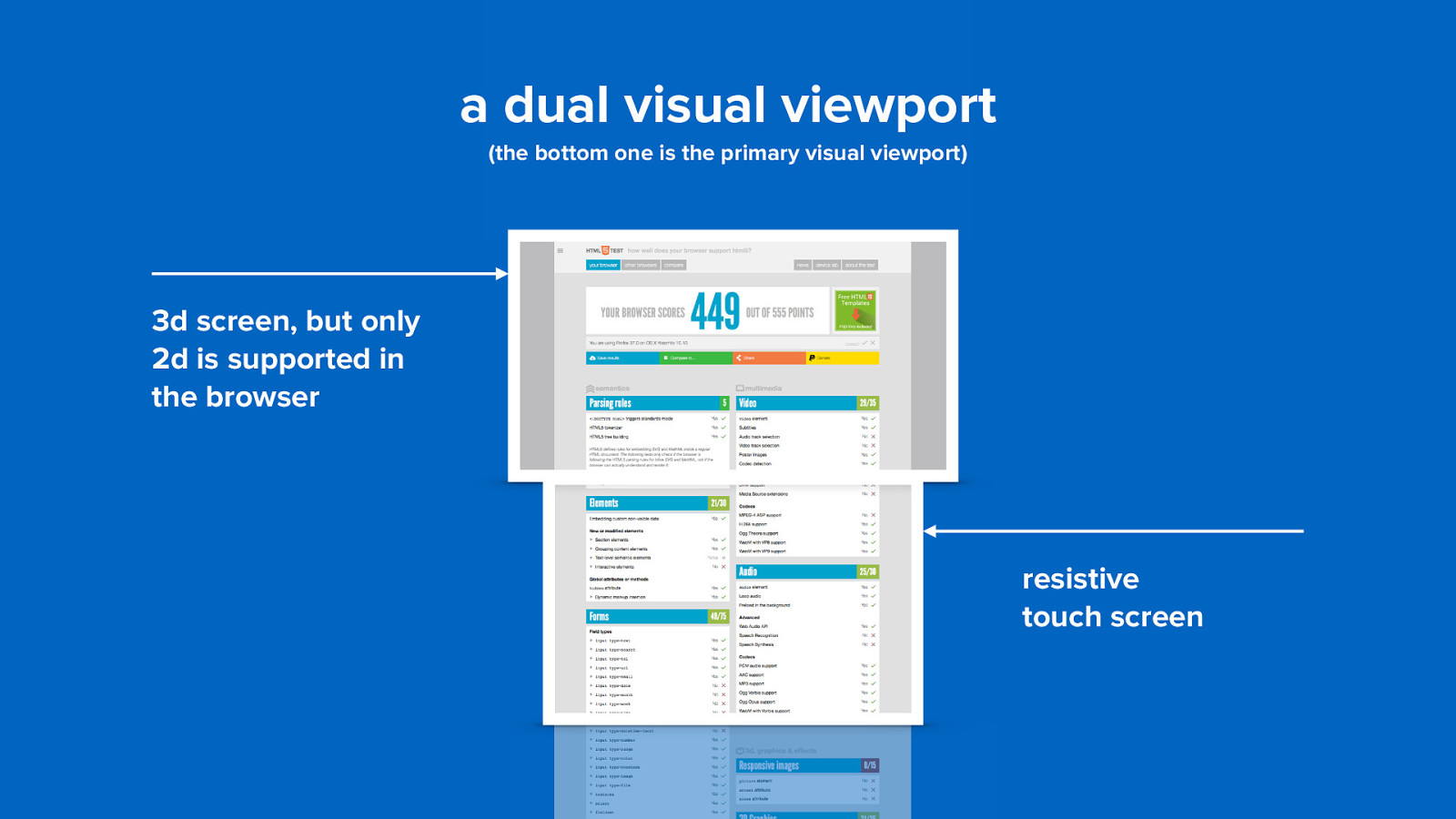
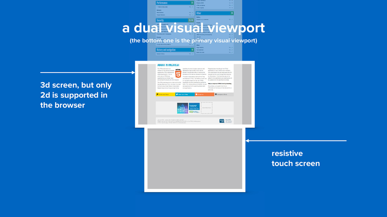
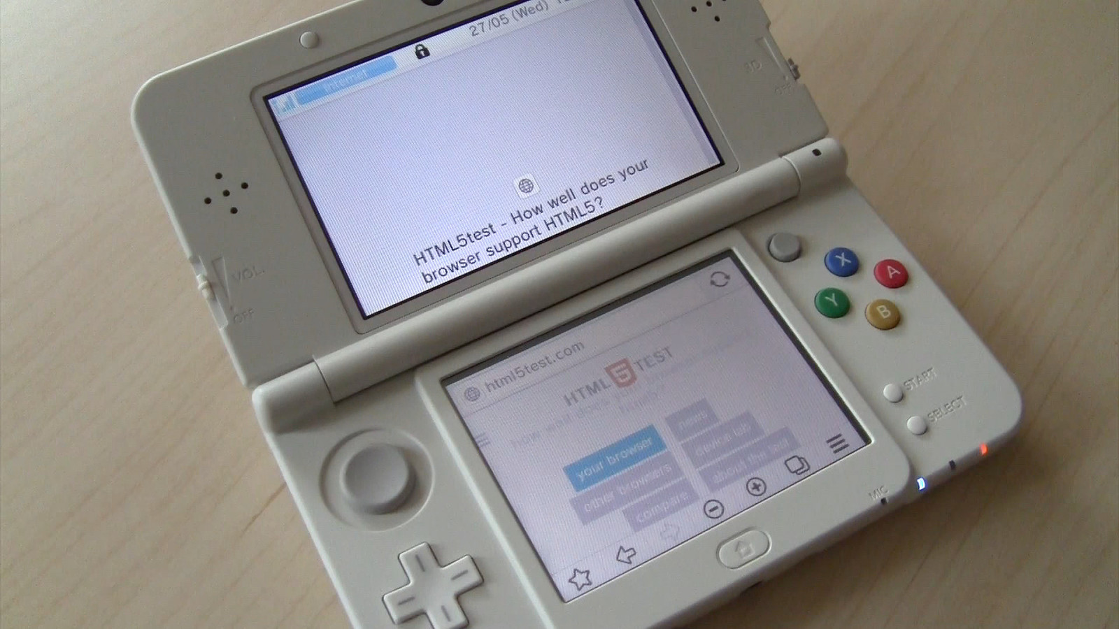
two screens (surprisingly normal)
a dual visual viewport (the bottom one is the primary visual viewport) 3d screen, but only 2d is supported in the browser resistive touch screen
a dual visual viewport (the bottom one is the primary visual viewport) 3d screen, but only 2d is supported in the browser resistive touch screen
a dual visual viewport (the bottom one is the primary visual viewport) 3d screen, but only 2d is supported in the browser resistive touch screen
a dual visual viewport (the bottom one is the primary visual viewport) 3d screen, but only 2d is supported in the browser resistive touch screen
?weird browsers!
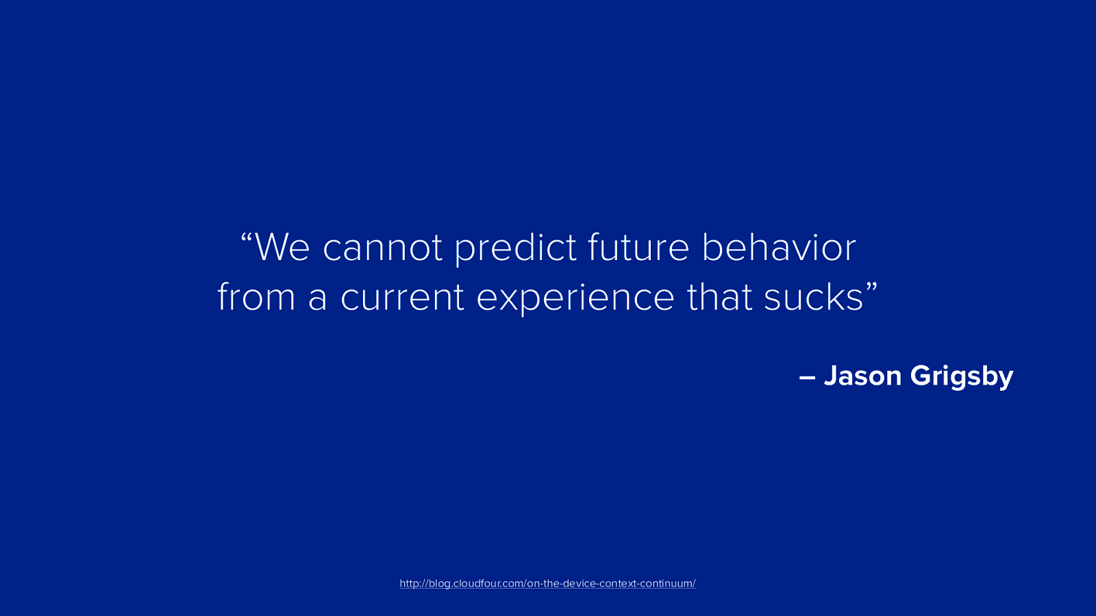
“We cannot predict future behavior from a current experience that sucks” – Jason Grigsby http://blog.cloudfour.com/on-the-device-context-continuum/
but wait…
weird browsers!
weird browsers!
rowsers browsers browsers browsers wsers! browsers! browsers! browsers browsers browser browsers browsers brows
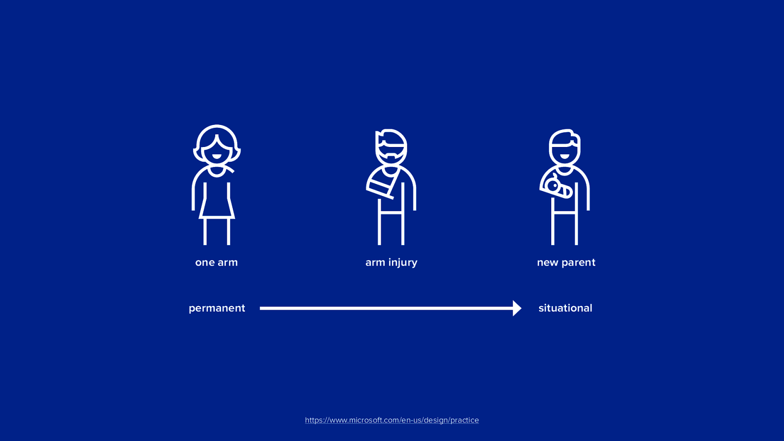
one arm arm injury new parent situational permanent https://www.microsoft.com/en-us/design/practice
thank you niels leenheer @html5test

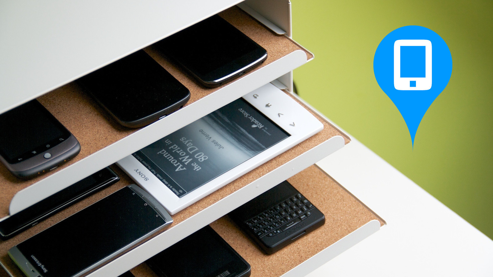
Ever since the web has conquered the desktop, people have been trying to bring it to other devices. Everything from microwaves and fridges to cars. Sometimes these experiments were a success and other times they were complete failures. What are the current frontiers for the web? Are there still any weird browsers left?
The latest generation of Smart TV's run on the same operating systems as our mobile devices. How weird can these browsers be? Perhaps Smart TV's aren't as smart as we all would like to think. But there are more weird browsers. How do game consoles like the Xbox One handle your websites and are e-readers really capable of browsing the web? And are the browsers in VR-headsets like the Hololens any good? I will try to give an overview of all the problems you are going to face when you want to make your site work on these weird browsers.