
A presentation at Global Accessibility Awareness Day (GAAD) - Futurice in in Munich, Germany by Núria Peña
Live. Learn. Access Designing for Accessibility Núria Peña Interaction Designer at Holidu @nuriapenya
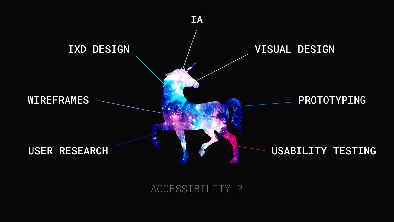
IA IXD DESIGN VISUAL DESIGN WIREFRAMES PROTOTYPING USER RESEARCH USABILITY TESTING ACCESSIBILITY ?
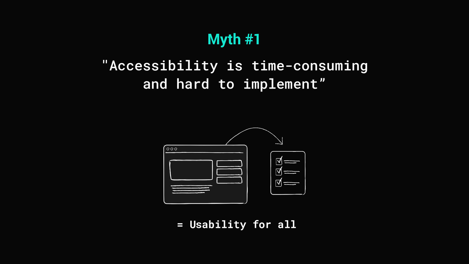
Myth #1 “Accessibility is time-consuming and hard to implement” = Usability for all
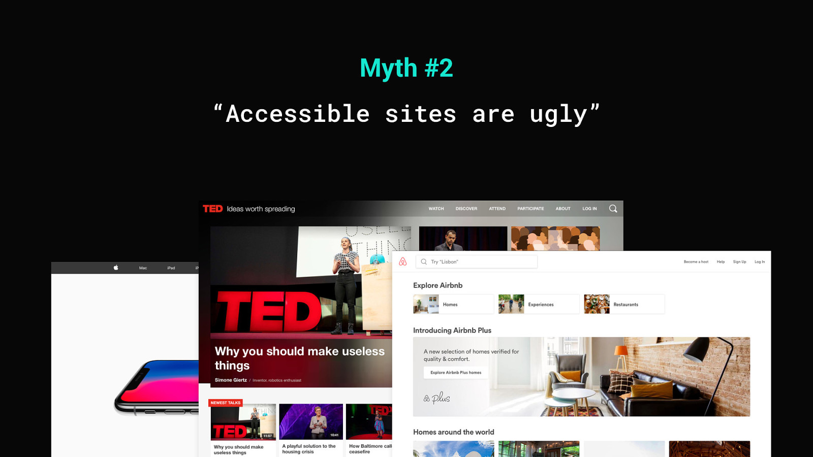
Myth #2 “Accessible sites are ugly”
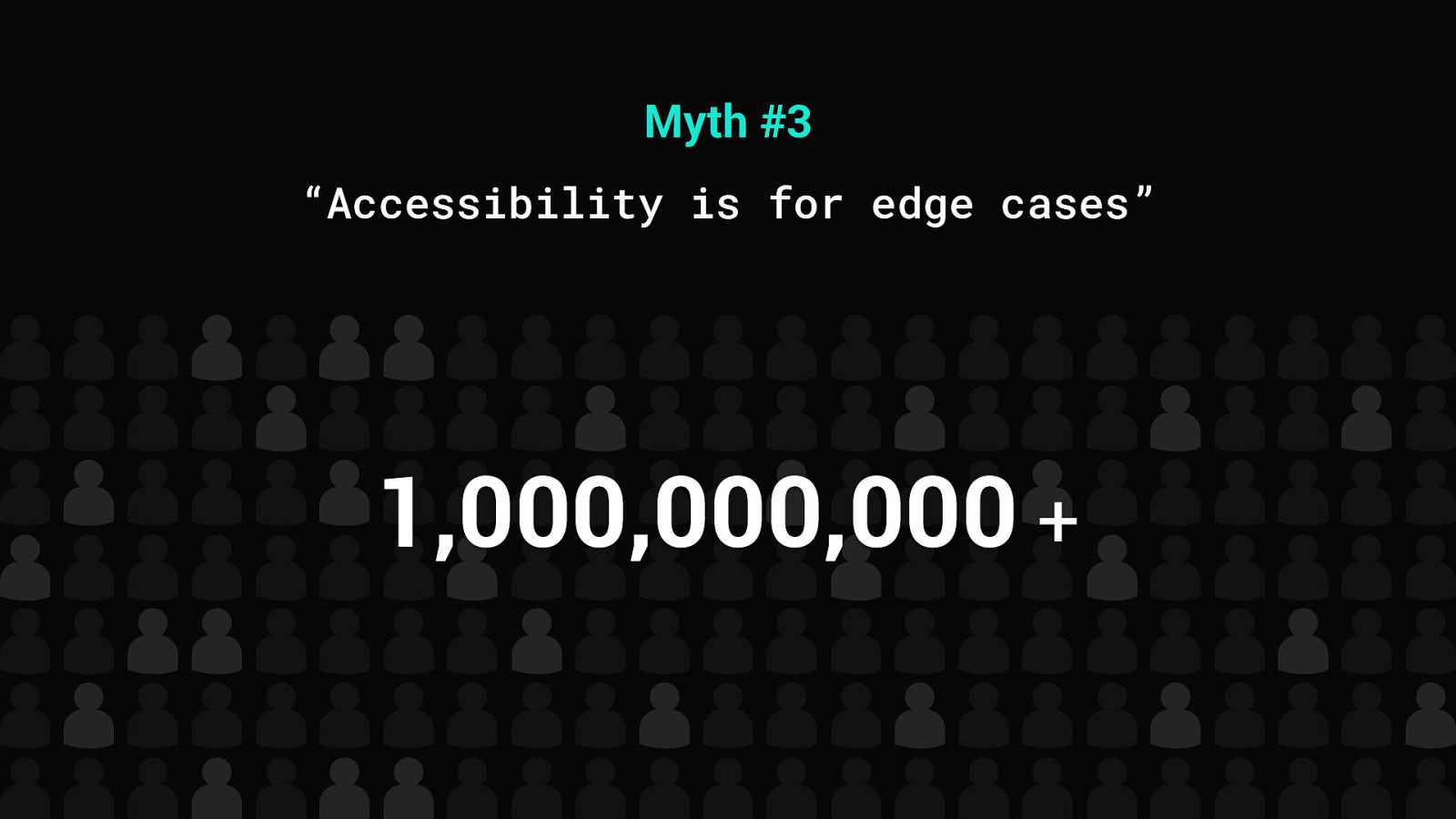
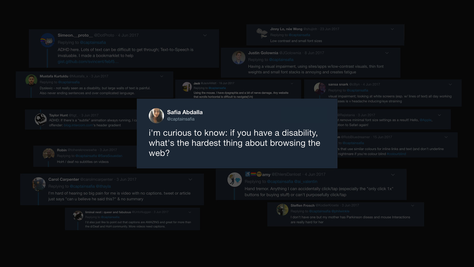
Myth #3 “Accessibility is for edge cases” 1,000,000,000 +
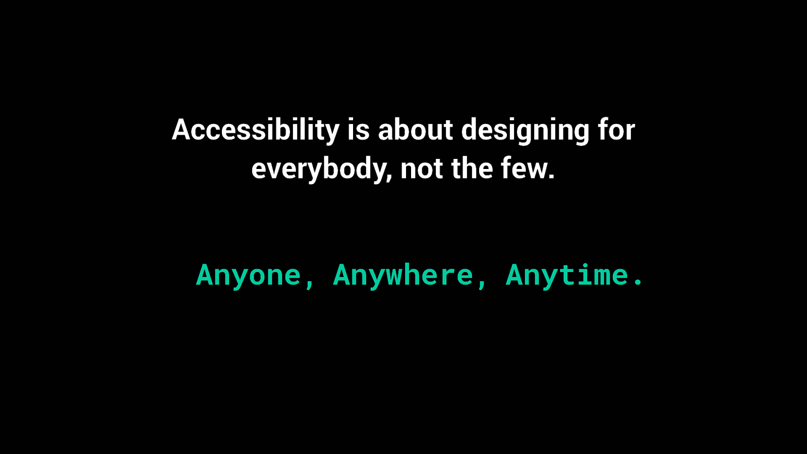
Accessibility is about designing for everybody, not the few. Anyone, Anywhere, Anytime.
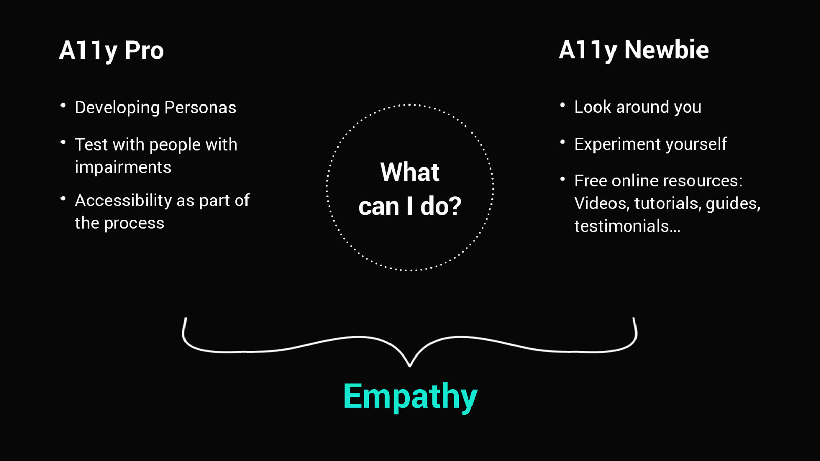
A11y Newbie A11y Pro Developing Personas Look around you Test with people with impairments Experiment yourself Accessibility as part of the process What can I do? Empathy Free online resources: Videos, tutorials, guides, testimonials…
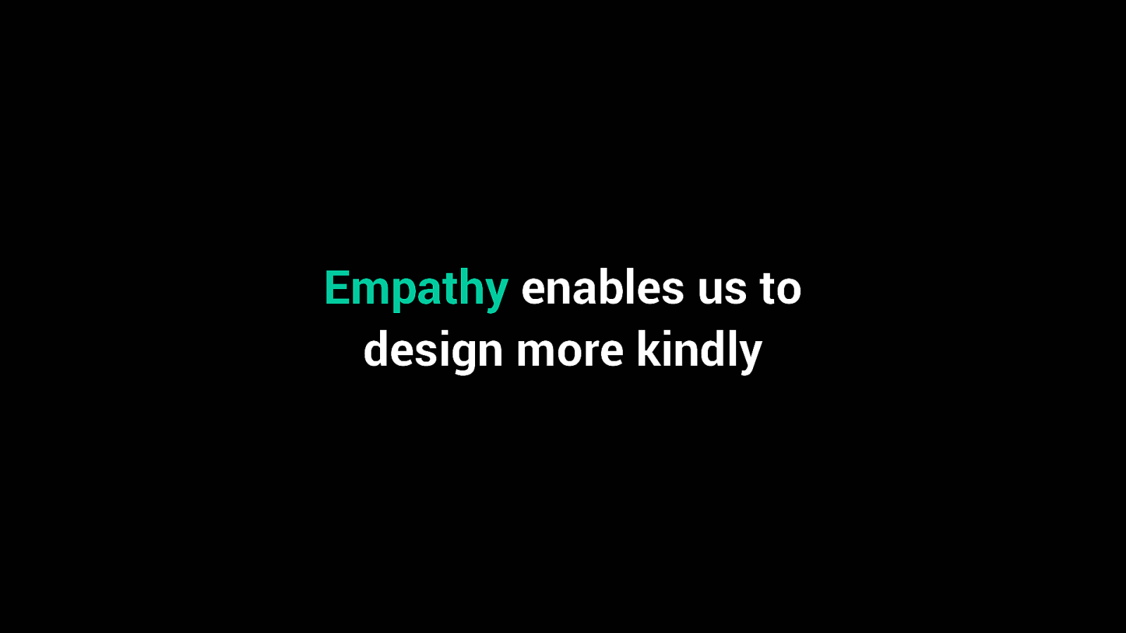
Empathy enables us to design more kindly
Design Principles
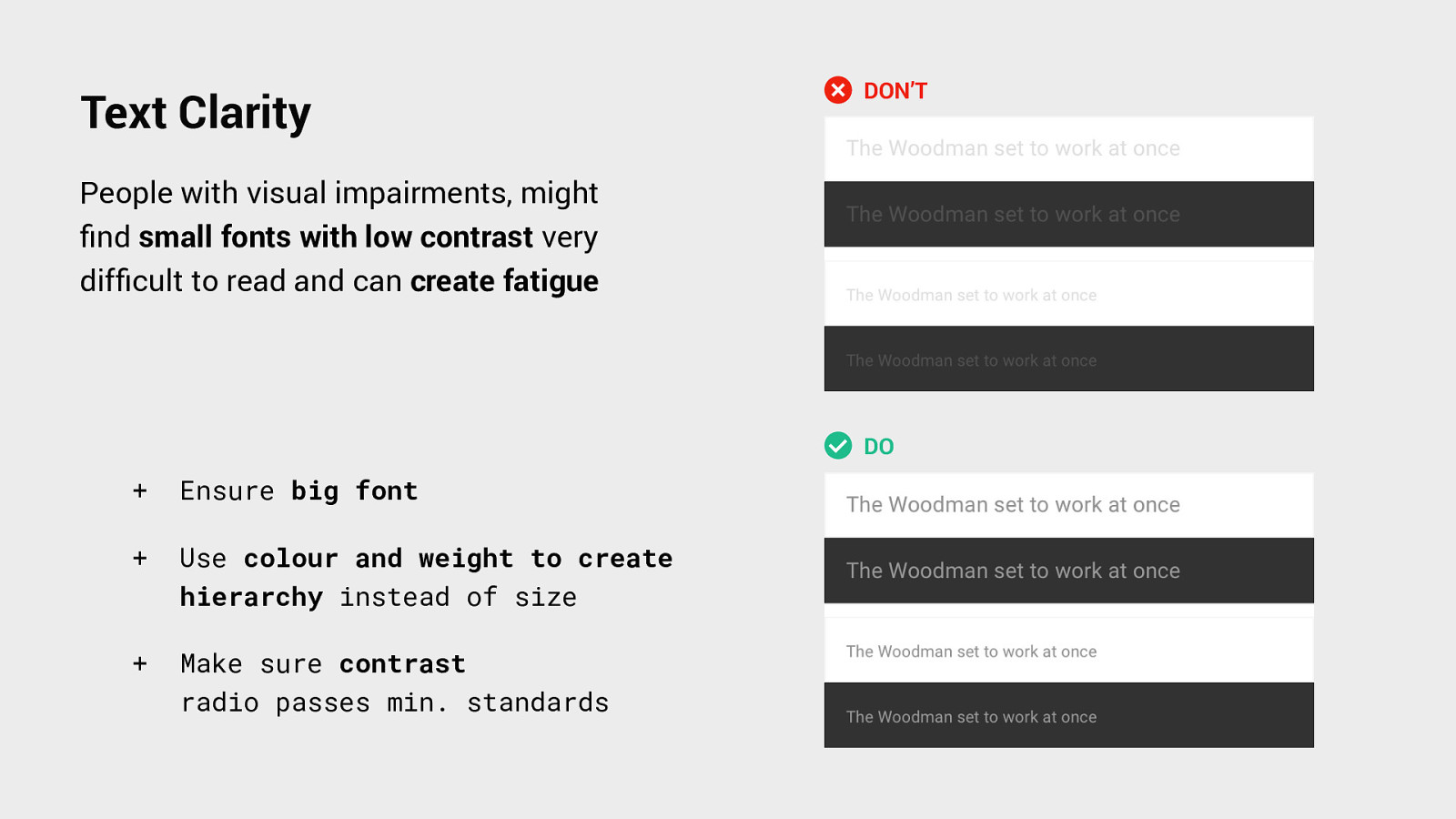
Text Clarity DON’T People with visual impairments, might find small fonts with low contrast very difficult to read and can create fatigue DO + Ensure big font + Use colour and weight to create hierarchy instead of size + Make sure contrast radio passes min. standards
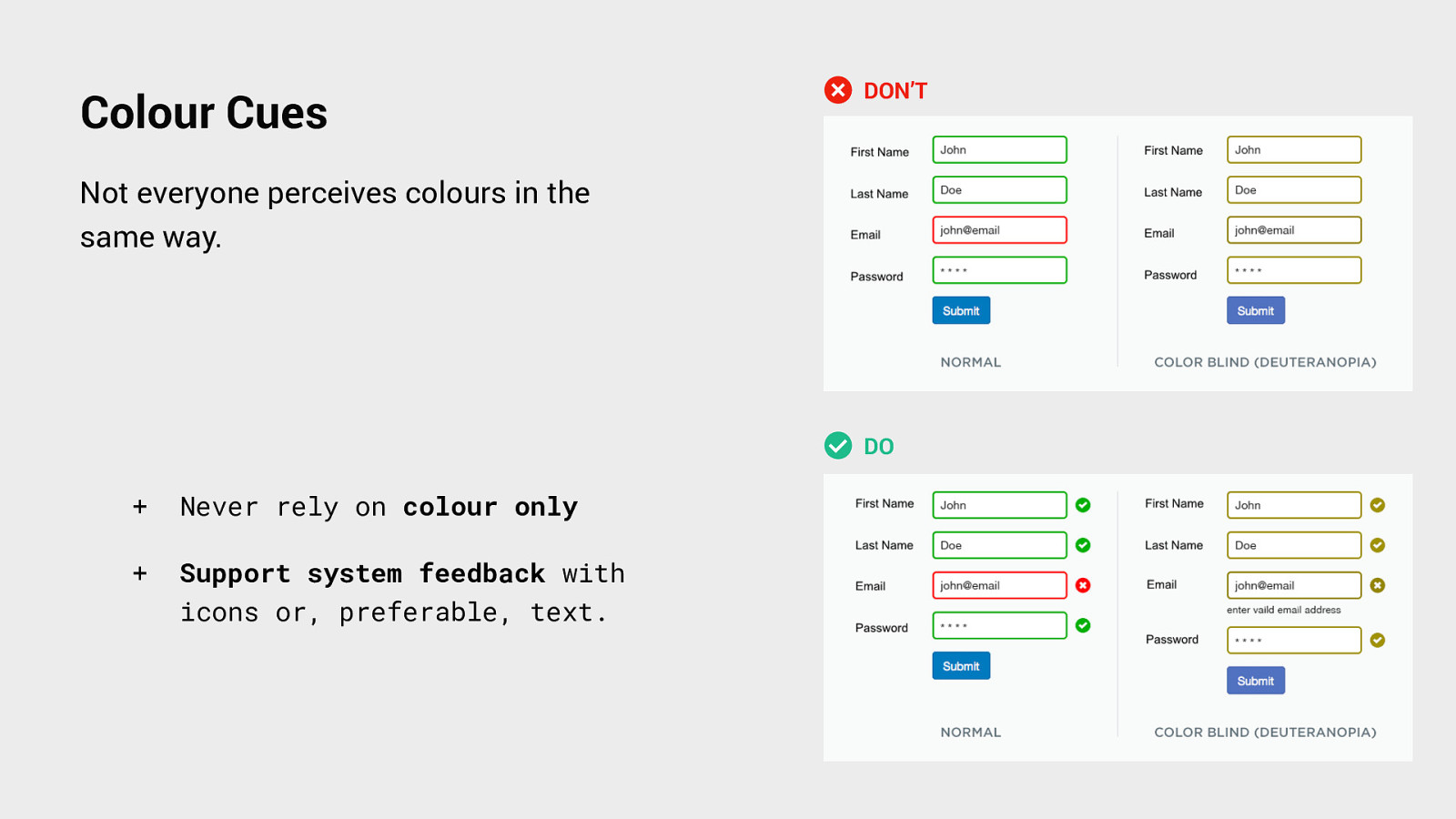
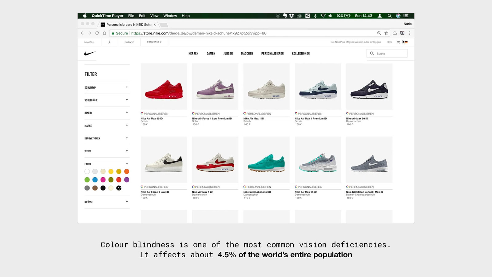
Colour Cues DON’T Not everyone perceives colours in the same way. DO + Never rely on colour only + Support system feedback with icons or, preferable, text.
Colour blindness is one of the most common vision deficiencies. It affects about 4.5% of the world’s entire population
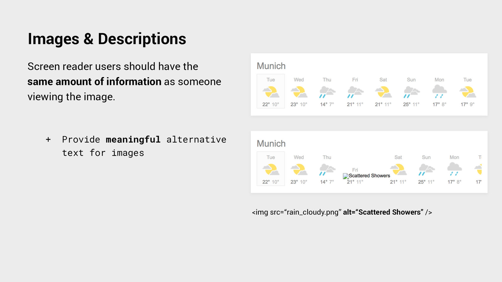
Images & Descriptions Screen reader users should have the same amount of information as someone viewing the image. + Provide meaningful alternative text for images <img src=“rain_cloudy.png” alt=“Scattered Showers” />
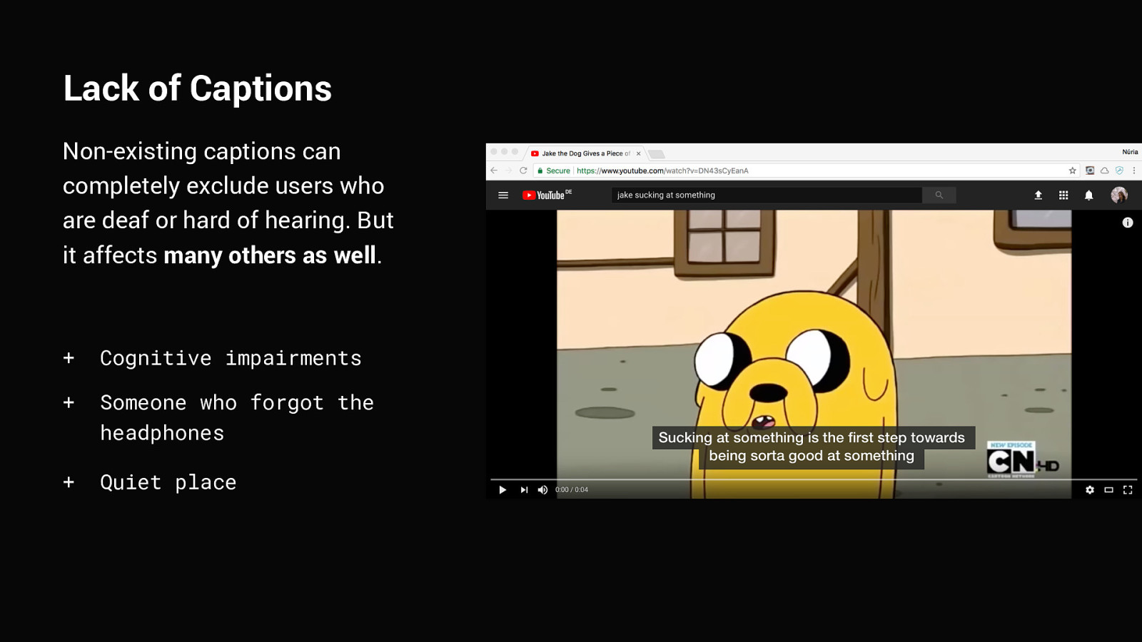
Lack of Captions Non-existing captions can completely exclude users who are deaf or hard of hearing. But it affects many others as well. + Cognitive impairments + Someone who forgot the headphones + Quiet place
Motion & Animation Motion and animation can be annoying to anyone, but is extra frustrating for people with vestibular disorders: + Heavy motion can cause dizziness, vertigo or nausea + Carousels and ads might distract users from completing a task. + Avoid videos or motion to start automatically
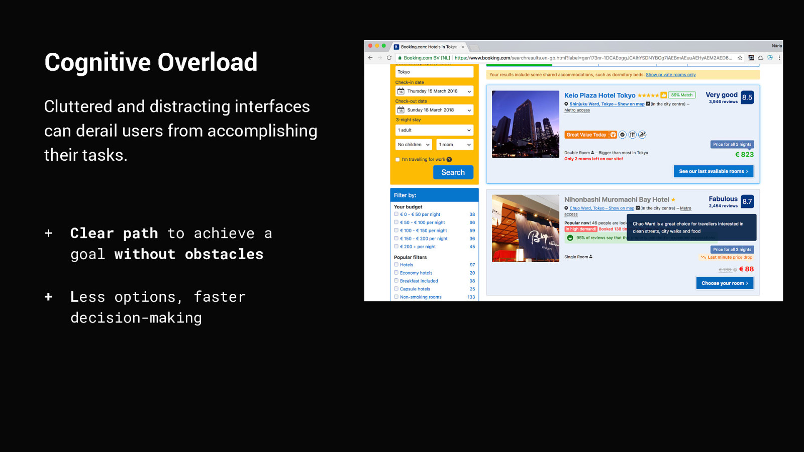
Cognitive Overload Cluttered and distracting interfaces can derail users from accomplishing their tasks. + Clear path to achieve a goal without obstacles + Less options, faster decision-making
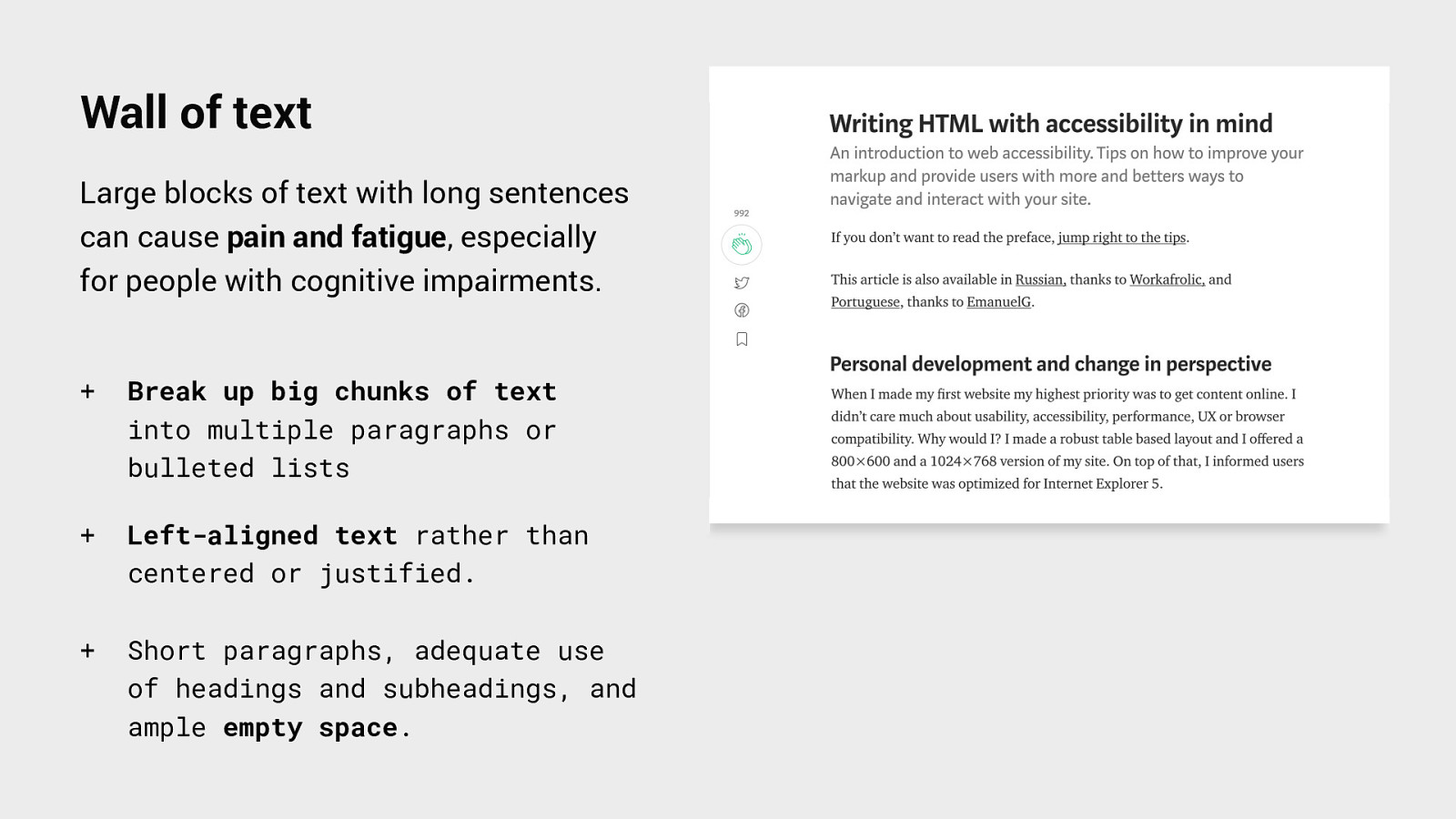
Wall of text Large blocks of text with long sentences can cause pain and fatigue, especially for people with cognitive impairments. + Break up big chunks of text into multiple paragraphs or bulleted lists + Left-aligned text rather than centered or justified. + Short paragraphs, adequate use of headings and subheadings, and ample empty space.
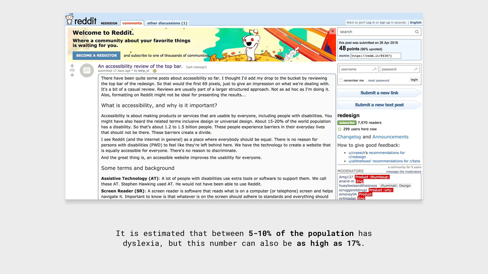
It is estimated that between 5-10% of the population has dyslexia, but this number can also be as high as 17%.
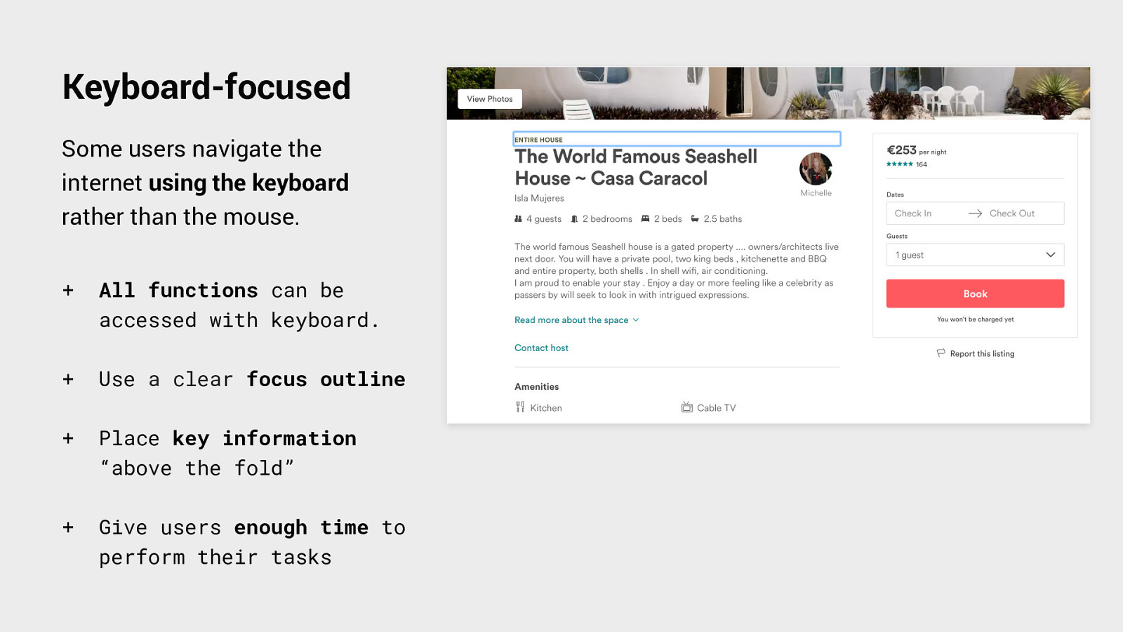
Keyboard-focused Some users navigate the internet using the keyboard rather than the mouse. + All functions can be accessed with keyboard. + Use a clear focus outline + Place key information “above the fold” + Give users enough time to perform their tasks
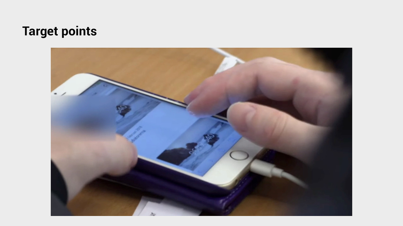
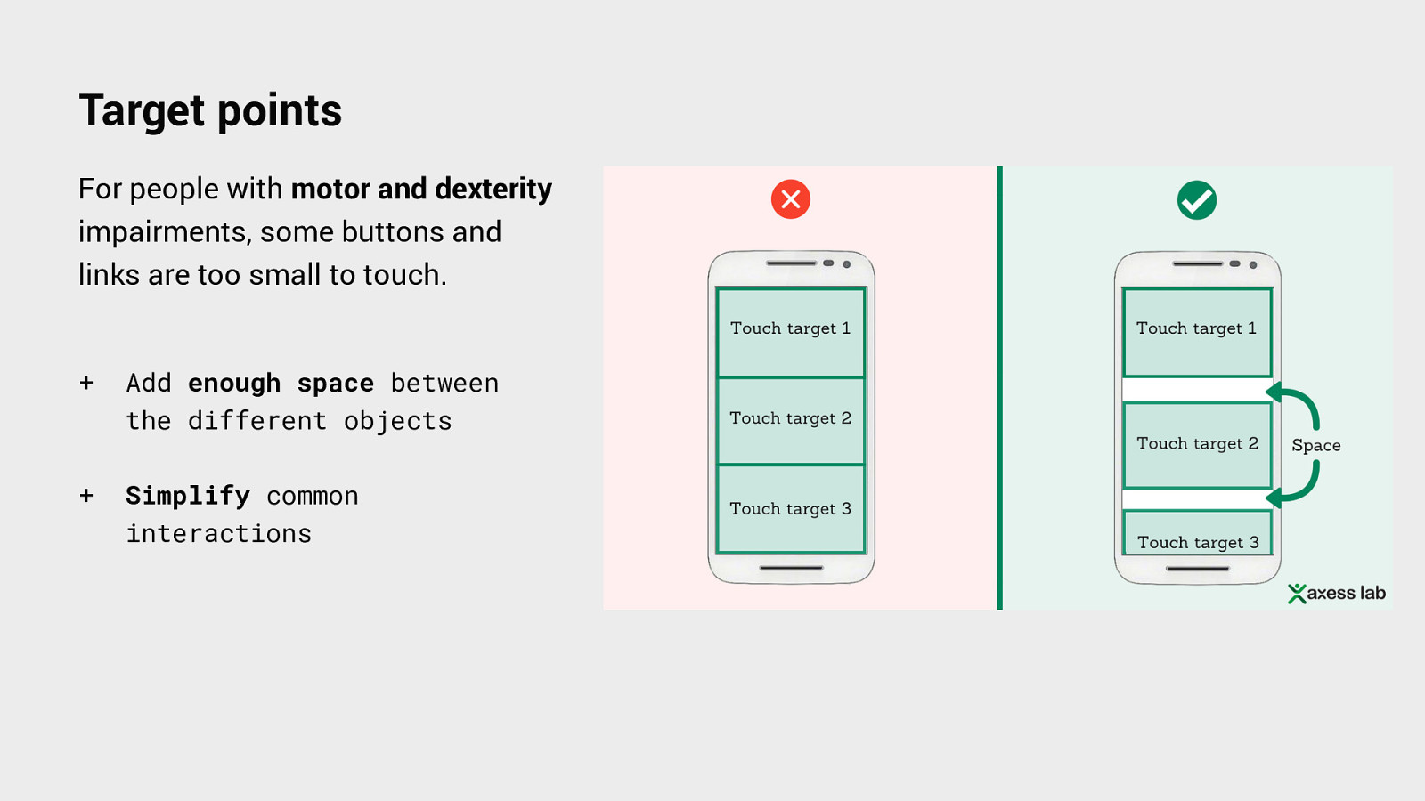
Target points
Target points For people with motor and dexterity impairments, some buttons and links are too small to touch. + Add enough space between the different objects + Simplify common interactions
By applying those design principles we are not only improving the experience to people with impairments but to everyone.
Final thoughts • Accessibility is just a better design for everyone. • Empathy will enable us to design more kindly. • Consider these design principles to improve accessibility in digital products.
“ ” “The power of the web is in its universality” — Tim Berners-Lee Inventor of the World Wide Web.
Live. Learn. Access Designing for Accessibility
Questions? Núria Peña Interaction Designer at Holidu @nuriapenya

In this presentation, I wanted to share my experience as a designer discovering and understanding accessibility. All the misconceptions I had and also share with you some learnings I got on this journey.
 for free. You
can too.
for free. You
can too.