Design for Web Accessibility Núria Peña @nuriapenya Slides & Resources: noti.st/nuriapena

A presentation at Code.Talks in October 2019 in Hamburg, Germany by Núria Peña

Design for Web Accessibility Núria Peña @nuriapenya Slides & Resources: noti.st/nuriapena
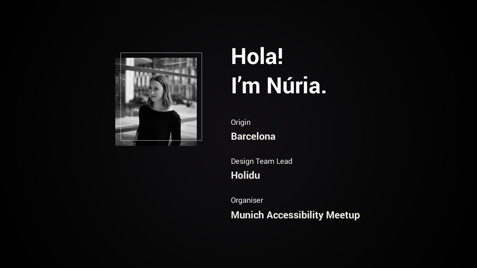
Hola! I’m Núria. Origin Barcelona Design Team Lead Holidu Organiser Munich Accessibility Meetup
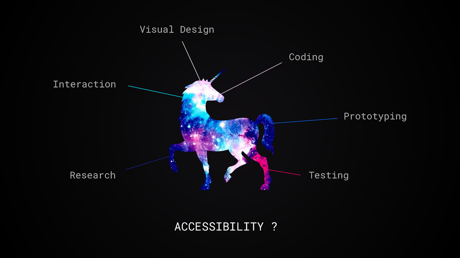
Visual Design Coding Interaction Prototyping Research Testing ACCESSIBILITY ?
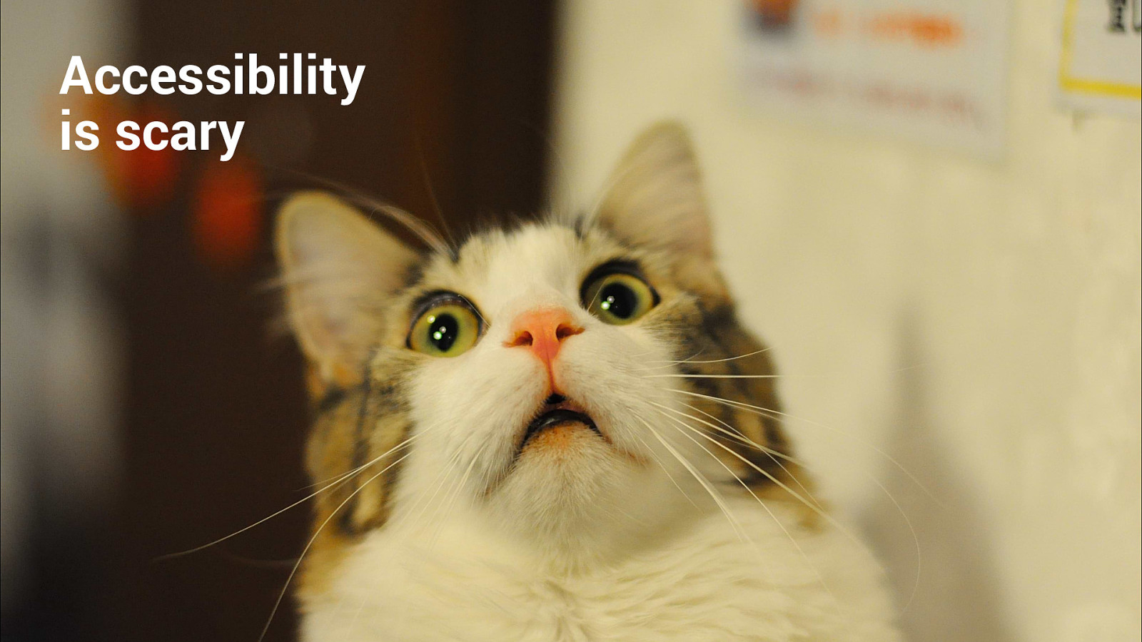
Accessibility is scary
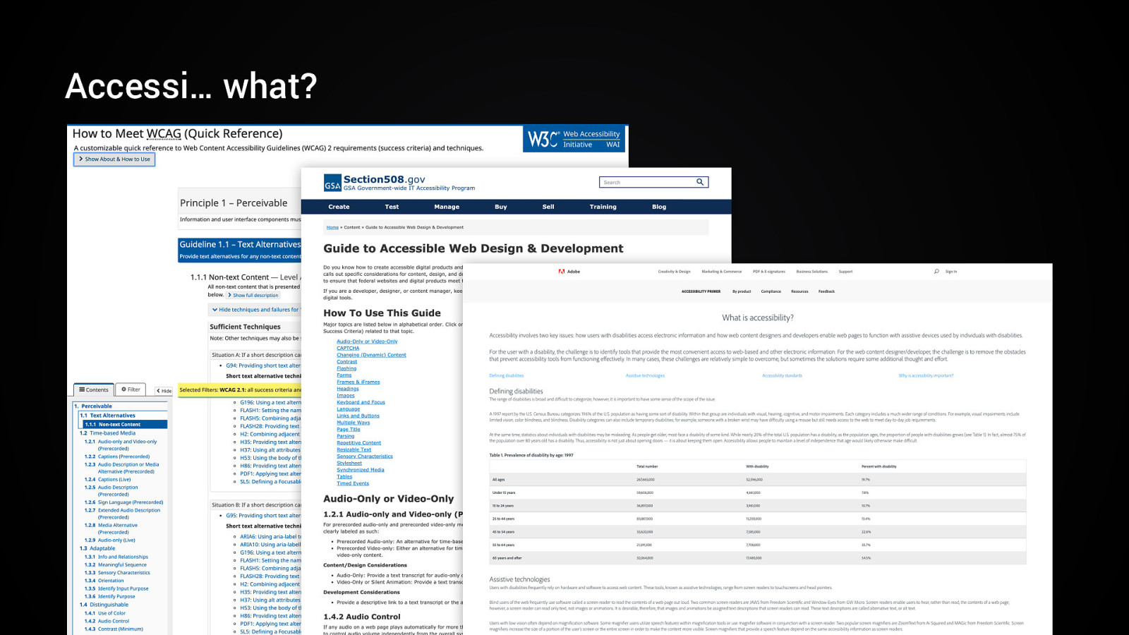
Accessi… what?
Accessibility = Creative Challenge Accessibility = A11y 11
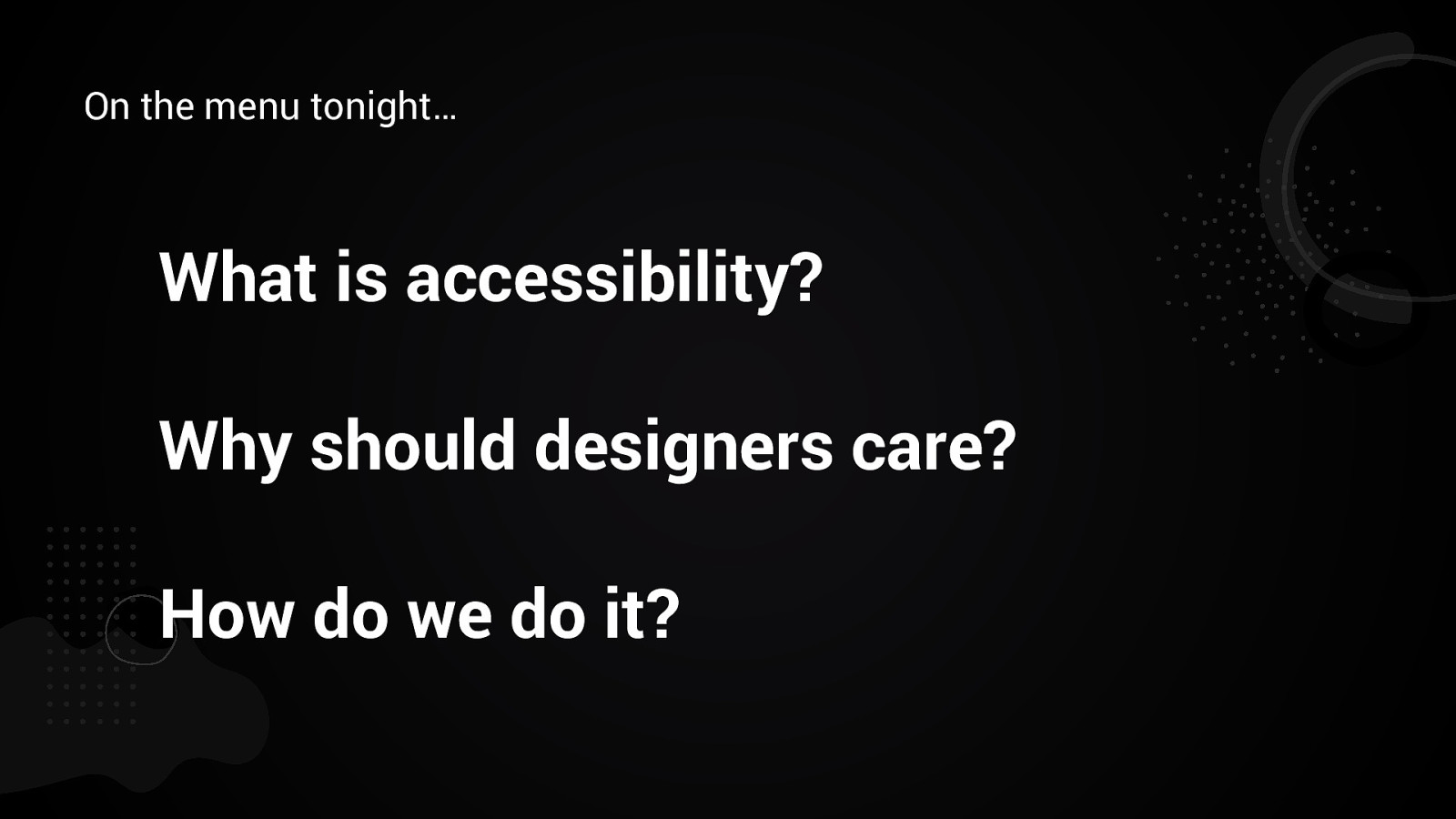
On the menu tonight… What is accessibility? Why should designers care? How do we do it?
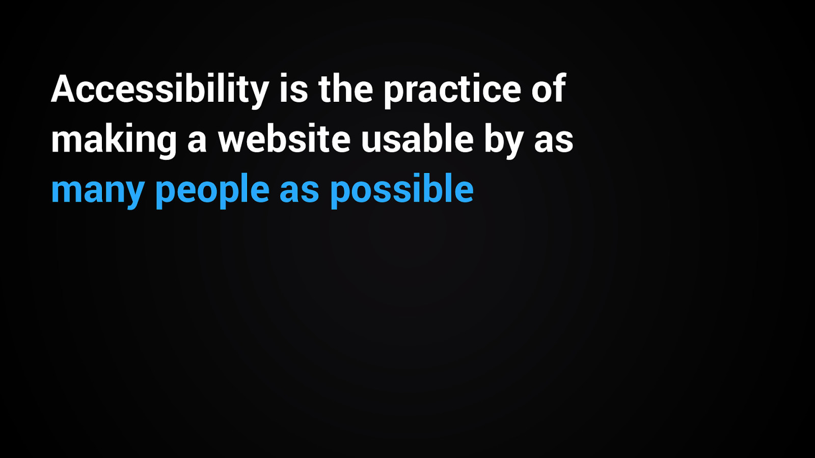
Accessibility is the practice of making a website usable by as many people as possible
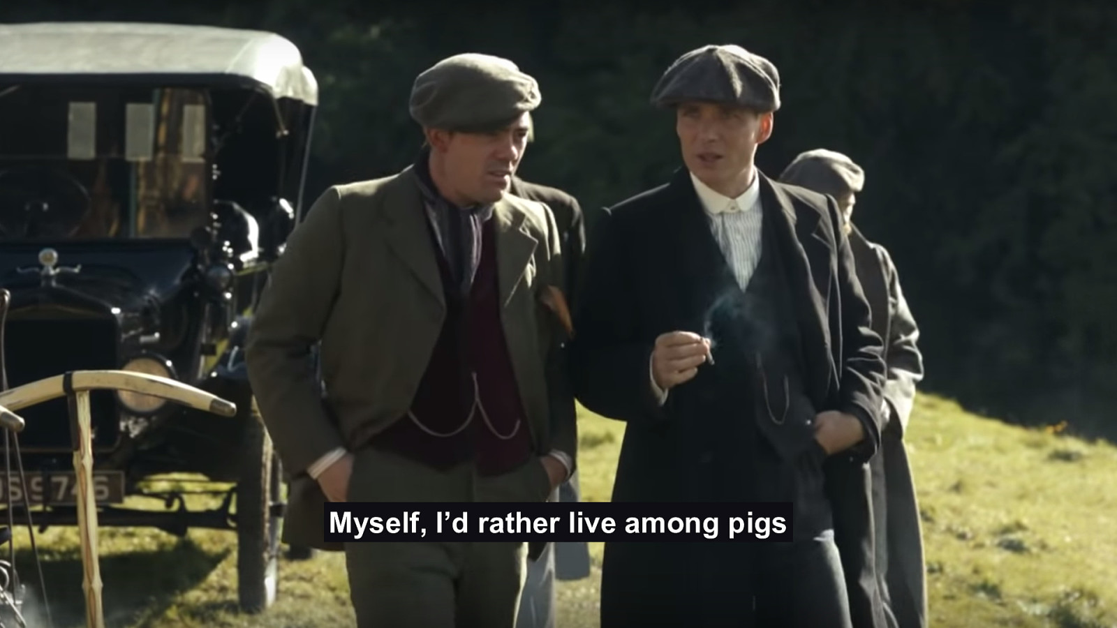
Myself, I’d rather live among pigs
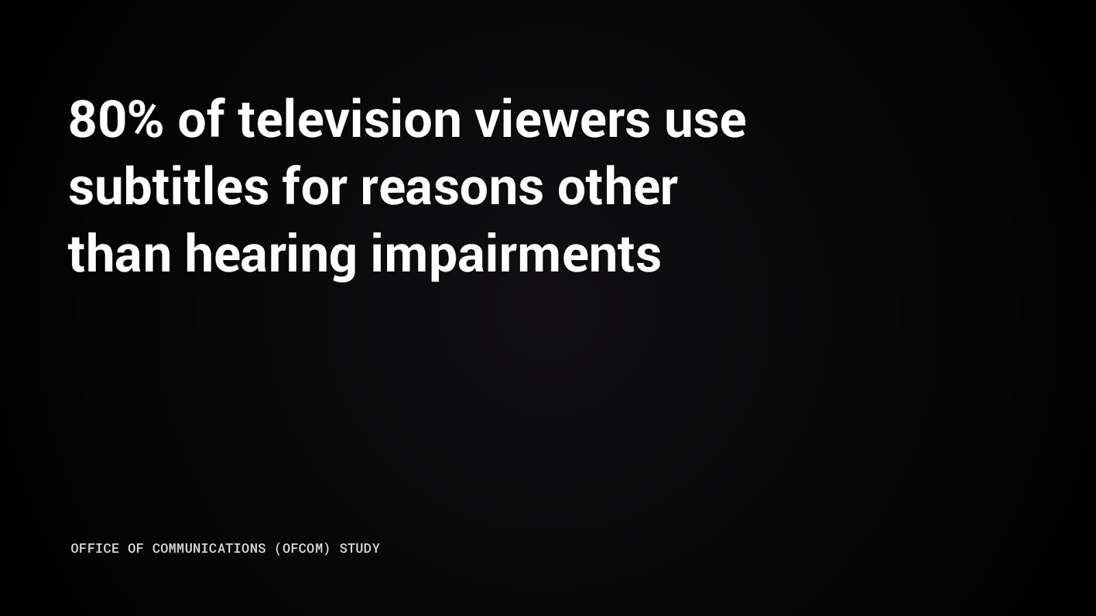
80% of television viewers use subtitles for reasons other than hearing impairments OFFICE OF COMMUNICATIONS (OFCOM) STUDY
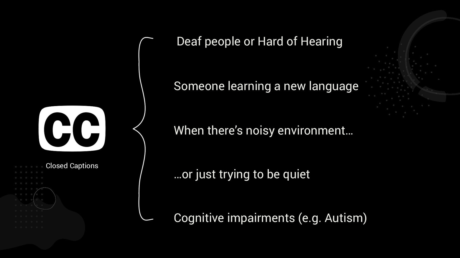
Deaf people or Hard of Hearing Someone learning a new language When there’s noisy environment… Closed Captions …or just trying to be quiet Cognitive impairments (e.g. Autism)
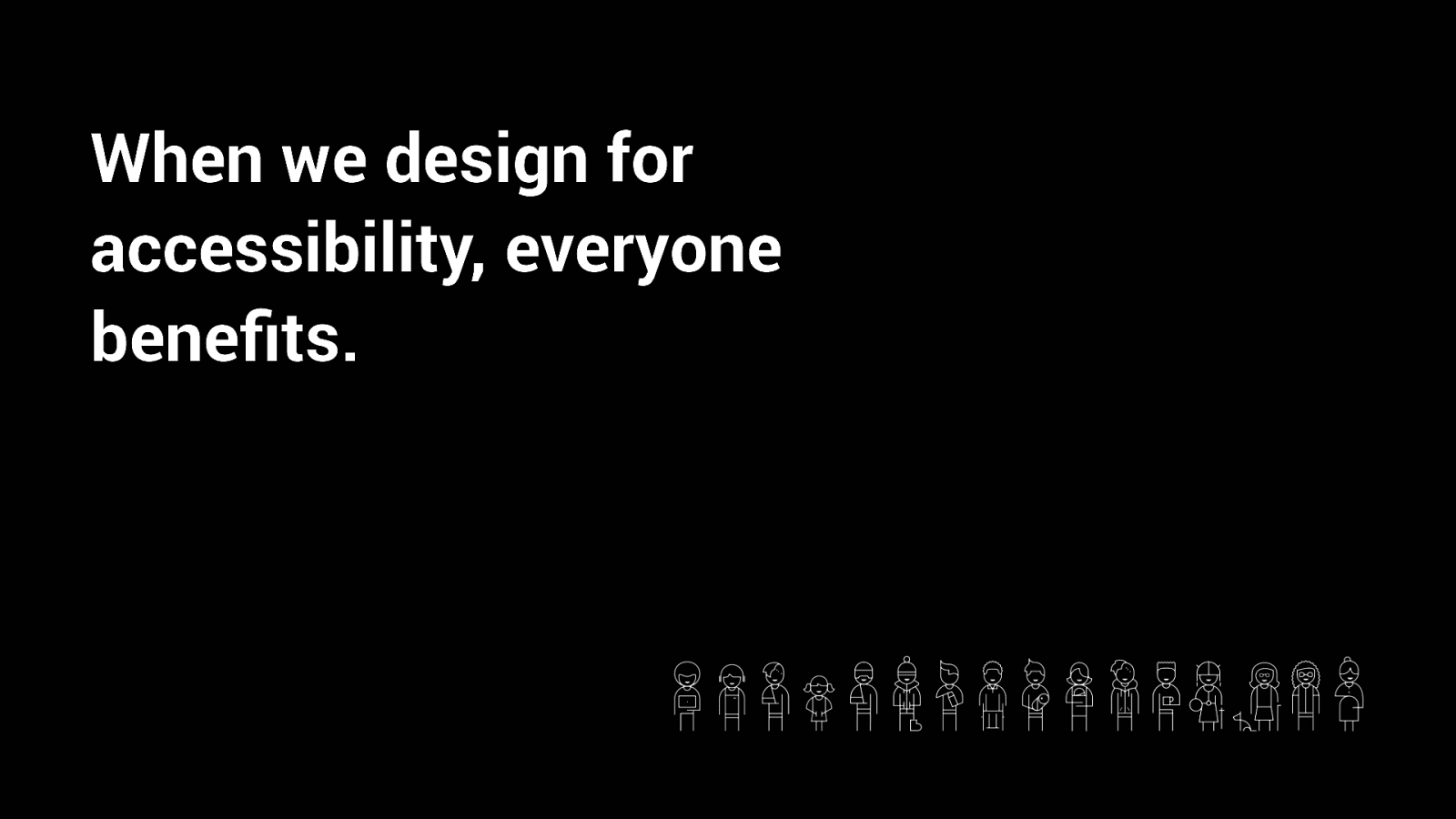
When we design for accessibility, everyone benefits.
Why is Accessibility important?
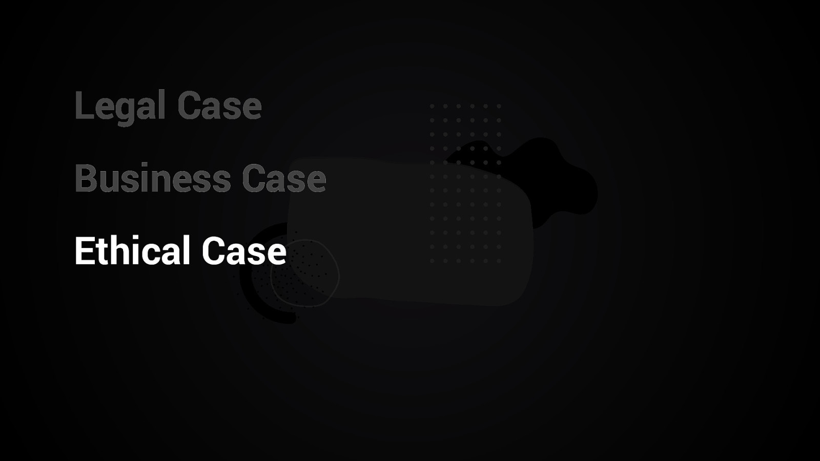
Legal Case Business Case Ethical Case
Empathy.
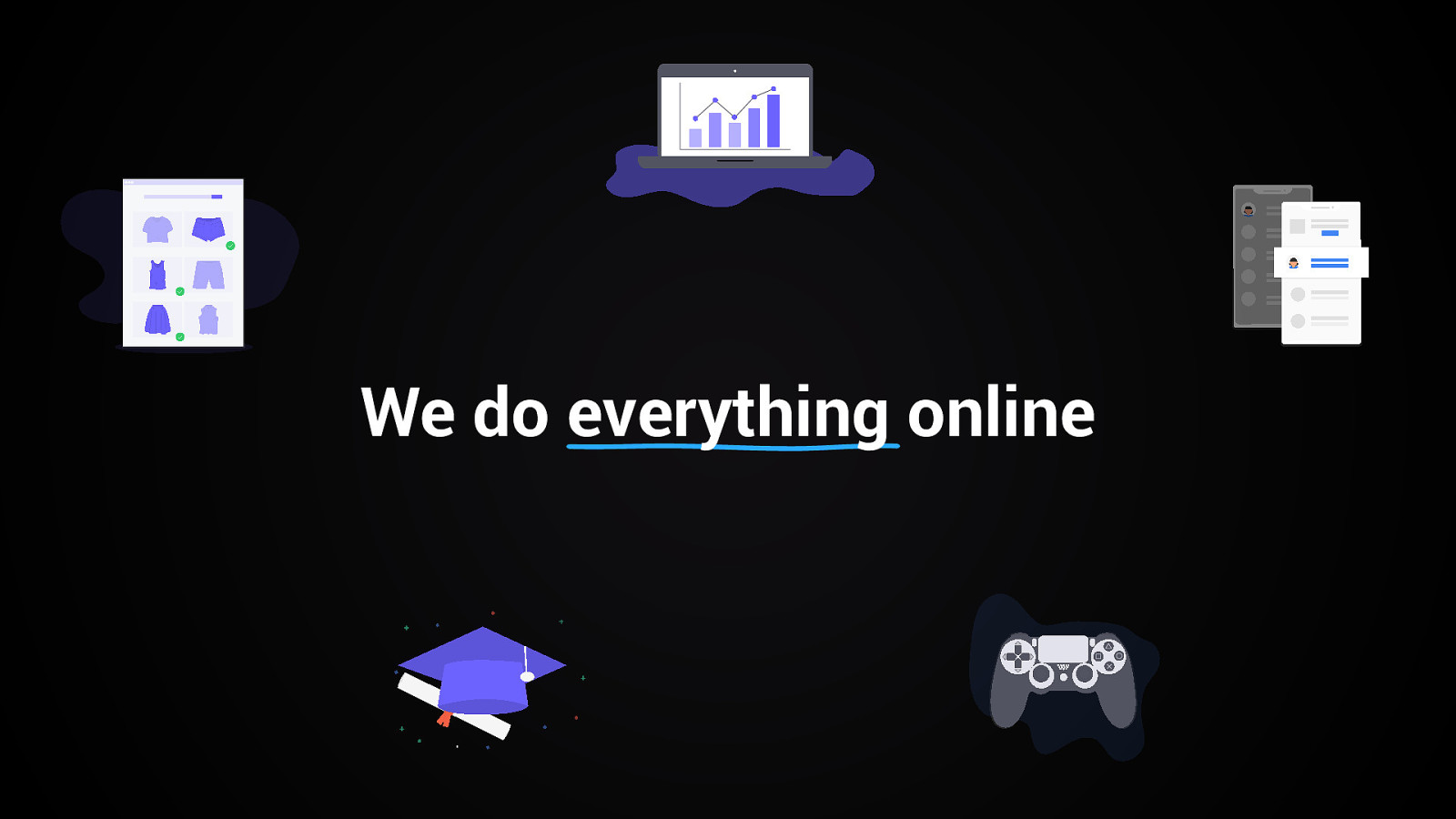
We do everything online
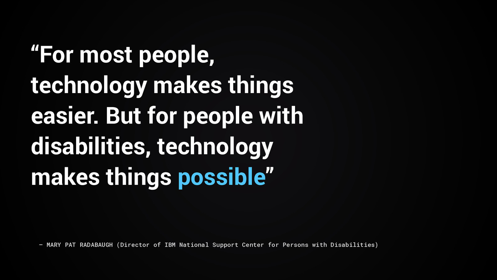
“For most people, technology makes things easier. But for people with disabilities, technology makes things possible” – MARY PAT RADABAUGH (Director of IBM National Support Center for Persons with Disabilities)
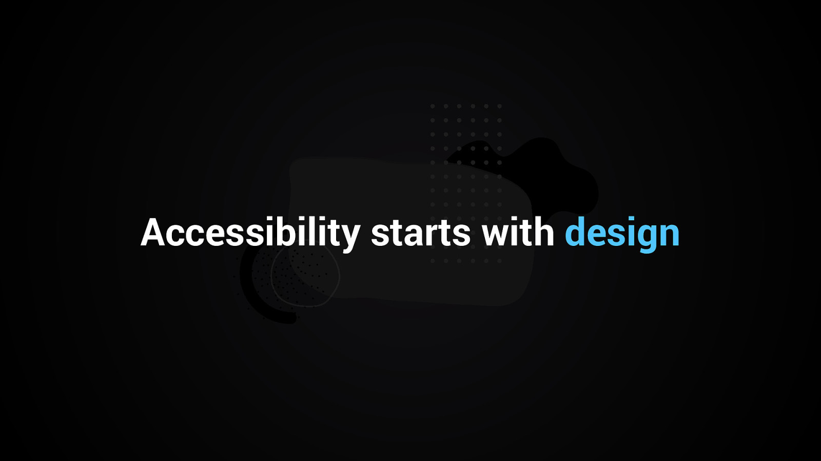
Accessibility starts with design
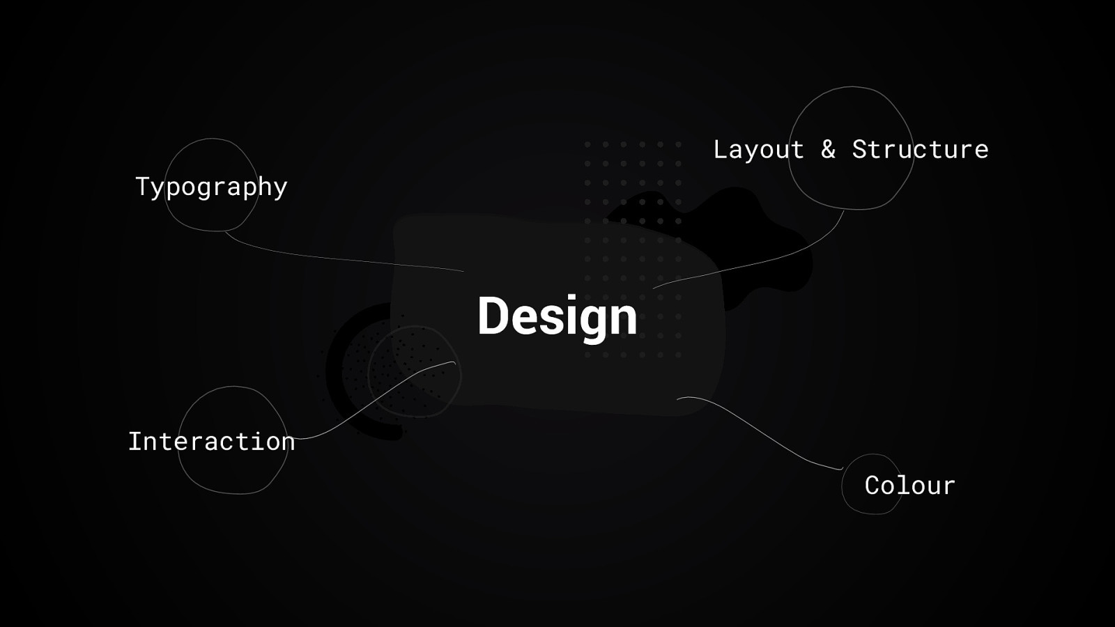
Layout & Structure Typography Design Interaction Colour
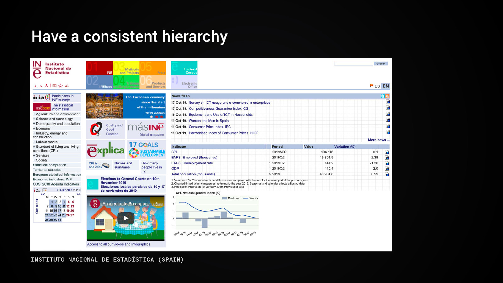
Have a consistent hierarchy INSTITUTO NACIONAL DE ESTADÍSTICA (SPAIN)
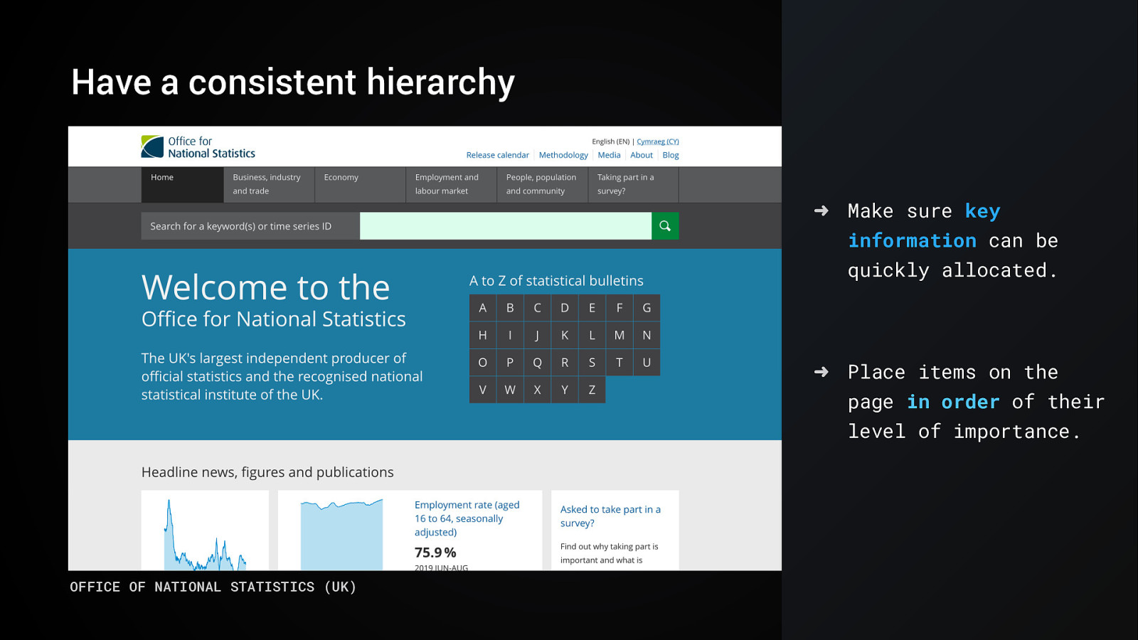
Have a consistent hierarchy ➜ Make sure key information can be quickly allocated. ➜ Place items on the page in order of their level of importance. OFFICE OF NATIONAL STATISTICS (UK)
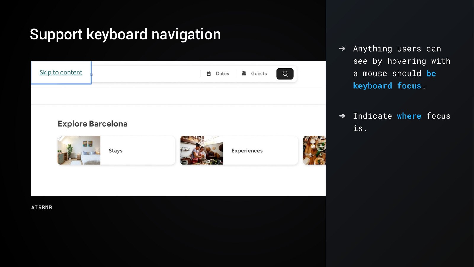
Support keyboard navigation ➜ Anything users can see by hovering with a mouse should be keyboard focus. ➜ Indicate where focus is. AIRBNB
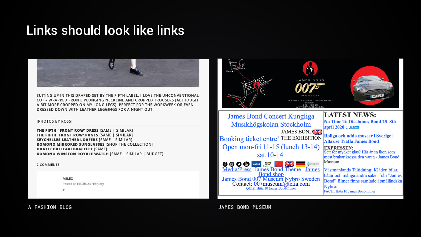
Links should look like links A FASHION BLOG JAMES BOND MUSEUM
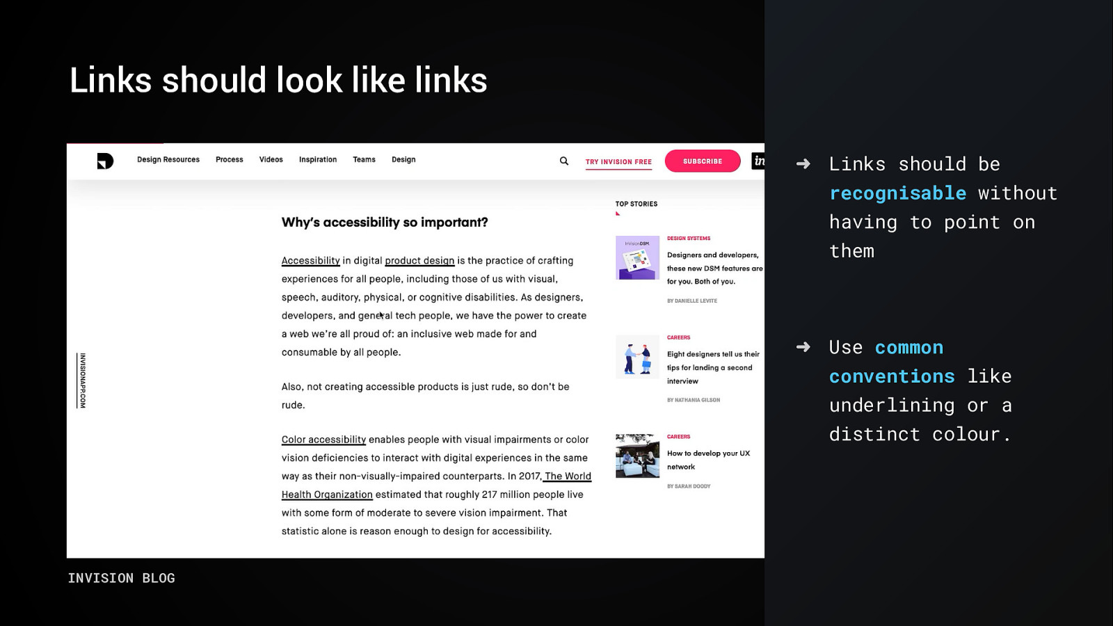
Links should look like links ➜ Links should be recognisable without having to point on them ➜ Use common conventions like underlining or a distinct colour. INVISION BLOG
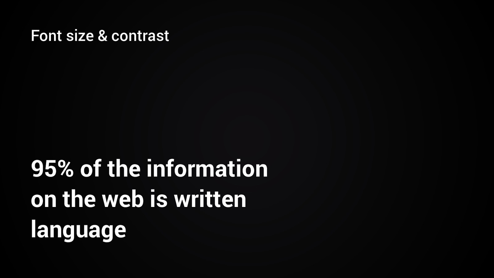
Font size & contrast 95% of the information on the web is written language
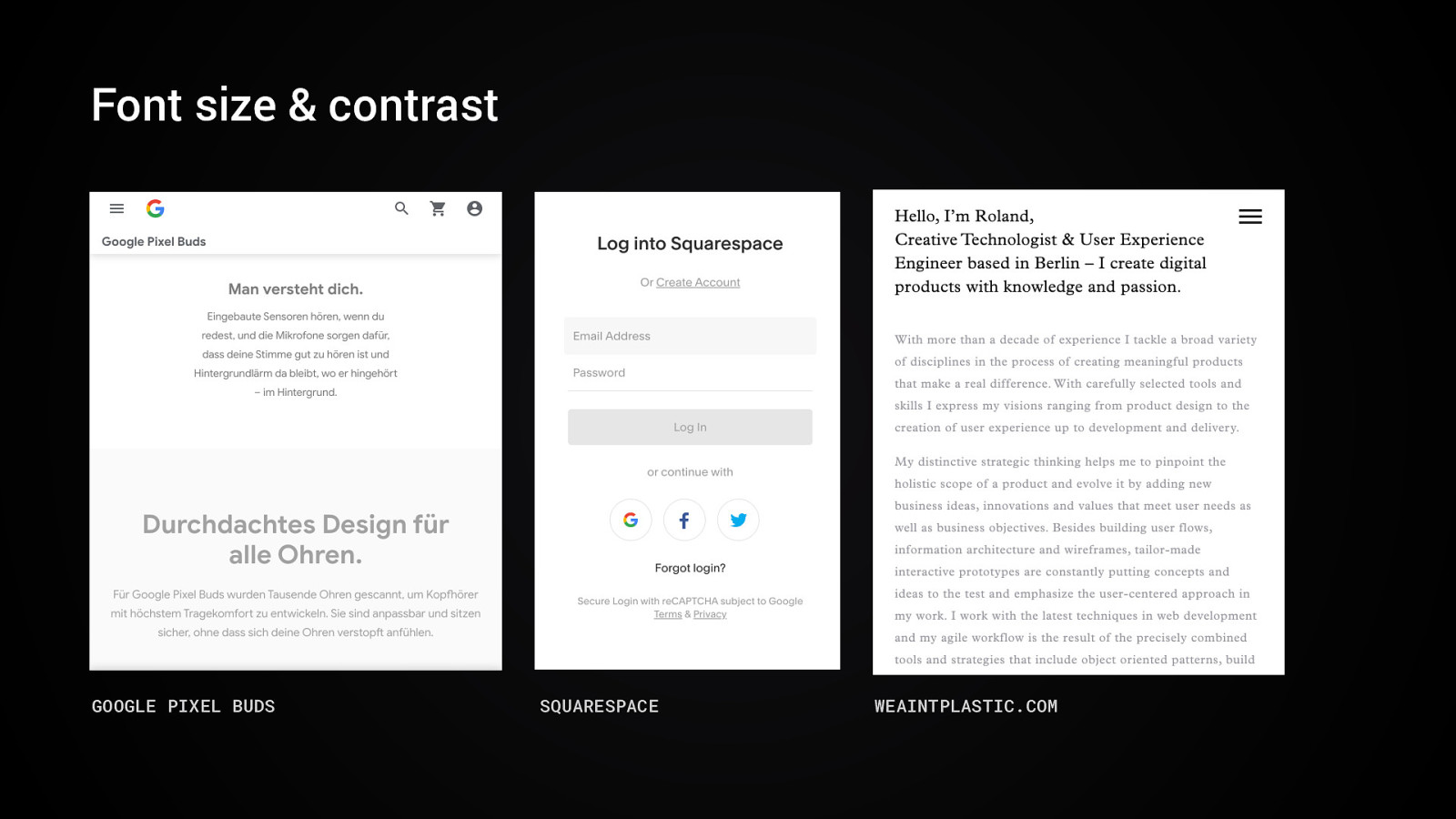
Font size & contrast GOOGLE PIXEL BUDS SQUARESPACE WEAINTPLASTIC.COM
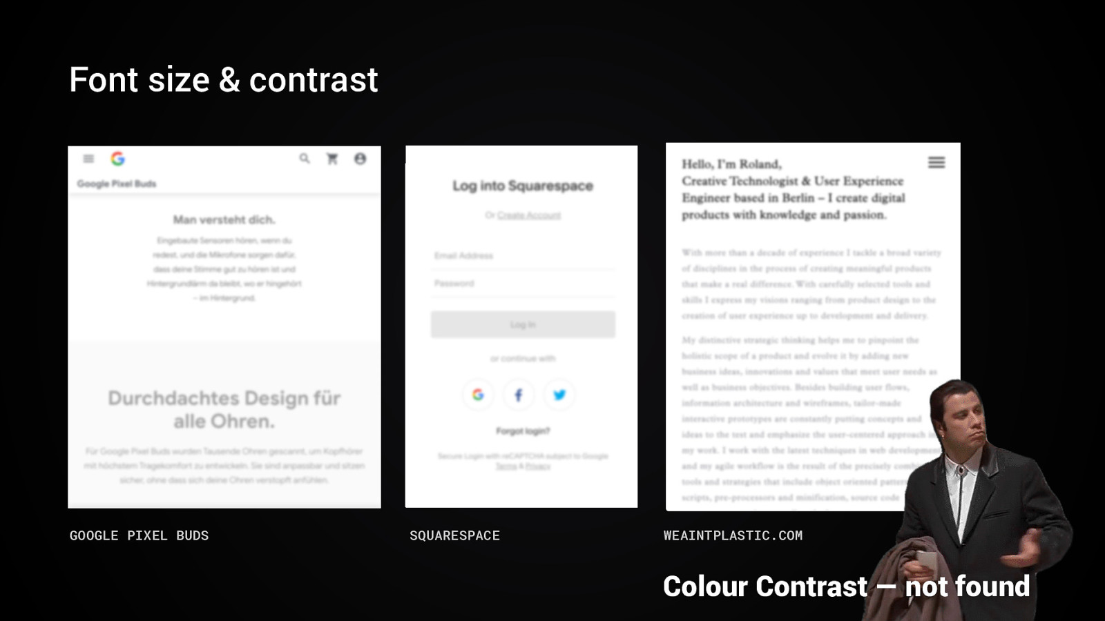
Font size & contrast GOOGLE PIXEL BUDS SQUARESPACE WEAINTPLASTIC.COM Colour Contrast — not found
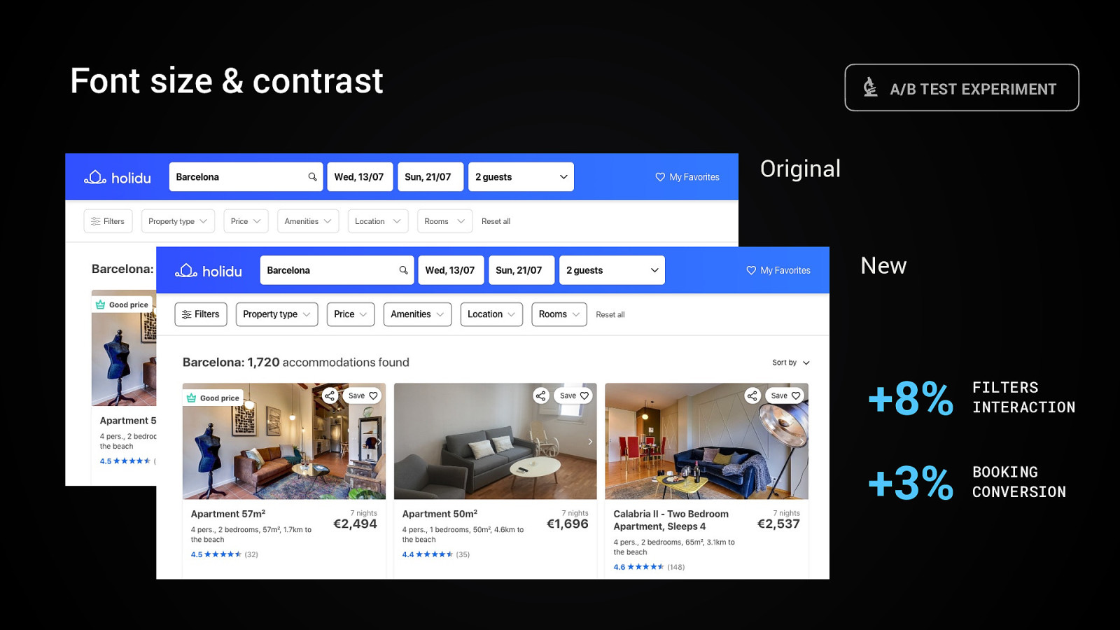
Font size & contrast A/B TEST EXPERIMENT Original New +8% FILTERS INTERACTION +3% BOOKING CONVERSION
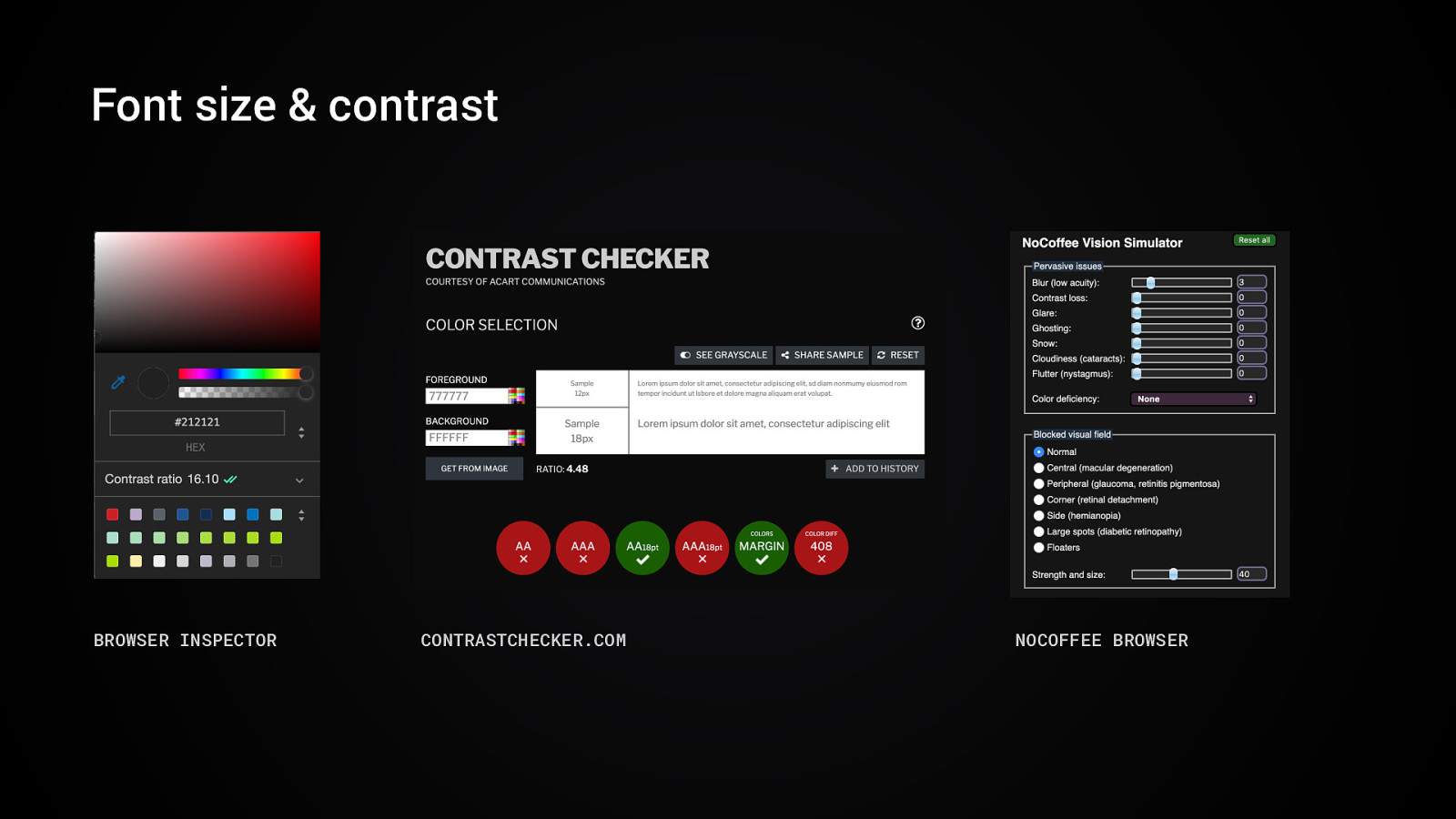
Font size & contrast BROWSER INSPECTOR CONTRASTCHECKER.COM NOCOFFEE BROWSER
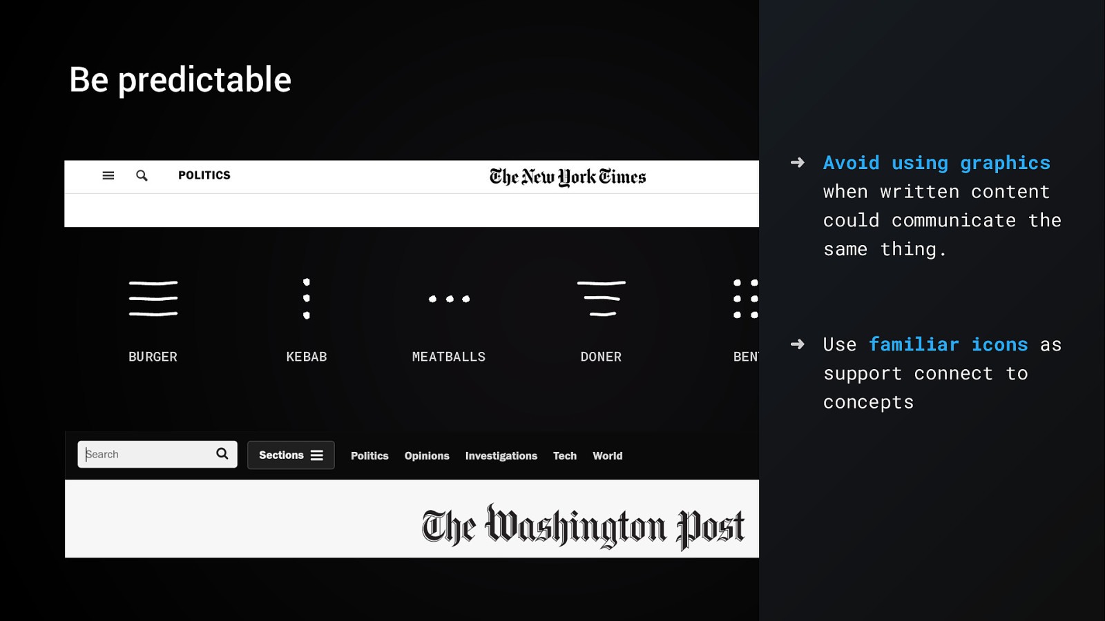
Be predictable ➜ Avoid using graphics when written content could communicate the same thing. BURGER KEBAB MEATBALLS DONER BENTO ➜ Use familiar icons as BREADSTICKS support connect to concepts
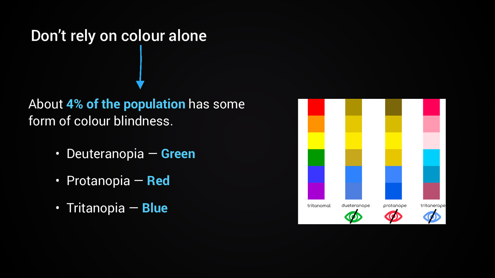
Don’t rely on colour alone About 4% of the population has some form of colour blindness. • Deuteranopia — Green • Protanopia — Red • Tritanopia — Blue
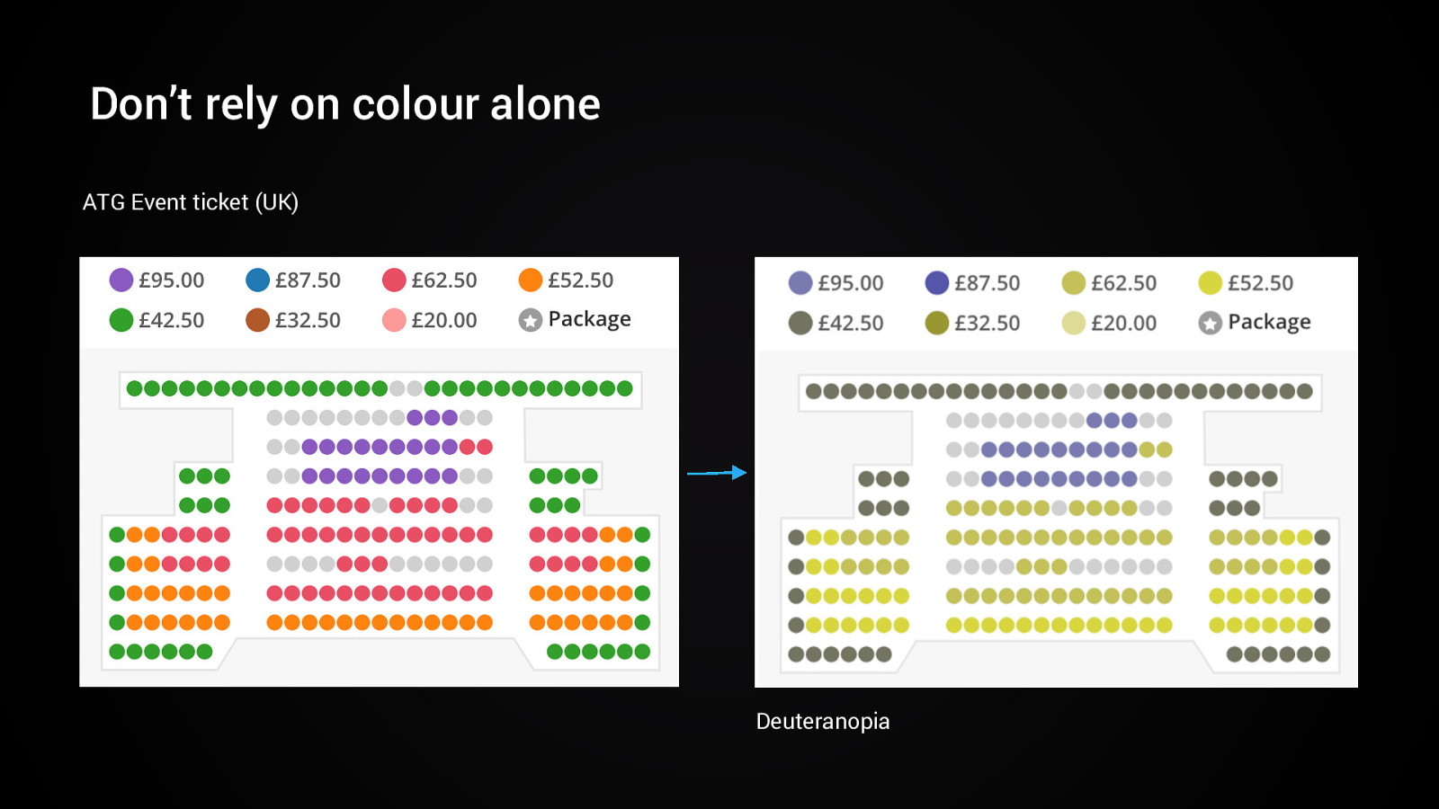
Don’t rely on colour alone ATG Event ticket (UK) Deuteranopia
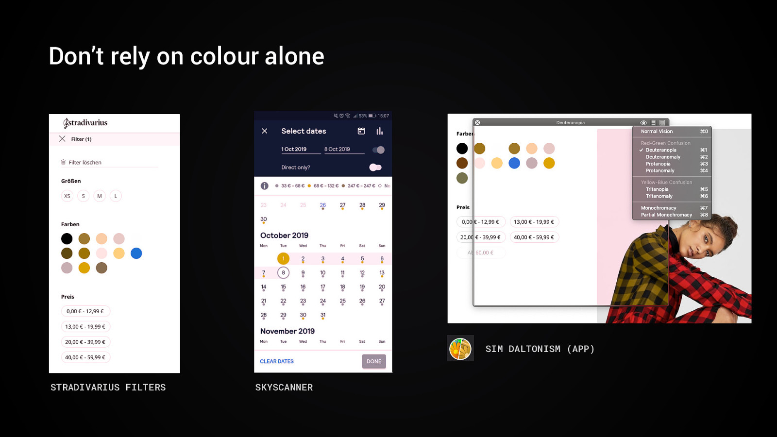
Don’t rely on colour alone SIM DALTONISM (APP) STRADIVARIUS FILTERS SKYSCANNER
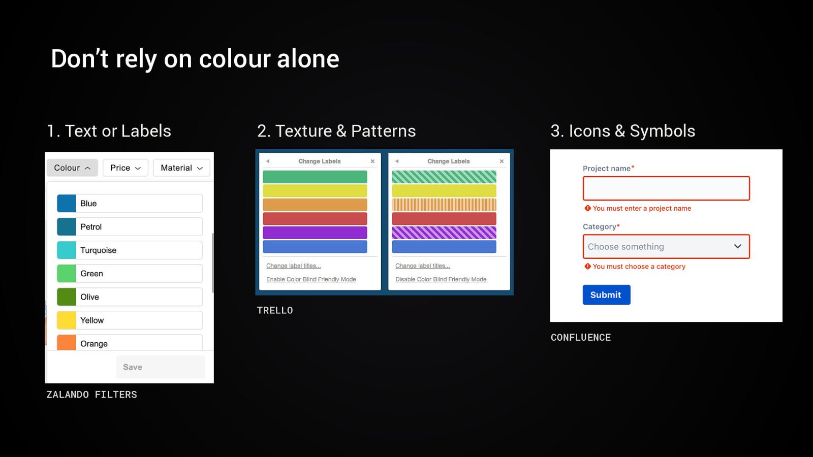
Don’t rely on colour alone 1. Text or Labels 2. Texture & Patterns 3. Icons & Symbols TRELLO CONFLUENCE ZALANDO FILTERS
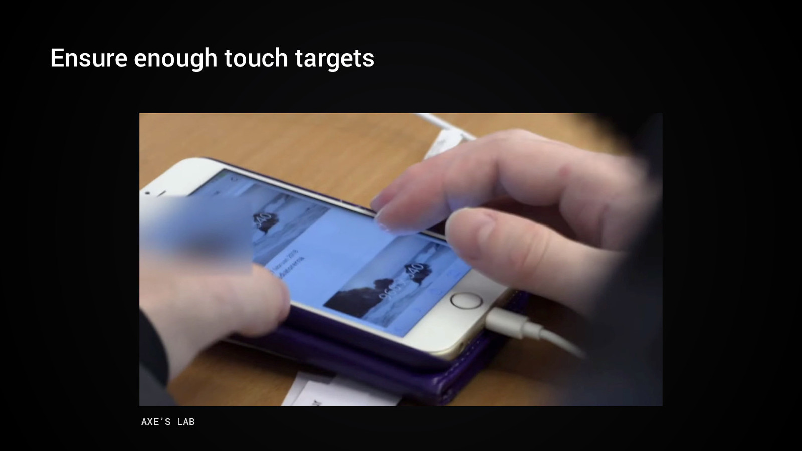
Ensure enough touch targets AXE’S LAB
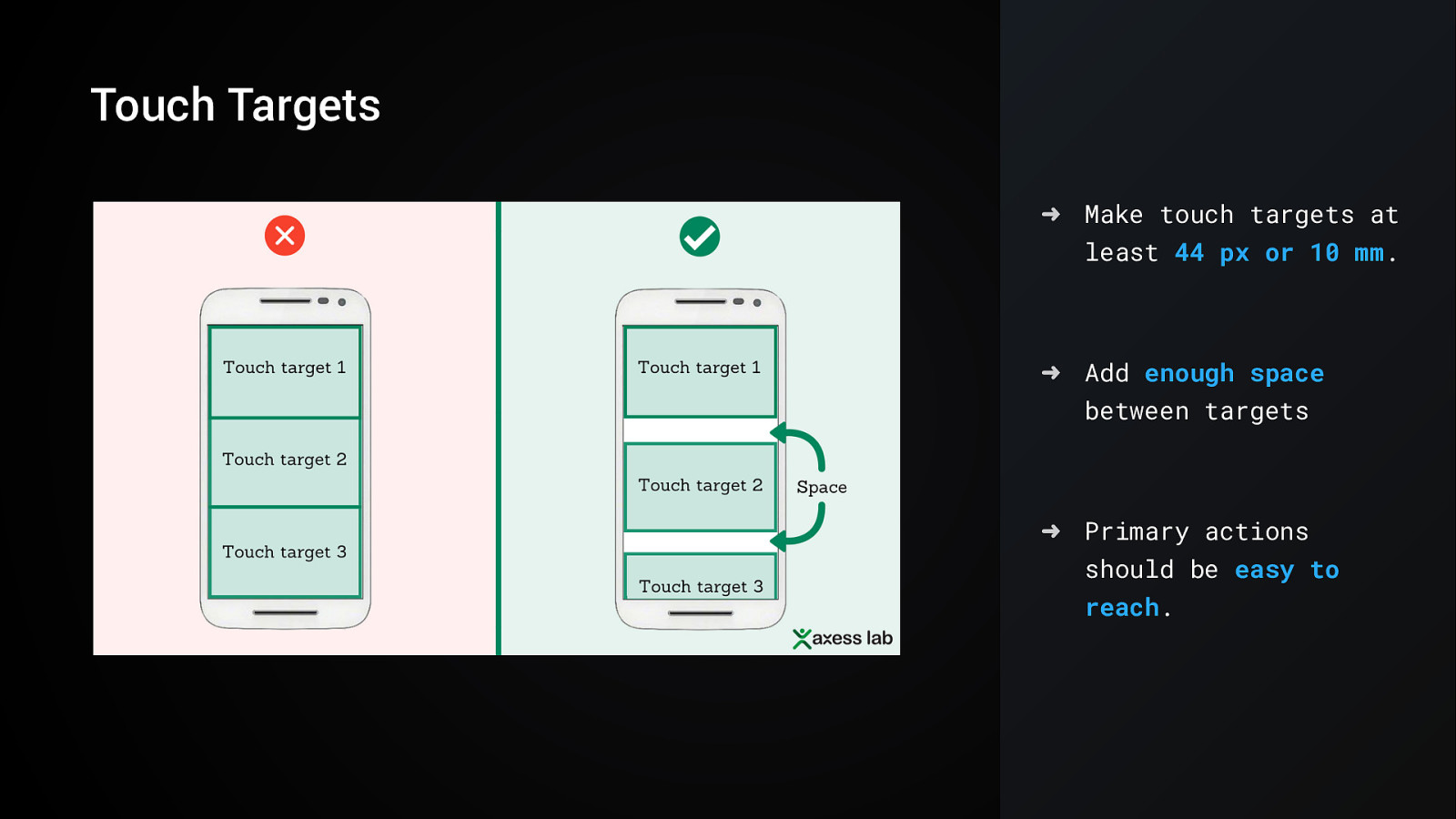
Touch Targets ➜ Make touch targets at least 44 px or 10 mm. ➜ Add enough space between targets ➜ Primary actions should be easy to reach.
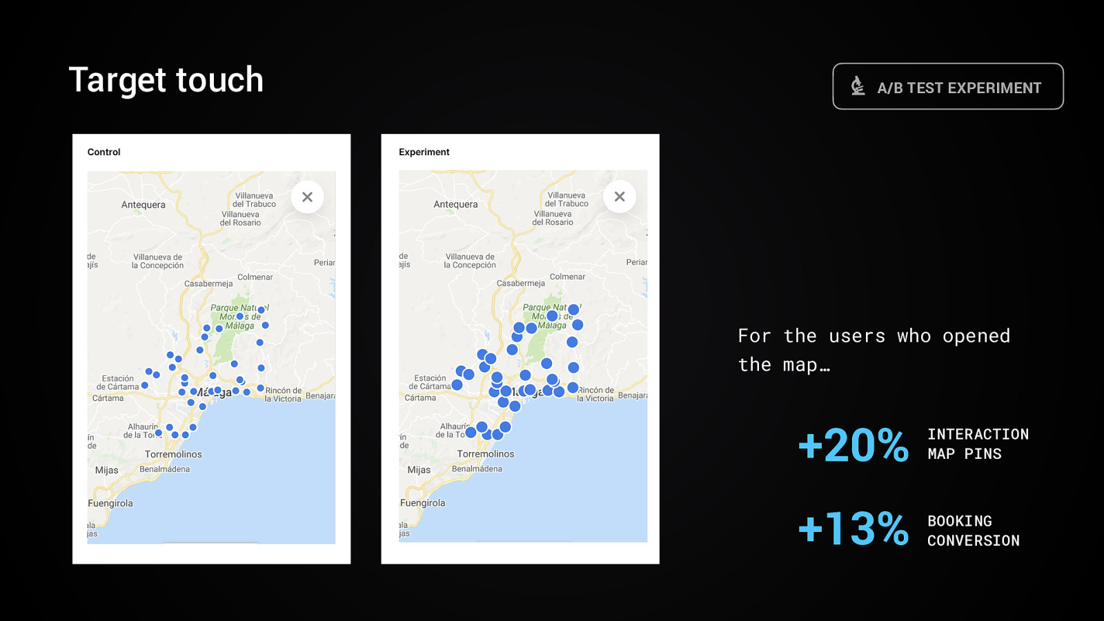
Target touch A/B TEST EXPERIMENT For the users who opened the map… +20% INTERACTION MAP PINS +13% BOOKING CONVERSION
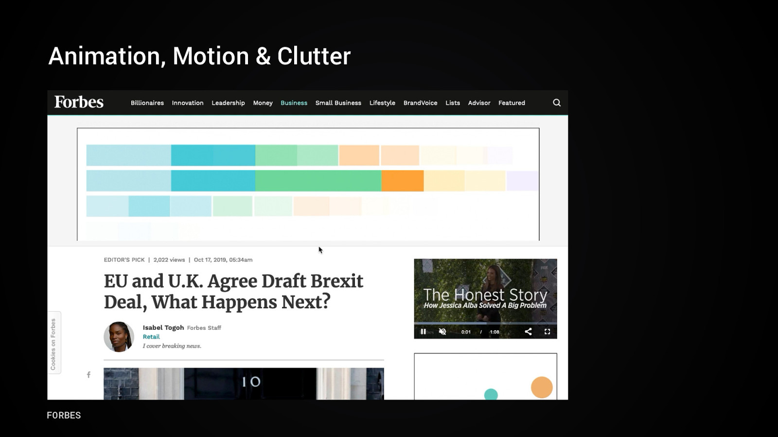
Animation, Motion & Clutter FORBES
Achtung! Next slide contains flashy (and f*** annoying) animations.
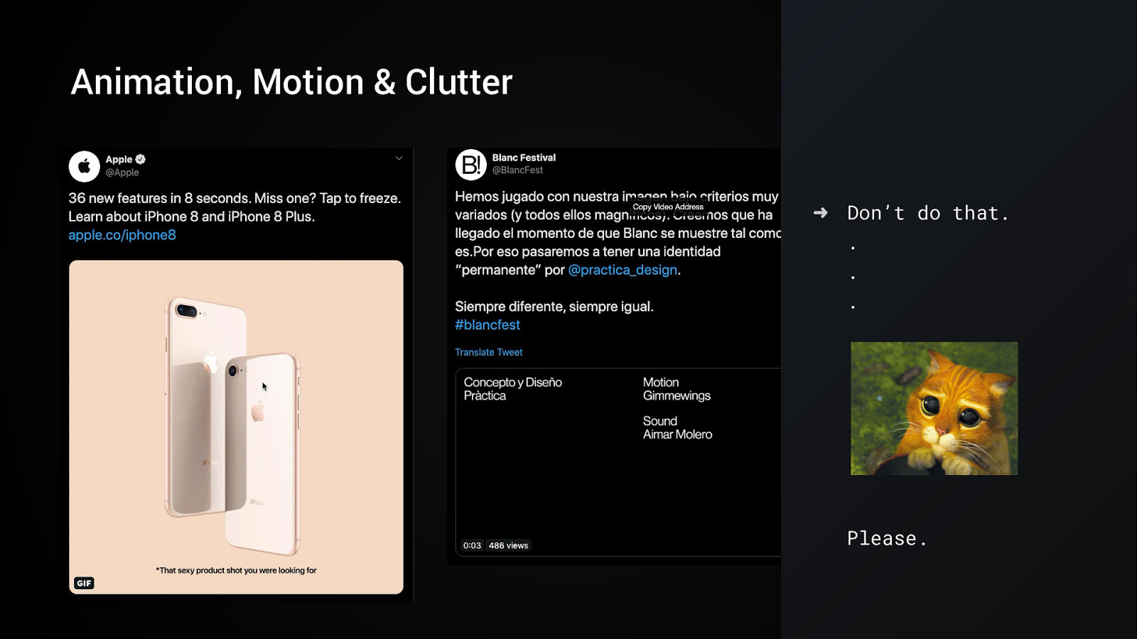
Animation, Motion & Clutter ➜ Don’t do that… . Please.
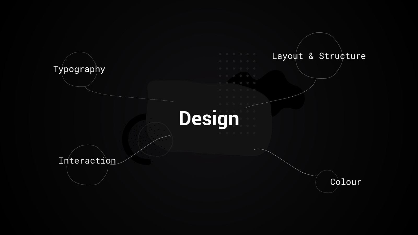
Layout & Structure Typography Design Interaction Colour
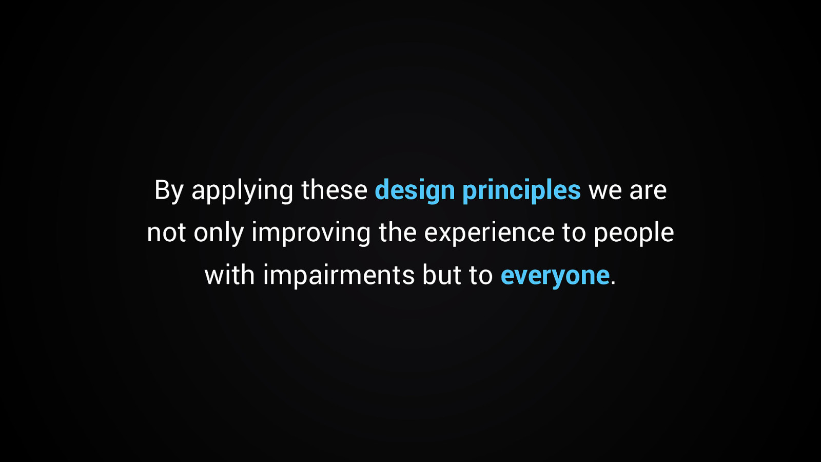
By applying these design principles we are not only improving the experience to people with impairments but to everyone.
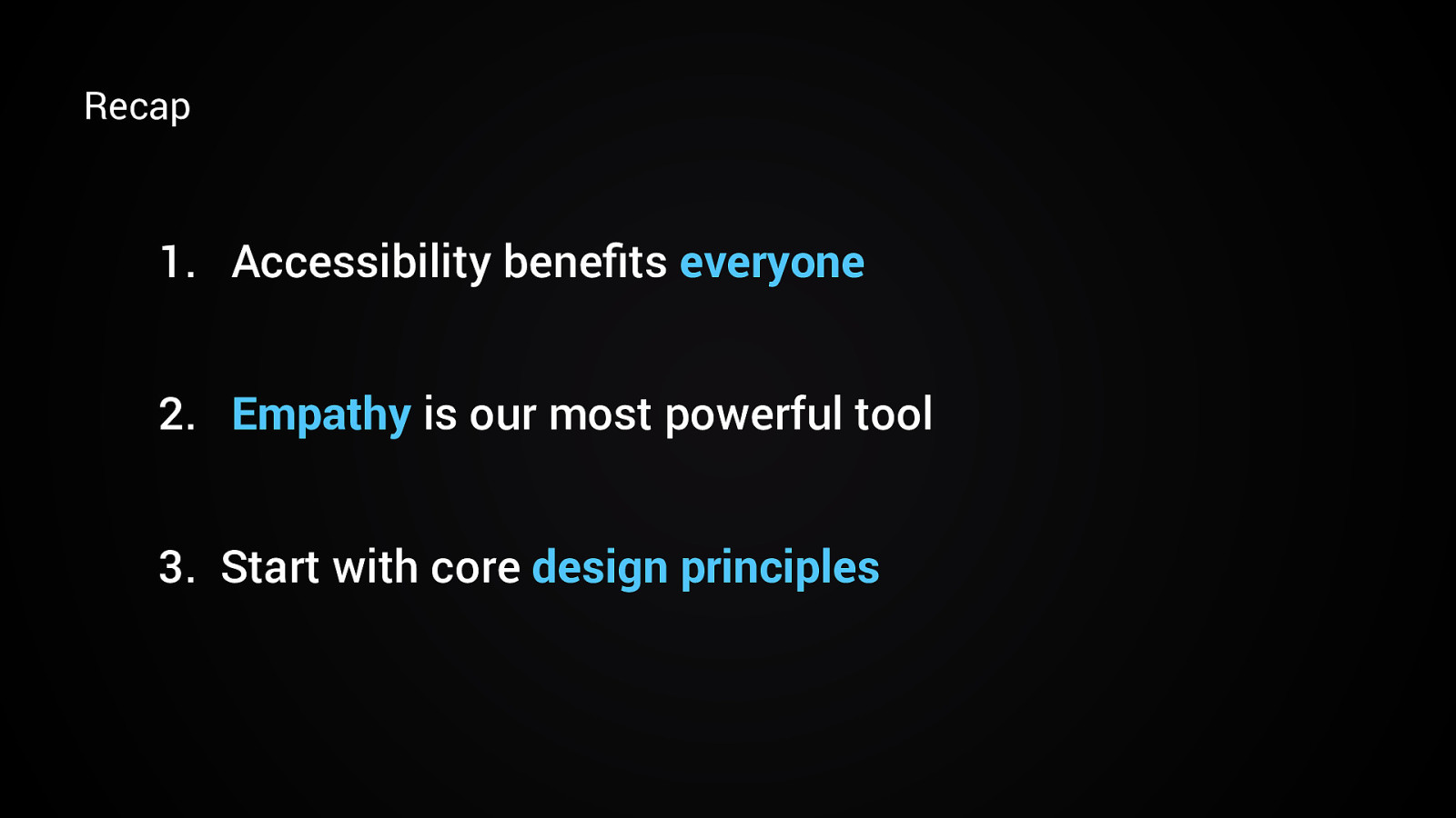
Recap
Dankeschön! Núria Peña @nuriapenya Slides & Resources: noti.st/nuriapena