A presentation at An Event Apart - Seattle 2017 in in Seattle, WA, USA by Rachel Andrew

Rachel Andrew @ An Event Apart Seattle New CSS Layout Meets the Real World
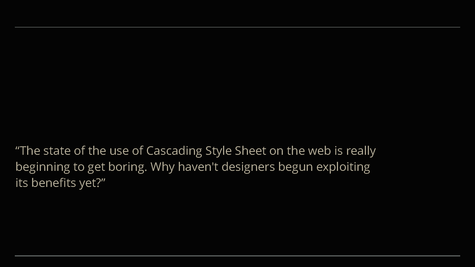
“The state of the use of Cascading Style Sheet on the web is really beginning to get boring. Why haven't designers begun exploiting its benefits yet?”
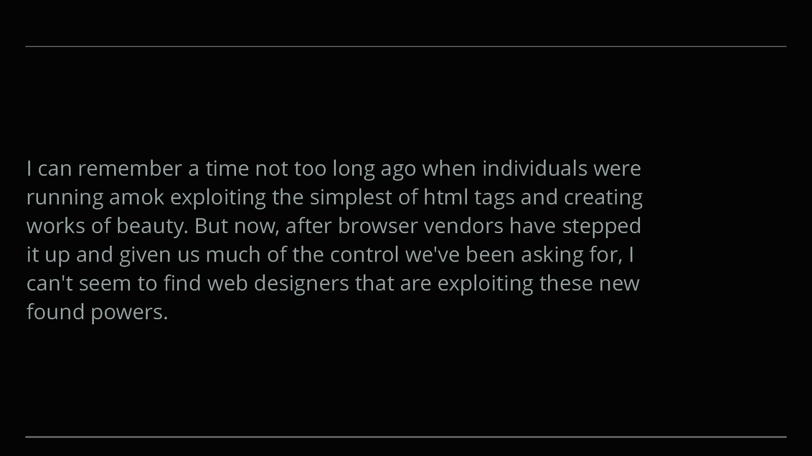
I can remember a time not too long ago when individuals were running amok exploiting the simplest of html tags and creating works of beauty. But now, after browser vendors have stepped it up and given us much of the control we've been asking for, I can't seem to find web designers that are exploiting these new found powers.
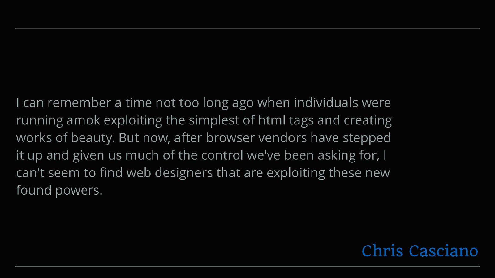
I can remember a time not too long ago when individuals were running amok exploiting the simplest of html tags and creating works of beauty. But now, after browser vendors have stepped it up and given us much of the control we've been asking for, I can't seem to find web designers that are exploiting these new found powers. Chris Casciano
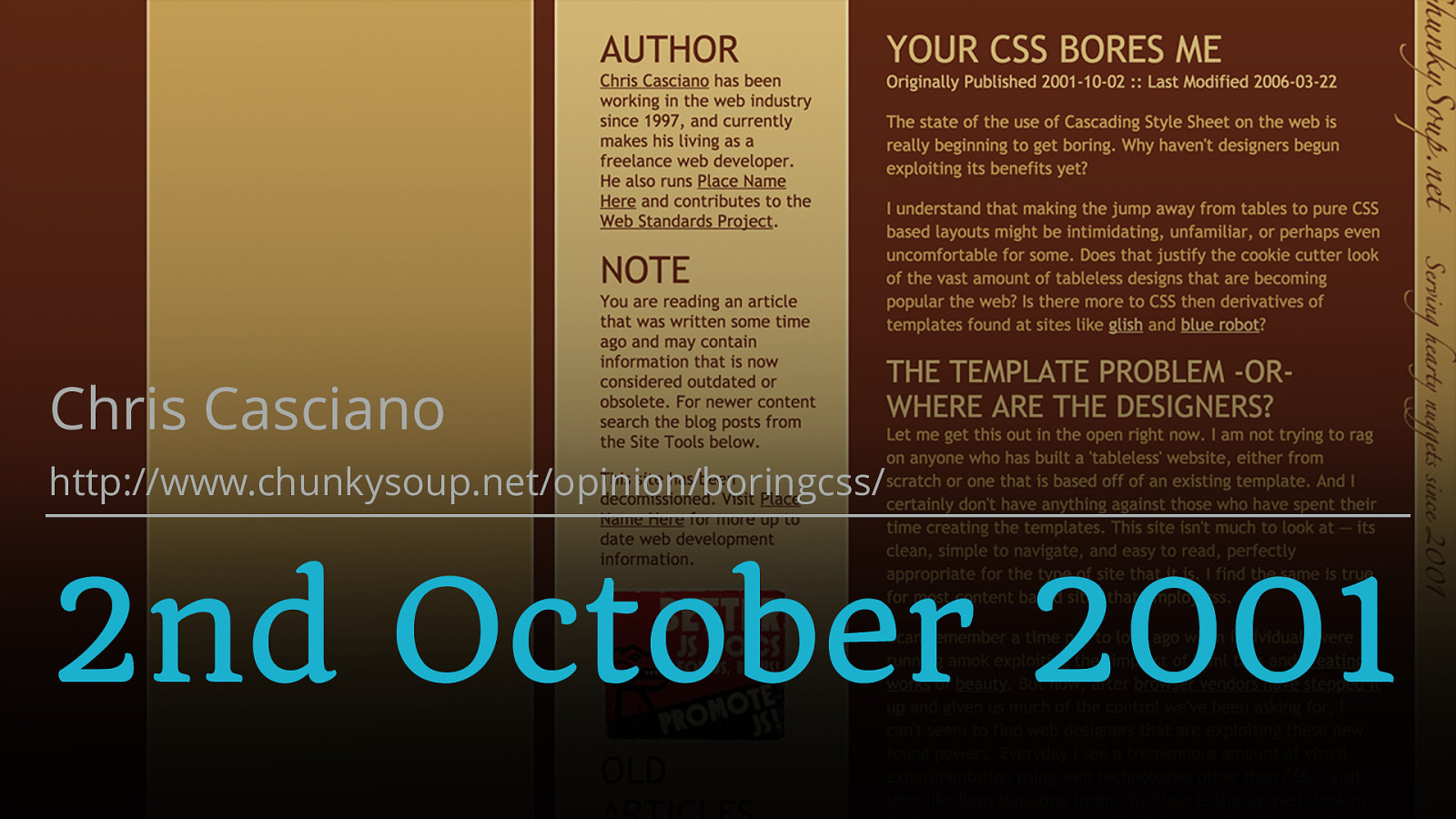
Chris Casciano http://www.chunkysoup.net/opinion/boringcss/ 2nd October 2001
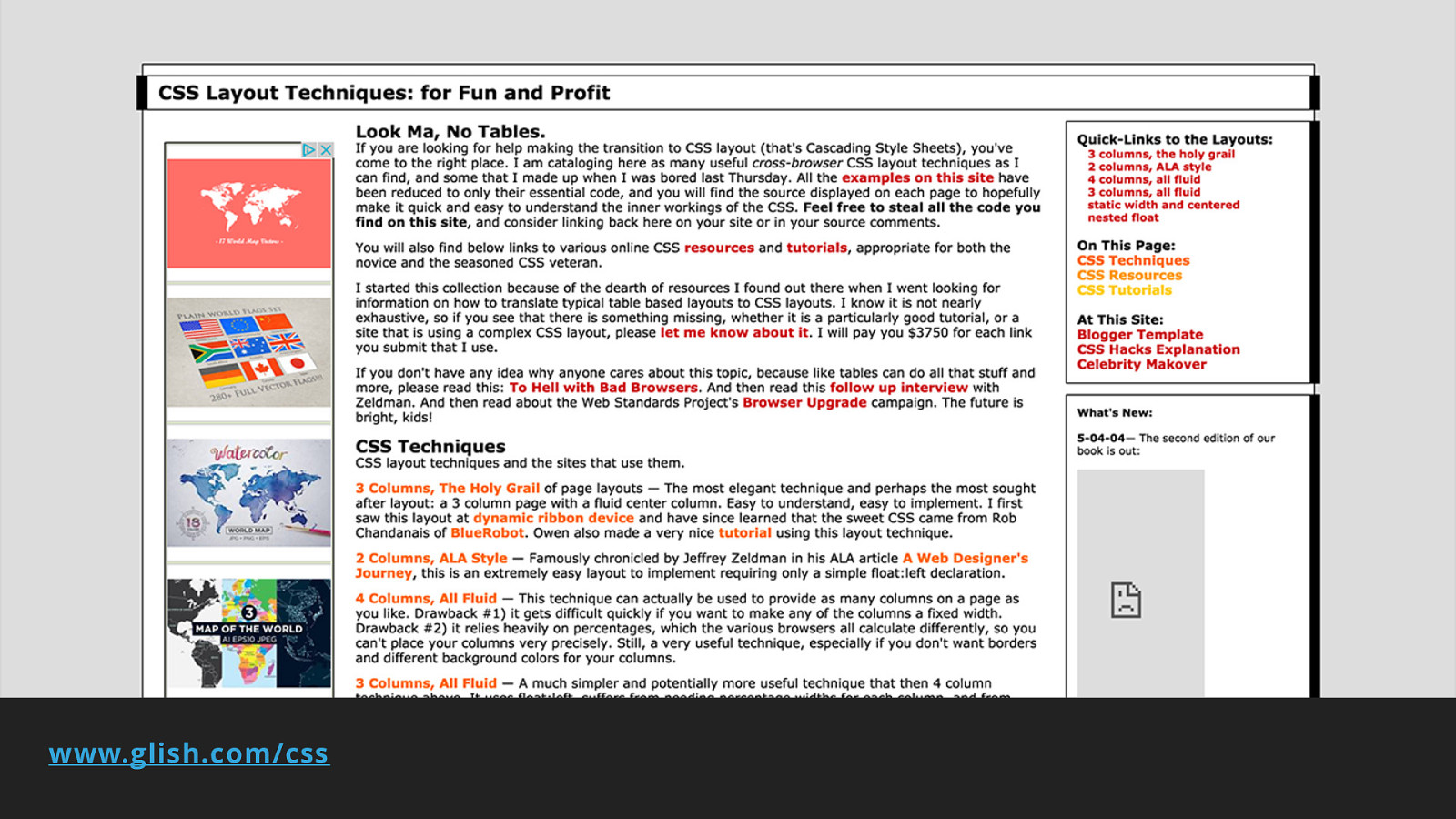
www.glish.com/css
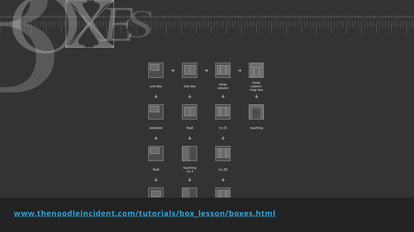
www.thenoodleincident.com/tutorials/box_lesson/boxes.html
16 Years.
March 2017
March 2017 March 2017 March 2017 March 2017 March 2017 Soooooon!
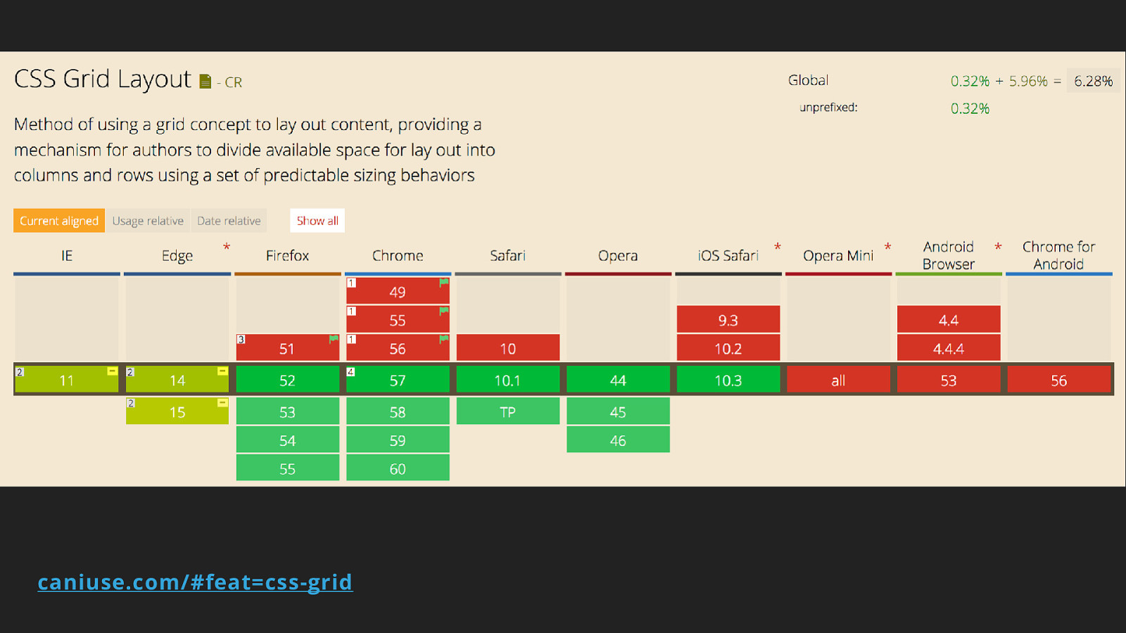
caniuse.com/#feat=css-grid
But, old browsers!
There will be code
A new system for layout
Featuring ▸ Flexbox ▸ CSS Grid Layout ▸ Box Alignment ▸ CSS Shapes ▸ CSS Feature Queries
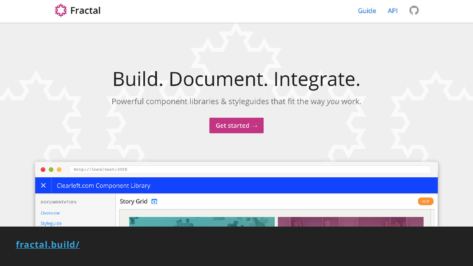
fractal.build/
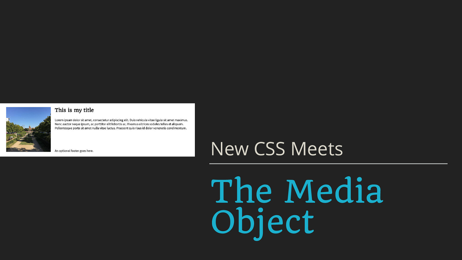
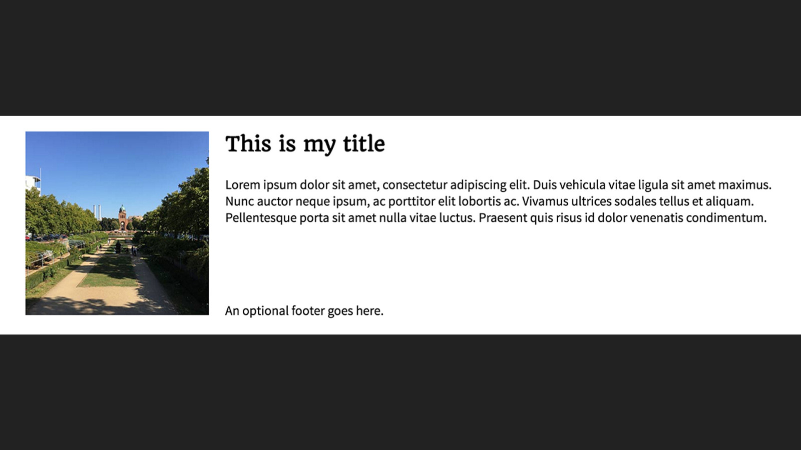
New CSS Meets The Media Object
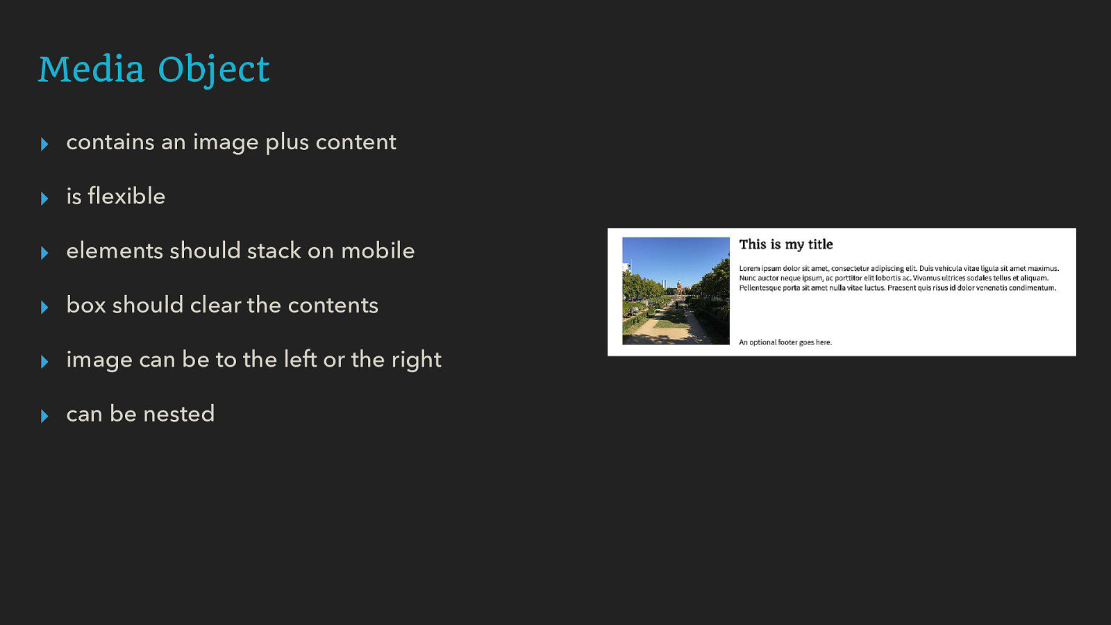
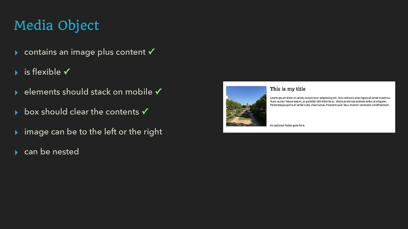
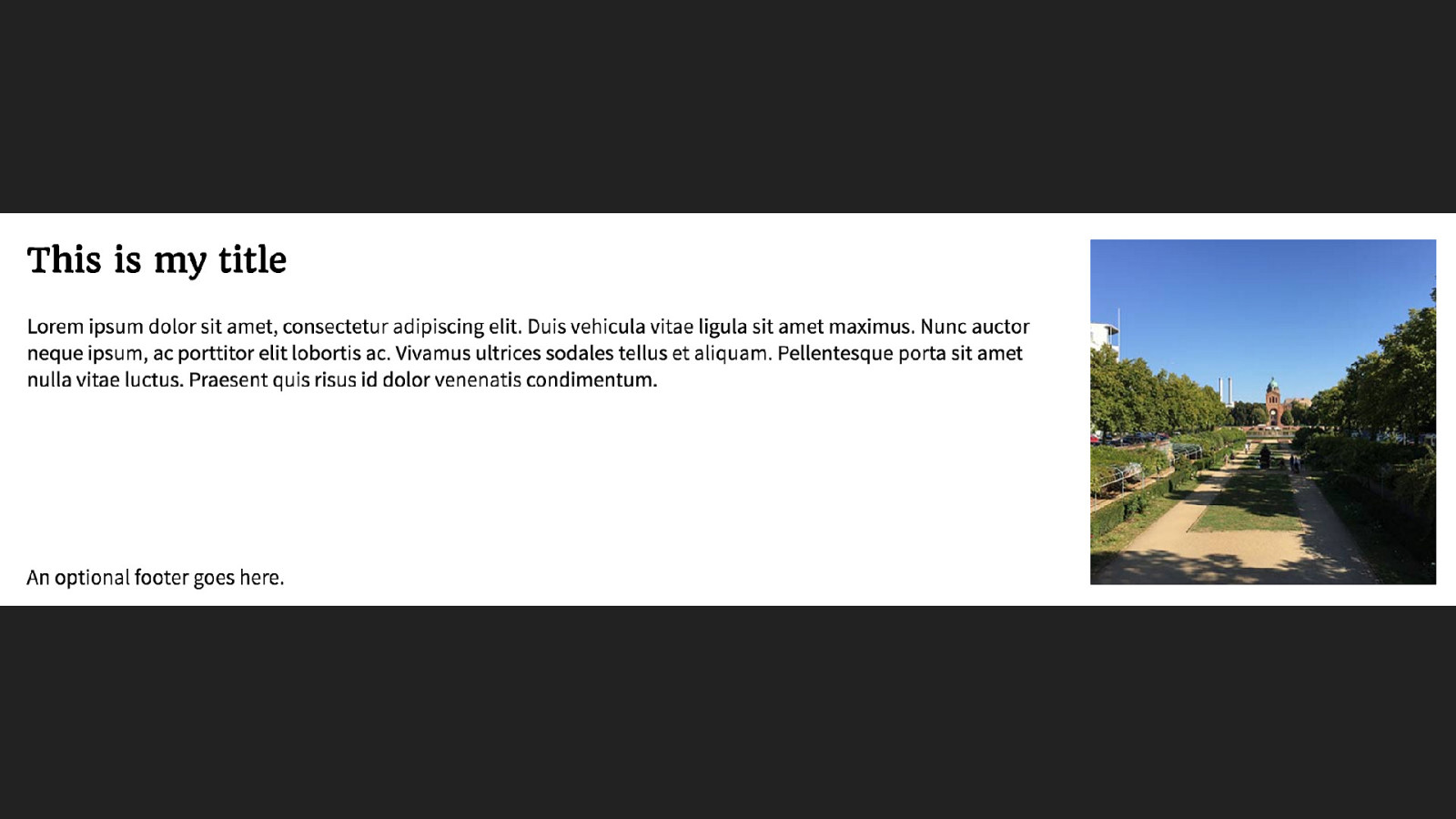
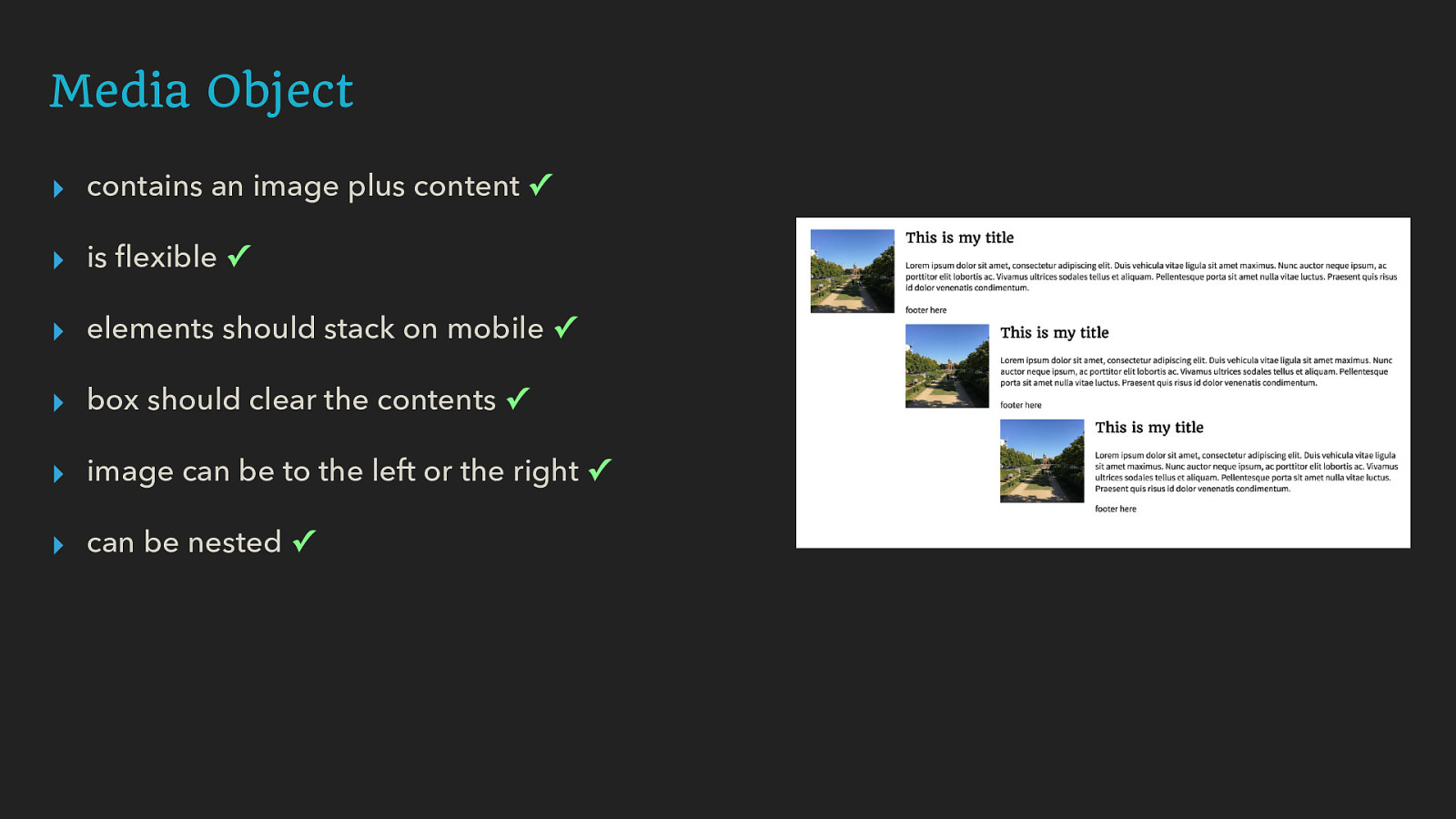
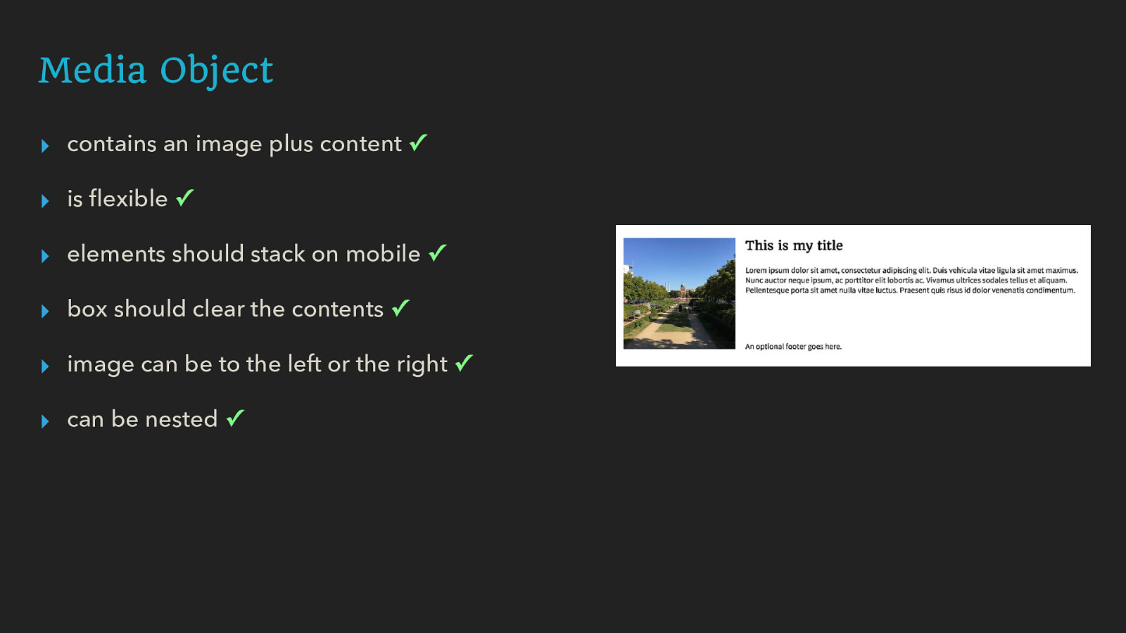
Media Object ▸ contains an image plus content ▸ is flexible ▸ elements should stack on mobile ▸ box should clear the contents ▸ image can be to the left or the right ▸ can be nested
Avoid pre-empting the need for markup as styling hooks.
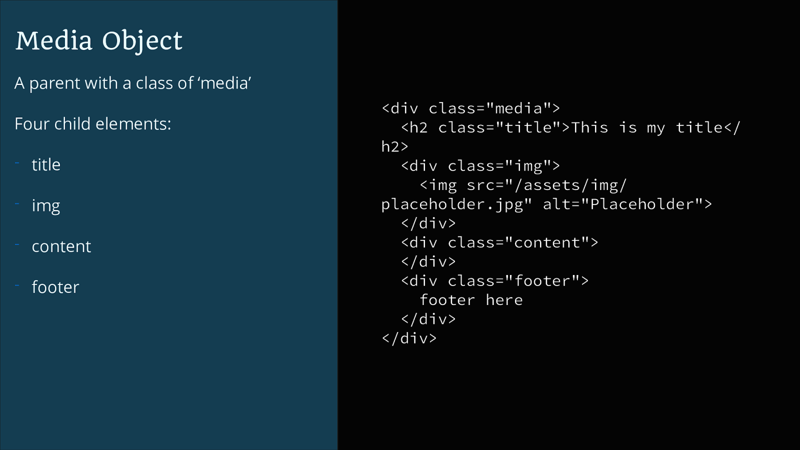
Media Object A parent with a class of ‘media’ Four child elements:
Media Object To create a grid use a new value of the display property: display: grid @media (min-width: 600px) { .media { display: grid; } }
Media Object Create gutters between grid cells:
Media Object The grid-template-columns property creates column tracks on the grid. The new fr unit represents a fraction of the available space. @media (min-width: 600px) { .media { display: grid; grid-column-gap: 20px; grid-template-columns: 1fr 3fr; } }
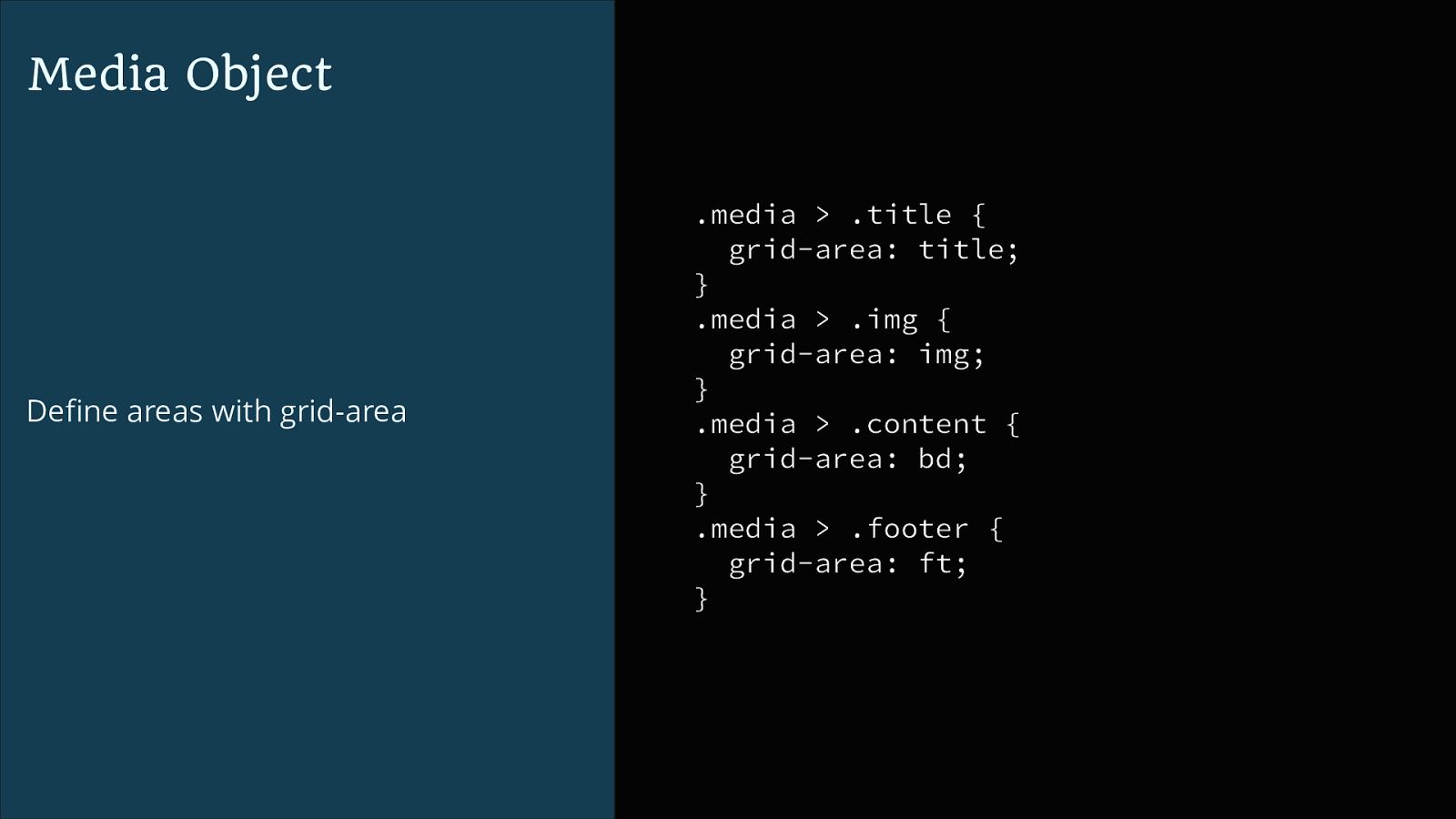
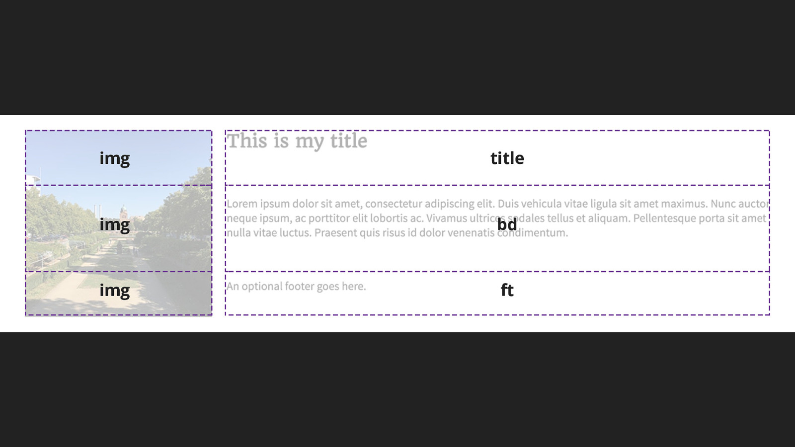
Media Object Define areas with grid-area .media > .title { grid-area: title; } .media > .img { grid-area: img; } .media > .content { grid-area: bd; } .media > .footer { grid-area: ft; }
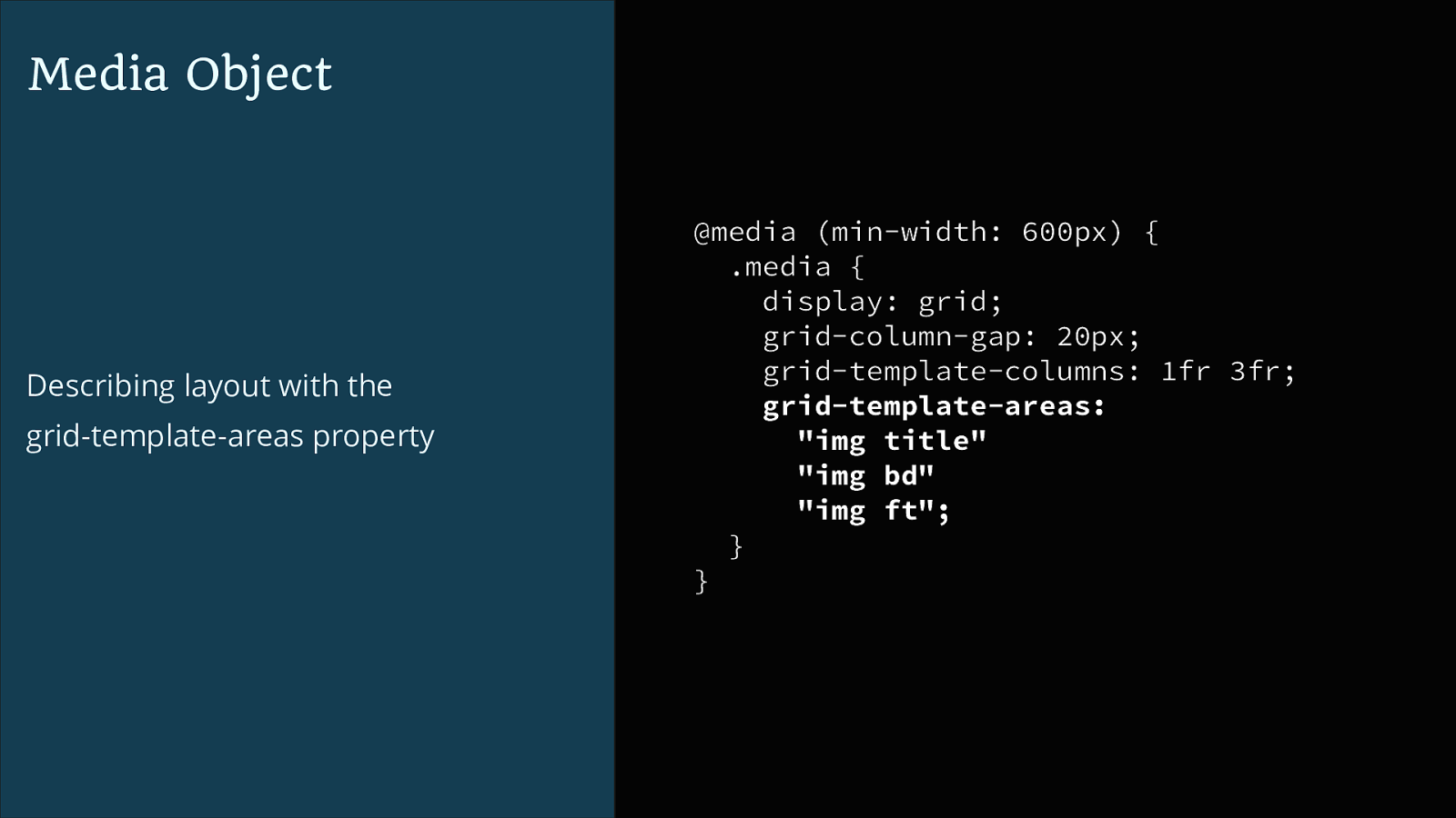
Media Object Describing layout with the grid-template-areas property @media (min-width: 600px) { .media { display: grid; grid-column-gap: 20px; grid-template-columns: 1fr 3fr; grid-template-areas: "img title" "img bd" "img ft"; } }
img title img bd img ft
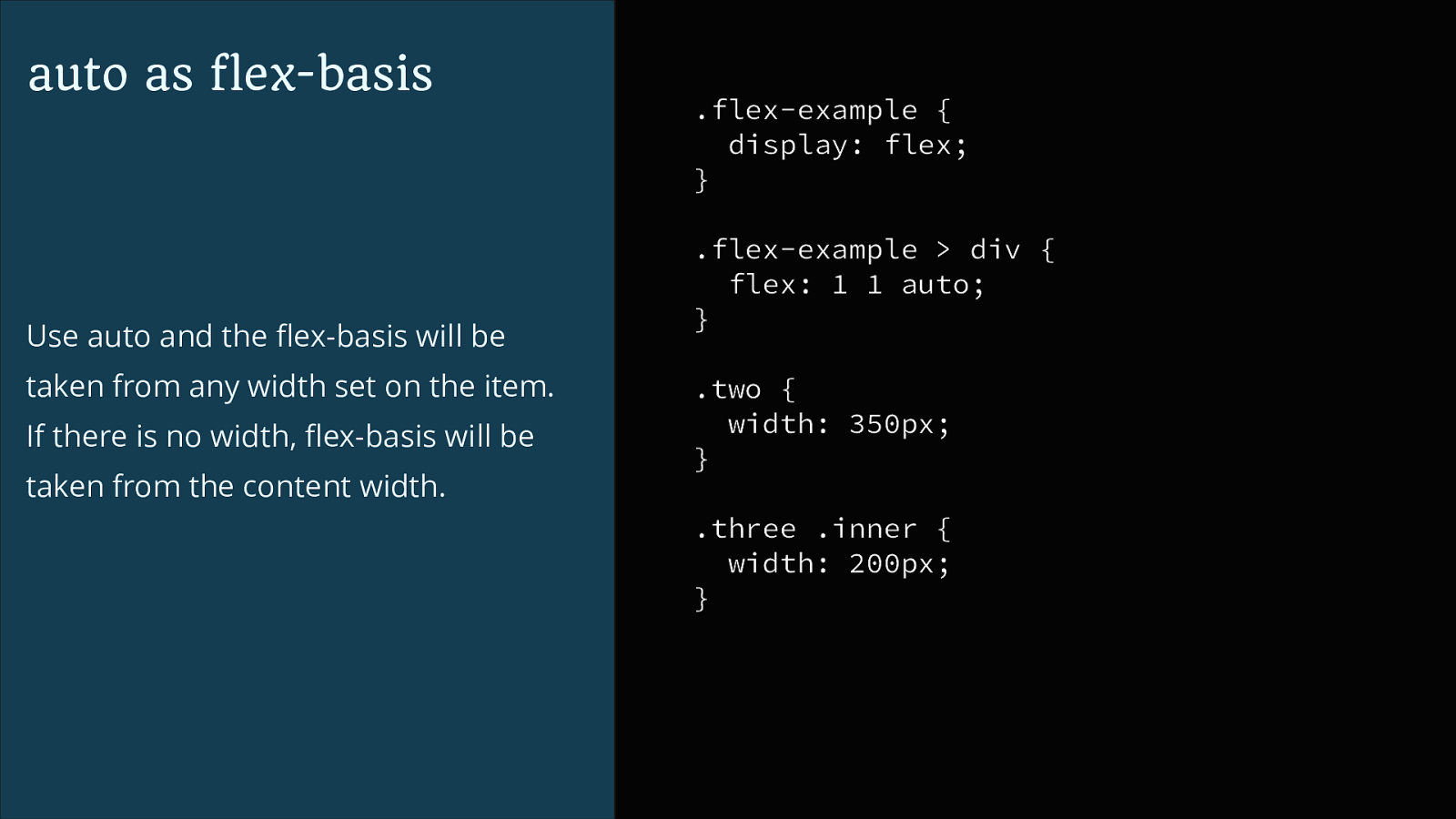
auto
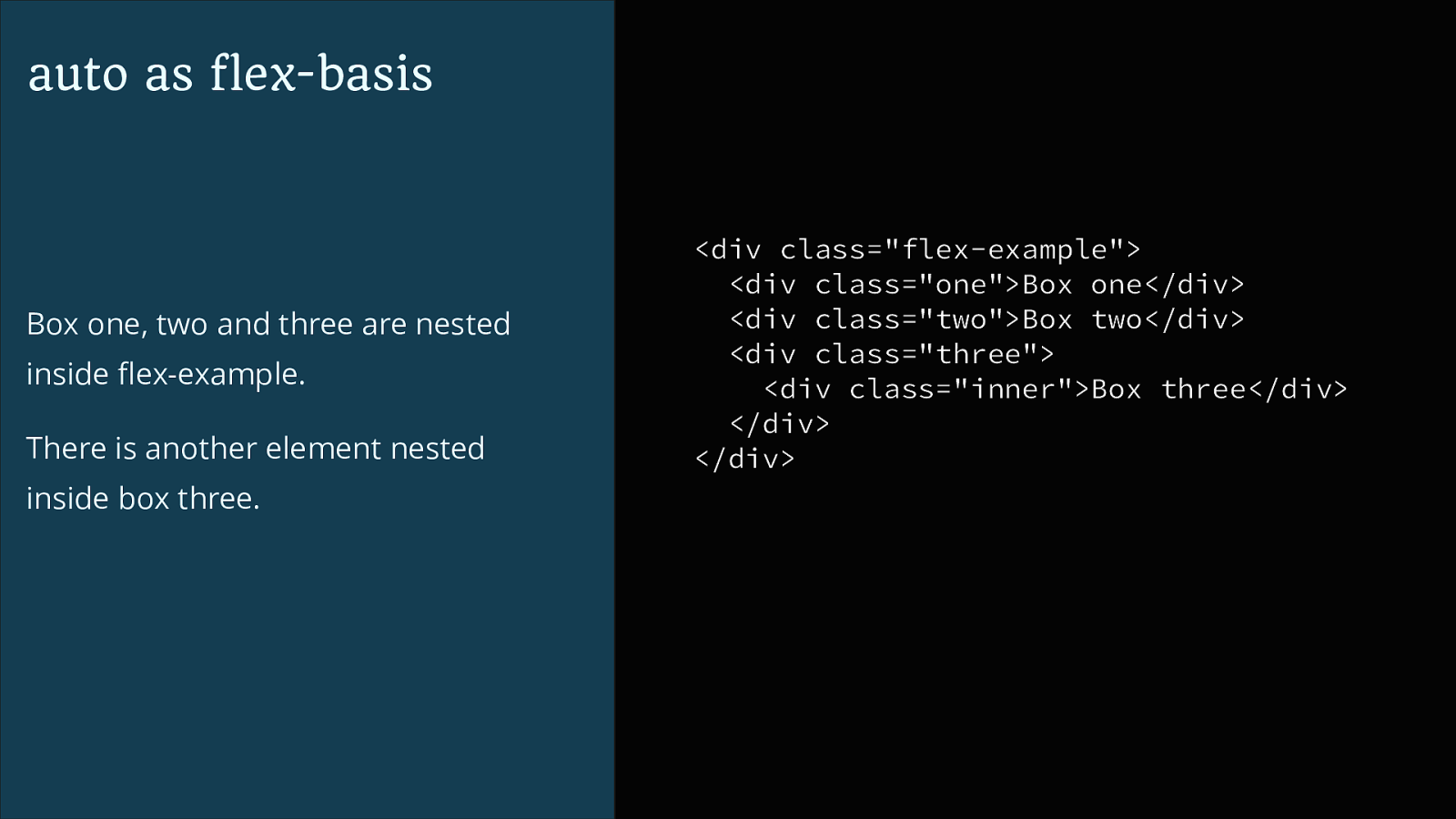
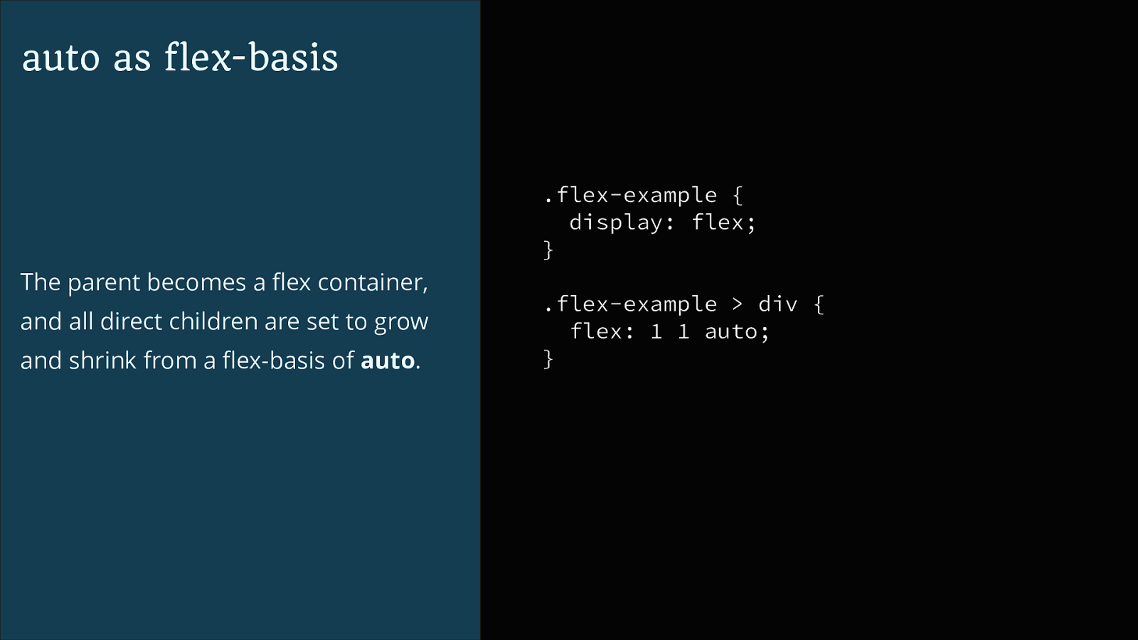
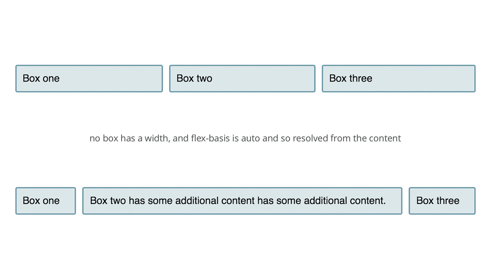
auto as flex-basis Box one, two and three are nested inside flex-example. There is another element nested inside box three.
<div class="flex-example"> <div class="one">Box one</div> <div class="two">Box two</div> <div class="three"> <div class="inner">Box three</div> </div> </div>auto as flex-basis .flex-example { display: flex; } The parent becomes a flex container, and all direct children are set to grow and shrink from a flex-basis of auto. .flex-example > div { flex: 1 1 auto; }
no box has a width, and flex-basis is auto and so resolved from the content
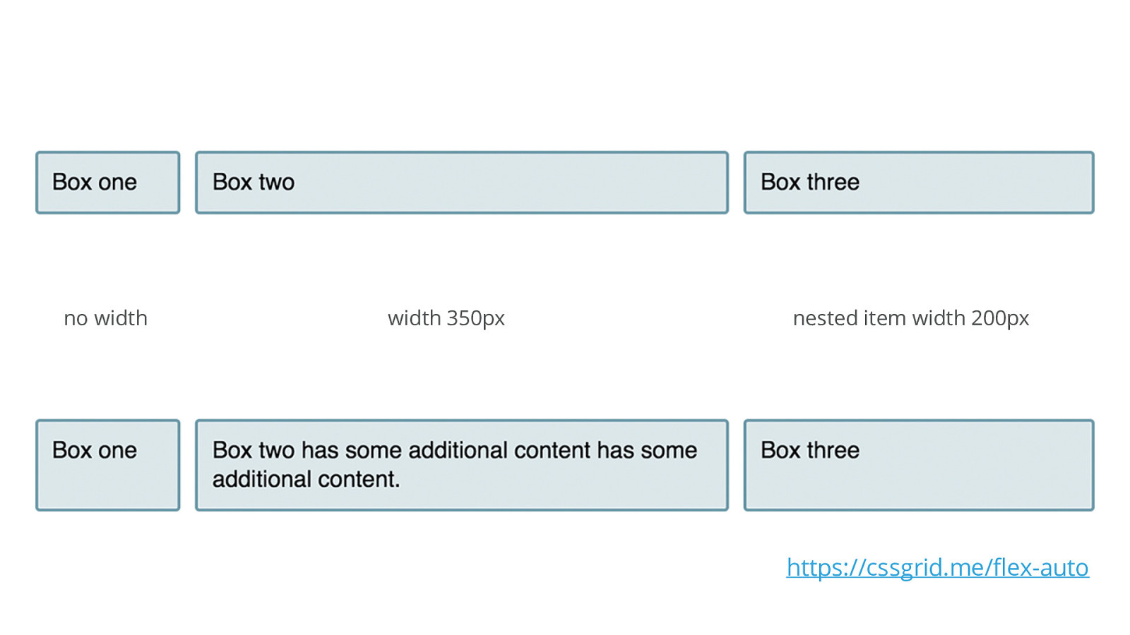
auto as flex-basis Use auto and the flex-basis will be taken from any width set on the item. If there is no width, flex-basis will be taken from the content width. .flex-example { display: flex; } .flex-example > div { flex: 1 1 auto; } .two { width: 350px; } .three .inner { width: 200px; }
no width width 350px nested item width 200px https://cssgrid.me/flex-auto
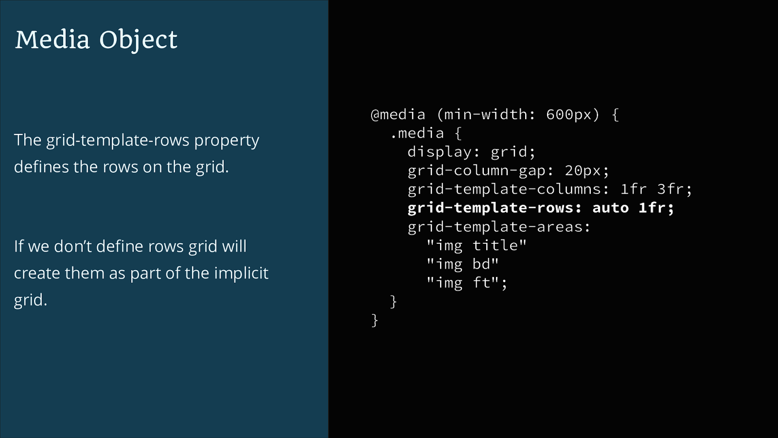
Media Object The grid-template-rows property defines the rows on the grid. If we don’t define rows grid will create them as part of the implicit grid. @media (min-width: 600px) { .media { display: grid; grid-column-gap: 20px; grid-template-columns: 1fr 3fr; grid-template-rows: auto 1fr; grid-template-areas: "img title" "img bd" "img ft"; } }
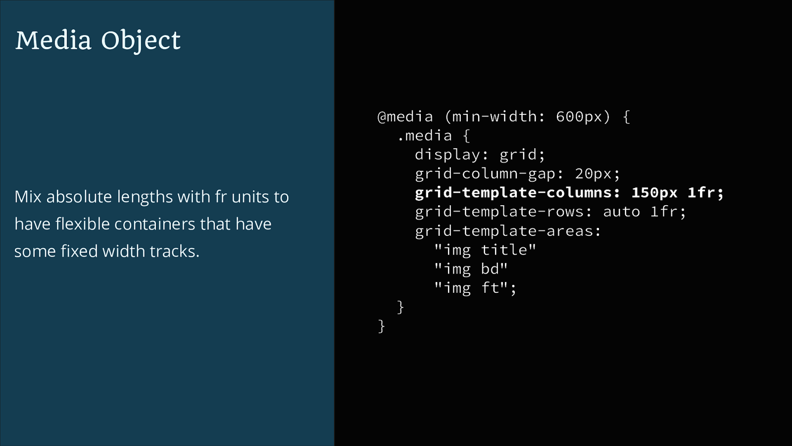
Media Object Mix absolute lengths with fr units to have flexible containers that have some fixed width tracks. @media (min-width: 600px) { .media { display: grid; grid-column-gap: 20px; grid-template-columns: 150px 1fr; grid-template-rows: auto 1fr; grid-template-areas: "img title" "img bd" "img ft"; } }
Media Object ▸ contains an image plus content ✓ ▸ is flexible ✓ ▸ elements should stack on mobile ✓ ▸ box should clear the contents ✓ ▸ image can be to the left or the right ▸ can be nested
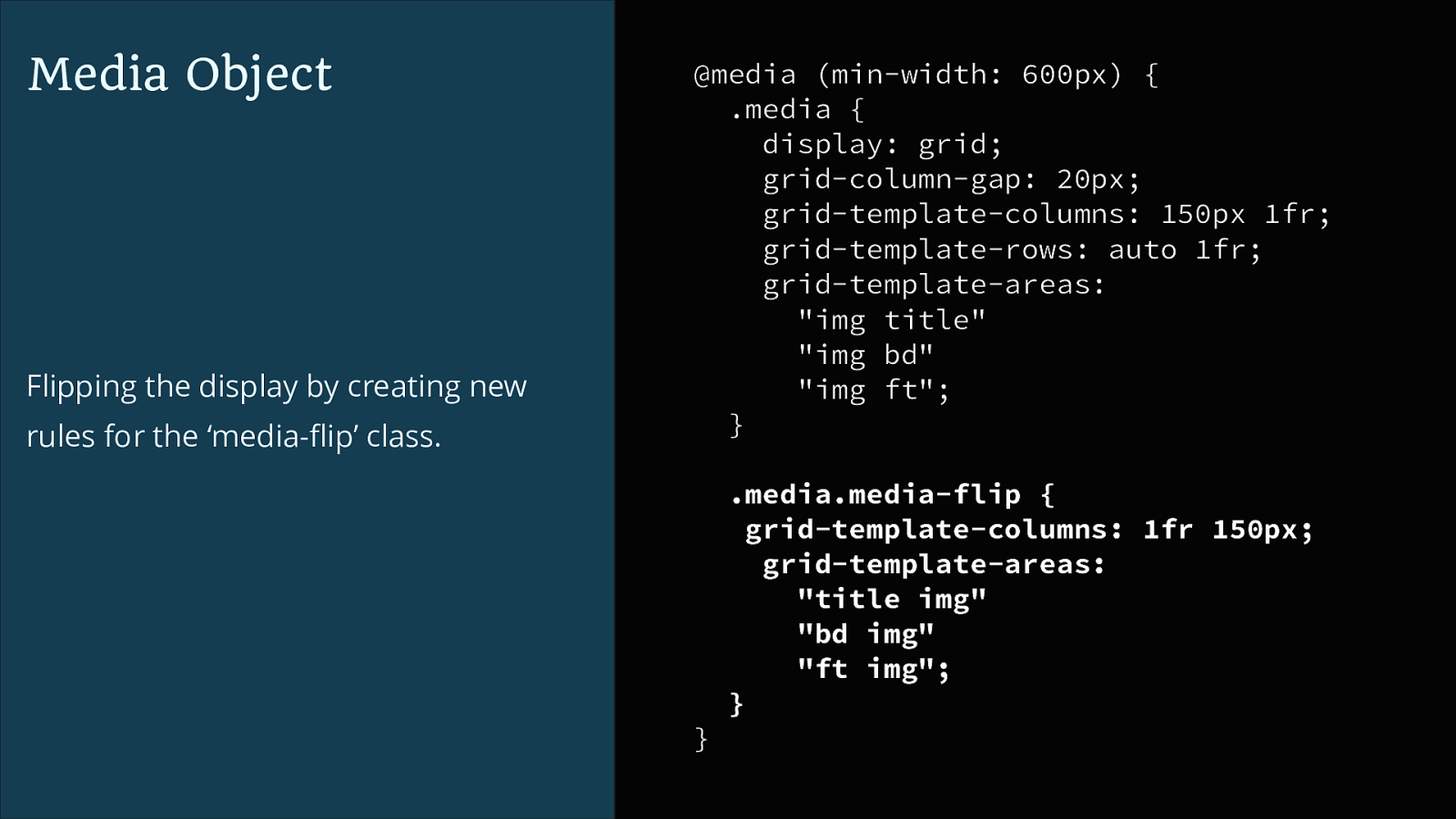
Media Object Flipping the display by creating new rules for the ‘media-flip’ class. @media (min-width: 600px) { .media { display: grid; grid-column-gap: 20px; grid-template-columns: 150px 1fr; grid-template-rows: auto 1fr; grid-template-areas: "img title" "img bd" "img ft"; } .media.media-flip { grid-template-columns: 1fr 150px; grid-template-areas: "title img" "bd img" "ft img"; } }
Media Object ▸ contains an image plus content ✓ ▸ is flexible ✓ ▸ elements should stack on mobile ✓ ▸ box should clear the contents ✓ ▸ image can be to the left or the right ✓ ▸ can be nested
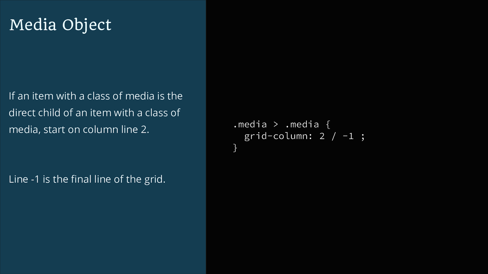
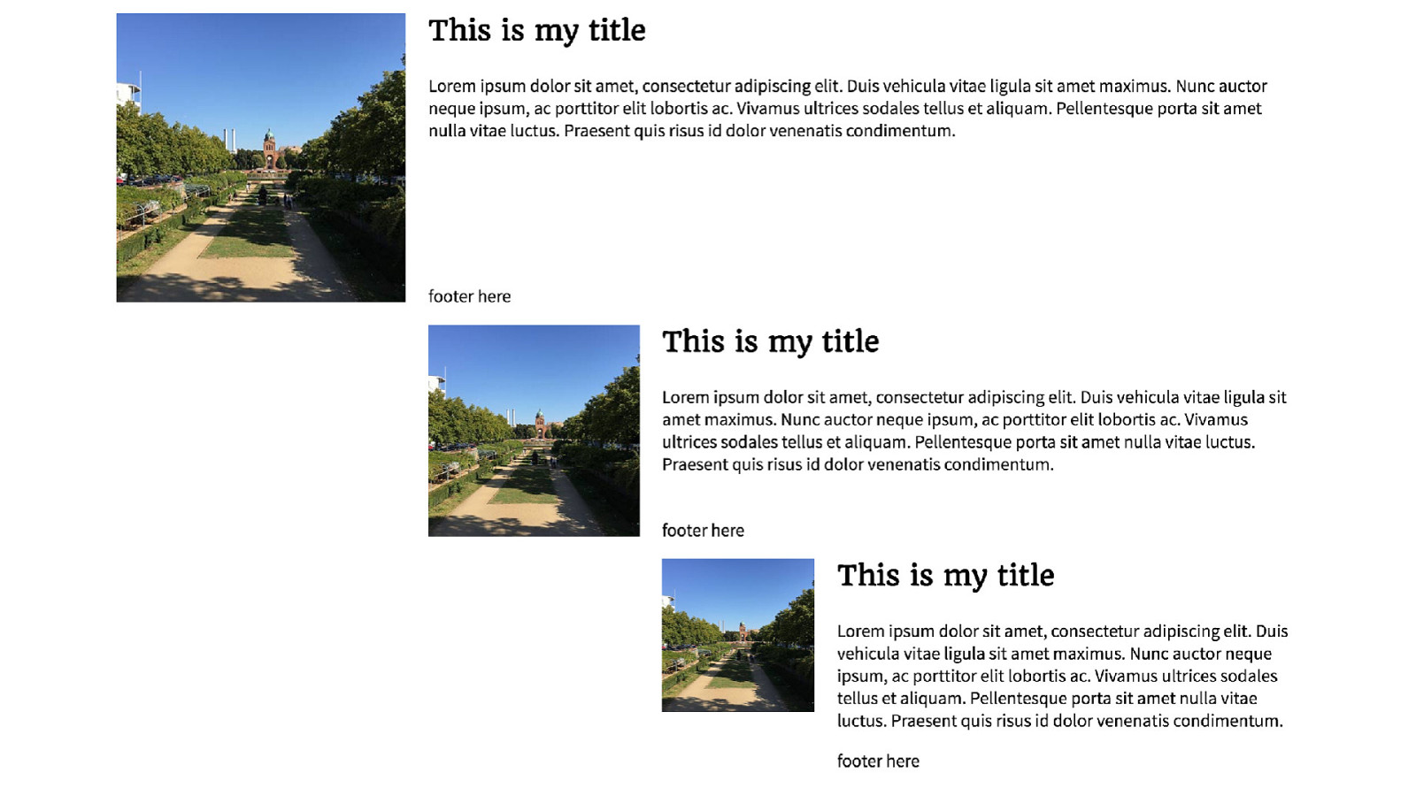
Media Object If an item with a class of media is the direct child of an item with a class of media, start on column line 2. Line -1 is the final line of the grid. .media > .media { grid-column: 2 / -1 ; }
Media Object ▸ contains an image plus content ✓ ▸ is flexible ✓ ▸ elements should stack on mobile ✓ ▸ box should clear the contents ✓ ▸ image can be to the left or the right ✓ ▸ can be nested ✓
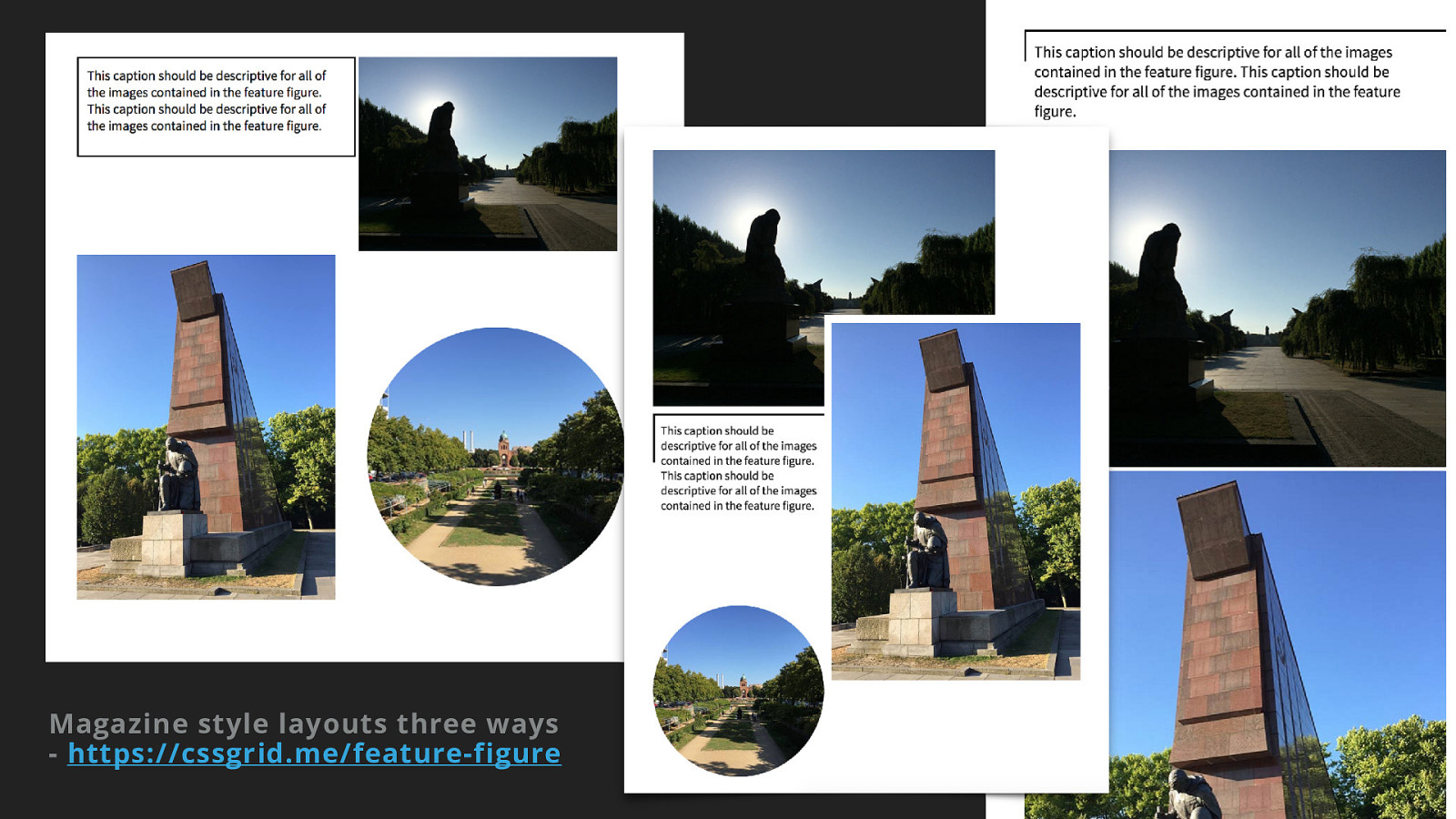
New CSS Meets Magazine style layout
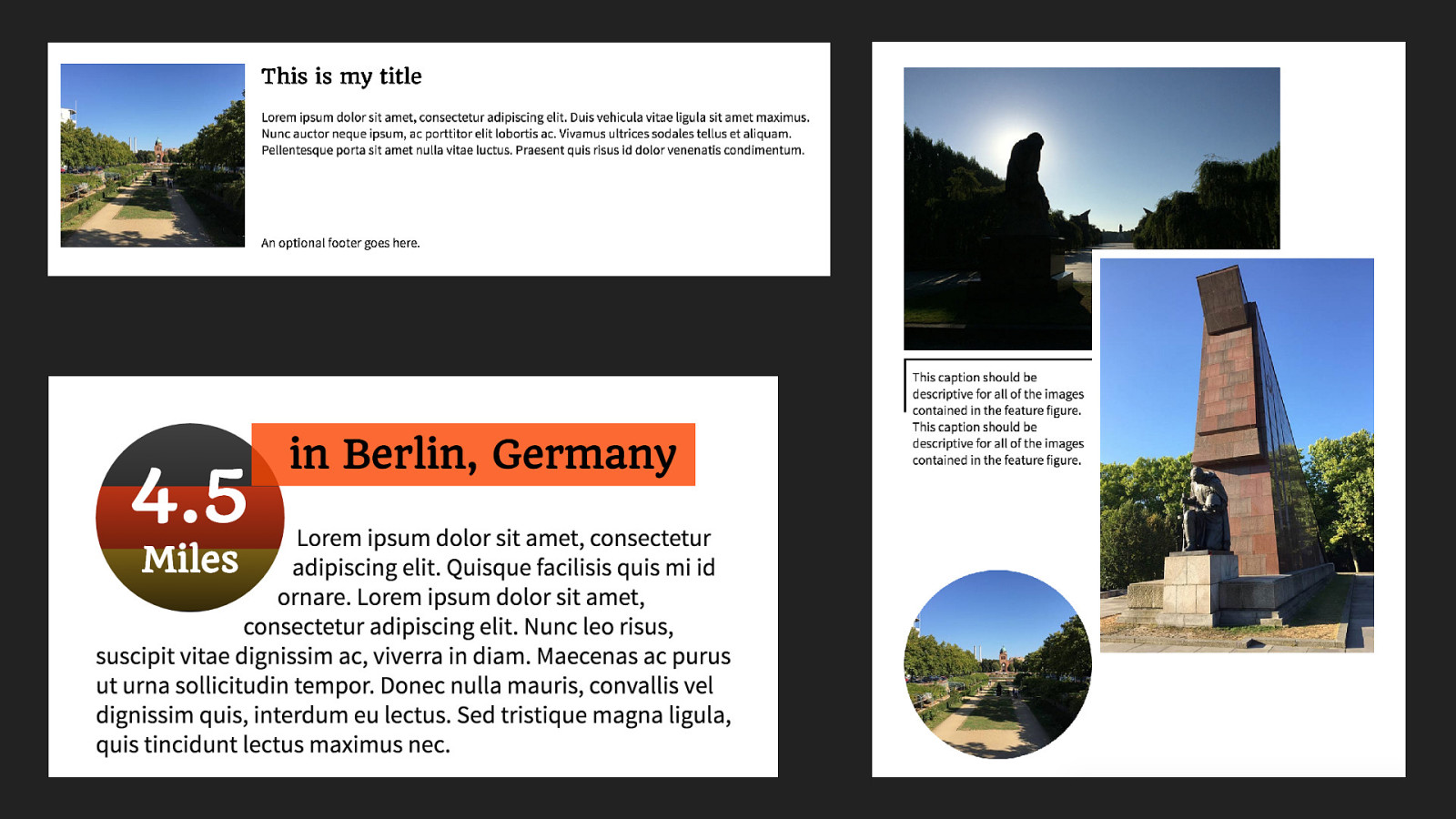
Magazine Style Layout
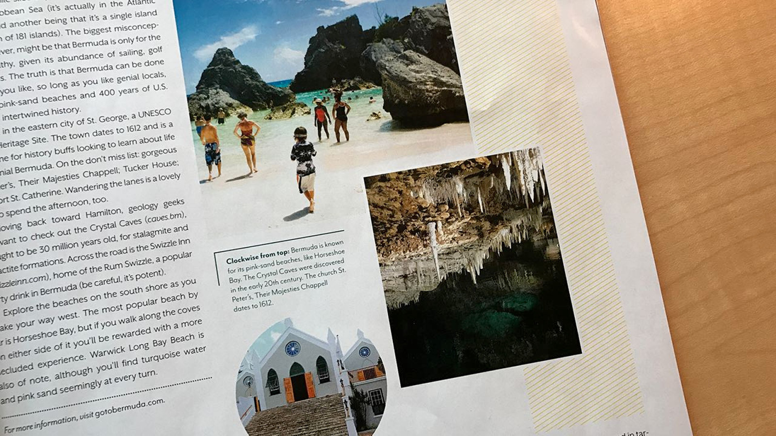
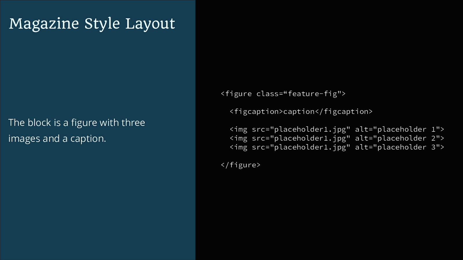
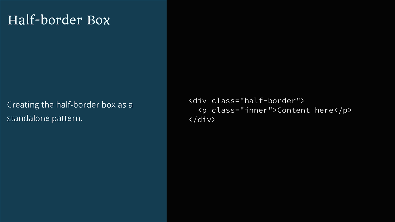
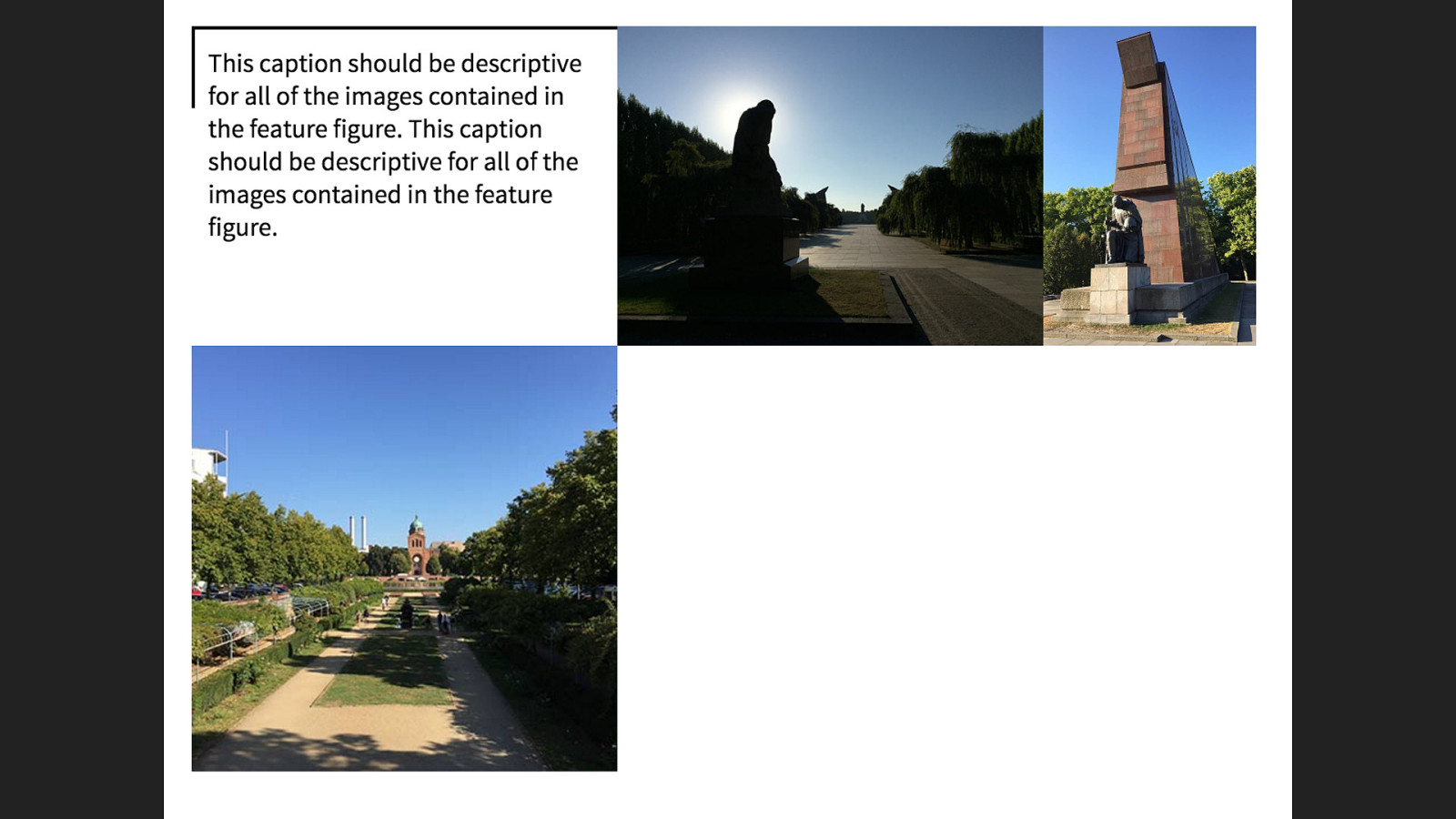
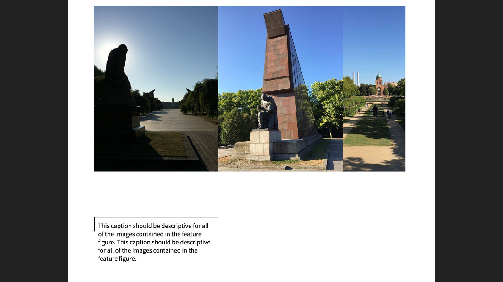
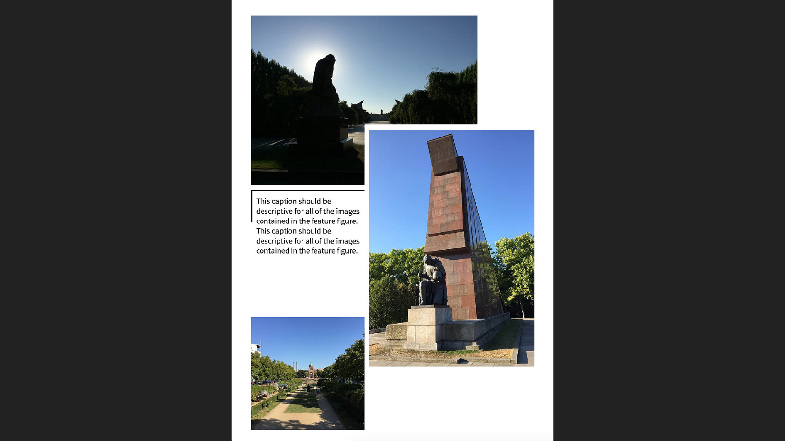
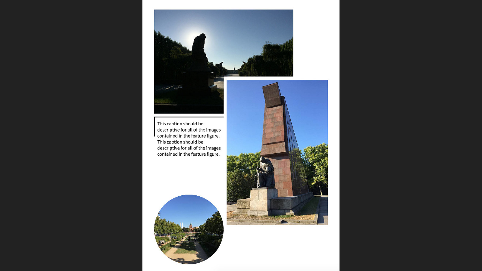
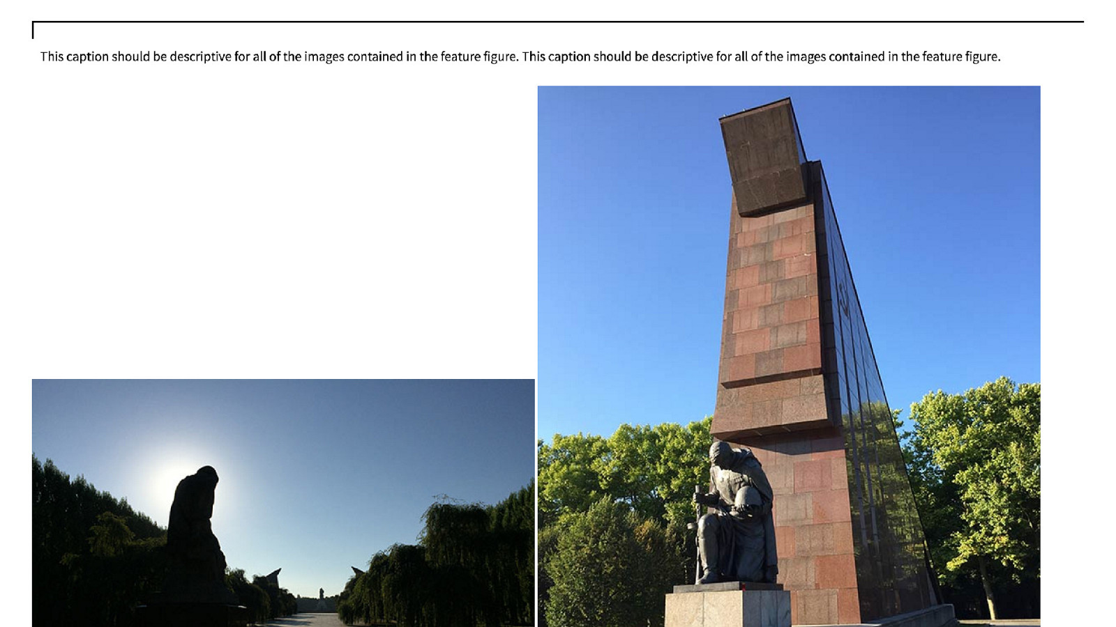
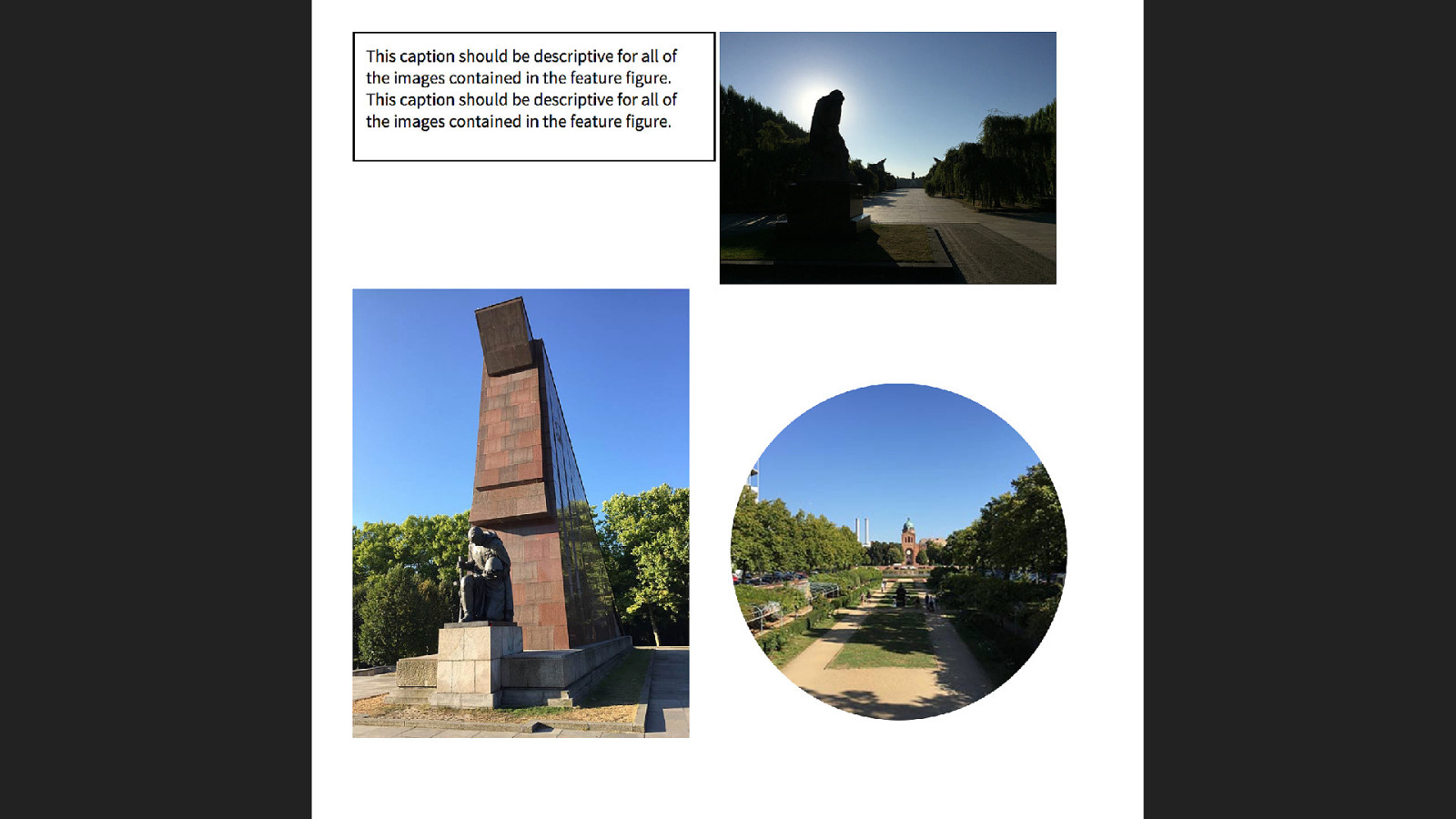
<figure class=“feature-fig"> The block is a figure with three images and a caption. <figcaption>caption</figcaption> <img src="placeholder1.jpg" alt="placeholder 1"> <img src="placeholder1.jpg" alt="placeholder 2"> <img src="placeholder1.jpg" alt="placeholder 3"> </figure>Half-border Box Creating the half-border box as a standalone pattern.
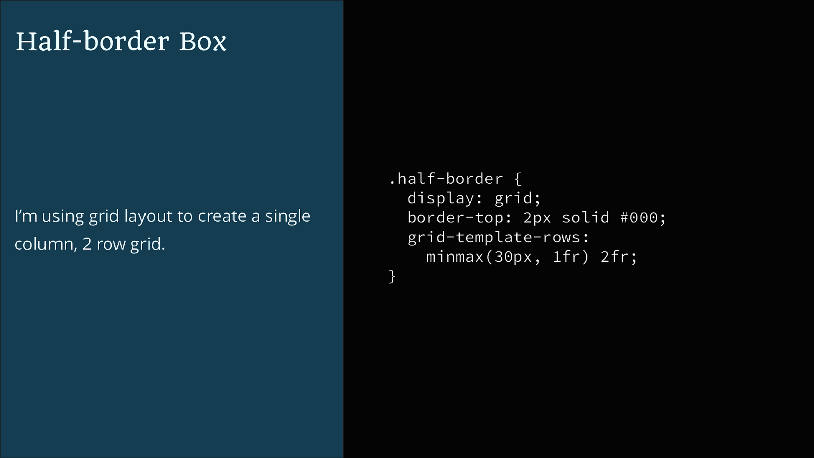
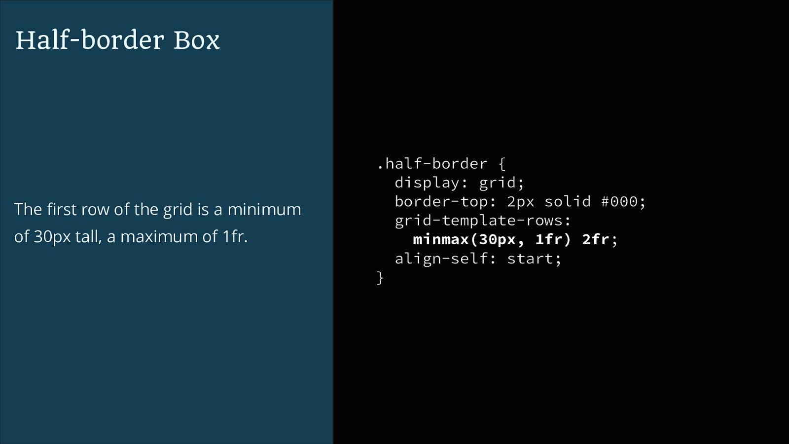
<div class="half-border"> <p class="inner">Content here</p> </div>Half-border Box I’m using grid layout to create a single column, 2 row grid. .half-border { display: grid; border-top: 2px solid #000; grid-template-rows: minmax(30px, 1fr) 2fr; }
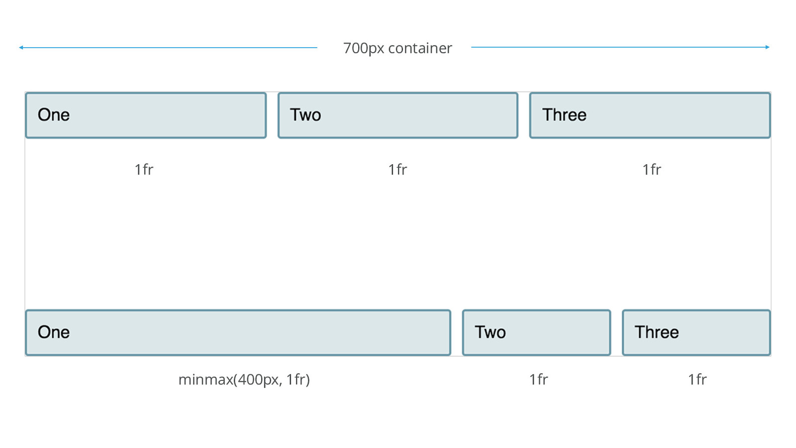
minmax()
700px container 1fr 1fr minmax(400px, 1fr) 1fr 1fr 1fr
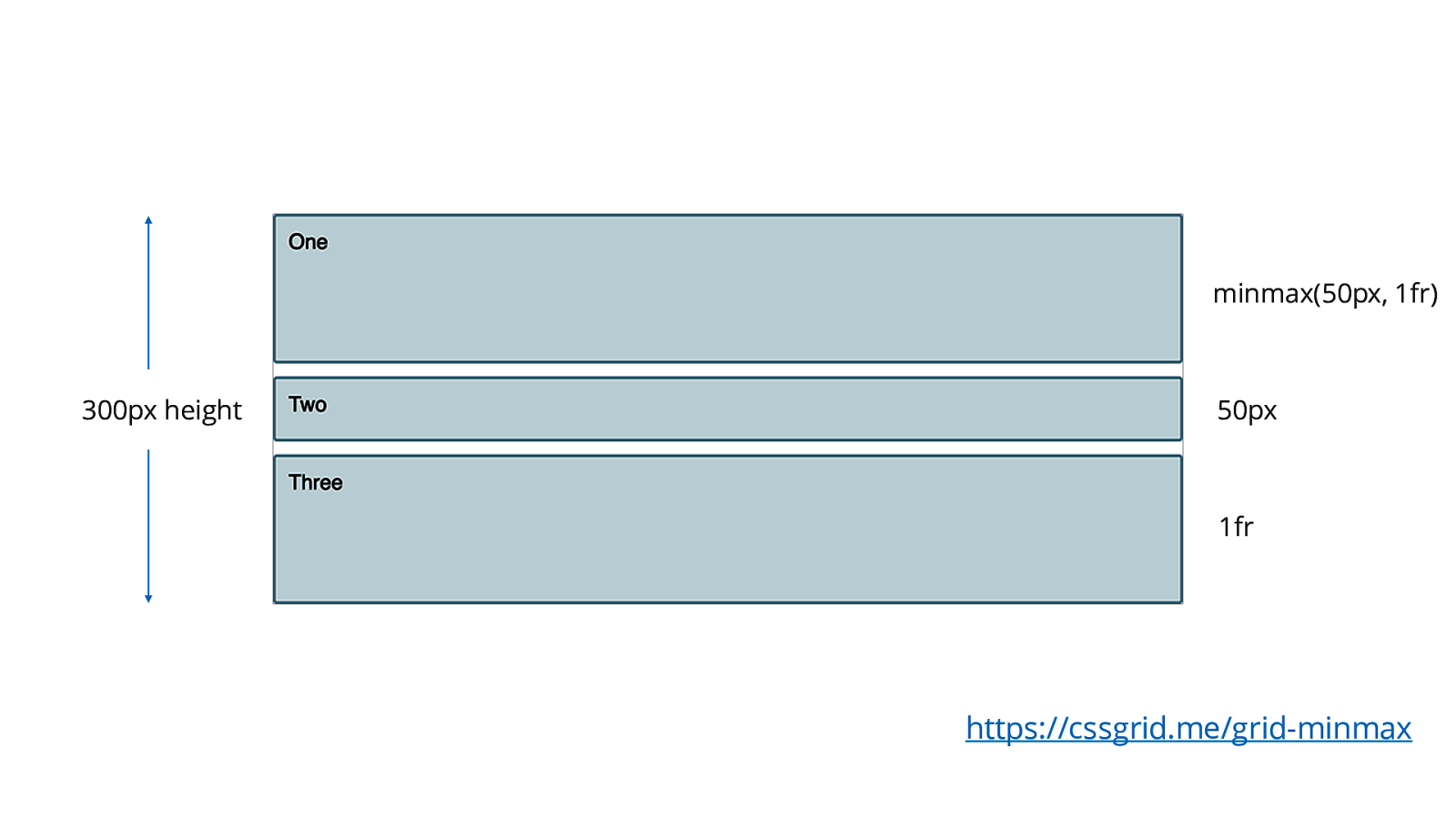
minmax(50px, 1fr) 300px height 50px 1fr https://cssgrid.me/grid-minmax
Half-border Box The first row of the grid is a minimum of 30px tall, a maximum of 1fr. .half-border { display: grid; border-top: 2px solid #000; grid-template-rows: minmax(30px, 1fr) 2fr; align-self: start; }
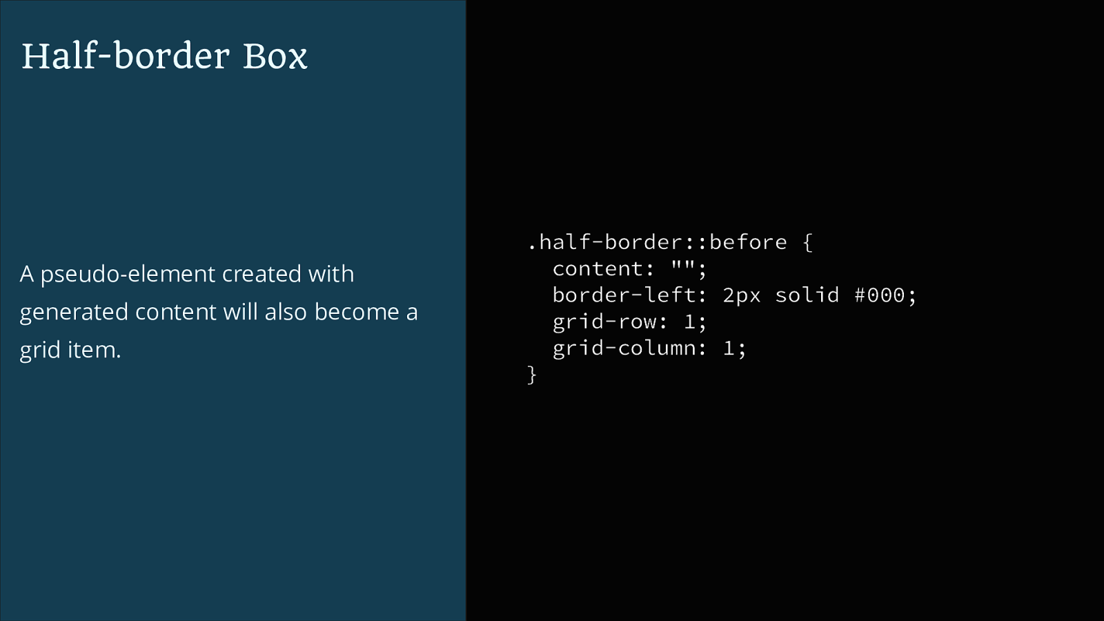
Half-border Box A pseudo-element created with generated content will also become a grid item. .half-border::before { content: ""; border-left: 2px solid #000; grid-row: 1; grid-column: 1; }
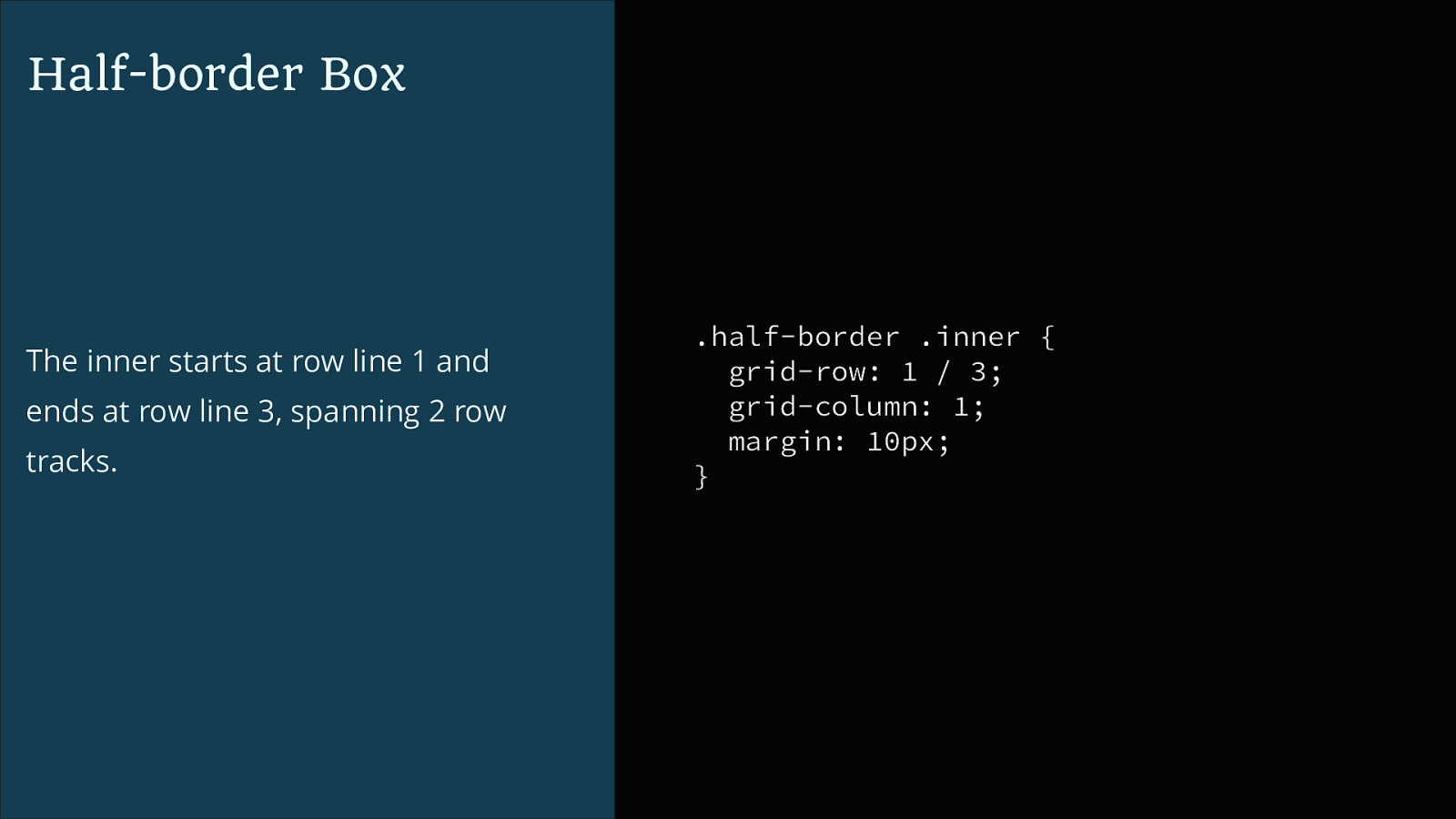
Half-border Box The inner starts at row line 1 and ends at row line 3, spanning 2 row tracks. .half-border .inner { grid-row: 1 / 3; grid-column: 1; margin: 10px; }
Magazine Style Layout
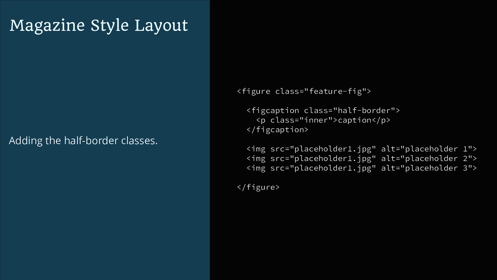
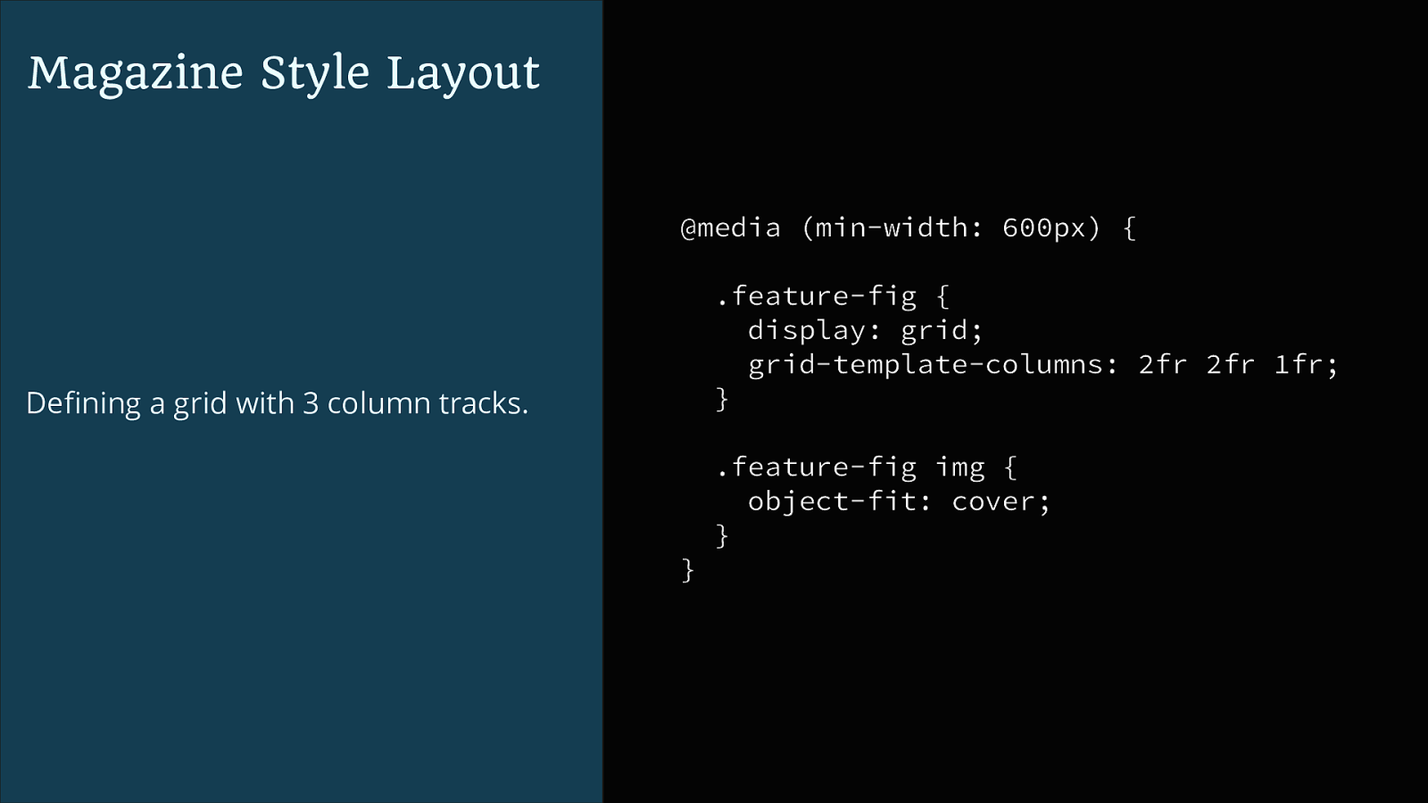
<figure class="feature-fig"> Adding the half-border classes. <figcaption class="half-border"> <p class="inner">caption</p> </figcaption> <img src="placeholder1.jpg" alt="placeholder 1"> <img src="placeholder1.jpg" alt="placeholder 2"> <img src="placeholder1.jpg" alt="placeholder 3"> </figure>Magazine Style Layout @media (min-width: 600px) { .feature-fig { display: grid; grid-template-columns: 2fr 2fr 1fr; } Defining a grid with 3 column tracks. .feature-fig img { object-fit: cover; } }
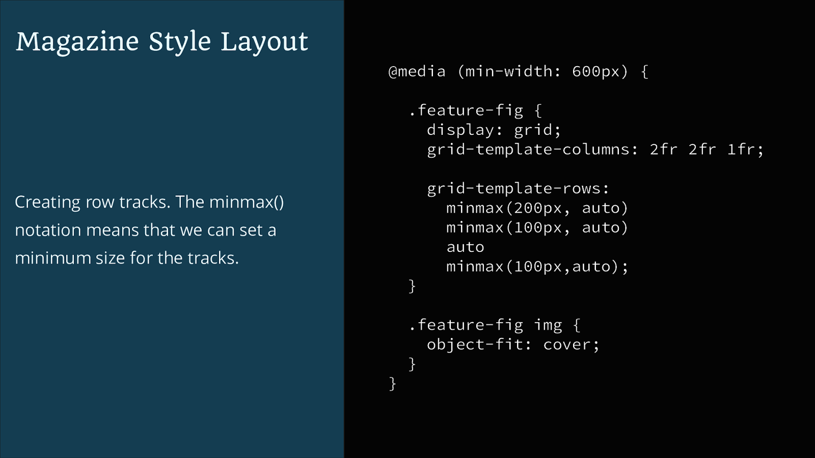
Magazine Style Layout @media (min-width: 600px) { .feature-fig { display: grid; grid-template-columns: 2fr 2fr 1fr; grid-template-rows: minmax(200px, auto) minmax(100px, auto) auto minmax(100px,auto); Creating row tracks. The minmax() notation means that we can set a minimum size for the tracks. } .feature-fig img { object-fit: cover; } }
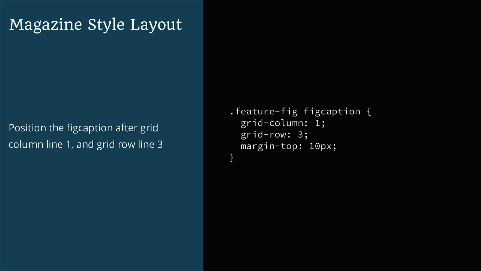
Magazine Style Layout Position the figcaption after grid column line 1, and grid row line 3 .feature-fig figcaption { grid-column: 1; grid-row: 3; margin-top: 10px; }
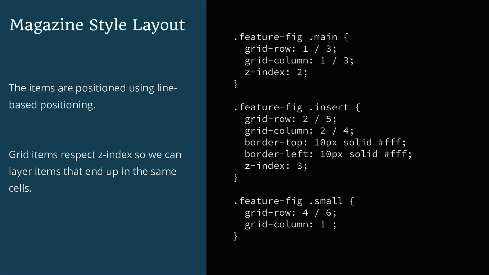
Magazine Style Layout The items are positioned using linebased positioning. Grid items respect z-index so we can layer items that end up in the same cells. .feature-fig .main { grid-row: 1 / 3; grid-column: 1 / 3; z-index: 2; } .feature-fig .insert { grid-row: 2 / 5; grid-column: 2 / 4; border-top: 10px solid #fff; border-left: 10px solid #fff; z-index: 3; } .feature-fig .small { grid-row: 4 / 6; grid-column: 1 ; }
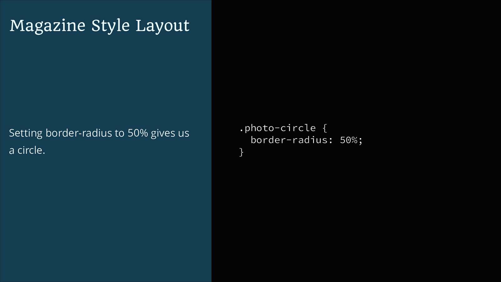
Magazine Style Layout Setting border-radius to 50% gives us a circle. .photo-circle { border-radius: 50%; }
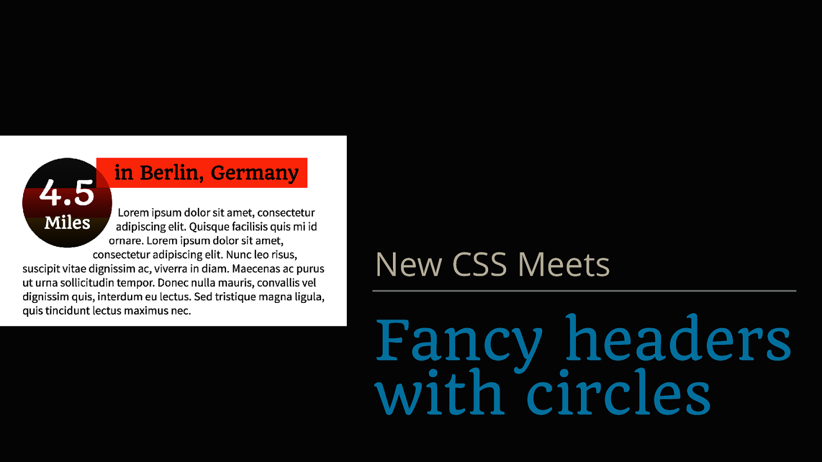
New CSS Meets Fancy headers with circles
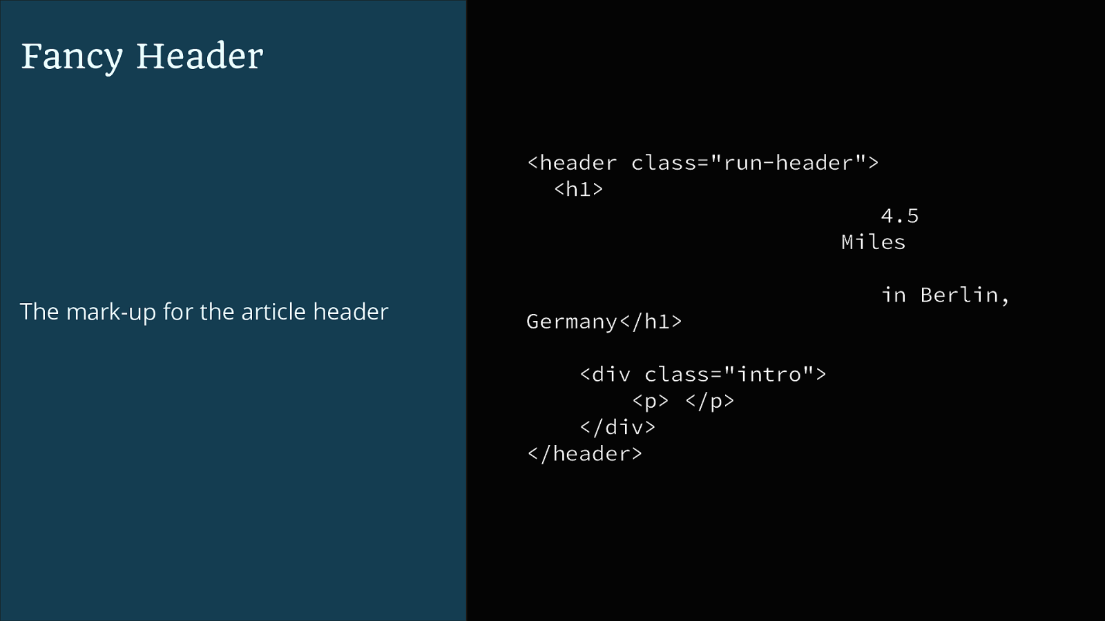
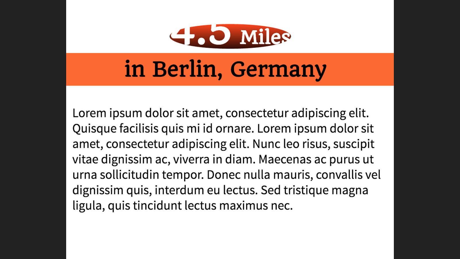
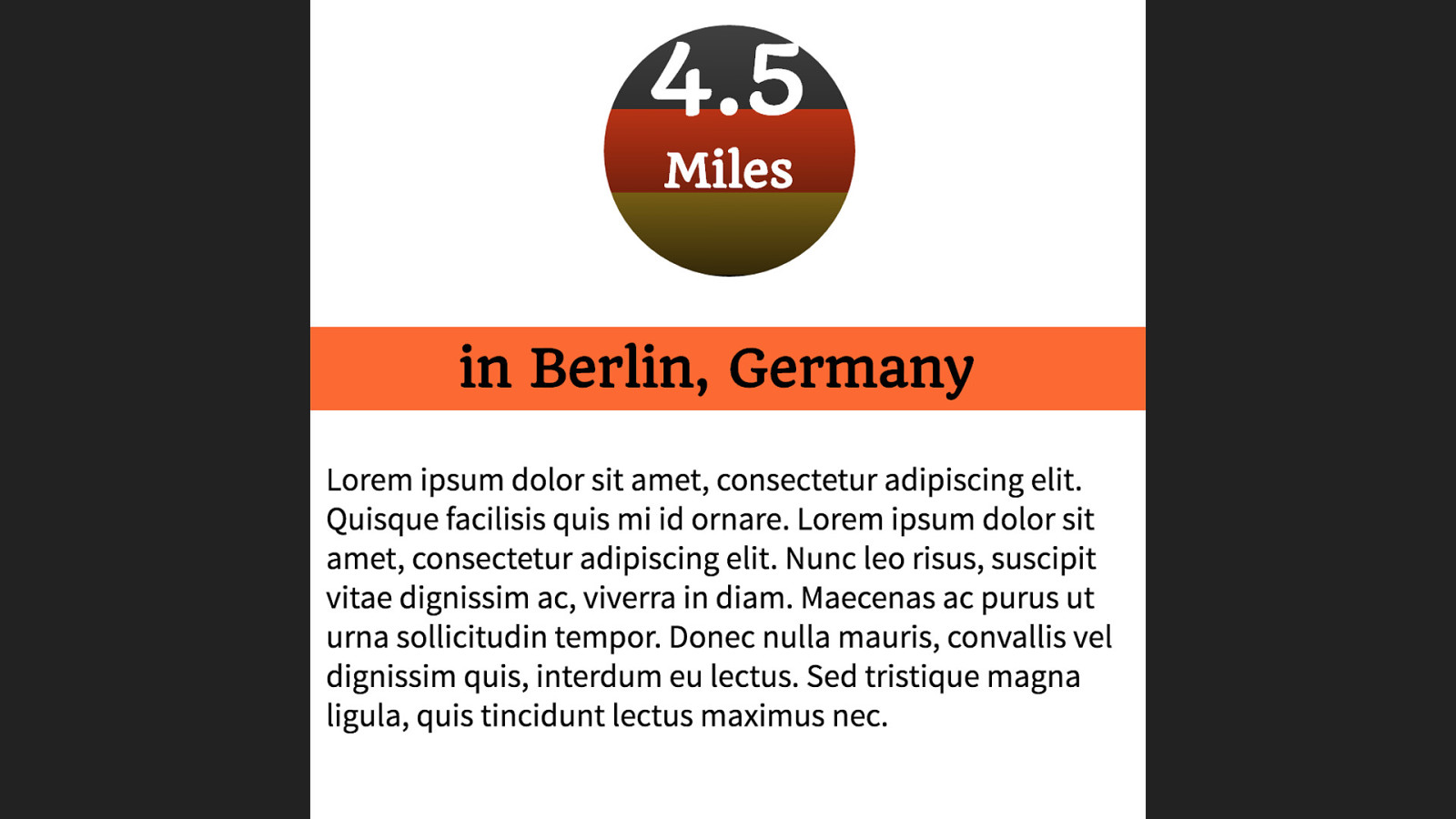
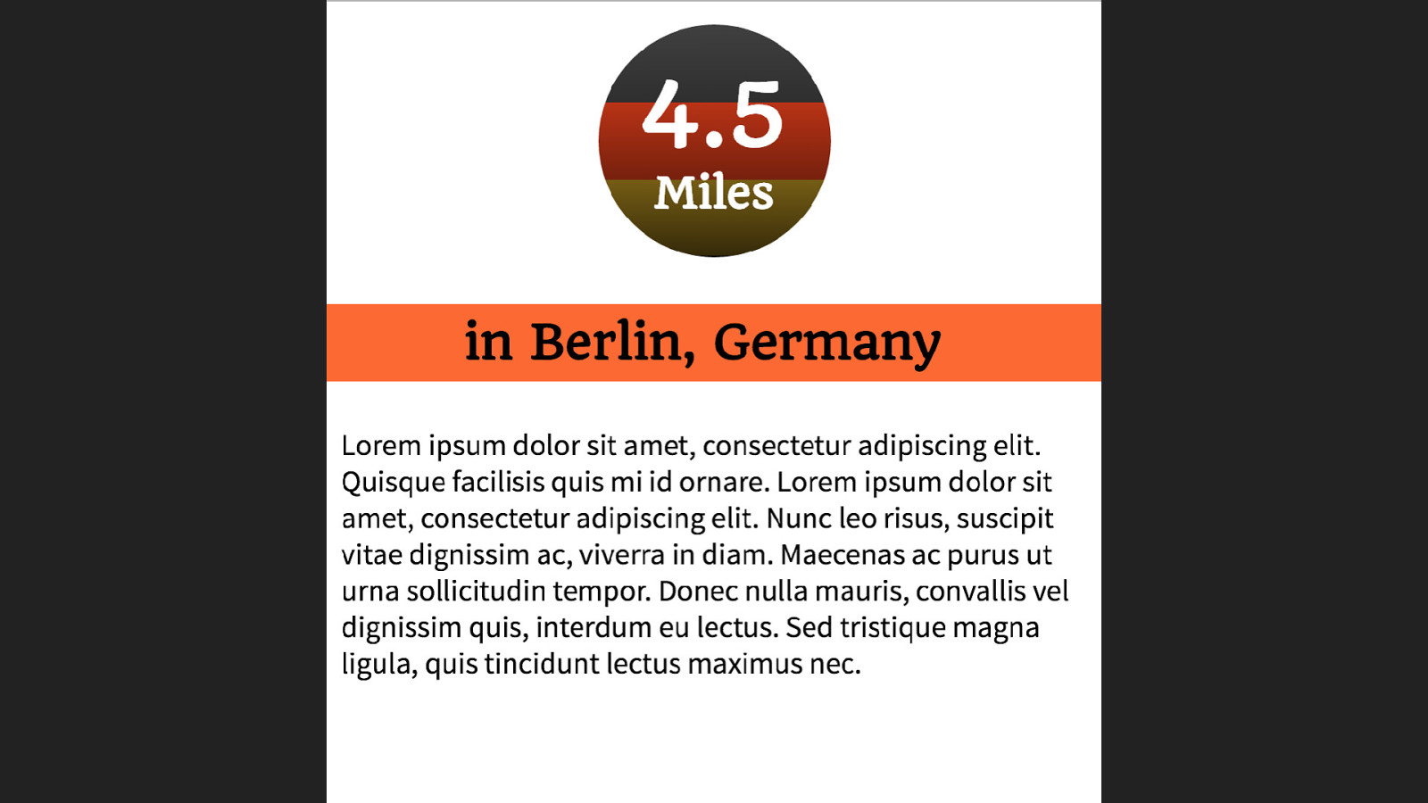
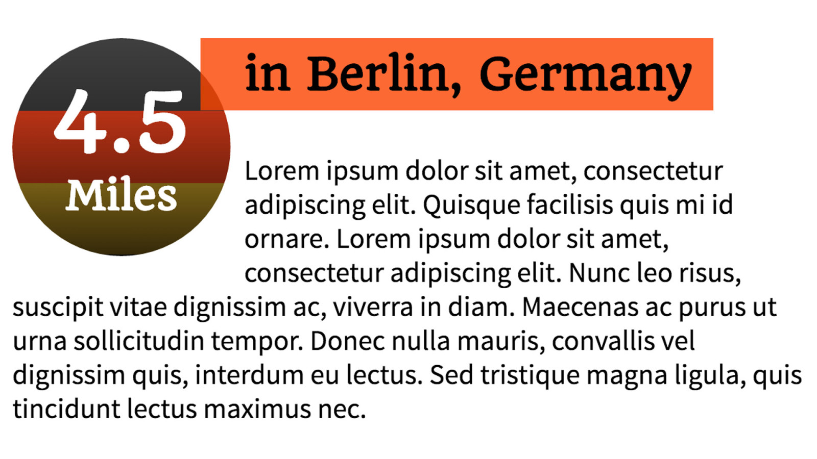
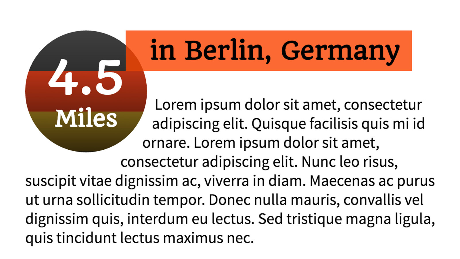
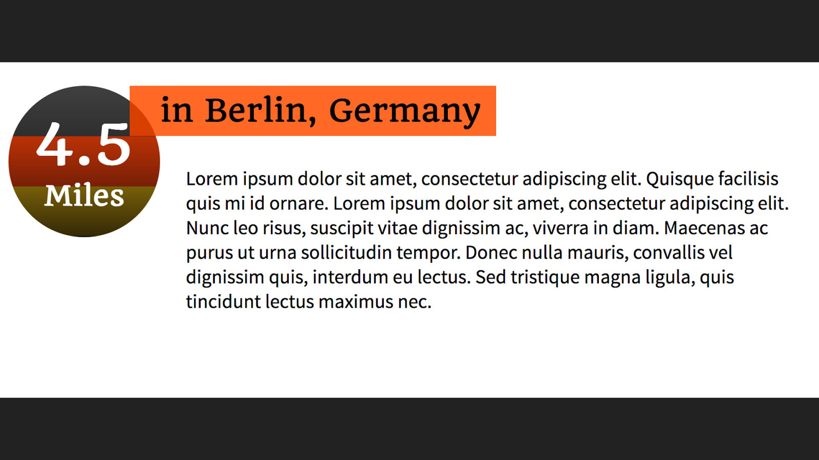
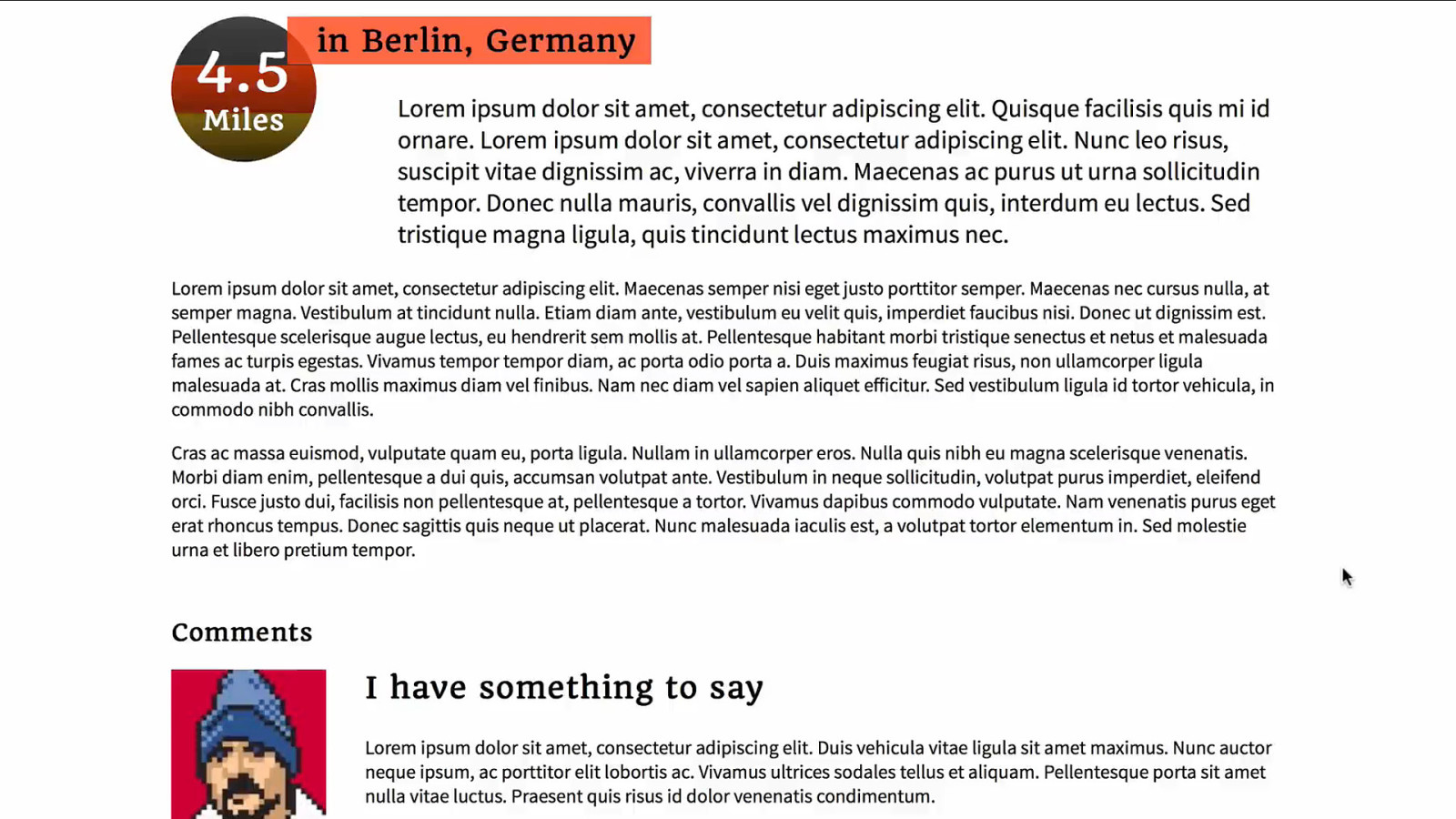
Fancy Header <header class="run-header"> <h1> 4.5 Miles The mark-up for the article header in Berlin, Germany</h1> <div class="intro"> <p> </p> </div> </header>
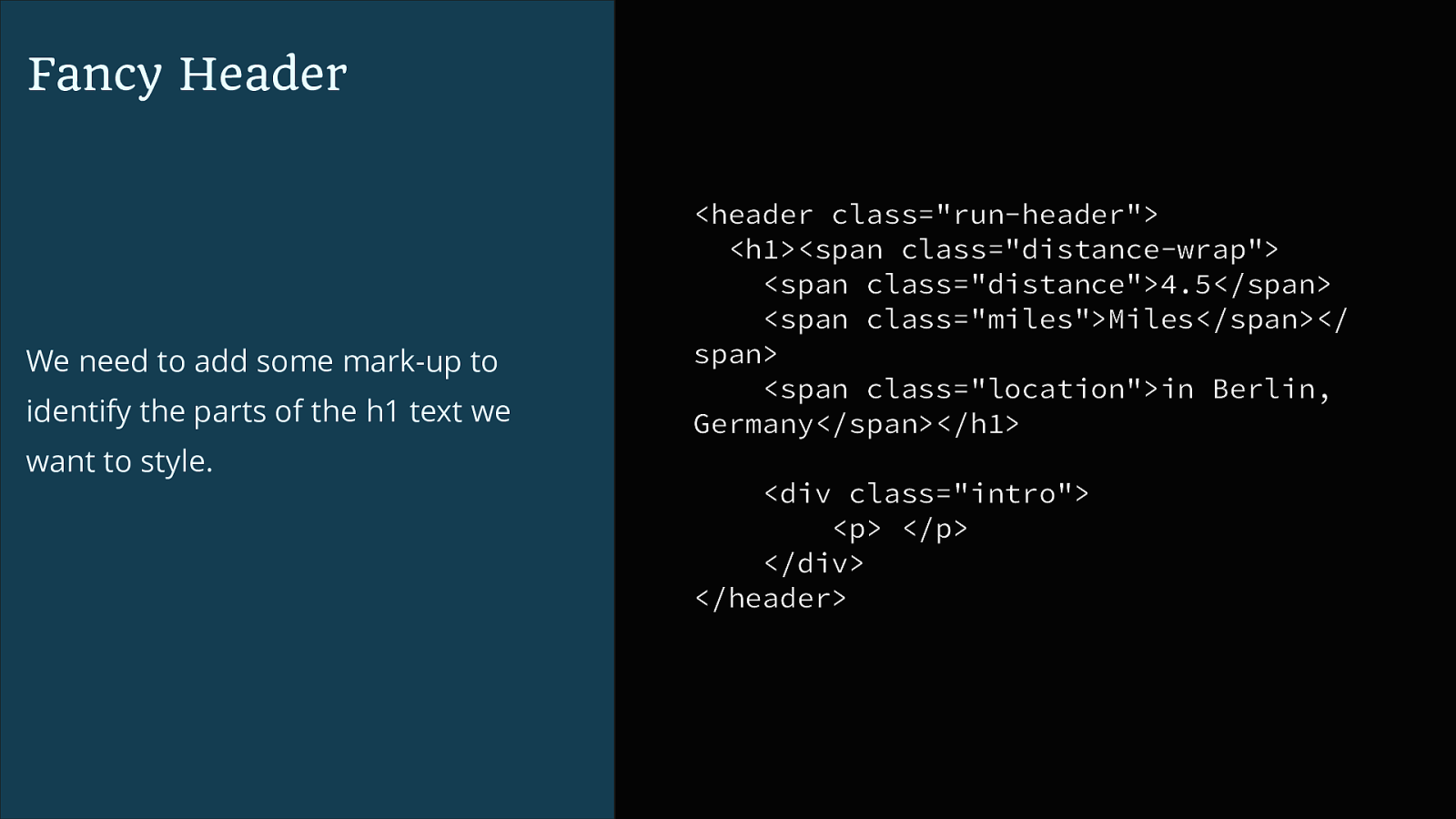
Fancy Header We need to add some mark-up to identify the parts of the h1 text we want to style.
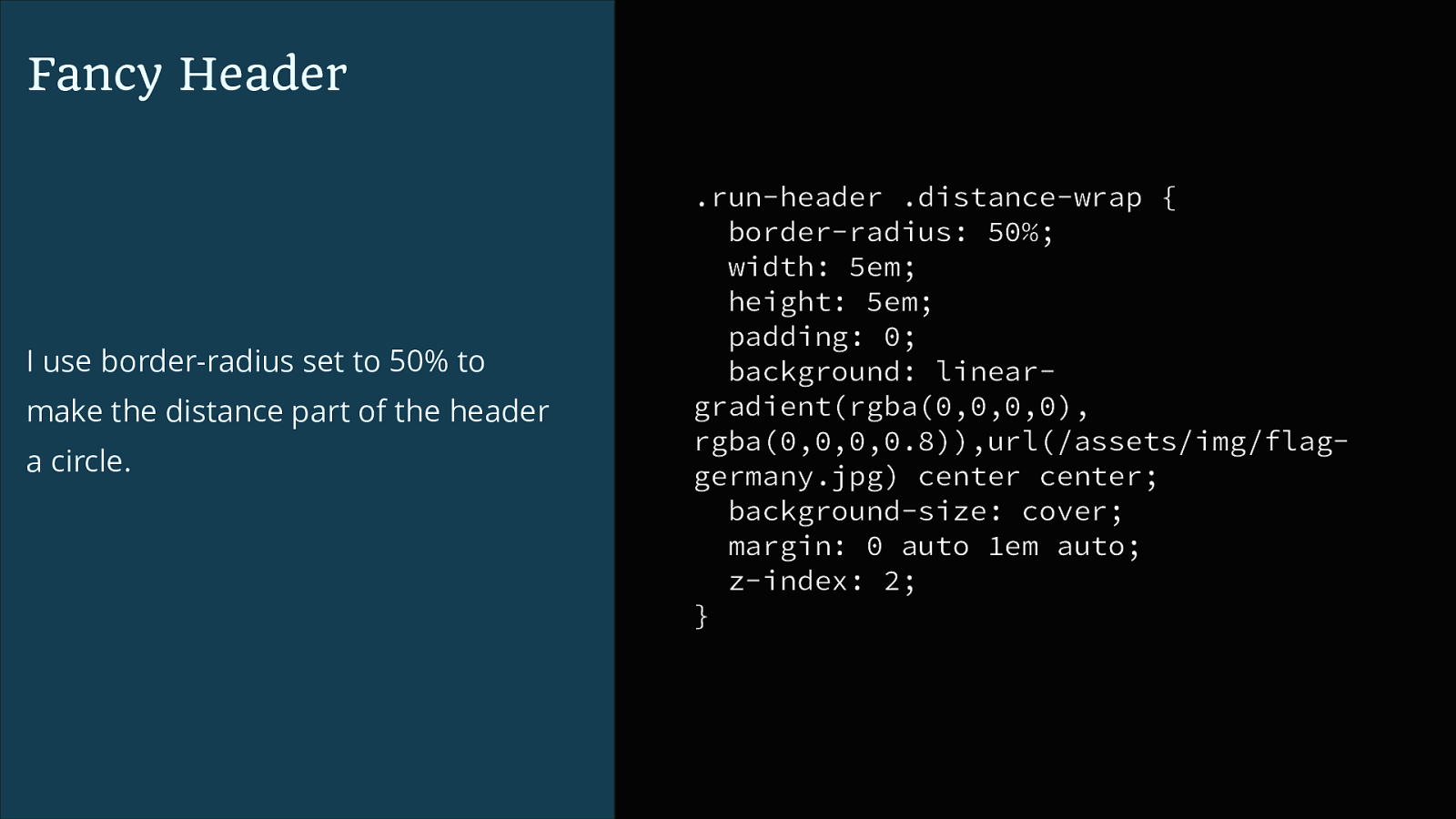
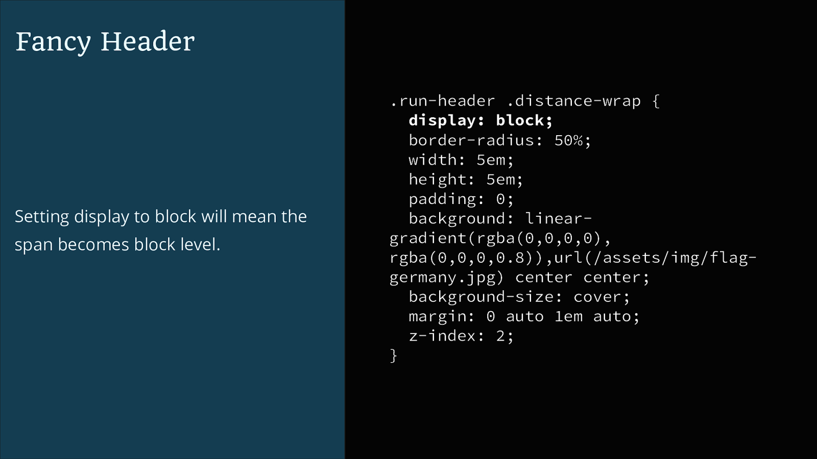
<header class="run-header"> <h1><span class="distance-wrap"> <span class="distance">4.5</span> <span class="miles">Miles</span></ span> <span class="location">in Berlin, Germany</span></h1> <div class="intro"> <p> </p> </div> </header>Fancy Header I use border-radius set to 50% to make the distance part of the header a circle. .run-header .distance-wrap { border-radius: 50%; width: 5em; height: 5em; padding: 0; background: lineargradient(rgba(0,0,0,0), rgba(0,0,0,0.8)),url(/assets/img/flaggermany.jpg) center center; background-size: cover; margin: 0 auto 1em auto; z-index: 2; }
Fancy Header Setting display to block will mean the span becomes block level. .run-header .distance-wrap { display: block; border-radius: 50%; width: 5em; height: 5em; padding: 0; background: lineargradient(rgba(0,0,0,0), rgba(0,0,0,0.8)),url(/assets/img/flaggermany.jpg) center center; background-size: cover; margin: 0 auto 1em auto; z-index: 2; }
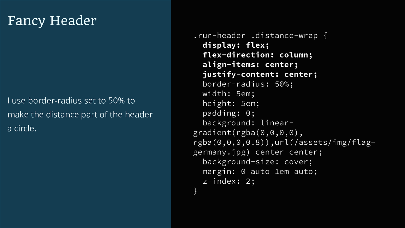
Fancy Header I use border-radius set to 50% to make the distance part of the header a circle. .run-header .distance-wrap { display: flex; flex-direction: column; align-items: center; justify-content: center; border-radius: 50%; width: 5em; height: 5em; padding: 0; background: lineargradient(rgba(0,0,0,0), rgba(0,0,0,0.8)),url(/assets/img/flaggermany.jpg) center center; background-size: cover; margin: 0 auto 1em auto; z-index: 2; }
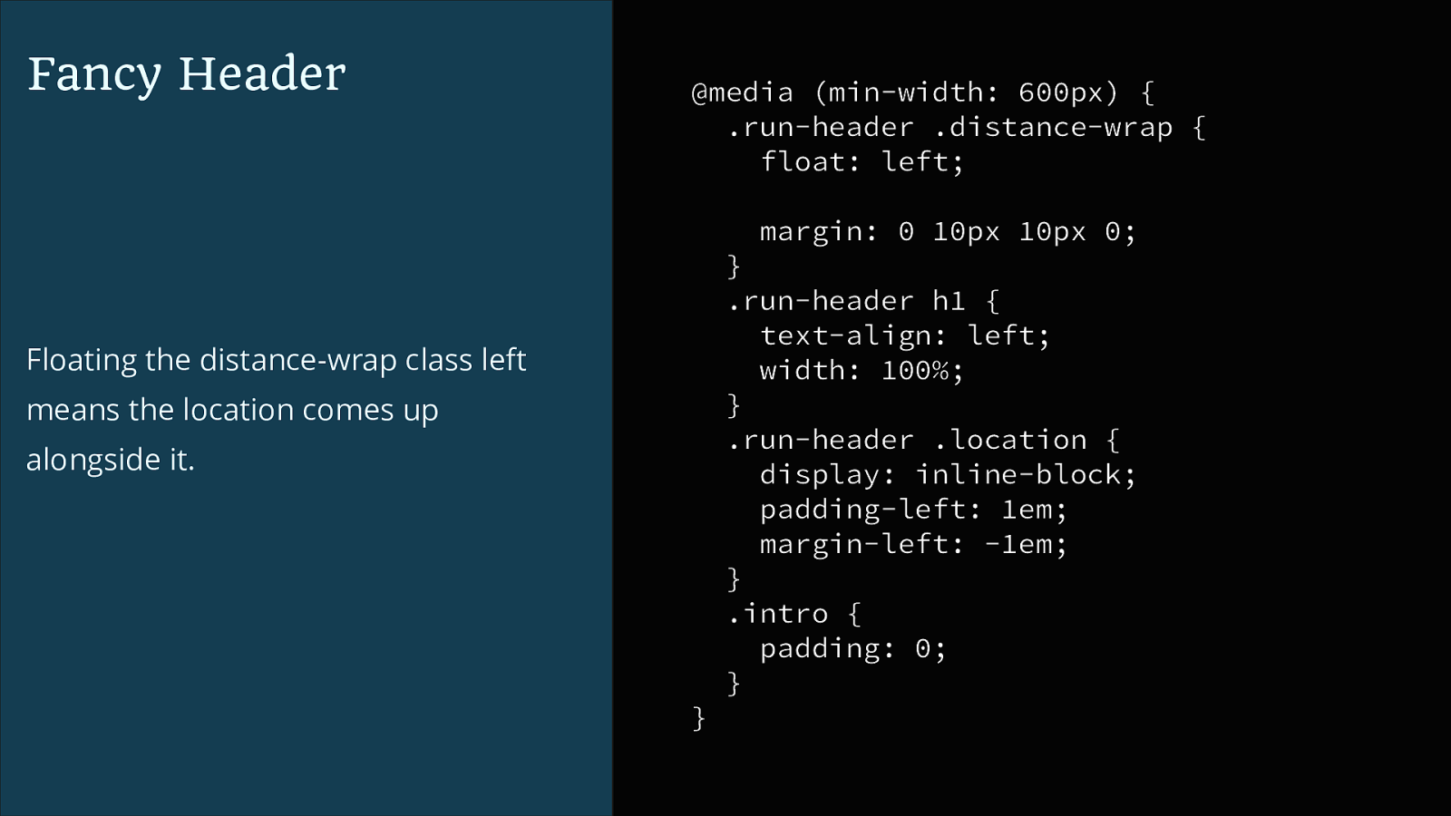
Fancy Header @media (min-width: 600px) { .run-header .distance-wrap { float: left; margin: 0 10px 10px 0; } .run-header h1 { text-align: left; width: 100%; } .run-header .location { display: inline-block; padding-left: 1em; margin-left: -1em; } .intro { padding: 0; } Floating the distance-wrap class left means the location comes up alongside it. }
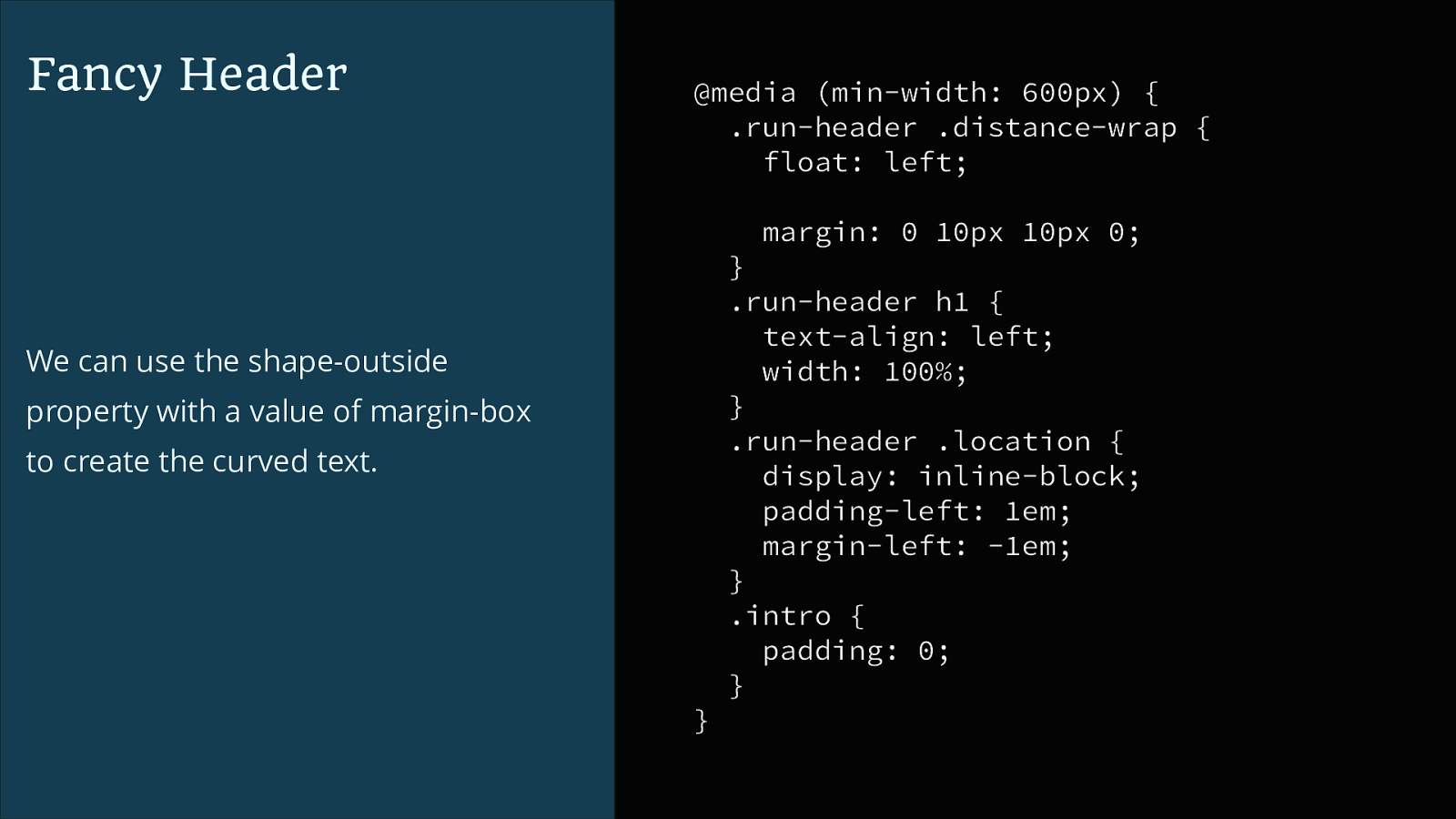
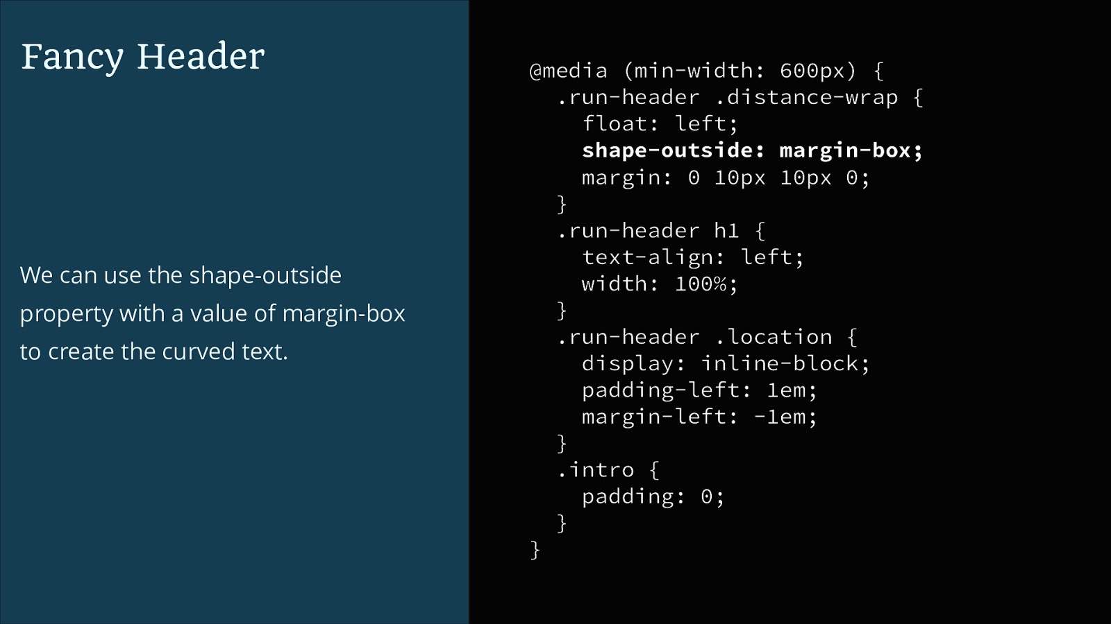
Fancy Header @media (min-width: 600px) { .run-header .distance-wrap { float: left; margin: 0 10px 10px 0; } .run-header h1 { text-align: left; width: 100%; } .run-header .location { display: inline-block; padding-left: 1em; margin-left: -1em; } .intro { padding: 0; } We can use the shape-outside property with a value of margin-box to create the curved text. }
Fancy Header We can use the shape-outside property with a value of margin-box to create the curved text. @media (min-width: 600px) { .run-header .distance-wrap { float: left; shape-outside: margin-box; margin: 0 10px 10px 0; } .run-header h1 { text-align: left; width: 100%; } .run-header .location { display: inline-block; padding-left: 1em; margin-left: -1em; } .intro { padding: 0; } }
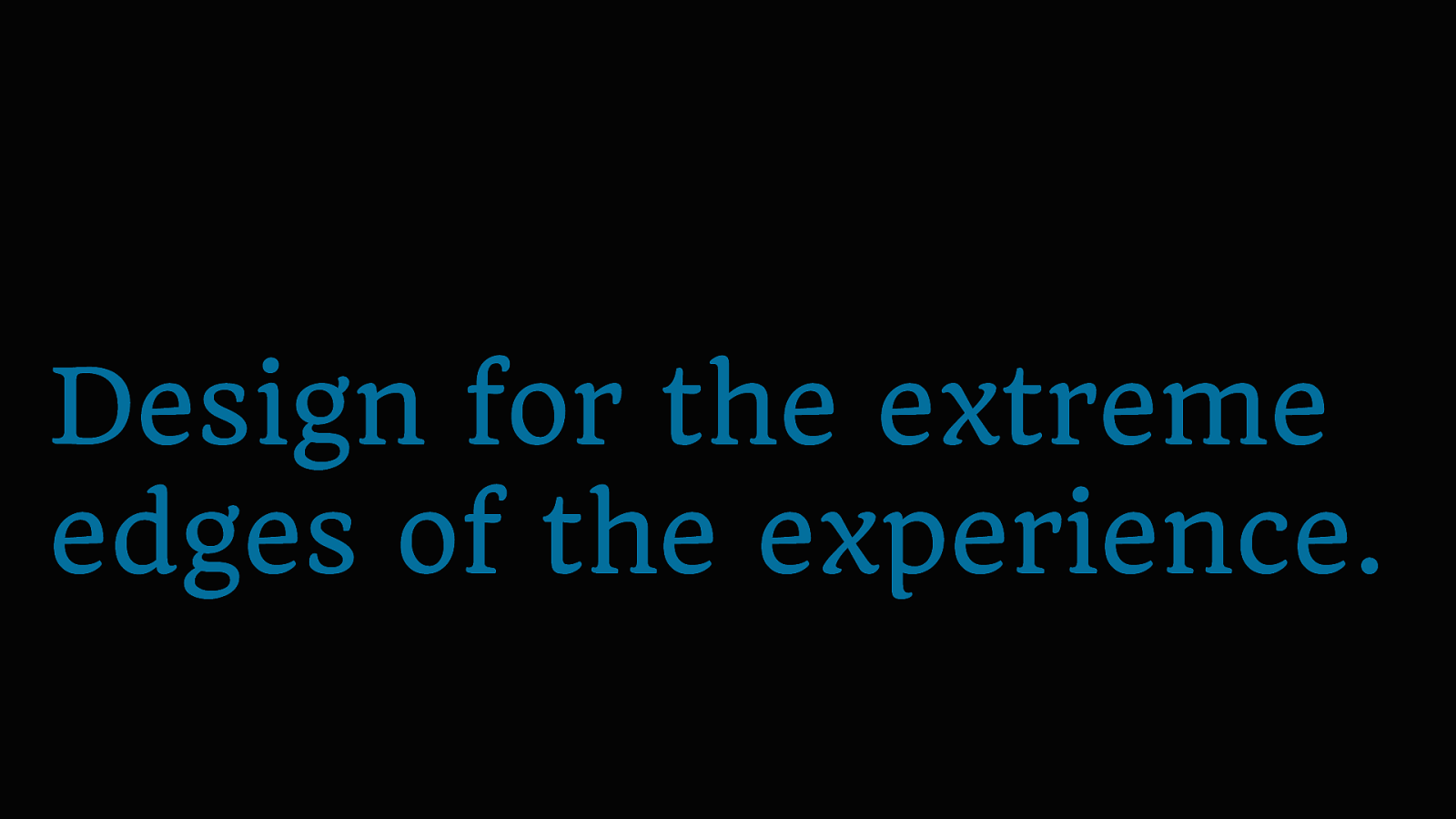
Design for the extreme edges of the experience.
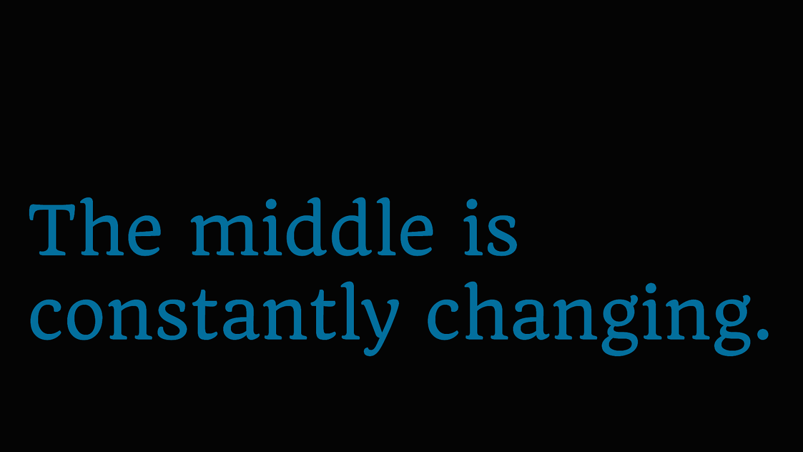
The middle is constantly changing.
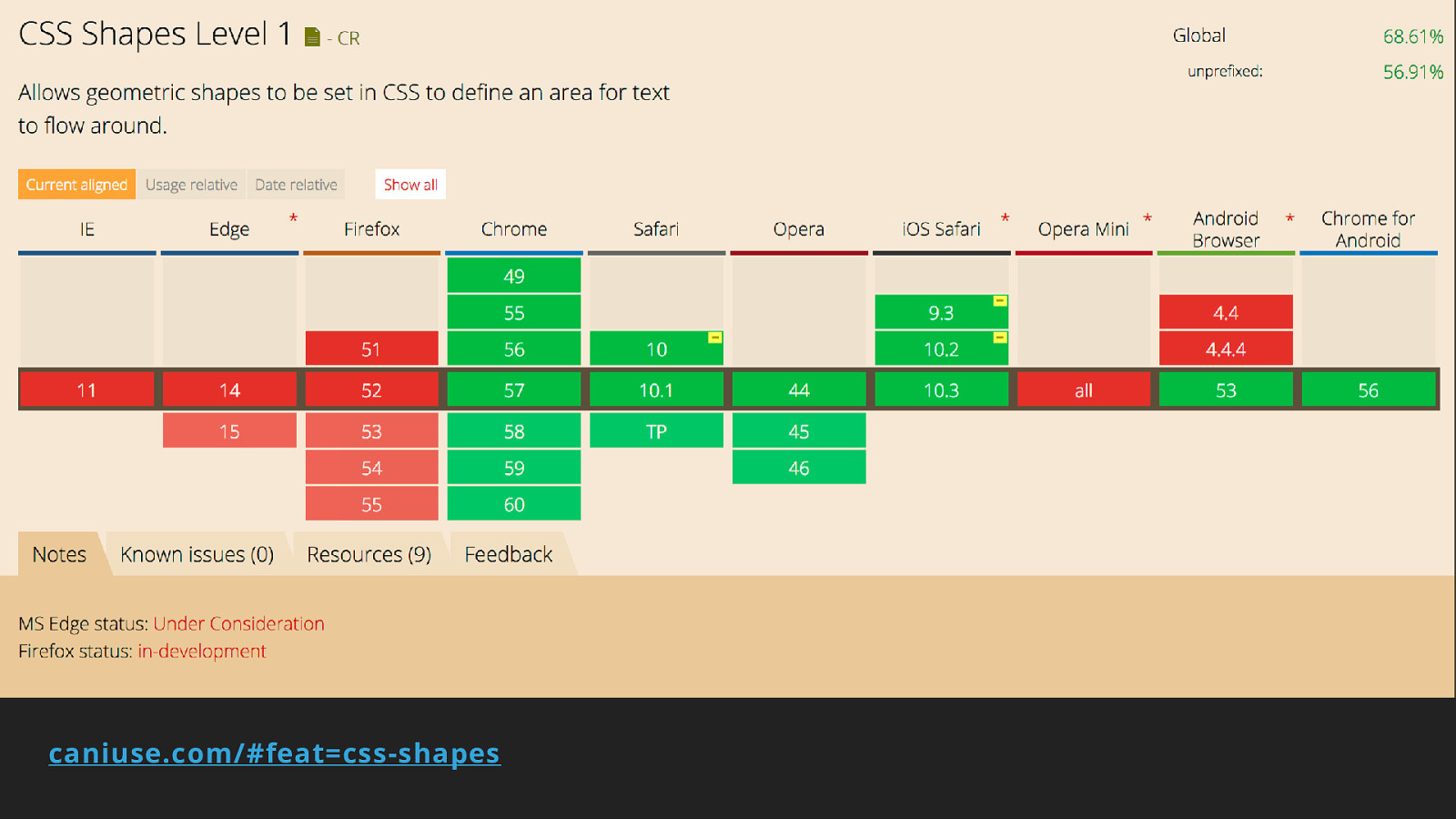
caniuse.com/#feat=css-shapes
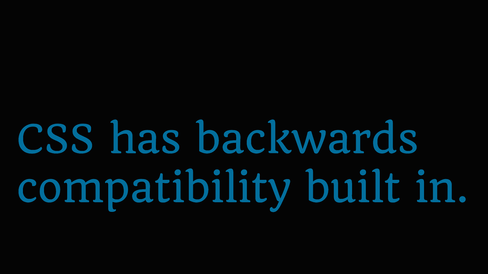
CSS has backwards compatibility built in.
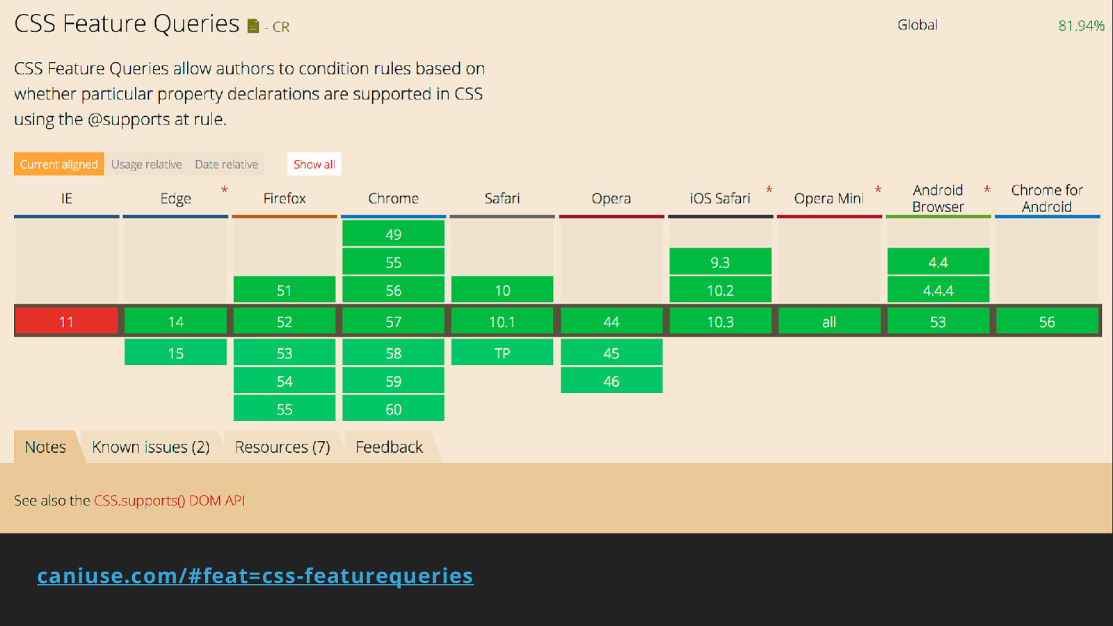
Feature Queries
caniuse.com/#feat=css-featurequeries
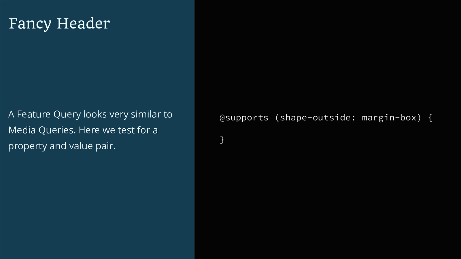
Fancy Header A Feature Query looks very similar to Media Queries. Here we test for a property and value pair. @supports (shape-outside: margin-box) { }
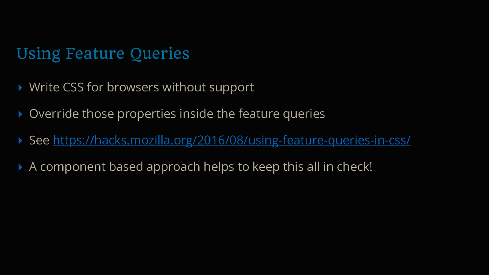
Using Feature Queries ▸ Write CSS for browsers without support ▸ Override those properties inside the feature queries ▸ See https://hacks.mozilla.org/2016/08/using-feature-queries-in-css/ ▸ A component based approach helps to keep this all in check!
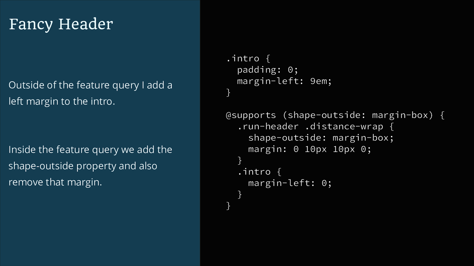
Fancy Header Outside of the feature query I add a left margin to the intro. Inside the feature query we add the shape-outside property and also remove that margin. .intro { padding: 0; margin-left: 9em; } @supports (shape-outside: margin-box) { .run-header .distance-wrap { shape-outside: margin-box; margin: 0 10px 10px 0; } .intro { margin-left: 0; } }
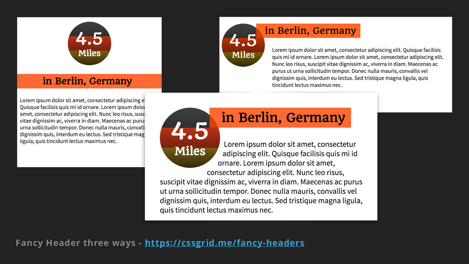
Fancy Header three ways - https://cssgrid.me/fancy-headers
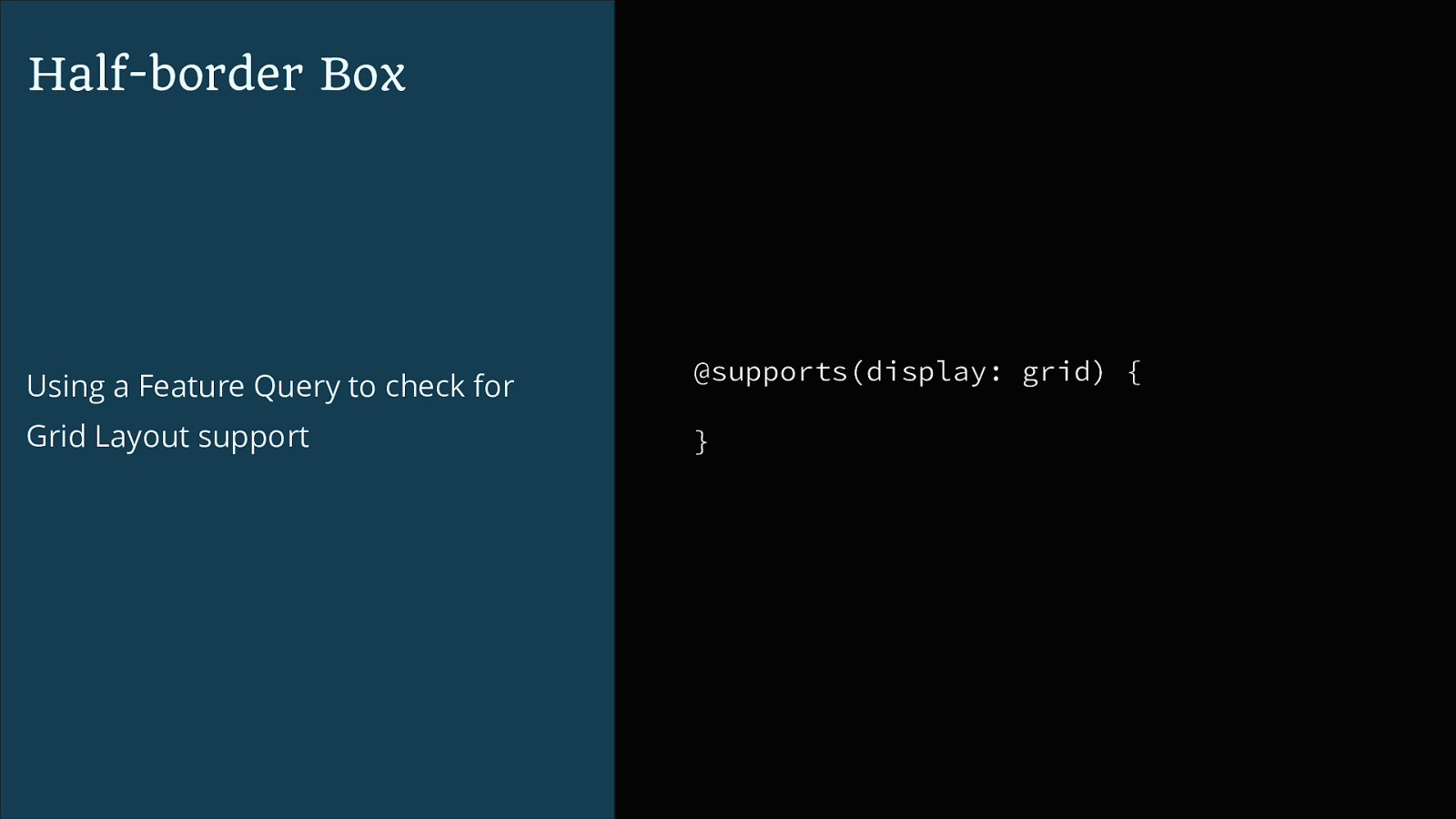
Half-border Box Using a Feature Query to check for @supports(display: grid) { Grid Layout support }
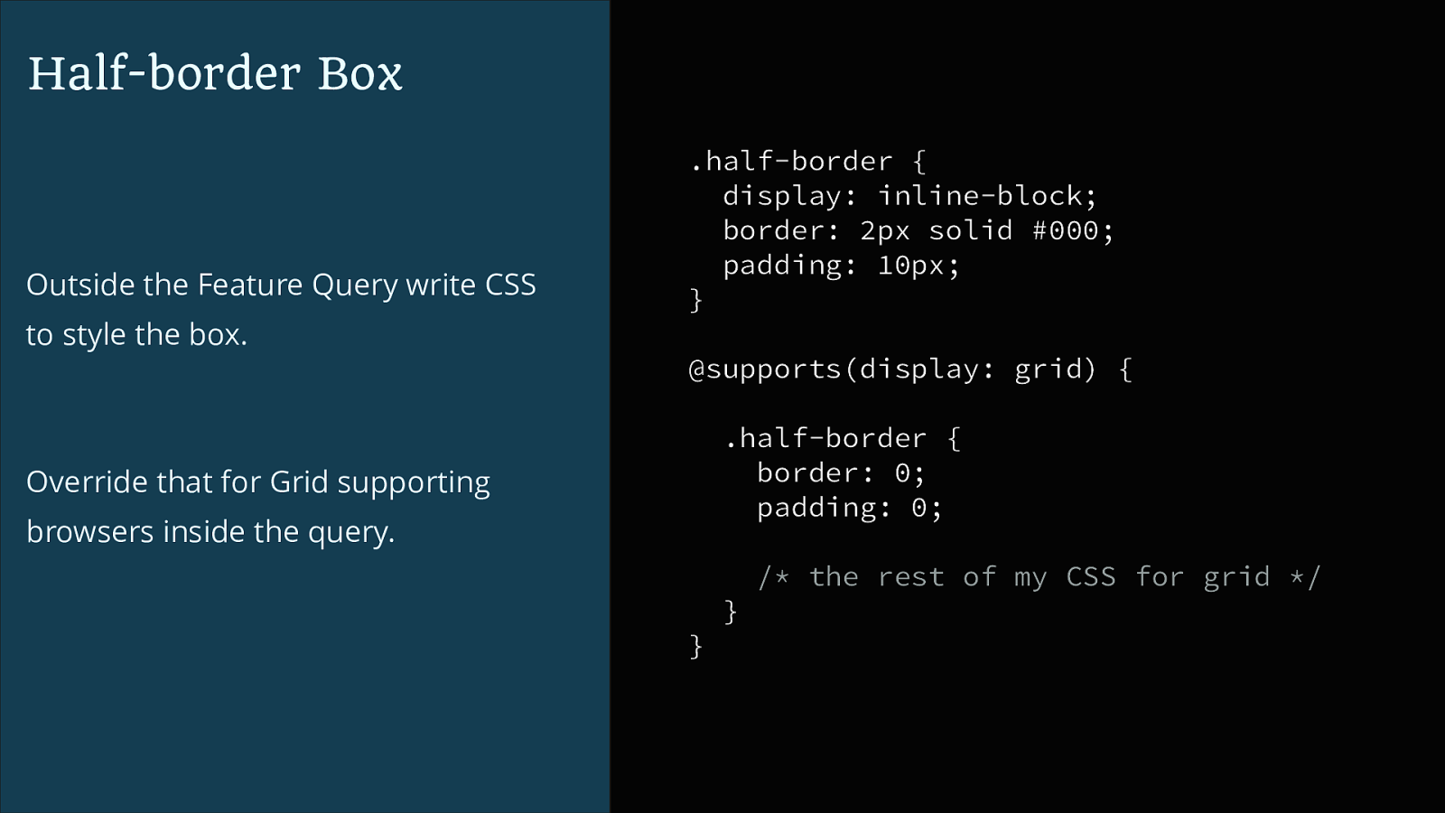
Half-border Box Outside the Feature Query write CSS to style the box. .half-border { display: inline-block; border: 2px solid #000; padding: 10px; } @supports(display: grid) { .half-border { border: 0; padding: 0; Override that for Grid supporting browsers inside the query. /* the rest of my CSS for grid */ } }
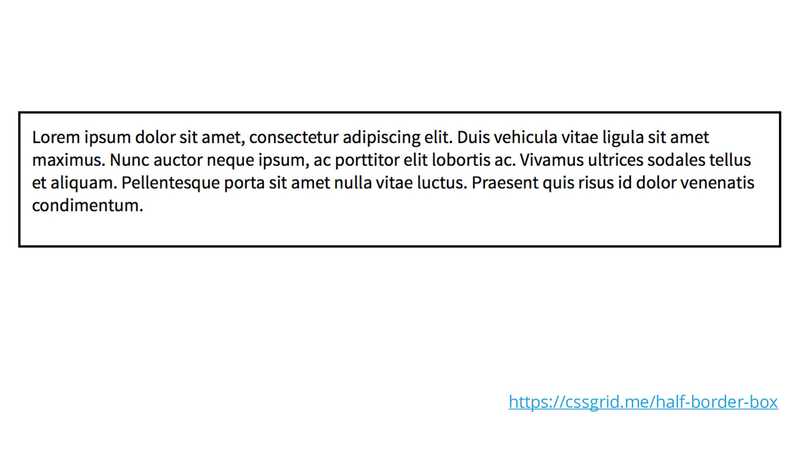
https://cssgrid.me/half-border-box
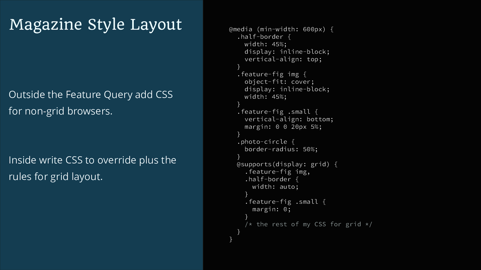
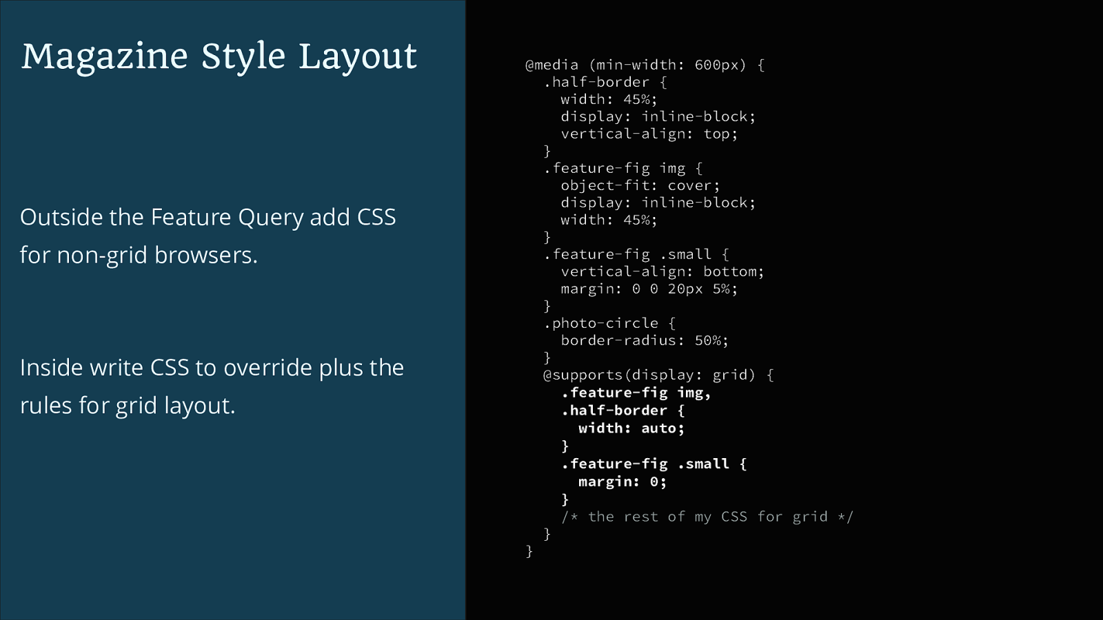
Magazine Style Layout Outside the Feature Query add CSS for non-grid browsers. Inside write CSS to override plus the rules for grid layout. @media (min-width: 600px) { .half-border { width: 45%; display: inline-block; vertical-align: top; } .feature-fig img { object-fit: cover; display: inline-block; width: 45%; } .feature-fig .small { vertical-align: bottom; margin: 0 0 20px 5%; } .photo-circle { border-radius: 50%; } @supports(display: grid) { .feature-fig img, .half-border { width: auto; } .feature-fig .small { margin: 0; } /* the rest of my CSS for grid */ } }
Magazine Style Layout Outside the Feature Query add CSS for non-grid browsers. Inside write CSS to override plus the rules for grid layout. @media (min-width: 600px) { .half-border { width: 45%; display: inline-block; vertical-align: top; } .feature-fig img { object-fit: cover; display: inline-block; width: 45%; } .feature-fig .small { vertical-align: bottom; margin: 0 0 20px 5%; } .photo-circle { border-radius: 50%; } @supports(display: grid) { .feature-fig img, .half-border { width: auto; } .feature-fig .small { margin: 0; } /* the rest of my CSS for grid */ } }
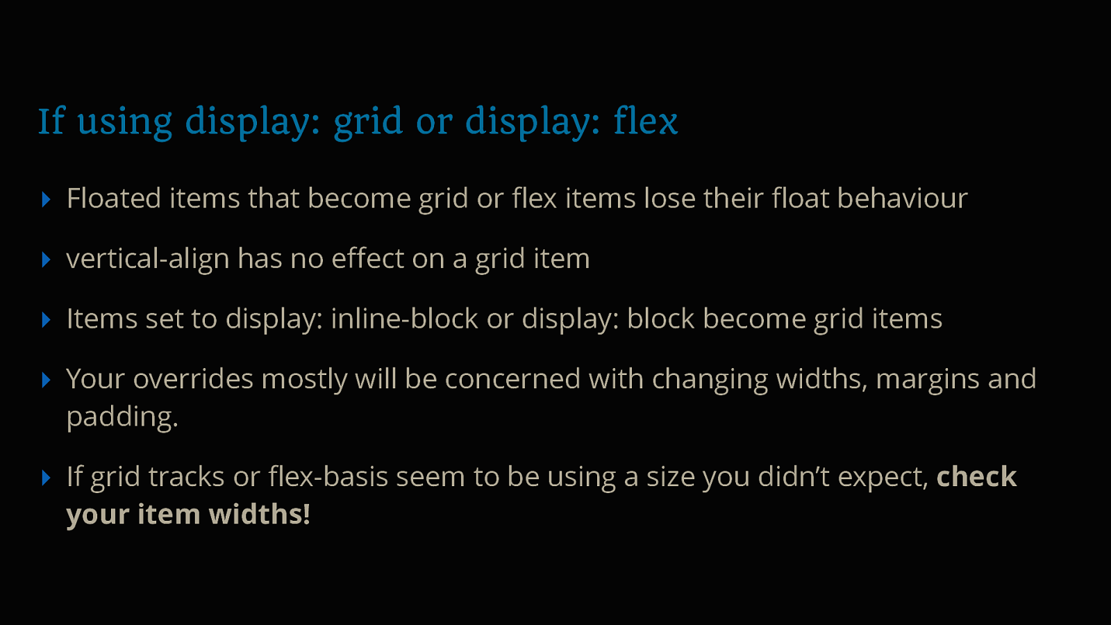
If using display: grid or display: flex ▸ Floated items that become grid or flex items lose their float behaviour ▸ vertical-align has no effect on a grid item ▸ Items set to display: inline-block or display: block become grid items ▸ Your overrides mostly will be concerned with changing widths, margins and padding. ▸ If grid tracks or flex-basis seem to be using a size you didn’t expect, check your item widths!
https://rachelandrew.co.uk/css/cheatsheets/grid-fallbacks
Magazine style layouts three ways - https://cssgrid.me/feature-figure
Media Object ▸ contains an image plus content ✓ ▸ is flexible ✓ ▸ elements should stack on mobile ✓ ▸ box should clear the contents ✓ ▸ image can be to the left or the right ✓ ▸ can be nested ✓
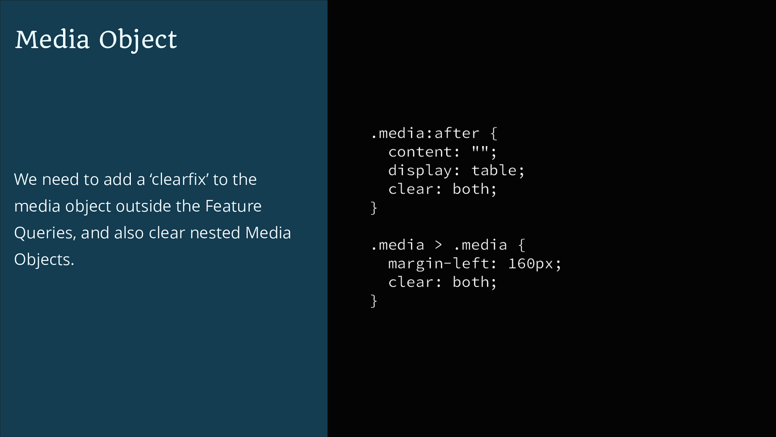
Media Object We need to add a ‘clearfix’ to the media object outside the Feature Queries, and also clear nested Media Objects. .media:after { content: ""; display: table; clear: both; } .media > .media { margin-left: 160px; clear: both; }
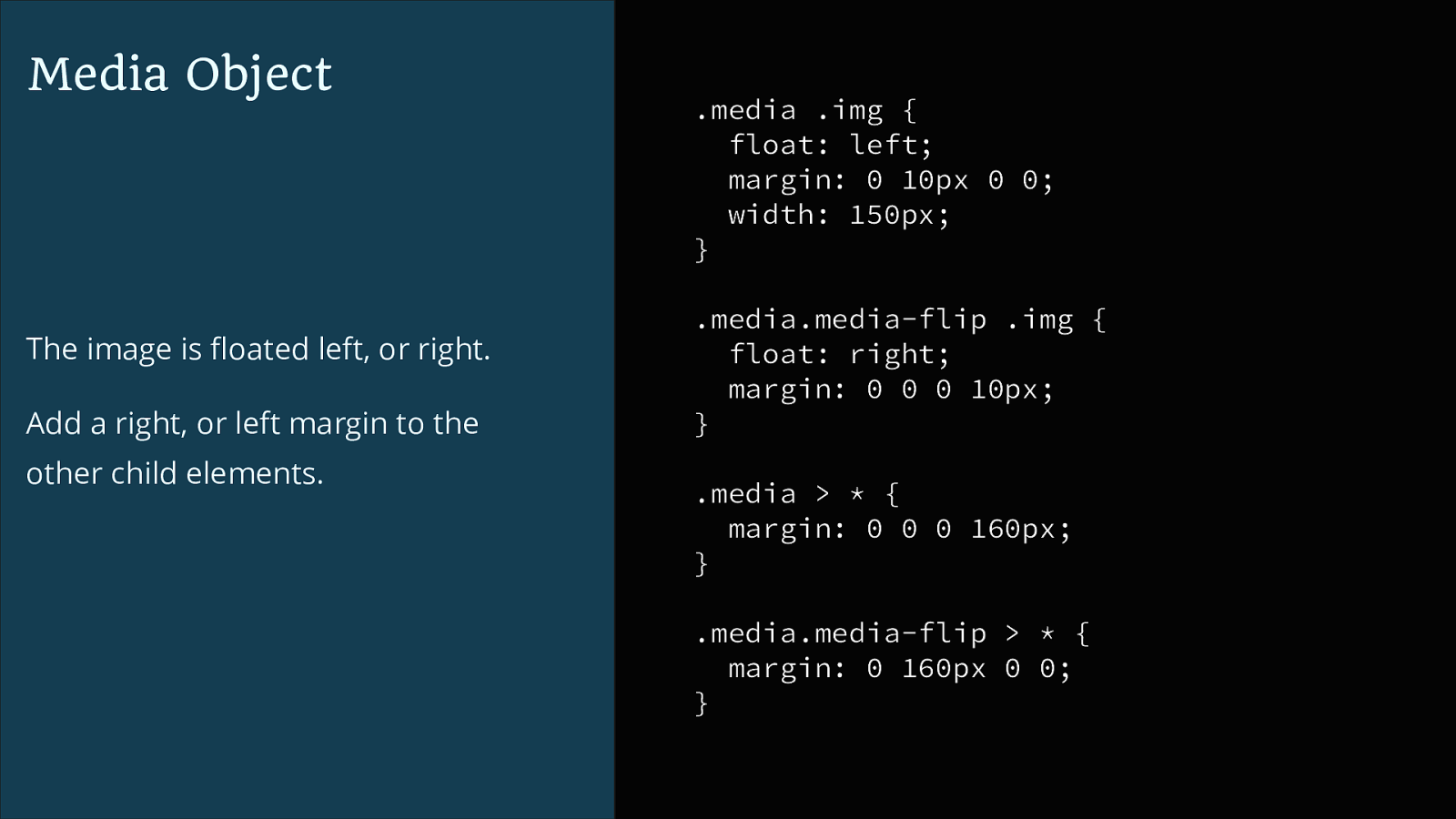
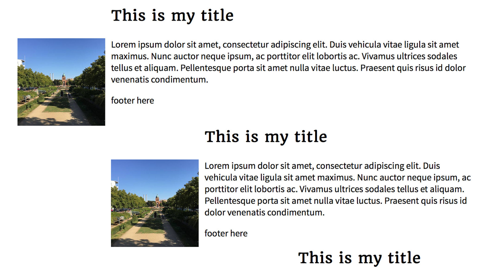
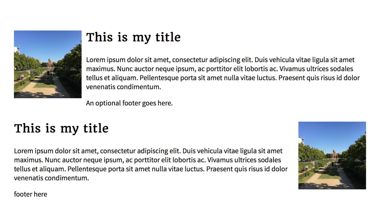
Media Object The image is floated left, or right. Add a right, or left margin to the other child elements. .media .img { float: left; margin: 0 10px 0 0; width: 150px; } .media.media-flip .img { float: right; margin: 0 0 0 10px; } .media > * { margin: 0 0 0 160px; } .media.media-flip > * { margin: 0 160px 0 0; }
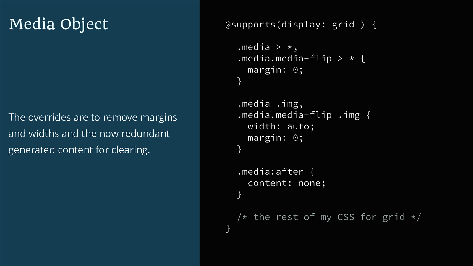
Media Object @supports(display: grid ) { .media > , .media.media-flip > * { margin: 0; } .media .img, .media.media-flip .img { width: auto; margin: 0; } The overrides are to remove margins and widths and the now redundant generated content for clearing. .media:after { content: none; } / the rest of my CSS for grid */ }
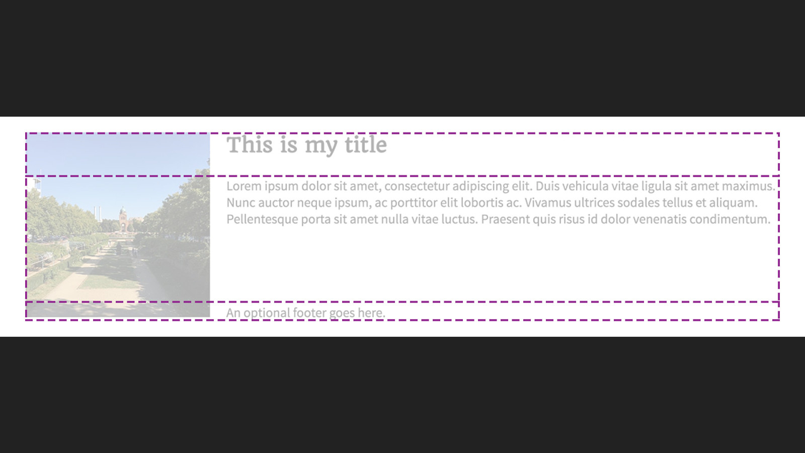
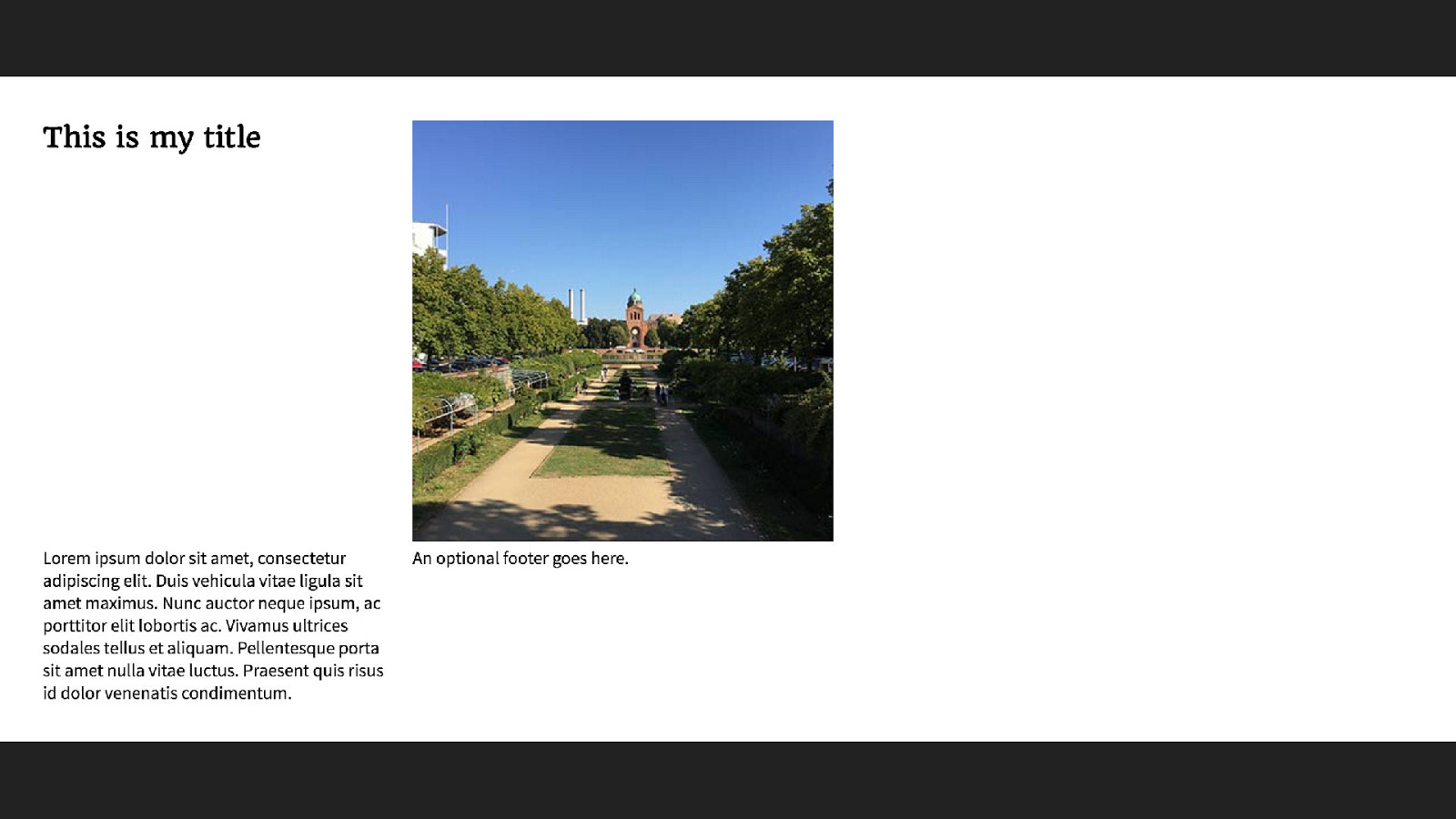
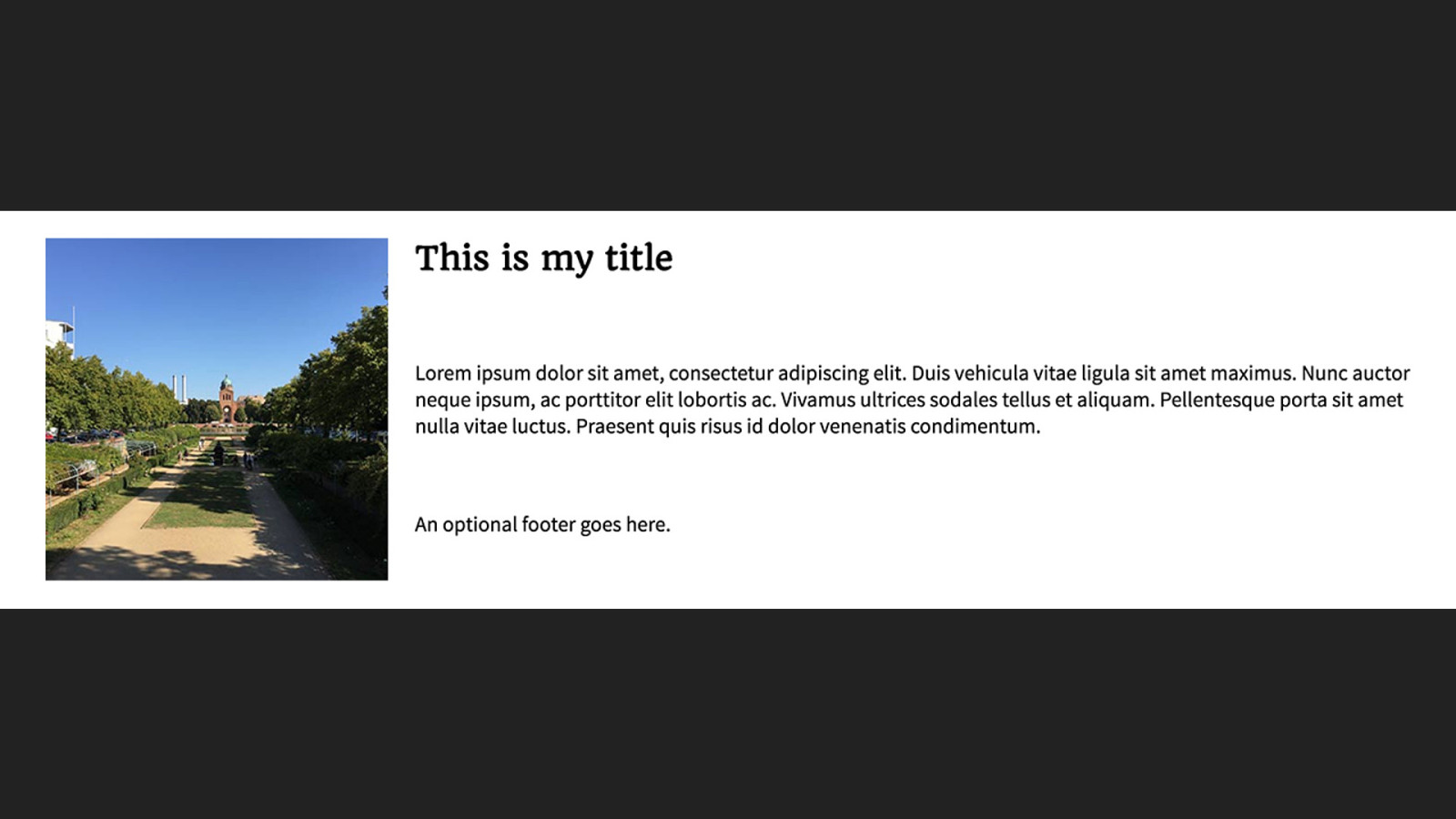
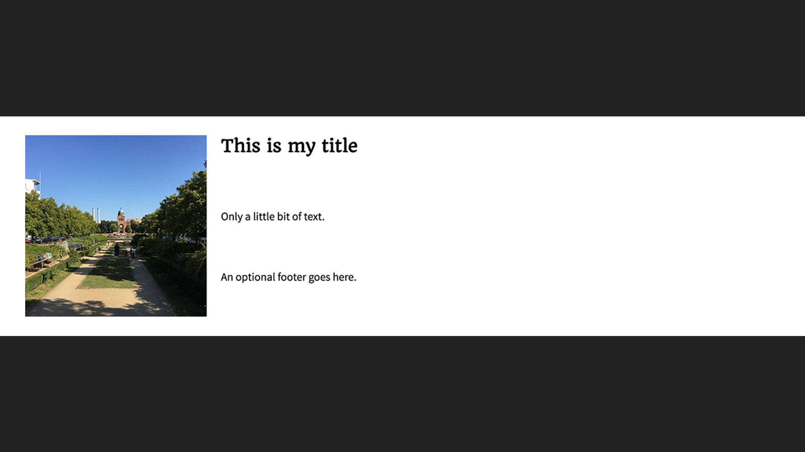
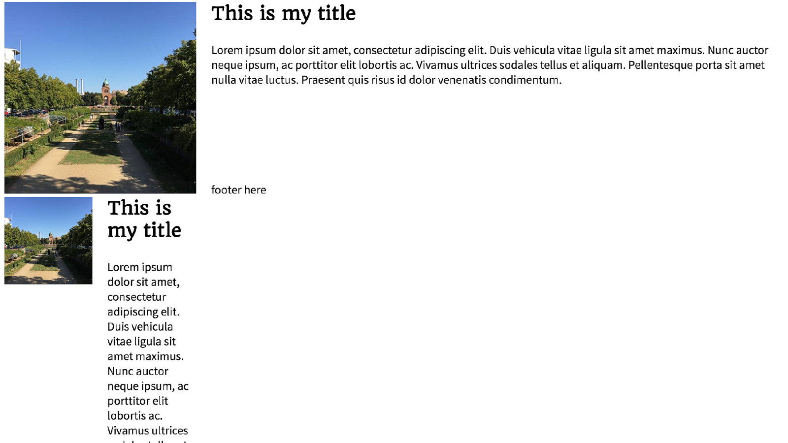
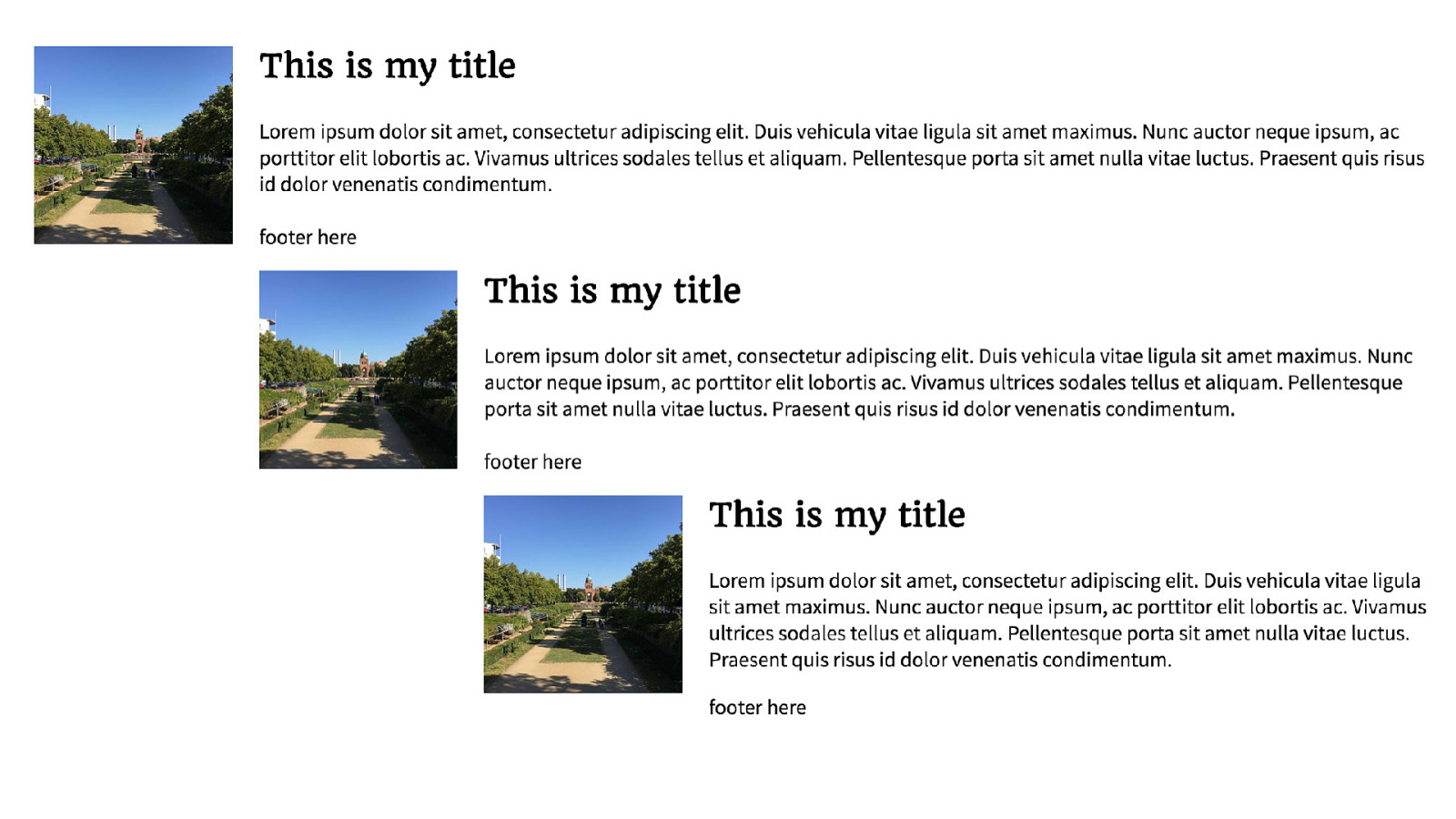
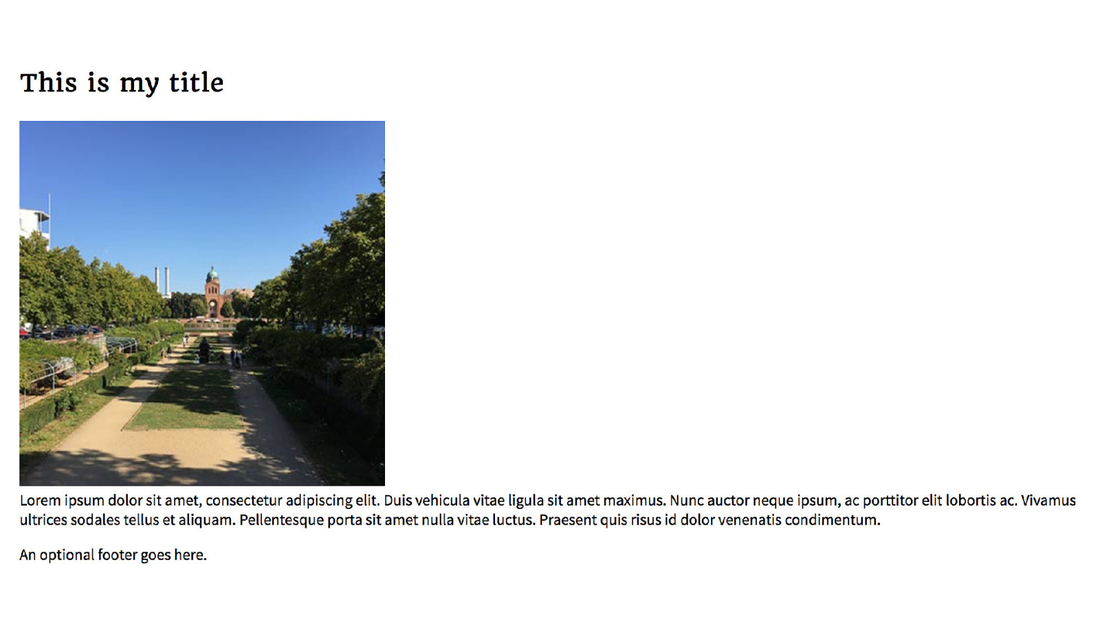
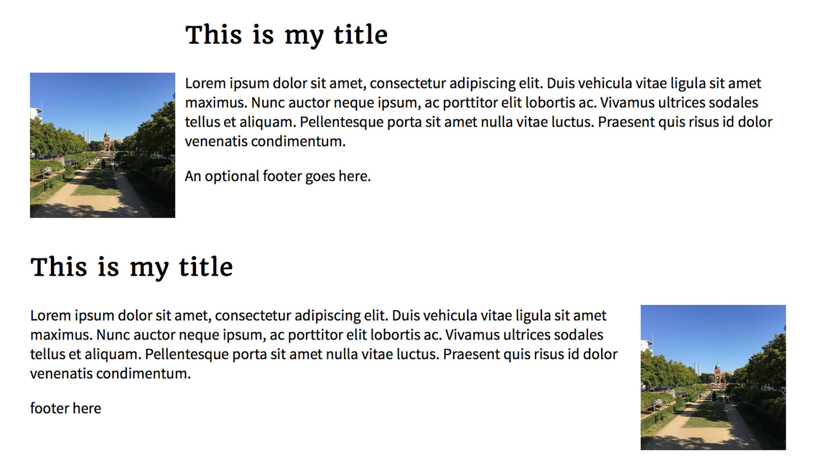
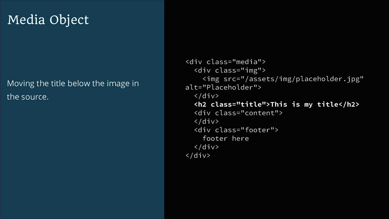
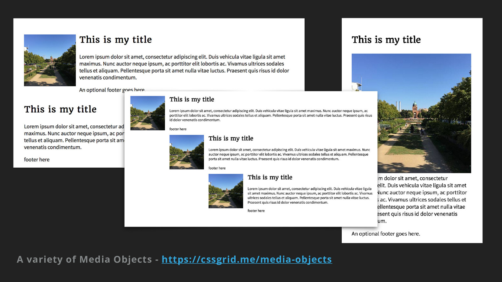
Media Object Moving the title below the image in the source.
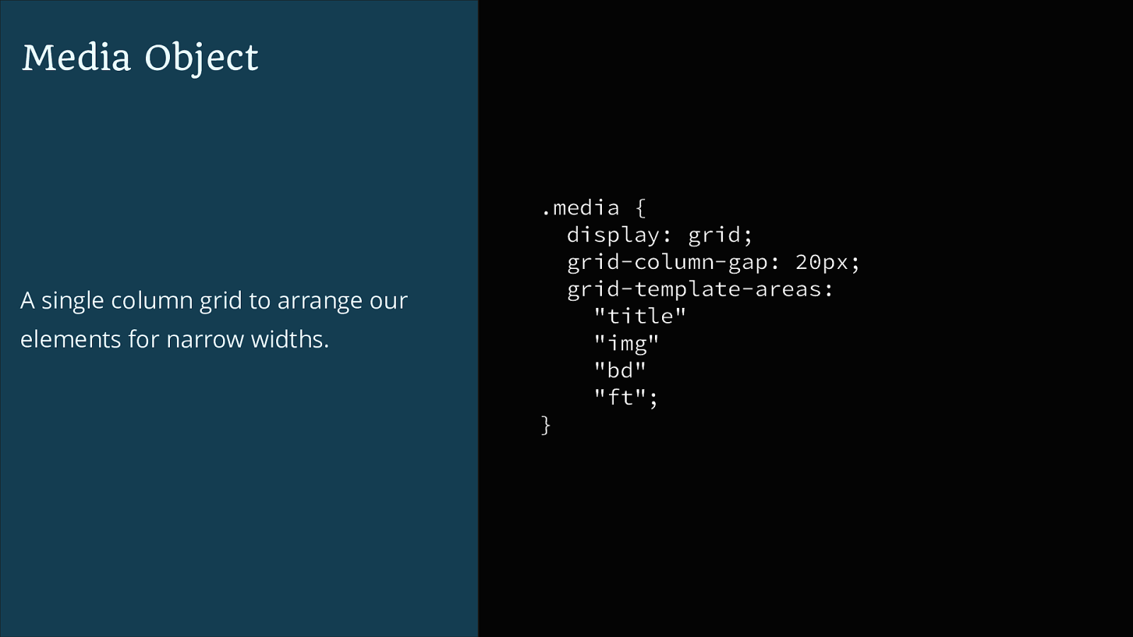
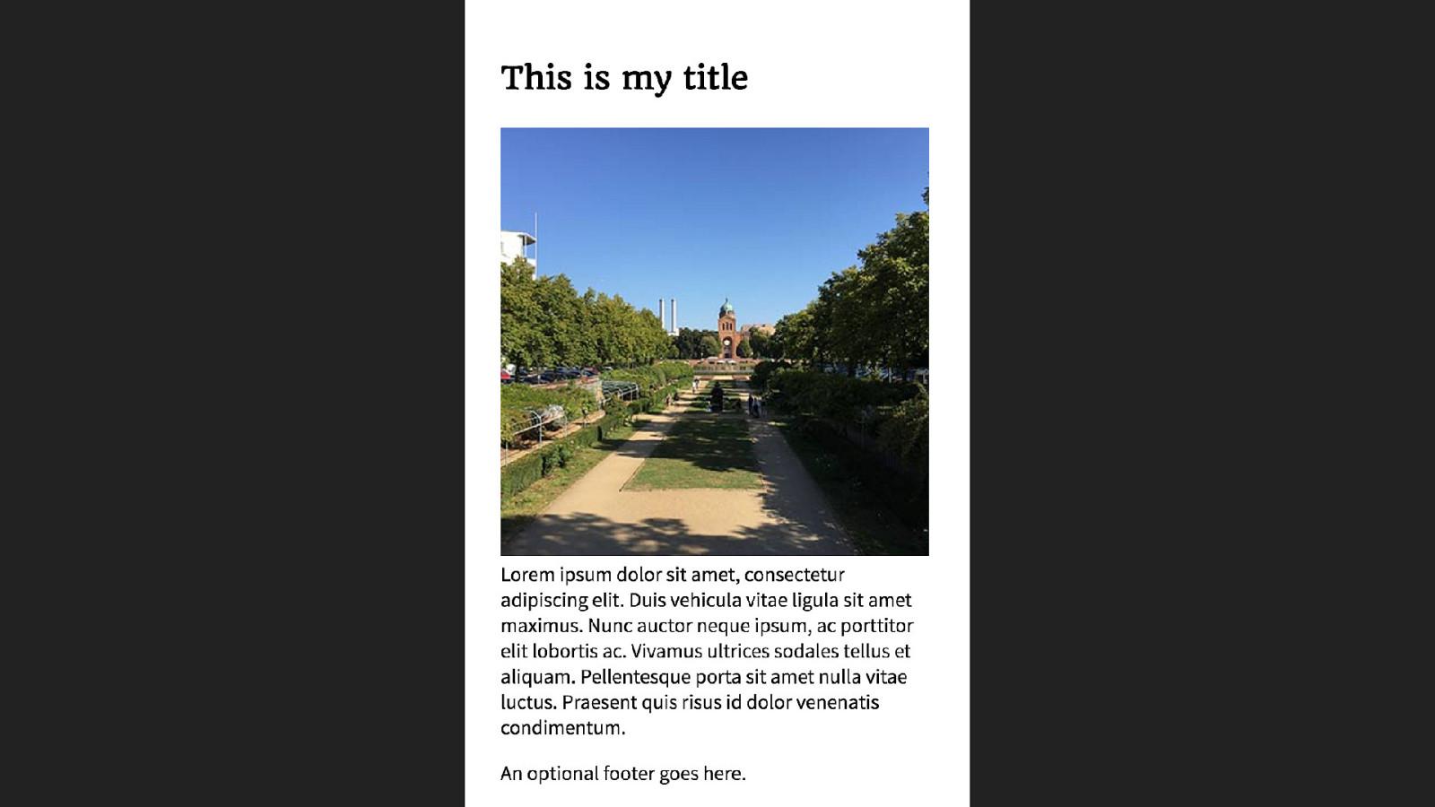
<div class="media"> <div class="img"> <img src="/assets/img/placeholder.jpg" alt="Placeholder"> </div> <h2 class="title">This is my title</h2> <div class="content"> </div> <div class="footer"> footer here </div> </div>Media Object A single column grid to arrange our elements for narrow widths. .media { display: grid; grid-column-gap: 20px; grid-template-areas: "title" "img" "bd" "ft"; }
A variety of Media Objects - https://cssgrid.me/media-objects
What happened to vendor prefixes?
Vendor Prefixes ▸ Vendor specific extensions to CSS ▸ Used by browsers to expose experimental features ▸ Used by developers to use those experimental features in production
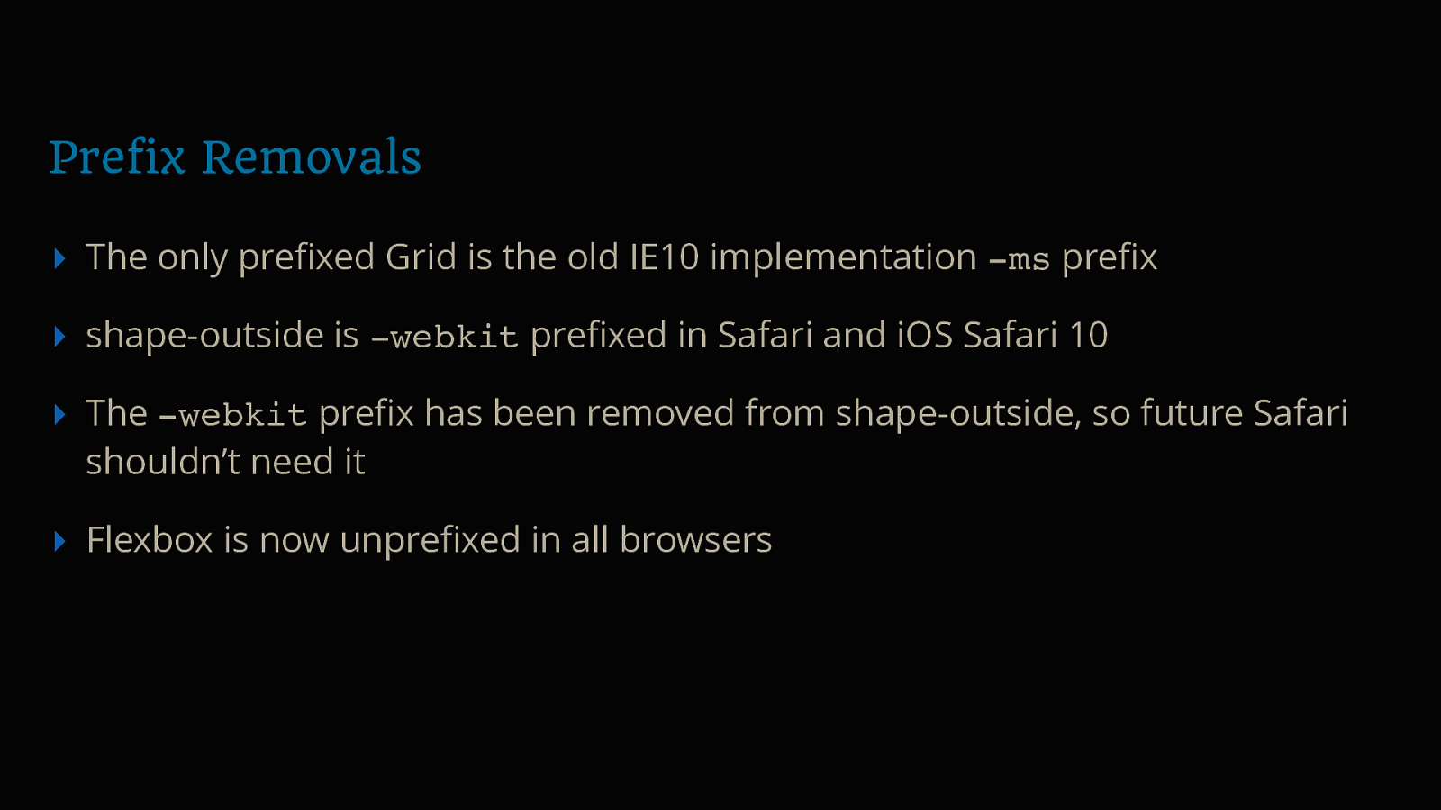
Prefix Removals ▸ The only prefixed Grid is the old IE10 implementation -ms prefix ▸ shape-outside is -webkit prefixed in Safari and iOS Safari 10 ▸ The -webkit prefix has been removed from shape-outside, so future Safari shouldn’t need it ▸ Flexbox is now unprefixed in all browsers
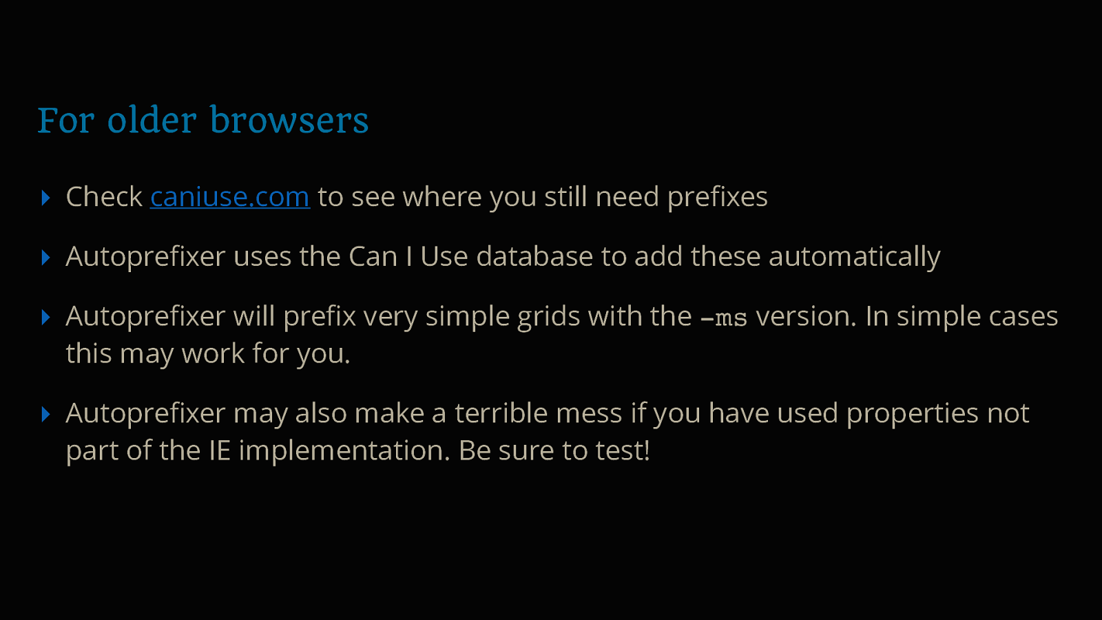
For older browsers ▸ Check caniuse.com to see where you still need prefixes ▸ Autoprefixer uses the Can I Use database to add these automatically ▸ Autoprefixer will prefix very simple grids with the -ms version. In simple cases this may work for you. ▸ Autoprefixer may also make a terrible mess if you have used properties not part of the IE implementation. Be sure to test!
Creating Layout
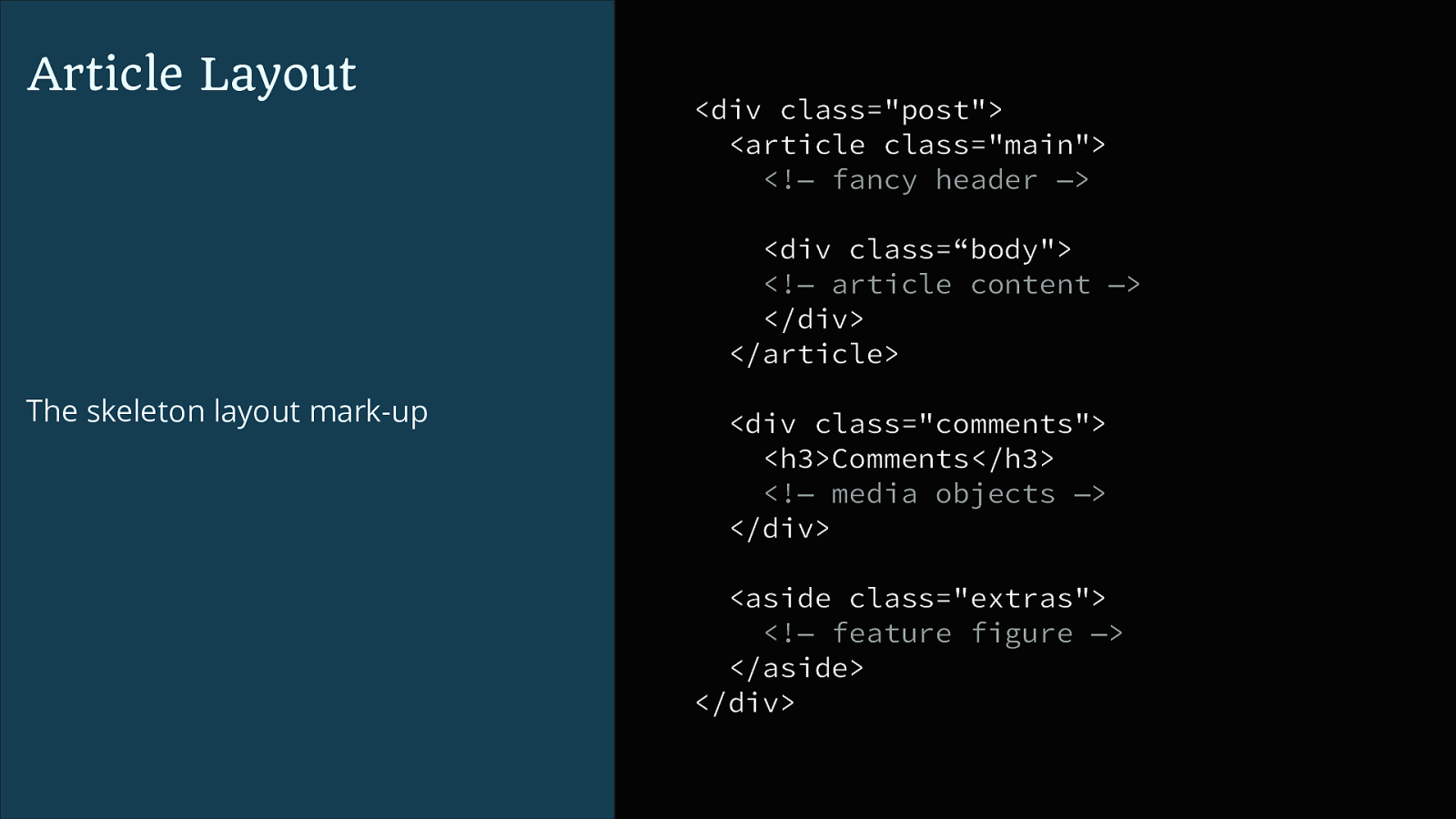
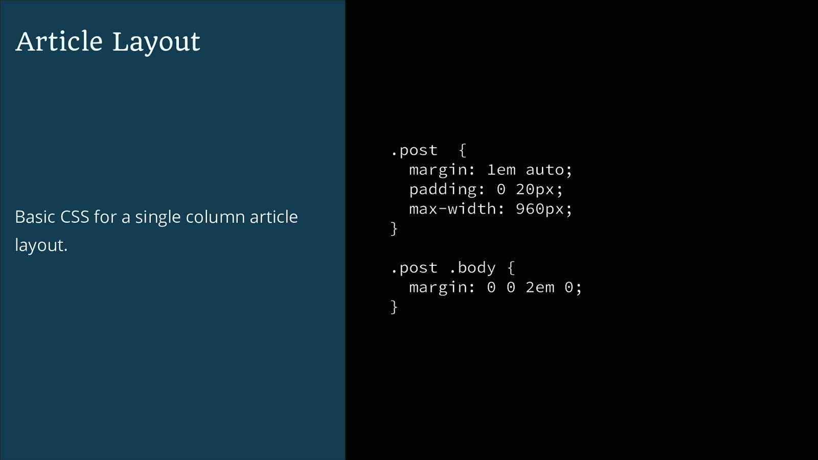
Article Layout
<div class="post"> <article class="main"> <!— fancy header —> <div class=“body"> <!— article content —> </div> </article> The skeleton layout mark-up <div class="comments"> <h3>Comments</h3> <!— media objects —> </div> <aside class="extras"> <!— feature figure —> </aside> </div>Article Layout Basic CSS for a single column article layout. .post { margin: 1em auto; padding: 0 20px; max-width: 960px; } .post .body { margin: 0 0 2em 0; }
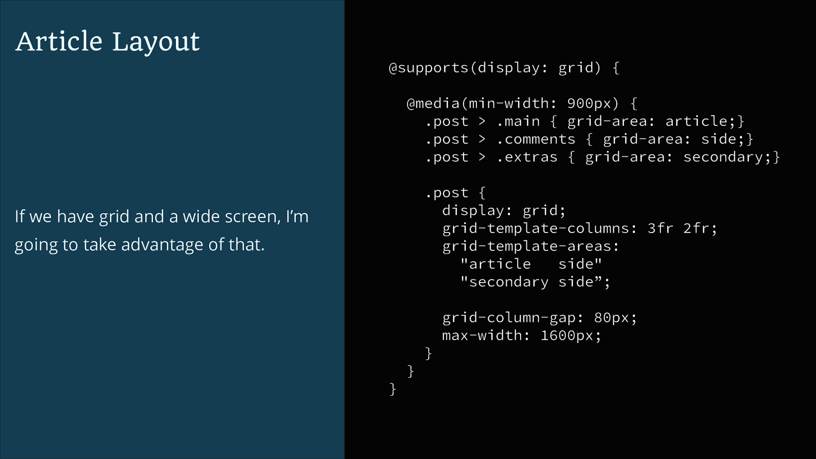
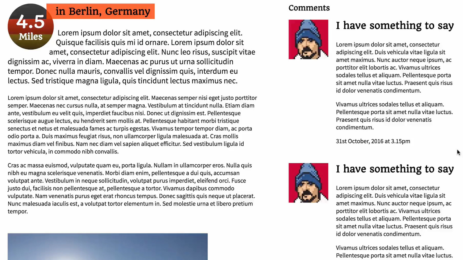
Article Layout @supports(display: grid) { @media(min-width: 900px) { .post > .main { grid-area: article;} .post > .comments { grid-area: side;} .post > .extras { grid-area: secondary;} .post { display: grid; grid-template-columns: 3fr 2fr; grid-template-areas: "article side" "secondary side”; If we have grid and a wide screen, I’m going to take advantage of that. grid-column-gap: 80px; max-width: 1600px; } } }
Your component is already a reduced test case.
This is not twice the work
This is not about fallback support
This is evergreen design
Design that enhances itself as the platform it lives on improves.
Thank you #aeasea @rachelandrew

In a world of evergreen, automatically updating browsers we need to change the way we think about browser support. It makes little sense to sign off on a brief mentioning target browsers when new features may become usable during the course of a project build. To be truly future friendly, we need to build with that future in mind—adding enhancements that our users’ browsers will grow into, release by release, our work getting better without us doing any more work on it. In this session, Rachel will demonstrate with practical examples how to embrace the new layout methods in CSS, without needing to cut off people who are using browsers that haven’t caught up yet, and show you how to get the best from the magic of Flexbox and Grid—without needing to lean on JavaScript and polyfills to get there.