A presentation at UX Immersion: Interactions in in Newport Beach, CA, USA by Rachel Andrew
@rachelandrew UX Immersion: Interactions The Creative New World of CSS
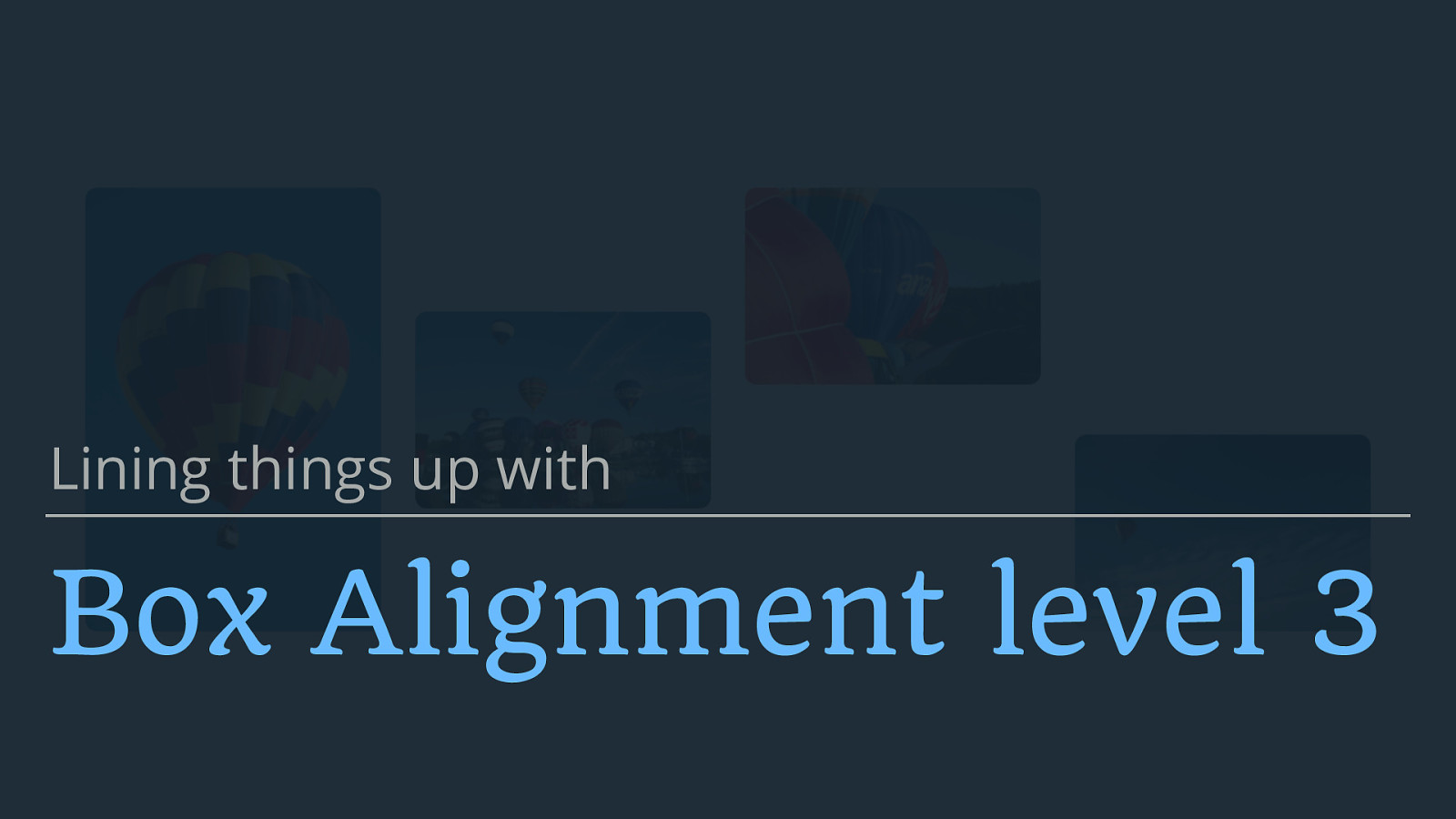
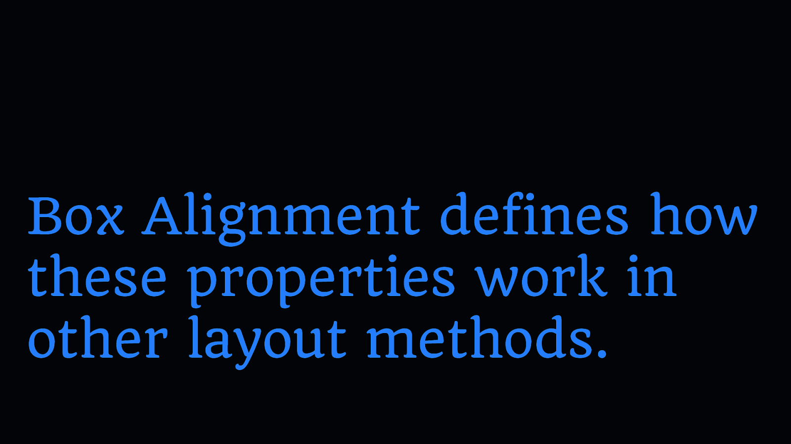
Lining things up with Box Alignment level 3
This is the verticalcentering module.
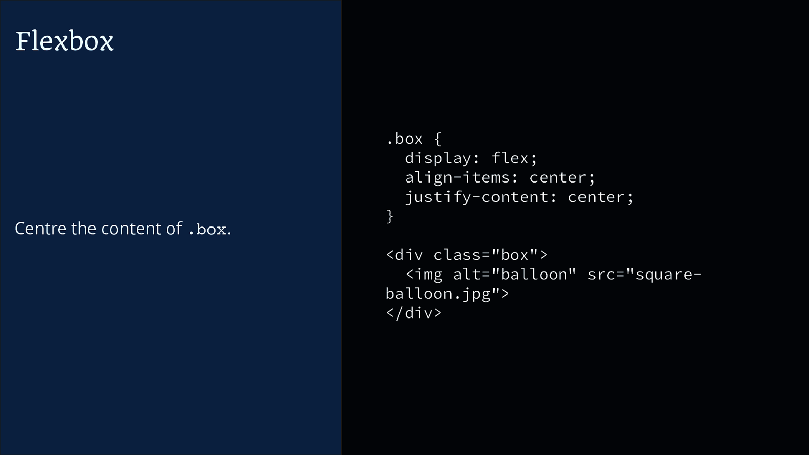
Flexbox Centre the content of .box. .box { display: flex; align-items: center; justify-content: center; } <div class="box"> <img alt="balloon" src="squareballoon.jpg"> </div>
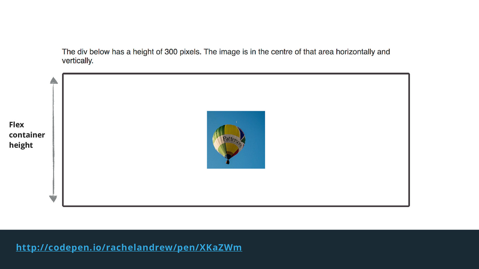
Flex container height http://codepen.io/rachelandrew/pen/XKaZWm
Flex container height stretch center http://codepen.io/rachelandrew/pen/RavbmN flex-start flex-end
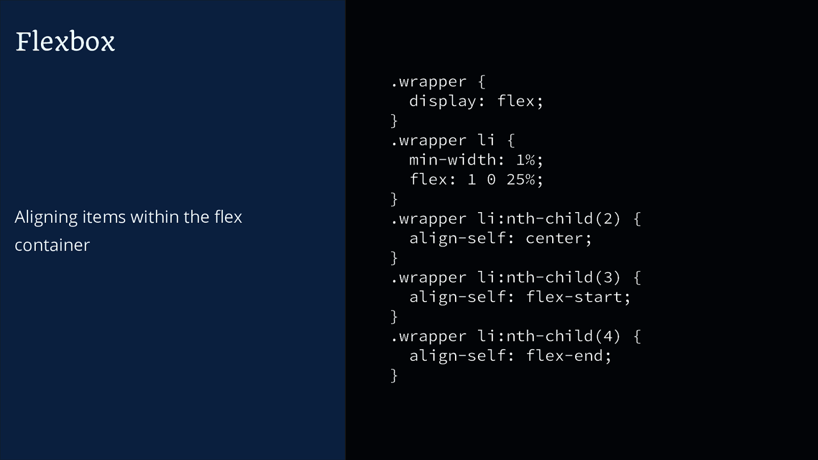
Flexbox Aligning items within the flex container .wrapper { display: flex; } .wrapper li { min-width: 1%; flex: 1 0 25%; } .wrapper li:nth-child(2) { align-self: center; } .wrapper li:nth-child(3) { align-self: flex-start; } .wrapper li:nth-child(4) { align-self: flex-end; }
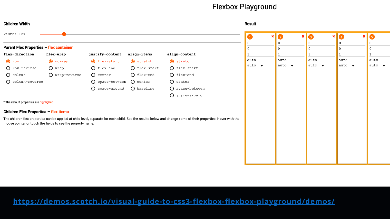
https://demos.scotch.io/visual-guide-to-css3-flexbox-flexbox-playground/demos/
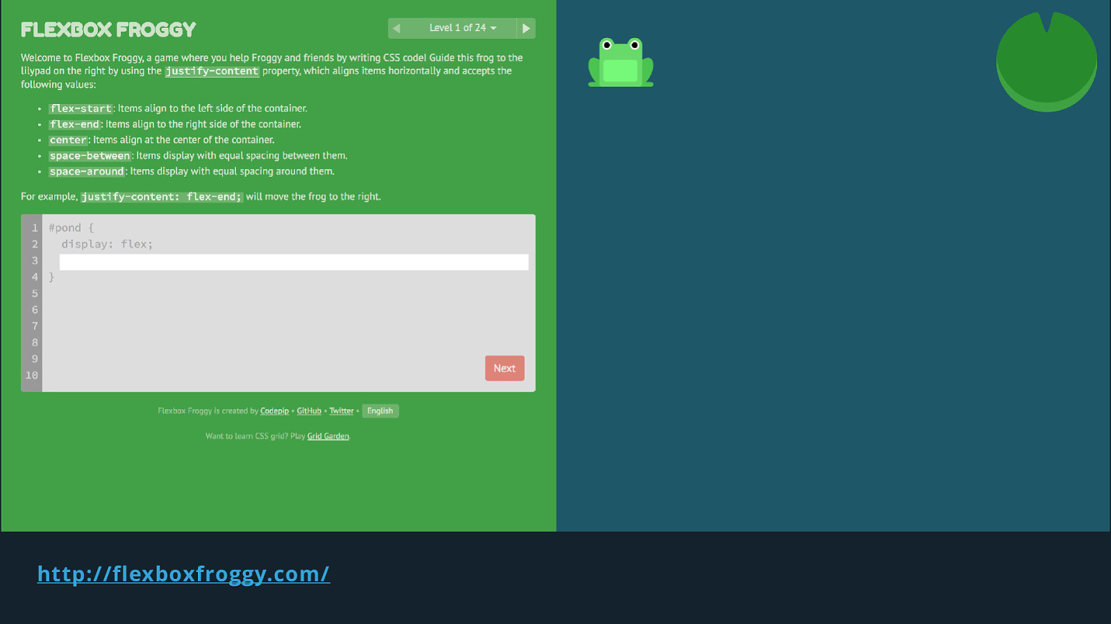
http://flexboxfroggy.com/
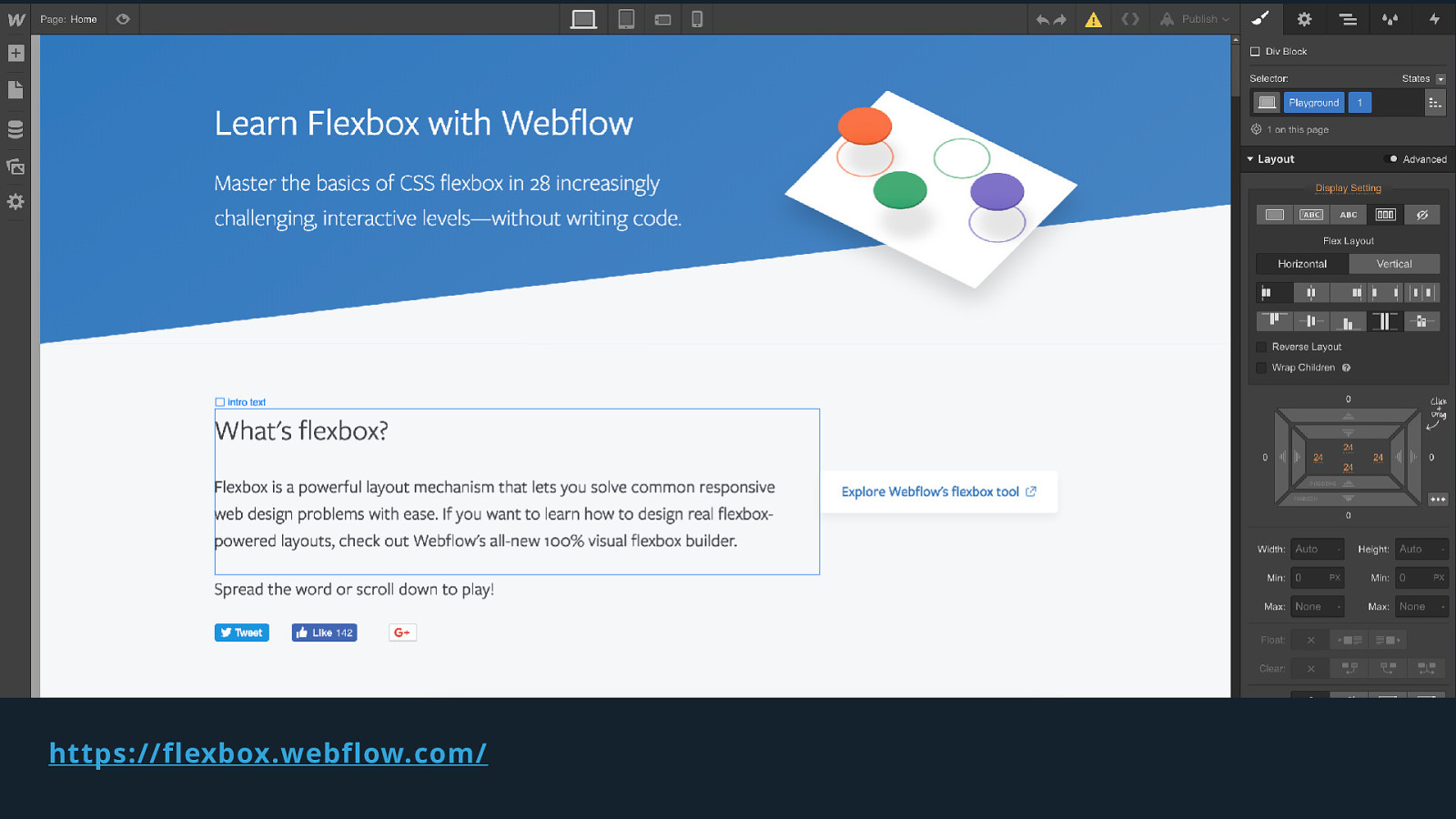
https://flexbox.webflow.com/
Box Alignment defines how these properties work in other layout methods.
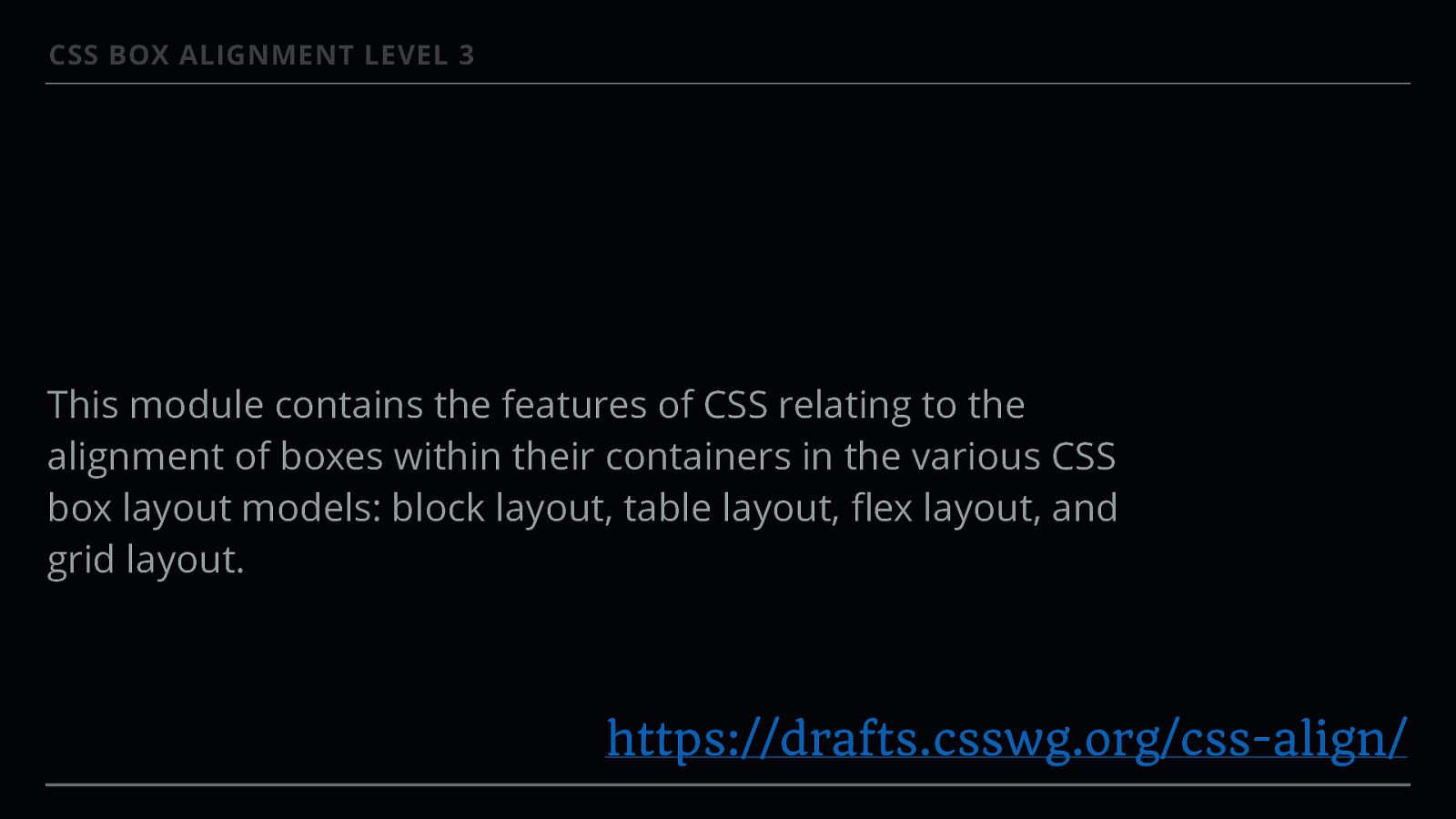
CSS BOX ALIGNMENT LEVEL 3 This module contains the features of CSS relating to the alignment of boxes within their containers in the various CSS box layout models: block layout, table layout, flex layout, and grid layout. https://drafts.csswg.org/css-align/
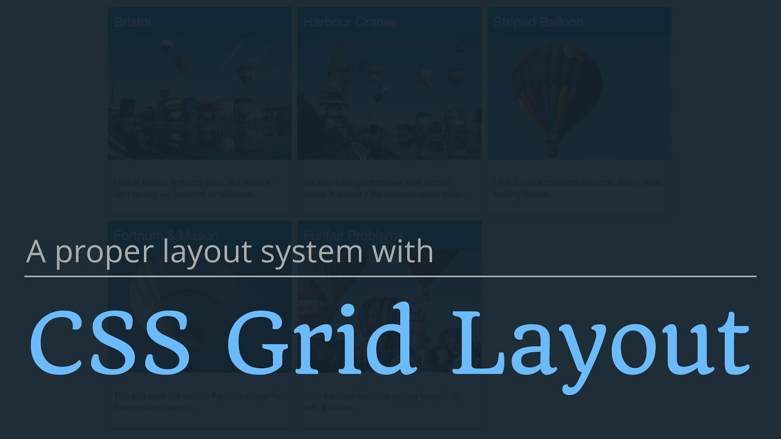
A proper layout system with CSS Grid Layout
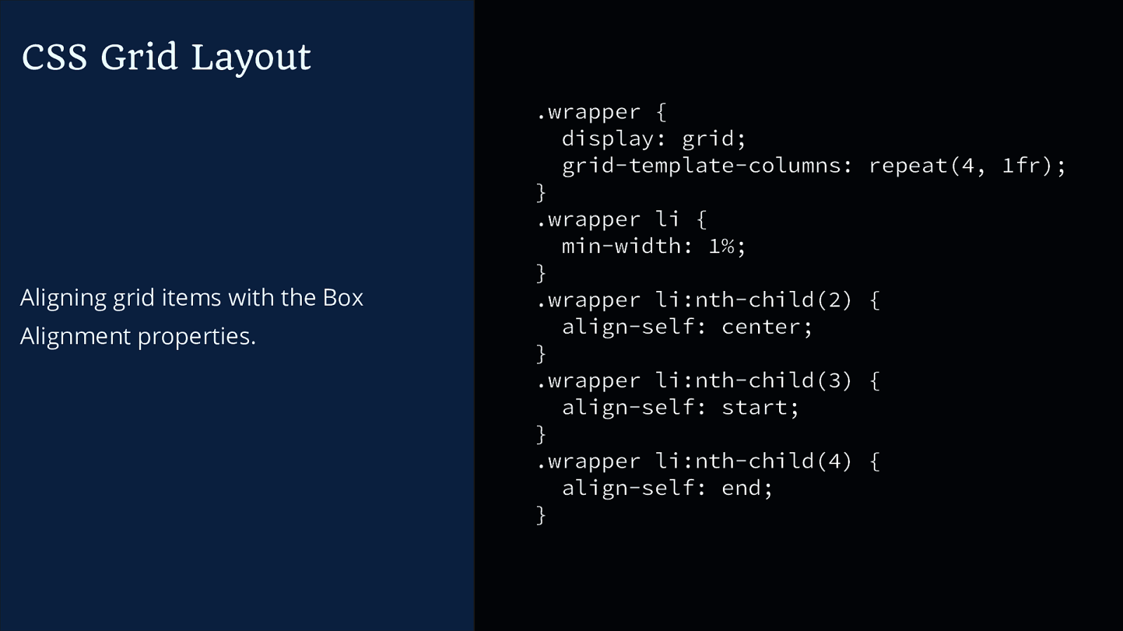
CSS Grid Layout Aligning grid items with the Box Alignment properties. .wrapper { display: grid; grid-template-columns: } .wrapper li { min-width: 1%; } .wrapper li:nth-child(2) align-self: center; } .wrapper li:nth-child(3) align-self: start; } .wrapper li:nth-child(4) align-self: end; } repeat(4, 1fr); { { {
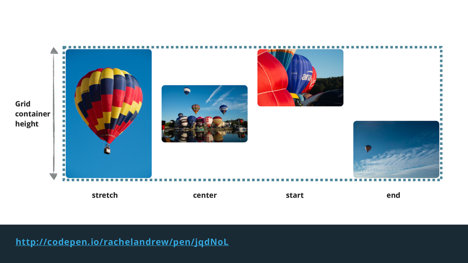
Grid container height stretch center http://codepen.io/rachelandrew/pen/jqdNoL start end
CSS GRID LAYOUT “Unlike Flexbox, however, which is single-axis–oriented, Grid Layout is optimized for 2-dimensional layouts: those in which alignment of content is desired in both dimensions.” https://drafts.csswg.org/css-grid/
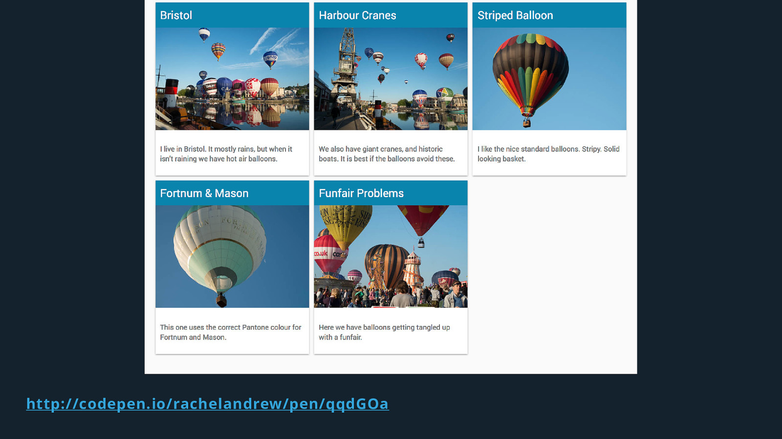
CSS Grid Layout Defining a 3 column grid .cards { display:grid; grid-template-columns: 1fr 1fr 1fr; grid-gap: 10px; }
http://codepen.io/rachelandrew/pen/qqdGOa
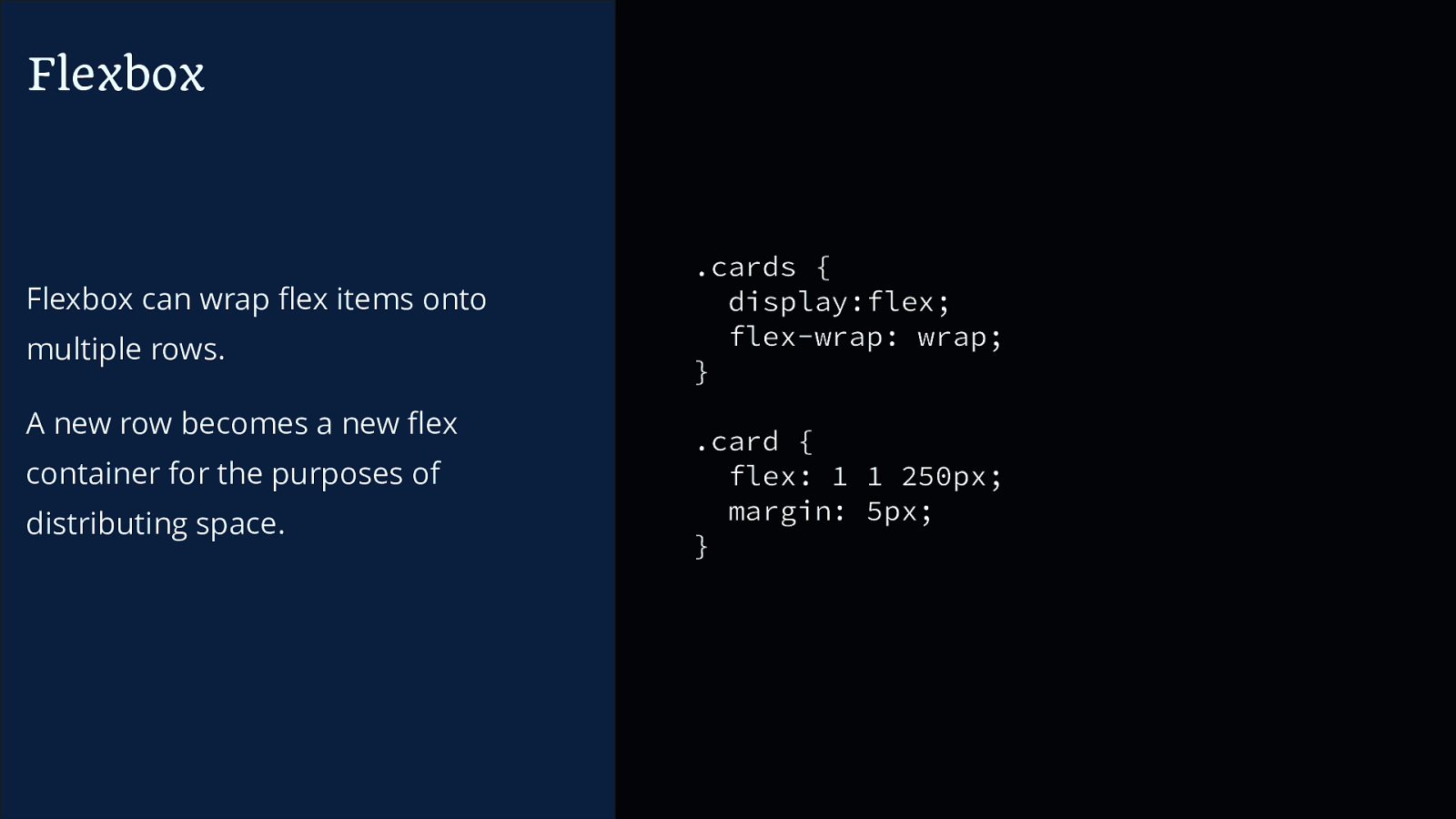
Flexbox Flexbox can wrap flex items onto multiple rows. A new row becomes a new flex container for the purposes of distributing space. .cards { display:flex; flex-wrap: wrap; } .card { flex: 1 1 250px; margin: 5px; }
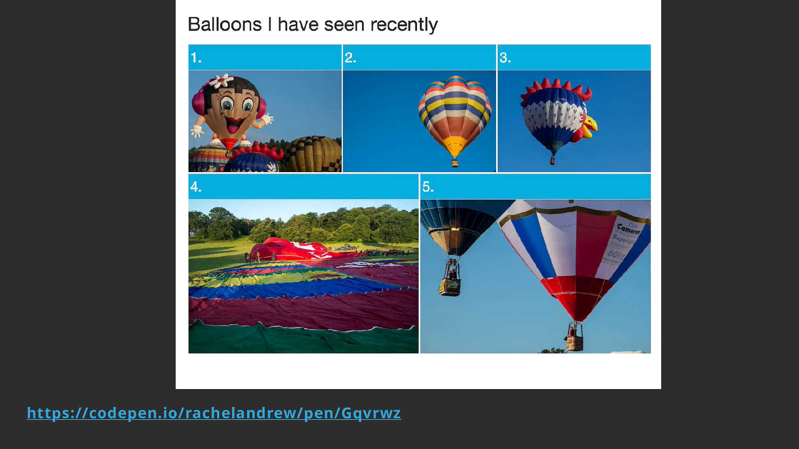
https://codepen.io/rachelandrew/pen/Gqvrwz
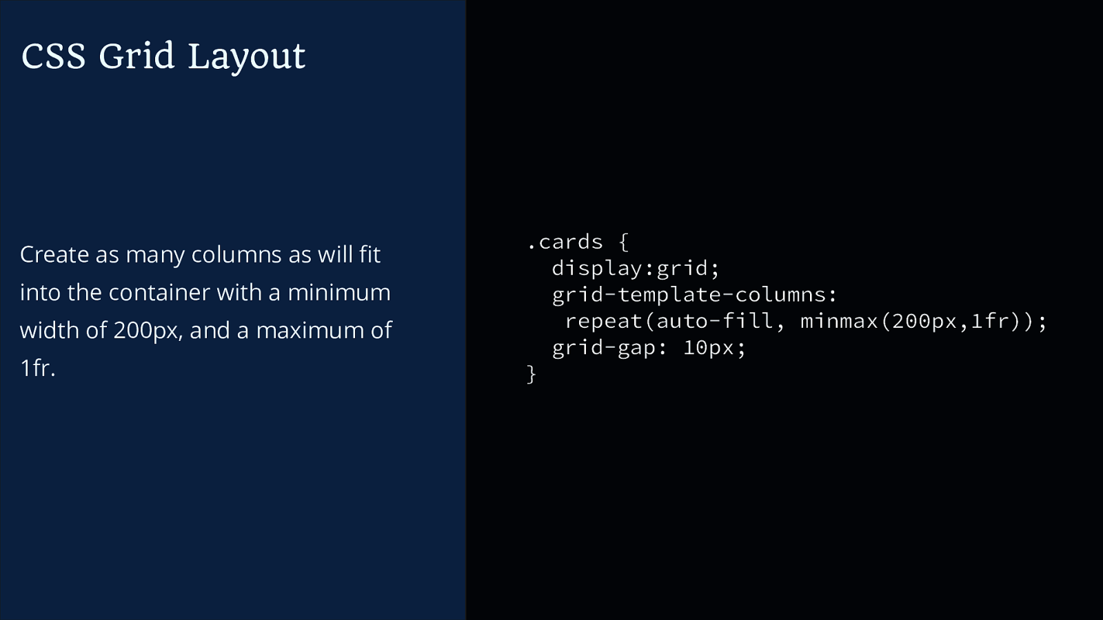
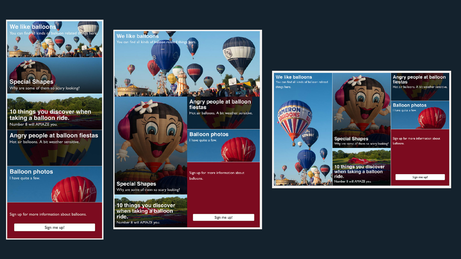
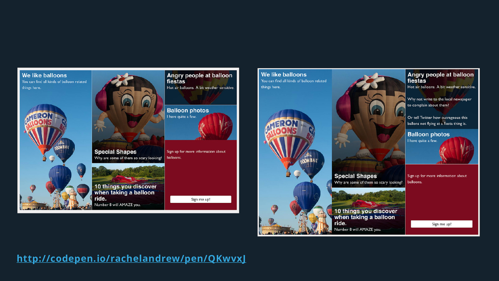
CSS Grid Layout Create as many columns as will fit into the container with a minimum width of 200px, and a maximum of 1fr. .cards { display:grid; grid-template-columns: repeat(auto-fill, minmax(200px,1fr)); grid-gap: 10px; }
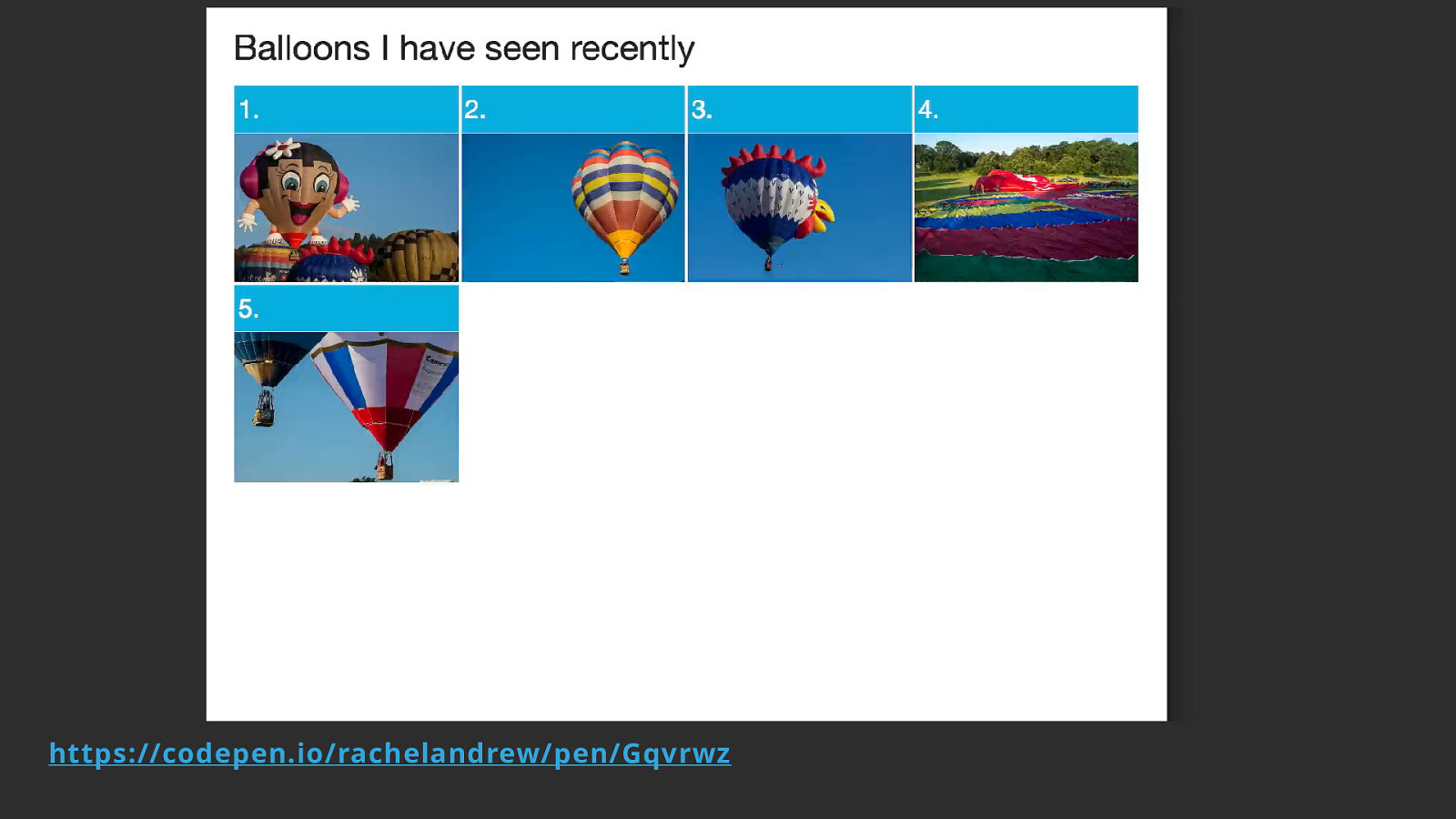
https://codepen.io/rachelandrew/pen/Gqvrwz
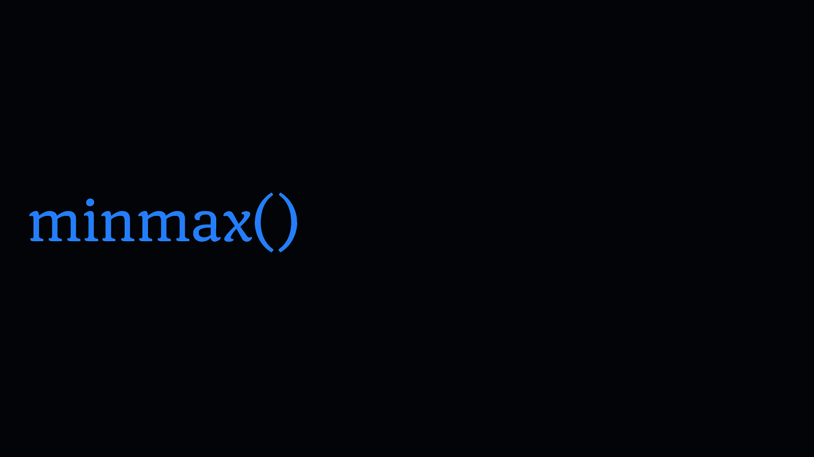
minmax()
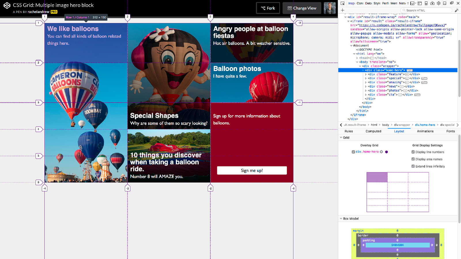
http://codepen.io/rachelandrew/pen/QKwvxJ
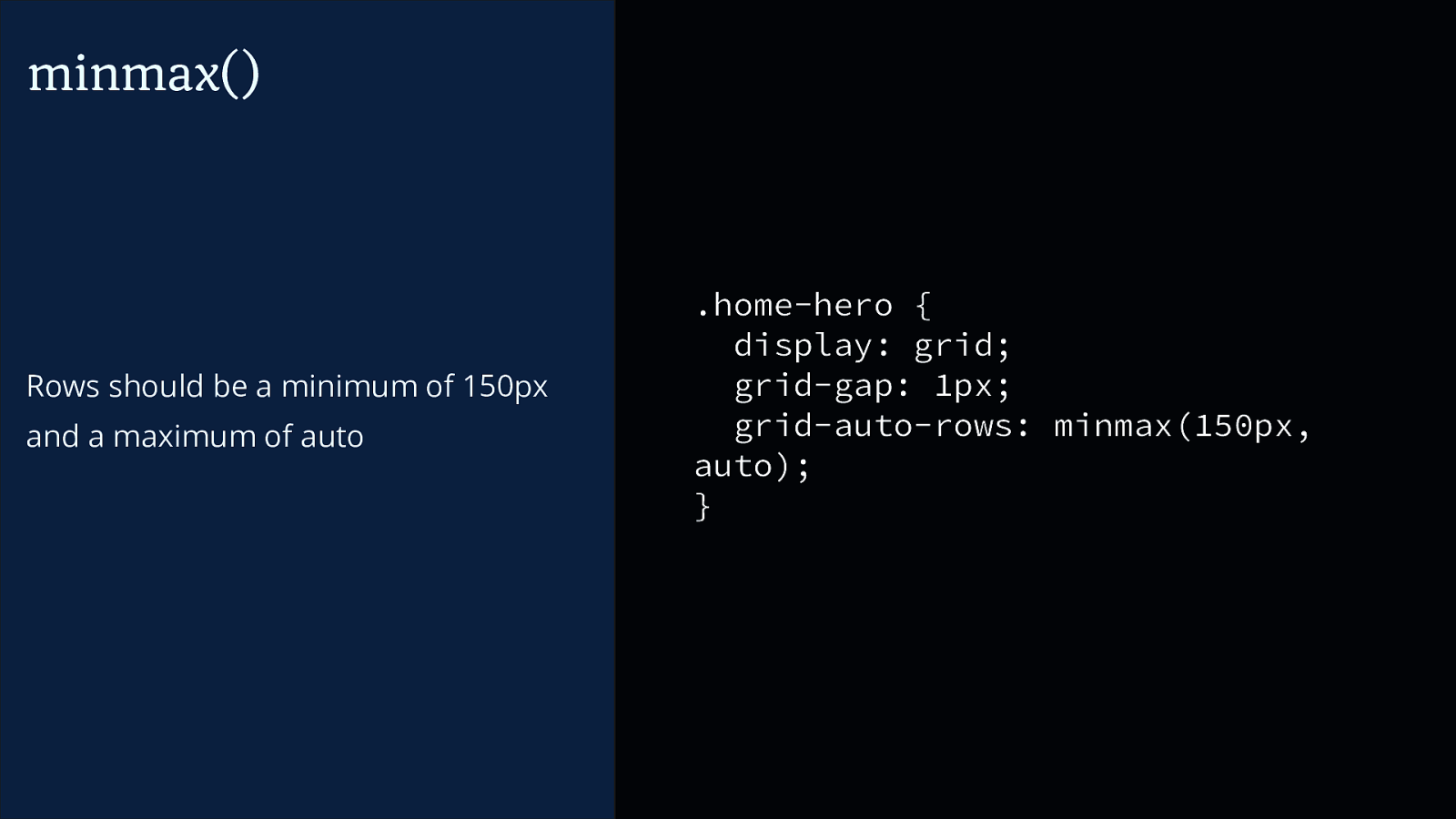
minmax() Rows should be a minimum of 150px and a maximum of auto .home-hero { display: grid; grid-gap: 1px; grid-auto-rows: minmax(150px, auto); }
CSS Grid auto-placement
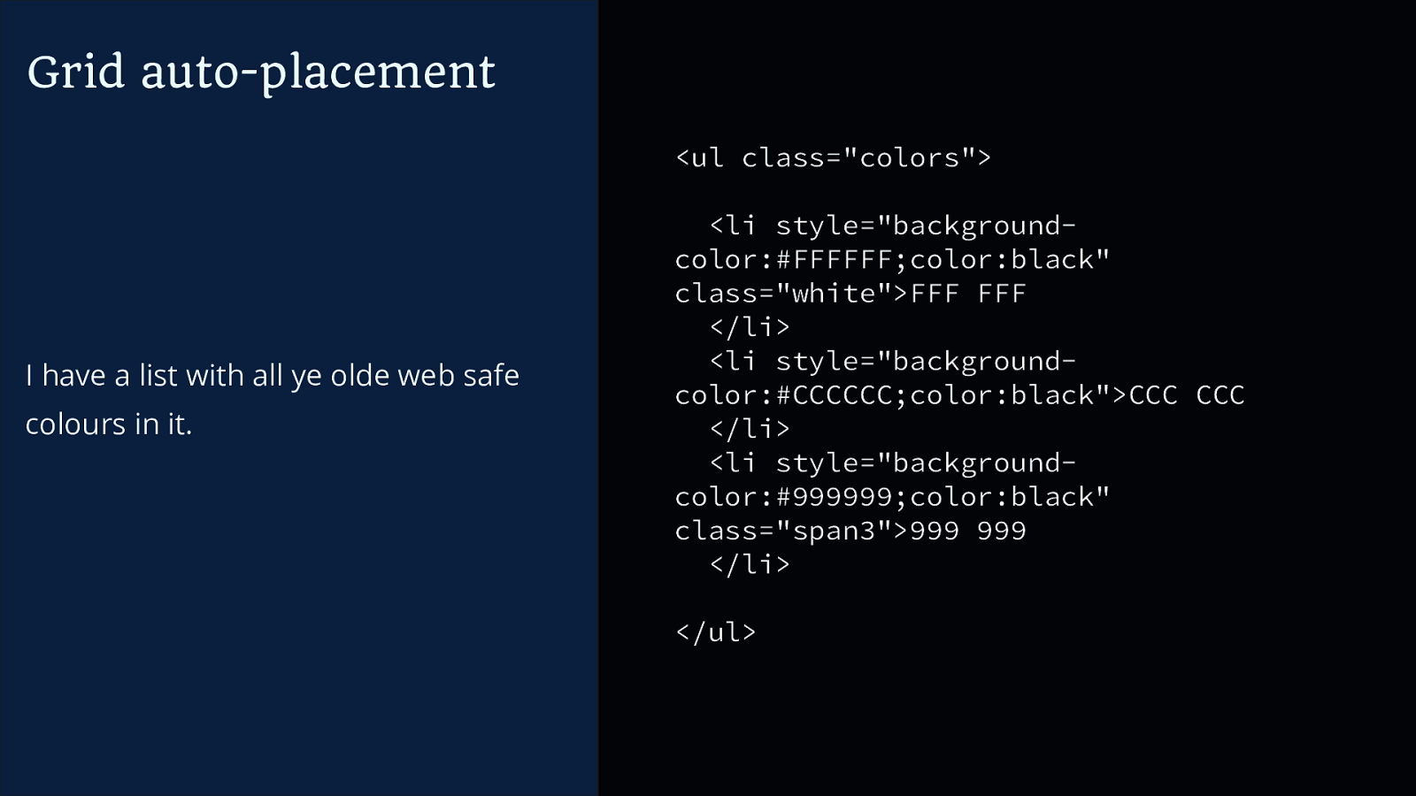
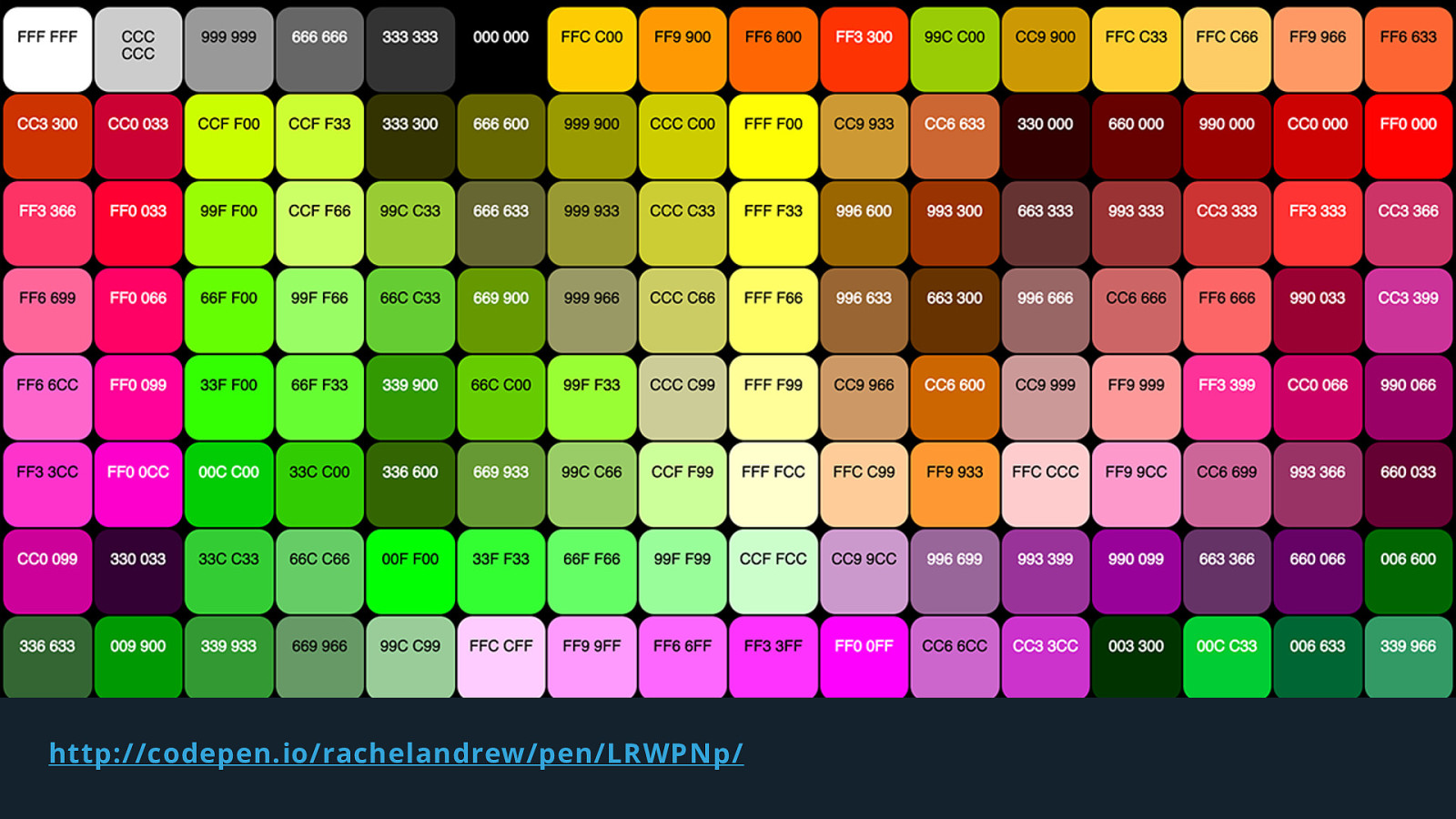
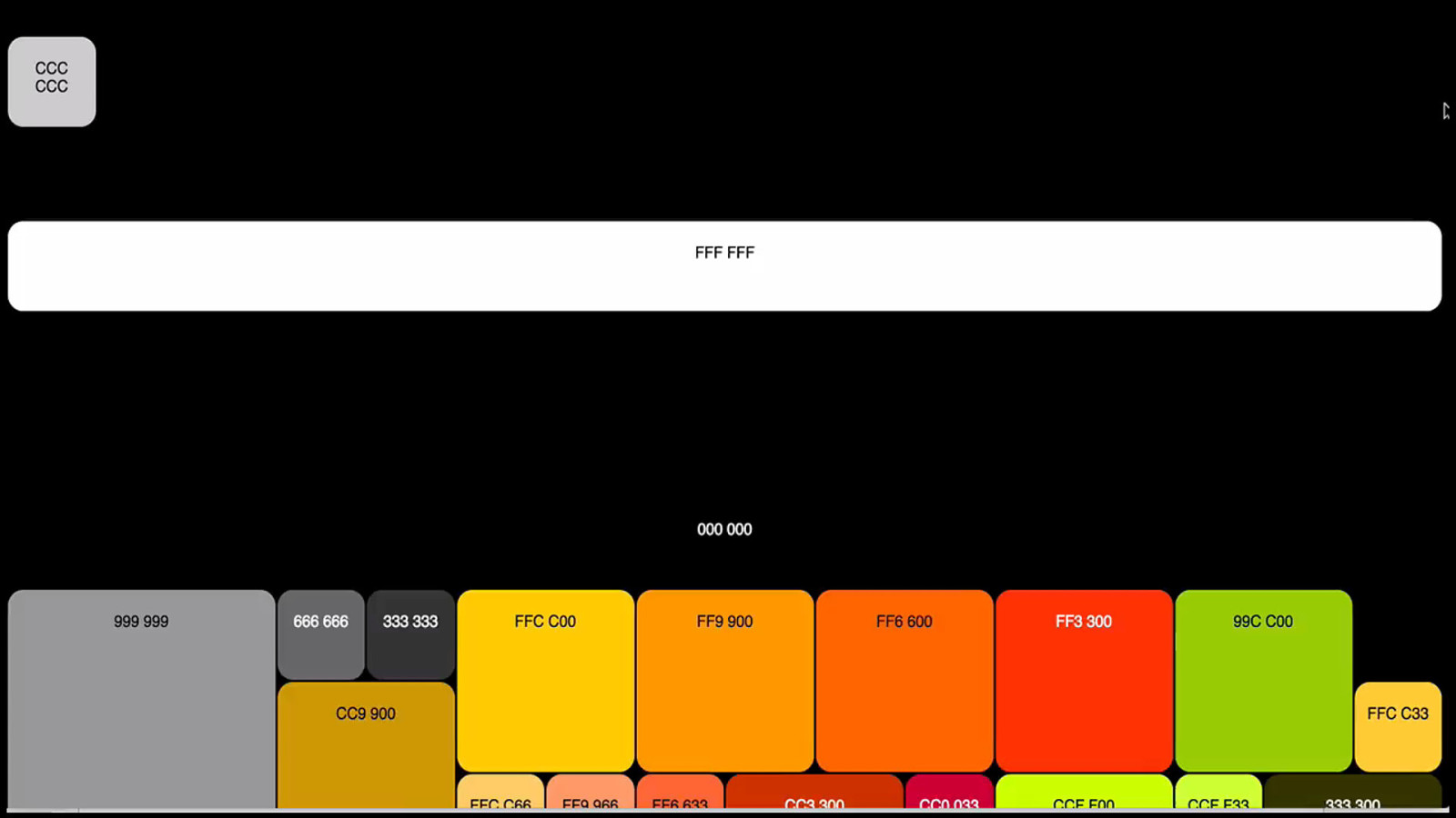
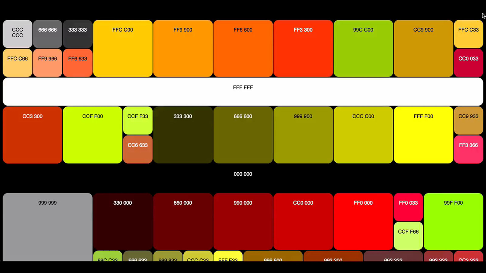
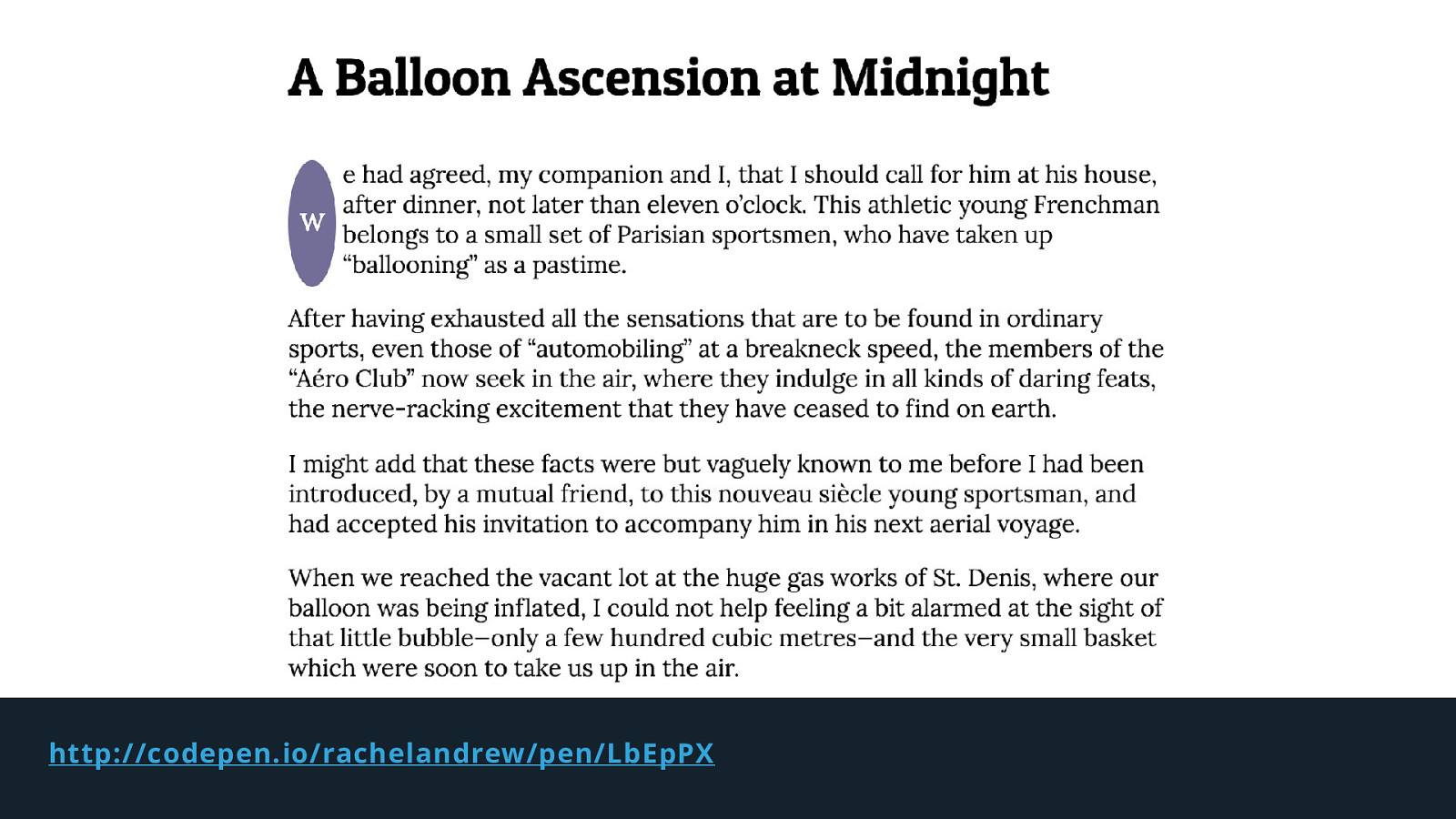
Grid auto-placement <ul class="colors"> I have a list with all ye olde web safe colours in it.
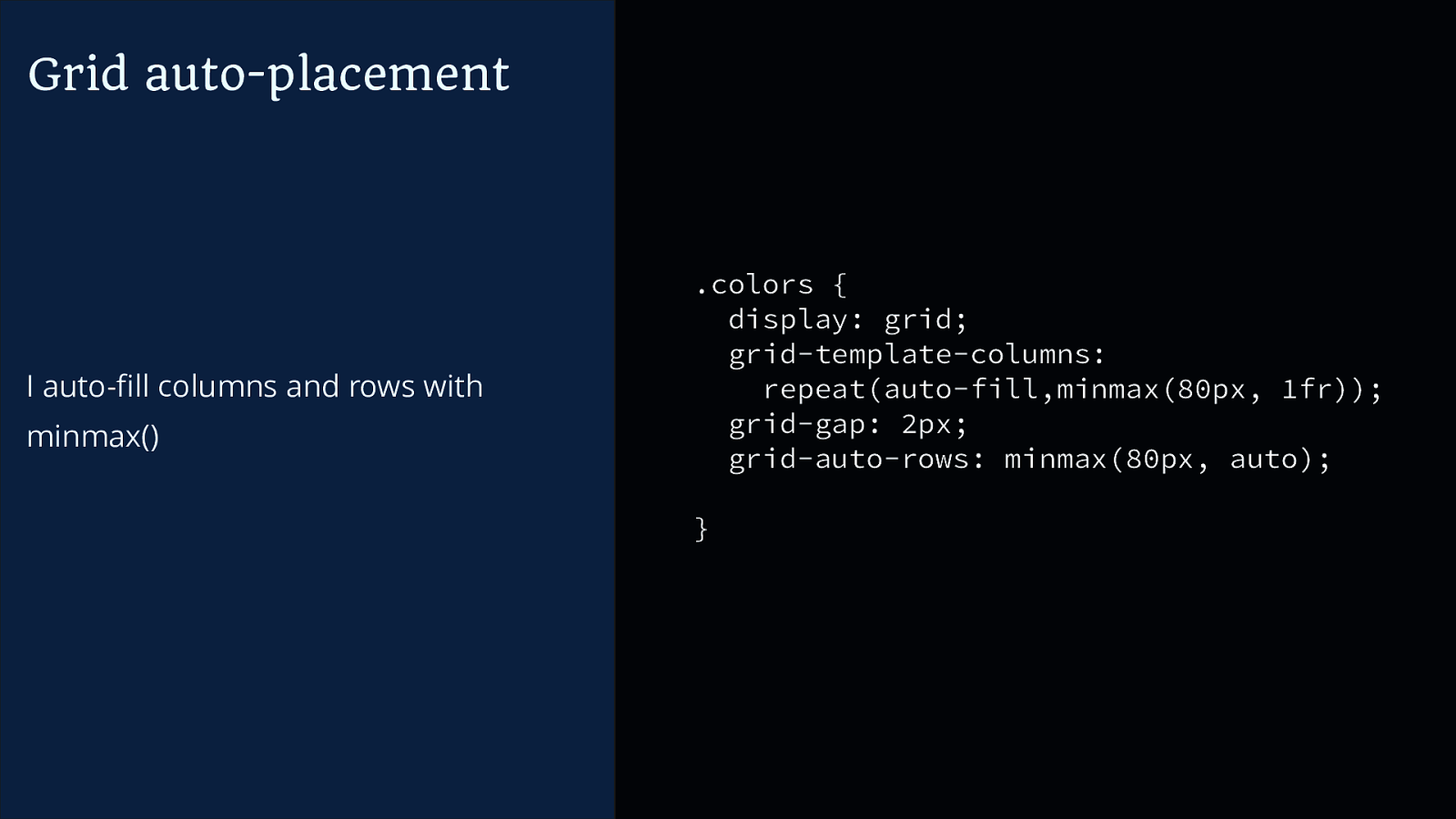
<li style="backgroundcolor:#FFFFFF;color:black" class="white">FFF FFF </li> <li style="backgroundcolor:#CCCCCC;color:black">CCC CCC </li> <li style="backgroundcolor:#999999;color:black" class="span3">999 999 </li> </ul>Grid auto-placement I auto-fill columns and rows with minmax() .colors { display: grid; grid-template-columns: repeat(auto-fill,minmax(80px, 1fr)); grid-gap: 2px; grid-auto-rows: minmax(80px, auto); }
http://codepen.io/rachelandrew/pen/LRWPNp/
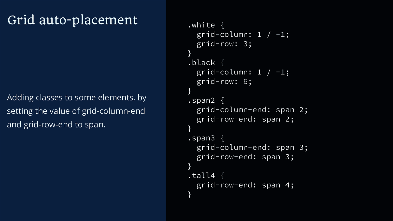
Grid auto-placement Adding classes to some elements, by setting the value of grid-column-end and grid-row-end to span. .white { grid-column: 1 / -1; grid-row: 3; } .black { grid-column: 1 / -1; grid-row: 6; } .span2 { grid-column-end: span 2; grid-row-end: span 2; } .span3 { grid-column-end: span 3; grid-row-end: span 3; } .tall4 { grid-row-end: span 4; }
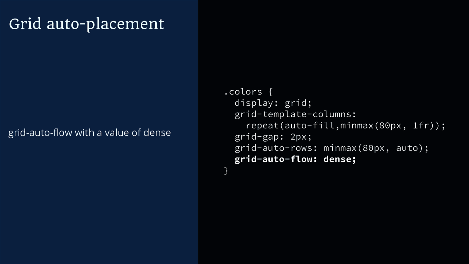
Grid auto-placement grid-auto-flow with a value of dense .colors { display: grid; grid-template-columns: repeat(auto-fill,minmax(80px, 1fr)); grid-gap: 2px; grid-auto-rows: minmax(80px, auto); grid-auto-flow: dense; }
The source and display order disconnect.
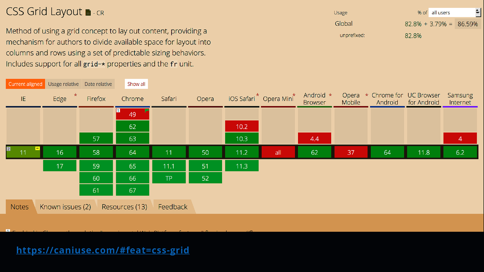
https://caniuse.com/#feat=css-grid
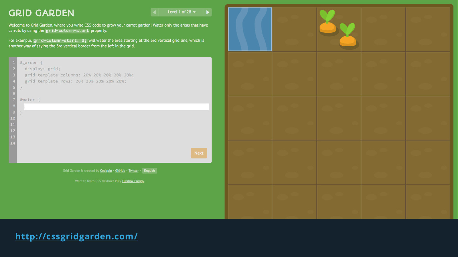
http://cssgridgarden.com/
https://www.youtube.com/c/layoutland
https://gridbyexample.com/video/
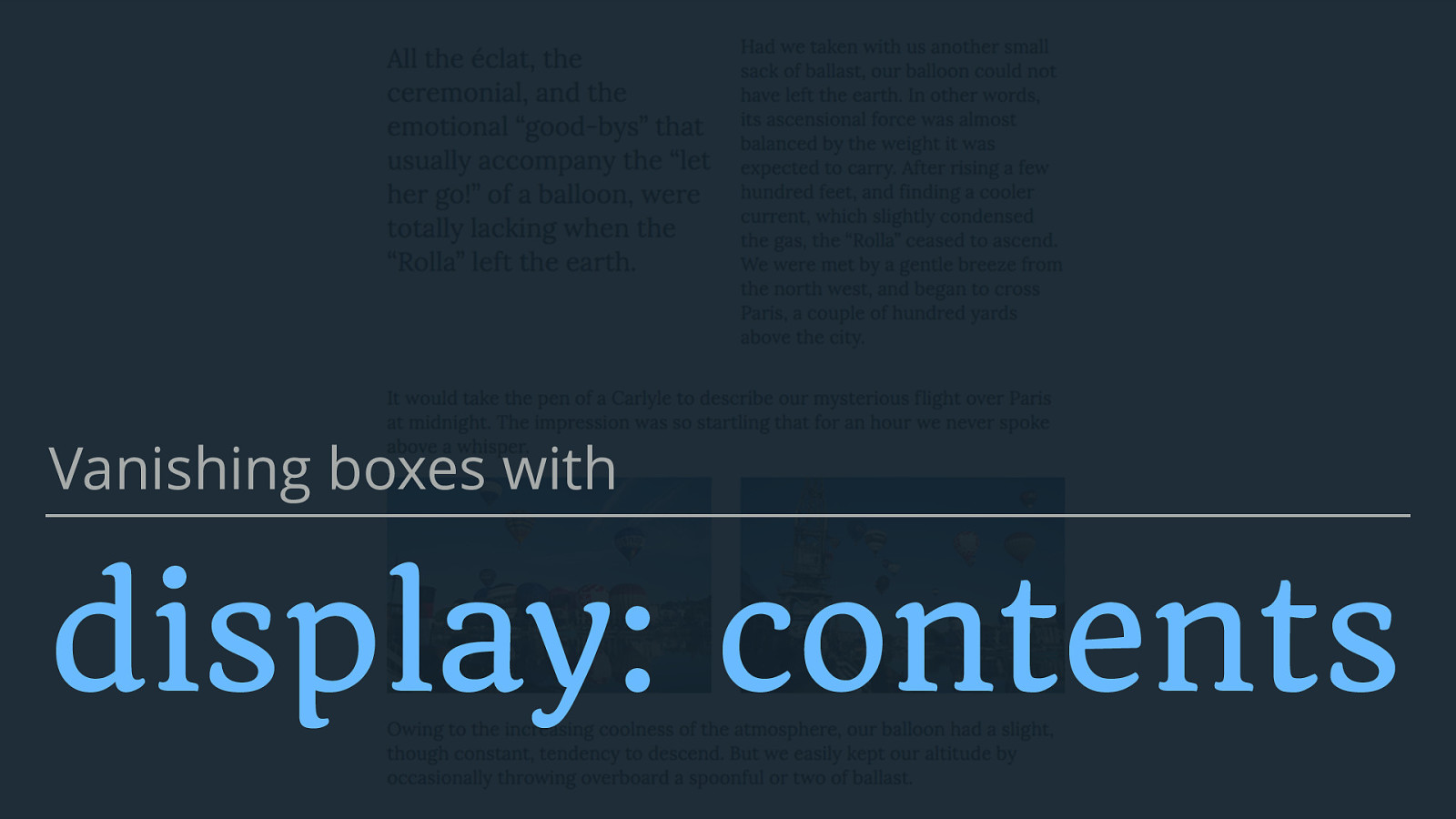
Vanishing boxes with display: contents
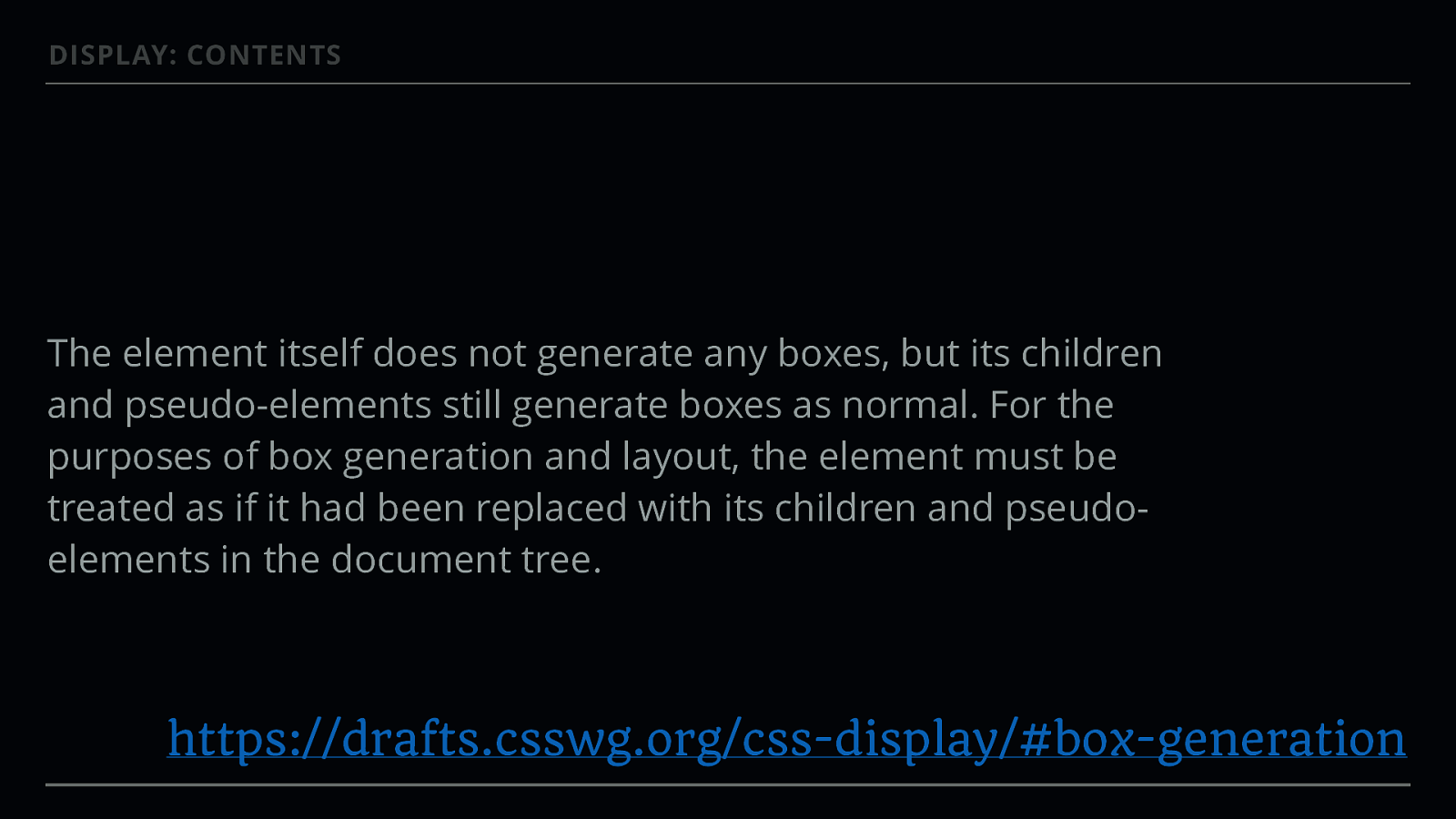
DISPLAY: CONTENTS The element itself does not generate any boxes, but its children and pseudo-elements still generate boxes as normal. For the purposes of box generation and layout, the element must be treated as if it had been replaced with its children and pseudoelements in the document tree. https://drafts.csswg.org/css-display/#box-generation
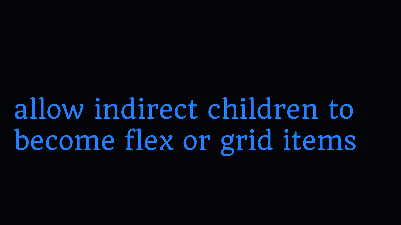
allow indirect children to become flex or grid items
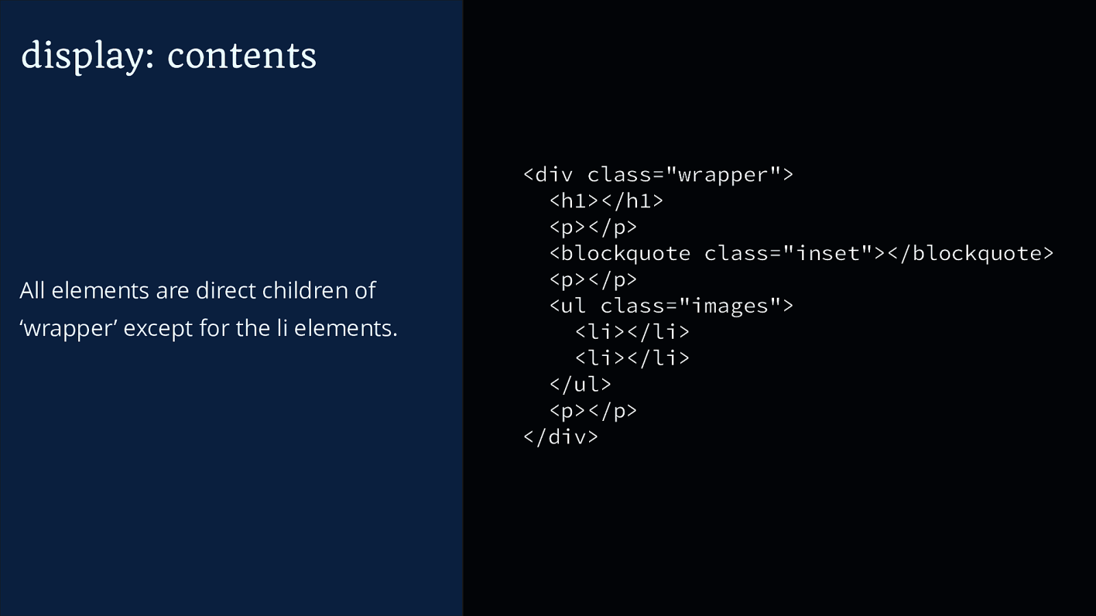
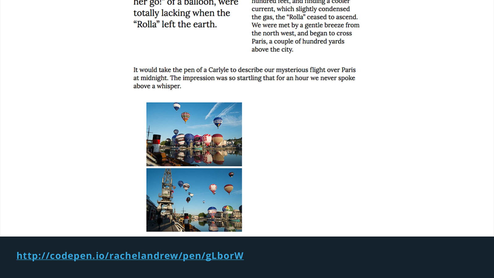
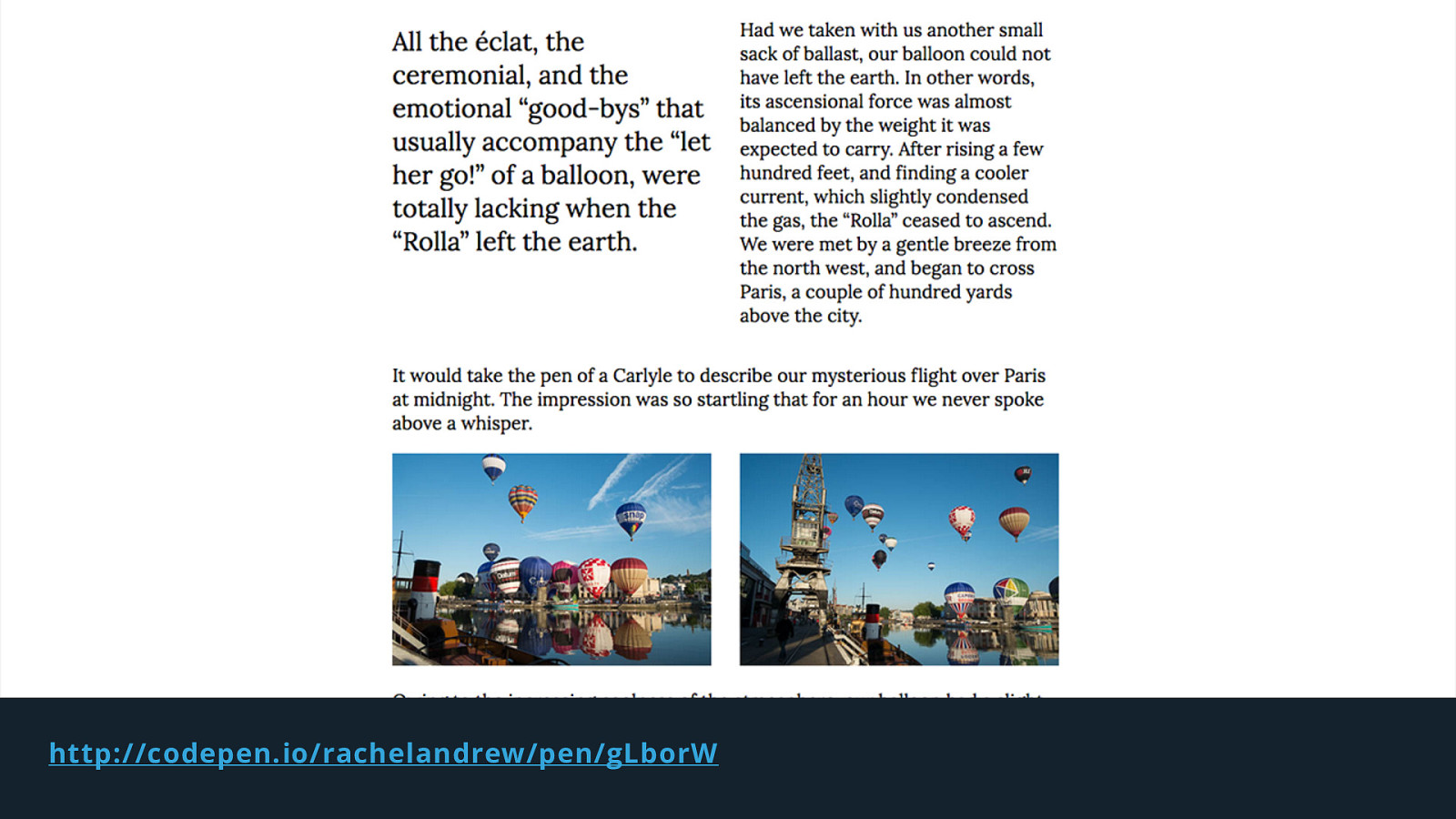
display: contents All elements are direct children of ‘wrapper’ except for the li elements.
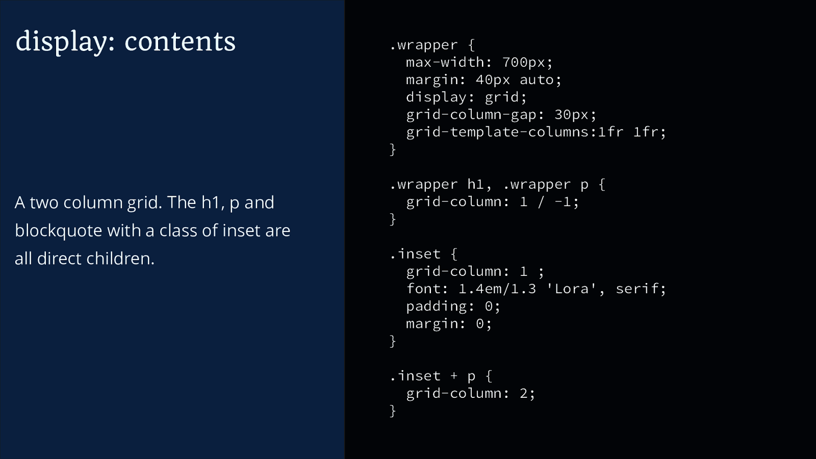
<div class="wrapper"> <h1></h1> <p></p> <blockquote class="inset"></blockquote> <p></p> <ul class="images"> <li></li> <li></li> </ul> <p></p> </div>display: contents A two column grid. The h1, p and blockquote with a class of inset are all direct children. .wrapper { max-width: 700px; margin: 40px auto; display: grid; grid-column-gap: 30px; grid-template-columns:1fr 1fr; } .wrapper h1, .wrapper p { grid-column: 1 / -1; } .inset { grid-column: 1 ; font: 1.4em/1.3 'Lora', serif; padding: 0; margin: 0; } .inset + p { grid-column: 2; }
http://codepen.io/rachelandrew/pen/gLborW
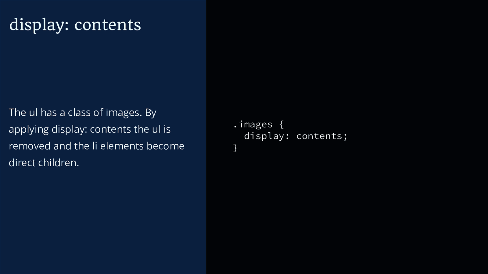
display: contents The ul has a class of images. By applying display: contents the ul is removed and the li elements become direct children. .images { display: contents; }
http://codepen.io/rachelandrew/pen/gLborW
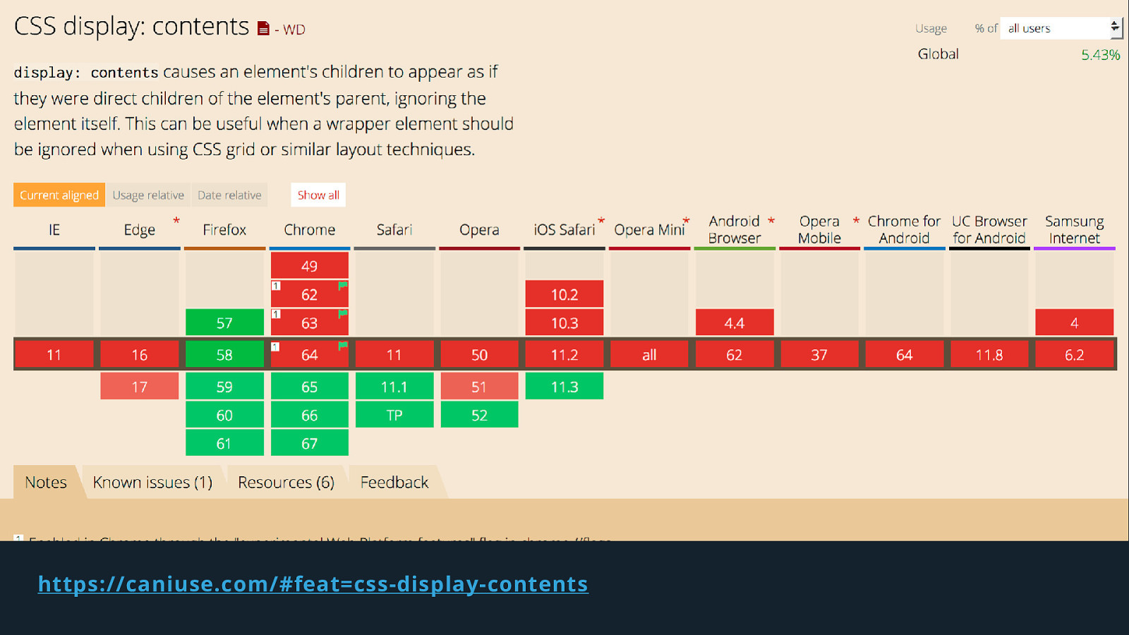
https://caniuse.com/#feat=css-display-contents
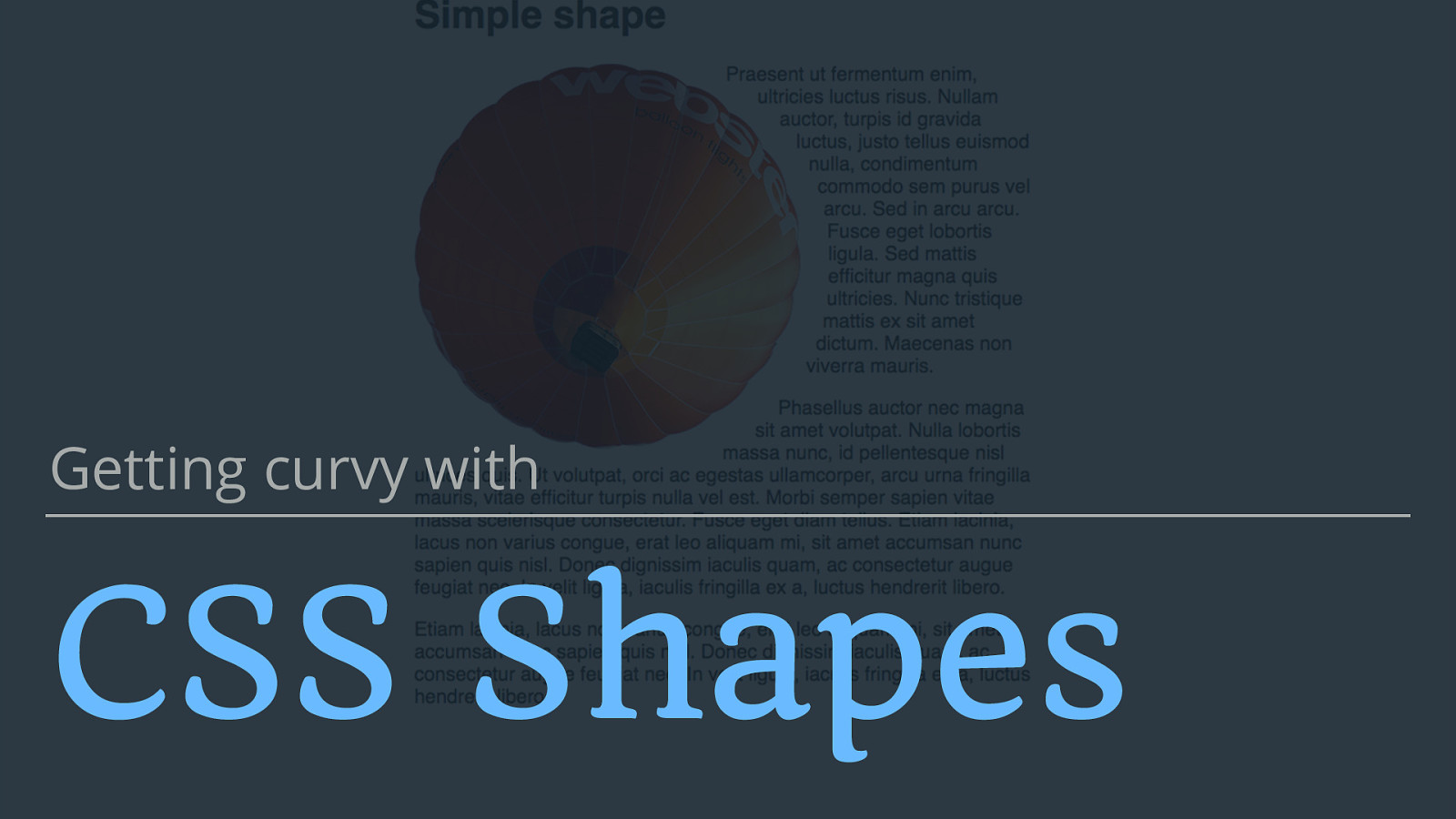
Getting curvy with CSS Shapes
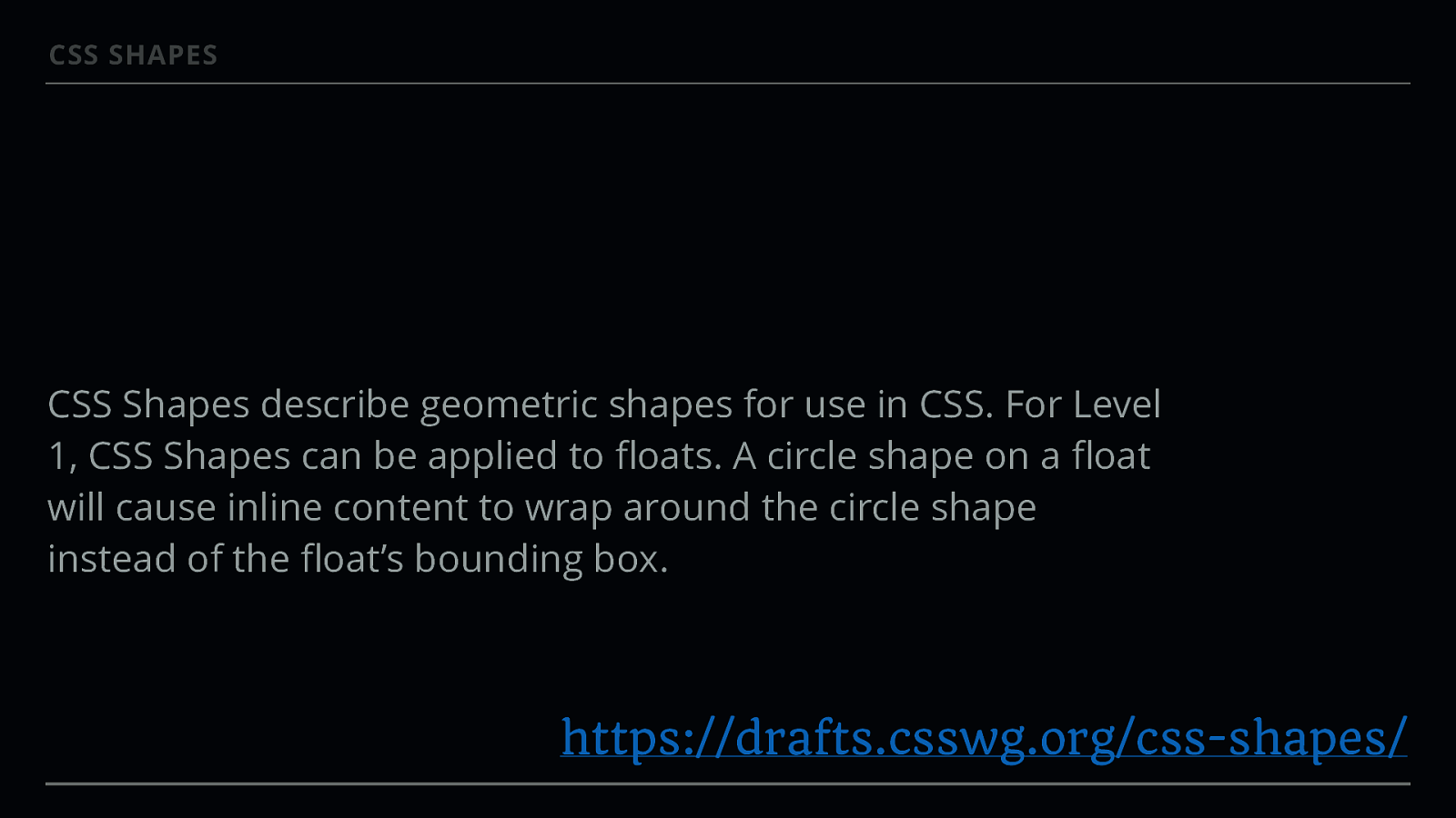
CSS SHAPES CSS Shapes describe geometric shapes for use in CSS. For Level 1, CSS Shapes can be applied to floats. A circle shape on a float will cause inline content to wrap around the circle shape instead of the float’s bounding box. https://drafts.csswg.org/css-shapes/
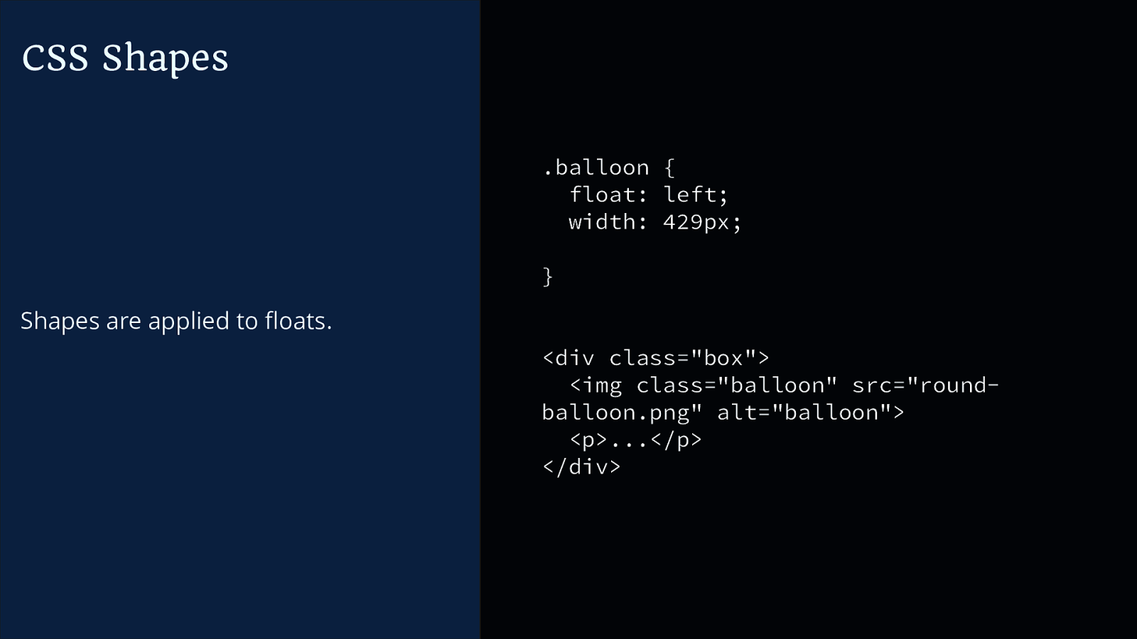
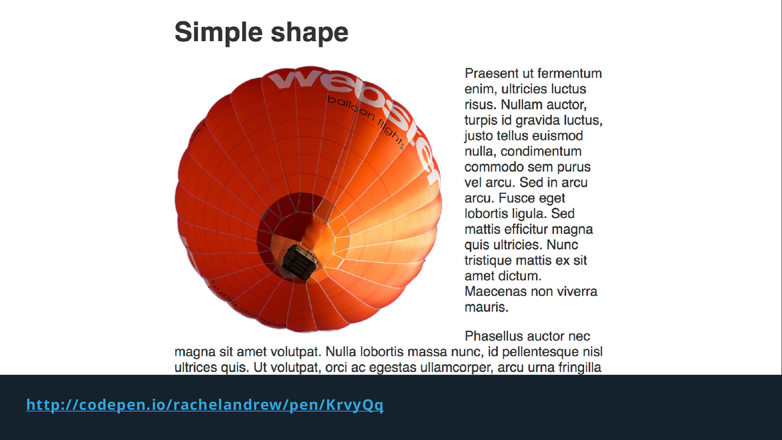
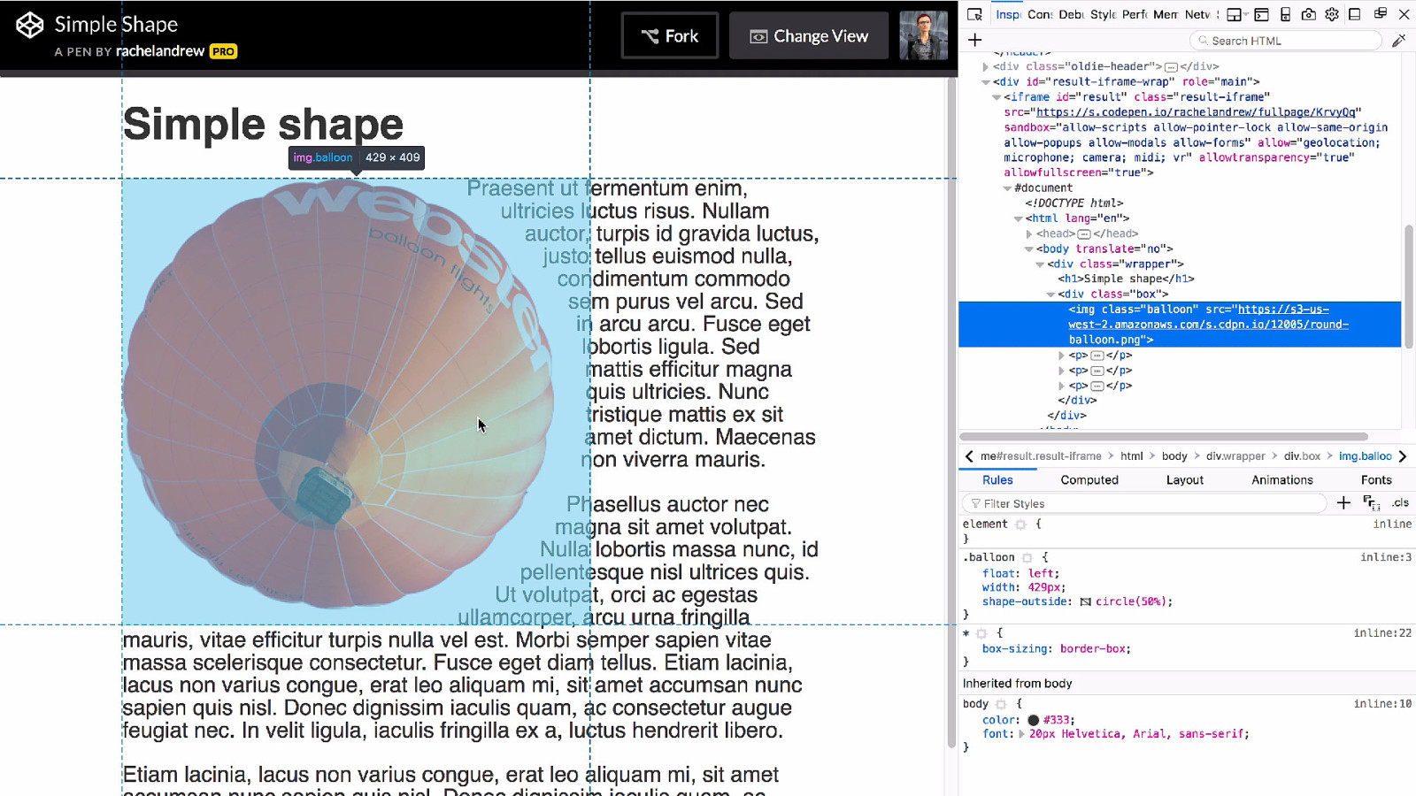
CSS Shapes .balloon { float: left; width: 429px; } Shapes are applied to floats. <div class="box"> <img class="balloon" src="roundballoon.png" alt="balloon"> <p>...</p> </div>
http://codepen.io/rachelandrew/pen/KrvyQq
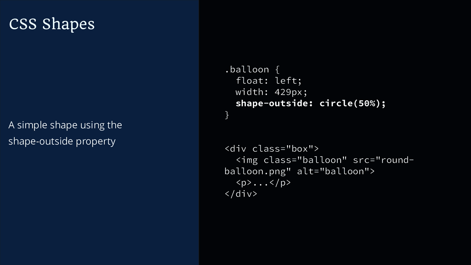
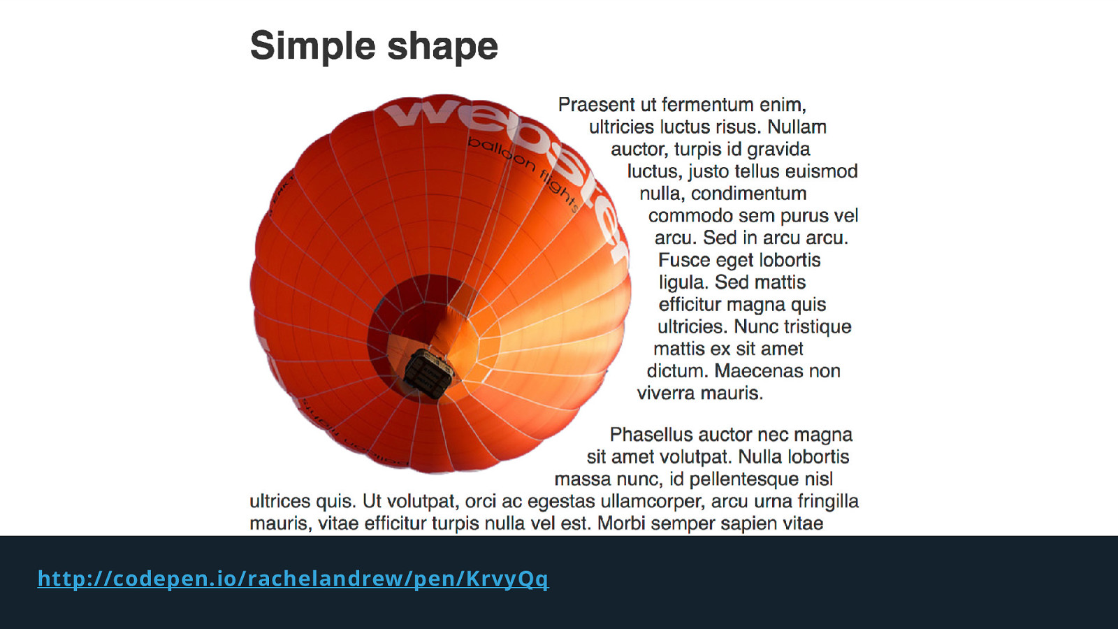
CSS Shapes A simple shape using the shape-outside property .balloon { float: left; width: 429px; shape-outside: circle(50%); }
<div class="box"> <img class="balloon" src="roundballoon.png" alt="balloon"> <p>...</p> </div>http://codepen.io/rachelandrew/pen/KrvyQq
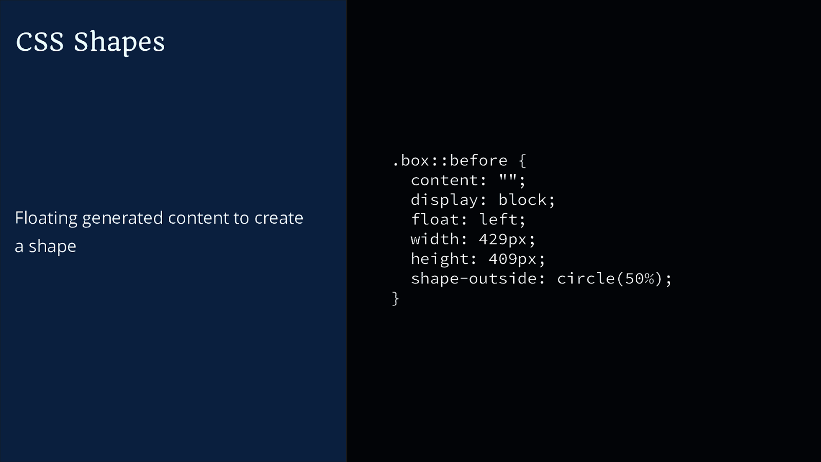
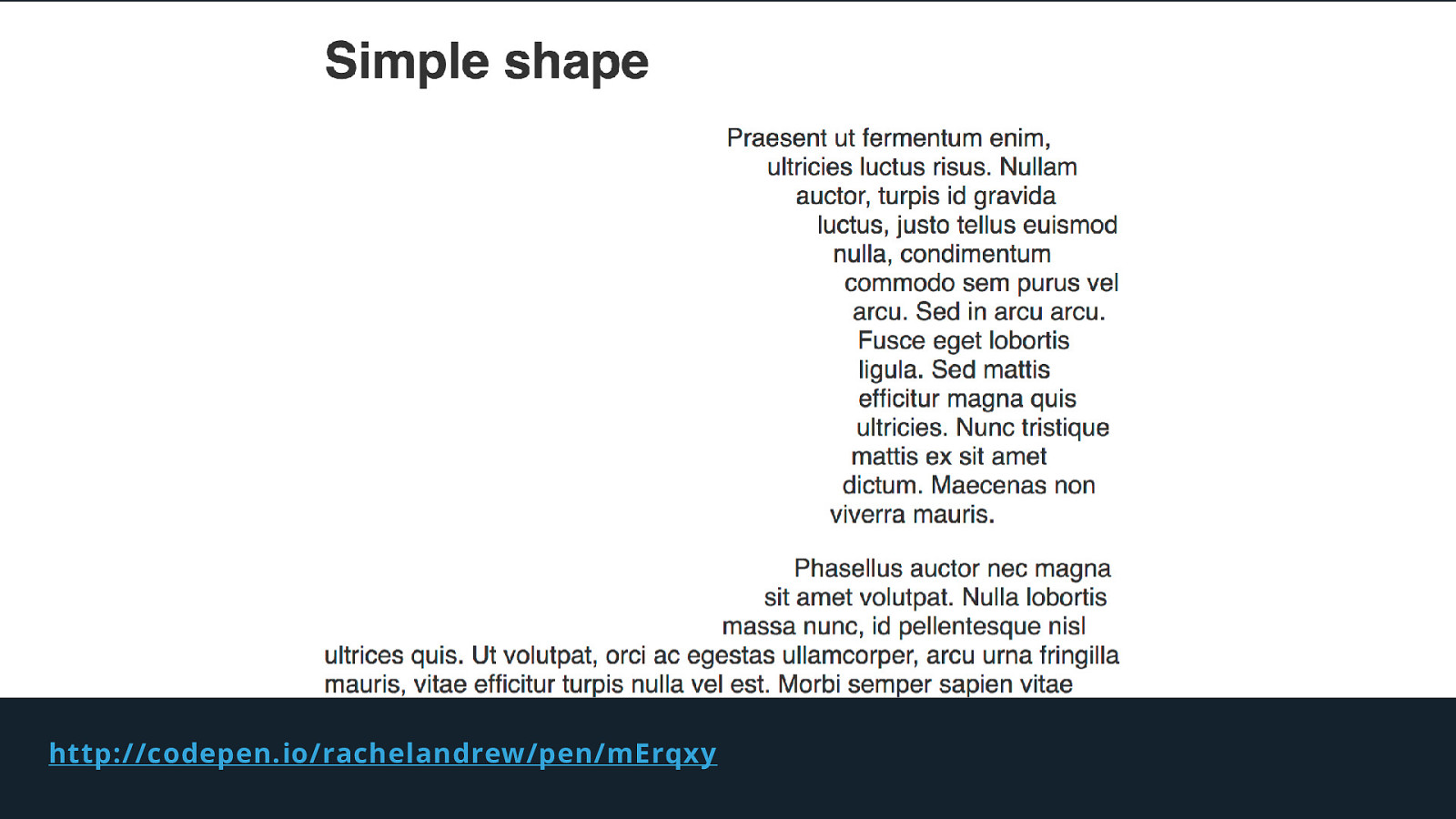
CSS Shapes Floating generated content to create a shape .box::before { content: ""; display: block; float: left; width: 429px; height: 409px; shape-outside: circle(50%); }
http://codepen.io/rachelandrew/pen/mErqxy
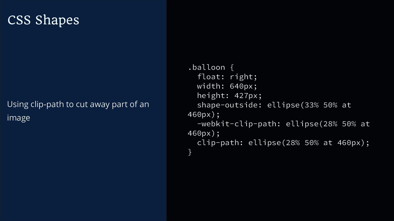
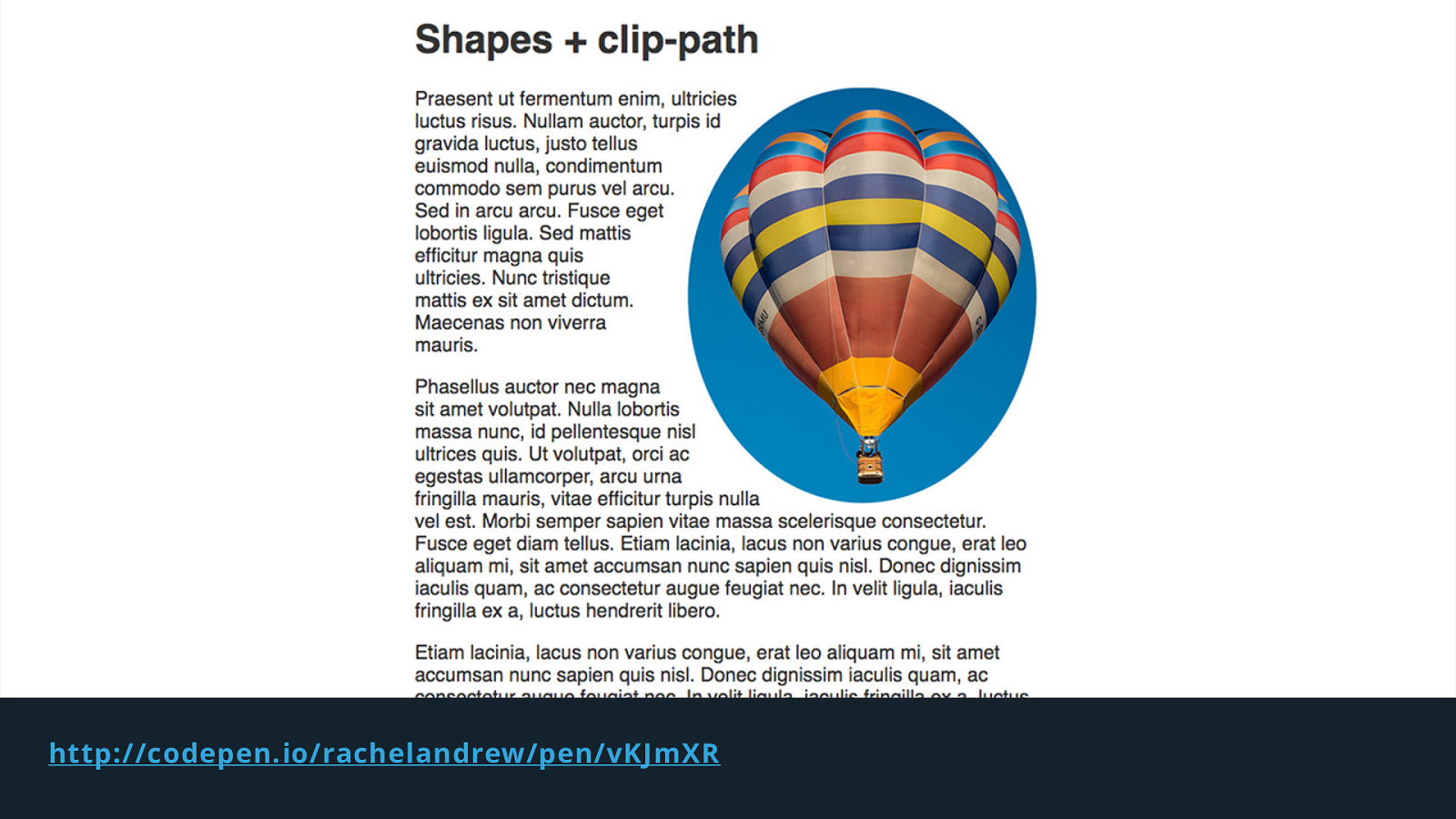
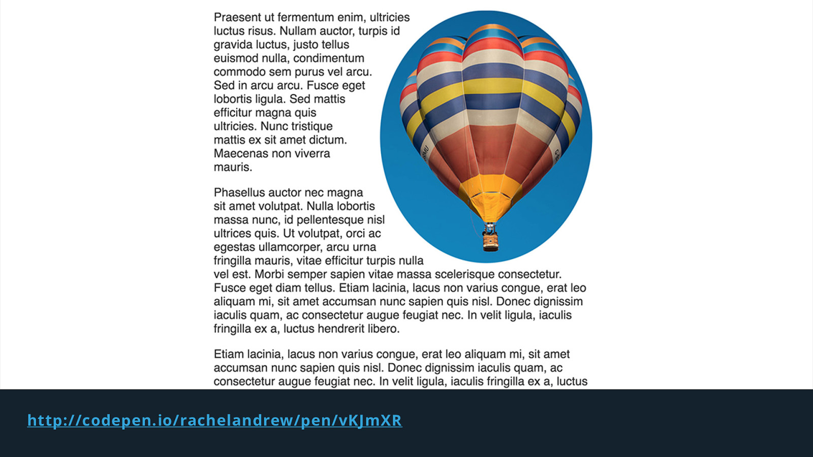
CSS Shapes Using clip-path to cut away part of an image .balloon { float: right; width: 640px; height: 427px; shape-outside: ellipse(33% 50% at 460px); -webkit-clip-path: ellipse(28% 50% at 460px); clip-path: ellipse(28% 50% at 460px); }
http://codepen.io/rachelandrew/pen/vKJmXR
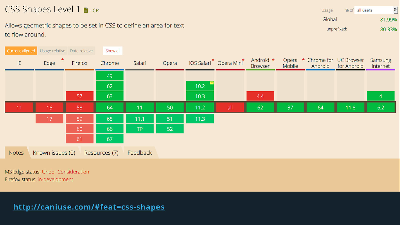
http://caniuse.com/#feat=css-shapes
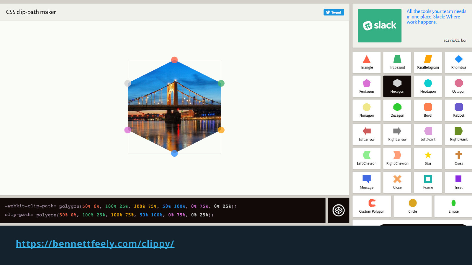
https://bennettfeely.com/clippy/
Can I Use this with Feature Queries
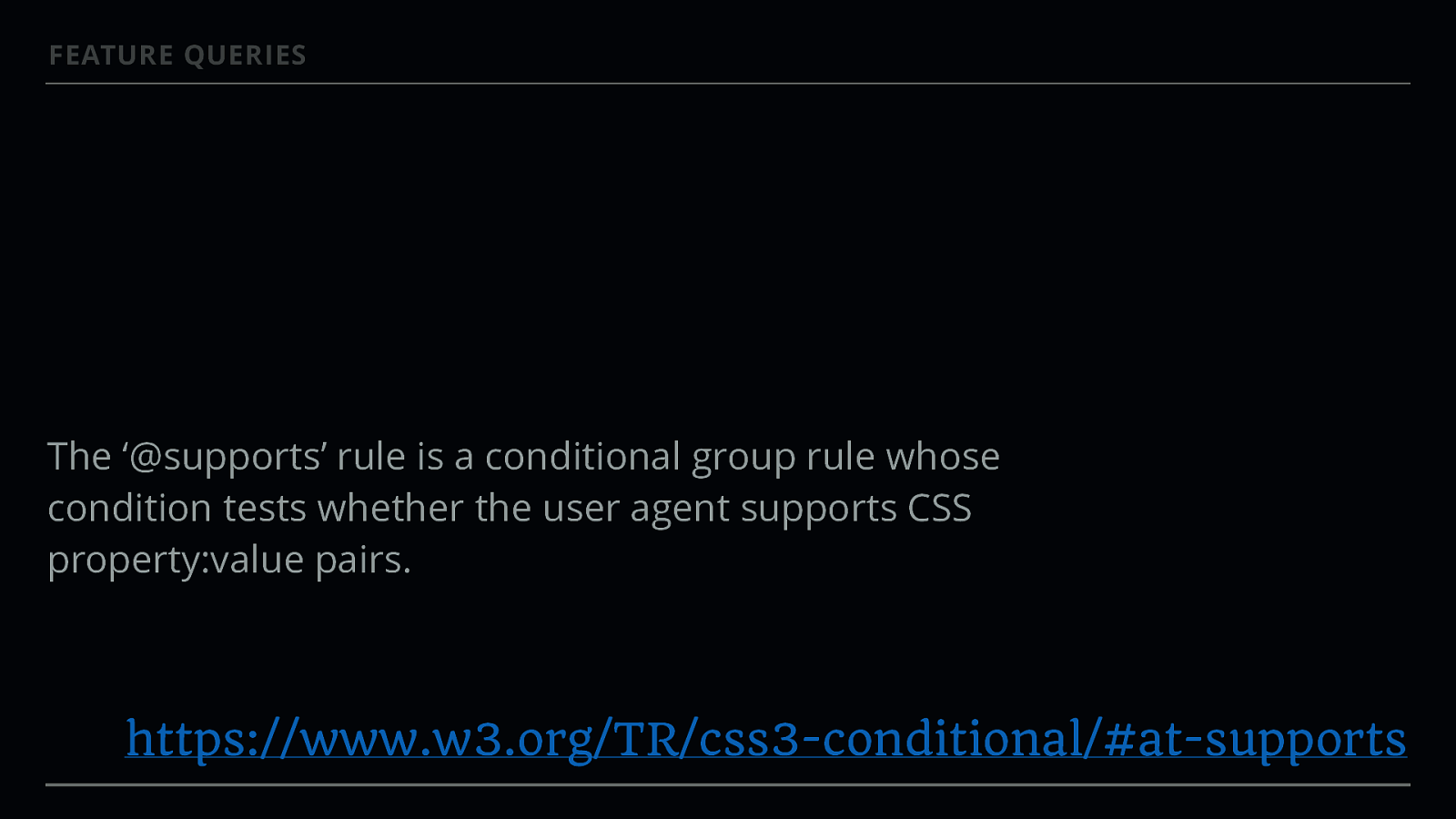
FEATURE QUERIES The ‘@supports’ rule is a conditional group rule whose condition tests whether the user agent supports CSS property:value pairs. https://www.w3.org/TR/css3-conditional/#at-supports
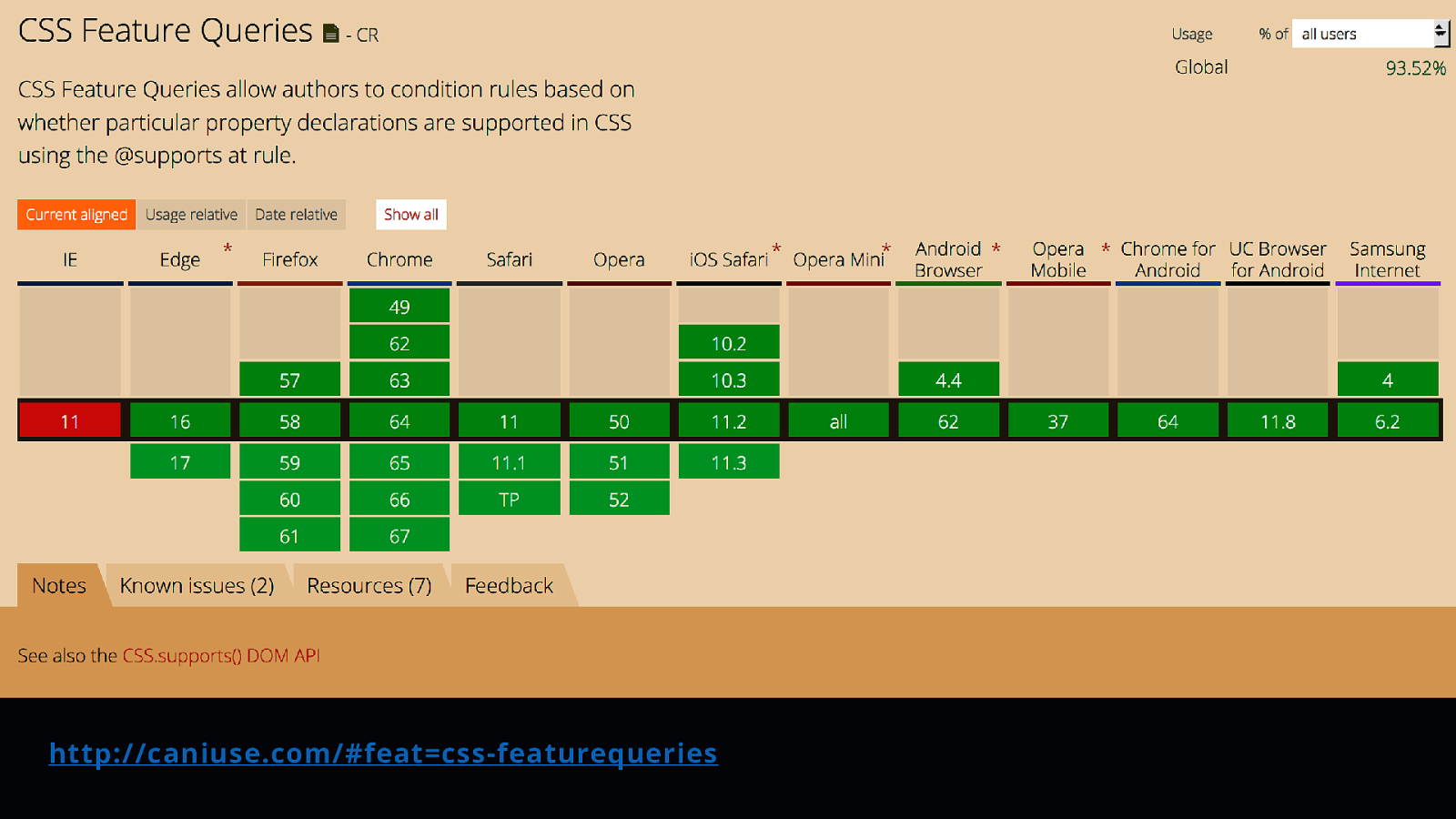
http://caniuse.com/#feat=css-featurequeries
Anything new in CSS you can use feature queries to detect support.
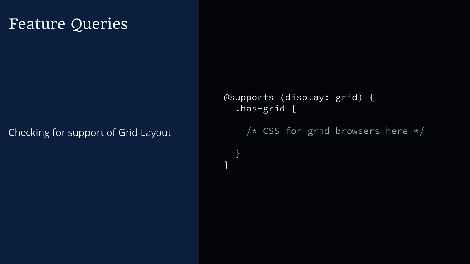
Feature Queries @supports (display: grid) { .has-grid { Checking for support of Grid Layout /* CSS for grid browsers here */ } }
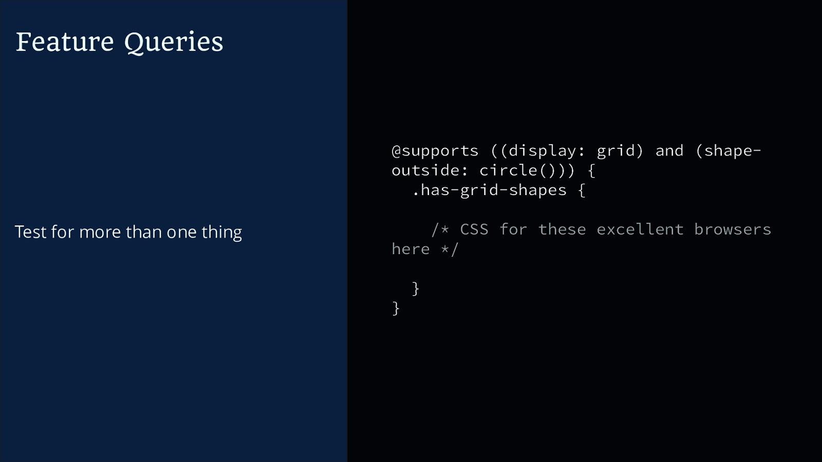
Feature Queries @supports ((display: grid) and (shapeoutside: circle())) { .has-grid-shapes { Test for more than one thing /* CSS for these excellent browsers here */ } }
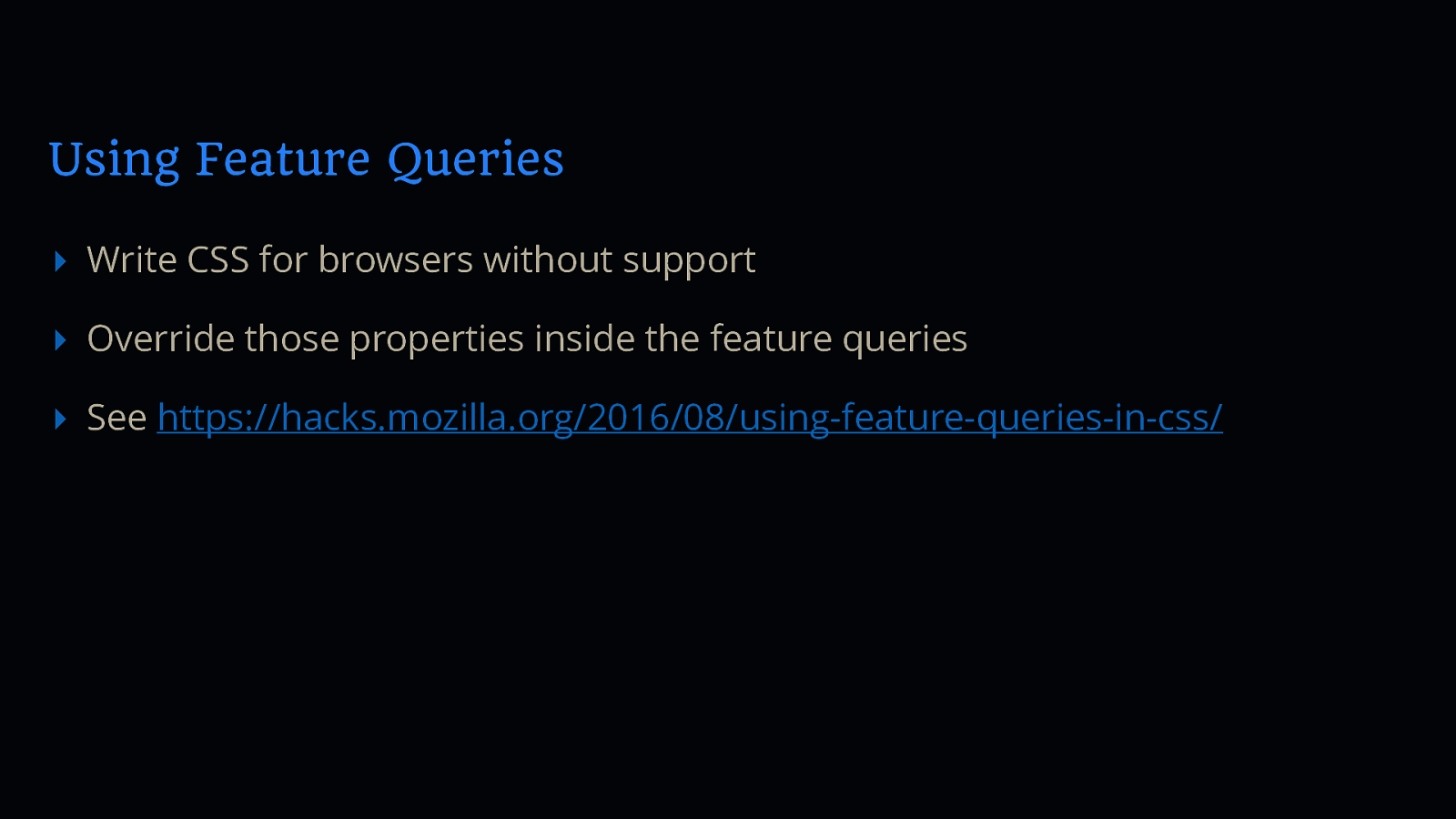
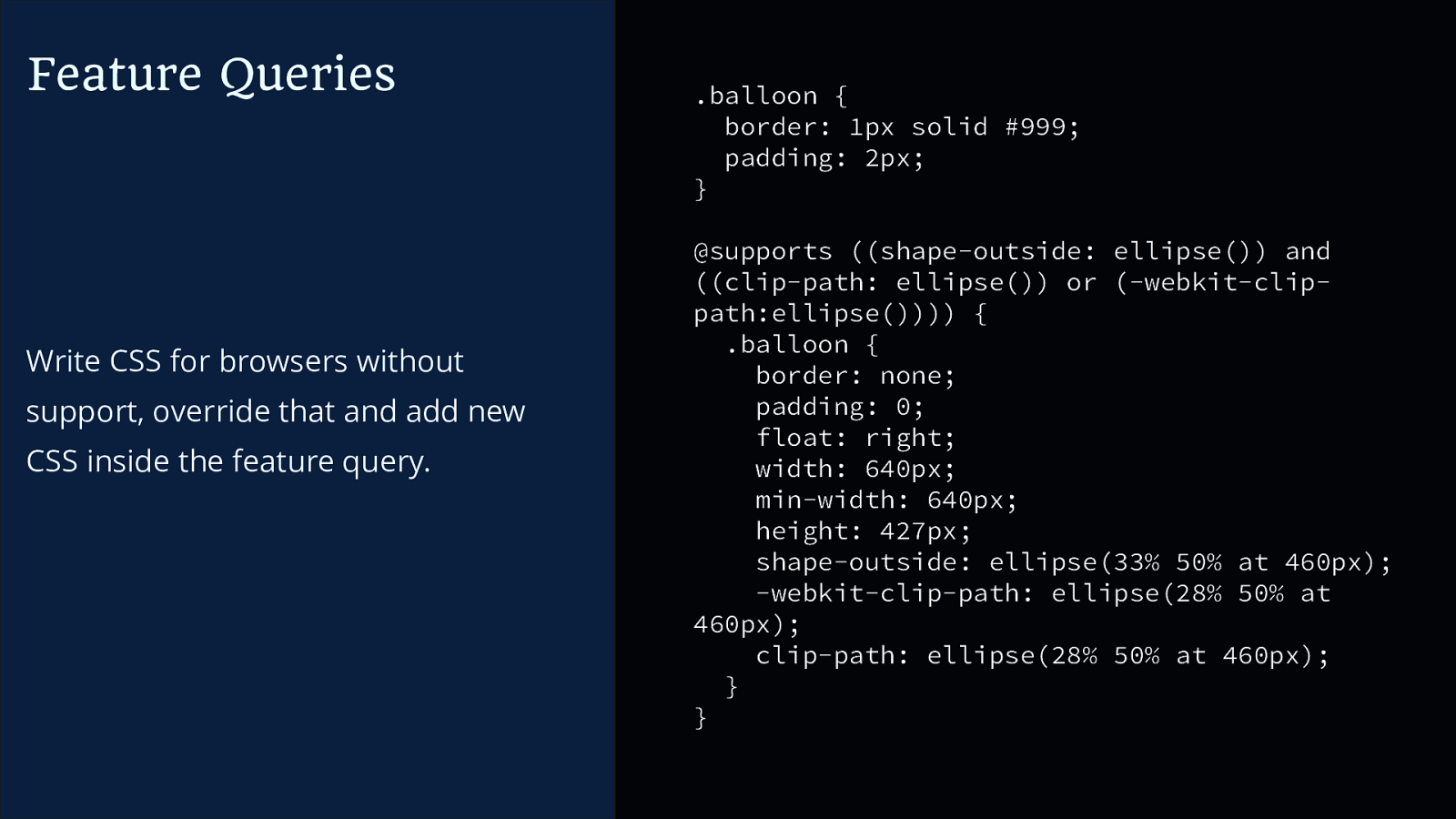
Using Feature Queries ▸ Write CSS for browsers without support ▸ Override those properties inside the feature queries ▸ See https://hacks.mozilla.org/2016/08/using-feature-queries-in-css/
Feature Queries Write CSS for browsers without support, override that and add new CSS inside the feature query. .balloon { border: 1px solid #999; padding: 2px; } @supports ((shape-outside: ellipse()) and ((clip-path: ellipse()) or (-webkit-clippath:ellipse()))) { .balloon { border: none; padding: 0; float: right; width: 640px; min-width: 640px; height: 427px; shape-outside: ellipse(33% 50% at 460px); -webkit-clip-path: ellipse(28% 50% at 460px); clip-path: ellipse(28% 50% at 460px); } }
http://codepen.io/rachelandrew/pen/vKJmXR
http://codepen.io/rachelandrew/pen/vKJmXR
Websites that enhance themselves as the platform improves.
Fancy introductions with Initial Letter
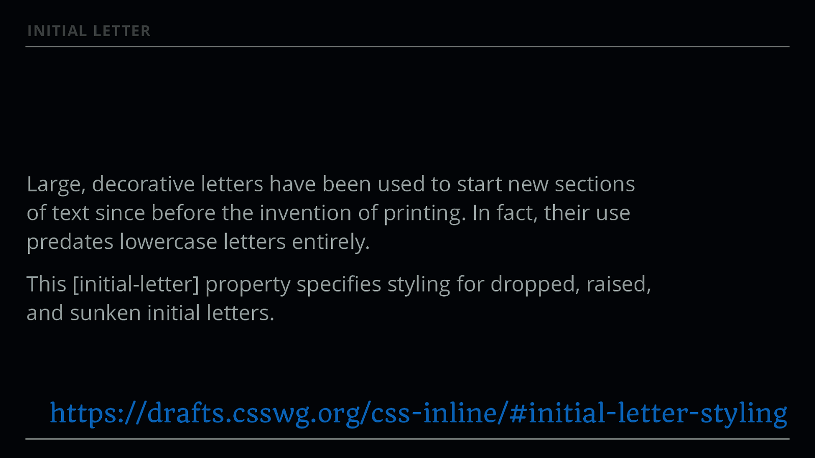
INITIAL LETTER Large, decorative letters have been used to start new sections of text since before the invention of printing. In fact, their use predates lowercase letters entirely. This [initial-letter] property specifies styling for dropped, raised, and sunken initial letters. https://drafts.csswg.org/css-inline/#initial-letter-styling
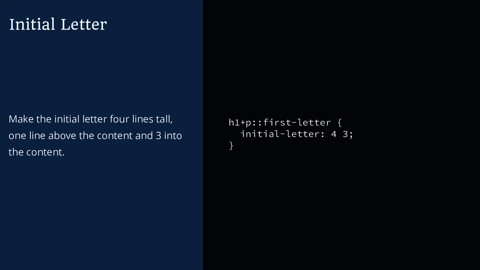
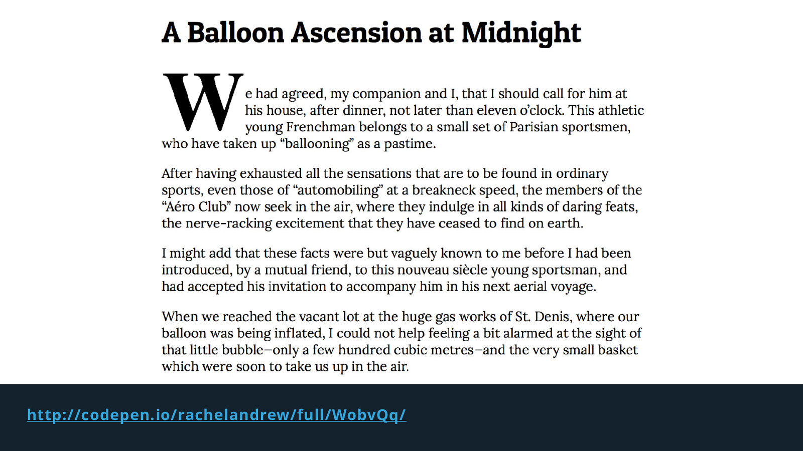
Initial Letter Make the initial letter four lines tall, one line above the content and 3 into the content. h1+p::first-letter { initial-letter: 4 3; }
http://codepen.io/rachelandrew/full/WobvQq/
http://codepen.io/rachelandrew/full/WobvQq/
Currently Safari 9+ only.
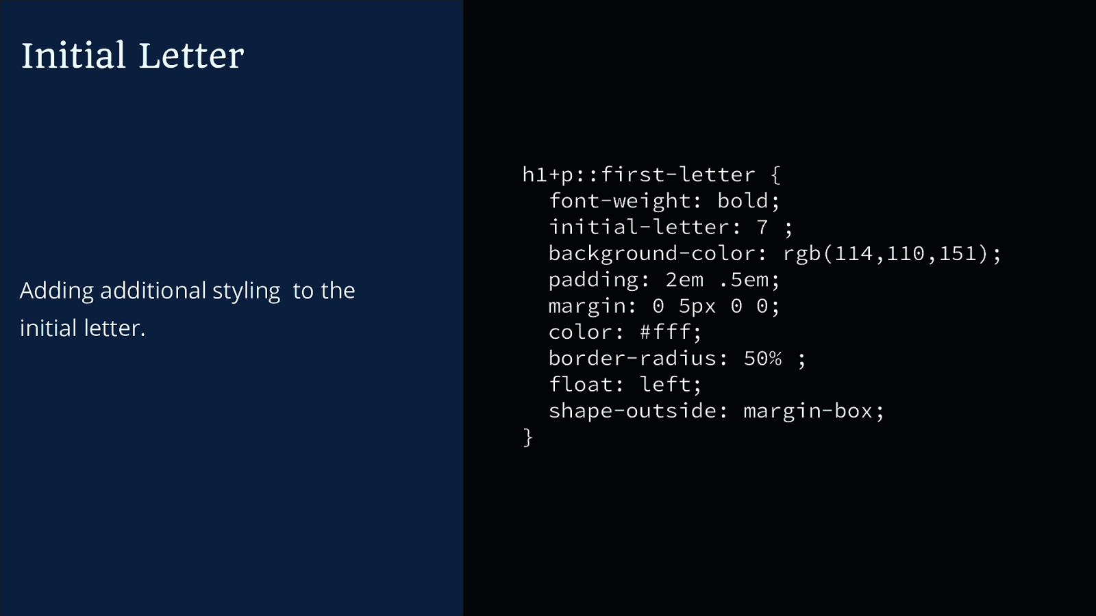
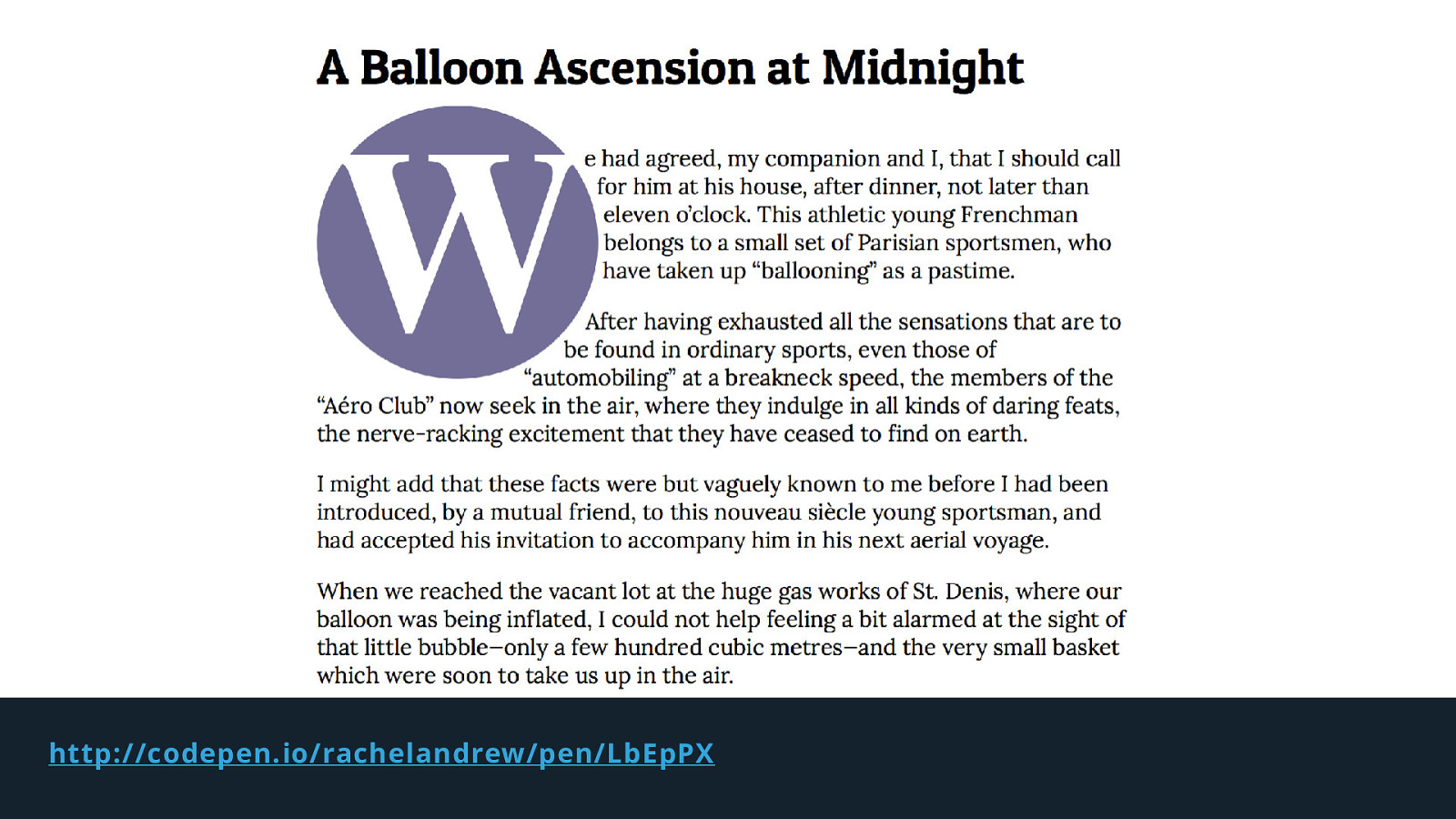
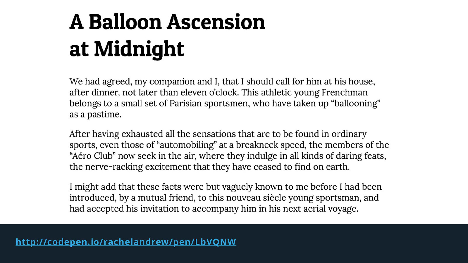
Initial Letter Adding additional styling to the initial letter. h1+p::first-letter { font-weight: bold; initial-letter: 7 ; background-color: rgb(114,110,151); padding: 2em .5em; margin: 0 5px 0 0; color: #fff; border-radius: 50% ; float: left; shape-outside: margin-box; }
http://codepen.io/rachelandrew/pen/LbEpPX
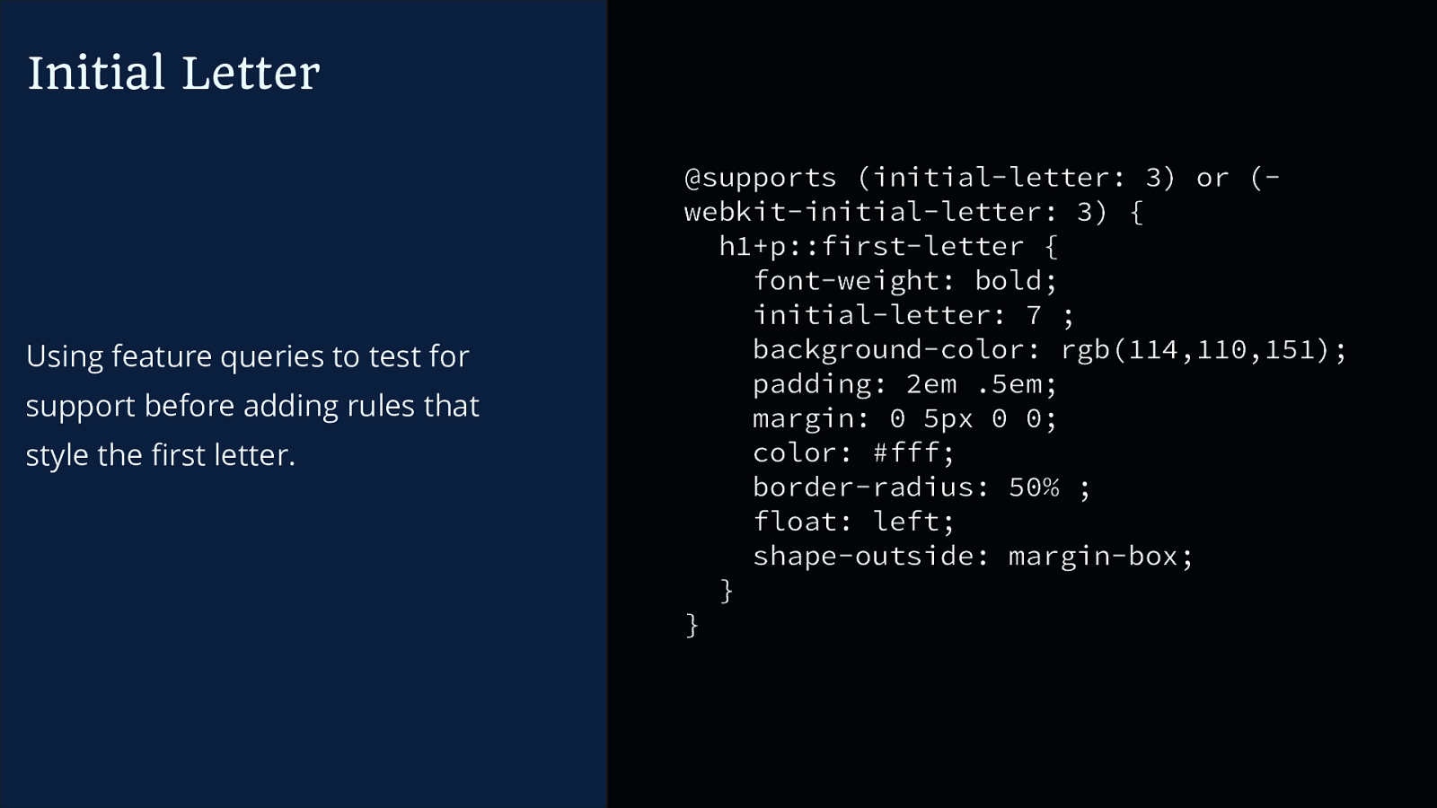
Initial Letter Using feature queries to test for support before adding rules that style the first letter. @supports (initial-letter: 3) or (webkit-initial-letter: 3) { h1+p::first-letter { font-weight: bold; initial-letter: 7 ; background-color: rgb(114,110,151); padding: 2em .5em; margin: 0 5px 0 0; color: #fff; border-radius: 50% ; float: left; shape-outside: margin-box; } }
http://codepen.io/rachelandrew/pen/LbEpPX
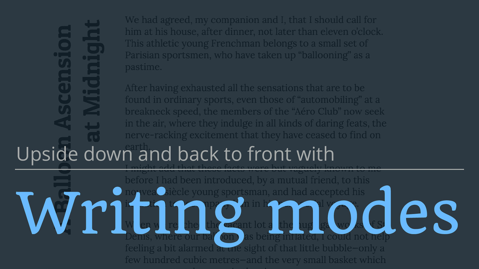
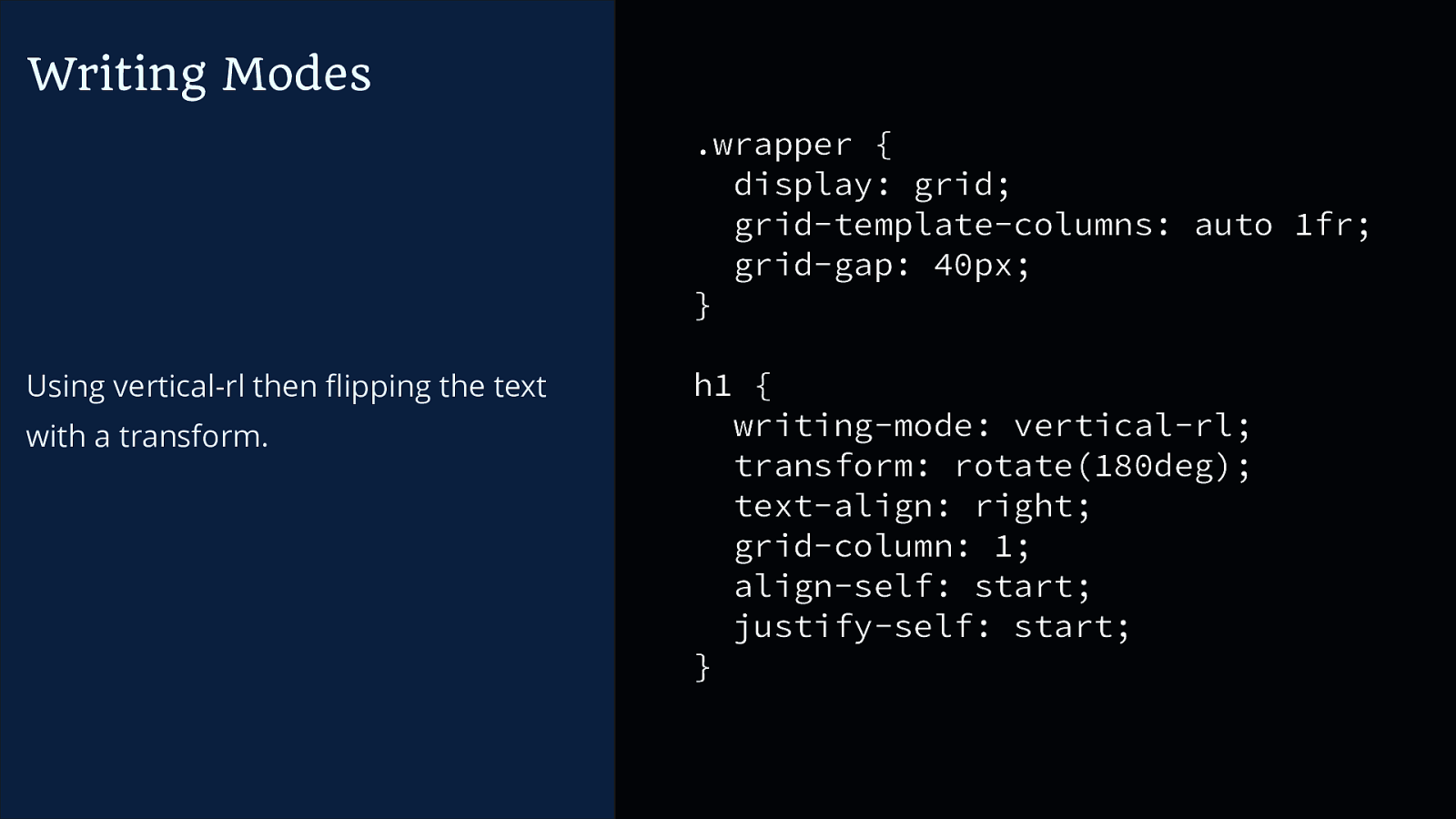
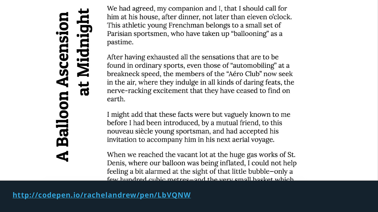
Upside down and back to front with Writing modes
http://codepen.io/rachelandrew/pen/LbVQNW
Writing Modes .wrapper { display: grid; grid-template-columns: auto 1fr; grid-gap: 40px; } Using vertical-rl then flipping the text with a transform. h1 { writing-mode: vertical-rl; transform: rotate(180deg); text-align: right; grid-column: 1; align-self: start; justify-self: start; }
http://codepen.io/rachelandrew/pen/LbVQNW
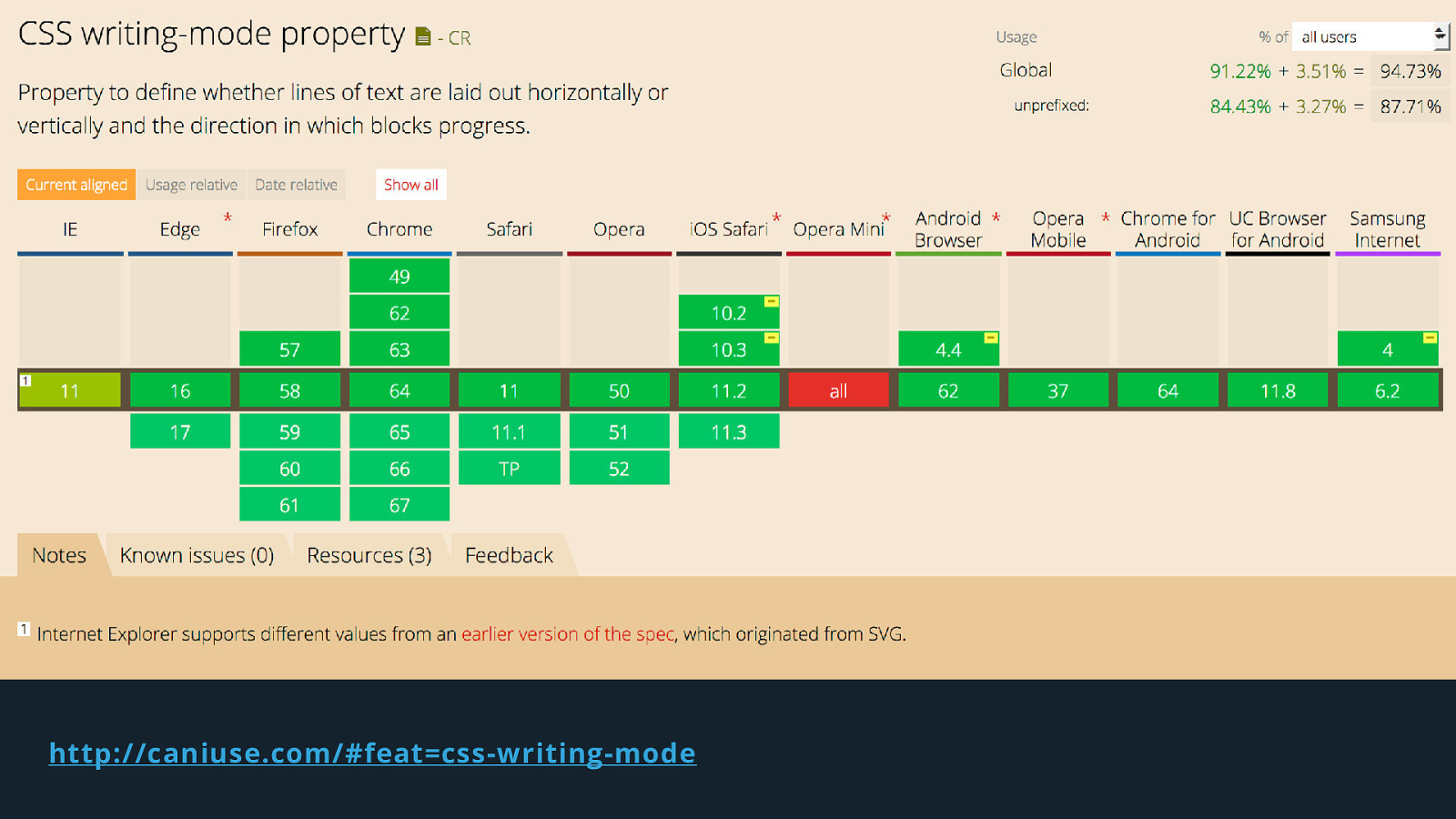
http://caniuse.com/#feat=css-writing-mode
Variables in CSS with Custom properties
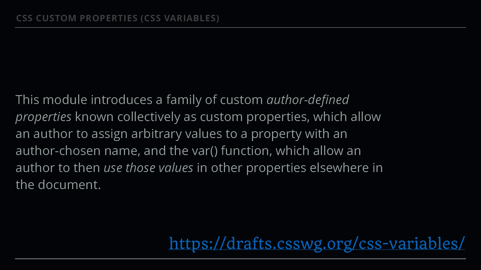
CSS CUSTOM PROPERTIES (CSS VARIABLES) This module introduces a family of custom author-defined properties known collectively as custom properties, which allow an author to assign arbitrary values to a property with an author-chosen name, and the var() function, which allow an author to then use those values in other properties elsewhere in the document. https://drafts.csswg.org/css-variables/
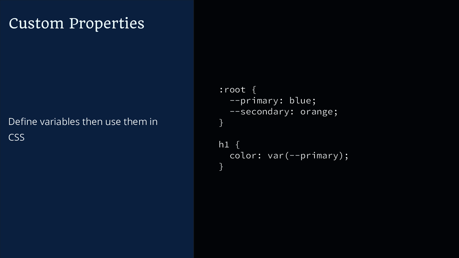
Custom Properties Define variables then use them in CSS :root { --primary: blue; --secondary: orange; } h1 { color: var(--primary); }
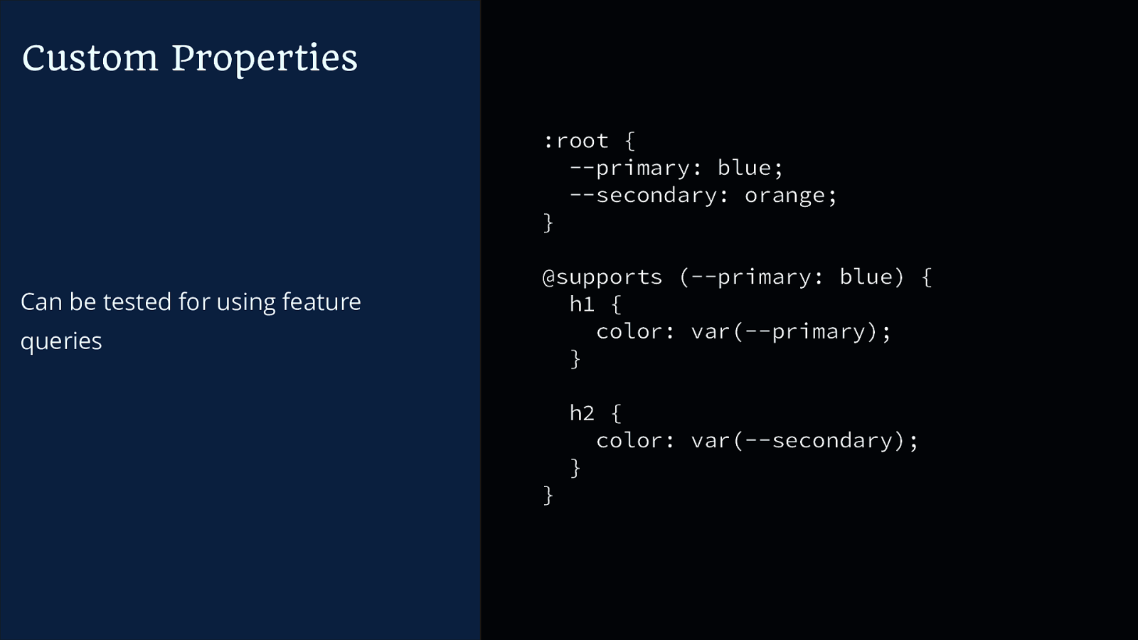
Custom Properties :root { --primary: blue; --secondary: orange; } Can be tested for using feature queries @supports (--primary: blue) { h1 { color: var(--primary); } h2 { color: var(--secondary); } }
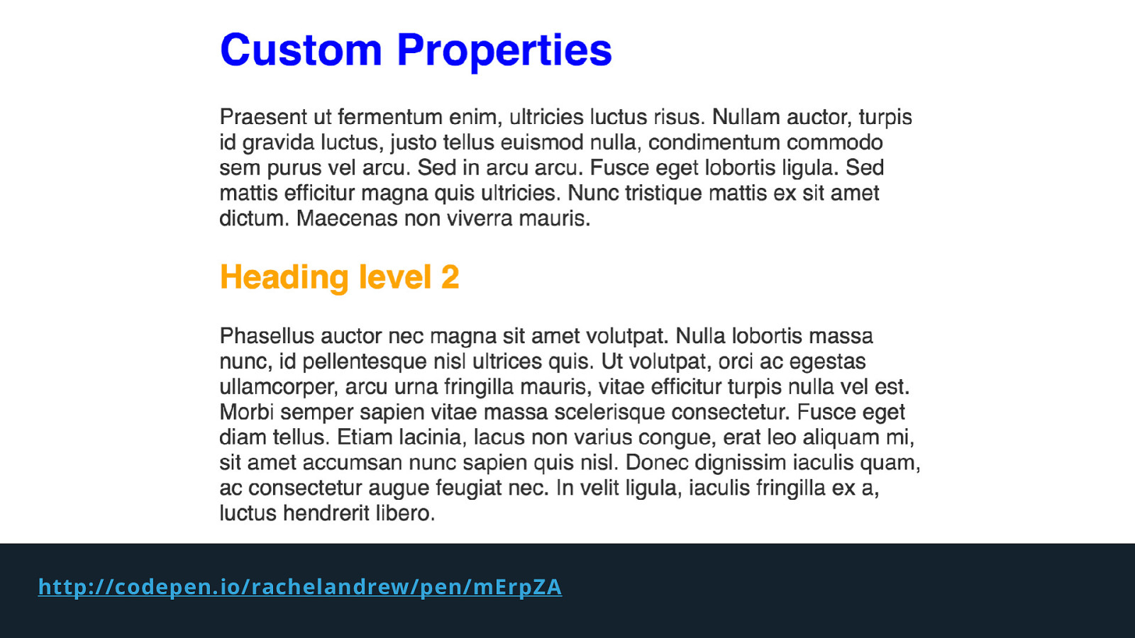
http://codepen.io/rachelandrew/pen/mErpZA
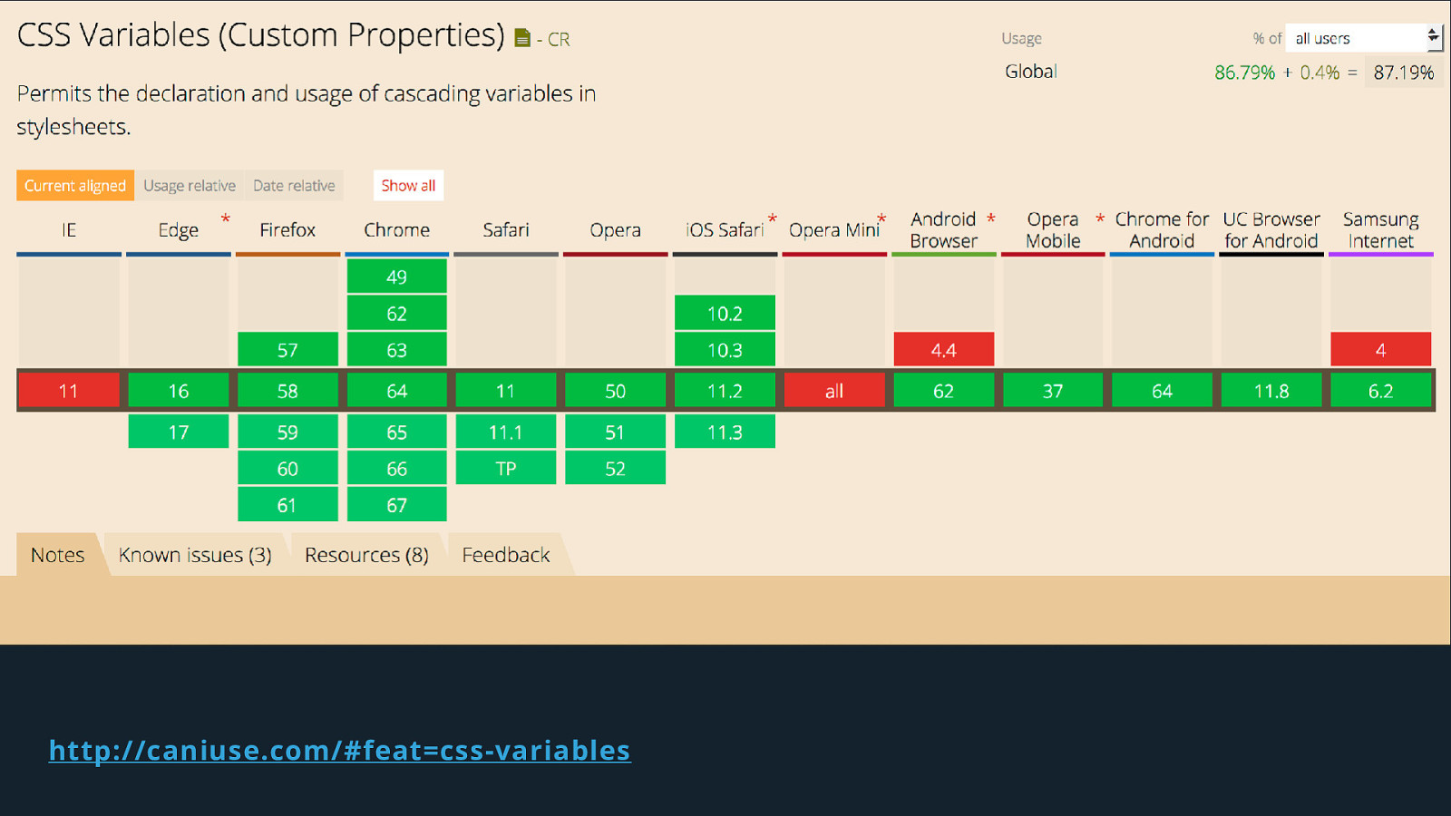
http://caniuse.com/#feat=css-variables
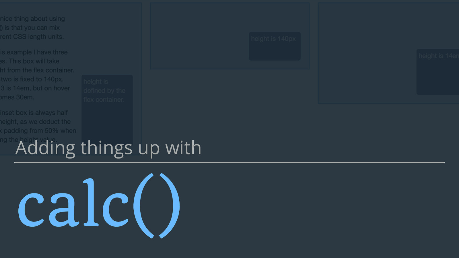
Adding things up with calc()
Basic mathematics in CSS
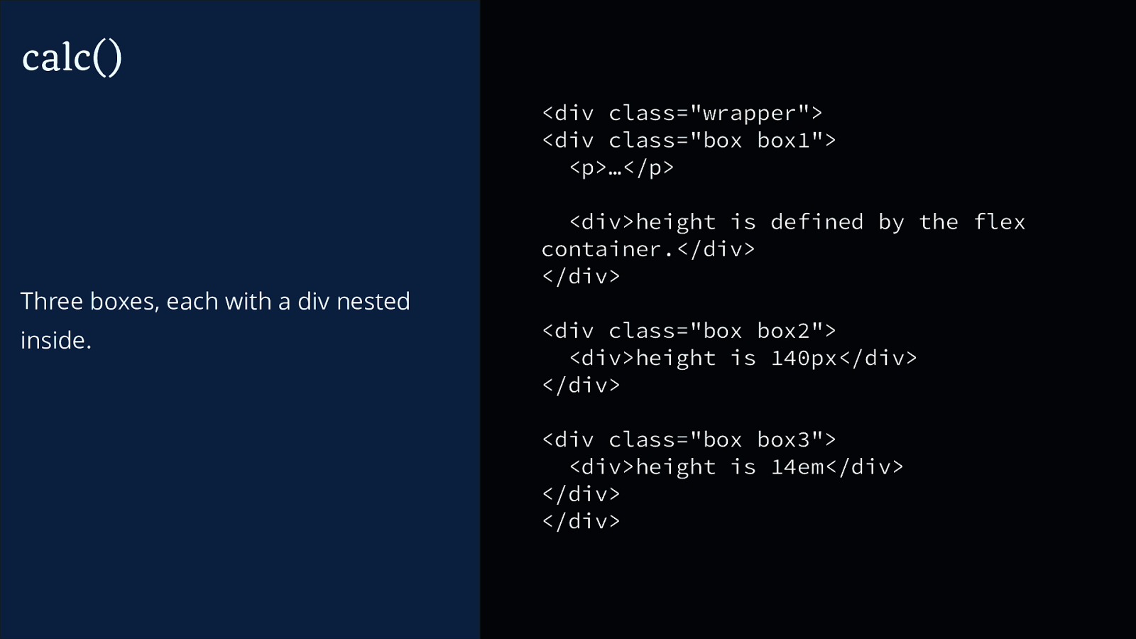
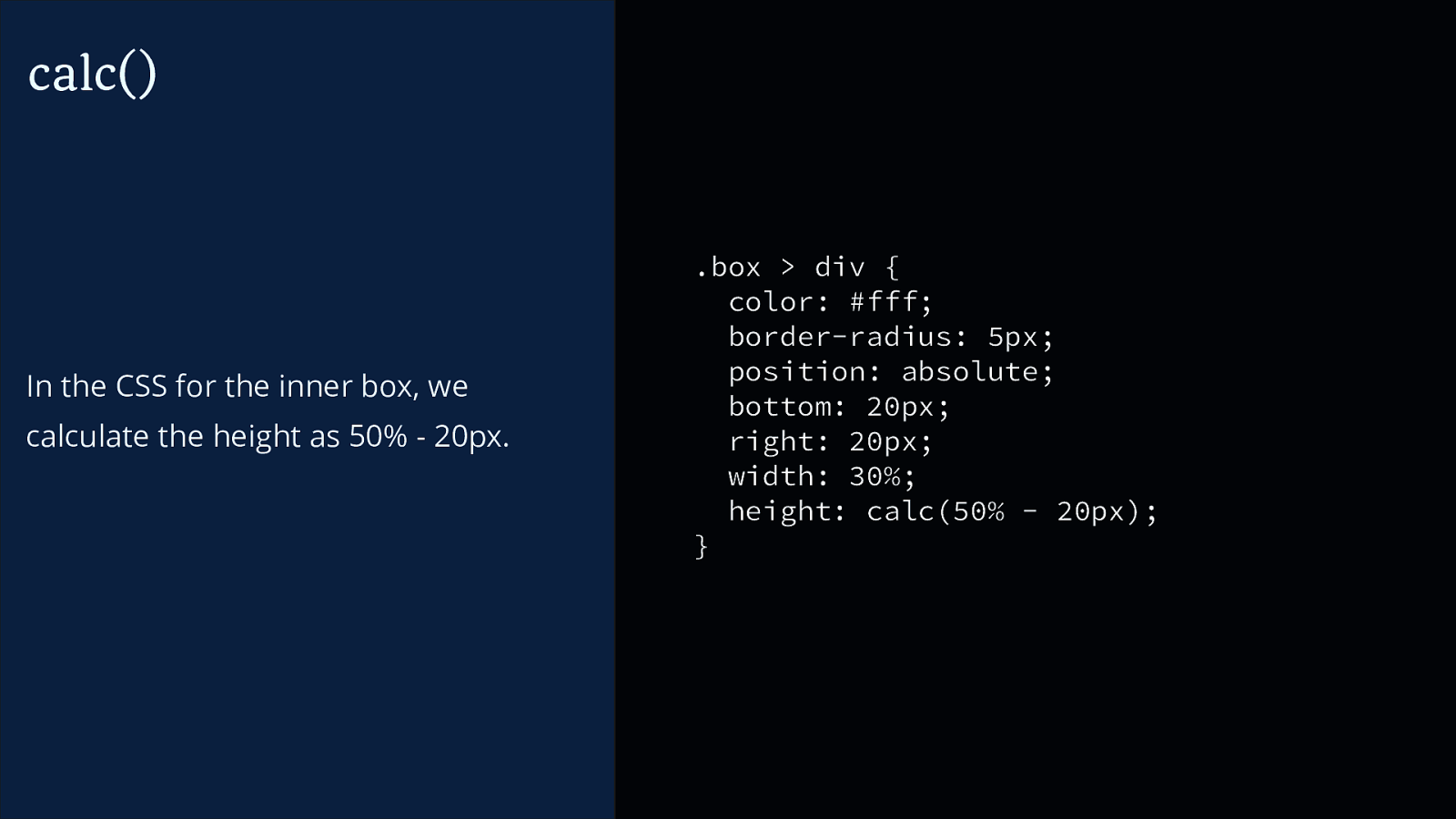
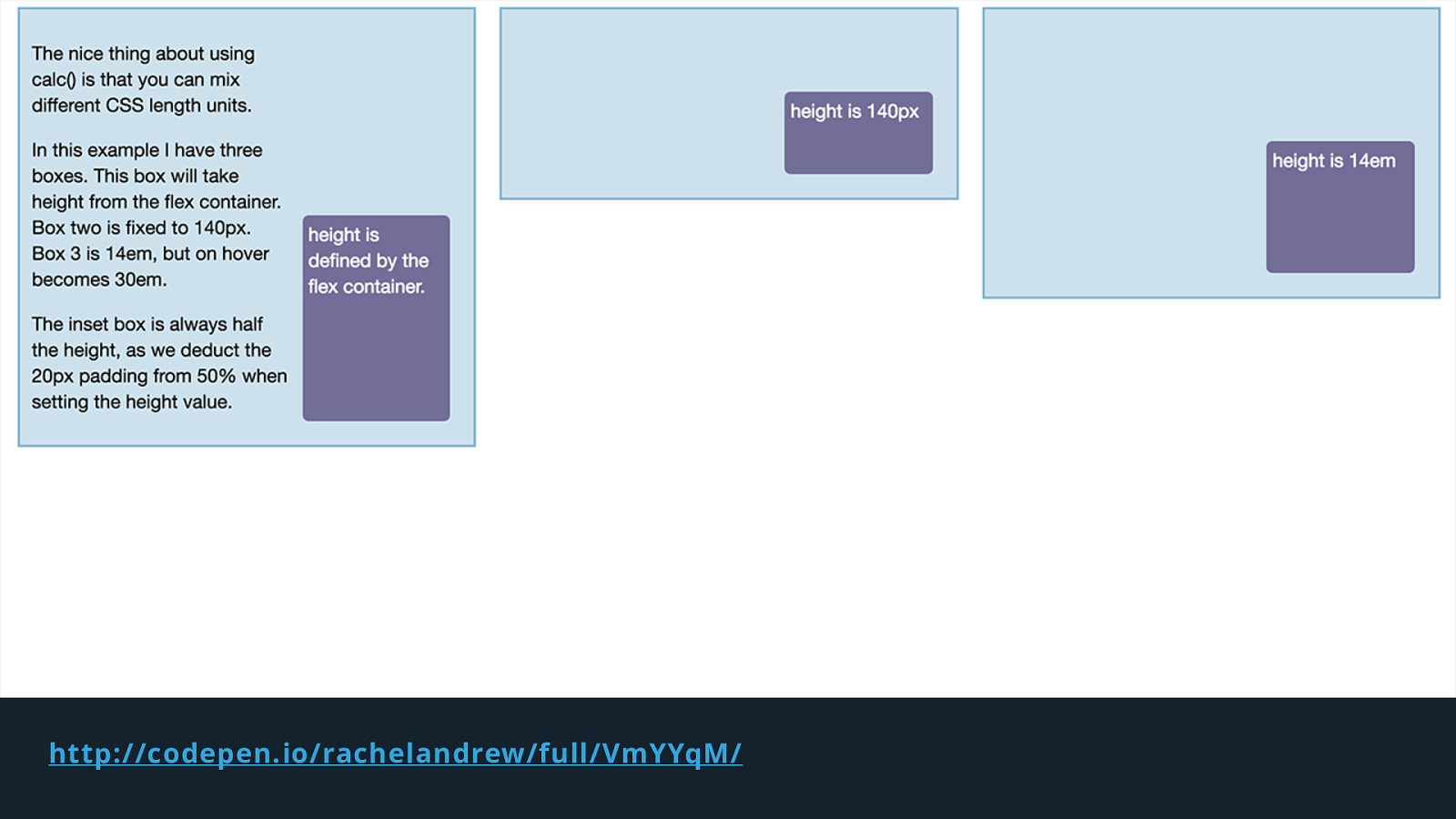
calc() <div class="wrapper"> <div class="box box1"> <p>…</p> Three boxes, each with a div nested inside.
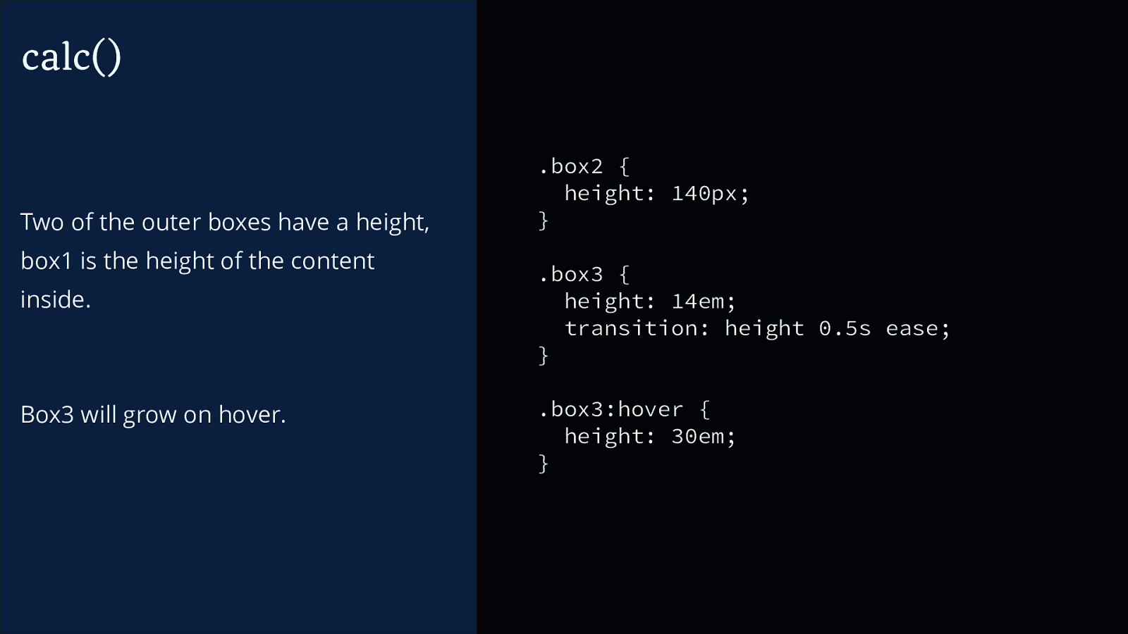
<div>height is defined by the flex container.</div> </div> <div class="box box2"> <div>height is 140px</div> </div> <div class="box box3"> <div>height is 14em</div> </div> </div>calc() Two of the outer boxes have a height, box1 is the height of the content inside. Box3 will grow on hover. .box2 { height: 140px; } .box3 { height: 14em; transition: height 0.5s ease; } .box3:hover { height: 30em; }
calc() In the CSS for the inner box, we calculate the height as 50% - 20px. .box > div { color: #fff; border-radius: 5px; position: absolute; bottom: 20px; right: 20px; width: 30%; height: calc(50% - 20px); }
http://codepen.io/rachelandrew/full/VmYYqM/
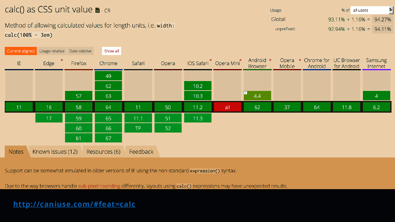
http://caniuse.com/#feat=calc
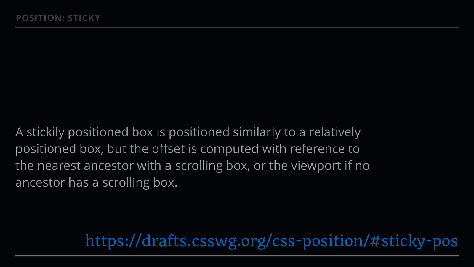
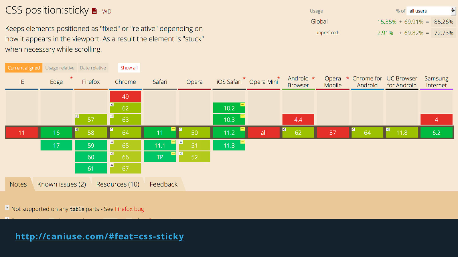
Staying put with position: sticky
POSITION: STICKY A stickily positioned box is positioned similarly to a relatively positioned box, but the offset is computed with reference to the nearest ancestor with a scrolling box, or the viewport if no ancestor has a scrolling box. https://drafts.csswg.org/css-position/#sticky-pos
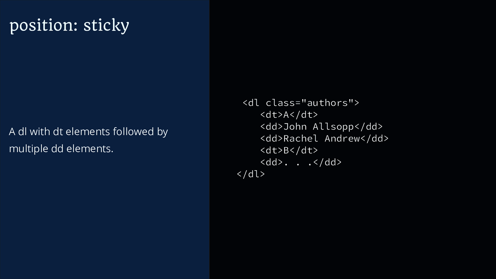
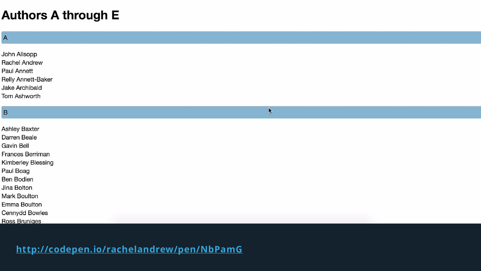
position: sticky A dl with dt elements followed by multiple dd elements.
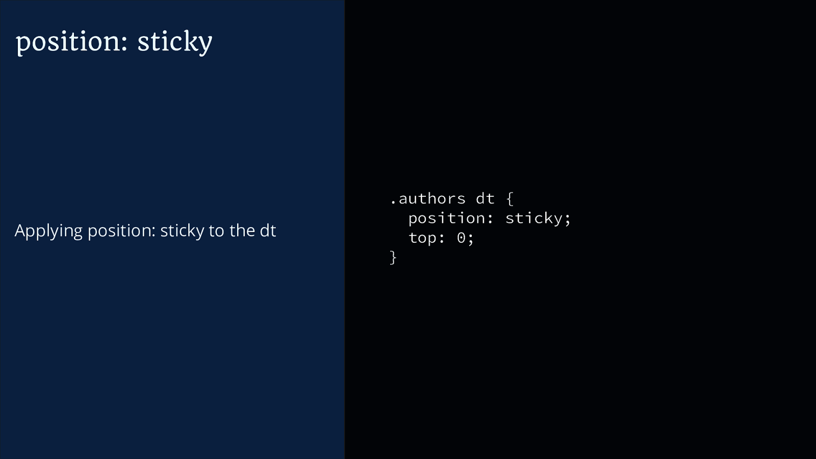
<dl class="authors"> <dt>A</dt> <dd>John Allsopp</dd> <dd>Rachel Andrew</dd> <dt>B</dt> <dd>. . .</dd> </dl>position: sticky Applying position: sticky to the dt .authors dt { position: sticky; top: 0; }
http://codepen.io/rachelandrew/pen/NbPamG
http://caniuse.com/#feat=css-sticky
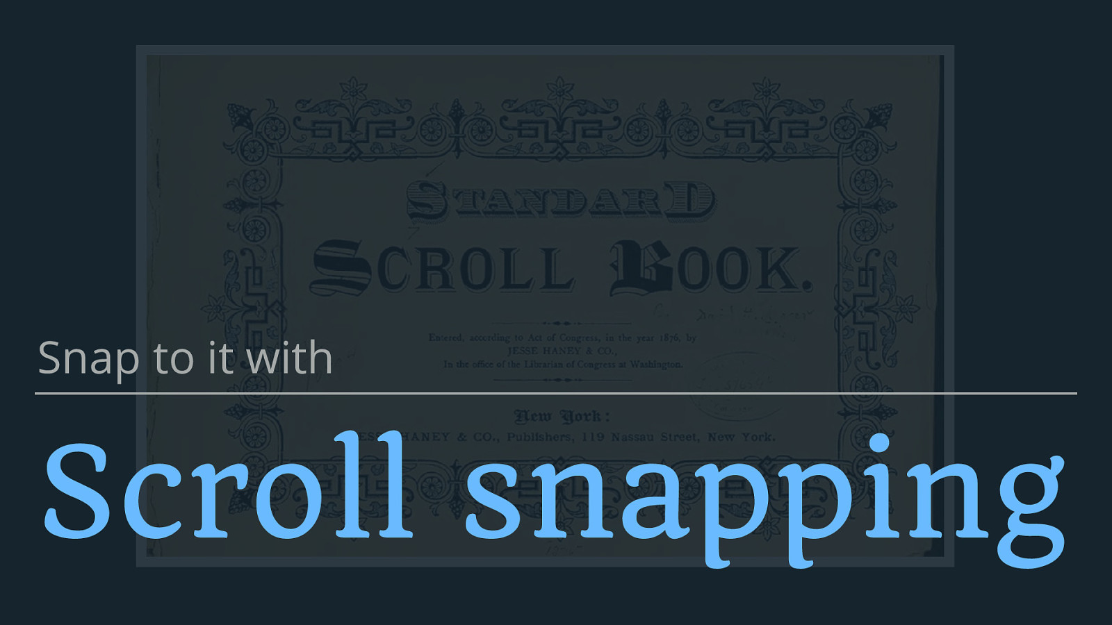
Snap to it with Scroll snapping
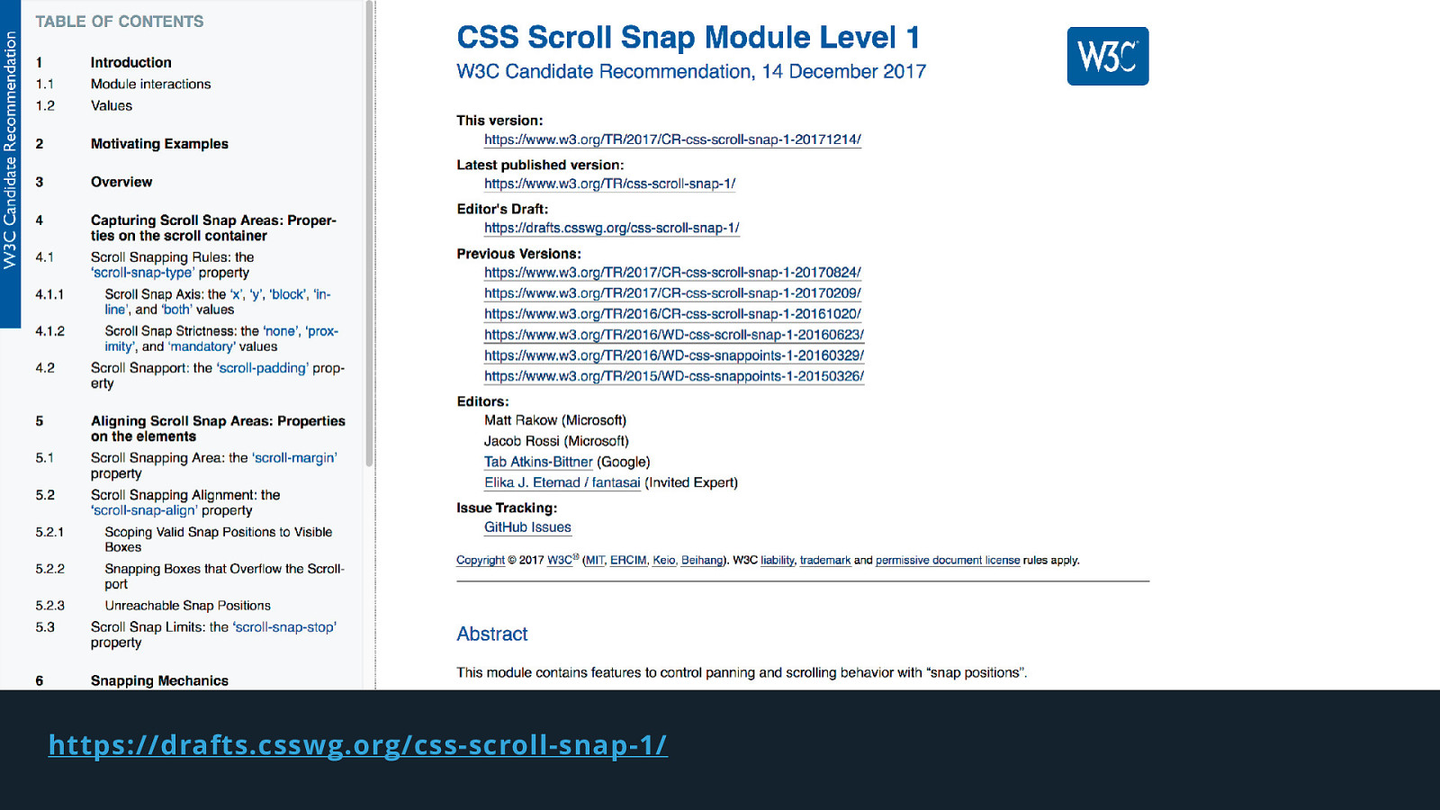
https://drafts.csswg.org/css-scroll-snap-1/
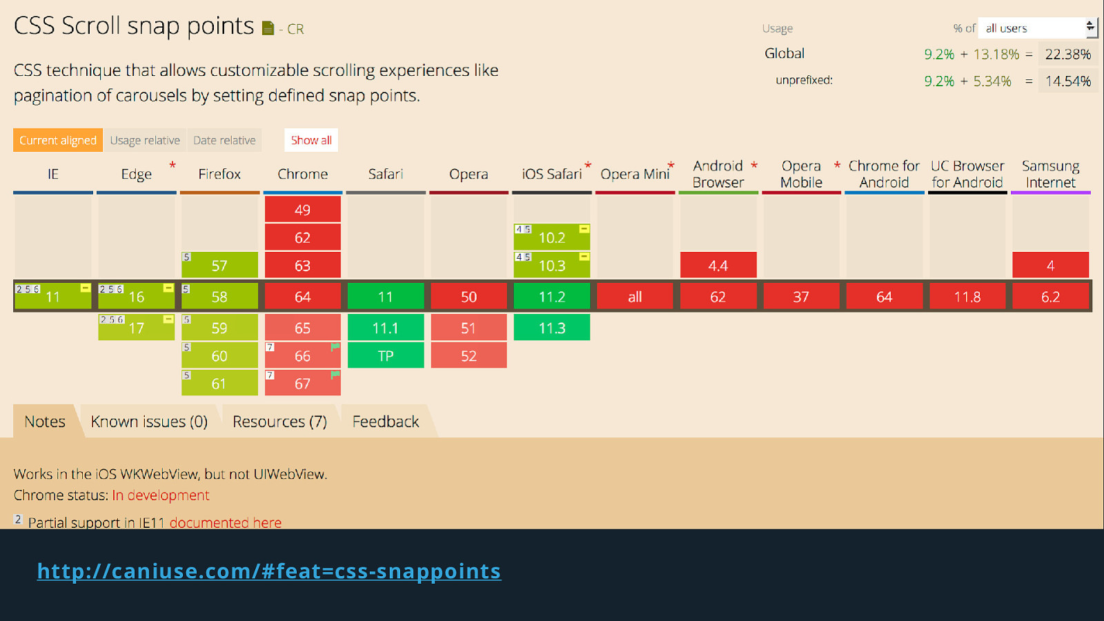
http://caniuse.com/#feat=css-snappoints
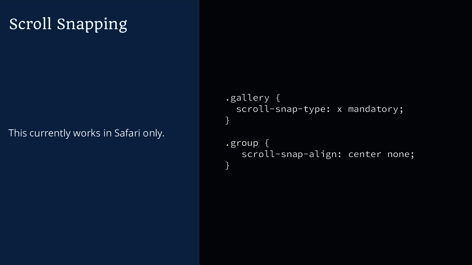
Scroll Snapping .gallery { scroll-snap-type: x mandatory; } This currently works in Safari only. .group { scroll-snap-align: center none; }
http://codepen.io/rachelandrew/pen/NbPGYg
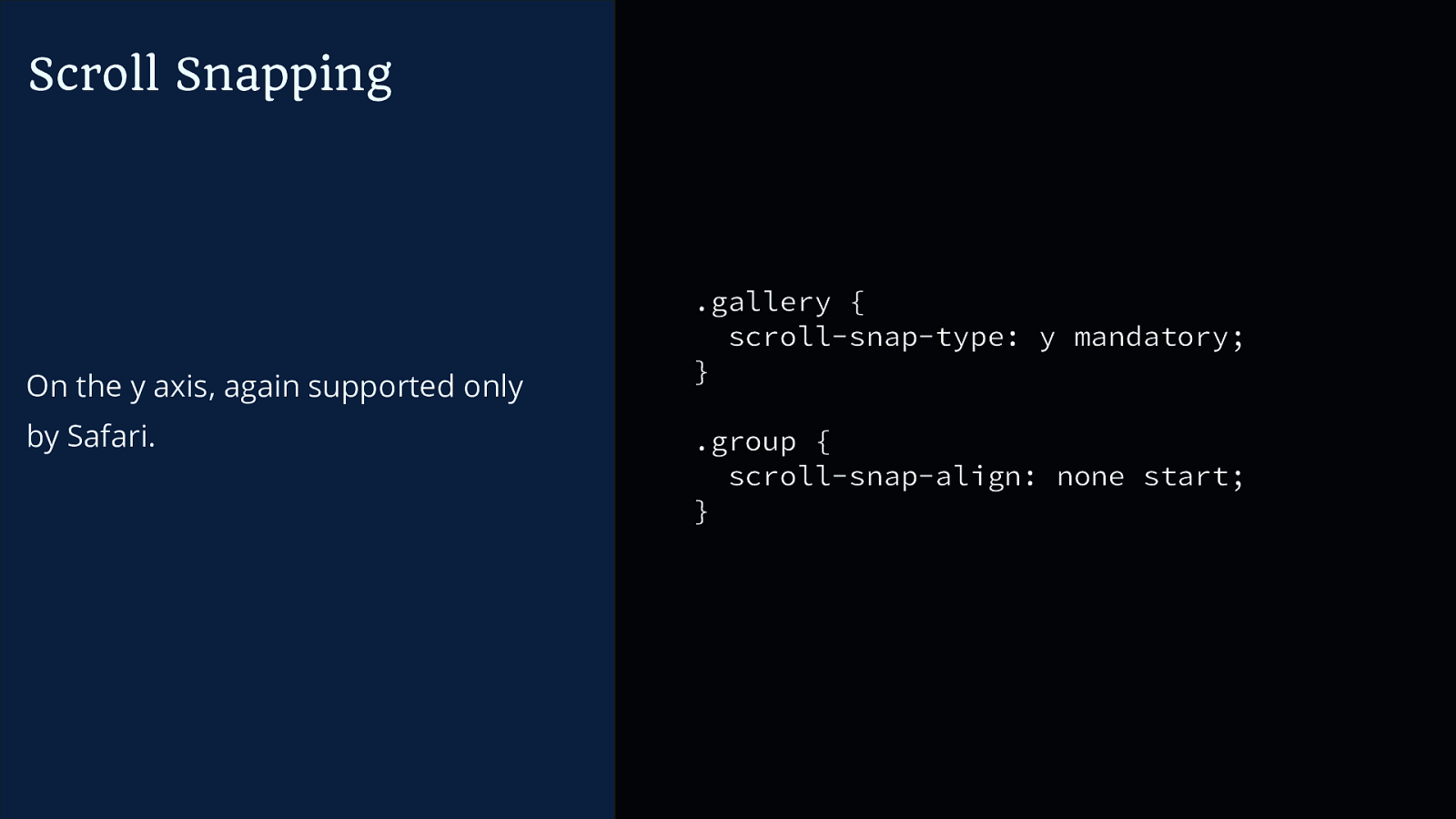
Scroll Snapping On the y axis, again supported only by Safari. .gallery { scroll-snap-type: y mandatory; } .group { scroll-snap-align: none start; }
http://codepen.io/rachelandrew/pen/xRbXqr
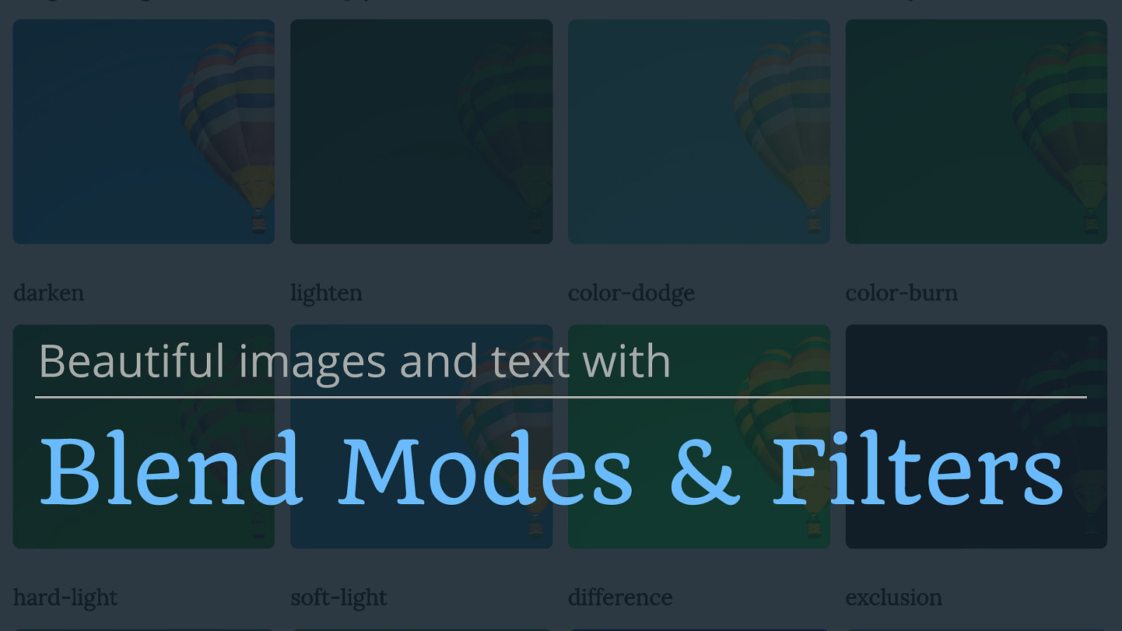
Beautiful images and text with Blend Modes & Filters
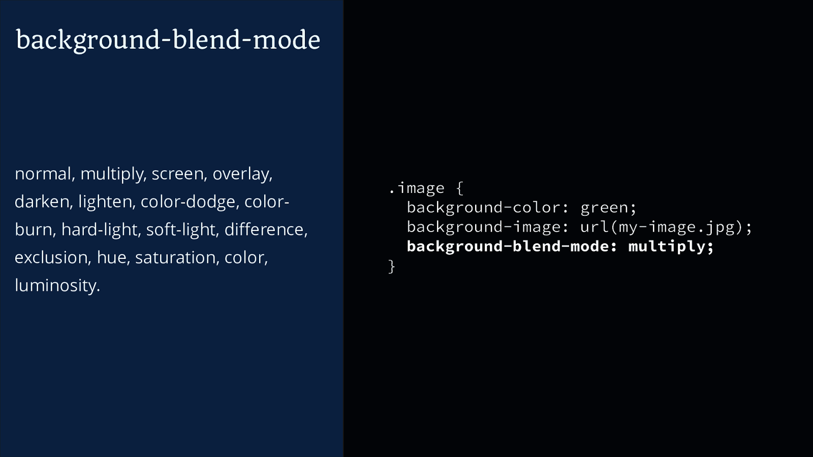
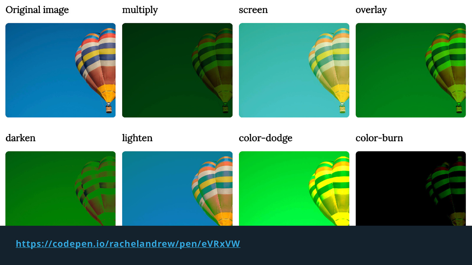
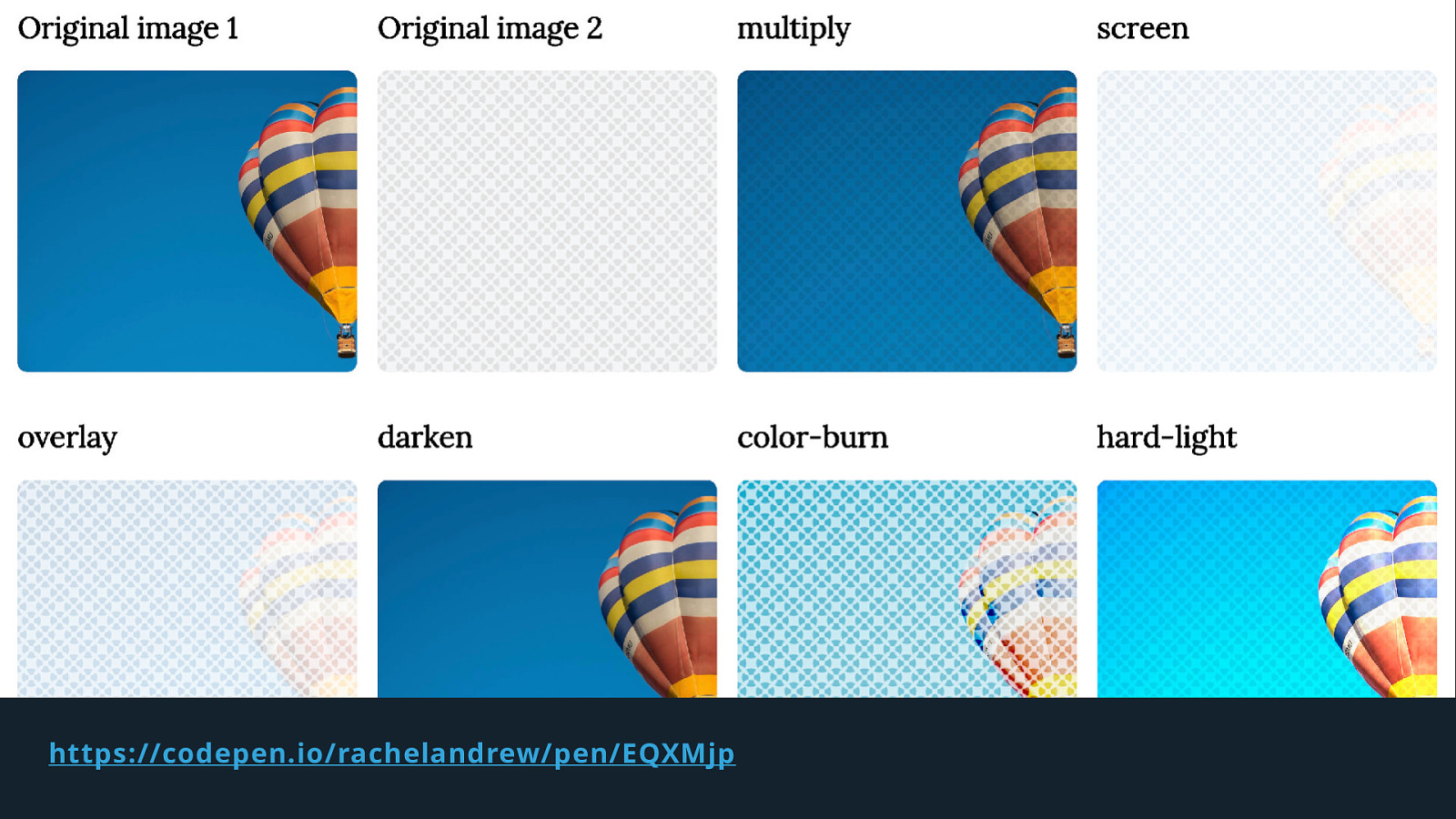
background-blend-mode normal, multiply, screen, overlay, darken, lighten, color-dodge, colorburn, hard-light, soft-light, difference, exclusion, hue, saturation, color, luminosity. .image { background-color: green; background-image: url(my-image.jpg); background-blend-mode: multiply; }
https://codepen.io/rachelandrew/pen/eVRxVW
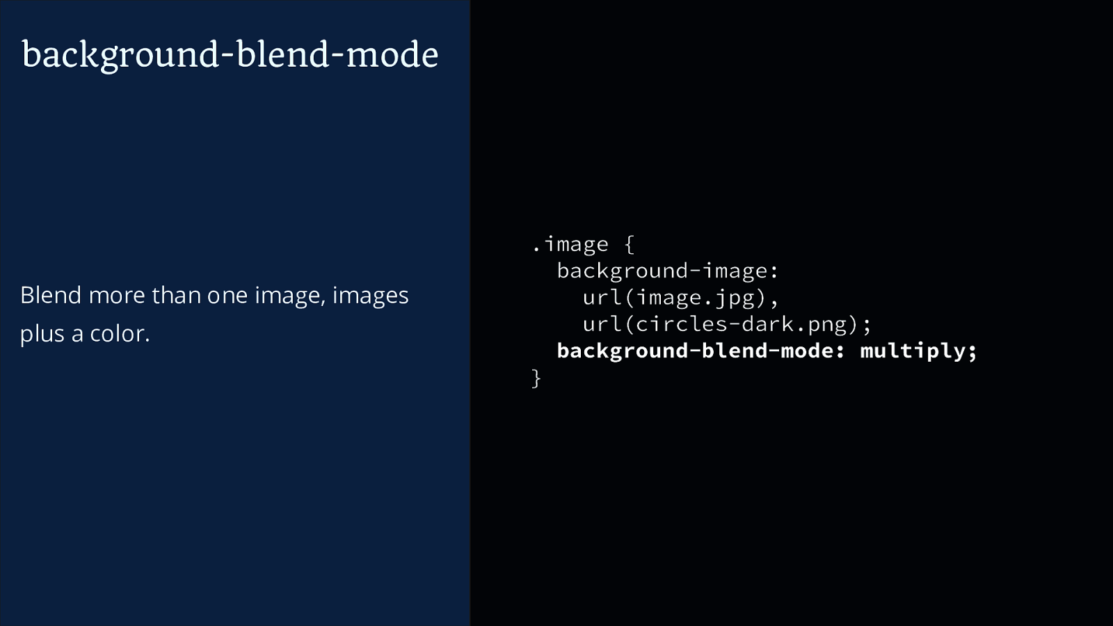
background-blend-mode Blend more than one image, images plus a color. .image { background-image: url(image.jpg), url(circles-dark.png); background-blend-mode: multiply; }
https://codepen.io/rachelandrew/pen/EQXMjp
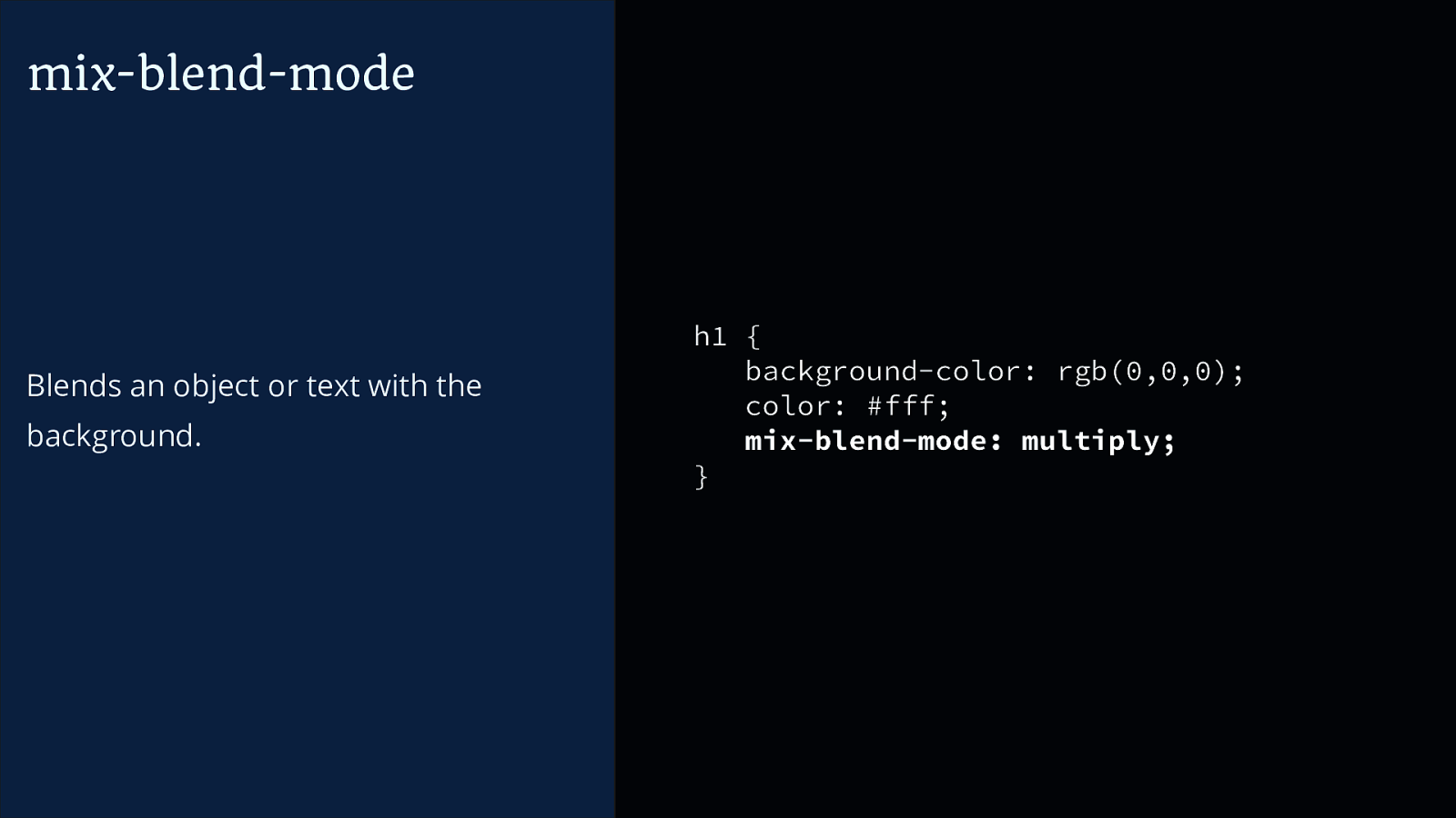
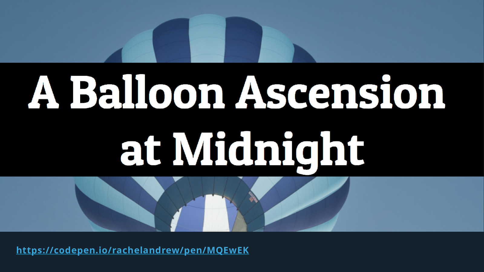
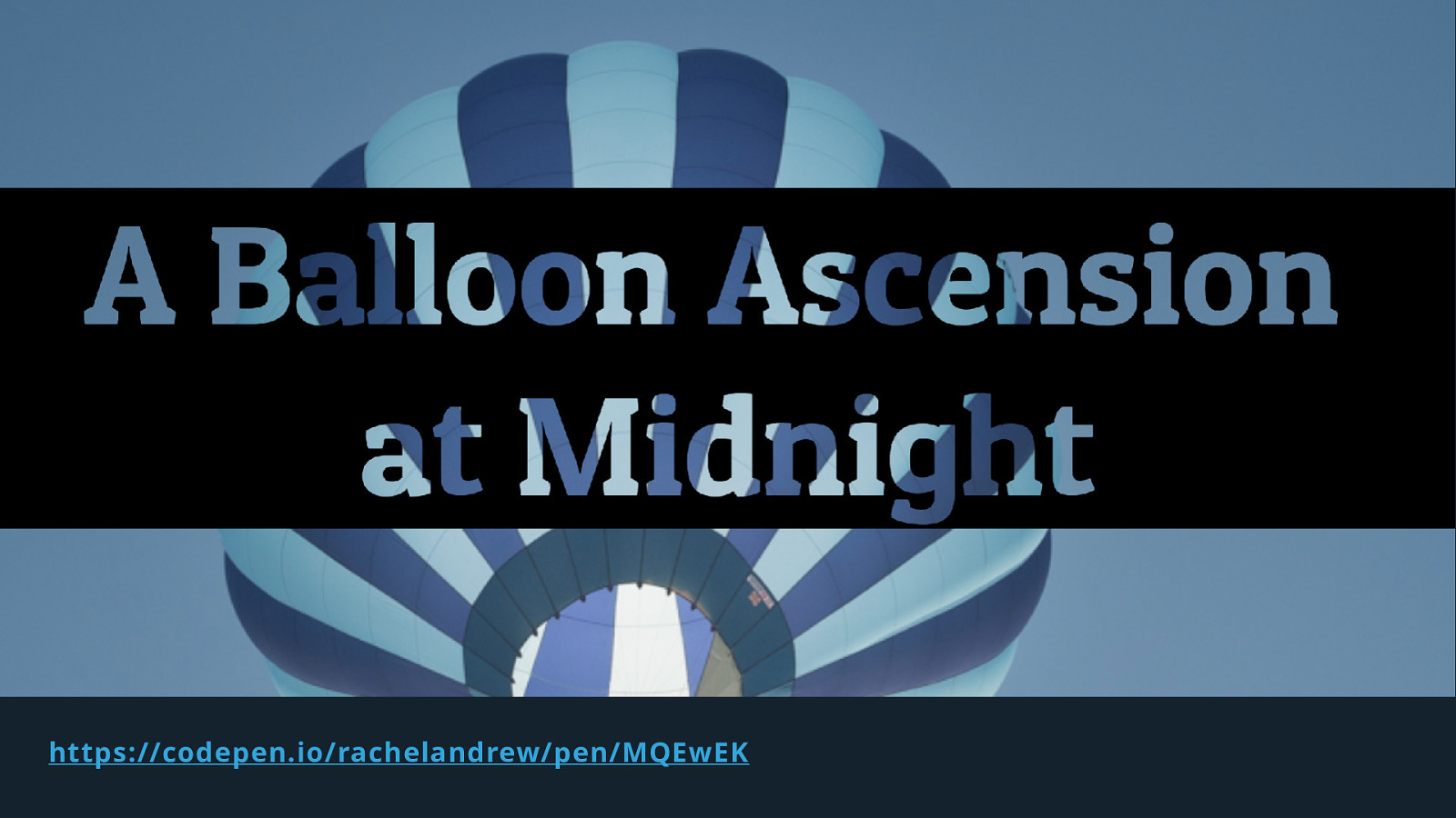
mix-blend-mode Blends an object or text with the background. h1 { background-color: rgb(0,0,0); color: #fff; mix-blend-mode: multiply; }
https://codepen.io/rachelandrew/pen/MQEwEK
https://codepen.io/rachelandrew/pen/MQEwEK
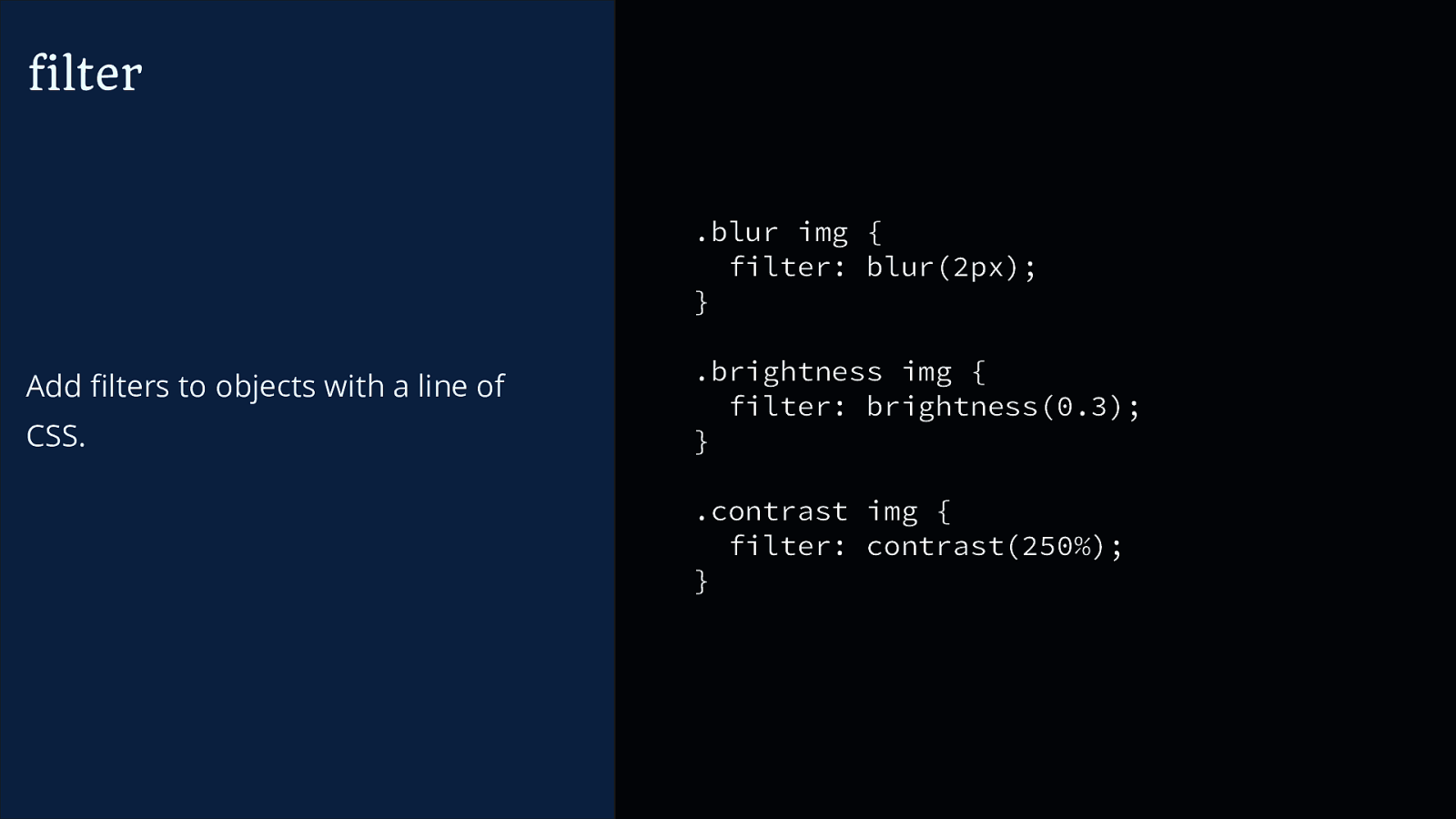
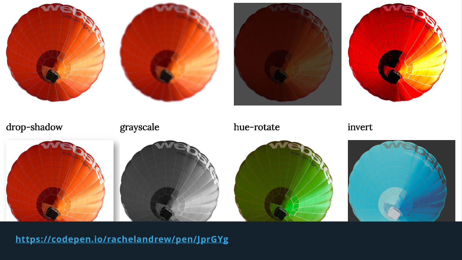
filter .blur img { filter: blur(2px); } Add filters to objects with a line of CSS. .brightness img { filter: brightness(0.3); } .contrast img { filter: contrast(250%); }
https://codepen.io/rachelandrew/pen/JprGYg
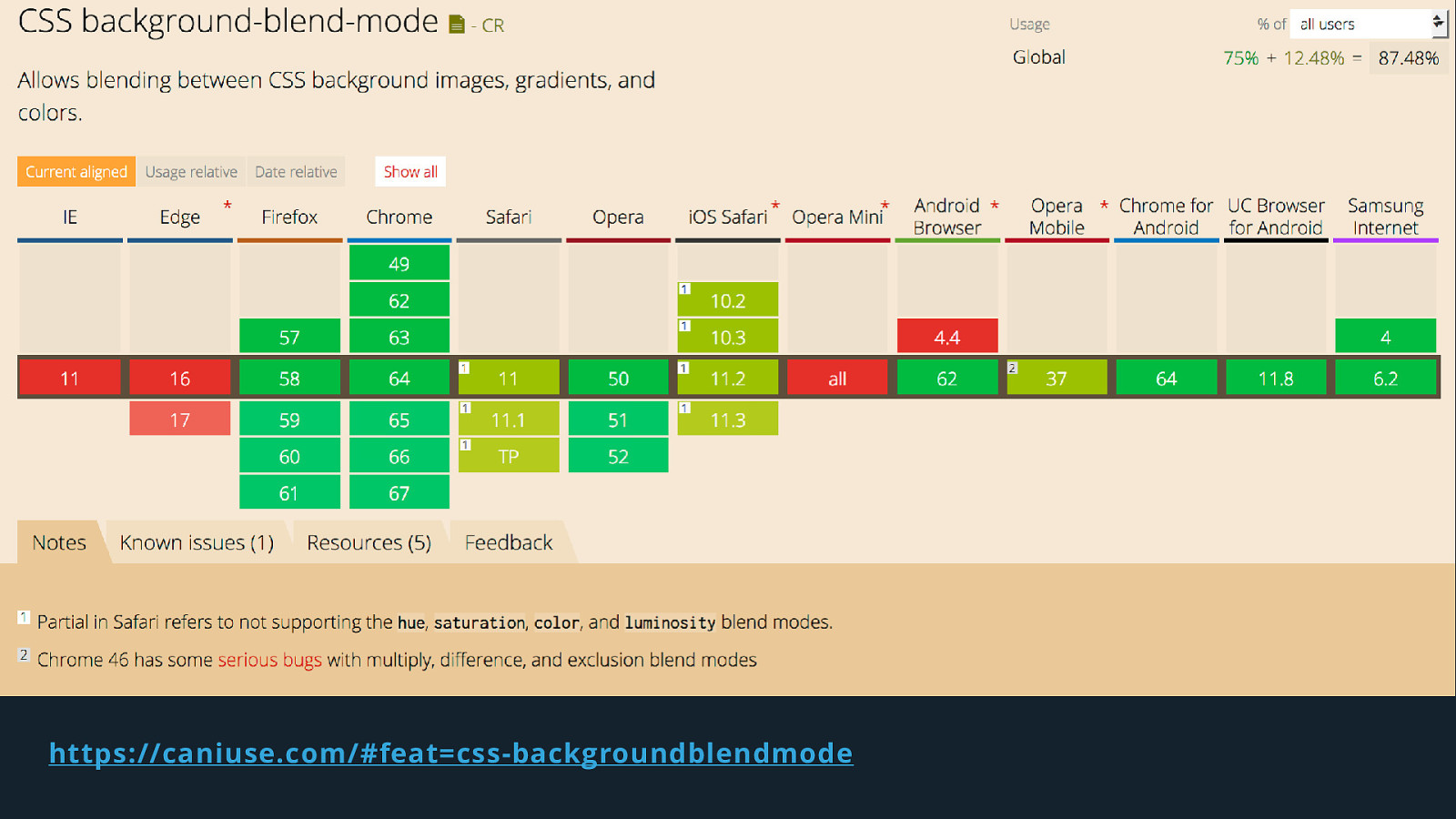
https://caniuse.com/#feat=css-backgroundblendmode
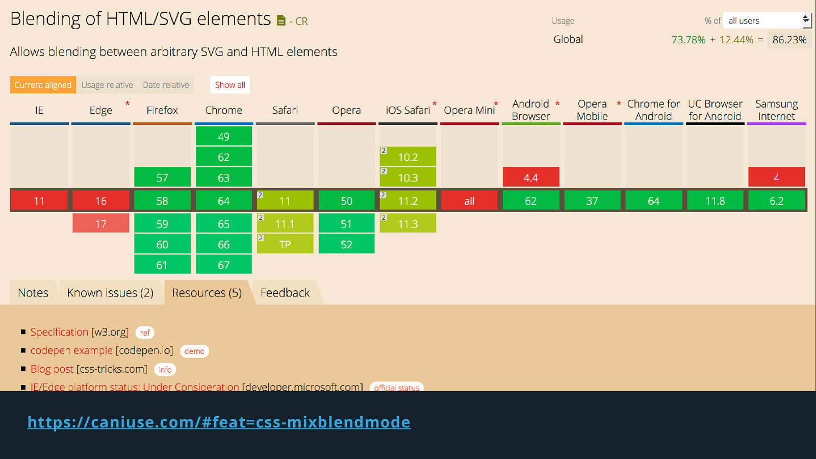
https://caniuse.com/#feat=css-mixblendmode
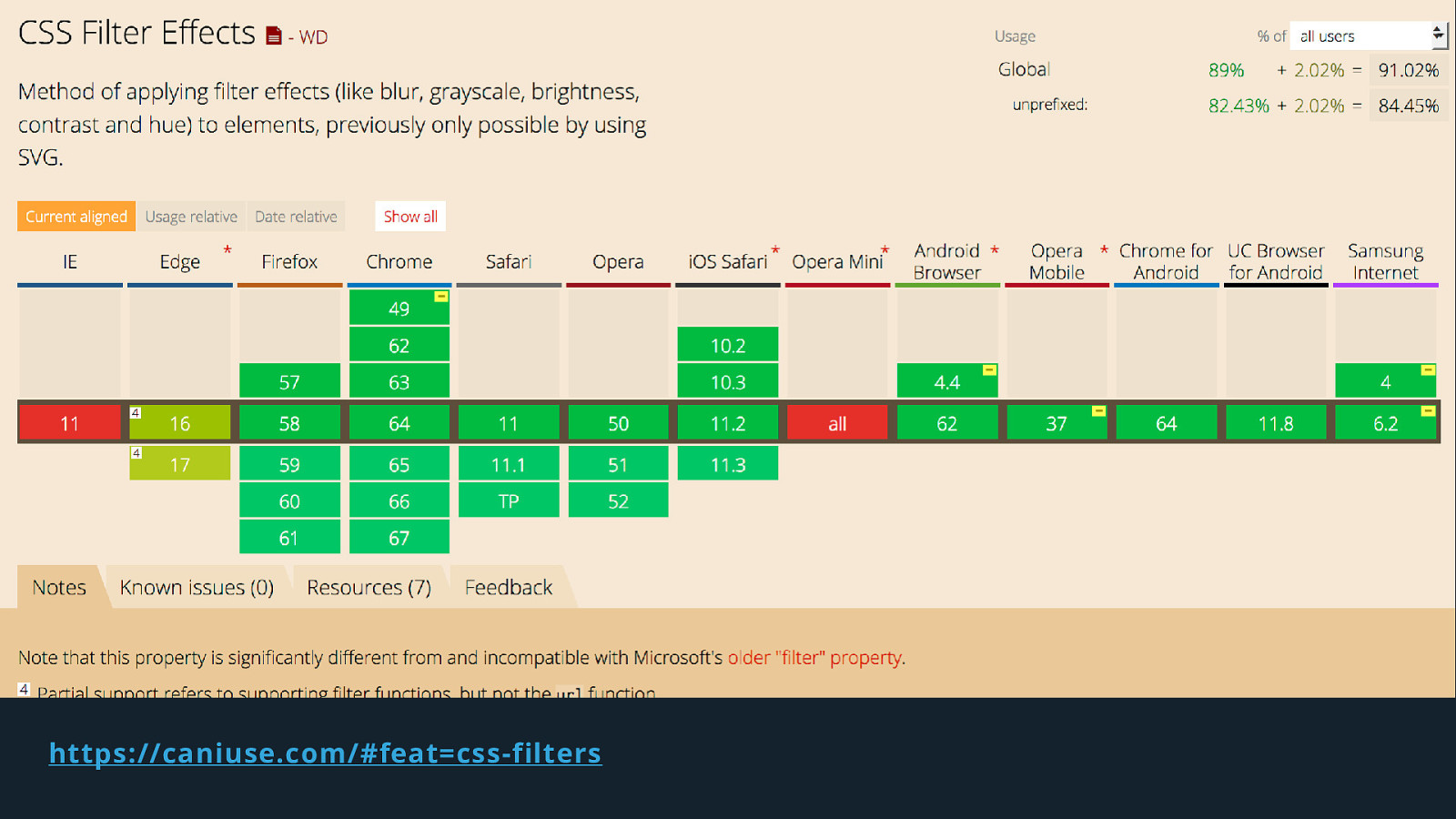
https://caniuse.com/#feat=css-filters
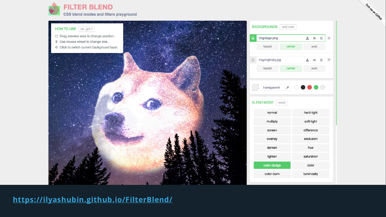
https://ilyashubin.github.io/FilterBlend/
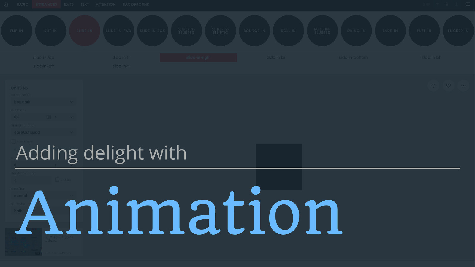
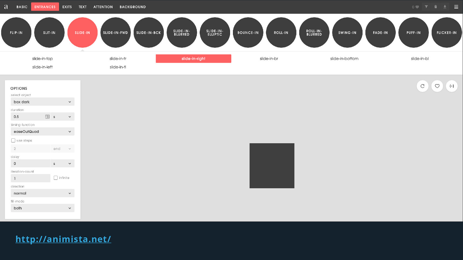
Adding delight with Animation
http://animista.net/
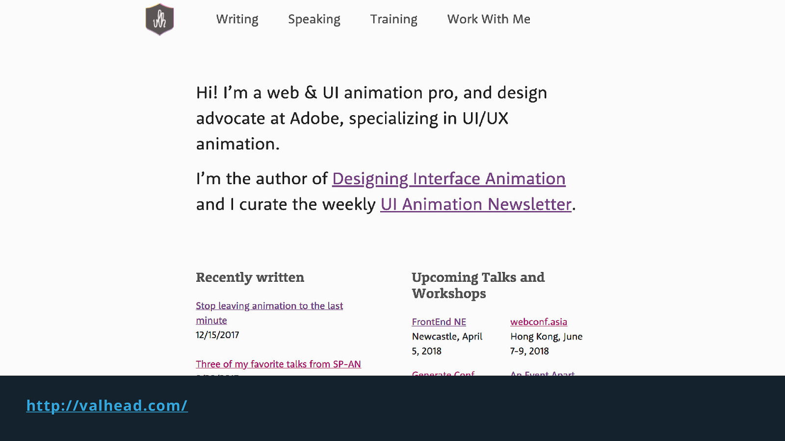
http://valhead.com/
CSS Transforms & Animations have excellent browser support.
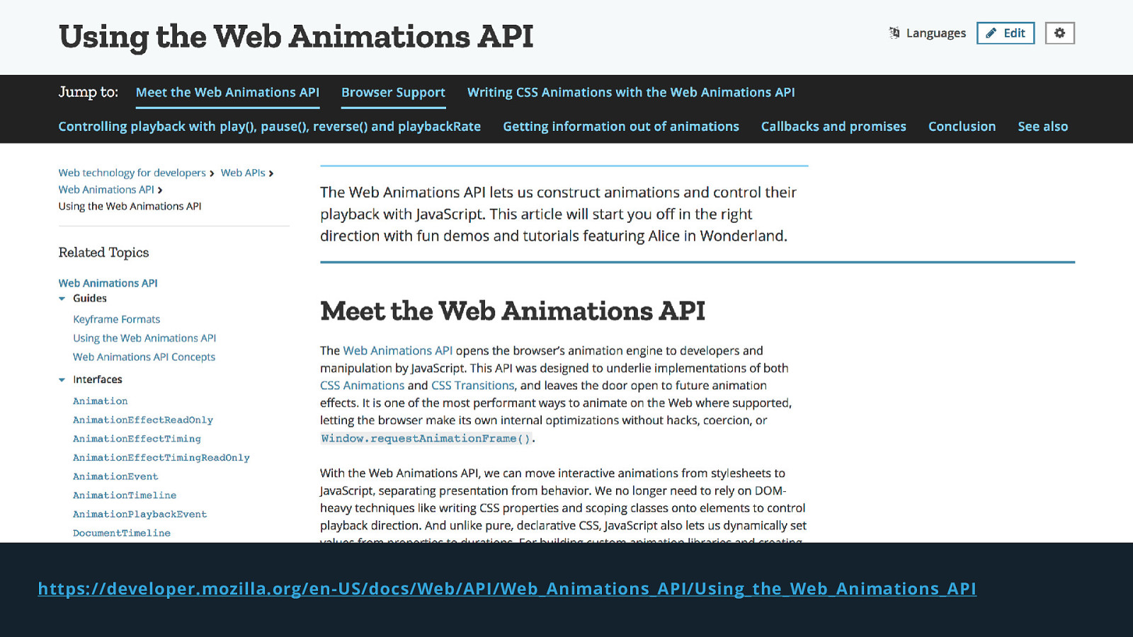
The Web Animations API
https://developer.mozilla.org/en-US/docs/Web/API/Web_Animations_API/Using_the_Web_Animations_API
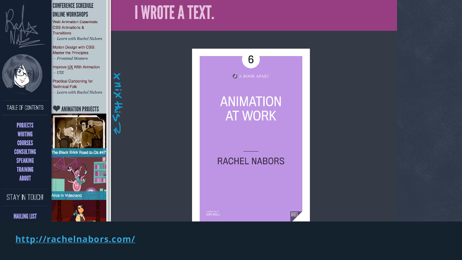
http://rachelnabors.com/
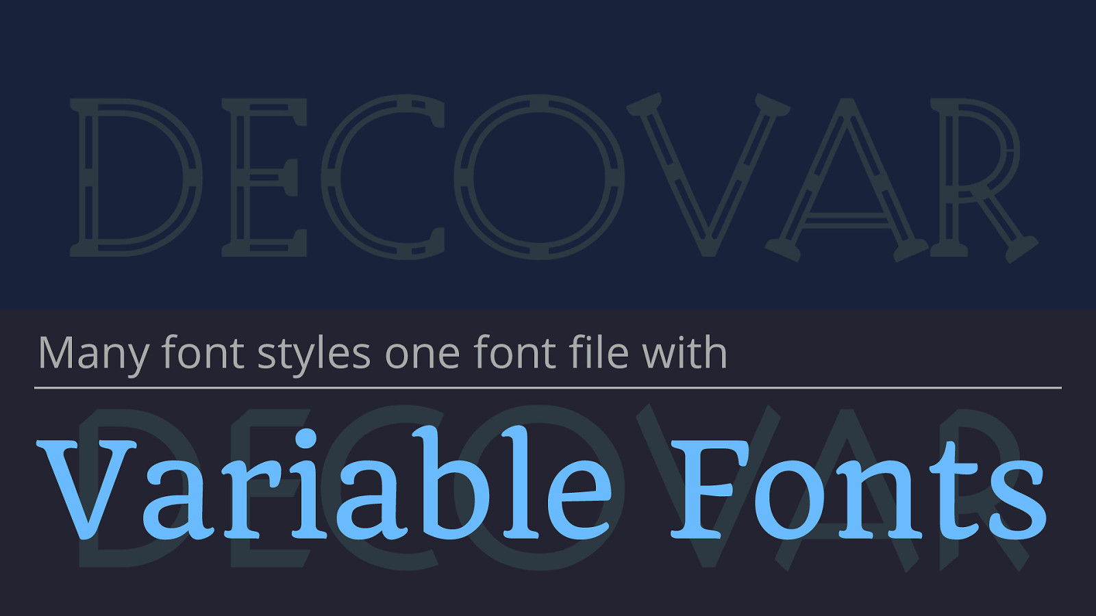
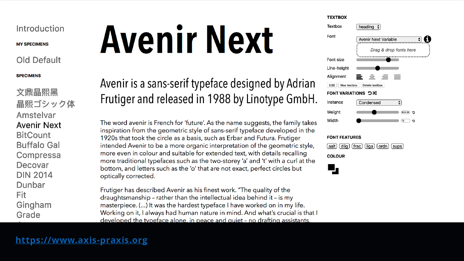
Many font styles one font file with Variable Fonts
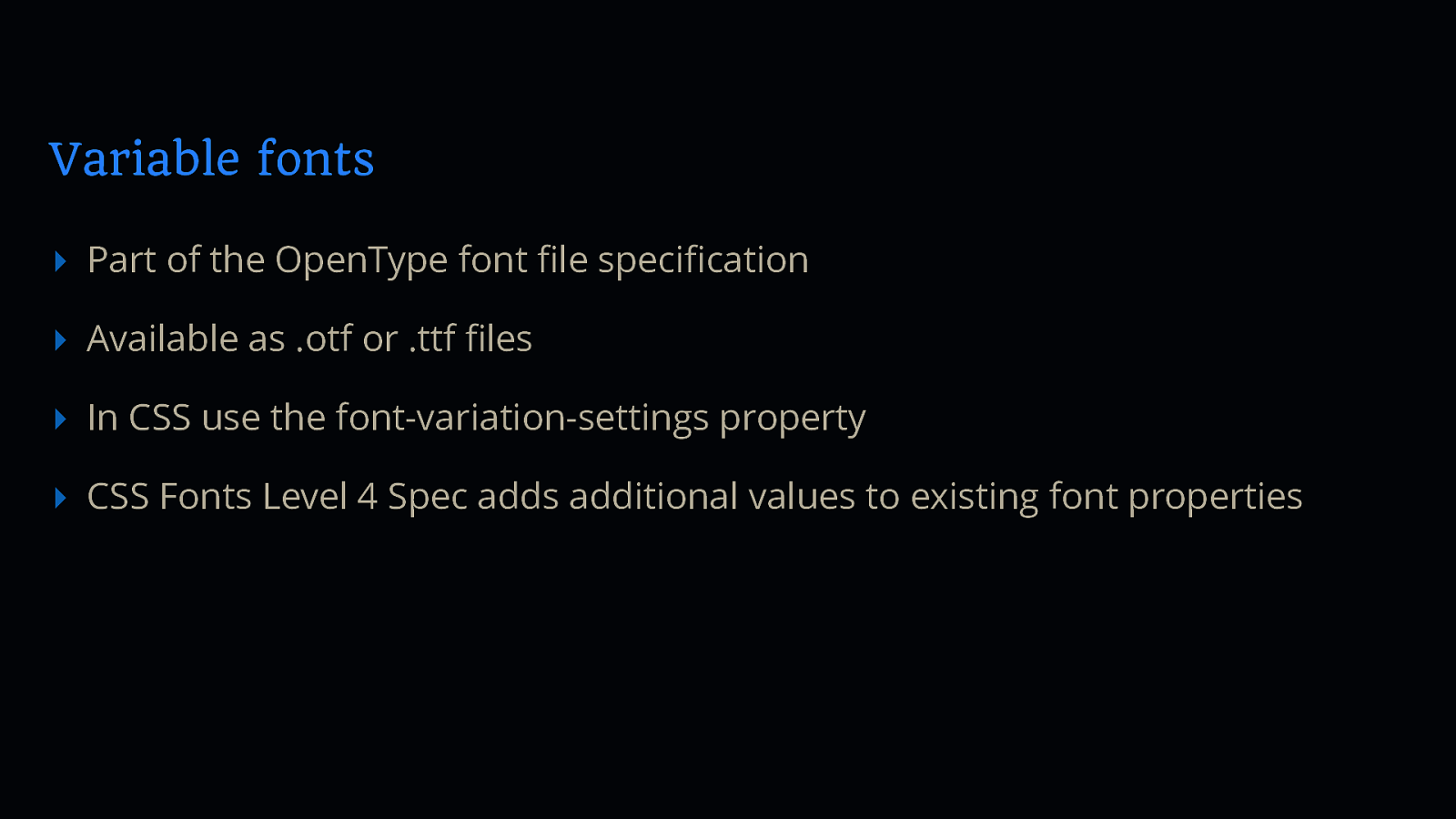
Variable fonts ▸ Part of the OpenType font file specification ▸ Available as .otf or .ttf files ▸ In CSS use the font-variation-settings property ▸ CSS Fonts Level 4 Spec adds additional values to existing font properties
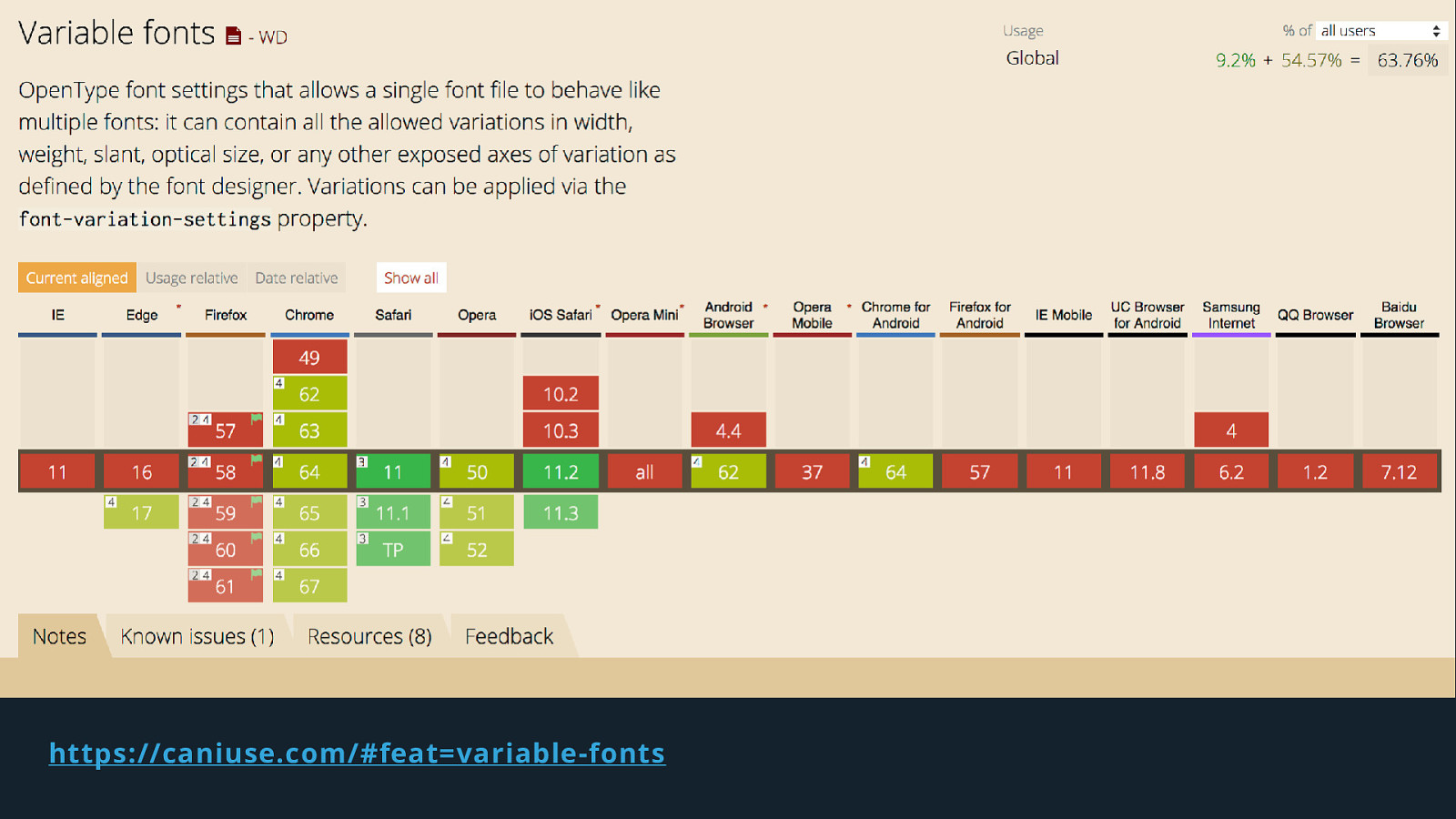
https://caniuse.com/#feat=variable-fonts
https://www.axis-praxis.org
Getting our hands on all the new shiny
Let browser vendors know you want these features
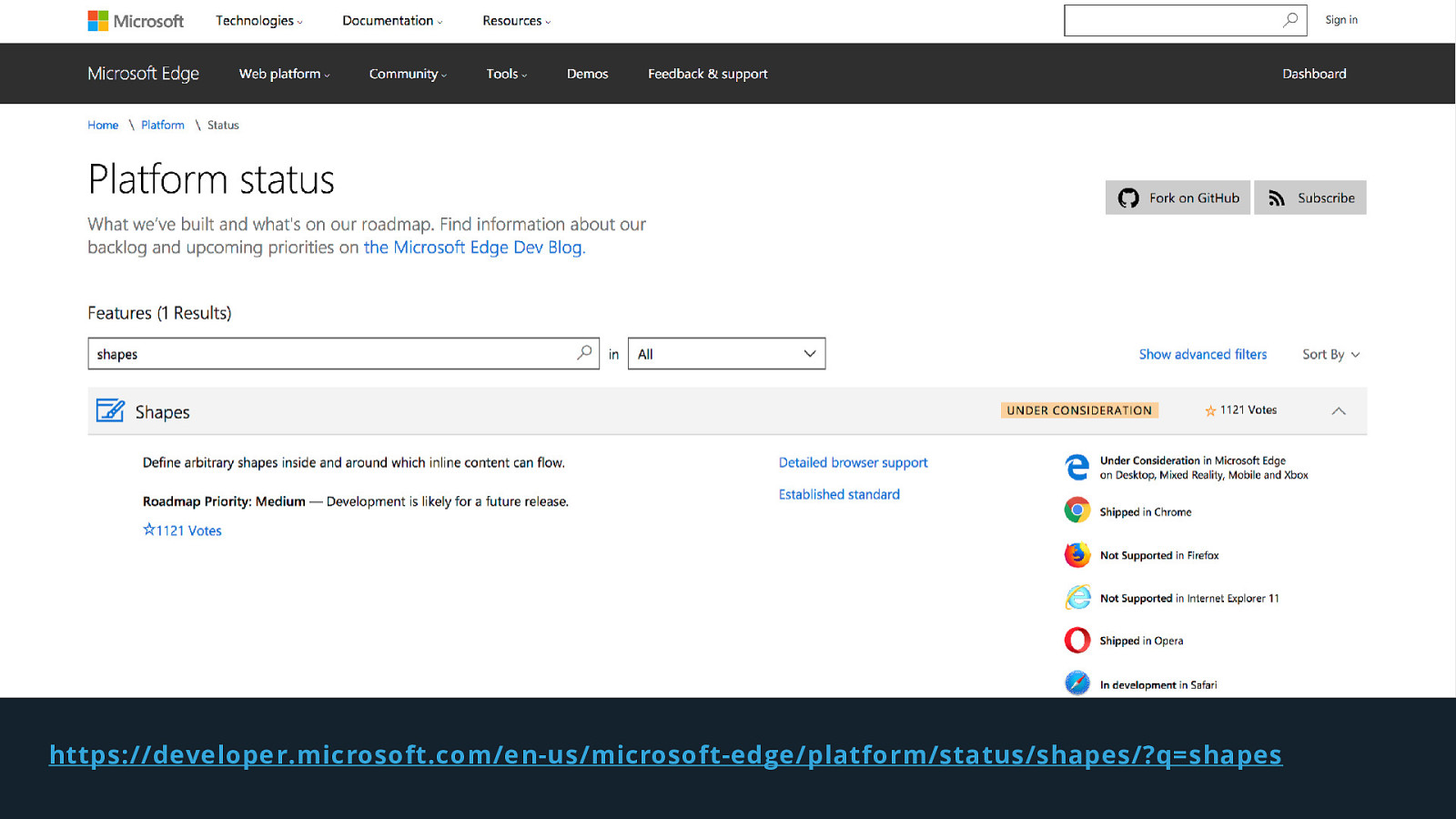
https://developer.microsoft.com/en-us/microsoft-edge/platform/status/shapes/?q=shapes
https://rachelandrew.co.uk/speaking/event/uxi18 Thank you
