
A presentation at BlinkOn 2 in May 2014 in Zürich, Switzerland by Manuel Rego Casasnovas

C S S
G r i d
L a y o u t S p e c i � c a t i o n
o v e r v i e w .
I m p l e m e n t a t i o n
s t a t u s
a n d
r o a d m a p . Manuel Rego Casasnovas - rego@igalia.com
13-14 May 2014
A b o u t
I g a l i a
&
3/28
C S S
G r i d
L a y o u t “ a l l o w s
a u t h o r s
t o
e a s i l y
d e � n e
c o m p l e x ,
r e s p o n s i v e
d i m e n s i o n a l l a y o u t s ” by Tab Atkins Jr. (Google)
at CSS WG Blog source: http://www.w3.org/blog/CSS/2014/01/23/css-grid-draft-updated/
C S S
G r i d
L a y o u t
|
I n t r o d u c t i o n #cssgrid #blinkon #igalia Grid based designs were �rst done using tables and more recently �oating divs. Those approaches have issues and a lot of complexity. Lots of CSS frameworks emerging to make things easier. CSS Grid Layout is a powerful and �exible standard de�ned by the W3C . · · · · 5/28
T i t l e M e n u F o o t e r M a i n C S S
G r i d
L a y o u t
|
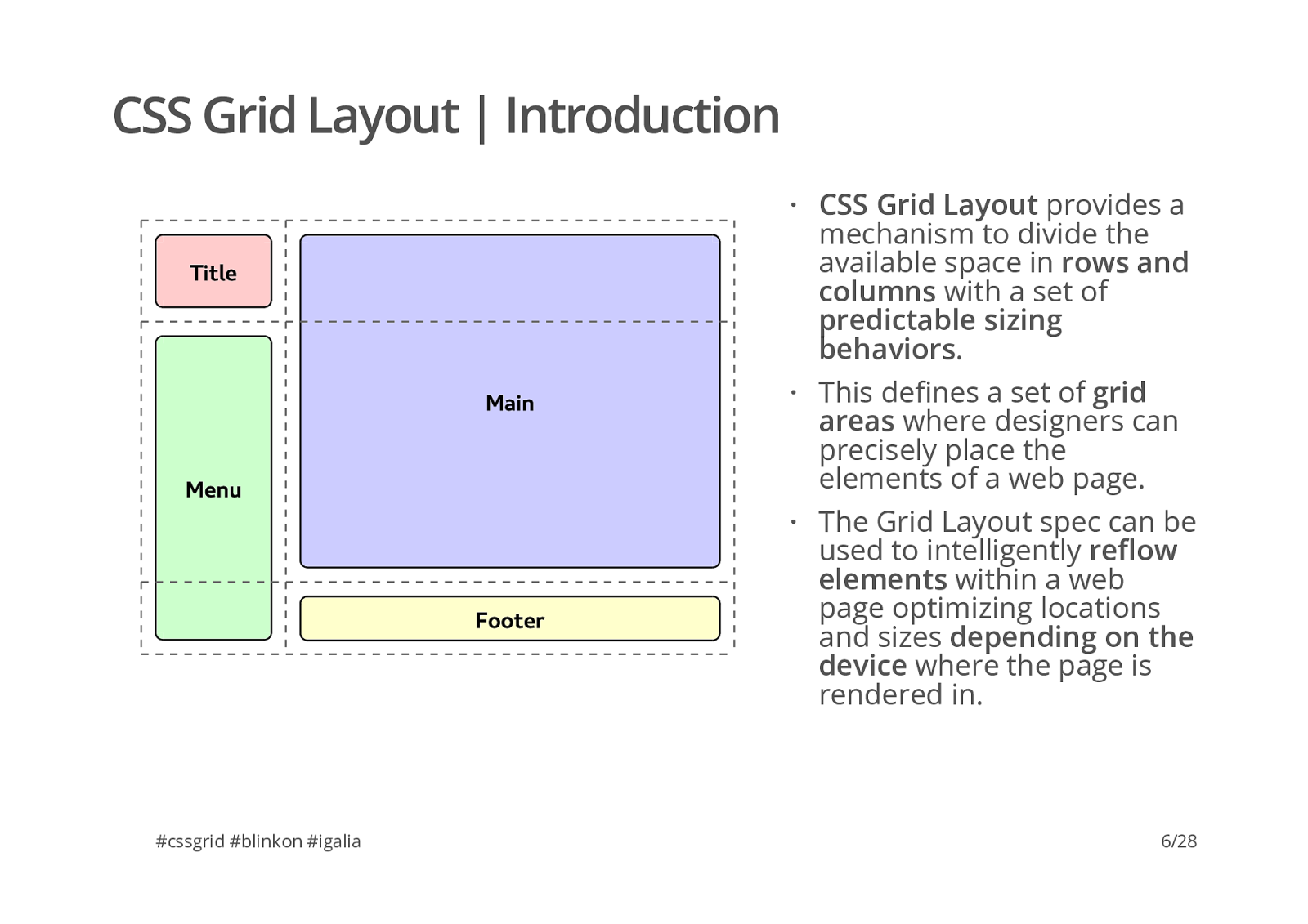
I n t r o d u c t i o n #cssgrid #blinkon #igalia CSS Grid Layout provides a mechanism to divide the available space in rows and columns with a set of predictable sizing behaviors . This de�nes a set of grid areas where designers can precisely place the elements of a web page. The Grid Layout spec can be used to intelligently re�ow elements within a web page optimizing locations and sizes depending on the device where the page is rendered in. · · · 6/28
T i t l e M e n u F o o t e r M a i n C S S
G r i d
L a y o u t
|
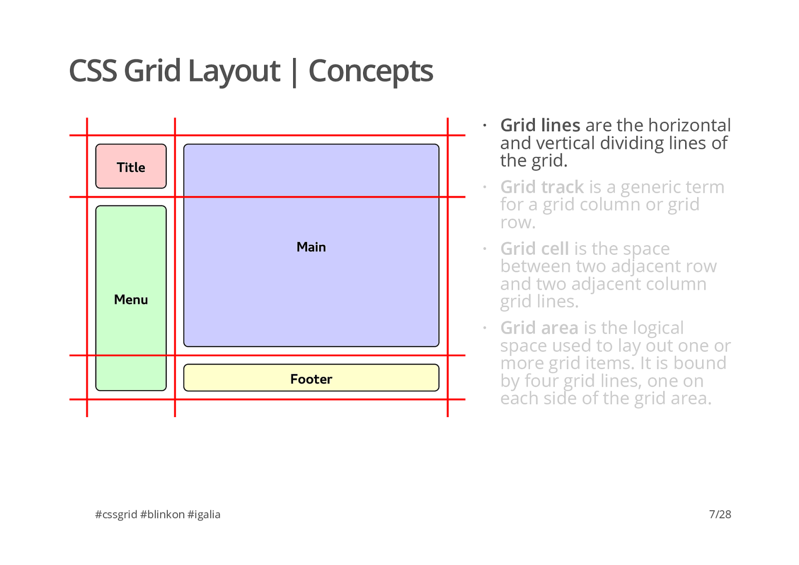
C o n c e p t s #cssgrid #blinkon #igalia Grid lines are the horizontal and vertical dividing lines of the grid. · 7/28 Grid track is a generic term for a grid column or grid row. · Grid cell is the space between two adjacent row and two adjacent column grid lines. · Grid area is the logical space used to lay out one or more grid items. It is bound by four grid lines, one on each side of the grid area. ·
T i t l e M e n u F o o t e r M a i n C S S
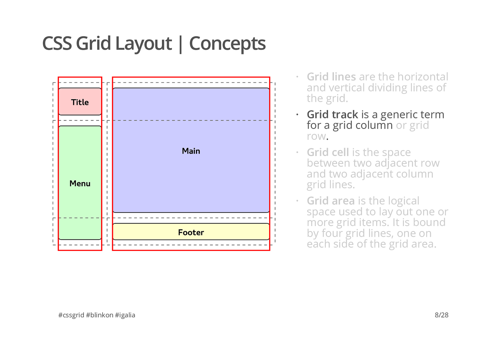
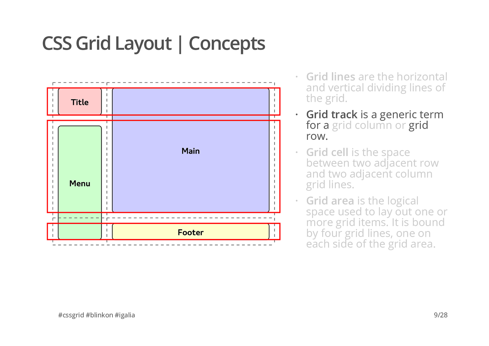
G r i d
L a y o u t
|
C o n c e p t s #cssgrid #blinkon #igalia Grid track is a generic term for a grid column . · 8/28 Grid lines are the horizontal and vertical dividing lines of the grid. · or grid row Grid cell is the space between two adjacent row and two adjacent column grid lines. · Grid area is the logical space used to lay out one or more grid items. It is bound by four grid lines, one on each side of the grid area. ·
T i t l e M e n u F o o t e r M a i n C S S
G r i d
L a y o u t
|
C o n c e p t s #cssgrid #blinkon #igalia Grid track is a generic term for a grid row. · 9/28 Grid lines are the horizontal and vertical dividing lines of the grid. · grid column or Grid cell is the space between two adjacent row and two adjacent column grid lines. · Grid area is the logical space used to lay out one or more grid items. It is bound by four grid lines, one on each side of the grid area. ·
T i t l e M e n u F o o t e r M a i n C S S
G r i d
L a y o u t
|
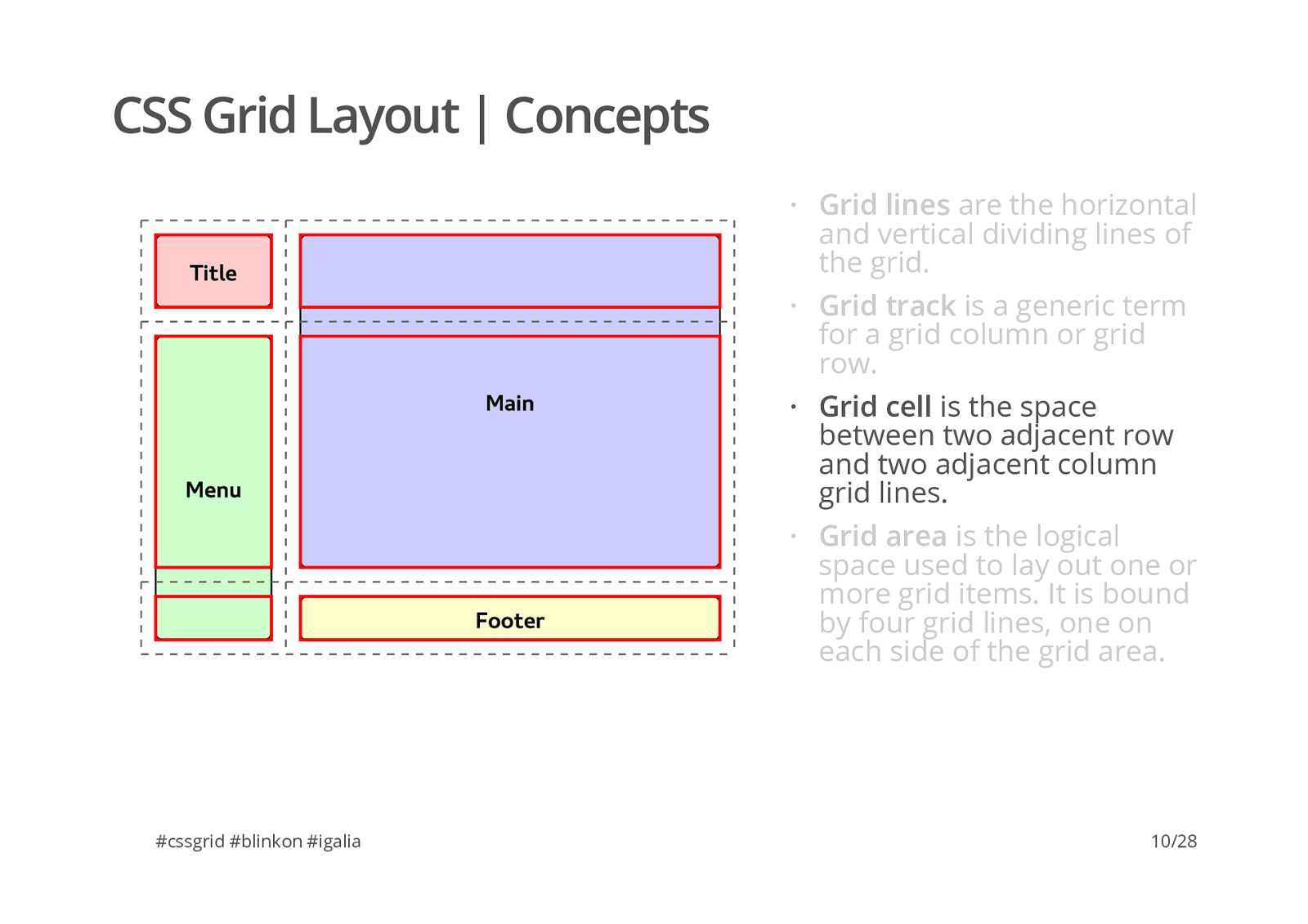
C o n c e p t s #cssgrid #blinkon #igalia Grid cell is the space between two adjacent row and two adjacent column grid lines. · 10/28 Grid lines are the horizontal and vertical dividing lines of the grid. · Grid track is a generic term for a grid column or grid row. · Grid area is the logical space used to lay out one or more grid items. It is bound by four grid lines, one on each side of the grid area. ·
T i t l e M e n u F o o t e r M a i n C S S
G r i d
L a y o u t
|
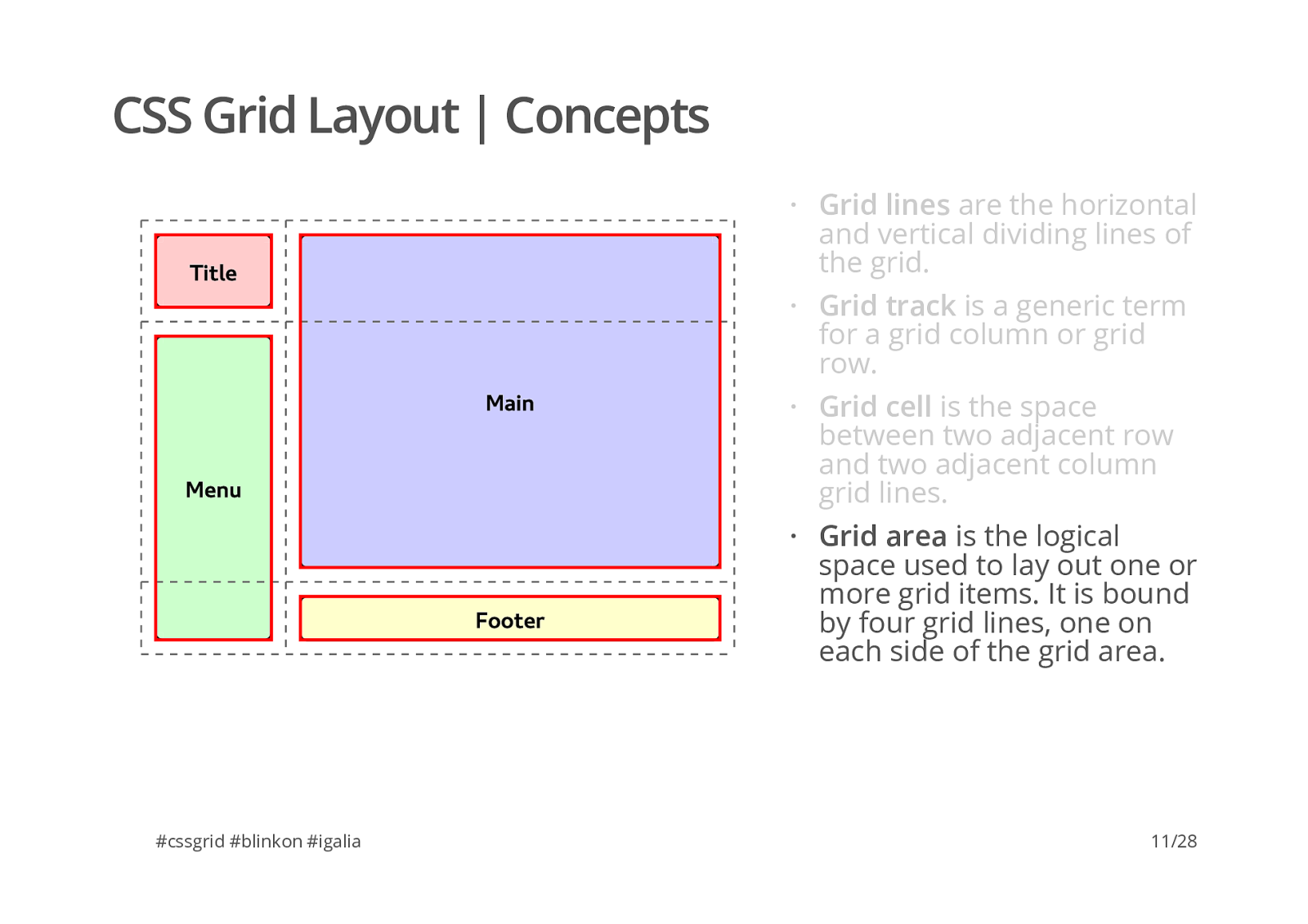
C o n c e p t s #cssgrid #blinkon #igalia Grid area is the logical space used to lay out one or more grid items. It is bound by four grid lines, one on each side of the grid area. · 11/28 Grid lines are the horizontal and vertical dividing lines of the grid. · Grid track is a generic term for a grid column or grid row. · Grid cell is the space between two adjacent row and two adjacent column grid lines. ·
C S S
G r i d
L a y o u t
|
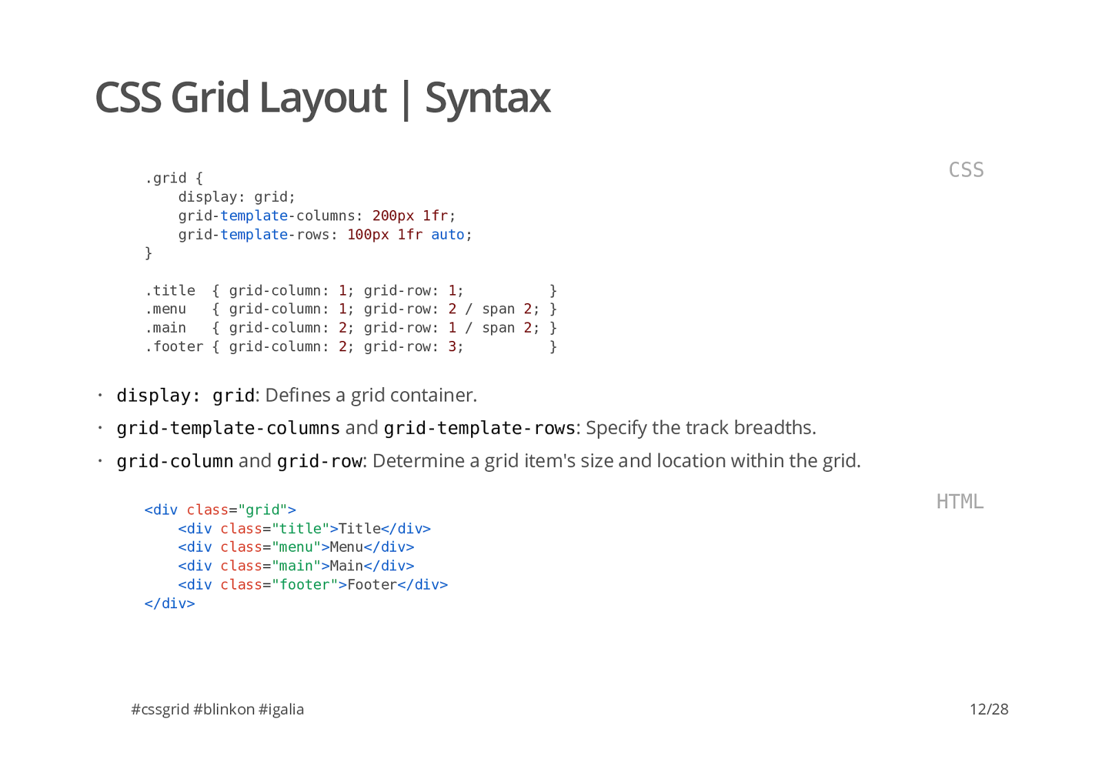
S y n t a x #cssgrid #blinkon #igalia
. grid {
display
: grid ;
grid
columns :
200px
1fr ;
grid
rows :
100px
1fr
auto ;
}
column :
row :
1 ;
}
column :
row :
2
/ span 2 ;
}
column :
row :
1
/ span 2 ;
}
column :
row :
3 ;
} C S S display: grid : De�nes a grid container. grid-template-columns and grid-template-rows : Specify the track breadths. grid-column and grid-row : Determine a grid item's size and location within the grid. · · ·
<div"grid"
<div"title"
Title
</div> <div"menu"
Menu
</div> <div"main"
Main
</div> <div"footer"
Footer
</div> </div> H T M L 12/28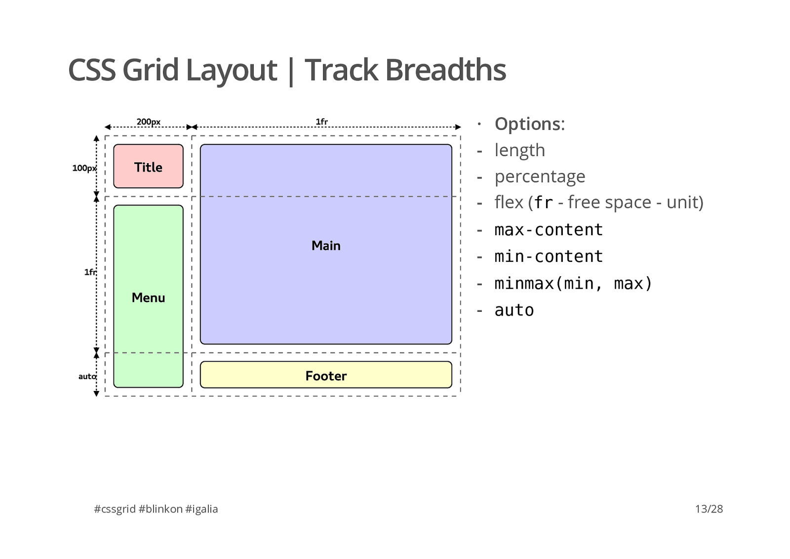
T i t l e M e n u F o o t e r M a i n 2 0 0 p x 1 f r 1 0 0 p x 1 f r a u t o C S S
G r i d
L a y o u t
|
T r a c k
B r e a d t h s #cssgrid #blinkon #igalia Options : · length percentage �ex ( f r
c o n t e n t m i n m a x ( m i n ,
13/28
T i t l e M e n u F o o t e r M a i n 2 0 0 p x 1 f r 1 0 0 p x 1 f r a u t o C S S
G r i d
L a y o u t
|
F l e x i b l e
T r a c k
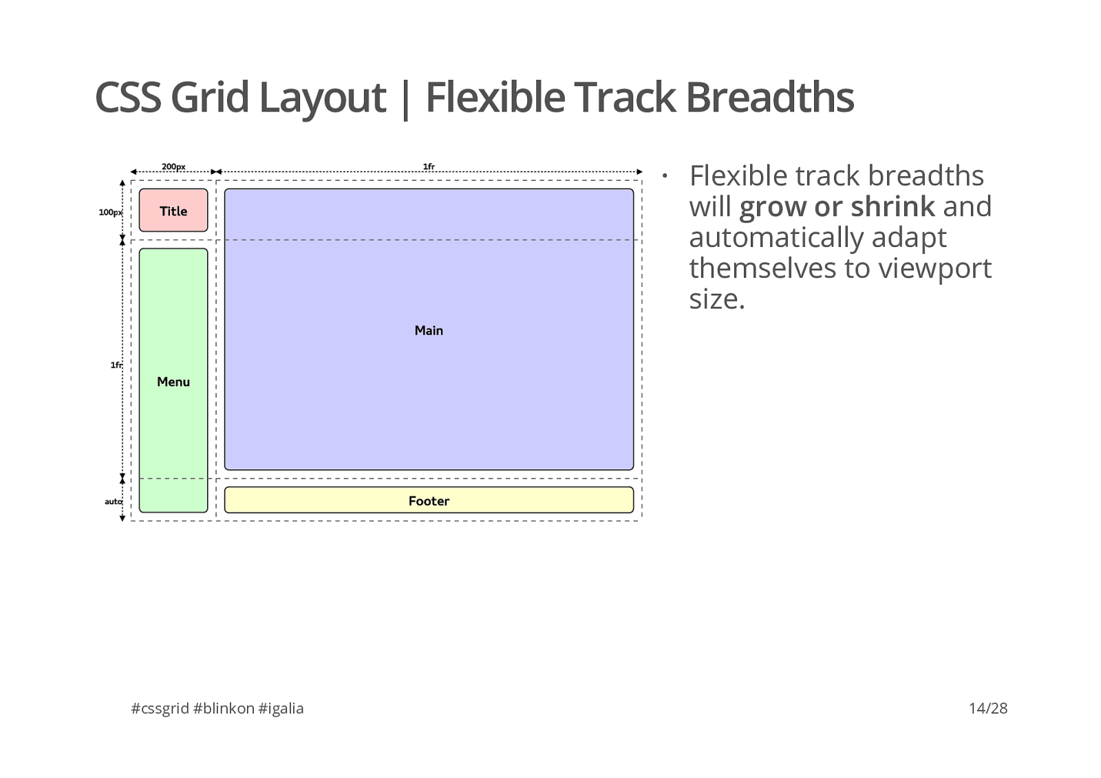
B r e a d t h s #cssgrid #blinkon #igalia Flexible track breadths will grow or shrink and automatically adapt themselves to viewport size. · 14/28
T i t l e M e n u F o o t e r M a i n 2 0 0 p x 1 f r 1 0 0 p x 1 f r a u t o C S S
G r i d
L a y o u t
|
F l e x i b l e
T r a c k
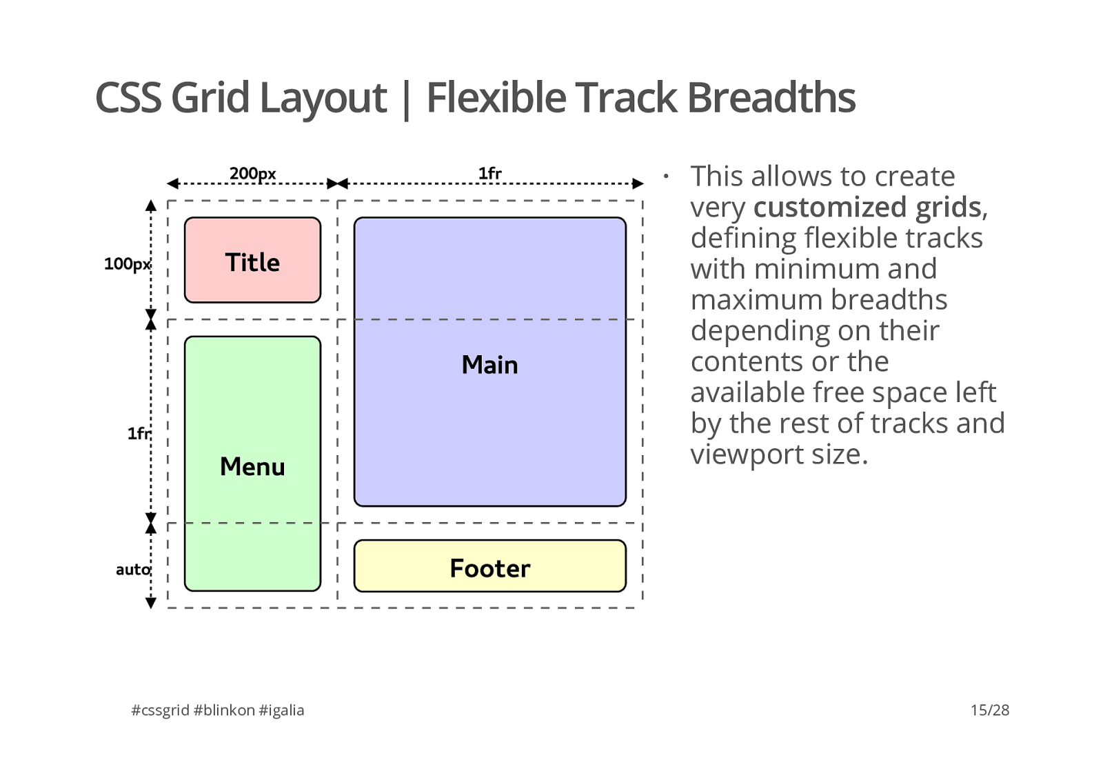
B r e a d t h s #cssgrid #blinkon #igalia This allows to create very customized grids , de�ning �exible tracks with minimum and maximum breadths depending on their contents or the available free space left by the rest of tracks and viewport size. · 15/28
T i t l e M e n u F o o t e r M a i n C S S
G r i d
L a y o u t
|
R e s p o n s i v e
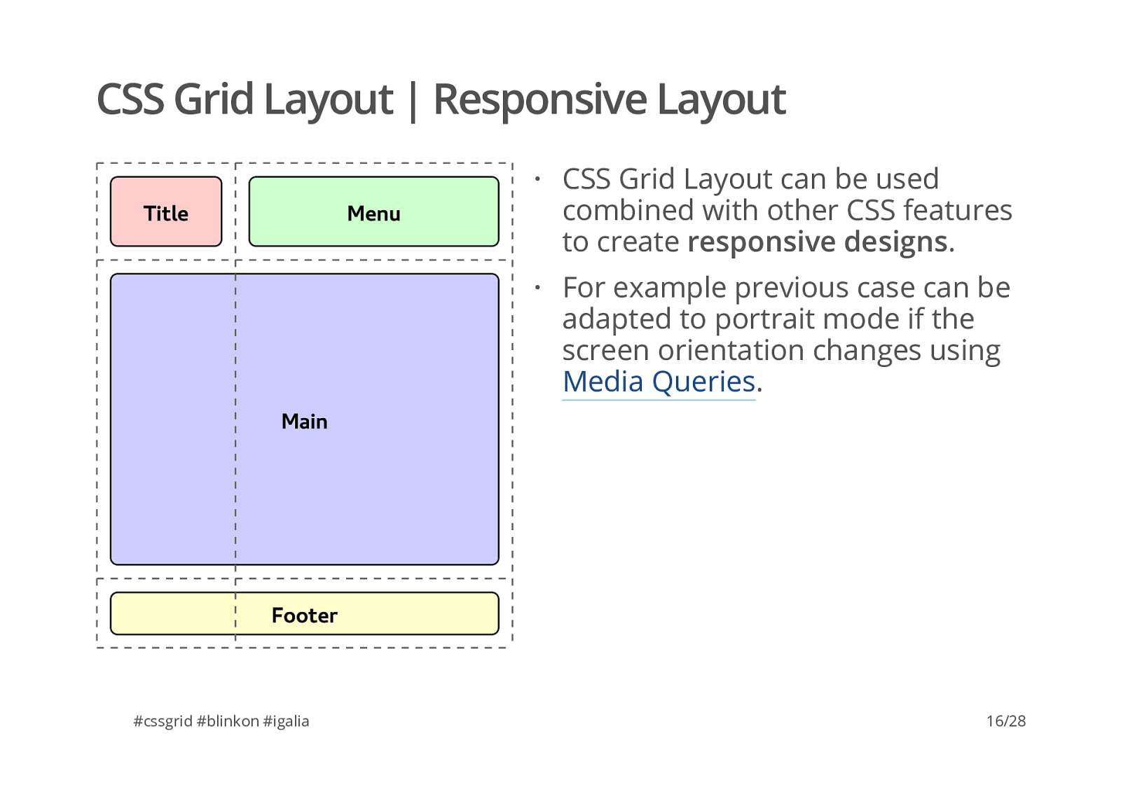
L a y o u t #cssgrid #blinkon #igalia CSS Grid Layout can be used combined with other CSS features to create responsive designs . For example previous case can be adapted to portrait mode if the screen orientation changes using Media Queries . · · 16/28
C S S
G r i d
L a y o u t
|
R e s p o n s i v e
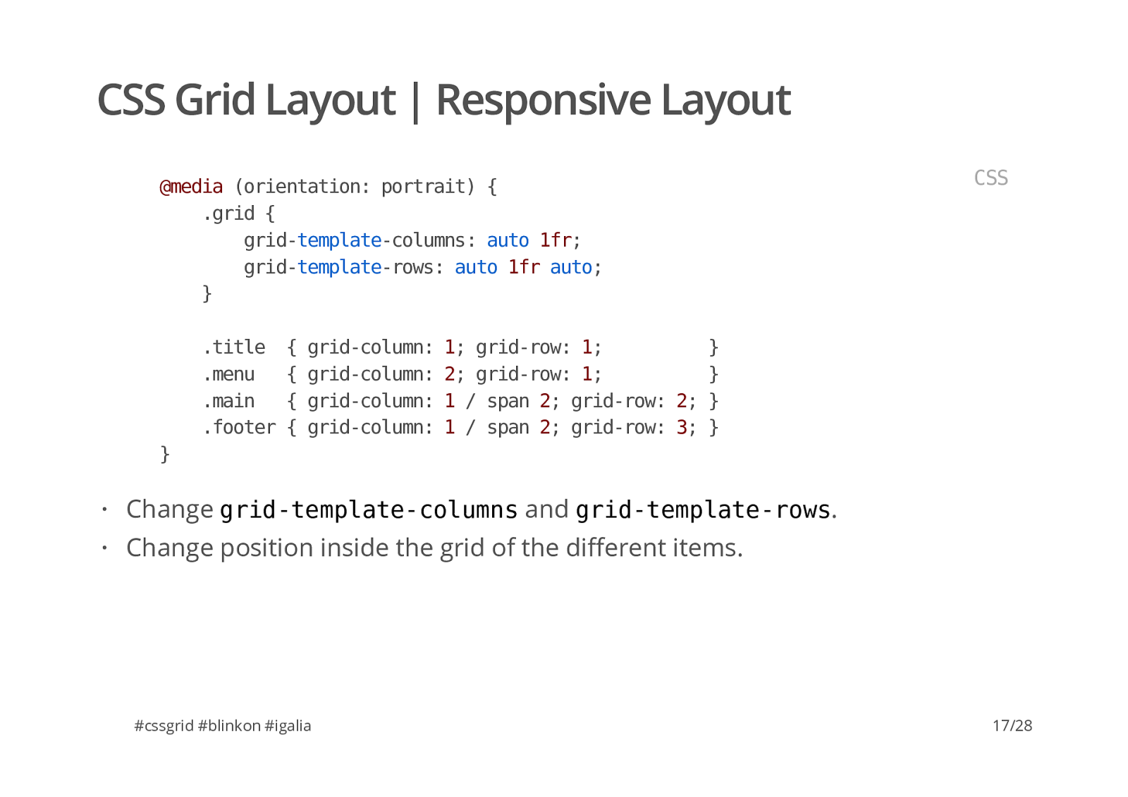
L a y o u t #cssgrid #blinkon #igalia
@ m e d i a
( o r i e n t a t i o n :
p o r t r a i t )
{
. g r i d
{
c o l u m n s :
a u t o
1 f r ;
r o w s :
a u t o
1 f r
a u t o ;
}
. t i t l e
{
c o l u m n :
1 ;
r o w :
1 ;
}
. m e n u
{
c o l u m n :
2 ;
r o w :
1 ;
}
. m a i n
{
c o l u m n :
1
/
s p a n
2 ;
r o w :
2 ;
}
. f o o t e r
{
c o l u m n :
1
/
s p a n
2 ;
r o w :
3 ;
}
r o w s . Change position inside the grid of the di�erent items. · · 17/28
C S S
G r i d
L a y o u t
|
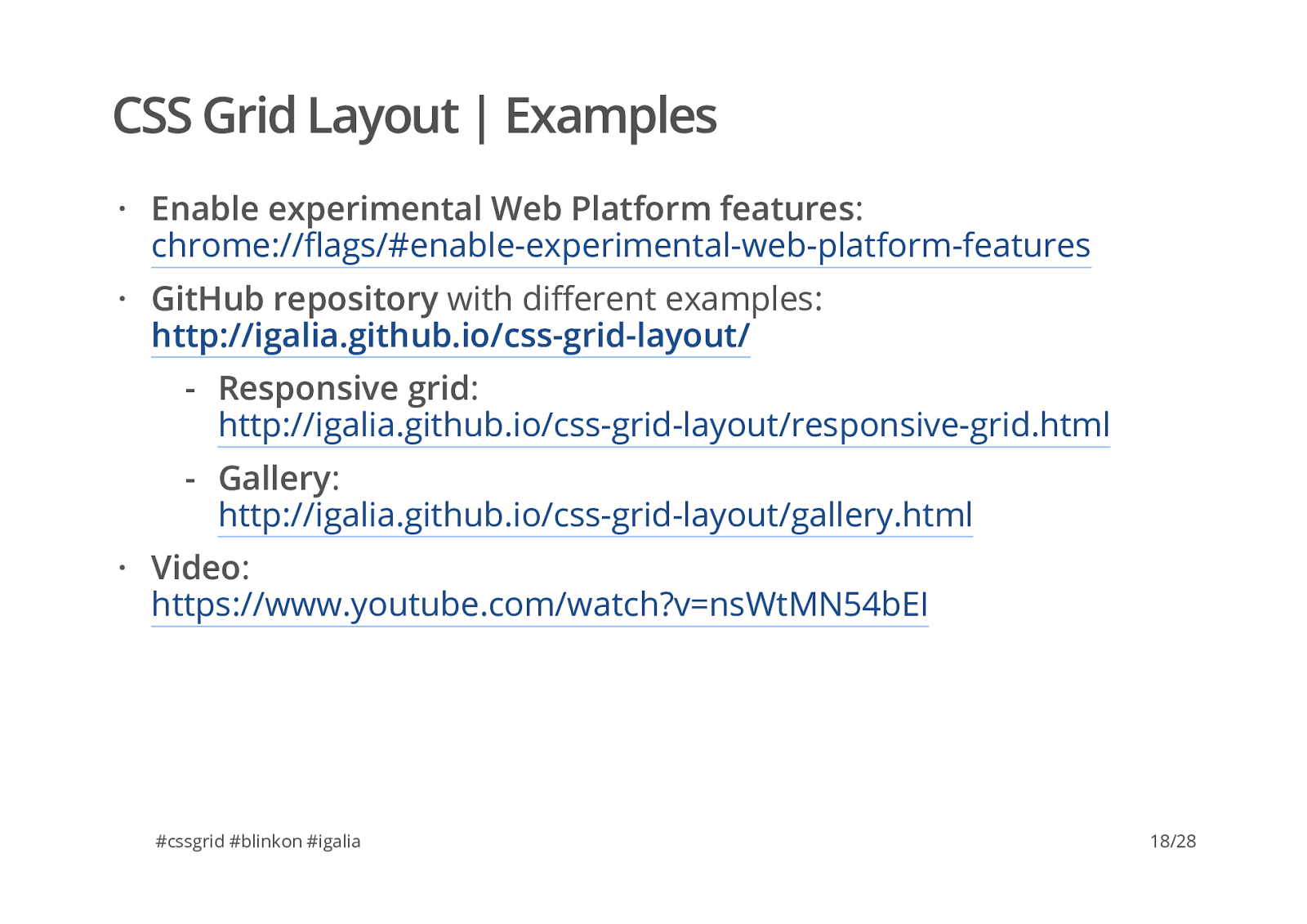
E x a m p l e s #cssgrid #blinkon #igalia Enable experimental Web Platform features :
chrome://�ags/#enable-experimental-web-platform-features GitHub repository with di�erent examples:
http://igalia.github.io/css-grid-layout/ Video :
https://www.youtube.com/watch?v=nsWtMN54bEI · · Responsive grid :
http://igalia.github.io/css-grid-layout/responsive-grid.html Gallery :
· 18/28
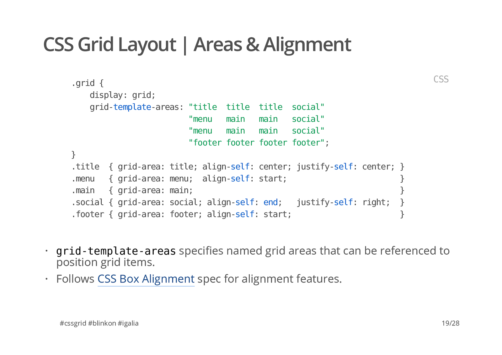
C S S
G r i d
L a y o u t
|
A r e a s
&
A l i g n m e n t #cssgrid #blinkon #igalia
. g r i d
{
d i s p l a y :
g r i d ;
a r e a s :
" t i t l e
t i t l e
t i t l e
s o c i a l "
" m e n u
m a i n
m a i n
s o c i a l "
" m e n u
m a i n
m a i n
s o c i a l "
" f o o t e r
f o o t e r
f o o t e r
f o o t e r " ;
}
. t i t l e
{
a r e a :
t i t l e ;
s e l f :
c e n t e r ;
s e l f :
c e n t e r ;
}
. m e n u
{
a r e a :
m e n u ;
s e l f :
s t a r t ;
}
. m a i n
{
a r e a :
m a i n ;
}
. s o c i a l
{
a r e a :
s o c i a l ;
s e l f :
e n d ;
s e l f :
r i g h t ;
}
. f o o t e r
{
a r e a :
f o o t e r ;
s e l f :
s t a r t ;
}
a r e a s speci�es named grid areas that can be referenced to position grid items. Follows CSS Box Alignment spec for alignment features. · · 19/28
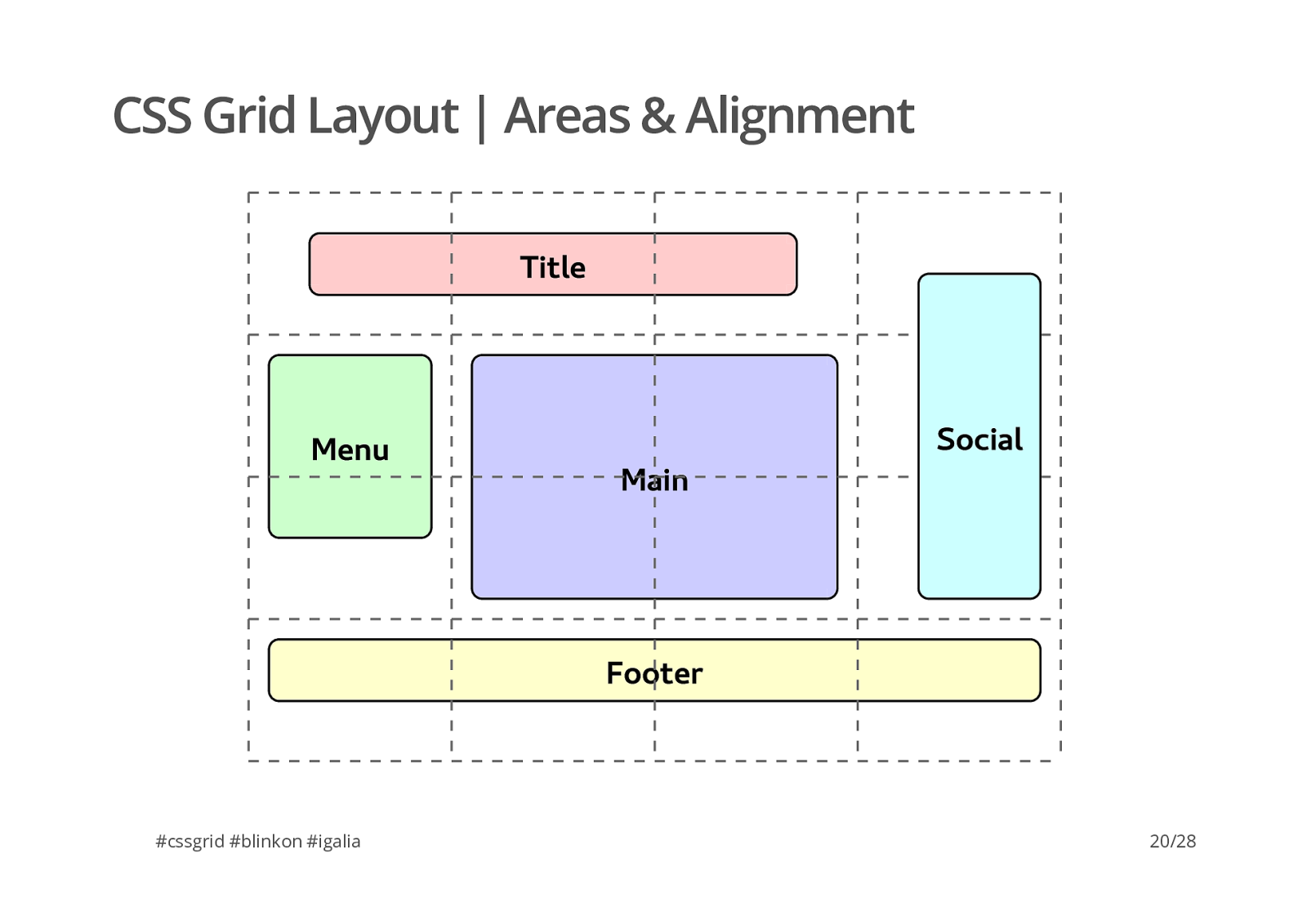
C S S
G r i d
L a y o u t
|
A r e a s
&
A l i g n m e n t T i t l e M e n u F o o t e r M a i n S o c i a l #cssgrid #blinkon #igalia 20/28
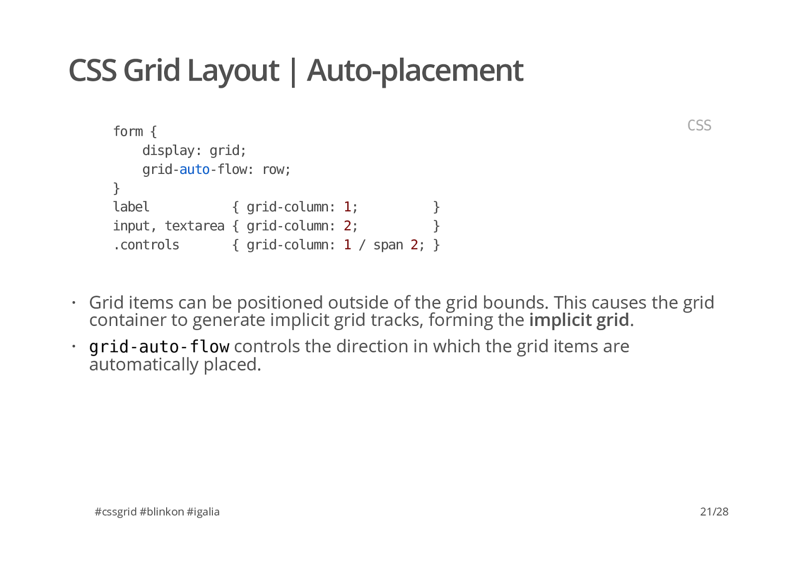
C S S
G r i d
L a y o u t
|
p l a c e m e n t #cssgrid #blinkon #igalia
f o r m
{
d i s p l a y :
g r i d ;
f l o w :
r o w ;
}
l a b e l
{
c o l u m n :
1 ;
}
i n p u t ,
t e x t a r e a
{
c o l u m n :
2 ;
}
. c o n t r o l s
{
c o l u m n :
1
/
s p a n
2 ;
}
f l o w controls the direction in which the grid items are automatically placed. · · 21/28
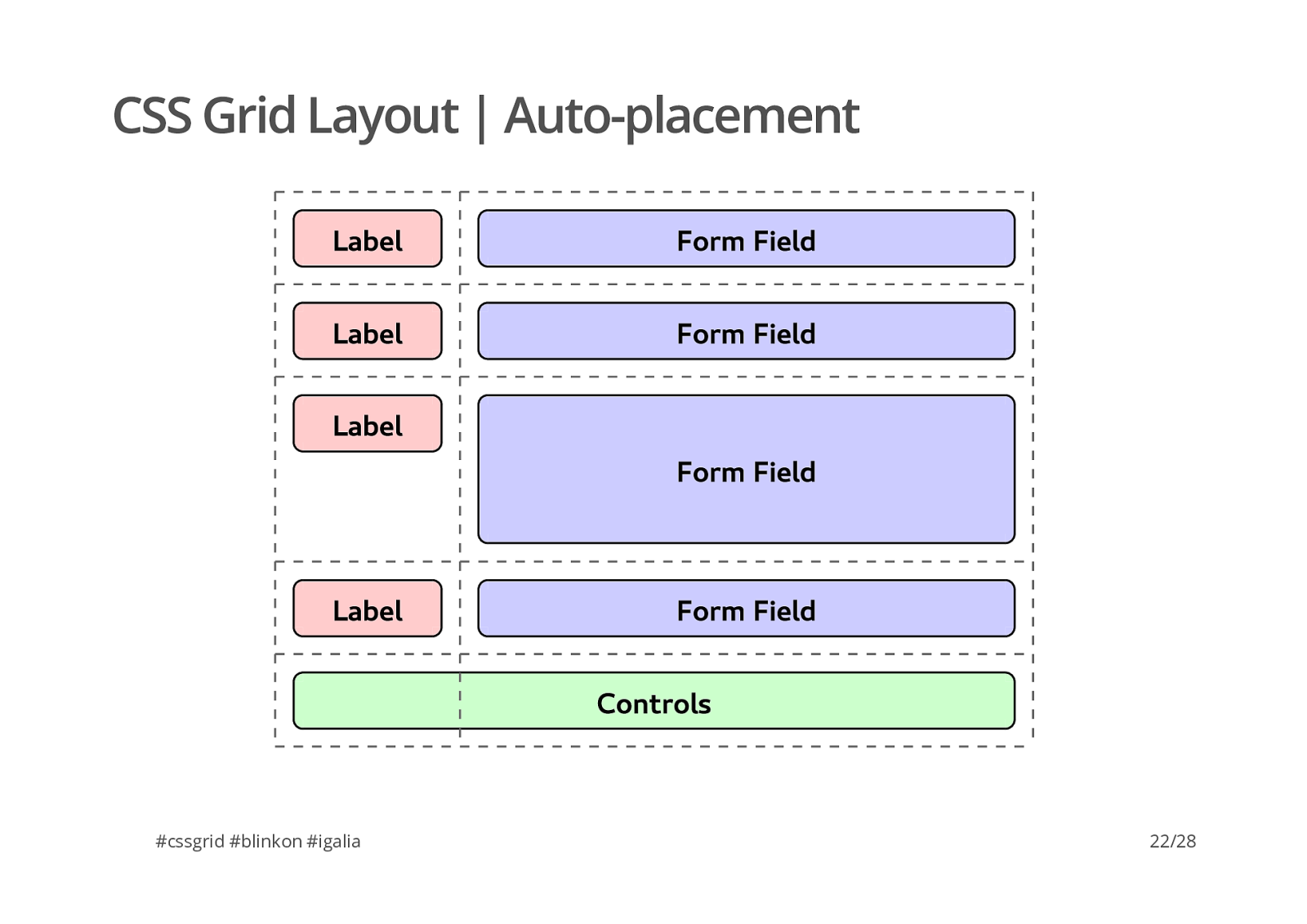
C S S
G r i d
L a y o u t
|
p l a c e m e n t L a b e l C o n t r o l s F o r m
F i e l d L a b e l F o r m
F i e l d L a b e l F o r m
F i e l d L a b e l F o r m
F i e l d #cssgrid #blinkon #igalia 22/28
C S S
G r i d
L a y o u t
|
C u r r e n t
s t a t u s #cssgrid #blinkon #igalia Spec (W3C Working Draft, 23 January 2014): http://www.w3.org/TR/css-grid-1/ . Main browsers: · · Old version already shipped in IE/Trident . Work in progress in Chromium/Blink (Google and Igalia) and Safari/WebKit (Igalia). Mozilla has started the development in Firefox/Gecko early this year. · · · 23/28
C S S
G r i d
L a y o u t
|
I m p l e m e n t a t i o n
S t a t u s #cssgrid #blinkon #igalia De�ne grids using all di�erent properties in the spec. Support for named grid lines and named grid areas . All placement options are supported too (both explicit and implicit grid). Track sizing and auto-placement algorithms are already implemented. · · · · 24/28
C S S
G r i d
L a y o u t
|
R o a d m a p #cssgrid #blinkon #igalia Subgrids (still under discussion inside the CSS WG). Alignment. Fragmentation. Test coverage. Performance optimizations. Support for di�erent writing modes. Selection. · · · · · · · 25/28
A c k n o w l e d g e m e n t s #cssgrid #blinkon #igalia Bloomberg is sponsoring our work in CSS Grid Layout. · 26/28
T h a n k
Y o u ! i g a l i a . c o m / b r o w s e r s g+ google.com/+ManuelRegoCasasnovas
twitter @regocasasnovas
www people.igalia.com/mrego/
github github.com/mrego
