Hi everyone. My name is Sarah, I work as a software engineer at Algolia, and I love CSS. I’ve written tons of it over the last 10 years, for projects of all kinds and sizes.
A presentation at DotCSS in December 2019 in Paris, France by Sarah Dayan

Hi everyone. My name is Sarah, I work as a software engineer at Algolia, and I love CSS. I’ve written tons of it over the last 10 years, for projects of all kinds and sizes.

Last year, we fully redesigned the Algolia documentation website. And since we were rewriting everything anyway, we used it as an opportunity to rethink our CSS.
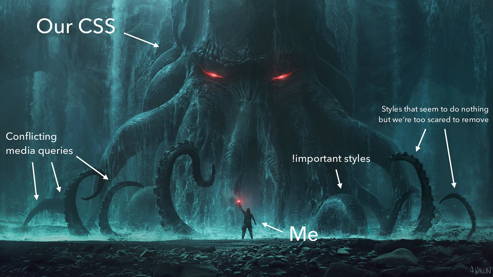
It had become really hard to change it without breaking things. Every edit felt like adding a band-aid. We were no longer in control.
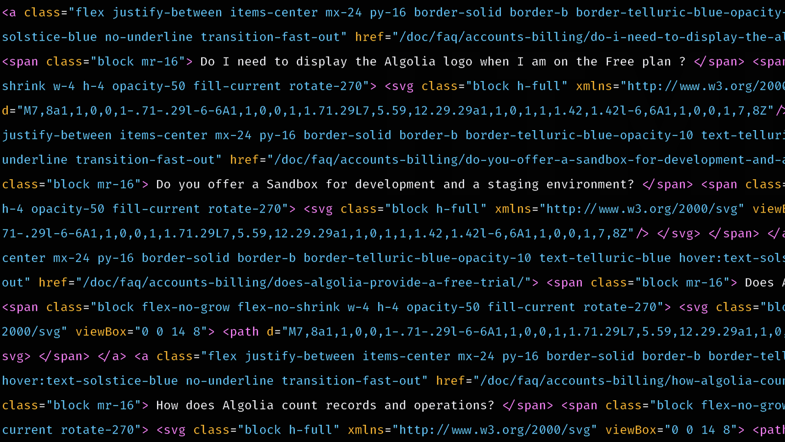
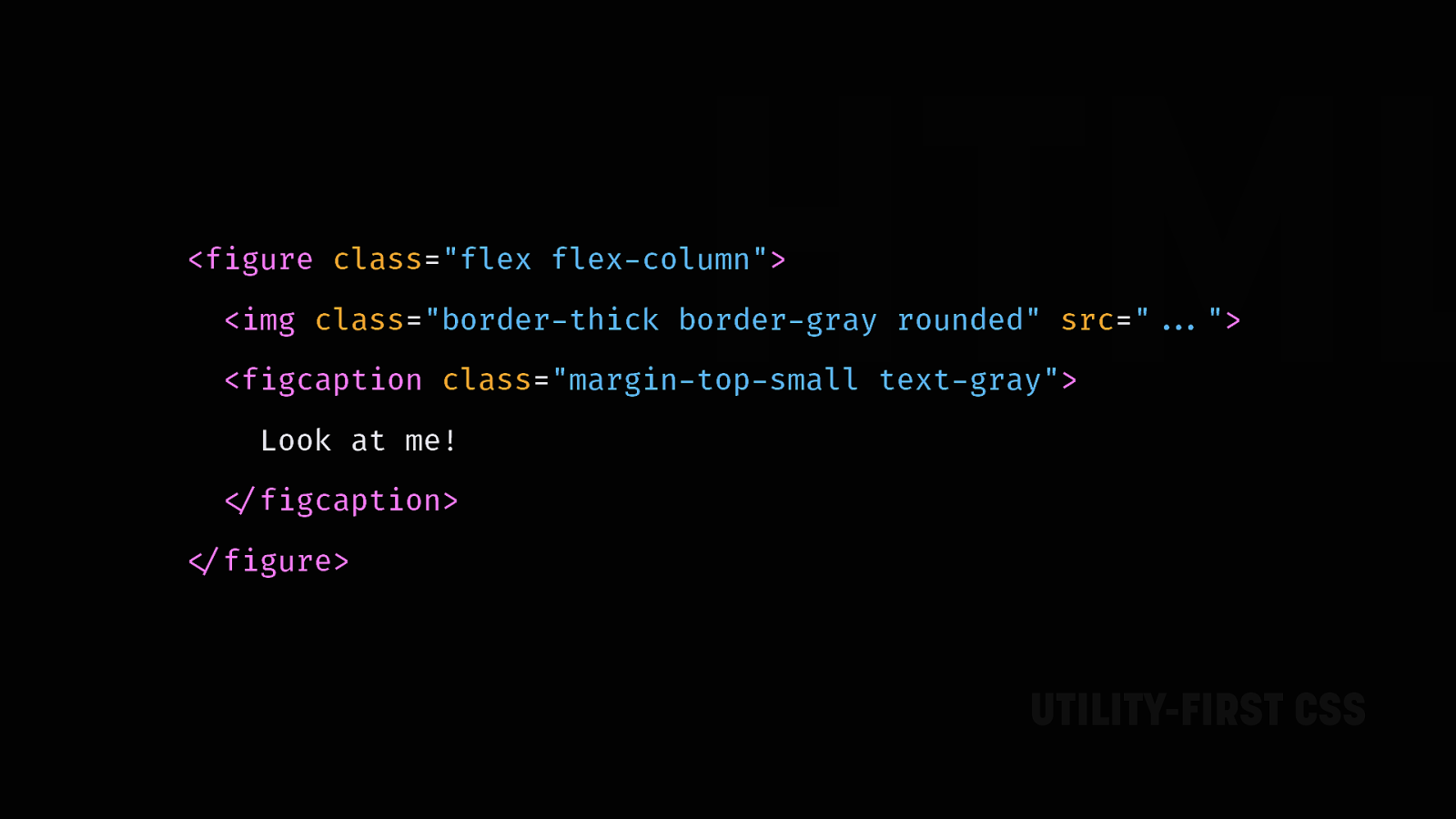
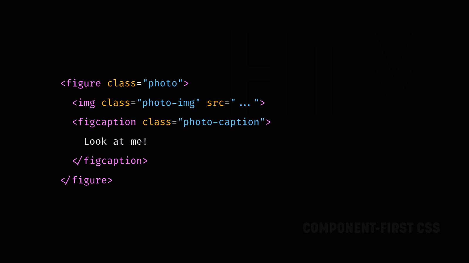

Now when people see atomic CSS for the first time, they usually go like: “OMG that’s so ugly, you’re mixing concerns, your HTML is gonna blow up, the web should be semantic, do you even CSS”. I can understand it! But I believe there are a lot of misconceptions about it.

So today, I’d like to invite you on a journey of understanding utility-first CSS. Let’s take a step back, and take some time to deconstruct the prejudices that either your coworkers, or maybe you, may have about it.

The first thing I would like to tear down about CSS is separation of concerns. Separation of concerns is an essential pillar of clean coding. You find it in many languages, many paradigms. Yet, the way we’ve established it for HTML and CSS is warped.
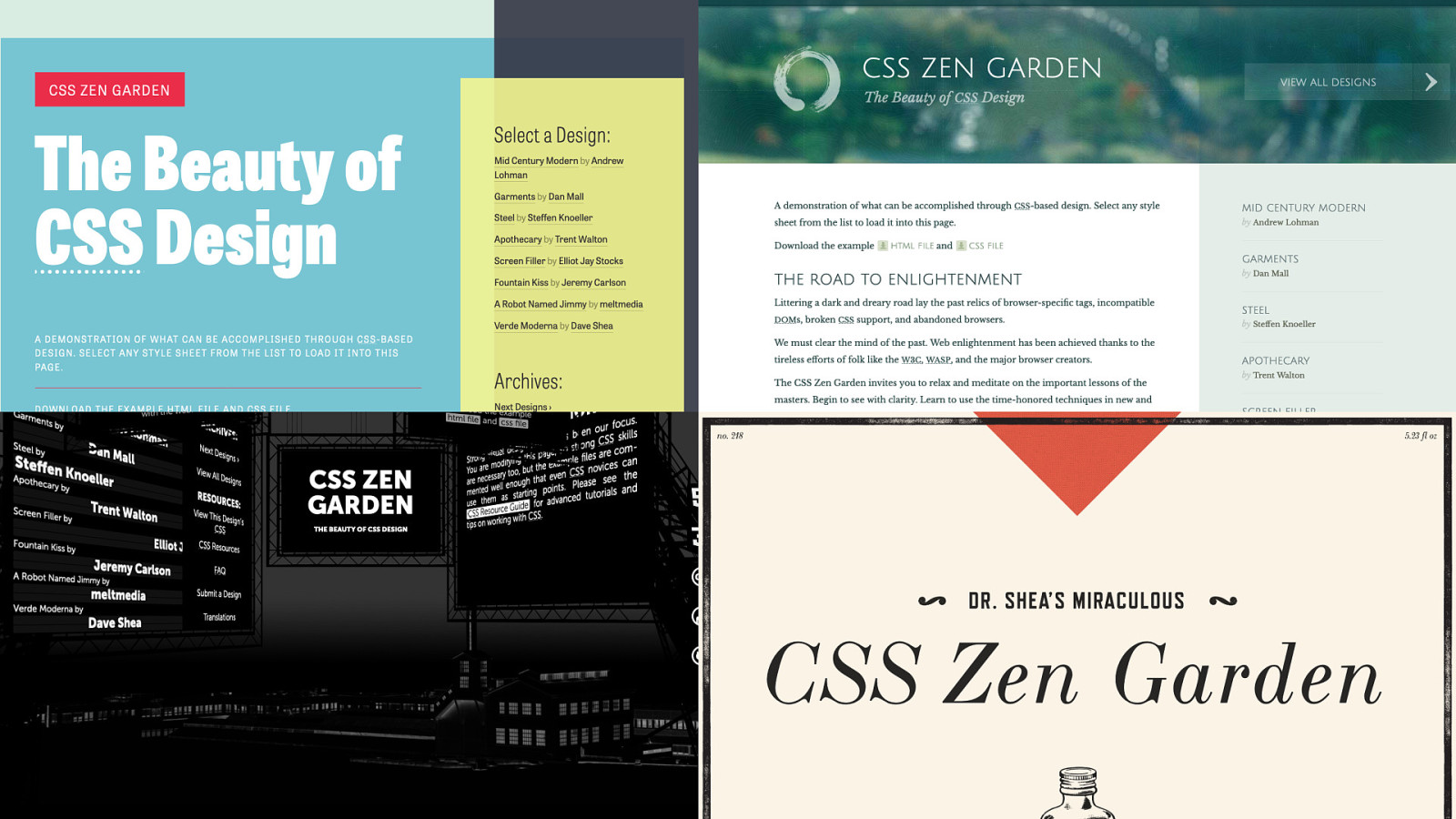
There’s a website out there called CSS Zen Garden. It showcases the same HTML page, styled with different stylesheets. The goal is to show how powerful CSS is and how it can totally change the look of a page. It’s beautiful.

But this is a technical demonstration. It’s doing a wonderful job at showing what CSS can do when you push it to its limits. Yet, this doesn’t stand up in the real world. The problem is that, for too long, this has been advertised as “the way you should write CSS”.

It’s a bit how when my former co-worker, Tim Carry, built a search engine in CSS for April’s Fools. It’s crazy to see that CSS can be pushed to doing this. But it doesn’t mean that it’s well suited for real-life usage.
I believe that HTML that is 100% oblivious of how it’s rendered is a dogmatic vision. It’s about checking some “best practices” box, but it doesn’t take real use cases into account.
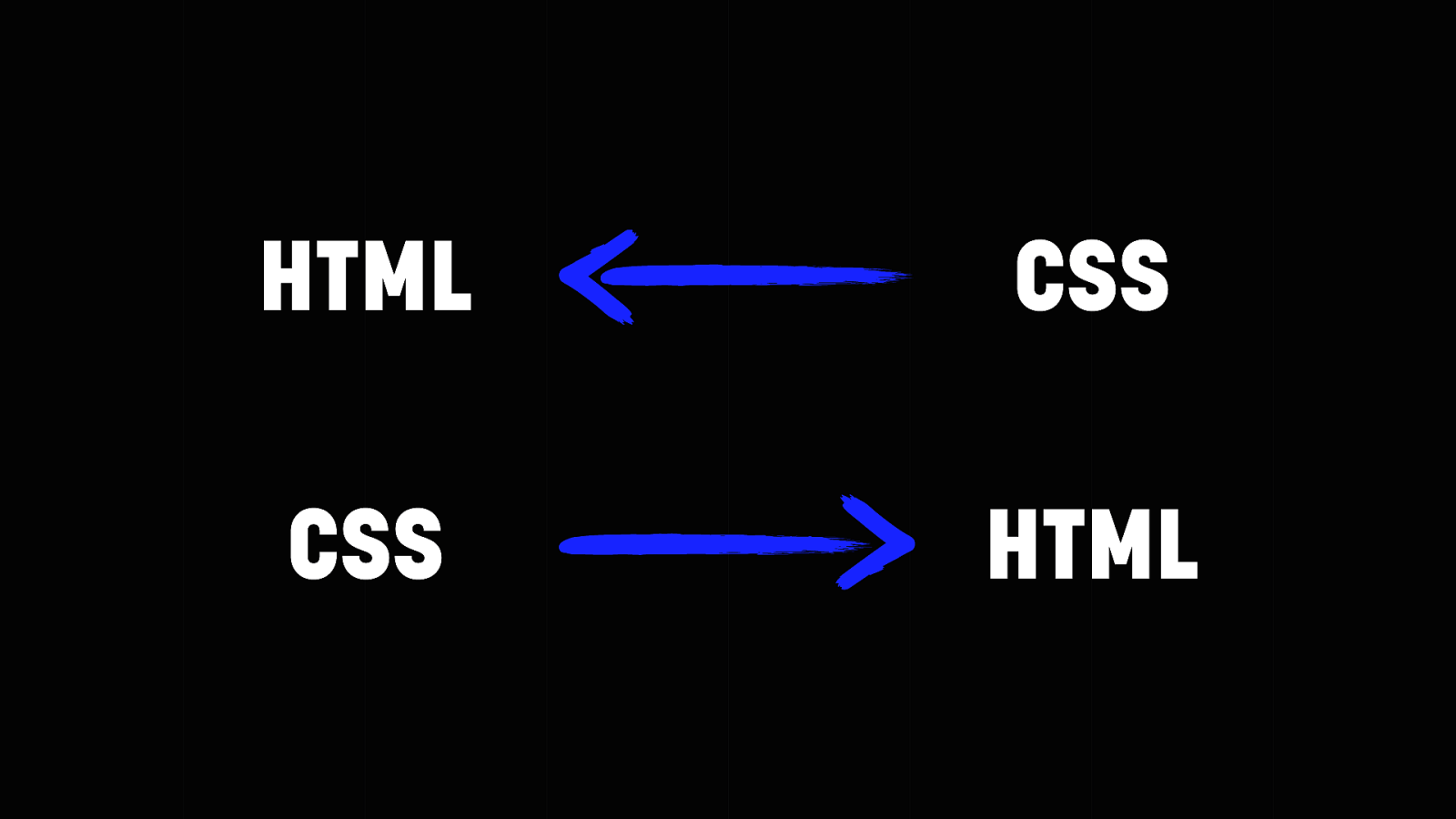
There’s no clean separation between HTML and CSS. In the CSS Zen Garden scenario, the HTML is unaware of the way it’s styled, but the CSS is very aware. Change the HTML, and the style breaks. On the other hand, you can have HTML that depends, or consumes, the CSS. This is what you have with CSS libraries like Bootstrap: a library of components as CSS classes that you can use in the HTML.
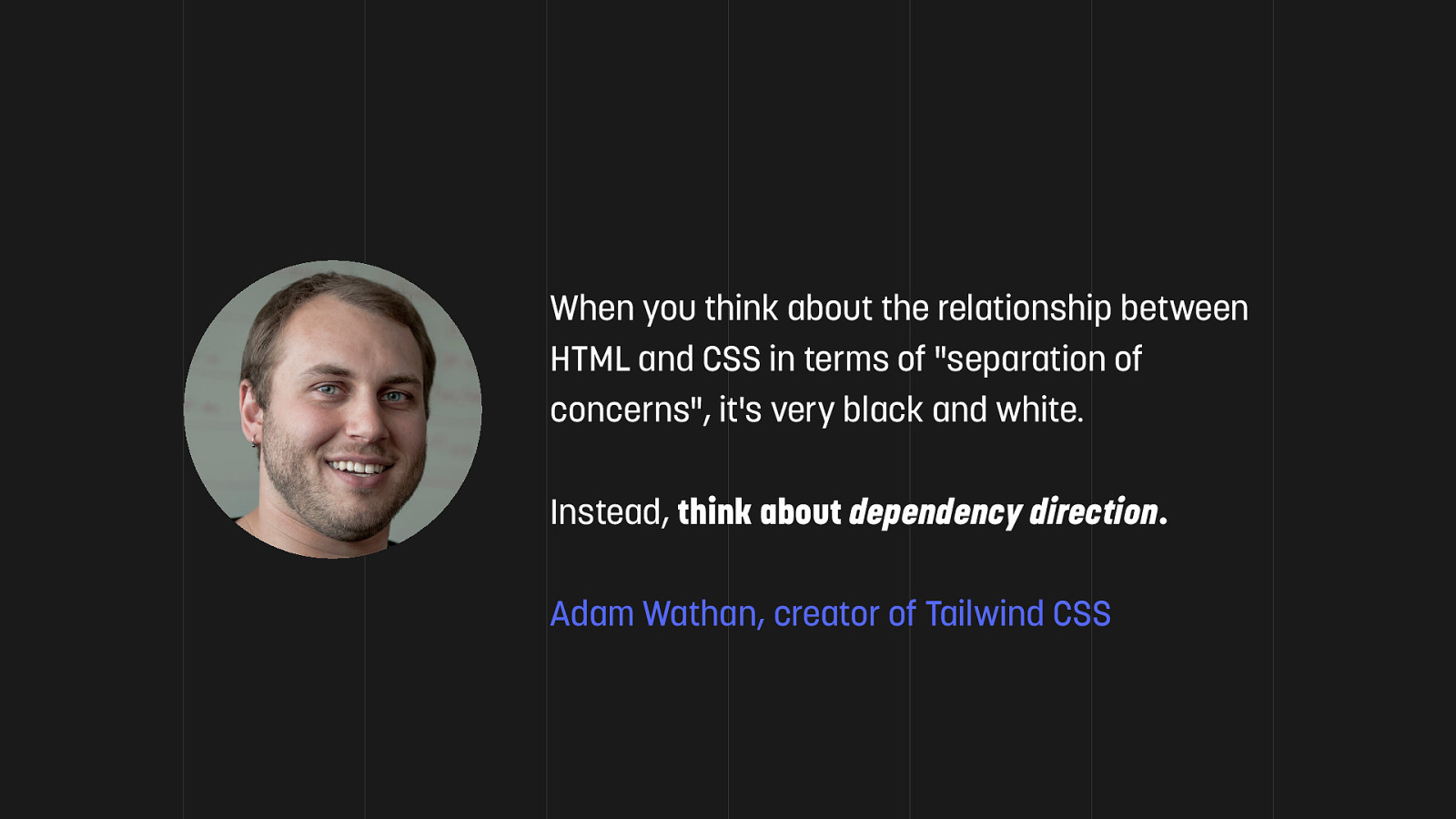
Adam Wathan has much healthier way of looking at it: he talks about dependency direction. What I like is that it acknowledges the inherent relationship between HTML and CSS. I believe that HTML that depends on CSS is more resilient.
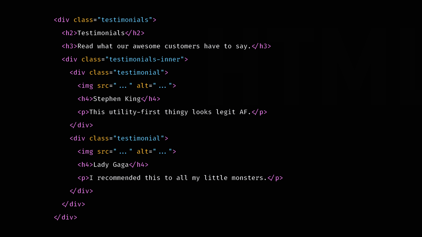
Take this HTML. It’s a section of a website that displays testimonials. It’s semantic, and uses only a minimal amount of classes.
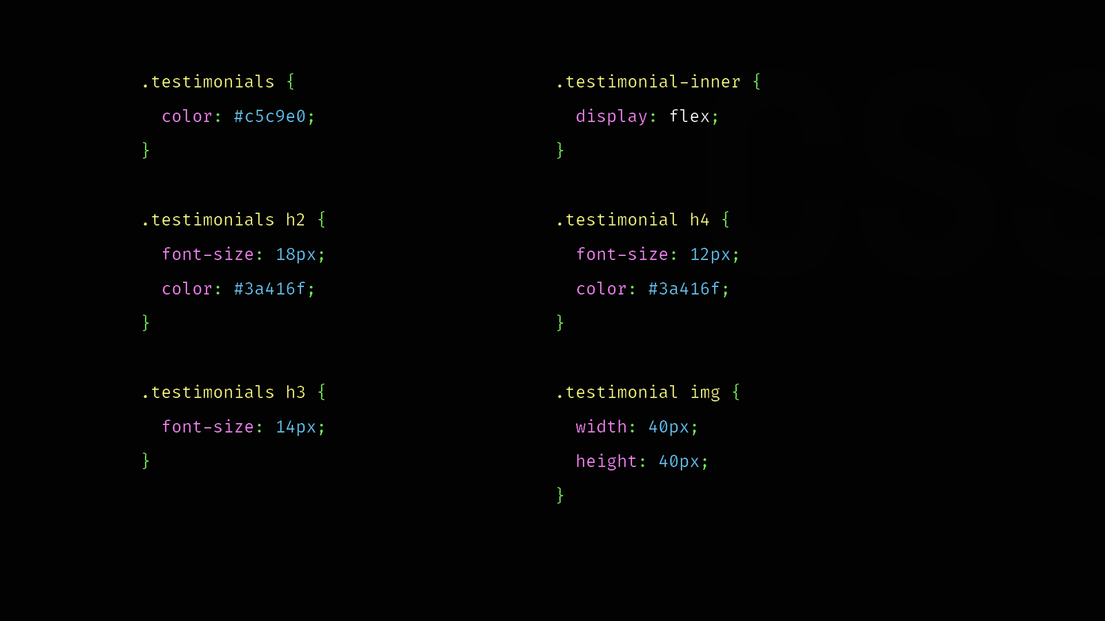
And here’s the CSS used to style it. It describes the structure of the existing HTML. It’s fully coupled to it.
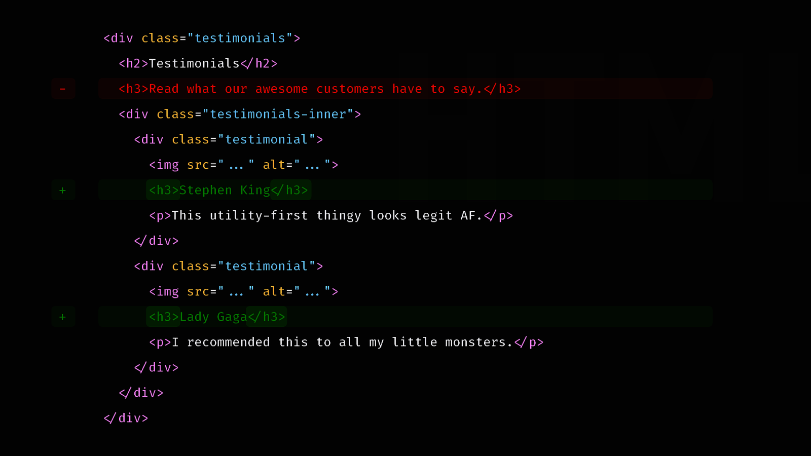
Now let’s say we decide to remove the tag line. This also means we must change our <h4> tags into <h3> to avoid skipping a heading level. But now we have an issue.
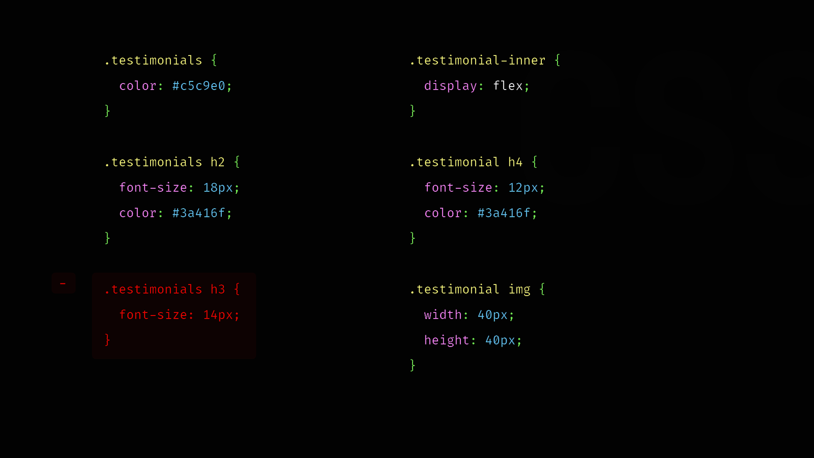
The CSS that used to style our tag line now applies to the titles of each testimonial. We have a visual regression. We need to get rid of that ruleset. It’s no longer useful anyway.
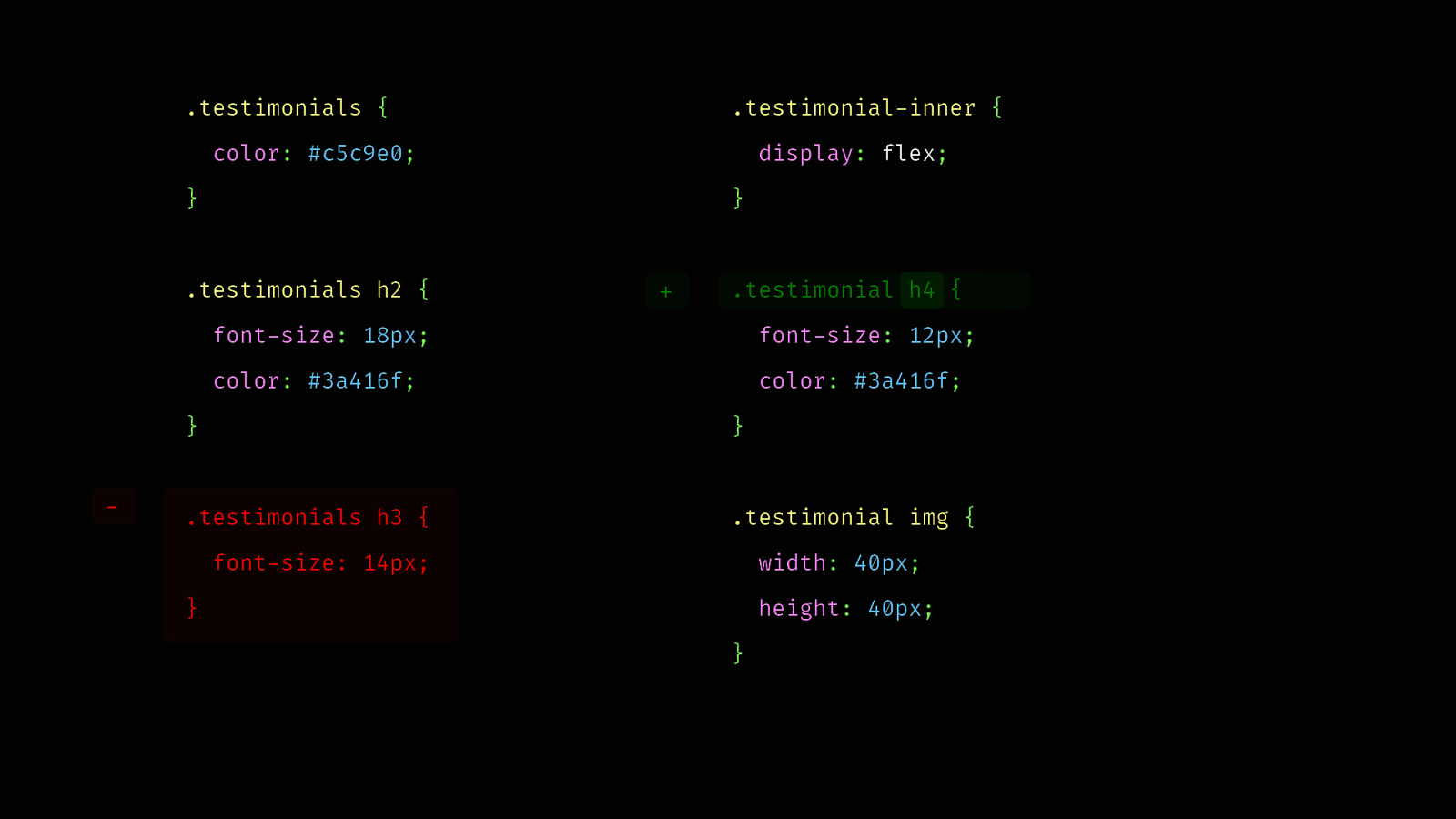
We also have to change the selector that used to apply to <h4> tags so it now applies to <h3> tags. As you can see, a simple change resulted in quite a few adjustments.
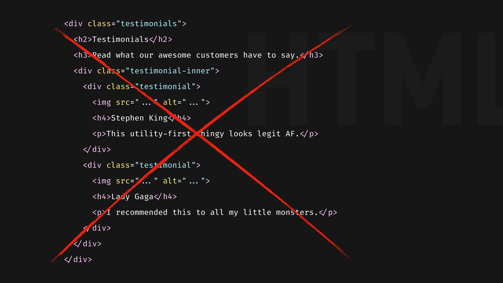
If we decide to get rid of the testimonials, we must remember to delete the CSS. Otherwise, we’ll be left with some unused code. The kind of CSS that a coworker finds 6 months later and has no idea if they can remove it or not.

CSS is a declarative, global language. When it matches, it applies. It’s that simple. It makes it powerful, but also hard to maintain. When it depends on HTML, it needs to grow with new use cases, be changed when HTML changes, and be dusted when things are removed. This isn’t maintainable at scale. Instead, CSS works much better when used as a library.

More than a decade ago, Nicole Sullivan came up with the concept of object-oriented CSS. It gave birth to component-based CSS, with many libraries like Bootstrap, Bulma, and methodologies, like BEM.
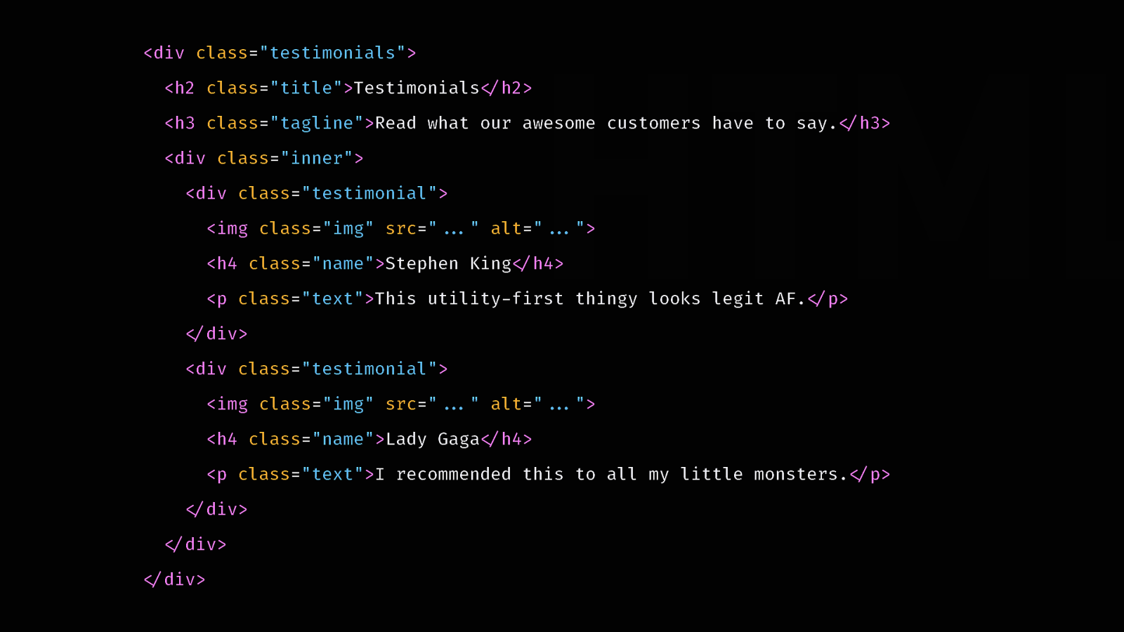
So here’s our CSS, using a component-based approach. Every styleable tag has a class that identifies it. If we removed the tagline now, we could adjust our headings and it wouldn’t cause any issue. We’d still have to clean up the unused CSS, but we don’t have visual regressions.

Why not stop at component-based CSS? Alright, so why not stop at component-based CSS?
There’s another topic that comes along with component-based approach: reusability. And the kind of reusability we get with a component-based approach is limited.
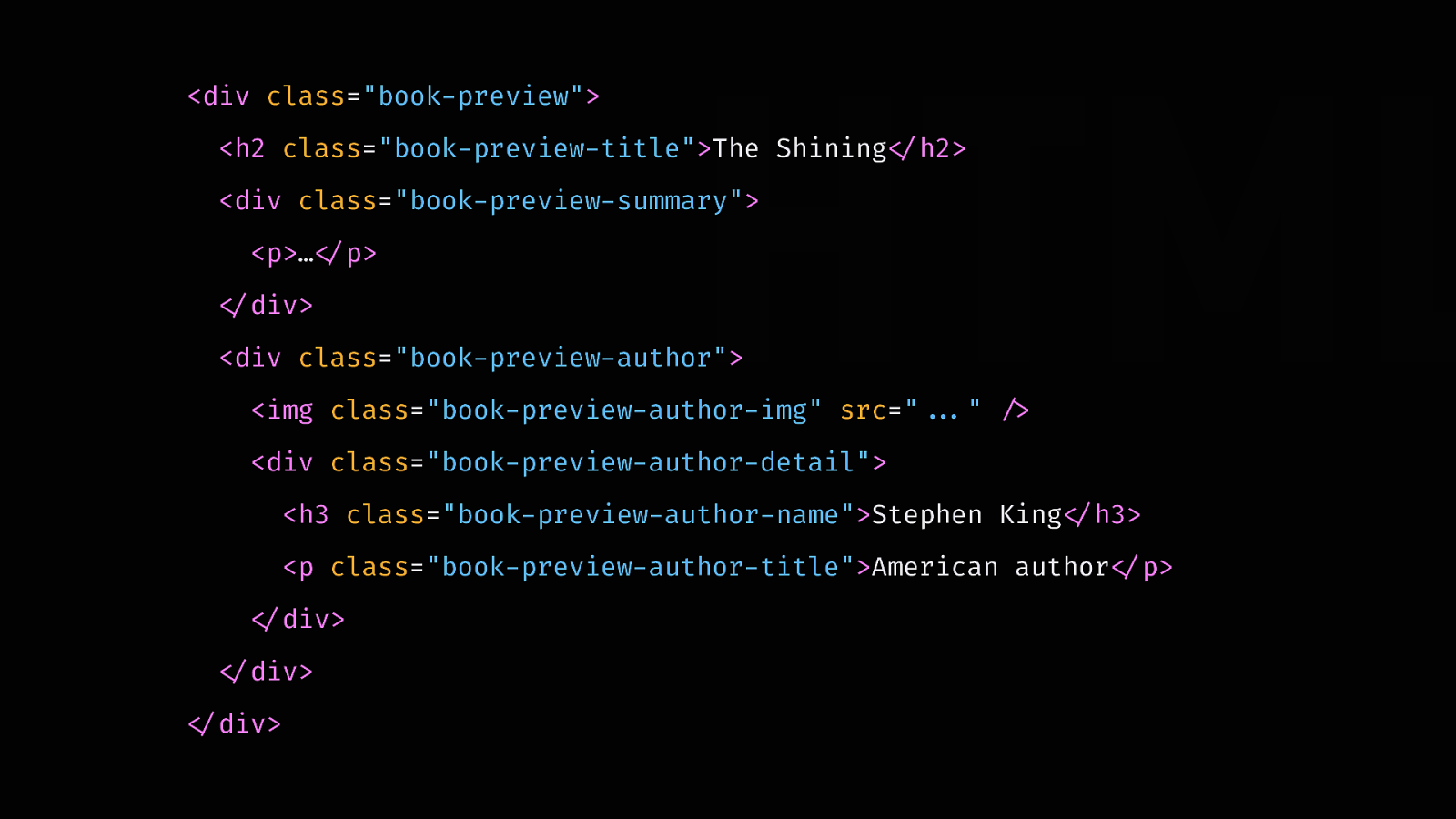
Let’s take a book preview component, written with a component-based approach.
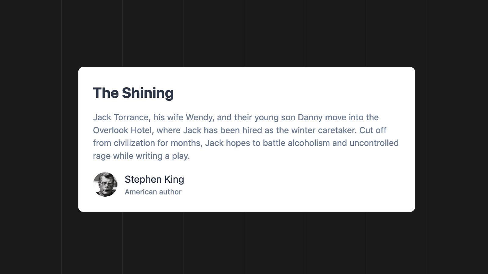
This is what it translates to visually.
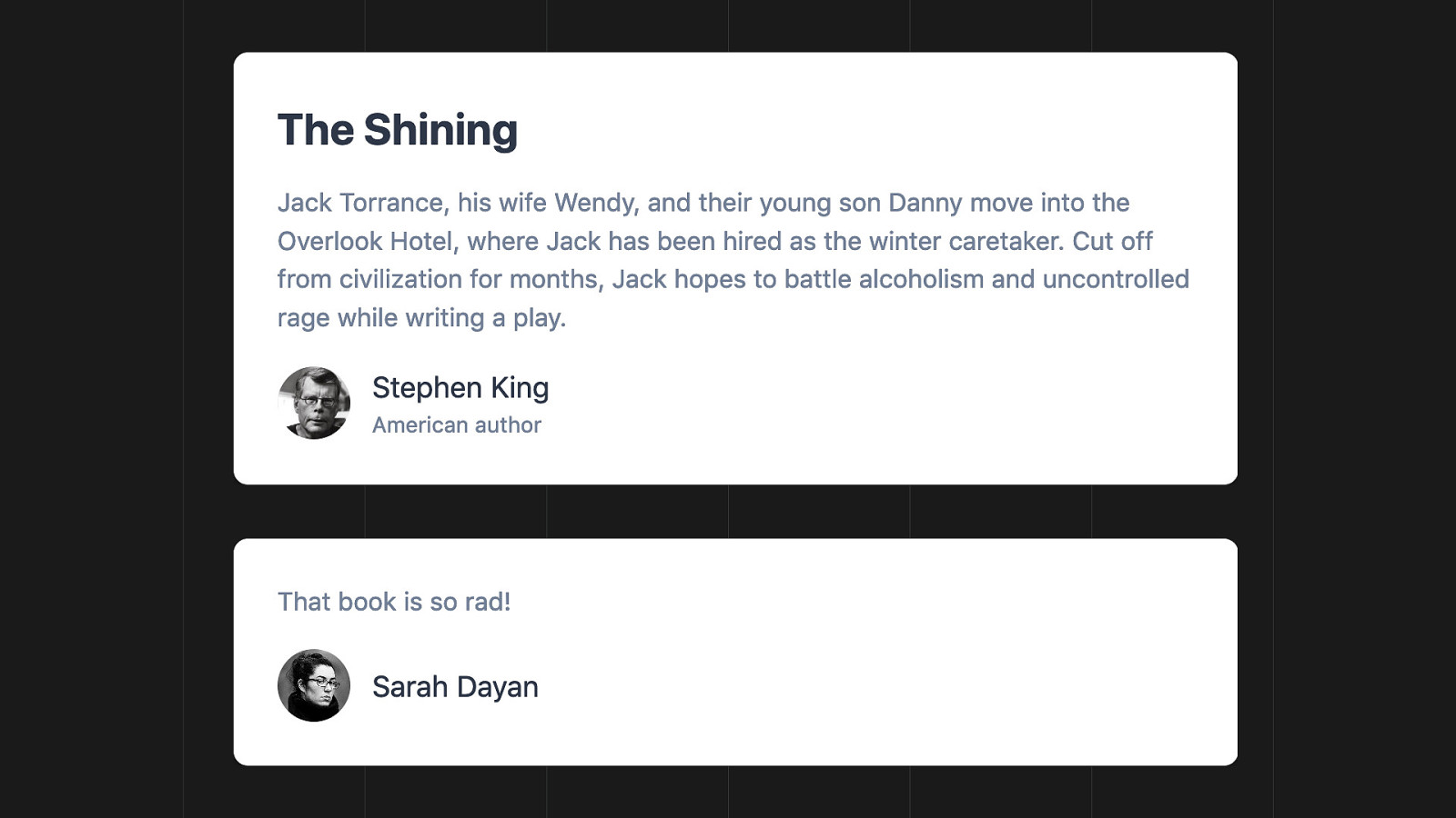
Now we want to implement a comment box. It looks similar. We may want to reuse the same classes to avoid duplication, right? The problem is that this isn’t a book preview, it’s a comment. We can’t reuse the same class as is. This would no longer be semantic.
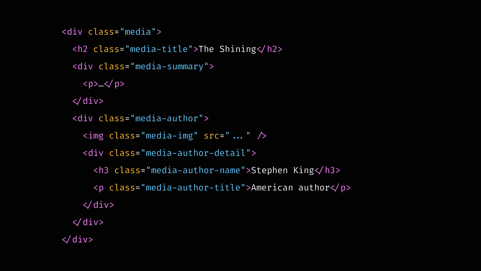
So, we refactor it to something more generic, a media. This way, we don’t duplicate our styles and we can reuse them on anything. Problem solved, right? Not so fast…
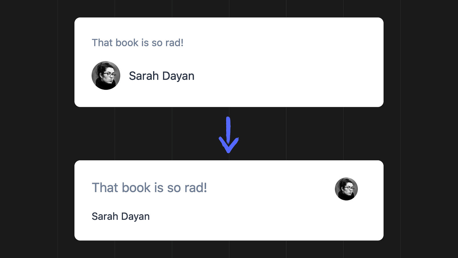
After a while, we decide to operate small changes in the comment component. Now we have to create variations to accomodate for this new use case. Our generic abstraction is no longer generic. Our component approach is showing its weakness: it led us to premature abstraction. Changing it forces us to constantly refactor.

When you look at it more closely, most complex UI components aren’t that reusable. This is why favoring composition is the most maintainable choice. You can’t predict the future. You don’t know where a UI will go, especially during early stages of a project.

Look at this UI. This block looks reusable. It’s repeated several times.

But here’s another component inside it. It could also be its own thing, since it’s repeated elsewhere. Notice, the one on top has a border. This means the component should support a variation.

And here’s another variation, without the background this time.

Oh, and check out these identical pieces of text. They’re exactly the same. Should they be components too?
When I say that most components aren’t reusable, I mean that they rarely are reused as is. They change, they have additional elements, some parts go away, some parts move, etc. The atom isn’t the component. The component is made of reusable pieces.
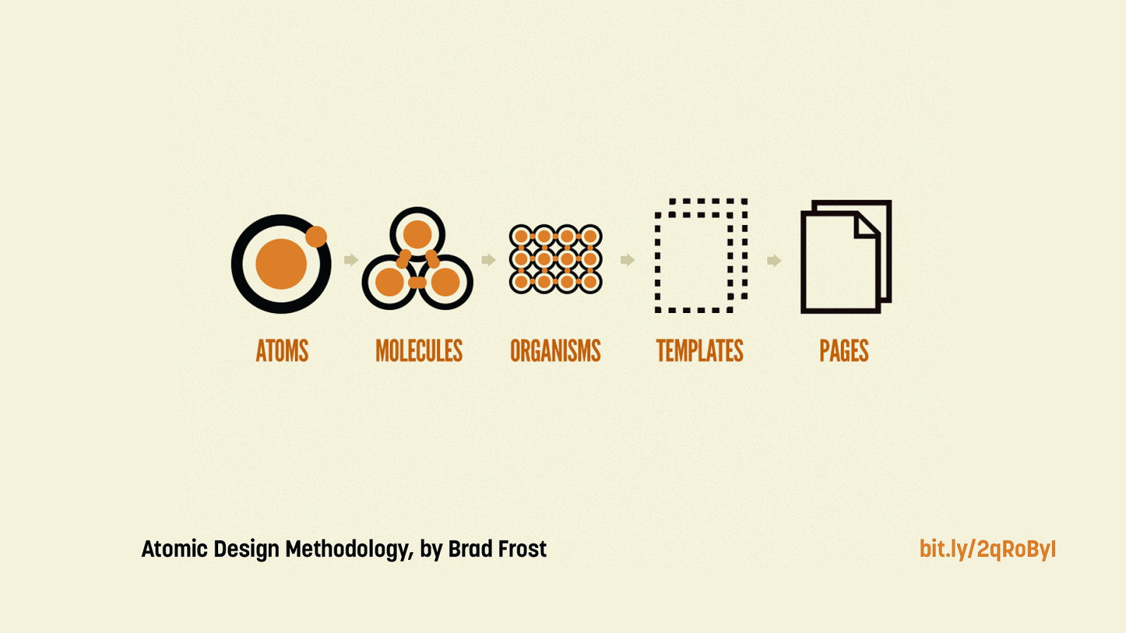
One way of rethinking reusability is find it in the way designers build UIs. Brad Frost came up with an approach called atomic design, which focuses on building design systems. It starts from the smallest elements, and reuses them to build bigger parts.
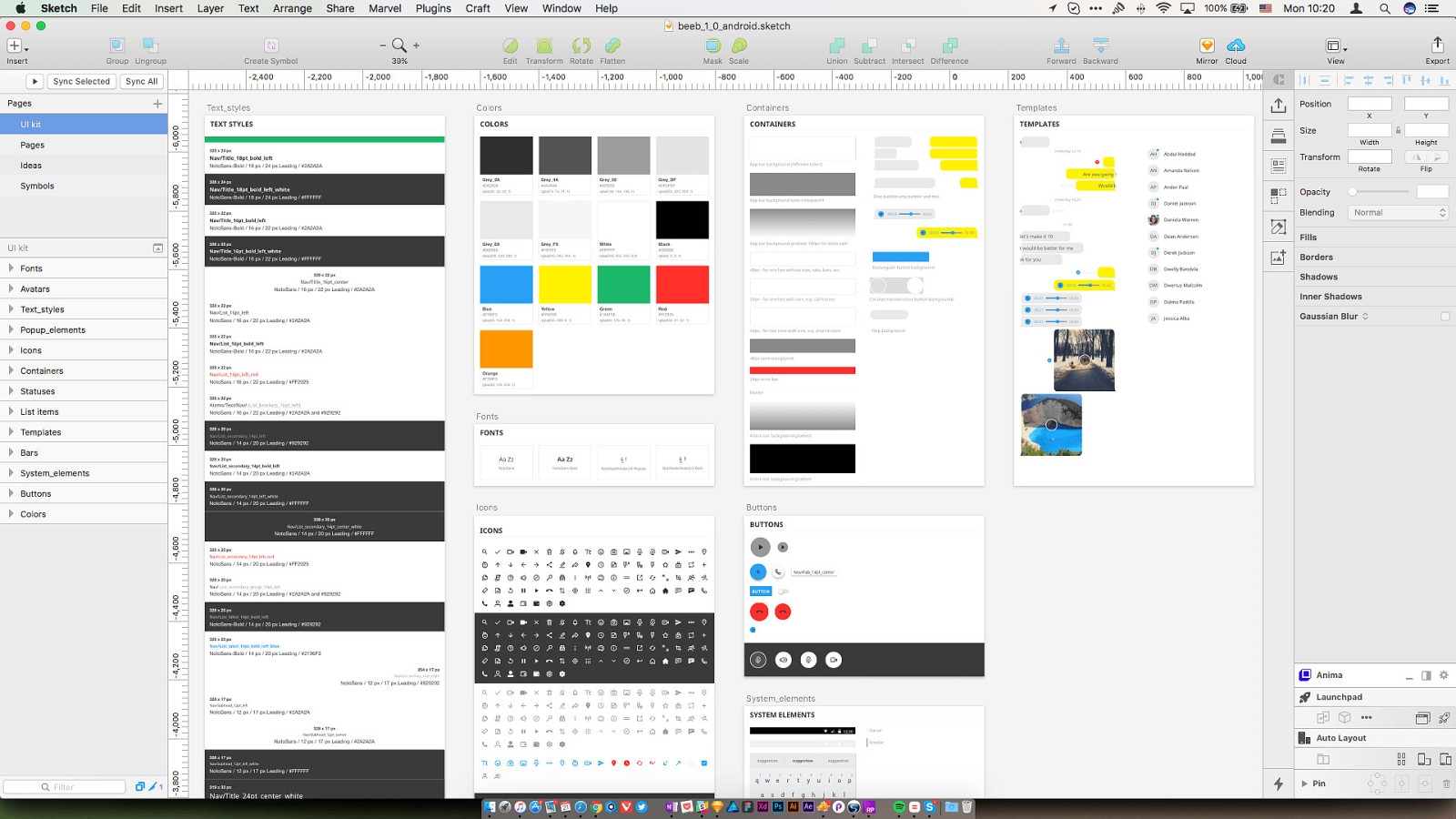
When you look at how designers work, you mostly see atoms. You see colors palettes. Font sizes. Spaces. Gradients. Icons. Components are small, like buttons or bages.
Reusing small atoms to compose bigger components is more resilient, because it’s immune to premature abstraction. Instead of adding new styles reactively, you reuse a well-thought out library that you build proactively.
A good indicator that your CSS scales well is that you don’t need to keep on writing more. This way, it doesn’t grow. You also don’t risk writing styles you already have, or diverging from your UI guidelines. And that is why I believe in using CSS as a design system, not a component library.
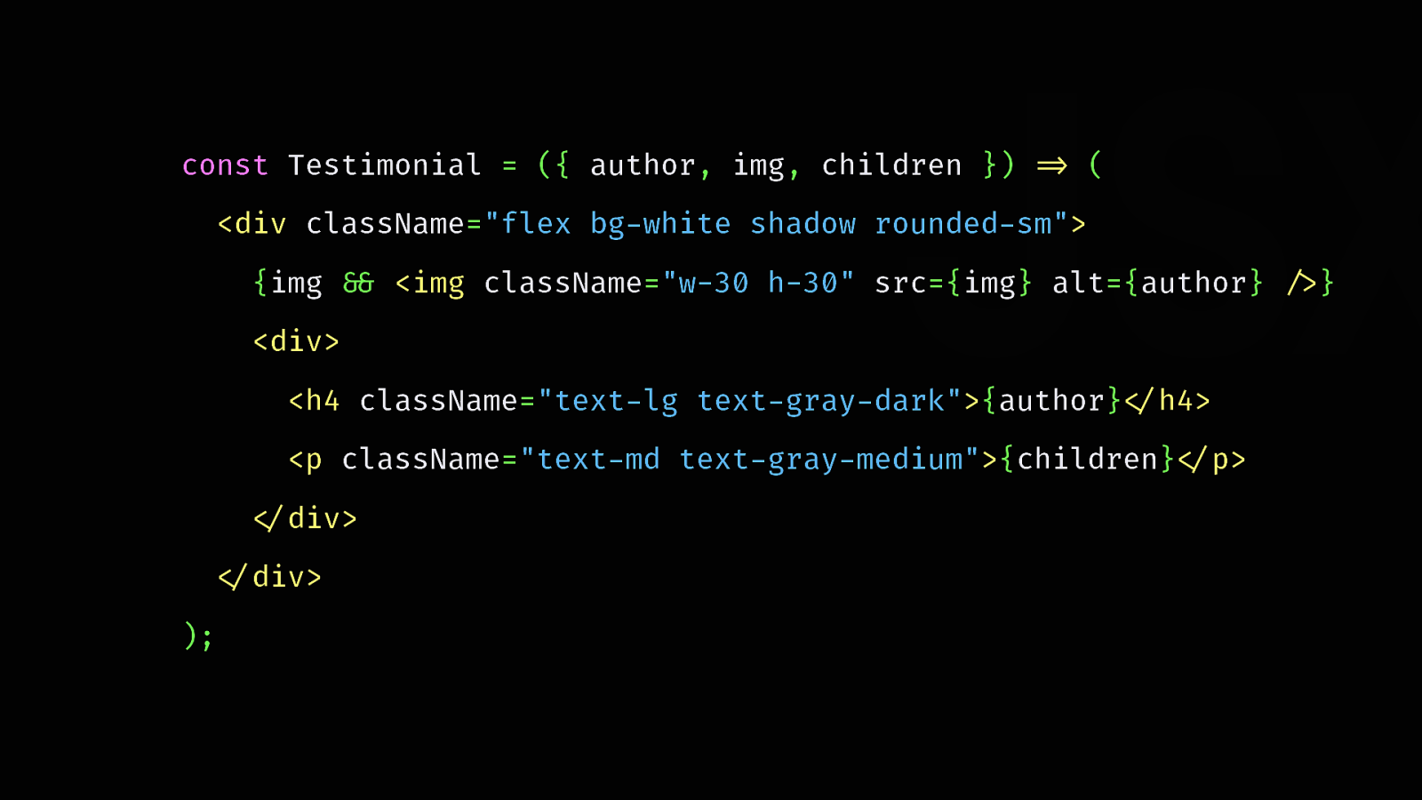
Abstracting into components makes more sense and works much better in the programming language you’re using in the front end. React, Vue, Ruby, PHP. That’s what it’s made for.
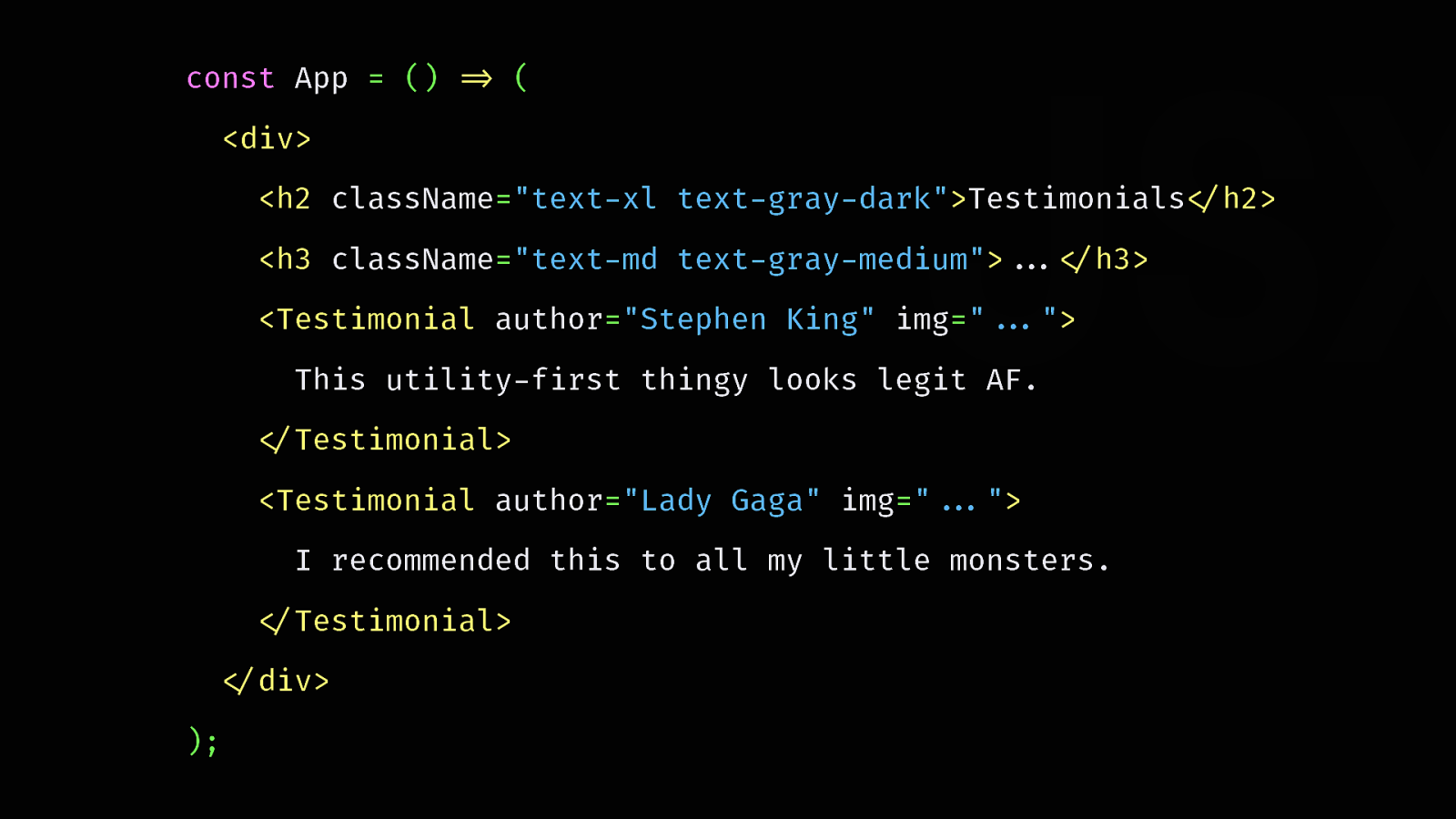
If you ever want to delete this section, all you have to do is… delete it. The CSS isn’t specifically linked to it, so you don’t have to worry about it. You don’t have an extra representation of your component to update.

“But it’s just like inline styles! Welcome back to 20 years ago.” Not because it looks the same means it is the same.
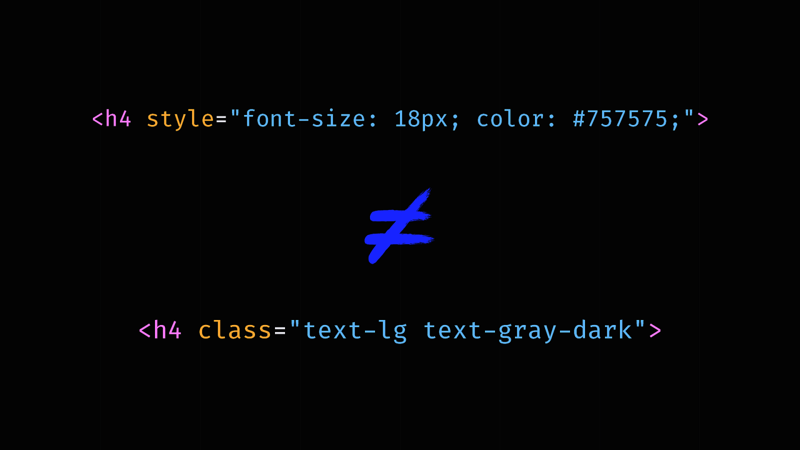
Utility classes are a well-defined API to compose more complex components. You maintain a consistent and limited catalog of allowed styles to choose from. You’re not granted total freedom like you are with inline styles.
But, won’t the HTML become super heavy with all those classes? That’s a valid concern, but…
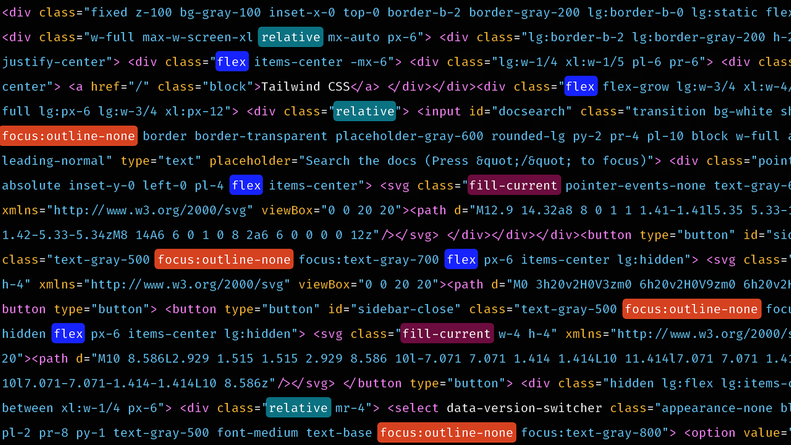
The neat thing with compression algorithms is that they do super well with repetition. When you compress such a file with Gzip or Brotli, it replaces all duplicates with references, and it safely encodes symbols with shorter representations.
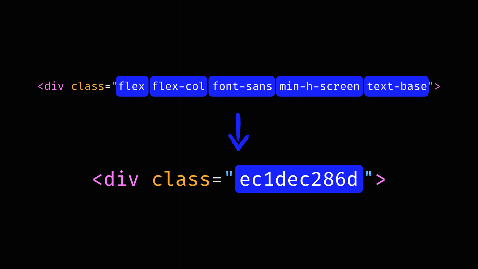
I did the experiment with homepage of the Algolia docs. I took all strings of utility classes, reordered them and hashed them to simulate a semantic approach.
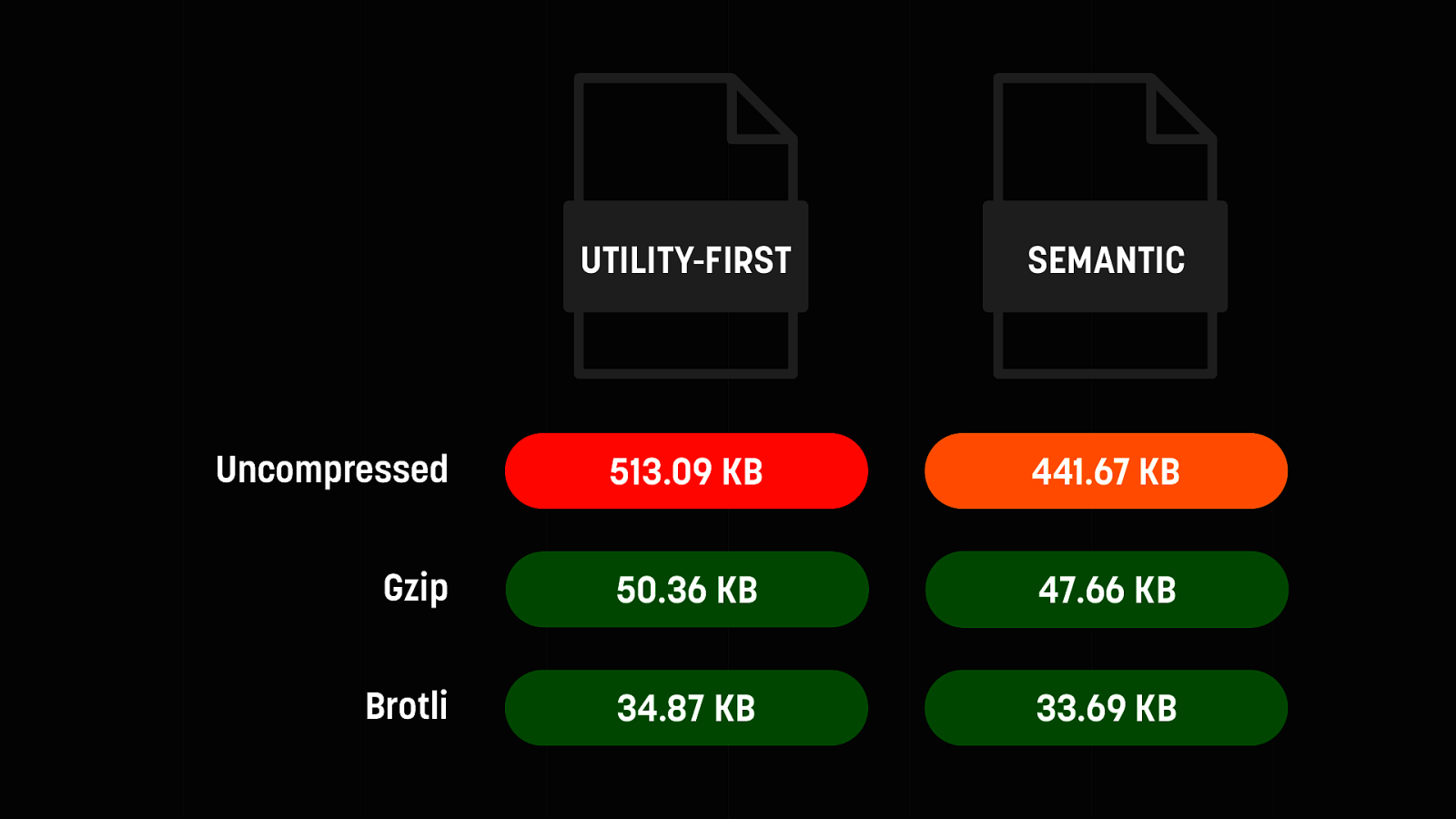
As you can guess, the size difference is important (71 KB). Yet, once compressed, this falls down to between 1.5 and 3 KB. This is insignificant.
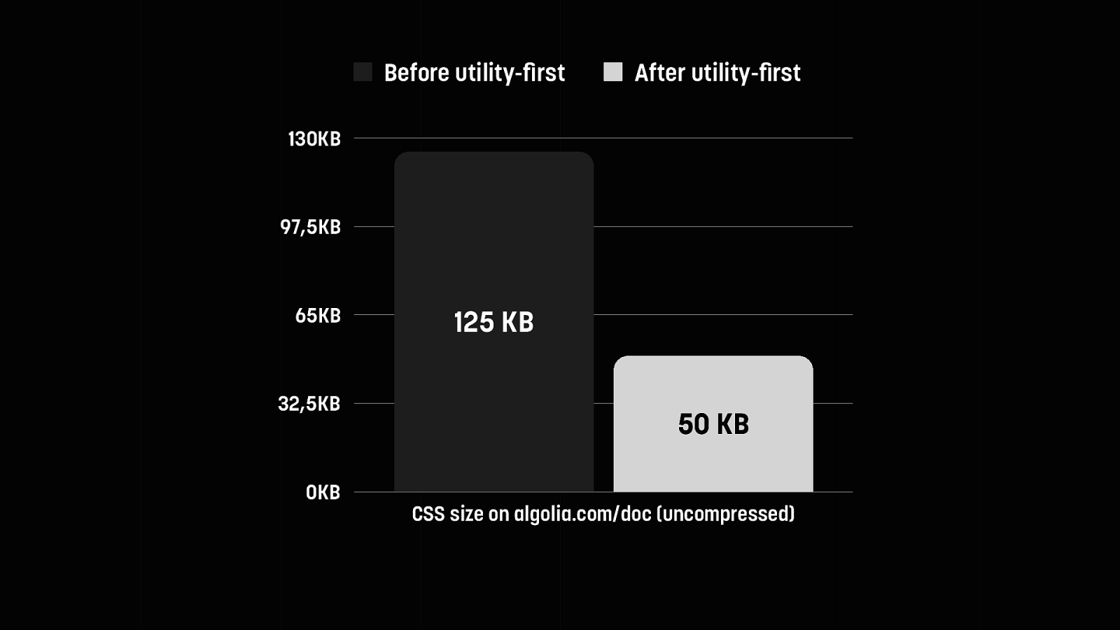
The other huge upside is, your CSS DOES get smaller, because you have less repetitions. This is the before/after of our transition to utility-first CSS on the Algolia docs. Now this may compress to similar sizes, but the parsing and matching of the CSS engine is much faster, since all classes are one level deep.

“Yeah, but it’s ugly!”
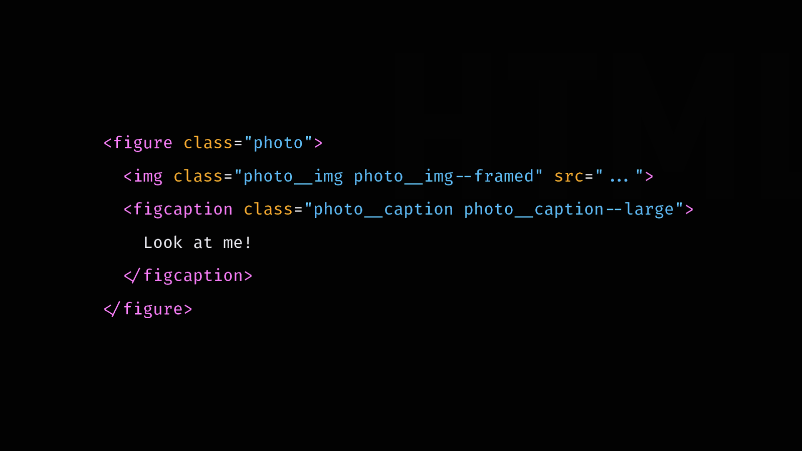
Do you remember the uproar when BEM started to become popular? Many people rejected it only because of its syntax. Now according to State of CSS 2019, it’s the most widely used CSS methodology.
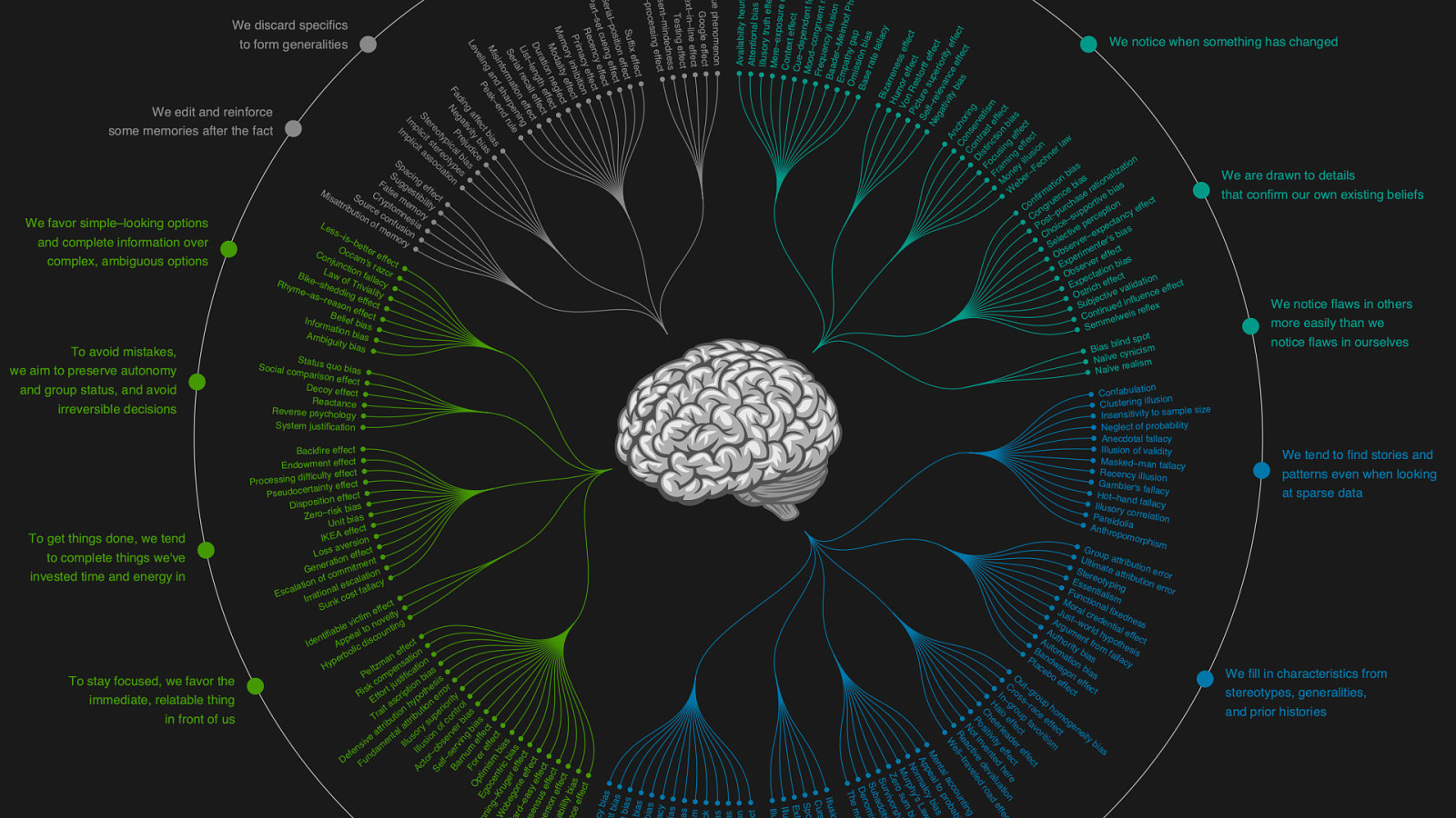
Our brain is cognitively biaised. We’ll always default to what we know and love, and reject what is different and uncomfortable. That’s why we need to keep an open mind. Cosmetic considerations shouldn’t come in the way of potentially useful techniques.
Yes. Absolutely. That’s precisely why it’s called utility-first and not utility-only. Utility-first isn’t about ditching components altogether. It means you should start off with utility classes, make the most of them, and only abstract when you see repeating patterns. You’re allowing your project to grow while remaining flexible, and identify actual components over time, when patterns start to emerge.

And yes, you’re probably going to use tons of buttons, so it makes sense to abstract them early on. But are you ever going to reuse a testimonial block? Or enough that it’s worth being a component? Will it always look like this in every context?

Keep your options open. It’s a lot easier to later abstract a composite style into a component than to try and undo one.
We, as developers, must be the first to embrace change. Our industry is still young, and we’re figuring things out as we go. Utility-first will probably be replaces by something better at some point. In the meantime, let’s try to stay open-minded, and do what’s best for the industry, the projects, and the users.

Thank you!
bit.ly/2pO9aGX @frontstuff_io