
A presentation at Front-end Day at Making Waves in in Oslo, Norway by Ronny Siikaluoma

THE GRID The future of CSS layout
Evolution of web layout
float
display: inline-block
display: table
position: absolute
CSS Frameworks
display: flex
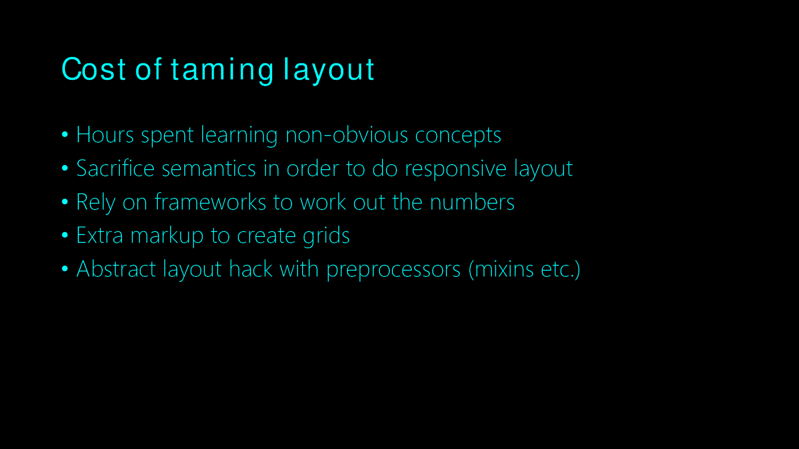
Cost of taming layout • Hours spent learning non-obvious concepts • Sacrifice semantics in order to do responsive layout • Rely on frameworks to work out the numbers • Extra markup to create grids • Abstract layout hack with preprocessors (mixins etc.)
display: grid
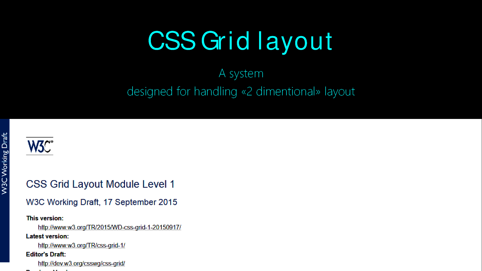
CSS Grid layout A system designed for handling «2 dimentional» layout
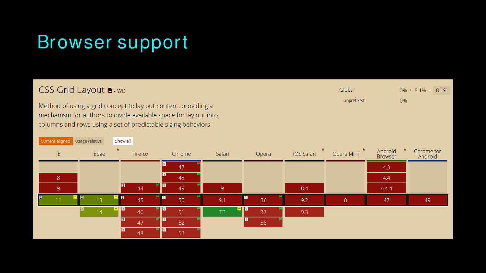
Browser support
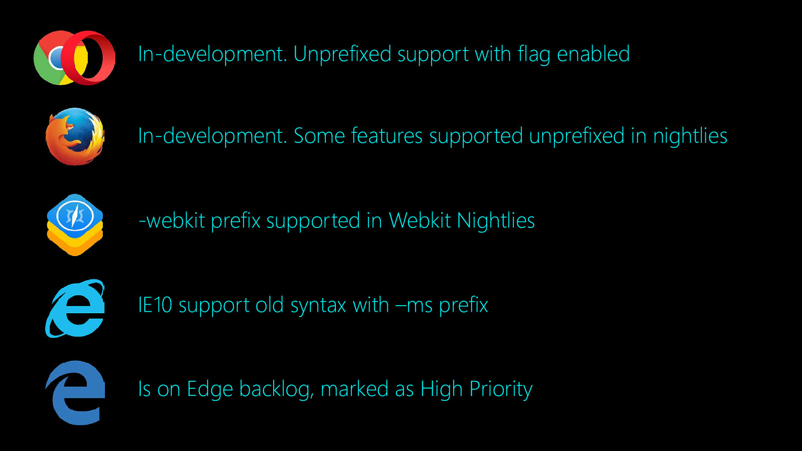
In-development. Unprefixed support with flag enabled In-development. Some features supported unprefixed in nightlies -webkit prefix supported in Webkit Nightlies IE10 support old syntax with –ms prefix Is on Edge backlog, marked as High Priority
The basics
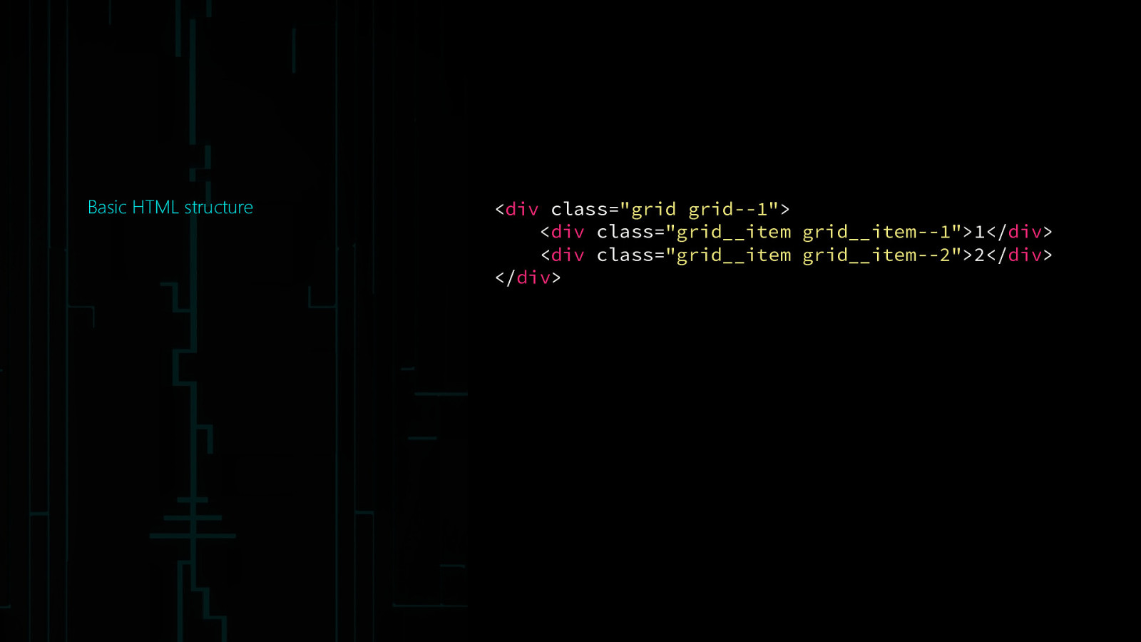
Basic HTML structure
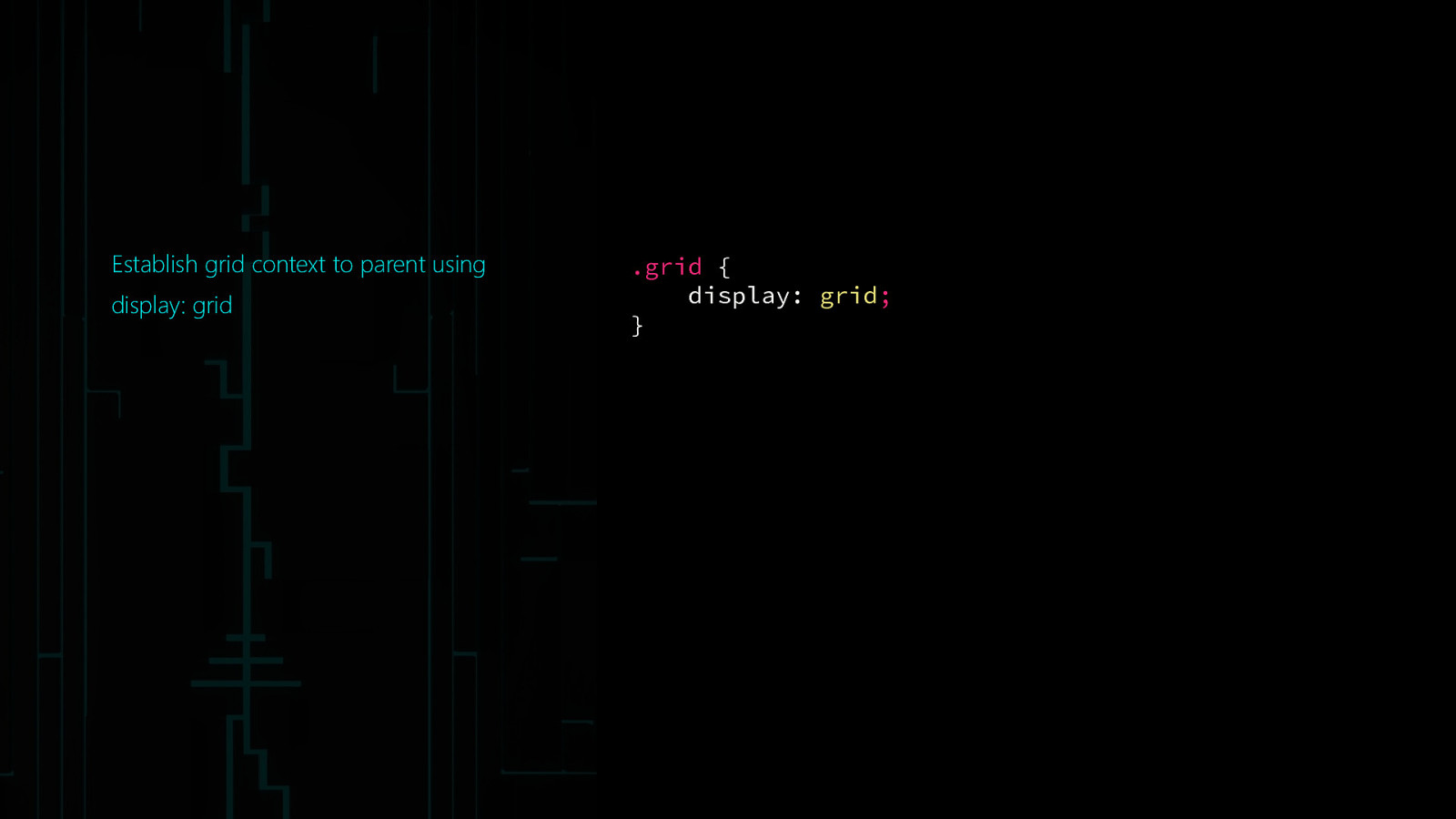
<div class=”grid grid—1”> <div class=”grid__item grid__item—1”>1</div> <div class=”grid__item grid__item—2”>2</div> </div>Establish grid context to parent using display: grid .grid { display: grid; }
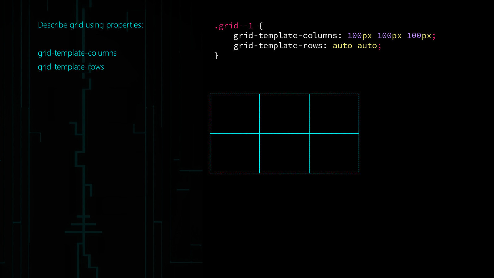
Describe grid using properties: grid-template-columns grid-template-rows .grid—1 { grid-template-columns: 100px 100px 100px; grid-template-rows: auto auto; }
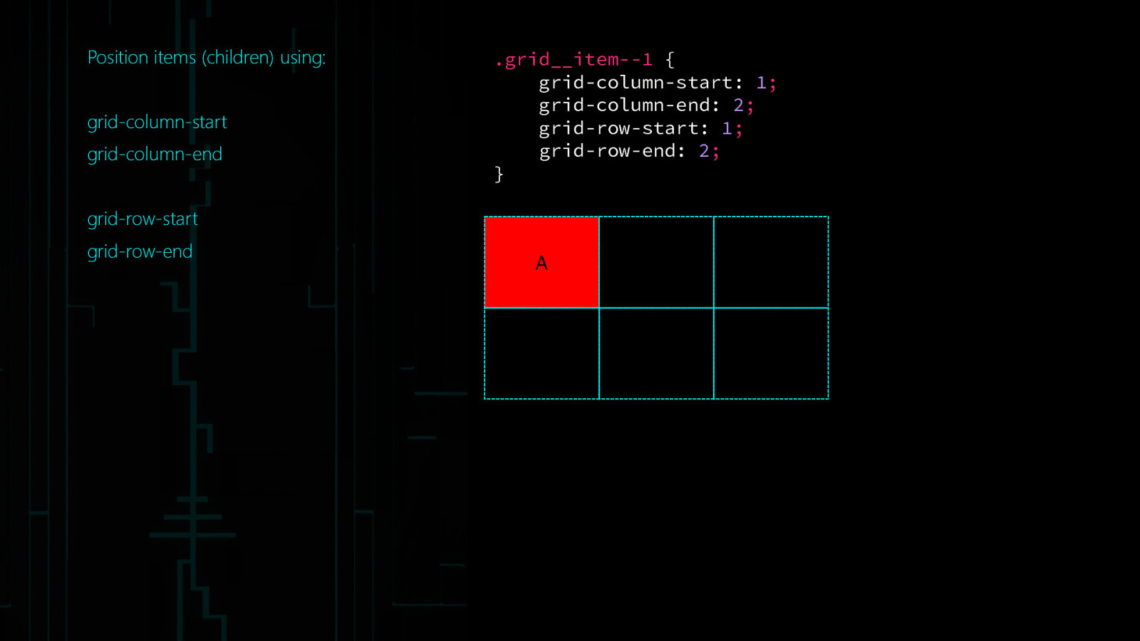
Position items (children) using: grid-column-start grid-column-end .grid__item—1 { grid-column-start: 1; grid-column-end: 2; grid-row-start: 1; grid-row-end: 2; } grid-row-start grid-row-end A
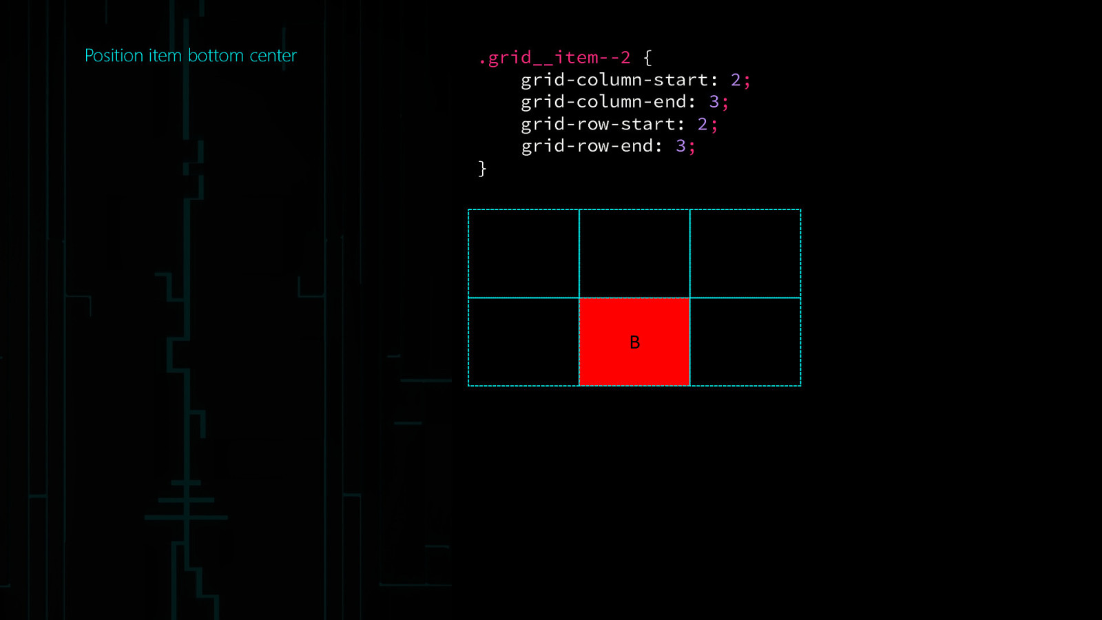
Position item bottom center .grid__item—2 { grid-column-start: 2; grid-column-end: 3; grid-row-start: 2; grid-row-end: 3; } B
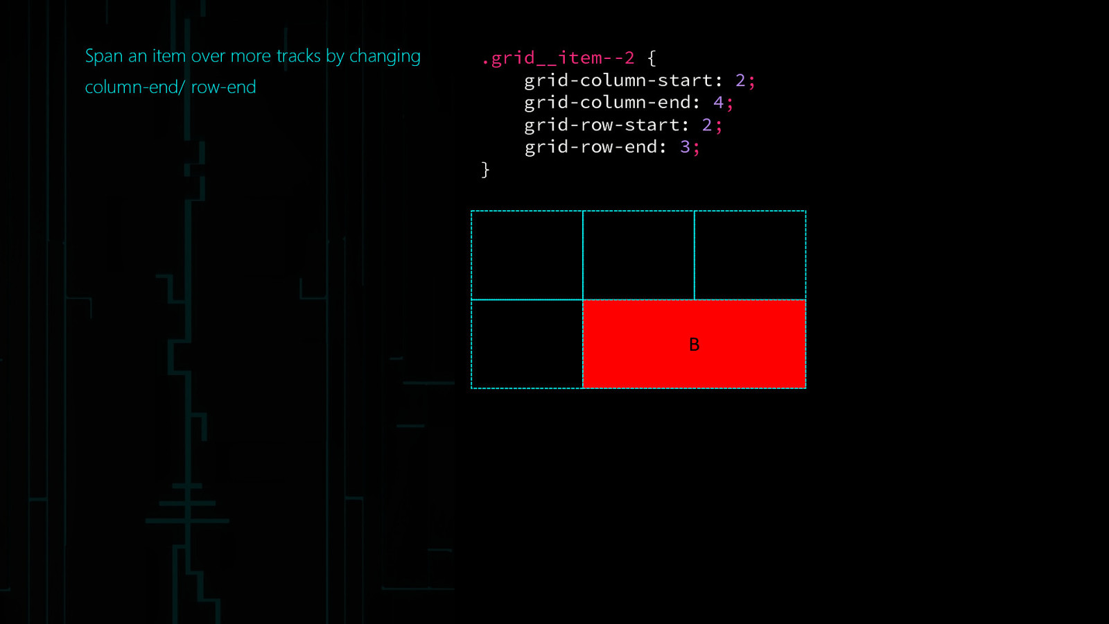
Span an item over more tracks by changing column-end/ row-end .grid__item—2 { grid-column-start: 2; grid-column-end: 4; grid-row-start: 2; grid-row-end: 3; } B
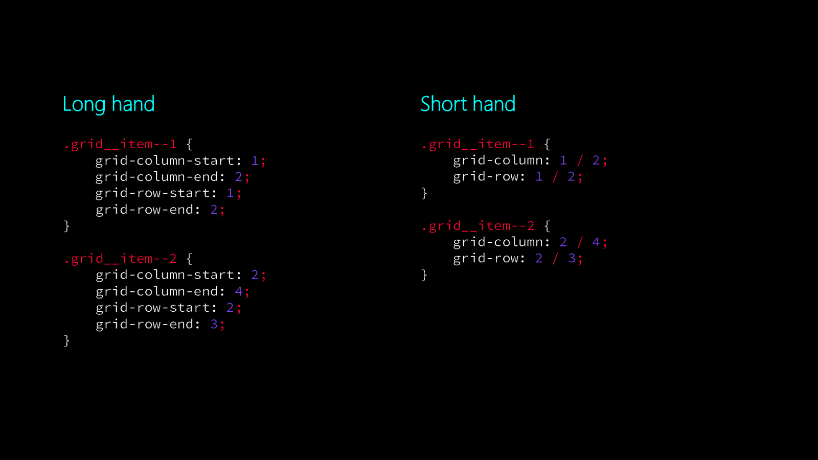
Long hand Short hand .grid__item—1 { grid-column-start: 1; grid-column-end: 2; grid-row-start: 1; grid-row-end: 2; } .grid__item—1 { grid-column: 1 / 2; grid-row: 1 / 2; } .grid__item—2 { grid-column-start: 2; grid-column-end: 4; grid-row-start: 2; grid-row-end: 3; } .grid__item—2 { grid-column: 2 / 4; grid-row: 2 / 3; }
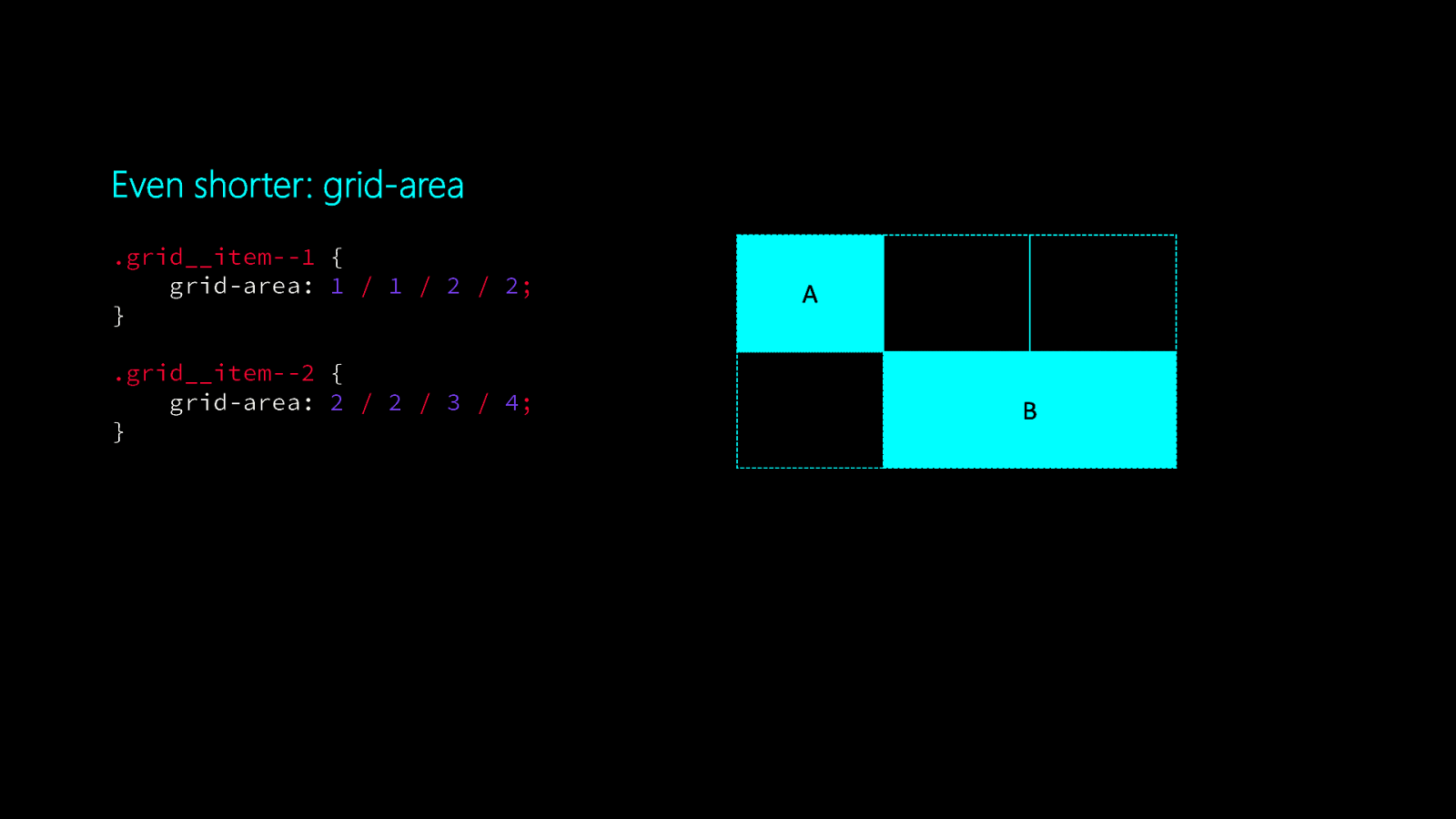
Even shorter: grid-area .grid__item—1 { grid-area: 1 / 1 / 2 / 2; } .grid__item—2 { grid-area: 2 / 2 / 3 / 4; } A B
Terminology
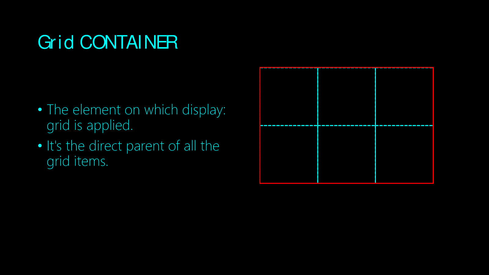
Grid CONTAINER • The element on which display: grid is applied. • It’s the direct parent of all the grid items.
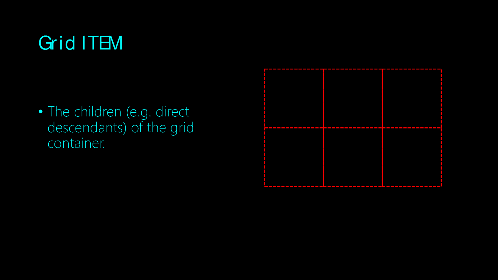
Grid ITEM • The children (e.g. direct descendants) of the grid container.
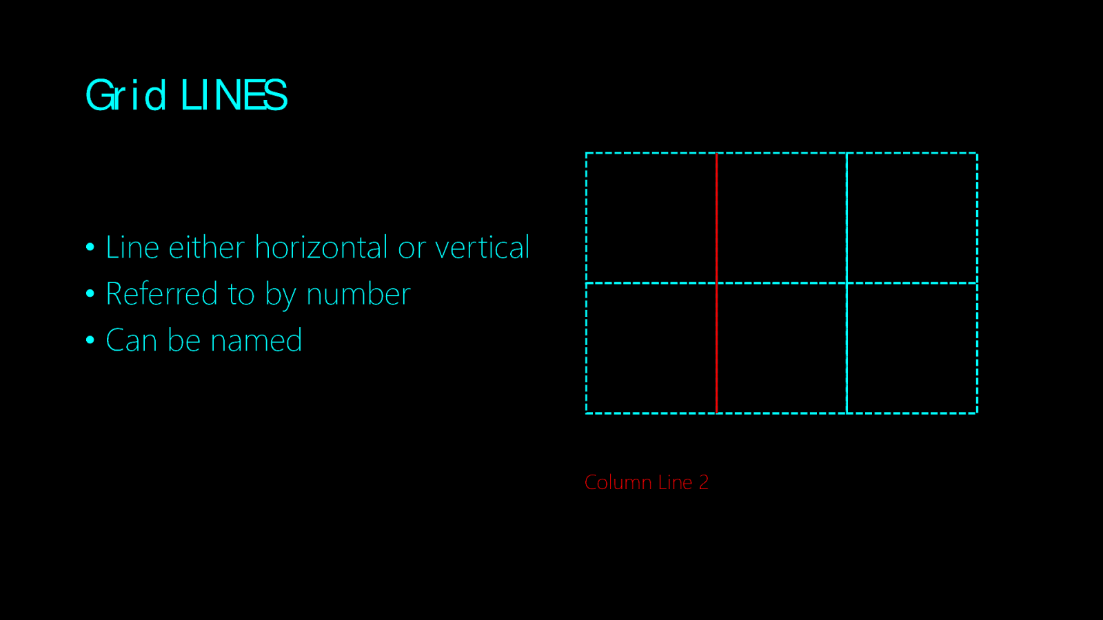
Grid LINES • Line either horizontal or vertical • Referred to by number • Can be named Column Line 2
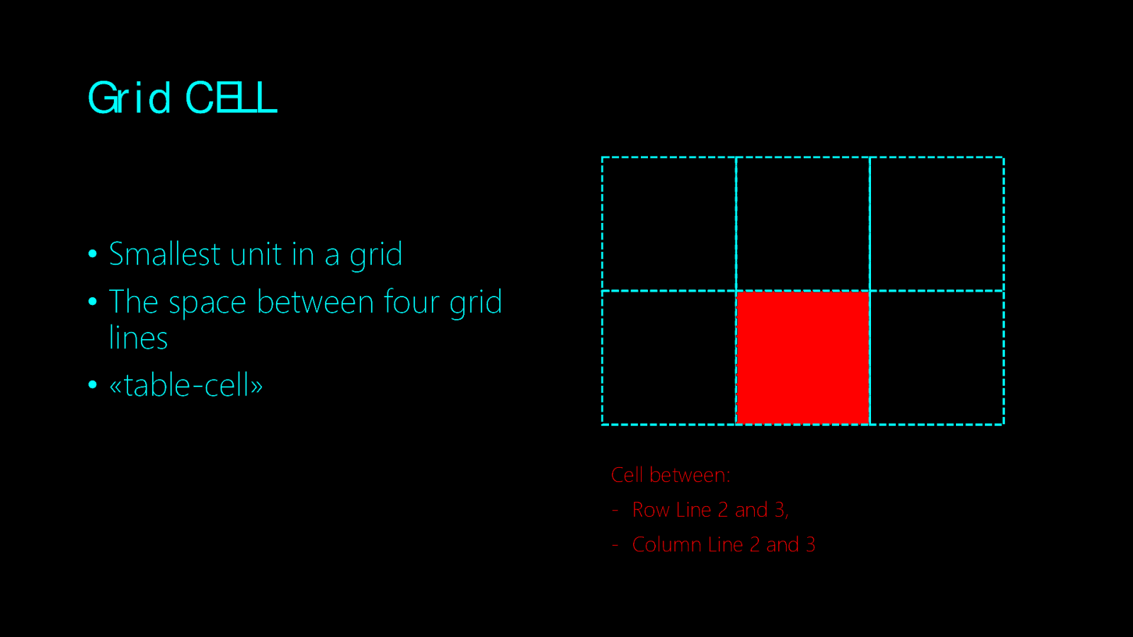
Grid CELL • Smallest unit in a grid • The space between four grid lines • «table-cell» Cell between: - Row Line 2 and 3, - Column Line 2 and 3
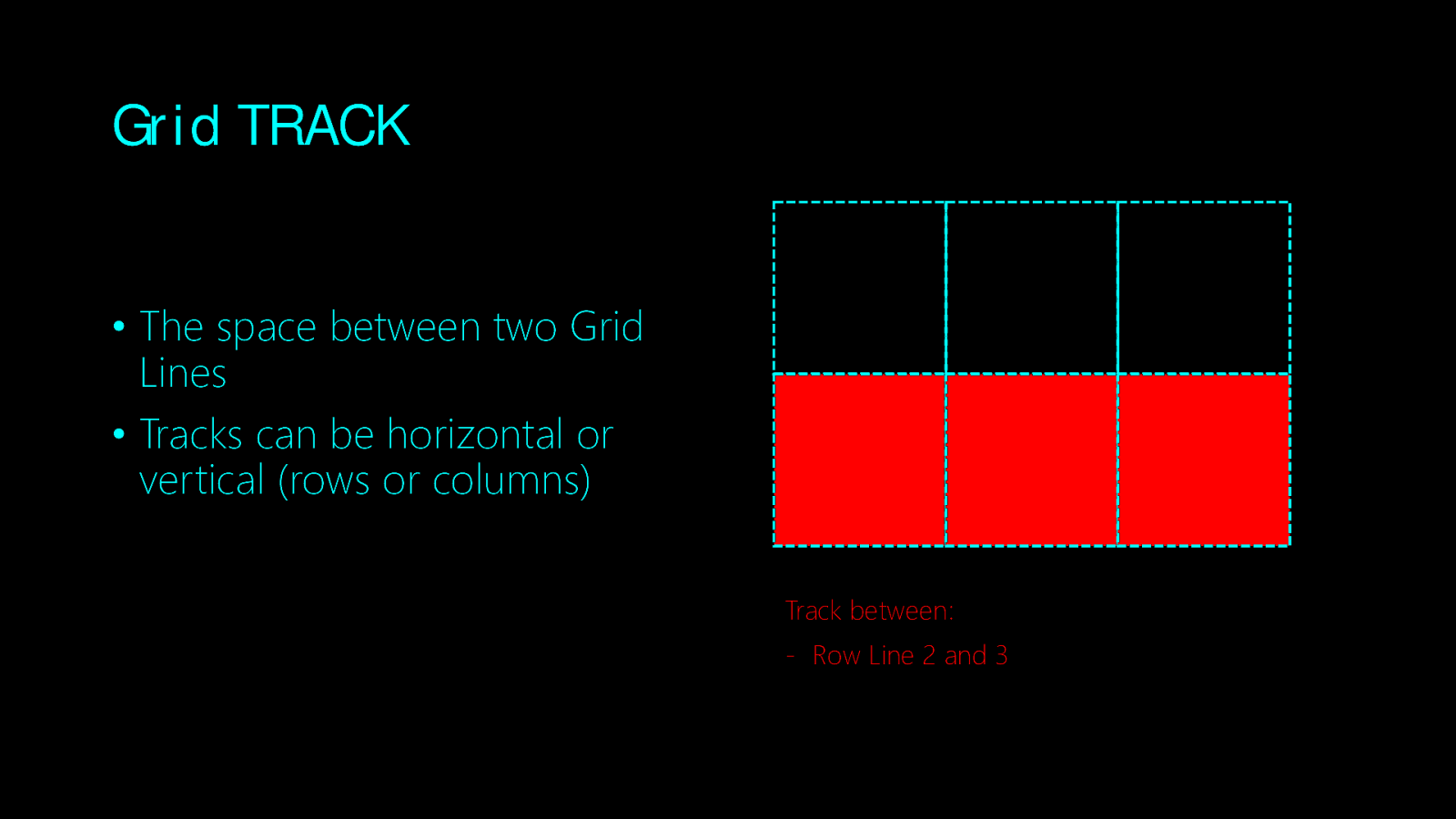
Grid TRACK • The space between two Grid Lines • Tracks can be horizontal or vertical (rows or columns) Track between: - Row Line 2 and 3
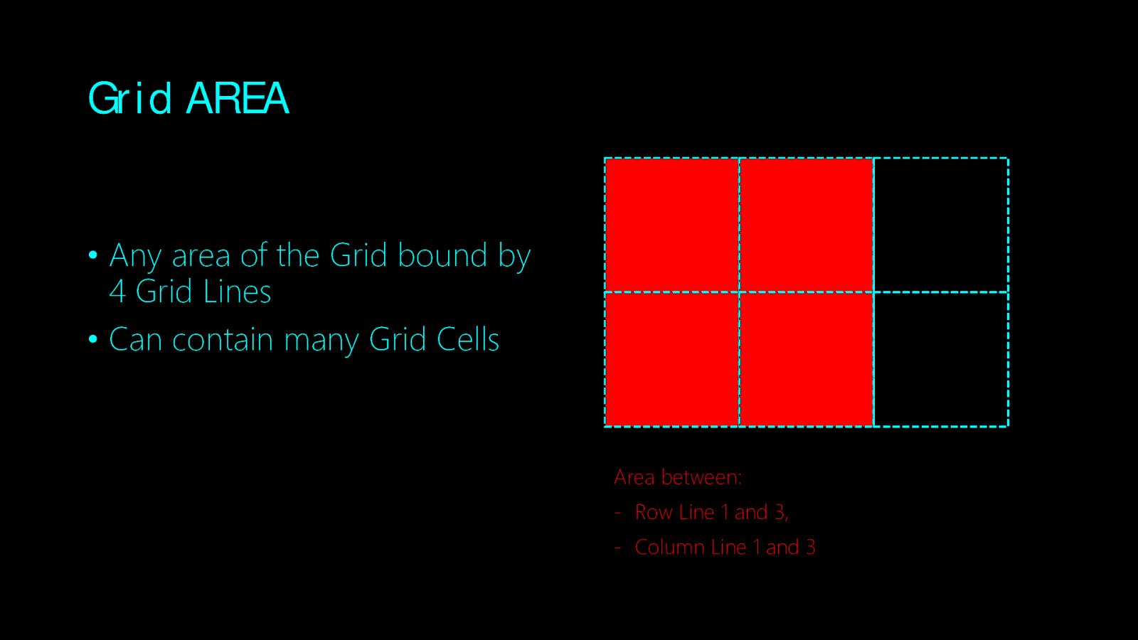
Grid AREA • Any area of the Grid bound by 4 Grid Lines • Can contain many Grid Cells Area between: - Row Line 1 and 3, - Column Line 1 and 3
Movin’ on
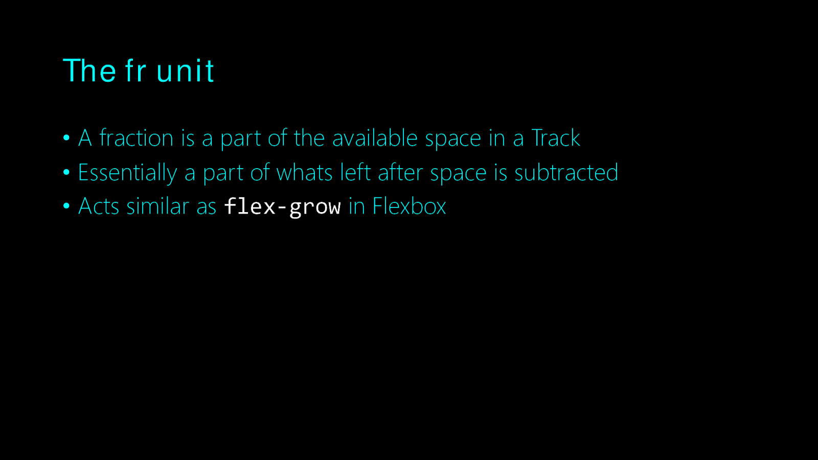
The fr unit • A fraction is a part of the available space in a Track • Essentially a part of whats left after space is subtracted • Acts similar as flex-grow in Flexbox
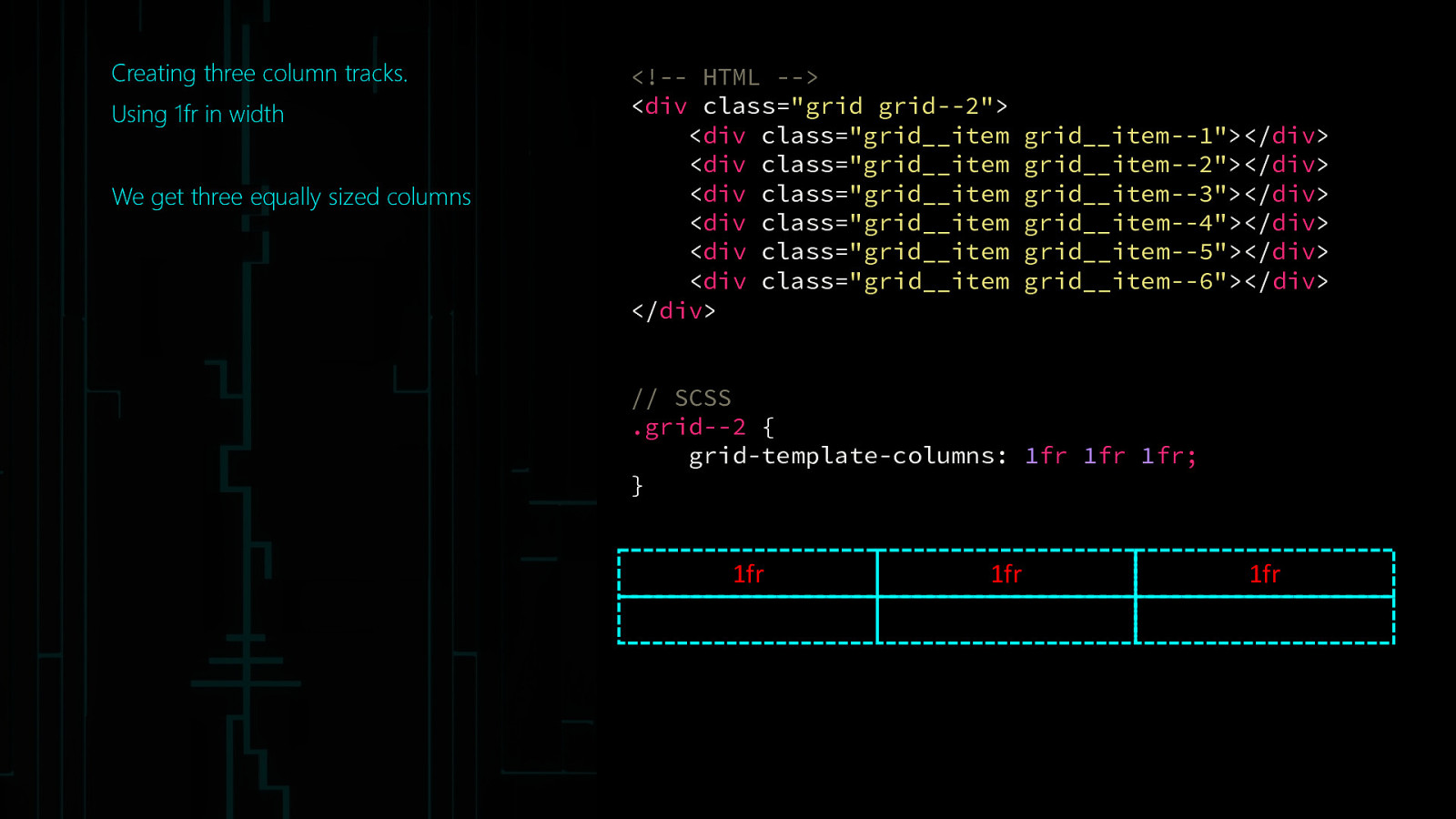
Creating three column tracks. Using 1fr in width We get three equally sized columns
<!— HTML —> <div class=”grid grid—2”> <div class=”grid__item <div class=”grid__item <div class=”grid__item <div class=”grid__item <div class=”grid__item <div class=”grid__item </div>grid__item—1”></div> grid__item—2”></div> grid__item—3”></div> grid__item—4”></div> grid__item—5”></div> grid__item—6”></div> // SCSS .grid—2 { grid-template-columns: 1fr 1fr 1fr; } 1fr 1fr 1fr
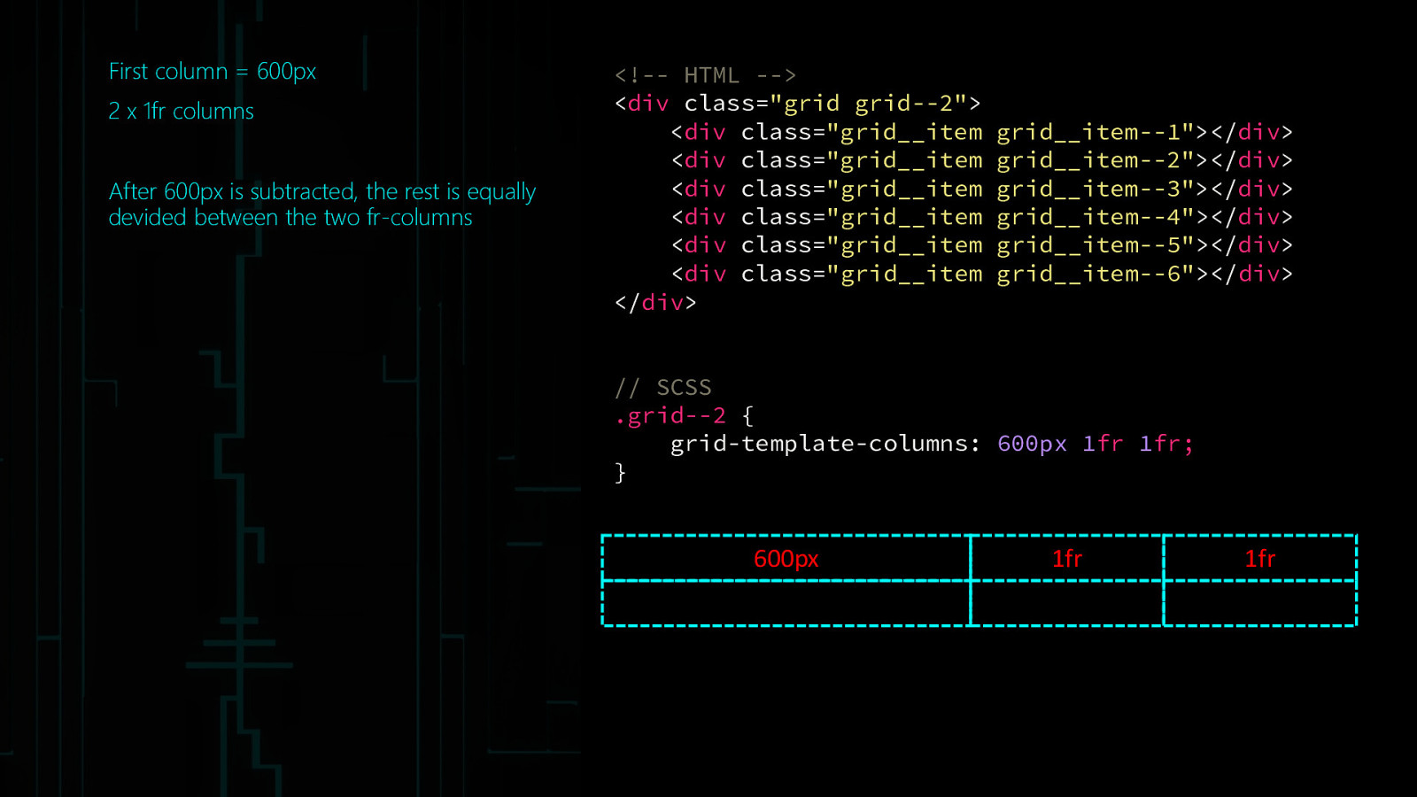
First column = 600px 2 x 1fr columns After 600px is subtracted, the rest is equally devided between the two fr-columns
<!— HTML —> <div class=”grid grid—2”> <div class=”grid__item <div class=”grid__item <div class=”grid__item <div class=”grid__item <div class=”grid__item <div class=”grid__item </div>grid__item—1”></div> grid__item—2”></div> grid__item—3”></div> grid__item—4”></div> grid__item—5”></div> grid__item—6”></div> // SCSS .grid—2 { grid-template-columns: 600px 1fr 1fr; } 600px 1fr 1fr
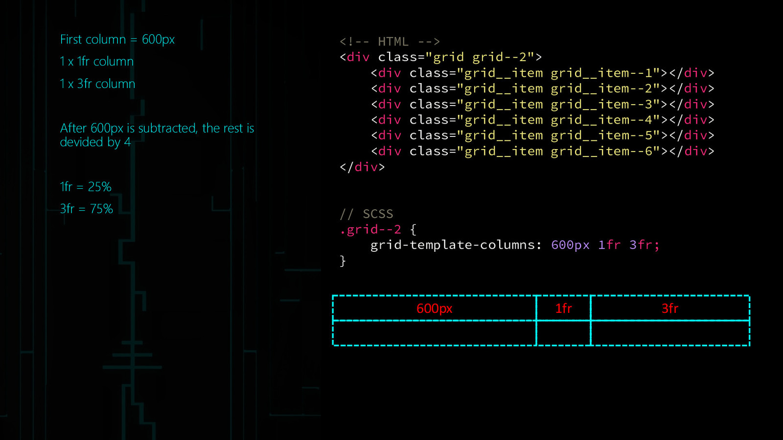
First column = 600px 1 x 1fr column 1 x 3fr column After 600px is subtracted, the rest is devided by 4
<!— HTML —> <div class=”grid grid—2”> <div class=”grid__item <div class=”grid__item <div class=”grid__item <div class=”grid__item <div class=”grid__item <div class=”grid__item </div>grid__item—1”></div> grid__item—2”></div> grid__item—3”></div> grid__item—4”></div> grid__item—5”></div> grid__item—6”></div> 1fr = 25% 3fr = 75% // SCSS .grid—2 { grid-template-columns: 600px 1fr 3fr; } 600px 1fr 3fr
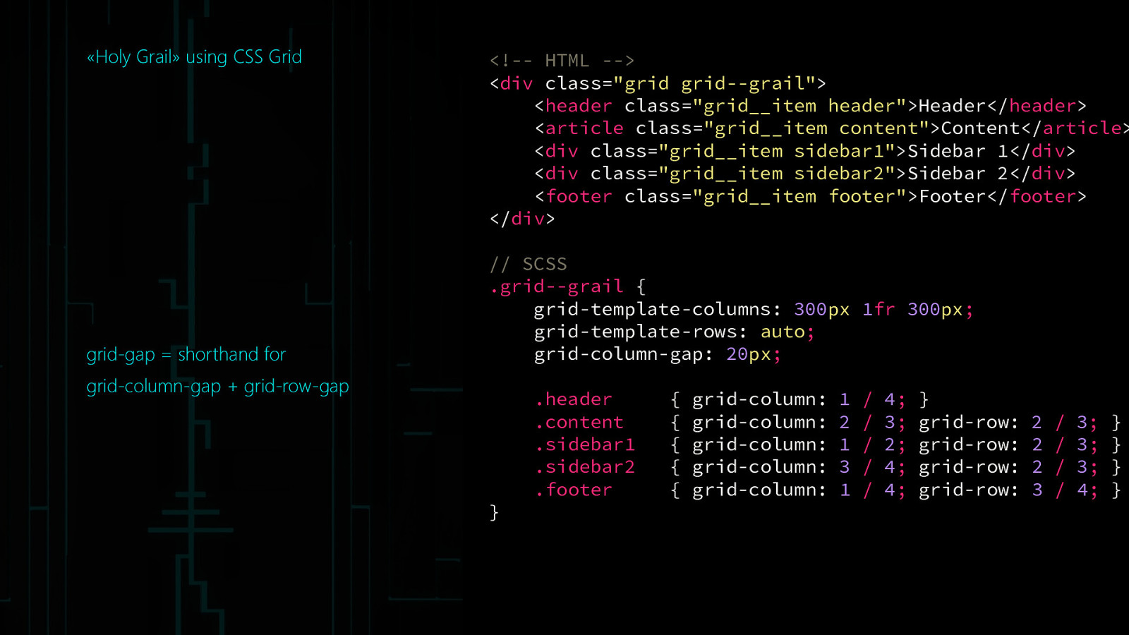
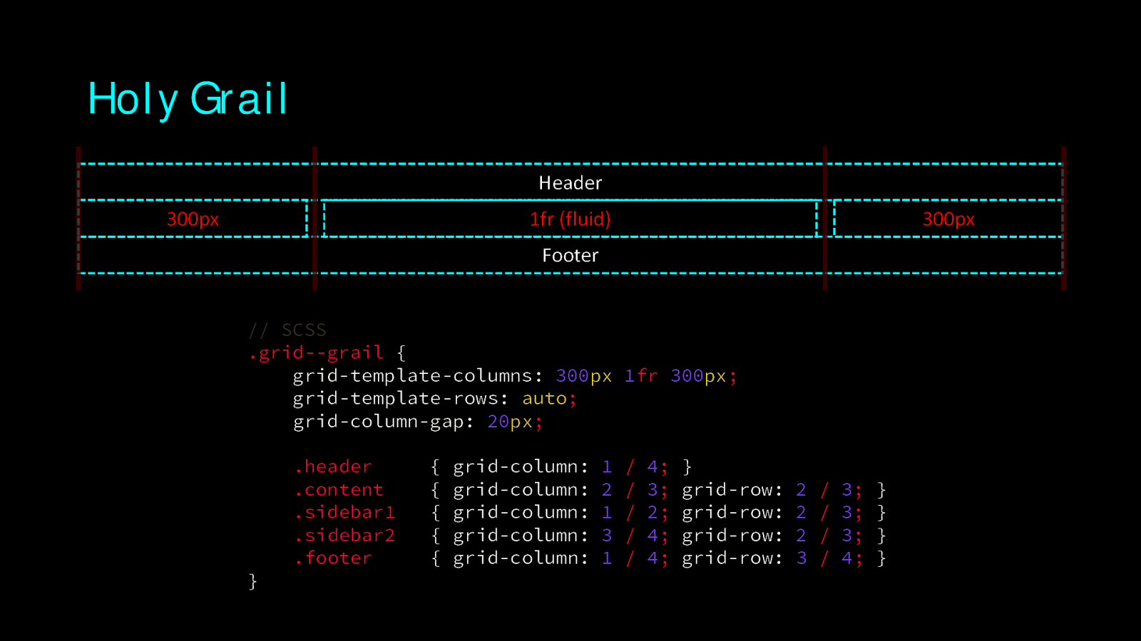
«Holy Grail» using CSS Grid grid-gap = shorthand for
<!— HTML —> <div class=”grid grid—grail”> <header class=”grid__item header”>Header</header> <article class=”grid__item content”>Content</article> <div class=”grid__item sidebar1”>Sidebar 1</div> <div class=”grid__item sidebar2”>Sidebar 2</div> <footer class=”grid__item footer”>Footer</footer> </div> // SCSS .grid—grail { grid-template-columns: 300px 1fr 300px; grid-template-rows: auto; grid-column-gap: 20px;grid-column-gap + grid-row-gap } .header .content .sidebar1 .sidebar2 .footer { { { { { grid-column: grid-column: grid-column: grid-column: grid-column: 1 2 1 3 1 / / / / / 4; 3; 2; 4; 4; } grid-row: grid-row: grid-row: grid-row: 2 2 2 3 / / / / 3; 3; 3; 4; } } } }
Holy Grail Header 300px 1fr (fluid) 300px Footer // SCSS .grid—grail { grid-template-columns: 300px 1fr 300px; grid-template-rows: auto; grid-column-gap: 20px; } .header .content .sidebar1 .sidebar2 .footer { { { { { grid-column: grid-column: grid-column: grid-column: grid-column: 1 2 1 3 1 / / / / / 4; 3; 2; 4; 4; } grid-row: grid-row: grid-row: grid-row: 2 2 2 3 / / / / 3; 3; 3; 4; } } } }
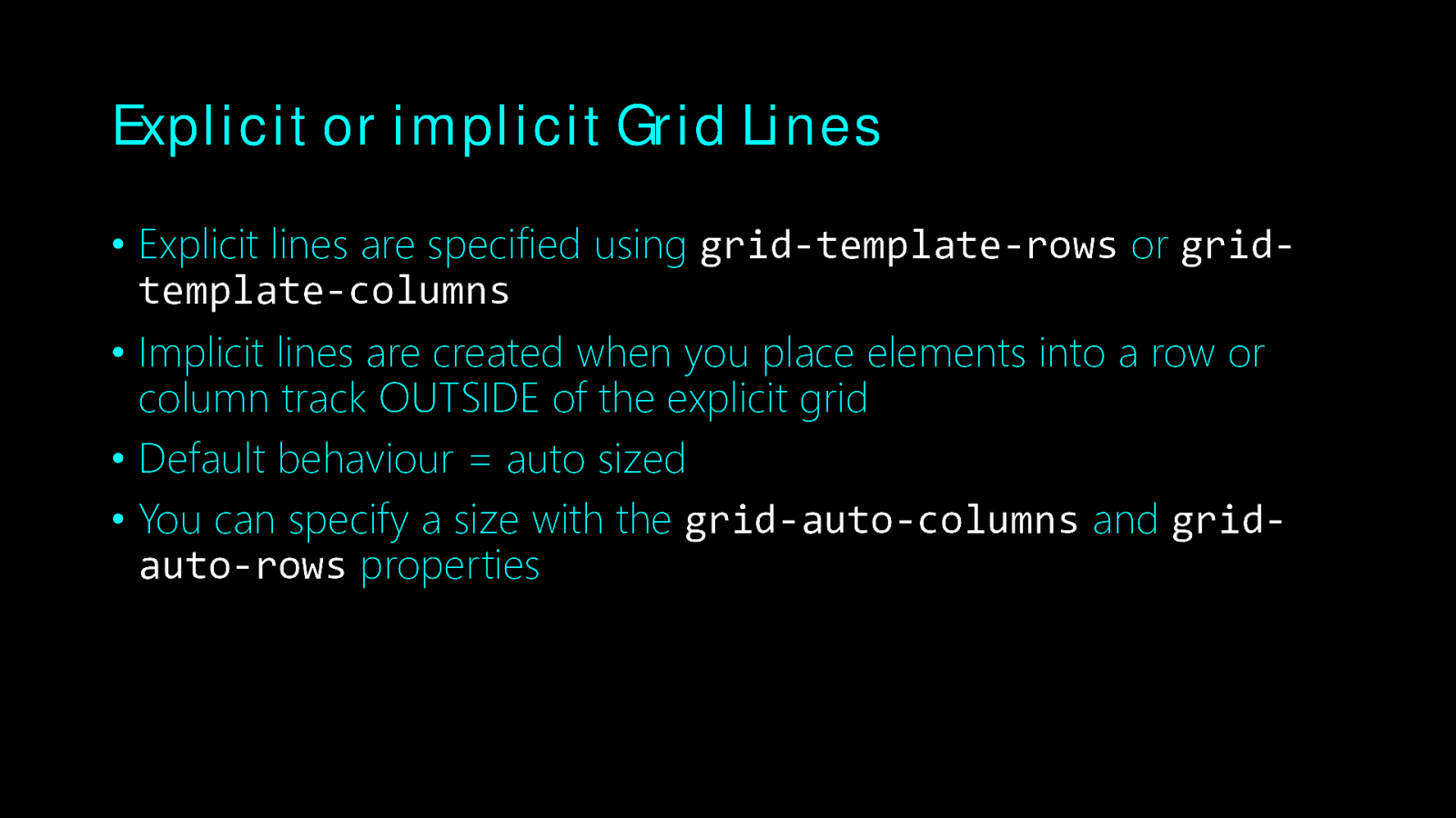
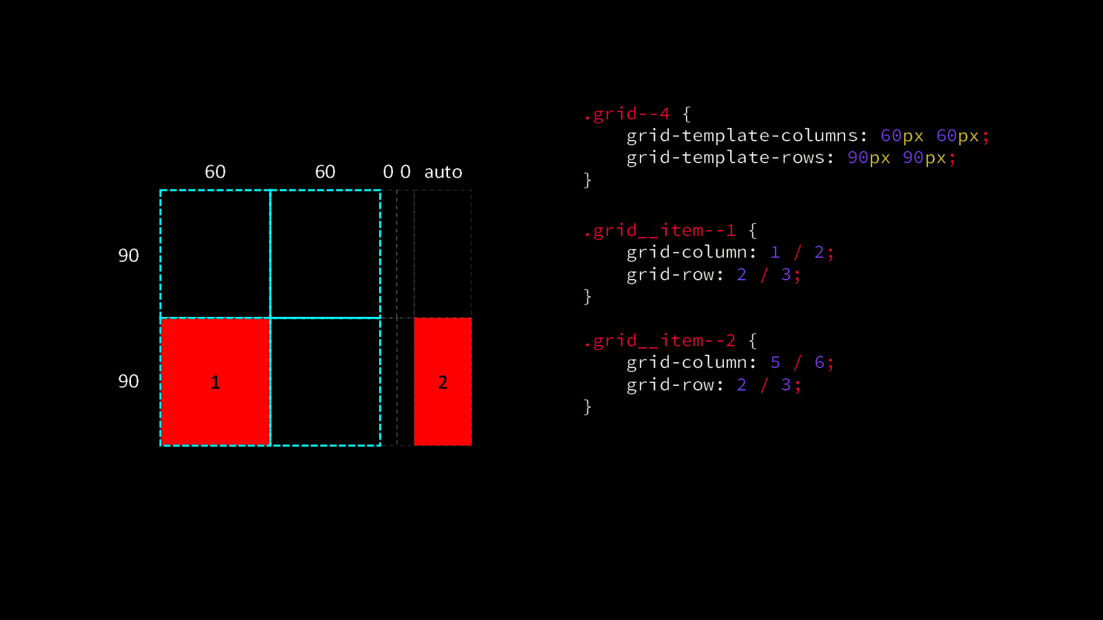
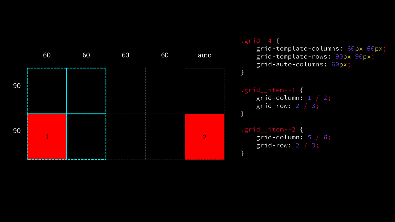
Explicit or implicit Grid Lines • Explicit lines are specified using grid-template-rows or gridtemplate-columns • Implicit lines are created when you place elements into a row or column track OUTSIDE of the explicit grid • Default behaviour = auto sized • You can specify a size with the grid-auto-columns and gridauto-rows properties
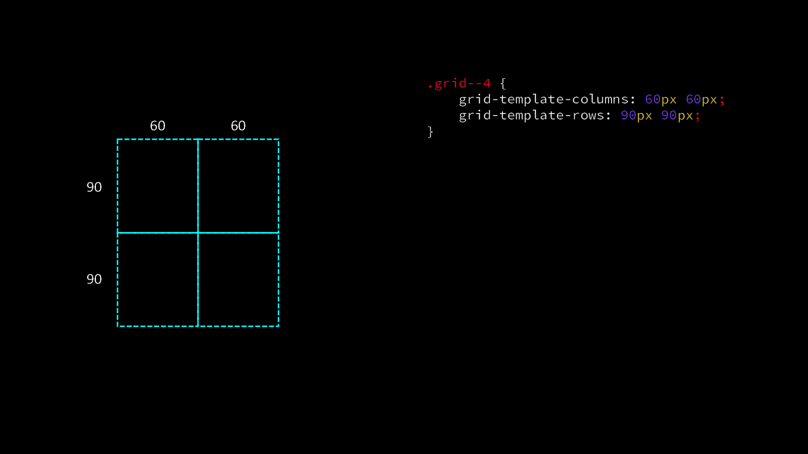
60 90 90 60 .grid—4 { grid-template-columns: 60px 60px; grid-template-rows: 90px 90px; }
60 60 0 0 auto .grid—4 { grid-template-columns: 60px 60px; grid-template-rows: 90px 90px; } 90 .grid__item—1 { grid-column: 1 / 2; grid-row: 2 / 3; } 90 .grid__item—2 { grid-column: 5 / 6; grid-row: 2 / 3; } 1 2
60 60 60 60 auto 90 90 .grid—4 { grid-template-columns: 60px 60px; grid-template-rows: 90px 90px; grid-auto-columns: 60px; } .grid__item—1 { grid-column: 1 / 2; grid-row: 2 / 3; } 1 2 .grid__item—2 { grid-column: 5 / 6; grid-row: 2 / 3; }
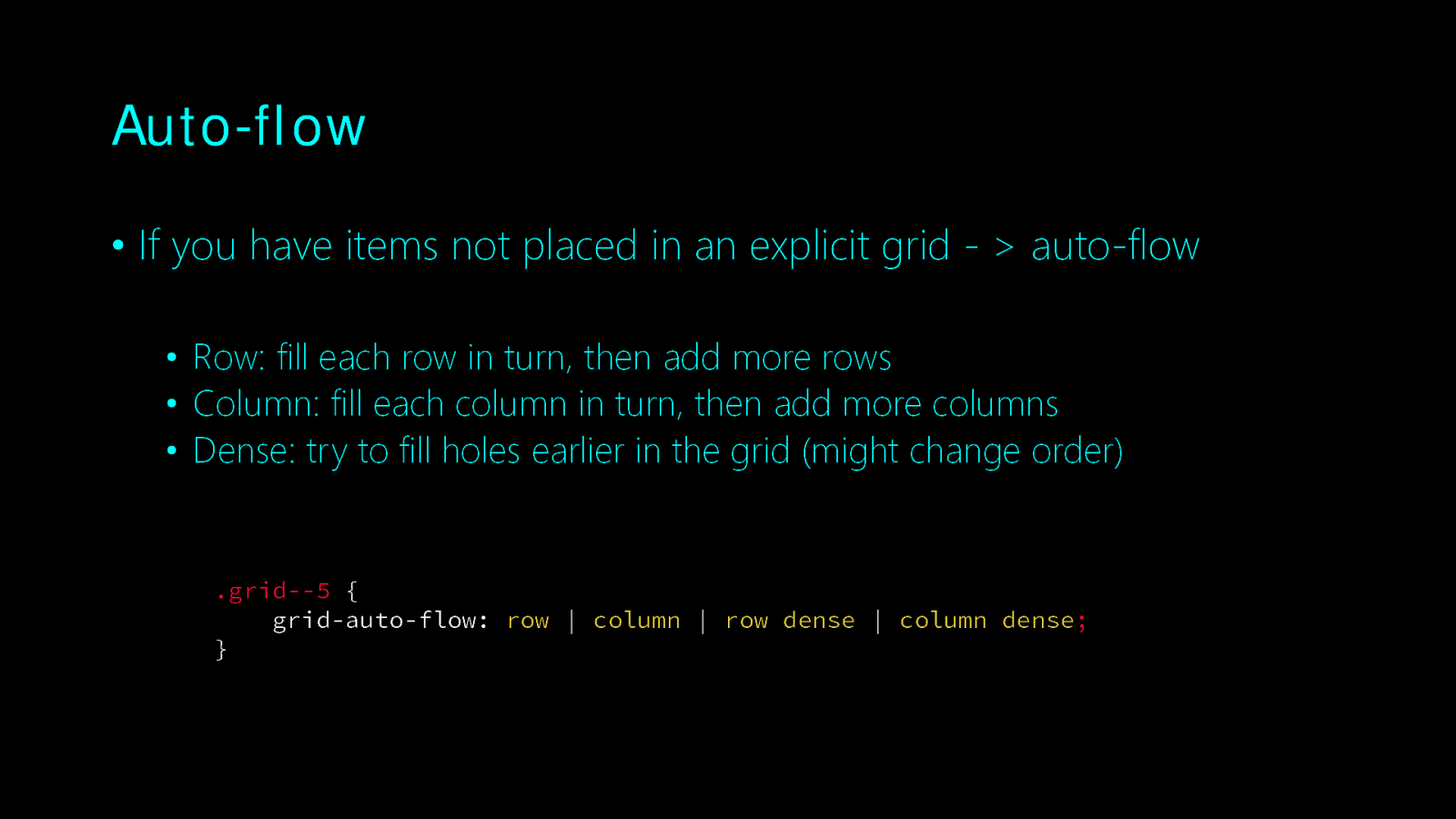
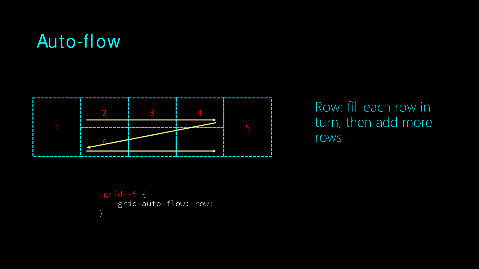
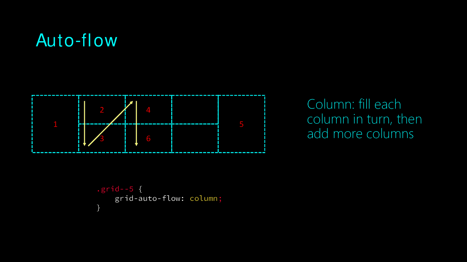
Auto-flow • If you have items not placed in an explicit grid - > auto-flow • Row: fill each row in turn, then add more rows • Column: fill each column in turn, then add more columns • Dense: try to fill holes earlier in the grid (might change order) .grid—5 { grid-auto-flow: row | column | row dense | column dense; }
Auto-flow 2 3 4 5 1 6 .grid—5 { grid-auto-flow: row; } Row: fill each row in turn, then add more rows
Auto-flow 2 4 5 1 3 6 .grid—5 { grid-auto-flow: column; } Column: fill each column in turn, then add more columns
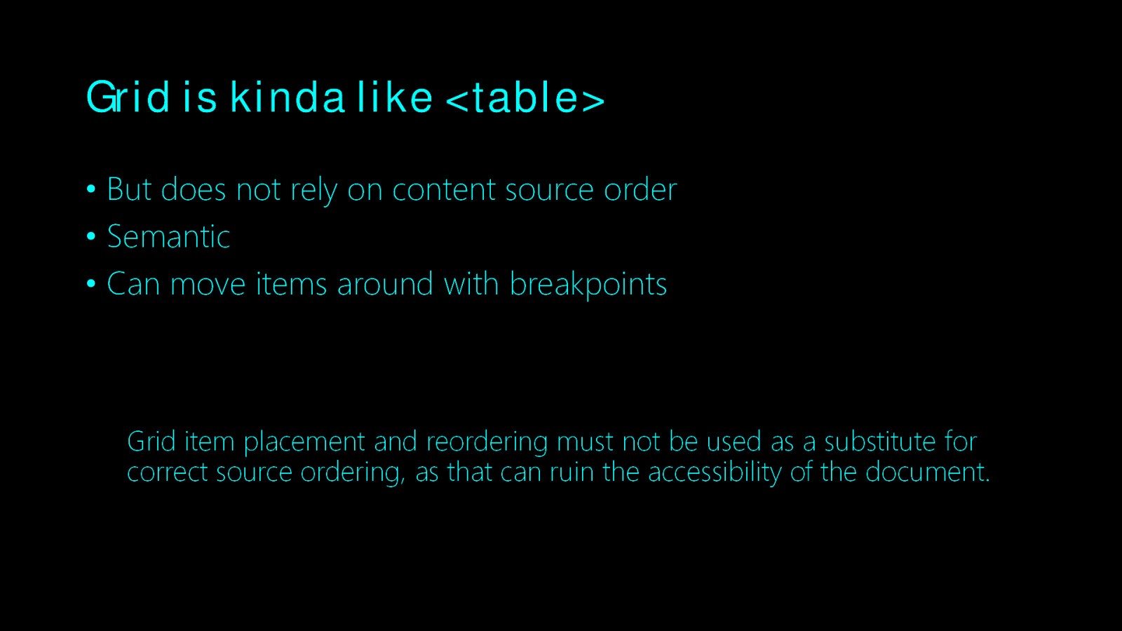
Grid is kinda like <table> • But does not rely on content source order • Semantic • Can move items around with breakpoints Grid item placement and reordering must not be used as a substitute for correct source ordering, as that can ruin the accessibility of the document.
Alignment
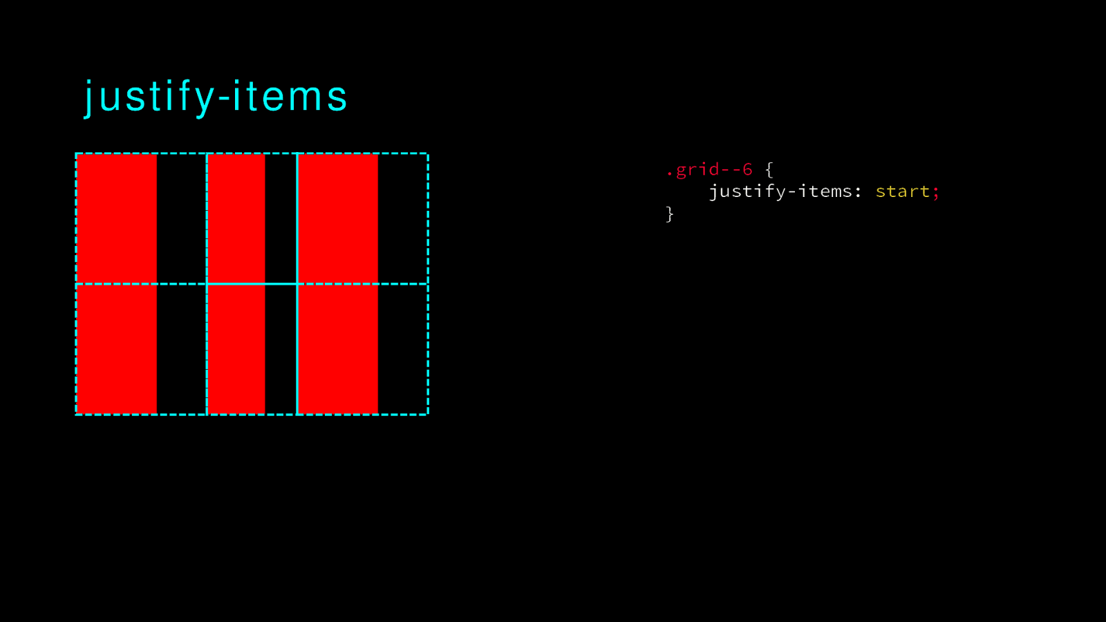
justify-items .grid—6 { justify-items: start; }
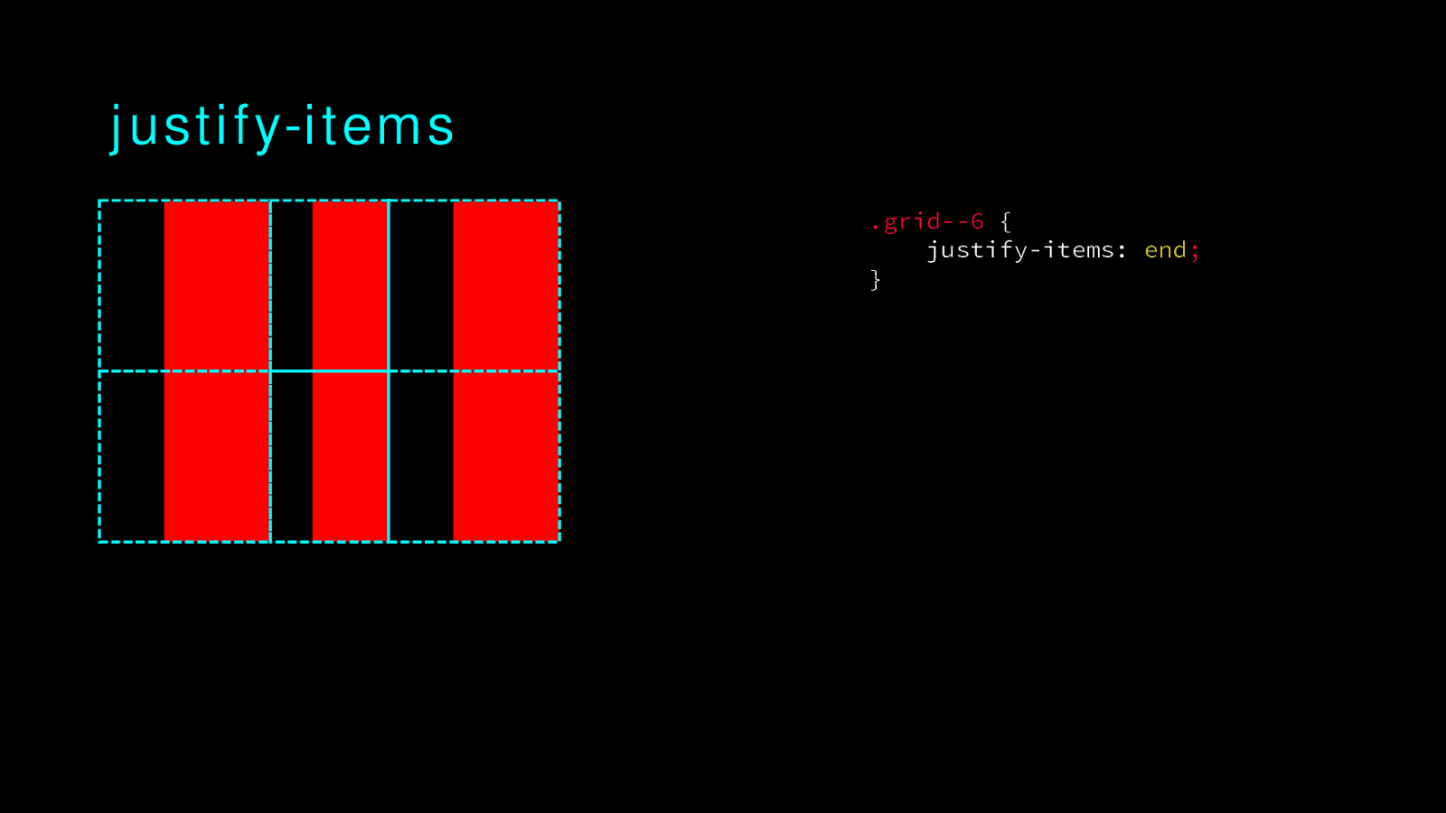
justify-items .grid—6 { justify-items: end; }
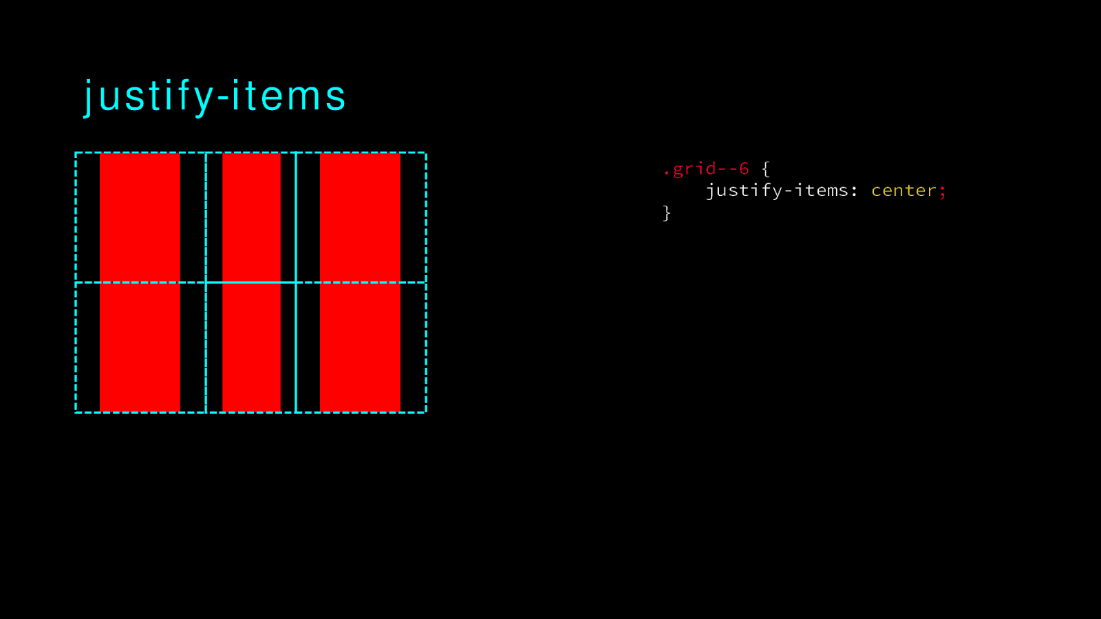
justify-items .grid—6 { justify-items: center; }
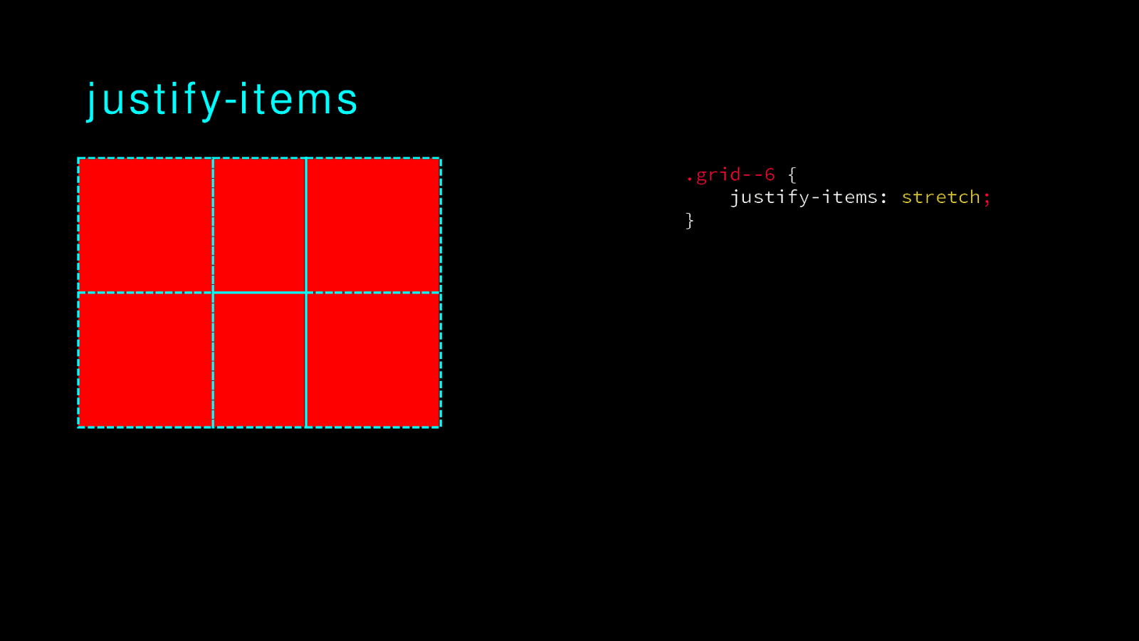
justify-items .grid—6 { justify-items: stretch; }
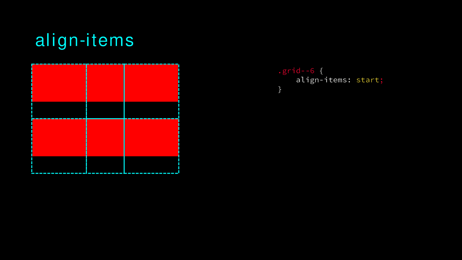
align-items .grid—6 { align-items: start; }
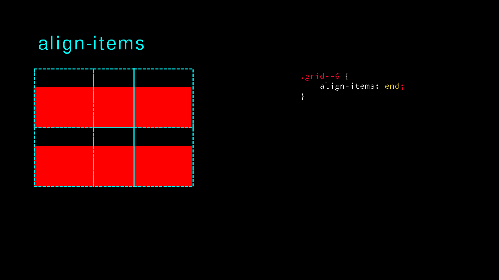
align-items .grid—6 { align-items: end; }
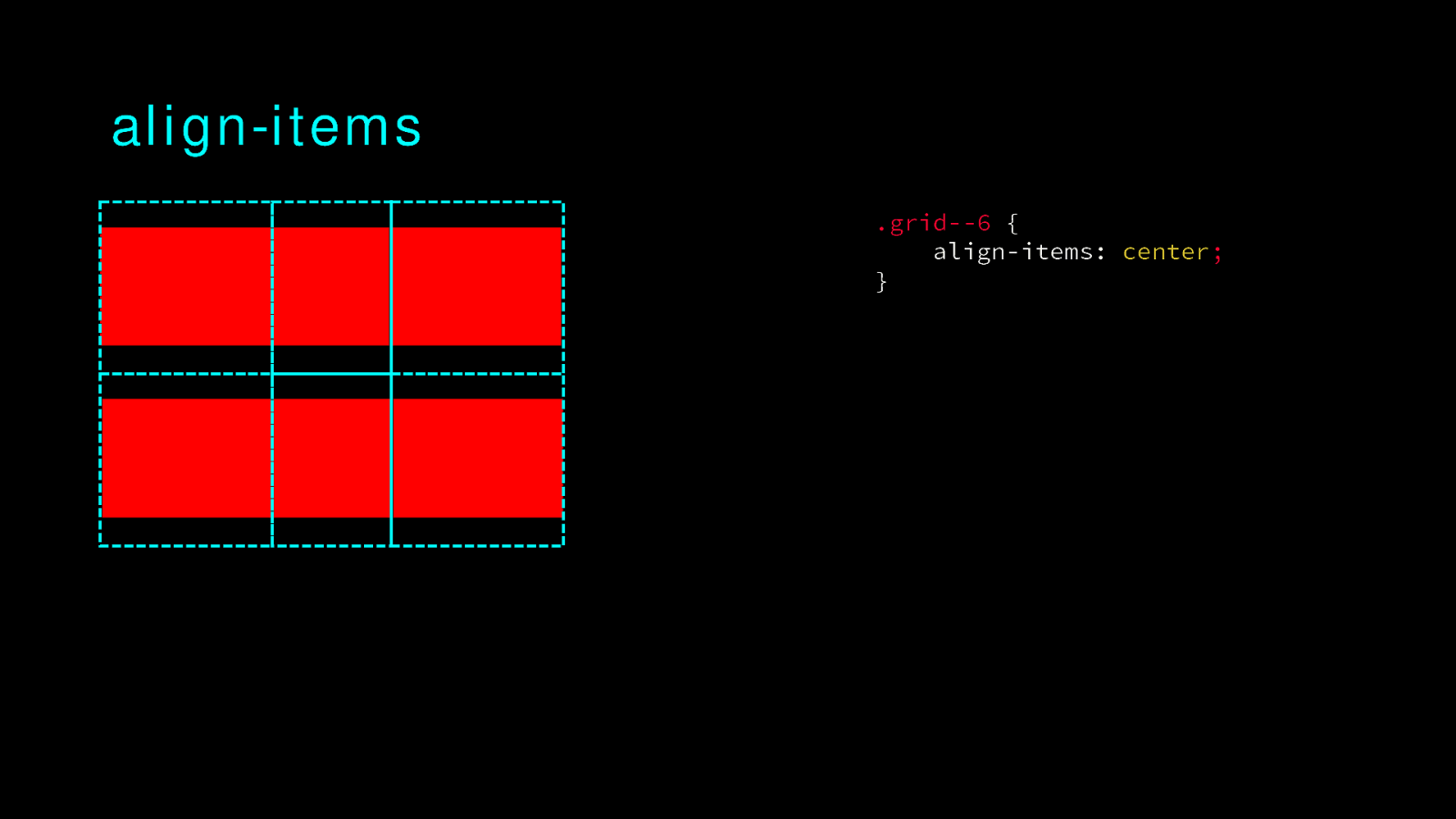
align-items .grid—6 { align-items: center; }
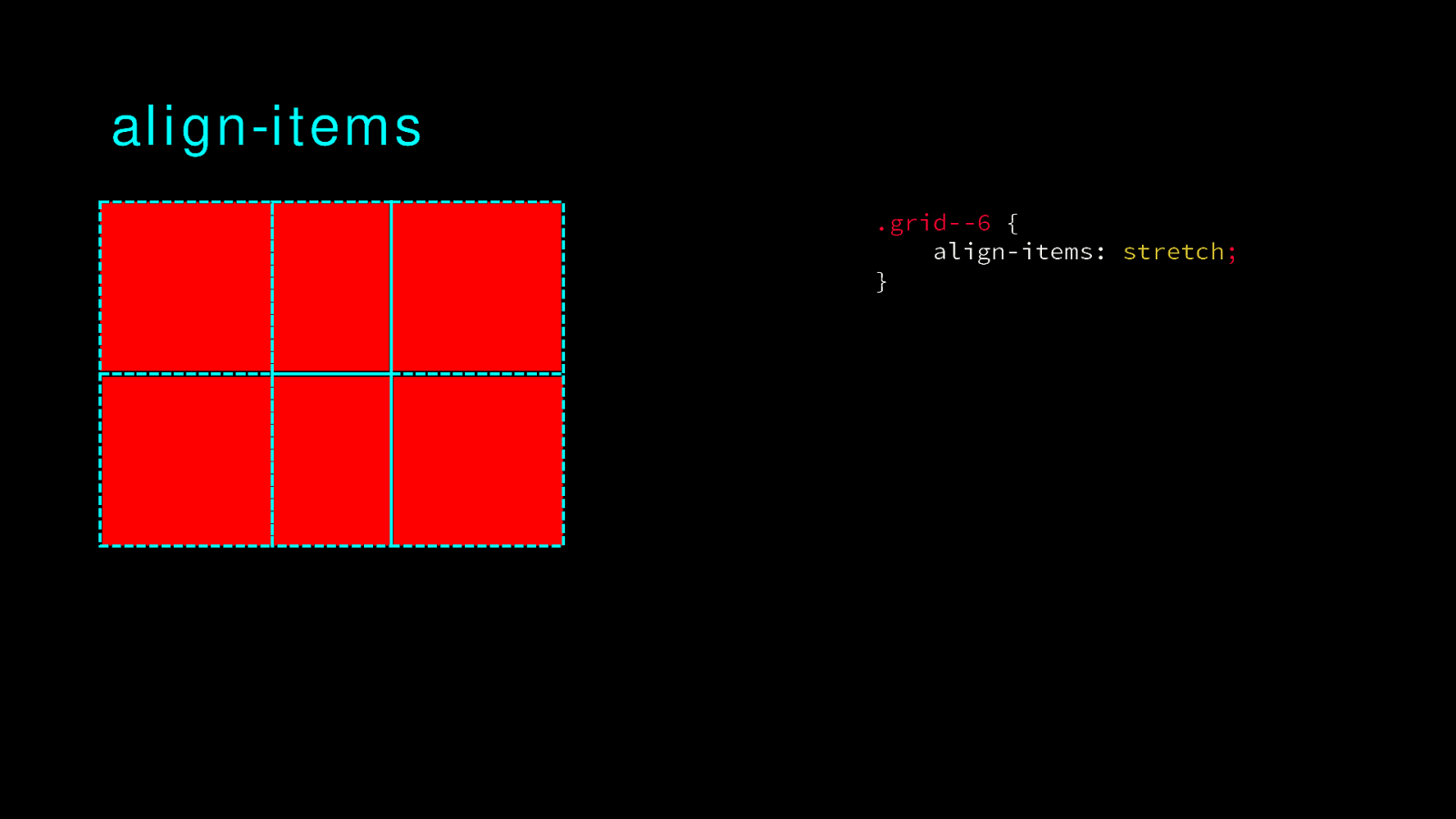
align-items .grid—6 { align-items: stretch; }
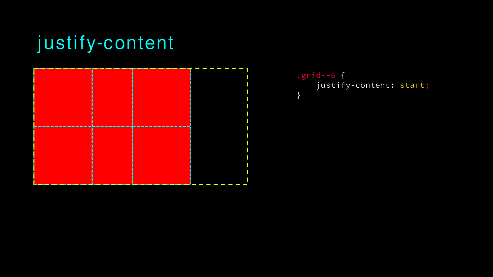
justify-content .grid—6 { justify-content: start; }
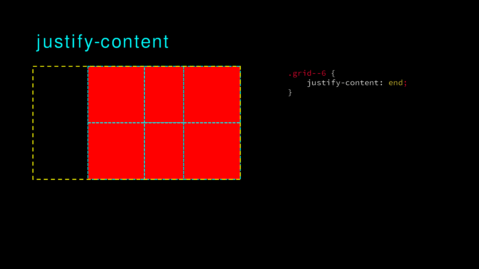
justify-content .grid—6 { justify-content: end; }
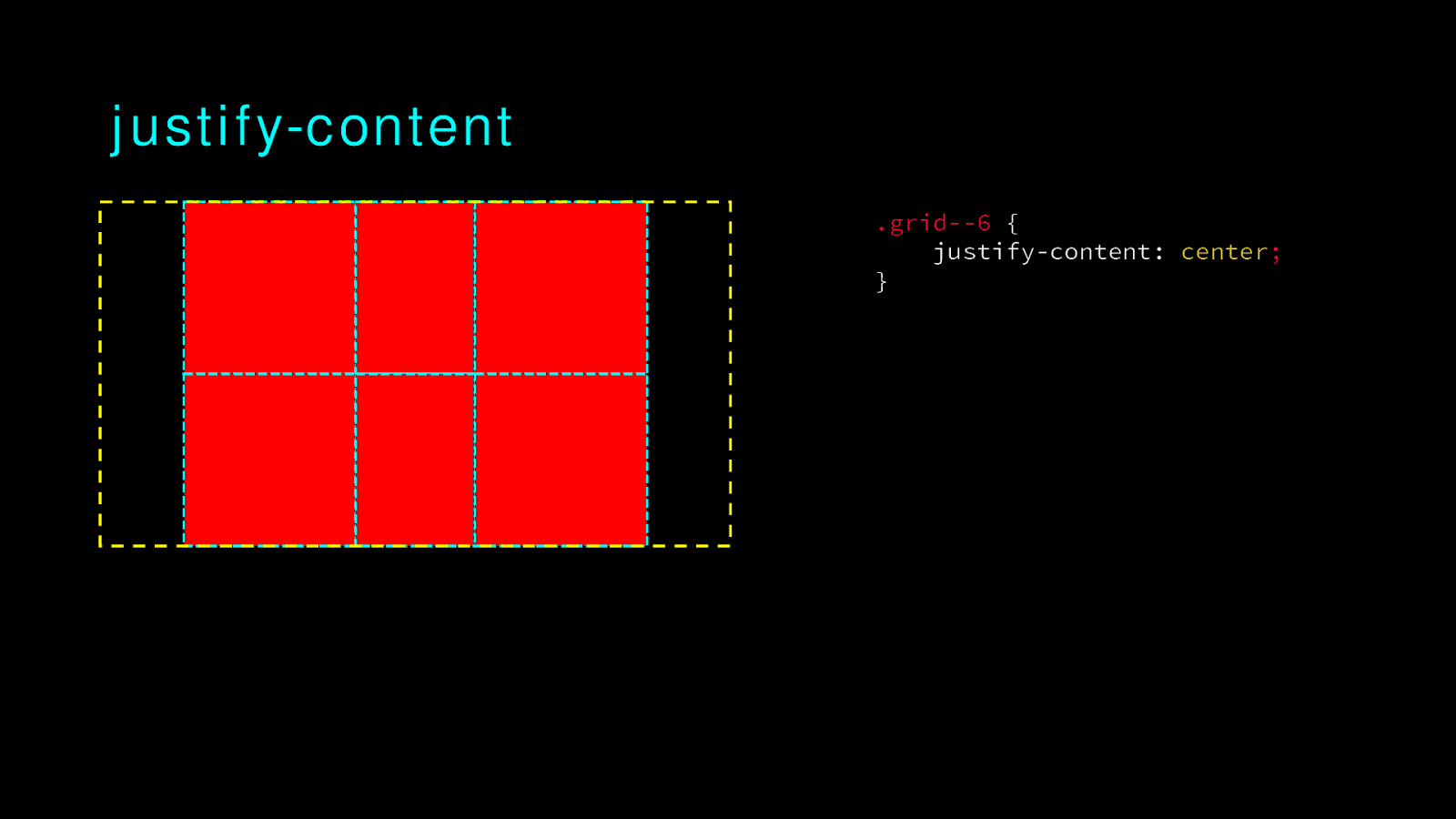
justify-content .grid—6 { justify-content: center; }
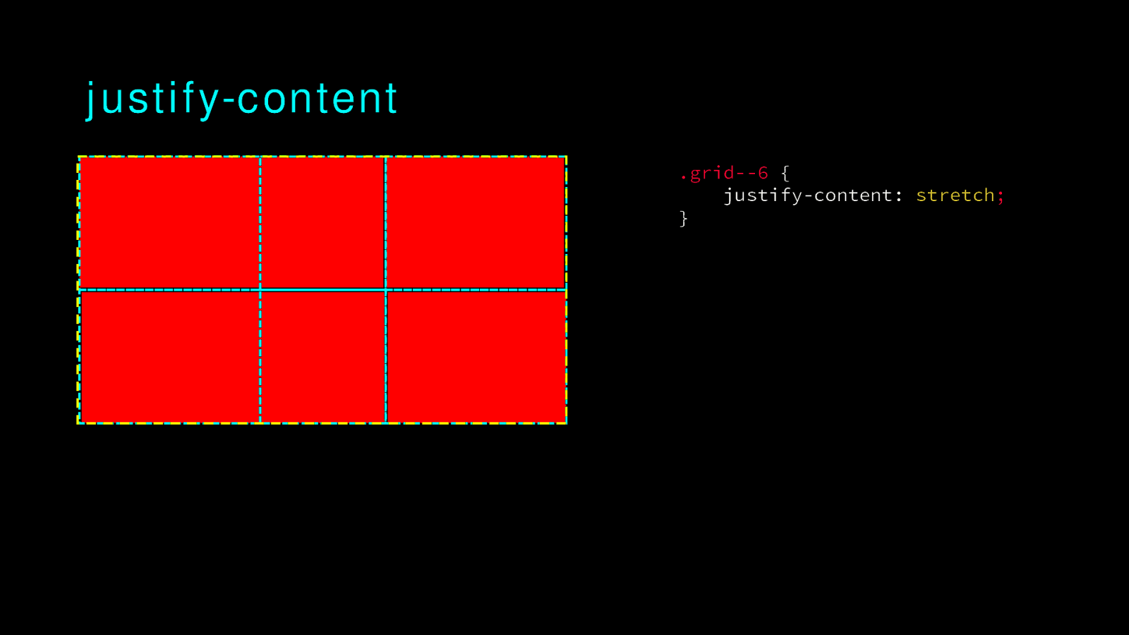
justify-content .grid—6 { justify-content: stretch; }
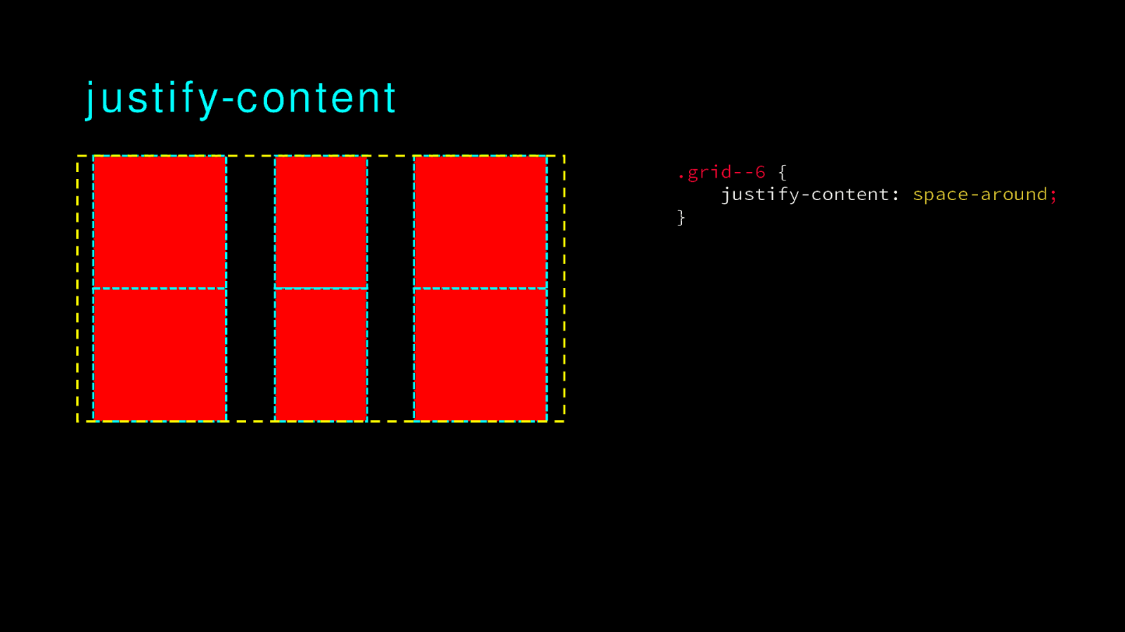
justify-content .grid—6 { justify-content: space-around; }
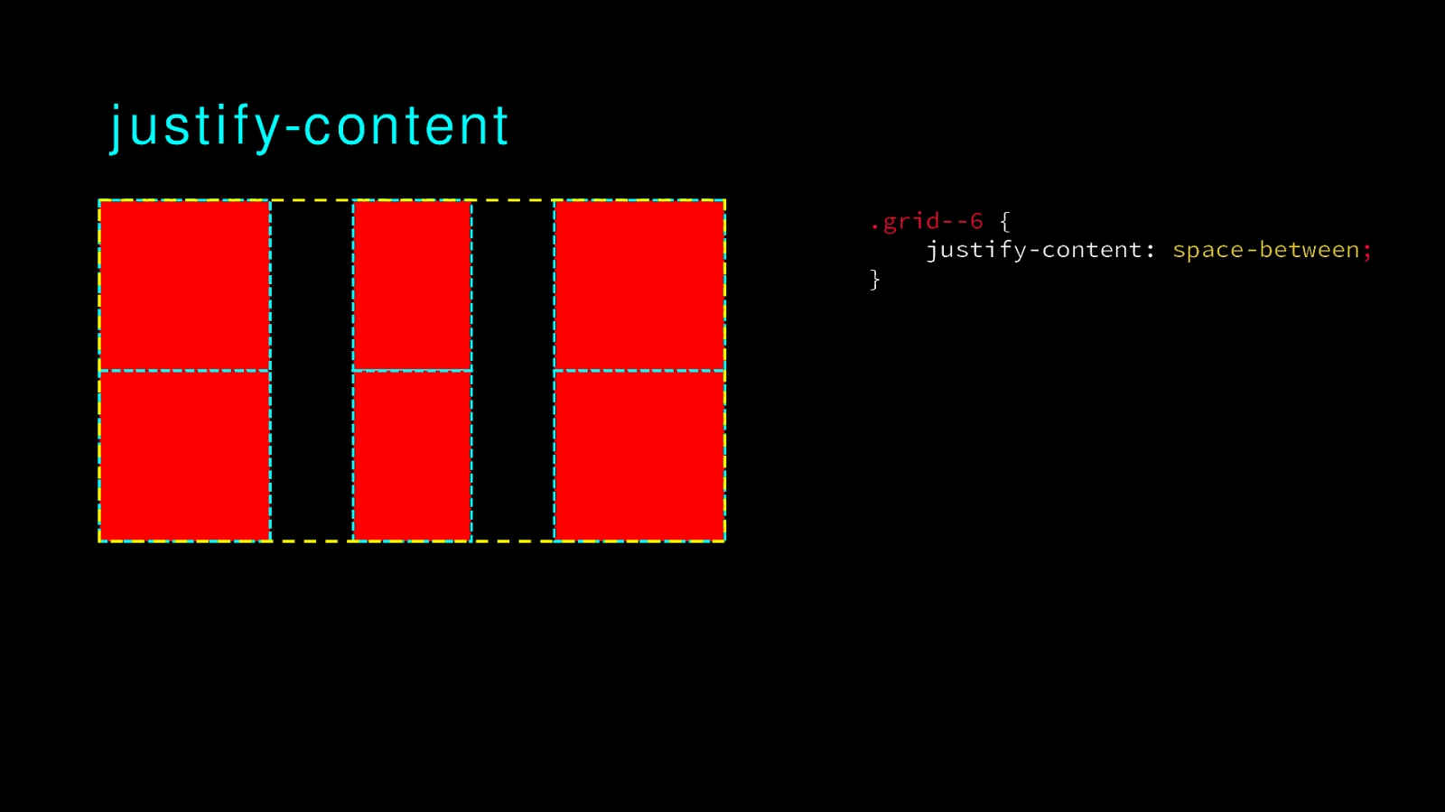
justify-content .grid—6 { justify-content: space-between; }
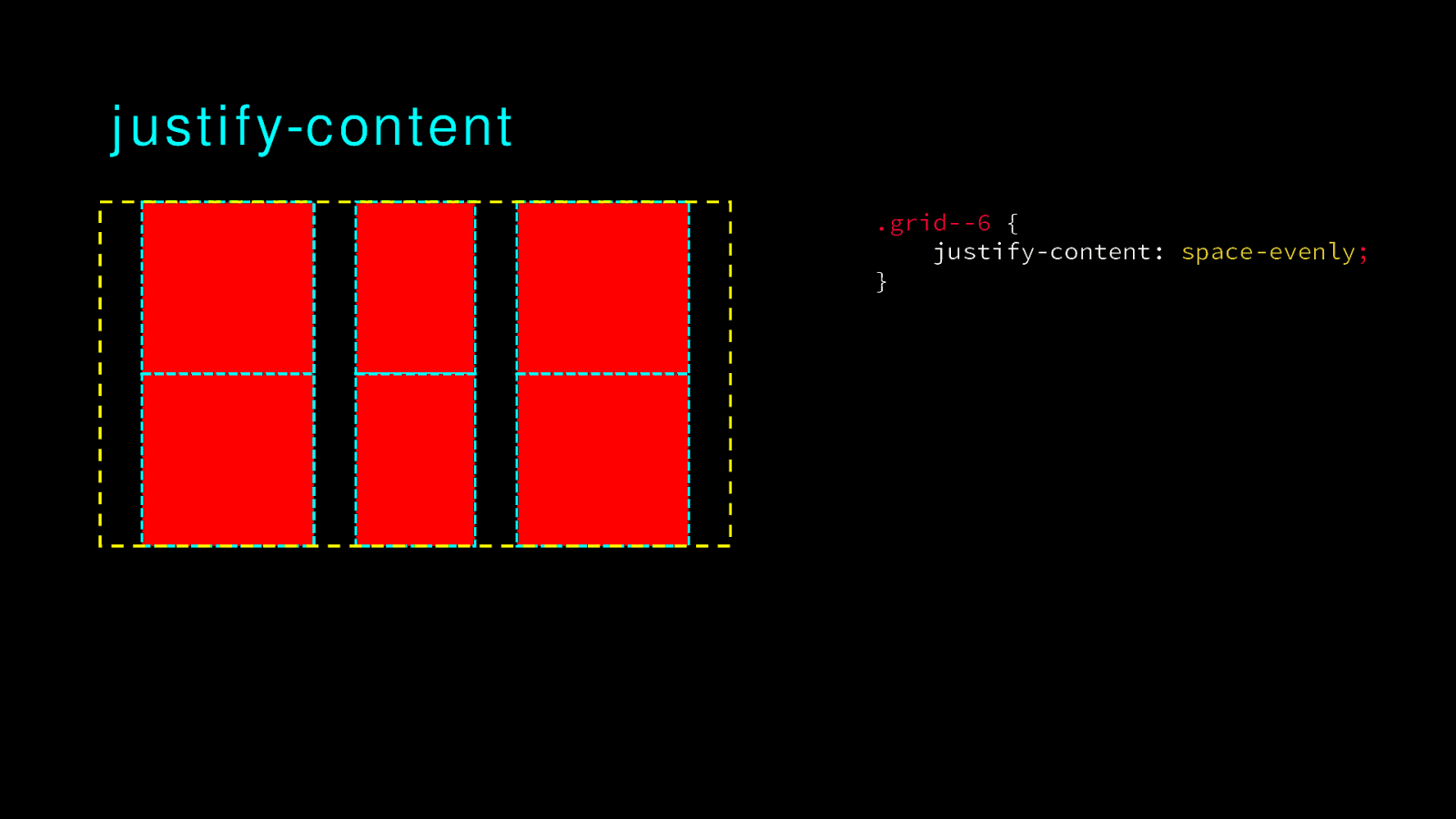
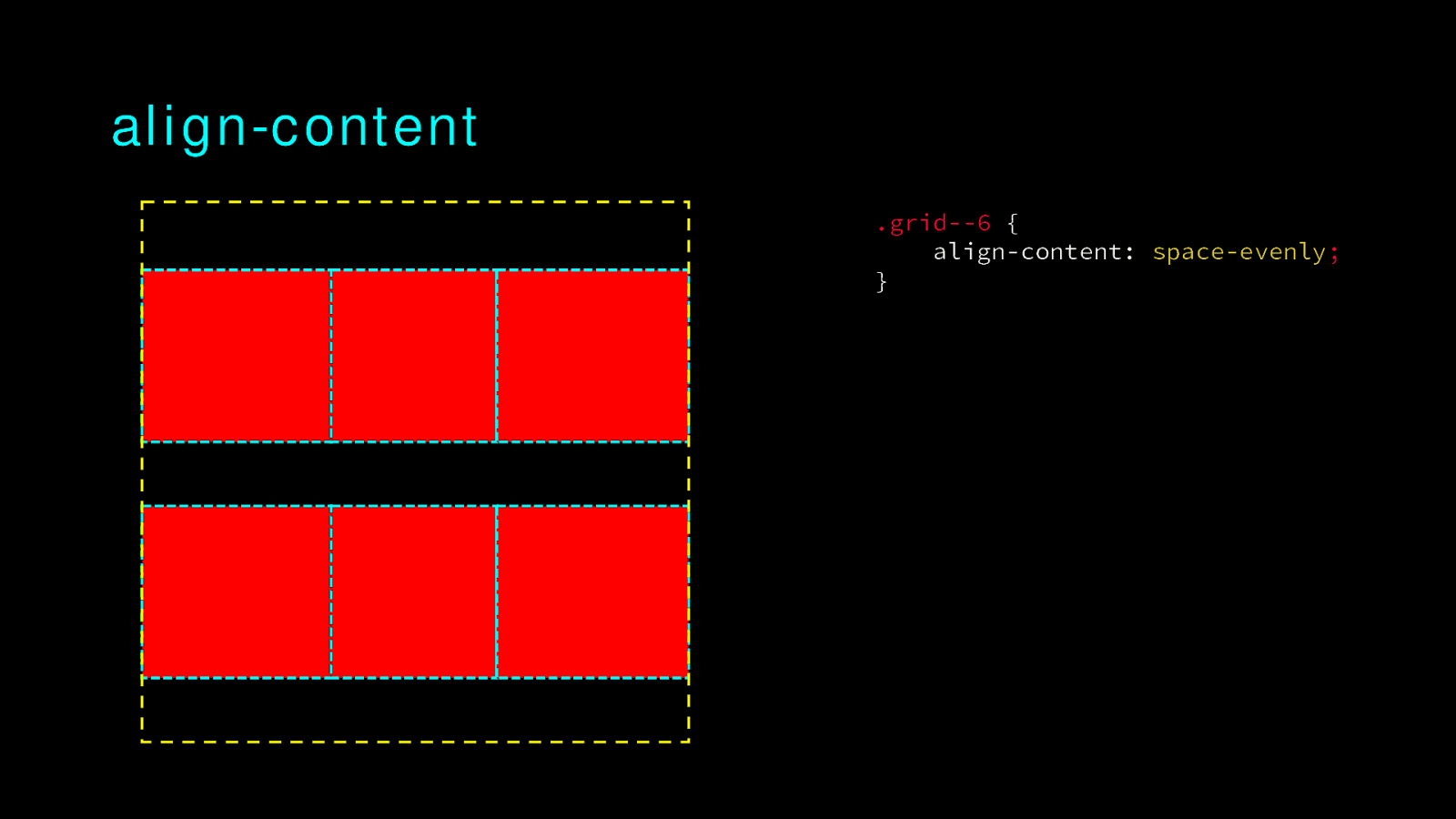
justify-content .grid—6 { justify-content: space-evenly; }
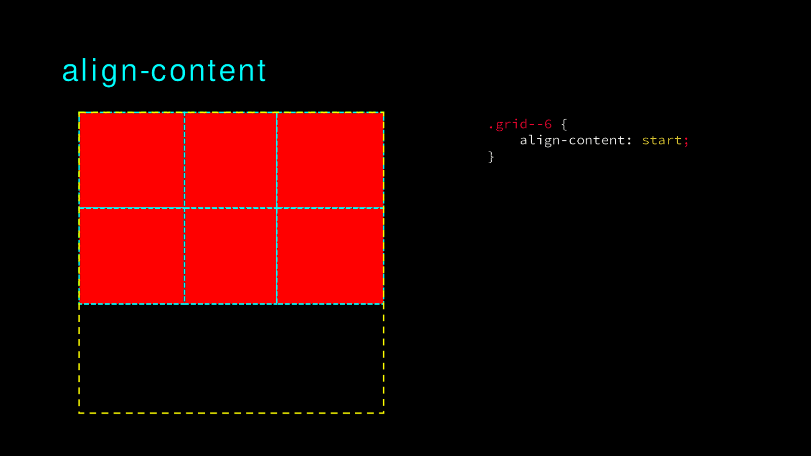
align-content .grid—6 { align-content: start; }
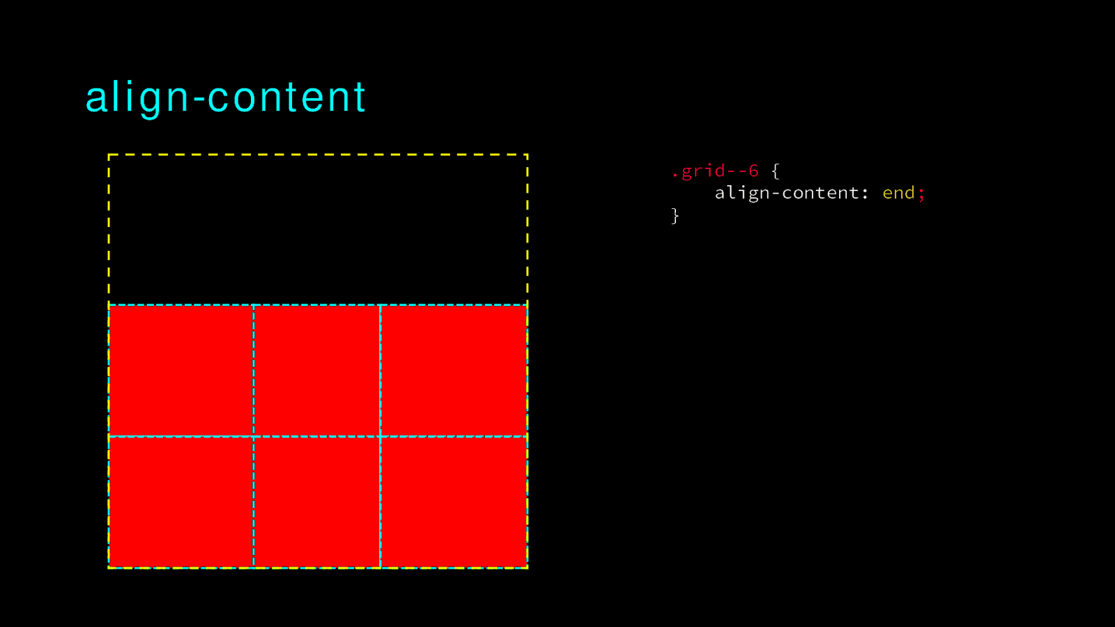
align-content .grid—6 { align-content: end; }
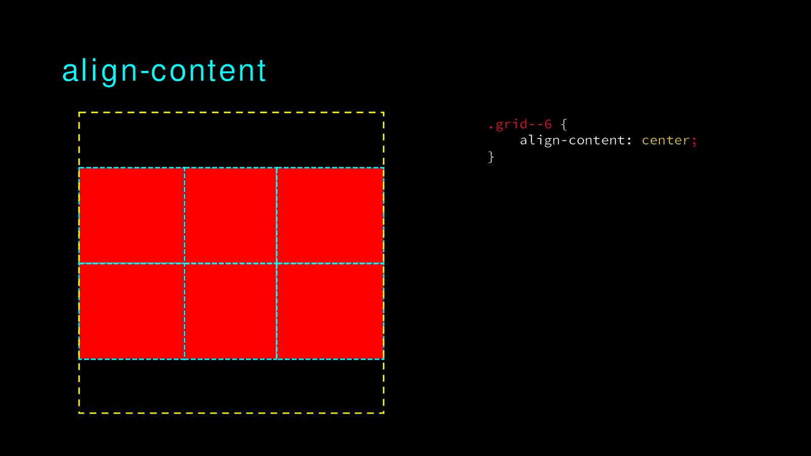
align-content .grid—6 { align-content: center; }
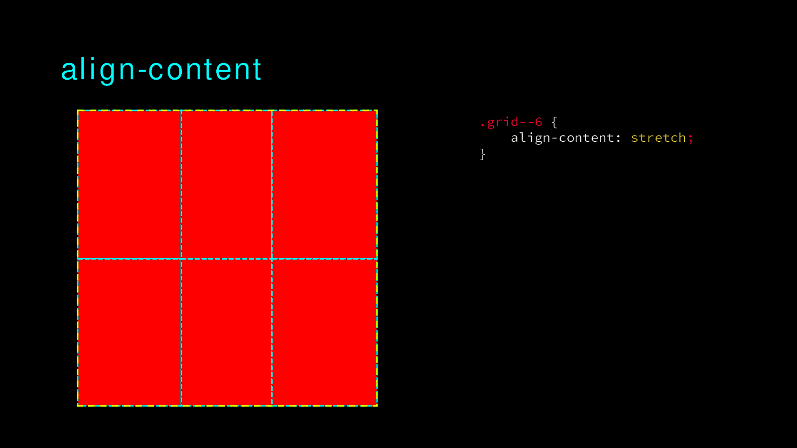
align-content .grid—6 { align-content: stretch; }
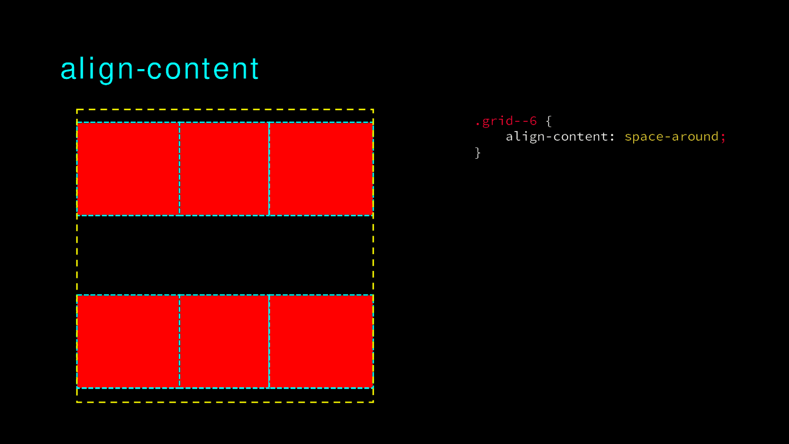
align-content .grid—6 { align-content: space-around; }
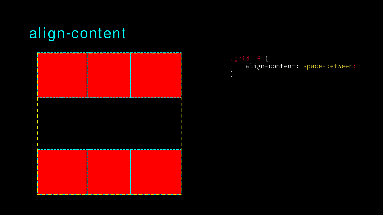
align-content .grid—6 { align-content: space-between; }
align-content .grid—6 { align-content: space-evenly; }
Naming things
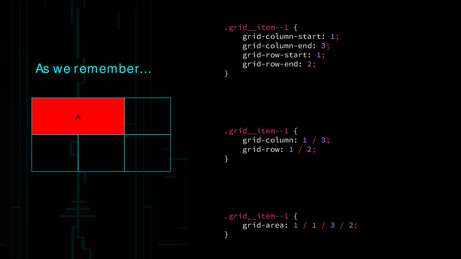
As we remember… .grid__item—1 { grid-column-start: 1; grid-column-end: 3; grid-row-start: 1; grid-row-end: 2; } A .grid__item—1 { grid-column: 1 / 3; grid-row: 1 / 2; } .grid__item—1 { grid-area: 1 / 1 / 3 / 2; }
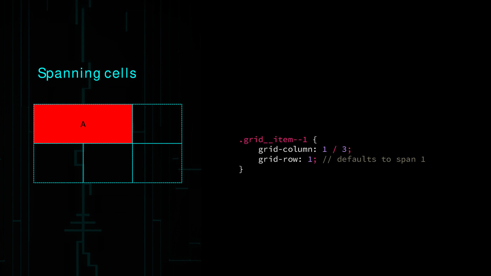
Spanning cells A .grid__item—1 { grid-column: 1 / 3; grid-row: 1; // defaults to span 1 }
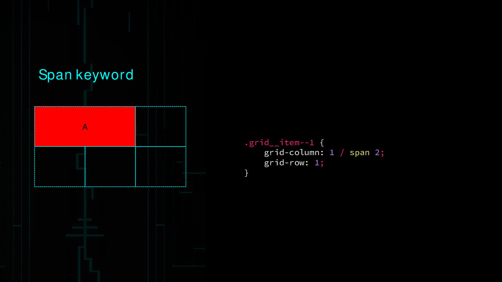
Span keyword A .grid__item—1 { grid-column: 1 / span 2; grid-row: 1; }
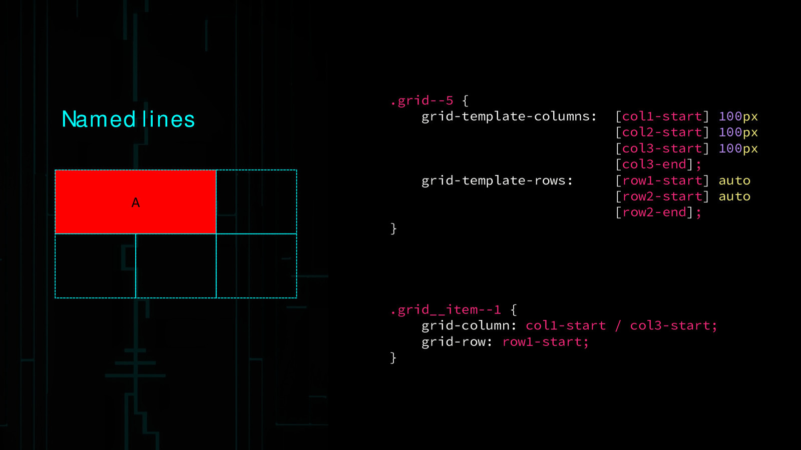
Named lines .grid—5 { grid-template-columns: grid-template-rows: A } [col1-start] [col2-start] [col3-start] [col3-end]; [row1-start] [row2-start] [row2-end]; .grid__item—1 { grid-column: col1-start / col3-start; grid-row: row1-start; } 100px 100px 100px auto auto
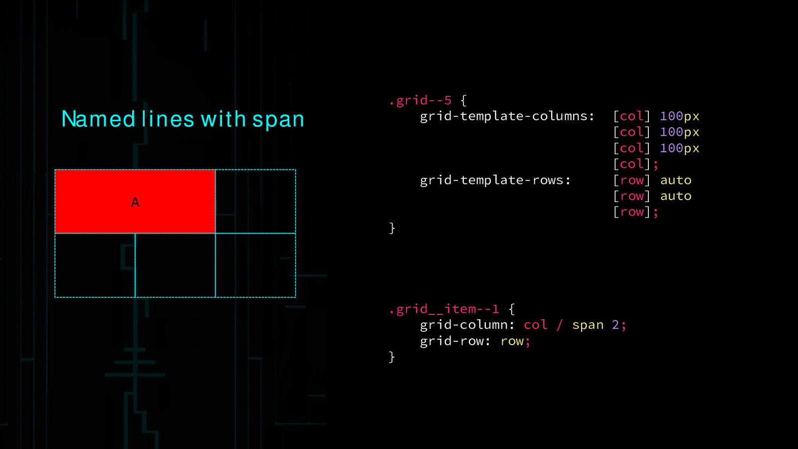
Named lines with span .grid—5 { grid-template-columns: grid-template-rows: A } [col] 100px [col] 100px [col] 100px [col]; [row] auto [row] auto [row]; .grid__item—1 { grid-column: col / span 2; grid-row: row; }
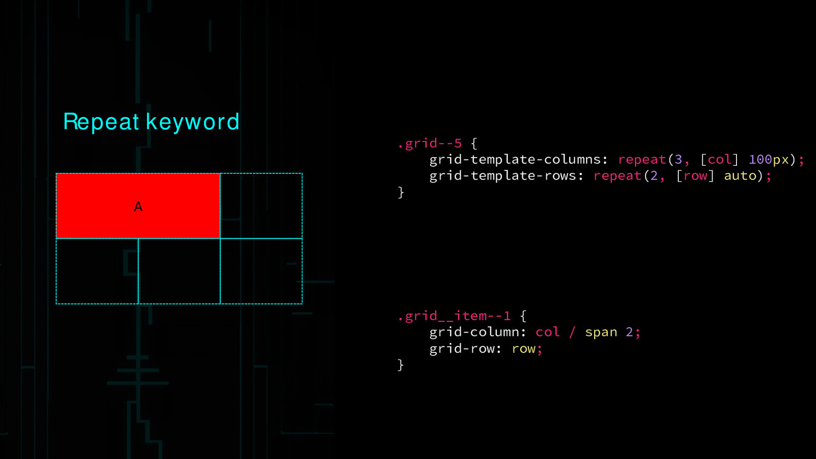
Repeat keyword A .grid—5 { grid-template-columns: repeat(3, [col] 100px); grid-template-rows: repeat(2, [row] auto); } .grid__item—1 { grid-column: col / span 2; grid-row: row; }
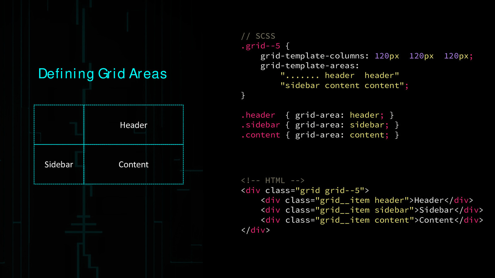
Defining Grid Areas Header Sidebar // SCSS .grid—5 { grid-template-columns: 120px 120px grid-template-areas: “……. header header” “sidebar content content”; } 120px; .header { grid-area: header; } .sidebar { grid-area: sidebar; } .content { grid-area: content; } Content <!— HTML —> <div class=”grid grid—5”> <div class=”grid__item header”>Header</div> <div class=”grid__item sidebar”>Sidebar</div> <div class=”grid__item content”>Content</div> </div>
Grids within grids
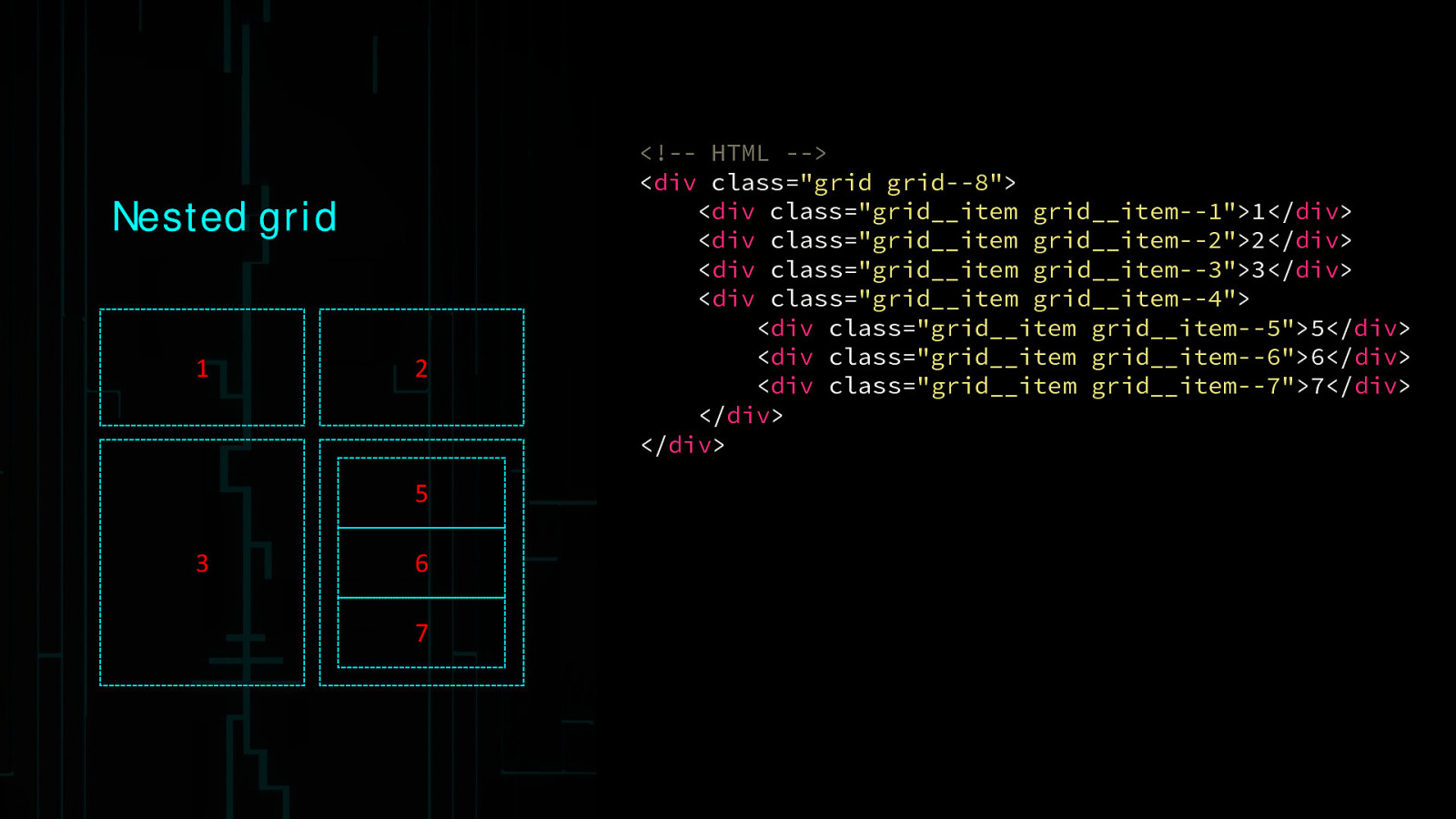
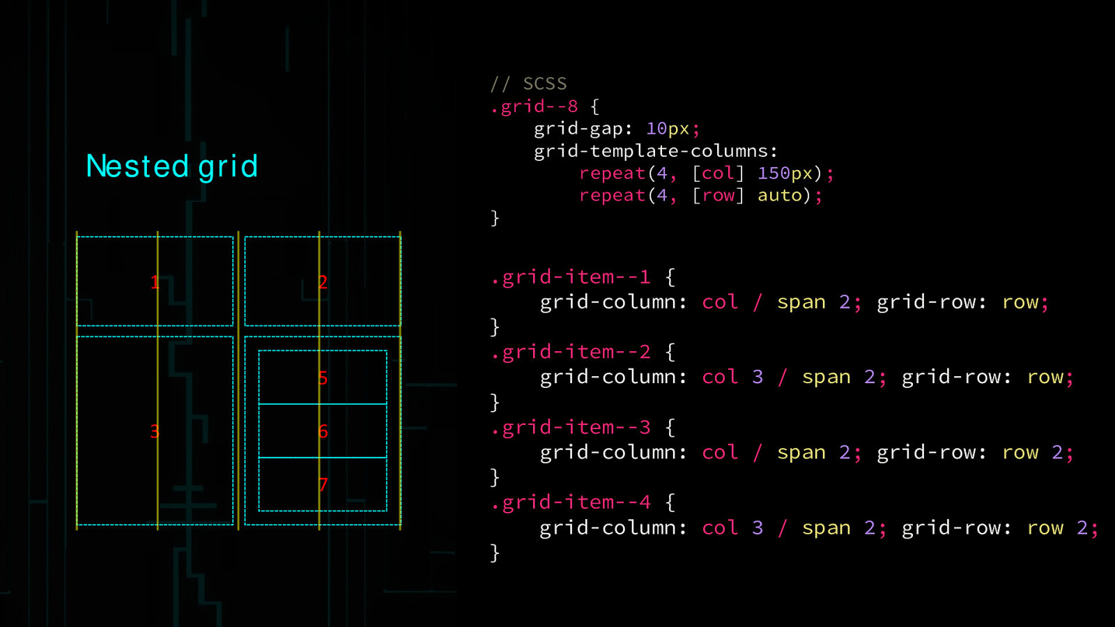
Nested grid 1 2 5 3 6 7
<!— HTML —> <div class=”grid grid—8”> <div class=”grid__item grid__item—1”>1</div> <div class=”grid__item grid__item—2”>2</div> <div class=”grid__item grid__item—3”>3</div> <div class=”grid__item grid__item—4”> <div class=”grid__item grid__item—5”>5</div> <div class=”grid__item grid__item—6”>6</div> <div class=”grid__item grid__item—7”>7</div> </div> </div>// SCSS .grid—8 { grid-gap: 10px; grid-template-columns: repeat(4, [col] 150px); repeat(4, [row] auto); } Nested grid 1 2 5 3 6 7 .grid-item—1 { grid-column: } .grid-item—2 { grid-column: } .grid-item—3 { grid-column: } .grid-item—4 { grid-column: } col / span 2; grid-row: row; col 3 / span 2; grid-row: row; col / span 2; grid-row: row 2; col 3 / span 2; grid-row: row 2;
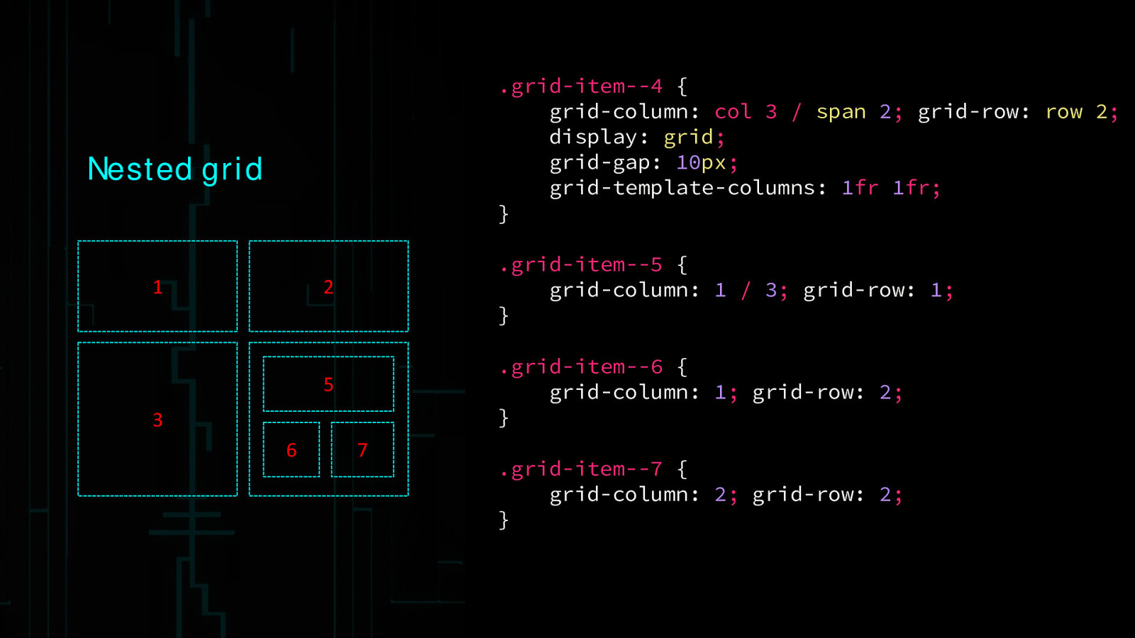
.grid-item—4 { grid-column: col 3 / span 2; grid-row: row 2; display: grid; grid-gap: 10px; grid-template-columns: 1fr 1fr; } Nested grid 1 2 .grid-item—5 { grid-column: 1 / 3; grid-row: 1; } 5 .grid-item—6 { grid-column: 1; grid-row: 2; } 3 6 7 .grid-item—7 { grid-column: 2; grid-row: 2; }
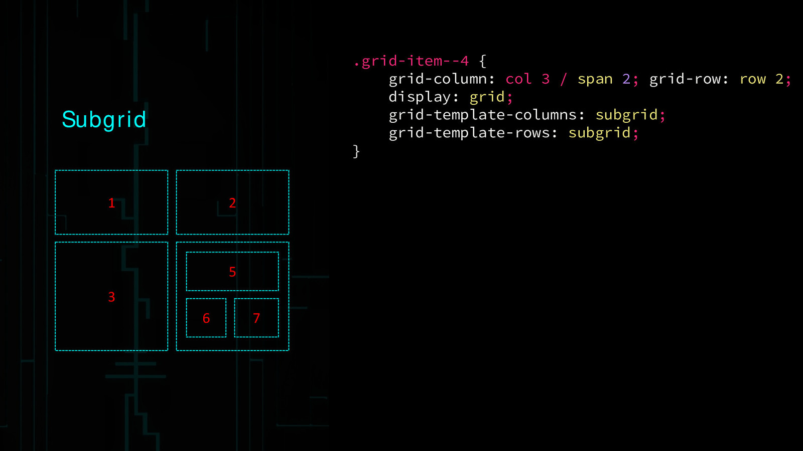
.grid-item—4 { grid-column: col 3 / span 2; grid-row: row 2; display: grid; grid-template-columns: subgrid; grid-template-rows: subgrid; } Subgrid 1 2 5 3 6 7
Subgrid “The following feature are at-risk, and may be dropped during the CR period: the subgrid value of grid-template-columns and grid-template-rows, and it’s component parts individually”
Resources • http://gridbyexample.com/ • https://www.youtube.com/watch?v=GRexIOtGhBU • http://www.slideshare.net/rachelandrew/css-grid-layout-for-topconf-linz • http://www.thedotpost.com/2015/12/rachel-andrew-the-new-css-layout • https://css-tricks.com/snippets/css/complete-guide-grid/ • https://hacks.mozilla.org/2015/09/the-future-of-layout-with-css-grid-layouts/ • http://igalia.github.io/css-grid-layout/index.html • https://github.com/FremyCompany/css-grid-polyfill • https://medium.com/@patrickbrosset/css-grid-layout-6c9cba6e8a5a#.ls5y5g53h
Thank You

A walkthrough of the CSS Grid Layout Module Specification as of April 2016


 for free. You
can too.
for free. You
can too.