Modular CSS Scott Vandehey — @spaceninja — Devsigner 2016

A presentation at Devsigner Con 2016 in August 2016 in Portland, OR, USA by Scott Vandehey
Modular CSS Scott Vandehey — @spaceninja — Devsigner 2016
FridayFrontEnd.com @fridayfrontend
CSS at Scale is Difficult
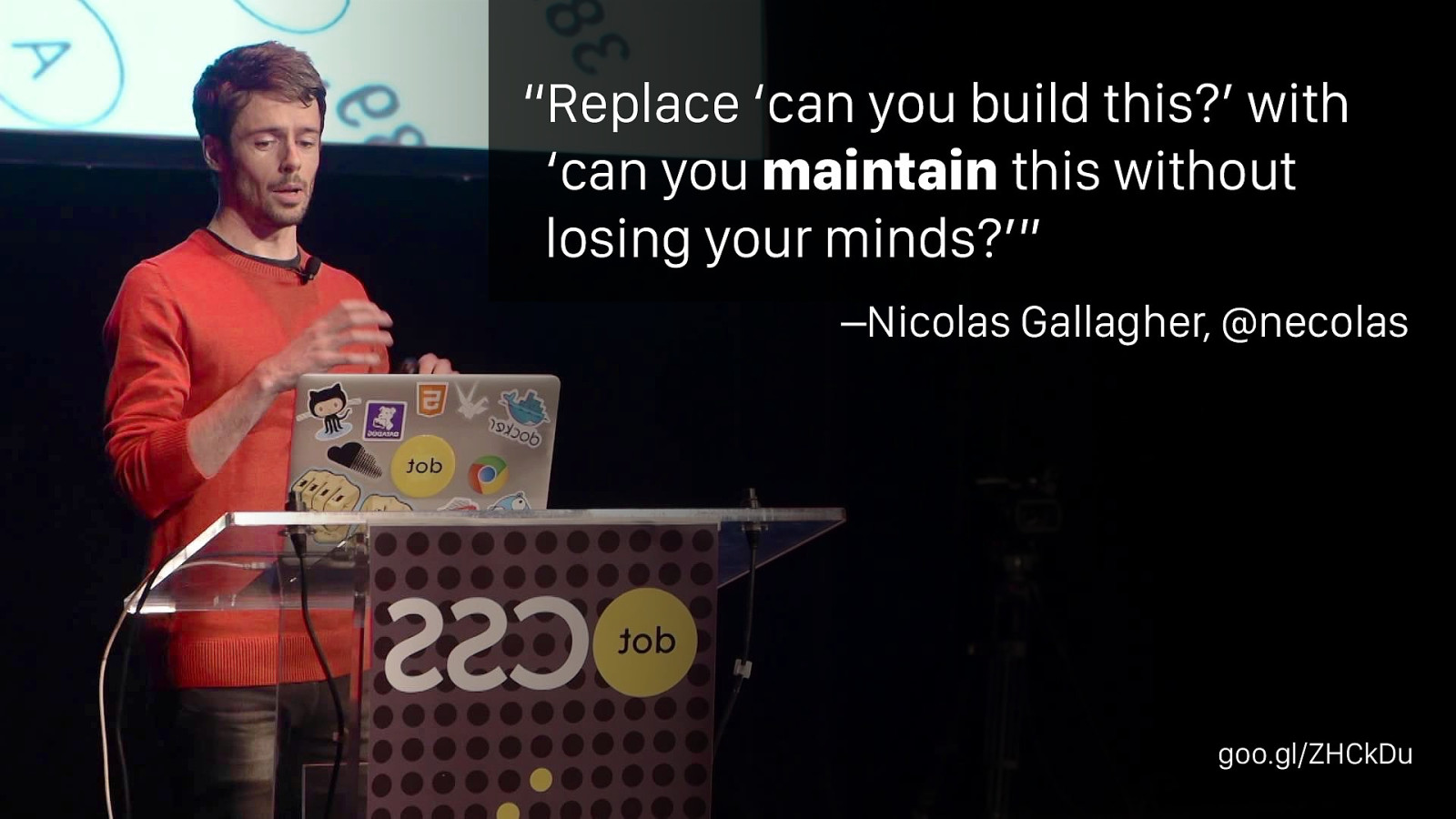
–Nicolas Gallagher, @necolas “Replace ‘can you build this?’ with ‘can you maintain this without losing your minds?’” goo.gl/ZHCkDu
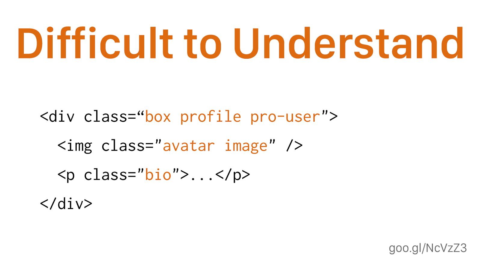
goo.gl/NcVzZ3 Difficult to Understand
<div class=“ box profile pro-user "> <img class=" avatar image " /> <p class=" bio ">...</p> </div> No one but the person who wrote this knows. How are .box and .profile related? How are .profile and .avatar related? Are they related at all? Should you be using .pro- user alongside .bio? Will .image and .profile live in the same part of the CSS? Can you use .avatar anywhere else?
Difficult to Reuse • You want to re-use a style from another page, but it’s written in a way that only works on that page • You don’t want to break the original, so you duplicate the code • Now you have two problems mention designer giving similar but not the same styles
Difficult to Maintain • You change the markup and the whole thing breaks • You want to change a style on one page and it breaks on another • You try to override the other page, but get caught in a specificity war namespacing in a global context
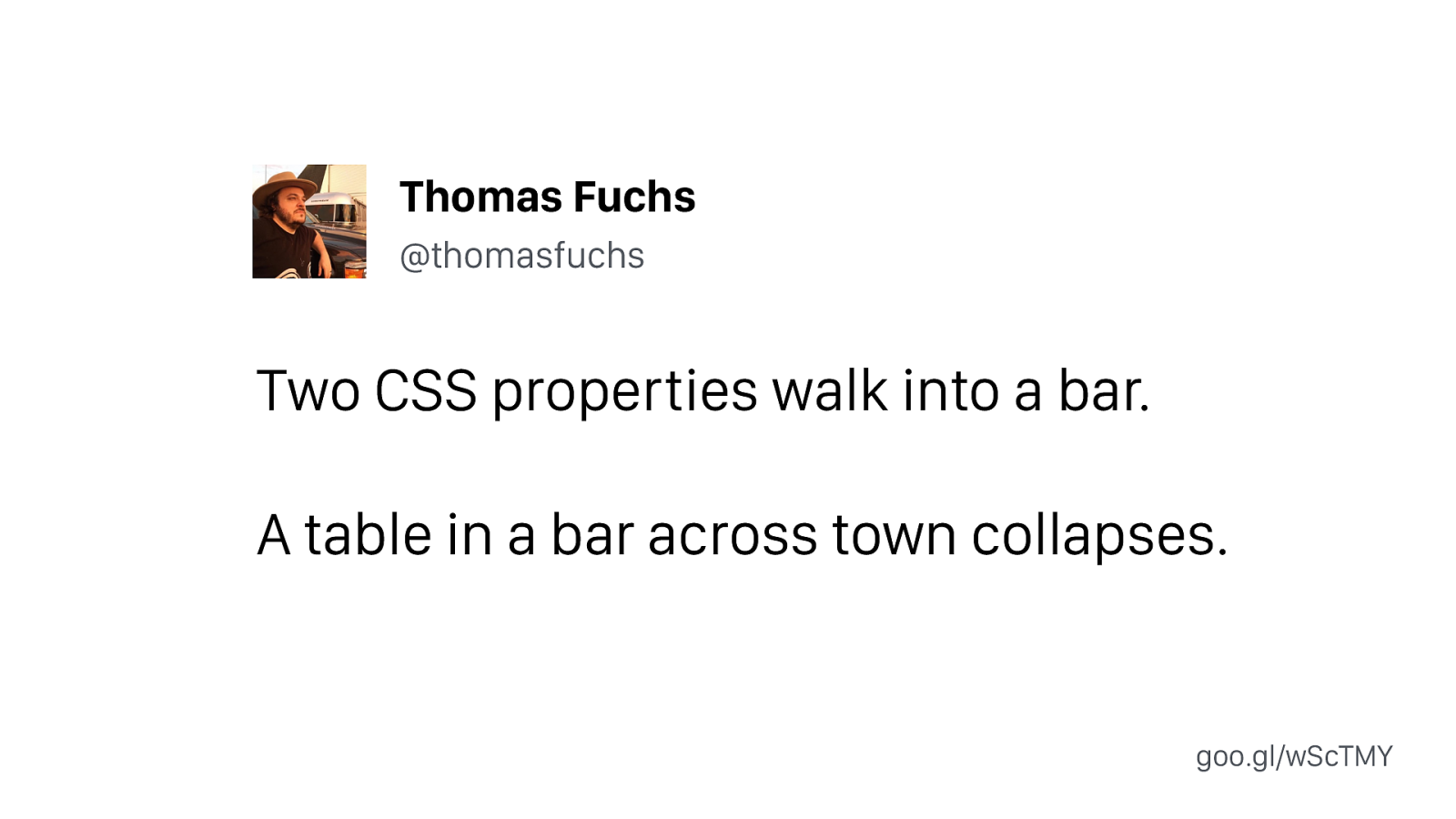
Two CSS properties walk into a bar. A table in a bar across town collapses. Thomas Fuchs @thomasfuchs goo.gl/wScTMY
Modularity What does that even mean?
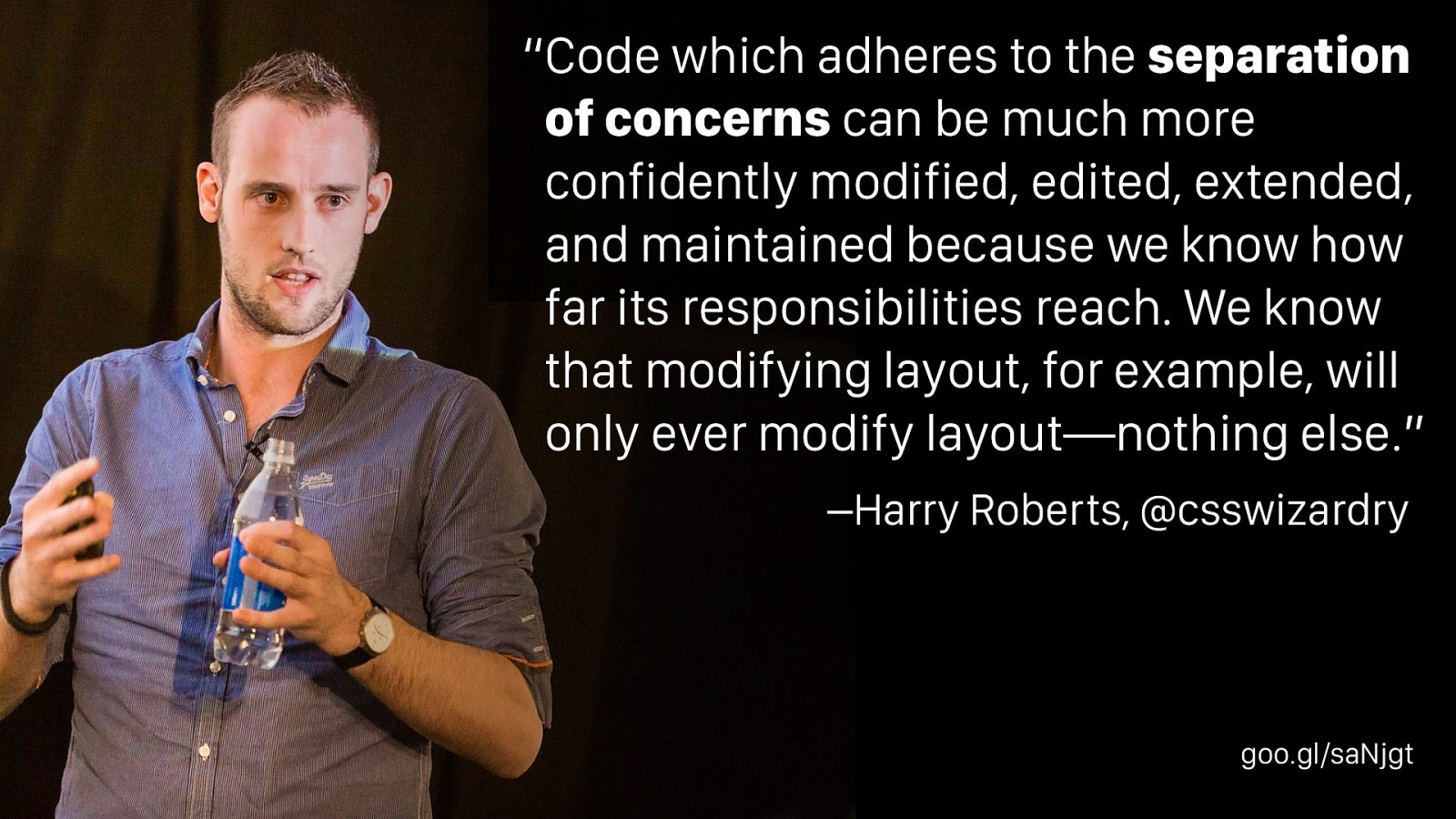
–Harry Roberts, @csswizardry “Code which adheres to the separation of concerns can be much more confidently modified, edited, extended, and maintained because we know how far its responsibilities reach. We know that modifying layout, for example, will only ever modify layout—nothing else.” goo.gl/saNjgt This quote is from Harry Roberts’ wonderful CSS Guidelines
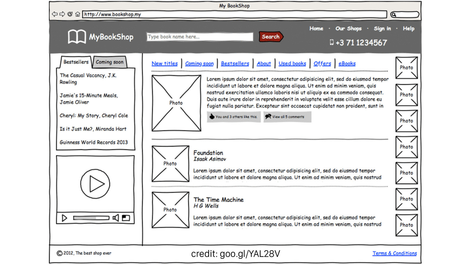
credit: goo.gl/YAL28V
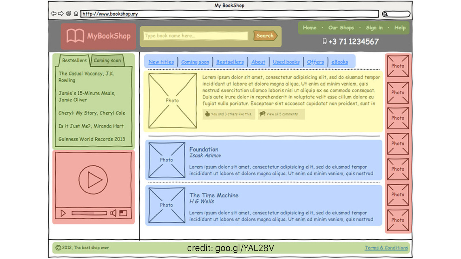
credit: goo.gl/YAL28V
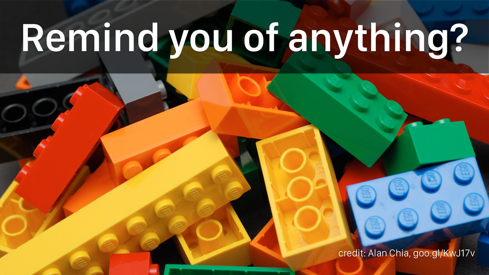
Remind you of anything? credit: Alan Chia, goo.gl/KwJ17v The lego analogy is used by almost everyone who writes about modular CSS for a good reason.
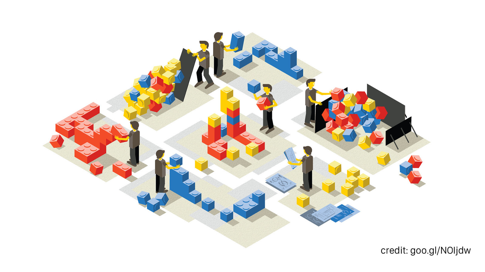
credit: goo.gl/NOIjdw The idea of building a UI out of standardized, easy-to-understand blocks that behave predictably regardless of context is a great goal.
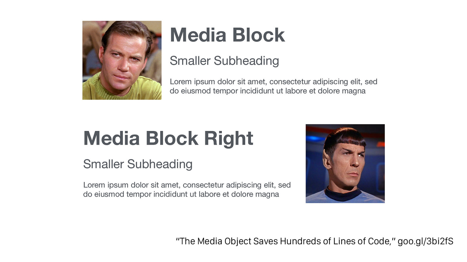
Media Block Smaller Subheading Lorem ipsum dolor sit amet, consectetur adipiscing elit, sed do eiusmod tempor incididunt ut labore et dolore magna Media Block Right Smaller Subheading Lorem ipsum dolor sit amet, consectetur adipiscing elit, sed do eiusmod tempor incididunt ut labore et dolore magna “The Media Object Saves Hundreds of Lines of Code,” goo.gl/3bi2fS Nicole Sullivan’s most famous pattern was the media object, found on almost every site
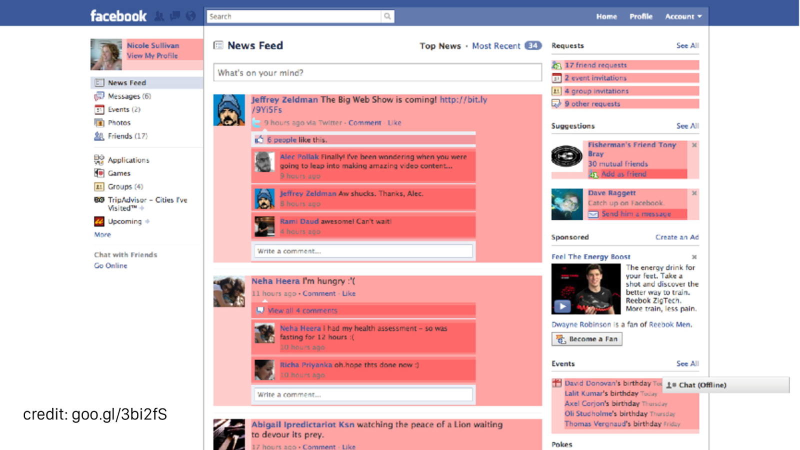
credit: goo.gl/3bi2fS Here she’s highlighted all the media blocks on a Facebook stream. By standardizing the styles used for these repeated patterns you can save dramatic amounts of code.
OOCSS Object Oriented CSS
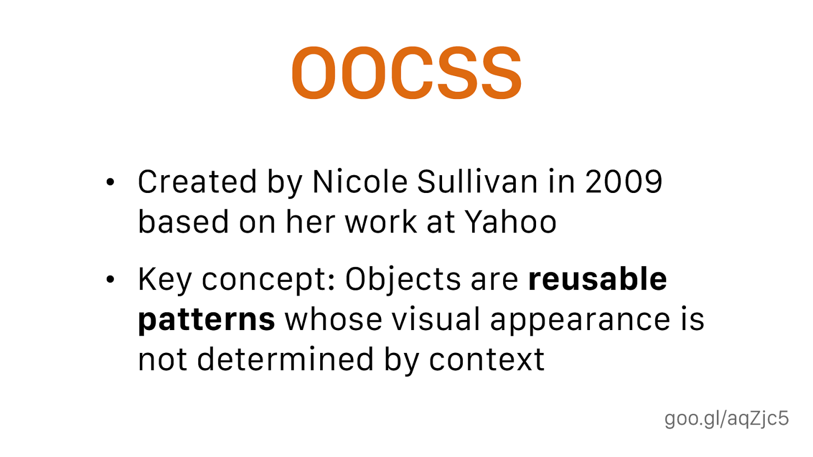
goo.gl/aqZjc5 OOCSS • Created by Nicole Sullivan in 2009 based on her work at Yahoo • Key concept: Objects are reusable patterns whose visual appearance is not determined by context OOCSS is basically the origin point of modular CSS.
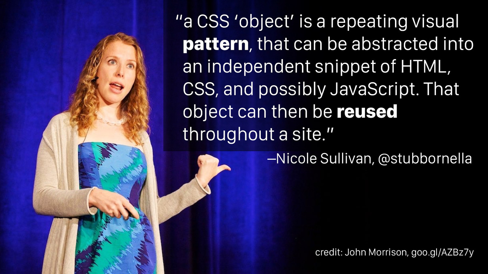
–Nicole Sullivan, @stubbornella “a CSS ‘object’ is a repeating visual pattern , that can be abstracted into an independent snippet of HTML, CSS, and possibly JavaScript. That object can then be reused
throughout a site.” credit: John Morrison, goo.gl/AZBz7y The roots of modular CSS is Nicole Sullivan’s work on OOCSS: You can break front-end work into reusable patterns.
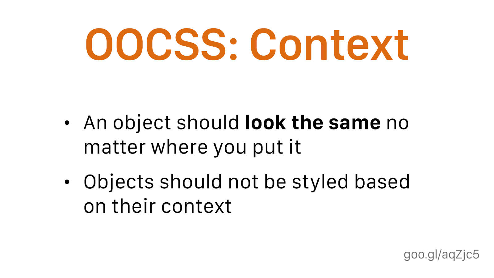
goo.gl/aqZjc5 OOCSS: Context • An object should look the same no matter where you put it • Objects should not be styled based on their context rather than style all buttons in the sidebar orange, make an orange button class that could be used anywhere
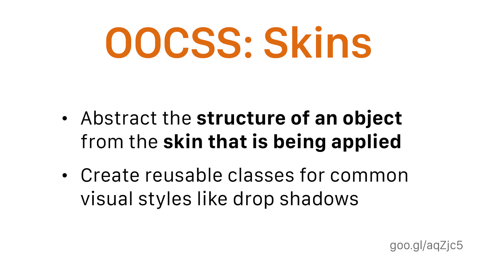
goo.gl/aqZjc5 OOCSS: Skins • Abstract the structure of an object
from the skin that is being applied
• Create reusable classes for common visual styles like drop shadows
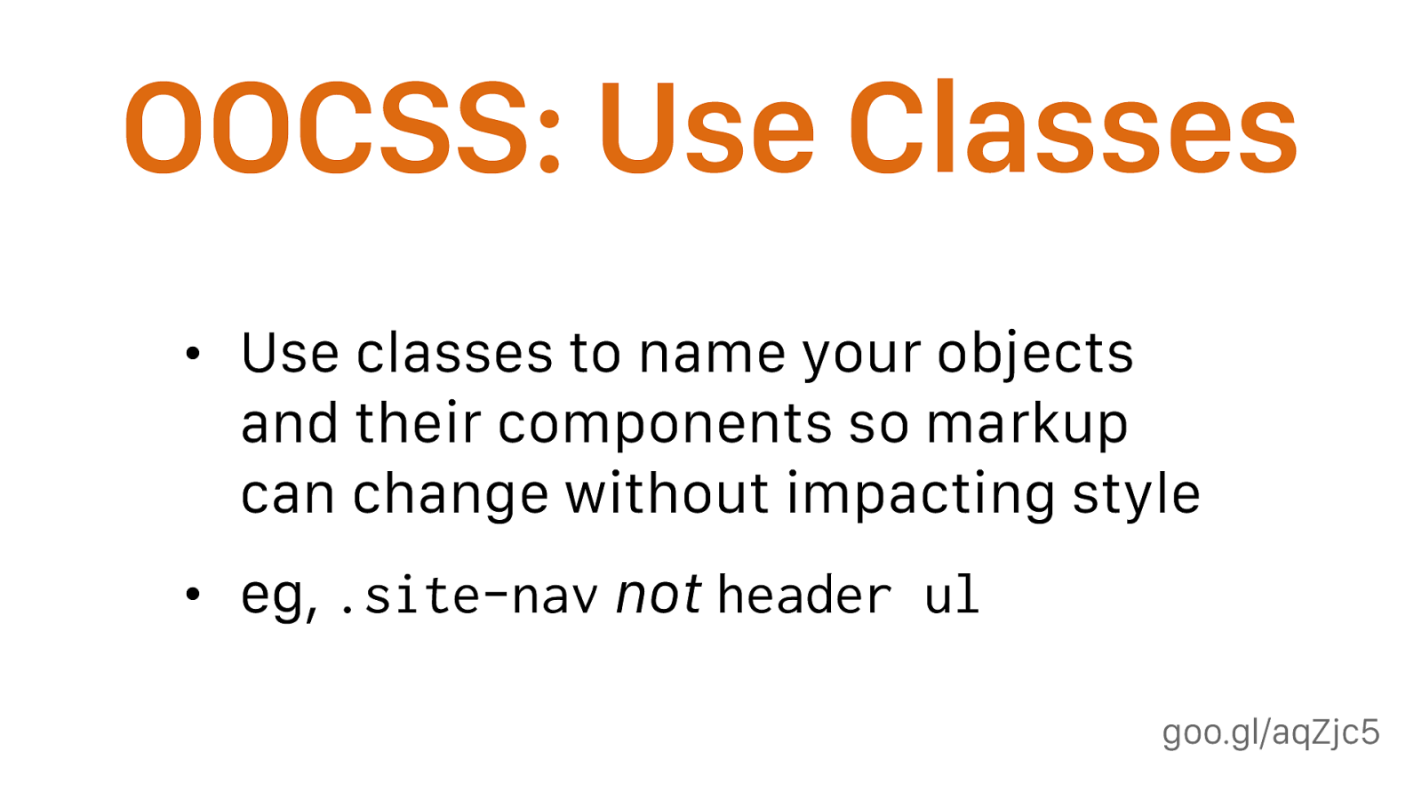
goo.gl/aqZjc5 OOCSS: Use Classes • Use classes to name your objects and their components so markup can change without impacting style • eg, .site-nav
not
header ul
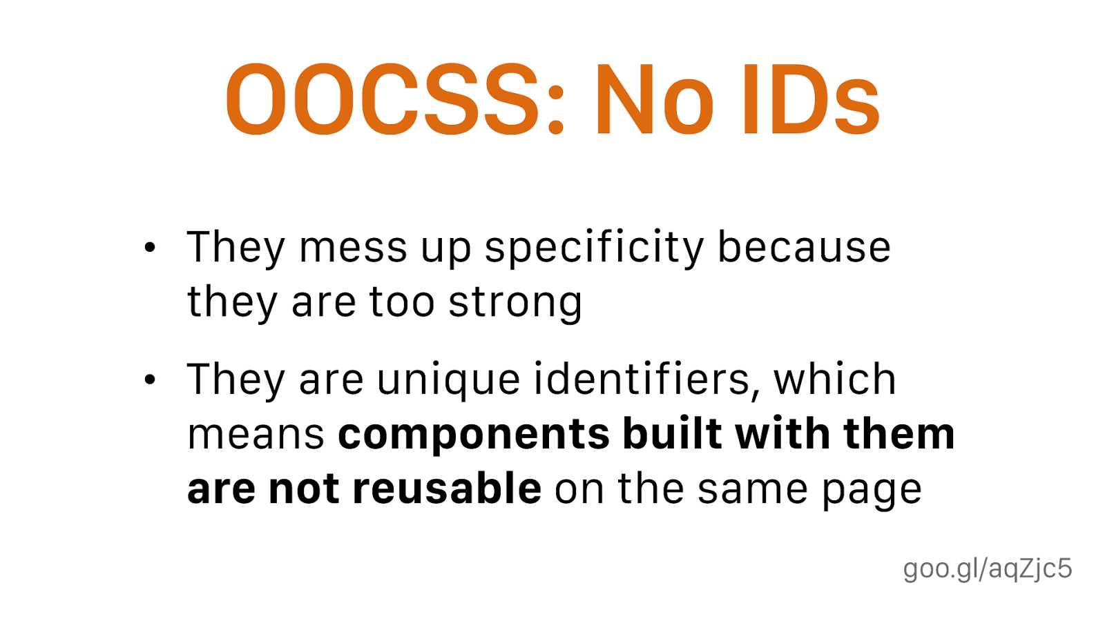
goo.gl/aqZjc5 OOCSS: No IDs • They mess up specificity because they are too strong • They are unique identifiers, which means components built with them are not reusable on the same page

BEM Block, Element, Modifier
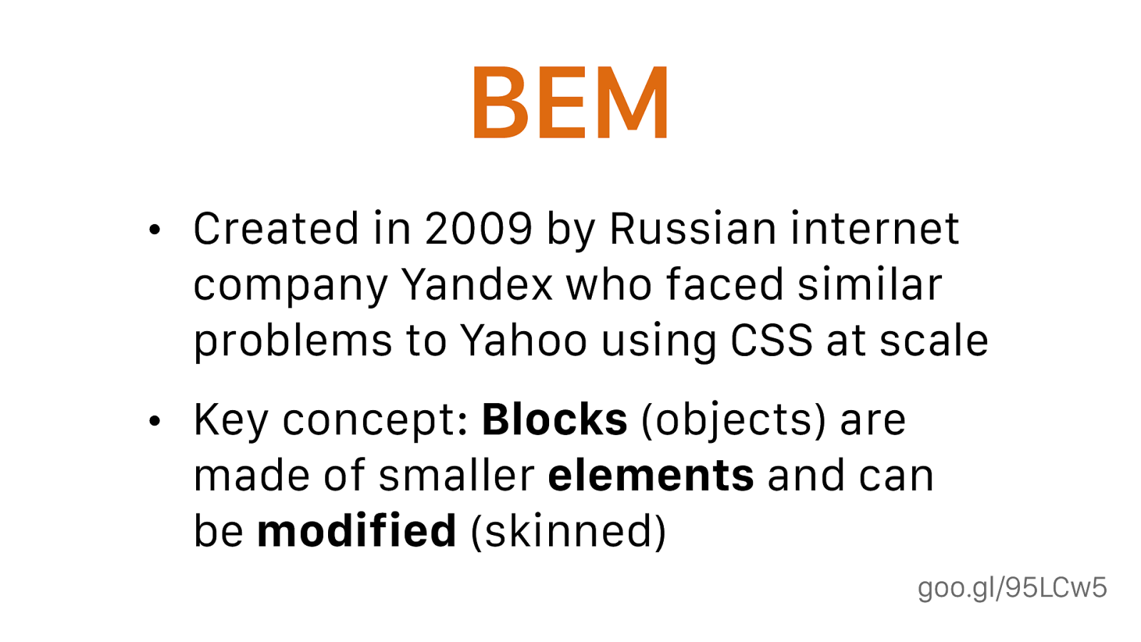
goo.gl/95LCw5 BEM • Created in 2009 by Russian internet company Yandex who faced similar problems to Yahoo using CSS at scale • Key concept: Blocks (objects) are made of smaller elements and can be modified (skinned)
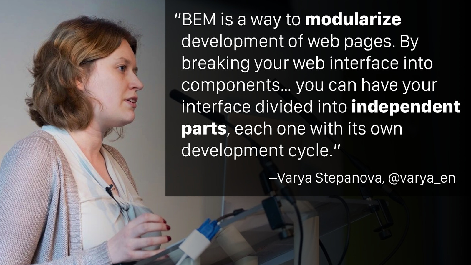
–Varya Stepanova, @varya_en “BEM is a way to modularize
development of web pages. By breaking your web interface into components… you can have your interface divided into independent parts , each one with its own development cycle.”
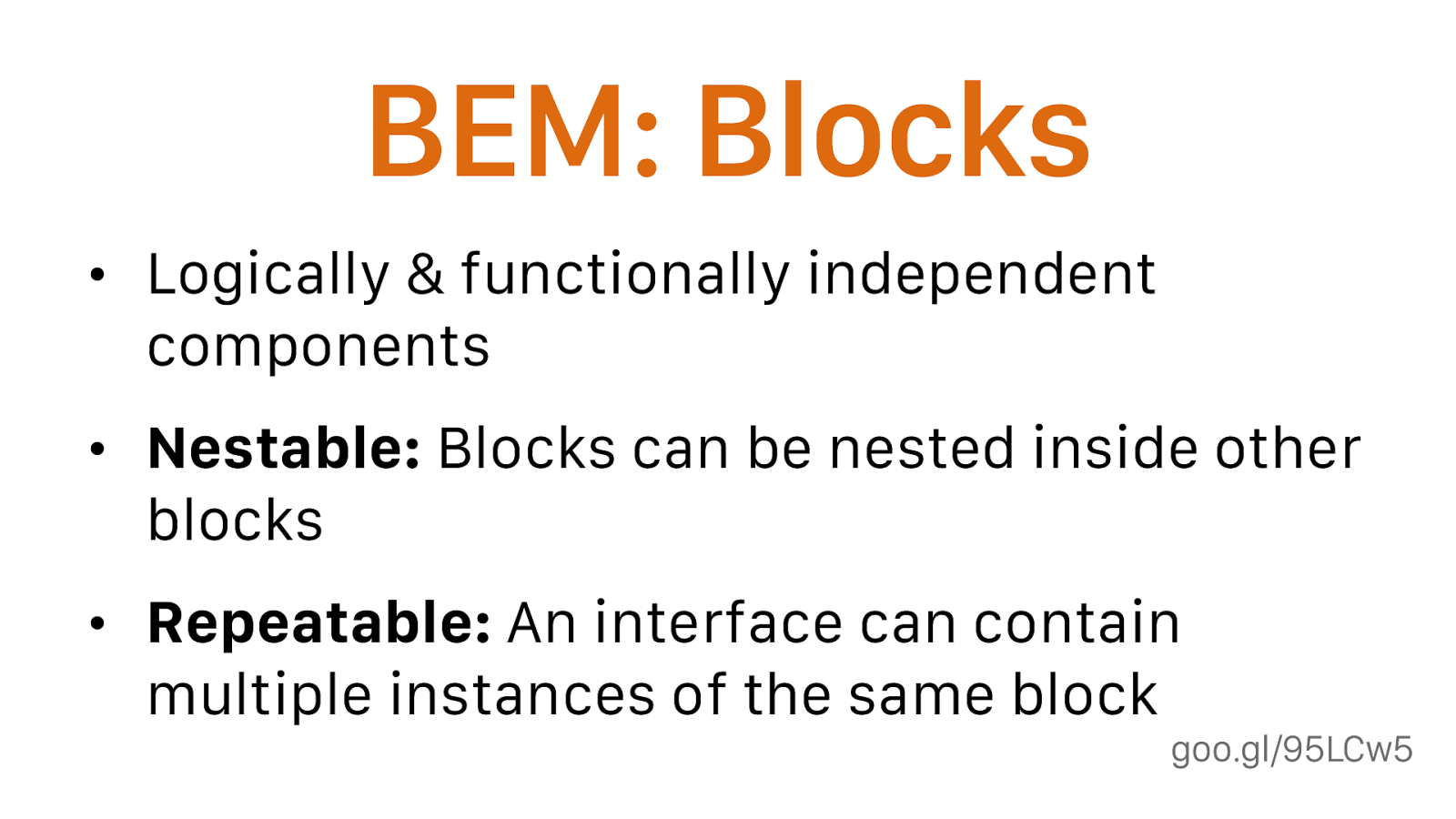
goo.gl/95LCw5 BEM: Blocks • Logically & functionally independent components • Nestable: Blocks can be nested inside other blocks • Repeatable: An interface can contain multiple instances of the same block
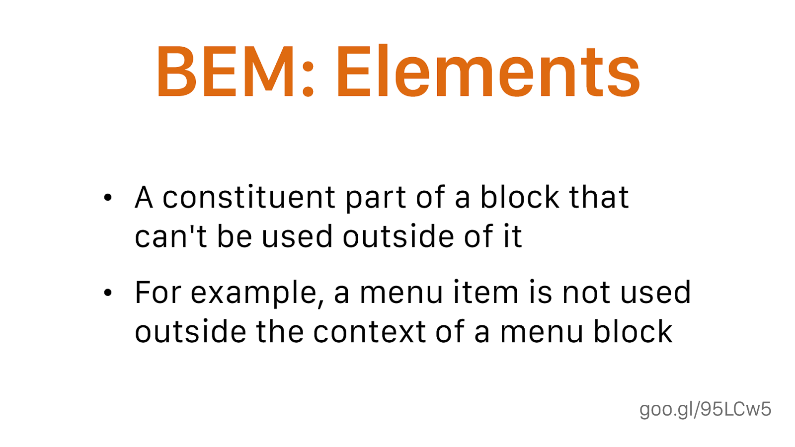
goo.gl/95LCw5 BEM: Elements • A constituent part of a block that can't be used outside of it • For example, a menu item is not used outside the context of a menu block
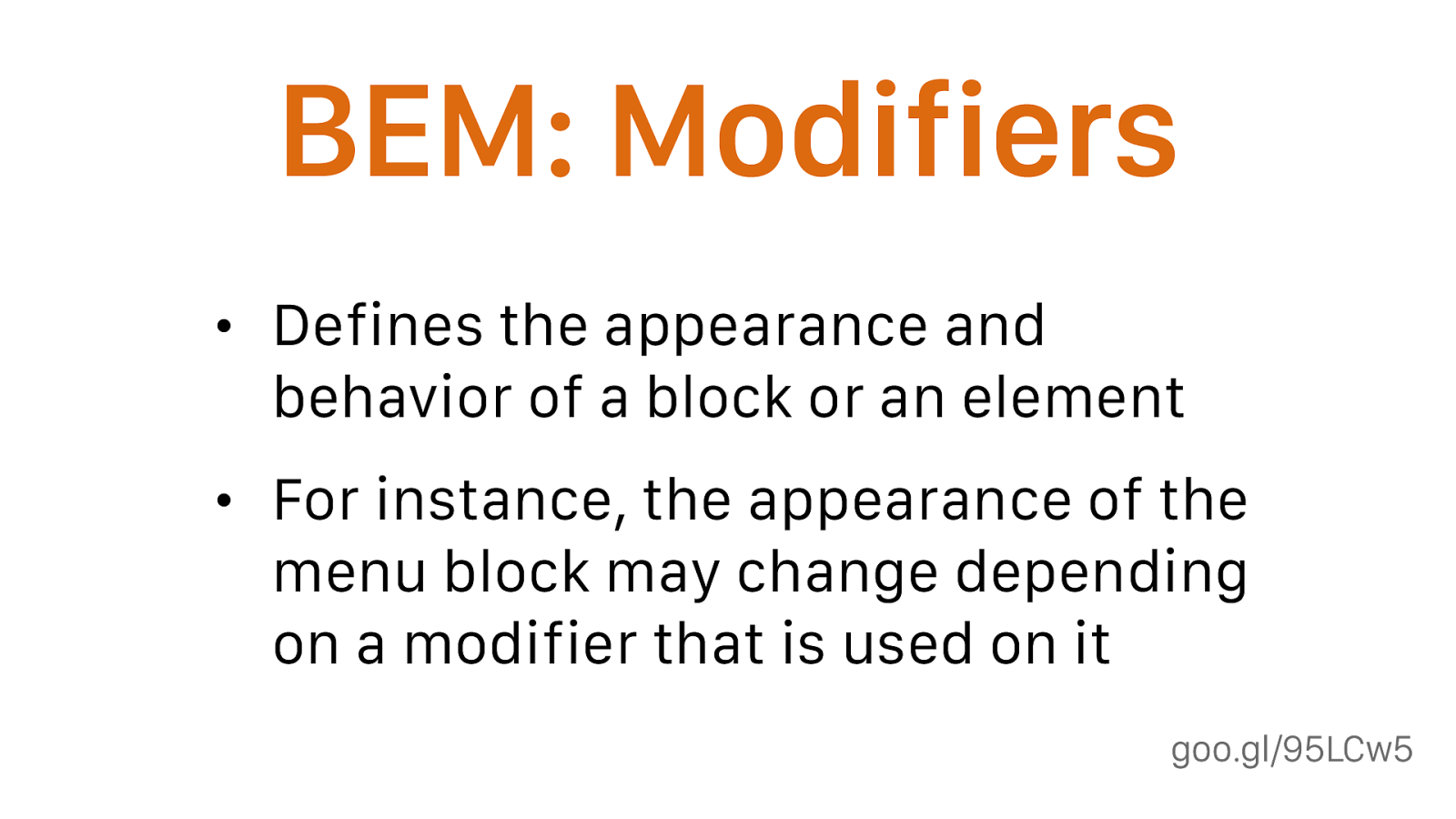
goo.gl/95LCw5 BEM: Modifiers • Defines the appearance and behavior of a block or an element • For instance, the appearance of the menu block may change depending on a modifier that is used on it
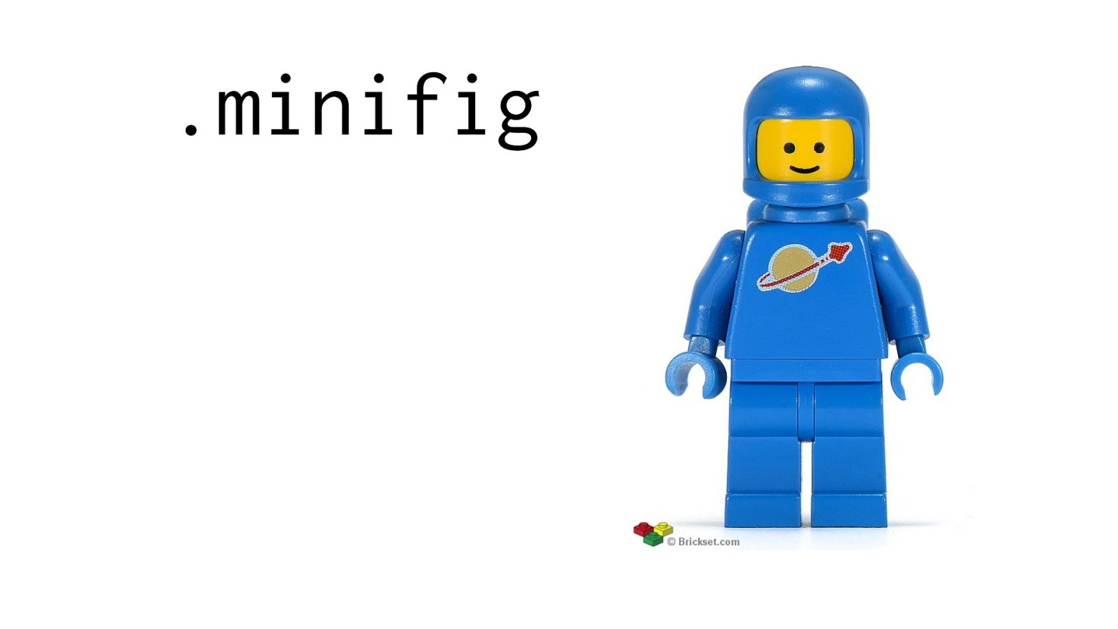
.minifig
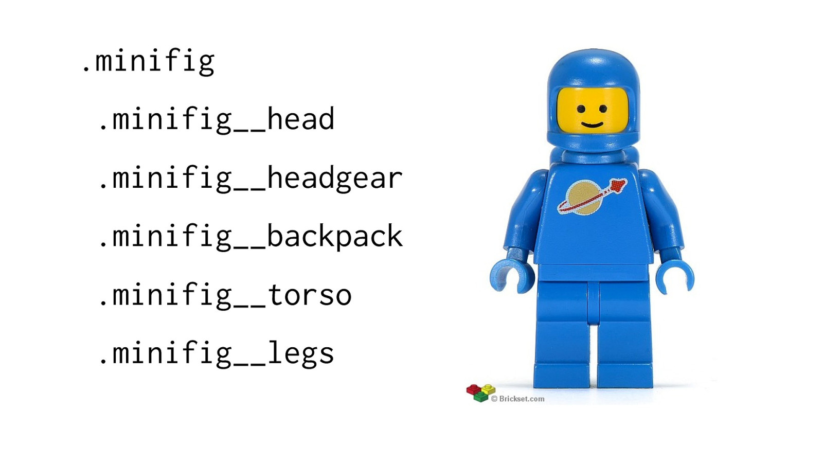
.minifig .minifig__head .minifig__headgear .minifig__backpack .minifig__torso .minifig__legs
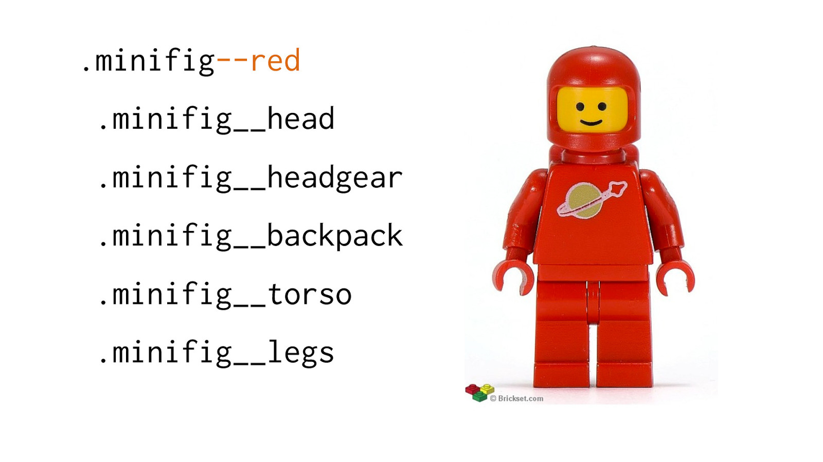
.minifig --red
.minifig__head .minifig__headgear .minifig__backpack .minifig__torso .minifig__legs
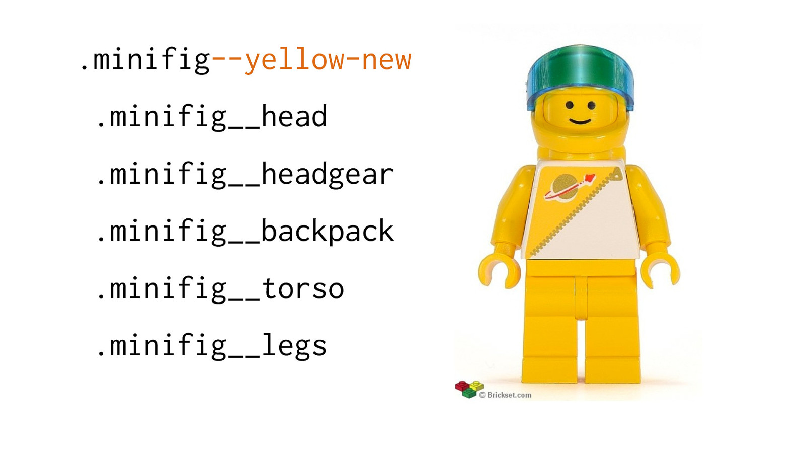
.minifig --yellow-new
.minifig__head .minifig__headgear .minifig__backpack .minifig__torso .minifig__legs
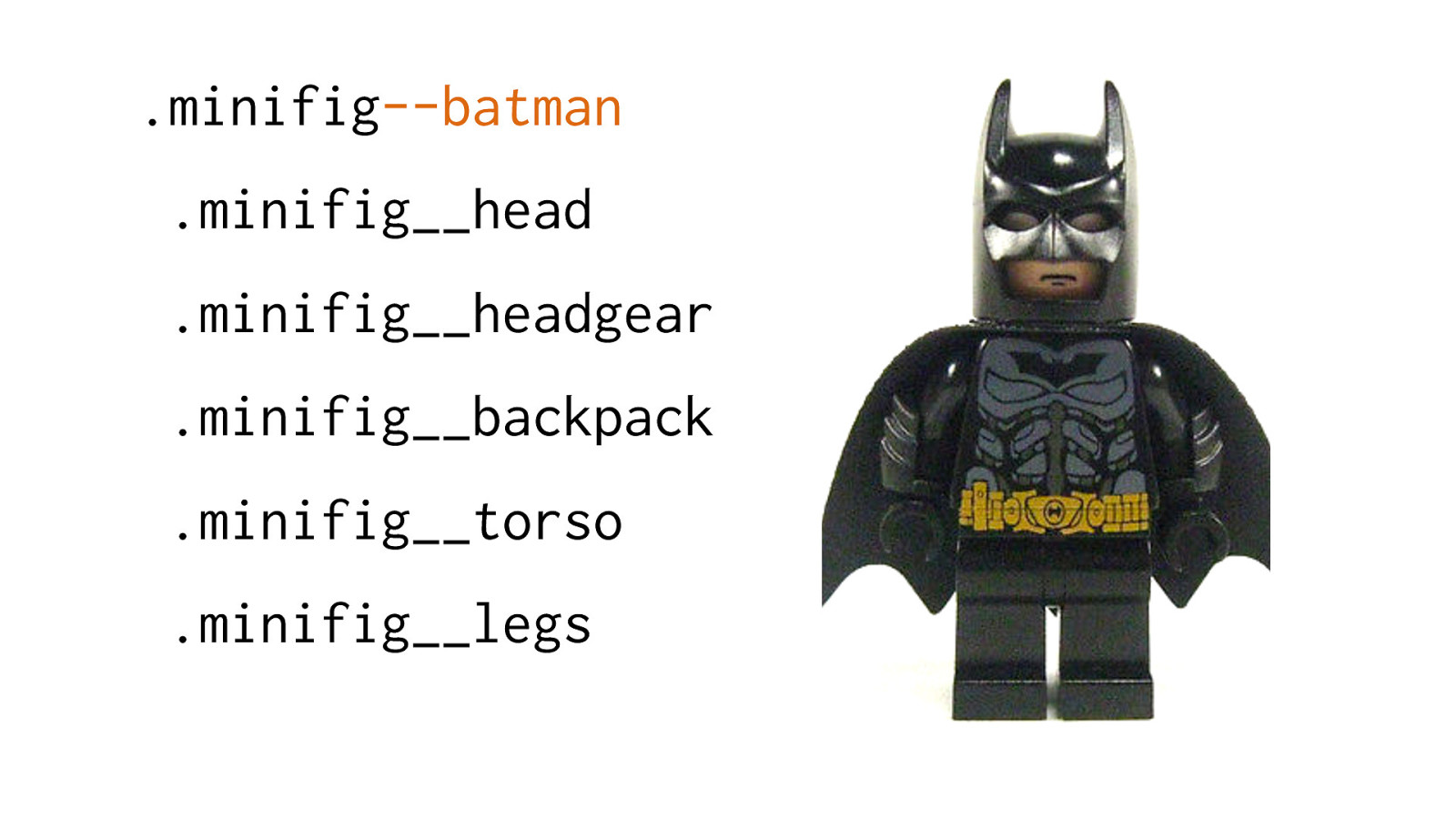
.minifig --batman
.minifig__head .minifig__headgear .minifig__backpack .minifig__torso .minifig__legs
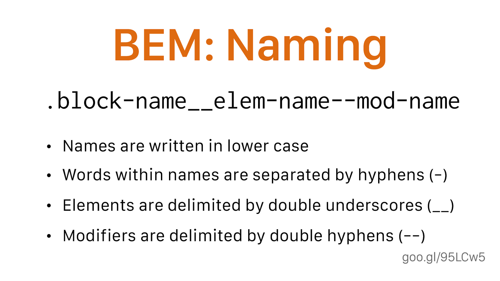
) .block-name__elem-name--mod-name
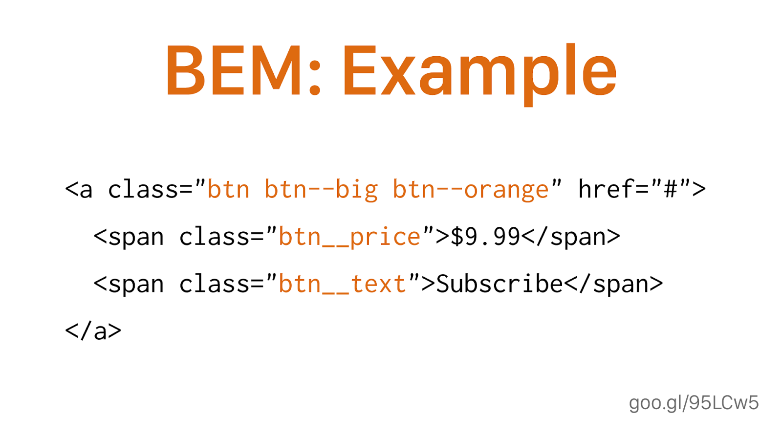
goo.gl/95LCw5 BEM: Example <a class=" btn btn--big btn--orange " href="#"> <span class=" btn__price ">$9.99</span> <span class=" btn__text ">Subscribe</span> </a>
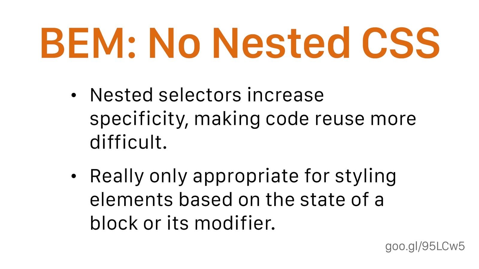
goo.gl/95LCw5 BEM: No Nested CSS • Nested selectors increase specificity, making code reuse more difficult. • Really only appropriate for styling elements based on the state of a block or its modifier. As a rule, if a selector will work without it being nested then do not nest it.
BEM naming provides namespace, so we don’t need to nest anymore
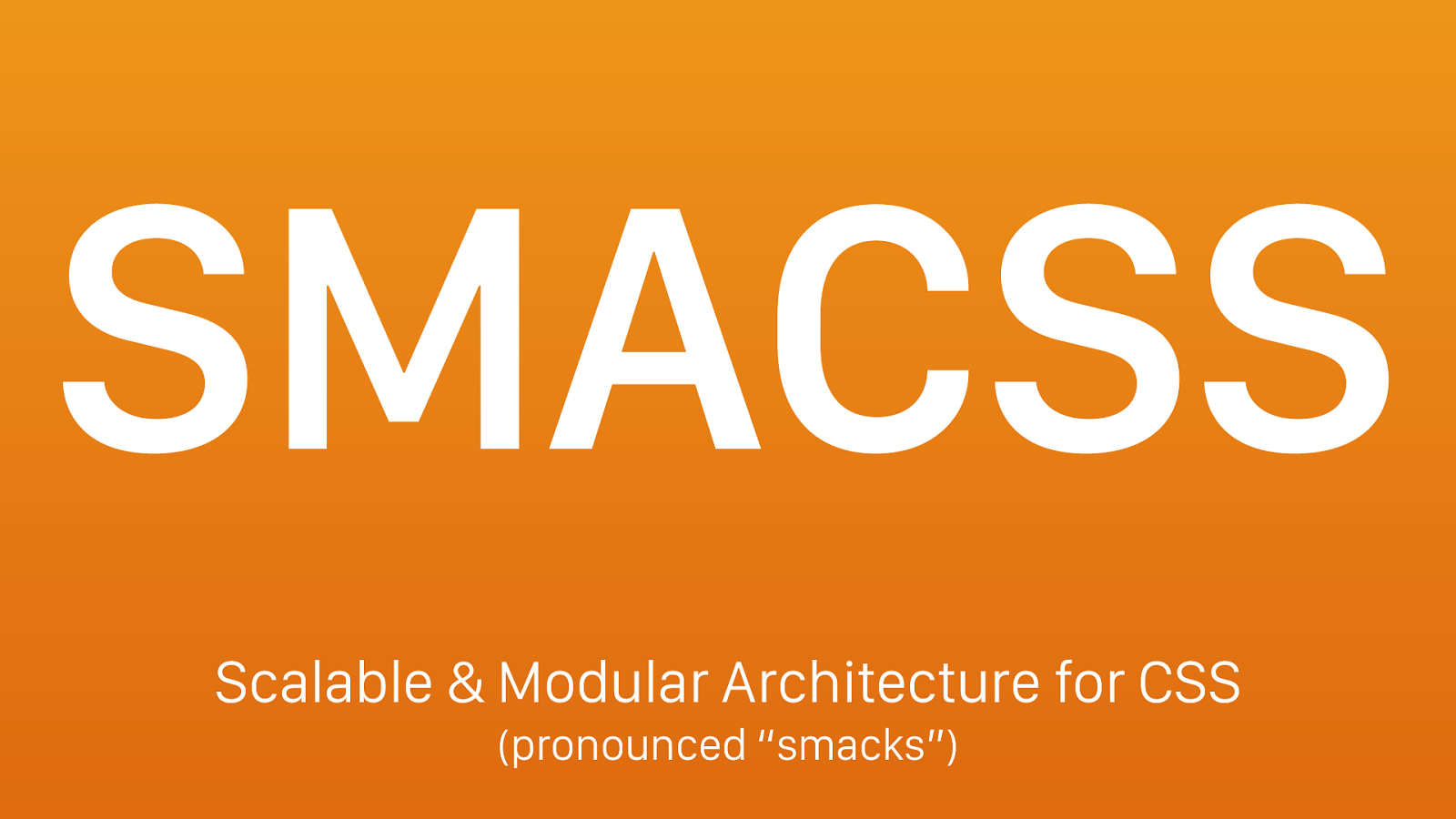
SMACSS Scalable & Modular Architecture for CSS (pronounced “smacks”)
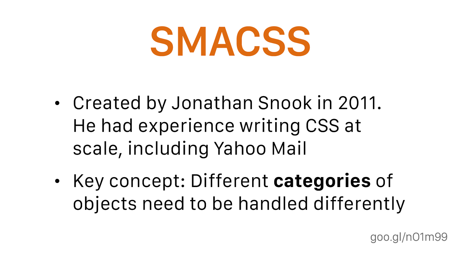
goo.gl/nO1m99 SMACSS • Created by Jonathan Snook in 2011. He had experience writing CSS at scale, including Yahoo Mail • Key concept: Different categories of objects need to be handled differently
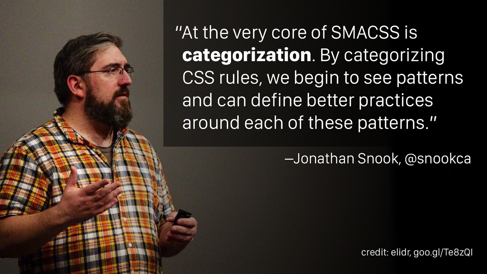
–Jonathan Snook, @snookca “At the very core of SMACSS is categorization . By categorizing CSS rules, we begin to see patterns and can define better practices around each of these patterns.” credit: elidr, goo.gl/Te8zQI
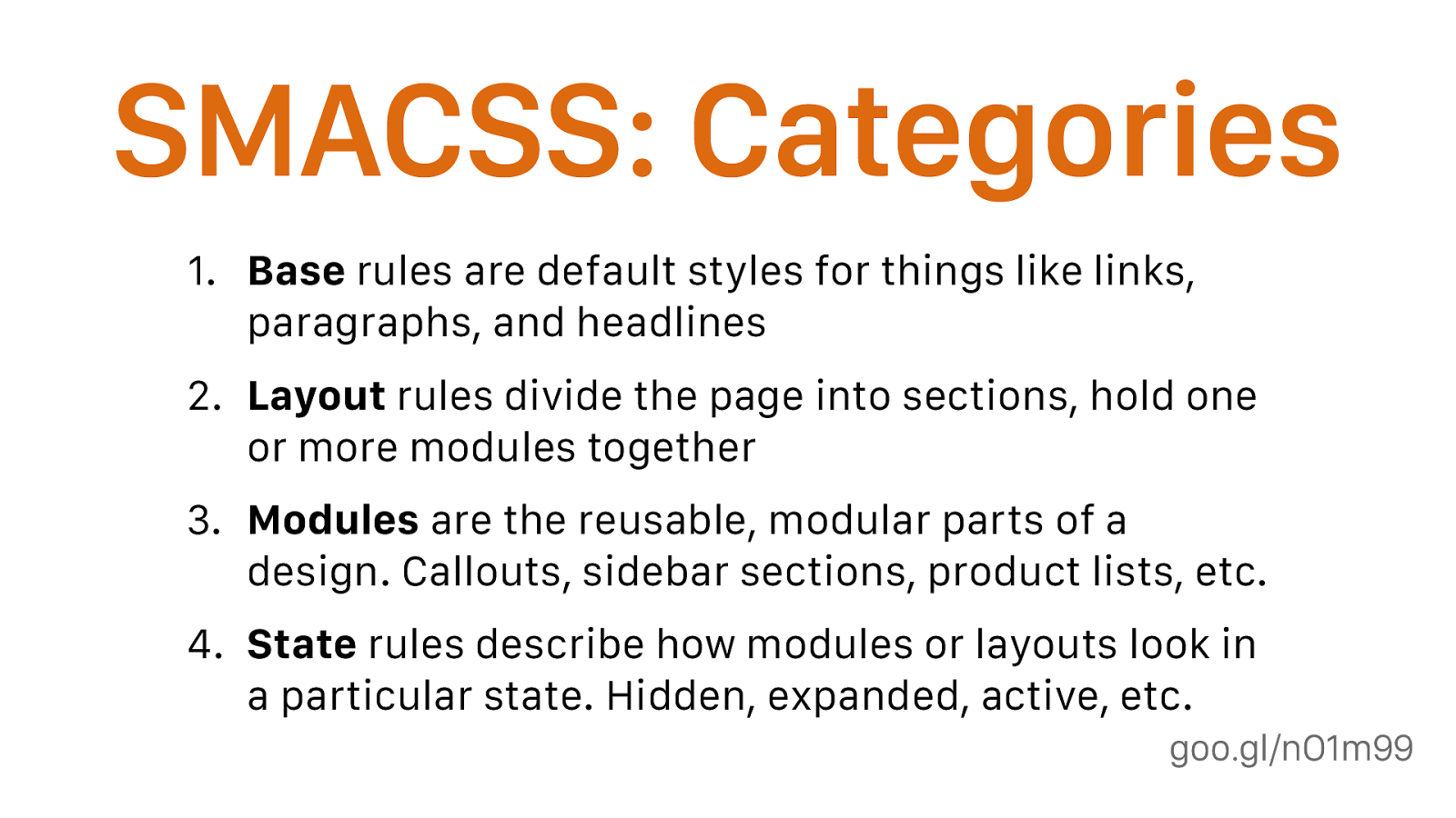
goo.gl/nO1m99 SMACSS: Categories 1. Base rules are default styles for things like links, paragraphs, and headlines 2. Layout rules divide the page into sections, hold one or more modules together 3. Modules are the reusable, modular parts of a design. Callouts, sidebar sections, product lists, etc. 4. State rules describe how modules or layouts look in a particular state. Hidden, expanded, active, etc. also theme, but no one uses that
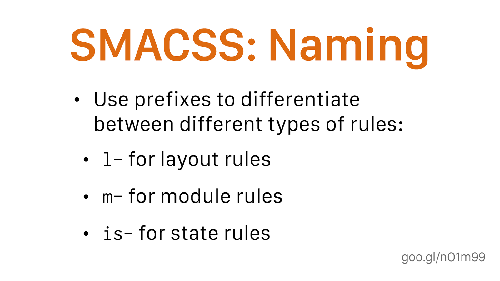
goo.gl/nO1m99 SMACSS: Naming • Use prefixes to differentiate between different types of rules: • l- for layout rules • m- for module rules • is- for state rules basic rules should be applied to HTML elements, so no prefix
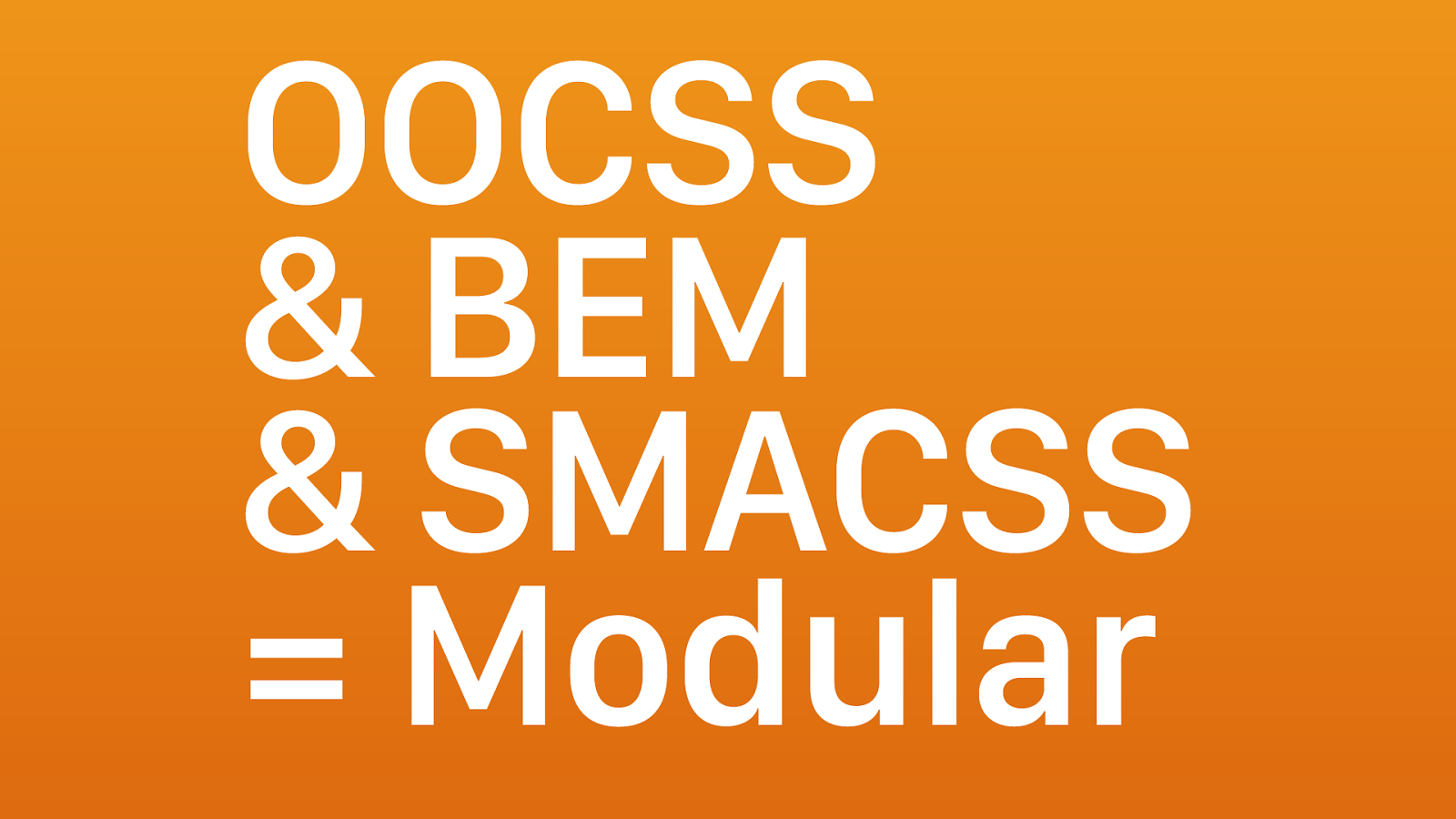
OOCSS & BEM & SMACSS = Modular
Modular CSS • These methodologies are more alike than different • Their evolution represents our industry’s growing experience with CSS at scale • We don’t have to limit ourselves. Look at what they share and keep the best parts
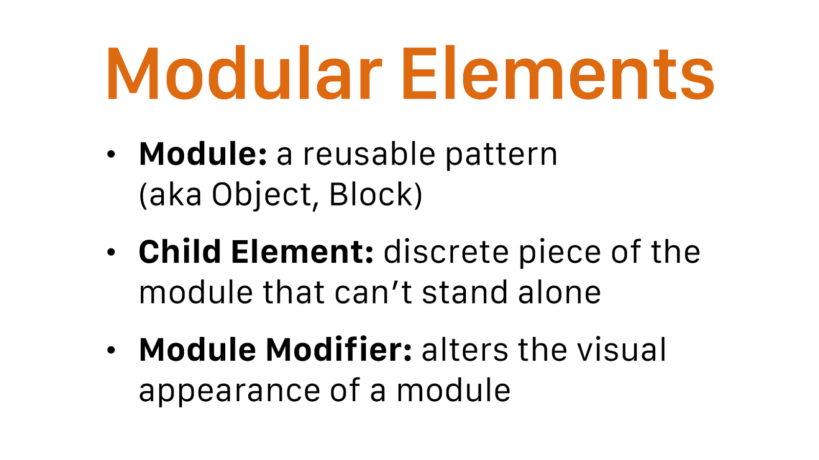
Modular Elements • Module: a reusable pattern (aka Object, Block) • Child Element: discrete piece of the module that can’t stand alone • Module Modifier: alters the visual appearance of a module • module examples: media object, navigation, page header
• child examples: media object image, navigation tab, page header logo
• modifier examples: left/right aligned media objects, vertical/horizontal navigation
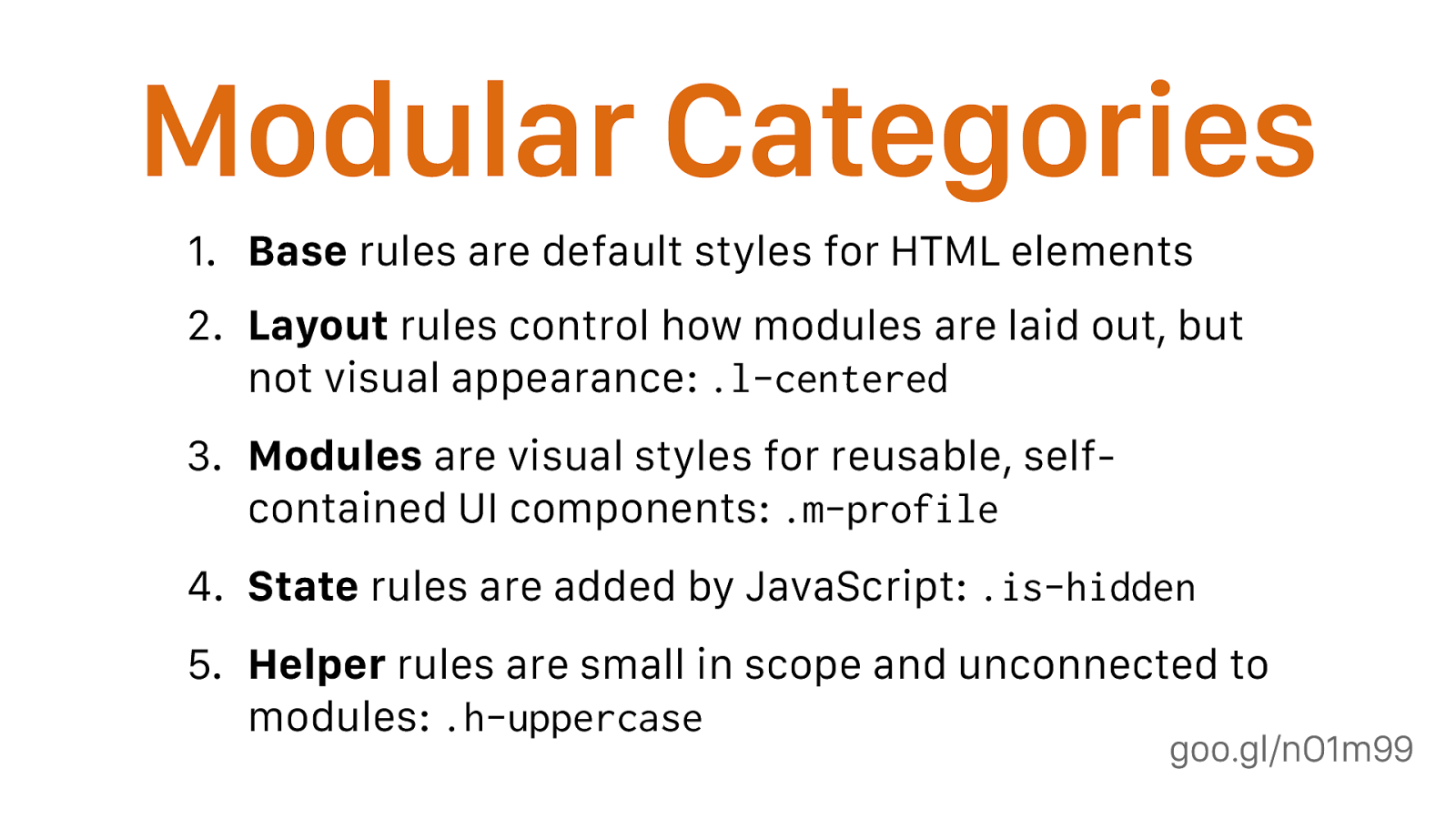
goo.gl/nO1m99 Modular Categories 1. Base rules are default styles for HTML elements 2. Layout rules control how modules are laid out, but not visual appearance: .l-centered
Modules are visual styles for reusable, self- contained UI components: .m-profile
State rules are added by JavaScript: .is-hidden
Helper rules are small in scope and unconnected to modules: .h-uppercase helper aka utility
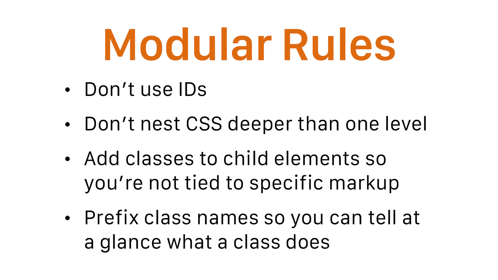
Modular Rules • Don’t use IDs • Don’t nest CSS deeper than one level • Add classes to child elements so you’re not tied to specific markup • Prefix class names so you can tell at a glance what a class does

FAQ
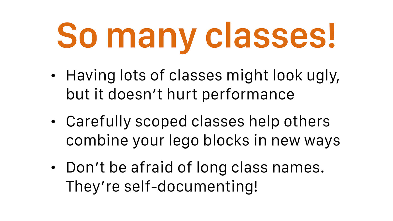
So many classes! • Having lots of classes might look ugly, but it doesn’t hurt performance • Carefully scoped classes help others combine your lego blocks in new ways • Don’t be afraid of long class names. They’re self-documenting! Favour the multiple-class approach over using something like @extend: using multiple classes in your markup—as opposed to wrapping the classes up into one using a preprocessor
A) gives you a better paper-trail in your markup, and allows you to see quickly and explicitly which classes are acting on a piece of HTML;\
B) allows for greater composition in that classes are not tightly bound to other styles in your CSS. Whenever you are building a UI component, try and see if you can break it into two parts: one for structural styles (paddings, layout, etc.) and another for skin (colours, typefaces, etc.).
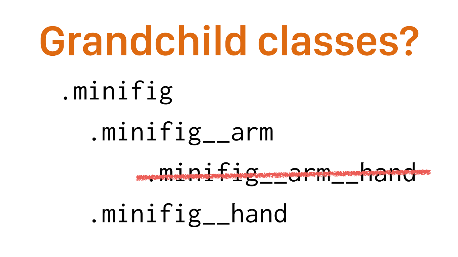
Grandchild classes? .minifig .minifig__arm .minifig__arm__hand .minifig__hand There’s no such thing. Ignore the structure of your markup. This makes it possible to change the DOM structure of the block without modifying the code of each individual element.
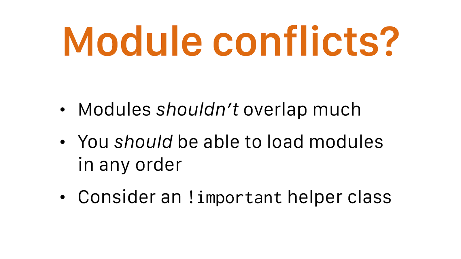
Module conflicts? • Modules shouldn’t overlap much • You should be able to load modules in any order • Consider an !important helper class strict separation between layout and style helps
Only use !important proactively, not reactively.
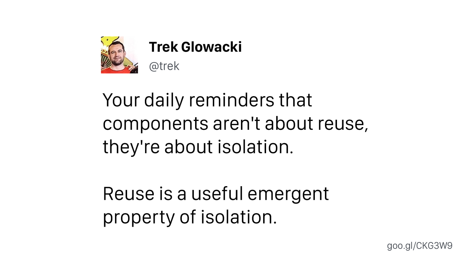
Your daily reminders that components aren't about reuse, they're about isolation. Reuse is a useful emergent property of isolation. Trek Glowacki @trek goo.gl/CKG3W9
Flexbox modules? • It’s tricky to make layout modules using flexbox • If you’re not careful, you’ll find yourself making modifiers for every single flex option • ¯_( ツ )_/¯
Preprocessors? • Modular CSS is more of a philosophy than a framework • As a result, it works with any preprocessor (or not) that you need
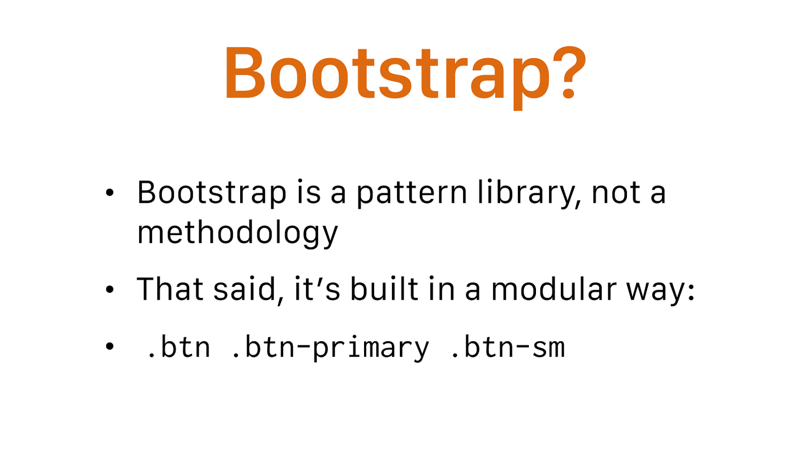
Bootstrap? • Bootstrap is a pattern library, not a methodology • That said, it’s built in a modular way: •
.btn .btn-primary .btn-sm

Recap Modular CSS is dope
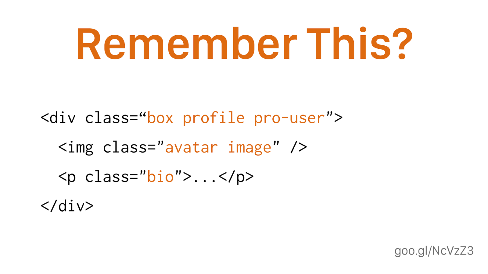
goo.gl/NcVzZ3 Remember This?
<div class=“ box profile pro-user "> <img class=" avatar image " /> <p class=" bio ">...</p> </div> How are .box and .profile related? How are .profile and .avatar related? Are they related at all? Should you be using .pro-user alongside .bio? Will .image and .profile live in the same part of the CSS? Can you use .avatar anywhere else?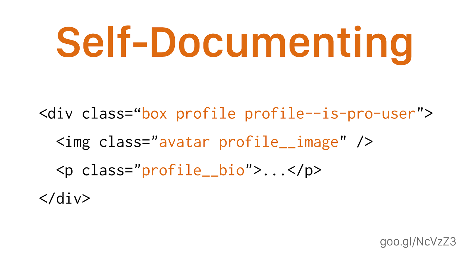
goo.gl/NcVzZ3 Self-Documenting
<div class=“ box profile profile--is-pro-user "> <img class=" avatar profile__image " /> <p class=" profile__bio ">...</p> </div> Now we can clearly see which classes are and are not related to each other, and how; we know what classes we can’t use outside of the scope of this component; and we know which classes we are free to reuse elsewhere.
Modular Benefits • Simplifies code and facilitates refactoring • Self-documenting code • Reusable code that doesn’t influence outside its own scope • Naturally leads to a pattern library
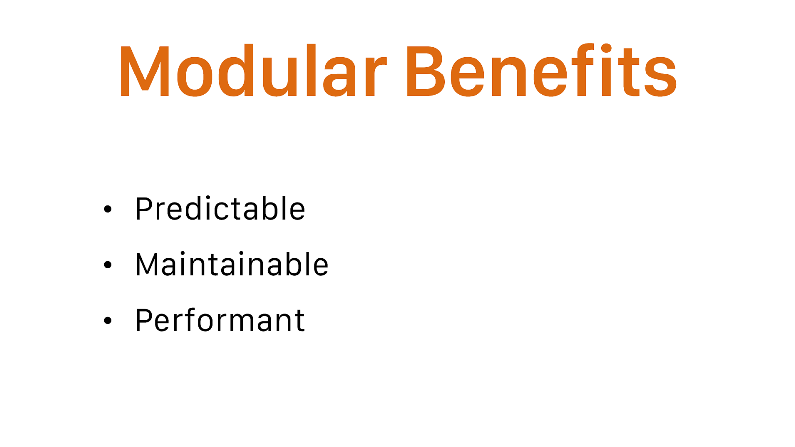
Modular Benefits • Predictable • Maintainable • Performant or to put it another way
Two CSS properties walk into a bar. A table in a bar across town collapses. Everything is fine, thanks to modular code and proper namespacing. goo.gl/wScTMY Thomas Fuchs @thomasfuchs
Thanks! slides: goo.gl/sp9wRS Scott Vandehey — @spaceninja — Devsigner 2016