
A presentation at Melbourne Web A11y meetup in in Melbourne VIC, Australia by Allison Ravenhall
Presented by Allison Ravenhall @RavenAlly Digital Accessibility Sensei at Intopia @Intopia
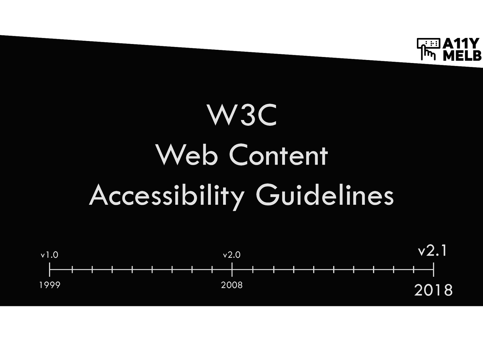
Version 1.0 was published in 1999. Version 2.0 was published in 2008. Version 2.1 was published in 2018.
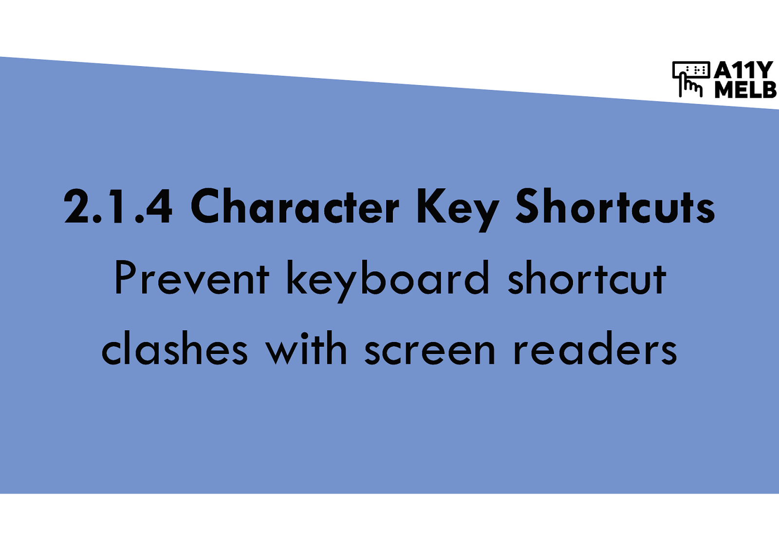
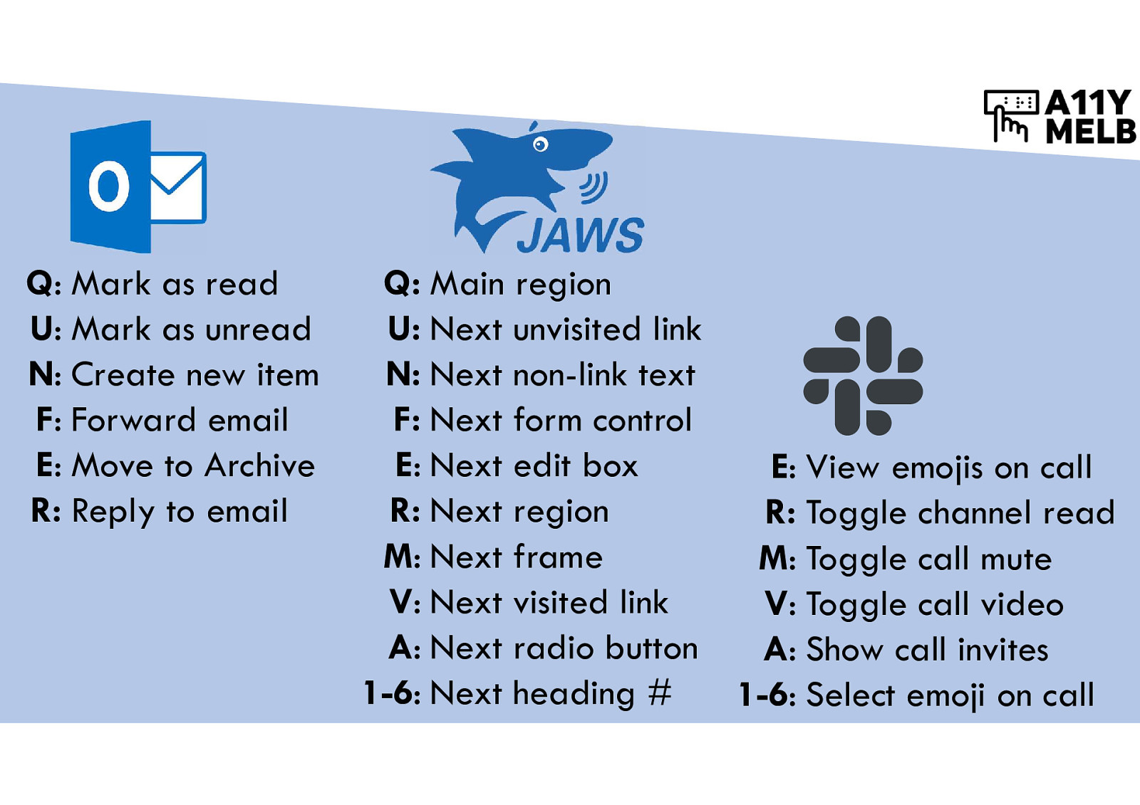
Prevent keyboard shortcut clashes with screen readers
Single-key keyboard commands for Microsoft Outlook, JAWS and Slack. JAWS uses keyboard commands that are also used by these web applications.
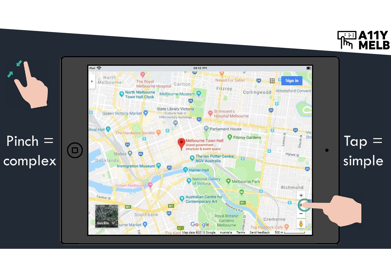
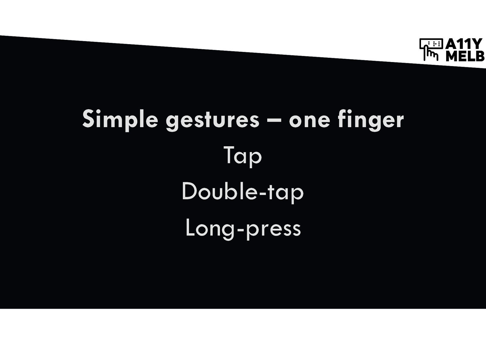
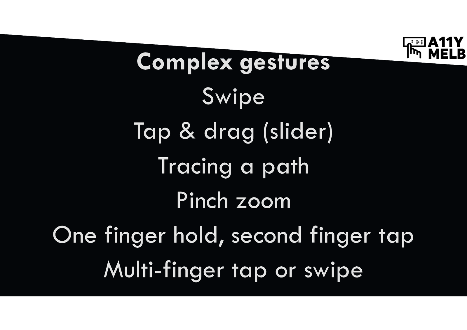
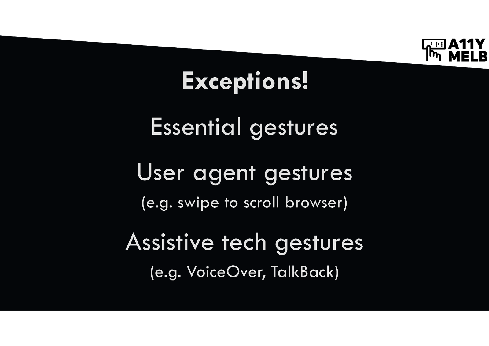
Define simple pointer gestures
Pinch = complex Tap = simple Screenshot of Google maps app on tablet with single finger tap and two-finger pinch icons.
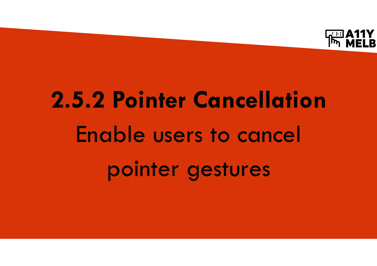
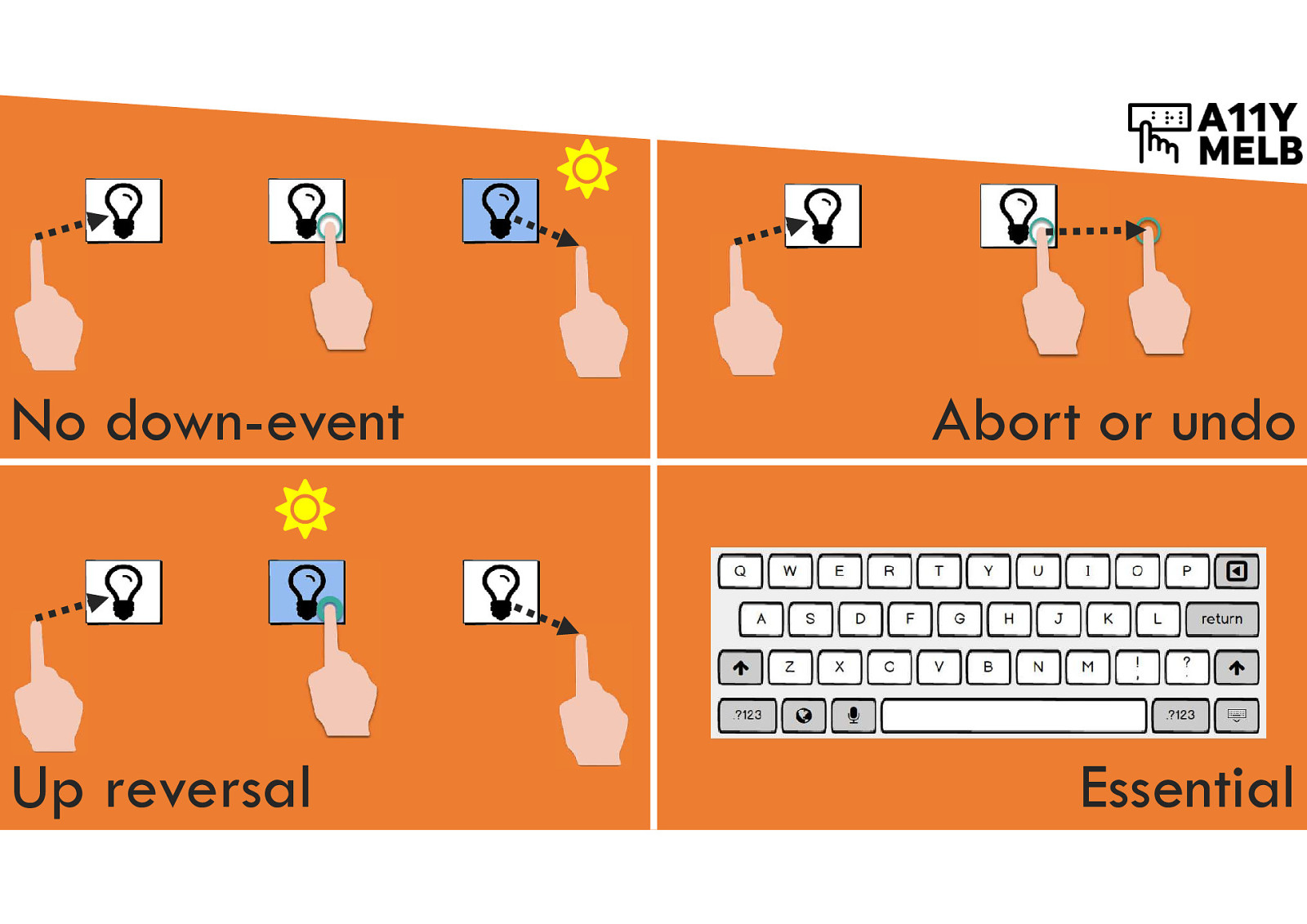
Enable users to cancel pointer gestures
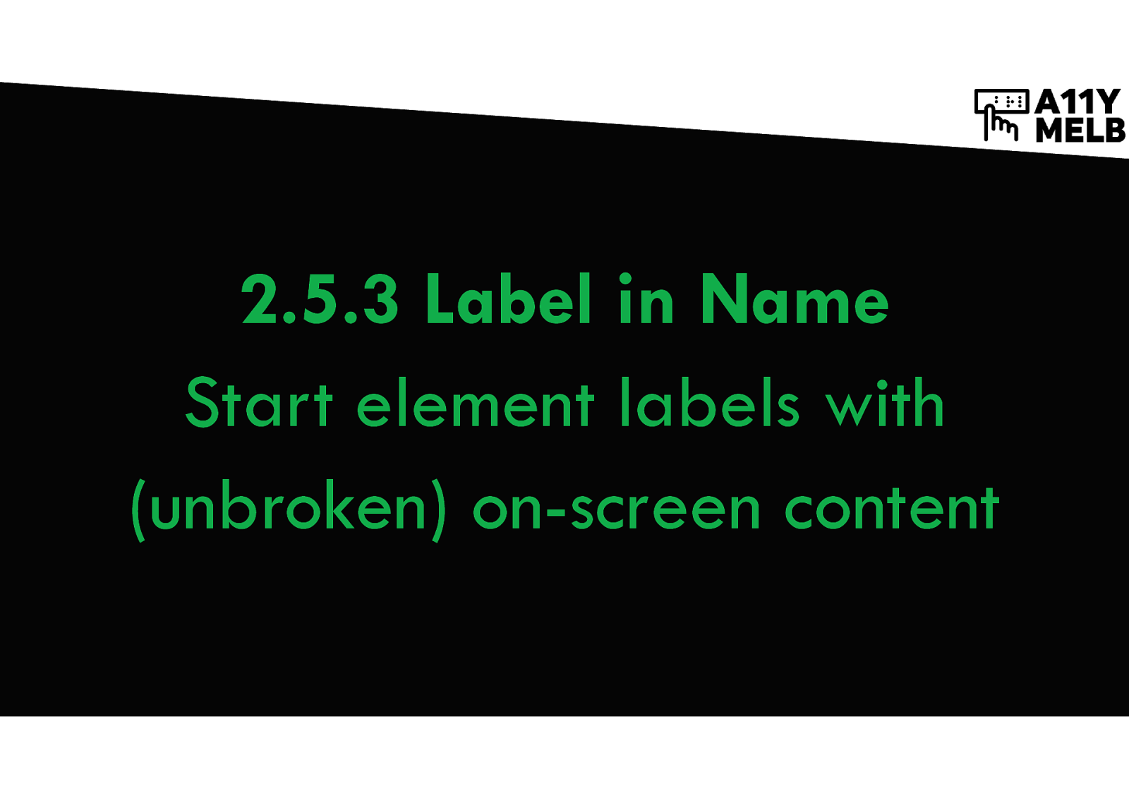
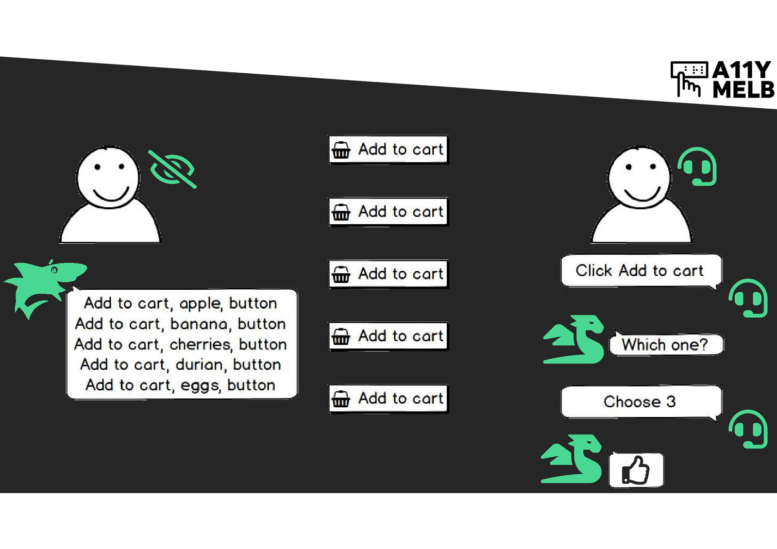
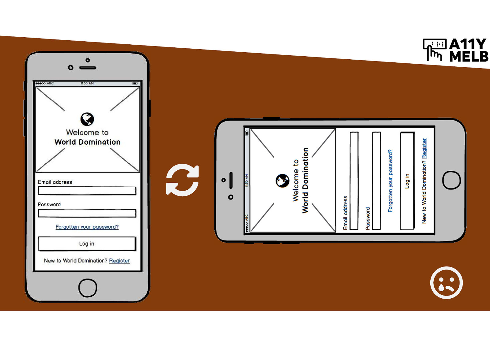
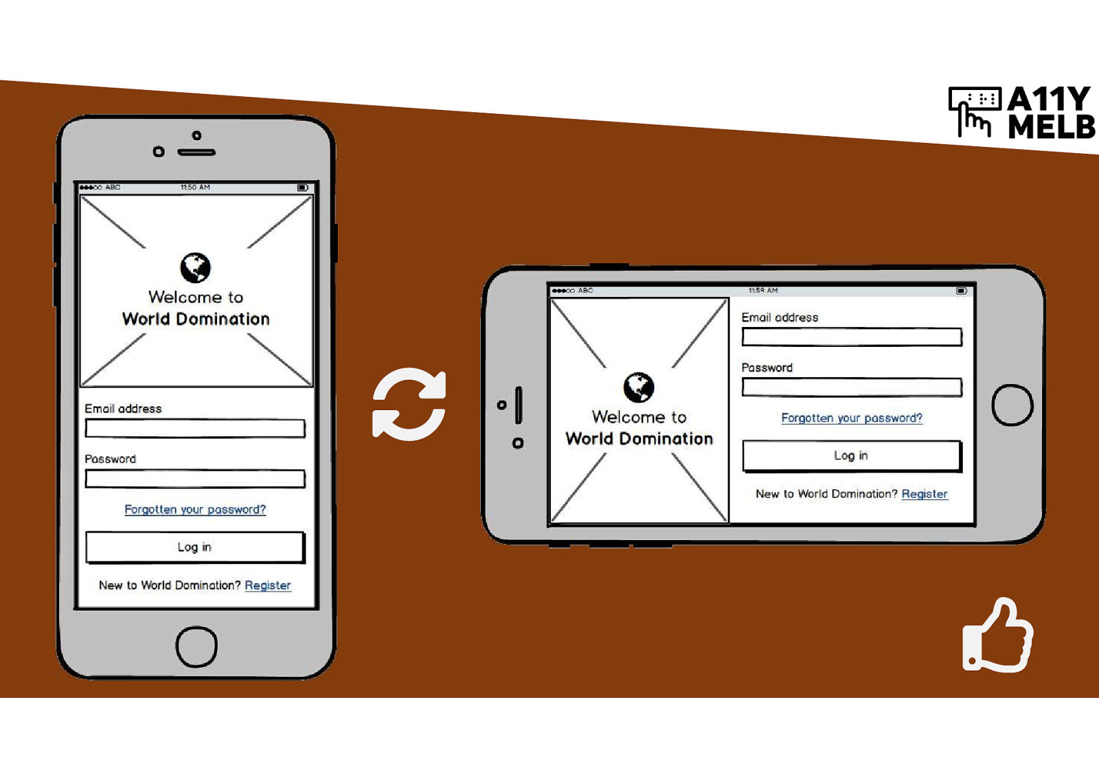
Start element labels with (unbroken) on-screen content
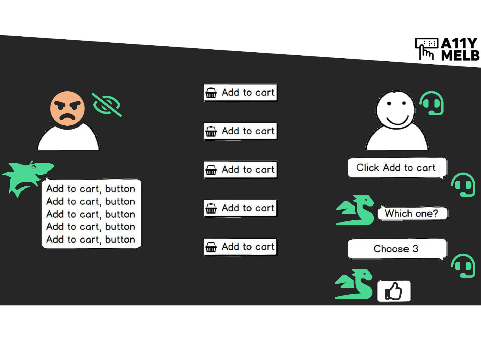
If there’s five “Add to Cart” buttons on screen, how is a screen reader user meant to tell them apart? A sighted voice control user can activate a specific button by saying “Click Add to cart” then saying the number applied to the button.
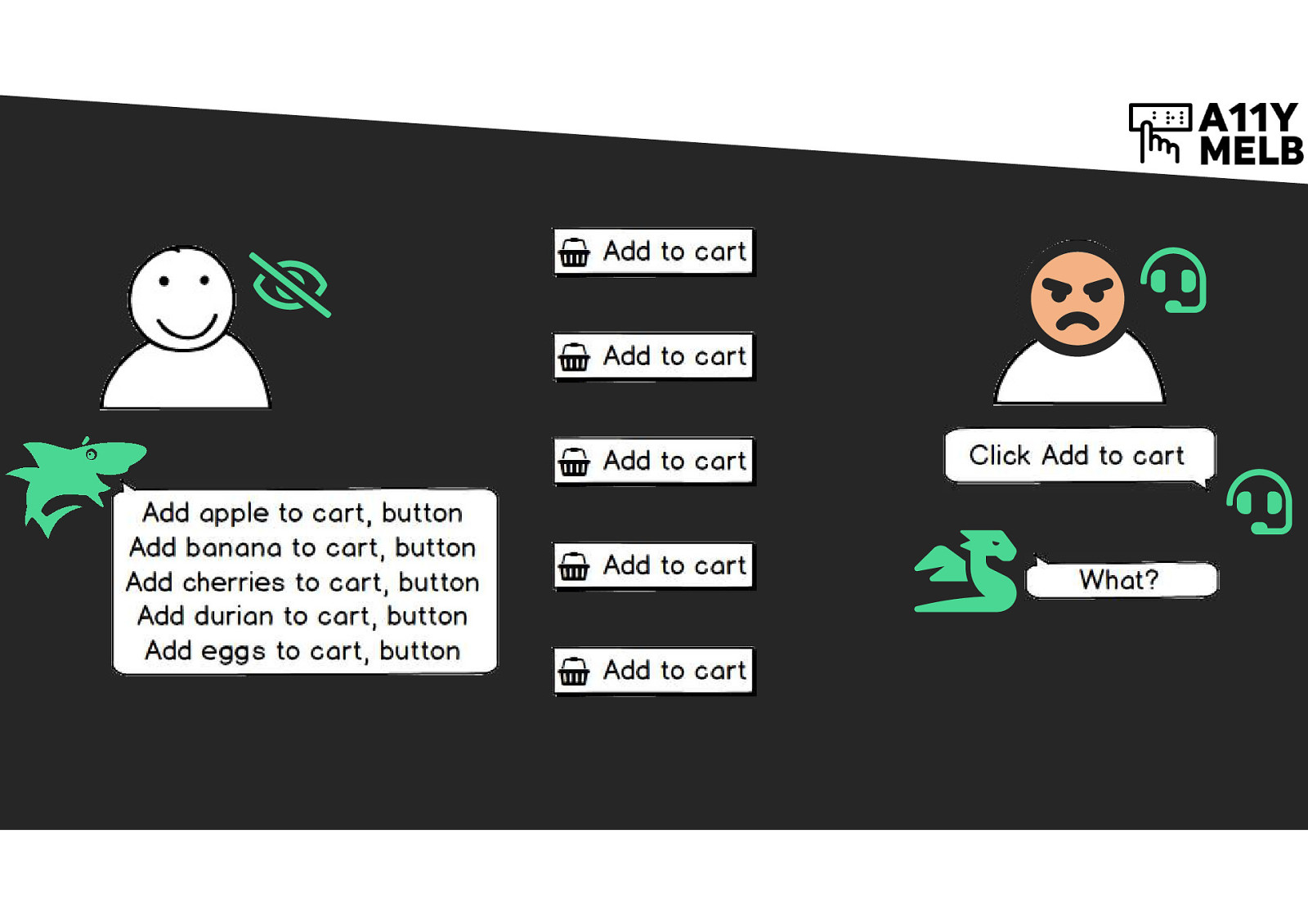
If the buttons have been enhanced with extra off-screen content, then a screen reader user can identify them more easily. “Add to cart” on-screen versus “Add apple to cart” for a screen reader. However, the voice control software doesn’t recognise “Add to cart” as a button anymore because that button label isn’t in the code anymore - it looks up the screen reader text, not the visible text.
If the screen reader label is rearranged so the on-screen label is read first, in full, unbroken, then screen reader users can uniquely identify buttons and voice control users can activate buttons by name. e.g. “Add to cart” on-screen, “Add to cart, apple” in code.
Provide alternatives to motion functions
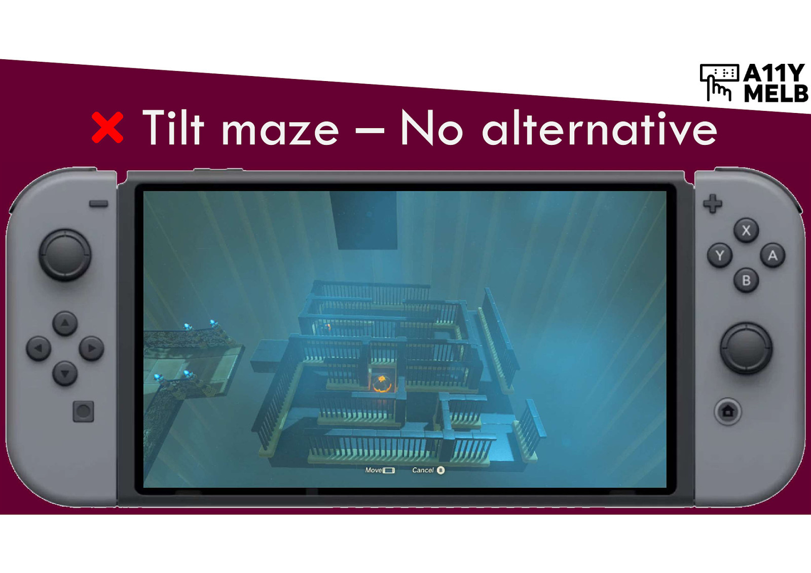
A tilt maze gives no alternative to motion input. The player must tilt the controller to move the ball through the maze. This fails the requirement.
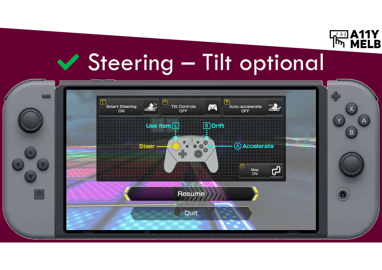
The Mario Kart game allows players to decide whether or not they want to user tilt controls. This enables people who can’t control the tilt steering to use the controller buttons to steer their kart instead.
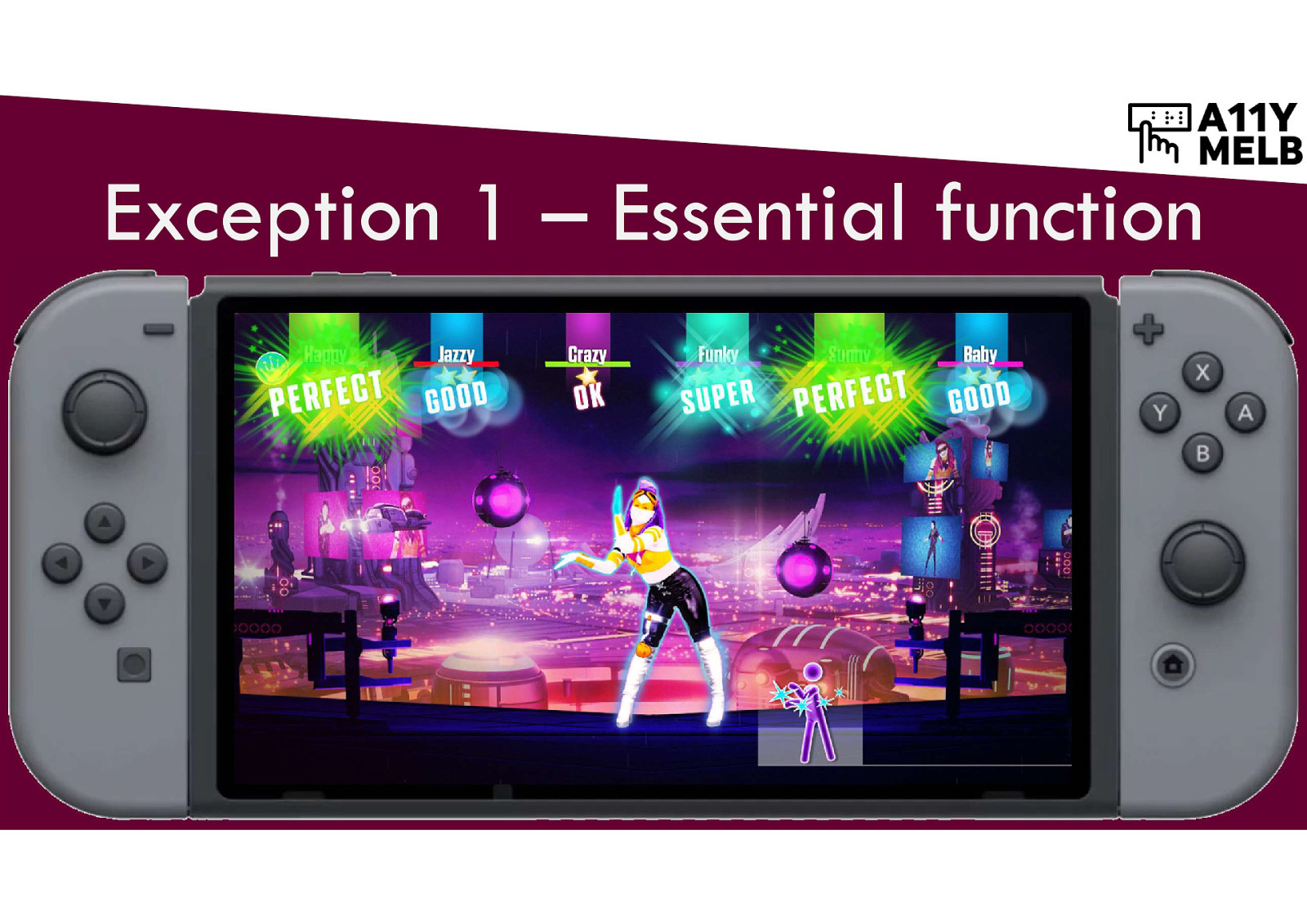
If movement is an essential part of the experience, then an alternative doesn’t need to be provided. Example: Just Dance game for Nintendo Switch tracks user motion and scores accuracy and timing. Without movement, there would be no game - it’s essential to the experience.
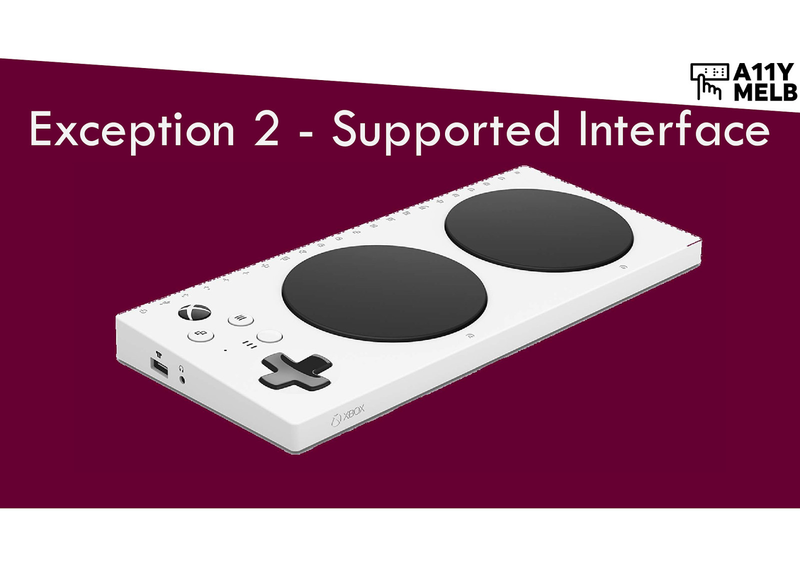
If there is an accessible interface that can simulate the player motion, then the game/site/app itself doesn’t need to provide a non-motion experience. Example: XBox adaptive controller.
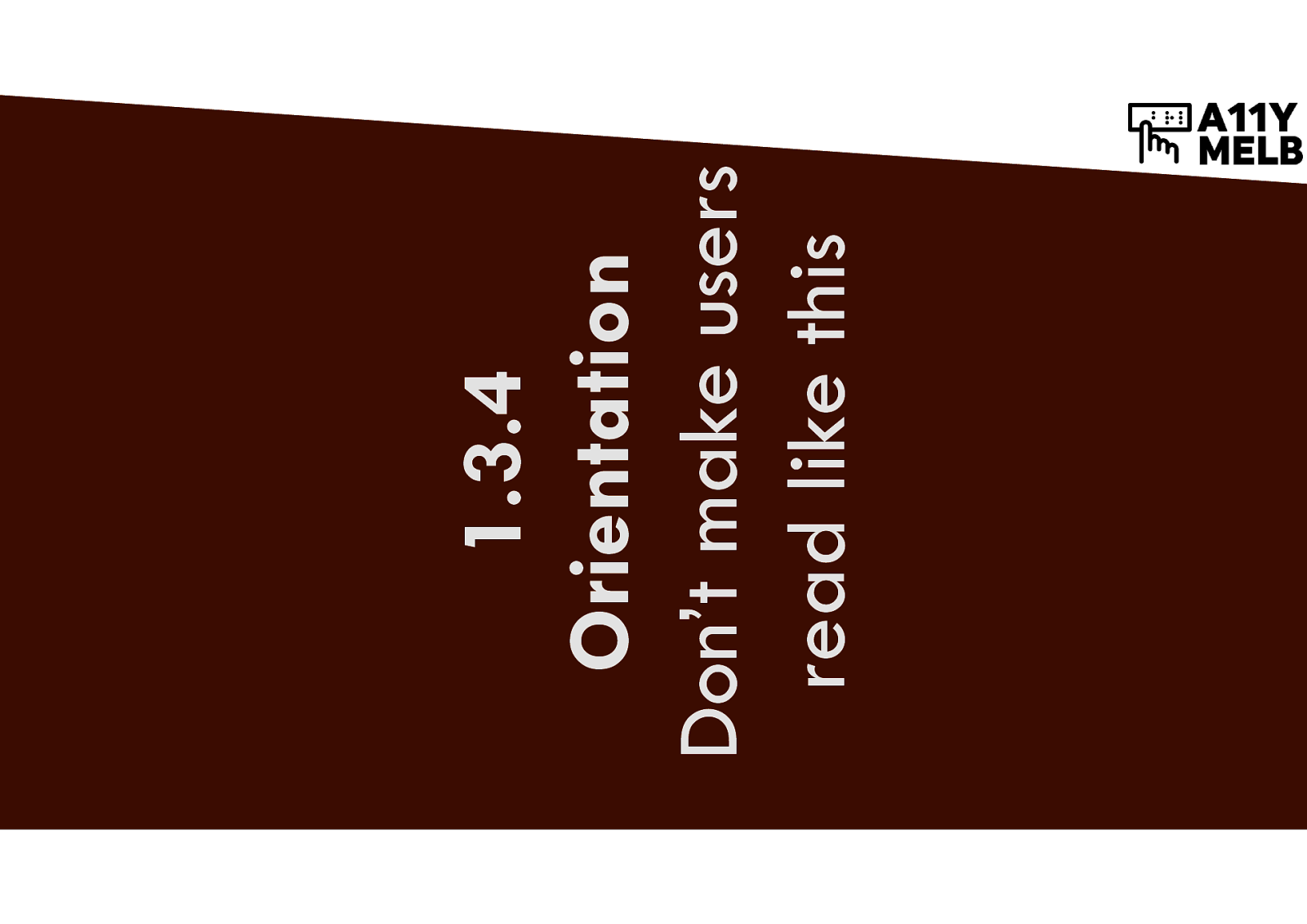
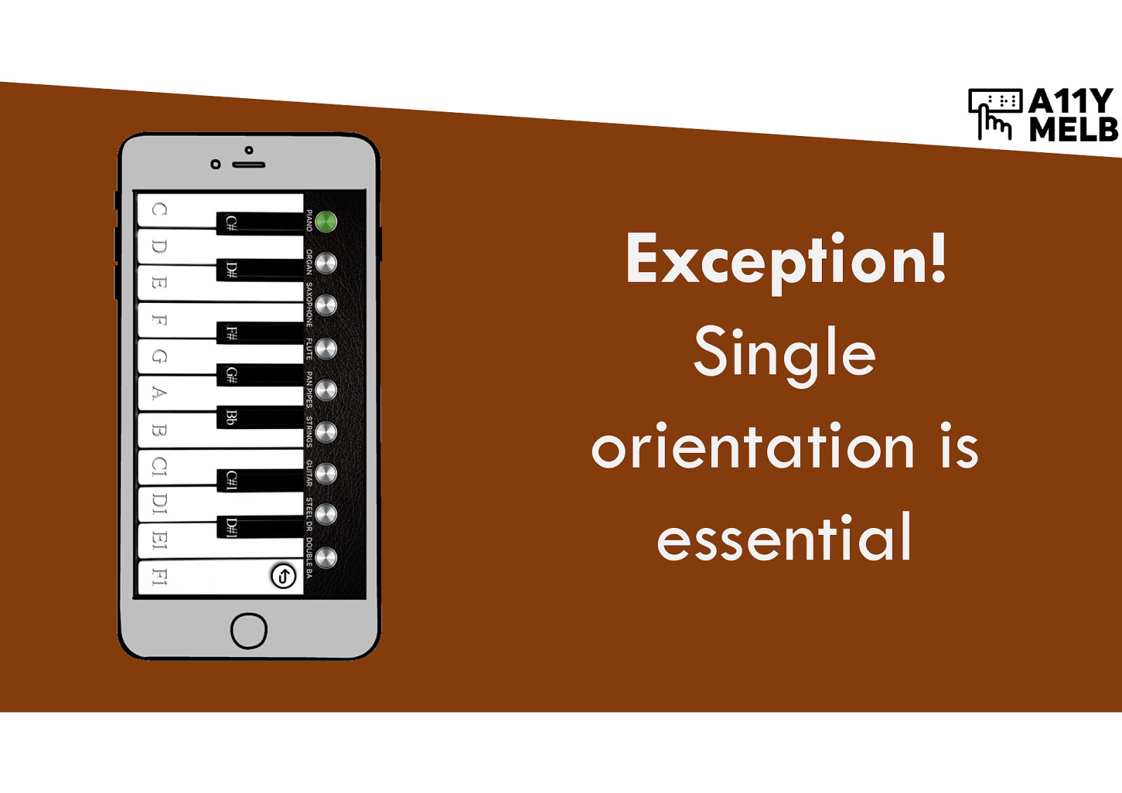
Don’t make users read like this (text is presented sideways)
If content is locked to a particular orientation (portrait or landscape), this makes it hard to use for people with limited mobility who have their devices mounted on a stand.
It’s better for content to detect and adapt to the current device orientation.
Sometimes single orientation is essential. Example: piano can only be presented in landscape.
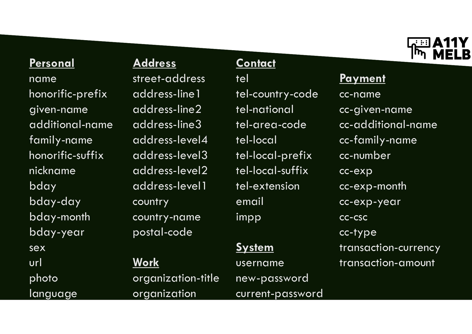
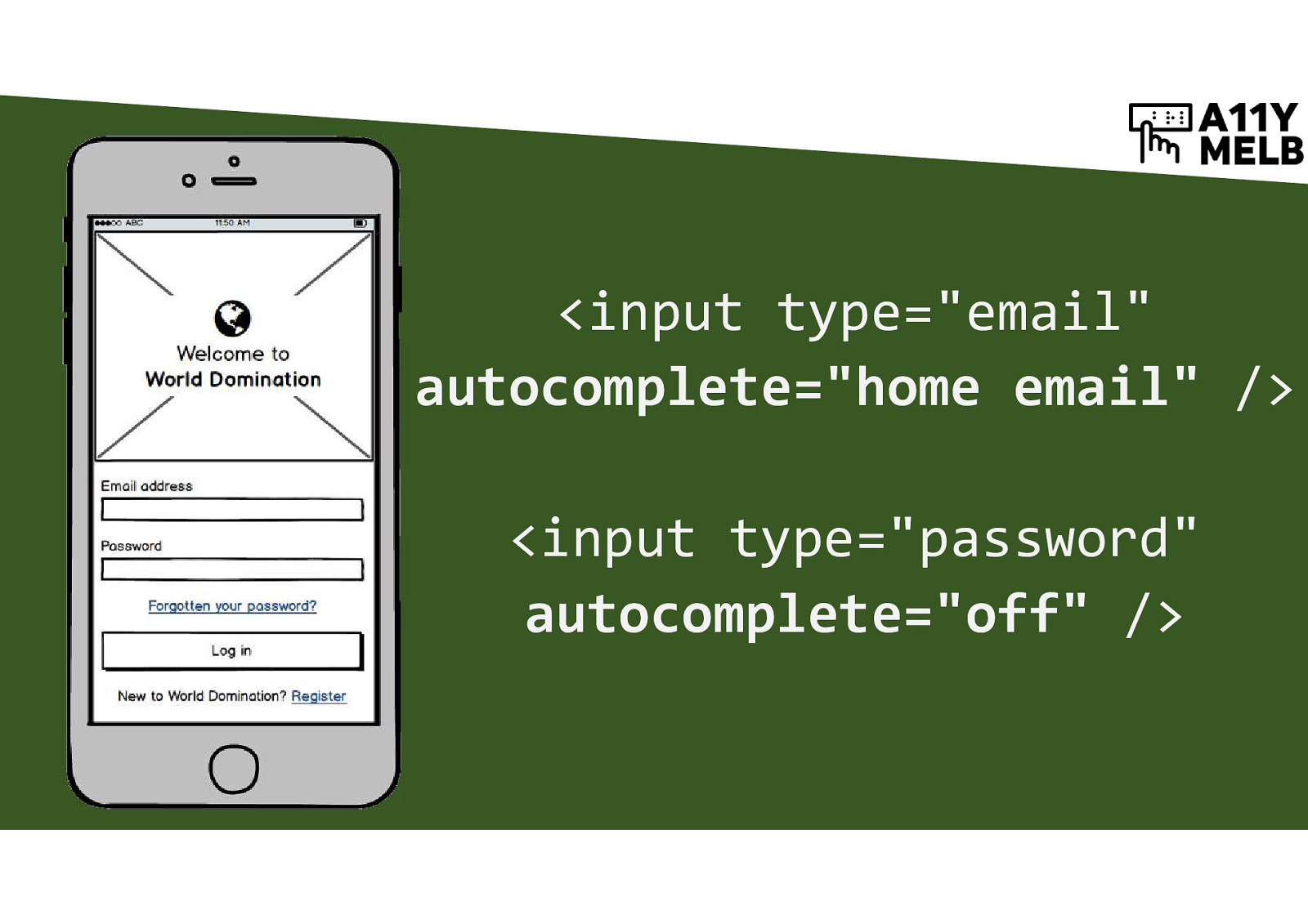
Add metadata to forms to enable autofill
A long list of all of the personal data input field types that can have autocomplete applied. Examples: given-name, family-name, address-line1, postal-code, tel, email.
<input type=”email” autocomplete=”home email” /> <input type=”password” autocomplete=”off” />
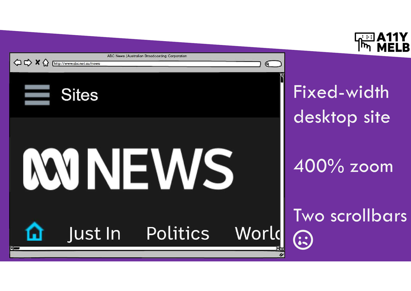
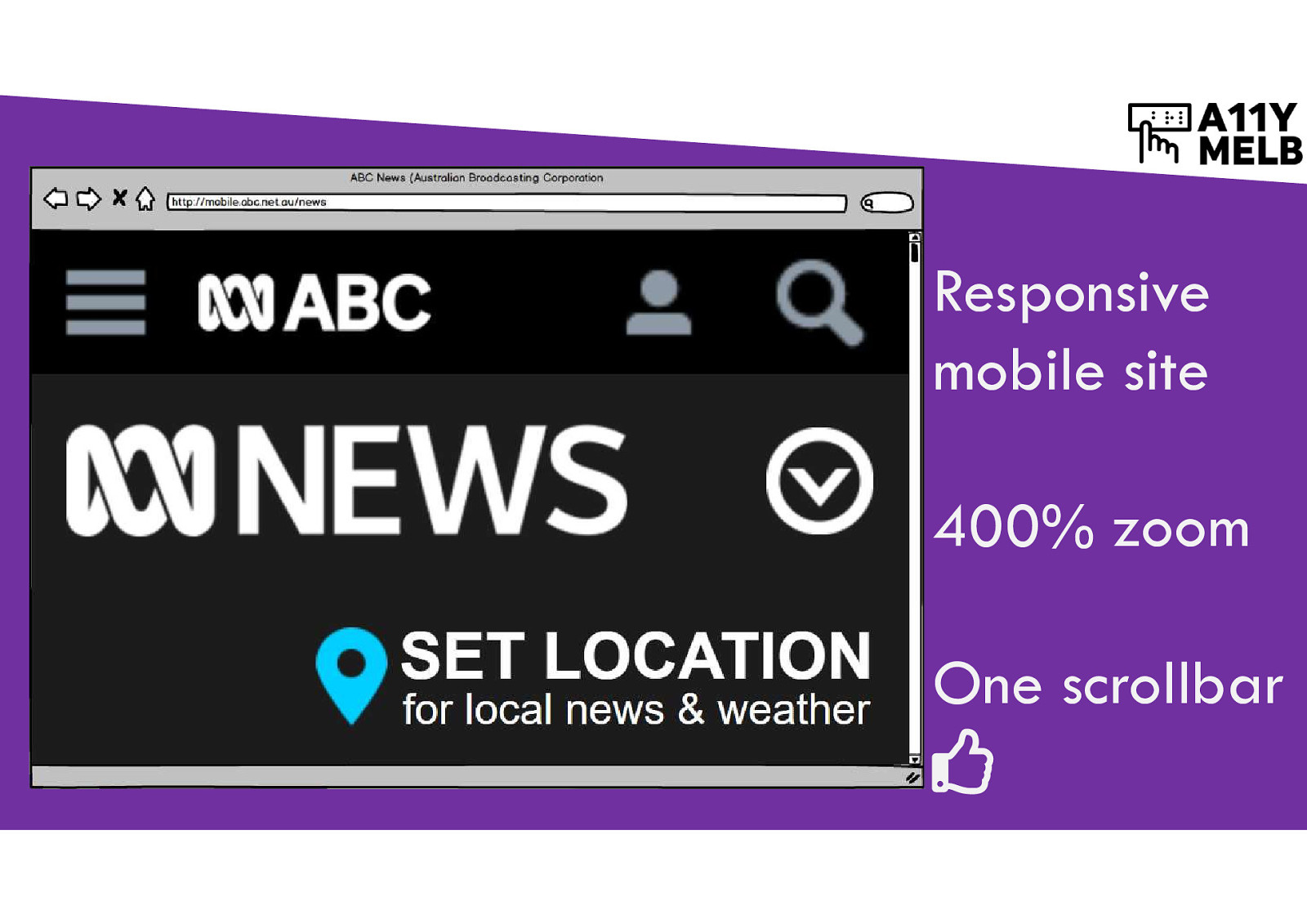
Build responsive sites
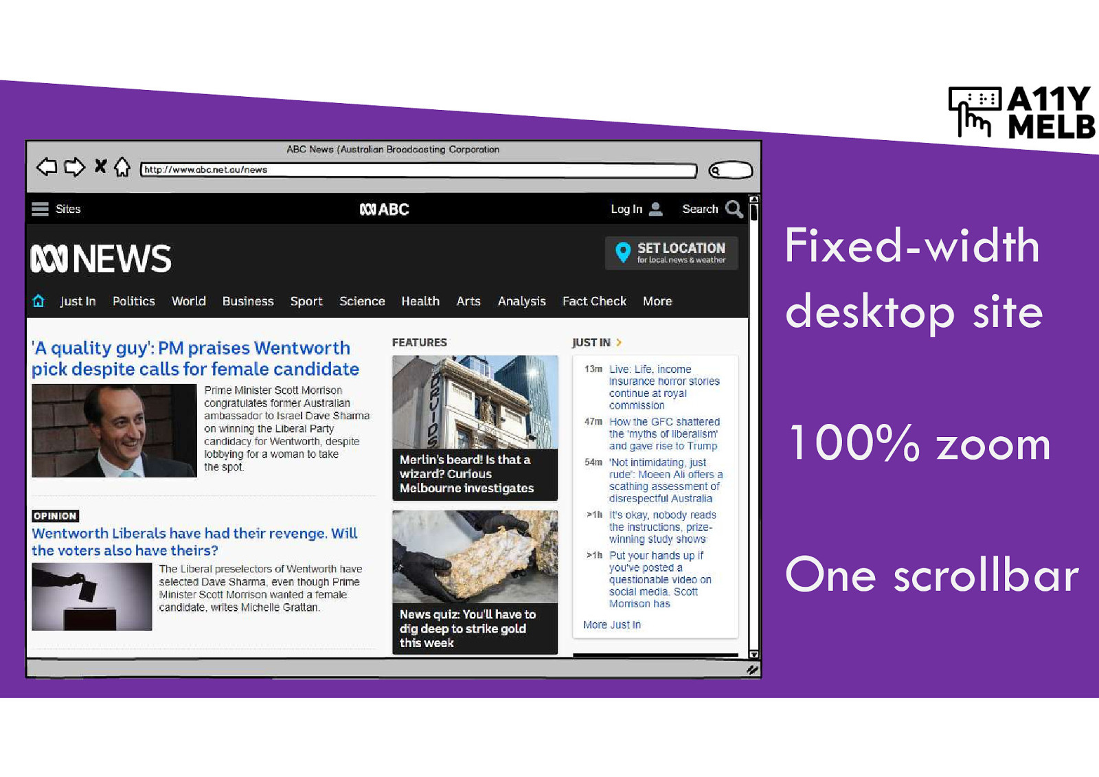
Screenshot of a fixed-width desktop site, 100% zoom, one vertical scrollbar.
Screenshot of the same fixed-width desktop site at 400% zoom - one vertical and one horizontal scrollbar. People aren’t used to scrolling sideways and will likely miss information that’s “off to the right”.
Screenshot of a responsive mobile site at 400% zoom - one vertical scrollbar only. Big content has rearranged and flowed down.
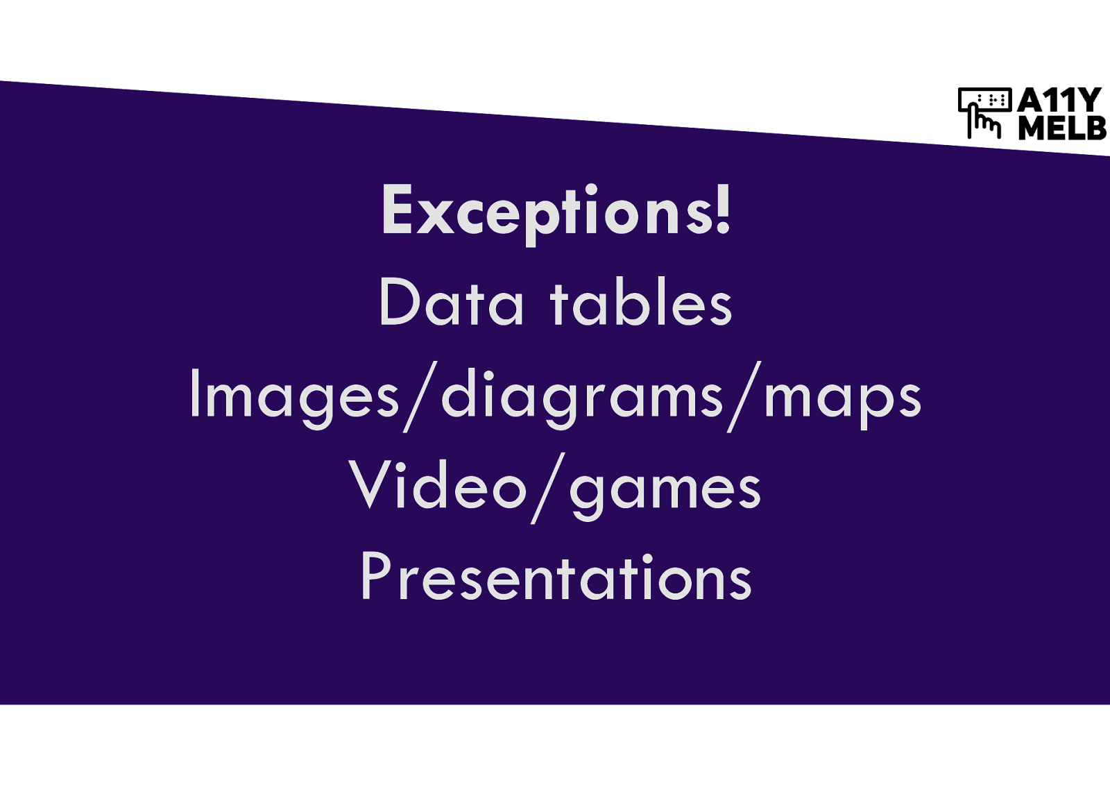
It’s OK to have horizontal scrollbars to maintain layout of: Data tables, images/diagrams/maps, video/games, presentations
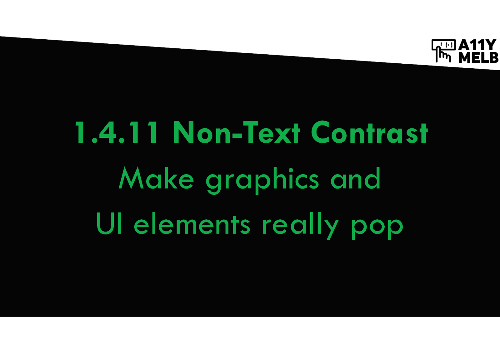
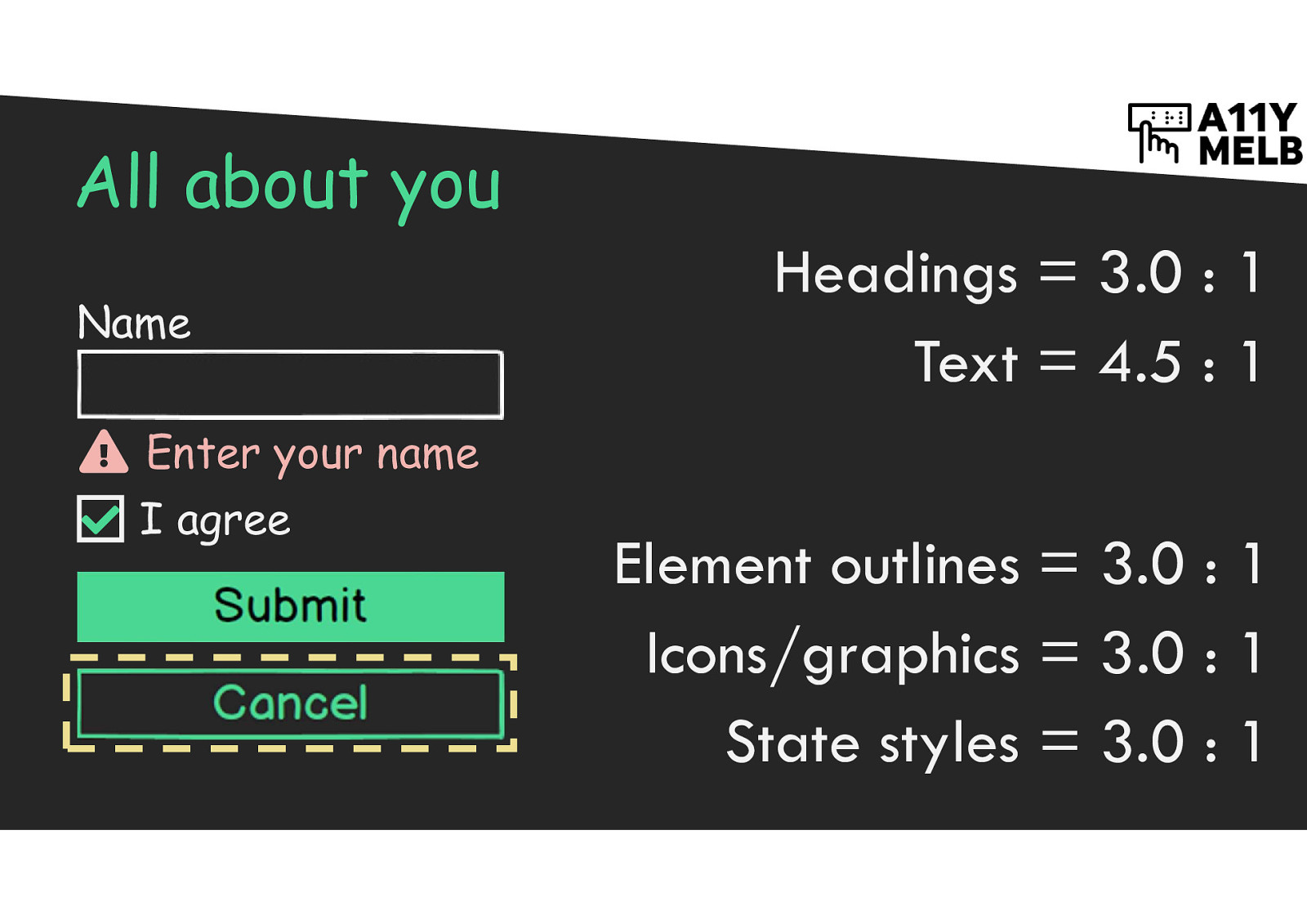
Make graphics and UI elements really pop
Headings = 3.0 : 1 Body text = 4.5 : 1 Element outlines = 3.0 : 1 Icons/graphics = 3.0 : 1 State styles = 3.0 : 1
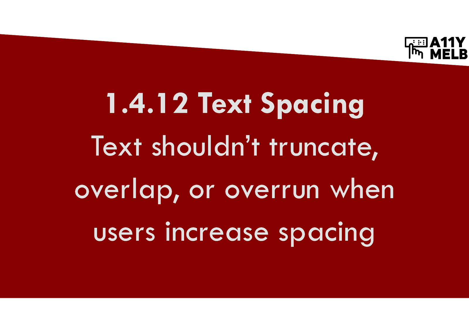
Text shouldn’t truncate, overlap, or overrun when users increase spacing
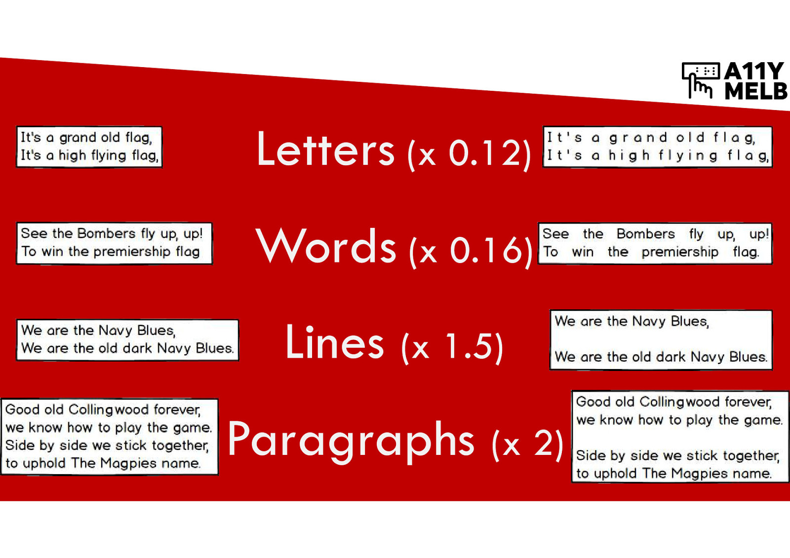
Sites need to maintain good layout with spacing up to these amounts: Letter spacing x 0.12 Word spacing x 0.16 Line spacing x 1.5 Paragraph spacing x 2
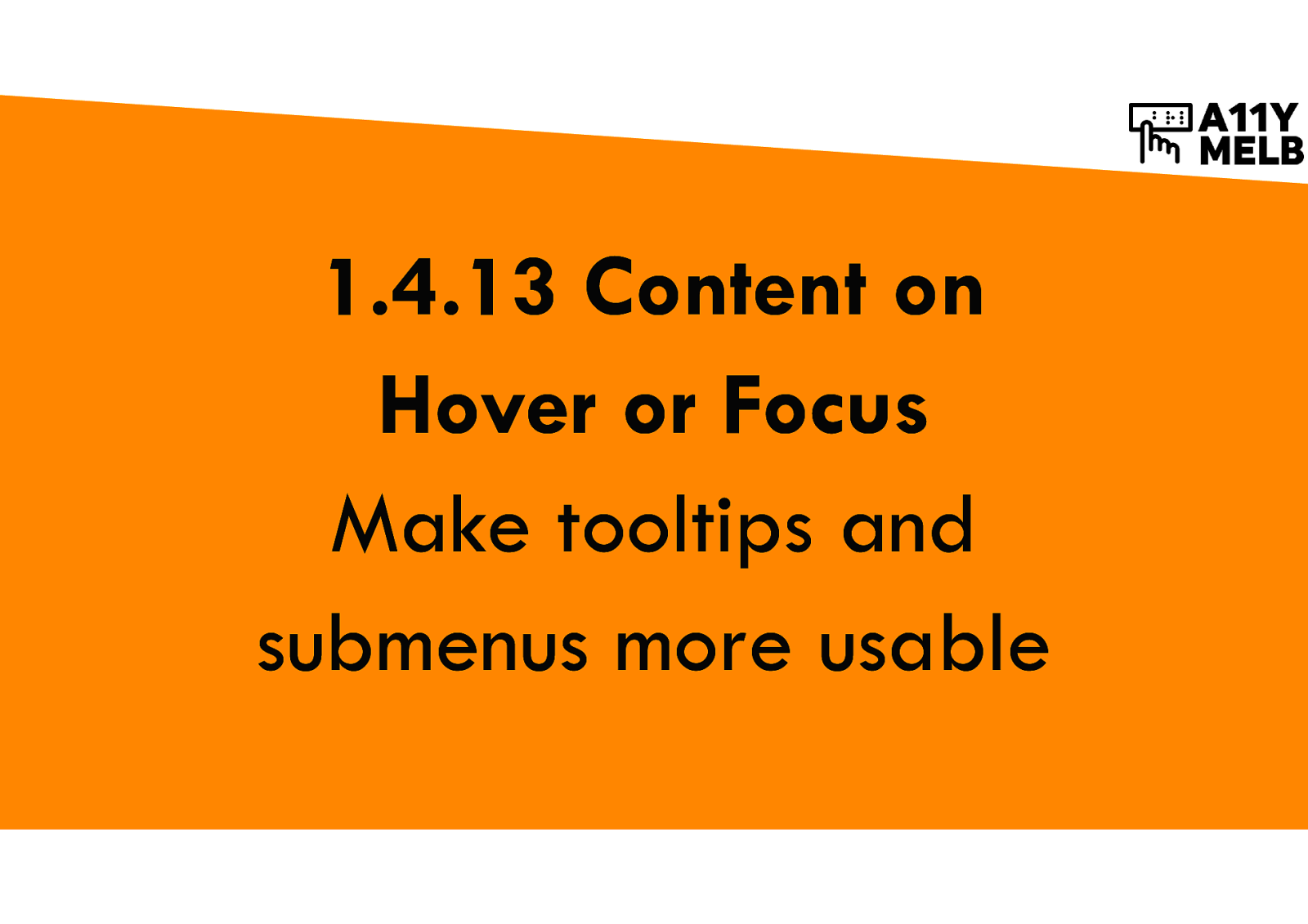
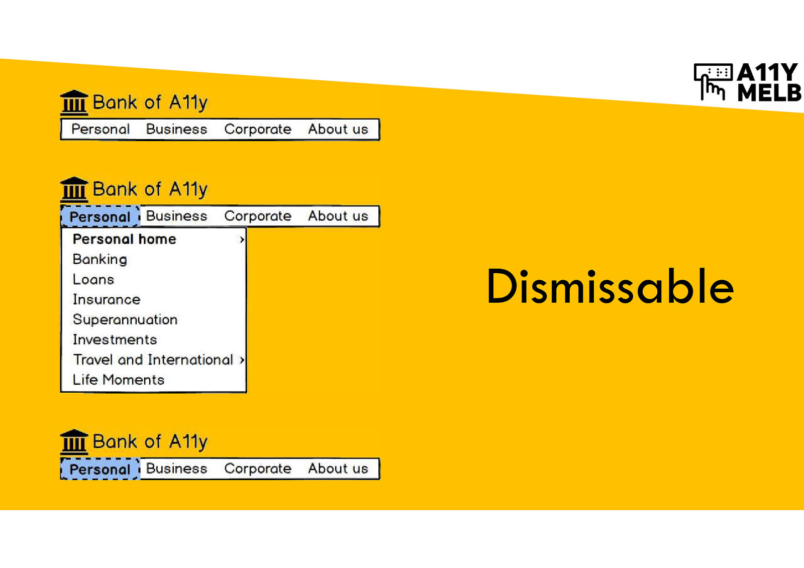
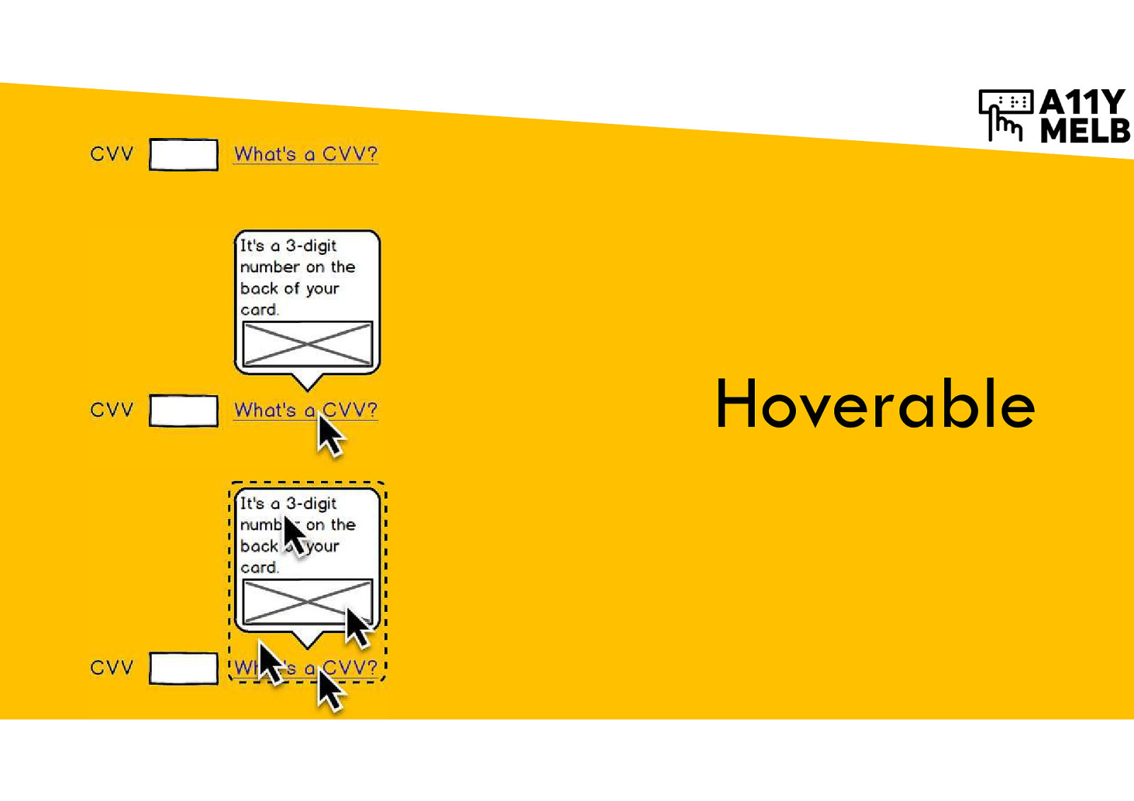
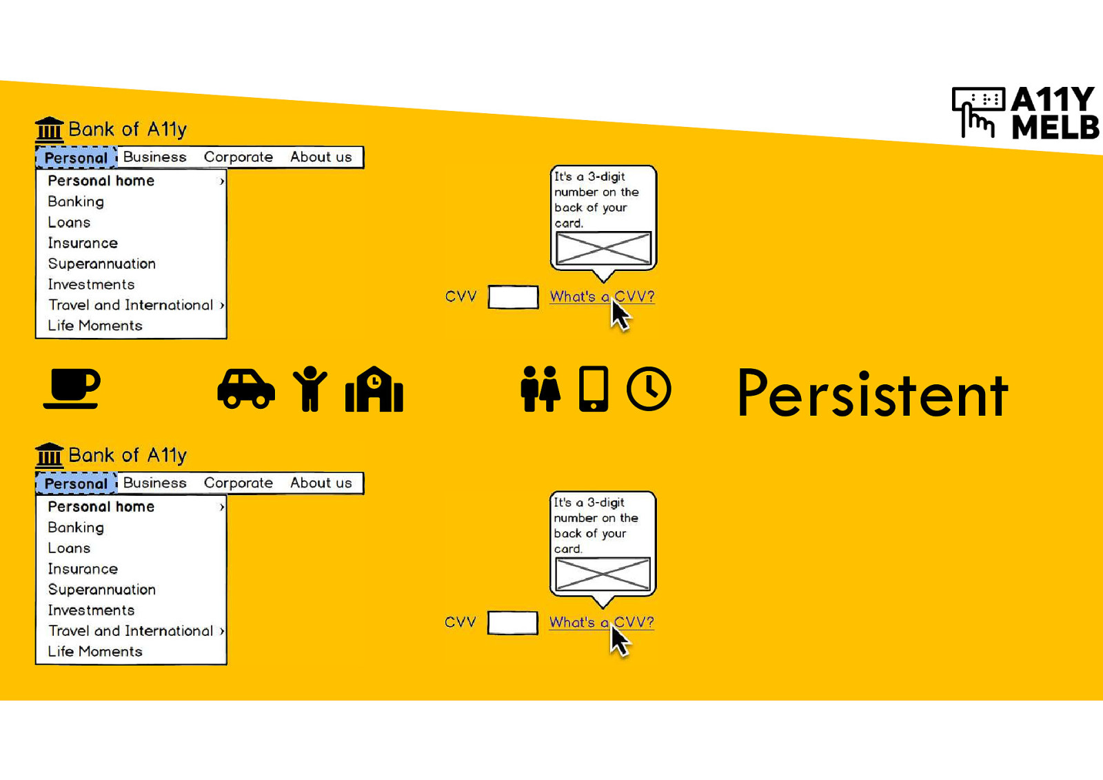
Make tooltips and submenus more usable
First principle: Dismissable Keyboard users should be able to dismiss a menu at any time without moving to a specific element e.g. press Tab.
Second princple: Hoverable Pointer users should be able to move their pointer anywhere over the trigger element and the triggered content (e.g. a tooltip) without the content disappearing
Third principle: Persistent If a user triggers a menu or tooltip, it shouldn’t automatically disappear after some time. It should stay visible as long as the keyboard focus or pointer is within it.
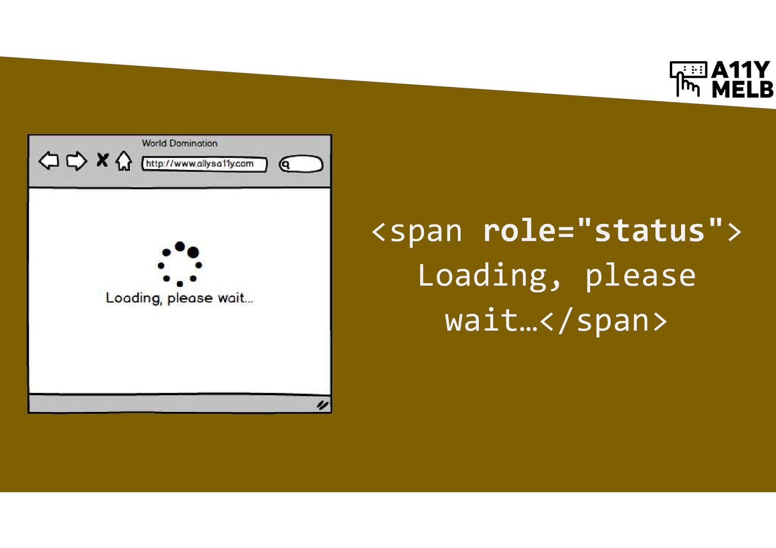
Mark up status messages for assistive technology
<span role=”status”> Loading, please wait…</span>
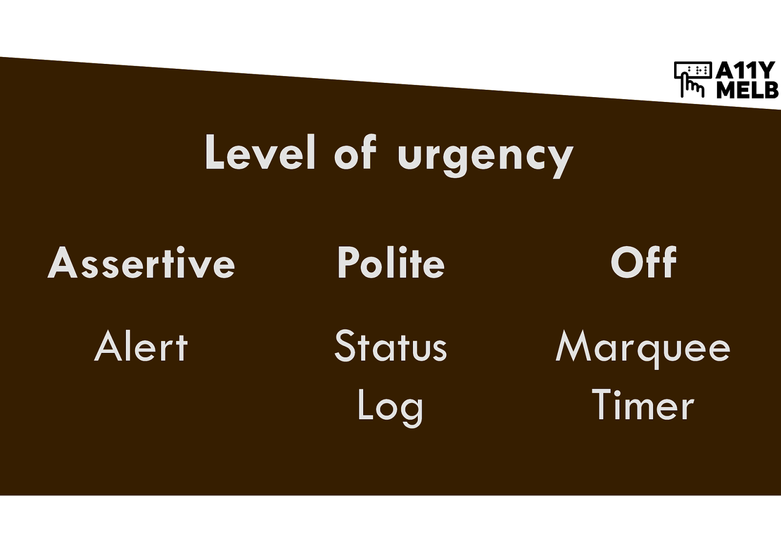
Alerts are Assertive (immediate) Status and Log are Polite (queued after current announcement) Marquee and Timer are Off (no announcement)
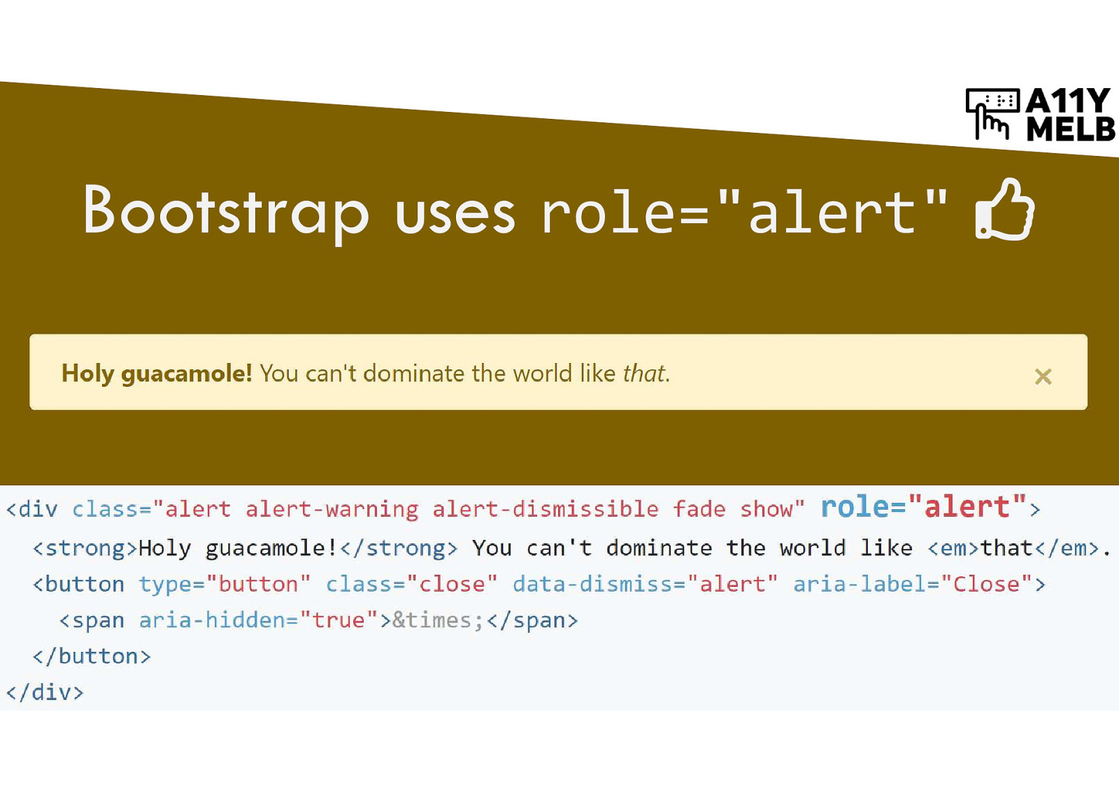
Bootstrap uses role=”alert” Screenshot of code sample of Bootstrap notification.
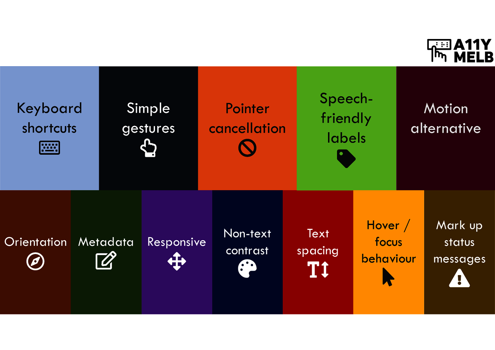
Keyboard shortcuts Simple gestures Orientation Metadata Responsive Pointer cancellation Non-text contrast Speech-friendly labels Text spacing Motion alternative Hover / focus behaviour Mark up status messages
Get accessible! Allison Ravenhall @RavenAlly Digital Accessibility Sensei at Intopia @Intopia

A quick introduction to the new level A and AA success criteria introduced in WCAG 2.1, presented to the Melbourne Web A11y meetup at Origin Energy.
Here’s what was said about this presentation on social media.

 for free. You
can too.
for free. You
can too.