
A presentation at React Alicante in in Alicante, Spain by Marco Cedaro

Modular architecture
Modular architecture Classes and components
Modular architecture classes and Components and modifiers
Modular architecture classes and Components, modifiers and overrides
Modular architecture classes, modifiers and overrides Components, patterns and sh*t it’s hard to deal with
@cedmax Webmaster before it was cool Tech Lead Condé Nast International
Components, patterns and sh*t it’s hard to deal with
Components, patterns and sh*t it’s hard to deal with or… How I came up with a good use of quotes from Lost in Translation
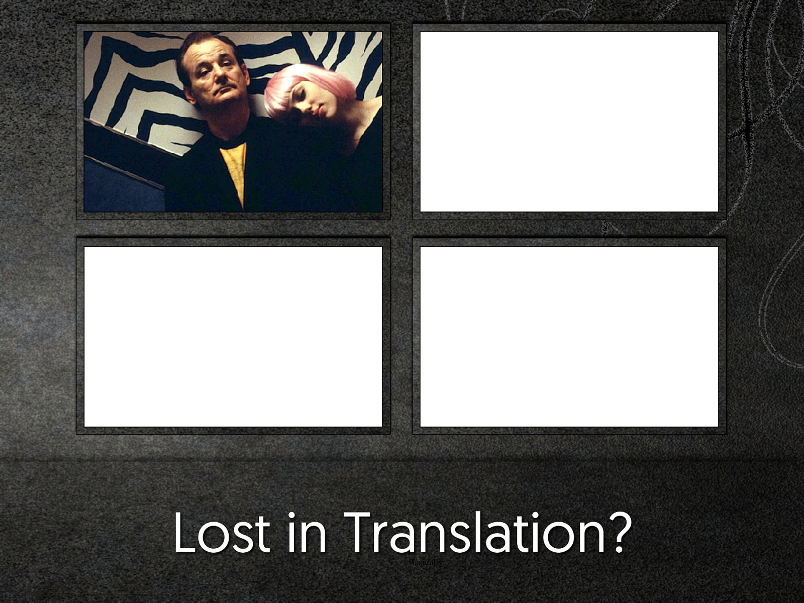
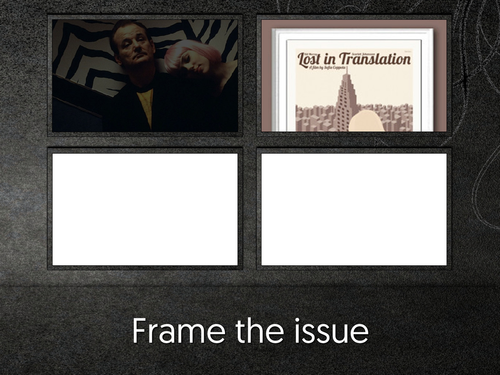
Lost in Translation? Basically
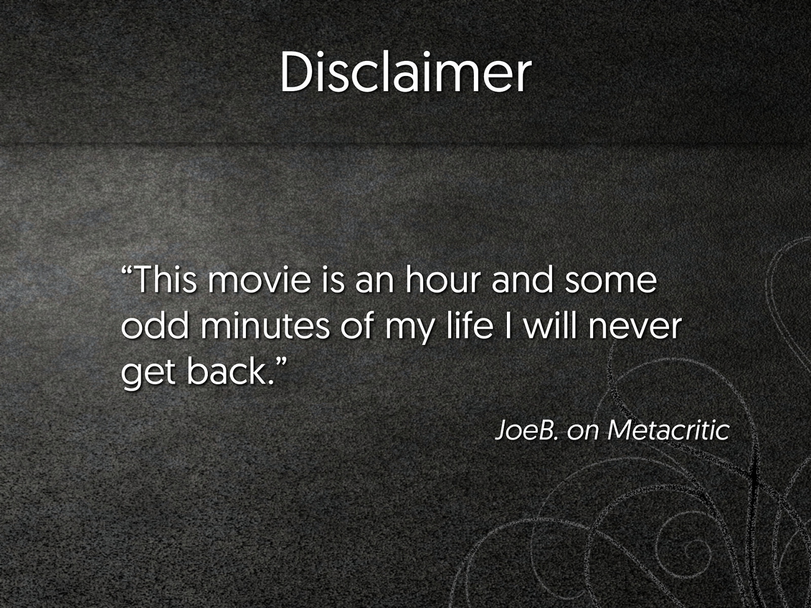
Disclaimer “This movie is an hour and some odd minutes of my life I will never get back.” JoeB. on Metacritic
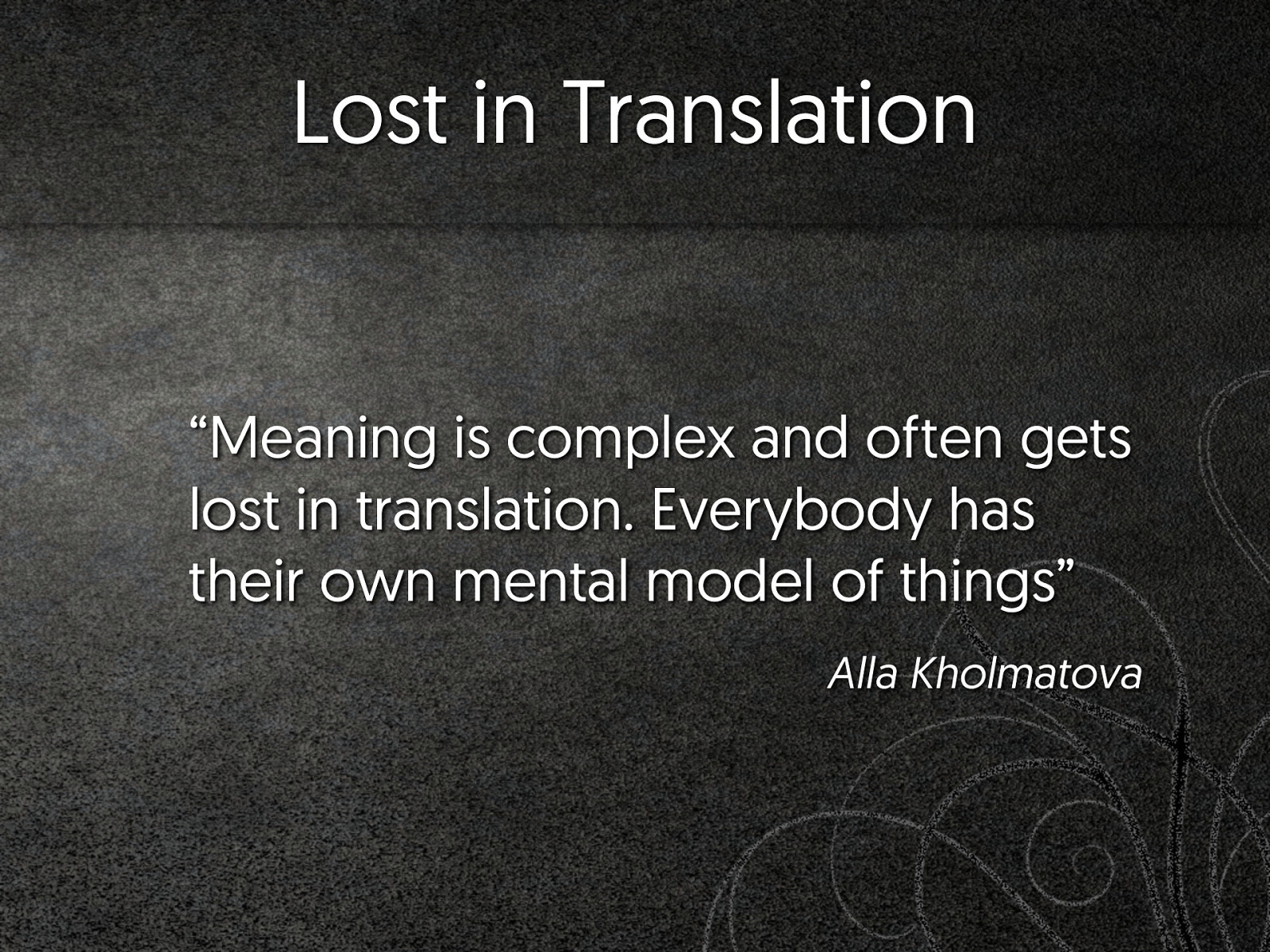
Lost in Translation “Meaning is complex and often gets lost in translation. Everybody has their own mental model of things” Alla Kholmatova
Modular design
2013 - 2015
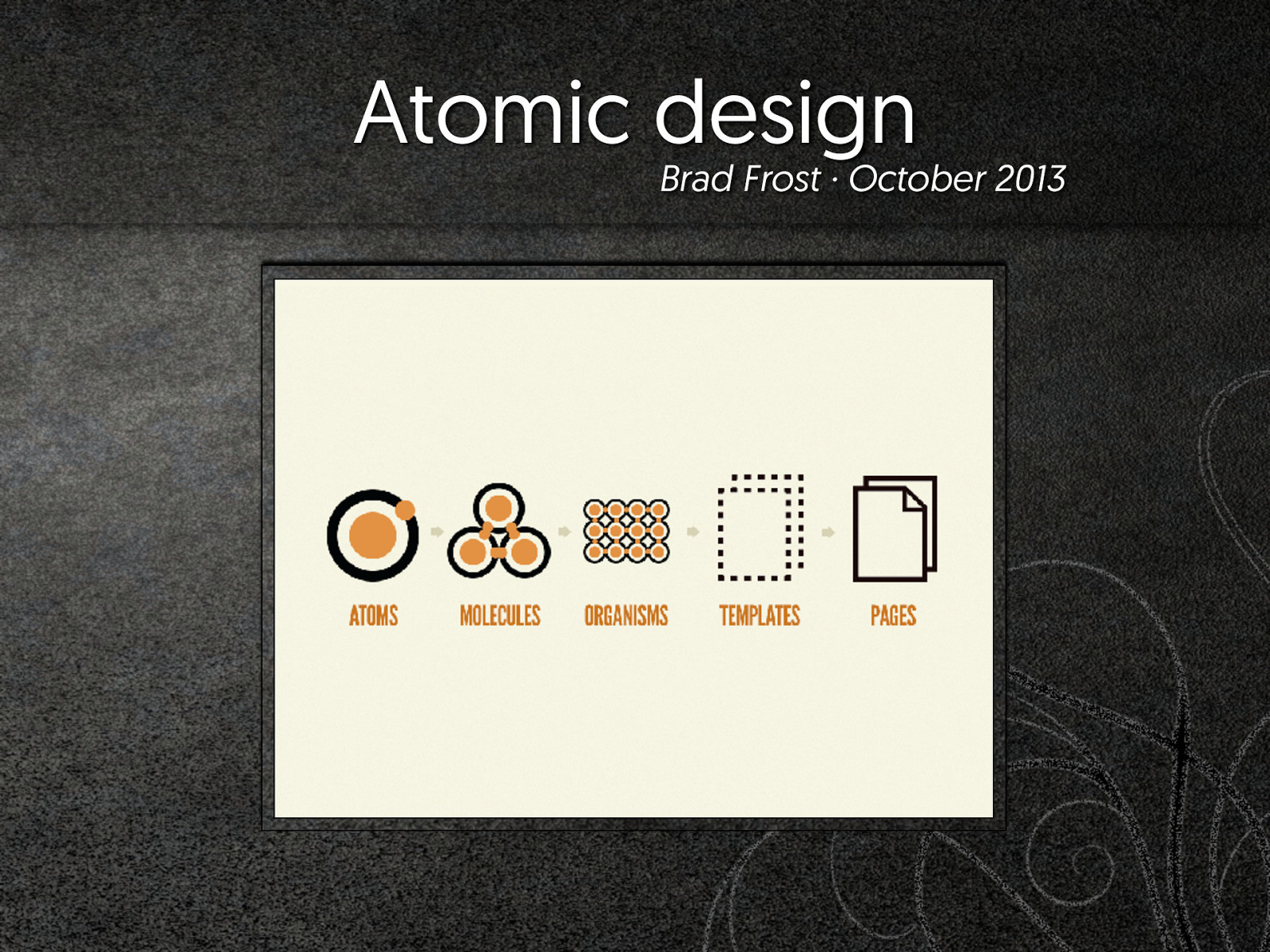
Atomic design Brad Frost · October 2013
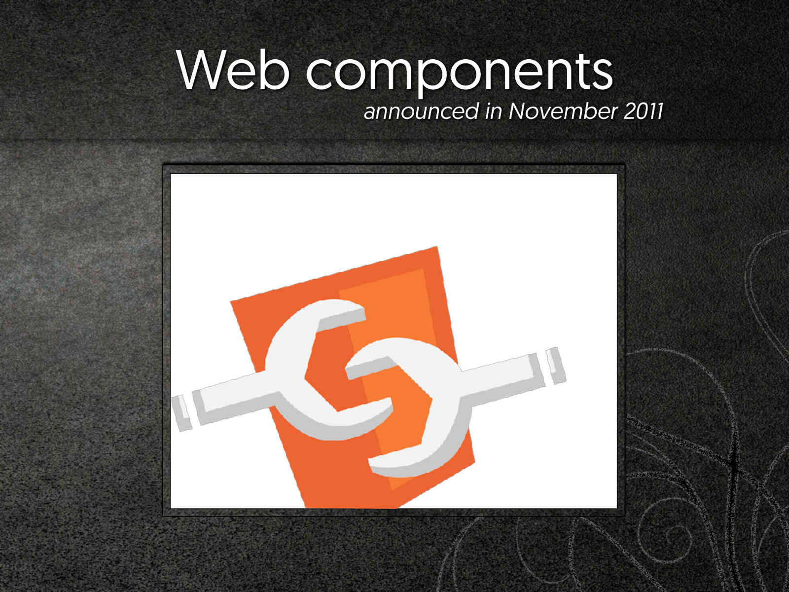
Web components announced in November 2011
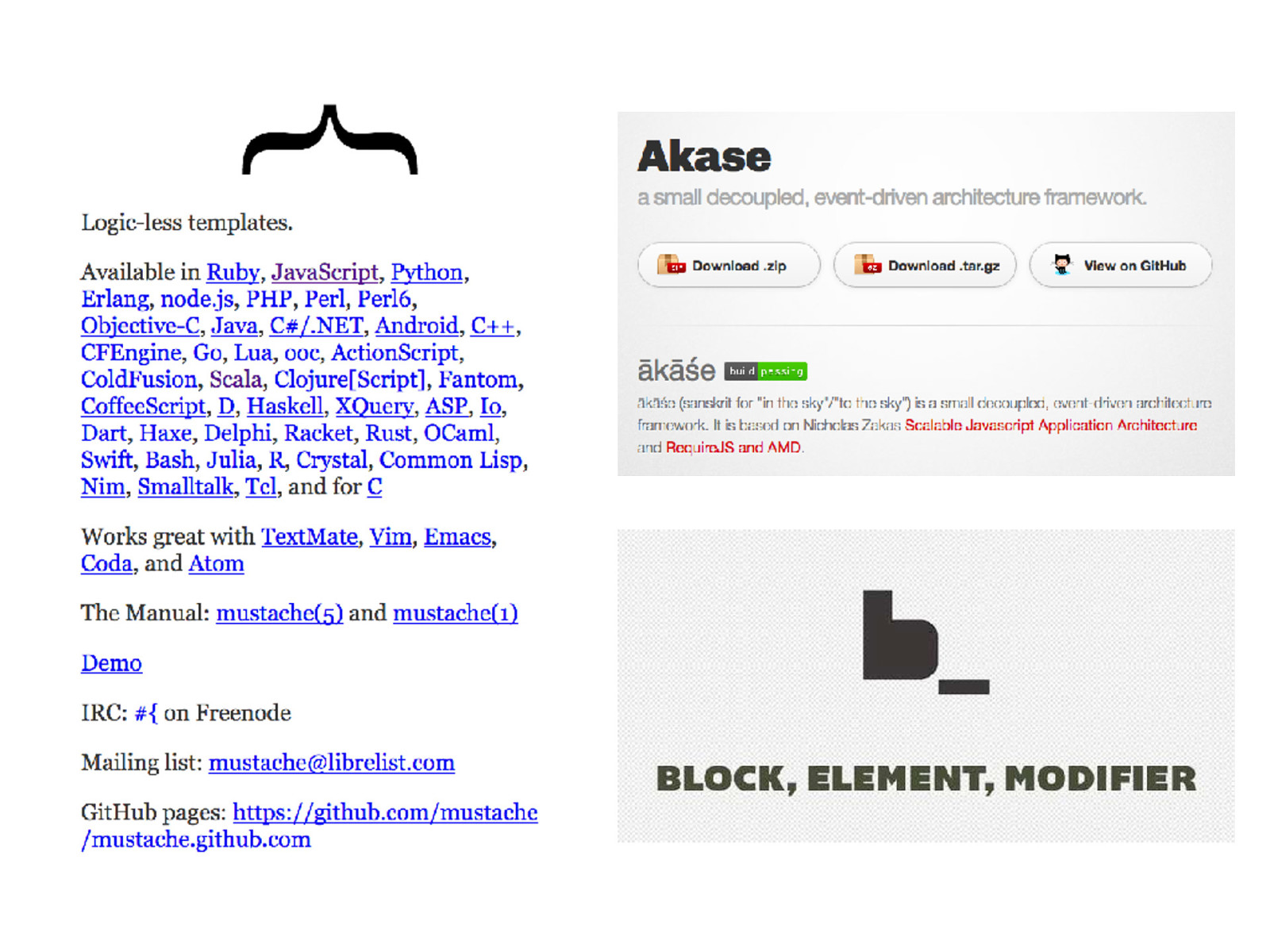
Pattern Library “Pattern libraries are something I do a lot for client projects. It’s a technique I first saw Natalie Downe develop for client projects back in 2009” […] […] Anna Debenham
MISSING SLIDE* ABOUT PATTERN LIBRARIES * on purpose, I promise
Pattern Library “Pattern libraries are something I do a lot for client projects. It’s a technique I first saw Natalie Downe develop for client projects back in 2009” […] […] Anna Debenham
ReactJS First release: March 2013
Where are we at, today?
Frame the issue Basically
It's not that simple “When you actually try to apply a modular approach to your day to day work, it isn’t really that simple” Alla Kholmatova · June 2015
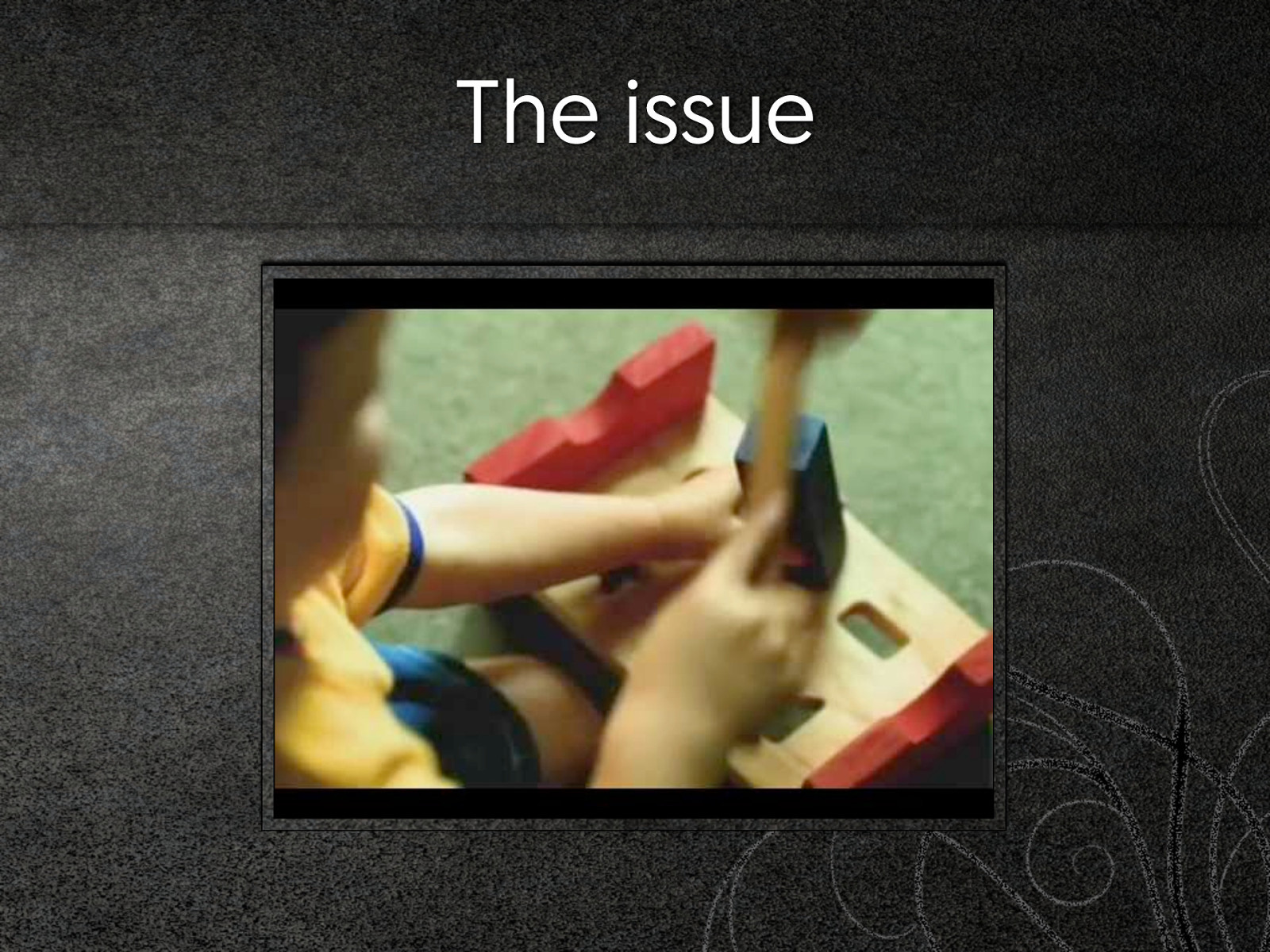
The issue
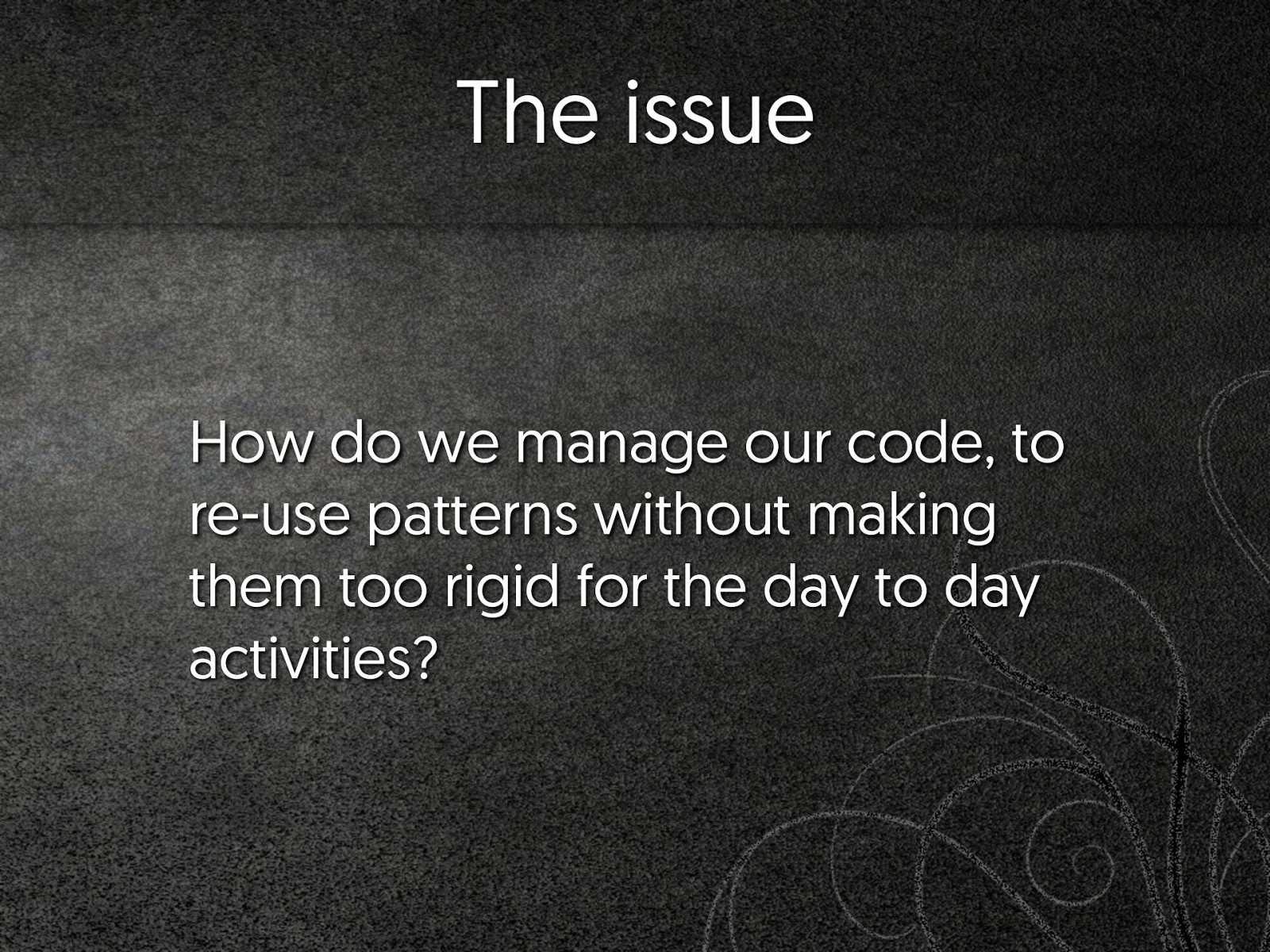
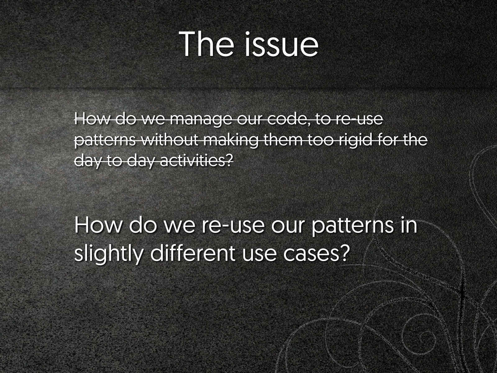
The issue How do we manage our code, to re-use patterns without making them too rigid for the day to day activities?
The issue How do we manage our code, to re-use patterns without making them too rigid for the day to day activities? How do we re-use our patterns in slightly different use cases?
Wish I could sleep
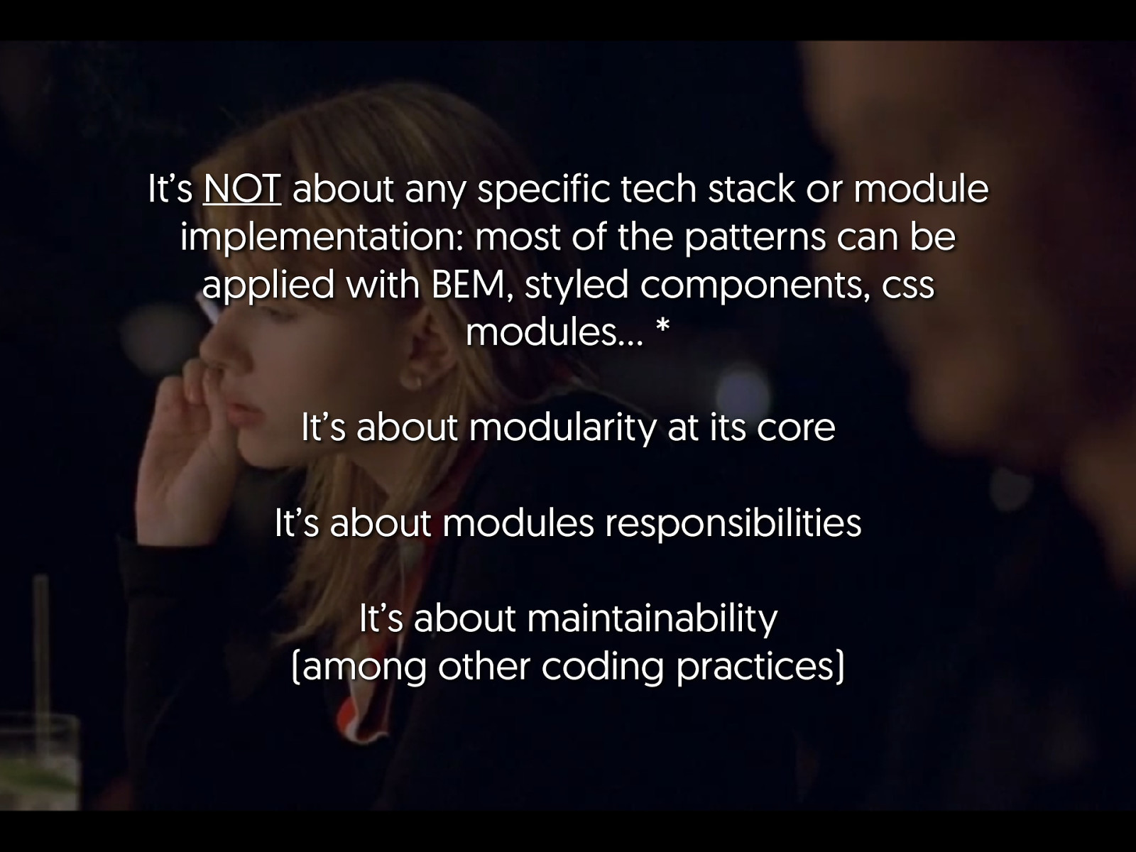
It’s NOT about any specific tech stack or module implementation: most of the patterns can be applied with BEM, styled components, css modules… * It’s about modularity at its core It’s about modules responsibilities It’s about maintainability (among other coding practices)
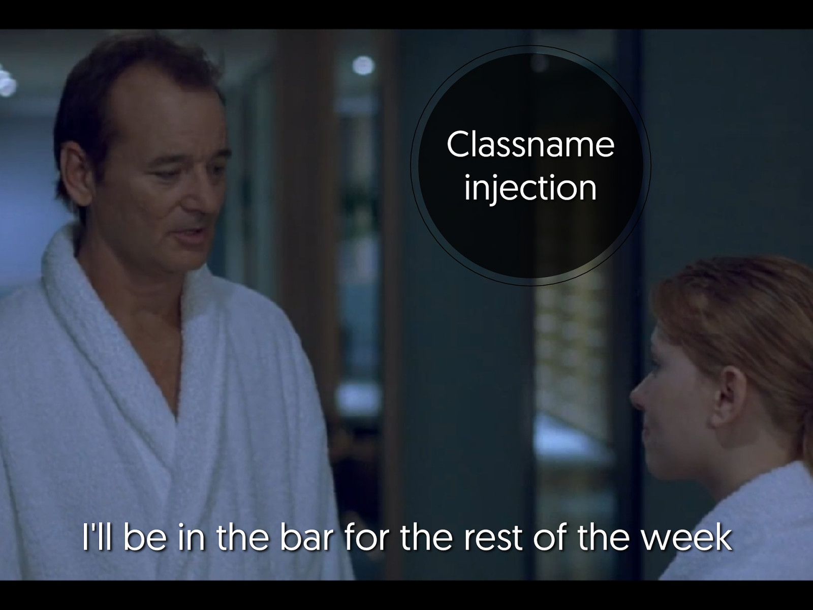
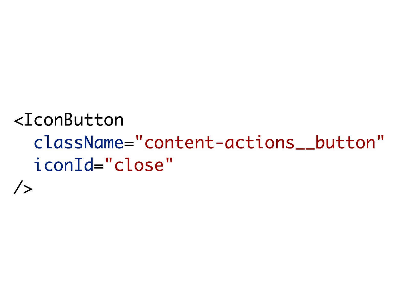
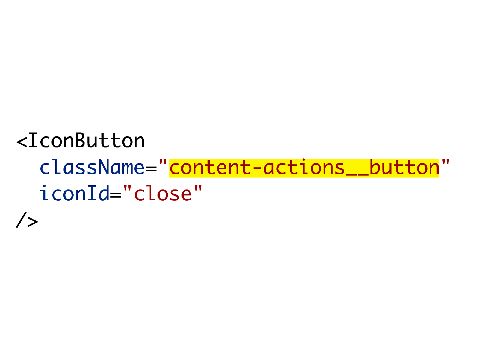
Classname injection I'll be in the bar for the rest of the week
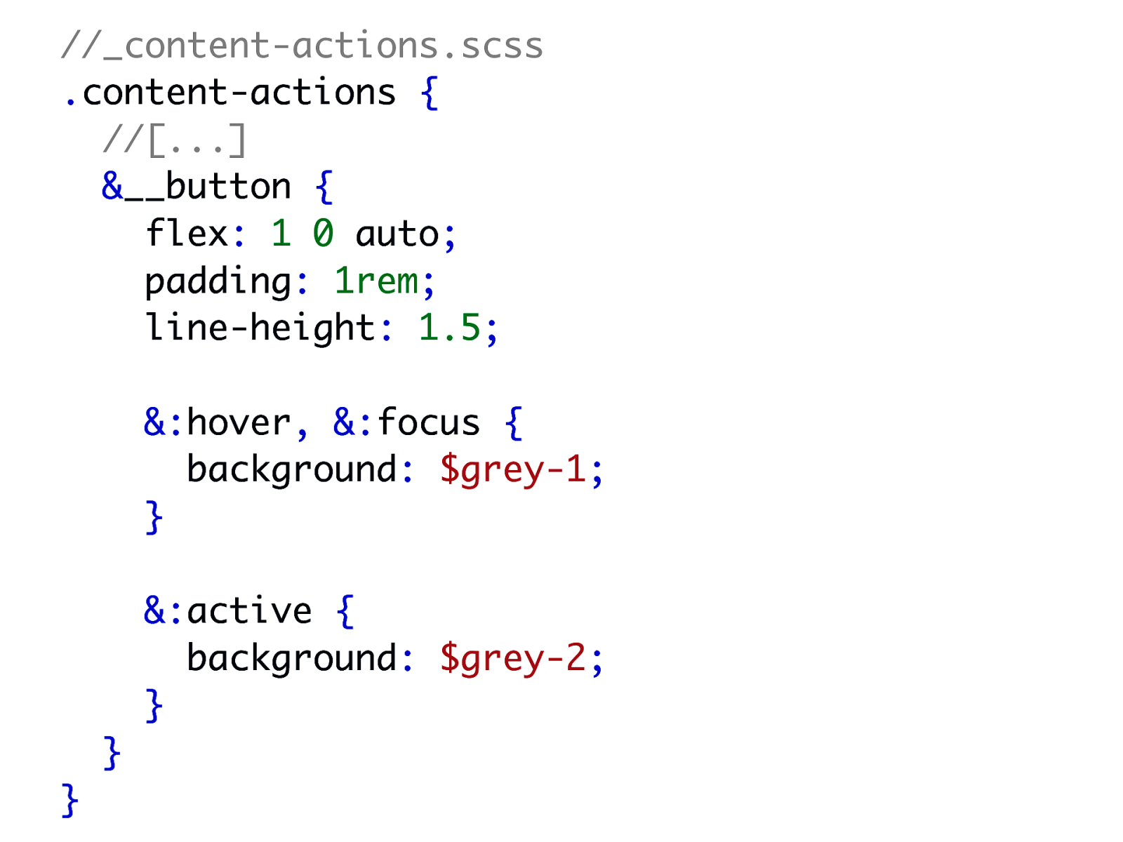
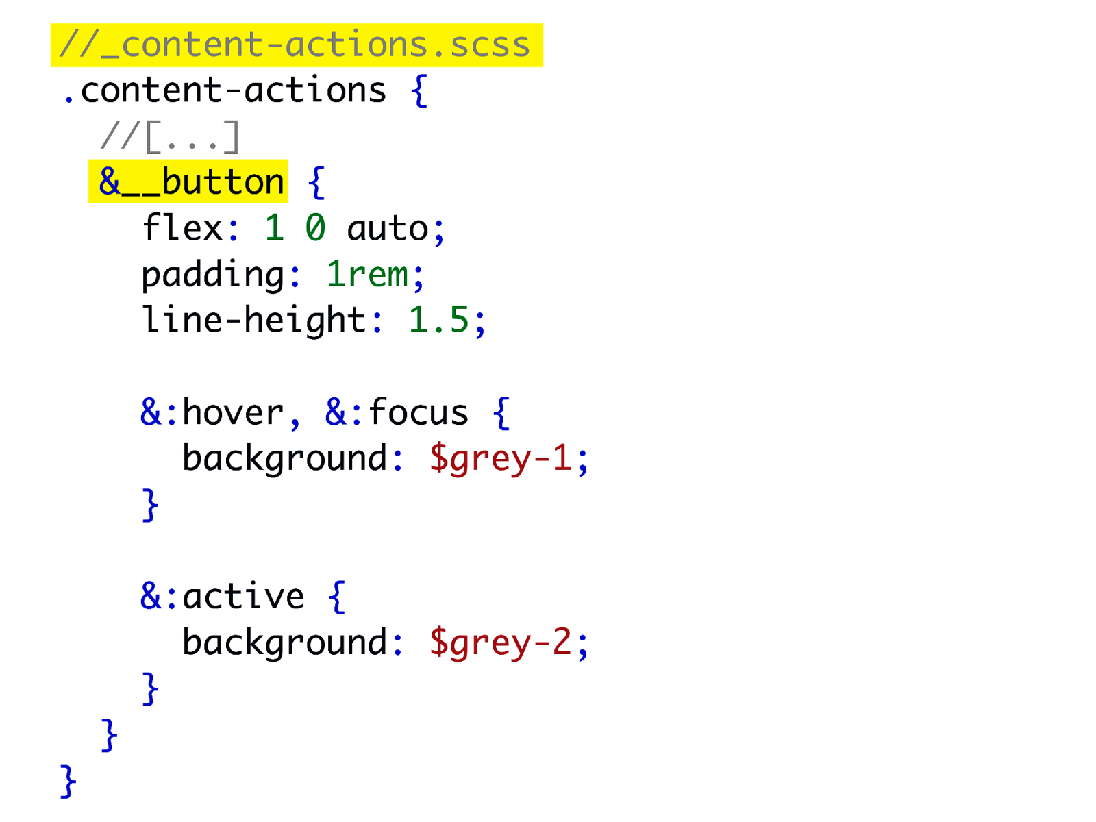
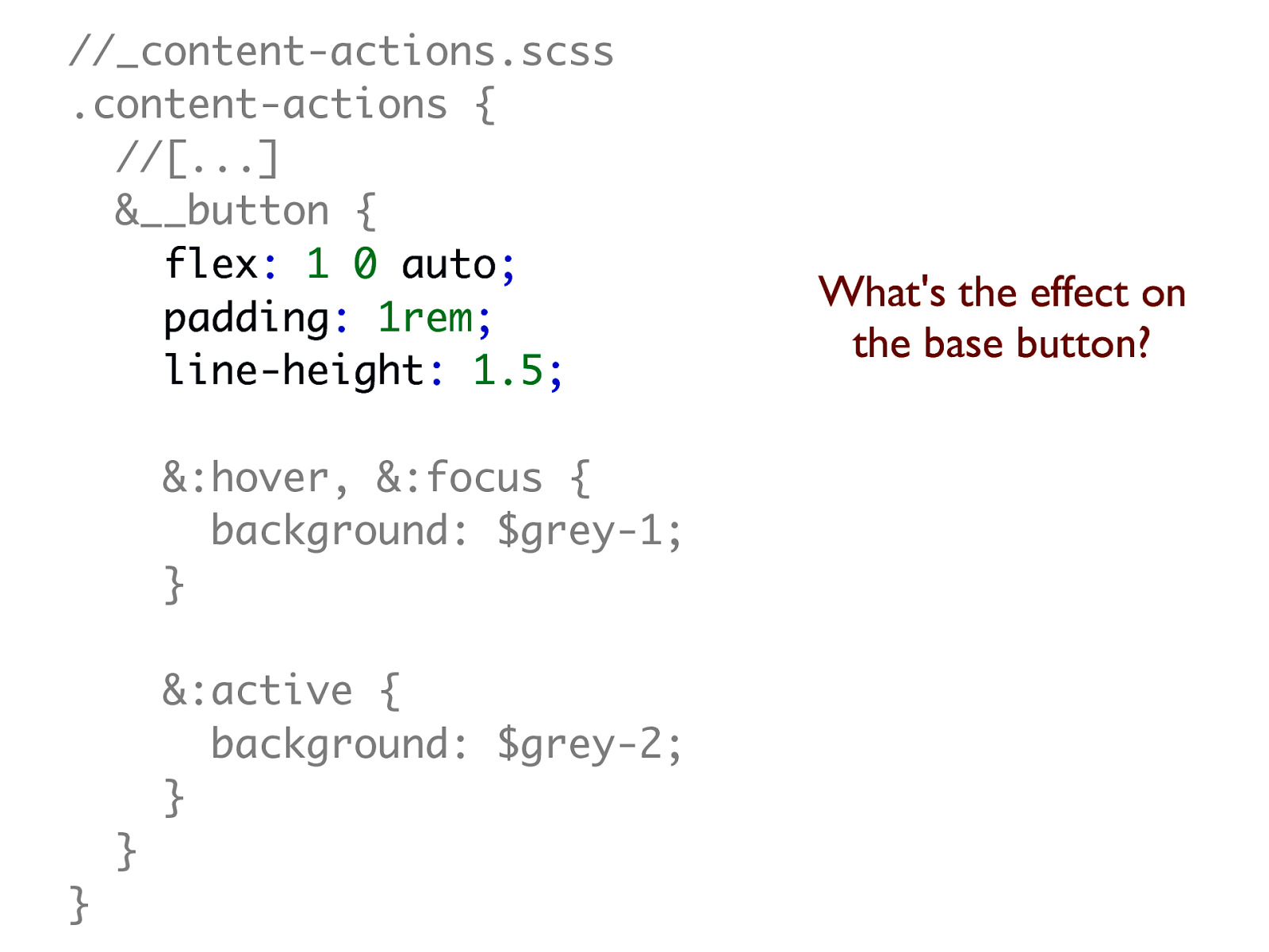
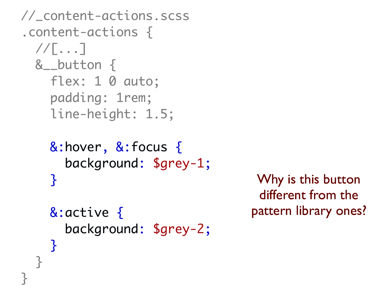
//_content-actions.scss .content-actions { //[...] &__button { flex: 1 0 auto; padding: 1rem; line-height: 1.5; &:hover, &:focus { background: $grey-1; } &:active { background: $grey-2; } } }
//_content-actions.scss .content-actions { //[...] &__button { flex: 1 0 auto; padding: 1rem; line-height: 1.5; &:hover, &:focus { background: $grey-1; } &:active { background: $grey-2; } } }
//_content-actions.scss .content-actions { //[...] &__button { flex: 1 0 auto; padding: 1rem; line-height: 1.5; &:hover, &:focus { background: $grey-1; } &:active { background: $grey-2; } } } What's the effect on the base button?
//_content-actions.scss .content-actions { //[...] &__button { flex: 1 0 auto; padding: 1rem; line-height: 1.5; &:hover, &:focus { background: $grey-1; } &:active { background: $grey-2; } } } Why is this button different from the pattern library ones?
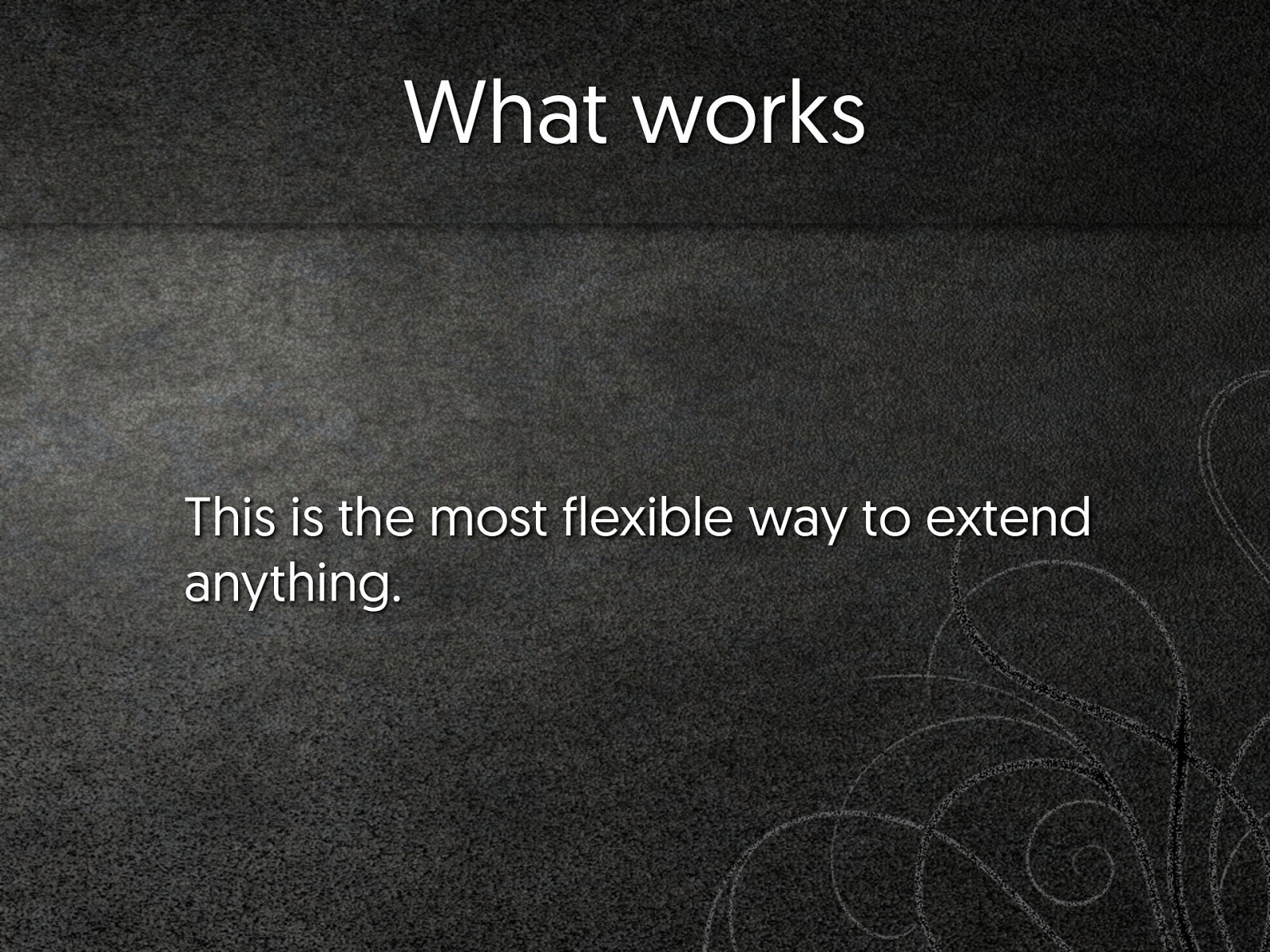
What works This is the most flexible way to extend anything.
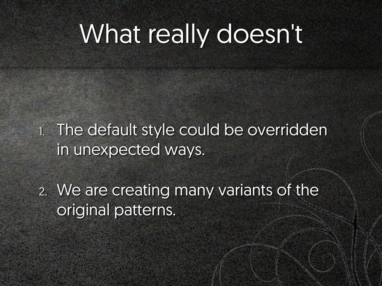
What really doesn't 1. The default style could be overridden in unexpected ways. 2. We are creating many variants of the original patterns.
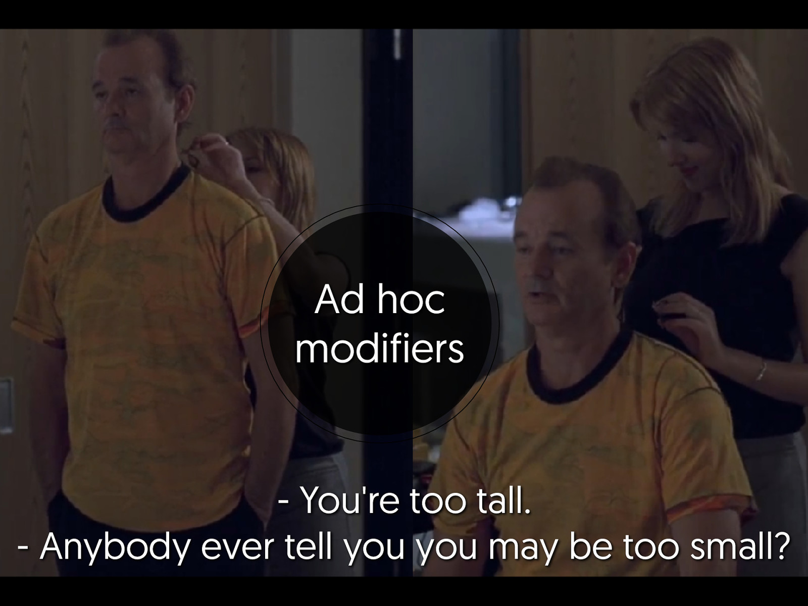
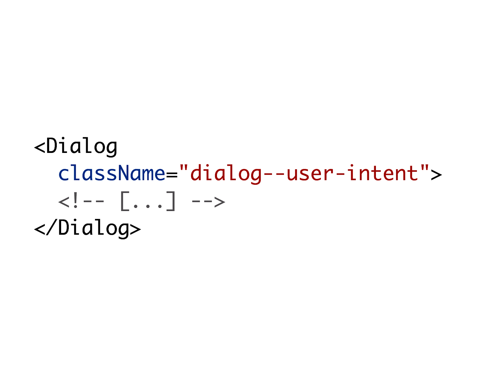
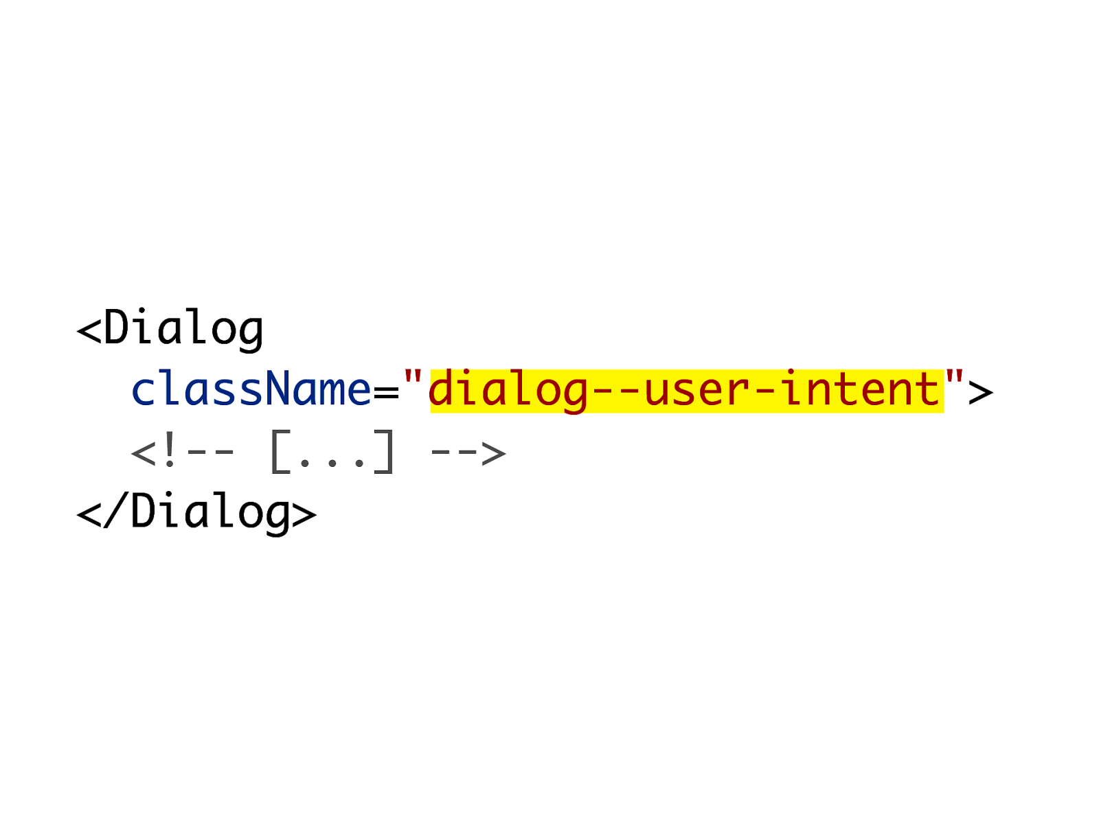
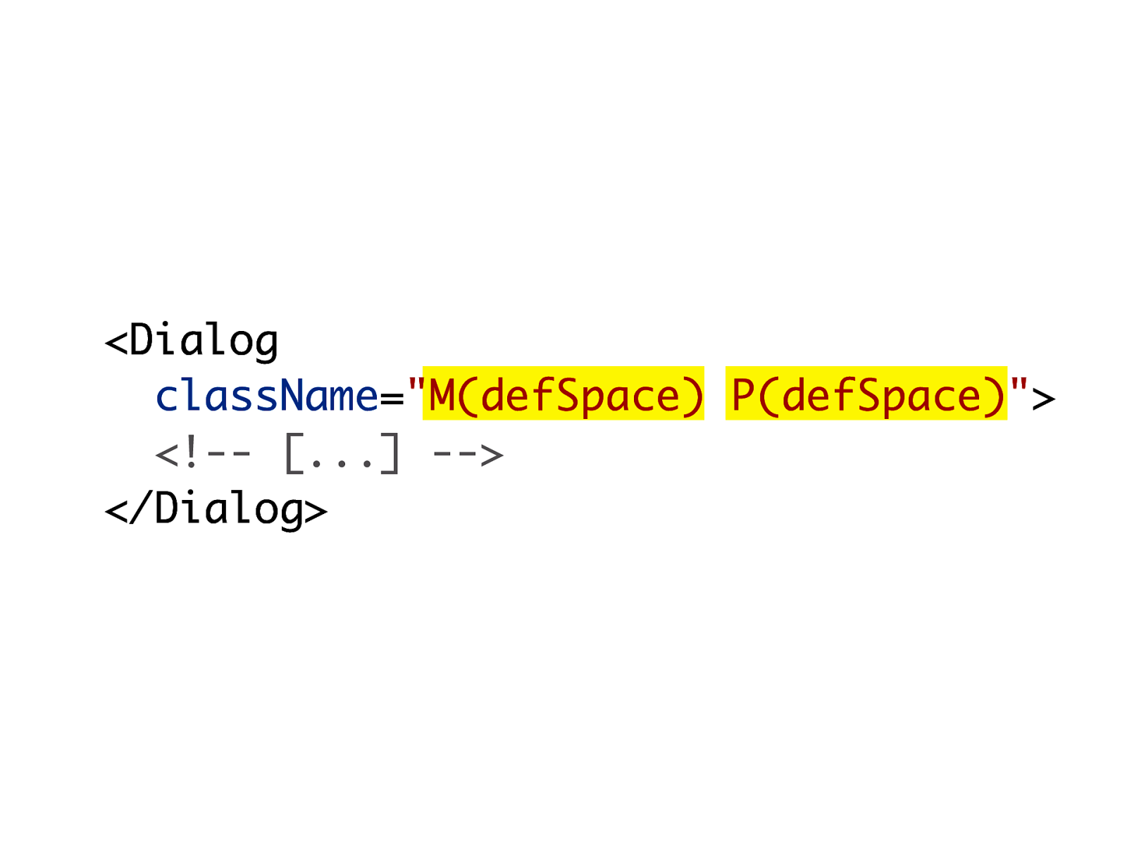
Ad hoc modifiers
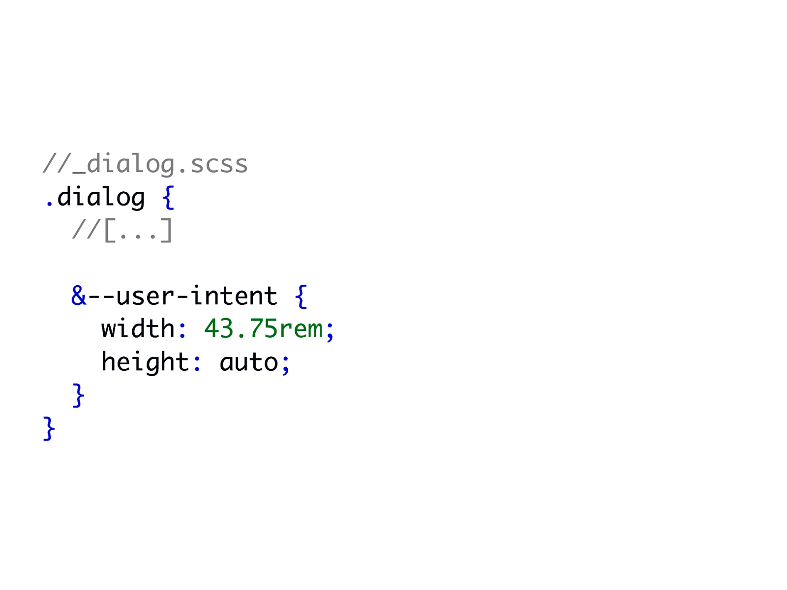
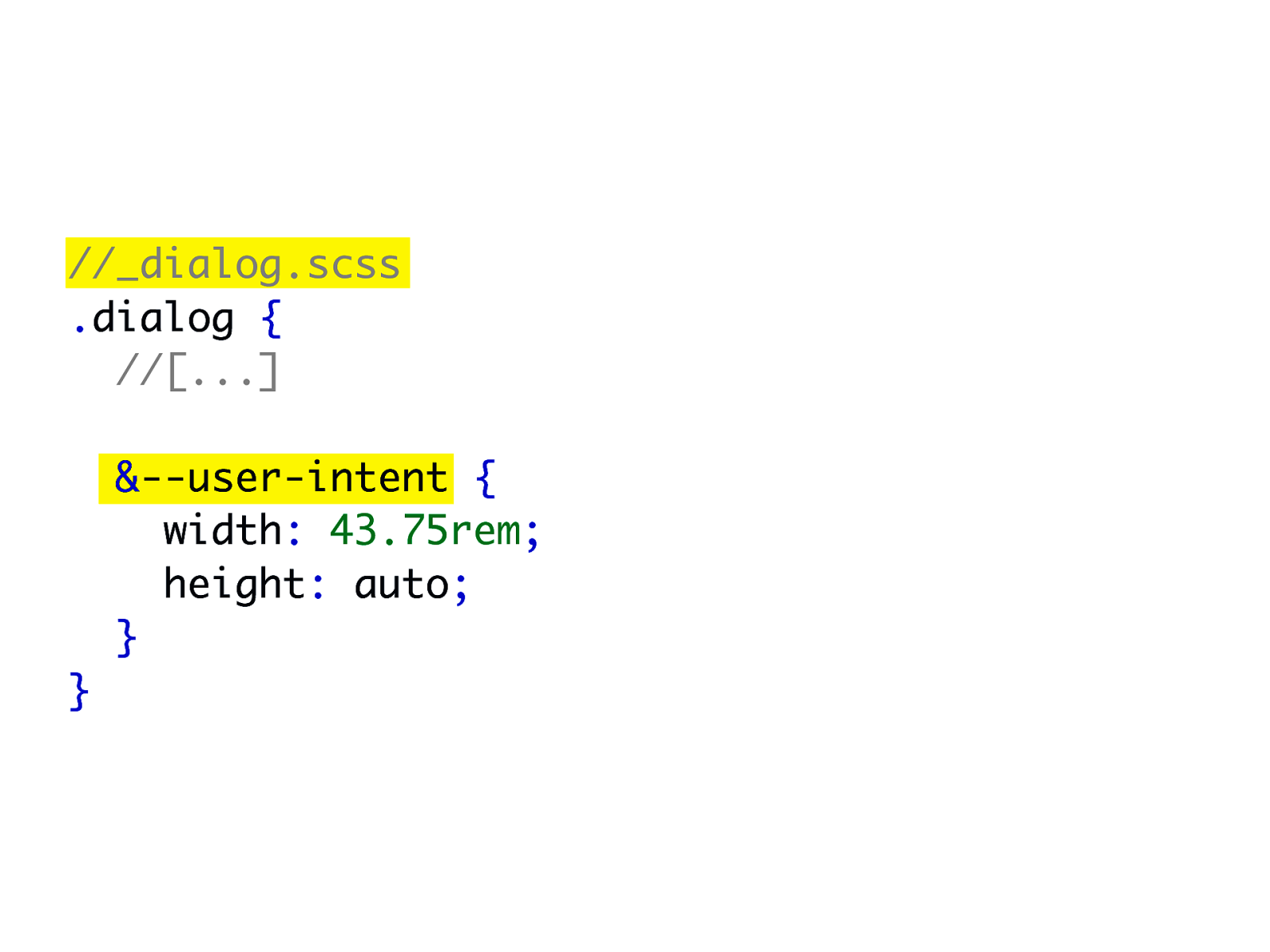
//_dialog.scss .dialog { //[...] &--user-intent { width: 43.75rem; height: auto; } }
//_dialog.scss .dialog { //[...] &--user-intent { width: 43.75rem; height: auto; } }
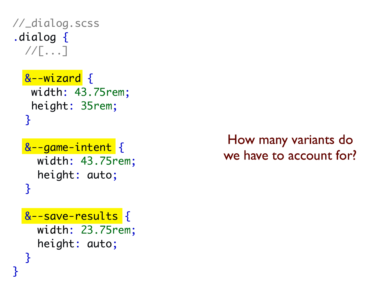
//_dialog.scss .dialog { //[...] &--wizard { width: 43.75rem; height: 35rem; } &--game-intent { width: 43.75rem; height: auto; } &--save-results { width: 23.75rem; height: auto; } } How many variants do we have to account for?
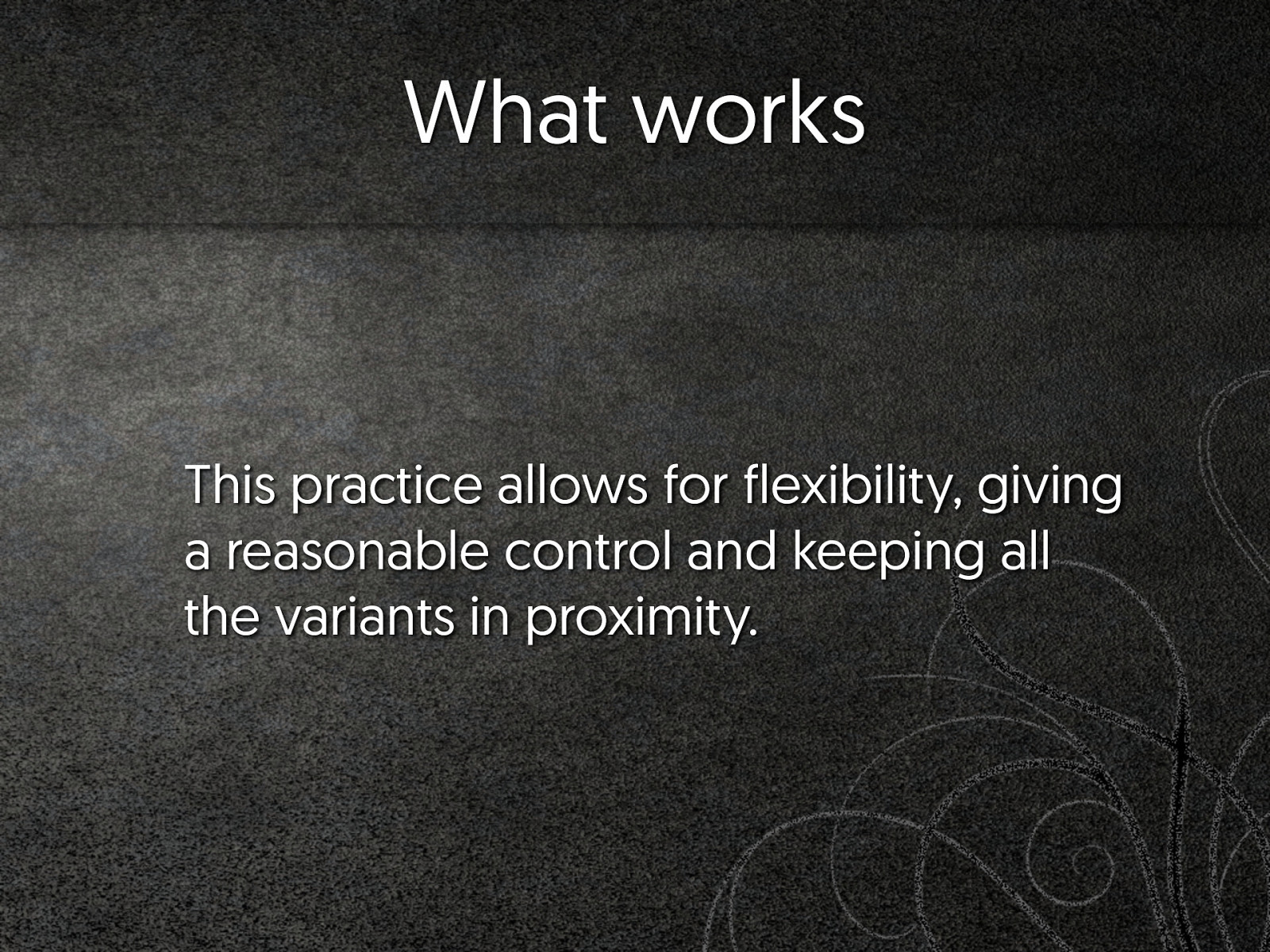
What works This practice allows for flexibility, giving a reasonable control and keeping all the variants in proximity.
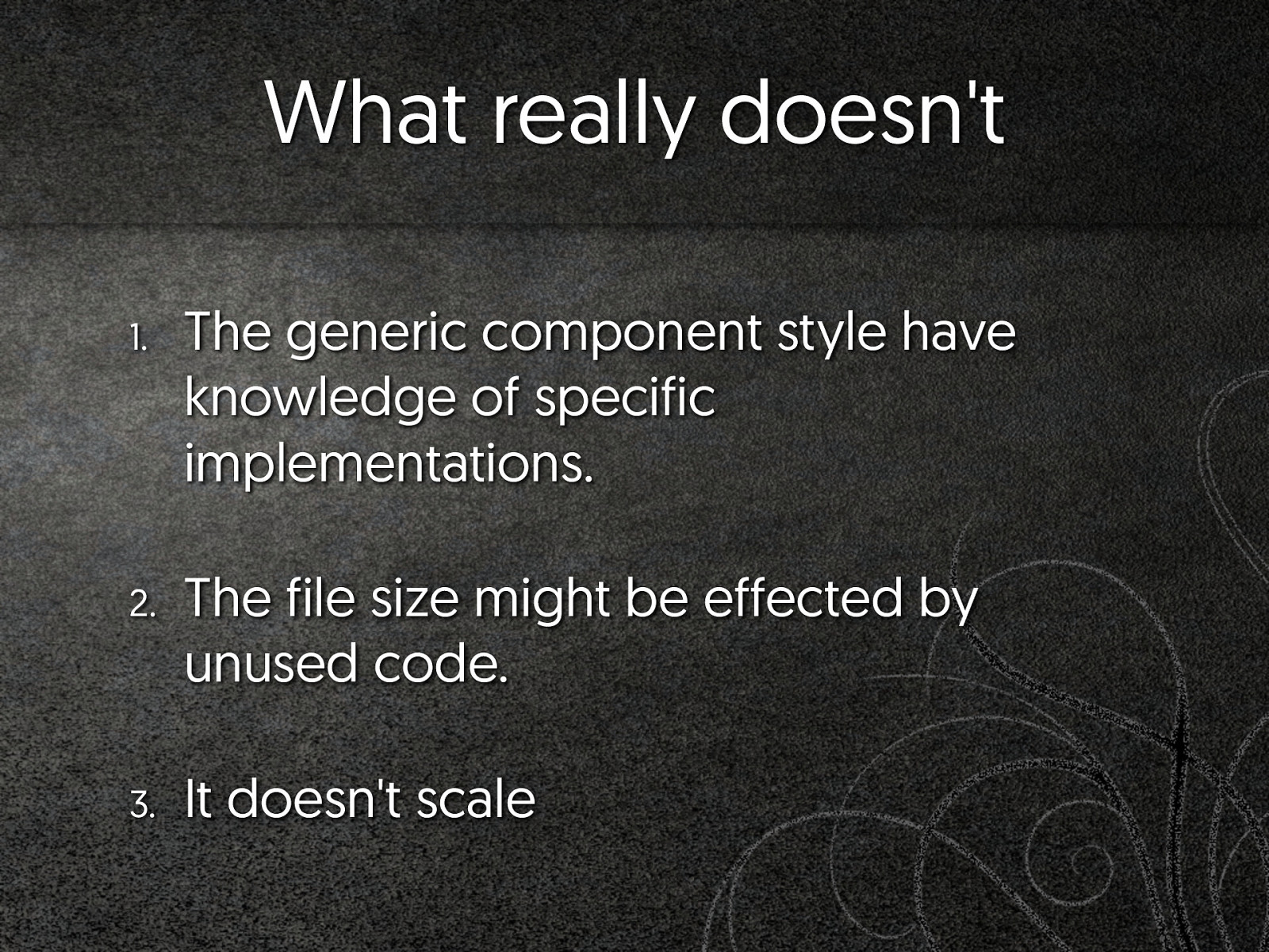
What really doesn't 1. The generic component style have knowledge of specific implementations. 2. The file size might be effected by unused code. 3. It doesn't scale
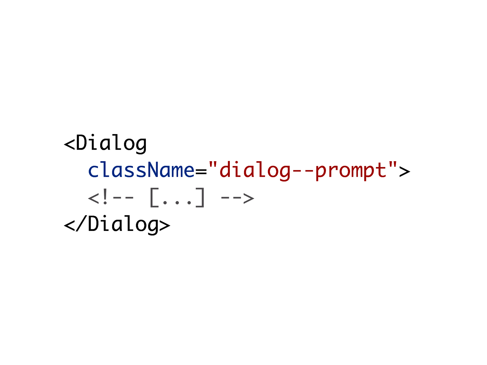
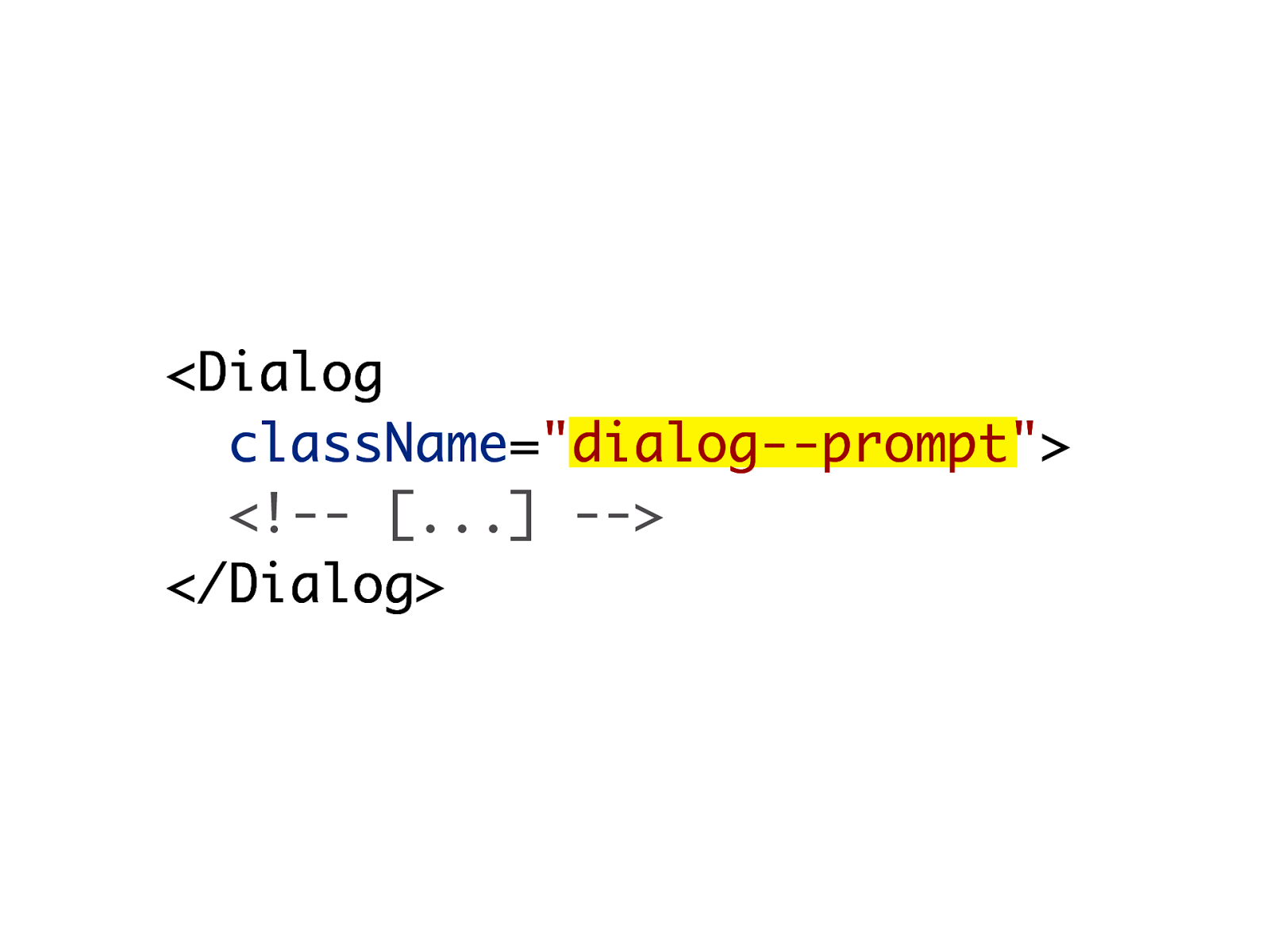
Specialised patterns I'm special
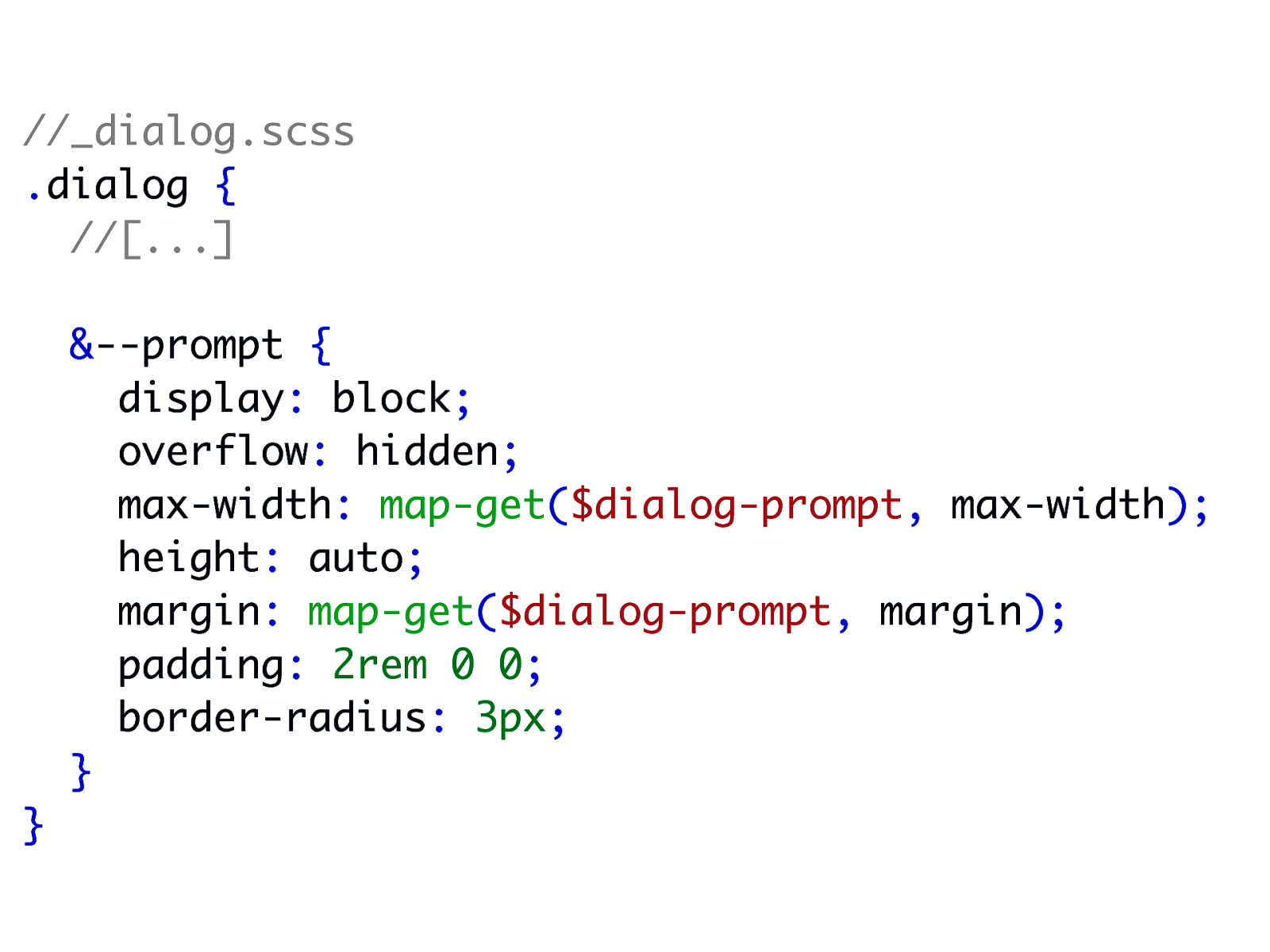
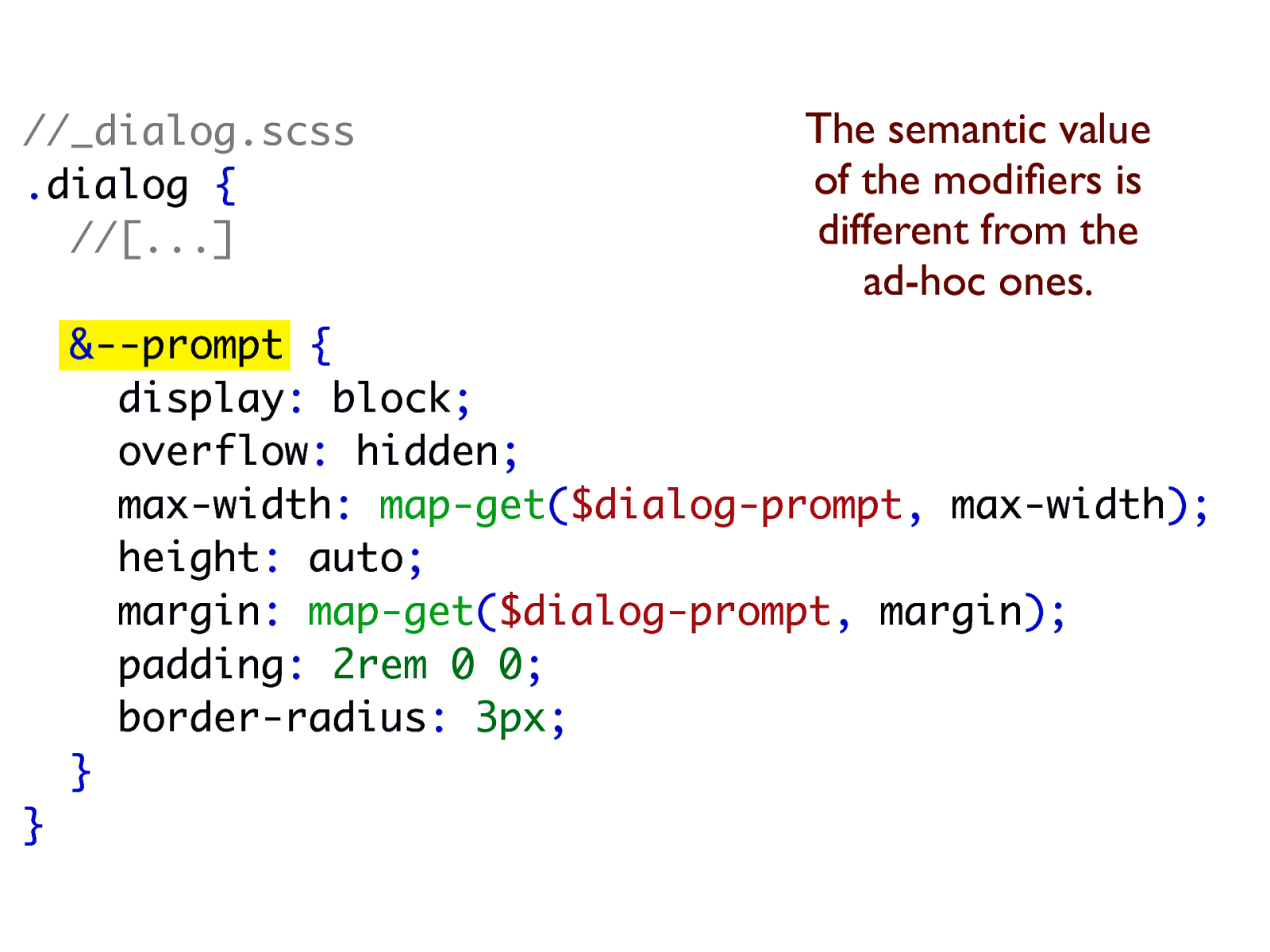
//_dialog.scss .dialog { //[...] &--prompt { display: block; overflow: hidden; max-width: map-get($dialog-prompt, max-width); height: auto; margin: map-get($dialog-prompt, margin); padding: 2rem 0 0; border-radius: 3px; } }
//_dialog.scss .dialog { //[...] The semantic value of the modifiers is different from the ad-hoc ones. &--prompt { display: block; overflow: hidden; max-width: map-get($dialog-prompt, max-width); height: auto; margin: map-get($dialog-prompt, margin); padding: 2rem 0 0; border-radius: 3px; } }
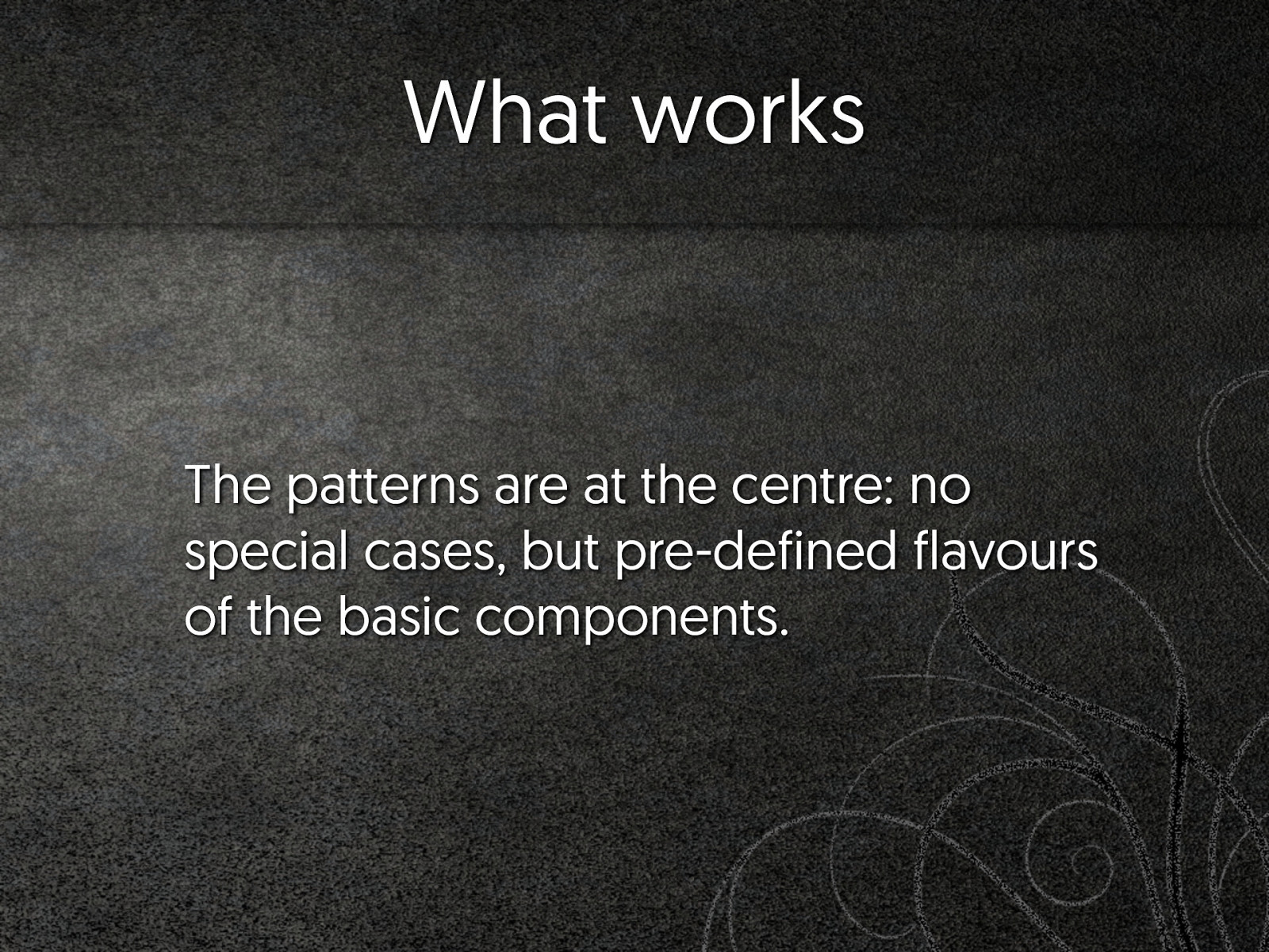
What works The patterns are at the centre: no special cases, but pre-defined flavours of the basic components.
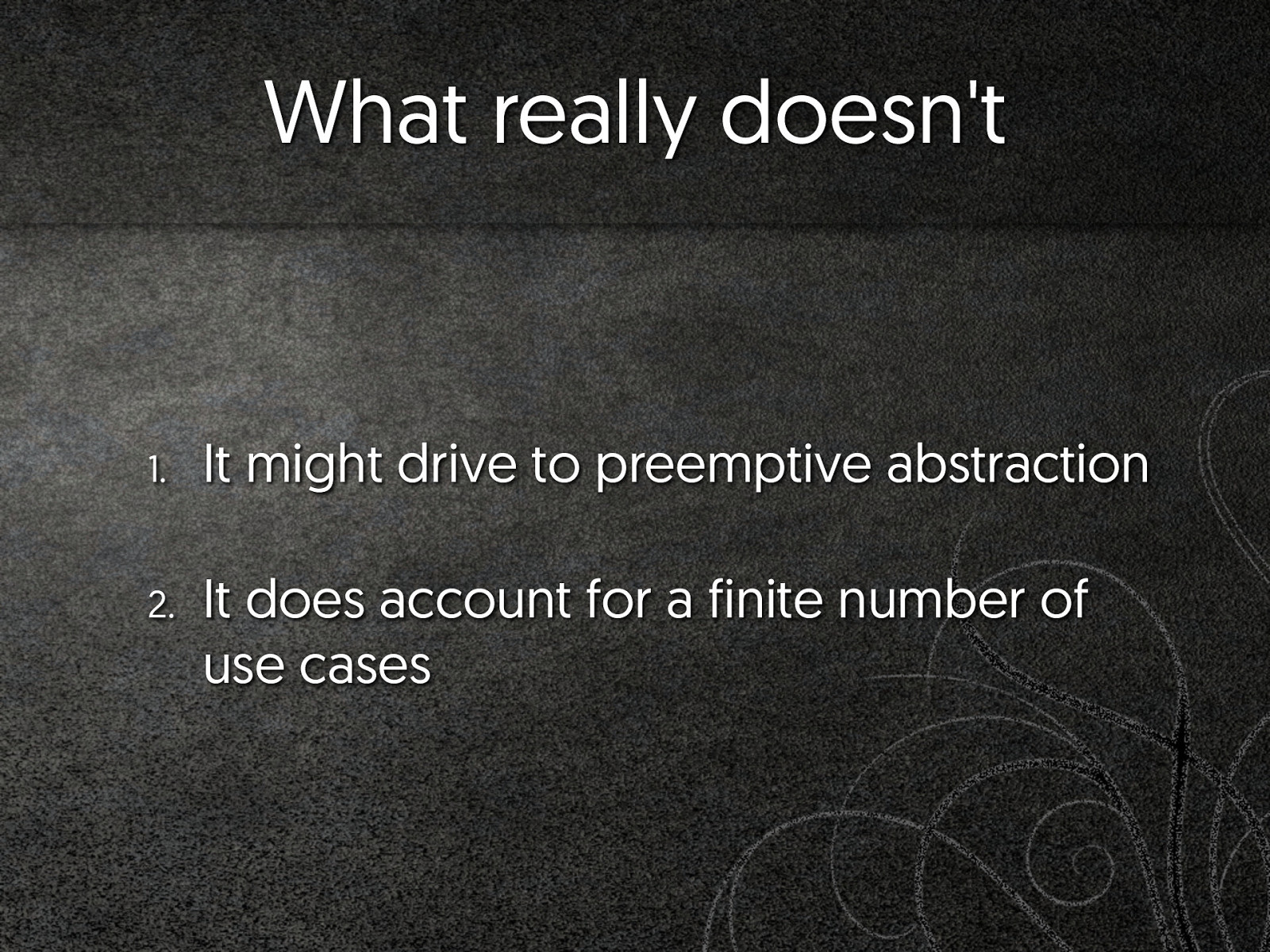
What really doesn't 1. It might drive to preemptive abstraction 2. It does account for a finite number of use cases
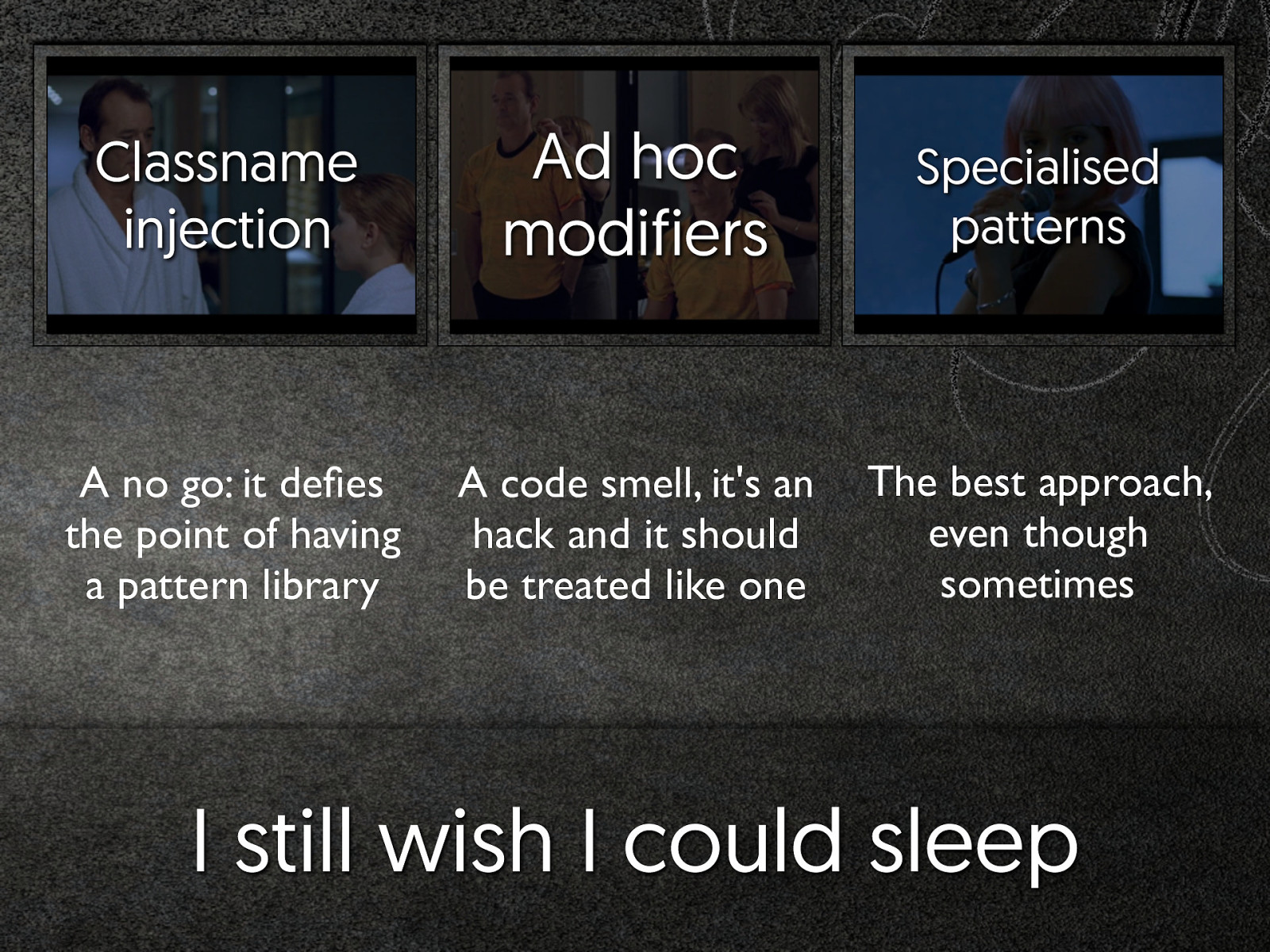
Classname injection Ad hoc modifiers Specialised patterns A no go: it defies the point of having a pattern library A code smell, it's an hack and it should be treated like one The best approach, even though sometimes I still wish I could sleep
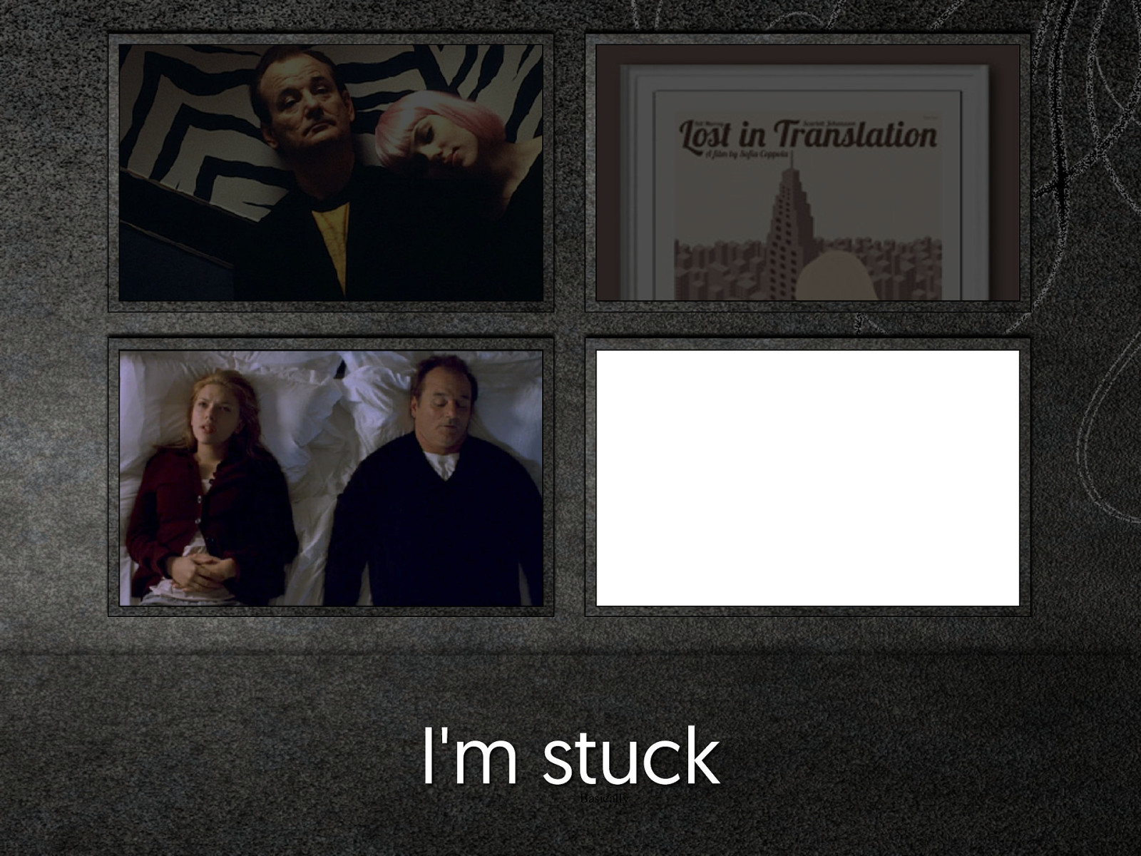
I'm stuck Basically
It's not that simple “It isn’t really that simple” Alla Kholmatova · June 2015
The issue How do we re-use our patterns in slightly different use cases?
What am I trying to solve?
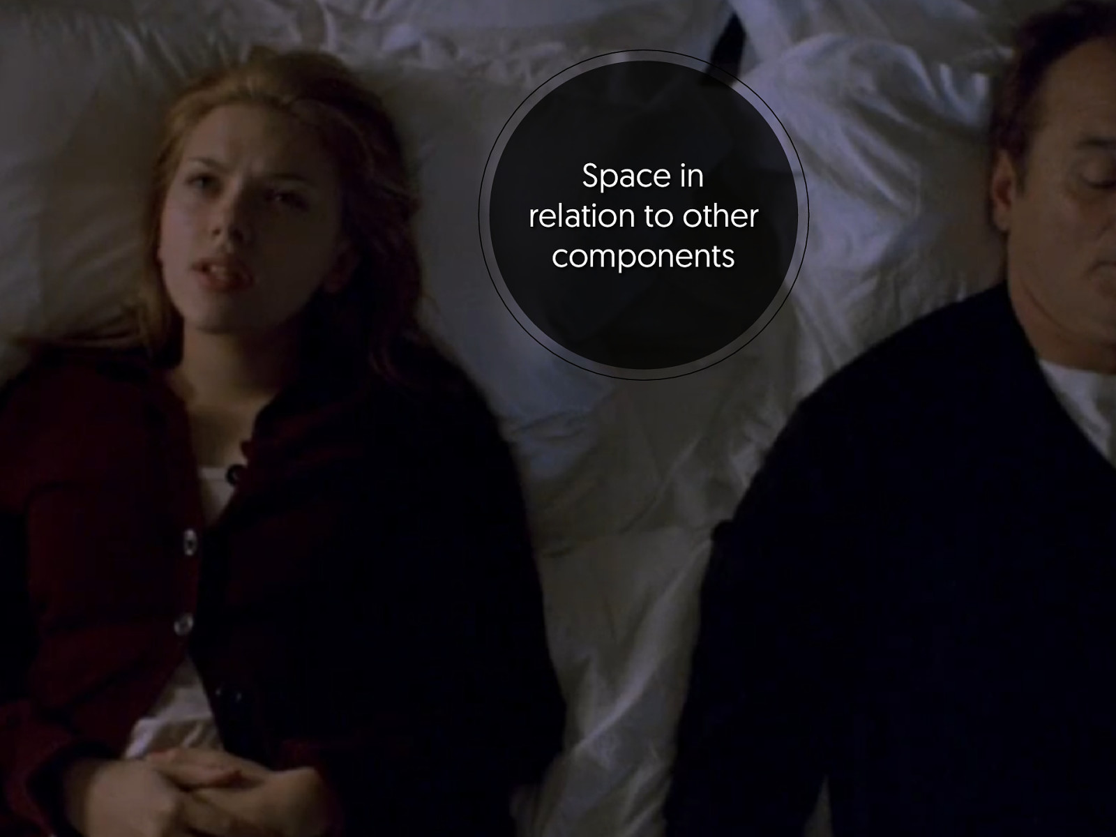
Arrangement within parent components
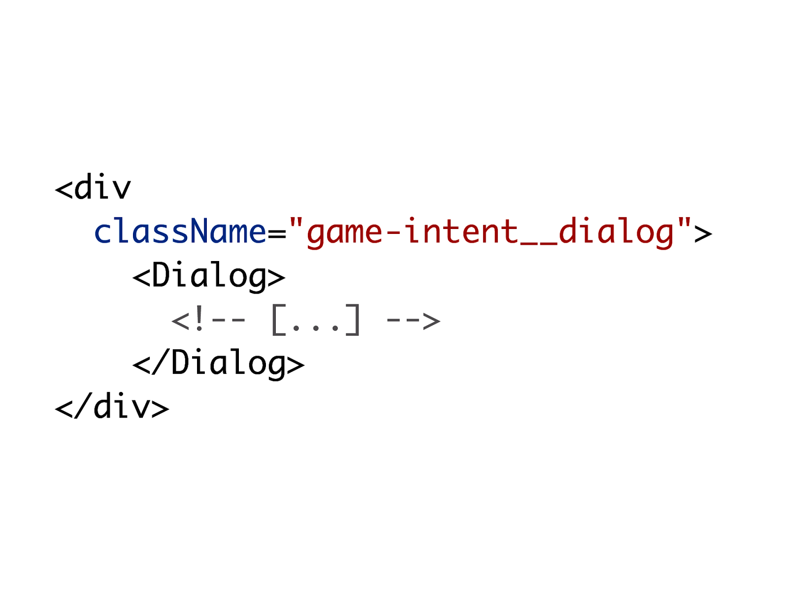
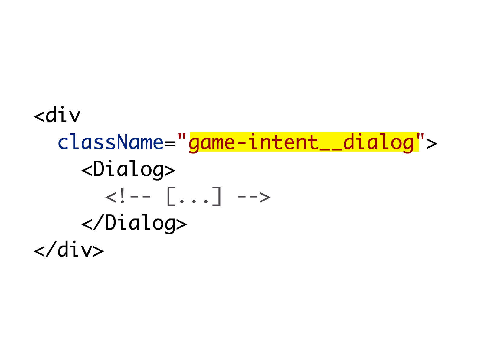
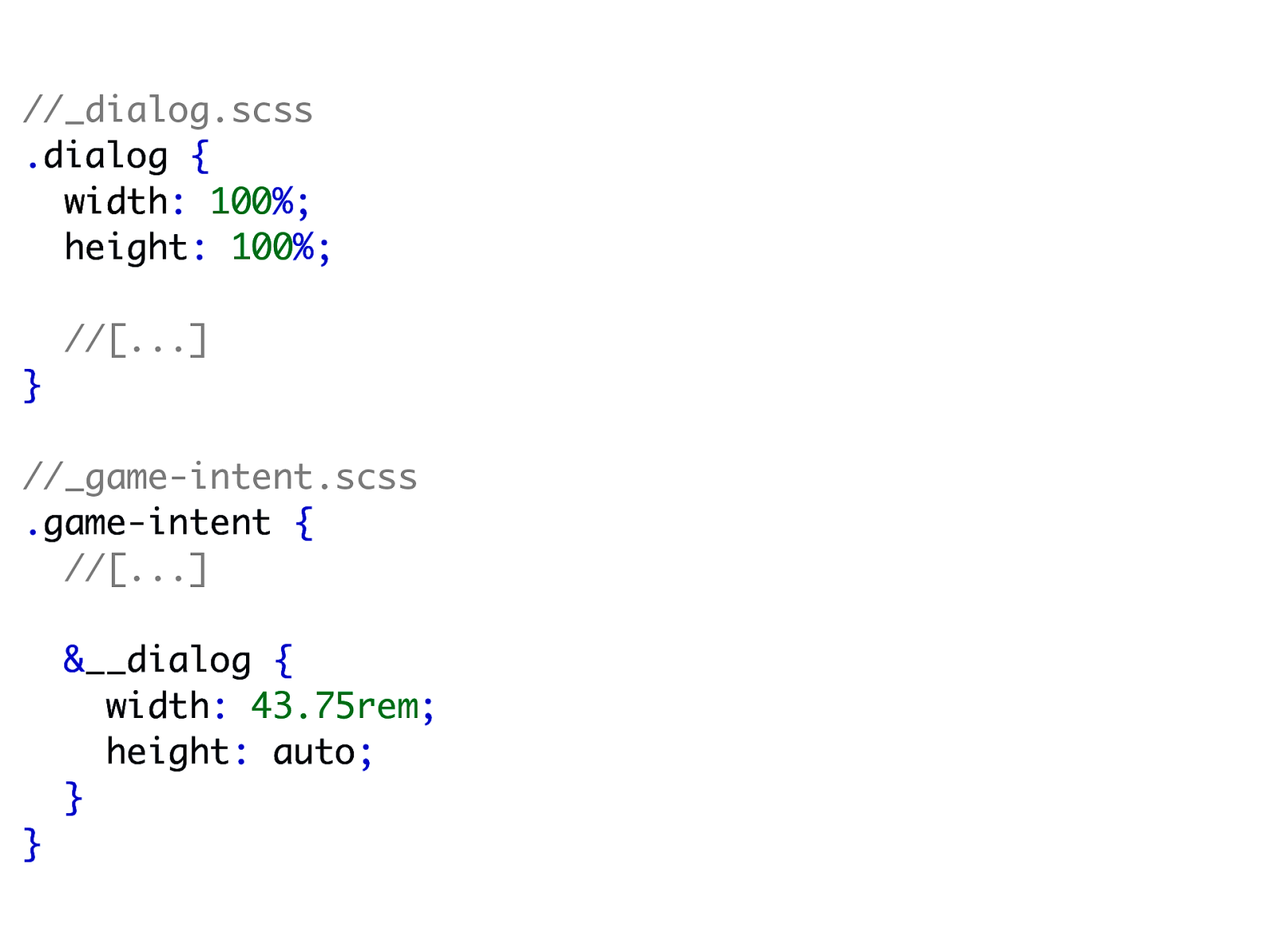
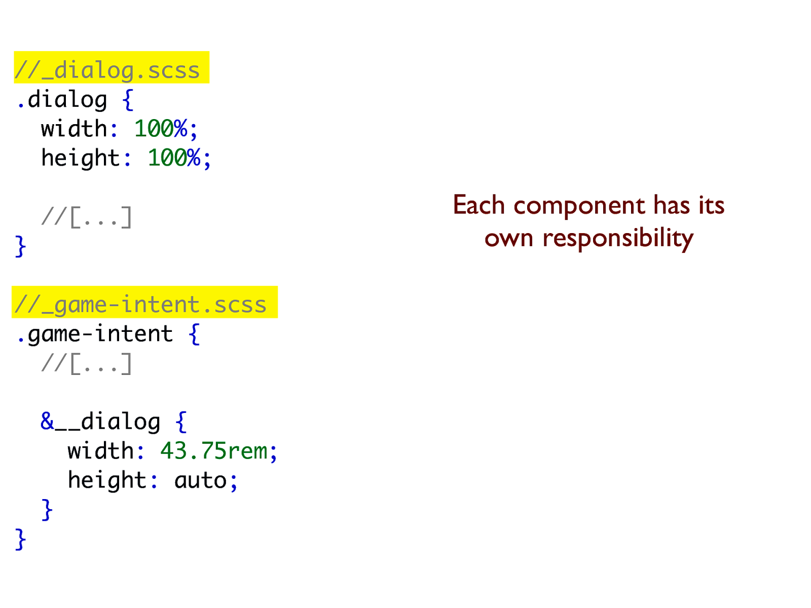
//_dialog.scss .dialog { width: 100%; height: 100%; //[...] } //_game-intent.scss .game-intent { //[...] &__dialog { width: 43.75rem; height: auto; } }
//_dialog.scss .dialog { width: 100%; height: 100%; //[...] } //_game-intent.scss .game-intent { //[...] &__dialog { width: 43.75rem; height: auto; } } Each component has its own responsibility
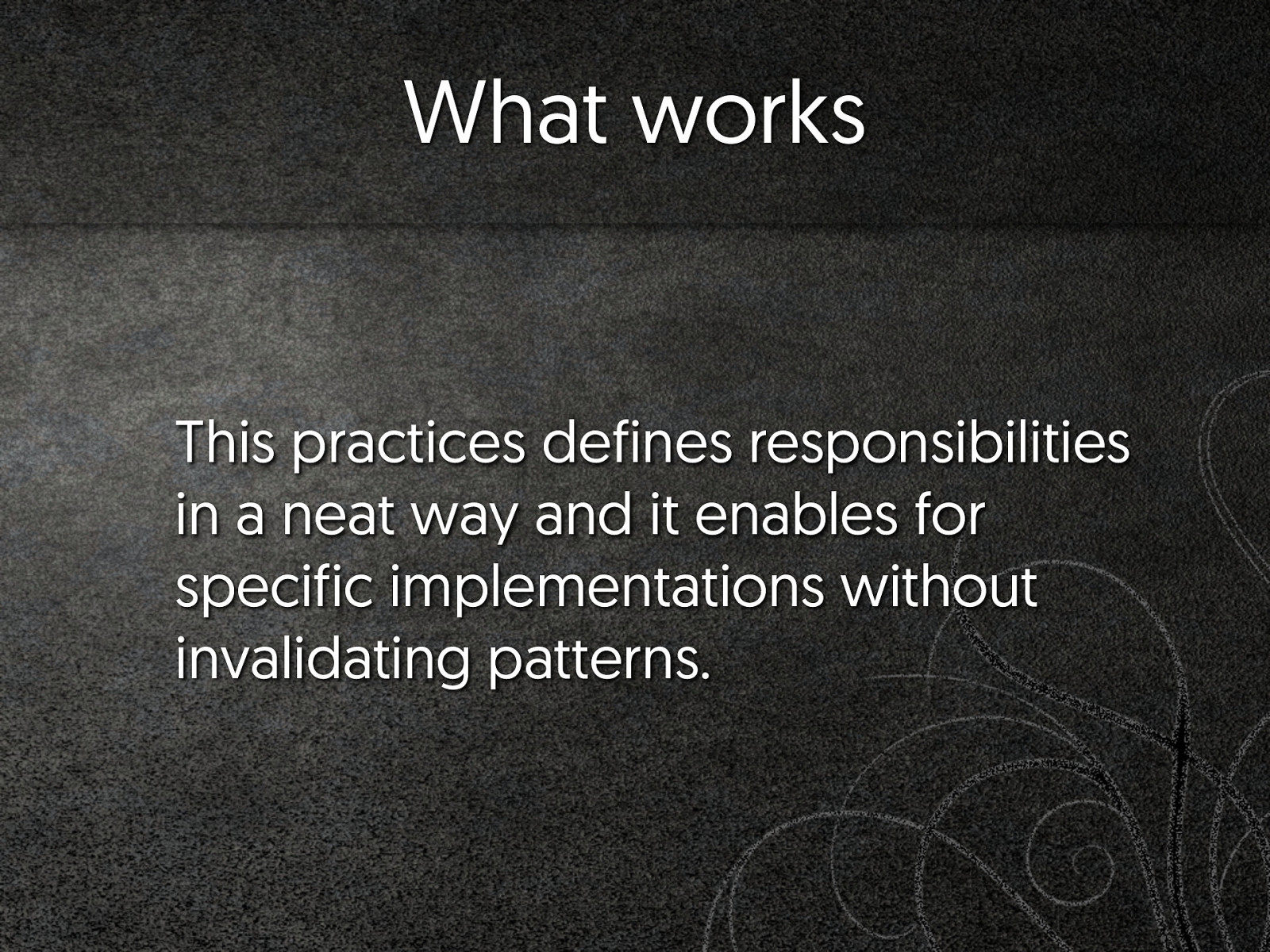
What works This practices defines responsibilities in a neat way and it enables for specific implementations without invalidating patterns.
What really doesn't Potentially you might need a wrapper HTML element that could have been avoided.
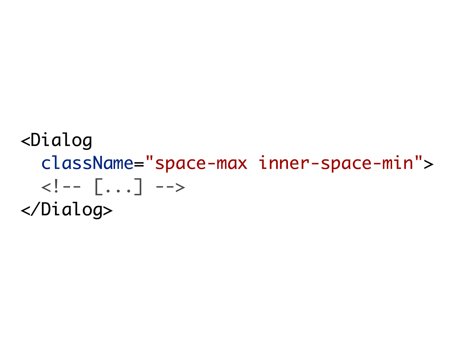
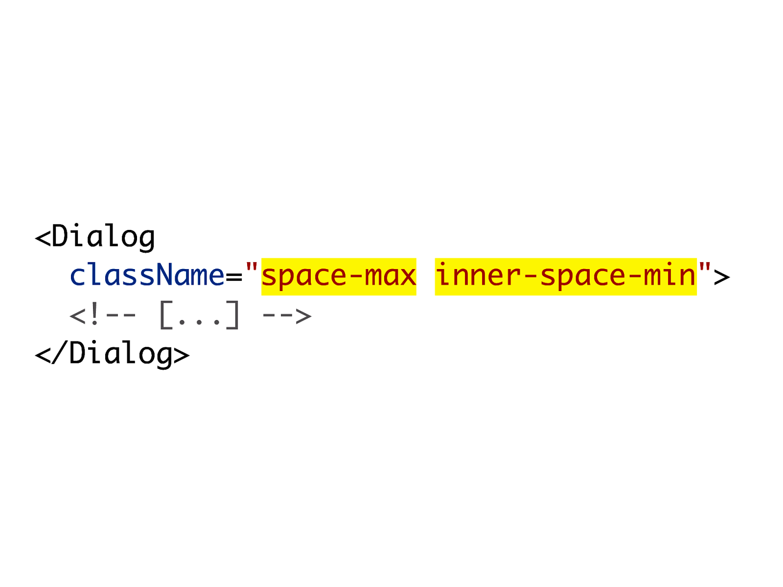
Space in relation to other components
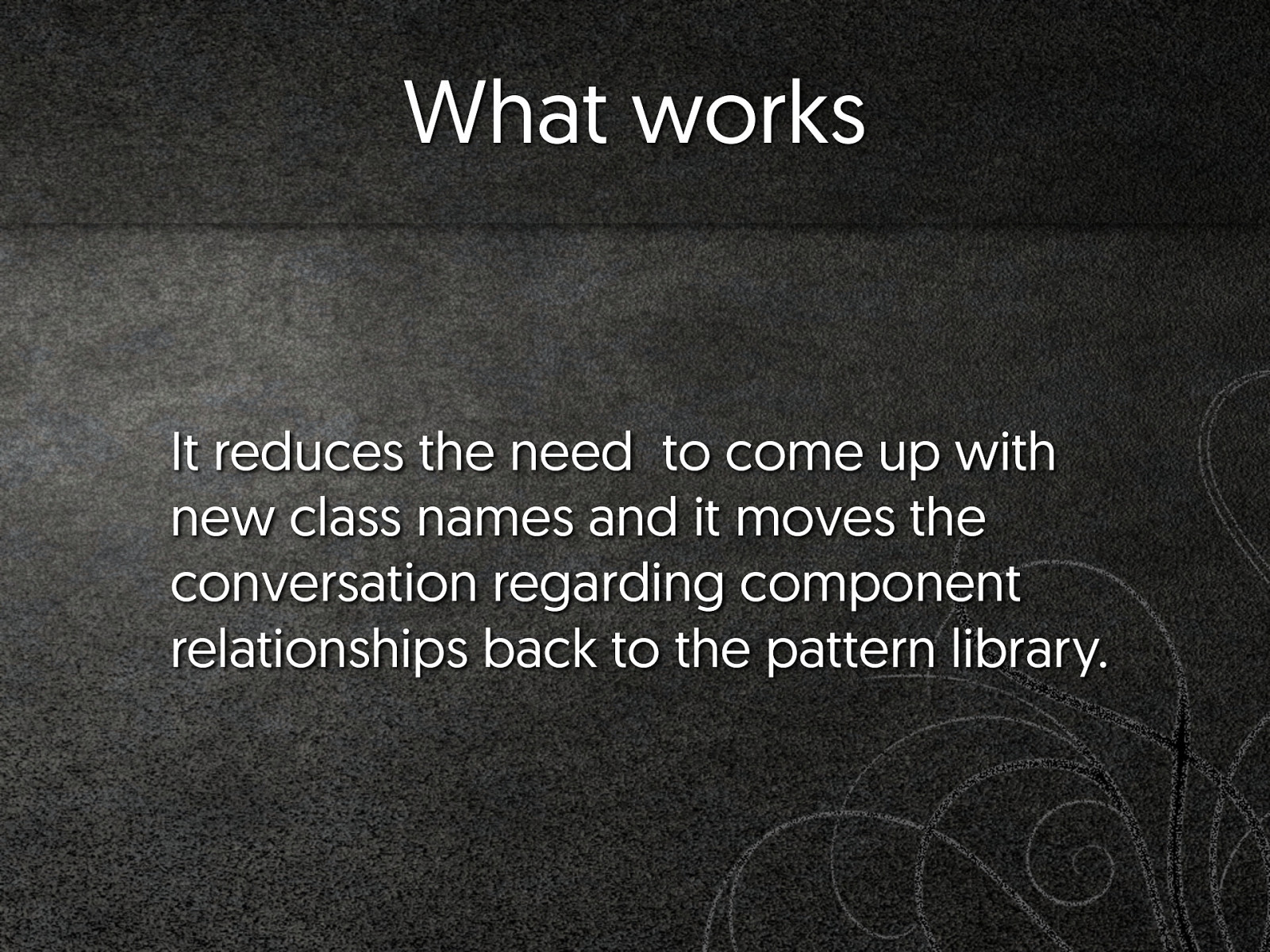
What works It reduces the need to come up with new class names and it moves the conversation regarding component relationships back to the pattern library.
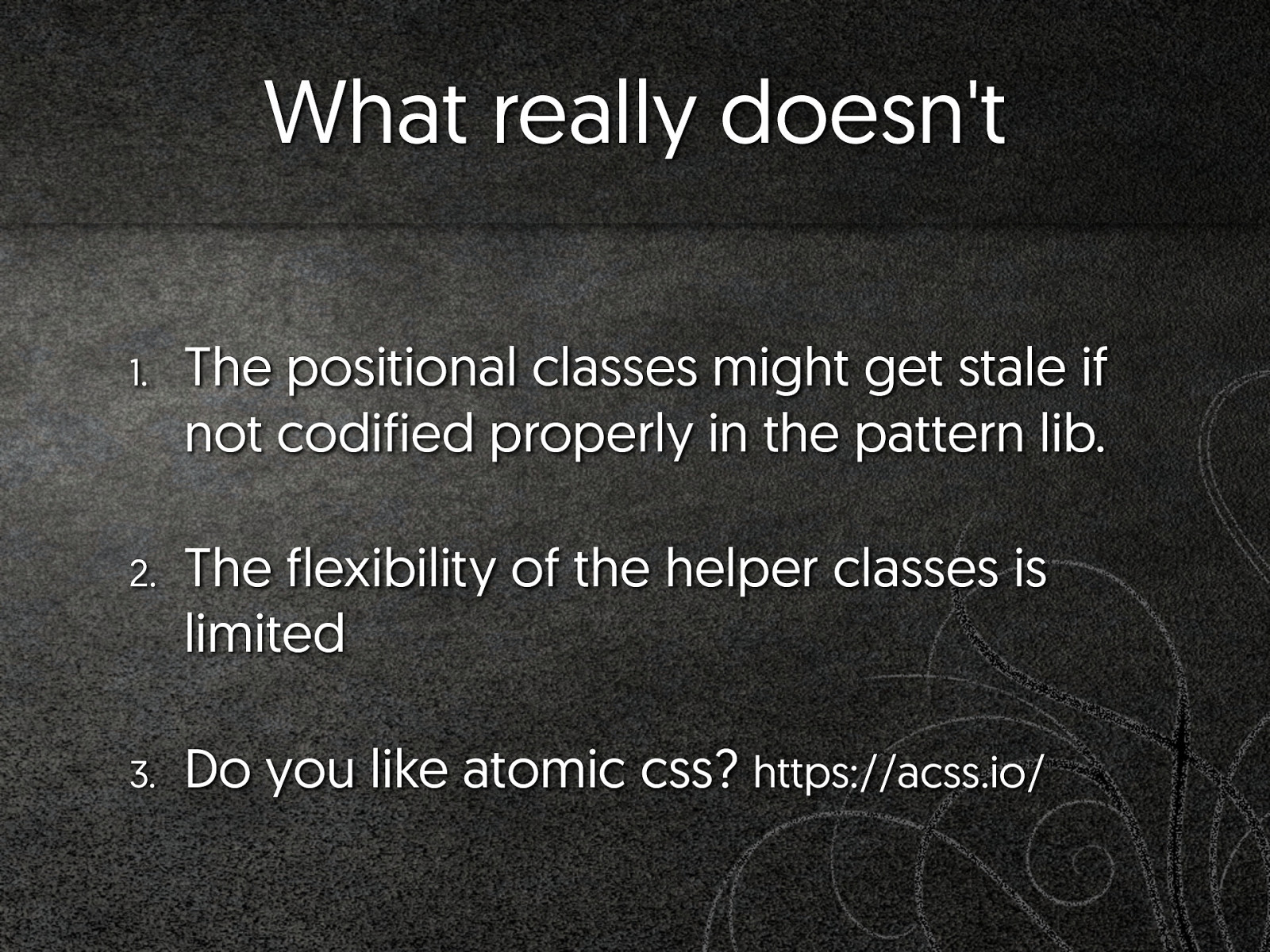
What really doesn't 1. The positional classes might get stale if not codified properly in the pattern lib. 2. The flexibility of the helper classes is limited 3. Do you like atomic css? https://acss.io/
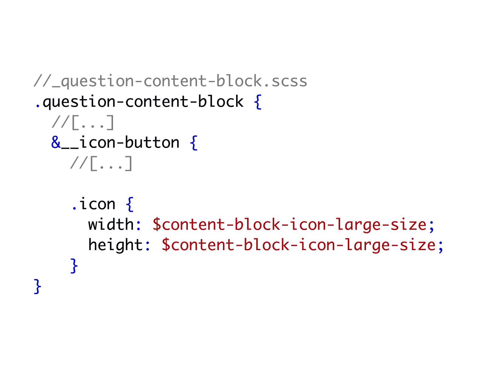
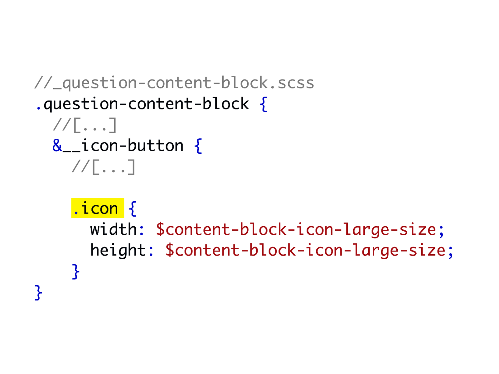
"Open" components
//_question-content-block.scss .question-content-block { //[...] &__icon-button { //[...] .icon { width: $content-block-icon-large-size; height: $content-block-icon-large-size; } }
//_question-content-block.scss .question-content-block { //[...] &__icon-button { //[...] .icon { width: $content-block-icon-large-size; height: $content-block-icon-large-size; } }
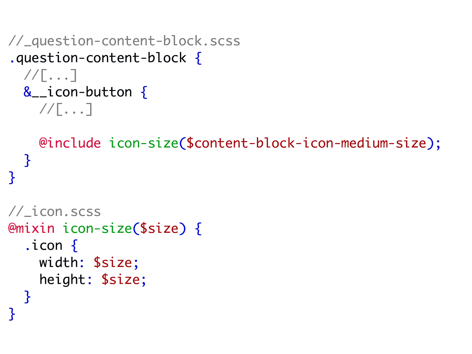
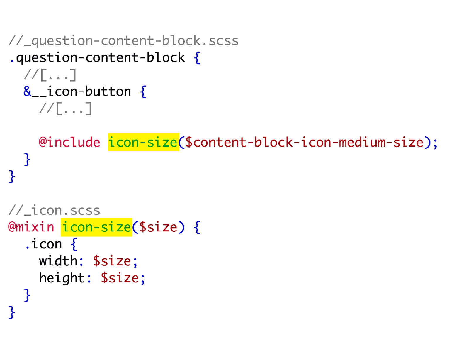
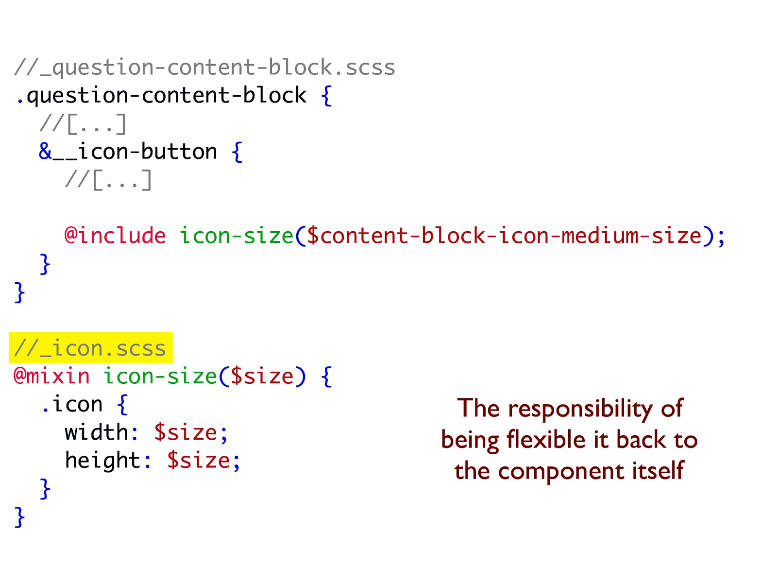
//_question-content-block.scss .question-content-block { //[...] &__icon-button { //[...] @include icon-size($content-block-icon-medium-size); } } //_icon.scss @mixin icon-size($size) { .icon { width: $size; height: $size; } }
//_question-content-block.scss .question-content-block { //[...] &__icon-button { //[...] @include icon-size($content-block-icon-medium-size); } } //_icon.scss @mixin icon-size($size) { .icon { width: $size; height: $size; } }
//_question-content-block.scss .question-content-block { //[...] &__icon-button { //[...] @include icon-size($content-block-icon-medium-size); } } //_icon.scss @mixin icon-size($size) { .icon { width: $size; height: $size; } } The responsibility of being flexible it back to the component itself
What works 1. Every base component can be as flexible as it defines itself to be. 2. Developers always have control on what they expose.
What really doesn't 1. This technique involves more complexity in thinking about the components 2. It's a slippery slope 3. How does an "open" component fit in the patterns?
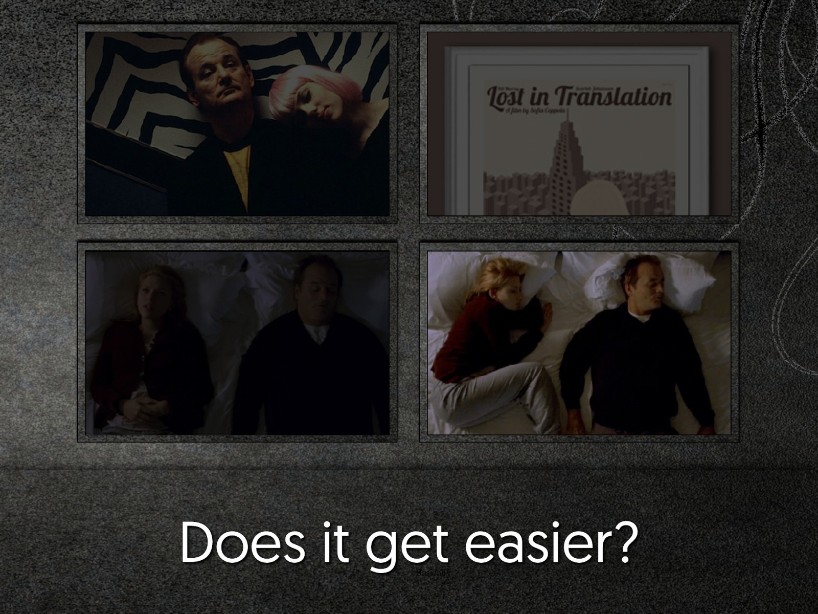
Does it get easier? Basically
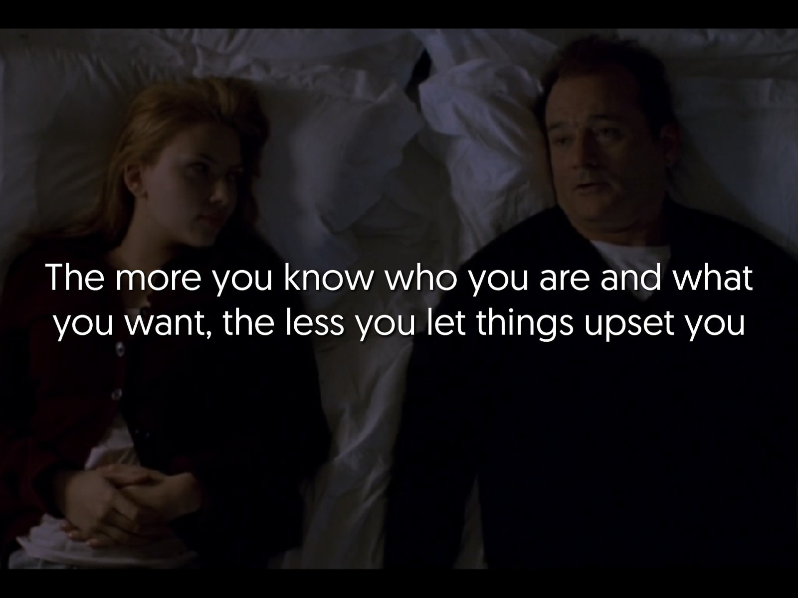
The more you know who you are and what you want, the less you let things upset you
I just don't know what I'm supposed to be
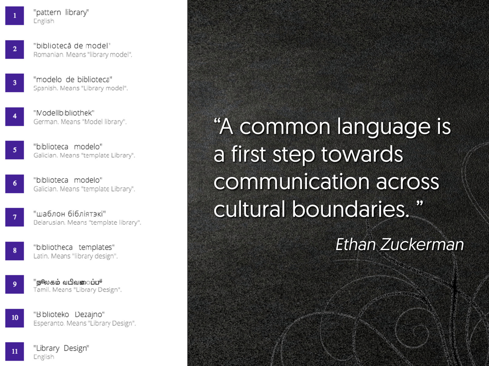
“A common language is a first step towards communication across cultural boundaries. ” Ethan Zuckerman
The issue How to understand - and convey the meaning of an exception in our patterns?
Learn what the pattern your are building is supposed to be
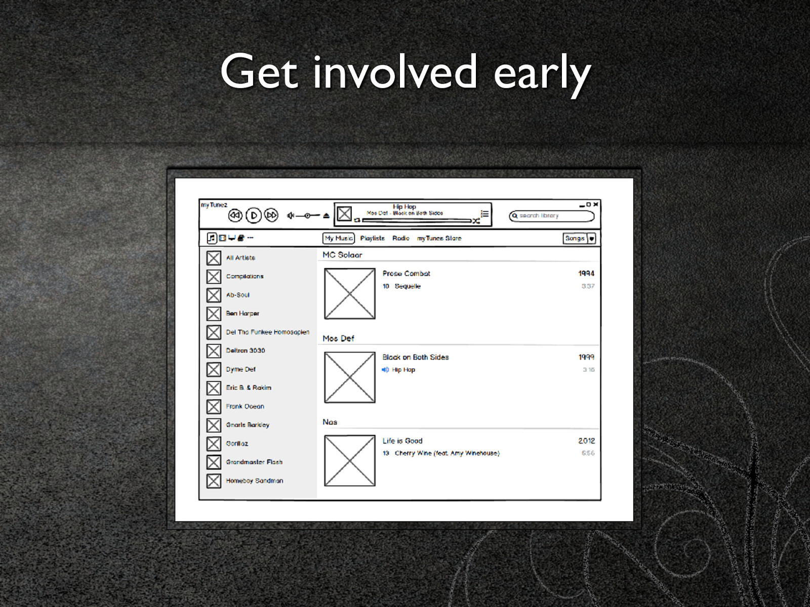
Get involved early
Talk to people
and remember that…
You are not hopeless marco@fromthefront.it http://cedmax.com @cedmax

Everyone has a pattern library or dreams about having one. We went through conversations and the codification of our visual dictionary and then we ended up with a beautiful living document.
But what happens when we need to re-use our components and they don’t fit in the design? How do we re-use our patterns in slightly different use cases?
We have all the tech to make a front end really modular, we have techniques and methodologies which enabled us avoiding the bad parts of the languages we use. Every part of the puzzle seems to be falling in the right place.
Yet, sometimes we are struggling in handling the variations of our patterns in a reliable and maintainable way. Our codebase is getting filled with exceptions and overrides and refactoring of base patterns becomes impossible.
Not a recipe for success, more of a way to frame the problem, identify some ideas we tried and re-discuss the way we approach componentisation
Here’s what was said about this presentation on social media.


 for free. You
can too.
for free. You
can too.