
A presentation at Web Directions Design in in Melbourne VIC, Australia by Chris Lienert
You can find show notes on my blog if you’d like to follow along.
This is not me
I think this is me
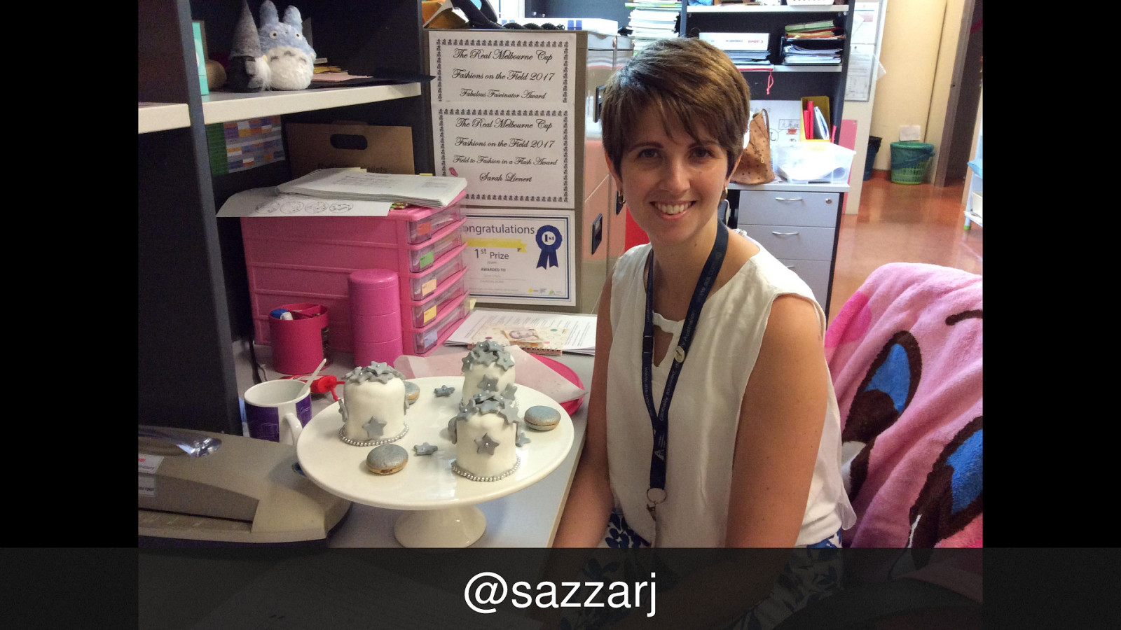
This is definitely not me. This is a primary school teacher. I’m here today because she studied learning difficulties for 3 months last year
Once upon a time before even Twitter and Facebook, people found the urge to draw on perfectly good cave walls. When I say “people”, this one was left by a Neanderthal as warning over 64,000 years ago.
Hand prints progressed to animal forms – this one over 40,000 years old in Indonesia
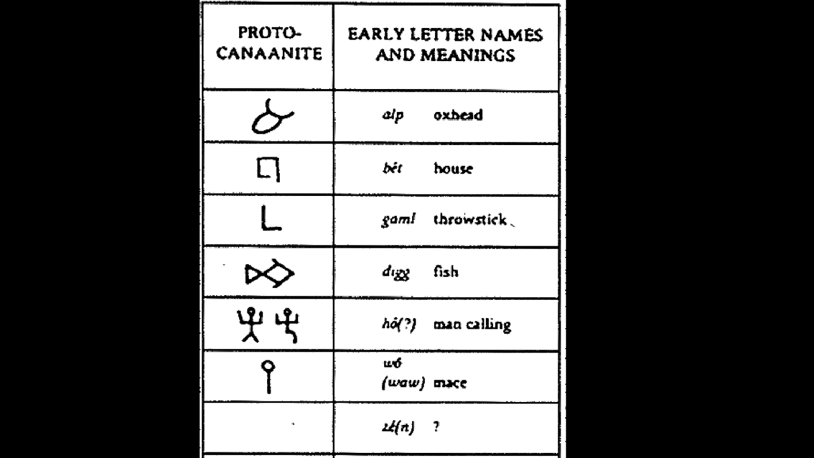
But after drawing lots of oxen, it gets easier to simplify the drawing and, just like that, we have proto-writing.
Written language progressed through to logograms where symbols have both semantic and phonetic meaning
Logographic languages (Egyptian hieroglyphs, Chinese hanji/pinyin, Japanese kanji) combine phonetic and semantic language. Here we have “fire” in Chinese/Japanese huǒ
This is “mountain” in Chinese/Japanese shān
From individual semantic symbols we get compound meaning. Combing “fire” and “mountain” gives us “volcano”. huǒshān
These languages have evolved beyond their pure logographic nature with some morphemes comprising multiple characters. “Animal” is “action” “object”. Dòngwù
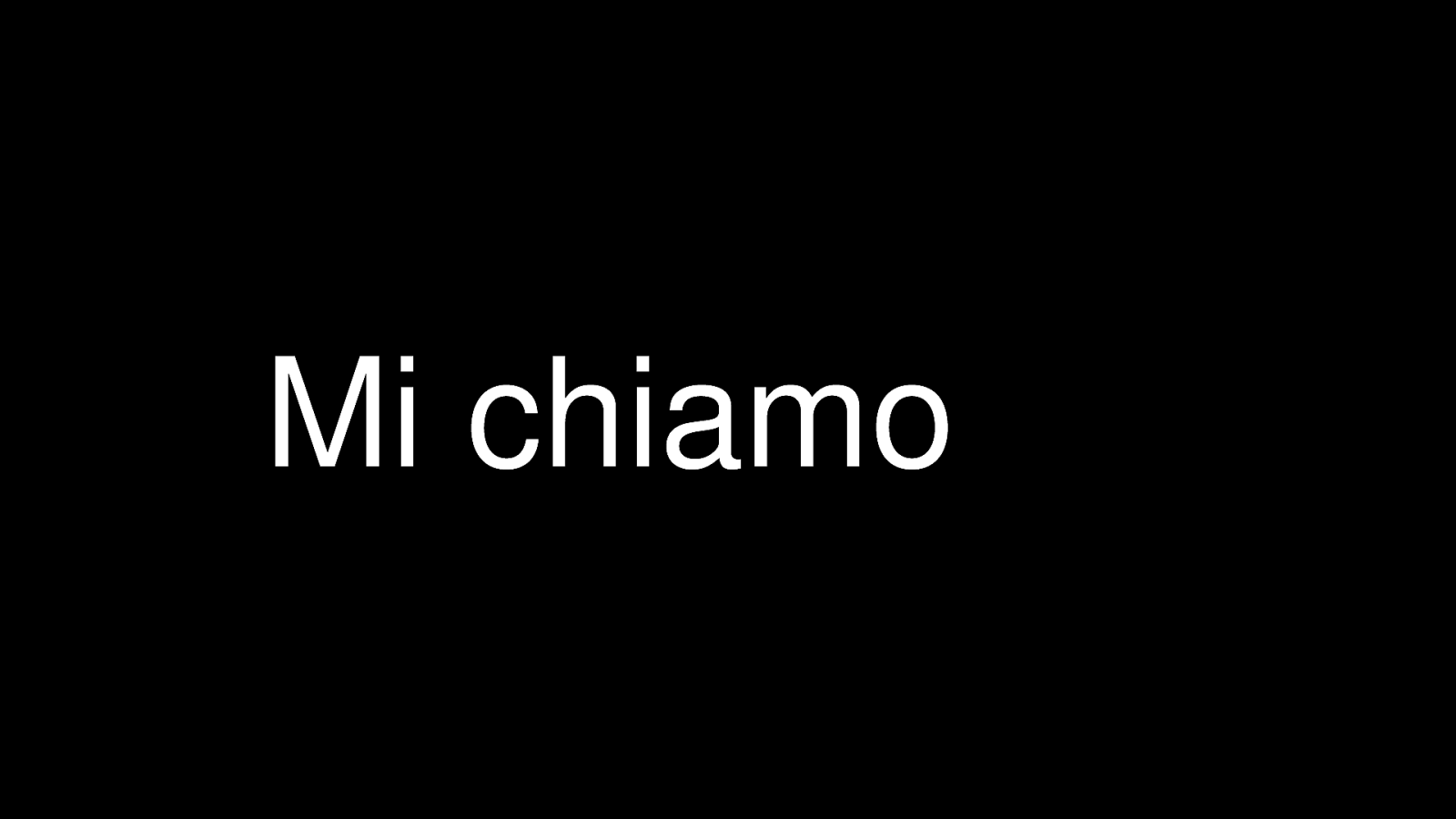
In alphabetic languages, individual characters have phonetic hints but no semantic meaning. This is Italian which is a highly transparent i.e. it features rules that, learned once, can be repeated. Mi, meaning “me” or “my”, comprises “m” and “I”. Once we know how each character is pronounced, we’re largely set.
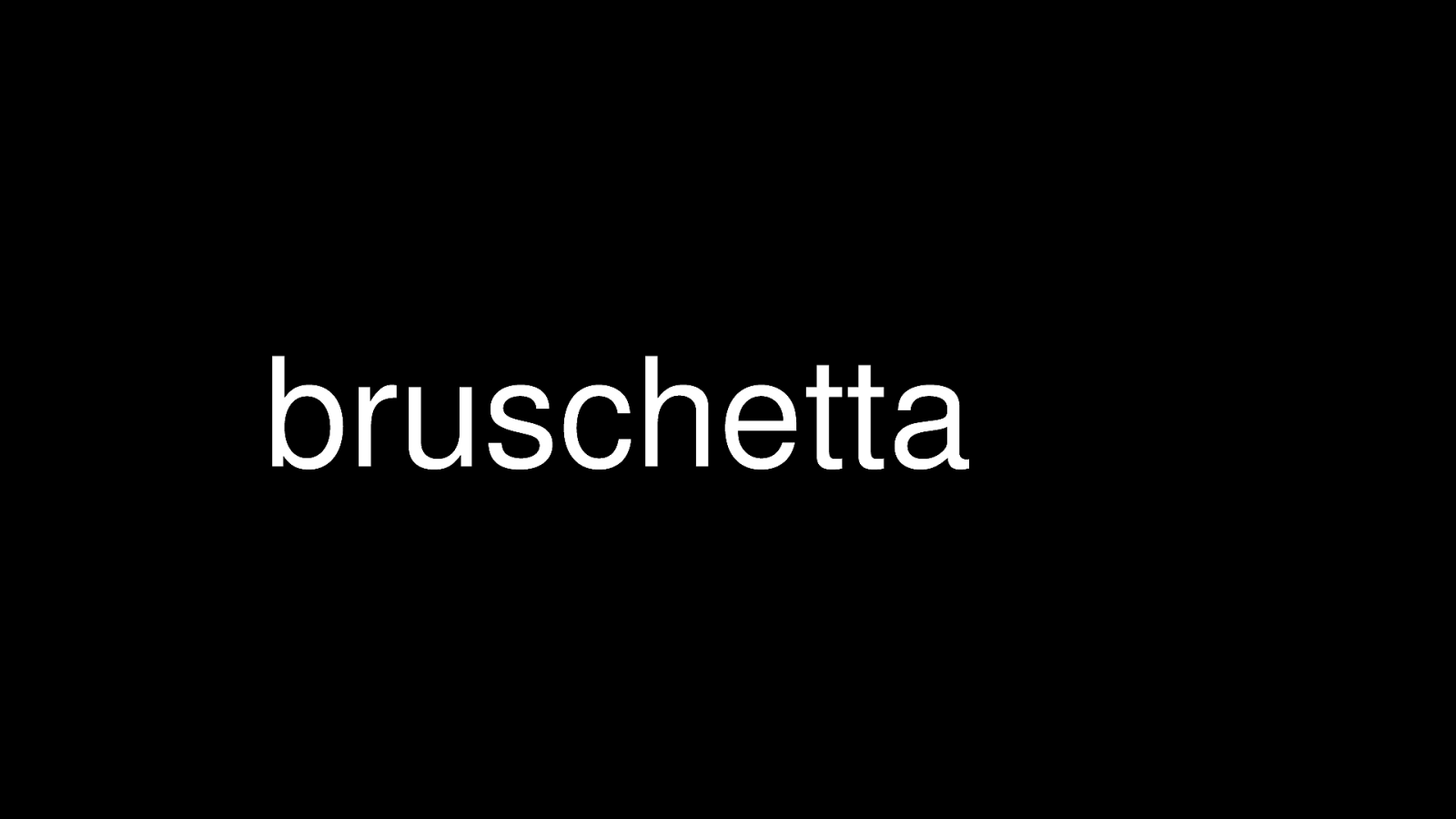
Knowing how to pronounce the “i” in “mi” means we know how to pronounce in in the word “chiamo”. Blends are when characters work differently in certain combinations. In Italian, the “ch” blend is pronounced with a hard “k” sound.
Now we know how to pronounce “ch”, we can have a good chance at pronouncing “bruschetta”.
Shifting across to German which is a less transparent than Italian, we have a different way of pronouncing “i” and “ch”.
“mich” is a simple advance from “ich” – exactly the same but with a “m” in front. Easy.
When we place an “s” in front, the pronunciation changes significantly and so we have a different blend. Still, it’s not too bad, because we now know how to consistently pronounce “sch” blends.
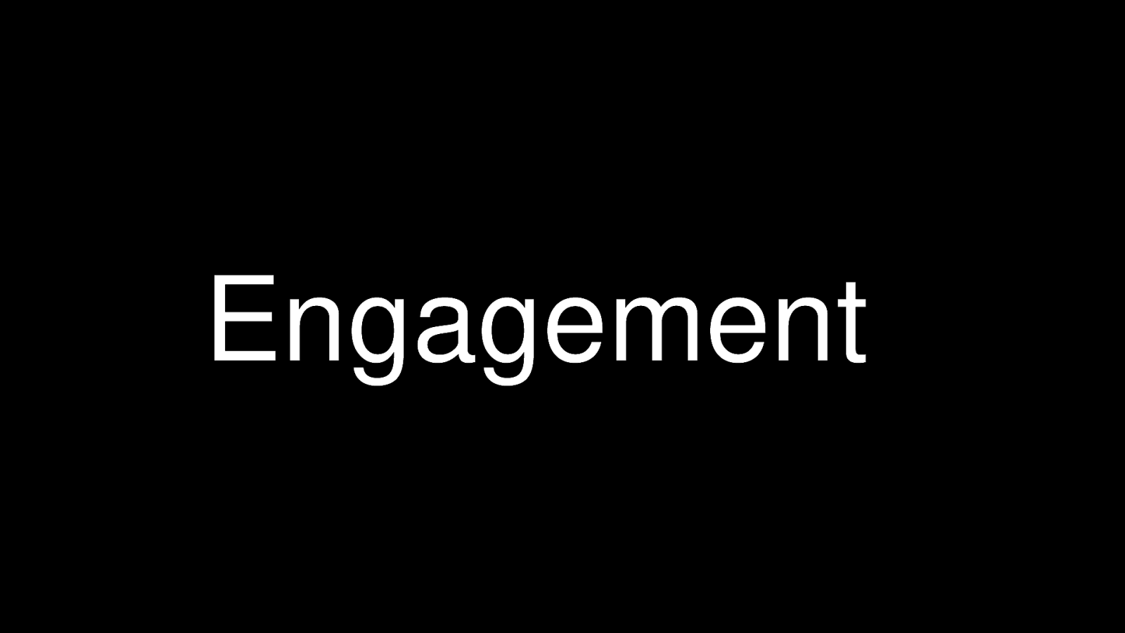
Where German gets weird is it’s sometimes approach to loan words – words that are borrowed from another language. With “engagement”, we ignore everything we know about German pronunciation and instead use the original French pronunciation.
I don’t know either, kookaburra.
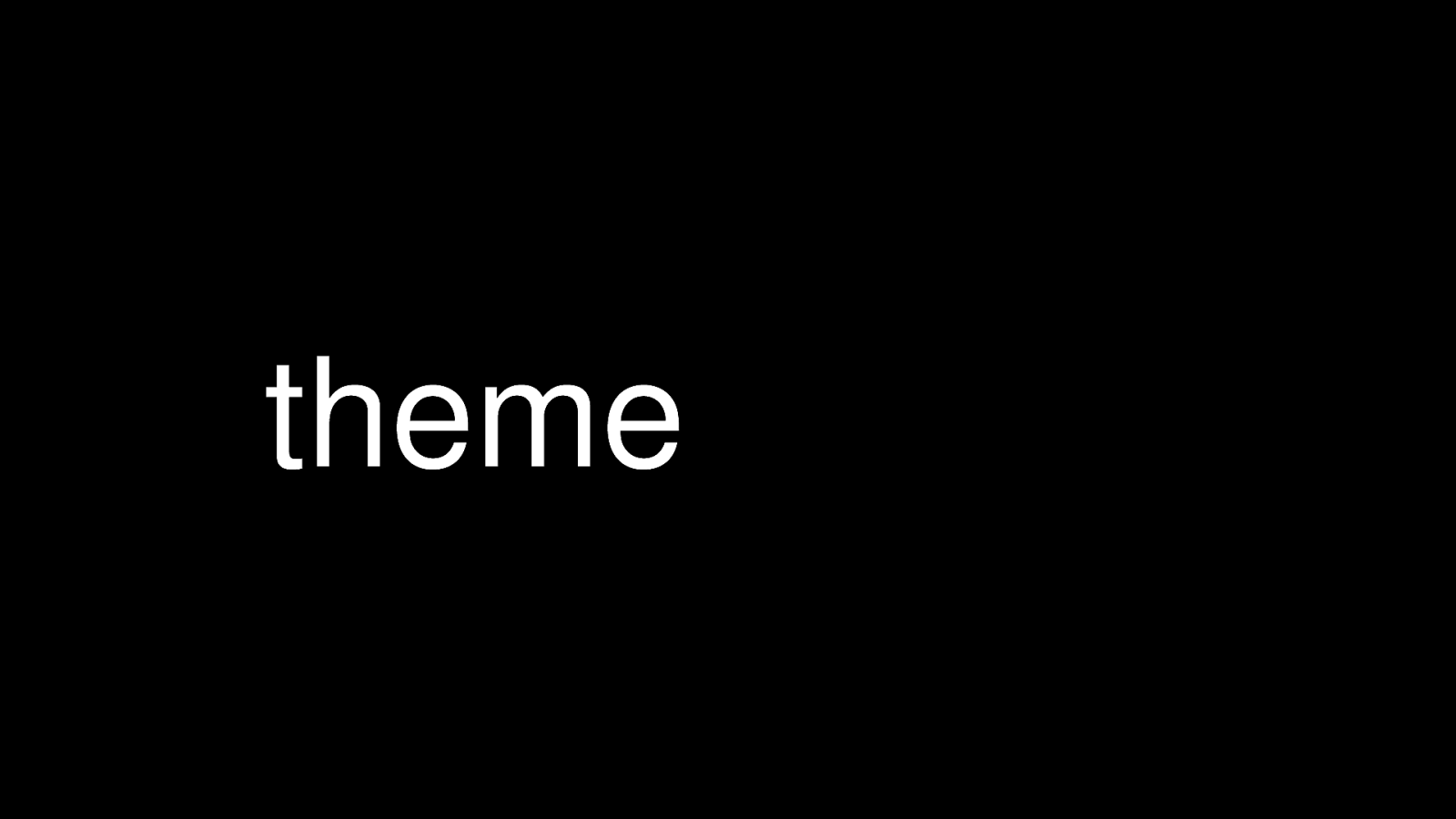
And then there’s English. “the” is fine enough.
Add an “m” and it’s different.
Add an “e” and it’s different again.
Animals are fun.
Nothing we know about “horse” prepares us for “worse”.
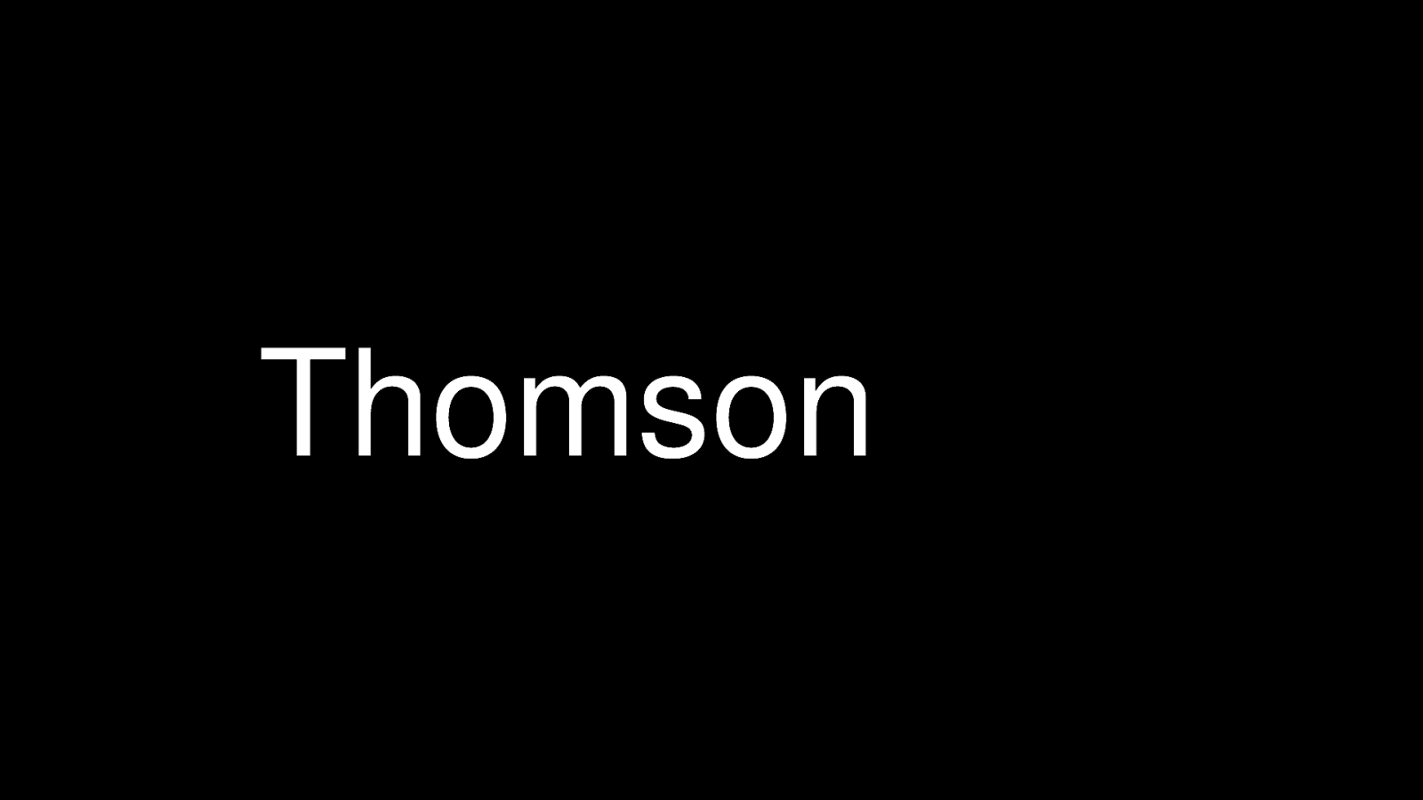
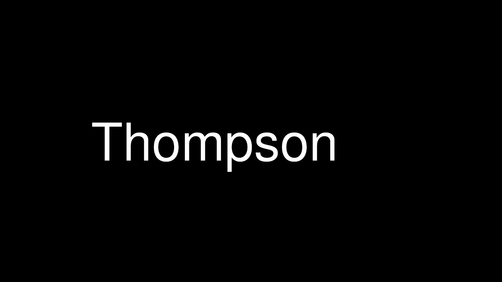
A more complex example here the name “Thomson”
Which is pronounced the same as “Thompson”
A little confusing to say the least. English is a cross-pollinated mess which makes it very difficult to learn but that’s not the only thing we’re up against here.
When we read an unfamiliar symbol, images are scanned in the frontal cortex, pass through arcuate fasciculus (hereby referred to as “a bunch of fibres”), to the posterior cortex to see if it makes sense. Once a pattern is determined, a snapshot is taken and stored for future reference. Depending on severity, dyslexics’ reference list can be extremely short requiring them to scan and decode every
single time. Estimates do vary but somewhere around 10% of people have dyslexia, 5% severely. As much as early diagnosis and intervention have drastic effects, the condition stays for life. People who learn English as another language may suddenly find they have difficulty reading the language despite never having had any problems before.
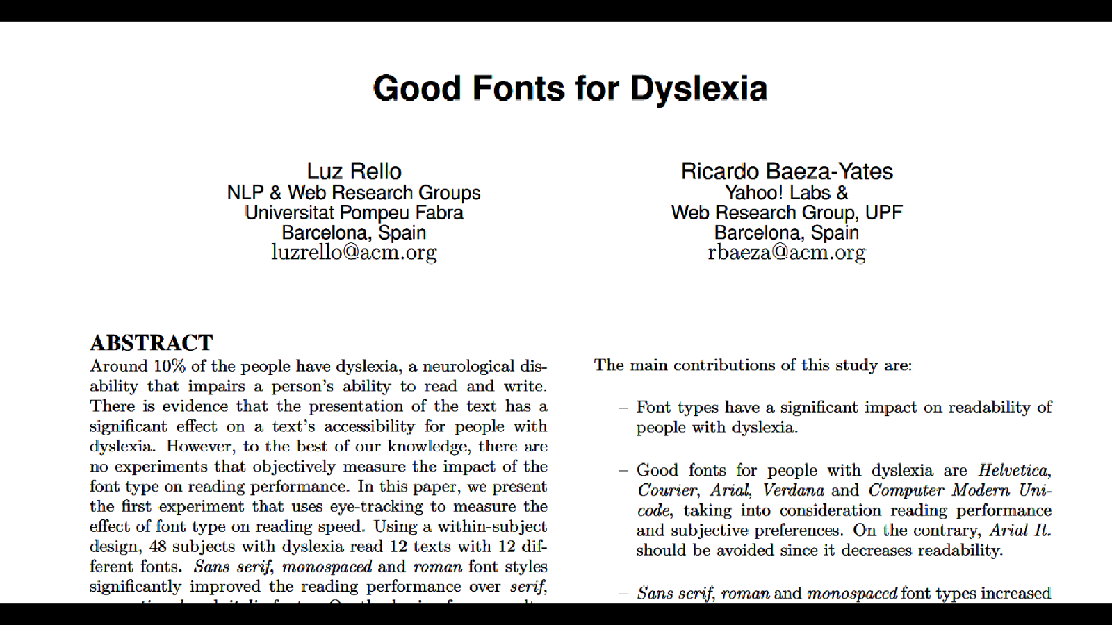
Since we talking about reading, typography plays a big part in improving readability. There are two major typefaces developed specifically for reducing cognitive load
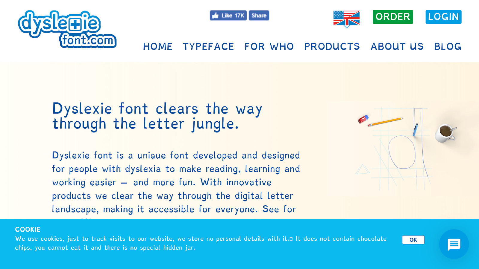
Dyslexie is a commercial typeface
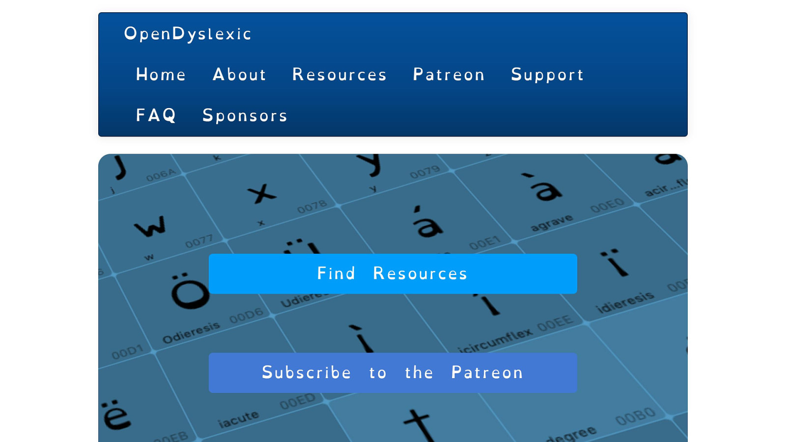
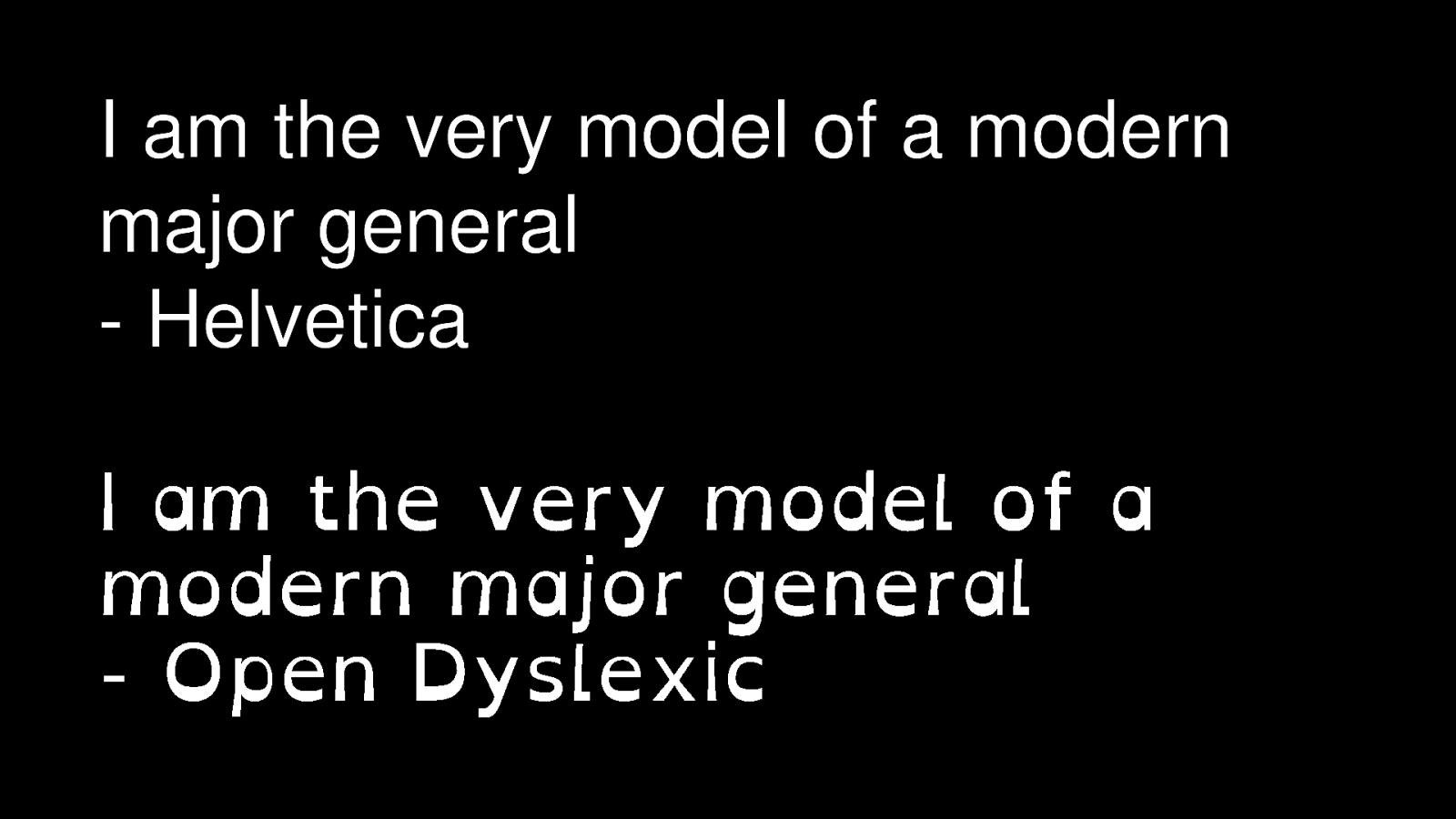
OpenDyslexic is an open-source typeface
Both typefaces focus on distinct letter forms to enhance readability.
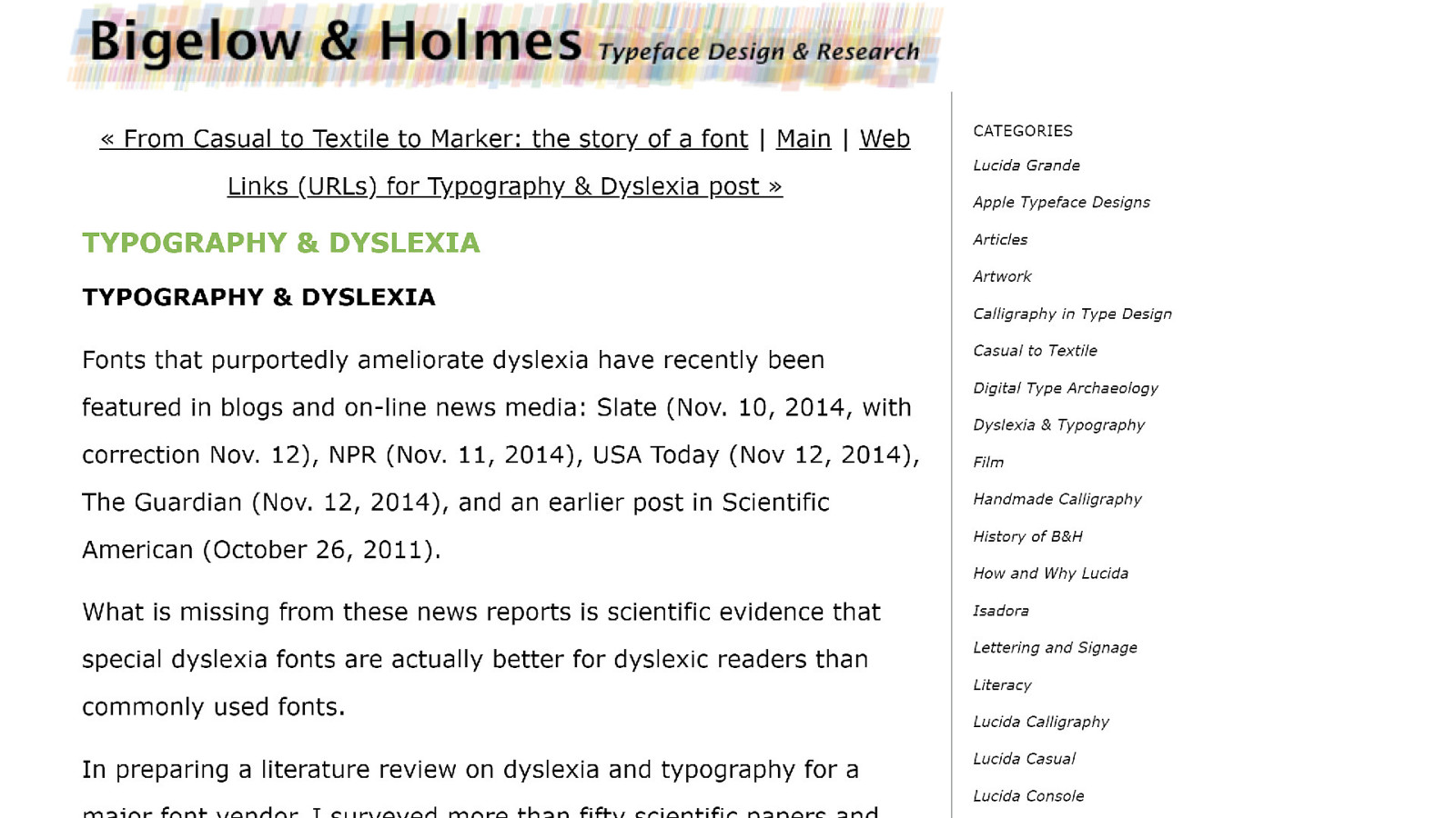
How good are these custom-developed typefaces? There’s plenty of research
But, true to Betteridge’s law of headlines, they’re not particularly special. Where they work, they work because their letter spacing is reasonably generous but you don’t need a special font for that.
What is good then? Broadly speaking, avoid serifs and italics. Comic Sans is surprisingly popular. What makes the difference?
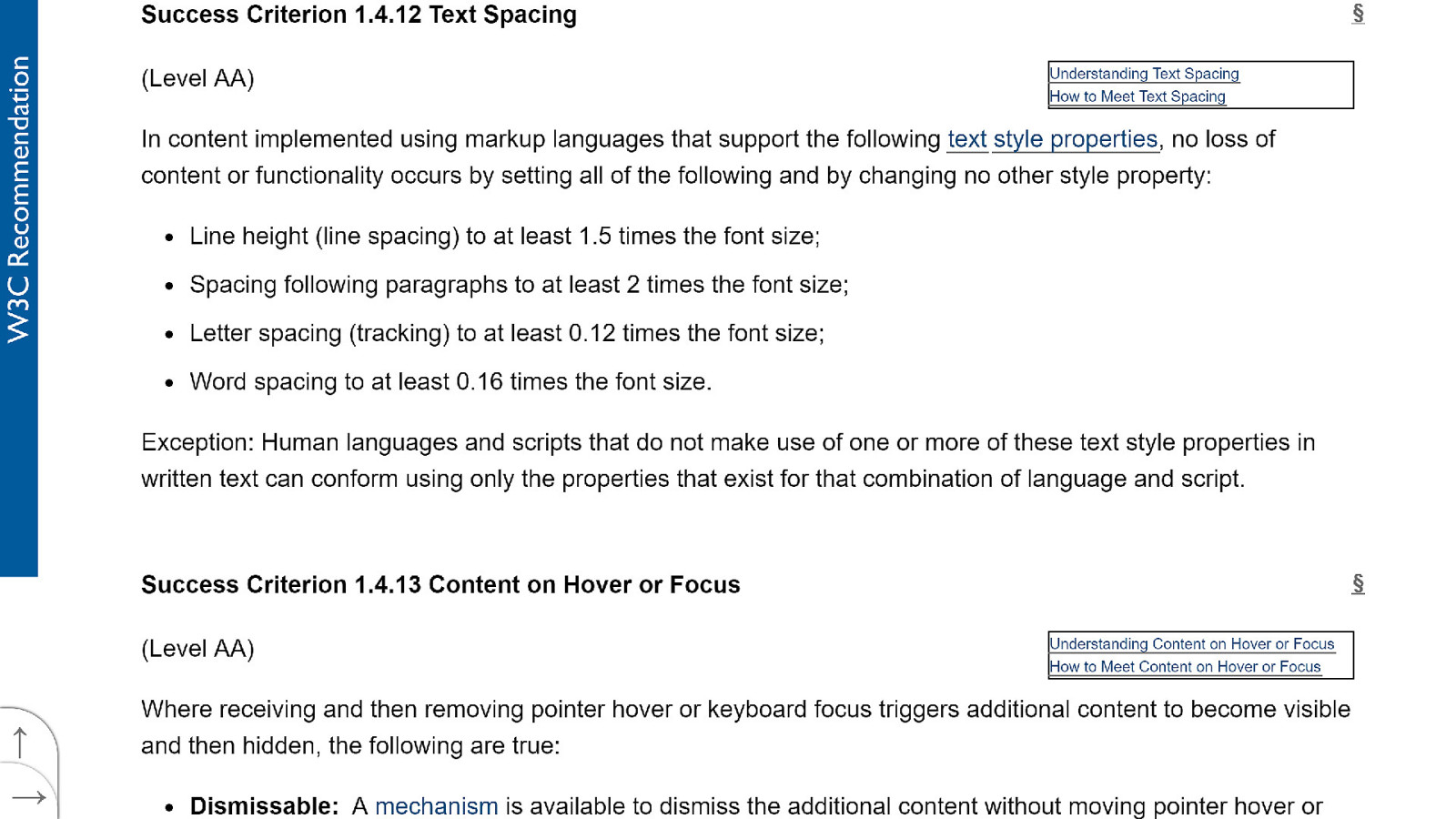
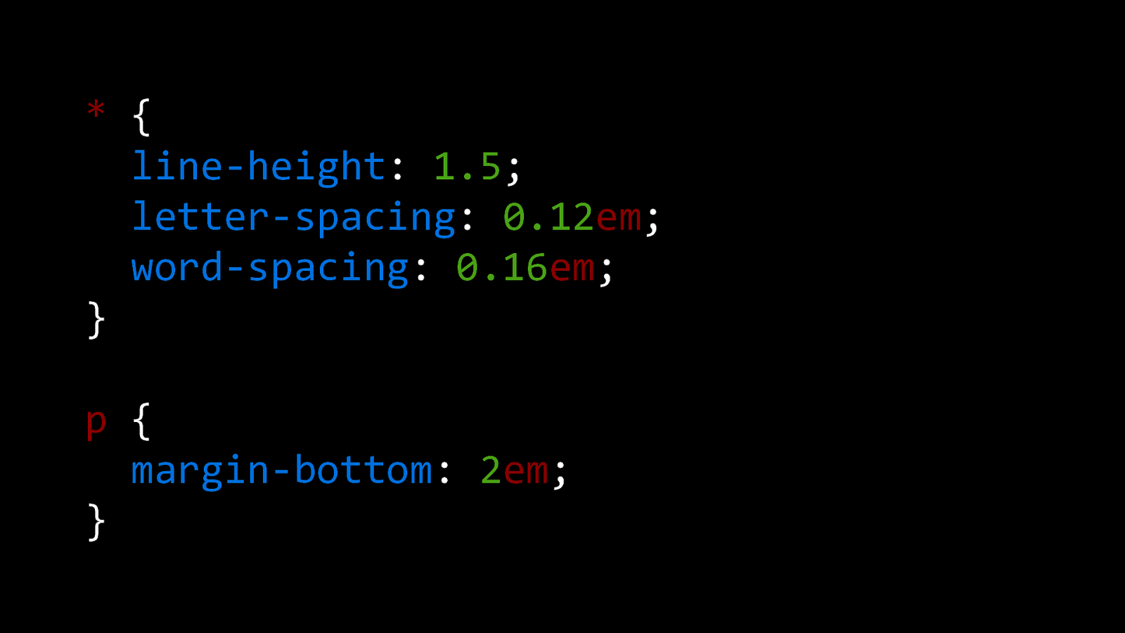
Fortunately the W3C accessibility rules cover most of what we need to know
And the CSS is quite short too. Depending on your choice of typeface, you may not need all of these rules – particularly letter-spacing and wordspacing – however it’s important to pay attention to these properties in the typefaces you choose.
There are some other key points regarding type: - Larger font sizes help - Line lengths are interesting. Normally around 60 characters are recommended however some dyslexics find really narrow blocks around 16-18 characters are much easier to read. - Justified text doesn’t help at all but it
doesn’t really help anyone anyway
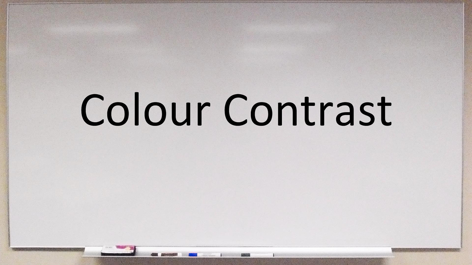
Perhaps unsurprisingly colour contrast is important when making text readable.
Colour contrast hurts me because we should be better at it but our tools are letting us down.
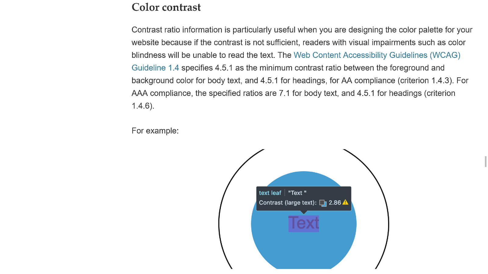
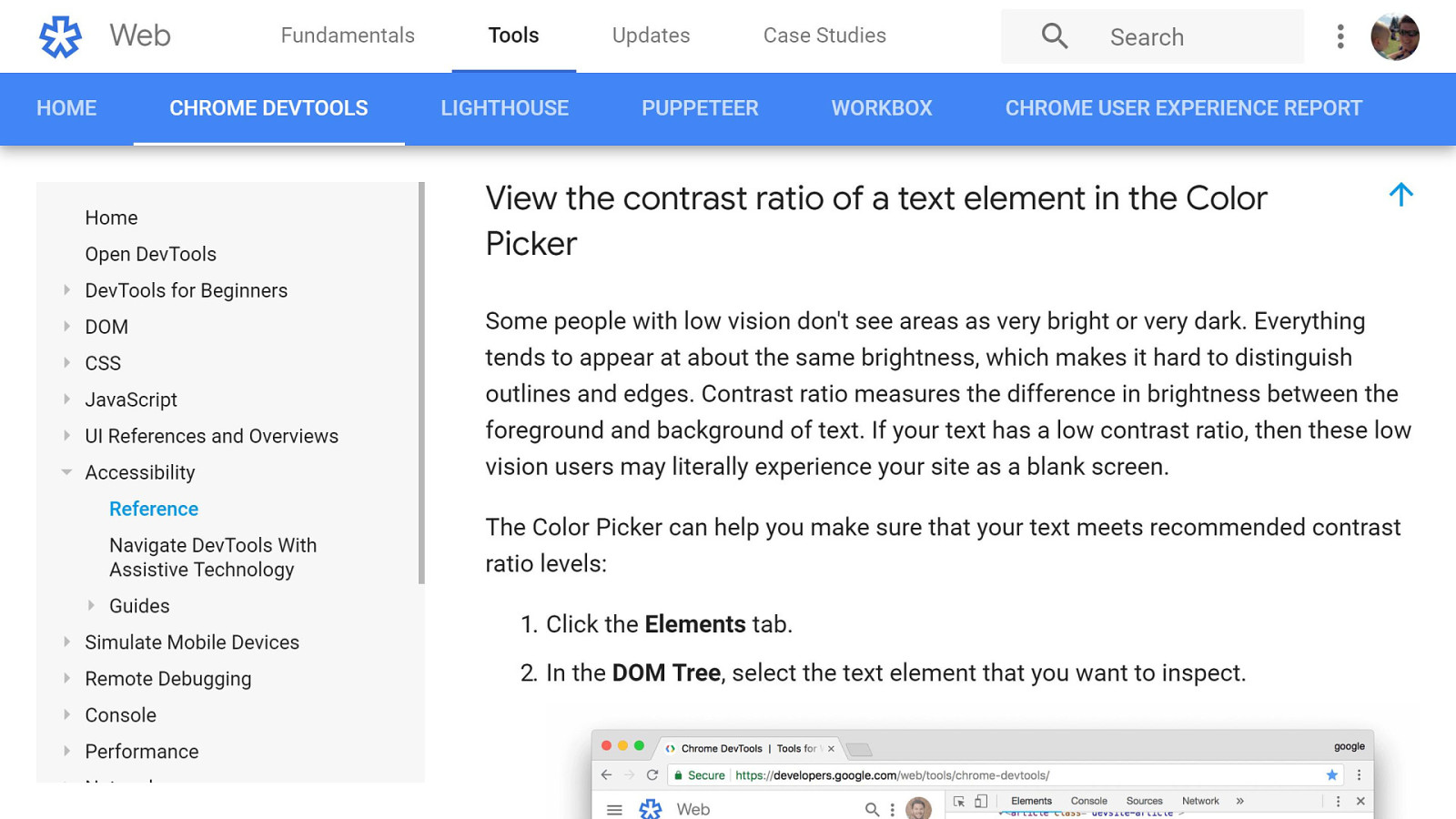
Colour contrast inspector was added to Firefox 65
…and Chrome 65. It’s five easy steps none of which is easy.
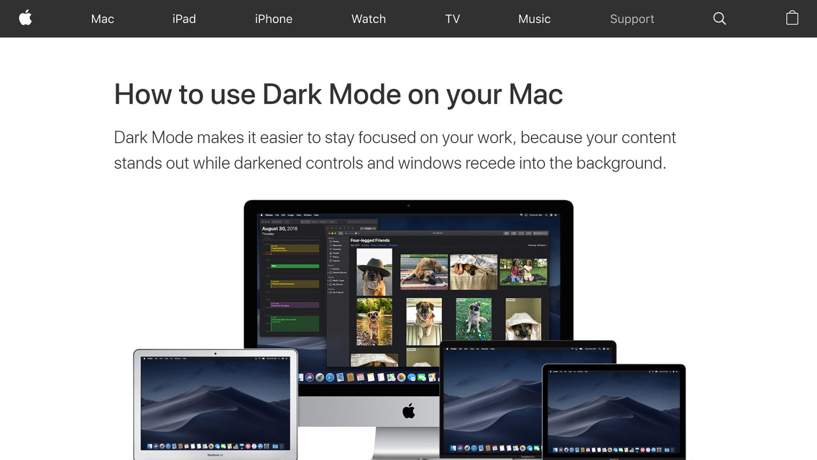
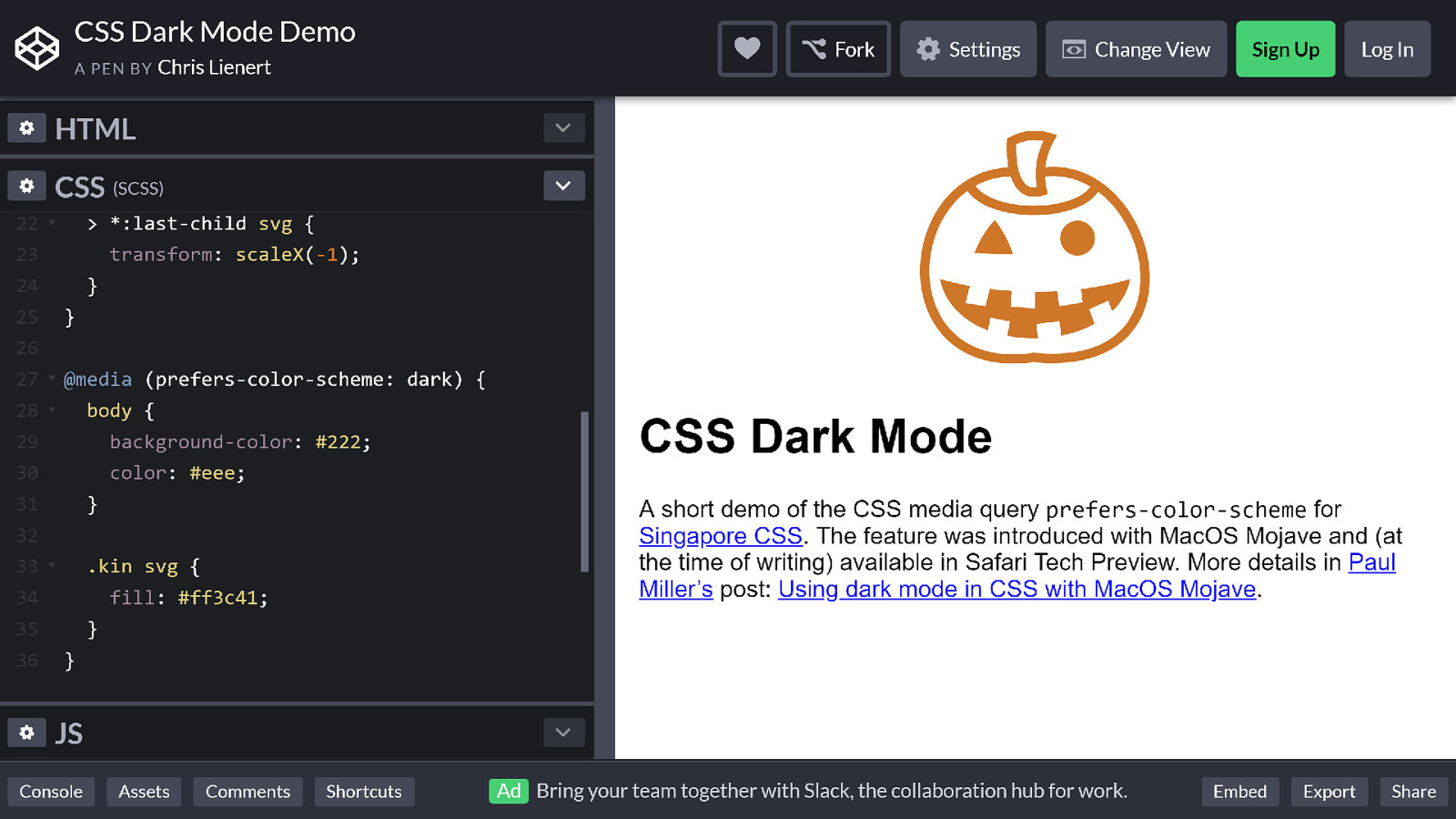
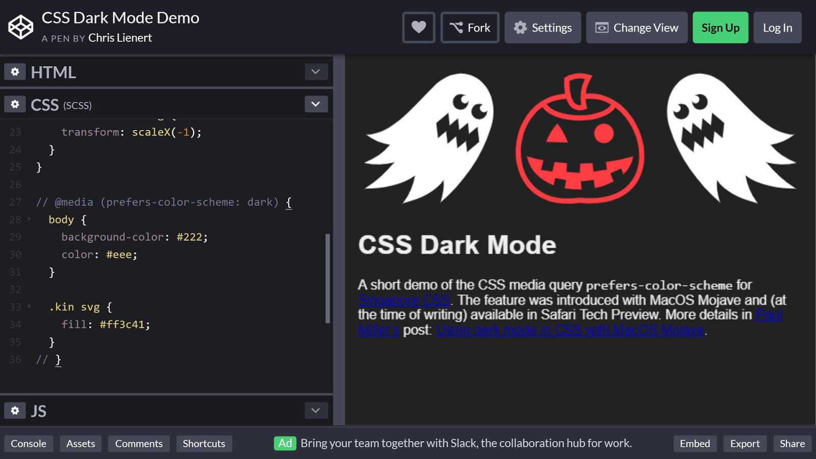
Colour contrast isn’t the only thing. The concept of visual glare is significant for people exhibiting a range of sensory challenges such as photophobia. With MacOS Mojave, Apple introduced a dark mode that even comes with it’s own media query that we can select on.
Demo of default “light” mode
Which changes when dark mode is enabled. I’ve cheated with this screenshot but hopefully you get the point.
Beyond prefers-color-scheme, supportedcolor-schemes lets us conditionally load entire style sheets based on colour preferences. This is very new but also very interesting.
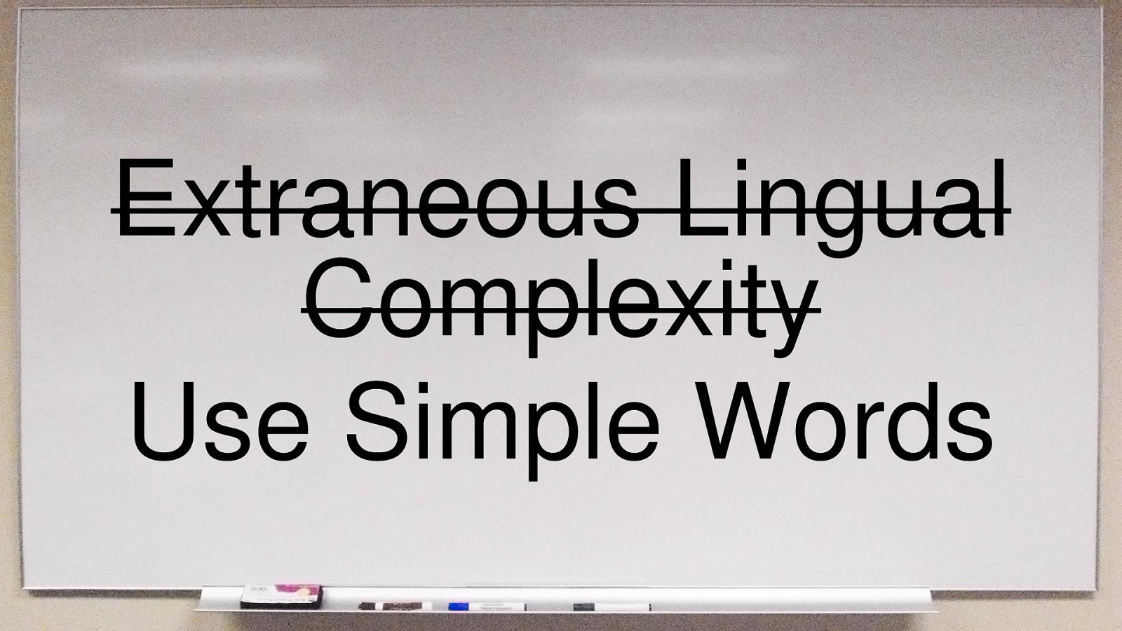
Now to extraneous lingual complexity…
…or let me rephrase that as “Use simple words”.
The English language is complex and while we might want to try simplifying it ourselves, the better answer is to use easier-to-understand language when we’re writing copy.
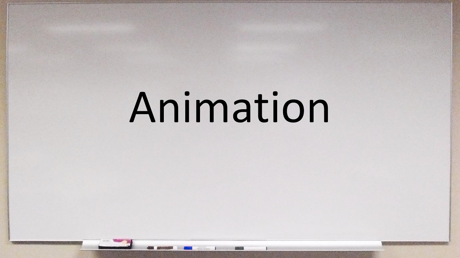
While we hopefully know frivolous animations aren’t the greatest but the key thing to remember is distractions are all the more distracting for people with reading difficulties.
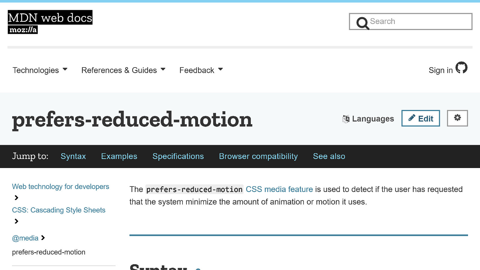
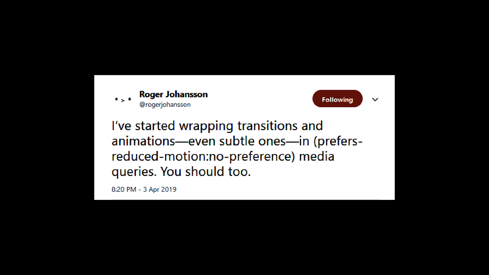
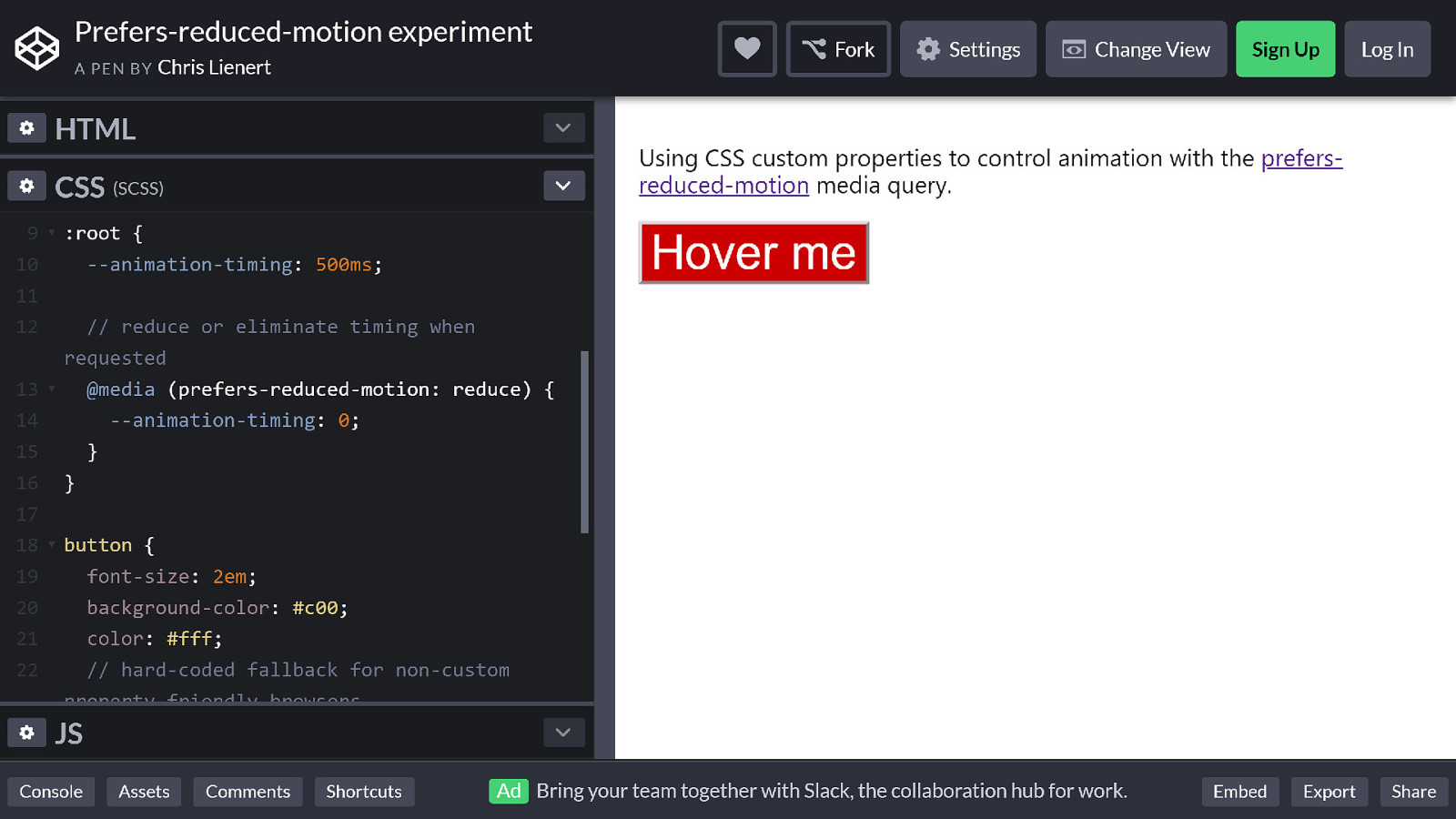
There’s a relatively new media query designed to help people with sensory disorders and otherwise preferring a reduced cognitive load.
You could go to the extreme of effectively disabling animation for browsers that don’t support prefers-reduced-motion but well-designed animations do help lower cognitive load for most people
Or use some CSS custom properties to work for you. If you’re using a preprocessor, this could be neatly wrapped in a mixin.
If you’ve ever used the web before you may have noticed that trying to read things is harder than ever with popups, intrusions, and autoplay everywhere
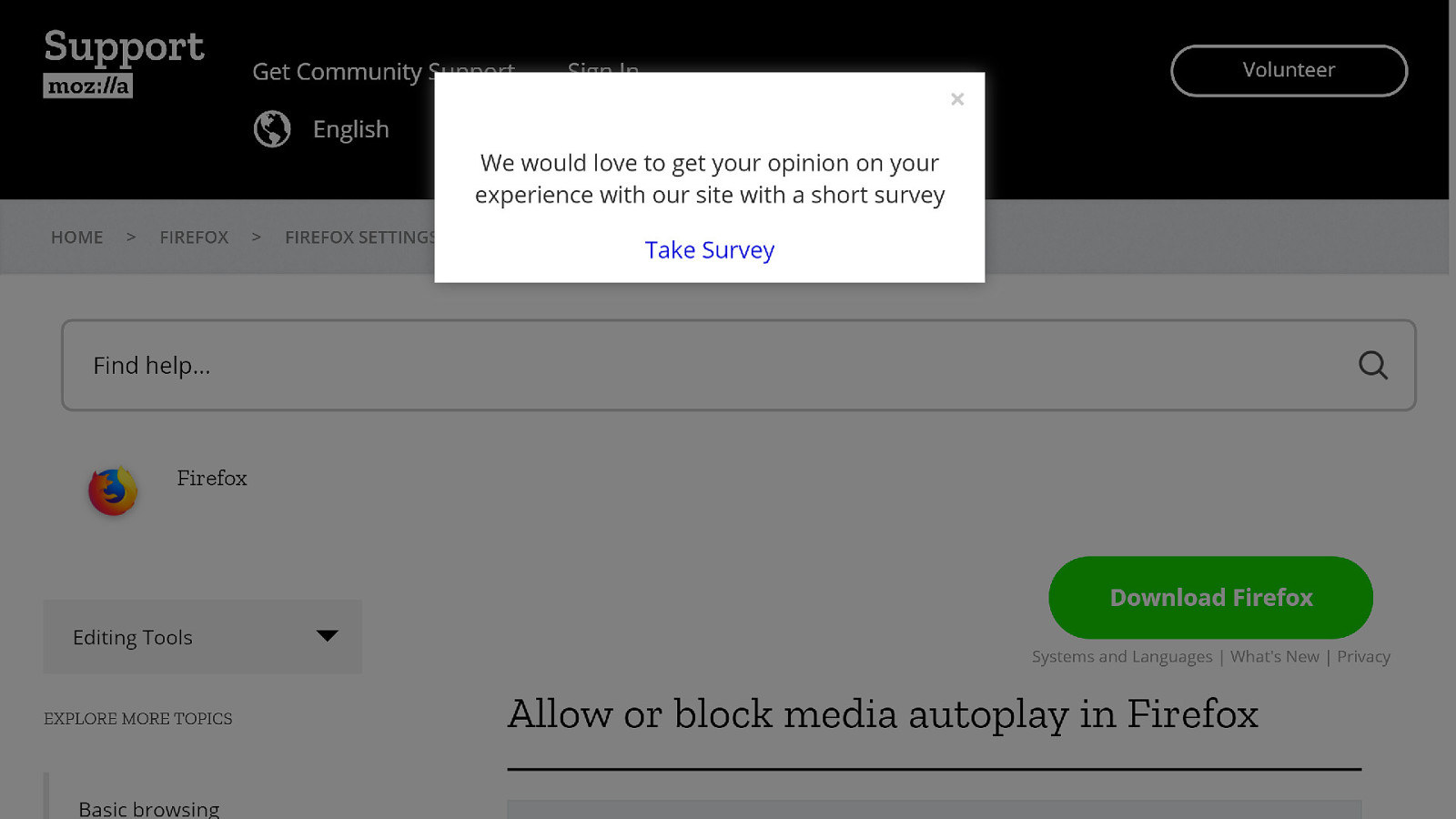
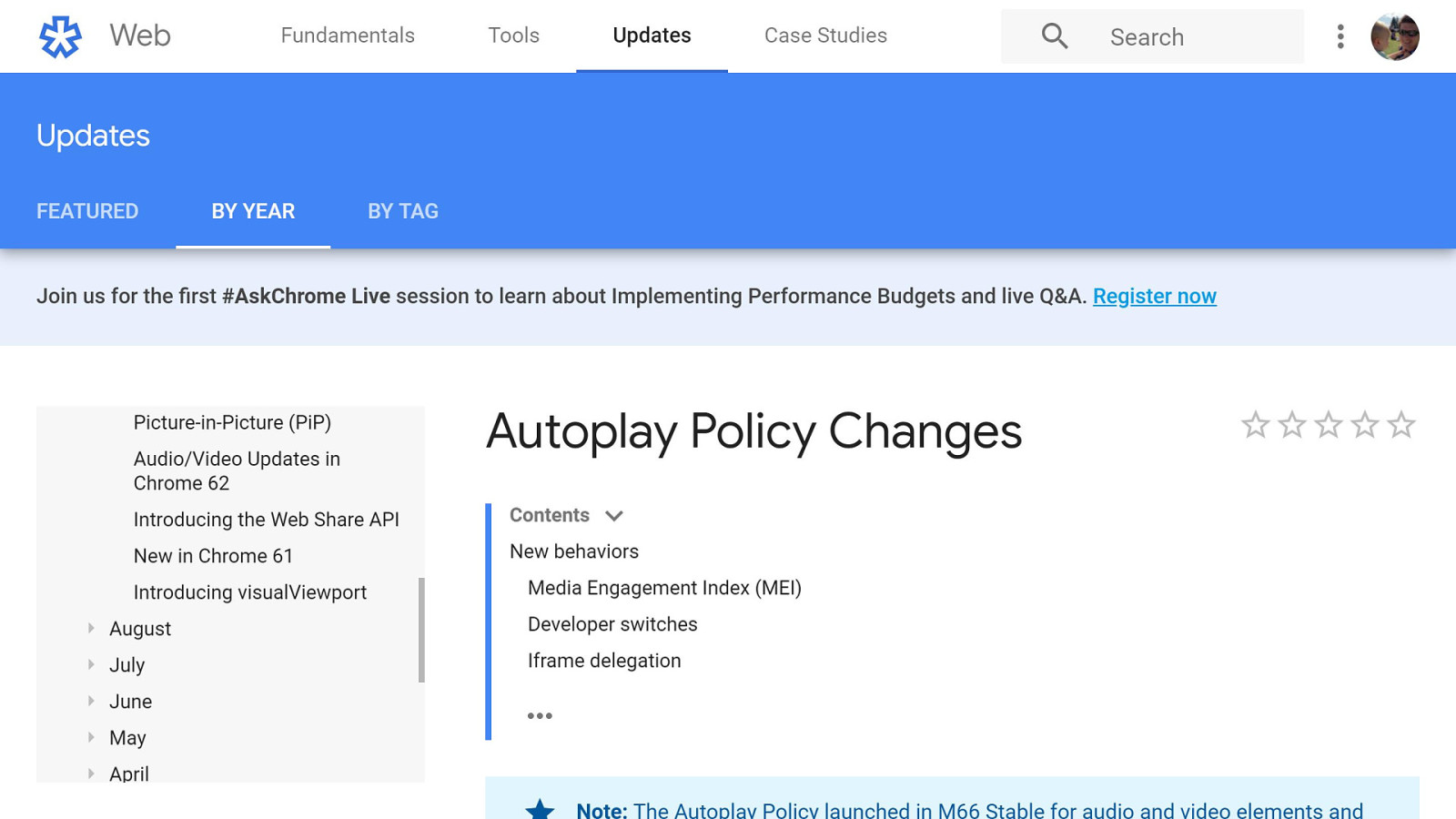
Firefox and Google have recently taken action because it seems pretty much every hates autoplay videos in the wrong context i.e. not explicitly requesting videos. Note: I’ve intentionally left the unnecessary distracting survey in place because that’s how the site loaded.
Why do we not like these things? Because they make it hard to concentrate on what we’re doing.
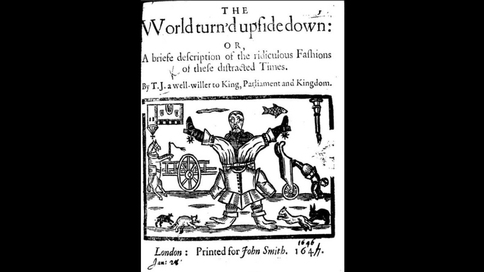
The world is turned upside down even for people not dealing with sensory difficulties.

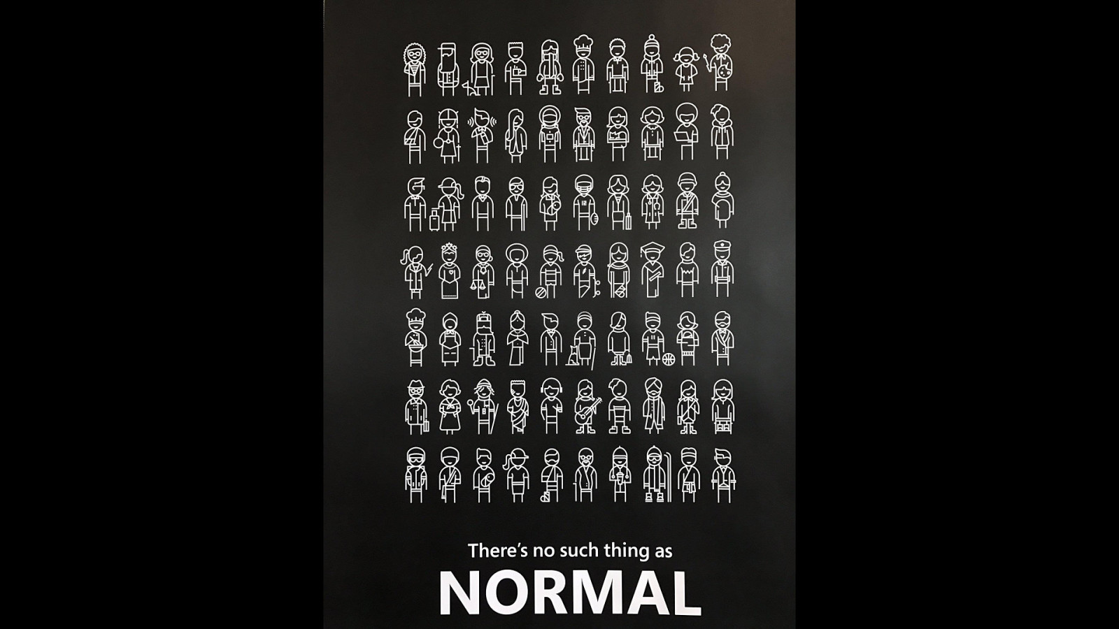
More than 1 in 20 people experience difficulty with reading and learning, and those difficulties don’t just end at school. We’ll go through some common learning difficulties including dyslexia and discuss what impact they have on designing for the web.
The following resources were mentioned during the presentation or are useful additional information.
Every web site referred to in the presentation plus a few extras


 for free. You
can too.
for free. You
can too.