Whose design is it anyway? An introduction to inclusive design and research
Hi! I’m Helen UX consultant User researcher Diversity & Inclusion champion Women in Tech Nottingham & Tech Nottingham organiser Hot yoga lover
A presentation at DDD East Midlands in October 2019 in Nottingham, UK by Helen Joy
Hi! I’m Helen UX consultant User researcher Diversity & Inclusion champion Women in Tech Nottingham & Tech Nottingham organiser Hot yoga lover
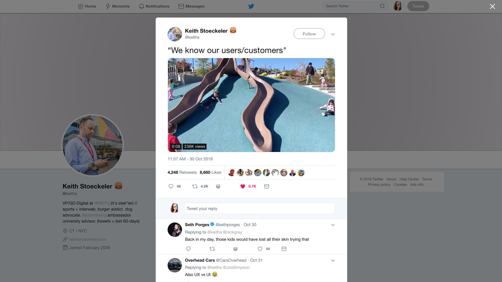
I saw a tweet a while ago that nicely summed up user needs “We know our users/customers”

• A metaphor for people not using design in the way it was intended • The aim of this talk is to think about the real people we’re designing for. Not who we imagine them to be.
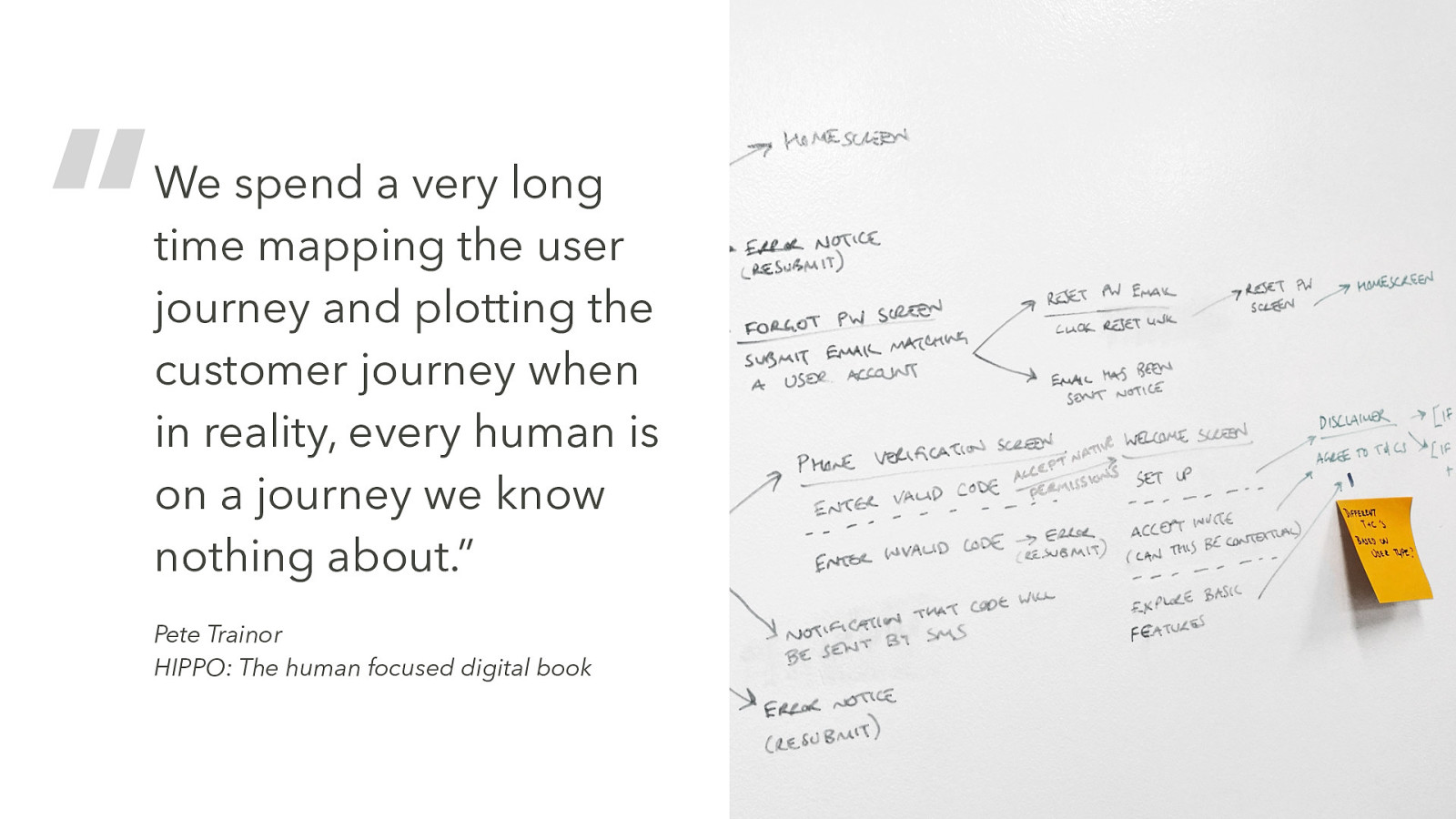
“We spend a very long time mapping the user journey and plotting the customer journey when in reality, every human is on a journey we know nothing about.” Pete Trainor HIPPO: The human focused digital book
I used the tools available to me, I planned user journeys As a designer I became the representative ‘user’ I would tell clients “you are not your user” but in reality, neither was I. When I switched my focus from design to research And I came to realise that in this industry it’s so easy to get trapped in filter bubbles

“The danger is that you think you are getting a representative view of the world and you are really, really not, and you don’t know it.” Eli Pariser, author of The Filter Bubble
• So often we build things on biases, assumptions, untested business models, wishful thinking…? • Especially within agile processes, we move so quickly, that sometimes we just need to build and ship something. • But when we do this are we…
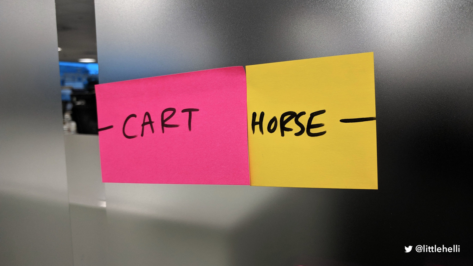
• Putting the cart before the horse • If we’re building without understanding who is going to use it, we are in danger of not only building something, like the slide, that doesn’t work as intended for users but actively excludes them
“Every decision we make can raise or lower barriers to participation in society. It’s our collective responsibility to lower these barriers through inclusive products, services, environments, and experiences.” Microsoft Inclusive Design Manual
• How can we lower these barriers if we’re acting as the people using the product? • We can make best guesses and stick with well-known design conventions • But what we really need to do is break out of our bubbles and speak to real people. • I want us to challenge our assumptions
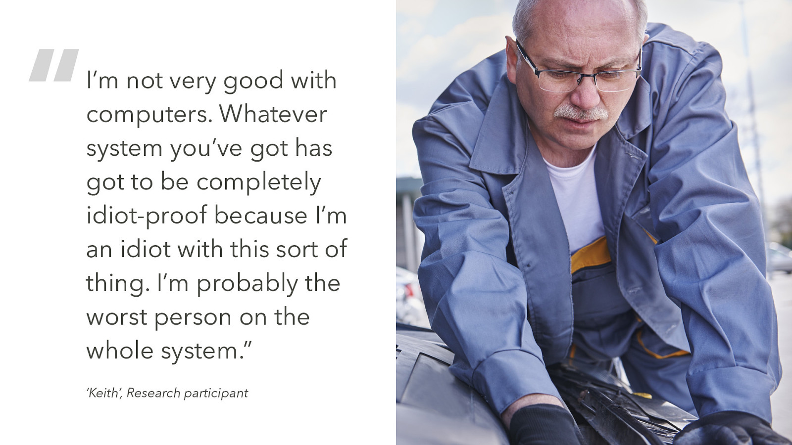
“I’m not very good with computers. Whatever system you’ve got has got to be completely idiot-proof because I’m an idiot with this sort of thing. I’m probably the worst person on the whole system.” ‘Keith’, Research participant
• Keith - not his real name or photo - we keep participants anonymous - he’s 61 • What stood out: self-critical about his tech abilities • He’s managed to ‘get to grips’ with online banking • He has an iPhone but uses it just for basic texts and a few emails • Even though he knows he can do things on his phone, if he has to do too much on it, he uses a laptop at home where his girlfriend and daughter can ‘guide him if he goes wrong.’
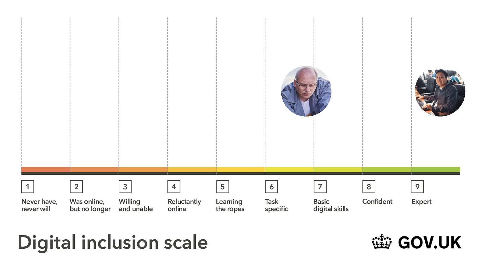
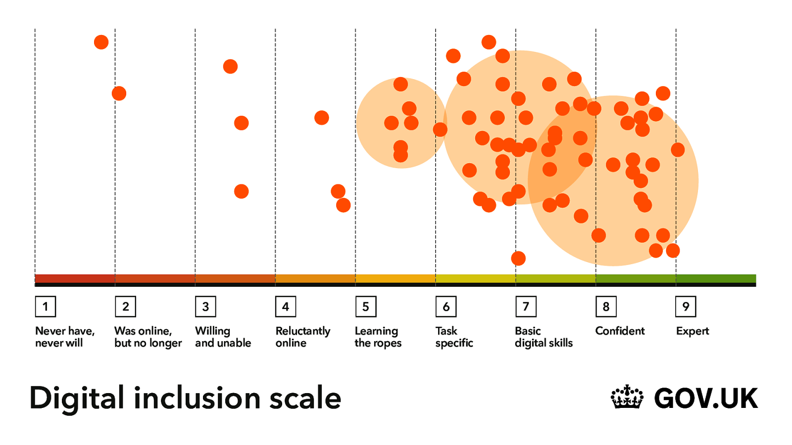
1 Never have, never will 2 Was online, but no longer 3 Willing and unable 4 Reluctantly online 5 Learning the ropes 6 Task-specific 7 Basic digital skills 8 Confident 9 Expert
• This is the GDS (Government Digital Service) inclusion scale. • A handy tool for understanding what skills people using a product or service have • So I’d place Keith here, he’s quite task-specific and feels more comfortable with repeated tasks. • But thinking about us in this room, we’re here [click] we’re experts in our industry. This is our thing. • This isn’t fully representative, a filled-in scale would look more like this…
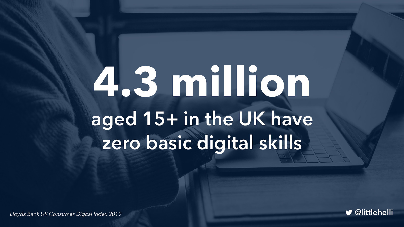
4.3 million aged 15+ in the UK have zero basic digital skills Lloyds Bank UK Consumer Digital Index 2019
•That’s zero basic digital skills
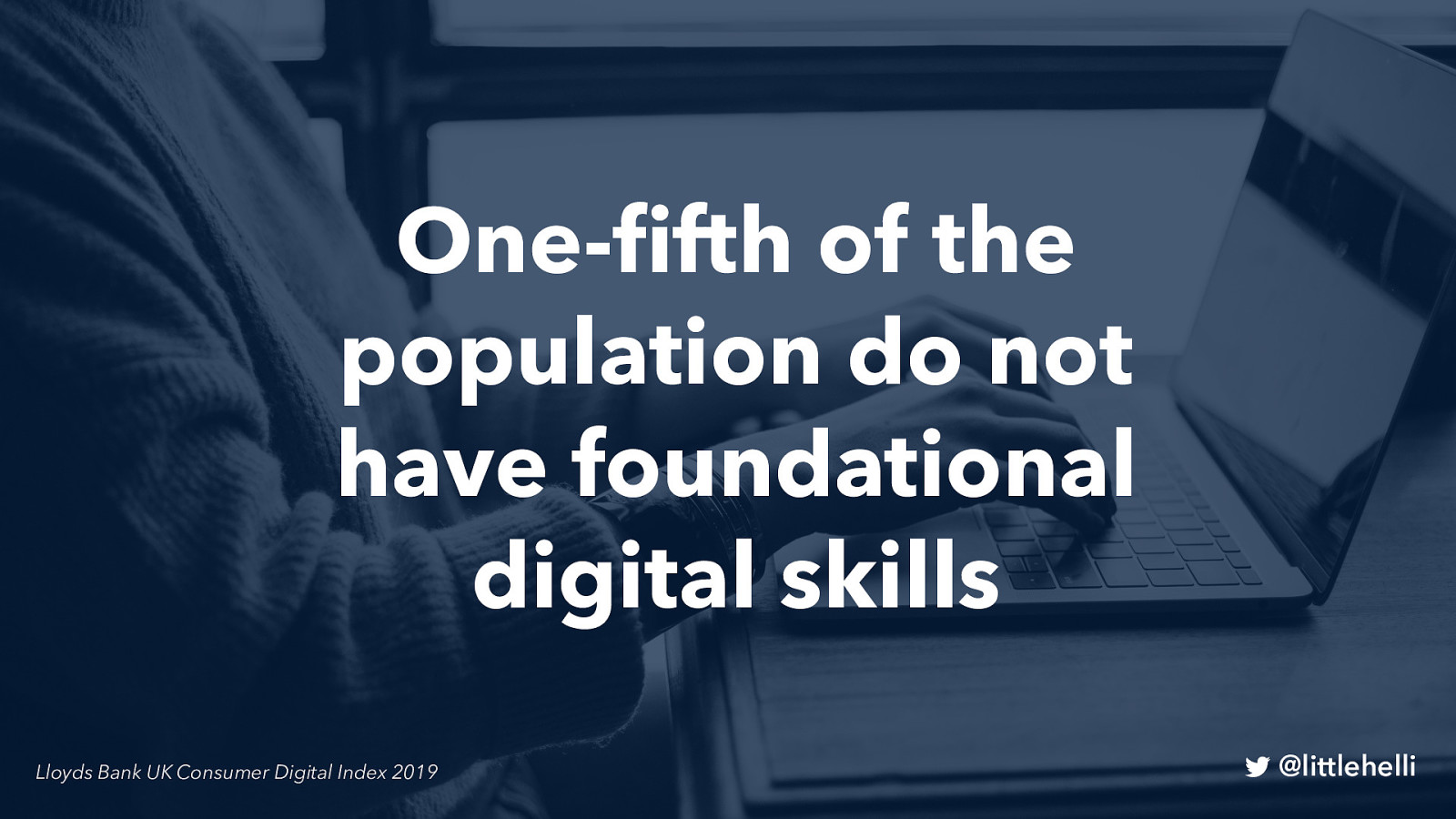
One-fifth of the population do not have foundational digital skills Lloyds Bank UK Consumer Digital Index 2019
• The ability to do all the digital foundation skills
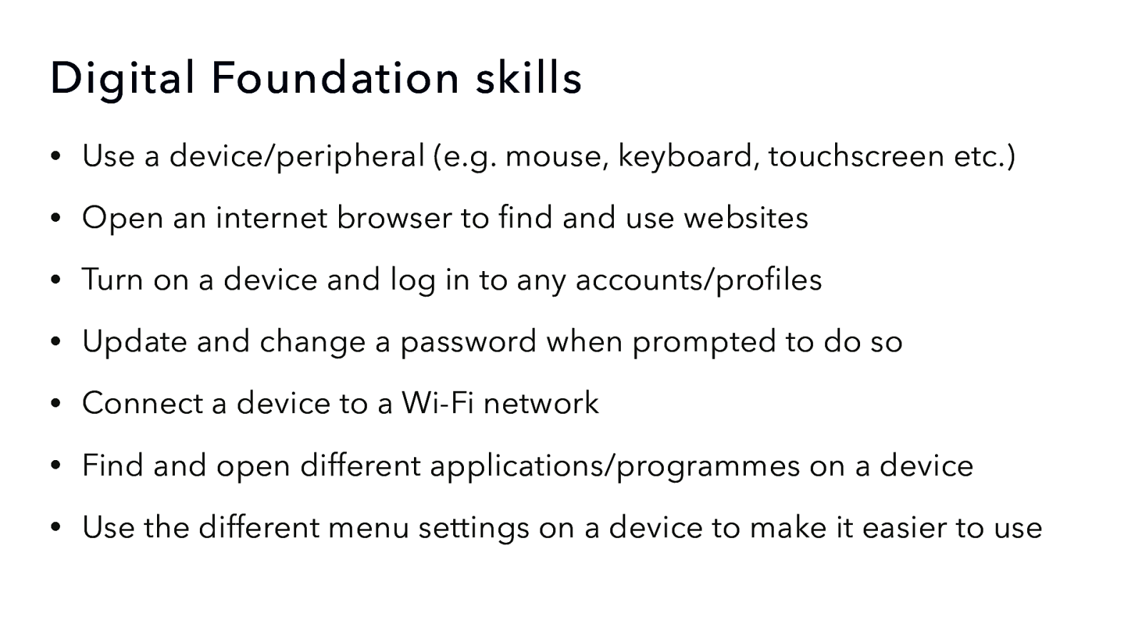
• Use a device/peripheral (e.g. mouse, keyboard, touchscreen etc.) • Open an internet browser to find and use websites • Turn on a device and log in to any accounts/profiles • Update and change a password when prompted to do so • Connect a device to a Wi-Fi network • Find and open different applications/programmes on a device • Use the different menu settings on a device to make it easier to use @littlehelli Let’s put some figures on this…
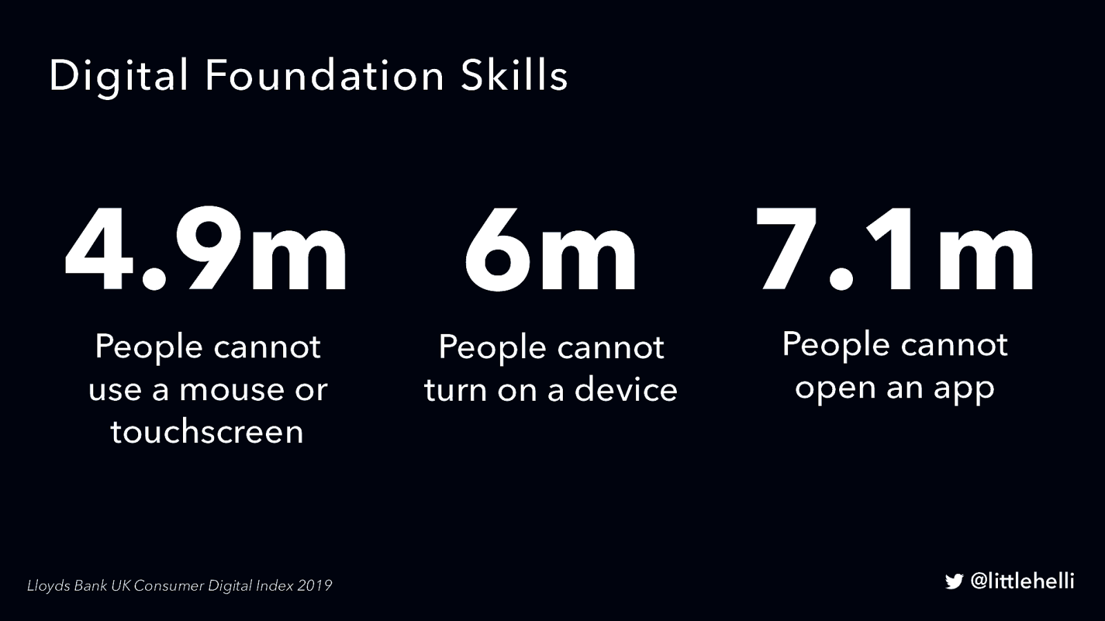
4.9m People cannot use a mouse or touchscreen 6m People cannot turn on a device 7.1m People cannot open an app Lloyds Bank UK Consumer Digital Index 2019
• Which leads me to some recent research.

All our research participants struggled with scanning a QR code.
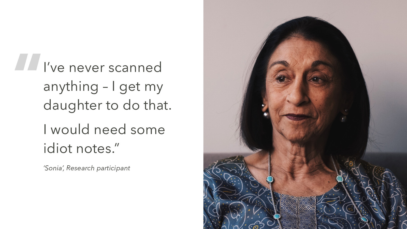
“I’ve never scanned anything – I get my daughter to do that. I would need some idiot notes.” ‘Sonia’, Research participant
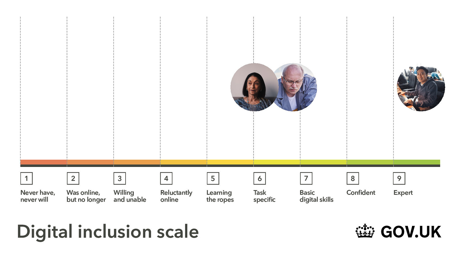
When we look at Sonia, she’s further down the scale.
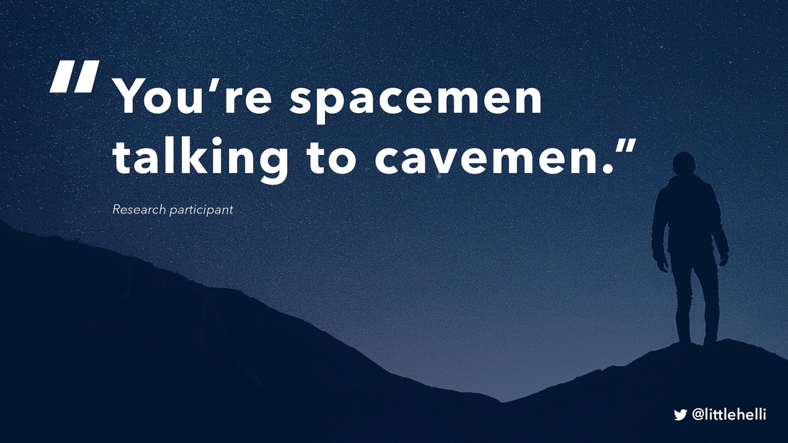
“You’re spacemen talking to cavemen.” Research participant
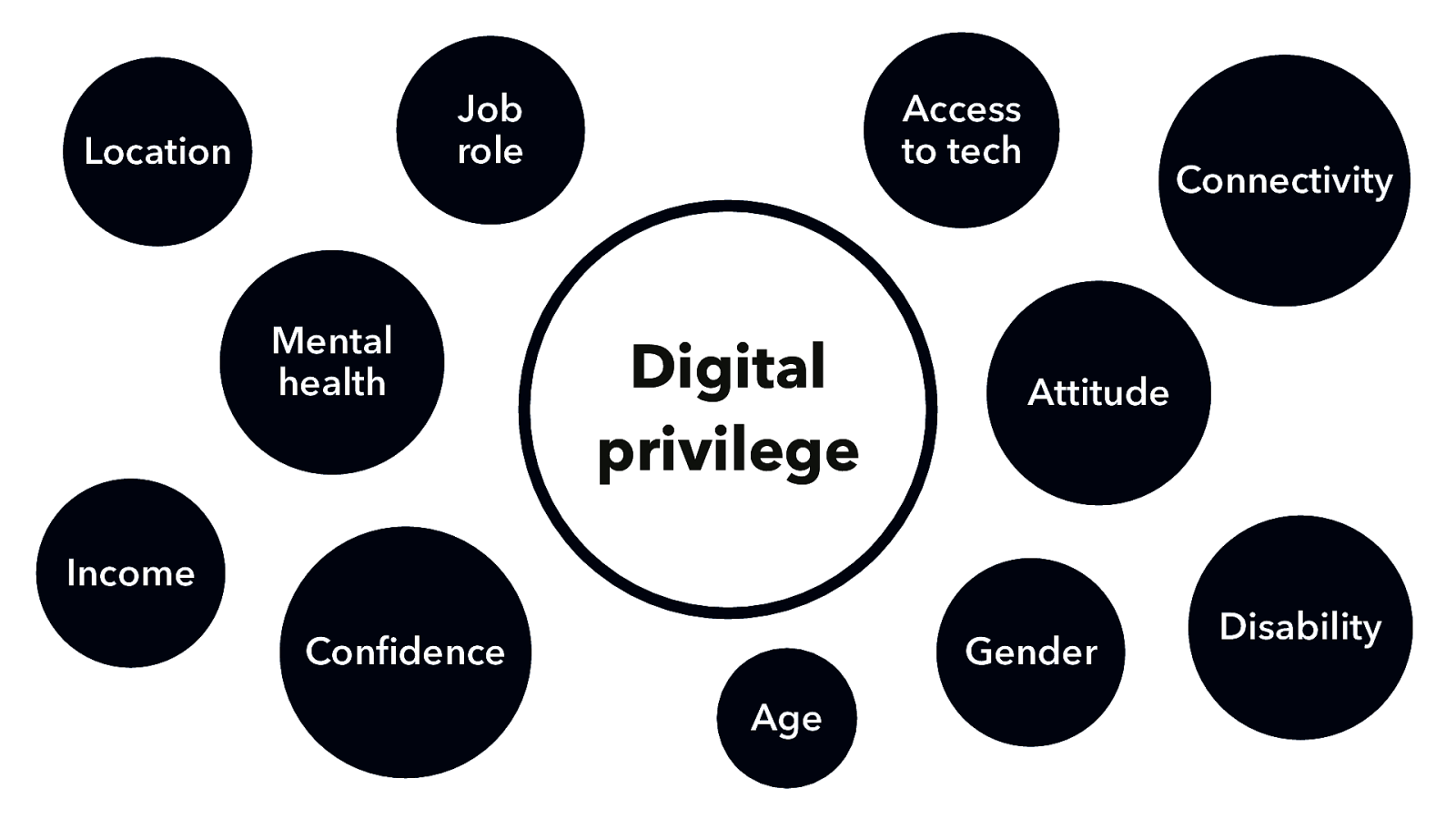
Job role Location Mental health Access to tech Connectivity Attitude Income Confidence Gender Age Disability • • • • We have digital privilege - lots of demographic/psychological reasons for exclusivity Everyone outside our bubble is excluded in some way So what should we do about these excluded people? We need to think inclusively and accessibly

Photo of a typical modern design/development office set-up
• Our set-up - latest tech, software, browsers, bean bags, beer, pool tables • Our toolkit is not the same as the people using it
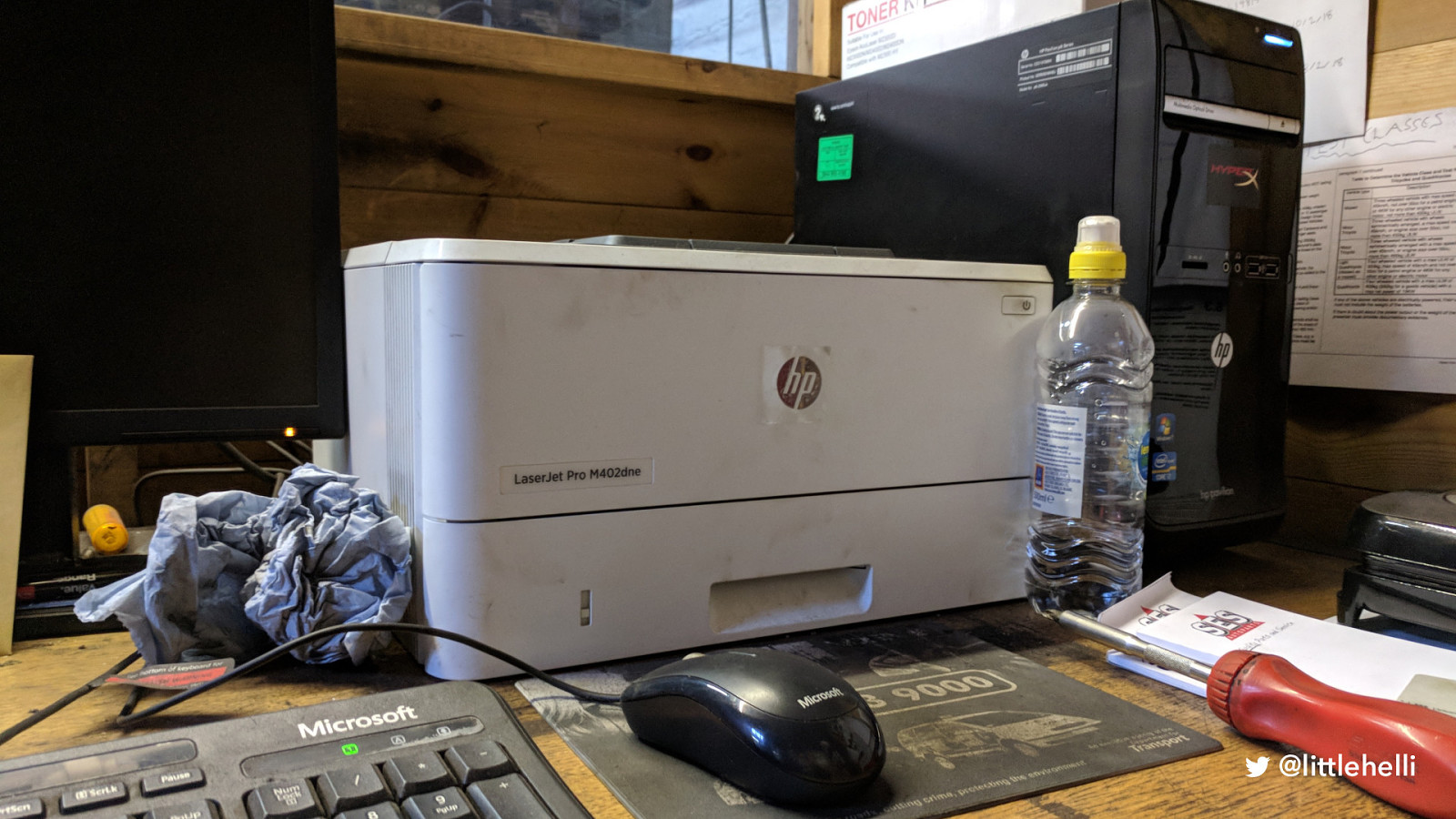
Photo of PC computer and printer in a garage
• This is what the tech really looks like.
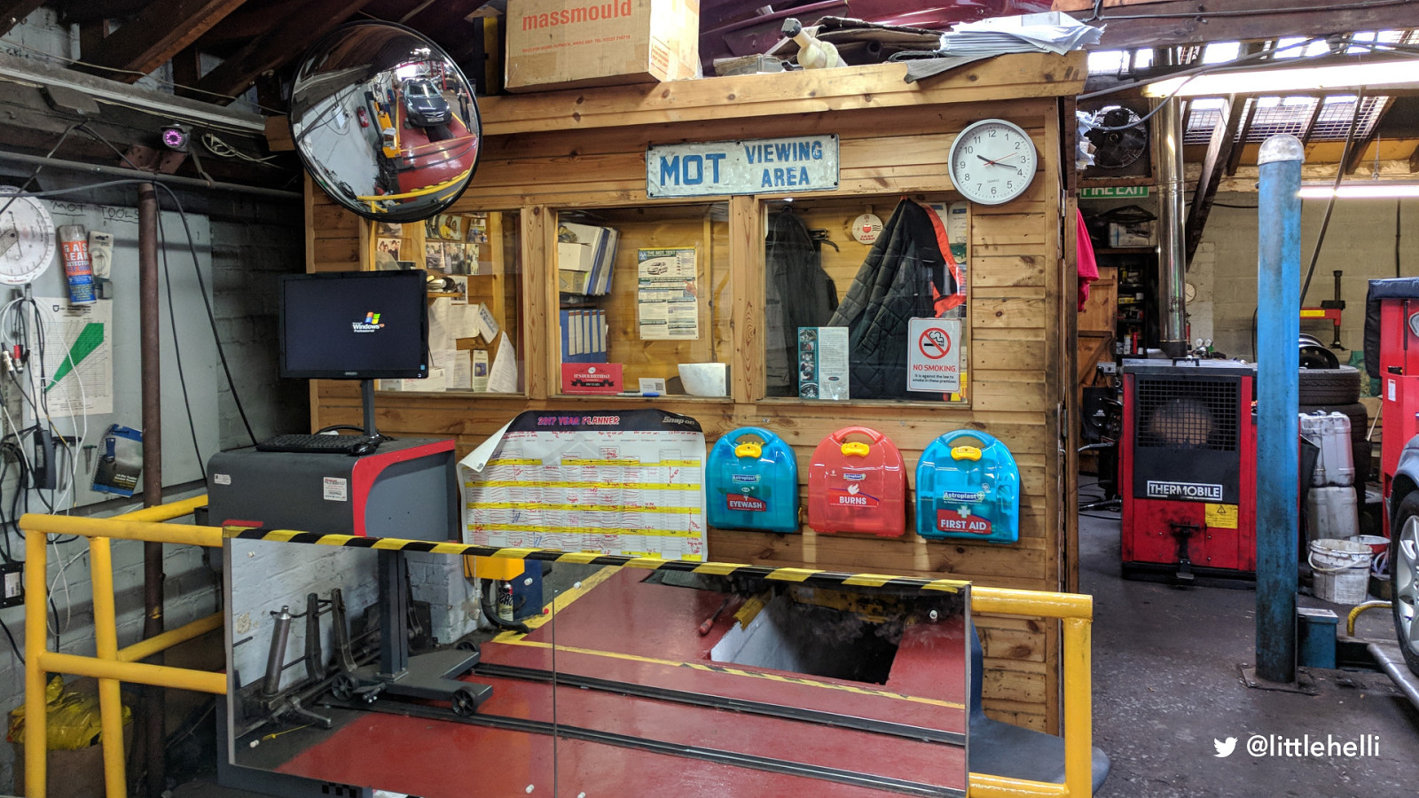
• It’s literally in a shed in a garage

• It’s a world away from this
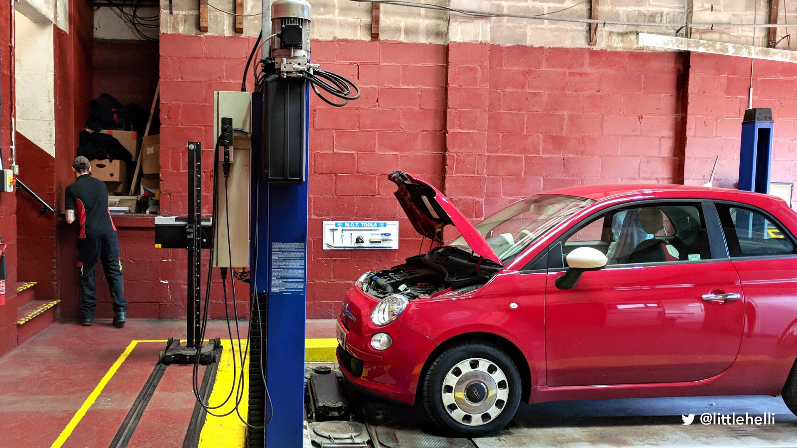
• No computer in this picture • No computer in the space in which he works • He has to walk through two workshops to reception to log on and then walk back to start working on the car - back and forth • This is the value of getting out: If we just imagined a user journey, we wouldn’t even consider he didn’t have instant access to a computer. This is why we need UR
“Without user research, you won’t know what problems you’re trying to solve, what to build or if the service you create will work well for users.” GDS Service Manual
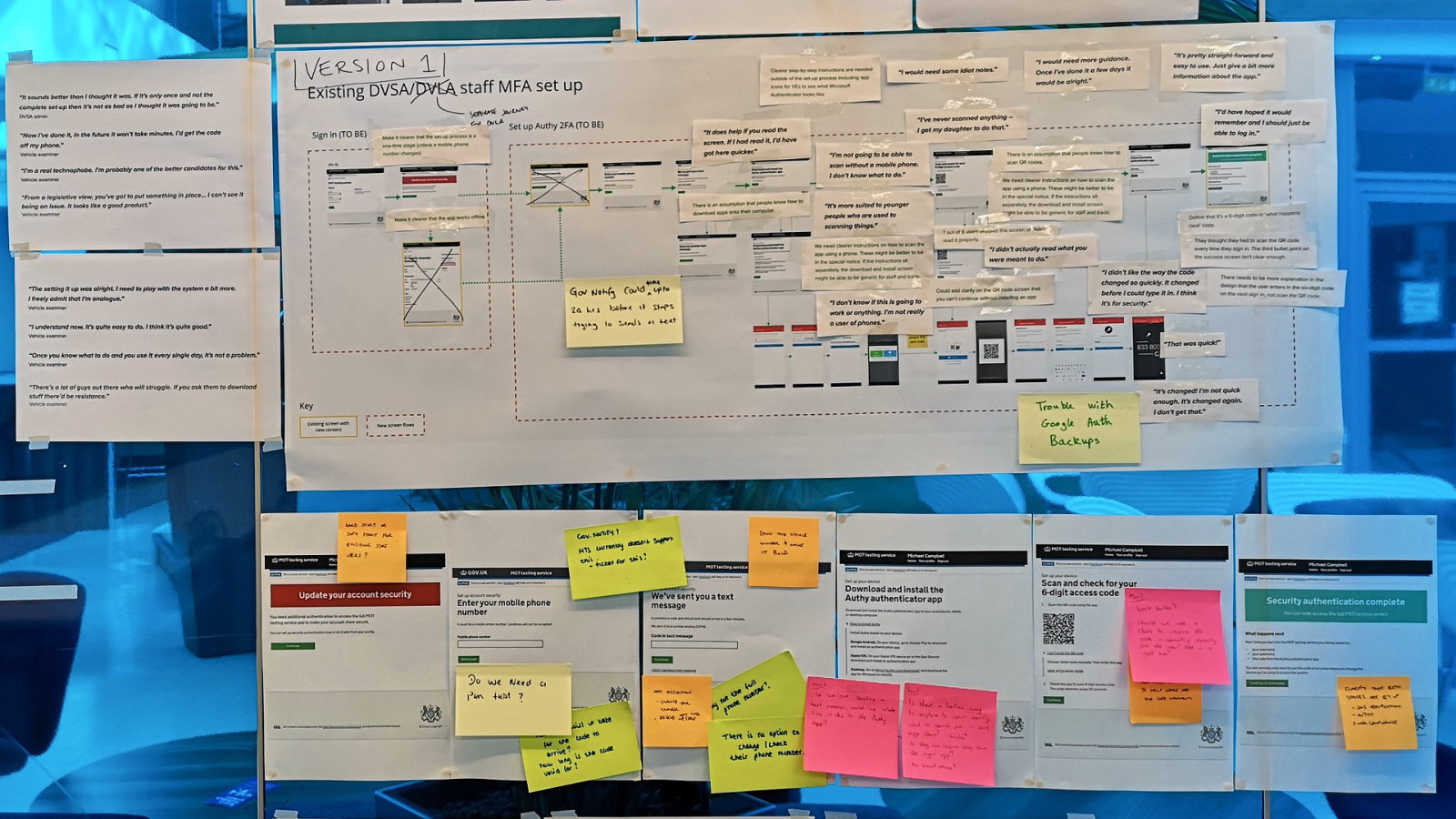
• My favourite UR quote - “I didn’t actually read what you were meant to do.” Accessibility statements gov
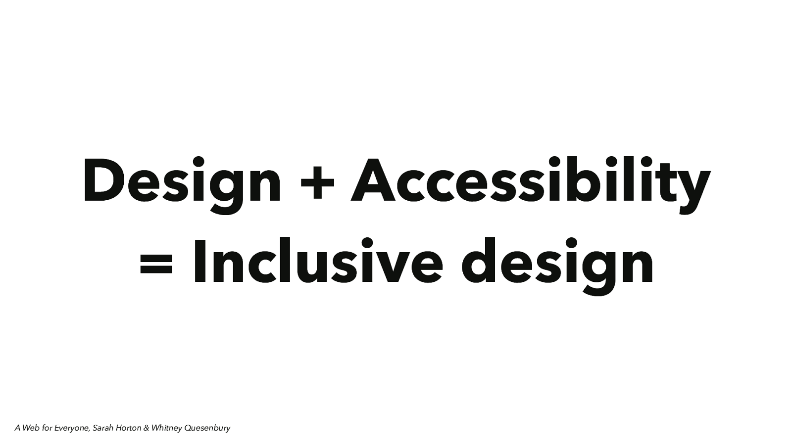
Design + Accessibility = Inclusive design A Web for Everyone, Sarah Horton & Whitney Quesenbury
• Accessibility covers two main areas • The ability to use the internet and online services • The ability to connect to the internet and go online • We often think of accessibility being on for disability
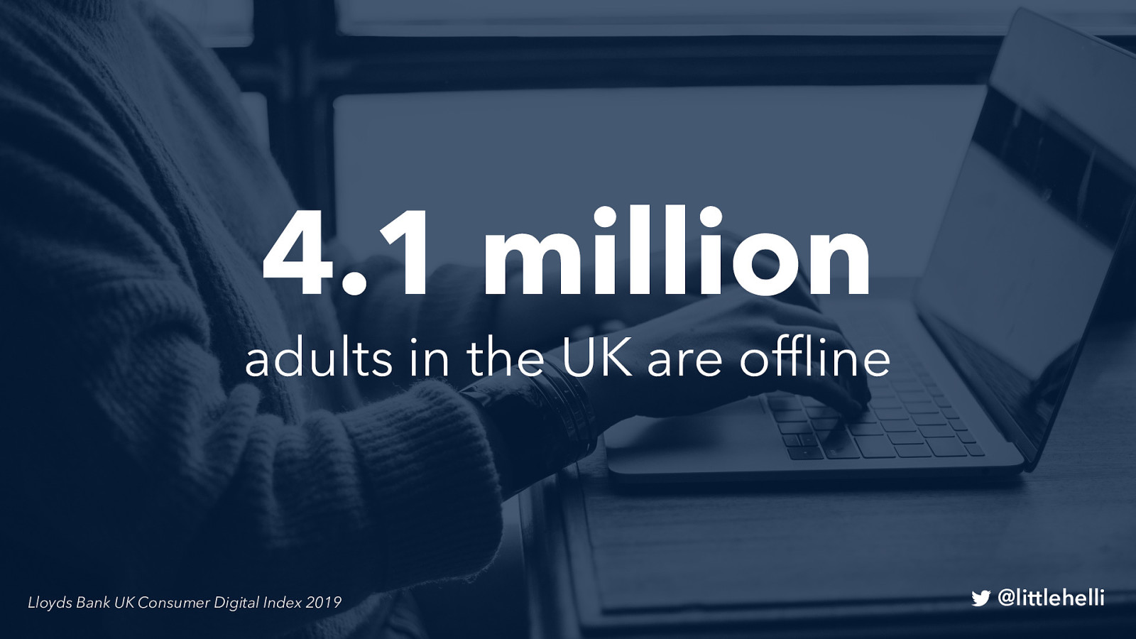
4.1 million adults in the UK are offline Lloyds Bank UK Consumer Digital Index 2019
When you hear this, do you think it must be older people like Keith and Sonia?

Photo of an older man
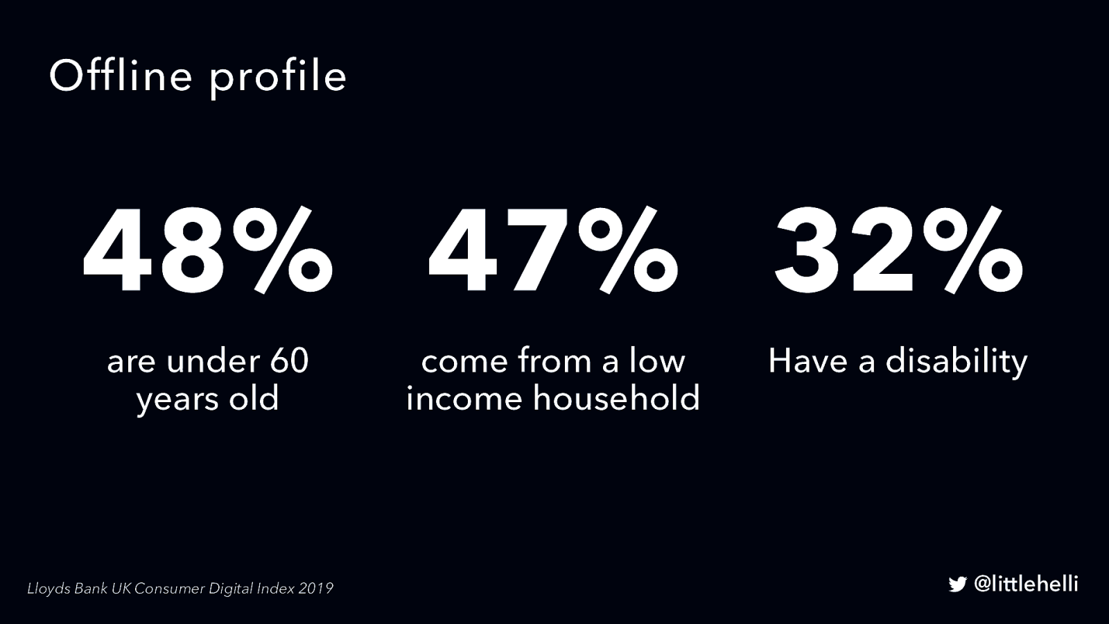
48% are under 60 years old 47% come from a low-income household 32% Have a disability
Lloyds Bank UK Consumer Digital Index 2019 • • • When asked what might get them online, 75% of those offline said ‘nothing’ More than half say that online safety concerns One-fifth say they have not used the Internet due to a lack of adequate connectivity.
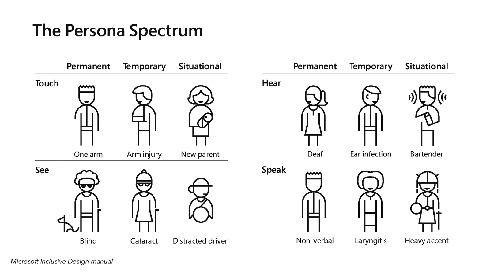
We use the Persona Spectrum to understand related mismatches and motivations across a spectrum of permanent, temporary, and situational scenarios. It’s a quick tool to help foster empathy and to show how a solution scales to a broader audience.
• Many non-disabled people can be in situations where they are inhibited. • When we think in terms of inclusivity rather than disability, we can understand the use of tech across a spectrum of scenarios. • This helps us become more empathetic
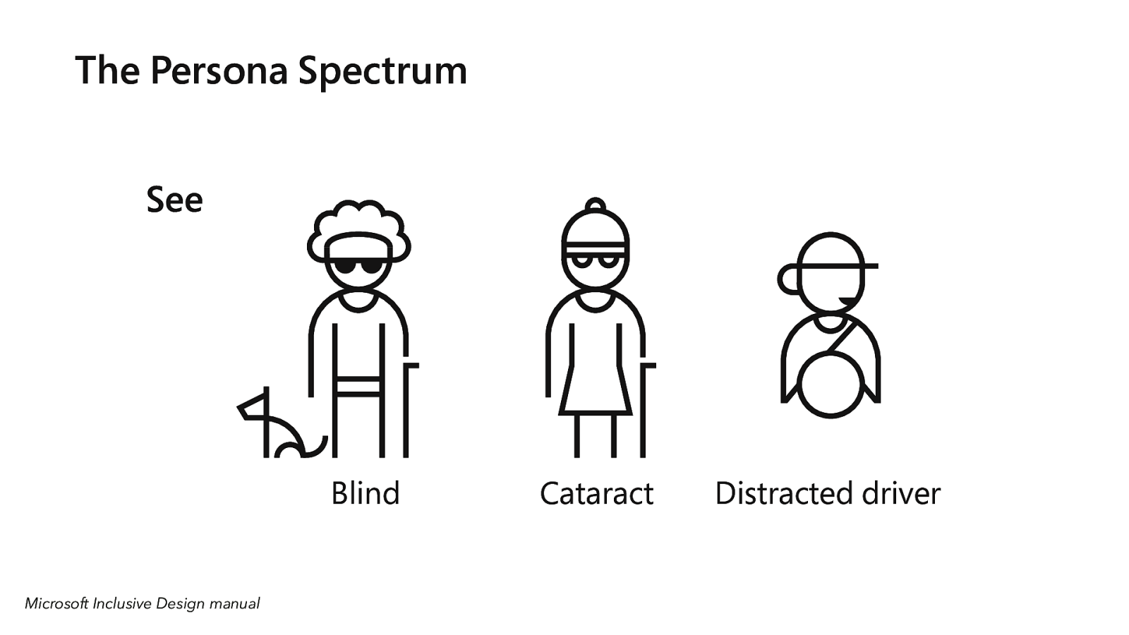
Sight Permanent: blind Temporary: cataract Situational: distracted driver
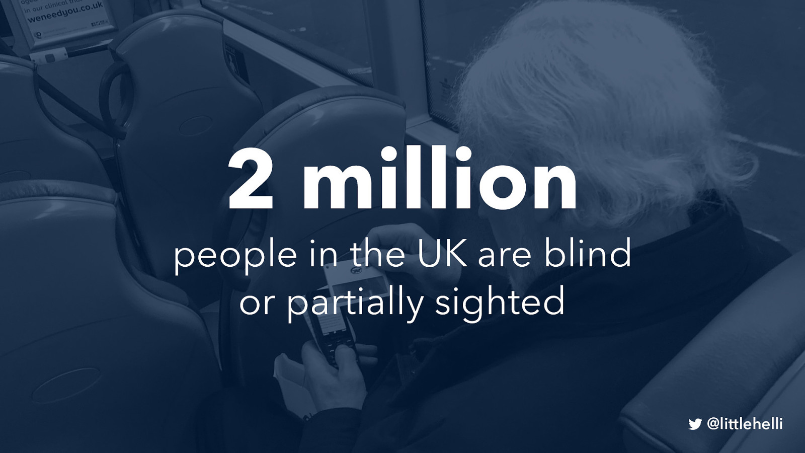
2 million people in the UK are blind or partially sighted
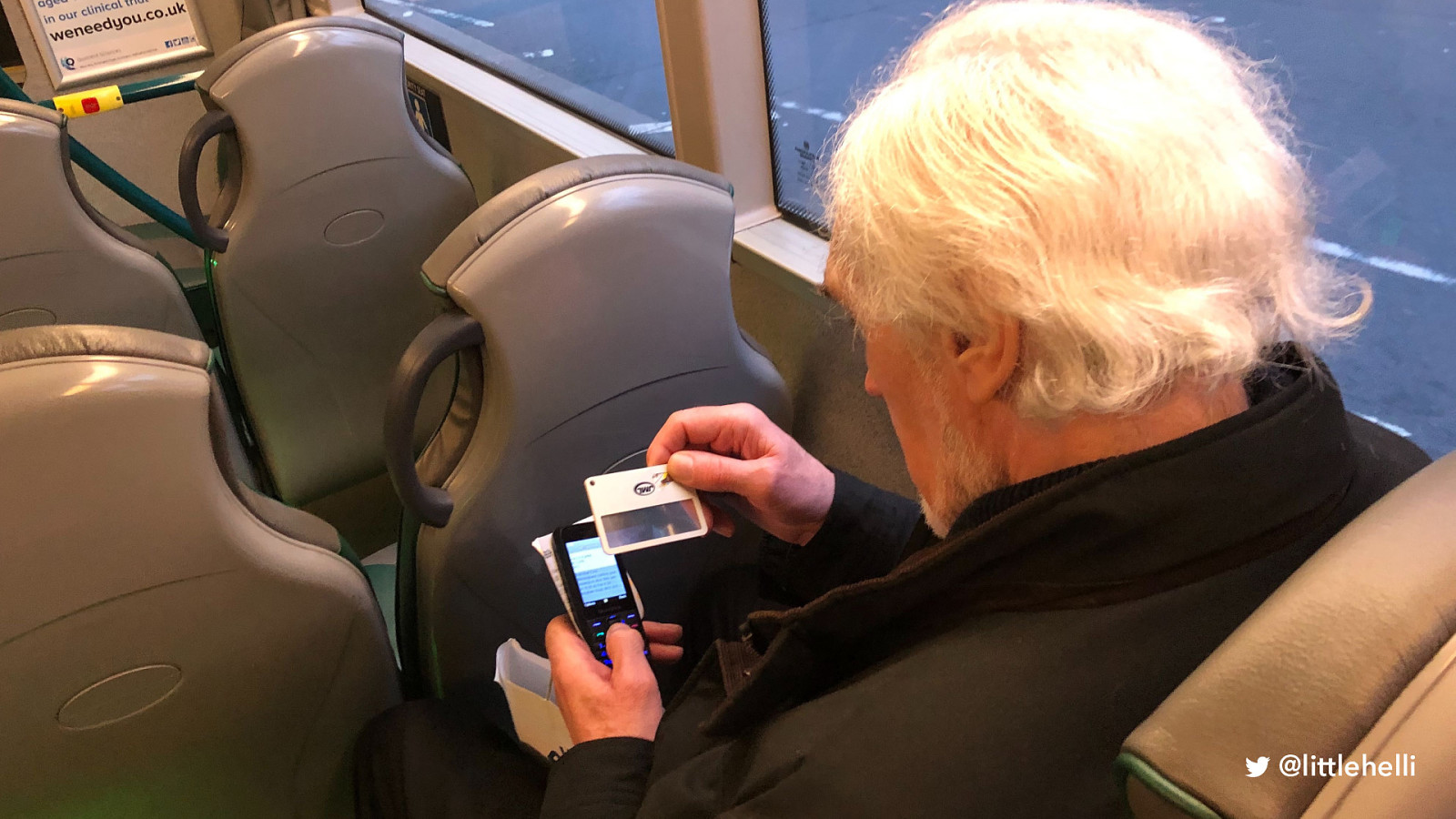
• Nearly 2 million people in the UK are blind or partially sighted and this figure is expected to double by 2050 •Only one-third of people registered blind or partially sighted are in paid work. •Individuals from black and Asian populations have a higher risk of diabetic eye disease and sight loss than white populations.
“We frequently only create idealised personas: attractive people happily interacting with our products and completing tasks.“ Design for Real life, Eric Meyer & Sara Wachter-Boettcher

• I don’t know what product he’s using, but he’s really loving it!
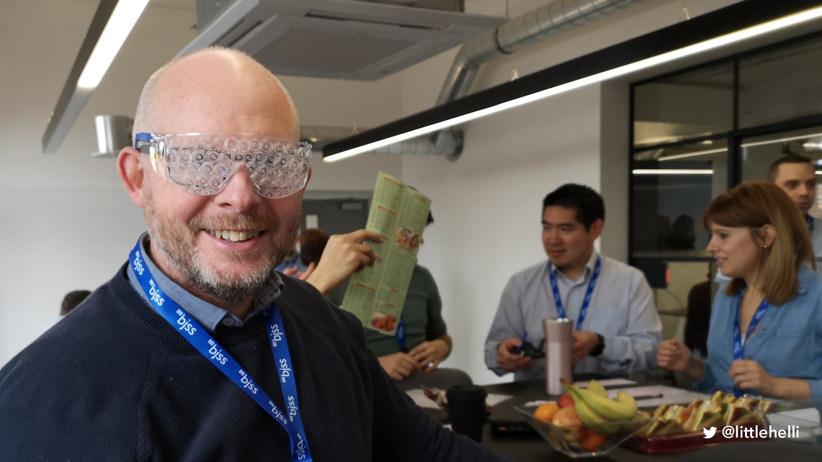
3 new parents with phone 1 mountain biker or cyclist 1 person who hasn’t travelled outside of Europe
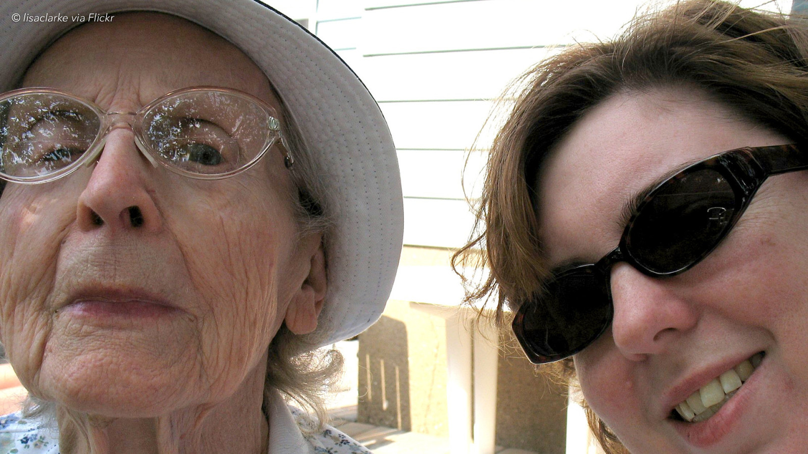
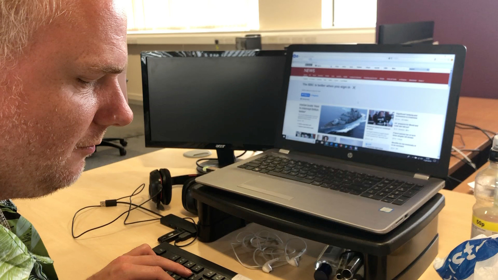
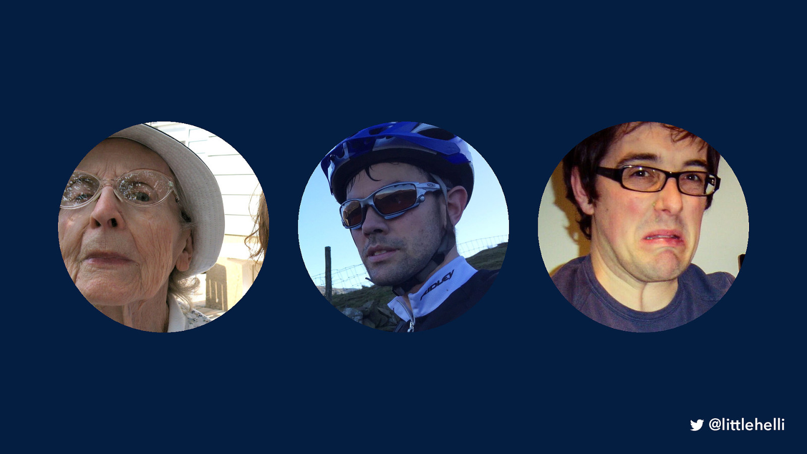
Photo of a woman in her 80s. Granddaughter (right) has moved to Australia and has had a baby. Jean wants to fly out to visit. She has visual impairments and hearing loss. She has a Chrome book that her son bought her and uses it for Facebook to keep in touch with family
TASK: find out the cost of a return flight to Sydney for two weeks holiday any week in February. You’d prefer to fly with BA as you’ve flown with them before many years ago
© lisaclarke via Flickr

Photo of a mountain-biking man in his late 20s, calls himself a bit of an adrenaline junky. Went cycling in the Peak District Fell off his bike and broke his arm and his iPhone X He’s got a follow-up appointment but has lost the information. No phone as it’s being repaired but had an old tablet that he can use
TASK: find out how to check what time and date his appointment is with at the QMC

Photo os a man in his early 30s father of a nearly one-year-old His son Joe is about to have a birthday and he promised his wife he’d organise a party at a local soft play centre. But he forgot and has just remembered. He has 5 minutes before he has to take Joe to Nursery.
TASK: Find a local soft play centre that does family parties to get in touch with about a booking
Q1: How did you find that? Q2: Do you have any ideas about how the design of what you were using could have improved things for you?
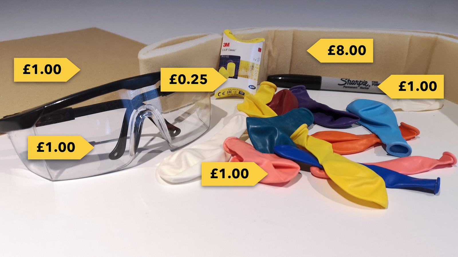
Photo of the empathy lab kit
“Designing for inclusion makes things better for everyone.” GDS Service Manual
• Accessibility as a definition as done • Accessibility is for everyone • Let’s have compassion for the people using our products and services
helen.joy@bjss.com @littlehelli