
A presentation at Abstractions II in in Pittsburgh, PA, USA by Damien Senger
Readability & Web: Let’s build great inclusive projects. Talk given during Abstractions, in Pittsburgh, PA (USA) on August 22, 2019.
Photo of a person sitting on a couch reading a book by iam Se7en on Unsplash
Photo of a person sitting on a bench in a parc reading a book by Tamarcus Brown on Unsplash
Photo of a person sitting in a coffee shop, reading a book, by Praveen Gupta on Unsplash
Photo of a series of people in a crowded train reading newspapers and books by Peter Lawrence on Unsplash
Photo of a person reading on their smartphone while sitting in a couch from The Gender Spectrum Collection
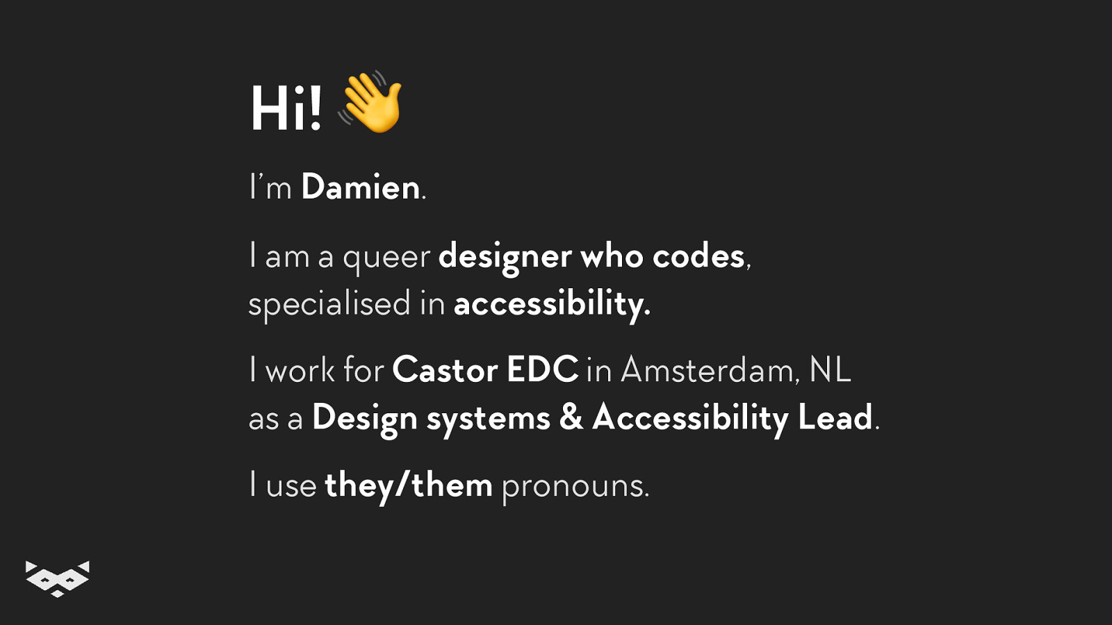
Hi! 👋 I’m Damien.
I am a queer designer who codes, specialised in accessibility. I work for Castor EDC in Amsterdam, NL as a Design systems & Accessibility Lead. I use they/them pronouns.
And in general, I try never to speak with people.
Just kidding! Let’s have a chat! 💬 I am more than happy to discuss how to make the Web a better place with you. So feel free to come and discuss any topics such as accessibility, inclusive design, design systems, collaboration, team building, trains, raccoons or just your favourite coffee spot in town!
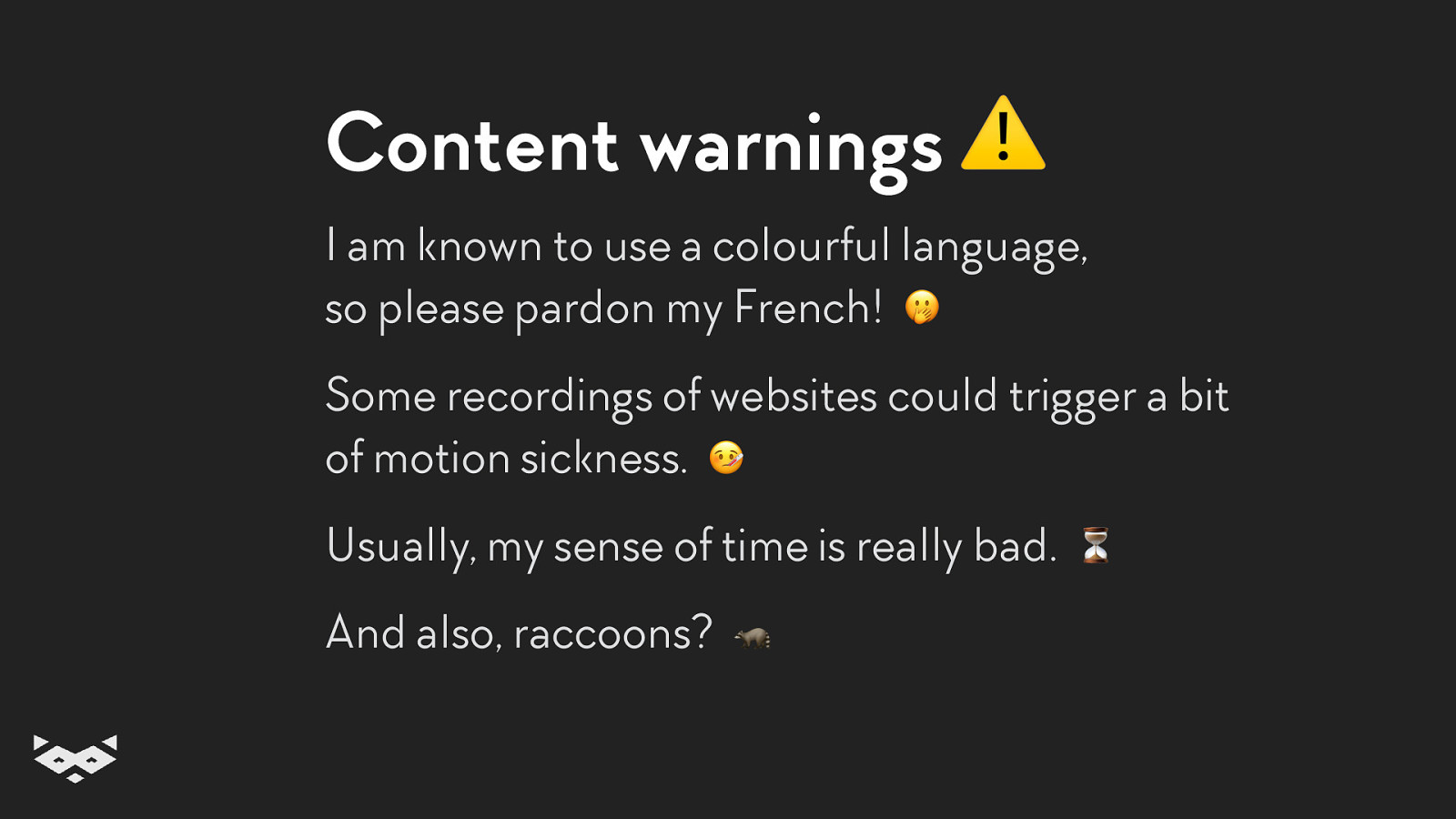
Content warnings ⚠ I am known to use a colourful language, so please pardon my French! 🤭 Some recordings of websites could trigger a bit of motion sickness. 🤒 Usually, my sense of time is really bad. And also, raccoons?
Buckle up! Let’s talk about readability.
But first, why?
Reading is a complex cognitive process.
Literacy is an acquired skill requiring an important learning curve.
Literacy is not always a life-long skill. You can acquire reading difficulties.
The thing is… the Web is mainly text-based. And a text is not accessible per se.
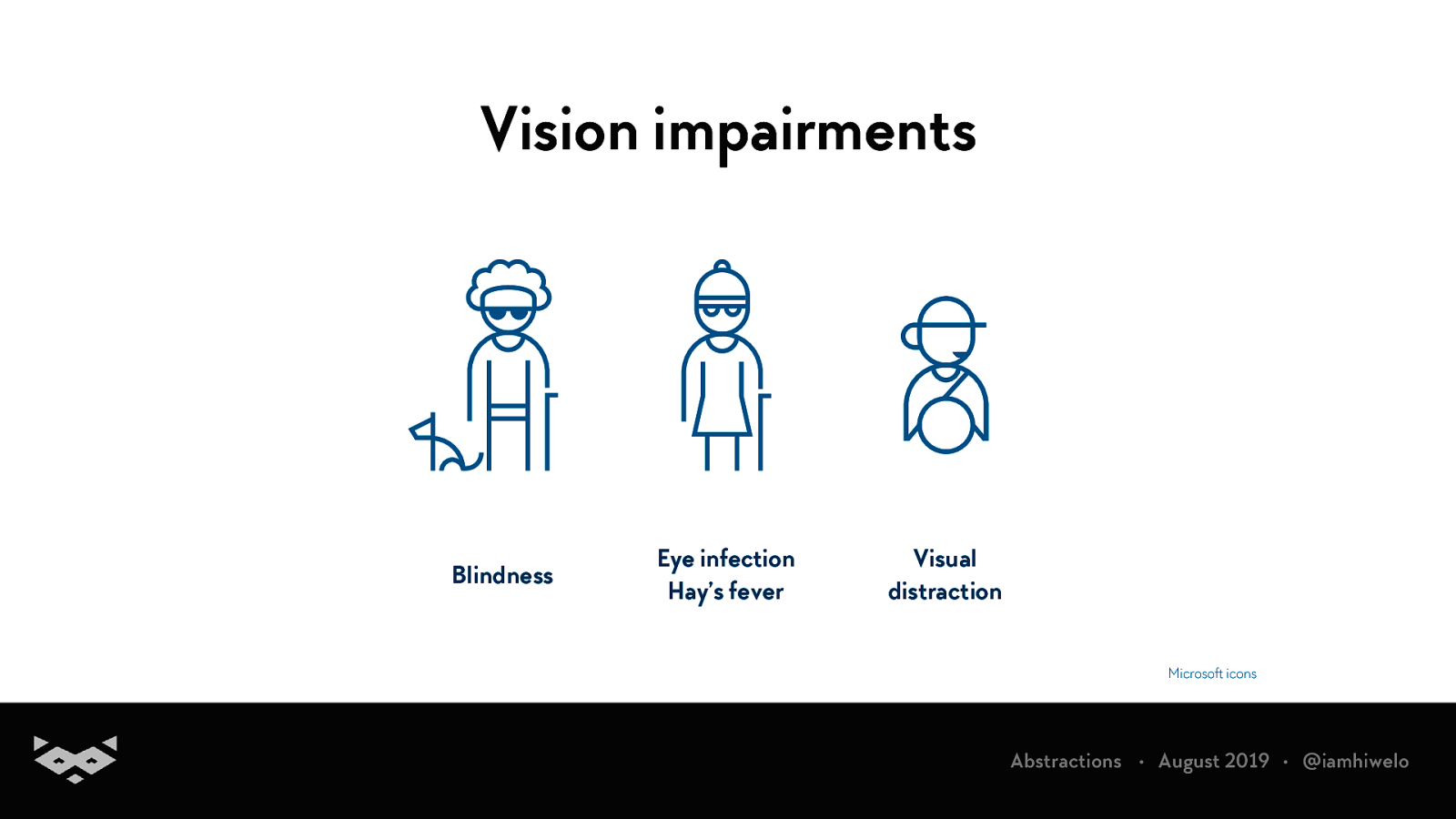
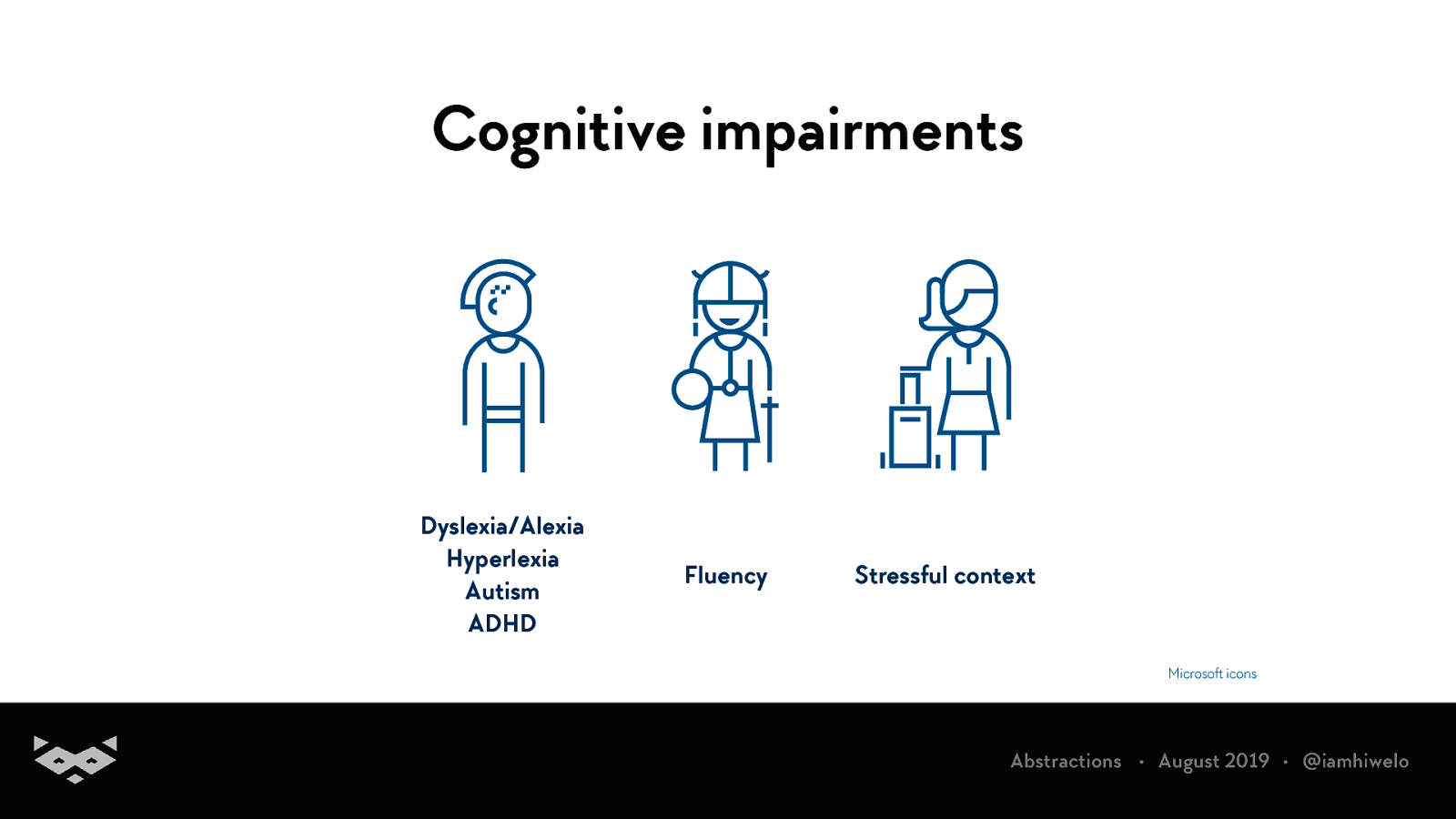
There is two groups of reading impairments
Vision impairments Blindness Eye infection Hay’s fever Visual distraction Microsoft icons
Cognitive impairments Dyslexia/Alexia Hyperlexia Autism ADHD Fluency Stressful context
A quick focus on dyslexia
± 10% of the global population is having a degree of dyslexia. World Health Organization, 2011 Dyslexia Research Trust, 2014 University of Gothenburg, Sahlgrenska Academy, 2014 United Kingdom NHS, 2017
Commonly associated with ADHD, autism or dyscalculia.
Not always since childhood: it can appear after traumatic brain injuries and strokes.
Also, dyslexia is not only about reading.
Studies show that improving readability for dyslexic users improve the experience for all. Ten guidelines for improving accessibility for people with dyslexia. V. Zarach - CETIS University of Wales Bangor, 2012
How do we read?
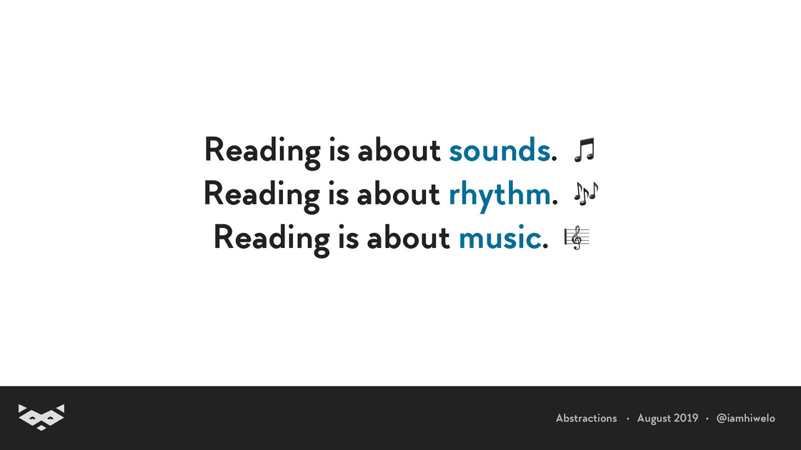
Reading is about sounds. 🎵 Reading is about rhythm. 🎶 Reading is about music. 🎼
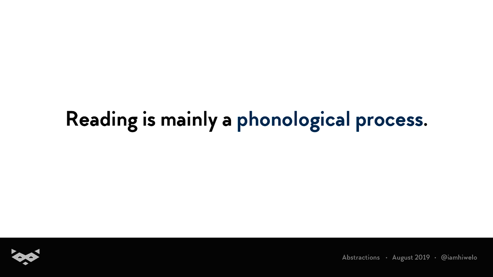
Reading is mainly a phonological process.
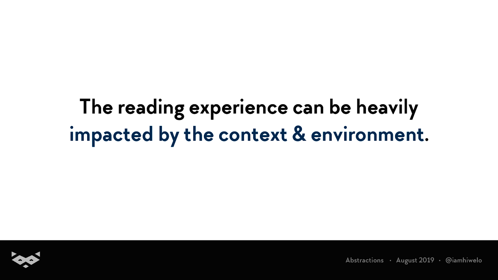
The reading experience can be heavily impacted by the context & environment.
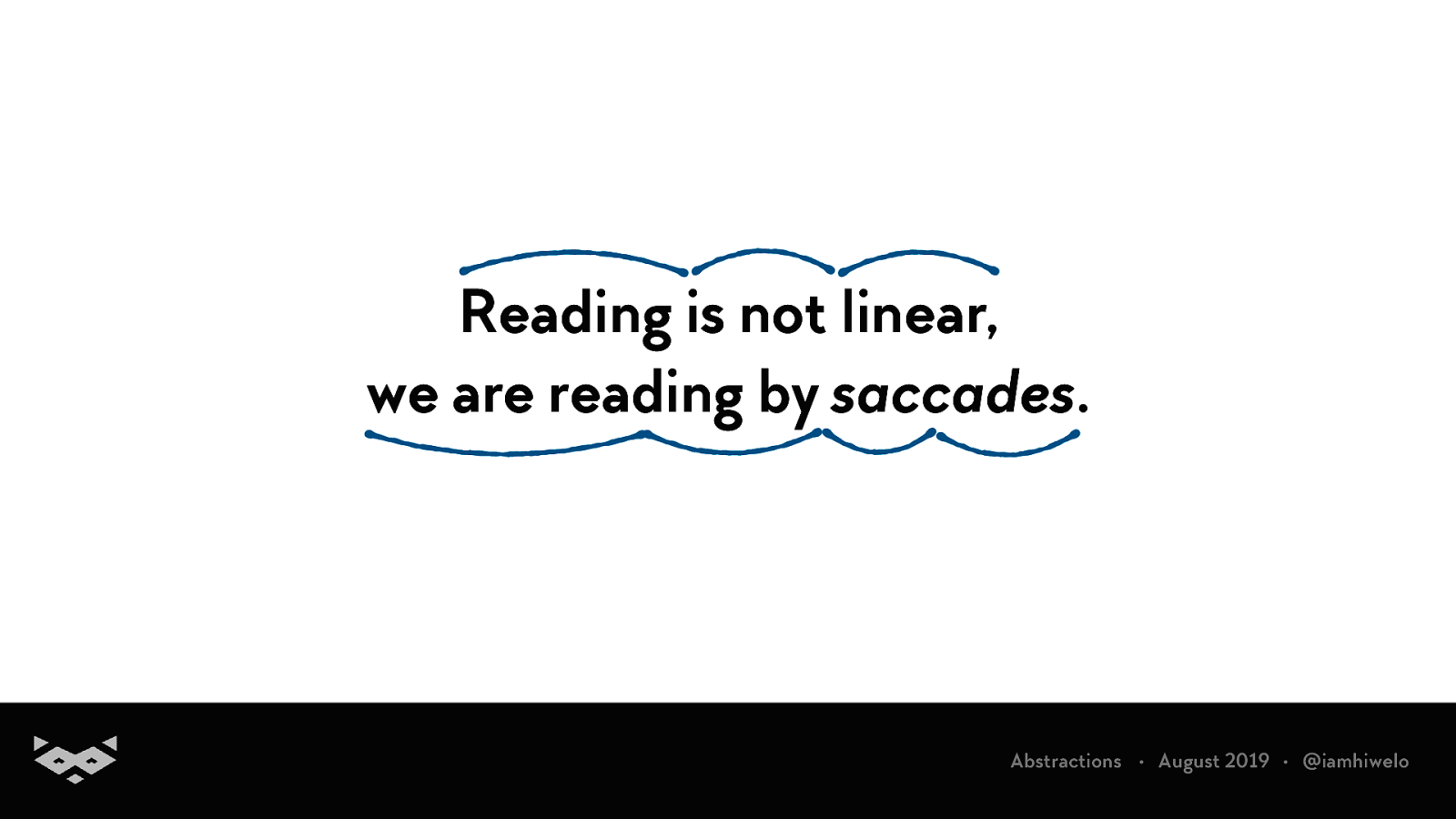
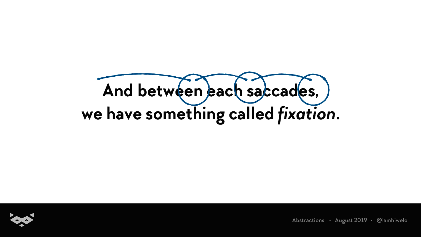
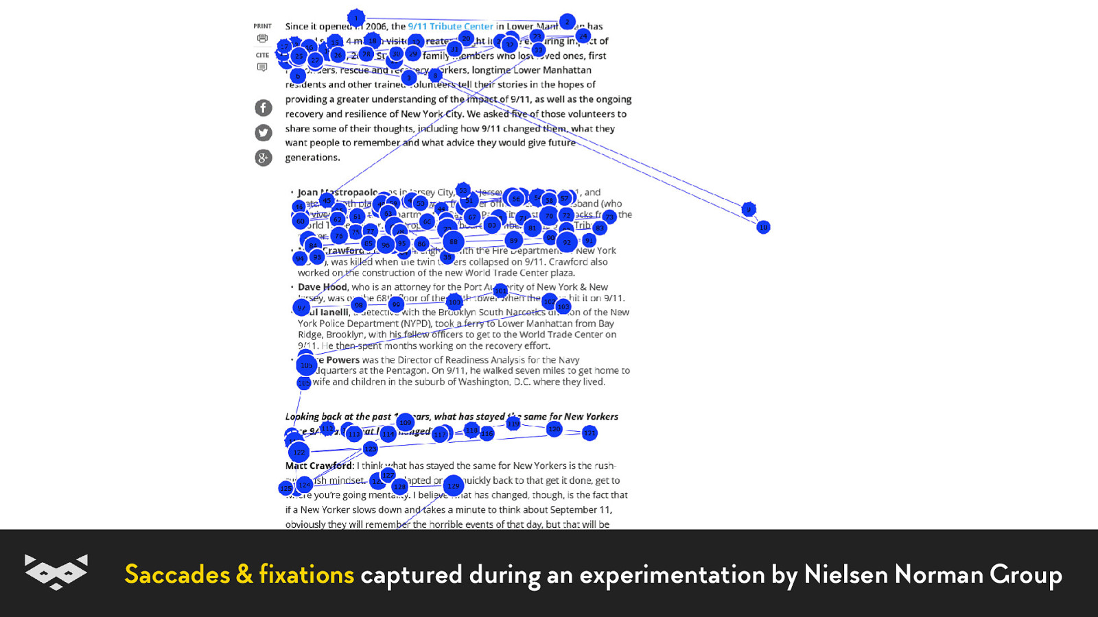
Reading is not linear, we are reading by saccades.
And between each saccades, we have something called fixation.
During a fixation, everything except the focus is blurry.
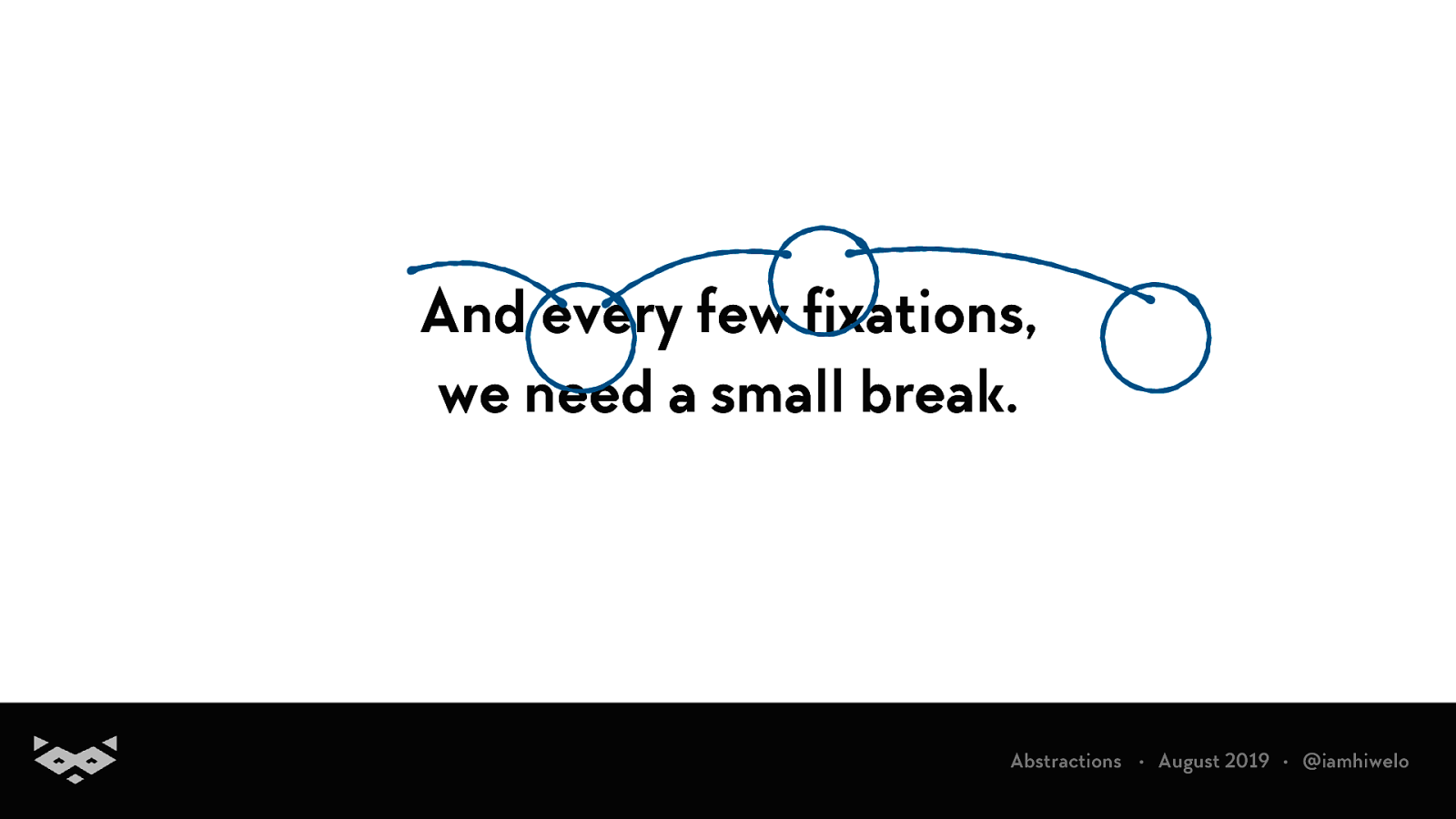
And every few fixations, we need a small break.
The size of our saccades and the duration of fixations depend on the type of reading. When browsing websites, we are mainly using an exploratory reading pattern.elo
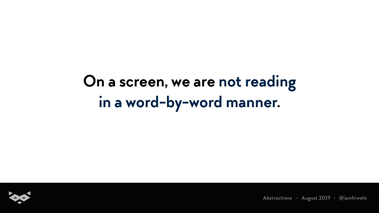
On a screen, we are not reading in a word-by-word manner.
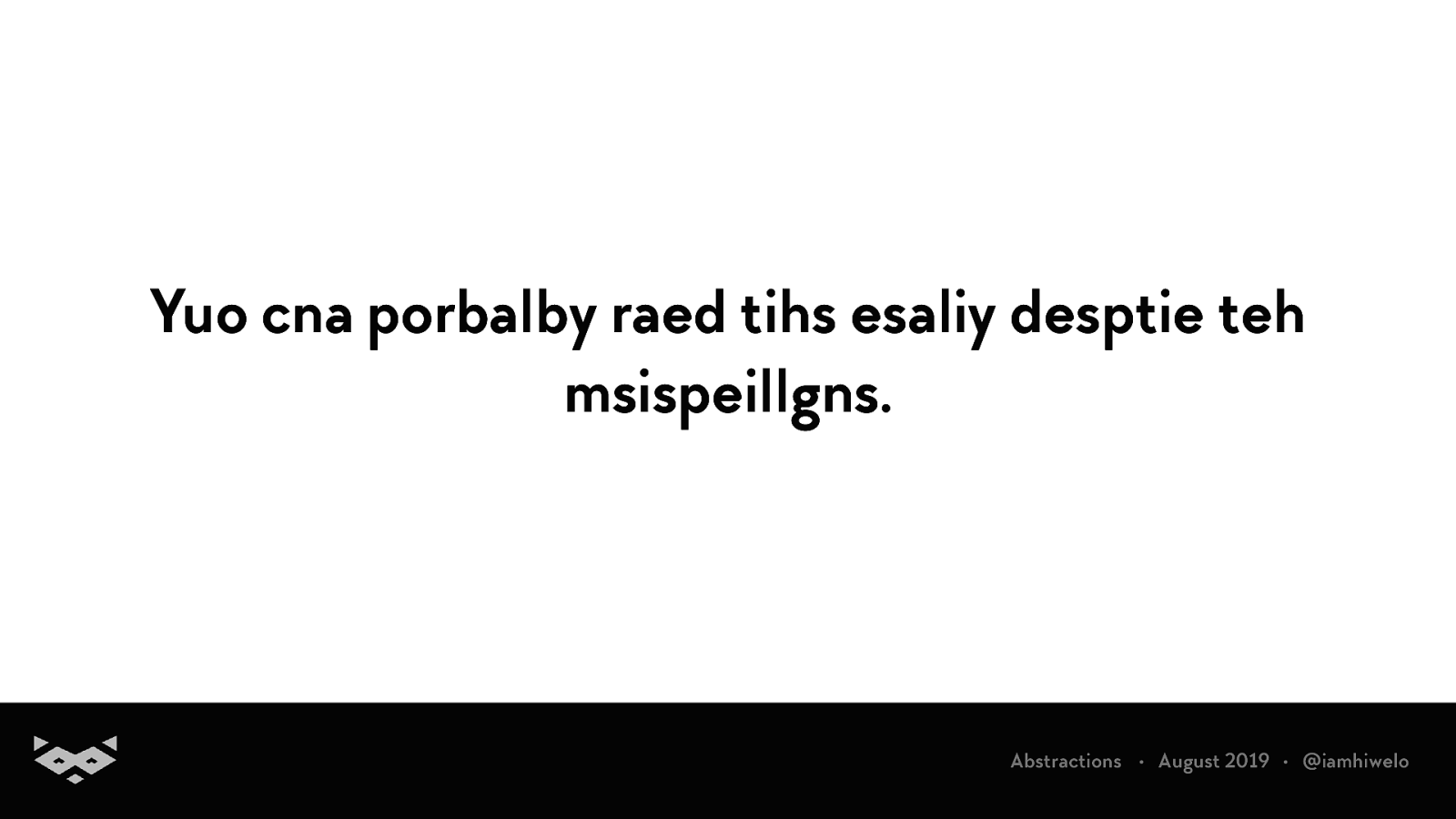
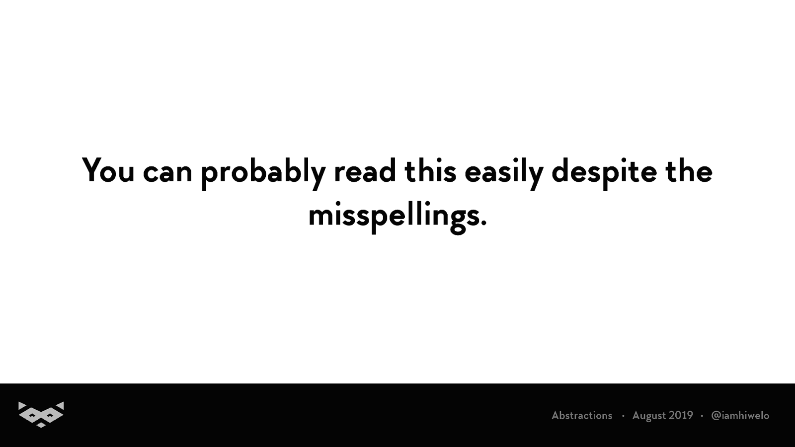
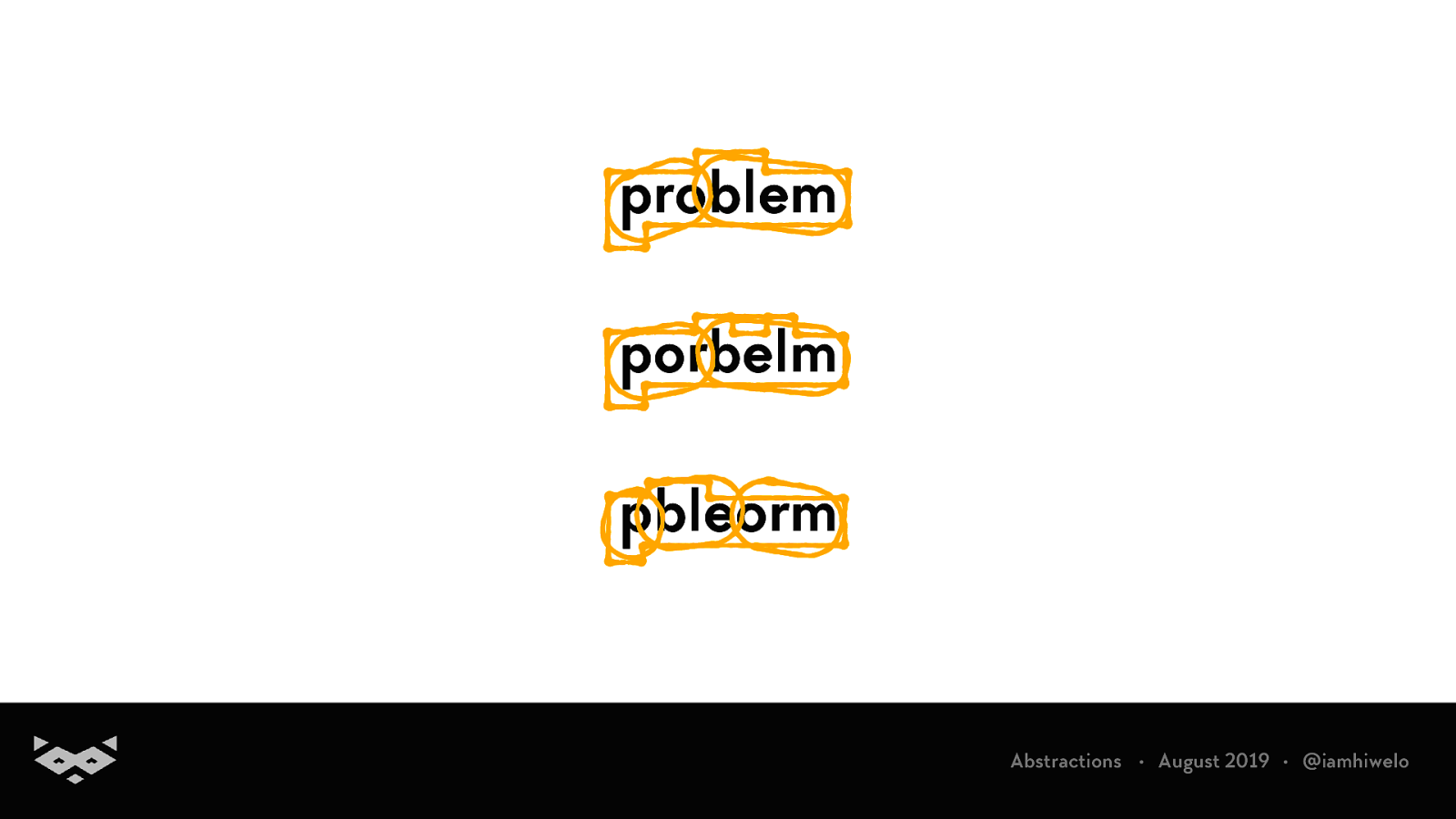
Yuo cna porbalby raed tihs esaliy desptie teh msispeillgns.
You can probably read this easily despite the misspellings.
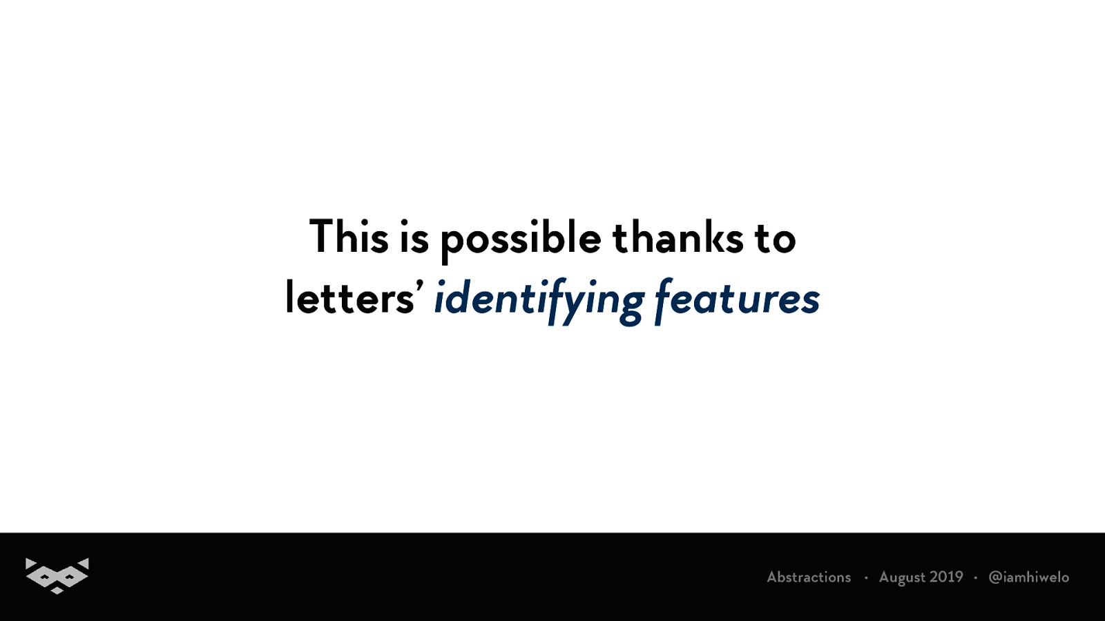
This is possible thanks to letters’ identifying features
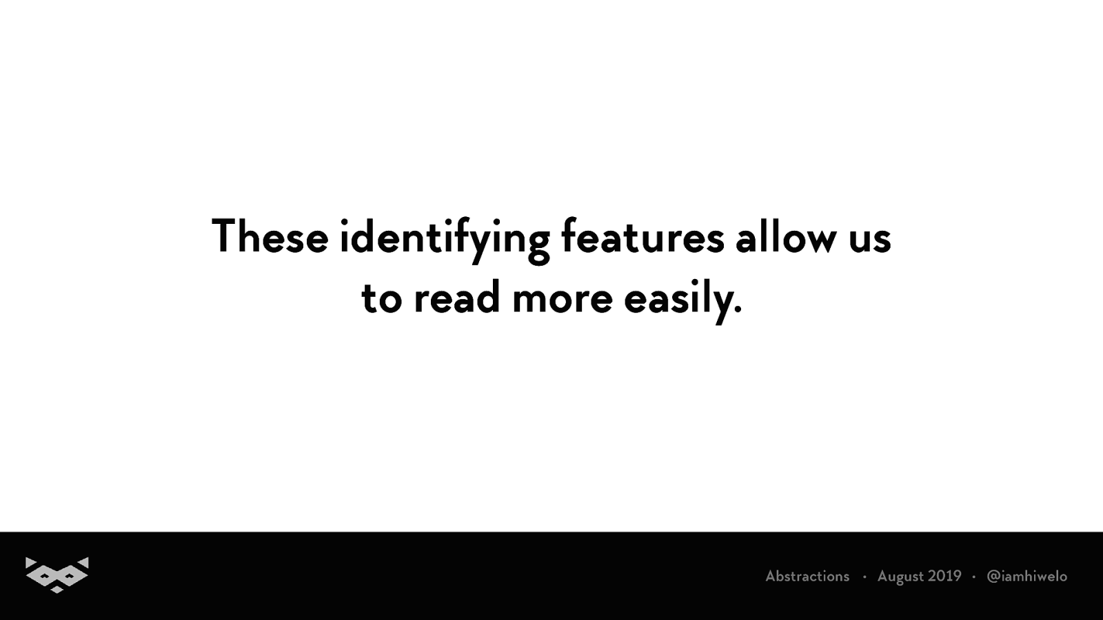
These identifying features allow us to read more easily.
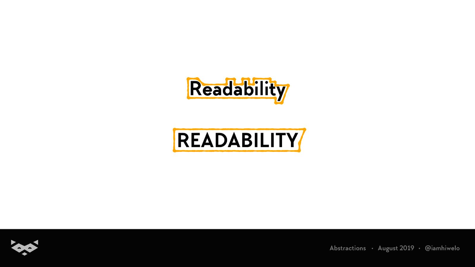
Readability READABILITY
problem porbelm pbleorm
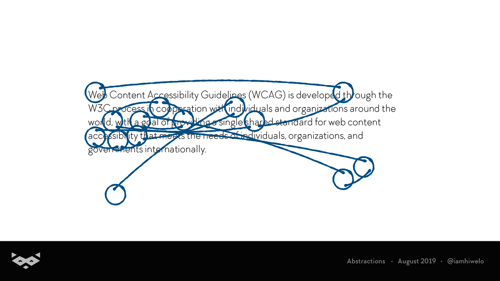
Saccades & fixations captured during an experimentation by Nielsen Norman Group
Bear with me, the lecture part of this talk is almost over. 🦝
Readability 101.
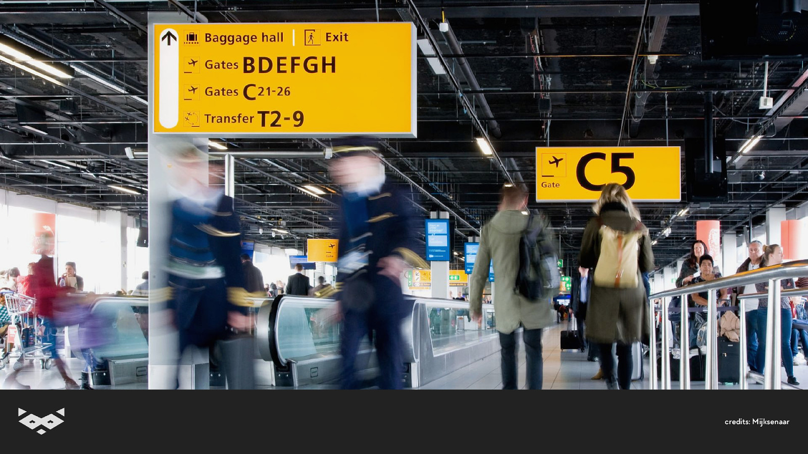
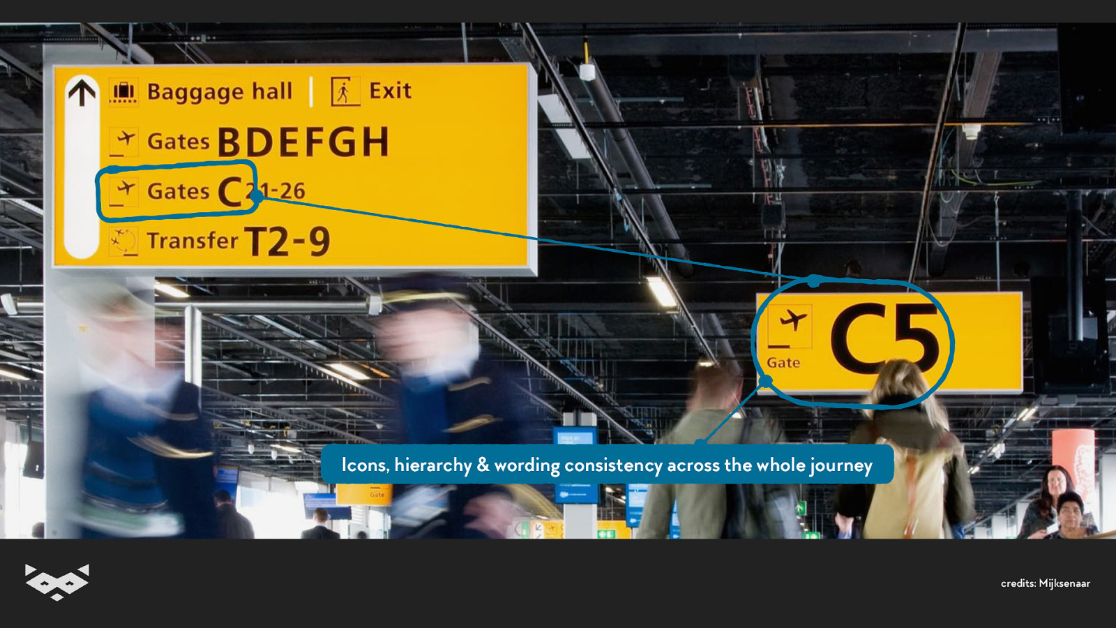
Using icons contribute to readability because it makes the content understandable even without knowledge of the language
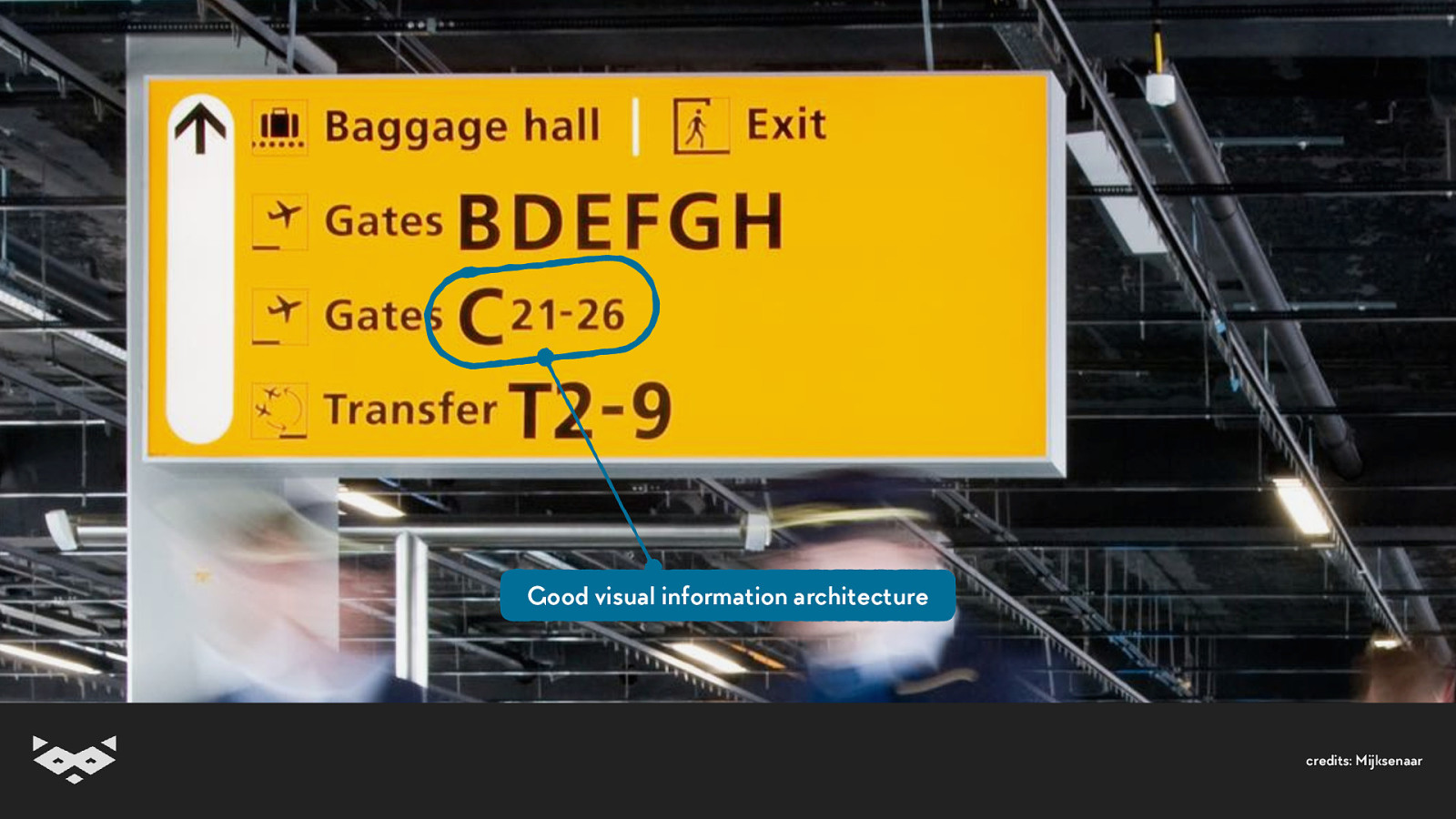
Good visual information architecture
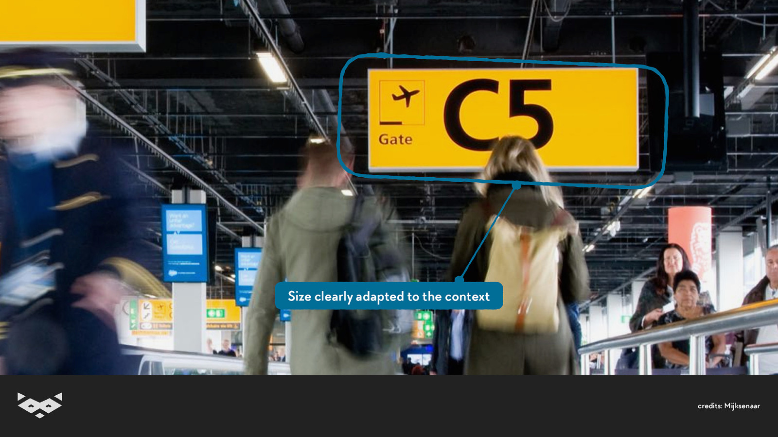
Size clearly adapted to the context
Icons, hierarchy & wording consistency across the whole journey
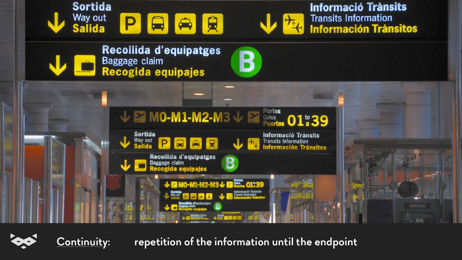
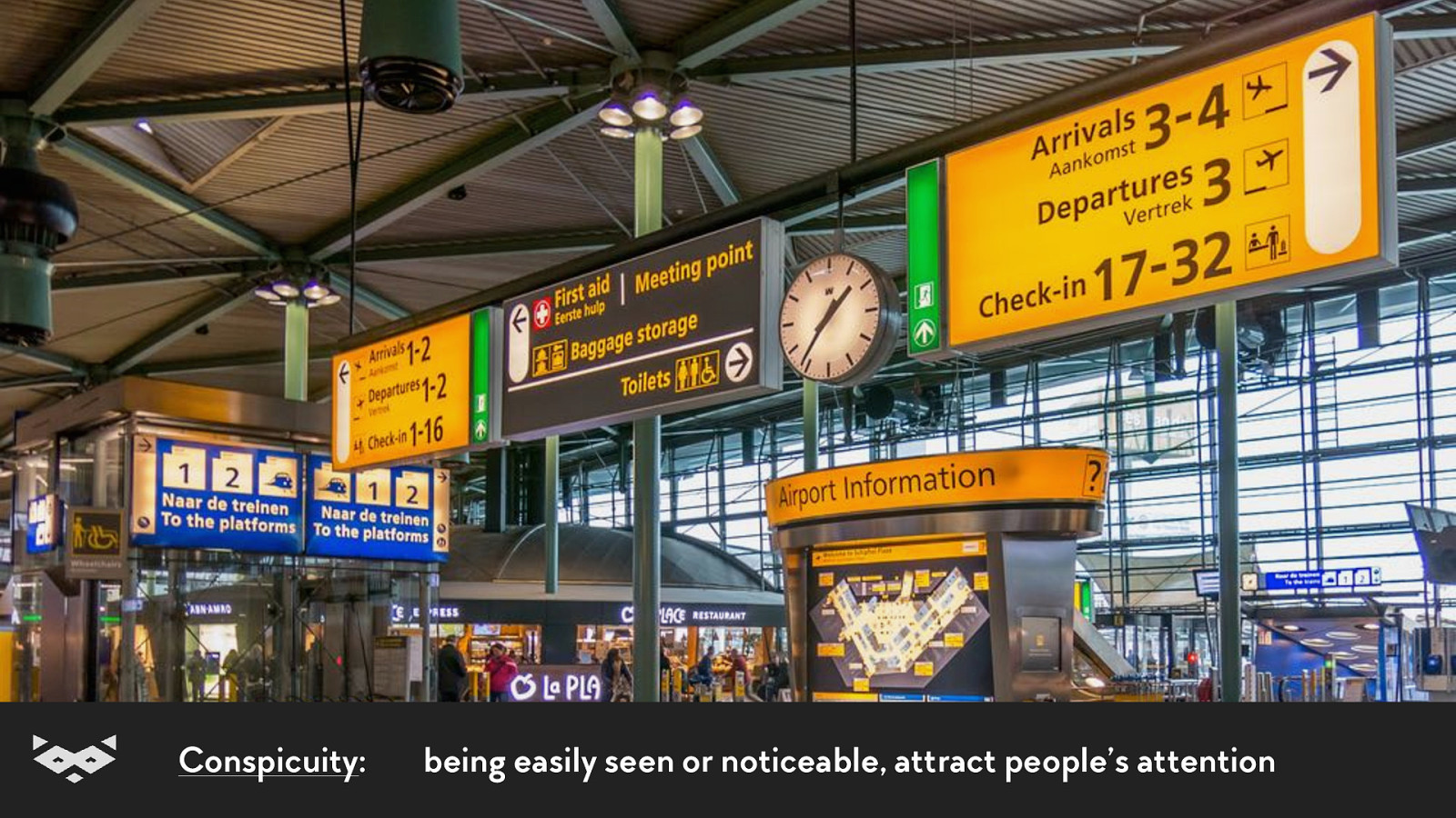
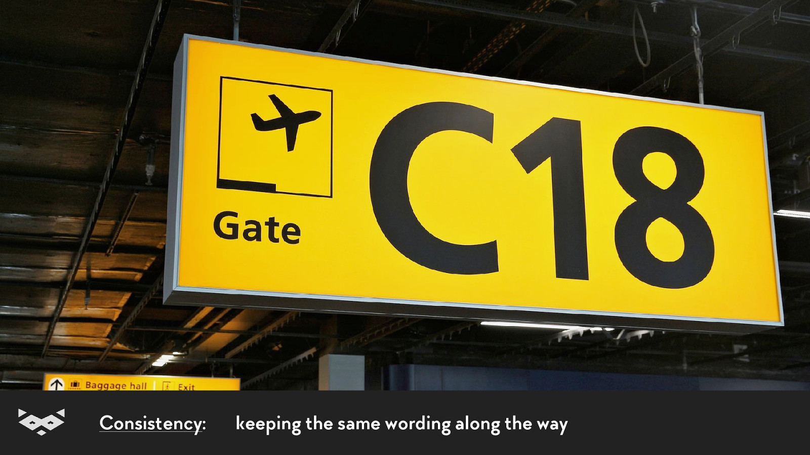
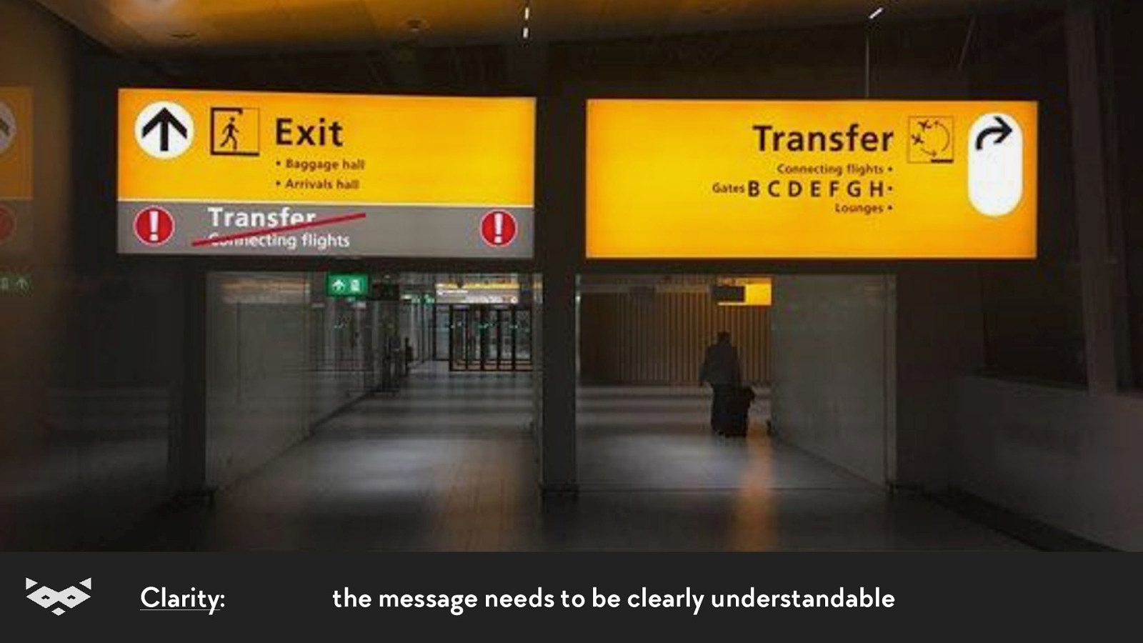
The 4C of readability
Continuity: repetition of the information until the endpoint
Conspicuity: being easily seen or noticeable, attract people’s attention
Consistency: keeping the same wording along the way
Clarity: the message needs to be clearly understandable
Thanks Paul Mijksenaar 👍
We’re done with the theory. You clearly deserve another cute raccoon. 🦝
Readability & web content.
First, Open Dyslexia is not a solution.
There is no one-fits-all solution.
So what?
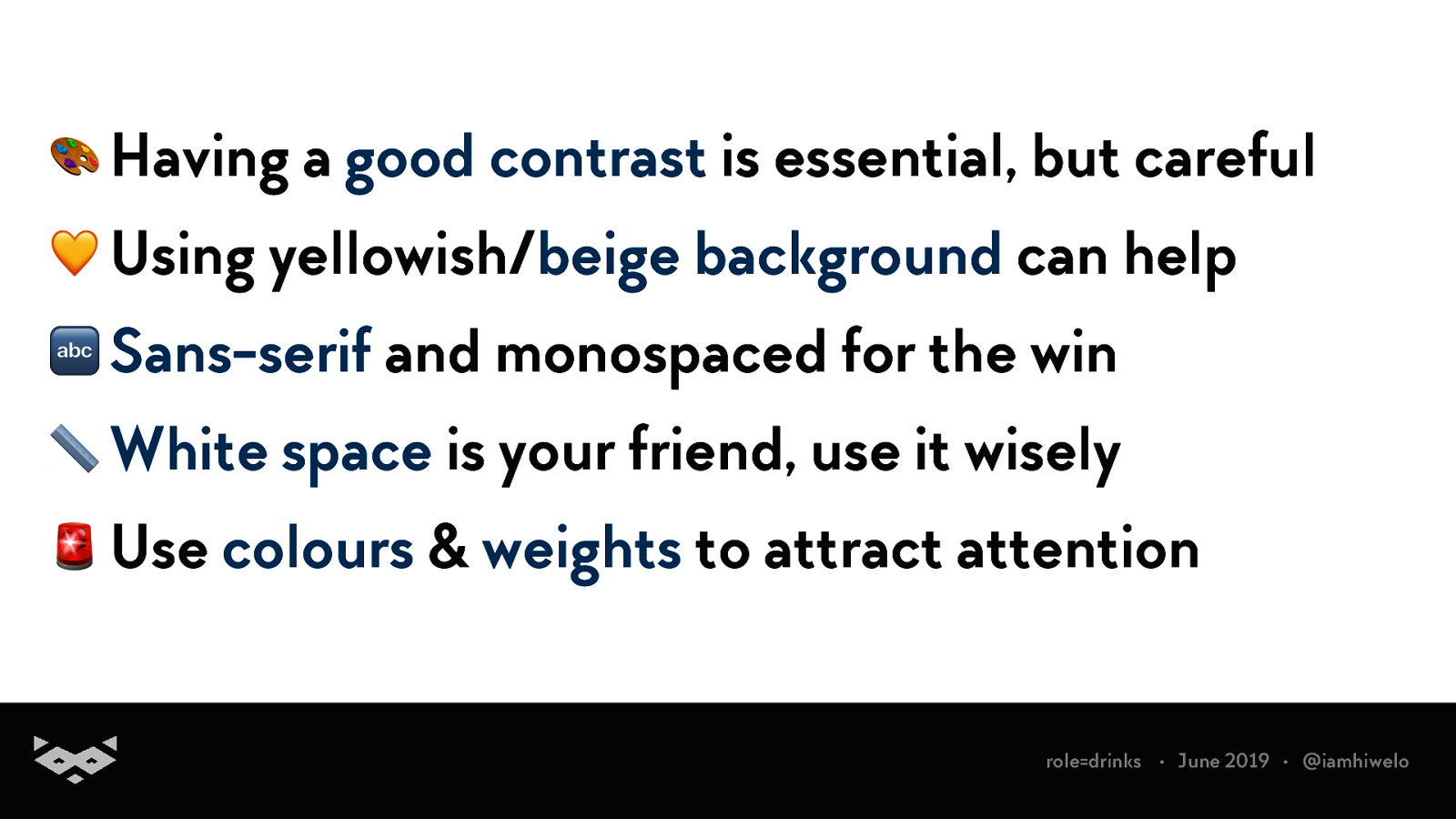
🎨 Having a good contrast is essential, but careful 💛 Using yellowish/beige background can help 🔤 Sans-serif and monospaced for the win 📏 White space is your friend, use it wisely 🚨 Use colours & weights to attract attention
Macro-typography & Layout Layout Guidelines for Web Text and a Web Service to Improve Accessibility for Dyslexics L Rello, G Kanvinde, R Baeza-Yates - Proceedings of the international …, 2012 - dl.acm.org
↔ Prefer left alignment for texts in LtR languages 📢 Use headings to make the information clearer 💻 Use semantic markup & design accordingly 🎛 Create consistency in the layout 🗺 Provide two ways to access content
Adopt an inclusive writing-style Based on the British Dyslexia Association Guidelines for Web Design 3.
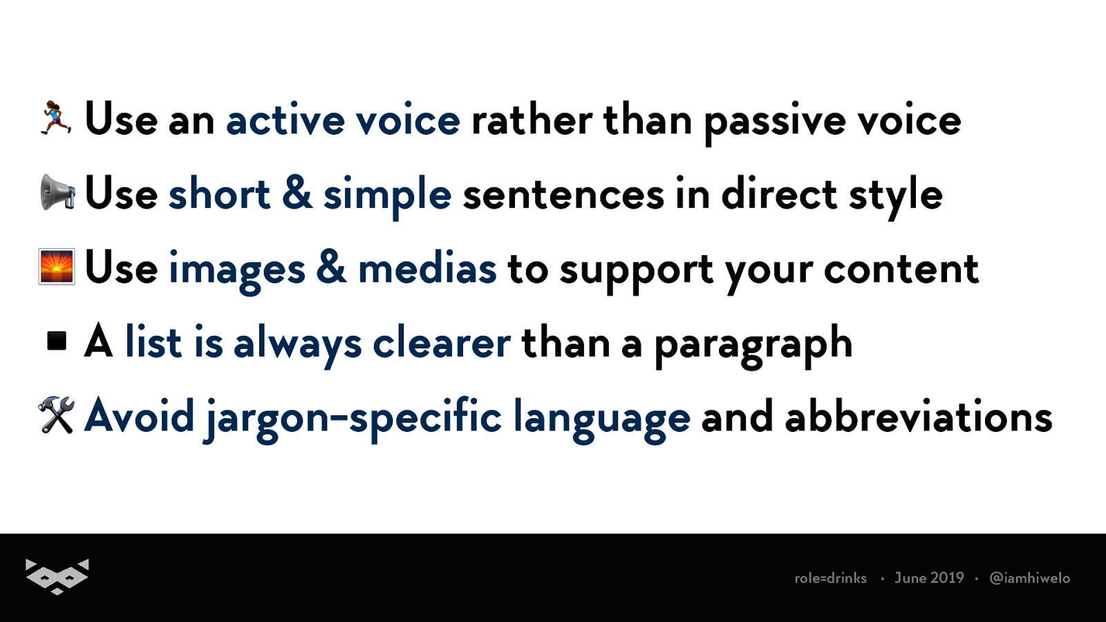
6 Use an active voice rather than passive voice 📢 Use short & simple sentences in direct style 🌅 Use images & medias to support your content ▪ A list is always clearer than a paragraph 🛠 Avoid jargon-specific language and abbreviations role=drinks • June 2019 • @iamhiwelo
Create distraction-free experiences
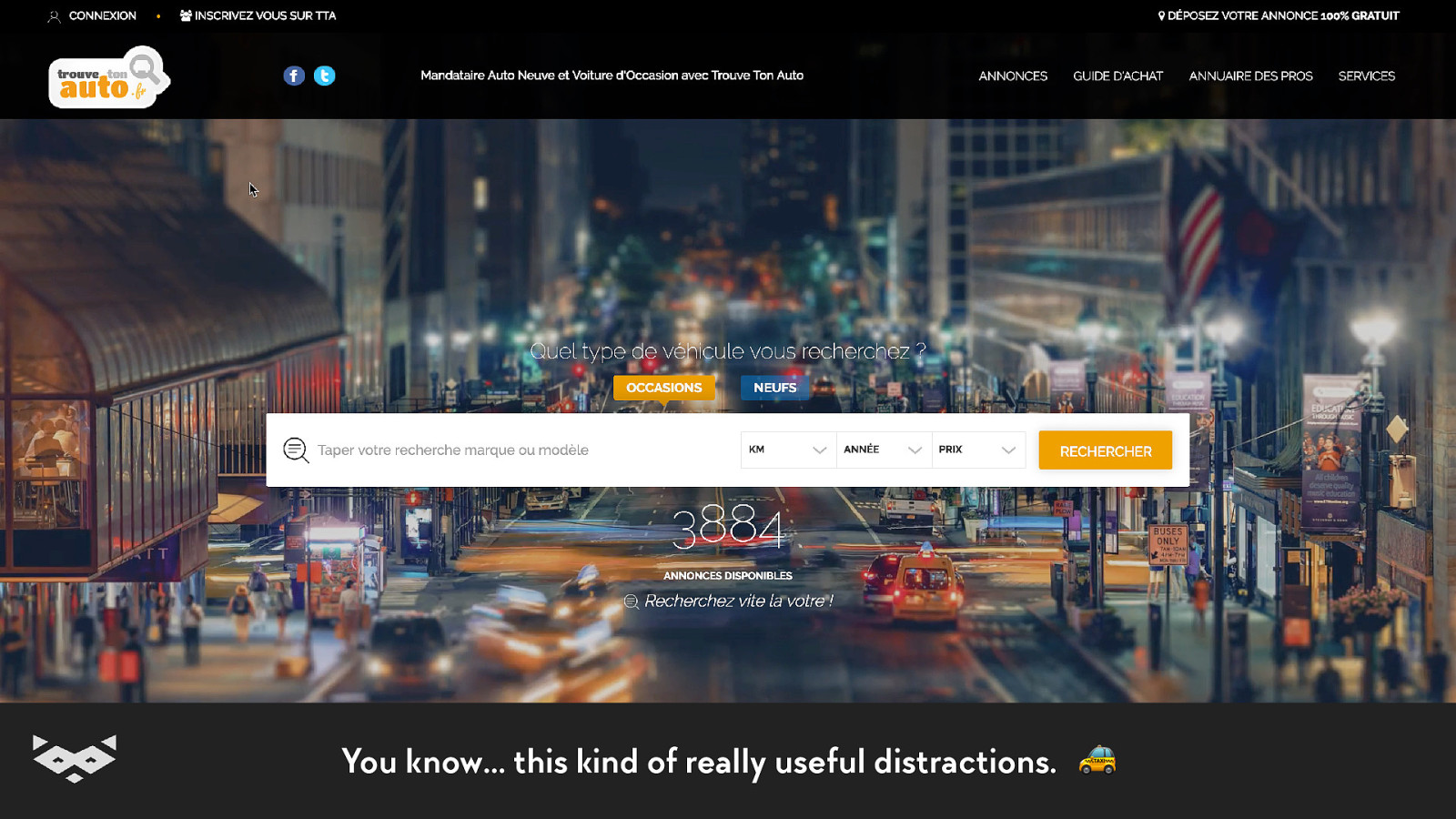
You know… this kind of really useful distractions. 🚕
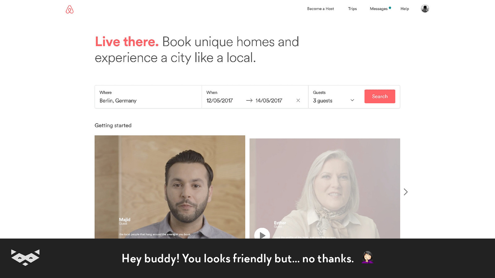
Hey buddy! You looks friendly but… no thanks.
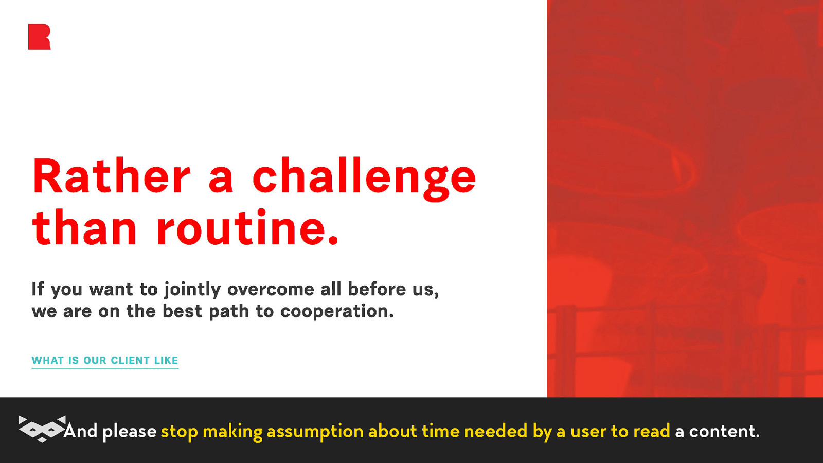
And please stop making assumption about time needed by a user to read a content.
The last, but not the least… +1
It’s time to remove unnecessary content.
So, how to experiment with your projects?
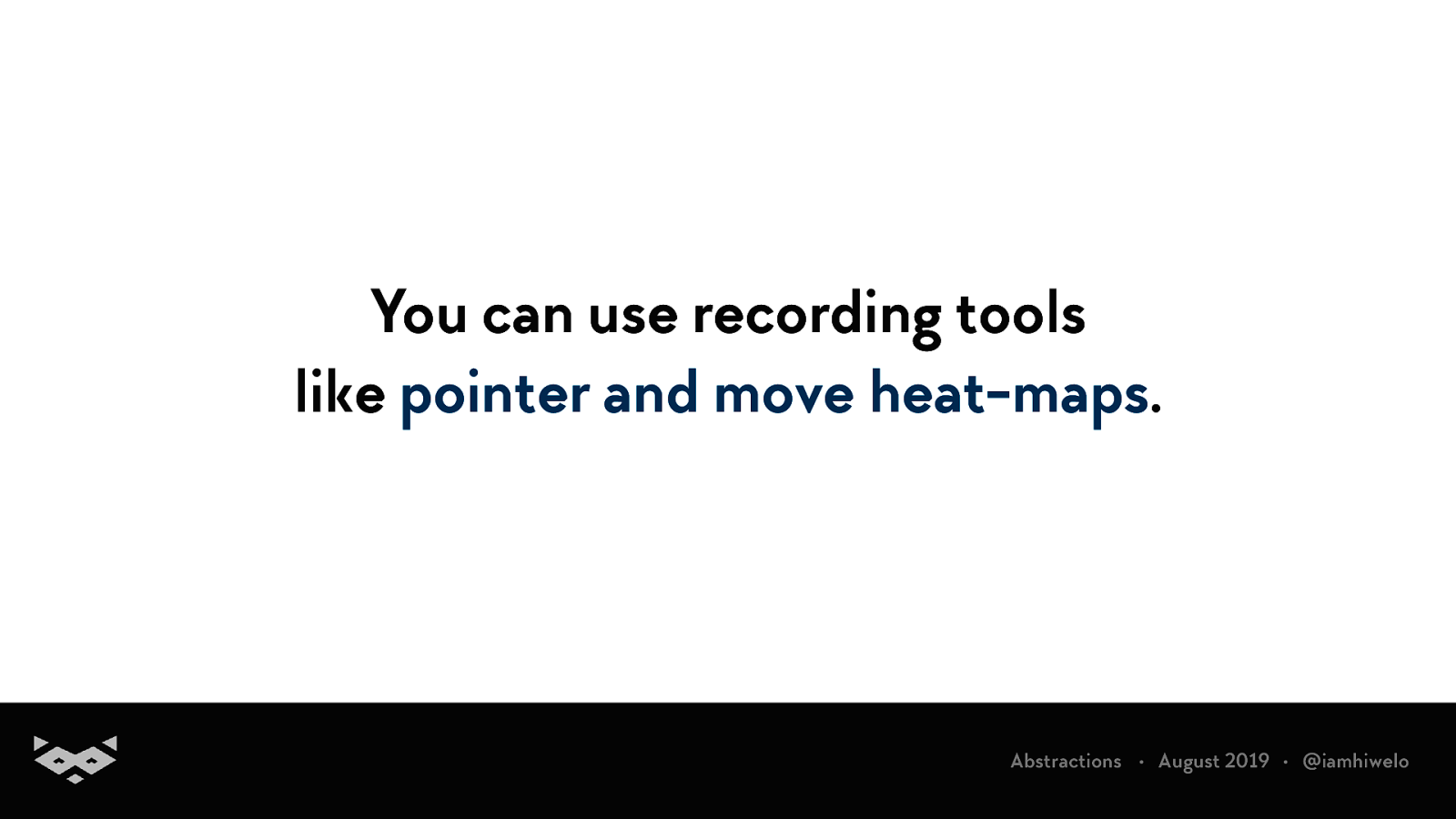
You can use recording tools like pointer and move heat-maps.
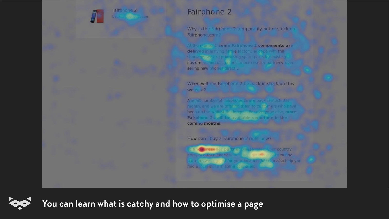
You can learn what is catchy and how to optimise a page
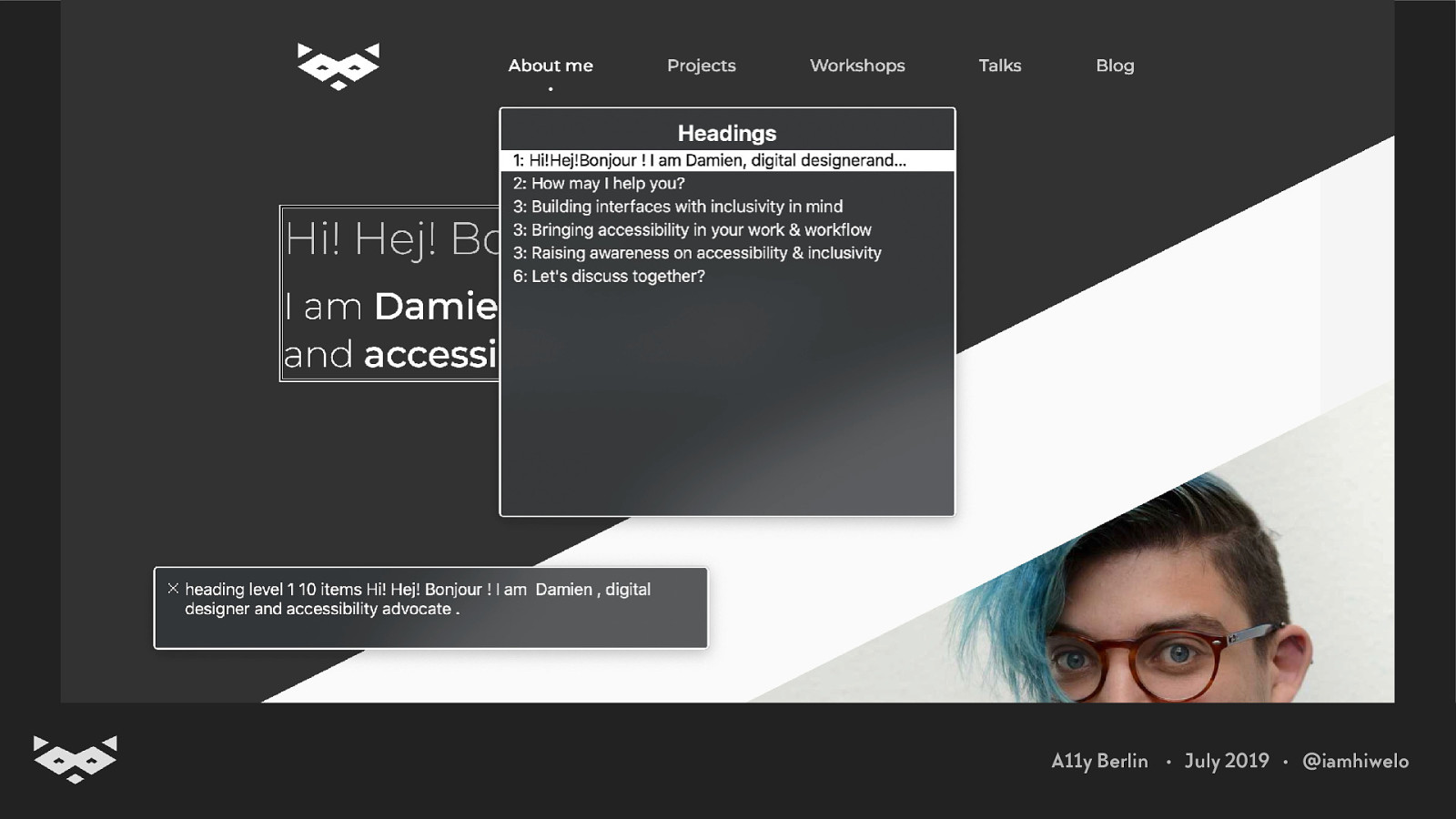
You should test your content using a screen reader and tools like the Web Rotor.
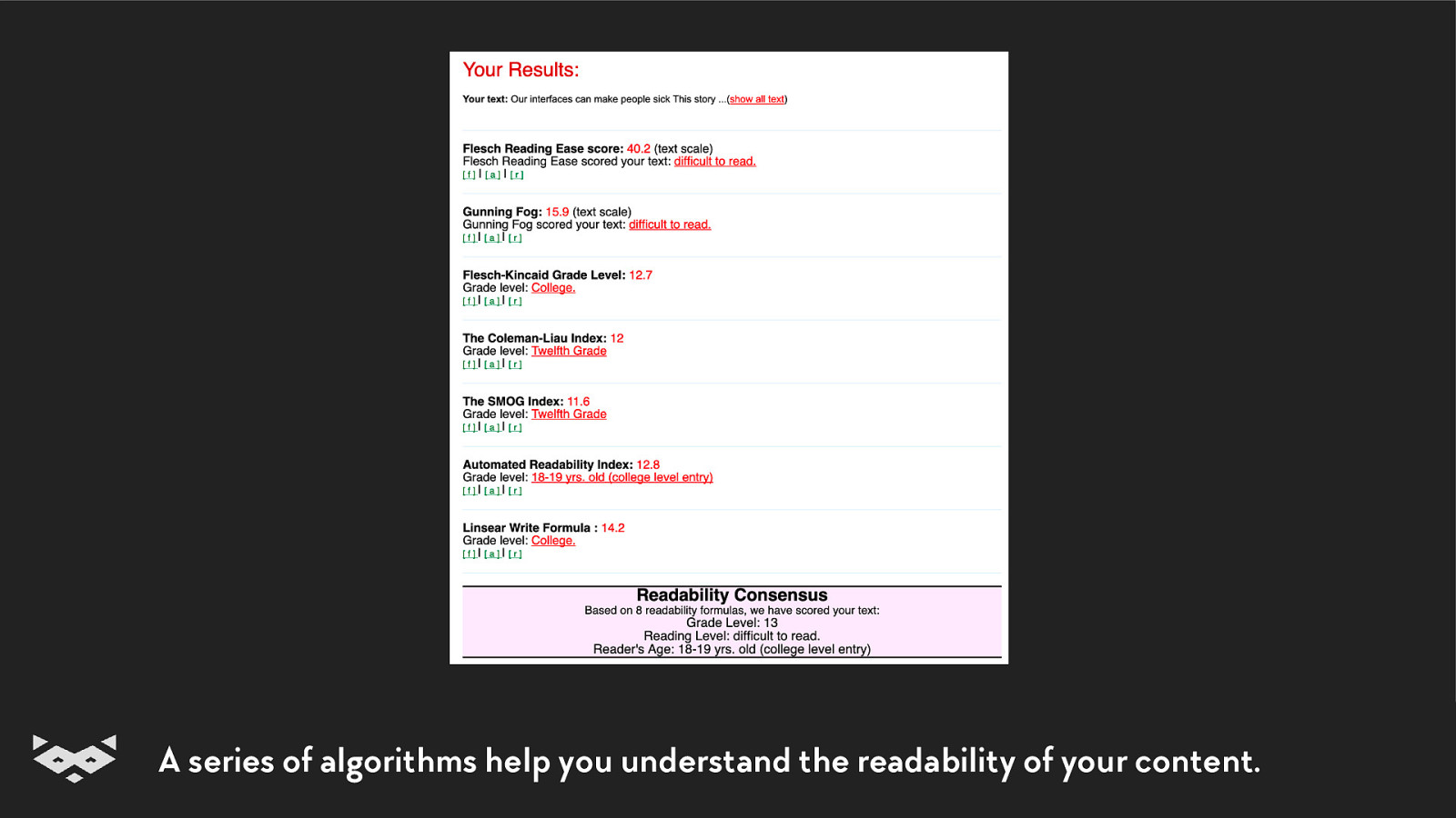
You can calculate your readability score.
A series of algorithms help you understand the readability of your content.
Some good examples.
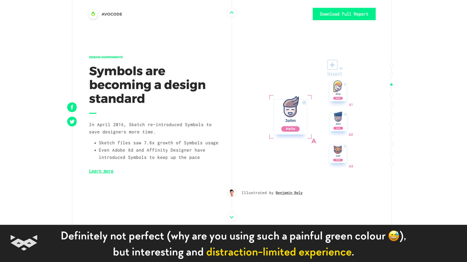
Definitely not perfect (why are you using such a painful green colour 😅), but interesting and distraction-limited experience.
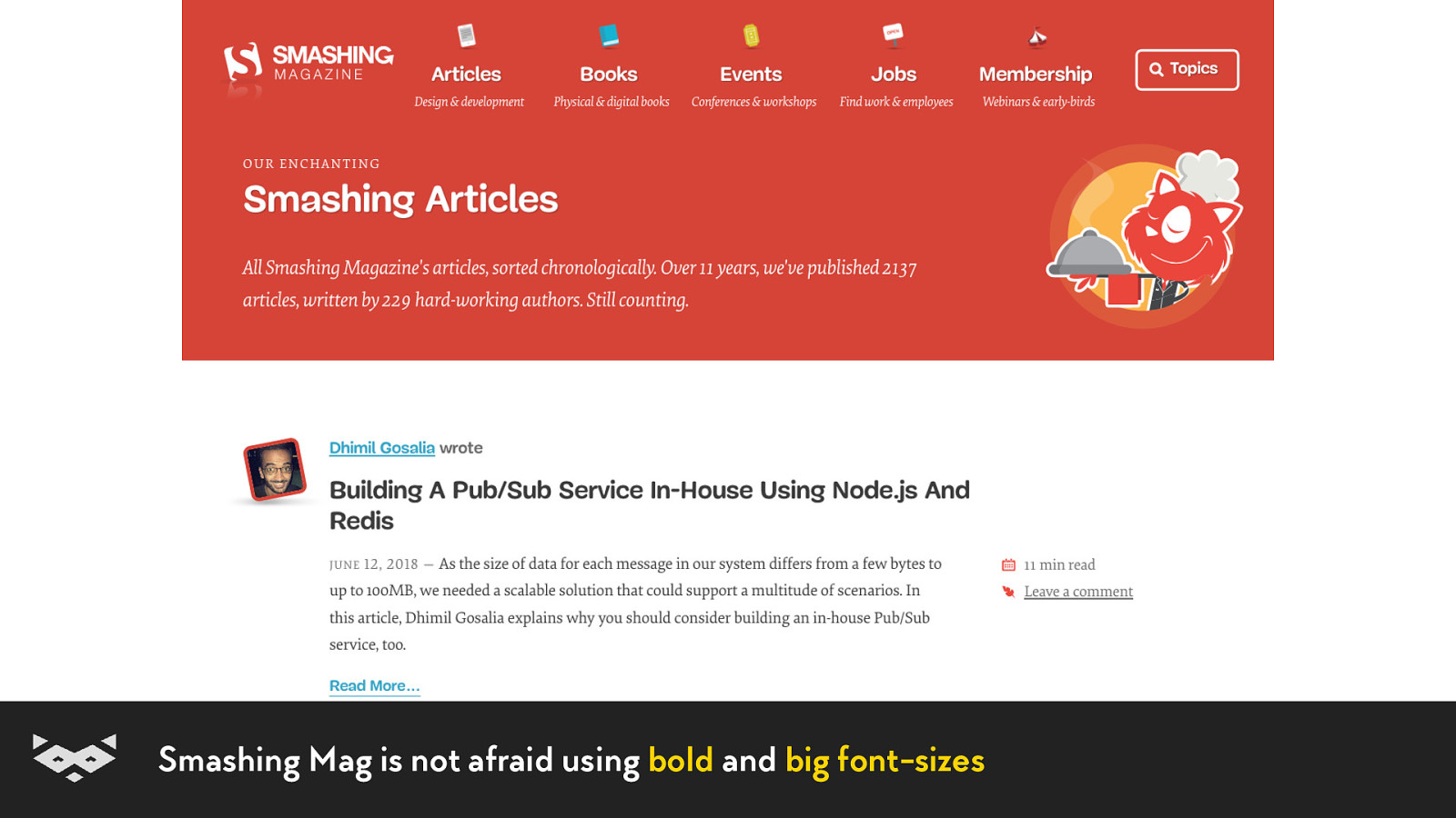
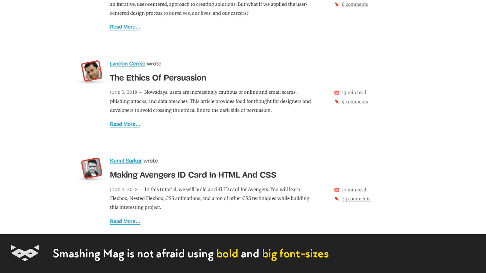
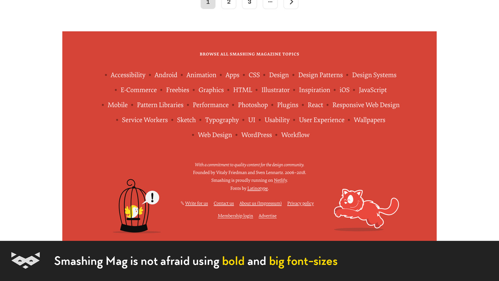
Smashing Mag is not afraid using bold and big font-sizes
Smashing Mag is not afraid using bold and big font-sizes
Smashing Mag is not afraid using bold and big font-sizes
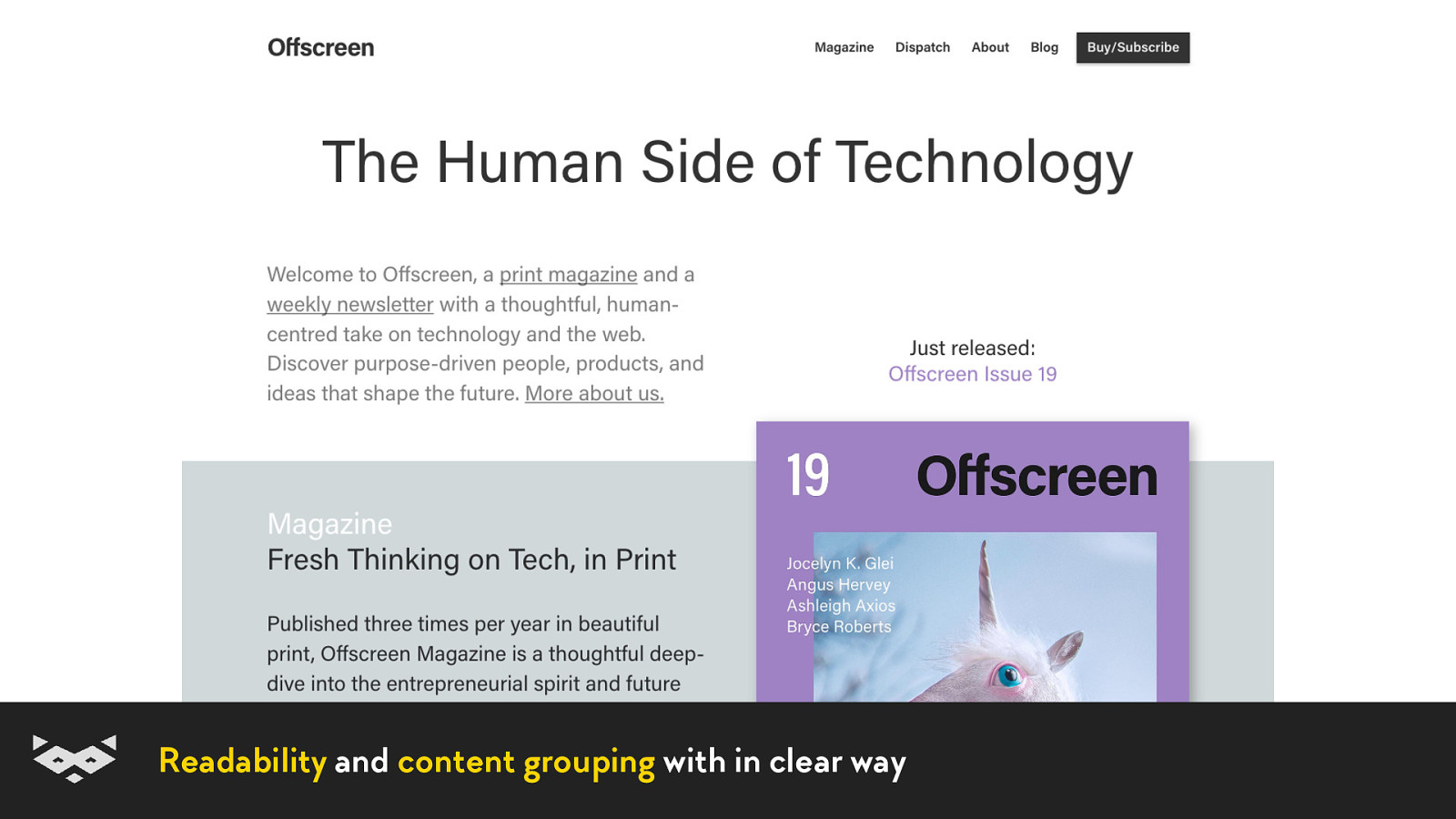
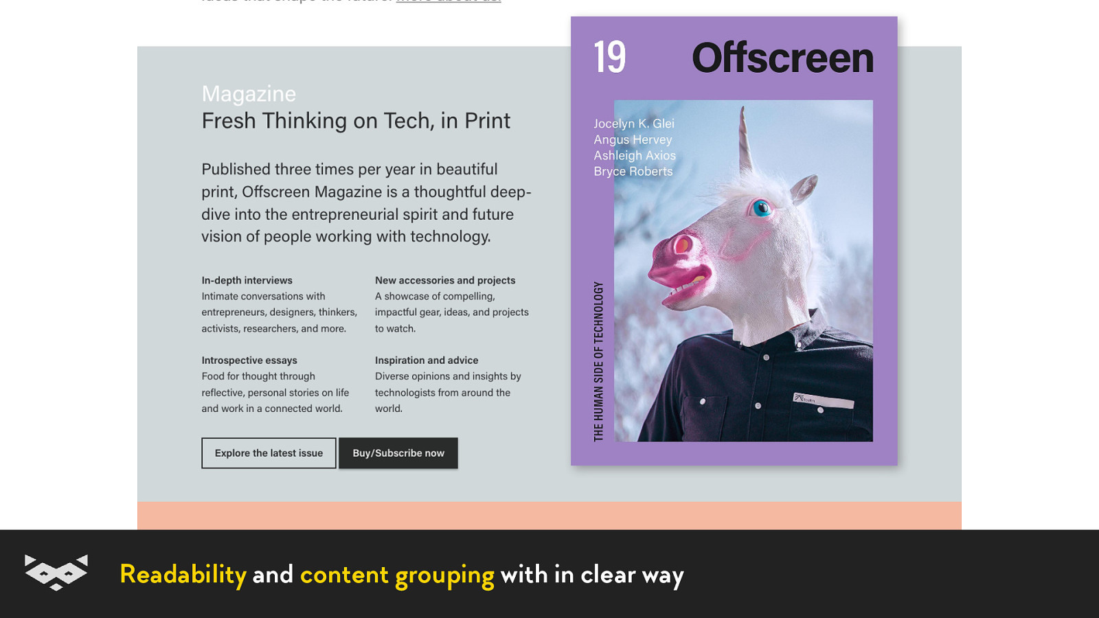
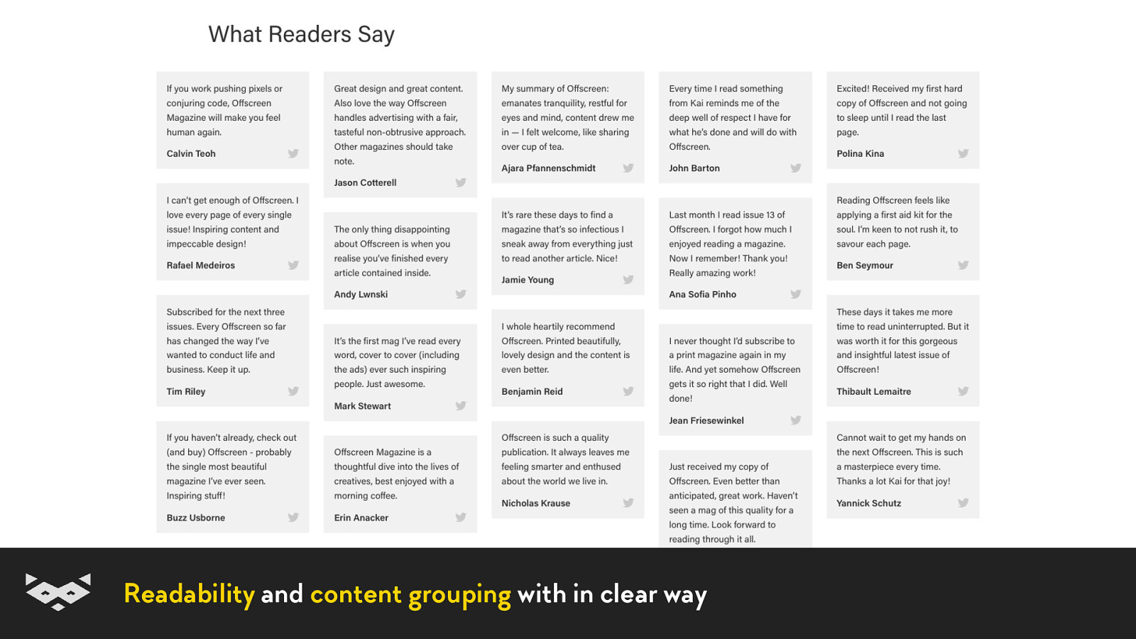
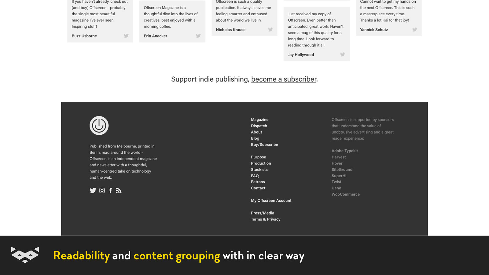
Readability and content grouping with in clear way
Readability and content grouping with in clear way
Readability and content grouping with in clear way
Readability and content grouping with in clear way
Readability and content grouping with in clear way
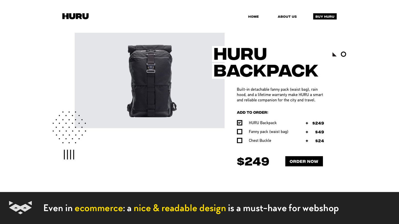
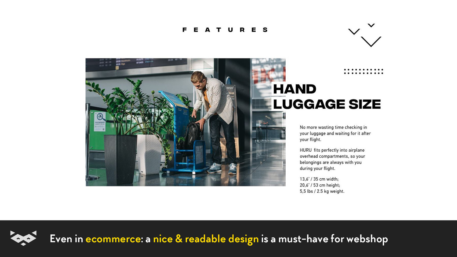
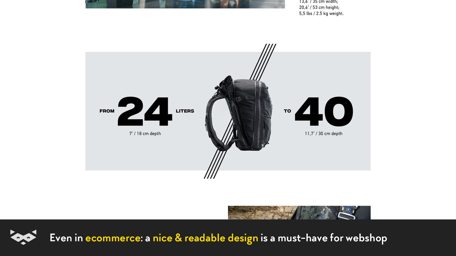
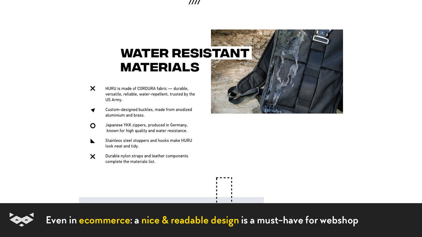
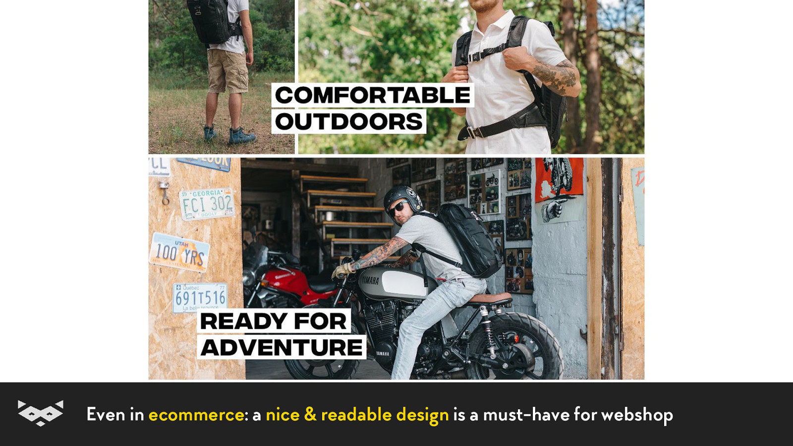
Even in ecommerce: a nice & readable design is a must-have for webshop
Even in ecommerce: a nice & readable design is a must-have for webshop
Even in ecommerce: a nice & readable design is a must-have for webshop
Even in ecommerce: a nice & readable design is a must-have for webshop
Even in ecommerce: a nice & readable design is a must-have for webshop
So… are you ready for this new challenge?
Bedankt! Merci beaucoup ! Tack så mycket! Thank you! Tusen takk! Vielen Dank!
Also, feel free to join me tomorrow at noon to discuss better designer/engineer collaboration through accessibility.
Damien Senger Queer designer who codes, specialised in accessibility. raccoon.studio • noti.st/hiwelo @iamhiwelo

Reading is not an easy thing. Even if we are used to having our eyes going through an important quantity of content every day, this action still requires a lot of energy and mechanisms in our head. And it is even more complex for people with reading or cognitive impairments.
The reading experience is highly dependent of the medium and the context.
Unfortunately, our bright displays are definitely not our best allies to help us read more efficiently.
Luckily for all our users and visitors, there is a lot of small improvements and tips every designer, content-writer and developer can do in a project to improve the life all of our users.
Let see together how reading on screen works for our eyes and our brain, then we will find together ways to help people with reading impairments and/or limited attention span to have a better access to our content.


 for free. You
can too.
for free. You
can too.