
A presentation at c’t webdev in in Cologne, Germany by Damien Senger
RESPONSIBLE RESPONSIVE WEB TYPOGRAPHY c’t webdev • Köln, Germany • February 5, 2020
Hi! 👋 I’m Damien.
Reading is one of the most universal yet personal human activity. c’t webdev • February 2019 • @iamhiwelo
Buckle up! Let’s talk about readability.
But first, why?
Reading is a complex cognitive process with an important learning curve. c’t webdev • February 2019 • @iamhiwelo
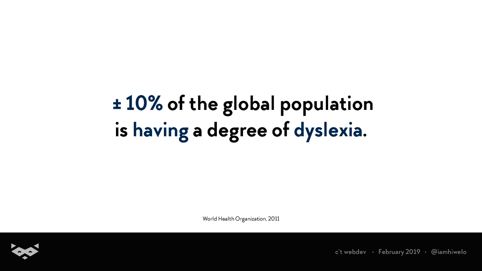
± 10% of the global population is having a degree of dyslexia. World Health Organization, 2011 c’t webdev • February 2019 • @iamhiwelo
Literacy is not always a life-long skill. You can acquire reading difficulties. c’t webdev • February 2019 • @iamhiwelo
Not always since childhood: it can appear after brain injuries, strokes or just for new languages you are learning. c’t webdev • February 2019 • @iamhiwelo
So no, a text is not accessible by essence. c’t webdev • February 2019 • @iamhiwelo
In 2018, W3C-WAI introduced an accessibility success criterion related to readability. c’t webdev • February 2019 • @iamhiwelo
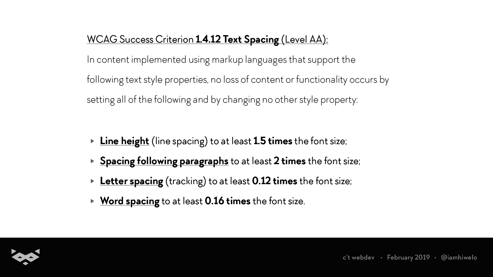
WCAG Success Criterion 1.4.12 Text Spacing (Level AA): In content implemented using markup languages that support the following text style properties, no loss of content or functionality occurs by setting all of the following and by changing no other style property: Line height (line spacing) to at least 1.5 times the font size; Spacing following paragraphs to at least 2 times the font size; Letter spacing (tracking) to at least 0.12 times the font size; Word spacing to at least 0.16 times the font size. c’t webdev • February 2019 • @iamhiwelo
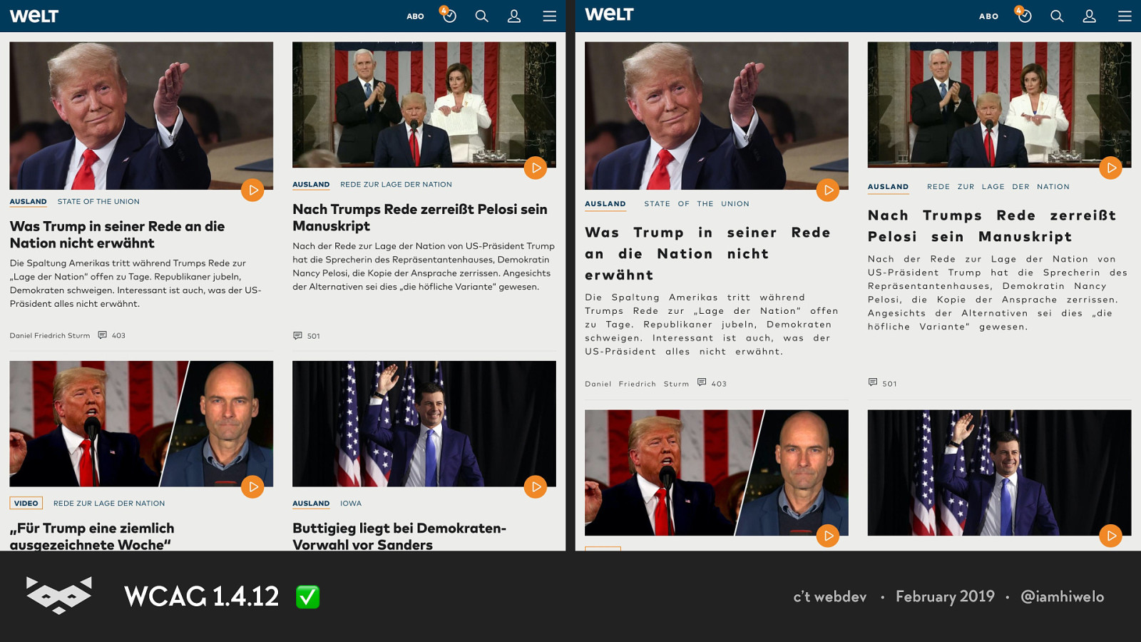
WCAG 1.4.12 ✅ c’t webdev • February 2019 • @iamhiwelo
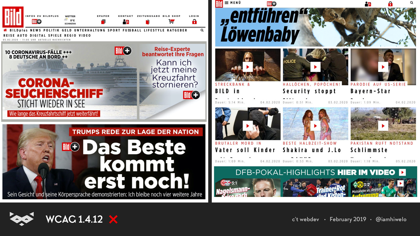
WCAG 1.4.12 ❌ c’t webdev • February 2019 • @iamhiwelo
WCAG 1.4.12 are not a set of guidelines to apply, but a series of rules to test. When applied, the layout should not break. c’t webdev • February 2019 • @iamhiwelo
How do we read?
Reading is about sounds. 🎵 Reading is about rhythm. 🎶 Reading is about music. 🎼 c’t webdev • February 2019 • @iamhiwelo
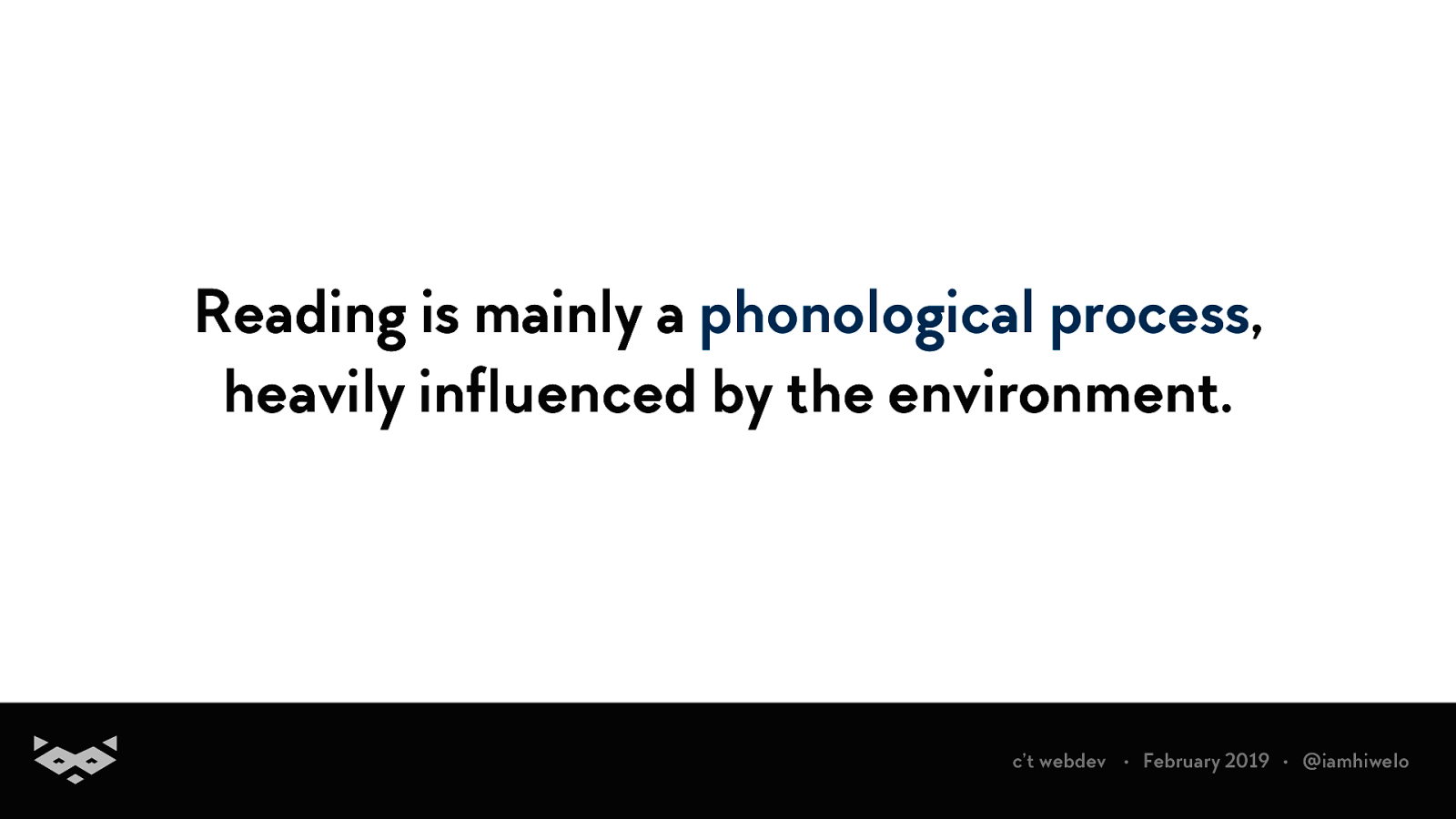
Reading is mainly a phonological process, heavily influenced by the environment. c’t webdev • February 2019 • @iamhiwelo
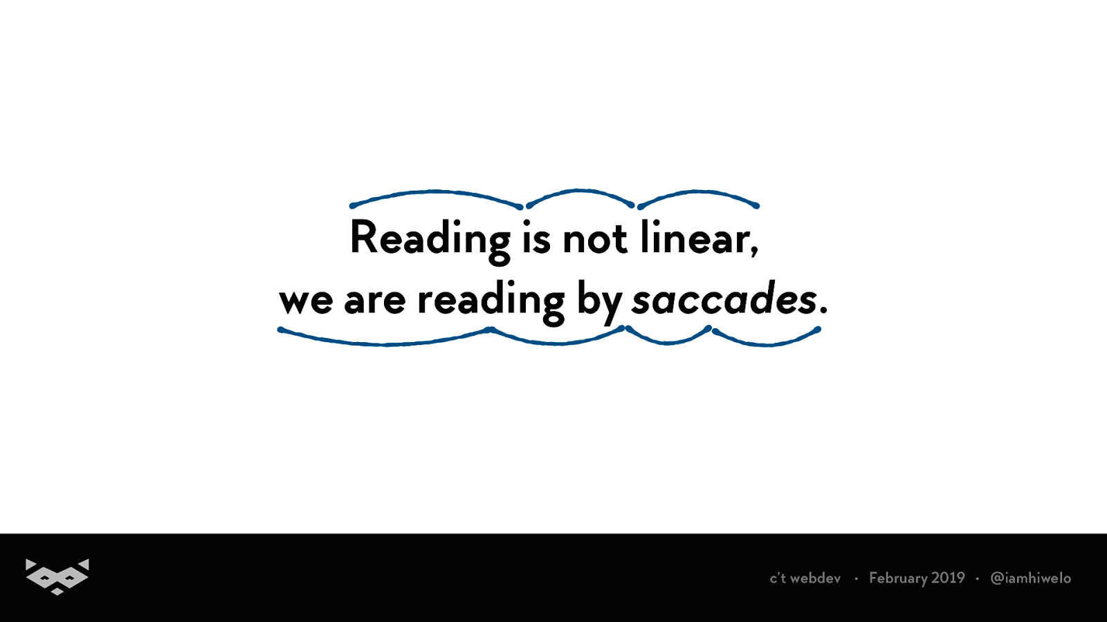
Reading is not linear, we are reading by saccades. c’t webdev • February 2019 • @iamhiwelo
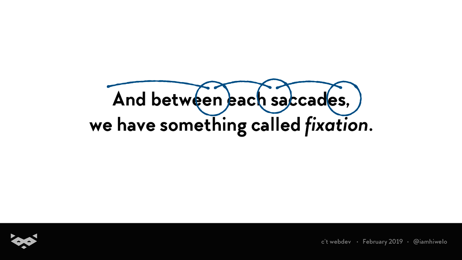
And between each saccades, we have something called fixation. c’t webdev • February 2019 • @iamhiwelo
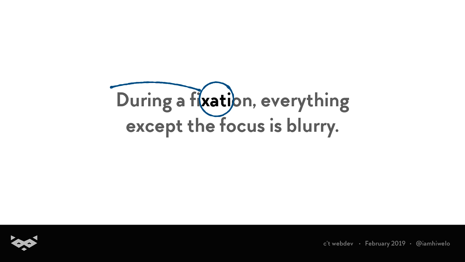
During a fixation, everything except the focus is blurry. § c’t webdev • February 2019 • @iamhiwelo
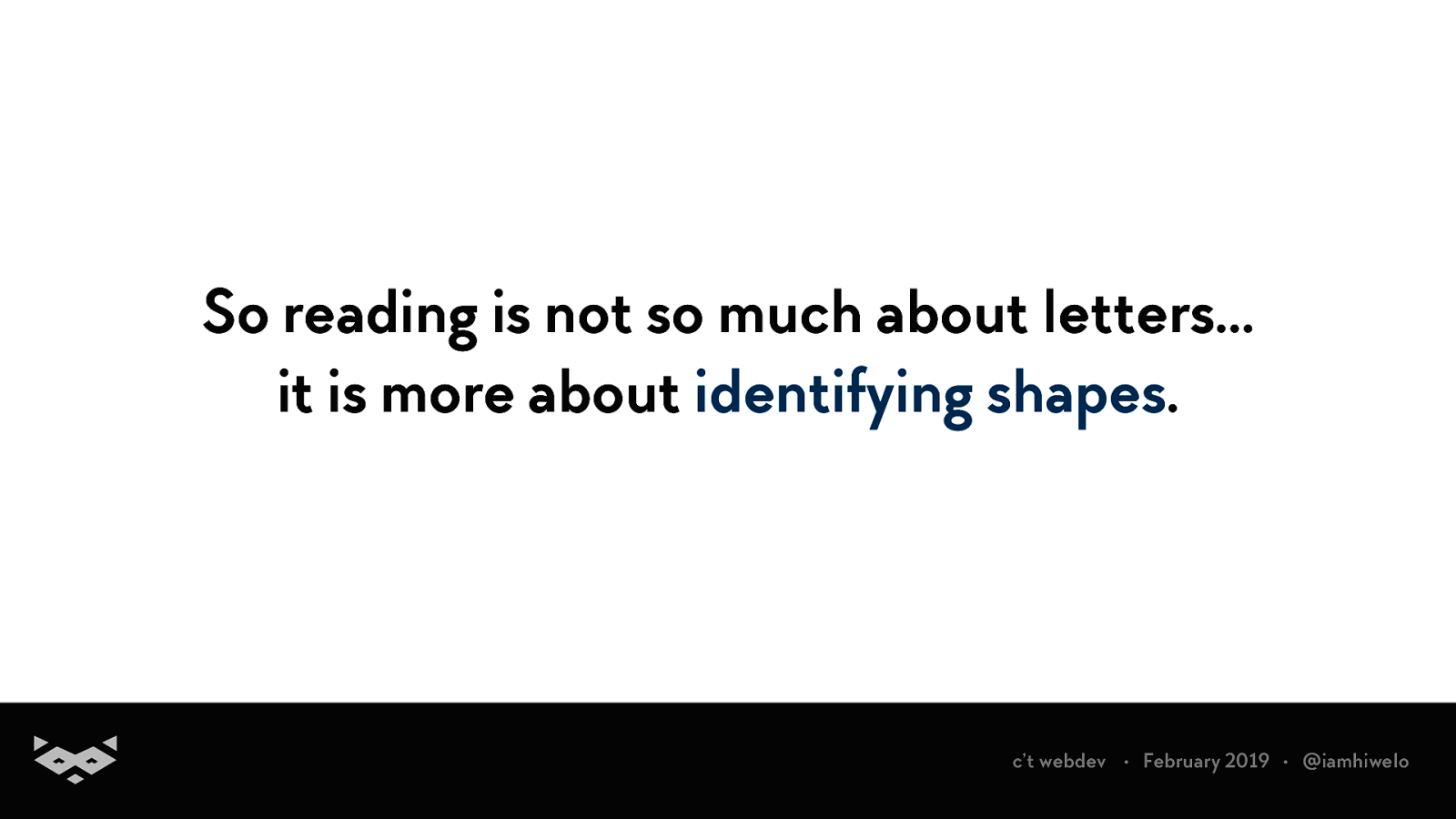
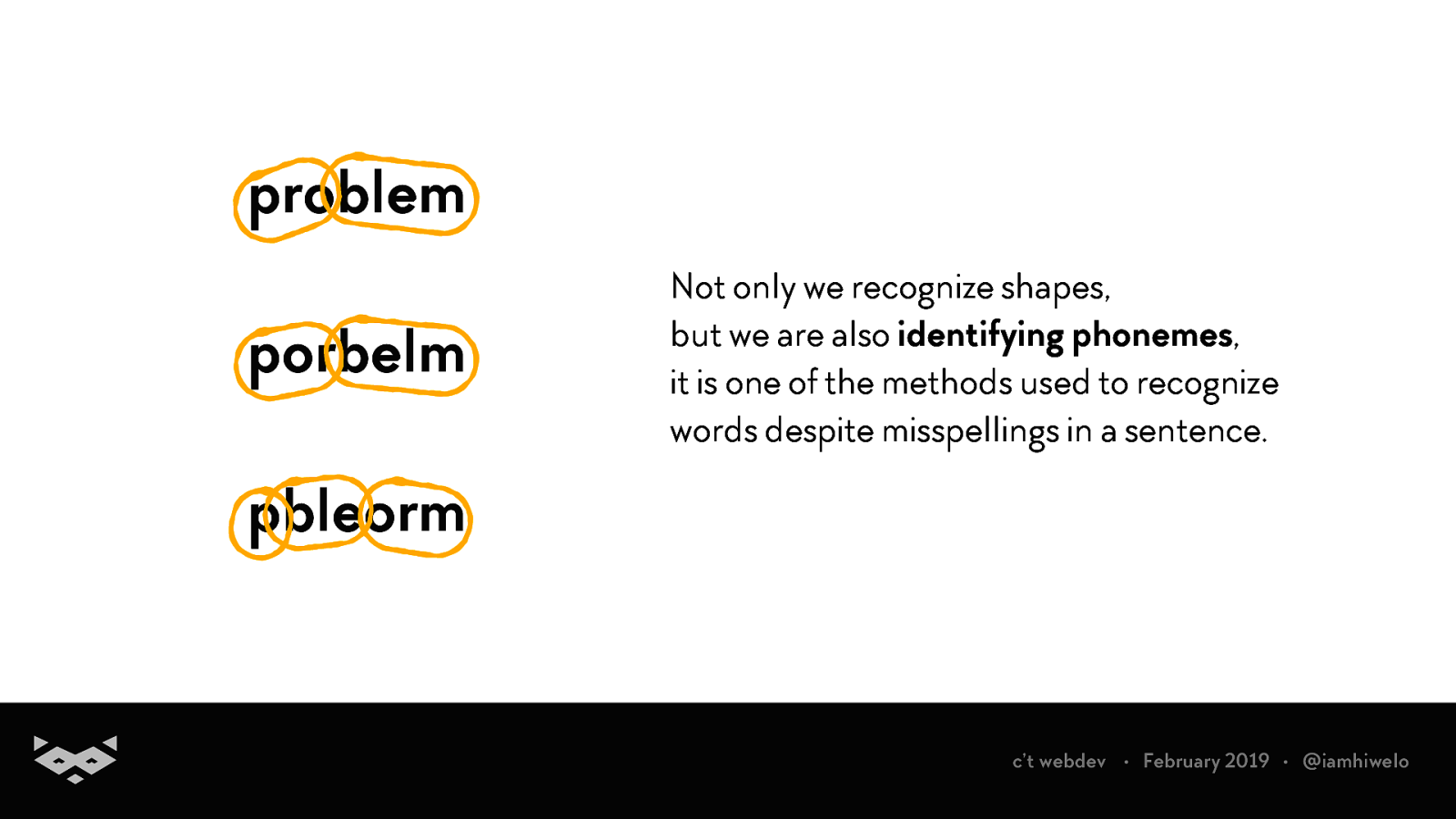
So reading is not so much about letters… it is more about identifying shapes. c’t webdev • February 2019 • @iamhiwelo
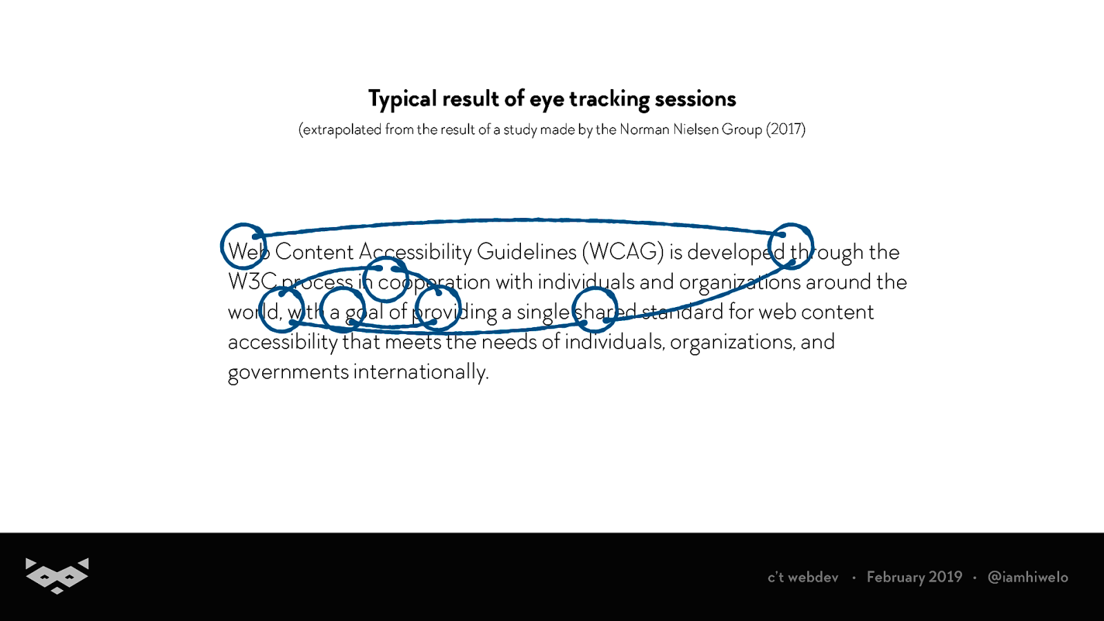
Typical result of eye tracking sessions (extrapolated from the result of a study made by the Norman Nielsen Group (2017) Web Content Accessibility Guidelines (WCAG) is developed through the W3C process in cooperation with individuals and organizations around the world, with a goal of providing a single shared standard for web content accessibility that meets the needs of individuals, organizations, and governments internationally. c’t webdev • February 2019 • @iamhiwelo
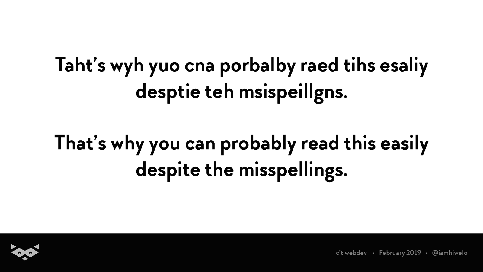
Taht’s wyh yuo cna porbalby raed tihs esaliy desptie teh msispeillgns. That’s why you can probably read this easily despite the misspellings. c’t webdev • February 2019 • @iamhiwelo
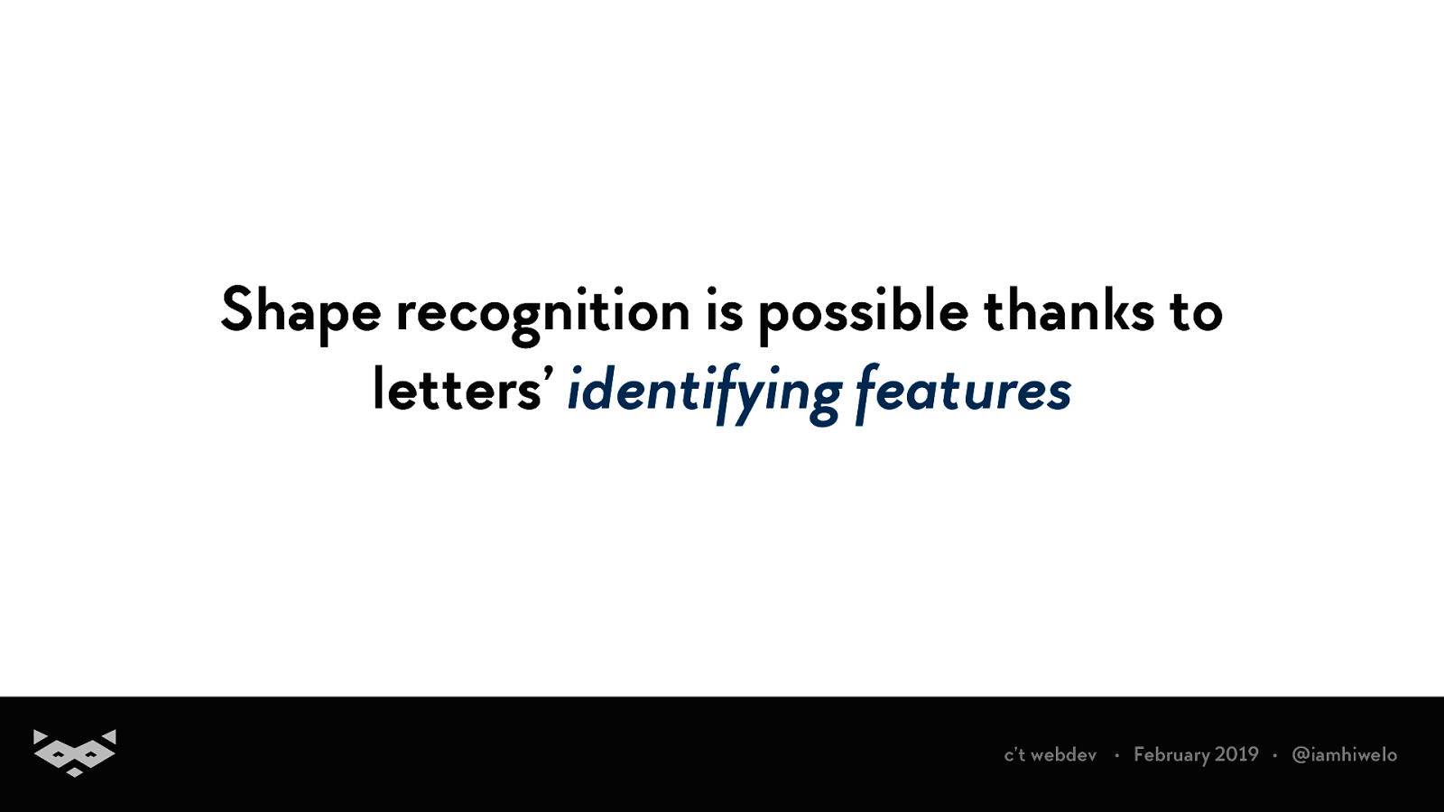
Shape recognition is possible thanks to letters’ identifying features c’t webdev • February 2019 • @iamhiwelo
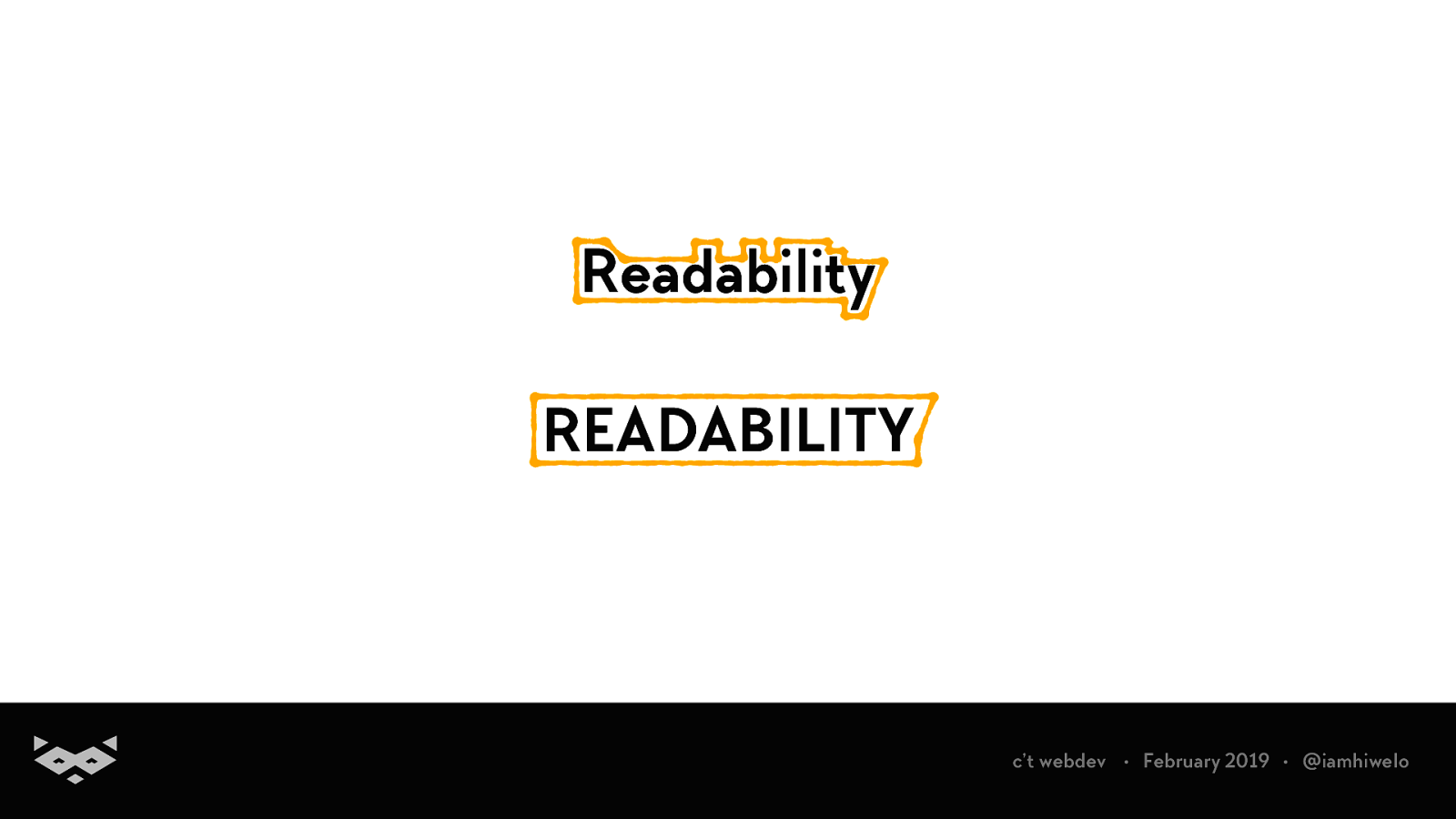
Readability READABILITY c’t webdev • February 2019 • @iamhiwelo
problem porbelm Not only we recognize shapes, but we are also identifying phonemes, it is one of the methods used to recognize words despite misspellings in a sentence. pbleorm c’t webdev • February 2019 • @iamhiwelo
So, that’s how we read. But, what’s the point?
Because multiple cognitive processes are involved, this universal method becomes highly personal. c’t webdev • February 2019 • @iamhiwelo
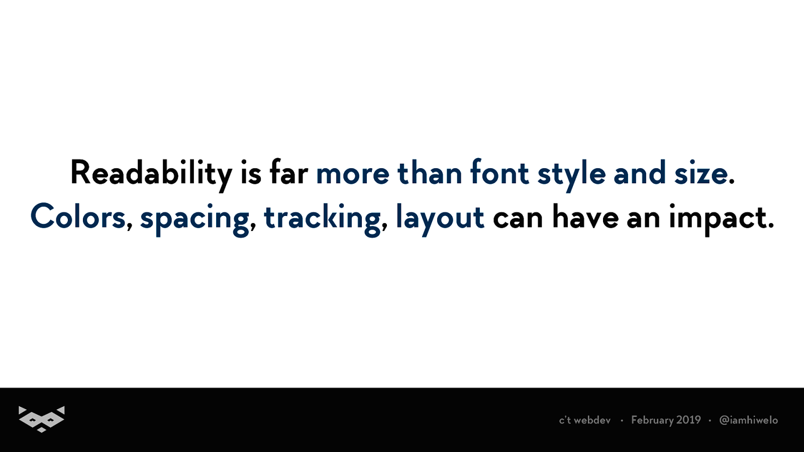
Readability is far more than font style and size. Colors, spacing, tracking, layout can have an impact. c’t webdev • February 2019 • @iamhiwelo
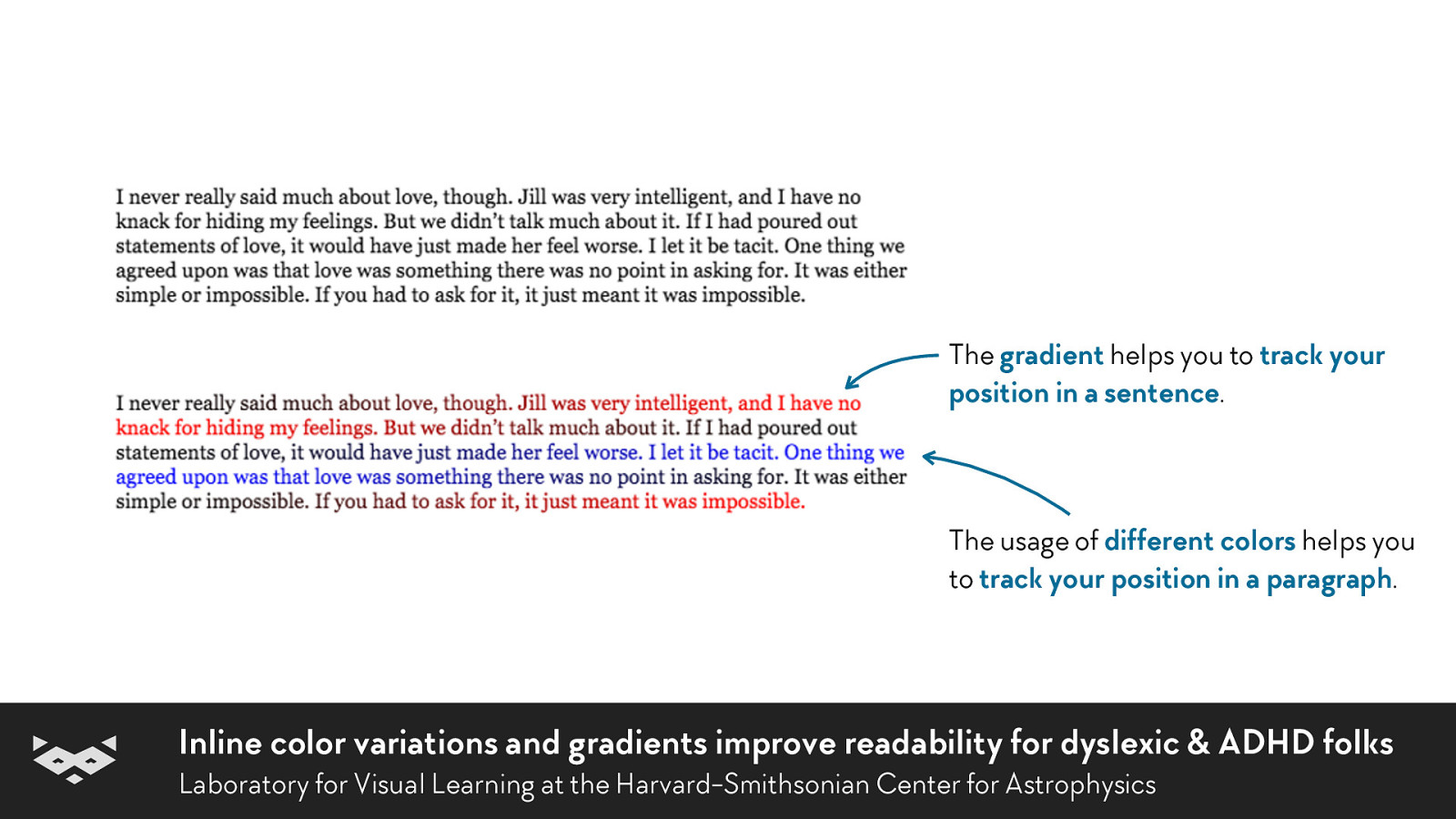
The gradient helps you to track your position in a sentence. The usage of different colors helps you to track your position in a paragraph. Inline color variations and gradients improve readability for dyslexic & ADHD folks Laboratory for Visual Learning at the Harvard-Smithsonian Center for Astrophysics
People can adapt their experience to their needs, even if they are often not aware of that. c’t webdev • February 2019 • @iamhiwelo
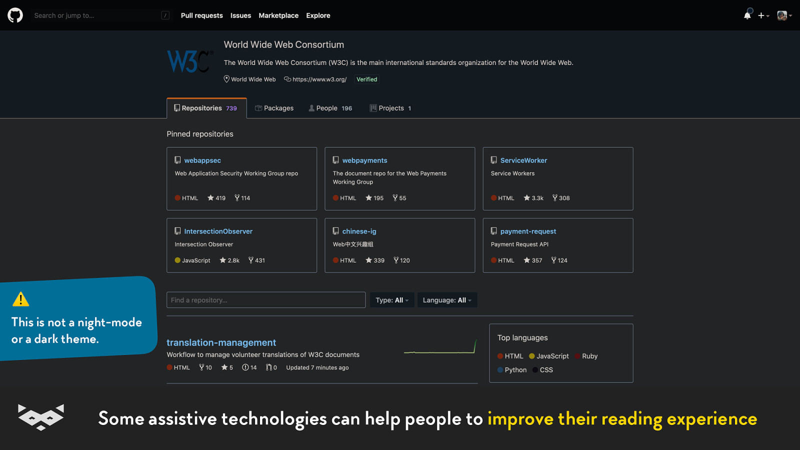
For example, assistive technologies are doing more than offering “screen-reader”-ish experiences. c’t webdev • February 2019 • @iamhiwelo
⚠ This is not a night-mode or a dark theme. Some assistive technologies can help people to improve their reading experience
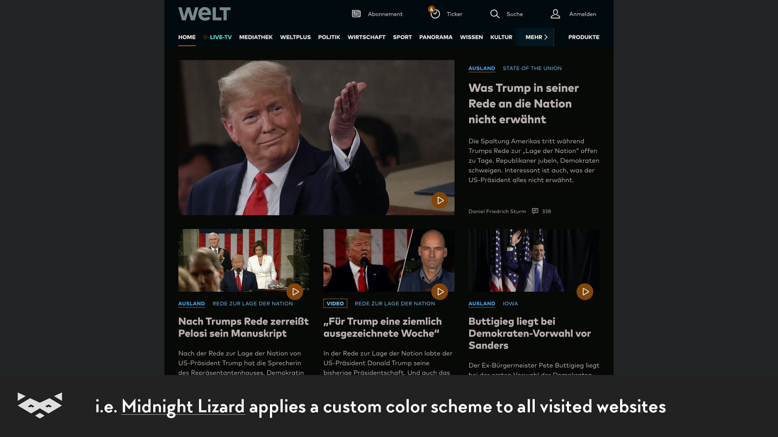
i.e. Midnight Lizard applies a custom color scheme to all visited websites
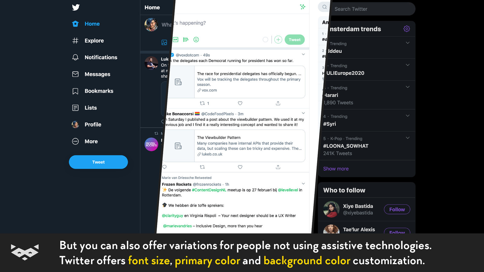
But you can also offer variations for people not using assistive technologies. Twitter offers font size, primary color and background color customization.
Let’s take a look to something designed for readability. c’t webdev • February 2019 • @iamhiwelo
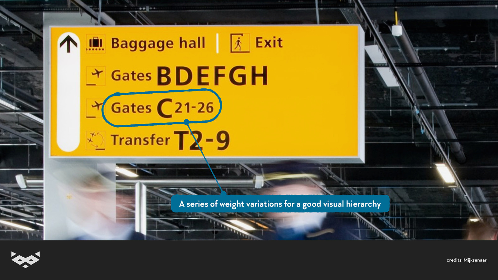
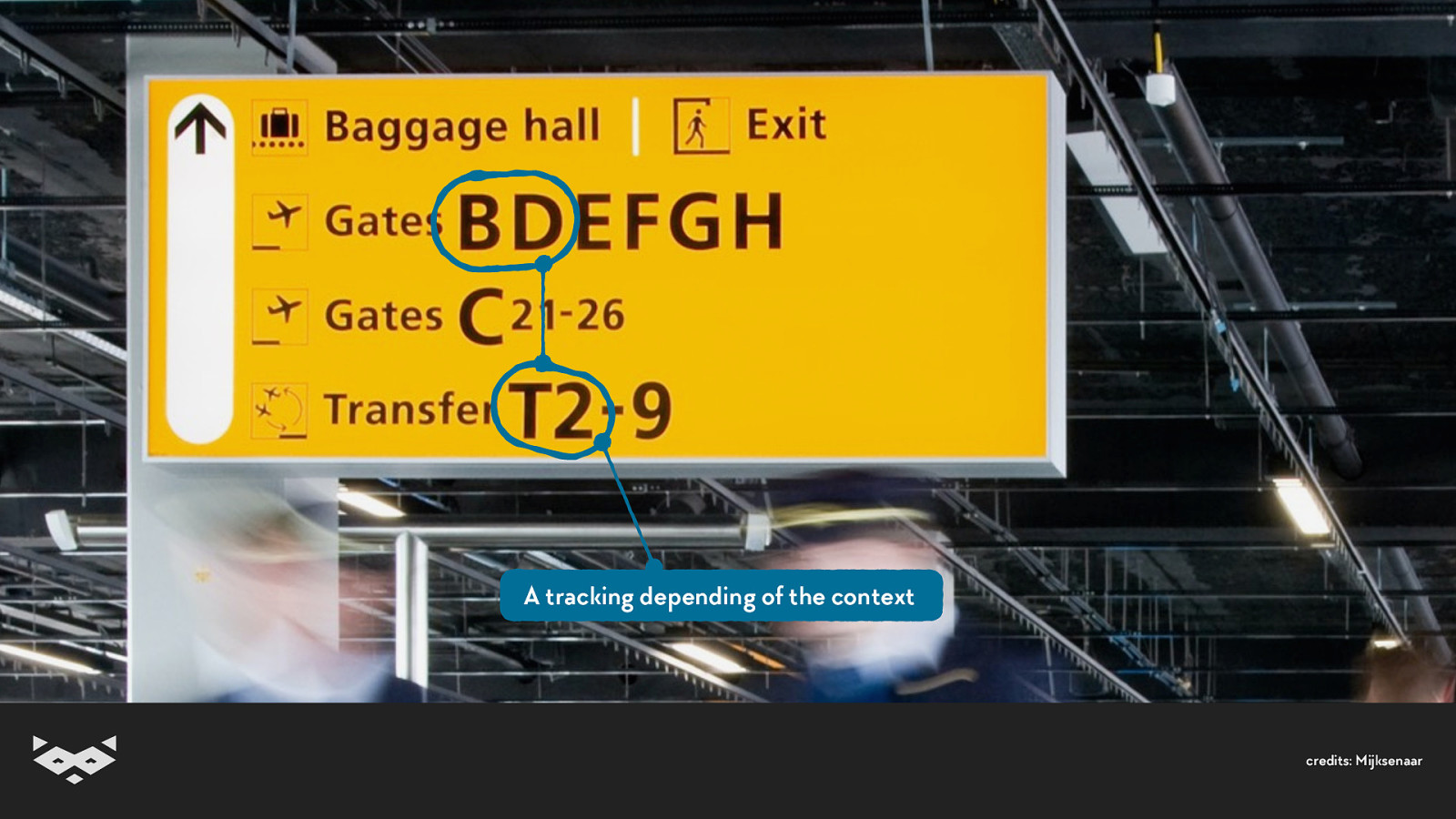
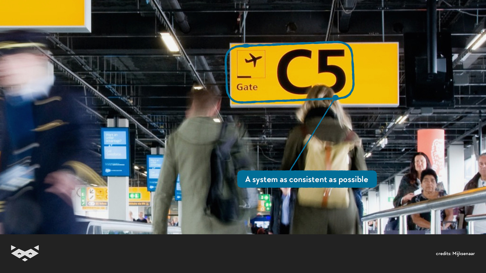
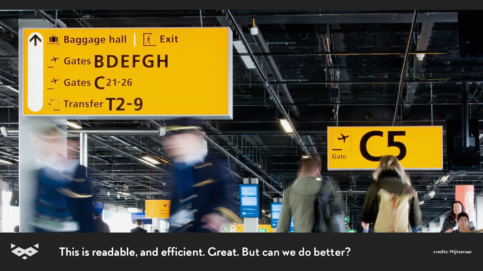
credits: Mijksenaar
A series of weight variations for a good visual hierarchy credits: Mijksenaar
A tracking depending of the context credits: Mijksenaar
A system as consistent as possible credits: Mijksenaar
This is readable, and efficient. Great. But can we do better? credits: Mijksenaar
So, I’m sold. What can we do?
Based on the airport signs, here’s 8 universal guidelines to apply: c’t webdev • February 2019 • @iamhiwelo
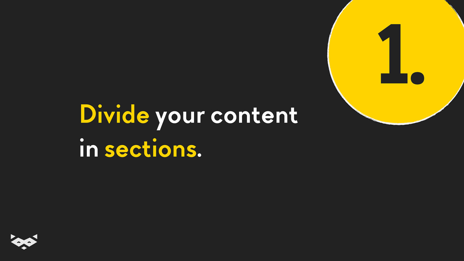
Divide your content in sections. 1.
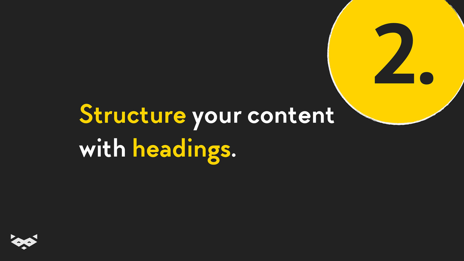
Structure your content with headings. 2.
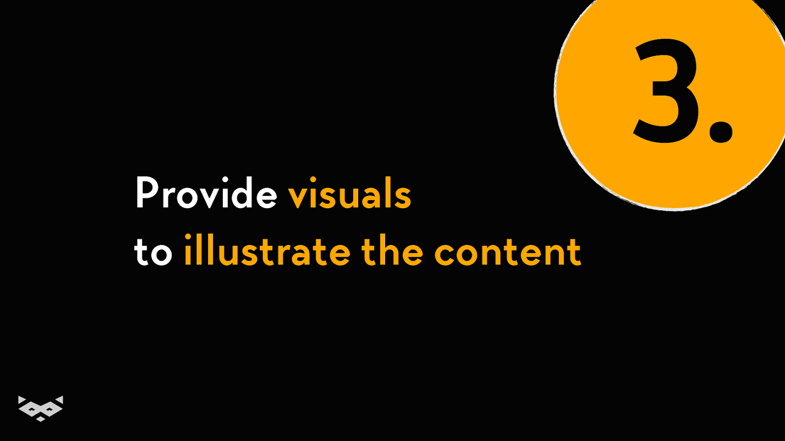
Provide visuals to illustrate the content 3.
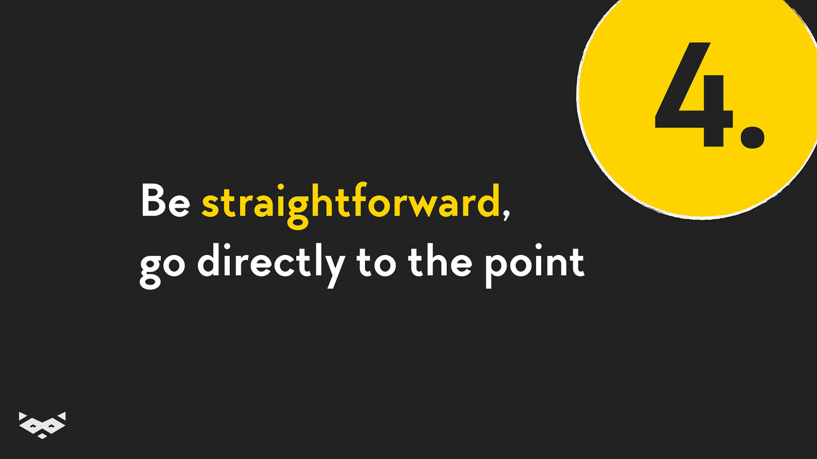
Be straightforward, go directly to the point 4.
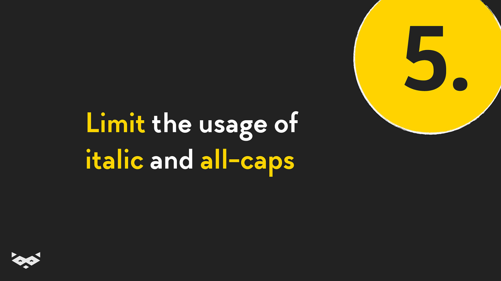
Limit the usage of italic and all-caps 5.
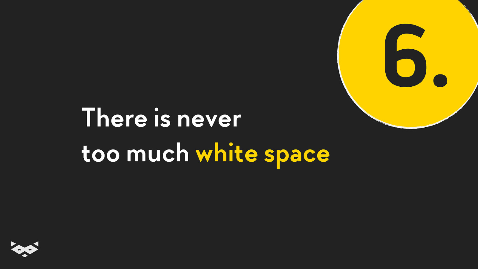
There is never too much white space 6.
Break lines after 50-70 characters 7.
Use colors and bold to highlight information 8.
These guidelines are not only about design, it must rely on a semantic implementation. c’t webdev • February 2019 • @iamhiwelo
HTML & CSS rock. Good accessibility comes out of the box with a semantic HTML c’t webdev • February 2019 • @iamhiwelo
Use relative sizes instead of fixed values c’t webdev • February 2019 • @iamhiwelo
Using rem is straightforward. Especially with tricks like a 62,5% font-size on :root c’t webdev • February 2019 • @iamhiwelo
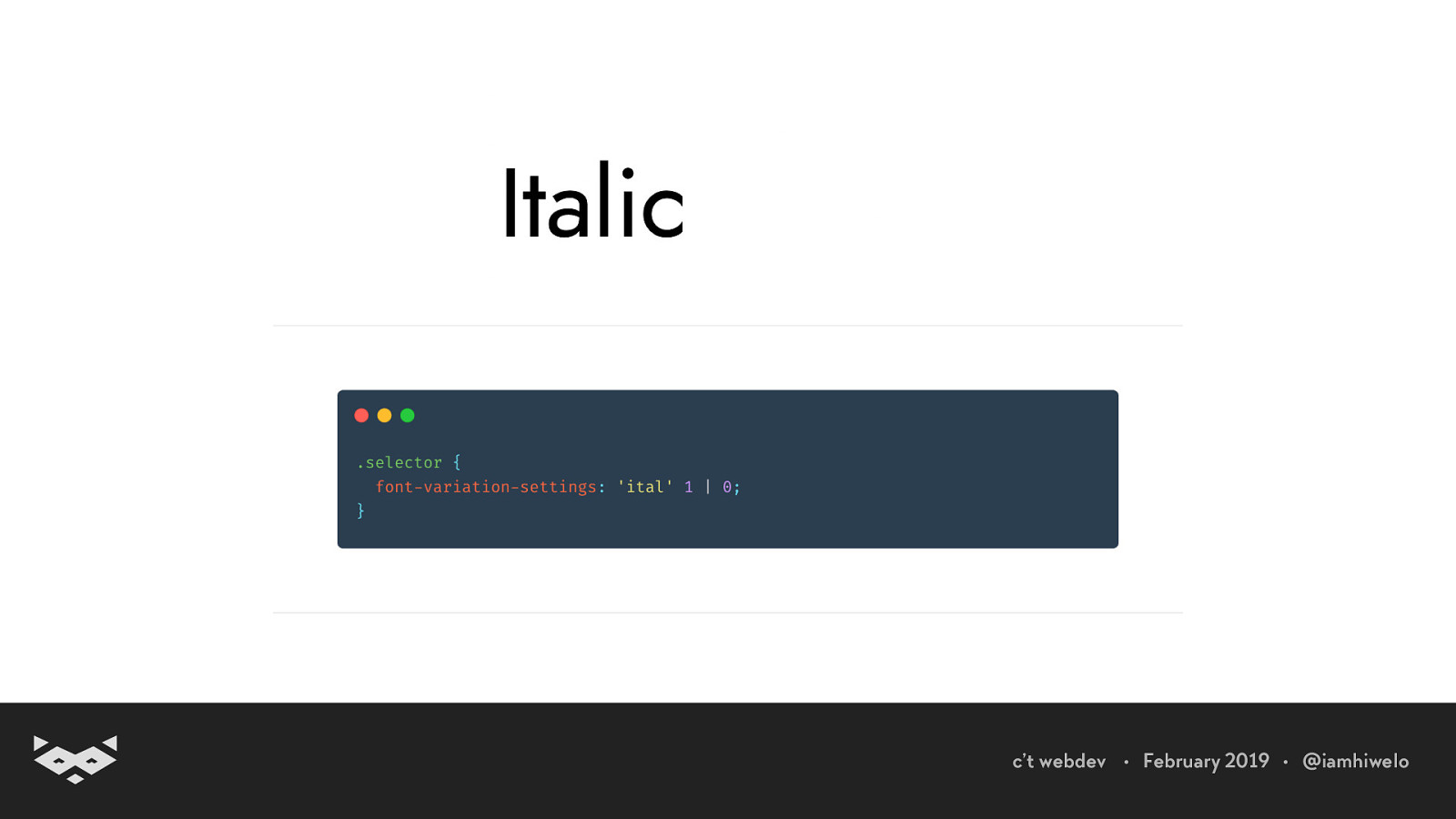
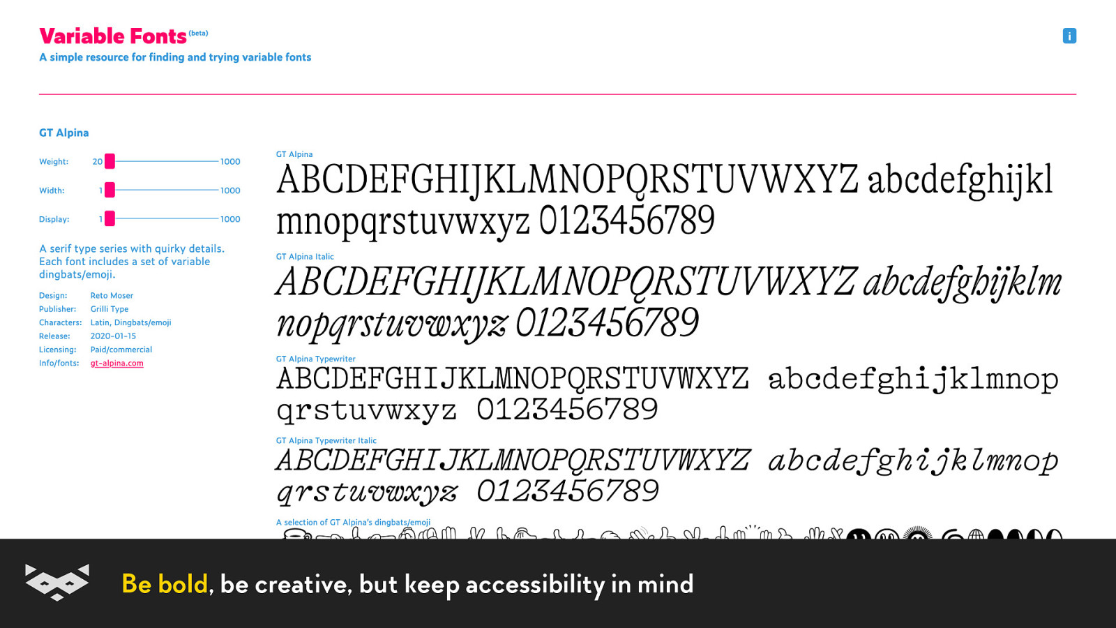
Variable fonts will help you doing the extra mile.
Accessibility is hard. c’t webdev • February 2019 • @iamhiwelo
It is hard because there is no one-fits-all solution. c’t webdev • February 2019 • @iamhiwelo
Creating accessible and inclusive experiences is about collaboration and customisation. c’t webdev • February 2019 • @iamhiwelo
Variable fonts can help create collaboration between designers and engineers. c’t webdev • February 2019 • @iamhiwelo
We can use variable fonts to offer a better experience when using justification. c’t webdev • February 2019 • @iamhiwelo
Variable fonts can also help users to customize their experience. c’t webdev • February 2019 • @iamhiwelo
Customization is needed because we have different capabilities, we are used to different media and platforms, and we are not reading the same way. c’t webdev • February 2019 • @iamhiwelo
There is no standard “readable” experience. c’t webdev • February 2019 • @iamhiwelo
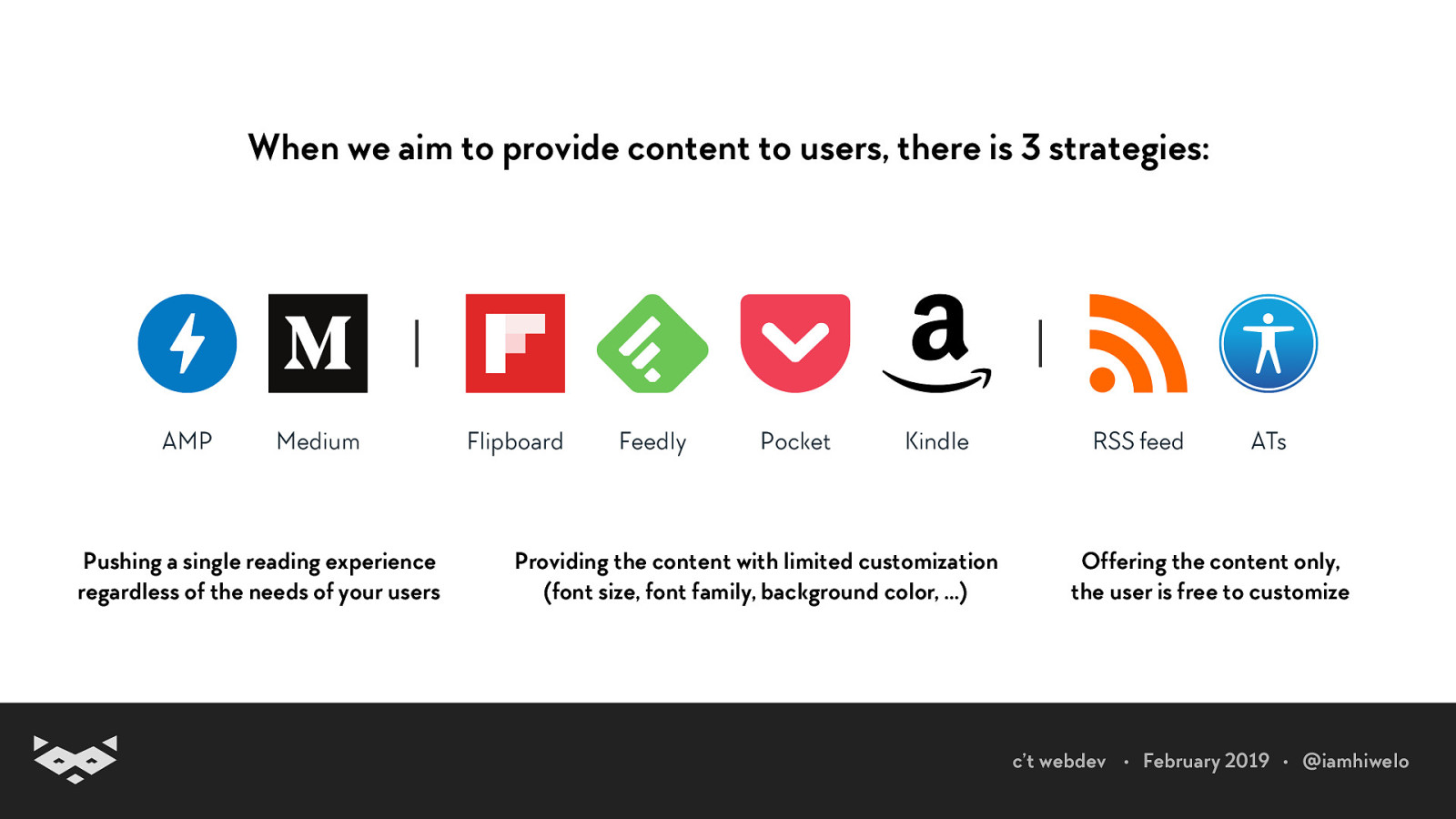
When we aim to provide content to users, there is 3 strategies: Pushing a single reading experience regardless of the needs of your users Providing the content with limited customization (font size, font family, background color, …) Offering the content only, the user is free to customize c’t webdev • February 2019 • @iamhiwelo
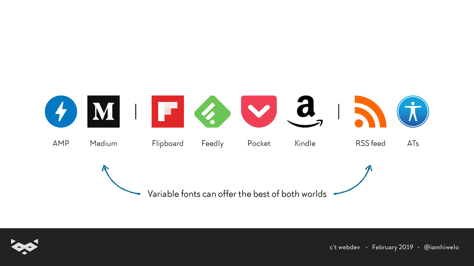
Variable fonts can offer the best of both worlds c’t webdev • February 2019 • @iamhiwelo
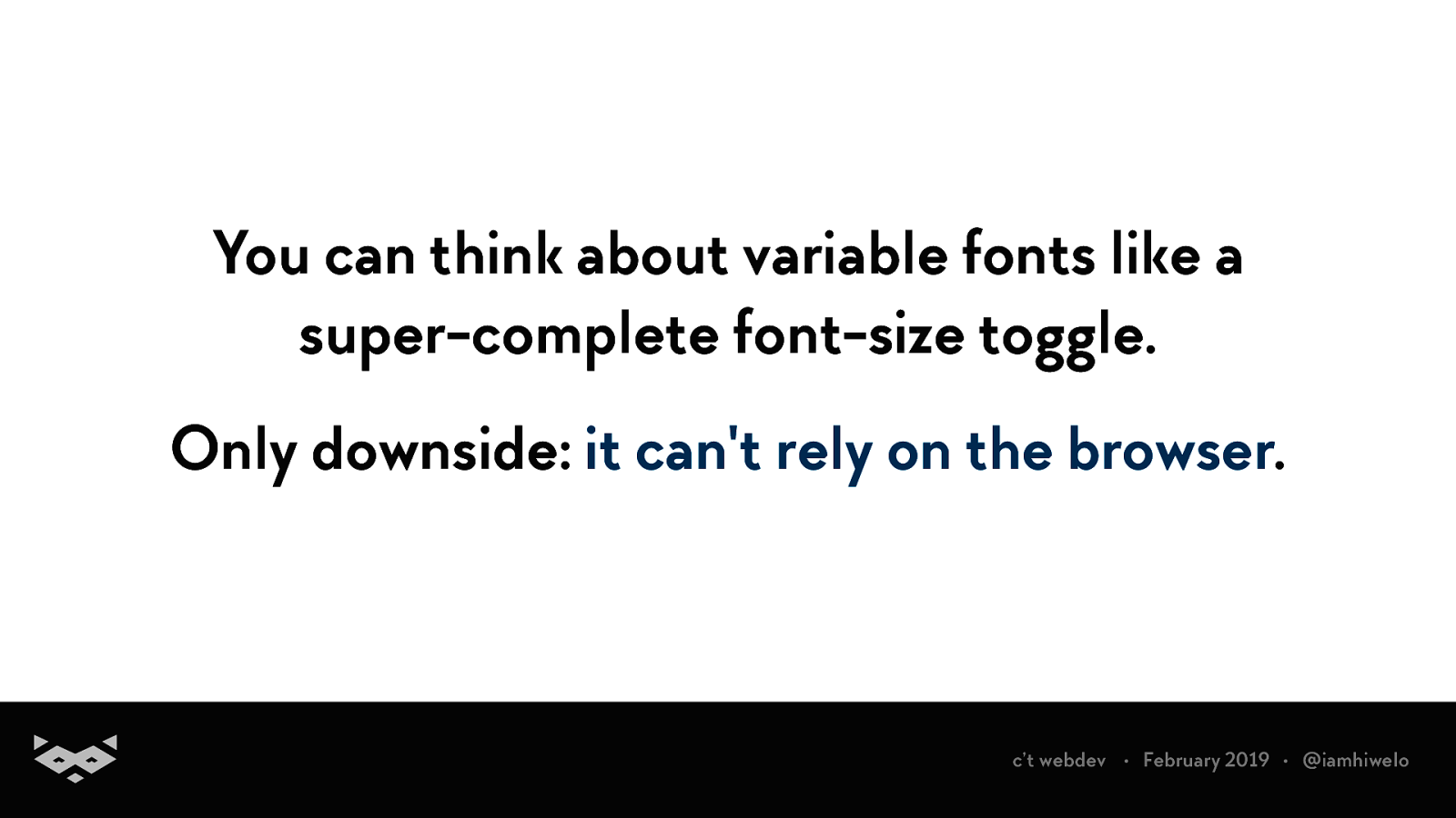
You can think about variable fonts like a super-complete font-size toggle. Only downside: it can’t rely on the browser. c’t webdev • February 2019 • @iamhiwelo
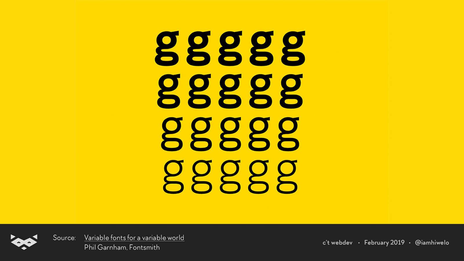
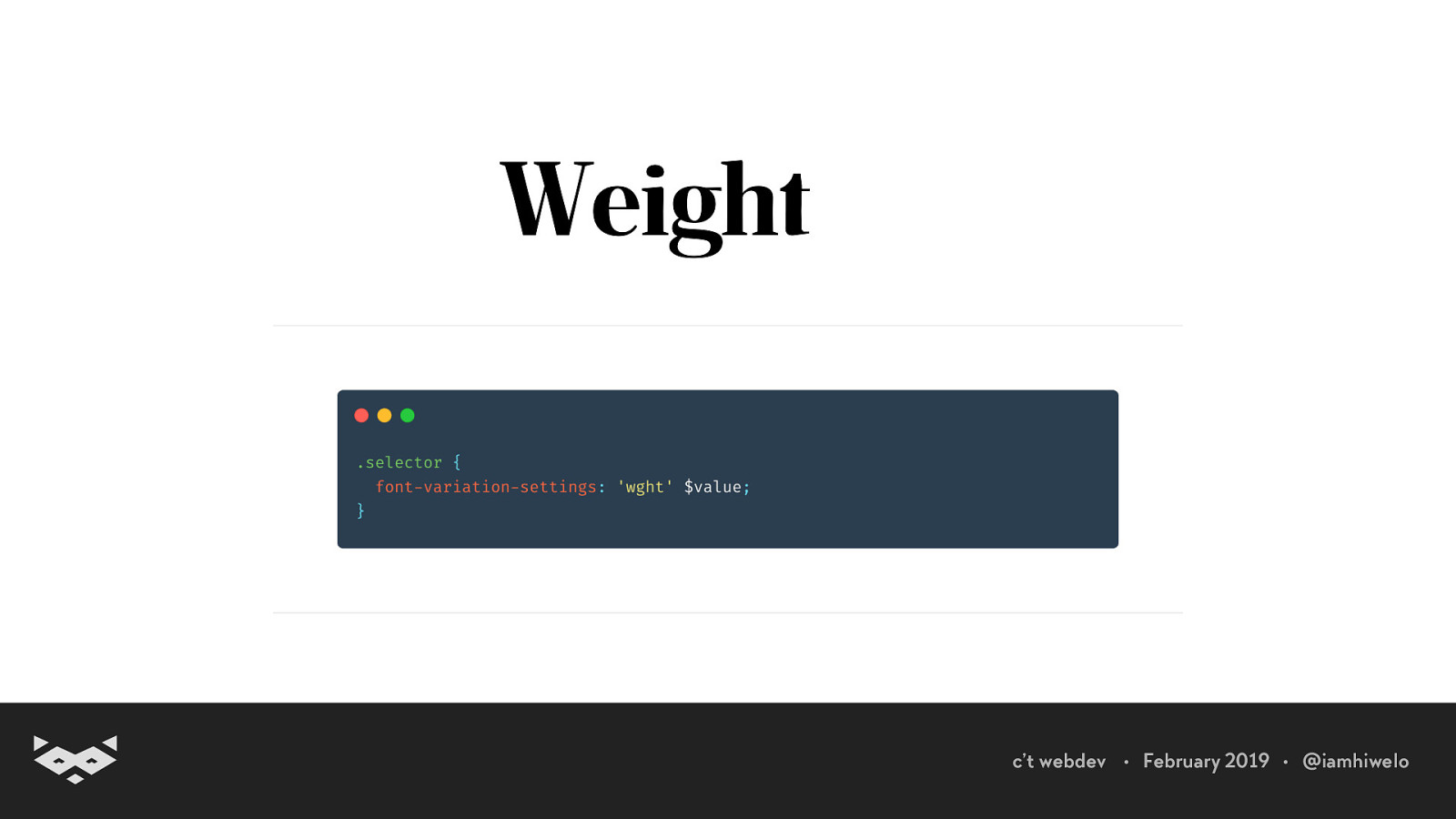
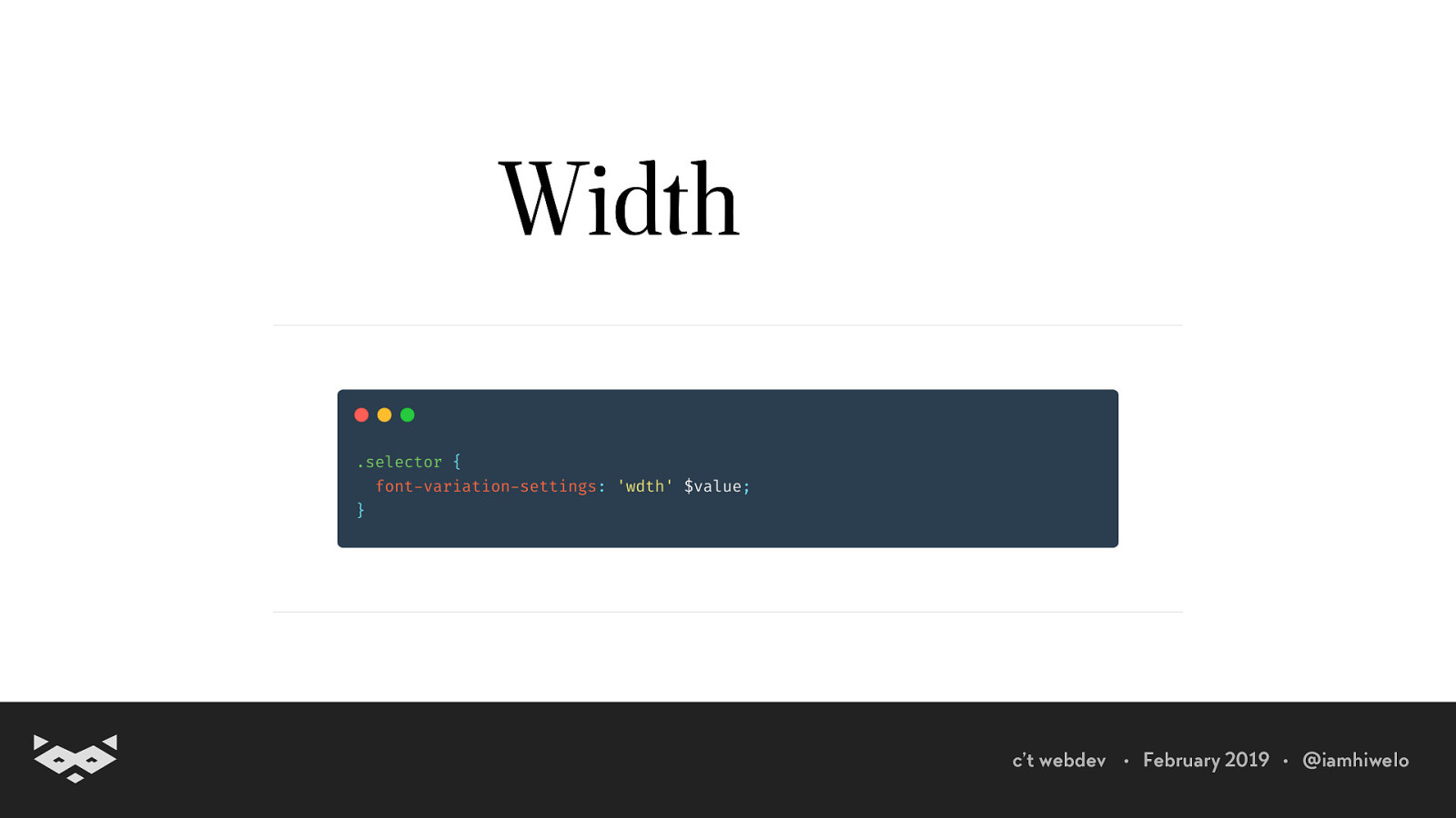
What is the variable part of a variable font?
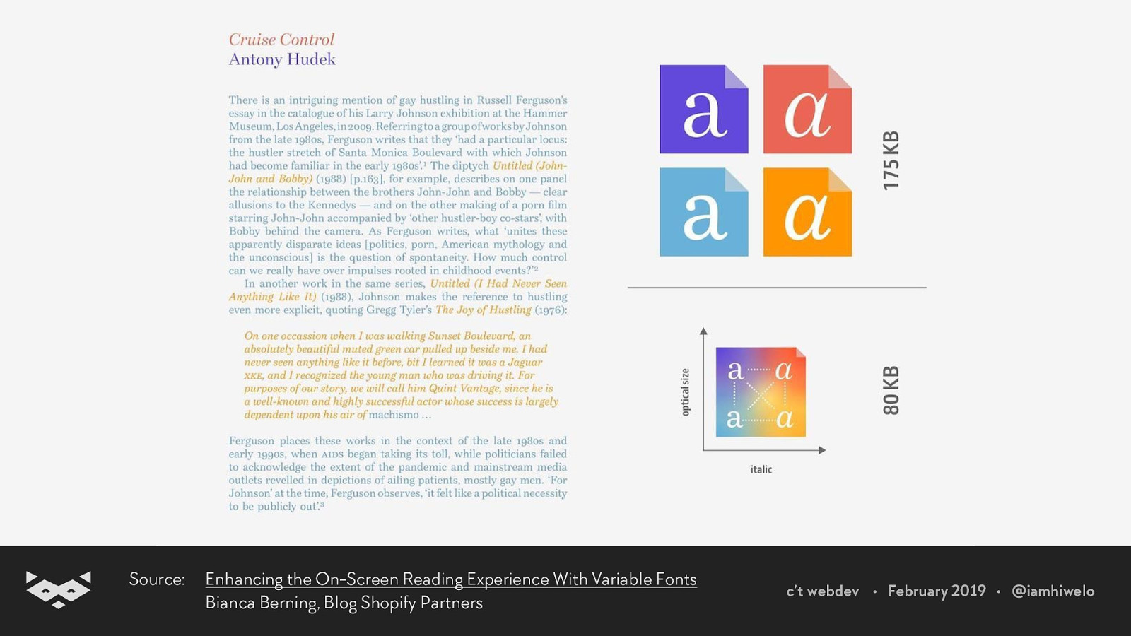
Source: Enhancing the On-Screen Reading Experience With Variable Fonts Bianca Berning, Blog Shopify Partners c’t webdev • February 2019 • @iamhiwelo
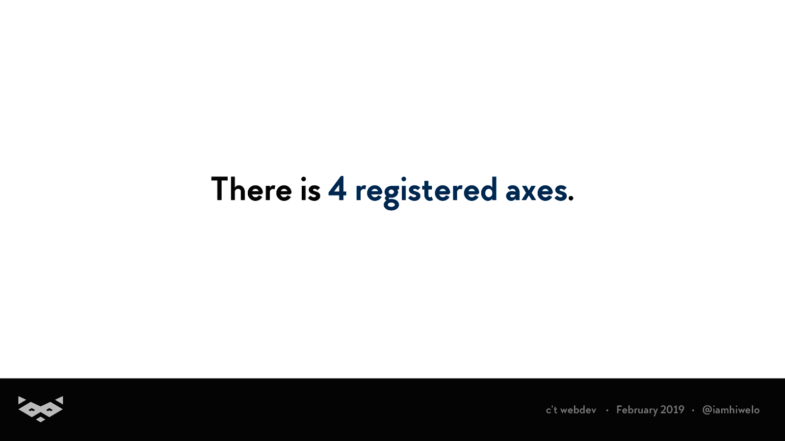
There is 4 registered axes. c’t webdev • February 2019 • @iamhiwelo
Source: Variable fonts for a variable world Phil Garnham, Fontsmith c’t webdev • February 2019 • @iamhiwelo
c’t webdev • February 2019 • @iamhiwelo
c’t webdev • February 2019 • @iamhiwelo
c’t webdev • February 2019 • @iamhiwelo
c’t webdev • February 2019 • @iamhiwelo
Variable fonts offer also custom axes defined by the font designer. c’t webdev • February 2019 • @iamhiwelo
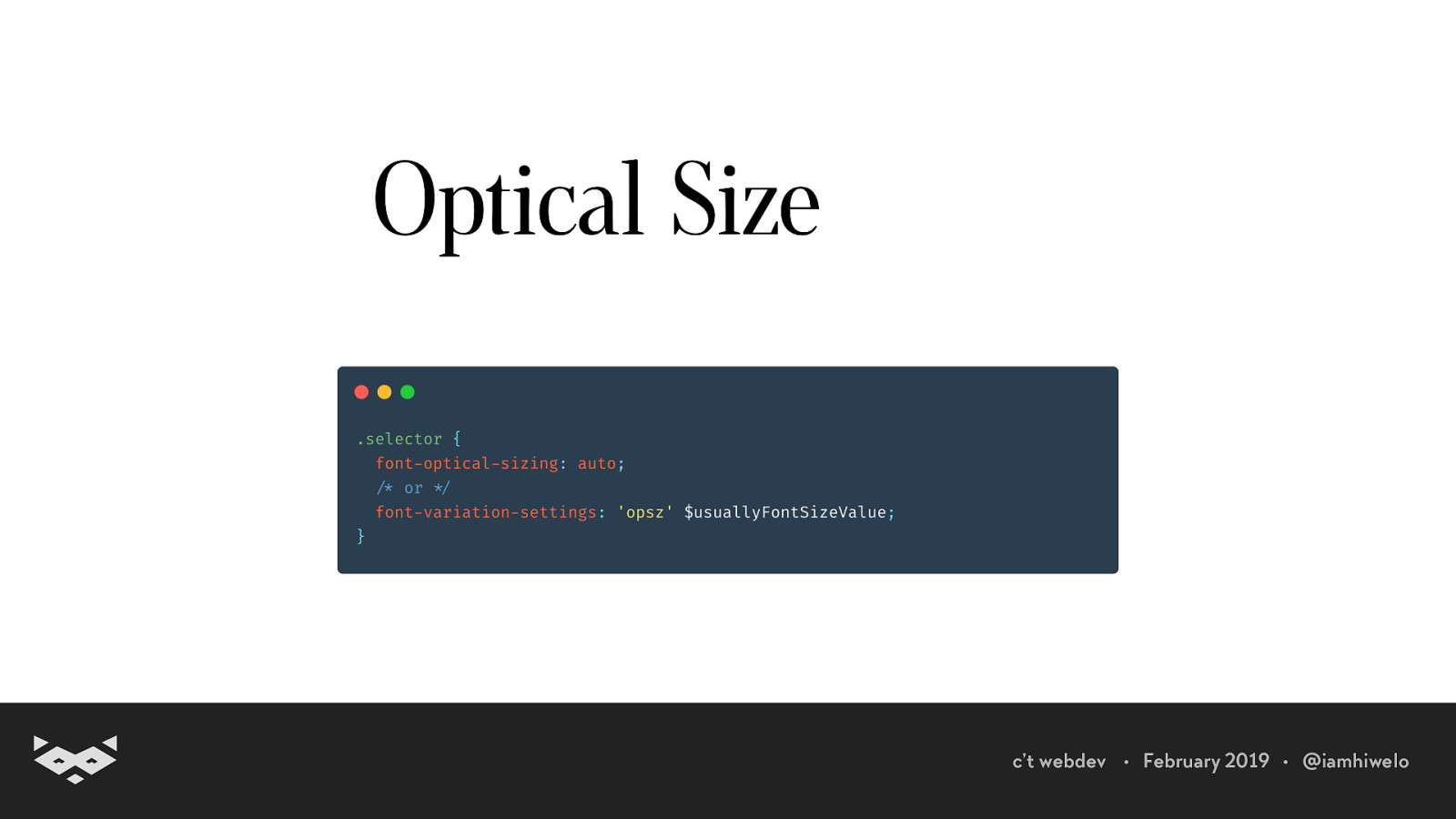
And that’s the real game changer: the ability to configure the optical size. c’t webdev • February 2019 • @iamhiwelo
The optical size is an old design concept finally available for our Web experiences. c’t webdev • February 2019 • @iamhiwelo
c’t webdev • February 2019 • @iamhiwelo
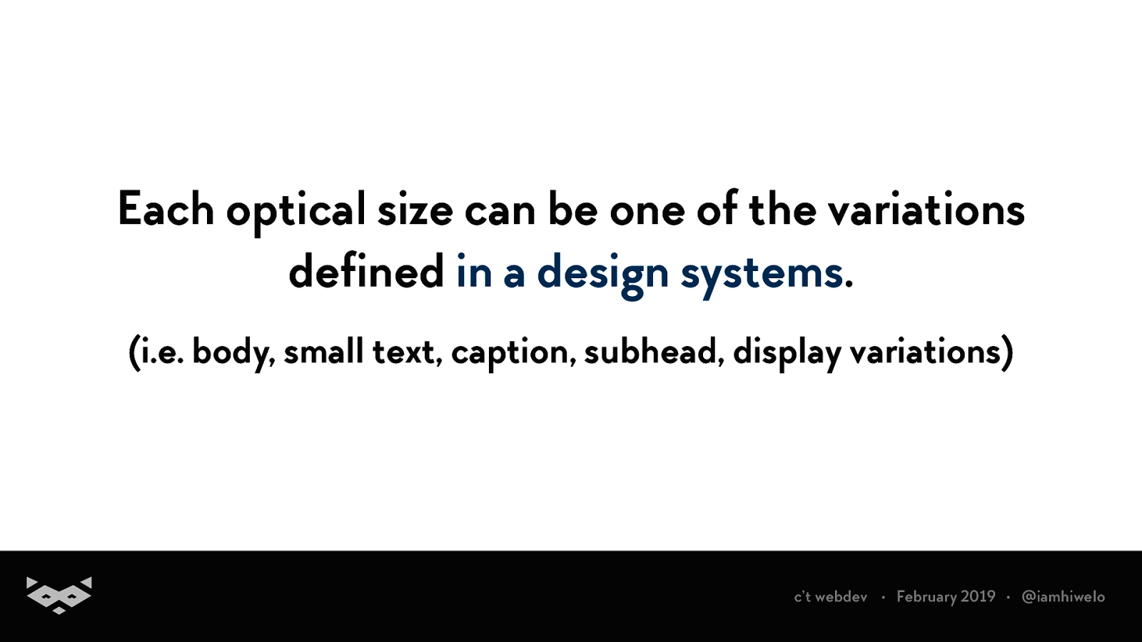
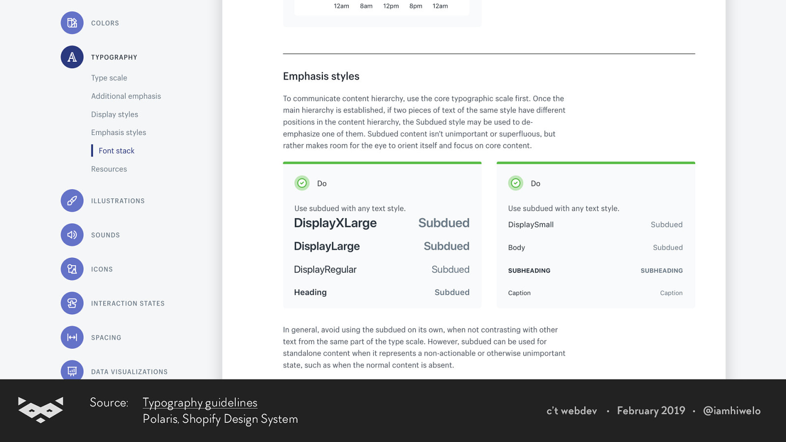
Each optical size can be one of the variations defined in a design systems. (i.e. body, small text, caption, subhead, display variations) c’t webdev • February 2019 • @iamhiwelo
Source: Typography guidelines Polaris, Shopify Design System c’t webdev • February 2019 • @iamhiwelo
c’t webdev • February 2019 • @iamhiwelo
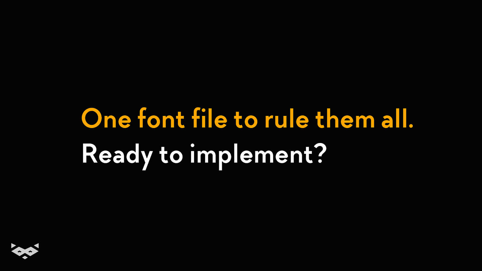
With only one font file, we could offer an important number of variations. c’t webdev • February 2019 • @iamhiwelo
It could include all design variation needed, but also some accessibility presets. c’t webdev • February 2019 • @iamhiwelo
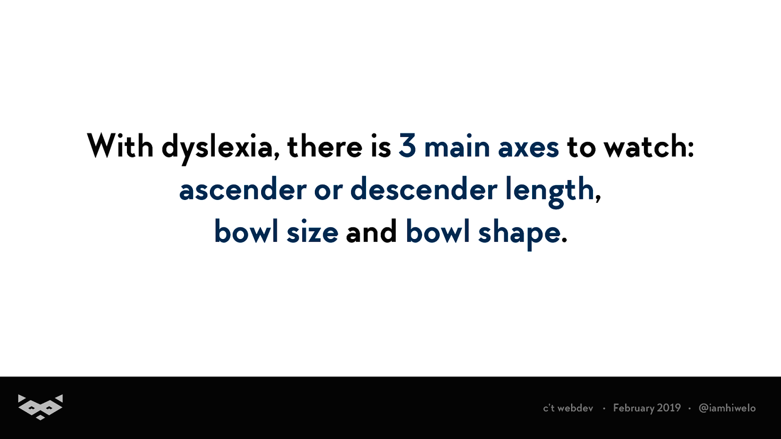
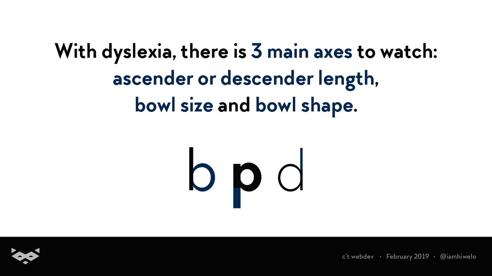
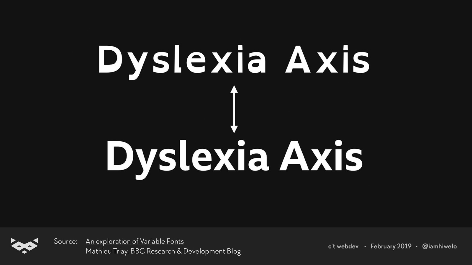
With dyslexia, there is 3 main axes to watch: ascender or descender length, bowl size and bowl shape. c’t webdev • February 2019 • @iamhiwelo
With dyslexia, there is 3 main axes to watch: ascender or descender length, bowl size and bowl shape. c’t webdev • February 2019 • @iamhiwelo
Source: An exploration of Variable Fonts Mathieu Triay, BBC Research & Development Blog c’t webdev • February 2019 • @iamhiwelo
Wanna experiment with your projects?
Font size, optical size and media queries: an endless world of opportunities
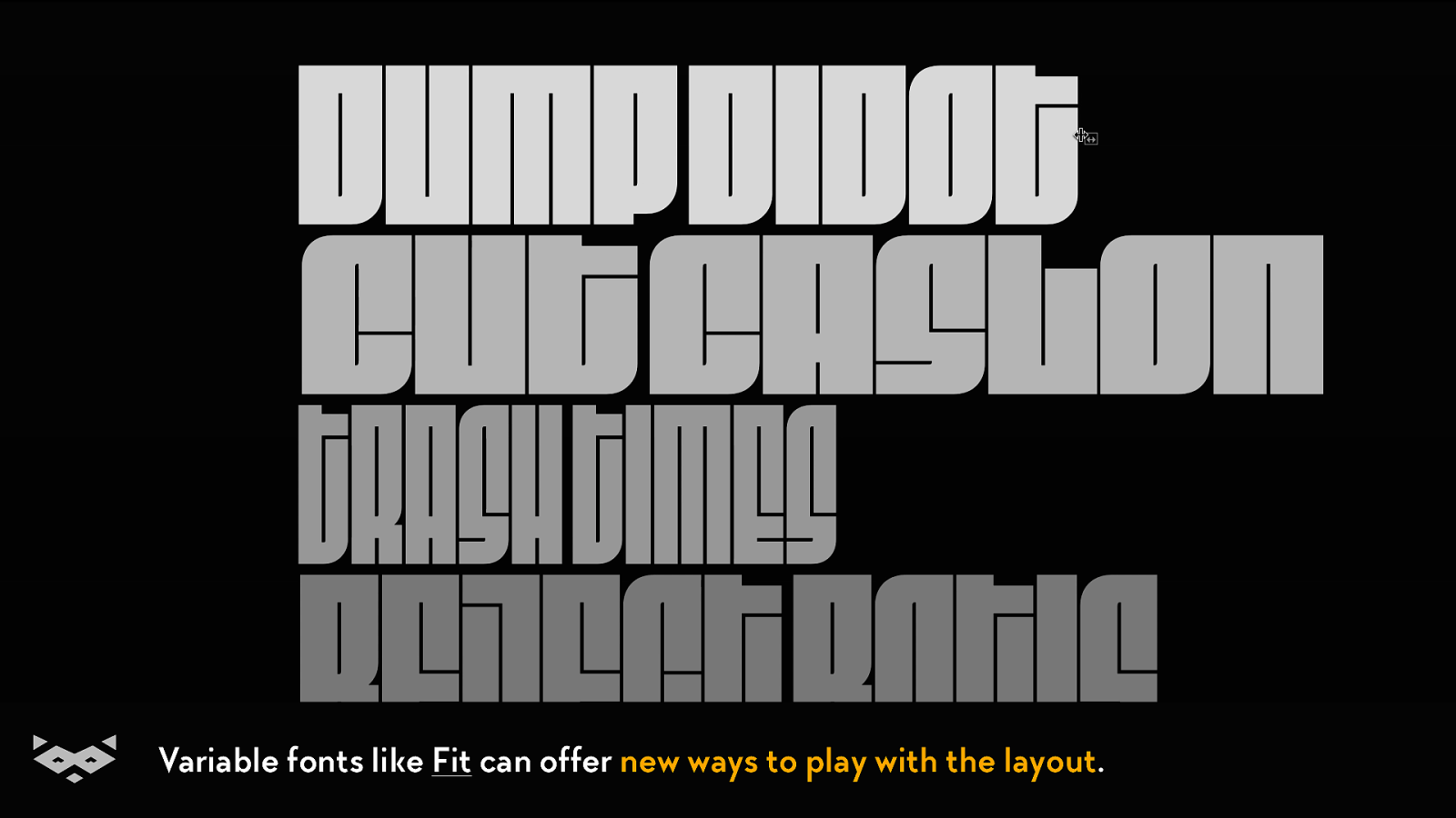
Variable fonts like Fit can offer new ways to play with the layout.
Adapting the font design to the message, like this experimentation by the BBC
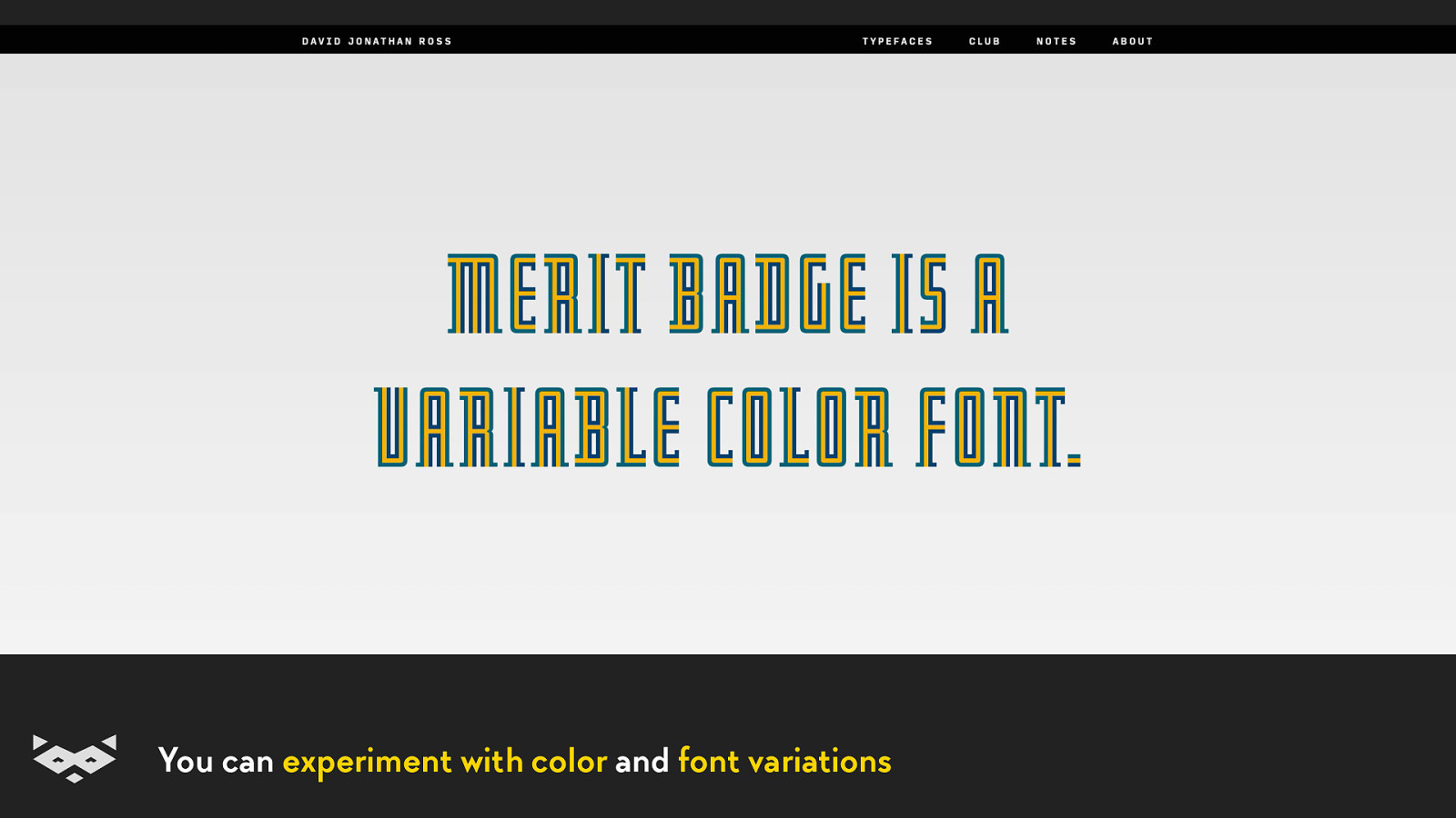
You can experiment with color and font variations
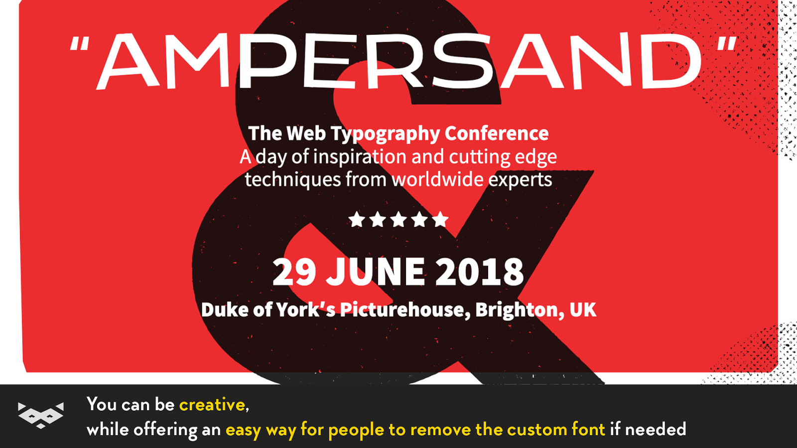
You can be creative, while offering an easy way for people to remove the custom font if needed
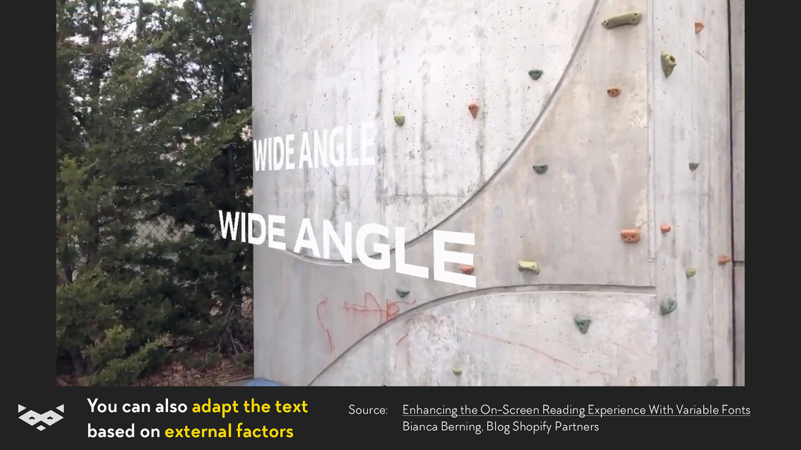
You can also adapt the text based on external factors Source: Enhancing the On-Screen Reading Experience With Variable Fonts Bianca Berning, Blog Shopify Partners
Finally, I would advise you to follow David Jonathan Ross. c’t webdev • February 2019 • @iamhiwelo
But also to read BBC’s experimentations, and to visit v-fonts.com and axis-praxis.org. c’t webdev • February 2019 • @iamhiwelo
Be bold, be creative, but keep accessibility in mind
One font file to rule them all. Ready to implement?
Bedankt! 🇳🇱 Merci beaucoup ! 🇫🇷 Tack så mycket! 🇸🇪 Thank you! 🇬🇧 Tusen takk! 🇳🇴 Vielen Dank! 🇩🇪 @iamhiwelo
Damien Senger Queer Web worker, specialized in accessibility & design systems. raccoon.studio • noti.st/hiwelo @iamhiwelo

Variable fonts are here and we can now create complex and scalable typographic system quickly and efficiently. An efficiency that can easily help us improving the performance and the accessibility our web projects. Sounds incredible right? But with great power comes a series of responsibilities: let’s see how we can balance accessibility needs, performance requirements and creativity to deliver accessible and inclusive reading experiences using variable fonts.
Here’s what was said about this presentation on social media.


 for free. You
can too.
for free. You
can too.