
A presentation at A11yNYC - Accessibility New York City in in New York, NY, USA by Damien Senger
LOWER LITERACY: IT’S NOT THE USER, IT’S THE PRODUCT A11yNYC Meetup • June 4, 2019
Photo by iam Se7en on Unsplash
Photo by Tamarcus Brown on Unsplash
Photo by Praveen Gupta on Unsplash
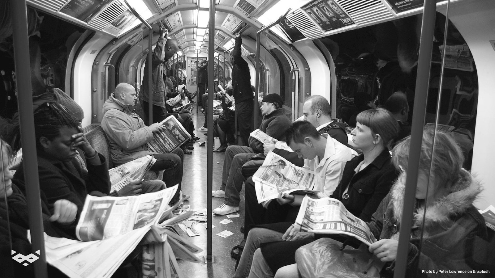
Photo by Peter Lawrence on Unsplash
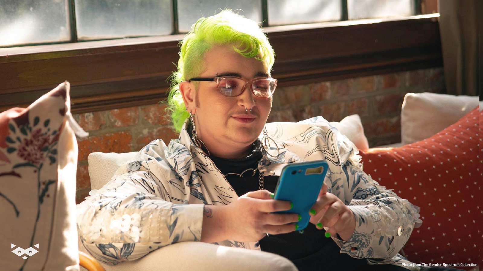
Photo from The Gender Spectrum Collection
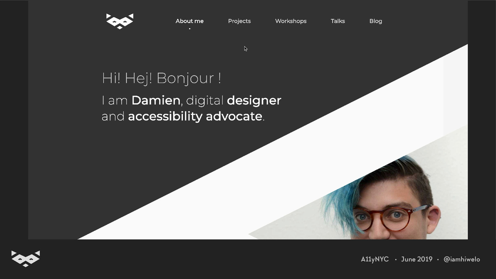
Hi! 👋 I’m Damien.
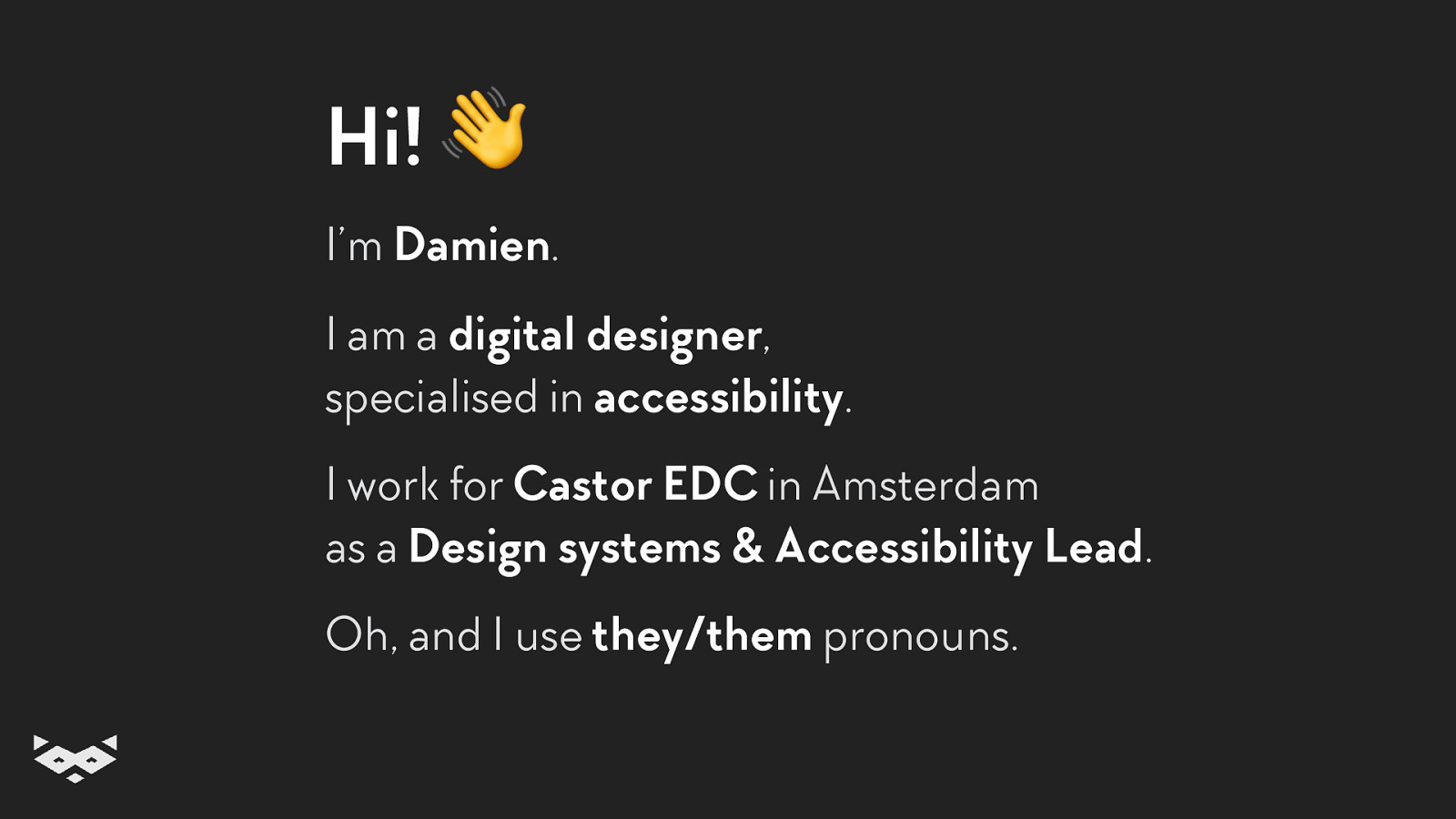
Hi! 👋 I’m Damien. I am a digital designer, specialised in accessibility. I work for Castor EDC in Amsterdam as a Design systems & Accessibility Lead. Oh, and I use they/them pronouns.
Also, good to know: The slides of this talk are available: https:!//speaking.raccoon.studio/ZIbn9M
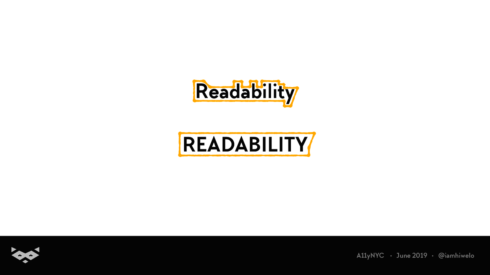
So! Let’s talk about readability.
But first, why?
Reading is not an easy thing. A11yNYC • June 2019 • @iamhiwelo
The Web is mainly text-based And a text is not accessible per se. A11yNYC • June 2019 • @iamhiwelo
There is two groups of reading impairments A11yNYC • June 2019 • @iamhiwelo
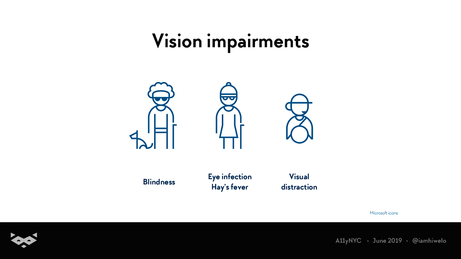
Vision impairments Blindness Eye infection Hay’s fever Visual distraction Microsoft icons A11yNYC • June 2019 • @iamhiwelo
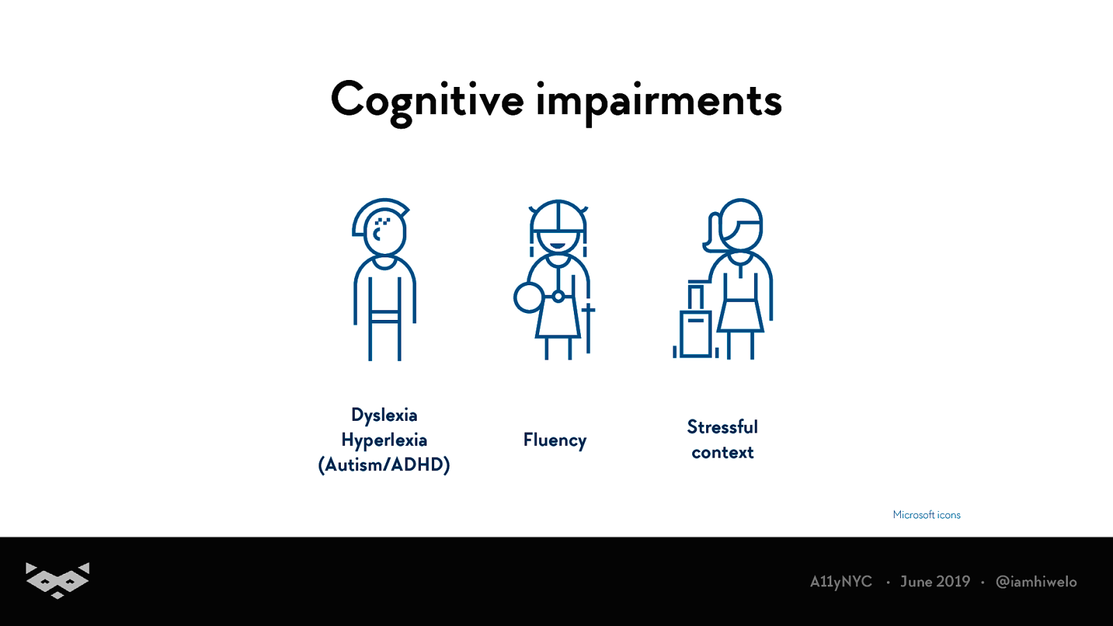
Cognitive impairments Dyslexia Hyperlexia (Autism/ADHD) Fluency Stressful context Microsoft icons A11yNYC • June 2019 • @iamhiwelo
A quick focus on dyslexia
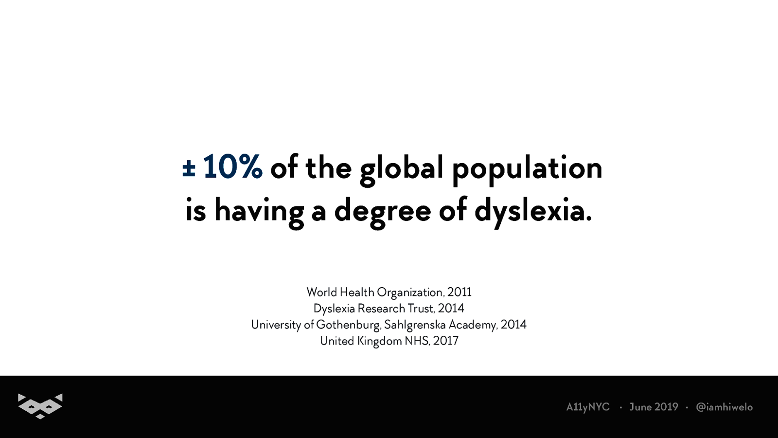
± 10% of the global population is having a degree of dyslexia. World Health Organization, 2011 Dyslexia Research Trust, 2014 University of Gothenburg, Sahlgrenska Academy, 2014 United Kingdom NHS, 2017 A11yNYC • June 2019 • @iamhiwelo
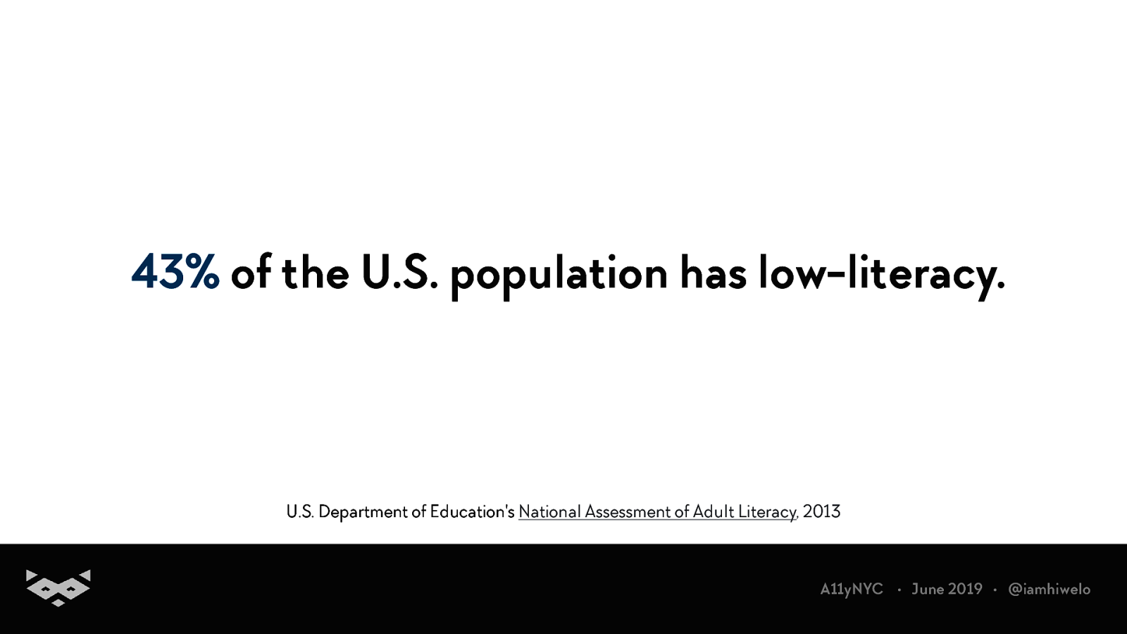
43% of the U.S. population has low-literacy. U.S. Department of Education’s National Assessment of Adult Literacy, 2013 A11yNYC • June 2019 • @iamhiwelo
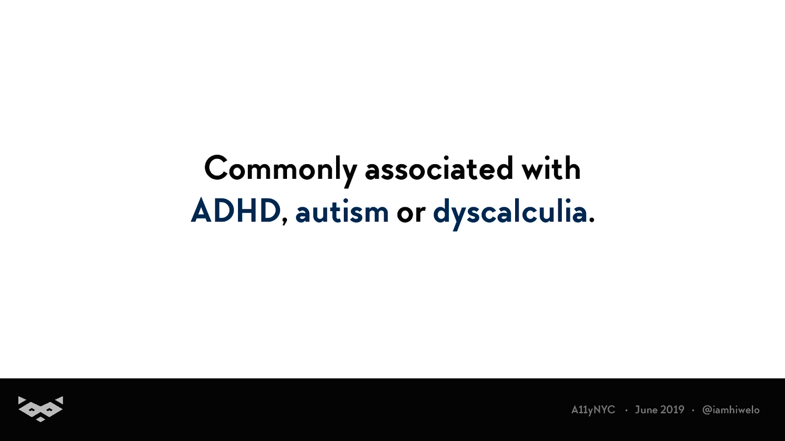
Commonly associated with ADHD, autism or dyscalculia. A11yNYC • June 2019 • @iamhiwelo
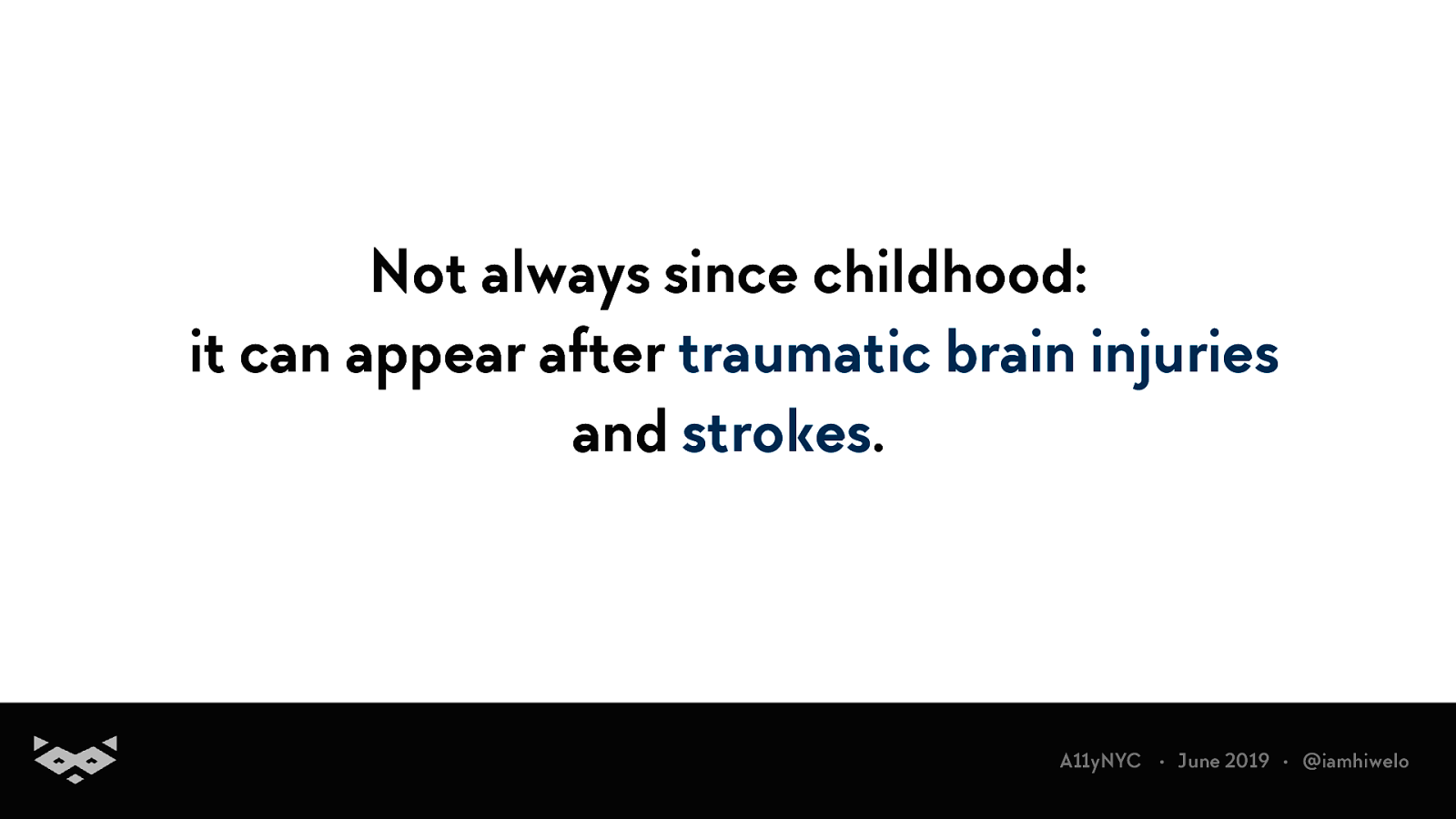
Not always since childhood: it can appear after traumatic brain injuries and strokes. A11yNYC • June 2019 • @iamhiwelo
Dyslexia is not only about reading. A11yNYC • June 2019 • @iamhiwelo
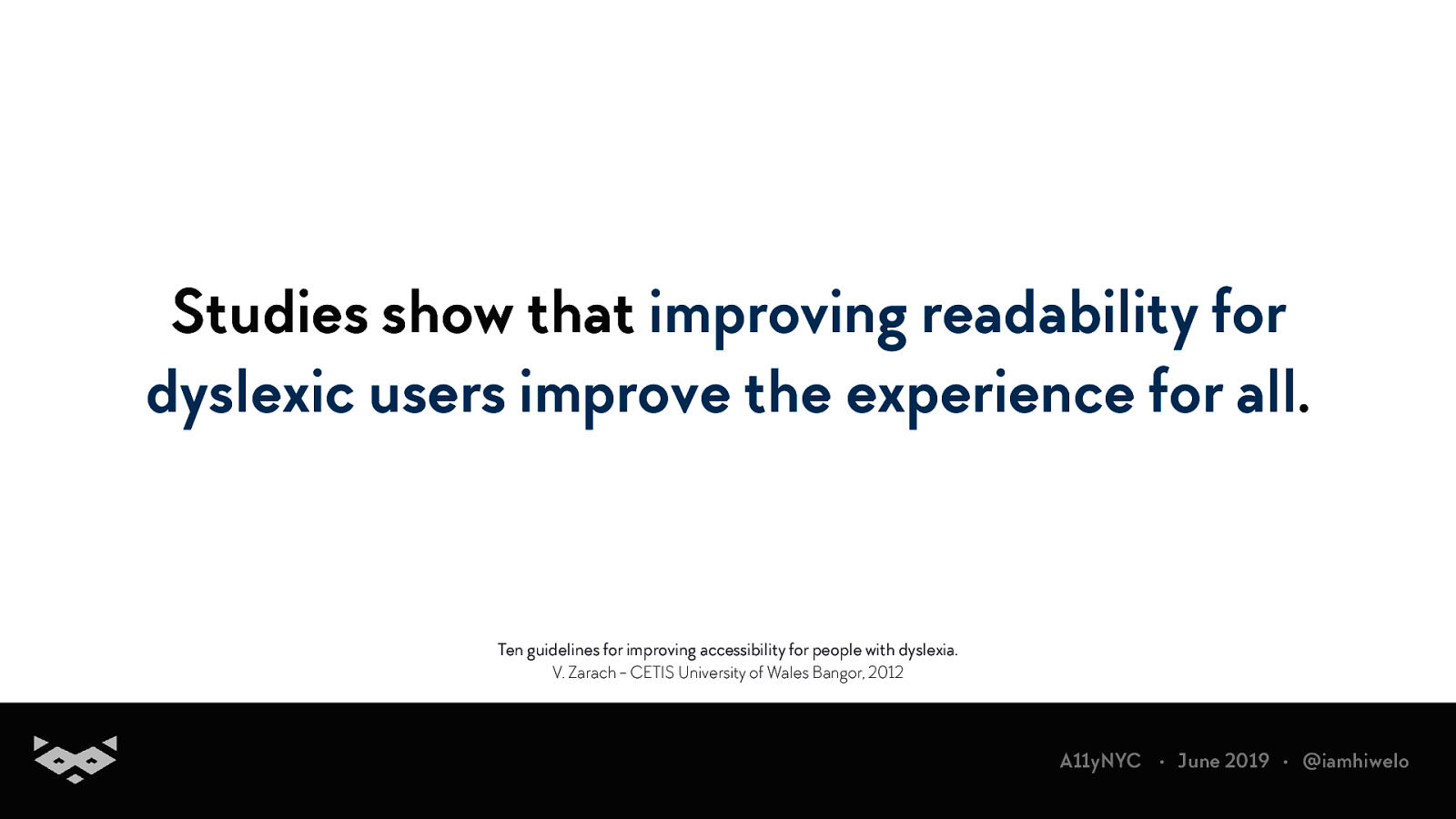
Studies show that improving readability for dyslexic users improve the experience for all. Ten guidelines for improving accessibility for people with dyslexia. V. Zarach - CETIS University of Wales Bangor, 2012 A11yNYC • June 2019 • @iamhiwelo
How do we read?
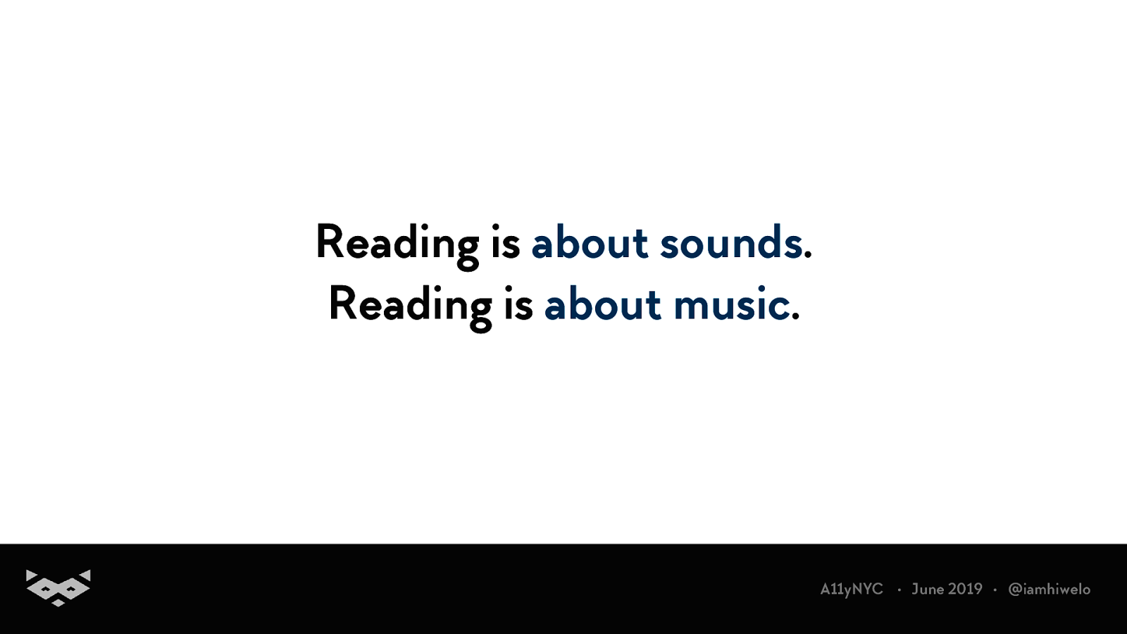
Reading is about sounds. Reading is about music. A11yNYC • June 2019 • @iamhiwelo
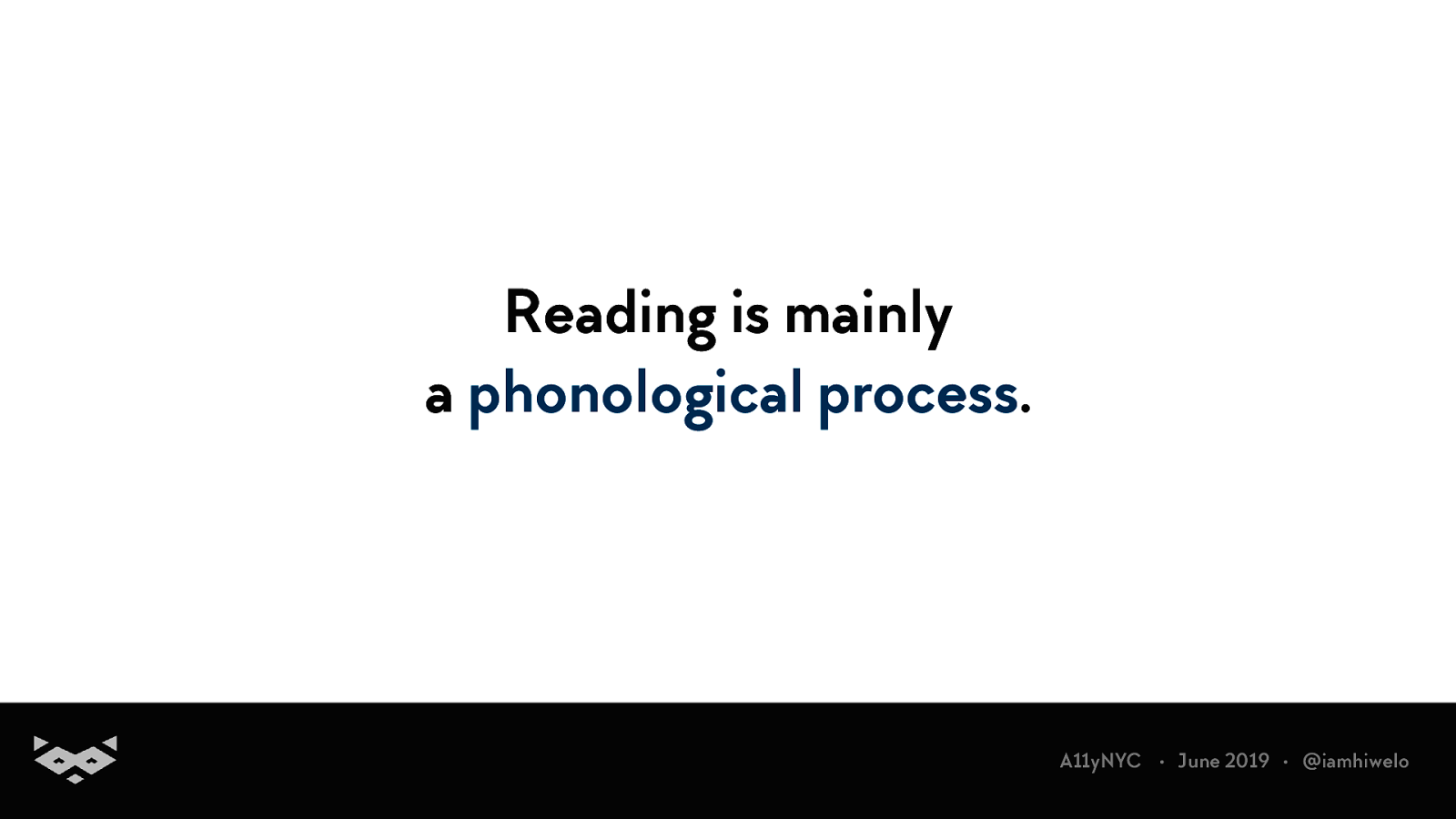
Reading is mainly a phonological process. A11yNYC • June 2019 • @iamhiwelo
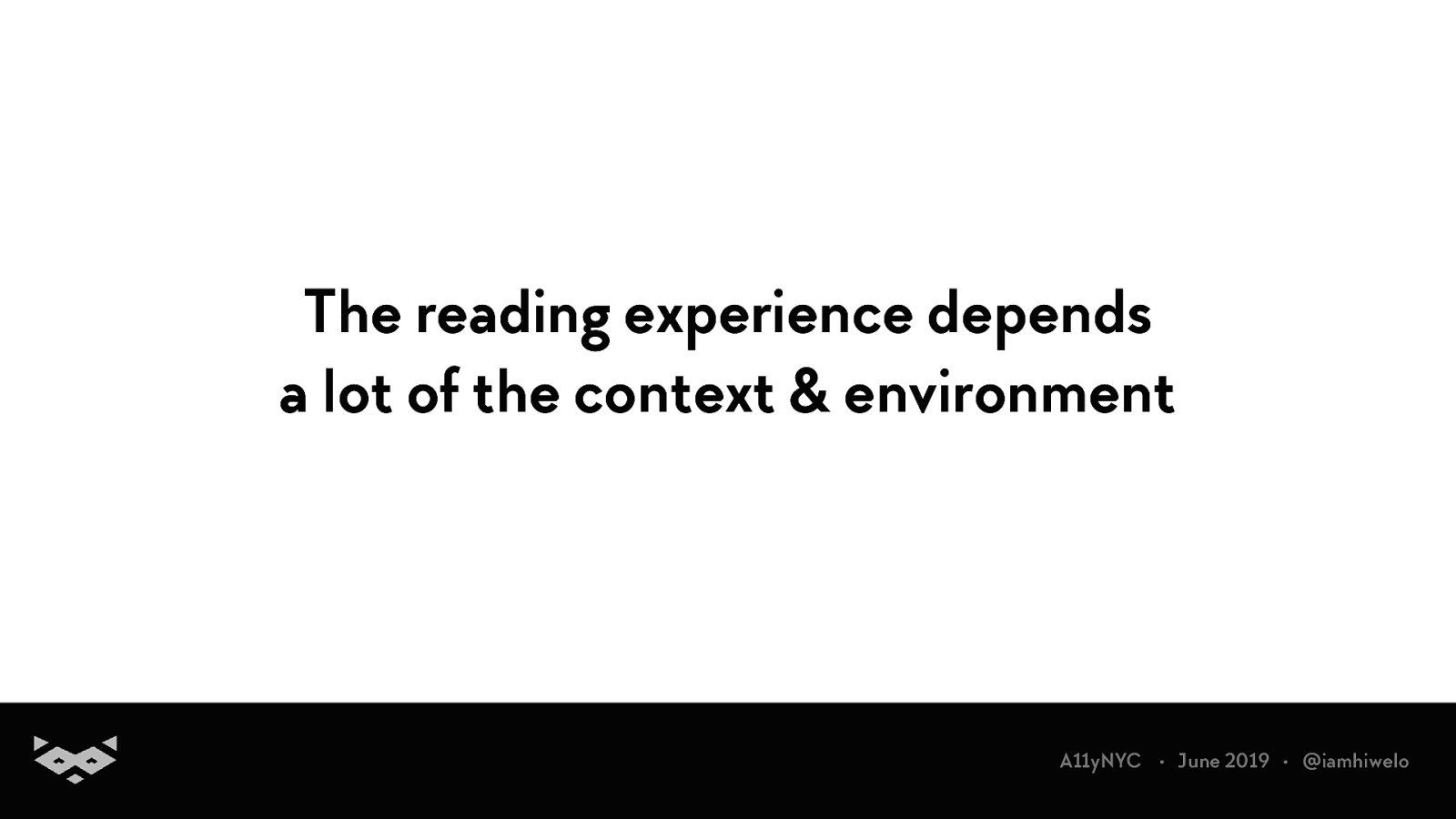
The reading experience depends a lot of the context & environment A11yNYC • June 2019 • @iamhiwelo
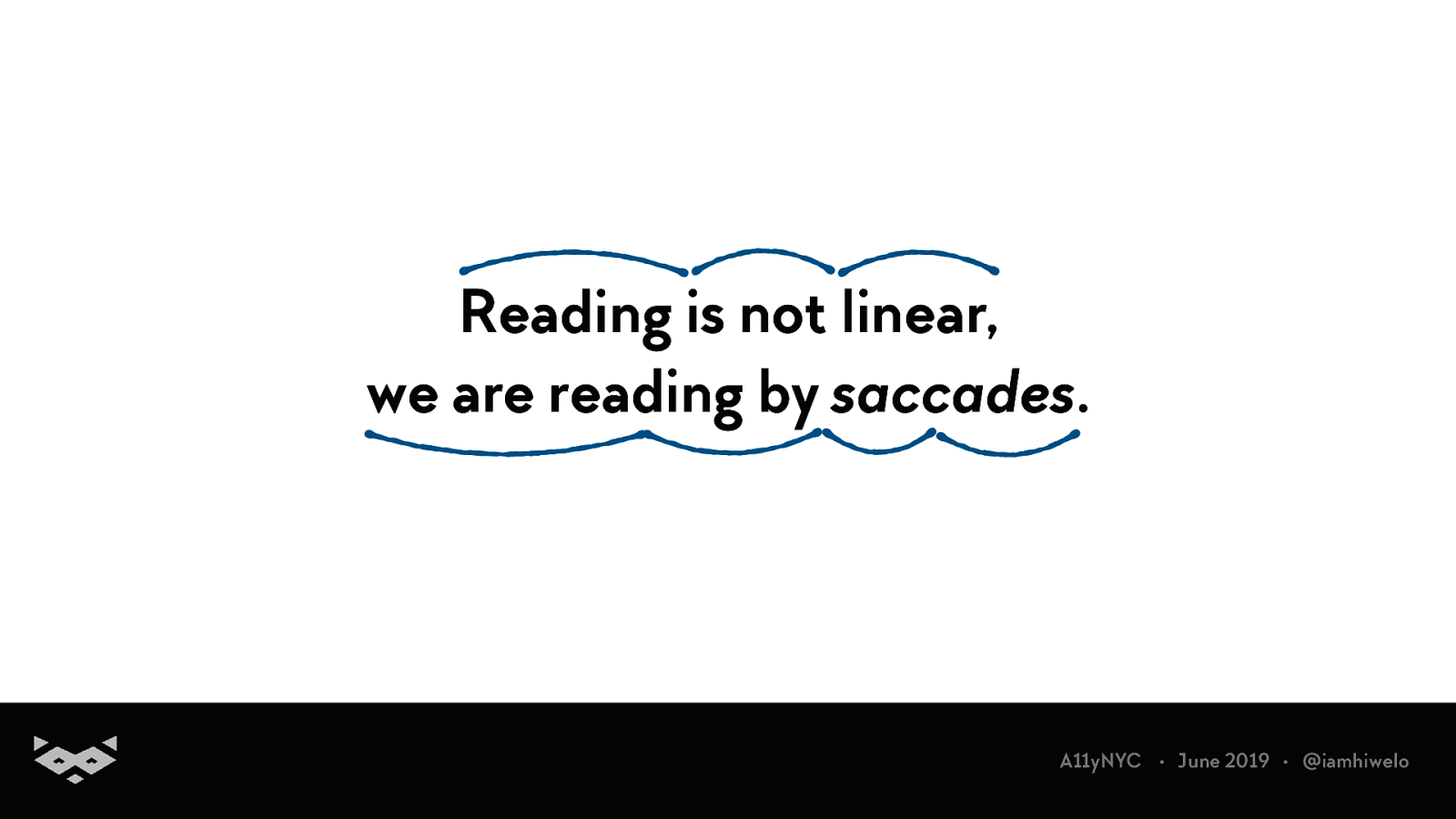
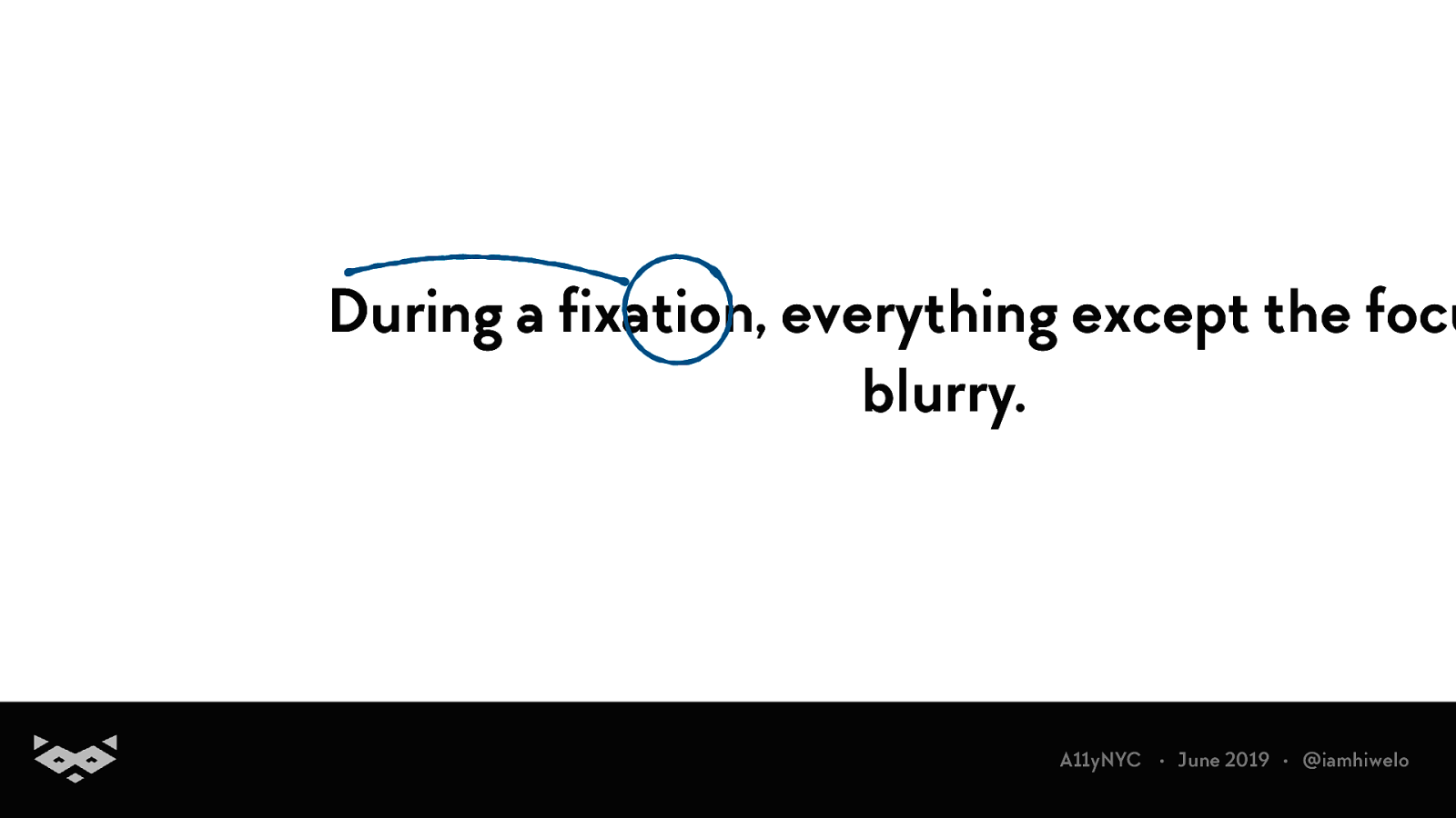
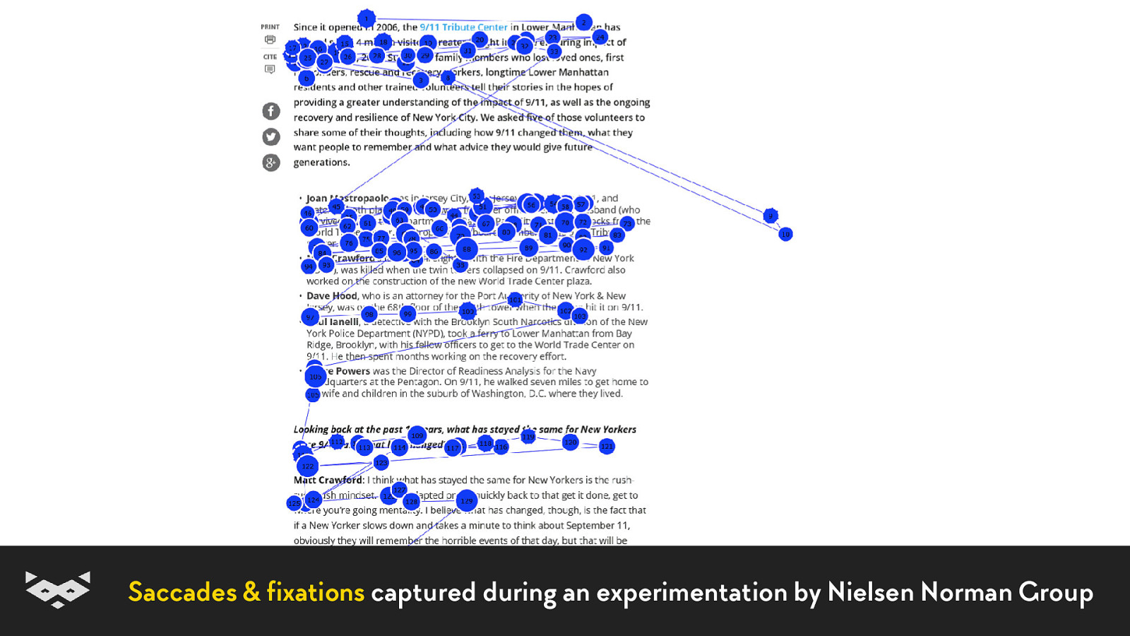
Reading is not linear, we are reading by saccades. A11yNYC • June 2019 • @iamhiwelo
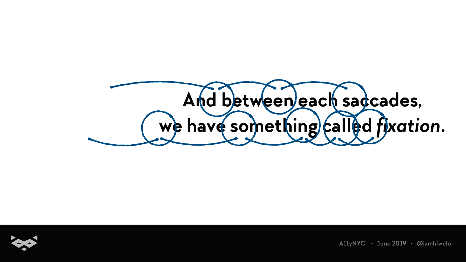
And between each saccades, we have something called fixation. A11yNYC • June 2019 • @iamhiwelo
During a fixation, everything except the focu blurry. A11yNYC • June 2019 • @iamhiwelo
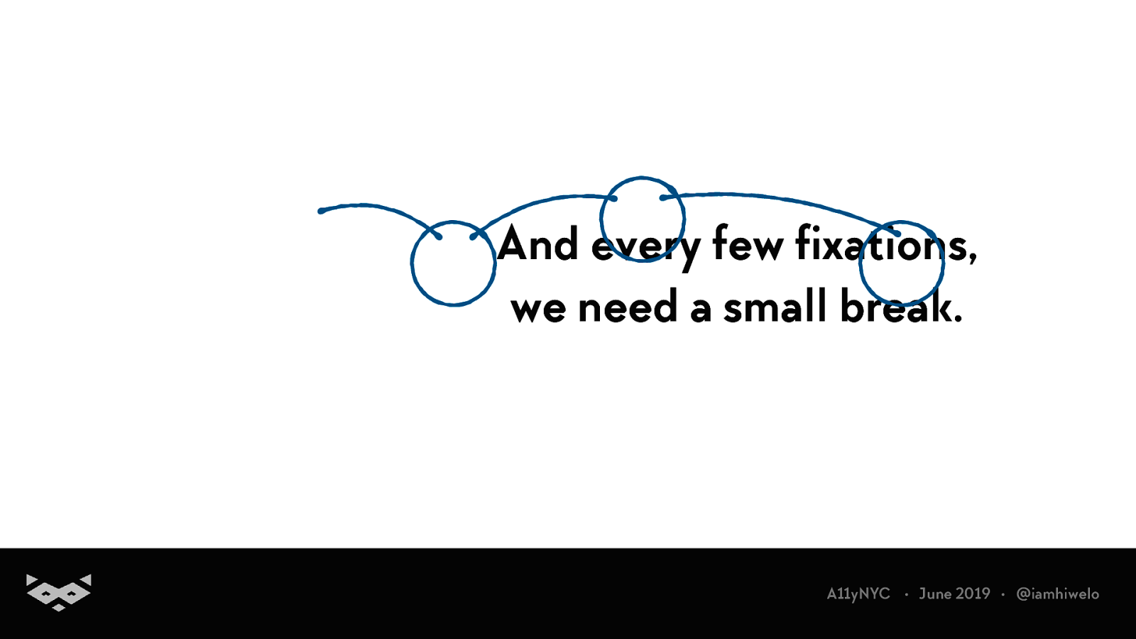
And every few fixations, we need a small break. A11yNYC • June 2019 • @iamhiwelo
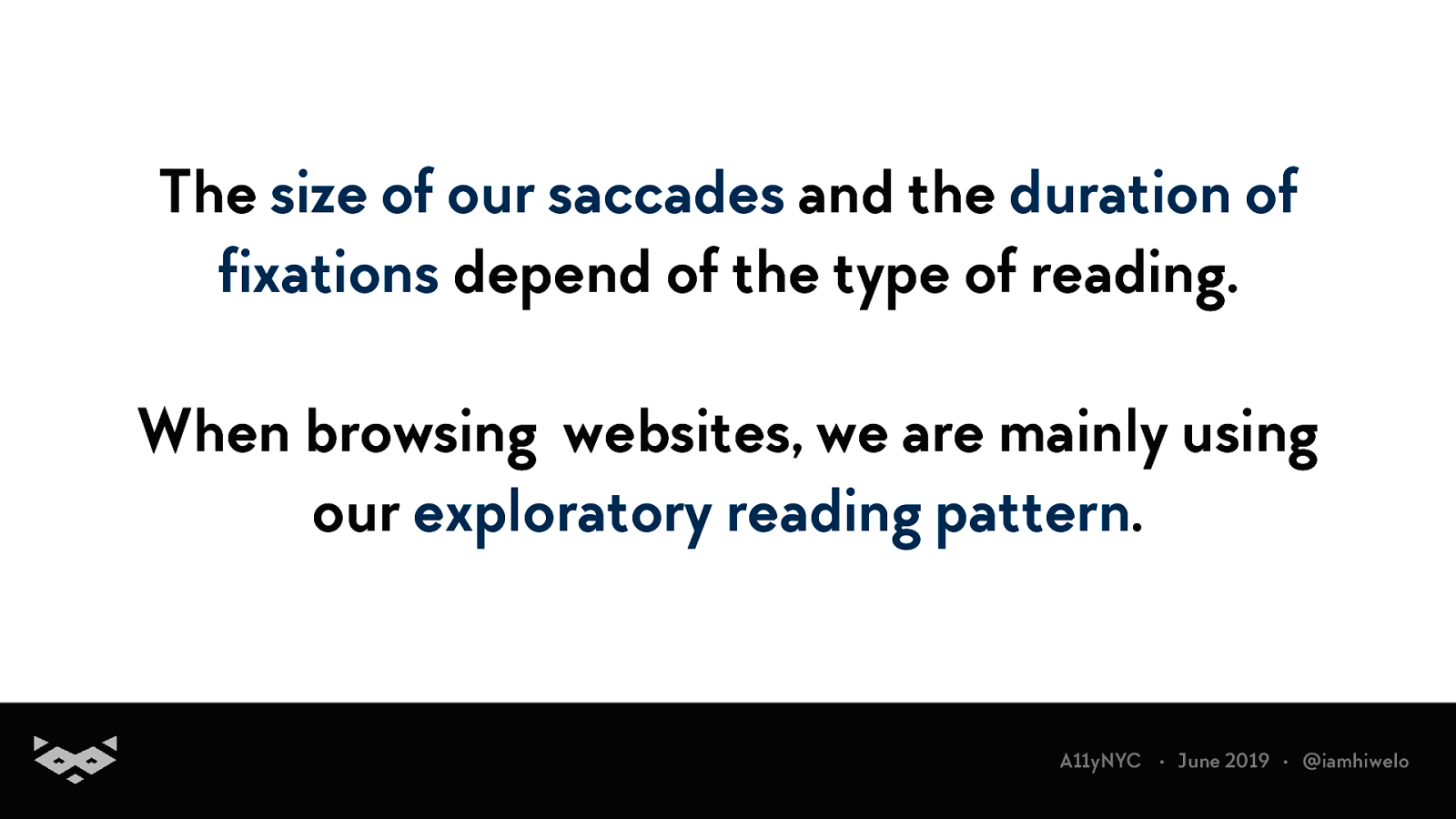
The size of our saccades and the duration of fixations depend of the type of reading. When browsing websites, we are mainly using our exploratory reading pattern. A11yNYC • June 2019 • @iamhiwelo
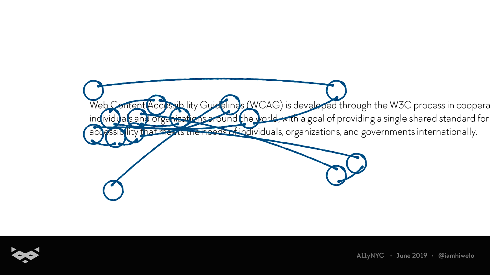
Web Content Accessibility Guidelines (WCAG) is developed through the W3C process in coopera individuals and organizations around the world, with a goal of providing a single shared standard for accessibility that meets the needs of individuals, organizations, and governments internationally. A11yNYC • June 2019 • @iamhiwelo
We are first analysing the paragraph before starting to read. A11yNYC • June 2019 • @iamhiwelo
On a screen, we are not reading in a word-by-word manner. A11yNYC • June 2019 • @iamhiwelo
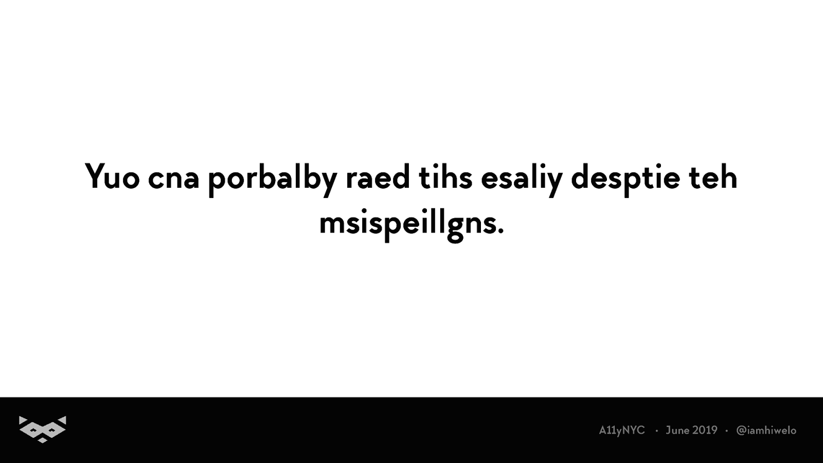
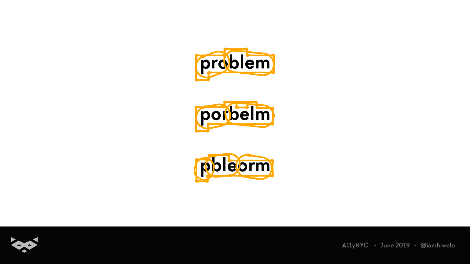
Yuo cna porbalby raed tihs esaliy desptie teh msispeillgns. A11yNYC • June 2019 • @iamhiwelo
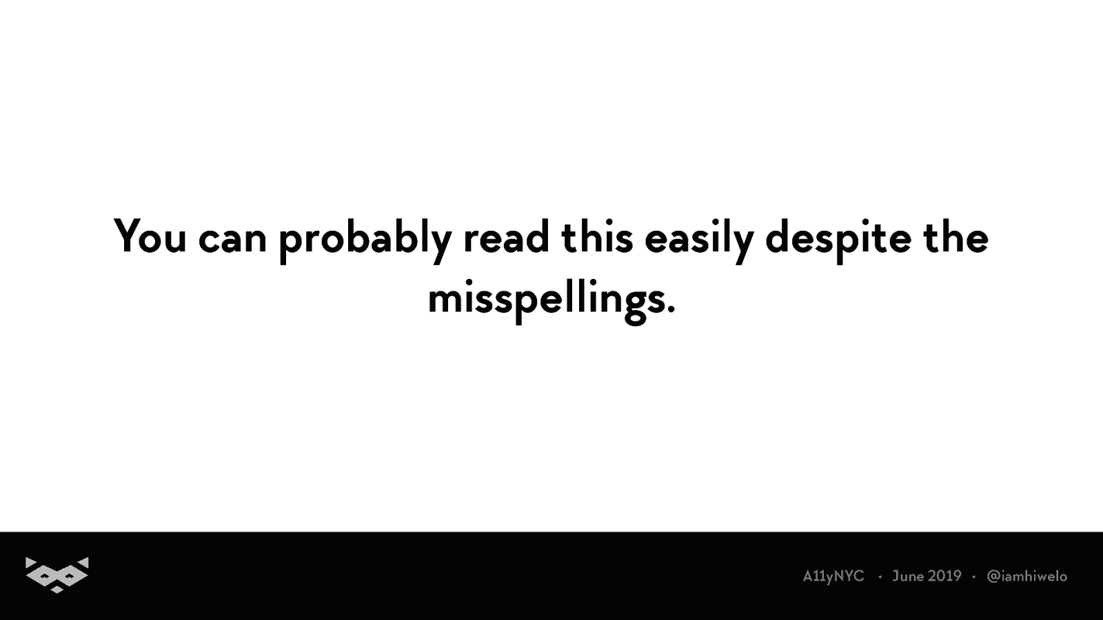
You can probably read this easily despite the misspellings. A11yNYC • June 2019 • @iamhiwelo
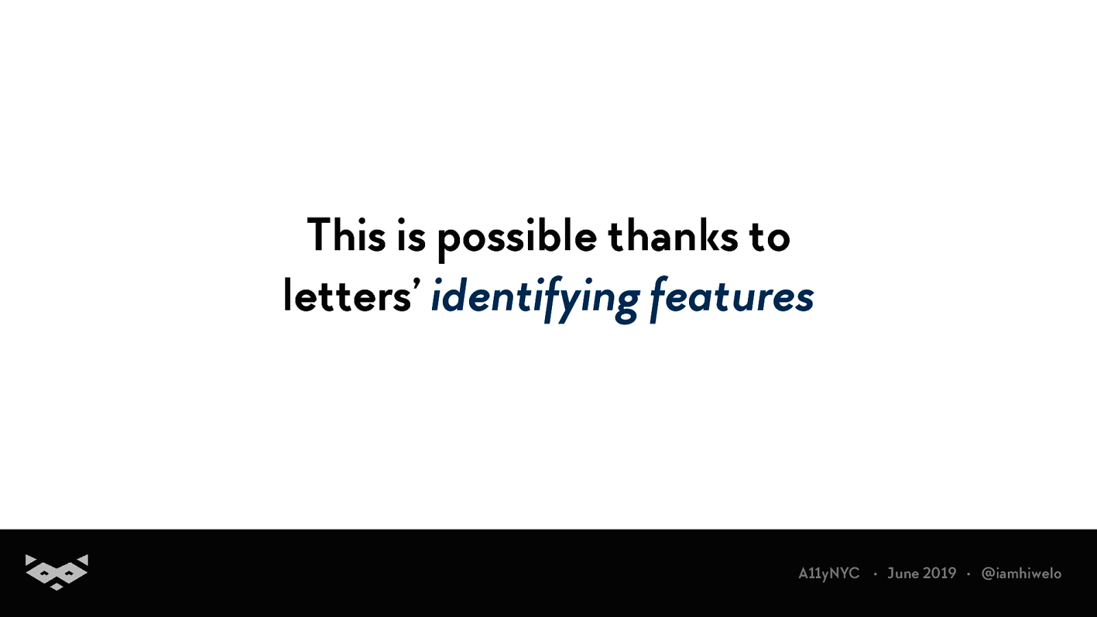
This is possible thanks to letters’ identifying features A11yNYC • June 2019 • @iamhiwelo
These identifying features allow us to read more easily. A11yNYC • June 2019 • @iamhiwelo
Readability READABILITY A11yNYC • June 2019 • @iamhiwelo
problem porbelm pbleorm A11yNYC • June 2019 • @iamhiwelo
Saccades & fixations captured during an experimentation by Nielsen Norman Group
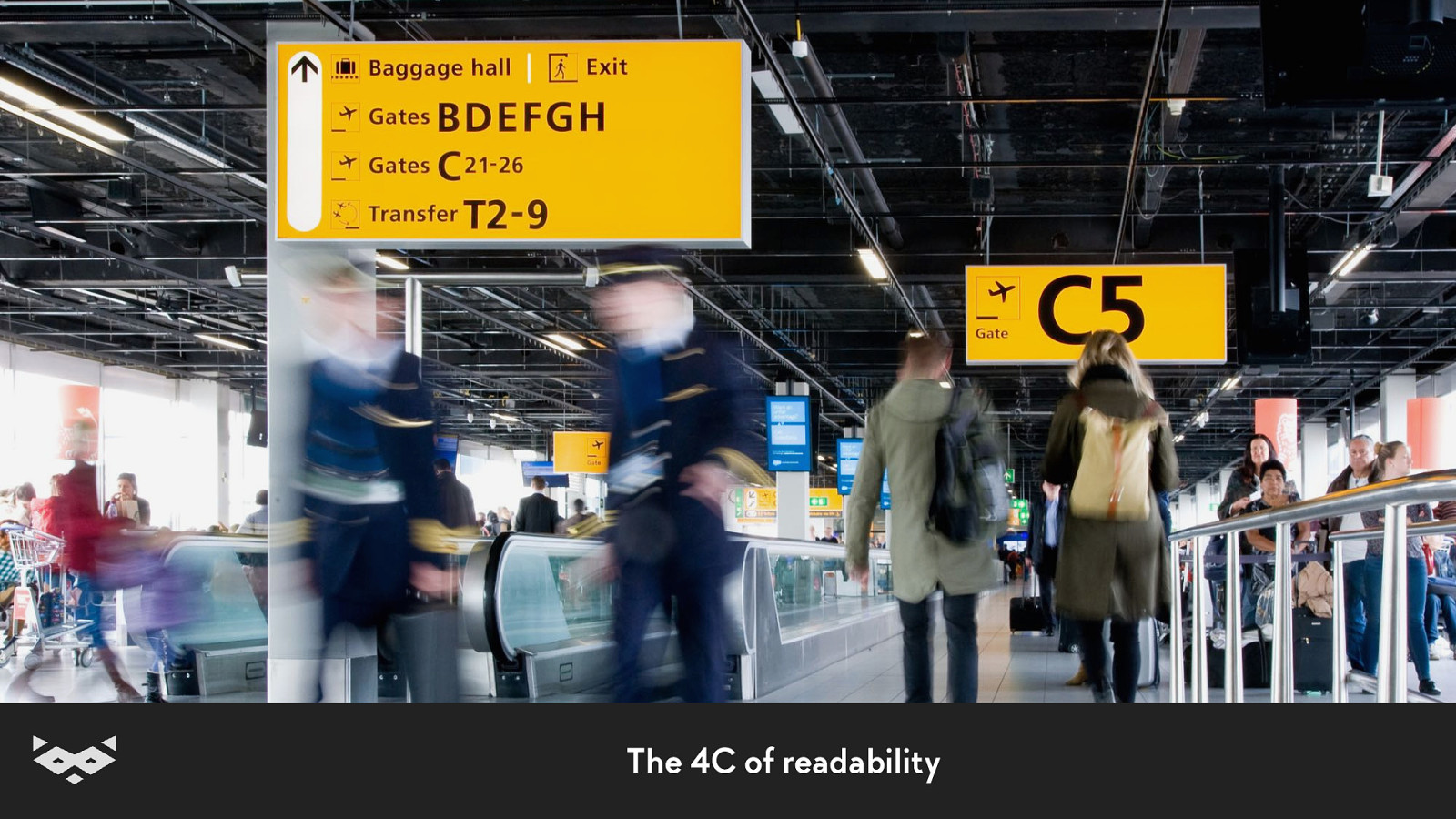
Readability 101.
credits: Mijksenaar
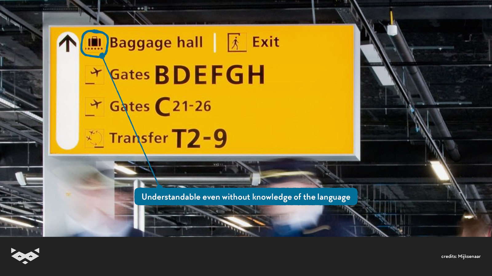
Understandable even without knowledge of the language credits: Mijksenaar
Good visual information architecture credits: Mijksenaar
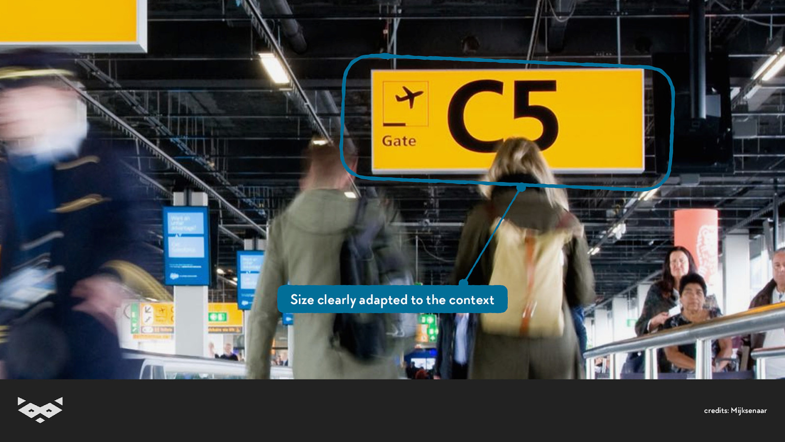
Size clearly adapted to the context credits: Mijksenaar
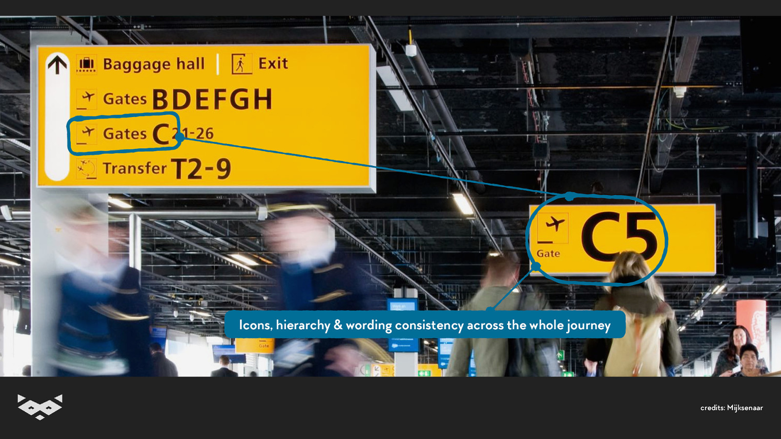
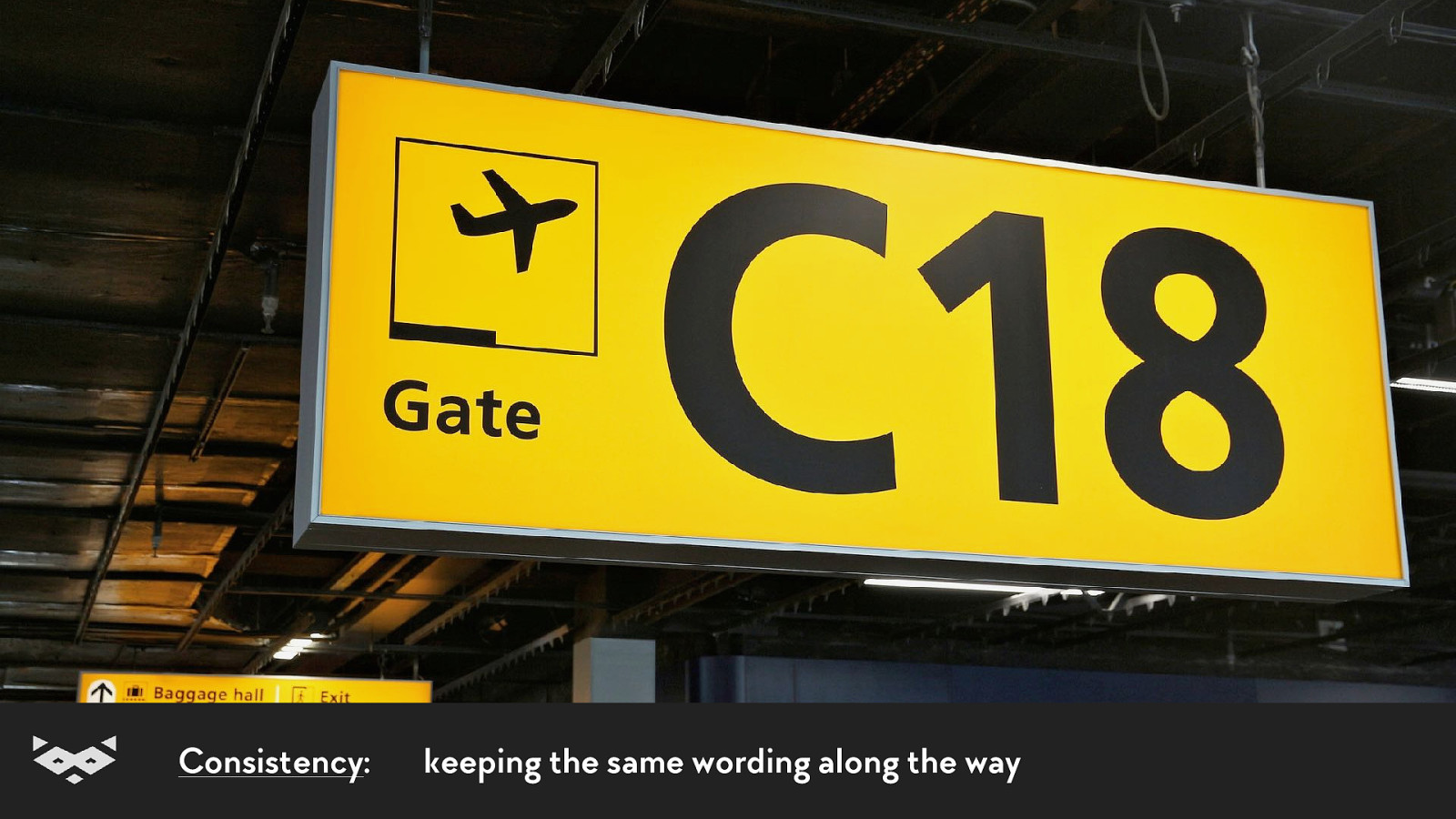
Icons, hierarchy & wording consistency across the whole journey credits: Mijksenaar
The 4C of readability
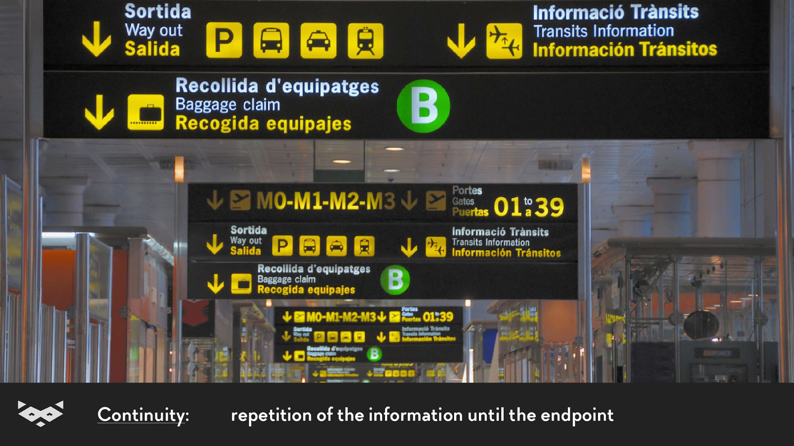
Continuity: repetition of the information until the endpoint
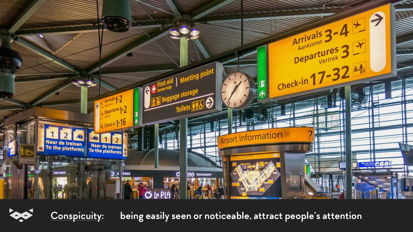
Conspicuity: being easily seen or noticeable, attract people’s attention
Consistency: keeping the same wording along the way
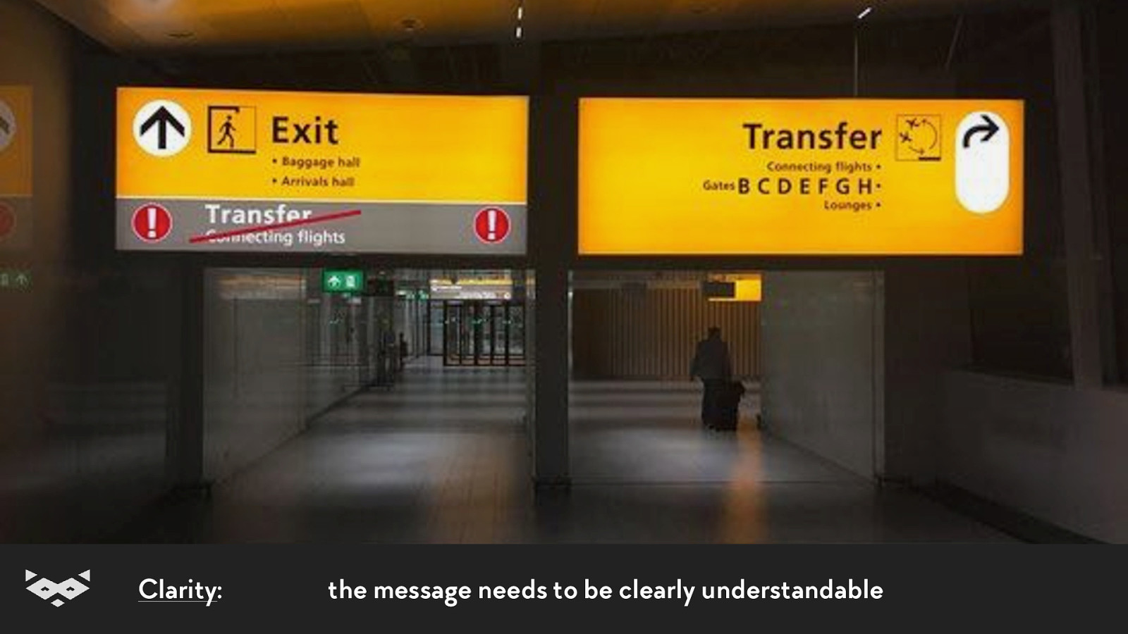
Clarity: the message needs to be clearly understandable
Thanks Paul Mijksenaar 👍
Readability & web content.
There is no one-fits-all solution. A11yNYC • June 2019 • @iamhiwelo
So what? A11yNYC • June 2019 • @iamhiwelo
A good contrast is primordial. A11yNYC • June 2019 • @iamhiwelo
But too much contrast can create a blur effect. A11yNYC • June 2019 • @iamhiwelo
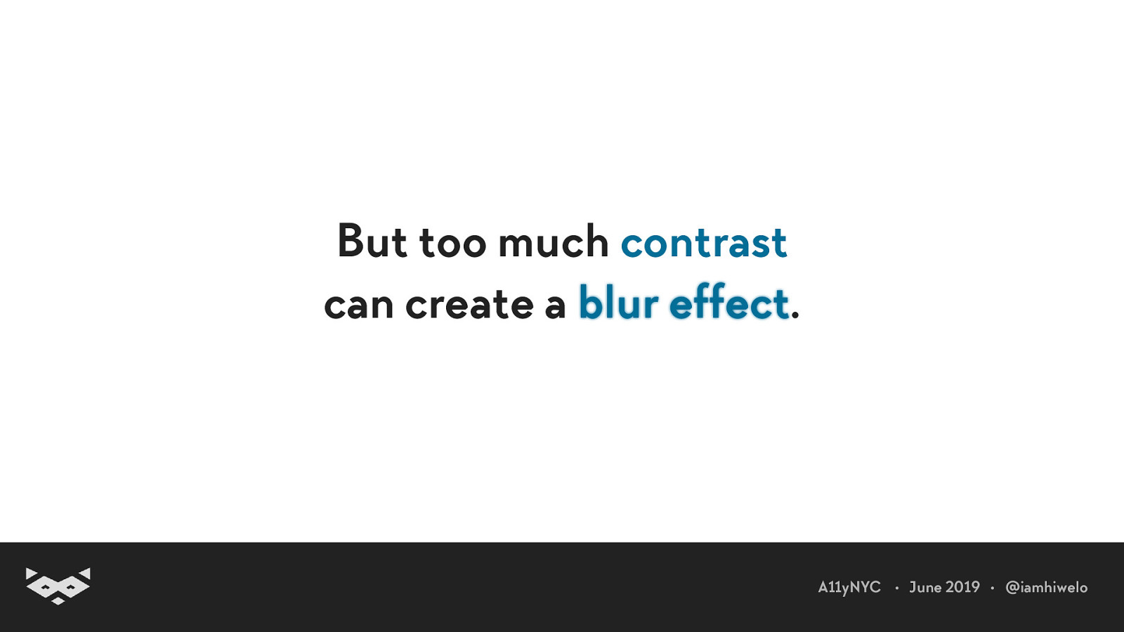
But too much contrast can create a blur effect. A11yNYC • June 2019 • @iamhiwelo
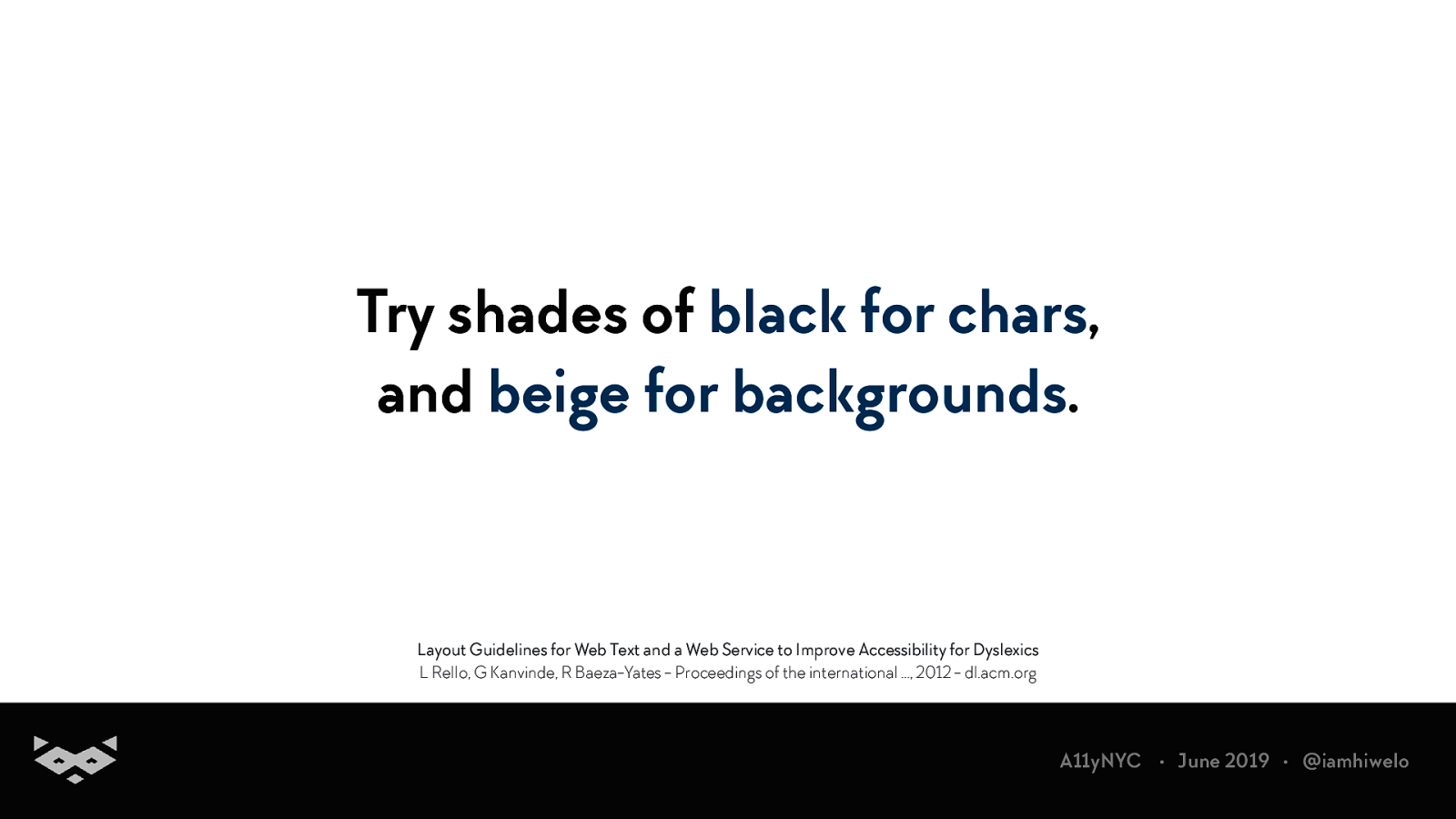
Try shades of black for chars, and beige for backgrounds. Layout Guidelines for Web Text and a Web Service to Improve Accessibility for Dyslexics L Rello, G Kanvinde, R Baeza-Yates - Proceedings of the international …, 2012 - dl.acm.org A11yNYC • June 2019 • @iamhiwelo
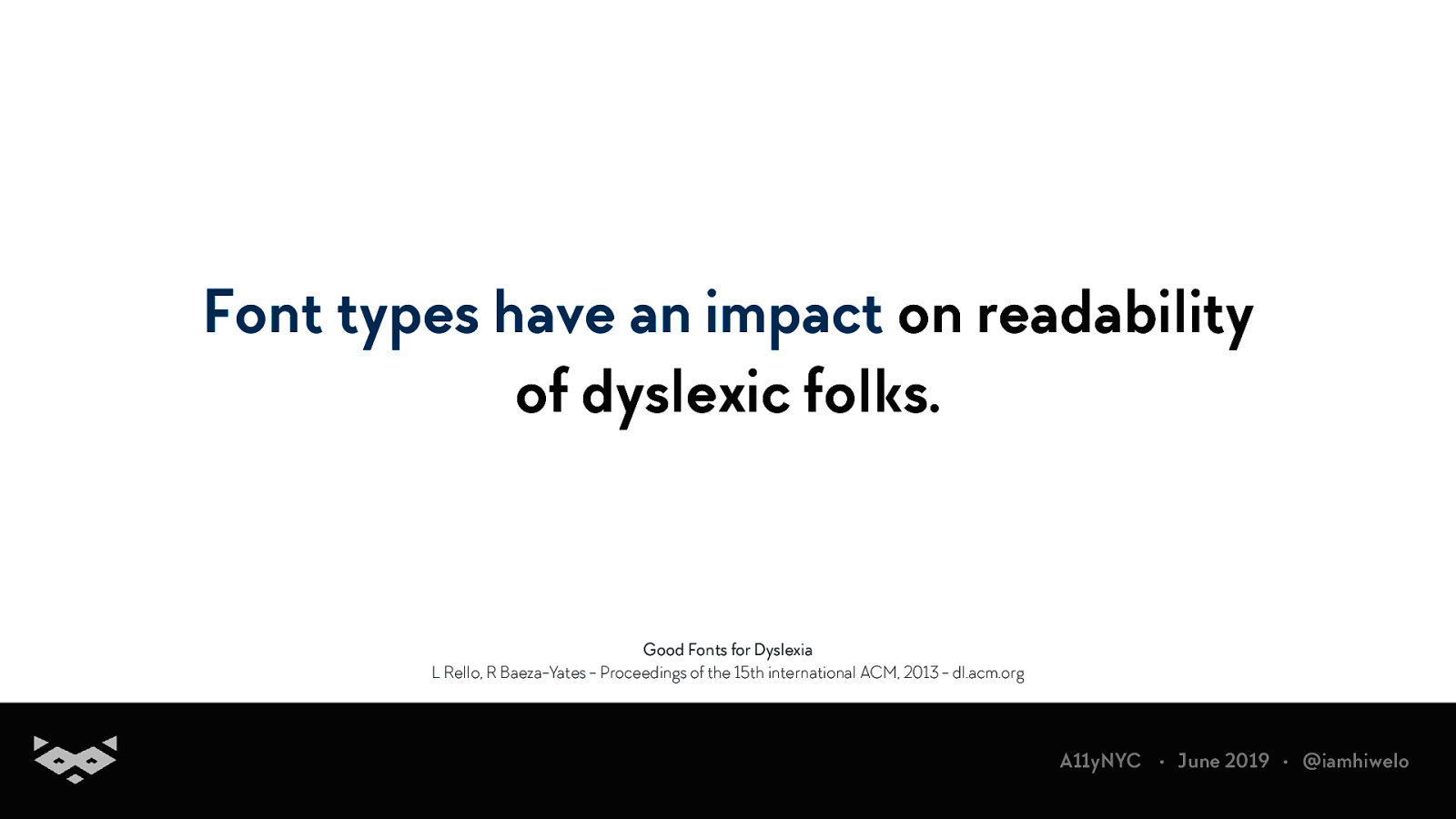
Font types have an impact on readability of dyslexic folks. Good Fonts for Dyslexia L Rello, R Baeza-Yates - Proceedings of the 15th international ACM, 2013 - dl.acm.org A11yNYC • June 2019 • @iamhiwelo
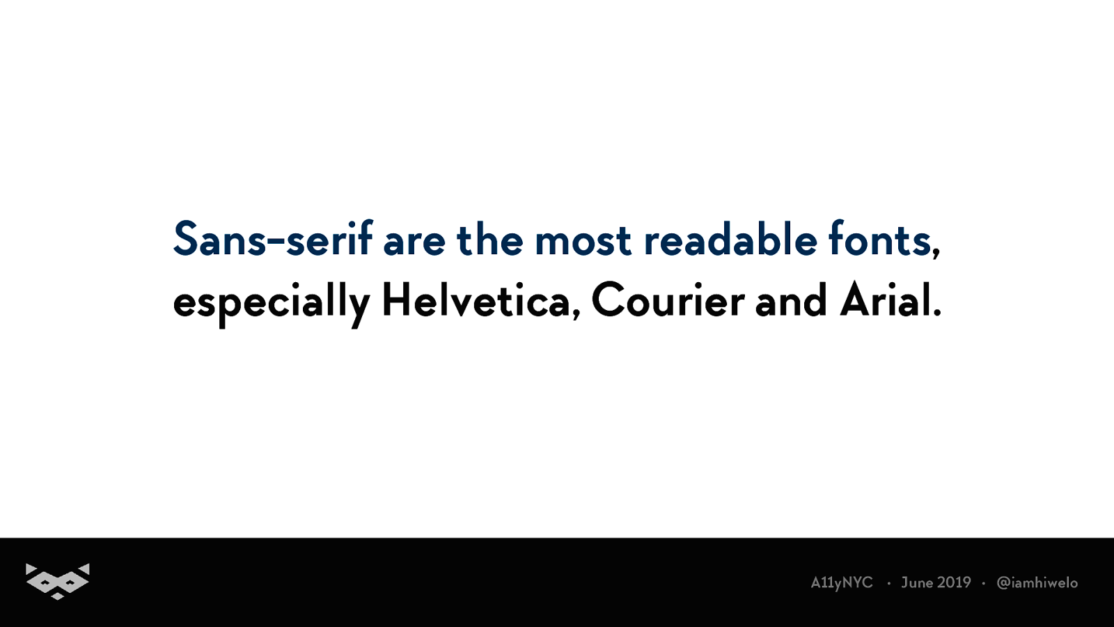
Sans-serif are the most readable fonts, especially Helvetica, Courier and Arial. A11yNYC • June 2019 • @iamhiwelo
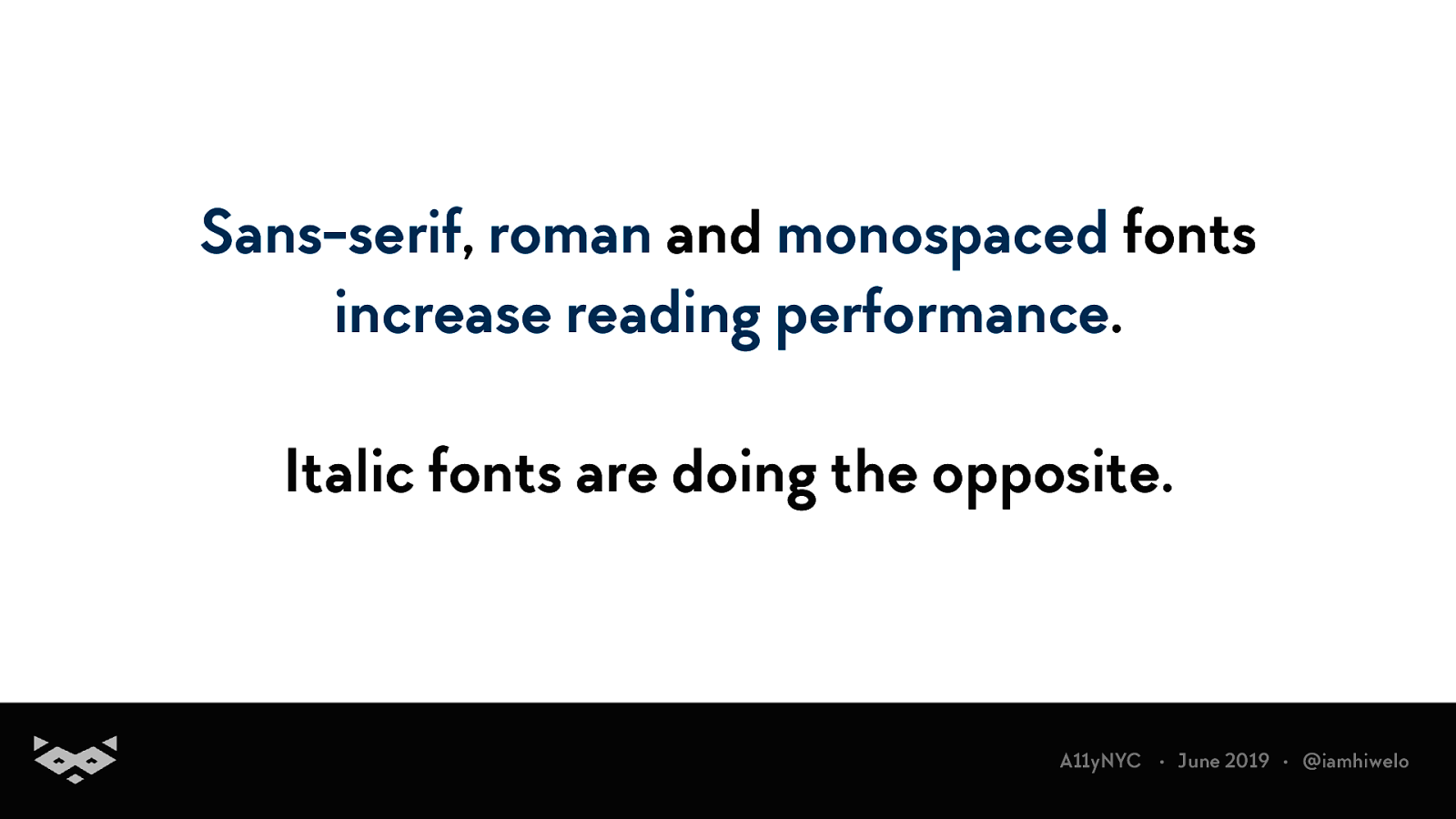
Sans-serif, roman and monospaced fonts increase reading performance. Italic fonts are doing the opposite. A11yNYC • June 2019 • @iamhiwelo
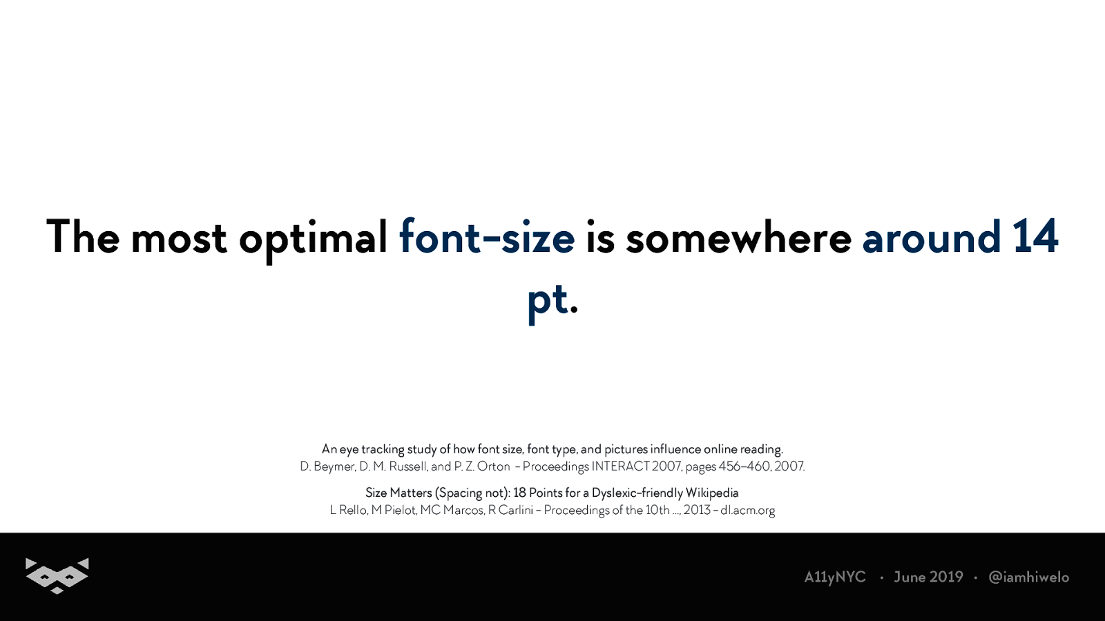
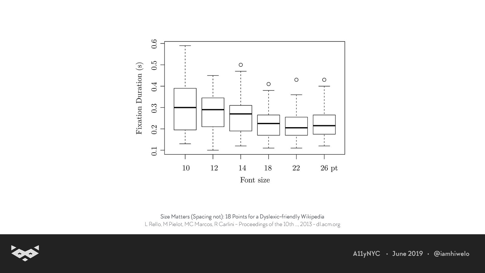
The most optimal font-size is somewhere around 14 pt. An eye tracking study of how font size, font type, and pictures influence online reading. D. Beymer, D. M. Russell, and P. Z. Orton - Proceedings INTERACT 2007, pages 456–460, 2007. Size Matters (Spacing not): 18 Points for a Dyslexic-friendly Wikipedia L Rello, M Pielot, MC Marcos, R Carlini - Proceedings of the 10th …, 2013 - dl.acm.org A11yNYC • June 2019 • @iamhiwelo
Size Matters (Spacing not): 18 Points for a Dyslexic-friendly Wikipedia L Rello, M Pielot, MC Marcos, R Carlini - Proceedings of the 10th …, 2013 - dl.acm.org A11yNYC • June 2019 • @iamhiwelo
Line-spacing appears to have few impact on readability. Size Matters (Spacing not): 18 Points for a Dyslexic-friendly Wikipedia L Rello, M Pielot, MC Marcos, R Carlini - Proceedings of the 10th …, 2013 - dl.acm.org A11yNYC • June 2019 • @iamhiwelo
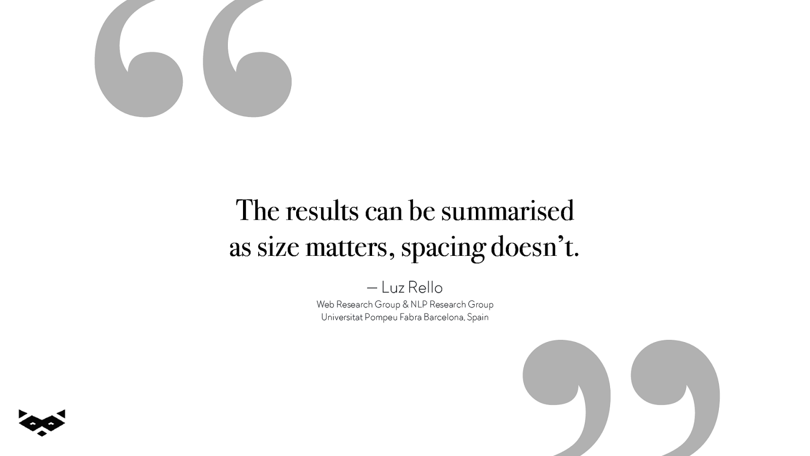
“ The results can be summarised as size matters, spacing doesn’t. — Luz Rello Web Research Group & NLP Research Group Universitat Pompeu Fabra Barcelona, Spain
Spacing doesn’t matter… except when it does. A11yNYC • June 2019 • @iamhiwelo
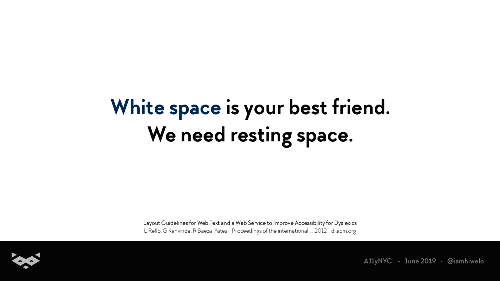
White space is your best friend. We need resting space. Layout Guidelines for Web Text and a Web Service to Improve Accessibility for Dyslexics L Rello, G Kanvinde, R Baeza-Yates - Proceedings of the international …, 2012 - dl.acm.org A11yNYC • June 2019 • @iamhiwelo
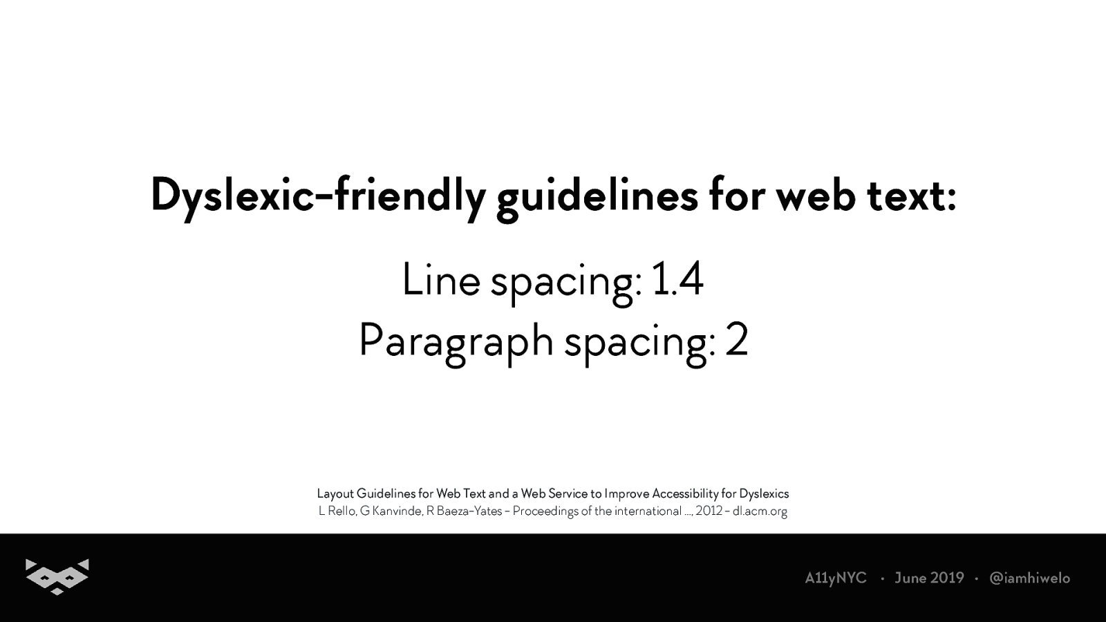
Dyslexic-friendly guidelines for web text: Line spacing: 1.4 Paragraph spacing: 2 Layout Guidelines for Web Text and a Web Service to Improve Accessibility for Dyslexics L Rello, G Kanvinde, R Baeza-Yates - Proceedings of the international …, 2012 - dl.acm.org A11yNYC • June 2019 • @iamhiwelo
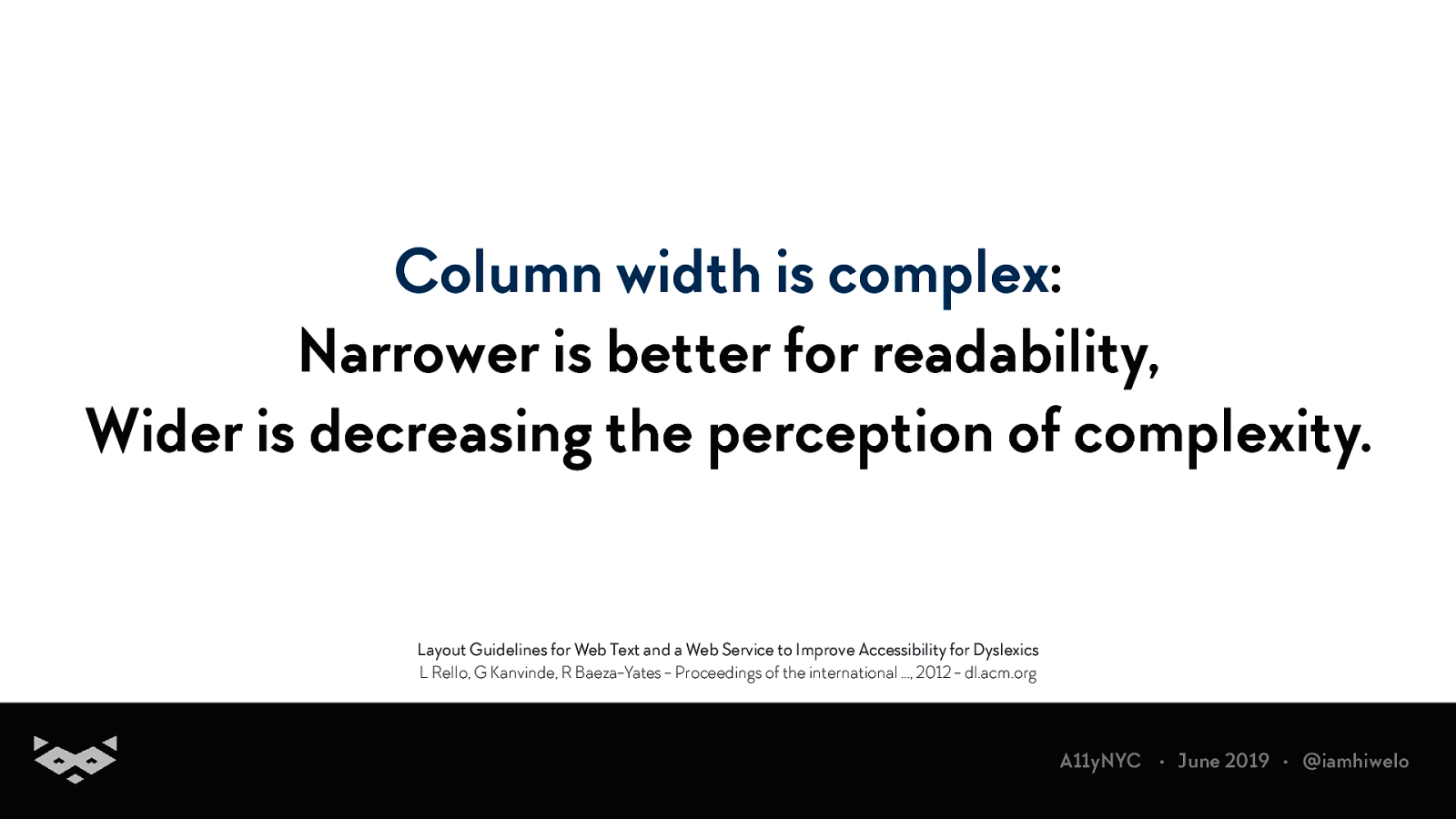
Column width is complex: Narrower is better for readability, Wider is decreasing the perception of complexity. Layout Guidelines for Web Text and a Web Service to Improve Accessibility for Dyslexics L Rello, G Kanvinde, R Baeza-Yates - Proceedings of the international …, 2012 - dl.acm.org A11yNYC • June 2019 • @iamhiwelo
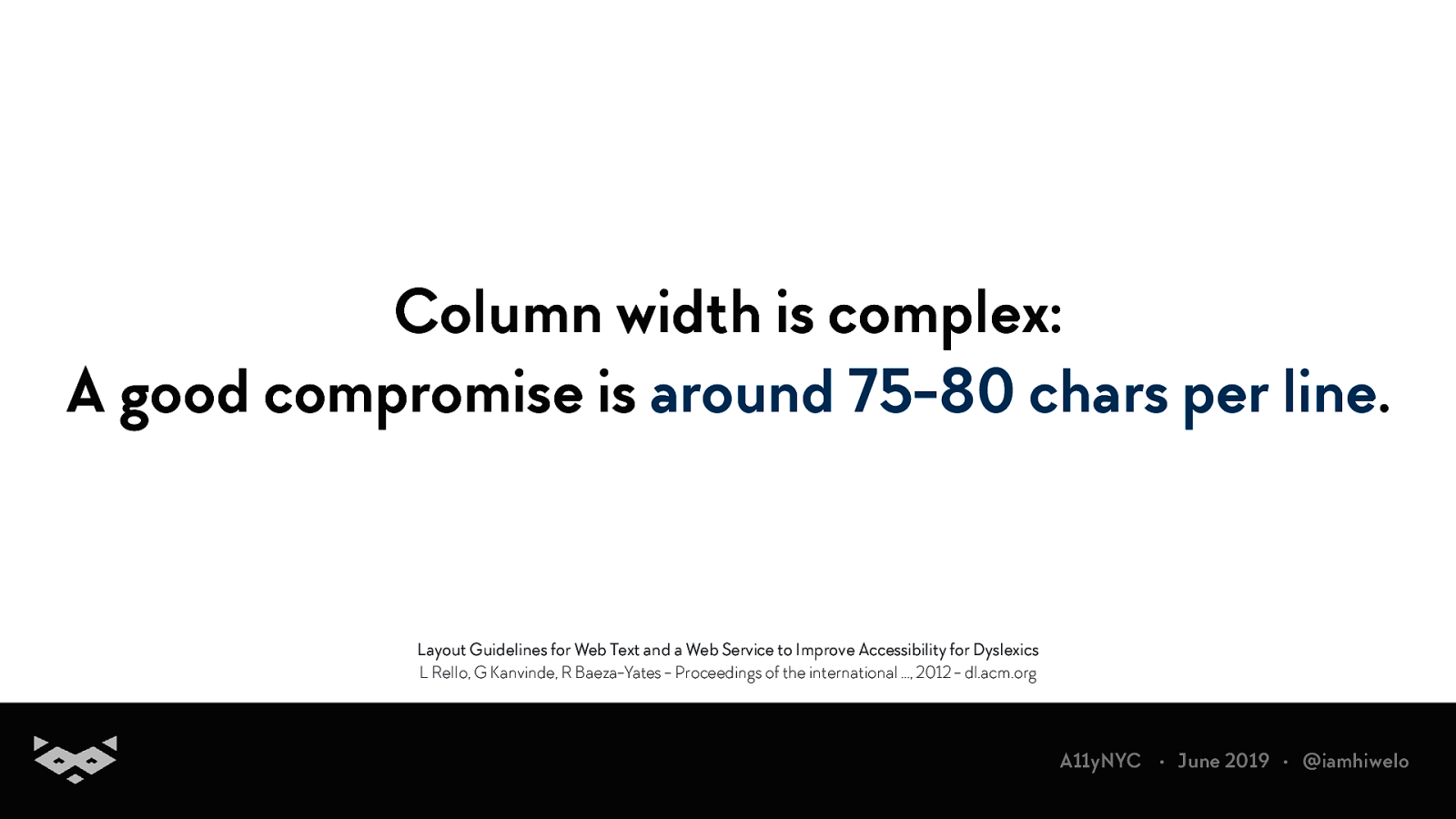
Column width is complex: A good compromise is around 75-80 chars per line. Layout Guidelines for Web Text and a Web Service to Improve Accessibility for Dyslexics L Rello, G Kanvinde, R Baeza-Yates - Proceedings of the international …, 2012 - dl.acm.org A11yNYC • June 2019 • @iamhiwelo
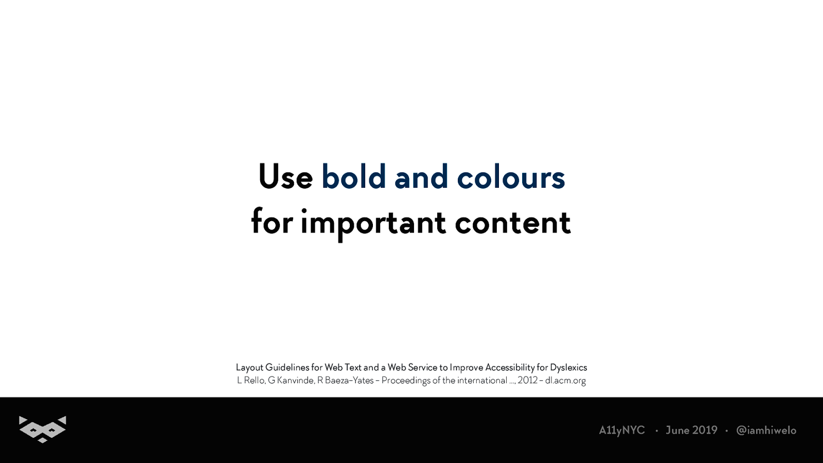
Use bold and colours for important content Layout Guidelines for Web Text and a Web Service to Improve Accessibility for Dyslexics L Rello, G Kanvinde, R Baeza-Yates - Proceedings of the international …, 2012 - dl.acm.org A11yNYC • June 2019 • @iamhiwelo
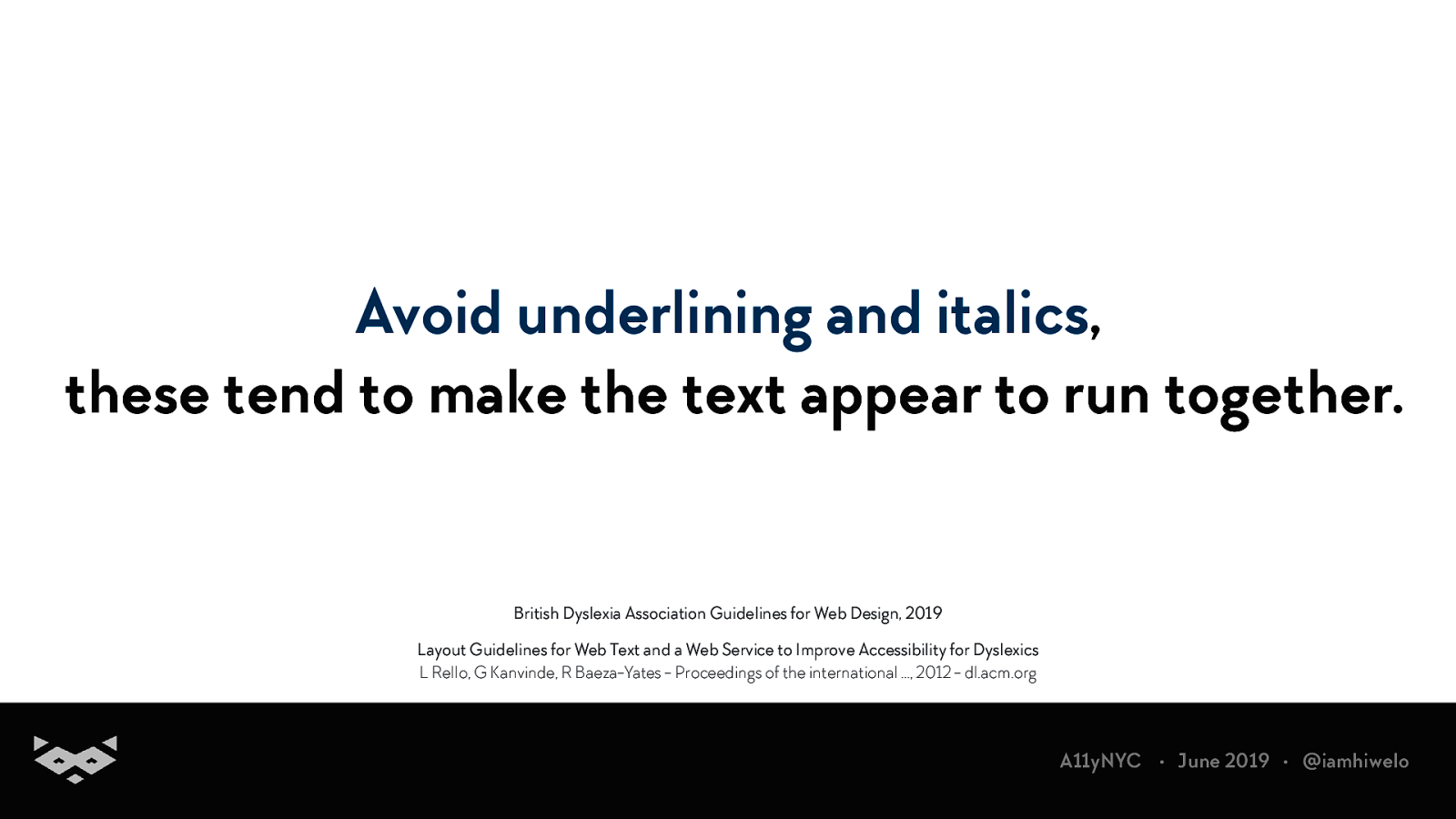
Avoid underlining and italics, these tend to make the text appear to run together. British Dyslexia Association Guidelines for Web Design, 2019 Layout Guidelines for Web Text and a Web Service to Improve Accessibility for Dyslexics L Rello, G Kanvinde, R Baeza-Yates - Proceedings of the international …, 2012 - dl.acm.org A11yNYC • June 2019 • @iamhiwelo
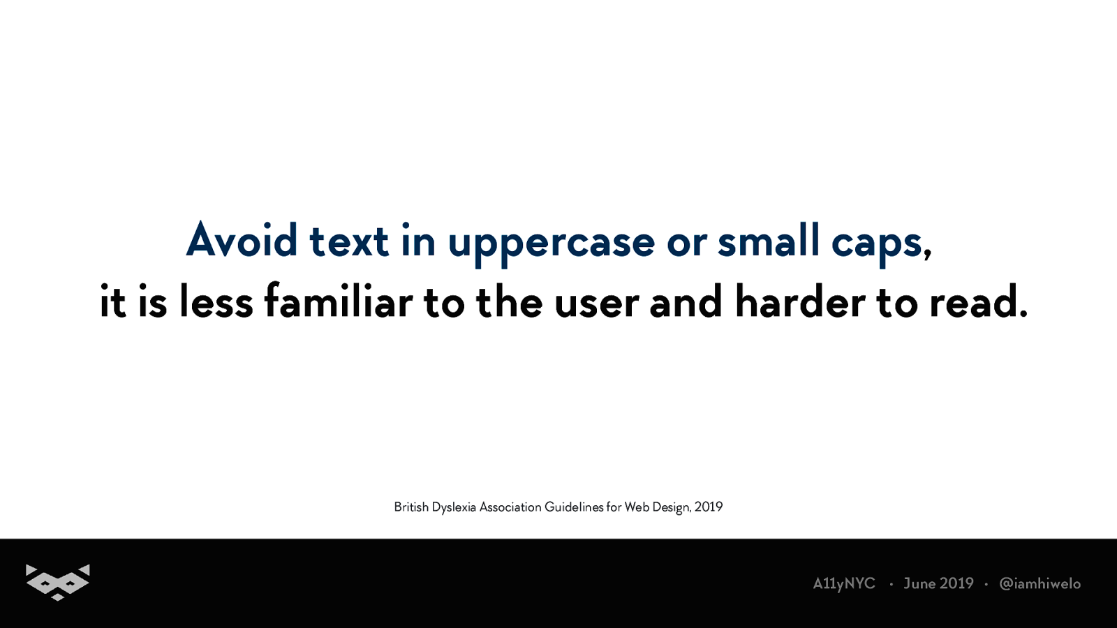
Avoid text in uppercase or small caps, it is less familiar to the user and harder to read. British Dyslexia Association Guidelines for Web Design, 2019 A11yNYC • June 2019 • @iamhiwelo
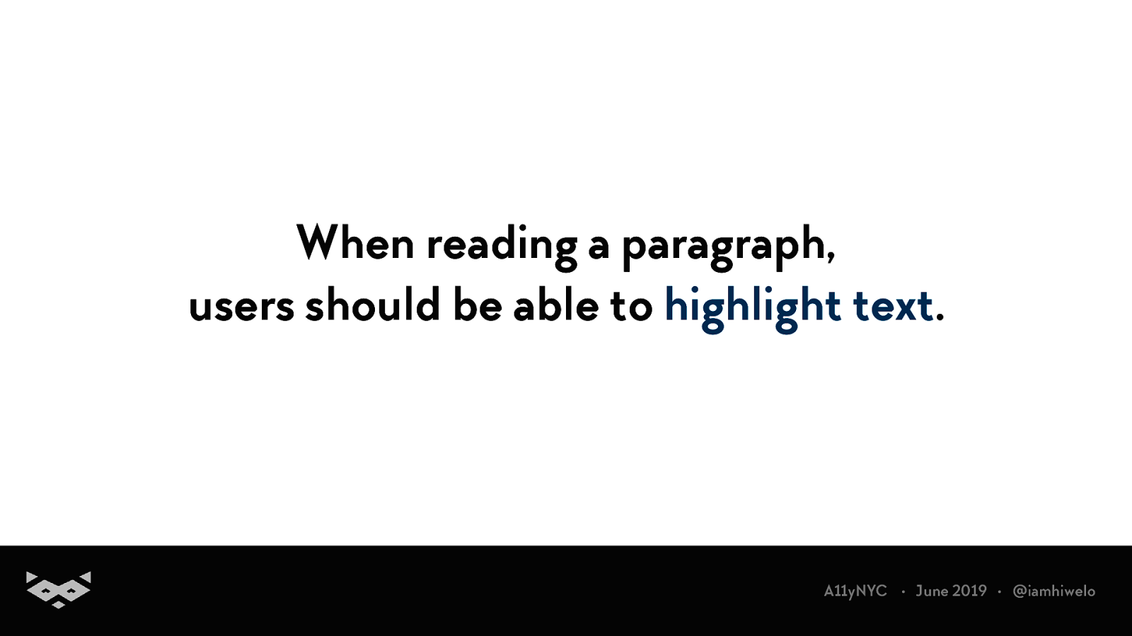
When reading a paragraph, users should be able to highlight text. A11yNYC • June 2019 • @iamhiwelo
Avoid the use of too generic content, be specific for links A11yNYC • June 2019 • @iamhiwelo
Text alignment is super important. A11yNYC • June 2019 • @iamhiwelo
Left-align text in left-to-right languages. A11yNYC • June 2019 • @iamhiwelo
Avoid justification and centered-text. A11yNYC • June 2019 • @iamhiwelo
Multi-columns content can be confusing. A11yNYC • June 2019 • @iamhiwelo
Group small related content with a strong visual system A11yNYC • June 2019 • @iamhiwelo
Heading & Information hierarchy A11yNYC • June 2019 • @iamhiwelo
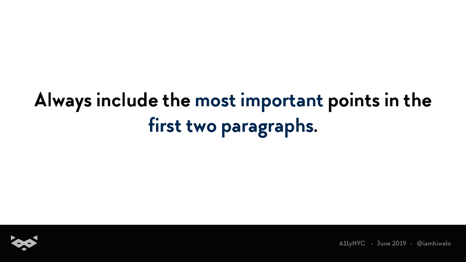
Always include the most important points in the first two paragraphs. A11yNYC • June 2019 • @iamhiwelo
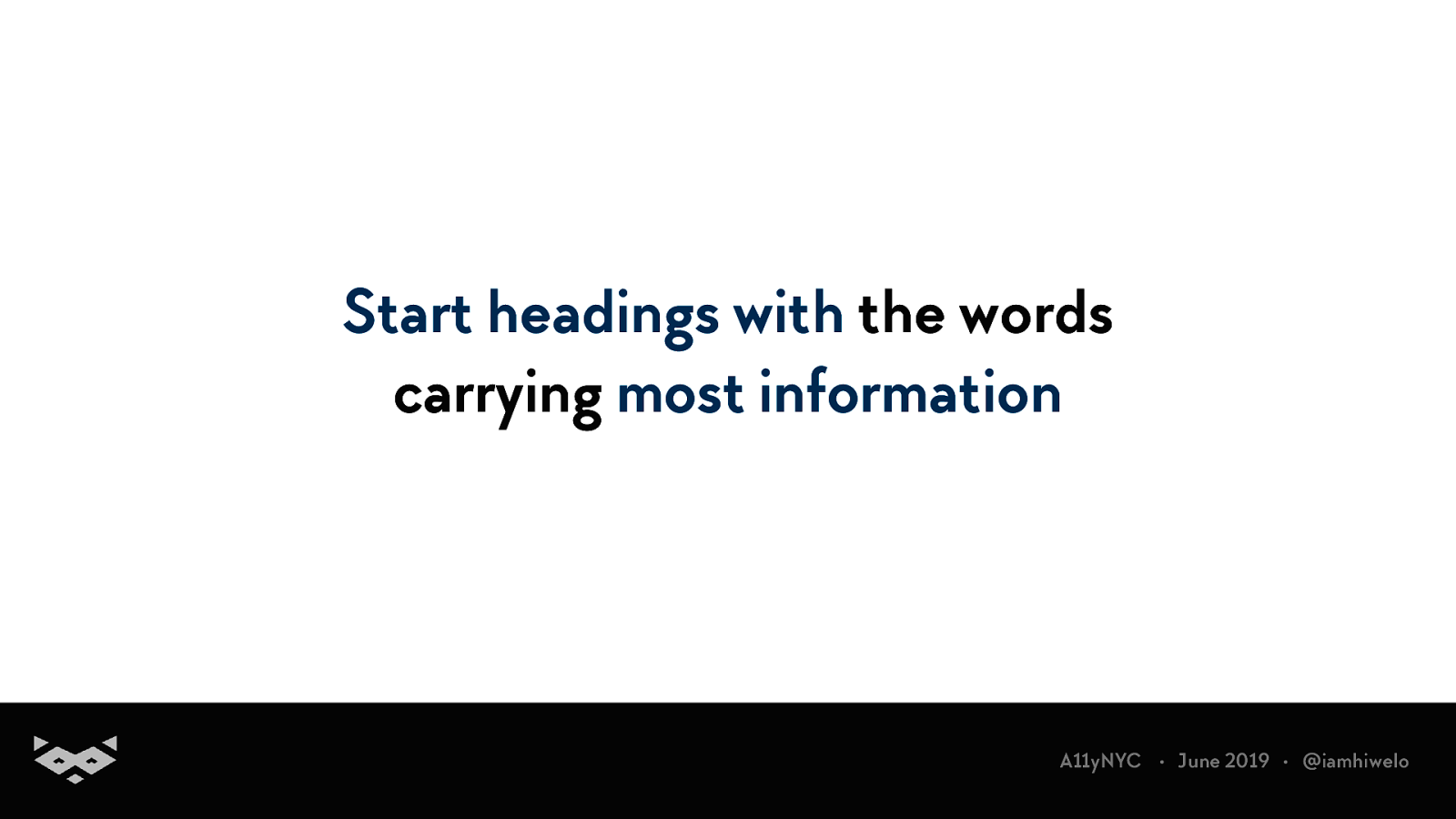
Start headings with the words carrying most information A11yNYC • June 2019 • @iamhiwelo
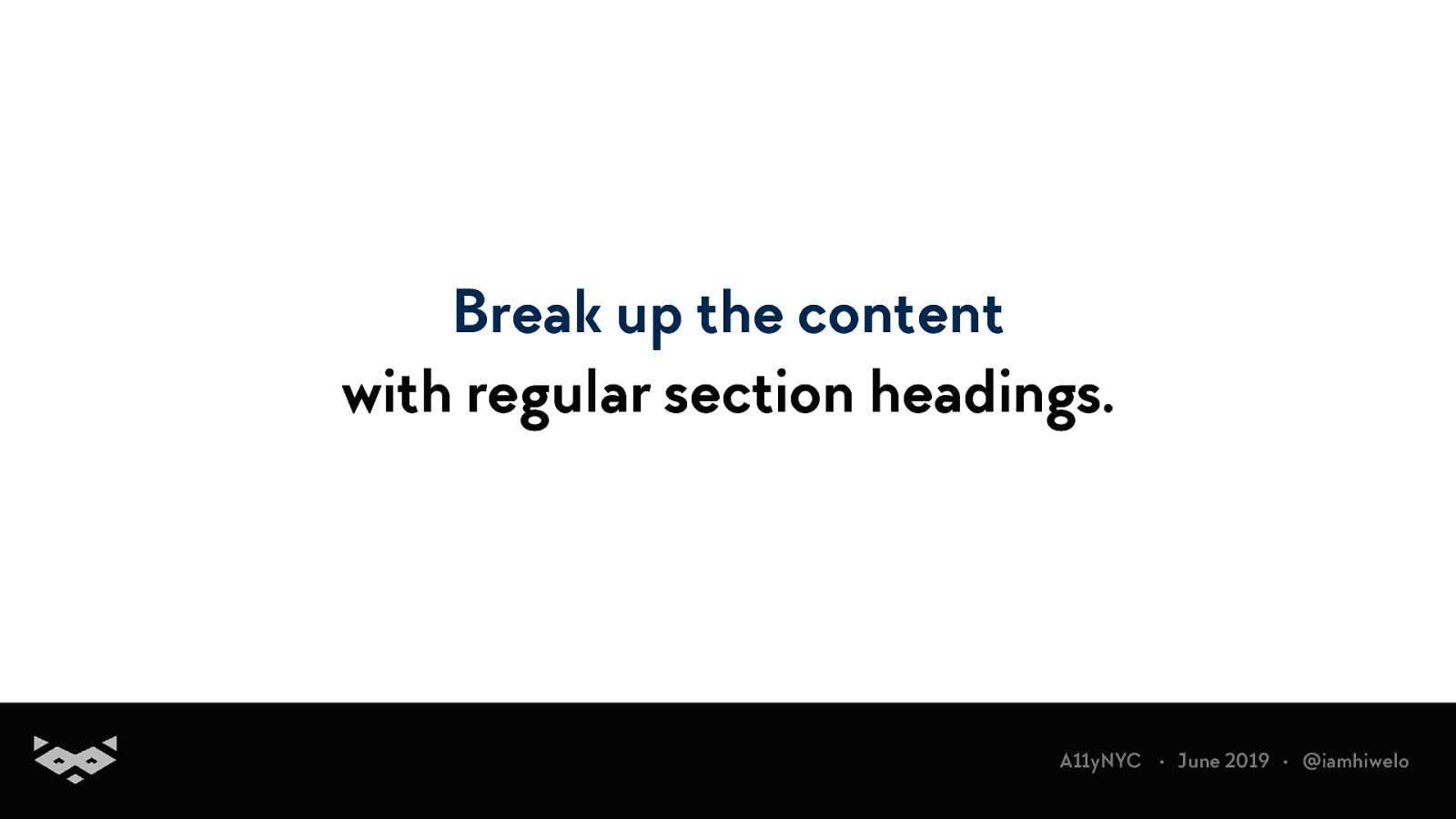
Break up the content with regular section headings. A11yNYC • June 2019 • @iamhiwelo
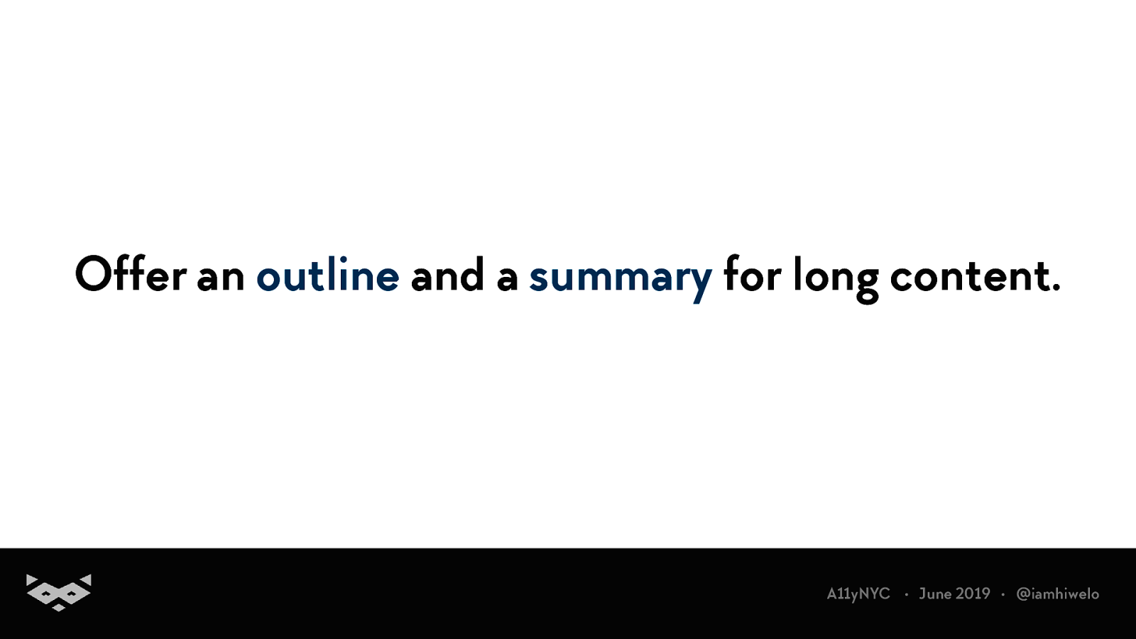
Offer an outline and a summary for long content. A11yNYC • June 2019 • @iamhiwelo
Basically, use HTML and design accordingly. (yeah, dl exists and it’s amazing) A11yNYC • June 2019 • @iamhiwelo
Keeping consistent layout motivates our users to read more when looking for an information. A11yNYC • June 2019 • @iamhiwelo
Users should have two ways to access an information. A11yNYC • June 2019 • @iamhiwelo
A11yNYC • June 2019 • @iamhiwelo
Use active voice rather than passive voice. A11yNYC • June 2019 • @iamhiwelo
Use short & simple sentences in a direct style. A11yNYC • June 2019 • @iamhiwelo
Use images, graphics & rich media to support your content. A11yNYC • June 2019 • @iamhiwelo
A list is always clearer than a paragraph. A11yNYC • June 2019 • @iamhiwelo
Avoid abbreviations, domain-specific jargon and double negatives. A11yNYC • June 2019 • @iamhiwelo
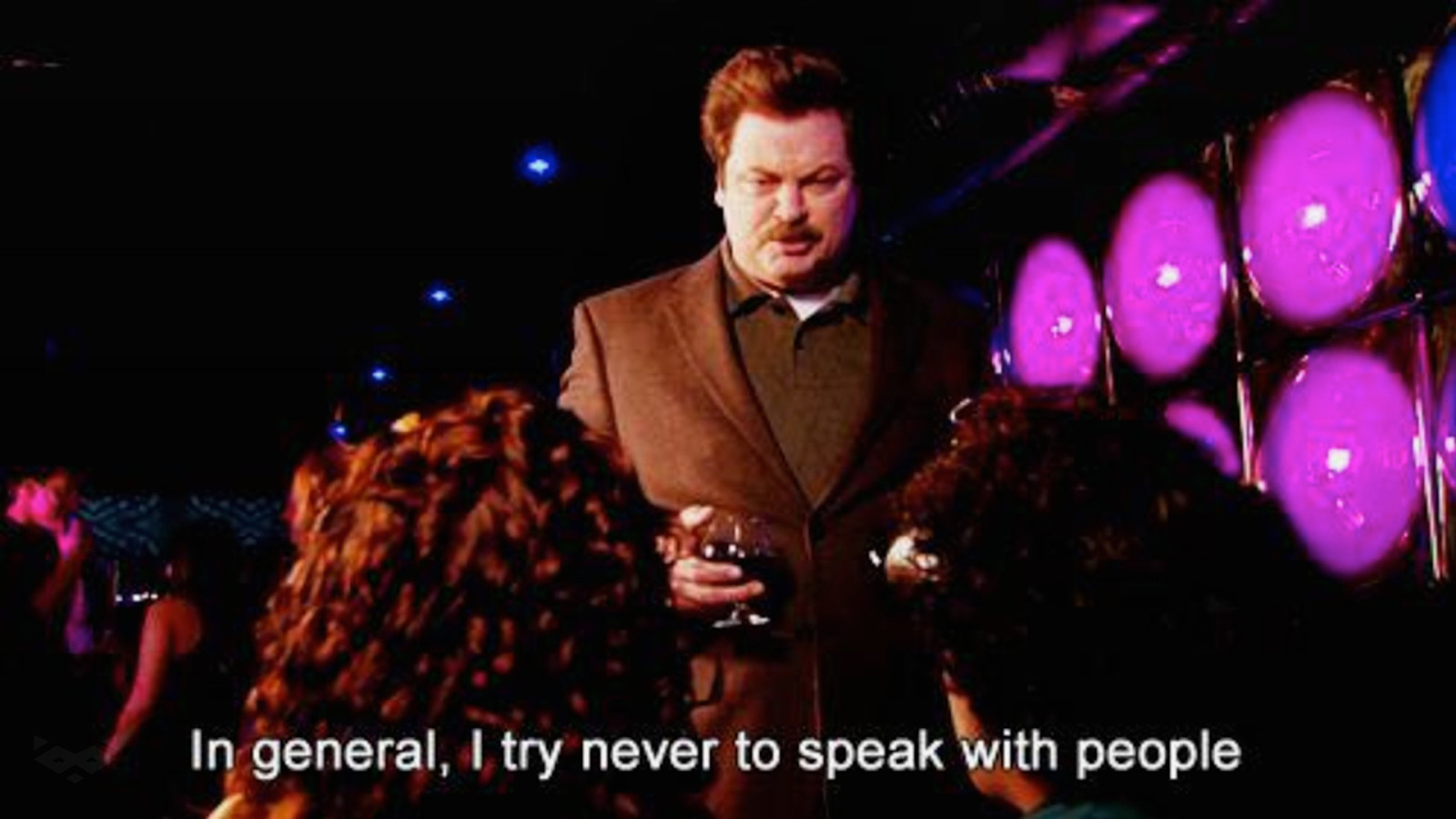
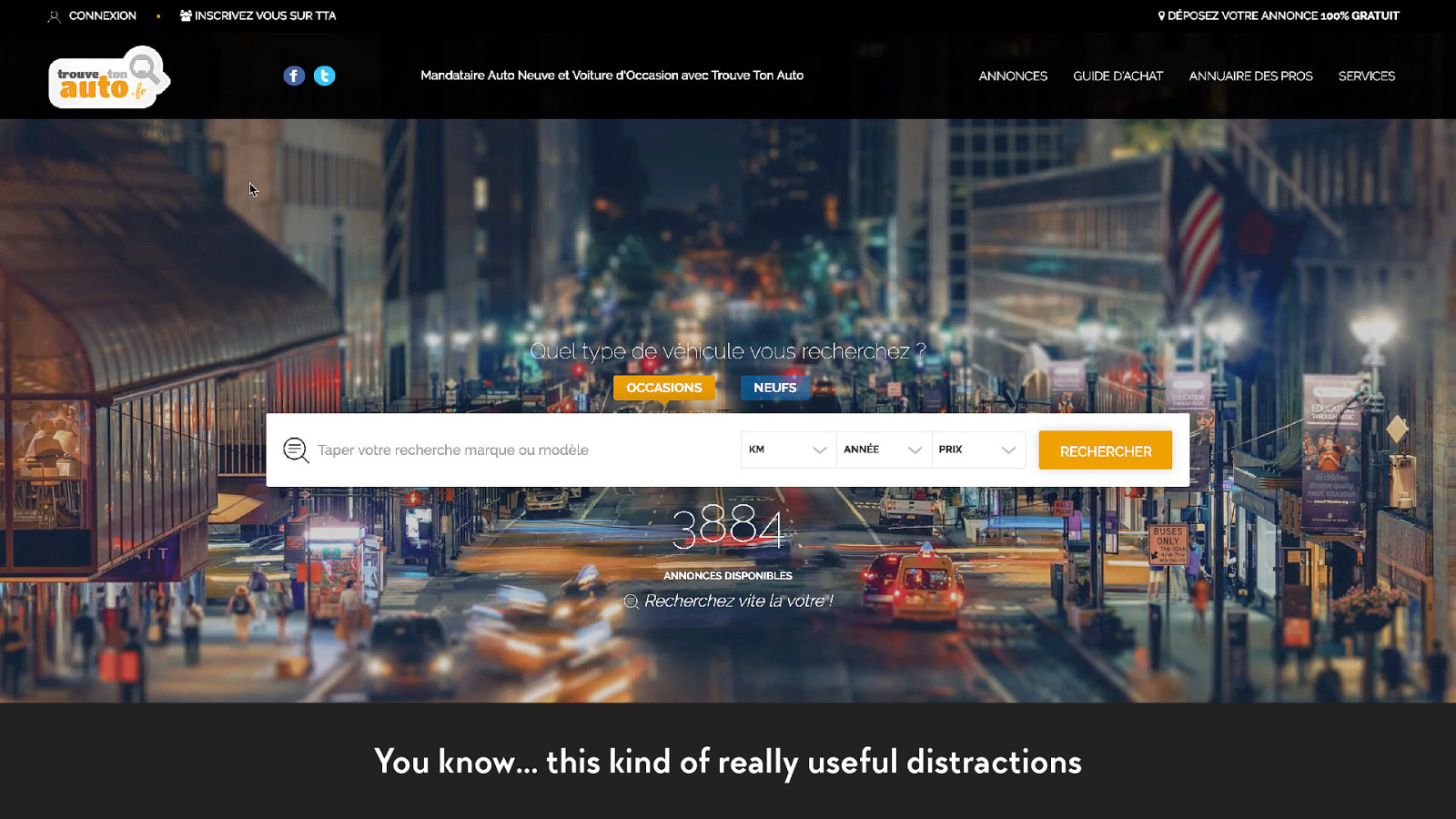
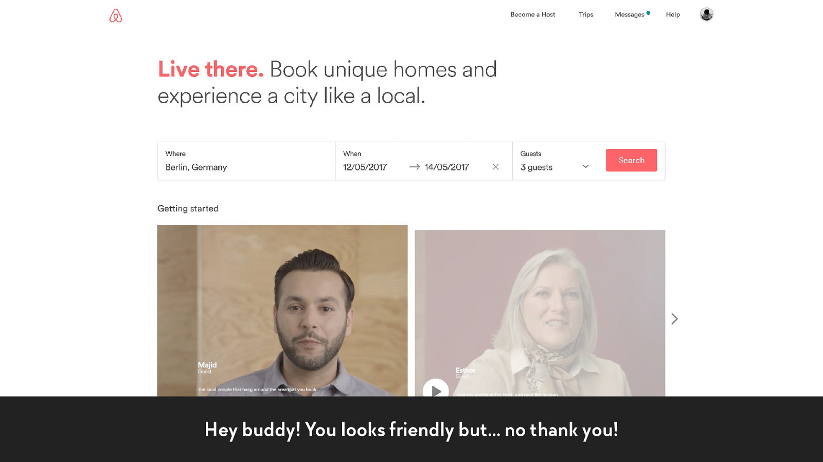
You know… this kind of really useful distractions
Hey buddy! You looks friendly but… no thank you!
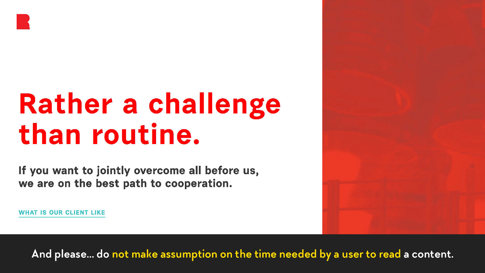
And please… do not make assumption on the time needed by a user to read a content.
bonus The last, but not the least…
bonus ✂
bonus It’s time to remove unnecessary content.
How to experiment with your projects?
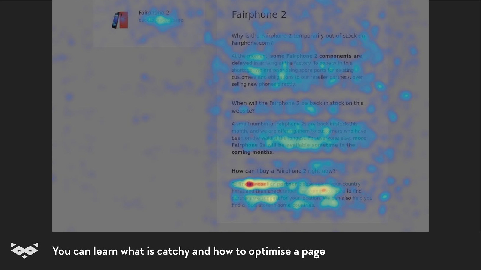
Using recording tools showing mouse position heat-maps A11yNYC • June 2019 • @iamhiwelo
You can learn what is catchy and how to optimise a page
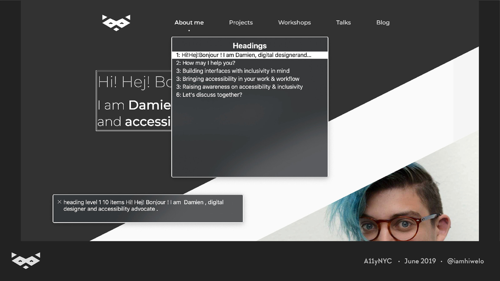
Using a screen reader and tools like the Web Rotor. A11yNYC • June 2019 • @iamhiwelo
A11yNYC • June 2019 • @iamhiwelo
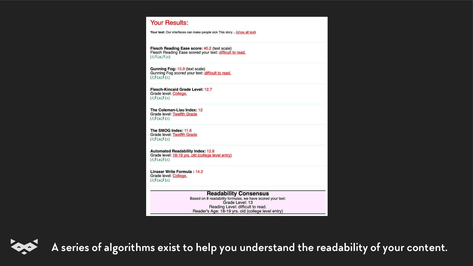
Calculate your readability score A11yNYC • June 2019 • @iamhiwelo
A series of algorithms exist to help you understand the readability of your content.
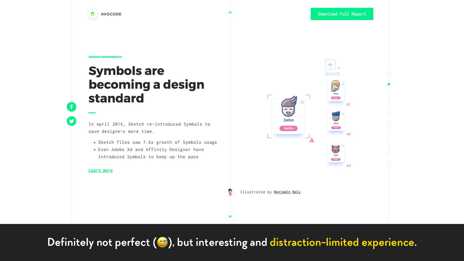
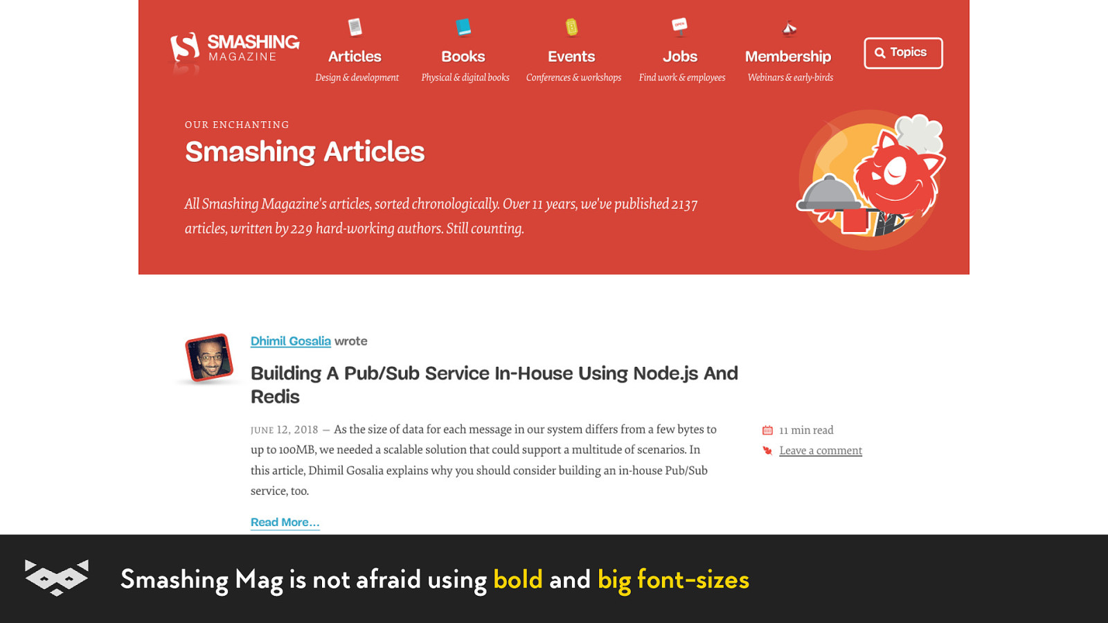
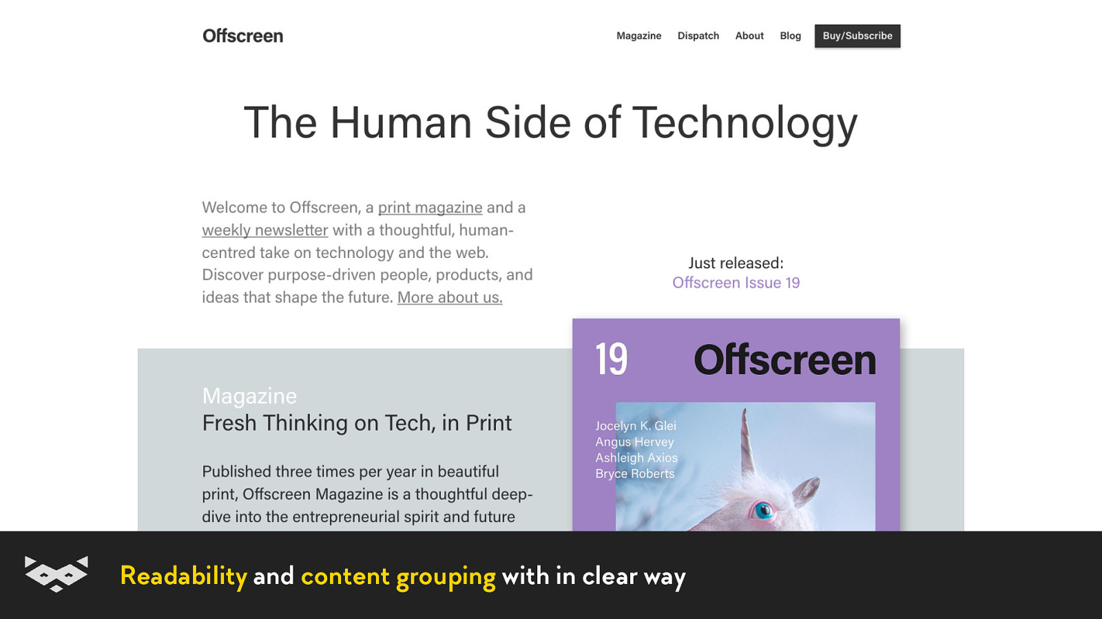
Some good examples.
Definitely not perfect (😅), but interesting and distraction-limited experience.
Smashing Mag is not afraid using bold and big font-sizes
Readability and content grouping with in clear way
Even in ecommerce: a nice & readable design is a must-have for webshop
Merci beaucoup ! % Thank you! & @iamhiwelo Tack! ’ Bedankt! (
Damien Senger Digital designer, specialised in accessibility. raccoon.studio • noti.st/hiwelo @iamhiwelo

Reading is a complex activity for our brains. We need to associate letters with sounds, and to understand the meaning of this music. Unfortunately for some users, this does not always work smoothly. It is complicated for people with reading or cognitive impairments but also for everybody depending on the context. Luckily, there are a lot of small improvements and tips every designer, content-writer and developer can use in a project to improve the life of all users.
The following resources were mentioned during the presentation or are useful additional information.
Here’s what was said about this presentation on social media.


 for free. You
can too.
for free. You
can too.