Build bridges, not walls - Design for users across cultures. Speaker: Jenny Shen, given at Beyond Tellerrand on November 2018
A presentation at beyond tellerrand 2018 in November 2018 in Berlin, Germany by Jenny Shen
Build bridges, not walls - Design for users across cultures. Speaker: Jenny Shen, given at Beyond Tellerrand on November 2018
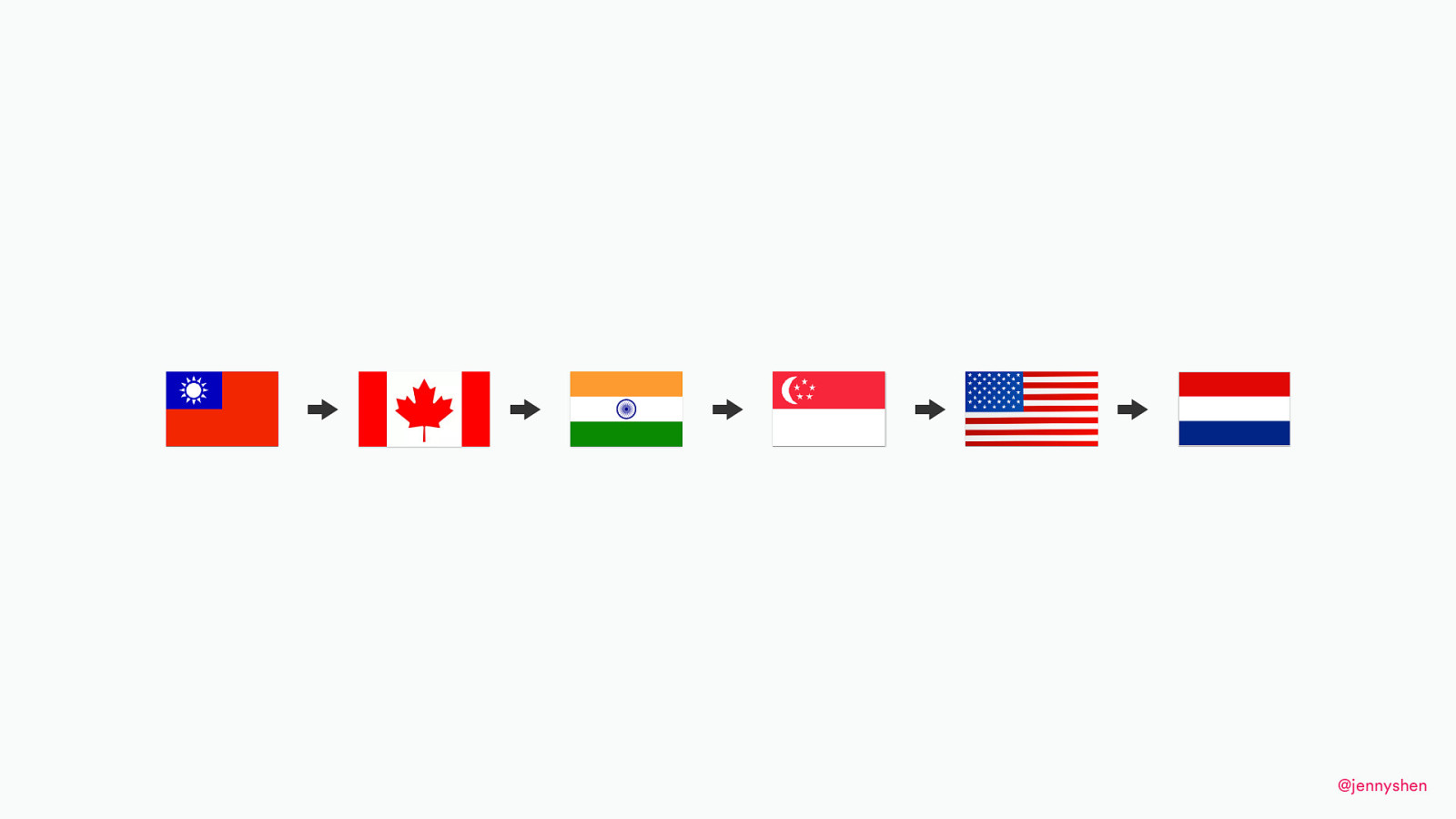
I was born in Taiwan, and my family moved to Canada when I was 12. Since 2012, I’ve been living in India. I moved to Singapore in 2013. I lived in the U.S. for a short period of time and, since 2015, I’m living in the Netherlands.

My name is Jenny. I am an independent consultant. I give talks. I give workshops, consulting. I’m part of a freelance network called Toptal. I also spend my spare time volunteering at a global nonprofit organization called Ladies that UX, and our goal is to grow female leaders. We want to see more underrepresented voices in conferences and events.
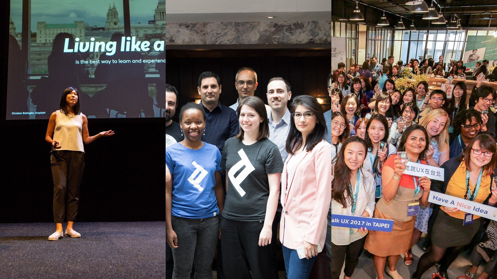
(photos of speaking and communities)
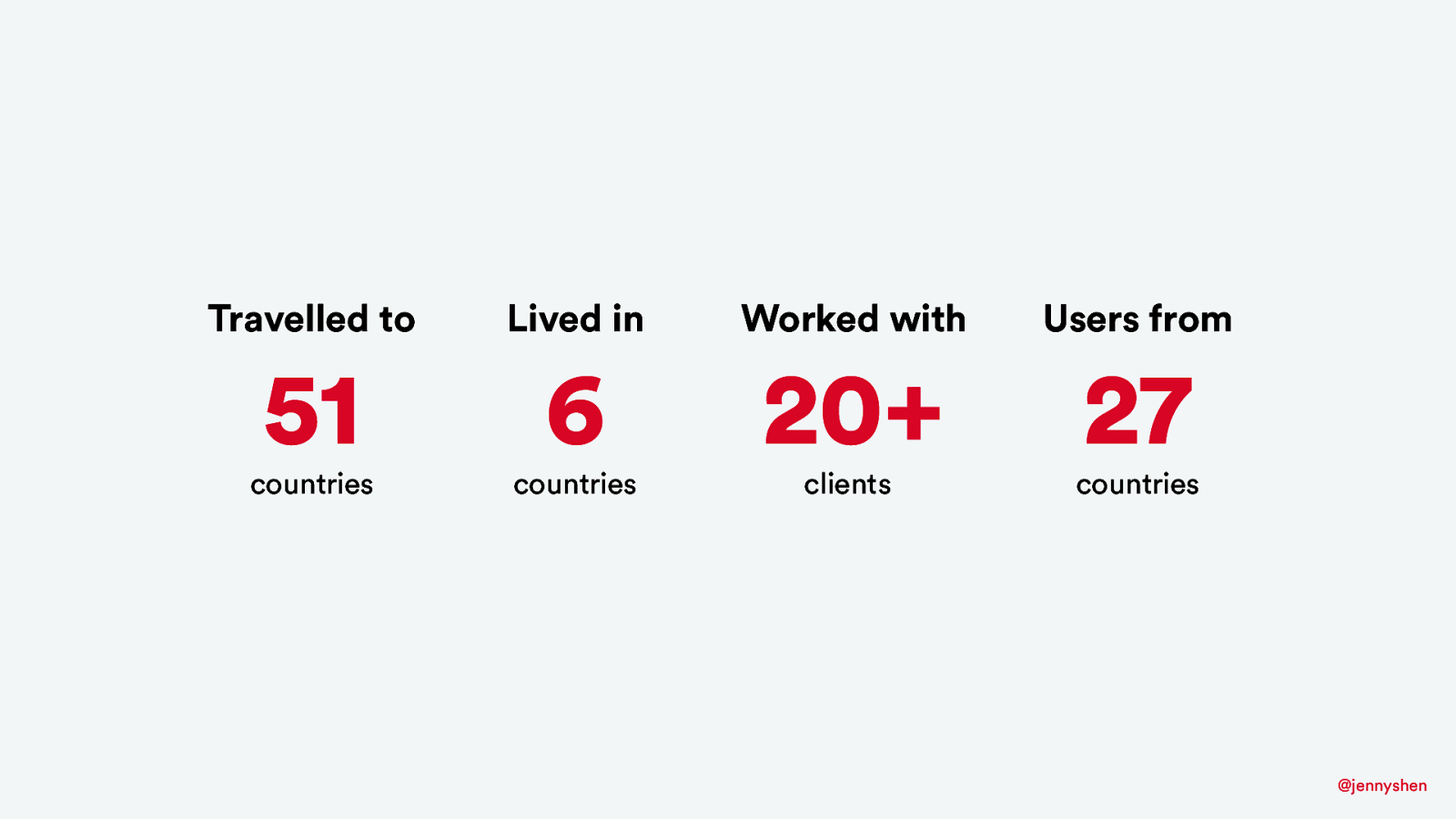
I have a passion for traveling and living in different places. So far, I’ve traveled to 51 countries, lived in 6, and have the opportunity to design for global clients for users around the world.
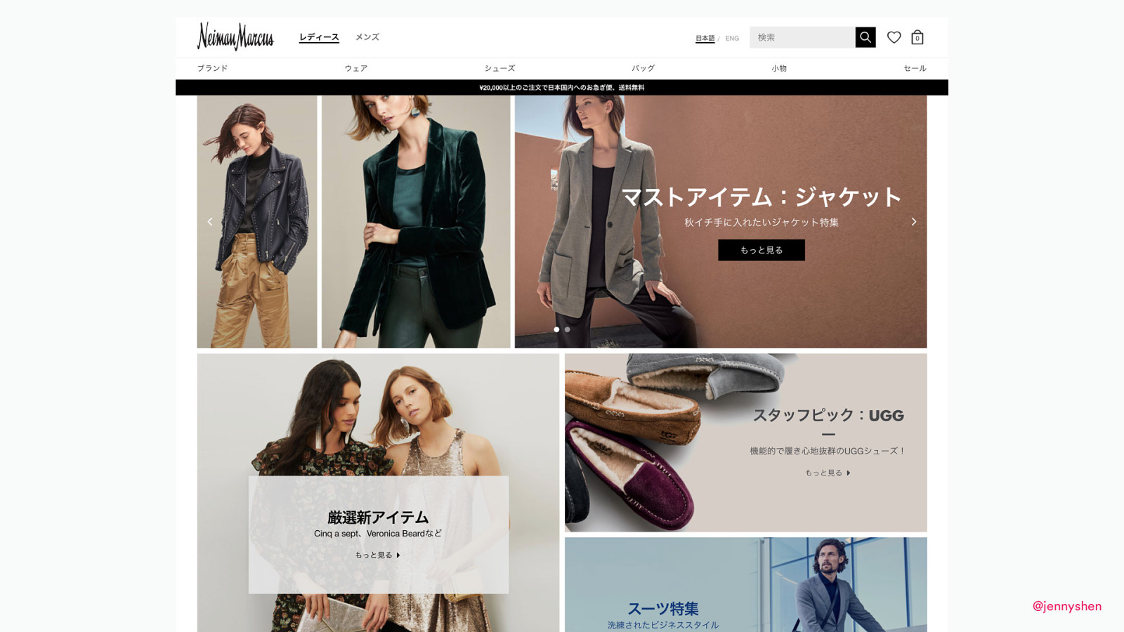
I spend my time designing and consulting for a fashion brand...
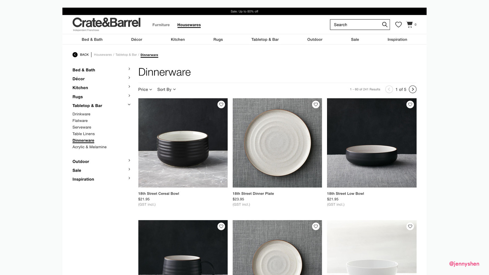
for a homeware brand...
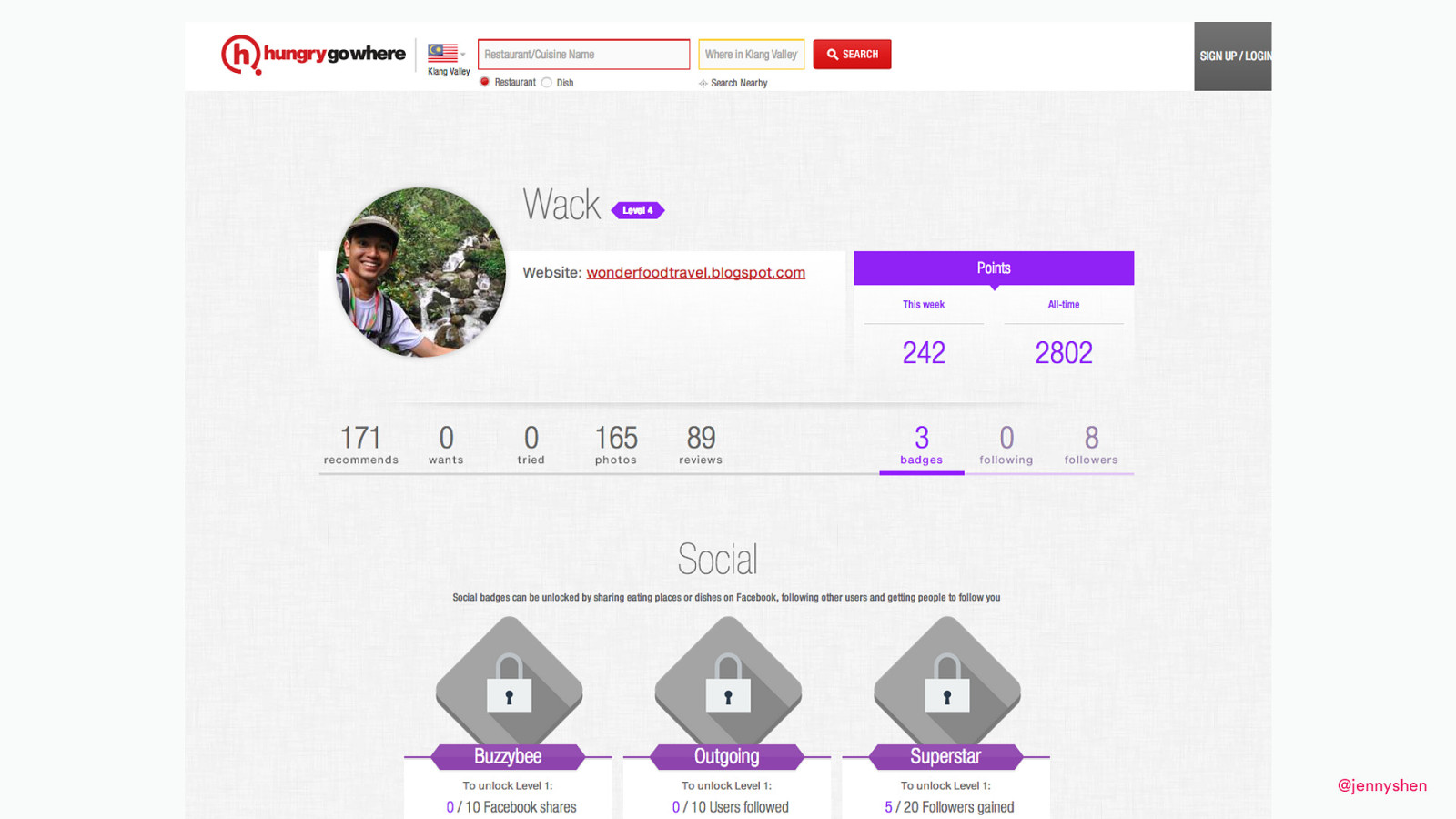
designing loyalty programs...
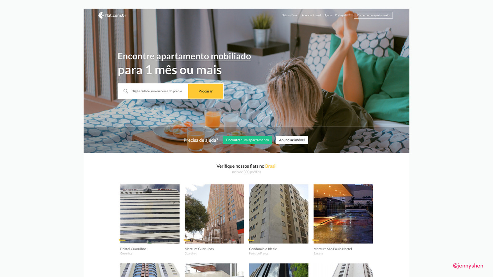
and designing for Latin America.
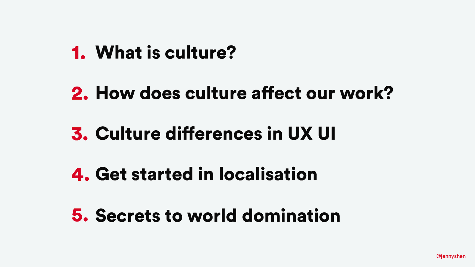
Today, in this talk, I want to cover: what is culture, how does culture affect our work, cultural differences in product design and development, and how to get started? Finally, the secrets to world domination.
What is culture? It’s the first thing I want to cover before we dive deep into the cultural differences in products.
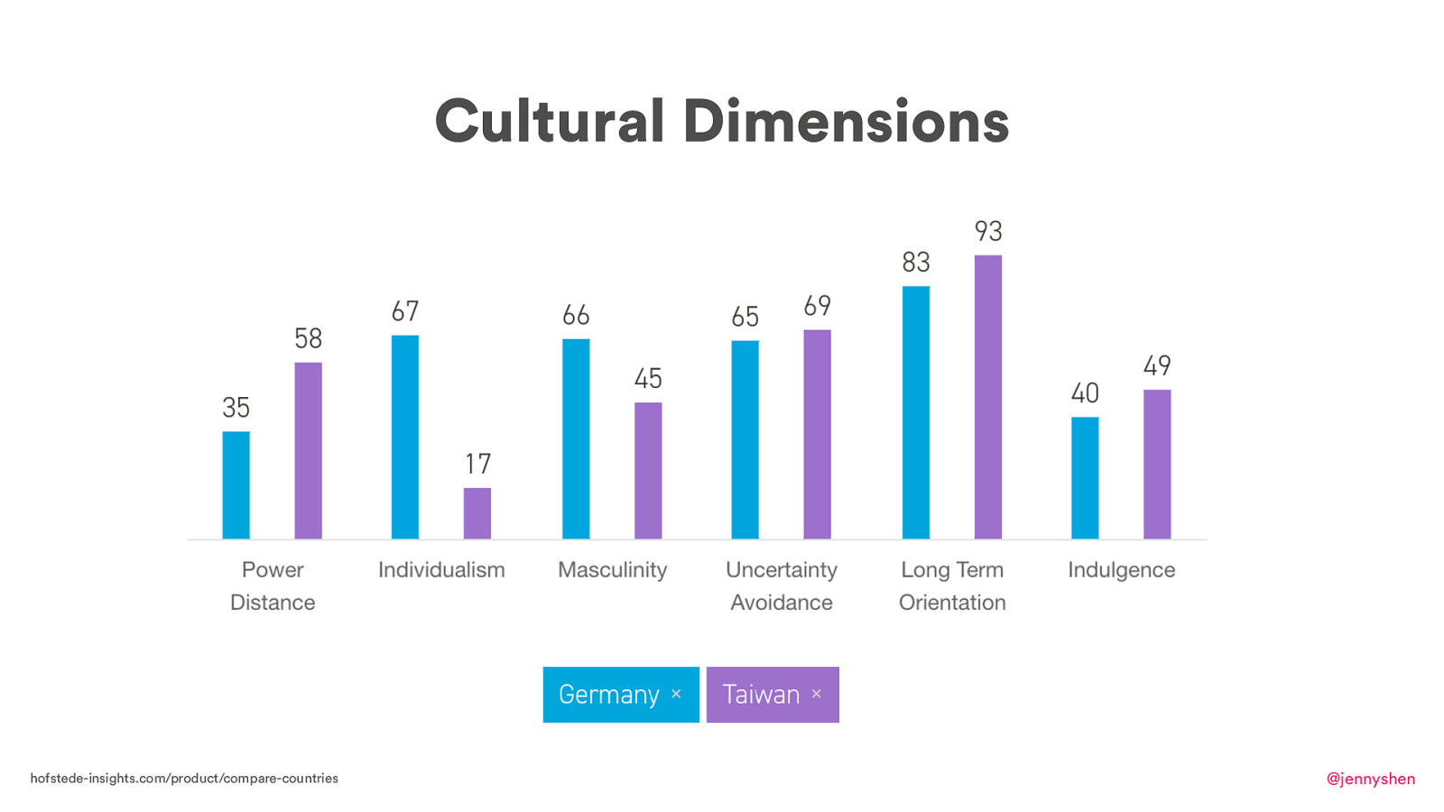
There are many ways to define culture and I like to go with Dutch social psychologist Geert Hofstede’s definition of culture. He interviewed more than 2,000 people, and he summarized his six cultural dimensions: power distance, individualism, masculinity, uncertainty avoidance, long-time orientation, and indulgence. This is how Germany’s culture compares to the culture of Taiwan.
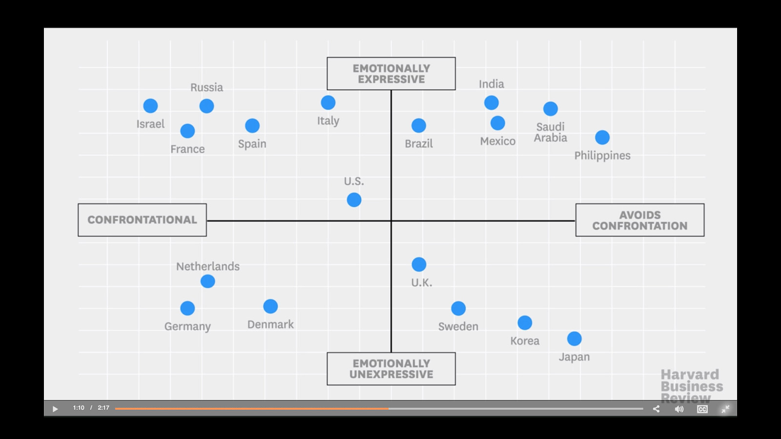
There is also a different study of culture that’s by Erin Meyer. She did her research on how different cultures approach doing business and working together. Let’s have a look.
Erin Meyer: You might be a star negotiator in your own country but, in today’s global economy, your skills may not automatically translate to other cultures. For instance, in some cultures, it’s entirely appropriate to show emotion during a negotiation, to raise your voice, laugh passionately, or even put a friendly arm around your counterpart. In others, this much expression not only feels intrusive or surprising but may be viewed as immature or unprofessional.
Then there’s open disagreement. Negotiators often assume that more expressive cultures are also more confrontational, but that isn’t always the case. In some countries, such as France and Israel, emotions pour out, including disagreement. But for other very expressive cultures such as Brazil, Mexico, and Saudi Arabia, open disagreement could be seen as insulting.
Some less expressive cultures such as Denmark, Germany, and the Netherlands see open disagreement and debate as positive and necessary as long as it’s expressed calmly and factually. Others tend to be both less emotional and nonconfrontational, which means you’ll have to be especially attuned to subtle cues for both positive and negative responses.
It’s also important to learn how others build trust. There are two distinct types: cognitive and effective. In a business setting, the dominant type of trust varies from one culture to another.
Cognitive trust is task-based. It comes from the head and is built on your counterpart’s accomplishments, skills, and reliability. American culture offers a good example of this kind of trust. In the United States, getting too emotionally close to a business counterpart is seen as unprofessional and mixing the personal and professional is seen as risky.
Effective trust is relationship-based and comes from the heart. It arises from the feelings of emotional closeness, empathy, and friendship that are developed gradually through sharing meals, evening drinks, and coffee breaks. In China, for instance, negotiators are unlikely to trust their counterparts until an effective connection has been made.
Adapting your negotiation approach accordingly will help you get to yes, or si, ja, oui, hai, and da.
We just learned about how different cultures approach doing business, working with one another, and how German users are more towards the confrontational side and emotionally and expressive. So what? Why should we care, how does that affect our work, and what does it mean for us?
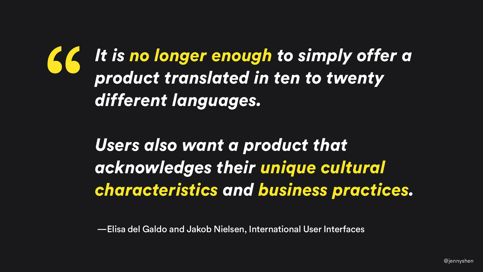
According to authors of “International User Interfaces” Jakob Nielsen and Elisa del Galdo, they write in their book that it is no longer enough to just translate your product. The user wants something that acknowledges their unique cultural characteristics and business practices. Therefore, users are actually expecting something more than just a translation. I want to get into how, in my past experiences, have localized these products and services and what are some of the key things that you should definitely pay attention to and design for.
The first part, of course, is about the local culture.

I now live in Amsterdam, Netherlands for about three years now.
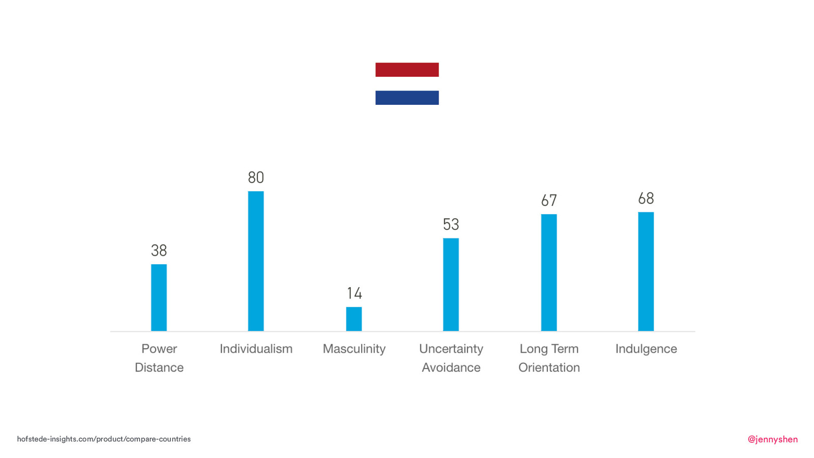
According to Geert Hofstede’s data, this is the Dutch culture. It scores high in individualism, uncertainty avoidance, long-term orientation, and indulgence.
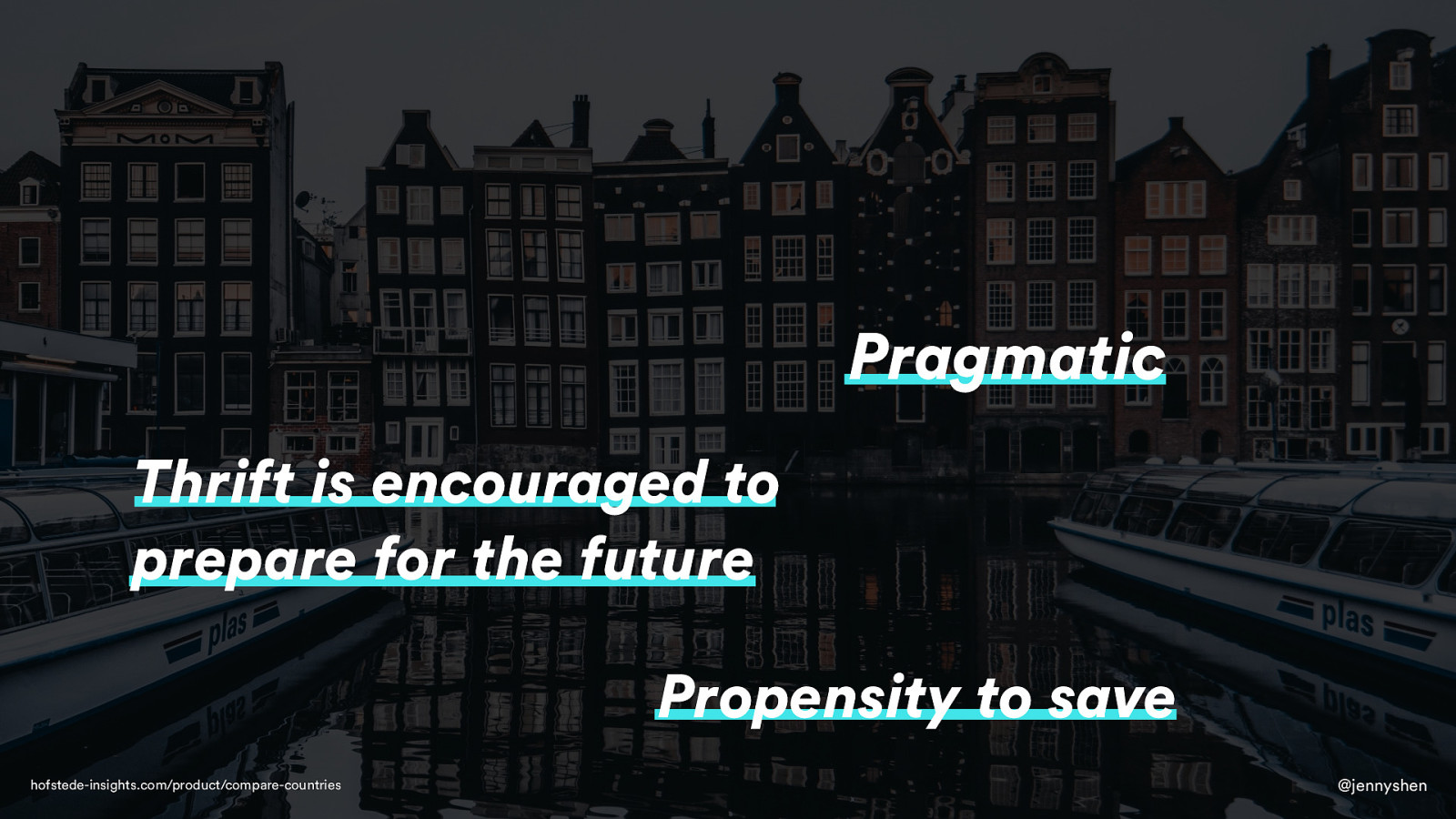
Hofstede also provides a summary of the culture and it mentions that Dutch users are pragmatic, thrifty, and have a tendency to save to prepare for the future.
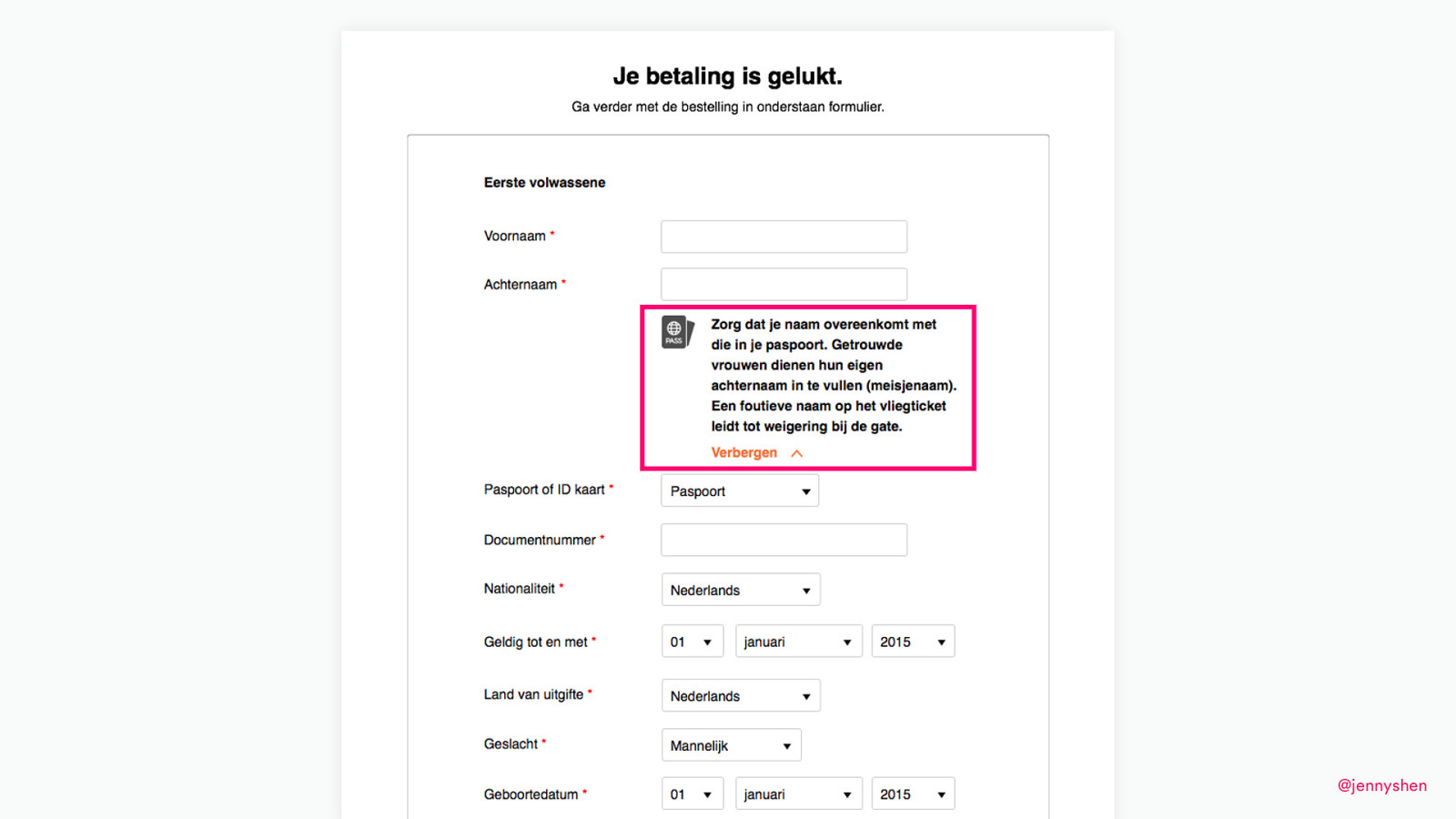
How does that actually manifest and translate to product design? At a company called TravelBird, one of my first projects at this online travel agency, my task is to improve a flight data entry form so that we can book users the flight because the user will book a tour and a package, and we have to ask the users for their passport details to book their flight. Here the problem was that users were not filling in the same details as in their passport. They were filling in their nicknames, their maiden names, whatever, their initials, but they were just not taking out their passport and putting in the correct name.
I thought, “Okay. What do I do?” I put a passport icon. I made this kind of warning, this label, big and bold, where the user can see. This text here, this label says, “Make sure your name matches the one in your passport. If it’s not correct, it will lead to refusal at the gate.” I thought that was a pretty serious consequence and surely the user must now know how important it is to have a correct name.
We rolled out this design. We tested it for a few weeks. We found that it was actually not helpful at all. It was not helping any users to understand why we need them to put the right name from their passport.
I went to do some research and learned what’s going on and what should I do.
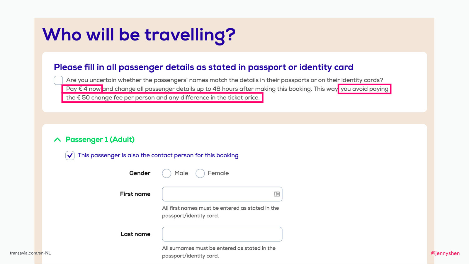
I found this passport form by the Dutch airline Transavia. Here, it actually asks the user, “Are you uncertain if the passenger name matches the one in your passport? You can pay 4 euros now or maybe you have to pay 50 euros later if you want to change the name that you entered in this form.”
Here, it actually asks the user, “Are you uncertain if the passenger name matches the one in your passport? You can pay 4 euros now or maybe you have to pay 50 euros later if you want to change the name that you entered in this form.”
Later, I learned maybe this is something that I should have tried. Maybe that would have worked.

I also got to design for the lovely German users one night during my time at TravelBird.
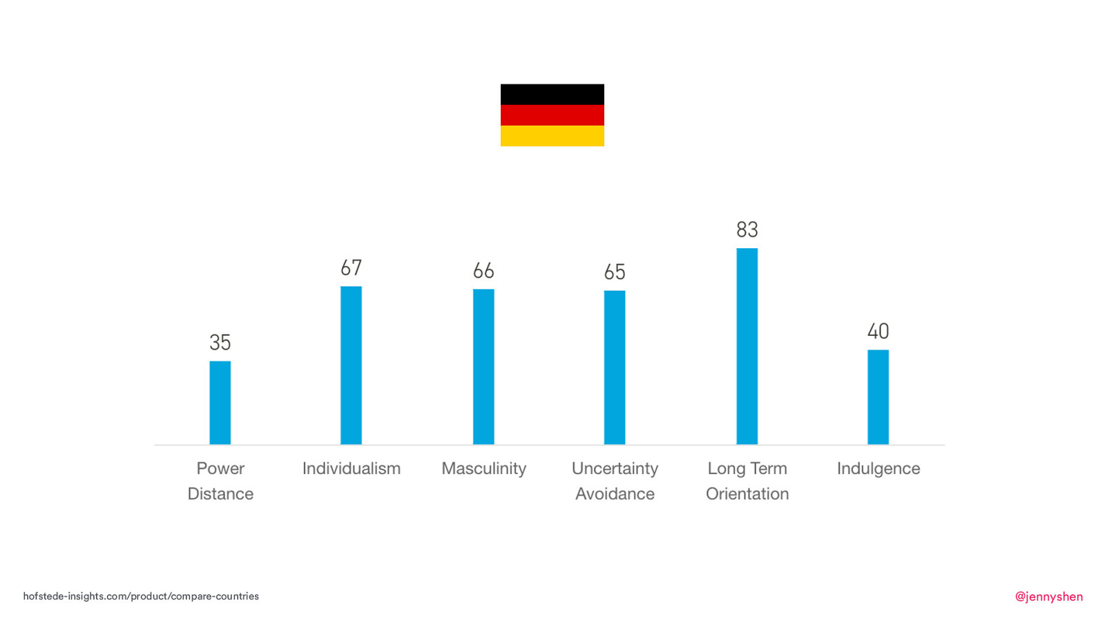
According to Geert Hofstede, the German culture scores high in individualism, masculinity, uncertainty avoidance, and long-term orientation.
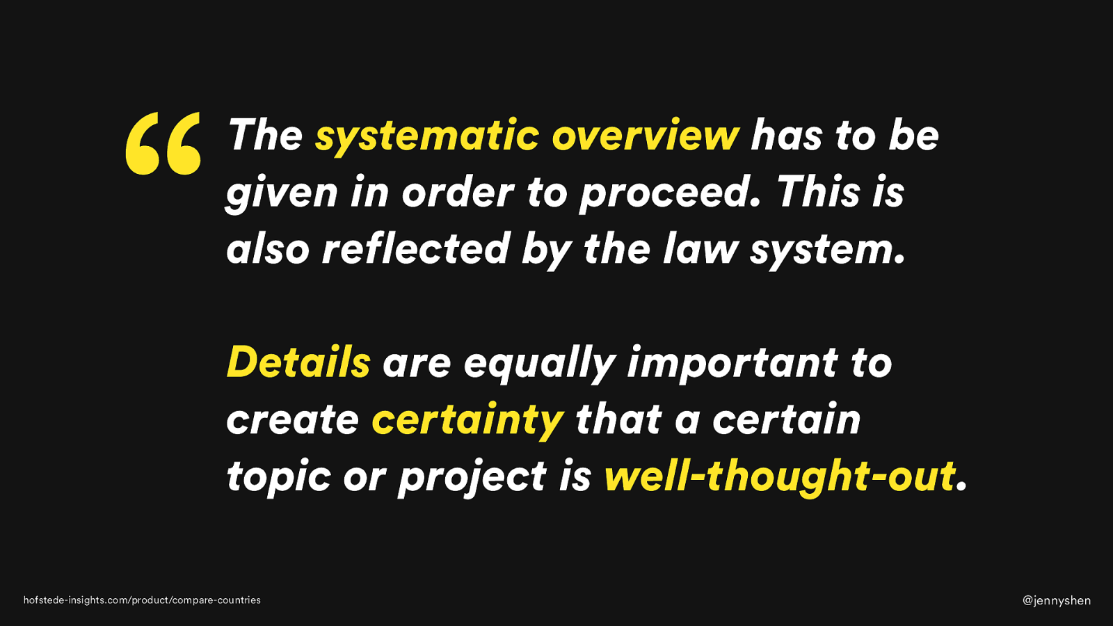
Hofstede’s summary of the German culture is that the systematic overview has to be given in order to proceed. This is reflected in a law system. Users are looking for details and that is important to have certainty in a topic and have it be well thought out.
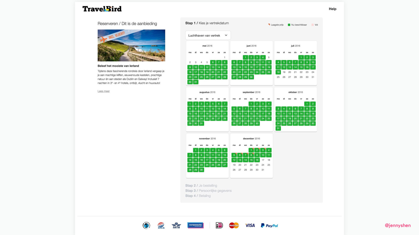
How does that actually translate to product design, again? This is the booking form at TravelBird where users select a date and continue on their booking process with the travel package. This is the Dutch site. This is the Dutch site and...
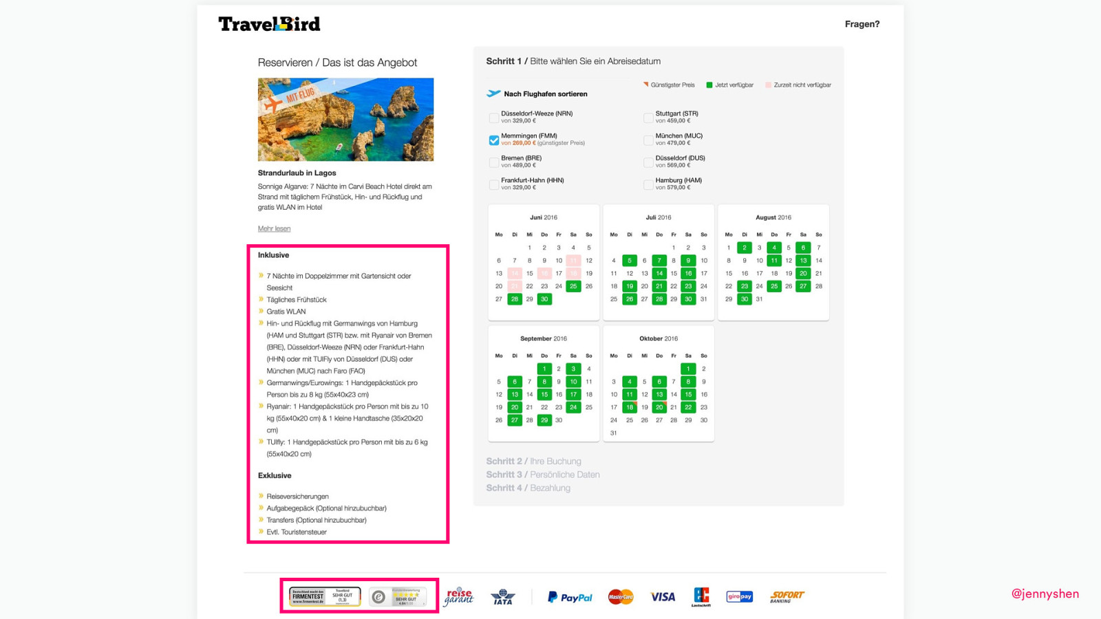
now, compare that with the German site.
Maybe you’ve spotted the difference. Maybe you didn’t. The difference is these two things. First, there are trust badges on the bottom telling the user how credible TravelBird is and also this list of inclusive and exclusive of a travel package.
It tells the users whether the luggage is included, the airport transfer is included, if breakfast is included, and sometimes it’s not included. But normally in e-commerce, the normal assumption is that if we tell the user what is not included, it might lead them to second-guess their choice and just think, “Oh, this is not a good deal. I probably should go back and shop for some more.” But apparently, we tested this design, this list of inclusive, exclusive, and we found out that having this information gives the user the assurance that this is what they are looking for. Actually, this helped us increase the conversion rates for Germany.
Aside from the culture, I will also say that it’s good to pay attention to the local UI patterns. What does that mean?
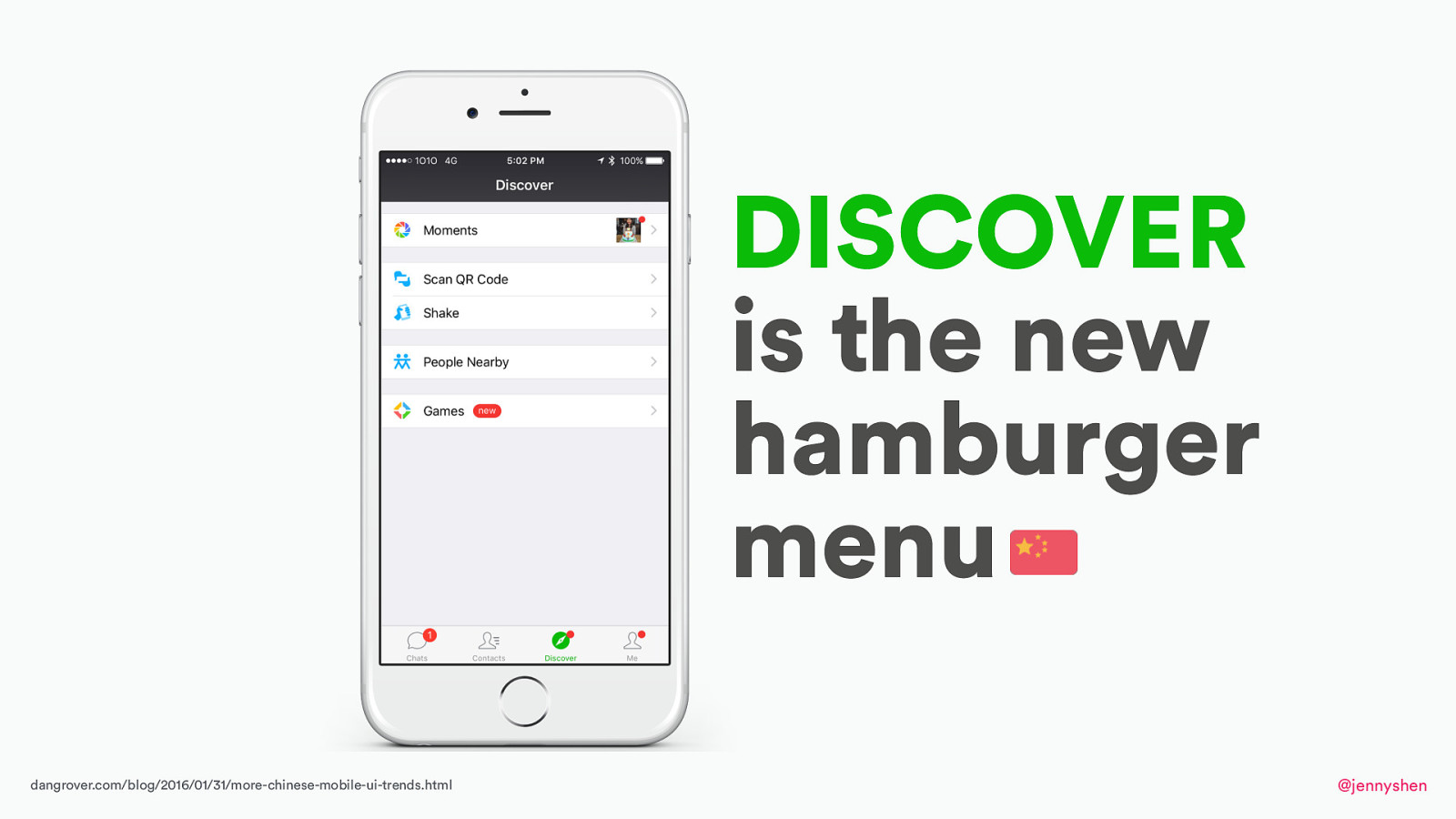
Normally, in our responsive design mobile app, it’s very common to see the three line hamburger menu that we probably all are familiar with, but did you know that it is not the norm in China?
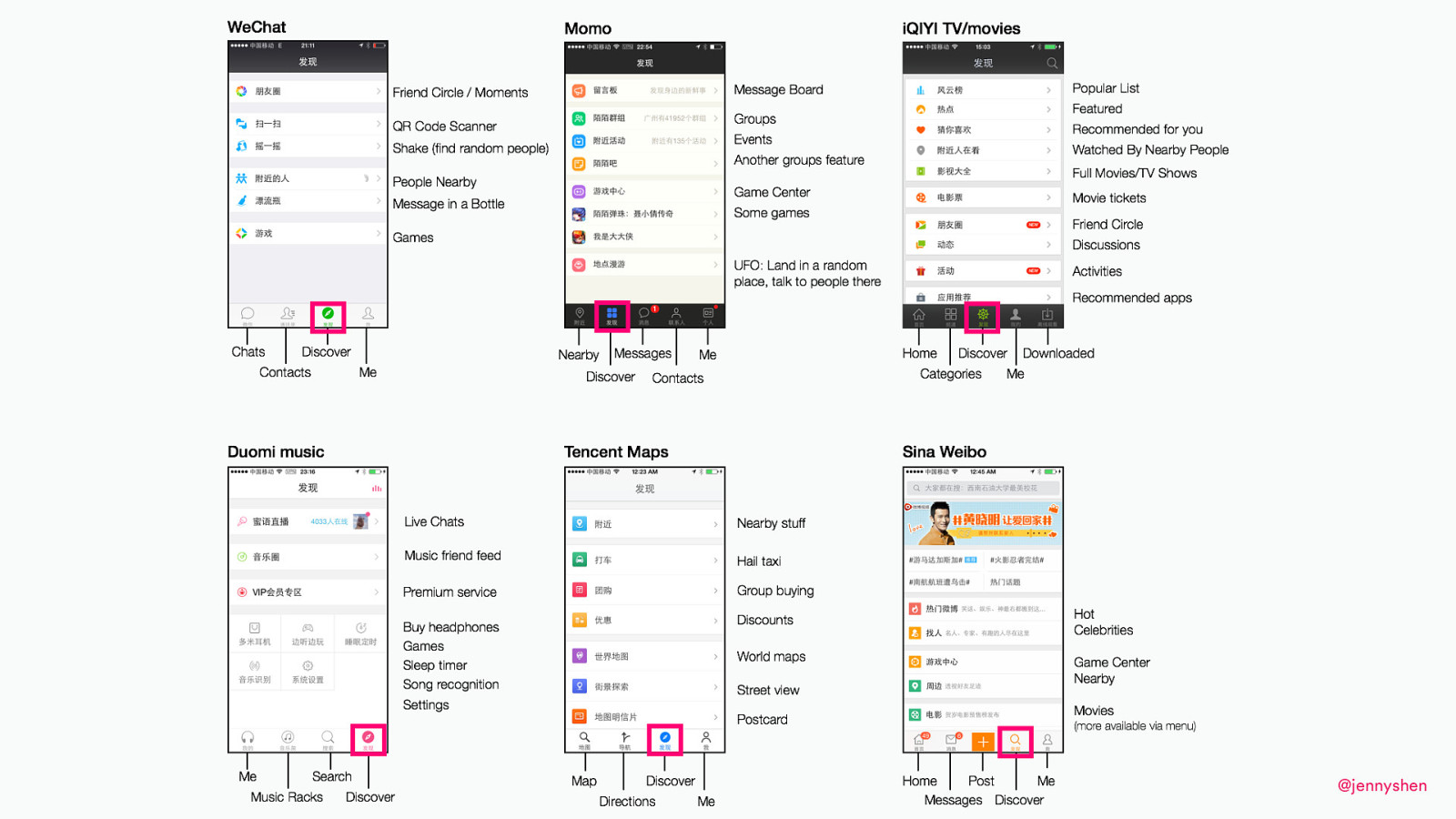
In China, Discover is the new hamburger menu where, instead of this hamburger menu, you see an icon of a compass and that’s appearing in most of the popular Chinese apps where it tells a user, “Here is where you can tab to find more of, you know, other sort of options, secondary options, more options. Here, you can discover more options,” instead of something that’s out of context like a three lines hamburger menu. Dan Grover is a project manager at Tencent, WeChat, and he actually analyzed all the Chinese apps to find to out that there is this pattern in China.

I also have another East versus West example, and that’s Mozilla Firefox. This is the American homepage, Mozilla.com, where the landing page to download Firefox is very simple. It’s very minimal. It’s very clean. It’s very visually pleasing. There is just one thing that you can do. You can click on the big green button and download Firefox.
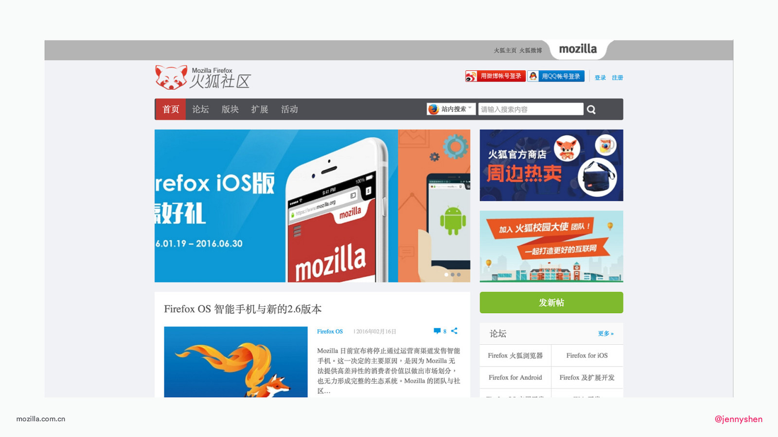
Now compare that with the Chinese version. As you can see here a big difference in the landing page design. There are a lot of things going on, a lot more graphics, and it just looks really different. In case you are wondering, this green button is not to download. It’s to actually post in the forum. You might be thinking, “Why is there such a big difference in the design?” Bram Pitoyo is a design strategist at Mozilla, and he went on an adventure to find out why there’s a big difference.
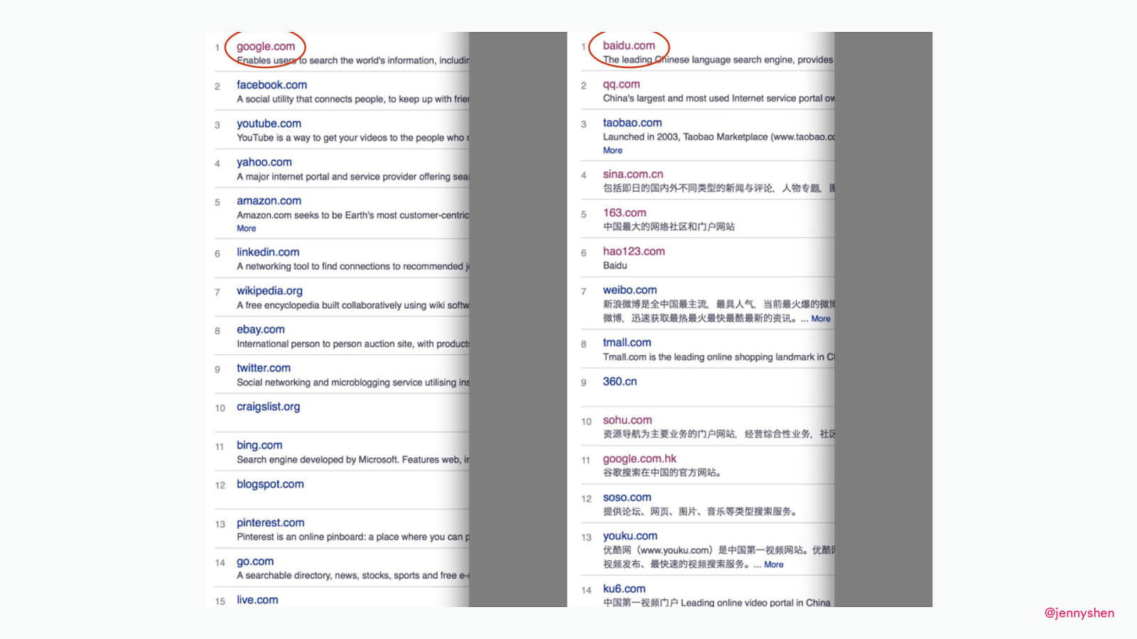
He looked at the top sites used in both the U.S. and China. On the top, you have Google and Baidu, which hare search engines optimized for searching.
You already know their interface. It’s very clean, very minimal.
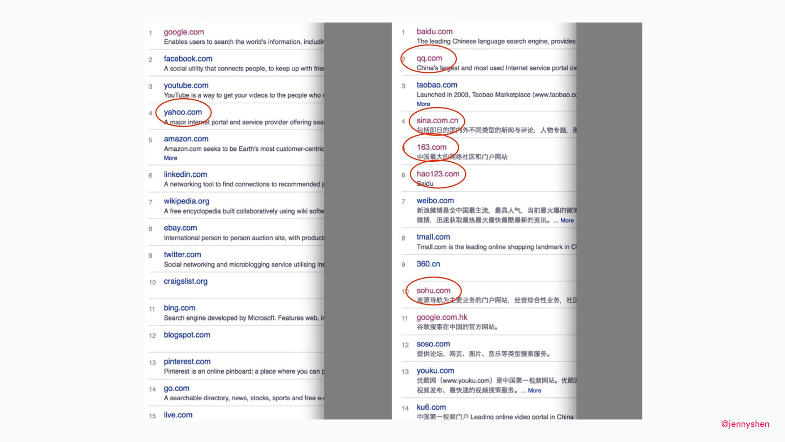
But if you look at the other sites, look at Yahoo, Sohu, 163, QQ/Tencent, and so on...
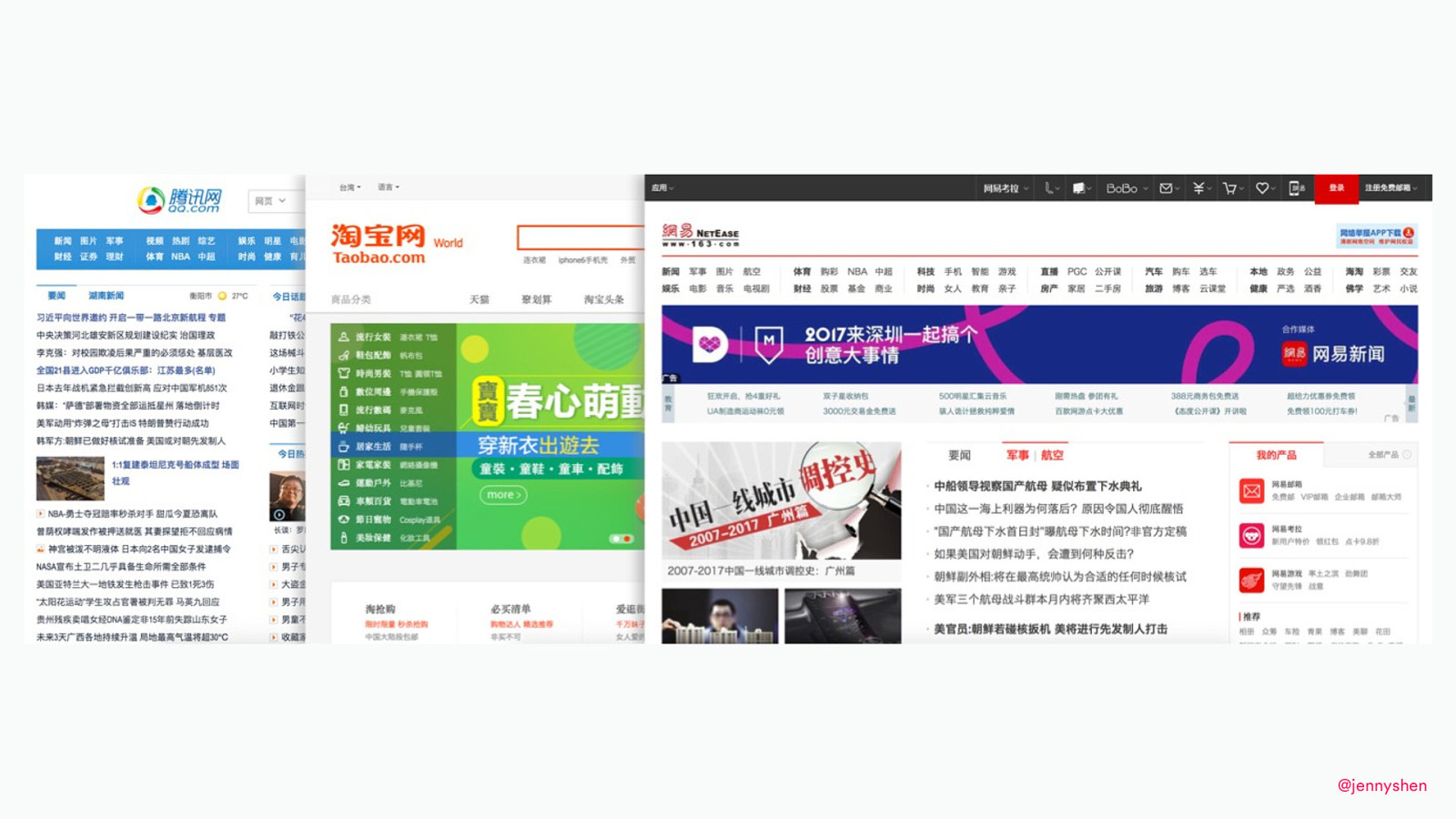
you’ll find out that they have an interface more like this. It’s more of a busy newspaper, dashboard looking kind of design where there’s just a ton of information.
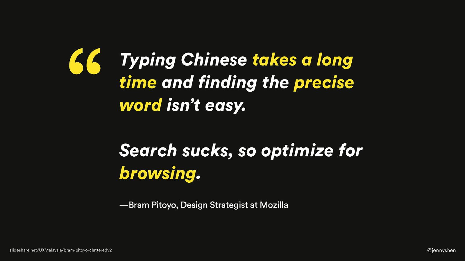
His assumption for the difference is due to the input method, which Marcin actually gave you all a glimpse into how typing in Japanese or how typing the Asian language actually works. You have to type in whatever it sounds like and you pick a list of different options to tell the system this is what you mean. Typing Chinese, especially, is very cumbersome. It takes a long time, and we have to scroll through five pages to find the right word. Instead, if it’s difficult to find the right word, why don’t we optimize for browsing by giving the user this information, which they can just view and then pick whatever stands out to them and that they want to read? That is his assumption for the East versus West difference.
Something else that can actually help you find the local users’ behavior is through quantitative data. One of my clients, Deskbookers, they were based in the Netherlands and then they wanted to expand to the rest of Europe, including Germany. Germany was one of the least performing countries.
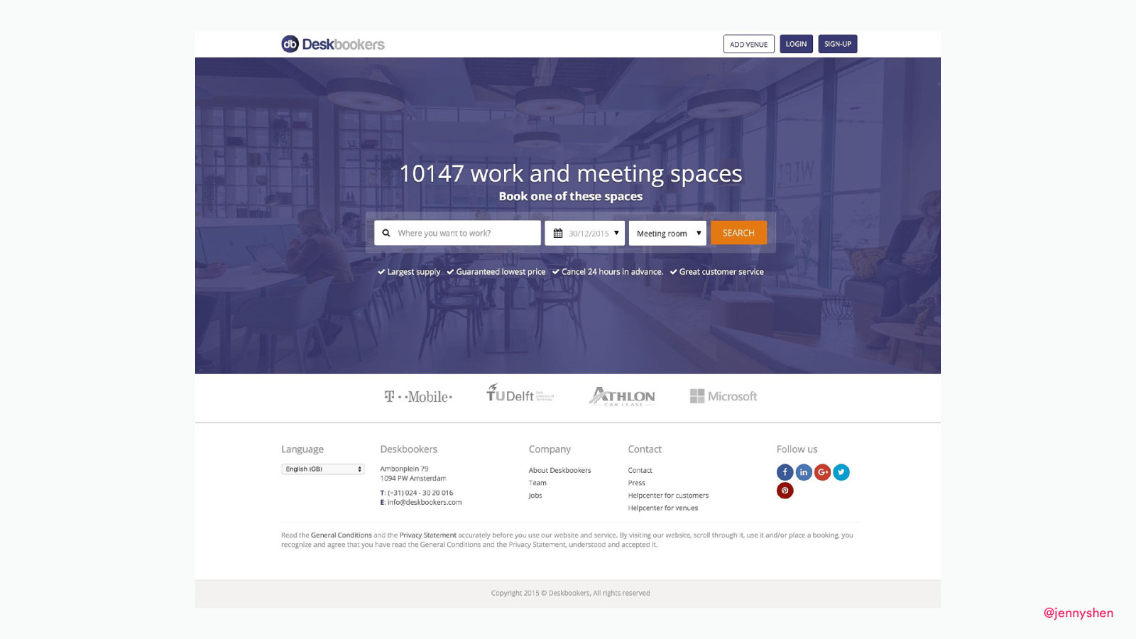
One of my clients, Deskbookers, they were based in the Netherlands and then they wanted to expand to the rest of Europe, including Germany. Germany was one of the least performing countries.
They were offering flexible office and workspaces. They were getting sales through phone calls. They were getting sales through their sales team, but they were not making any sales on their website.
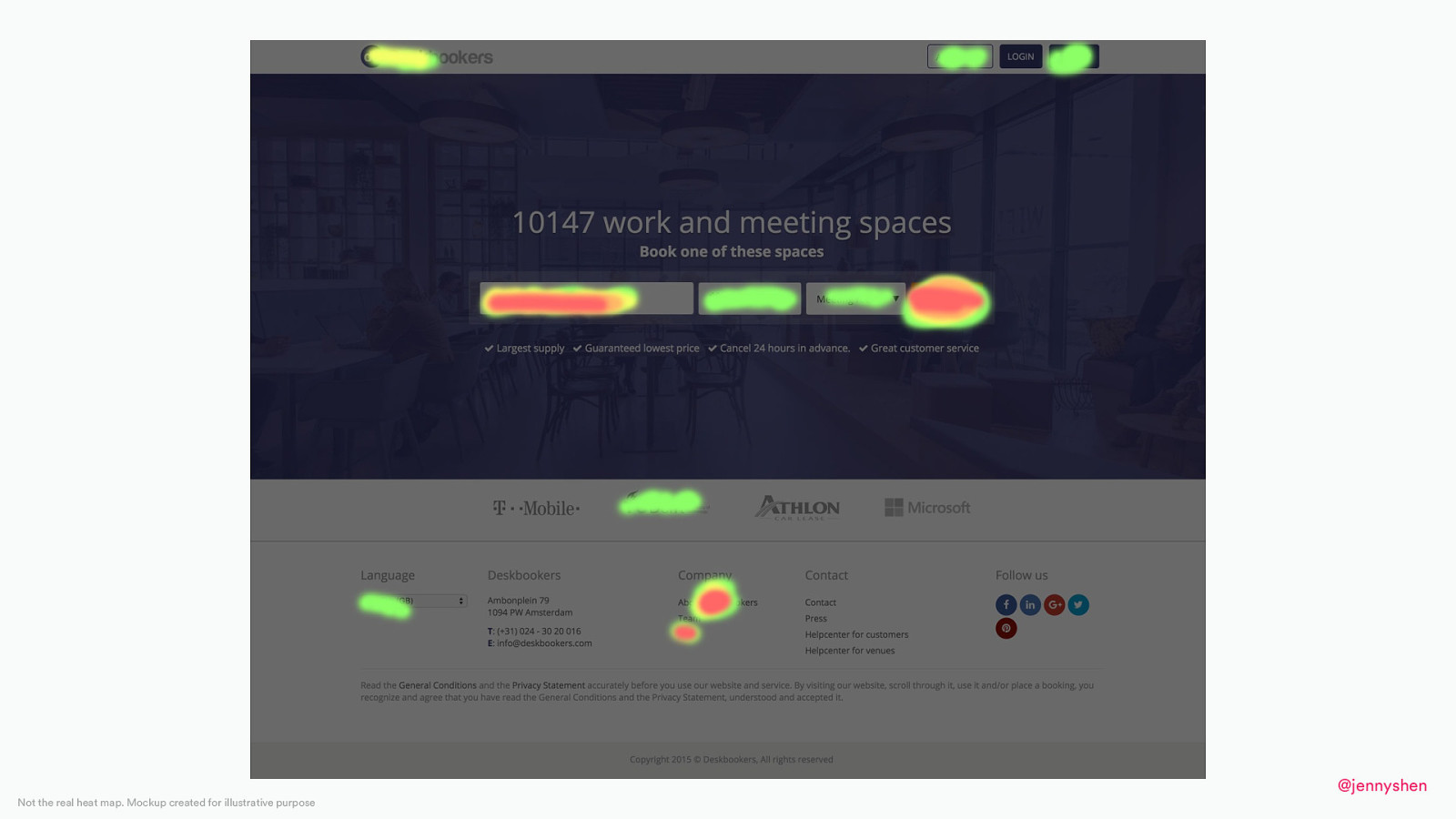
I helped this client. I looked at the heat map. I looked at some Google Analytics data, then find out what’s going on.
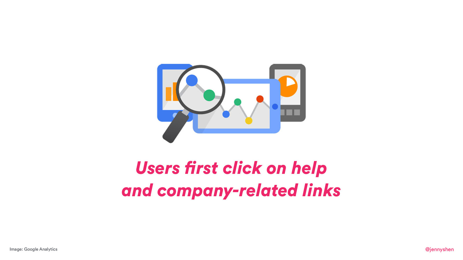
There was one thing that kind of stood out to me is that we were looking at the data, both heatmaps and Google Analytics, and found out our users, before they were putting in this location where they want to search, they were first clicking to read about the company. They were first clicking on help before they did anything. That was a bit odd, but I had two assumptions why German users had that behavior.
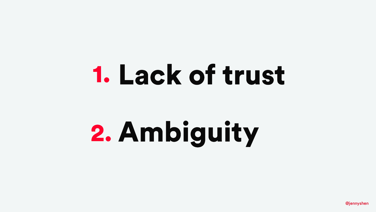
I assumed it was because of lack of trust. Users did not trust who Deskbookers is because they have never heard of them. There was nothing on the website. Also, they provided too little information and that they didn’t know how to proceed. They didn’t know how to book.
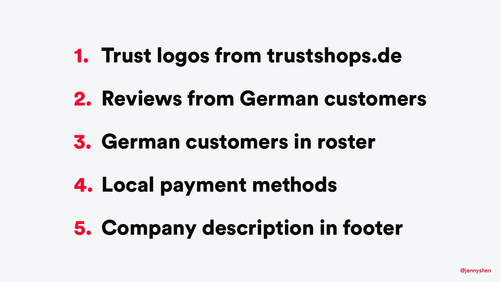
I provided several suggestions for my client including adding the trust logos and definitely localizing the site so that we have reviews from German customers, logos of German customers, and definitely the local payment methods as the bank transfer that you know. Also, we should include a description about the company in the footer to at least tell the users that it’s a German company and to trust us to book with us.
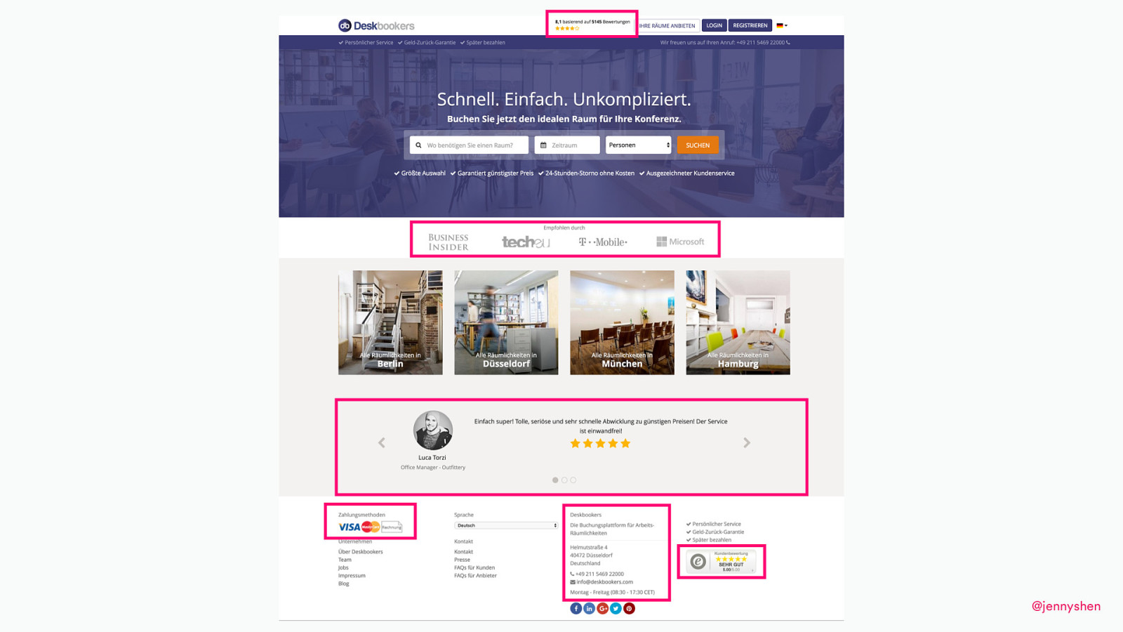
With all the information, we revamped the website with a different design, incorporating all of the insights that we got from the quantitative data, and we were successful to increase the conversion rates for Germany after all these changes.
I always like to share my process of local culture research because earlier, like the whole day, you kind of see the process of an artist and here is the process of someone who does localization. This is actually how to conduct local culture research.
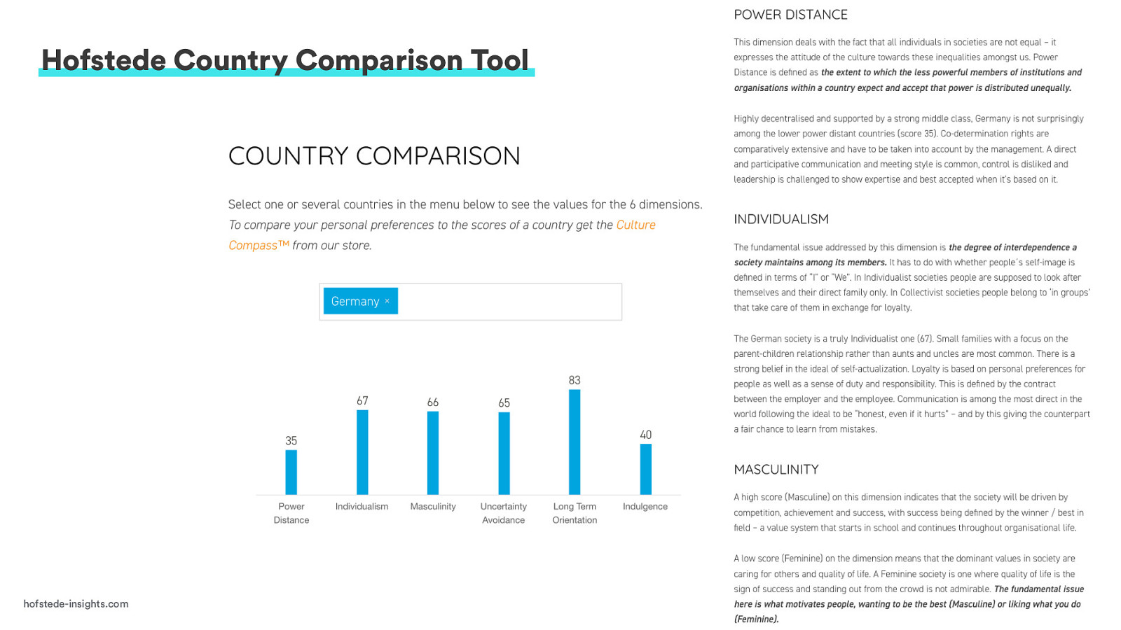
The first place I go is actually to a host data country comparison tool where, if you type in the country and compare it to your own, and you can actually learn a lot about the country’s culture. It gives a pretty comprehensive analysis of it. Next, I will do some Internet research. There are some things, three things, I want to point out that you can learn from Internet research like, for example, Wikipedia or blogs, expat sites, or even countries’ official sites, cities’ official sites like Visit Berlin can tell you a lot about the city and also the country’s culture.
The three things I want to point out first doing your research, you can find out about the colloquial language and slangs.
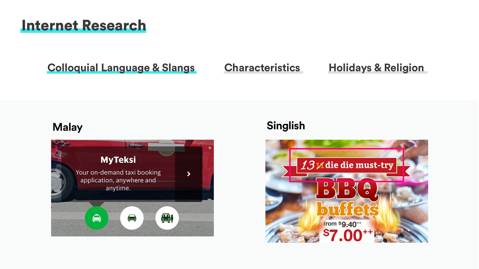
For example, in product design, this is the local copy by a Malaysian taxi company called Grab. In Grab, they localize the copy so that instead of “taxi,” the Western word “taxi,” they use “texsi,” which is an Indonesian word that will make the user feel more connected to them.
They use Malay in this design and also, for Singapore users, they use Singlish in their marketing design. “Die, die, must try” using in BBQ buffet actually means like you have to try it before you die.
These kind of local language makes the user feel more connected, feels more familiar, and just feels like more friendly that you can consider using in your marketing or designs. Also, in your Internet research, you can learn about characteristics.
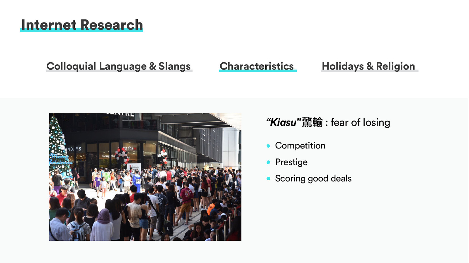
I lived in Singapore for one and a half years, and I learned a lot about Singapore and culture firsthand. I learned that Singaporeans, generally, some of them have a culture being “Kiasu.” That actually literally means the fear of losing.
This is a photograph from a store opening of a Bubble Tea in Singapore. The Bubble Tea actually here costs like 3.50 euros but, in Singapore, it costs like one-ish euro. Because of a store opening, they give out 100 bubble tea for free, and look at how many people are lining up for one dollar bubble tea.
Perhaps, the reason for the behavior is that the users like the competition. They like the prestige of winning that free one dollar bubble tea, and they love scoring a good deal. The Singaporean Kiasu culture, you can see from the users’ behavior, and this is something that you can work into your product design and development process.
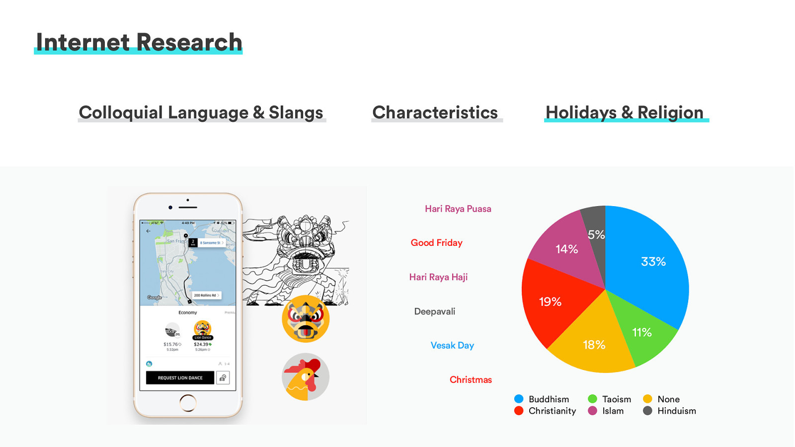
Also, in your research, you can find out about the local holidays and religion. For example, Uber in Lunar New Year, which is one of the biggest holidays and festivity activities that we celebrate in the eastern culture, they have considered it and work it into their product where, during Lunar New Year, you can order a lion dance during the year of Rooster. For people who celebrate this holiday, it feels that, hey, Uber cares about us. They know that we are celebrating this, and they are bringing us something that we usually bring the lions dance--fake lions, of course--to celebrate with us on a Lunar New Year. So, it makes the user feel the extra connection.
Of course, you find out about the religions. In Singapore, you can see that is quite diverse. There is no, like, one dominant culture. Well, I guess you can say, yeah, Buddhism and also Christianity. They are kind of the bigger religions. But still, it’s quite diverse ethnicities and religions and, therefore, in your marketing or whatever things that you design for the user, think about being inclusive and think about serving the needs of diverse users and not just focus on one particular religion like Christianity because that seems to be kind of the norm in the Western cultures.
Aside from doing Internet research, I learned a lot doing informal interviews. One client I was working with, they were actually launching a fashion site for Singapore. We had pressing deadlines, and I was asked to interview as many people as possible and have the users test our site. I was asked to interview 100 people.
We were under a really tight deadline, and I was thinking, “Well, okay. I don’t really have that many friends who are into luxury fashion brands. How am I going to find 100 users to talk to?”
I thought if I cannot or if I don’t have time to find 100 users, why don’t I talk to someone who had? Why don’t I talk to somebody who has talked to 100 users and ask them about their experiences with the local users who have purchased these fashion brands, luxury fashion brands?
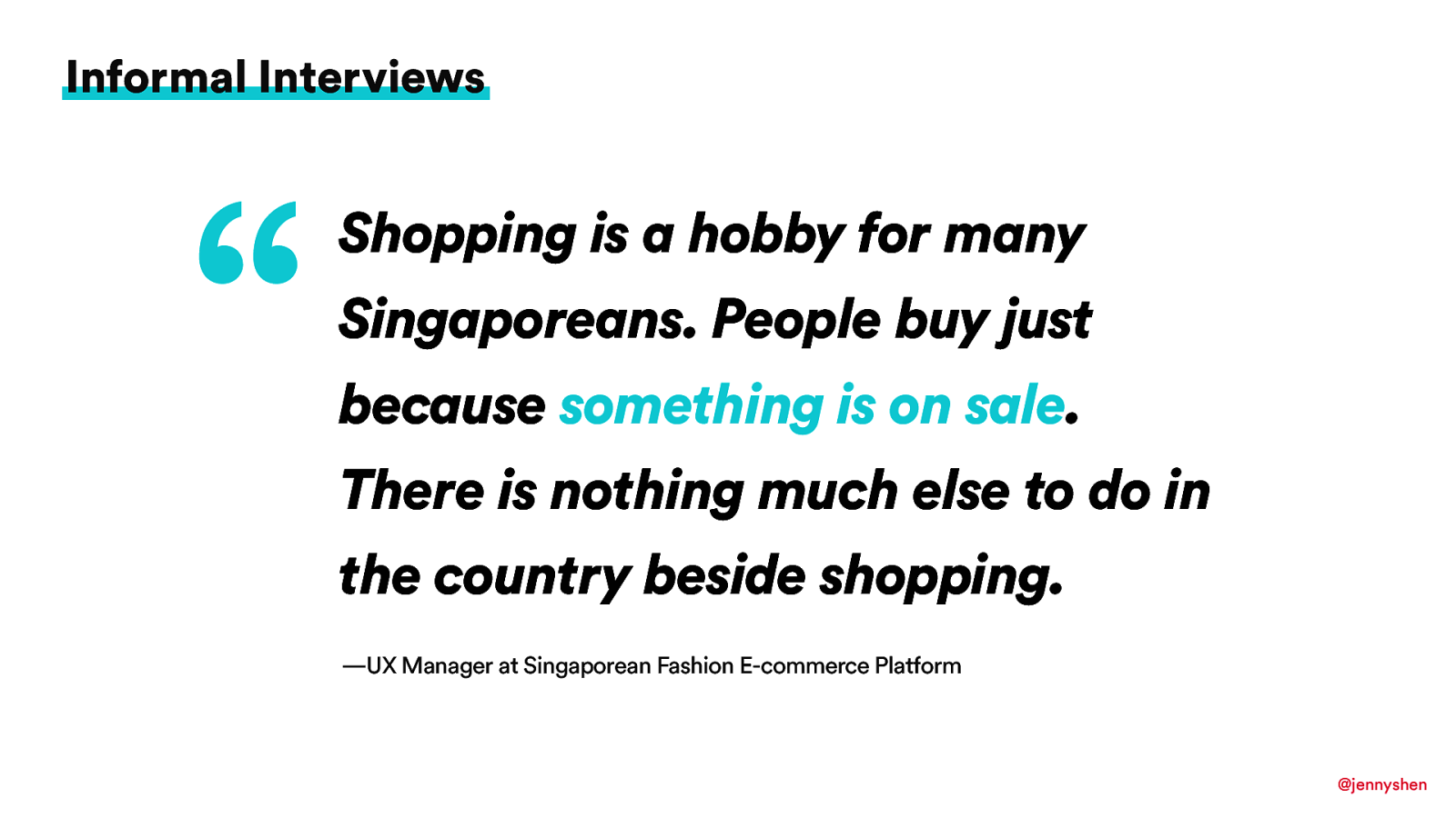
I talked to several people who are very generous to tell me some insights, their experiences working at large e-commerce platforms and one UX manager, she has told me that shopping is a hobby for many Singaporeans. People buy just because something is on sale. There’s nothing much else to do in the country besides shopping so, therefore, they always try to push for sales. They try to always incorporate discounts and, whenever there is a holiday, they always just try to push for the discount because people actually love the shopping. That was quite an insight for me.
This is how you could go about researching the local culture and, of course, as developers, designers, we also have things to think about in our design or development process. This is how I will approach the localization research.
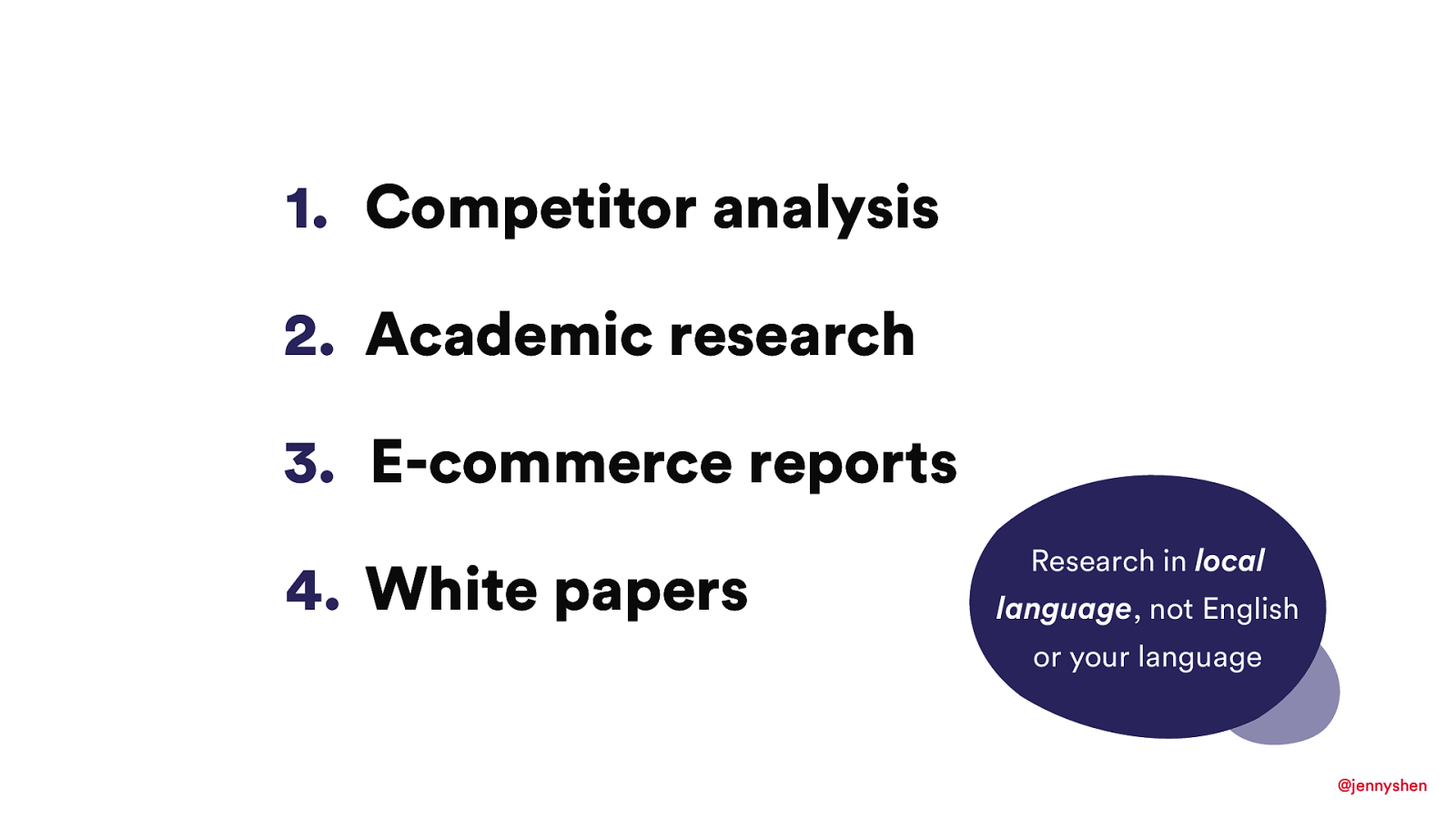
You can find out a lot of things through competitor analysis, academic research, e-commerce reports, and white papers. Of course, all of this research is going to take some time.
Here, I have a tip that is to research in the local language instead of your language or in English. The reason why--this seems very obvious, but I think it’s so important as a reminder--was because when we were designing for our users of Taiwan, my colleague who is American, he wanted to find out what mobile devices people were using and some of the characteristics of a Taiwanese market. Being American, of course, he was typing all the terms in English, and he was telling me there’s no report, there is no data about Taiwan, and maybe they don’t shop online. I’m like, “Really?” [Laughs]
I went and did the research myself. Of course, I typed in Chinese, and I actually found so much research about the Taiwanese mobile e-commerce report, and it was just so much that I reminded my colleague that the reason why he didn’t find anything was because all of the research was done by Taiwanese companies or Asian companies. Of course, the research was in a local language. If you want to conduct localization research, definitely work with somebody who speaks the local language or with a translator. That will help you a lot.
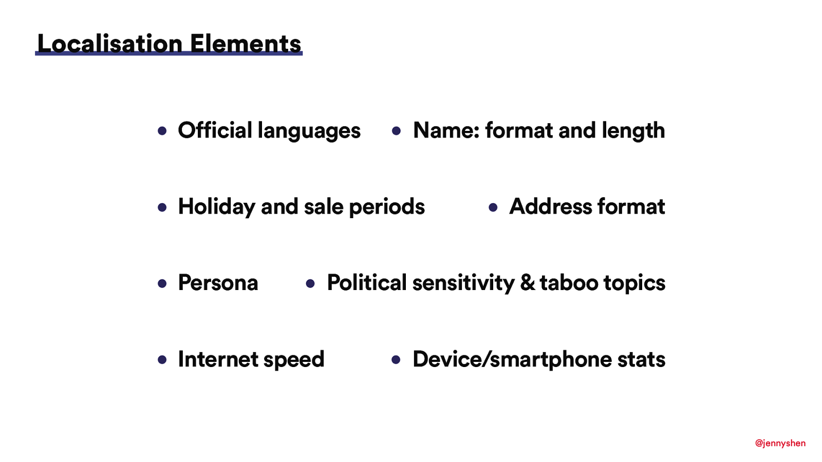
In the localization element, I would just four things to explain. There are a lot of things actually not on the list, but then I would just pick four things to explain that you might want to localize. For example, the official language.
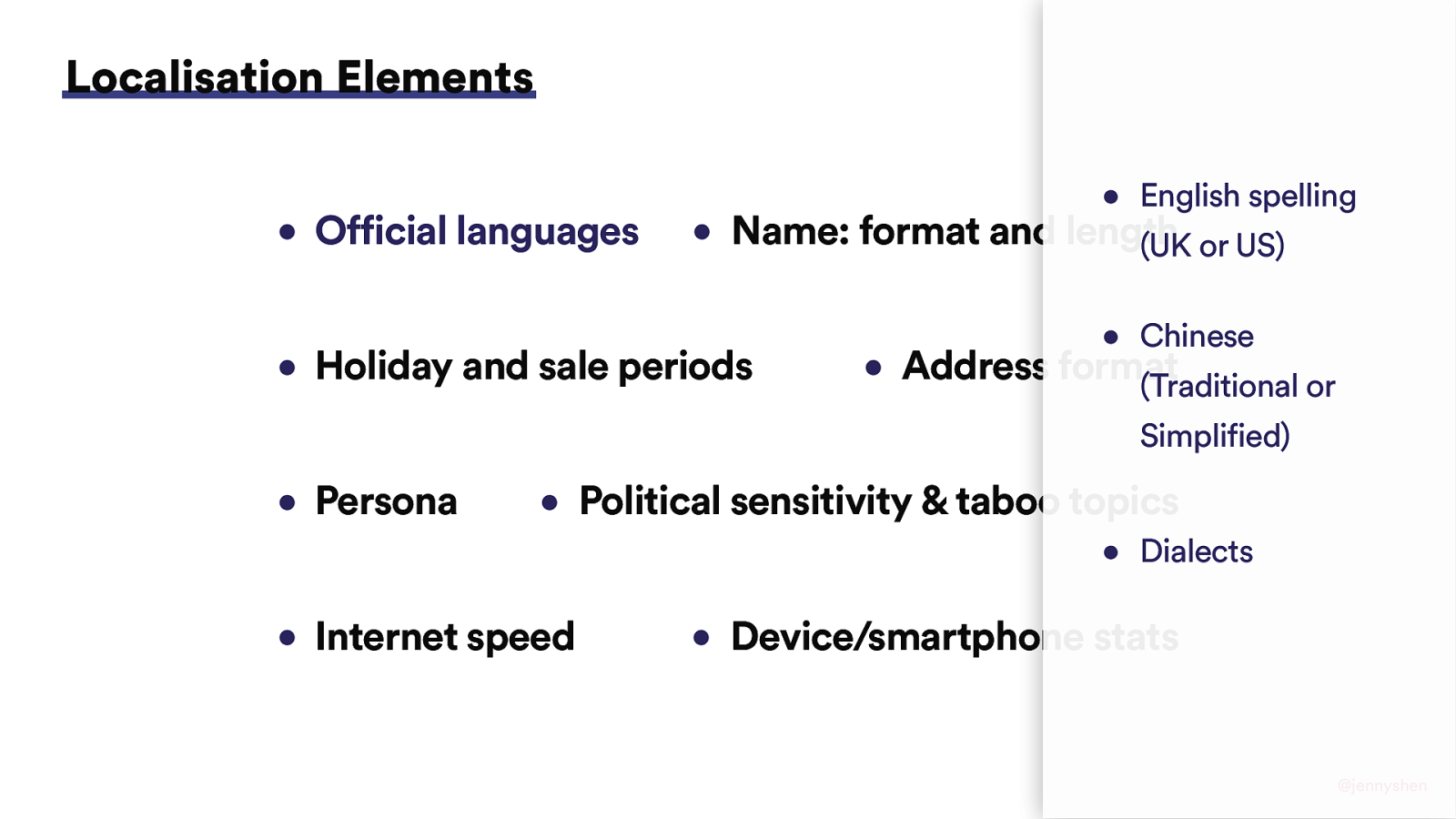
If it’s an English speaking country, it’s kind of obvious that you either provide both options, the U.K. spelling or U.S. spelling. Depending on the market, you would choose the right one. Be careful. Keep in mind that English, previous English colonies like India and Singapore, they will go for the U.K. spelling, so definitely don’t mix it up there.
Also, if the country users speak Chinese, then make sure to pick the right one, either simplified or traditional. There is actually a difference and you don’t want to upset the users or confuse the users by choosing the wrong one. Sometimes you also have dialects, but also it depends on what your goal with localization is. Sometimes you might not even need to incorporate the dialect.
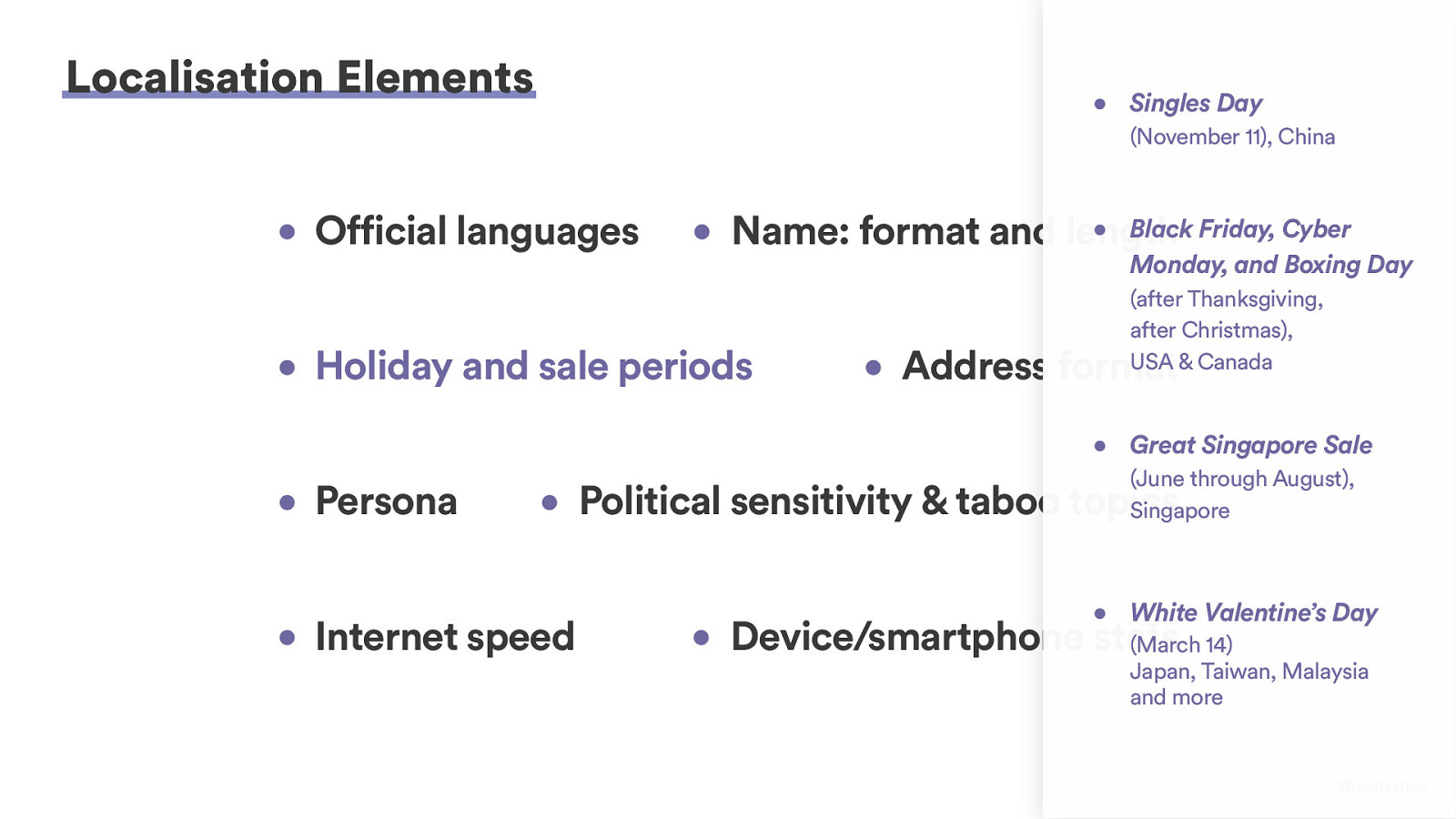
If you work in the e-commerce industry, you definitely want to be aware of the biggest holidays and sale periods. Did you know that in Singles’ Day, I believe it was hitting one of the highest transaction amounts of the world, November 11 in China where everybody shops online? Of course, you keep in mind of the local holidays like Black Friday, Great Singapore Sale, White Valentine’s Day, and so on. You definitely do not want to miss them.
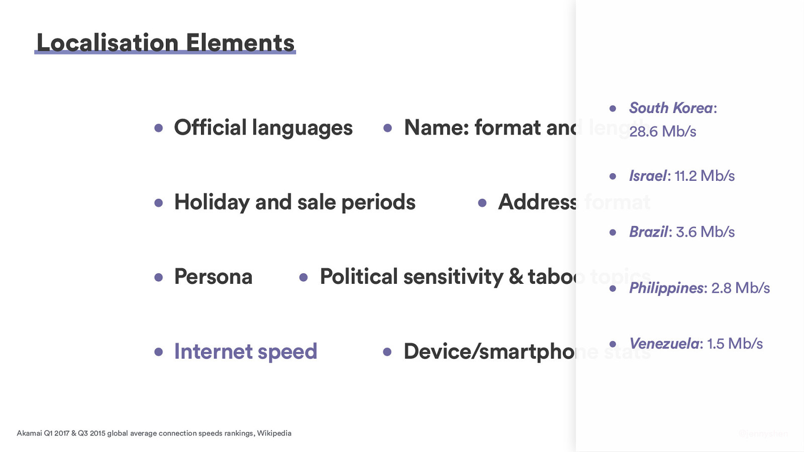
Next, the Internet speed. As developers, we know that Internet speed and also the resolution can affect the user experiences, and these are the things that we need to research to kind of decide about things like progressive enhancements or graceful degradation and what not. This is kind of a comparison list of one of the highest Internet speeds, the average Internet speed in South Korea compared to Venezuela. You might need to work that into the considerations that a user might not have the same fast Internet as we all have here in Berlin.
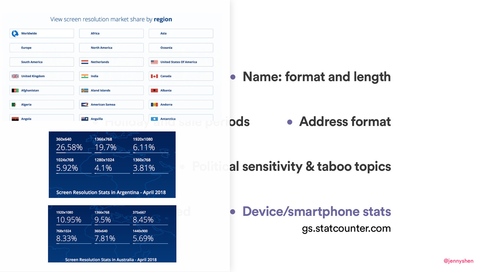
In terms of the device smartphone stats, I like to use a tool called Statcounter, and you can actually pick the regions or you can see what kind of screen resolutions. These are actually updated quite frequently and it can give you some insights about, like, what screen resolutions to optimize when you actually do have priorities and you need to choose.

I hope that some of these serve as reminders because it’s a lot of things you probably already know to keeping account. That brings us to the next part of my talk that is about world domination.
By world domination, I mean how to dominate a world with a product or service that serve international users and is loved by users around the world. How do we actually go about doing that? Do we just need to translate the strings? Do we just need to take into account people’s different addresses and name fields? I would say there’s more that we have to do than that.
Here is a tip. We can start with a diverse team in a company because if you’re building a product for international users, a team of diverse backgrounds helps you to think about the product from a different perspective, and you’re bringing different talent, different skills, different experiences and, in the end, you will have a more creative and inclusive solution if you want to target the international, the global market.
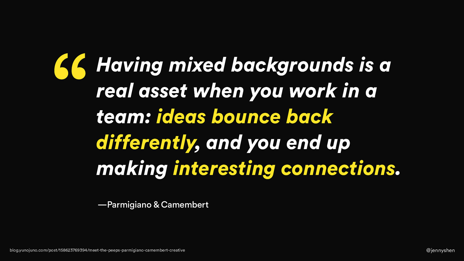
This U.K.-based creative advertising duo, Parmigiano and Camembert--one is Italian and one is French--they’re working with clients all around the world. They said that having a mixed background is actually an asset because they get different ideas and things. The ideas they get end up being more creative and they have interesting connections just because there is some diversity, even in the small company that they have.

Next, I will advocate that travel and doing ethnography research can help you to design for global users. Who here have traveled from another place to attend this conference? Actually, yeah, that’s a lot of people.
Travel is great. I love traveling. It’s actually one of my biggest passions as well.
While living around the world in different places and living like a local, I found that this is actually the best way to learn about and experience the local culture. You don’t have to immediately leave your country and move to a different one if you just want to design for a new market. What I’m advocating for is that even if you take a trip, you live there for like a week or two weeks, talk to the locals, get to know the local people, get to know the local matters, it can definitely help you bring more empathy for the users and think from their point of view of what they’re struggling with, what their pains are, and what their needs and wants are.
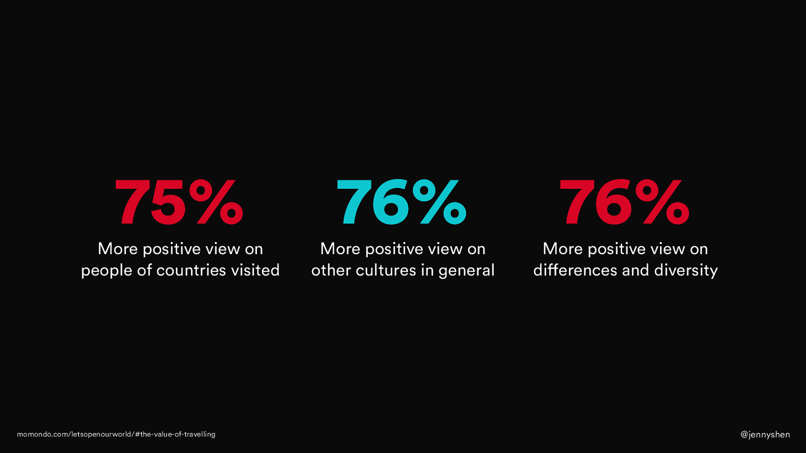
Did you also know that traveling can help you have a more positive view in other people, other cultures, and also differences in diversity in general? This is a study by Momondo, and they found that people who travel, during the travel they have a more positive view on these things. I think it’s a great thing if you want to build a product for international users.

We talked a lot about what you can do and what helps. I just want to tell you about one thing that probably you don’t want to do.
That is, Google Translate or machine translate, any sort of machine translation, for that matter, when you’re designing for users of different cultures.

When you do Google Translate, what can happen? A sign is translated into "the suckers are out working".
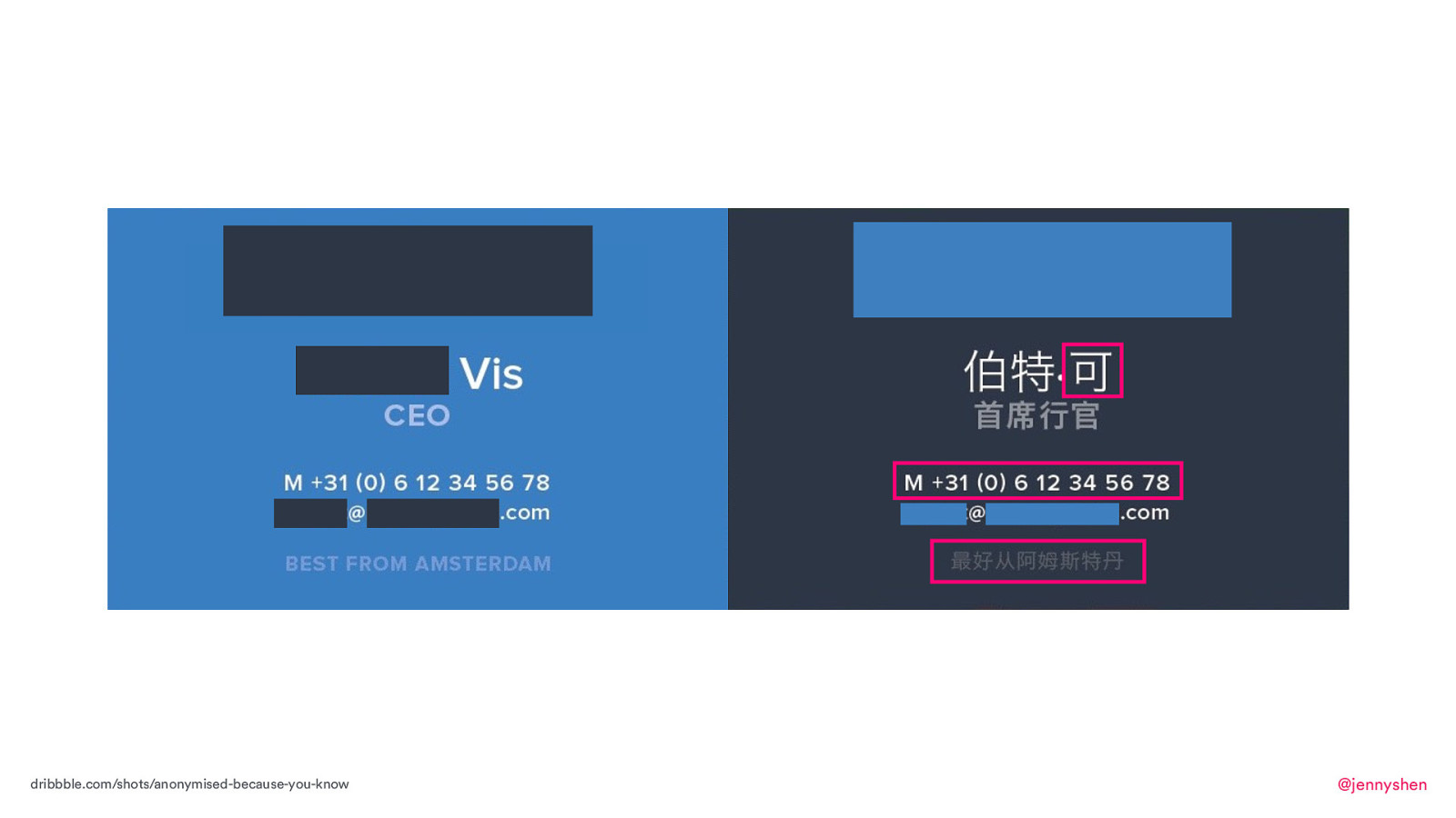
This is a real case of a translation that have gone astray. This is a business card from a company based in Amsterdam. They designed this business card for the intention of meeting business partners in China, and they want to make a good impression. However, as a native Chinese speaker, I can spot many mistakes in the business card design.
For example, the name “Vis” is now translated to “Co,” so maybe his business partners are calling him Mr. Co, Mr. Co, when he has no idea where that’s coming from or who he’s calling. I don’t know where that came from.
Secondly, the phone number. In the Netherlands, it’s common. It’s actually the way to format our phone number is to have a space in between every two digits. Personally, as an expat, I find it super confusing and really hard to read. It’s so hard to memorize a phone number that way, but it’s the way it is.
They decided that they want to incorporate a Dutch number format in this business card to the Chinese partners. A Chinese person will probably find it really difficult to read. Besides, the M stands for mobile, which makes sense to us. But then, if they have to translate the business card, then I guess it will make sense to translate an M as well because the probably wouldn’t know what M means if they had to translate a business card. The best way to do it is actually to use an international standard like an icon, like a phone icon so then you can communicate that this is the phone number.
Lastly, the biggest mistake here is perhaps this one. In here, if you can see from very far, this actually says, “Best from Amsterdam,” on the business card. But in the Chinese translation, it’s translated into, “Better be from Amsterdam.”
So, here I have shared a lot about translation, localization, design for different cultures, and also best practices, tips, and processes. Some of you might be thinking that “Well, I don’t need to localize. It’s not our priority right now,” or, “It sounds interesting, but I don’t know if I’m ever going to do it.” That’s okay. Maybe one day you will.
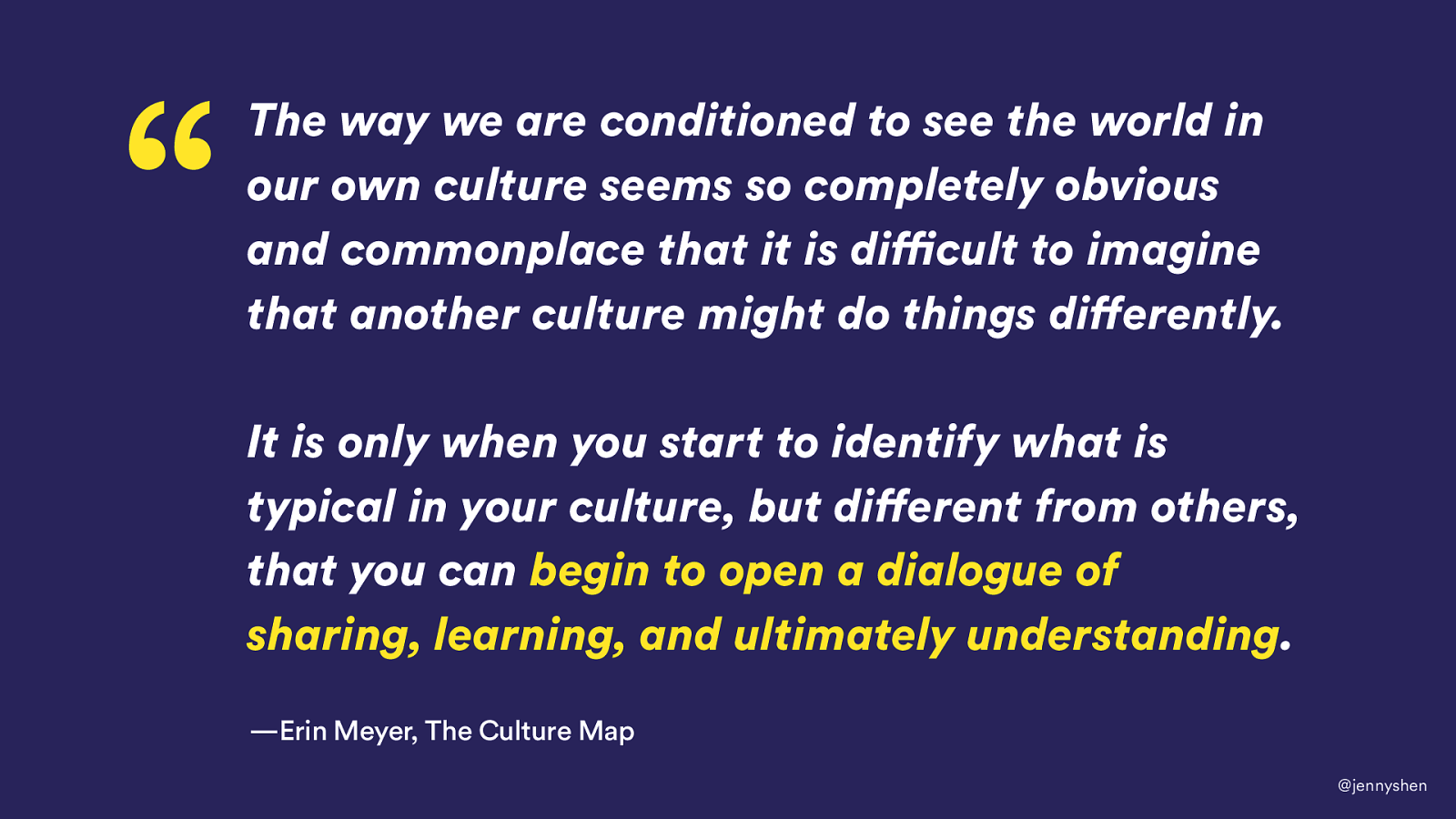
The key idea I’m advocating here today is about understanding different cultures. I really like this quote by Erin Meyer, the author of “The Culture Map.” In the book, she writes, “The way we are conditioned to see the world in our own culture seems so completely obvious and commonplace that it is difficult to imagine that another culture might do things differently. It is only when you start to identify what is typical in your culture, but different from others, that you can begin to open a dialog of sharing, learning, and ultimately understanding.”

Thank you.
I'm giving a workshop on localisation next year in the Hague. Join me!