Nov 2018 Digital Summit Design for Humans Build Human-centered Products with Cognitive Psychology

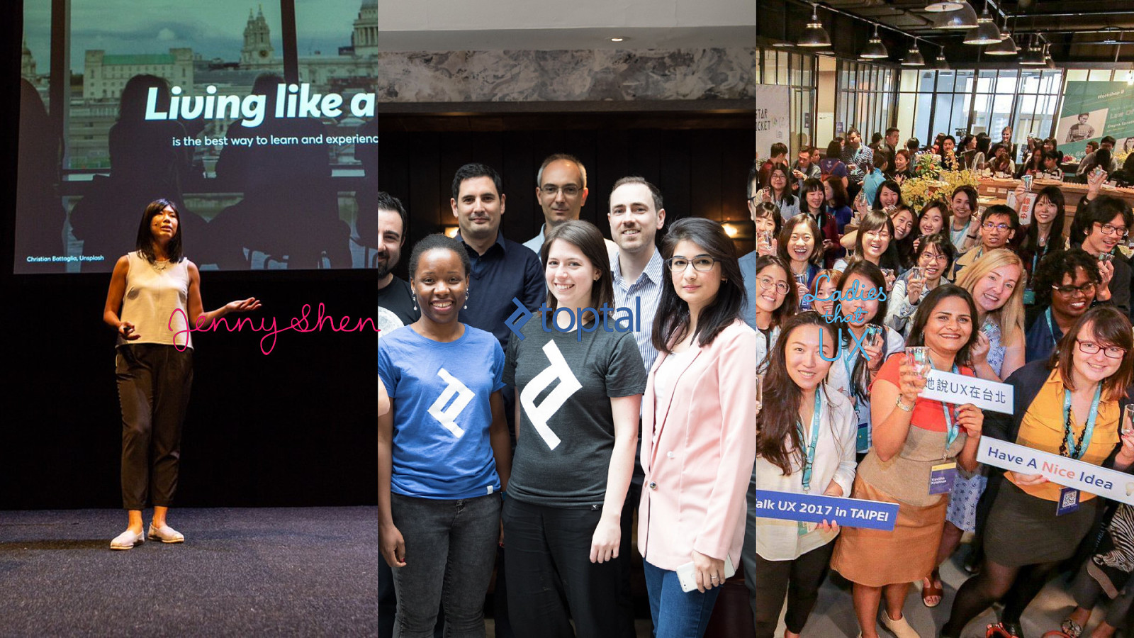
A presentation at Digital Summit MX 2018 in November 2018 in Guadalajara, Jalisco, Mexico by Jenny Shen
Nov 2018 Digital Summit Design for Humans Build Human-centered Products with Cognitive Psychology
@jennyshen
@jennyshen
@jennyshen
Design psychology quiz @jennyshen

612241 http://kahoot.it Wifi pw: EBC565786
1 State of Using Psychology Minimal Experiment-focused Dark @jennyshen
@jennyshen
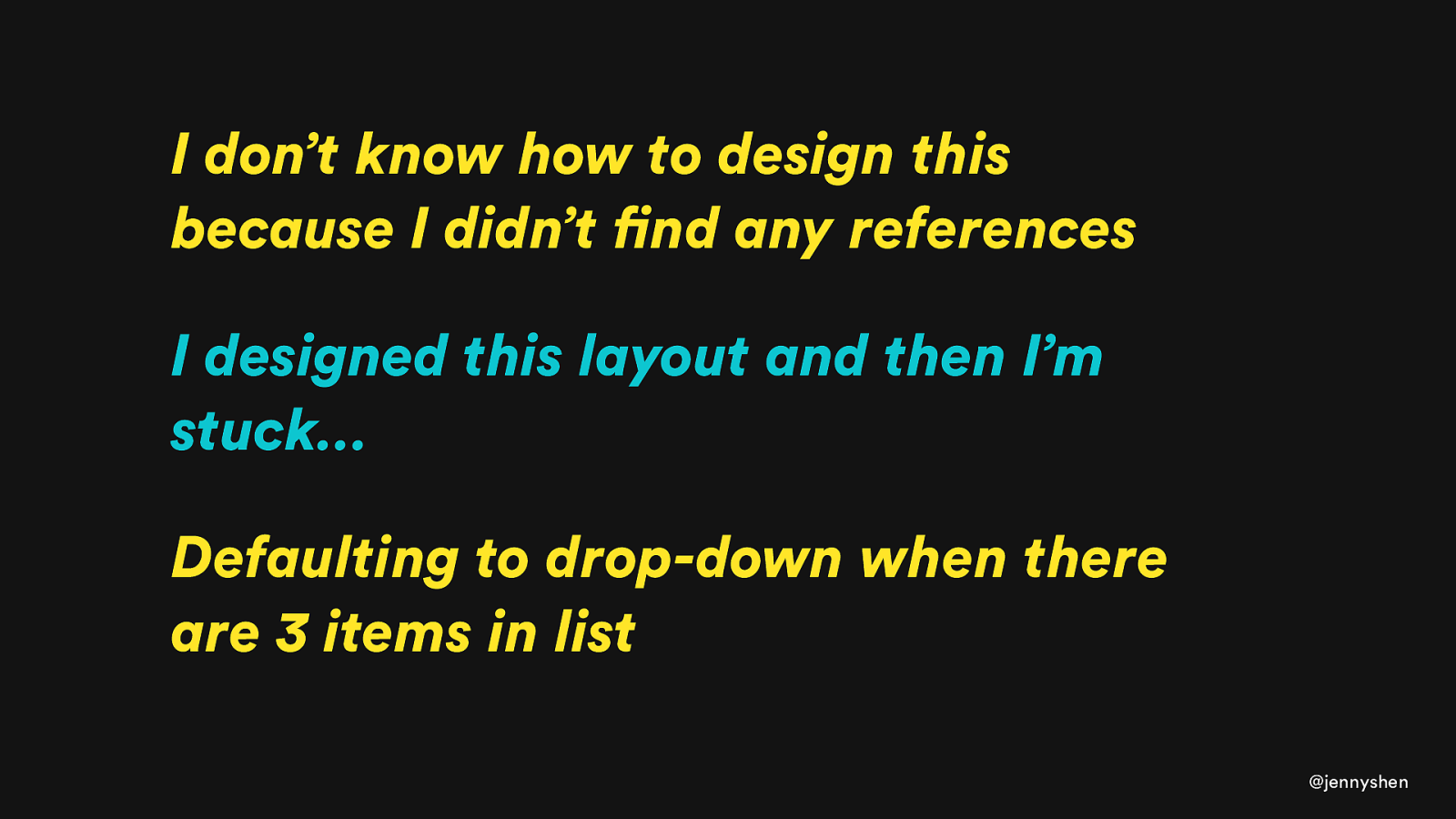
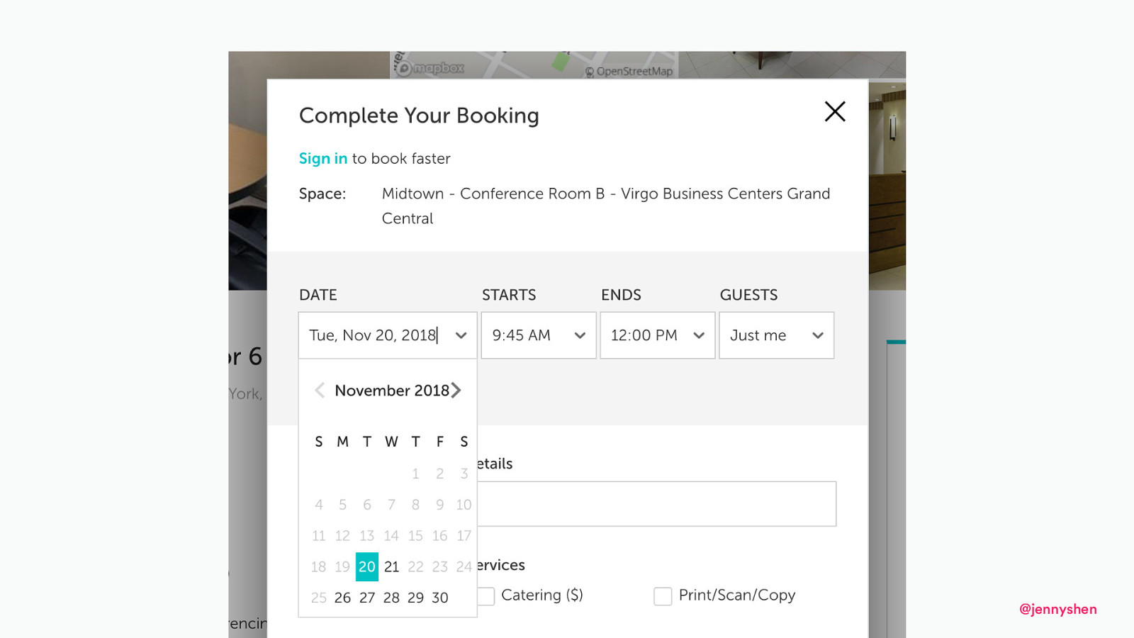
I don’t know how to design this because I didn’t find any references I designed this layout and then I’m stuck… Defaulting to drop-down when there are 3 items in list @jennyshen
Firstly, the splash screen should be quick. How quick? As quick as possible, but never more than 2 or 3 seconds. Why do you think hotels and big businesses spend so much money on their grand and impressive entrances? Because the moment you walk through that door, you know you’re in a place of quality.
But my main complaint is that I don’t like using the system. The visuals are very basic and the machine makes a very loud sound with each button press. The interface uses only two colors, bright yellow and blue, the company colors of NS. Firstly, the splash screen should be quick. How quick? As quick as possible, but never more than 2 or 3 seconds. Why do you think hotels and big businesses spend so much money on their grand and impressive entrances? Because the moment you walk through that door, you know you’re in a place of quality.
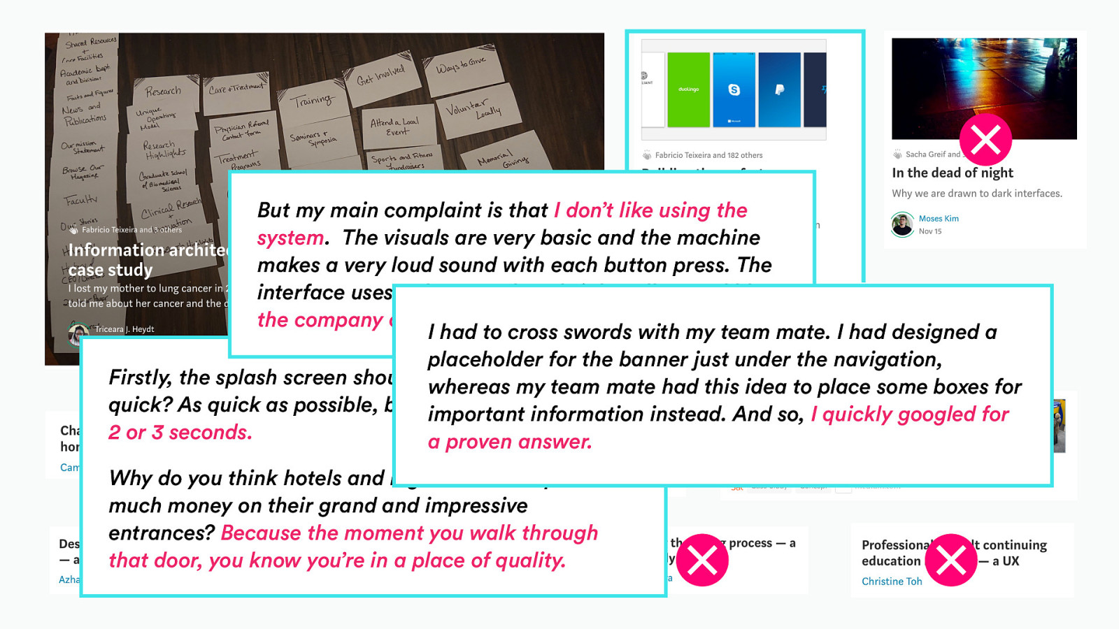
But my main complaint is that I don’t like using the system. The visuals are very basic and the machine makes a very loud sound with each button press. The interface uses only two colors, bright yellow and blue, the company colors of NS. I had to cross swords with my team mate. I had designed a placeholder for the banner just under the navigation, Firstly, the splash screen should be quick. How whereas my team mate had this idea to place some boxes for quick? As quick as possible, but never more than important information instead. And so, I quickly googled for 2 or 3 seconds. a proven answer. Why do you think hotels and big businesses spend so much money on their grand and impressive entrances? Because the moment you walk through that door, you know you’re in a place of quality.
https://medium.com/@danmaccarone/the-ux-of-learning-ux-is-broken-f972b27d3273
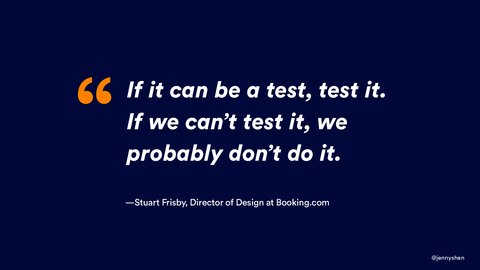
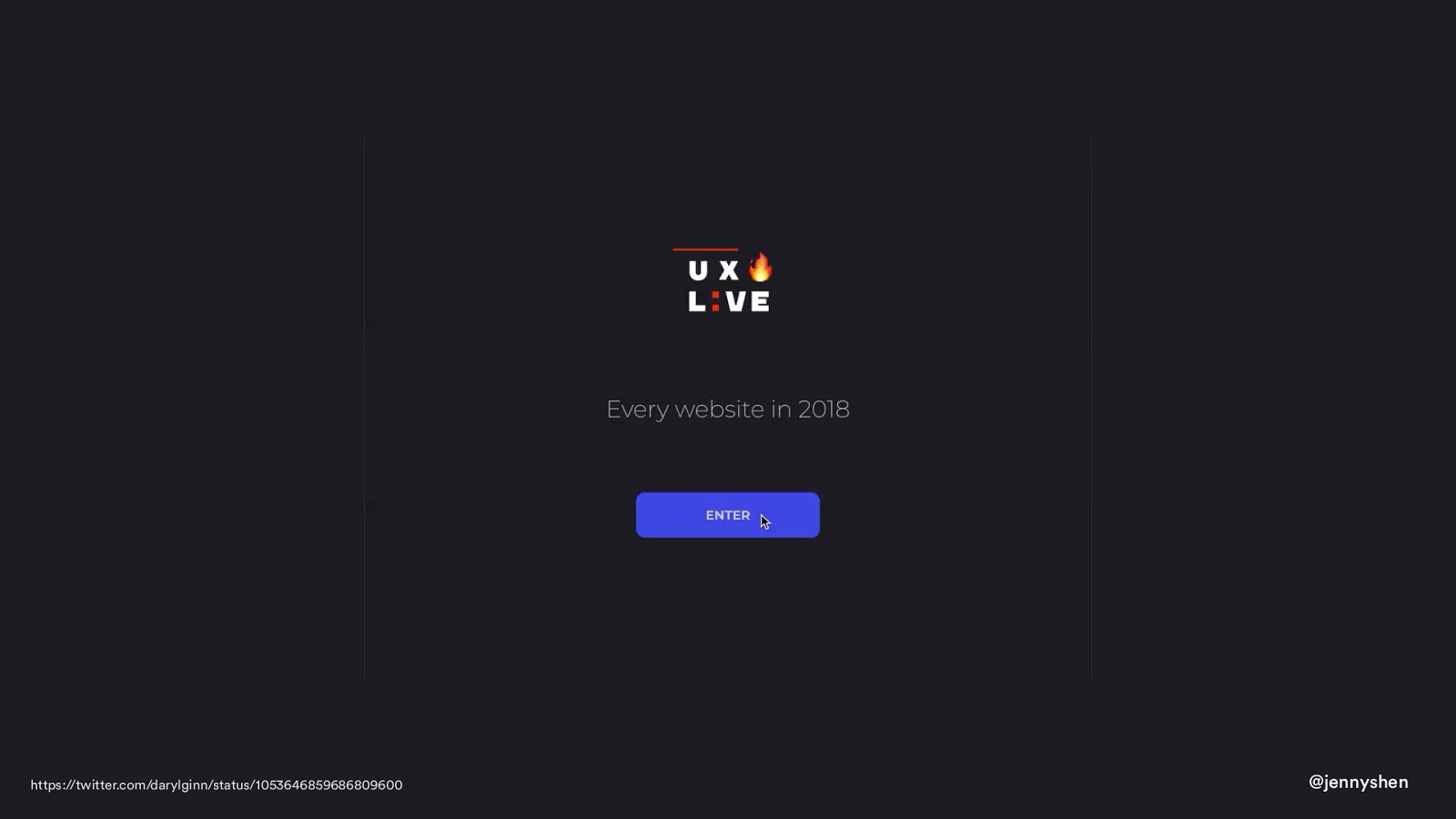
“ If it can be a test, test it. If we can’t test it, we probably don’t do it. —Stuart Frisby, Director of Design at Booking.com @jennyshen
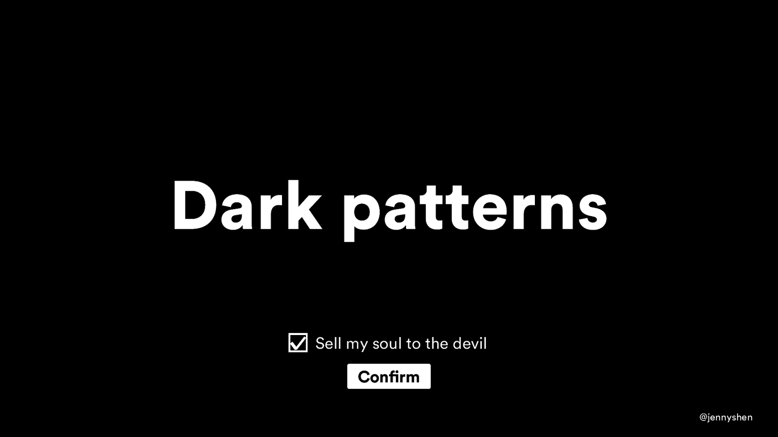
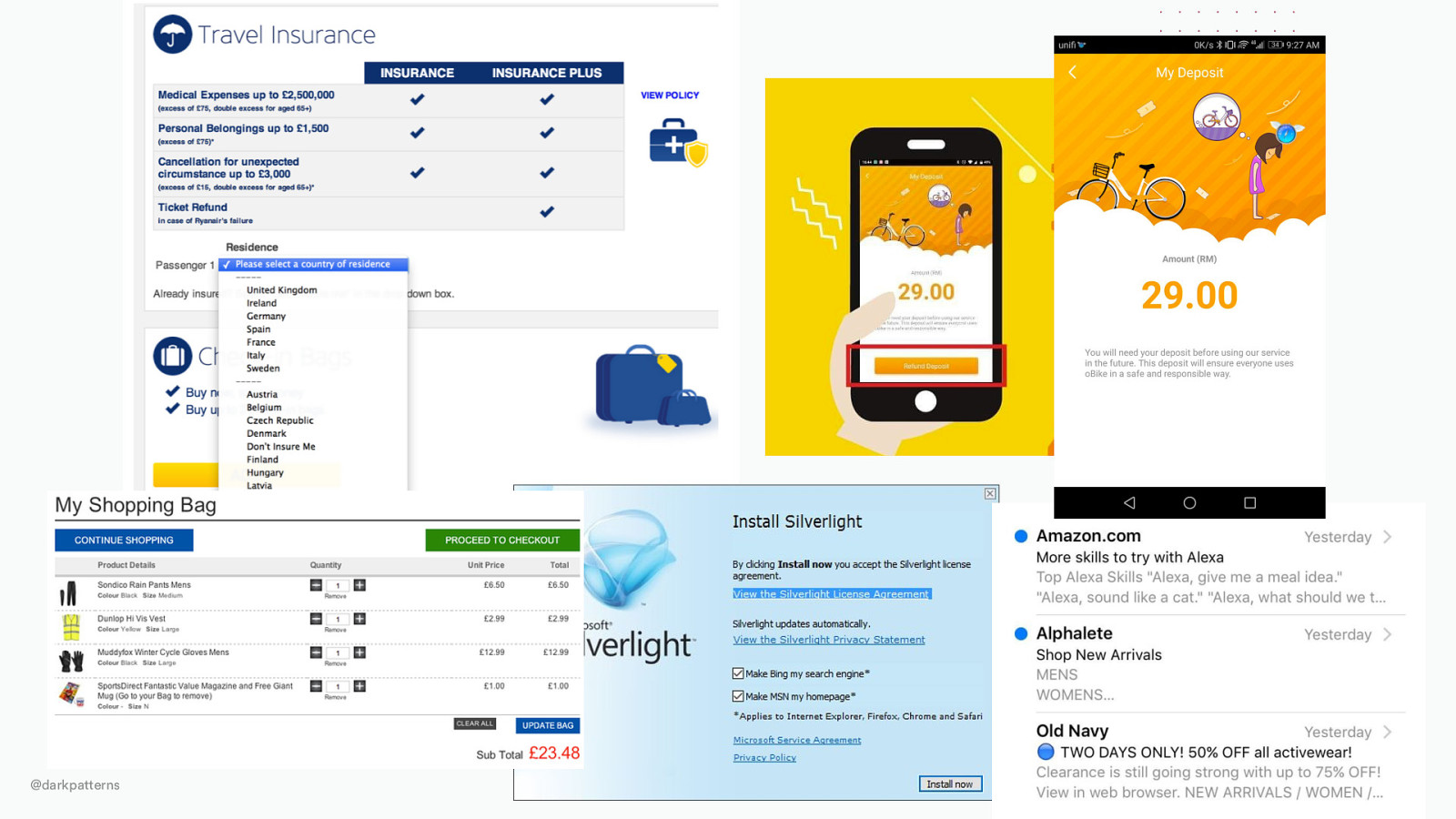
Dark patterns Sell my soul to the devil Confirm @jennyshen
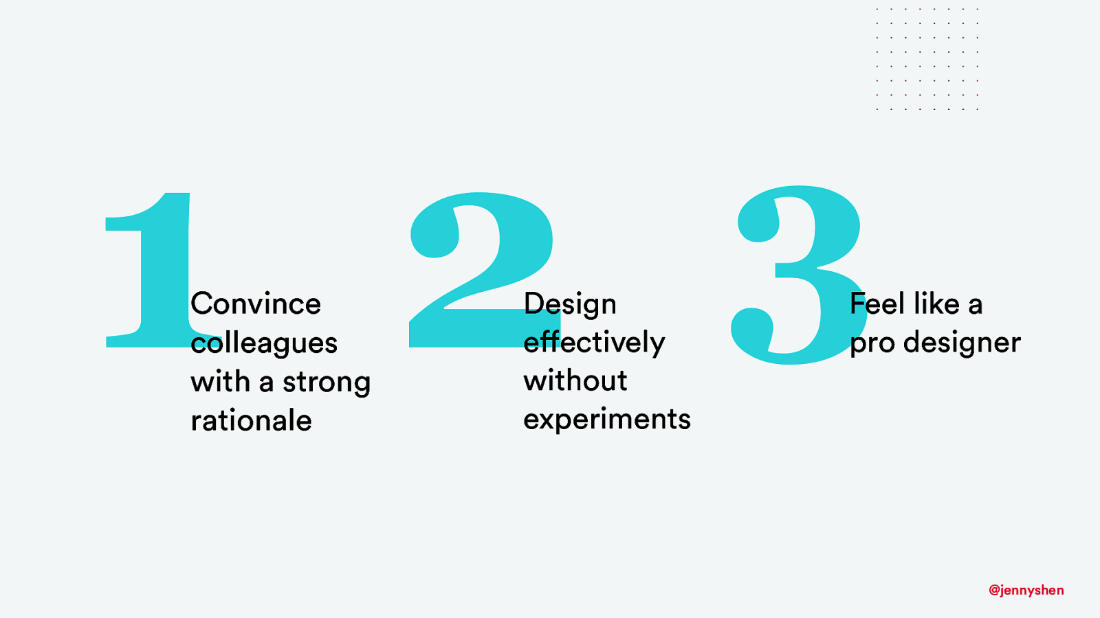
3 1 2 Convince colleagues with a strong rationale Design effectively without experiments Feel like a pro designer @jennyshen
2 Cognitive Psychology @jennyshen
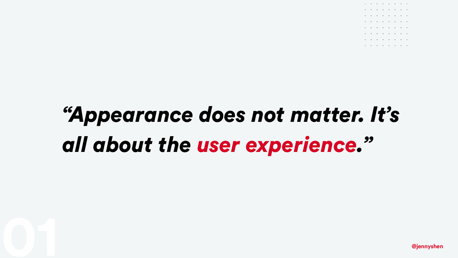
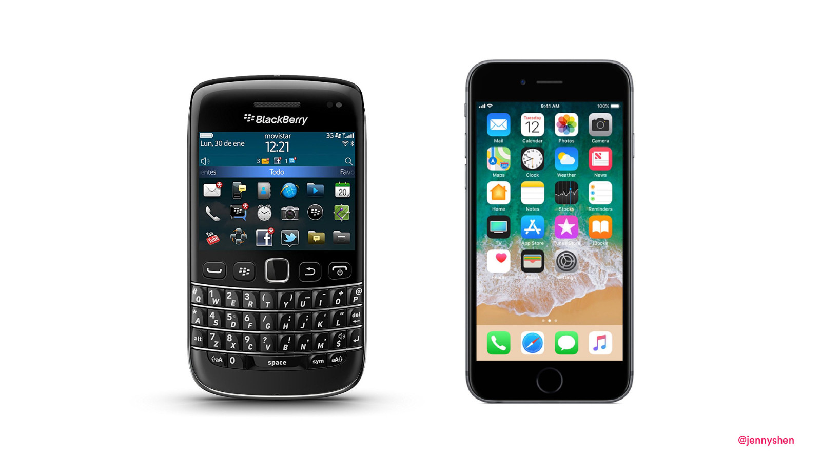
“Appearance does not matter. It’s all about the user experience.” 01 @jennyshen
@jennyshen
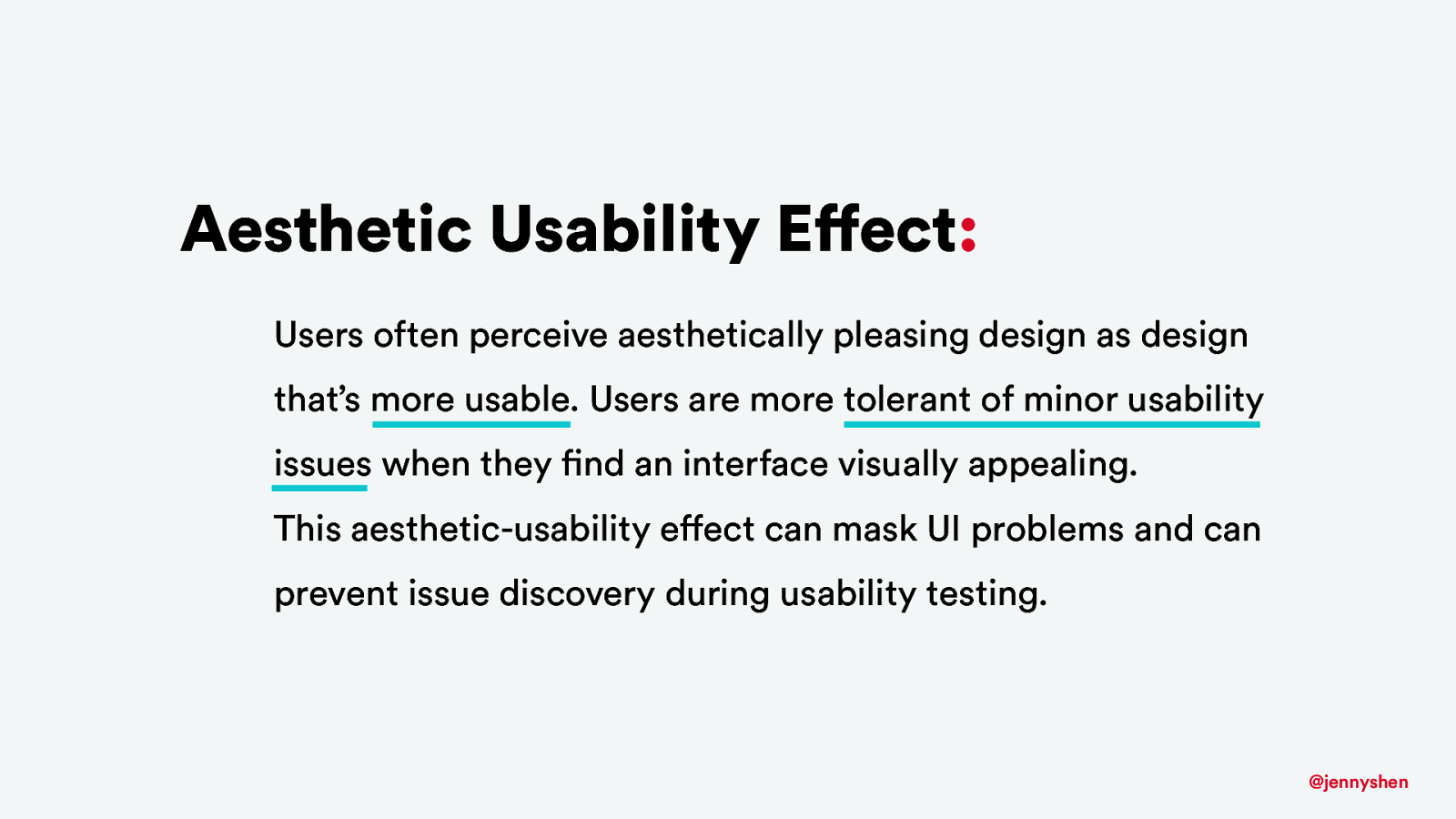
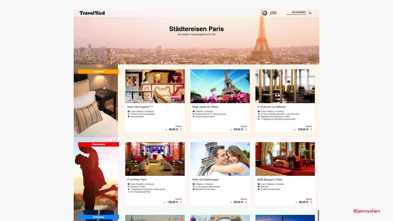
Aesthetic Usability Effect: Users often perceive aesthetically pleasing design as design that’s more usable. Users are more tolerant of minor usability issues when they find an interface visually appealing. This aesthetic-usability effect can mask UI problems and can prevent issue discovery during usability testing. @jennyshen
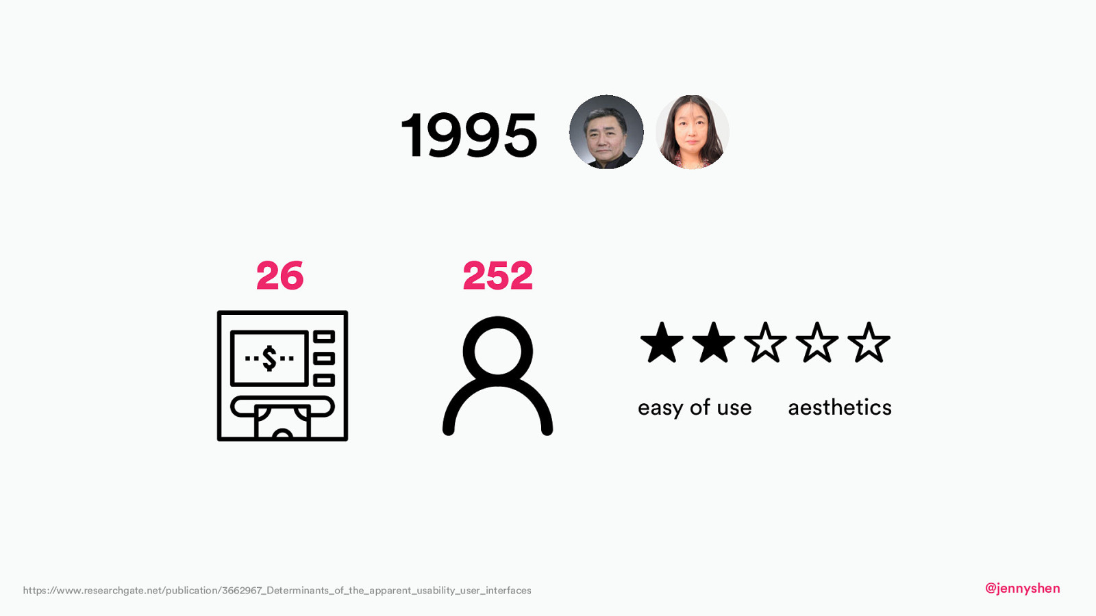
1995 26 252 easy of use https://www.researchgate.net/publication/3662967_Determinants_of_the_apparent_usability_user_interfaces aesthetics @jennyshen
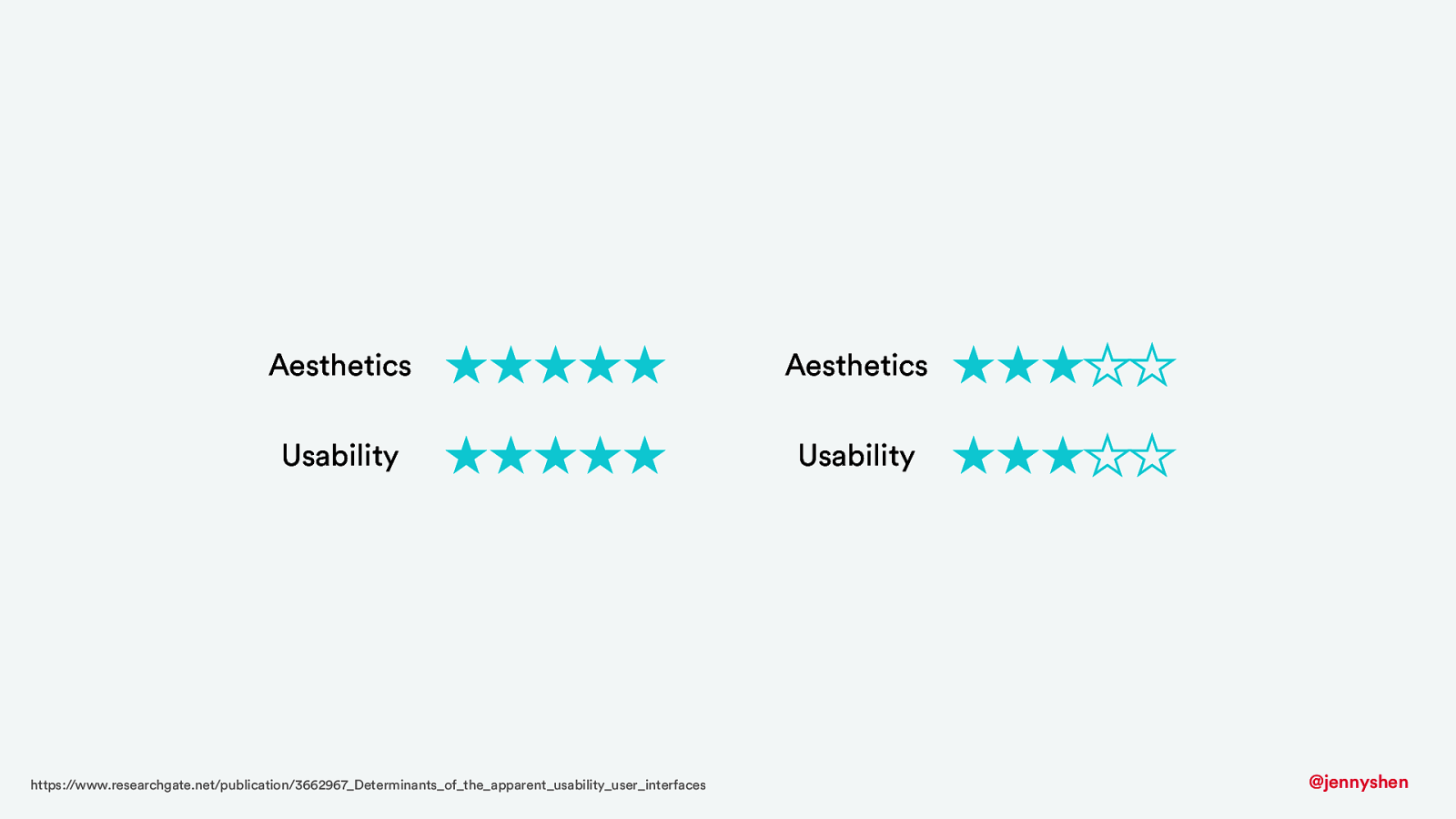
Aesthetics Aesthetics Usability Usability https://www.researchgate.net/publication/3662967_Determinants_of_the_apparent_usability_user_interfaces @jennyshen
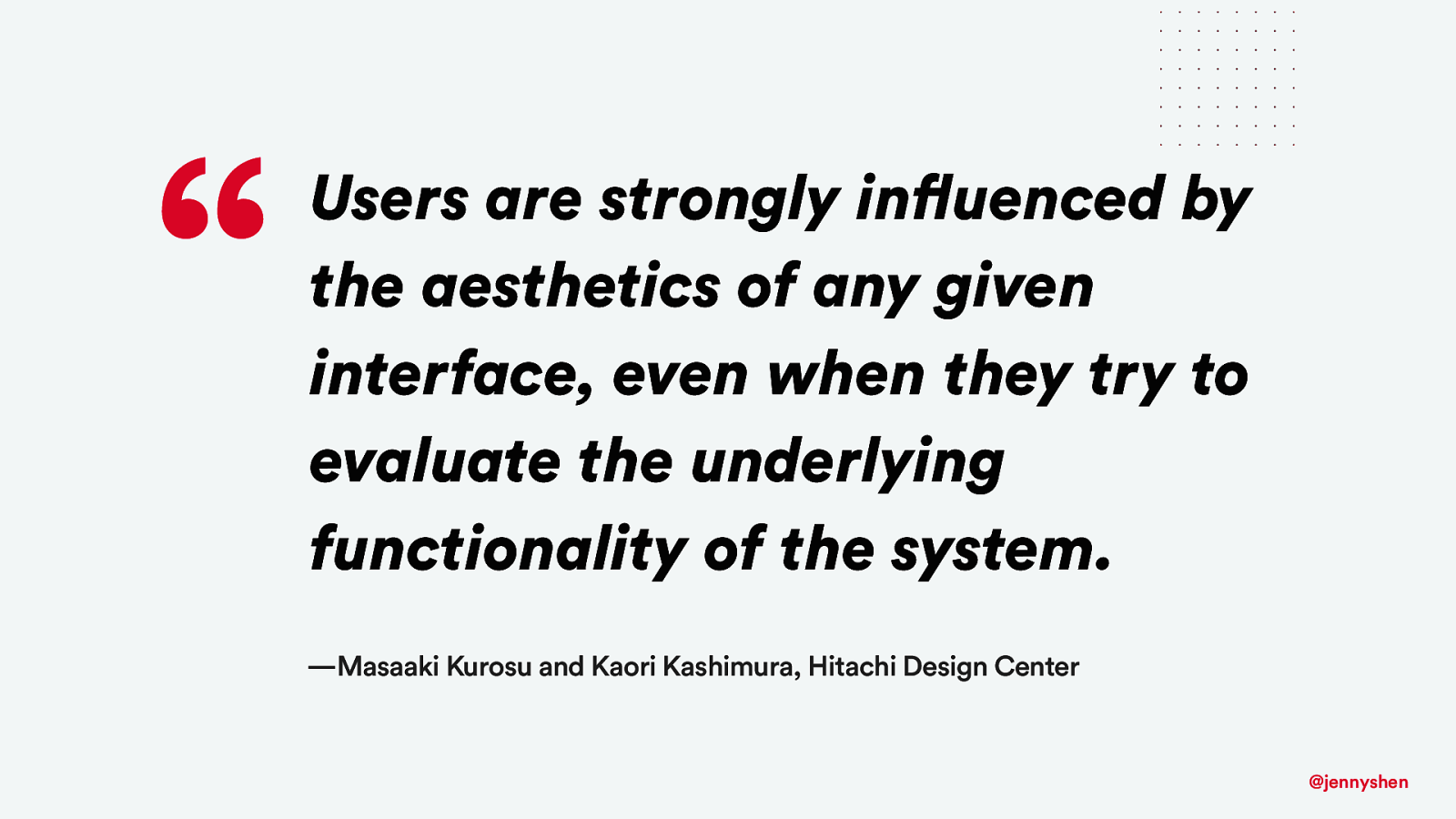
“ Users are strongly influenced by the aesthetics of any given interface, even when they try to evaluate the underlying functionality of the system. —Masaaki Kurosu and Kaori Kashimura, Hitachi Design Center @jennyshen
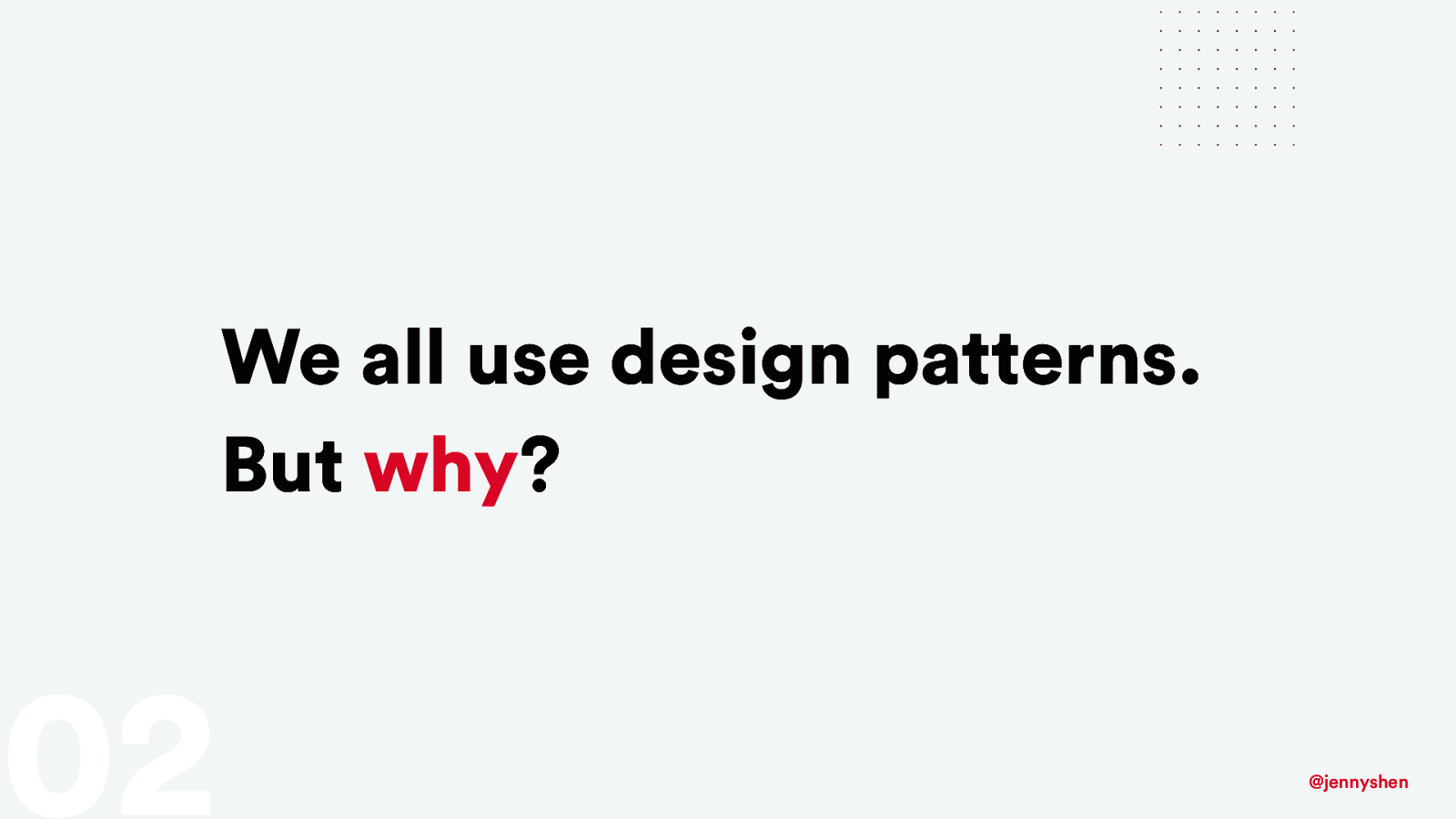
We all use design patterns. But why? 02 @jennyshen
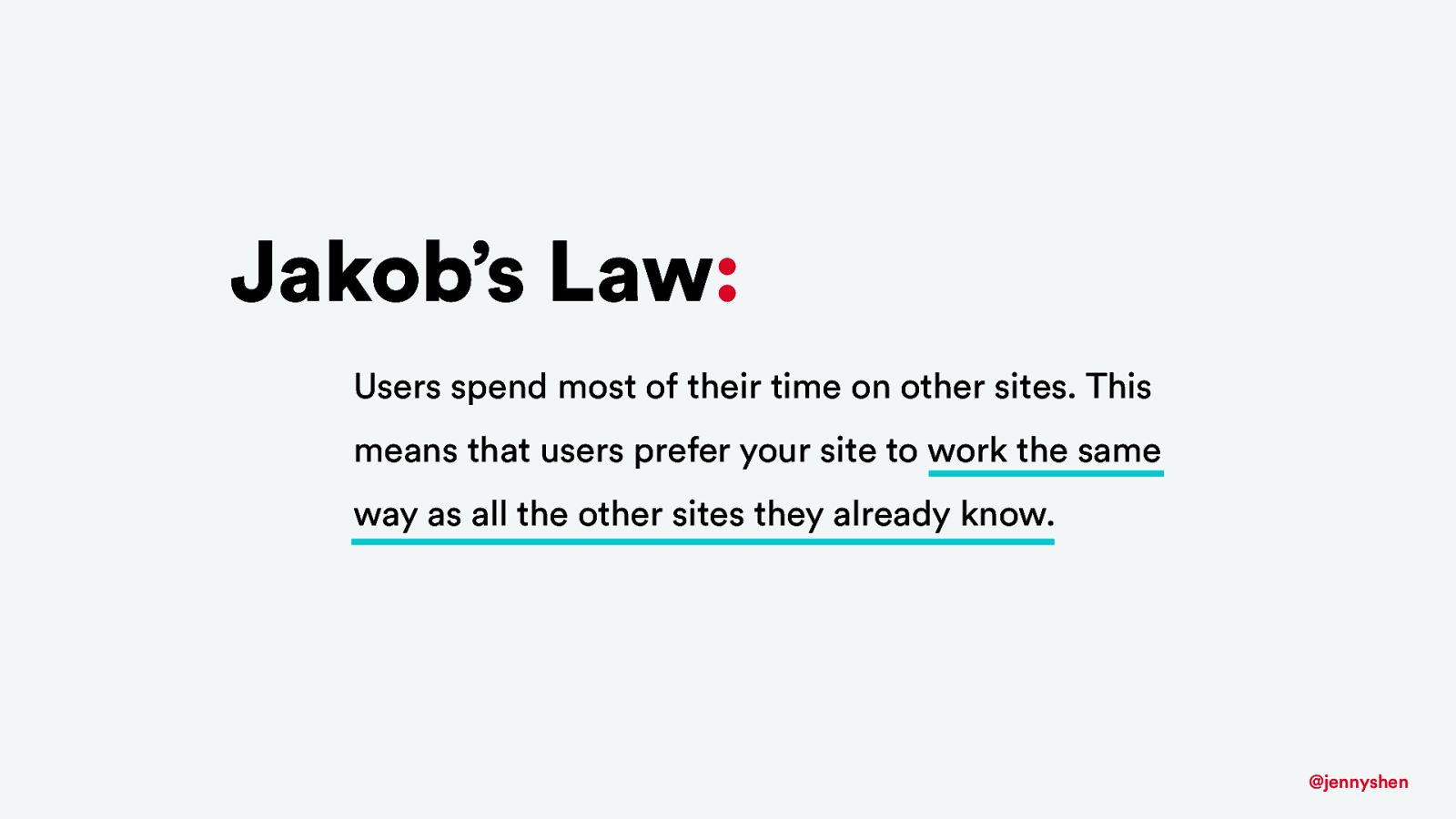
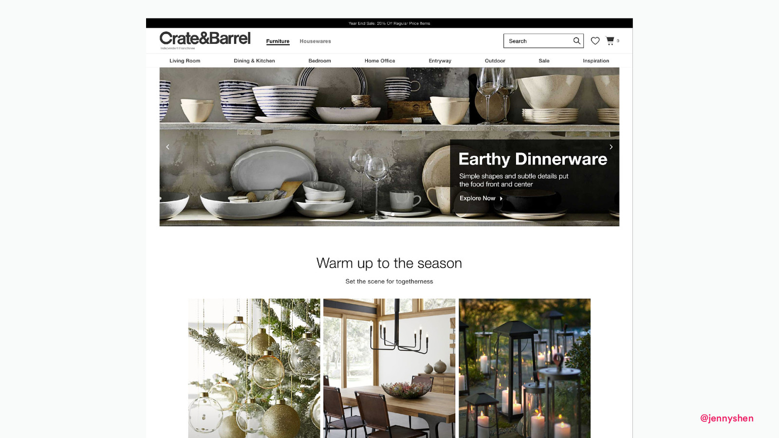
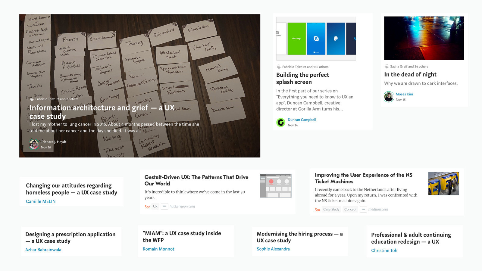
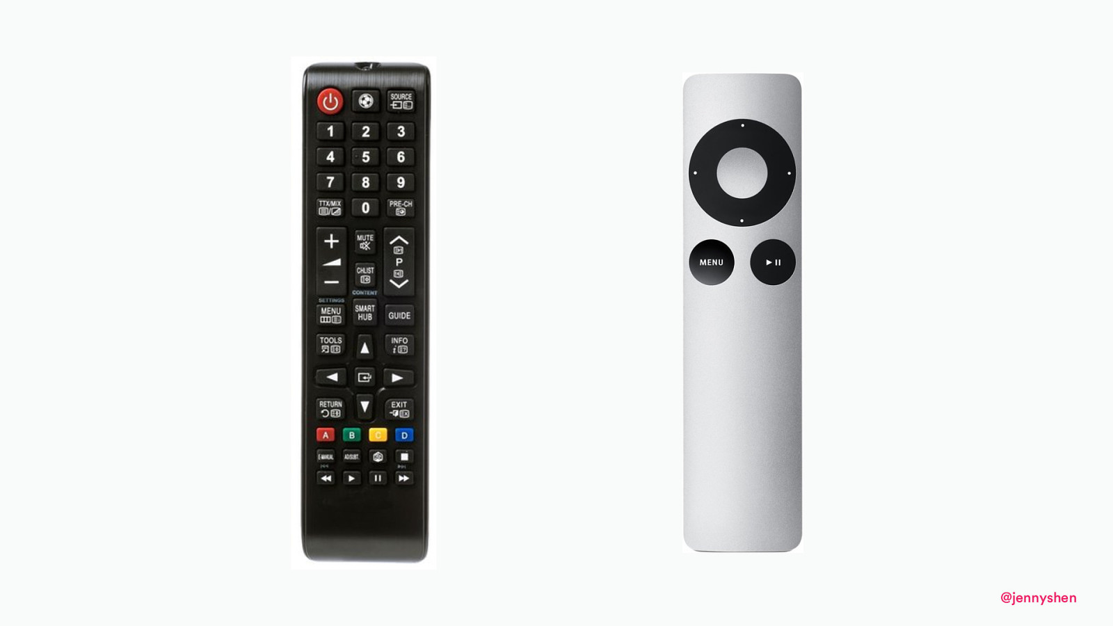
Jakob’s Law: Users spend most of their time on other sites. This means that users prefer your site to work the same way as all the other sites they already know. @jennyshen

Cognitive Load: The mental effort required to learn new information. Designers should strive to eliminate/minimize extraneous cognitive load because user attention is a precious resource. @jennyshen
@jennyshen
@jennyshen
Why do users prefer less choices? 03 @jennyshen
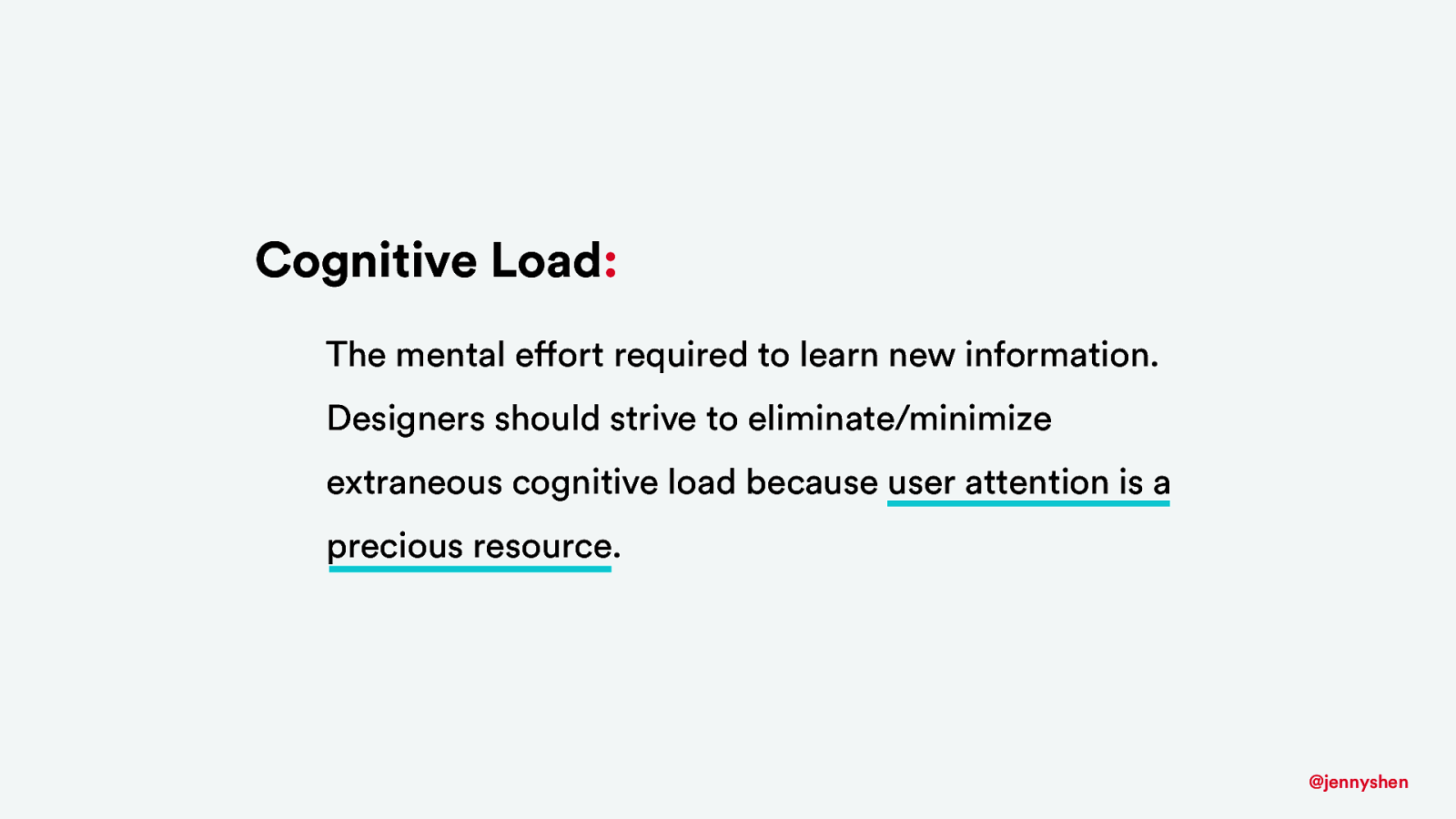
Cognitive Load: The mental effort required to learn new information. Designers should strive to eliminate/minimize extraneous cognitive load because user attention is a precious resource. @jennyshen
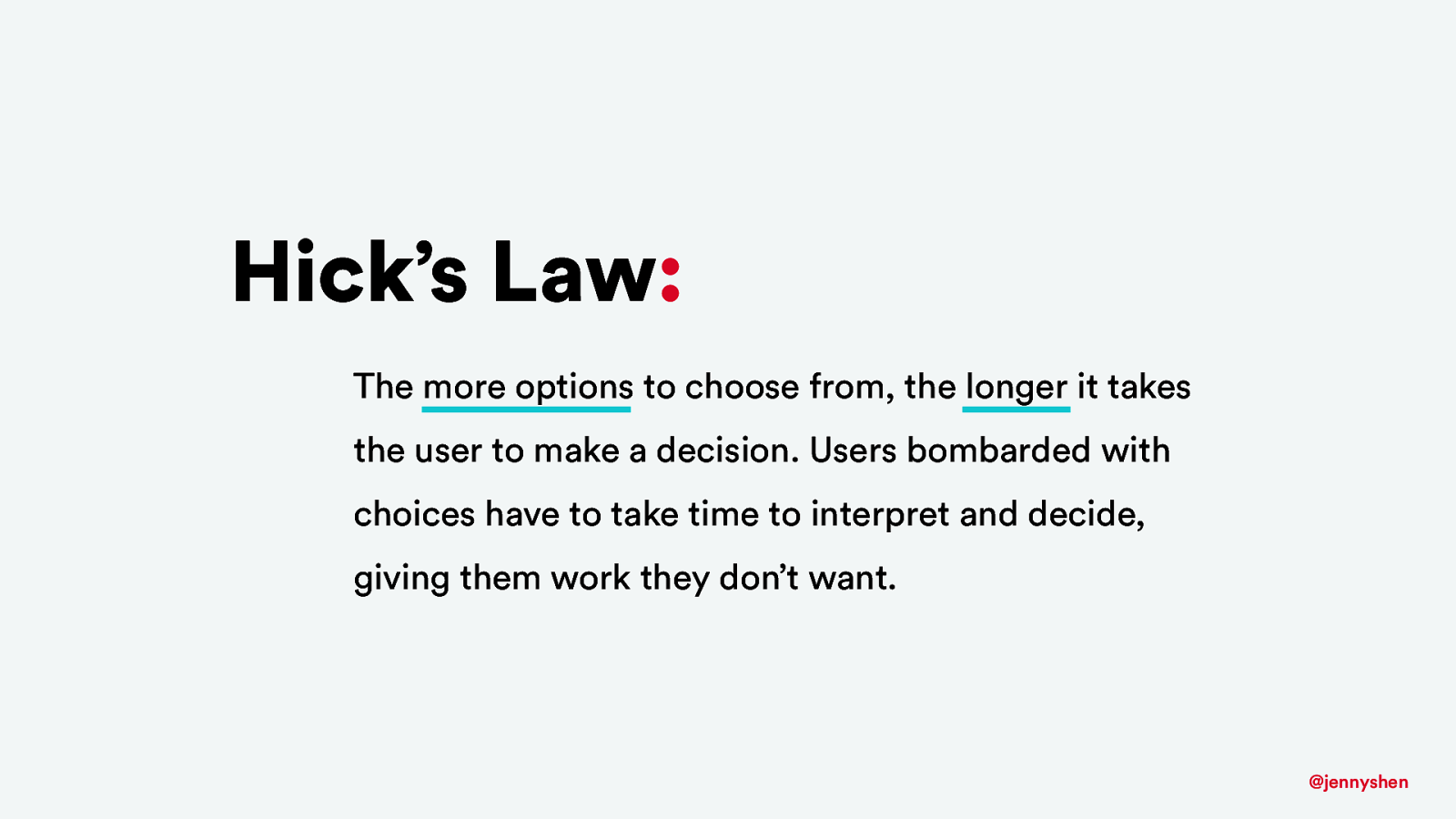
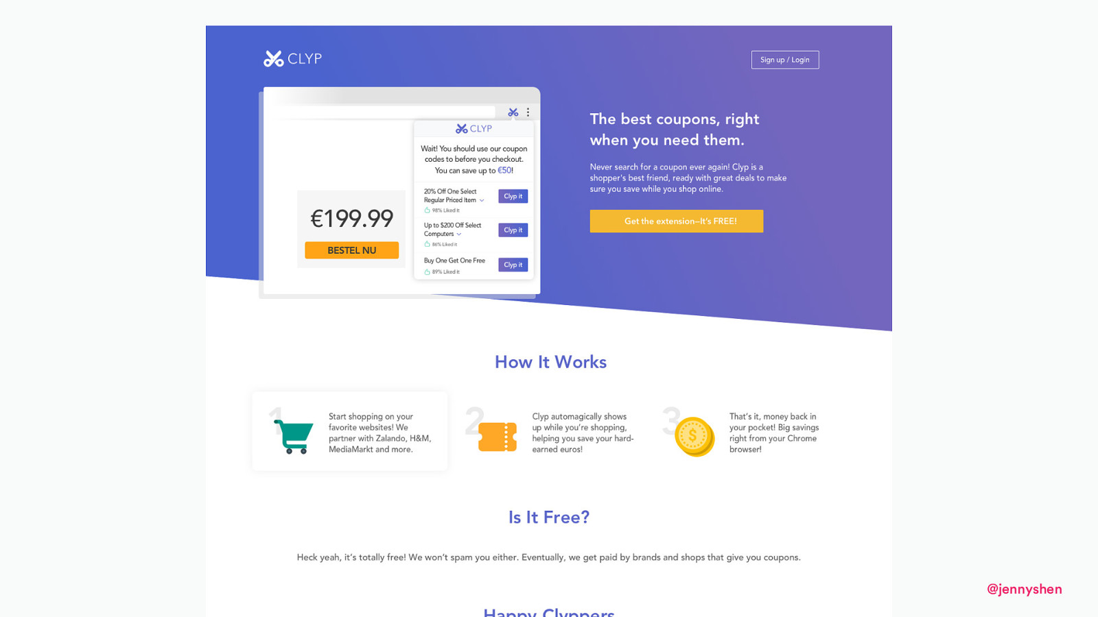
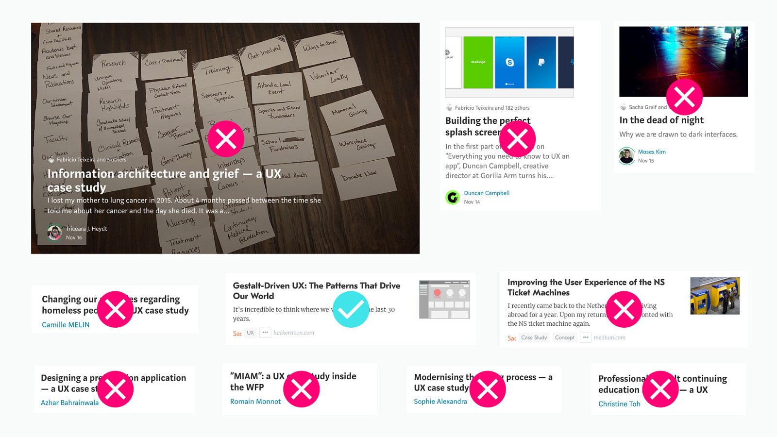
Hick’s Law: The more options to choose from, the longer it takes the user to make a decision. Users bombarded with choices have to take time to interpret and decide, giving them work they don’t want. @jennyshen
@jennyshen
@jennyshen
@jennyshen
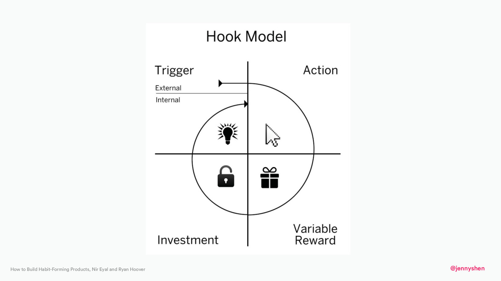
How to Build Habit-Forming Products, Nir Eyal and Ryan Hoover @jennyshen
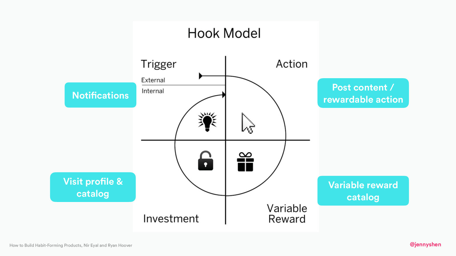
Notifications Visit profile & catalog How to Build Habit-Forming Products, Nir Eyal and Ryan Hoover Post content / rewardable action Variable reward catalog @jennyshen
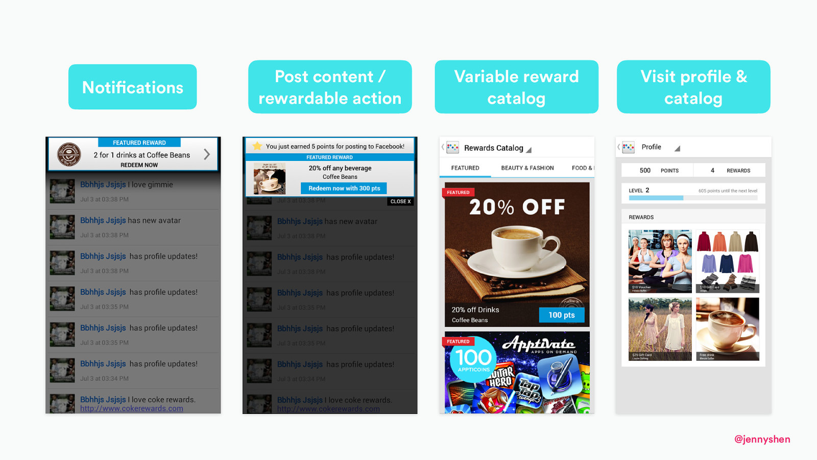
Notifications Post content / rewardable action Variable reward catalog Visit profile & catalog @jennyshen

Zegarnik effect Incomplete tasks are easier to remember than completed ones @jennyshen
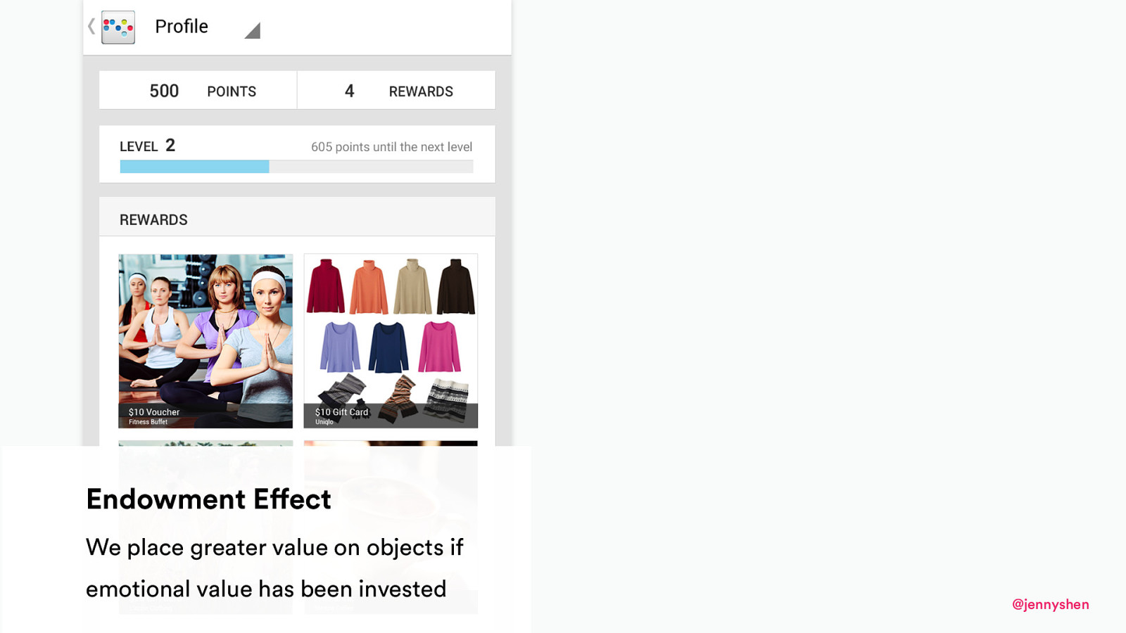
Endowment Effect We place greater value on objects if emotional value has been invested @jennyshen

Completion The need for closure drives humans toward a well defined end-goal @jennyshen
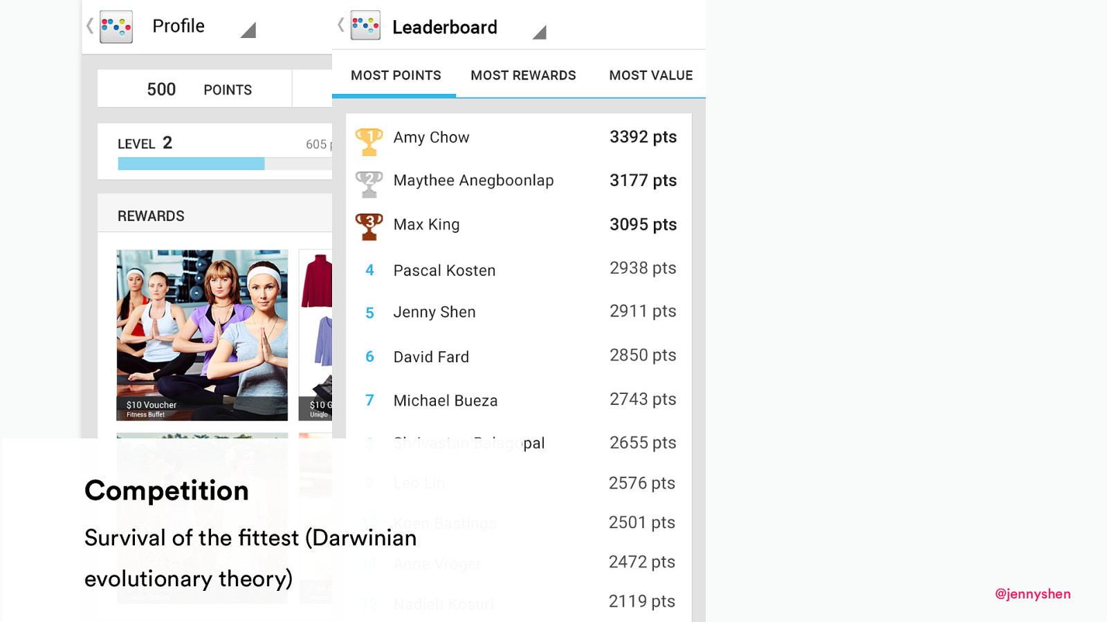
Competition Survival of the fittest (Darwinian evolutionary theory) @jennyshen
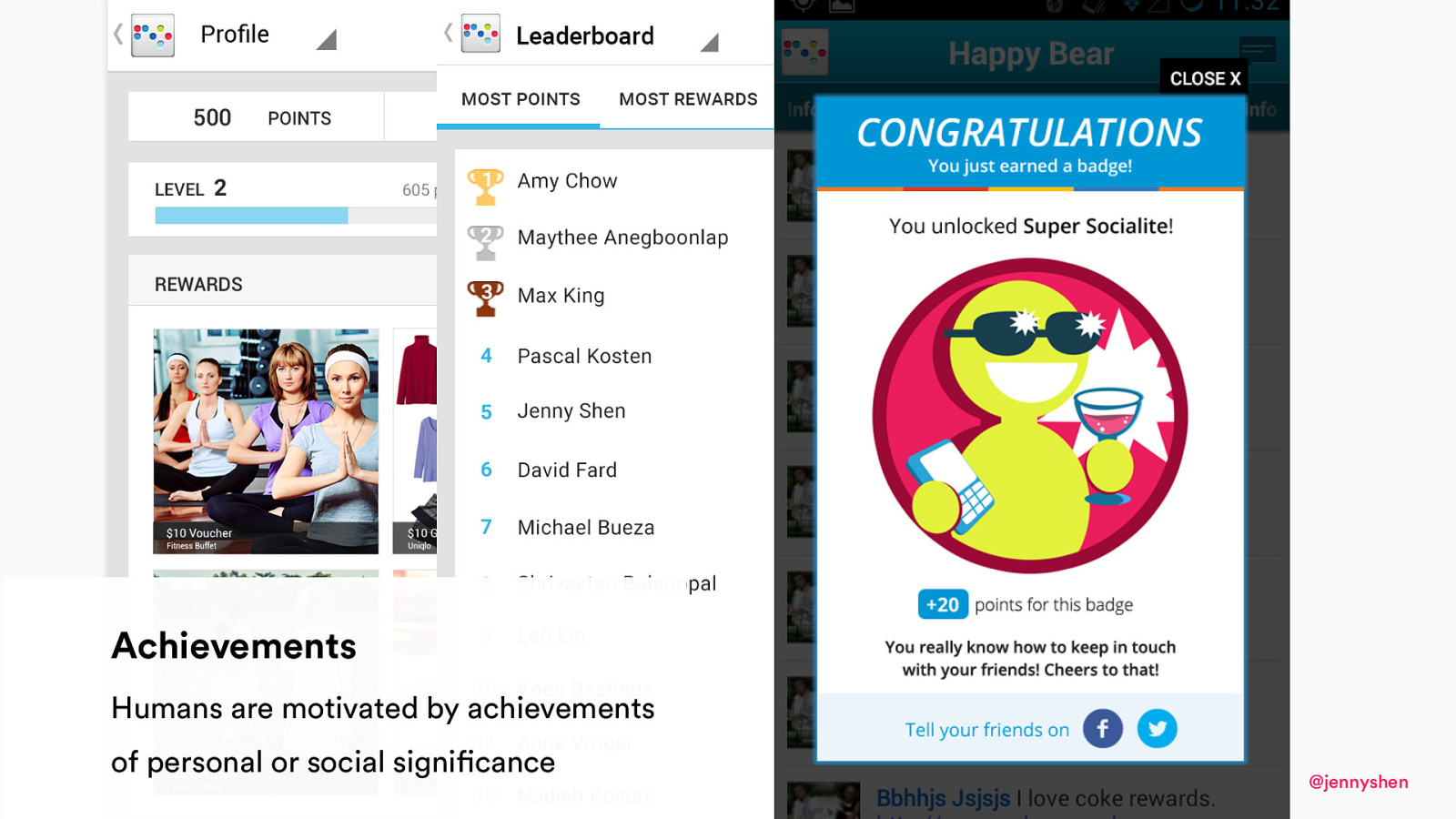
Achievements Humans are motivated by achievements of personal or social significance @jennyshen
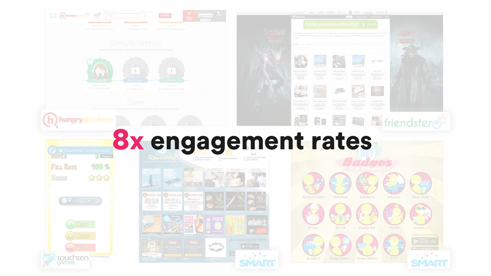
8x engagement rates
3 Dark Side of Psychology @jennyshen
https://twitter.com/darylginn/status/1053646859686809600 @jennyshen
@darkpatterns @jennyshen
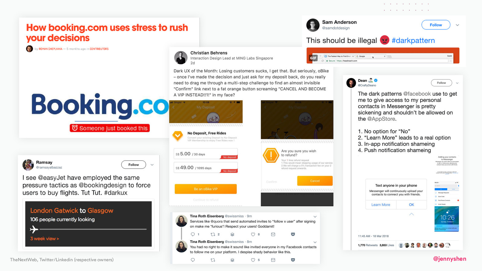
TheNextWeb, Twitter/Linkedin (respective owners) @jennyshen
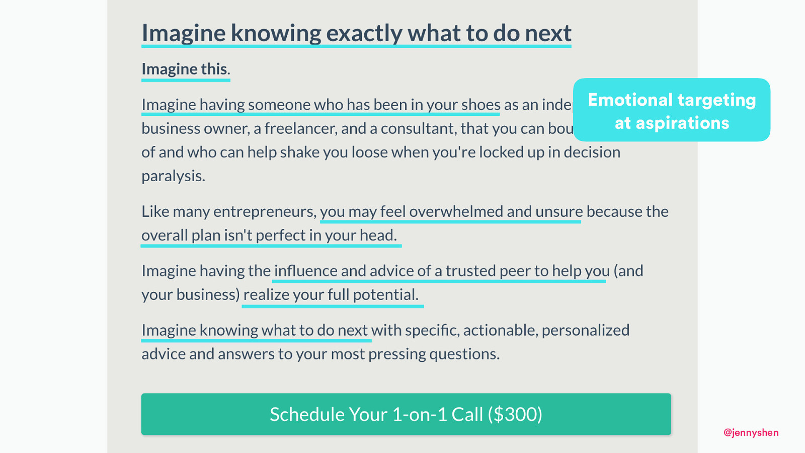
Emotional targeting at aspirations @jennyshen
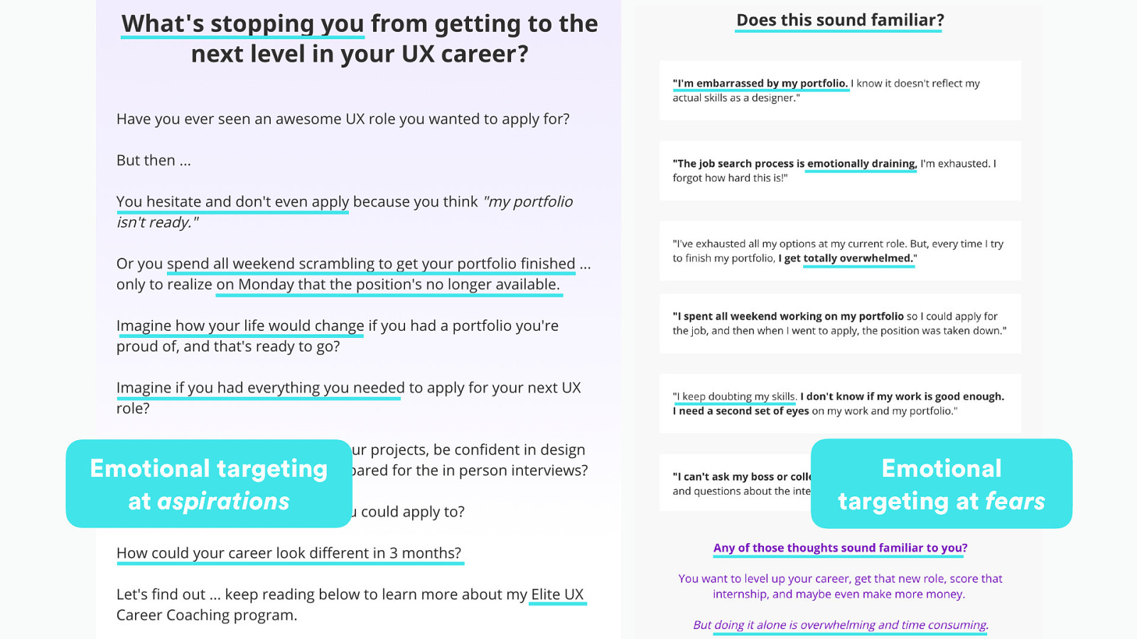
Emotional targeting at aspirations Emotional targeting at fears
Can we do this differently? @jennyshen
@jennyshen
@jennyshen
@jennyshen
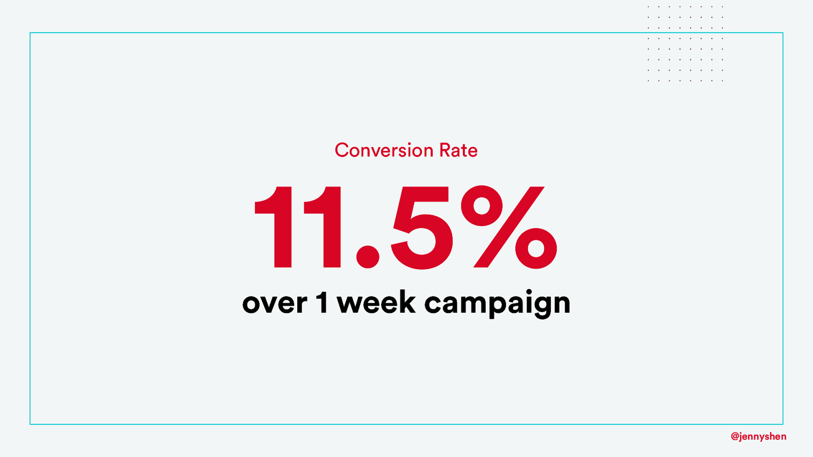
Conversion Rate 11.5% over 1 week campaign @jennyshen
@jennyshen
4 Ethics and Responsibility @jennyshen
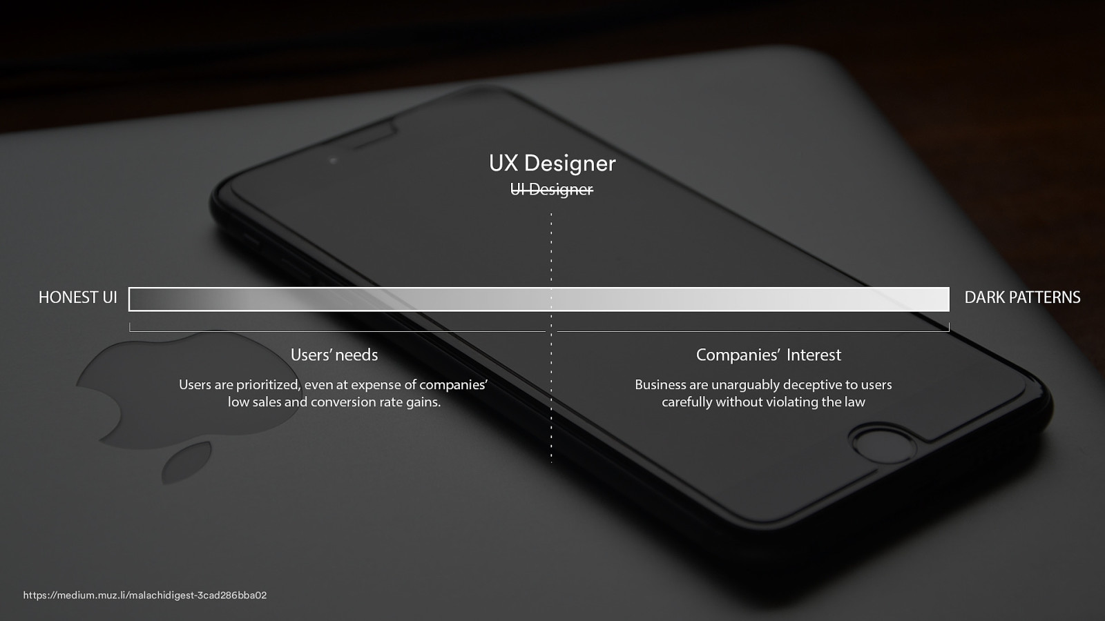
UX Designer https://medium.muz.li/malachidigest-3cad286bba02 @jennyshen
Is using psychology ethical? @jennyshen
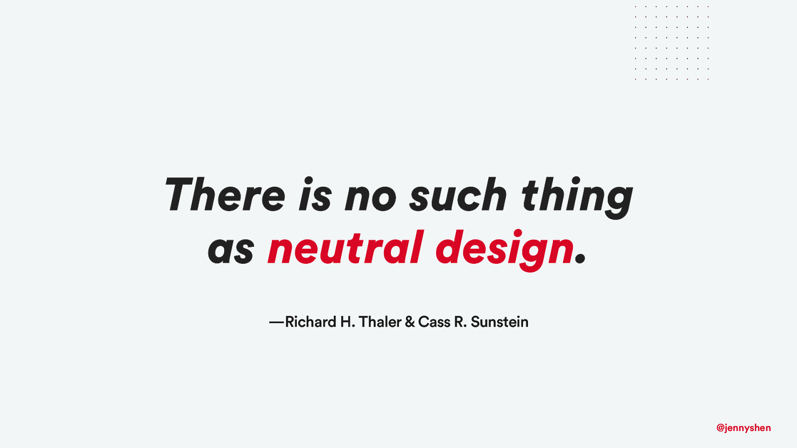
There is no such thing as neutral design. —Richard H. Thaler & Cass R. Sunstein @jennyshen
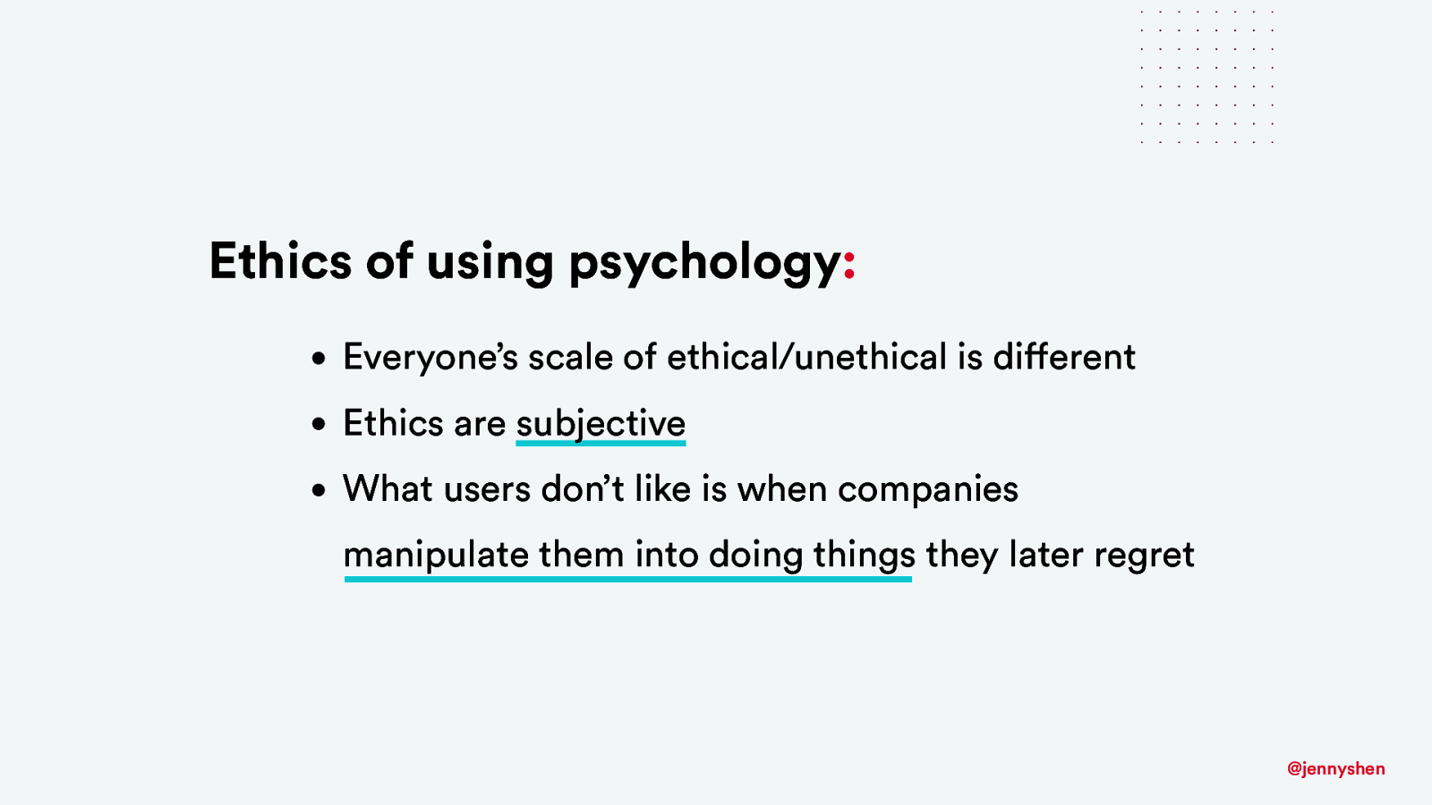
Ethics of using psychology: • Everyone’s scale of ethical/unethical is different • Ethics are subjective • What users don’t like is when companies manipulate them into doing things they later regret @jennyshen
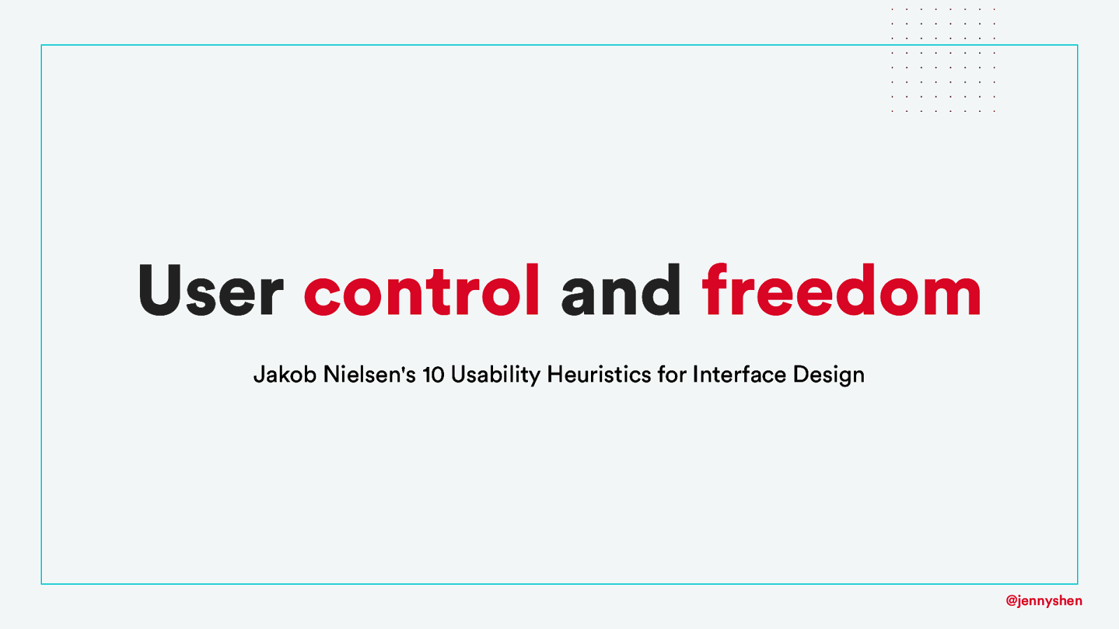
User control and freedom Jakob Nielsen's 10 Usability Heuristics for Interface Design @jennyshen
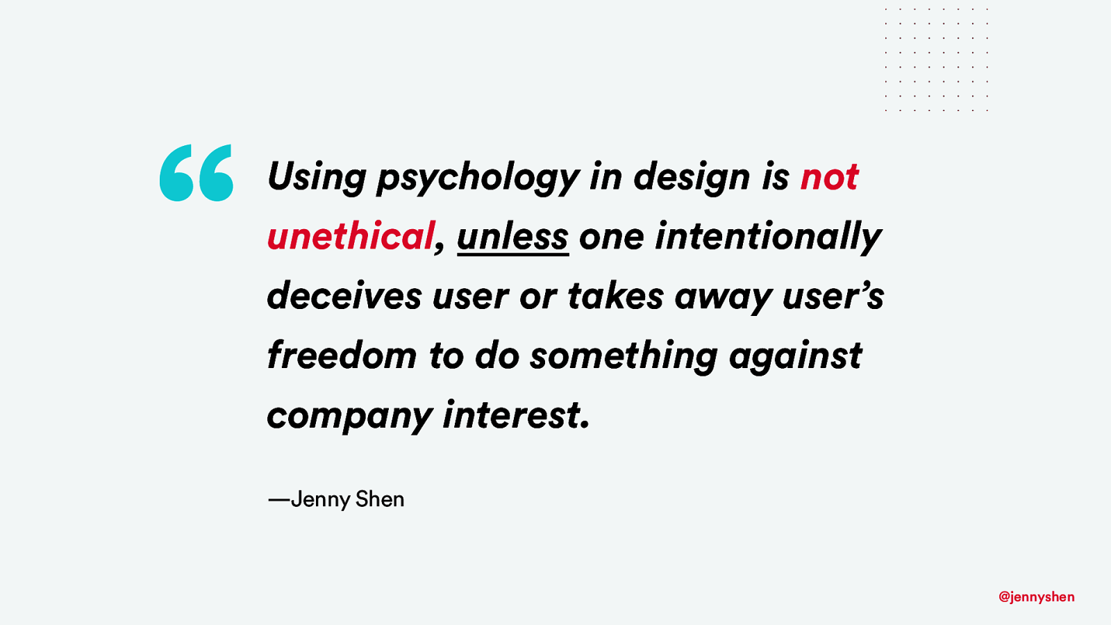
“ Using psychology in design is not unethical, unless one intentionally deceives user or takes away user’s freedom to do something against company interest. —Jenny Shen @jennyshen
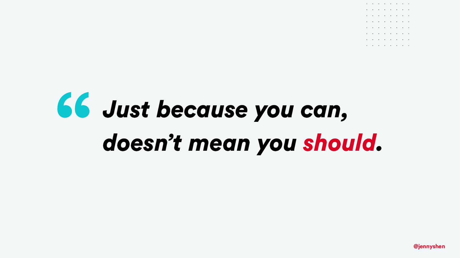
“ Just because you can, doesn’t mean you should. @jennyshen
ethical and humane design methods @jennyshen
Designers have responsibility to educate others about design psychology @jennyshen
Designers have the responsibility to shape design education @jennyshen
Let’s advocate heuristics and principles over tactics @jennyshen
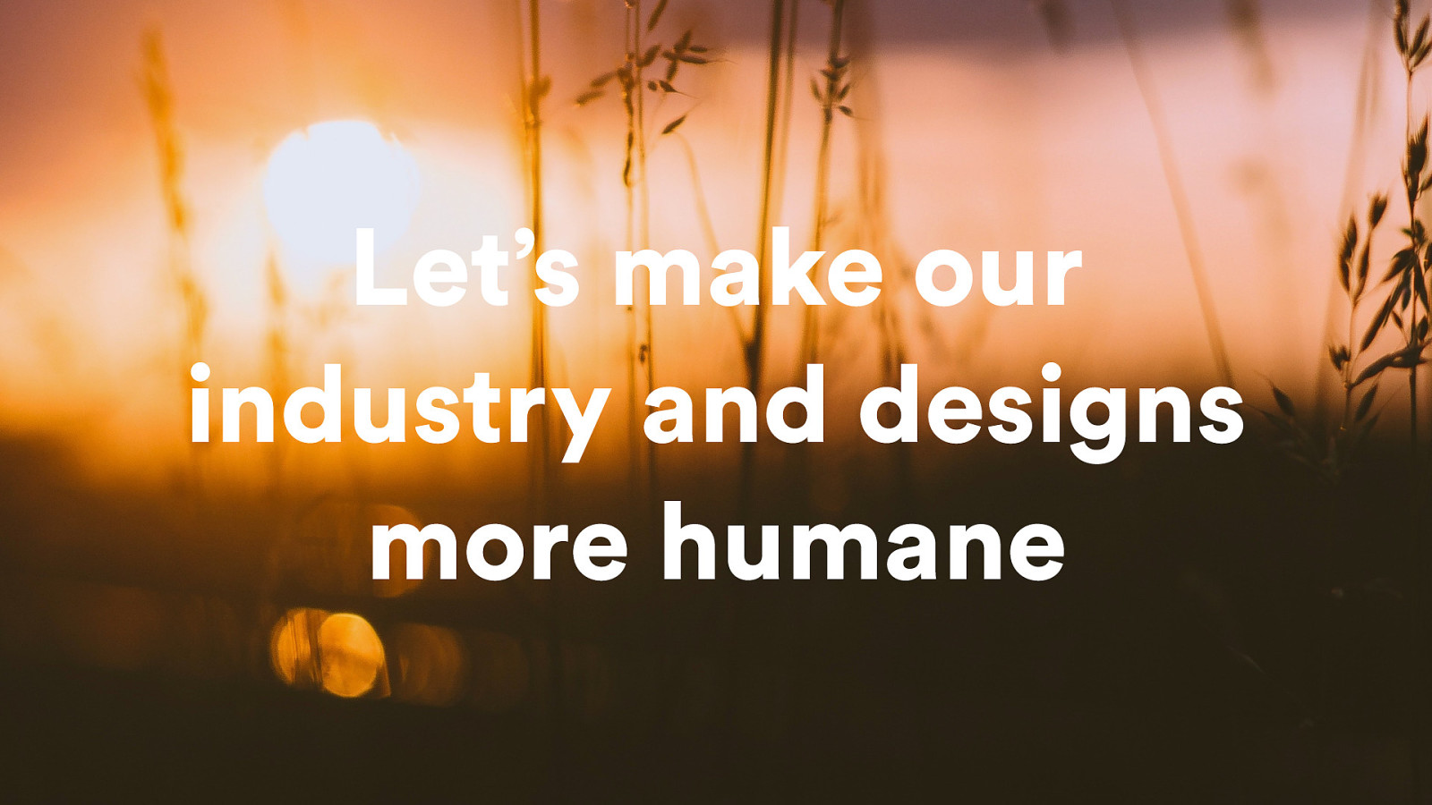
Let’s make our industry and designs more humane @jennyshen
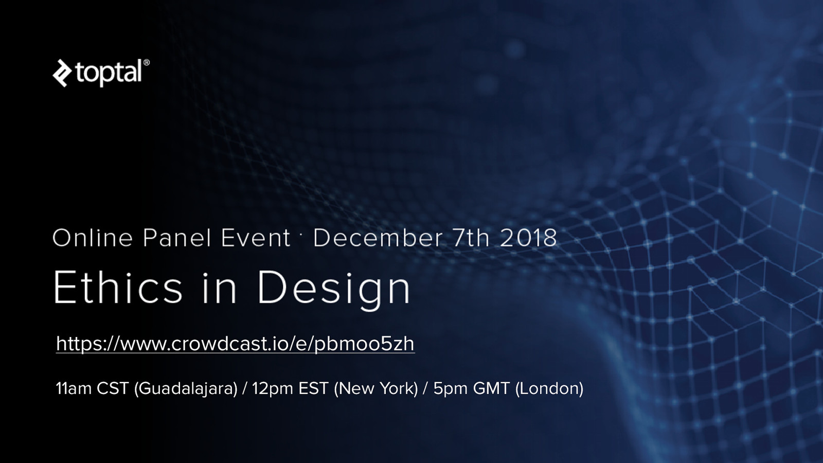
https://www.crowdcast.io/e/pbmoo5zh 11am CST (Guadalajara) / 12pm EST (New York) / 5pm GMT (London)
@jennyshen ! jennyshen.com 📩 get updates: jennyshen.com/newsletter
Icons: Yanick Brezet, Becris, Ryan Houk, Mello, Tim Neumann from the Noun Project Background image: Anton Darius Thesollers from Unsplash @jennyshen