
A presentation at beyond tellerrand Düsseldorf 2025 in in Düsseldorf, Germany by Matthias Ott
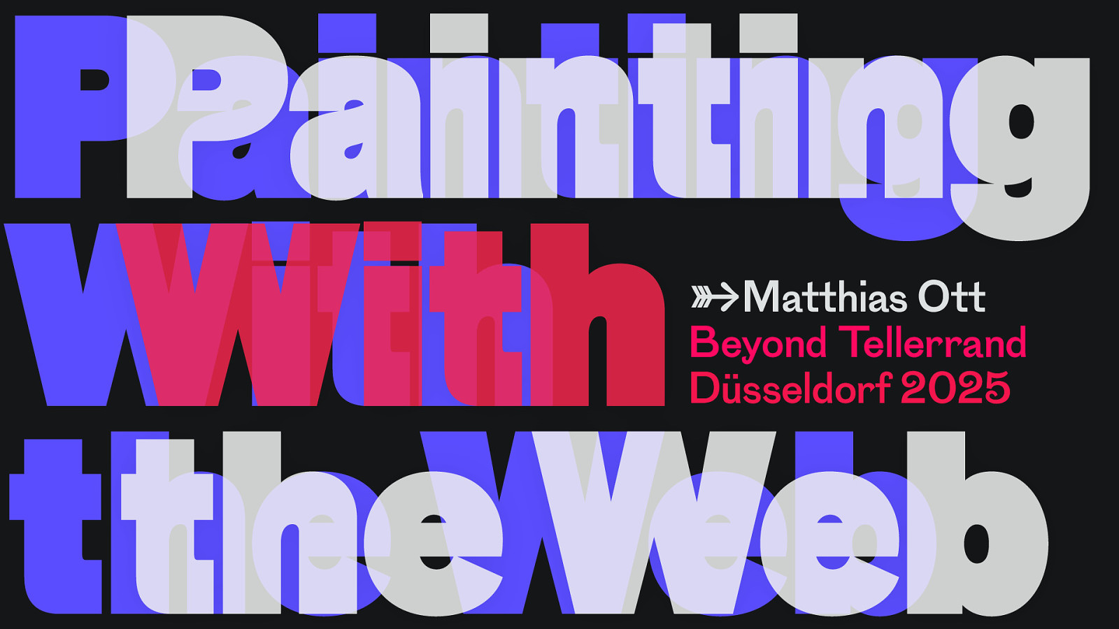
Painting Painting With With the theWeb Web →Matthias Ott Beyond Tellerrand Düsseldorf 2025
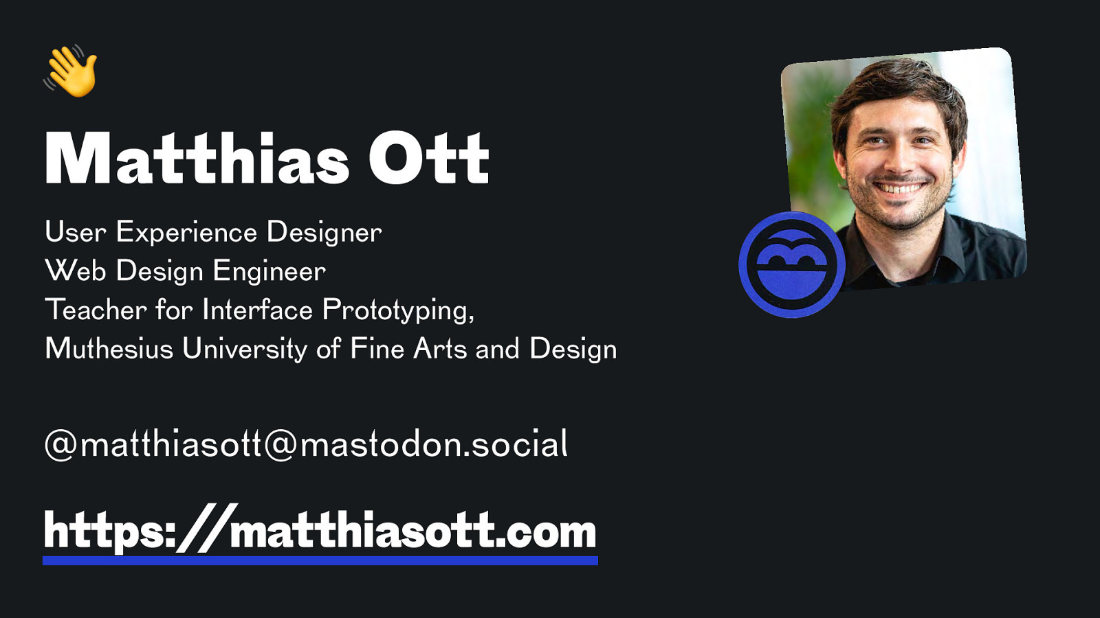
! Matthias Ott User Experience Designer Web Design Engineer Teacher for Interface Prototyping, Muthesius University of Fine Arts and Design @matthiasott@mastodon.social https://matthiasott.com
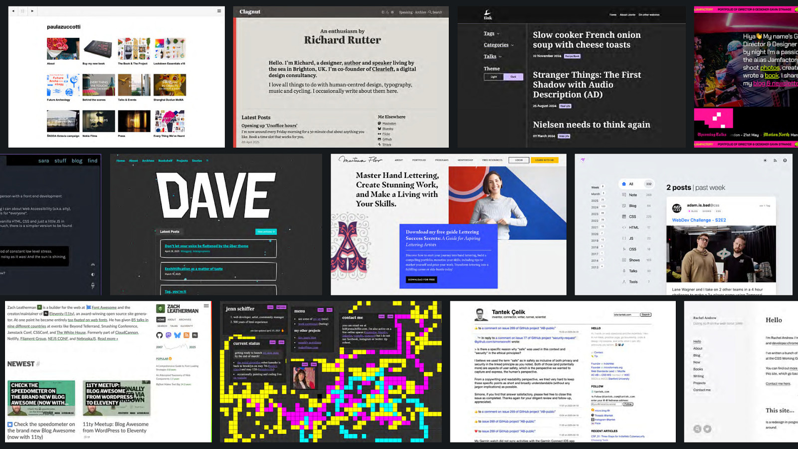
ow n e t i s . b e w yo u r
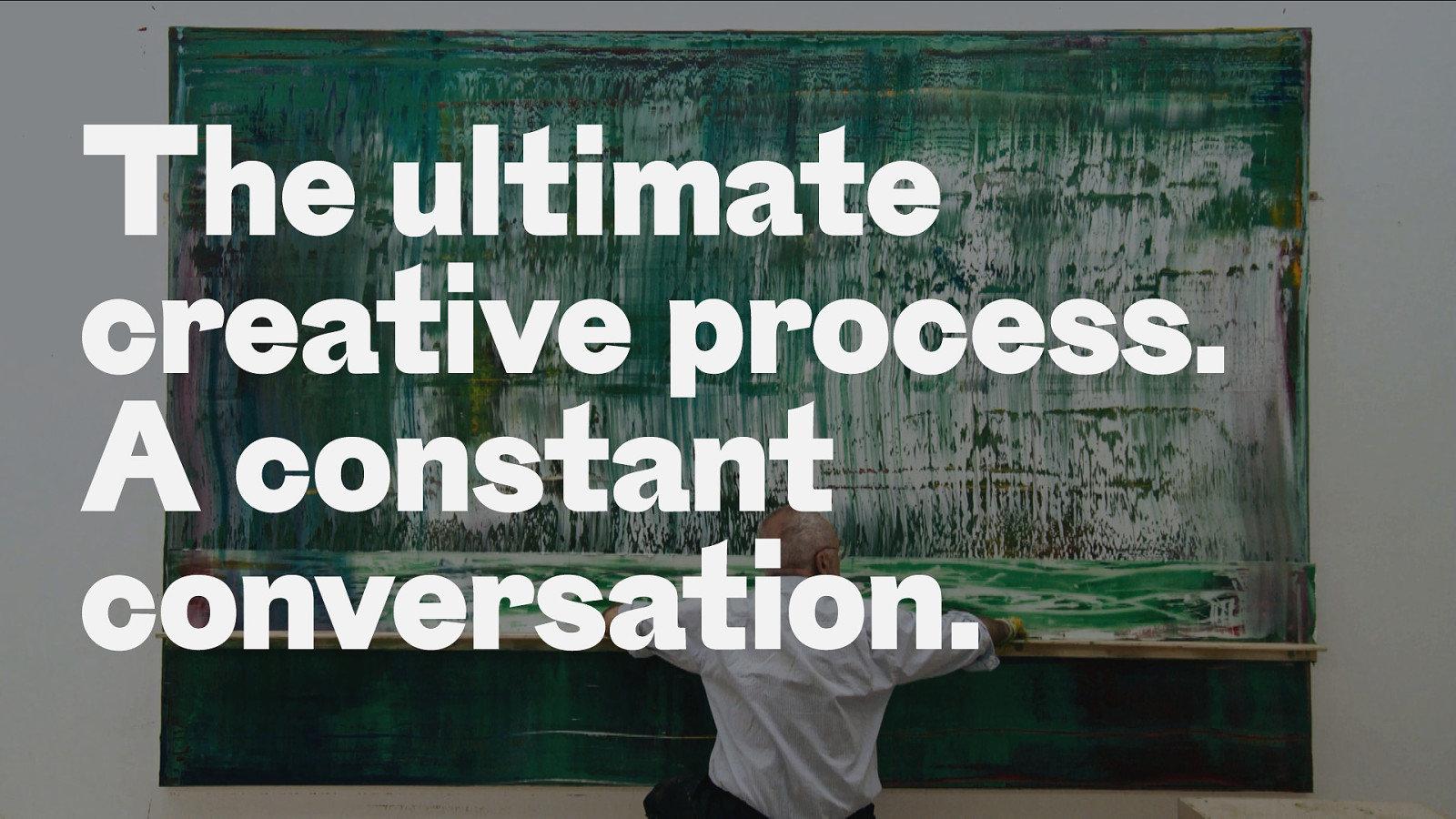
The ultimate creative process. A constant conversation.
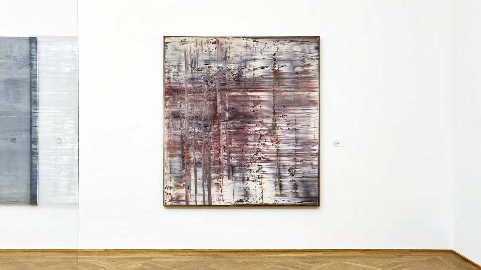
The Canvas
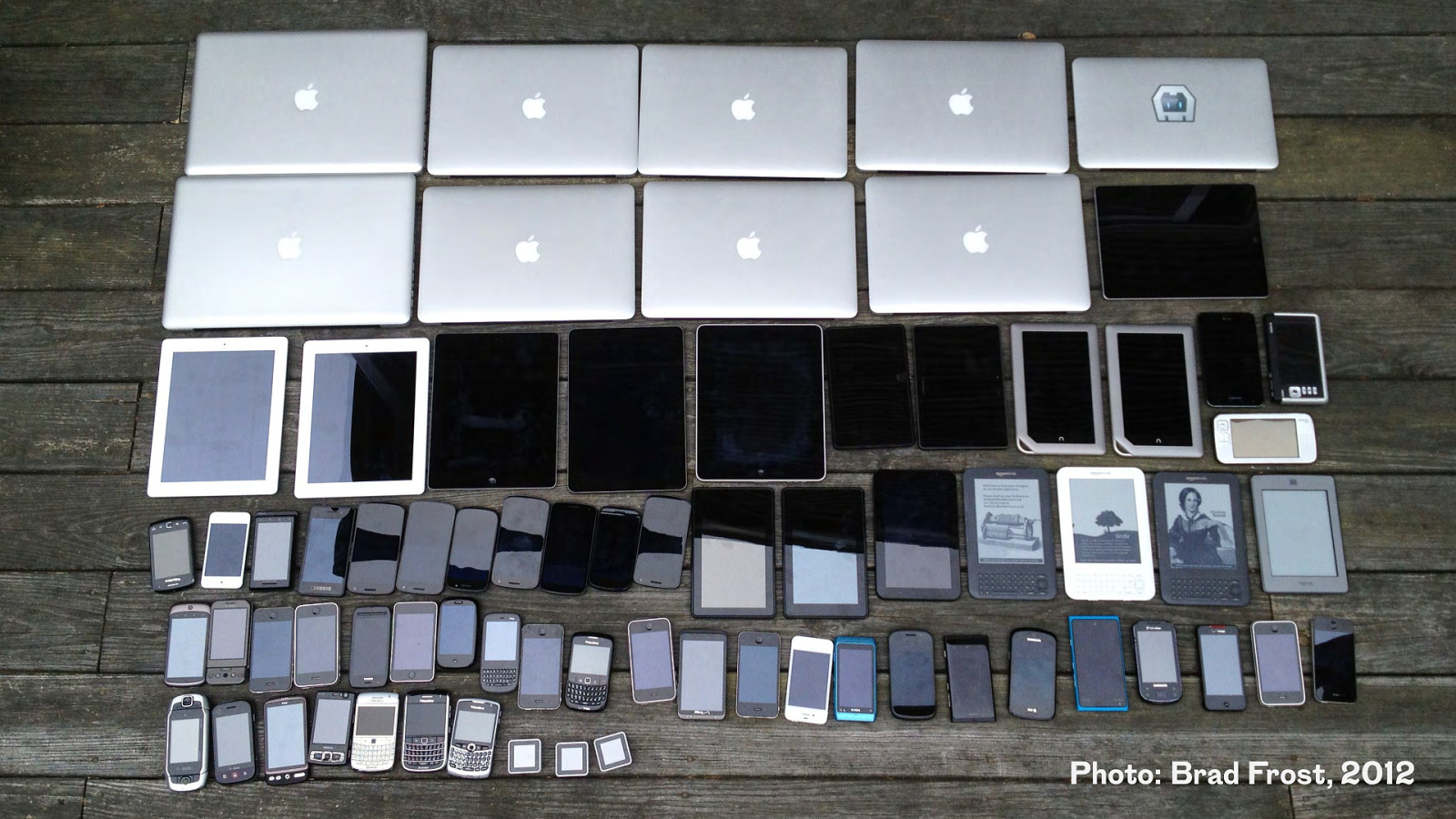
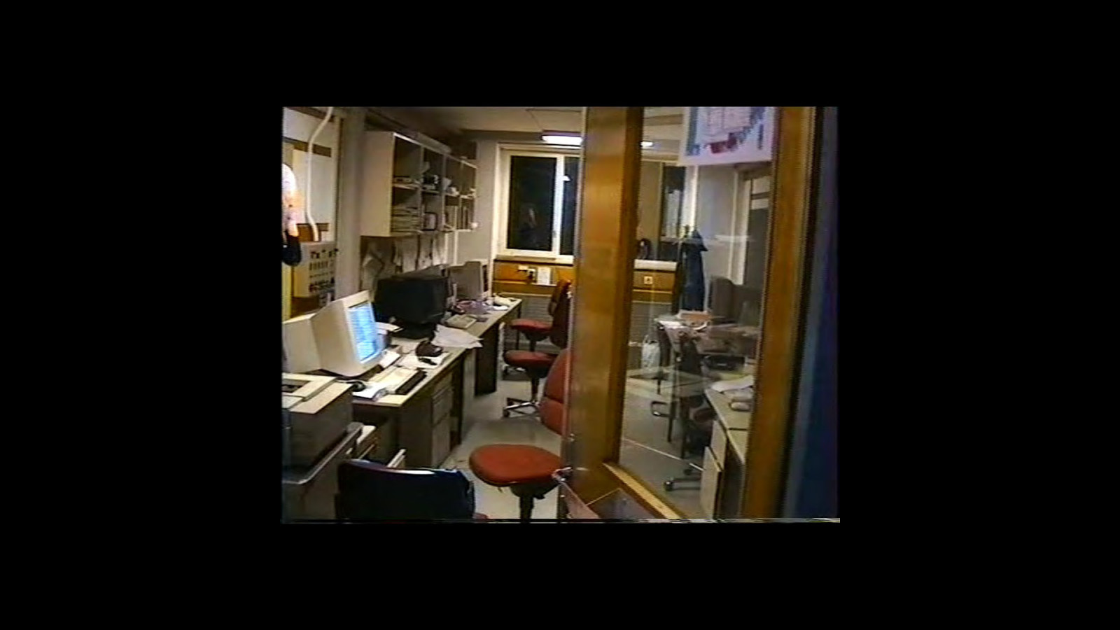
Photo: Brad Frost, 2012
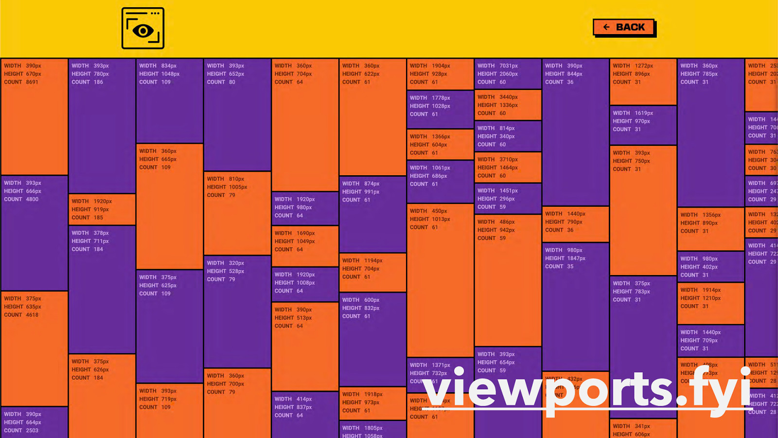
viewports.fyi
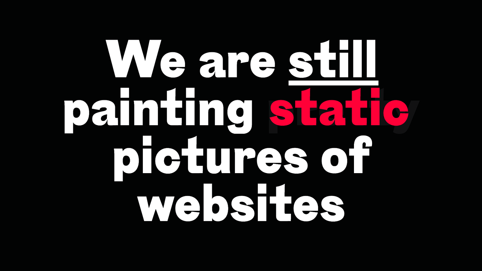
We are still static painting pretty pictures of websites
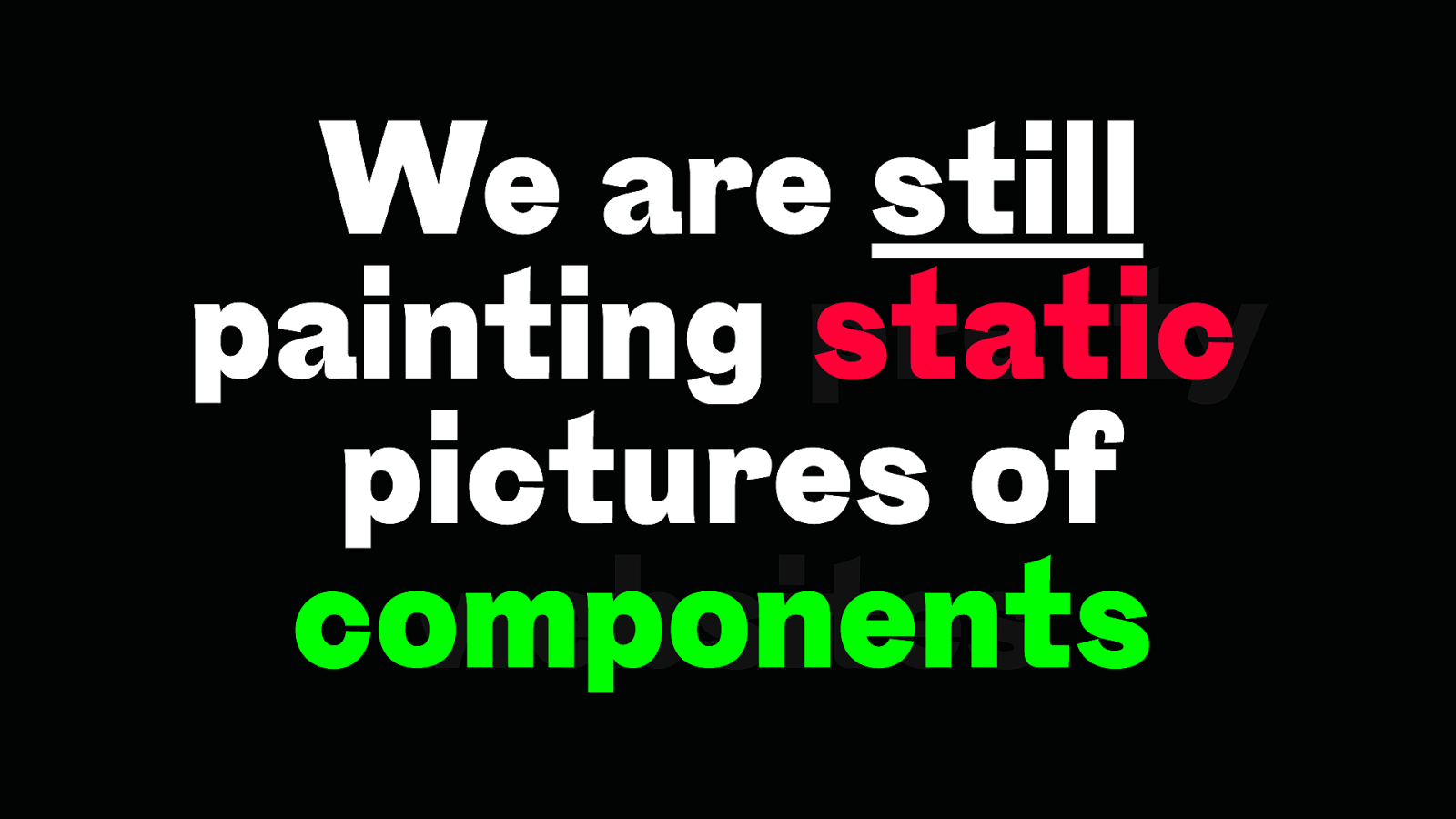
We are still static painting pretty pictures of components websites
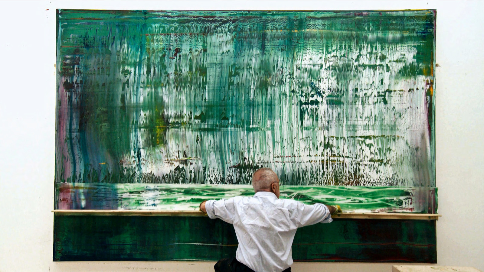
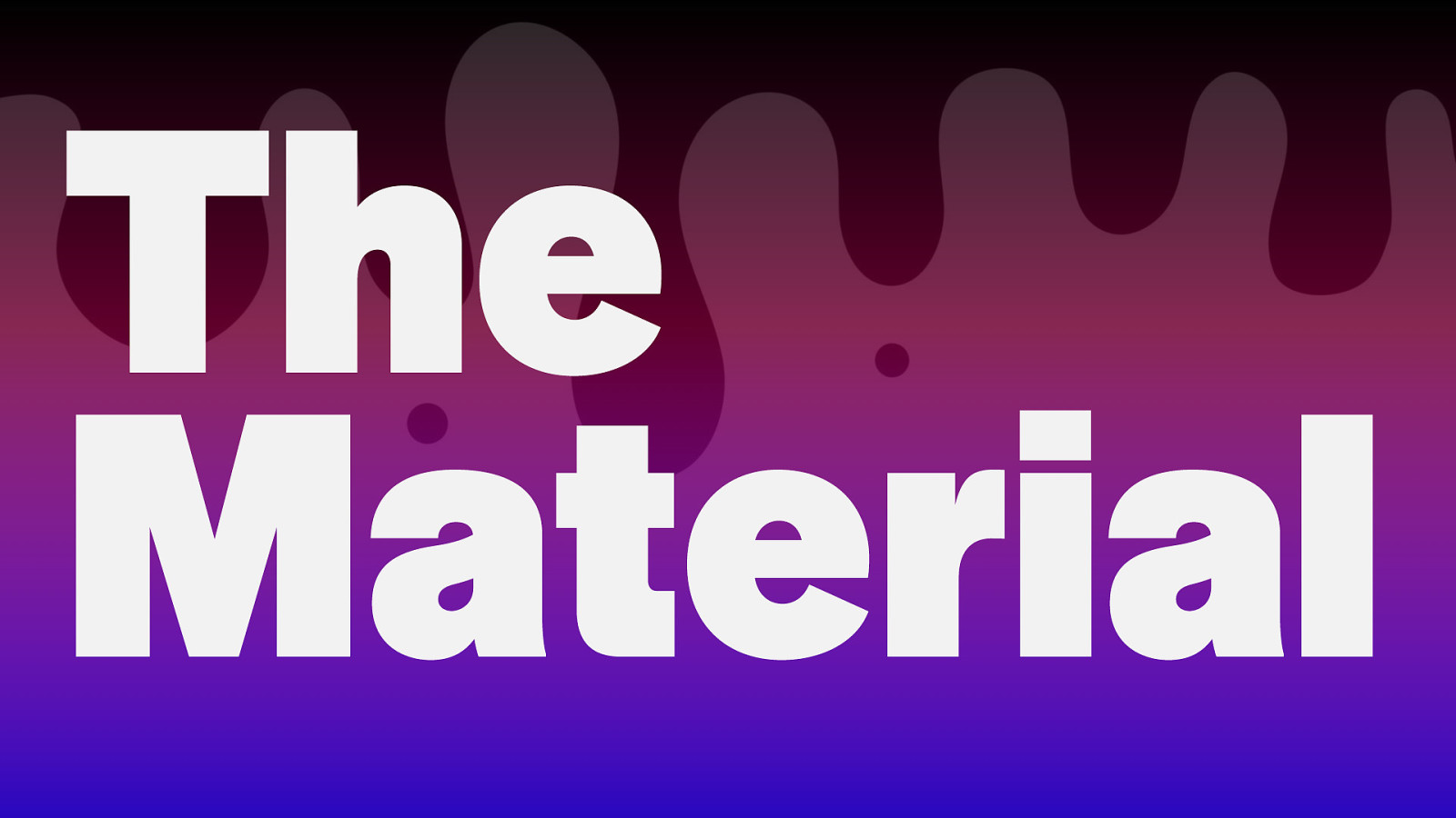
The Material
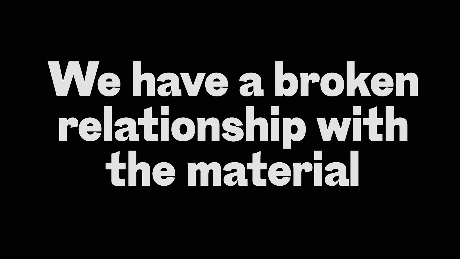
We have a broken relationship with the material
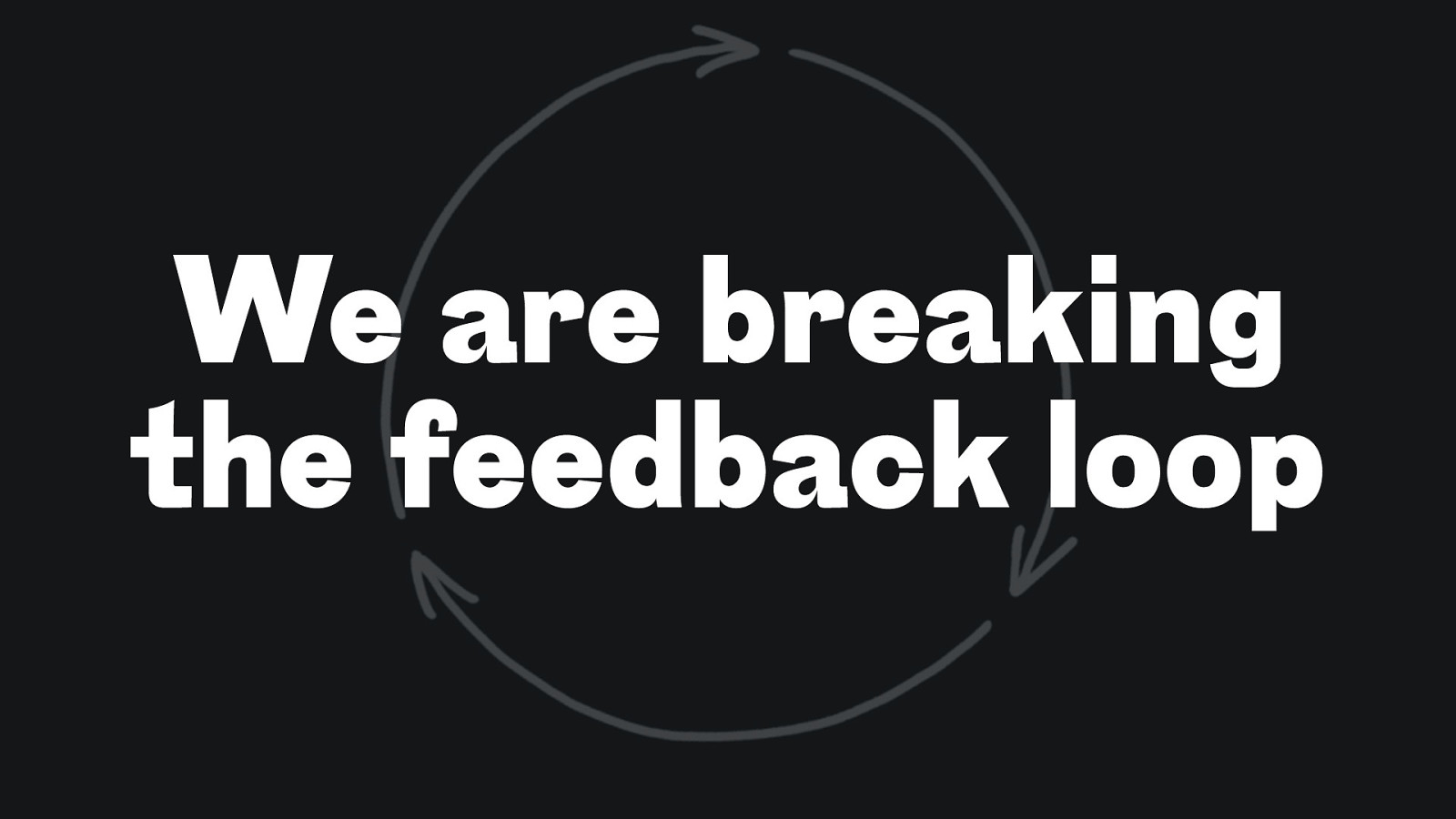
We are breaking the feedback loop
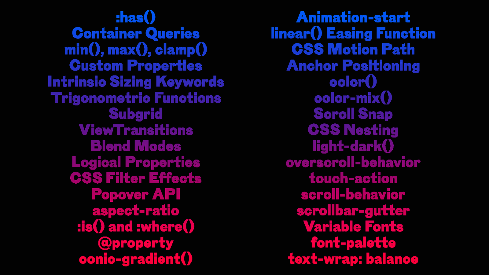
:has() Container Queries min(), max(), clamp() Custom Properties Intrinsic Sizing Keywords Trigonometric Functions Subgrid ViewTransitions Blend Modes Logical Properties CSS Filter Effects Popover API aspect-ratio :is() and :where() @property conic-gradient() Animation-start linear() Easing Function CSS Motion Path Anchor Positioning color() color-mix() Scroll Snap CSS Nesting light-dark() overscroll-behavior touch-action scroll-behavior scrollbar-gutter Variable Fonts font-palette text-wrap: balance
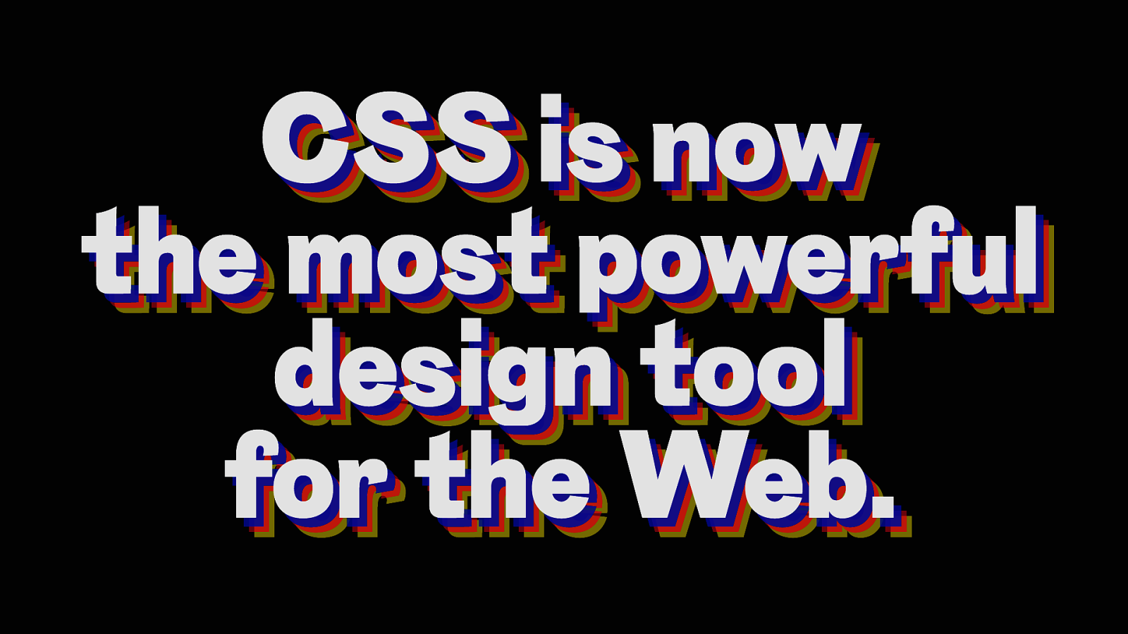
CSS is now CSS is now the most powerful the most powerful design tool design tool for the Web. for the Web.
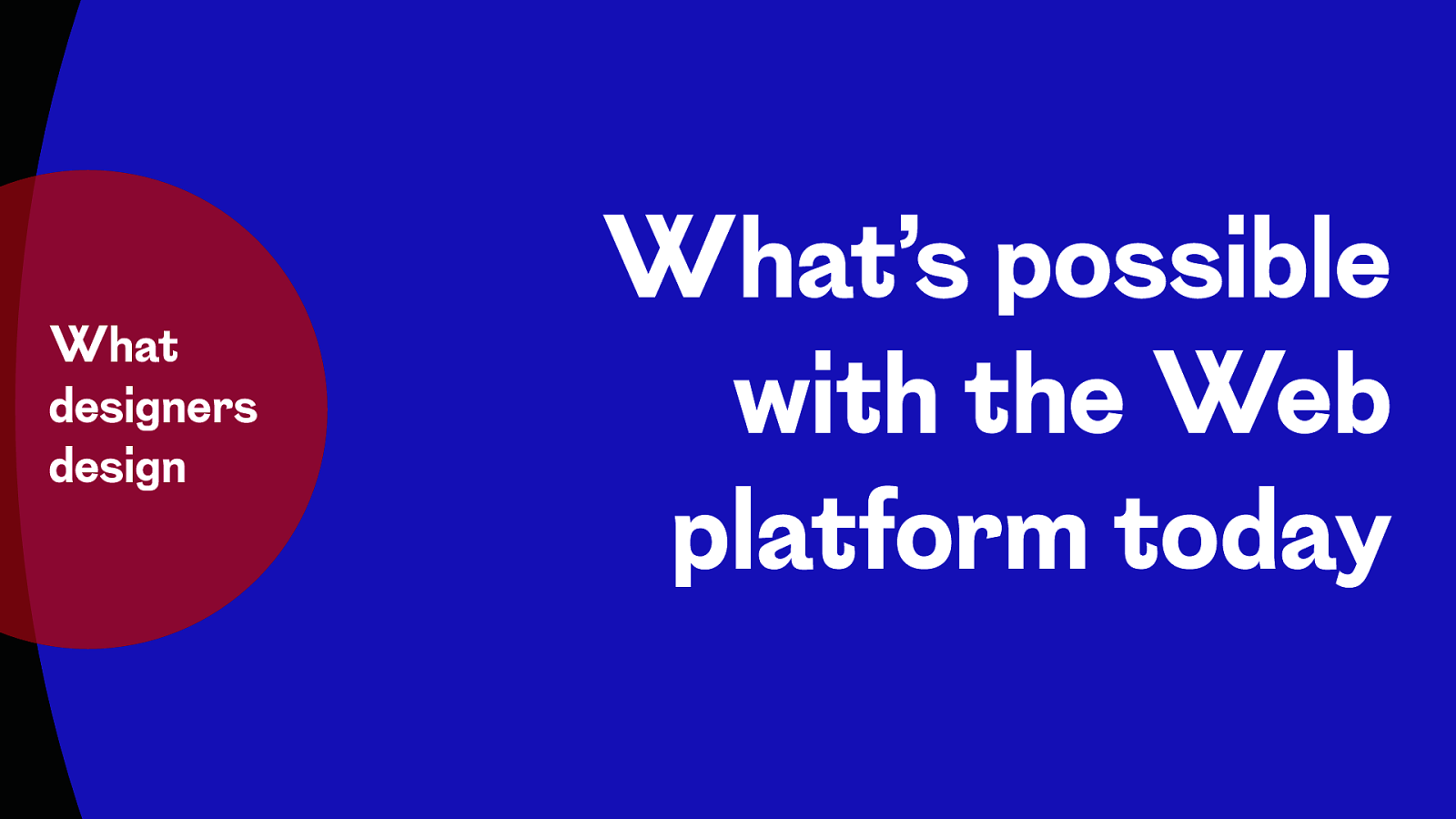
What designers design What’s possible with the Web platform today
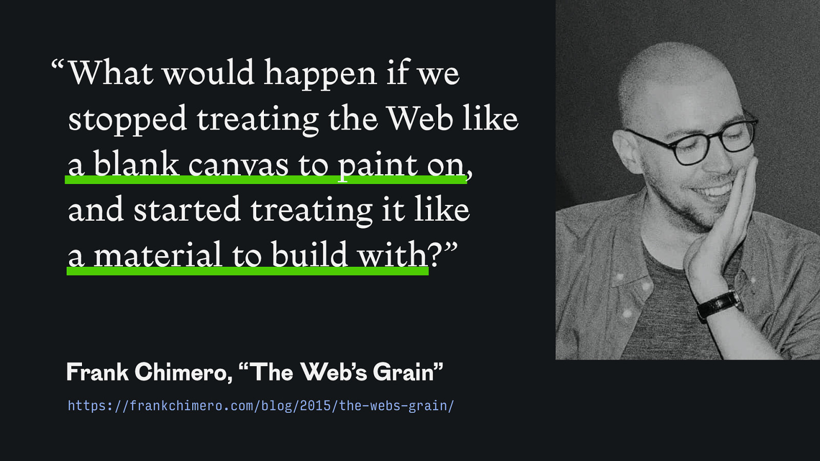
“ What would happen if we stopped treating the Web like a blank canvas to paint on, and started treating it like a material to build with?” Frank Chimero, “The Web’s Grain” https://frankchimero.com/blog/2015/the-webs-grain/
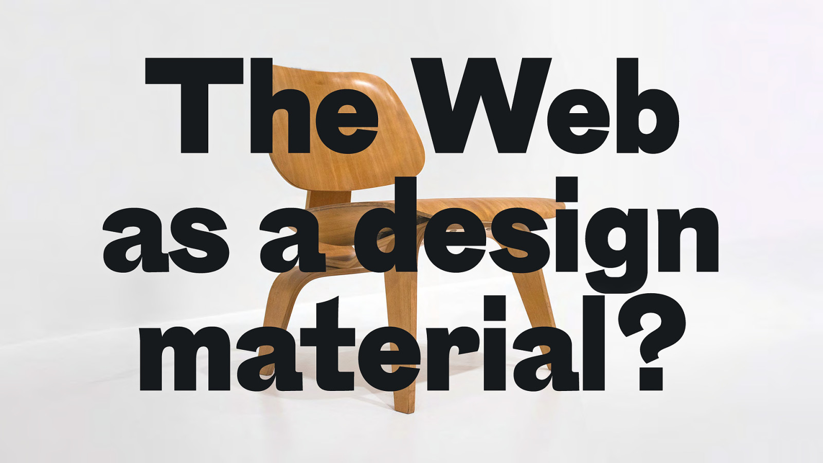
The Web as a design material?
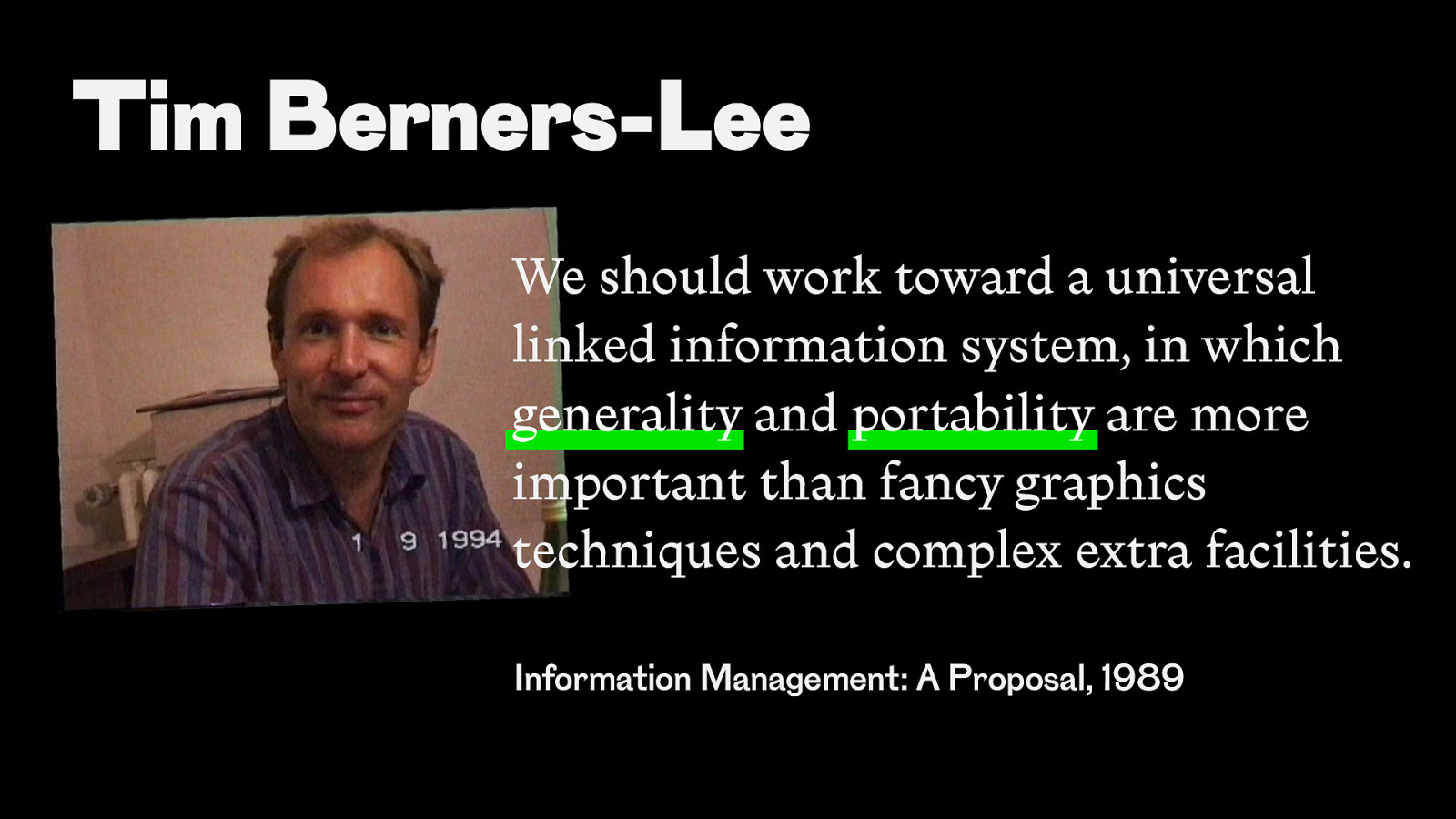
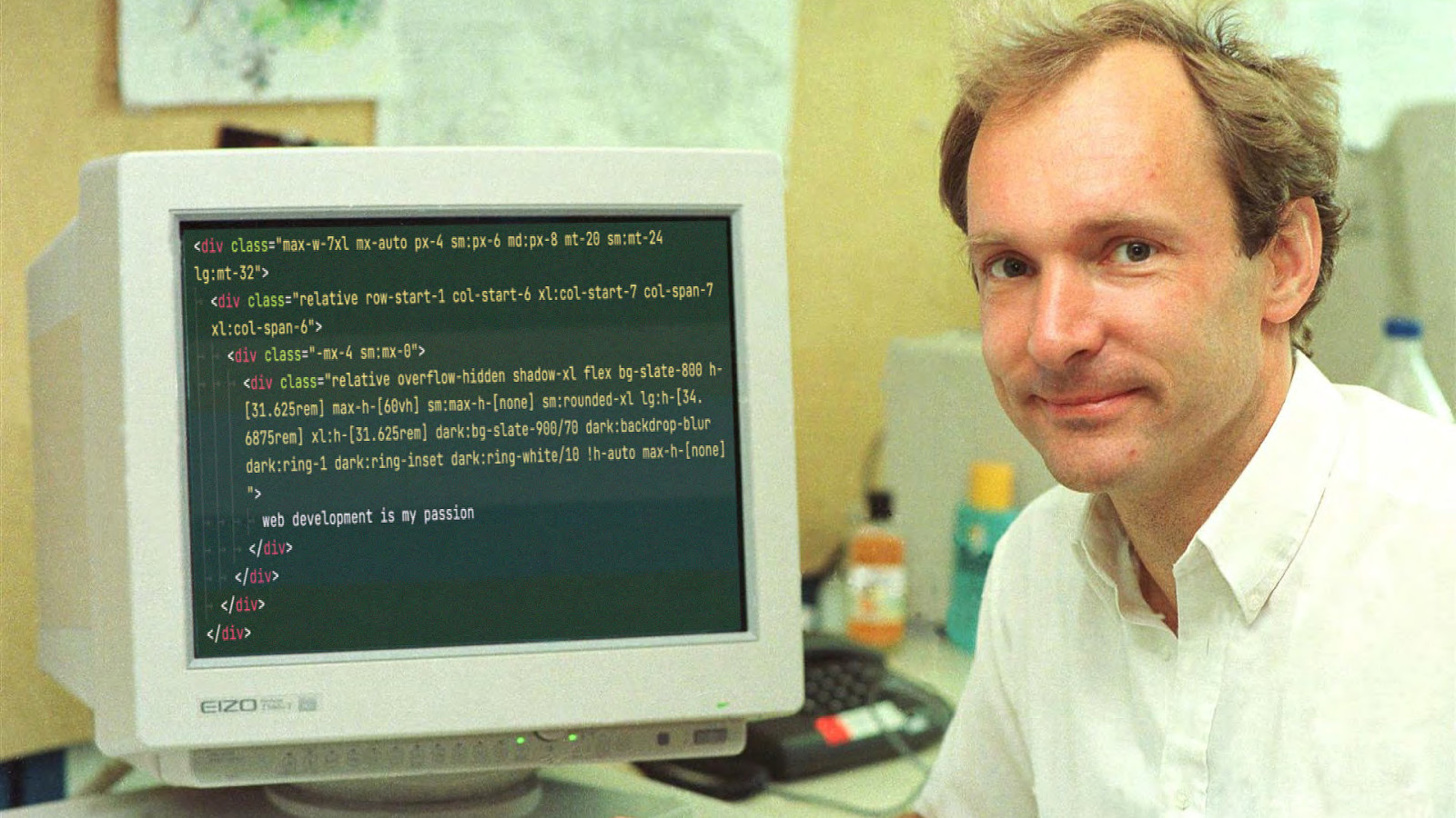
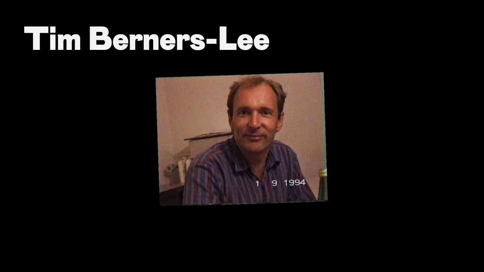
Tim Berners-Lee
Tim Berners-Lee We should work toward a universal linked information system, in which generality and portability are more important than fancy graphics techniques and complex extra facilities. Information Management: A Proposal, 1989
Tim Berners-Lee
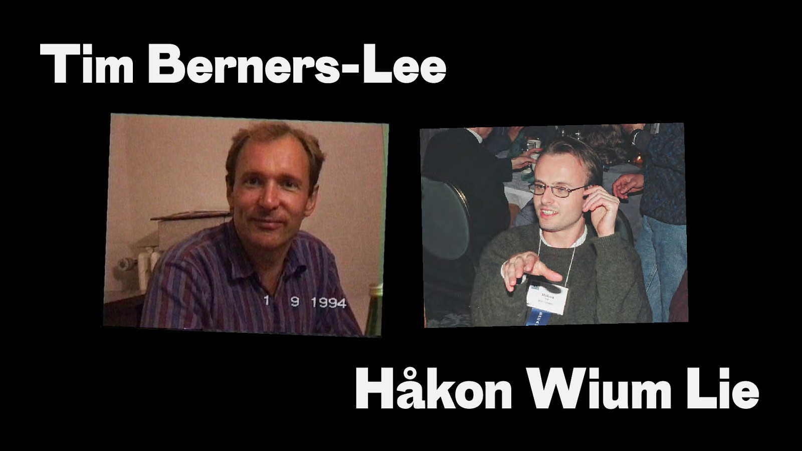
Tim Berners-Lee Håkon Wium Lie
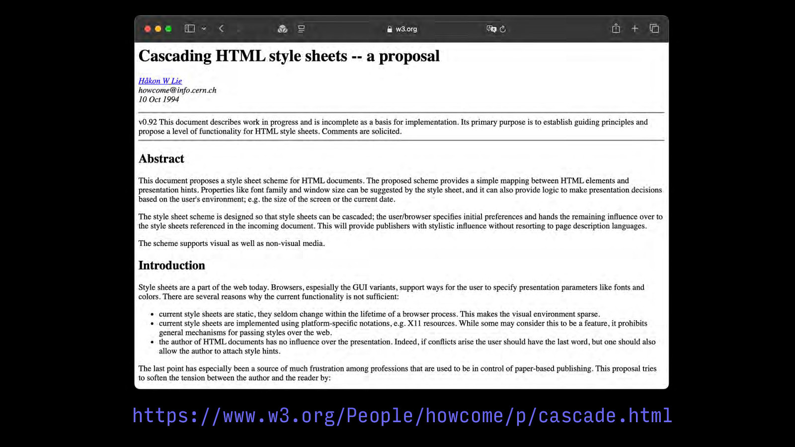
https://www.w3.org/People/howcome/p/cascade.html
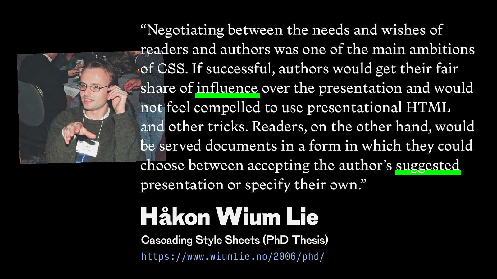
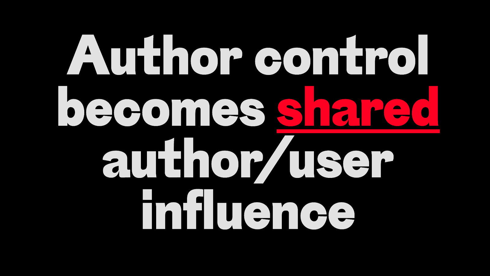
“Negotiating between the needs and wishes of readers and authors was one of the main ambitions of CSS. If successful, authors would get their fair share of influence over the presentation and would not feel compelled to use presentational HTML and other tricks. Readers, on the other hand, would be served documents in a form in which they could choose between accepting the author’s suggested presentation or specify their own.” Håkon Wium Lie Cascading Style Sheets (PhD Thesis) https://www.wiumlie.no/2006/phd/
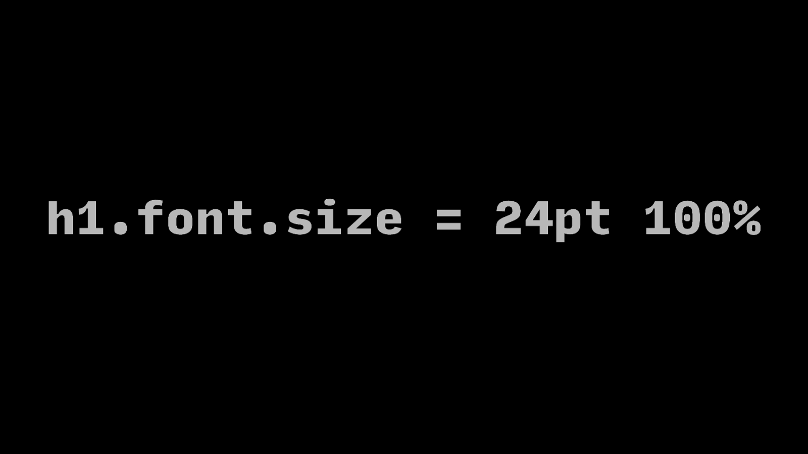
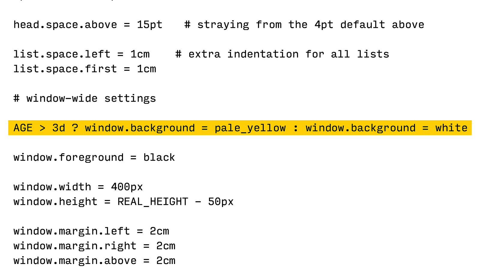
h1.font.size = 24pt 100%
24pt 100%
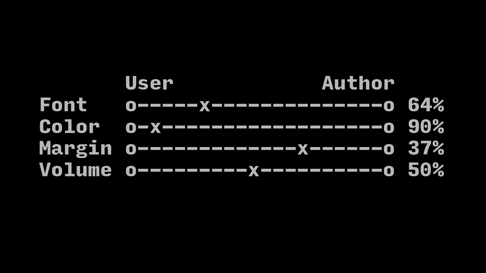
User Author Font o——-x———————o Color o-x—————————o Margin o——————-x———o Volume o————-x—————o 64% 90% 37% 50%
Author control becomes shared author/user influence
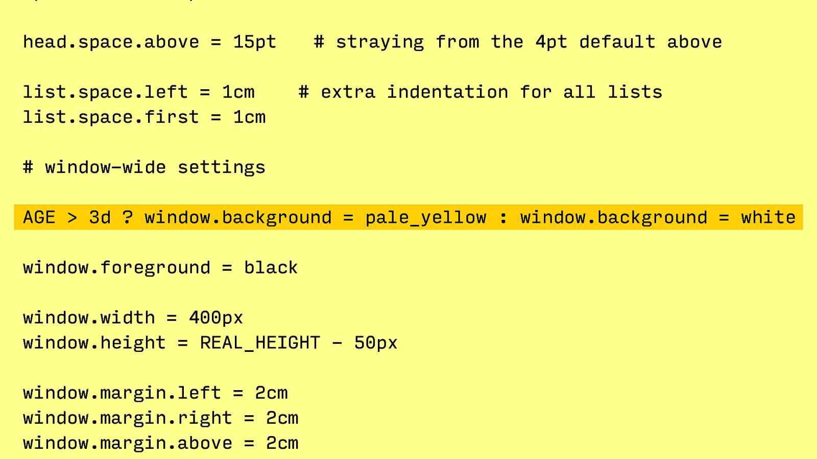
head.space.above = 15pt list.space.left = 1cm list.space.first = 1cm
head.space.above = 15pt list.space.left = 1cm list.space.first = 1cm
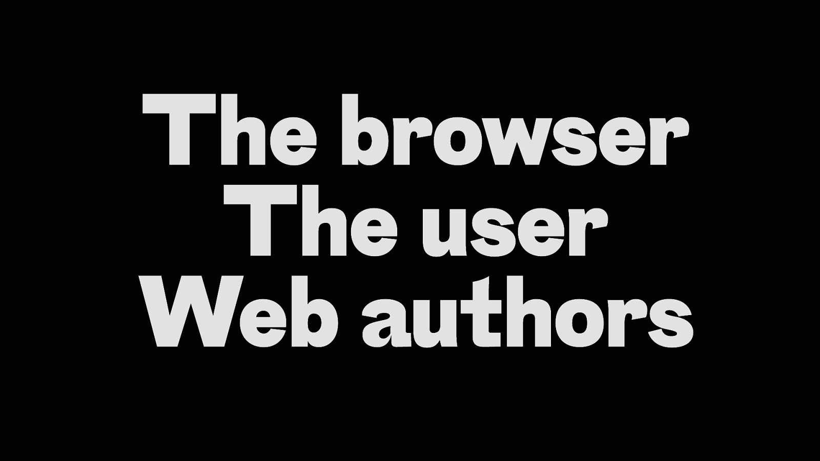
The browser The user Web authors
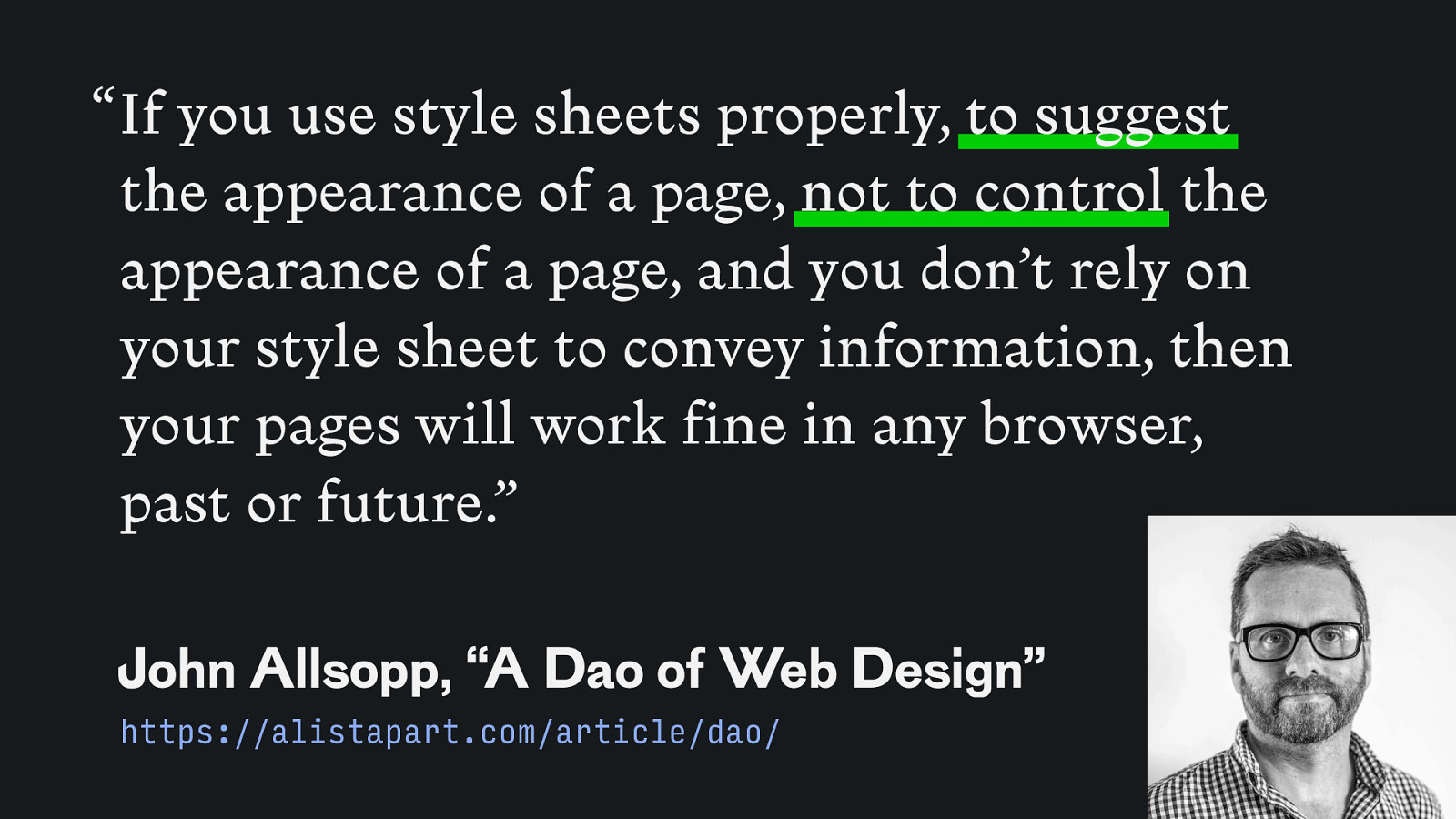
“ If you use style sheets properly, to suggest the appearance of a page, not to control the appearance of a page, and you don’t rely on your style sheet to convey information, then your pages will work fine in any browser, past or future.” John Allsopp, “A Dao of Web Design” https://alistapart.com/article/dao/
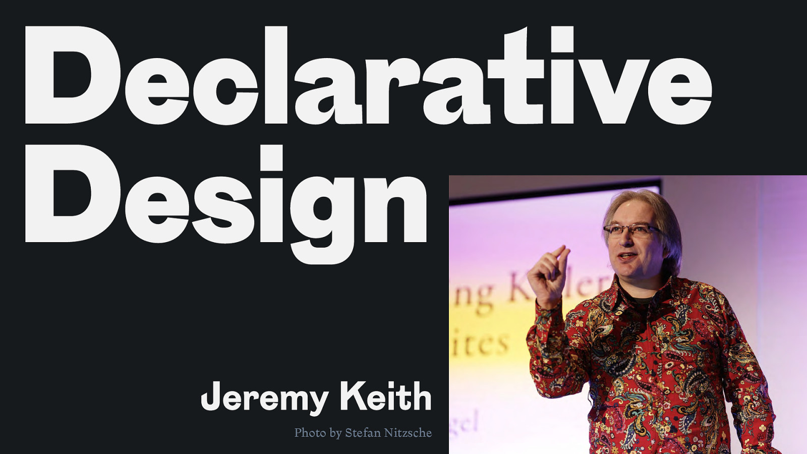
Declarative Design Jeremy Keith Photo by Stefan Nitzsche
ARIA javascript() .css <html>
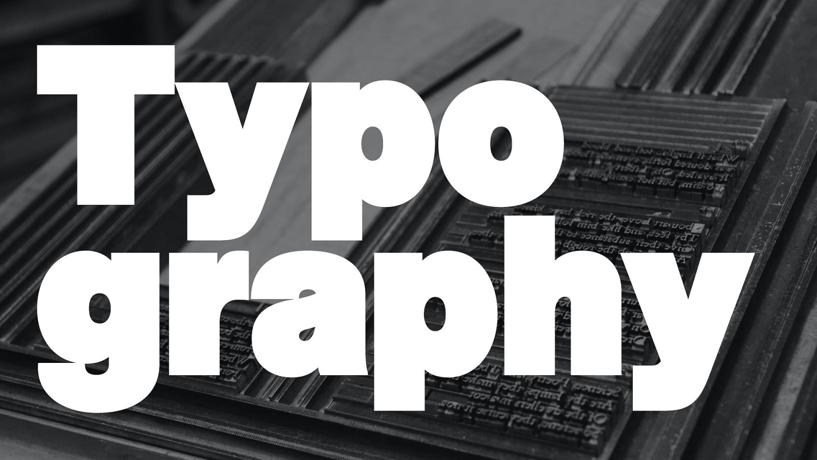
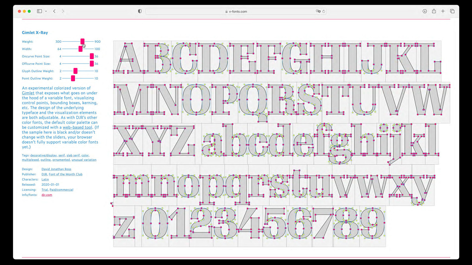
Typo graphy
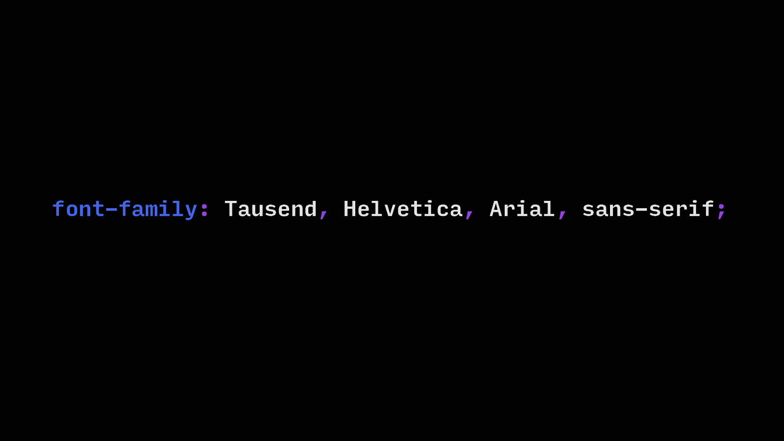
font-family: Tausend, Helvetica, Arial, sans-serif;
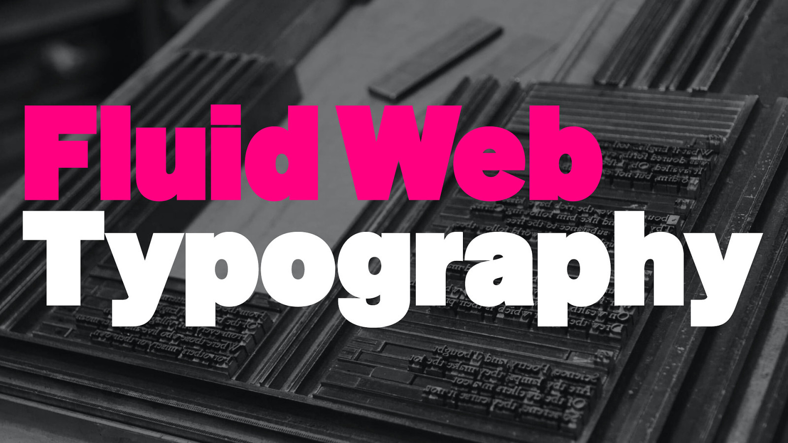
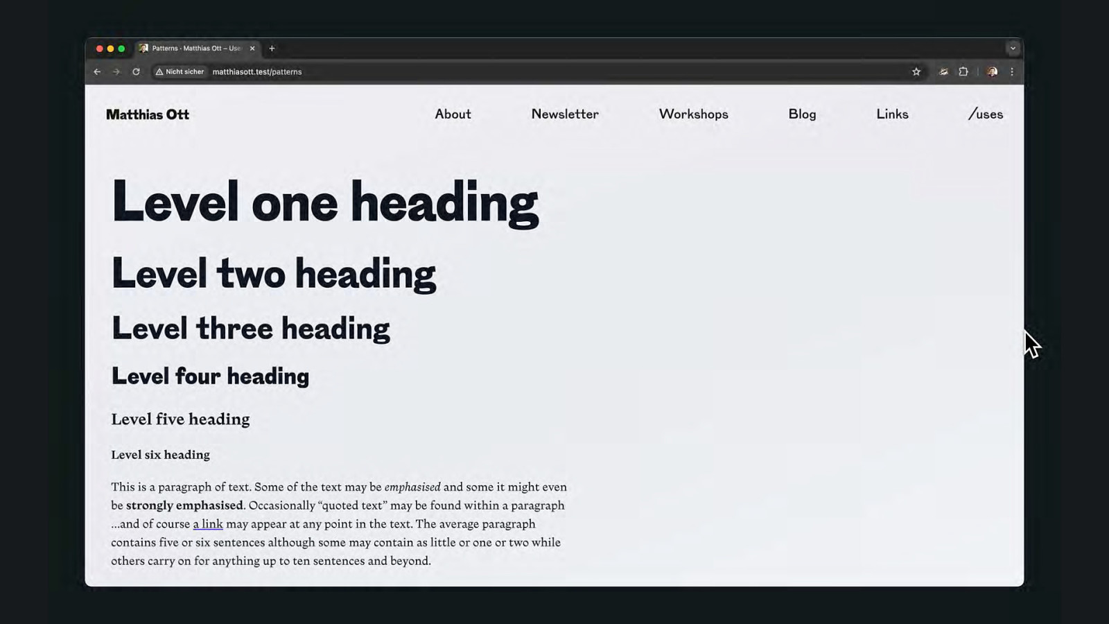
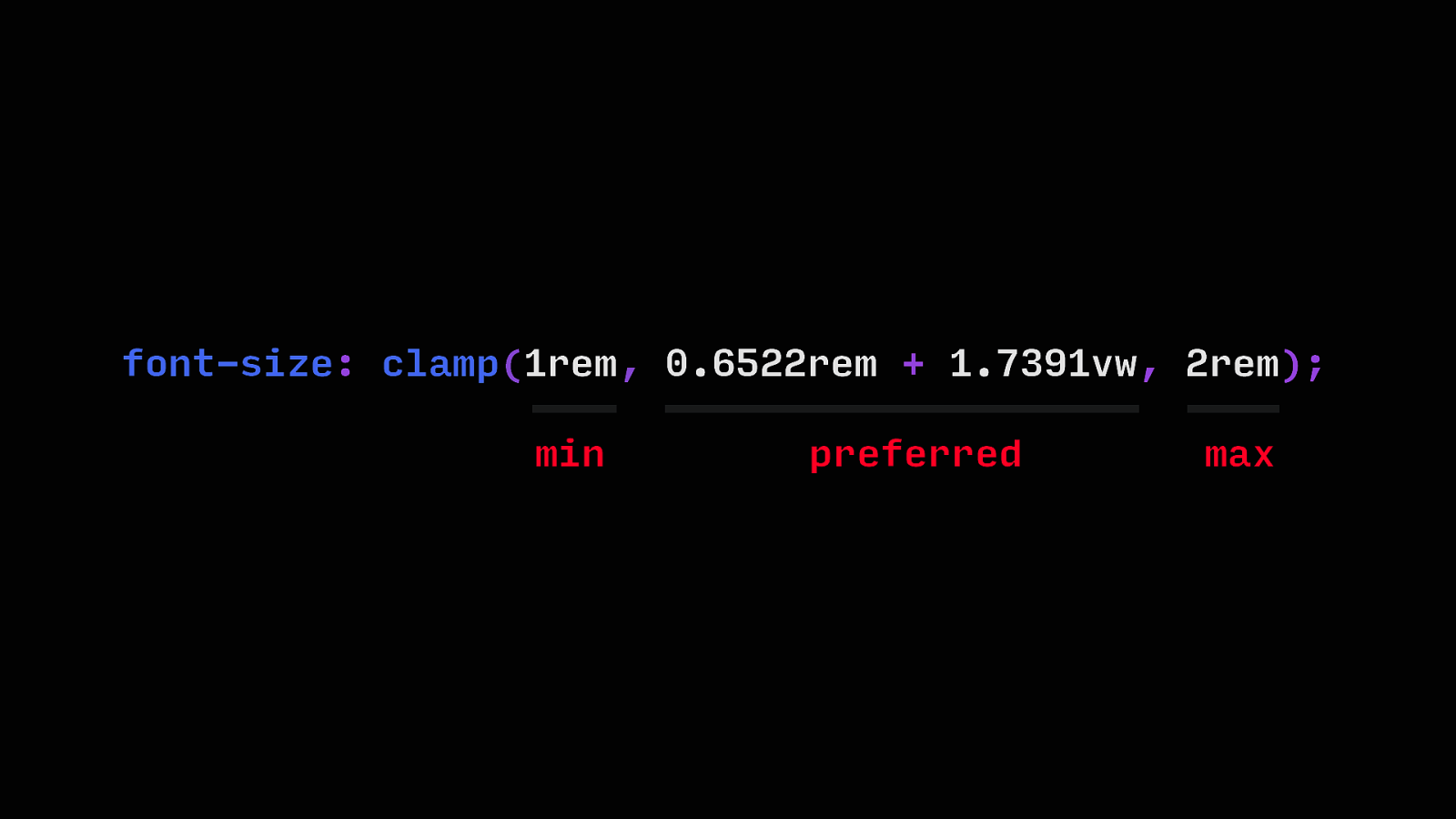
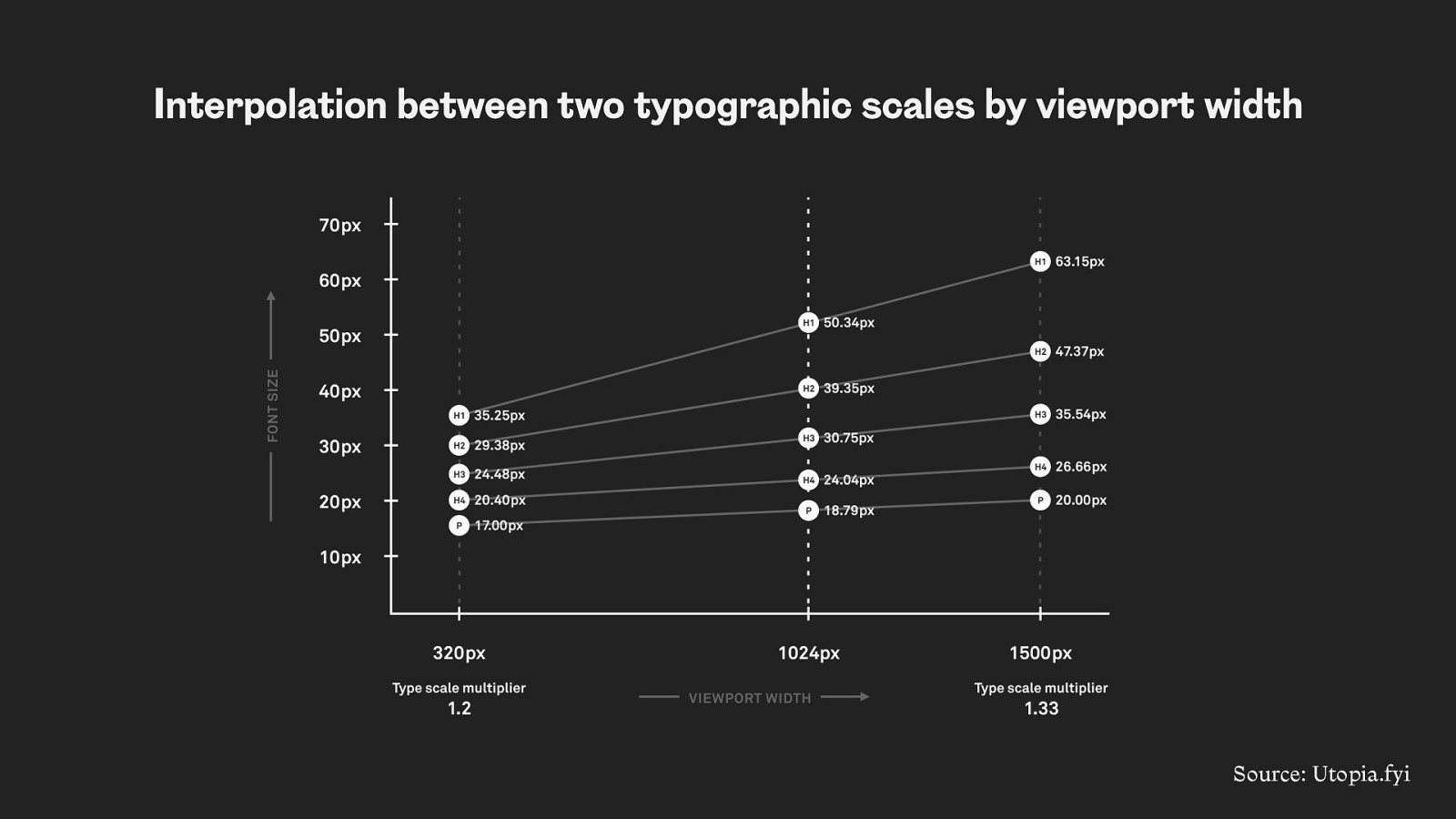
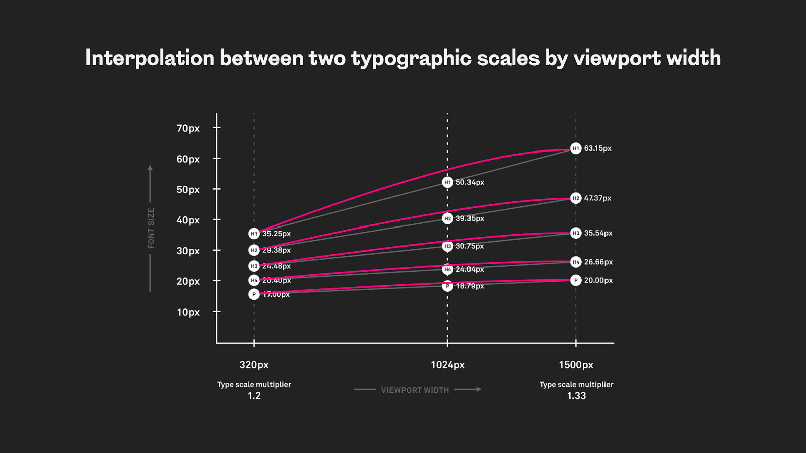
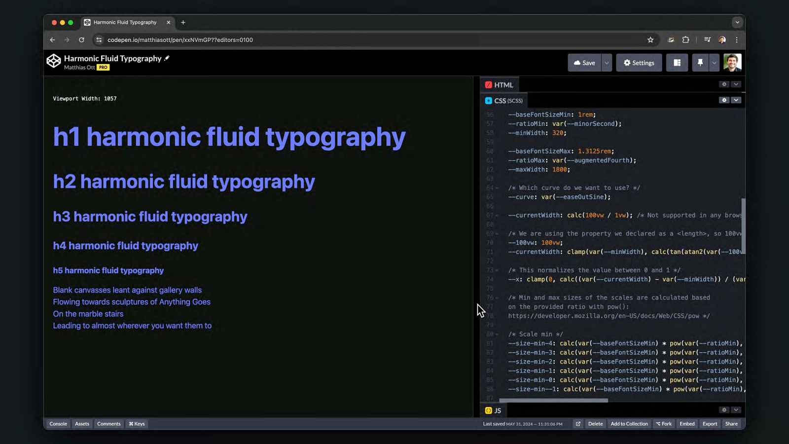
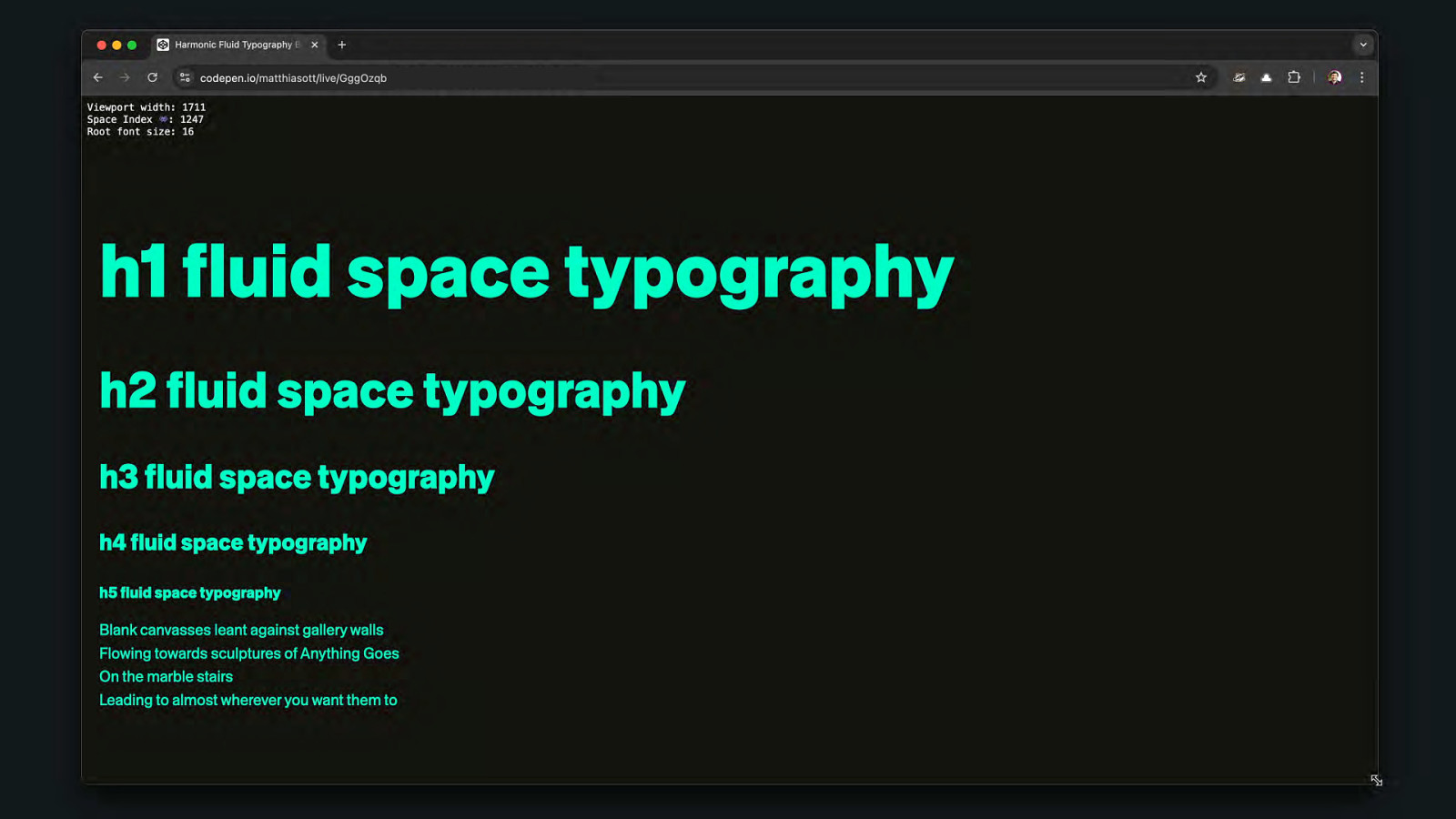
Fluid Web Typography
font-size: clamp(1rem, 0.6522rem + 1.7391vw, 2rem); min preferred max
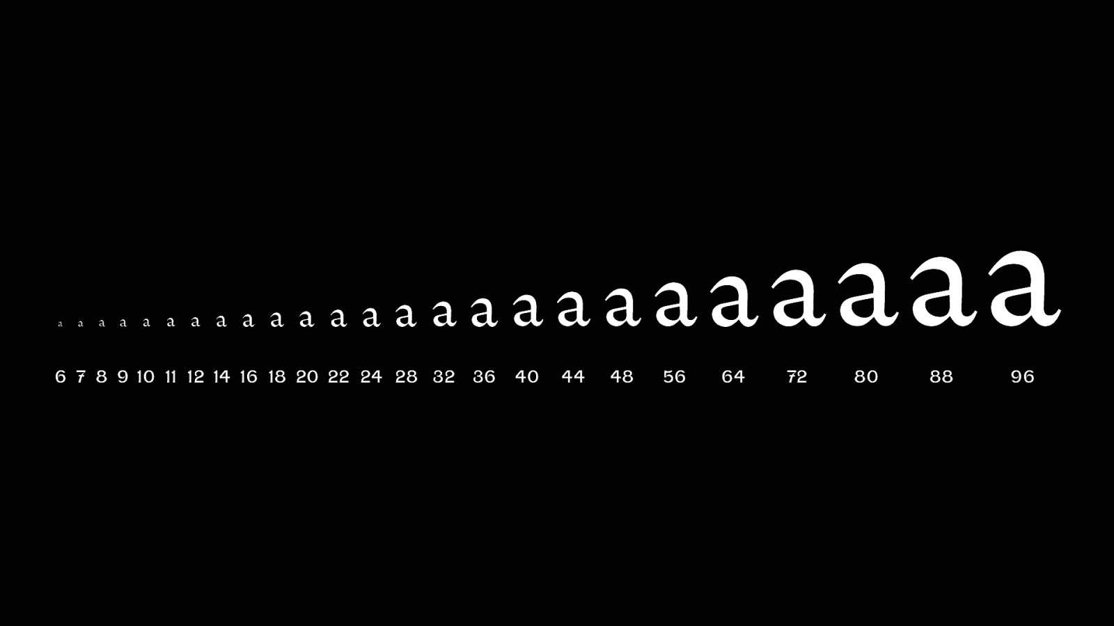
a a a a a a a a a a a a aa aaaaa 6 7 8 9 10 11 12 14 16 18 20 22 24 28 32 36 40 44 48 aaaaa 56 64 72 80 88 a 96
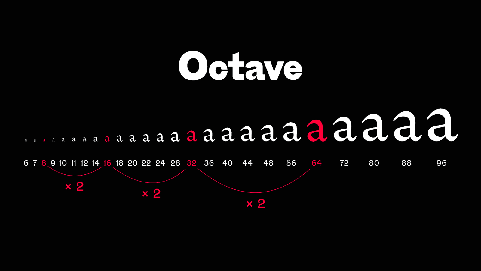
Octave a a a a a a a a a a a a aa aaaaa 6 7 8 9 10 11 12 14 16 18 20 22 24 28 32 ×2 ×2 36 40 44 48 ×2 aaaaa 56 64 72 80 88 a 96
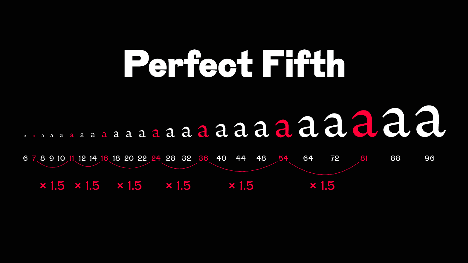
Perfect Fifth a a a a a a a a a a a a aa aaaaa 6 7 8 9 10 11 12 14 16 18 20 22 24 28 32 × 1.5 × 1.5 × 1.5 × 1.5 36 40 44 × 1.5 48 aaaa 54 64 72 × 1.5 81 aa 88 96
Interpolation between two typographic scales by viewport width Source: Utopia.fyi
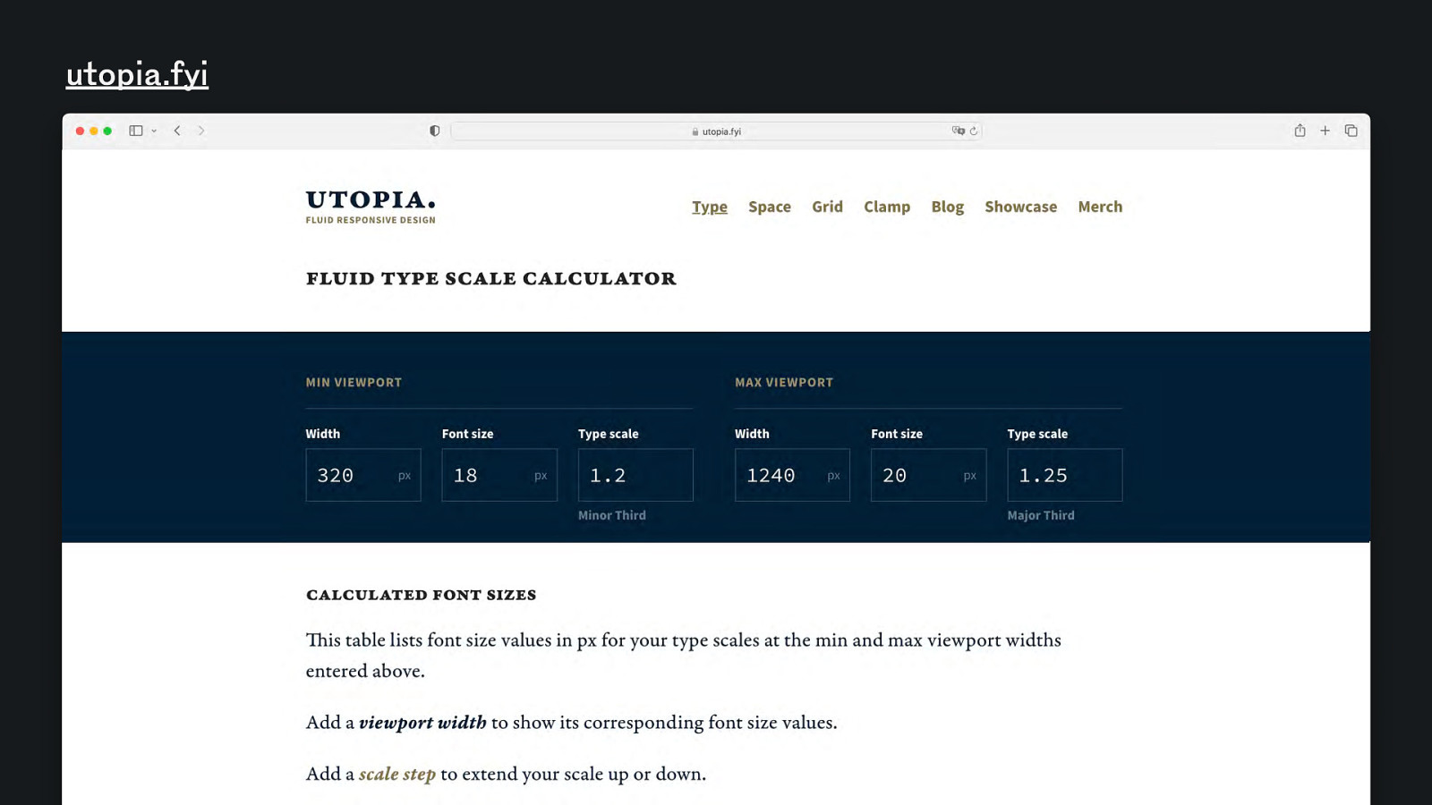
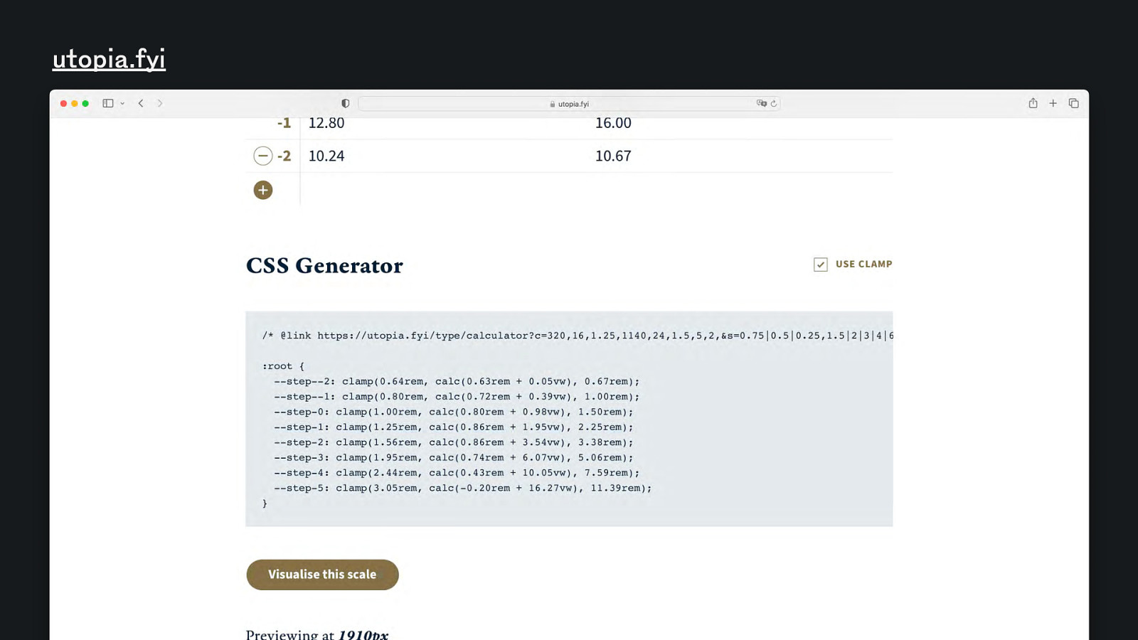
utopia.fyi
utopia.fyi
Interpolation between two typographic scales by viewport width
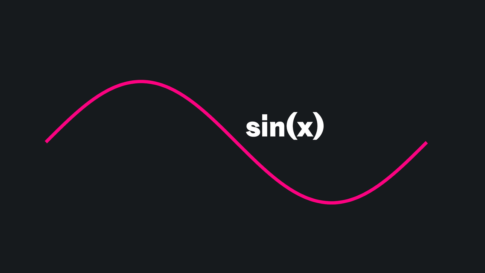
sin(x)
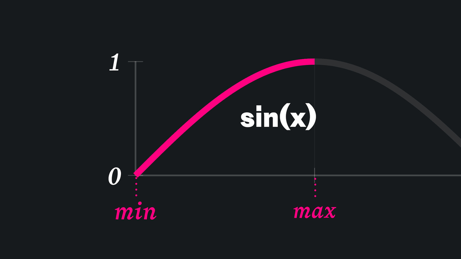
1 sin(x) 0 min max
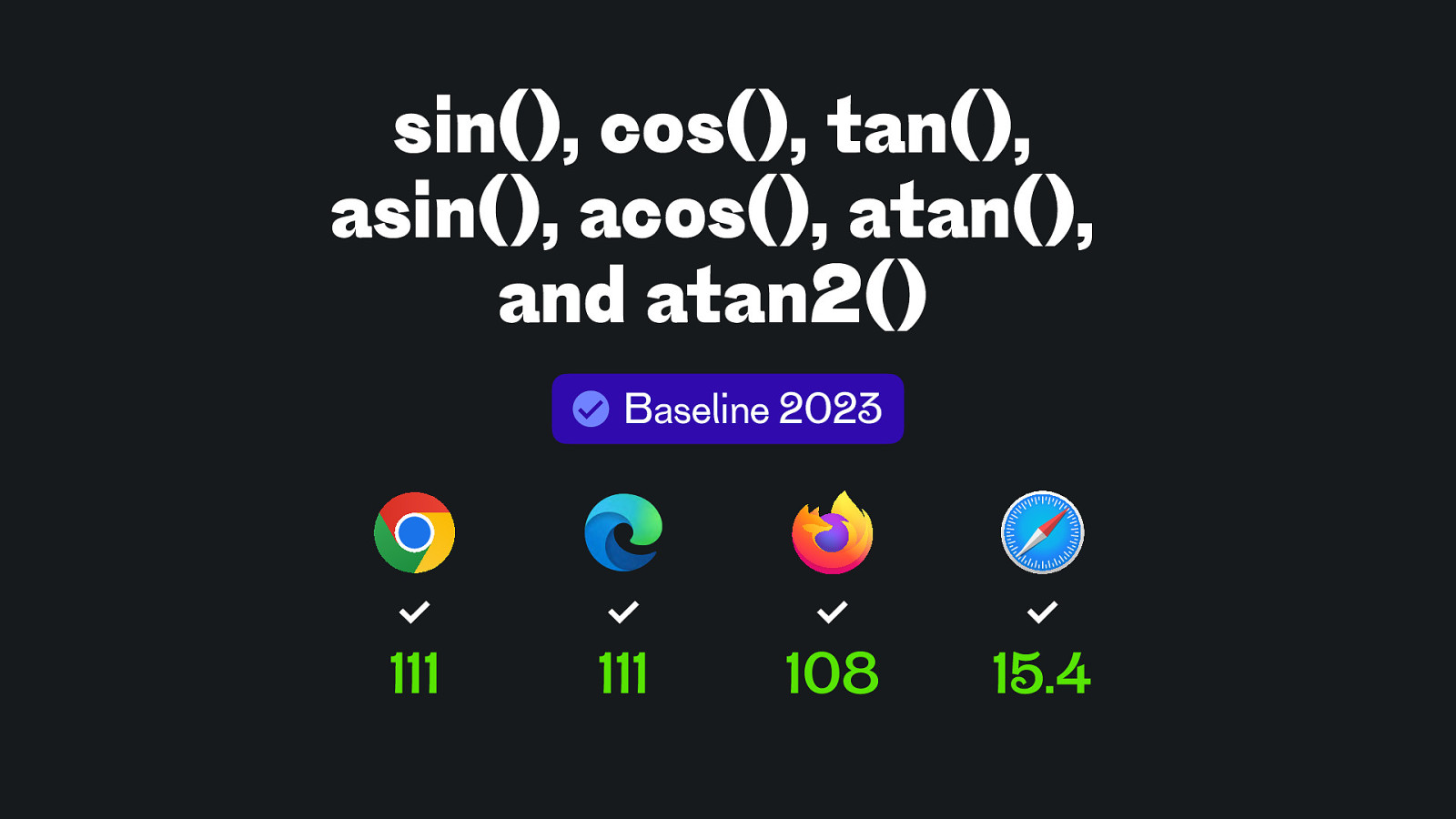
sin(), cos(), tan(), asin(), acos(), atan(), and atan2() Baseline 2023 111 111 108 15.4
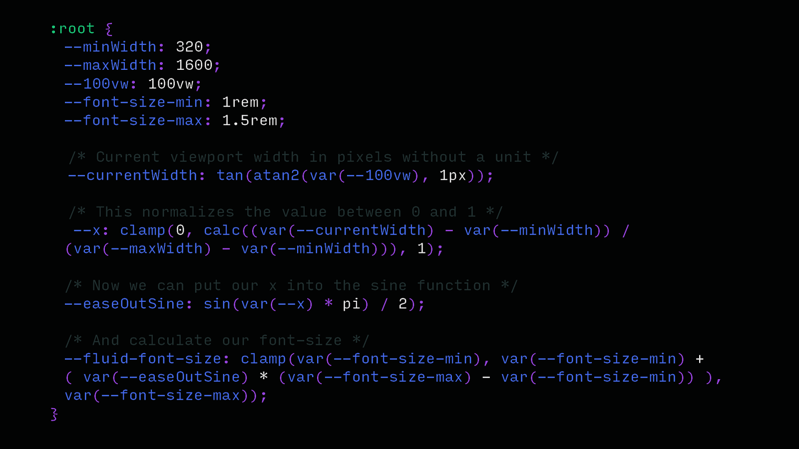
:root { —minWidth: 320; —maxWidth: 1600; —100vw: 100vw; —font-size-min: 1rem; —font-size-max: 1.5rem; /* Current viewport width in pixels without a unit / —currentWidth: tan(atan2(var(—100vw), 1px)); / This normalizes the value between 0 and 1 / —x: clamp(0, calc((var(—currentWidth) - var(—minWidth)) / (var(—maxWidth) - var(—minWidth))), 1); / Now we can put our x into the sine function / —easeOutSine: sin(var(—x) * pi) / 2); / And calculate our font-size */ —fluid-font-size: clamp(var(—font-size-min), var(—font-size-min) + ( var(—easeOutSine) * (var(—font-size-max) - var(—font-size-min)) ), var(—font-size-max)); }
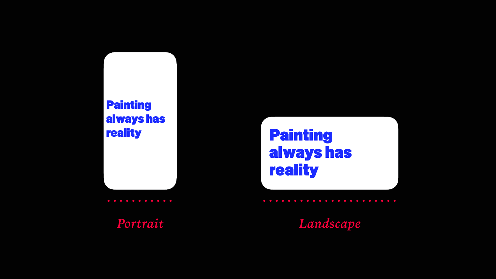
Painting always has reality Portrait Painting always has reality Landscape
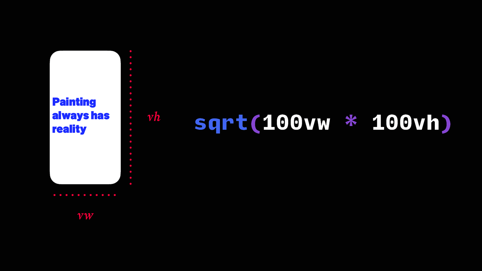
Painting always has reality vw vh sqrt(100vw * 100vh)
Painting always has reality vw vh
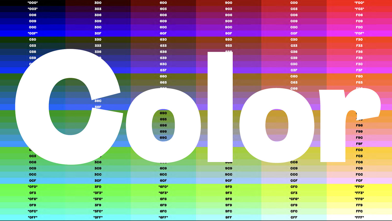
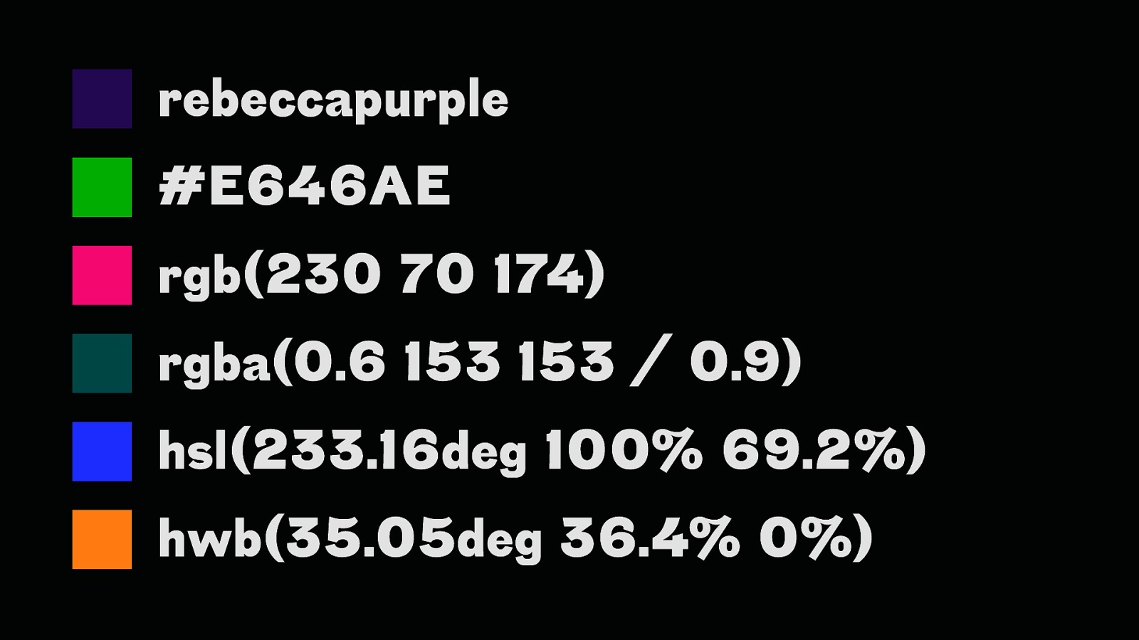
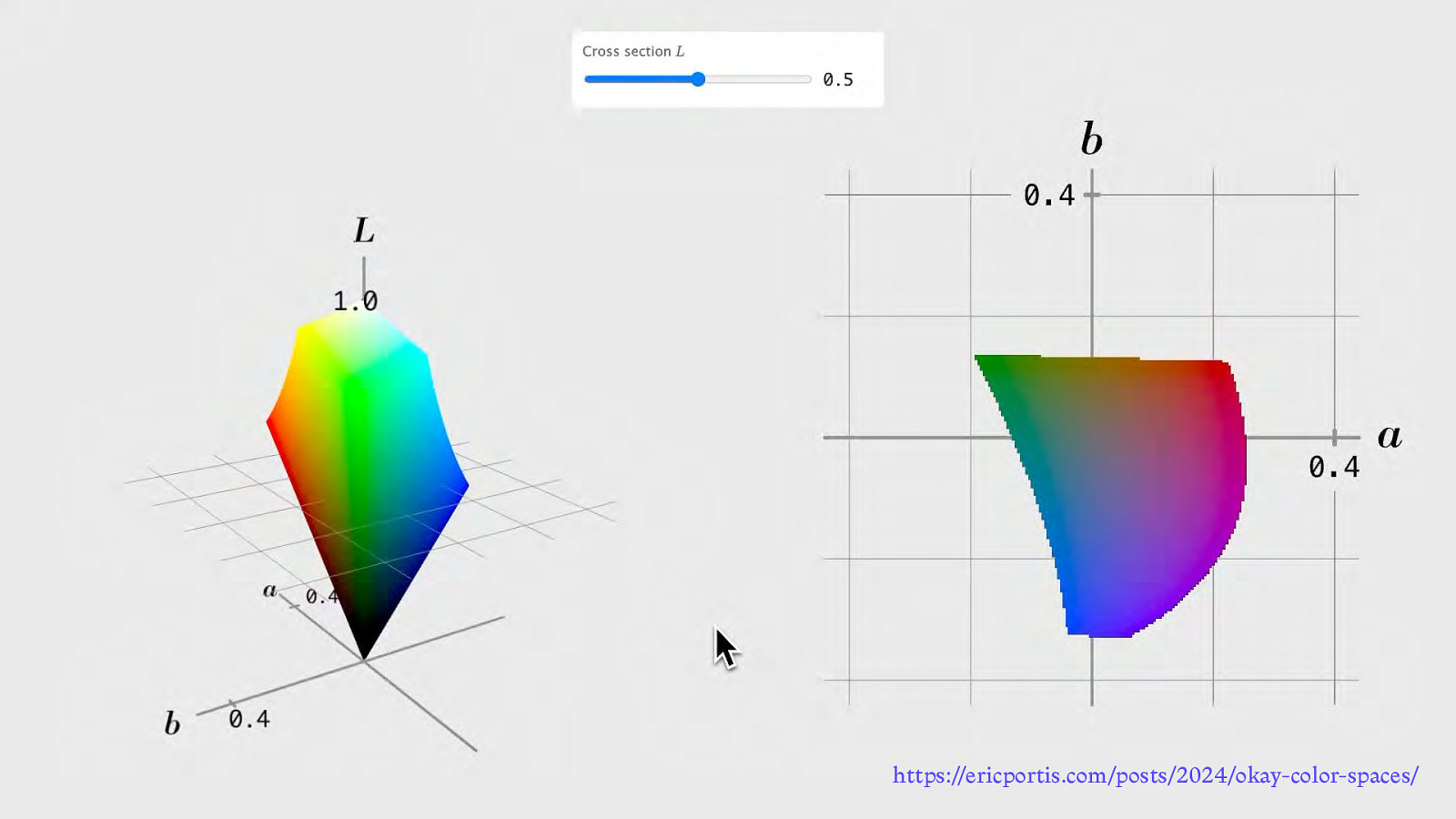
Color
rebeccapurple #E646AE rgb(230 70 174) rgba(0.6 153 153 / 0.9) hsl(233.16deg 100% 69.2%) hwb(35.05deg 36.4% 0%)
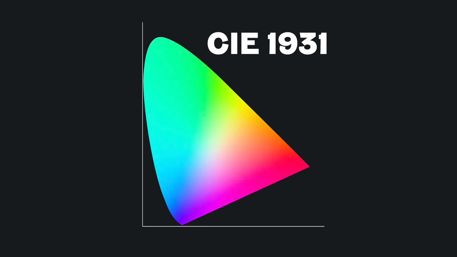
CIE 1931
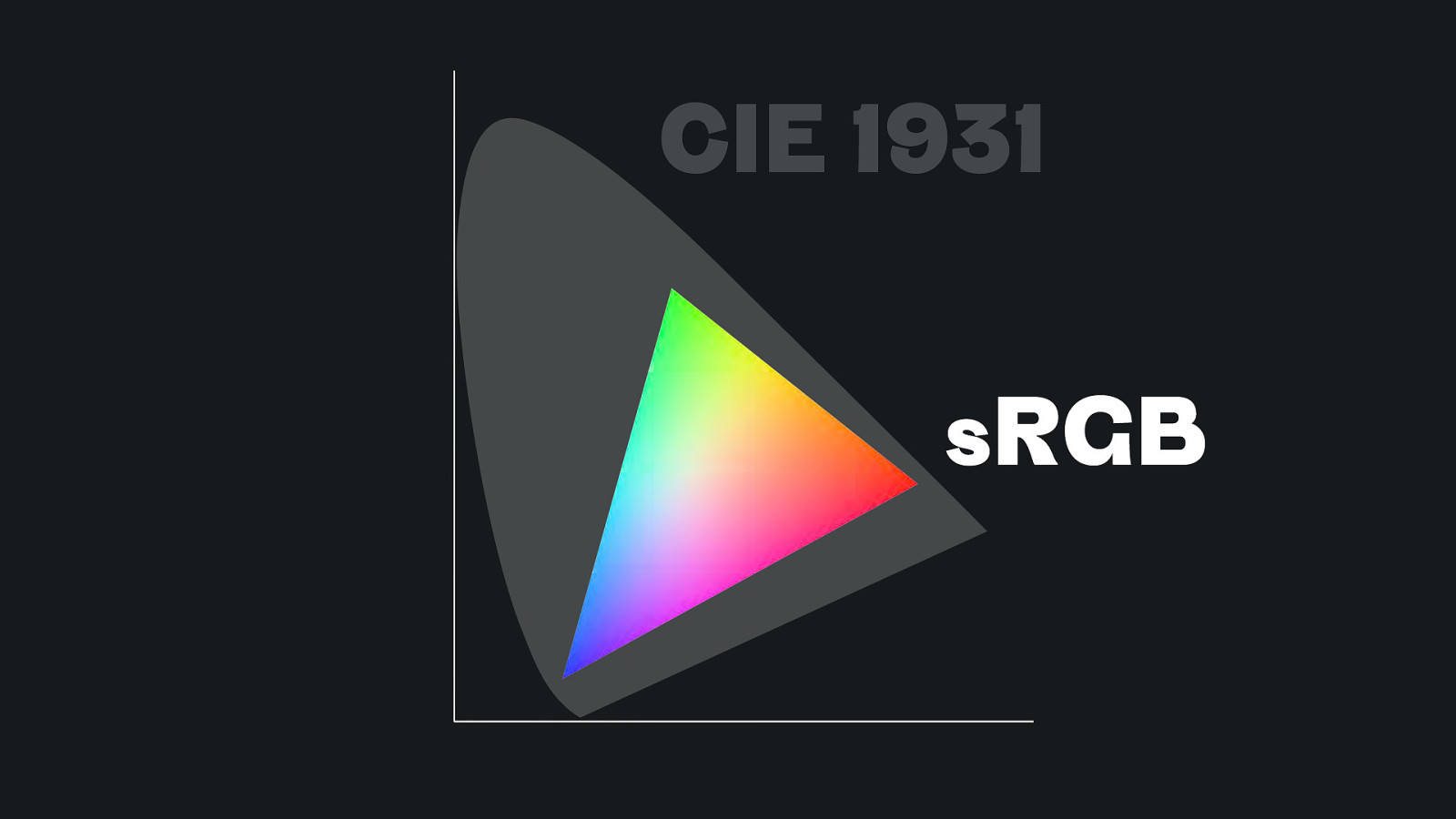
CIE 1931 sRGB
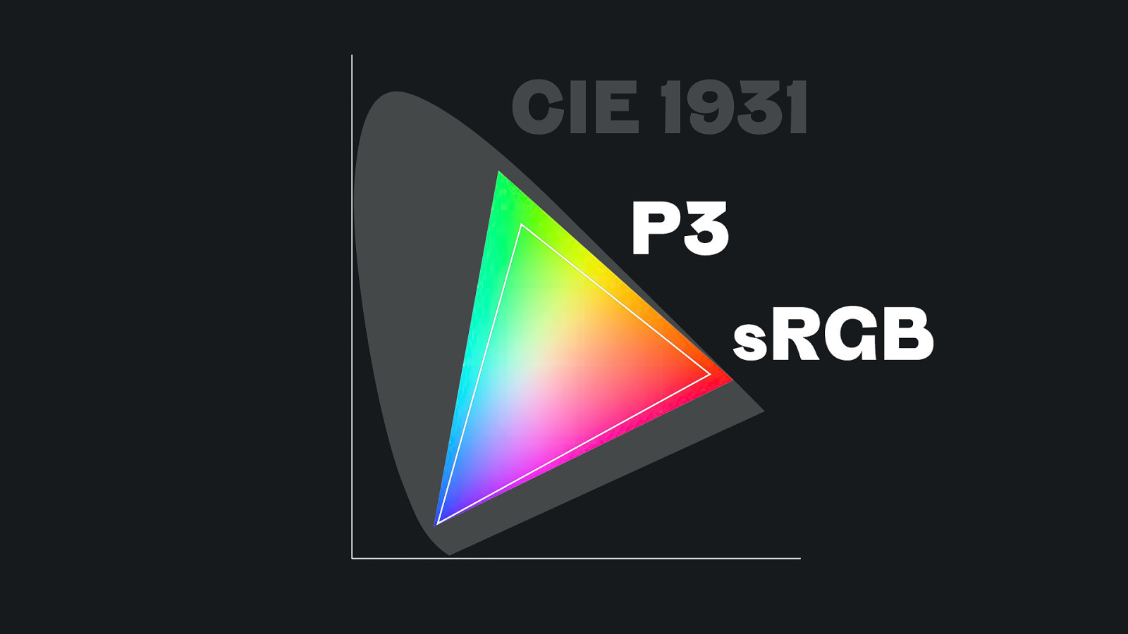
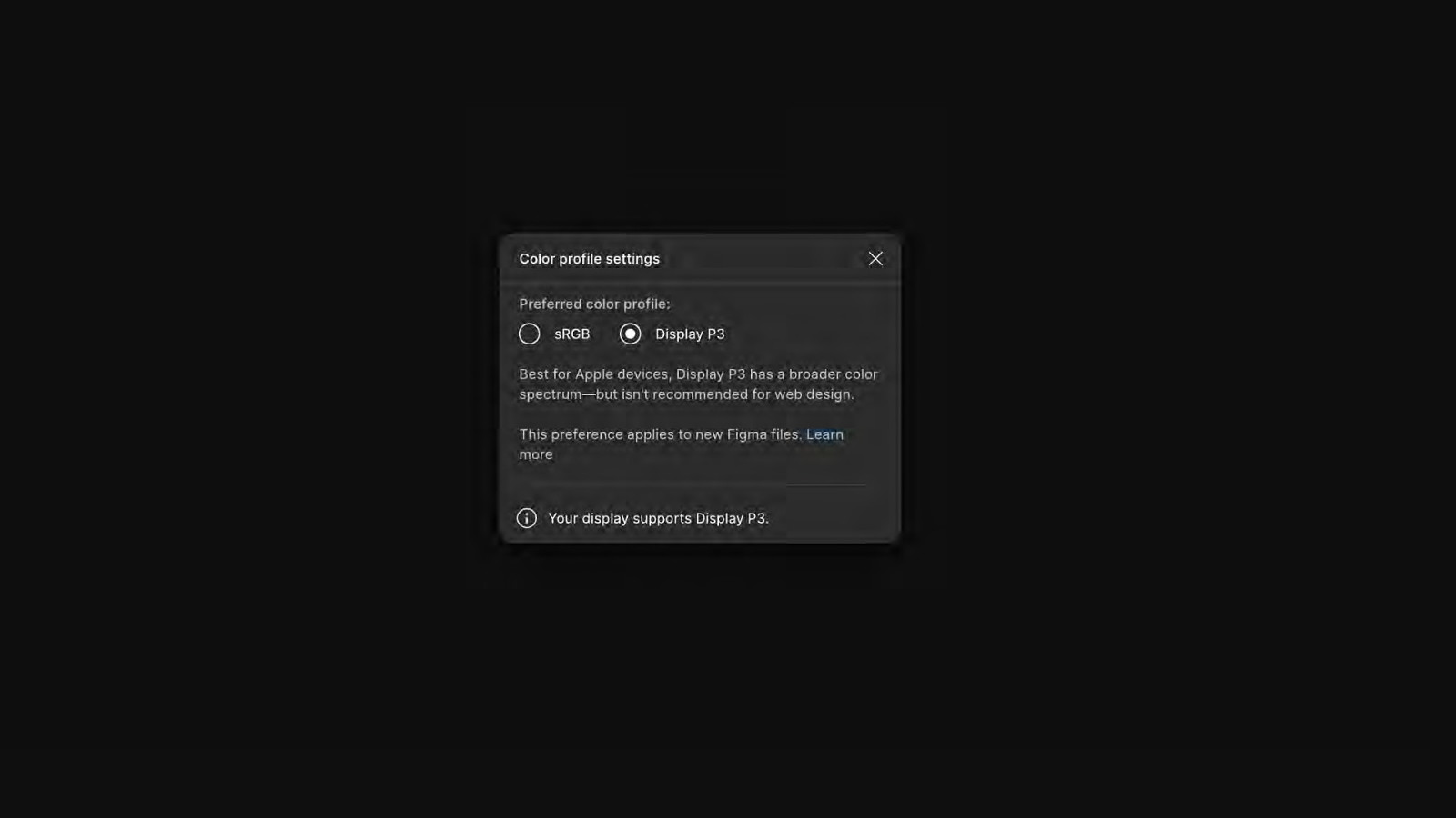
CIE 1931 P3 sRGB
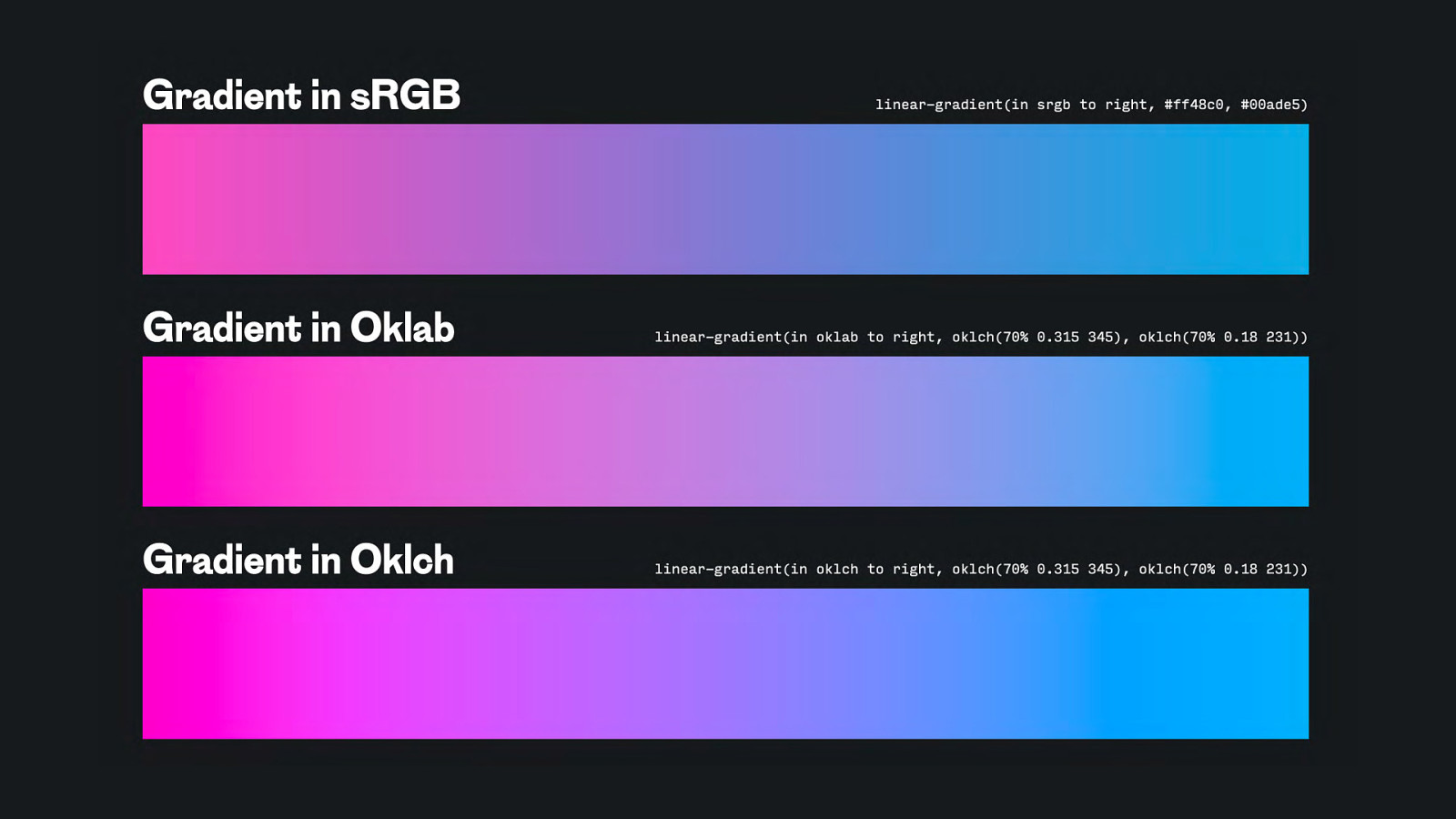
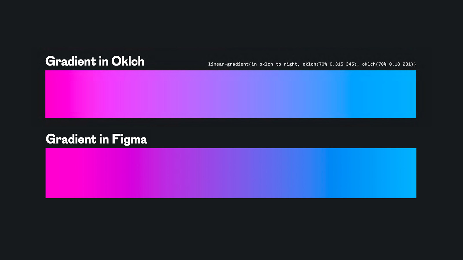
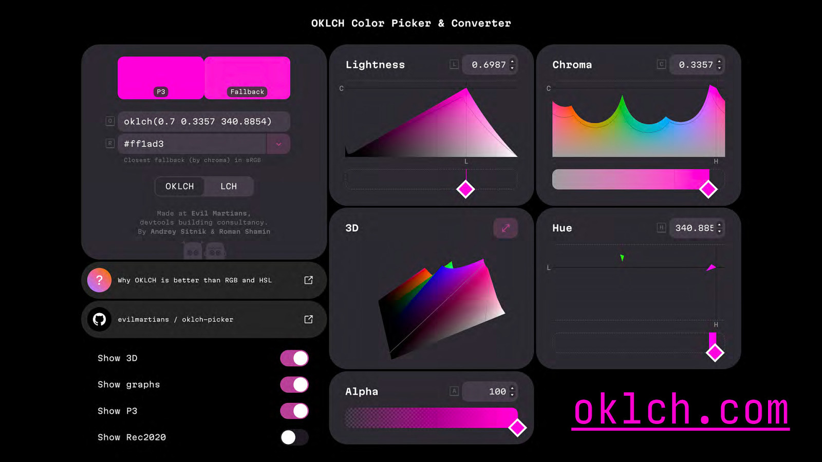
oklch
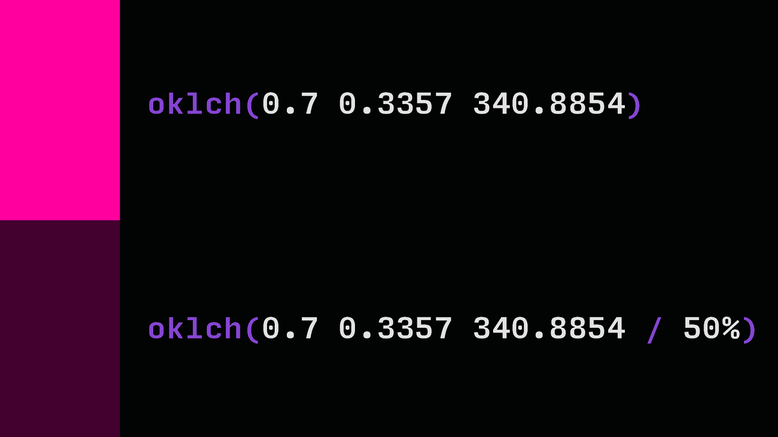
oklch(0.7 0.3357 340.8854) oklch(0.7 0.3357 340.8854 / 50%)
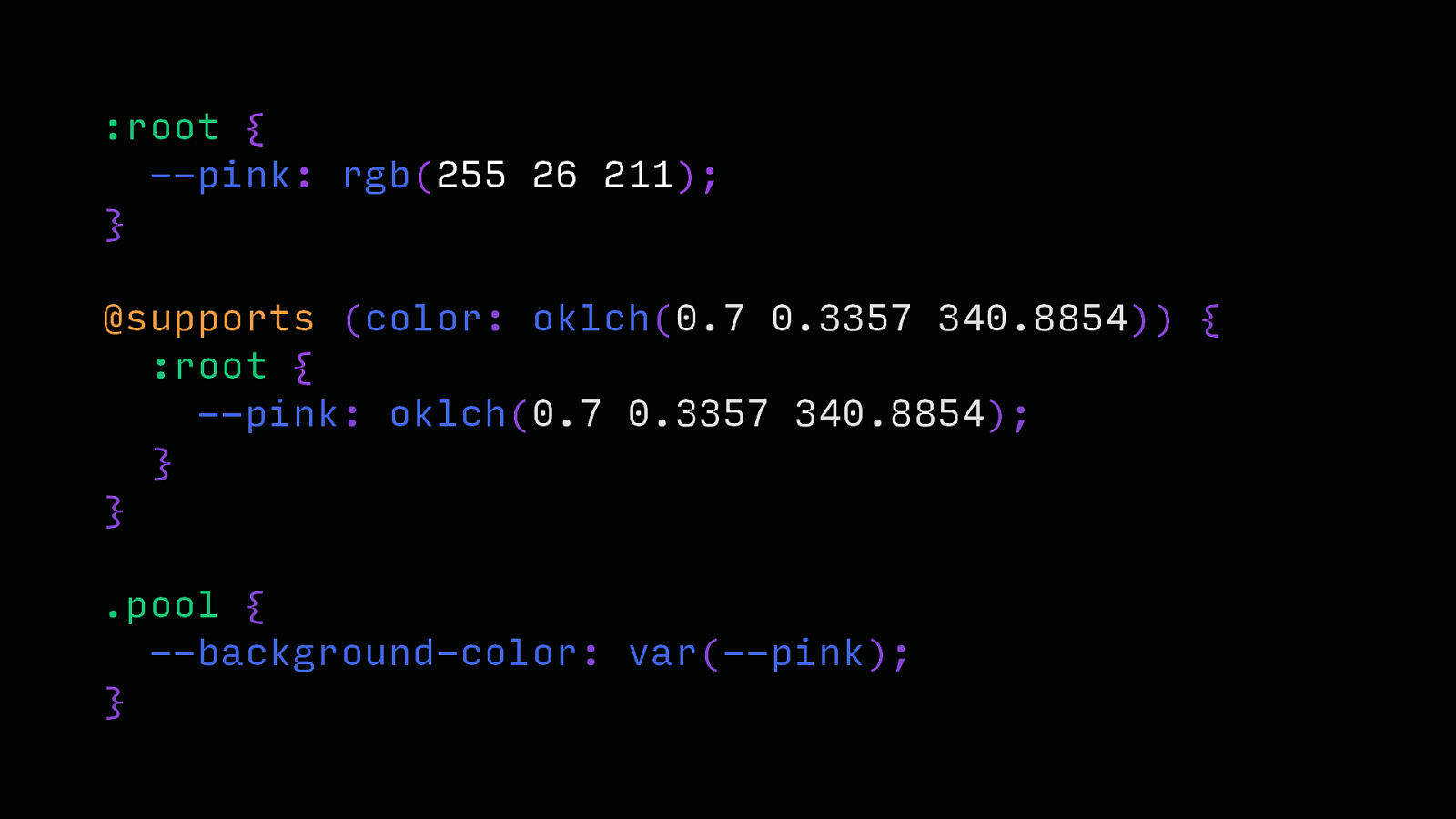
:root { —pink: rgb(255 26 211); } @supports (color: oklch(0.7 0.3357 340.8854)) { :root { —pink: oklch(0.7 0.3357 340.8854); } } .pool { —background-color: var(—pink); }
oklch.com
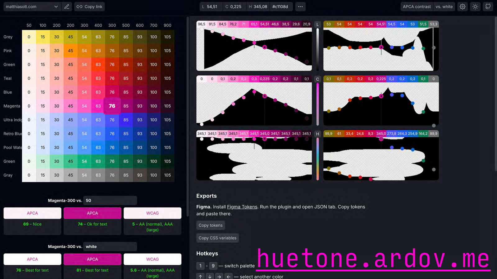
huetone.ardov.me
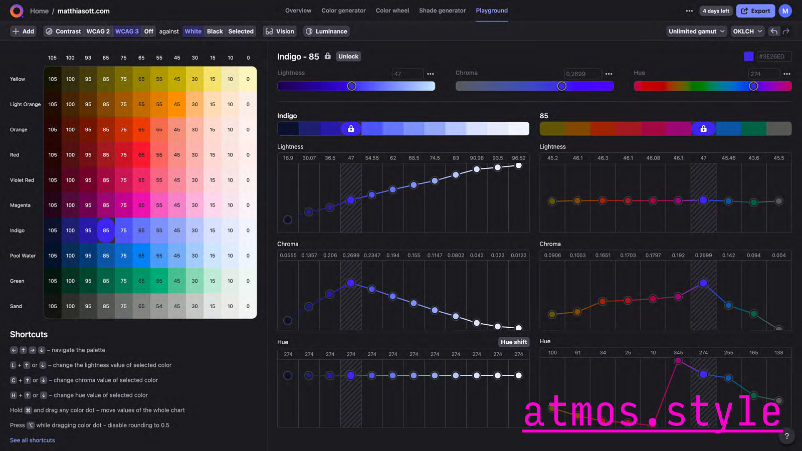
atmos.style https://huetone.ardov.me/
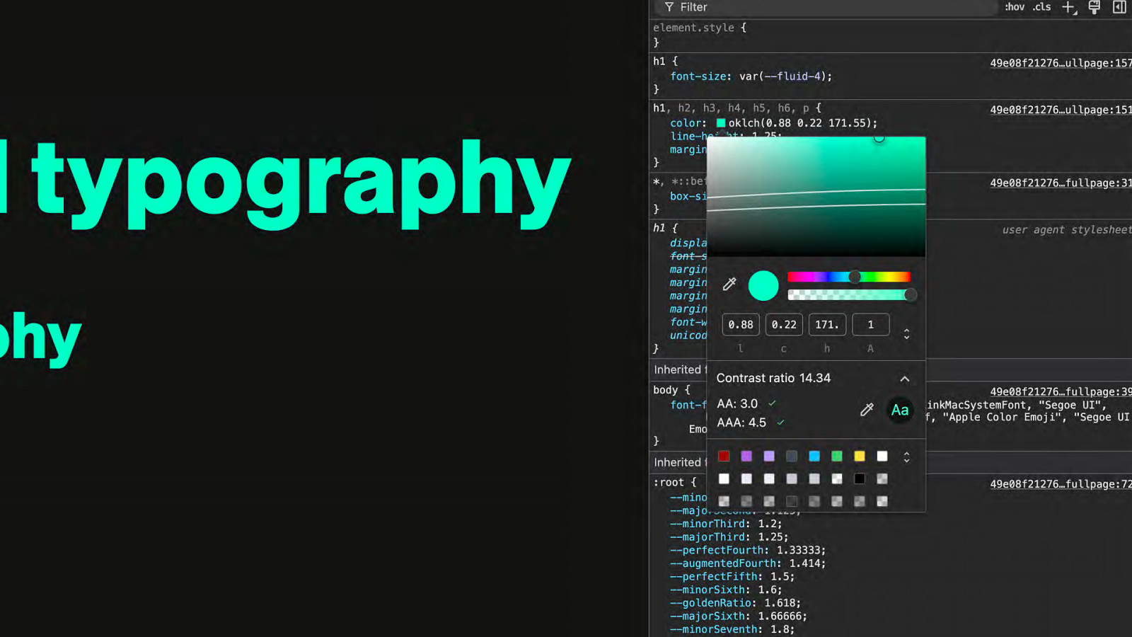
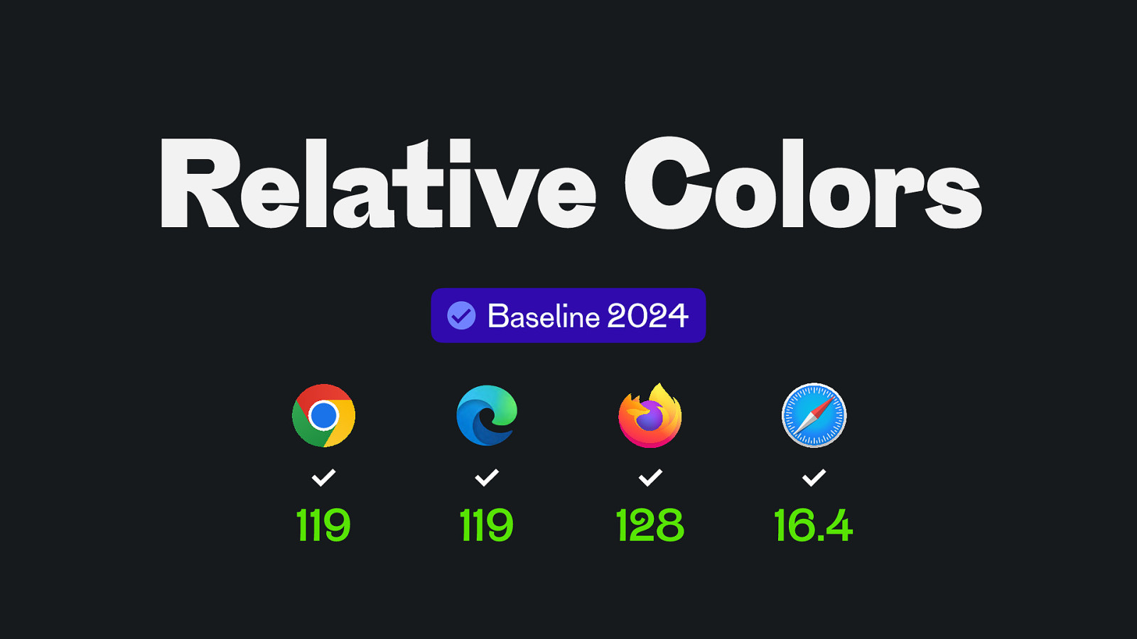
Relative Colors Baseline 2024 119 119 128 16.4
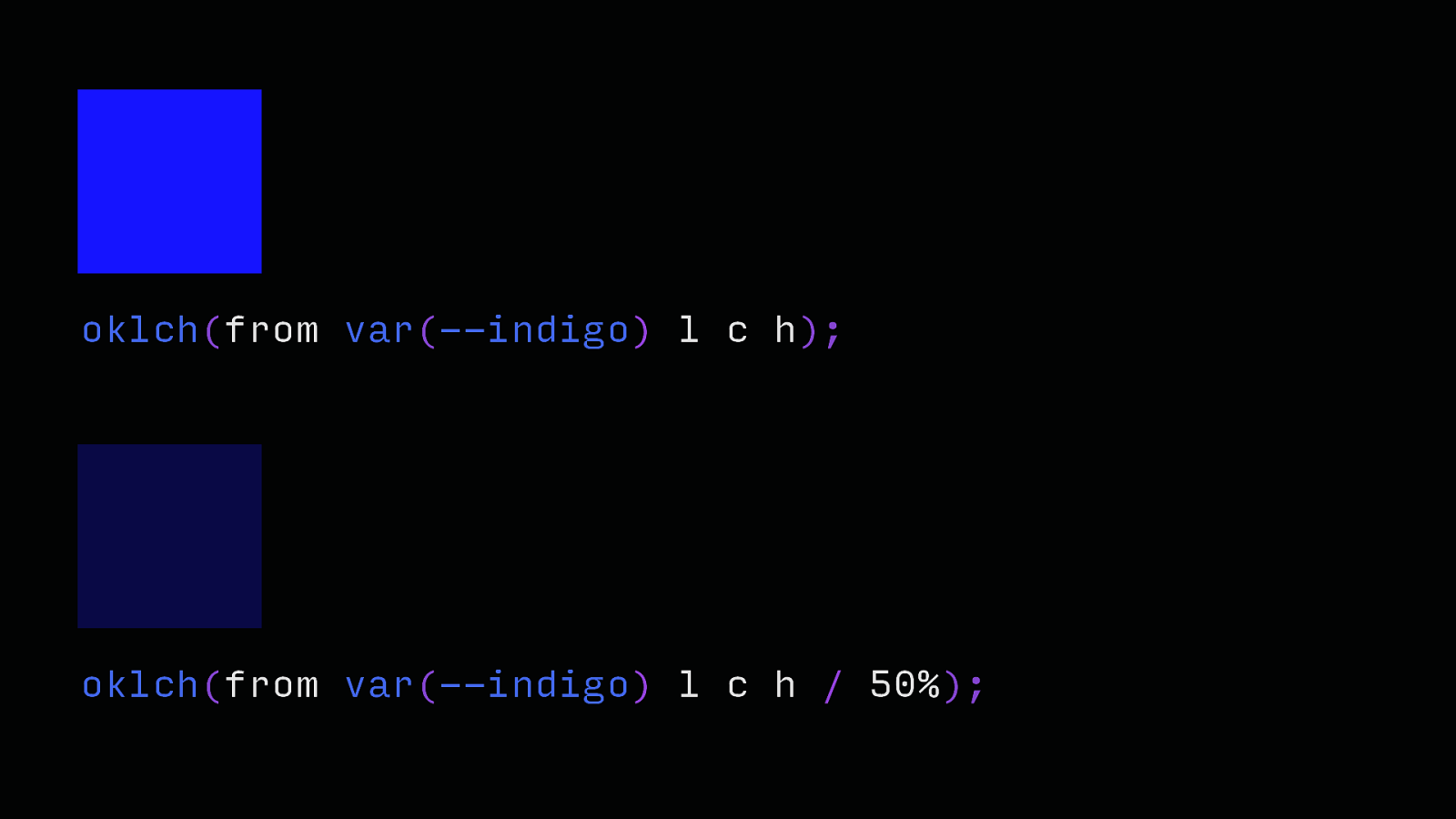
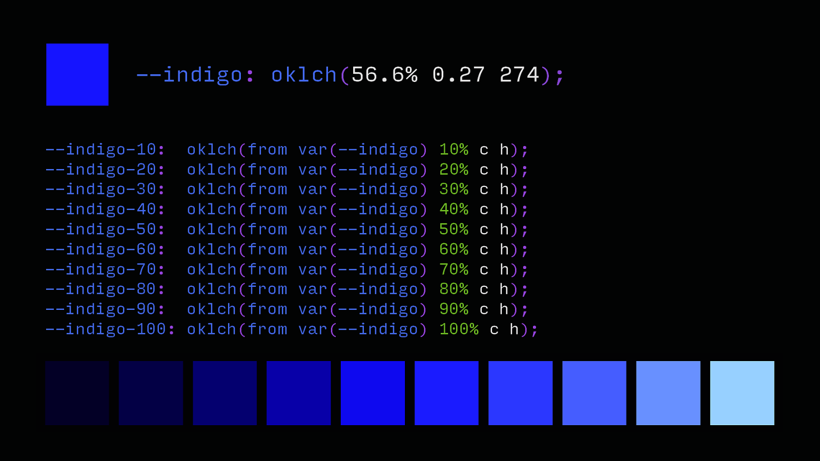
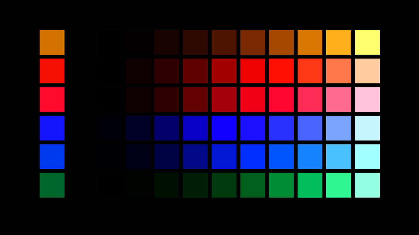
oklch(from var(—indigo) l c h); oklch(from var(—indigo) l c h / 50%);
—indigo: oklch(56.6% 0.27 274); —indigo-10: —indigo-20: —indigo-30: —indigo-40: —indigo-50: —indigo-60: —indigo-70: —indigo-80: —indigo-90: —indigo-100: oklch(from oklch(from oklch(from oklch(from oklch(from oklch(from oklch(from oklch(from oklch(from oklch(from var(—indigo) var(—indigo) var(—indigo) var(—indigo) var(—indigo) var(—indigo) var(—indigo) var(—indigo) var(—indigo) var(—indigo) 10% c h); 20% c h); 30% c h); 40% c h); 50% c h); 60% c h); 70% c h); 80% c h); 90% c h); 100% c h);
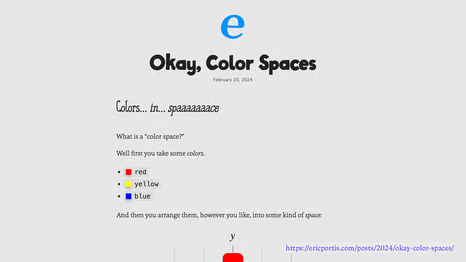
https://ericportis.com/posts/2024/okay-color-spaces/
https://ericportis.com/posts/2024/okay-color-spaces/
Layout
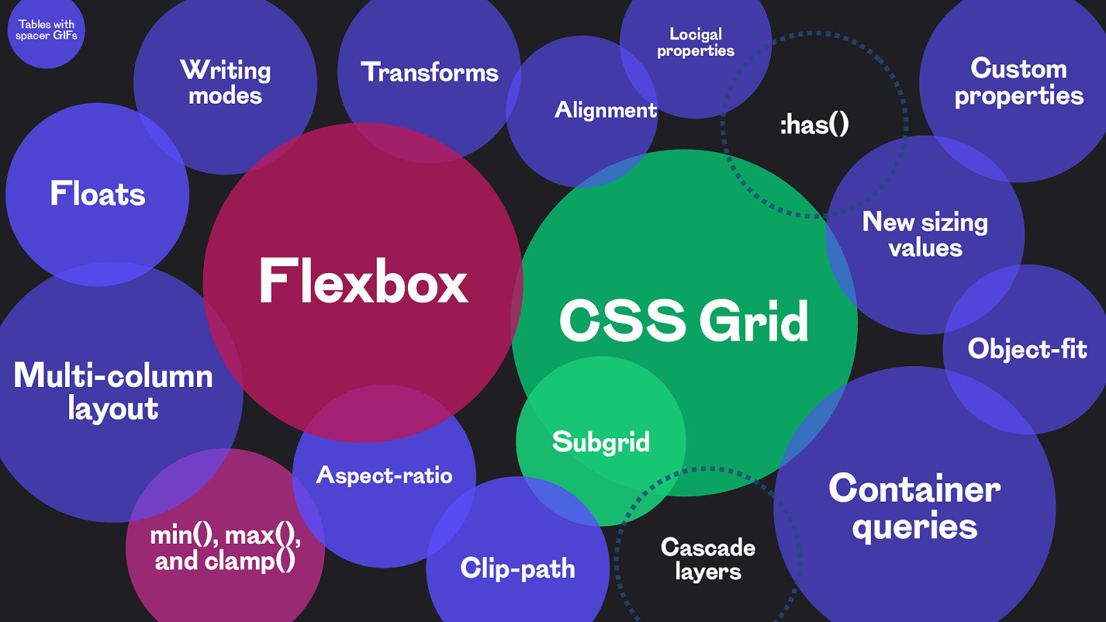
Tables with spacer GIFs Writing modes Transforms Locigal properties Alignment :has() Floats Flexbox Multi-column layout Aspect-ratio min(), max(), and clamp() Custom properties New sizing values CSS Grid Subgrid Clip-path Cascade layers Object-fit Container queries
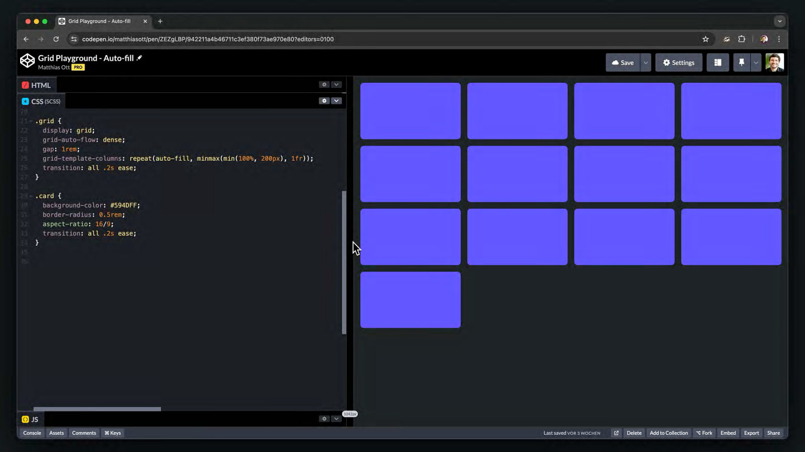
CSS Grid
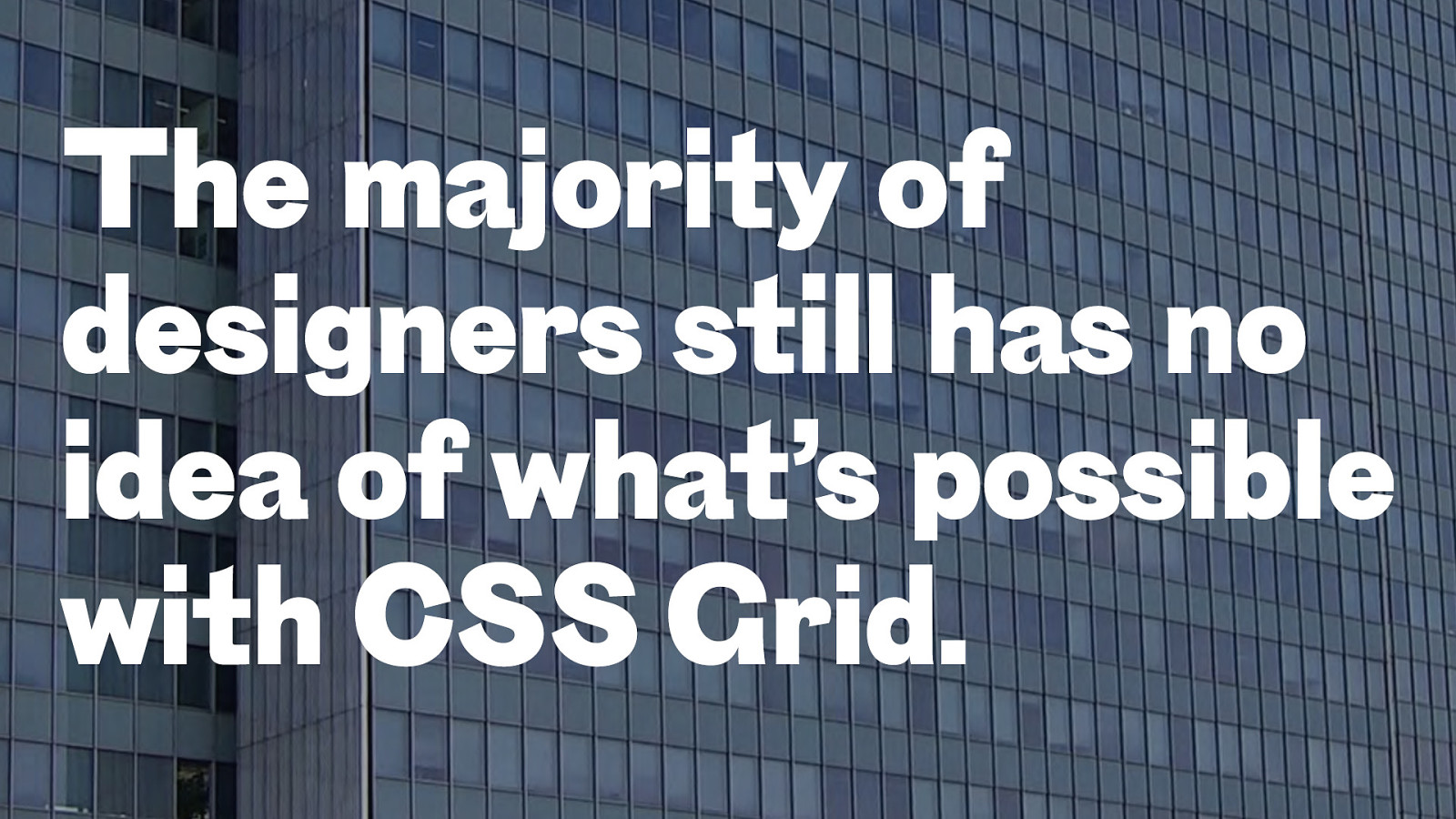
The majority of designers still has no idea of what’s possible with CSS Grid.
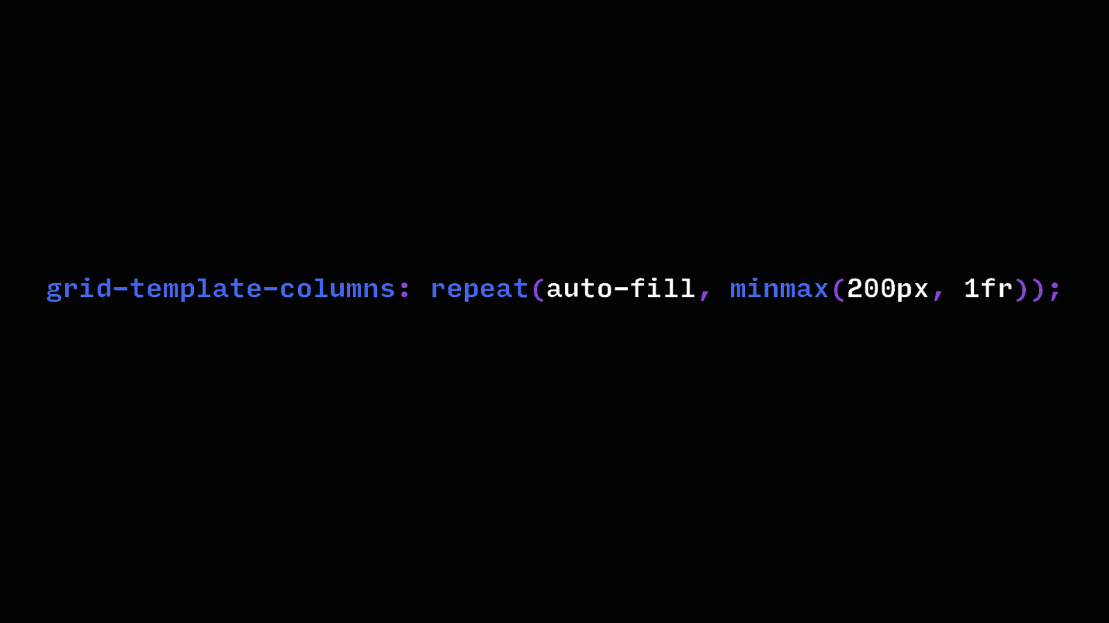
grid-template-columns: repeat(auto-fill, minmax(200px, 1fr));
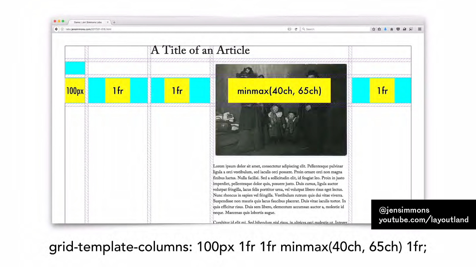
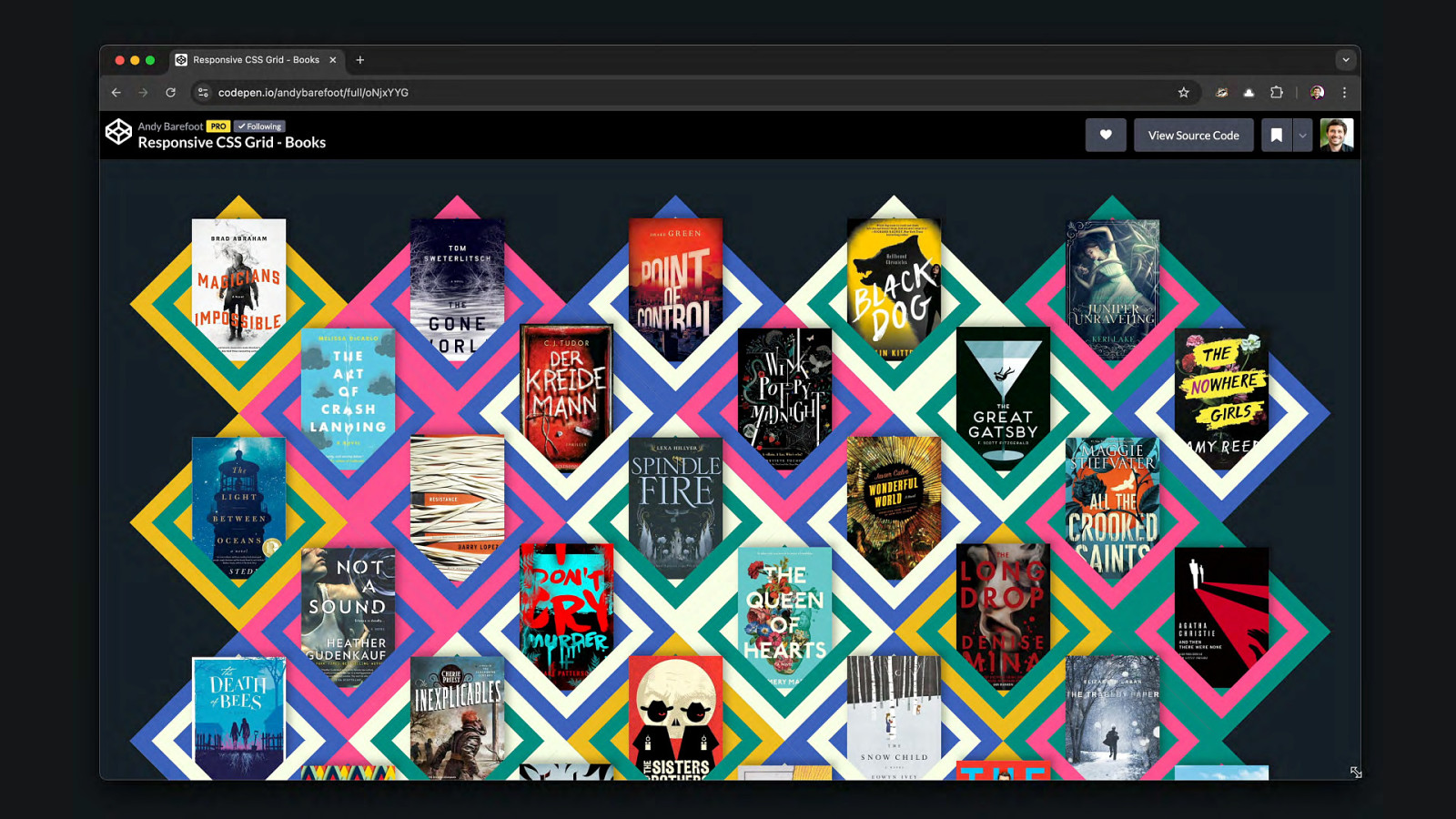
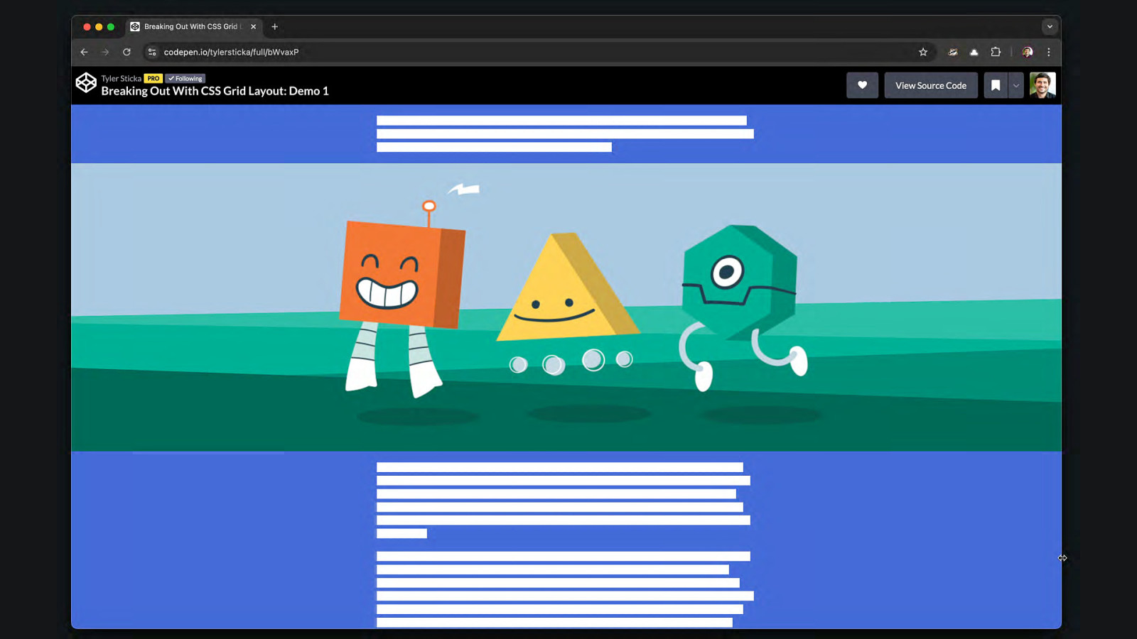
Example: CSS Grid @jensimmons youtube.com/layoutland
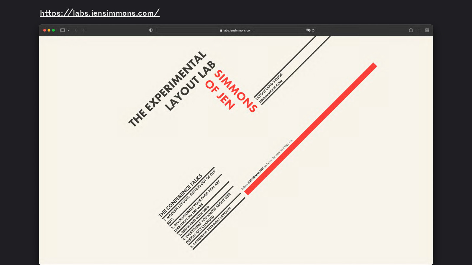
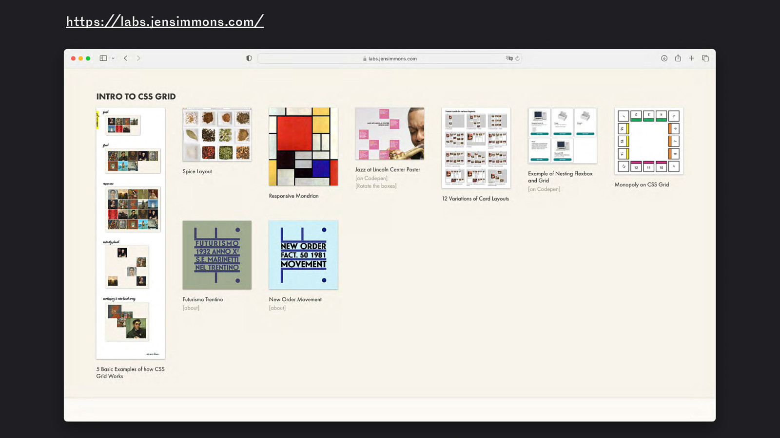
https://labs.jensimmons.com/
https://labs.jensimmons.com/ Example: CSS Grid
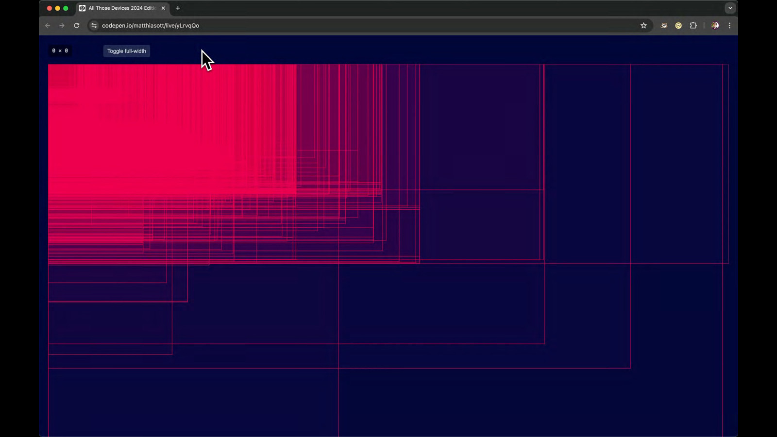
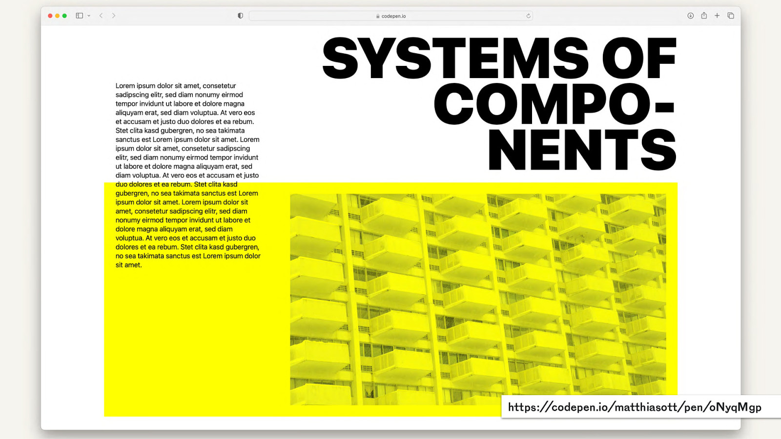
https://codepen.io/matthiasott/pen/oNyqMgp
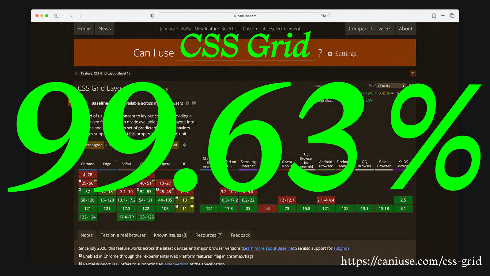
CSS Grid 99.63 % https://caniuse.com/css-grid
Subgrid
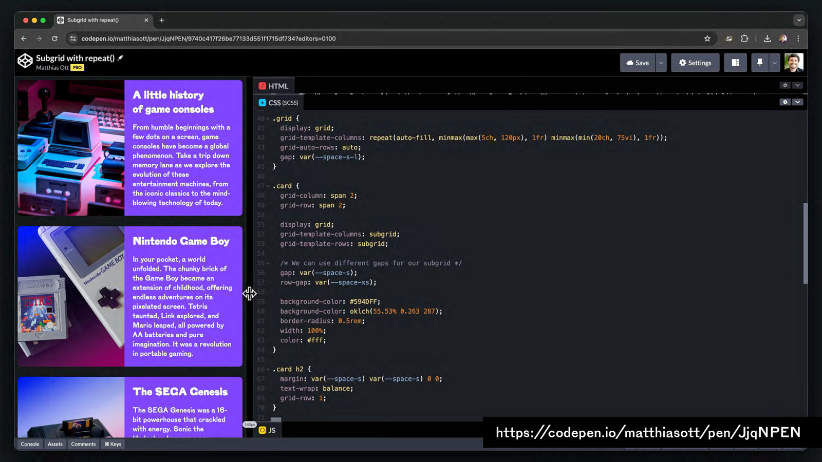
https://codepen.io/matthiasott/pen/JjqNPEN
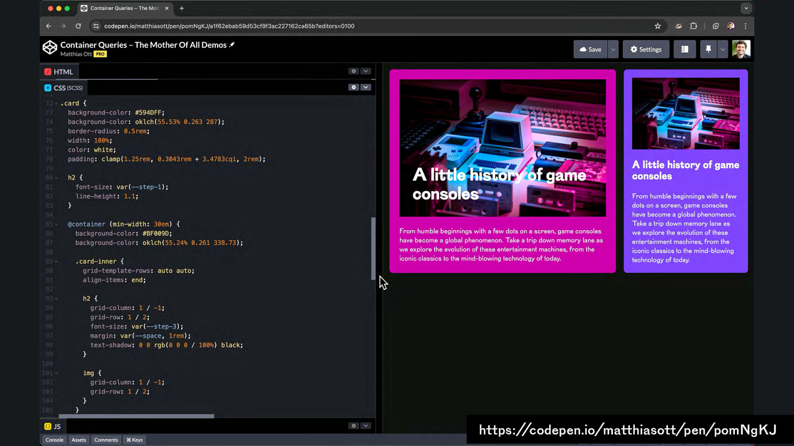
Container Queries
https://codepen.io/matthiasott/pen/pomNgKJ
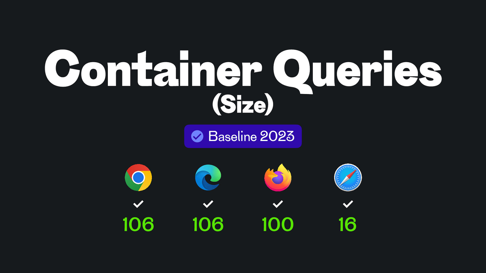
Container Queries (Size) Baseline 2023 106 106 100 16
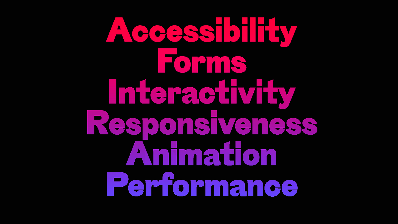
Accessibility Forms Interactivity Responsiveness Animation Performance
What is our toolset?
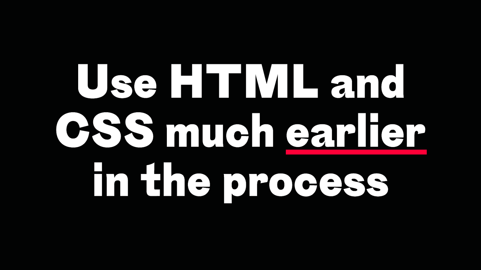
Use HTML and CSS much earlier in the process
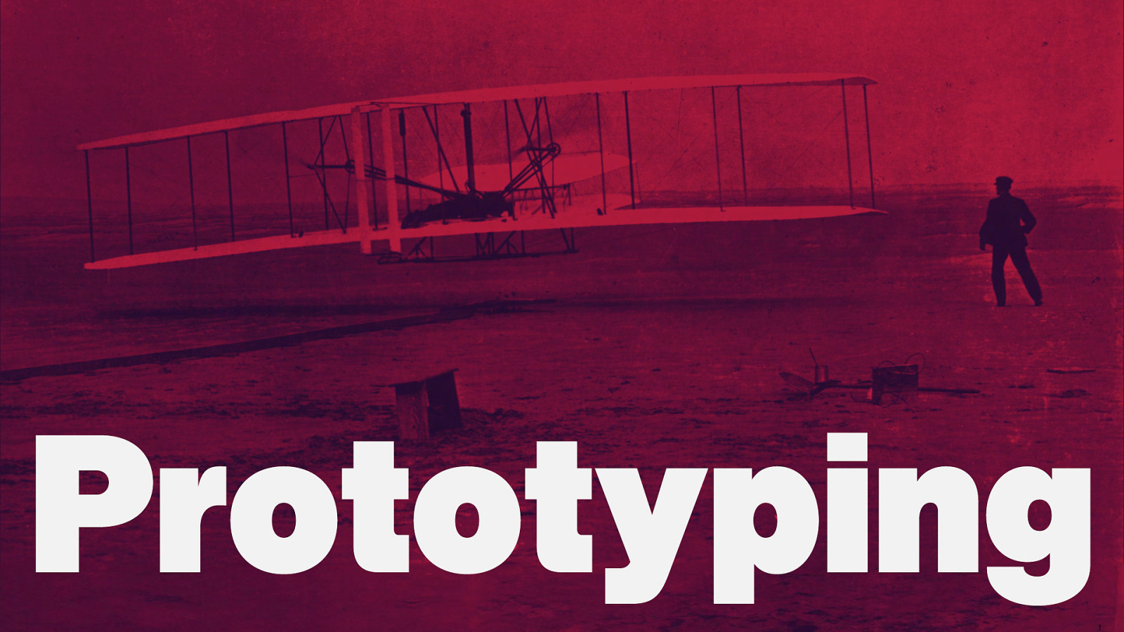
Prototyping
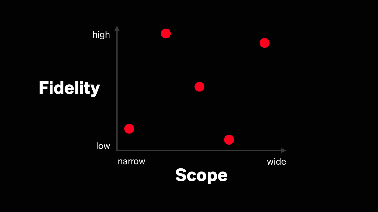
high Fidelity low narrow Scope wide
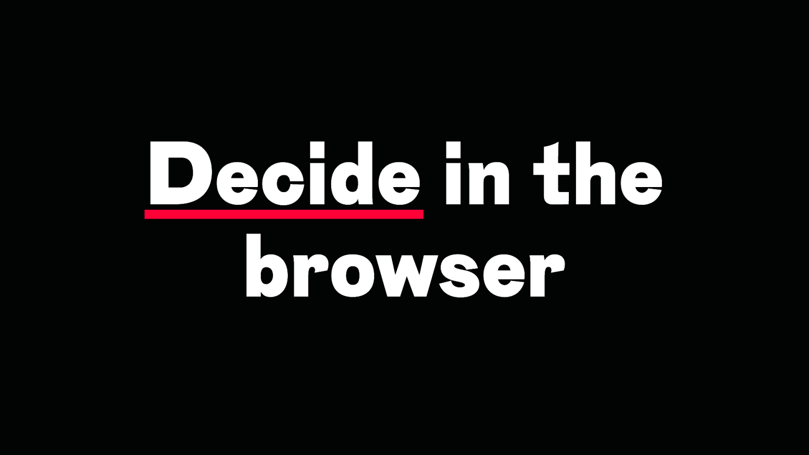
Decide in the browser
Design Engineering
Design Engineering
Web Design Engineering
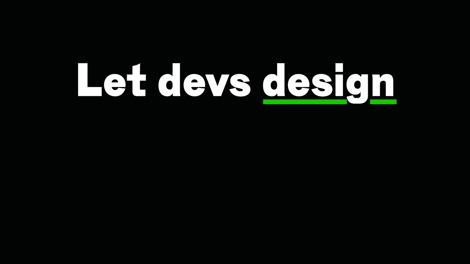
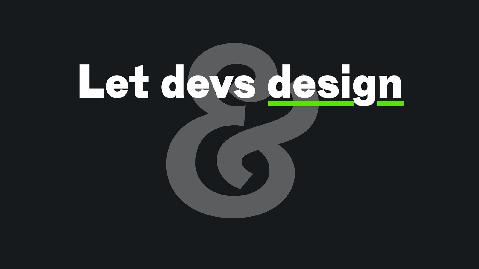
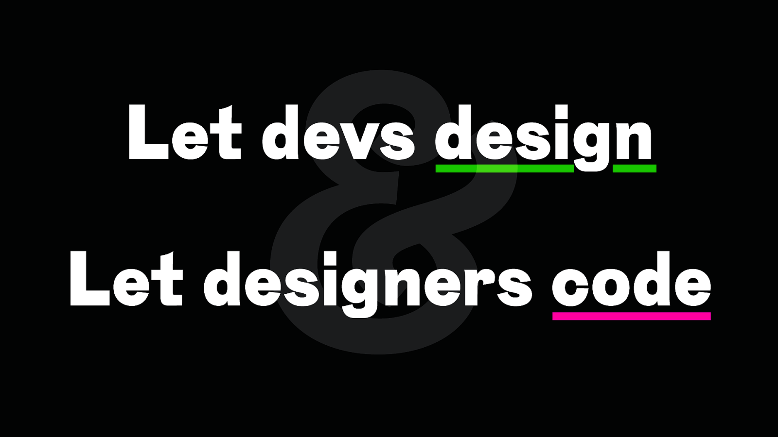
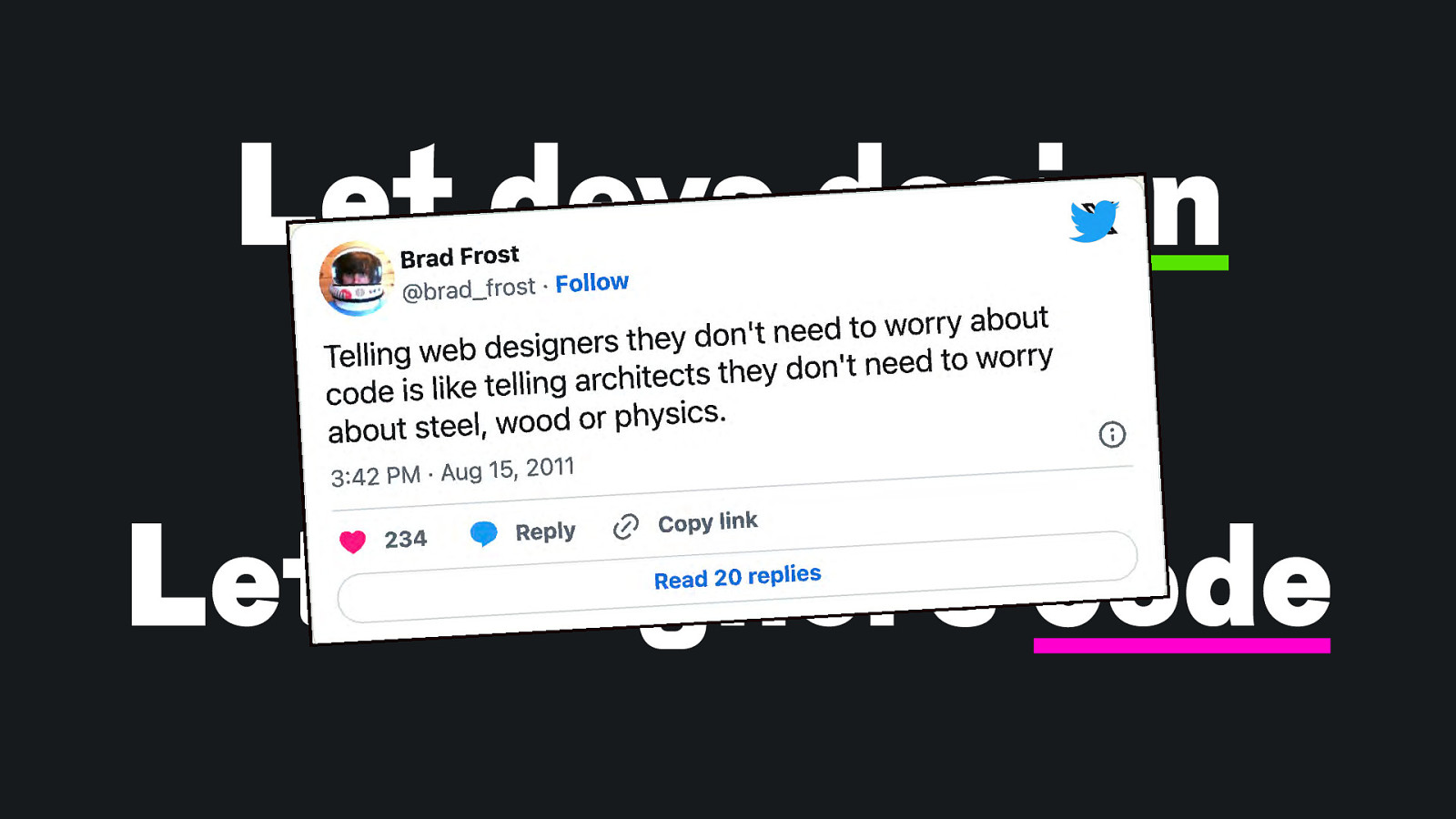
Let devs design
& Let devs design
& Let devs design Let designers code
Let devs design & Let designers code
Thank you! Slides: https://noti.st/matthiasott/31ArQI ” ownyourweb.site # Typefaces: Tausend by Christoph Koeberlin, NaN Tresor by Christoph Koeberlin, NaN Tragedy by Jean-Baptiste Morizot, Input Mono by David Jonathan Ross

Today’s Web is more complex, unpredictable, dynamic, and powerful than ever. Yet, 25 years after “A Dao of Web Design” we still approach building for the Web with a mindset of control, using linear workflows and static design tools that often don’t reflect the Web’s true nature and potential. The canvas we work on has transformed, the materials we use have changed. Together, we’ll explore how we can use web design engineering to start painting with the Web and create designs that are resilient, accessible, and true to the Web’s greatest strength: its inherent flexibility.


 for free. You
can too.
for free. You
can too.