A presentation at axe-con by Melanie Sumner Temple
A look at common patterns found on the web, how they are harmful for accessibility, and what to do instead.
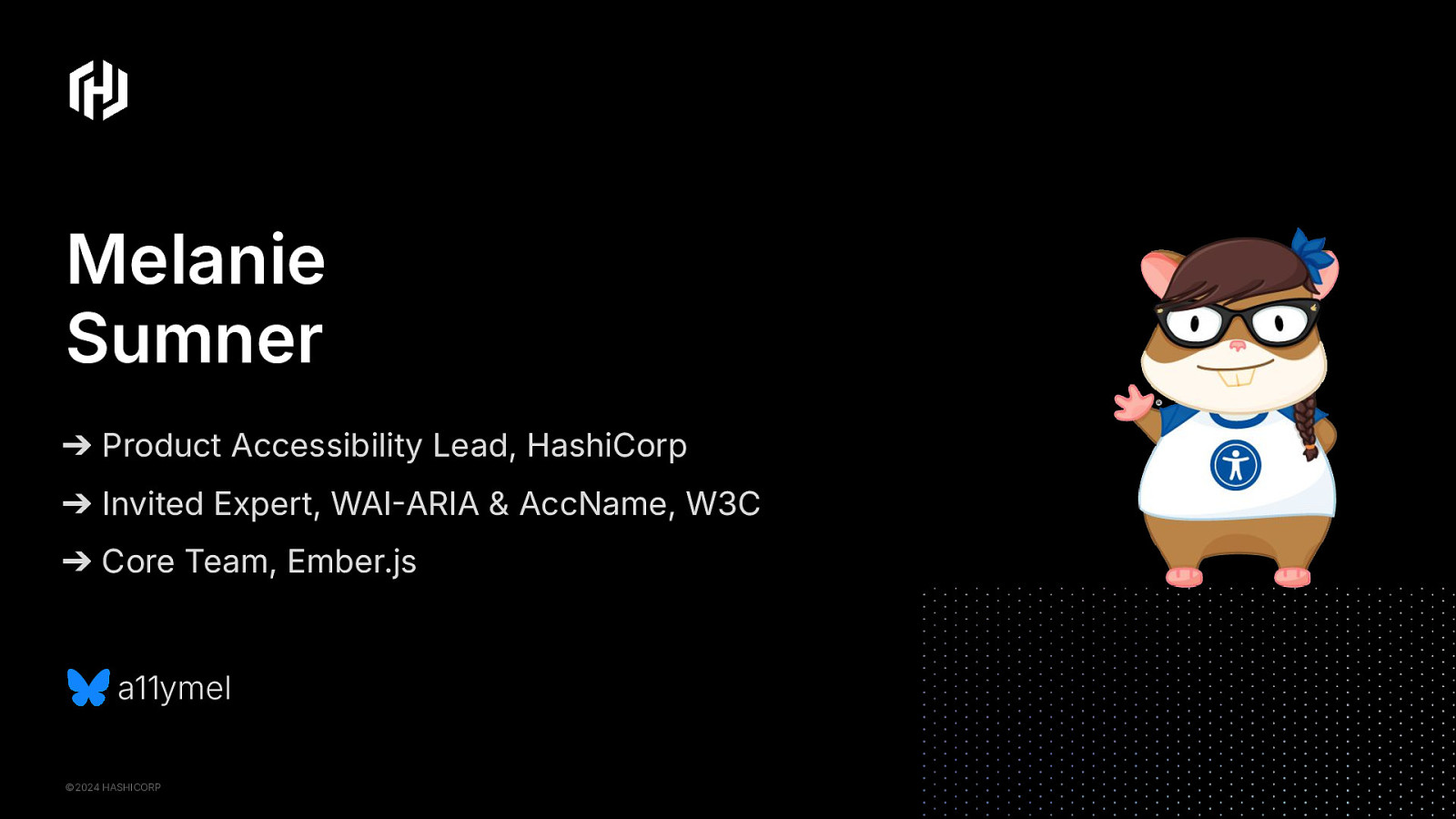
Hi, I’m Melanie Sumner. I might be new to some of you, but others may know me from talks I’ve given about accessibility at other tech conferences. I’ve been creating things for the web for almost 30 years now; and have specialized in accessibility in web development and software engineering for the past 15 years or so.
I’m the product accessibility lead for design systems at HashiCorp. I’m also an invited expert for the WAI ARIA working group, and the co-editor of the accessible name specification for the W3C.
And in the rest of my free time, I work on open source. I am a core team member for the Ember.js framework and have been leading the accessibility work for that javascript framework.
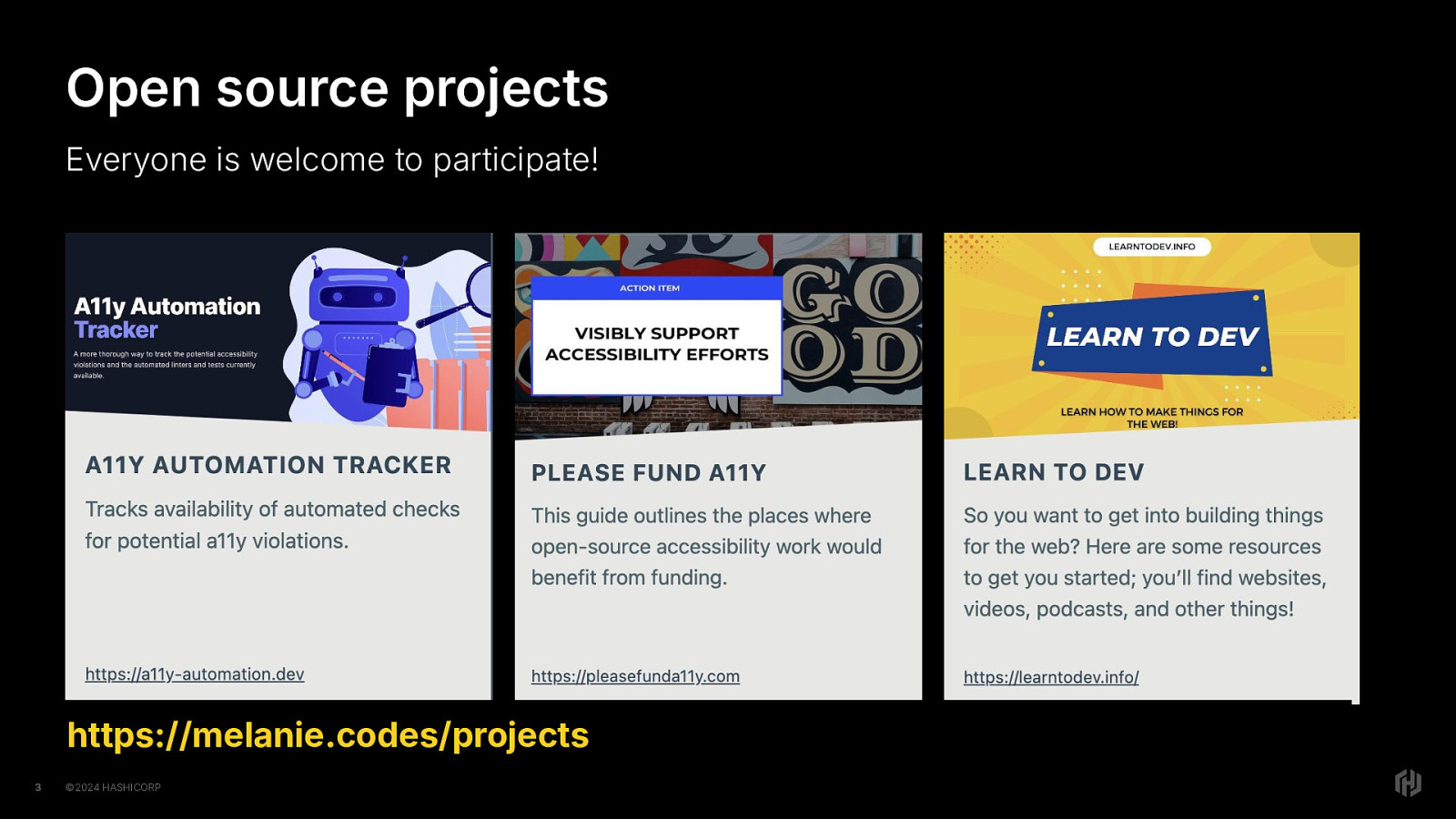
In addition to the open source work I do in Ember, I have a few other open source projects and invite everyone to participate. The three I’ll highlight today is the accessibility (a11y) automation tracking website, where I am working on tracking the availability of automated tooling to detect specific accessibility violations. That’s available at a11y dash automation dot dev.
Another project I have is please fund a11y dot com. Please Fund A11y is a guide that outlines the places where open-source accessibility work would benefit from funding, and how they would benefit from that funding..
I made learn to dev, that’s learn to dev dot info, after someone asked me “hey I heard you are a web developer, how do I learn how to do that?” I realized there was no simple answer to this, so decided to create a website that listed resources in a way that anyone could find the right path for them.
There are other open source projects that welcome participation. Design, development, content, even reviewing existing content and providing feedback. These are all ways to contribute, and It’s all valuable and important.
If you have any questions you can totally DM me on the axe community Discord or post to the forum thread for this session.
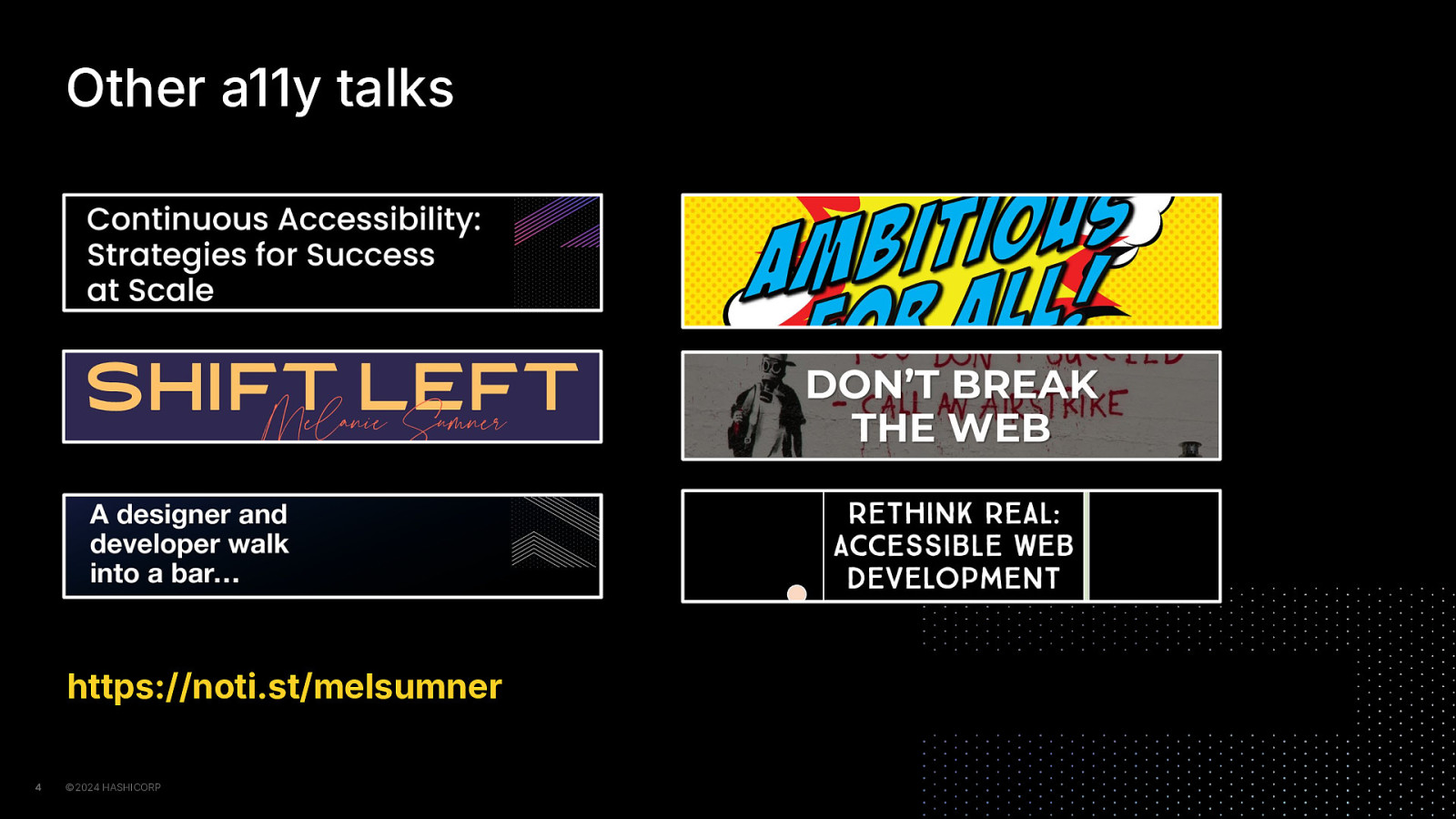
Giving talks is one of the other ways I am trying to be the change I wish to see on the web. I make my talks available on notist. That’s n-o-i-t dot s-t forward slash melsumner.
Most recently I’ve been primarily focused on my trademarked topic, Continuous Accessibility, but over the years I’ve given a lot of other talks about things like the concept of shift left, don’t break the web, and how JS framework engineers can be more accessibility-forward.
Someone asked me recently what topic I could talk about for five hours without any prep, and with no hesitation I said “how we get to a fully accessible web, but I think it would be hard to fit it into only five hours.”
Anyway, I want to take a minute and talk about why this talk.
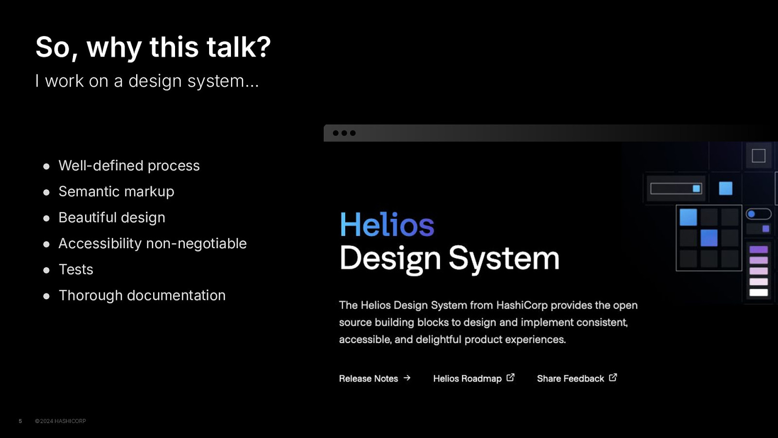
I work on a design system, and you may have heard of it; it’s called Helios It’s been deeply satisfying work, for a few reasons. We have a solid process. We use semantic markup. Our designers create these really beautiful designs. Accessibility is a non-negotiable, included in the requirements from day 1. We test with automated tests, tests we write ourselves, manual tests, visual tests and even test on various browser and assistive technology combinations.
We create our components in such a way that our Figma API matches our code API, reducing the gap between designers and engineers by giving everyone the same language to use.
We provide complete documentation that includes guidance for designers, guidance for engineers, API documentation and copyable code samples, and accessibility documentation. In addition to explaining the conformance of each component, and which combinations will produce different results, for each component, we list the WCAG success criteria that are explicitly related to that component.
Sounds pretty great, right?
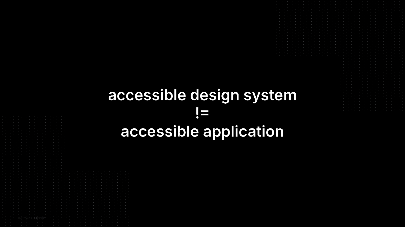
But as y’all know, an accessible design system does not make your application accessible.
But what really solidified this talk as more than just a saying was that while working to make our design system components REALLY accessible…
I observed that I kept seeing similar accessibility issues in the applications using our design system, so… I started taking some notes.
Where were the gaps? And that’s what I want to talk about today. Some of the gaps, and what to do about it.
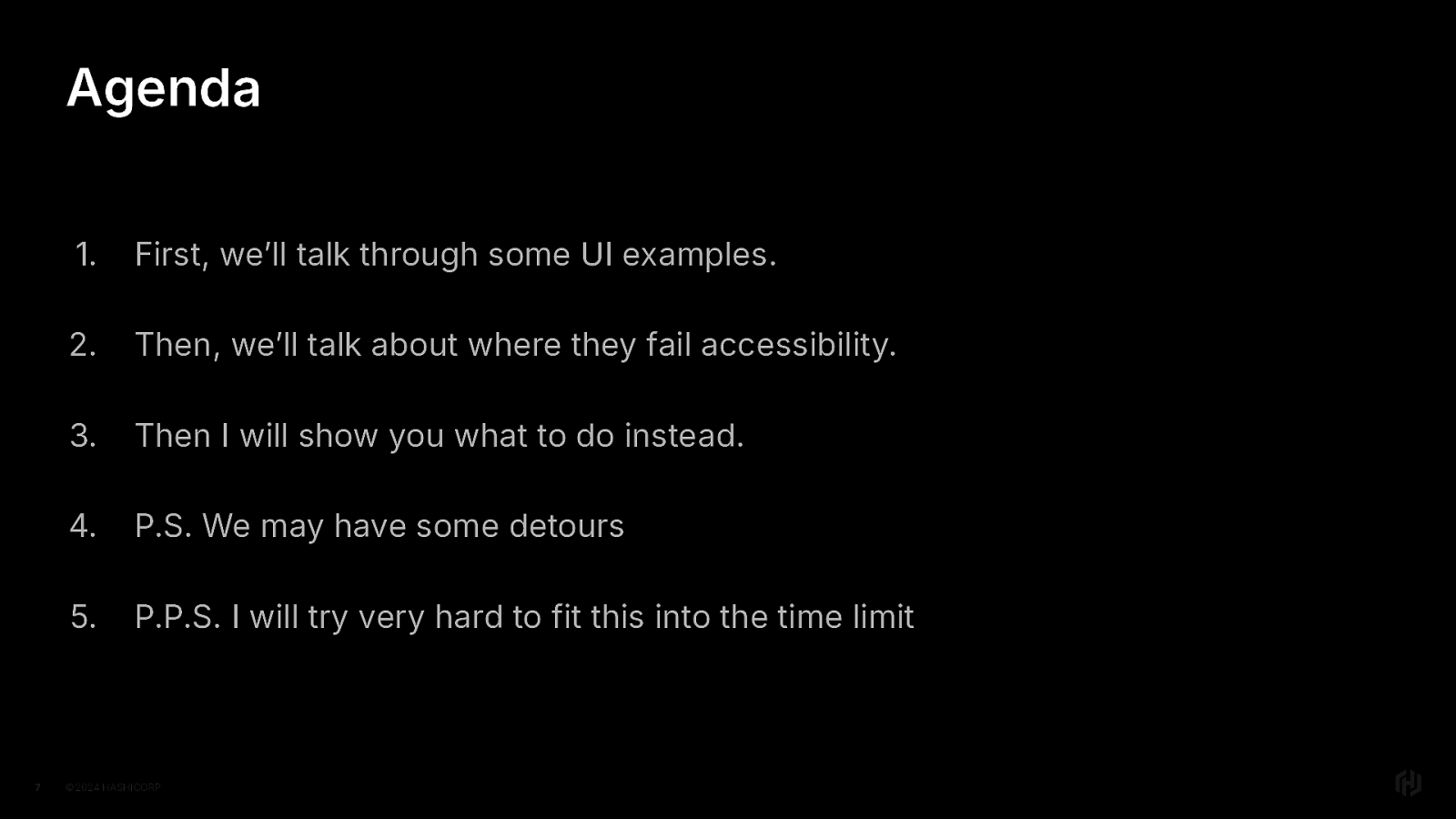
And that brings us to my most predictable slide, the agenda.
First, we’ll talk through some UI examples Then we’ll talk about where each example fails for accessibility Then we’ll talk about at what to do instead.
Oh and PS we may have some detours And P.P.S. I’ve practiced this a lot and will try very hard to keep to the time limit
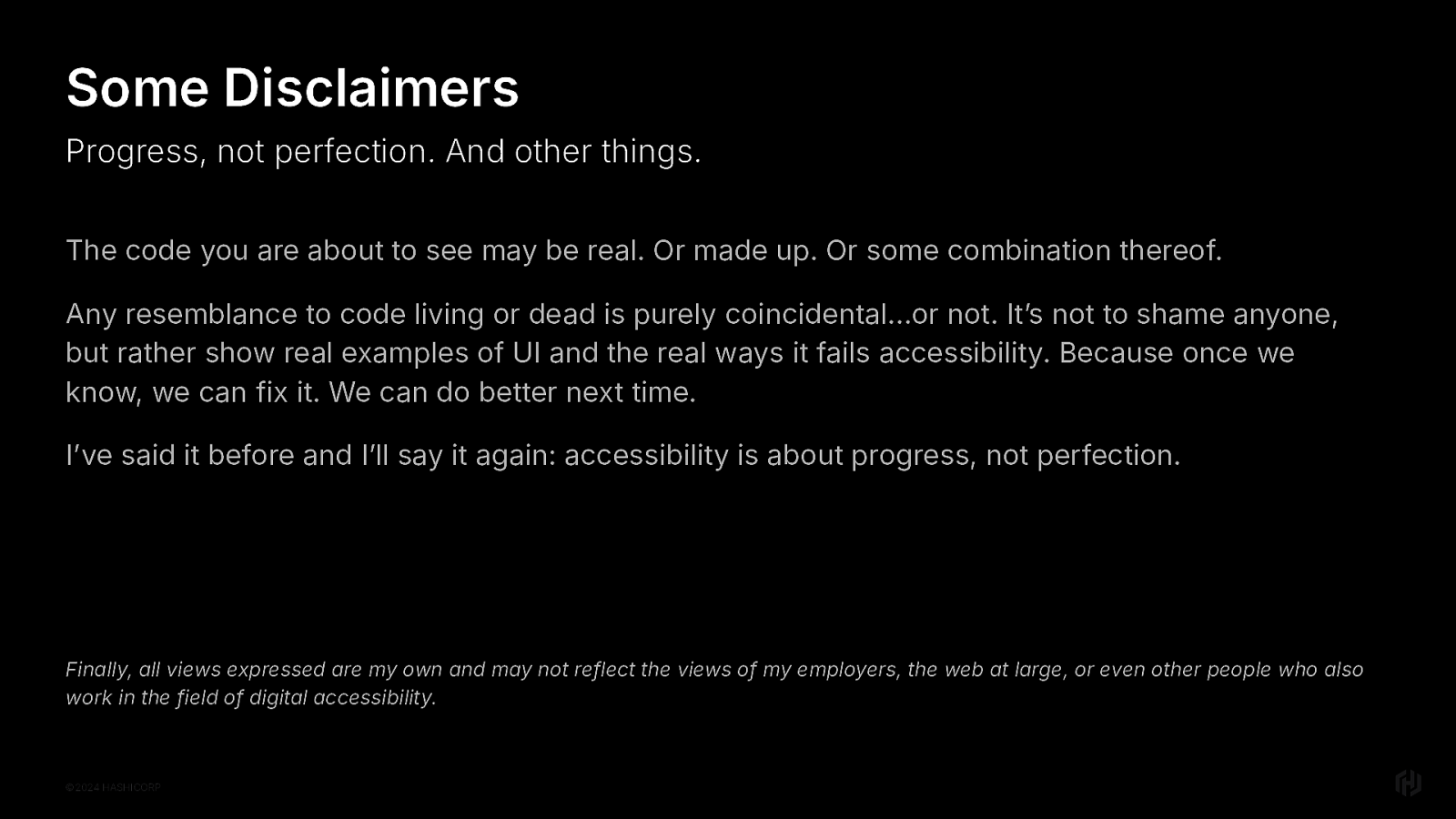
But first, some disclaimers.
The premise of this talk is that we’ll look at patterns in real life and that means real code. Real design.
And it’s important to know that I don’t show you these things to shame any designer or developer, we’ve all written code that we later looked back on and thought “oh dear lord what have I done” I did that just this morning even.
I show real UI and real code because I want to guide us to do better; that way we can do better, next time. And the time after that. And show others how to do better, too.
I while I do still dream of the day when accessibility is so baked into the way the web works that I don’t really have a job anymore,
I’ve said it before and I will say it again. Accessibility is a journey that’s about progress, not perfection.
So let’s dive in.
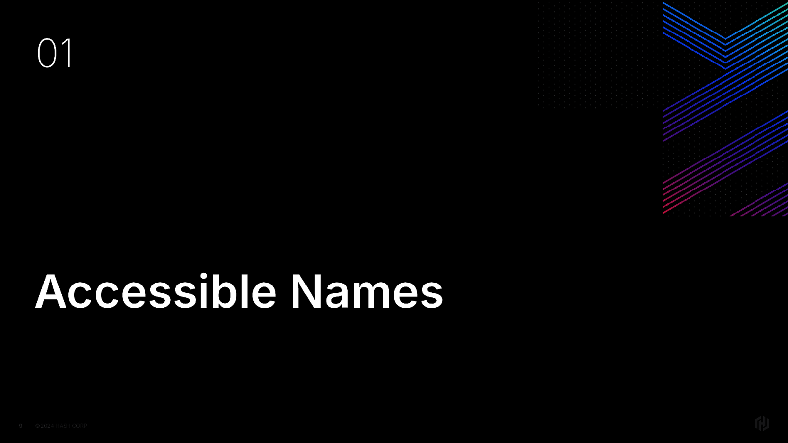
First up: how do you make unique, accessible names?
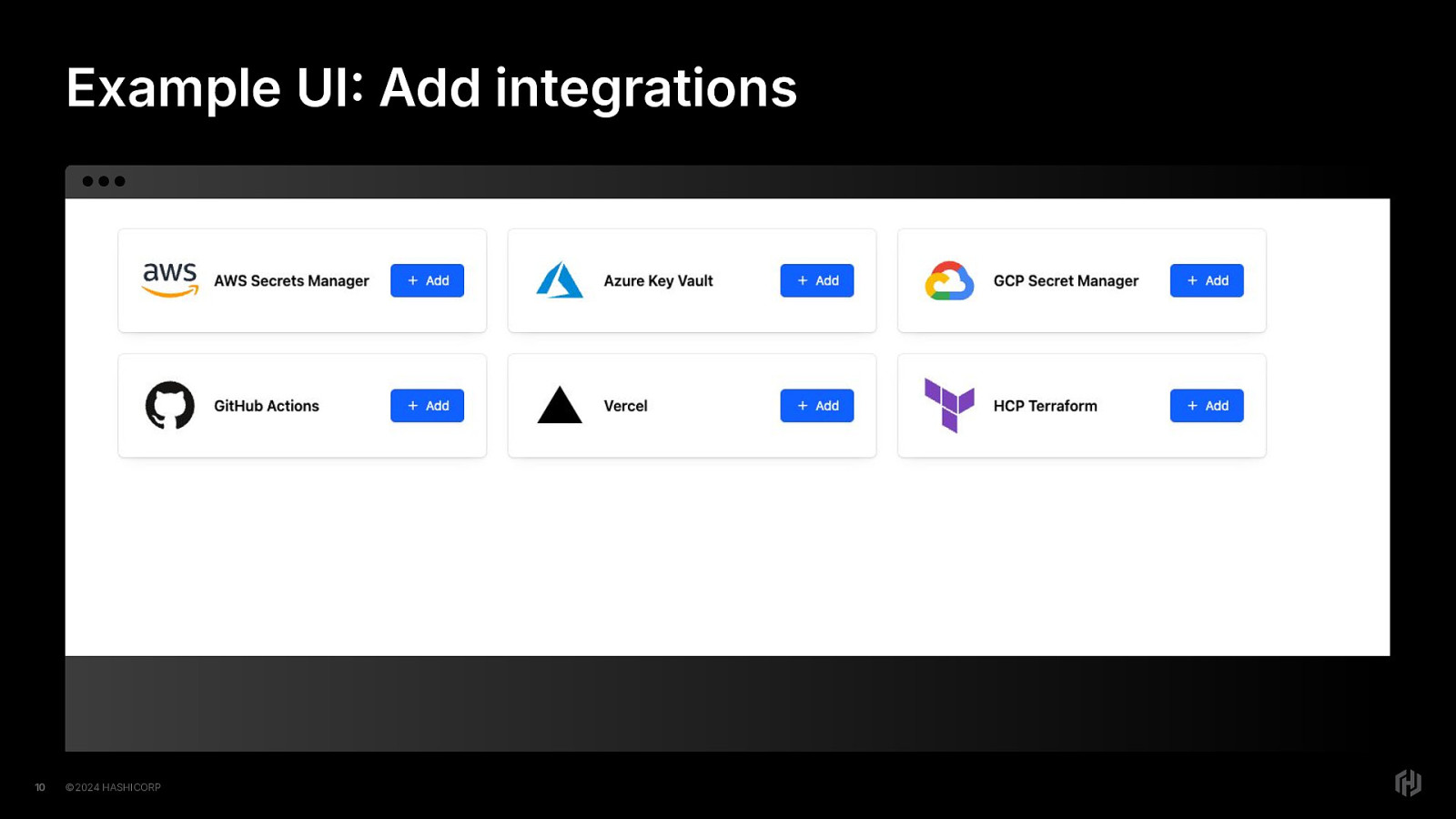
Our first UI example demonstrates something that is super common in technical apps today: the ability to add integrations with different products, or maybe login with different platforms.
Here we have small cards, each with the company’s logo, the name of the company’s product that could be potentially integrated, and the link that will take you to the page where the user can perform that action.
It’s a link styled as a button, with a plus sign icon and the word “Add”.
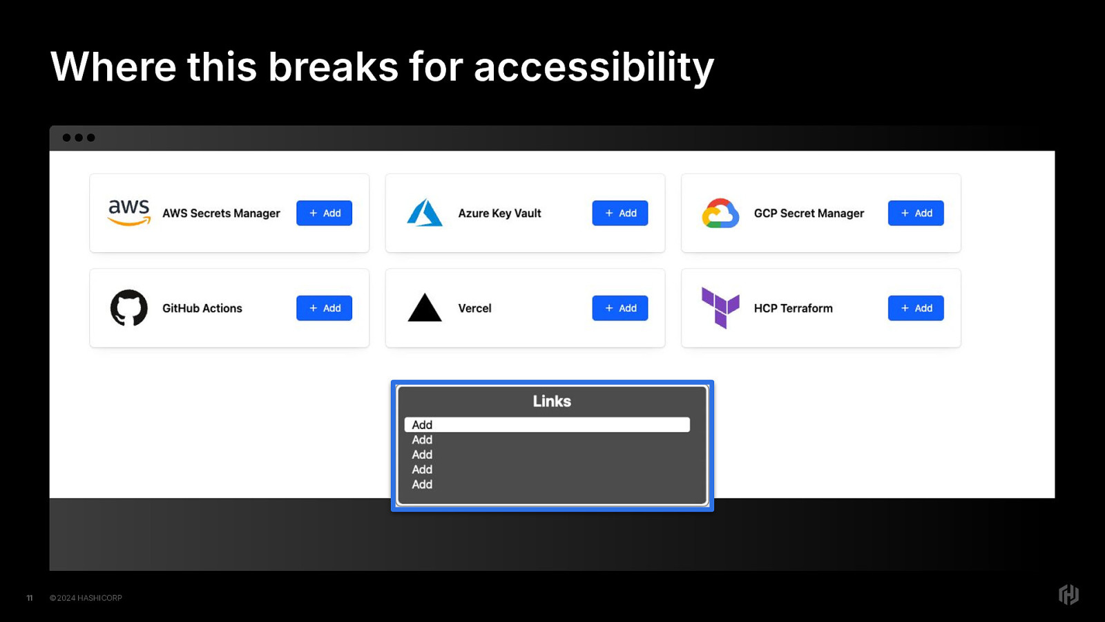
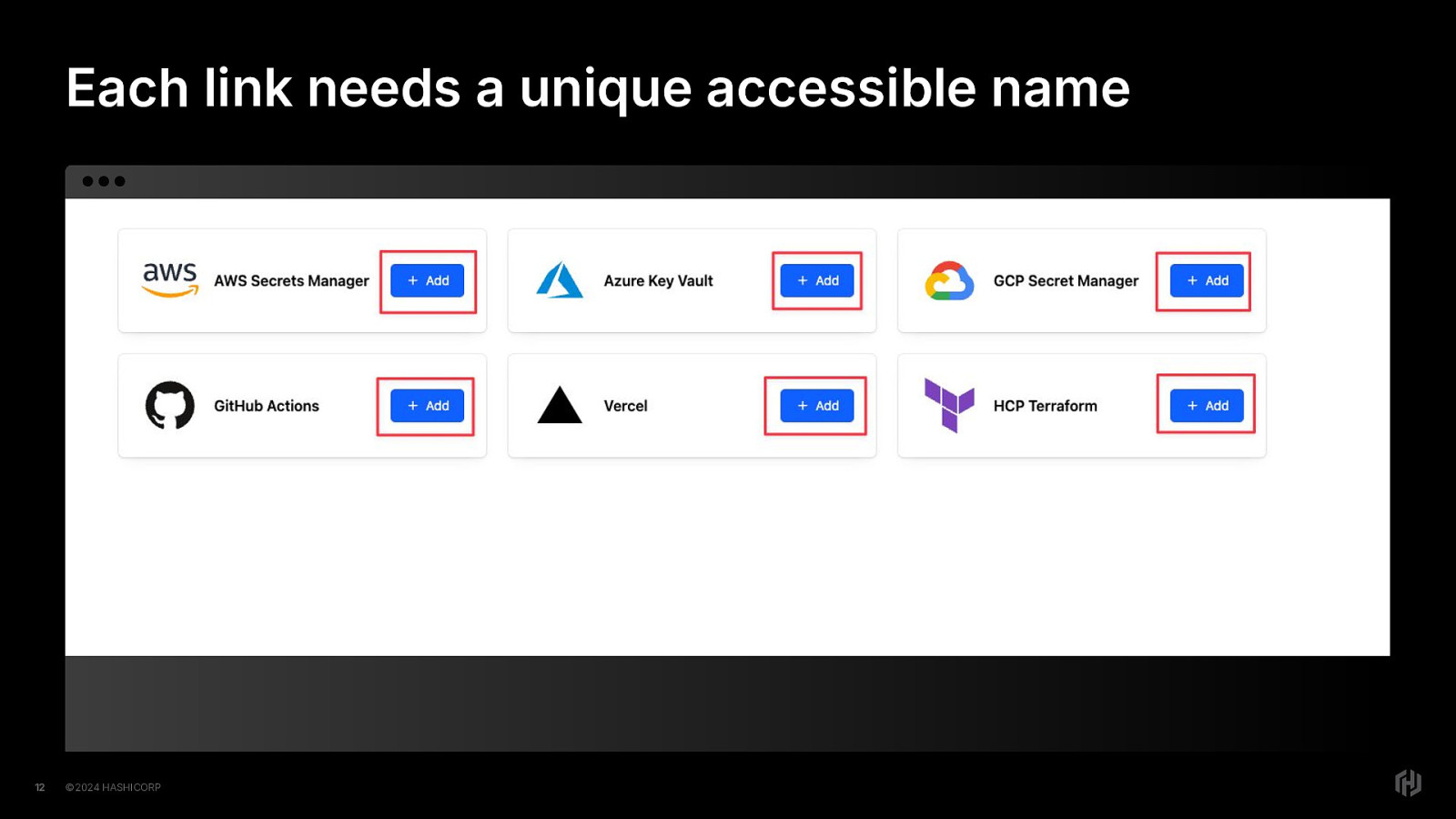
Where this breaks for accessibility is that all of these links have the same accessible name, even though they go to different URLs.
Now, real quick: The mechanism for screen readers that allows users to navigate through a site by groups of elements is called different things in different screen readers. I’m going to call it a rotor, because in VoiceOver on a macbook, that’s what it’s called. Just know that it is probably called different things by different screen readers.
Anyway. In this case, if the user is navigating by rotor, they will see a list of links, all named “add”. Add…what? There’s no way to differentiate these links from each other in the same quick way that a sighted user can.
Even if the user navigates with UI with the just the TAB key, going from one interactive element to the next, they will still hear “Add, link” over and over and over again.
That’s…not useful.
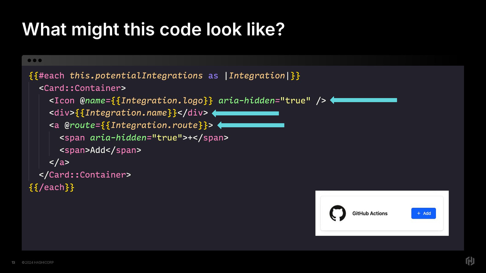
Let’s imagine what this code might look like. This code sample is heavily edited so we can focus on the important bits. This code sample is in Ember and uses both handlebars and anglebrackets in its templating language. However, it should be relatively identifiable to most web developers what we’re trying with this piece of code.
The each is telling us that we’re going to have an array of potential integrations and iterate over them to create each of the cards rendered to the browser.
We have the svg icon there, correctly hidden with aria-hidden=”true”. We have the name of the potential integration. We have the link to navigate to the route that will allow the user to add that integration. We can even imagine the styling that went into it to make the little card that renders to the browser.
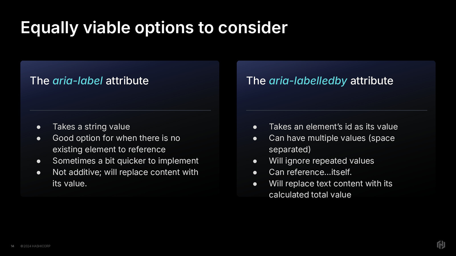
So in this case in particular, we have some equally viable options to consider. Let’s talk about them.
We have two equally viable options to consider, aria-label and aria-labelledby.
The aria-label attribute
The aria-labelledby attribute
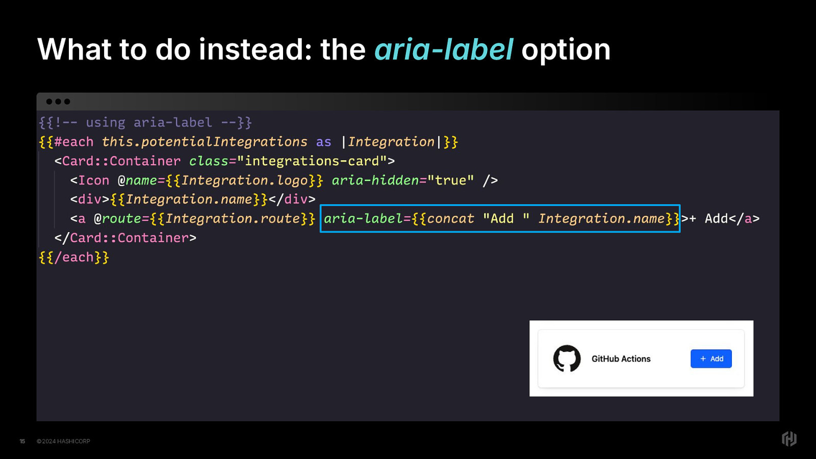
Let’s talk about the option of using the aria-label attribute to fix the code.
In this approach, we add the aria-label attribute to the link, and we’ll concatenate the word “Add” along with the Integration name. If you’re internationalizing your apps, you’ll have property instead of the word “Add”, so that translations will work properly, but hopefully you get the idea here.
When rendered, like before we made any code changes, we’ll still have the same visual element(s) in the browser But unlike before, we’ll have a new accessible name. The screen reader will tell us something like “Add GitHub Actions, Link”
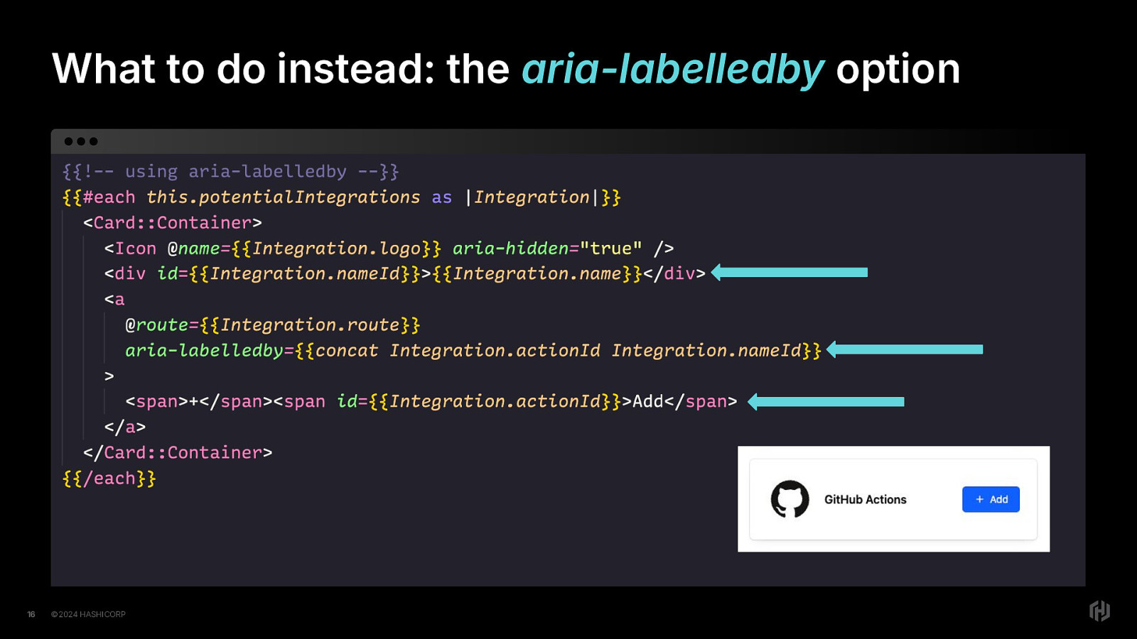
Now let’s talk about using the aria-labelledby attribute to fix this problem.
We’ll start by adding an id attribute to the div element with the integration name Then we’ll add an id attribute to the span element with the word “Add” in it. Then on the link element, we’ll add the aria-labelledby attribute and set the value to the two id attributes we want to use, in the order we want them to be read to the user.
When rendered, like before we made any code changes, we’ll still have the same visual element(s) in the browser But unlike before, we’ll have a new accessible name. The screen reader will tell us something like “Add GitHub Actions, Link”
So there’s another option for you. I will say that I typically prefer thearia-label approach because 9 times out of 10 it’s simply faster for me to implement as an engineer. But I recognize that YMMV, so choose the one that works best for your scenario.
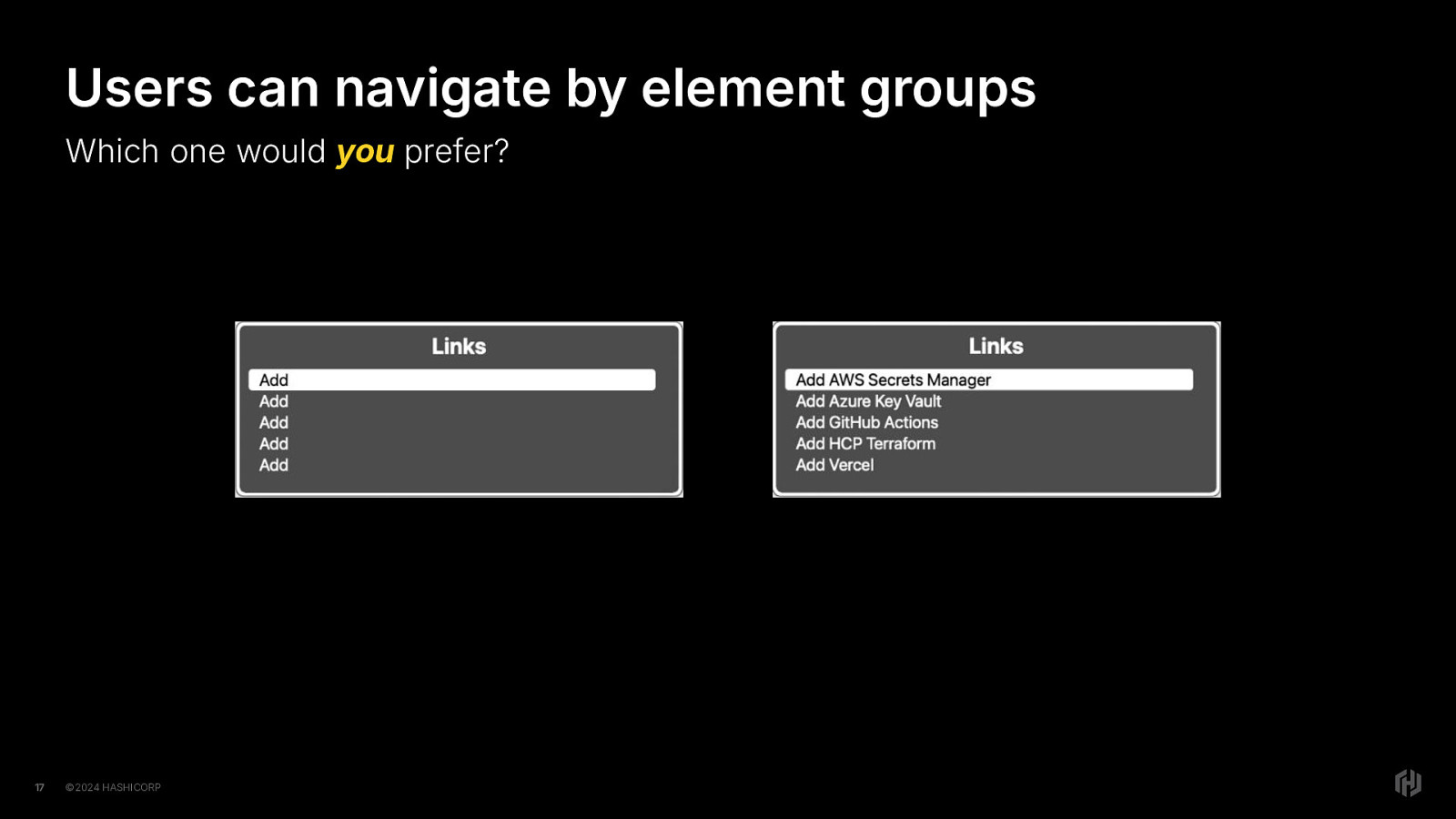
Anyway, if we compare the rotor list we saw before, where the list of links did not have unique names, just “add, add, add” And we pull it up again after changing the code to use one of the solutions we just talked about, We’ll notice a different list of links. “Add AWS Secrets Manager.” “Add Azure Key Vault”. “Add GitHub Actions” and so on.
We can immediately notice the improvement! The user can now differentiate quickly and easily.
Which one would you prefer?
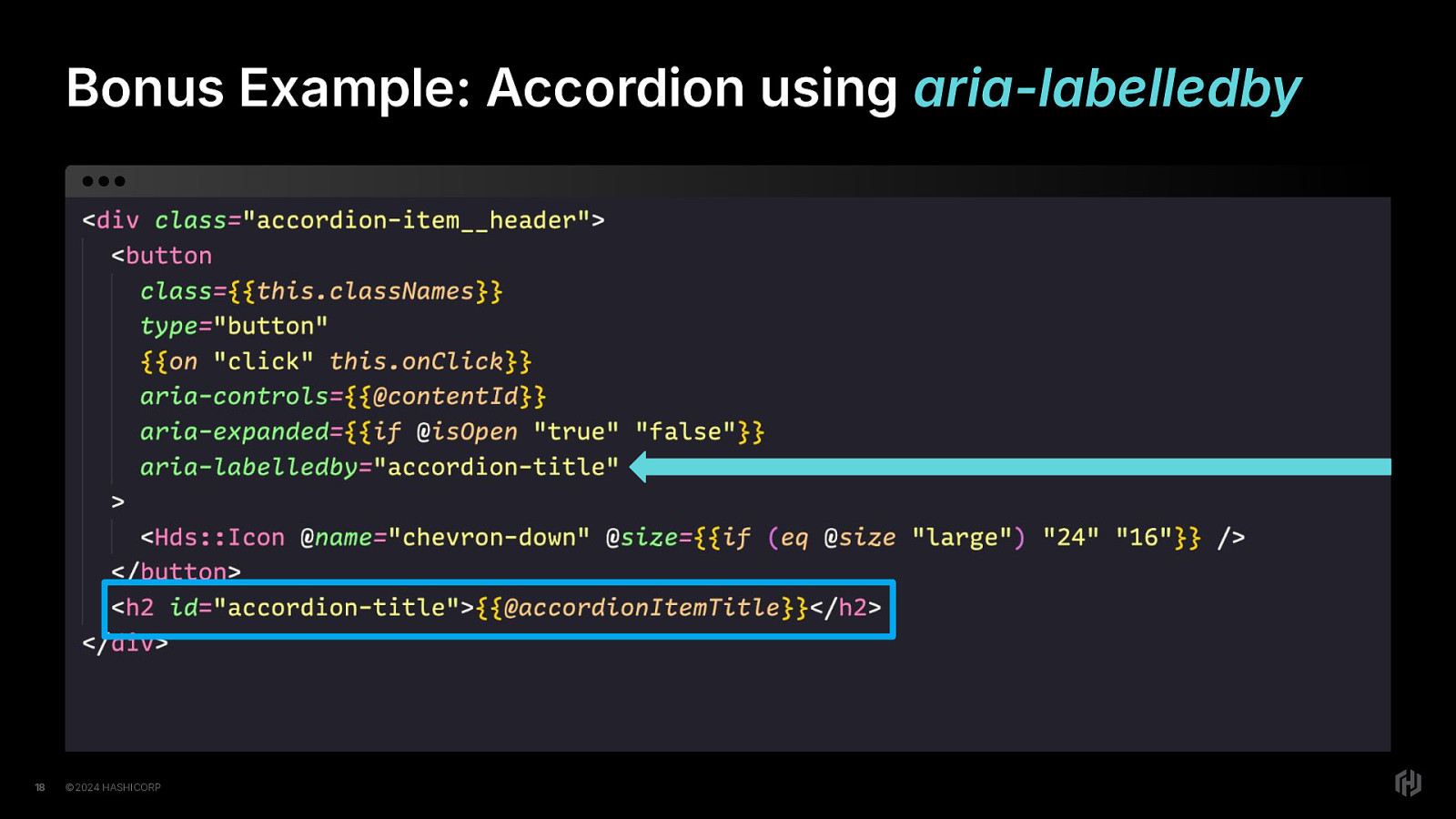
Here’s a little bonus example, an accordion item using the aria-labelledby attribute. By adding an id attribute to the h2 element that gives the accordion item a heading, (click) we can then use that id attribute value for the aria-labelledby attribute on the button element that is an icon-only button used to expand or collapse the accordion panel.
Furthermore, because we have the aria-expanded attribute here, the user will be informed if the element is expanded or collapsed. So we get that information for free.
Ok. I did warn you there might be a detour, and guess what, it’s time for a detour.
A detour into the accessible name and description computation specification. Wow that’s a mouthful. I just call it AccName. You can too if you want. It’s easier and people will know what you mean.
This detour is happening because I’ve had too many developers tell me that they don’t understand AccName and I’m the co-editor. So I feel responsible for that.
So I’m going to take a few minutes and explain some things because it’s worth it to understand what’s going on here.
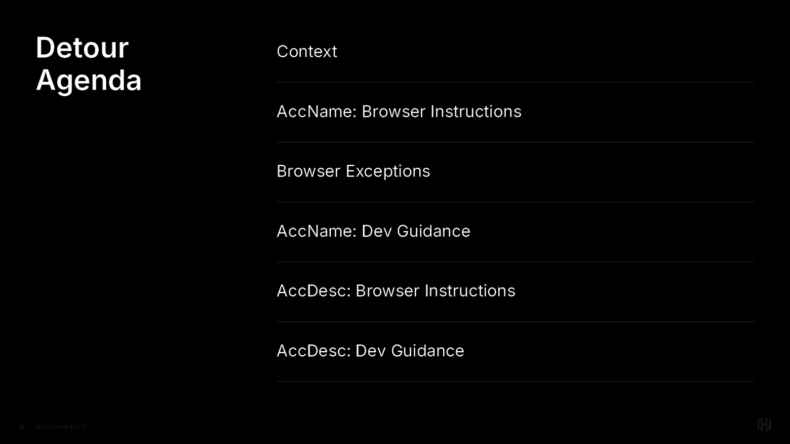
So I’m going to explain this to y’all from a few angles. That’s why we have a mindful detour agenda. First, some context Then we’ll look at the accessible name instructions for the browser Then we’ll talk about some ways browsers are like, ”yeah but no” aka accessible name browser exceptions Then we’ll look at the accessible name guidance for developers
Then the accessible description instructions for the browsers And finally the accessible description guidance for developers
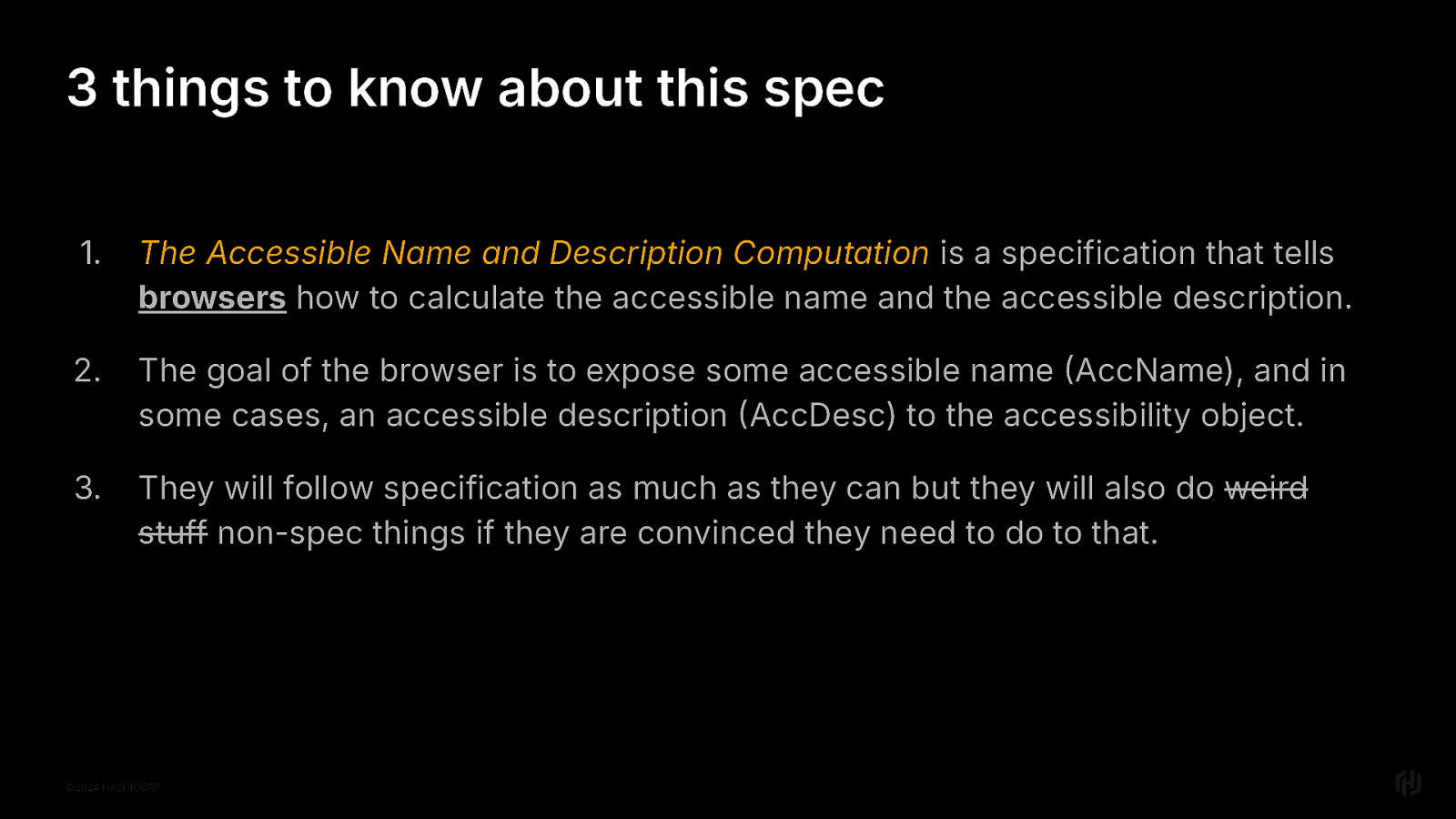
So. Three things to know about this spec for context.
First, it provides browsers with instructions for how to calculate the accessible name and the accessible description. Both may exist. Neither may exist.
Browsers need to figure that out,
Because the browser’s goal is to return the results to the accessibility object.
Now, they will follow the specification FOR THE MOST PART. But, they may also do other things if they are convinced they need to do that.
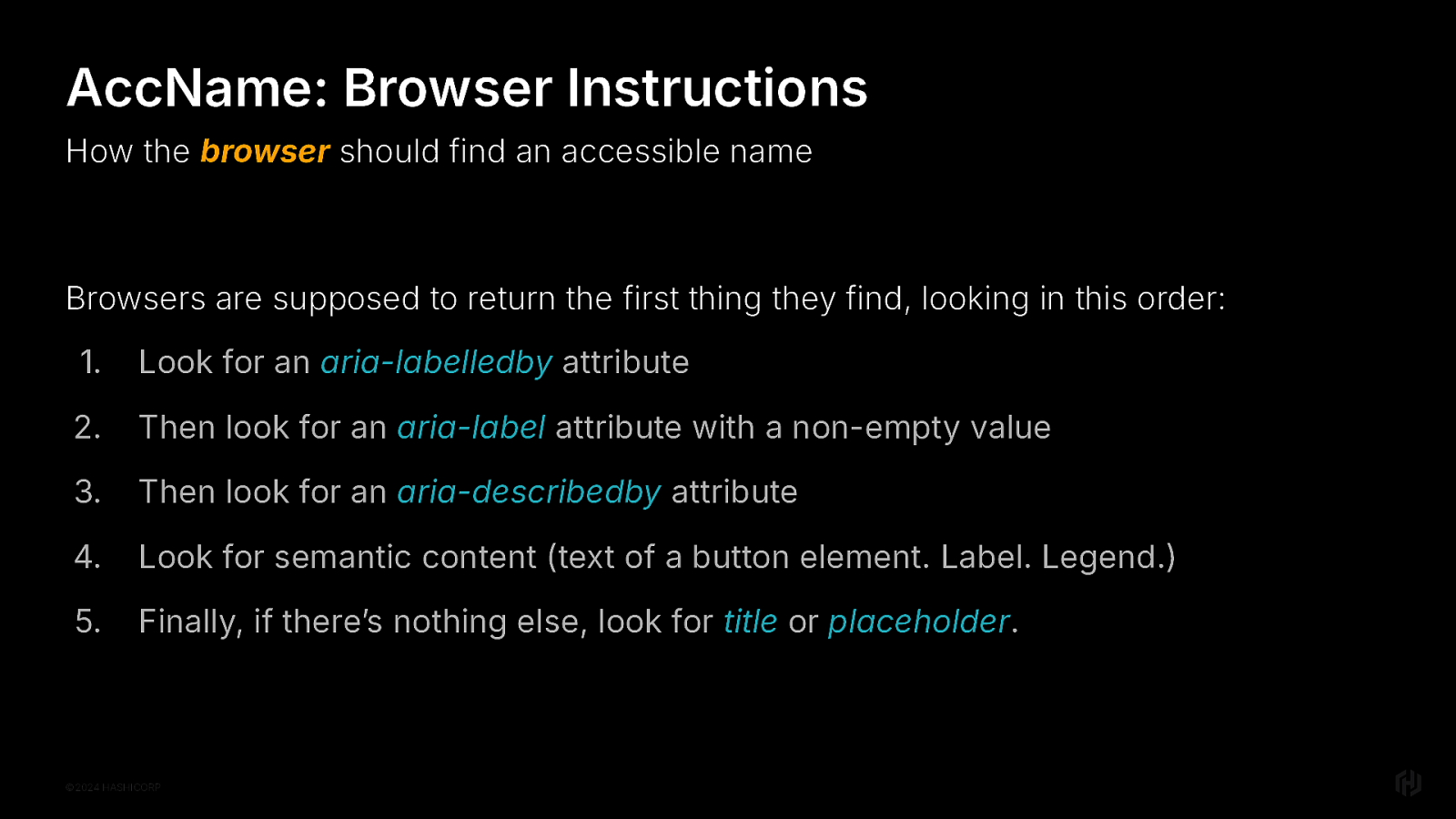
Browsers are supposed to return the first thing they find, looking in this order: Look for an aria-labelledby attribute Then look for an aria-label attribute with a non-empty value Then look for an aria-describedby attribute Look for semantic content (text of a button element. Label. Legend.) Finally, if there’s nothing else, look for title or placeholder attribute.
And again, to be 100% clear, these are instructions for the browser.
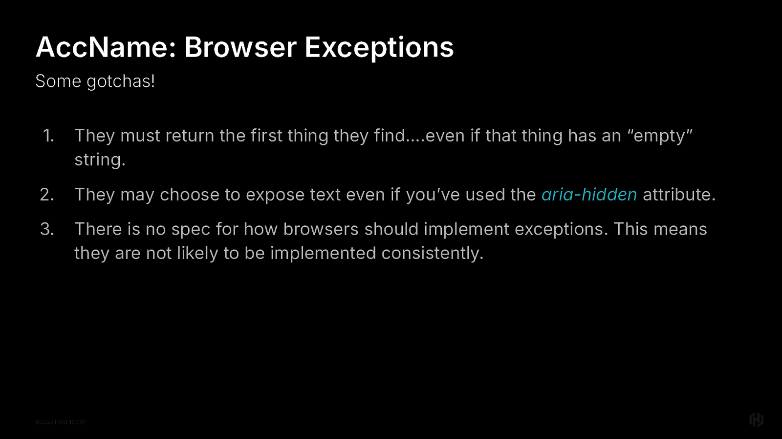
There are some edge case exceptions to know about, so you don’t run into them and then are like “WTF MEL YOU TOLD ME THE WRONG THING”
First, we previously noted that they must return the first thing they find…even if that thing has an “empty” string. And this really means like, a space between your quotes. Not even joking. It’s because there’s been a lot of back-and-forth to explicitly define how whitespace should be handled in the AccName spec, and browser implementers kind of have to agree. So there are some realllllllly weird edges to this one. Just make sure that you’re not putting any whitespace in your “empty” strings.
Second, they can choose to expose text even if you’ve used the aria-hidden attribute on it. This is done in some cases where browsers cannot otherwise find an accessible name and have determined that aria-hidden was used incorrectly. The reason behind this is that many feel that it’s better to return something for the user, rather than nothing. So “thar be dragons.” Make sure you’re testing your UI with a few different browser and screen reader combinations, so you know what to expect.
Finally, There is no specification for implementing exceptions. This means that browsers implement exceptions as they see fit.
The thing is, if you aren’t doing weird stuff; if the code rendered to the browser is valid HTML, then you’ll probably be fine. It’s when developers try to get too clever and be tricksy hobbitses that these exceptions and edge cases may crop up.
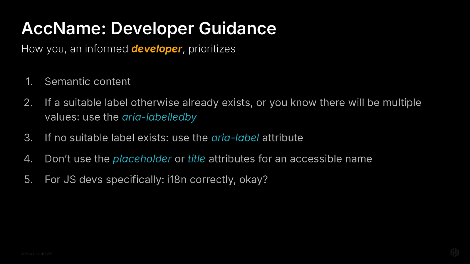
Let’s talk about how you, an informed developer, provides an accessible name
Semantic content should be your default go-to. The first rule of aria is to not use aria if you can help it. So using semantic content is really the best and the most reliable thing to do. If a suitable element that can be used to provide the label content: use the aria-labelledby attribute If no suitable label already otherwise exists: use the aria-label attribute Don’t use the placeholder or title attributes for an accessible name. They just weren’t implemented appropriately and are terrible. So just don’t do it. Placeholders, if used at all, should be used to demonstrate to the user the formatting for the data you’re asking them for. That’s it. Maybe. You’ll read online that aria-label is not translated. This is a kind of click-bait thing used on social media. What it’s really referring to is sites that rely on google translate in the browser to translate the page. But if you’re web developers and internationalizing your apps and all, you don’t have to worry about it.
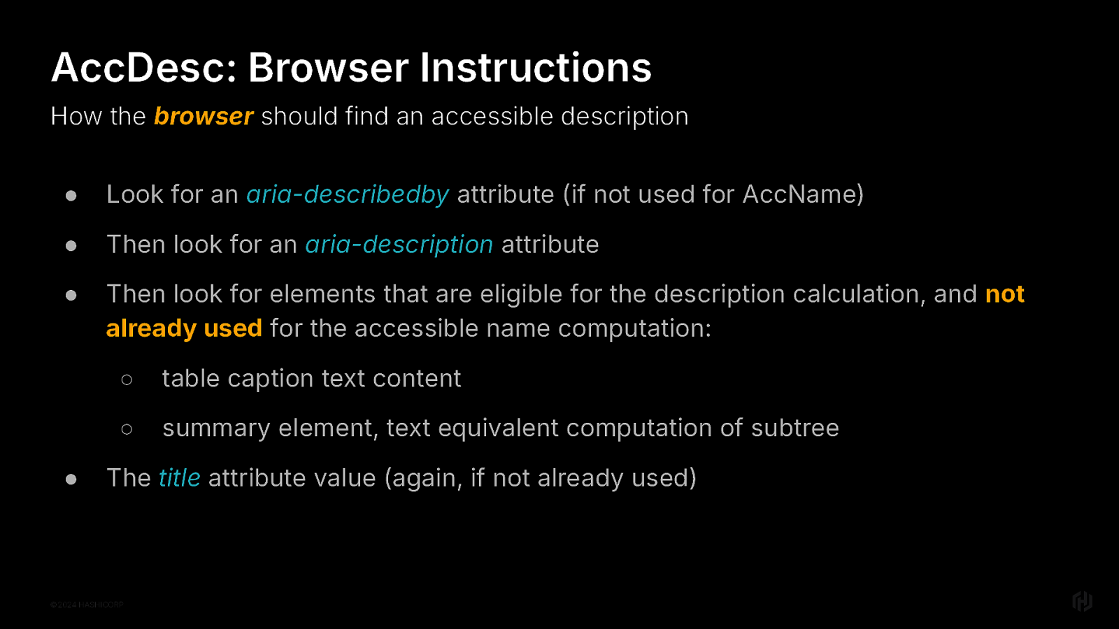
AccDesc: browser instructions Look for an aria-describedby attribute (if not used for AccName) Then look for an aria-description attribute Then look for elements that are eligible for the description calculation, and not already used for the accessible name computation: table caption element’s text content summary element, text equivalent computation of subtree The title attribute value (again, if not already used)
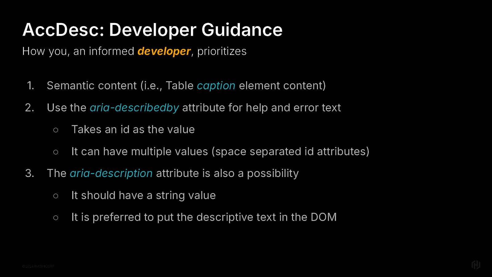
AccDesc: dev guidance Semantic content (i.e., Table caption element content) Use the aria-describedby attribute for help and error text on things like form inputs Takes an id as the value It can have multiple values (space separated id attributes) The aria-description attribute is also a possibility It should have a string value It is preferred to put descriptive text in the DOM, though, because that’s useful to everyone.
Loosely, you can think of aria-describedby as the description equivalent of aria-labelledby And aria-description as the description equivalent of aria-label
And that is the end of this detour. If you have specific questions or want to know more about things like why it’s so hard to define whitespace rules in the accname spec, come talk to me later.
Ok, on to the next. Let’s look at Headings, Labels, and Instructions. I grouped it this way because there is WCAG guidance about Headings and labels And also Labels and instructions And in my experience, all of these things end up being related to each other. So here we are.
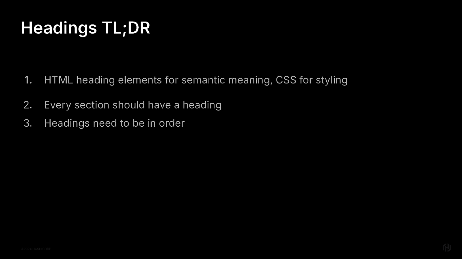
So first in our headings, labels and instructions section, let’s talk headings.
Here’s your headings cheat sheet HTML heading elements for semantic meaning, CSS for styling Every section should have a heading Headings need to be in order
Browsers will change, and over time, expand to support MORE things But these rules will always apply no matter what
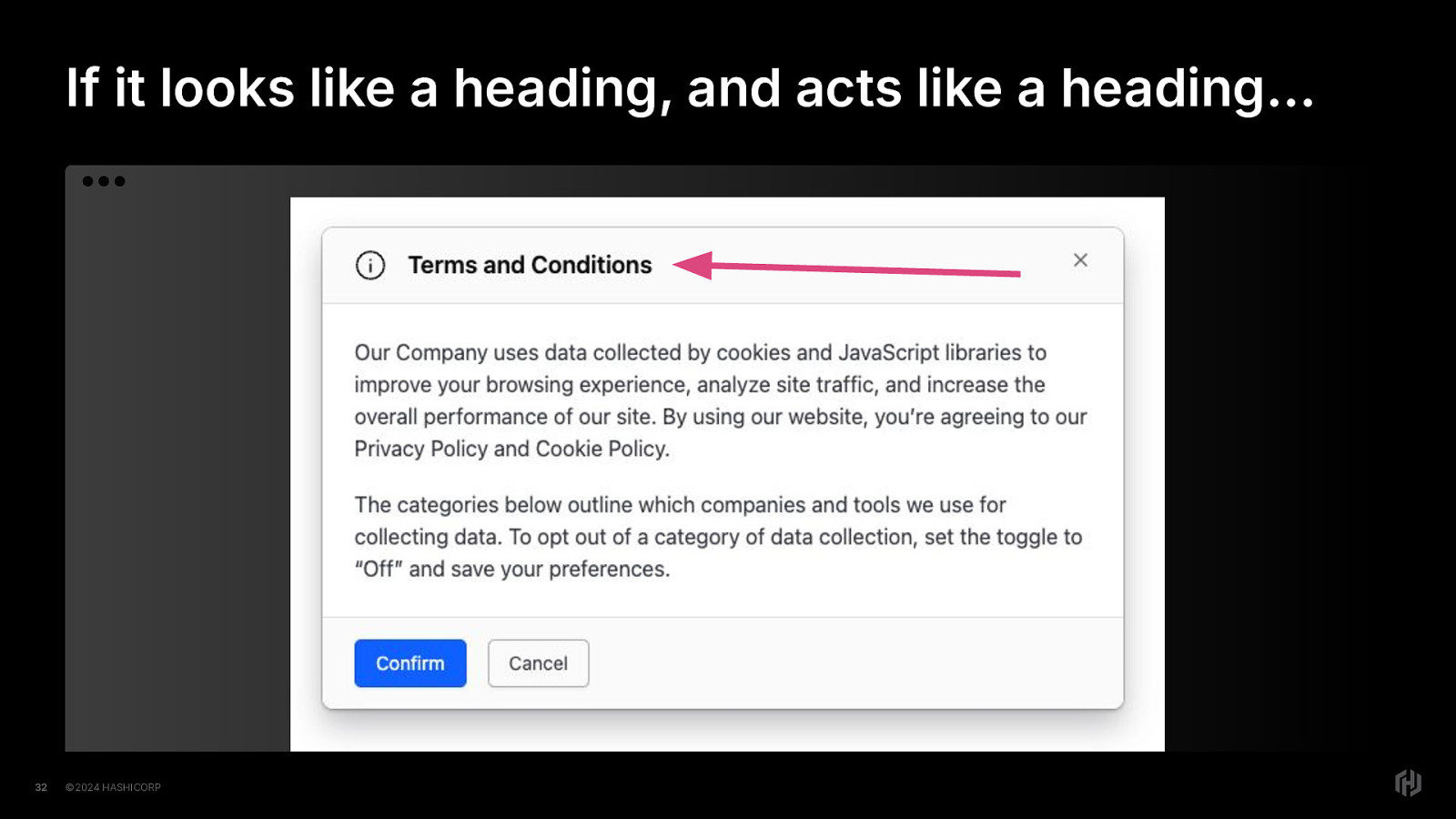
Let’s talk through an example.
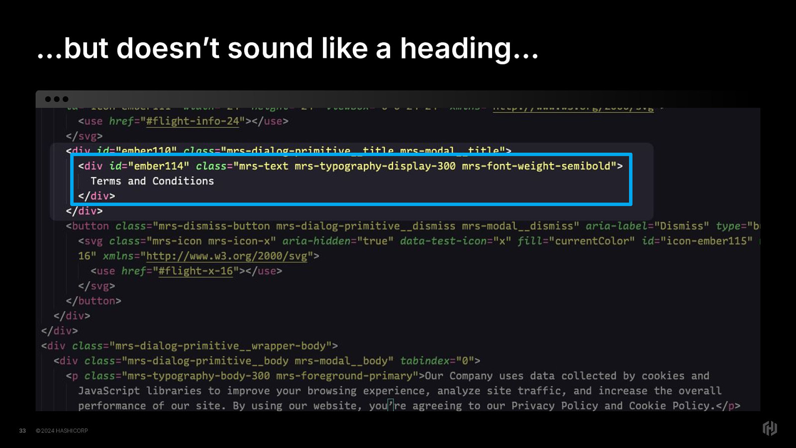
If you have, let’s say, a modal And you give that modal a title And that modal’s title looks like a heading…
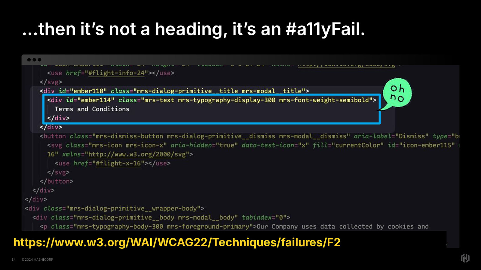
But, that modal title that looks like heading but doesn’t sound like a heading to a user with a screen reader Because the underlying code was not implemented correctly (it was a div element instead of a heading.
Then it’s not a heading, it’s an accessibility failure.
Oh no!
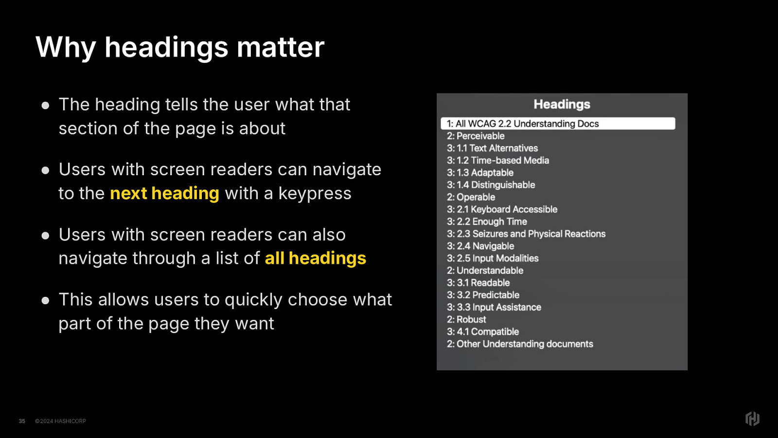
This matters because the heading tells the user what that part of the page is about.
This matters because users with screen readers can navigate to the next heading with a keyboard shortcut that is built into screenreaders.
This matters because users with screen readers can navigate through a list of all headings
This matters because it provides users with the means to quickly navigate to the part of the page they care about. Or get an overall idea of what the different sections of the page are.
Like sighted users can do. All at once. With their eyes.
And I think that’s important to recognize, because sighted folks tend to take for granted JUST HOW MUCH information eyes can take in all at once.
So, what to do instead?
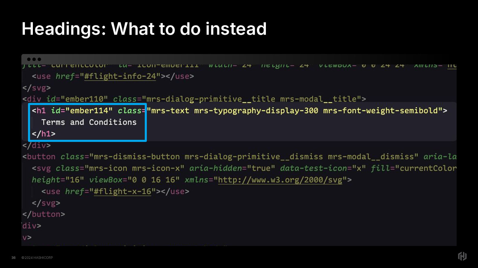
Turn it into a header if it’s acting like a header. Let’s think about that modal. A modal, when implemented correctly, will use the dialog element and when open, mark the rest of the page as inert, or unusable.
Now, If we think about this from the perspective of the user with AT Either the page “exists” or the modal “Exists” But both do not exist at the same time.
If we pair this understanding with the concept of “have a single h1 per page” Then we can see that modals should have an h1 element as their title heading element.
We will only have a single h1 element when the modal is open. When the modal is closed, the page’s h1 element is the only h1 that now exists. We will only have a single h1 at a time.
Next up in our headings, labels and instructions, let’s talk labels.
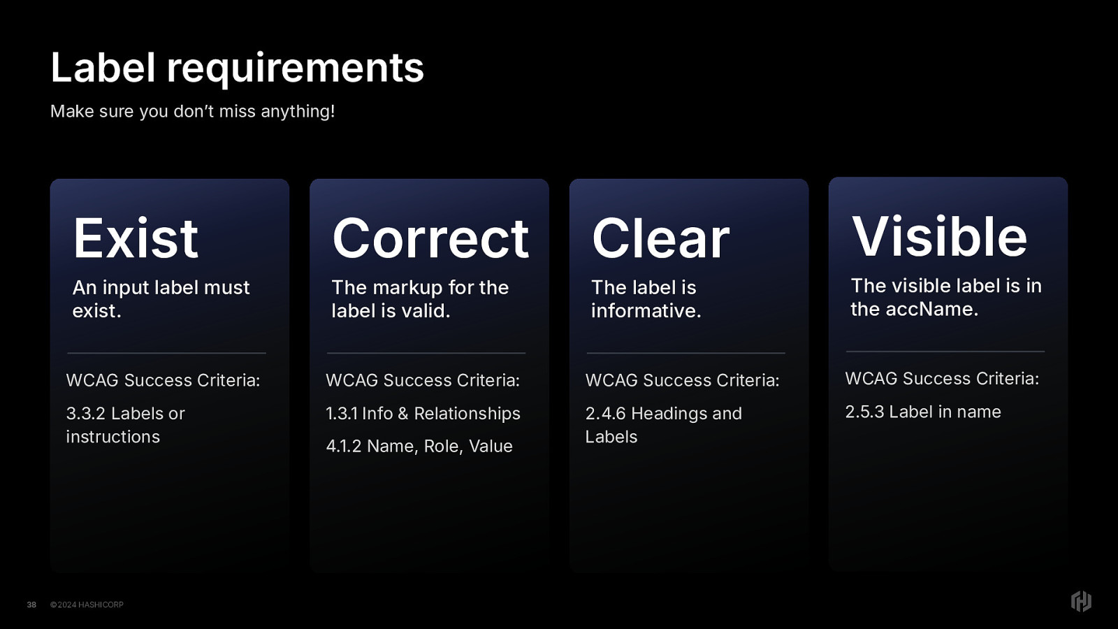
Here’s your label cheat sheet.
Exist. Labels must exist Correct. The markup must be valid and the label must be correctly associated with the input Clear. The label must also be informative and the user must be able to discern what is required of them for that input. Visible. the visible name of the label must also be in the accessible name of the label. This is for users who use speech control software.
There are 5 WCAG Success Criteria related to these four label requirements.
That’s FIVE different ways labels could fail for accessibility. FIVE. For ONE THING.
This is why I frequently tell folks to not get all bendy with the code they put on the web.
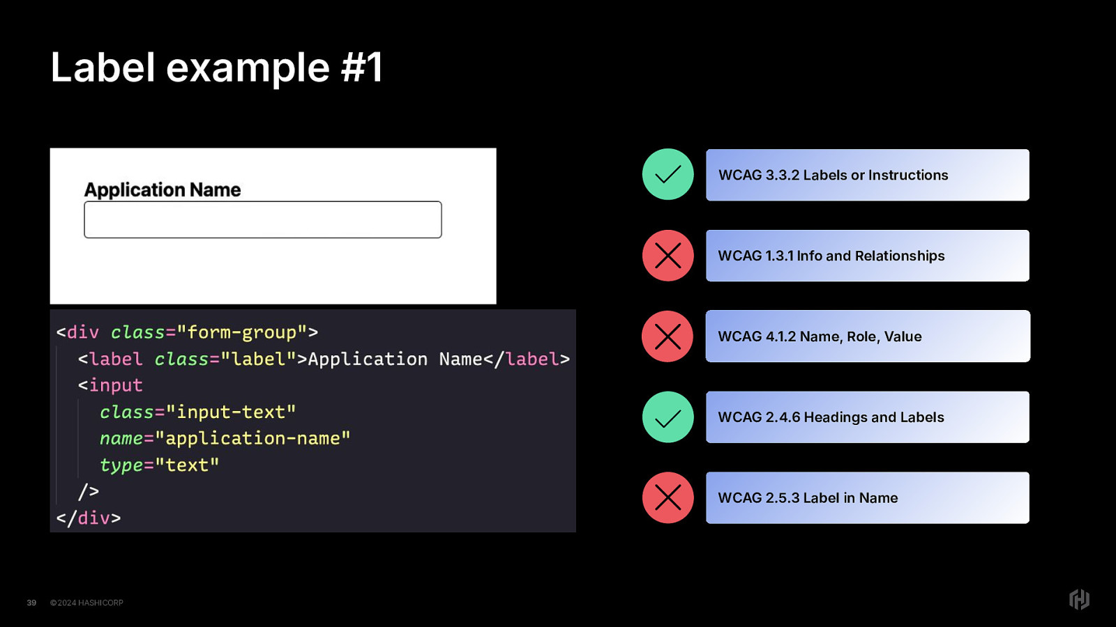
So let’s talk about some label examples and see what’s what. First up, we have a form label and input here. Let’s peek at the rendered code. There’s a label, Application Name is the text. There’s an input with a class, name, and type attribute.
Now let’s apply the cheat sheet: Exist, Correct, Clear, Visible. Exist: Does a label exist? Yes. Correct: Is the label associated correctly with the input? well, we’re missing the for attribute on the label element and the id attribute on the input element, so we’ll say no here. Clear: Is it informative enough for the user? Yes Visible: Is the visible label in the accessible name? Since the accessible name here is non-existent, the visible label is not in the accessible name, so No .
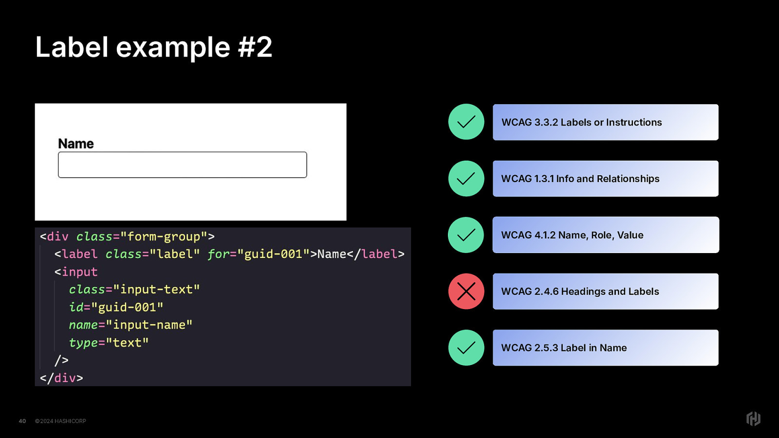
Let’s talk about another example. Here we have a form input with the label of “Name” Let’s peek at the rendered code. There’s a label with the for attribute, Name is the text. There’s an input with a class, id, name, and type attribute.
The label and the input are using the for/id attribute approach.
Again, let’s apply the cheat sheet:
Exist: Does a label exist?. Yes
Correct: Is is associated correctly with the input? yes, we see that the label element has a for attribute and input element has an id attribute, and the label element and input element are correctly associated.
Clear: Is the label informative enough for the user? Hmm. Name. First name? Last name? Full name? What does name mean here? This would fail, because it’s not informative enough.
Visible: Is the visible label in the accessible name? Yes, the visible label is in the accessible name, so it would pass that criterion.
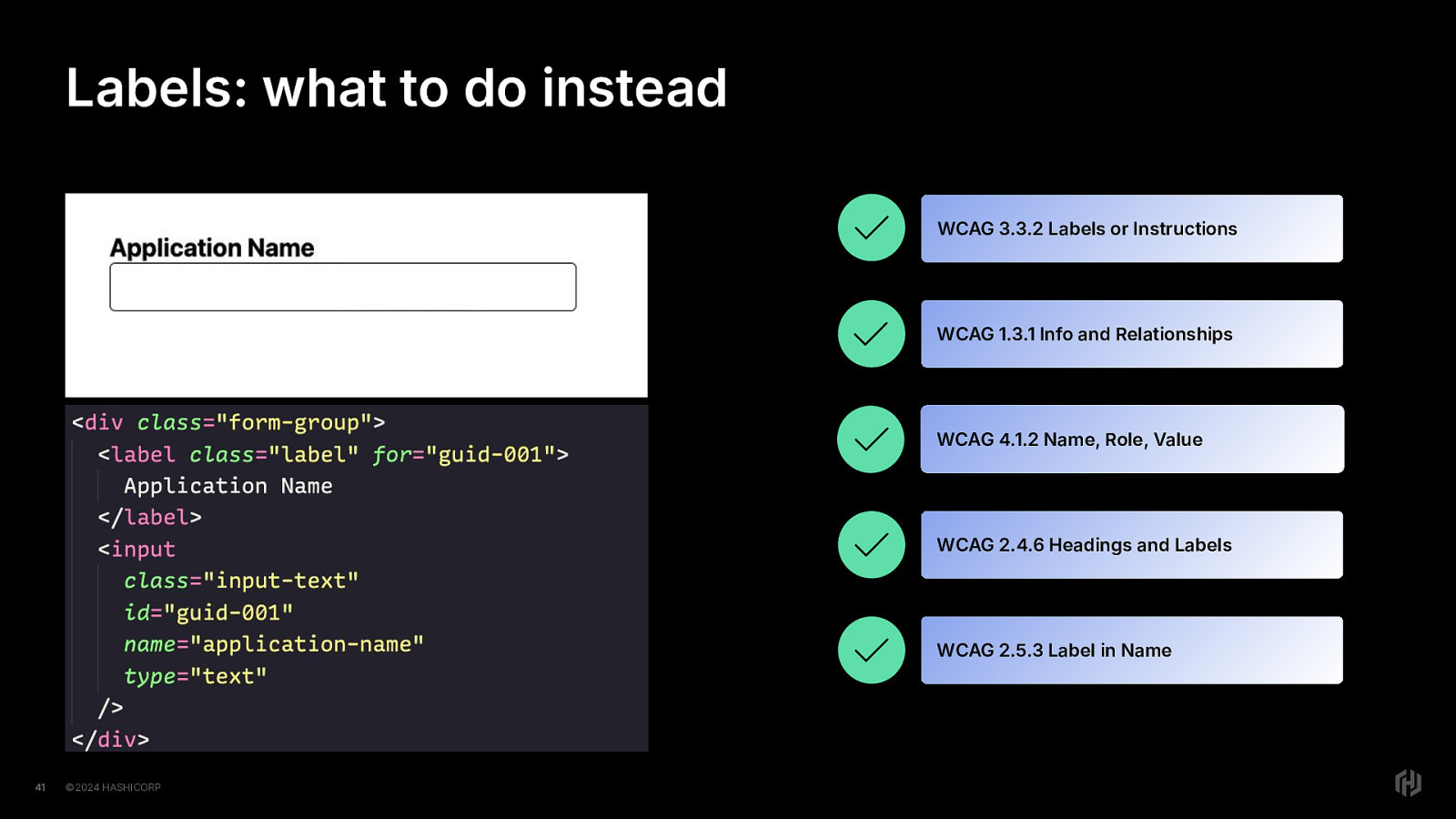
So fixing our labels, let’s look at a corrected example of the Application Name labeled input.
we’ve added the for attribute to the label element and the id attribute to the input element.
How does it stack up?
Exists? yuppers! Correct definitely now correctly associated! Clear? well that passed before, so it isn’t going to fail now. The label is clear enough. Visible name in accName? you betcha!
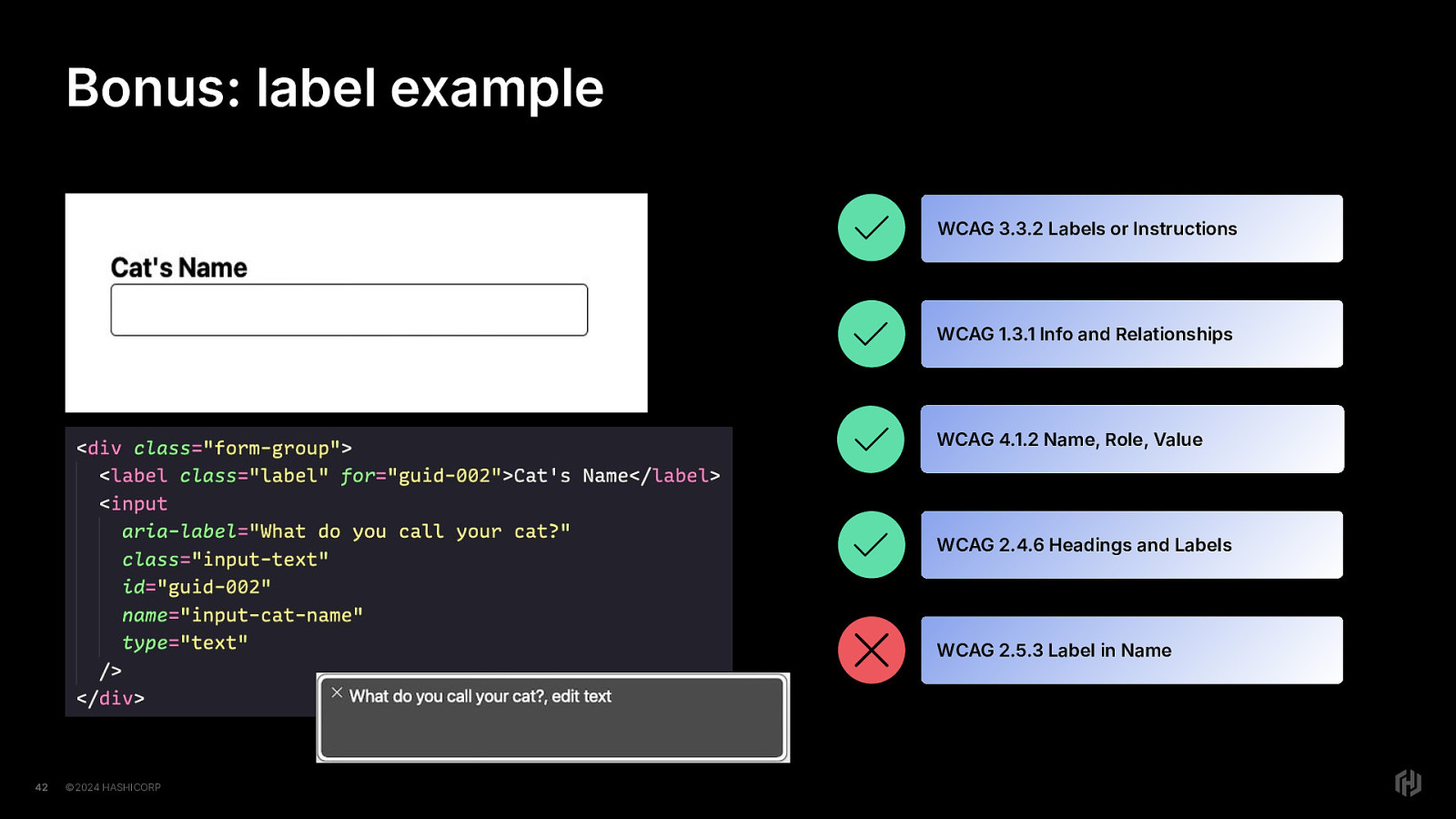
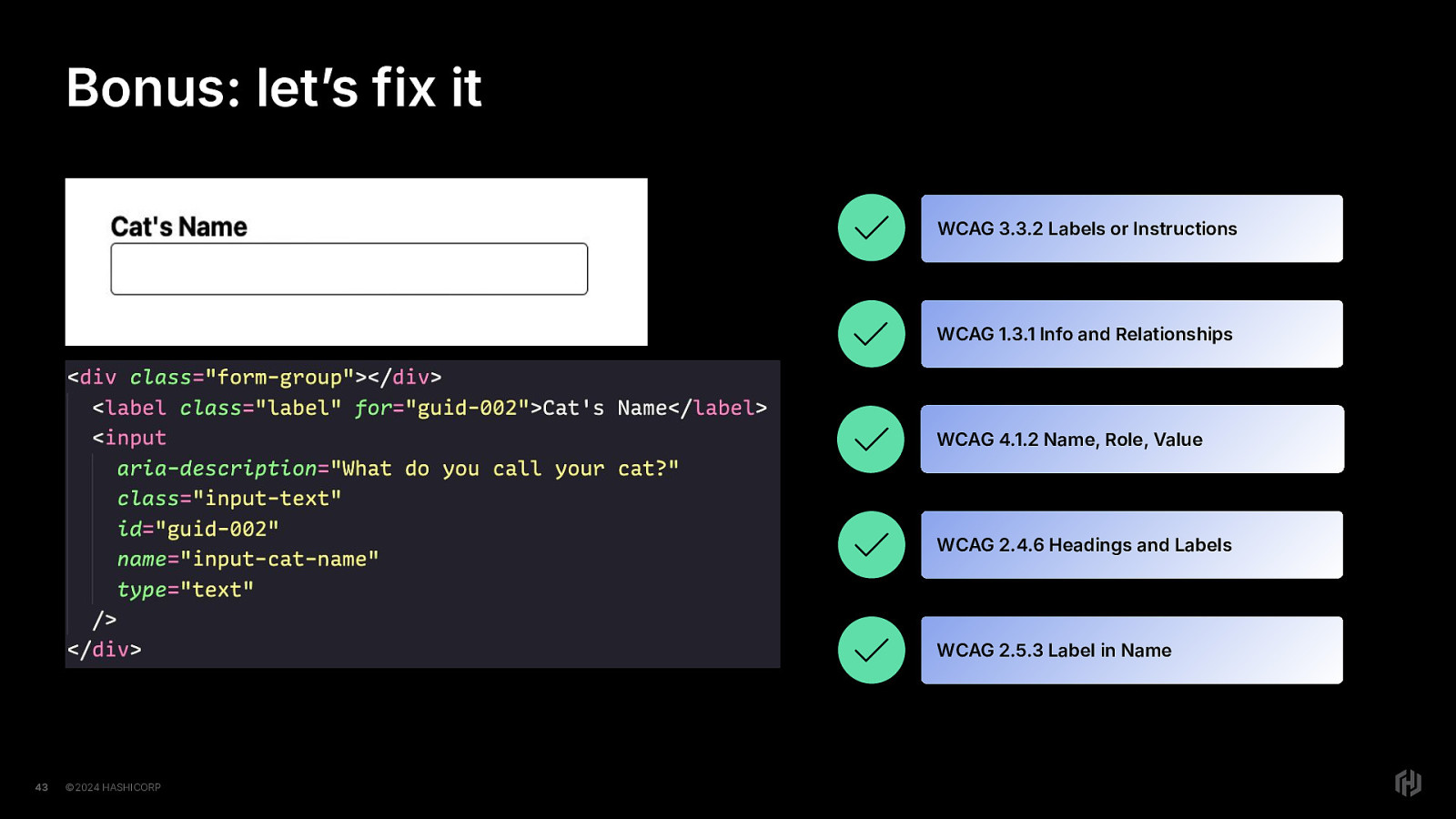
One more example. Here we have a form input asking for your cat’s name. We see…oh! We see an aria-label here. Perhaps the developer wanted to give the screen reader user extra information. Perhaps they were trying to be helpful. When we turn on Voiceover we hear that the accessible name of the input is “what do you call your cat?” So let’s see how this stacks up in our little checklist.
Exists:yup, the label for the input field exists. Correct? yup, the label is correctly associated with the input element, using the for/id attribute approach. Clear? yes, the label is clear…in both cases. Visible (label in accname)? now here’s where it fails. The visible label is not in the accessible name.
Oh no! We were just trying to be extra helpful! What will we do? Maybe we should just not want to be helpful.
Now, you might be tempted to pout a little bit, but
And I’ll tell you this for free, you can still give a little extra hint to users with screen readers. No pouting necessary!
In the cat’s name example, it was incorrect because the visible label wasn’t in the accessible name.
However, if we change aria-label to aria-description, we get (click through) Green lights all the way!
Don’t do this for all help text, but you can do it if you want to add a little something extra for users with screen readers. YMMV.
Ok now to the third part of this. Instructions.
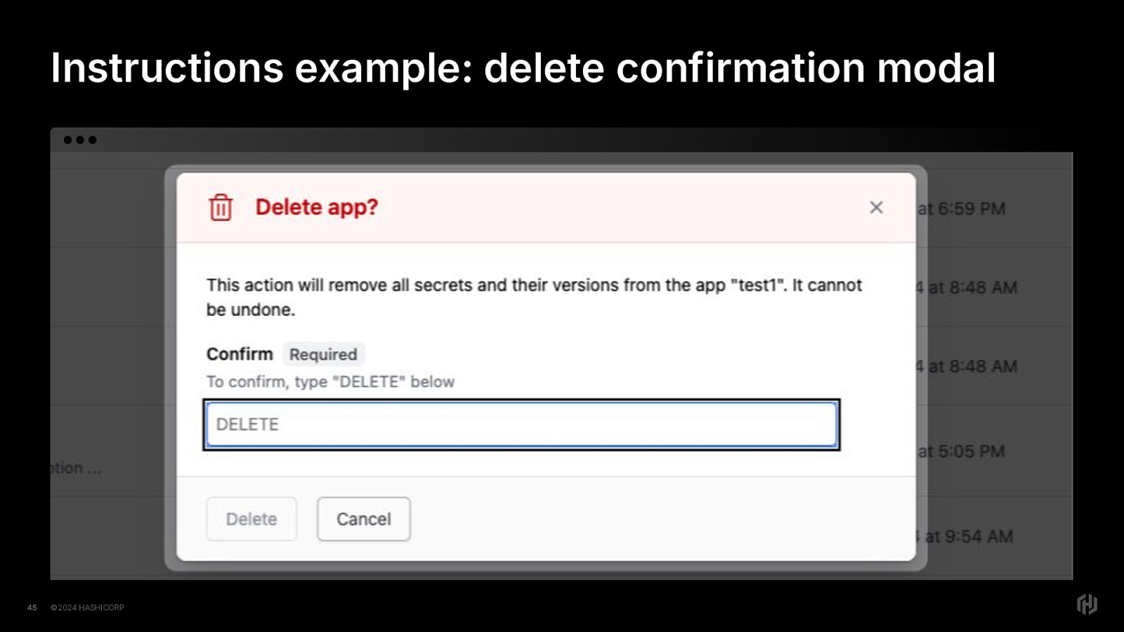
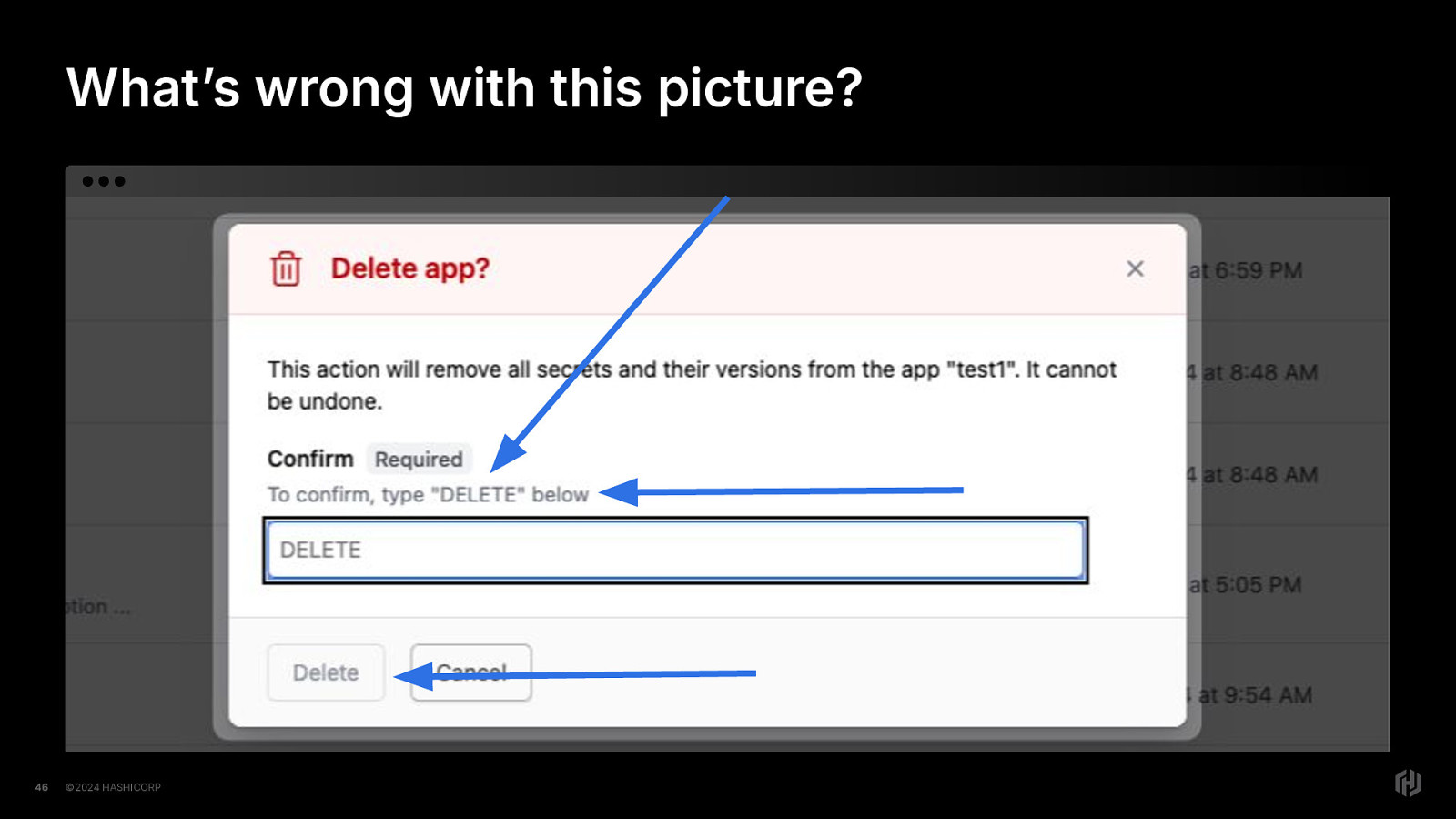
Let’s think about instructions in terms of help text. Now let’s talk about this modal example I have here. A brief exercise for sighted users: How many accessibility issues do you see just by looking at it?
There are at least four that are visible from this screenshot. Since we already talked about headings in the context of modals, let’s look at the other three.
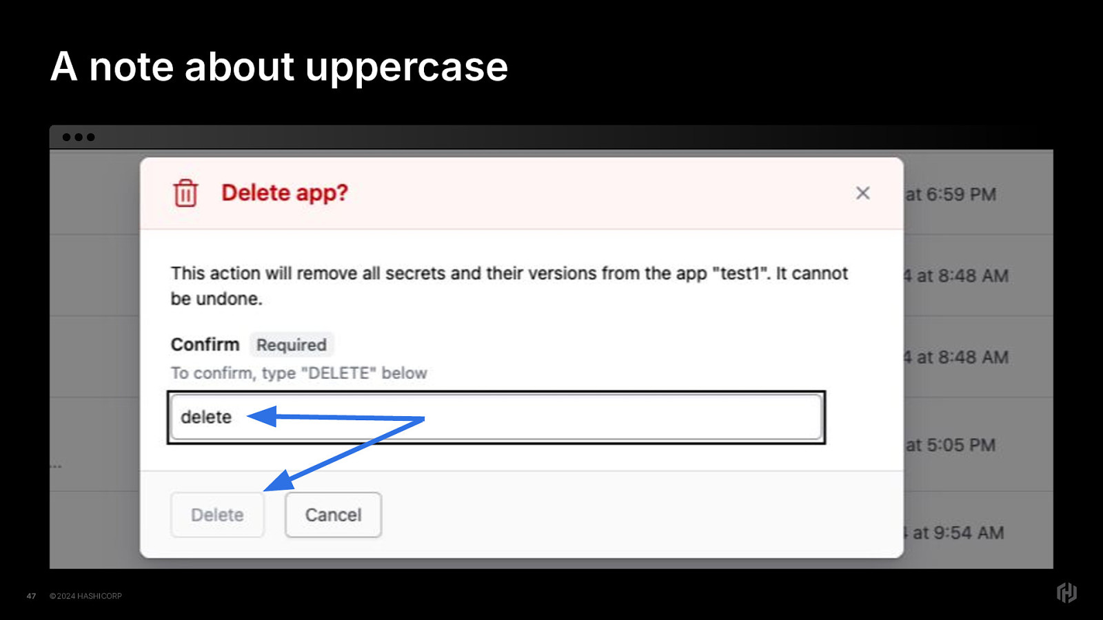
First, we have the word “DELETE” in all uppercase - this is problematic because not all screen readers treat uppercase letters consistently. Even within the same screen reader, different voice engines (the voices used in screen readers) have varying levels of support to read out uppercase letters correctly.
Second, we have the help text, “to confirm, type DELETE below.” Now the word “below” is referred to as a sensory characteristic. Except, the user with a screen reader hears this when they are focused on the input field, so what does “below” mean? It only has meaning for the sighted user.
Third, we have a button with a disabled attribute, which means that the user with a screen reader may not even know that the button is even there. In VoiceOver, it will say “button, dimmed” which is the hint to the user that a disabled button exists, but in general, if an interactive element has the disabled attribute, then it’s completely hidden from screen readers.
So let’s talk about the scenario we’ve created in this UI. we have delete in all uppercase in the input instructions- “to confirm, type DELETE below’ And we have a delete button that won’t be enabled for interaction until we get it right
Only, the user may not hear that it’s in uppercase (a common setting is to announce the word in a higher pitch, like (say it in a higher pitch) DELETE) So the user could types in delete in lowercase, if they haven’t gotten the right instructions, but still nothing happens. They are blocked from continuing and have no guidance here as to why.
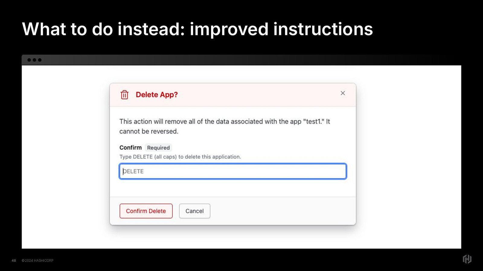
So let’s say that our designer is super busy and we want to make this more accessible and not drastically change the design because we love our designers and we want to keep our happy relationship. What do we do?
We’re going to change the help text in two ways. First, we’re going to put parentheses in with the “all caps” so that a user with a screen reader will definitely know that uppercase DELETE is required. So the instructions will say “Type DELETE (all caps) to delete this application.” Next, we’re removing the word “below” because if you’re focused on the input element when you get those instructions, there is no “below”…and if you can see the screen, there’s only one input element here, so in addition to a violation of the WCAG Success Criterion Sensory Characteristics, it’s just confusing in general. Next, we’re updating the button element text from “Delete” to “Confirm Delete” And finally, and we’re not going to disable the button; The user will get an error message if they do not fill in the field properly. We’ll lean into form validation to do exactly what it was created to to. So it’s not only completely acceptable, it’s ideal. Our form’s validation can make sure that absolutely nothing happens to the user’s data unless they fill out the form correctly, and ALL users will be able to figure out what is expected from them.
Next section is reflow, resize, space
And by this I mean three WCAG requirements that are all related: Reflow Text resizing Text spacing
Now your designer might say, “we’re a desktop app. We don’t “support” mobile.”
and then they give you a bunch of designs with fixed pixel widths everywhere, which is Figma’s fault, but ya know what?
It’s only mostly Figma’s fault. There’s math for responsive design, and developers are more than capable of doing math. Or maths if you prefer. So I don’t really accept the excuse.
We know the formula: target ÷ context = result
Also: It’s 2025 and you don’t “support” mobile? Are ya sure about that?
But fine, whatever. Time is money and money is constraints.
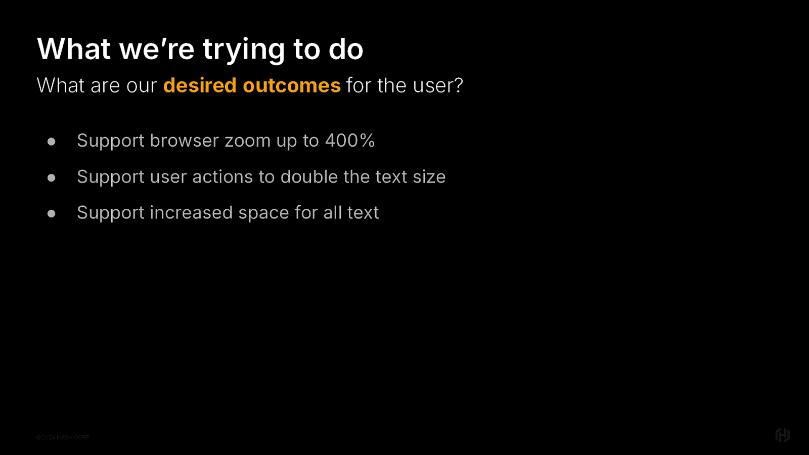
Right so let’s shift our thinking a little bit and Let’s think about this in terms of desired outcomes, though.
What do we want the user to be able to do?
They should be able to zoom up to 400% They should be able to increase the font size up to double They should also be able to increase all facets of spacing for text.
https://www.w3.org/WAI/WCAG22/Understanding/reflow.html https://www.w3.org/WAI/WCAG22/Understanding/resize-text https://www.w3.org/WAI/WCAG22/Understanding/text-spacing
Ok so let’s talk at an example of a reflow failure.
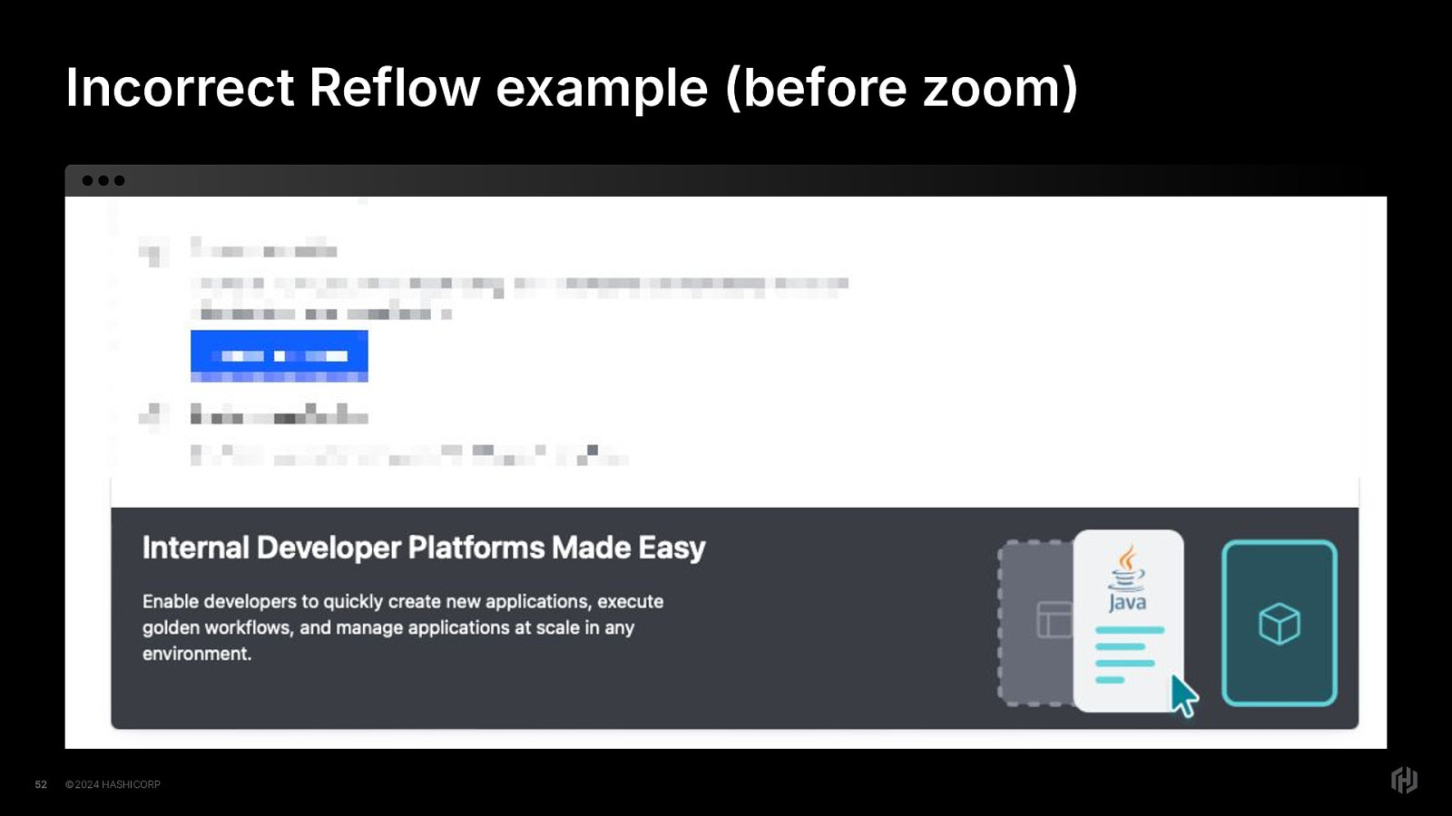
Here we have a screenshot with the irrelevant bits blurred out, so we can all hone in on the banner.
This is at full width in the browser, and the banner elements are placed as designed. The the title and the descriptive text are on the left and some decorative graphic art is to the right.
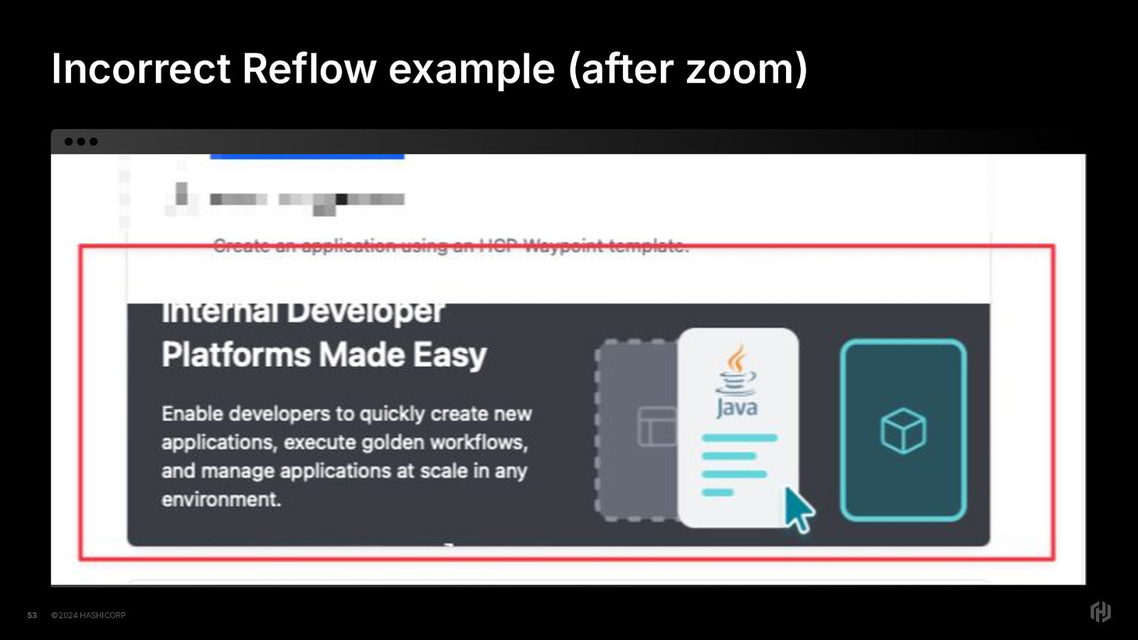
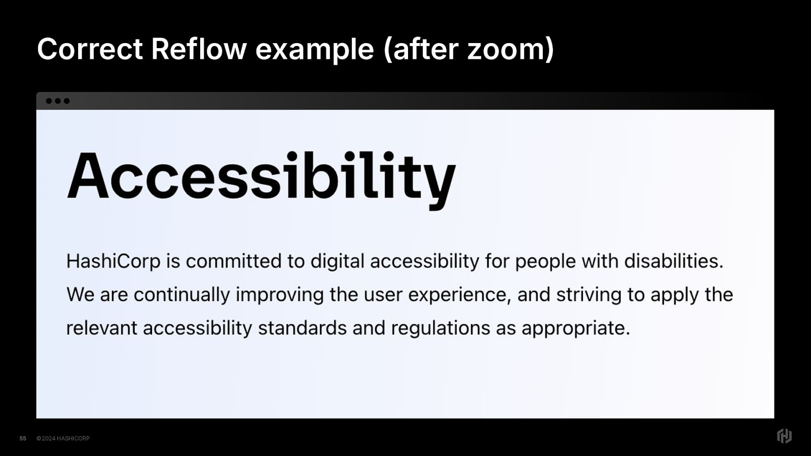
But then once we zoom in, we see that the content has not reflowed…it’s starting to become clipped and unreadable. This was not even at full zoom. At full zoom, the content would not be visible. The container is no longer meeting the sizing needs of the content inside.
When done correctly, none of the content is hidden or clipped when browser zoom is used.
The content is still visible and fits the viewport, and it does not require the user to scroll in two directions to see content. Or not see the content at all because overflow was hidden.
This also mostly applies to text resizing as well; while users can especially only just resize their text, using browser zoom has become commonplace enough for that to be an acceptable check in most cases.
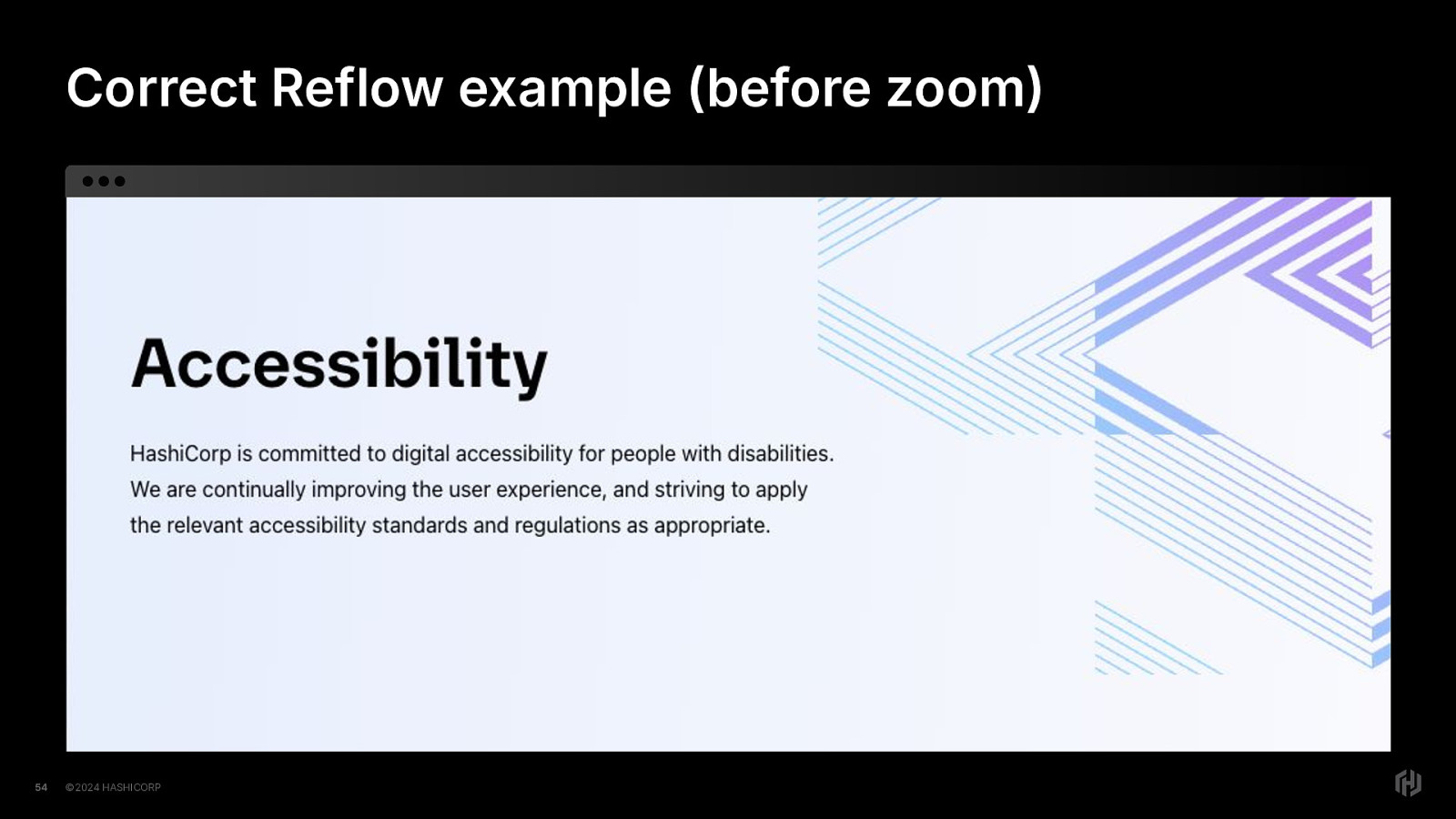
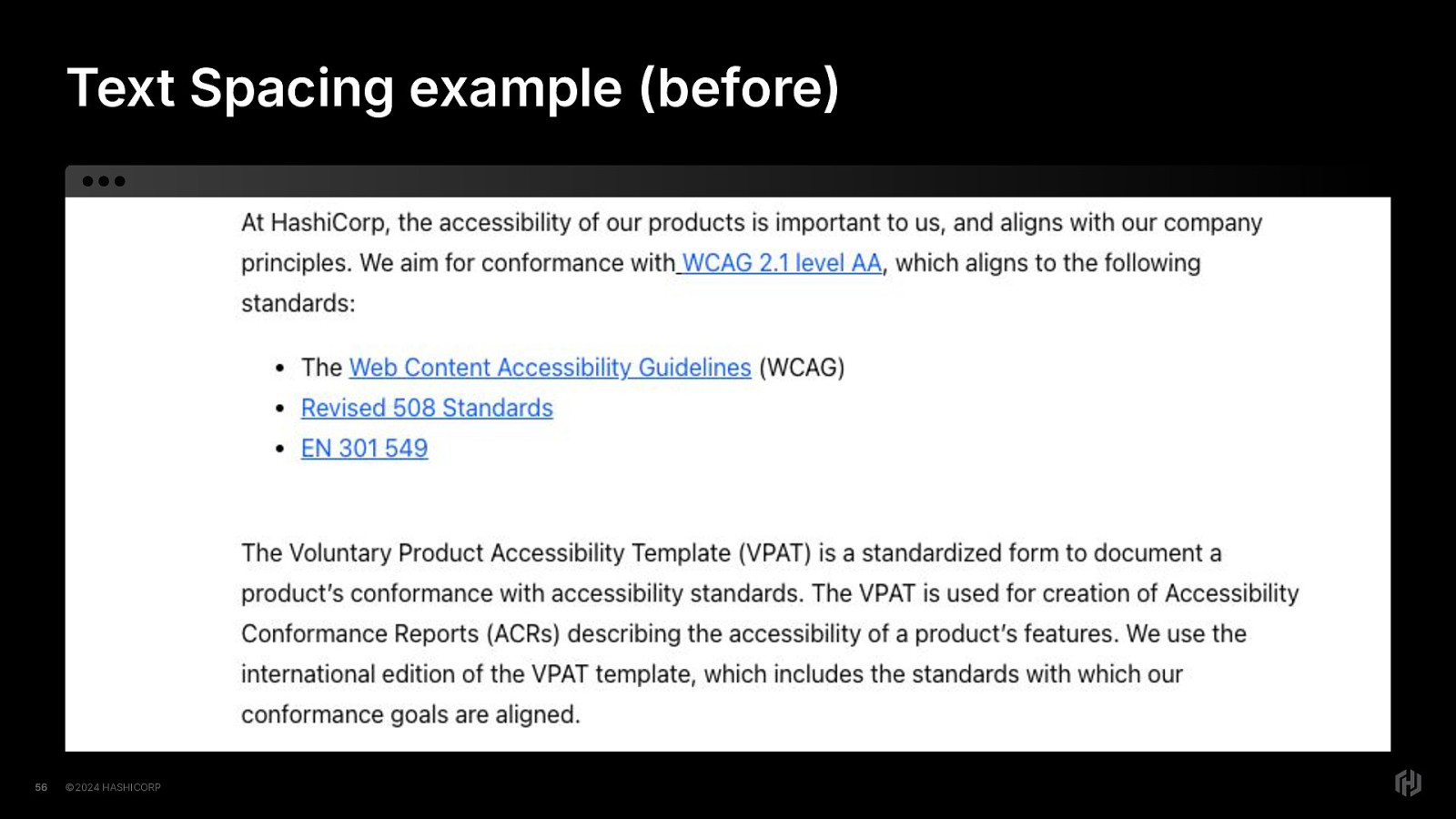
For text spacing, let’s observe a “before” and “after”, first.
Here is some website content before the text spacing requirement has been applied. It presents as expected. The content fits into the viewport. Nothing special.
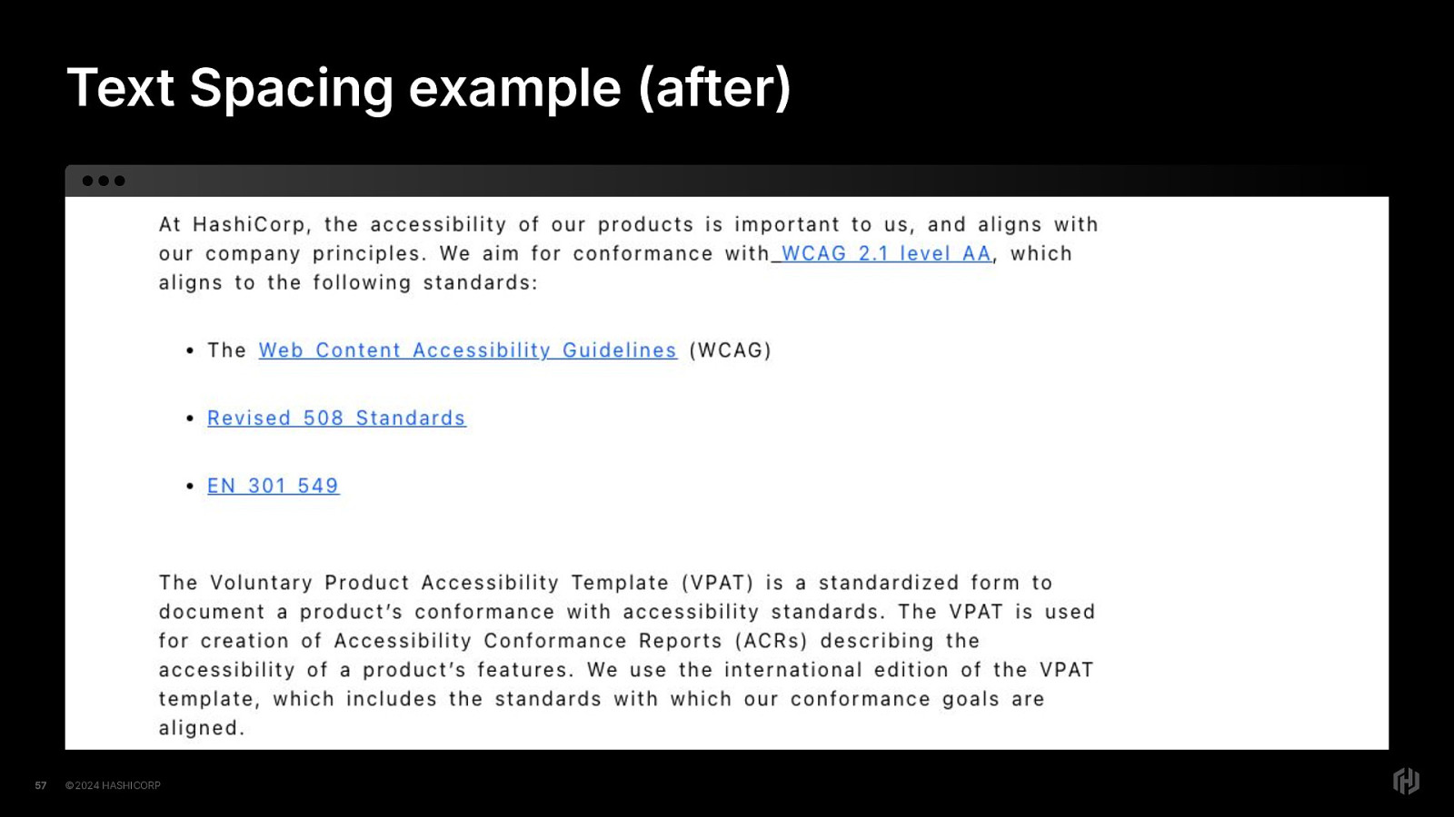
And here it is after the text-spacing requirements have been applied. We can observe that the container has been created in a way that supports changing text spacing without clipping or hiding any content.
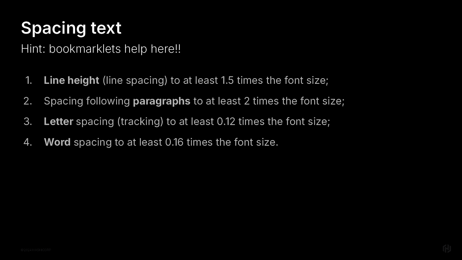
Let’s talk about what those text spacing requirements are.
https://www.w3.org/WAI/WCAG22/Understanding/text-spacing
Users should be able to change the line height The spacing that follows a paragraph Letter spacing And word spacing
Since these all should support very specific amounts, have a CSS class you can use for testing, or a bookmarklet and try it out in the browser.
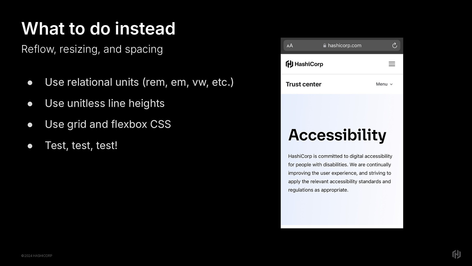
Right so what to do instead for reflow, resizing and spacing. To successfully do this, you’ll want to use all of the lovely techniques we have for responsive design.
Relational units Unitless line heights. Grid and Flexbox CSS
And make sure you test!
In the end, “browser zoom support” ends up looking a little bit like “mobile viewport”
The takeaway here is that if you meet the accessibility success criteria related to reflow, text resizing and text spacing, you sorta get some responsive design for free.
Okay, let’s put all of these things together and wrap this up.
The WCAG success criteria are the bare minimum requirements for people with disabilities to use the internet. But There is so much more beyond that to make sure we’re providing an equivalent experience. We want to answer the question, can all users use the app in the way it was designed to be used? I’d say beyond that, can they use it delightfully? Does it bring them delight? Does it make their work easier? Are we removing barriers to satisfaction or are we putting more up?
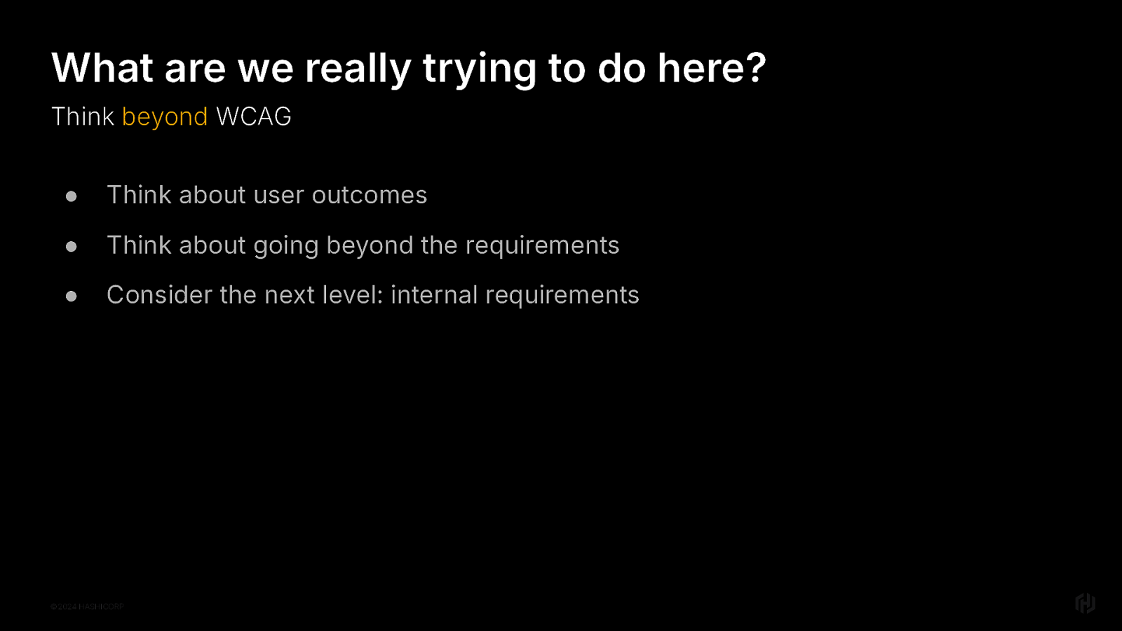
I want you to think beyond. What are we really trying to do here? Think about what a delightful user experience is for all types of users. Think about how you could do more. Challenge yourself. Challenge your team! Maybe the next level for you is internal requirements.
“How can we go beyond, Mel?” you are asking yourself right now.
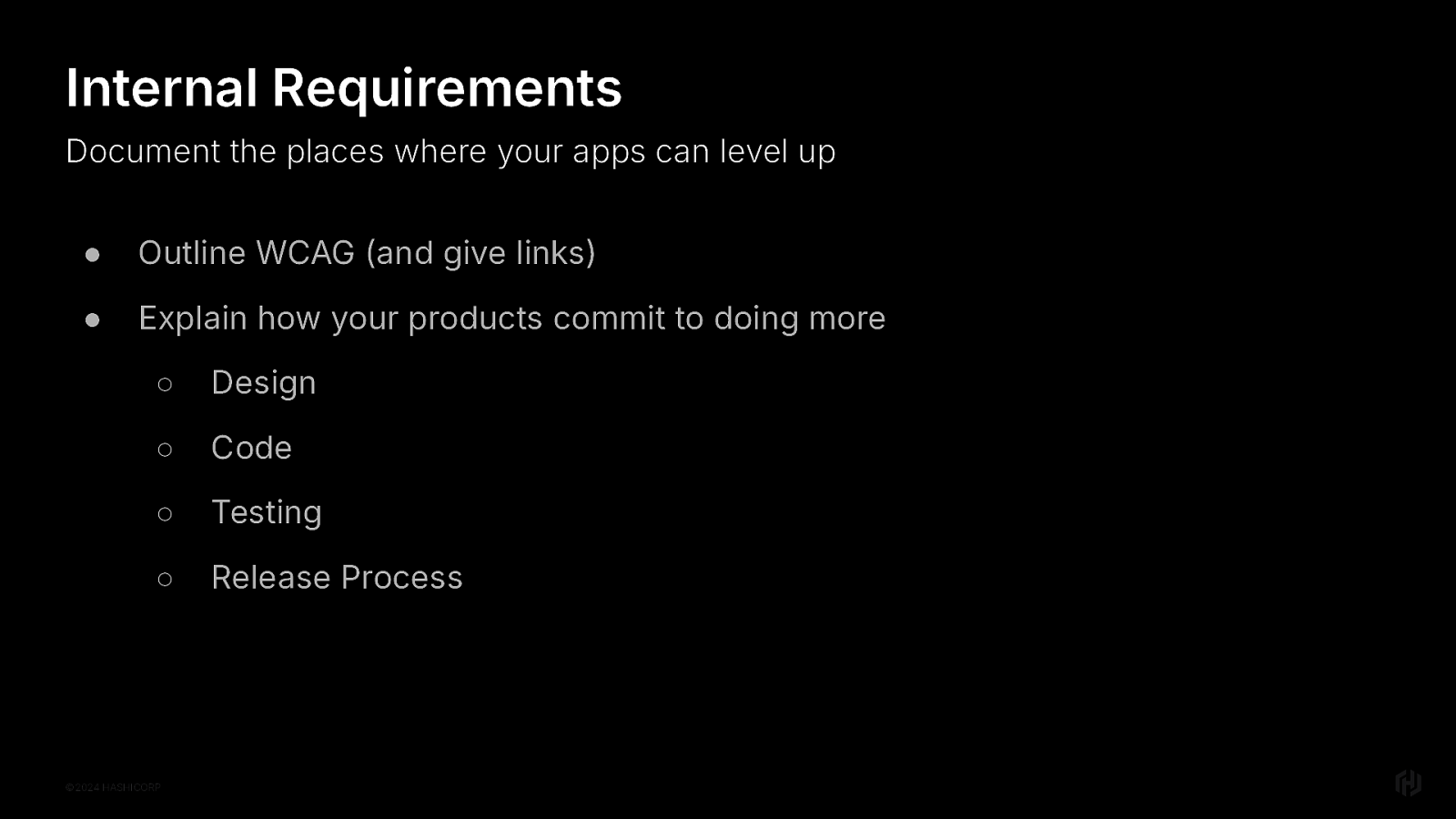
I’m delighted you asked. Because I have ideas. Outline the bare minimum WCAG requirements internally, and then explain ways that your products will do more. Outline requirements for design. For code. For how you will test. For how you will integrate accessibility reviews into your product development and release process.
The thing is, I am calling on all developers to be a little more selfish. Did you know that there’s such thing has an “age burst” and the first one happens (or will happen) to you in your mid 40’s?
Play a video game one day? Have tennis elbow for a month. Hear a sudden noise and turn your head too quickly? You just have a sore neck that’s your life now. Then one day you need reading glasses. Then six months later, you need stronger reading glasses. And your doctor says that your eyes will “settle down” but you don’t know if you believe that because a year ago you had 20/20 vision. Everything just kinda…hurts now.
So be a little selfish.
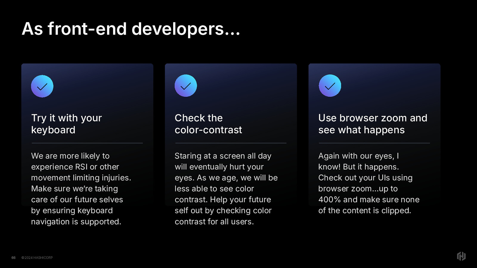
Try out your front-end with your keyboard. Check the color contrast with an automated tool that does the math for you. Use browser zoom and make sure it works, and give your eyes a break.
You’ll improve your apps a little bit for accessibility…and your future self.
You might be saying, “Mel, I won’t be around to use these apps in the future, I’m sure they’ll be re-written by then anyway.”
But the thing is, every single developer influences the way that code for the web will be written in the future. What are you teaching those who come after you? What will learn when they look at your code?
Or even worse, what will AI churn out because it learned from your code?
Finally, I’ll just say this.
You do not require permission to create accessible code. It doesn’t have to be explicitly stated in the requirements, you don’t have to be specifically told to do it. You don’t require permission. Create accessible code.

A look at common patterns found on the web, how they are harmful for accessibility, and what to do instead.