Designing Connected Content

A presentation at Amuse in October 2019 in Budapest, Hungary by Mike Atherton

Slide 1

Slide 1

Many years ago I used to work in porn. Not as an actor, but as a web designer for Playboy TV. And not just Playboy, reducing awful plastic softcore porn to blurry 160 pixel video clips sent over dial-up internet, oh no.

Also websites for a terrible kids channel, an even more terrible quiz show channel, and a channel for drunk men coming home from the pub, where we thought it was a good idea to put five young women in a London flat and stream a live webcam from every room. A year before Big Brother too.

Slide 2

Slide 2

Nowadays we look at this in horror, but sadly the Nineties were less enlightened times. Anyone remember the Nineties? All those tamagotchis and Magic Eye pictures, yeah? We didn’t have UX back then. Didn’t argue over job titles or call ourselves visual interaction experience architecture strategists. We were web designers. We designed the web. A punk web made out of HTML, GIFs, Perl scripts, late nights, Jolt cola and naive optimism. The old days. Yet even back then something was bugging me.

Well, two things really.

Slide 3

Slide 3

Problem 1: Bringing Old Ideas to New Media

First off, we had this amazing new hypertext, hyperlinked, hyperactive highway. Cyberspace. All fizzing electrons and bad Lawnmower Man CGI. A future of non-linear, intertextual, intertwingled information.

We used it to make shitty microsites for energy drinks.

Slide 4

Slide 4

We didn’t take the time to figure out the grammar of this new space. We just brought with us what we knew from old media, like print and TV and retail spaces.

But then we always do, don’t we? Marshall McLuhan - yes, another conference talk quote from a dead white guy - said when faced with a new situation we attach ourselves to the flavor of the recent past.

Slide 5

Slide 5

Problem 2: What Even is Digital Design?

My other beef was with design itself. I thought a designer is supposed to design the ends, not just the means, aren’t they? The meal, not just the plate. The flowers, not just the vase.

Sometimes it seems like being a designer is just designing the container for the thing that people really want. I was designing user interfaces (and hell, it was the 90s so hello unskippable Flash intros and unreadable typography) yet the only real point of the interface was to give people what they came for: Information.

Slide 6

Slide 6

People wanted the content. I guess some things never change. It’s why I moved from pushing pixels to pushing words. And as I entered another brave new world I brought with me my designer’s systems thinking. I still keep an eye on the UX design world: people worrying about losing their jobs to artificial intelligence. Arguments over whether ‘everyone is a designer’. Designers still complaining about their seat at the table.

Seems we’re in a hole. But I’ve been here before, and I know the way out. And maybe it’s design, or content strategy, or something more human than both.

Slide 7

Slide 7

Enter Content Strategy

Yeah, that’s the job I do at Facebook: Content Strategy. Sounds rather grand. Google calls my job UX Writing. My friends call it “writing Click Here on buttons”. I tell them *“No that’s not right actually. Cos ‘Click Here’ isn’t accessible actually. So I use a verb-noun pair on the buttons I write for”.

But tt’s true. Most of what I do at Facebook is interface microcopy.

Slide 8

Slide 8

What is Microcopy?

It’s things like dialog boxes…

Slide 9

Slide 9

Error messages…

Slide 10

Slide 10

More error messages…

Slide 11

Slide 11

Calls to action…

Slide 12

Slide 12

And crash reports.

I kid. Those examples aren’t mine (but sorry if they’re yours). This is what happens when you don’t put care into constructing your product language; the same care you’d put into visual design, research or engineering.

Slide 13

Slide 13

And it’s not just instructions. We also do onboarding flows, labels, even marketing messages. And yes, sometimes it literally is writing words on buttons.

Slide 14

Slide 14

Words that SHOW ME THE MONEY! Hell yeah 87% clickthrough boost!

There are dozens (if not hundreds) of content strategists working across Facebook’s family of apps. We’re hiring more every week if you’re interested.

Slide 15

Slide 15

Content Strategy at Facebook

You probably know that Facebook has a few different apps: Facebook, Messenger, Instagram, WhatsApp and so on. Within each of those teams, there are lots of little teams.

Inside the Facebook app there are teams for Groups, Marketplace, Gaming, Dating, Video - and that’s just for starters. News Feed has a team. And Stories. And Profile, and Search, and Memories, and Local News and many, many more.

Slide 16

Slide 16

With so many moving parts it’s a wonder anything fits together at all. But it does. That’s partly because all these people share patterns and standards to hold everything together.

Product designers whip up a Sketch mocks super quick because they’re just Lego-ing together pre-designed components. Content people use standards and style guides to stay on message.

Slide 17

Slide 17

This tonal scale makes sure we’re saying stuff in the right way. Because you don’t want to be all happy happy joy joy when telling someone their card was declined.

Content development is baked into the design workflow. That’s not to say we ‘wordsmiths’ always get the respect we think we’re owed. I’ve heard UX writers often complain despite considering their work meticulous and intentional, their clients just want them to make the words look pretty.

So on that note, let’s run through…

Slide 18

Slide 18

Five Lies About Writing for Products!

…some of the things I hear almost every day.

Slide 19

Slide 19

1. It's Copywriting

“Huh, you’re a wordsmith. Can you work your magic?”. It looks like writing, but it’s really design. In fact if you want to justify the “strategy” part of content strategy, it boils down to design thinking. Planning out user journeys, error states–all that stuff.

If interaction design is the boxes and arrows, we do the stuff that goes inside the boxes.

Slide 20

Slide 20

2. It's Cute

You know what I mean. There’s this habit that products have that they want to talk in this amusing, overfamiliar way. And it’s not awful. Not always. But come on, there’s a time and a place.

Do you want get a “WHATEVER DUDE” when your account was closed or your pet just died. Coming up with a product voice is also learning to moderate the tone for each occasion.

Slide 21

Slide 21

3. Anyone Can Do It

“Yeah I’m the client here. I write emails and powerpoints, so how hard can it be?”. Just words, right?

Sure, anyone can do it - just like clients can spend the weekend bastardising your mocks with their own ideas. “Couldn’t we just do something like this - not this obviously, not this, I’m not a designer. But, er… this?” Yeah, no. Content may be the main artefact, but that strategy part makes sure it’s the right content.

Slide 22

Slide 22

4. It Only Takes a Minute

It’s just two words on a button, how hard can it be? But that button does something complex. And we need to make sure it lines up with terms used somewhere else. And we need to make it clear. And you would not believe the rounds of A/B testing, or A/B/C/D/E testing it can take to get a win.

Slide 23

Slide 23

5. Nobody Reads

Best way to piss off a UX writer is telling them that nobody reads the words. I mean it’s true of course. Nobody does read. Until they do.

Like the rest of the UI, microcopy gives contextual cues and signals affordances. When we’re in a state of flow, we don’t consciously notice these things–context carries us along. It’s only when we break out of flow and get lost that our eyes dart over to the words. They’re like a guardrail nudging us back into flow.

Slide 24

Slide 24

It’s not about being cute or flashy or standing out. It’s about being clear. Drawing attention only when needed, and otherwise staying the hell out of the way.

Or as we like to say, Simple, human and straightforward.

Slide 25

Slide 25

Content Strategy is Systems Design

Anyway, I was saying before that standards and patterns are only a small part of how our content folk hold Facebook together and make everything speak in the same voice.

The bigger reason is that we need to think in systems. Give us any product idea and we should be able to see the conceptual skeleton under the interface skin we have to, because usually have to give those concepts a name.

Slide 26

Slide 26

Terminology, in other words. Any decent product writing starts with coming up with names for all your objects, actors, actions and properties.

If you don’t have that, you don’t understand the product.

Slide 27

Slide 27

If you do, that’s the ballgame. Systems thinking is making a comeback everywhere on design Twitter. Companies show off their design systems. Service design is still that weirdly snobby, Whole Foods version of UX design. And for a while there it looked like the the hard things, you know: ideation and synthesis and technical skill needed to actually design something, was being drowned out by more abstract ideas like empathy.

Now I like empathy, I do. But there’s a big jump between understanding someone’s problem and being able to solve it.

Slide 28

Slide 28

So maybe now’s the time to deal with my 20-year bellyache about how there must be more to design than interface design. There’s a ton of new content-friendly devices coming out–phones are so last year. You’ve got to be on this pretty wild Alexa ring now.

Slide 29

Slide 29

Or these glasses.

Slide 30

Slide 30

Or maybe even this microwave if you want to be out there. So maybe systems thinking holds the answer. Not just to be better UX designers or content strategists, although that too. Not just to get that seat at the table, although that too. But to assess the present, look to the future and think again about what digital product design really is.

But be warned: once you throw away the rear-view mirror, you might never look back.

Slide 31

Slide 31

So, What is Content?

Previously on this talk, I said that people just want the content. But content is a broad church. Movies on Netflix. Photos on Facebook. Tweets on Twitter. Pieces of audiovisual or textual data meant to inform, educate, or entertain. If I were a different kind of content strategist, I’d go deep into what makes the content itself well-designed. But I’m not. This isn’t about how to write better blog posts or make better videos. Oh go on then, just quickly.

Slide 32

Slide 32

Well-designed content is: Useful! Of course it is. Lose the CEO bio, just tell us what time your store closes. Useable! I mean have you tried reading a PDF of a restaurant menu on your phone? Findable! Make it match what people are looking for. Focused! Don’t ramble all over the place (like I do). Think Wikipedia–one topic, one page. Targeted! Are those animal videos meant for kids or zoologists? Distinctive! What can only you give me? Because when I’m Googling I’m gonna go back and forth on the first few results. What will make me stop on yours? Connected! More on that in a moment.

Slide 33

Slide 33

But no matter how good the content is, the painful truth is that nobody cares. Yep, you heard that right. No one cares about content. People actually care about… stuff.

Slide 34

Slide 34

Stuff

Stuff! Celebrities, cars, movies, theme parks, recipes, pensions, music, travel. Someone looks you up because they’ve got an itch to scratch. They’re buying a house. Planning a vacation. Learning the electric clarinet.

The content is just a means to an end.

Slide 35

Slide 35

So what matters then are the things you’re content is about. Compelling content is specifically about the things that matter. To me this is where design, content, and research collide.

Let’s forget about designing interfaces. We’re going to get practical now and make ourselves a little world.

Slide 36

Slide 36

You see, every business is in a world of its own. Lego is in the space of imagination and play. Spotify? It’s music. Workplace by Facebook attracts people who like team collaboration.

Your product has to keep your audience interested in the thing that keeps them interested in you.

Slide 37

Slide 37

For example, look at this customer email from Dyson. They sell posh vacuum cleaners. But the email isn’t about vacuum cleaners. It’s about keeping your house clean and tidy.

Dyson know that keeping a customer is about keeping them interested in the thing that makes them a customer.

Slide 38

Slide 38

Let’s take music. What are music fans actually into? It’s bands, isn’t it? Artists, songs, albums, labels and tours.

Slide 39

Slide 39

You come to a conference like this one. What do you want to know?

You want to know where and when it is. You want to know who’s speaking and what they’re gonna talk about. Whatever your subject, design starts by figuring out the things that matter to your audience.

These concepts will become your design material - your Lego blocks. You’ll use those blocks to build your world. Your subject domain.

Slide 40

Slide 40

In my best-selling book - I say ‘best’ (I also say ‘selling’). But just FYI (in case you’re stuck for Christmas gifts) Carrie Hane and I wrote a book about all this.

In that book we talk about another conference where we used a process I’ll share with you now. We wanted to build a digital presence not just for one year’s conference event, but for every event into the future.

We started by finding the most interesting things in that world.

Slide 41

Slide 41

Research was our friend and should be yours too. Talking to users is a given, of course. But also seek out the subject matter experts. These are the folks who know how everything works. Interview them. Ask questions.

Slide 42

Slide 42

Asking Questions

What exactly is the difference between a talk, a keynote and a workshop? How do we express the overall conference brand and this year’s specific event? What can sponsors actually sponsor?

You can go way deep on these questions, but this is how to figure out how that world joins up.

Slide 43

Slide 43

Through the things you choose to represent, you’ll show the audience you understand the stuff they care about. Name the things appropriately so they match what people look for.

Keep an eye on the future. Our conference was held in a hotel, so we thought HOTEL a good label. But what if one year they decide to hold it somewhere else? In our case, HOTEL became the more generic VENUE.

Slide 44

Slide 44

Like atomic structures, things contain more things. Take a PERSON. What does a conference audience need to know about each person? Their name for one. And what they look like (or in my case what I looked like 5 years and 30 pounds ago). Their job. Their bio. Whatever you know to be useful.

Slide 45

Slide 45

Eventually we get a list of the important things that make up the world of a conference. These are the building blocks of our design. And our content strategy. Keeps us focused on the stuff that matters and stops us wasting time making content about stuff that doesn’t.

But we’re not done yet.

Slide 46

Slide 46

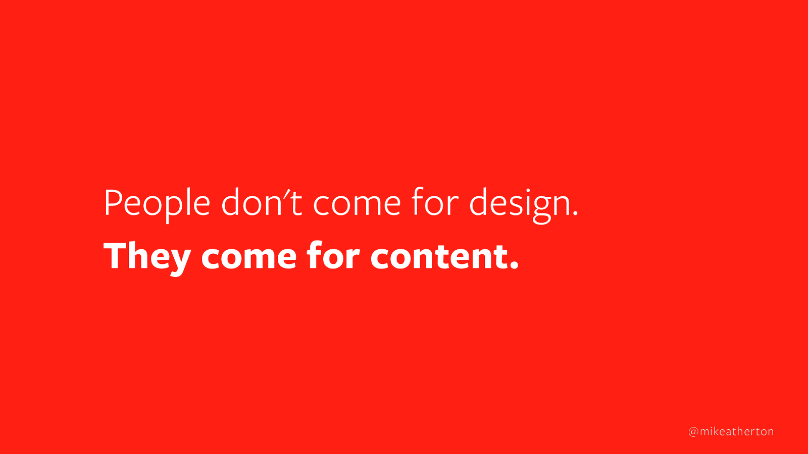
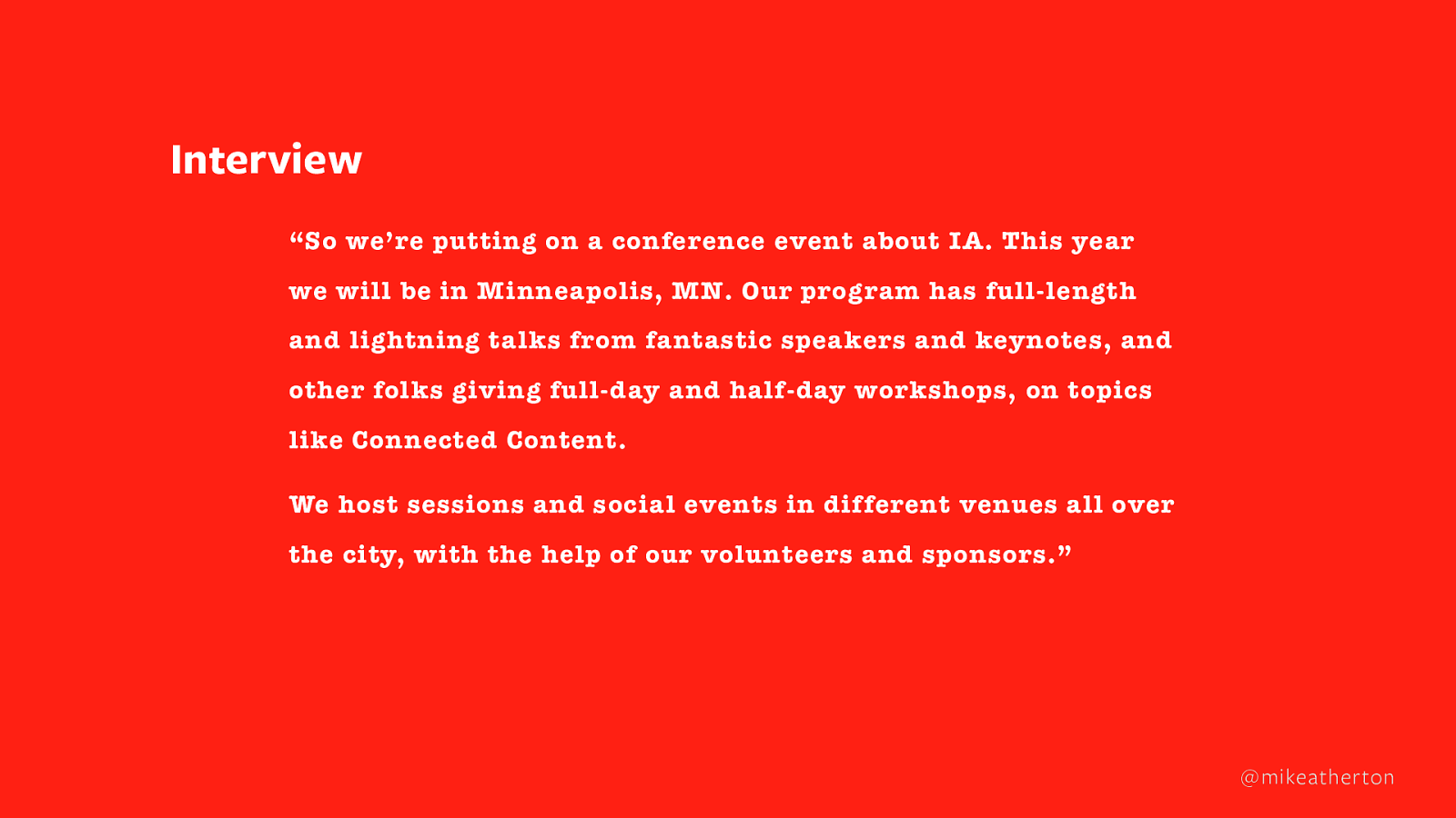
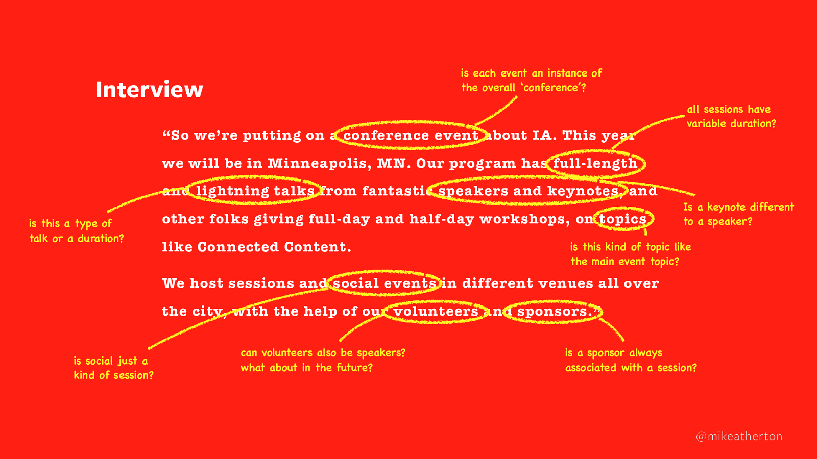
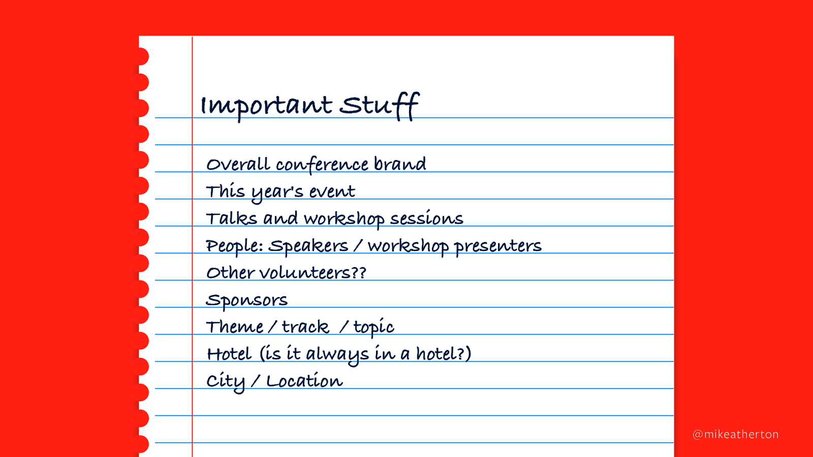
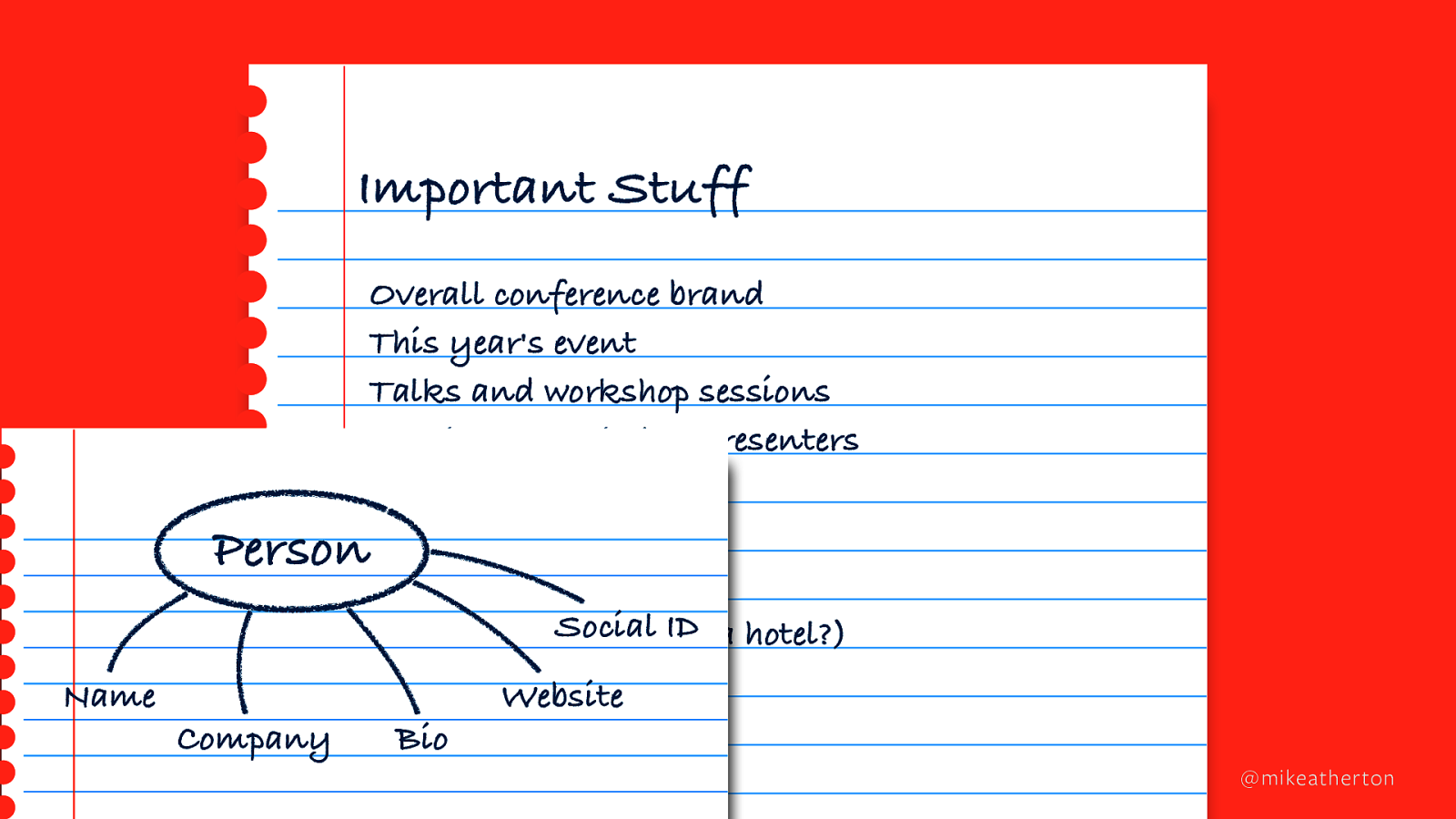
I said before that nobody cares about content. (Is that why the book isn’t selling?). So how about this? No one cares about the user interface either. Wowsers.

Hear me out. Our industry has changed. More and more we’ve come to expect less and less of interface design. It’s a commodity. Standardised frameworks. Recycled tropes and patterns. And cost-cutting across the business. When we think of design as just interface design we sell ourselves short.

More and more, the interface has less and less of a gatekeeping role. Power has shifted from centralised, first-party silos to distributed, third-party platforms. People are less likely to get your content from your website than they are to get it via YouTube or Facebook. Or a voice assistant. Or a bloody microwave.

More and more there’s just more and more. 600 hours of video uploaded to YouTube every minute. A million tweets. Seven million Facebook posts. And all the while we have less and less time to dig through it.

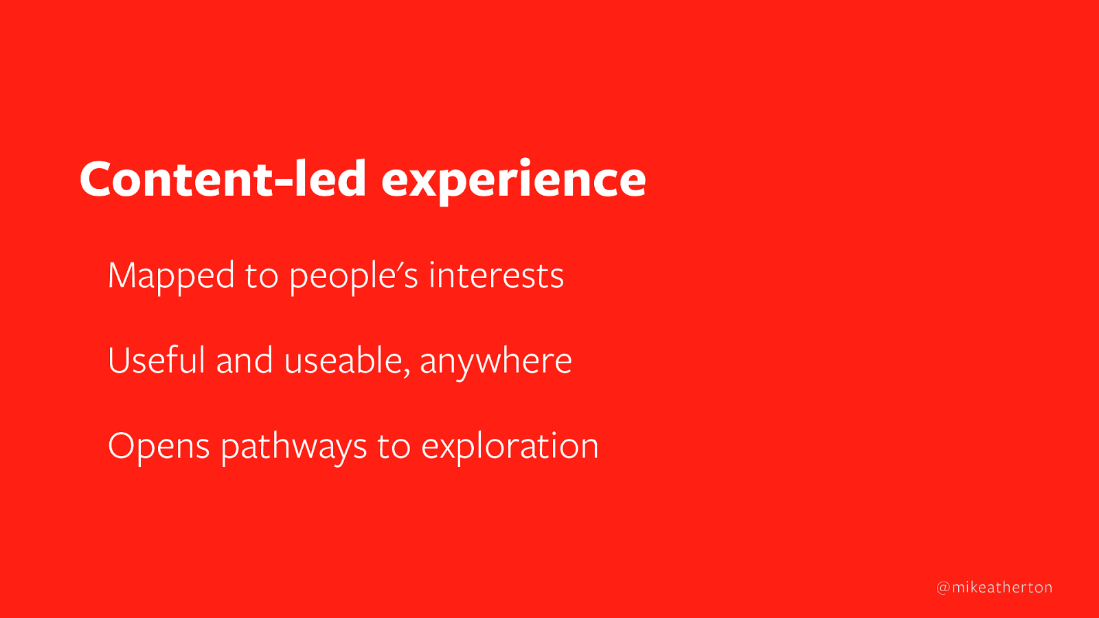
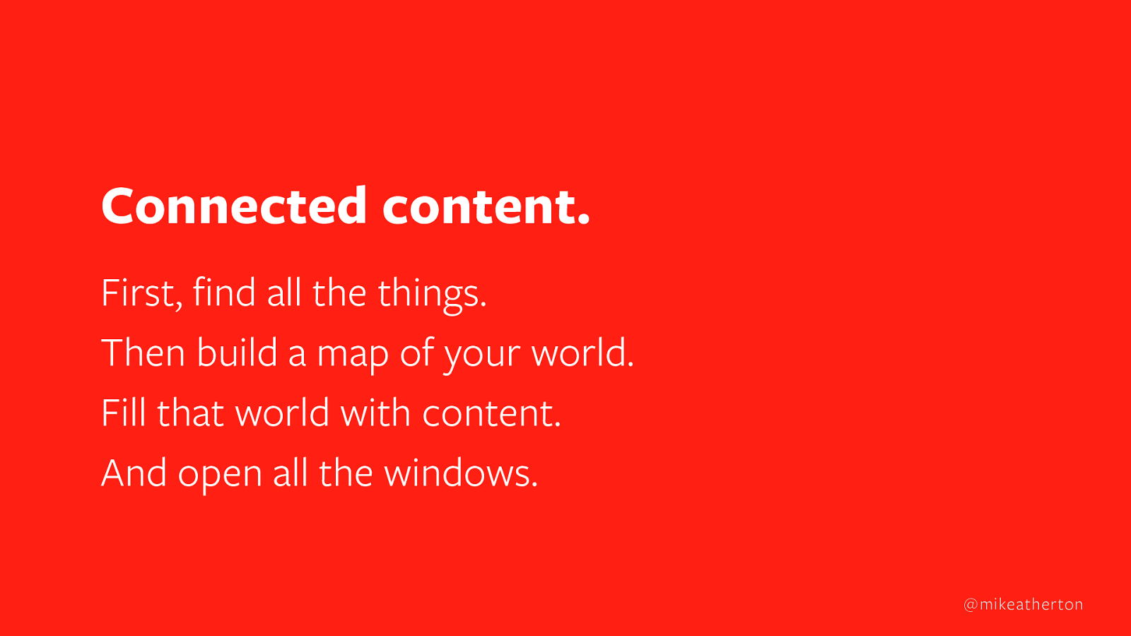
Where does that leave ‘experience design’? It becomes less about layout and interaction, and more about the abstract experience of finding, enjoying and exploring content from wherever we are.

Slide 47

Slide 47

Findable content maps to what people are looking for. Their interests. To enjoy it, content should be useful and useable on whatever equipment people have. Rings. Glasses. Microwaves. So content has to be ‘clean’: not tied to any single mode of presentation but formatted differently for each device, or social platform, or audience.

To explore, people need onward journeys. No dead ends. Ever lost half a day on Wikipedia, clicking from from idea to idea? We follow the natural connections between concepts to learn how the world joins up.

I think this is what I wanted to get at all those years ago. The fundamental experience of finding, enjoying and exploring content. User research often uncovers it but doesn’t capture it completely. Interface design tries to express it, but gets lost in the weeds of wireframes. It loses sight of the bigger picture.

Slide 48

Slide 48

That special something, so often missing in our process, is the explicit design of the world itself.

We make software to replicate the structure of real-word topics. Systems. Processes. We pave those cowpaths. Before we design any kind of presentation, we need to design the world it represents.

The interface won’t always be visible. And when interfaces become invisible, all that’s left is the structure of ideas.

Slide 49

Slide 49

Information architecture used to be cool. (I’m lying–it was never cool, but totally was a thing.)

When websites were pages stitched together by hand, the blueprint was the good old site map. Still is, although this kind of IA works best a function of front-end design. Structure is implied by the navigation controls in a UI, but under the hood the ideas remain unconnected. Take away the interface and structure collapses.

Now I think of information architecture as a back-end design job. Structuring concepts in the content itself. Connecting the natural relationship. Reflecting reality in software is almost never a neat hierarchy like this. So if user-centered design is your thing, then you’ve gotta get involved in designing that back-end structure.

Slide 50

Slide 50

Okay, so to represent our world we need to make a map of the territory. Let’s go back to our conference example. We already have our building blocks. Next we need to figure out how they fit together. For that we need the most powerful tool in the world. Love.

Well, almost. Relationships.

Slide 51

Slide 51

We only understand things relative to what we already understand, says another old white guy. Yep, these days we can do better than connecting things with a dumb hyperlink. We can actually teach our back-end systems how and why two things connect.

Slide 52

Slide 52

You’ve got a cat. You’ve got a mat. What happened? The cat SAT ON the mat. This story isn’t new. Also, the chef created the dish. The person wrote the book.

Slide 53

Slide 53

Or in our case, the PERSON held the ROLE of speaker at the EVENT that was sponsored by the SPONSOR. And on and on we go until we’ve mapped out how everything fits together.

Slide 54

Slide 54

Which looks something like this. A model of our subject domain. Design in a pure and abstract form. The engine that drives everything. Every interface you later create represents these same relationships. Relationships that are held within the content inside the content database. Everything stays connected even when there’s no visible interface at all.

It’s informative. Telling people how concepts are related helps them build context. It teaches them how ideas fit together. It’s scalable. Fill this structure with content and it doesn’t matter if you have one event or fifty events. One session or a thousand sessions. The structure still holds without bringing extra cognitive load.

It’s reusable. Wouldn’t it be great if a conference could track all the talks someone gave over the years and link you to all the slides and videos from those sessions? We’ve designed a structure that stays true year after year, so a knowledge base of amazing content could grow forever. And not just conferences, but any subject domain you like.

Slide 55

Slide 55

Restaurants, where DISHES on a MENU have INGREDIENTS sourced from local SUPPLIERS.

Slide 56

Slide 56

Live music, where ACTS have PERFORMANCES at VENUES as part of a TOUR.

Slide 57

Slide 57

Even theme parks, where ATTRACTIONS live within a LAND that is part of a PARK which is part of a RESORT and has a big WEENIE.

That’s a real thing. Seriously, look it up.

Slide 58

Slide 58

AirBnB does this, with HOMES in PLACES that have EXPERIENCES and RESTAURANTS.

Slide 59

Slide 59

Or be like Google and start connecting everything in the world to everything else. And if Google’s doing it, you can see that building these graphs of connected content and knowledge is the future of information retrieval. And the foundation of information design.

Slide 60

Slide 60

Where Now for Interfaces?

Our job is not about designing an interface and then filling it with content. Not any more. Now we need to design a content structure and then wrap it in an interface.

So let’s talk interfaces. The first interface to consider is the most boring one, but it’ll help explain things. It’s the interface of the content management system that holds our actual content.

Slide 61

Slide 61

With a modern CMS, we can set things up to follow the structure of our model, like this.

Slide 62

Slide 62

Then we link the profile of a presenter to their session, so it’s easy to change things up. Names, dates, titles - believe me, that stuff changes all the time.

If the same person speaks again next year, we can just pick them again from the roster and keep a record of everything they spoke about before. The CMS is set up to represent our conceptual objects and their relationships.

Entering the content becomes easy. The computer takes care of how it all fits together.

Slide 63

Slide 63

Next is our user interface. (Apologies: this is some pretty basic webpage design from 2015.I know you can do better.) You can see that a page is not really a page. It’s a template made from individual chunks of connected content.

That’s important because we might decide that for our mobile app, or voice UI digital signage or microwave interface we want to show more, fewer, or different chunks.

Slide 64

Slide 64

There are a couple of other tricks we can do. Remember when we fed in those start times and end times for sessions? That data is computer-readable, so schedules like this get assembled automatically. Super useful when things change and you need to put that change out everywhere on the fly.

Slide 65

Slide 65

Visual hierarchy too. Our keynote speakers are our big selling point, so they get a bigger photo. That’s done by designing our template to put anyone assigned the role of KEYNOTE to the top.

We can make different choices for every kind of interface we want to support. We’re even good for devices yet to be invented. Because the interface is a window on our world. And the natural structure of that world stays in tact, no matter how you view it.

Slide 66

Slide 66

Connected Content

That’s all there is to it. How to design anything to make it useful and usable to your audience, and stay focused on what’s important.

Find the things that matter to your audience. This is what you’ll make content about. Make a map, a model, of your subject domain based on the natural relationships between things. This drives the structure of your presentation. Pour in the content, using a content management system to link it together based on those natural connections. Then share it far and wide, treating every interface as a window on to your world.

Slide 67

Slide 67

It's All About the Relationships

Seems every day lately I hear complaints from designers and content people that they can’t get the respect of their company or team. I understand, I do. Being a content strategist on an engineering team feels like being a poet on a submarine.

We’ve got to find better ways of working together. This mapping and modeling stuff is a great trick to get close to the team. It’s a good concrete activity you can do together - just get in a room with a whiteboard and start mapping stuff out. It flushes out complexity early on. It gives everyone a shared vision and a common language. It’s abstract enough to keep everyone in their comfort zone, because it’s a bit like how engineers, researchers, designers think anyway. Plus you can use stakeholders or clients for their subject expertise, rather than holding up your wireframes and asking them to be art critics.

Slide 68

Slide 68

New Horizons

We’ve come a long way since I started out all those years ago. The only constant is change. New spaces bring new grammar to learn and new behaviors to account for.

Next year, Facebook launches a new virtual space for building community. Already this changes the conversation of what it means to do product writing, when the very idea of an interface is so disrupted. But looking to the next horizon is what keeps all of us at the top of our game.

Slide 69

Slide 69

Closer Together

So often we seem to find ourselves pitted against our peers. Each of us–designers, researchers, writers, engineers–talking the collaboration talk but secretly regarding those other folks’ work in service to our own.

Empathy is more than caring about issues. It’s meeting people halfway. You need it just as much within your team as the people you design for. Whether we work on the surface with words, pixels, questions or code, we all of us can come together in pursuit of what lies beneath. The design behind the design.

Let go of your old ideas about what a designer should and shouldn’t do. Everyone on the team must take a hand in how a system works, not just how it’s presented. I hope I’ve shown you today that it’s within your grasp. And please, for the love of god…

Slide 70

Slide 70

…will somebody buy this book?