The Road Less Travelled
We are filling the world with more and more stuff. Apps, and websites, and hardware. All kinds of digital crap. Some strong opinions ahead, albeit weakly held.
A presentation at Collaborate Bristol in November 2015 in Bristol, UK by Mike Atherton
We are filling the world with more and more stuff. Apps, and websites, and hardware. All kinds of digital crap. Some strong opinions ahead, albeit weakly held.
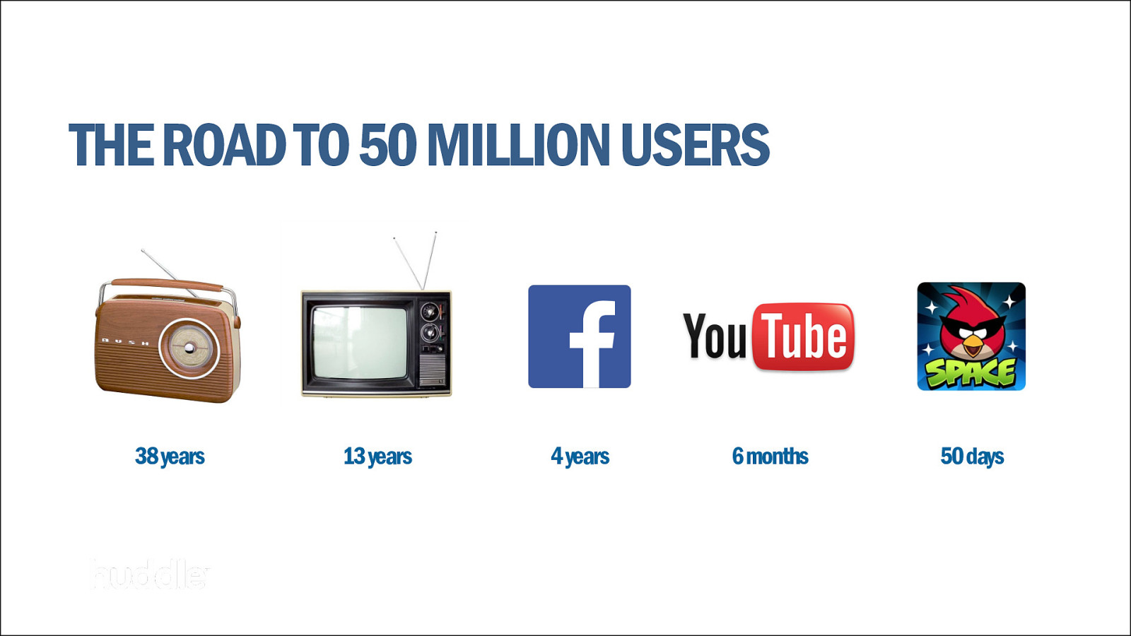
Startups are the new rock bands. Everyone wants to be in the unicorn club: the billion-dollar business. You don’t even have to start with a good idea–just a reasonable hypothesis–because according to digital Dianetics The Lean Startup you can pivot again and again until you eventually hit the right course. The same philosophy is true of Agile development.
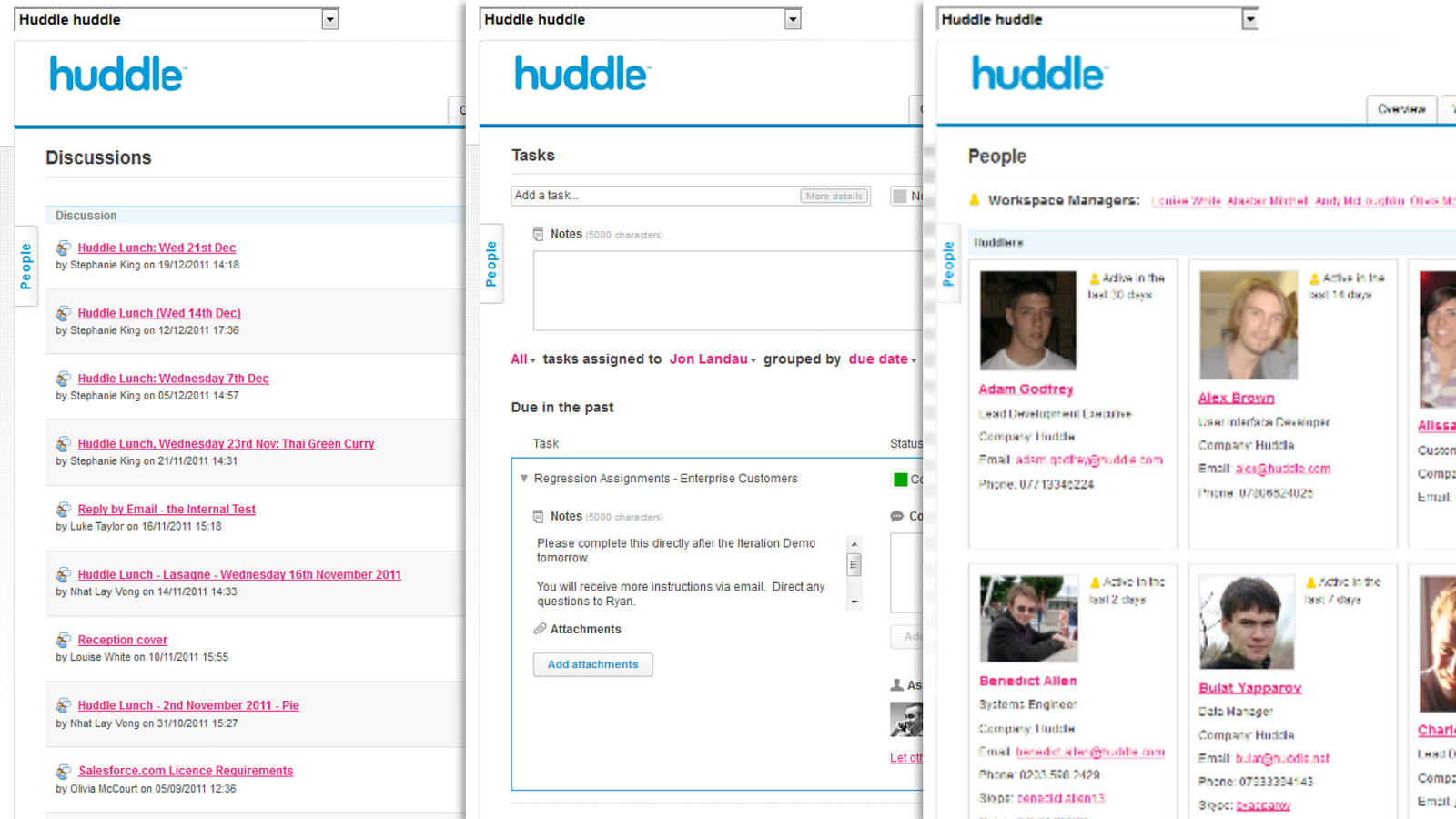
This was something I found a few years ago working with a startup called Huddle. Huddle is a B2B enterprise collaboration tool. That sector of software that User Experience forgot.
I was expected to ‘make the UX better’ by sprinkling my UX fairy dust on top of a product already built. And while some degree of sprucing up the interface would help, Huddle’s real problem was…
In B2B the people who buy the software aren’t the people who use it. And IT buyers like to have lots of features which might come in handy one day.
Across Huddle’s disparate customer base–government, enterprise, agencies-disparate feature requests flooded in. Iteration after iteration, pivot after pivot, the codebase ballooned as the product dragged the technical and UX debt of all its previous incarnations.
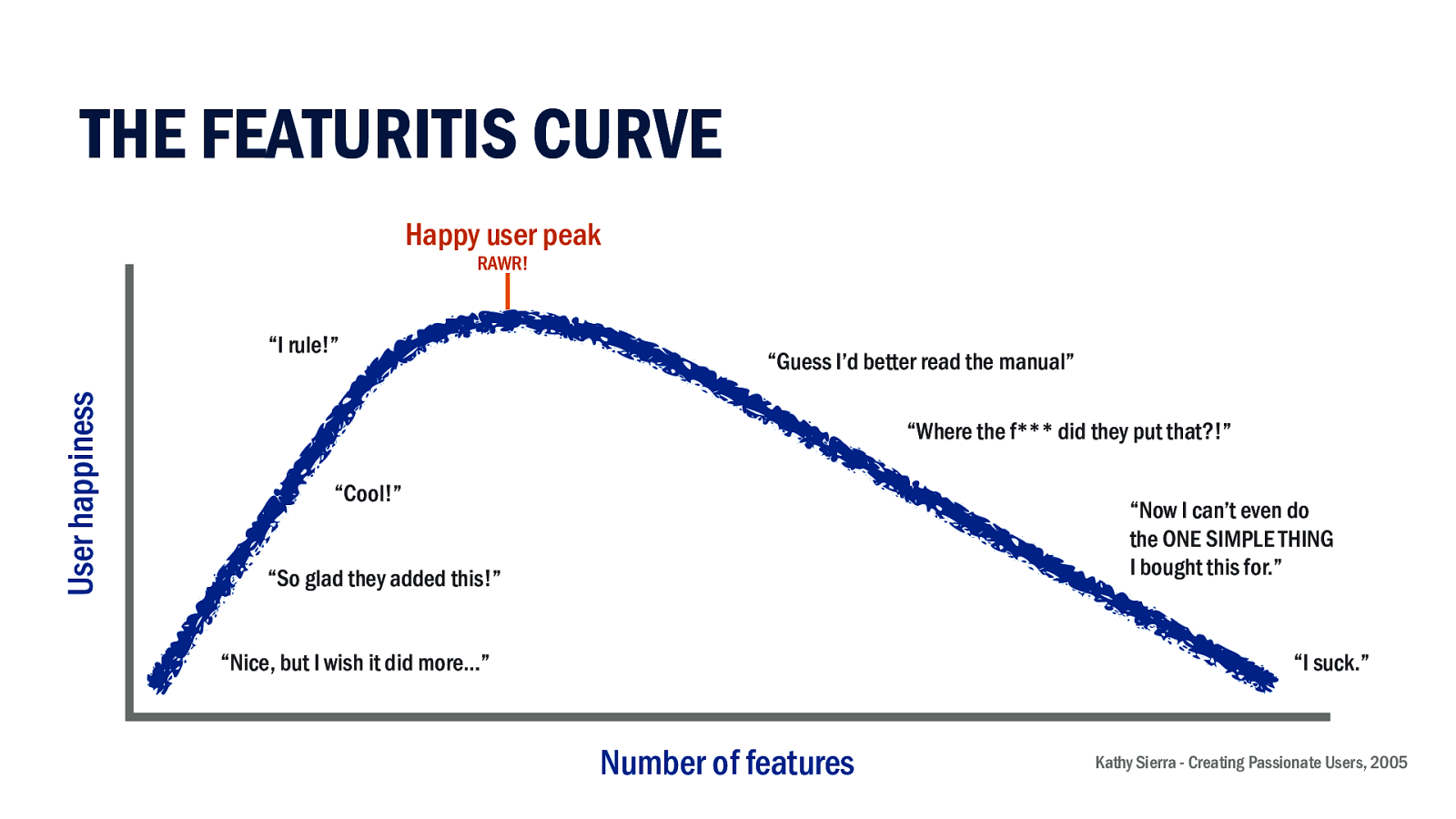
This is not uncommon. All software matures and typically gets ‘featuritis’. At first a new tool addresses a validated unmet need. Usage grows. Need begets new need.
Enter competitors to heat up the sector. Integrations happen. Link your Dropbox. Sign in with Facebook. And so we reach the peak of happiness. It’s empowering. A well-designed product turns its user into a superhero.
But things don’t stop there. Now the product wants retention. Maybe trying to lock us into annual updates. So on we go, now with added complexity. In usability testing they tell me, “I can’t do my one simple thing.”
As fully featured as we make our products, there’s usually an irreducible core; a fundamental idea around which we build our experience. Once we lose sight of that our software starts to suck. Worse still, our users blame themselves for not being smart enough.
This is usually the cue for a challenger product to offer a simpler alternative focused on the core task.
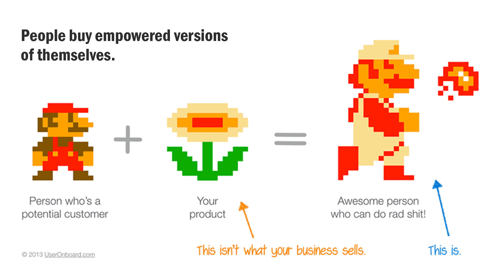
And yes, people want to feel like a superhero. They want their outcome in a way that feels empowering and feels like them. So not only the rational benefit of the product, but the self-reflexive benefit too.
(Slide credit: Samuel Hulick)
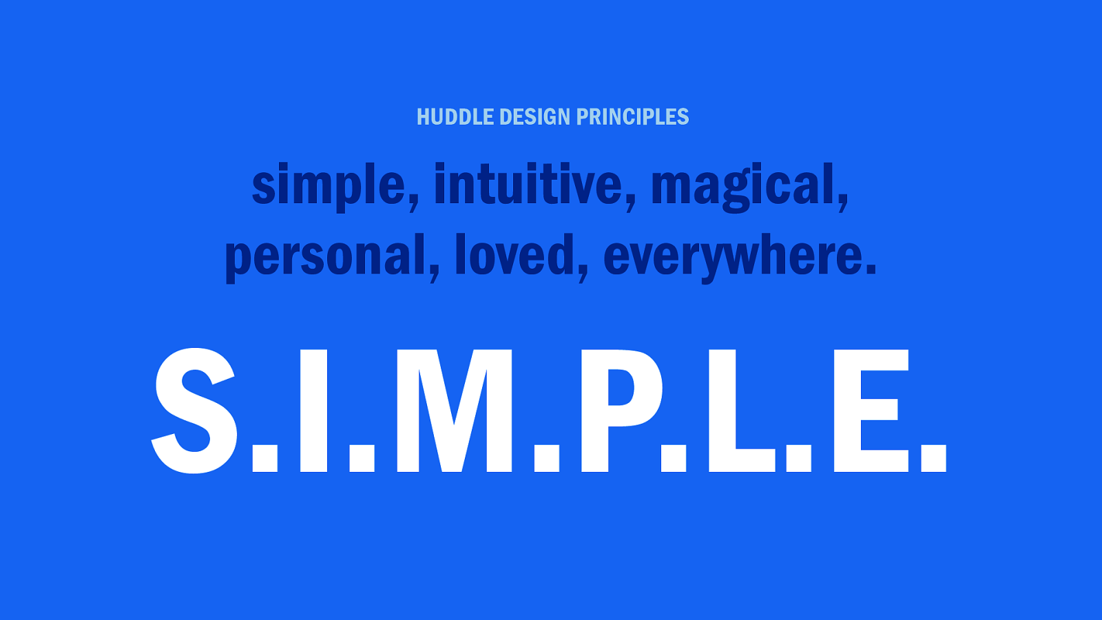
I told Huddle we needed a strategic approach to getting back to a simple and distinctive proposition. We would use that to guide our product experience in a way that delivers rational, emotional, and self-reflexive benefits to our customers.
I had just the thing.
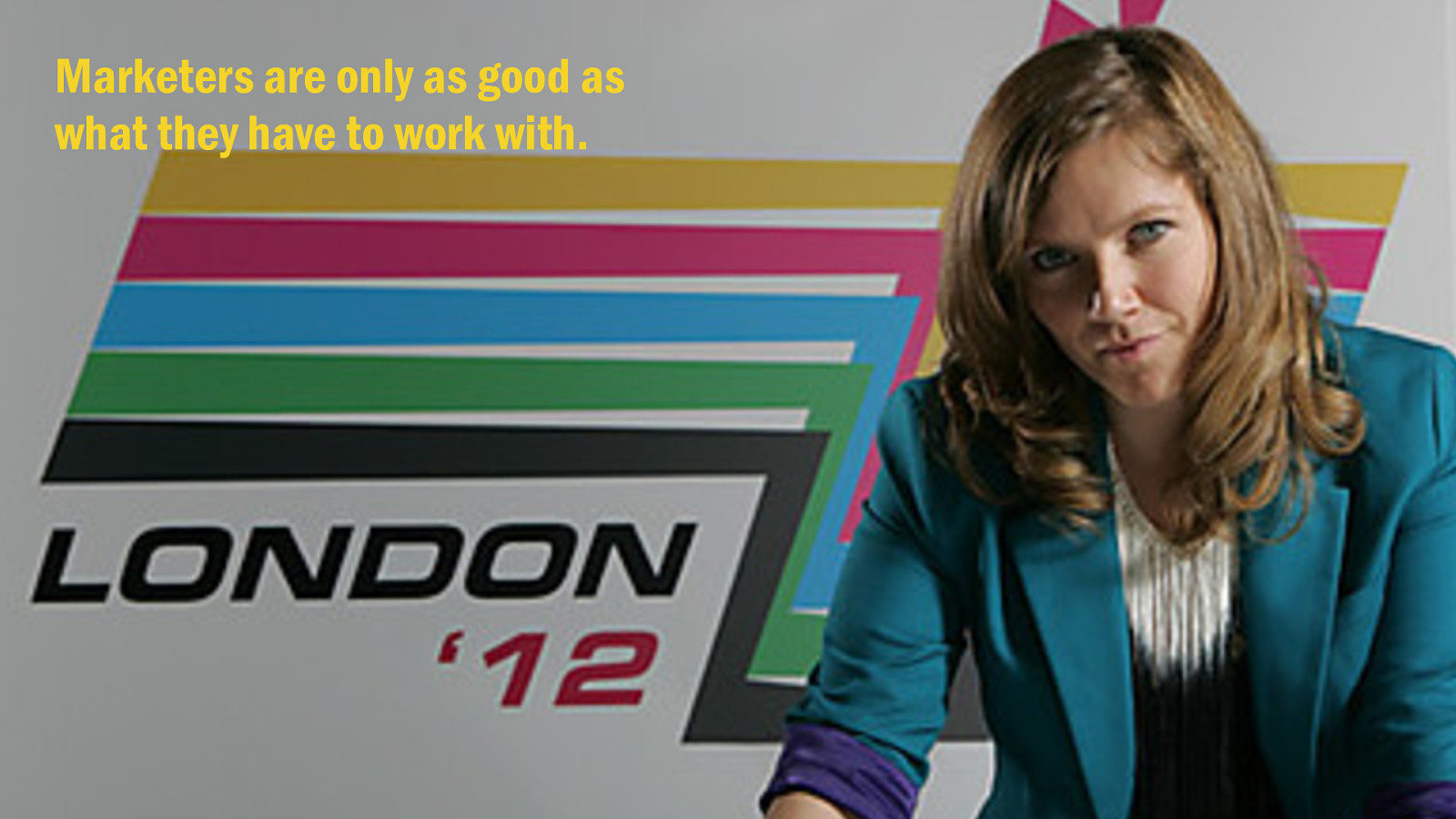
Branding. Make the logo bigger. The photography more expensive. Give us a flashy microsite which lets people turn the product 360 degrees. Totes amazeballs. Random acts of marketing.
But branding doesn’t have to be that way.
Brand is not your logo, colour palette, or typeface. In fact ‘brand guidelines’ shouldn’t document how you look, but how you behave.
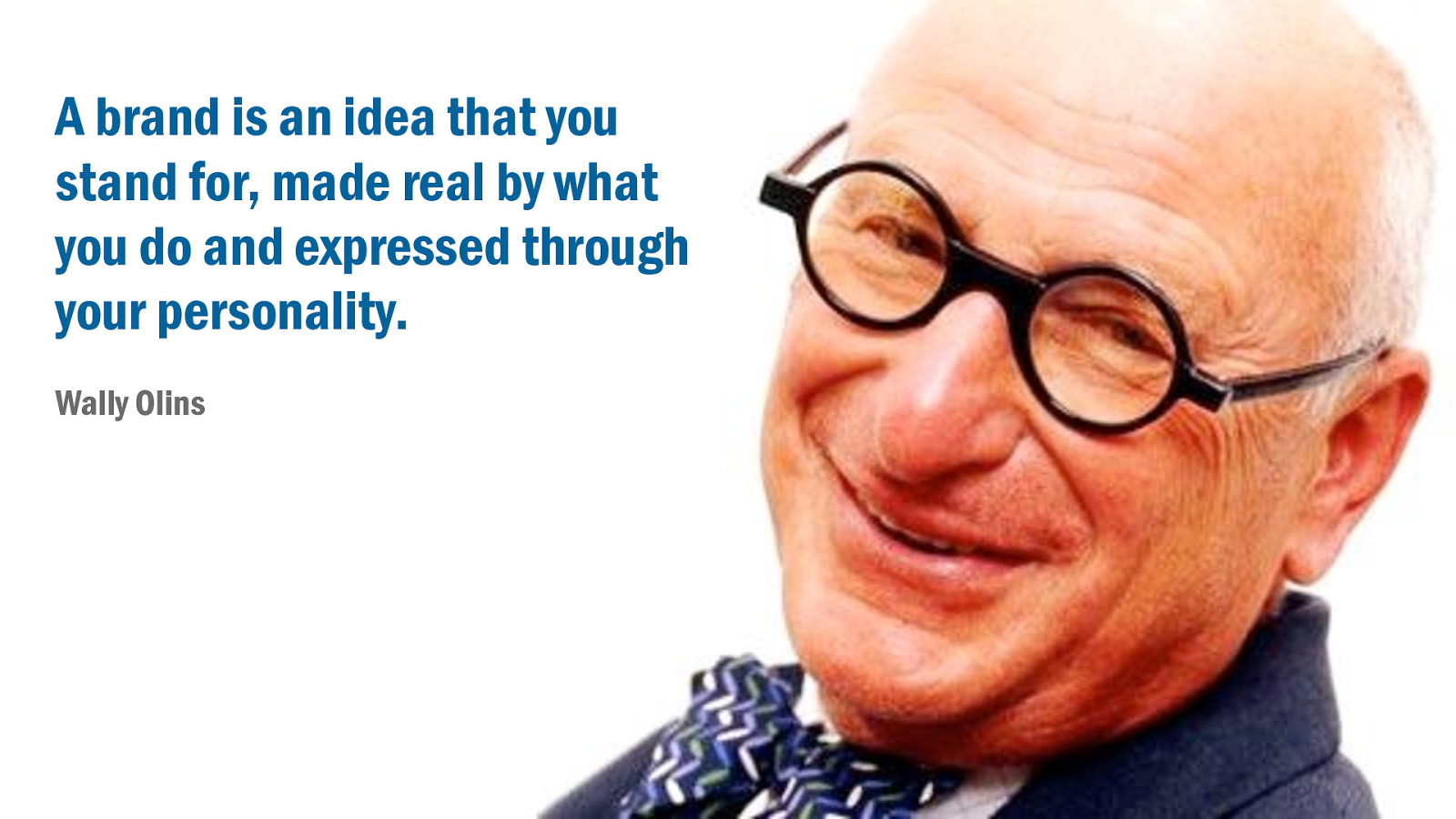
Brand is an idea of what you stand for. You make that idea real every day through the things that you do, and you express it through your distinctive personality.
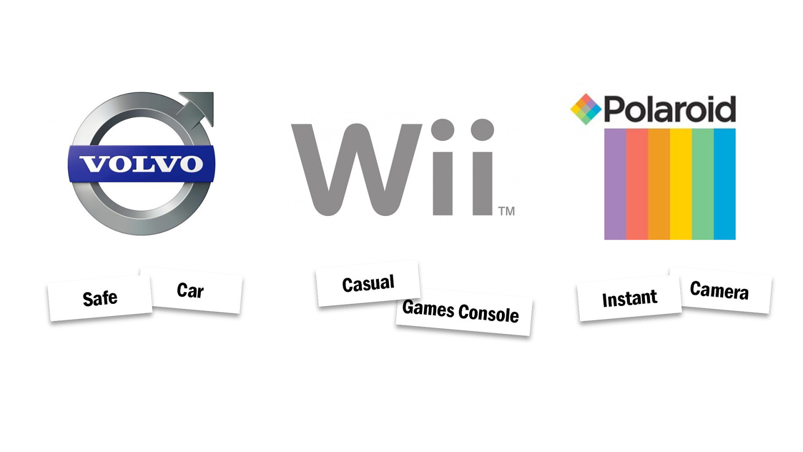
It’s way of creating an instinctive association between a particular value or quality and a product. I say ‘safe car’, your say ‘Volvo’. I say ’casual games console’ you say ‘Wii’. I say ‘instant camera’ you say ‘what’s that granddad?’. Or maybe you say ‘Polaroid’.
So your brand is really small idea that occupies a corner of our mind. A promise to your customer about what to expect from your products and services. A statement of differentiation between you and your competitors.
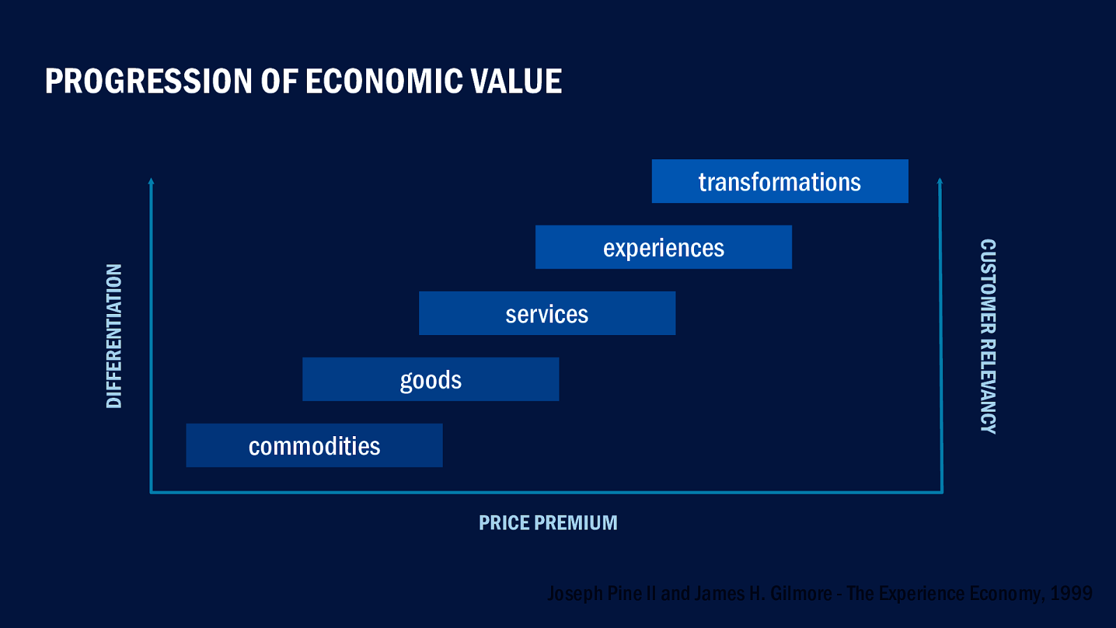
That distinctiveness drives experience and business value. Consider the humble coffee bean. A commodity if ever there was one. But grind them into a cup of coffee and you’ve got a product to sell. Sell it in a coffee shop and you’re offering a service. Put comfy chairs and smooth jazz in the shop and you’re creating an experience. Make that experience part of our everyday lives and you’ve driven a behavioural transformation, building preference and long-term loyalty.
As Peter Drucker says, “Create the customer and the money will follow.”
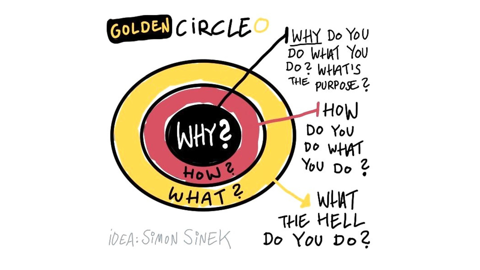
You might have heard this expressed by Simon Sinek in his idea of the Golden Circle. How the most compelling brands of our age–the Apples and Nikes of the world–found found success through defining and communicating their core beliefs.
People don’t buy what you do, the buy why you do it.
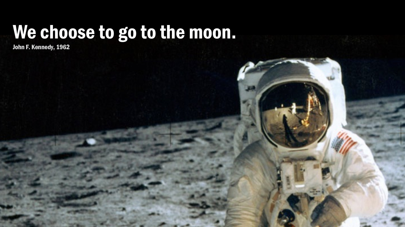
So building that customer experience starts with why. Your core purpose. Looking beyond the day-to-day operations and understanding ultimately what you’re trying to achieve. It’s not about profits or shareholder value. Those things are not an end in themselves.
There’s a great story about President Kennedy visiting NASA. He walked up to a janitor and said, “What do you do here?” The janitor puts down his mop, stands up straight and says proudly, “I’m helping put a man on the moon!”
Why do we get out of bed in the morning? We work best when we feel the most rewarded. Sure, the money helps. But true reward comes from feeling that what we do has purpose. A company needs a mission to inspire everyone to come together and mount our own moonshot.
In the 1970s, Microsoft started out with a great mission; to put a computer on every desk and in every home. And whatever your feelings about working with Excel, my goodness they did achieve it. So ask yourself: what are we for? And how will we know when we’re done?
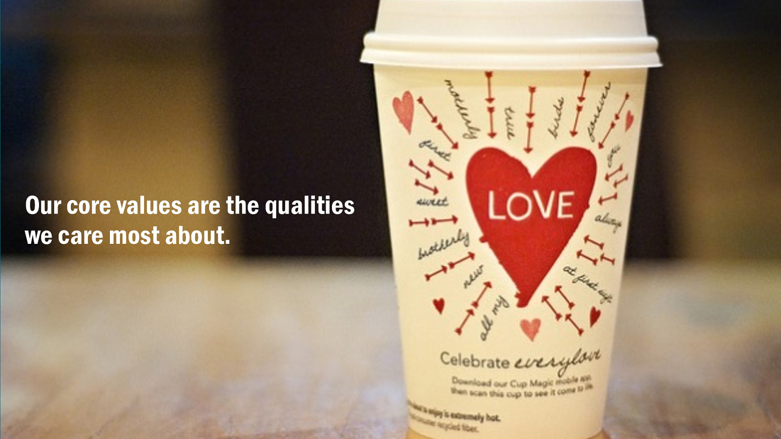
Hand-in-hand with core purpose are core values. Values are the qualities and virtues we care most deeply about. To support our brand, values also need to be compelling to customers, relevant to the our product category, and be meaningfully distinctive.
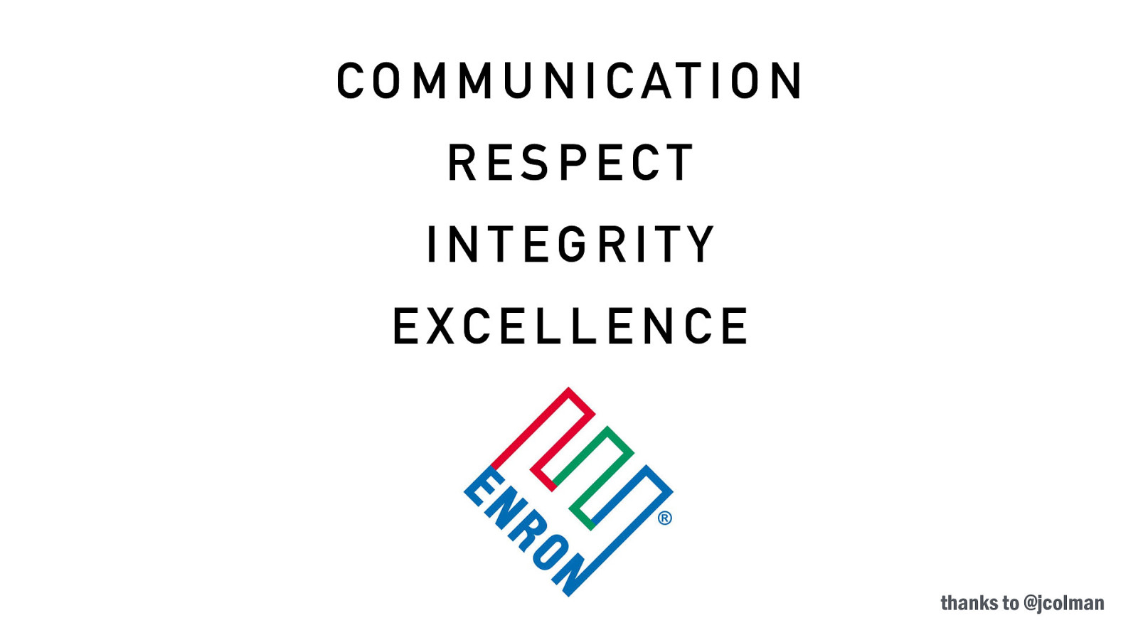
Values are things like communication, respect, integrity, excellence. Aren’t they?
It’s no wonder people think this branding stuff is bullshit. What do those even mean? And who wouldn’t say they cared about any of those things? Who would really say they they valued disrespect, disingenuousness, and mediocrity?
You’d end up sounding like a bunch of crooks.
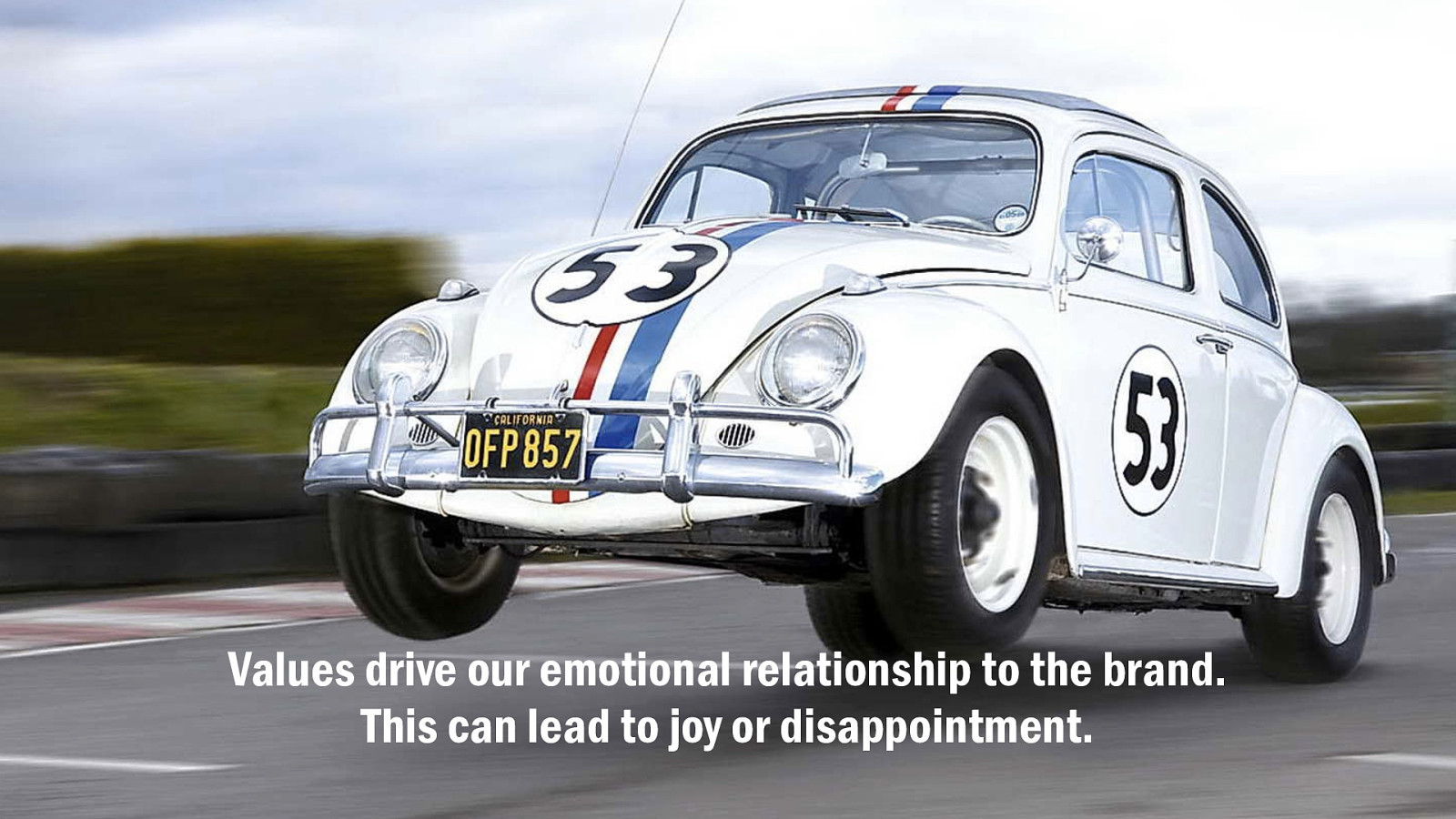
Values drive our emotional relationship to the brand. This can lead to joy, or disappointment. They must come from the bottom up; the authentic and shared values of the people in the organisation. A contract that hold us to account.
Poor old Volkswagen. Loveable, self-effacing Volkswagen. If only everything in life was as reliable as a Volkswagen, as they told us in the 80s. They owned the idea ’reliability’ as a differentiator, both of the cars and the company. ‘You can trust us’ it suggests. And then the emissions scandal let us down.
We’re not even angry. We’re just disappointed.
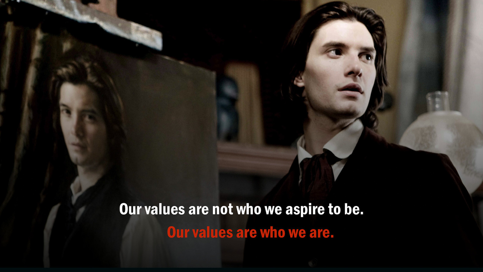
The trying times aren’t when we stop trying. For better or worse, our values are not a picture of who we want to be, but a reflection of who we really are. We get the organisational culture we deserve.
Impressive-sounding platitudes issued as commandments from on-high are worthless. It has to come from the bottom-up. Every organisation is made of individuals, so it stands to reason that the collective values of the company are the shared values of its people.
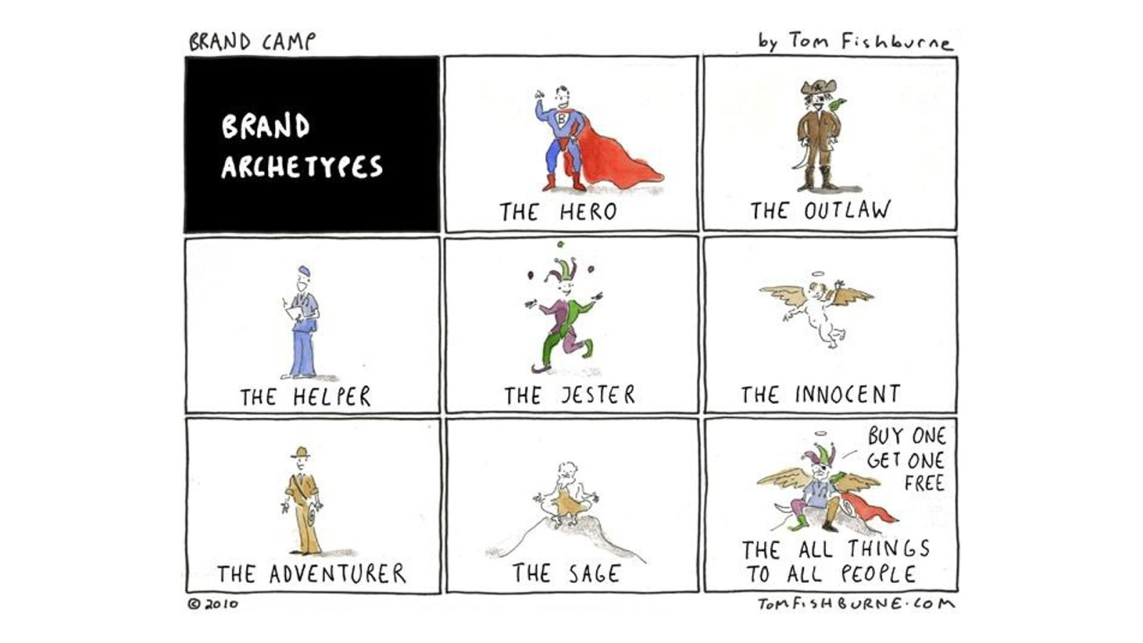
If values and purpose drive what we say, then our personality is how we say it. Are we a little bit cheeky, or buttoned-up and formal. Do we speak like a peer or like a parent. Personality is a great driver in creating memorable and engaging experiences.
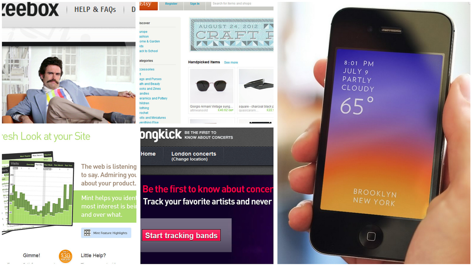
With digital products we can put personality right into the experience. The characterful way we write our microcopy or present information expresses our voice and tone. The interface becomes an expression of the brand.
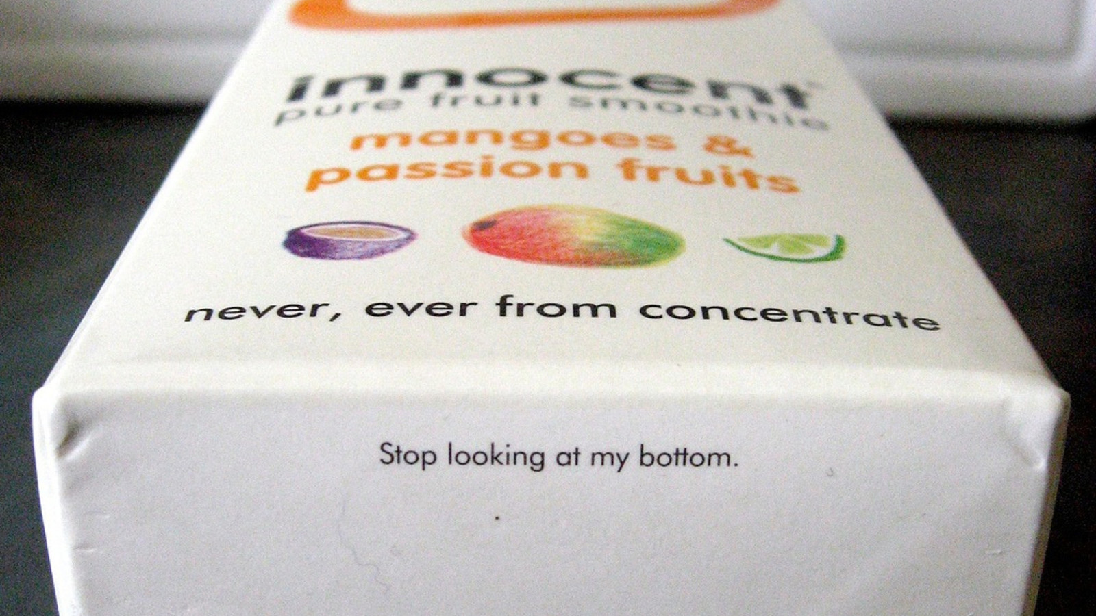
For years the go-to example for characterful brand personality has been Innocent Drinks. They got known for the funny, irreverent tone they put on their packaging. It really played to the idea of Innocent being different, non-corporate and, well, innocent.
So of course, this kind of cheeky overfamiliarity is now the only acceptable way for modern brands to speak to customers.
Isn’t it?
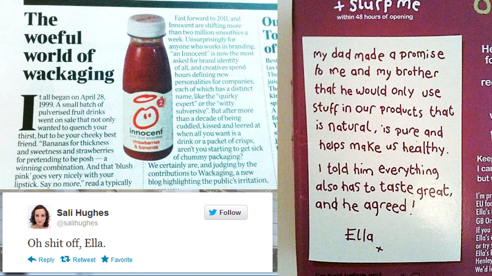
I don’t buy it. Innocent were the first mover here, and that refreshing, distinctive voice marked them out as being something quite different in their sector. But their success led to many others trying this informal, over-friendly tone of voice.
And when everyone’s doing it, it all gets a bit too much. It got a name: *wackaging (wacky packaging) and now it’s bloody everywhere, co-opted by banks, utilities and other companies far from Innocent in any sense.
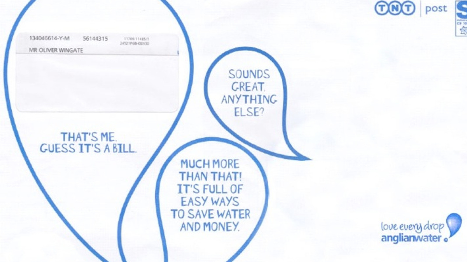
Do we really want the bill from our water company speaking to us in an overly chatty tone, before we’ve even opened the envelope? How appropriate is this for someone who might be struggling to pay?
It’s okay to be different. The choice is not between that overly-familiar personality or no personality.
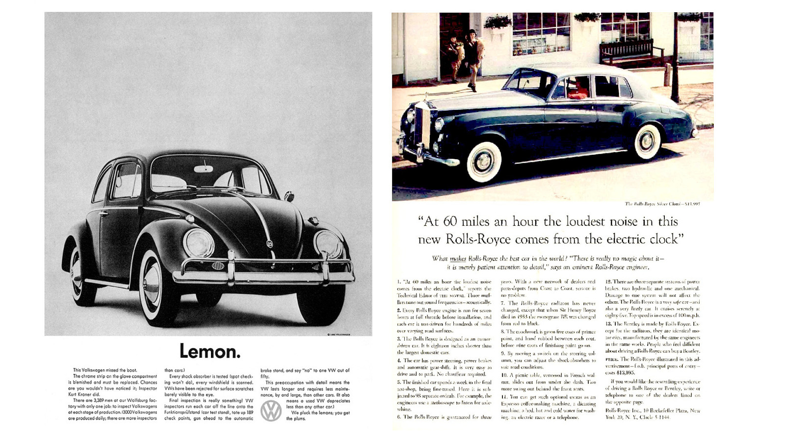
Take these two iconic ads. Volkswagen’s straightforward, honest, playful voice talking about their engineering standards and quality control. By contrast, this Rolls-Royce tell us that at 60 miles an hour the loudest sound in the car comes from the ticking of the clock. An elegant, and authentically true idea, expressed with a quiet confidence and charm.
Two brands, discussing the same thing, but poles apart on personality. Yet both are authentic and distinctive.
So find a voice that’s truly yours. We’re very good at spotting fakes. We hate it when big corporate brands try to pretend they’re small and artisanal. And we’re getting weary of the wackaging. To get attention we need to be truly different.
Be honest, be authentic, be appropriate.
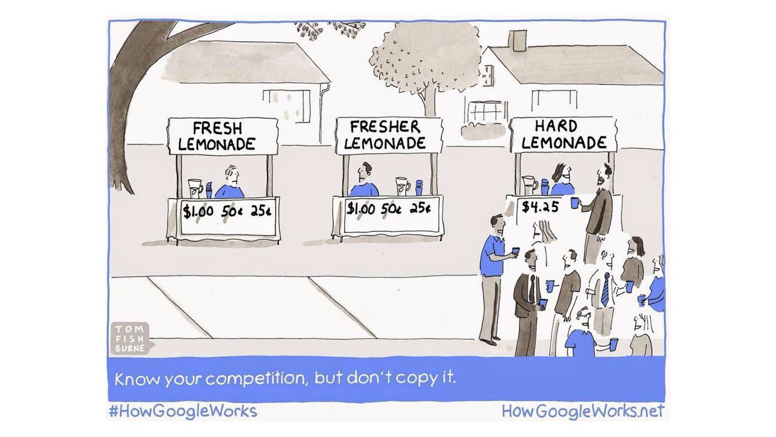
Rarely, if ever, are you delivering something entirely new. You’re competing against other products, and other ways of solving the problem. Fighting to get that small, differentiated idea firmly lodged in your customer’s mind. You’re a challenger, and the challenger’s role is to disrupt the status-quo. Make people think about a product category in new ways, and turn any weaknesses they have into strengths.
Successfully challenging means taking a different road. Zagging where others zig. I look around today’s digital design, and I wish I saw more of this.
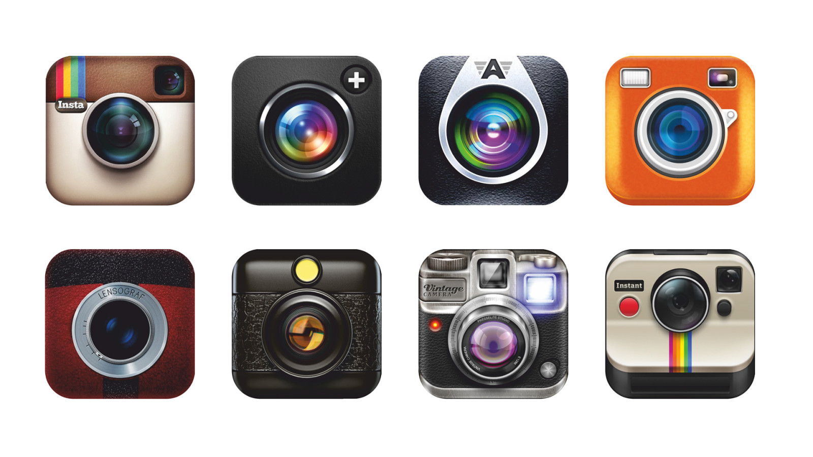
Instead I see trends. Fashions. Products copying more successful products.
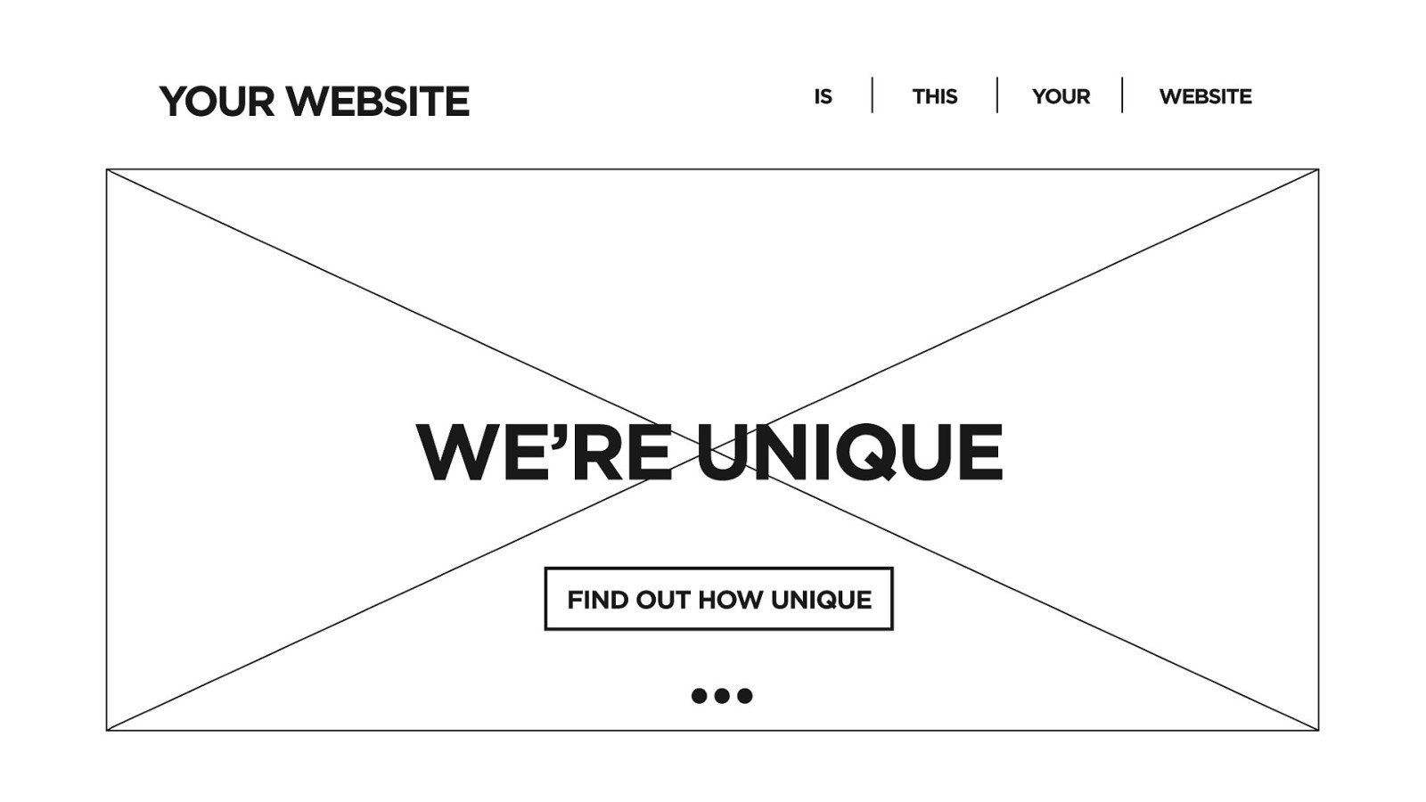
And everything looking the same as everything else.
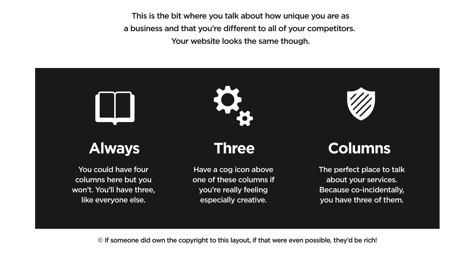
Responsive design is great. Frameworks are helpful. But together they’ve ushered in a lack of differentiation.
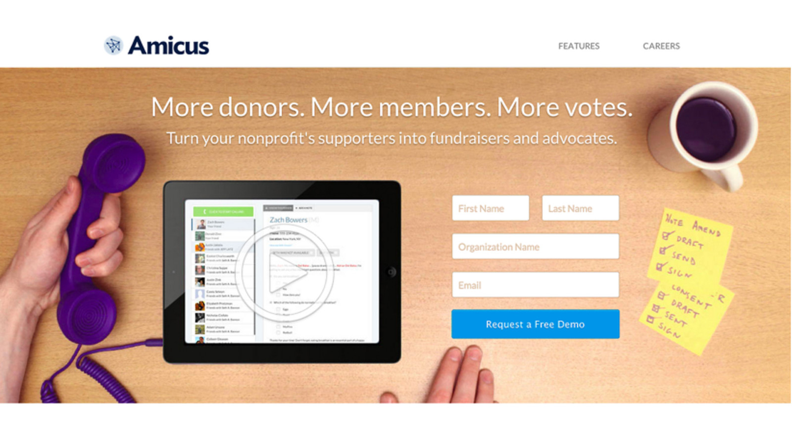
Or maybe it’s design culture itself that leads to everything looking like it needs to be set in a coffee shop.
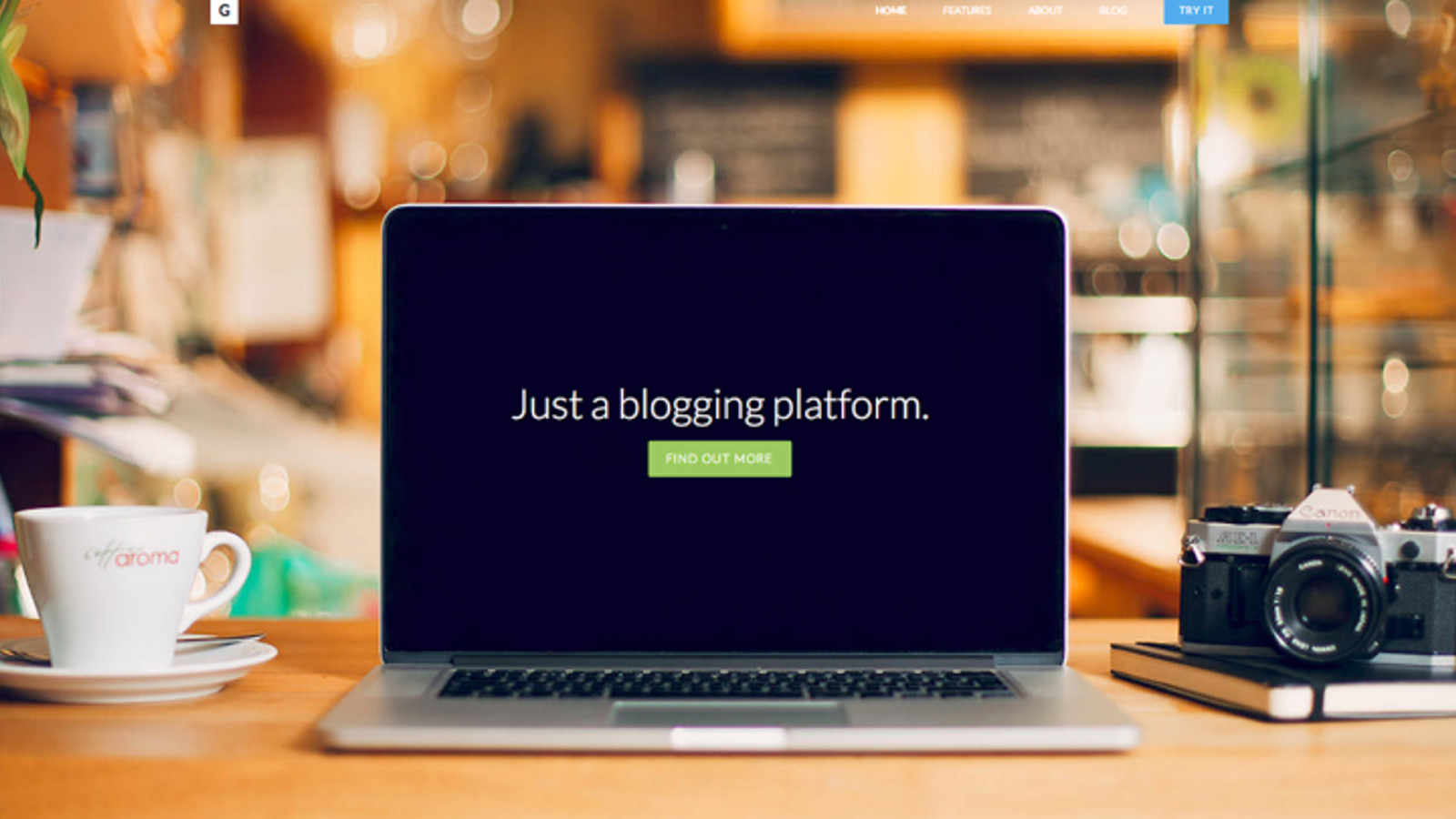
Or in another coffee shop.
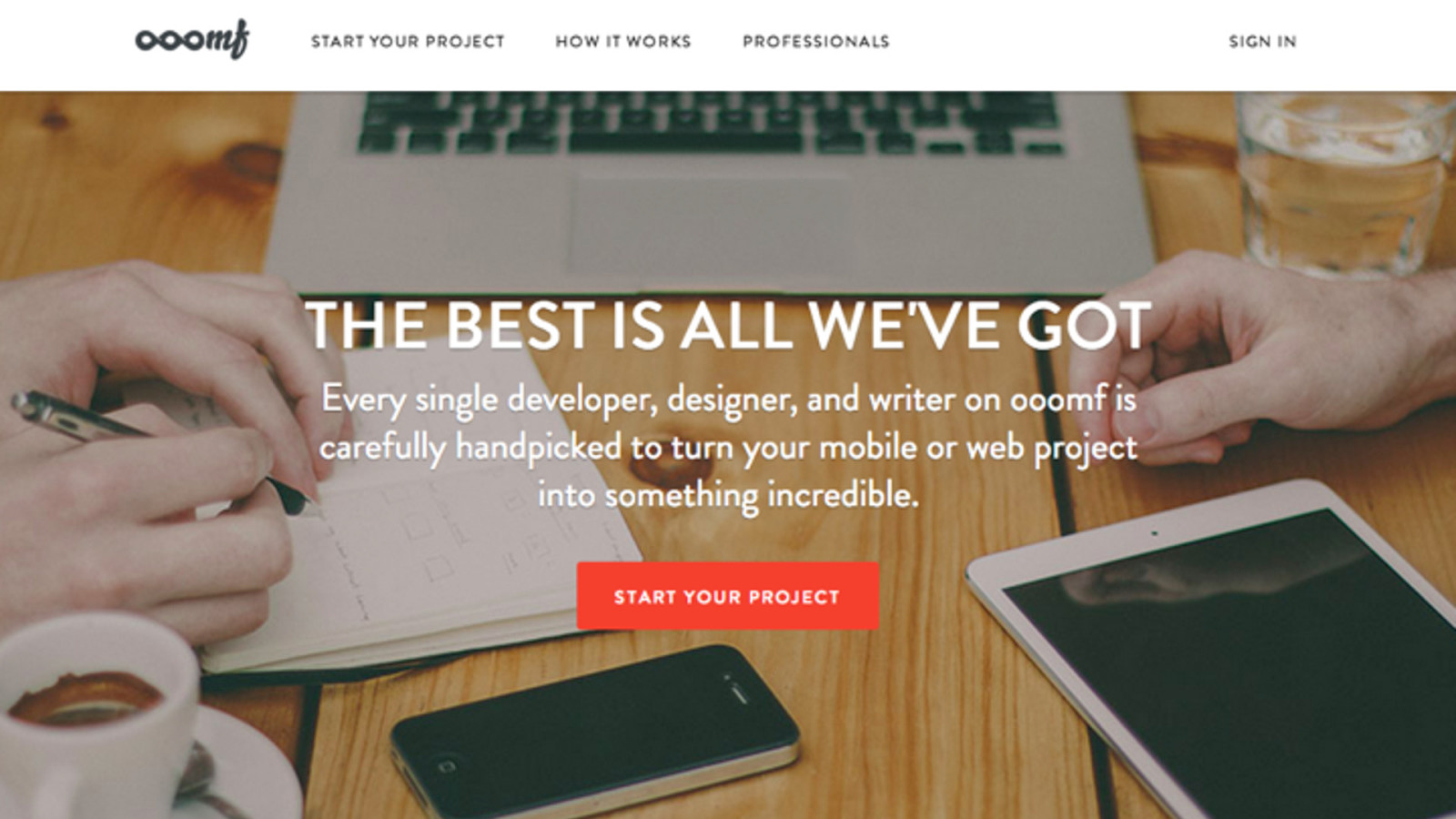
Or another coffee shop, surrounded by every device you own. I’ve a hunch that one tactic for differentiation is ‘not being the same as everyone else’.
Design and brand personality can be more than aesthetic tropes. Your personally can be used to really underscore your values. Your differentiator. How you’re disrupting the status quo.
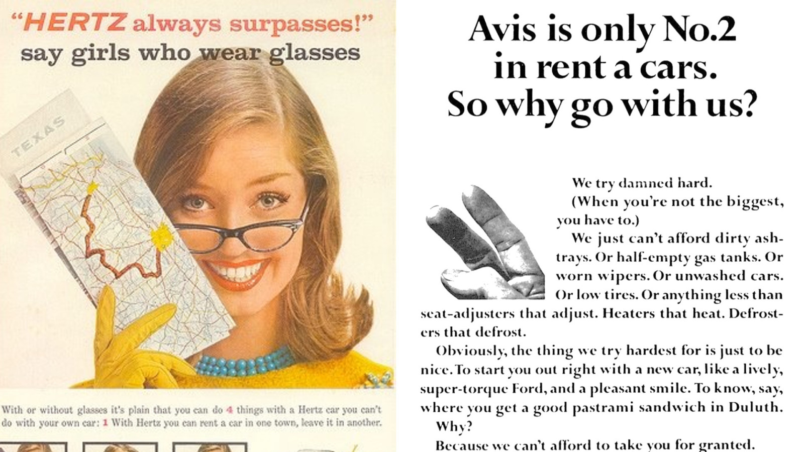
In the 1950s, US car rental was dominated by Hertz with decidedly un-PC ads like this one. Their challenger was Avis, who made advertising history by telling us “We’re number 2, so we try harder.”“We’re number 2, so the lines are shorter at our desk.”
They made trying harder a virtue. They reframed their underdog position as trustworthy and earnest. And subtly repositioned Hertz as lazy and complacent.
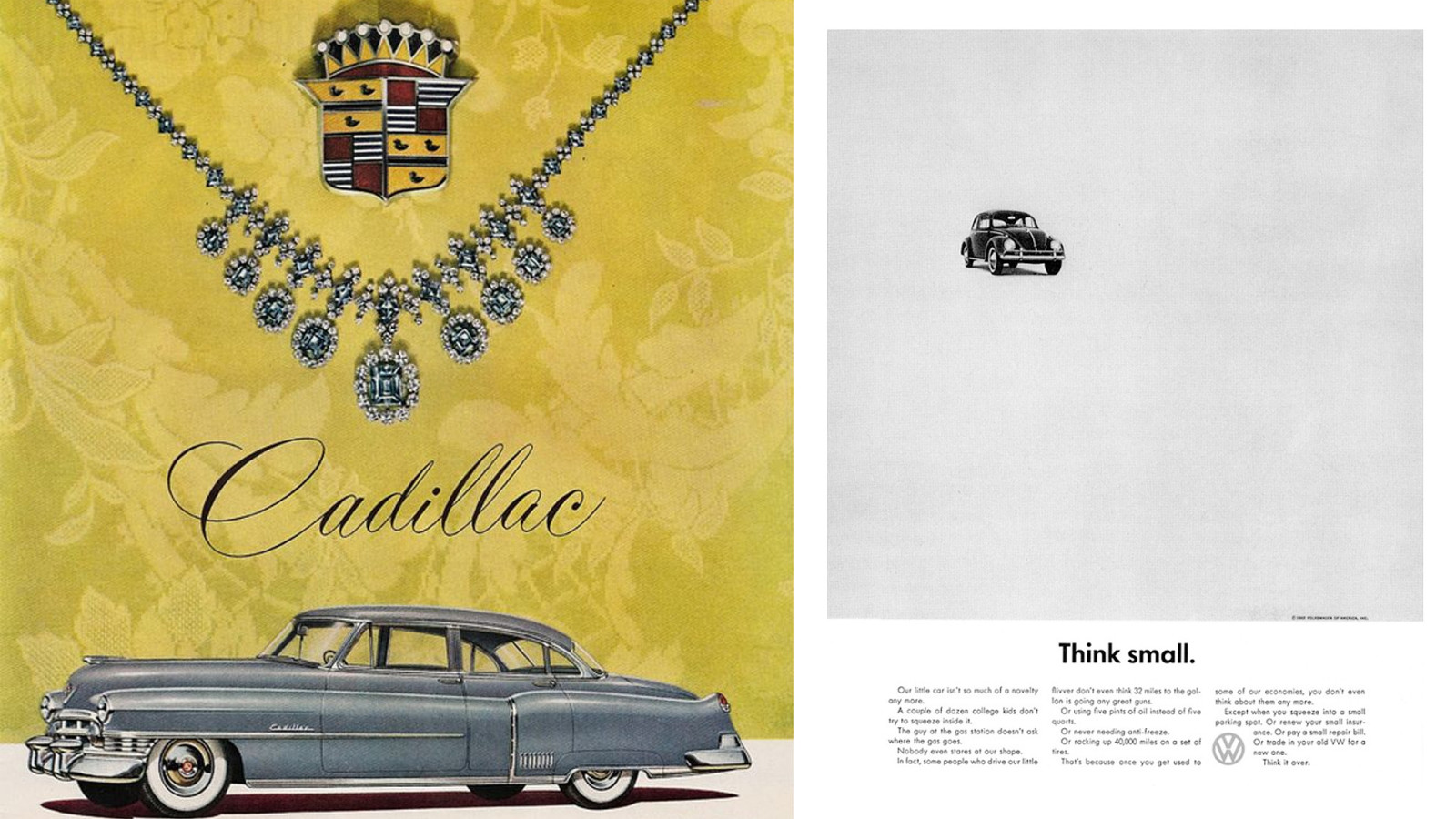
This was typical American car advertising in the 50s. Big, opulent, luxurious. Big meant status. Then came this little German car, making a virtue out of small. Small is cheaper to run, cheaper to fix and easier to park. A bold move at the time, but it ushered in a new category of ‘small cars’.
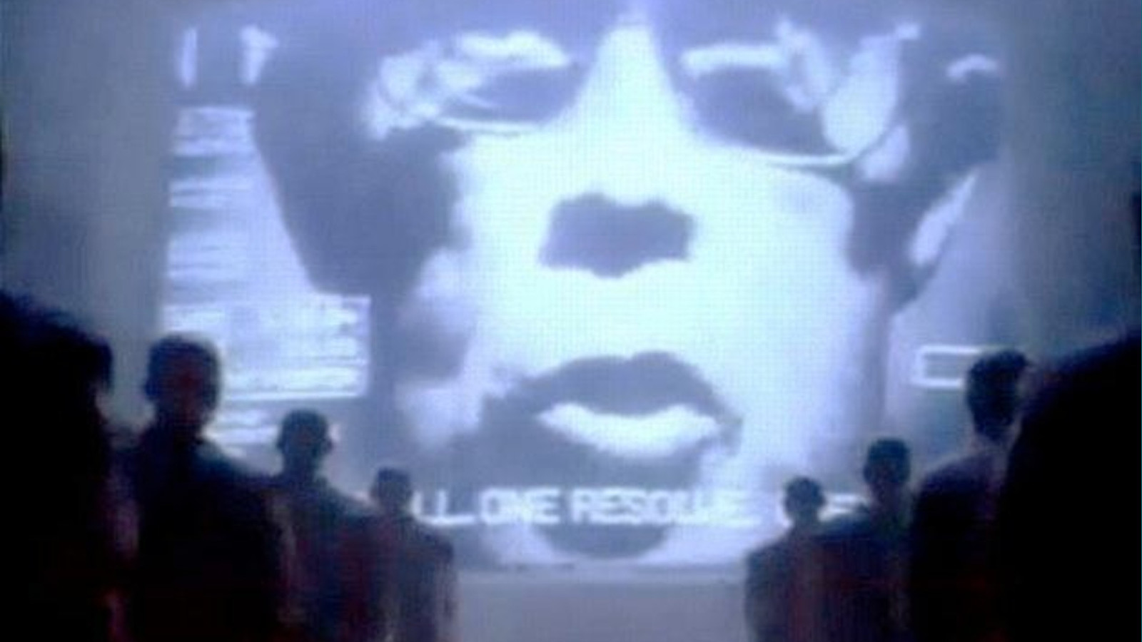
Apple’s 1984 commercial suggested IBM were Big Brother and big-box computer users their drones. With the Macintosh, Apple created the category of the Personal Computer. Not just one you could personally own, but one with personality itself. One that literally said ‘Hello’.
So the challenger reframes the conversation. Changes our perception in their favour. And reframing can create whole new sub-categories, of which your brand can then be a first-mover.
Think Personal Stereos. Luxury Ice Cream. Light Beer.
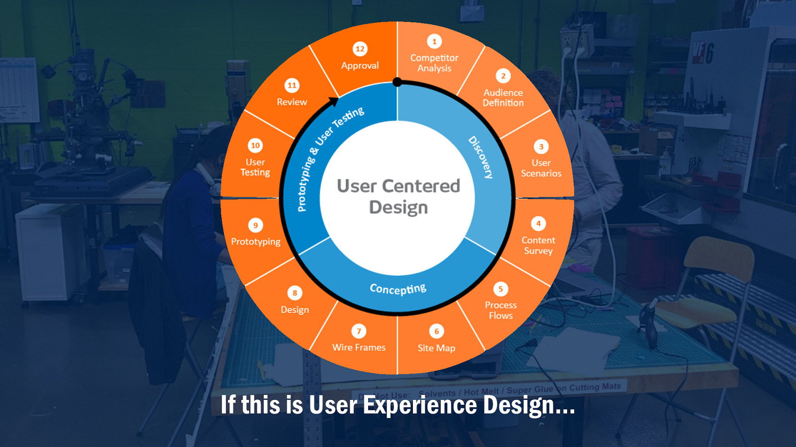
Everyone here believes that a user-centered design approach leads to better and more engaging products. But I wonder how much of our experience design process considers the crowded marketplace, the need to differentiate and compete, the need to create business value.
It’s no secret I’m often frustrated with the UX community. I see a lot of tribalism, blanket adherence to dogma. ‘UX’ can sometimes feel like an inward-looking, self-congratulatory, happy-clappy cult, throwing themselves at the Wailing Wall of Post-it notes.
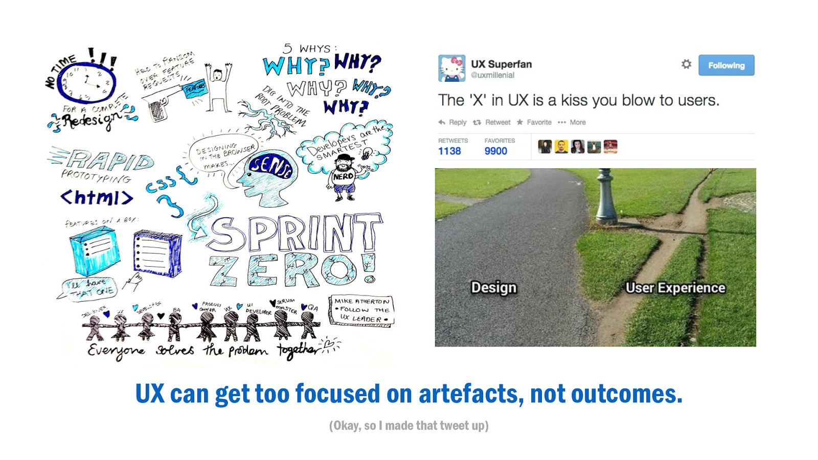
UX can get too focused on outputs, not outcomes.
We like making artefacts. Wireframes, prototypes, sketchnotes, even poorly-defined memes to get misinterpreted by shiny-faced marketing managers on LinkedIn. We love to make. To design.
Process and design and documentation are important. But it’s a bit like learning to drive. Experience teaches you to internalise the process and fix your eyes on the road ahead. The destination, not the process of getting there.
And this is where the discipline has an opportunity to step up. A popular question I hear from designers is “How can I convince the business of the value of UX?”
I think it’s the wrong question.
A better question is “How can I make UX valuable to the business?” This isn’t about getting permission to play with the Sharpies or run an offsite design sprint. Its working to speak the language, integrate the processes, and deliver the value that business needs.
Yes, our methods are meant to be more engaging and human-centered, but make no mistake, we are business transformation consultants and our one true deliverable is behavioural change.
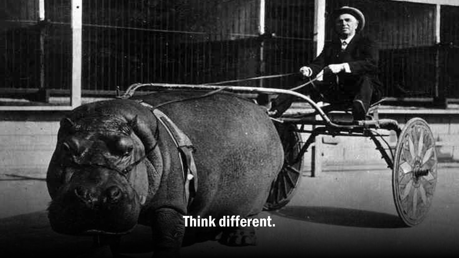
A truly successful experience is not limited to interaction or interface, it comes from a value proposition which offers tangible benefit.
UX people are really good at uncovering that value, because we’re close the customer. But within the business we need to do what it takes to be heard. Leadership. Let’s swim upstream and use our expertise to help define the value proposition. Not just building the thing right, but building the right thing. The right thing that can compete in a crowded marketplace where value is often tapped out.
Finding the differentiator is crucial. Every successful challenger, from online-only insurance to lettuce-in-a-bag took a existing status quo and turned it on its head. But as we’ve said, with our stuff often the product is the brand. Can we make our differentiator, our values, and our personality somehow integral to our user experience?
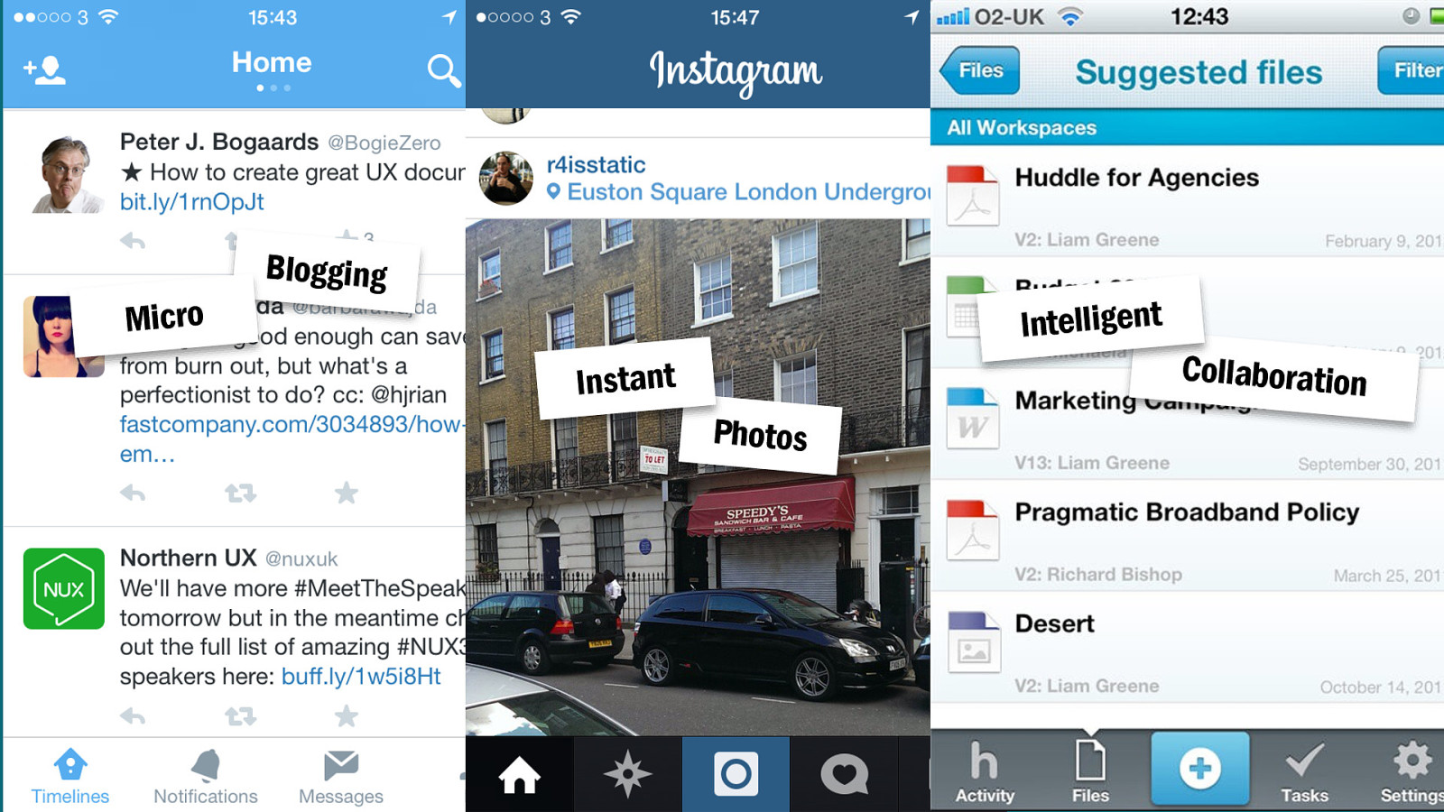
Twitter wasn’t the first blogging platform, but popularised a new category of micro-blogging. That 140 character hard limit made the differentiator clear.
Instagram restricted you from uploading photos from your computer. You have to do it all on the phone. Their point of difference was the instant experience.
With Huddle, we uncovered Intelligence as a differentiator; the intelligence of the individual user, the aggregate business intelligence, and our own smart algorithms that could serve up appropriate content. Rather than be a me-too collaboration tool, we could be the first ‘intelligent’ collaboration tool. Focusing the experience around personalised content and so make our competitors seem like mere file storage.
I call this brand-driven design. Crafting an experience with your differentiated values at its heart.
The first law of branding is focus. Staying true to that one idea. Doing less. Fewer features, less content. The more we add the further we blur the clarity of that simple proposition we want people to remember.
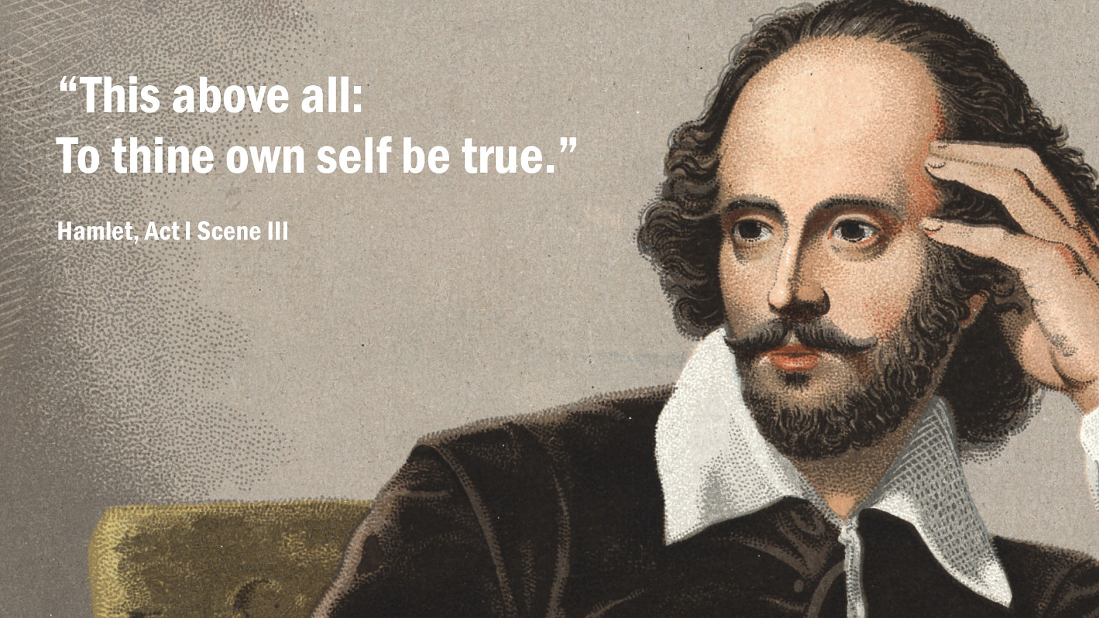
Brand is made of mission and values and personality. The things we care about, made real by what we do. Virtue untested is no virtue at all. That’s true of us as individuals too.
I’ll tell you a secret. When your work aligns with your personal values and mission, it doesn’t feel like work at all.
Businesses are made of people. Successful brands aren’t defined from the top-down, but the bottom-up. The motivations of each individual shape the culture of the organism.
In that sense, you are not your job. Your job is being you.
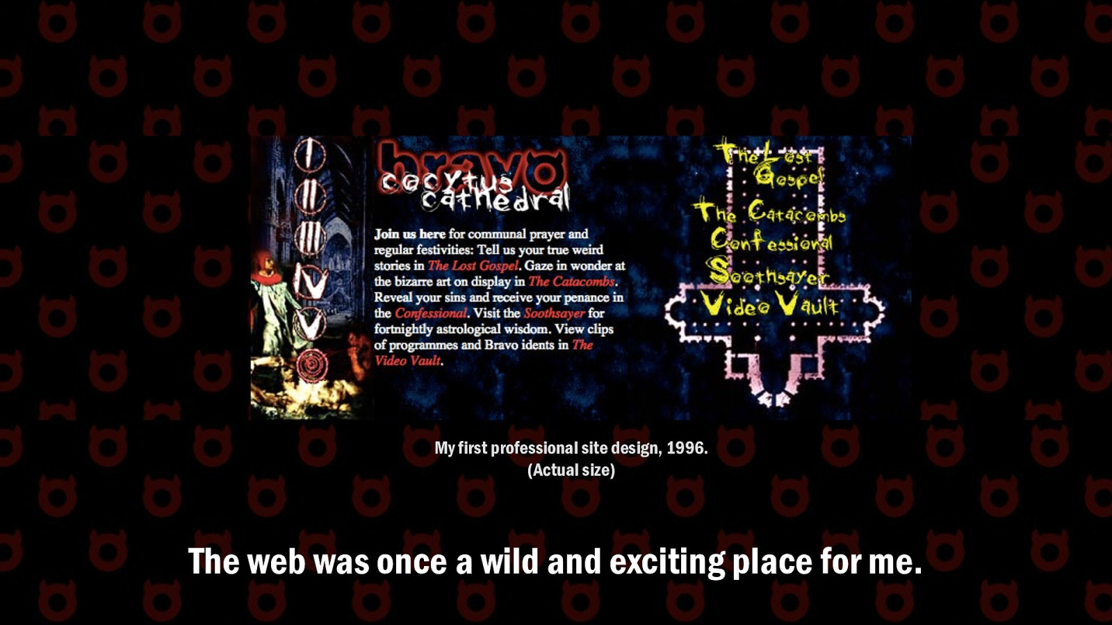
What first drew me to working in the web almost 20 years ago were my hobbies in graphic design, writing, and computers. It was incredible to see these things come together in a global publishing network where I could make something in my bedroom and put it live to the whole world.
I fell out of love with web design during my agency years. It was a thankless grind, crapping out microsites for clients who wanted the moon on a stick for no money. Clients who didn’t know what they wanted, but absolutely knew they had to have it by the end of the week. Late nights. Blood, sweat, and tears on marketing sites for bands, utilities, energy drinks. Stuff that just didn’t matter.
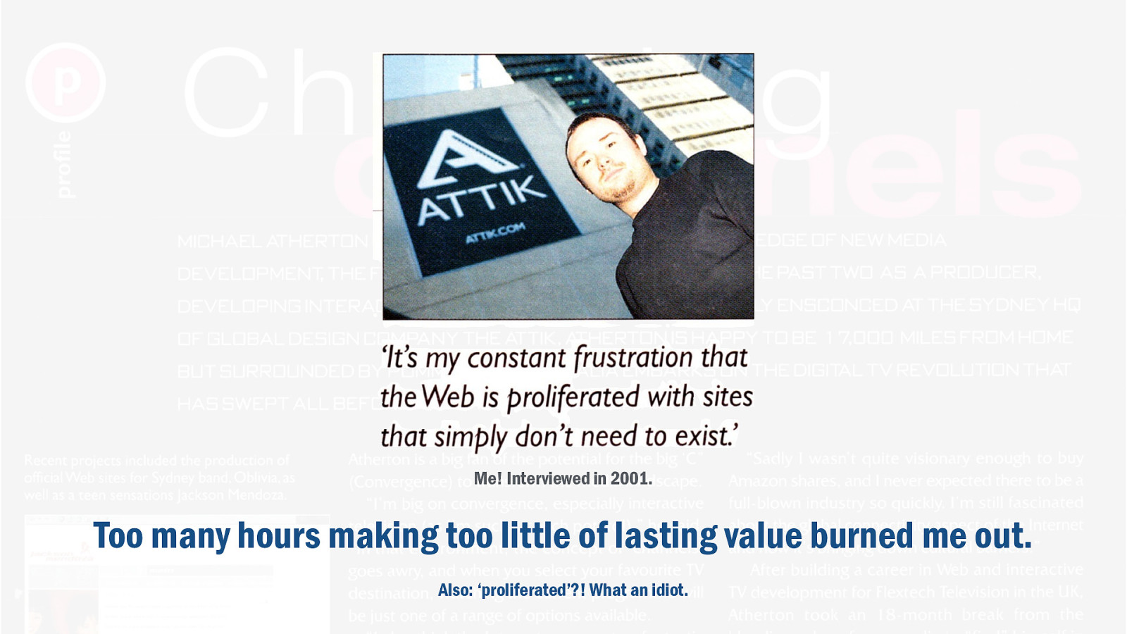
By the time UX was a thing I was already burned out. You know what UX people are like. They talk about passion, energy, inspiration. Loving their job. Bit I just didn’t feel that way. I was too far into my career to start again, and feeling no love for the only thing I knew how to do. The process of design had lost its novelty, and the outcomes weren’t meaningful. I wanted to make things of lasting value. If I’d put hours I’ve spent over the years making websites into writing novels, those creative works might outlive me. The websites I made rarely outlived the job I was in.
If you want to see my portfolio, check out the Wayback Machine.
I had to look at my own ‘why’. Why did I get out of bed? What mission motivated me? What did I care about? I knew my greatest kick came from speaking at events and giving workshops. Even in web design, the best part was making sure the clients had the skills to keep things running after launch. My ‘why’ was wanting to create lasting value and give people new superpowers.
That led to my own pivot. I moved from UX leadership into teaching. I found the first job in 20 years that I actually loved. Taking all I’d learned the years prior and focusing through a new lens.
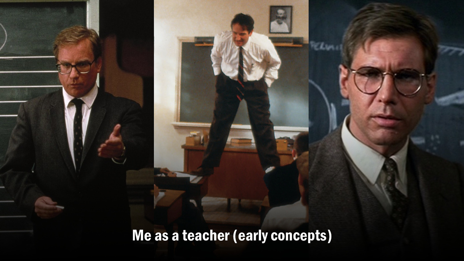
I lived out my fantasy of being Mr Holland, John Keating, Professor Jones, a highly qualified and capable teacher who almost certainly…
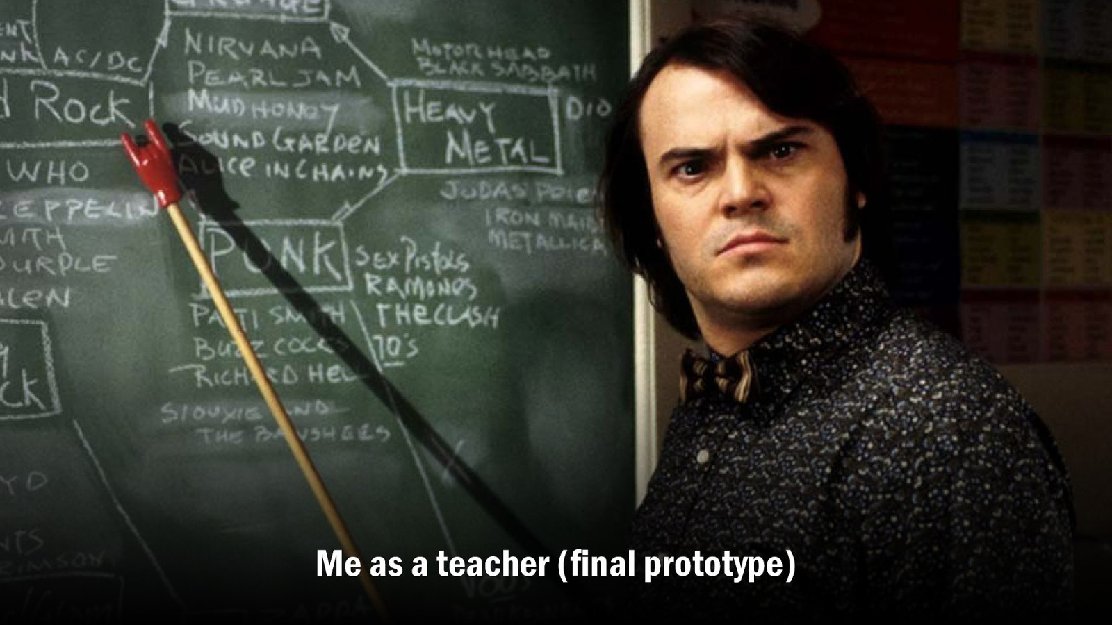
…hasn’t blagged his way in and is making it up as he goes along. But there were meaningful outcomes. Turning out future UX designers with the right attitude and approach. And my students who’ve gone to work for IBM, Method, Red Badger, Future Workshops - to name a few - will tell you that it bloody works. I was the most rewarding job I’d ever had.
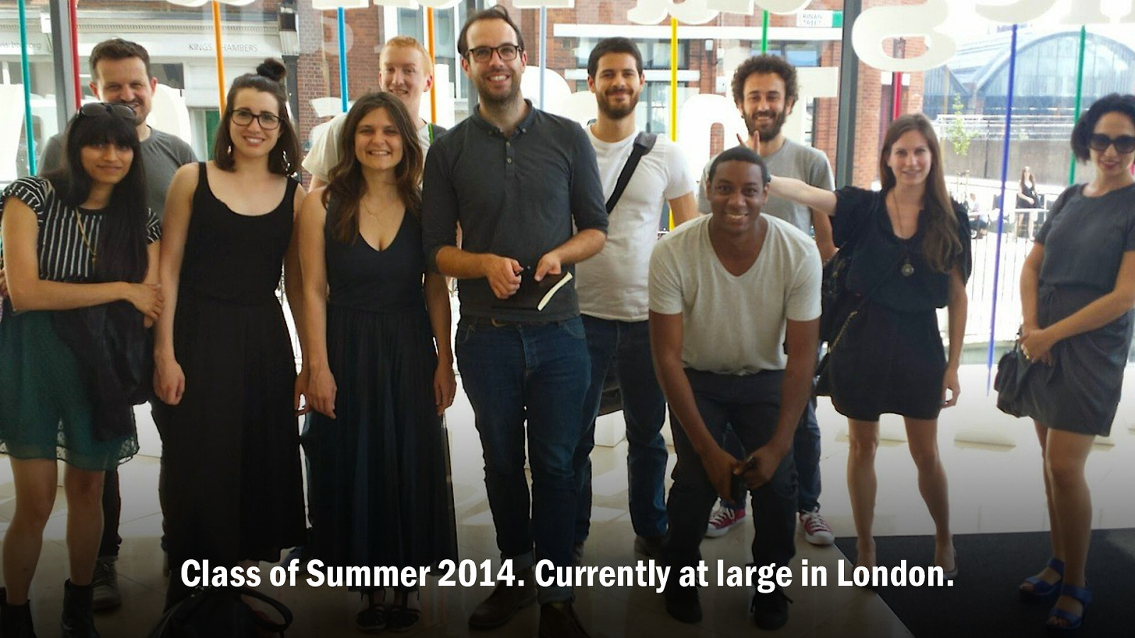
People were my deliverables, who’ll go on to create value of their own. Meaningful outcomes. Sending the elevator back down. It made me happier as a person.
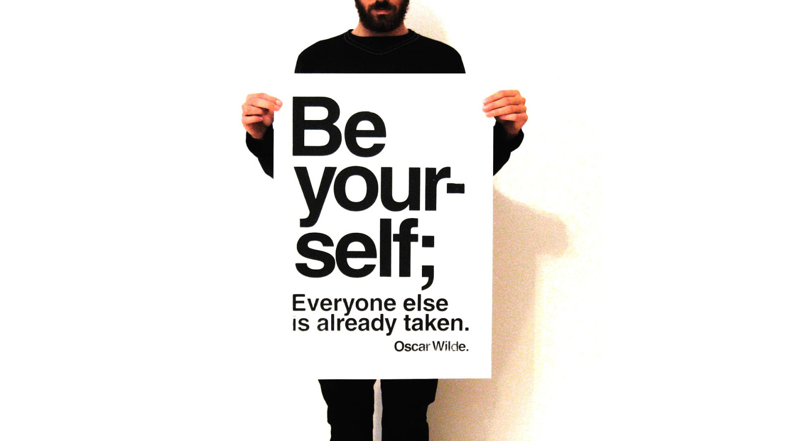
And I was able to be myself. I may not be the best teacher in the world, but I’m the best ‘me’ there is.
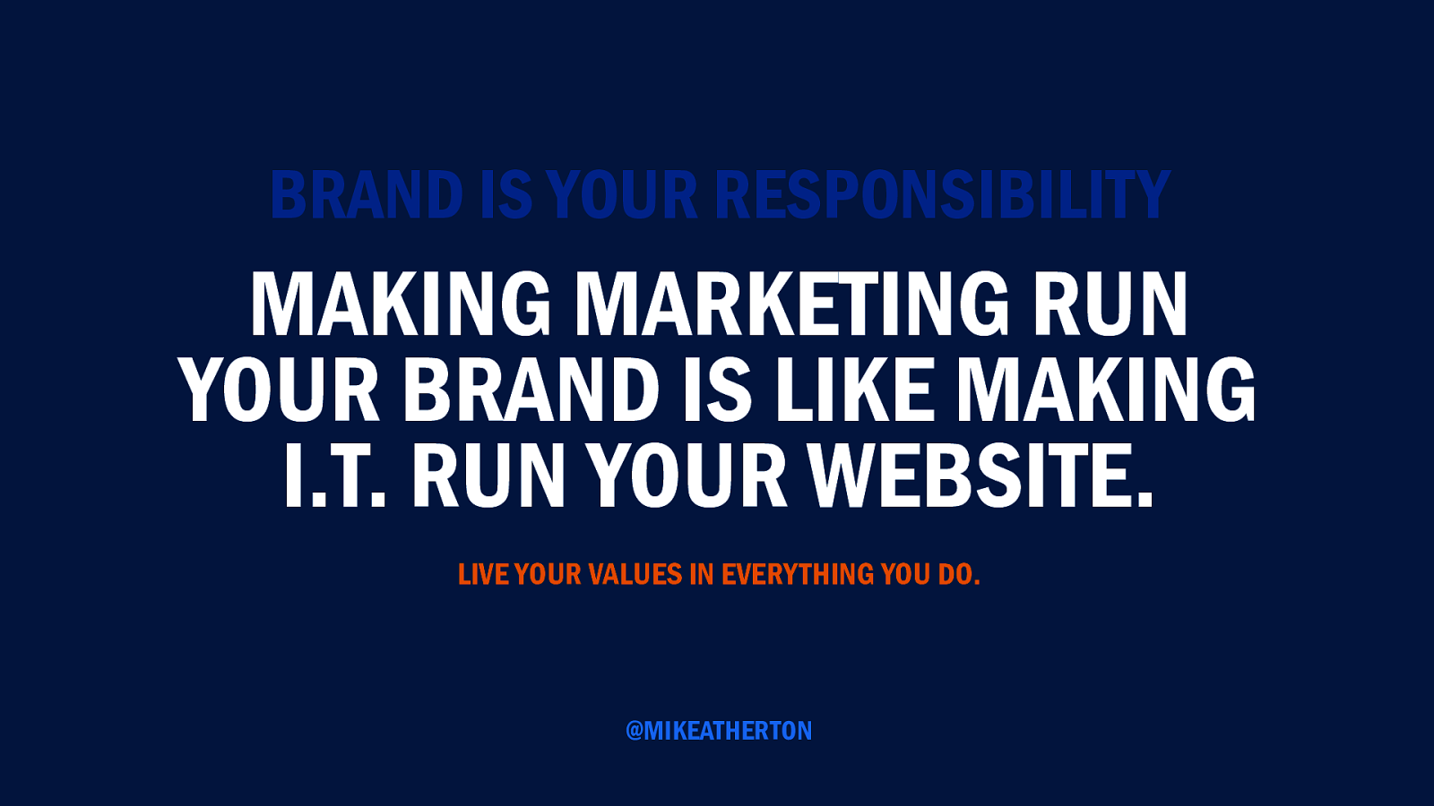
I believe we can all benefit from taking a road less travelled. It starts with you. A company’s brand is the everyone’s responsibility. We’re in the business of affecting change. Changing behaviour. Changing minds. The vision, values, purpose of the business are expressed through the things you create.
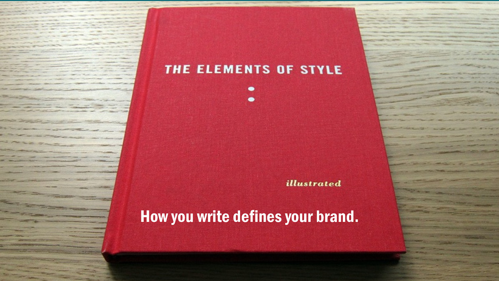
The way you maintain a consistent voice and a tone defines your brand personality. People form relationships with brand like they form relationships with people, so present a personality that we want to spend time getting to know.
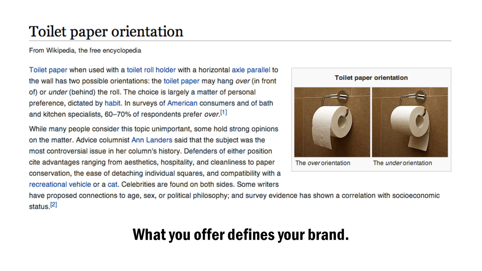
It shows people what you care about and acknowledges your speciality. Always remember you’re part of a larger conversation. If Wikipedia has a better article, just send people there.
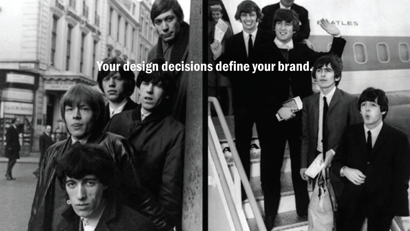
The choreography of content across channels, the specific emphases and restrictions you impose to govern behaviour, control the conversation, and draw lines in the sand. Where Android expressed humility by giving users ultimate customisation, iOS offers the firm hand of consistent design.
Brands can justifiably be arrogant or humble, neither is bad. You can be the Beatles or the Stones, but you can’t be both.
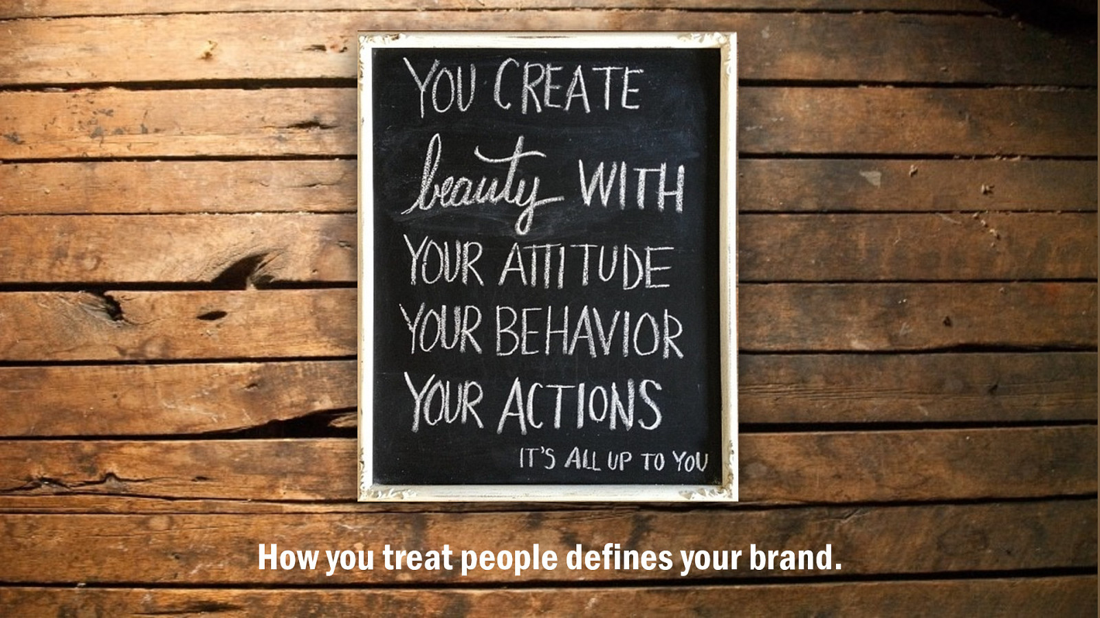
In this age of instantaneous social feedback, where we are all at once creators, consumers, and curators of content, there’s no room for bullshit. We have choice. We demand radical transparency and authenticity from our relationships. In a world of too much stuff, we want distinctiveness. Give them something they can’t get from the next click away.
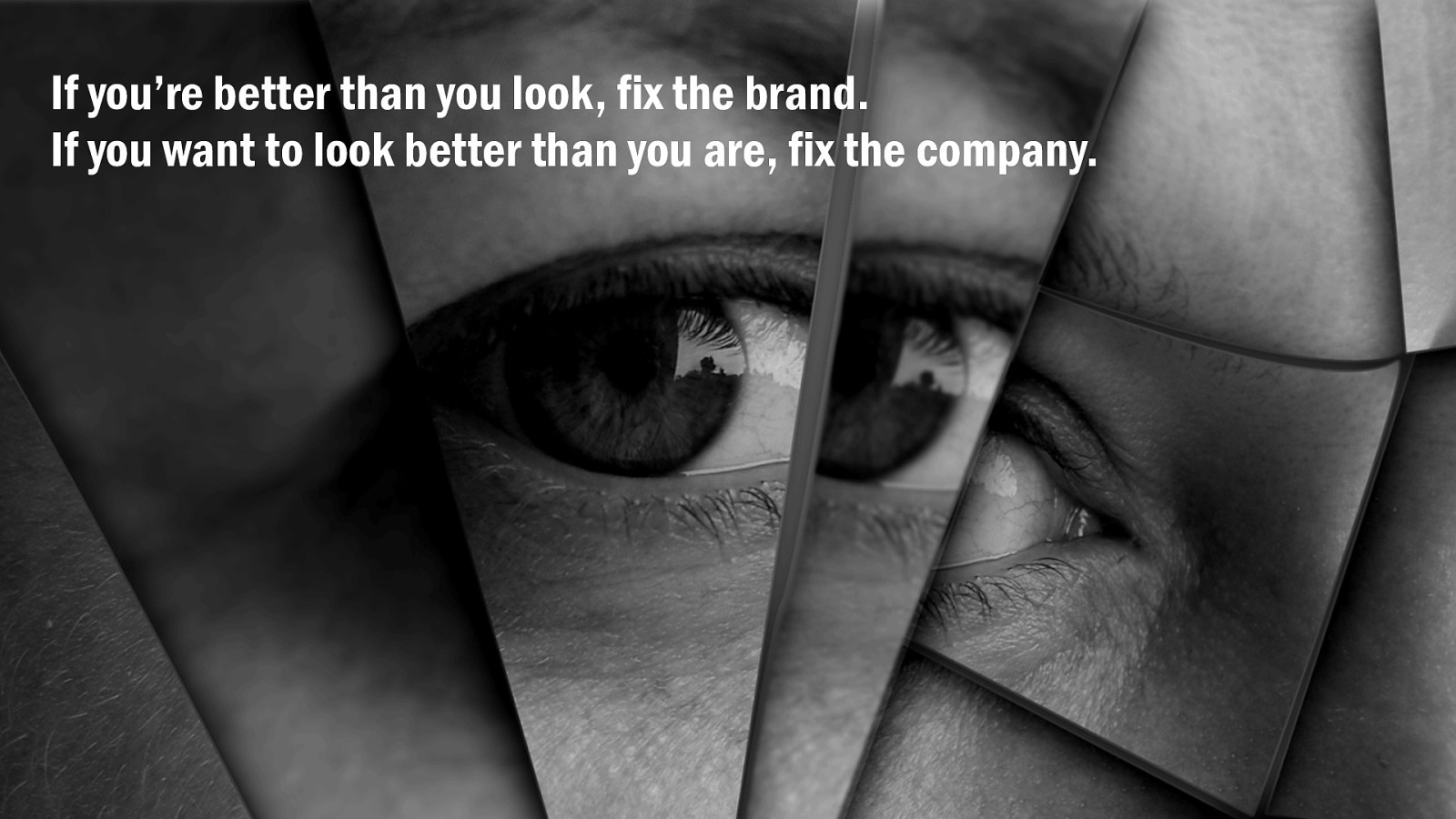
Brand is the reflection of who you truly are. If the reality of your company is better than your image, fix the brand message. If you want an image more positive than your reality, fix the company.
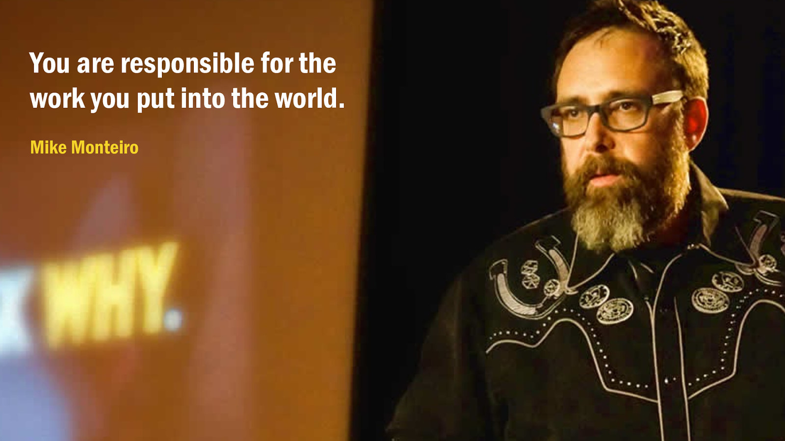
The things you value should drive the things you do, and shape the work you put into the world. It builds that relationship, that loyalty, that love which customers could have for your brand.
Wouldn’t we all like to come to work every day with a sense of purpose?
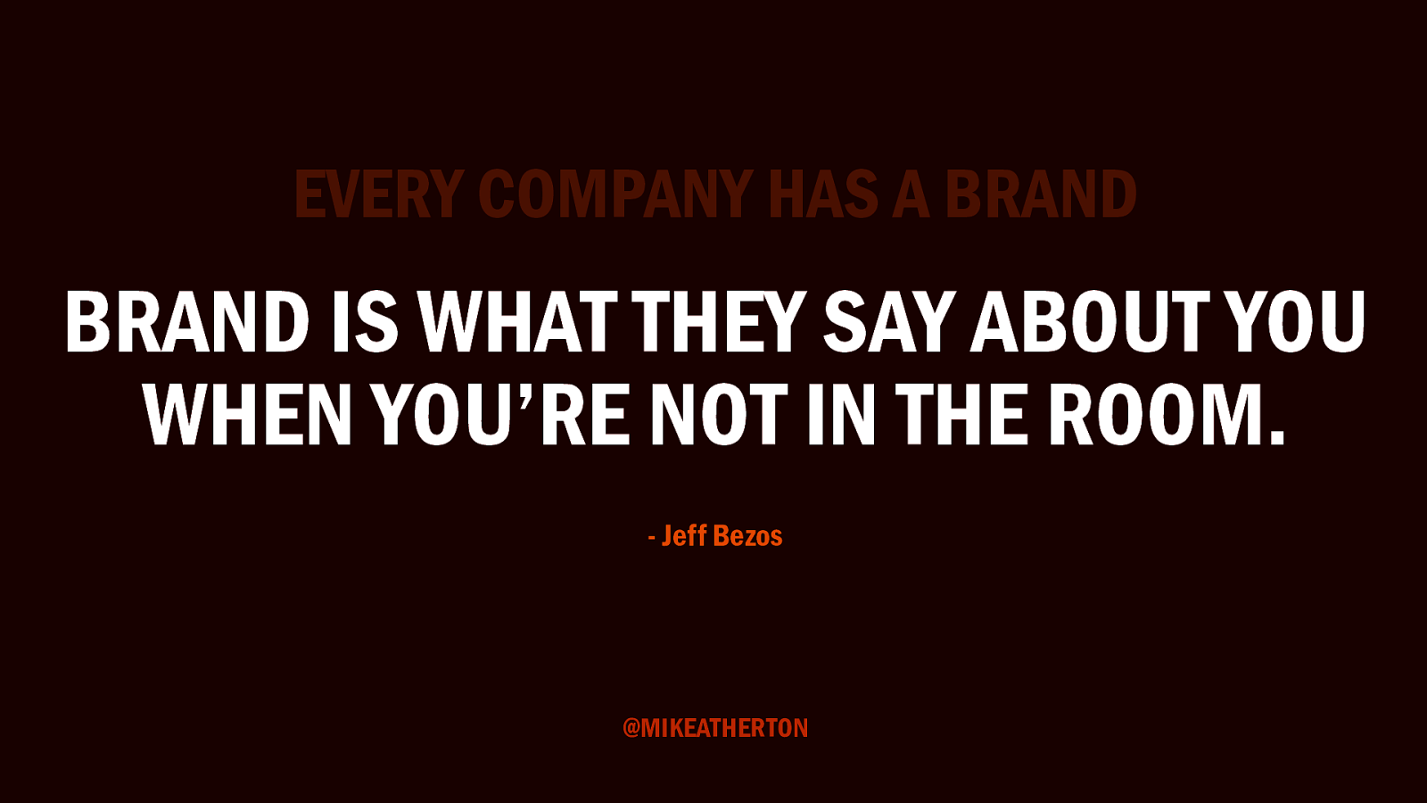
I’ll leave you with a final thought, for those who may think this is all very well, but my company doesn’t have a brand. You do. Like information architecture, like user experience, brand is always there. The only question is how much care and attention you’ll give it.
Brand is what people say about you when you’re not in the room. What will it take for them to say something nice? Which road will you take? When I stayed true to my values I was happy and fulfilled. I was a nicer person, and people were actually nicer to me.
For one brief shining career episode, I found the fork in the path I was on and took the road less travelled, and that has made all the difference.
Thanks for listening!