A presentation at React Brussels in in Brussels, Belgium by Kathleen McMahon
Welcome, everyone! I’m Kathleen McMahon and I’m here today to show how you can roll out a product rebrand — in secret — using feature flags.
Before we begin, let’s get some details out of the way.
First, I want to give a huge thank you to Omar, Aymen, the speakers, the event production crew, the volunteers, and everyone that worked so hard to create an excellent event!
My presentation will be posted on Notist, that’s https://noti.st/resource11, after my talk.
You can follow me at. Resource11 on Twitter, Instagram, and GitHub.
Let’s back up so I can introduce myself better…
So I’m an engineer and a designer and I like to speak about things…
And… I sometimes race cyclocross. Very badly.
Mostly you’ll see me in costume, racing two laps to your six, at the back of the pack, on a singlespeed bicycle — with a bunch of onlookers laughing at me, toasting with their beverages.
Now I think y’all agree these past few of years have been intense. Right?!
See the penguin in the middle of the screen? The one that failed to jump on the iceberg? That was me. Burning out. Surviving Covid layoffs. Tech interviews. New jobs. The isolation of lockdown. More burnout. So.. I did a few things to survive. Like…
Spending my time getting crafty with lighting setups during the colder months.
Photographing my cats Thor…
…and Otis…
As this photo of them snuggling clearly shows… they are always fighting. It’s a problem.
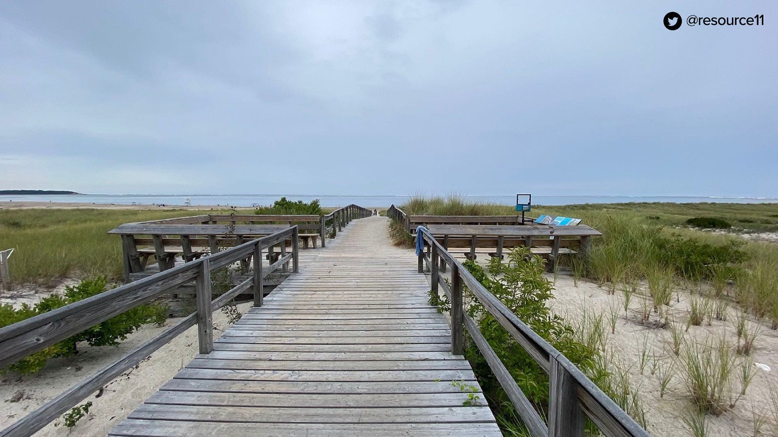
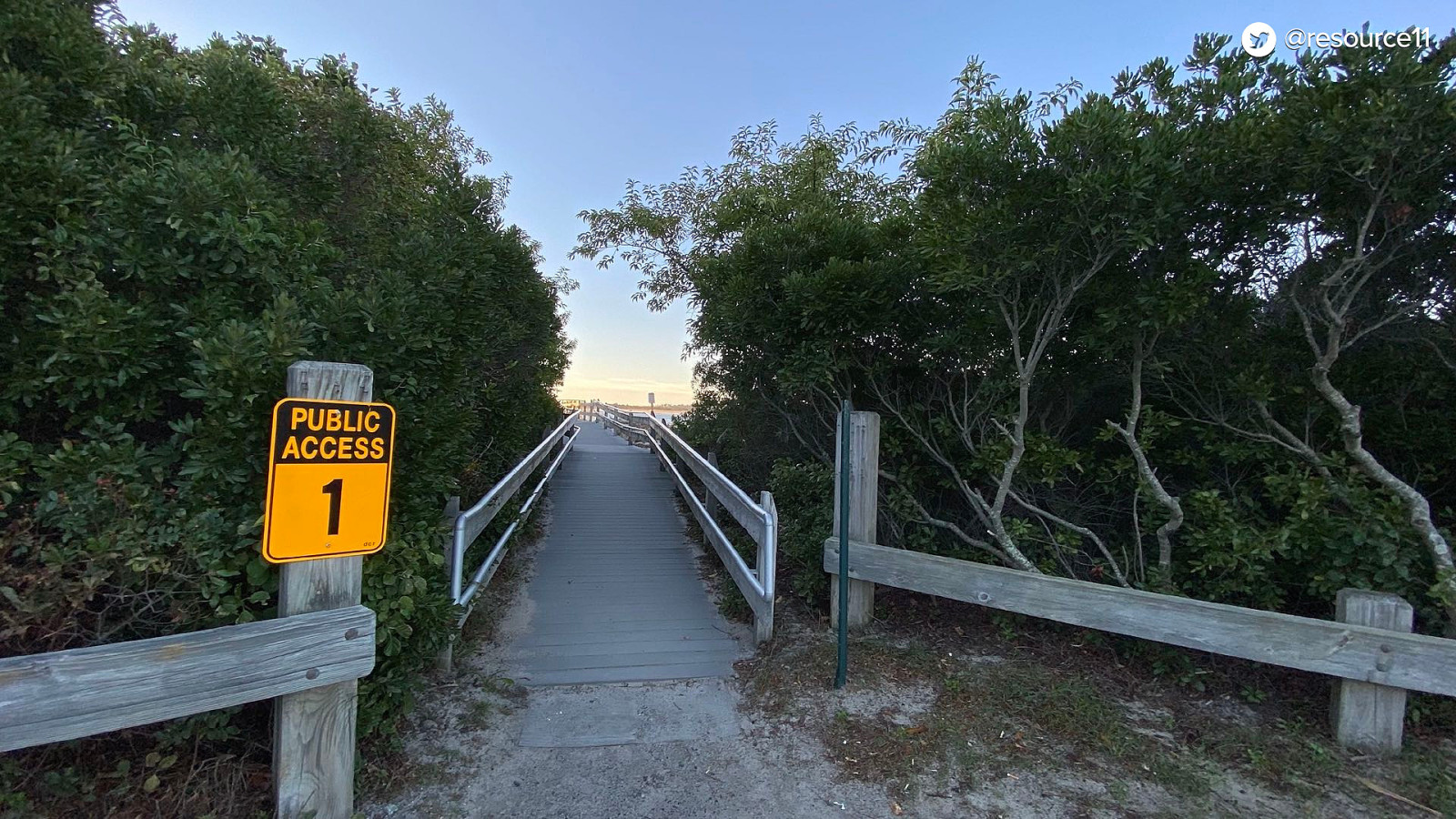
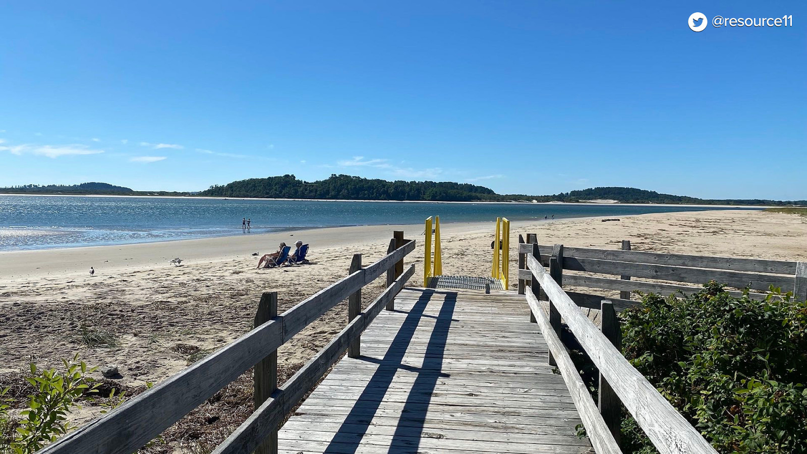
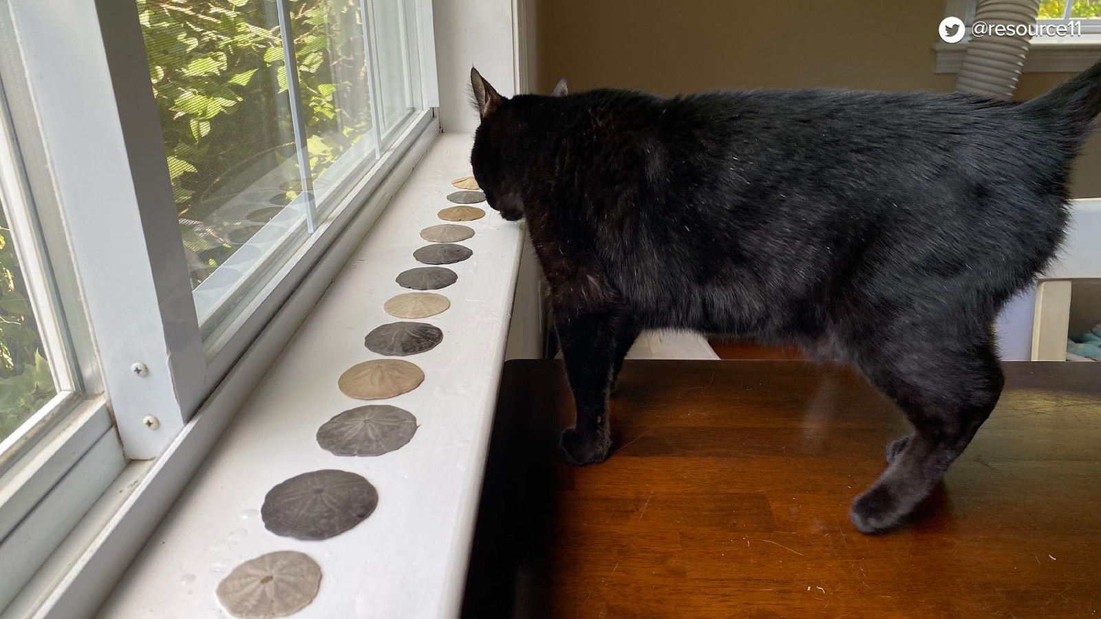
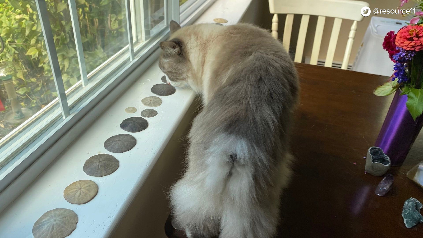
And in the summer, I go to the beaches!
At different times…
Different days, and…
Different locations…
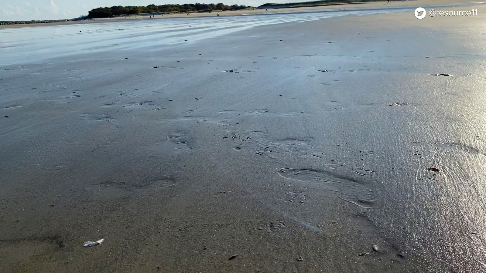
Always at low tide…
Which is the best time…
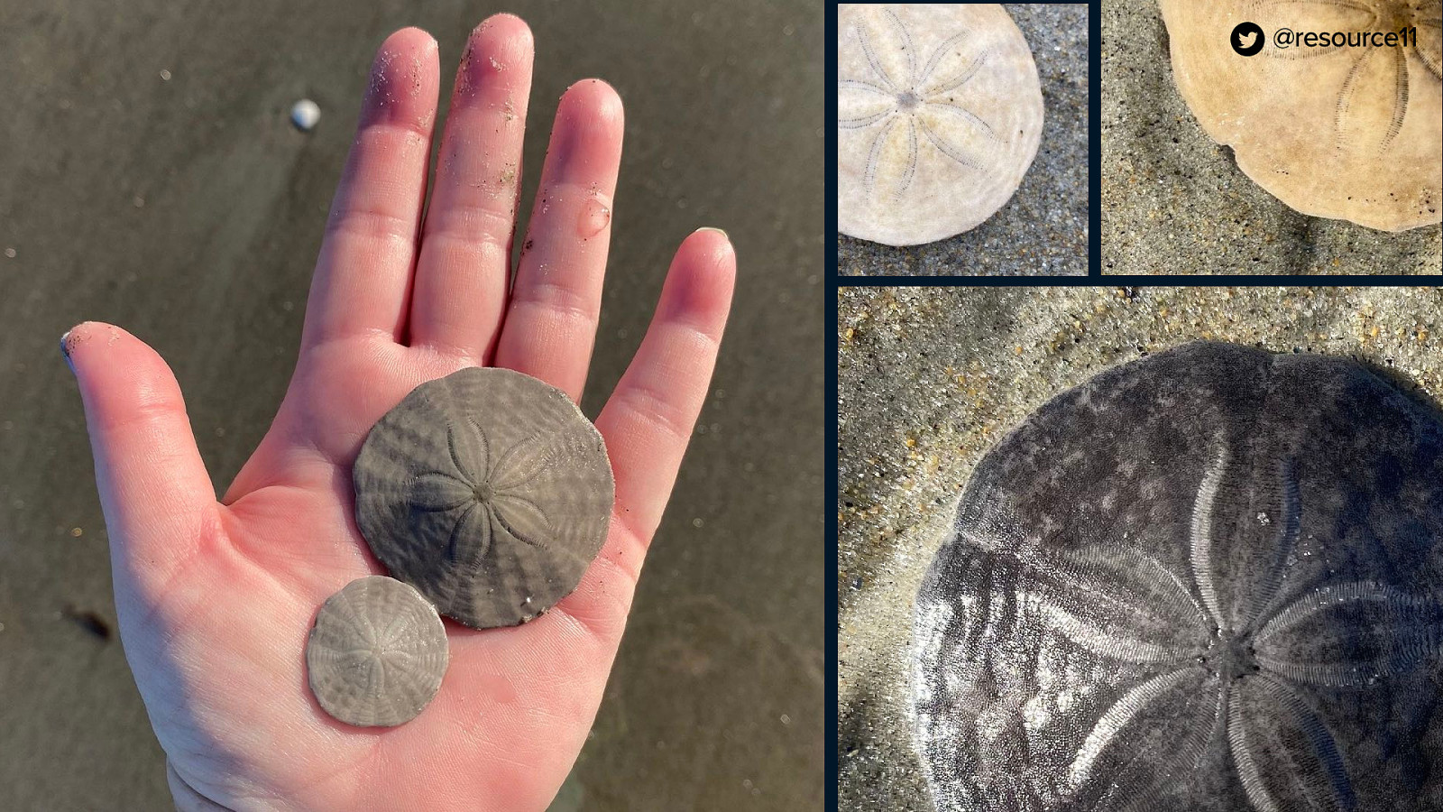
…to look for sand dollars
It’s like the Where’s Waldo of the ocean.
So I get a serious…
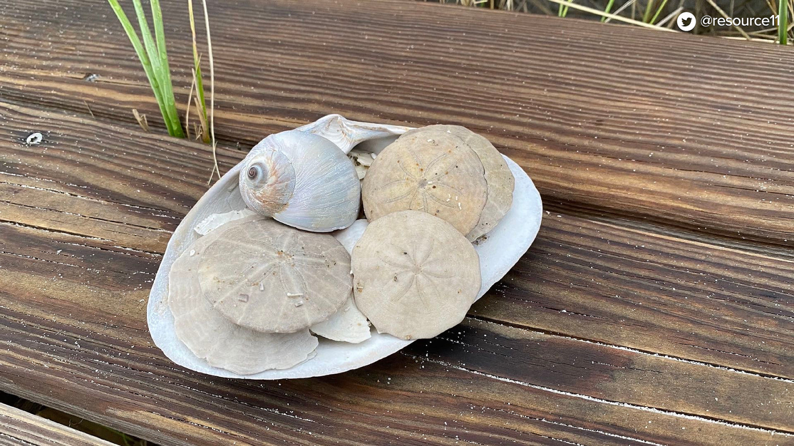
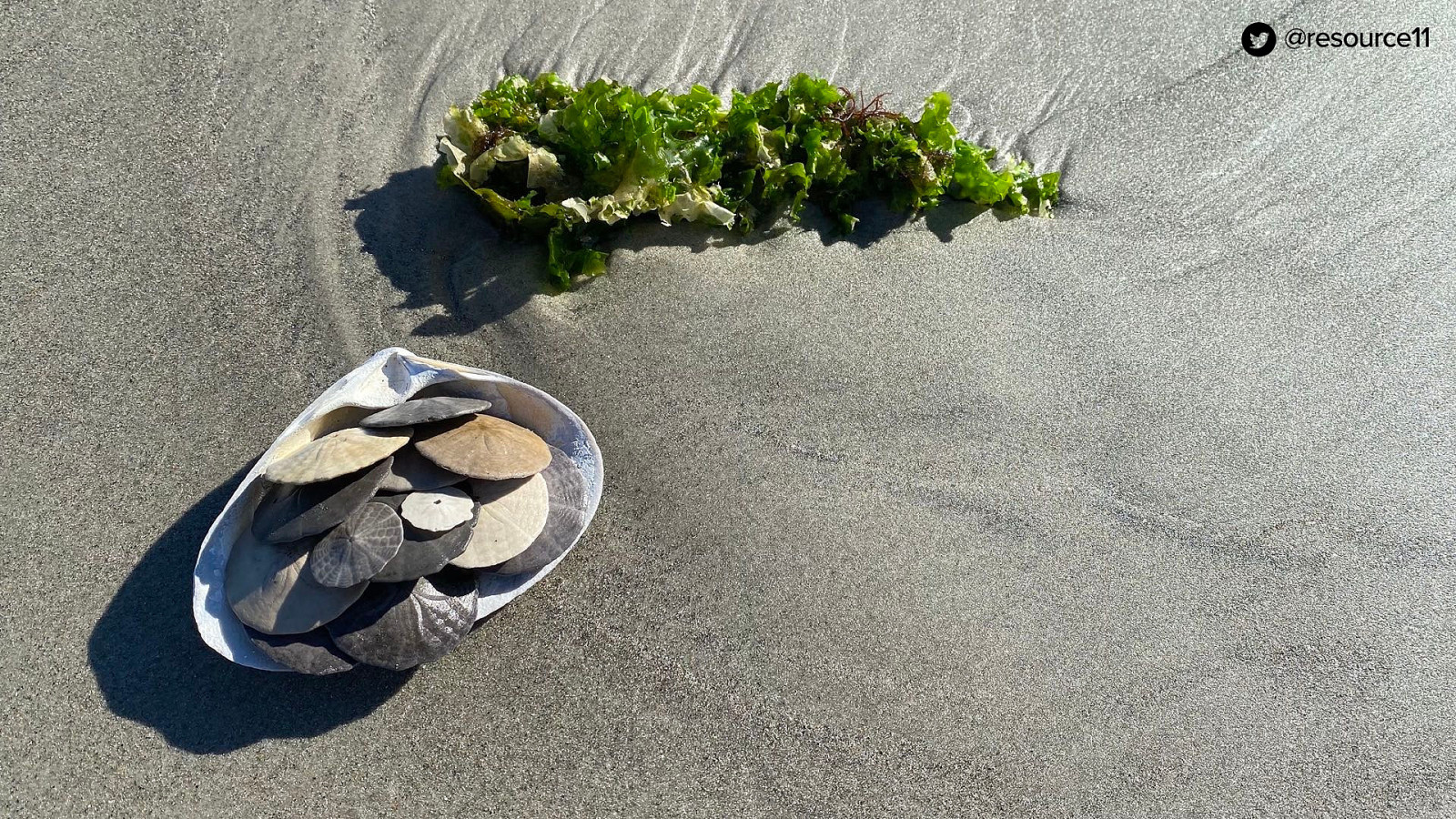
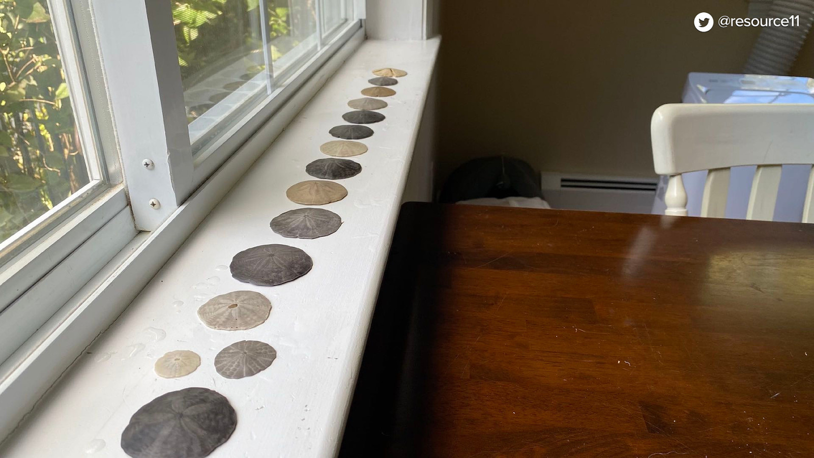
Collection of sand dollars!
And I photograph
My treasure
Every time
Trying to do this at home is a problem… because of the Otis factor.
Because Otis is especially needy…
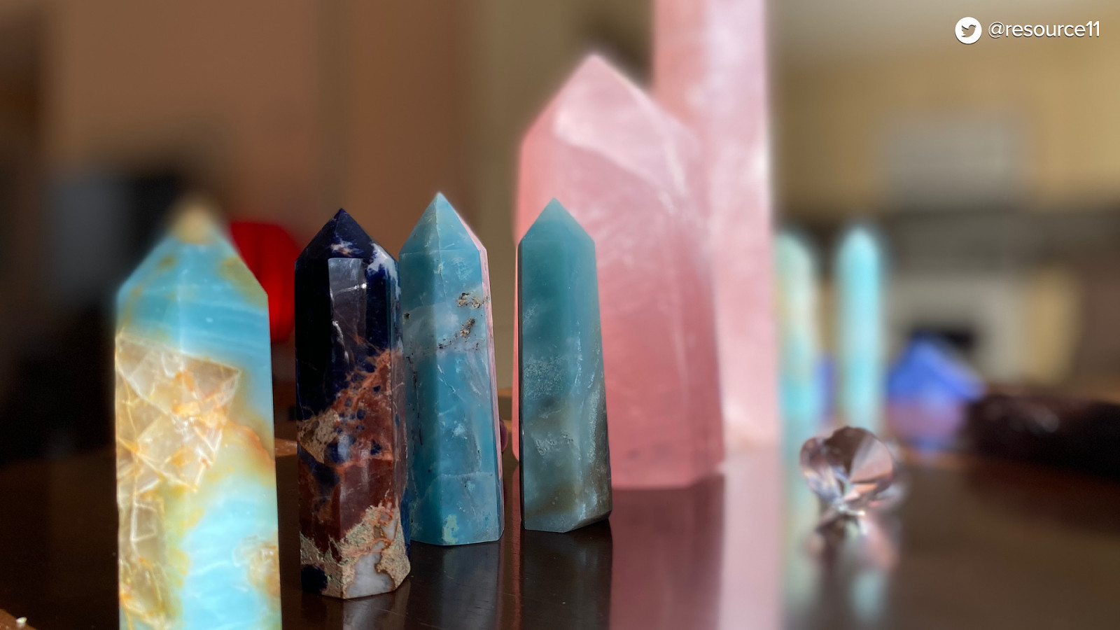
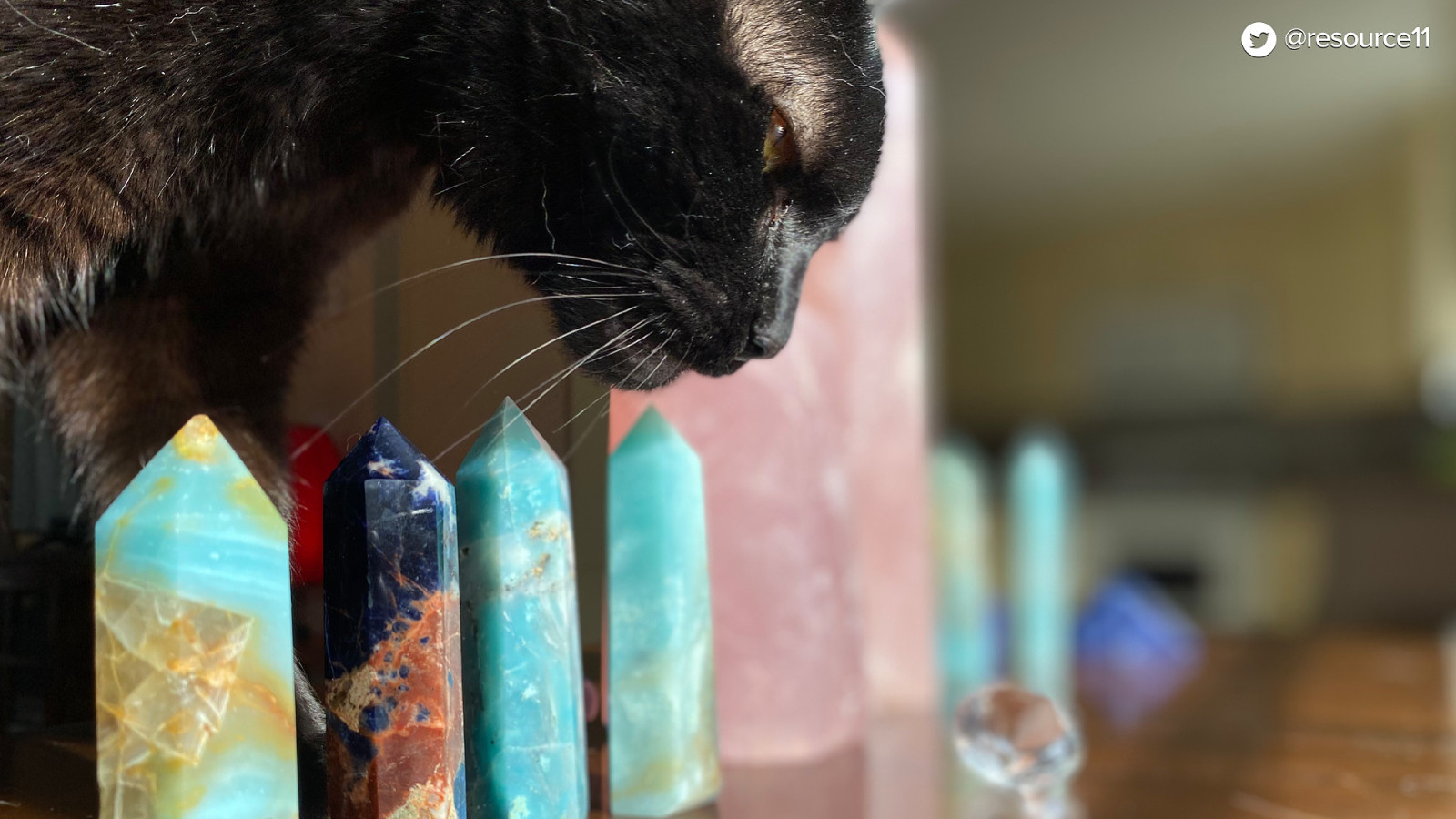
See, during lockdown before burnout hit peak, I also started a heck of a crystal collection. And attempted…
To get good photos. But Otis was having none of that…
None…
…of it.
None of it.
So my attempts at this…
Yeah… nope.
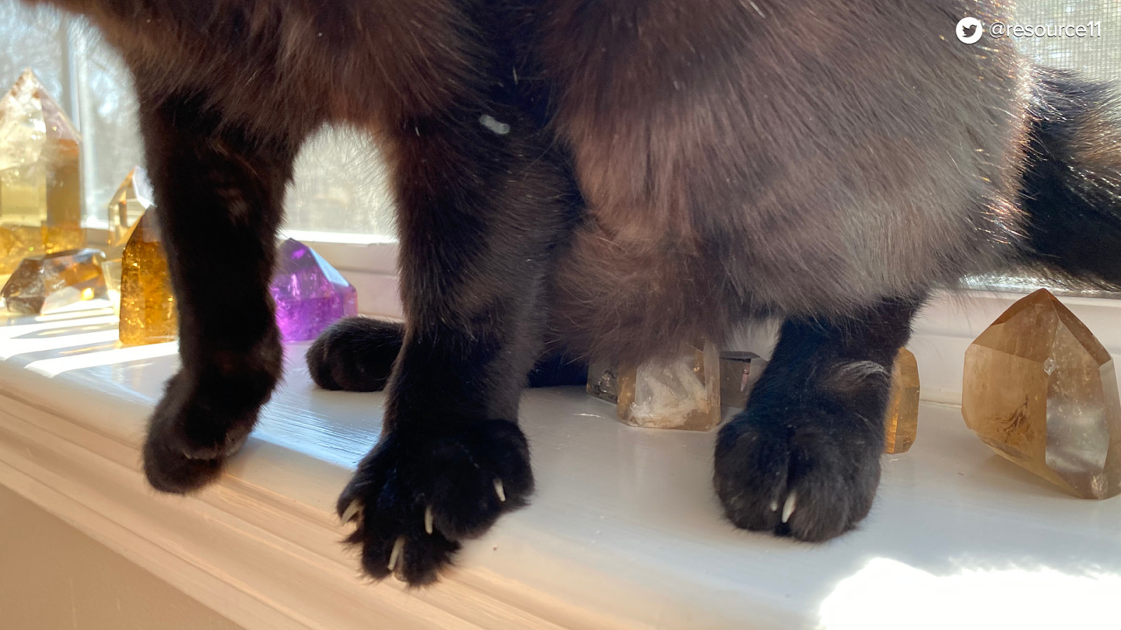
And now he’s even taught Thor…
To do…
The same…
Thor looks pretty satisfied.
Who could resist Otis though? He’s the reason I made that intro video that BeJS shared out on Twitter. He wanted to be here.
So here is Otis. Attending by proxy.
Anyhow… When it was time to head to Brussels to see people in person, I felt so excited! People. Finally!
Then I remembered… omg… talking to people.
How many of you felt the same? My introvert did a little panic…
But excitement won out, y’all!
And now I’ve shaken off my stage fright anxiety…
Thanks for your patience.
So… you’re here to learn about secret rebrands…
I’ll tell you a story about that.
Currently, I’m working with an amazing group of people at Northwestern Mutual as a Senior Design Systems Engineer, helping them take the Luna Design System to the next level.
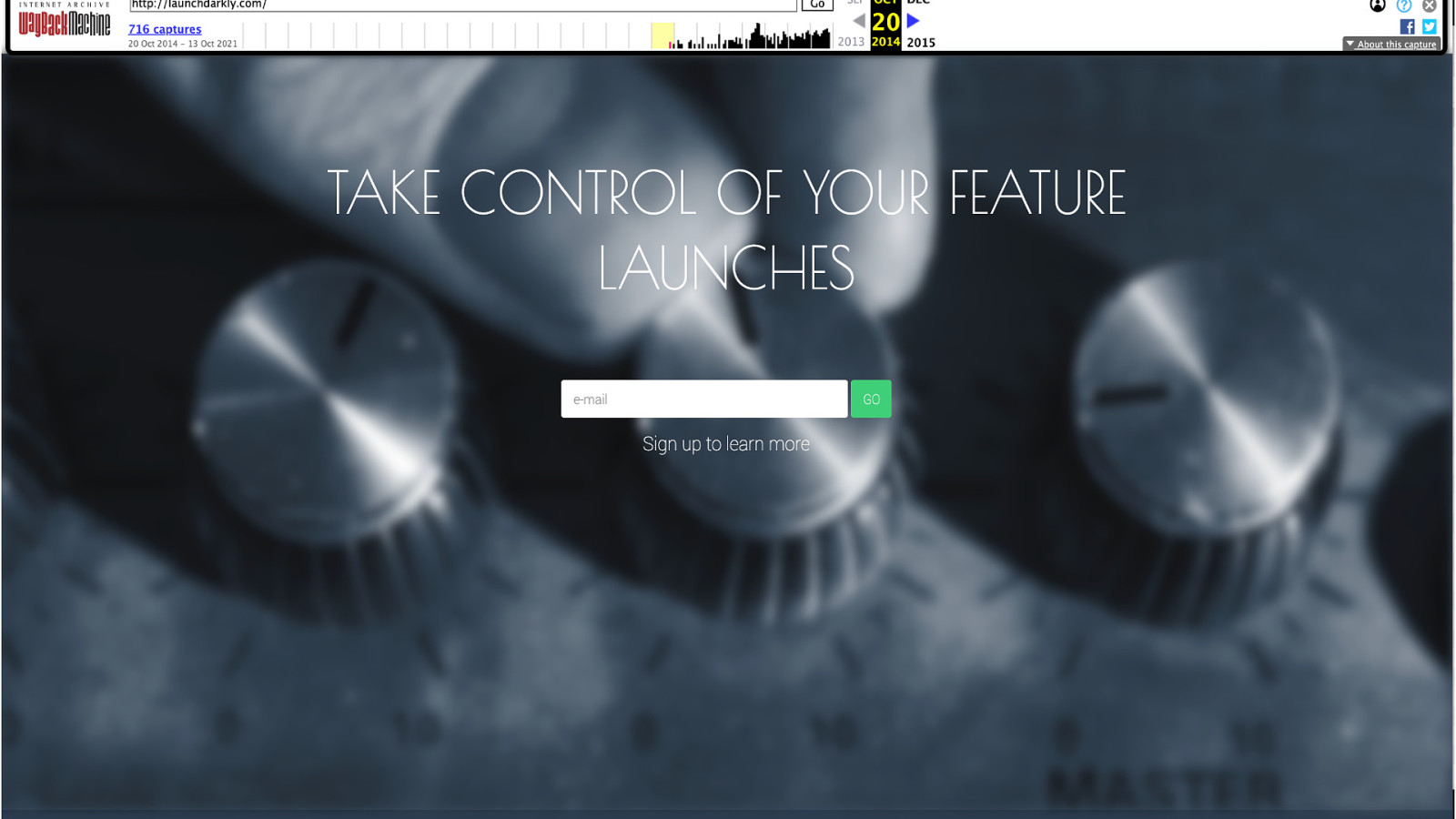
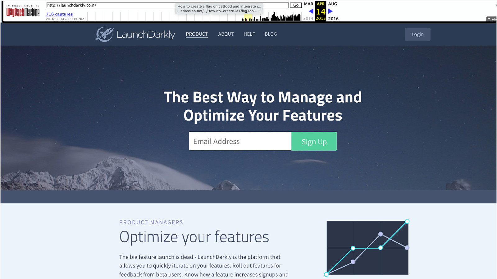
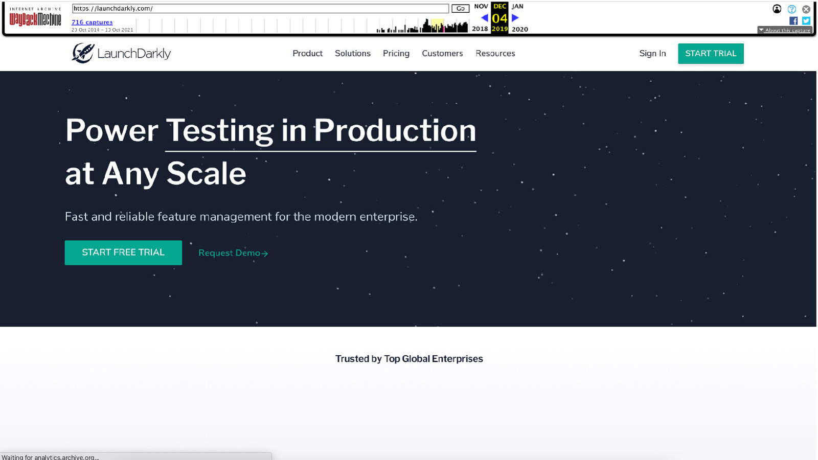
Before working at Northwestern Mutual, I was on the UX Next team at LaunchDarkly. This story is about my time there.
The UX Next team enabled other designers and engineers to craft high-quality experiences for their customers.
Wow, that sure is some corporate speak, huh?
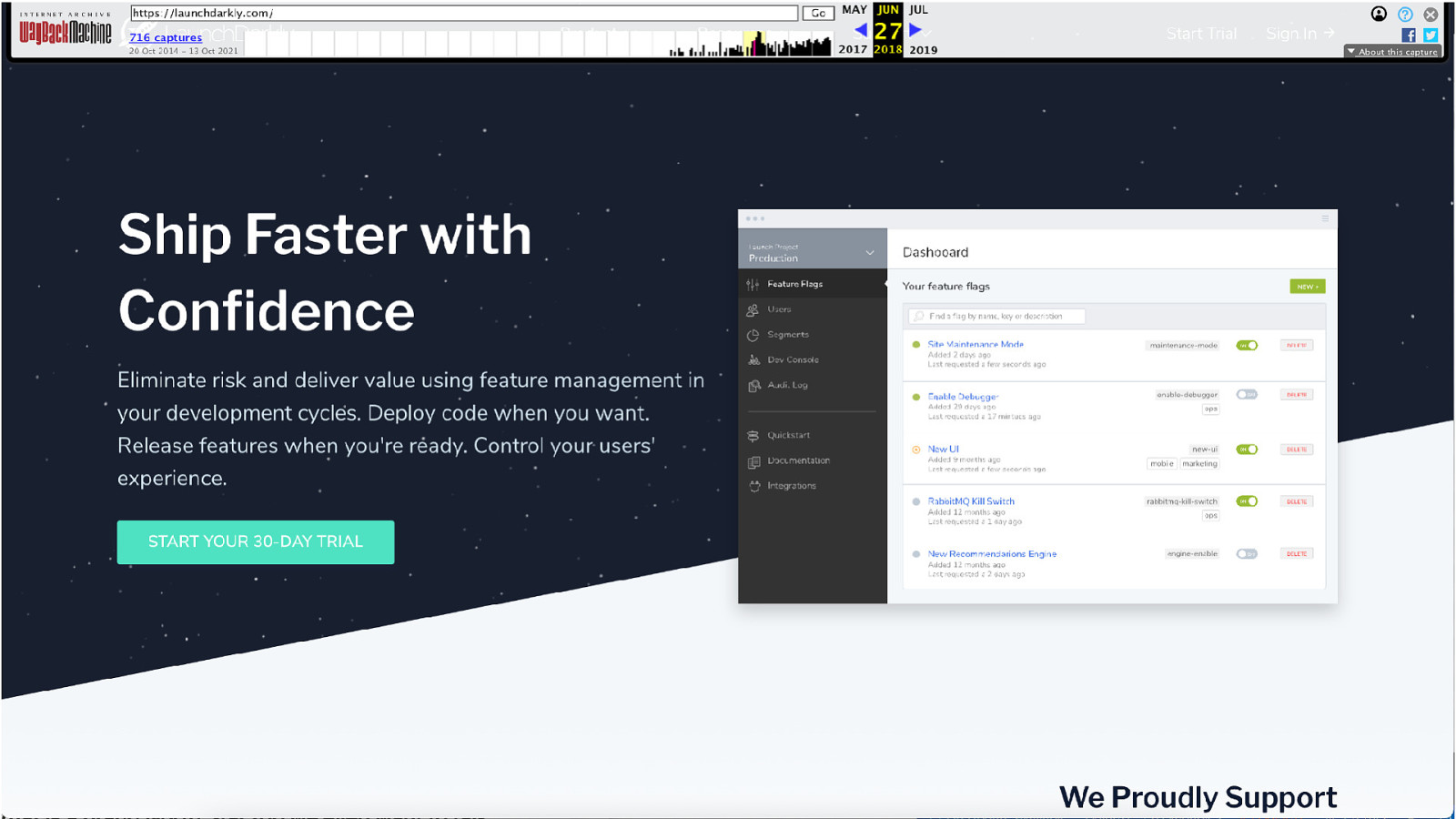
When I first joined LaunchDarkly, part of our work included maturing the design system.
And I’m a super fan of design systems, so it was exciting!
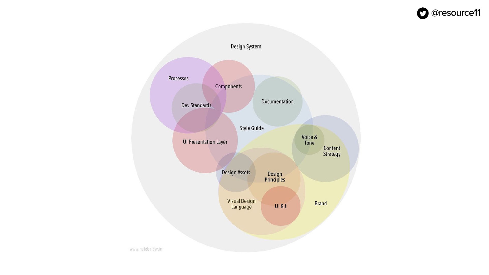
If you’ve ever worked on a design system, you know there are a lot of things to consider. Which can sometimes feel like…
…herding kittens. Always fun, yet lots of moving parts. Similar to herding kittens, maturing a great design system can be tough with so many moving parts. If your squad is small, and not a dedicated system team you have to be very strategic and choose what to tackle. For example…
In our case, the foundations were missing from our system. We had components, but none of the building blocks, so we began our journey to define them.
Like design tokens.
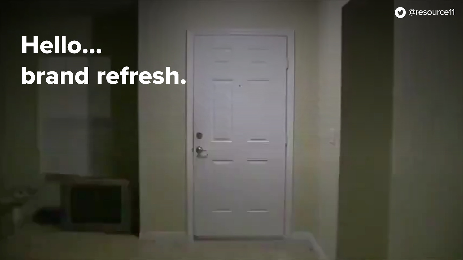
Naturally, we were just beginning to start re-defining our tokens when…
In an unexpected twist, someone kicked in the door wearing a Big Bird costume!…
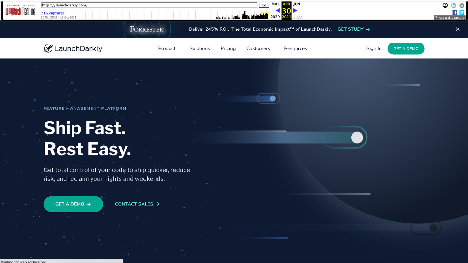
Not really. The creative team entered the scene and announced a brand refresh.
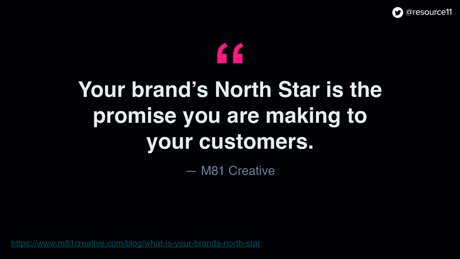
So there we were, presented an updated brand North Star!
You may ask… what is a brand North Star, Kathleen?
There is this article by M81 Creative that gives a great explanation of North star:
“Your brand’s North star is the promise that you are making to your customers.”
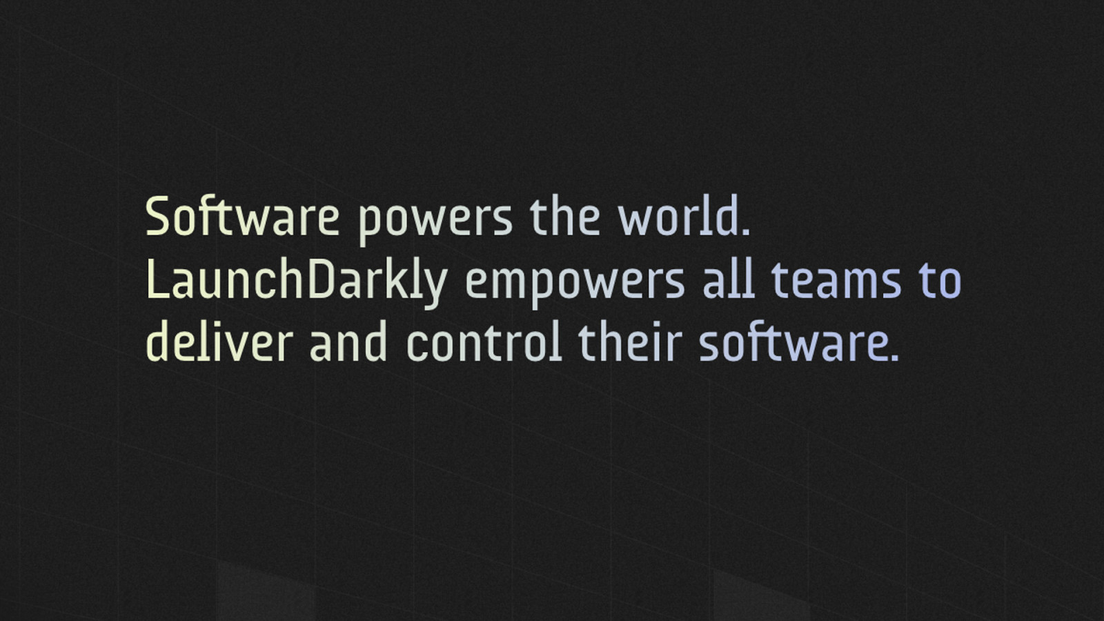
At LaunchDarkly, their North Star aligns with their core message:
Software powers the world. LaunchDarkly empowers all teams to deliver and control their software.
They lean into this mission with their colors, typography and signature logo.
Now creating a brand North Star takes time to do right
You have to do things like strategy, competitive analysis, user and customer insights, and creative explorations
This process take up you know many months, sometimes up to a year.
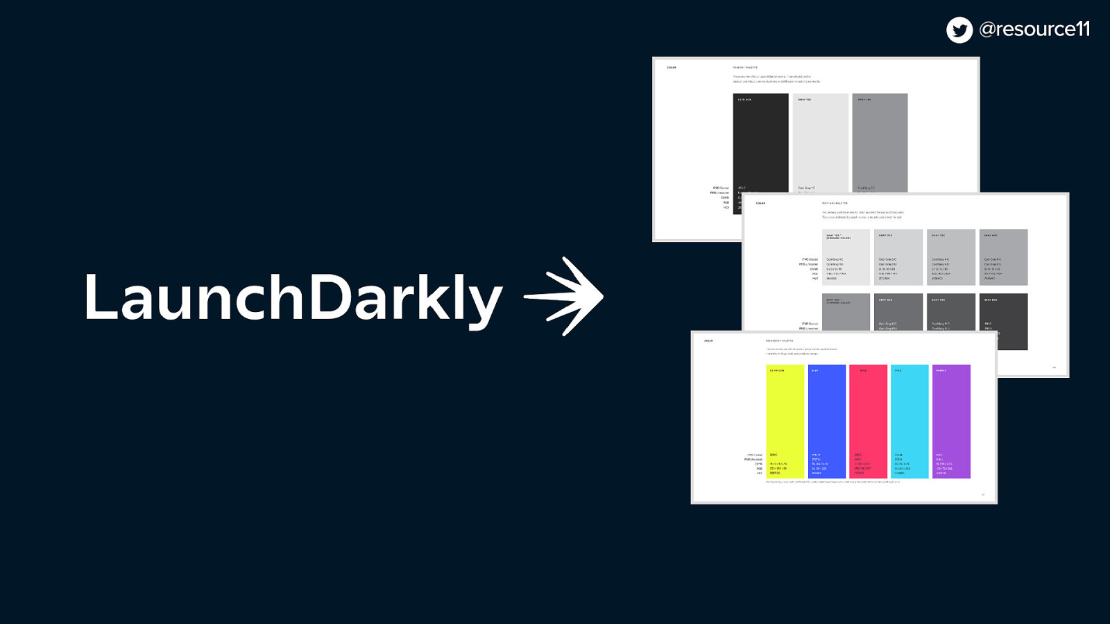
At that time, you will have some key outputs like logos, colors, typography and such.
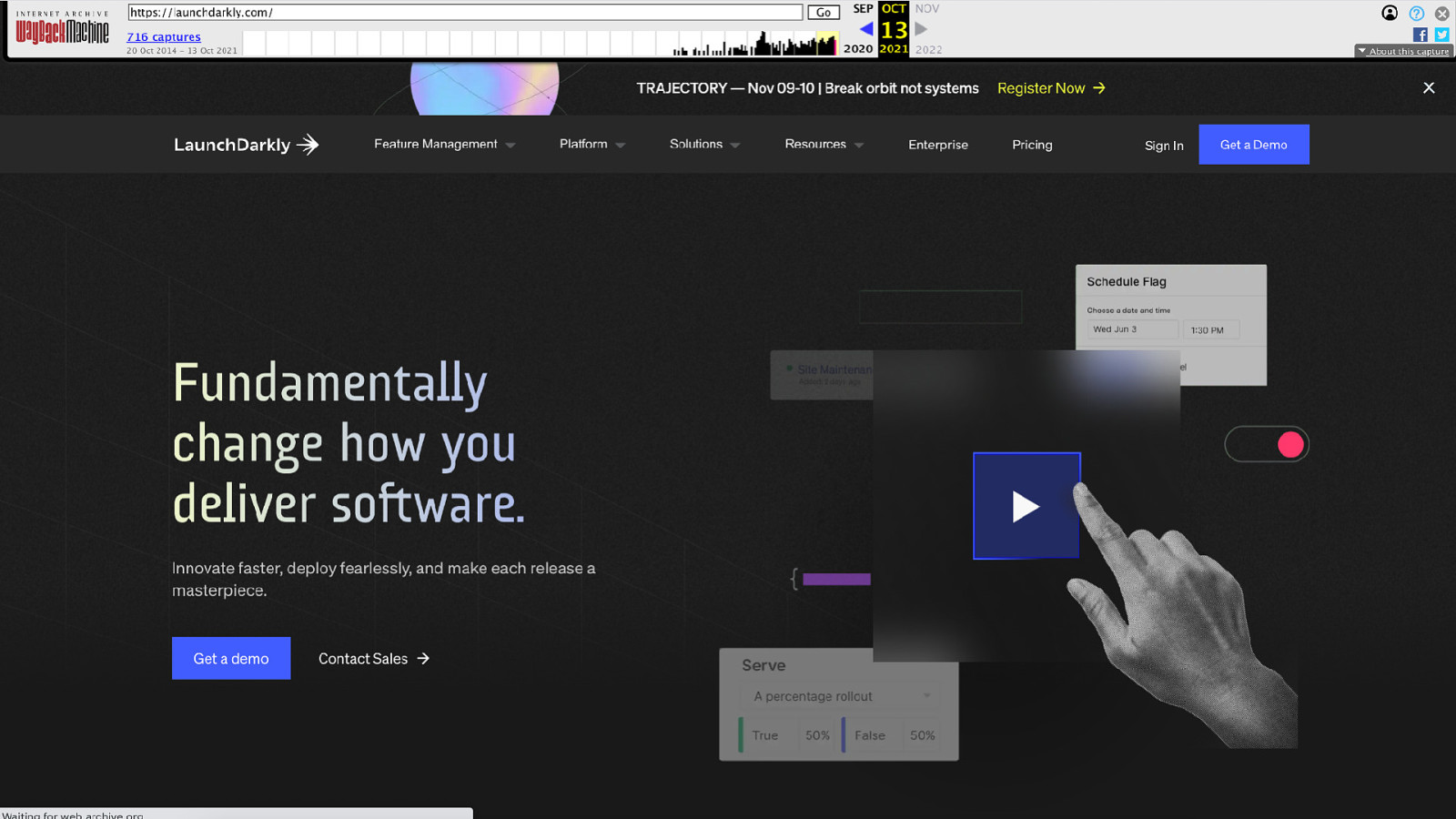
Once those branding visuals are established, it’s time for teams to roll that North Star into the marketing site and the product app.
This is where it gets tricky.
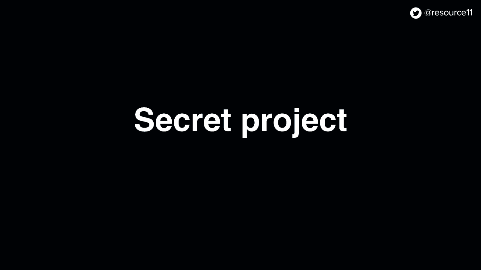
While our team was informed about the brand refresh at the earliest possible moment, we had one wrinkle. And was a big one.
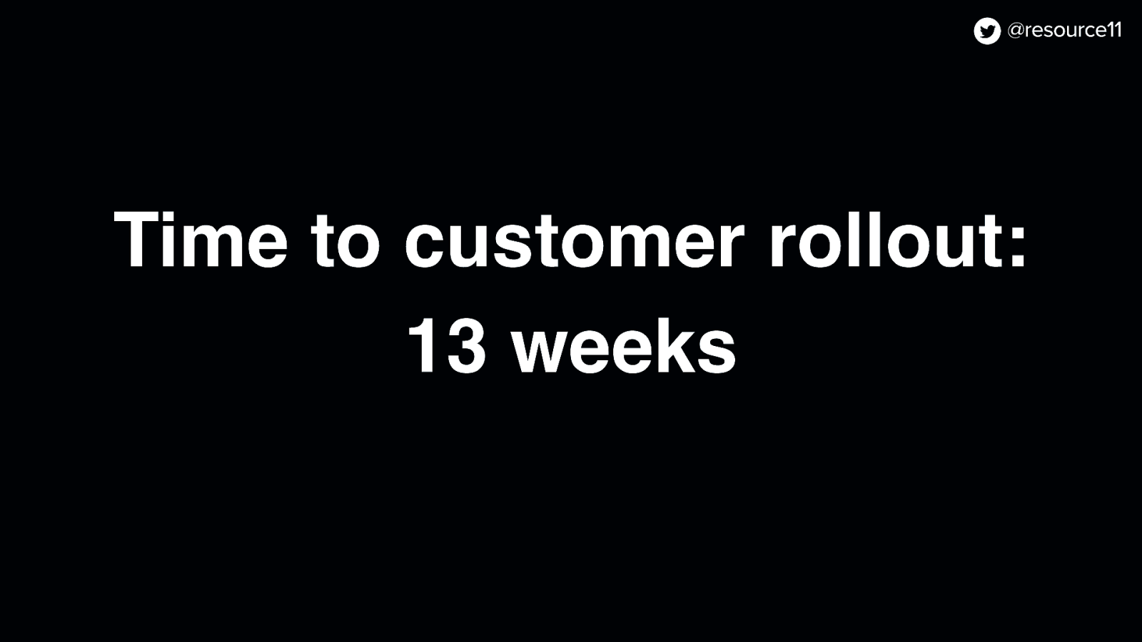
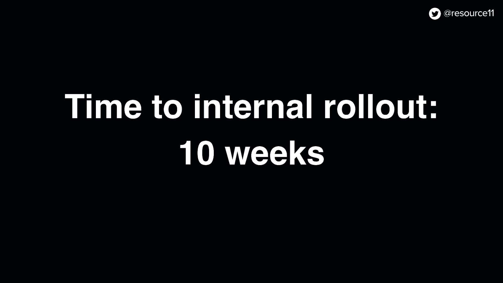
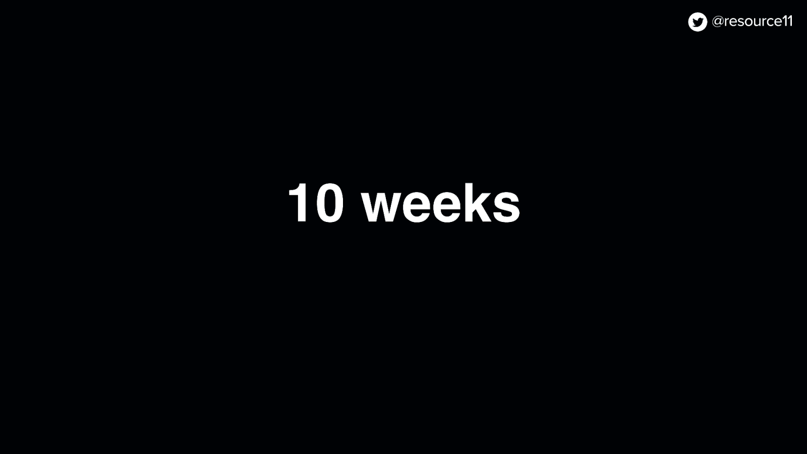
The time to the rebrand rollout to customers was in 13 weeks
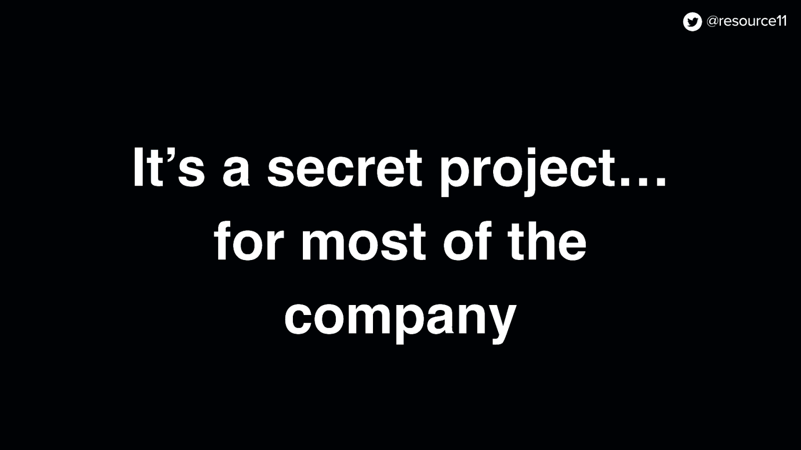
And it was a secret project,
…for most of the company.
That meant the time to internal rollout to our teams was 10 weeks
So we had to carefully pivot to figure out how to get things done, since…
Typically, visual refreshes happen more often on the marketing side
And visual refreshes happen less often in the product app because…
Rebrands impact established product roadmaps.
And you need to be careful when the visuals between your marketing site and product app get out of sync.
First, your product app will start looking outdated and
Second, outdated app visuals break your brand promise.
So our team regrouped and thought… how can we get this done?
And how do we do this without making any questionable decisions that may impact the product, because you don’t want to be making questionable decisions like I don’t know…
Making dishes that include jello and shellfish?
It’s just not a good look.
But then… we had an idea.
Why not… use our own product to roll out a rebrand?
Feature flags! This means that…
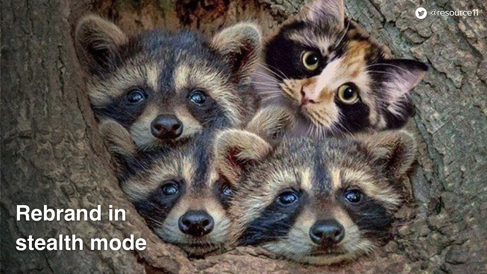
We could set up a flagging structure and…
…rebrand in stealth mode.
We could make all of our changes alongside other teams, not disrupt other squads roadmaps.
All while the other squads were not aware that the product brand refresh was actually happening.
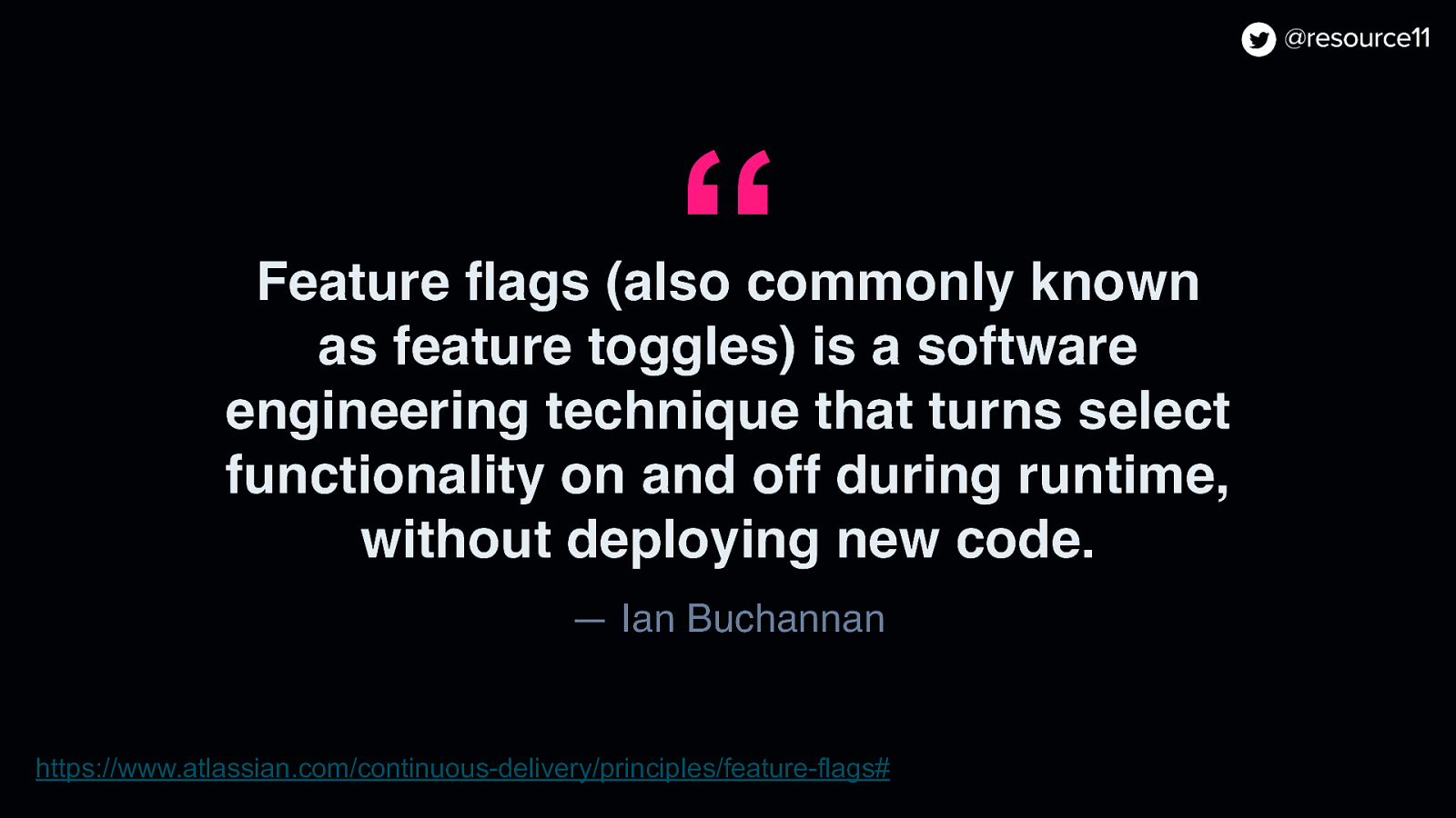
You may be asking… what is a feature flag, anyway?
There is this article by Ian Buchannan about Feature Flags and it states
“Feature flags (also commonly known as feature toggles) is a software engineering technique that turns select functionality on and off during runtime, without deploying new code.”
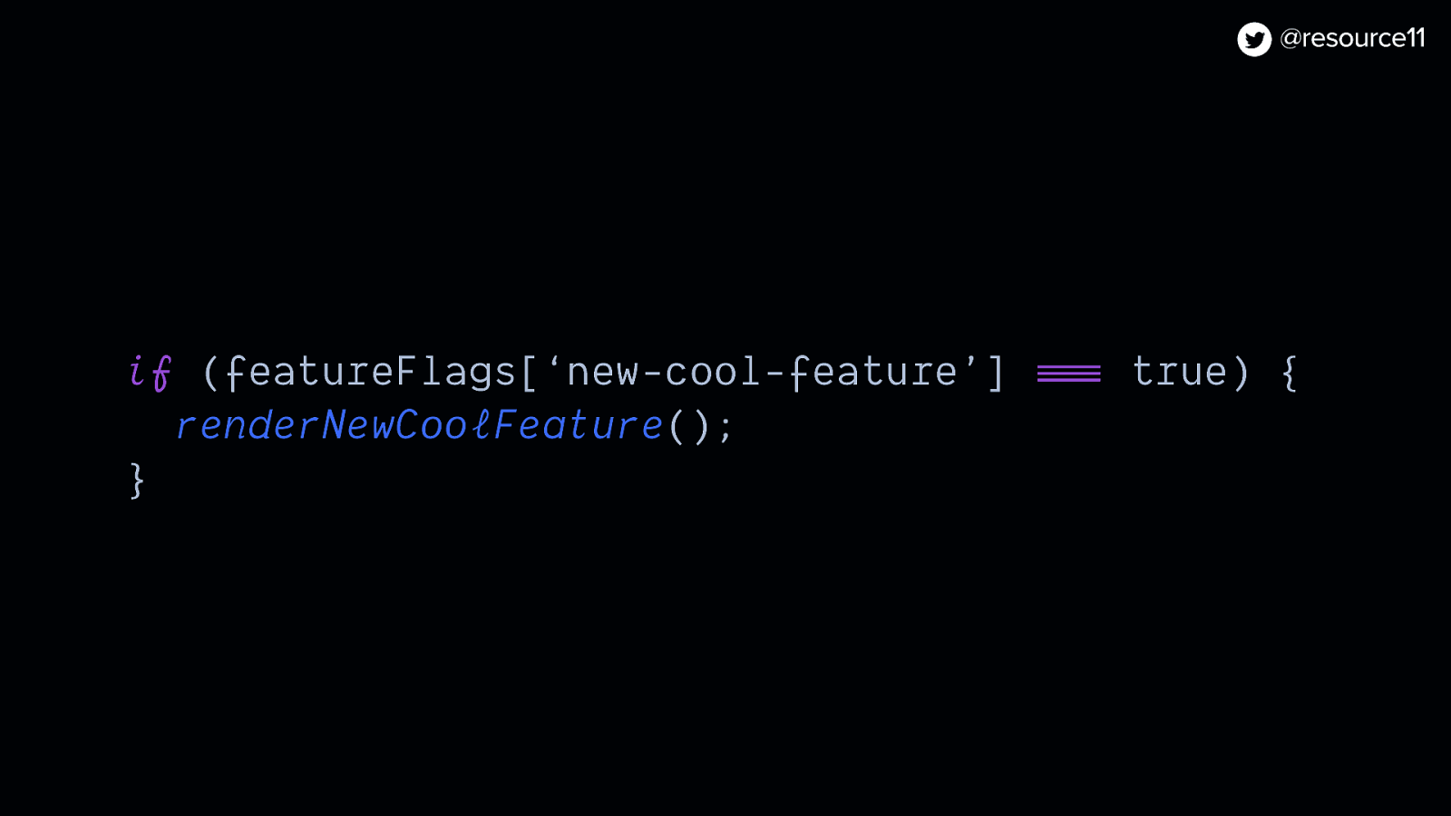
In JavaScript, it may look something like this.
if (featureFlags[‘new-cool-feature’] === true) { renderNewCoolFeature(); }
So what did we use flags for in this case?
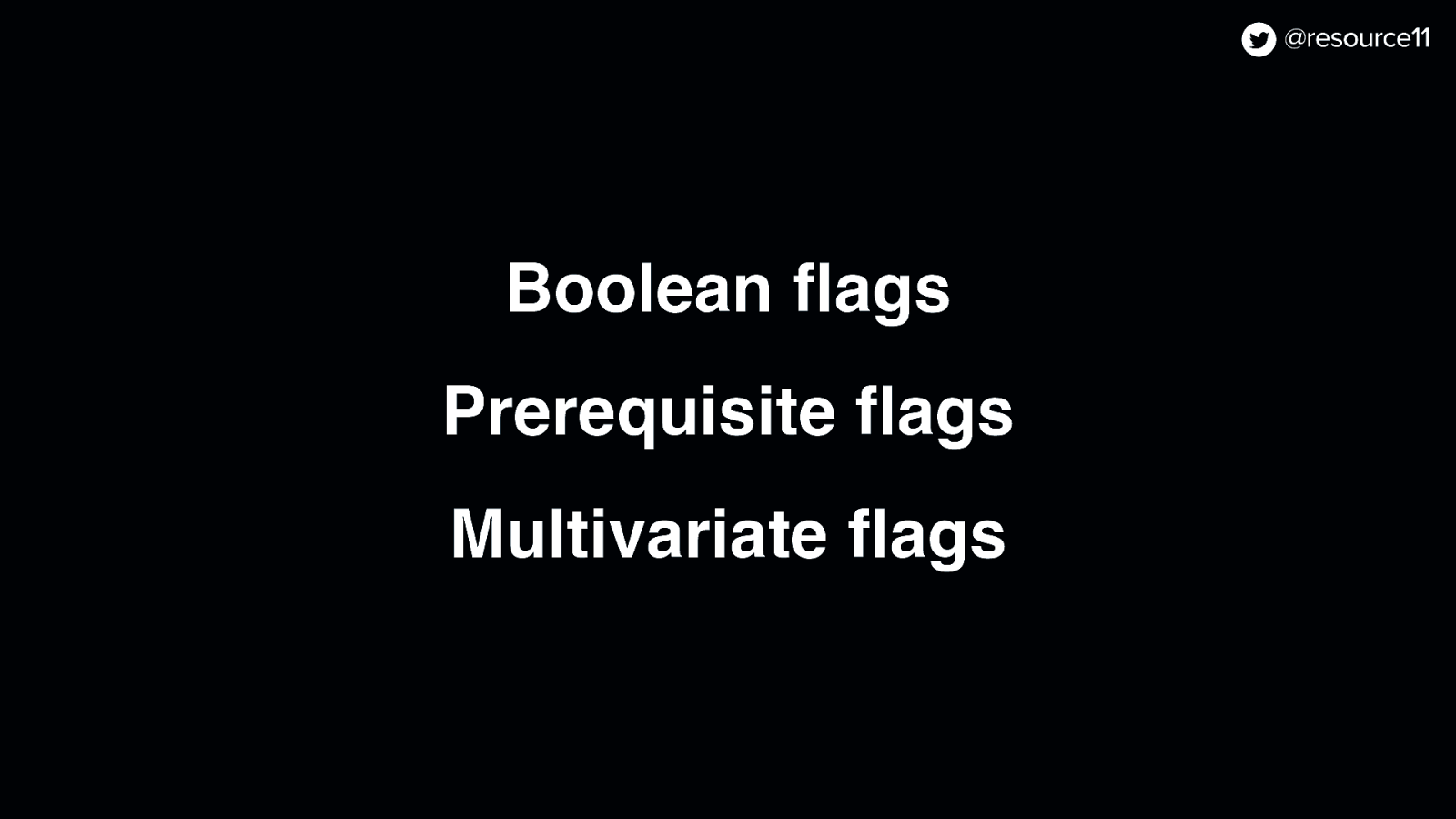
Well, we used three types of flags.
Boolean, prerequisite, and multivariate flags
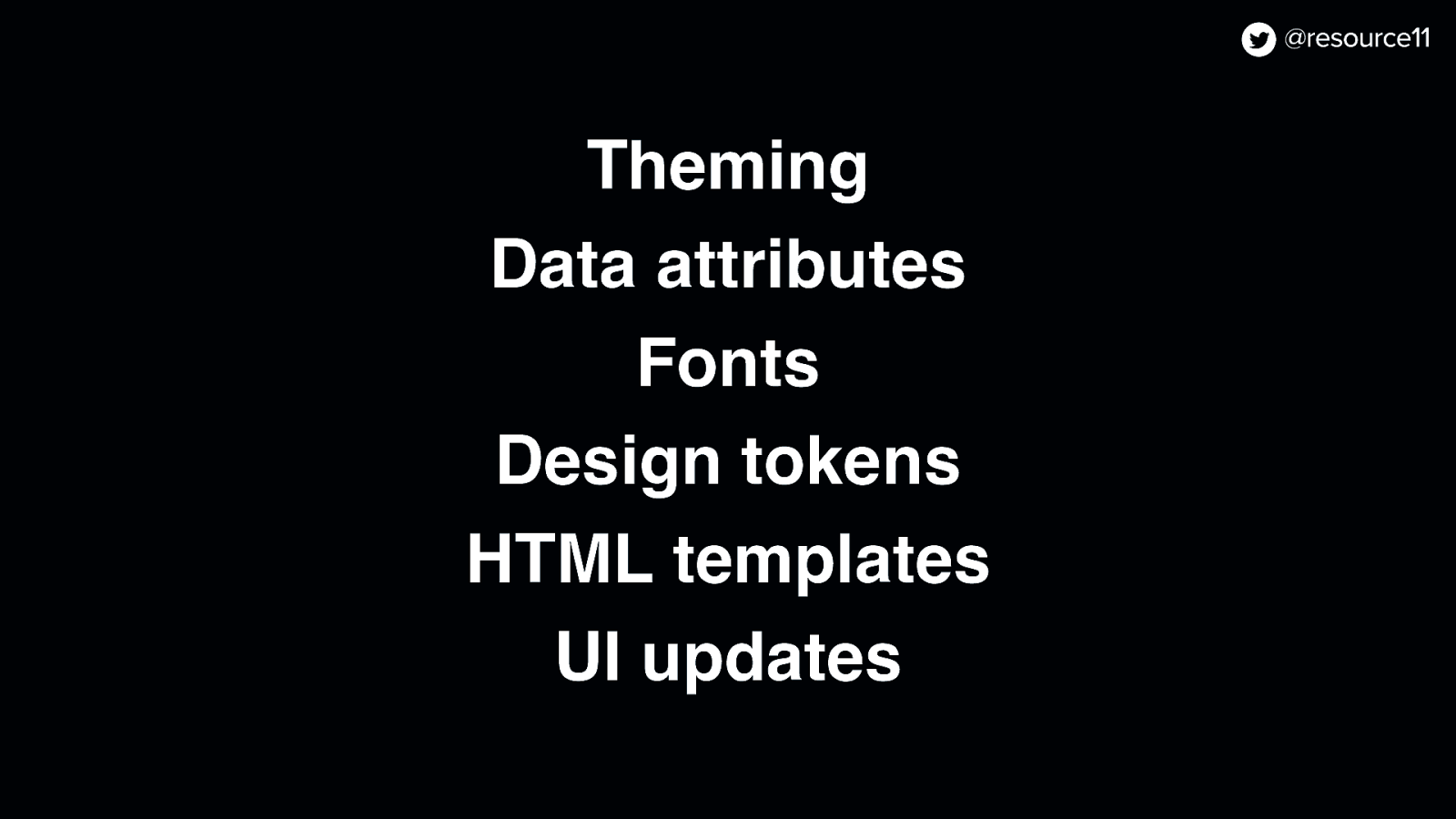
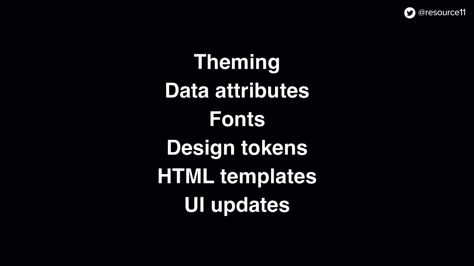
Well, we used them to control:
Theming, data attributes, fonts, design tokens, HTML templates, and UI updates.
And! Since we had to do it all in 10 weeks…
In secret…
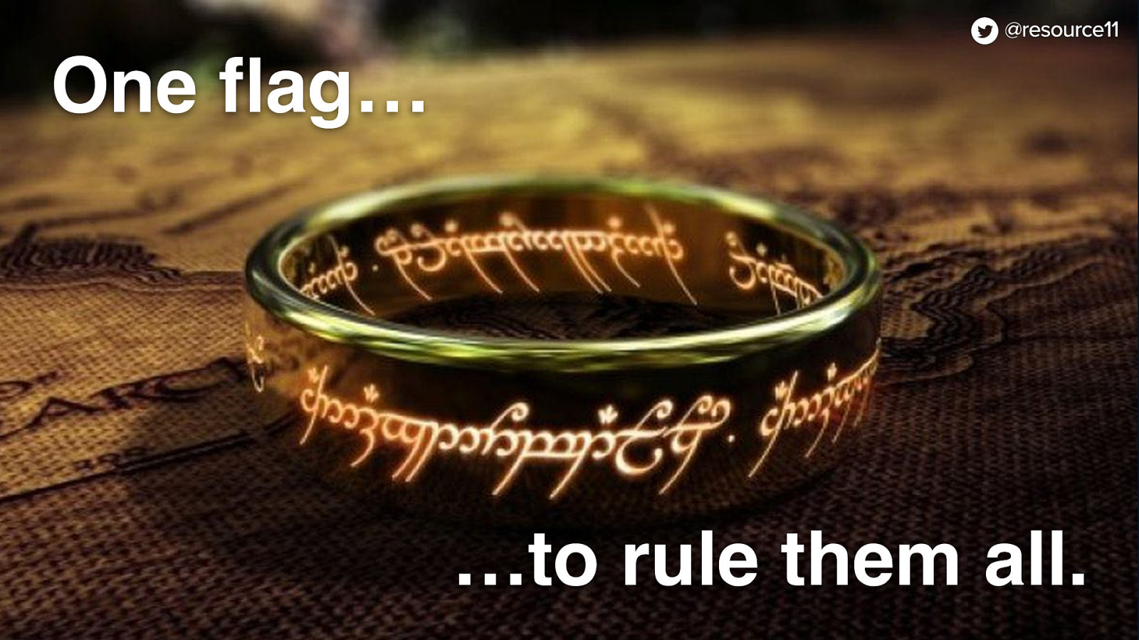
We used this one ring…
…ahem!
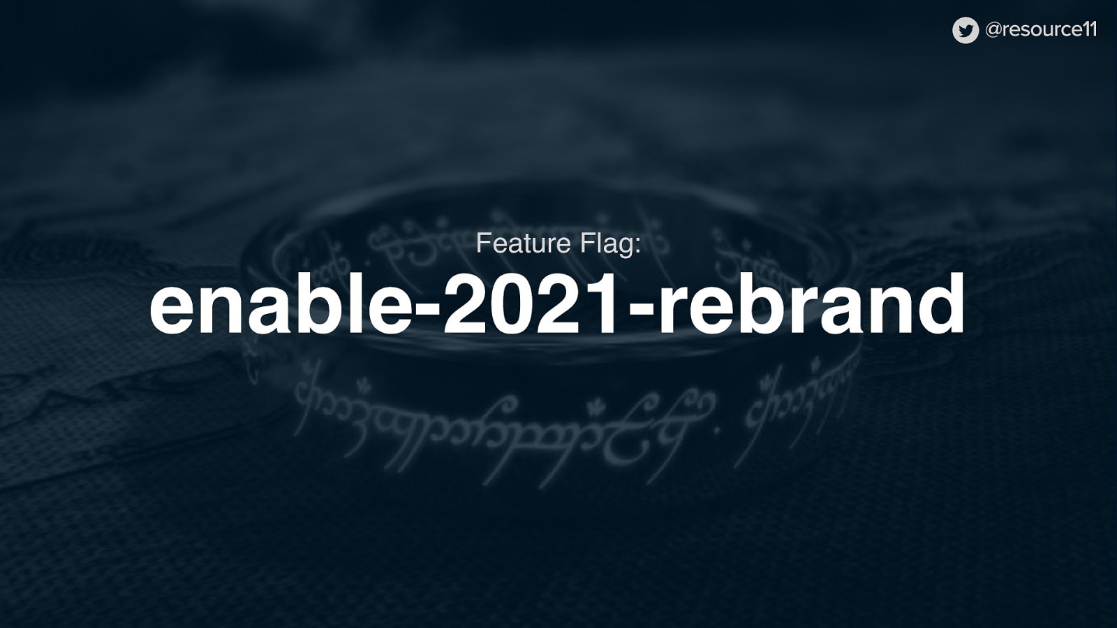
One flag as the basis of most of our changes.
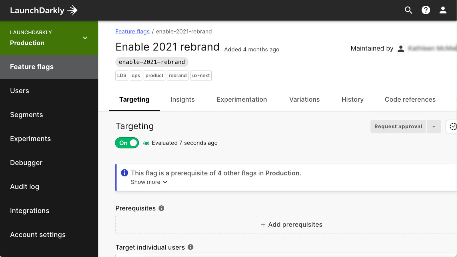
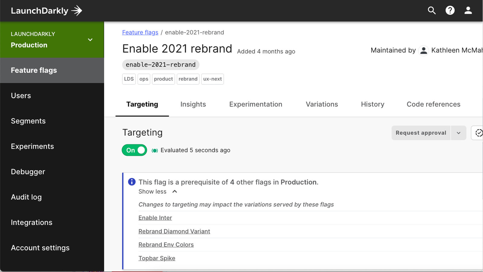
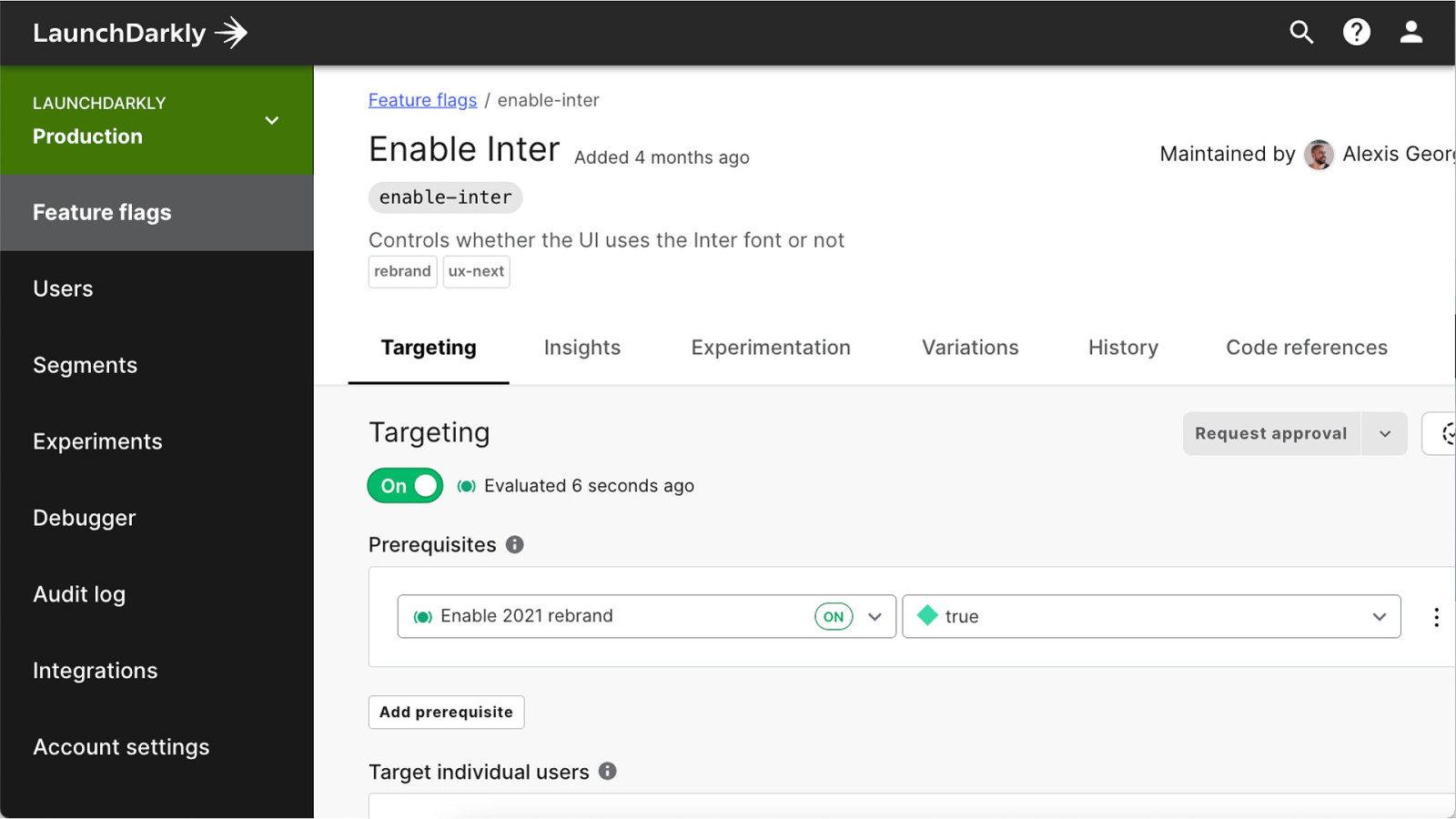
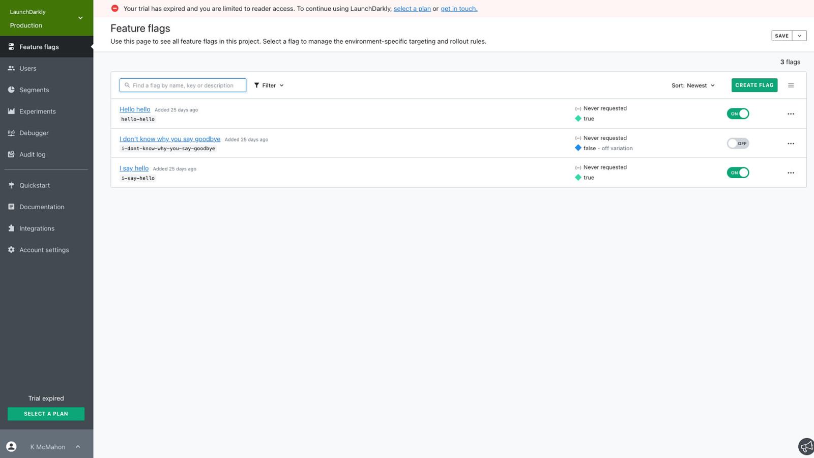
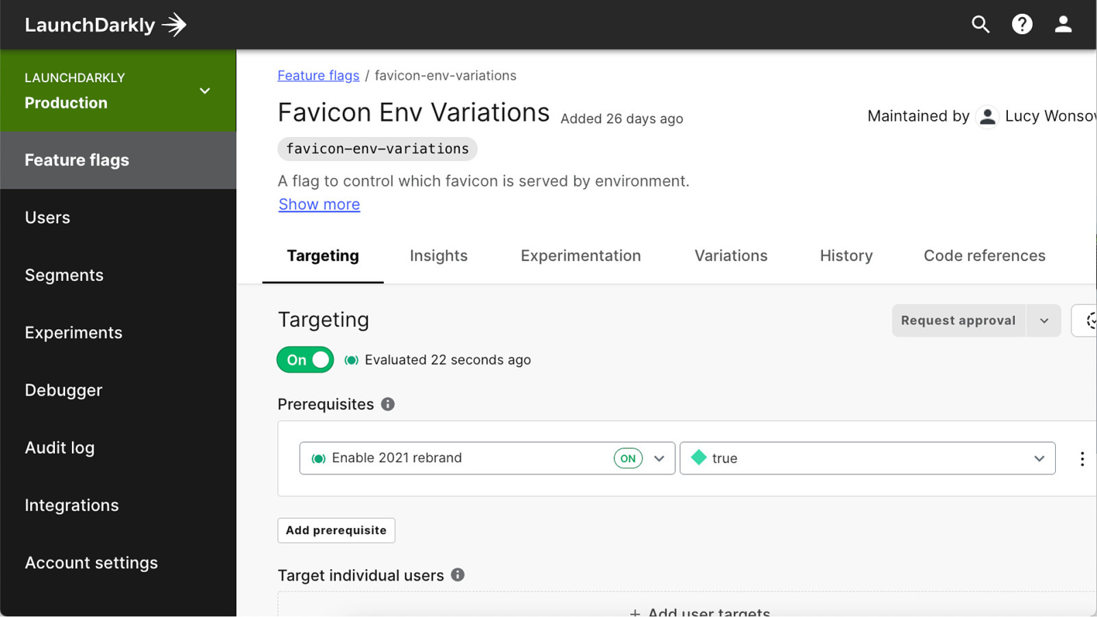
The flag that all our other flags were dependent upon was the enable-2021-rebrand flag
Of course, in retrospect, we could have named our flag a bit differently. Anyone in our company that looked up our flag name in our LaunchDarkly UI probably had some idea of what we were working on.
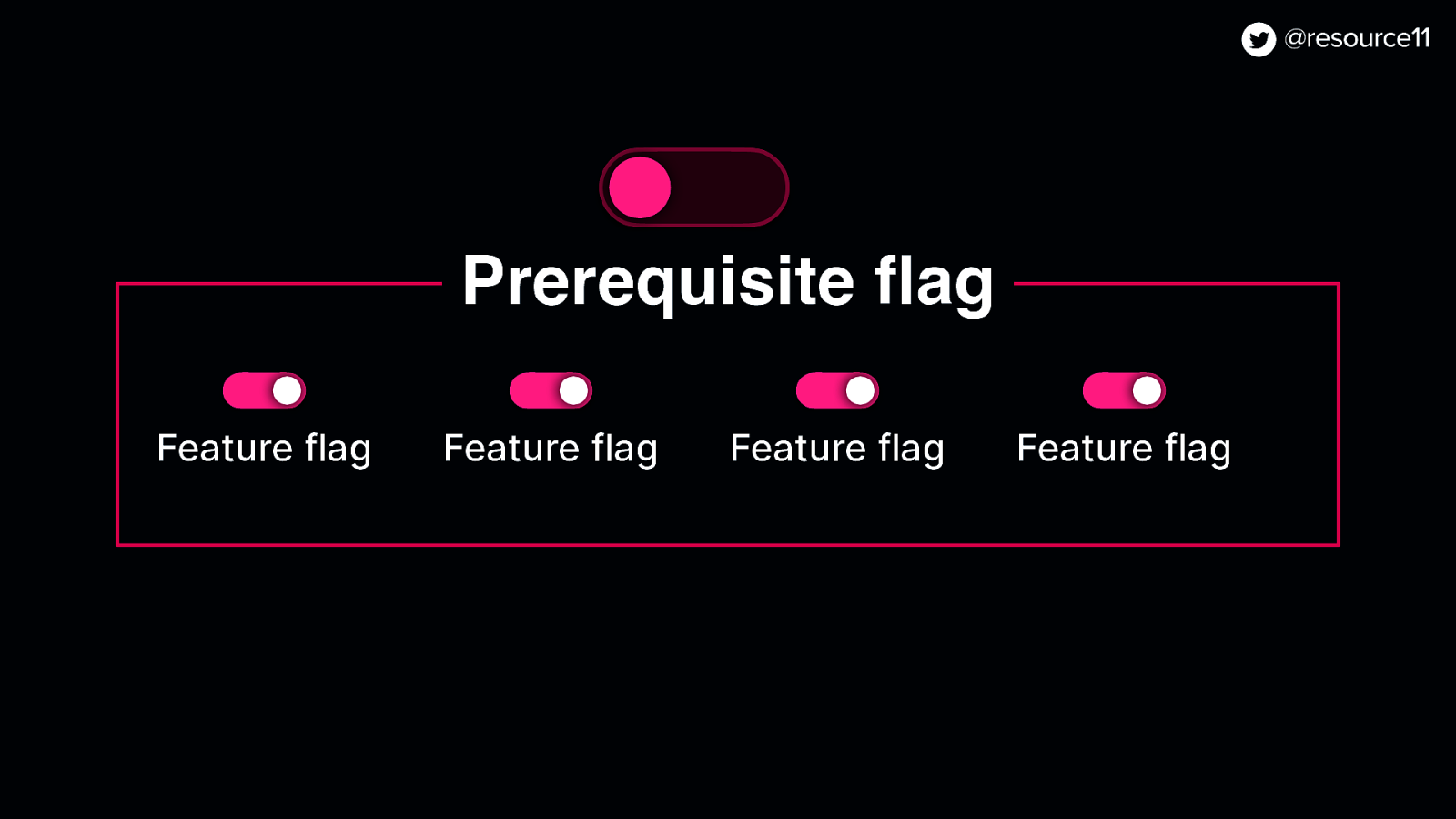
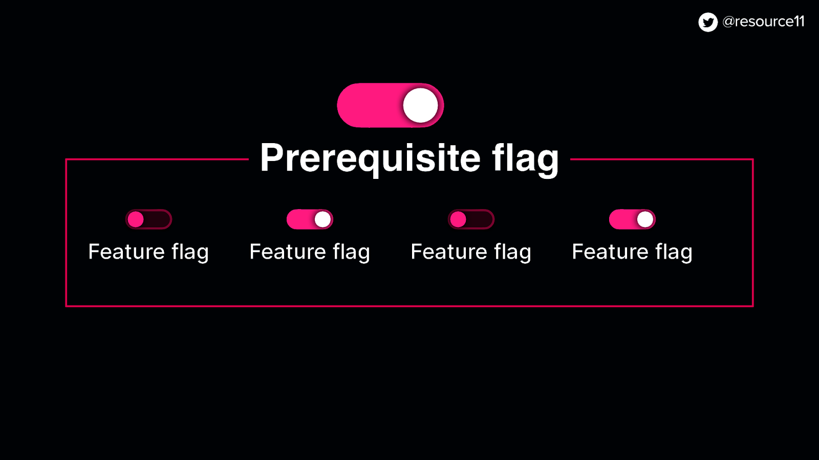
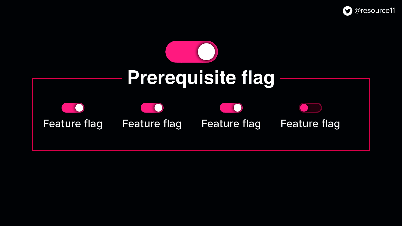
And this flag was a prerequisite for other flags.
Prerequisite flags are great for testing out additional features in isolation
This means you can have all these sub flags turned on.
But unless the prerequisite flag is on…
…the other flags wouldn’t work
A prerequisite flag allowed us to test individual features…
In various combinations without impacting the rest of the app.
And because… secret project, we could target our stakeholders to share a preview of our work.
Once this flag was on, we could continue work on things like…
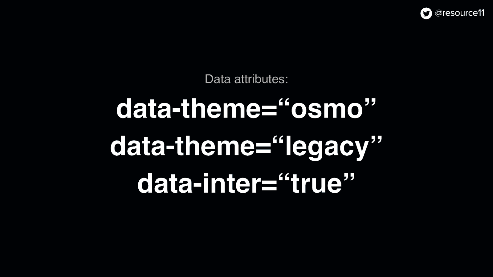
Theming support using…
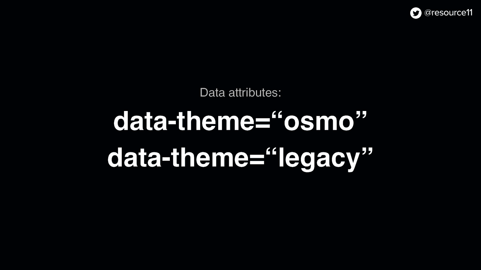
Data attributes ● Data attributes…
…to control whichever theme we wanted to serve up.
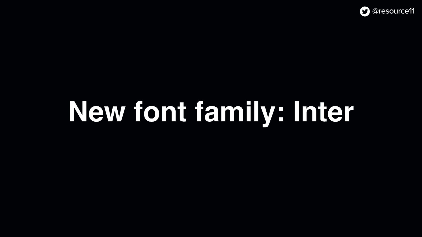
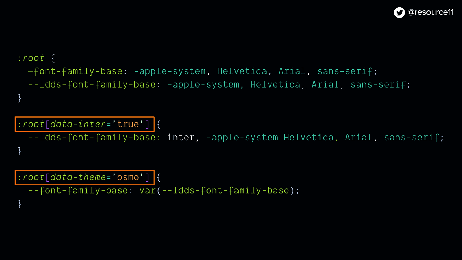
But we also wanted to use our new font, Inter, in our visual refresh so…
We added the enable-inter flag inter with the rebrand flag as a prerequisite…
Now that our font flag was set up, we added data-inter to our set of data attributes so we could test fonts independently within our rebrand theme.
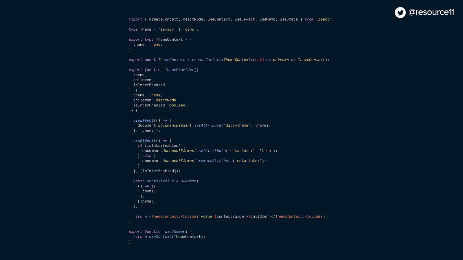
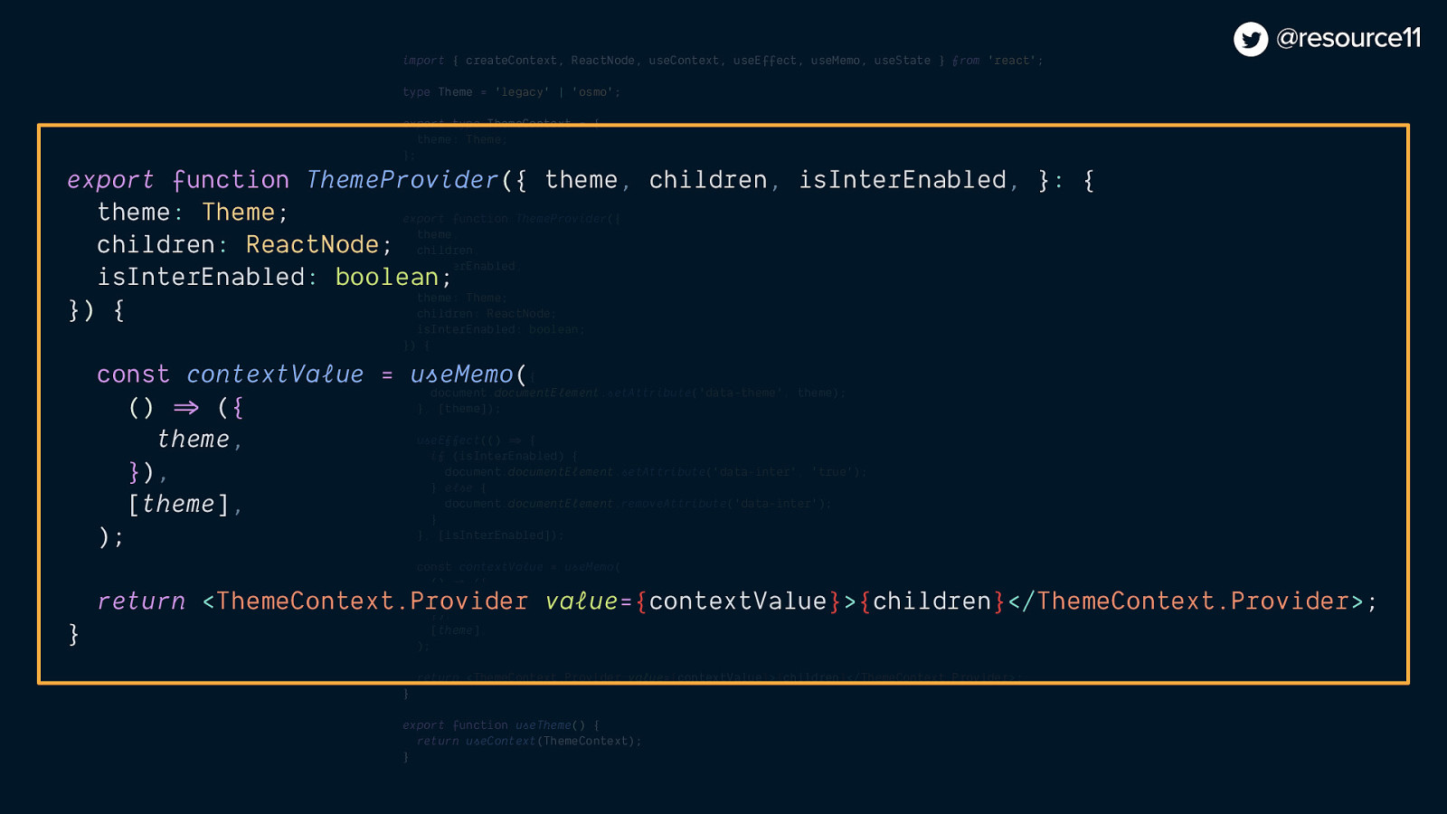
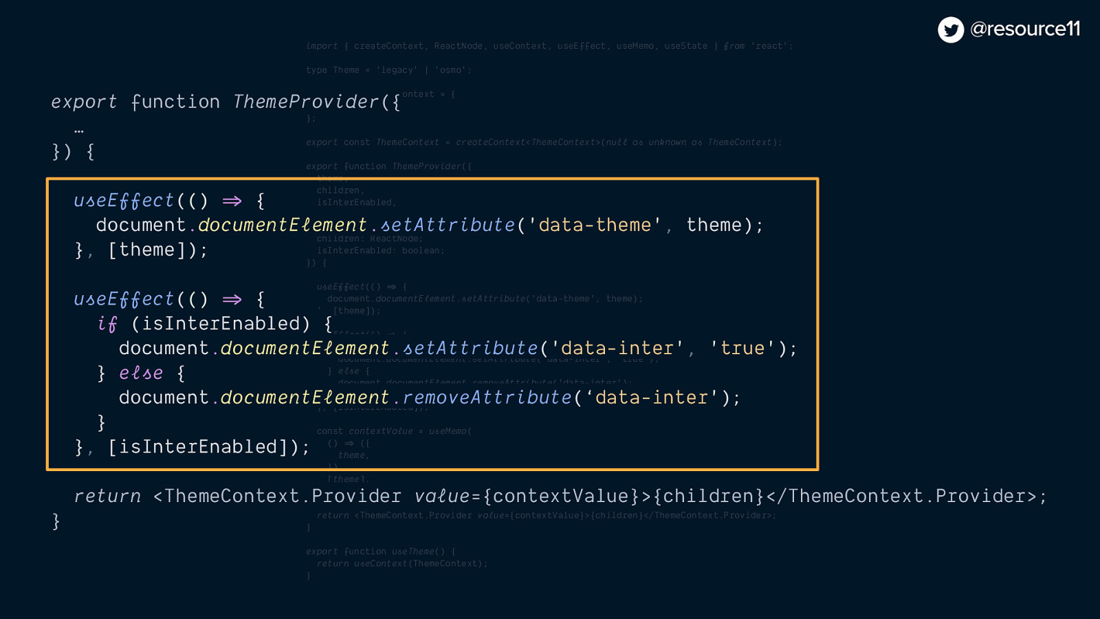
Then, we paired those data attribute values with React Context…
import { createContext, ReactNode, useContext, useEffect, useMemo, useState } from ‘react’;
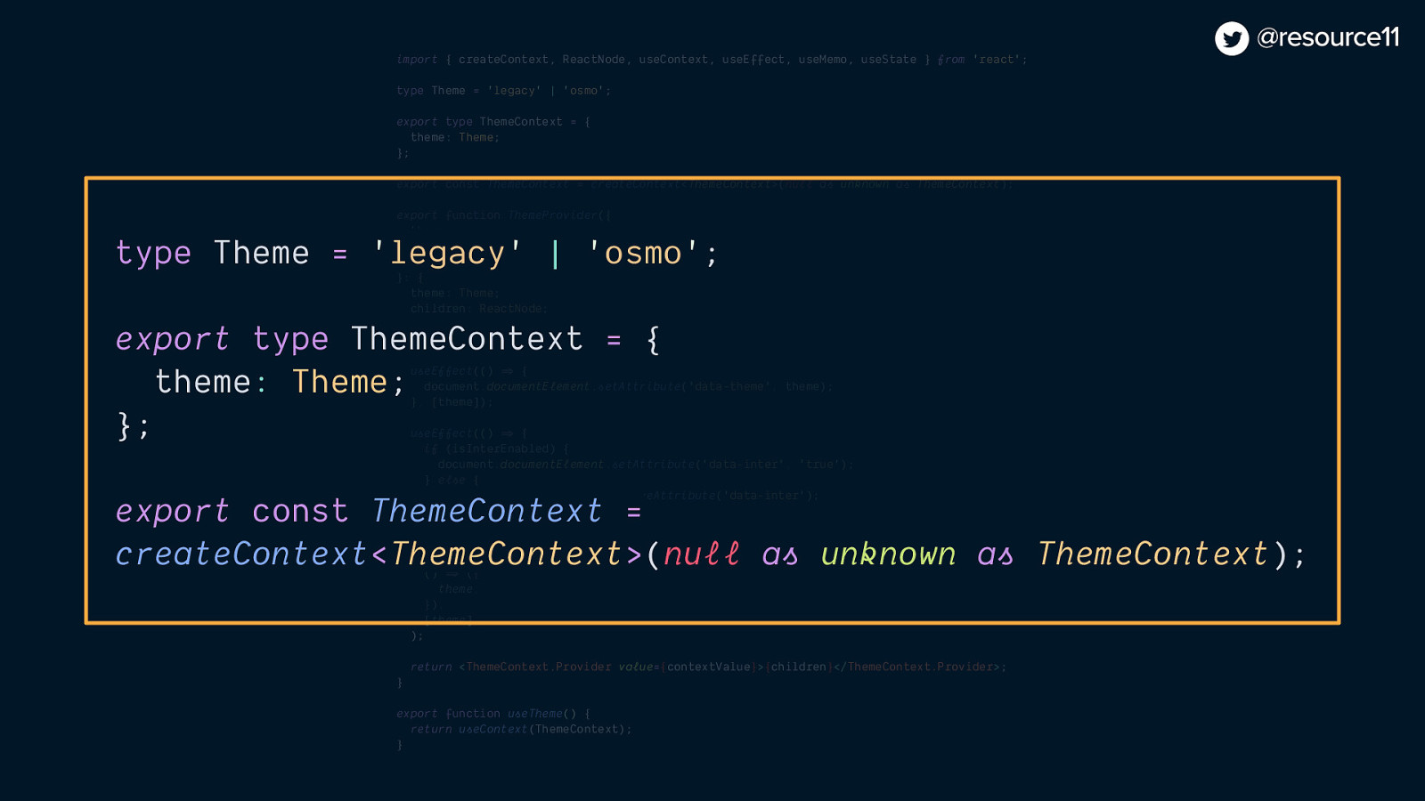
type Theme = ‘legacy’ | ‘osmo’;
export type ThemeContext = { theme: Theme; };
export const ThemeContext = createContext<ThemeContext>(null as unknown as ThemeContext);
export function ThemeProvider({ theme, children, isInterEnabled, }: { theme: Theme; children: ReactNode; isInterEnabled: boolean; }) {
useEffect(() => { document.documentElement.setAttribute(‘data-theme’, theme); }, [theme]);
useEffect(() => { if (isInterEnabled) { document.documentElement.setAttribute(‘data-inter’, ‘true’); } else { document.documentElement.removeAttribute(‘data-inter’); } }, [isInterEnabled]);
const contextValue = useMemo( () => ({ theme, }), [theme], );
return <ThemeContext.Provider value={contextValue}>{children}</ThemeContext.Provider>; }
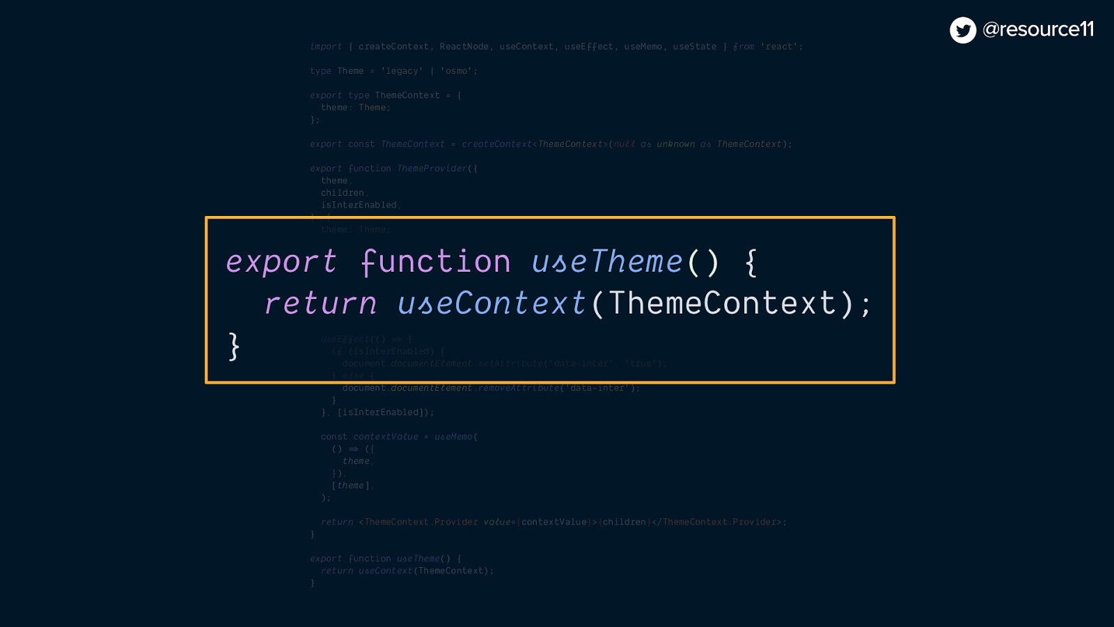
export function useTheme() { return useContext(ThemeContext); }
type Theme = ‘legacy’ | ‘osmo’;
export type ThemeContext = { theme: Theme; };
export const ThemeContext = createContext<ThemeContext>null as unknown as ThemeContext);
export function ThemeProvider({ theme, children, isInterEnabled, }: { theme: Theme; children: ReactNode; isInterEnabled: boolean; }) {
const contextValue = useMemo( () => ({ theme, }), [theme], );
return <ThemeContext.Provider value={contextValue}>{children}</ThemeContext.Provider>; }
export function useTheme() { return useContext(ThemeContext); }
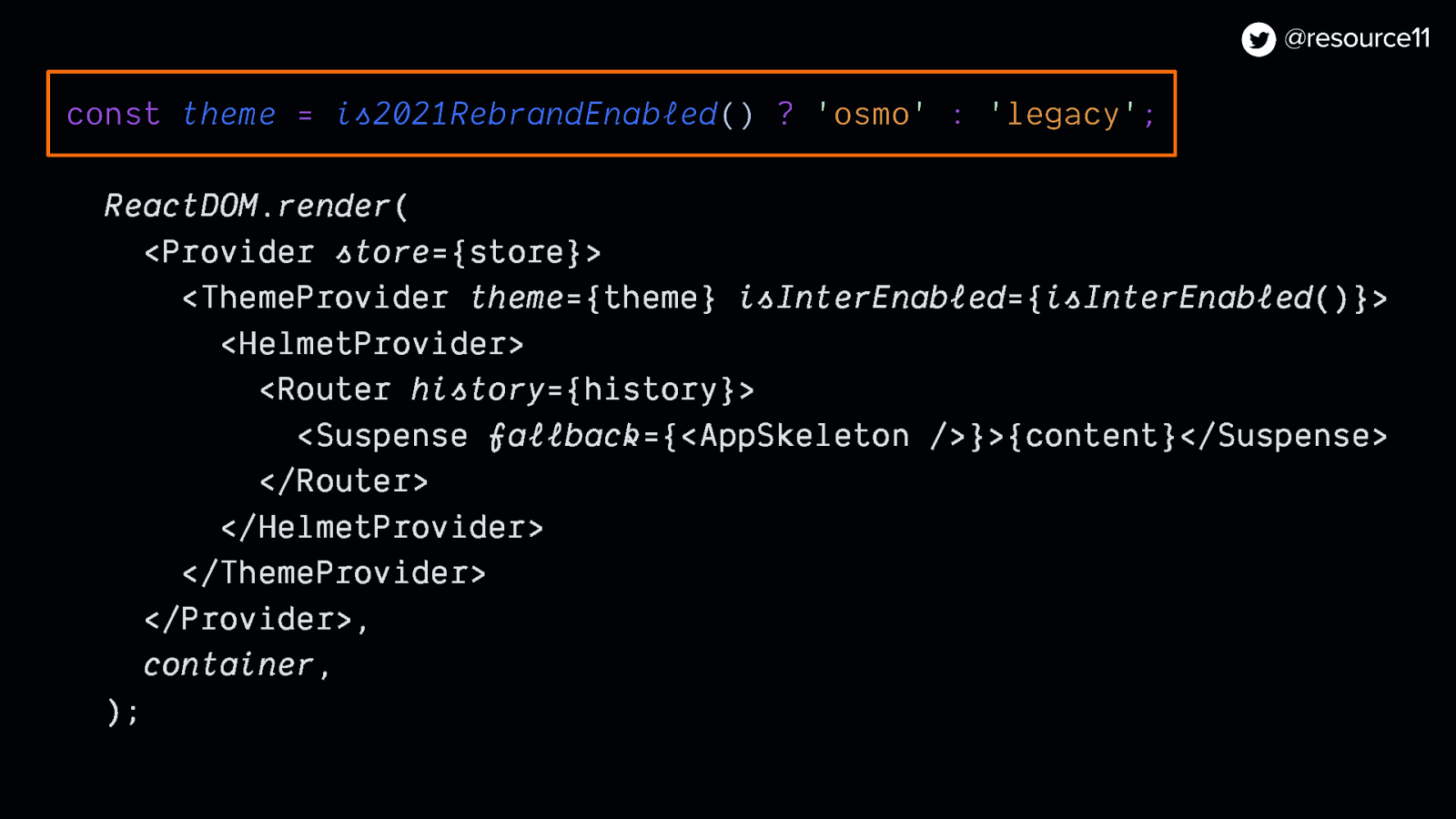
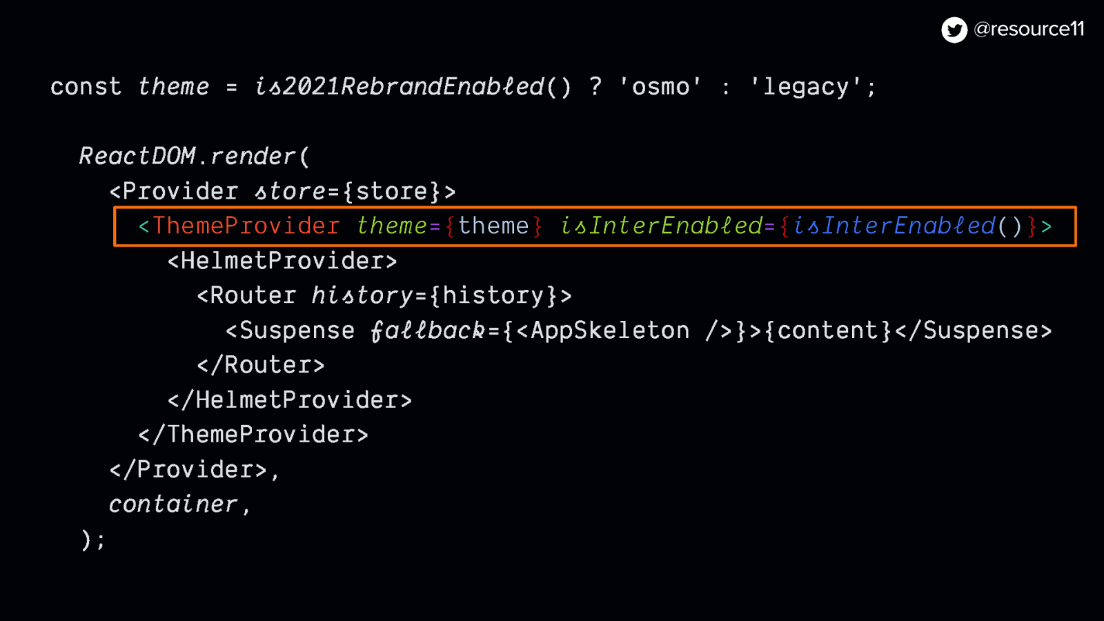
const theme = is2021RebrandEnabled() ? ‘osmo’ : ‘legacy’;
useEffect(() => { document.documentElement.setAttribute(‘data-theme’, theme); }, [theme]);
useEffect(() => { if (isInterEnabled) { document.documentElement.setAttribute(‘data-inter’, ‘true’); } else { document.documentElement.removeAttribute(‘data-inter’); } }, [isInterEnabled]);
Now that app theming was scaffolded, we could continue work on…
Design tokens. So like I mentioned, before the North Star was revealed, our team was already refactoring our token architecture.
Once this rebrand was announced, we had to adjust our tokens work without losing any of our progress.
And we didn’t have time to automate the process with Style Dictionary.
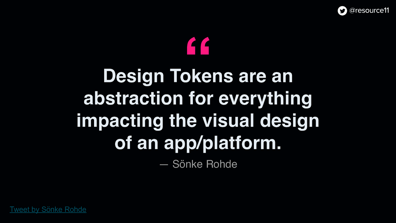
If you’ve never heard of design tokens, Sönke Rohde Tweeted a great definition: Design Tokens are an abstraction for everything impacting the visual design of an app or platform.
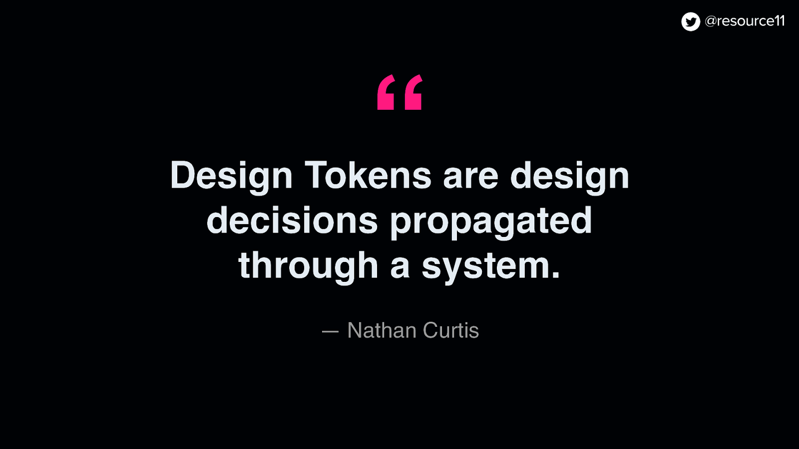
In other words, design tokens are design decisions propagated through a system.
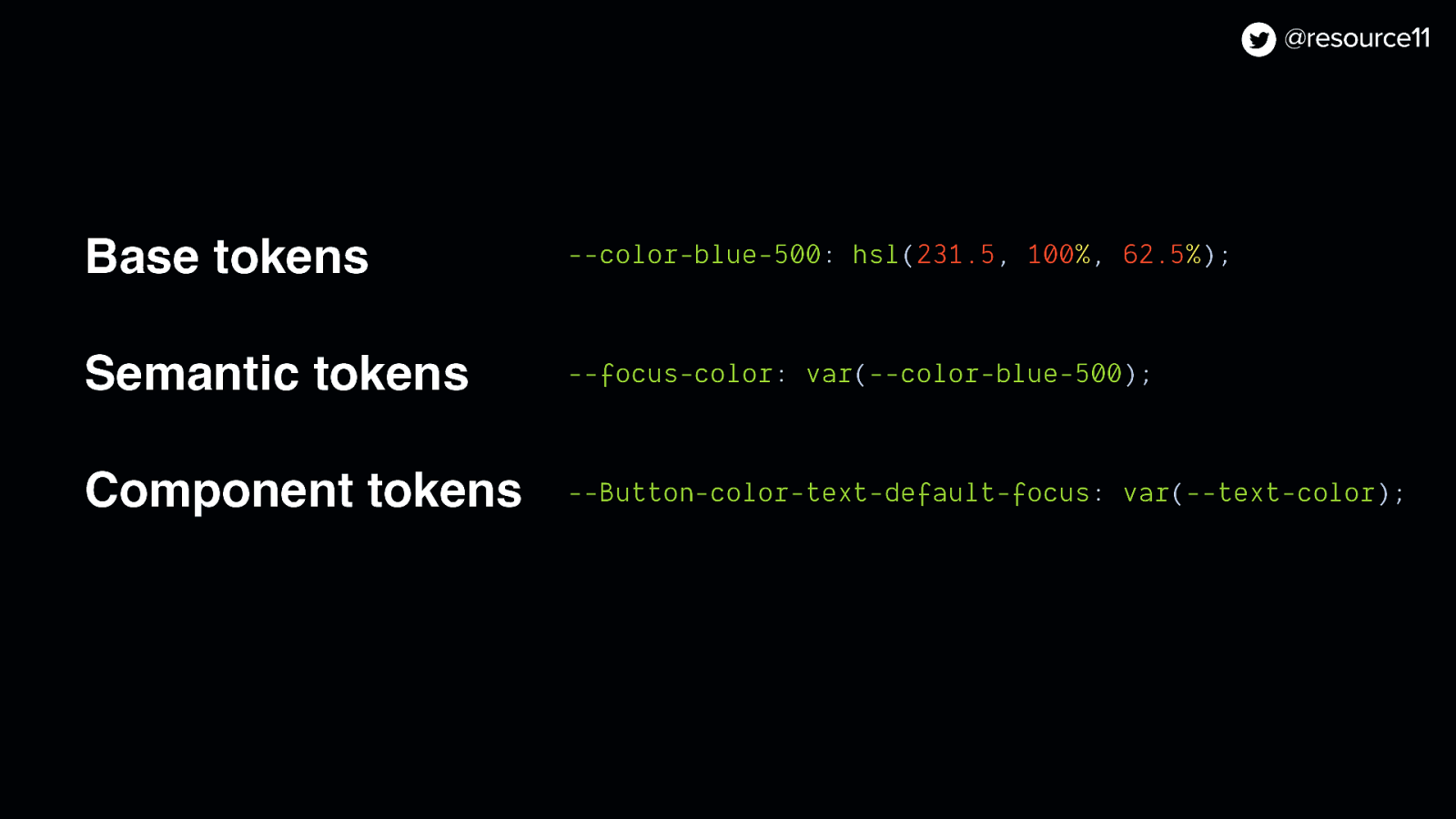
Base tokens —color-blue-500: hsl(231.5, 100%, 62.5%);
Semantic tokens —focus-color: var(—color-blue-500);
Component tokens —Button-color-text-focus: var(—color-blue-500);
Generally, tokens span three categories:
Base, the raw values. Semantic, aliased to base values and shared across the application, and component tokens, scoped at the component level.
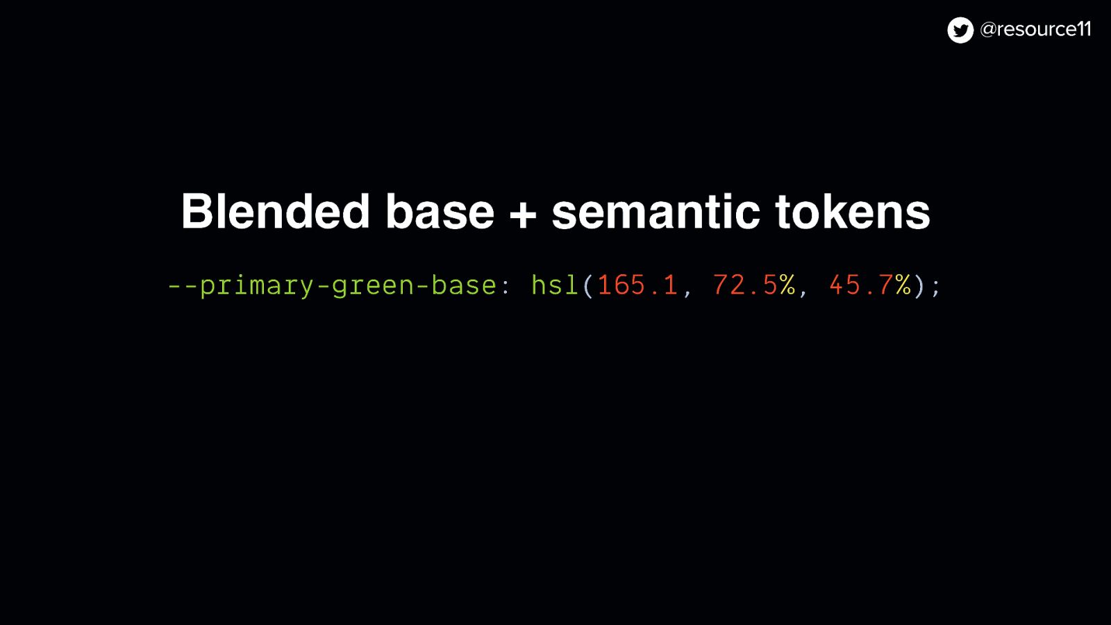
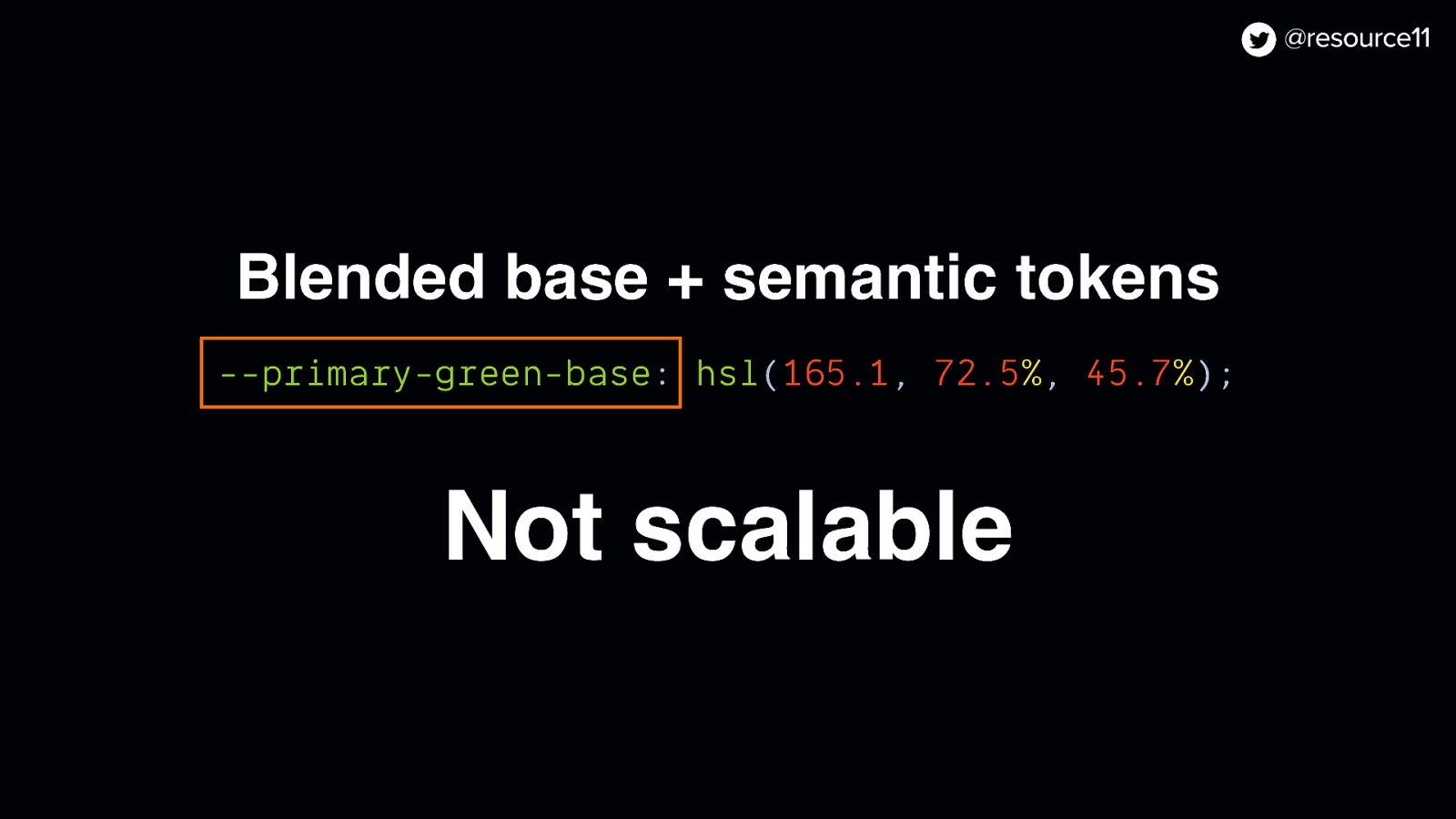
Our legacy token system was a blend of base and semantic…
Blended base + semantic tokens —primary-green-base: hsl(165.1, 72.5%, 45.7%);
…so it wasn’t scalable, due to the naming conventions used.
It didn’t make sense to have a color name in a semantic token if our primary color changed. Hence the refactor.
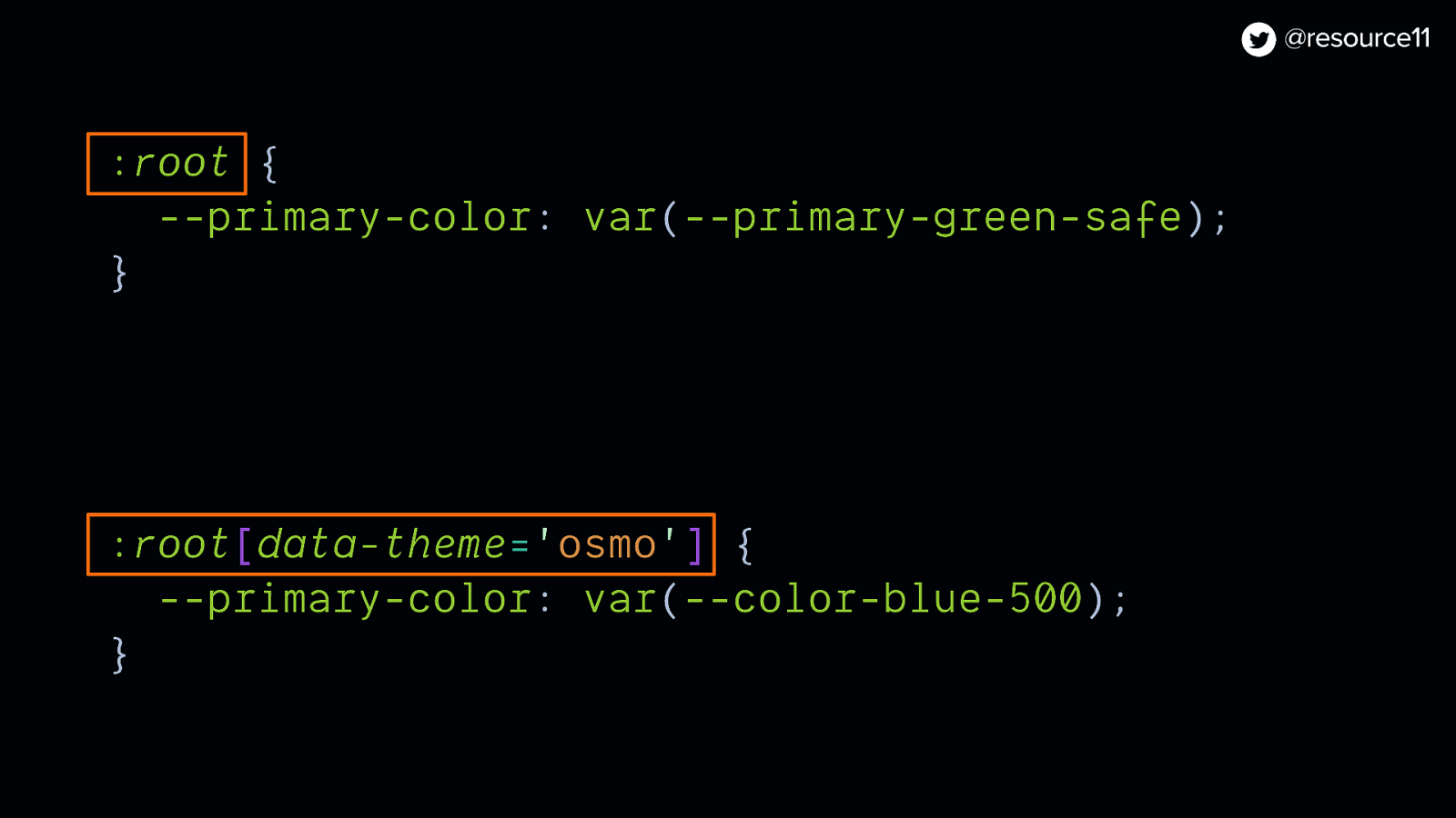
Considering the 10-week time frame…The tokens that we were most concerned about were our application-level tokens.
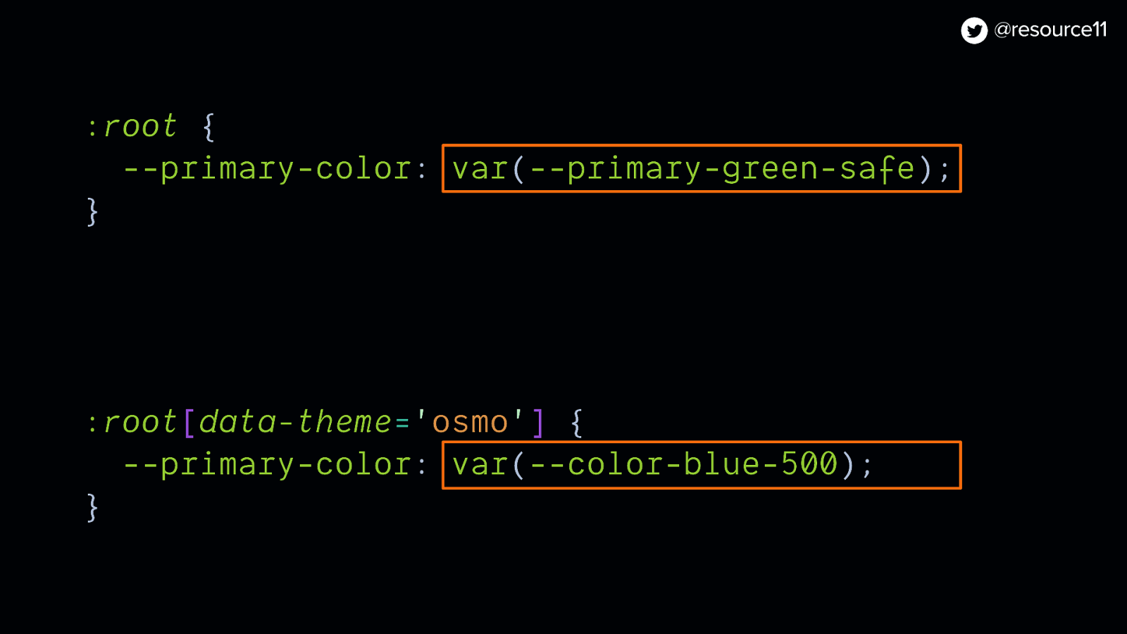
We chose to focus on using the data attribute to map our application-level tokens to base tokens in either the legacy or osmo theme.
Since our theme was controlled by a flag, we could target the data attributes in our CSS…
:root { —primary-color: var(—primary-green-safe); }
:root[data-theme=’osmo’] { —primary-color: var(—color-blue-500); }
…And change values by adjusting the data attribute
We used this 1:1 mapping of our values and tested our rebrand by toggling on our flag.
This was especially helpful because we could introduce a new set of semantic tokens quickly without much fuss.
:root { —primary-color: var(—primary-green-safe); }
:root[data-theme=’osmo’] { —primary-color: var(—color-blue-500); }
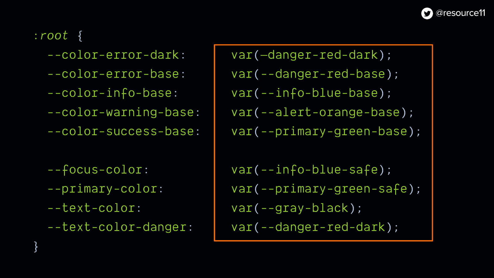
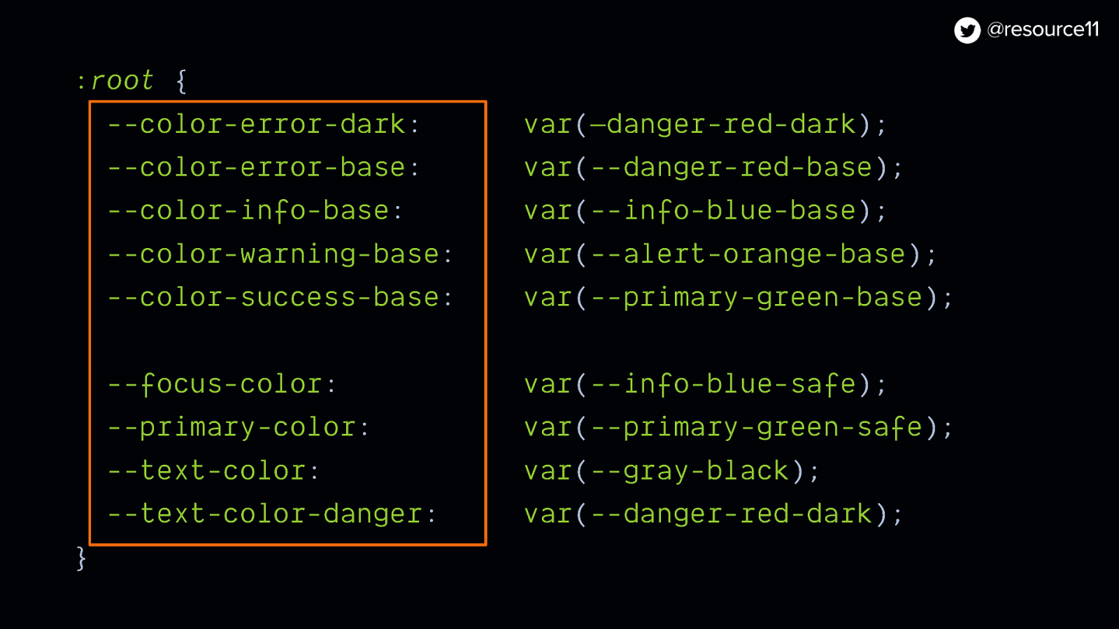
:root { —color-error-dark: var(—danger-red-dark); —color-error-base: var(—danger-red-base); —color-info-base: var(—info-blue-base); —color-warning-base: var(—alert-orange-base); —color-success-base: var(—primary-green-base);
—focus-color: var(—info-blue-safe); —primary-color: var(—primary-green-safe); —text-color: var(—gray-black); —text-color-danger: var(—danger-red-dark); }
By leveraging those data attributes through feature flagging, we could test out our new token values in the app at runtime, without impacting any of the other teams’ work.
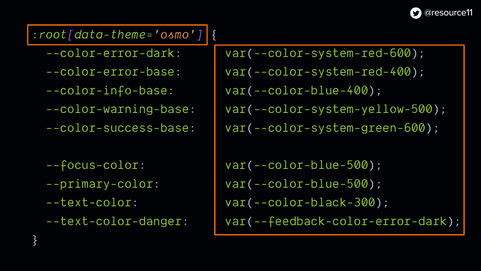
:root[data-theme=’osmo’]
:root[data-theme=’osmo’] { —color-error-dark: var(—color-system-red-600); —color-error-base: var(—color-system-red-400) —color-info-base: var(—color-blue-400); —color-warning-base: var(—color-system-yellow-500); —color-success-base: var(—color-system-green-600);
—focus-color: var(—color-blue-500); —primary-color: var(—color-blue-500); —text-color: var(—color-black-300); —text-color-danger: var(—color-system-red-600); }
:root[data-inter=’true’]
:root[data-theme=’osmo’]
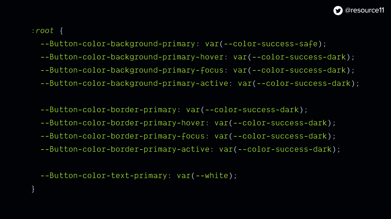
:root { —Button-color-background-primary: var(—color-success-safe); —Button-color-background-primary-hover: var(—color-success-dark); —Button-color-background-primary-focus: var(—color-success-dark); —Button-color-background-primary-active: var(—color-success-dark);
—Button-color-border-primary: var(—color-success-dark); —Button-color-border-primary-hover: var(—color-success-dark); —Button-color-border-primary-focus: var(—color-success-dark); —Button-color-border-primary-active: var(—color-success-dark);
—Button-color-text-primary: var(—white); }
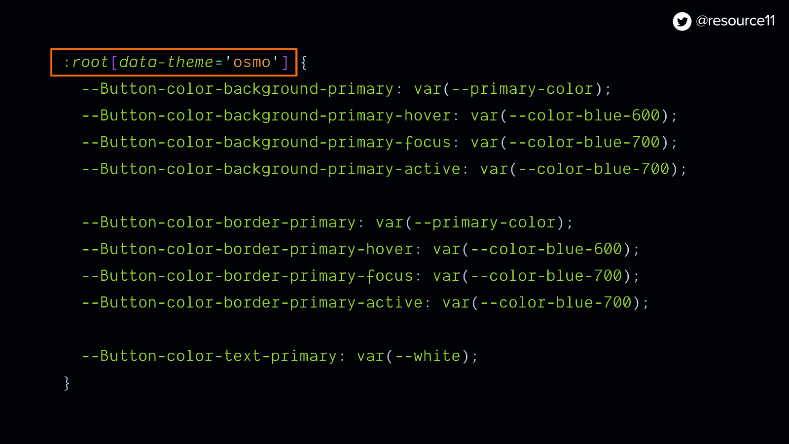
To theme and streamline our CSS.
Even better, we could use this data attribute to wrap blocks of CSS code, and when it’s time to remove legacy styles, we can quickly remove blocks of code later on.
:root[data-theme=’osmo’] { —Button-color-background-primary: var(—primary-color); —Button-color-background-primary-hover: var(—color-blue-600); —Button-color-background-primary-focus: var(—color-blue-700); —Button-color-background-primary-active: var(—color-blue-700);
—Button-color-border-primary: var(—primary-color); —Button-color-border-primary-hover: var(—color-blue-600); —Button-color-border-primary-focus: var(—color-blue-700); —Button-color-border-primary-active: var(—color-blue-700); —Button-color-text-primary: var(—white); }
We also used flags in other ways for performance optimizations
In our HTML templates…
We used the LaunchDarkly Go SDK and Go templates on the backend to bootstrap our flag data into our HTML templates.
This would give us just enough information to render our pages.
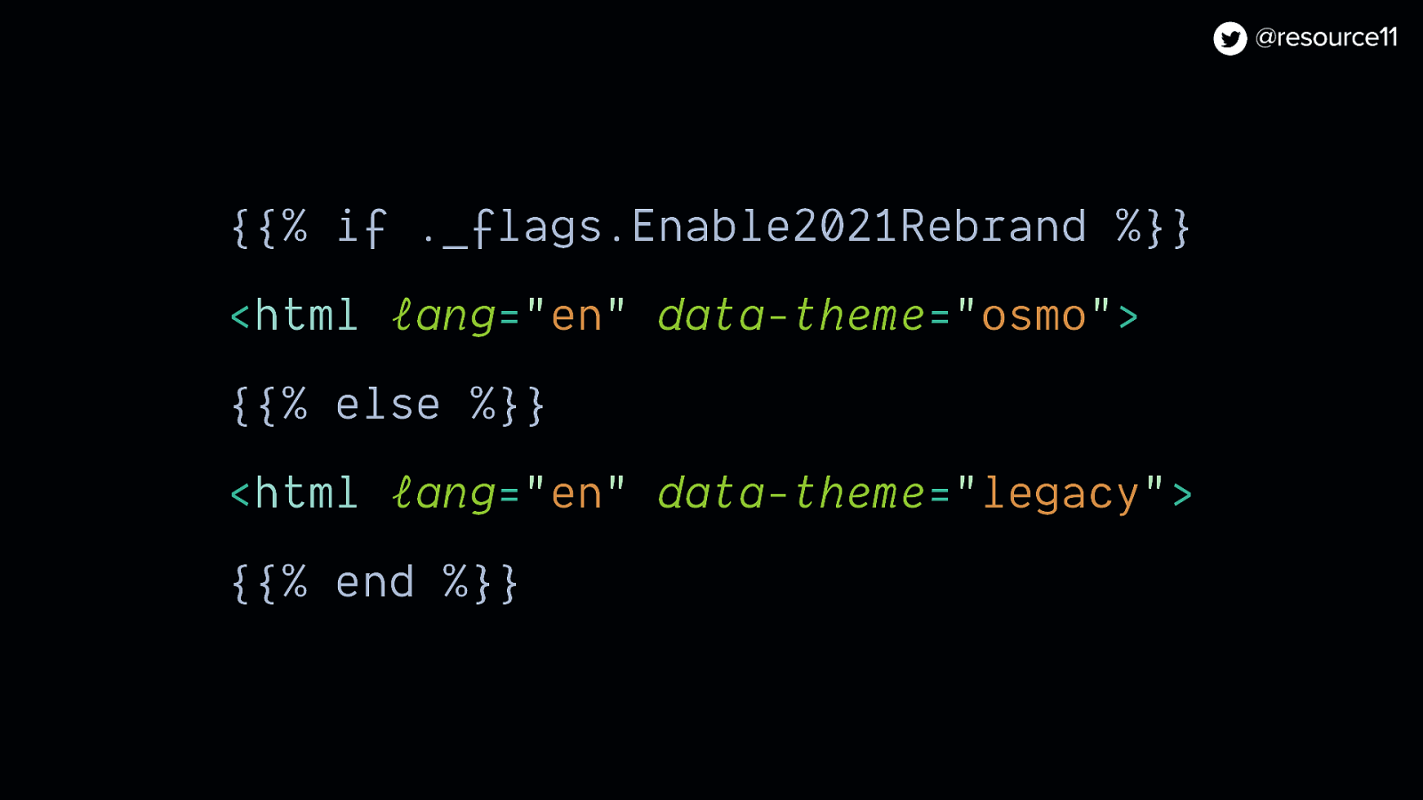
And used the enable-2021-rebrand feature flag to set the data-theme attribute as a performance optimization.
This way, we could have the HTML templates check for this flag and render the correct theme while we wait for the JavaScript to load and initialize the HTML, to avoid a flash of incorrectly-styled content
{{% if ._flags.Enable2021Rebrand %}}
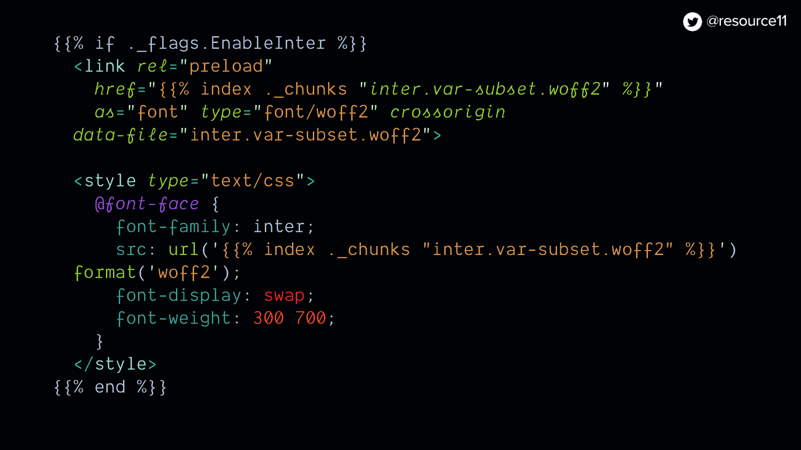
<html lang=”en” data-theme=”osmo”> {{% else %}} <html lang=”en” data-theme=”legacy”> {{% end %}}We also used the enable-inter flag value preload this variable font only if the flag was on.
This way, our app performance wouldn’t take a hit from loading any unnecessary fonts if the flag was off.
{{% if ._flags.Enable2021Rebrand %}}
<html lang=”en” data-theme=”osmo”> {{% else %}} <html lang=”en” data-theme=”legacy”> {{% end %}}For UI updates…
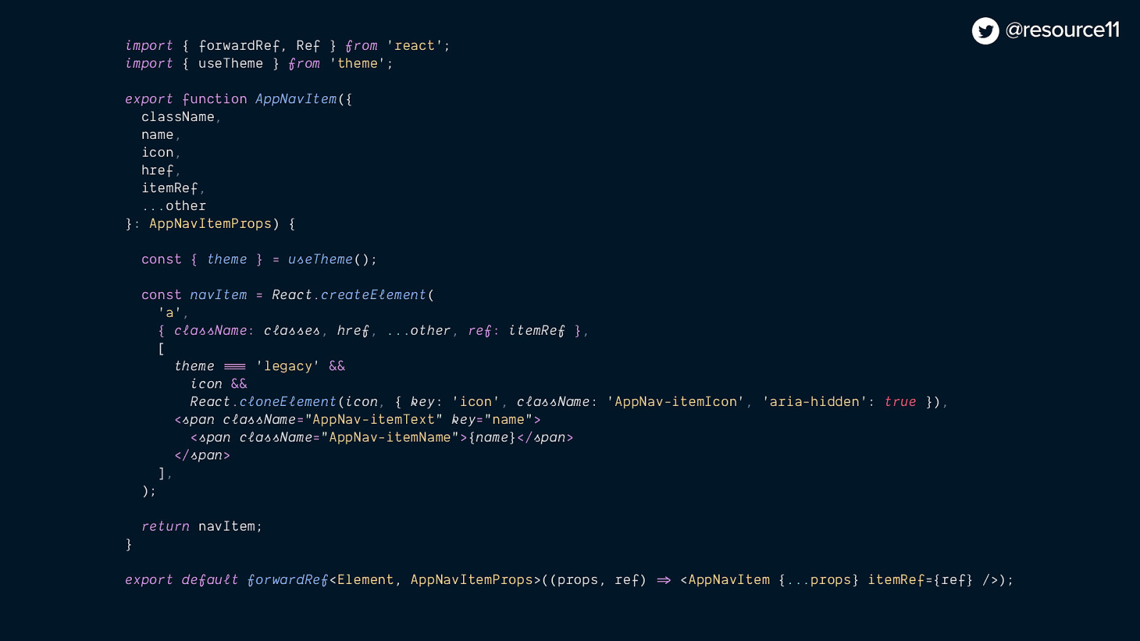
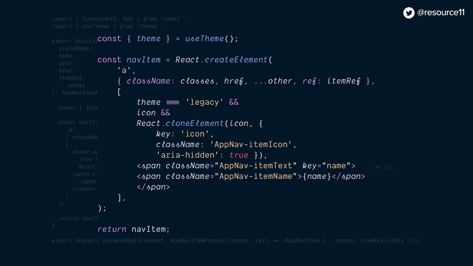
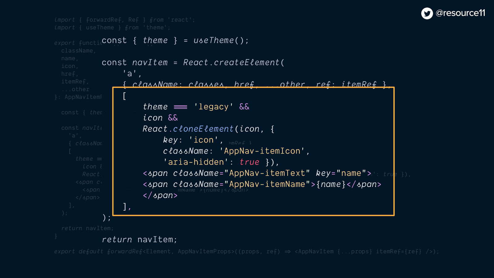
We used feature flags to control whether we would show/hide content in our left nav
import { forwardRef, Ref } from ‘react’; import { useTheme } from ‘theme’;
export function AppNavItem({ className, name, icon, href, itemRef, …other }: AppNavItemProps) {
const { theme } = useTheme();
const navItem = React.createElement( ‘a’, { className: classes, href, …other, ref: itemRef }, [ theme === ‘legacy’ && icon && React.cloneElement(icon, { key: ‘icon’, className: ‘AppNav-itemIcon’, ‘aria-hidden’: true }), <span className=”AppNav-itemText” key=”name”> <span className=”AppNav-itemName”>{name}</span> </span> ], );
return navItem; }
export default forwardRef<Element, AppNavItemProps>((props, ref) => <AppNavItem {…props} itemRef={ref} />);
const { theme } = useTheme();
const navItem = React.createElement( ‘a’, { className: classes, href, …other, ref: itemRef }, [ theme === ‘legacy’ && icon && React.cloneElement(icon, { key: ‘icon’, className: ‘AppNav-itemIcon’, ‘aria-hidden’: true }), <span className=”AppNav-itemText” key=”name”> <span className=”AppNav-itemName”>{name}</span> </span> ], );
return navItem; }
const { theme } = useTheme();
const navItem = React.createElement( ‘a’, { className: classes, href, …other, ref: itemRef }, [ theme === ‘legacy’ && icon && React.cloneElement(icon, { key: ‘icon’, className: ‘AppNav-itemIcon’, ‘aria-hidden’: true }), <span className=”AppNav-itemText” key=”name”> <span className=”AppNav-itemName”>{name}</span> </span> ], );
return navItem;
So users would have the expected legacy UI experience
While we worked on the rebranded nav in secret
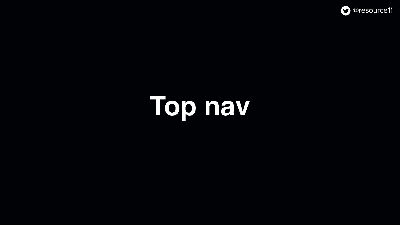
There wasn’t a top nav in the legacy UI…
…and now there is one.
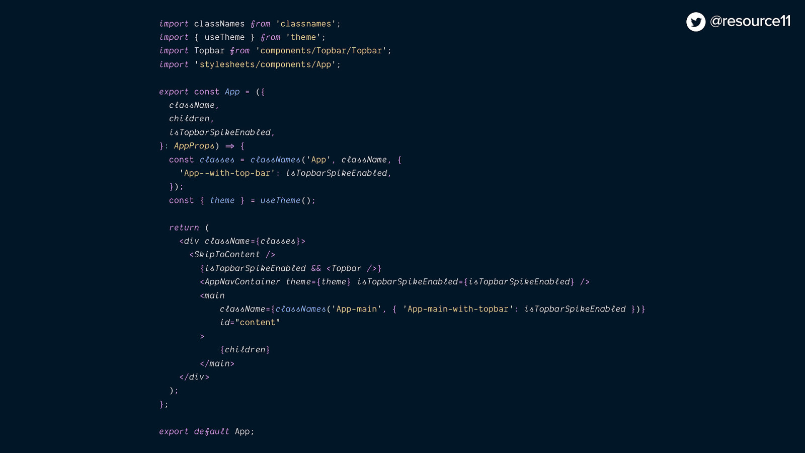
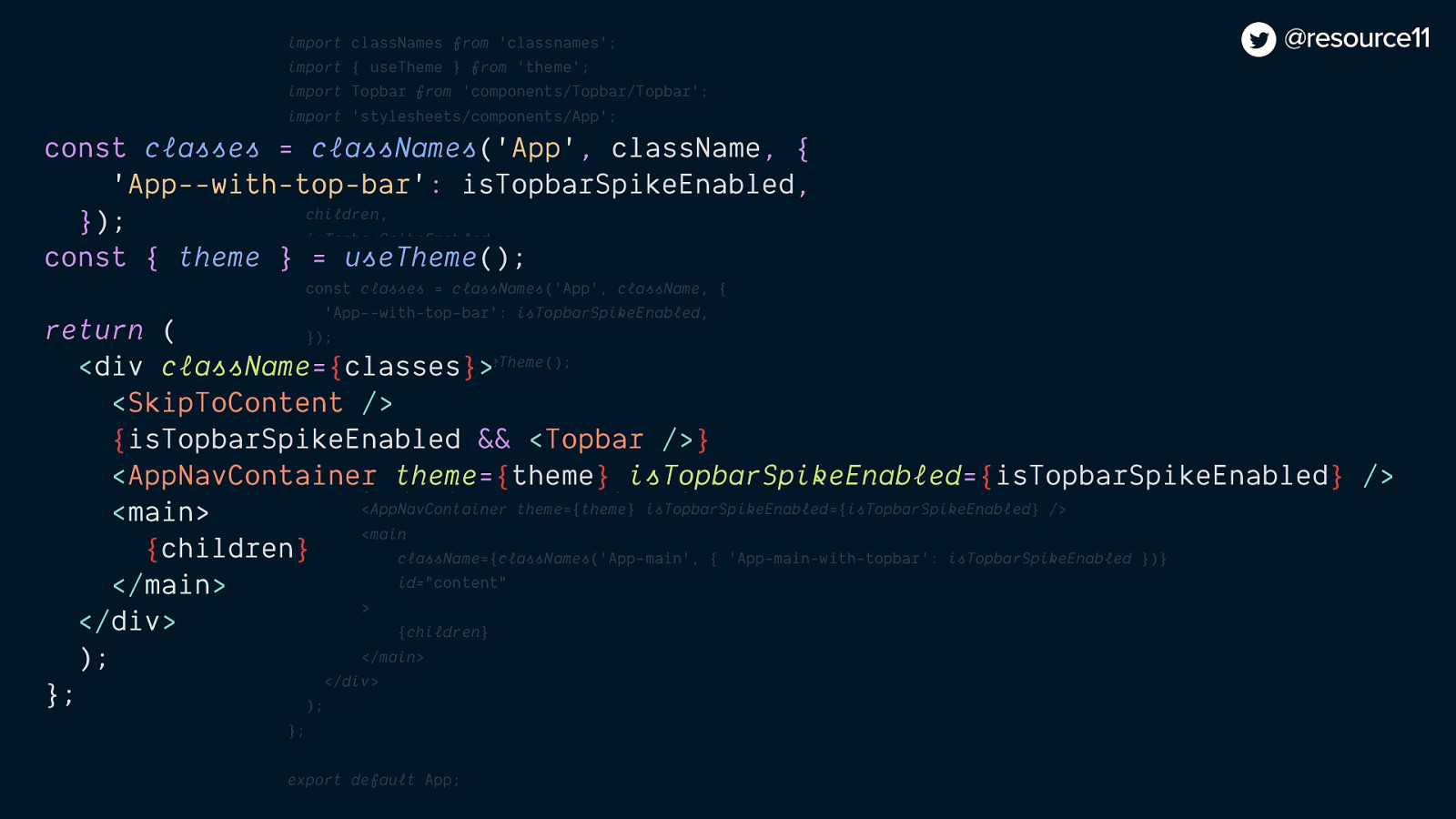
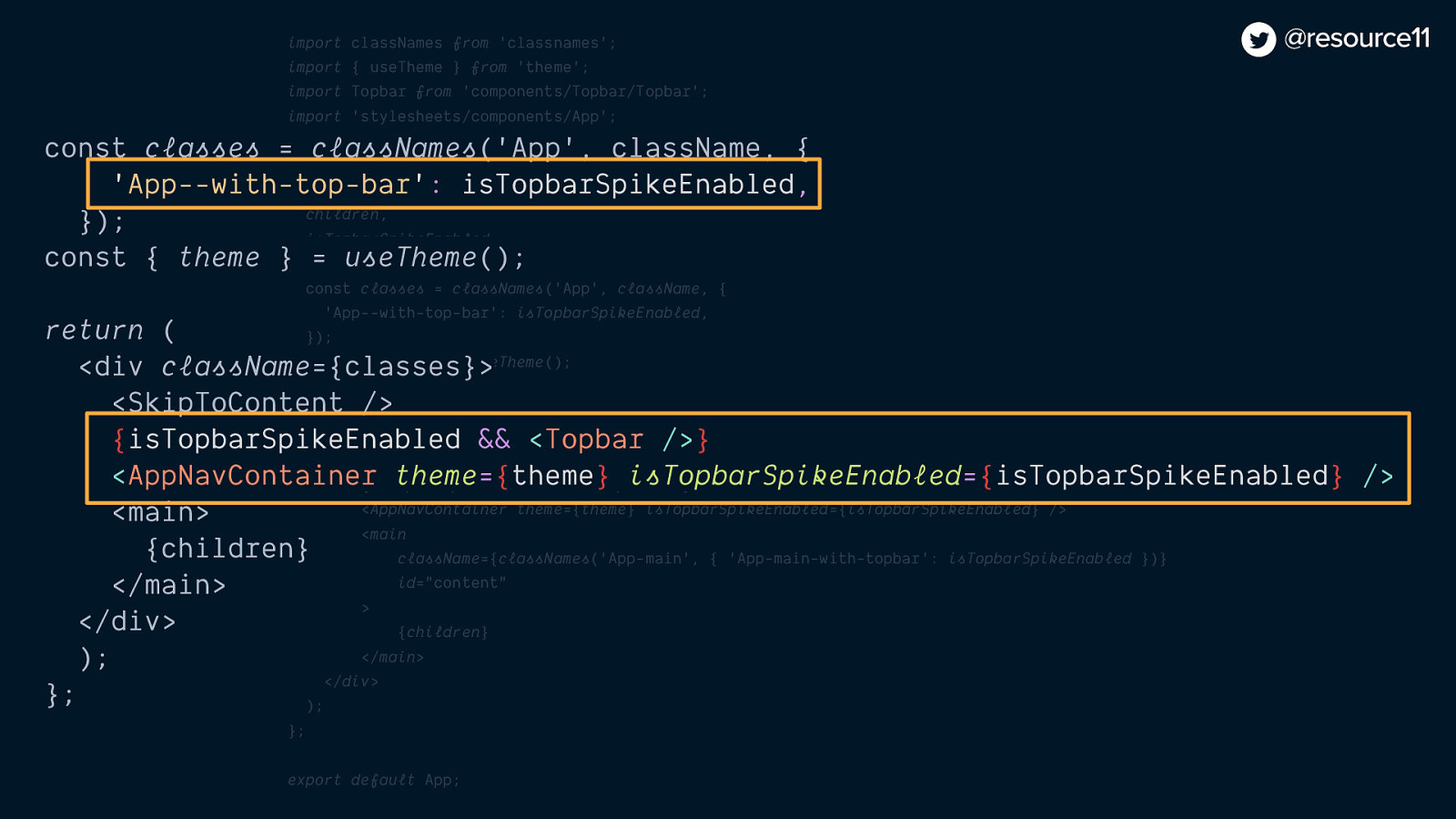
By adding the topbar-spike flag with the rebrand prerequisite
import classNames from ‘classnames’; import { useTheme } from ‘theme’; import Topbar from ‘components/Topbar/Topbar’; import ‘stylesheets/components/App’;
export const App = ({ className, children, isTopbarSpikeEnabled, }: AppProps) => { const classes = classNames(‘App’, className, { ‘App—with-top-bar’: isTopbarSpikeEnabled, }); const { theme } = useTheme();
return ( <div className={classes}> <SkipToContent /> {isTopbarSpikeEnabled && <Topbar />} <AppNavContainer theme={theme} isTopbarSpikeEnabled={isTopbarSpikeEnabled} /> <main className={classNames(‘App-main’, { ‘App-main-with-topbar’: isTopbarSpikeEnabled })} id=”content” > {children} </main> </div> ); };
export default App;
const classes = classNames(‘App’, className, { ‘App—with-top-bar’: isTopbarSpikeEnabled, });
return ( <div className={classes}> <SkipToContent /> {isTopbarSpikeEnabled && <Topbar />} <AppNavContainer isTopbarSpikeEnabled={isTopbarSpikeEnabled} /> <main id=”content”> {children} </main> </div> ); };
const classes = classNames(‘App’, className, { ‘App—with-top-bar’: isTopbarSpikeEnabled, });
return ( <div className={classes}> <SkipToContent /> {isTopbarSpikeEnabled && <Topbar />} <AppNavContainer isTopbarSpikeEnabled={isTopbarSpikeEnabled} /> <main id=”content”> {children} </main> </div> ); };
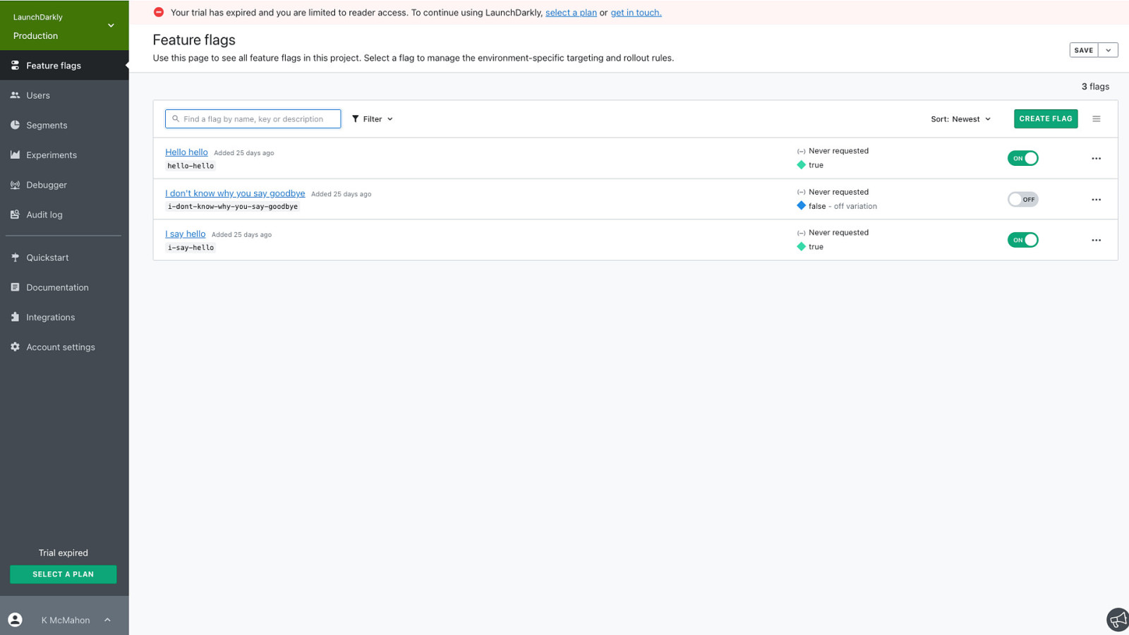
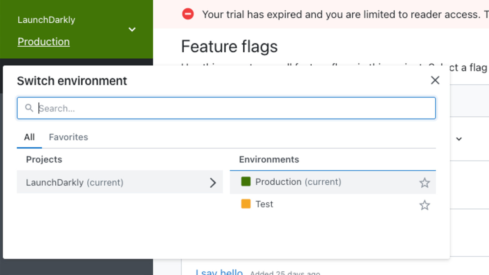
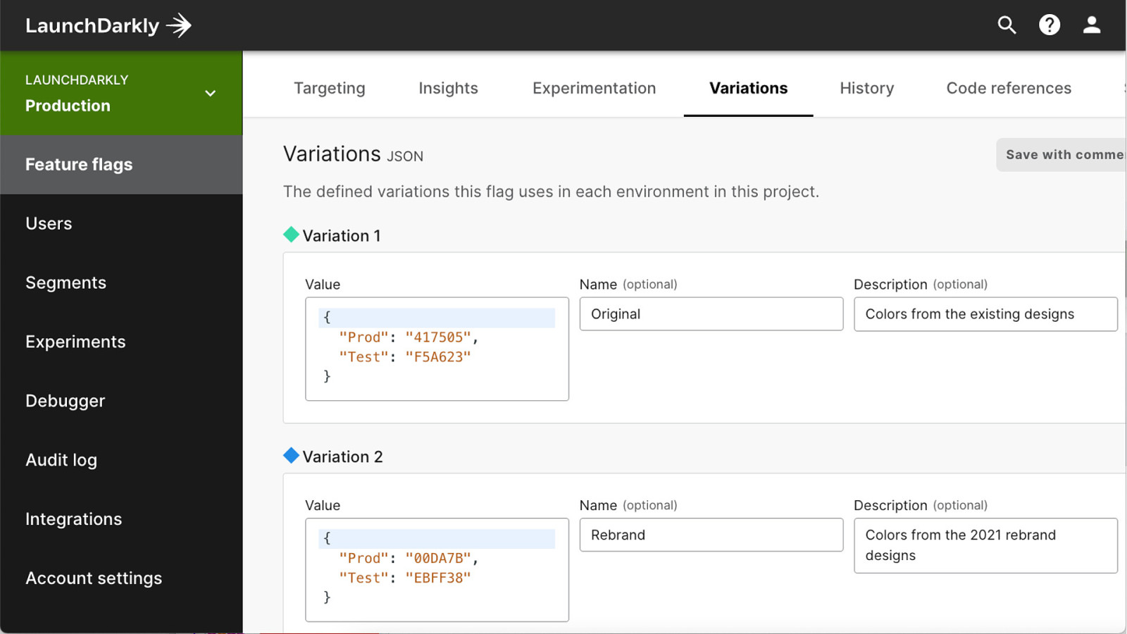
With LaunchDarkly, whenever you create a new project you get two default environments, production, and test, and they are set to specific colors by default.
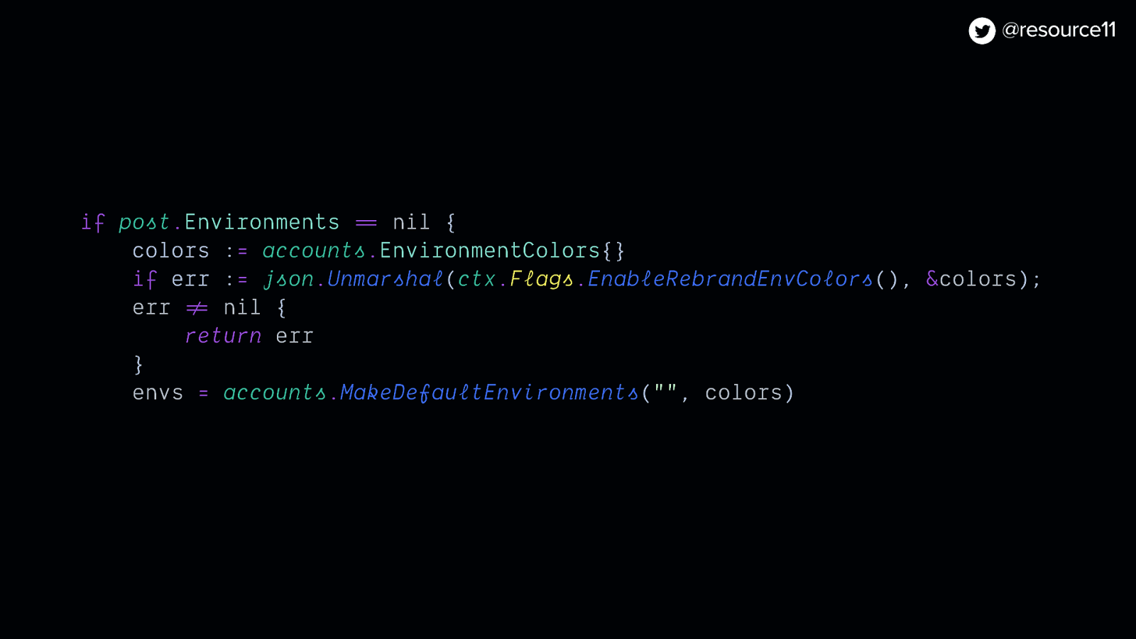
We wanted to test out new default environment colors, so created the rebrand-env-colors multivariate flag…
…used blocks on JSON in our variations to test out color combinations on the fly…
And used Go to store the values.
if post.Environments == nil { colors := accounts.EnvironmentColors{} if err := json.Unmarshal(ctx.Flags.EnableRebrandEnvColors(), &colors); err != nil { return err } envs = accounts.MakeDefaultEnvironments(“”, colors)
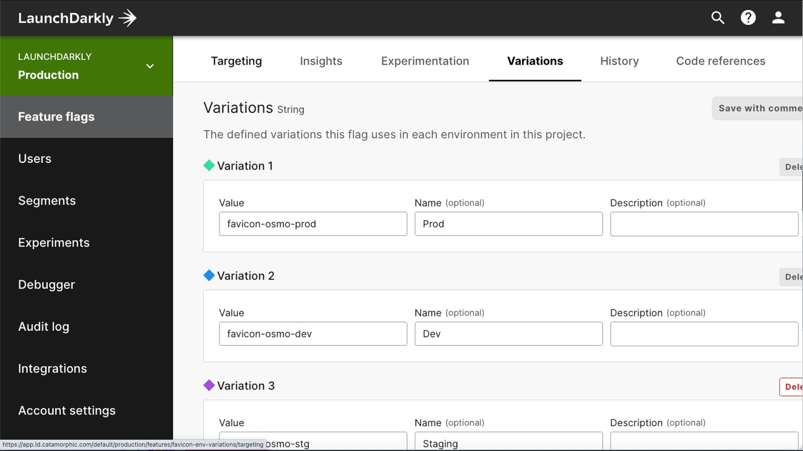
Lastly… Favicons. It’s always a nice touch to have your favicon ready to go when you roll out your rebrand rather than scrambling to update at the last moment.
Especially if you are using them in more than one environment.
By adding the favicons-env-variations multivariate flag…
We could use strings in our variations…
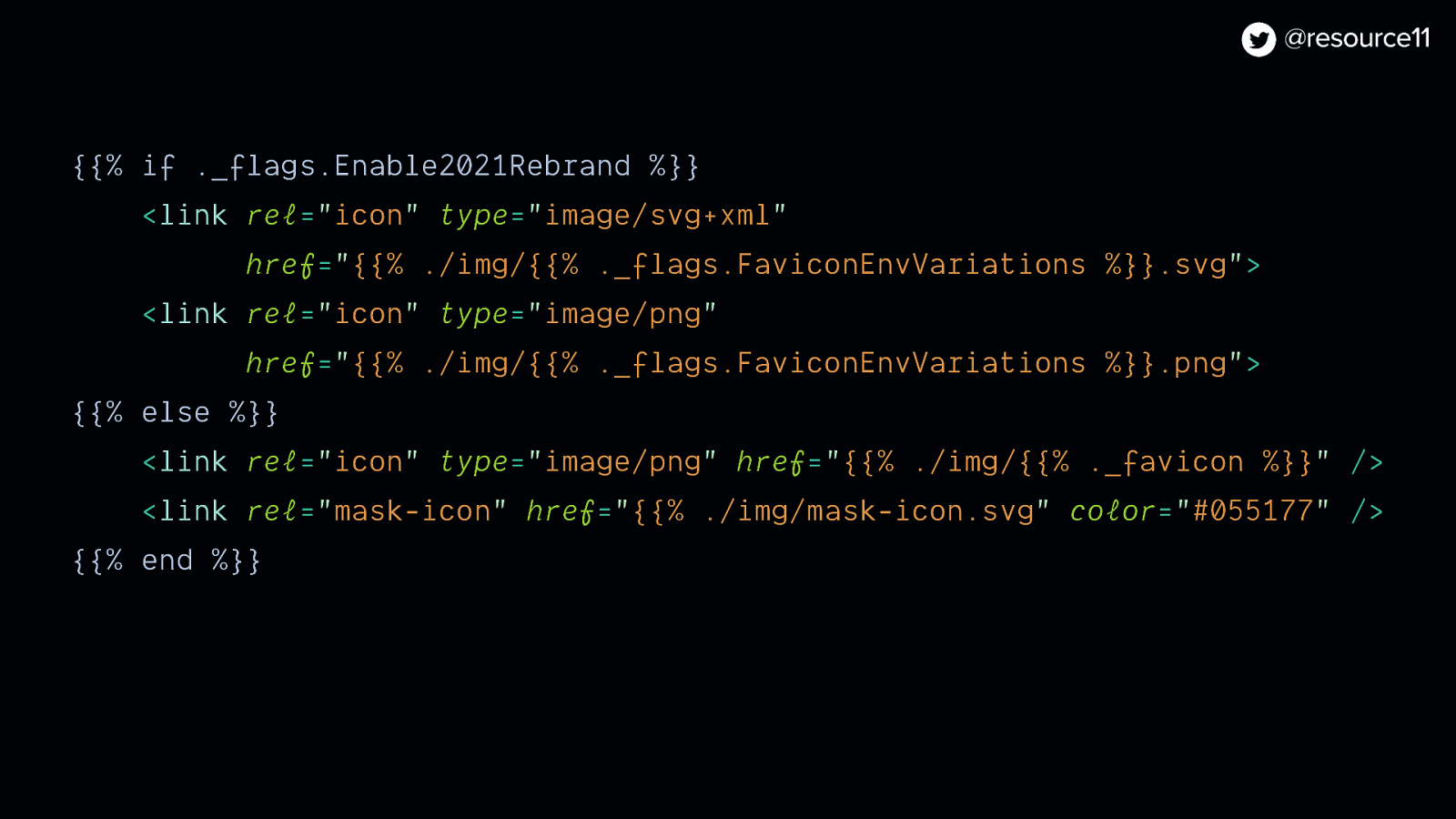
{{% if ._flags.Enable2021Rebrand %}} <link rel=”icon” type=”image/svg+xml” href=”{{% ./img/{{% ._flags.FaviconEnvVariations %}}.svg”> <link rel=”icon” type=”image/png” href=”{{% ./img/{{% ._flags.FaviconEnvVariations %}}.png”> {{% else %}} <link rel=”icon” type=”image/png” href=”{{% ./img/{{% ._favicon %}}” /> <link rel=”mask-icon” href=”{{% ./img/mask-icon.svg” color=”#055177” /> {{% end %}}
That was a lot… So to wrap up…
With the power of feature flags
In a 10-week time frame.
We implemented a substantial amount of changes to a product app.
And rolled out a product rebrand in stealth mode.
So I figure… if we could do it, so can you.
@resource11 Twitter | Instagram | GitHub

Rebranding a product is nothing new. However! Oftentimes, rebranding a product can be a challenge when a product roadmap is in play. Developers want to get a new visual refresh implemented quickly, yet often don’t know where to begin or how to sync those needs alongside other product goals. This talk will reduce the barrier for developers that want to integrate a brand refresh into a product and retain their teams’ feature and velocity goals.
The following resources were mentioned during the presentation or are useful additional information.
Here’s what was said about this presentation on social media.