A presentation at Responsive Day Out 2 in in Brighton, UK by Inayaili León
Realistic responsive design by Inayaili de León Persson Responsive Day Out, Brighton, 2014
1 It’s not about you
2 Make a plan
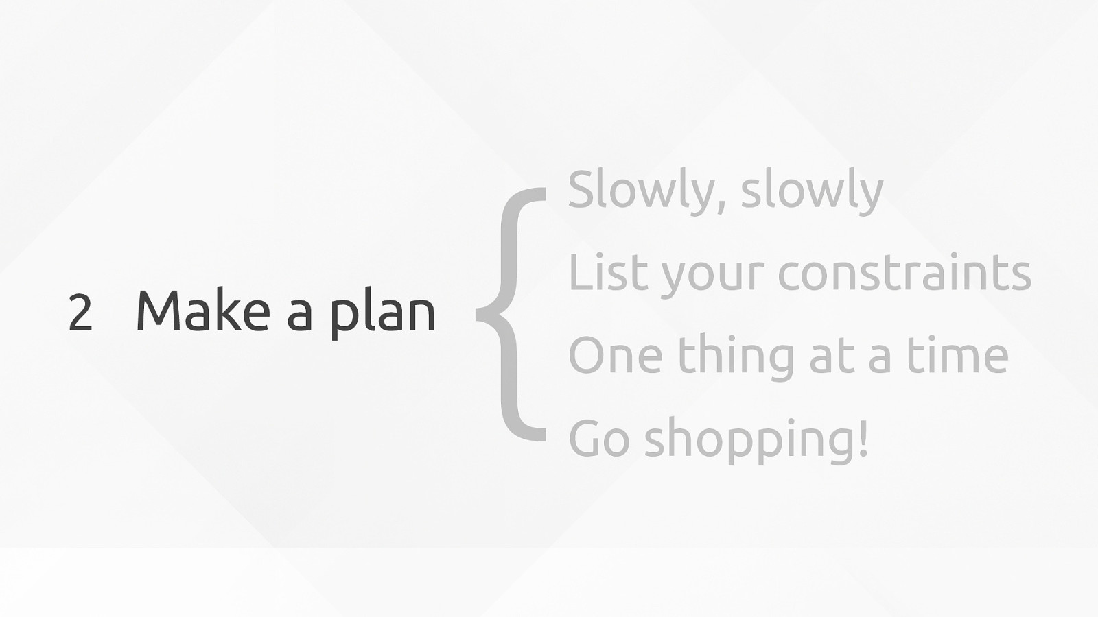
Slowly, slowly List your constraints One thing at a time Go shopping! {
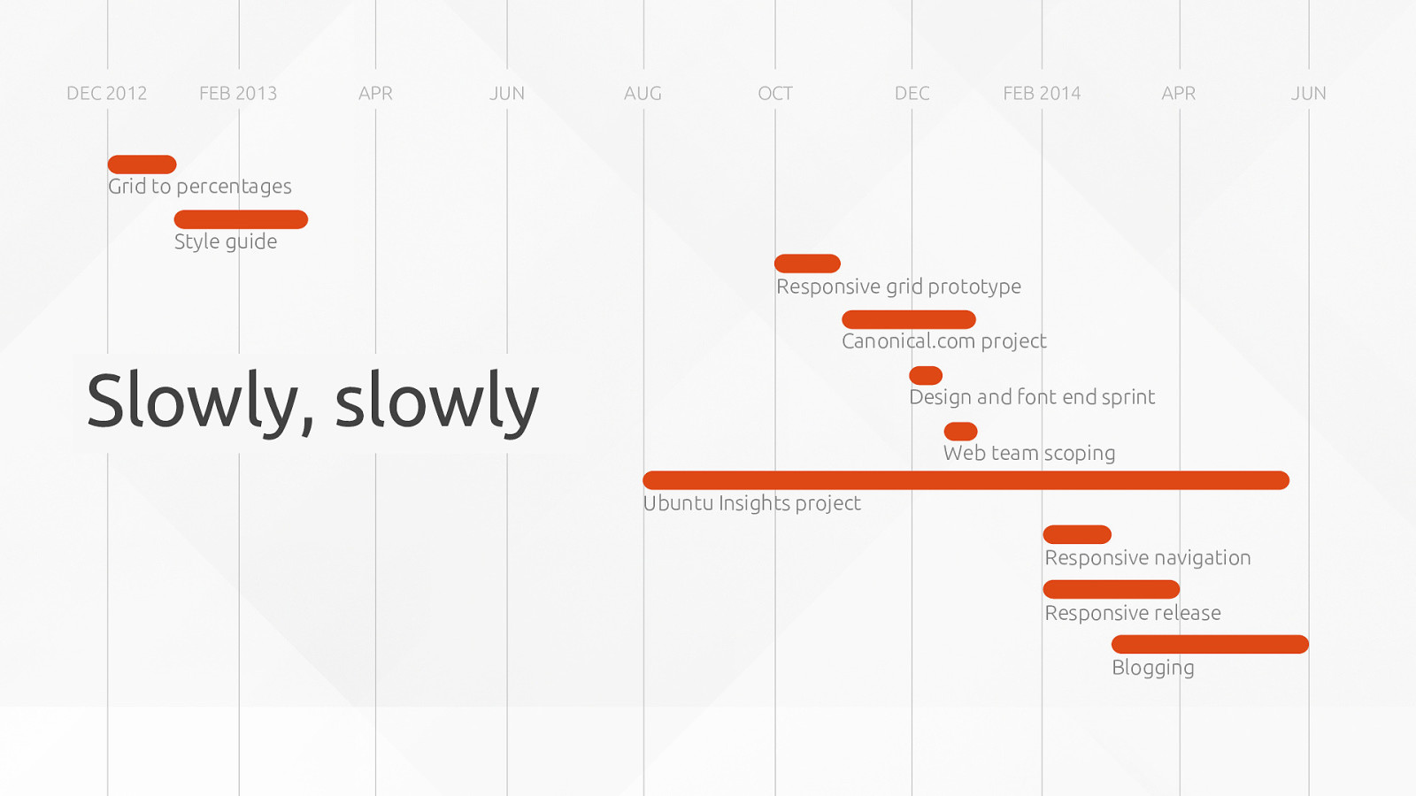
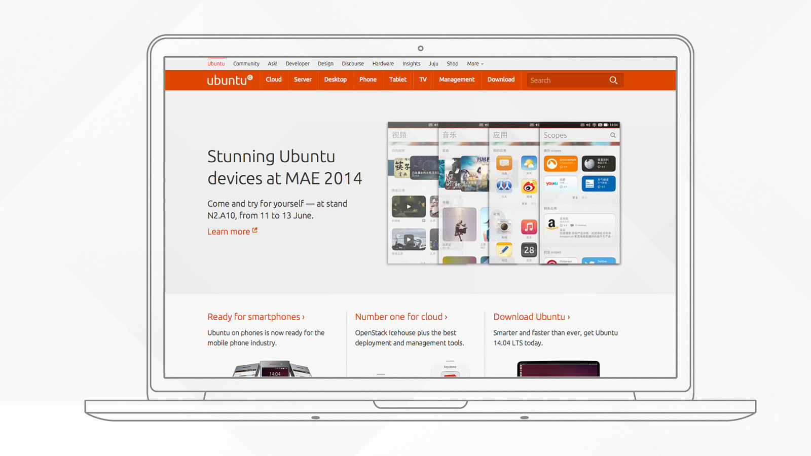
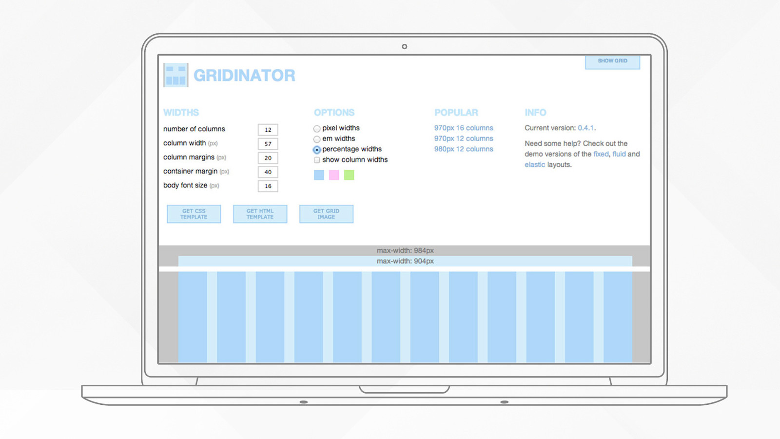
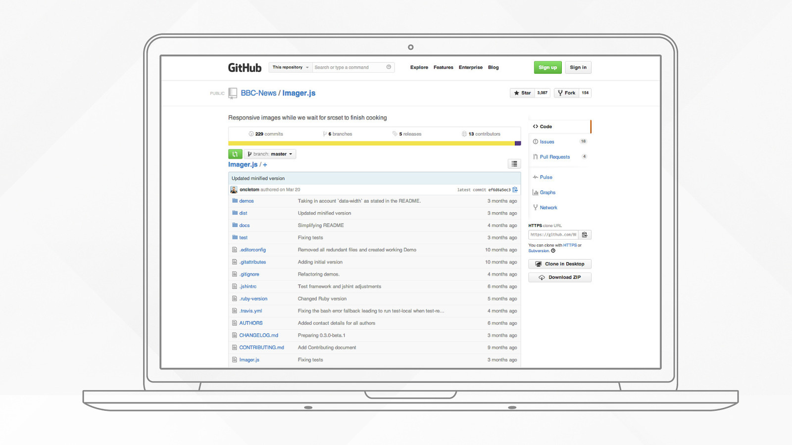
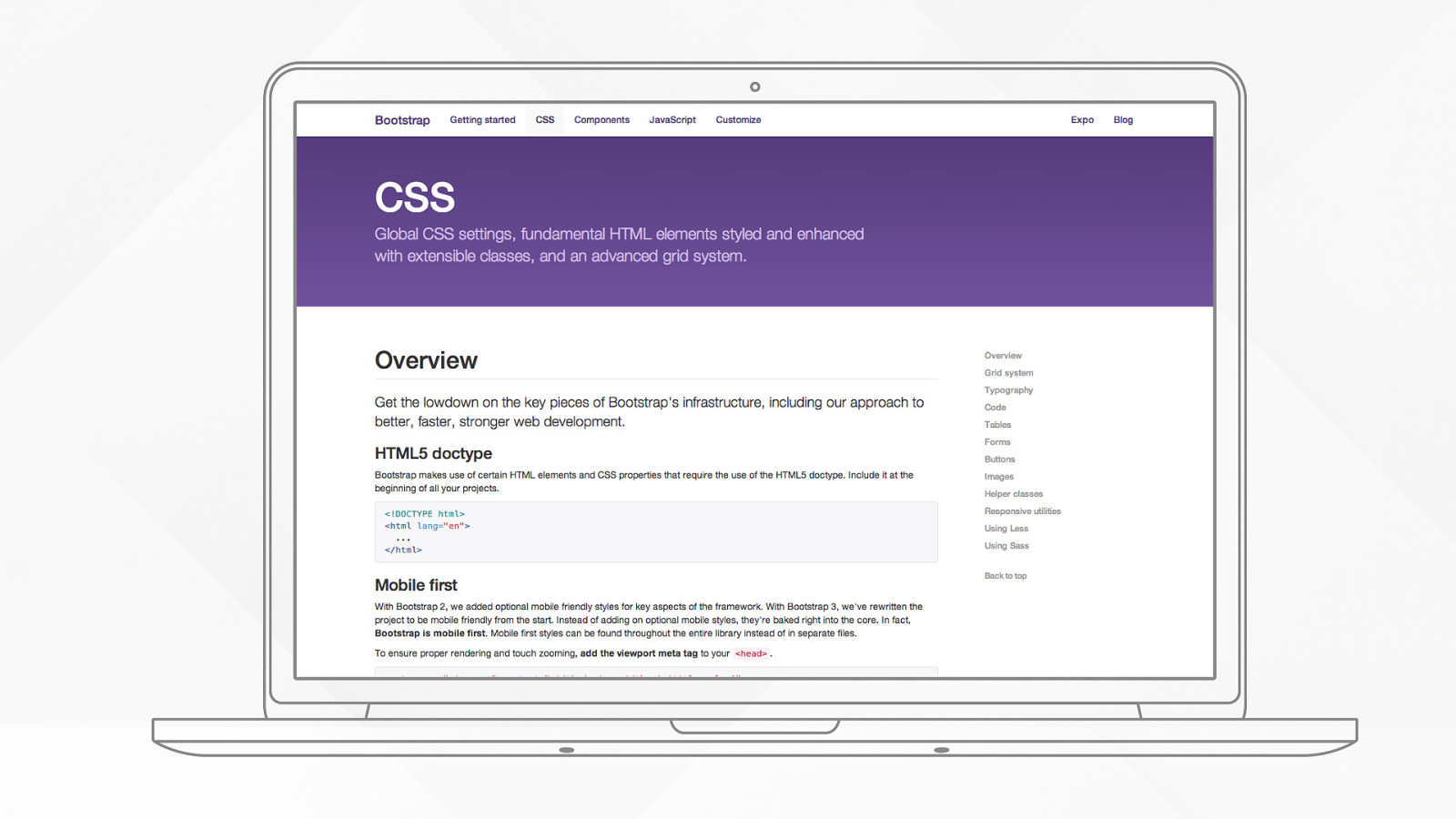
Grid to percentages Style guide Responsive grid prototype Canonical.com project Ubuntu Insights project Responsive release Design and font end sprint Web team scoping Blogging Responsive navigation Slowly, slowly
DEC 2012 AUG APR DEC FEB 2014 OCT JUN FEB 2013 APR JUN
List your constraints
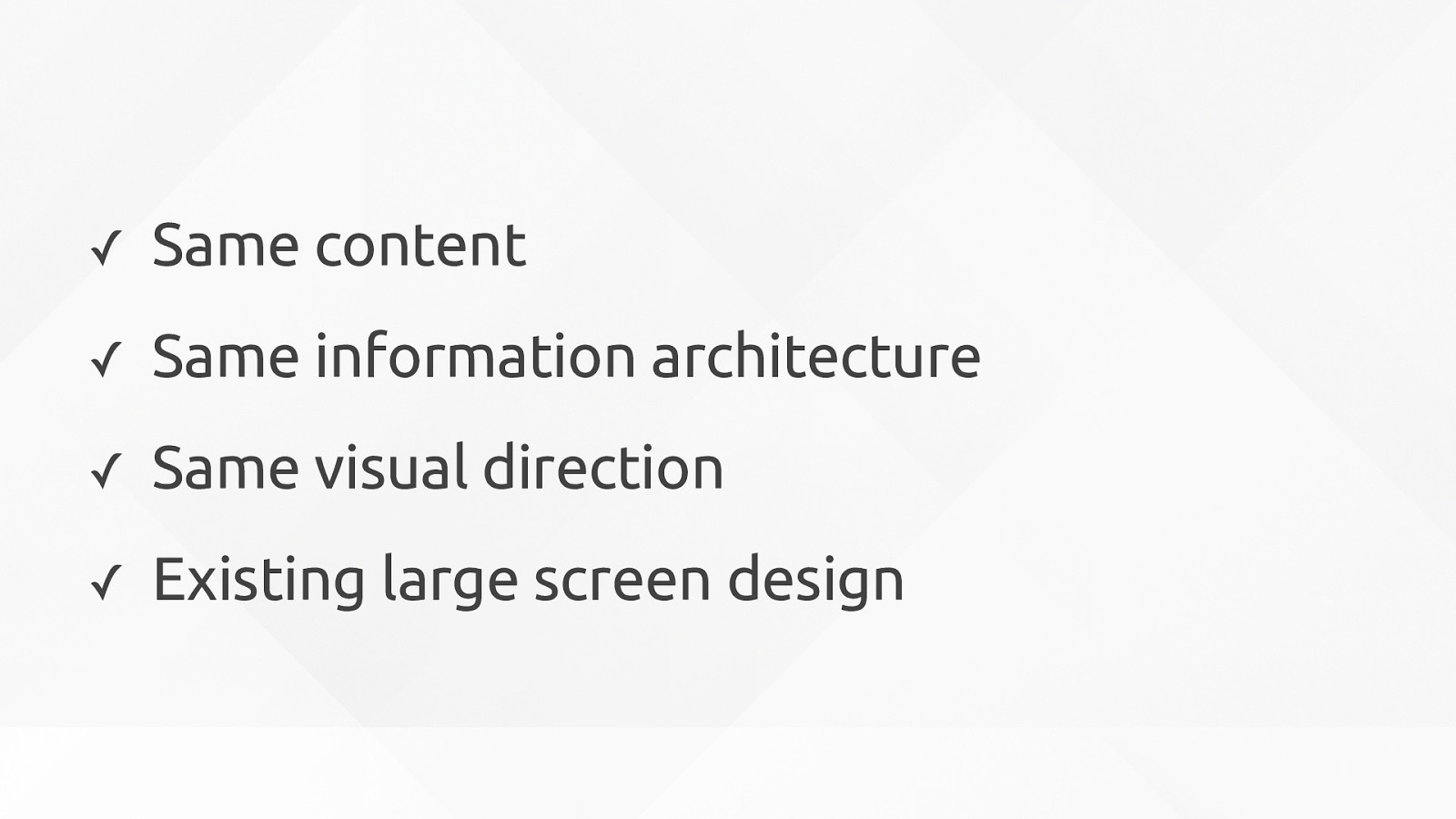
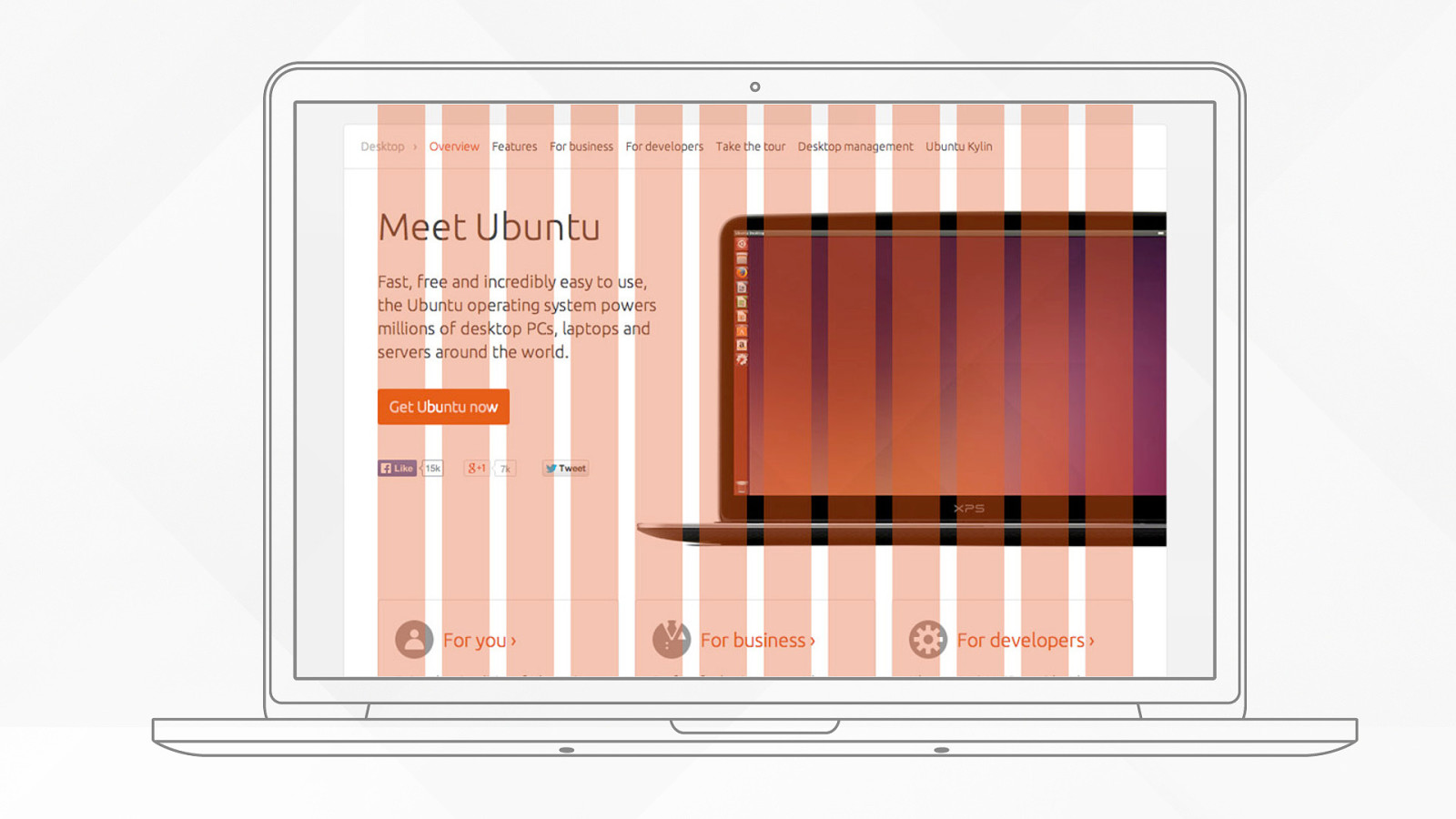
✓ Same content ✓ Same information architecture ✓ Same visual direction ✓ Existing large screen design
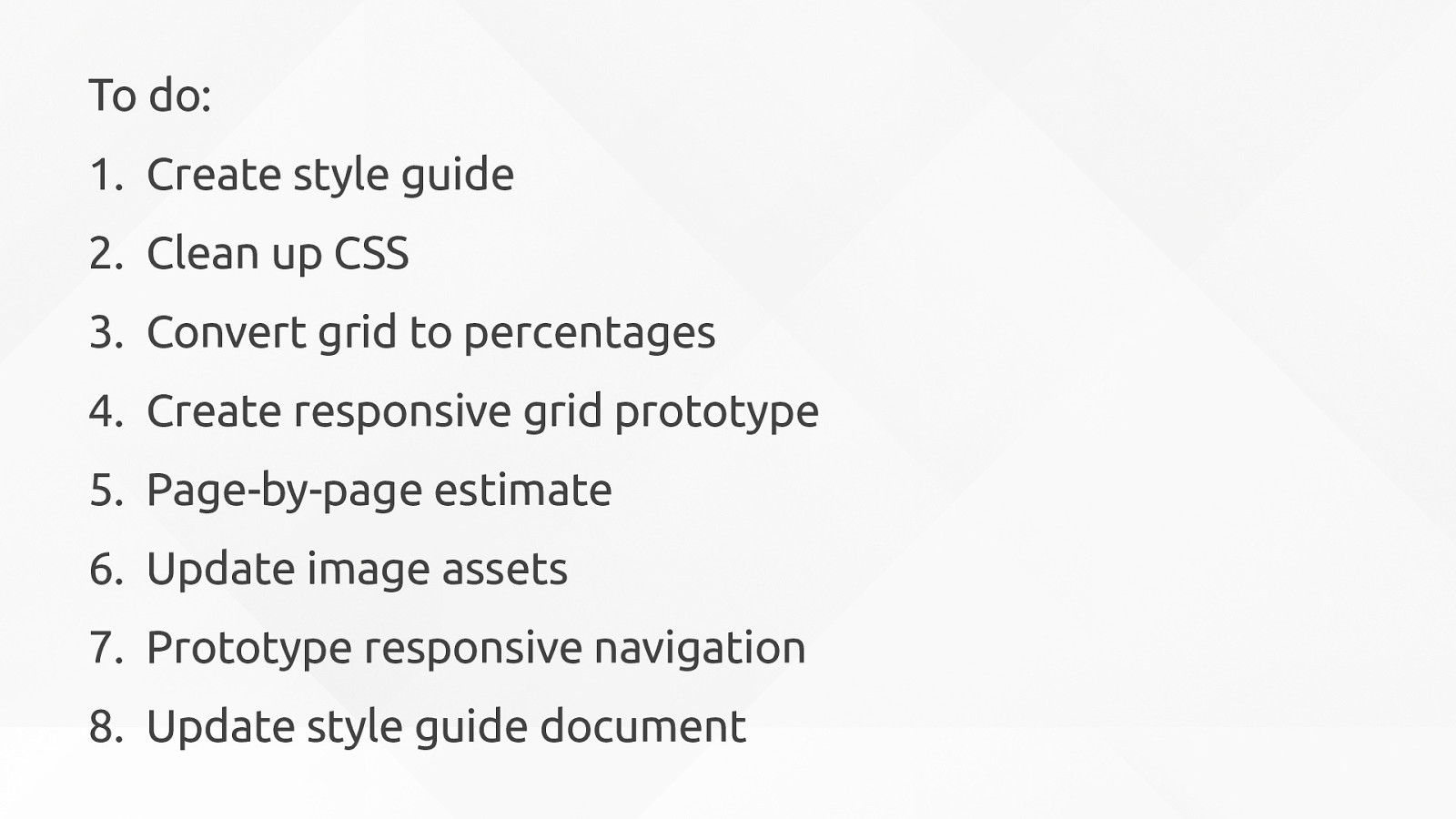
One thing at a time
To d o : 1. Create style guide 2. Clean up CSS 3. Convert grid to percentages 4. Create responsive grid prototype 5. Page-by-page estimate 6. Update image assets 7. Prototype responsive navigation 8. Update style guide document
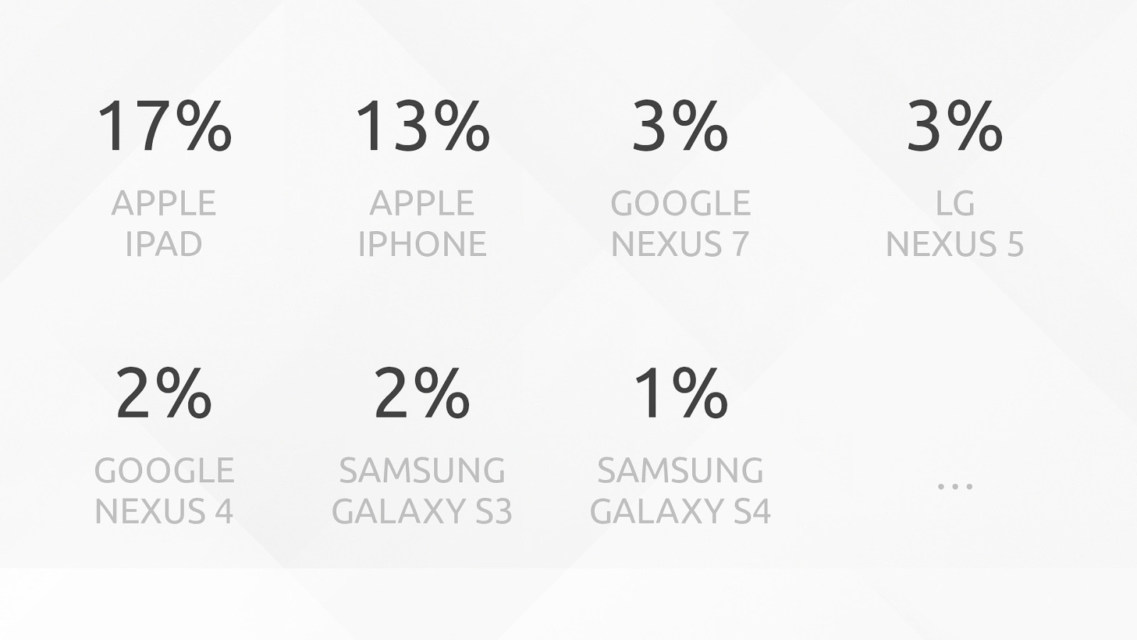
Go shopping!
17% APPLE IPAD 13% APPLE IPHONE 3% GOOGLE NEXUS 7 3% LG NEXUS 5 2% GOOGLE NEXUS 4 2% SAMSUNG GALAXY S3 1% SAMSUNG GALAXY S4 …
3 Evolve
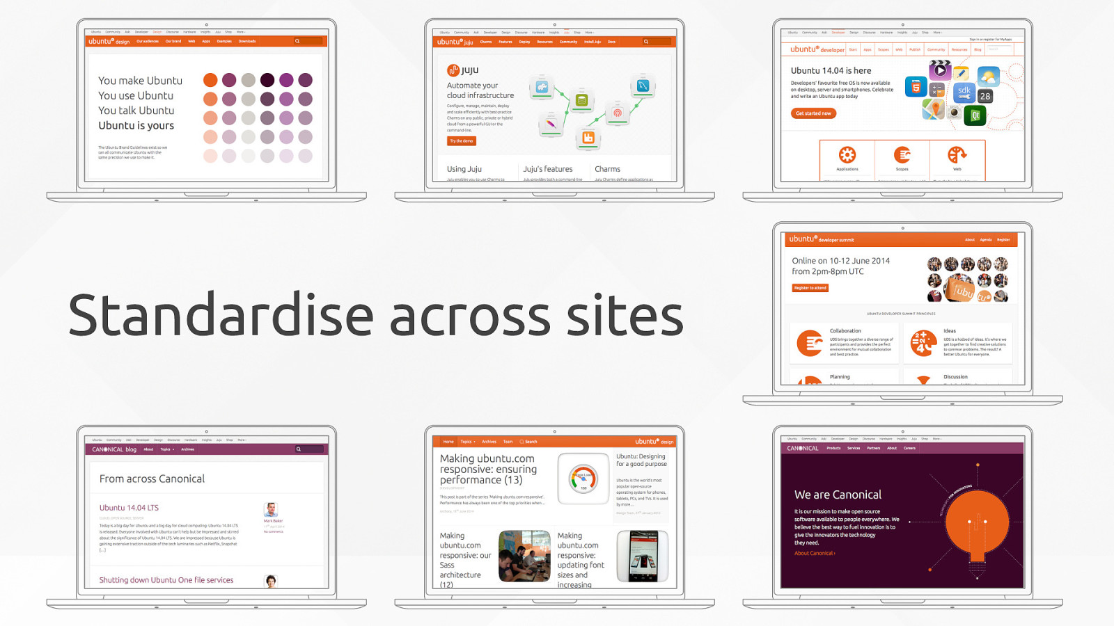
Reuse Standardise across sites {
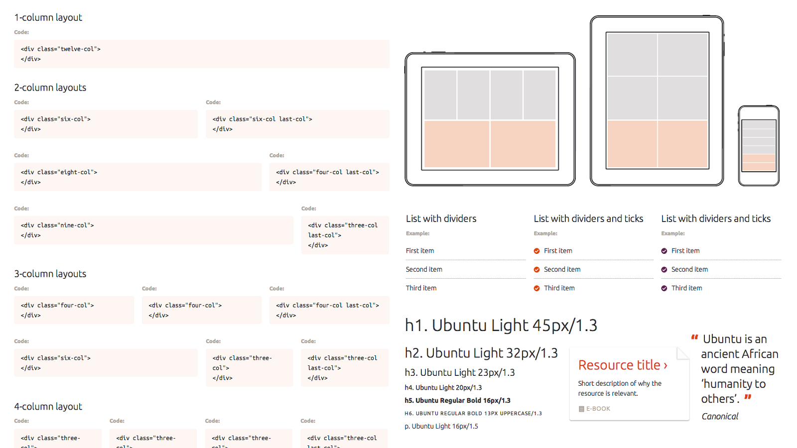
Reuse
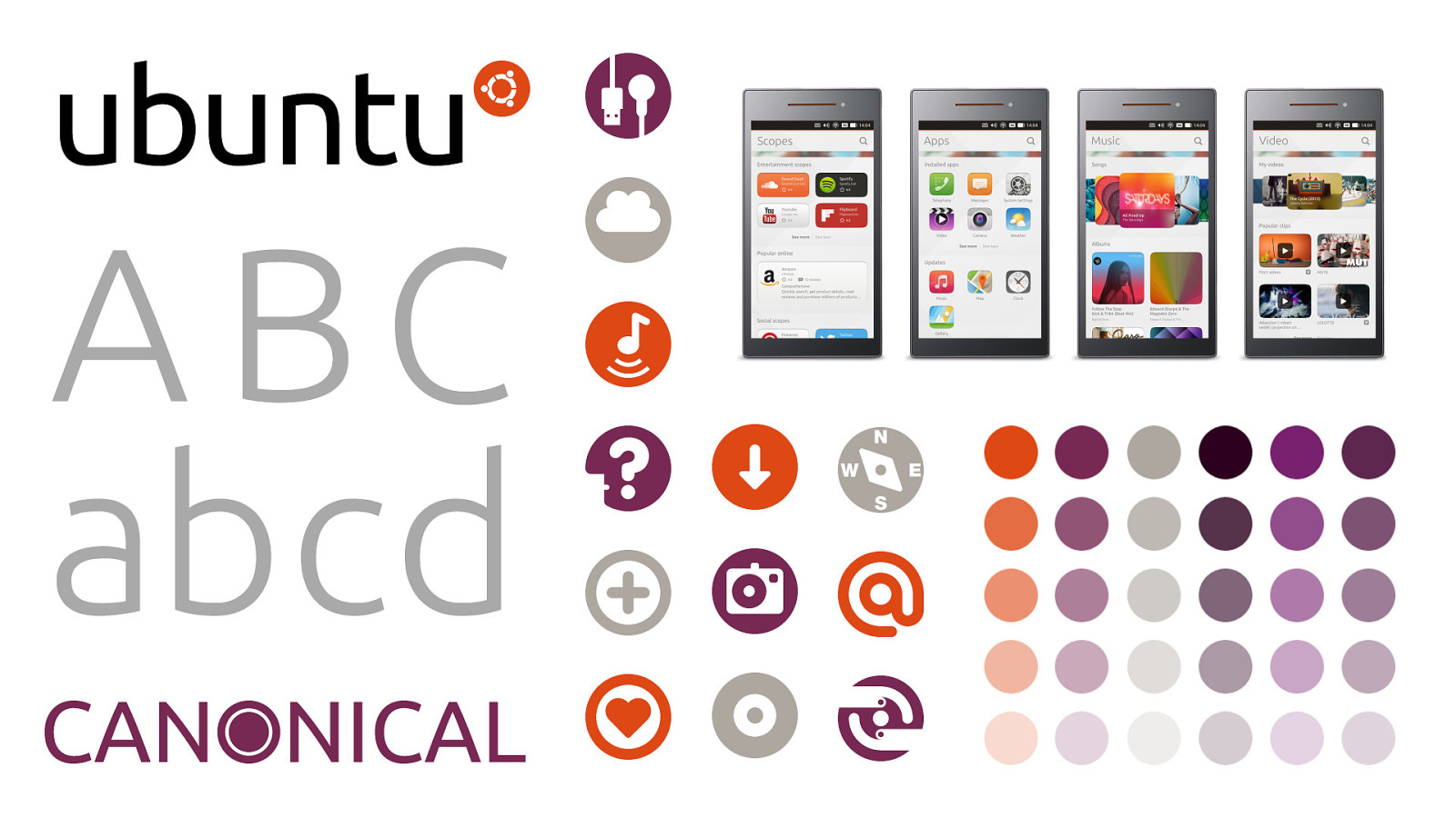
A B C a b c d
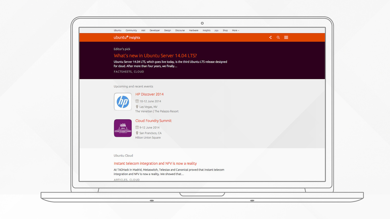
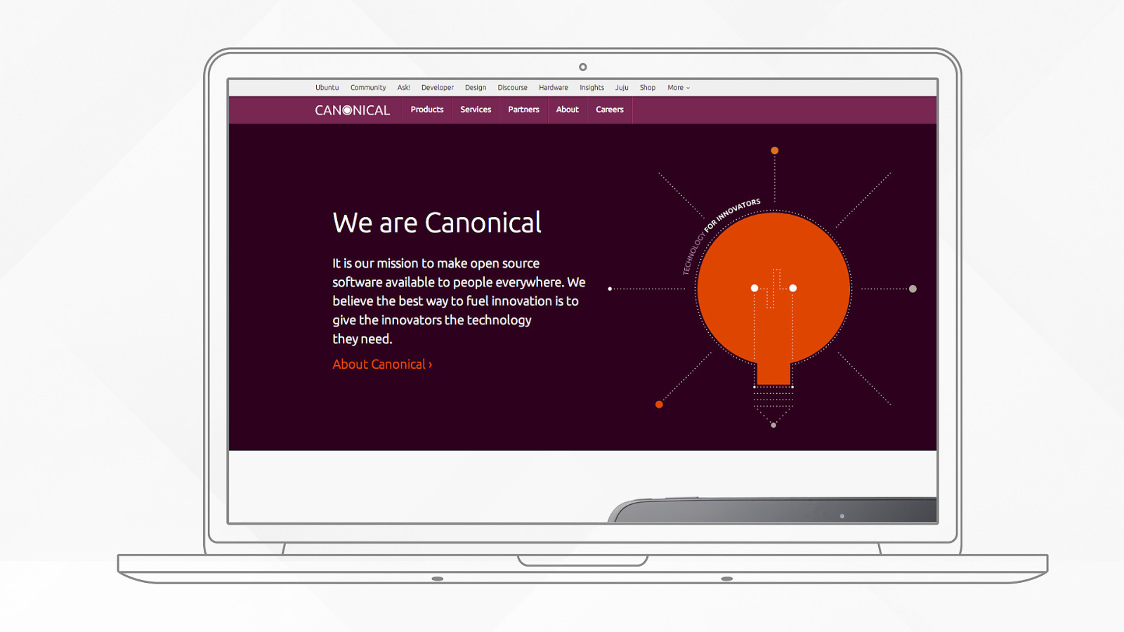
Standardise across sites
4 Experiment
5 Just do it
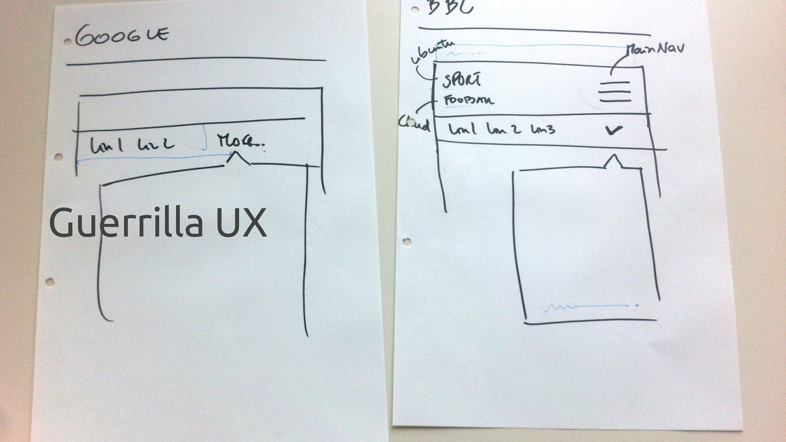
Tidy up before you start Set the rules Guerrilla UX {
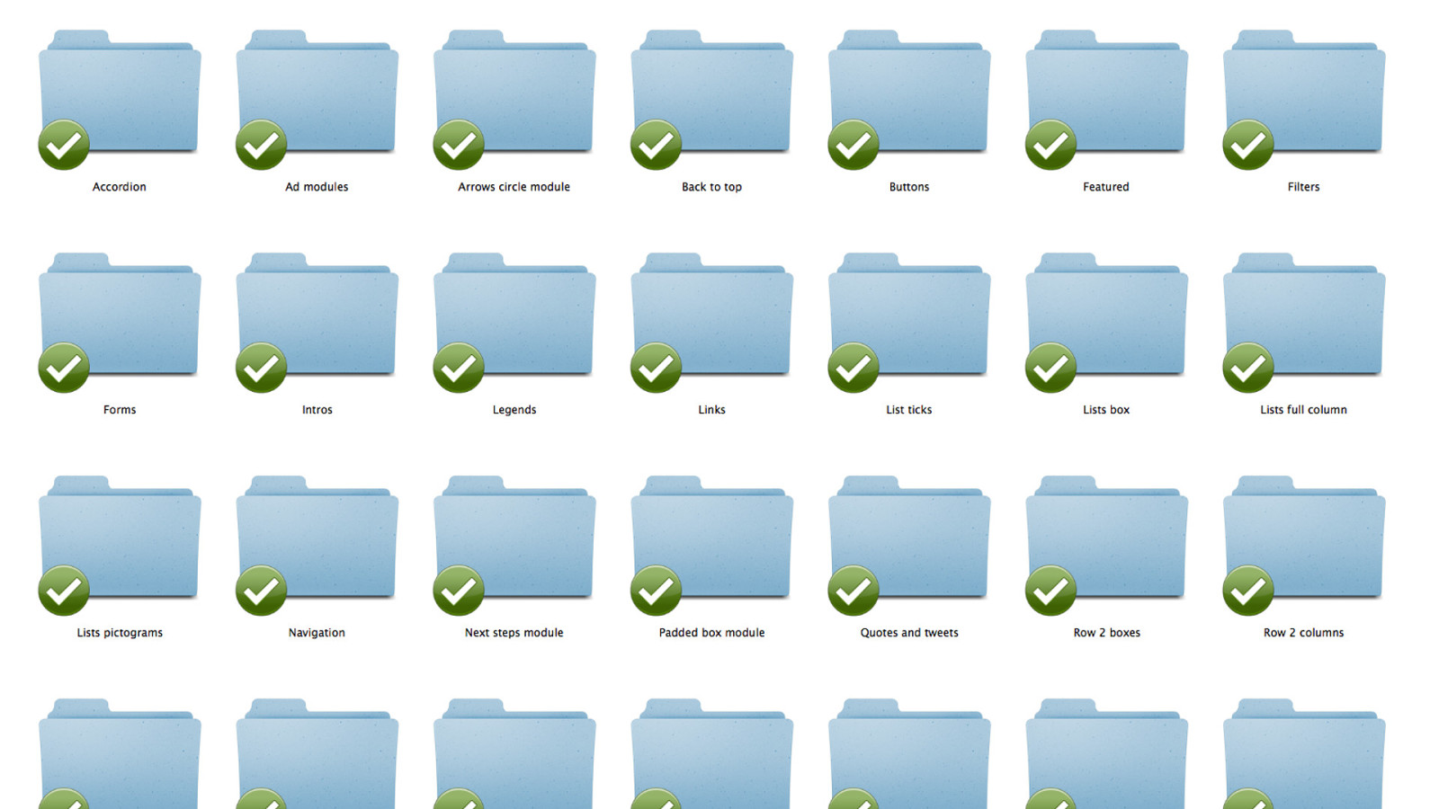
Tidy up before you start
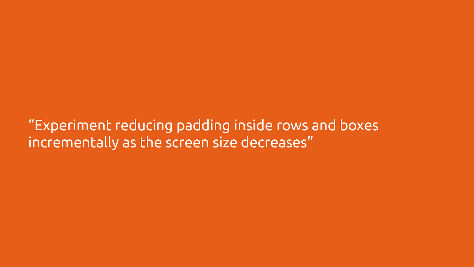
Set the rules
“Experiment reducing padding inside rows and boxes incrementally as the screen size decreases”
Guerrilla UX
Epilogue
Read more at design.canonical.com
The end. Thanks for listening, Inayaili de León Persson @yaili

The following resources were mentioned during the presentation or are useful additional information.