
A presentation at Home Office User Centered Design Meetup in in London, UK by Adam Silver
Hey everyone. I’m Adam and I’m an Interaction Designer currently at the Department for Education.
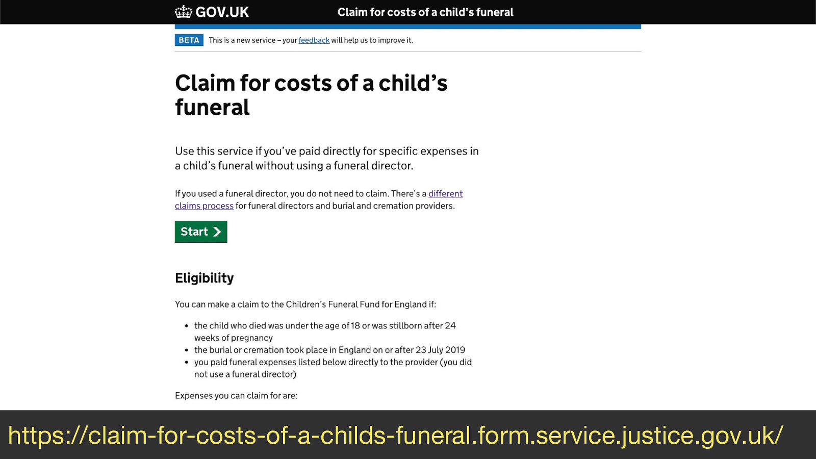
Today I want to talk to you about designing the Child Funeral Fund service which is something I did while at the Ministry of Justice.
While it’s not the nicest thing to talk about, it’s an important one and it’s got lots of interesting things to talk about.
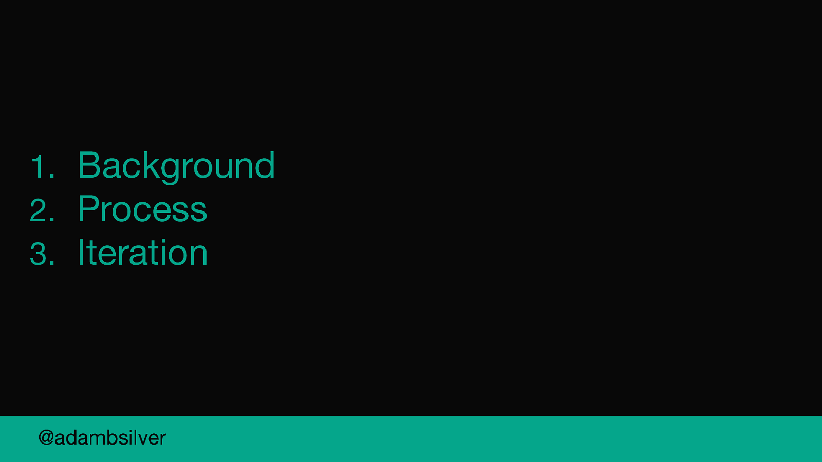
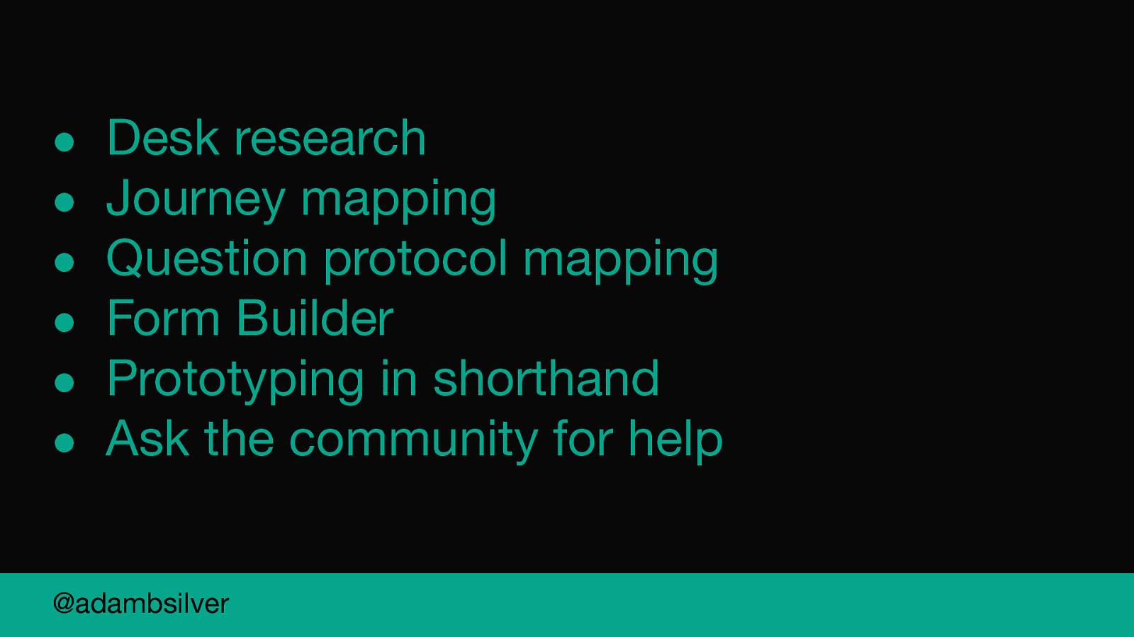
So I’ve broken this talk into 3 parts.
Firstly I’m going to set the scene and tell you about the constraints we faced
Secondly, I’m going to tell you the process we went through in response to those constraints.
Finally I’m going to take you through 5 little design iterations we made to the service before we launched it.
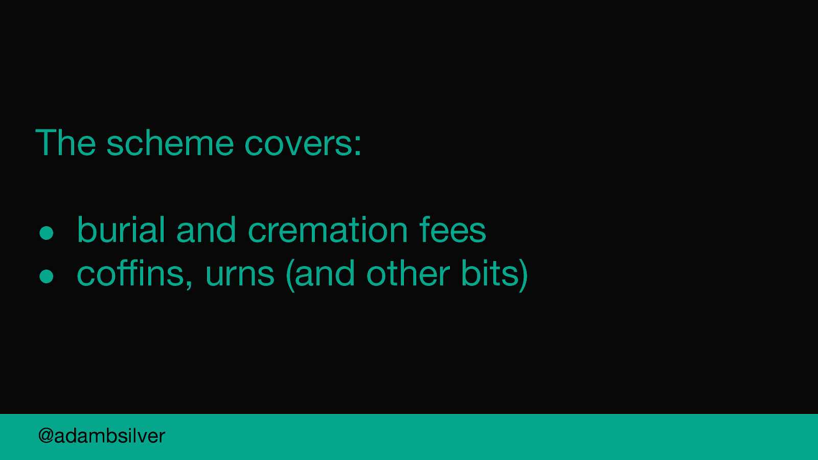
So the purpose of the service is to help pay for the cost of a child’s funeral.
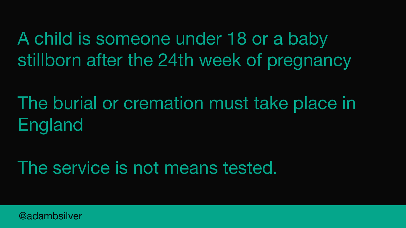
A child is someone under 18 or a baby stillborn after the 24th week of pregnancy.
The service isn’t means tested. You don’t even need to be a UK citizen. It’s just that funeral must take place in England.
The scheme covers burial and cremation fees and other bits like coffins and urns.
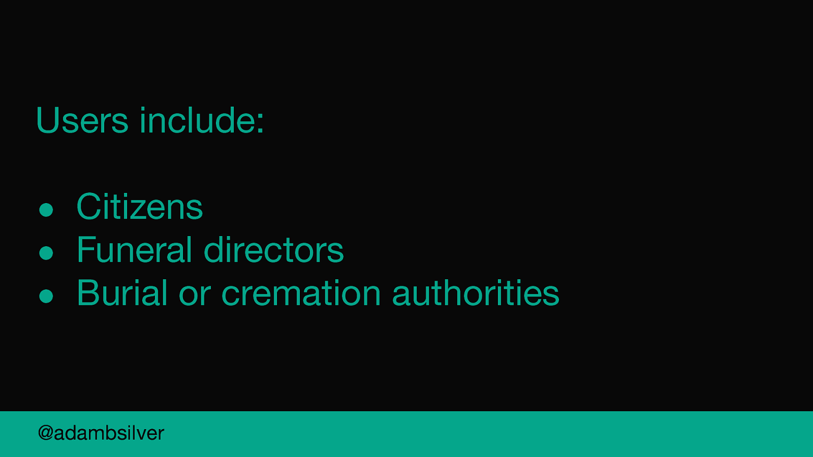
There are three groups of users:
The claims process works differently depending on who you are.
The fees for the burial or cremation can be claimed directly by the burial or cremation provider.
If you are using a funeral director you do not need to submit any claims yourself. The funeral director will claim back the costs.
If you are not using a funeral director you can claim for some other funeral expenses like the coffin.
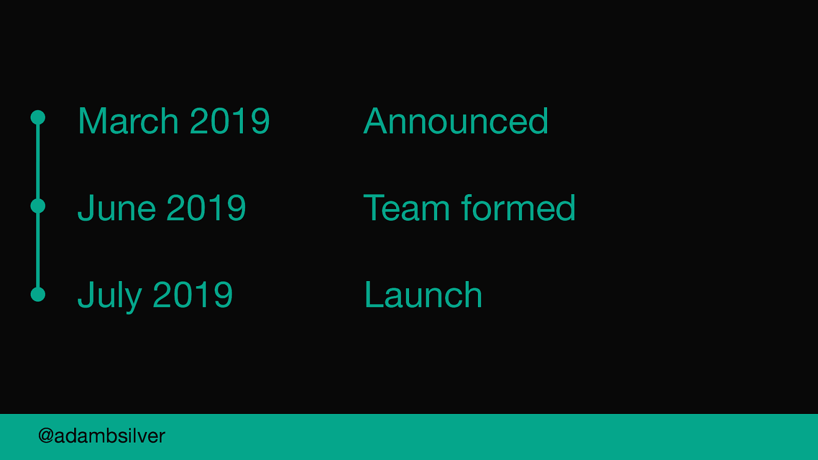
In March 2019 the then Prime Minister announced the scheme.
At the start of June, on my first day the delivery team was created and we had a kick off mid morning.
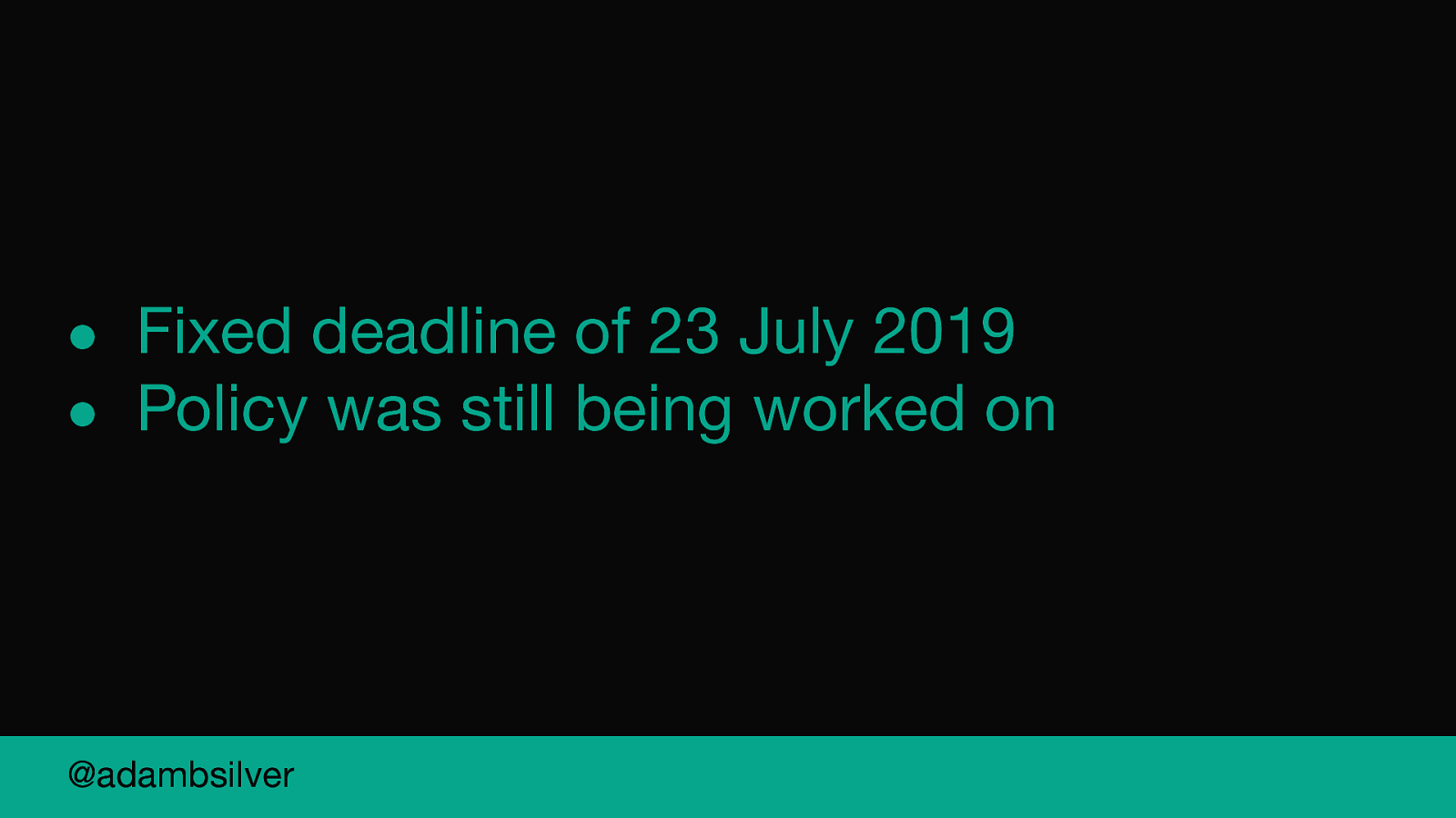
Fixed deadline of 23 July 2019 Policy was still being worked on
I don’t know about you, but this is super daunting. Launching anything in 6 months is pretty good going sometimes, let alone 6 weeks.
But I was also excited to know that something would be actually delivered in just 6 weeks.
As I said before the team was just formed.
We had no idea what the service was? How it worked? What happens when someone dies? What the policy guidance was?
We had to make trade offs.
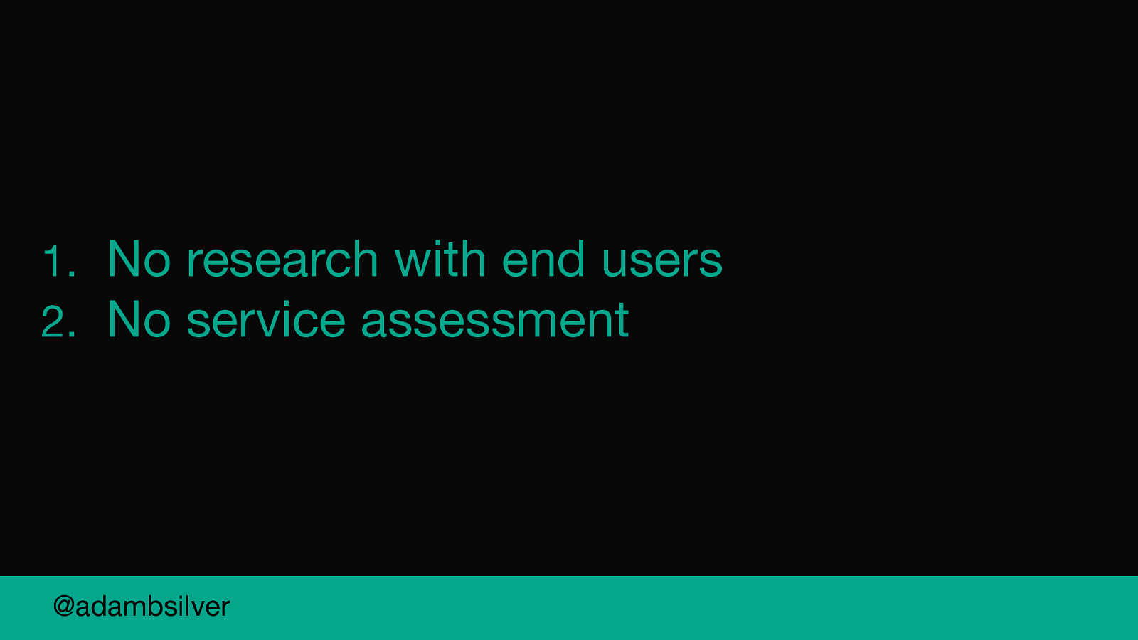
The first thing was that we weren’t going to be able to do research with end users.
I don’t recommend this one bit but the reality was that we weren’t going to have time and even if we made time somehow, we weren’t going to be able to act on the feedback.
And similarly, we weren’t going to be able to do a service assessment. As it happens the service has way under 100,000 transactions a year and so we were not subject to a GDS assessment.
But MOJ did a lot of internal assessments and it would have been good to have done that.
But we probably would have failed anyway given that we weren’t planning to research with end users.
But—and I’m sure you can sympathise, we can only do our best within the limitations we face on the job.
So given the context, this talk in many ways is about making good services fast.
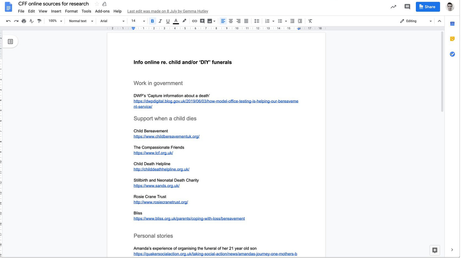
Straight after kick-off, we created a Google doc and shared links to any existing content or resources that could help us understand more about the domain.
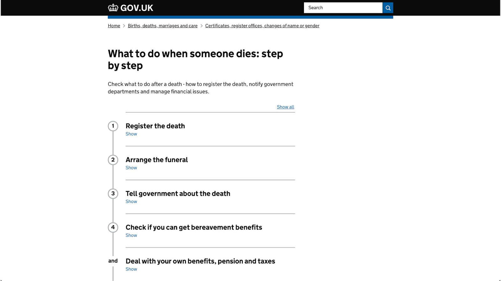
This included content on GOV.UK like the when someone dies step by step.
And links to guidance on bereavement charities and blog posts like this one.
A Google Doc isn’t really a big deal but we didn’t waste any time in working together because design and research is a team sport.
And we were going to need to do that to get this project over the line.
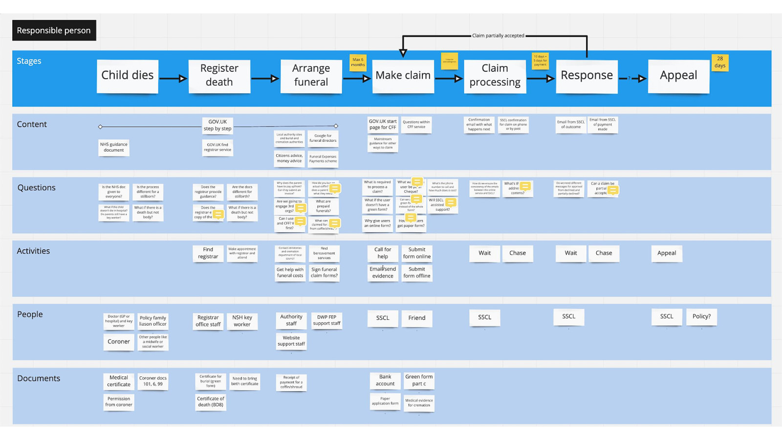
Within the first 10 days I planned and facilitated workshops to map the end to end journey. This helped us to understand the process, spot gaps and jot down ideas quickly as a team to explore further.
We did 3 sessions—one for each user group.
We used the map to prioritise additional tasks, like doing more targeted desk research and getting clarification about the policy.
This was another useful thing to get us working together and on the same page quickly.
Questions and documents was particularly useful as there was a lot of gaps in our knowledge we needed to fill and documents would come into play in order to validate a claim, something I’ll be talking about later.
Question protocol mapping
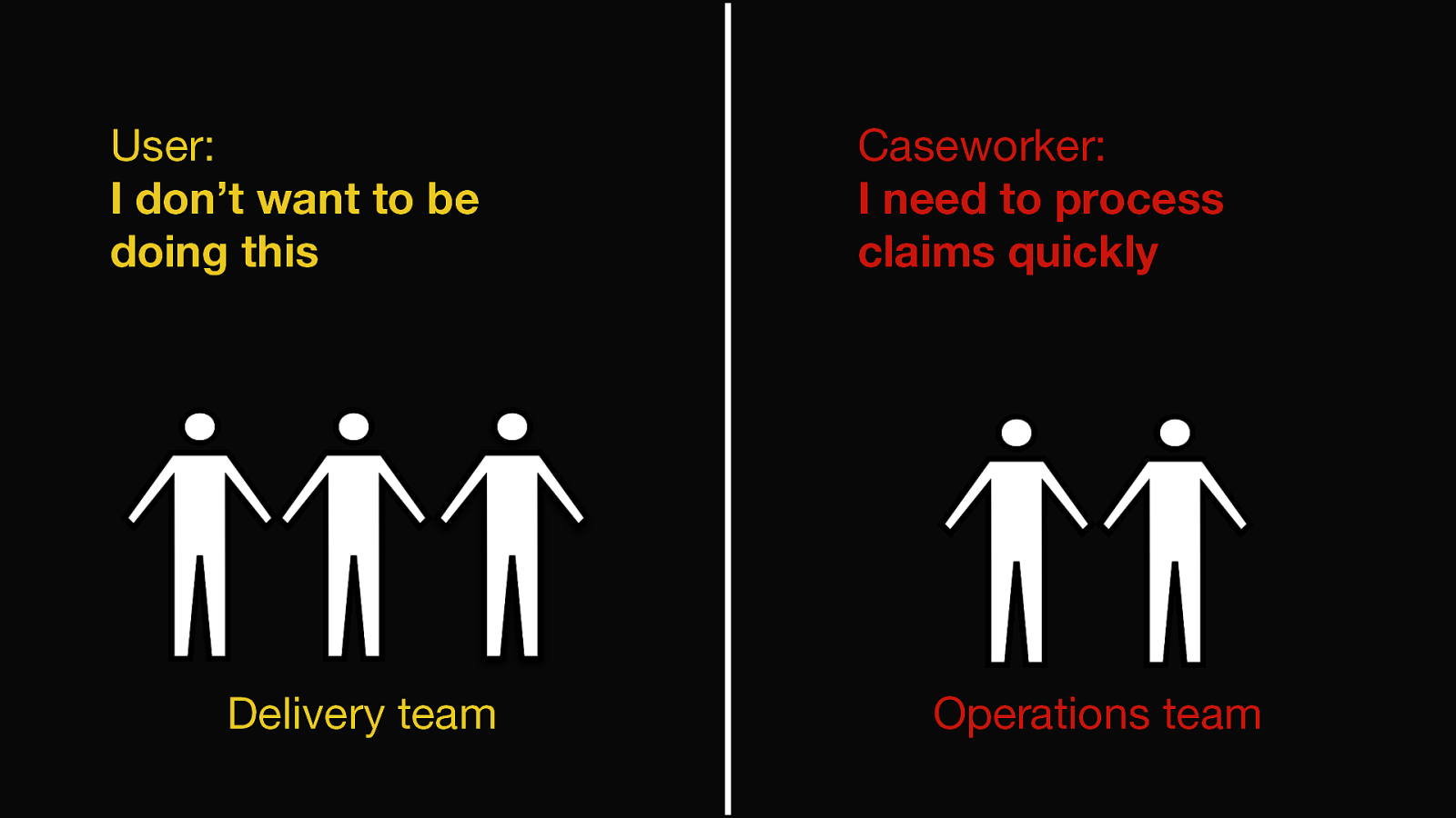
Our team were responsible for the design and build of the service.
But the operational side was outsourced to a third party supplier and the ‘business architect’ was leading on that side of things.
He was concerned about his caseworkers being able to process claims quickly and accurately.
We were concerned that users don’t want to be doing this and to make sure the form is as simple to use as possible.
So there’s a tension there.
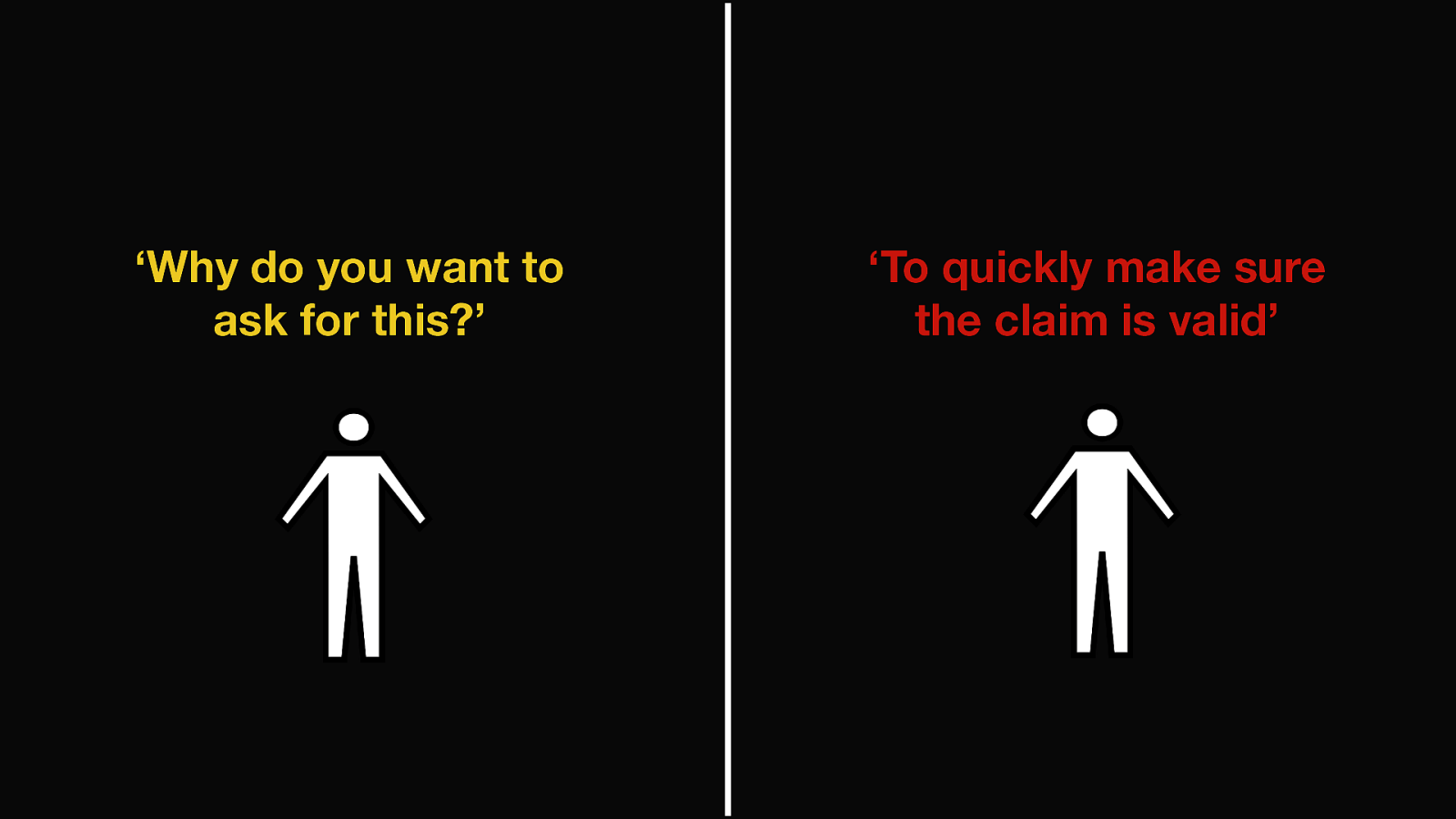
So in the first 2 weeks there was a lot of back and forth between us and the business architect.
I would ask him why we’re asking for certain questions and his response was always the vague answer of ‘to process the claim’ (or similar).
This was really frustrating for our team but in retrospect, I realise how much pressure he must have been under in order to get the service operational.
Remember he had the same 6 weeks to get this going and was going to be responsible for it.
And quite frankly he may have not known the answers to the questions so it makes sense from his side to ask for everything just in case.
So to stop all these back and forth ad-hoc questions I setup a meeting with all of us including policy to get to the bottom of this as quickly as possible.
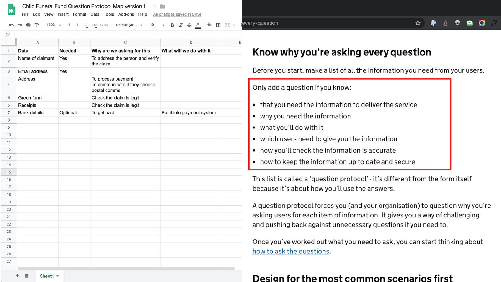
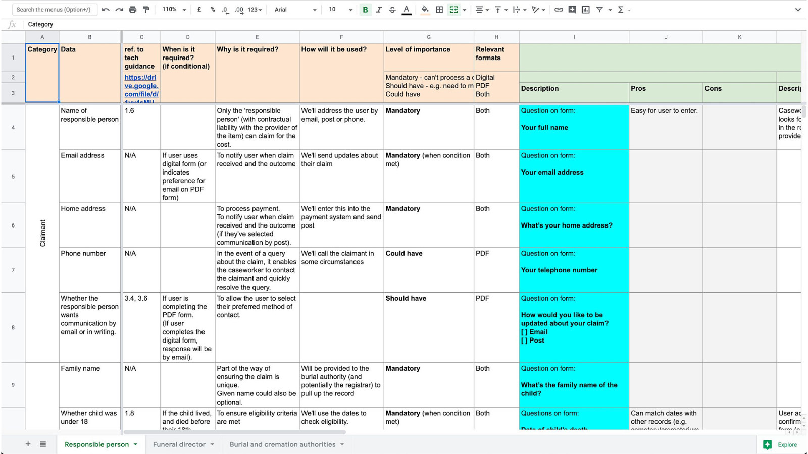
The map on the left handside is what we used.
We had rows for each thing we were potentially going to ask users to fill out. And then columns mapped to certain things in the guidance on the service manual around knowing why you’re asking every question.
So you should only ask a question if you need it to run the service.
And while I thought we did a good job of explaining the importance of this, by the end of the meeting we had killed exactly 0 questions and were none the wiser really about why were asking for all these things.
I didn’t know what to do but Gemma, our researcher, took this map and turned it in this which is more centered around the policy and operational side of things.
So column 3 for example maps data to clauses in the technical guidance.
We then had a more intimate meeting with me, Gemma and the business architect.
And ran through each row line by line.
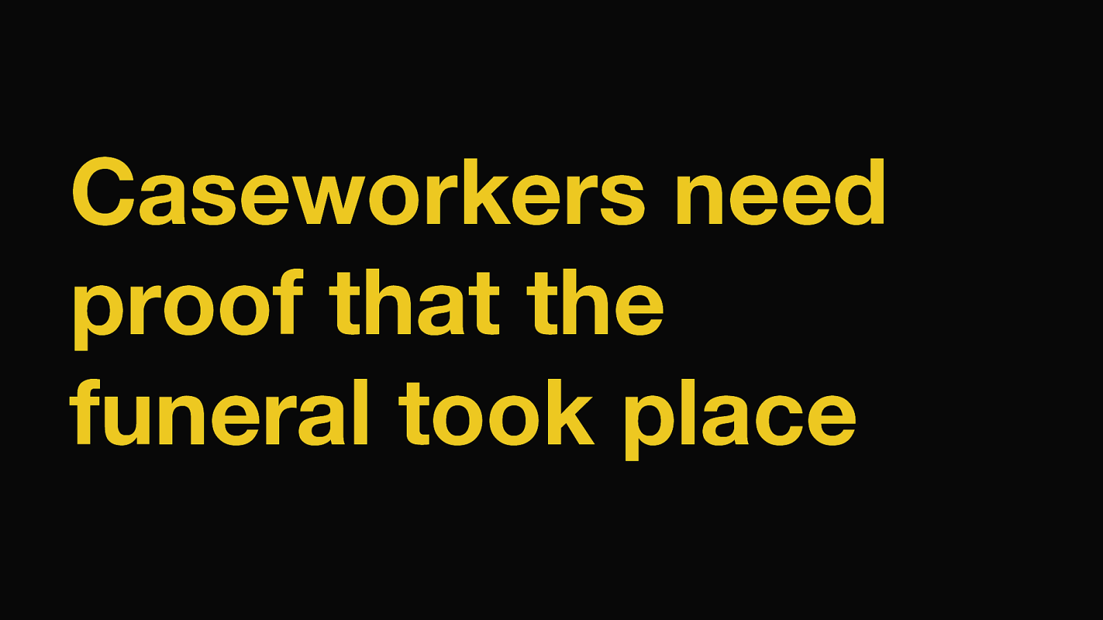
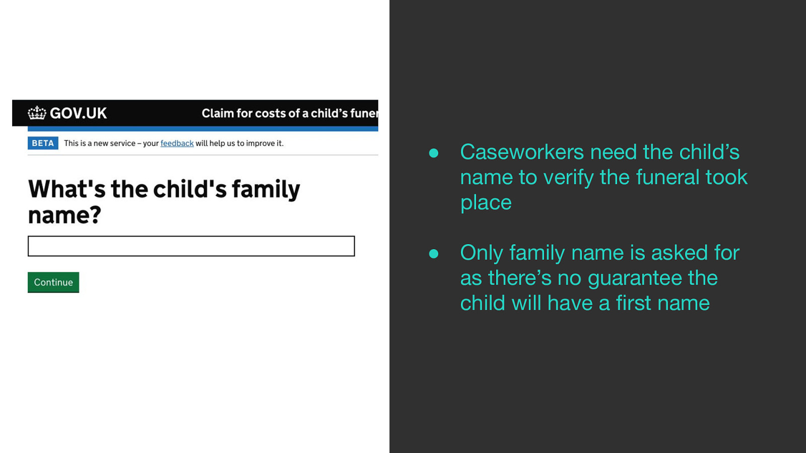
Caseworkers need proof that the funeral took place.
To do this the business architect wanted to ask citizens to upload a copy of the green form, which is the certificate for burial or cremation.
Our research showed that citizens wouldn’t have this by the time they come to claim because:
And we all agreed this was the case.
So the conversation moved on.
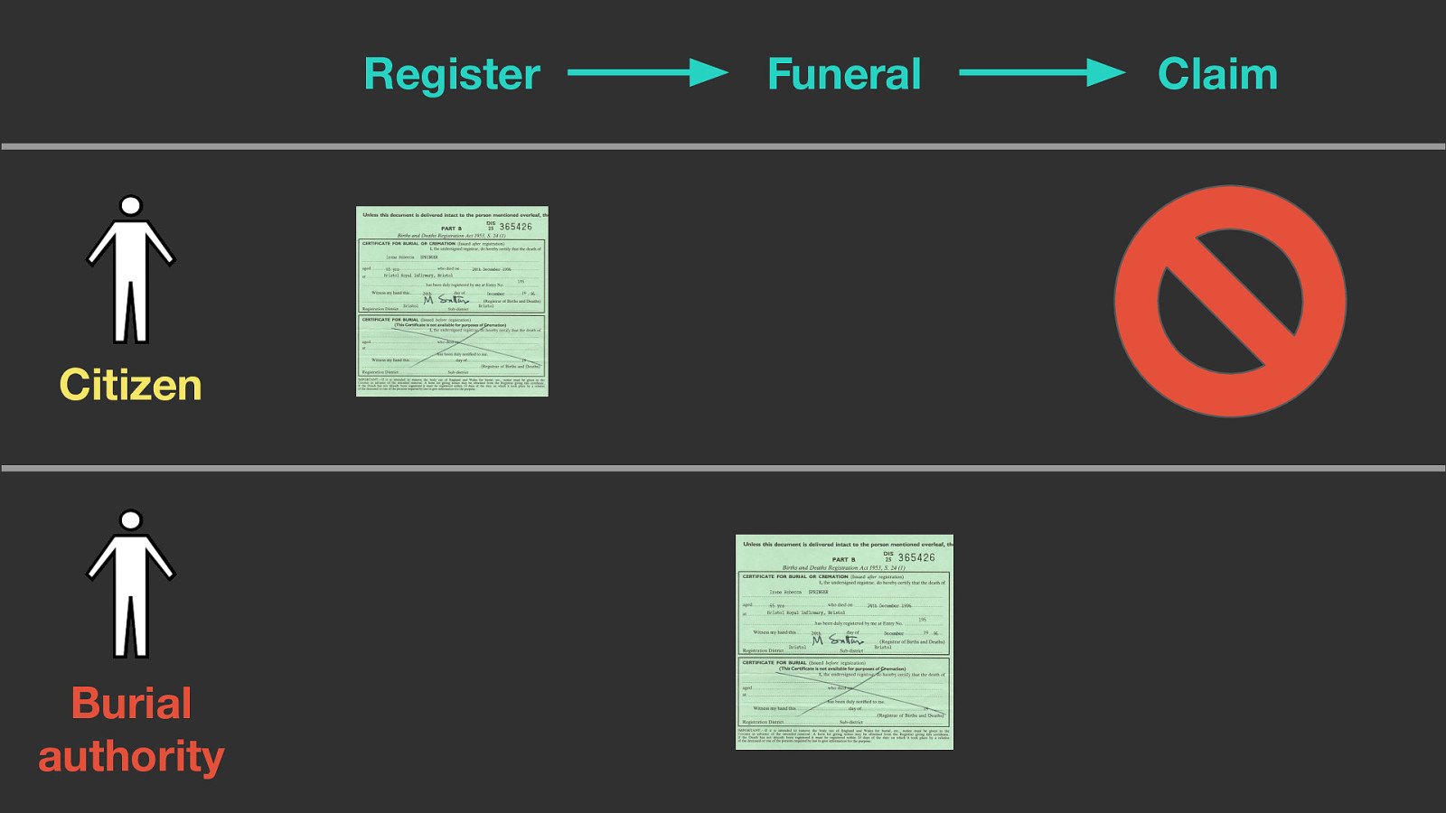
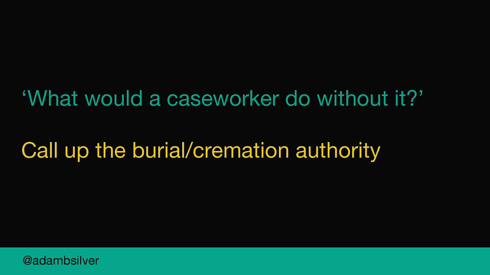
We asked the business architect what caseworkers would do with it.
The answer was to call up the authority.
So then the conversation moved on again.
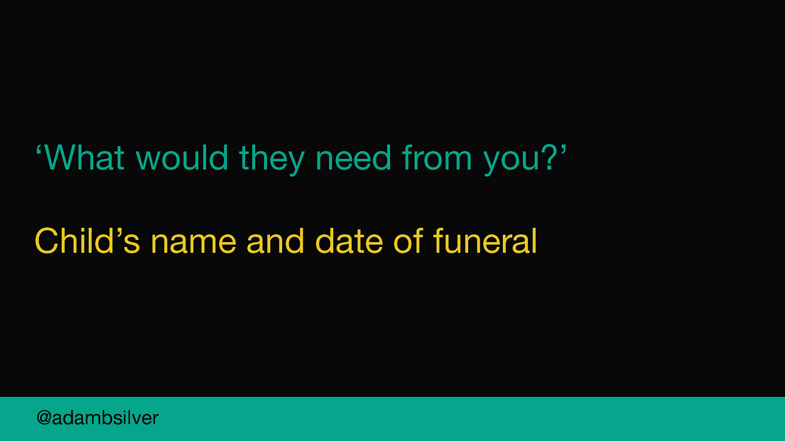
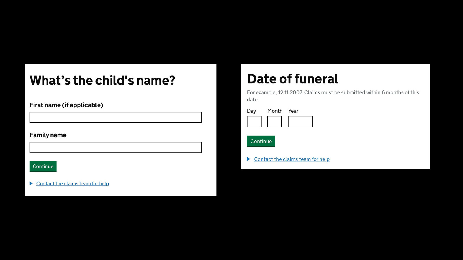
We asked so what would they need from you.
And the answer was the child’s name and date of funeral.
And voila, that’s what we put on the form.
The rest of the workshop went exactly like this and by the end of the 90 mins we had killed off pretty much all of the contentious questions which felt really good.
And this was probably my biggest lesson. Engage policy and operations early and often.
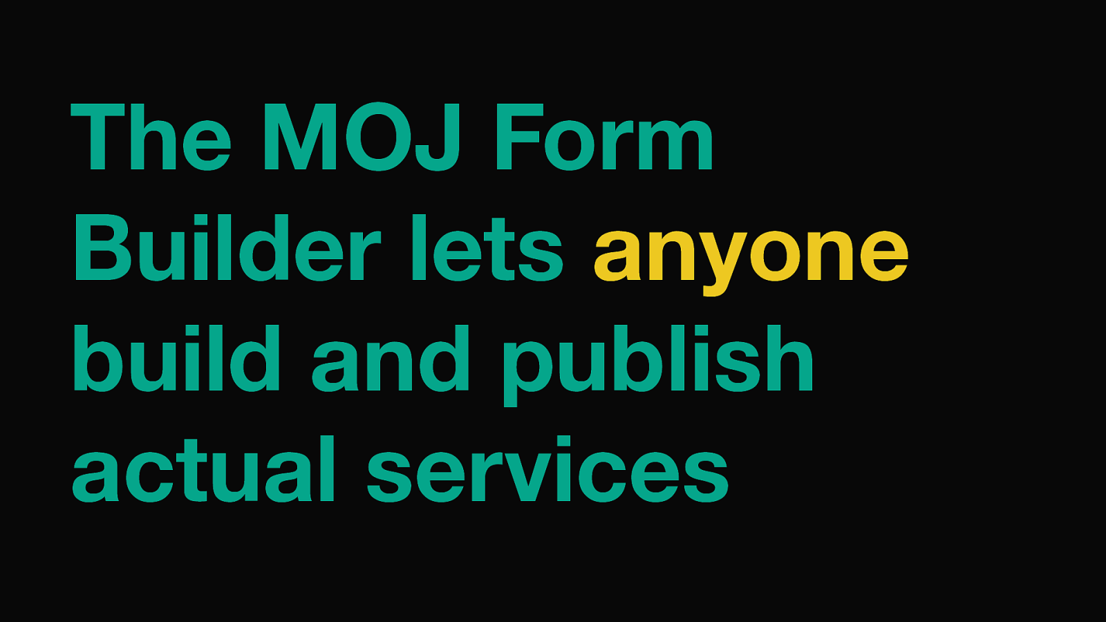
Most form builders are tools for developers to help build forms quickly through config instead of coding up forms from scratch.
But, the MOJ Form Builder lets anyone build and publish actual services from scratch without spinning up a dev team and production environments and deployment pipelines.
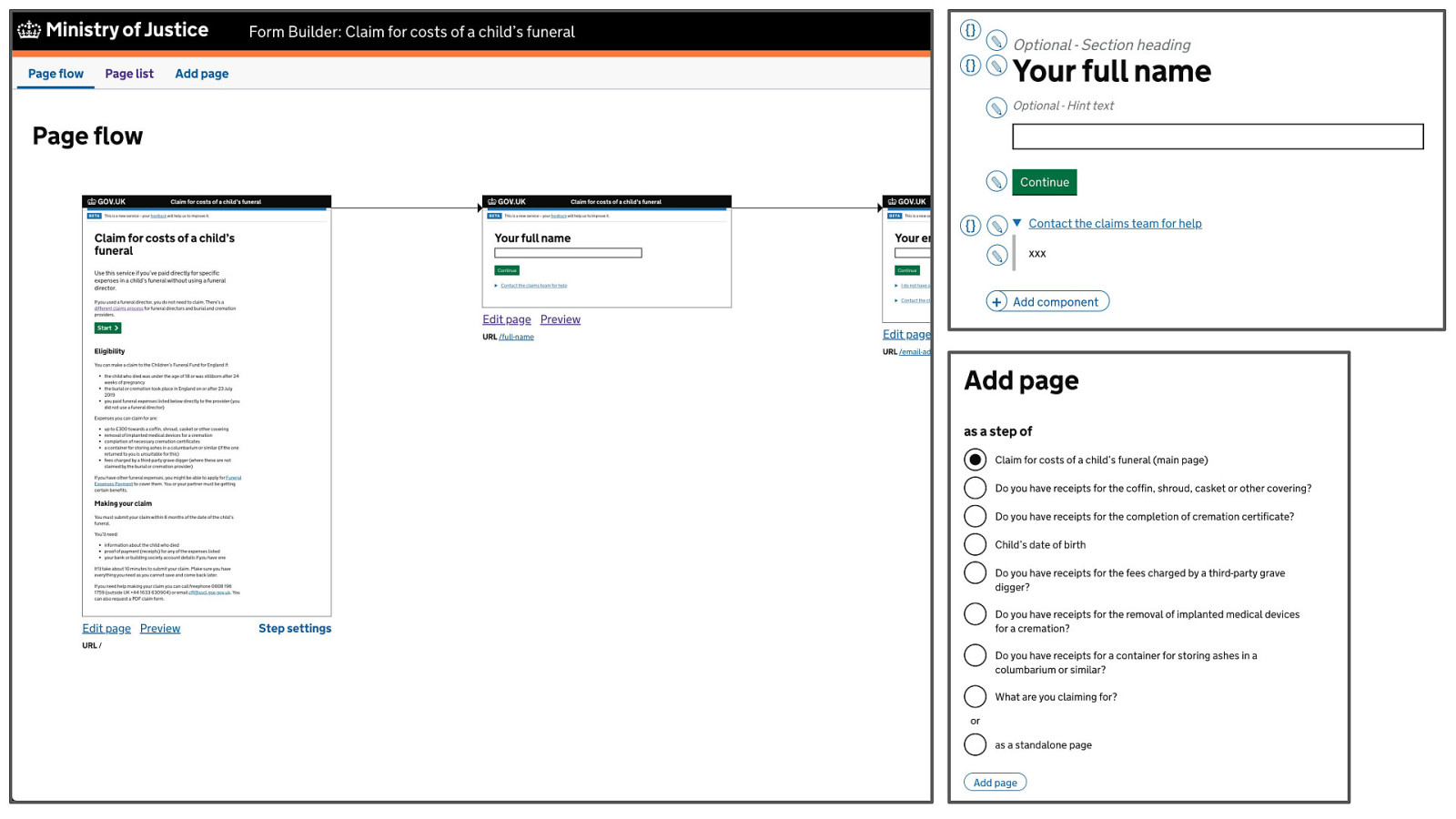
Here’s the editor. You can:
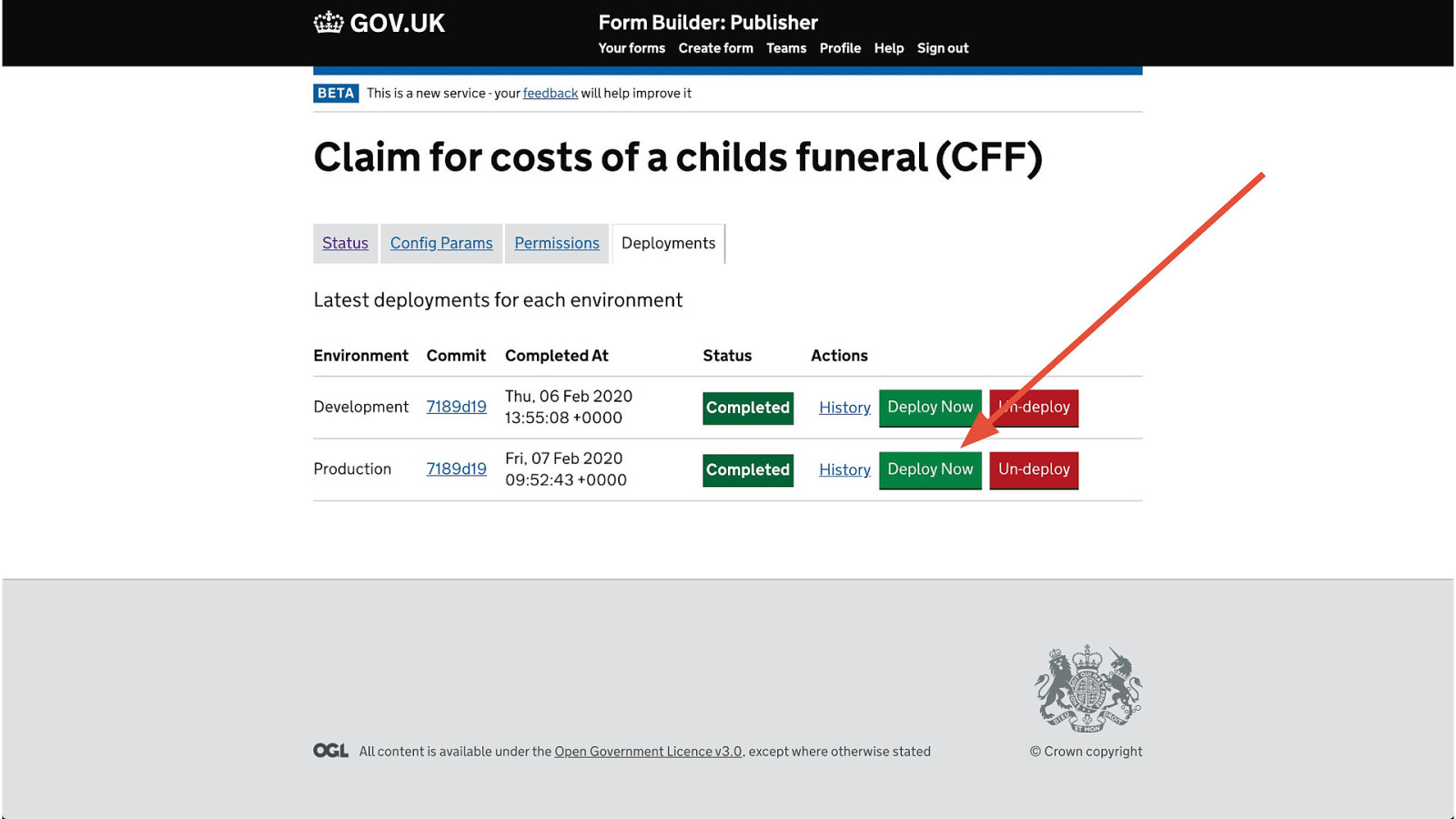
And once you’re done, you can hit this button and it’ll take that form and put it live on the web.
Right here at the name of the form (which you configure) dot form dot service dot justice dot gov dot uk.
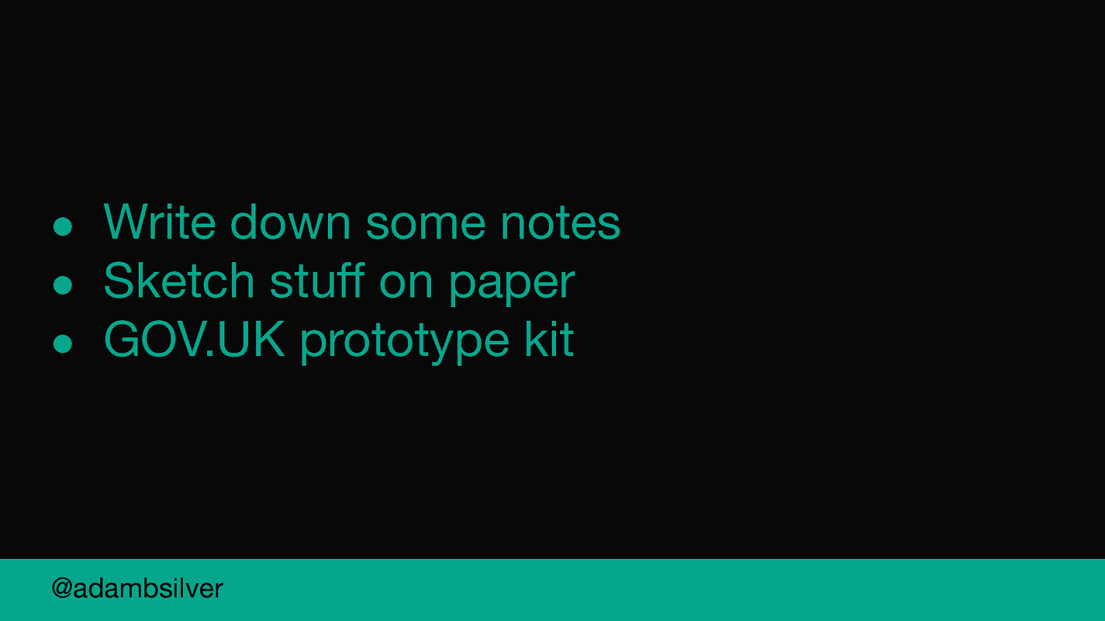
Write some scenarios/constraints down
Sketch stuff out on paper
Move to the prototype kit.
Having been a dev I love the kit, but it does have barriers to for people who aren’t so confident working in code meaning work slows down and becomes less collaborative.
So instead we prototyped in shorthand.
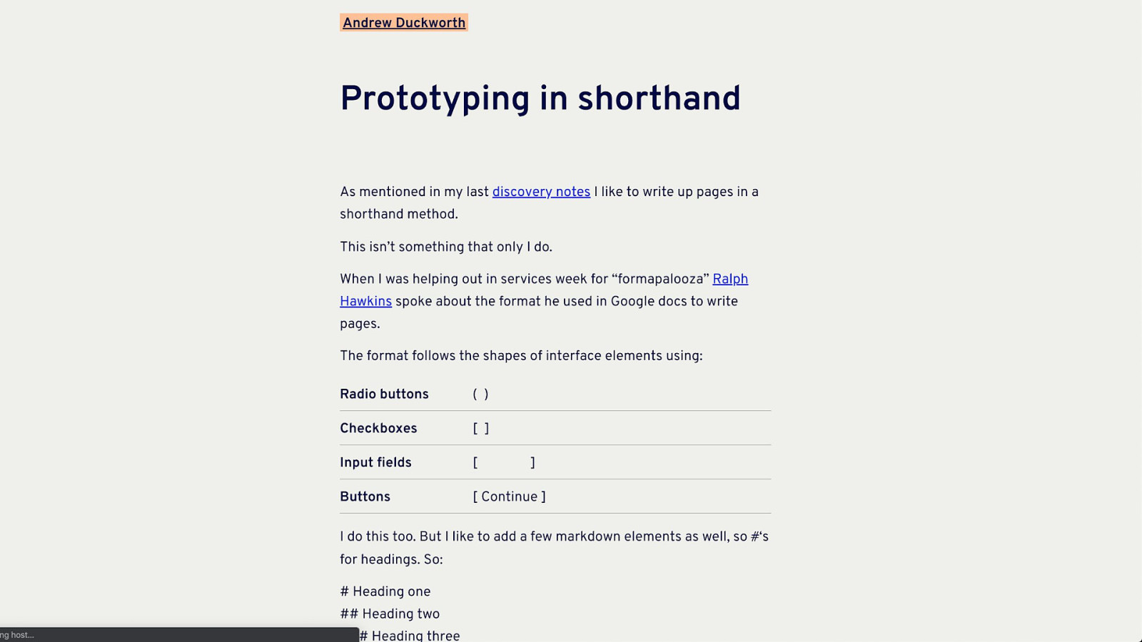
I’m not the first person to talk about this.
This is Andrew Duckworth’s blog post on this and in it hee says that he’s not the first person to talk about it either.
But in short you use simple characters to represent form fields.
Brackets for radio buttons and square brackets for checkboxes.
This is our form in shorthand syntax inside a Google doc.
We lived in this for 3 weeks.
It’s a simple technique that has a low barrier to entry and meant we could focus on:
This sped us up a lot and made the design process far more inclusive.
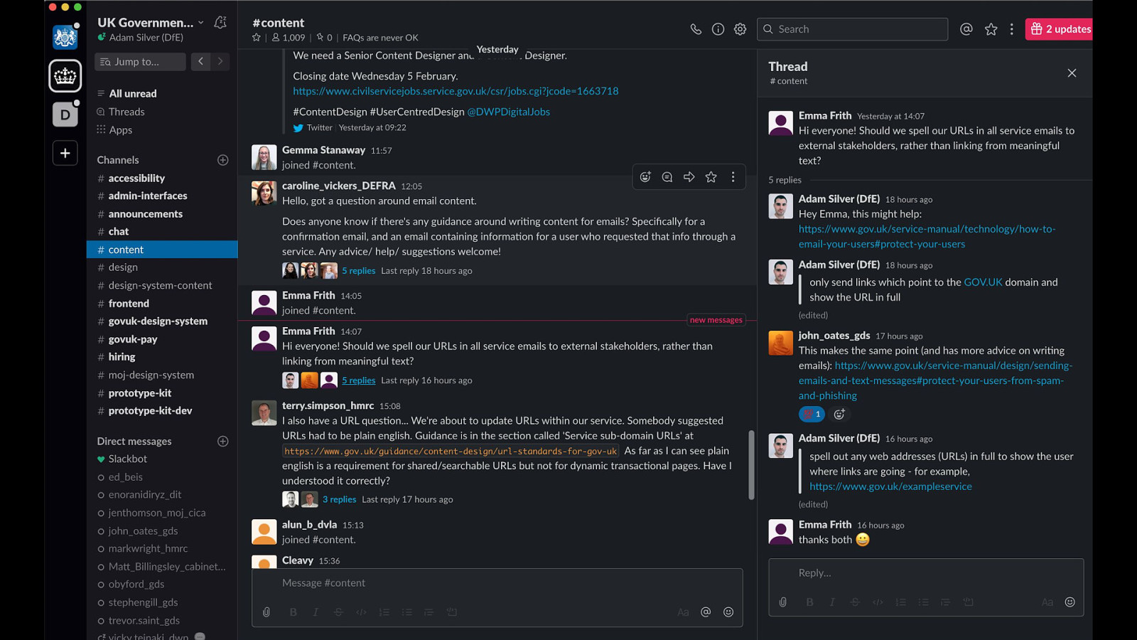
The last thing that helped us go fast was using the wisdom of the crowd.
When I first joined gov a few years back I was really intimidated by this.
I wasn’t sure of the etiquette and didn’t want to look stupid.
But it’s quickly become one of my favourite things about being a designer in gov.
Someone has almost always solved the same problem as you and can help.
And this came in handy for us—I’ve got an example of that in a bit later.
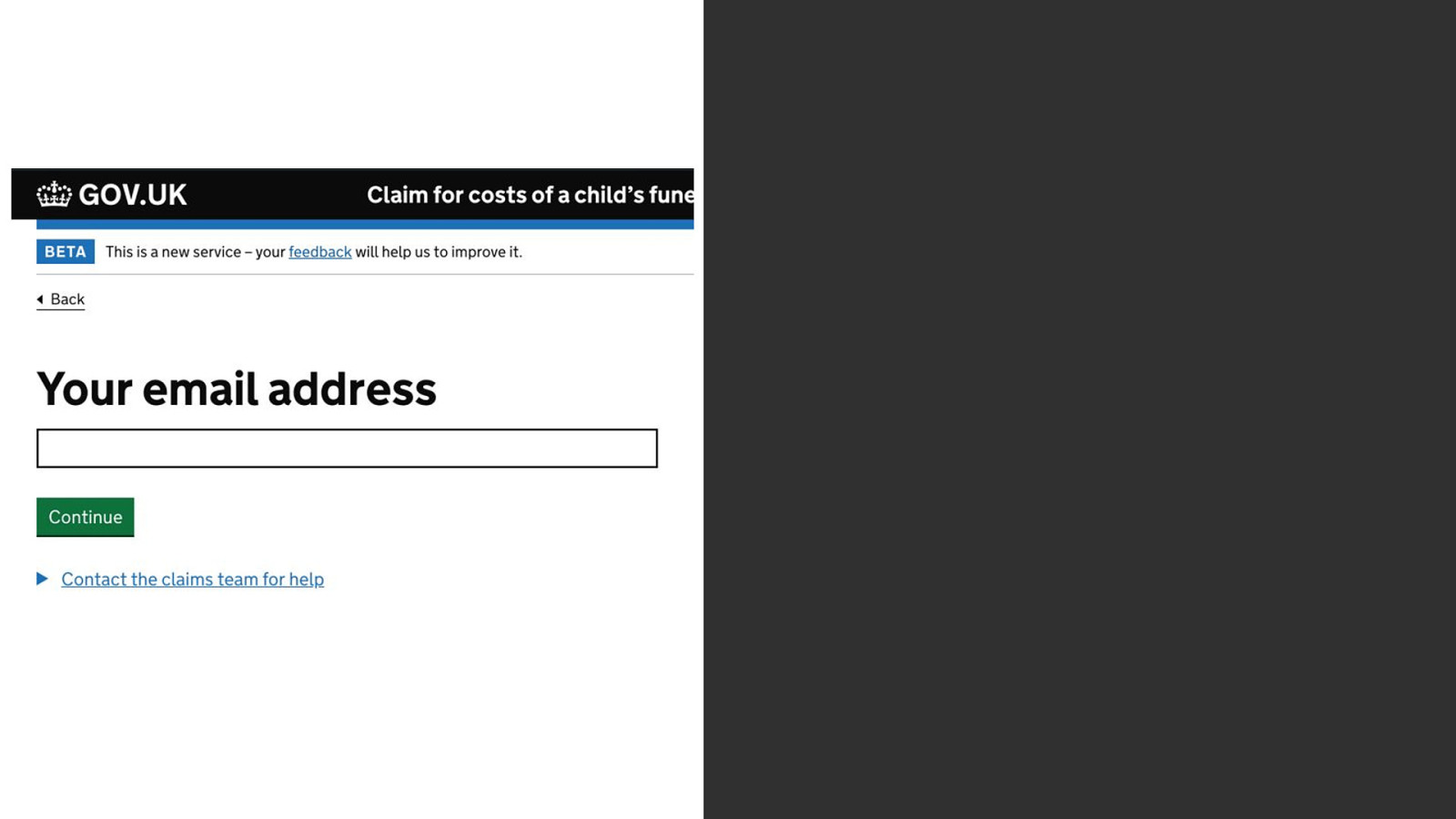
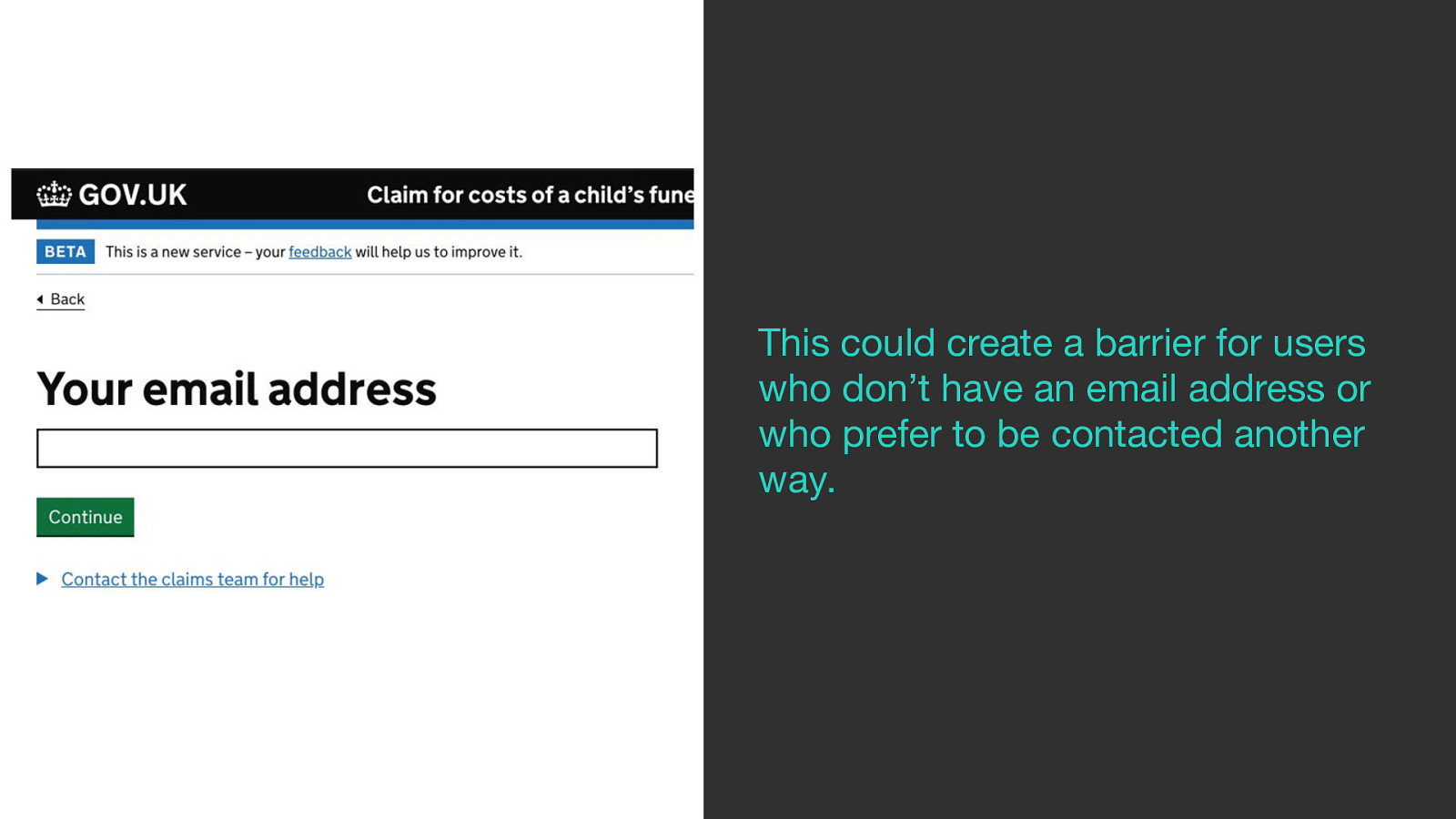
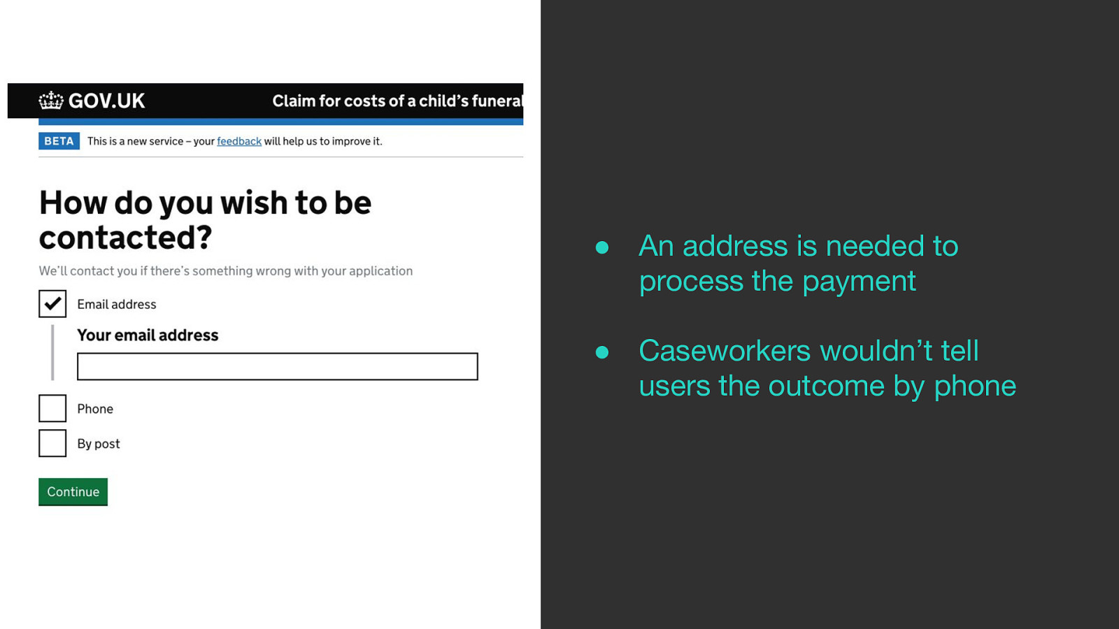
One of the first questions we added to the form was the email address.
But this could create barriers for people who don’t have an email address or who preferred to be contacted another way
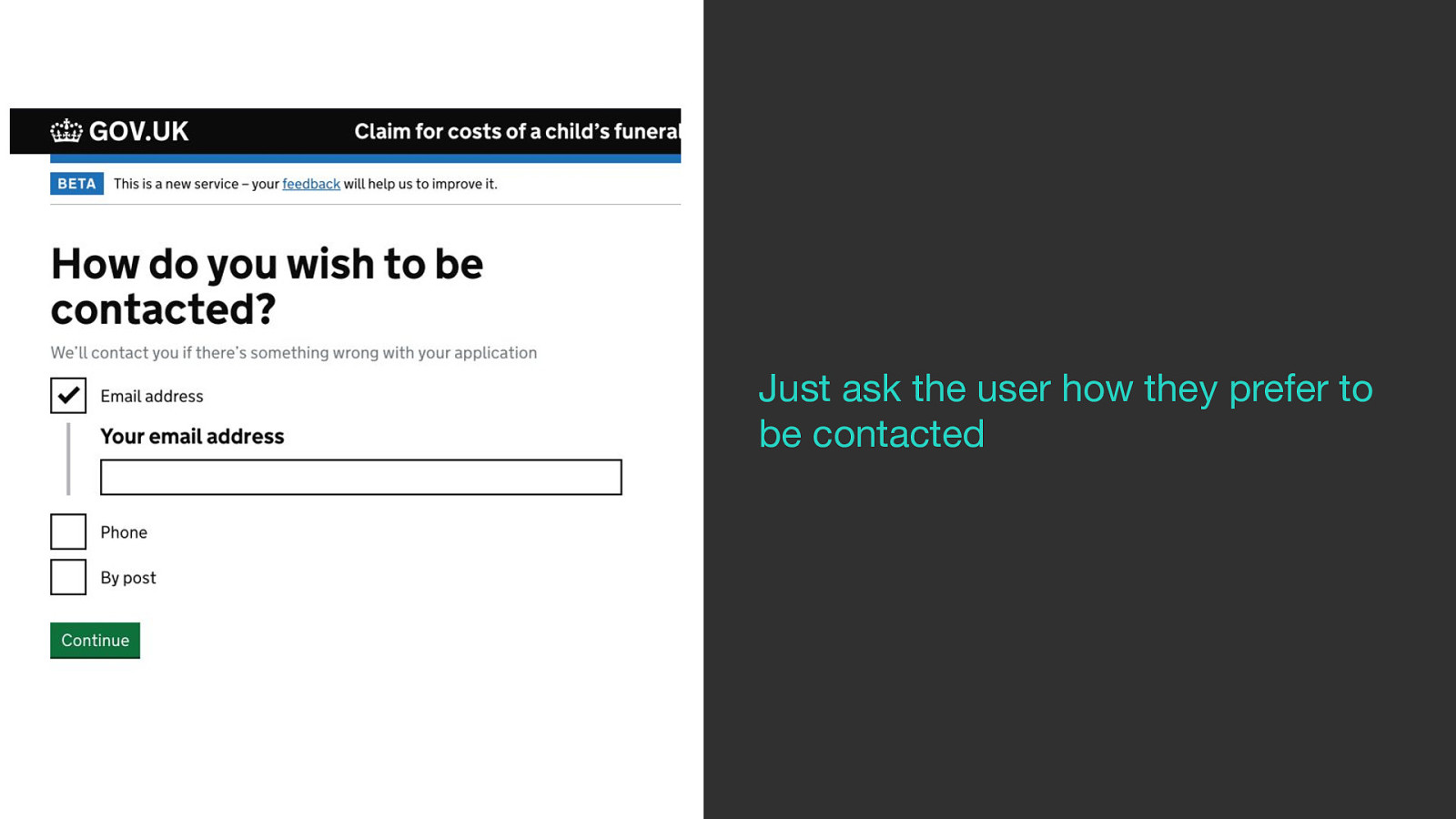
So we changed to a question that just asks the user how they prefer to be contacted.
The problem is that an address is needed regardless in order to process the payment.
And phone is not an optimal way for caseworkers to tell claimants the outcome of their claim.
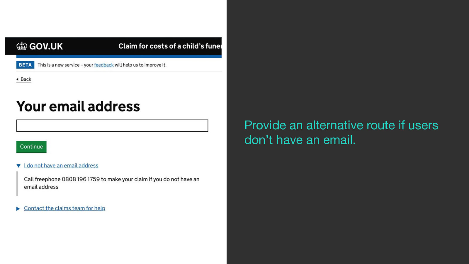
So we went back to the first iteration but added a Details component underneath the continue button labeled ‘I do not have an email address’.
When clicked it reveals a number you can call for help either to get a paper form or to get help creating an email account.
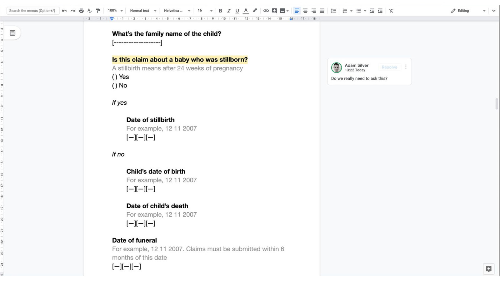
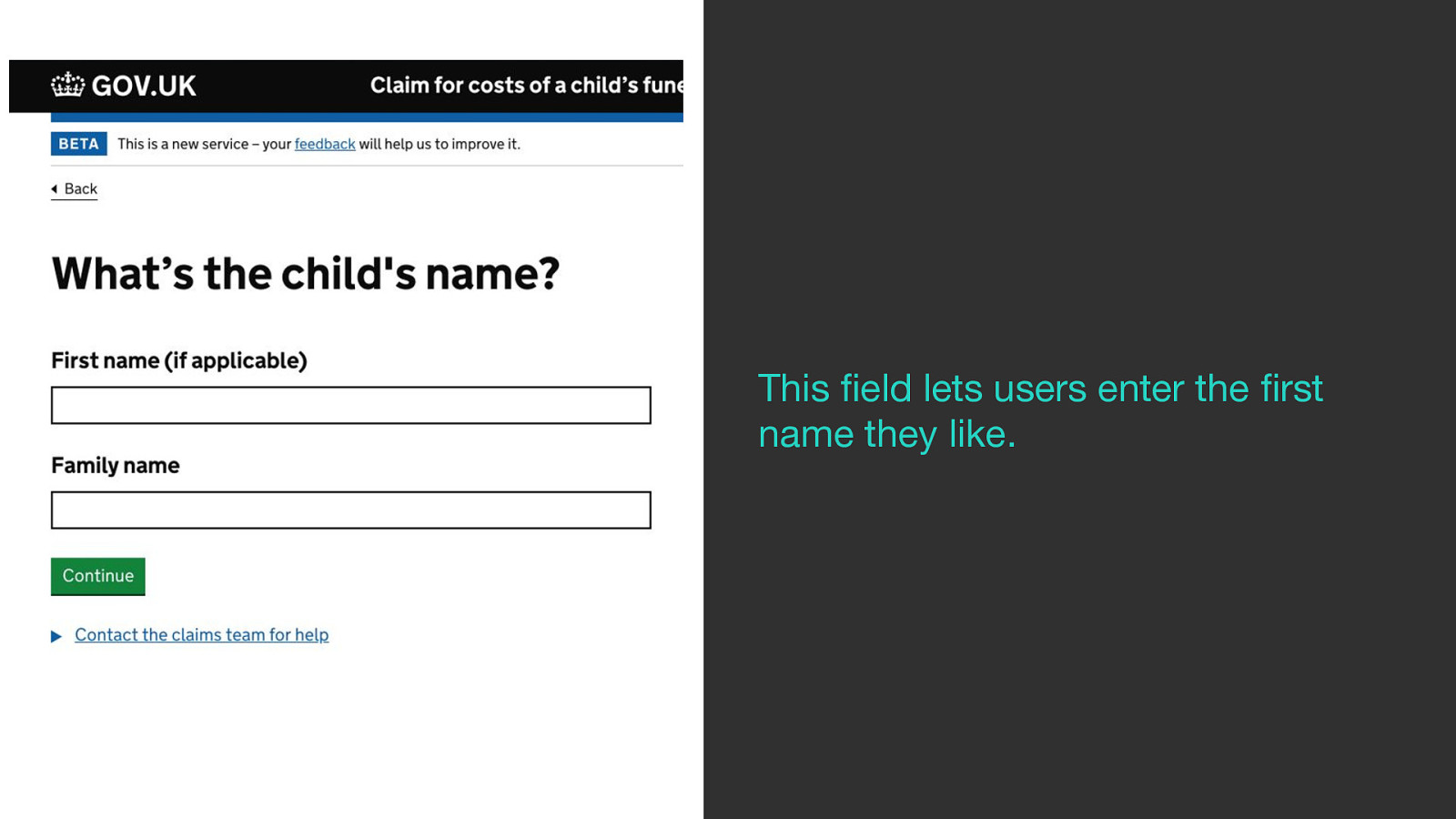
We asked for the child’s name to verify the funeral took place.
We only ask for the family name as there’s no guarantee the child will have a first name.
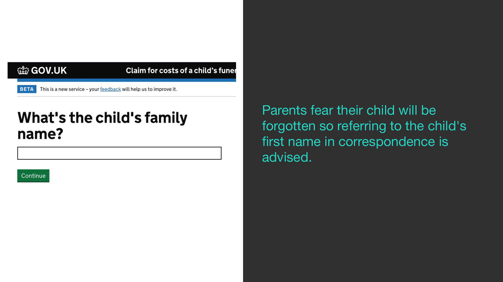
But research shows that parents fear their child will be forgotten so referring to the child’s first name in correspondence is advised.
So we added a first name field and marked it as optional so users can enter the first name they like giving caseworkers the option to use it in correspondence.
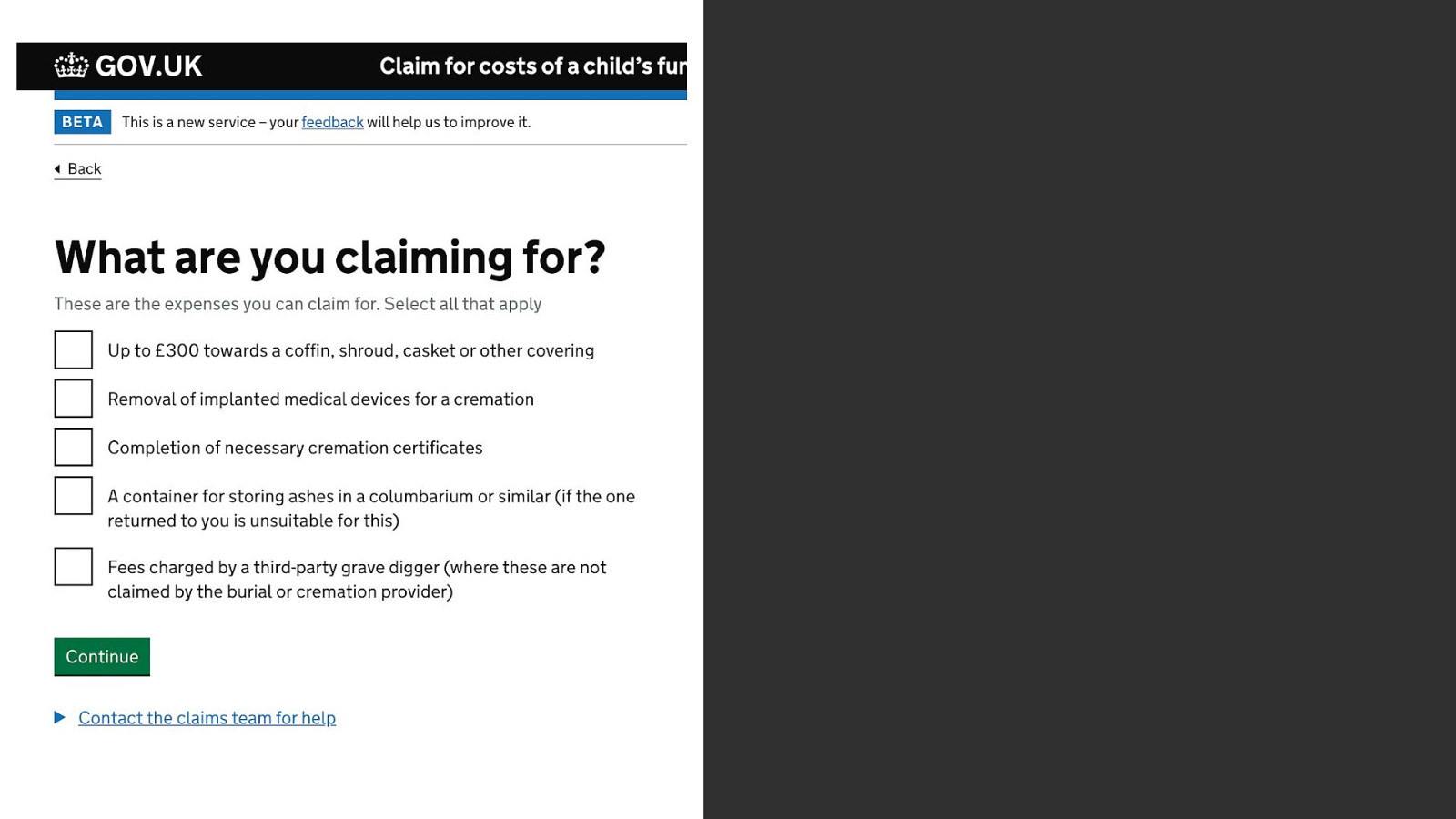
We ask users to select what items they’re claiming for using checkboxes.
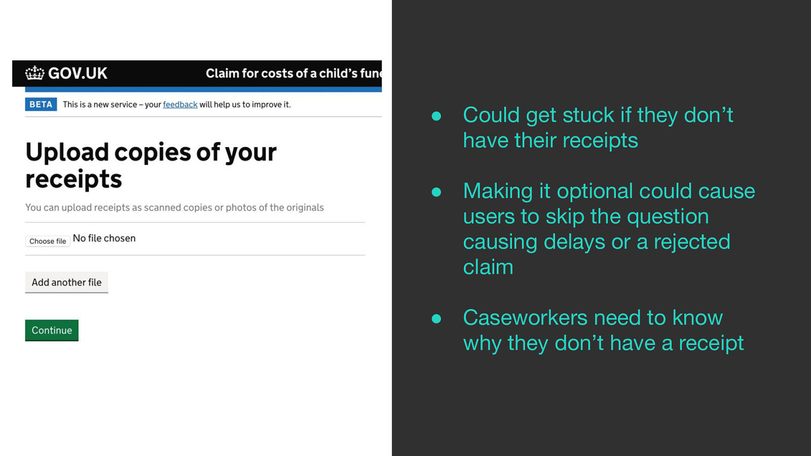
As the field is required this is a dead end for people without receipts.
Making it optional could cause delays in their claim or end up being rejected.
Caseworkers need to know why they don’t have a receipt.
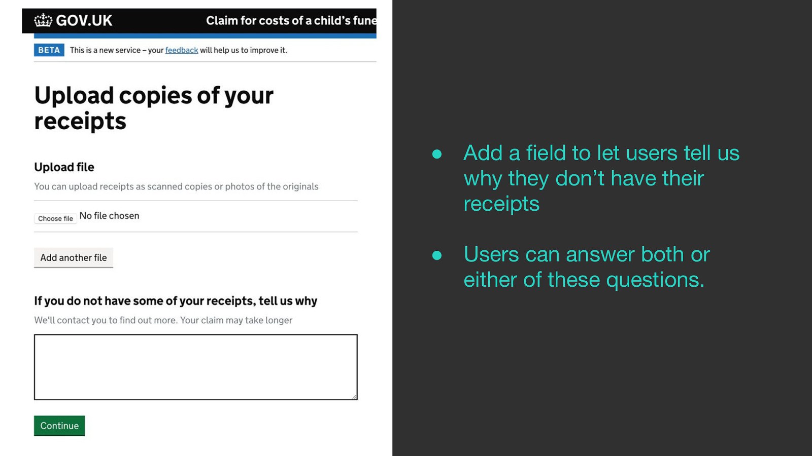
So we added textbox underneath the upload field to tell us why they don’t have their receipts
Users can answer both or either of these questions.
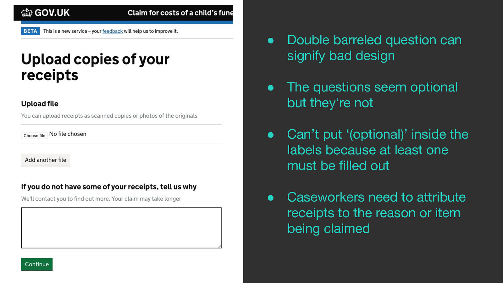
But these questions look optional when in reality you have to answer at least one of these questions.
The double-barreled question signifies bad design as the user has to work out for themselves if the question is applicable to them.
Can’t put ‘(optional)’ inside the labels because at least one must be filled out
Caseworkers need to attribute receipts to the reason or item being claimed which slows down the claims process.
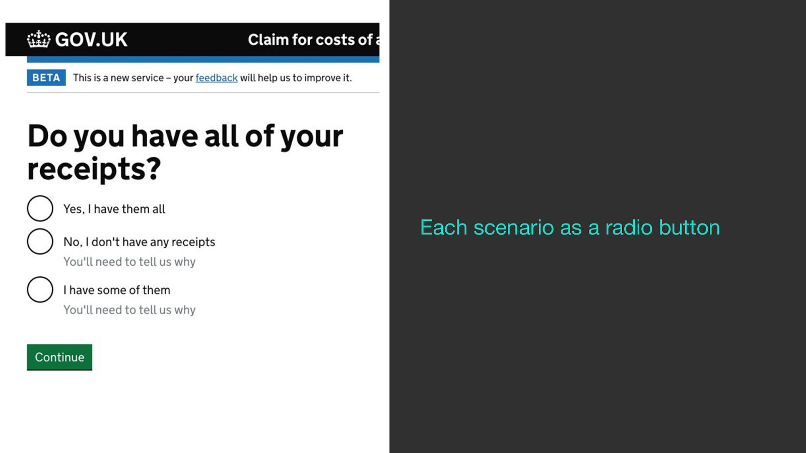
Normally when I’m struggling with a design I take all the scenarios a user may face and just represent them as radio buttons for the user to pick from like this.
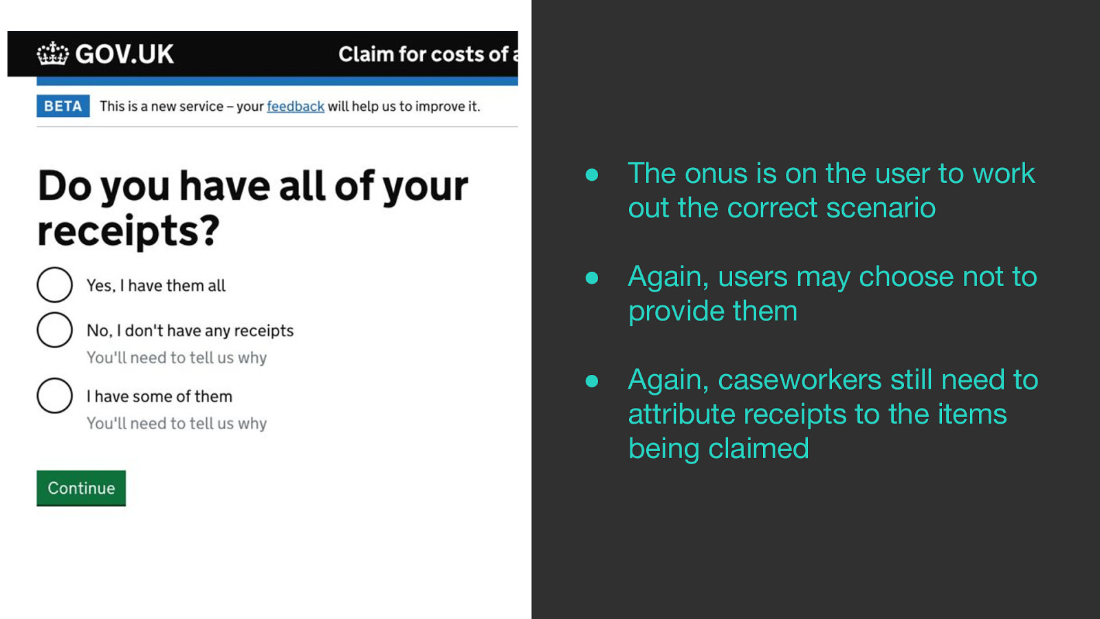
But again the onus is on the user to work out which scenario best suits them.
Users may still choose to say they don’t have receipts when they have them.
And again, caseworkers still need to attribute receipts to the items being claimed.
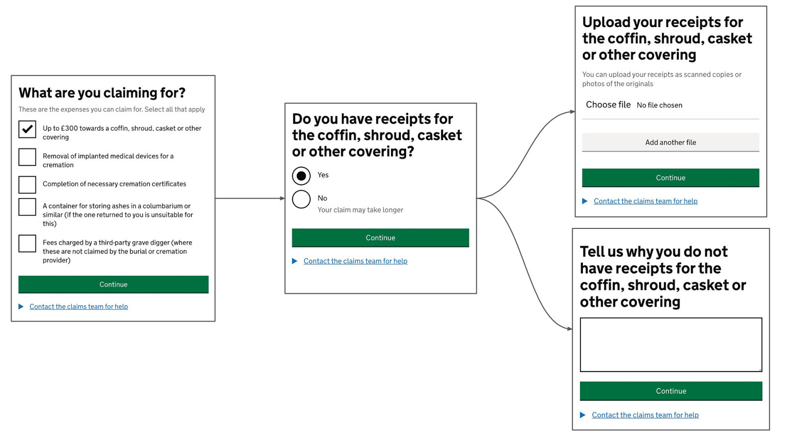
I asked this on the x-gov Slack channels and got this back.
For each item the user is claiming for just ask the user whether they have receipts or not.
If yes send them to an upload form. If not make them tell us why.
Simple, less onerous.
The only problem is that I wish I came up with this myself :)
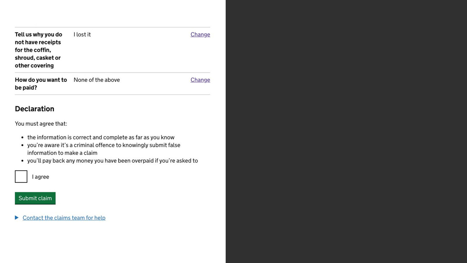
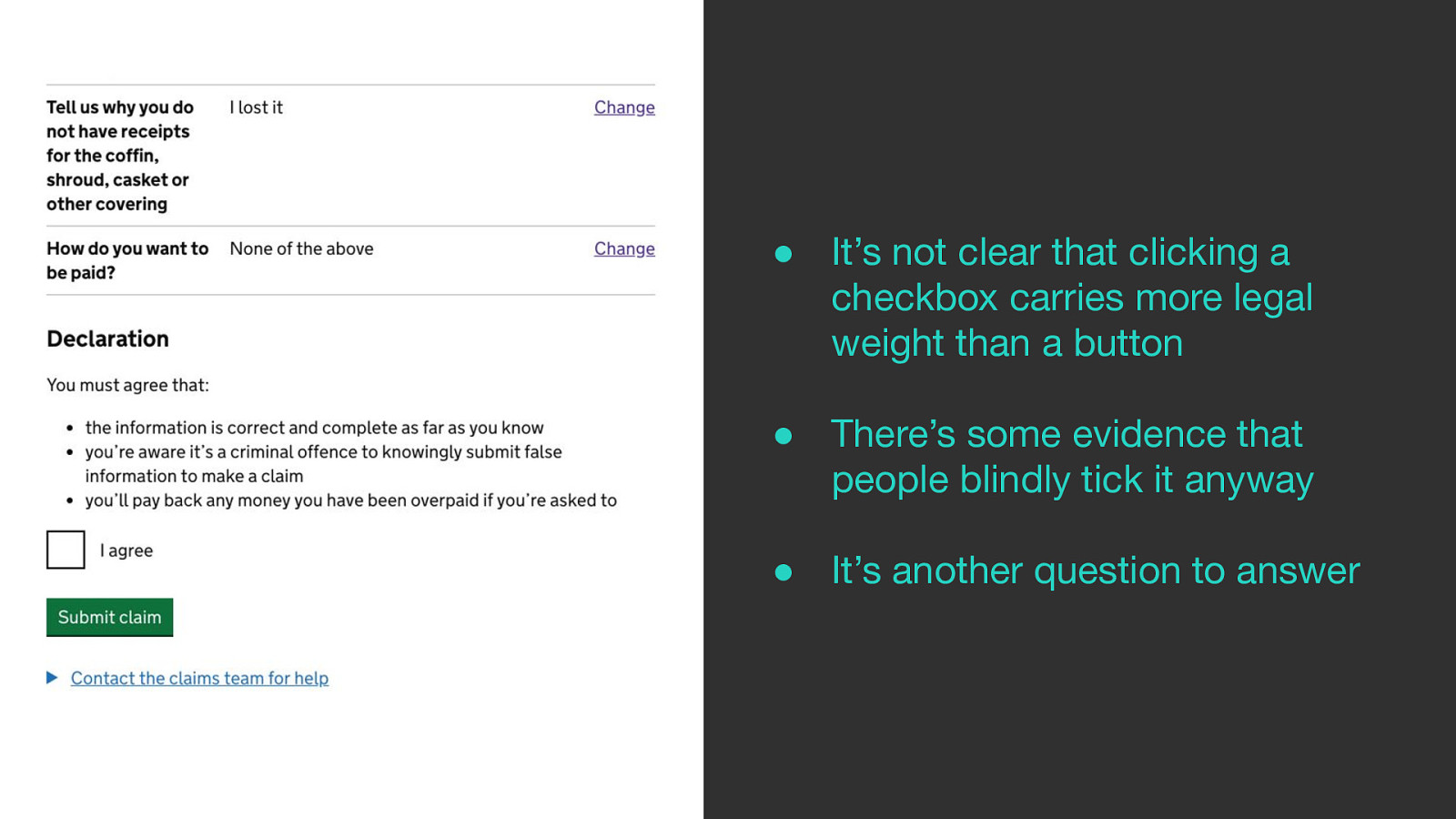
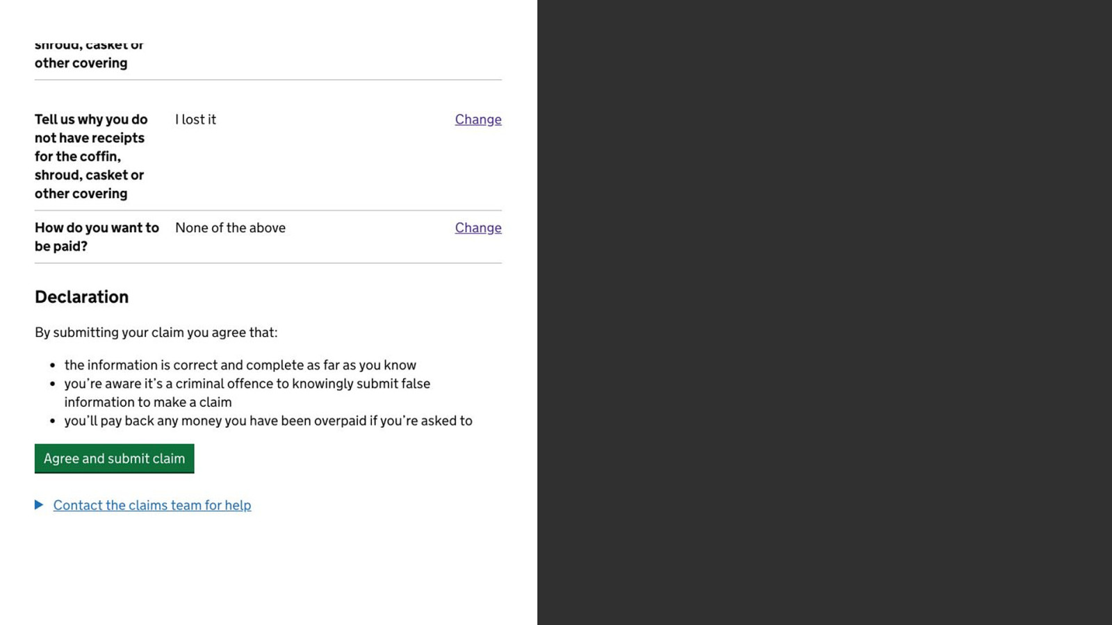
The first version involved a checkbox at the bottom of the check answers page.
But it’s not clear that clicking a checkbox carries more legal weight than just clicking a button.
And there’s some evidence that people blindly tick it anyway like a terms and conditions checkbox that users just tick to get it out of their way.
And it’s another question to answer.
So we killed the checkbox and added text the button to say ‘Agree and submit claim’. Not a huge deal but one less question is always a nice thing.

Here’s what was said about this presentation on social media.

 for free. You
can too.
for free. You
can too.