
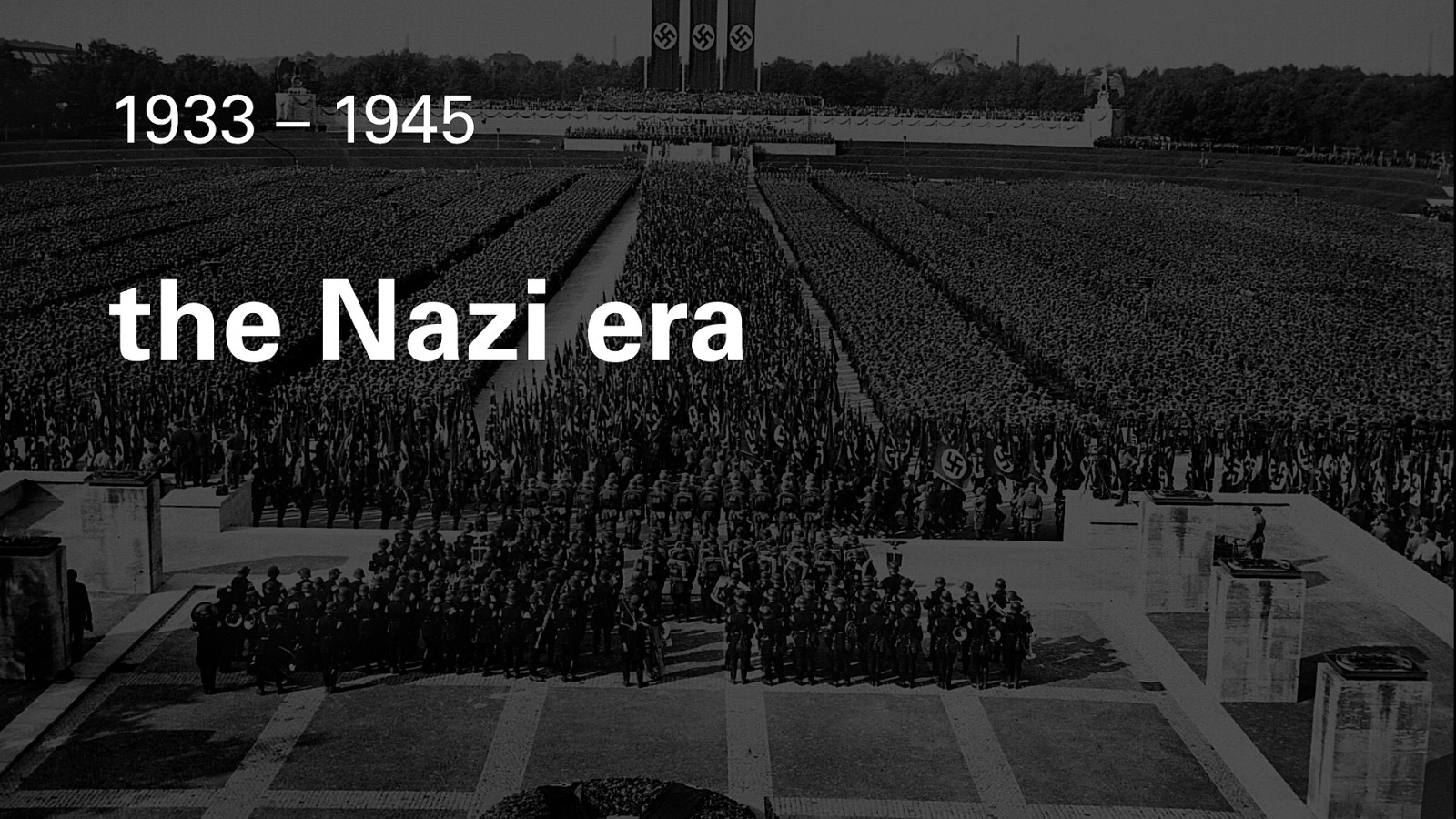
A presentation at CanUX in in Ottawa, ON, Canada by A.J. Kandy
Hi. I’m A.J. Kandy. I’m a UX designer, originally from Montreal, Quebec, now living in Calgary, Alberta. This is a talk about how history shaped the design aesthetic of, well, everything, after the Second World War.
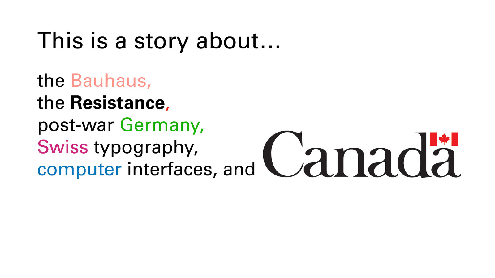
This is a story about the Bauhaus (celebrating their centenary), the anti-Nazi resistance movement, post-war Germany, Swiss typography, computer interfaces and… Canada.
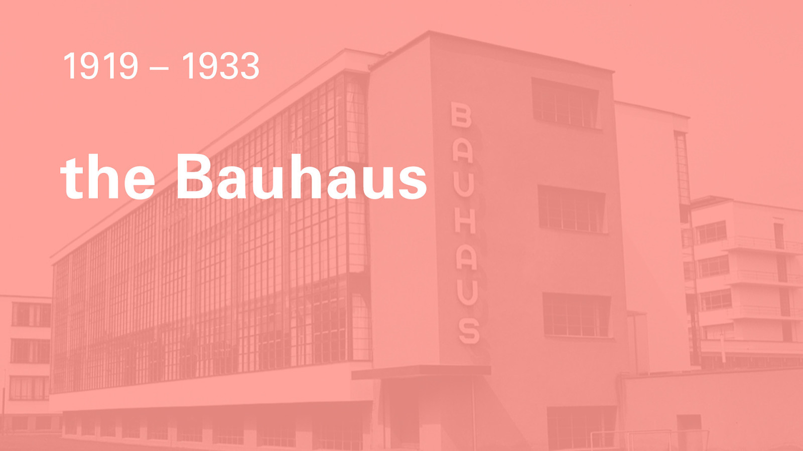
Our story starts at the world’s premiere higher education institution for modern design, the Bauhaus. Literally, “the house of building.” Founded by architect Walter Gropius in the liberal Weimar Republic period of German history, it was an ambitious institute that aimed to unify all the arts, which at the time, were undergoing radical ferment, in Weimar and all across Europe. I’m not going to go into the entire wide-ranging history of the Bauhaus here, but suffice it to say that what they did there influenced everything that came after, in architecture, product design, graphic design, and more.
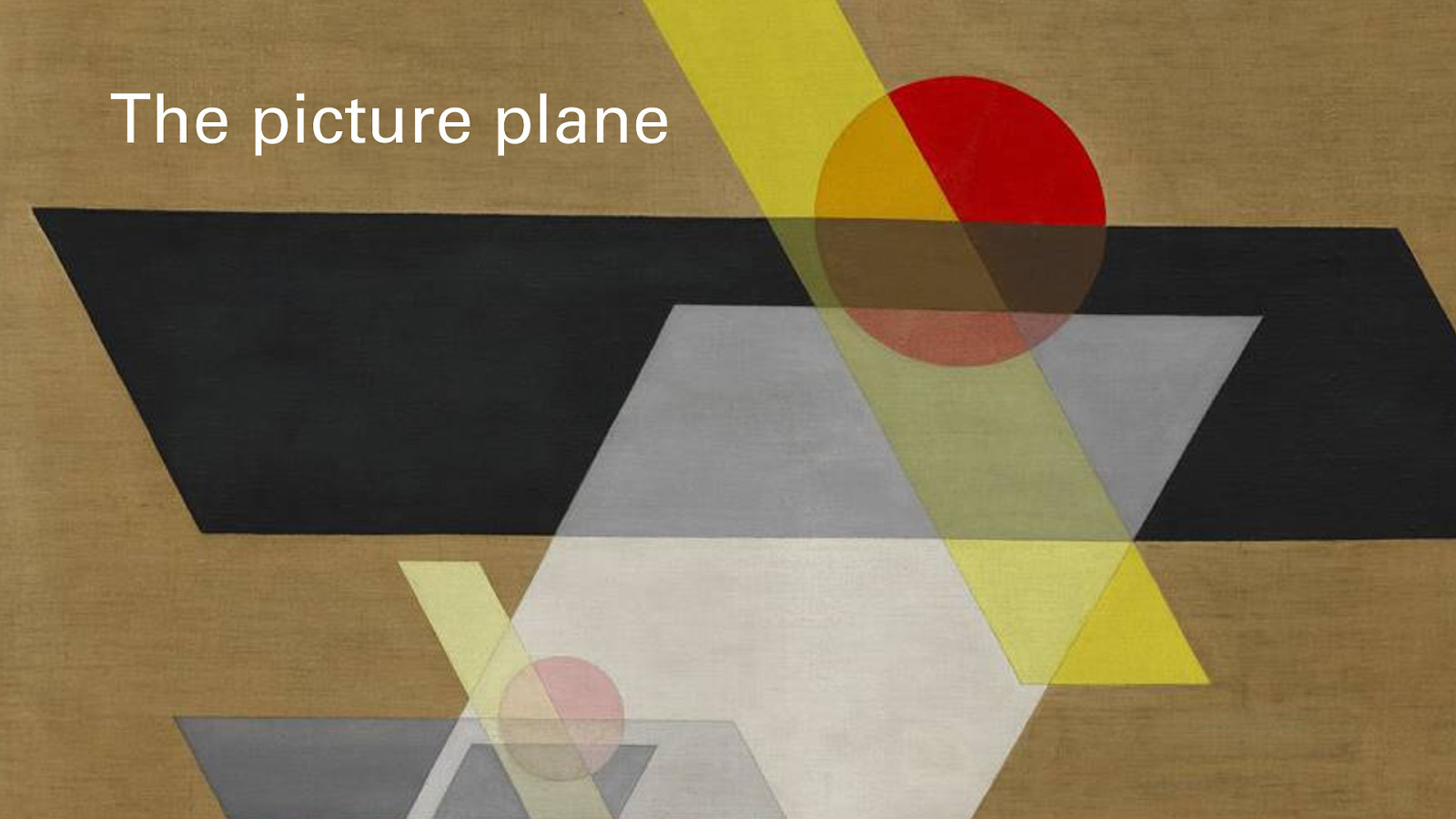
An important concept in Bauhaus visual art is the picture plane. The idea of recognizing that the surface is two-dimensional, and any idea of form or shadow is an illusion. Just as the Impressionists had rendered the visible world with tiny dots or strokes of paint, geometric Abstraction broke things down further, to component geometric elements, layers and planes, exploring the nature of pure color, light, optical effects, contrast and transparency, rhythm and proportion.
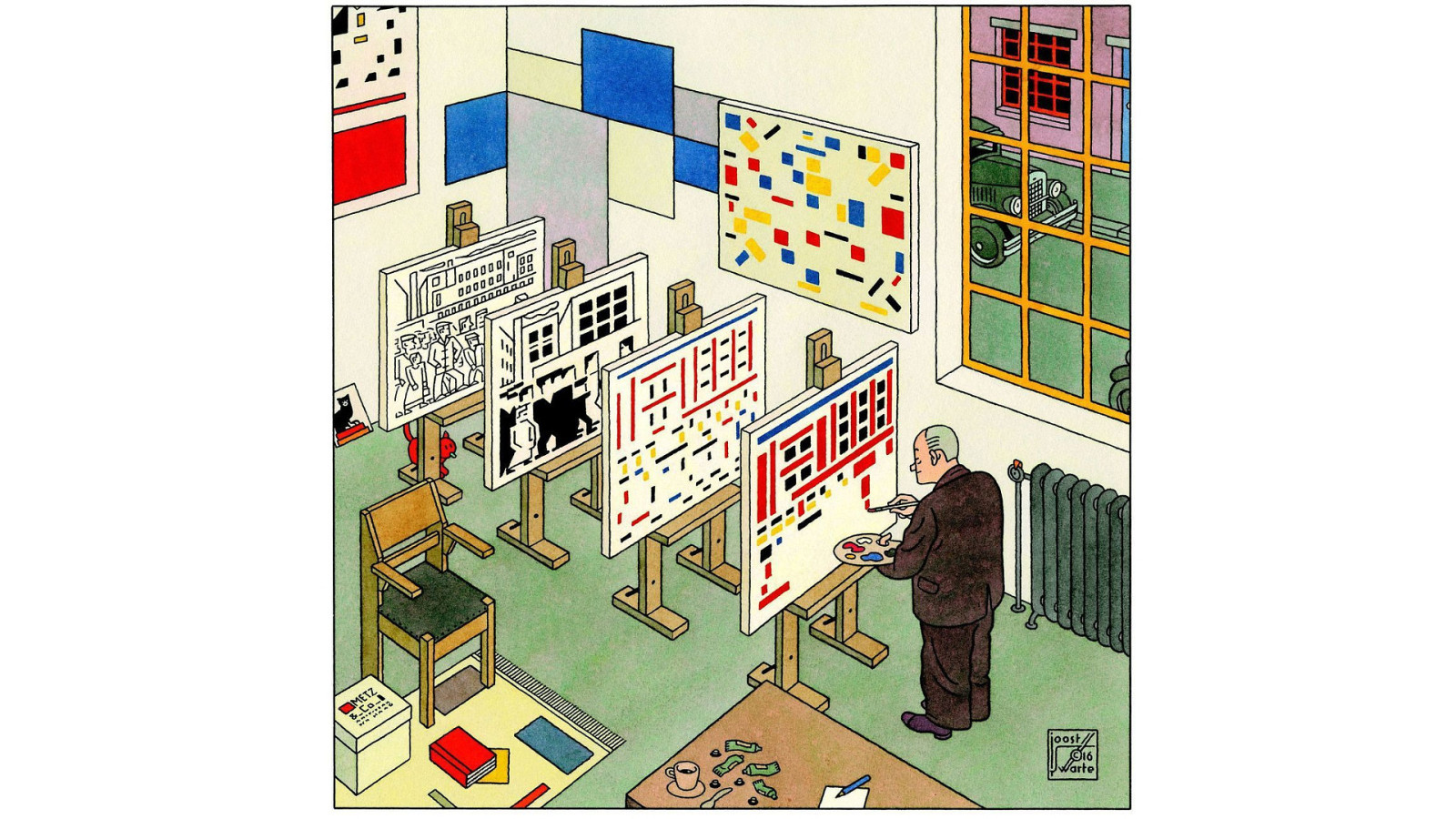
This cartoon by Joost Swarte shows an artist breaking down an image into the pure picture plane. At the back, a typical heroic-realist painting of workers at a factory. In the second, they are broken down into angles and squares. In the next, pure lines, in the next, blocks of colour.
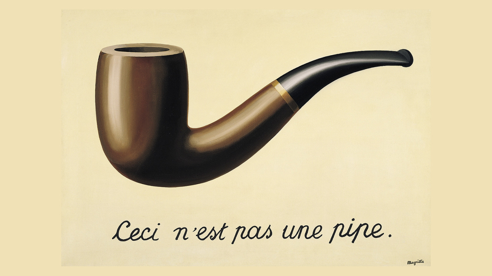
Rene Magritte’s expression of the picture-plane duality problem was his 1929 painting ‘The treachery of images.’ This is not a pipe; it’s a flat 2-dimensional rendering of a pipe. Even though it appears to have depth, weight, shadow, and highlight, it is really just paint on a canvas. (Or here, pixels on a screen.)
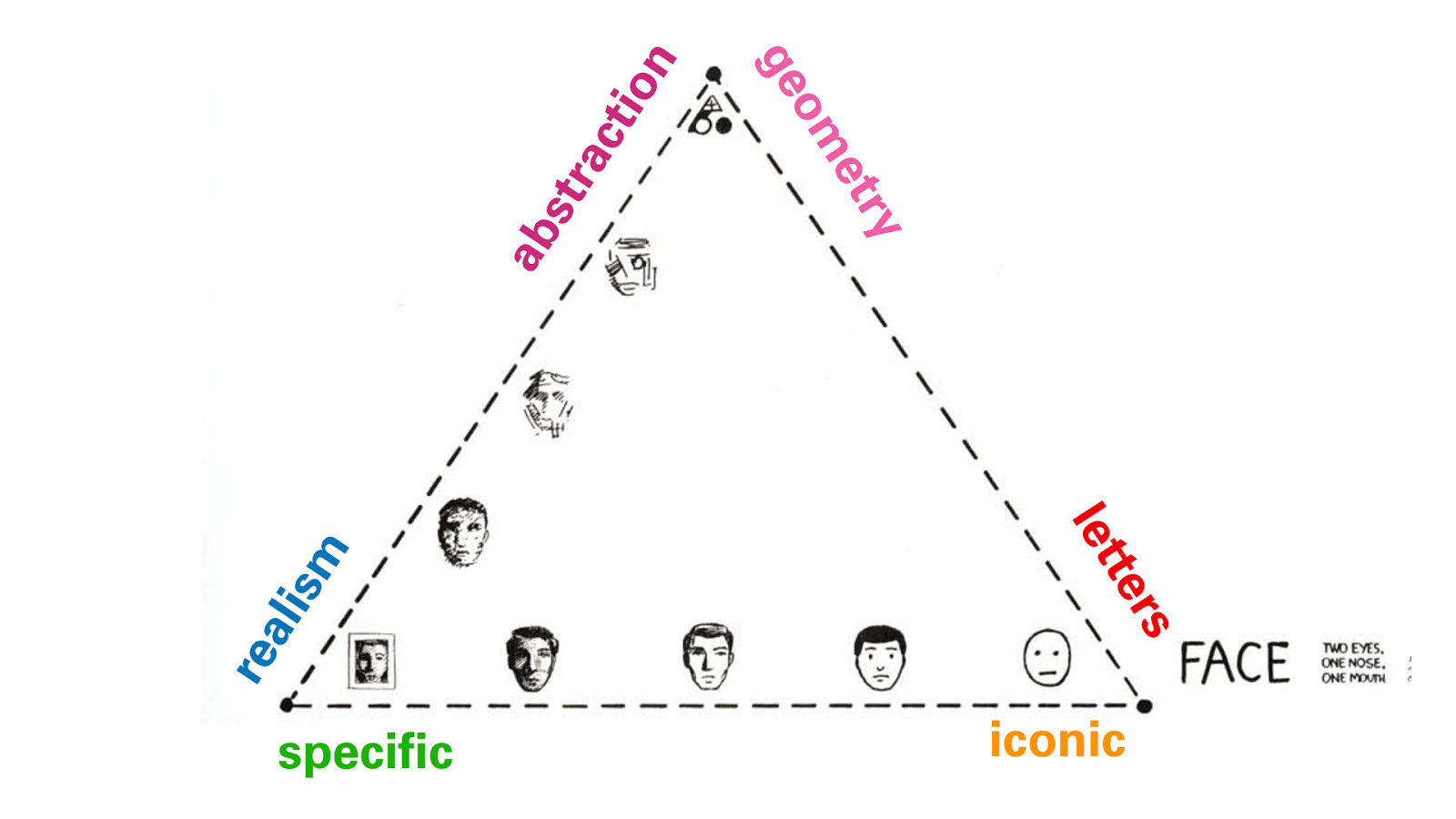
This diagram is adapted from Scott McCloud’s book Understanding Comics. It’s a really helpful shorthand to understanding what we mean by visual abstraction. Basically, along these three axes, we can go from a specific image like a photograph (lower left), up towards increasingly flat, geometric abstraction where the image becomes pure shapes and colors. Or across, simplifying as we go, towards a less specific, more universal, iconic cartoon face. Slightly off and to one side are letters, which are their own kind of abstract icons. We’ll come back to this later.
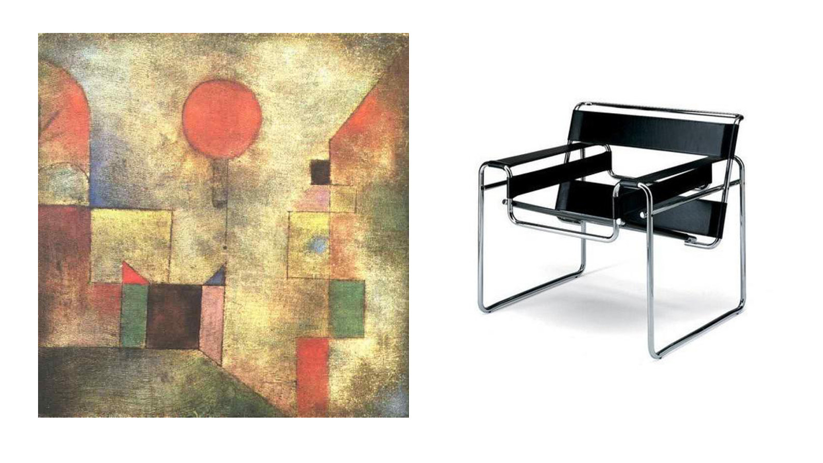
Painters like Paul Klee (left) and Wassily Kandinsky explored geometric composition. Designers like Marcel Breuer (right) used modern materials to reimagine furniture.
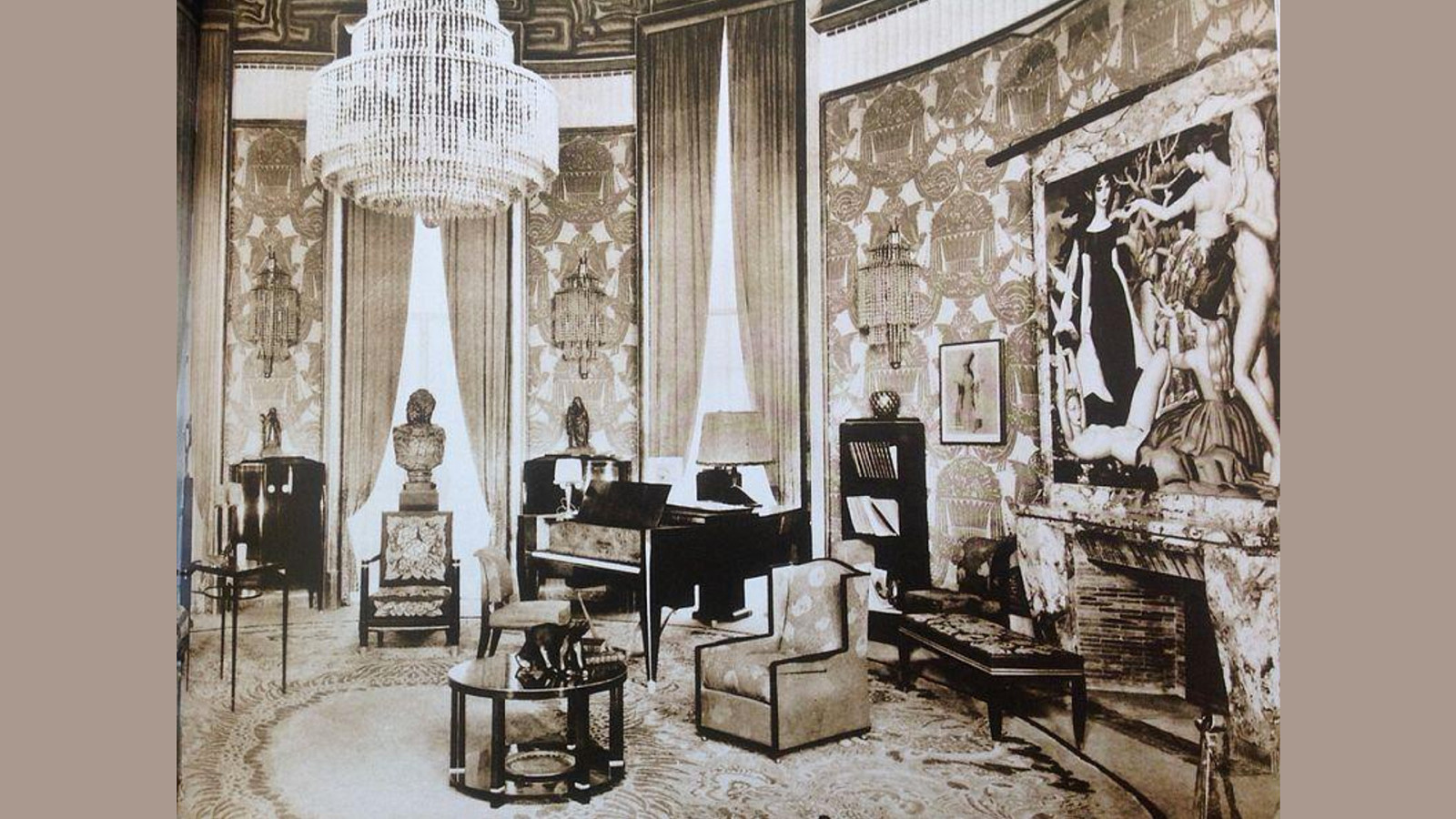
Imagine how shocking that Breuer chair would have seemed when first shown in 1925, when most interiors looked like this.
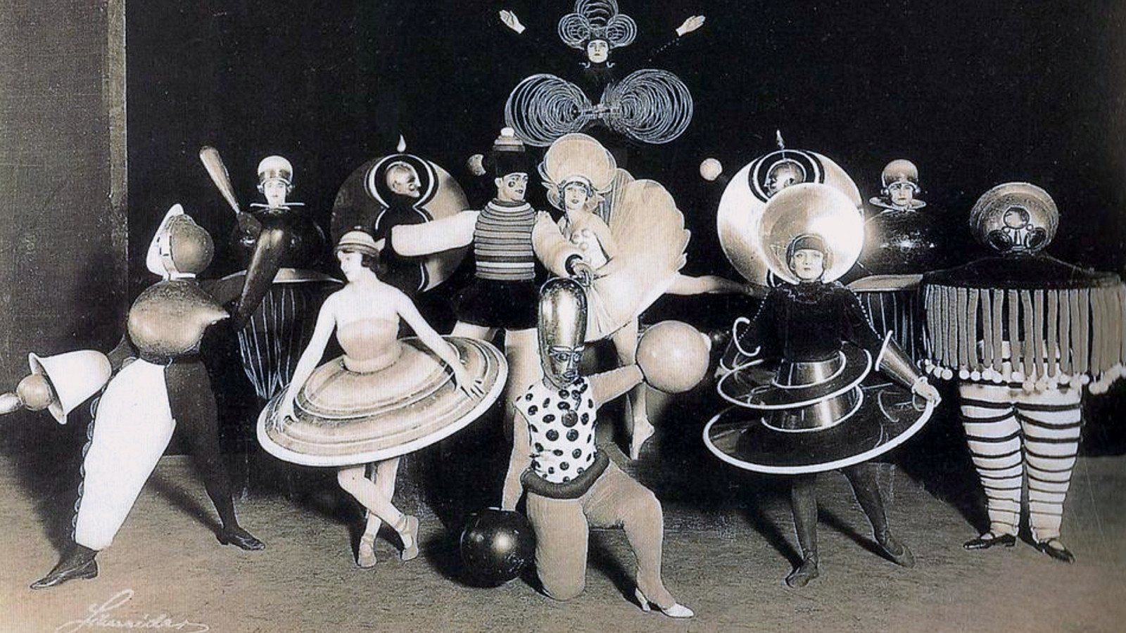
These are some costumes for the Triadisches Ballett, a modernistic performance that brought minimalism to dance, costumes designed by Bauhaus members. They’re still weird and futuristic today.
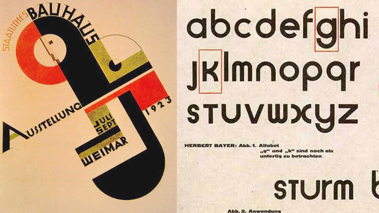
Bauhaus typography embraced both the grid, and unconventional layouts inspired by Constructivist art. In an attempt to break with the past and create a new, purely geometric typeform, Herbert Bayer created his Universal Alphabet (right), composed strictly of straight lines and circular segments.
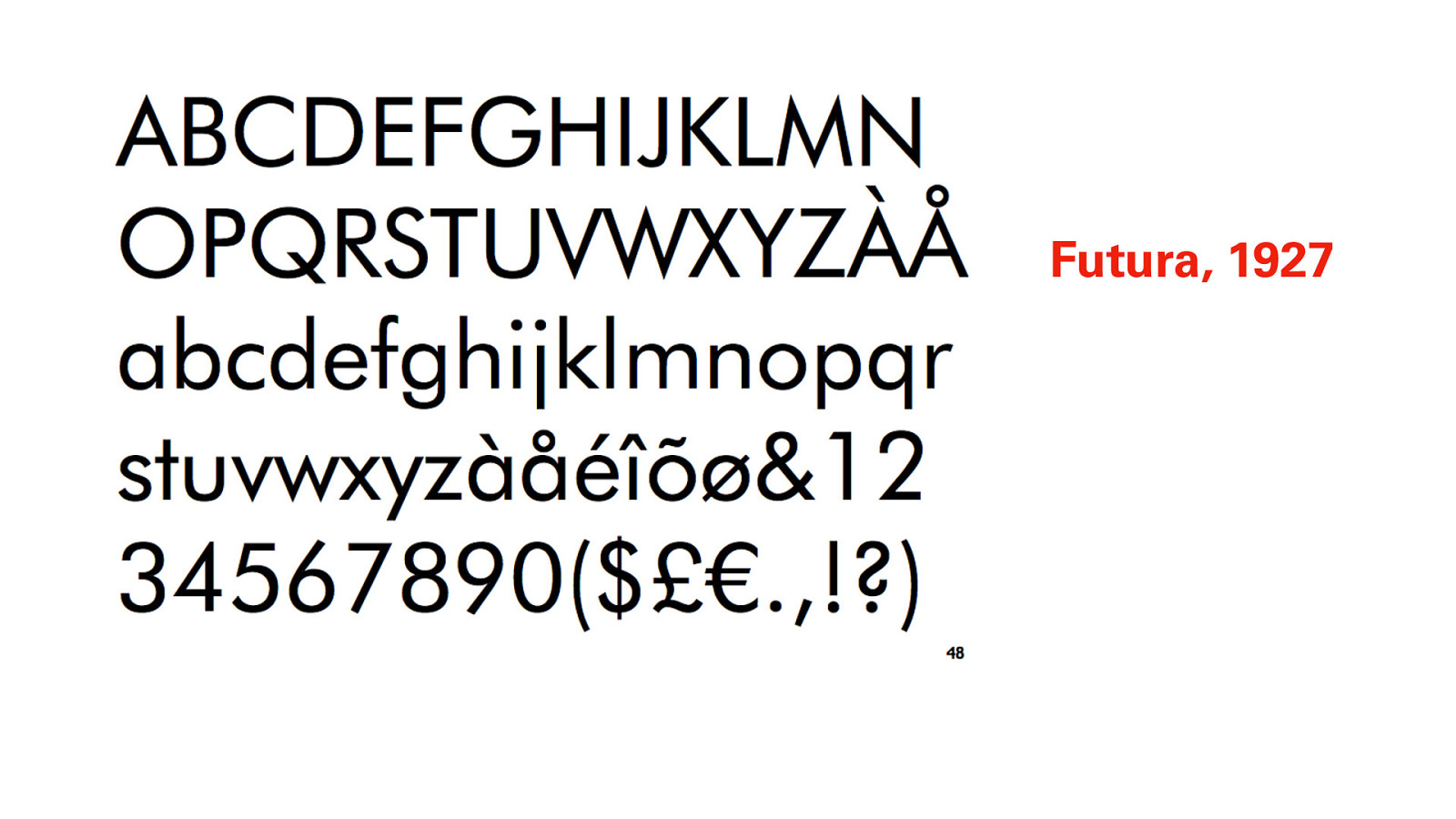
Paul Renner created what would be the longest-lasting geometric typeface of the Bauhaus era, Futura. It seems almost plain and old-fashioned now, but in a world of renaissance revival type, it was shockingly new.
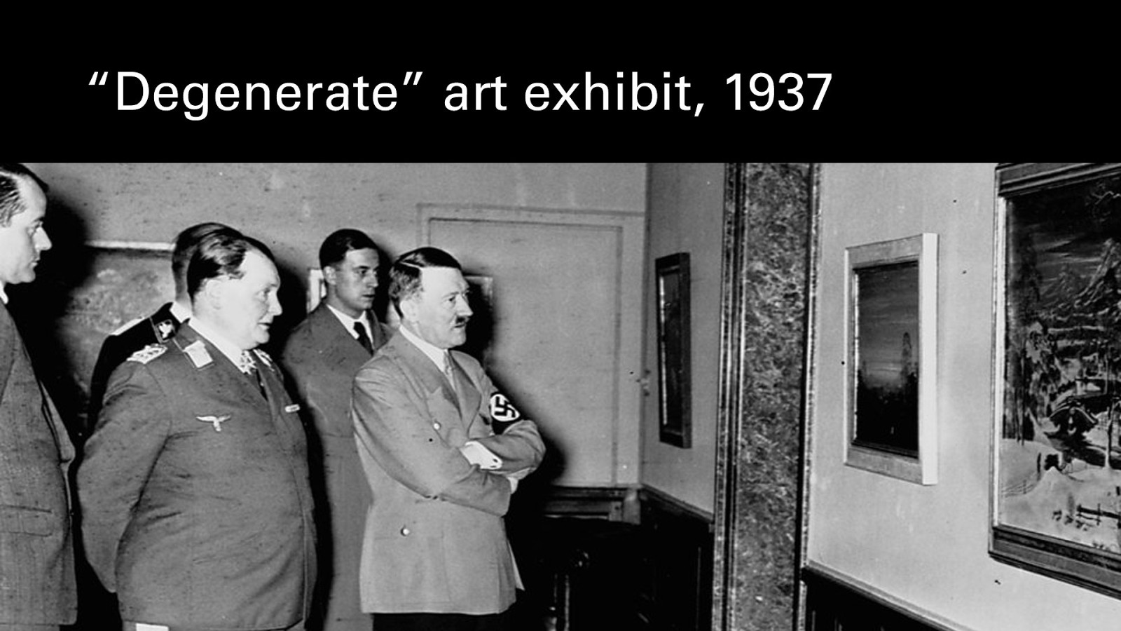
This period of creative flowering was brought to an end by the rise of the Nazi Party. The Bauhaus school, with its associated politics and the perceived decadence of the Weimar period, became increasingly unwelcome, and it was eventually shut down and many of the works seized. Its leading artists and architects mostly fled for Paris, London, the Netherlands, and the United States, which we’ll come back to.
Modern artwork seized by the Nazis was put on display, in an attempt to mock it, in a remarkable show called “Degenerate Art”, as a sort of sideshow from the official state art show happening down the road, which was full of the sort of heroic, neoclassical kitschy numbers Hitler loved. The Nazis wanted art and architecture that harked back to the Roman Empire, that glorified an imaginary past.
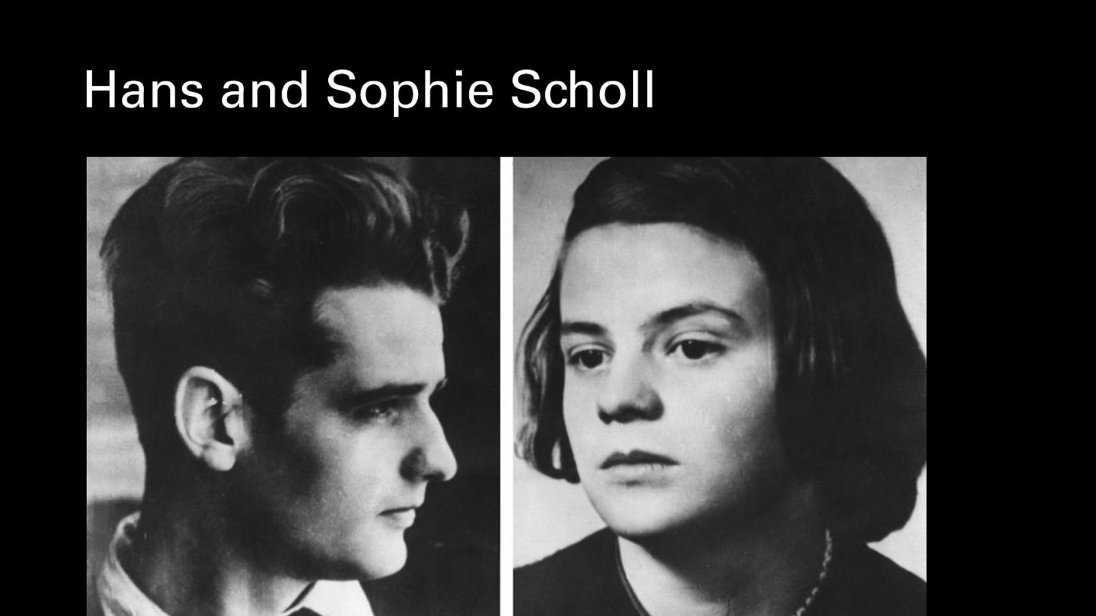
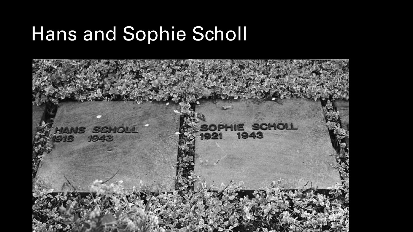
While the Nazis were rising to power, they faced internal resistance, notably from a student protest organization called the White Rose Movement. Two of its organizers were the siblings Hans and Sophie Scholl. He was a medical student, and she, a former kindergarten teacher, had re-enrolled in university to study biology and philosophy. At the time, much of the schooling had been turned into Nazi indoctrination of one kind or another. In 1943, they were caught by a custodian at their university as they scattered anti-Nazi leaflets. He reported them to the Gestapo.
They were tried and along with four others in their group, were executed by guillotine the same day.
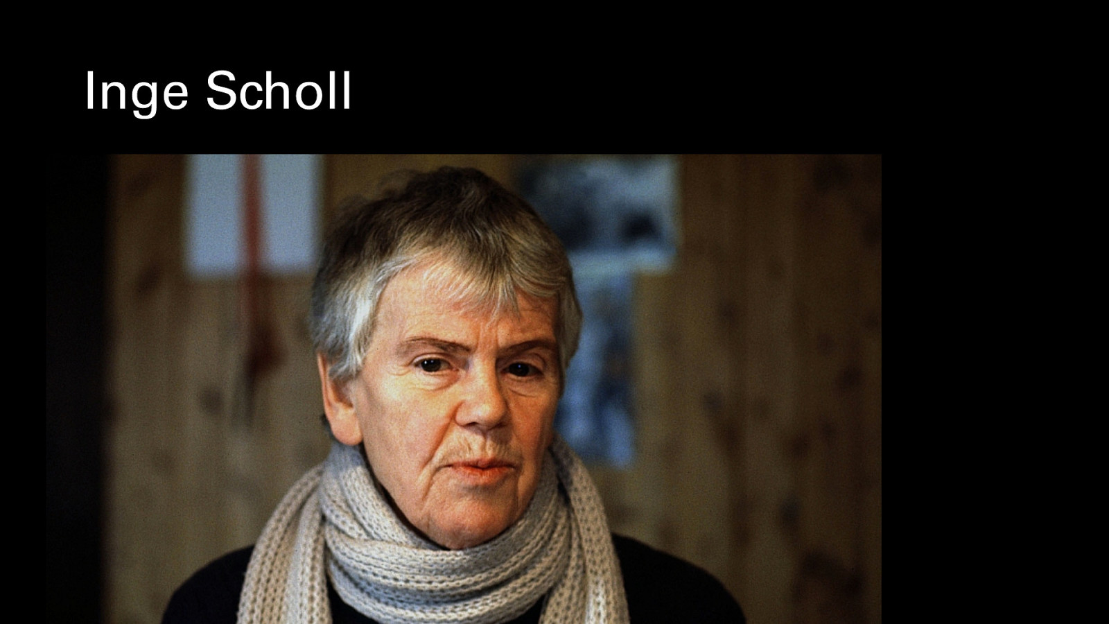
Sophie’s older sister, Inge Scholl, survived the war and would later write a book about the White Rose Movement that documented their actions and the repression of the Nazi era.
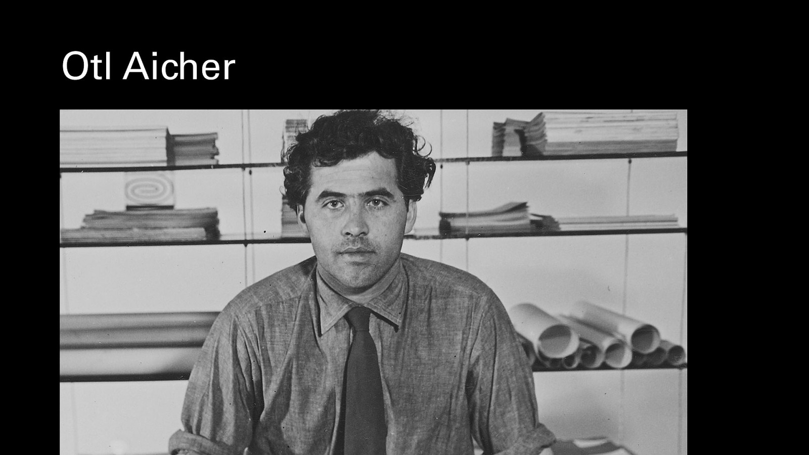
Inge Scholl was married to the sculptor and designer Otto “Otl” Aicher, who plays a large part in our story of post-war design.
World War Two was devastating to Continental Europe. Cities lay in ruins, entire industries destroyed. Rebuilding was funded by the Marshall Plan.
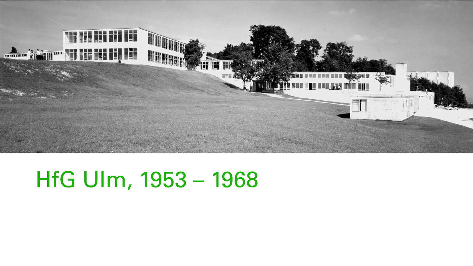
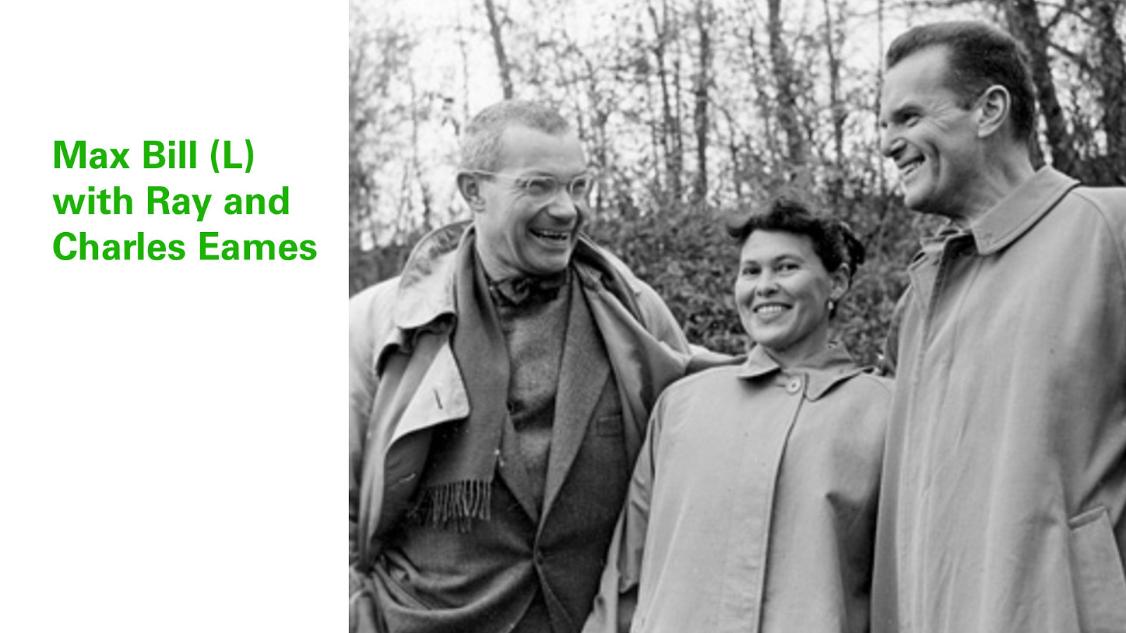
In 1953, Inge Aicher-Scholl, Otl Aicher and Max Bill founded the Hochschule fur Gestaltung or HfG in Ulm, Germany, aka the Ulm School of Design, in order to train a new generation of designers and artists. The idea of producing “good design for the masses” both for domestic and export products was key. The school remained controversial, and battled with state authorities to keep its funding, but its influence would be felt long after it closed in 1968.
Here, cofounder Max Bill is giving visiting American designers Charles and Ray Eames a tour of the Ulm campus.
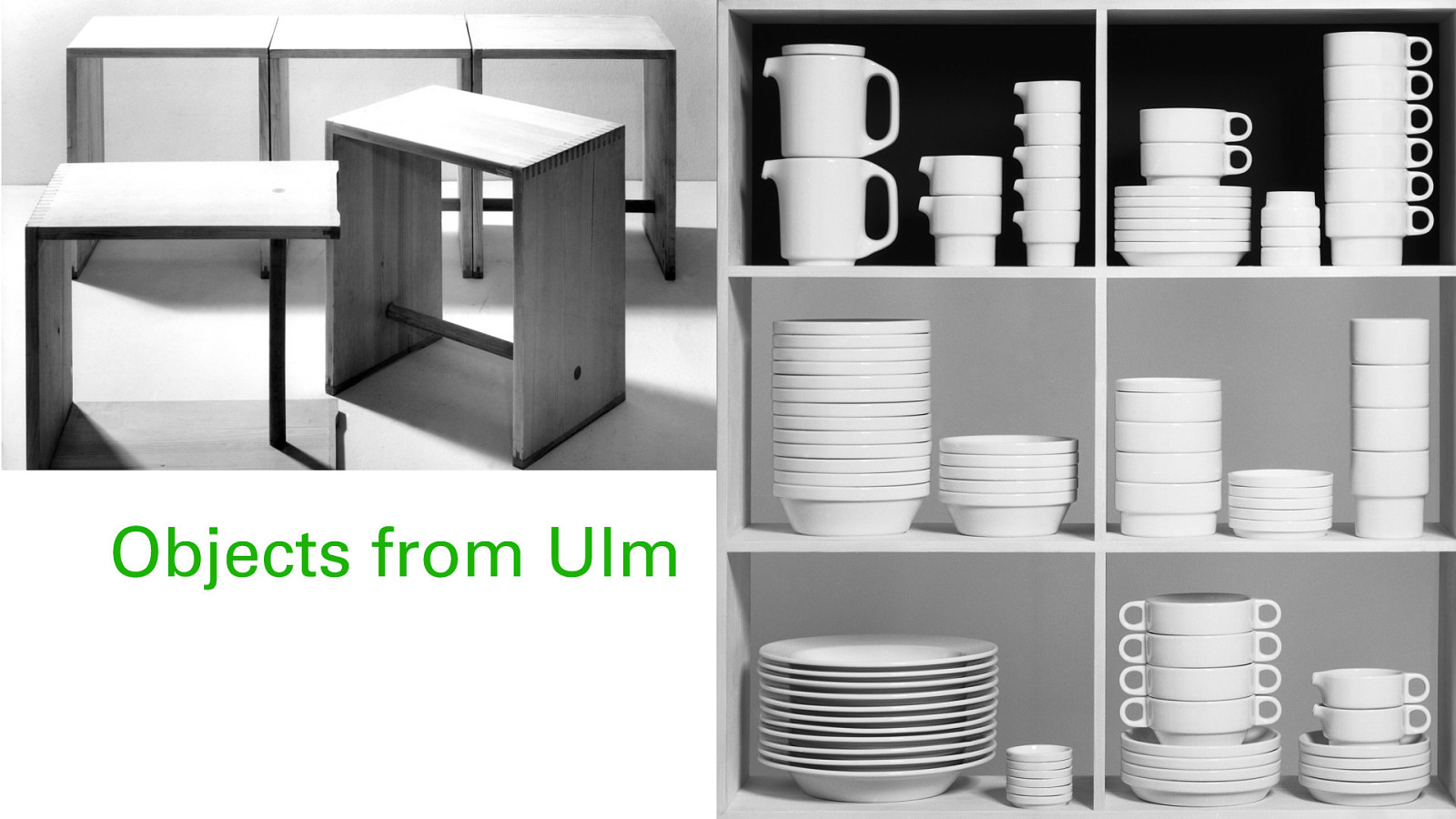
Ulm objects included things like these deceptively simple block wooden stools that had a high degree of craft proficiency in their construction. Ceramics work included these clean-lined stacking items, which look like you might find them at Ikea today. It was also one of the first times ergonomics was taught in a design curriculum, paving the way for modern product design.
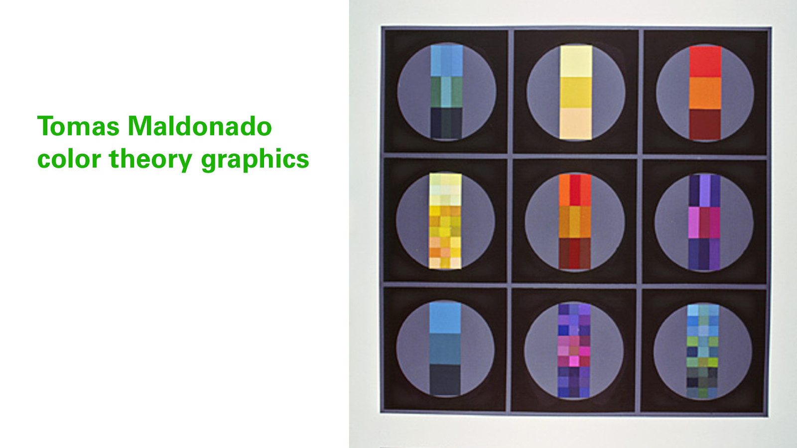
The Argentinian designer Tomas Maldonado studied color theory at Ulm, producing these graphics to demonstrate the relative power of colour and scale.
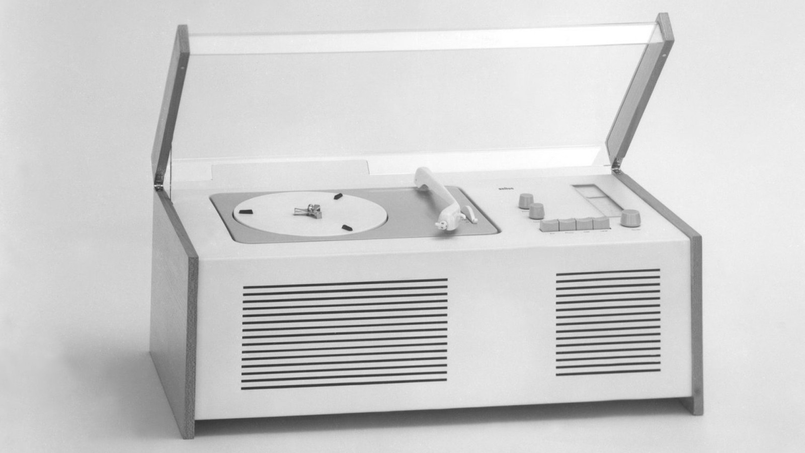
Importantly, the school partnered with industry to create well-designed, functional objects. This hi-fi / record player was co-designed with Dieter Rams for Braun.
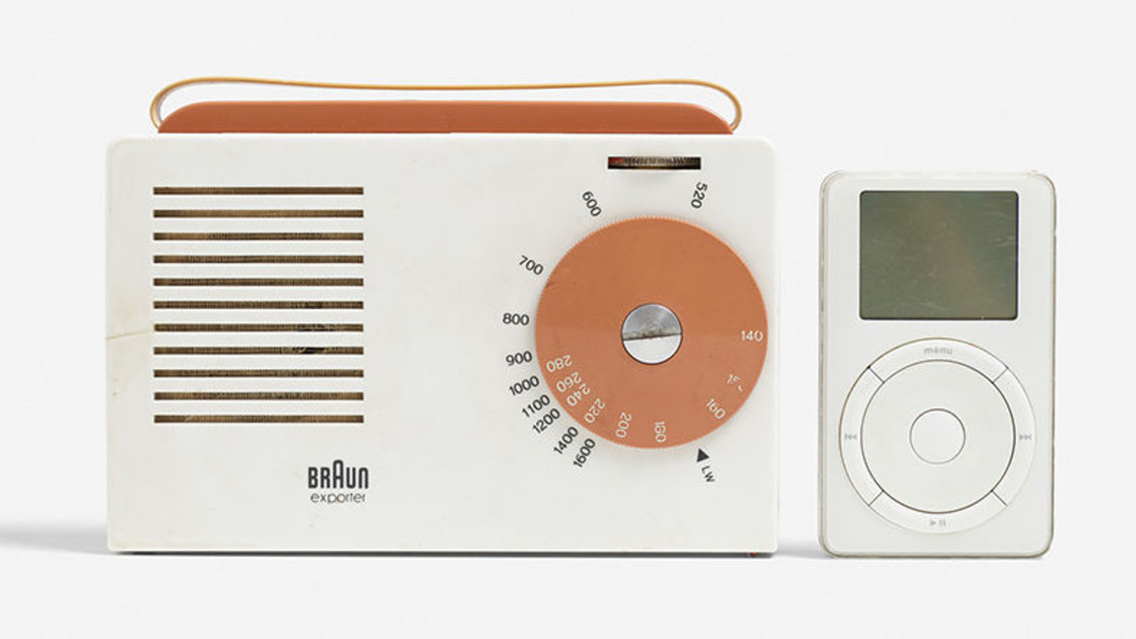
Another Braun / Rams collaboration, the ‘Explorer’ transistor radio from 1955. It was so ahead of its time, it actually looks more timeless than the iPod on the right.
Meanwhile, in Switzerland, a quiet revolution was happening in graphic design and typography. Continuing the advances made by pre-war Bauhaus typographers, Swiss designers like Josef Muller-Brockman, Max Miedenger, Adrian Frutiger and others created striking new works. This was also spurred by advances in printing technology such as phototypesetting, which allowed for much easier scaling and juxtaposition of type, compared to older hot-metal or wood-block printing methods.
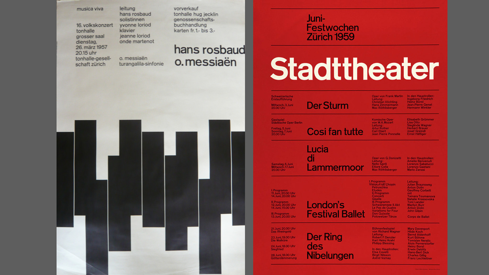
A hallmark of the Swiss style was the use of flat graphics, combined with sans-serif typography, aligned to a grid. At its most minimal, purely typographic designs could be used.
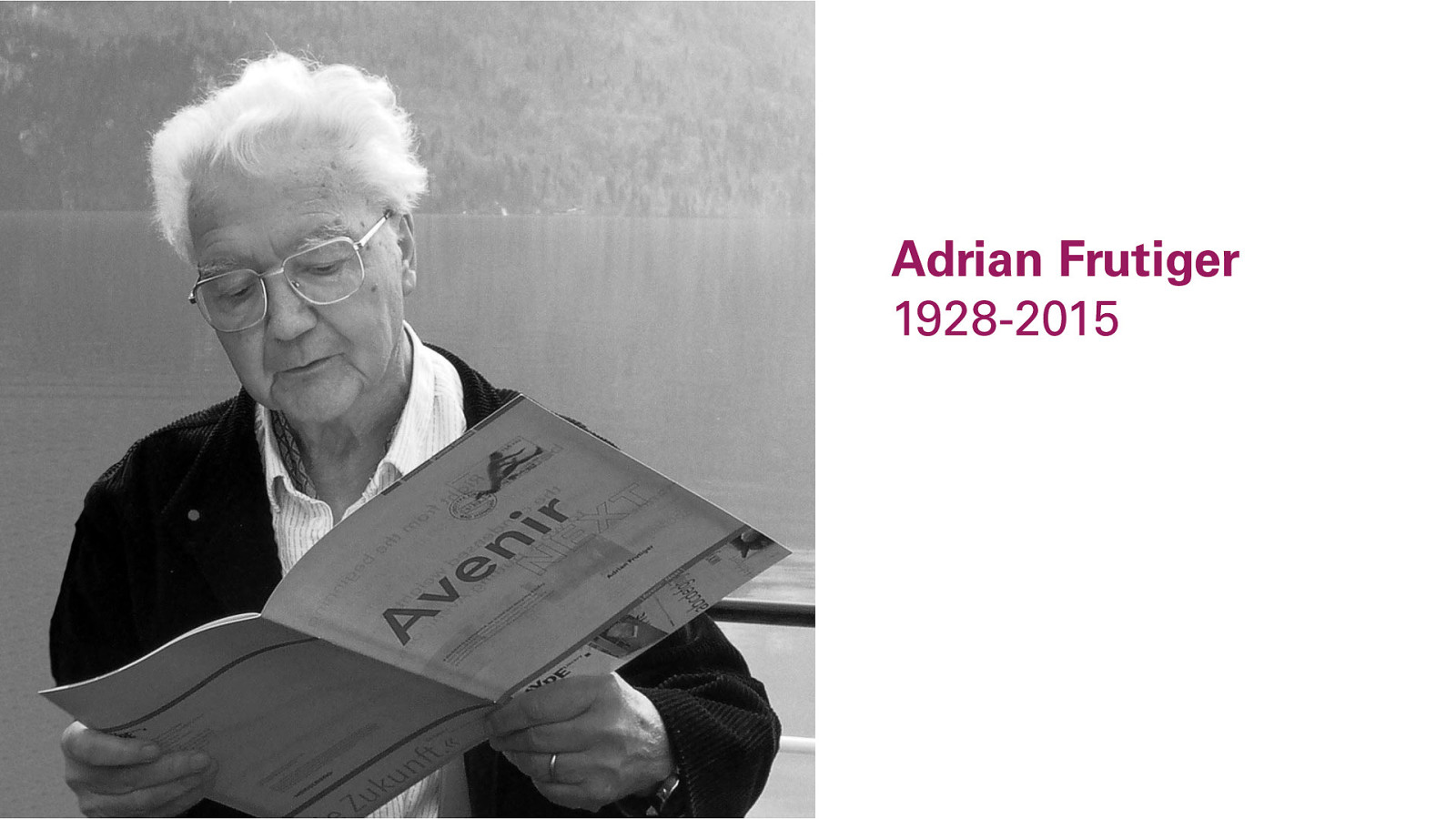
Adrian Frutiger designed many typefaces we consider to be timeless classics today, including his namesake Frutiger, Avenir, Egyptienne, Serifa, and many others.
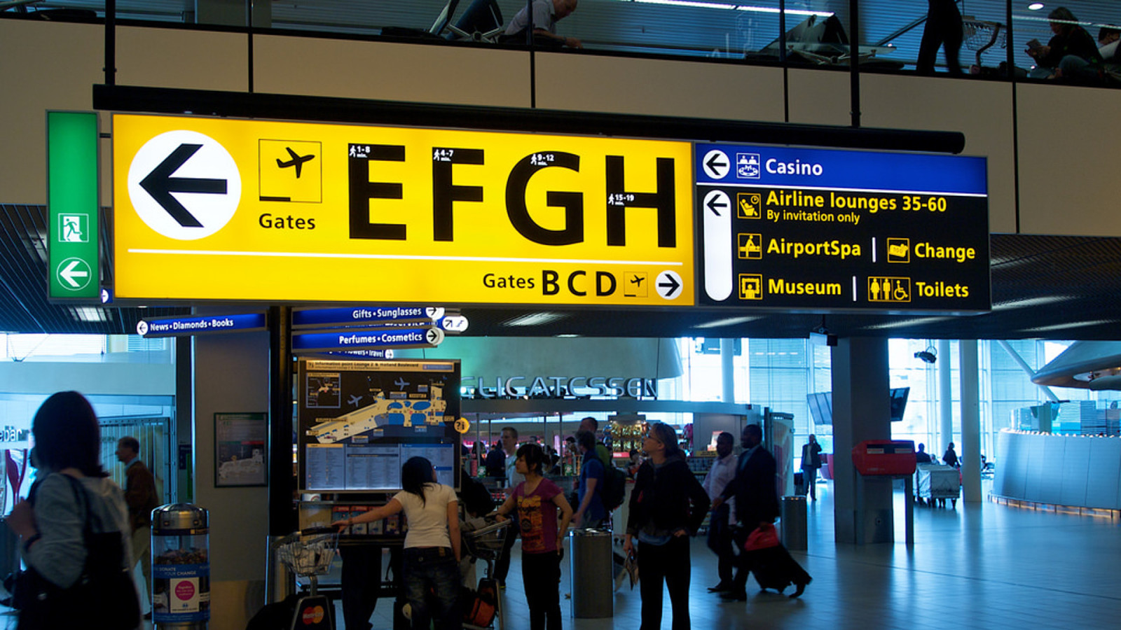
Here’s the typeface Frutiger in one of its most common habitats: Wayfinding signage for airports and other public places. (Wait, this airport has a spa?) But most important to our story is one particular typeface of Adrian Frutiger’s….
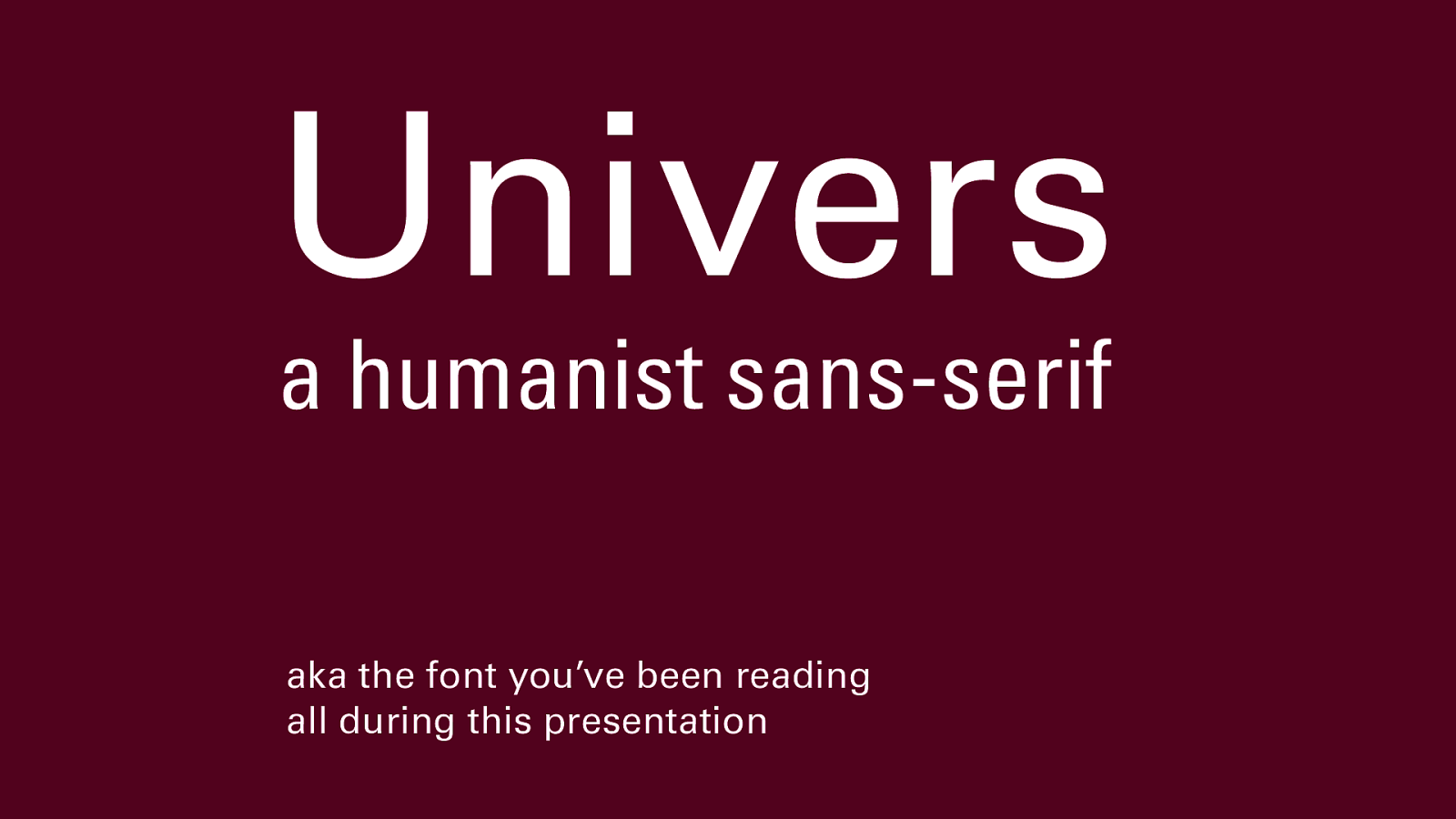
…Univers. It’s probably one of the most common typefaces on the planet, so clean and easy to read you probably never noticed it was there, which is its job; clean and easy communication without coloration or distortion.
And yet, it’s not a purely geometric typeface; it has aspects of hand lettering in the shape of its strokes, which makes it feel human and friendly.
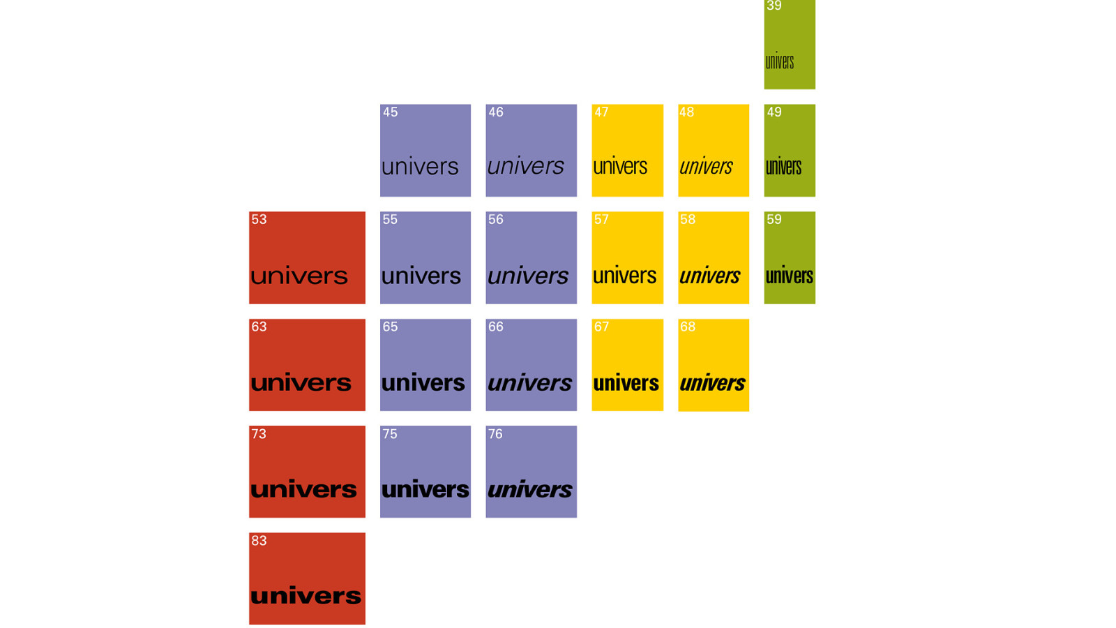
Univers was one of the first typefaces ever to be designed and sold as a family with related weights and widths, each with its own “atomic weight” number, the first denoting weight, the second, width; from wide to regular to condensed to ultra-condensed, light to regular to medium to bold to black, in both roman (straight) and oblique (italic) versions.
Linotype made this chart to intentionally mimic a table of elements; it showed that type could be systematized, scientific, and rational while still remaining human in origin. This gave Univers incredible range and versatility.
By the late 1960s, everything we’ve discussed so far - rational grids, abstract design, Swiss typography, International Style architecture - had become shorthand for not only a utopian future, but a postwar consensus, the idea that science and rationality, in a spirit of common humanity, would win out over superstition, fear, and greed. And those Bauhaus folks, either in exile in North America, or their spiritual descendants, were still working.
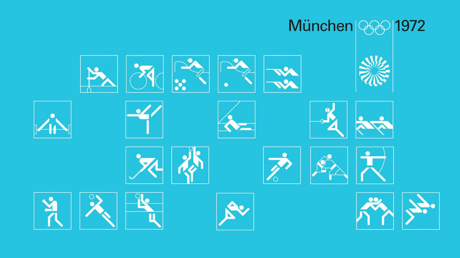
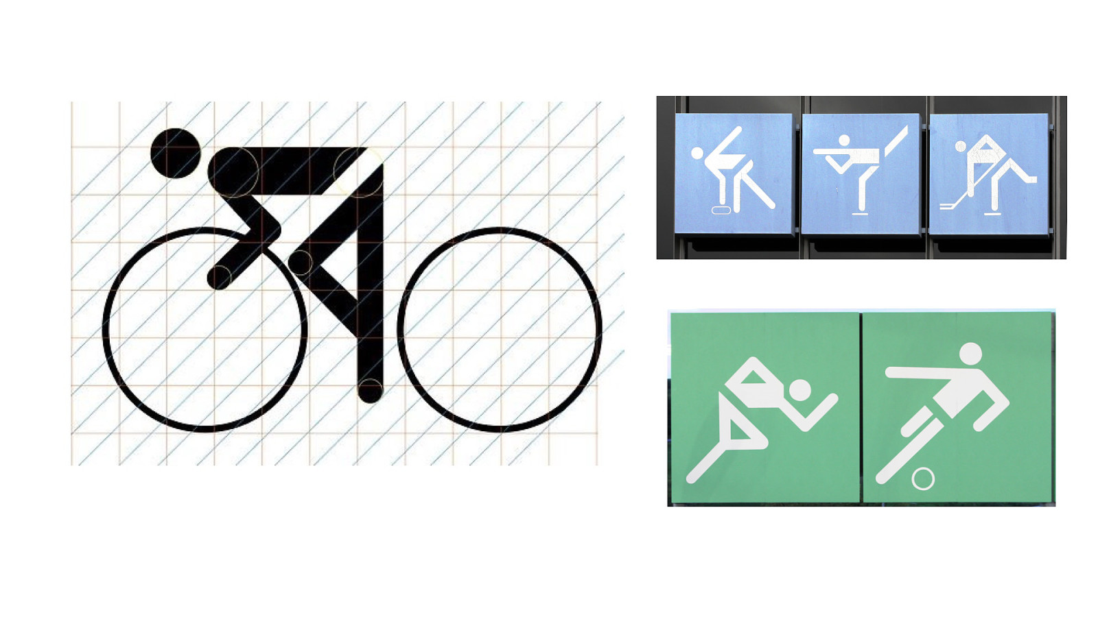
Otl Aicher’s most remembered achievement was as the master graphic designer for the 1972 Munich Olympics. Exactly 36 years after the last German games, which had been held in Berlin, these Olympics were an opportunity to show the new Germany to the world.
The pictograms created for these Olympics went on to become one of the most widely licensed sets of icons ever created. All designed geometrically, to a grid system. Color-coding of blue for ice sports, and green for field sports, etc, was another aspect of the system.
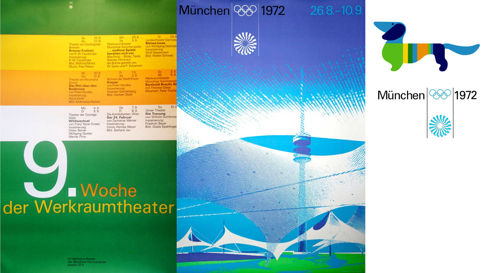
Aicher and his team produced stunning sets of posters, using a rational, Swiss grid system, all using Univers. And they even created the adorable dachshund mascot for the Games, Waldi. (For your kinder. Awww.)
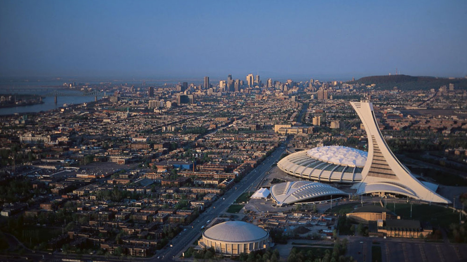
Now here is where the story gets a bit personal, for me. I was born and spent the majority of my adult life in Montreal, QC. (Shout-out, Montreal.) We hosted the next Olympics after the Munich games, which had been tragically marred by a terrorist incident in which many Israeli athletes were killed.
Our games had an ambitious (and at the time, unfinished) stadium, but the designers intentionally re-used a lot of Otl Aicher’s work from the ’72 games; the pictograms, the grid system, and the use of Univers.
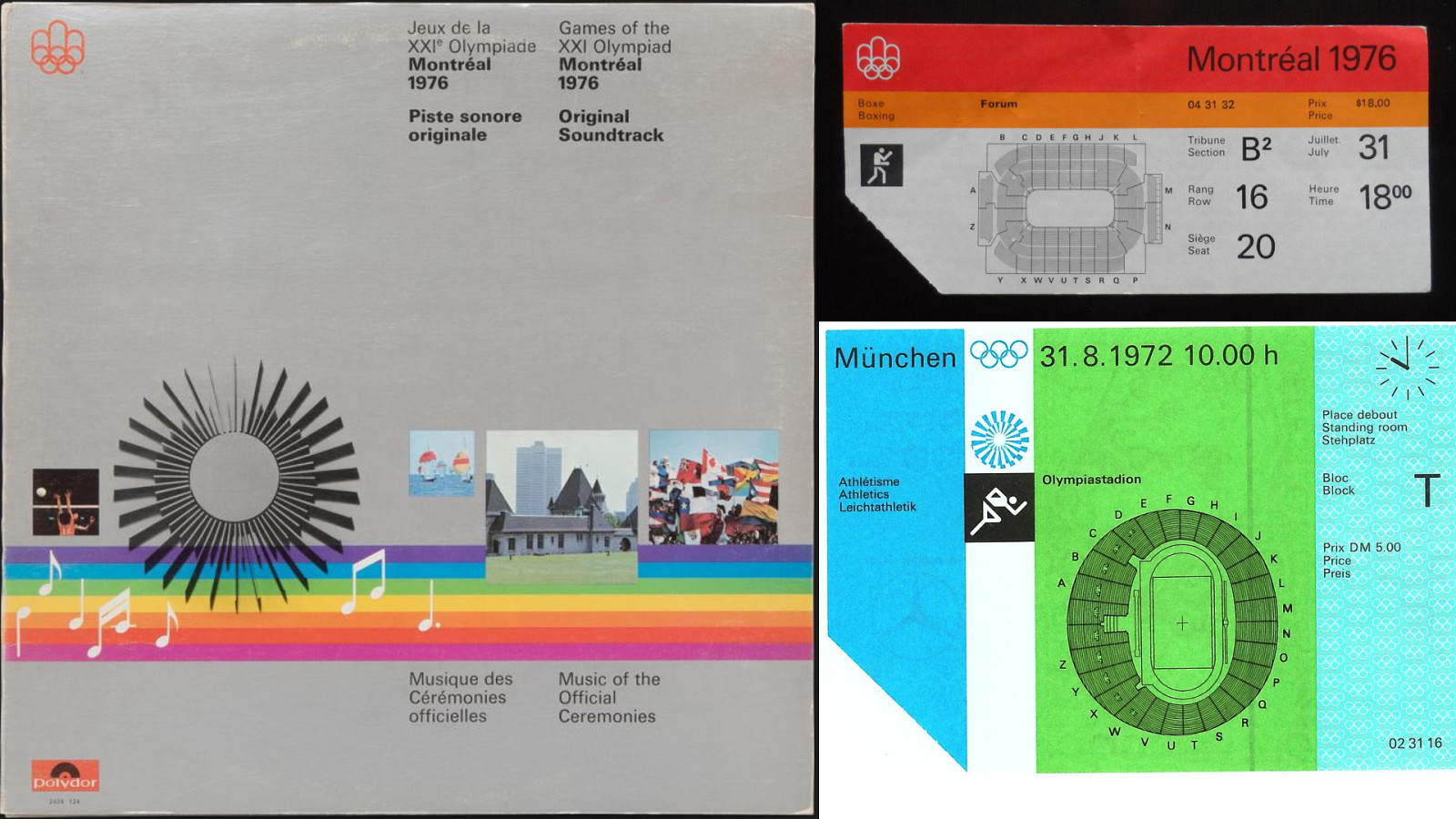
Here’s one of my favourite artifacts from the 76 games, the soundtrack. A jazz-rock score created by bandleader Vic Vogel, based on the work of the Quebec prodigy André Mathieu. The ‘Mouvement Rock’ track was used as the theme for the local CBC news for a long time.
At top right, is a ticket from the Montreal games for a boxing match. Look at that easy-to-read type. Below, for comparison, is a ticket from the 1972 games. It was seeing these items that made a connection in my mind.
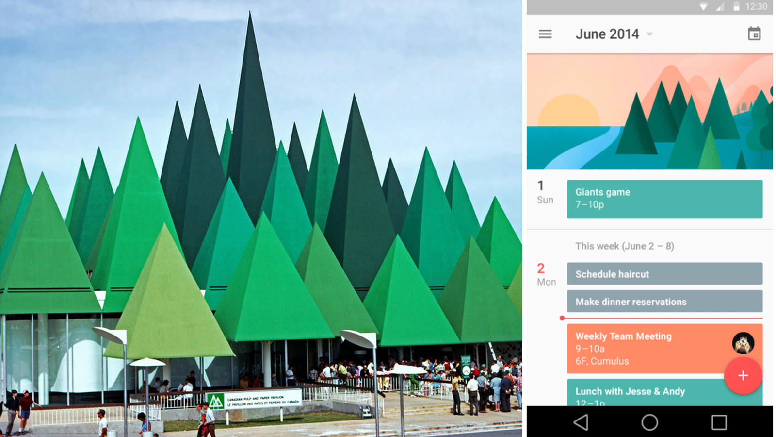
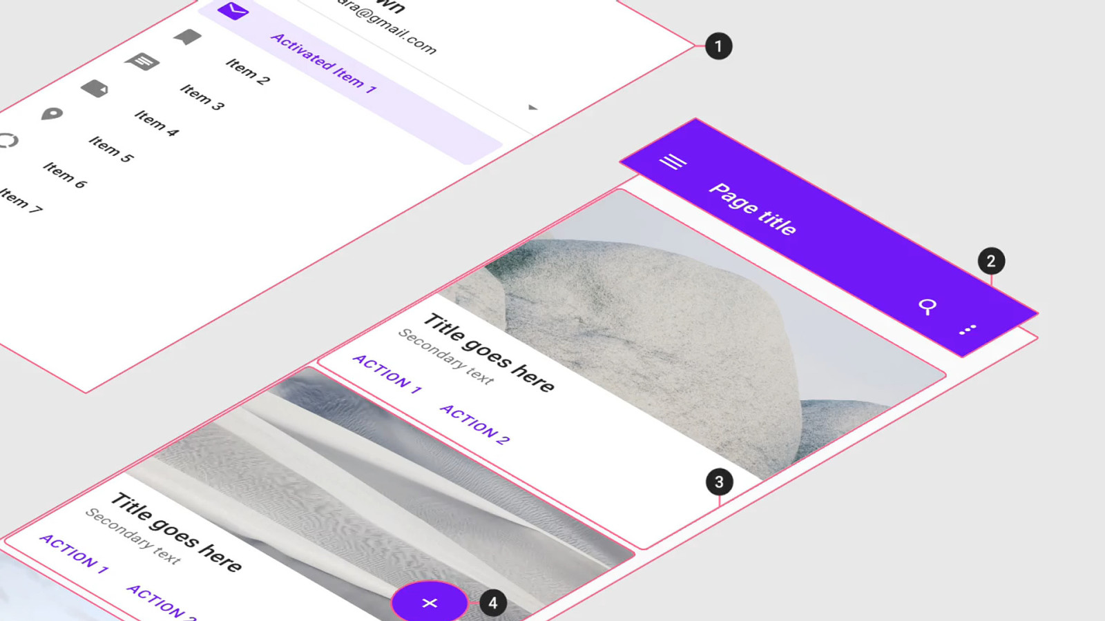
Where had I seen something like that before? Oh yes. Material Design. This is a view from the Google Calendar app. It looks like Otl Aicher might have designed it 40 years ago. The grid and proportions match a 1972 Munich poster almost perfectly.
Oh, and where had I seen that forest before? Oh right. Expo 67. The Canadian Pulp and Paper Association pavilion. We’ll come back to that in a second.
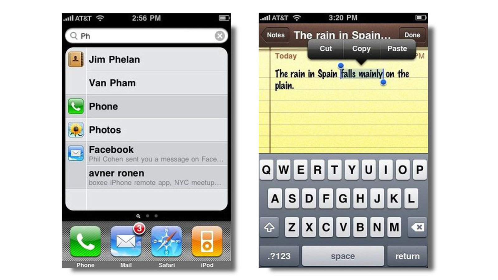
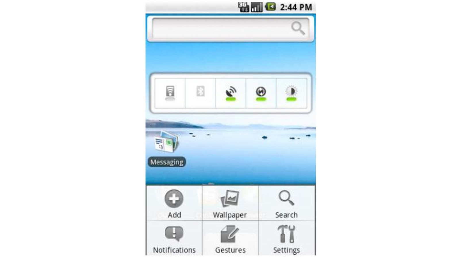
Remember this? This is an early version of iOS. Yeah, the skeuomorphic version with all those glossy reflections, drop shadows, faux-leather stitching and torn-off paper edges.
And this was an early version of Android. It wasn’t much better.
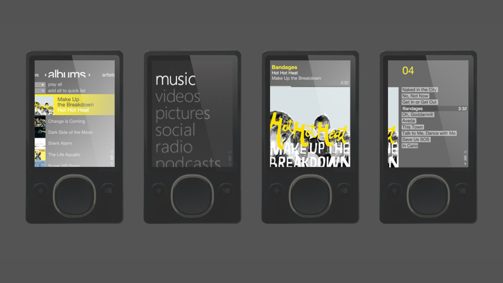
We tend to forget this, but the modern trend of flat design, particularly for mobile interfaces, came from Microsoft.
Yeah — them!
With a product we tend to use as a punchline: the Zune. But look at that purely typographical interface! If you saw it in motion, you remembered it as being very clean and new. The Zune didn’t last, but a lot of its design roots went into making another product: Windows Phone.
With those dynamic tiles, a strong grid, and the typographical focus, Windows Phone seems a bit ahead of its time, now.
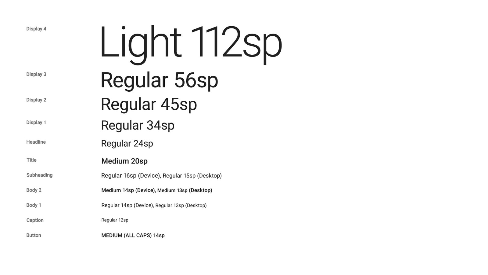
Google’s Material Design effort, which launched around 2014, uses a modulated typographic scale, with different sizes and weights keyed to different use cases and device contexts. Very Swiss.
And Google commissioned Christian Robertson to create a new, humanist grotesk sans-serif, Roboto, to be its premiere Material typeface. It’s very Swiss, very Frutiger.
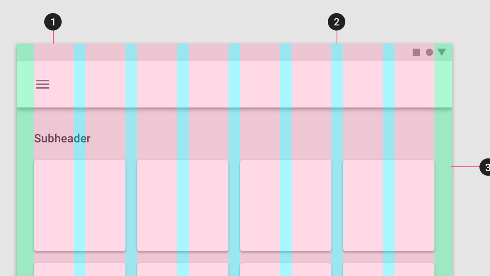
Material uses a grid system which could have come straight from Josef Muller-Brockman.
And critically, the metaphor in Material recognizes that we are looking at pixels on a screen. It doesn’t try to pretend to be leather or felt or brushed aluminum.
It recognizes the picture plane, as in Bauhaus art, and respects the honesty in materials, like International Style and so-called ‘brutalist’ architecture.
It does use height as a metaphor for focus, but there are no extraneous animations, 3D flips, it doesn’t curl like paper, etc.
So that, briefly, wraps up our story.
The Bauhaus created a new kind of design. The Nazis tried to destroy or co-opt it.
After the war, their acolytes brought that new spirit of design back, to show off a better Germany and by extension, a better world.
And decades later, that design ethos - flat colors, honesty in materials, Swiss typography - informs our digital interfaces today.
Now, if you’ll indulge me, here’s a continuation of that Bauhaus story, and it involves…
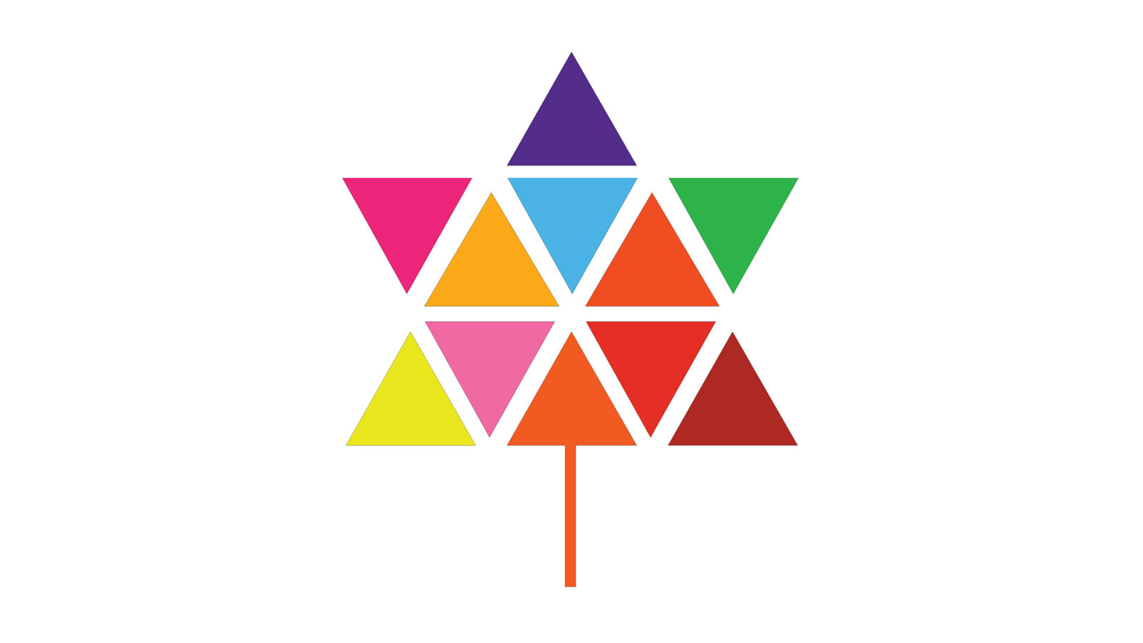
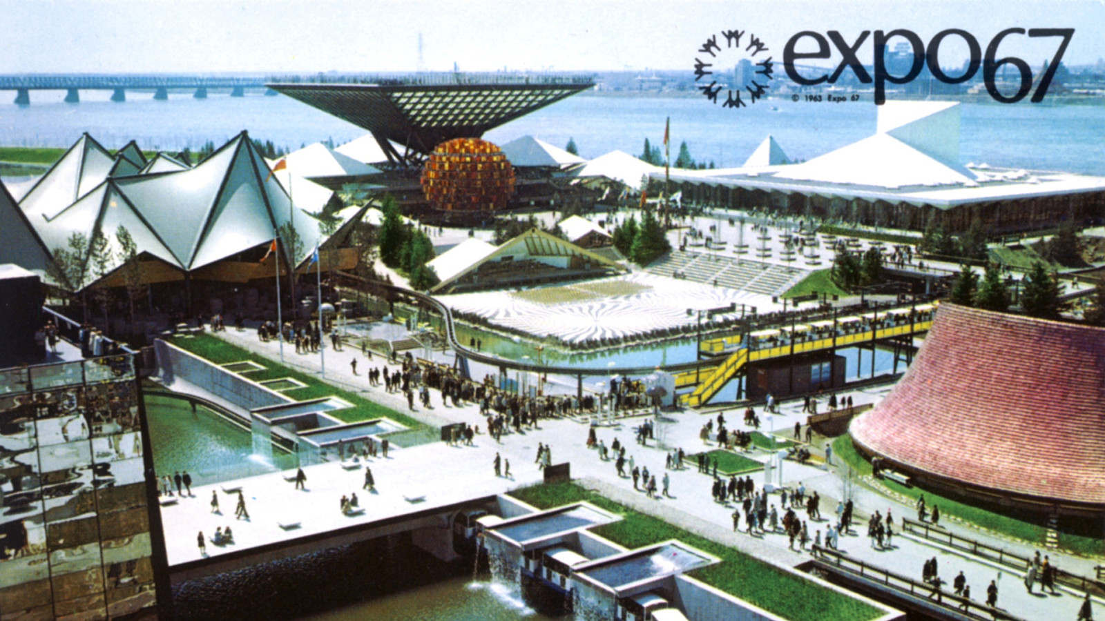
Canada. In 1965, Canada got its new flag. It’s crisp! Clean! It’s modern, like us.
And in 1967, Canada was going to celebrate its centennial. One hundred years of Confederation.
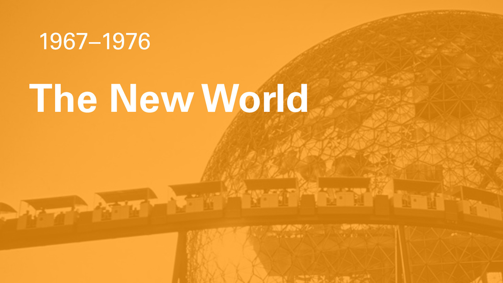
We threw ourselves an incredible birthday party, and we invited everyone to come visit. We called it Expo 67.
And most of the designers who worked on it were Canadians, who had gone to Europe to train with the Swiss and the Germans.
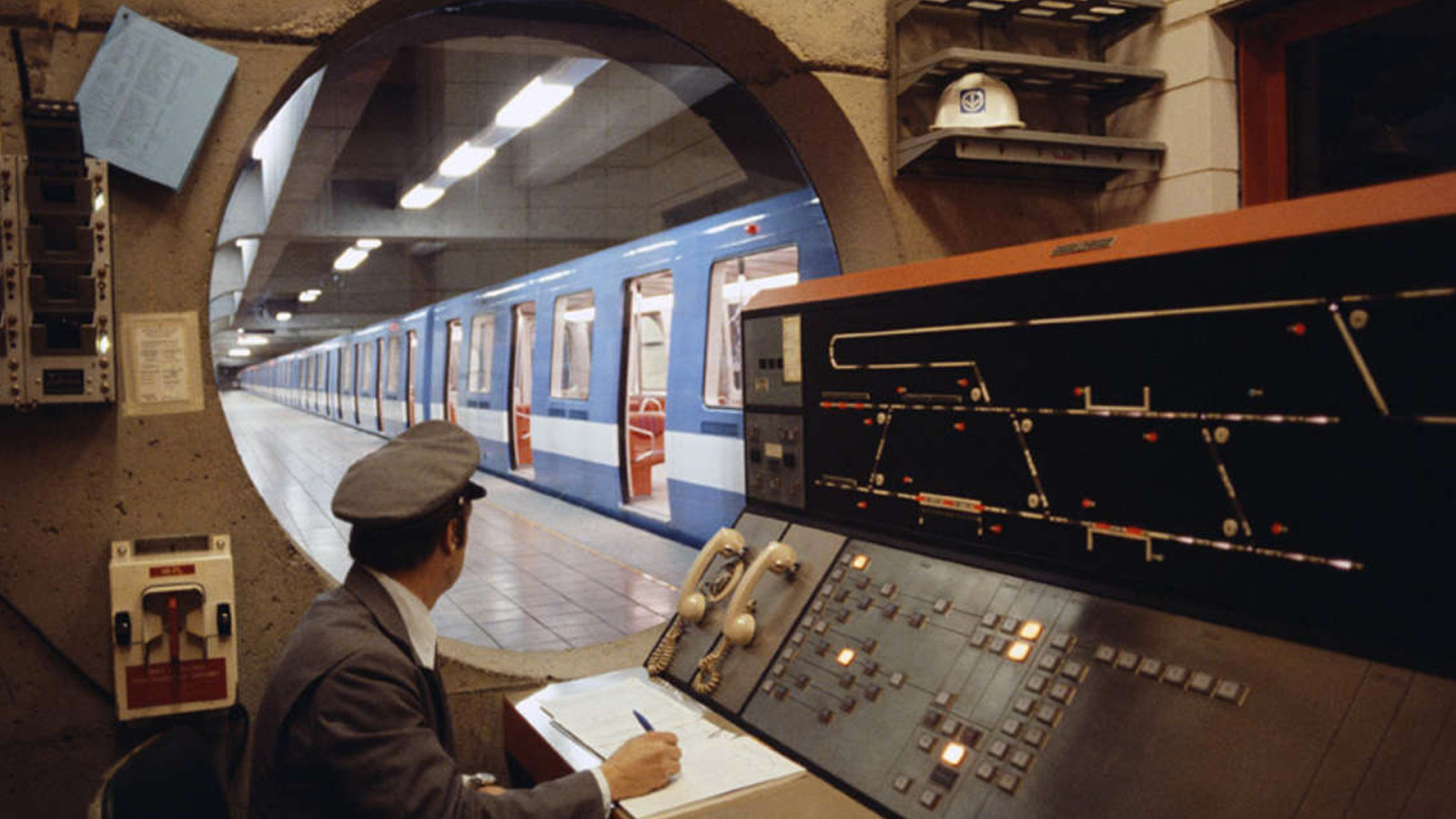
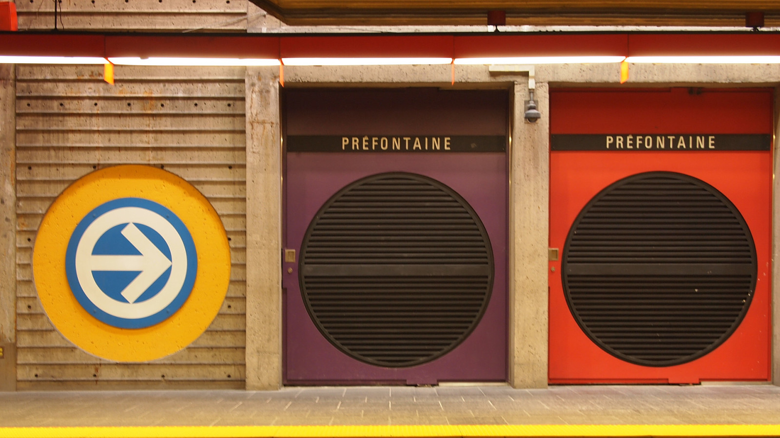
How would people get to Expo? Why, with the brand-new Montreal Metro system. Each station was designed by a different architect, with beautiful art integrated into the entrances, the walls, the platforms, everywhere.
Oh, and the entire system used our good typographic friend: Univers. Every station had its name spelled out on a uniform black strip, placed at a uniform height in all stations, in uppercase Univers Condensed, which was also used for all the signage and maps. It was a real example of a unified design system that you saw every day on your way to work or school.
The City of Montreal even adopted Univers as its official typeface! (Until the 90s, when they adopted Otl Aicher’s Rotis).
Growing up in Montreal, between the Olympic park, city signs and the Metro, it seemed like Univers, and modern design, was everywhere.
Expo was partially built on an artificial island made from earth excavated from the Metro. It was the most incredible, futuristic thing people had ever seen, and put Canada on the world map.
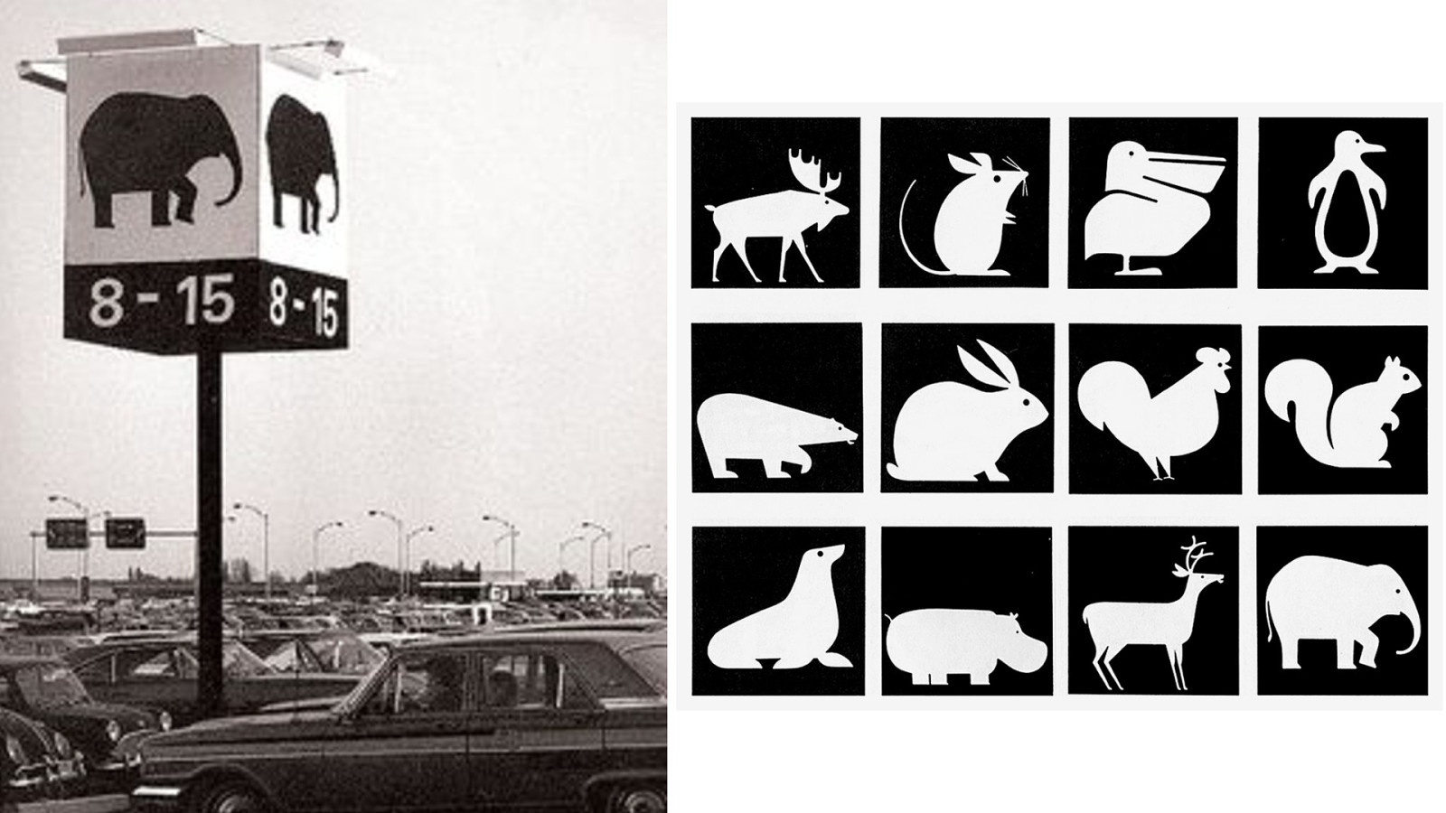
The amusement park attached to Expo, La Ronde, continued to run for years later. It’s still there, now called Six Flags La Ronde.
One fun thing were these animal pictograms to help you remember where you parked. They were designed by an American, who had studied under Laszlo Moholy-Nagy.
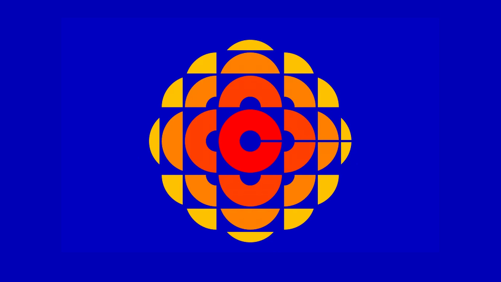
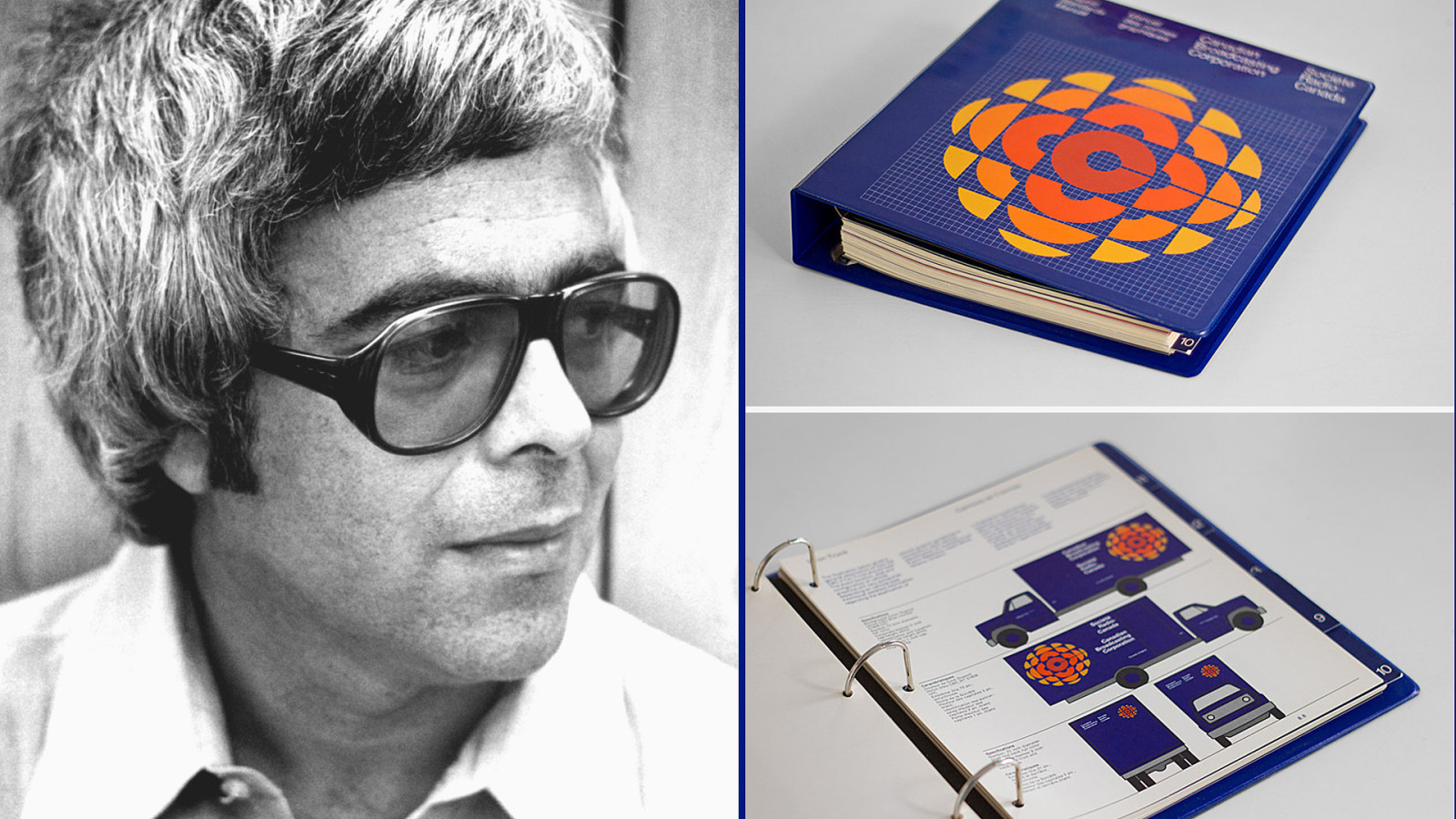
Moholy-Nagy was a Bauhaus refugee who had started a school called ‘The New Bauhaus’ at the Illinois Institute of Technology. His student’s name is Burton Kramer. You might know him for something else he designed…
…the classic 1974 CBC brand identity we grew up with. The logo, aka the “Molecule,” represented waves emanating from a central C, for Canada. The logo, with modifications, survived well into the 2000s before being modified into a more simplified version.
But this one has more color, dynamism, and an optimistic personality, in my opinion. To see the logo with its original “kaleidoscope” animation: https://www.youtube.com/watch?v=zoX8x-YIKLQ
Burton Kramer’s firm created not just the logo, but a complete brand identity system, which was recently painstakingly scanned, reprinted, and reissued as a hardback book. Here you can see an example of the branding applied to a mobile production truck. It was one of the first complete identity systems that applied to a national entity, and Kramer’s firm would go on to do many such projects for Canadian corporations.
And here’s another Canadian logo for you.
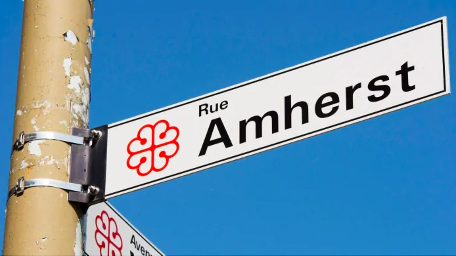
Launched in 1969, the logo symbolized a vision of humanity, and was called “Man Seeing / L’homme qui voit”.
It was designed by Georges Beaupré, born in Quebec, and who had studied at the Ecole des Beaux-Arts in Montreal before studying and apprenticing to the Swiss designer Hans Weber in Zurich.
See the animated version here: https://www.youtube.com/watch?v=RBWEFlKcwHs
It’s not an exaggeration to say that during that golden age, between Expo 67 and the Montreal Olympics, Canadian design was deeply informed by German and Swiss postwar modernism.
And that’s why, I feel, we as Canadians should look at Material Design and think, there’s a bit of us in there.
And it’s up to us to use design to make the world more accessible, more friendly, more rational and humane.
And remember, kids, Nazis are bad.
thanks / merci
@ajkandy

This talk looks at how world history and design history interweave; how the Bauhaus ethos literally survived the Nazis, and how post-war German designers created a utopian vision that went on to influence today’s digital user interfaces, with a bonus section all about Canada.
Presented at CanUX 2018 in Ottawa, Canada on Saturday, November 3rd. Thanks to the organizers and all the attendees for a wonderful experience!


 for free. You
can too.
for free. You
can too.