
A presentation at Mission UX in in San Antonio, TX, USA by Michael Verdi
Hi I’m Michael Verdi and I’m a product designer at Mozilla. In case you don’t know, Mozilla is the non-profit that makes Firefox. About 40% of our company (including me) is remote so I work from my home here in San Antonio where I’m super lucky to spend my days for the last 8 years, designing things for my favorite web browser. I don’t just say that because I work at Mozilla. I work there because it’s true.
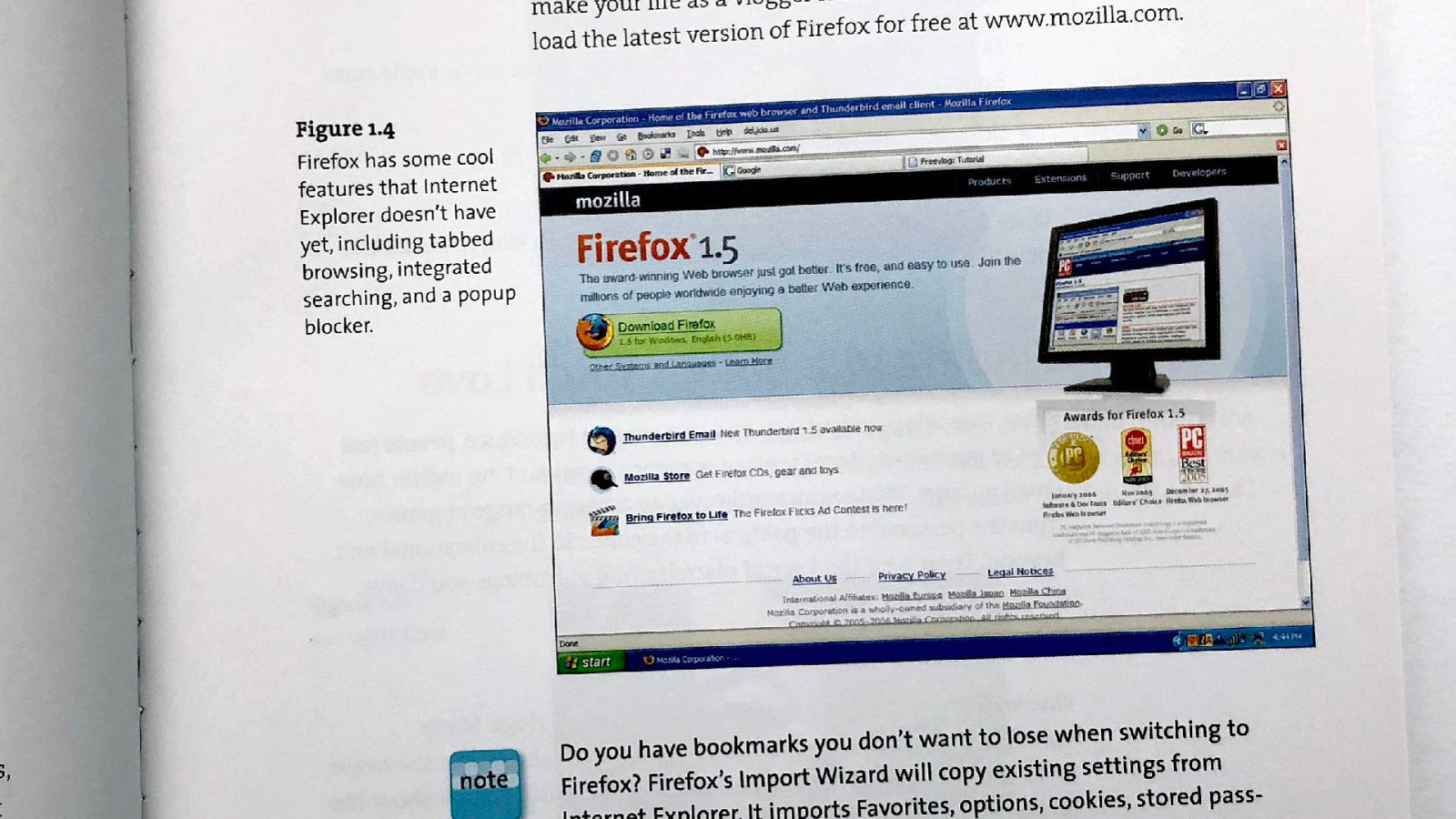
This is the Firefox 1.5 download page from a book that I wrote about videoblogging 12 years ago.
Over my time at Mozilla I’ve gotten to work on a lot of interesting projects. I spent some time working on our support website - designing a wiki that can be used by volunteers to write content for multiple versions of Firefox and localize it in nearly 90 languages.
I’ve had couple of brushes with fame while working on Firefox. I made a button to fix all your problems and for no reason central to the plot, it showed up for about 10 frames of a Mr. Robot episode.
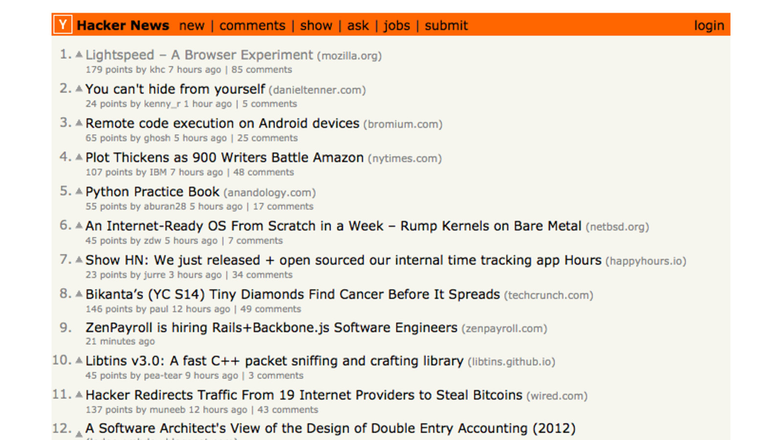
And once, a colleague and I, dreamt up a new web browser as a thought experiment and we ended up on the front page of Hacker News. Surprisingly, we got mostly good comments. The cool thing about that, and the reason I point it out, is that even though we never built that browser…
it’s core idea was around a completely new search experience. And now I’m super excited to get to lead design for Firefox’s search experience.
But what I’m here to talk to you about today is the thing I’ve spent the most time working on for Firefox - And that’s Onboarding.
So what is onboarding anyway? I like to define it as that time between or moving people between
I-think-I’ll-try-that-thing-out to I-use-that-thing.
You can apply it to a whole product or service or just a feature. You can apply to people upgrading You can also apply to efforts to keep people from leaving — like going from
I-use-that-thing to maybe-I’ll-use-something-else.
The big point here is that it’s mostly concerned with retaining people.
Why is this important? We’ve made it incredibly easy to try things like software and services out. But because it’s easy and the cost of switching is relatively low, it’s hard to get people to stick around, or convert or purchase.
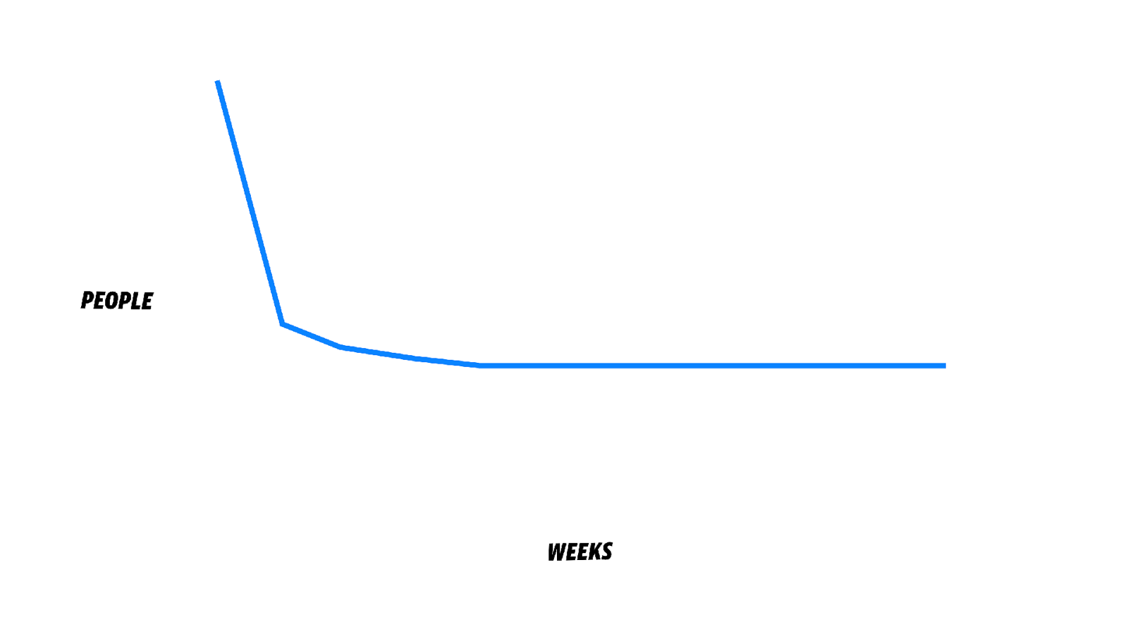
User retention often looks something like this. Half (or more) of the people who try your site, product or app leave right away and never come back. This is good retention by the way because the curve flattens out - you stop loosing people at some point.
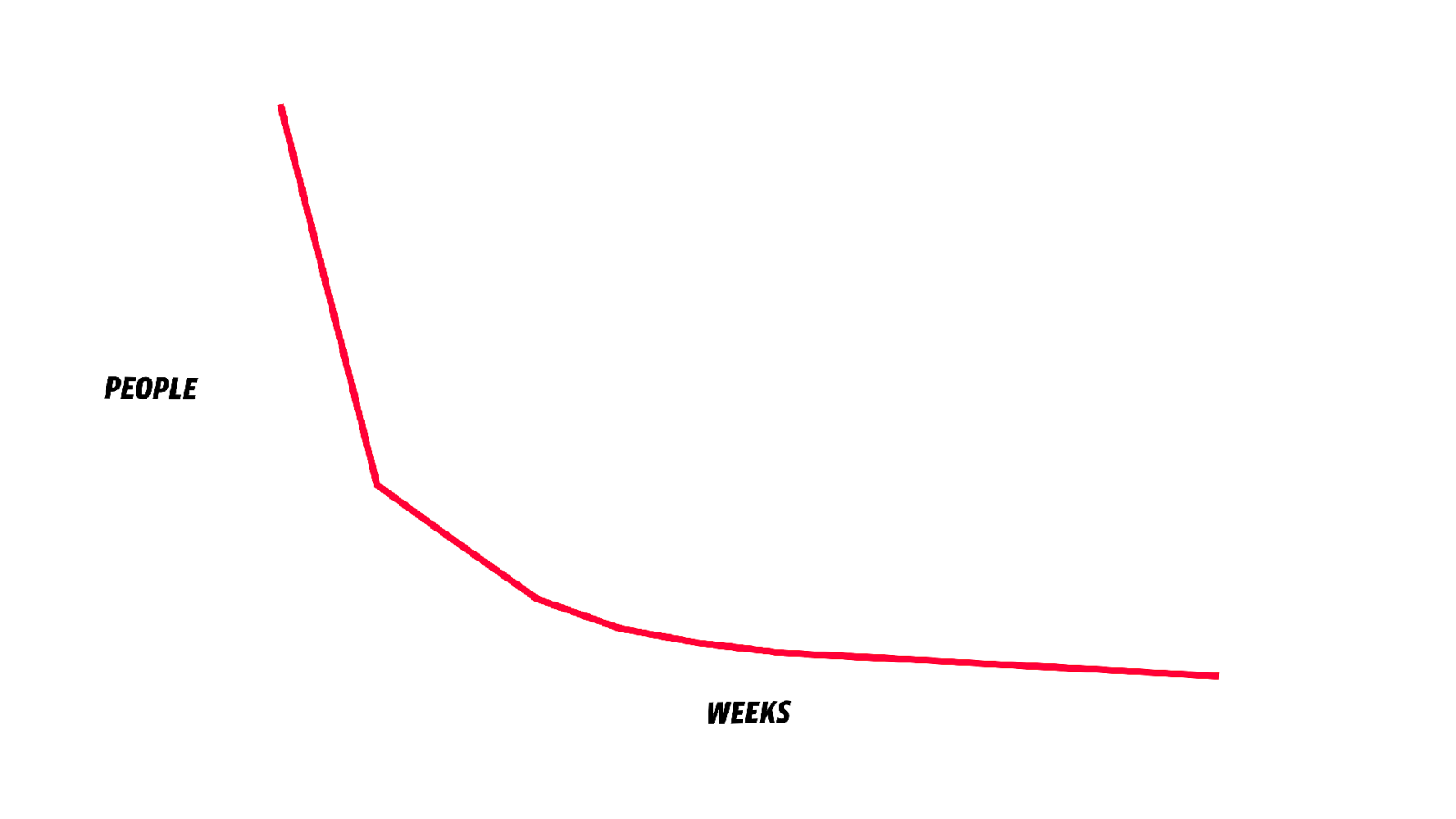
Onboarding is not a miracle worker. You still have to have a good product that people want. If not, your retention will probably look like this. Almost everyone leaves right away and then the rest leave soon after.
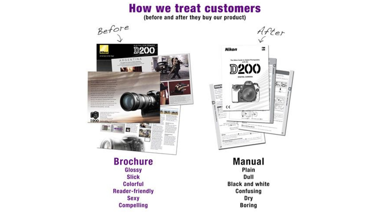
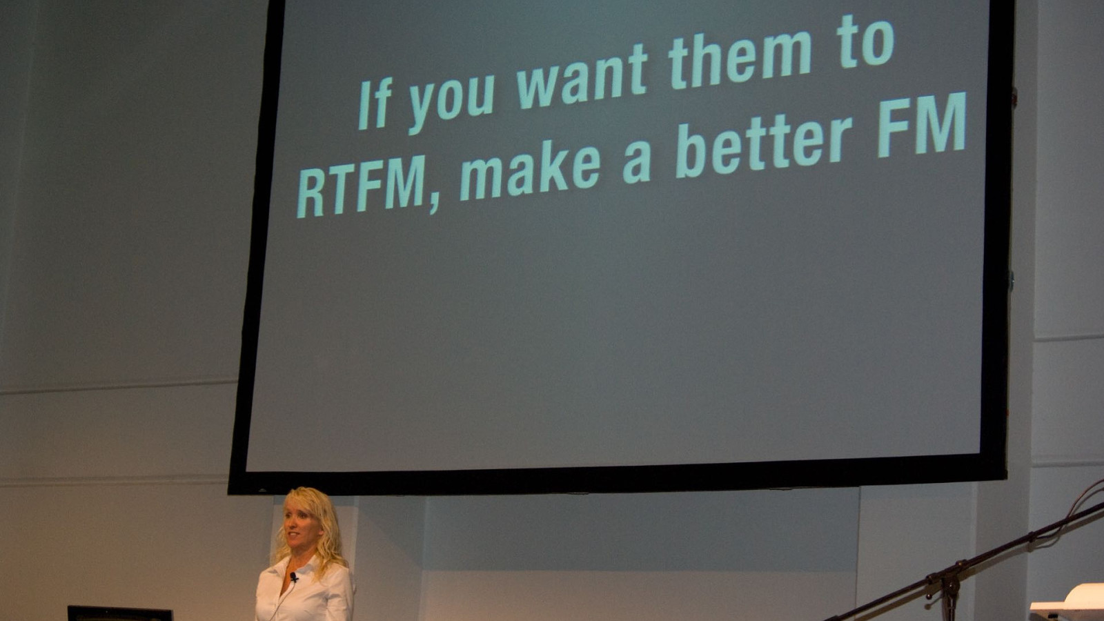
Kathy Sierra used to write a blog called Creating Passionate Users. She talked a lot about how making your users successful was the best kind of marketing. If they were successful, others would want to know their secret. She would rail against things like companies spending a lot on marketing and then dropping the ball after you made a purchase. This Nikon user manual was a favorite example.
I believe this is a big part of where onboarding can make a difference. Most people don’t have the time or desire to read the manual. It’s our job to weave that information throughout the product in a way that’s useful — that helps people see value.
But I don’t want you to get the idea that I’m JUST talking about that — about building tutorials or tool tips or screencasts. Those are are all good things that should probably be part of your onboarding strategy.
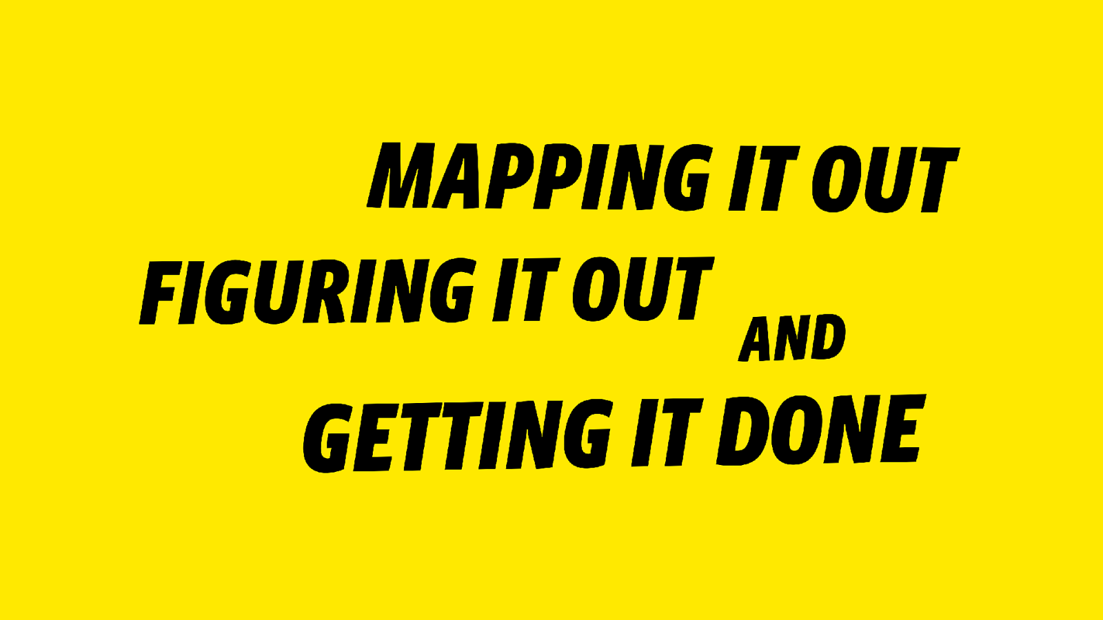
What I’m going to talk about today are, in my experience, the really hard problems: Mapping it out: Understanding what you’ve got and how it’s working or not working. Because if you work on a thing that exists, you have an onboarding experience whether you designed it or not. Figuring out what you want to do: This also includes things you want to stop doing and how you might want to reorganize your org to make it happen. And… Getting it done and all the sacrifices, compromises, plan Bs… that go with that.
So I’ll use Firefox as a case-study to explain some of the valuable things I learned over the years.
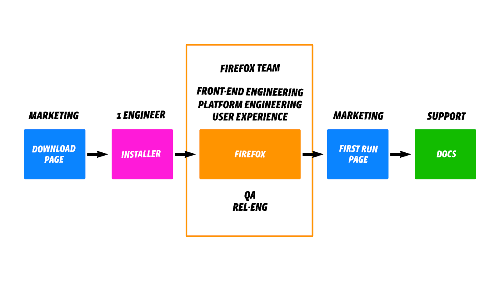
Now, like I was saying, if you have something that people use (an app, a website, a service, a store), you have an onboarding experience. If you haven’t specifically designed it, you’ve got the default experience that teams in your company make when left to their own devices. This was the case when I started looking at what Firefox was doing.
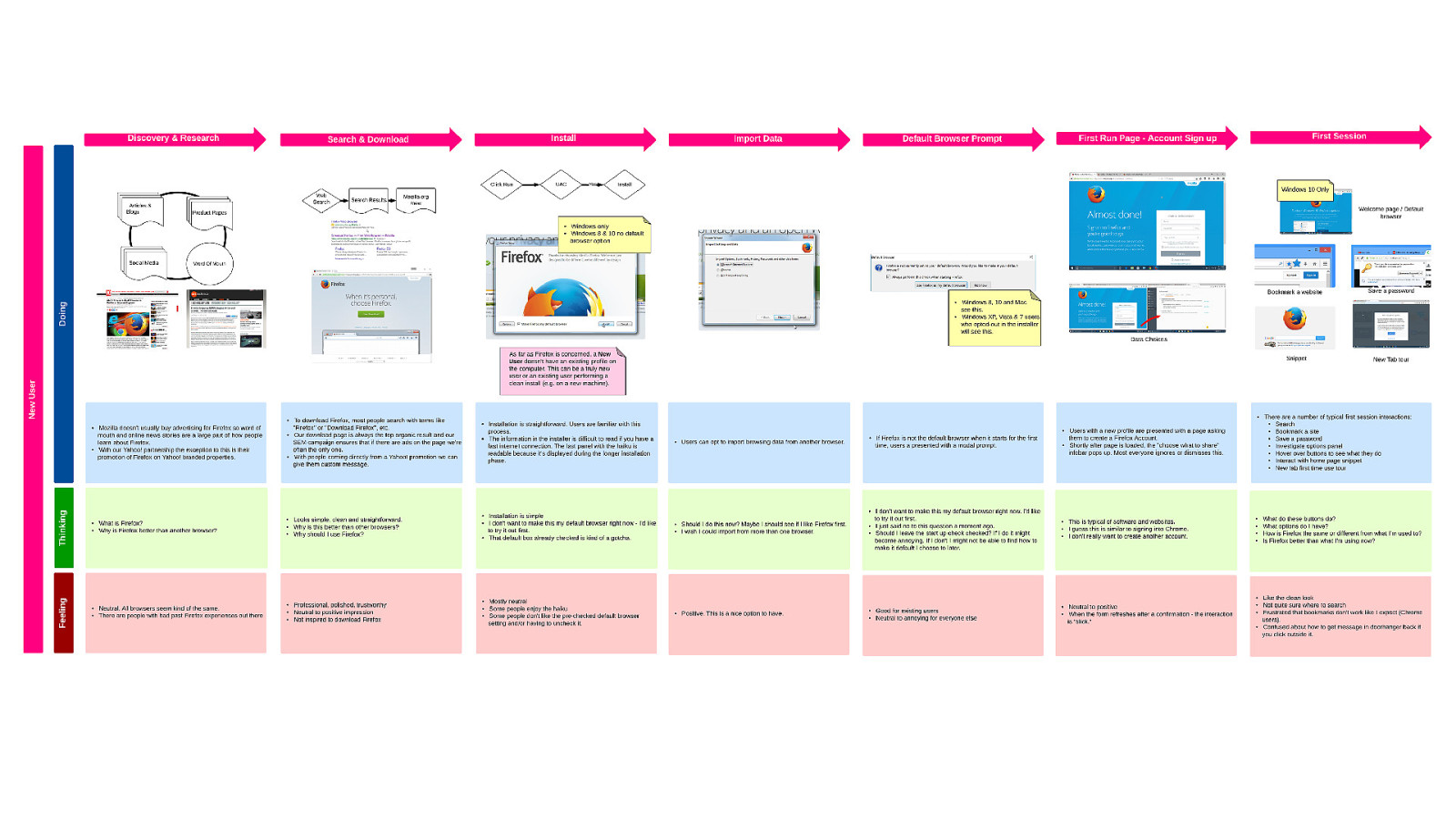
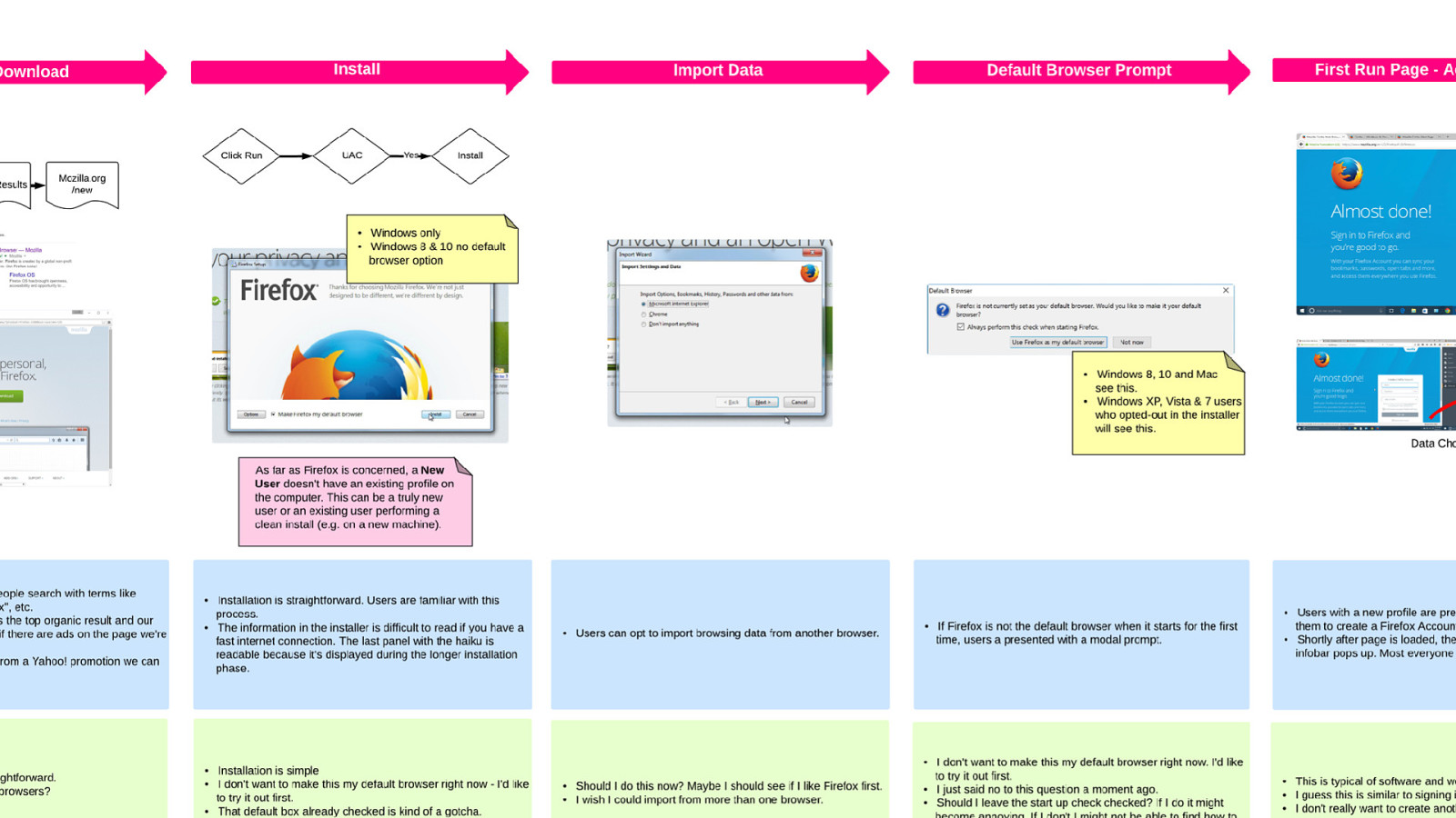
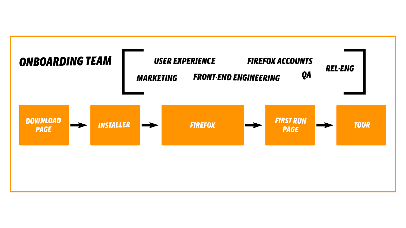
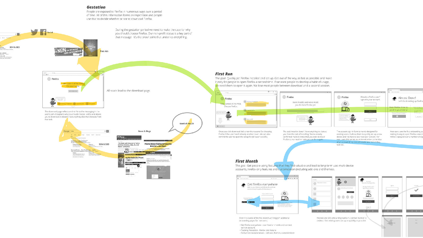
For example, here’s a simplified look at what a new user would experience when they downloaded and installed Firefox a few years ago.
But users see this as one thing. They see all these pieces over the course of about 2 minutes. As you can see, it looked a lot like our org structure.
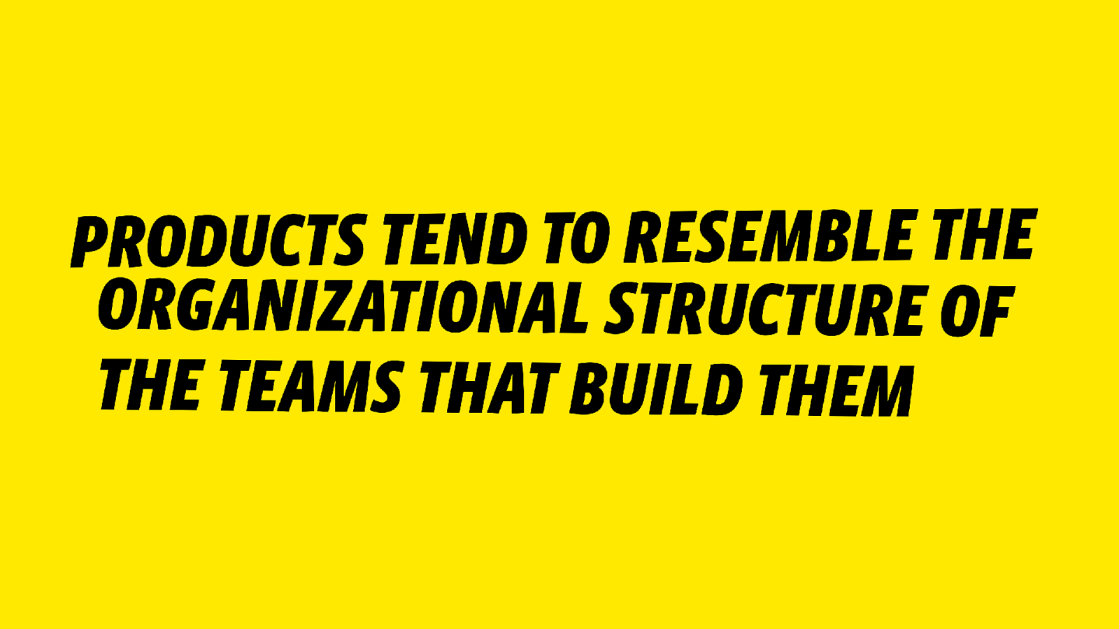
This sort of default experience I’m talking about happens because, products tend to resemble the organizational structure of the teams that build them. I didn’t make that up by the way. It’s an effect called “mirroring” or “Conway’s Law.”
So step one to designing an experience is to distinguish what you already have.
Journey maps are a great tool for figuring out what you’ve got or for planning what you want to have. This is more detailed version of that one I showed a moment ago.
Basically a journey map is an inventory of experiences over time, overlaid with people’s thoughts and feelings at each point. To create a really comprehensive map you use a number of tools:
One important one is user research.
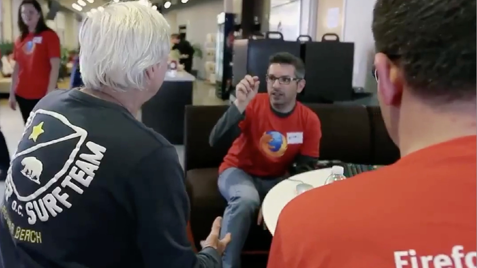
The best way to develop deep understanding, empathy and intuition is to spend a lot of time observing and talking with your users. The most interesting times I’ve had at Mozilla is traveling around, visiting people in their kitchens and living rooms.
A couple of years ago we had the opportunity to visit the Government Digital Service in London. This was one of our favorite of their many posters because it’s so true and it’s something we’ve adopted. We always include people who are not researchers or designers with us on research projects. It’s often like pulling them out of the Matrix and they become much more trusting of qualitative data.
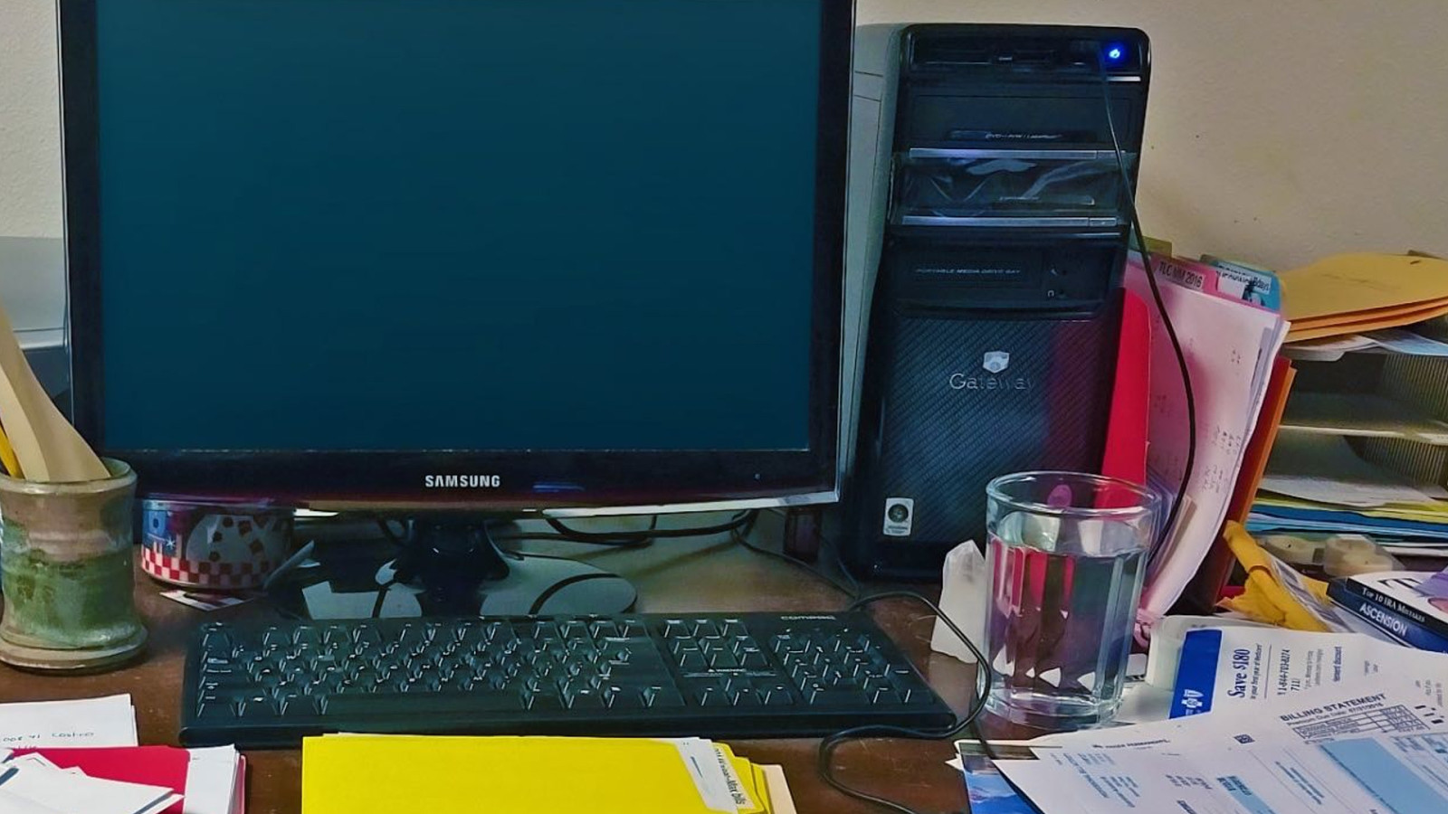
Another tool is heuristic evaluation. You go through the experience yourself. One thing that’s important is to calibrate yourself. You might have a fiber internet connection and new MacBook Pro but your users probably don’t.
A more realistic environment is usually something more like this. You also have to be part QA person.
What happens if I’m busy, trying to multi-task, don’t read everything and then click the wrong button? Then I would do that for all of the other user journeys. Like, what if I last used Firefox 3 years ago, forgot that I even had it installed and installed it again? What happens?
Answering people’s questions is another good way to calibrate yourself. You’ll learn all kinds of things spending a day or two in a support forum, answering emails, tweets or even phone calls. Once, we held an in-person support day in our San Francisco office. It was as much a learning experience for us as it was for the people who attended.
Another thing you’ll want to do is to interview people in your company. Who works on this? Who built that? Why do we do things this way?
This will give you a good idea of the problem space. You’ll probably be surprised at what you find. We had 3 big ones…
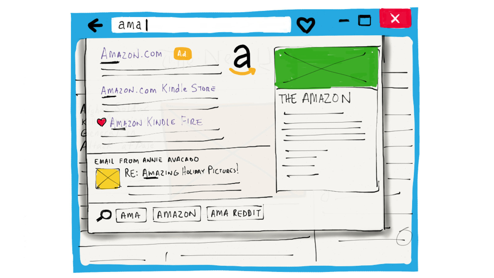
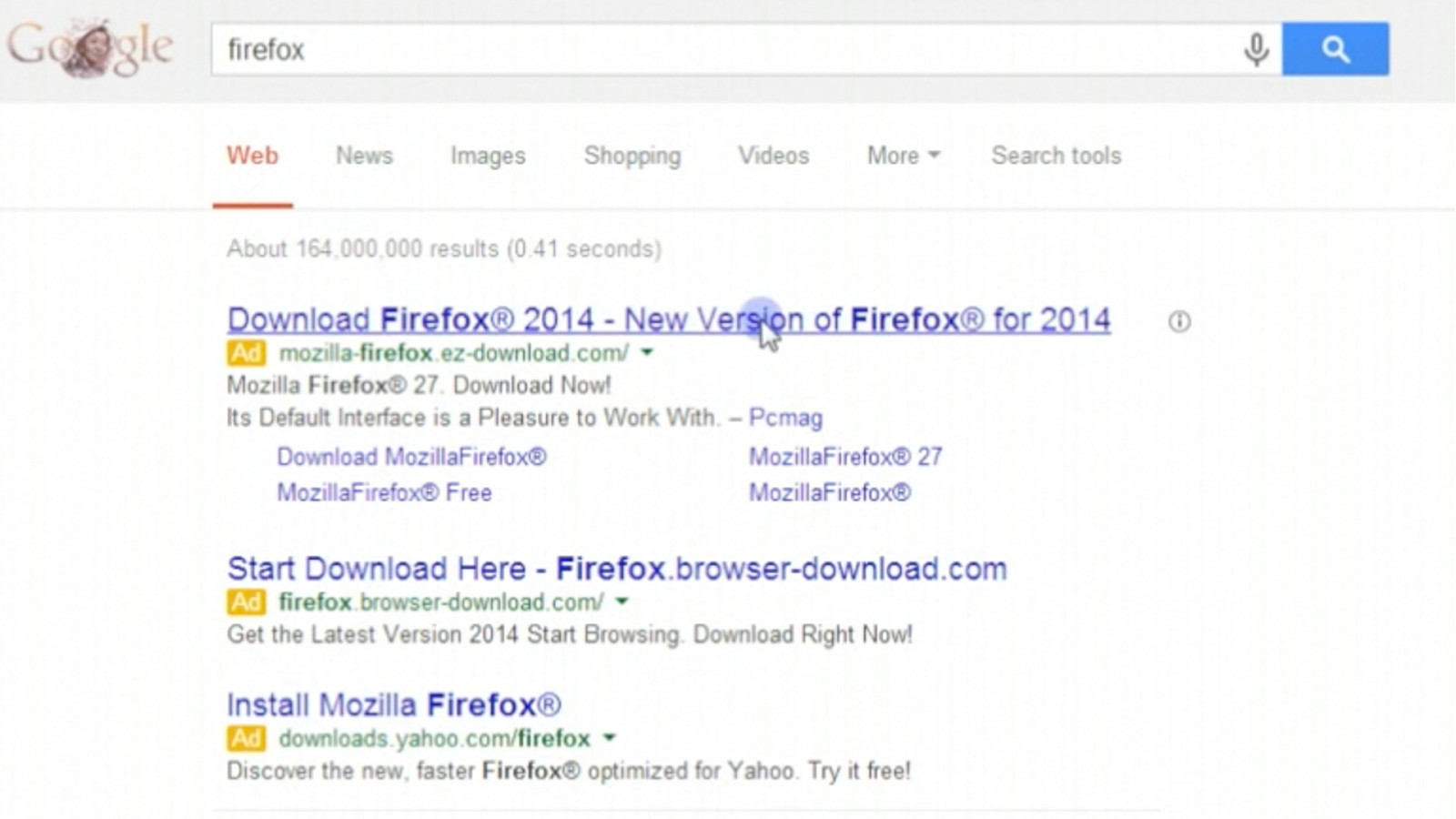
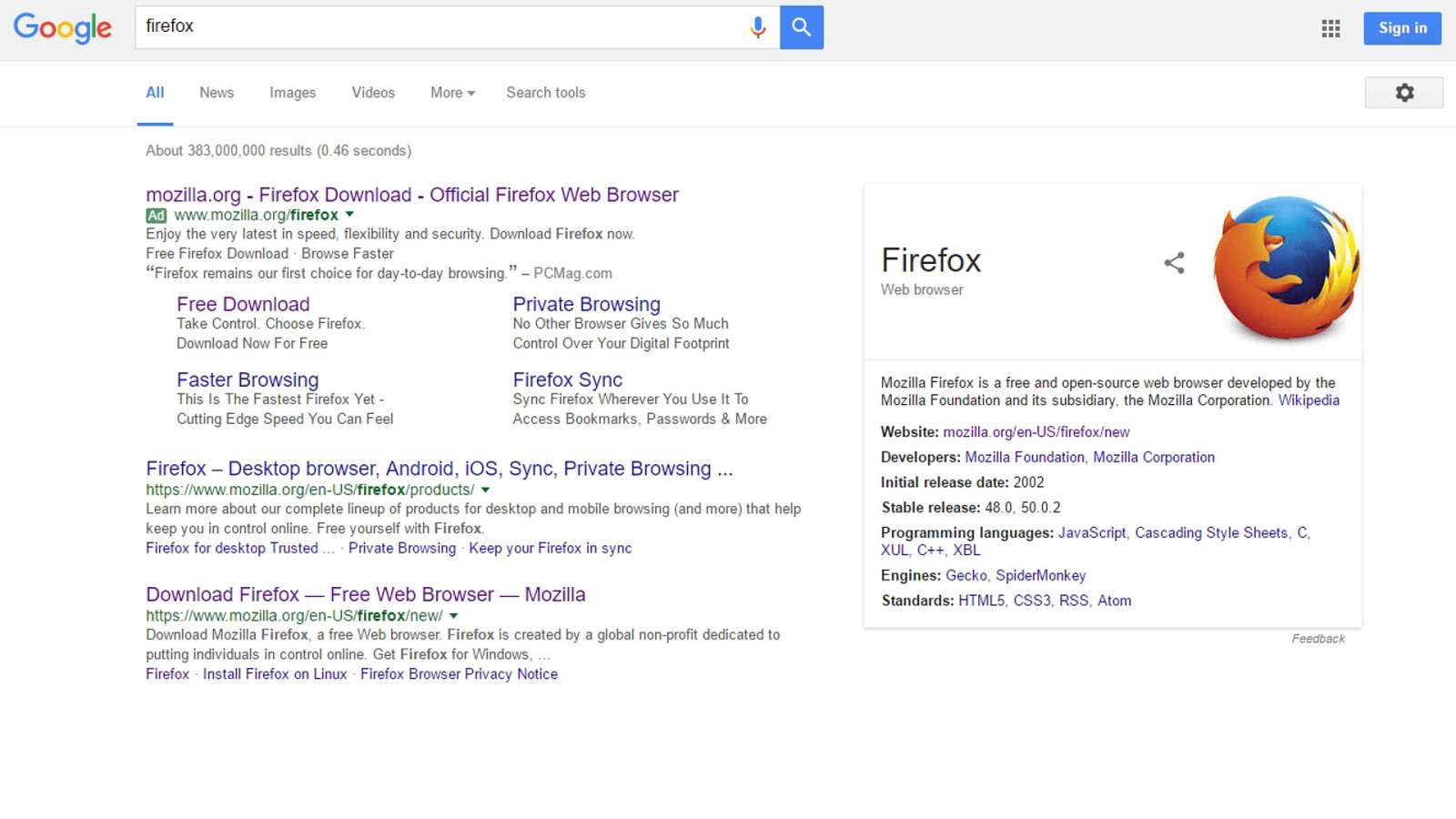
First surprise — many people who wanted Firefox were getting crapware instead!
Nearly everyone I’ve ever tested or observed gets Firefox on their computer by searching for searching for “firefox” “download firefox” “mozilla firefox” or some variation. Once on the results page, there are group of people who just click the top result no matter what. Some of them know it’s usually an ad; some don’t. Either way, they all explain that they expect this to go the right place for this type of search.
Here’s the thing. None of those links on the screen are ours.
Search engine marketing can be expensive. In our case it costs millions of dollars a year. So we ruled it out long ago. Also it didn’t seem like we need to do this to get people to try Firefox. We had gotten lots of press and…
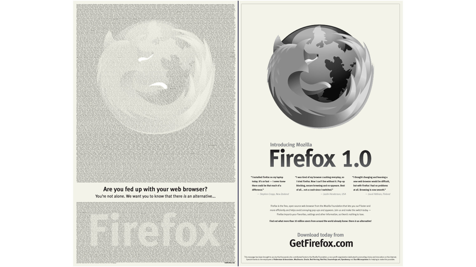
Our amazing community did stuff like buy a full page spread in the New York times
Or built a crop circle to spread the word.
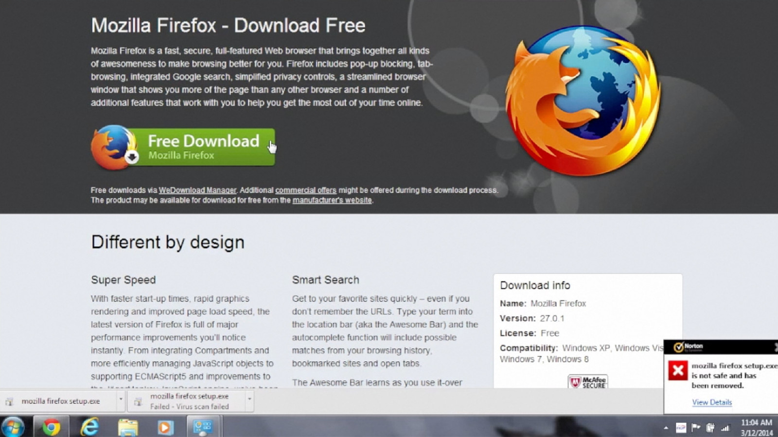
But, once Firefox was popular, shady websites capitalized on our not buying search ads. They bought ads for firefox as a lure. Instead of getting Firefox you got a of crapware. We had seen these sites before but nobody knew how big of a problem it was until we started tying to make a journey map. At first, nearly HALF our participants ended up on sites like this!
So before we did anything else, we started a search ad campaign to outbid and remove the scammers.
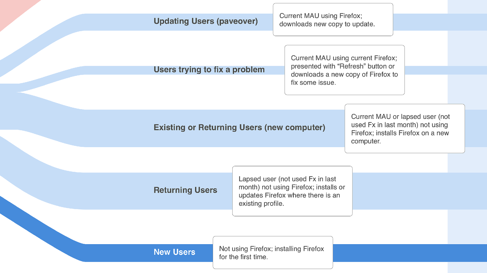
The second surprise was how many different user journeys we found:
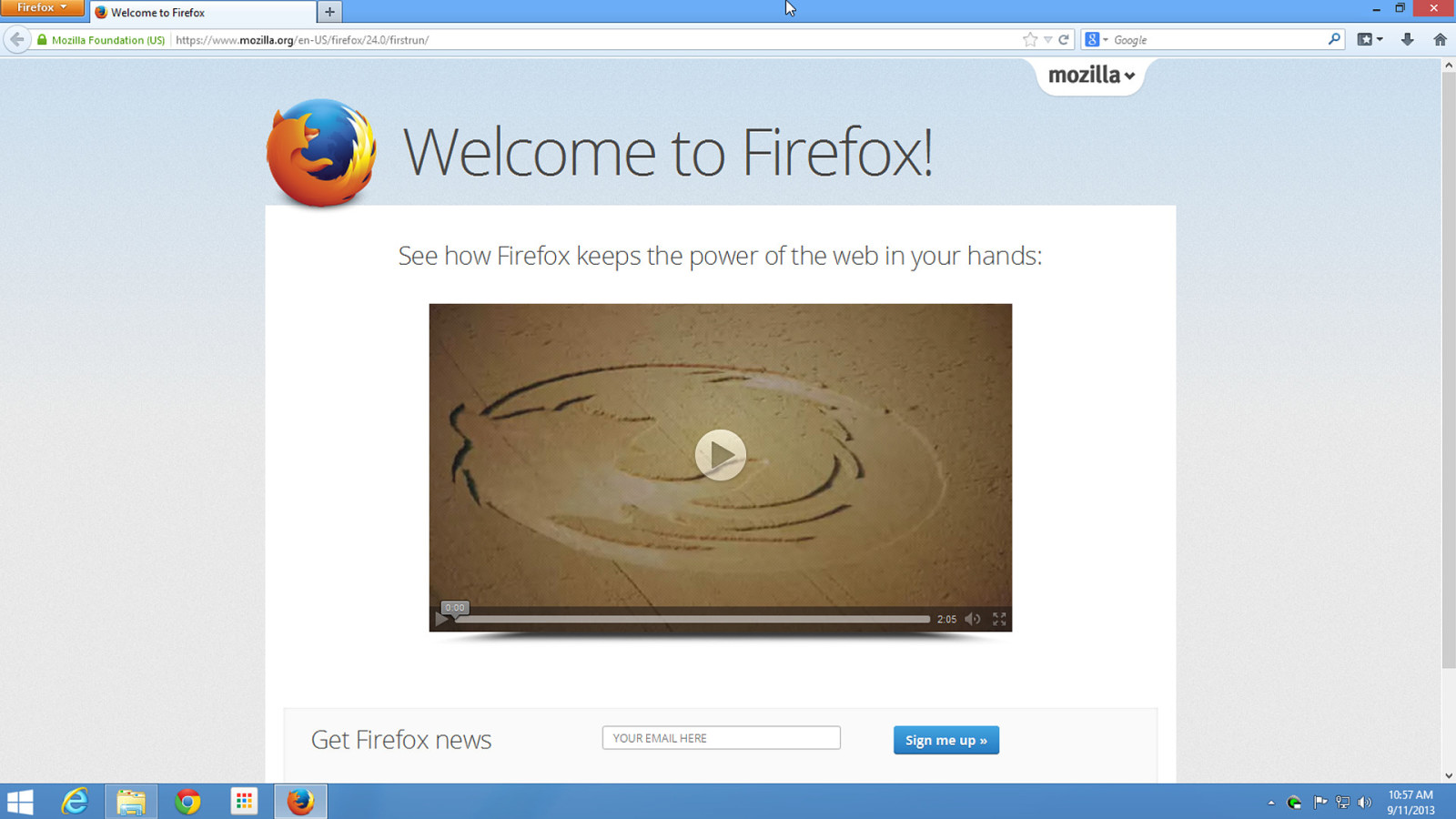
The third big surprise was that our onboarding flow was built for a world where people were frustrated with Internet Explorer and they’d already decided to switch to Firefox. All we had for them was this crop circle video welcoming them to the tribe. But things had changed. They weren’t joining a tribe, they were just trying it out.
Now that we’d mapped out the problem space, upon reflection it seemed we had three big problems that we wanted to address.
So when we started out, we were kind of organized by technology. Marketing made all the websites, there was one person who made the installer, the support team made all tutorials and the Firefox team made Firefox.
We spent a good deal of time creating a cross-functional team to tackle this. Internal reporting structures didn’t change — we just created a new working relationship.
Honestly it was slow going. We actually had competing projects that we had to reconcile. Some things worked, some failed. I guess it depends on the culture and organization of your company but I think for us, this has been the hardest thing to make stick.
What really helped was adding a product manger, running lots of tests and insisting that decisions be based on both the quantitative AND qualitative data. This is where having everyone participate in user research made a big difference.
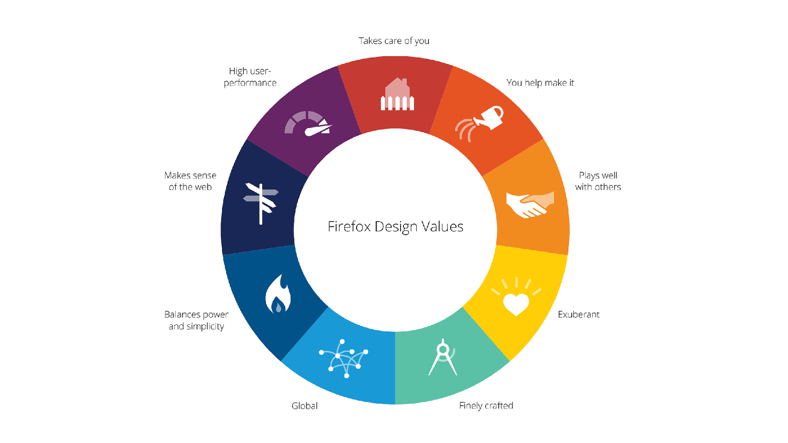
Our design values and the research we just did made a good starting place for thinking about what kind of experience we wanted to create. What did it need to accomplish? How did we want people to feel?
One of our values — part of Firefox takes care of you — is user choice and control. Our research showed us that people like to learn by diving in and exploring. They also already have a task in mind when they install Firefox.
So we wanted our onboarding experience to stay out of people’s way, get them to the web quickly. We wanted to support people’s desire to try Firefox out before making a commitment. That meant we had a bunch of things that we needed to stop doing.
Simultaneously, there is not much time to make a difference with people. So we wanted to use our exuberance and whimsy to get people’s attention and help them get the most out of Firefox.
Meanwhile… We’d embarked on a huge project to remake Firefox. We had written a new programing language — Rust — and were using it to rewrite parts of Firefox and our rendering engine and swap them out. Along with that we were updating the UI and to go with that created a new style guide with a new color pallet, new logo, new copy rules, and whole motion and illustration system.
This was great because it helped flesh out all the pieces we had at our disposal.
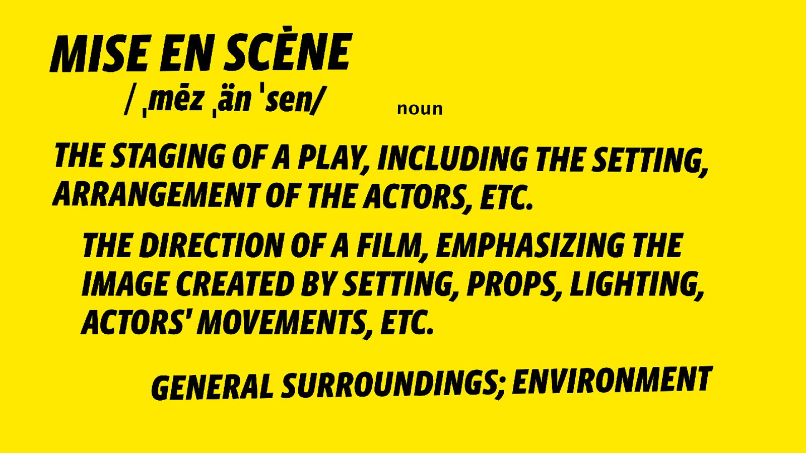
I started out in theater and film. The first thing I learned was how to use design elements to create whole new realities.
That’s me, by the way, in 1995.
You have all the things visible on screen or stage along with things like music and time. If your story is set in the 70s like this, costumes and props help a lot.
In theater and film this arranging or orchestrating — creating a new reality — is called Mise en scène. But this isn’t limited to theater and film. It’s common to design in general. We just might call it art direction for example.
For me this was a helpful way to frame the problem we were trying to solve. Especially because our solution had to combine the work of many teams, while remaining cohesive, and then play out over time. There are cues and marks to hit. So to me it felt very much like directing.
Alright. Getting it done. This is fun part. This is where we experiment and iterate and make all of our ideas better.
So we wanted our onboarding experience to stay out of people’s way, get them to the web quickly. We wanted to support people’s desire to try Firefox out before making a commitment. That meant we had a bunch of things that we needed to stop doing.
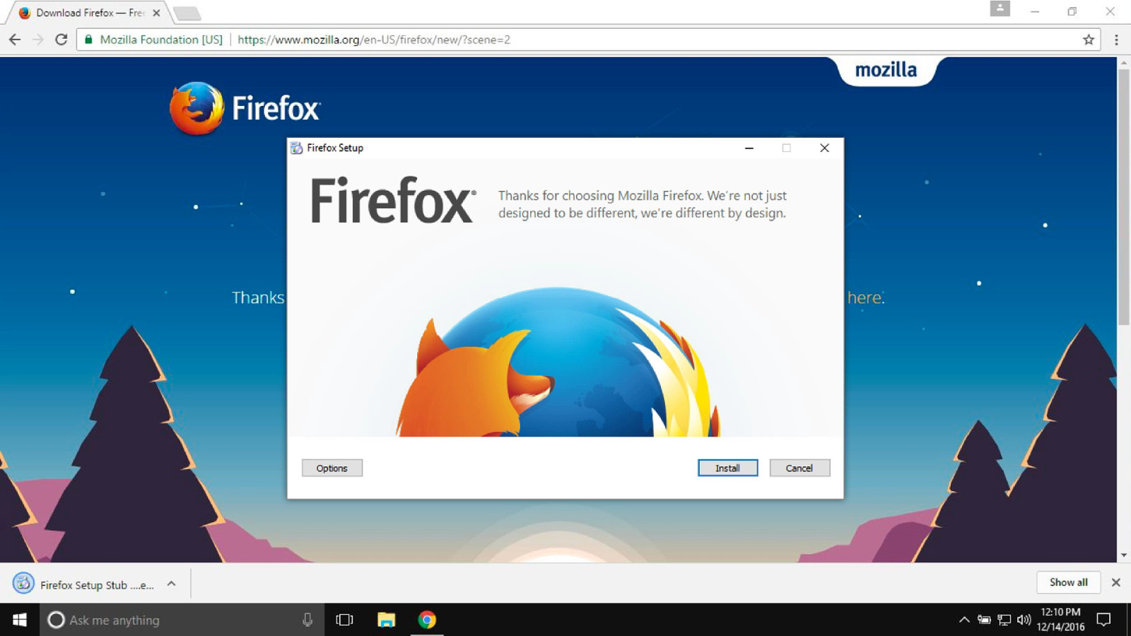
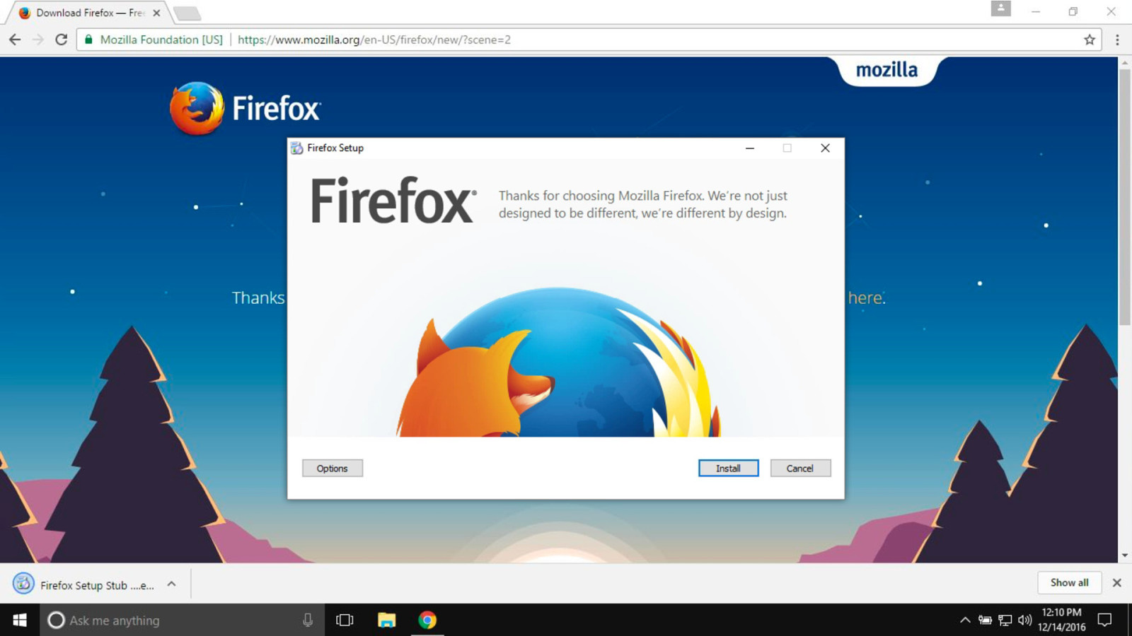
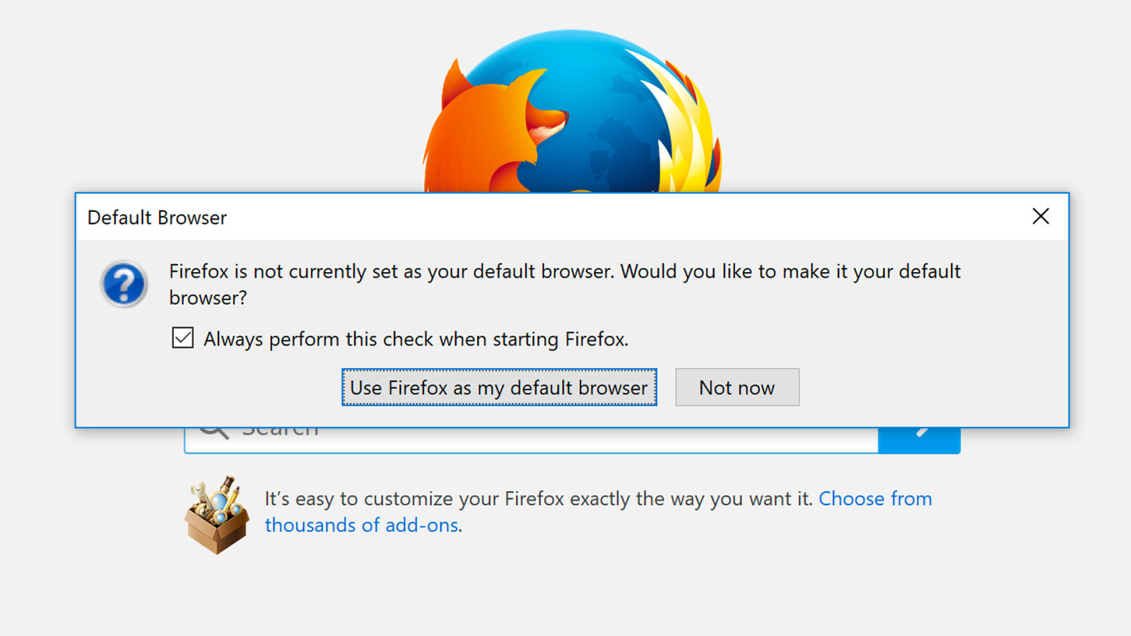
Our installer seemed unnecessarily complicated and felt clunky.
It had had an school software box and CD icon and had a jargon-y name — “Firefox Setup Stub”
We suspected that if people didn’t open it right way they might not recognize it in their download folder.
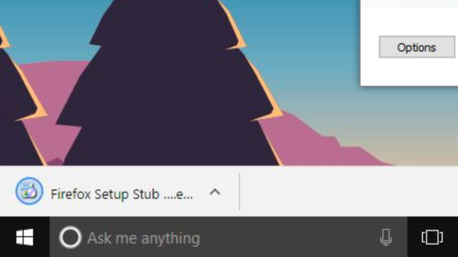
It also had this Install button that we wanted to get rid of. The only reason it was there was to give people access to that options button on the left. But almost no one clicks that options button and even less need it. So we moved the options to the download page and got rid of the install button.
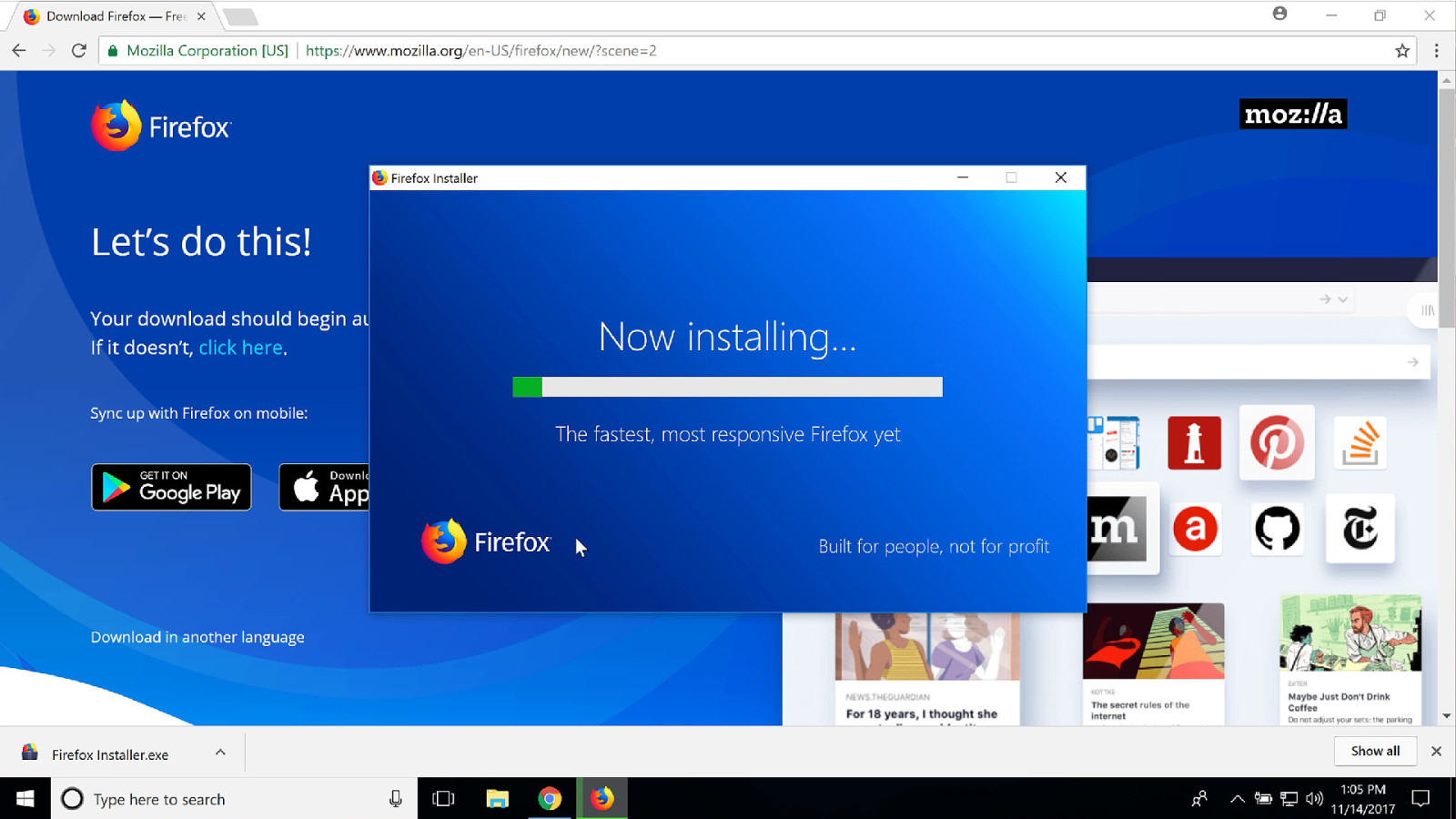
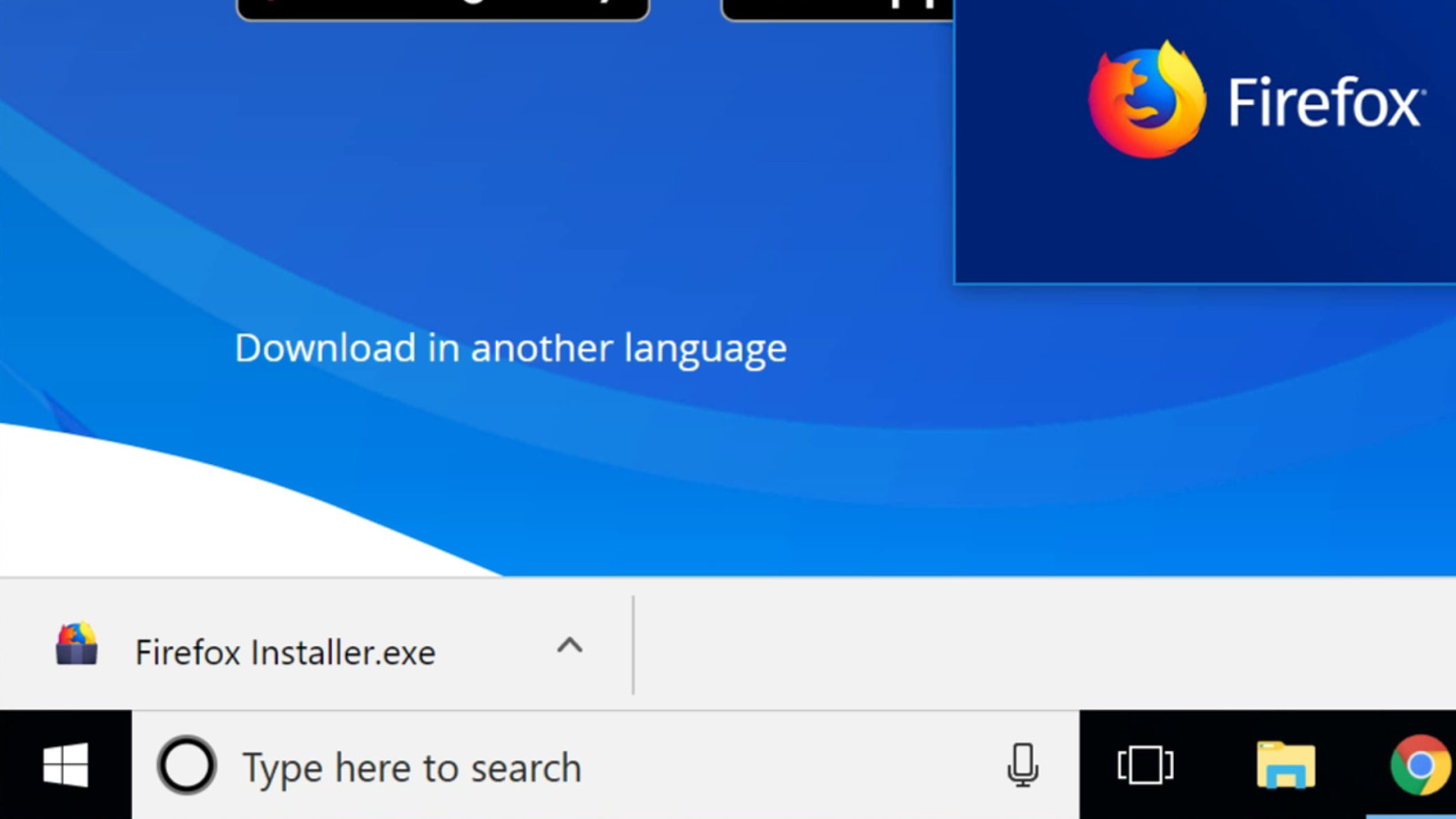
Now with the install button gone, the installer just goes to work after you run it. While we were at it we carried over our non-profit message from the download page and renamed everything “Firefox Installer”…
And we gave it a recognizable icon.
It turns out those little changes resulted in 8% more successful installs. That comes out to many millions more each year.
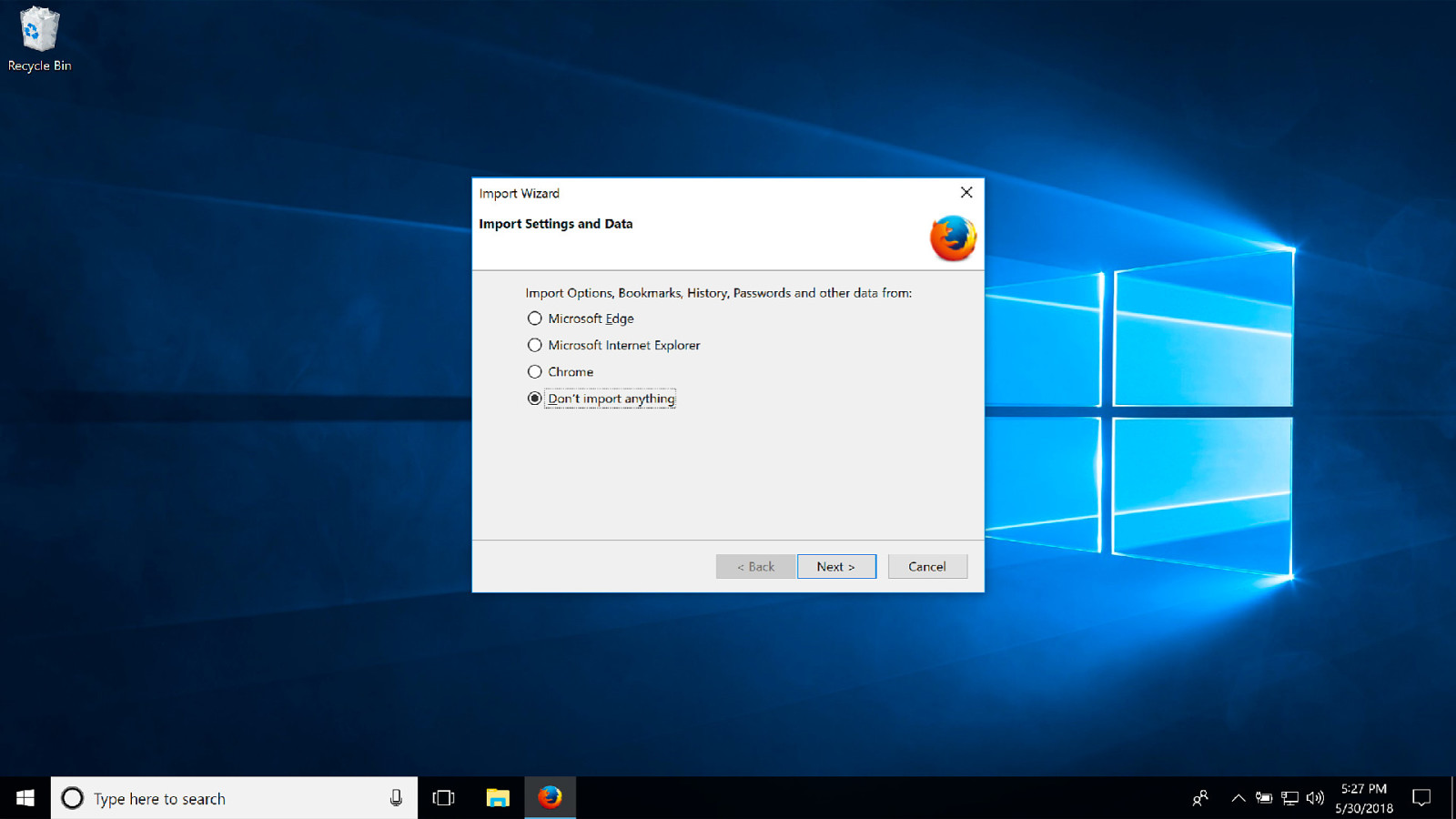
This is the import wizard. For our whole history it prevented a new copy of Firefox from opening until you made a decision. Again, over time the world changed and people were no longer pre-sold. They wanted to try Firefox out first before they committed. Importing your stuff feels like committing. The problem with that was that people often run into problems right away. They’d want to test how well Firefox worked with Facebook or they’d want to check their email and they wouldn’t be able to remember their password.
So we built an auto-import feature. It would do everything behind the scenes, automatically, while Firefox was starting up and give you the ability to undo it at any time. Then you could try Firefox without having to start from scratch.
We tested the copy to make sure people understood what was happening, we iterated on the UI and we rolled it out in a small test. What happened was that when people were confronted by their real data showing up (and not fake prototype data like up there) a good number of them were surprised and a bit creeped out. They quickly understood what we’d done and most of them even kept the auto-imported data and were happy happy about it.
But we didn’t ship it because it made people feel like they weren’t in control and violated our “no surprises” value.
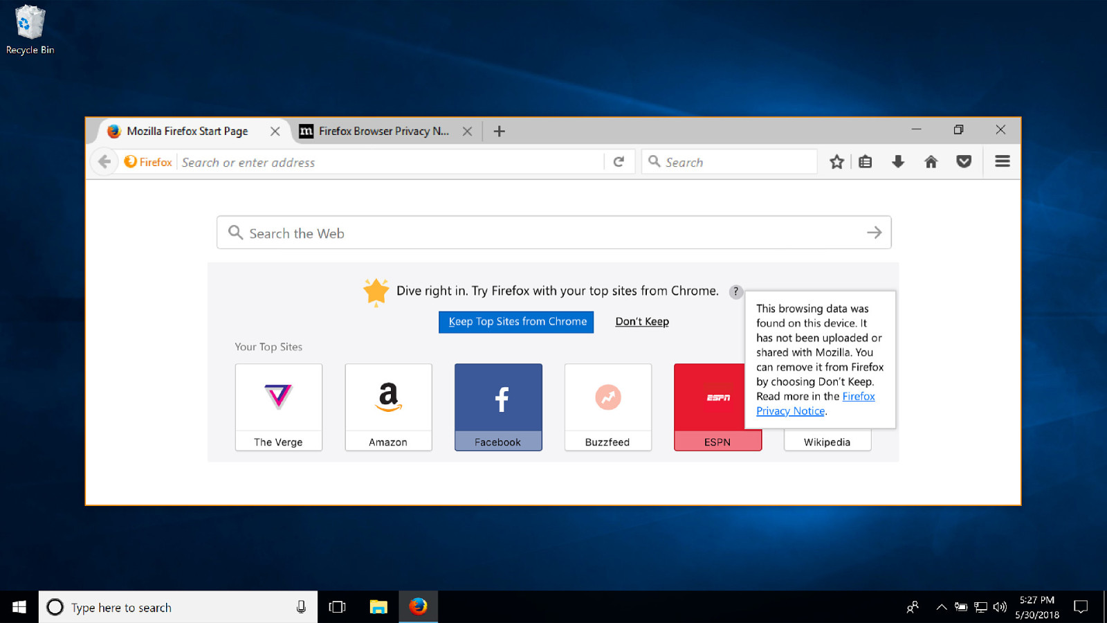
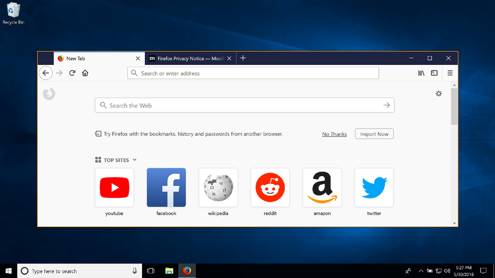
But there’s always multiple ways to solve a problem. So we went with plan B. Instead of the modal import wizard that we’d shipped since version 1, we put a passive import command on the home page, right above the top sites section.
I have dozens of videos of people saying “I just want to try it out first” as they click not now. This was relatively easy to fix because it has become way less important over the years. Most people open a browser, do all of their browsing tasks and then close it. So we delayed this to showing up the second time you start the browser and additionally we added it to our tour.
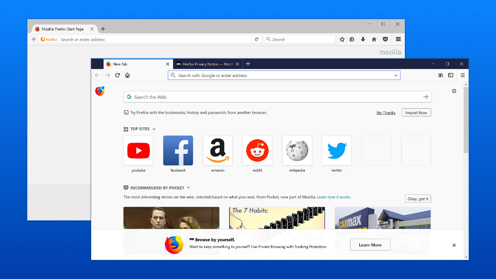
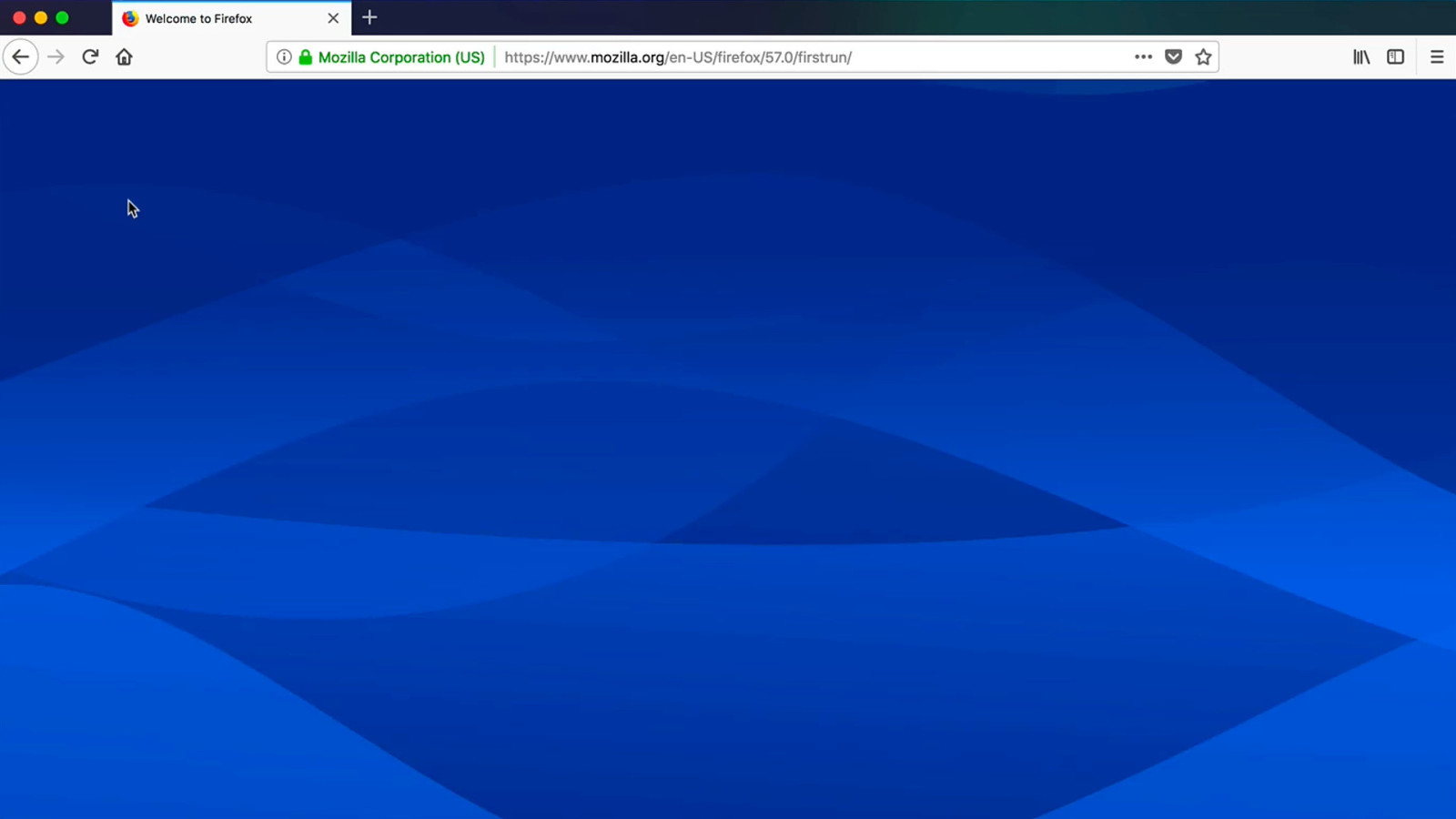
We did have some things we wanted add or change. One thing we really wanted was an animation to welcome you into Firefox. We have an account sign-in page that load when you open Firefox for the first time. This is so that if you are one of those existing users installing on a new computer, you can sign right into your account and sync all of your data. When you complete that or skip it, you get this nice animation that takes you right to the web.
Here’s that sign in form. I’ll click skip this time. And kapow! You’re ready to hit the web.
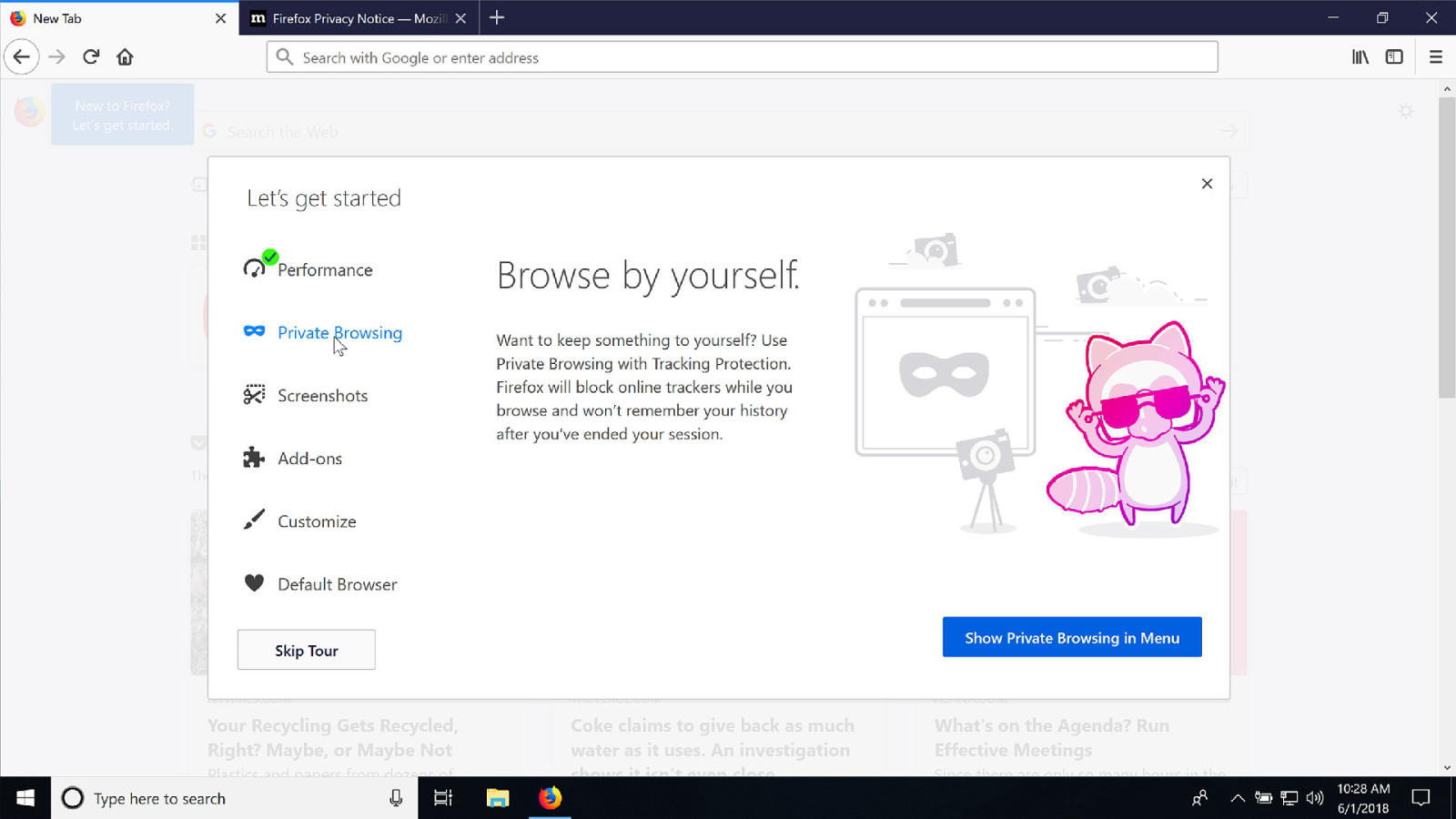
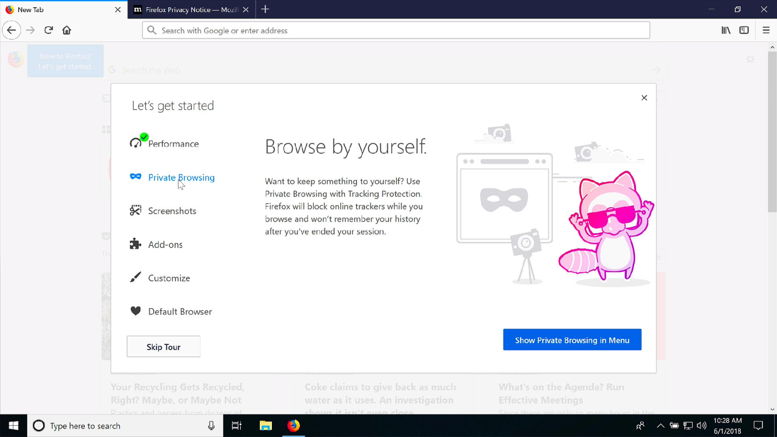
And we also added this tour. We had one for new users and a slightly different one for people who were updating because this was big release and we were changing the UI.
We designed this to guide people through locating and using various features. Here’s what it looks like in action.
Here we introduce private browsing Show you were to access it And then once there, we have more info about how it works And way to learn what to expect from tracking protection.
So as we built this new experience we did a lot of testing and iterating. We ended up releasing the new download and install flow before the big Firefox release. Just changing those first 2 minutes — by aligning it with the goal of letting people try Firefox — we increased our retention by almost 3%. And that’s before all of our big changes to Firefox itself.
So to recap: A quick search will turn up tons of tips for user onboarding. There’s a lot of helpful stuff out there but… There is important work you have to do before you can put any of that information to use.
Talk to your users. Do research. Journey maps. Get organized. What problems are you solving? What things do you need to stop doing? What do you want to start doing?
Most importantly, onboarding is not something you build once. You’re product will change, your users will change and the world will change. So your onboarding will have to keep changing.

Half of the people who try your site, product or app leave and never come back. Crafting that first impression can make all the difference. It is the best chance you have to get people to see value in what you’re offering. Creating a great onboarding experience is, by its nature, a complicated endeavor. Michael will share practical insights from five years of designing onboarding experiences for 100 million Firefox users. In this session, he’ll help you take a step back and look holistically at what you’re doing. Learn to use research, design and marketing, to hold onto more of your users.


 for free. You
can too.
for free. You
can too.